
The Essential Guide to Presenting Numbers in an Engaging Way
- In Business , Chris Atkinson , Communication , Engagement , Leadership

The Essential Guide to Presenting Numbers in an Engaging Way:
A systemic organisational deficiency we seem to accept without a second thought.
Recently I was asked by a global client to help their European finance team present their subject in ways that are more engaging for their audience. As I started to develop the session, I realised on almost every course I have run, there has been one or two people from financial or technical functions who found the content harder to adapt to their situation. Because in general these issues were met with humour and laughter (people saying things like “I’ve got the boring subject!”) I overlooked the genuine commercial need that exists. It’s not just finance either, if you look at meeting agendas I would guess that more than 50% of meeting time is dominated by managers presenting their departmental numbers, KPIs or other metrics and so on.
I have come to the conclusion…
We are terrible at presenting numbers, KPIs and data!!
It is an organisational deficiency that we seem to accept without a second thought – “it’s okay, it’s a boring subject anyway” – “I wouldn’t expect finance to inspire me” – “I’ve got the boring bit to talk to you about” – “these are just the numbers, I’m not trying to inspire or engage”. Well no, that’s not okay. Organisations live and die by the numbers. Measures and KPIs are the front line tools for evaluating performance. The cost of people either not engaging, not caring or not being properly informed because ‘the content is boring’ is unthinkable; the subsequent business impact – even more so.
So I write here today to try and turn the tide on this epidemic, to make a stand for all of those people in your audience who have given their time to listen to you speak and most importantly to argue that if we can present numbers in an engaging way we can transform our organisations.
WE CAN DO BETTER!
Last year I wrote a book on how to engage and inspire audiences, it was well received and as a result I have been invited to speak, write and be interviewed on the subject of engaging audiences. As I reflect on this, I believe I have often cited the soft topics as examples of how to engage and inspire – the team talks or leadership presentations. I sincerely hope this is a step towards taking the proven principles of my book and using them to address some of the harder topics (more dry or technical subjects).
4 Techniques to Transform Numbers
- Find Interesting Angles – Useful when the information is routine, repeating or likely to be ‘skimmed’ over
- Use Comparisons – Useful when the numbers are big or abstract or hard to visualise
- Use Analogies – Useful when the presentation is complex, boring or technical
- Paint a picture – Useful when introducing a change of process, new system, new ways of working etc.
Technique 1: Find Interesting Angles
This is probably the safest and easiest first step for people who are cautious about getting too creative. Most ‘reporting’ type presentations feature a standardised series of graphs or data showing the current results, often these are the same from person to person or department to department (just with different numbers). The impact is that few people, except the speaker and the boss, will be that interested in what is being said. Moreover, if all you are doing is presenting data, why not simply ask people to review this information on the company intranet or circulate the slides? Beyond ‘we’ve always done it that way’ – the reason why these types of presentation exist is generally;
- Because people can’t be trusted to actually look at the information of their own accord
- The group hope for some form of open dialogue, accountability or debate around the figures
In fact, this second reason is a good one but this is why the standardised slide decks WILL…NOT….WORK for a presentation! You can certainly report in a standardised way and publish figures to colleagues in a standardised way but if you are investing the time/money to gather everyone in a room then surely your intention is to engage and stimulate them?
Here are some common examples:
So my first suggestion is to do some investigation into the numbers to find interesting ways to view the ‘normal’ data. Maybe search for overlooked insights, specific trends or hidden facts. These new perspectives will not only be far more interesting for your audience but could even redefine your strategy entirely. I recently facilitated a workshop on quality strategy with a global automotive manufacturer, during our discussion the group started to question their standard practice of prioritising the most serious quality (fault) issues first. They wanted to know what percentage of the total fault landscape these most serious issues accounted for. As they dug into the data they found examples of many single smaller issues which were occurring many hundreds of times but had minimal impact so never got prioritised. When they positioned quality through this perspective it, almost turned everyone’s thinking upside down – this is not about right or wrong, it is about the immediate engagement of the group into that quality conversation.
Here is another example.

Imagine your corporate data is similar to this PGA Tour Statistics for 2017-18, rows of columns and data. Our tendency is to simply skim read the top/bottom/largest/smallest and so on.
Let’s look at these two quite different people from this list:
- Phil Mickelson – #2 – $3,159,197
- Austin Cook – #20 – $1,610,277
Phil Michelson basically earned twice as much money as Austin Cook… and these aren’t small sums!! But if we dig deeper into the numbers there is a really interesting figure in the statistics
- Phil Mickelson – Average 69.3
- Austin Cook – Average 69.9
The difference between these two golfers is, on average, 0.6 of a stroke! So if I was presenting this data to a group of people, I might start a discussion about what is the difference causing Phil to earn so much more money (for reference Phil played 4 fewer events than Austin). Basically, there seems to be very little separating these two in their game BUT a huge difference in their financial outcome.

I’m not a golf expert so please take this example in the spirit of what I’m trying to show especially if I’ve made a mistake here… my point is that you can surely find similar interesting perspectives to create engagement, debate and vibrant discussion.
Technique 2: Use Comparisons
This is also quite a safe idea to experiment with and relatively easy to use. The issue here is that numbers and percentages are often hugely abstracted from the real world. Many people simply do not relate to raw numbers, they don’t have enough real-world meaning and as a result, they are hard to conceptualise. The larger and more complex the organisation, the truer this becomes, even the average manager will struggle to truly grasp figures that equate to millions of parts or cost etc. The impact of this abstraction is that the figures take on a sense of irreality and do not have the desired emotional impact on the audience.
Numbers often don’t have enough real-world meaning and, as a result, they are hard to conceptualise
If you want to ensure your numbers land heavily with your audience, it can be helpful to translate the numbers into other equivalents that might have more resonance to your audience. The comparison you choose to make will depend on what things you believe your audience would be emotionally affected by. Let me give you an example, a large packaging client of mine was having issues with waste at one of their sites. The ‘waste’ levels were a critical KPI and were at 11% which was simply too high, the target was under 9% for that financial year. They tried to explain to the front line teams that 11% equated to £1,100,000 pounds of wasted raw materials which they had to shred. In fact, the weight of this material was 1311 tonnes! Every day they threw away 5.2 tonnes of material! This was wasteful, logistically inconvenient, and expensive.
No matter how much they communicated these figures they never really gained traction until one manager equated the figures… he worked out that…
EVERY YEAR they shred the equivalent of 6 Ferrari 458 Italias
Then he compared the weight of the wastage they dispose of to…
2 large aircraft …. plus 3 jumbo jets! (he used a very clever dramatic reveal of the 3 jumbos after the 2 planes, in fact 2 planes alone seemed shocking enough)
This dramatic comparison really engaged the front line teams who could suddenly visualise both the financial figures and physical weight of the waste they were creating.
In the UK, there is a long-running joke that many things are compared to the size of Wales. “It is a truth, universally acknowledged, that every British journalist when faced with a disaster such as a forest fire, flood, earthquake, tidal wave or hurricane that has created widespread devastation of a sufficiently noteworthy extent, will inform us that an ‘area the size of Wales’ has been subjected to said devastation. If the facts warrant it, the journalist may refer to multiples of this standard unit of measure such as an ‘area twice the size of Wales’ or even occasionally to fractions thereof, such as an ‘area half the size of Wales’. In Australia they use the “size of Sydney Harbour”, in Denmark “the size of Fyn” (one of the islands); in the US they choose a state.” https://www.dailypost.co.uk/whats-on/size-of-wales-why-what-13328892
Technique 3: Use Analogies
This technique is especially useful where you need to not simply present results but rather explain a process that could be perceived as technical, complex or boring to the audience. In other words where they need to understand the actual system or process being used.
Analogies are often confused with metaphors. They are similar but metaphors will not be useful for our purposes here. A metaphor is a short comparison such as “this new system will be the Rolls Royce of technology”. Our aim in using analogies is to carry the weight of the boring, complexity of your subject – a metaphor cannot do that.
Analogies compare the similarities between two dissimilar subjects, most helpful is when you compare the unknown (your complex, boring technical subject) to the known (something familiar and every day). You need to be able to explain more than 50% of your technical subject through the language of your analogy – crucially it is this that transforms your topic from something heavy and boring to something engaging and lighter. At some point, the analogy will not be able to go any further and you can transition across to your technical subject – often I recommend saying “in the same way….” before then making the links from the analogy to the technical topic.
When done right your 60-minute presentation on ‘Hedge Accounting’ transforms to an engaging, and possibly even entertaining, conversation about the ups and downs of supporting your favourite sports team!
I have a word of caution here, it takes patience and creativity to find the right analogy for a technical subject. Once you found one it also takes time and patience to craft the story you want to tell using the analogy. There are analogies that I hear all the time, it doesn’t make them bad it just makes them slightly less fun to listen to and therefore slightly less effective. Here are some common ones I’m sure you have heard before.
Common analogies:
When you think of possible analogies try to have some fun with the idea, pick something unusual or if you want to use something every day then exaggerate the situation. Instead of buying a house, try saying imagine you want the lottery and were buying a MULTI-MILLION DOLLAR house. This simple change will make the analogy (your ‘story’) more interesting and more engaging to listen to. Simple twists on the normal can really transform an analogy.
Steve Jobs is credited with coming up with a now commonplace analogy of “the desktop”. Back in 1984 the computer was an intimidating object, complex, technical and unfamiliar. Jobs envisaged the “desktop” as a way to make the machine more familiar, more accessible. “Just as you could write words on a piece of paper and retrieve those words later by holding that paper and reading it, so could you store and retrieve words in a virtual ‘document’ on your computer. Just as you could organise those papers into folders for storage and easy retrieval, so could you organise those documents in virtual ‘folders’ on your computer. And just as you could move your real-life folders around the surface of your desk at home, so could you move these folders and documents along a ‘desktop.’ Your computer screen and its contents were fundamentally like something you already knew: your physical desk. It was meant to teach new users, squeamish about the virtual world, that you could use a Macintosh’s graphical interface the same way you used something you were familiar with: the top of your real, physical desk.” https://www.fastcompany.com/3037014/how-steve-jobss-mastery-of-analogies-sent-apple-sky-rocketing
Technique 4: Paint a Picture
The final option uses a technique called ‘word pictures’. It is most appropriate when you are trying to communicate a process change or a discuss a new system. All too often in these circumstances, the speaker’s technical expertise is their downfall because they give too much detail and unnecessary background information. They misjudge the most important purpose of their presentation – namely to engage and motivate people to support the change and adapt their behaviours. So whilst at some point in the presentation some details will be needed, this technique can be used alongside the detail to really inspire or motivate.
The technique sounds incredibly simple but in practice takes some skill to really bring to life. Firstly you outline the problem and give examples of common frustrations. This creates agreement that there is a problem and puts you, as the speaker, empathically on their side. The stronger they agree that there is a problem the more they will listen to you subsequent ‘picture’.
The ‘word picture’ starts with just one word…
IMAGINE…
After the word ‘imagine…’ you paint a vivid picture of the new world once the process/system is fully operational and working perfectly. The key to success is to make this story highly descriptive, motivational and appealing but be warned it must always stay within the realms of the real world; if you start to sound like fantasy or a dreamer you’ve lost! Be sure you are describing a real-world story, think in terms of sensory information, what would the audience see, hear, feel, be able to do and so on.
This technique is particularly effective because people’s emotions are fuelled by the vividness of the outcomes, their ability to visualise the results. The question of ‘HOW’ is a much more cognitive one and therefore comes secondary in people’s thinking. If you can win their hearts you have achieved the hardest part of the battle.
I recently worked with a member of a finance team responsible for SAP implementation within a complex framework of a European division of a packaging company. There was a lot of content to inform people about the roll-out and in fact a number of the messages needed to be about the anticipated challenges and disruptions. I suggested they use this technique along the following lines:
“Who here in the audience spends too much time creating reports for managers or sending KPIs to head office? *(assume all hands go up)* If you were asked to compare the current inventory levels against supplier payments for the last 18 months, right now that would take you hours and probably you’d have to chase people in different departments to get the accurate figures, right? So now imagine, with this new system if you were able to produce that report instantly simply by selecting that dates and corresponding SAP areas. Imagine that your weekly inventory management report, your procurement analytics, your lost working days information, your profit/loss report, your quality audit results and in fact every other major report you currently do …was no longer your responsibility. How much time would that save you? What would you do with your time if you didn’t have to sit at your desk compiling information every day/week month? So now picture that your manager can simply access all of this data in real time, in team meetings you can log into the system and show the most up to date data. Imagine never getting any calls from head office because there is nothing you can produce by hand that they can’t access directly!”
We can develop your teams to present in a more compelling and dynamic way. People need support, encouragement and coaching in order to make the necessary changes in these areas (existing habits are often deeply embedded in our cultures). Therefore, if this is an issue in your organisation, PLEASE do connect with us.
Author: Chris Atkinson
SPECIAL OFFER: 50% off the author’s book! It has been 12 months since Chris published his book, the response has been incredible over the last year. The book is a great starting point for learning about this topic and we would love for you to read it. Please follow this link and use the discount code: 50CEBOOK

You may also like
Chris atkinson talks about motivation beyond money.
- by Kate Tuck
- in Chris Atkinson

Empathy Is The Most Important Leadership Skill According To Research

How to prioritise when everything is a priority – a test

Leaders need to fundamentally change their ways of working
Free Numbers PowerPoint
Download this Numbers PowerPoint and use it in class today. Below you will find a numbers PPT for teaching numbers 1 to 10 and one for teaching numbers 1 to 20 . These numbers PowerPoint lessons are ideal for teaching kids, kindergarten, pre-school students, and other beginner English language learners about the cardinal numbers. Each number PowerPoint below includes the numbers and words in English plus some fun colorful pictures. See below to download these Numbers PowerPoint lessons and check the bottom of the page for related resources.
Numbers PowerPoint 1 to 10
Numbers powerpoint 1 to 20, related resoures.
For more lesson materials for teaching numbers in English, check out these related resources: Numbers Worksheets Number Flashcards Ordinal Numbers PowerPoint Ordinal Numbers In English Classroom Games With Numbers Numbers One To Hundred Spelling
Tips for creating the best presentation
Tips Trick and Technique for creating and delivering Powerpoint and Keynote Presentation

How to Present Numbers for an Attractive Presentation
March 10, 2013 by Muhammad Noer
A good presenter will always try her best to deliver an attractive presentation. This includes how to present numbers in an interesting way. Those who often deal with numbers will surely want to have their numbers well presented, understood and appreciated by the audience.
In this article, I will explain how to present numbers to make your presentation more attractive. This article will also address frequently asked questions regarding how to present number in an effective way.
I got a question from one of the readers, Edi Mantawijaya :
“How do I present numbers to be more effective?
To tell you the truth, I can’t avoid numbers, particularly in presenting a financial report which deals with numbers in a standard format.
Perhaps there are some tips to make it more informative, and of course more interesting? Thank you.”
Similar question comes from another reader, Tri Hariyanto:
“Almost every 2 weeks, I have to make a presentation which includes data and chart. Using different chart for different purpose has been explained in this blog. I want to know how to present data but don’t want to make it a boring presentation.
Thanks a lot!”
Here are my answers.
Numbers is Different from Images and Words
The first thing you should remember is that numbers is different from images and words. If you present an image, audience could create an association. This is the strong point of using image. The same thing occurs with words. If you choose the right words your presentation will be powerful.
That’s images and numbers. How do I present numbers? As numbers have to be presented as it is, isn’t?
Help Your Audience to understand the Numbers Shown
Number is abstract thing. Nobody could easily imagine a number. Number is not only abstract, but also relative. Its value depends on another number being used as comparison.
For example, what is the meaning of 6% economic growth? For those who don’t have any economic background would think 6% is just a small number. However, this number is considered as one of the highest economic growth rate in the world at this time around.
Hence, you have to make the audience understand the story behind the number. Don’t just tell them that the prediction for Indonesian economic growth is 6%. Yet, explain that the 6% of economic growth is one of the best in the world.
Steve Jobs was one of profiecient speakers especially when presenting numbers. When he was explaining the capacity of an Ipod, he didn’t mention 1 gigabyte, 2 gigabyte or 100 gigabyte. Why? Because those numbers were abstract to the audience. Instead, he explained that you could store up to 1000 songs in your pocket. The number then had a meaning and a story.
Steve Jobs also said that 5 million songs were being sold every day on iTunes, which seems a big number to the audience. To make it easier for the audience to understand, Jobs gave an analogy that the number is equal to 58 songs sold every second of every day. Now the audience can imagine the number clearly. That’s the story behind the number.
When you present numbers, try to bring up the story behind. Don’t simply say that the sale of our product has increased 20%. But, explain that the number represent a combination of our 3 closest competitors. The number then becomes meaningful.
Use A Simple Chart to Present Numbers
A presentation should use simple chart rather than pointing directly to a table. Table is difficult for audience to understand right away, unless they have information about it beforehand. You certainly don’t want your audience to frown because of the way you present the numbers.
Transforming numbers into a chart would help the audience to understand better. The numbers will no longer appear abstract, but becomes visually comprehensible because there is comparison.
Here is an example. The following slide shows a table which presents sales of a product in numbers. Such data would not be readily understood by the audience. Only those who are good in counting could do the comparison. Though, it would take time to come out with a conclusion after analyzing these numbers.
X’s product sales in Indonesia
Now if you compare the same data but presented on a simple chart, the data would be more comprehensible. The actual numbers are not important, but the chart emphasizes the comparison between numbers.
The audience immediately becomes aware that the highest sale is in Java, followed by Sumatera and then Kalimantan. The audience should also be able to see instanly that the increasing sales in Java from 2011 to 2012 is almost in the same amount as the total sale in Kalimantan in year 2012.
X Sales in Indonesia
What if for some reasons you have to use a table to present your data?
Designing a table would be more effective by highlighting the important parts of the table, in line with its purpose.
For example, the table below shows an increase in the sales of motorcycle by percentage on a quarterly basis.
You could see from the highlighted table that the second quarter represents the highest growth rate of all islands in Indonesia. The purpose of the highlight is to make the audience understand the message easily and guide their eyes to focus on specific information.
The Trend of Motorcycle Sales in Indonesia
How do I Present a Financial Report?
In relation to accounting, sometimes numbers could not be presented on a chart or graph. There are also times when you can not avoid presenting numbers as it is in a financial report.
So how to make it interesting?
The answer is to make the numbers concise, and only show the numbers which are important for the audience to recognize. It is unnecessary to show the entire numbers. The audience would find it hard doing the counting and at the same time listening to the presentation.
You can see in the example below, a slide presenting a complete financial report full of numbers in small font. Obviously, the audience would have difficulty to observe and understand the numbers. In this case the numbers become meaningless in the actual presentation.
Most likely the presenter has no intention of going into the details in presenting the financial report. Perhaps the presenter only needs to emphasize certain components such as Revenue or Net Income.
The following slide shows the same financial report, but in a version that is brief, clear and to the point. Using this way, you only show important numbers to be recognized.
This slide only focuses on the numbers pertaining to Revenue, Gross Profit and, particularly the Net Income. An additional note of 35% indicates that the value of Net Income comes from 35% of the Revenue. Actually, this is the key message that the presenter would like to convey.
Therefore, handouts which contain the details could be disseminated to the audience.
A Combination of Image and Number
You could project a powerful and dramatic number if you are able to combine it with the right image. Through this approach, you create a visual association with the number being presented. Here is an example from Thirst Presentation by Jeff Brenman, who won an award as the best slideshare presentation in 2008.
You could see how this slide uses a powerful image and just a simple number. This kind of slide is perfect if you wish to convey a message with simple number in a powerful way.
Otherwise you could use a chart to show the comparison. Choose the right chart for explaining your slide.
The following slide shows the Indonesian labor forces in the Agricultural sector compared to those in the Fishery sector. You could see that the data only highlights the sections that we are supposed to focus on, namely the sectors of Agriculture and Fishery.
The number of Indonesian Labor Forces is still dominated by the sectors of Agriculture and Fishery
- Agriculture and Fishery
- Retails and Services
- Public and community
- Manufacture
- Construction
- Transportation and Construction
- Finance and Business Services
36 % belongs to the sectors of Agriculture and Fishery
64% belongs to the other 8 sectors
Hopefully, this article could help you to present numbers to be more attractive.
If you wish to learn how to use a graph correctly for a presentation, please read this following article.
You can also learn how to present a graph effectively, and highlight on the important parts of the data.
I wish you good luck for your presentation by presenting data and numbers in an interesting way.
Don’t forget you can also learn how to present inspirational slide here.
Download Inspiring Presentation

Simply complete the form below and click download. We will send you two Inspiring Slides. FREE!

About Muhammad Noer
Muhammad Noer is a Human Resources Professional who has passion in sharing how to create and deliver a great presentation.
August 13, 2013 at 8:55 pm
Hi Mr Noer: Do you have any fantastic presentation on land plotting..
September 23, 2013 at 5:03 pm
Love the example about financial reports.
There is a nice book called “Read This – Business Writing That Works” that shows a lot of brilliant examples of how use of white-space and formatting to create the kind of result you showed.
I have written a step-by-step guide on creating good tables for people who have raw-number data in front of them and want to do a good job for their presentation. You can find it here:
dansteer.wordpress.com/2013/09/10/make-effective-tables-for-your-presentation-8-simple-tips
Thanks fo this post! @dan_steer
October 5, 2013 at 12:37 pm
Thanks for your appreciation. Also sharing a great book and your article.
December 5, 2013 at 2:41 am
THIS IS REMARKABLE!!!
Best Presentation is aiming to give you practical tips on how to create a great presentation. We believe everyone can learn how to create a better presentation, deliver a great speech and show amazing visual slides.
We created wide-ranging presentations template products from Inspiring Slides to Powerful Business Presentation. Click below for the products:
- WOW Presentation
- Inspiring Slides
Email: [email protected]
Address: Level 38, Tower A, Kota Kasablanka Jl. Casablanca Raya Kav 88 Jakarta – INDONESIA
Home Top – Download

Recent Post
- How to Reduce PowerPoint File Size: 3 Quick Tips To Help You Out
- Want Your Audience Keep Listening to You? Check This Out!
- Start Your Presentation with Villain
- How to Use Storytelling in Presentations
- 5 Things to Remember Before Doing Online Presentation
Present tables and figures clearly in PowerPoint: Tips and Tricks!
Annual reports, financial plans, or calculations: Too many tables and figures often seem unnecessarily complex. In a presentation this can quickly seem overwhelming and irritate the audience. In most cases, however, numbers are useful and unavoidable.
This makes it even more important to be able to convince with a minimalist, clearly structured overall appearance of your presentation. In this article, we will show you how to include tables and figures in your presentation without overwhelming your audience.
6 tips for the correct handling of tables and figures in Microsoft PowerPoint
Of course – presentations rarely work without numbers. User numbers, key figures and statistics are important and should be mentioned. However, a presentation overflowing with numbers often misses its primary goal : to provide the audience with an engaging, understandable approach to interpreting the various numerical values.
To help you focus on the purpose of your presentation, we will present 6 tips on how to handle complex tables and figures in PowerPoint presentations.
#1: Only mention relevant numbers
Always ask yourself if the numbers listed add to the understanding or support of your argument. Sometimes it makes more sense not to mention some numbers if they are not relevant for the purpose of your presentation.
#2: Use rounded numbers
If possible, round numbers up or down to make them easier for the audience to understand. Further, numbers can be understood easier when they are rounded.
#3: Visualize numbers
If possible, use infographics and images to visually support the numbers you are presenting. If you are displaying production figures, for example, enhance the display of these figures with symbol images of the product you are talking about.

You can find a variety of professionally designed diagrams in our shop on the PresentationLoad website.

#4: Always put figures and comparative values in context
When you quote a number, its context should always be easy to understand. To do this, it is important to rely on both the verbal level in the lecture and the visual level in the presentation. Comparative values should always be mapped in parallel, and the context of a number should be clearly read out.
#5: Use infographics instead of tables
Instead of filling tables with numbers, create infographics that communicate the relevant numbers clearly. Ensure that you don’t show too many numbers on the graphics and use images that are related to the numbers.
You can find a number of professionally designed infographics in our PresentationLoad shop.
#6: Use 2D instead of 3D diagrams
Even though 3D charts are visually appealing and a good way to grab the audience’s attention, they have limited use for presentations with high numerical content. Two-dimensional representations run less risk of distorting the conditions and are usually easier to grasp visually.
Especially with high volume of numbers, it is important to keep the rest of your slides minimalistic.
Inserting numbers and cells from Excel spreadsheets into PowerPoint
Entrepreneurial numerical values are commonly collected and archived in tabular form, usually in Excel. To include Excel tables in your PowerPoint presentation, there are several ways. In this paragraph we will show you how to create and edit a well-structured Excel table in PowerPoint. Afterwards we will show you how to use shortcuts to get results even faster.
Create and edit Excel sheets in PowerPoint
In your opened PowerPoint project, you will find the “table” option in the “insert” tab. Once you click on “Spreadsheet”, a drop-down menu opens where you will find a “Excel spreadsheet” button at the bottom.

After you select the Excel button, two things will happen: the PowerPoint view turns into an Excel view inside the open window. Also, a miniature Excel spreadsheet opens on the selected slide.
This “Excel mode” lets you create a completely new table or insert content from already existing tables. This is because Office effectively opens a simplified mini version of Excel within PowerPoint.

If you are working within the small Excel spreadsheet, you will also remain in “Excel mode”. To leave it and return to the familiar PowerPoint view, simply click anywhere next to the box on your slide. By double-clicking the Excel table, you immediately return to Excel mode and can continue editing the table.
Within Excel mode, dark corner points appear along a thick table frame. You can drag the corner points of the table to reveal more columns and rows and then enter all the necessary numbers and labels for your presentation. By pressing the Enter key, you can jump to the next cell and continue there.
As long, as you have selected one or more cells of the table, you have various options for further processing and reshaping. These are located at the top of the screen. To finish your Excel table or to exit Excel mode again, simply click next to the table on your slide again at the end of your editing.
Shortcut: copy and paste directly from Excel to PowerPoint
The simple Copy + Paste function provides a faster variant for creating an Excel table in PowerPoint. With the shortcut Ctrl + C you can copy marked contents and with Ctrl + V you paste these contents into a new place.
This way you can copy already existing tables completely or partly into PowerPoints.
After selecting Ctrl + V on your PowerPoint slide, press the Ctrl key again, one at a time. Five different ways to insert the content will appear. These five options significantly influence both the display and further processing of your table. This makes it even more important to choose the right option. In this paragraph we will explain the five different insertion options:
#1: Use target format templates
With this option you can paste all copied data from Excel. PowerPoint will then format the data as a table by default. This way you can still edit the table partly, but you can no longer add or remove new cells.
#2: Keep original formatting
All graphical attributes are taken over from Excel, the formatting is again done by PowerPoint using a standardized table. The graphic elements mainly include font and color design. Graphics are inserted as complete image objects in the upper left corner.
Graphic elements are adopted again (font and color). In addition, all graphics and image objects remain in place. Double-clicking on the embedded table also takes you back to Excel mode. You can then edit the table freely or extend it as you wish.
#4: Graphics
Here, the Excel spreadsheet is converted into graphic/ image and inserted into PowerPoint. Size and shape can be changed, content, however, cannot.
#5: Adopt text only
With this insert option, only the text is transferred. Neither formatting, color scheme nor fonts are taken over from Excel.
So, to properly use the shortcut to your Excel spreadsheet, you must first copy the contents from Excel using Ctrl + C, paste them onto your PowerPoint slide using Ctrl + V, and select the “Embed” option after pressing the Ctrl key again.
We hope you enjoy trying our tips!
Tip: Professional table templates for PowerPoint
If creating a visually appealing table in PowerPoint on your own takes too much time and effort, you are welcome to take a look at our store where we offer various PowerPoint templates suitable for different themes:

PowerPoint notices this change in Excel and adjusts its display accordingly. This way, you can have data you just collected visualized live in no time. Due to technical difficulties, there are few data-driven table templates for PowerPoint that actually work.
Should you have questions about the correct handling of numbers and tables in PowerPoint or other PowerPoint problems, feel free to contact us via email at [email protected] . As a market-leading PowerPoint agency, we can support you with years of practical experience.
Further articles, that might also interest you:
- The 10/20/30 rule: Create better PowerPoint presentations!
- Revealed: The 12 secrets for a perfect PowerPoint presentation
Share this post
- share
- save

Design Thinking: Problem Solving with a Difference

Why Corporate Mission Statements Are So Important

7 Tips & Learnings from the Apple Keynote

- PowerPoint Design
- PowerPoint Training
- Presentation Skills Coaching
- Presentation Tips
Call Us. 202.681.0725
Displaying Numbers on PowerPoint Slides
- April 12, 2013
- Danny Rocks

Five Tips to effectively display numbers and financial data in presentations
Do not overwhelm your audience.
When presenting financial results on a PowerPoint slide, do not overwhelm your audience. Use the power of your numbers to support your conclusions. Do not make the mistake of thinking that “the numbers speak for themselves.” They do not! Do not allow your numbers-filled slide deck to overshadow you, the presenter.
Your audience came to listen to you; to hear your opinions and conclusions; and to see the trends that you have discovered during your analysis. Use the power of your numbers strategically during your presentation. Reveal your numbers point by point as you direct the discussion of the meaning of the numbers. Displaying lots of numbers on a slide is boring and mind-numbing for the audience. Discussing the meaning of the numbers engages your audience. Don’t allow numbers to be passively displayed on the screen. Bring your numbers to life; give them meaning. Animate your charts to liven up your presentation!
Here are five tips to help you to effectively present numbers during your presentation:
Do more than simply use the “four slides on a page” thumbnails as your handout. Your handout should contain relevant facts and resources. Your slide show is not your handout.
As you create your slides, develop the habit of using “Notes View” in PowerPoint for listing your sources and your background notes. Then you can “polish” your notes and use them as your handout.
Notice that I said “graphics.” In addition to using charts, you can use tables to compare options or use SmartArt Diagrams and other shapes to illustrate concepts. When you do use actual numbers, display only the relevant numbers. You can put the details in your handout. Consider your audience. Don’t force them to squint and strain their eyesight.
Understand the purpose of each chart type: Column Charts show comparisons, usually over a time period. Bar Charts show results in a “Top to Bottom” order. Pie Charts display the parts that make up 100% of a category. Line Charts illustrate trends. With all Chart Types, be careful to only display “significant” numbers. For example, limit your pie slices to four: The top three, and all of the others combined into the fourth slice.
When appropriate, apply Custom Animation to your Chart Slides in PowerPoint. With animation, you can introduce one series or one category at a time. This helps your audience to see the correlations in your numbers and to compare one category or series with the other. Used effectively, chart animations will engage your audience in the discussion and this leads to improved comprehension of the topic that you are presenting.
Always remember that when you are in the front of the room, you are the presentation. Design your presentation so that the numbers enhance the quality of your presentation. Do not allow numbers to overwhelm your audience and to make your comments irrelevant to the presentation.
About the author
Danny Rocks is a speaker, a trainer and an author. He has published five DVDs designed to help users get the most out of Microsoft Office programs. Also, Danny has posted over 200 video lessons on his website. This article started from a blog post by Geetesh Bajaj on how people start using PowerPoint like an extension of Word or Excel. Danny wrote this article to provide tips on displaying numbers more effectively on your PowerPoint slides.
Powerpoint Presentations Chart Slides Slide Master Professional Designers Numbers-Filled Slide Deck
Presentation Perfection for Clients around the World.

"We engaged The Presentation Team to do a Presentation training for our team and he did a great job. He spent time understanding our requirements and the skill level of our team members and created a course which met our expectations and goals. I highly recommend The Presentation Team as a Presentation (PowerPoint) trainer."
Navdeep Sidhu Senior Director, Software AG
"Kevin Lerner provided best-in-class services when hired to work on promotional materials for the launch of a key product at Motorola. The expertise and quality that he brought to the project were second to none and as a result, he delivered a top-notch presentation that was quickly adopted throughout the organization. Kevin is great to work with, delivers on time, is a great team player and is always willing to go the extra mile."
Maria Cardoso Motorola
"Kevin has been a working with Cox Communications to deliver world-class PowerPoint presentation visuals since 2009. His ability to meet our specific needs, timeframe, and budgets has been exceptional. His professional interaction with our team reflects his deep expertise in the industry, superior presentation design skills, and commitment to superior service."
Jonathan Freeland VP, Video Marketing at Cox Communications
"Kevin is an enthusiastic, creative, and passionate presentation guru. Our company was impressed and felt the value of his training in 2013 that he was invited again recently to again share his knowledge. Both times he has been energetic and addressed many areas for presentation development. From planning to follow-up Kevin is personable and easygoing, motivating our teams to take their presentations to the next level."
Yoshimi Kawashima Project Coordinator, Nissin International
"Kevin helped me immensely improve my presentation slides development, from tips & tricks to aesthetics, all with the intent of getting the message across crisply and creatively. I've already received praise for decks that incorporate the skills obtained from his training. I highly recommend Kevin's services."
Era Prakash General Electric
"Kevin helped me immensely improve my presentation slides development, from "The PowerPresentations seminar opened my eyes to all the limitless possibilities in presenting."
Leah Gordillo Saint Francis Medical Center
"Kevin helped me immensely improve my presentation slides development, from "[Kevin and The Presentation Team have] always delivered 110% in terms of meeting our objectives for finished product and budget"
Paul Price Watsco Corp.
"I had more people come up to me after I spoke, commenting on the visuals you created, than I did on the subject matter!"
Andy Smith Smith & Robb Advertising
"As a Fortune 1000 company, we sought to produce a classy, yet conservative presentation for our shareholders. It was evident that you and your team listened to our thoughts as you developed the presentation..."
Will Flower Republic Services
"Your expertise in the filed of PowerPoint and general presentation techniques helped elevate us to the level necessary to beat the competition."
Mike Geary James Pirtle Construction
"Kevin brought a high level of creativity, enthusiasm, and deep multmedia experience to our team. He worked dillegently with the team to produce an outstanding proposal which we subsequently won.
Jeff Keller Accenture/L3
info @ presentationteam.com
Giving a Presentation? We can Help.
Sign-up for free PowerPoint Tips, PowerPoint Templates, and Presentation Strategies.
- My Account My Account
- Cards Cards
- Banking Banking
- Travel Travel
- Rewards & Benefits Rewards & Benefits
- Business Business
Related Content
Enhancing data presentations: tips for data storytelling.

Published: August 03, 2023
Presenting your data in an interesting way and effectively conveying your data with engaging data presentation strategies can help grab your audience's attention.
Because there are so many ways to embellish or distort the truth in today's world, some people may be inclined to question the reliability of the data presented to them. Whether you're an entrepreneur trying to drum up business or a leader seeking to persuade your staff, you should consider providing solid evidence to support your data presentation.
But data by itself doesn't guarantee a persuasive or compelling presentation. How you present the data can be crucial to determining its impact and interpretation. That's where data visualization and data storytelling play a role.
When done correctly, data visualization and data storytelling can increase your credibility and persuasion power.
This article provides tips to help present the data in a way that's clear, convincing, engaging, and easy to remember.
1. Contextualize your data storytelling.
When you present the data, don't just recite the raw figures. In developing your data storytelling, try to give audiences your insights into the numbers. For example,
- What's your analysis of the numbers?
- Is there a trend that you can showcase?
- How do the numbers compare to the industry average?
The link to the critical points you're trying to prove should be clear. For example:
- "These numbers demonstrate that . . ."
- "The data suggests that . . ."
- "This graph shows that . . ."
Try to focus on the key metrics that reveal crucial parts of your data storytelling. One way to do this is to share contextual information about the data you present.
Here's an example.
- Poor: Net profits amounted to 3 million dollars in the second quarter of 2022. Profits were 15% higher than in the first quarter.
- Better: Net profits amounted to 3 million dollars in the second quarter of 2022. This is the highest number in two years. Profits were 15% higher than in the first quarter. The increase in net profits resulted from two main factors: lower gasoline costs and higher profits from our new subsidiaries in the western region. While we're pleased with the results, we are still below our competitor's market share.
2. Replace some numbers with words.
Don't expect your listeners to remember a number-laden presentation easily. A simple strategy for presenting numbers in an interesting way is to sometimes use words instead of numbers. For example, rather than saying "59% of Americans," you could say, "Three out of five Americans would try a new brand for better service."
In data presentation, words are far simpler for the audience to recall than numbers. If you can't easily replace numbers with words, then at least consider displaying the numbers on the slide whenever you can.
Help your audience visualize the numbers by turning the unfamiliar into the familiar and the abstract into the concrete.
3. Round up the numbers in your presentation.
Rounding the numbers when you present the data helps your audience remember them. Take a large number, like 349,670, as an example. People are more likely to remember the number if you say, "approximately 350,000."
Too many decimals in your numbers are also challenging for the audience to process quickly. Some people, especially executives, like to do the math on the fly. Consider making it easy for them to compare your numbers by rounding them out.
Rounded numbers in your presentation also make it easier to summarize your data.
Sometimes it's essential to have the exact numbers. In this case, you can leave the unrounded number for the handout.
4. Display your data graphically when giving a presentation.
Displaying your data graphically is a powerful data presentation technique, but you should consider avoiding some common pitfalls in chart design.
Here are some general guidelines for the three most commonly used charts:
You may readily think of pie charts to visualize your data storytelling. However, a pie chart may be confusing if there are too many components. It can pose a challenge in promptly interpreting the data during a presentation, as it's harder for the eye to discern the relative sizes of the slices quickly.
A rule of thumb is to limit the pie to six slices or fewer. Consider using an alternative chart type if the number of categories you display exceeds six.
All the percentages in the pie chart must add up to 100%. Try not to use a pie chart if the numbers you're working with aren't percentages of a larger whole.
Consider arranging your slices in descending order starting at 12:00 unless there is a compelling reason to justify deviating from this sequence.
A horizontal or vertical bar chart can be a good option for presenting data in an interesting way. A horizontal bar chart may be preferable to a vertical one when dealing with lengthy data labels. Since most of us are used to reading from left to right, this could make your graph easier to grasp at a glance.
To help your audience better understand the data, consider starting the vertical axis of bar charts at zero. Your audience perceives the value of the data by the length of the bar in the chart. If you start the bar at 2,000, for example, you may unwittingly create visual distortions in the comparisons of the lengths of the bars. An accurate judgment of length needs a zero baseline.
Consider avoiding the use of 3-D effects on bar graphs. In his book, The Visual Display of Quantitative Information , data scientist Edward Tufte calls these "chart junk" because they detract from the clarity and effectiveness of visualizations, making it more difficult to understand the presented data. Details such as bar ends and lengths are not clearly visible in a 3-D bar graph.
Line Graphs
Line charts can be ideal for demonstrating how the value of something changes over time. Unlike bar graphs, starting the vertical axis at zero is not generally mandatory in a line chart. You might choose a starting value other than zero to help narrow the lens's focus on the specific data you're discussing.
Try using solid lines in different colors rather than a distracting variation of dotted or dashed lines to make it easier for your audience to see, at a glance, the key points in your data presentation.
You can also try adding direct labels to each line instead of a legend. This can help the audience quickly see what each line represents.
5. Use color to enhance the data presentation.
Consider not settling for the default colors in your chart and graph software. An intentional choice of colors can reinforce or reveal the story behind your data.
For example, try using color strategically to highlight particular columns in your graph that support your data storytelling.
As a rule, try to limit your color usage to 10 or fewer colors. More than that, it may become difficult to differentiate between categories.
6. Clearly flag the "Aha!" zones in your data presentation.
When you present the data, consider flagging the "Aha!" zone in your charts or graphs. The "Aha!" zone refers to a specific number or a set of numbers that unveils a pivotal insight relevant to your point.
For example, say you display a graph showing four quarter results, and the "Aha!" zone is in the third quarter. You can:
- Consider verbalizing that 3rd quarter results exceeded $90 million, which is record-breaking.
- Try to add a bullet to that effect either on the graph itself or within the main body of the slide.
- Try to take it to the next level by highlighting the "Aha!" insight right on the graph itself with a circle, an arrow, or a differentiated color.
7. Be judicious in your use of tables.
Complex tables or spreadsheets may not be the most effective way to present data because your audience may not have time to absorb and interpret all the figures quickly.
"Using a table in a live presentation is rarely a good idea," writes Cole Nusbaumer Knaflic in Storytelling with Data: A Data Visualization Guide for Business Professionals . "As your audience reads it, you lose their ears and attention to make your point verbally."
Complex tables or spreadsheets should be saved for the handout. Handouts are additional resources that you provide to the audience before, during, or after a presentation to enhance their understanding and support the main content being delivered.
Showing a table instead of a graph could be an appropriate choice if the precise number is essential and may not be shown with the same degree of precision using a graph. For example, you may want to ensure your audience understands a crucial change from 4.55 to 4.57. The subtlety of this point, if it is important to your presentation, could be lost in a graph.
8. Help your audience visualize the numbers.
Help your audience visualize the numbers by turning the unfamiliar into the familiar and the abstract into the concrete. In Data Story: Explain Data and Inspire Action Through Story , Nancy Duarte writes: "We use numbers at very large and very tiny scales that humans sometimes struggle to understand. Find an approximate comparison to develop a sense of scale very quickly."
You can help visualize numbers by using different scales such as size, distance, time, speed, height, length, volume, and familiar places and things, to name a few.
Here are some examples for visualizing the numbers in your data presentation:
- "Thirty-nine million people" means nothing, but "that's equivalent of the population of California" shows a relatable scale.
- How much pizza is sold in New York every day? The answer is 500,000 pizzas, which are difficult to visualize. But saying, "That's the equivalent of 11 football fields of pizza," makes it easier to "see" the numbers.
9. Tell a story to help bring the numbers alive.
Data storytelling can help you present the numbers in an interesting way by converting dry statistical data into a compelling narrative. Data storytelling is about communicating insights from your data in a way that's easy for the audience to understand.
"There is a story in your data," writes Nussbaumer Knaflic, "but your tools don't know what that story is. That's where it takes you – the analyst or communicator of the information – to bring that story visually and contextually to life."
Data storytelling can be vital because data alone rarely inspires. The story, supported by the visuals, can reveal critical information that would otherwise be hidden from the audience.
Moreover, data storytelling can increase the chances that your audience will remember your message. During a presentation at the Michelle R. Clayman Institute for Gender Research, Jennifer Aaker , General Atlantic Professor of Marketing at Stanford University's Graduate School of Business, said: "Stories are remembered up to 22 times more than facts alone and are more likely to persuade."
Data Storytelling Examples
Many people can make the classic presentation blunder of focusing too much on the data's "what" rather than its "why."
Example #1: Let's say you're displaying a graph that shows 30% of sales in 2022 were from new customers, while 70% were from regular customers. What's the story within the data? For example, you might mention that the high number of regular customers strongly indicates the success of the service you provide and insert a few illustrative examples and a customer service story about one of your major clients. Ideally, mention the very words the customer said when visiting your office or in their written feedback.
Example #2: Say you're showing a graph outlining a 35% decrease in website traffic over 12 months. Your data presentation needs to fill the gap in your audience's knowledge by telling them what they want to know: why traffic has declined and whether it's likely to continue. Was it a sharp drop in traffic or a gradual decline? What were the possible causes? Bring out the patterns or exceptions in your data. That's the story hidden in the numbers.
Crafting Compelling Data Narratives
Numbers can boost your credibility when you present. They can help you get your point across and persuade your audience. Know what story you want to tell your audience and try to use the numbers to support your story with clarity and integrity.
A version of this article was originally published on March 23, 2017.
Photo: Getty Images
Trending Content
Got any suggestions?
We want to hear from you! Send us a message and help improve Slidesgo
Top searches
Trending searches

12 templates

68 templates

el salvador
32 templates

41 templates

48 templates

33 templates
The Origin of Numbers
The origin of numbers presentation, free google slides theme and powerpoint template.
We all use numbers every day and always have, without stopping to think how and when numbers first appeared. If your elementary students are inquisitive about this topic, you can use this presentation for Google Slides and PowerPoint created by an educator to explain all about the Egyptian, Roman and Chinese numerical systems and how they affect us to this day. The content is ready for use and available in different languages, but of course that doesn’t mean you can’t change things around!
Features of this template
- Designed for Elementary
- 100% editable and easy to modify
- 18 different slides to impress your audience
- Contains easy-to-edit graphics such as graphs, maps, tables, timelines and mockups
- Includes 500+ icons and Flaticon’s extension for customizing your slides
- Designed to be used in Google Slides and Microsoft PowerPoint
- A4 format optimized for printing
- Includes information about fonts, colors, and credits of the resources used
- Available in different languages
How can I use the template?
Am I free to use the templates?
How to attribute?
Attribution required If you are a free user, you must attribute Slidesgo by keeping the slide where the credits appear. How to attribute?
Available in, related posts on our blog.

How to Add, Duplicate, Move, Delete or Hide Slides in Google Slides

How to Change Layouts in PowerPoint

How to Change the Slide Size in Google Slides
Related presentations.

Premium template
Unlock this template and gain unlimited access

Register for free and start editing online
How-To Geek
How to add slide numbers in powerpoint.
If you want to keep track of your PowerPoint presentation slides, you could think about adding page numbers. Here's how.
Quick Links
Add slide numbers to a powerpoint presentation, remove slide numbers from a powerpoint presentation, format slide numbers in powerpoint.
When you're presenting a PowerPoint presentation, it can be easy to lose track of what slide you're currently on---especially if it's a large one. To help, you can add slide numbers in PowerPoint to know your position.
You could, of course, add slide numbers manually to each of your slides using text boxes. This isn't an option we'd recommend because any changes you make (for instance, by adding new slides) would require you to update your slide numbers manually, too.
Instead, you can add slide numbers that update automatically on all of your slides, including any hidden slides. By default, these slide numbers will appear in your slide footer, but you can move and format your slide numbers by editing the "Slide Master" for your presentation.
To add slide numbers, open a PowerPoint presentation with several slides added and then click the "Insert" tab.
From here, you'll need to select the "Header & Footer" button in the "Text" section.
This will bring up the "Header and Footer" options box. To add slide numbers to your PowerPoint slides, click the "Slide Number" checkbox in the "Slides" tab.
Press the "Apply to All" button to add slide numbers to all of your slides.
Once applied, your slide numbers will appear on each of your slides in the bottom-right corner. If you've split your PowerPoint presentation into sections, you'll need to repeat this action for each section.
To remove slide numbers from a PowerPoint presentation , you can follow similar steps to those shown above.
Related: How to Remove Slide Numbers from PowerPoint Slides
Press Insert > Header & Footer to bring up the PowerPoint header and footer options. In the "Header and Footer" box, uncheck the "Slide number" checkbox option.
You can remove the page number from only the currently selected slide by clicking "Apply" or to all of your slides by clicking the "Apply to All" button instead.
You can format your slide numbers using the PowerPoint Slide Master to make them appear in a different font, size, color, or position.
Related: How to Create a Slide Master in Microsoft PowerPoint
To do this, click View > Slide Master from the ribbon bar.
This will load the Slide Master editing screen. You'll see the current position of your page number as a text box in the bottom-right section of the slide.
You can move the text box to another position to move your slide number across all of your slides.
To edit the text formatting of the slide number, select the text box and then select the "Home" tab on the ribbon bar.
You can then edit the text formatting options using the available options in the "Font" and "Paragraph" sections.
For instance, pressing the "Bold" button will make the slide numbers appear in bold across all slides.
Once you've formatted your slide numbers, return to the "Slide Master" tab on the ribbon bar and then select the "Close Master View" button.
Your slide numbers will update with new formatting across all of your slides, depending on the changes you made.

- SUGGESTED TOPICS
- The Magazine
- Newsletters
- Managing Yourself
- Managing Teams
- Work-life Balance
- The Big Idea
- Data & Visuals
- Reading Lists
- Case Selections
- HBR Learning
- Topic Feeds
- Account Settings
- Email Preferences
How to Make a “Good” Presentation “Great”
- Guy Kawasaki

Remember: Less is more.
A strong presentation is so much more than information pasted onto a series of slides with fancy backgrounds. Whether you’re pitching an idea, reporting market research, or sharing something else, a great presentation can give you a competitive advantage, and be a powerful tool when aiming to persuade, educate, or inspire others. Here are some unique elements that make a presentation stand out.
- Fonts: Sans Serif fonts such as Helvetica or Arial are preferred for their clean lines, which make them easy to digest at various sizes and distances. Limit the number of font styles to two: one for headings and another for body text, to avoid visual confusion or distractions.
- Colors: Colors can evoke emotions and highlight critical points, but their overuse can lead to a cluttered and confusing presentation. A limited palette of two to three main colors, complemented by a simple background, can help you draw attention to key elements without overwhelming the audience.
- Pictures: Pictures can communicate complex ideas quickly and memorably but choosing the right images is key. Images or pictures should be big (perhaps 20-25% of the page), bold, and have a clear purpose that complements the slide’s text.
- Layout: Don’t overcrowd your slides with too much information. When in doubt, adhere to the principle of simplicity, and aim for a clean and uncluttered layout with plenty of white space around text and images. Think phrases and bullets, not sentences.
As an intern or early career professional, chances are that you’ll be tasked with making or giving a presentation in the near future. Whether you’re pitching an idea, reporting market research, or sharing something else, a great presentation can give you a competitive advantage, and be a powerful tool when aiming to persuade, educate, or inspire others.
- Guy Kawasaki is the chief evangelist at Canva and was the former chief evangelist at Apple. Guy is the author of 16 books including Think Remarkable : 9 Paths to Transform Your Life and Make a Difference.
Partner Center
- Insert WordArt Article
- Add a hyperlink to a slide Article
- Create a PowerPoint presentation from an outline Article
- Check spelling in your presentation Article
- Create and format a table Article
- Insert a linked Excel chart in PowerPoint Article
- Add slide numbers, page numbers, or the date and time Article
- Set text direction and position in a shape or text box Article

Add slide numbers, page numbers, or the date and time
You can add slide numbers and the date and time to your presentation.
1. Date and time
2. Slide number
To add header and footer information to handouts , see Edit page numbering, footers, and headers for Handouts in PowerPoint .
Add slide numbers or notes page numbers
On the View tab, in the Presentation Views group, click Normal .
On the left of your screen, in the pane that contains the slide thumbnails, click the first slide thumbnail in your presentation.
On the Insert tab, in the Text group, click Header & Footer .

In the Header and Footer dialog box, do one of the following:
If you want to add slide numbers, click the Slide tab, and then select the Slide number check box.
If you want to add page numbers to notes, click the Notes and Handouts tab, and then select the Page number check box.

If you want to add page numbers to all of the slides or notes pages in your presentation, click Apply to All .
Change the starting slide number
You can change the starting slide number, number only one slide, or omit the slide number from the first slide. Here's how.
On the Design tab, in the Customize group, click Slide Size > Custom Slide Size.
In the Slide Size box, in the Number Slides from drop-down list, select a starting number.
Number only one slide or number all slides but the first slide
In the Header and Footer dialog box, click the Slide tab.
Do one of the following:
To number the slide that you have selected, select the Slide number check box, and then click Apply . Repeat this step for each individual slide that you want to number.
To number all slides but the first slide, select the Slide number check box, select Don’t show on title slide , and then click Apply to All .
For information about how to rearrange the slides in your presentation, see Change the order of your slides .
Add the date and time
On the Insert tab, in the Text group, click Date & Time .
In the Header and Footer box, do one of the following:
If you want to add the date and time to your slides, click the Slide tab.
If you want to add the date and time to your notes pages, click the Notes and Handouts tab.
Select the Date and time check box, and then do one of the following:
If you want the date and time to reflect the current date and time each time you open or print the presentation, click Update automatically , and then select the date and time format that you want .
If you want to set the date and time to a specific date, click Fixed , and then in the Fixed box, type in the date that you want.
By setting the date on your presentation so that it is Fixed , you can easily keep track of the last time you made changes to it.
If you want to add the date and time to all of the slides, notes pages, or handouts in your presentation, click Apply to All .
Insert or remove slide numbers
Go to View > Normal .
Go to Insert > Slide Number .
Select Slide Number and enter the starting slide number. Preview shows the location.
To add or remove the slide number from just the title page, clear or select Don’t show on title slide .
Select Apply to all or Apply .
On the Insert tab, select Footer > Slide Number .
In the Footer pane, select the Slide Number box.
If you want to avoid having a slide number on the title slide, select Don't show on title slide .
If you want to include additional "footer" text on your slides, select Footer , then enter the info you want in the text box.
Select Apply to All .
Close the Footer pane.

Need more help?
Want more options.
Explore subscription benefits, browse training courses, learn how to secure your device, and more.

Microsoft 365 subscription benefits

Microsoft 365 training

Microsoft security

Accessibility center
Communities help you ask and answer questions, give feedback, and hear from experts with rich knowledge.

Ask the Microsoft Community

Microsoft Tech Community

Windows Insiders
Microsoft 365 Insiders
Was this information helpful?
Thank you for your feedback.
How to Add & Fix Slides Numbers in PowerPoint? [An EASY Guide!]
By: Author Shrot Katewa
![How to Add & Fix Slides Numbers in PowerPoint? [An EASY Guide!]](https://artofpresentations.com/wp-content/uploads/2021/12/Featured-Image-Slide-Numbers-in-PowerPoint.webp "presentation of numbers")
Isn’t it annoying when you add a new slide within a sequence of slides in your PowerPoint presentation, and all your slide numbers go for a toss! If you are in this boat, then you’ve come to the right place!
Adding slide numbers can be confusing even after you’ve been using PowerPoint for quite some time. However, with the proper process of adding slides numbers in PowerPoint, you won’t go wrong. But, the question really is, what is the correct way to add slides numbers in PowerPoint?
To add slide numbers in PowerPoint, click on the “Insert” tab and click on the “Slide Number” option from the ribbon. Then, enable the “Slide Number” checkmark. Finally, click on the “Apply to All” option to apply slide numbers to all slides in your presentation.
This article will walk you through the complete details of adding slide numbers in PowerPoint in a step-by-step manner with visual references so that you can easily understand the process! You’ll also learn to add slide numbers in the “1 of X slides” format.
Furthermore, I’ll also show you how to exclude slide numbers from specific slides. In the end, I’ll help you troubleshoot some of the most common issues that you may be facing with slide numbers in PowerPoint. That, and much more!
So, let’s get started!
1. Adding Slide Numbers the Wrong Way! [Don’t Do This!]
First, let’s talk about what you shouldn’t do!
The easiest (and most common incorrect way) to add a slide number is by manually adding a text box on each slide, manually inputting the slide number, and placing it at the bottom of the slide. However, this is the wrong way to add slide numbers to your PowerPoint presentation.
If you add slide numbers this way, you have to add the slide number to each slide individually. Moreover, if you decide to place a new slide in the middle of your presentation, it messes up the sequence numbers for all the slides you just inserted slide numbers. Don’t do this!
The following part of this article discusses the different ways you can add slide numbers to your PowerPoint presentation efficiently.
2. How to Add Slides Numbers in PowerPoint? [Correct Way]
There are multiple ways to add slide numbers in PowerPoint. However, I’ll share the most straightforward method in this article with you.
A quick heads up – if you prefer watching the tutorial rather than reading about it, then check out my video below with the step-by-step instructions. However, if you prefer to read the instructions, continue with the article below.
Adding a Slide Number in PowerPoint Using the “Insert” Tab
Although you will see people talk about using the “Slide Master” to add slide numbers to your presentation, using slide layouts in PowerPoint can be confusing!
The easiest method is to use the “Insert” tab to add slide numbers to your slide. You can use this method even if you are a beginner!
So, what do you need to do? Let’s take a look –
Step-1: Insert a Blank Slide Layout
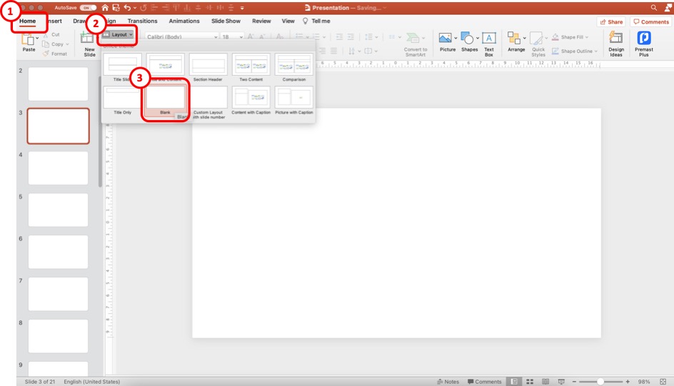
The first step of the process is to insert a blank slide in your presentation. This step is only optional. It is not necessary to do this every time. Don’t do this step, especially if you use a presentation template. But, for the sake of explanation and practice, this will be a helpful step.
Click on the “Home” tab to add a blank slide layout. Then, click on “ Layout “, and from the options, click on the “ Blank ” slide option.
This will convert the slide layout of your current slide to a blank layout. You can also add a slide to your presentation and then convert it to a blank slide layout using the steps I just mentioned.
Step-2: Click on the “Slide Number” option
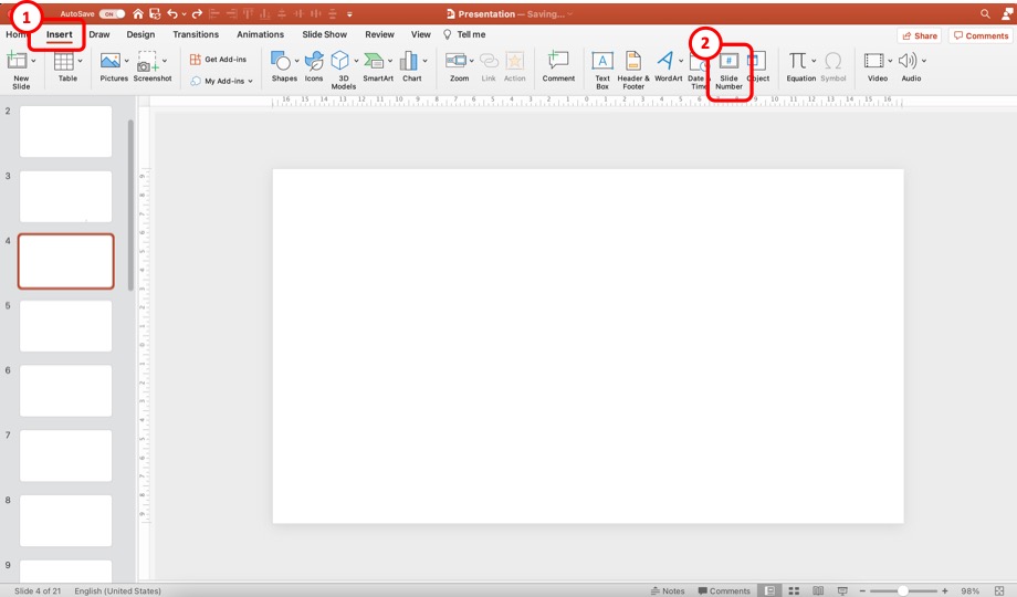
Now, click on the “ Insert ” tab. Then, from the options, click on the “ Slide Number “. This will open a new pop-up window with more options.
Step-3: Add the Slide Numbers to the Slides
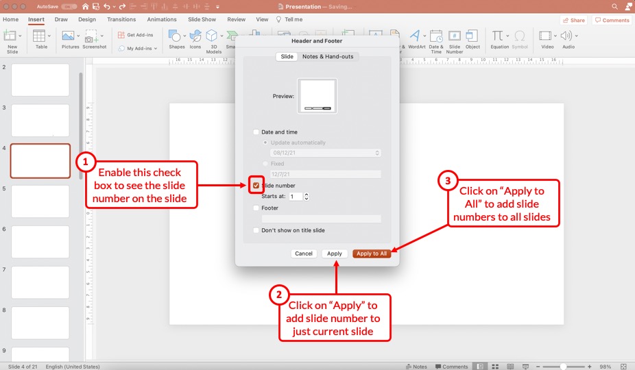
First, make sure that you enable the “Slide Number” option in the next step. Next, make sure that add a checkmark to the check box. You can choose to start the number at “ 1 “.
Then, click on the “ Apply ” option to add the slide number to just the current slide. However, if you wish to add slide numbers to all the slides, click on the “ Apply to All ” option.
Don’t worry. We’ll look at how to disable slide numbers for specific slides slightly later in the article.
Step-4: Duplicate the Slide with the Slide Number
This is, again, an optional step.
Once you have the slide number added by clicking on “Apply” in the previous step, you need to copy and paste the slide in PowerPoint .
Make sure that you format the slide number on this slide before you start duplicating this slide. (check the rest of the article to know how to format the slide number)
However, duplicating the slide with a slide number is only helpful when starting with a new presentation. If you already have a bunch of different slides that have been designed especially using a presentation template, this step 4 won’t work.
If you are in that situation, select the “Apply to All” option in step 3. Then, check the section below to format the slide number in PowerPoint.
3. How to Remove Slide Number from Specific Slides
If you don’t want specific slides to show the slide number, you can easily toggle it off.
To remove slide numbers from specific slides in PowerPoint, first, select the slide. Then, click on the “Insert” tab, and click on the “Slide Number” button. Next, “Uncheck” the slide number option in the pop-up that appears, and click on “Apply” to remove the slide numbers from the selected slides.
I’m hopeful that the process mentioned above is self-explanatory. Nevertheless, here’s a step-by-step process to disable slide numbers for specific slides in your PowerPoint presentation.
Step 1 – Select the Slides to Remove the Slide Number
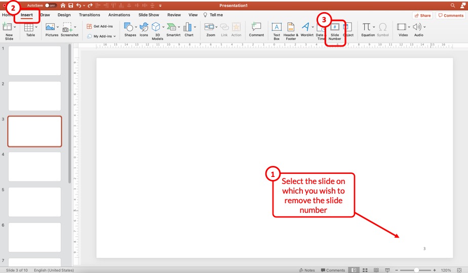
First, select the specific slides on which you wish to remove the slide numbers. You can use the “Ctrl” on your keyboard (or Cmd key for Mac) and click on the slides on the left part of the screen to select multiple slides at once.
Then, click on the “ Insert ” ribbon, and click on the “ Slide Number ” option from the ribbon. This will open a pop-up.
Step 2 – Uncheck the Slide Number Option

From the pop-up window that appears, uncheck the box for the “ Slide Number ” option and click on “ Apply “. This will remove the slide number just on the selected slides.
4. How to Remove Slide Number from Title Slide in PowerPoint?
One common problem that you may encounter once you add the slide numbers to all your slides is that the title slide of your presentation also now shows a slide number!
Most of us usually don’t want the slide number visible on the title slide. So, how do you remove the slide number from the title slide of your PowerPoint presentation?
Well, there are three different methods you can use. Let’s take a look at them one by one.
Method 1 – Manually Removing the Slide Number
The easiest way is to remove the slide number from the title slide manually. Simply select the slide number on the title slide and hit the “Delete” key on your keyboard, and the slide number will be deleted.
This method works well for the title slide only since the title slide will always remain as the first slide in the presentation and won’t change its position in the sequence.
If you use this method on other slides, chances are you may want to move the slides around and may want the slide numbers back on the slide later. And, that may just complicate things for you. Instead, just follow the steps mentioned in the previous section to delete slide numbers on other slides.
However, sometimes, PowerPoint just doesn’t allow you to select the slide number field on the slide! In such a scenario, you can’t just delete the slide number.
This is where the other two methods come in handy!
Method 2 – Uncheck the Slide Number Option on the Title Slide
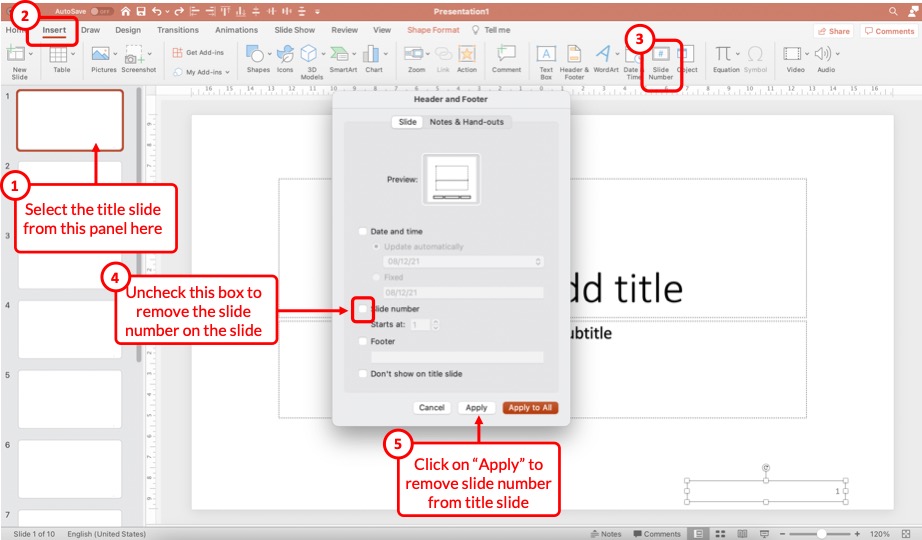
This method works just the same way as per the steps described in the previous section (section 3 above) of the article that describes the process to remove slide numbers from specific slides.
All you need to do is select the title slide by clicking on it. Then, click on the “ Insert ” tab. Next, click on the “ Slide Number ” option. From the pop-up that appears, uncheck the box for “Slide Number”, and click on “ Apply “.
Just as before, this will remove the slide number from the selected slide.
Method 3 – Use the “Don’t Show on Title Slide” Option
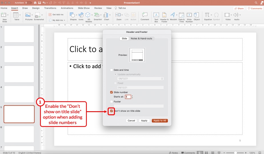
You can also use the “Don’t show on title slide” option when adding the slide numbers to your presentation in order to avoid the slide number on the title slide!
To do so, repeat the steps of adding the slide number to your presentation. Then, enable the checkmark on the “Don’t show on title slide” option to remove the slide number from the title slide.
5. How to Remove Slide Numbers on All Slides in PowerPoint?
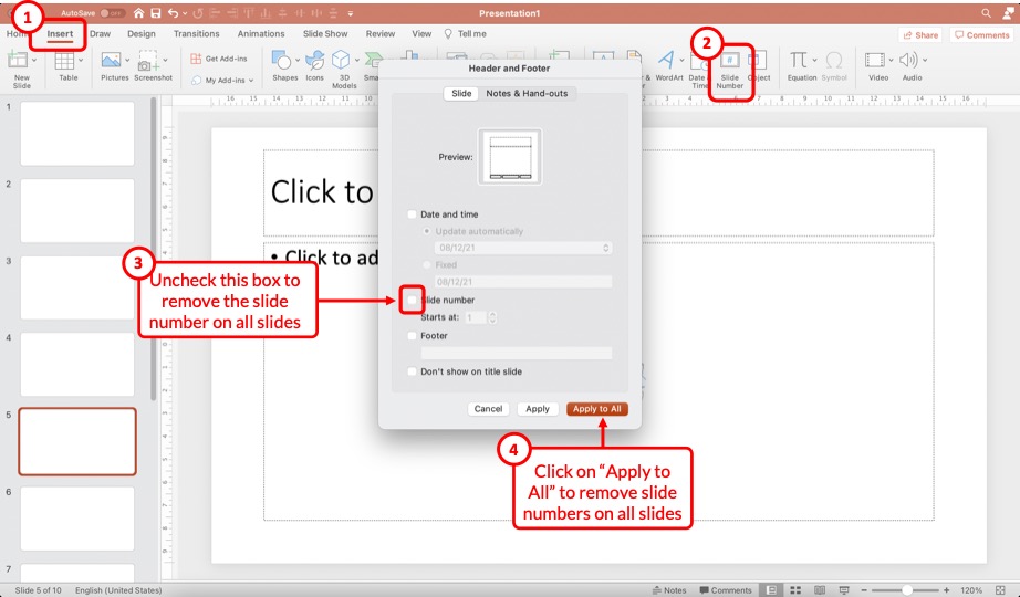
Removing slide numbers from all slides is just as easy as adding slide numbers to your slides!
To remove slide numbers from your PowerPoint presentation, click on the “Insert” tab. Then, click on the “Slide Number” option. From the pop-up that appears, uncheck the box for “Slide numbers”, and click on the “Apply to All” option.
Check the steps on the image shared above in case you need any further clarification.
Once all the steps are complete, you will notice that the slide number disappears from all slides!
6. How to Make Slide Numbers “1 of X Slides” in PowerPoint?
If you have a really long presentation that contains more than 50 slides, then you may want to use the “1 of X Slides” format! [Where “X” is the total number of slides that your presentation contains]
Doing so allows the audience to estimate the number of slides remaining in the presentation. So, how do you do that?
Let me share with you a ninja tip in this section! Here’s a step-by-step explanation of what you need to do!
Step 1 – Insert a Text Box on the Slide
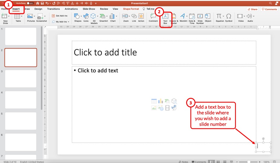
The first step is to insert a text box on the slide. To do that, click on the “ Insert ” tab. Then, click on the “ Text Box ” option from the ribbon. Next, just drag the cursor on the bottom right corner of your slide (or wherever you wish to have the slide number).
Step 2 – Insert the Slide Number
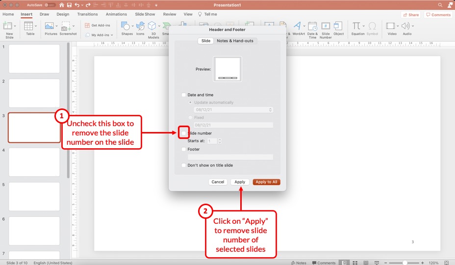
The next step is to insert the slide number. But, don’t add the slide number manually.
Instead, first, click inside the text box to make it active. Then, click on the “ Insert ” tab and click on the “ Slide Number ” option from the ribbon.
This will automatically insert the slide number inside the text box.
Step 3 – Add Text After the Slide Number
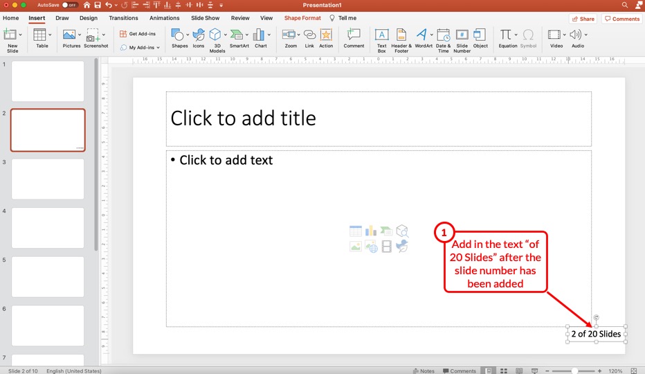
Now, simply add the text that you wish to appear after the slide number. In this case, I’ve added “of 20 Slides” after the slide number (as shown in the image above).
Step 4 – Copy and Paste the Text Box
Now, all you need to do is simply copy and paste this text box on all the slides!
Once you copy and paste the text box on other slides, you will notice that the slide number within the text box will change with the changing slide. However, “of 20 Slides” will remain constant!
Thus, it is advised to add such a slide number format to all slides once you’ve completed creating the presentation as it will provide you with a clear understanding of the exact number of slides in your presentation.
Don’t worry! Even if you move the slides around and change the sequence, the slide numbers will still change with the specific slide!
7. How to Format Slide Numbers in PowerPoint?
Formatting slides numbers is quite easy if you know what to do!
PowerPoint allows you to change the font color, font size, and even the font that is used for the slide numbers. Formatting a slide number works just like formatting text in PowerPoint .
There are two key processes to know when formatting a slide number in PowerPoint! Let’s take a look at both of them –
7.1 How to Format Slide Numbers for a Specific Slide Layout?
Formatting slide numbers of a specific slide layout will affect only those slides that use a particular type of slide layout. Here’s what you need to do –
Step 1 – Add Slide Numbers to the Slides
The first step is to add the slides numbers to your slide. Obviously, in order to edit the slide numbers and see the effect, the slide numbers need to be present on the slide.
So, if you haven’t added the slide numbers already, follow the steps mentioned earlier in the article and add the slide numbers first.
Step 2 – Check the Slide Layout
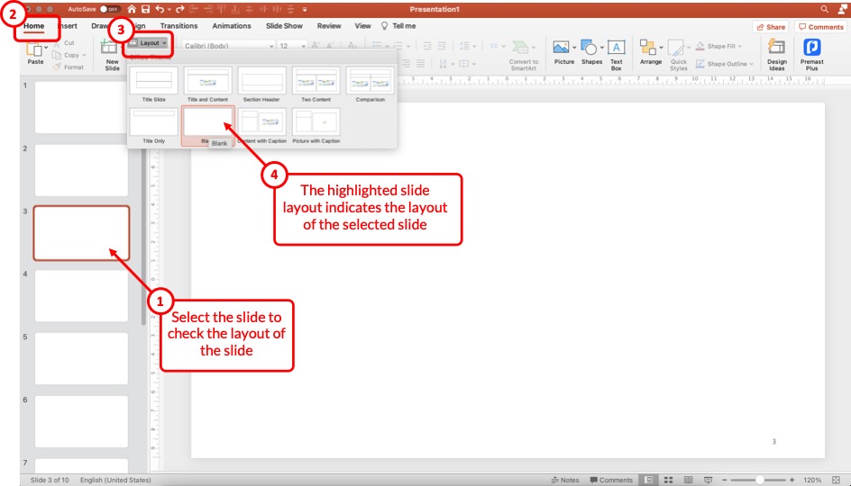
The next step that we need to take is to check the slide layout that is currently in use for the specific slide on which we intend to format the slide number.
To check the slide layout, first, select the slide. Then, click on the “ Home ” tab and click on the “ Slide Layout ” option from the ribbon.
The highlighted slide layout will indicate the layout the current slide uses.
Step 3 – Open the Slide Master View
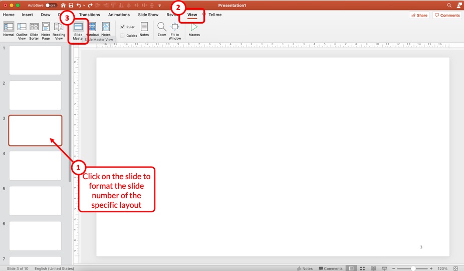
In the next step, we need to open the Slide Master View in PowerPoint .
To do that, first, click on the slide for which you wish to change the slide number format. Then, click on the “ View ” tab, and click on the “ Slide Master ” option from the ribbon.
This will open the slide master view in PowerPoint.
Slide 4 – Format the Slide Number for the Specific Slide Layout
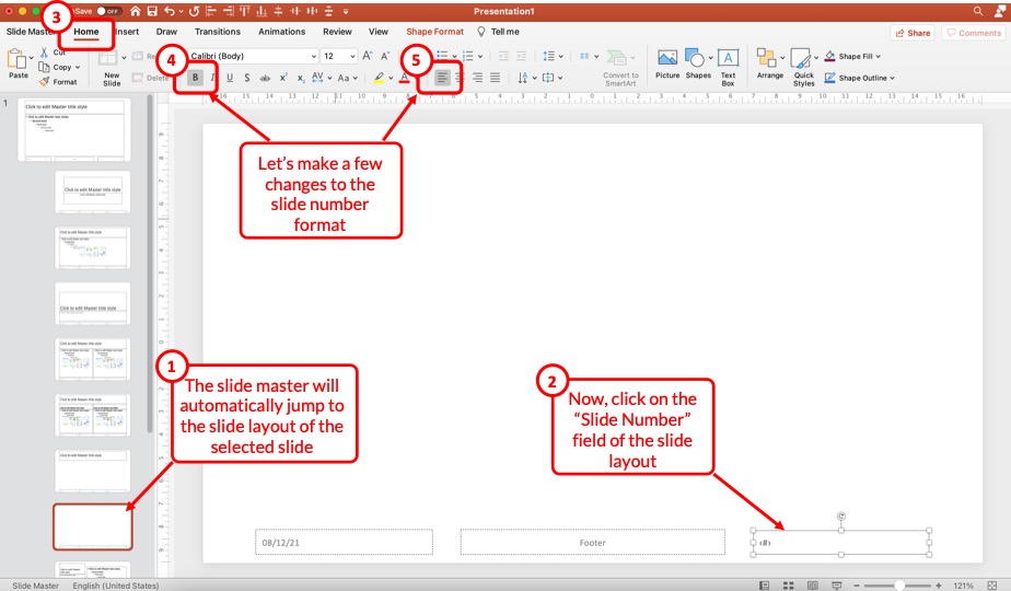
Now, first, make sure that you have the correct layout selected. By default, PowerPoint will open the slide layout of the slide that was selected before opening the slide master view.
Then, to make changes to the format of the slide number, select the slide number field present on the slide. Click on the “ Home ” tab, and make the changes as per your preference.
You can change the font, text alignment, text styles, font size, and much more! For the sake of this example, let’s change the alignment to left, and add a “Bold” style.
Slide 5 – Exit the Slide Master
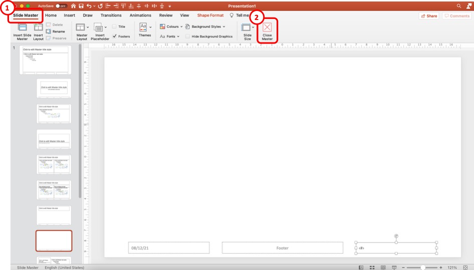
Once you’ve made the desired formatting changes, click on the “ Slide Master ” tab once again, and click on the “ Close Master ” option to exit the slide master.
Once you exit the slide master and open the normal view, you will notice that the formatting of the slide number on the current slide layout is different from other slides.
7.2 How to Format Slide Numbers on All Slides in PowerPoint?
If you wish to change the format of the slide number on all slides instead of specific slide layouts, you can do so just as easily. And, no! You don’t need to individually change the format of slide numbers on each slide!
Here’s what you need to do to change the slide numbers on all slides in PowerPoint –
Step 1 – Open the Slide Master View
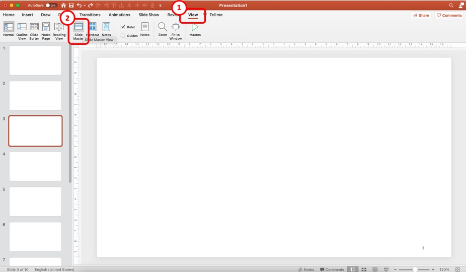
First, you need to open the slide master view in PowerPoint. Just as before, click on the “ View ” tab. Then, click on the “ Slide Master ” option from the ribbon.
Step 2 – Format the Slide Number Field on the “Master Slide”
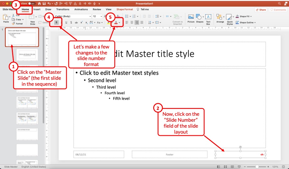
Once you open the slide master view, click on the “ Master Slide ” i.e. the first slide in the sequence (which is also larger in size than the other slides).
Next, make sure you select the slide number field on the bottom right of the slide. Then, click on the “ Home ” tab. Here you can make all the formatting changes that you need.
For the sake of this example, I’ll click on the “ Bold ” option and change the font color to red.
You can see the change taking place on the selected slide number field on the master slide.
Step 3 – Exit the Slide Master
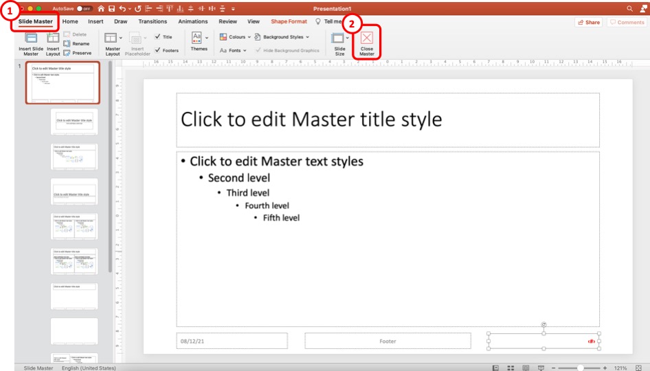
The last step is to exit the slide master.
Once you have made all the changes to the slide number formatting, click on the “ Slide Master “. Then, click on the “ Close Master ” options.
When you return to the normal view, you will notice that the formatting changes have been applied to all the slide numbers in your presentation.
Using the method described above, you can make changes to font color, font size, type of font, text alignment, and other formatting changes that you can normally make to text in PowerPoint!
8. How to Change the Position of Slide Numbers in PowerPoint?
To change the position of the slide numbers in your PowerPoint presentation, at first, select the text box of the slide number. After that click and hold the text box and drag it to your preferred position anywhere on the slide.
Once you’ve dragged it to where you want the slide numbers to be let go of the mouse button and the position of the slide number will change accordingly.
In order to change the position of slide number on all the slides, make sure that you use the method described in the previous section of the article (section 7.2)
9. Troubleshooting Slides Numbers in PowerPoint
While adding slide numbers to your PowerPoint presentation you may encounter some difficulties as some users of PowerPoint has.
There may be problems like the slide numbers not, showing the slide number may not be showing as “#”, you may have difficulty removing the slide number, or maybe you want the slide number to start from 0.
All these issues and possible reasons why you are encountering them are described in the following section.
9a. Slide Numbers Not Showing in PowerPoint
Sometimes you may find it difficult to add slide numbers to your PowerPoint presentation. Some of the reasons why you’re having this problem and possible ways to get around them are described below.
1. There may be a shape inserted over your slide number: Sometimes, there may be a shape or an image placed over the location where you inserted your slide number.
To solve this issue, click on the area where the slide number should be, and if there is a shape over it, “Right-click” on the shape and select the “Send to Back” option.
2. Make sure you have used the right layout: Some layouts don’t include the “ Slide Number ” placeholder in the slide. In that case, you won’t be able to see the slide number in slides using that layout.
To get around this issue, either insert a slide number placeholder in that layout or use a different layout that has a page number placeholder.
9b. Slide Number Showing as “#”
If the slide number is not showing as “#” in your PowerPoint presentation, then the presentation may be using multiple layouts.
To resolve this issue either use a different layout or manually insert a “ Footer ” in your PowerPoint presentation. After that that you should be able to see the “#” sign in the slide number placeholder.
9c. Can’t Remove Slide Number in PowerPoint?
You can’t remove slide numbers from your PowerPoint presentation by simply deleting them. This would only remove the slide number from the single slide where you deleted the slide number.
To remove slide number from all the slides in your PowerPoint, follow the instructions of excluding a slide from being number described earlier in this presentation, but instead of selecting the “ Apply ” button, select the “ Apply all ” button.
9d. Make Slide Number Start at 0
To make the slide number start from zero, follow the instructions given below.
Step-1: Select the “Customize Slide Size” option
The first step of the process is to select the “ Customize Slide Size ” option. To do that simply go to the “ Design ” tab from the ribbon of your presentation, click on the “ Slide Size ” button located in the “ Customize ” section of the “ Design ” tab.
After that, a dropdown menu will appear on your screen. From the dropdown menu, click on the “ Customize Slide Size ” option.
Step-2: Type in 0 in the “Number starts from” box
Finally, type in ‘0’ in the “ Number starts from ” box which is the last box in the “ Slide Size ” pop-up window, and then hit the “ Ok ” button. This will make the slide numbering start from zero.
Credit to drobotdean (on Freepik) for the featured image of this article (further edited)
- FanNation FanNation FanNation
- Swimsuit SI Swimsuit SI Swimsuit
- Sportsbook SI Sportsbook SI Sportsbook
- Tickets SI Tickets SI Tickets
- Shop SI Shop SI Shop
- March Madness
- What's on TV
- NCAAB NCAAB NCAAB
- Home Home Home
- Scores Scores Scores
- Schedule Schedule Schedule
- Men's Bracket Men's Bracket Men's Bracket
- Women's Bracket Women's Bracket Women's Bracket
- Rankings Rankings Rankings
- Standings Standings Standings
- Stats Stats Statistics
- Teams Teams Teams

Dawn Staley Had Beautiful Message for Caitlin Clark During NCAA Championship Trophy Ceremony
- Author: Andy Nesbitt
In this story:
South Carolina was able to race past Iowa in Sunday's national championship game in Cleveland and win their second title in three years with an 87-75 victory over Caitlin Clark and the Iowa Hawkeyes .
Gamecocks coach Dawn Staley was emotional immediately following the win during her postgame interview with ESPN's Holly Rowe. Then during the trophy presentation, Staley took a minute to shout out Clark and all that she's done for women's basketball during her legendary career, which came to an end Sunday.
“I want to personally thank Caitlin Clark for lifting up our sport,” Staley said. “She carried a heavy load for our sport and it’s not going to stop here on the collegiate tour. When she’s the No. 1 pick in the WNBA draft she’s going to lift that league up as well. So Caitlin Clark, if you’re out there, you are one of the GOATs of our game and we appreciate you.”
Here' s that moment:
Dawn Staley with a tribute to Caitlin Clark and what she's done for the game: "You are one of the GOATs of our game and we appreciate you" pic.twitter.com/Rg4okSZlFE — CJ Fogler account may or may not be notable (@cjzero) April 7, 2024
Latest NCAAB News

Former Kentucky Wildcats are favorites or near the top for every important NBA Award

Minnesota to face No. 1 Indiana State in NIT second round

Louisville Men's Basketball Head Coach Hot Board 2.0

The Auburn Tigers need to watch out for these two Yale stars

2024 NCAA Tournament: How to watch Gonzaga Bulldogs vs. McNeese State Cowboys, live stream, TV channel for first round matchup
Free All-in-One Office Suite with PDF Editor
Edit Word, Excel, and PPT for FREE.
Read, edit, and convert PDFs with the powerful PDF toolkit.
Microsoft-like interface, easy to use.
Windows • MacOS • Linux • iOS • Android

- Articles of PPT
How to Add Slide Numbers in PowerPoint A Comprehensive Guide
Creating engaging and organized PowerPoint presentations is crucial for effective communication. One essential element is slide numbers, which provide a clear path through your content. In this guide, we'll walk you through the process, ensuring a seamless experience for both you and your audience.
Part 1: What Are Slide Numbers

Slide numbers are a way to reference and navigate through a presentation. They typically appear in the footer or header of each slide, but can also be placed in different locations on the slide. Slide numbers can be used for a variety of purposes, including:
Helping the presenter stay on track and organized
Allowing the audience to follow along and take notes
Making it easy to reference specific slides during the presentation or later on
Giving the presentation a more professional look and feel
Number Format:
Slide numbers can be formatted in a variety of ways, including:
Arabic numerals: 1, 2, 3
Roman numerals: I, II, III
Alphabetic characters: A, B, C
Custom formats: For example, you could use slide numbers to represent different sections of your presentation, such as "Section 1.1," "Section 1.2," and so on.
Slide numbers are an important part of any presentation. They make it easier for the presenter and audience to follow along and reference specific slides.
Part 2: A step-by-step guide on adding Slide Numbers in PowerPoint
Creating a seamless and informative presentation involves incorporating slide numbers for easy navigation. Follow these steps to effortlessly add slide numbers to your PowerPoint presentation:
To add slide numbers in PowerPoint:
Step 1: Open your PowerPoint presentation.

Step 2: Click the Insert tab.

Step 3: In the Text group, click Slide Number.

Step 4: In the Header and Footer dialog box, click the Slide tab.

Step 5: Select the Slide number check box.
Step 6: If you don't want a number to appear on the title slide, also select the Don't show on title slide box.
Step 7: Click Apply to All.

Your slide numbers will now appear on each slide in the bottom-right corner.
To customize the slide numbers:
Step 1: Click the Slide Number button in the Header and Footer dialog box.
Step 2: In the Slide Number dialog box, you can change the font, size, color, and alignment of the slide numbers.

Step 3: You can also choose to display the slide number with or without the total number of slides in the presentation.
Step 4: Click OK when you're finished.
To update slide numbers after adding or removing slides, click the Slide Number button in the Header and Footer dialog box and select Update Slide Number.
To add slide numbers to specific slides, select the slide(s) you want to add slide numbers to and then click the Slide Number button in the Header and Footer dialog box.
If you're using a template, note that the slide numbers may already be formatted for you. However, you can still customize them as needed.
Part 3: How to Removing Slide Numbers in PowerPoint
When it comes to removing slide numbers in PowerPoint, you have two options: you can either temporarily hide them or permanently remove them. Follow these steps with accompanying images for both methods:
Temporarily Hiding Slide Numbers
Step 1: Open your PowerPoint presentation and go to the slide containing the numbers you want to hide.
Step 2: Click on the slide to select it.
Step 3: Navigate to the "Insert" tab in the ribbon at the top.
Step 4: Select "Header & Footer" from the drop-down menu.

Step 5: In the Header and Footer dialog box, uncheck the box next to "Slide number."

Step 6: Click "Apply" to hide the slide numbers on the selected slide.
This method allows you to quickly hide slide numbers for a clean and focused presentation. However, remember that if you need to bring them back, you'll have to revisit the Header and Footer settings.
Permanently Removing Slide Numbers
Step 2: Navigate to the slide sorter view by clicking on the icon at the bottom-right corner of the PowerPoint window.

Step 3: Select the slides from which you want to permanently remove slide numbers.
Step 4: Right-click on the selected slides and choose "Delete Slide."

Step 5: Confirm the deletion if prompted.
This option provides a clean slate for specific slides, ensuring an uncluttered look. Just be cautious, as this action is irreversible. Always consider if it aligns with your overall presentation strategy.
Part 4: Solving Common Problems with Slide Numbering in PowerPoint
Slide numbers can sometimes be a bit finicky. Here are solutions to some of the most common issues you might encounter:
Slide Numbers Not Appearing: If your slide numbers aren't showing up, it could be due to a few reasons. First, make sure they're enabled in the Header and Footer settings. Check if they're set to appear on the title slide as well. Additionally, ensure that there's no overlapping text or graphics obscuring the numbers.
Slide Numbers Not Updating: Sometimes, after making significant changes, slide numbers may not update automatically. To fix this, click on the "Insert" tab, go to "Header & Footer," and then tick the box that says "Slide Number." After that, click "Apply to All" to update all slides.
Slide Numbers Appearing on Specific Slides Only: This issue might arise if certain slides have unique master layouts. To rectify this, select the affected slides, go to the "View" tab, and choose "Slide Master." From there, ensure that the slide numbers are set to appear uniformly across all slides.
Part 5. Versatile Powerpoint Tool - WPS Office

WPS Office is a modernized powerful office tool suite that offers a variety of features, including a word processor, spreadsheet, presentation software, and PDF editor. It is available for free download and use, and it is compatible with a wide range of devices, including Windows, Mac, Android, and iOS.
WPS Office is a great alternative to Microsoft Office, and it offers a number of advantages, including:
Free to use: WPS Office is free to download and use for personal and commercial purposes.
Powerful PDF toolkit: WPS Office includes a built-in PDF editor that allows you to create, edit, and convert PDF files.
Rich template store: WPS Office offers a rich template store with a wide range of templates for presentations, documents, and spreadsheets.
Rich functions: WPS Office offers a wide range of features and functions, including support for macros, formulas, and charts.
Light weight: WPS Office is a lightweight application that does not require a lot of system resources.
Support online documents: WPS Office supports online documents, which allows you to access and edit your documents from anywhere with an internet connection.
Safe and stable: WPS Office is a safe and stable application that is regularly updated with new features and security patches.
I have been using WPS Office for several months now, and I have been very impressed with its features and functionality. I find WPS Office to be a very user-friendly application, and it is easy to learn how to use.
WPS Office has all of the features that I need to create and edit presentations, documents, and spreadsheets. I especially appreciate the built-in PDF editor, which allows me to edit PDF files without having to purchase a separate application.
Use Word, Excel, and PPT for FREE, No Ads.
Edit PDF files with the powerful PDF toolkit.
Microsoft-like interface. Easy to learn. 100% Compatibility.
Boost your productivity with WPS's abundant free Word, Excel, PPT, and CV templates.
Can I add slide numbers to only some slides?
Yes, you can indeed add slide numbers to specific slides in PowerPoint. Simply follow these steps:
Step 1: Select the slides to which you want to add slide numbers.
Step 2: Go to the "Insert" tab in the PowerPoint ribbon.

Step 3: Click on "Slide Number" in the "Text" group.
Step 4: Check the box that says "Slide Number".
Step 5: Optionally, you can choose to apply to "All" slides or "Selected" slides.
This flexibility allows you to customize slide numbering to suit your specific presentation needs.
How do I change the format of slide numbers?
To change the format of slide numbers in PowerPoint, follow these steps:
Step 1: Go to the "Insert" tab in the PowerPoint ribbon.
Step 2: Click on "Slide Number" in the "Text" group.

Step 3: In the "Header and Footer" dialog box, click the "Slide Number" checkbox if it's not already checked.
Step 4: Click the "Format" button.
This comprehensive guide has walked you through the importance of adding slide numbers in PowerPoint presentations, aiding in navigation and organization for both presenters and audiences. The step-by-step tutorial covers everything from initial setup to customizing slide numbers, ensuring a seamless process. The guide also addresses common problems related to slide numbering, providing practical solutions. A standout feature is the introduction of WPS Office , a powerful and modern office tool with advantages like free access to essential software, a robust PDF toolkit, and a rich template store. Lightweight and secure, WPS Office offers a versatile alternative for optimized presentations.
- 1. How to Extract Numbers from Cells With Letters and Numbers in Excel (3 Easy Steps)
- 2. How To Change Slide Size In Keynote: A Comprehensive Guide
- 3. A Comprehensive Guide to Slide Carnival[2024]
- 4. How to Create a Master Slide in PowerPoint (Step-By-Step Guide)
- 5. How to Unhide a Slide in PowerPoint Comprehensive Guide
- 6. How to Use a Master Slide in PowerPoint (Step-By-Step Guide)

15 years of office industry experience, tech lover and copywriter. Follow me for product reviews, comparisons, and recommendations for new apps and software.
This is a potential security issue, you are being redirected to https://csrc.nist.gov .
You have JavaScript disabled. This site requires JavaScript to be enabled for complete site functionality.
An official website of the United States government
Here’s how you know
Official websites use .gov A .gov website belongs to an official government organization in the United States.
Secure .gov websites use HTTPS A lock ( Lock Locked padlock icon ) or https:// means you’ve safely connected to the .gov website. Share sensitive information only on official, secure websites.
Migrating Some Legacy e-Governance Applications to Post-Quantum Cryptography
Description.
This paper speaks about our experience in adding support for post-quantum cryptography to a number of software components underlying and supporting the e-Governance processes of Estonia. In the paper, we briefly introduce our approach with state of the art of post-quantum engineering and our methodology. Then, we describe several Estonia’s e-Government-related projects and provide an experience report about our efforts to make them quantum safe. We present some engineering problems we had to tackle with, different project-specific approaches, etc. Overall, we believe that this paper would be beneficial for the general audience interested in practical adoption of post-quantum cryptography.
Presented at
Event details.
Fifth PQC Standardization Conference
IMAGES
VIDEO
COMMENTS
How to Present Data and Numbers in Presentations. We've learned that the best way to present data is with charts. Now that you're armed with this knowledge, you've got many options to choose from. Premium PowerPoint data presentation templates are your best friend. These take the hard work out of building and sharing data charts.
4 Techniques to Transform Numbers. Find Interesting Angles - Useful when the information is routine, repeating or likely to be 'skimmed' over. Use Comparisons - Useful when the numbers are big or abstract or hard to visualise. Use Analogies - Useful when the presentation is complex, boring or technical.
By presenting numbers effectively you will engage your listeners and position yourself as a leader. Here are six tips for using numbers in your presentation: 1. Tell your story 2. Less is more 3. Hide numbers in a story 4. Simplify 5. Think like a teacher 6. Show your personality
Download this Numbers PowerPoint and use it in class today. Below you will find a numbers PPT for teaching numbers 1 to 10 and one for teaching numbers 1 to 20. These numbers PowerPoint lessons are ideal for teaching kids, kindergarten, pre-school students, and other beginner English language learners about the cardinal numbers. Each number ...
Presenting large numbers and complex data creates unique challenges in presentations. In this video, I'll show you a creative way to present the information ...
TheJoelTruth. While a good presentation has data, data alone doesn't guarantee a good presentation. It's all about how that data is presented. The quickest way to confuse your audience is by ...
Numbers is Different from Images and Words. The first thing you should remember is that numbers is different from images and words. If you present an image, audience could create an association. This is the strong point of using image. The same thing occurs with words. If you choose the right words your presentation will be powerful.
In this video you will find a creative way to present your numbers to make your numbers memorable. This is especially useful in business presentations. These...
Free Number Slide Templates for an Engaging Slideshow. Make your data-driven presentations shine with a numbers PowerPoint template. Whether you're a business analyst, researcher, or student, these templates will help you convey your numerical information with clarity and impact. With a range of customizable slides, you can easily organize and ...
However, a presentation overflowing with numbers often misses its primary goal: to provide the audience with an engaging, understandable approach to interpreting the various numerical values. To help you focus on the purpose of your presentation, we will present 6 tips on how to handle complex tables and figures in PowerPoint presentations. ...
Reveal your numbers point by point as you direct the discussion of the meaning of the numbers. Displaying lots of numbers on a slide is boring and mind-numbing for the audience. Discussing the meaning of the numbers engages your audience. Don't allow numbers to be passively displayed on the screen. Bring your numbers to life; give them meaning.
In data presentation, words are far simpler for the audience to recall than numbers. If you can't easily replace numbers with words, then at least consider displaying the numbers on the slide whenever you can. Help your audience visualize the numbers by turning the unfamiliar into the familiar and the abstract into the concrete. 3.
An effective presentation has fewer key points, not more. Those key points sometimes involve numbers. Fair enough. But your presentation will be better when you're only using the ones necessary to communicate what's most essential. 3. When you can, use numbers via a visual. If a picture is worth a thousand words, it's worth as many numbers.
Premium Google Slides theme and PowerPoint template. Learning the numbers from 1 to 10 will be a fun task with our recently created Google Slides and PPT lesson. Teachers and designers have come together to create an interactive and engaging lesson for young learners. Not only does this lesson include real content, but it also includes ...
This adorable Google Slides & PowerPoint template with illustrated numbers comes with loads of ideas, matching and coloring activities and more to help the kids make the connection between the written digit and a number of objects. Easy to edit, almost ready to use and informative and entertaining to look at - what more can you ask?
Free Google Slides theme and PowerPoint template. We all use numbers every day and always have, without stopping to think how and when numbers first appeared. If your elementary students are inquisitive about this topic, you can use this presentation for Google Slides and PowerPoint created by an educator to explain all about the Egyptian ...
Use this interactive, illustrated PowerPoint to teach your young students the numbers between 1 and 20. This presentation shows these numbers in their numerical form, written form and also with pictures. It is ideal for visual learners and can be a great warm-up exercise for the beginning of your math lesson. Thanks twinkl support team for ...
This PowerPoint pack includes all of the PowerPoints for the individual numbers 0-10. Each PowerPoint is a colorful and interactive way of introducing individual numbers to your children. If you've found these PowerPoints useful, we would recommend our All About Numbers 11-20 PowerPoints. Used as a whole class for number of the day/week and for ...
To add slide numbers to your PowerPoint slides, click the "Slide Number" checkbox in the "Slides" tab. Press the "Apply to All" button to add slide numbers to all of your slides. Once applied, your slide numbers will appear on each of your slides in the bottom-right corner. If you've split your PowerPoint presentation into sections, you'll need ...
When in doubt, adhere to the principle of simplicity, and aim for a clean and uncluttered layout with plenty of white space around text and images. Think phrases and bullets, not sentences. As an ...
Add slide numbers or notes page numbers. On the View tab, in the Presentation Views group, click Normal. On the left of your screen, in the pane that contains the slide thumbnails, click the first slide thumbnail in your presentation. On the Insert tab, in the Text group, click Header & Footer. If you want to add slide numbers, click the Slide ...
Once you have downloaded the PPT, you will be able to enable editing. Please note, PowerPoint and Google Slides have different functionalities, so the resources may have some differences. Our Numbers 11-20 PowerPoint & Google Slides is a fun and engaging way to help students to identify numbers 11 through 20.
Step-2: Click on the "Slide Number" option. Now, click on the " Insert " tab. Then, from the options, click on the " Slide Number ". This will open a new pop-up window with more options. Step-3: Add the Slide Numbers to the Slides. First, make sure that you enable the "Slide Number" option in the next step.
Dawn Staley. South Carolina was able to race past Iowa in Sunday's national championship game in Cleveland and win their second title in three years with an 87-75 victory over Caitlin Clark and ...
Follow these steps to effortlessly add slide numbers to your PowerPoint presentation: To add slide numbers in PowerPoint: Step 1: Open your PowerPoint presentation. Open PowerPoint. Step 2: Click the Insert tab. the Insert tab. Step 3: In the Text group, click Slide Number. click Slide Number. Step 4: In the Header and Footer dialog box, click ...
A New York-based campaign official for Robert F. Kennedy Jr. is pitching Republican voters to support his independent presidential bid by arguing that Kennedy will help Donald Trump defeat Joe ...
This paper speaks about our experience in adding support for post-quantum cryptography to a number of software components underlying and supporting the e-Governance processes of Estonia. In the paper, we briefly introduce our approach with state of the art of post-quantum engineering and our methodology. Then, we describe several Estonia's e-Government-related projects and provide an ...