Web Accessibility Best Practices – How to Ensure Everyone Can Use Your Website

In the dynamic world of web development, creating websites that are accessible to all users, including those with disabilities, is not just a best practice – it's a necessity.
Web accessibility ensures that everyone, regardless of their abilities, can perceive, understand, navigate, and interact with the web. This inclusivity not only broadens your audience but also reflects social responsibility and compliance with legal standards.

Here's what we'll cover:
What is web accessibility.
- Best Practices for Web Accessibility – Use semantic HTML – Use sufficient contrast – Make all functionality keyboard accessible – Provide alt text for images – Use ARIA roles when necessary – Ensure forms are accessible – Caption and transcribe audio and video – Design consistent, predictable navigation
Automation Tools for Accessibility Testing
- Wrapping Up
Accessibility in web design means creating web pages that can be used by people with a wide range of abilities and disabilities. This encompasses auditory, cognitive, neurological, physical, speech, and visual impairments.
Key Principles of Accessibility
The Web Content Accessibility Guidelines (WCAG) provide a framework for making web content more accessible to people with a wide range of abilities and disabilities. These guidelines are based on four key principles, often summarized as POUR, each crucial for creating a universally accessible web.
Here's a deeper look into what these principles mean in practice:
- Perceivable : Information and user interface components must be presented in ways that all users can perceive. This means providing text alternatives for non-text content (like images), creating content that can be presented in different ways without losing information (such as using a simpler layout), and making it easier for users to see and hear content. Example : Providing alt text for images. Alt text allows screen reader users to understand the content and context of the images, making visual content accessible.
- Operable : User interface components and navigation must be operable by everyone. This includes ensuring all functionalities are accessible via keyboard, giving users enough time to read and use content, and not designing content in a way that is known to cause seizures. Example : Implementing keyboard navigation. All interactive elements like links, buttons, and form fields should be accessible using a keyboard, making them accessible to users who cannot use a mouse.
- Understandable : Information and operation of the user interface must be understandable. This means making text readable and understandable, and ensuring that web pages appear and operate in predictable ways. Example : Using consistent navigation menus. Keeping navigation menus consistent across a website helps users with cognitive disabilities learn and remember how to navigate.
- Robust : Content must be robust enough to be reliably interpreted by a wide variety of user agents, including assistive technologies. This includes ensuring compatibility with current and future user tools. Example : Using clean, validated HTML. Well-structured and standard-compliant HTML ensures content can be interpreted by different browsers and assistive technologies.
By integrating these principles into web design, developers and designers can create more accessible and inclusive digital environments. Each principle plays a crucial role in ensuring that the web is a space for everyone, regardless of their abilities or disabilities.
Best Practices for Web Accessibility
Use semantic html.
Semantic HTML involves using HTML elements according to their intended purpose rather than just for presentation. It's about structuring your website with elements that describe their meaning and role in the document structure.
This practice is crucial for assistive technologies, like screen readers, which rely on this structure to interpret and navigate content.
How to implement semantic HTML
Consider a typical webpage layout comprising a header, main content, a navigation menu, and a footer. Instead of using non-semantic <div> tags for these sections, you should use the semantic elements <header> , <main> , <nav> , and <footer> respectively.
Here's an example:
Why semantic HTML is useful:
- Accessibility : Screen readers can easily navigate and interpret the content. For example, a user can skip directly to the main content or easily find the navigation menu.
- SEO benefits : Search engines favor well-structured content. Semantic elements make it easier for search engine bots to understand the content of a webpage, potentially improving search rankings.
- Maintainability : Semantic HTML leads to cleaner, more readable code, making it easier for developers to understand and maintain.
Using semantic HTML is the foundation of web accessibility, ensuring content is accessible and meaningful to all users, including those using assistive technologies.
Use Sufficient Contrast
Contrast refers to the difference in color and brightness between the text and its background. Ensuring sufficient contrast is vital for readability, especially for users with visual impairments like color blindness or low vision. High contrast between text and background makes it easier for these users to read and understand content.
How to implement good contrast
Imagine a webpage with light gray text on a white background. This combination might look aesthetically pleasing but can be hard to read for many users.
To improve contrast, you could change the text color to a much darker shade, like black or dark gray.
Why contrast is useful:
- Enhanced readability : High contrast makes the text legible to users with visual impairments and those reading under challenging lighting conditions.
- Inclusivity : It caters to a wider audience, including users with deteriorating vision and those with temporary or situational impairments.
- Legal compliance : Many regions have regulations requiring accessible web content, and sufficient contrast is a common requirement.
Tools like the WebAIM Contrast Checker can help you evaluate your color choices, ensuring they meet accessibility standards like WCAG. By ensuring sufficient contrast, you not only make your website more accessible but also improve the overall user experience.
Make All Functionality Keyboard Accessible
Ensuring that all functionalities on a website are accessible via keyboard is essential for users who cannot use a mouse due to physical disabilities, temporary injuries, or personal preference. This includes navigating menus, activating buttons and links, filling out forms, and using interactive widgets.
How to make content keyboard accessible
Consider a dropdown menu on a website. Typically, users hover over the menu with a mouse to view the options.
To make this keyboard-accessible, you need to ensure that users can navigate to the menu using the Tab key and expand the menu using the Enter or Space key.
Why keyboard navigation is useful:
- Accessibility for all : Keyboard accessibility ensures that users with motor disabilities or those who prefer keyboard navigation can use the website effectively.
- Enhanced usability : Keyboard shortcuts can speed up navigation, offering an enhanced experience even for users who can use a mouse.
- Compliance with accessibility standards : Adhering to standards like WCAG and ADA (Americans with Disabilities Act) often requires keyboard accessibility.
In practice, keyboard accessibility may involve more than just basic navigation. It also includes managing focus, creating keyboard shortcuts for complex actions, and ensuring custom widgets are keyboard-friendly. By prioritizing keyboard accessibility, you make your website more inclusive and user-friendly.
Provide Alt Text for Images
Alt text (alternative text) is a concise description of an image's content and function. It's crucial for visually impaired users who rely on screen readers to understand image content. Alt text ensures that even if users can't see the images on a web page, their purpose and message can still be conveyed.
How to add alt text to images
Suppose your website has an image of a company logo. The alt text should describe the logo, not just state "logo". For instance, alt="FreeCodeCamp's campfire Logo" .
For purely decorative images that don't add informational content, use an empty alt attribute ( alt="these websites are typically accessible" ) to indicate that they can be skipped by screen readers.
Why alt text is useful:
- Accessibility Compliance : Providing alt text is a fundamental aspect of web accessibility, required under WCAG guidelines.
- SEO Benefits : Alt text improves SEO by providing better image context/descriptions, helping search engines index an image properly.
- Fallback Content : If an image fails to load, the alt text will be displayed, helping all users understand what was supposed to be there.
Properly implemented alt text makes your website more accessible and inclusive, ensuring that all users, regardless of their ability to see, have access to the information conveyed by images. It's a simple yet impactful practice that enhances the overall user experience.
Use ARIA (Accessible Rich Internet Applications) Roles When Necessary
ARIA roles and attributes enhance the accessibility of web content, particularly for dynamic content and advanced user interface controls developed with Ajax, HTML, JavaScript, and related technologies. ARIA helps make web content and web applications more accessible to people with disabilities, especially when HTML can't accomplish it alone.
How to implement ARIA roles and attributes
Consider a web application with a dynamic content update section, such as a live news feed. Standard HTML alone may not be able to convey the dynamic nature of this content to screen readers.
By using ARIA roles, you can make it clear to assistive technologies that this section of the page is a live region and its updates are important. For instance:
In this example, aria-live="polite" indicates that updates to this region should be announced by screen readers, but not interrupt the current task, while aria-atomic="true" ensures that the entire region is read as a whole, not just the updated part.
Why ARIA is useful:
- Enhanced screen reader experience : ARIA roles provide screen reader users with a more comprehensive understanding of what's happening on the page, particularly for dynamic and complex content.
- Greater interactivity : ARIA can make web applications more interactive and usable for people with disabilities, facilitating operations that standard HTML can't handle.
- Custom widget accessibility : For custom widgets that lack semantic HTML equivalents, ARIA roles can define the widget's function, making it accessible.
While ARIA is powerful, it's important to use it only when necessary. Native HTML elements should be the first choice as they inherently carry semantic meaning and accessibility features. ARIA should be used as a supplement to enhance accessibility when HTML's semantics don't suffice.
Ensure Forms are Accessible
Accessible forms are vital for users with disabilities to interact with a site, input data, and utilize services. Ensuring that form elements are accessible means they can be easily navigated, understood, and filled out by everyone, including those using screen readers or keyboard navigation.
How to make forms accessible
Imagine a simple contact form with fields for name, email, and a message. For each form element, use a <label> tag to provide a clear description. Ensure that each <label> is associated with its respective form control using the for attribute, which matches the id of the input element. This is crucial for screen reader users to understand what each field represents.
Why accessible forms are useful:
- Clarity and context : Labels provide context to users, especially those using screen readers, about what type of information is expected in each field.
- Error handling : Accessible forms should also handle errors clearly, informing users about what went wrong and how to fix it. This can include real-time validation feedback and error messages that are announced by screen readers.
- Keyboard navigation : All form controls should be navigable using the keyboard, allowing users who can't use a mouse to interact fully with the form.
Accessible forms not only comply with accessibility standards but also enhance the overall user experience, making your website more inclusive and user-friendly.
Caption and Transcribe Audio and Video
Providing captions for video content and transcriptions for audio is crucial for accessibility. Captions and transcriptions ensure that deaf or hard-of-hearing users, as well as those who prefer reading to listening, can access audio and video content.
How to make audio and video content accessible
For a video on your website, include closed captioning that accurately reflects the spoken content and other auditory cues. You can use HTML5's <track> element to specify caption files. Similarly, for audio content like podcasts or interviews, provide a text transcription.
In this example, a WebVTT (.vtt) file is used for captions. Ensure the captions are synchronized with the audio and include descriptions of relevant non-speech audio.
Why captions and transcriptions are useful
- Accessibility for hearing impaired : Captions and transcriptions are essential for users who are deaf or hard of hearing, enabling them to access content that would otherwise be inaccessible.
- Enhanced comprehension : They also benefit users who are not fluent in the language of the video or have difficulty understanding the speech.
- Flexible viewing : Captions allow content to be consumed in sound-sensitive environments, like workplaces or libraries.
Remember to regularly check the accuracy and readability of your captions and transcriptions. Well-implemented captions and transcriptions not only make your audio and video content accessible but also enhance the overall engagement and reach of your content.
Design Consistent, Predictable Navigation
Designing a website with consistent and predictable navigation is key to accessibility. It allows users, especially those with cognitive disabilities, to learn the navigation pattern quickly, enhancing their ability to find information and navigate your site effectively.
How to design effective navigation
Consider a website with a top navigation menu. The menu items should be in a logical order and remain consistent across all pages. Avoid changing the order of menu items or their location on different pages.
In this example, the navigation structure is simple and straightforward. It's important to maintain this structure and order consistently throughout the website.
Why good navigation is useful:
- Ease of use : A consistent navigation structure helps users understand and remember how to interact with your website, reducing confusion and frustration.
- Improved orientation : Users can better orient themselves and understand their current location within the website.
- Support for assistive technologies : Consistent navigation is easier for screen readers and other assistive technologies to interpret, providing a smoother browsing experience for users relying on these tools.
By ensuring that your website's navigation is consistent and predictable, you enhance the usability for all users, making your website more accessible and user-friendly.
Incorporating automation tools into the accessibility testing process can significantly enhance efficiency and coverage. These tools can swiftly identify areas of non-compliance, allowing for prompt rectifications.
Below are some key tools with link to their websites if you want to explore more:
1. Axe Accessibility Checker
Axe is a versatile browser extension and testing tool available for Chrome, Firefox, and Edge. It provides reliable and detailed issue reporting, making it ideal for quick checks and in-depth analysis.
2. WAVE (Web Accessibility Evaluation Tool)
WAVE, offered as a browser extension, visually represents potential accessibility problems on web pages, helping to pinpoint issues with color contrast, alt text, and ARIA roles.
3. Google Lighthouse
Integrated into Google Chrome's Developer Tools, Lighthouse features an accessibility audit tool that highlights issues and provides actionable recommendations.
4. Tenon.io
Tenon.io is a comprehensive web-based tool for detailed accessibility testing. It can be integrated into development workflows for automated testing during the build process.
5. JAWS Inspect
JAWS Inspect translates screen reader outputs into a visual format, aiding in the testing of screen reader compatibility and navigability.
6. Color Contrast Analyzer
This tool assists in evaluating the contrast between text and its background, ensuring readability for users with visual impairments.
7. Accessibility Insights
Developed by Microsoft, Accessibility Insights offers a suite of tools, including a web tool for Chrome and Edge, to guide manual testing alongside automated checks.
Pa11y is a command-line tool that runs automated accessibility tests on web pages, customizable for integration into development processes.
By leveraging these tools, developers and designers can ensure their websites meet accessibility standards, providing an inclusive experience for all users. Regular use, combined with manual testing and user feedback, creates a comprehensive approach to maintaining and enhancing web accessibility.
Embrace Accessibility as a Cornerstone of Web Development
In conclusion, the integration of web accessibility best practices is not just a matter of compliance but a commitment to inclusivity and universal design. The digital world is for everyone, and ensuring that web content is accessible to all, including those with disabilities, is a fundamental responsibility of web developers and designers.
Utilizing tools like Axe, WAVE, Google Lighthouse, and others, combined with manual testing and adherence to guidelines like WCAG, can significantly improve the accessibility of web content. By doing so, we open up our digital spaces to a wider audience, enhance user experience, and foster an environment of inclusivity.
Accessible web design benefits everyone, not just those with disabilities. It leads to cleaner code, better SEO, and a more flexible and resilient website. As the web continues to evolve, prioritizing accessibility will be crucial in creating a more connected and inclusive world. Remember, when we design for accessibility, we improve the web for everyone.
Read more posts .
If this article was helpful, share it .
Learn to code for free. freeCodeCamp's open source curriculum has helped more than 40,000 people get jobs as developers. Get started
Web Accessibility: The Definitive Guide (2024)

Even though a large percentage of the global population is living with disabilities, there are still a number of websites that have accessibility barriers, making it next to impossible for some people to use them.
Web accessibility is an initiative that benefits people, businesses, and society as a whole, and should be a key consideration for any business that has an online presence.
This in-depth guide will unpack everything you need to know about web accessibility and how it’s linked to your site.

Web accessibility is an initiative that ensures websites can be used by all visitors, including those living with mental impairments and physical limitations.
Let’s look into detail what is web accessibility and why is it important.
Why Is Web Accessibility Important?
The guidelines and web standards for accessibility outline design principles that can be used to make it possible for all online users to access your content, products, and services.
Web accessibility is currently enforced by the Web Accessibility Initiative (WIP) of the World Wide Web Consortium (W3C). It’s these organizations that regularly update and publish the Web Content Accessibility Guidelines (WCAG) , which we will outline later on.
A 2023 report by the World Health Organization states that 16% of the global population is living with some form of disability, which includes cognitive, neurological, and physical disabilities.
What’s more, disability rates are set to increase as the population ages and the likelihood of chronic health conditions rises.
Web accessibility is important because it makes the digital arena a more inclusive space for everyone, including the differently-abled community. A sound accessibility strategy also carries business benefits.
Businesses that adopt web accessibility best practices are able to offer their visitors a more memorable and inclusive online experience. And because user experience is at the heart of these best practices, it offers a number of search engine optimization benefits too, making it possible for more of the right people to find your site more often.
Fortunately, technology has made it that much easier to remove online barriers – more on that later.

There are currently two versions of WCAG: WCAG 2.0, which was published in 2008, and 2.1, which was published in 2018. All WCAG 2.0 guidelines are included in 2.1, which only has a few extra success additions.
This means that if your website complies with WCAG 2.1 standards, you will automatically comply with WCAG 2.0 too.
WCAG forms the basis of most disability legislations across the globe, including the Americans with Disabilities Act (ADA) and the Accessibility for Ontarians with Disabilities Act (AODA). Even the European Standard EN 301 549 references the WCAG.
Understanding the WCAG Compliance Levels
WCAG is currently made up of three levels of compliance: Level A, AA, and AAA.
This level covers the most basic accessibility requirements for websites and is the minimum level that businesses should aim to achieve. Failure to meet level A requirements means you have a completely inaccessible website.
Achieving level AA, means some additional criteria have been met. It addresses more of the common online barriers that the disabled community encounters every day. It’s highly recommended that website owners aim to achieve level AA to meet as many accessibility success criteria as possible.
This is the highest level of accessibility that you can achieve, but it’s also the most difficult because it covers every single aspect of WCAG. And even though this is the most desirable level to achieve, it’s not an absolute necessity.
The Web Accessibility Principles

The WCAG requires website owners to abide by four main principles when making their sites accessible. Referring back to these principles makes it easier to determine whether any changes or updates you are making are in line with WCAG guidelines.
Principle 1: Perceivable
Your website visitors should always be able to understand and perceive the content presented on your site. This includes visitors who are blind or have other visual impairments and rely on technology such as screen readers to consume online content.
Principle 2: Operable
An operable website is one where every part of a site’s functionality can be utilized without disruption to the user. From the most basic functionality such as selecting a link from a menu to any specialized functionality should be operable to all users.
Principle 3: Understandable
Any content on your site, whether it’s written or visual, should be understandable to all visitors. Complex language should be avoided to ensure visitors with cognitive impairments and those who don’t speak your site’s primary language can still engage with all your content. An understandable site is also one that’s organized as intuitively as possible.
Principle 4: Robust
The final principle dictates that your site should be robust, meaning it can be interpreted and consumed by visitors who rely on assistive technology. This means that a site needs to be developed in a way that makes it compatible with a variety of assistive technology.
The 4 Main Components of Web Accessibility
Web accessibility is linked to every component of a website, all of which should be considered to ensure you comply with WCAG guidelines.
Site Content
This includes all of the information that’s housed on your website or app. Examples include text, images, audio, and all code. Basically, site content refers to anything a user would see when visiting your website.
User Agents
User agents refer to desktop and mobile browsers, plugins, media players, and assistive technology – anything a user would need to access your website, app, or content.
Development Tools
Any software, editors, or content management systems that are used to create your website, app, or content also need to be considered during the remediation process.
Evaluation Tools
Lastly, there are the tools that help you test and track your accessibility and remediation efforts.

Whether you’ve just started your accessibility journey or you’ve realized you don’t meet all the accessibility requirements for websites, here are some of the ways you can get to level AA.
Any content on your site that isn’t text-related should have alternative text, including images, video, graphs, and audio content. This ensures that visitors with visual impairments are still able to understand and interact with it. For images that are purely decorative and don’t warrant alternative text, you can use a blank alt attribute: <img src=”decorative.jpeg” alt=”” />
Another way that you can make your site easier to read is by adopting the right color contrast. This makes it easier for users with color blindness to engage with your site. Aim for a 4.5:1 ratio between the foreground color and the background color.
If you have audio and video files on your site, be sure to add a full transcript to each recording. This way, users who rely on screen readers and text-to-audio technology can access these files.
Structured web pages are easier to consume, so opt for proper headings, bullet points, bolded text, clear links, and simplified menu structures. Structuring your pages in a logical order is also essential.
Users should be able to read or watch content in a time frame that works for them. If any of your content is timed, users should be able to extend the time limit or cancel it.
Because flashing and blinking can trigger seizures in some users, this type of content should be avoided wherever possible. If this is not an option, a warning should always be provided.
Many of today’s users navigate the web using only a keyboard, which means your site needs to be compatible with this need. An accessible website is one that is fully functional with a keyboard alone.
Before drafting any content for your site, think twice about the language you’re using. Some users may not speak your site’s primary language and others may have cognitive impairments that require simplified sentences. Technical jargon and regional slang should be avoided where possible.
Assistive technologies rely on clean HTML code to correctly relay information to users. For this reason, it’s imperative for your code to be clean and clear. Avoid duplicate IDs and attributes and make sure start and end tags are used consistently.
These are some of the top requirements your site should meet for it to be deemed accessible.
To better help you understand the web standards for accessibility that are required in your country or country of operation, let’s move into legislation and compliance.
Legislation & Compliance

Even though most of today’s accessibility standards and regulations across the world are based on WCAG, there are some slight differences per country.
Here are the most prominent laws you should be aware of.
ADA – United States
Title III of the Americans with Disabilities Act refers to places of public accommodation, which includes websites. It states that all areas of public accommodation should be accessible to all users. Websites that create barriers to access are considered to be in violation of this law.
Section 508 – United States
Section 508 forms part of the Rehabilitation Act of 1973. It states that all federal agencies in the United States need to make their electronic and information technology accessible to all users, including websites, web applications, software, and electronic documents. Accessibility applies to employees as well as members of the public.
AODA – Canada
The Accessibility for Ontarians with Disabilities Act 2005 (AODA) is applicable to businesses with 50 or more employees operating in or offering products and/or services to people in Ontario. The act requires businesses to identify, remove, and prevent barriers for people with disabilities in order to comply.
EAA – Europe
The European Accessibility Act is an EU initiative that requires EU member states to provide equal access to products and services to all, including those offered online. The EN 301 549 is another European web accessibility standard that covers all information and communications technologies, which means everything from web content to ATMs need to be fully accessible.
DDA – Australia
The Australian Disability Discrimination Act was put in place to protect people living with disabilities. Businesses are required to provide people with equal access to all areas of public life, including online information and services. It also promotes the recognition and acceptance of these individuals within a community.
Web Accessibility Assessment Tools
Now that you have a clearer understanding of what web accessibility entails, you can use these tools to better understand where your website falls in terms of compliance.
Accessibility Checker

This free tool is not only easy to use but will provide you with a detailed report that outlines the accessibility issues on your site and show you how to fix them, helping you meet WCAG 2.1, level AA requirements. The tool checks your site against both global and local accessibility standards and regulations.
IBM Accessibility Toolkit

This tool is a fan favorite among developers and testers who want to incorporate accessibility right from the start. As an open-source toolkit, this can be used to develop websites as well as web applications. This toolkit comes in the form of a browser extension and offers detailed guidelines for how to create accessible online platforms.

WebAIM, the creator of Wave, is a non-profit organization with the goal to make the web a more accessible space for all. Simply type in your URL to audit your site or install the browser extension, which allows you to check any site as you browse. And for businesses that want to automate web accessibility checks, the Wave API is available as a paid application.

This open-source application is another simple way to test whether your site meets the necessary web accessibility standards. Pa11y reports are better suited to developers but if you cannot code, Koa11y is an alternative.
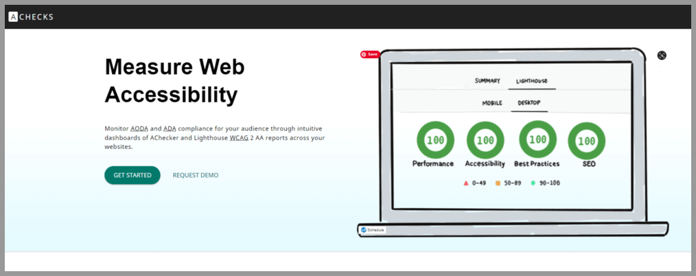
For businesses looking to comply with WCAG 2.1 at level AA, AChecks is another good tool to use. AChecks makes it possible to monitor your site for any accessibility issues related to ADA and AODA compliance. The detailed reports outline what needs to be fixed on your site and the dashboard even gives you access to web analytics to track performance once changes are made.
5 Good Examples of Accessible Websites
Let’s look at a few websites that get it right in terms of accessibility that you can use as a reference.
Based in England and Wales, this charity website is an excellent example of accessibility done right. The copy is clear and to the point, color contrast ratios have been met, and the site is fully compatible with assistive technology. An accessibility panel is also available on the site to allow users to customize their experience.

1% for the Planet
This is another charity organization that values the importance of web accessibility. The site’s layout is simple, clean, and responsive, and its animated header can be paused. They’ve also used high-contrasting text, ARIA tags, and have used HTML correctly to structure each page.

BBC iPlayer
Along with being a popular streaming service, BBC iPlayer is a site that other businesses can learn from when it comes to accessibility. The website is compatible with assistive technology, easy to navigate, and the layout is well thought out. They have even gone as far as adding an accessibility help option to their logo, ensuring disabled users can find answers to questions.

Girls Who Code
This non-profit organization helps women and girls pursue careers in technology, including those in the disabled community. This particular site is uncluttered and is built with clean, simple code to ensure it’s compatible with assistive technology. And because there are very few visual effects, it’s one of the easiest sites for anyone to navigate.
NSW Government
The New South Wales government has ensured that its website is accessible to all through a clean, simple, and accessible design. Tab navigation makes the site keyboard compatible and large fonts and contrasting colors make it very readable. It’s also compatible with other forms of assistive technology.

5 Examples of Inaccessible Websites
We also thought it helpful to include some examples of websites that don’t meet the necessary web accessibility standards so that you know what not to do.
Even though CBS Miami is a leading news website, it’s not fully compliant with all WCAG guidelines. For one, there are little to no alt tags on their images, which is surprising considering how many visuals they use. The site also isn’t entirely keyboard-friendly, which alienates a number of disabled users who rely on keyboards to navigate the web.

L’Oréal
The L’Oréal group website is another example of a site that isn’t fully compliant with a number of important web accessibility laws. Even though they state that they are compliant with article 47 of the French law n°2005-102 of February 11th 2005, there are still some accessibility gaps. For one, not all of their script is compatible with assistive technology. Some website components also can’t be controlled by users with disabilities. Color contrast and heading elements are other areas where they fall short.

Air Choice One
Air Choice One is a leading regional airline in America. Unfortunately, blind users would have a difficult time navigating the website. There is no indication of which elements on the site are keyboard navigable, which means certain content and functionality is inaccessible to certain users.

Disabled users who would like to shop on the ASOS website may have a difficult time doing so as there are a number of accessibility issues. Along with an incorrect color contrast ratio, the ASOS site doesn’t make use of image alt tags. Both of these issues would greatly impact people with blindness and other visual impairments.
While this news site does have some accessibility features such as the ability to skip content, there are still a few other glaring issues – a poor color contrast ratio being one of them. The other is that the name, value, and role cannot be programmatically determined which means that users who rely on screen readers would not be able to use this site.

Businesses that want to operate in the online arena can no longer afford to push web accessibility compliance to the side. In order to cater to as many customers as possible, provide a more inclusive experience, and avoid unnecessary and costly lawsuits, it’s essential to familiarize yourself with the standards and regulations that are applicable to your country or country of operation.
Web accessibility is made up of four main principles:
- Perceivable. Your site’s content should always be understandable and perceivable, meaning even users who rely on technology such as screen readers must be able to read and engage with your content.
- Operable. Every aspect of your website needs to be operable. Whether it’s simply clicking on a link in a menu or interacting with more advanced functionality.
- Understandable. All visitors should be able to understand your content. Avoiding any jargon and sticking to clear, simple language is essential.
- Robust. Finally, your website should be compatible with a range of assistive technologies to ensure any user can access to engage with it.
UX accessibility, also known as user experience accessibility, refers to the design processes that are used to create platforms and products that provide a meaningful and relevant experience to all users, including those who are living with physical and cognitive impairments and limitations.
Even though there are several types of accessibility issues that a user might encounter, the three main types are:
- Visual. These are users who are blind, have partial visual impairments, or are color blind. They rely on technology such as braille keyboards and screen readers to browse the web.
- Mobility. Users with motor impairments are not always able to use websites in traditional ways and rely on keyboards, voice recognition, or sip-and-puff devices to navigate the internet.
- Auditory. Online users with auditory impairments rely on transcripts and alternative text to understand and engage with content on the web.
HTML accessibility refers to coding in a clean and clear way in order for a site to be compatible with assistive technologies. HTML elements should be used for their intended purposes as much as possible, which includes using the necessary start and end tags and avoiding duplications to prevent confusion to disabled users.
Every website has a built-in cascading style sheet, or CSS, that allows developers to modify and display and style characteristics of HTML elements. However, differently-abled users need to be able to style a website in a way that works for them in order to access it. For example, users with visual impairments may require a larger text size, while color-blind users may need to adjust the contrast of a site in order to read the content. CSS accessibility means giving users the option to perform this action.
Scan your website for accessibility related issues for free

- Reviews / Why join our community?
- For companies
- Frequently asked questions

Learn to Create Accessible Websites with the Principles of Universal Design
“Productivity is never an accident. It is always the result of a commitment to excellence, intelligent planning and focused effort.” — Paul J. Meyer, premier international authority on goal setting, motivation , time management, and personal and professional development
Accessibility is not the first item we consider when we start designing a website. It is often a hidden need that we don't think about until something goes wrong. For example, let’s say you are in the middle of a design project and one of your test users tells you he can’t read the text on the screen. Then, you start analyzing what happened, and it turns out that he is one of the 8% of males in the world who has color blindness—and he could not differentiate the green font from the red background. Okay, we’ll admit that we often don’t see green text on a red background, but you get the point, don’t you?
Accessibility issues can creep in throughout the project life cycle. In fact, the most expensive accessibility issues often come after the completion of a project. In countries with strong accessibility legislations, companies can find themselves in costly lawsuits. In general, companies and federal agencies are accountable to provide equal access to all users. Besides legal matters, accessibility can benefit your users and also improve the brand of your product. That’s why, here, we will teach you to plan for and focus your efforts to design for accessibility in the first place.
Learn to Apply the 7 Principles of Universal Design

The Principles of Universal Design was created by Ron Mace and a group of design researchers and practitioners across the United States. It was published in 1997 by NC State University, The Center for Visual Design . The Principles of Universal Design is an invaluable resource you can use to plan and guide your design process intelligently. This will benefit the company you work for and the people who’re going to use your designs in the end. © Center for Universal Design, NC State. 2011, All rights reserved.
The Principles of Universal Design is a foundation for designers who set out to create Universal Design products. The principles were created to guide a wide range of design disciplines including environments, products, and communications. You can apply these principles to any design style or trend; they are timeless and adaptable. You will be proactively taking on accessibility by incorporating these principles at the beginning of a project.
There are seven principles, and they all include guidelines with actionable approaches for Universal Design. Each principle captures a key concept. Whenever you are using the guidelines to plan and evaluate your design, an important thing to note is that sometimes only a few of the seven principles will be relevant to your current design. In the following section, you'll learn about each of the seven principles and its guidelines. Additionally, we will look at design examples for each principle so you can apply these immediately to your projects.
Principle 1: Equitable Use
“The design is useful and marketable to people with diverse abilities.”
Equitable use is the first principle because it is the driver for accessibility. The principle promotes you to think about users with different abilities. When you use this principle, you must consider all users, instead of only the target users. When you design for all users, you will also improve the experience for your target users and increase the brand value of your company.
Guidelines for Equitable Use
1a. Provide the same means of use for all users: identical whenever possible, equivalent when not.
1b. Avoid segregating or stigmatizing any users.
1c. Provisions for privacy, security, and safety should be equally available to all users.
1d. Make the design appealing to all users.
Design Example: Use strong color contrast to avoid stigmatizing users with color blindness
Colour blindness affects approximately 1 in 12 men (8%) and 1 in 200 women (0.5%) in the world. You can avoid segregating or stigmatizing your users by designing color palettes with strong contrast. One of the common myths about accessibility is if you design for accessibility, then you would be sacrificing the visual design. This is incorrect. A design with strong color contrast can be aesthetically appealing to all users.

Color blindness - deuteranomaly (red/green distinction). On the left are two pictures as seen by a person with "normal" vision. On the right, the same pictures are simulated as seen by a person with deuteranomaly. When you choose colors for your design, make sure to avoid red/green combinations. © Johannes Ahlmann. 2011, CC BY 2.0.
Principle 2: Flexibility in Use
“The design accommodates a wide range of individual preferences and abilities.”
No one person is the same as another. A static and inflexible design will never be able to accommodate all users. The Flexibility in Use principle encourages flexible, adaptable and/or customizable design. It takes into account individual preferences and lets the users choose how they will use a product. When you provide choices for your users, they will feel more free and more in control of their experience on your website.
Guidelines for Flexibility in Use
2a. Provide choice in methods of use.
2b. Accommodate right- or left-handed access and use.
2c. Facilitate the user's accuracy and precision.
2d. Provide adaptability to the user's pace.
Design Example: Provide customization for dashboards
Customization is a technique to accommodate a wide range of individual preferences and abilities. It enables users to choose and organize what they see on a website and how they will use it. Dashboards are good examples for customization. Many enterprise systems and project management applications have customizable dashboards. Depending on their various work tasks and needs, users can select what they want to see on the dashboard and how they want to use it.

Trello is a web-based project management application. It uses boards, lists and cards to help users to organize and prioritize their projects with flexibility. It offers a range of customizable dashboard options. Here, the user can choose the color of the cards to display on a board. © Trello, LLC. All rights reserved, Fair Use.
Principle 3: Simple and Intuitive Use
“Use of the design is easy to understand, regardless of the user's experience, knowledge, language skills, or current concentration level.”
Simple and intuitive use is one of the goals of user experience design . It’s not surprising this is also one of the universal design principles . This principle aims to reduce complexity and mental or cognitive loads. According to the cognitive load theory, humans can handle only 3–9 items in a short amount of time when processing information. So as to reduce complexity and reduce cognitive loads, you should always aim to present information between 3 and 9 items.
Guidelines for Simple and Intuitive Use
3a. Eliminate unnecessary complexity.
3b. Be consistent with user expectations and intuition.
3c. Accommodate a wide range of literacy and language skills.
3d. Arrange information to be consistent with its importance.
3e. Provide effective prompting and feedback during and after task completion.
Design Example: Reduce visual clutter with Progressive Disclosure
Progressive Disclosure is an interaction design technique. It reduces visual clutter and removes irrelevant information on the screen. It prioritizes information to display on the screen based on user needs and interactions. On top of that, it allows the user to drill in for more information, usually without a page load. Progressive Disclosure reduces users’ cognitive loads and helps them focus on the tasks at hand.

MailChimp is a web-based email marketing service. On its pricing page, it uses progressive disclosure to display service plans. A user can interact with the slider to communicate the number of subscribers to whom she will be reaching out using MailChimp. Based on the input, MailChimp displays a subset of three service plans on the screen and recommends one of them to the user. © MailChimp, LLC, Fair Use.
Principle 4: Perceptible Information
“The design communicates necessary information effectively to the user, regardless of ambient conditions or the user's sensory abilities.”
Information is critical to users. Whether it’s communicated via text, pictures, audio or videos, make sure the information is easy to digest and access. When you incorporate this principle into your design, start with your users. You can figure out how best to present information by considering users with disabilities, such as those with vision or hearing impairments.
Guidelines for Perceptible Information
4a. Use different modes (pictorial, verbal, tactile) for redundant presentation of essential information.
4b. Provide adequate contrast between essential information and its surroundings.
4c. Maximize "legibility" of essential information.
4d. Differentiate elements in ways that can be described (i.e., make it easy to give instructions or directions).
4e. Provide compatibility with a variety of techniques or devices that people with sensory limitations use.
Design Example: Enable users with hearing impairments to watch videos with Video Transcription
Multimedia requires multisensory experiences, especially videos. People with hearing problems or language barriers have difficulty consuming information from videos. You can remove these barriers by providing video transcriptions and/or subtitles. Video transcriptions and subtitles add an alternative channel. They allow users to consume words and information from the video without relying on hearing. Designing with accessibility in mind can be a win-win situation for both the company and the users – just as it is for TED.

TED is a non-profit organization, which is dedicated to spreading ideas via short power talks. The talks are usually 18 minutes or less and are often uploaded as videos on their websites. In order to reach and help as many users as possible, TED's website provides subtitles and transcriptions for their online videos. It also provides the option to select a language. That’s a huge service for the hearing-impaired user, and it’s a great service for everybody else who prefers to read instead of viewing and hearing videos. In turn, it’s also good for TED as they reach more users and increase their popularity. When designing for accessibility, this is most often the case. It’s a win-win situation for both the users and the companies or organizations we design for. © TED Conferences, LLC., Fair Use.
Principle 5: Tolerance for Error
“The design minimizes hazards and the adverse consequences of accidental or unintended actions.”
"Human beings should only use technology which if the worst case happens, it leads to an acceptable damage. Definitely nuclear energy is not in that category. I want an industrial world where people are allowed to make errors. Because human creativity has to do with being allowed to make errors. We want an error-friendly environment.” — Hans-Peter Durr, a German physicist
Errors are inevitable amongst humans, hence the adage “to err is human”. While we are not designing for nuclear technology, we should design for an error-friendly environment. Universal Design aims to design for all users—as well as design in anticipation for different environments and users’ actions; this principle pushes you to think beyond the screen and how the system and user will interact with each other.
Guidelines for Tolerance for Error
5a. Arrange elements so as to minimize hazards and errors: most used elements, most accessible, with hazardous elements eliminated, isolated, or shielded.
5b. Provide warnings about hazards and errors.
5c. Provide fail-safe features.
5d. Discourage unconscious action in tasks that require vigilance.
Design Example: Reduce submission error with Form Validation
Form Validation minimizes and prevents user errors . There are three ways to validate form inputs.
1. Input Format Validation – Make sure the user has used the correct format for an input field. For example, the email address input field should have a format start with a string of alphabets and/or letters, followed by ‘@’ and an email domain name.
2. Data Validation – Check to make sure whether the data the user entered is in the correct context. For example, many hotel reservation systems need check-in dates to be no earlier than the ‘current’ day.
3. Server Validation – Input format validation and data validation are applied to a specific input field. Server validation sends all the data of a form to the server and checks for a correct data relationship. For example, a simple login form would use server validation to check whether the username and password are correct.

Twitter is an online social networking service, which allows users to send and read messages of 280 characters or less. Here is Twitter’s sign-up form with error messages for input format validation errors. It checks for correct email and password format. © Twitter, LLC., Fair Use.
Principle 6: Low Physical Effort
“The design can be used efficiently and comfortably and with a minimum of fatigue.”
We may not first associate physical efforts with using the web. Anyone can easily just sit down and use a mouse, but technology is now integrated and ubiquitous in workplaces. Many people are using their computers for eight or more hours to perform tasks at work. The amount of time we spend on our computers is taxing on our bodies. In fact, people with physical disability have even more difficulty with using the web than normal users do. For example, those with mobility issues may have a hard time moving the mouse to the desired target. This is why designing for low physical efforts is vital to bear in mind whenever we work.
Guidelines for Low Physical Effort
6a. Allow user to maintain a neutral body position.
6b. Use reasonable operating forces.
6c. Minimize repetitive actions.
6d. Minimize sustained physical effort.
Design Example: Minimalize mouse usage with Keyboard Shortcuts
Keyboard shortcuts reduce the need to move from the keyboard to the mouse for simple tasks. Most browsers such as Chrome, Firefox, and Safari provide keyboard shortcuts to perform tasks such as copy (Ctrl + C) and paste (Ctrl + V). You can design superb interactive experiences by adding appropriate keyboard shortcuts. They will improve the navigation and make websites easier to use for all users.

Asana is a web-based project management platform. It allows teams to track and manage work items. Asana has a rich set of keyboard shortcuts. These shortcuts reduce mouse usage and minimize repetitive actions. © Asana, LLC., Fair Use.
Principle 7: Size and Space for Approach and Use
“Appropriate size and space is provided for approach, reach, manipulation, and use regardless of user's body size, posture, or mobility.”
For product designers , their focus is on form factors such as the size of and space involved with the product. As digital designers, our focus is less on form factors but more on what is on the screen . This is a shortsighted mindset because it is important to think outside of the screen and consider our users’ environment as well, especially as users view websites not only on desktops but also—increasingly—on mobile devices as well. As you can see, most of the guidelines for this principle apply more to product and environmental design. Nevertheless, we can still look at the principle and its guidelines so as to create a universal design website, one for both desktop and mobile devices.
Guidelines for Size and Space for Approach and Use
7a. Provide a clear line of sight to important elements for any seated or standing user.
7b. Make reach to all components comfortable for any seated or standing user.
7c. Accommodate variations in hand and grip size.
7d. Provide adequate space for the use of assistive devices or personal assistance.
Design Example: Consider the Target Area of your website when it is on mobile devices
On a desktop, a user interacts with a website via a small pointer on the screen. On a mobile device, a user interacts with a website using his or her index finger or thumb. A small target area can be a problem on mobile devices because it is more difficult to select with precision. According to an MIT Touch Lab study in 2003, the average size of a human adult index finger is 1.6 to 2 cm. Converting that, we have approximately 60–76 pixels on a digital screen. So, the next time you design for mobile, make sure your touch target areas take the human physical factors into consideration.

According to an MIT Touch Lab study in 2003, the average size of a human adult index finger is 1.6 to 2 cm. If we convert that to pixels, then it is approximately 60px to 76px on a digital screen. You can improve the accessibility of your product if you provide adequate target areas for your users. © jéshoots, CC0
The Importance of Universal Design
The most important international work on accessibility is the Convention on the Rights of Persons with Disability (CRPD). We refer to it as the Convention by lawmakers and the disability community. It is the first major human rights treaty of the 21st century, and it protects the rights and dignity of persons with disabilities. It calls for the removal of environmental and attitudinal barriers in physical and digital spaces. The United Nations (U.N.) adopted the CRPD in 2007. As of July 2015, as many as 157 countries had ratified the Convention and 159 countries had signed it.
The Convention listed Universal Design as one of the general obligations to protect the rights of persons with disabilities. “To undertake or promote research and development of universally designed goods, services, equipment and facilities, as defined in article 2 of the present Convention, which should require the minimum possible adaptation and the least cost to meet the specific needs of a person with disabilities, to promote their availability and use, and to promote universal design in the development of standards and guidelines;” — U.N. Convention on the Rights of Persons with Disabilities , Article 4, 2006
The Takeaway
Creating accessible products can be a challenging task. Sometimes, we as designers do not know where to start. Universal Design is a solid approach to design because the seven principles help us consider the needs of all users in general. Universal Design benefits everyone, not just the aging population or people with disability. The Principles of Universal Design is a great resource for us to use when we want to design accessible websites, ones which serve and cater to as many users as possible. These principles will help guide your design process. Thus, you should incorporate them into any project you do from the very beginning.
References & Where to Learn More
Hero Image: © Dan Zen, CC BY 2.0.
Course: Accessibility—How to Design for All
Text version of the Principles of Universal Design
Universal Design Case studies and examples
U.N. Convention on the Rights of Persons with Disabilities
Interaction Design for Usability

Get Weekly Design Insights
Topics in this article, what you should read next, the 7 factors that influence user experience.

- 1.2k shares
Occam’s Razor: The simplest solution is always the best

- 3 years ago
Accessibility: Usability for all

- 2 years ago
Understand the Social Needs for Accessibility in UX Design

10 Principles of Accessibility

3 Reasons Why Accessible Design Is Good for All

Healthcare UX—Design that Saves Lives

The Principles of Information Visualization for Basic Network Data

- 5 years ago
Stand on the shoulders of giants and follow international standards

- 7 years ago
How to Handle Designer Bias When Designing for Accessibility

Open Access—Link to us!
We believe in Open Access and the democratization of knowledge . Unfortunately, world-class educational materials such as this page are normally hidden behind paywalls or in expensive textbooks.
If you want this to change , cite this article , link to us, or join us to help us democratize design knowledge !
Privacy Settings
Our digital services use necessary tracking technologies, including third-party cookies, for security, functionality, and to uphold user rights. Optional cookies offer enhanced features, and analytics.
Experience the full potential of our site that remembers your preferences and supports secure sign-in.
Governs the storage of data necessary for maintaining website security, user authentication, and fraud prevention mechanisms.
Enhanced Functionality
Saves your settings and preferences, like your location, for a more personalized experience.
Referral Program
We use cookies to enable our referral program, giving you and your friends discounts.
Error Reporting
We share user ID with Bugsnag and NewRelic to help us track errors and fix issues.
Optimize your experience by allowing us to monitor site usage. You’ll enjoy a smoother, more personalized journey without compromising your privacy.
Analytics Storage
Collects anonymous data on how you navigate and interact, helping us make informed improvements.
Differentiates real visitors from automated bots, ensuring accurate usage data and improving your website experience.
Lets us tailor your digital ads to match your interests, making them more relevant and useful to you.
Advertising Storage
Stores information for better-targeted advertising, enhancing your online ad experience.
Personalization Storage
Permits storing data to personalize content and ads across Google services based on user behavior, enhancing overall user experience.
Advertising Personalization
Allows for content and ad personalization across Google services based on user behavior. This consent enhances user experiences.
Enables personalizing ads based on user data and interactions, allowing for more relevant advertising experiences across Google services.
Receive more relevant advertisements by sharing your interests and behavior with our trusted advertising partners.
Enables better ad targeting and measurement on Meta platforms, making ads you see more relevant.
Allows for improved ad effectiveness and measurement through Meta’s Conversions API, ensuring privacy-compliant data sharing.
LinkedIn Insights
Tracks conversions, retargeting, and web analytics for LinkedIn ad campaigns, enhancing ad relevance and performance.
LinkedIn CAPI
Enhances LinkedIn advertising through server-side event tracking, offering more accurate measurement and personalization.
Google Ads Tag
Tracks ad performance and user engagement, helping deliver ads that are most useful to you.
Share Knowledge, Get Respect!
or copy link
Cite according to academic standards
Simply copy and paste the text below into your bibliographic reference list, onto your blog, or anywhere else. You can also just hyperlink to this article.
New to UX Design? We’re giving you a free ebook!

Download our free ebook The Basics of User Experience Design to learn about core concepts of UX design.
In 9 chapters, we’ll cover: conducting user interviews, design thinking, interaction design, mobile UX design, usability, UX research, and many more!
New to UX Design? We’re Giving You a Free ebook!
- Website Planet
Website Accessibility Guide: Accessibility Made Easy in 2024

- How Do I Make My Website Accessible Quickly?
- Who Needs an Accessible Website?
- Blind visitors
- Users with poor or partial sight
- Deaf or hearing-impaired users
- Users with dyslexia who struggle to understand long texts
- Users with cognitive or neurological impairments
- Users with a physical disability
- Accessible Websites Are Good for Us All
- Older internet users can struggle to click on small buttons on a website.
- Users who aren’t familiar with the internet find it difficult to understand where to click on a new tab.
- If you’re in a noisy train station and want to watch a video, but you forgot your headphones, you rely on the captions for the hearing-impaired.
- When using your tablet in the bright sunlight you need better contrast options that aid users with visual disabilities.
- You might need to use accessible website practices if you broke your arm and can’t use a mouse effectively, or you’re holding a baby with one hand and completing an important form online with the other.

- The Laws about Website Accessibility
- Perceivable , meaning that users can perceive websites with their senses (mainly sight and hearing);
- Operable by mouse, keyboard and assistive device;
- Understandable without confusion;
- Robust so as to be accessible by a range of technologies new and old.

- Making your Website Accessible

- Accessibility for Users with Visual Disabilities
- Total or partial blindness
- Poor vision
- Color blindness
- Difficulty distinguishing colors and contrasts
- Is visiting your website on a mobile or tablet with a smaller screen
- Has dyslexia and struggles to follow text instructions
- Is using their device in bright sunlight or trying to cope with a lot of glare on the screen
- Has epilepsy which can be triggered by flashing or blinking images
- How to Make Your Site More Accessible for Visitors with Visual Disabilities
- Make sure that your titles describe the page clearly and are different from the titles of other pages so that blind users listening to an assistive screen reader can understand without the context of layout, and users with poor vision can get the information they need.
- Optimize your site for voice search SEO , to make sure visually-impaired visitors can find it easily on search engines.
- Check that there are alt image texts for every image . Alt image texts should briefly and clearly describe the image. For example, the alt image text for a search button should be “search” not “magnifying glass.” These can be read out by a screen reader.
- Ensure that all your text has a high contrast ratio , meaning that it contrasts sharply with the background such as black text on a white background or light text on a dark background. Bear in mind that some people such as dyslexics have trouble reading bright colors. It’s best to enable users to set their own colors for texts on your site.
- Blind and visually impaired users tend to use keyboard commands or voice commands instead of a mouse. They need buttons and drop-down lists which show which option is currently chosen . This could be by highlighting the current choice or adding a border.
- Your texts all need to be in a font that’s large enough to be easily read by your visitors . Fonts should also be clear and easy to read, without a lot of extra decoration. If you choose to use a smaller font, be sure that the page still renders correctly if your user decides to manually increase the font size.
- Don’t have any text, buttons, or images that flash or blink . This can trigger a seizure in users with epilepsy, but it’s also very hard for users with poor vision to read and take in the information.
- Make wise color choices . Don’t choose anything too bright, which can dazzle and confuse the eyes, or too faint that can’t be easily seen.
- 8% of men and 0.5% of women have color blindness, so never use a color to define a button or an instructional field .
- Very large images can be confusing for many viewers , especially if they are viewing on a screen that isn’t large enough to show the entire image. They also take a long time to load or might be blocked from loading due to their size, so able users will be affected too.
- Make sure that every piece of video content has an audio alternative or a text transcript which can be accessed by a screen reader.
- Advanced Accessibility Tips for Users with Visual Impairments
- Make sure that headings are clearly described in your HTML markup , so that screen readers can navigate between them.
- CSS coding and visual formatting effects often make it difficult or impossible for blind users to access the information in the text. It’s best to avoid CSS and to style clean, unfussy texts .
- Design your texts for easy enlargement . Use relative size values so that when a user makes their screen view bigger, the letters won’t overlap, remove spaces between lines, or cut off the ends of sentences in a way that requires horizontal scrolling. Avoid bitmap images of text which are difficult to enlarge.
- Enable users to navigate the website using voice input , voice to text and text to voice tools, screen readers, and other assistive technologies.
- Offer key information in audio form as well as visually . For example, permit users to hear captcha texts that screen for bots as an audio media as well as visually.
- Set text contrast and color choices to be adjustable so that each user can adjust their browser for the color and contrast that they find easiest to read .
- Provide descriptive labels for your links , so that a blind user who encounters a list of links on a page without any context knows where each link leads.
- Provide full keyboard support , including an intuitive and logical navigation structure and keyboard focus that highlights fields in a form and choices in a drop-down menu or list when using keyboard controls, not only with a mouse.

- Accessibility for People with Auditory Disabilities
- People who are profoundly deaf with severe hearing loss in both ears
- People who are hard of hearing in one or both ears
- People who can hear sounds but not clearly enough to distinguish speech
- Users in a noisy setting like a train station
- Users who wish to keep their activity private, like at work or when sharing a room
- Your own site to archive videos by content and subject matter
- How to Make your Site Accessible for Visitors with Auditory Disabilities
- Explanatory images that accompany audio or written instructions , to accommodate deaf users who are more familiar with sign language than with the written word.
- Sign language instructions and comments
- Videos and other media that have captions should come with closed captions which are easy to turn on and off using keyboard commands , not just with a mouse. They should be available in a number of languages, and/or as an international sign language accompaniment.
- Make sure that there is nothing that is audio-only , such as beeps, error warning alarms, or audio prompts.
- All audio materials should have a written transcript that is clearly available on the same page as the audio file.
- No voice-only controls . Everything should be operable through keyboard controls as well as with the mouse.
- Advanced Accessibility Tips for Users with Auditory Impairments
- Make it easy for users to adjust the volume of an audio file separately to the volume level of the rest of the computer system.
- Ensure that all audio files are the highest quality possible , without background noises, buzz or other auditory distractions
- Implement adjustable captions that can be set to the right size, contrast, and color for each user’s preference
- Include easy-to-use controls to stop, pause and move backward within an audio or video file
- Add an audio description as well as a transcript . This tells deaf users about other interactions within the video or audio file, not only the words that were spoken.

- Accessibility for People with Physical Disabilities
- People with amputated limbs or fingers
- Users with arthritis, rheumatism or other conditions that cause pain in the joints
- Older users and people with conditions that cause trembling fingers
- Those who suffer from muscular dystrophy
- Users with reduced dexterity and poor hand-eye coordination
- Paraplegics or quadriplegics
- Using keyboard controls instead of a mouse
- Struggling to click on the correct space on a page, such as when traveling on a bumpy train
- Unable to use two hands, such as a parent holding a baby while typing or someone with a broken arm
- Very slow at typing or navigating a webpage, and/or new to using the internet
- How to Make your Site Accessible for Visitors with Physical Disabilities
- Create much larger buttons so that it is easier for users with trembling fingers or limited coordination to click within the button field.
- Allow plenty of time for tasks to be completed before letting a page “time out,” since users with physical disabilities may take longer to enter text, type, or click on a button.
- Make sure that all content is organized in a logical fashion , with clear and well-organized titles and headings, so that users using keyboard controls can navigate through the website in a logical sequence without becoming confused at the next option.
- Advanced Accessibility Tips for Users with Physical Disabilities
- Make sure that your website fully supports keyboard controls . This should include different ways to highlight or indicate a choice in a drop-down menu or when completing a form.
- Format and enter content in a way that makes it accessible to assistive readers and other tools that are used by people with physical disabilities.
- Make sure that all commands can be activated using single keystrokes . Most users with physical disabilities can only type one key at a time.
- Build a website that can respond to touch-free controls , such as voice controls, foot controls, mouth controls, or eye movement trackers.
- Set up easy options for correcting errors and mistakes , since users with physical disabilities frequently hit the wrong key or enter the wrong text.
- Build mechanisms that allow users to skip page headers , navigation bars, and other design blocks without using a mouse.

- Accessibility for Users with Cognitive Disabilities
- Individuals with developmental, learning, perceptual or intellectual disabilities
- Individuals with mental health issues
- Aging users suffering from early stages of dementia
- Users with ADD or ADHD, autism spectrum disorders
- Users with short-term memory loss and short attention spans
- People with mental health disorders such as anxiety or schizophrenia, which can cause difficulties in focusing on, processing and/or retaining information
- People with multiple sclerosis, especially during relapses
- Are not native speakers of your language
- Have low literacy
- Are not used to using the internet
- Are suffering from the effects of aging
- How to Make your Site Accessible for Visitors with Cognitive Disabilities
- Use simple, direct language that is not full of slang or confusing metaphors
- Include explanatory illustrations and images alongside the text (as for users with auditory impairments)
- Avoid using long, dense blocks of text that are unbroken by images or spacing. Short groups of text along with clear, instructional images are much easier to take in
- Don’t use text that flashes, blinks or scrolls across the page, because it takes longer for users to read and assimilate it and they’ll be held back by the visual distractions
- Advanced Accessibility Tips for Users With Cognitive Disabilities
- Allow enough time for slower readers to respond , complete forms or comment on a webpage before it times out
- Make sure that your website markup can be read by assistive screen devices for those who have trouble understanding written instructions
- Implement a logical, hierarchical navigation structure to make it easy for users to move between pages and sections
- Provide a search function and a hierarchical menu for easier navigation
- Be consistent in your web design, link placement, webpage structure and labeling protocols
- Make it easy for users to suppress confusing and distracting animations and audio on web browsers and media players. Make sure that media doesn’t start automatically on the opening of a webpage, and that it is easy to stop it when it does start.
- Avoid using visual page designs that can’t be easily adjusted with CSS or web browser controls.
- How to Check Your Website’s Accessibility
- Which languages it operates in
- Which set of standards it takes as guidelines
- What formats it checks
- Which type of tool it is – for web browsers, mobile or desktop apps, command tools, etc.
- How much it can check automatically
- Whether it provides reports, in-page feedback, transformations, and more

We check all comments within 48 hours to make sure they're from real users like you. In the meantime, you can share your comment with others to let more people know what you think.
Once a month you will receive interesting, insightful tips, tricks, and advice to improve your website performance and reach your digital marketing goals!
So happy you liked it !
Share it with your friends!
Or review us on
Save up to 50% on your Wix plan!
Limited-time offer - Don't miss it!

30 Web Accessibility Tips
These web accessibility tips can be used by web designers, developers, or content authors to guide them in creating or deploying web-based resources that are fully accessible to all users. This list is not intended to replace or map to formal standards such as the World Wide Web Consortium’s (W3C’s) Web Content Accessibility Guidelines . Have suggestions for how this list can be improved? Please send your ideas to [email protected] .
Add proper alt text to images. Use alt text to provide access to the content of images for individuals who cannot see them, including people using screen readers or Braille output devices. Alt text is supported by most document formats, including HTML, Microsoft Word, and Adobe PDF. For more information, see the UW Accessible Technology page Making Images Accessible .
Use headings properly. Use headings and subheadings to form an outline of the page. Do not skip heading levels. They help non-visual users (including search engines) to understand how the page is organized, and make it easy for screen reader users to navigate. For more information, see the UW Accessible Technology page Providing Structure in Web Pages and Documents .
Create accessible PDFs. Use "tagged PDF", the only type of PDF that supports headings and alt text for images. Use the PDF Accessibility Checker that’s provided by Adobe Acrobat. For more information, see the UW Accessible Technology page Creating Accessible Documents .
Know when to use PDF. PDF preserves a document’s appearance across operating systems and devices. If this characteristic is not essential, consider using another format such as HTML, which is much more accessible.
Use ARIA landmarks. The W3C Accessible Rich Internet Applications (ARIA) specification makes it possible to produce accessible interactive web applications. One easy entry into ARIA is landmark roles. Simply add an HTML attribute for one of the eight landmark roles (e.g., role=" navigation ", role=" main ") and users will be able to jump directly to that section of the page with a single keystroke. Alternatively, use HTML semantic elements that map to ARIA roles. For more information, see the UW Accessible Technology page Providing Structure in Web Pages and Documents .
Add labels to form fields. Use the HTML label element so screen reader users will know which labels or prompts are associated with which form fields. For more information, see the UW Accessible Technology page Creating Accessible Forms .
Group related form fields together. In HTML, wrap groups of checkboxes or radio buttons in a fieldset element, and wrap the question or prompt that applies to them all in a legend element. For more information, see the UW Accessible Technology page Creating Accessible Forms .
Markup tables appropriately. Use HTML markup properly to communicate relationships between column and row headers and the data cells within their scope. For more information, see the WebAIM article Creating Accessible Tables .
Identify language of text. Since some screen readers are multi-lingual, use markup to identify the default language of a document and of any text that deviates from the default. For more information, see the UW Accessible Technology page Identifying Language of a Document and its Parts .
Provide sufficient color contrast. Be sure foreground and background have adequate contrast. There are many free tools that can help with this. For more information, see the UW Accessible Technology page Providing Sufficient Color Contrast .
Avoid using tiny fonts. Since users may be unaware they can increase font size using browser hot keys, use a reasonably large font size by default; then, users can make it smaller if desired. Note that a font size of 1em uses the default browser font size, therefore is an ideal choice for most text, thereby honoring users’ preferences and expectations.
Respect white space. Provide plenty of space between lines and blocks of text. This helps many users to more easily track text horizontally, and generally makes text easier to read.
Provide visible indication of focus. In CSS, use :hover to make the page come alive, responding to user’s mouse movements. For people who aren’t using a mouse, provide the same functionality using :focus . For more information, see the UW Accessible Technology page Providing Visible Focus for Keyboard Users .
Use text, not pictures of text. Use text instead of pictures of text, and control its appearance using CSS. Pictures of text become blurry when enlarged, take longer to download, and are inefficient for the website author to edit.
Think twice about the words you choose. Keep your content simple to read and understand. Often web authors use larger words and longer sentences than is really necessary.
Caption video. Captions provide benefits to all users. There are many free, easy-to-use tools available that support the process of transcribing and captioning videos. For more information, see the UW Accessible Technology page Creating Accessible Videos .
Describe video . For people are unable to see video, create a script that includes brief descriptions of important visual content, then provide that as a separate description track, either as timed text or recorded narration. This solution is known as audio description . For more information, see UW Accessible Technology page Creating Accessible Videos , especially the section on Audio Description .
Provide a transcript. Provide a transcript for video and audio so individuals who are deaf-blind and those with low Internet bandwidth can access the content. Transcripts benefit all users by allowing them to access content quickly.
Choose media players that support accessibility. When choosing a media player, ask questions like: Does this player support closed captions? Does it support description? Can it be operated without a mouse? Are buttons and controls accessible to screen reader users? Able Player is a free player created with accessibility in mind by the University of Washington, with help from the open source community.
Use a website navigation menu that works for all users. When creating a navigation menu, Ask questions like: Can this menu be operated by keyboard alone? If it can, is doing so efficient or does it require dozens or hundreds of keystrokes? Consult credible resources such as the WAI-ARIA Authoring Practices for accessible design patterns and examples on how to properly code navigation menus.
Create JavaScript widgets that support accessibility. An accessible interactive widget is one that can be operated with the keyboard alone, uses ARIA to communicate with assistive technology (AT), and degrades gracefully for users who don’t have the latest AT. Consult the WAI-ARIA Authoring Practices for accessible design patterns and examples on how to properly code a wide variety of common widgets.
Choose JavaScript widgets that support accessibility. If choosing to use an existing widget rather than creating your own, perform due diligence. Check the documentation and bug reports for details about accessibility. Test widgets using keyboard alone, or using AT, and ask users with disabilities to test them.
Know how your Learning Management Systems (LMS) and Content Management Systems (CMS) support accessibility. Most LMSs and CMSs provide some level of support for accessibility. Understand the accessibility features of the tools you’re using. If there are accessibility shortcomings, understand the workarounds. Know which themes, plug-ins, and modules are accessible, and recommend or require those over inaccessible options.
Test web pages using a keyboard. Take the #nomouse challenge! Try navigating the web page and controlling all its features using the tab key on a keyboard; don’t touch the mouse. This simple test is typically a good indicator of accessibility. For more information, see nomouse.org .
Test pages using high contrast color schemes. All major operating systems and some web browsers have high contrast color schemes available. When these are enabled, make sure that all important page content is still visible.
Test pages with assistive technologies. There are free screen readers and other AT available that can be used for testing. You don’t have to become an expert user, but simple tests with AT can provide valuable insights into whether certain features on a web page might present accessibility problems. For more information, see the WebAIM article Testing with Screen Readers , as well as their series of quick guides on testing with specific screen readers.
Test pages on mobile devices. Growing numbers of users, including users with disabilities, are accessing the web using phones, tablets, and other mobile devices. Test your website using mobile devices, and when doing so, be sure to check for accessibility.
Ask vendors specific questions about the accessibility of their products. When procuring products from third party vendors, we are dependent on those vendors to provide products that work for all users. Always ask about accessibility of products, even for minor purchases. For major products, consider adopting a more formal process for addressing accessibility. For more information, see the UW Accessible Technology page Procuring Accessible IT .
Demand accessibility! If a product is not accessible, avoid buying it, using it, or supporting it. Work to implement policies on your campus that require IT purchases to be accessible. If it is required that an inaccessible product be used because it is the only alternative, put the vendor on notice that you expect to purchase an accessible alternative when it becomes available.
Get involved! There are many communities of practice that are working together on making the web (and world) more accessible. For example, consider getting involved with the Access Technology Higher Education Network ( ATHEN ) or EDUCAUSE IT Accessibility Community Group . Together we can make a difference!
About AccessComputing
The Paul G. Allen School of Computer Science & Engineering and DO-IT (Disabilities, Opportunities, Internetworking and Technology) at the University of Washington lead AccessComputing , a project that aims to increase the participation of people with disabilities in computing careers nationwide.
For further information, to be placed on the mailing list, request materials in an alternate format, or to make comments or suggestions about DO-IT publications or web pages, contact:
University of Washington Box 354842 Seattle, WA 98195-4842 [email protected] www.uw.edu/accesscomputing/ 206-685-DOIT (3648) (voice/TTY) 888-972-DOIT (3648) (toll free voice/TTY) 509-328-9331 (voice/TTY) Spokane
University of Washington Dr. Richard Ladner Dr. Sheryl Burgstahler Dr. Amy J. Ko Dr. Brianna Blaser
Gallaudet University Dr. Raja Kushalnagar
Tufts University Dr. Elaine Schaertl Short
University of California, Irvine Dr. Stacy Branham
Acknowledgment
AccessComputing is supported by the National Science Foundation under Grant #CNS-0540615, CNS-0837508, CNS-1042260, and CNS-1539179. Any opinions, findings, and conclusions or recommendations expressed in this material are those of the authors and do not necessarily reflect the views of the National Science Foundation.
Copyright © 2020, University of Washington. Permission is granted to copy these materials for educational, noncommercial purposes provided the source is acknowledged.
- AI Integration UX Design
- Digital Product Strategy
- Digital Transformation
- UI/UX Design
- UX Research
- UX Organization Design
- UX Training and Hiring
- Case Studies
- Business Applications (B2B)
- Financial Services
- All Resources
- UX Leadership by Design Podcast
- UX Glossary
- Internships
- Get in Touch
Website Accessibility Checklist

Website accessibility takes into account users’ needs in terms of how they might experience the website in various capacities. For instance, thinking about how a user would interact with a website using a screen reader exclusively or how a user with limited mobility might navigate a site would both be scenarios to consider when developing a website that is more accessible. It is unlikely that every website creator will have the option to test their website’s accessibility with real users. Luckily, there are several website accessibility guidelines that designers and developers can follow to make sure that they are creating a user experience that is not only delightful but usable for more people.
There is a lot of guidance out there on how to create a more accessible website. To get you started, we compiled a few high-level things to keep in mind when creating your website to make it more accessible.
Why is Accessibility Important?
Having a disability should not prevent a person from using a website and a website should not be a burden for anyone to use. Having an accessible website means that all users, particularly those with disabilities, will have an equitable experience and be able to easily complete tasks and access the information they need with minimal frustration. It is the responsibility of designers and developers alike to create these digital products with all potential users in mind.
Disabilities vs. Situational and Temporary Limitations
Making something accessible for people with disabilities often benefits people without disabilities in unexpected ways. For example in the physical world, take a look at curb cuts, which disability advocates argued for heavily in the years preceding the Americans with Disabilities Act (ADA) of 1990. It wasn’t until after the curb cuts were installed, that many more uses revealed themselves, including but not limited to, families with strollers, bicyclers and skateboarders. ( Source )
While temporary or situational/environmental limitations are not the same as a disability, people are often unexpectedly faced with trying to navigate spaces, products, or tools in ways not typically designed for them. A situational or environmental limitation, like a parent trying to use their phone with one hand while holding their baby, or a temporary limitation, like someone being unable to speak because of laryngitis, may not be as essential as recognizing the lived experiences that people with disabilities face on a daily basis. However, recognizing these diverse experiences could help to further the understanding of why having accessible websites, products, and apps should be an essential part of design strategy and not an afterthought.
Designing for accessibility is not designing for a niche user group; it’s designing with a variety of potential users in mind, even those you might not have expected.
The Basics of Web Accessibility
Accessibility guidelines: wcag 2.1 compliance.
Industry-standard web accessibility guidelines are abbreviated to WCAG (web content accessibility guidelines). These guidelines are updated whenever new information is made available, and the most up-to-date guidance is then posted on the W3C (World Wide Web Consortium) website . W3C is an international community that “develops open standards to ensure the long-term growth of the Web” and focuses on making the internet and other digital products as accessible as possible for everyone.
The latest version of their guidelines is WCAG 2.1 , which just includes additions to WCAG 2.0. There are three levels of accessibility compliance (A, AA, and AAA). Each level is more accessible than the previous with level A being the minimum requirements necessary (but not fully accessible) and AAA being the most optimized level of accessibility.
For instance, in order to ensure that users are able to navigate and find the content they are looking for on a website, one of the requirements (among others) that pages must have are titles that describe the content of the page to meet level A standards. Moving into level AA standards, one of the requirements is that pages must include headings and labels to describe the topic or purpose. Moving further into level AAA standards, one of the requirements is that pages must use section headings in order to organize the content of the page.
There are a lot of guidelines to meet all WCAG standards, but, with more practice, it will become second nature.
8 Web Accessibility Tips
There are a number of requirements needed to meet accessibility guidelines, but here are a few tips to keep in mind to make sure that you are meeting basic requirements for the different elements on your website.
1. Header Structure
One of the most important pieces of web accessibility is orienting users to the website and the content they’re interacting with. This is where incorporating a header structure is essential.
While it’s easy enough to visually make headings on a website by changing the font sizes, if those headers are not labeled as such, the structure of the website is not going to be recognized by screen readers in particular. Not having a decided header structure can also put you at risk of having inconsistencies on various pages of your website. To avoid running into these problems, set up a structure for your website so that there is a clear hierarchy of headers. This would look like having a dedicated H1, H2, H3, and so on that’s not only reflected visually but also embedded in the website’s code. Not only will this be helpful for users using screen readers, but it also ensures consistency throughout a website, giving everyone a better experience.
As a bonus, having a dedicated header structure allows search engines to better scan your website, leading to better SEO .
- Text hierarchy is clearly established (e.g. H1, H2, etc)
Users have well-established expectations for what they see and interact within digital spaces, and links are one of the things that have worked the same way for years. For instance, when reading a body of text, it’s safe to assume the linked text will be underlined and potentially a different color than the rest. Because this is a user’s expectation, developers and designers should embrace it rather than depart from it for style reasons. The visual indicator of underlined text gives the user a cue to decide whether or not to interact with the element and ensures that they are not missing out on information.
Additionally, the linked text is more accessible when it’s descriptive. Phrases like “Learn More” and “Click Here” do not give users any clear indication of what they are going to encounter through the link. However, using linked text such as “view our UX resources” gives users a better hint of what to expect when clicking the link .
- Linked in-line text is clearly identifiable from body text
- All hyperlinks are clearly phrased to indicate to users where the link leads
When it comes to including images on your website, one important thing to keep in mind is how images are labeled. Alt text (also called alt tags and alt descriptions) are used to describe images within a web page’s code so users can understand what’s in an image without having to actually see it. (If you’ve ever been on a website and an image doesn’t load but there’s text in its place, that’s the alt text.) Alt text is especially useful for users interacting with a website through a screen reader because they are able to get a sense of what the images convey too. Just remember to be mindful of the amount of detail going into these alt text descriptions. If an image is mainly for decorative use , a short and simple description is appropriate rather than a slightly longer description that might be used for a more essential image for a page.

- All images are accompanied by alt text
- Alt text is appropriately descriptive for image types
Read more: Improve Accessibility for Users Who are Visually Impaired with These 9 Tips
4. Audio & Video
W3C has lots of guidance on how to make audio and video more accessible. The important thing to keep in mind is that there should always be a text option available. Including captions or having a transcript to accompany all audio and video files is essential to accessibility. Users who are Deaf, hard of hearing, or even just in a setting where listening to audio is not an option (e.g. on a noisy subway car without headphones) will be thankful that they are able to consume your content with ease.
Make creating closed captions a regular step in your video creation process. Even better, embed captions into your videos so that no matter what platform the video ends up on, users will be able to read them without having to toggle captions on or off. It’s also a good idea to include transcripts to accompany audio files. While these do take time to develop, making transcripts available to your users provides them with another avenue for consuming your content in the way that works best for them. On NPR’s website, for example, a number of their shows are accompanied by transcripts for users to read when listening is not an option.

- All videos include captions
- A transcript of audio content is easily available for users
Colors can be used to communicate a number of things to users in the digital world. For instance, red is typically associated with danger or an error while green is associated with something good or it means that a task has been completed. But what if a user has a color vision deficiency? How can those same messages be effectively communicated beyond color? Including other pieces of communication in these cases, like clear text and icons, can ensure that users understand your message without it relying solely on color. You should also consider adding in patterns or textures to indicate visual differences like Trello has implemented into their platform.

In a similar vein, ensuring that strong color contrast between elements and backgrounds throughout your site is a key component to accessibility. Strong contrast allows users with vision deficiencies to better see what’s on-screen. There are a number of tools out there to determine if color combinations are WCAG compliant (like this online contrast checker ) by giving contrast ratios that are less obvious to people without color vision deficiencies. It’s always a good rule of thumb to check color combinations before committing to them to ensure users are able to effectively interact with your website.
- Colors alone are not being used to communicate important messages to users
- Patterns or textures are used to indicate visual differences on charts, graphs, etc.
- Elements have a strong color contrast compliant with WCAG. Use a contrast checker if you’re unsure!
Read more: Accessibility and Me (and You)
6. Typography
An essential element to consider when getting started on creating or updating a website’s designs is typography. Website typography should be able to give users the information they need in a legible, easy-to-understand manner. Legibility is especially important for users with low vision who still see the screen but might not see all of the details as clearly on a webpage.
Choosing accessible typeface(s) includes paying special attention to whether or not characters look distinguishable from one another and whether the font has adequate spacing between letters. Some additional typography best practices for accessible design include aligning text to the left (for languages read from left to right), ensuring text can be able to be easily resized, and making sure line length is around 66 characters per line (with exceptions for text with more spaces).
To help combat inaccessible typography some organizations have developed more accessible fonts, like this typeface from the Braille Institute , making it easier for designers to make their websites accessible. It’s also recommended that designers opt for larger font sizes in order to make text easier to read and characters easier to distinguish.
- Typefaces are legible and characters have distinct features from one another
- Large bodies of text are left-aligned
- Text can be easily resized and the webpage still functions as expected
- Line lengths are close to 66 characters per line
7. Navigation & Site Structure
There is a lot of information out there about how to properly develop a website so that it is accessible for users navigating using a keyboard rather than a mouse. However, designers also need to be mindful of these users during the design phase. This is particularly important when designing a website’s navigation. While someone using a mouse typically scans a website with their eyes then clicks a navigation item, someone using a keyboard to navigate typically utilizes the “tab” key to navigate to get a sense of what’s on the page before engaging with it. If a website’s navigation is lengthy, that keyboard user could easily get frustrated with the vast number of options to get through in order to find the information they are looking to access. To avoid this, make sure your site navigation only contains the necessary items that get users where they want to go. Also, make sure the website’s code follows navigation best practices to get people using a keyboard around the website easily without having to go through unnecessary items.
- N avigation is succinct and includes only necessary high-level categories
- Website’s code follows navigation best practices
Forms seem like a straightforward design pattern that doesn’t need much guidance. However, there has been a recent emergence of forms taking on a minimalist approach where there are no clearly defined boundaries or labels that remain in place once a user starts typing. This makes forms that are seemingly simple, unnecessarily difficult for many users to interact with. Instead of removing key boundaries and borders to simplify a form’s design, just remember to keep the basic elements in place. They work for a reason!
- Form fields have clearly defined boundaries and borders
- Form fields have clear labels
Free Accessibility Evaluation Tools
There are a number of free resources out there to evaluate the accessibility of your website or application. Here are just a few:
WAVE evaluates the accessibility of a webpage by looking at key accessibility traits in the webpage’s code. Simply enter the URL of any currently published website and WAVE will highlight areas that are and are not accessible making it easier for you to go through your website’s code to make improvements.
Web Accessibility
Similar to WAVE, Web Accessibility evaluates the code of a webpage and indicates where accessibility improvements can be made. This tool also provides an overall WC3 compliance score out of 100, so you can see how compliant your website is.
Sort Site is another evaluation tool that uses a website’s URL to evaluate its accessibility. However, this site scans through an entire website and compiles a report to note where issues lie. It breaks down the overall quality of the site but also highlights any errors (such as broken links), accessibility problems, usability problems, and more.
Downloadable Accessibility Checklist
Web accessibility checklist, it’s the role of designers and developers alike to ensure that their tools are built to suit all users..
Check all the boxes on basic web accessibility with our Accessibility Checklist .
Understanding how your product or website works for people with disabilities is a key part of our expert process. Get in touch to learn about our web accessibility services.
Additional Reading
- 7 Things Every Designer Needs to Know about Accessibility
- Email Accessibility Best Practices
- Understanding WCAG 2.1
- Simple accessibility tools for UX designers
Let’s Work Together
Want more content like this?
Filed under:.
Twenty Examples of Stunning Accessible Websites
If you're looking for some inspiration to design in a way that is both visually stimulating and accessible to people with a variety of disabilities, look no further. We've gathered 20 of the most stunning and accessible websites out there for you!
Table of Contents
The top 20 most beautiful accessible websites, what makes a website accessible, how to test your website for accessibility, closing thoughts, want to learn more about web accessibility .
Join our next free live webinar and learn about digital inclusivity, the ADA, and discover accessiBe’s AI-Powered solution that can help make your website accessible and compliant.
The information presented within this guide is aimed at website owners seeking to learn the ropes of web accessibility. Technical elements are described in layman’s terms, and, as a rule, all topics pertaining to the legalities of web accessibility are presented in as simplified a manner as possible. This guide has no legal bearing, and cannot be relied on in the case of litigation.
Research from Stanford University reveals that 75% of people judge a company's credibility based on their website design alone . This demonstrates the critical role of design in shaping how people perceive your brand.
But a professional, well-designed site goes beyond visual appeal — it provides an accommodating space for all visitors, including people with disabilities .
The good news is you don't have to sacrifice aesthetics for accessibility. With careful planning and design, you can make a website that is both visually pleasing and usable for everyone.
In this blog, we'll show you twenty stunning websites that stand out in accessibility. We'll look at the important elements that make a site easy for everyone to use and show why making your website accessible is smart — beyond meeting legal requirements.
We're excited to present a curated list of 20 websites that blend aesthetic appeal with web accessibility . These examples prove that creativity and accessibility can coexist beautifully, allowing brands to be both innovative and inclusive.
Each website on this list has passed accessScan , fully conforming to WCAG 2.1 Level AA. This means they're not just nice to look at for some while excluding others. These websites can be fully enjoyed by everyone, regardless of ability.
1. Peanut Butter & Co.

Peanut Butter & Co. brings a delightful twist to everyone's favorite spread, peanut butter. Offering a variety of flavors from Old Fashion Crunchy to Cinnamon Swirl, they invite you to explore their world of gourmet peanut butter (and related products).
The website stands out for its effective use of color scheme and contrast. Warm, inviting colors capture the brand's essence of being family-owned. Additionally, the site ensures easy readability of text against background. This makes the website not only aesthetically pleasing but also accessible to a wide range of visitors.
2. Company Six

With the robust ReadySight robot, Company Six ensures safety for responders and professionals. Built to withstand harsh conditions, this robot highlights Company Six's commitment to 'delivering the future of safety' by creating tools that protect those on the front lines.
Company Six's website has optimal contrast, featuring white text on a black background and black text on a white background. This combination ensures maximum readability for everyone. Furthermore, as a Webflow website, Company Six exemplifies how platforms can be both stylish and accessible. You can read more about making Webflow websites accessible by pressing here .
3. 2Gether-International

Challenging the traditional entrepreneurial landscape, 2Gether-International empowers founders with disabilities by connecting them with essential resources. Recognizing that they've historically been underserved in entrepreneurship, 2GI strives to flip the narrative — viewing disability as a competitive advantage in business.
2GI's website design is as impactful as their mission. It combines a beautiful aesthetic with functionality, demonstrating the organization's commitment to inclusivity. The welcoming and professional layout ensures all visitors can engage with and appreciate their message of empowerment.

Bringing the beauty of indoor gardening to your doorstep, Rooted is all about houseplants. They offer a variety that's perfect for adding greenery to any living space. Tropical, pet-friendly, low-light, rare plants… you name it, they have it.
Rooted's green and off-white color scheme brilliantly complements their vibrant plant images. This choice enhances the visual appeal and aligns with the user experience. Navigating the site and shopping for plants is intuitive and enjoyable.
5. AdCentral

AdCentral is a one-stop digital solution for businesses across various industries. Whether it's boosting a retail location's online presence, automating social media for a landscaping firm, or crafting a professional website for an auto repair shop, their platform adapts to a multitude of needs.
The website captivates with its cool gradient, seamlessly blending black, dark blue, and purple hues. This background, combined with crisp white text, ensures strong contrast and readability.
6. Laservue Eye Center

Discover the world of advanced eye care at Laservue Eye Center , where cutting-edge technology meets patient-centered service. Laservue makes comprehensive information on laser vision correction and eye care solutions readily available.
The standout feature of their website is its highly readable copy. The text is clear and concise, making complex medical information accessible to everyone. This readability allows visitors to easily find and understand the information they need without eye strain or confusion.
7. Constant

Founded by Catherine York Powers, Constant is reshaping how teams approach loan servicing and collections. Their innovative SaaS platform shifts contact volume to self-service channels. This allows financial institutions to maximize profit margins by reducing operational costs.
What sets Constant's website apart is its customer-centric design. It's simple to use and fully accessible for users from various backgrounds. The site's interface is clean and intuitive, making navigation straightforward and efficient.
8. Commonwealth Insurance

Commonwealth Insurance streamlines the insurance experience by offering clear, direct coverage options. Catering to a wide range of insurance needs, their approach simplifies the process of finding and managing insurance policies.
The website mirrors their offering with a very simple, yet stimulating, design. Free of distracting elements, it presents what the business offers in a highly accessible way. This clean approach ensures that information is easily found and understood — setting a new benchmark for web accessibility in the insurance industry.
9. Match Stoneware

Transforming the everyday dining experience, Match Stoneware showcases a unique collection of handcrafted ceramics. Website visitors can explore tableware that marries functionality with artistic design — perfect for any meal setting.
Match Stoneware's website features excellent use of white text on a black background. Again, this lends to ample contrast, improving readability. Using Squarespace for their site, the handmade ceramics brand shows how thoughtful design contributes to accessibility. You can read more about Squarespace website accessibility by pressing here.
10. Blue Bowl

Blue Bowl redefines the concept of healthy eating with its delightful array of superfood bowls. They offer nourishing, flavorful options — inviting people to explore and try their favorite blends.
The site's charm is largely in its font choice — Karla and Karla Bold. These fonts strike a balance between cool and legible, making browsing enjoyable and easy on the eyes for all visitors.
11. Michael Kohn Gallery

Michael Kohn Gallery is a distinguished art gallery in Los Angeles showcasing diverse artists, exhibitions, and art fairs. Known for its curated selection of contemporary art, the gallery provides a platform for artistic expression and engagement.
The gallery's website reflects its commitment to elegance and accessibility in the art world. Embracing minimalism, the site reminds us that simplicity can be both sophisticated and user-friendly. The clean design and easy navigation make exploring contemporary art online an accessible experience for all art enthusiasts.
12. Gallica

Immersing visitors in the world of fine wines, Gallica celebrates the artistry of winemaking. It invites enthusiasts and connoisseurs to explore its exquisite vineyards virtually or book a wine tasting session.
The site's true highlight is its beautiful imagery. Each photo tells a compelling story of the care and passion that goes into Gallica's wines. This visual storytelling not only captures the essence of their offerings but also makes the browsing experience alluring for all visitors.

An industry leader in Augmented Reality (AR), Vuzix specializes in pioneering optical products that provide comfort and performance for defense, security, and enterprise professionals. Their smart glasses offer advanced solutions, pushing the boundaries of what's possible in AR technology.
Their red, black, and white color scheme creates a visual impact that mirrors the cutting-edge nature of their products. This bold color combination ensures clear navigation and conveys a sense of high-tech sophistication. As a Shopify-built site, Vuzix also shows how eCommerce sites can be both striking and accessible. You can read more about Shopify website accessibility by pressing here .
14. Hickies

Hickies brings a fresh and innovative approach to footwear with its unique no-tie shoelaces. Their product range appeals to those wanting to add convenience and style to their shoes.
The website impresses with its cool color schemes, which are both eye-catching and harmonious. Coupled with a readable font, the site offers an accessible, fun browsing experience for everyone.
15. Som Sleep

Som Sleep is all about helping people get better sleep with their functional berry-flavored sleep drinks. They serve those seeking a drug-free way to sleep well with a proprietary blend of magnesium, vitamin B6, L-theanine, GABA, and melatonin.
The website's design echoes the calm and restfulness of a good night's sleep. It features a cool color scheme with white and two soothing shades of blue. Additionally, the site has legible, well-spaced fonts, making it easy for anyone to explore their sleep-enhancing options.
16. Aura Bora

Challenging the norm in the sparkling water industry, Aura Bora has created a refreshing alternative. With a focus on natural ingredients, they offer sparkling water infused with herbs, fruits, and flowers — free from uninspiring flavors and unwanted additives.
Aura Bora's website design is a vibrant mix of playful graphics and bright colors, perfectly showcasing their unique beverage blends. It's a visual treat that makes exploring their range of flavors an exciting experience.
17. Whispering Willow

Whispering Willow brings a touch of serenity to daily self-care with its natural and handcrafted personal care products. Embracing simplicity and purity, they offer a range of items to soothe the mind and body.
The elegance of Whispering Willow extends to its website — where a minimal design enhances both beauty and accessibility. Clean lines, a muted and earthy color palette, and an uncluttered layout make it a breeze for anyone to shop and use the site.
18. Color More Lines

Color More Lines distinguishes itself in the eCommerce sector by offering quantifiable solutions to expand online businesses. Their approach, focusing on significant revenue growth without long-term contracts, has driven impressive results for their clients.
The website employs a best practice in accessible web design — a dark background with contrasting white font. This design choice not only provides a sleek and professional look but also ensures optimal readability. Leveraging the Wix platform, the site exemplifies how accessibility and aesthetic appeal can coexist seamlessly. You can read more about optimizing accessibility on Wix websites by pressing here .

Established in 1910, Koeze offers a variety of gourmet nuts and popcorn, fine chocolates, and peanut butter. Their commitment to quality and tradition is evident in every product, offering a premium taste experience for discerning palates.
Website visitors are greeted with a clean and elegant layout, making it easy and fun to browse and shop for scrumptious treats. Built on the Magento platform, the site is a prime example of how eCommerce can be both luxurious and accessible. You can read more about making Magento websites accessible by pressing here.
20. AdventHealth University

At AdventHealth University , education is about nurturing the next generation of nursing professionals. With a commitment to excellence, AHU offers a diverse range of degrees and certificates, dedicated to advancing skills in the medical field and promoting compassionate care.
AHU's site excels in using great imagery and contrast, bringing to life the university's dynamic community and advanced facilities. This visual appeal is complemented by the site's accessible design, built on Drupal. You can read more about making Drupal websites accessible by pressing here .
An accessible website conforms to the Web Content Accessibility Guidelines (WCAG) . Developed by the World Wide Web Consortium (W3C) , these guidelines are the benchmark for creating web content that is accessible to people with disabilities . WCAG also plays a major role in multiple web accessibility laws; either being the official standard for compliance (like in the case of the Accessibility for Ontarians with Disabilities Act and Section 508 of the Rehabilitation Act ), or being referred to as the optimal level of web accessibility conformance (like in the case of the Americans with Disabilities Act ).
WCAG is built upon four guiding principles:
- Perceivable : Website visitors should be able to perceive website content and information through various senses
- Operable : Website visitors need to be able to operate your website regardless of ability. Visitors should be able to navigate the site using different methods like a keyboard or assistive technologies , regardless of their physical condition
- Understandable : Website visitors should be able to easily understand content and instructions without confusion
- Robust : For your website to be robust, it needs to use HTML and CSS according to specification, and be compatible with assistive technologies and devices like screen readers
WCAG has evolved, with WCAG 2.0 introduced in 2008 and its update, WCAG 2.1, having been released in 2018. The latest version, WCAG 2.2, was published in October 2023.
All three WCAG versions have three conformance levels :
- Level A (minimum)
- Level AA (standard)
- Level AAA (optimal)
Conforming to WCAG 2.1 Level AA is generally the standard for ensuring a website is accessible.
This involves practices like making text readable and understandable, providing descriptive alternative text for meaningful images, and ensuring compatibility with assistive technologies.
Click here for a detailed checklist on how to achieve WCAG conformance.
To test your website for accessibility, you can use automated tools like accessScan and/or lean on expert service providers such as accessServices .
With accessScan , all you have to do is enter your website's URL. Then, the tool conducts an automated audit against WCAG 2.1 Level AA standards. You'll receive a score indicating your site's compliance level — compliant, semi-compliant, or non-compliant. Additionally, you'll get a detailed report pinpointing specific areas needing remediation.
Check if your website is accessible for free:
For a more comprehensive evaluation, accessServices provides manual audits and remediation services. Many businesses find value in these detailed inspections. They like the peace of mind of knowing their websites meet accessibility standards beyond automated checks.
Note : Combining both methods is often the best approach. Automated tools like accessScan give a quick initial audit, while services like accessServices provide in-depth analysis and remediation for any issues discovered. This two-pronged strategy helps create a website that's truly accessible to everyone.
Making your website accessible to everyone, including people with disabilities, is an excellent step toward inclusivity . Accessible web design results in sites that are intuitive, engaging, and visually appealing — benefiting all users.
As you can see from the examples we've covered, incorporating accessibility best practices can lead to sleek, readable, and stimulating websites that elevate the user experience. By prioritizing accessibility, you broaden your audience, improve customer satisfaction, and contribute to an equitable digital space. In the end, an accessible website represents your commitment to serving and valuing all your visitors.
More interesting content for you
The sound of inclusion: accessible podcasting done right.
You might not realize that listeners with disabilities are not necessarily able to tap into your podcast content, but it’s well worth making them accessible. Here’s why.
The Top Shopify Accessibility Apps
Shopify stores aren't accessible by default. Luckily, you can use an accessibility app to tackle this problem. But which should you use? Check out our comprehensive guide before you make your decision!
The Many Faces of Autism
In honor of April being Autism Acceptance Month, we asked accessiBe's Head of Content and our autism-focused nonprofit partners, to share what "autism is" to them.
Find out now if your website is WCAG & ADA compliant
How can we help? We’ll get back to you shortly
How to make a website accessible
Learn how to make your site accessible for all visitors

When designing or building an online presence for your business, it's important to know how to make a website accessible. Many of the best website builders simplify the process, and even the best web hosting services often provide some advice nowadays, but it's important to plan ahead.
Making a website more accessible will increase your customer reach, ensuring that anyone with an accessibility issue can still view your website in the way that you want it to look. It also improves your search engine optimisation, with Google likely to rank your site higher in search results because of accessibility features.
An accessible site is generally far easier to use for everyone too, not just those users with disabilities that may affect how they browse a website. Simply put, there's no downside to making a website accessible. That's why we've taken a look at how to make a website accessible, and anything you need to consider along the way.
As with a lot of web hosting and website maintenance these days, many of these steps are very simple to implement, but it's worth setting aside some time to doing so.
How to make a website accessible: Preparation
Preparing for making a website accessible differs depending on if you already have a website or you're still building one. If you're currently learning how to build a website from scratch , the process to make a website more accessible is generally simpler, but the same rules and tips below apply.
That's also the case if you're setting up a site with one of the best website builders such as Wix or Square Online . Both services offer numerous accessibility features as standard, so it's much easier to follow advice intended for making sites more accessible. Some of them may have even been automatically implemented by the service.
Because of that, not every one of these tips below will apply to your business's website. It's still useful to read up on them, especially if you're considering a redesign in future, but work your way through the ones that are relevant and stick with it.
Sign up to get the BEST of Tom’s Guide direct to your inbox.
Upgrade your life with a daily dose of the biggest tech news, lifestyle hacks and our curated analysis. Be the first to know about cutting-edge gadgets and the hottest deals.
Be prepared to set aside a number of hours, such as half a day, to ensuring the website is up to current accessibility standards.
Step 1: Check your website's colors

One of the biggest issues for many users is when it comes to colors and contrast.
Some visual impairments can lead to low color contrast sensitivity, which makes it tricky to see foreground and background colors when they've been designed poorly. For instance, yellow letters on a black background or white on a black background.
Make sure your site is designed in a way that is visually clear at all times. That includes avoiding using thin fonts or awkward color combinations. It's also good to consider users with color blindness, and adjust your site accordingly.
Step 2: Use headings correctly throughout your writing
If your business's site is quite text-heavy, it's important to use headings correctly to organise how the site is arranged. Screen readers for visually-impaired users use heading structures to navigate the content.
Make sure that you only use <h1> tags for the primary title of the page, and avoid skipping heading levels as you work your way through a document.
By working through the headings from <h1> to <h2> and <h3>, screen readers won't be confused by the possibility of content being missing.
Step 3: Use proper alt text for images

When uploading an image, it might feel inconvenient to have to describe it via an alt text tag, but it's vital for screen readers.
An alt tag should only ever be used to describe what an image is displaying. It should never be used to add information to an existing article or in a vague sense. A clear description ensures that visually-impaired users can still appreciate what the image is displaying.
Step 4: Use descriptive names for links
Previously, many websites used terms like "Click here" to entice visitors to click on a link. Screen reader users typically navigate a list of links separately from the article, so it's a better idea to use descriptive and unique names for these so that the user knows exactly what the link leads to.
In conjunction with that, create links that are logical. Avoid using "about" when you could instead use "about the company" instead.
Step 5: Make your site keyboard-accessible

It's important to make your website accessible for someone solely using a keyboard. Many users with mobility disabilities may not be able to use a mouse or trackpad. Instead, they may prefer to access content by pressing the tab or arrow keys. Other users may need to use single-switch inputs or a mouth stick.
Make sure that your website's tab order matches the visual order on the site, so that it can be logically navigated. For any long articles, break content up with anchor links so that a user can skip to the relevant portion of the page they require.
Step 6: Offer different text sizes
Make it possible to enlarge the font size used on your website. That way, visitors with limited vision can enlarge the font, so they can read it more easily. It's also useful for anyone viewing content on a small monitor or a mobile screen.
Many website builders and popular CMSs such as WordPress offer this option.
Step 7: Make video accessible
If your website utilises videos, make sure that each video includes an audio description, to describe any visual-only parts of the video for blind and visually-impaired users.
For deaf users or those with hearing issues, make sure that there are subtitles for any audio-only parts of a video.
Step 8: Avoid using tables

Tables should only be used on websites to arrange data and figures. They shouldn't be used to create a layout of a site. This is fairly easy to avoid when using a website builder, but it's important to consider this when building a site from scratch.
Fail to do so, and screen readers will treat a table layout like a table of data, reading out information incorrectly and making it difficult to navigate.
How to make a website accessible: Summary
Planning is core when exploring how to make a website accessible. It's important to set aside significant time to either creating a website that is accessible, or adapting an existing one to fit such needs.
Besides looking through this list of tips, it's also important to look at your site and consider how it would be approached by users with other needs.
Using one of the best website builders or WordPress is a good way to ensure that you can't make any accessibility mistakes, but with a bit of planning, it's still just as achievable making your first website too.
Further reading on making a website accessible
It's important to think about accessibility right from the start when setting up a website. Check out how to choose a web hosting service as well as look at the core differences between web hosting vs WordPress hosting so you can figure out what works best for you and your business.

Jennifer is a roving tech freelancer with over 10 years experience. Her main areas of interest are all things B2B, smart technology, wearables, speakers, headphones, and anything gaming related. Her bylines include T3, FitandWell, Top Ten Reviews, Eurogamer, NME and many more. In her spare time, she enjoys the cinema, walking, and attempting to train her pet guinea pigs. She is yet to succeed.
Apple's Notes app might get an AI assistant that transcribes audio — everything we know so far
Huge weekend sale at Dell — 11 laptop deals from $299
The new Moto Razr Plus specs have been revealed in a big leak
Most Popular
- 2 Huge weekend sale at Dell — 11 laptop deals from $299
- 3 The new Moto Razr Plus specs have been revealed in a big leak
- 4 For real this time? New rumor suggests Apple is again working with Samsung on foldable screens
- 5 OpenAI confirms ChatGPT event for Monday — 'feels like magic'

Improving Accessibility of Federal Government Websites
- Tables Spreadsheet
Despite legislative requirements, many federal government websites are not accessible for people with disabilities. This creates obstacles for millions of Americans, especially as the COVID-19 pandemic has moved many government services online.
KEY TAKEAWAYS
Introduction, best practices for accessible websites, methodology, recommendations.
Over 40 million Americans have a disability, yet many organizations, including some federal government agencies, fail to prioritize or even consider accessibility when designing their websites. Though legislation requires federal government websites be accessible to people with disabilities, many are not, which makes it more difficult for certain individuals to obtain government information, access government services, and participate in civic activity. During the COVID-19 pandemic, many Americans have been unable to access government services in person, making web accessibility even more important.
“Accessible websites” are designed such that the barriers that prevent people with disabilities from using the Internet are eliminated, as web developers typically fail to take into account that not every user is able to see and hear content or use a keyboard and mouse to navigate their sites. As such, websites that rely only on those tools create issues for users with disabilities, particularly the 11 million American adults who are hearing impaired and 7 million with low-vision issues. [1]
Creating an accessible website entails adhering to accessible-design principles, such as using high-contrast colors, providing text alternatives to audio and visual content, avoiding the use of flashing animations that might cause seizures, and using labels for buttons so people using a screen reader can navigate the site. Not only does accessible design enable people with disabilities to navigate websites but it also helps all users navigate websites more easily. [2]
While some federal agencies do adhere to current web accessibility standards, most federal agencies could improve their web accessibility for people with disabilities. Indeed, this report finds that almost half of the most popular federal websites (48 percent) failed a standard accessibility test on at least one of their three most frequently visited pages. To ensure all citizens can access government services and important information online, the federal government should do the following:
- Create a federal website accessibility test lab.
- Launch a website accessibility “sprint” to fix known problems.
- Host a “hackathon” aimed at developing artificial intelligence (AI) solutions for web accessibility.
- Make reports on Section 508 compliance publicly available.
- Expand the Digital Analytics Program (DAP) to offer real-time accessibility testing.
The World Wide Web Consortium (W3C) has been developing accessibility standards since 1997, having published the first version of its Web Content Accessibility Guidelines (WCAG) in 1999. W3C creates web standards for developers that are drawn from global best practices and follow an iterative, multi-stakeholder process of working drafts individuals and organizations around the world are able to review. The end result is a set of standards designed to be understood by developers and implementable in a variety of websites, web content, and web applications. [3]
To develop WCAG, W3C’s Web Accessibility Initiative works with industry, the disabled community, government, research institutions, and educators. The standards are cross-disability and include accessibility for users with visual impairments, hearing impairments, mobility or dexterity impairments, cognitive or neurological disabilities, and photosensitive seizure disorders. [4] W3C significantly updated its accessibility standards in 2008 with its publication of WCAG 2.0. It has since released updated standards in 2018 with WCAG 2.1, and plans to publish its latest version, WCAG 2.2, in 2021. [5]
WCAG 2.0 and its subsequent iterations lay out three levels of conformance to web accessibility standards: A, AA, and AAA. Level A is the minimum level of conformance, AA indicates a higher level of conformance, and AAA is the highest level. W3C recommends websites achieve Level AA conformance because it is not possible to achieve AAA for all types of content. [6]
Current Federal Accessibility Requirements
Federal websites are subject to the legislative requirements in Section 508 of the Rehabilitation Act of 1973, as amended in 1998, which requires the General Services Administration (GSA) to ensure federal electronic and information technology is accessible to people with disabilities, including federal employees and members of the public alike. [7]
The U.S. Access Board, established in Section 502 of the Rehabilitation Act, is tasked with publishing and updating standards for developing, procuring, maintaining, or using electronic and information technology. The Board consists of 13 members appointed by the president, the majority of whom must be people with disabilities, as well as the heads of each of the executive departments, the United States Postal Service, and GSA. [8]
The current Section 508 standards, which the Access Board last updated in 2018, use WCAG 2.0 Level A and Level AA success criteria and conformance requirements as the federal government’s web accessibility standard. [9]
Section 508 also requires the Department of Justice (DOJ) to submit biennial reports to the president and Congress evaluating the extent to which the electronic and information technology federal agencies use is accessible for people with disabilities and making recommendations for improvement. [10] However, DOJ is not required to make these reports available to the public, and has not done so since 2012. [11]
ITIF tested the most popular federal websites to measure agencies’ compliance with Section 508’s web accessibility standards. To identify the most popular federal websites, we used the “Majestic Million,” a free online service that ranks the most popular websites in the world based on how many unique IP addresses refer to a particular domain. It publishes its “Fresh Index” daily, which ranks sites over a rolling 90-day period. [12] For this report, we used the dataset from the Fresh Index downloaded on March 1, 2021.
We first filtered the top 10,000 entries in the Majestic Million list with a .gov or .mil top-level domain. We then reviewed these sites and excluded those for state or local government from our analysis. We included only executive branch departments, sub-agencies, and bureaus while excluding legislative and judicial branch websites and those for independent agencies. Additionally, we excluded all subdomains of federal websites (except for the popular federal website ncbi.nlm.nih.gov) and all federal government websites that either had been retired, failed to load, redirected to subdomains, or redirected to new pages whose domains were either unranked or we had already included.
Next, to ensure that we did not miss any popular federal government websites (including those without a .gov or .mil top-level domain, such as those that end in .org, .com, or .edu), we reviewed analytics.usa.gov—a GSA website that reports government website usage data for sites participating in the DAP). [13] On March 1, 2021, we downloaded data for visits to all domains over the previous 30 days. As none of the federal government websites ending in .org, .com, or .edu were for executive branch departments, sub-agencies, or bureaus that ranked in the top 10,000 entries in the Majestic Million list, none were included in the final assessment.
For this report, we identified 72 U.S. federal government websites, and used the “axe DevTools” browser extension, a tool that scans a webpage for common accessibility issues. [14] To avoid unfairly penalizing websites, the report only scores websites based on confirmed issues (which the extension lists as “automatic”) and not potential issues (listed as “review”), and on issues that violated WCAG 2.0 Level A or Level AA standards, the current federal government standards for accessibility. Whenever axe DevTools found a confirmed issue that violated these guidelines, we reduced that website’s accessibility score by 1 point per issue to produce a final score of between 0 and 100.
We first tested each of the 72 U.S. government websites’ homepages. We then scanned their second and third most popular pages using the same extension. To identify these pages, we used Moz Link Explorer, which ranks a domain’s top pages. [15] We did not include pages that were broken, inaccessible, archived, or were simply PDFs. As a result, not all of the websites were included in the assessments of second and third pages.
Because this automated accessibility test was only able to detect whether text alternatives to audio and visual content existed, and not whether those alternatives provided accurate descriptions of audio and visual content, we also conducted a qualitative assessment of both the top-scoring homepages (i.e., those that earned a perfect score of 100 in the technical assessment) and the bottom-scoring homepages (i.e., scoring 75 or lower). This entailed navigating these homepages using a keyboard and a screen reader, reviewing captions for video content, and checking for other accessibility issues such as flashing elements or low-contrast colors.
In addition to our technical assessment of federal government websites, we interviewed individuals representing stakeholders such as private-sector companies, disability advocates, and standards-setting organizations. We used the findings from these interviews to inform our policy recommendations for the federal government.
After testing the 50 most popular nongovernment websites from the Majestic Million list, we determined that a reasonable benchmark for passing the accessibility test was a score of 90. Websites with this score may have up to 10 confirmed accessibility issues that should be fixed but are generally in close compliance with the WCAG 2.0 Level AA guidelines.
This report finds that 50 of the 72 federal websites (70 percent) passed the accessibility test for their homepage. Table 2 presents the score each website earned for its homepage. Of the 65 federal websites whose second and third most popular pages we scanned, 34 (52 percent) passed the accessibility test for all three pages. Tables 3 and 4 present the score each website earned for its second and third most popular pages, respectively. Table 1 shows the average score for each of the 65 domains, as well as whether all three of their pages passed an accessibility test.
Table 1: Popular federal government websites ranked by accessibility (2021) ( Spreadsheet )
Table 2: Homepages of popular federal government websites ranked by accessibility (2021) ( Spreadsheet )
Table 3: Second most popular pages of federal government websites ranked by accessibility (2021) ( Spreadsheet )
Table 4: Third most popular pages of popular federal government websites ranked by accessibility (2021) ( Spreadsheet )
Our qualitative assessment of the top-scoring homepages found that for most of these websites, the text alternatives to visual content were largely accurate and the pages were navigable using a keyboard and a screen reader. However, one of these websites, faa.gov, shows a video, which displays images and text depicting and describing various items travelers are or are not permitted to bring on board airplanes in checked and carry-on bags. This information is accessible to hearing-impaired users but not to those with visual impairments using a screen reader. The information presented in the video exists in an accessible format elsewhere on the site, but this is not clearly communicated, as WCAG requires. [16]
Only one website that earned a perfect score in the technical assessment contains multiple accessibility issues. Four images on the dtic.mil homepage either are not accurately described in the site’s text alternatives or have no text alternative at all.
A qualitative assessment of the lowest-scoring homepages revealed many more errors, as expected. Common issues include images and links that are not accurately described in their text alternatives, text alternatives that are repetitive or confusing, and images with no text alternatives. On the other hand, there were some notable successes across the board, including accurate captions on video content, the use of high-contrast colors, and a lack of flashing elements that might impact people with photosensitive seizure disorders.
Overall, our assessments reveal a large amount of variation in how agencies are meeting Section 508 requirements. Some agencies that have a large footprint—such as the Internal Revenue Service, the Census Bureau, the Department of Defense, and the Department of Education’s office of Federal Student Aid—scored low in our accessibility test of their websites, indicating that people with disabilities may have difficulty accessing essential government services or information about these services online.
Many of the websites of agencies that are part of the Department of Homeland Security (DHS) performed well on the assessments. These include not only DHS itself (dhs.gov), but also U.S. Customs and Border Protection (cbp.gov), U.S. Citizenship and Immigration Services (uscis.gov), Transportation Security Administration (tsa.gov), Cybersecurity and Infrastructure Security Agency (us-cert.gov), and Federal Emergency Management Agency (fema.gov). One reason these agencies may have performed better than others is DHS has a dedicated Office of Accessible Systems and Technology that supports its Section 508 compliance efforts and is part of both the Office of Civil Rights and Civil Liberties and the Office of Chief Information Officer. [17] DHS has also created the “Trusted Tester Process”—a manual testing approach that adheres to GSA’s web accessibility requirements. The goal of this program is to provide repeatable and reliable conformance testing performed by individuals who have completed formal accessibility testing certification. [18]
Notably, the White House and the Centers for Disease Control and Prevention earned a perfect score in our accessibility test of all three of their pages, and also performed well in our qualitative assessment. The Biden administration has committed to adhering to WCAG 2.1 Level AA criteria on the White House website—a step above Section 508’s requirements, which use WCAG 2.0. [19]
Finally, for each of the 72 federal government websites that we tested, we searched for an accessibility page with contact information or a contact form for users to report accessibility issues. Figure 1 shows how many of the websites had easily discoverable accessibility pages with contact information, how many had accessibility pages with contact information that was not easily discoverable, and how many had no accessibility page or whose accessibility page contained no contact information.
Figure 1: Easily discoverable accessibility pages with contact information for the most popular federal government websites
This report shows that of the federal government websites we tested, the homepage and second and third most popular pages of just over half passed an accessibility test for all three pages. There are several steps the federal government should take to ensure all Americans, including those with disabilities, can navigate government websites and access government services and important information online.
GSA should create a federal accessibility testing lab.
The first step in determining what federal agencies need to do to improve their web accessibility is thorough, accurate accessibility testing. As this report demonstrates, thorough testing must go beyond automated tools that scan for accessibility issues. These tools are a good first step and can identify the majority of issues, but they overlook some problems that may prevent people with certain disabilities from navigating a website without unnecessary barriers or confusion. For example, automated tools can detect whether images on a webpage have text alternatives, but cannot judge whether those text alternatives accurately describe the images. Qualitative assessments are the next step to identify the issues automated tools may overlook and ensure websites are fully accessible for people with disabilities.
However, on their own, agencies may not have the in-house resources, or be able to afford hiring outside contractors, for this kind of thorough testing. GSA should create a federal accessibility testing lab that would centralize federal government web accessibility testing. The federal accessibility testing lab could both include dedicated in-house staff to evaluate particular high-impact projects with different agencies, similar to the 18F model, and create a one-stop shop for finding certified outside testers, building on the DHS Trusted Tester Process. By centralizing these efforts, the federal government would also ensure that the testing process is consistent across agencies.
The White House should launch a series of website accessibility sprints to fix known problems with the most popular government websites.
The Biden administration identified accessibility for people with disabilities as an early priority. [20] This commitment is evident in both the White House’s high scores across the board in our accessibility test and its performance in our qualitative assessment. The White House website is an example of how prioritizing accessibility in the design process pays off.
To expand on its commitment and ensure all federal agencies make accessibility a priority, the White House should direct agencies to launch a series of “sprints” to address the known problems with the most popular government websites. These sprints should take place after DOJ publishes its biennial report on federal agencies’ Section 508 compliance so agencies are up to date and aware of the accessibility issues on their websites, and be completed before the publication of the subsequent biennial report in order to track agencies’ progress.
The White House should host a hackathon aimed at developing AI solutions for federal government web accessibility.
As technology develops, it reveals both new accessibility challenges and new opportunities to improve accessibility for people with disabilities. AI is one such technology that could accelerate accessibility, if implemented correctly. Through natural language processing, AI can automatically caption audio and video content for people with hearing impairments, while AI trained to recognize images could automatically add text alternatives for people with vision impairments. And machine learning can help developers test their websites faster and more easily through automated tools such as the one we used for our technical assessment. [21]
These applications are still in development, but as the accuracy of AI and machine learning algorithms improves, it will become easier for organizations such as federal agencies that may have inadequate resources to dedicate themselves to solving accessibility challenges so they can deliver more accessible experiences to people with disabilities. To take advantage of these opportunities, the White House should host a “hackathon,” (an event in which programmers meet to do collaborative computer programming), modeled after the Congressional Hackathons, that would bring together federal agency staff, disability advocates, AI experts, and accessibility experts from digital companies and standards-setting organizations to explore and develop AI solutions for web accessibility that federal agencies could implement.
Congress should require the Department of Justice to make its biennial reports on federal agencies’ Section 508 compliance publicly available.
A common theme in our stakeholder interviews was the inadequacy of current Section 508 reporting practices. The lack of transparency makes it more difficult for disability advocates to hold agencies accountable and track their improvement over time. Federal agencies are required by law to make their websites accessible for people with disabilities, but this report demonstrates that many are not fully compliant. The lack of public reporting on agencies’ compliance and progress is a disincentive for agencies to improve their digital accessibility, to the detriment of Americans with disabilities.
Section 508 requires DOJ to submit biennial reports to the president and Congress evaluating federal agencies’ compliance and making recommendations, but it does not require DOJ to make these reports available to the public, and DOJ has not done so since 2012. [22] To increase accountability and allow disability advocates to track the federal government’s compliance and progress, Congress should amend Section 508 to require DOJ to make all of its biennial reports publicly available.
As part of these reports, Congress should also require DOJ to collect and share data on the number of accessibility complaints agencies receive each year.
GSA should expand the Digital Analytics Program to include real-time accessibility testing.
While DOJ’s biennial reports are useful, federal websites change often, and accessibility bugs should be fixed more than once every two years. To address this gap, GSA should expand its DAP, which many federal agencies already use to collect website metrics, to include automated baseline accessibility testing. [23] The goal of the automated testing should be to increase transparency on website accessibility performance both within agencies and to the public. The federal Chief Information Officer should work with any federal agencies that have websites that fail to meet minimum requirements to develop remediation plans, and then the Office of Management and Budget and Congress should hold senior agency officials responsible for successfully executing these plans.
Acknowledgement
ITIF wishes to thank the Information Technology Industry Council (ITI) for providing financial support to make this report possible.
About the Authors
Ashley Johnson (@ashleyjnsn) is a policy analyst at ITIF. She researches and writes about Internet policy issues such as privacy, security, and platform regulation. She was previously at Software.org: the BSA Foundation, and holds a master’s degree in security policy from The George Washington University and a bachelor’s degree in sociology from Brigham Young University.
Daniel Castro (@CastroTech) is vice president at ITIF and director of its Center for Data Innovation. He writes and speaks on a variety of issues related to information technology and Internet policy, including privacy, security, intellectual property, Internet governance, e-government, and accessibility for people with disabilities.
The Information Technology and Innovation Foundation (ITIF) is an independent, nonprofit, nonpartisan research and educational institute focusing on the intersection of technological innovation and public policy. Recognized by its peers in the think tank community as the global center of excellence for science and technology policy, ITIF’s mission is to formulate and promote policy solutions that accelerate innovation and boost productivity to spur growth, opportunity, and progress.
For more information, visit us at www.itif.org .
[1] “2019 American Community Survey 1-Year Estimates Subject Tables, Table S1810,” U.S. Census Bureau, accessed April 27, 2021, https://data.census.gov/cedsci/table?t=Disability&tid=ACSST1Y2019.S1810 .
[2] “How does accessible web design benefit all web users?” University of Washington, updated April 29, 2021, https://www.washington.edu/doit/how-does-accessible-web-design-benefit-all-web-users .
[3] Web Accessibility Initiative, World Wide Web Consortium, video interview with ITIF on March 26, 2021.
[5] “Web Content Accessibility Guidelines (WCAG) Overview,” World Wide Web Consortium, accessed April 27, 2021, https://www.w3.org/WAI/standards-guidelines/wcag/ .
[6] “Understanding Conformance,” Understanding WCAG 2.0 , World Wide Web Consortium, accessed April 27, 2021, https://www.w3.org/TR/UNDERSTANDING-WCAG20/conformance.html .
[7] 29 U.S.C. § 794d. (1998).
[8] “Rehabilitation Act of 1973,” U.S. Access Board, accessed April 30, 2021, https://www.access-board.gov/law/ra.html .
[9] “Revised 508 Standards and 255 Guidelines,” U.S. Access Board, accessed April 30, 2021, https://www.access-board.gov/ict/ .
[10] 29 U.S.C. § 794d.(d) (1998).
[11] “Section 508 Home Page,” U.S. Department of Justice, accessed April 30, 2021, https://www.justice.gov/crt/section-508-home-page-0 .
[12] “The Majestic Million,” Majestic, accessed March 1, 2021, https://majestic.com/reports/majestic-million .
[13] “About this Site,” analytics.usa.gov, accessed March 1, 2021, https://analytics.usa.gov/ .
[14] “axe TM – The Standard in Accessibility Testing,” Deque, accessed March 1, 2021, https://www.deque.com/axe/ .
[15] “Meet Link Explorer,” Moz, accessed March 10, 2021, https://moz.com/link-explorer .
[16] “Checklist for Creating Accessible Videos,” Bureau of Internet Accessibility, accessed April 28, 2021, https://www.boia.org/blog/checklist-for-creating-accessible-videos .
[17] “About the Office of Accessible Systems & Technology,” Department of Homeland Security, August 10, 2020, https://www.dhs.gov/office-accessible-systems-technology .
[18] “Trusted Tester and ICT Testing Baseline,” U.S. General Services Administration, August 2019, https://www.section508.gov/test/trusted-tester .
[19] “Accessibility Statement,” White House, accessed April 30, 2021, https://www.whitehouse.gov/accessibility/ .
[20] Jeanine Santucci, “Early commitment to accessibility for disabled Americans has advocates hopeful for Biden’s tenure,” USA Today , https://www.usatoday.com/story/news/politics/2021/02/01/biden-white-house-prioritizing-accessibility-disabled-americans/6662321002/ .
[21] Min Xiong, “How AI Can Influence Accessibility,” Medium, June 24, 2020, https://medium.com/lexisnexis-design/how-ai-can-influence-accessibility-aadd6a398996 .
[22] “Section 508 Home Page,” U.S. Department of Justice.
[23] Daniel Castro, Gaila Nurko, and Alan McQuinn, “Benchmarking U.S. Government Websites” (Information Technology and Innovation Foundation, November 2017), http://www2.itif.org/2017-benchmarking-us-government-websites.pdf .
Editors’ Recommendations
July 15, 2021
Removing Barriers to Accessibility on Federal Government Websites
April 15, 2020
Most State Unemployment Websites Fail Mobile and Accessibility Tests
November 27, 2017
Benchmarking U.S. Government Websites
A Web Accessibility Checklist to Make Your Content 100% Compliant
Published: November 23, 2021
As a marketer, you want your website to reach your target audience. You've probably fine-tuned your branding, your messaging, and your value proposition. But what about your website's accessibility?

Web accessibility is about removing access barriers from websites that prevent disabled people from using them effectively. This is a critical initiative considering that people with some type of disability make up 15% of the world's population, according to the World Health Organization. In the United States lone, the Centers for Disease Control and Prevention estimate that 26% of Americans have a disability. That's 61 million people.
This group is large and diverse. They may have one or more of the following types of disability:
- Vision : blindness, low vision, and color blindness.
- Hearing : deafness and hearing loss.
- Mobility : for example, paralysis, limited sensation, or lack of fine motor control.
- Cognition : including epilepsy, dyslexia, learning disability, autism, ADHD, and more.
.png)
Website Accessibility Checklist
This checklist will help you make the following more accessible on your website:
- Video & Media
You're all set!
Click this link to access this resource at any time.
To meet all of these different needs, it helps to have a set of guidelines. That's where the Web Content Accessibility Guidelines come in.

Web Content Accessibility Guidelines (WCAG)
The Web Content Accessibility Guidelines (WCAG) are a set of guidelines for making web content more accessible to people with disabilities. Published by the Web Accessibility Initiative (WAI), WCAG is an international standard for web content accessibility.
Although the first version of the WCAG wasn't released until 2008, web accessibility guidelines have been around as long as the internet has. The first was published in 1995 by technologist Gregg Vanderheiden. Other authors added more web accessibility guidelines to create the Unified Web Site Accessibility Guidelines. This document became the basis of the Web Content Accessibility Guidelines 1.0, which were released in 1999.
WCAG 1.0 contained 14 guidelines. These guidelines included specifying alternatives for audio and video content, avoiding the use of tables for layout, and giving users controls over moving or blinking text.
In the years following WCAG 1.0, there were several changes in the way that people created and used websites. Then, Web 2.0 evolved and became a more user-centered, social, and interactive web. People began creating and sharing their own content on the web, and social media sites started to gain popularity. Phones were released with internet capability. Websites couldn't just work on desktop computers and laptops anymore — they had to adapt to mobile devices. Table layouts became out of date, and responsive web design was born.
As a result of all these changes, WCAG 1.0 needed updating. In December 2008, a complete revision was published, called WCAG 2.0. WCAG 2.0 organized its 12 guidelines around four accessibility principles: perceivable, operable, understandable and robust. WCAG 2.0 became an official standard in 2012.
Launched in 2018, WCAG 2.1 is the latest version. It built on version 2.0 by adding a new guideline and new criteria to aid users with low vision, users with cognitive issues, and mobile device users.
A working draft of WCAG 2.2 was published in May 2021. It includes new success criteria and quotes from fictional personas to help readers understand this criteria. Since it has not yet been finalized, we will focus on the WCAG 2.1 principles below.
How the Web Content Accessibility Guidelines are Organized
The Web Content Accessibility Guidelines are organized around four principles:
- Perceivable : users can consume content via the senses (sight or hearing, sometimes touch).
- Operable : users can operate a website with the controls they use normally.
- Understandable : websites and user interfaces are comprehensible to users.
- Robust : websites should work cross-browser and cross-platform.
We'll go in-depth on each of these principles below.
There are thirteen web accessibility guidelines in all, and each guideline is broken down further into a list of success criteria. The success criteria are designed to be testable measures of accessibility. Each success criterion has a level of A, AA, or AAA. Level A criteria are the easiest criteria to pass and Level AAA are the hardest.
You might see a website described as WCAG 2.0 AA compliant. What does this mean? It means that the site passed all the WCAG 2.0 level A success criteria and the level AA success criteria. Think of it like levels in a video game. You can't complete level two unless you've completed all of level one.
Government websites in many countries have adopted WCAG 2.0 or WCAG 2.1 at level AA as their preferred standard. In the U.S., there have been rulings under the Americans with Disabilities Act (ADA) to say that the ADA applies to websites . As yet, there has not been a consensus on what web accessibility guidelines a website should follow to comply with the ADA.
As it seems highly likely that WCAG will be recommended in the future for ADA compliance, it's worth taking the time to understand and apply these web accessibility guidelines now.
How to Follow Web Content Accessibility Guidelines
- Provide alternatives for non-text content.
- Provide different options for viewing media content.
- Create content that can be viewed on different platforms.
- Make content easy to hear and see.
- Make all functions keyboard accessible.
- Allow users to adjust timing.
- Avoid content that blinks or flashes alot.
- Provide tools to help navigate your website.
- Accommodate various input options.
- Ensure text content is grammatically correct.
- Design predictable website features.
- Offer assistance when users make mistakes.
- Write code that works.
1. Provide alternatives for non-text content.
WCAG Guideline 1.1: " Provide text alternatives for any non-text content so that it can be changed into other forms people need, such as large print, braille, speech, symbols or simpler language. "
All non-text content needs a text description to convey the meaning to users who can't see it. This means images, primarily, but also other content such as CAPTCHAS, ASCII art, and emoticons.
The most common method to describe images is through alternative text , commonly known as image alt text. This is a short description added to the HTML code for the image that indicates what it represents.
Most content management systems have a mechanism to add alt text when an image is uploaded.

When you write alt text, think how you would describe the image to someone on the phone . You don't need to add the words "image of" or "graphic of". Screen reader software, which blind people use to access the web, notifies users when an image is present. It's okay to add keywords to alt text if they're relevant for SEO. However, stuffing the same keywords in every image on a page is uncalled for.
This applies to GIFs as well. HubSpot Senior Software Engineer Shea Hunter Belsky says, "Lots of GIFs have embedded subtitles these days, so it's often necessary to describe who is saying what. For example, good alt text for the GIF below might be: Zuko from Avatar, the Last Airbender saying 'Hello, Zuko Here!'"
Linked images are a bit different. They need alt text that details their URL destination, not a description of the image.

For example, if this image of a house was linked to a home page, it would need alt="Home", not descriptive alt text like alt="an orange house with a yellow roof and a brown picket fence".
If you're unsure on what alt text to write, you can consult this handy Alt Decision Tree , or Hubspot's guide to image alt text .
2. Provide different options for viewing media content.
WCAG Guideline 1.2: "Provide alternatives for time-based media."
Time-based media refers to audio and video content. If your site has audio or video, it's most likely that they are pre-recorded, so you should supply them with alternative formats when you upload them. These formats will allow your visitors with hearing or visual impairments to access the content.
Audio Media Guidelines
For audio content, providing a transcript is the most common way to provide an alternative format. Transcripts should have a full record of speech that describe other relevant sounds in the recording, like sound effects or music.
Here's a good example from the Founders Unfound podcast:

Video Media Guidelines
To meet the captions requirement, videos should have captions synchronized to the audio. Captions may be open (burned into the video) or closed (able to be toggled on and off).
Here is an example of a closed caption video from HubSpot:
<iframe width="560" height="315" src="https://www.youtube.com/embed/Jr67E02-a9Q" frameborder="0" allow="accelerometer; autoplay; encrypted-media; gyroscope; picture-in-picture" allowfullscreen></iframe>
A common closed caption format is a .SRT file , which is a text file which is a text file containing the dialog and timings for a video. When you upload a .SRT file alongside your video, it enables your visitors to turn on closed captions if they need them. Try not to rely on auto-captioning, as it may misrepresent some dialogue.
For silent videos or parts of videos without audio, you can add an audio description describing what is happening in the video, e.g., for a video showing how to assemble a piece of furniture.
It's good practice to provide transcripts for videos as well. One big advantage of captions and transcripts is that they can be indexed by Google and help with your SEO.
3. Create content that can be viewed on different platforms.
WCAG Guideline 1.3: "Create content that can be presented in different ways (for example simpler layout) without losing information or structure."
This guideline has to do with the structure of pages and relationships between elements. Some of the problems can be solved by using the correct HTML code. Using a WYSIWYG editor makes it easy to add this to web pages. Here are three examples of using code for better accessibility.
Using headings makes a page easier to scan. People with vision loss who rely on a screen reader also benefit from headings as they aid navigation. When a section has a heading, screen reader users can jump directly to that section and bypass other parts of the page.
Start with a heading 1 for the page title. Your first subheading will be a heading 2. A further subheading under your heading 2 will be a heading 3, and so on. It's important to use proper headings because text that is bold or enlarged won't be recognized as a heading by a screen reader.
Here's part of the heading structure for a HubSpot post on making a sales plan . There is a single Heading 1, the page title. Each main section has a heading 2, and subsections have heading 3s. In addition, many of the heading 3s are numbered in sequence for clarity.

Use bulleted or numbered lists for groups of items. Screen reader software can tell a user how many list items there are, and which one is being read out. Otherwise, screen reader users miss out on that information. Using bulleted or numbered lists may also help your content to be shown in Google's featured snippets .
Emphasize text with bold or italic text to make it stand out. Bold is preferable.
4. Make content easy to hear and see.
WCAG Guideline 1.4: "Make it easier for users to see and hear content including separating foreground from background."
This guideline is about making content easier for people to see or hear.
Use of Color
Don't rely on color alone to convey information, as colorblind people may not be able to make the distinction.
As an example, the UK Government Digital Service deliberately created an inaccessible website . This example taken from the website shows that careless use of color could have serious consequences for colorblind people.

Underlining links in your content can also help colorblind people. Otherwise, link text must have at least 3:1 contrast with surrounding body text, which you can test using WebAIM’s Link Contrast Checker . It also must present a non-color indicator (typically underline) on mouse hover and keyboard focus. If you don't do this, and your link color and the surrounding text appear too similar to a colorblind person, they won't be able to tell them apart. As a result, they won't click on your links.
Audio Control
Does any background audio autoplay on your site? If so, make sure your visitors have a control to stop it or adjust the volume. Speech or music that autoplays and can't be controlled will interfere with screen reader software as it reads a web page.
Minimum Contrast
Poor color contrast can affect anyone, but particularly people with low vision conditions. If you have any control over the design, test the color combinations you use for background and foreground text.
A good strategy would be to use the Emulate vision deficiencies feature in Chrome DevTools, which was added to Chrome83 in 2020. With this feature, you can find out how people with vision deficiencies experience your web app. This will not only help you discover and resolve contrast issues — it will also help you build empathy with users with blurred vision and various types of colorblindness.
If you identify a section that's difficult to read using DevTools, you can figure out the exact contrast ratio using a tool like WebAIM's Contrast Checker .
To be WCAG AA compliant, WCAG recommends a contrast ratio of 4.5:1 for regular text , and 3:1 for large text . For AAA it's even more strict.
5. Make all functions keyboard accessible.
WCAG Guideline 2.1: "Make all functionality available from a keyboard."
All functionality on a site should be reachable via a keyboard , as not everyone can use a mouse. People who can't use a mouse include those with fine motor control problems, caused by a condition such as Parkinson's disease; those with muscle spasms, as seen in multiple sclerosis; and those with pain in their hands or arms, which can be caused by repetitive strain injury.
Try using the keyboard only for a day to browse the web. Pack away your mouse, or cover your touchpad, and use the tab key to navigate. When you reach a link, check that you can use the enter key to go to the destination. On buttons, check that pressing enter or the space bar performs an action, such as submitting a form.
If you appear to skip some controls when doing this exercise, it might mean that they don't have keyboard support — something that you can raise with a developer. And if you can't tell where you are on the page when you use the tab key, that's another accessibility issue.
Belsky also suggests trying a screenreader to see how they can navigate their website: "If a screenreader can't get to it, there's a problem!" (See WCAG Guideline 2.4: Navigable.)
6. Allow users to adjust timing.
WCAG Guideline 2.2: "Provide users enough time to read and use content."
Users should be able to adjust timings on websites if they need more time to complete actions. This is important for elderly users, who may be slower at browsing, motor impaired users, and users who are anxious.
One example of a situation where timing is critical is making a booking. If there's a time limit a user should be allowed to extend it. Another example is alert messages. Users should be permitted to turn off alerts if it would interrupt their browsing, except for emergency messages.
7. Avoid content that blinks or flashes a lot.
WCAG Guideline 2.3: "Don't design content in a way that is known to cause seizures or physical reactions."
People with seizure disorders are sensitive to blinking or flashing content. The advice is to avoid using any content that blinks or flashes more than 3 times a second, as it might trigger a seizure. Be aware that some people are sensitive to the motion effect in parallax scrolling , so you might want to limit its usage.
8. Provide tools to help navigate your website.
WCAG Guideline 2.4: "Provide ways to help users navigate, find content, and determine where they are."
Make it easy for visitors to find their way around web pages by implementing the following five guidelines on your site.
Defining the Page Title
A web page should have a descriptive title that indicates its content in the title tag . A well-written title tag makes it clear to users and search engines what the page is about, can help the page rank higher in search, and assists a visitor to find it when there are multiple tabs open.
You can check the title tag of your page by hovering your mouse over the browser tab. Usually a page title will be the same as the first heading on the page.

Descriptive Links
Experienced screen reader users can have pages read to them very fast. Rather than listen to the whole page, they may browse a page by a list of the headings, or a list of links. It's therefore not very helpful for them to hear links that say "Click here," for example, because they'll have no idea where they're being sent to.
HubSpot Tech Lead Sang-Min Yoon provides this example: "Let's say there is a button that just said 'Learn More'. This is not accessible because users don't know what they are learning more about. So screen reader text is needed to let users know what they are learning more about."
In the screenshot below, you can see the screen reader text "about HubSpot CRM Platform" is highlighted.

For websites bigger than a few pages, it helps if users have different methods to reach their destination.
Some people, such as those with visual impairments or cognitive disabilities, find it easier to use a search facility to find their way rather than a complex navigation menu.
A site map can also be a useful tool. A site map lists all the website's pages in one place grouped by section. Using one makes it easy for users to quickly find what they need.

Another aid is breadcrumb navigation . Breadcrumb navigation is like a "You are here" sign, with links letting a visitor know where they've been and how to return home.
Finally, consider adding skip links to allow keyboard users to skip to the contents of the page. Yoon says this is a particularly helpful feature for primary navigation menus that contains a lot of links: "Let's say for example that there are 30 menu links on a primary navigation menu. Keyboard users would need to tab through all 30 items to get to the main content area if there wasn't a skip link."
Keyboard Focus
A focus indicator, also known as a focus ring or visible focus, is a visible indication on links, buttons, and form fields. Users will see a focus indicator when they use the tab key to navigate a web page. Focus indicators often get overlooked in web design but are essential for sighted keyboard users to find their way. Without a focus indicator, they won't know where they are on a page, and could waste time clicking on links to unknown destinations.
Focus indicators usually show as an outline or a highlight on links, buttons, and form fields. In the example below, a dotted outline and a yellow highlight make up the focus indicator on the link. It's an obvious way for the user to see where they are on the page.

It's essential that focus indicators have a high contrast level, like the one above. Otherwise, they aren't actually helpful for sighted keyboard users.
Section Headings
Having section headings relates back to WCAG Guideline 1.3: Adaptable. Section headings break up the page and increase readability. A web page with a wall of text is not user-friendly and is difficult to read.
9. Accommodate various input options.
WCAG Guideline 2.5: "Make it easier for users to operate functionality through various inputs beyond keyboard."
Guideline 2.5 is new in WCAG 2.1. It considers user input beyond the traditional keyboard and mouse. This includes tapping and gestures on touch devices, and speech input. This guideline's success criteria are more applicable to developers.
10. Ensure text content is grammatically correct.
WCAG Guideline 3.1: "Make text content readable and understandable."
You should aim for all your text content to be easily read and understood by your audience. Below are a few tips.
Page Language
It's important that you set the language of a page because it helps both assistive technologies and conventional user agents (like media players) render text, captions, and pronunciation rules more accurately. As a result, users with disabilities will be better able to understand the content.
Michele Herzog, a HubSpot developer on the Web Accessibility team, said, “The TLDR I always tell folks is that it tells the screen reader what language to read the page in. If those don’t match, you might get a screen reader trying to read Spanish content as if it’s in English, and it’s very difficult to understand.”
If you use WordPress, you can define this in your Settings. The language will be applied to all your website's pages.

Plain Language
Write in plain language where you can. The Hemingway App can help with this. It warns you when your sentences are too complex or when you could use simpler words by highlighting the text in color.

If you need to use abbreviations or unusual words, they may not be universally understood, so define them for your readers' benefit. You could include your definition as part of the text, or link to the definition in a glossary.
11. Design predictable website features.
WCAG Guideline 3.2: "Make Web pages appear and operate in predictable ways."
Users expect websites to behave in predictable ways. If the navigation on a website switched order or position on every page, most of us would get very confused. The effect would be heightened for anyone who had low vision, blindness, or a cognitive disability.
One example of unpredictable behavior is if a link is set to open in a new window or tab, and the user isn't warned before they click or tap. This will likely baffle or annoy some users, particularly those with cognitive issues, because they can't use the Back button on the browser to return to where they came from.
ARIA roles are also key. Herzog said, “The main benefit of them is that common website features, like tabbers or toggles, have pre-defined keyboard interactions and roles you can use on your website to make your content — and how a user interacts with it — predictable and standardized.”
For example, say a button element contains a div element with an ARIA role set to “alert.” This role identifies the div element as the container where alert content will be added or updated.
12. Offer assistance when users make mistakes.
WCAG Guideline 3.3: "Help users avoid and correct mistakes."
We all have to fill in forms on websites sometimes and often we make mistakes. Tips on completing forms and descriptive error messages help prevent or correct mistakes. Avoid doing the following things and you will make your forms more accessible.
Relying on placeholders instead of form labels . Placeholder text disappears when someone starts typing. Anyone with memory issues may forget what information they were supposed to complete, with the result that they may type in the wrong data or abandon the form completely.

Withholding key information until after the form is submitted . An example is what characters to use when creating a password. If information is quite complex to fill in, people need to know the format first. Otherwise, they can get frustrated with having to repeat their input through no fault of their own.

Failing to mark required form fields as required . It's very frustrating for someone to complete a form and find it fails on submission, because it wasn't obvious which form fields were required and which were optional. Keep your users happy by marking required fields clearly.
Giving unhelpful error messages that don't tell users how to fix their mistakes. "Email address is invalid" tells someone what the error is, but not what to do to correct it. "Your email address is missing the @ symbol" is better, as it gives specific feedback on how to fix the error.
13. Write code that works.
WCAG Guideline 4.1: "Maximize compatibility with current and future user agents, including assistive technologies."
The final guideline of the Web Content Accessibility Guidelines relates to the technical aspects of web pages. It covers these points:
Is the code correct and valid? Browsers are smart and can usually compensate for errors, but screen readers might not be able to recognize controls without the right code.
Are semantic elements used when appropriate? Semantic HTML uses HTML tags to effectively describe the purpose of page elements, not just because of the way they look. Emphasizing the importance of using valid, semantic, standard HTML, HubSpot Senior Web Developer David Ding said, "Often developers can over-engineer components, which then need a lot of manual intervention to make them accessible, when using boring, standard <button> or <input> elements would have done the trick and supplied most of the accessibility out of the box."
Are custom controls built in such a way that they can be used correctly? For example, an accordion might not be usable by a screen reader user if poorly coded.
Do users get status messages that let them know of a change as a result of their actions? If a user adds an item to a shopping cart, they should be told as much.
Additional Website Accessibility Tips
Following the guidelines above will make your content more accessible to a wider range of people with disabilities. WCAG includes accommodations for blindness and low vision, deafness and hearing loss, limited movement, speech disabilities, photosensitivity, learning disabilities and cognitive limitations, and combinations of these. However, they will not address every need for people with these disabilities.
If you would like to continue your efforts in making your content as accessible as possible, check out the tips below.
1. Focus on the most common types of WCAG 2 conformance failures.
All of the guidelines above are important for making web content more accessible. If you’re just starting your accessibility efforts and don’t know where to start, prioritize items which cause accessibility issues most frequently. WebAIM analyzed the homepages of the one million most popular websites and found that 96.7% of all detected errors fall into six categories:
- Low contrast text
- Missing alternative text for images
- Missing form input labels
- Empty links
- Missing document language
- Empty buttons
2. Regularly perform web accessibility testing.
Web accessibility testing is the method of evaluating how easily users with disabilities can understand, navigate, and interact with a website. Doing so will provide valuable information for improving your website for users with and without disabilities.
WAVE browser extensions and axe DevTools extensions are just a few tools that can help simplify and automate parts of the testing process.
Ding also notes that modern operating systems have built-in screen readers — like VoiceOver for MacOS and Narrator on Windows — which can be used to test their websites for screen reader accessibility in particular.
3. Respect a users' motion preferences.
Websites with bounce animations and other types of motion can be engaging and delightful for some users, but not all. Some users with or without a disability might feel sick or have a serious medical emergency, like a seizure, on websites with lots of motion. That’s one reason most new operating systems enable the user to set their own motion preferences.
To respect this, you can use the prefers-reduced-motion media query in your CSS and set it to either reduce or no-preference. By setting it to reduce, you can turn off an element’s animation if the user has explicitly set a preference for reduced motion. Or you can set it to no-preference, which means the animation will only apply if the user has no motion preference.
4. Respect a user's light or dark mode setting.
Similar to motion, dark and light modes might be preferred by users for accessibility reasons or other reasons. Users can indicate this preference through an operating system or user agent setting. To respect this, you can use the prefers-color-scheme media feature to detect if the user has requested a light or dark color theme and style your web page accordingly.
According to Belsky, respecting this setting as well as the "prefers reduced motion" setting above is great for all users, not just ones with a disability.
Make Your Site Accessible
Following the Web Content Accessibility Guidelines may feel like a challenge, but the rewards of an accessible website are worth the effort.
You will reach a wider audience because you've thought about and catered to a range of different people's needs. Your website will be more usable because people will find it easier to understand and interact with. Your SEO will likely improve, as using the correct code plus text alternatives to multimedia will delight search engines as well as visitors. You will protect yourself from legal risk and liability that could happen as a result of an inaccessible site.
Finally, you will foster good public relations as you are doing the right thing.

Don't forget to share this post!
Related articles.

Web Accessibility: The Ultimate Guide

Designing for Accessibility: The Complete Guide

ARIA Accessibility: The Beginner’s Guide to Understanding How it Works

How to Run a Web Accessibility Audit

Understanding the Web Accessibility Initiative (WAI): A Comprehensive Guide

Website Accessibility Mistakes Novice Designers Make

12 Web Accessibility Resources Every Developer Needs

Website Accessibility: 25 Statistics that Prove It Matters

What is an ADA-Compliant Website? The Complete Guide
![Best Fonts for Accessibility and Visually Impaired Users [ADA-Compliant Fonts]](https://blog.hubspot.com/hubfs/ada-fonts.jpg "these websites are typically accessible")
Best Fonts for Accessibility and Visually Impaired Users [ADA-Compliant Fonts]
A checklist to help you make your website more accessible and usable.
CMS Hub is flexible for marketers, powerful for developers, and gives customers a personalized, secure experience
888-266-7153

- B2B Marketing Services – Lead Catalyst Platform
- Trade Show Marketing
- Website Design
- Digital Marketing
- Website Accessibility
- Why You Should Choose A Fully Integrated Marketing Agency For B2B
- How to Create an Effective B2B Marketing Plan
- Measuring Marketing Effectiveness: A Guide for Business Leaders
- B2B Email Marketing Strategy That Works
- How to Measure Trade Show Effectiveness
- 15 Tactics to Scale Your Trade Show Marketing Strategy
- Unlock Your Trade Show Success: Get Your Free Essential Marketing Planner & Checklist
- Accessible Web Design Best Practices
- The Benefits of Investing in Custom Web Design
- WordPress vs. the Alternatives
- Is Your Website Losing Conversions?
- Things to Consider Before a Website Redesign
- ADA Compliant Website: The Ultimate Guidelines
- The Complete Guide on Web Accessibility
- Top 5 Tools for Website Accessibility Testing
- A WCAG Digest
- Is Your Website ADA Compliant?
- View All Resources

How to Make Your Website Accessible and Compliant
Businesses and brands have a lot to consider when creating – and updating – their websites. They have to choose the right designs, make sure calls to action are appropriately placed, check that everything works on mobile, and, of course, practice good SEO. But another part of web design that can sometimes get overlooked in the process is Web Accessibility.
Website accessibility is all about making sure everyone can use your site, even if they may have a disability. Accessibility – and related compliance requirements – have gotten more of a spotlight in recent years, largely due to a rise in lawsuits and other legal trends. If your business has a website, now is the time to make sure it’s compliant with any required accessibility standards.

Not sure where to begin? Our guide is the perfect starting place: We cover everything you should know about online accessibility, standards, and how a website becomes accessible. We’ll also dive into the details of accessibility guidelines, current examples, and mistakes to avoid when updating. Let’s start with a few common questions businesses have about this field and everything they should know about website updates.
What Exactly Does Accessibility Mean?
Accessibility refers to ensuring content and services are available to people with disabilities. In other words – anything that a person without disabilities can do on a website, a person with a disability should ideally be able to do as well.
What kind of disabilities are we talking about? That can vary and may include many physical and mental disabilities.

Common examples include:
- Auditory problems , where website visitors may not be able to hear, or not easily distinguish different sounds. This can be problematic when playing videos, podcasts, or other audio elements on a site.
- Visual disabilities require the use of a screen reader to read any text on a website. Other visual problems can make it difficult to read text if the contrast is low, or difficult to perceive the colors that a website uses.
- Physical and neurological disabilities that make it impossible to use a mouse or touchpad. In this case, visitors navigate websites with the help of keyboard controls and shortcuts. More severe mobility issues may also mean visitors can only use touchscreens to navigate sites.
- Cognitive disabilities make it more difficult to understand complex language or instructions on a website. This may also mean individuals need extra time to complete certain steps, which means that timers and similar elements are problematic.
Keep in mind that disabilities like these can come in many forms. Sometimes, they are permanent. Sometimes, issues are the result of aging and come on gradually. Some disabilities may only cause problems in certain conditions, such as under bright lights. Other disabilities may be temporary, like a broken arm. The CDC estimates that around 26% of American adults have some kind of disability.
What are the Benefits of Accessibility?
The first advantage of accessibility is that the website becomes usable by those with disabilities, which expands the potential pool of buyers a business has. But there are many other advantages to updating a website for accessibility, such as:
- Improving the menu design and navigation so visitors can find what they are looking for more easily. This is especially important if you have product pages and can address web traffic issues like a high bounce rate on your landing pages.
- Improving readability and text formatting for all users.
- Improving the site experience on mobile devices.
- Fixing problems with poor contrast or color choices to make the site look more aesthetically pleasing.
- Improving the site experience for those who have slow or intermittent internet connections.
- Improving the site experience for the elderly
- Getting better results from web forms and CTAs.
- Making the checkout process easier for all users to understand.
- Applying the same content guidelines to social media and email for broad digital improvements.
Is Web Accessibility Required by Law?
For most businesses in the United States, the answer is yes. That’s due to the ADA (Americans with Disabilities) Act, which was first put into practice in the early 1990s. This Act was originally made to provide civil rights protections for those with disabilities, making sure that they have equal employment opportunities and equal access to businesses and related services. Originally, much of the ADA applied to buildings and physical accessibility.
Over time, court rulings and memos from the Department of Justice indicated that the ADA also applied to the services businesses offer online with their websites, especially if that business also has a brick-and-mortar location. When the average American business takes a look at accessibility compliance, this is the primary law that’s discussed.
Nonetheless, it’s crucial to acknowledge that individual states might impose their own accessibility mandates via specific legislation. Furthermore, industry organizations and standards bodies often endorse web accessibility best practices.
Are There Different Requirements for Government-Related Accessibility?
Government accessibility is mandated in the Rehabilitation Act of 1973 and later amendments. Specifically, Section 508 – a term that often comes up in compliance-related issues – discusses the use of electronic information.

Government requirements via this mandate are often more stringent than business requirements via the ADA. This is because government services absolutely need to be as accessible as possible so that all citizens can access and use them, regardless of disability.
This is why (as we will discuss in-depth below), accessibility guidelines often have separate tiers for business compliance and government compliance. If you provide services or content through a government contract, government accessibility requirements may apply to your business as well.
How Do I Know If My Website is Accessible or Not?
Website accessibility is the sum of many parts. That can make it difficult for a business to know where to start and how to understand what needs to be changed.
There are a couple of solutions for this. The first is an accessibility audit or a program that runs an automated check on a website to look for any compliance issues. There are many auditing tools available online, some good and some not great.
The best auditing tools are made specifically for ADA and Section 508 compliance and can provide detailed lists of potential problems that web developers can go through. Some auditing tools even include options for visual indicators that point out specific spots of a webpage that are problematic.
Common tools used by businesses include these web accessibility evaluation tools . Some brands may choose a simpler approach and use popular screen readers to run through their website text and look for problems.

However, an auditing tool is only a first step. Automated audits can’t check everything, and they can only report on what appears to be accessibility problems. They require interpretation and use by experienced people with the right web development skills. Audits also need developers to take the reports and make specific changes in both design and code.
This is why it can be complicated to work on accessibility updates in-house, and why many businesses prefer to partner with an agency experienced in auditing and accessibility development like Blue Atlas Marketing.
Are There Official Guidelines for Website Accessibility?
Yes. They are known as the Web Content Accessibility Guidelines , or WCAG, and are currently on version 2.2. Most individual laws don’t make specific website requirements – that would be too complex and require too many updates. However, some cite the WCAG as the proper guidelines to follow, and the standards are internationally accepted, making them the best way to meet compliance requirements no matter where you plan on offering products or services.
The WCAG is collected and published by the World Wide Web Consortium, W3C, and the Web Accessibility Initiative, or WAI. These groups work with experts around the world to develop standards and ratify them through several phases of consensus.
Alistair Duggin, Head of Accessibility at GDS, explains the four ‘POUR’ principles of accessibility.
There’s a lot of information in the WCAG 2.1, but it can be summarized by referencing four pillars, the four things that a compliant website should be:
- Perceivable : Individuals with disabilities should be able to perceive all available website content. This pillar closely relates to our senses – sight, hearing, and touch-related interactions. If a user doesn’t have one of those senses, then a website should still be perceivable to them.
- We’ll talk about how this is done in more detail below. Still, it typically means offering an alternative way to perceive content and ensuring no content is locked behind only one “sense,” like a video that must be seen to be understood, or a header image that must be seen to be read.
- Operable : There are many ways a visitor can operate a website. They can click on menus, choose dropdown options, select products to put in a cart, fill out web forms, select buttons, scroll down a page, and so on. All these operations should also be available to individuals with disabilities, even if they can’t use certain devices.
- That means a website should be fully navigable for people who use a keyboard or can access a landscape touchscreen. It also includes people using a joystick instead of a mouse or those using a mouse/touchpad but only with limited movements. Again, we’ll go into some details below.
- Understandable : All the content on the website should be understandable to users. This means that screen readers must be able to correctly read out all text, with no behind-the-scenes coding problems that make the reader nonsensical.
- On a deeper level, this pillar also applies to all text and how easy it is to understand: Websites should use clear language and avoid overlong explanations or confusing technical jargon that the average visitor won’t understand.
- The website’s instructions for web forms, CTAs, etc. should be clear, and the exact phrasing should be used for all similar actions. This not only helps those who may have cognitive disabilities but makes the site a lot friendlier for everyone.
- Robust : This means that website content should work with any type of assistive technology that visitors may be using. That includes screen readers, joysticks, and so on.
- Content should also work well on alternative devices like tablets or smartphones, as well as across all common browsers like Chrome and Safari. Content should be created in such a way that it will continue to work with these devices/browsers over time, even if new technology and updates come along. This usually means choosing smart, durable coding options and keeping the website properly updated.
WCAG Levels of Conformance

Additionally, if you look through the WCAG 2.1, you will see that its “success criteria” is divided into three different tiers, conformance levels called A, AA, and AAA:
- Level A : This is a baseline level of conformance for online content. It’s a starting place, but shouldn’t be the end goal for any business with a website.
- Level AA : AA conformance is the goal for businesses with their websites. These standards are achievable for any website without being too difficult or complex. Following these guidelines will ensure reasonable accessibility for those with disabilities.
- Level AAA : This is the highest conformance level and is typically reserved for government websites and related services. Average business sites may find it difficult to implement this level of conformance without drastic changes to web design.
The WCAG is periodically updated to account for new devices and technology, as well as ever-evolving web coding approaches. In fact, the WCAG 2.1 is due to be updated to the WCAG 2.2 with new information, something that’s taking a little longer than expected due to factors like the COVID-19 pandemic but should happen within the next year or so.
However, the WCAG’s focus is not on specific types of coding or design elements that websites should use. While the guidelines include some potential web accessibility techniques developers can use, they are only examples and not requirements. This allows developers to choose the best approach for a specific site – using HTML5 tags instead of including ARIA categories, for example, or sticking with CSS while still making the necessary layout changes.
Does Website Accessibility Compliance Change Over Time?
The general requirements for websites don’t really change – they need to be accessible to people with disabilities, and there’s not much more to add. However, technology does change over time, and this means that specific standards are occasionally updated.
For example, some laws were updated to expand the definition of electronic documents or specify that websites are also covered. The WCAG updates we mentioned above change the guidelines to consider new kinds of assistive technology and new tech like mobile devices.
How Long Does a Website Accessibility Update Take?
It’s difficult to set a timeline until a website has been audited and an updated plan has been created. If the changes are minimal and easy to make with basic edits, the project may take a week or two. If the website is large and needs a broad redesign, including new color and graphics choices, then the update can take months or more. An experienced development agency will be able to give you a more precise estimate.
How to Make a Website Accessible
We’ve already used broad explanations to talk about website accessibility and how it’s done. But what do those standards look like when actually put into place? What can you reasonably expect to change on a business site to make it compliant? Let’s look at some of the most common updates and why they’re necessary.
- Alt text on images : Image metadata has space to add alt text, which a screen reader will automatically read aloud to listeners. Alt text should always helpfully describe an image as concisely as possible so those who cannot see it know why the image is there. If an image contains much information, like a graph or infographic, it should also be created to work with screen readers.
- Clean, well-spaced fonts : This not only looks better but is a boon to those with certain kinds of visual impairments, dyslexia or related conditions, and attention deficit disorders. Sites may also have an on-page option to increase text spacing, etc.

- Clear glossaries, site maps, and tables of content : These additions aren’t just helpful for newcomers, they are also very important for those with visual disabilities trying to navigate the site and find what they want. It can also be helpful for those with various neurological conditions, learning disorders, and so on.
- Easy keyboard navigation between selection options : Keyboard navigation should be easy to use with the Tab and Shift keys, allowing users who cannot use a cursor to move through the website quickly. That means including logical, quick progression across menus and any buttons or selection options on the webpage. No option should be inaccessible by a keyboard. Keyboard navigation should also move through any in-text links and allow users to follow them. It’s also a best practice to include basic skipping options on a webpage so keyboard users can immediately skip to the most important button or content. Adding search functions is also very helpful.
- Descriptive tags for website elements : Screen readers don’t just read the visible text you see on a site and alt tags – they can also read a wide variety of other tags that can be placed to describe different website elements and why they are there. Descriptive tags can indicate where a web form is, for example, and what specific information that form is asking for, as well as telling listeners when something is a button, navigation element, menu, etc. That makes these tags vital for website interaction. However, tags must also be placed accurately and should replace any coding that screen readers would find confusing. There are a variety of approaches for this, including ARIA (Accessible Rich Internet Applications) and the newer tagging options that HTML5 provides.
- Colors friendly to those with color blindness: Certain shades should not be combined in menus or navigation because they can confuse those with color blindness.
- Captions and subtitles : Any audio content on a website, like a video or podcast, should be accompanied by captions and subtitles so that those with hearing loss (and those who don’t want to turn the volume on) can understand. If a video tackles a particularly complex topic or has a lot of dialogue, it’s a good idea to provide a separate transcript. Likewise, those with vision problems may need audio to describe what is happening in an important video clearly, so audio clips also have an important role.
- Logical and consistent header use : Headers help break apart content and identify different sections or categories for a webpage. Header use should always be consistent: If an H1 header is used in one location, H1 headers should be used in that situation throughout the website. H2 and H3 headers should always be used in descending order.
- Reactive elements that change when used or highlighted : Menu options, buttons, and other form control elements should always make it clear when they are highlighted, changing to a different color or design. This should work if the element is highlighted by the keyboard or mouse cursor.
- Autofills : When possible, websites should use autofill features for web forms to make it easier for individuals with disabilities to fill out forms, and help improve accuracy while saving time. Again, this is one of those features that also helps the average visitor!
- Clearly differentiated anchor text : Any text that includes a link should make that link visually apparent and should indicate when that link is used.

Accessibility and Lawsuits

In recent years, there has been a growing trend of ADA-related lawsuits that every business with a website should be aware of. These lawsuits specifically target websites and claim that the sites don’t meet accessibility compliance as required by the ADA .
There are several problems with this. First, these lawsuits are filed in select locations and states with their own specific accessibility requirements, in hopes that the courts will be more willing to consider the suits.
Second, these suits have grown exponentially in recent years and many appear to have a common goal – getting a swift settlement from the company before the matter can even reach a court, or soon afterward (and it’s not only websites that are being targeted with this tactic).
Third, the lawsuits often use cheap accessibility auditing tools and point to the reports generated to show that websites aren’t compliant. As we’ve mentioned, this is not a reliable way to examine website accessibility, but case law is fuzzy in this field and the limits are being tested.
This is another reason that website accessibility is more important than ever before. Not only do you not have to worry about fines or lost business, but it’s also less likely you’ll be targeted by a lawsuit. Your business will also have solid evidence that you have made your website compliant with current laws.
Accessibility, Overlays, and Specific Mistakes to Avoid
With so many approaches to accessibility, it’s important to avoid making mistakes that won’t meet compliance requirements or may make your site even less accessible. Here are some of the problems we notice websites making when they approach accessibility the wrong way.
- Using an accessibility overlay instead of changing the site . An overlay is an extension added to your website to give it accessibility features, like increasing the text size or using an on-site screen reader. At first glance, this may seem like a way to make a website compliant without needing in-depth changes or code alterations. In practice, it’s not a good idea. Overlays are too limited to cover all compliance issues, and their options don’t work the same across every site. The features they add can interfere with apps or assistive technology that individuals with disabilities may already use. They also can’t affect things like video captions or keyboard navigation. Ultimately, direct changes are the best way to ensure a website is accessible now and in the future.
- Adding too many unique keyboard shortcuts . Website shortcuts are theoretically an easy way for frequent users to save time. However, individuals with disabilities already rely on their own keyboard shortcuts for navigation and browsing the internet. Adding unique website keyboard shortcuts can mess up those innate shortcuts and make the site difficult or impossible for keyboard users to navigate.
- Using too many tables . Tables are an easy way to display detailed information, like tier packages of a service. However, they don’t play well with screen readers. Screen readers tend to have a lot of trouble parsing exactly what a table is trying to say, and can quickly confuse visitors who rely on this assistive technology. It’s better to keep tables very simple and clearly labeled or to use a different design element instead.
- Coding that places elements in different locations . Some websites use code techniques to relocate certain content to a different spot (making it appear at the top of a webpage, for example) without needing to move the content in the code itself. The big problem is that screen readers can’t tell the difference. They will read out the content where it’s located behind the scenes. It’s best to avoid this option when using style sheets or other design options.
- Flashy or distracting graphics and animations . This can be dangerous for those with epilepsy and similar conditions. It’s also generally poor website design to make animations that distract from important content you want your visitors to focus on. If your website needs flashing animation like an embedded GIF, it should be coded to turn off after a few seconds.
- Relying on a single audit report . Again, audits need to be used by developers with experience in accessibility to be useful. Even the best audits will only catch about 70% to 80% of the changes that need to be made to a site to make it fully accessible. Experts and additional reports are the best way to assure accessibility. Some services also offer ongoing reports so that companies can monitor accessibility regarding new content.
Key takeaways
Key takeaways for enhancing web accessibility include adopting best practices and guidelines to ensure websites are perceivable, operable, understandable, and robust for all users, including those with disabilities. Focus on accessible web optimization through compliance with ADA accessible website guidelines and the Web Content Accessibility Guidelines (WCAG). Implementing these strategies not only broadens your audience by making your site more inclusive but also mitigates the risk of legal challenges.
Make Blue Atlas Your Accessibility Partner for Web Development
Planning for a web accessibility update can quickly grow complicated. If your team is feeling overwhelmed by the idea, contact Blue Atlas Marketing today . We can provide consultations and advice on what your unique website needs to become accessible . When the time is right, our experienced developers can help with website updates, redesigns, and new additions. We’ll also be happy to answer any questions you have about the process, accessibility, and more.
Share this post:
Related posts.

Why Trade Show Booth Accessibility Matters for B2B?

Trade Show Booth Design Best Practices in 2024

Blue Atlas Marketing Unveils Key Metrics for Trade Show Success

Why Trade Shows Are So Popular For B2B Marketing?
Popular articles.
- The Ultimate ADA Compliant Website Guide
- Tools for Website Accessibility Testing
- What Is ADA Website Accessibility?
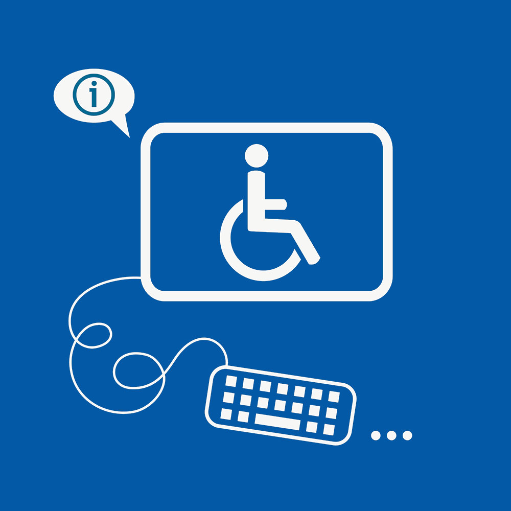
Test Your Website's ADA Compliance Status With Our Free Audit
Our free audit tool scans your website for ADA Compliance according to Web Content Accessibility Guidelines (WCAG 2.1) and gives you specific notices and issues that affect your ADA Compliance.
Accessibility
Accessibility modes, readable experience, visually pleasing experience, easy orientation.
Blue Atlas Marketing Accessibility Statement
Accessibility Statement
- www.blueatlasmarketing.com
- May 11, 2024
Compliance status
We firmly believe that the internet should be available and accessible to anyone, and are committed to providing a website that is accessible to the widest possible audience, regardless of circumstance and ability.
To fulfill this, we aim to adhere as strictly as possible to the World Wide Web Consortium’s (W3C) Web Content Accessibility Guidelines 2.1 (WCAG 2.1) at the AA level. These guidelines explain how to make web content accessible to people with a wide array of disabilities. Complying with those guidelines helps us ensure that the website is accessible to all people: blind people, people with motor impairments, visual impairment, cognitive disabilities, and more.
This website utilizes various technologies that are meant to make it as accessible as possible at all times. We utilize an accessibility interface that allows persons with specific disabilities to adjust the website’s UI (user interface) and design it to their personal needs.
Additionally, the website utilizes an AI-based application that runs in the background and optimizes its accessibility level constantly. This application remediates the website’s HTML, adapts Its functionality and behavior for screen-readers used by the blind users, and for keyboard functions used by individuals with motor impairments.
If you’ve found a malfunction or have ideas for improvement, we’ll be happy to hear from you. You can reach out to the website’s operators by using the following email
Screen-reader and keyboard navigation
Our website implements the ARIA attributes (Accessible Rich Internet Applications) technique, alongside various different behavioral changes, to ensure blind users visiting with screen-readers are able to read, comprehend, and enjoy the website’s functions. As soon as a user with a screen-reader enters your site, they immediately receive a prompt to enter the Screen-Reader Profile so they can browse and operate your site effectively. Here’s how our website covers some of the most important screen-reader requirements, alongside console screenshots of code examples:
Screen-reader optimization: we run a background process that learns the website’s components from top to bottom, to ensure ongoing compliance even when updating the website. In this process, we provide screen-readers with meaningful data using the ARIA set of attributes. For example, we provide accurate form labels; descriptions for actionable icons (social media icons, search icons, cart icons, etc.); validation guidance for form inputs; element roles such as buttons, menus, modal dialogues (popups), and others. Additionally, the background process scans all of the website’s images and provides an accurate and meaningful image-object-recognition-based description as an ALT (alternate text) tag for images that are not described. It will also extract texts that are embedded within the image, using an OCR (optical character recognition) technology. To turn on screen-reader adjustments at any time, users need only to press the Alt+1 keyboard combination. Screen-reader users also get automatic announcements to turn the Screen-reader mode on as soon as they enter the website.
These adjustments are compatible with all popular screen readers, including JAWS and NVDA.
Keyboard navigation optimization: The background process also adjusts the website’s HTML, and adds various behaviors using JavaScript code to make the website operable by the keyboard. This includes the ability to navigate the website using the Tab and Shift+Tab keys, operate dropdowns with the arrow keys, close them with Esc, trigger buttons and links using the Enter key, navigate between radio and checkbox elements using the arrow keys, and fill them in with the Spacebar or Enter key.Additionally, keyboard users will find quick-navigation and content-skip menus, available at any time by clicking Alt+1, or as the first elements of the site while navigating with the keyboard. The background process also handles triggered popups by moving the keyboard focus towards them as soon as they appear, and not allow the focus drift outside of it.
Users can also use shortcuts such as “M” (menus), “H” (headings), “F” (forms), “B” (buttons), and “G” (graphics) to jump to specific elements.
Disability profiles supported in our website
- Epilepsy Safe Mode: this profile enables people with epilepsy to use the website safely by eliminating the risk of seizures that result from flashing or blinking animations and risky color combinations.
- Visually Impaired Mode: this mode adjusts the website for the convenience of users with visual impairments such as Degrading Eyesight, Tunnel Vision, Cataract, Glaucoma, and others.
- Cognitive Disability Mode: this mode provides different assistive options to help users with cognitive impairments such as Dyslexia, Autism, CVA, and others, to focus on the essential elements of the website more easily.
- ADHD Friendly Mode: this mode helps users with ADHD and Neurodevelopmental disorders to read, browse, and focus on the main website elements more easily while significantly reducing distractions.
- Blindness Mode: this mode configures the website to be compatible with screen-readers such as JAWS, NVDA, VoiceOver, and TalkBack. A screen-reader is software for blind users that is installed on a computer and smartphone, and websites must be compatible with it.
- Keyboard Navigation Profile (Motor-Impaired): this profile enables motor-impaired persons to operate the website using the keyboard Tab, Shift+Tab, and the Enter keys. Users can also use shortcuts such as “M” (menus), “H” (headings), “F” (forms), “B” (buttons), and “G” (graphics) to jump to specific elements.
Additional UI, design, and readability adjustments
- Font adjustments – users, can increase and decrease its size, change its family (type), adjust the spacing, alignment, line height, and more.
- Color adjustments – users can select various color contrast profiles such as light, dark, inverted, and monochrome. Additionally, users can swap color schemes of titles, texts, and backgrounds, with over 7 different coloring options.
- Animations – epileptic users can stop all running animations with the click of a button. Animations controlled by the interface include videos, GIFs, and CSS flashing transitions.
- Content highlighting – users can choose to emphasize important elements such as links and titles. They can also choose to highlight focused or hovered elements only.
- Audio muting – users with hearing devices may experience headaches or other issues due to automatic audio playing. This option lets users mute the entire website instantly.
- Cognitive disorders – we utilize a search engine that is linked to Wikipedia and Wiktionary, allowing people with cognitive disorders to decipher meanings of phrases, initials, slang, and others.
- Additional functions – we provide users the option to change cursor color and size, use a printing mode, enable a virtual keyboard, and many other functions.
Browser and assistive technology compatibility
We aim to support the widest array of browsers and assistive technologies as possible, so our users can choose the best fitting tools for them, with as few limitations as possible. Therefore, we have worked very hard to be able to support all major systems that comprise over 95% of the user market share including Google Chrome, Mozilla Firefox, Apple Safari, Opera and Microsoft Edge, JAWS and NVDA (screen readers), both for Windows and for MAC users.
Notes, comments, and feedback
Despite our very best efforts to allow anybody to adjust the website to their needs, there may still be pages or sections that are not fully accessible, are in the process of becoming accessible, or are lacking an adequate technological solution to make them accessible. Still, we are continually improving our accessibility, adding, updating and improving its options and features, and developing and adopting new technologies. All this is meant to reach the optimal level of accessibility, following technological advancements. For any assistance, please reach out to
What is a Website? Everything You Need to Know
By Tibor Moes / Updated: June 2023

What is a Website?
Did you know that there are approximately 1.9 billion websites on the internet today? From e-commerce to social media, informational to entertainment, websites have truly revolutionized the way we interact, learn, and consume information.
In this blog post, we’ll explore the essence of websites, their evolution, diverse types, and the impact they have on society. So let’s dive in and unravel the fascinating world of websites!
- A website is a collection of interconnected web pages that can be accessed from a web browser.
- Websites have revolutionized how we access info, learn, communicate & consume content in the digital economy.
- Ten of the most visited websites are Google, YouTube, Facebook, Twitter, Instagram, Baidu, Wikipedia, Yandex, Yahoo, and Amazon.
Don’t become a victim of cybercrime. Protect your devices with the best antivirus software and your privacy with the best VPN service .
The Essence of a Website
A website is essentially a collection of interconnected web pages and related content, all identified by a shared domain name and published on at least one web server. Websites are the building blocks of the World Wide Web, allowing us to access a treasure trove of information, entertainment, and services at our fingertips. They are versatile and come in various forms, from simple static websites that provide basic information to complex dynamic sites that allow users to interact and engage with the content.
The core technologies that underpin websites are the internet and the web, which provide the foundation for accessing and sharing content across the globe. Websites can be created for various purposes, such as a news site for information, an e-commerce platform for online shopping, or a personal blog to share your thoughts and experiences. With roughly 1.9 billion websites in existence, the impact of websites on our lives is evident in the way we learn, communicate, and conduct business.
Definition and Purpose
A website is a hub of interconnected web pages, all sharing the same domain name and accessible via the internet. It can serve various purposes, such as providing information or services from a business, organization, or individual. The content on websites can be presented in various formats, including text, images, videos, audio, and animation, making it a versatile platform for sharing information on a specific topic or purpose.
The home page of a website is the first web page users see when they enter the web address into their browser. It typically provides an overview of the website’s content and services, guiding visitors to explore the various web pages and interact with the content as they desire.
Some websites focus on a single page, known as one-page or single-page websites, while others, like a personal site, have different web pages that delve deeper into specific topics or categories.
Web Address and Domain Names
Every website has a unique web address, also known as a URL (Uniform Resource Locator). This address helps browsers access websites on the internet and fetch the requested content.
Alongside the web address, websites also have a domain name, which is a unique identifier registered with a domain registrar. To obtain a domain name, you need to search for an available domain with a domain registrar, finalize your choice, and then purchase the domain name.
The domain name is an essential component of a website, as it provides a unique identity for your online presence and ensures potential visitors can easily find your website on the internet.
Web Servers and Hosting
Websites are stored and delivered to users through web servers, which are computer systems that take requests from clients (browsers) and deliver web content to them. Web servers use HTTP or other network protocols to facilitate this communication.
Web hosting is the place where all the website files and content are stored, making it accessible to users on the internet. Web hosts and servers provide hosting services, which are essentially remote computers with ample memory and powerful processors. This infrastructure ensures that your website remains accessible to users worldwide, allowing you to reach a broader audience and effectively share your content or services with the online community.
Evolution of Websites
Websites have come a long way since the early days of the World Wide Web, evolving from simple text and image-based pages to complex, interactive platforms that cater to various user needs and preferences. This evolution has been driven by technological advancements, changing user behaviors, and the growing importance of websites as a means to access information and services.
From the birth of the World Wide Web to the rise of dynamic websites and modern website technologies, the evolution of websites has transformed the way we interact with the internet and consume content. Let’s take a closer look at this fascinating journey through the history of websites.
Early Beginnings and the World Wide Web
The World Wide Web was created by Tim Berners-Lee in 1989, marking the beginning of a new era in information sharing and communication. The first website, constructed at CERN by Tim Berners-Lee, went live on August 6, 1991, paving the way for the development of countless other websites that would soon populate the internet.
In the early days, websites consisted primarily of text and images, with the primary focus being on information dissemination rather than interactivity. As the internet grew, so did the number of websites, leading to the development of more advanced technologies and the proliferation of various types of websites catering to different user needs.
Static Websites vs. Dynamic Websites
Two main types of websites emerged during the evolution of the web: static and dynamic. Static websites are designed using HTML and don’t update automatically, presenting fixed information to users without any interactive elements.
On the other hand, dynamic websites can update web pages depending on user behaviors and preferences, often leveraging databases to provide personalized experiences and engaging content.
The distinction between static and dynamic websites is crucial, as it determines the level of interactivity and user engagement offered by a website. While static websites serve a purpose for providing basic information, dynamic websites have grown in popularity due to their ability to adapt to user needs and offer more engaging content.
Modern Website Technologies
Today’s websites are built using a diverse range of modern technologies, such as HTML5, CSS3, JavaScript, ReactJS, AngularJS, VueJS, Progressive Web Applications, Web 3, Advanced AI, and low-code/no-code platforms. These technologies have enabled the creation of more advanced, interactive, and visually appealing websites that cater to the ever-evolving needs of internet users.
As the internet continues to grow and evolve, so too will the technologies used to build websites. This constant innovation ensures that websites remain relevant and effective in meeting the diverse needs of users worldwide, shaping the way we interact with the internet and consume content.
Diverse Types of Websites
Websites come in all shapes and sizes, catering to various purposes and user needs. From informational and content websites that provide knowledge on specific topics, to e-commerce platforms facilitating online shopping, and social media websites connecting people worldwide, the diversity of publicly accessible websites is vast and ever-expanding.
As the internet continues to grow, so too does the range of websites available to users. Understanding the different types of websites and their purposes can help you navigate the online landscape effectively and make the most of the wealth of information and services at your fingertips.
Informational and Content Websites
Informational websites are designed to provide information on a particular topic or subject, often focusing on communicating the details about a business or organization to their online audience. Content websites, on the other hand, display unique content related to a specific category, such as news, education, or entertainment. These websites serve as valuable resources for users seeking knowledge or insights on a particular subject.
Examples of informational and content websites include news websites, educational websites, personal websites, webcomics, archives, and help and Q&A websites. These websites provide a wealth of information to users, enabling them to learn, explore, and stay informed on a wide range of topics.
E-commerce and Business Websites
E-commerce and business websites are designed to facilitate online transactions, allowing users to purchase goods or services directly through the website. A well-designed business website often features online shops, payment gateways, and customer review sections, providing a seamless shopping experience for users.
Examples of e-commerce and business websites include online marketplaces, auction websites, and affiliate websites, among others. From small businesses to global corporations, e-commerce websites play a crucial role in the digital economy, enabling businesses to reach customers worldwide and drive growth through online sales.
Social Media and Online Communities
Social media websites and online communities are platforms that facilitate communication, content sharing, and collaboration among users. These websites often feature user profiles, messaging systems, and various tools for sharing and engaging with content, such as likes, comments, and shares.
Popular social media websites include Facebook, Instagram, Twitter, and YouTube, each catering to different user preferences and content formats. Social media websites have become an integral part of modern life, enabling users to stay connected with friends and family, discover new content, and share their experiences with the world.
Building and Managing a Website
Creating and managing a website may seem like a daunting task, but with the right tools and resources, it can be a rewarding and enjoyable process. From choosing the right website creation option to registering a domain name and selecting a hosting provider, there are several steps to building a successful website.
Once your website is up and running, it’s essential to maintain and secure it, ensuring that it remains accessible, up-to-date, and protected from potential threats. In this section, we’ll explore the various aspects of building and managing a website, helping you navigate the process with confidence.
Website Creation Options
There are several options available when it comes to creating a website, each catering to different levels of technical expertise, budget, and requirements. Website builders, such as Wix, Weebly, and Squarespace, are user-friendly platforms that allow you to create a website without any coding knowledge, using pre-designed templates and drag-and-drop features.
For those who prefer more control and customization, content management systems (CMS) like WordPress, Drupal, and Joomla offer a more flexible solution, allowing you to create, manage, and publish content with ease.
Lastly, custom development is an option for those with technical experience and a larger budget, enabling you to create a website from scratch using coding languages like HTML, CSS, and JavaScript.
Domain Registration and Hosting
Registering a domain name is a crucial step in creating a website, as it provides a unique identity for your online presence. To obtain a domain name, you’ll need to find a domain name registrar, search for an available domain, and then purchase the domain name.
In addition to registering a domain name, you’ll also need to select a hosting provider, which is responsible for storing your website files and making them accessible to users on the internet. Hosting providers offer various plans and features to cater to different website needs, such as storage capacity, bandwidth, and security measures.
Website Maintenance and Security
Maintaining and securing your website is essential for ensuring a smooth user experience and protecting your online presence from potential threats. Regular website maintenance tasks include checking web traffic, updating content, fixing broken links, and ensuring compatibility with different browsers and devices.
To secure your website, it’s important to use strong passwords, install security patches, and utilize secure protocols. By regularly maintaining and securing your website, you can ensure that it remains accessible, up-to-date, and protected from malicious attacks and unauthorized access.
The Impact of Websites on Society
Websites have had a profound impact on society, revolutionizing how we access information, learn, communicate, and consume content. From shaping the digital economy to facilitating online learning and knowledge sharing, websites have transformed our lives in countless ways.
In this section, we’ll explore the various ways in which websites have influenced society, including their role in the digital economy, online learning and knowledge sharing, and entertainment and media consumption.
The Digital Economy
The digital economy encompasses all economic activities that are generated through online connections between people, businesses, devices, data, and processes. Websites have played a pivotal role in the growth of the digital economy, enabling businesses to reach customers worldwide, streamline operations, and drive innovation.
E-commerce websites, in particular, have transformed the way we shop and conduct business, providing consumers with greater choice, convenience, and access to products and services. The digital economy continues to evolve, with websites at the forefront of this transformation, shaping how we interact with the world around us.
Online Learning and Knowledge Sharing
Websites have revolutionized the way we learn and share knowledge, breaking down barriers to education and fostering a global community of learners. Online learning platforms, such as Coursera, Udemy, and Khan Academy, provide users with access to a wealth of educational resources, from lectures and tutorials to interactive quizzes and forums.
Knowledge sharing websites, such as Wikipedia, Quora, and Stack Overflow, enable users to collaborate and build on existing knowledge, furthering our understanding of various subjects and fostering a culture of learning and discovery.
Through online learning and knowledge sharing, websites have democratized education, making it accessible to individuals worldwide, regardless of their location or background.
Entertainment and Media Consumption
Websites have transformed the way we consume entertainment and media, providing users with unprecedented access to content from around the world. Streaming platforms, such as Netflix, Hulu, and Spotify, have revolutionized the way we watch movies and listen to music, while social media websites enable users to create, share, and discover new content with ease.
Online gaming websites, news portals, and media sharing platforms all contribute to the diverse landscape of entertainment and media consumption, ensuring that users have a wealth of options at their fingertips.
As technology continues to advance, websites will play an increasingly important role in shaping our entertainment experiences and the way we consume media.
From the early beginnings of the World Wide Web to the diverse and dynamic websites that populate the internet today, websites have truly revolutionized the way we interact, learn, and consume information. As we’ve explored in this blog post, websites are an integral part of our lives, shaping the digital economy, facilitating online learning and knowledge sharing, and transforming entertainment and media consumption. As technology continues to evolve, so too will the role of websites in our society, ensuring that we remain connected, informed, and engaged with the world around us.
How to stay safe online:
- Practice Strong Password Hygiene : Use a unique and complex password for each account. A password manager can help generate and store them. In addition, enable two-factor authentication (2FA) whenever available.
- Invest in Your Safety : Buying the best antivirus for Windows 11 is key for your online security. A high-quality antivirus like Norton , McAfee , or Bitdefender will safeguard your PC from various online threats, including malware, ransomware, and spyware.
- Be Wary of Phishing Attempts : Be cautious when receiving suspicious communications that ask for personal information. Legitimate businesses will never ask for sensitive details via email or text. Before clicking on any links, ensure the sender's authenticity.
- Stay Informed. We cover a wide range of cybersecurity topics on our blog. And there are several credible sources offering threat reports and recommendations, such as NIST , CISA , FBI , ENISA , Symantec , Verizon , Cisco , Crowdstrike , and many more.
Happy surfing!
Frequently Asked Questions
Below are the most frequently asked questions.
What is a website in simple words?
In simple words, a website is a collection of interconnected webpages that provide useful information to users online. It can be created and maintained by an individual, group, business, or organization and is usually designed to serve a particular purpose such as news, education, entertainment, e-commerce, or social networking.
What is the main purpose of a website?
The main purpose of a website is to help your business reach its goals by engaging with your target audience, building trust, and providing useful information. With an effective website, you can grow your business and connect with more potential customers.
What is the difference between a static and dynamic website?
The main difference between a static and dynamic website is the interactivity and content generation. Static websites display fixed, unchanging content, while dynamic websites can update web pages on the fly in response to user input and draw information from a database.

Author: Tibor Moes
Founder & Chief Editor at SoftwareLab
Tibor has tested 39 antivirus programs and 30 VPN services , and holds a Cybersecurity Graduate Certificate from Stanford University.
He uses Norton to protect his devices, CyberGhost for his privacy, and Dashlane for his passwords.
You can find him on LinkedIn or contact him here .
Antivirus Comparisons
Best Antivirus for Windows 11 Best Antivirus for Mac Best Antivirus for Android Best Antivirus for iOS
Antivirus Reviews
Norton 360 Deluxe Bitdefender Total Security TotalAV Antivirus McAfee Total Protection
An official website of the United States government Here's how you know
Official websites use .gov A .gov website belongs to an official government organization in the United States.
Secure .gov websites use HTTPS A lock ( Lock A locked padlock ) or https:// means you’ve safely connected to the .gov website. Share sensitive information only on official, secure websites.
Trespass Prevention
FRA works in partnership with railroads, state and local governments, and organizations to conduct outreach efforts to raise awareness about the inherent dangers and consequences of trespassing on railroad property—illegally entering or remaining on a railroad right-of-way. FRA also provides multiple resources to assist these stakeholders and the public to prevent trespassing.
Trespassing Is Dangerous and Illegal
Trespassing is the leading cause of rail-related deaths in the United States. Nationally, more than 500 trespass fatalities occur each year. The number of trespassing occurrences on railroad property each year far exceeds the number of fatalities, which means the potential for more trespasser accidents.
It is illegal to access private railroad property anywhere other than a designated pedestrian or roadway crossing. Trespassers are most often pedestrians who walk across or along railroad tracks as a shortcut to another destination. Some trespassers are loitering or are engaged in recreational activities such as taking photographs, jogging, bicycling, hunting, or operating recreational off-highway vehicles (ROVs). Riding ROVs along railroad tracks leads to the erosion of an important part of the track foundation known as ballast, or the rock and soil material that supports the ties and rail. Damage to the ballast degrades the entire track structure and can lead to a train derailment—which can cause a hazardous materials spill or damage to other people and property.
Always Expect a Train!
- Trains do not follow a set schedule, so they can come at any time of day from either direction.
- A train traveling at 55 miles per hour can take more than a mile to stop.
- Trains overhang railroad tracks by three feet or more on either side. Even when you are not standing directly on the tracks, you risk being hit by a train by being on railroad property.
- Despite their size, trains are relatively quiet and do not always sound warning horns when approaching a crossing.
- Never attempt to walk under, around, or between train cars, even when a train is at a complete stop.
- For more safety tips, view FRA's I am a Pedestrian/Motorist webpage.
Community Trespass Prevention Program
The Community Trespass Prevention Guide is a program for local, state, and national partnerships aimed at reducing trespassing and its related injuries and deaths. The goal of the program is to create safer communities by fostering the development of long-term trespass prevention strategies through community problem-solving partnerships. The program incorporates a problem-solving model with a step-by-step approach for dealing with trespassing issues in communities.
- Trespass & Suicide Prevention Toolkit
FRA has an interactive resource, the Trespass & Suicide Prevention (TSP) Toolkit , to identify effective strategies for trespass and suicide prevention and mitigation on the Nation’s railroads. The TSP Toolkit is useful for individuals who work in railroad safety and for researchers, community members, suicide prevention groups, or other individuals or organizations with an interest in preventing trespassing and suicide.
National Strategy to Prevent Trespassing on Railroad Property
FRA’s National Strategy to Prevent Trespassing on Railroad Property is a 2018 Report to Congress that includes four strategic focus areas: data gathering and analysis, community site visits, funding, and partnerships with stakeholders.
Data gathering and analysis of trespass incidents and close calls enables FRA to target resources to trespassing "hot spots." Conducting community site visits helps FRA to learn more about the specific local circumstances that contribute to trespassing and work with partners to help implement and evaluate targeted mitigation strategies. Requesting and providing funding supports community-based efforts to deter trespassing. Finally, building strong and enduring partnerships with communities, law enforcement, railroads, and organizations with a shared interest in saving lives enables FRA to leverage and concentrate available resources, expertise, and local knowledge to reduce trespassing.
Click here to access the report.
- Railroad Infrastructure Trespass Detection Performance Guidelines
- Community Trespass Prevention Program Guide
- Rail Trespasser Fatalities Demographic and Behavioral Profiles, June 2013
- Trespasser Casualty Statistics
- Trespasser Casualty Map
- FRA Reports on Trespassing
- Rails with Trails Best Practices and Lessons Learned
- Always Expect a Train
- Cuidado Con El Tren
- Operation Lifesaver
- Recreational Off-Highway Vehicle Association
- Skip to main content
- Keyboard shortcuts for audio player

- LISTEN & FOLLOW
- Apple Podcasts
- Google Podcasts
- Amazon Music
- Amazon Alexa
Your support helps make our show possible and unlocks access to our sponsor-free feed.
NOAA Issues First Severe Geomagnetic Storm Watch Since 2005

Regina G. Barber

Rebecca Ramirez

NASA's Solar Dynamics Observatory captured this image of a strong solar flare on May 8, 2024. The Wednesday solar flares kicked off the geomagnetic storm happening this weekend. NASA/SDO hide caption
NASA's Solar Dynamics Observatory captured this image of a strong solar flare on May 8, 2024. The Wednesday solar flares kicked off the geomagnetic storm happening this weekend.
Scientists at the National Oceanic and Atmospheric Administration Space Weather Prediction Center observed a cluster of sunspots on the surface of the sun this week. With them came solar flares that kicked off a severe geomagnetic storm. That storm is expected to last throughout the weekend as at least five coronal mass ejections — chunks of the sun — are flung out into space, towards Earth! NOAA uses a five point scale to rate these storms, and this weekend's storm is a G4. It's expected to produce auroras as far south as Alabama. To contextualize this storm, we are looking back at the largest solar storm on record: the Carrington Event.
Want us to cover more about the sun? Email us at [email protected] .
Listen to Short Wave on Spotify , Apple Podcasts and Google Podcasts .
Listen to every episode of Short Wave sponsor-free and support our work at NPR by signing up for Short Wave+ at plus.npr.org/shortwave .
The update to this episode was produced and edited by Rebecca Ramirez. Regina G. Barber checked the facts. Ko Takasugi-Czernowin was the audio engineer.
More From Forbes
The world’s best airport hotels—according to a 2024 report.
- Share to Facebook
- Share to Twitter
- Share to Linkedin
Crowne Plaza Changi Airport
A stay at an airport hotel is usually booked with convenience in mind. You’ve got an early morning flight and want to be close to your departure gate or you’ve got a layover that’s too long to wait out in the lounge, yet too short to venture deep into a city. But some airport hotels go above and beyond with their amenities and design, and, Skytrax , a London-based air transport ratings organization, rates airport hotels each year.
The world’s best airport hotel in 2024 is: Crowne Plaza Changi Airport in Singapore, according to Skytrax.
The IHG Resort & Hotel is a repeat winner on the organization’s best airport hotel list, clinching the No. 1 spot for the past nine years.
TOPSHOT - Newly built Changi Jewel complex at the Changi international airport is pictured during a ... [+] media preview in Singapore on April 11, 2019. (Photo by Roslan RAHMAN / AFP) (Photo by ROSLAN RAHMAN/AFP via Getty Images)
A major hub for travel throughout Asia, the Singapore Changi Airport is a traveler favorite thanks in part to the Jewel, a nature-themed retail and entertainment complex with amenities like the 7-story rain vortex, a hedge maze, shops, and restaurants all set among a lush landscape with more than 2,000 trees and palms and 10,000 shrubs.
The top airport hotel in the United States, and also high on the global list, is the wonderfully nostalgic TWA Hotel at New York’s JFK airport where you can enjoy a libation in a 1958 Lockheed Constellation “Connie” airplane that’s been transformed into a cocktail lounge.
The Best Mattress For Couples, Regardless Of Your Sleep Styles
Wwe smackdown results winners and grades on may 10 2024, the 8 best trampolines with insights from an industry expert.
The Connie lounge at TWA Hotel at New York's JFK Airport
The Airport Hotel Awards are determined by guest surveys, which use criteria like access to the airport, friendly staff, cleanliness of rooms and bathrooms, a bedroom that allows for a goodnight sleep, hotel amenities, and value.
Corner suite bathroom at Grand Hyatt SFO
Ahead, find out which airport hotels are the best in the world — and what sets them apart.
What Are The Best Airport Hotels in the World in 2024?
1. crowne plaza changi airport in singapore.
The top airport hotel has rooms with runway views and a beautifully landscaped outdoor pool.
2. Hyatt Regency Shenzhen Airport in China
For travelers looking for a pick-me-up, the onsite spa is open until 11 p.m. and is outfitted with a sauna and steam room.
3. TWA Hotel at New York’s JFK Airport in the U.S.
Heated to 95 degrees and open year-round, the rooftop pool at TWA Hotel is a plane watcher’s paradise.
4. Hilton Munich Airport in Germany
Grab a nightcap at the Nightflight bar, which is located in an atrium with palm trees and greets weary travelers until 1:30 a.m.
5. Fairmont Vancouver Airport in Canada
Fairmont’s strong presence in Vancouver includes a luxury hotel at the airport where guests can watch planes take off with picturesque mountains in the backdrop.
6. Grand Hyatt at SFO in the U.S.
The luxury 351-room hotel has a dedicated AirTrain stop to get guests to and from their gates seamlessly, plus a nice collection of art and oversized bathtubs in the guestrooms.
7. Mövenpick Hotel Bahrain
Daily “chocolate hour” rituals and a light-filled atrium serving French fare are perks at this airport hotel.
8. Hilton Amsterdam Schiphol Airport in the Netherlands
A covered walkway links the hotel to the airport, and 15-minute train ride zips visitors to downtown Amsterdam to see the restaurants, markets, and museums.
9. Pullman Guangzhou Airport
This 500-room hotel has an on-site Chinese restaurant and a buffet, plus nice touches like a pool table, courtyard pool, and a spa.
10. Sofitel London Heathrow
Sofitel’s posh airport hotel has a tea room serving teas from around the world and La Belle Époque, a fine dining French restaurant.
What Are The Best Airport Hotels in North America in 2024?
TWA Hotel's pool is a perfect perch for plane spotters.
The Skytrax team also named the five best hotels in North America, three of which made its global list.
1.TWA Hotel at New York’s JFK Airport in the U.S.
2. Fairmont Vancouver Airport in Canada
3. Grand Hyatt at SFO in the U.S.
4. The Westin SFO Airport
5. The Westin Denver International Airport

- Editorial Standards
- Reprints & Permissions
Join The Conversation
One Community. Many Voices. Create a free account to share your thoughts.
Forbes Community Guidelines
Our community is about connecting people through open and thoughtful conversations. We want our readers to share their views and exchange ideas and facts in a safe space.
In order to do so, please follow the posting rules in our site's Terms of Service. We've summarized some of those key rules below. Simply put, keep it civil.
Your post will be rejected if we notice that it seems to contain:
- False or intentionally out-of-context or misleading information
- Insults, profanity, incoherent, obscene or inflammatory language or threats of any kind
- Attacks on the identity of other commenters or the article's author
- Content that otherwise violates our site's terms.
User accounts will be blocked if we notice or believe that users are engaged in:
- Continuous attempts to re-post comments that have been previously moderated/rejected
- Racist, sexist, homophobic or other discriminatory comments
- Attempts or tactics that put the site security at risk
- Actions that otherwise violate our site's terms.
So, how can you be a power user?
- Stay on topic and share your insights
- Feel free to be clear and thoughtful to get your point across
- ‘Like’ or ‘Dislike’ to show your point of view.
- Protect your community.
- Use the report tool to alert us when someone breaks the rules.
Thanks for reading our community guidelines. Please read the full list of posting rules found in our site's Terms of Service.
IMAGES
VIDEO
COMMENTS
12. World Wildlife Fund. The website for the nonprofit World Wildlife Fund (WWF) conveys its mission, initiatives, partnerships, and educational content in a way that is accessible. Like other examples we've listed, the fact that WWF doesn't overload its pages with content helps with accessibility and navigability.
Now that you have a better understanding of the basic requirements that an accessible site should meet, let's delve into some of the best accessible websites. 1. Patagonia. Patagonia, a leading outdoor clothing company, is a top example of an accessible eCommerce site. For one, the text offers high contrast, all images have the necessary ...
How to make content keyboard accessible. Consider a dropdown menu on a website. Typically, users hover over the menu with a mouse to view the options. To make this keyboard-accessible, you need to ensure that users can navigate to the menu using the Tab key and expand the menu using the Enter or Space key.
LinkedIn is the most accessible social media platform. Not only is LinkedIn a good place to find work, it's also a great place if you use assistive technologies. Only 0.34% of the site's login screen is inaccessible, as descriptive links, great colour contrast and simple layout make the page easy to move around.
1. A: Your website is accessible to some users. The level A success criteria details the steps you can take to avoid some of the most serious violations of accessibility principles. For instance, guideline 1.4 focuses on distinguishability, which simply means making it easy for users to perceive content.
Web accessibility includes all types of disabilities that affect access to the Web, including auditory, cognitive, neurological, physical, speech, and visual. Ensuring your website is compliant with the ADA (Americans with Disabilities Act) means having these assistive elements easily accessible for your website visitors.
Web accessibility is the practice of making websites usable for all ... of The World Wide Web Consortium (W3C). These guidelines are highly detailed and include many suggestions for how to ensure your website is accessible to all users. ... Navigation menus are typically found in the header and footer of each page. Third, help your users avoid ...
Web accessibility is important because it makes the digital arena a more inclusive space for everyone, including the differently-abled community. A sound accessibility strategy also carries business benefits. Businesses that adopt web accessibility best practices are able to offer their visitors a more memorable and inclusive online experience.
Designing with accessibility in mind can be a win-win situation for both the company and the users - just as it is for TED. TED is a non-profit organization, which is dedicated to spreading ideas via short power talks. The talks are usually 18 minutes or less and are often uploaded as videos on their websites.
Website Accessibility Guide: Accessibility Made Easy in 2024. Mark Holden Website Development Expert. Inside this Article. A website with accessibility issues prevents both disabled and able-bodied users from getting the most out of your site, its content, and - if applicable - the products and services on offer.
This simple test is typically a good indicator of accessibility. For more information, see nomouse.org. Test pages using high contrast color schemes. All major operating systems and some web browsers have high contrast color schemes available. When these are enabled, make sure that all important page content is still visible.
Industry-standard web accessibility guidelines are abbreviated to WCAG (web content accessibility guidelines). These guidelines are updated whenever new information is made available, and the most up-to-date guidance is then posted on the W3C (World Wide Web Consortium) website. W3C is an international community that "develops open standards ...
Additionally, the site ensures easy readability of text against background. This makes the website not only aesthetically pleasing but also accessible to a wide range of visitors. 2. Company Six. With the robust ReadySight robot, Company Six ensures safety for responders and professionals.
An accessible website should support such aids, while also being easily perceivable on its own, through the use of contrasting colors, legible text, and alternative methods of presentation for time-based media. 2. Operability. The operability of a website has to do with how easy it is to operate and navigate.
Provide transcripts or closed captions for files with audio. Make your website keyboard accessible. Opt for on-page content rather than PDFs. Keep the text short and sweet. Organize your site for easy navigation. Offer multiple means of communication. Add an accessibility statement to your site. Use templates.
These regulations are usually based on the World Wide Web Consortium (W3C) guidelines, formally known as Web Content Accessibility Guidelines (WCAG). Unlike websites in the public sector which have to adhere to the highest standard of accessibility (think government websites or the BBC), regulations are more lenient for digital properties in ...
Step 5: Make your site keyboard-accessible. Some users will need to use keyboards to navigate sites, so ensure they can navigate your website without any difficulties (Image credit: Tom's Guide ...
These guidelines are widely accepted as the benchmark for web accessibility and are often referenced in legal requirements. Advocacy groups and NGOs. Non-profit organizations and advocacy groups actively promote website accessibility, often offering resources, conducting audits, and sometimes pushing for legal action against non-compliant websites.
Web accessibility, or eAccessibility, is the inclusive practice of ensuring there are no barriers that prevent interaction with, or access to, websites on the World Wide Web by people with physical disabilities, situational disabilities, and socio-economic restrictions on bandwidth and speed.When sites are correctly designed, developed and edited, more users have equal access to information ...
"Accessible websites" are designed such that the barriers that prevent people with disabilities from using the Internet are eliminated, as web developers typically fail to take into account that not every user is able to see and hear content or use a keyboard and mouse to navigate their sites. As such, websites that rely only on those tools ...
Web accessibility is about removing access barriers from websites that prevent disabled people from using them effectively. This is a critical initiative considering that people with some type of disability make up 15% of the world's population, according to the World Health Organization. In the United States lone, the Centers for Disease Control and Prevention estimate that 26% of Americans ...
These lawsuits specifically target websites and claim that the sites don't meet accessibility compliance as required by the ADA. There are several problems with this. First, these lawsuits are filed in select locations and states with their own specific accessibility requirements, in hopes that the courts will be more willing to consider the ...
Definition and Purpose. A website is a hub of interconnected web pages, all sharing the same domain name and accessible via the internet. It can serve various purposes, such as providing information or services from a business, organization, or individual. The content on websites can be presented in various formats, including text, images ...
FRA works in partnership with railroads, state and local governments, and organizations to conduct outreach efforts to raise awareness about the inherent dangers and consequences of trespassing on railroad property—illegally entering or remaining on a railroad right-of-way. FRA also provides multiple resources to assist these stakeholders and the public to prevent trespassing.
These infusions contain antibodies that target particular proteins called immune checkpoints. Typically, the immune system relies on checkpoint proteins to turn off overactive white blood T cells.
To solve the climate crisis, we need reliable satellites to track carbon emissions and changing weather patterns. Astrodynamicist Moriba Jah says space junk is putting these satellites in jeopardy.
Scientists at the National Oceanic and Atmospheric Administration observed a cluster of sunspots on the surface of the sun this week. With them came solar flares that kicked off a severe ...
Crowne Plaza Changi Airport. Crowne Plaza Changi Airport. A stay at an airport hotel is usually booked with convenience in mind. You've got an early morning flight and want to be close to your ...