Log in / Sign up
Don't have an account? Sign up --> Forgot Password? --> -->
Log in directly with a Google account, no need to register
Already have an account? Log in
Reset Password

Charting Success: A Guide to Creating Graphs in PowerPoint

In the world of presentations, effective communication is key, and visuals play a crucial role in conveying complex information in a digestible format. Among the arsenal of visual aids, graphs stand out as powerful tools for illustrating trends, comparisons, and patterns. In this guide, we will delve into the art of creating graphs in PowerPoint, exploring their definition, the benefits they bring to presentations, practical how-to guides, and concluding with insights on why mastering the art of charting success can elevate your presentations to new heights.
Before we embark on the journey of mastering graph creation in PowerPoint, let's first define what a graph is and its role in presentations. A graph is a visual representation of data that allows audiences to quickly grasp complex information. In PowerPoint, graphs come in various forms, including bar charts, line graphs, pie charts, and more. They serve as dynamic tools for illustrating numerical information, making it easier for viewers to interpret and understand the significance of the data being presented.
Understanding the benefits of incorporating graphs into your PowerPoint presentations is essential for harnessing their full potential. Here are some key advantages:
Clarity and Simplicity: Graphs distill complex data into clear and concise visuals, reducing the cognitive load on your audience. They present information in a way that is easy to understand, even for those less familiar with the subject matter.
Visual Appeal: Graphs add a visual element to your presentation, making it more engaging and memorable. A well-designed graph can captivate your audience's attention and leave a lasting impression.
Comparison and Trends: Different types of graphs allow you to showcase comparisons between data sets and highlight trends over time. Whether you're analyzing sales figures, market trends, or survey results, graphs provide a visual narrative that enhances comprehension.
Professionalism: Incorporating well-crafted graphs demonstrates a level of professionalism and attention to detail. It signals to your audience that you have thoroughly analyzed the data and are presenting it in a format that facilitates understanding.
Data-driven Decision Making: Graphs empower decision-makers by providing a visual representation of data, enabling more informed and data-driven decision-making processes.

How-to Guides
Now that we recognize the importance and benefits of using graphs in PowerPoint, let's delve into practical how-to guides for creating impactful visuals:
Choosing the Right Graph Type: Start by selecting the most appropriate graph type for your data. Bar charts work well for comparisons, line graphs for trends over time, and pie charts for illustrating proportions. Understanding the nature of your data will guide your choice.
Inserting a Graph in PowerPoint: In PowerPoint, navigate to the "Insert" tab, select "Chart," and choose the desired graph type. A spreadsheet will open where you can input your data. Once done, the graph will automatically update on your PowerPoint slide.
Customizing Graphs: PowerPoint provides a range of customization options. Experiment with color schemes, fonts, and labels to ensure your graph aligns with your presentation's overall design. Use legends, titles, and data labels to enhance clarity.
Animating Graphs: Adding animations to your graphs can create a dynamic and engaging presentation. Utilize PowerPoint's animation features to reveal data points or entire graphs sequentially, guiding your audience through the information.
Updating Data in Real-time: If your data is subject to change, leverage PowerPoint's ability to link graphs to external data sources. This ensures that your graphs stay up-to-date without manual adjustments.
Revolutionizing Presentations with Smallppt's AI PowerPoint
Smallppt's AI PowerPoint, a cutting-edge AI PowerPoint maker, transforms presentation creation. As an intuitive online AI PowerPoint maker, it generates polished slides effortlessly. The innovative Redraw Feature, a highlight of this PPT generator AI, refines text precision. Real-time formatting recommendations, part of its Artificial Intelligence presentation PowerPoint suite, enhance design dynamically. Integrated with Microsoft PowerPoint for familiarity, it champions efficiency, focusing on substantive content. As a beacon for the AI for presentations movement, it combines traditional design strengths with transformative AI capabilities.
In conclusion, mastering the art of creating graphs in PowerPoint is a valuable skill that can significantly enhance your presentation prowess. From defining the role of graphs in presentations to exploring their myriad benefits, and finally, providing practical how-to guides, this guide equips you with the knowledge to chart success in your presentations.
By harnessing the power of visuals, you not only make your presentations more accessible but also elevate the overall impact of your message. Whether you're a business professional, educator, or student, the ability to create compelling graphs in PowerPoint is a valuable asset that can set you apart in a world where effective communication is paramount. So, next time you prepare a presentation, remember the transformative potential of well-crafted graphs – your key to charting success in the world of PowerPoint.

Title / Email address / Description can not be empty!
- SUGGESTED TOPICS
- The Magazine
- Newsletters
- Managing Yourself
- Managing Teams
- Work-life Balance
- The Big Idea
- Data & Visuals
- Reading Lists
- Case Selections
- HBR Learning
- Topic Feeds
- Account Settings
- Email Preferences
Present Your Data Like a Pro
- Joel Schwartzberg

Demystify the numbers. Your audience will thank you.
While a good presentation has data, data alone doesn’t guarantee a good presentation. It’s all about how that data is presented. The quickest way to confuse your audience is by sharing too many details at once. The only data points you should share are those that significantly support your point — and ideally, one point per chart. To avoid the debacle of sheepishly translating hard-to-see numbers and labels, rehearse your presentation with colleagues sitting as far away as the actual audience would. While you’ve been working with the same chart for weeks or months, your audience will be exposed to it for mere seconds. Give them the best chance of comprehending your data by using simple, clear, and complete language to identify X and Y axes, pie pieces, bars, and other diagrammatic elements. Try to avoid abbreviations that aren’t obvious, and don’t assume labeled components on one slide will be remembered on subsequent slides. Every valuable chart or pie graph has an “Aha!” zone — a number or range of data that reveals something crucial to your point. Make sure you visually highlight the “Aha!” zone, reinforcing the moment by explaining it to your audience.
With so many ways to spin and distort information these days, a presentation needs to do more than simply share great ideas — it needs to support those ideas with credible data. That’s true whether you’re an executive pitching new business clients, a vendor selling her services, or a CEO making a case for change.
- JS Joel Schwartzberg oversees executive communications for a major national nonprofit, is a professional presentation coach, and is the author of Get to the Point! Sharpen Your Message and Make Your Words Matter and The Language of Leadership: How to Engage and Inspire Your Team . You can find him on LinkedIn and X. TheJoelTruth
Partner Center
- The Complete Guide to Mastering Business Presentations
- Visual Aids in Your Business Presentation
Data Visualization in Business Presentations: Graphs and Charts Best Practices

Aayush Jain
Navigating the graphs and charts galaxy: a guide for data storytellers.

Introduction to Graphs and Charts Selection
When it comes to data visualization in business presentations , the choice of graphs and charts is pivotal. These visual aids are the storytellers of numerical tales, translating complex datasets into comprehensible narratives. The art lies in matching the story you wish to tell with the appropriate visual vehicle. Whether it’s a bar graph illustrating quarterly sales or a line chart tracking website traffic trends, the right selection can illuminate insights and guide decision-making processes. A well-chosen chart or graph not only enhances the business case presentation but also reinforces the message with clarity and impact.
Historically, visual representations of data have been instrumental in facilitating understanding. From Florence Nightingale's Coxcomb plots to John Snow's cholera outbreak maps, the ability to see patterns and relationships in data has shaped decision-making in business and beyond. Today, with the surge in big data and analytics, the role of presentation design services has grown exponentially. They specialize in harnessing the power of PowerPoint presentation design and other tools to distill and display data. The choice of graph or chart hinges on the nature of the data – categorical, time-series, comparative, or relational – and the story it is intended to convey.
Real-world Application and Current Trends
In the realm of real-world application, companies often turn to presentation design agencies to help them craft a compelling business case slide. For instance, a product launch with right presentation design agency might leverage a combination of pie charts and histograms to depict market segmentation and consumer preferences. Meanwhile, presentation design companies are increasingly adopting interactive dashboards, allowing for a dynamic and engaging data experience. These tools not only display static figures but also enable viewers to interact with the data, drilling down into specifics and exploring different scenarios on the fly.
Credibility in data representation is paramount, and referencing high-quality external sources is key to achieving this. For a presentation redesign for example, the use of business case templates with proven effectiveness can be backed by statistics from reputable agencies. According to a recent survey by a leading PowerPoint design agency, presentations that utilized tailored, data-specific graphs saw a 30% increase in audience engagement. Furthermore, a study in the Journal of Business Communication found that incorporating clear and relevant graphs in sales presentations increased the persuasiveness of the argument by 43%.
Simplifying the Complex: The Art of Streamlining Data Visualization

Introduction to Simplifying Complex Data
Data, by its nature, can be intricate and overwhelming, especially when large volumes are involved. This is where the second rule of data visualization in business presentations comes into play: simplification. The goal is to strip down complexity without losing the essence of the information. Simplifying complex data visualization involves choosing the right powerpoint presentation design services that can distill vast amounts of data into easily digestible visuals. By doing so, presentation design agencies ensure that the audience can quickly grasp the underlying patterns and messages without getting lost in a sea of numbers.
Delving into Simplification Techniques
The process of simplification is not about dumbing down data; it's about smart consolidation and prioritization. Techniques vary from employing data aggregation—whereby data is categorized into larger groups for a broader view—to highlighting significant data points to draw attention to critical trends or outliers. Google slides and other presentation software offer tools that can enhance simplicity, such as clean lines and comparative scales. These techniques by skilled presentation designers help to avoid cognitive overload and make the data more approachable and memorable.
Real-world examples abound where complex data visualization has been successfully simplified. Presentation design companies often showcase before-and-after scenarios to demonstrate their skill in transforming convoluted spreadsheets into intuitive charts. For instance, a recent corporate presentation by a tech giant exhibited a remarkable use of a minimalist interactive data dashboard that allowed the audience to explore various market scenarios with ease. Additionally, many presentation design agencies have created visual case studies that display their expertise in simplifying complex projects, making a strong case for their presentation services here.
Statistics show that presentations with simplified visuals have a higher retention rate. A survey by a top presentation design company revealed that their clients reported a 50% better understanding of data when it was presented in a simplified manner. The Harvard Business Review also emphasizes the effectiveness of simple visual aids, citing that investors and executives often prefer straightforward graphs over complex ones because they can quickly comprehend and act on the information. Thus, the importance of simplification in data visualization cannot be overstated, as evidenced by the expertise and recommendations of industry leaders.
Precision in Presentation: Ensuring Accuracy and Clarity in Data Visualization

Introduction to Accuracy and Clarity in Data
The integrity of a business case presentation hinges on the accuracy and clarity of its data visualization. This concept is a cornerstone in communicating information effectively, as even the most visually appealing business case presentation template can be rendered useless if the data it conveys is not accurate and clear. The challenge for presentation design services is to maintain the delicate balance between aesthetic appeal and the precise portrayal of data. It is a balance that requires a deep understanding of data nuances and a keen eye for design.
Background on the Importance of Accurate Data Representation
The history of data visualization is littered with examples where inaccuracies in data representation have led to misinformed decisions with significant consequences. Thus, presentation designers place a high emphasis on data integrity. Accuracy involves double-checking data sources, using appropriate scales, and avoiding misleading graph elements such as truncated axes or inappropriate intervals. Clarity is about making the data accessible, using the right type of graph to match the message, and avoiding clutter that can obscure the data's meaning.
Illustrating with Real-World Examples
Consider a PowerPoint presentation for a major product launch presentation. Here, precise market data visualization could be the difference between securing stakeholder buy-in or not. A presentation design agency might use clear, accurate bar charts to depict market share, while a sales presentation may require precise line graphs to forecast sales trends. Google Slides and other tools now offer advanced features that help ensure accuracy, such as live data integration, which can update charts in real-time to reflect the most current data.
The best presentation design companies not only focus on the aesthetics of graphs but also on the verifiability of the data presented. They often cite and link to data from credible sources, such as industry reports or academic studies, which adds a layer of trust to the presentation. For instance, a business case analysis might be supported by data from financial institutions or market research firms, complete with citations. According to a survey by a leading business school, presentations that referenced authoritative data sources were rated as more than persuasive presentations by 65% of executives surveyed.
Unveiling Success Stories: Real-world Examples of Effective Data Visualization

Introduction to Effective Data Visualization
Effective data visualization acts as a bridge between complex data sets and decision-making processes. It is a potent tool in a business case presentation, with the power to influence and inform. But what makes a data visualization effective? The answer lies in its ability to tell a story that is both compelling and understandable. It’s not just about presenting data; it’s about crafting a narrative that resonates with the audience. Presentation design services strive to achieve this by focusing on design elements that highlight the key messages within the data.
Background on Data Visualization Success
The success stories of data visualization are as varied as the fields that use them. For example, the use of infographics in business case slides has transformed dry statistics into engaging stories. Historical examples, like the work of Edward Tufte, who emphasized the importance of displaying data with integrity and simplicity, continue to influence modern presentation design. Moreover, both powerpoint presentations and presentation design services have evolved to incorporate storytelling elements, making data not just informative but also memorable.
Real-world Examples of Visualization
Among the notable instances of effective data visualization are the interactive dashboards used by major consulting firms. These dashboards have revolutionized the way data is presented, allowing users to interact with the information dynamically. For example, a business case analysis presented through an interactive dashboard can help the audience visualize the impact of different business scenarios. Another example is the annual reports of leading tech companies, which often employ a mix of charts, graphs, and animations to present financial data, user statistics, and performance metrics.
The real-world effectiveness of data visualization is often supported by research and expert opinion. A study published in the 'International Journal of Business Communication' found that incorporating well-designed charts and graphs could increase comprehension by up to 70%. Presentation design agencies often highlight these findings to validate their approaches. Additionally, companies like Google have published white papers on the effectiveness of visualization in Google Slides, demonstrating how visual storytelling aids information retention and decision-making.
The Art of Data Storytelling: Leveraging Infographics

Introduction to Data Storytelling Through Infographics
Infographics have revolutionized the way we understand and interact with data in a business case presentation. They blend visual appeal with information-rich content to create a compelling narrative. The essence of data storytelling lies in its ability to make complex information easily digestible, and infographics are the perfect vessel for this. Presentation design services use infographics to transform rows of data into a visual story that engages and informs the audience, making them a staple in the arsenal of best presentation design company.
Exploring the Evolution of Infographics
Infographics are not a modern invention; they have been used for centuries, from ancient cave paintings to the elaborate diagrams of the Renaissance. In the context of business, they have taken center stage as a means to convey business cases, market analyses, and statistical data. The evolution of presentation design tools, including PowerPoint presentation design services and Google Slides, has given rise to innovative infographic formats that combine images, charts, and text to depict information more dynamically and interactively.
Real-world Applications of Infographics
Business presentations , especially those related to marketing presentations and sales presentations, have benefited greatly from the use of infographics. For example, an infographic detailing customer demographics and purchasing behaviors can provide a clear picture of market segments in a business presentation. Presentation design agencies often showcase their expertise by creating infographics that distill complex data, such as financial reports or consumer surveys, into concise visuals that highlight key trends and insights.
Infographics must be rooted in reliable data to maintain credibility. Top presentation design companies ensure that the data they visualize comes from authoritative sources, often referencing industry reports, academic research, or proprietary data. For instance, a business case slide that includes an infographic might cite data from a well-known market research firm to back up the market trends it presents. The use of verifiable sources not only strengthens the message but also enhances the reputation of the business or individual presenting the data.
Enhancing Engagement: Animations and Transitions in Data Visualization

Introduction to Dynamic Visualizations in Presentations
In the landscape of business presentations , animations, and transitions are not mere embellishments; they serve as critical tools for enhancing the understanding and retention of data. When used judiciously, these dynamic elements can guide the audience through a narrative, revealing insights step-by-step and keeping them engaged. The judicious use of animations in PowerPoint presentation design services, for instance, can turn a static business case slide into an interactive storytelling experience.
The Role of Animations in Simplifying Information
Animations can break down complex information into manageable sequences, making it easier for the audience to follow and absorb. By progressively disclosing information, animations help to maintain focus and can effectively highlight changes over time or the relationship between data points. Presentation design agencies understand the cognitive load of their audience and use transitions to direct attention, reduce overwhelm, and facilitate the digestion of complex data.
Real-world Examples of Effective Use of Animations
Consider the impact of a well-animated product launch presentation. It can reveal market trends, product features, and user statistics in a manner that builds anticipation and keeps the audience engaged. Real-world examples include sales presentations that use motion to track the journey of a product from conception to market leader. Presentation designers may use animated charts to depict the growth trajectory, with each phase of growth revealed through a transition, creating a more memorable presentation and persuasive narrative.
While animations can add a layer of sophistication to presentations, their accuracy and relevance should be grounded in solid data. Top presentation design service companies often quote statistics on the effectiveness of animated visuals. For instance, research has shown that animated visuals in a PowerPoint presentation can increase audience engagement by up to 40%. Presentation design services ensure that the animated elements are not only visually appealing but also represent the data faithfully, often referencing and displaying source data on-screen during the presentation for transparency and trustworthiness.
Interactive Insights: The Power of Data Dashboards in Presentations

Introduction to Interactive Data Dashboards
Data dashboards are at the forefront of modern business presentations, offering a dynamic and interactive way to display complex data. They serve as a control panel, providing a comprehensive view of metrics and key performance indicators (KPIs) at a glance. In a business case presentation, an interactive dashboard can empower the audience to engage directly with the data, fostering a deeper understanding and a more personalized experience.
The Evolution and Importance of Dashboards
Historically, data was presented in static tables and charts, which could be difficult to interpret and act upon. The advent of interactive dashboards has changed the game, allowing users to filter, drill down, and manipulate data in real time. This evolution has been driven by advances in presentation design services and software, with PowerPoint presentation design services now integrating dashboard functionality into their offerings. Dashboards have become an essential tool for project managers and business analysts to convey complex data succinctly and effectively.
Dashboards in Action: Case Studies
Real-world examples of dashboard implementation include multinational corporations that use them for tracking sales and operations across different regions. Presentation design agencies have crafted bespoke dashboards for these companies, which are used in executive summaries and monthly reports. These dashboards often include interactive elements like sliders and dropdown menus, allowing viewers to select different data segments and receive immediate, visual feedback.
The inclusion of interactive dashboards is supported by research indicating their effectiveness. For instance, a study from a presentation design company found that presentations featuring interactive dashboards saw a 50% increase in audience participation. Furthermore, industry experts from presentation design agencies have noted that interactive dashboards can lead to more informed decision-making, as they allow users to explore and interrogate the data themselves, leading to a more engaging and insightful presentation.
Future-Proofing Presentations: Trends in Data Visualization for Business

Introduction to Data Visualization Trends
As the business landscape evolves, so do the trends in data visualization. Keeping abreast of these trends is crucial for any business case presentation, as it reflects a company's ability to adapt and innovate. From AI-powered analytics to real-time data feeds, the latest trends in data visualization are shaping the way businesses present and interpret data. Presentation design services that stay ahead of these trends not only offer cutting-edge solutions but also provide their clients with a competitive edge.
Understanding the Impact of New Visualization Techniques
Emerging technologies are continuously influencing the techniques used in presentation design. For instance, augmented reality (AR) and virtual reality (VR) are beginning to find their way into powerpoint presentation design services, offering immersive ways to explore data. Big data and machine learning are also impacting the field, with algorithms now capable of identifying patterns and insights that might be missed by the human eye, and presenting them in novel and compelling ways.
Case Studies: Innovation in Data Visualization
Innovative companies are already harnessing these new trends to powerful effect. A business case slide that uses AR can allow stakeholders to visualize product placement in a real-world setting, while VR can create an immersive environment for exploring complex datasets. Presentation design agencies are also leveraging these technologies to offer more impactful and engaging presentation experiences. For example, a financial firm used an interactive, real-time data visualization to illustrate market fluctuations during a high-stakes investment meeting, enabling investors to make more informed decisions on the spot.
The future of data visualization is a hot topic among industry experts and thought leaders. Research papers and tech conferences often highlight the potential for AI and interactive elements to transform business presentations. A recent article in a tech journal by a leading presentation design company projected that the use of dynamic and interactive data visualization will increase by 70% in the next five years. This suggests a future where data visualization not only informs but also interacts with the audience in real-time, making presentations more engaging and informative.
Mastering the Numbers: Strategies for Presenting Statistical Data

Introduction to Statistical Data Presentation Strategies
Presenting statistical data effectively is a cornerstone of a persuasive business case for best presentation design agency. The challenge is to present statistics in a way that is accurate, accessible, and engaging. This requires a blend of clear communication, appropriate visualization, and a narrative that connects the data to the audience's needs and interests. Successful presentation design services understand that the right strategies can transform raw numbers into powerful insights.
Deep Dive into Effective Data Strategy
The key to presenting statistics effectively lies in understanding the audience and the context. For a product launch presentation, this might involve focusing on consumer statistics and market potential. Presentation design agencies have developed a range of strategies to handle such data, such as segmenting information, using relative comparisons, and emphasizing change over time. These techniques help to contextualize data, making it more meaningful and impactful for the audience.
Real-World Examples of Statistical Presentation
Real-world examples of statistical data presentation abound in annual business reports and market analysis presentations. For instance, sales presentations often use comparative bar graphs to show performance against competitors, while business case analyses might employ scatter plots to identify correlation between variables. In these cases, presentation designers aim to highlight the most important statistics to support the narrative of the presentation.
Credibility in statistical presentation is reinforced by sourcing data from reputable institutions. Presentation design companies often cite market research firms, government databases, and academic studies to back up the data they present. For example, a business case slide might include statistics from an industry report, adding authority to the presentation. According to a study by a leading university, presentations that include cited statistics are considered more trustworthy by 80% of business executives.
The Persuasive Power of Data: Visualization for Impact

Introduction to Persuasive Data Visualization
In the world of business presentations , data visualization is not just about displaying information; it's about persuasion. It's about using data effectively to influence and drive decision-making. A business case presentation, for instance, needs to do more than just inform—it must convince. To achieve this, presentation design services must leverage data visualization techniques that not only present data but also tell a compelling story, creating an emotional connection with the audience and emphasizing the key takeaways.
Background on the Art of Persuasion through Data
The art of persuasion in data visualization is rooted in an understanding of human psychology and the principles of design. It involves the strategic use of colors, shapes, and layouts to emphasize important data points and guide the audience's perception. For instance, a PowerPoint presentation design that wants to underscore growth will use ascending bar charts with bold, upward-pointing arrows. Presentation designers are adept at using visual hierarchies to direct attention to key factors and employ contrast to create focal points for persuasive storytelling.
Case Studies of Impactful Data Visualization
Looking at case studies, we find numerous instances where data visualization has been used to great persuasive effect. Sales presentations, for instance, often use infographics to highlight customer satisfaction rates or to compare feature benefits. A presentation design company might produce a business case slide that uses a combination of pie charts and pictograms to represent market share and demographic segments, making the data more relatable and impactful.
The persuasive power of visualizations is often backed by data and research from credible sources. Presentation design agencies typically reference statistical evidence to support the choices made in data representation. For instance, a study might show that presentations with data visualizations are 43% more persuasive than those without. Furthermore, experts from presentation design services can cite cases where their visual strategies have directly contributed to successful business outcomes, such as increased investment or improved stakeholder buy-in.
What should be included in a business case presentation?
A business case presentation should include an executive summary, problem statement, proposed solution, benefits and drawbacks, cost-benefit analysis, risk assessment, and implementation plan. Visual aids like graphs and charts should be used to support the data presented.
What are the 4 key elements that a business case should contain?
The four key elements include the executive summary, business idea, analysis of the problem or opportunity, discussion of possible solutions, and a recommendation with justification.
How do you present a business use case?
Present a business use case by starting with a clear problem statement, a simple business case template followed by the proposed solution, the benefits, and how it aligns with business objectives. Use data visualization to make your case compelling.
How do you present an effective business case?
An effective business case is presented by clearly defining the problem, showcasing the benefits of your solution, providing a detailed analysis and evidence, and concluding final presentation with a strong call to action. Incorporate visual data representation for clarity and impact.
What is a business case slide?
A business case slide is a part of a presentation deck that succinctly presents the rationale for a project or initiative, highlighting the benefits, costs, and impact on the organization. It uses graphs, charts, and bullet points for easy comprehension.
How do you structure a business case presentation?
Structure a business case presentation by including an introduction, background information, presentation of the business case, analysis of alternatives, recommended solution, implementation plan, and conclusion. Use charts and graphs to visualize data.
What should a business case include?
A business case should include an introduction, problem statement, analysis of options, technical details, recommended solution, implementation plan, financial analysis, risk assessment, and conclusion. Visual aids can enhance understanding and retention.
How do you write a case study slide?
Write a case study slide by summarizing the background, challenge, solution, and results. Use visuals like graphs, charts, and images to illustrate key points and outcomes effectively.
How much does it cost to design a PowerPoint presentation?
The cost to design a PowerPoint presentation can vary widely, from $100 to over $1,000, depending on complexity, length, and the expertise of the designer or agency involved.
How do I get a PowerPoint designer?
PowerPoint Designer is a feature within Microsoft PowerPoint that offers design ideas for slides. To use it, simply start creating a slide, and the Designer panel will offer suggestions. Ensure you have an active internet connection and a valid Microsoft 365 subscription.
How much does the presentation design cost per page?
Presentation design costs per page can range from $10 to $50 or more, based on the the design style, complexity, amount of content, and the designer's expertise.
How much does Slide Genius cost?
Slide Genius offers custom quotes based on the specific needs of a project. Pricing can vary based on the complexity of the presentation, the number of slides, and additional services required.
How do you start a product launch presentation?
Start a product launch presentation with a compelling story or statistic that highlights the need or opportunity for the product. Follow with an overview of the product, its features, benefits, and market potential, using engaging visuals to captivate the audience.
How do you introduce a product in a presentation?
Introduce a product by clearly defining the problem it solves, its unique value proposition, key features, and benefits. Use visuals and data to support your points and make the presentation partner introduction memorable.
How do you introduce a new product launch?
Introduce a new product launch by setting the stage with market insights, the inspiration behind the product, its differentiation points, and expected impact. Engage the audience with dynamic visuals and compelling data.
What are the five steps to launching a product?
The five steps to launching a product include market research, product development, creating a marketing plan, preparing the launch, and executing the launch strategy. Incorporating visual data presentations can enhance each step.
How much do presentation designers charge?
Presentation designers charge based on the project scope, with rates ranging from $50 to $200 per hour. Fixed project rates are also common, varying based on complexity and requirements.
What is a presentation design agency?
A presentation design agency specializes in creating visually appealing and effective presentation slides keynote presentations. They offer services like custom design, storytelling, and data visualization to enhance the impact of presentations.
Are presentation designers in demand?
Yes, presentation designers are in high demand, especially in fields requiring complex data visualization, persuasive storytelling, and professional branding in presentations.
Which company is best for presentation design?
The best company for presentation design depends on specific needs, but firms like Slide Genius, Presentation Design Co., and Buffalo 7 are highly regarded for their expertise and creativity in creating impactful corporate presentations.
Discover how we can create magic in your communication
%20(1).jpg "advantages of graphs presentation")
The Future of Talk Tracks in Presentations
Emerging Trends in Communication Introduction to Emerging Trends in Communication As we navigate through the digital age, the landscape of communication continues to evolve at an unprecedented pace. Emerging trends in communication technology are reshaping how we connect, interact, and share information across various platforms and environments. These technology trends
Handling QA Sessions with Effective Talk Tracks
Q&A sessions, an essential element of many events, serve as a dynamic platform where speakers can engage directly with the audience. They allow for a lively exchange of ideas and are critical in enhancing understanding and deepening discussions on the presented topics. Effective management of Q&A
The Role of Non-Verbal Communication in Talk Tracks
The Basics of Body Language Understanding the Silent Language Body language, a pivotal form of non-verbal communication, conveys much about our intentions and true feelings without the need for words. This aspect of communication includes various nonverbal signals like facial expressions, body posture, and gestures. Understanding body language is essential
Presentation Guru
The 2 most effective strategies for presenting data and graphs.

Far too many presenters pack their slides with far too much information: text, bullet points, graphs, data markers, data labels, and collections of images. This information-dump encourages the audience to read the slides and spend less time listening to you speak.
Graphs present a particular challenge for many presenters, especially those used to working with detailed data and numbers. In my experience, researchers and analysts tend to put all of their data on the screen, filling up graphs with lines and bars and packing tables full of numbers.
Even what seem to be the simplest graphs can give your audience difficulties discerning patterns or trends. Take this slide, for example. With only four lines, this graph doesn’t have so much information, but the different (ugh, Excel default!) colors and the crisscrossing patterns make it difficult to identify a single trend.

There are (at least) two strategies you can take to make this graph easier for your reader.
Strategy #1: “Layer” the Graph
One strategy I often use is something I call “Layering.” Here, you present each data element sequentially, building up your story one data element at a time and walking your audience through your argument. The Layering technique can be applied to almost any slide object including images, graphs, and text.
In this example, instead of throwing the entire slide on the screen for the audience to decipher at one time, you can build up the graph one series at a time. (In some cases where the graph type may be non-standard or more complex, you may find it valuable to first show just the axes, describe what the graph is going to do, and then sequentially add the data.) Notice how in this case, the final graph has all four series, but you have brought the audience along with you to that final graph.

Strategy #2: Small Multiples
Another strategy is to take the “Small Multiples” approach. With small multiples, you create multiple, small versions of the graph. For presentations, you can also use small multiples with a layering approach, by sequentially adding each additional graph.

In either case, when using these approaches, be sure to make your last graph first and get everything arranged exactly the way you like. Then, when you start deleting the different data series, only the data values will change and not the axes or gridlines.
It’s especially important to lock the minimum and maximum values of the y-axis, because the software may change the axis values once you start deleting different data series.
When it comes to coloring the particular series of interest, the presenter needs to consider what is most important. Perhaps presenting every single line is not as important as focusing on a single data series. In that case, the Layering and Small Multiples approaches may not be entirely necessary and instead a single graph is best. I find that I begin building your graphs in the same color—gray works great—and then purposefully add color to help support the written or spoken word.

In the end, presentations are a fundamentally different form of communication than what you might write down and publish in a journal, report, or blog post. Simply copying and pasting portions of text, tables, and graphs disrupts how the speaker communicates information.
Instead, consider how you can visualize your content, unify what you say and what you show, and focus your audience’s attention where you want it when you want it.
These, and other important lessons about designing, creating, and delivering presentations can be found in my forthcoming book, Better Presentations: A Guide for Scholars, Researchers, and Wonks.
- Latest Posts
Jon Schwabish
Latest posts by jon schwabish ( see all ).
- The Guru’s Big Five Questions – Jon Schwabish - 25th August 2016
- The 2 Most Effective Strategies for Presenting Data and Graphs - 19th May 2016
Your email address will not be published. Required fields are marked *
Follow The Guru

Join our Mailing List
Join our mailing list to get monthly updates and your FREE copy of A Guide for Everyday Business Presentations

The Only PowerPoint Templates You’ll Ever Need
Anyone who has a story to tell follows the same three-act story structure to...

How to get over ‘Impostor Syndrome’ when you’re presenting
Everybody with a soul feels like an impostor sometimes. Even really confident and experienced...
The Role of Data Visualization in Presentations
Data visualization in presentations: types and advantages.
Sep 19, 2022
Your presentation should inspire, persuade, and inform your audience without boring them to tears. However, even with a creative mind and polished design skills, infusing life into sticky and data-populated presentation topics can be a tall order. But not if you leverage data visualization.

Data visualization is the representation of data through visual displays such as charts, histograms, maps, tables, dashboards, graphs, and infographics. Integrating data visualization into your presentation makes it easy for your audience to digest, absorb, and remember complex information and data. The American Management Association says visuals and actions make written information 70% more memorable .
Thus, if you want to design a stellar presentation that delights your audience from start to finish, utilize graphical displays to your advantage. Fortunately, as we discuss below, you can employ several types of data visualization in your presentation.
The Different Types of Interactive Data Visualizations
Interactive information visualization helps your audience quickly gather your presentation’s primary insights and takeaways by analyzing the visuals.
Interactive visualizations create a synergetic interaction between your audience and the data, empowering them to summarize and correlate findings more efficiently. They’re especially effective in the corporate world, for instance, when delivering a business process improvement presentation.
While interactive visualizations can take many forms, these are the most prevalent in presentations:
Pie Charts To Show Important Percentages

Pie charts are by far the most effective way of representing data in percentages. A pie chart denotes individual percentages of a whole figure, making it easier to interpret data since percentages tally up to 100%.
The full circle represents the whole figure, while each slice of the pie portrays the individual percentages. Ideally, you should use the pie chart to visualize five to six parts utmost, so it’s legible and not too populated. If you have seven or more sections to compare, go for the donut chart .
Lastly, make good use of color coding to differentiate each wedge of your pie chart as color schemes make your data more memorable. Research has shown that colors improve human memory by boosting concentration and focus.
Bar Chart or Scatter Plots for Easy Data Comparison
Bar charts contrast data along a vertical axis (y-axis) and a horizontal axis (x-axis). The graphical representation created by bar charts makes it easy to compare correlative data. For instance, when comparing the yearly profit revenues of a company, you can display the revenue numbers on the x-axis and the years on the y-axis.
Complete Dashboard Design With Multiple Graphs and Maps

When you need to display geographical data and protracted metrics, a dashboard design that integrates maps and graphs will suffice. You may need multiple graphs to present overlapping information like sales, revenue, and marketing data. Maps are handy when displaying geographical data like election results or meteorological data.
You need ample graphic design knowledge to create aesthetic data visualization designs — like business process flowcharts — to integrate them smoothly into your presentation. Good thing you can hire graphic design experts who understand the assignment inside out and are flexible and prompt.
Why Data Visualization Tools Are Necessary for a Presentation
You need data visualization tools to create all types of visual displays. These tools are software applications designed to render and present raw data in graphical formats, such as pie charts, graphs, and bar charts. Besides handling data rendering, data visualizations tools offer the following benefits:
Tells Your Data Story in an Elegant and Meaningful Way
Data in its raw form is complex and challenging to interpret and understand. It’s hard to tell a perceptive data story using blocks of text only. Given that the attention span for a typical audience is seven minutes , you’ll lose your audience sooner if your presentation is crammed with lots of raw data and statistics.
Conversely, visuals help you tell a compelling data story that your audience can follow without being at sea. Good thing you’ll find a suitable data visualization tool no matter your field of expertise. For instance, you’ll find a tool for creating complex scientific visualizations if you’re a scientist and one for creating simple pie charts if you’re a motivational speaker.
Supports Idea Generation Beyond Just Those in the Field of Statistics
It’s easier for your audience to derive business insights and spot data inaccuracies from a presentation with a lot of data visualizations. By assessing and probing these insights, your audience may get a light-bulb moment that births a conceptual idea with a real-world transformational impact.

With a graphical representation of data, it’s easier for a discerning eye to spot marginal differences in cycles and patterns. These are the subtle insights that decision-makers and top professionals need to implement innovative ideas. Without data visualization tools, it would take a great deal of time to structure raw data in an easy-to-read format that can foster idea generation.
Simplifies Data and Business Processes
If you had to draw all the data visualization examples you need in a presentation by yourself, it would be a huge undertaking that would tie up most of your productive time. But with data visualization tools, it’s simple and less time and resource-intensive. This has multifold benefits for you and your audience.
On the one hand, you’ll prepare your presentation visuals more swiftly. Faster preparation gives you more time to complete other tasks on your tab. On the other hand, your audience will access real-time data in a digested form, making it more valuable to their business processes.
Visualize Data With Ease By Outsourcing Your Presentations
Admittedly, adding data visualizations in your presentations isn’t a no-sweat job. Particularly, when dealing with large-scale data that needs multiple visual and graphic representations, the workflow can easily overwhelm you as there's much design thinking needed. But, creating data visualizations shouldn’t be overwhelming since you can hire presentation design experts like GhostRanch Communications to do all the heavy lifting.
At GhostRanch Communications, we design any graphical and visual representations you need for your presentation. Whether you want 3-D maps, bar graphs, or simple pie charts, we have the tools and talent to deliver exquisite designs that’ll turn heads, close deals, and save you time.
Contact us today , and let us help you visualize your next presentation.
You May Also Like…
Move content from an ugly table into a pretty table.
Feb 27, 2024
How do you write a powerful personal story? (Even when you don’t have a story to tell)
You don’t have to launch Xbox 360 in Europe or tour with rock bands to have a tale worth telling.
Feb 13, 2024
Transferring Themes - Colors and Fonts - from PowerPoint to Word and Excel and Vice Versa
Feb 12, 2024
A Top 5 Shortcut That Works in PowerPoint and Google Slides
The 2 secret powers of the redo shortcut
- Mardigian Library
- Subject Guides
Using Charts Effectively
Why use a chart.
- What Type of Chart Should I Choose?
- How Do I Create a Good Chart?
- Chart Checklist
- Common Mistakes
- Can I Use a Chart I Did Not Create?
- How Can I Learn More?

Adding charts to your research paper or PowerPoint/slide deck presentation/ helps you succinctly communicate new information or interrelated information.
You have heard the adage that "a picture is worth a thousand words". A chart or graph can summarize a complex topic or a large amount of data and give emphasis to your analysis.
Which is easier to comprehend -- the Excel spreadsheet or the bar chart shown below?

- Next: What Type of Chart Should I Choose? >>
- Last Updated: Aug 30, 2022 2:16 PM
- URL: https://guides.umd.umich.edu/usingcharts
Call us at 313-593-5559
Chat with us
Text us: 313-486-5399
Email us your question
- 4901 Evergreen Road Dearborn, MI 48128, USA
- Phone: 313-593-5000
- Maps & Directions
- M+Google Mail
- Emergency Information
- UM-Dearborn Connect
- Wolverine Access
Top Tips for Using Graphs and Charts in your Presentations
Graphs and charts are a great way to convey complex information. But it is also easy to deliver information overload. We asked a range of expert presenters for their hints and tips on using graphs and charts in presentations.
Types of Graphs
Although texts carry ideas among individuals, there is no replacement for the pictorial representations that exist right from the days men lived in caves. In order to standardise the communication, many types of graphs evolved in the man’s quest for quick, easy and precise representation of data. Graphs range from simple lines to complex cosmograms that even animate.
The below infographic will share some interesting information about different graph types:
1. Less is more
I think one of the big things is to make sure you are using the right kind of chart to display the story you want your data to tell. Also, less is more. Charts are busy enough and any extra axis numbers, tick marks and such should be removed and the gridlines should be subtle colours that don’t overwhelm the image.
2. Highlight key data points
I am asked to do a lot of creative tinkering with charts, and one of the most requested items is to highlight particular data points on a line chart. An easy and effective way to do this is by assigning a unique graphic to selected data points.
To do this you simply have to insert the graphic (could also be a text box with a relevant symbol character or wingding) somewhere on the slide. Then cut the graphic item to the clipboard. Go into your chart and select the single data point you want to affect (make sure you have the single data point and not the data series selected) and paste the graphic.

Valary Oleinik
Now that data point will carry the unique appearance even as the chart figures change.
I use this in instances such as a stock price timeline where you want to highlight the price at a certain date or you want to highlight where a change occurred in a business and you want a visual marker to make a comparison of the effects prior to and after the change. I could work up a chart sample if you would like.
3. Simplify your slides
Many graphs can be simplified to make them easier to read.
Take this example.

- Too much clutter, what I call mumblers and what Edward Tufte calls chartjunk. These mumblers are like the dense foliage in a jungle; you need to hack away at them with effort to work your way further into the jungle. Mumblers in this chart include horizontal lines, unnecessarily large numbers on the x- and y-axes, unnecessary detailed text.
- Large gaps between the columns. The rule of thumb is the bars should be TWICE as large as the gap.
- Sideways numbers above the bars, which are unnecessarily hard to read. In fact, you don’t need the y-axis at all if the bar values are included.
- No pictures. Whenever possible, try to convert your graphs into concrete pictures. Adding a pictures of Bush and Obama can replace the legend.
Here is an example of how this slide can be improved.

Bruce Gabrielle
4. Pie charts are not always easy to understand
Use the correct graph to display data. Pie charts are generally poor because viewers cannot quickly understand relative sizes of pie slices. Horizontal bar charts, sorted from high to low, communicate more clearly and are easier for the reader to scan quickly.
Both have their place, depending on what the audience needs.
Bruce Gabrielle – author, Speaking PowerPoint – www.speakingppt.com
5. Create better-looking graphs in PowerPoint 2010
PowerPoint 2010 creates much better graphs than the standard graphs that you get with PowerPoint 2003. Something we often do here if we are creating a PowerPoint 2003 presentation and the client does NOT need to edit the graphs themselves: we would create much better-looking graphs in PowerPoint 2010 and then copy them into the 2003 presentation as images. We know we are in the very fortunate position of having easy access to all versions of PowerPoint and this might not be possible for everyone.
6. Be careful of embedding sensitive data

But there are more reasons for doing this than just more visually aesthetic graphs. Whatever version of PowerPoint you are using, it’s still a good idea to keep the editable graph separate from your main presentation.
We know of a horror story where a presentation was left behind after an event and the Excel files that linked to the graphs contained some very commercially sensitive information.
7. Convey data in other ways than PowerPoint
Very few people remember the numbers. Convey them in some other meaningful way.
I had a participant on a course recently who was talking about a number of people that had been taken out of poverty in recent years. The number is meaningless, because I wouldn’t remember and cannot comprehend the number of people.
When he paused for a moment and said “That’s the same as the population of America”, it was easily understandable and extremely memorable.
8. Use props to convey data
Use props – check out Hans Rosling at TED on population statistics. He uses boxes and models of cars, planes and flip flops.

Paul Hayden
I once used steel buckets and coins – for the effect of the noise. If you show your market share by tipping in a (proportional number of ) few coins and then show the size of the available market left by tipping in another proportional number, people will not remember the number, but they will remember how long that noise lasted and how much share is up for grabs.
9. Only present key information
Think of what it means to the audience, perhaps just some of the data is enough (e.g. top 3 or 5 instead of the whole chart)
10. Concentrate on trends and changes
Concentrate on trends and changes rather than numbers and data.
11. 3D graphs are hard to read
Avoid 3-d graphs as much as possible, they are hard to read.
12. Animate your graphs
Try to animate the data instead of showing everything at once (overwhelming). By animating I don’t mean the custom animation on the software, but show the data gradually, one bar at a time for comparisons, one year at a time on a line chart, one piece of the pie on pie charts.
It will be like storytelling your data and the audience will be able to keep up.
Dr.Ahmad Al-Ani
13. Take a look at data visualisation

Yolanthe Smit
I find graphs and charts usually rather boring unless they are on paper or a webpage so I can study them at my leisure.
We recently devoted an entire TEDxTheHague Salon to data visualisation and watched these great presentations:
Recommended Pages

- All Templates
- Persuasive Speech Topics
- Informative
- Architecture
- Celebration
- Educational
- Engineering
- Food and Drink
- Subtle Waves Template
- Business world map
- Filmstrip with Countdown
- Blue Bubbles
- Corporate 2
- Vector flowers template
- Editable PowerPoint newspapers
- Hands Template
- Red blood cells slide
- Circles Template on white
- Maps of America
- Light Streaks Business Template
- Zen stones template
- Heartbeat Template
- Web icons template

< Go back to Login
Forgot Password
Please enter your registered email ID. You will receive an email message with instructions on how to reset your password.

How To Make A Graph In PowerPoint?
Do you need help communicating data effectively in your presentations?
Data visualization is an essential tool in today’s world as it helps represent complex data sets in a simple and easily understandable manner. With the abundance of data we encounter daily, conveying information effectively through graphs has become a vital skill.
In this guide, you will learn how to create a graph in PowerPoint, making it easier to communicate your data .
Benefits Of Using A Graph In A Presentation
Using graphs in presentations is an excellent way to convey complicated information comprehensibly. Graphs can help to simplify complex statistics and ideas, make information visually pleasing, and engage the audience better.
They also add interest to dry data, making information communication fun. Additionally, charts in PowerPoint can assist analysts in extracting more meaningful information from data.
The following are some of the benefits of using a graph in a presentation:
- Display a frequency distribution for each data category.
- Show the relative numbers or percentages of specific categories.
- Visually summarize a vast data collection.
- Better than tables at illustrating trends.
- Quickly estimate crucial values.
- Allow for visual verification of calculation correctness and reasonableness.
- Allow for easy visibility of relationships.
- Consolidate detailed information to reduce the need for complicated and repeating statements.
- Serve as a synopsis of extensive information.
- Act as a refreshing break from the endless pages of text.
Types Of Graphs In PowerPoint
There are several types of graphs that you can create in PowerPoint, each of which is better suited to different types of data.
- Line graph: A line graph is best suited to showing changes in data over time.
- Bar graph: A bar graph is best suited to comparing different categories of data.
- Pie chart: A pie chart is best suited to showing the proportions of data.
- Column graph: A column graph is similar to a bar graph, but the columns are vertical.
- Scatter plot: A scatter plot best shows the relationship between two data sets.
- Area graph: An area graph is similar to a line graph, but the area below the line is filled in.
And many more!
How To Make Graphs In PowerPoint?
In this section, we will dive into how to make a chart in PowerPoint. Whether you’re new to the software or an experienced user, this guide will provide you with the knowledge and skills to create visually appealing and informative graphs that effectively communicate your message.
Step 1: Open your PowerPoint presentation.
Step 2: Go to ‘Insert’ and then click on ‘Chart.’

Step 3: A new window listing different types of charts will appear.
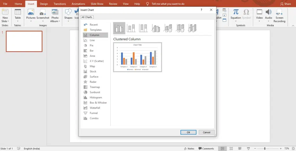
Step 4: Simply select any of these types and click ‘Ok.’
Step 5: A worksheet will appear on your screen.
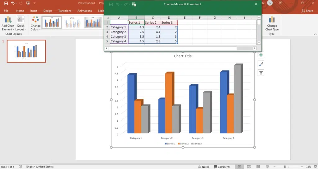
Step 6: Replace the placeholder data with your information.
Step 7: Once down, adjust the position and size of the graph.
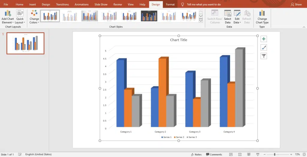
Step 8: You can add or change the elements of the chart, like title, legend, and axis title, using the ‘+’ option on the left side of the graph.
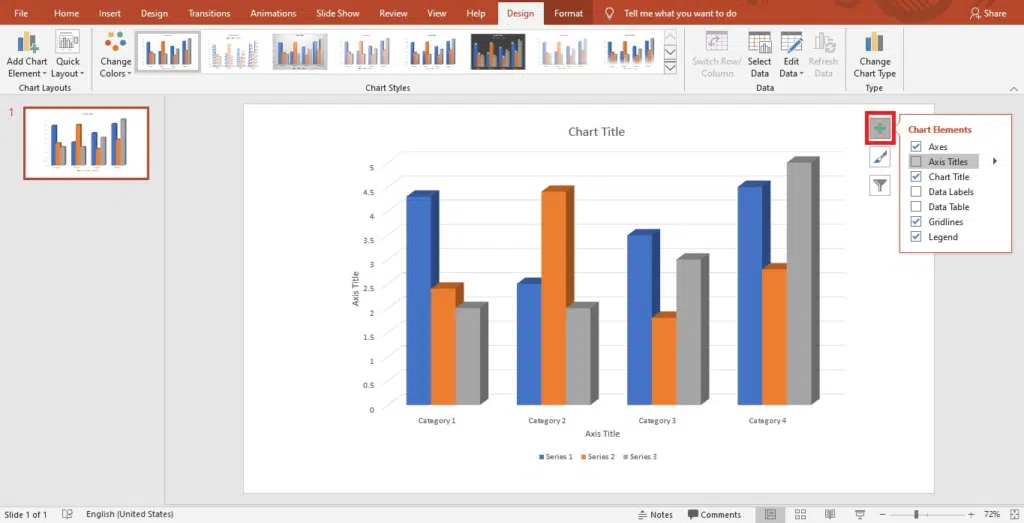
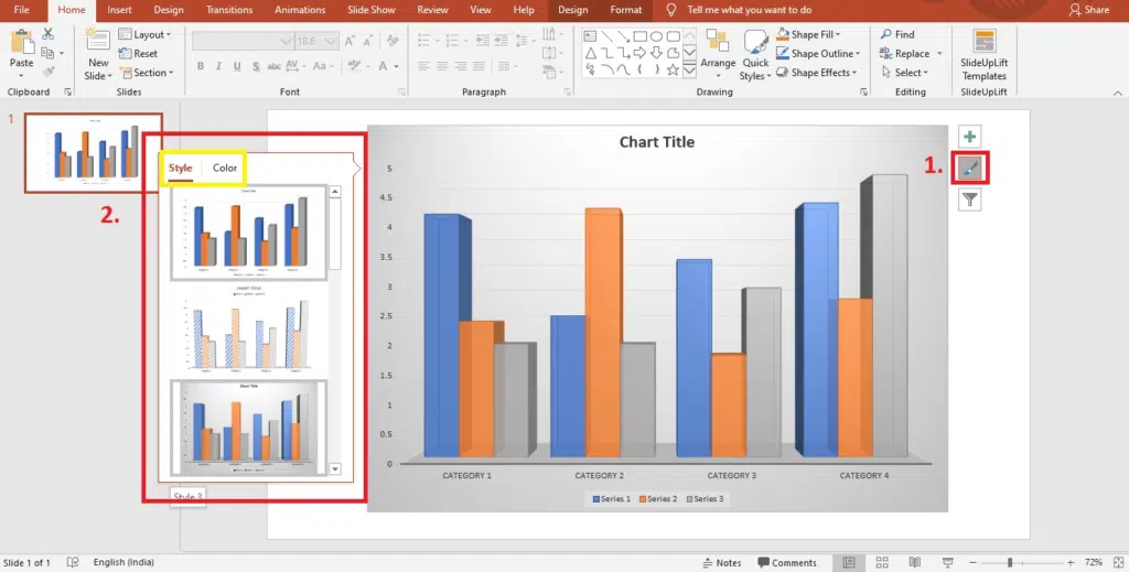
Step 9: Using the ‘Chart Styles’ option, you can set your graph’s style and color scheme.
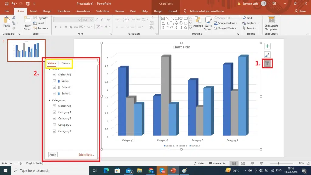
Step 10: Using the ‘Chart Filters’ option, you can choose which data points and names to display in your graph.
Voila, you’re done!
How To Insert The Data Chart From An Excel Worksheet Into PowerPoint?
PowerPoint also allows you to add data from an excel sheet to your PowerPoint chart. Here is how you can do it:
- Open the Excel document containing the chart you wish to add to PowerPoint.
- Right-click the chart you wish to use and select “Copy.”
- Return to PowerPoint, choose the slide you want to paste the chart, and then hit Ctrl + V.
Wrapping It Up
In conclusion, making graphs in PowerPoint is a valuable skill that can help you effectively communicate data in presentations. With the step-by-step guide in this blog, you now have the knowledge and tools to create different charts in PowerPoint, customize them to meet your needs, and effectively communicate your message.
People Are Also Reading:
How To Make A Table Of Contents In PowerPoint?
- How To Share PowerPoint Presentations On Microsoft Teams?
How To Use Transparency In PowerPoint?
- How To Make A Table In PowerPoint
- How To Add Pictures To PowerPoint Using Stock Images
Table Of Content
Related posts from the same category.

26 Dec, 2022 | SlideUpLift
How to make a table in PowerPoint?
Tables are an essential element of any presentation, as they allow you to organize and present data in a clear and concise manner. Whether you're creating a business presentation, a

20 Oct, 2022 | SlideUpLift
How To Make Jigsaw Puzzle In PowerPoint – PowerPoint Tutorial
The jigsaw puzzle is a perfect design element to add to your strategy presentations. They are a powerful storytelling tool that can be used to showcase how the pieces of

30 Dec, 2022 | SlideUpLift
Are you tired of flipping through multiple slides or using the "Find" function to locate specific content in your PowerPoint presentations? A Table of Contents can help solve this problem

18 Oct, 2022 | SlideUpLift
How to make a Curved Arrows in PowerPoint | PowerPoint Tutorial
Curved Arrows Cyclic diagrams show the process and series of events that interact repetitively through the cycle. Such diagrams depict the flow of one step following another repeatedly, which means

28 Feb, 2023 | SlideUpLift
How To Track Changes in PowerPoint: Methods and Best Practices
PowerPoint is a widely used presentation tool frequently used in group settings where several people can make additions to the same presentation. When multiple persons edit the same file, tracking

30 Dec, 2020 | SlideUpLift
How to Make a Quiz in PowerPoint | PowerPoint Tutorial
Did you know you could make a Quiz in PowerPoint? To make your presentations all the more intriguing and intuitive, you can add an interactive PowerPoint quiz to your presentation

25 Jan, 2018 | SlideUpLift
How To Add Annotations In PowerPoint | How To Add Comments In PowerPoint
This PowerPoint tutorial explains how to add annotations in PowerPoint in simple steps. Often presentations are used in business discussions and interactive sessions. During the discussion, you might need to
17 Feb, 2020 | SlideUpLift
How to make 3D Arrow Diagram in PowerPoint | PowerPoint Tutorial
This PowerPoint article contains a stepwise tutorial to create 3D Arrows in PowerPoint. Also learn- What do Arrow PPT's represent? How to create an Arrow template in PowerPoint Examples of

8 Dec, 2022 | SlideUpLift
PowerPoint's user-friendly design has made it a top choice among many, one of the key contributing factors to its immense popularity. Microsoft PowerPoint is one of the most used software

30 Apr, 2021 | SlideUpLift
Learn How To Communicate In Several Languages In PowerPoint
In this tutorial, we will learn how to change language in PowerPoint. Presentations are an essential part of the business world. Businesses and professionals use presentations to inform, educate, motivate
Forgot Password?
Privacy Overview
Necessary cookies are absolutely essential for the website to function properly. This category only includes cookies that ensures basic functionalities and security features of the website. These cookies do not store any personal information
Any cookies that may not be particularly necessary for the website to function and is used specifically to collect user personal data via ads, other embedded contents are termed as non-necessary cookies. It is mandatory to procure user consent prior to running these cookies on your website.

6 Key Benefits of Graph Visualizations
The 'Aha!' moment or eureka moment (also known as insight or epiphany) refers to the common human experience of suddenly understanding a previously incomprehensible problem or concept . The effect is taken from a story about the ancient Greek polymath Archimedes who discovered how to measure the volume of an irregular object while being in a public bath. When he made this great hydrostatics discovery, Archimedes allegedly jumped out and ran home naked shouting eureka , "I have found it!".
Virtually all property graph users from time to time experience the Aha! moments when visualizing graphs. Why? Read more to find out.
In this article we'll dive deeper and will walk you through the following topics:
- The ultimate benefits of visualizing graphs
- Property Graphs
- Graph Visualizations
- Graph Databases
Cypher Query Language
- What kind of puzzle are you working on?
- Graph visualization with Graphlytic
Before we jump to the first part, please note and follow this instruction:
Be aware! When working with property graphs you might get a nanosecond of deep insight, also known as the Aha! moment. No matter when, and how many times this occurs, please do not run naked in public!
1. The ultimate benefits of visualizing graphs

As the human eye instinctively captures patterns within the graphs, complex networks visualized as graphs are naturally easier to comprehend than data sorted in the form of spreadsheets or reports. This fact brings deep insights or 'Aha!' moments to users manipulating the data in the node edge graph visualization.
Faster action due to much better comprehension and quicker absorption of knowledge into the mind, as the human brain is able to incorporate visual information much faster than just text or numbers.
Interactivity within the graph visualization is the essential benefit to satisfying human desires to explore, search for, and find patterns that bring fresh insights; and the creativity to define specific ones.
Graph visualization is an effective way to share ideas or insights to spread knowledge or to support the decision-making process.
The best network graph visualization tools provide a user-friendly environment for any kind of user - no need for technical background.
Synonyms for graph visualization are simplicity and effectiveness . You can easily use a whiteboard to simply draw the data model. Just draw a diagram with bubbles or squares for entities and arrows for relationships. A draft of the data model can be then directly incorporated into the graph database.
2. An Introduction to Property Graphs and Graph Visualizations
Note: Read more in Graphlytic Concepts if you want to know more about the graph terminology we are using in this article.
Property Graph
A property graph is a network of nodes and directed relationships among these nodes. Generally, anything that could be drilled down into a set of data records that have relationships, or links within the set can be represented as a graph.
This kind of data interpretation brings insights into use cases where connections are important in various industries. In the article below (see Point 3. What kind of puzzle are you working on?) we'll introduce several domains where graph visualization tools are highly beneficial.
A ' Node ', or a 'Vertex' is a data record within a graph that represents any entity you can think of (a person, a movie, an address, or a transaction). Nodes may have ' Labels ' that group nodes together into smaller groups of named subsets.
A ' Relationship ' or an 'Edge' is directed and precisely connects two nodes - a start node and an end node. ' Relationship type' marks a relationship as a member of a named subset. Both nodes and relationships incorporate zero to an arbitrary collection of properties.
The main purpose of a 'Property ' is to store information. A property is a key-value pair, consisting of a name and a value attached to that name, saved in a node or relationship.
Let's introduce this basic graph concept with the help of a simple schema from 'The Big Bang Theory' series written down on the whiteboard.

In our example, we have 4 nodes. Two of them are labeled as a 'Person', and the third is labeled as a 'Restaurant'. Due to their second label nodes with the label 'Person' are divided into smaller subgroups - 'Man', 'Woman'. So, based on these labels we have 3 different types of nodes.
Every node contains a certain set of properties to further define the data in the graph. For example, the node with the labels 'Person' and 'Man' has a name property 'Leonard' with a nickname property 'Lenny', and an education property 'Ph.D.'. The second node labeled as 'Person' and 'Woman' has the same two properties as the first one - the name and the education, but with different values - 'Penny' for the name, and 'college' for the education. All properties that we mentioned so far have a type of string (= text) value. The third property for the "Penny" node is the born property.
For explanatory purposes, let's focus solely on the relationships between "Leonard" and "Penny". There are 2 directed relationships heading from "Leonard" to "Penny" with relationship types of 'fell in love', and 'bought a car for'. There is 1 directed relationship from "Penny" to "Leonard" that indicates that Penny proposed to Leonard.
Graph Visualization
Graph visualization is used to visualize and analyze graph data - a network of nodes and relationships. Algorithms in the background calculate the positions of nodes and visualize them on the user's display as two- or three-dimensional representations of a graph.
Graph visualization applications provide an interactive interface for users to explore graph data. The best network graph visualization applications like Graphlytic bring an easy-to-learn web interface where users can:
- place the nodes from the graph database and interactively explore their relationships, visualize a graph,
- create additional calculations and filter data,
- map visual properties (like color, size, or topic-relevant icons) to data,
- modify data in the graph database,
- write or schedule custom scripts, preferably without having knowledge of a specific query language,
- automate regular jobs,
- collaborate within the defined user groups, and share their visualizations with others.
Let's stick to our simple example from The Big Bang Theory and transfer a whiteboard draft into the Graphlytic graph visualization. This is the resulting graph:

Graph Database
The graph elements are stored in a graph database. A graph database is a set of nodes, relationships between those nodes, and the attached labels, types, and attributes. In comparison to traditional databases that put data in tables with rows and columns, the graph database has a flexible structure.
Graphlytic can be connected to multiple graph database products and platforms, e.g.
- Neo4j Server and Neo4j Aura
- Azure Cosmos DB
- AWS Neptune
- Apache TinkerPop
Cypher is a declarative query language, developed by Neo4j to query the graph database. The Cypher allows for expressive and efficient querying and updating of graph data. It is designed to be a human-friendly query language constructed to use iconography (called ASCII Art) to make queries more self-explanatory . The main benefit of Cypher compared to SQL is in writing statements with a large number of JOINs. Cypher uses the following basic syntax:
- ( ) a pair of parentheses to represent a node, which indicates a circle
- : a colon to prefix a label
- --> a pair of dashes with an arrowhead to represent a relationship
- -[ ]-> a pair of dashes with an arrowhead and a pair of brackets in the middle to represent a relationship with additional information
- { } a pair of braces for enclosing properties into nodes and relationships
Now, let's come back a bit to our whiteboard model to introduce the simple relationship between "Leonard" and "Penny" in Cypher.
This is a whiteboard draft of a strong emotion called love transferred into Graphlytic interface:

This is the same relationship written in Cypher query language.

As mentioned above we can use Cypher to query or update the graph database or visualize the graph. The definition of patterns and the ability to query in the graph are the most powerful advantages of using the Cypher language.
Example of a query that can be described as "find all men that fell in love":
MATCH (m:Men)-[r:FELL_IN_LOVE_WITH]->(w:Woman) RETURN m
3. What kind of puzzle are you working on?
Here are just a few examples of where node edge graph visualization brings a ton of benefits for users.
The operations of large IT networks
Complex data networks with an enormous number of elements (such as racks, servers, databases, and services) need adequate support. All these components are highly interconnected and mutually dependent. Graph visualization tools support companies with network documentation, network configuration management, impact analysis, asset management, and total costs of ownership management. But not only this, graph visualization analysis helps unearth bottlenecks inside the network, assists in the planning of the outages, and their prevention.
More on the topic in IT Infrastructure Graph Visualization use-case description.
Fraud detection and prevention
As well as its well-documented advantages in banking and insurance, graph visualization can be used in any industry using e-commerce. The graph visualization application is an ideal support tool for traditional anti-fraud and risk management tools to increase the ability of the business unit to detect and prevent significant financial losses caused by sophisticated and well-organized fraud rings.
Pain points of fraud detection and prevention efforts and the benefits of visualizing graphs in fraud-fighting are well described in our separate use case: Fraud Detection And Analytics Enhancement .
Cybersecurity
Graphy visualization tools are pretty useful in this field as well. Importing log data from network devices standing in the first line (such as firewalling, routing, and managed switching devices) into the graph database followed by the analytics in the graph visualization tool can again unveil certain schemas of the performed or potential cyber attack. By having insights into how things are organized, network security officers can better apply the policy and procedures to decrease network vulnerability.
Enterprise Communication Analysis
Enterprise communication and collaboration analysis are based on the fact that an enterprise is a living unit. This enterprise has its own patterns of internal and external communication and collaboration. These changes over time. On the one hand, in every organization, there is for sure space for improvements in this area. On the other hand, not only do communication improvements count, but also some preventive measures are to be applied when the unit is hit by internal or external changes (such as personnel changes in the department, management replacement, changes in internal processes, or switch of external partner) to avoid disruption in existing processes of communication.
Graph visualization and analysis of various communication logs (such as call logs, e-mail logs, and internal chat logs) bring a unique pattern that clearly illustrates the bottlenecks, desired communication streams, or changes over a defined period. For more on how to do it, please, read our use-case Enterprise Communication Analysis . You'll again find the pain points of internal and external collaboration and the benefits that enterprise communication visualization brings.
For more use cases such as Process Analysis, Scientific Research, or Software Source Code Refactoring check out our focused Top 7 Graph Use Cases for 2020 blog post.
4. Graph visualization with Graphlytic
We at Graphlytic help our clients get better business insight by connecting the dots and unveiling patterns in their highly interconnected data. Our ultimate aim is to enable all teams of analysts to quickly and collaboratively use their graph data with no coding required.
Graphlytic is available as:
- Free installation and usage in Neo4j Desktop (for 1 user)
- Free 30-day Trial Graphlytic Enterprise Server License
- Cloud Offering (with flexible PAYG model)
Request a Free Trial here .
Blog subscription
Popular posts.

We are a group of data analysts and coders from Slovakia and we have been making graph visualizations since 2008. Starting with specific domains like Business Registry Analysis, we quickly began to gain graph knowledge. When we started using native graph databases it was all clear - we had to make GRAPHLYTIC to enable all teams of analysts to quickly and collaboratively use their graph data with no coding required.
- Documentation
- End User License Agreement
- Online Demo
- Download Free Trial
- Privacy Policy
- Terms and Conditions
Demtec, s.r.o.
Hraničná 18
821 05 Bratislava
ID: 47807890
VAT ID: SK2024104434
info [at] graphlytic.com
@ graphlytic
+421 944 289 809
Please leave your email below and we will send you download links and some hints on how to start immediately.
Please leave your email below and we will create and send you access to the demo immediately.
Or go straight to the login page of the demo if you already have an account
- Data Structures
- Linked List
- Binary Tree
- Binary Search Tree
- Segment Tree
- Disjoint Set Union
- Fenwick Tree
- Red-Black Tree
- Advanced Data Structures
- Graph Data Structure And Algorithms
- Introduction to Graphs - Data Structure and Algorithm Tutorials
- Graph and its representations
- Types of Graphs with Examples
- Basic Properties of a Graph
Applications, Advantages and Disadvantages of Graph
- Transpose graph
- Difference Between Graph and Tree
BFS and DFS on Graph
- Breadth First Search or BFS for a Graph
- Depth First Search or DFS for a Graph
- Applications, Advantages and Disadvantages of Depth First Search (DFS)
- Applications, Advantages and Disadvantages of Breadth First Search (BFS)
- Iterative Depth First Traversal of Graph
- BFS for Disconnected Graph
- Transitive Closure of a Graph using DFS
- Difference between BFS and DFS
Cycle in a Graph
- Detect Cycle in a Directed Graph
- Detect cycle in an undirected graph
- Detect Cycle in a directed graph using colors
- Detect a negative cycle in a Graph | (Bellman Ford)
- Cycles of length n in an undirected and connected graph
- Detecting negative cycle using Floyd Warshall
- Clone a Directed Acyclic Graph
Shortest Paths in Graph
- How to find Shortest Paths from Source to all Vertices using Dijkstra's Algorithm
- Bellman–Ford Algorithm
- Floyd Warshall Algorithm
- Johnson's algorithm for All-pairs shortest paths
- Shortest Path in Directed Acyclic Graph
- Multistage Graph (Shortest Path)
- Shortest path in an unweighted graph
- Karp's minimum mean (or average) weight cycle algorithm
- 0-1 BFS (Shortest Path in a Binary Weight Graph)
- Find minimum weight cycle in an undirected graph
Minimum Spanning Tree in Graph
- Kruskal’s Minimum Spanning Tree (MST) Algorithm
- Difference between Prim's and Kruskal's algorithm for MST
- Applications of Minimum Spanning Tree
- Total number of Spanning Trees in a Graph
- Minimum Product Spanning Tree
- Reverse Delete Algorithm for Minimum Spanning Tree
Topological Sorting in Graph
- Topological Sorting
- All Topological Sorts of a Directed Acyclic Graph
- Kahn's algorithm for Topological Sorting
- Maximum edges that can be added to DAG so that it remains DAG
- Longest Path in a Directed Acyclic Graph
- Topological Sort of a graph using departure time of vertex
Connectivity of Graph
- Articulation Points (or Cut Vertices) in a Graph
- Biconnected Components
- Bridges in a graph
- Eulerian path and circuit for undirected graph
- Fleury's Algorithm for printing Eulerian Path or Circuit
- Strongly Connected Components
- Count all possible walks from a source to a destination with exactly k edges
- Euler Circuit in a Directed Graph
- Word Ladder (Length of shortest chain to reach a target word)
- Find if an array of strings can be chained to form a circle | Set 1
- Tarjan's Algorithm to find Strongly Connected Components
- Paths to travel each nodes using each edge (Seven Bridges of Königsberg)
- Dynamic Connectivity | Set 1 (Incremental)
Maximum flow in a Graph
- Max Flow Problem Introduction
- Ford-Fulkerson Algorithm for Maximum Flow Problem
- Find maximum number of edge disjoint paths between two vertices
- Find minimum s-t cut in a flow network
- Maximum Bipartite Matching
- Channel Assignment Problem
- Introduction to Push Relabel Algorithm
- Introduction and implementation of Karger's algorithm for Minimum Cut
- Dinic's algorithm for Maximum Flow
Some must do problems on Graph
- Find size of the largest region in Boolean Matrix
- Count number of trees in a forest
- A Peterson Graph Problem
- Clone an Undirected Graph
- Introduction to Graph Coloring
- Traveling Salesman Problem (TSP) Implementation
- Introduction and Approximate Solution for Vertex Cover Problem
- Erdos Renyl Model (for generating Random Graphs)
- Chinese Postman or Route Inspection | Set 1 (introduction)
- Hierholzer's Algorithm for directed graph
- Boggle (Find all possible words in a board of characters) | Set 1
- Hopcroft–Karp Algorithm for Maximum Matching | Set 1 (Introduction)
- Construct a graph from given degrees of all vertices
- Determine whether a universal sink exists in a directed graph
- Number of sink nodes in a graph
- Two Clique Problem (Check if Graph can be divided in two Cliques)
Graph is a non-linear data structure that contains nodes (vertices) and edges. A graph is a collection of set of vertices and edges (formed by connecting two vertices). A graph is defined as G = {V, E} where V is the set of vertices and E is the set of edges.
Graphs can be used to model a wide variety of real-world problems, including social networks, transportation networks, and communication networks. They can be represented in various ways, such as by a set of vertices and a set of edges, or by a matrix or an adjacency list. The two most common types of graphs are directed and undirected graphs.
Terminologies of Graphs:
.An edge is one of the two primary units used to form graphs. Each edge has two ends, which are vertices to which it is attached.
.If two vertices are endpoints of the same edge, they are adjacent.
.A vertex’s outgoing edges are directed edges that point to the origin.
.A vertex’s incoming edges are directed edges that point to the vertex’s destination.
.The total number of edges occurring to a vertex in a graph is its degree.
.A vertex with an in-degree of zero is referred to as a source vertex, while one with an out-degree of zero is known as sink vertex.
.A path is a set of alternating vertices and edges, with each vertex connected by an edge.
.The path that starts and finishes at the same vertex is known as a cycle.
.A path with unique vertices is called a simple path.
.A spanning subgraph that is also a tree is known as a spanning tree.
.A connected component is the unconnected graph’s most connected subgraph.
.A bridge, which is an edge of removal, would sever the graph.
.Forest is a graph without a cycle.
Graph Representation :
Graph can be represented in the following ways:
- Set Representation: Set representation of a graph involves two sets: Set of vertices V = {V 1 , V 2 , V 3 , V 4 } and set of edges E = {{V 1 , V 2 }, {V 2 , V 3 }, {V 3 , V 4 }, {V 4 , V 1 }} . This representation is efficient for memory but does not allow parallel edges.
- Adjacency Matrix: This matrix includes information about the adjacent nodes. Here, a ij = 1 if there is an edge from V i to V j otherwise 0 . It is a matrix of order V×V .
- Incidence Matrix: This matrix includes information about the incidence of edges on the nodes. Here, a ij = 1 if the j th edge E j is incident on i th vertex V i otherwise 0 . It is a matrix of order V×E.
- Path Matrix: This matrix includes information about the simple path between two vertices. Here, P ij = 1 if there is a path from V i to V j otherwise 0 . It is also called as reachability matrix of graph G .
- Linked Representation: This representation gives the information about the nodes to which a specific node is connected i.e. adjacency lists. This representation gives the adjacency lists of the vertices with the help of array and linked lists. In the adjacency lists, the vertices which are connected with the specific vertex are arranged in the form of lists which is connected to that vertex.
Real-Time Applications of Graph:
- Social media analysis : Social media platforms generate vast amounts of data in real-time, which can be analyzed using graphs to identify trends, sentiment, and key influencers. This can be useful for marketing, customer service, and reputation management.
- Network monitoring: Graphs can be used to monitor network traffic in real-time, allowing network administrators to identify potential bottlenecks, security threats, and other issues. This is critical for ensuring the smooth operation of complex networks.
- Financial trading: Graphs can be used to analyze real-time financial data, such as stock prices and market trends, to identify patterns and make trading decisions. This is particularly important for high-frequency trading, where even small delays can have a significant impact on profits.
- Internet of Things (IoT) management: IoT devices generate vast amounts of data in real-time, which can be analyzed using graphs to identify patterns, optimize performance, and detect anomalies. This is important for managing large-scale IoT deployments.
- Autonomous vehicles: Graphs can be used to model the real-time environment around autonomous vehicles, allowing them to navigate safely and efficiently. This requires real-time data from sensors and other sources, which can be processed using graph algorithms.
- Disease surveillance : Graphs can be used to model the spread of infectious diseases in real-time, allowing health officials to identify outbreaks and implement effective containment strategies. This is particularly important during pandemics or other public health emergencies.
- The best example of graphs in the real world is Facebook. Each person on Facebook is a node and is connected through edges. Thus, A is a friend of B. B is a friend of C, and so on.
Advantages of Graph:
- Representing complex data: Graphs are effective tools for representing complex data, especially when the relationships between the data points are not straightforward. They can help to uncover patterns, trends, and insights that may be difficult to see using other methods.
- Efficient data processing: Graphs can be processed efficiently using graph algorithms, which are specifically designed to work with graph data structures. This makes it possible to perform complex operations on large datasets quickly and effectively.
- Network analysis: Graphs are commonly used in network analysis to study relationships between individuals or organizations, as well as to identify important nodes and edges in a network. This is useful in a variety of fields, including social sciences, business, and marketing.
- Pathfinding: Graphs can be used to find the shortest path between two points, which is a common problem in computer science, logistics, and transportation planning.
- Visualization : Graphs are highly visual, making it easy to communicate complex data and relationships in a clear and concise way. This makes them useful for presentations, reports, and data analysis.
- Machine learning : Graphs can be used in machine learning to model complex relationships between variables, such as in recommendation systems or fraud detection.
- Graphs are used in computer science to depict the flow of computation.
- Users on Facebook are referred to as vertices, and if they are friends, there is an edge connecting them. The Friend Suggestion system on Facebook is based on graph theory.
- You come across the Resources Allocation Graph in the Operating System, where each process and resource are regarded vertically. Edges are drawn from resources to assigned functions or from the requesting process to the desired resources. A stalemate will develop if this results in the establishment of a cycle.
- Web pages are referred to as vertices on the World Wide Web. Suppose there is a link from page A to page B that can represent an edge. this application is an illustration of a directed graph.
- Graph transformation systems manipulate graphs in memory using rules, Graph databases store and query graph-structured data in a transaction-safe, perment manner.
Disadvantages of Graph:
- Limited representation: Graphs can only represent relationships between objects, and not their properties or attributes. This means that in order to fully understand the data, it may be necessary to supplement the graph with additional information.
- Difficulty in interpretation: Graphs can be difficult to interpret, especially if they are large or complex. This can make it challenging to extract meaningful insights from the data, and may require advanced analytical techniques or domain expertise.
- Scalability issue s: As the number of nodes and edges in a graph increases, the processing time and memory required to analyze it also increases. This can make it difficult to work with large or complex graphs.
- Data quality issues : Graphs are only as good as the data they are based on, and if the data is incomplete, inconsistent, or inaccurate, the graph may not accurately reflect the relationships between objects.
- Lack of standardization : There are many different types of graphs, and each has its own strengths and weaknesses. This can make it difficult to compare graphs from different sources, or to choose the best type of graph for a given analysis.
- Privacy concerns : Graphs can reveal sensitive information about individuals or organizations, which can raise privacy concerns, especially in social network analysis or marketing.
Please Login to comment...
Similar reads, improve your coding skills with practice.
What kind of Experience do you want to share?

- Onsite training
3,000,000+ delegates
15,000+ clients
1,000+ locations
- KnowledgePass
- Log a ticket
01344203999 Available 24/7
Advantages and Disadvantages of Presentation
Exploring the 'Advantages and Disadvantages of Presentation,' this blog explores how presentations can effectively communicate ideas yet sometimes hinder creativity. It discusses the ease of conveying complex information visually and the potential for engaging audiences but also considers the challenges of over-reliance on visuals and potential misinterpretation.

Exclusive 40% OFF
Training Outcomes Within Your Budget!
We ensure quality, budget-alignment, and timely delivery by our expert instructors.
Share this Resource
- Effective Communication Skills
- Presenting with Impact Training
- Interpersonal Skills Training Course
- Effective Presentation Skills & Techniques
- Public Speaking Course

Table of Contents
1) What is a Presentation: A brief introduction
2) Advantages of Presentations
3) Disadvantages of Presentations
4) How to make a successful Presentation?
5) Conclusion
What is a Presentation: A brief introduction
A Presentation refers to a method of conveying information, ideas, or data to an audience using visual aids and spoken words. It is a formal or informal communication tool used in various settings, such as business meetings, educational environments, conferences, or public speaking engagements.
During a Presentation, the presenter uses visual elements like slides, charts, graphs, images, and multimedia to support and enhance their spoken content. The goal of a Presentation is to engage the audience, effectively communicate the message, and leave a lasting impact on the listeners. You can ace your presentation skill by understanding various presentation skills interview questions and answers . It will expand your horizon to elevate your skills.
Presentation Skills can be used to cover a wide variety of Presentations, from business proposals and academic research to sales pitches and motivational speeches.The success of a Presentation depends on the presenter's ability to organize the content coherently, engage the audience, and deliver the information in a clear and compelling manner, showcasing strong principles of presentation skills. Therefore, it is essential to understand the elements of presentation .
Unlock your full potential as a presenter with our Presentation Skills Training Course. Join now!
Advantages of Presentations

Effective communication
One of the primary advantages of Presentations is their ability to facilitate effective communication. Whether you're addressing a small group of colleagues or a large audience at a conference, Presentations help you to convey your message clearly and succinctly. By structuring your content and using visuals, you can ensure that your key points are highlighted and easily understood by the audience.
Visual appeal
"Seeing is believing," and Presentations capitalise on this aspect of human psychology. The use of visuals, such as charts, graphs, images, and videos, enhances the overall appeal of the content. These visual aids not only make the information more engaging but also help reinforce the main ideas, making the Presentation more memorable for the audience.
Engaging the audience
Captivating your audience's attention is crucial for effective communication. Presentations provide ample opportunities to engage your listeners through various means. By incorporating storytelling, anecdotes, and real-life examples, you can nurture an emotional connection with your audience. Additionally, interactive elements like polls, quizzes, and group activities keep the audience actively involved throughout the Presentation.
Simplifying complex information
Complex ideas and data can often be overwhelming, making it challenging to convey them effectively. However, Presentations excel in simplifying intricate information. By breaking down complex concepts into digestible and interconnected slides, you can present the information in a logical sequence, ensuring that the audience grasps the content more easily.
Persuasive impact
Presentations are powerful tools for persuasion and influence. Whether you're convincing potential clients to invest in your product, advocating for a particular cause, or delivering a motivational speech, a well-crafted Presentation can sway the audience's opinions and inspire action. The combination of visual and verbal elements enables you to make a compelling case for your ideas, leaving a lasting impact on the listeners.
Versatility in delivery methods
Another advantage of Presentations lies in their flexibility and versatility in terms of delivery methods. Gone are the days when Presentations were limited to in-person meetings. Today, technology allows presenters to reach a wider audience through various platforms, including webinars, online videos, and virtual conferences. This adaptability makes Presentations an ideal choice for modern communication needs.
Enhanced understanding and retention
When information is presented in a visually appealing and structured manner, it aids in better understanding and retention. Human brains process visuals faster and more effectively than plain text, making Presentations an ideal medium for conveying complex concepts. The combination of visual elements and spoken words create a multi-sensory experience, leading to increased information retention among the audience.
Professionalism and credibility
In professional settings, well-designed Presentations lend an air of credibility and professionalism to the presenter and the topic being discussed. A thoughtfully crafted Presentation shows that the presenter has put effort into preparing and organising the content, which in turn enhances the audience's trust and receptiveness to the information presented.
Take your Presentations to the next level with our Effective Presentation Skills & Techniques Course. Sign up today!
Disadvantages of Presentations

Time-consuming
Creating a compelling Presentation can be a time-consuming process. From researching and gathering relevant information to designing visually appealing slides, a significant amount of effort goes into ensuring that the content is well-structured and impactful. This time investment can be challenging, especially when presenters have tight schedules or are faced with last-minute Presentation requests.
Technical glitches
Presentations heavily rely on technology, and technical glitches can quickly turn a well-prepared Presentation into a frustrating experience. Projectors may malfunction, slides might not load correctly, or audiovisual components may fail to work as expected. Dealing with such technical issues during a Presentation can disrupt the flow and distract both the presenter and the audience.
Overdependence on technology
In some cases, presenters may become overly reliant on the visuals and technology, neglecting the importance of direct engagement with the audience. Overloaded slides with excessive text can make presenters read directly from the slides, undermining the personal connection and interaction with the listeners. This overdependence on technology can lead to a lack of spontaneity and authenticity during the Presentation.
Lack of interactivity
Traditional Presentations, particularly those delivered in large auditoriums, may lack interactivity and real-time feedback. In comparison, modern Presentation formats can incorporate interactive elements; not all Presentations provide opportunities for audience participation or discussions. This one-sided communication can lead to reduced engagement and limited opportunities for clarifying doubts or addressing queries.
Public speaking anxiety
For many individuals, public speaking can be a nerve-wracking experience. Presenting in front of an audience, especially in formal settings, can trigger anxiety and stage fright. This anxiety may affect the presenter's delivery and confidence, impacting the overall effectiveness of the Presentation. Overcoming public speaking anxiety requires practice, self-assurance, and effective stress management techniques.
Not suitable for all topics
While Presentations are an excellent medium for conveying certain types of information, they may not be suitable for all topics. Some subjects require in-depth discussions, hands-on demonstrations, or interactive workshops, which may not align well with the traditional slide-based Presentation format. Choosing the appropriate communication method for specific topics is crucial to ensure effective knowledge transfer and engagement.
Accessibility concerns
In a diverse audience, some individuals may face challenges in accessing and comprehending Presentation materials. For instance, people with visual impairments may find it difficult to interpret visual elements, while those with hearing impairments may struggle to follow the spoken content without proper captions or transcripts. Addressing accessibility concerns is vital to ensure inclusivity and equal participation for all attendees.
Information overload
Presentations that bombard the audience with excessive information on each slide can lead to information overload. When the audience is overwhelmed with data, they may struggle to absorb and retain the key points. Presenters should strike a balance between providing adequate information and keeping the content concise and focused.
How to make a successful Presentation?
Now that we know the Advantages and Disadvantages of Presentations, we will provide you with some tips on how to make a successful Presentation.
1) Know your audience: Understand your audience's needs and interests to tailor your content accordingly.
2) Start with a strong opening: Begin with an attention-grabbing introduction to captivate the audience from the start of presentation .
3) Organise your content logically: Structure your Presentation in a clear and coherent manner with a beginning, middle, and end.
4) Limit text on slides: Keep slides simple and avoid overcrowding with excessive text; use bullet points and keywords.
5) Use visuals effectively: Incorporate high-quality images, graphs, and charts to enhance understanding and engagement.
6) Practice, practice, practice: Rehearse your Presentation multiple times to improve your delivery and confidence.
7) Be enthusiastic and confident: Show passion for your topic and maintain good eye contact to build trust with the audience.
8) Tell stories and use examples: Include relevant anecdotes and case studies to make your points more relatable and memorable.
9) Keep it interactive: Encourage audience participation through questions, polls, or discussions to keep them engaged.
10) Manage time wisely: Respect the allotted time for your Presentation and pace your delivery accordingly.
11) End with a strong conclusion: Summarise your key points and leave the audience with a clear takeaway or call to action.

Conclusion
All in all, Presentations have altered the way we communicate and share information. While they offer numerous advantages, such as effective communication, visual appeal, and persuasive impact, they also come with their share of disadvantages, including technical challenges and public speaking anxiety. By understanding the advantages and disadvantages of presentations and employing best practices, we can Improve Presesntation Skills , create engaging and impactful presentations that leave a lasting impression on the audience.
Want to master the art of impactful Presentations? Explore our Presentation Skills Courses and elevate your communication prowess!
Frequently Asked Questions
Upcoming business skills resources batches & dates.
Fri 7th Jun 2024
Fri 5th Jul 2024
Fri 2nd Aug 2024
Fri 6th Sep 2024
Fri 4th Oct 2024
Fri 1st Nov 2024
Fri 6th Dec 2024
Get A Quote
WHO WILL BE FUNDING THE COURSE?
My employer
By submitting your details you agree to be contacted in order to respond to your enquiry
- Business Analysis
- Lean Six Sigma Certification
Share this course
Our biggest spring sale.

We cannot process your enquiry without contacting you, please tick to confirm your consent to us for contacting you about your enquiry.
By submitting your details you agree to be contacted in order to respond to your enquiry.
We may not have the course you’re looking for. If you enquire or give us a call on 01344203999 and speak to our training experts, we may still be able to help with your training requirements.
Or select from our popular topics
- ITIL® Certification
- Scrum Certification
- Change Management Certification
- Business Analysis Courses
- Microsoft Azure Certification
- Microsoft Excel Courses
- Microsoft Project
- Explore more courses
Press esc to close
Fill out your contact details below and our training experts will be in touch.
Fill out your contact details below
Thank you for your enquiry!
One of our training experts will be in touch shortly to go over your training requirements.
Back to Course Information
Fill out your contact details below so we can get in touch with you regarding your training requirements.
* WHO WILL BE FUNDING THE COURSE?
Preferred Contact Method
No preference
Back to course information
Fill out your training details below
Fill out your training details below so we have a better idea of what your training requirements are.
HOW MANY DELEGATES NEED TRAINING?
HOW DO YOU WANT THE COURSE DELIVERED?
Online Instructor-led
Online Self-paced
WHEN WOULD YOU LIKE TO TAKE THIS COURSE?
Next 2 - 4 months
WHAT IS YOUR REASON FOR ENQUIRING?
Looking for some information
Looking for a discount
I want to book but have questions
One of our training experts will be in touch shortly to go overy your training requirements.
Your privacy & cookies!
Like many websites we use cookies. We care about your data and experience, so to give you the best possible experience using our site, we store a very limited amount of your data. Continuing to use this site or clicking “Accept & close” means that you agree to our use of cookies. Learn more about our privacy policy and cookie policy cookie policy .
We use cookies that are essential for our site to work. Please visit our cookie policy for more information. To accept all cookies click 'Accept & close'.
Guide On Graphical Representation of Data – Types, Importance, Rules, Principles And Advantages
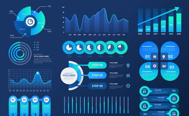
What are Graphs and Graphical Representation?
Graphs, in the context of data visualization, are visual representations of data using various graphical elements such as charts, graphs, and diagrams. Graphical representation of data , often referred to as graphical presentation or simply graphs which plays a crucial role in conveying information effectively.
Principles of Graphical Representation
Effective graphical representation follows certain fundamental principles that ensure clarity, accuracy, and usability:Clarity : The primary goal of any graph is to convey information clearly and concisely. Graphs should be designed in a way that allows the audience to quickly grasp the key points without confusion.
- Simplicity: Simplicity is key to effective data visualization. Extraneous details and unnecessary complexity should be avoided to prevent confusion and distraction.
- Relevance: Include only relevant information that contributes to the understanding of the data. Irrelevant or redundant elements can clutter the graph.
- Visualization: Select a graph type that is appropriate for the supplied data. Different graph formats, like bar charts, line graphs, and scatter plots, are appropriate for various sorts of data and relationships.
Rules for Graphical Representation of Data
Creating effective graphical representations of data requires adherence to certain rules:
- Select the Right Graph: Choosing the appropriate type of graph is essential. For example, bar charts are suitable for comparing categories, while line charts are better for showing trends over time.
- Label Axes Clearly: Axis labels should be descriptive and include units of measurement where applicable. Clear labeling ensures the audience understands the data’s context.
- Use Appropriate Colors: Colors can enhance understanding but should be used judiciously. Avoid overly complex color schemes and ensure that color choices are accessible to all viewers.
- Avoid Misleading Scaling: Scale axes appropriately to prevent exaggeration or distortion of data. Misleading scaling can lead to incorrect interpretations.
- Include Data Sources: Always provide the source of your data. This enhances transparency and credibility.
Importance of Graphical Representation of Data
Graphical representation of data in statistics is of paramount importance for several reasons:
- Enhances Understanding: Graphs simplify complex data, making it more accessible and understandable to a broad audience, regardless of their statistical expertise.
- Helps Decision-Making: Visual representations of data enable informed decision-making. Decision-makers can easily grasp trends and insights, leading to better choices.
- Engages the Audience: Graphs capture the audience’s attention more effectively than raw data. This engagement is particularly valuable when presenting findings or reports.
- Universal Language: Graphs serve as a universal language that transcends linguistic barriers. They can convey information to a global audience without the need for translation.
Advantages of Graphical Representation
The advantages of graphical representation of data extend to various aspects of communication and analysis:
- Clarity: Data is presented visually, improving clarity and reducing the likelihood of misinterpretation.
- Efficiency: Graphs enable the quick absorption of information. Key insights can be found in seconds, saving time and effort.
- Memorability: Visuals are more memorable than raw data. Audiences are more likely to retain information presented graphically.
- Problem-Solving: Graphs help in identifying and solving problems by revealing trends, correlations, and outliers that may require further investigation.
Use of Graphical Representations
Graphical representations find applications in a multitude of fields:
- Business: In the business world, graphs are used to illustrate financial data, track performance metrics, and present market trends. They are invaluable tools for strategic decision-making.
- Science: Scientists employ graphs to visualize experimental results, depict scientific phenomena, and communicate research findings to both colleagues and the general public.
- Education: Educators utilize graphs to teach students about data analysis, statistics, and scientific concepts. Graphs make learning more engaging and memorable.
- Journalism: Journalists rely on graphs to support their stories with data-driven evidence. Graphs make news articles more informative and impactful.
Types of Graphical Representation
There exists a diverse array of graphical representations, each suited to different data types and purposes. Common types include:
1.Bar Charts:
Used to compare categories or discrete data points, often side by side.
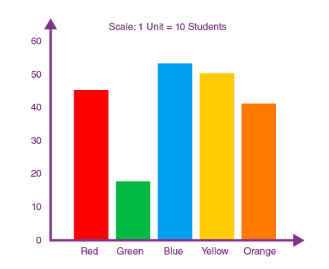
2. Line Charts:
Ideal for showing trends and changes over time, such as stock market performance or temperature fluctuations.
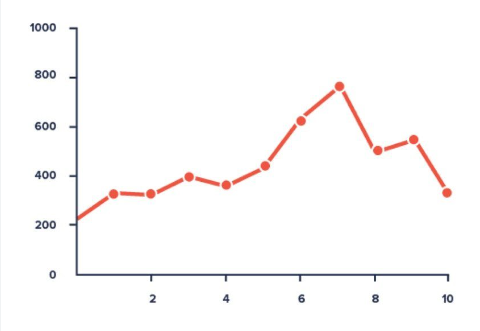
3. Pie Charts:
Display parts of a whole, useful for illustrating proportions or percentages.
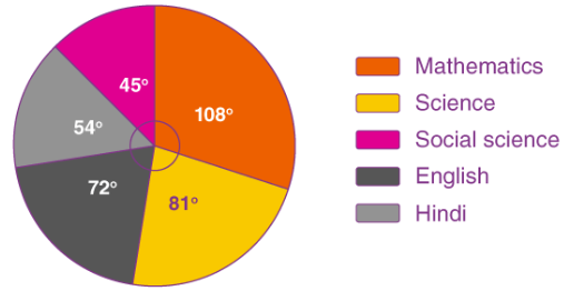
4. Scatter Plots:
Reveal relationships between two variables and help identify correlations.
5. Histograms:
Depict the distribution of data, especially in the context of continuous variables.
In conclusion, the graphical representation of data is an indispensable tool for simplifying complex information, aiding in decision-making, and enhancing communication across diverse fields. By following the principles and rules of effective data visualization, individuals and organizations can harness the power of graphs to convey their messages, support their arguments, and drive informed actions.
Download PPT of Graphical Representation
Video On Graphical Representation
FAQs on Graphical Representation of Data
What is the purpose of graphical representation.
Graphical representation serves the purpose of simplifying complex data, making it more accessible and understandable through visual means.
Why are graphs and diagrams important?
Graphs and diagrams are crucial because they provide visual clarity, aiding in the comprehension and retention of information.
How do graphs help learning?
Graphs engage learners by presenting information visually, which enhances understanding and retention, particularly in educational settings.
Who uses graphs?
Professionals in various fields, including scientists, analysts, educators, and business leaders, use graphs to convey data effectively and support decision-making.
Where are graphs used in real life?
Graphs are used in real-life scenarios such as business reports, scientific research, news articles, and educational materials to make data more accessible and meaningful.
Why are graphs important in business?
In business, graphs are vital for analyzing financial data, tracking performance metrics, and making informed decisions, contributing to success.
Leave a comment
Cancel reply.
Your email address will not be published. Required fields are marked *
Save my name, email, and website in this browser for the next time I comment.
Related Posts

Best Google AdWords Consultants in India...
What is a Google Ads Consultant? A Google Ads Consultant is an expert who specializes in delivering expertise and advice on Google Ads, which is Google’s online advertising medium. Google Ads permits companies to develop and run ads that are visible on Google’s search engine and other Google platforms. The function of a Google Ads […]

Best PPC Consultants in India –...
What Is a PPC Consultant? A PPC consultant or a pay per click consultant is an expert who specializes in handling and optimizing PPC advertisement drives for companies. PPC is a digital marketing model where advertisers pay a price each time their ad is clicked. Standard PPC mediums include Bing Ads, Google Ads, and social media advertisement platforms like […]

Top 20 Generic Digital Marketing Interview...
1. What is Digital Marketing? Digital marketing is also known as online marketing which means promoting and selling products or services to potential customers using the internet and online platforms. It includes email, social media, and web-based advertising, but also text and multimedia messages as a marketing channel. 2. What are the types of Digital […]

Best Social Media Consultants in India...
What Is a Social Media Consultant? A social media advisor is a specialist who delivers direction, recommendation, and assistance linked to the usage of social media for people, companies, or associations. Their prime objective is to support customers effectively by employing social media platforms to gain specific objectives, such as improving brand awareness, entertaining target […]
Gaurav Mittal
Had a great time spent with some awesome learning at The Digital Education Institute. It really helped me to build my career and i am thankful to the institute for making me what i am today.
Company where our students are working

Enroll Now for 2 Hour Free Digital Marketing Class
Lorem Ipsum is simply dummy text of the printing and typesetting industry
Lorem Ipsum is simply dummy text of the printing and typesetting industry . Lorem Ipsum is simply dummy text of the printing and typesetting industry
Loading metrics
Open Access
Perspective
The Perspective section provides experts with a forum to comment on topical or controversial issues of broad interest.
See all article types »
Beyond Bar and Line Graphs: Time for a New Data Presentation Paradigm
* E-mail: [email protected]
Affiliation Division of Nephrology & Hypertension, Mayo Clinic, Rochester, Minnesota, United States of America
Affiliations Division of Nephrology & Hypertension, Mayo Clinic, Rochester, Minnesota, United States of America, Department of Biostatistics, Medical Faculty, University of Belgrade, Belgrade, Serbia
Affiliation Division of Biomedical Statistic and Informatics, Mayo Clinic, Rochester, Minnesota, United States of America
- Tracey L. Weissgerber,
- Natasa M. Milic,
- Stacey J. Winham,
- Vesna D. Garovic
Published: April 22, 2015
- https://doi.org/10.1371/journal.pbio.1002128
- Reader Comments
Figures in scientific publications are critically important because they often show the data supporting key findings. Our systematic review of research articles published in top physiology journals ( n = 703) suggests that, as scientists, we urgently need to change our practices for presenting continuous data in small sample size studies. Papers rarely included scatterplots, box plots, and histograms that allow readers to critically evaluate continuous data. Most papers presented continuous data in bar and line graphs. This is problematic, as many different data distributions can lead to the same bar or line graph. The full data may suggest different conclusions from the summary statistics. We recommend training investigators in data presentation, encouraging a more complete presentation of data, and changing journal editorial policies. Investigators can quickly make univariate scatterplots for small sample size studies using our Excel templates.
Citation: Weissgerber TL, Milic NM, Winham SJ, Garovic VD (2015) Beyond Bar and Line Graphs: Time for a New Data Presentation Paradigm. PLoS Biol 13(4): e1002128. https://doi.org/10.1371/journal.pbio.1002128
Copyright: © 2015 Weissgerber et al. This is an open access article distributed under the terms of the Creative Commons Attribution License , which permits unrestricted use, distribution, and reproduction in any medium, provided the original author and source are credited
Funding: This project was supported by Award Number P-50 AG44170 (Project 1, VDG) from the National Institute on Aging ( http://www.nia.nih.gov/ ). TLW and SJW were supported by the Office of Research on Women's Health (Building Interdisciplinary Careers in Women’s Health award K12HD065987; http://orwh.od.nih.gov/ ). This publication was made possible by CTSA Grant Number UL1 TR000135 from the National Center for Advancing Translational Sciences (NCATS; http://www.ncats.nih.gov/ ), a component of the National Institutes of Health (NIH; http://www.nih.gov/ ). Its contents are solely the responsibility of the authors and do not necessarily represent the official view of NIH. The funders had no role in study design, data collection and analysis, decision to publish, or preparation of the manuscript.
Competing interests: The authors have declared that no competing interests exist.
Abbreviations: ANOVA, analysis of variance; ARRIVE, Animal Research: Reporting of In Vivo Experiments; SD, standard deviation; SE, standard error
Introduction
Data presentation is the foundation of our collective scientific knowledge, as readers’ understanding of a dataset is generally limited to what the authors present in their publications. Figures are critically important because they often show the data that support key findings. However, studies of the Journal of the American Medical Association [ 1 ] and the British Medical Journal [ 2 ] provide compelling evidence that fundamental changes in the types of figures that scientists use are needed. Authors generally use figures to present summary statistics, instead of providing detailed information about the distribution of the data or showing the full data [ 1 , 2 ].
Bar graphs are designed for categorical variables; yet they are commonly used to present continuous data in laboratory research, animal studies, and human studies with small sample sizes. Bar and line graphs of continuous data are “visual tables” that typically show the mean and standard error (SE) or standard deviation (SD). This is problematic for three reasons. First, many different data distributions can lead to the same bar or line graph ( Fig 1 and Fig 2 ). The full data may suggest different conclusions from the summary statistics ( Fig 1 and Fig 2 ). Second, additional problems arise when bar graphs are used to show paired or nonindependent data ( Fig 2 ). Figures should ideally convey the design of the study. Bar graphs of paired data erroneously suggest that the groups being compared are independent and provide no information about whether changes are consistent across individuals (Panel A in Fig 2 ). Third, summarizing the data as mean and SE or SD often causes readers to wrongly infer that the data are normally distributed with no outliers. These statistics can distort data for small sample size studies, in which outliers are common and there is not enough data to assess the sample distribution.
- PPT PowerPoint slide
- PNG larger image
- TIFF original image
The full data may suggest different conclusions from the summary statistics. The means and SEs for the four example datasets shown in Panels B–E are all within 0.5 units of the means and SEs shown in the bar graph (Panel A). p -values were calculated in R (version 3.0.3) using an unpaired t-test, an unpaired t-test with Welch’s correction for unequal variances, or a Wilcoxon rank sum test. In Panel B, the distribution in both groups appears symmetric. Although the data suggest a small difference between groups, there is substantial overlap between groups. In Panel C, the apparent difference between groups is driven by an outlier. Panel D suggests a possible bimodal distribution. Additional data are needed to confirm that the distribution is bimodal and to determine whether this effect is explained by a covariate. In Panel E, the smaller range of values in group two may simply be due to the fact that there are only three observations. Additional data for group two would be needed to determine whether the groups are actually different.
https://doi.org/10.1371/journal.pbio.1002128.g001
The bar graph (mean ± SE) suggests that the groups are independent and provides no information about whether changes are consistent across individuals (Panel A). The scatterplots shown in the Panels B–D clearly demonstrate that the data are paired. Each scatterplot reveals very different patterns of change, even though the means and SEs differ by less than 0.3 units. The lower scatterplots showing the differences between measurements allow readers to quickly assess the direction, magnitude, and distribution of the changes. The solid lines show the median difference. In Panel B, values for every subject are higher in the second condition. In Panel C, there are no consistent differences between the two conditions. Panel D suggests that there may be distinct subgroups of “responders” and “nonresponders.”
https://doi.org/10.1371/journal.pbio.1002128.g002
In contrast, univariate scatterplots, box plots, and histograms allow readers to examine the data distribution. This approach enhances readers’ understanding of published data, while allowing readers to detect gross violations of any statistical assumptions. The increased flexibility of univariate scatterplots also allows authors to convey study design information. In small sample size studies, scatterplots can easily be modified to differentiate between datasets that include independent groups ( Fig 1 ) and those that include paired or matched data ( Fig 2 ).
We conducted a systematic review of standard practices for data presentation in scientific papers, contrasting the use of bar graphs versus figures that provide detailed information about the distribution of the data (scatterplots, box plots, and histograms). We focused on physiology because physiologists perform a wide range of studies, including human studies, animal studies, and in vitro laboratory experiments. We systematically reviewed all full-length, original research articles published in the top 25% of physiology journals between January 1 and March 31, 2014 ( n = 703) to assess the types of figures that were used to present continuous outcome data ( S1 Fig and Table A in S1 Text ). We also abstracted information on sample size and statistical analysis procedures, as these factors may influence figure selection. Detailed methods and results are presented in the data supplement. Based on our findings, we recommend major changes to standard practices for presenting continuous data in small sample size studies. We hope that these recommendations will promote scientific discourse by giving readers the information needed to fully examine published data.
Are Your Figures Worth a Thousand Words?
In addition to showing data for key findings, figures are important because they give authors the opportunity to display a large amount of data very quickly. However, most figures provided little more information than a table (Panel A in S2 Fig and S1 Text ). Bar graphs were the most commonly used figures for presenting continuous data. 85.6% of papers included at least one bar graph. Most of these papers used bar graphs that showed mean ± SE (77.6%, Panel B in S2 Fig ), rather than mean ± SD (15.3%). Line graphs and point and error bar plots were also common (61.3% of articles, Panel A in S2 Fig ), and most showed mean ± SE. Figures that provide detailed information about the distribution of the data were seldom used. 13.4% of articles included at least one univariate scatterplot, 5.3% included at least one box plot, and 8.0% included at least one histogram. The journals that we examined publish research conducted by investigators in many fields; therefore, it is likely that investigators in other disciplines follow similar practices. The overuse of bar graphs and other figures that do not provide information about the distribution of the data has also been documented in psychology [ 3 ] and medicine [ 1 , 4 ].
Our data show that most bar and line graphs present mean ± SE. Fig 3 illustrates that presenting the same data as mean ± SE, mean ± SD, or in a univariate scatterplot can leave the reader with very different impressions. While the scatterplot prompts the reader to critically evaluate the authors’ analysis and interpretation of the data, the bar graphs discourage the reader from thinking about these issues by masking distributional information. The question of whether investigators should report the SE or the SD has been extensively debated by biomedical scientists and statisticians [ 5 , 6 ]. We argue that figures for small sample size studies should show the full distribution of the data, rather than mean ± SE or mean ± SD. However, given that figures showing these summary statistics are ubiquitous in the biomedical literature, researchers should understand why the SE and SD can give such different visual impressions. The SD measures the variation in the sample, whereas the SE measures the accuracy of the mean. The SE is strongly dependent on sample size (SE = SD / √ n )—as sample size increases, the uncertainty surrounding the value of the mean decreases. If two samples have the same SE, the one with the larger sample size will have the larger SD. Showing the SE rather than the SD magnifies the apparent visual differences between groups. This effect is exacerbated when the groups being compared have different sample sizes, which is common in physiology and in other disciplines.
While scatterplots prompt the reader to critically evaluate the statistical tests and the authors’ interpretation of the data, bar graphs discourage the reader from thinking about these issues. Placental endothelin 1 ( EDN1 ) mRNA data for four different groups of participants is presented in bar graphs showing mean ± SE (Panel A), or mean ± SD (Panel B), and in a univariate scatterplot (Panel C). Panel A (mean ± SE) suggests that the second group has higher values than the remaining groups; however, Panel B (mean ± SD) reveals that there is considerable overlap between groups. Showing SE rather than SD magnifies the apparent visual differences between groups, and this is exacerbated by the fact that SE obscures any effect of unequal sample size. The scatterplot (Panel C) clearly shows that the sample sizes are small, group one has a much larger variance than the other groups, and there is an outlier in group three. These problems are not apparent in the bar graphs shown in Panels A and B.
https://doi.org/10.1371/journal.pbio.1002128.g003
The infrequent use of univariate scatterplots, boxplots, and histograms is a missed opportunity. The ability to independently evaluate the work of other scientists is a pillar of the scientific method. These figures facilitate this process by immediately conveying key information needed to understand the authors’ statistical analyses and interpretation of the data. This promotes critical thinking and discussion, enhances the readers’ understanding of the data, and makes the reader an active partner in the scientific process. In contrast, bar and line graphs are “visual tables” that transform the reader from an active participant into a passive consumer of statistical information. Without the opportunity for independent appraisal, the reader must rely on the authors’ statistical analyses and interpretation of the data.
Summary Statistics Are Only Meaningful When There Are Enough Data to Summarize
Sample size is an important consideration when designing figures and selecting statistical analysis procedures ( Box 1 ) for continuous data. Our analysis shows that most studies had very small sample sizes (Panel C in S2 Fig ). The minimum sample size for any group shown in a figure was four (median number of independent observations), with an interquartile range of three independent observations (25th percentile: n = 3, 75th percentile: n = 6). The maximum sample size for any group shown in a figure was ten, with an interquartile range of nine (25th percentile: n = 6, 75th percentile: n = 15). Univariate scatterplots would be the best choice for many of these small studies. The summary statistics shown in bar graphs, line graphs, and box plots are only meaningful when there are enough data to summarize. Histograms are difficult to interpret when there aren’t enough observations to clearly show the distribution of the data.
Box 1. Data Analysis
- The distribution of the data and the sample size are critical considerations when selecting statistical tests. Univariate scatterplots immediately convey this important information.
- T-tests and analysis of variance (ANOVA) are examples of parametric tests. These tests compare means and assume that the data are normally distributed with no outliers. In small samples, these tests are prone to errors if the data contain outliers or are not normally distributed.
- The Wilcoxon rank sum test is an example of a nonparametric test. Nonparametric tests don’t make assumptions about the distribution of the variables that are being assessed. These tests often compare the ranks of the observations or the medians across groups. Nonparametric statistics are often preferred to parametric tests when the sample size is small and the data are skewed or contain outliers.
- Some statisticians recommend nonparametric tests for small sample size studies. Others argue that these tests are underpowered, especially if the data distribution appears symmetric.
- Our data suggest that most authors assume that their data are normally distributed, use parametric statistical analysis techniques, and select figures that show parametric summary statistics (Table B in S1 Text ). 78.1% of studies performed only parametric analyses. 13.6% of studies used both parametric and nonparametric analyses, whereas 3.8% included only nonparametric analyses.
- More than half of the authors who performed non-parametric analyses showed means when presenting their data. Investigators should show medians whenever they use nonparametric statistical tests. Medians are often used in situations where the mean is misleading due to outliers or a skewed distribution.
- Investigators who use nonparametric statistics for paired or matched data should report the median difference instead of the median values for each condition ( Fig 2 ). Unlike means, medians are not additive. The median difference is not the same as the difference between the medians for each condition.
- Scientists and statisticians continue to debate many statistical practices that are commonly used in basic science research. These include whether to test the assumptions underlying parametric analyses [ 7 ], when to use parametric versus nonparametric tests [ 8 , 9 , 10 ], whether to report SD versus SE for normally distributed data [ 5 , 6 , 8 ], and how to use p -values [ 11 ]. The data presentation practices that we recommend will benefit scientists and statisticians on all sides of these debates by allowing others to examine the potential impact of using different statistical techniques.
Recommendations for a New Data Presentation Paradigm
These results suggest that, as scientists, we urgently need to change our standard practices for presenting and analyzing continuous data in small sample size studies. We recommend three changes to resolve the problems identified in this systematic review.
- Encourage a more complete presentation of data . We encourage investigators to consider the characteristics of their datasets, rather than relying on standard practices in the field, whenever they present data. The best option for small datasets is to show the full data, as summary statistics are only meaningful if there are enough data to summarize. In 75% of the papers that we reviewed, the minimum sample size for any group shown in a figure was between two and six. Univariate scatterplots are the best choice for showing the distribution of the data in these small samples, as boxplots and histograms would be difficult to interpret. By displaying the full dataset, scatterplots allow readers to detect gross violations of statistical assumptions and to determine whether the results would have been different using alternative statistical analysis techniques. This is especially important for investigators who use parametric analyses to compare groups in small studies. While Microsoft Excel allows scientists to quickly and efficiently create bar graphs, univariate scatterplots are more challenging. We created free Excel templates that are available in the supplemental files for the manuscript ( S2 Text and S3 Text ). The templates can also be downloaded from CTSpedia ( https://www.ctspedia.org/do/view/CTSpedia/TemplateTesting ), where we will post updated versions. Researchers can quickly enter data to make univariate scatterplots for paired data, independent data, and independent data with points jittered so that points with similar values do not overlap. The supplemental files also include detailed instructions for investigators who wish to make univariate scatterplots for paired or independent data using Graph Pad PRISM ( S4 Text , S5 Text and S6 Text ).
- Change journal policies . We strongly recommend that journals change their editorial policies and peer review practices to discourage the use of bar graphs and encourage the use of univariate scatterplots, boxplots, and histograms to present continuous data. Journal policies should provide specific guidance about what types of figures are preferred. Nonspecific policies stating that figures are preferred to tables whenever possible do not effectively promote the use of figures that show the distribution of continuous data (Table C in S1 Text , Table D in S1 Text , and S1 Text ). Journals play a crucial role in redefining standard practices in scientific research [ 12 ]. However, editorial policies are only effective if they are implemented. There were few improvements in scientific reporting among animal studies two years after the Animal Research: Reporting of In Vivo Experiments (ARRIVE) guidelines were published, despite endorsement by top journals and funding agencies [ 13 ]. These guidelines were designed to encourage reporting of key methodological details in animal studies. Journals seeking to implement the policy changes recommended in this paper will need to work with editors and reviewers [ 14 ] to accomplish this goal.
- Train investigators in data presentation . This systematic review demonstrates that scientists need better training in how to select the appropriate type of figure for their data. A visually appealing figure is of little value if it is not suitable for the type of data being presented. Investigators should consider the type of outcome variable (categorical versus continuous), the sample size and the study design (independent versus nonindependent data, etc.) when designing figures. Presenting data in scientific publications is a critical skill for scientists [ 15 ], although this information is not universally included in statistics courses. This systematic review demonstrates that most scientists who publish in top physiology journals work with very small datasets. However, in the authors’ experience, statistics courses in many basic science departments are taught by statisticians, epidemiologists, or other researchers who perform complex analyses in very large datasets. Effective statistics instruction cannot follow a “one size fits all” approach [ 15 ]. Statistics instructors need to consider the types of data that their students will be working with and the standard practices in their students’ fields when designing courses. Basic science departments should work with instructors to develop course materials that will address the needs of their students and faculty. Data presentation training should include techniques for small sample size studies and address the problems with the standard practices identified in this review.
Conclusions
Our systematic review identified several critical problems with the presentation of continuous data in small sample size studies. A coordinated effort among investigators, medical journals, and statistics instructors is recommended to address these problems. We created free Excel templates ( S2 Text and S3 Text , https://www.ctspedia.org/do/view/CTSpedia/TemplateTesting ) that will allow researchers to quickly make univariate scatterplots for independent data (with or without overlapping points) and nonindependent data. We hope that improved data presentation practices will enhance authors’, reviewers’, and readers’ understanding of published data by ensuring that publications include the information needed to critically evaluate continuous data in small sample size studies.
Supporting Information
S1 text. supplemental methods and results..
This file contains the methods and results for the systematic review, including Table A in S1 Text, Table B in S1 Text, Table C in S1 Text and Table D in S1 Text. Table A in S1 Text: The number of articles examined by journal. Values are n, or n (% of articles reviewed that were eligible and included in the analysis). Journals are organized by 2012 impact factor. Articles that were not full length original research articles were excluded after screening (i.e. reviews, editorials, perspectives, commentaries, letters to the editor, short communications, etc.). Abbreviations: AJP, American Journal of Physiology; APS, American Physiological Society. *APS Journal. Table B in S1 Text: Most studies performed parametric analyses. Values are n (%). *n (%) of 493 articles which performed parametric analyses. The remaining articles did not specifically state whether these assumptions were tested. Table C in S1 Text: Relationship between journal affiliation and the use of bar graphs and univariate scatterplots. Abbreviations: APS, American Physiological Society. Seven of the top 20 physiology journals are published by the American Physiological Society (APS), which specifies that outcome data should be presented in figures rather than in tables whenever possible. Nonhuman studies did not include human participants, tissues, cells or cell lines. Human studies included human participants, tissues, cells or cell lines. Table D in S1 Text: Relationship between journal affiliation and the use of histograms and line graphs/point and error bars plots. Abbreviations: APS, American Physiological Society. Seven of the top 20 physiology journals are published by the American Physiological Society (APS), which specifies that outcome data should be presented in figures rather than in tables whenever possible.
https://doi.org/10.1371/journal.pbio.1002128.s001
S2 Text. Excel templates for creating univariate scatterplots for independent data.
Use this template to create scatterplots for independent data in two to five groups. Independent data means that the variable of interest is measured one time in each subject, and subjects are not related to each other. If your data do not meet these criteria, see the spreadsheet for paired or nonindependent data.
https://doi.org/10.1371/journal.pbio.1002128.s002
S3 Text. Excel templates for creating univariate scatterplots for paired or matched data.
Use this template to create scatterplots for paired or matched data. Paired data are when you measure the variable of interest more than one time in each participant. Matched data are when participants in groups one and two are matched for important characteristics. If your data are independent, please see the template for independent data. The template will allow you to create scatterplots for one group with two conditions, or two groups with two conditions.
https://doi.org/10.1371/journal.pbio.1002128.s003
S4 Text. Instructions for creating univariate scatterplots for independent data in GraphPad PRISM.
Use these instructions to create univariate scatterplots for independent data in one or more groups of subject using GraphPad PRISM 6.0. Independent data means that the variable of interest is measured one time in each participant or specimen and participants or specimens are not related to each other. If your data are paired or matched, please see the instructions for paired or matched data.
https://doi.org/10.1371/journal.pbio.1002128.s004
S5 Text. Instructions for creating univariate scatterplots for paired or matched data in GraphPad PRISM (one group, two conditions).
Use these instructions to create univariate scatterplots for paired or matched data (two or more conditions) in one group of participants or specimens using GraphPad PRISM 6.0. Paired data are when you measure the variable of interest more than one time in each participant. Matched data are when participants in group one and group two are matched for important characteristics. If your data are independent, please see the instructions for independent data.
https://doi.org/10.1371/journal.pbio.1002128.s005
S6 Text. Instructions for creating univariate scatterplots for paired or matched data in GraphPad PRISM (two groups, two conditions).
Use these instructions to create scatterplots for paired data (two conditions) in two groups of participants or specimens using GraphPad PRISM 6.0. Paired data are when you measure the variable of interest more than one time in each participant. If your data are independent, please see the instructions for Independent data.
https://doi.org/10.1371/journal.pbio.1002128.s006
S1 Fig. Study flow chart.
https://doi.org/10.1371/journal.pbio.1002128.s007
S2 Fig. Figure types, sample sizes, and statistical analysis.
Panel a: Bar graphs and other figures that typically show mean and SE or mean and SD were strongly preferred to figures that provide detailed information about the distribution of the data (scatterplots, box plots, and histograms). Panel b: Most bar graphs show mean ± SE. Panel c: Box plots show the minimum and maximum sample sizes for any group presented in a figure. The box shows the median and interquartile range. Whiskers show the furthest point that is within 1.5 times the interquartile range. Note that a few very high outliers are not shown ( n = 8 for minimum sample size; n = 7 for maximum sample size). The maximum values for minimum and maximum sample size per group were 593 and 2,192, respectively. Showing these outliers would make the box plots impossible to see. Seventeen studies were excluded from this analysis as sample size was not reported ( n = 614). Panel d: The types of figures that are selected depend on the type of statistical analysis that is performed. We performed ordinal logistic regression, with analysis type and figure type both classified as ordinal variables. The distribution of figure types differed significantly between studies that performed only parametric analyses and studies that performed both parametric and nonparametric analyses ( p < 0.001), and between studies that performed both types of analyses and studies that performed only nonparametric analyses ( p < 0.001).
https://doi.org/10.1371/journal.pbio.1002128.s008
- View Article
- PubMed/NCBI
- Google Scholar
Advantages and Disadvantages of Graphical Representation of Data
The graphical view is vastly used in every type of data or report. It makes data easier to understand and also has a lot more advantages like this. But it also has some disadvantages so for that reason, we are giving here some advantages and disadvantages of graphical representation of data.
Everyone should know the advantages and disadvantages of the graphical representation of data because some people are not aware of the disadvantages of the graphical representation of data. This article will clear the concept of those people.
Advantages of Graphical Representation of Data
Graphical representation of reports enjoys various advantages which are as follows:
1. Acceptability : Such a report is acceptable to busy persons because it easily highlights the theme of the report. This helps to avoid waste of time.
2. Comparative Analysis : Information can be compared in terms of graphical representation. Such comparative analysis helps for quick understanding and attention.
3. Less cost : Information if descriptive involves huge time to present properly. It involves more money to print the information but the graphical presentation can be made in a short but catchy view to make the report understandable. It obviously involves less cost.
4. Decision Making : Business executives can view the graphs at a glance and can make a decision very quickly which is hardly possible through descriptive reports.
5. Logical Ideas : If tables, designs, and graphs are used to represent information then a logical sequence is created to clear the idea of the audience.
6. Helpful for less literate Audience : Less literate or illiterate people can understand graphical representation easily because it does not involve going through line-by-line and descriptive reports.
7. Less Effort and Time : To present any table, design, image, or graph require less effort and time. Furthermore, such a presentation makes a quick understanding of the information.
8. Less Error and Mistakes : Qualitative or informative or descriptive reports involve errors or mistakes. As graphical representations are exhibited through numerical figures, tables, or graphs, it usually involves fewer errors and mistakes.
9. A complete Idea : Such representation creates a clear and complete idea in the mind of the audience. Reading a hundred pages may not give any scope to make a decision. But an instant view or looking at a glance obviously makes an impression in the mind of the audience regarding the topic or subject.
10. Use in the Notice Board : Such representation can be hung on the notice board to quickly raise the attention of employees in any organization.
Disadvantages of Graphical Representation of Data
The graphical representation of reports is not free from limitations. The following are the problems with a graphical representation of data or reports:
1. Costly : Graphical representation of reports is costly because it involves images, colors, and paints. A combination of material with human efforts makes the graphical presentation expensive.
2. More time : Normal report involves less time to represent but graphical representation involves more time as it requires graphs and figures which are dependent on more time.
3. Errors and Mistakes : Since graphical representations are complex, there is- each and every chance of errors and mistakes. This causes problems for a better understanding of general people.
4. Lack of Secrecy : Graphical representation makes the full presentation of information that may hamper the objective to keep something secret.
5. Problems to select a suitable method : Information can be presented through various graphical methods and ways. Which should be the suitable method is very hard to select.
6. The problem of Understanding : All may not be able to get the meaning of graphical representation because it involves various technical matters which are complex to general people.
Last, of all, it can be said that graphical representation does not provide proper information to general people.
Related Content of Report Writing:
- Definition of Graphical Representation of Report
- An Effective Structure of a Market Report
- Definition and Uses of Formal Reports
- Internal Report Template
- Informal Report Example for Business
- Difference Between Formal and Informal Reports
- Importance of Market Report for Market Research
- Principles of a Market Report for Market Research
- Difference Between Informational Report and Analytical Report
- Importance of Market Report for Marketing of Agricultural Product
- Types of Market Report
- Structure of a Report and Sample Report in Letter Format
- Market Research Report Template, Sample, Example, and Format
- Market Report Definition
- Essential Features of a Market Report
- Annual Report Template, Sample, Example, and Format
- Internal Control Questionnaire to Evaluate Internal Control Structure
- Formal Report Example / Format / Template / Sample
- How to Write an Informal Report Step by Step
- How to Write a Formal Report Effectively
- Steps to Write a Report Effectively
- Effective Business Report Writing Methods
- Purposes / Objectives / Significance / Importance of Report
- Principles / Qualities of a Good Report
- Parts of Informal Report
6 thoughts on “Advantages and Disadvantages of Graphical Representation of Data”

the answers are very good in maybe answering a question on the advantages and disadvantage of using graphical representation of reporting a research findings, as compared to using simple reporting numbers

The Content is nice but do something with the layout, remove that social network sight bar at the left. It blocks half of the content
Nice one, great presentation, it help me a lot
It helped me with my math project

Rare article on internet but you write it very well and this is very informative. Please keep it up.

Realy suitable answer as per to my concern…….hope ur site….always give preference to suitability…..ats, pam
Leave a Comment Cancel Reply
Your email address will not be published. Required fields are marked *
IMAGES
VIDEO
COMMENTS
Different types of graphs can be used, depending on the information you are conveying. While each features advantages and disadvantages, some common benefits exist. Graphs make the data more convincing and provide a way to engage your audience during your presentation. Let's explore some of the main graphs that are in use.
1. Use charts and graphs to compare data. One of the most common uses of charts and graphs is to compare data. Whether you are comparing sales figures, market trends or customer feedback, charts and graphs can help you present the information in a visually compelling way. Use bar charts, line graphs, pie charts, and scatter plots to showcase ...
Customizing Graphs: PowerPoint provides a range of customization options. Experiment with color schemes, fonts, and labels to ensure your graph aligns with your presentation's overall design. Use legends, titles, and data labels to enhance clarity. Animating Graphs: Adding animations to your graphs can create a dynamic and engaging presentation.
TheJoelTruth. While a good presentation has data, data alone doesn't guarantee a good presentation. It's all about how that data is presented. The quickest way to confuse your audience is by ...
Sales presentations, for instance, often use infographics to highlight customer satisfaction rates or to compare feature benefits. A presentation design company might produce a business case slide that uses a combination of pie charts and pictograms to represent market share and demographic segments, making the data more relatable and impactful.
Strategy #2: Small Multiples. Another strategy is to take the "Small Multiples" approach. With small multiples, you create multiple, small versions of the graph. For presentations, you can also use small multiples with a layering approach, by sequentially adding each additional graph. Figure 3a.
Free PowerPoint charts, graphs, and tables templates. In this article, we have explored the benefits of incorporating visuals like charts, graphs, and presentation tables in PowerPoint. We also know how to add them and ensure they look good. Just remember to pick the right chart and keep your presentations consistent.
Data visualization is the representation of data through visual displays such as charts, histograms, maps, tables, dashboards, graphs, and infographics. Integrating data visualization into your presentation makes it easy for your audience to digest, absorb, and remember complex information and data. The American Management Association says ...
Title - The title of the graph should focus on the interpretation of the data, not the data itself. Remember that we are using a graph to help make a point, and the title will be a key factor in the audience interpreting the graph properly. For example, instead of a title like "Sales 1996-2001", you could say "Sales Up 42% '96-'01".
Adding charts to your research paper or PowerPoint/slide deck presentation/ helps you succinctly communicate new information or interrelated information.. You have heard the adage that "a picture is worth a thousand words". A chart or graph can summarize a complex topic or a large amount of data and give emphasis to your analysis.
Paul Hayden. 9. Only present key information. Think of what it means to the audience, perhaps just some of the data is enough (e.g. top 3 or 5 instead of the whole chart) 10. Concentrate on trends and changes. Concentrate on trends and changes rather than numbers and data. 11. 3D graphs are hard to read.
Benefits Of Using A Graph In A Presentation. Using graphs in presentations is an excellent way to convey complicated information comprehensibly. Graphs can help to simplify complex statistics and ideas, make information visually pleasing, and engage the audience better. They also add interest to dry data, making information communication fun.
Data visualization is the representation of information and data using charts, graphs, maps, and other visual tools. These visualizations allow us to easily understand any patterns, trends, or outliers in a data set. Data visualization also presents data to the general public or specific audiences without technical knowledge in an accessible ...
The purpose of a graph is to present data that are too numerous or complicated to be described adequately in the text and in less space. Do not, however, use graphs for small amounts of data that could be conveyed succinctly in a sentence. Likewise, do not reiterate the data in the text since it defeats the purpose of using a graph.
Be aware! When working with property graphs you might get a nanosecond of deep insight, also known as the Aha! moment. No matter when, and how many times this occurs, please do not run naked in public! 1. The ultimate benefits of visualizing graphs. As the human eye instinctively captures patterns within the graphs, complex networks visualized ...
Graph is a non-linear data structure that contains nodes (vertices) and edges. A graph is a collection of set of vertices and edges (formed by connecting two vertices). A graph is defined as G = {V, E} where V is the set of vertices and E is the set of edges.. Graphs can be used to model a wide variety of real-world problems, including social networks, transportation networks, and ...
5 Tips for using graphs and charts. To effectively use graphs and charts in a technical report, you must plan and prepare your data by deciding what to include or exclude, the type and format to ...
During a Presentation, the presenter uses visual elements like slides, charts, graphs, images, and multimedia to support and enhance their spoken content. The goal of a Presentation is to engage the audience, effectively communicate the message, and leave a lasting impact on the listeners. ... Advantages of Presentations . Presentations have ...
Graphs, in the context of data visualization, are visual representations of data using various graphical elements such as charts, graphs, and diagrams. Graphical representation of data, often referred to as graphical presentation or simply graphs which plays a crucial role in conveying information effectively. Principles of Graphical Representation
Recommendations for a New Data Presentation Paradigm. These results suggest that, as scientists, we urgently need to change our standard practices for presenting and analyzing continuous data in small sample size studies. We recommend three changes to resolve the problems identified in this systematic review.
Introduction. Visual learning is one of the primary forms of interpreting information, which has historically combined images such as charts and graphs (see Box 1) with reading text. 1 However, developments on learning styles have suggested splitting up the visual learning modality in order to recognize the distinction between text and images. 2 Technology has also enhanced visual presentation ...
Much of the data collected will be presented in the form of graphs of some form; Each type of graph is suitable for particular data sets; The graphs also may have advantages and disadvantages; Bar graphs One of the simplest methods to display discrete data Bar graphs are useful for: Comparing classes or groups of data; Changes over time
4. Lack of Secrecy: Graphical representation makes the full presentation of information that may hamper the objective to keep something secret. 5. Problems to select a suitable method: Information can be presented through various graphical methods and ways. Which should be the suitable method is very hard to select.