Table of Contents

Data Analysis Using Excel Case Study
Data analysis is an essential skill in today’s business world. As organizations deal with increasing amounts of data, it becomes crucial for professionals to make sense of this information and derive useful insights. Excel is a powerful and versatile tool that can assist in analyzing and presenting data effectively, particularly through the use of case studies.
A case study is a detailed examination of a specific situation or problem in order to better understand the complexities involved. By using Excel for data analysis, individuals can explore and analyze the data related to the case study in a comprehensive and structured manner. Excel offers various tools and functionalities, such as PivotTables, slicers, and data visualization features, which allow users to assess patterns, trends, and relationships within the data.
Applying these techniques for data analysis in Excel case studies enables professionals to make well-informed business decisions and communicate their findings effectively. By leveraging the capabilities of Excel in conjunction with case studies, individuals can unlock valuable insights that drive organizational success and contribute to an enhanced understanding of the overall data landscape.
Excel Basics for Data Analysis
Dataset preparation.
When working with Excel, the first step in data analysis is dataset preparation . This process involves setting up the data in a structured format, with clearly defined headers and cells. To start, you must import or enter your data into an Excel spreadsheet, ensuring that each record is represented by a row and each variable by a column. Headers should be placed in the top row and provide descriptive labels for each column. Proper organization of your dataset helps to ensure accurate analysis and interpretation .
For example, suppose you have a dataset that contains the following information:
In this dataset, the headers are “Year,” “Category,” “Sales,” and “Profit.” Each row represents a record, and the cells contain the corresponding data.
Data Cleaning
The next step in data analysis using Excel is data cleaning . Data cleaning is the process of identifying and correcting errors, inconsistencies, and inaccuracies in your dataset. Common data cleaning tasks include:
- Removing duplicate records,
- Filling in missing values,
- Correcting data entry errors,
- Standardizing and formatting variable names and values.
To perform data cleaning in Excel, you can use various functions and tools:
- Remove duplicates: To remove duplicate records, select your dataset and navigate to the Data tab. Click the “Remove Duplicates” button and select the columns to be used for identifying duplicate rows.
- Fill in missing values: Use Excel functions such as VLOOKUP , HLOOKUP , and INDEX-MATCH to fill in missing values based on other data in your dataset. You can also use the IFERROR function to handle errors when looking up values.
- Correct data entry errors: Use Excel’s “Find and Replace” tool (Ctrl + F) to search for and correct errors in your dataset. You may need to perform this multiple times for different errors.
- Standardize and format variable names and values: Use Excel functions such as UPPER , LOWER , PROPER , and TRIM to standardize text data. Format numerical values using the Number Format options in the Home tab.
By ensuring your dataset is clean and well-organized, you can confidently move forward with more advanced data analysis tasks in Excel.
Powerful Excel Functions
Excel is a versatile tool when it comes to data analysis. There are many powerful functions that can help you perform complex calculations and analysis easily. In this section, we will explore some of the top functions in three categories: Text Functions, Date Functions, and Lookup Functions.
Text Functions
Text Functions are crucial when working with large sets of data containing text. These functions help in cleaning, extracting, and modifying text data. Some key text functions include:
- LEFT : Extracts a specified number of characters from the beginning of a text string.
- RIGHT : Extracts a specified number of characters from the end of a text string.
- MID : Extracts a specified number of characters from a text string, starting at a specified position.
- TRIM : Removes extra spaces from text, leaving a single space between words and no space at the beginning or end of the text.
- CONCATENATE : Joins multiple text strings into one single string.
- FIND : Locates the position of a specific character or text string within another text string.
Date Functions
Date Functions are essential for dealing with dates and times in data analysis. These functions help in calculating the difference between dates, extracting parts of a date, and performing various date-related calculations. Some notable date functions include:
- TODAY : Returns the current date.
- NOW : Returns the current date and time.
- DATEDIF : Calculates the difference between two dates in days, months, or years.
- DATE : Creates a date by combining individual day, month, and year values.
- WEEKDAY : Returns the day of the week corresponding to a specific date, as an integer between 1 (Sunday) and 7 (Saturday).
- EOMONTH : Returns the last day of the month for a given date.
Lookup Functions
Lookup Functions are powerful tools used to search and retrieve data from a specific range or table in Excel. These functions can save time and effort when working with large datasets. Some essential lookup functions include:
- VLOOKUP : Searches for a specific value in the first column of a range and returns a corresponding value from a specified column.
- HLOOKUP : Searches for a specific value in the first row of a range and returns a corresponding value from a specified row.
- INDEX : Returns a value from a specific cell within a range, using row and column numbers.
- MATCH : Searches for a specific value in a range and returns its relative position within that range.
- XLOOKUP : Performs a lookup by searching for a specific value in a range or table and returning a corresponding value from another column or row (available only in Excel 365 and Excel 2019).
These powerful Excel functions can help make the process of data analysis more efficient and accurate. In combination with appropriate formatting, tables, and other visual aids, these functions can greatly enhance your ability to process and understand large datasets.
Related Article: Excel Functions for Data Analysts.
Data Exploration and Visualization
In the process of data analysis using Excel, data exploration and visualization play essential roles in revealing patterns, trends, and relationships within the data. This section will cover two primary techniques for data visualization in Excel: Charts and Trends, and Pivot Tables and Pivot Charts.
Charts and Trends
Charts in Excel are a highly effective method of uncovering patterns and relationships within the dataset. There are various types of charts available in Excel that cater to different use cases, such as bar charts, line charts, and scatter plots. These chart types can be customized to suit the needs of the analysis and to emphasize specific trends or patterns.
Trends in the data can be identified with the help of charts, and Excel offers trend lines functionalities to visualize these trends more clearly. By applying a trend line, one can easily identify the overall direction (positive or negative) of the dataset and make predictions based on this information. Additionally, Excel offers built-in formatting options that can help emphasize certain data points or highlight particular trends for easier interpretation.
Pivot Tables and Pivot Charts
Pivot Tables are another powerful data analysis feature in Excel. They allow the user to summarize, reorganize, and filter data by dragging and dropping columns into different areas. This enables the user to analyze data across multiple dimensions, revealing hidden insights and patterns.
To complement Pivot Tables, Excel also offers Pivot Charts, which allow users to create dynamic visualizations derived from the Pivot Table data. Pivot Charts offer the same chart types as regular Excel charts but with the added capability to update the chart when the Pivot Table data is altered. This makes Pivot Charts ideal for creating interactive and easily updatable visualizations.
Overall, incorporating these techniques into the data analysis process can enhance understanding and unveil valuable insights from the dataset. When using Excel for data analysis, data exploration and visualization with Charts and Trends, as well as Pivot Tables and Pivot Charts, can provide a comprehensive and insightful overview of the data in question.
Case Study: Covid-19 Data Analysis
Data collection and cleaning.
The Covid-19 pandemic has generated vast amounts of data, requiring researchers and analysts to collect, clean, and organize data sets to gain valuable insights. Several sources, such as the World Health Organization and Johns Hopkins University , provide updated information on confirmed cases, recoveries, and deaths.
Data collection starts with gathering raw data from various sources. These data sets may have inconsistencies, missing values, or discrepancies, which need to be addressed to ensure accurate analysis. Data cleaning is a critical step in this process, involving tasks such as removing duplicates, filling in missing values, and correcting errors.
Exploratory Data Analysis
Once the data is clean and organized, exploratory data analysis (EDA) can be conducted using tools like Excel. EDA helps analysts understand the data, identify patterns, and generate hypotheses for further investigation.
Some useful techniques in conducting EDA in Excel include:
- Pivot Tables : These allow users to summarize and reorganize data quickly, providing aggregated views of the data.
- Charts and Graphs : Visual representations of data, such as bar charts or line graphs, can display trends, correlations, or patterns more clearly than raw numbers.
- Descriptive Statistics : Excel’s built-in functions allow easy calculation of measures such as mean, median, and standard deviation, providing a preliminary statistical analysis of the data.
In the context of Covid-19 data, EDA can help reveal important information about the pandemic’s progression. For example, analysts can:
- Compare infection rates across countries or regions
- Monitor changes in case numbers over time
- Evaluate the effectiveness of public health interventions and policies
The insights gained from exploratory data analysis can guide further research, inform decision-making, and contribute to a better understanding of the pandemic’s impact on public health.
Case Study: Stock Market Data Analysis
Data collection and preparation.
The first step in the stock market data analysis case study is collecting and preparing the data. This process involves gathering historical stock prices, trading volumes, and other relevant financial metrics from reliable sources. The data can be cleaned and organized in Excel, removing any errors or inconsistencies. It’s essential to verify the collected data’s accuracy to ensure the analysis’s validity.
After preparing the financial data, the next step is to compute essential measures and ratios. These may include:
- Price-to-Earnings (P/E) Ratio
- Dividends Yield
- Total Return
- Moving Averages
Calculating these ratios and measures provides a general overview of a company’s performance in the stock market, which can be further analyzed with Excel tools.
Profit and Loss Analysis
In this stage of the case study, profit and loss analysis is conducted to assess the stock’s performance. Using Excel PivotTables, we can summarize the data to identify trends or patterns in the stock market. For instance, we can analyze the historical profits and losses of multiple stocks during a specific state or market condition.
Analyzing profit and loss data can also be done with natural language capabilities in Excel. This feature allows us to ask questions about the dataset, and Excel will produce relevant results. For example, we could pose a question like “Which stocks had the highest profit margins in the last quarter?” or “What is the average loss for the technology sector?”
After exploring the profits and losses of the stocks, we can gain insights into which stocks or sectors are more profitable or risky. This information can help potential investors make informed decisions about their investment strategies. Additionally, the insights from the case study can serve as a reference point for future stock market analyses.
Remember, this case study only serves as an example of how to conduct stock market data analysis using Excel. By adapting and expanding on these techniques, one can harness the power of Excel to explore various aspects of financial markets and derive valuable insights.
Case Study: San Diego Burrito Ratings
Data gathering and cleaning.
The main objective of this case study is to evaluate and analyze the various factors that contribute to the ratings of San Diego burritos. The data used in this analysis is collected from different sources, which include customer reviews and ratings from Yelp, along with other relevant information about burrito sales and geographical distribution. The raw data is then compiled and cleaned to ensure that it is consistent and free from any discrepancies or errors. This process involves standardizing the fields and records, as well as filtering out any irrelevant information. The cleaned data is then organized into a structured format, which is suitable for further analysis using Excel PivotTables and Charts.
Use of Pivot Tables and Charts
After cleaning and organizing the data, Excel PivotTables are utilized to analyze the regional distribution of San Diego burrito ratings. By categorizing the data based on regions, such as East and West, it becomes convenient to identify the ratings and sales trends across these regions. The organized data is then sorted based on the ratings and popularity of burrito establishments within specific densely populated areas.
Using Pivot Charts, a graphical representation of the data is created to provide a clear and comprehensive visual of the ratings distribution in different regions of San Diego. It becomes easier to discern patterns and trends, allowing for the development of informed conclusions on the factors influencing the popularity and success of burrito establishments.
Throughout the analysis, various parameters are investigated, which include the relationship between ratings and sales, the potential impact of particular fields on popularity, and the apparent differences between densely populated regions in terms of burrito preferences. By utilizing PivotTables and Charts confidently, it is possible to draw insights and conclusions that can help optimize marketing strategies, guide customer preferences, and influence the overall success of burrito establishments across San Diego.
Case Study: Shark Attack Records Analysis
Data collection and pre-processing.
In this case study, the primary focus is on the analysis of shark attack records recorded between 1900 and 2016, consisting of just under 5,300 records or observations. To begin the analysis, the data needs to be collected from a reliable source and pre-processed to ensure its accuracy and relevance.
Data pre-processing is an essential step to prepare the dataset for analysis. It involves checking for missing values, outliers, and inconsistencies in the data. Additionally, it may also require converting the data into a suitable format, such as categorizing dates or splitting location information into separate columns (latitude and longitude).
Identifying Trends and Patterns
Once the dataset has been pre-processed, it’s time to dive into the analysis using Microsoft Excel. Excel offers a fast and central way to analyze data and search for trends and patterns within shark attack records. One powerful tool for this purpose is Excel’s PivotTables, which allows users to easily aggregate and summarize data.
Some possible trends and patterns that can be identified through the analysis of shark attack records include:
- Temporal Trends: Analyzing the frequency of shark attacks over time to identify any patterns in the occurrence of attacks, such as seasonality or specific years with higher attack rates.
- Geographical Patterns: Identifying areas with a higher concentration of shark attacks, which can provide insights into hotspots and potentially dangerous locations.
- Victim Demographics: Examining the demographics of shark attack victims, such as age, gender, and activity type, to determine if certain groups are more prone to attacks.
- Species Involved: Investigating the types of shark species responsible for attacks and their relative frequency in the dataset.
By utilizing Excel’s data analysis tools and PivotTables, researchers can confidently and clearly identify trends and patterns in the shark attack records, providing valuable insights into shark behavior and risk factors associated with shark attacks. This analysis can be helpful in understanding and managing the risks associated with shark encounters for both public safety and conservation efforts.
Related Article: How to Solve Data Analysis Real World Problems.
Additional Resources and Exercises
Kaggle and data analysis courses.
Kaggle is a popular platform that offers data science competitions, datasets, and courses to help you improve your data analysis skills in Excel. The courses are designed for various skill levels, and they cover essential concepts like PivotTables and data visualization. The comprehensive exercises and practical case studies provide a real-world context for mastering data analysis techniques.
The course reviews on Kaggle are usually quite positive, with many users appreciating the knowledgeable instructors and engaging content. If you’re looking to become a data analyst or enhance your existing skills, exploring the data analysis courses on Kaggle is a great starting point.
Power Query in Excel
Power Query is a powerful data analysis tool in Excel that enables you to import, transform, and combine data from various sources. This feature is particularly useful when working with large datasets or preparing data for analysis. There are numerous resources available to learn how to use Power Query effectively.
To practice using Power Query, consider working on exercises that focus on data cleansing, data transformation, and data integration. As you progress, you will gain a deeper understanding of the various Power Query functionalities and become more confident in your data analysis abilities.
In conclusion, engaging with additional resources like Kaggle courses and Power Query exercises will help you hone your Excel data analysis skills and enable you to tackle complex case studies with ease.
Frequently Asked Questions
How can excel be used for effective case study analysis.
Excel is a versatile tool that can be utilized for effective case study analysis. By organizing and transforming data into easily digestible formats, users can better identify trends, patterns, and insights within their data sets. Excel also offers various functions and tools, such as pivot tables, data tables, and data visualization, which enable users to analyze case study data more efficiently and uncover valuable information.
Which Excel functions are most useful for data analysis in case studies?
There are numerous Excel functions that can be highly useful for data analysis in case studies. These include:
- VLOOKUP, which allows users to search for specific information in large data sets
- INDEX-MATCH, a more advanced alternative to VLOOKUP that’s capable of handling more complex data structures
- IF, which helps in making conditional statements and decisions in data analysis
- AVERAGE, MAX, MIN, and COUNT for basic data aggregation
- SUMIFS and COUNTIFS, which allow users to perform conditional aggregation based on predefined criteria
What are some examples of data analysis projects using Excel?
Many different projects can benefit from data analysis using Excel, such as financial analysis, market research, sales performance tracking, and customer behavior analysis. Businesses across industries are known to use Excel for evaluating their case studies and forming data-driven decisions based on their insights.
How can Excel pivot tables aid in analyzing case study data?
Pivot tables in Excel are powerful, enabling users to summarize and analyze large data sets quickly and efficiently. They allow users to group and filter data based on different dimensions, making it much easier to identify trends, patterns, and relationships within the data. Additionally, pivot tables provide user-friendly drag-and-drop functionalities, allowing for easy customization and requiring minimal Excel proficiency.
In which industries is Excel data analysis most commonly applied in case studies?
Excel data analysis is widely used across various industries for case studies, including:
- Finance and banking, for analyzing investment portfolios, risk management, and financial performance
- Healthcare, for patient data analysis and identifying patterns in disease occurrence
- Marketing and sales, to analyze customer data and product performance
- Retail, for inventory management and sales forecasting
- Manufacturing, to evaluate the efficiency and improve production processes
What steps should be followed for a successful data analysis process in Excel?
A successful data analysis process in Excel typically involves the following steps:
- Data collection: Gather relevant data from various sources and consolidate it in Excel.
- Data cleaning and preprocessing: Remove any errors, duplicate records, or missing values in the data, and reformat it as necessary.
- Data exploration: Familiarize with the data, identify patterns, and spot trends through descriptive analysis and visualization techniques.
- Data analysis: Use relevant functions, formulas, and tools such as pivot tables to analyze the data and extract valuable insights.
- Data visualization: Create charts, graphs, or dashboard reports to effectively visualize the findings for improved understanding and decision-making.
What you should know:
- Our Mission is to Help you to Become a Professional Data Analyst.
- This Website is a Home for Data Analysts. Get our latest in-depth Data Analysis and Artificial Intelligence Lessons and Updates in your Inbox.
Tech Writer | Data Analyst | Digital Creator
Get Our Professional Data Analyst Roadmap for free
You may also like

Data Analysis in Excel (A Comprehensive Guideline)
In this article, we will learn how to analyze data in Excel , including:
- Different Excel functions, such as VLOOKUP , INDEX-MATCH , SUMIFS , CONCAT , and LEN functions.
- Using Excel charts – learn how to create various chart types, customize them, and interpret the insights they offer, and how to apply conditional formatting effectively for data analysis purposes.
- Creating pivot tables, performing calculations, and generating insightful reports.
- Using Excel’s sorting and filtering capabilities.
- The What-If Analysis feature in Excel and explore different scenarios by changing input values and observing the resulting outputs.
- Implementing data validation techniques to maintain data accuracy.
- The benefits of using tables and the built-in Analyze Data feature in Excel , which provides insights and recommendations based on your data.
- Introducing the Analysis ToolPak add-in, which offers a wide range of statistical functions and tools, including descriptive analysis and ANOVA ( Analysis of Variance ).
Let’s use the following dataset as a demonstration of analyzing data in Excel.

Download Practice Workbook
Download the workbook and practice.
Analyze Data in Excel.xlsx
How to Analyze Data in Excel
Method 1 – use excel functions to analyze data.
Case 1.1 – The VLOOKUP Function
The VLOOKUP function is a frequently used function for looking up any particular data from a dataset. In the following example, we want to know how many goals an individual (for instance, Alex ) has scored.
- The formula in cell F5 is

Here, Excel is looking for the value in cell E5 within the range B5:C14 and retrieving the corresponding value from the second column of that range.
Case 1.2 – INDEX and MATCH Functions
- The formula in this case is:

Formula Breakdown
MATCH(E5, B5:B14, 0) → The MATCH function searches for the value in cell E5 within the range B5:B14 . The 0 as the third argument indicates an exact match. Output: 1
Case 1.3 – The SUMIFS Function
The SUMIFS function gets the sum of a range of cells with a set of conditions.
- If you want to get the goals scored by the players from Group A and Group B separately, the formula you can use in cell G5 is:

The formula sums the values in the range $D$5:$D$14 but only includes values where the corresponding cells in the range $C$5:$C$14 match the value in cell F5 .
Case 1.4 – The CONCAT Function
Let’s join the first and last names of certain individuals here using the CONCAT function in Excel .
- The formula in cell D5 is:

The formula joins the values in cells B5 and C5 , with a space between them, resulting in a single combined text string.
Case 1.5 – The LEN Function
You can count the number of characters of a cell or an array using the LEN function .
The formula in cell E5 is:

Method 2 – Data Analysis Using Excel Charts
- Select the range F4:G6.
- Go to the Insert tab and select any column chart .

- Excel will create a column chart for you.

Method 3 – Apply Conditional Formatting to Analyze Data
- Select the dataset in the range C5:C14.
- Go to the Home tab and choose Conditional Formatting, then select a set of Data Bars .

- Excel will add data bars.

Method 4 – A Pivot Table
Let’s calculate the number of goals scored by Group 1 and Group 2 players using the Pivot Table .
- Select the dataset in range B4:B14.
- Go to the Insert tab and select PivotTable .

- A box will appear. We have chosen a New Worksheet as the destination of the Pivot Table .

- Drag the fields in the areas ( Group in Rows and Goal in Values ) shown in the image.

- Excel calculates the sum of goals.
Method 5 – Sorting Data in Excel
Suppose you want to sort the dataset in a descending order ( Largest to Smallest ).
- Select the range C5:C14.
- Go to the Data tab and select the Sort Z to A icon for descending order.

- Select Expand the selection option from the warning window.

- Your data will be sorted.

Method 6 – Filtering Data in Excel
Suppose you want to see the performance of the players of Group A .
- Select range B4:D14 .
- Go to the Data tab and activate the Filter option.

- Filter your dataset from the drop-down icon in the column heading. We have selected Group A in the Group column.

- Excel will get the list of all Group A players and their performance.

Method 7 – Excel What-If Analysis Feature
What-If Analysis in Excel refers to a set of tools and techniques that allow you to explore different scenarios and observe the potential impact on the results of your formulas or models. Excel provides several features for performing what-if analysis, including:
- Data Tables: Data Tables allow you to create a table displaying multiple results based on input values. You can perform either one-variable or two-variable data tables to see how changing inputs affect the final results.
- Goal Seek: Goal Seek helps you determine the input value needed to achieve a specific result. You specify a target value, and Excel automatically adjusts the input value until it reaches the desired outcome.
- Scenario Manager: Scenario Manager enables you to create and compare different sets of input values for your model. You can define multiple scenarios with varying inputs and switch between them to see the impact on the calculated results.
We will show an example of the Goal Seek feature. Suppose you have 100 units of a product to be sold. You want to see the necessary unit price if you want to get a revenue of $200 .
The formula in C6 is:
This is very simple as we all know that the unit price will have to be $2 . However, the fun with this Goal Seek feature is that you do not have to manually put the unit price. Rather, Excel will find it for you.
- Go to the Data tab and select What-If Analysis , then select Goal Seek .

- You want the revenue ( To value ) to be $ 200 and get the unit price in cell C5 . So, the Set cell is C6 and the cell for By changing cell is C5 . Put those values in the dialog box and click OK .

- Excel will put the unit price in C5 . Put the Revenue in the currency format if you want.
- Modify the Units Sold value and repeat the process to see how it affects the result.

Read More: How to Perform Case Study Using Excel Data Analysis
Method 8 – Data Validation
Let’s get back to our previous example (from the VLOOKUP section). We want to select a player’s name from all the available options rather than manually typing their names.
- Select cell E5.
- Go to the Data tab and select the Data Validation option.

- A Data Validation box will pop up. Choose List in the Allow field.
- Set the source to =$B$5:$B$14 .

- You can now select the names from the drop-down icon.

- Once you select a name, you will get the number of goals the player scored.

Method 9 – Excel Table
- Select the dataset in range D5:D14.
- Press CTRL + T.

- Excel will create a table.

Let’s see how you can get the total goals scored by these players without using any Excel Function .
- Click on any cell of the table.
- Go to the Table Design tab (this tab will be seen only if you select a cell of the table first).
- Select Table Style Options and check the Total Row box.

- Excel shows the total goals scored.
Read More: How to Analyse Qualitative Data from a Questionnaire in Excel
Method 10 – The Analyze Data Feature
- Add this feature to your ribbon. Put the cursor on the Home ribbon and right-click, then select Customize the Ribbon .

- Select New Group and set its position on the Home ribbon.
- Select All Commands and add Analyze Data to this newly created group.

- Go to the Home tab and select Analyze Data .

- Excel will recommend several options for data analysis.
Method 11 – Using the Analysis ToolPak Add-in
- Go to the File tab and select Options . The Excel Options box will open.
- Go to Add-ins and select Excel Add-ins in the Manage field, then click Go .

- Check the box for Analysis ToolPak and click OK .

- Let’s do some analysis using this add-in.
Read More: How to Convert Qualitative Data to Quantitative Data in Excel
Descriptive Analysis with the ToolPak
- Select range C5:C14.
- Go to the Data tab and select Data Analysis (This will be available once you activate the Analysis ToolPak add-in).

- A Data Analysis box will pop up. Select the Descriptive Statistics option and click OK .

- Set the input range and the output range and click OK . Check Summary statistics .

- You will get the descriptive statistics of the selected input range in your Excel workbook.

Read More: How to Make Histogram Using Analysis ToolPak
ANOVA Analysis in Excel with ToolPak
ANOVA stands for Analysis of Variance . It is a statistical method used to compare the means of two or more groups to determine if there are any significant differences between them.
- Go to the Data tab and select Data Analysis .
- Select ANOVA from the Data Analysis box and click on OK .

- Set the input and output ranges.

- Excel will perform the analysis for you.

Read More: How to Analyze Data in Excel Using Pivot Tables
Things to Remember
- Data Validation ensures accuracy.
- The INDEX-MATCH function is better than the VLOOKUP function.
- You need to refresh the Pivot Table when you change your dataset.
Frequently Asked Questions
1. What are the advantages of using the Analyze Data feature in Excel over manual analysis techniques?
Advantages of using the Analyze Data feature in Excel over manual analysis techniques include saving time by automating tasks, an easy-to-use interface, lots of helpful tools and functions, the ability to customize, and working well with other Excel features.
2. What is the difference between descriptive and inferential statistics?
Descriptive statistics help describe data by summarizing it while inferential statistics help make predictions about a larger group based on a smaller sample.
3. What are the uses of ANOVA?
ANOVA is used to compare the averages of different groups, see how categorical variables affect outcomes, analyze experiments, and understand different sources of variation in data.
Analyze Data in Excel: Knowledge Hub
- How to Install Data Analysis in Excel
- How to Use Data Analysis Toolpak in Excel
- How to Enter Data for Analysis in Excel
- How to Use Analyze Data in Excel
- [Fixed!] Data Analysis Not Showing in Excel
- How to Analyze Raw Data in Excel
- How to Analyze Large Data Sets in Excel
- How to Analyze Text Data in Excel
- How to Analyze Time Series Data in Excel
- How to Analyze Sales Data in Excel
- How to Analyze Likert Scale Data in Excel
- How to Analyze qPCR Data in Excel
- How to Analyze Time-Scaled Data in Excel
- How to Analyze Quantitative Data in Excel
- How to Analyze Qualitative Data in Excel
- Organize Data in Excel: A Complete Guide
- Rearranging in Excel
- How to Add Tags in Excel?
- How to Summarize Data in Excel
- Quick Analysis Tool Excel
<< Go Back to Learn Excel
What is ExcelDemy?
Tags: Learn Excel

AKIB BIN RASHID, a materials and metallurgical engineer, is passionate about delving into Excel and VBA programming. To him, programming is a valuable time-saving tool for managing data, files, and internet-related tasks. Proficient in MS Office, AutoCAD, Excel, and VBA, he goes beyond the fundamentals. Holding a B.Sc in Materials and Metallurgical Engineering from Bangladesh University of Engineering and Technology, MD AKIB has transitioned into a content development role. Specializing in creating technical content centred around Excel and... Read Full Bio
Leave a reply Cancel reply
ExcelDemy is a place where you can learn Excel, and get solutions to your Excel & Excel VBA-related problems, Data Analysis with Excel, etc. We provide tips, how to guide, provide online training, and also provide Excel solutions to your business problems.
Contact | Privacy Policy | TOS
- User Reviews
- List of Services
- Service Pricing

- Create Basic Excel Pivot Tables
- Excel Formulas and Functions
- Excel Charts and SmartArt Graphics
- Advanced Excel Training
- Data Analysis Excel for Beginners

Advanced Excel Exercises with Solutions PDF

Analyze Data in Excel

Analyze Data in Excel empowers you to understand your data through natural language queries that allow you to ask questions about your data without having to write complicated formulas. In addition, Analyze Data provides high-level visual summaries, trends, and patterns.
Have a question? We can answer it!
Simply select a cell in a data range > select the Analyze Data button on the Home tab. Analyze Data in Excel will analyze your data, and return interesting visuals about it in a task pane.
If you're interested in more specific information, you can enter a question in the query box at the top of the pane, and press Enter . Analyze Data will provide answers with visuals such as tables, charts or PivotTables that can then be inserted into the workbook.
If you are interested in exploring your data, or just want to know what is possible, Analyze Data also provides personalized suggested questions which you can access by selecting on the query box.
Try Suggested Questions
Just ask your question
Select the text box at the top of the Analyze Data pane, and you'll see a list of suggestions based on your data.

You can also enter a specific question about your data.

Analyze Data is available to Microsoft 365 subscribers in English, French, Spanish, German, Simplified Chinese, and Japanese. If you are a Microsoft 365 subscriber, make sure you have the latest version of Office . To learn more about the different update channels for Office, see: Overview of update channels for Microsoft 365 apps .
The Natural Language Queries functionality in Analyze Data is being made available to customers on a gradual basis. It may not be available in all countries or regions at this time.
Get specific with Analyze Data
If you do not have a question in mind, in addition to Natural Language, Analyze Data analyzes and provides high-level visual summaries, trends, and patterns.
You can save time and get a more focused analysis by selecting only the fields you want to see. When you choose fields and how to summarize them, Analyze Data excludes other available data - speeding up the process and presenting fewer, more targeted suggestions. For example, you might only want to see the sum of sales by year. Or you could ask Analyze Data to display average sales by year.
Select Which fields interest you the most?

Select the fields and how to summarize their data.

Analyze Data offers fewer, more targeted suggestions.

Note: The Not a value option in the field list refers to fields that are not normally summed or averaged. For example, you wouldn't sum the years displayed, but you might sum the values of the years displayed. If used with another field that is summed or averaged, Not a value works like a row label, but if used by itself, Not a value counts unique values of the selected field.
Analyze Data works best with clean, tabular data.

Here are some tips for getting the most out of Analyze Data:
Analyze Data works best with data that's formatted as an Excel table . To create an Excel table, click anywhere in your data and then press Ctrl+T .
Make sure you have good headers for the columns. Headers should be a single row of unique, non-blank labels for each column. Avoid double rows of headers, merged cells, etc.
If you have complicated, or nested data, you can use Power Query to convert tables with cross-tabs, or multiple rows of headers.
Didn't get Analyze Data? It's probably us, not you.
Here are some reasons why Analyze Data may not work on your data:
Analyze Data doesn't currently support analyzing datasets over 1.5 million cells. There is currently no workaround for this. In the meantime, you can filter your data, then copy it to another location to run Analyze Data on it.
String dates like "2017-01-01" will be analyzed as if they are text strings. As a workaround, create a new column that uses the DATE or DATEVALUE functions, and format it as a date.
Analyze Data won't work when Excel is in compatibility mode (i.e. when the file is in .xls format). In the meantime, save your file as an .xlsx, .xlsm, or .xlsb file.
Merged cells can also be hard to understand. If you're trying to center data, like a report header, then as a workaround, remove all merged cells, then format the cells using Center Across Selection. Press Ctrl+1 , then go to Alignment > Horizontal > Center Across Selection .
Analyze Data can't analyze data when Excel is in compatibility mode (i.e. when the file is in .xls format). In the meantime, save your file as an .xlsx, .xlsm, or xslb file.
Analyze Data works best with data that's formatted as an Excel table . To create an Excel table, click anywhere in your data and then click Home > Tables > Format as Table .
We're always improving Analyze Data
Even if you don't have any of the above conditions, we may not find a recommendation. That's because we are looking for a specific set of insight classes, and the service doesn't always find something. We are continually working to expand the analysis types that the service supports.
Here is the current list that is available:
Rank : Ranks and highlights the item that is significantly larger than the rest of the items.

Trend : Highlights when there is a steady trend pattern over a time series of data.

Outlier : Highlights outliers in time series.

Majority : Finds cases where a majority of a total value can be attributed to a single factor.

If you don't get any results, please send us feedback by going to File > Feedback .
Microsoft Privacy Policy
Because Analyze Data analyzes your data with artificial intelligence services, you might be concerned about your data security. You can read the Microsoft privacy statement for more details.
Licensing information for Analyze Data
Analyze Data uses material from third-parties. If you'd like to read the details, see Licensing information for Analyze Data .
Need more help?
You can always ask an expert in the Excel Tech Community or get support in Communities .

Want more options?
Explore subscription benefits, browse training courses, learn how to secure your device, and more.

Microsoft 365 subscription benefits

Microsoft 365 training

Microsoft security

Accessibility center
Communities help you ask and answer questions, give feedback, and hear from experts with rich knowledge.

Ask the Microsoft Community

Microsoft Tech Community

Windows Insiders
Microsoft 365 Insiders
Was this information helpful?
Thank you for your feedback.
How to Analyze Data in Excel

Microsoft Excel has become a ubiquitous tool for data analysis. From business analysts to researchers, Excel provides a powerful platform to analyze data quickly and efficiently. If you are new to data analysis or looking to enhance your existing skills, this article will guide you through the basics of data analysis in Excel, including various tools, techniques, best practices, and common mistakes to avoid.
Table of Contents
Introduction to Data Analysis in Excel
Data analysis is a process of transforming data into meaningful insights. In Excel, there are numerous ways to analyze data, ranging from simple formulas and functions to advanced tools like PivotTables and charts. The first step in the data analysis process is to understand the data. This involves examining the data set and identifying trends, patterns, outliers, and other characteristics that may impact your analysis. Once you have a good understanding of your data, you can start exploring different tools and techniques to analyze it more effectively.
One important aspect of data analysis in Excel is the ability to clean and organize your data. This involves removing any duplicate or irrelevant data, correcting any errors or inconsistencies, and structuring your data in a way that makes it easy to analyze. Excel provides a variety of tools to help with this process, such as the Remove Duplicates function, the Text to Columns feature, and the ability to sort and filter data. By taking the time to clean and organize your data, you can ensure that your analysis is accurate and reliable.
Basic Excel Formulas for Data Analysis
Excel provides a vast array of formulas and functions that can help you perform basic calculations, such as summing, averaging, counting, and sorting data. These functions can be found in the Formulas tab, and you can either type them manually or use the formula builder. Some of the commonly used functions for data analysis include SUM, AVERAGE, COUNT, MAX, MIN, IF, and ROUND. These functions can be used individually or combined to perform more complex calculations.
One of the most useful functions for data analysis in Excel is the VLOOKUP function. This function allows you to search for a specific value in a table and return a corresponding value from another column. This can be extremely helpful when working with large datasets and trying to find specific information.
Another important function for data analysis is the PivotTable. This function allows you to summarize and analyze large amounts of data quickly and easily. You can use PivotTables to group data, calculate totals and averages, and create charts and graphs to visualize your data.
Sorting and Filtering Data in Excel
Sorting and filtering data are essential techniques to organize and explore data sets. Sorting data involves rearranging data in a particular order, such as alphabetical, numerical, or chronological. Excel provides several ways to sort data, such as the Sort command, the filter command, and the data tab. Filtering data enables you to display only specific data rows or columns in your data set, based on specific criteria or conditions. Filtering is especially useful when you need to focus on a particular subset of data or exclude outliers and errors.
One of the benefits of sorting data in Excel is that it allows you to quickly identify patterns and trends in your data. For example, if you have a large data set of sales figures, sorting the data by date or by product can help you identify which products are selling the most and when sales are highest. This information can be used to make informed business decisions and improve overall performance.
Filtering data in Excel can also be used to perform complex data analysis. For instance, you can use filters to display only data that meets certain criteria, such as sales figures that exceed a certain threshold or customer data from a specific region. This can help you identify trends and patterns that may not be immediately apparent when looking at the data as a whole.
Using Pivot Tables to Analyze Data in Excel
Pivot tables are a powerful tool to summarize and analyze large data sets quickly and effectively. Pivot Tables enable you to rearrange, summarize, and calculate data in rows and columns, based on a set of criteria or filters. Pivot Tables can be used to visualize trends and patterns quickly, identify outliers and create custom reports. To create a Pivot Table, you need to have a tabular range of data and define the rows, columns, values, and filters. With some practice and experimentation, you can master the art of Pivot Tables and become a more efficient analyst.
One of the key benefits of using Pivot Tables is that they allow you to easily compare and contrast different sets of data. For example, you can use a Pivot Table to compare sales figures for different products, regions, or time periods. This can help you identify which products are selling well, which regions are performing better than others, and which time periods are the busiest. By analyzing this information, you can make informed decisions about where to focus your efforts and resources, and how to optimize your business operations.
Creating Charts and Graphs from Data in Excel
Visualizing data is an essential part of data analysis. Excel provides a range of chart and graph options that enable you to display your data in a visually compelling way. These charts and graphs can be customized based on your requirements, such as the type of data, the size and layout of the chart, and the colors and labels used. Excel charts and graphs can help you draw insights from your data, communicate results more effectively, and gain buy-in from your stakeholders.
One of the most popular chart types in Excel is the column chart, which is used to compare values across different categories. Another commonly used chart type is the line chart, which is used to show trends over time. Excel also offers more advanced chart types, such as scatter plots and bubble charts, which can be used to visualize relationships between variables.
In addition to creating charts and graphs, Excel also provides tools for analyzing data. For example, you can use Excel’s built-in functions to calculate averages, sums, and other statistical measures. You can also use Excel’s pivot tables to summarize and analyze large datasets. By combining these tools with Excel’s charting capabilities, you can gain a deeper understanding of your data and communicate your findings more effectively.
Advanced Data Analysis Tools in Excel
Excel provides several advanced tools and features that enable you to perform more complex data analysis tasks, such as statistical analysis, data mining, and predictive modeling. Some of the advanced tools and features include regression analysis, data validation, solver, scenario analysis, and goal seek. These tools are not as commonly used as the basic ones, but they can be very powerful when applied correctly. However, using these tools requires a more in-depth understanding of data analysis principles and statistical concepts.
Tips and Tricks for Efficient Data Analysis in Excel
Excel can be a powerful tool, but it can also be overwhelming at times. To become a more efficient data analyst, it is essential to know some tips and tricks that can save time and improve the quality of your analysis. Some of these tips and tricks include using keyboard shortcuts, using templates, creating data models, applying conditional formatting, using named ranges, and customizing the ribbon. These tweaks may seem minor, but they can significantly impact the speed and accuracy of your analysis.
Importing and Exporting Data to/from Excel for Analysis
In most cases, the data you need to analyze will not be directly available in Excel. You may have to import data from various sources, such as CSV files, databases, web pages, or APIs. Similarly, you may need to export data from Excel in different formats, such as PDFs, HTML, or text files. Excel provides several options to import and export data, including the Get and Transform, Power Query, and Data Connection Wizards.
Common Mistakes to Avoid When Analyzing Data in Excel
Despite its power and versatility, Excel is not immune to errors and pitfalls. As a data analyst, it is crucial to be aware of common mistakes that can compromise the accuracy and validity of your analysis. Some of the common mistakes include not verifying the data, relying too much on defaults, using incorrect formulas, overlooking outliers and errors, and not adjusting for biases or confounding variables. To avoid these mistakes, it is important to conduct thorough quality checks and validation throughout the analysis process.
Automating Your Data Analysis with Macros in Excel
If you frequently perform the same tasks repeatedly, such as formatting data, creating charts, or running functions, you may benefit from using macros. Macros are custom-made scripts that automate a particular set of tasks in Excel. Macros can save you time, reduce the risk of errors, and improve the consistency of your analysis. To create a macro, you need to use the Visual Basic for Applications (VBA) editor, which allows you to write code that interacts with Excel objects, properties, and events.
Using Conditional Formatting to Analyze Data in Excel
Conditional formatting is a useful feature in Excel that enables you to highlight and format cells based on specific conditions or rules. For example, you can use conditional formatting to highlight cells that contain values greater than a certain threshold or cells that match specific criteria. Conditional formatting can help you identify trends, patterns, and anomalies in your data, and can also be used to create custom reports and dashboards.
Collaborating on Data Analysis Projects with Excel
Data analysis is rarely a solo activity. More often than not, it involves collaboration with peers, clients, or stakeholders. Excel provides several features and tools that enable you to collaborate on data analysis projects, such as sharing workbooks, tracking changes, commenting, and protecting cells and worksheets. You can also use tools like Power BI and SharePoint to share data and insights with a broader audience and keep everyone in the loop.
Integrating External Tools for Better Data Analysis with Excel
Excel is not the only tool in your data analysis toolbox. There are several external tools and platforms that can complement Excel and provide additional functionality, such as data visualization, data cleaning, and data preparation. Some of the popular external tools include R, Python, Tableau, and Power BI. By integrating these tools with Excel, you can expand your data analysis capabilities and create more complex and sophisticated analyses.
Real-life Case Studies of Effective Data Analysis Techniques using Excel
The best way to learn data analysis is through practice and examples. In this section, we will provide some real-life case studies of effective data analysis techniques using Excel. These case studies will cover various industries and domains and demonstrate how Excel can be used to solve real-world business problems. By studying these examples, you can gain insights into the best practices, tools, and techniques used by professionals in the field.
In conclusion, data analysis using Excel is a critical skill in today’s data-driven world. From basic calculations to advanced modeling, Excel provides a wide range of tools and features that can help you analyze data more effectively and efficiently. By following the best practices, avoiding common pitfalls, and constantly learning and experimenting, you can become a proficient and respected data analyst.
By humans, for humans - Best rated articles:
Excel report templates: build better reports faster, top 9 power bi dashboard examples, excel waterfall charts: how to create one that doesn't suck, beyond ai - discover our handpicked bi resources.
Explore Zebra BI's expert-selected resources combining technology and insight for practical, in-depth BI strategies.

We’ve been experimenting with AI-generated content, and sometimes it gets carried away. Give us a feedback and help us learn and improve! 🤍
Note: This is an experimental AI-generated article. Your help is welcome. Share your feedback with us and help us improve.


Supply Chain Analysis: Data Analysis Case Study Using Excel
A supply chain analysis project using microsoft excel and microsoft power bi..

Supply chain analytics plays a crucial role in driving data-driven decision-making across industries, including manufacturing, retail, healthcare, and logistics. In this report, I presented an analysis of a Fashion and Beauty startup’s supply chain data, specifically focused on the movement of makeup products. By collecting, analyzing, and interpreting this dataset, I aim to gain insights that can inform strategic decisions and optimize supply chain operations.

Dataset Overview
The dataset comprises various features related to the fashion and makeup product supply chain. These features provide valuable information for understanding the flow of products from suppliers to customers. The following features include:
Product Type
Availability
Number of products sold
Revenue generated
Customer demographics
Stock levels
Order quantities
Shipping times
Shipping carriers
Shipping costs
Supplier name
Production volumes
Manufacturing lead time
Manufacturing costs
Inspection results
Defect rates
Transportation modes
Supply Chain Analysis using Excel
The supply chain represents a network of interconnected processes involved in the production and delivery of goods to customers. Analyzing the various components of a supply chain is crucial for identifying opportunities to enhance its effectiveness and generate greater value for customers. In this report, I conducted a supply chain analysis using Excel and gave valuable insights into optimizing supply chain operations.
Dataset Source
To perform a supply chain analysis on this company, it is crucial to gather data related to various stages of the supply chain. This includes information on sourcing, manufacturing, transportation, inventory management, sales, and customer demographics.
Fortunately, I have come across this excellent dataset that provides comprehensive data about the supply chain of a Fashion and Beauty startup.
In the following section, I will guide you through the process I use to conduct a supply chain analysis using Excel.
Dataset from Github
Dataset Analysis using Excel
The first step is to import the file into Excel.
After importing the file, the next task is to remove any duplicate entries. To do this, I selected all the data by clicking on cell A1 and then pressed Ctrl+A. Then click on the “Data” tab and choose “Remove Duplicates” under the “Data Tools” section. Once duplicates are removed, the next step is to filter the data to identify any spelling errors or unwanted names. To do this, I can click on the “Filter” tool under the “Sort & Filter” section. While filtering, I noticed that some entries under the “Customer Demographics” category are labelled as “Unknown” instead of specific demographics like Male, Female or Non-Binary. Since I won’t be using this data, I proceeded with the existing information. At this stage, the data cleaning process is considered complete, and I have moved on to the next steps.
To facilitate further analysis, I converted the data into a table. I achieved this by selecting the entire data range (Ctrl+A) and then pressing Ctrl+T to convert it into a table. The next step is to create a pivot table. Navigated to the “Insert” tab and select the “PivotTable” tool. Choose the location for the pivot table (such as a new worksheet) and specify the data range (Table 1 or the relevant table name). Once the pivot table was created, I formatted the numbers to display as whole numbers and removed any decimal places for better readability.
A. Now, I’m ready to analyze the data and provide insights based on the following requirements or objectives.
I begin the analysis of the Supply Chain by examining the correlation between product prices and the corresponding revenue they generate.

Therefore, the company generates a higher revenue from skincare products, and there is a positive relationship between the price of skincare products and the revenue they generate.
B. Now, I examined the sales based on different product types.

Skincare products account for 45% of the company’s business, while haircare products contribute to 29.5% of the revenue, and cosmetics make up 25.5% of the total sales.
C. Now, I analyzed the total revenue generated from shipping carriers.

The company utilizes three shipping carriers for transportation, and among them, Carrier B contributes significantly to the company’s revenue generation.
D. Now, I examined the average lead time and average manufacturing costs for all products of the company.

Analyzing SKUs
In the dataset, there is a column labelled SKUs, which stands for Stock Keeping Units. SKUs are unique codes assigned to products to facilitate inventory management and tracking. They serve as a means to identify and differentiate individual items, ensuring accurate monitoring of stock levels. For instance, in a toy store with a diverse range of toys, each toy would be assigned a unique SKU as a secret number known only to the store, enabling efficient inventory control.
A. Now, I analyzed the revenue generated by each SKU.

Another column in the dataset is labelled Stock levels. Stock levels indicate the quantity of products available in a store or business’s inventory at a given time
B. Now, I examined the stock levels of each SKU.

C. Now, I analyzed the order quantity of each SKU.

Cost Analysis
A. Now, I analyzed the shipping costs associated with different carriers.

The above visualizations revealed that Carrier B contributes significantly to the company’s revenue. However, it is also the most expensive carrier among the three options.
B. Now, I examined the distribution of costs by transportation mode.

The company allocates a larger portion of its transportation expenses to the Road and Rail modes for the transportation of goods.
Analyzing Defect Rate
The defect rate in the supply chain refers to the percentage of products that are found to have issues or are damaged after being shipped.
A. Now, I analyzed the average defect rate across all product types.

Haircare products have a higher defect rate compared to other product types.
B. Now, I examined the defect rates based on the mode of transportation.

Road transportation exhibits a higher defect rate, while Air transportation demonstrates the lowest defect rate. This showcases how Excel programming language can be utilized to analyze a company’s supply chain.

I successfully created a dashboard using Power BI that presents the insights mentioned earlier. The dashboard effectively highlights essential revenue-related information, including:
1. Revenue generated from each supplier. 2. Revenue generated from each location. 3. Revenue generated from each company product. 4. Total products delivered by each carrier.
These insightful visualizations offer valuable data-driven perspectives, enabling informed decision-making and strategic planning.
Supply Chain Analysis involves examining different aspects of a supply chain to identify areas for improvement and enhance the overall efficiency of the supply chain, ultimately delivering greater value to customers. This report provided an overview of conducting a supply chain analysis using Excel, highlighting key steps and techniques and revenue generated.
Thank you for reading, for more guides like this follow me on;
Twitter || LinkedIn
Buy Me a Coffee
If you find this article insightful you can support me by buying me a coffee (Click HERE ).
Remember to like, share, comment and subscribe.
Ready for more?
Data Is the New Oil: Developing Business Insights with Statistics Software in Excel
The explosion of data over the last 15 years has led commentators like The Economist magazine’s opinion writers to declare that “[t]he world’s most valuable resource is no longer oil, but data.” While this analogy isn’t perfect — oil, after all, is a finite resource, while data appears to be endlessly renewable — there are some important parallels. For example, data must be refined to produce something of value. The statistical analysis skills necessary to extract insights from data take time to learn and master. As a result, there’s a critical lack of professionals available to perform this refining.
Dr. James Abdey is an Associate Professor of Statistics at the London School of Economics . In 2018, he helped to develop and launch a Bachelor of Science in Data Science and Business Analytics for the University of London. This drove him to think about how crucial data analytics skills are — and how intimidating they can be to study and learn.
“There was an estimate that in the last two to three years, more data [has] been collected and recorded digitally than in the rest of human history combined,” said Dr. Abdey. He also notes that this data is on track to continue growing as more and more people go online and more smart devices proliferate.
Part of Dr. Abdey’s mission as an educator is to help train business data analysts. That’s why, in addition to launching a new degree program, he’s also written a new textbook on the subject: “Business Analytics: Applied Modeling and Prediction” . In our webinar, Business Insights Through Data Using Excel , Dr. Abdey took viewers through some of the teaching examples from his book that use Excel to conduct statistical analysis for businesses. In this article, we’ll look at summaries of three key scenarios he presented.
Getting an Overview of Your Dataset Before Starting Statistical Analysis
First, using the Data Analysis tool in Excel makes it possible to quickly generate descriptive statistics (such as the mean, standard deviation, and other factors) and generate scatterplots for raw datasets. This is an important initial step in evaluating a dataset, according to Dr. Abdey, because just eyeballing the raw numbers for a dataset can’t help you spot patterns very well.
Dr. Abdey used the example of Anscombe’s Quartet to demonstrate the importance of creating a visualization before beginning substantive data analysis. Anscombe’s Quartet, developed by the British statistician Francis Anscombe in 1973 , was an illustration designed to counter the idea that numbers mean more than graphs. The Quartet consists of four sets of paired data that have the same descriptive statistics – such as means, standard deviations, and correlations – but which are qualitatively different.
It’s only when they’re visualized that an analyst can see how different datasets may have different outliers and patterns in spite of sharing some common statistical characteristics. Plotting a dataset, therefore, is a key first step in conducting exploratory statistical analysis.
Hypothesis Testing with Statistics Software
Next, Dr. Abdey talked about the potential for data to help business analysts better understand their customers. While some of that understanding can be gleaned by analyzing transactional data – what products sell at what price points on what dates, for example – often a more qualitative approach is necessary. Survey responses can support this type of understanding, and statistics software can support many different methods for evaluating those survey responses.
In the webinar, Dr. Abdey’s example came from politics: he generated a graph showing UK support for leaving the European Union over time. There was a marked difference in support based on how the survey was conducted – online versus via telephone. Dr. Abdey was able to show how analysts could test the hypothesis “do respondents prefer to leave the EU” using several techniques:
- Calculating and modeling confidence intervals (e.g., a way to estimate population attributes based on a random sample of survey respondents).
- Conducting ANOVA (analysis of variance) using single or multiple factors to arrive at a p-value (a number which facilitates hypothesis testing).
- Carrying out a linear regression to understand the source(s) of variation in a dependent variable of interest.
Dr. Abdey noted that XLSTAT statistics software can be especially helpful for conducting advanced analyses as even survey data can be analyzed to develop actionable insights.
Modeling Systems with Uncertainty
Statistical software in Excel makes it possible for data analysts to develop models that can predict the likelihood of disruptive events or determine the best path forward following a disruptive event based on probability.
Dr. Abdey gave the example of the supply chain disruptions caused in 2021 when the container ship the Ever Given became wedged in the Suez Canal for nearly a week, blocking a shipping lane that, according to the U.S. Naval Institute , carries approximately 12% of global trade. The question for businesses in such a situation was: “to wait, or not to wait?” That is, should a company with goods to ship wait for the obstruction to be cleared from the canal, or should it ship its goods via the longer, more costly route around the Cape of Good Hope, off the coast of South Africa?
Statistical analysis software in Excel can help create analyses to guide business leaders’ decision making in similar situations. While not used in this example, Dr. Abdey noted that with XLSTAT, analysts can generate Monte Carlo simulations without a need for extensive coding knowledge – it’s all done from XLSTAT’s user interface within Microsoft Excel. With Monte Carlo simulation, business analysts can use company sales figures, revenues, and shipping costs (plus other data) to estimate how many days the Suez Canal blockage would need to last before the losses incurred by waiting to ship goods become greater than those incurred by paying extra to take the longer route.
Creating Compelling Visualizations
Finally, Dr. Abdey noted that while data analysis and Microsoft Excel skills are highly sought after by employers, the ability to communicate the data’s significance is just as desirable. In his webinar presentation, he noted that while generative artificial intelligence (AI) is making inroads into creating summaries of information, “for the foreseeable future, I think humans will ... retain the comparative advantage in terms of the communication stakes. I don't really see the machines replacing that component any time soon.”
While focusing on data insights in Excel in this webinar, Dr. Abdey highlighted the ability to use XLSTAT for deeper data analysis. With XLSTAT, business professionals don’t just have access to powerful statistics software for analyzing data and developing models. They can also quickly develop compelling visualizations that help them communicate insights with impact. XLSTAT’s basic version allows users to develop everything from simple scatterplots and histograms to radar charts and even word clouds. Plus, with XLSTAT’s optional 3DPLOT add-on (Windows only), you can create even more dynamic visualizations – including movies of your data!
Getting Started with XLSTAT Statistical Software
Watch Dr. Abdey’s full webinar, Business Insights Through Data Using Excel , for free on demand!
You can also join the Lumivero community to connect with current XLSTAT users and discuss how they’ve used it for developing business insights that drive better decisions.
Finally, the best way to learn how XLSTAT’s leading statistical software can supercharge Microsoft Excel’s capabilities with advanced analytics for refining your company’s data into valuable insights is to try it yourself. Request a free demo today .

Latest tweets
No tweet to display
The Best Excel AI Tools to Optimize Your Spreadsheet Workflow
No doubt, excel AI tools provide a smarter and more efficient way to analyze and manage your Excel data than the traditional way of sorting through rows and columns.
In today’s data-driven world, AI is revolutionizing how we interact with Excel, offering a wide array of tools and functionalities to streamline data analysis and automation.
From predictive analytics to natural language processing, Excel AI tools are empowering users to extract deeper insights from their data and make more informed decisions.
So, if you’ve ever felt overwhelmed by the sheer volume of data in your Excel spreadsheets, let me take you on a tour of the best Excel AI tools.
Understanding Excel AI Tools
What are excel ai tools.
Excel AI tools are sophisticated functionalities seamlessly integrated into Microsoft Excel, powered by cutting-edge artificial intelligence algorithms.
They represent a significant evolution in data analysis and automation, offering users advanced capabilities to streamline processes and extract deeper insights from their data.
The significance of Excel AI tools lies in their transformative impact on data analysis workflows. Traditionally, Excel has been a staple tool for organizing and analyzing data.
However, with the advent of AI, Excel has become more than just a spreadsheet software. It has become an intelligent assistant that augments users’ analytical capabilities.
These AI tools enable users to automate repetitive tasks such as data cleaning, sorting, and formatting, saving valuable time and effort. Moreover, they can detect complex patterns, trends, and anomalies within datasets, facilitating more accurate and insightful analysis.
By harnessing the power of AI, Excel AI tools empower users to make data-driven decisions with confidence and precision. They enhance efficiency, accuracy, and productivity, enabling users to extract meaningful insights from their data and drive informed decision-making processes.
How AI Enhances Excel Capabilities for Data Analysis and Automation
Stay informed with the latest news in AI and tech , and receive daily actionable tips and advice right in your inbox. Work less, earn more and read about the latest trends before everyone else 🫵
- AI-powered features automate tedious tasks such as data cleaning, sorting, and formatting, saving users time and effort.
- Excel AI tools can automatically recognize patterns and structures within datasets, allowing for efficient data organization and manipulation.
- AI algorithms enable Excel to perform complex data analysis tasks, such as predictive modeling, trend identification, and outlier detection.
- With AI, Excel can uncover hidden patterns, correlations, and trends within datasets, providing users with deeper insights into their data.
- AI-powered visualization tools in Excel generate interactive charts, graphs, and dashboards that dynamically update based on underlying data changes.
- These visualizations help users better understand complex datasets and communicate insights effectively to stakeholders.
- Excel AI tools incorporate predictive analytics capabilities, allowing users to forecast future trends, identify potential risks, and make informed decisions.
- By analyzing historical data and patterns, AI algorithms can generate accurate forecasts and scenario analyses, empowering users to anticipate future outcomes.
- AI-powered NLP features enable users to interact with Excel using natural language commands, making data analysis more intuitive and accessible.
- Users can ask questions, receive insights, and perform analysis tasks using simple language, without the need for complex formulas or queries.
Benefits of Using AI Tools in Conjunction With Excel
Using AI tools alongside Excel offers numerous benefits that enhance data analysis, streamline workflows, and empower users to make informed decisions:
- AI automates repetitive tasks such as data cleaning, sorting, and formatting, saving time and effort.
- Excel AI tools streamline complex processes, enabling users to analyze large datasets quickly and efficiently.
- AI algorithms minimize human error by detecting and correcting inconsistencies in data.
- Excel AI tools ensure data accuracy by analyzing patterns, trends, and outliers with precision.
- AI-powered analytics uncover hidden patterns and correlations within datasets, providing deeper insights.
- Excel AI tools facilitate advanced data analysis techniques such as predictive modeling and trend identification, enabling users to extract meaningful insights.
- By automating repetitive tasks, AI frees up time for users to focus on strategic analysis and decision-making.
- Excel AI tools enable users to generate interactive visualizations and reports that communicate insights effectively to stakeholders.
- AI-powered predictive analytics capabilities allow users to forecast future trends and make informed decisions.
- Excel AI tools empower users to anticipate potential risks, identify opportunities, and drive business growth.
Top 10 Free Excel AI Tools
1. excel formula bot.

This is one of the best free AI tools for Excel that transforms text instructions into Excel formulas using GPT-3 AI. It also explains complex formulas in plain English and works as an add-in or web-based dashboard. Offers 5 free queries per month, with paid plans for more.
2. SheetGo d

This free AI tool for Excel generates complex Excel formulas, macros, and regular expressions from plain English, creates Google Apps Script code snippets, and has a user-friendly dashboard with tutorials.
3. GPTExcel

This is one of the best Excel AI tools available. It is an AI-powered Excel add-in that helps create formulas and analyze data, generates formulas from natural language descriptions and provides insights and recommendations based on data.
4. AI Excel Formula Generator by ChatGPT

This free AI tool for Excel analyzes user input and understands the context of the problem at hand. Then, ChatGPT generates tailored Excel formulas that address specific needs and requirements.
5. PromptLoop

Promptloop is one of the free AI tools for Excel analysis that generates Excel formulas and VBA code from text prompts, supports a wide range of formula types, and provides step-by-step explanations.
6. Excelly-AI

This is a Text-to-Excel tool that generates formulas in browser or Slack, uses GPT-3.5-turbo to compute complex formulas, provides explanations for each formula, and supports Excel and Google Sheets.
7. Excel Formularizer
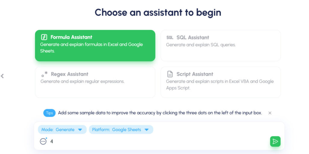
This is one of the top free AI tools for Excel. It converts text instructions into Excel formulas, and supports various instructions and regular expressions.
8. Formula Dog

This best Excel AI tool generates Excel formulas, VBA code, and regex from text instructions, translates code, formulas, and SQL into English, and is user-friendly and intuitive
9. AI Excel Bot

This is one of the AI tools for Excel analysis that helps users create complex Excel formulas in seconds, uses simple English prompts, and is designed to be user-friendly and intuitive
10. Google Bard

Read Also: The Best AI Excel Formula Generator To Try Out
Top 10 AI Plugins for Excel
1. datarails.

This is one of the best plugins that offers an AI-powered FP&A platform that seamlessly integrates with Excel. It automates repetitive processes, reduces errors, and provides actionable insights from data.
It supports data consolidation, financial reports, scenario analysis, and more, making it ideal for finance professionals and data analysts.
2. MonkeyLearn

MonkeyLearn is an AI plugin for Excel that focuses on text analysis. It allows users to extract valuable insights from textual data in Excel, such as customer feedback and social media comments.

Tableau is known for its data visualization capabilities, enabling users to create interactive and insightful visual representations of data directly within Excel.
4. Kutools for Excel

If you know Kutools for Excel, you’d know it’s one of the best AI plugins for Excel. It enhances Excel’s functionality by providing a wide range of tools and utilities to simplify tasks, improve productivity, and streamline workflows.

XLSTAT is a statistical analysis software that integrates with Excel. It offers advanced data analysis tools and functions for users working with complex datasets.
6. Power Query

Power Query is a powerful data connectivity and transformation tool that allows users to import, transform, and combine data from various sources directly in Excel.
Tell me why this shouldn’t make it to the list of top AI plugins for Excel.

Zapier is an automation AI plugin for Excel that connects different apps and services, enabling users to automate workflows and integrate Excel with other platforms seamlessly.

9. Arcwise AI

Arcwise AI offers AI-generated formula suggestions, data cleaning, and automation of tasks like data sorting and summarization. It provides chat-based support for spreadsheet tasks and facilitates the creation of charts and graphs.
10. AI-aided Excel Formula Generator

AI-aided is an AI plugin for Excel that helps create formulas by integrating AI functions with GPT-4 technology. It enhances data analysis by automating tasks and providing insights.
Case Studies Demonstrating the Effectiveness of AI Tools for Excel Analysis
Case study 1: datarails helps finance team streamline reporting.
Datarails, an AI-powered FP&A platform, was implemented by the finance team at a large retail company to streamline their reporting processes.
Before using Datarails, the team spent significant time manually consolidating data from multiple sources into Excel spreadsheets for reporting.
After integrating Datarails with Excel, the finance team was able to:
- Automatically consolidate data from various ERP systems and data sources into a centralized Excel-based platform
- Quickly create financial reports and perform scenario analysis using AI-powered features
- Reduce reporting time from 10 days to just 2 days per month
- Improve data accuracy and consistency across the organization
The AI capabilities in Datarails enabled the finance team to work more efficiently, make faster decisions, and provide higher-quality insights to the business.
Case Study 2: Ajelix Helps Analysts Translate Business Questions into Excel Formulas
A financial analyst at an investment firm used Ajelix, an AI-powered Excel plugin, to help translate complex business questions into Excel formulas.
The analyst was tasked with analyzing customer churn data to identify key drivers and predict future churn rates.
Using Ajelix, the analyst was able to:
- Quickly generate Excel formulas to clean, transform, and analyze the churn data
- Explain the formulas in plain English to share insights with the team
- Automate repetitive data preparation tasks to save time
- Collaborate with colleagues to refine the analysis and build interactive dashboards
The Bottom Line
The integration of AI tools with Excel represents a significant advancement in data analysis and automation.
By leveraging advanced algorithms and machine learning capabilities, Excel becomes more than just a spreadsheet software. It becomes an intelligent assistant that empowers users to extract deeper insights from their data, make informed decisions, and drive business success.
1. Is there an AI tool for Excel?
Yes, there are AI tools specifically designed for Excel, such as Numerous.ai, GPT Excel, and Ajelix, that enhance productivity, automate tasks, and provide advanced functionalities within Excel
2. Is GPT Excel free?
GPT Excel offers a free tier that includes features like Formula Generator for Excel and Sheets, Formula Explainer, with limited access to customer support and 4 requests per day. There is also a Pro plan available for more advanced features and increased usage limits
3. Is there a ChatGPT for Excel?
While there isn’t a specific ChatGPT tool designed exclusively for Excel, AI tools like Numerous.ai and GPT Excel integrate AI capabilities, including ChatGPT intelligence, to enhance Excel functionalities and streamline tasks within the spreadsheet software
4. How to use GPT Excel?
To use GPT Excel, you can sign up for a free account or opt for a Pro plan. The tool assists in generating and understanding formulas, creating automation scripts, simplifying SQL queries, and more. Users can leverage its AI capabilities to boost productivity and streamline tasks in Excel, Google Sheets, and Airtable
Sign Up For Our Newsletter
Don't miss out on this opportunity to join our community of like-minded individuals and take your ChatGPT prompting to the next level.
Join 130,000 readers getting daily AI updates from the AutoGPT newsletter, Mindstream.
Find out why so many trust us to keep them on top of AI and get 25+ AI resources when you join.

This is sold for $99 but today it’s FREE!
We spent 1000s of hours creating these resources.
✔️ Ways to earn passive income with AI ✔️ The ultimate ChatGPT bible ✔️ Mega guides and secrets for AI marketing, SEO and social media growth ✔️ AI framework libraries

Attack Rate, Case Fatality Rate and Predictors of Pertussis Outbreak During Pertussis Outbreak Investigation in Ethiopia: Systematic Review and Meta-Analysis
- Review Article
- Open access
- Published: 15 May 2024
Cite this article
You have full access to this open access article

- Mengistie Kassahun Tariku 1 ,
- Abebe Habtamu Belete 1 ,
- Daniel Tarekegn Worede 1 ,
- Simachew Animen Bante 2 ,
- Agumas Alemu Alehegn 3 ,
- Biniam Kebede Assen 3 ,
- Bantayehu Addis Tegegne 4 &
- Sewnet Wongiel Misikir 5
Pertussis, a highly contagious, vaccine-preventable respiratory infection caused by Bordetella pertussis, is a leading global public health issue. Ethiopia is currently conducting multiple pertussis outbreak investigations, but there is a lack of comprehensive information on attack rate, case fatality rate, and infection predictors. This study aimed to measure attack rates, case fatality rates, and factors associated with pertussis outbreak.
This study conducted a systematic review and meta-analysis of published and unpublished studies on pertussis outbreaks in Ethiopia from 2009 to 2023, using observational study designs, using the guideline Preferred Reporting Items for Systematic Reviews and Meta-Analyses (PRISMA). The study utilized databases like Science Direct, MEDLINE/PubMed, African Journals Online, Google Scholar and registers. The data were collected using an Excel Spreadsheet and then exported to STATA version 17 for analysis. Subgroup analysis was conducted to identify potential disparities. A random effects model was used to consider heterogeneity among studies. I 2 -squared test statistics were used to assess heterogeneity. The attack rate, case fatality rate, and odds ratio (OR) were presented using forest plots with a 95% confidence interval. Egger’s and Begg’s tests were used to evaluate the publication bias.
Seven pertussis outbreak investigations with a total of 2824 cases and 18 deaths were incorporated. The pooled attack and case fatality rates were 10.78 (95% CI: 8.1–13.5) per 1000 population and 0.8% (95% CI: 0.01–1.58%), respectively. The highest and lowest attack rates were in Oromia (5.57 per 1000 population and in the Amhara region (2.61 per 1000 population), respectively. Predictor of pertussis outbreak were being unvaccinated [odds ratio (OR) = 3.05, 95% CI: 1.83–4.27] and contact history [OR = 3.44, 95% CI: 1.69–5.19].
Higher and notable variations in attack and case fatality rates were reported. Being unvaccinated and having contact history were the predictors of contracting pertussis disease in Ethiopia. Enhancing routine vaccination and contact tracing efforts should be strengthened.
Avoid common mistakes on your manuscript.
1 Introduction
A pertussis outbreak investigation involves identifying and confirming suspected outbreaks through prompt and intelligent use of appropriate procedures to contain the outbreak [ 1 ]. The aim of the pertussis outbreak investigation is to assess the outbreak’s magnitude, locate the source and population at risk, and initiate prompt case management in order to lower morbidity and mortality [ 2 ].
Pertussis (whooping cough), a highly communicable respiratory infection caused by Bordetella pertussis infection [ 3 ]. A cough of 14 days or more, or any duration with a paroxysm, or any duration cough with whoop is the suspect of pertussis case. A case that meets the clinical case definition and is linked epidemiologically or directly to a laboratory-confirmed case is known as a confirmed case [ 4 , 5 ]. Catarrhal, paroxysmal, and convalescent are the three stages of pertussis. Grasping, fever, congestion, and sneezing are all part of the catarrhal stage. A severe cough, cyanosis, and rapid coughing are symptoms of the paroxysmal stage. Over the course of two to three weeks, the cough will lessen in intensity and eventually go away during the convalescent phase [ 1 , 6 , 7 ].
Pertussis can be transmitted through respiratory contact with infected individuals’ secretions, up to two weeks before and after symptoms appear [ 8 , 9 ]. There are no known sources of pertussis in animals, insects, or vectors; humans are the only known reservoir for the disease [ 10 , 11 ].
Globally, over 150,000 cases, with 160,700 children are dying annually. Africa has the highest global case and death rates of the disease, accounting for 33% of cases and 58% of deaths [ 12 ]. In 2016, Ethiopia reported 4,719 confirmed pertussis cases and 9 deaths [ 13 ].
Pertussis cases and outbreaks are primarily influenced by factors such as living in close proximity to an infected person, waning immunity post-vaccination, and not being immunized [ 10 , 14 ]. Individuals without diphtheria, pertussis and tetanus (DPT) vaccines in the same household are 80–100% susceptible to exposure, while those immunized and living in the same household are 20% [ 15 ].
The highest likelihood of pertussis-related morbidity and mortality is present in infants and early childhood [ 16 ]. Young unvaccinated infants, under-vaccinated preschool children, and those under 6 months old are at higher risk for severe complications related to pertussis [ 17 ].
Vaccination is the most effective method for preventing pertussis in all age groups [ 18 ]. High vaccine coverage leads to high protection in children under five, while minor reductions can increase cases [ 1 , 19 ]. Three doses of the pertussis vaccine, when completed, prevent 95% of deaths and 80% of cases. It has been demonstrated that incomplete vaccination can prevent severe morbidity; mortality is reduced by 50% and 80%, respectively, after one and two doses [ 1 , 20 ].
Most African countries, except Morocco and Rwanda, have varying DPT3 coverage by 25%, with Ethiopia, Somalia, and Angola having low coverage and high dropout rates [ 21 ].
Ethiopia’s national vaccination strategy includes Pentavalent vaccines at 6, 10, and 14 weeks, but not pertussis booster. Despite good coverage, recent outbreaks of pertussis have been reported in various localities [ 22 ].
In 2009 and 2017, Ethiopia introduced advanced field epidemiology and frontline programs, respectively to improve outbreak identification and investigation [ 23 ]. Meta-analysis is a widely-used tool that integrates findings from various studies to inform decision-making in evidence-based medicine [ 24 ]. Ethiopia is currently conducting multiple pertussis outbreak investigations, but there is a lack of comprehensive information on attack rate, case fatality rate, and infection predictors. Therefore, this study aimed to measure the pooled attack rates, case fatality rates, and factors associated with pertussis outbreak.
2.1 Study Design and Searching Methods
A systematic review and meta-analysis of published or unpublished studies on pertussis/ whooping cough outbreaks were employed from December 1–25/2023 by using the guideline Preferred Reporting Items for Systematic Reviews and Meta-Analyses (PRISMA) in this study. The databases of Science Direct, MEDLINE/PubMed, African Journals Online, and Google Scholar were searched for published studies. The terms that were used were “Whooping cough or pertussis or Bordetella pertussis and attack rate or incidence and case fatality rate or mortality and determinants or risk factors and outbreak or epidemic and investigation or study or search and Ethiopia.”
2.2 Study Selection and Eligible Criteria
All published or unpublished articles on pertussis/ whooping cough outbreaks investigations in Ethiopia were included in this systematic review and meta-analysis. The study designs used in the studies were observational study designs. The systematic review included studies on pertussis/ whooping cough outbreak investigations that were written, in English andaccessible online between 2009 and 2023. Outbreak investigations without attack rate or case fatality rate measurement were excluded.
2.3 Measurement of Outcomes
The pertussis attack rate, which is determined by dividing the number of cases of the disease by the total number of population at risk and multiplied by 100, and the case fatality rate, which is determined by dividing the number of deaths from the disease by the total number of cases and multiplied by 100 [ 25 ], are the outcome variables. Additionally, factors influencing the likelihood of getting a Bordetella pertussis infection were outcome variables. The presence of the Bordetella pertussis infection was determined by contact and vaccination status. These factors were reported in odds ration with 95% CI.
2.4 Quality Assessment and Data Extraction
Independently, two authors reviewed full-length articles, examined titles and abstracts, and evaluated the quality of studies to include or exclude. To ensure transparent communication and thorough analysis, the team convened with a third author in order to arrive at a consensus decision. The Joanna Briggs Institute quality check tool was used to assess each study’s quality [ 26 ]. The eight checklists in this quality check tool are designed to evaluate the following aspects of research quality: (1) evaluating inclusion and exclusion criteria; (2) summarizing the study subject and setting; (3) measuring outcome; (4) measuring exposure; (5) identifying confounding factors; (6) confounding factor control strategies; (7) suitable statistical analysis; and (8) objective and standard criteria applied. Seven studies that received a score of six out of eight were considered suitable for inclusion in the systematic review and meta-analysis.
Prior to collecting data, various kinds of literature were reviewed in order to adapt a standard tool. Two authors worked independently to develop the data extraction tool, and two more authors made revisions. The tool was approved by all authors prior to data collection. Author names, publication years, study designs, study periods, study settings, sample sizes, descriptive data analysis (attack rate, case fatality rate, outbreak duration, and vaccination status), and Pertussis/ Whooping cough outbreak factors were among the details included in the data extraction tool.
2.5 Data Management and Analysis
To perform the meta-analysis, data was gathered, arranged, and imported into an Excel spreadsheet before being imported into STATA version 17. The thorough evaluation and consolidation of attack rates, case fatality rates, and variables influencing Bordetella pertussis infection was the primary objective of the systematic review and meta-analysis.
The attack rate, case fatality rate, and standard error data from each study were used to calculate the pooled attack and case fatality rates as well as the corresponding 95% confidence intervals (CI). The findings were visually represented using forest plots, which showed the odds ratios (OR) corresponding to variables linked to Bordetella pertussis infection as well as the 95% confidence intervals (CI) for attack and case fatality rates.
Subgroup analysis, which took into account variables like study design and geography, was done to look into any potential disparities. The meta-analysis used a random effects model to take into consideration the heterogeneity among the included studies.
The I 2 -squared test statistic and its associated p-value were used to assess the heterogeneity of the investigation. Heterogeneity was defined as a p-value less than 0.05. We used I 2 25, 50, and 75% statistics to indicate low, moderate, and high heterogeneity [ 27 ], respectively. A meta-analysis’s potential publication bias is often evaluated using Egger’s and Begg’s tests, with a p-value of less than 0.005 indicating the significance of the results [ 28 ].
3.1 Study Selection
We were able to obtain a total of 242 records through electronic database searches. One hundred thirty investigations were removed from consideration after a preliminary screening process that evaluated titles, abstracts, and full article reviews. Following this, eligibility was assessed for 25 articles, of which 18 were rejected because of insufficient reporting. In the end, seven studies satisfied the requirements and were included in the systematic review and the meta-analysis (Fig. 1 ).

Flow diagram of pertussis outbreak investigation included in systematic review and meta-analysis in Ethiopia, 1980–2023
3.2 Characteristics of Included Investigations
Seven different Pertussis/whooping cough outbreak investigations were included in this systematic review and meta-analysis, a total of 2824 confirmed cases of the disease and 18 deaths recorded (ages 1 month to 51 years) [ 4 , 5 , 29 , 30 , 31 , 32 , 33 ]. Of the seven studies, four had a case-control study design and the other three had a descriptive cross-sectional, study design. Five articles were conducted in the Amhara region [ 4 , 5 , 30 , 32 , 33 ], one in South Nation Nationality and People Region (SNNPR) [ 29 ], and one in Oromia region [ 31 ]. The included articles were investigated from 2017 to 2023, and the outbreak lasted from 21 days to 149 days (Table 1 ).
3.3 Study bias Assessment Results
Every article was carefully evaluated, with studies receiving an 8 out of 8 being classified as good quality, and studies receiving a 6 or 7 being classified as medium risk. Using the aforementioned appraisal tools, no study was left out of the reviews. Cross-sectional and case-control studies were assessed using the following criteria (Table 2 ).
3.4 Attack Rate
The systemic review and meta-analysis yielded a pooled attack rate (A.R.) of 10.78 (95% CI: 8.1–13.5) per 1000 population [ 4 , 5 , 30 , 31 , 32 , 33 , 34 ] (Fig. 2 ). The heterogeneity was significantly higher (p-value < 0.0001 and I 2 = 99.81% (95% CI: 99.78-99.84%)) (Fig. 3 ). There was a noticeable publication bias found, with Eggers, P < 0.0001 and funnel plot (Fig. 4 ).

Forest plot of attack rate of pertussis outbreak in Ethiopia, 2009–2023

Galbraith plot with 95% CI of precision of Attack rate during pertussis outbreak investigations in Ethiopia, 2009–2023

Funnel plot with Pseudo 95% CI to assess publication bias of the Meta-analysis of attack rate during pertussis outbreak investigations in Etiopia, 2009–2023
3.5 Case Fatality Rate
The pooled CFR for this study was 0.8% (95% CI: 0.01–1.58%) [ 4 , 28 , 30 , 31 ] (Fig. 5 ). Significantly moderate heterogeneity was present (p-value = 0.05 and I 2 = 61.47% (95% CI: 0-87.1%)) (Fig. 6 ). There was a detectable publication bias with Egger tests, p-value = 0.015 and funnel plot (Fig. 7 ).

Forest plot of case fatality rate of pertussis outbreak in Ethiopia, 2009–2023

Galbraith plot with 95% CI of precision of case fatality rate during pertussis outbreak investigations in Ethiopia, 2009–2023

Funnel plot with Pseudo 95% CI to assess publication bias of the Meta-analysis of case fatality rate during pertussis outbreak investigations in Ethiopia, 2009–2023
3.6 Subgroup-Analysis
Based on a subgroup analysis of attack rates by region, the Oromia region had the highest attack rate, with 55.7 (95% CI: 50.6–60.7) per 1000 population. The Amhara region had the lowest reported AR, 2.61 (95% CI: 1.81–3.40) per 1000 population. A higher attack rate was reported in the cross-sectional study design: 26.30 (95% CI: 11.35–41.26) per 1000 population (Table 3 ).
3.7 Predictor of Pertussis Infection
Three investigations into outbreaks found a significant association between the vaccination status—vaccinated or unvaccinated—and the likelihood of contracting pertussis disease [ 4 , 5 ]. According to the meta-analysis, individuals who had not received the pertussis vaccination had an almost threefold increased risk of getting the illness (OR = 3.05, 95% CI: 1.83–4.27). The evidence of heterogeneity (I 2 = 0, P-value = 0.6623) demonstrated the absence of heterogeneity.
Contact history was found to be a significant risk factor for contracting pertussis in three outbreak investigations [ 4 , 5 , 30 ]. The individuals who had contact history were more than 3 times more likely in contracting pertussis disease (OR = 3.44, 95% CI: 1.69–5.19). The heterogeneity test showed that there was no heterogeneity (I 2 = 0, P-value = 0.6250) (Table 4 ).
4 Discussion
In order to assess the total evidence of the pertussis outbreak investigation in Ethiopia, a systematic review and meta-analysis were carried out. During the course of the outbreak investigation, the pooled attack rate of 10.78 (95% CI: 8.06–13.51) per 1000 has been estimated. The highest and lowest attack rates were 55.682 per 1000 population [ 31 ] and 0.864 per 1000 population [ 5 ], respectively. There could be several reasons for this variation in attack rate between outbreaks, including the population’s vaccination status, the duration of the outbreak, its range, and at the time the intervention was launched. Differences may also exist in the response-to-action threshold and the duration of the outbreak investigation.
In four studies, the age group of children under five years old had the highest age-specific attack rate, 197.7/1000 [ 31 ], 73.6/1000 [ 30 ], 6.8/1000 [ 4 ], and 5.5/1000 (929) populations. The age group of 5 to 9 years old had the highest attack rate (245 per 1000 population) according to one outbreak investigation [ 5 ]. Children under the age of four were the most affected group population in another investigation [ 33 ].
A sex-specific attack rate was found to be similar in four outbreak investigations [ 5 , 30 , 31 , 32 ], whereas the highest attack rate was found in females in two outbreak investigations [ 4 , 33 ].
Six articles [ 4 , 5 , 29 , 31 , 32 , 33 ] used the epidemic curve to plot the outbreak over time, while the epidemic curve was not used to characterize the outbreak in terms of time in one outbreak investigation [ 30 ]. Between September and January, three distinct outbreaks had occurred [ 29 , 33 ].
Two outbreak investigations used place specific attack rate but did not use map [ 5 , 31 ], while three outbreak investigations did not use place specific attack rate [ 4 , 30 , 33 ]. In one outbreak investigation, place specific attack rate and map were utilized [ 29 ]. The attack rate showed significant regional variation. Between 0.864 and 7.5 attacks per 1000 population were noted in the Amhara region [ 4 , 5 , 30 , 32 , 33 ], 55.682 attacks per 1000 population in the Oromia region [ 31 ], and 17.080 attacks per 1000 population in the SNNPR region [ 29 ]. According to subgroup analysis, the Amhara region had the lowest pooled attack rate (2.61 per 1000 population) [ 4 , 5 , 30 , 32 , 33 ], while the Oromia region had the highest pooled attack rate (55.682 per 1000 population) [ 31 ]. This discrepancy could result from a difference in the timing of the outbreak response’s start and detection. After the outbreak had been ongoing for two weeks and two months, respectively, the district health office and the zonal health department in the Oromia region responded to it [ 31 ]. Another explanation for this variation could be the different denominator used to calculate the attack rate. In the Oromia region, the smallest administrative unit, the affected Keble [ 31 ], served as the denominator, whereas in other outbreak investigations, the district population—which included people living outside of affected Kebeles—was used. This could inflate the AR in the Oromia region.
A higher attack rate—26.30 (95% CI; 11.35–41.26) per 1000 population—was found in subgroup analysis of a cross-sectional study design. This could be as a result of the case-control study design’s primary focus on risk factors identification during data collection, which could jeopardize active case search.
In this study, the pooled case fatality rate was 0.8% (95% CI: 0.01–1.58%). The case fatality rate in four outbreaks [ 4 , 29 , 31 , 32 ] ranged from 0.33 to 3.72%, while in three other outbreak investigations, the CFR was zero [ 5 , 30 , 33 ]. The variation may be attributed to disparities in the duration of the outbreak. The Amhara region experienced an outbreak with a CFR of 3.72% for 112 days [ 4 ], the Oromia region experienced an outbreak with a CFR of 0.68% for 85 days [ 31 ] and the SNNPR experienced an outbreak with a CFR of 0.33% for 149 days [ 29 ]. The duration of outbreak of the remaining outbreak investigations, which had zero CFR, was 60 days [ 30 ], 30 days [ 33 ] and 21 days [ 5 ]. A discrepancy in the intervention’s start time could be another factor. Three fatalities were recorded in the Oromia region prior to the start of the outbreak control and public health response measures. Additional deaths might have been avoided if clinical case management had started sooner [ 31 ].
In two outbreak investigation, the highest CFR was observed at the age of 5–9 years, 6.3% [ 4 ] and 1.4% [ 31 ]. The age group ≤ 5 years had the highest CFR, 0.87% [ 29 ] in another outbreak investigation. In one unpublished outbreak investigation, the highest CFR was reported at the age group of < 1 year, 17% [ 32 ]. This variation might be due to difference in immunization status across age group.
In three outbreak investigation, females had the highest CFR, 2% [ 32 ], 0.91% [ 31 ] and 4.34% [ 4 ].
Childhood pertussis vaccination provides limited protection, but when completed, it prevents 95% of deaths and 80% of cases with three doses [ 1 , 19 ]. Individuals without diphtheria, pertussis and tetanus (DPT) vaccines in the same household are 80–100% susceptible to exposure [ 13 ]. The study found that individuals who did not receive the pertussis vaccination had a nearly threefold increased risk of contracting the disease [ 4 , 5 , 32 ]. Two outbreak investigations revealed that all cases had unknown vaccination status [ 32 , 34 ], while in two other investigations, 41% of cases completed the DPT 3 dose [ 5 , 30 ]. A study in Janamora district, Amhara region revealed 86.6% of cases were unvaccinated [ 30 ], while 51.2% completed DPT3 in Mekdela district, South Wollo zone, Amhara region [ 4 ]. Another study in Mahal Saynt district, South Wollo Zone, Amhara Region showed that 34.29% of cases were not vaccinated [ 32 ]. The article in the Oromia region, the study setting, had 100% official reported vaccination coverage [ 31 ]. In four outbreak investigation, there was no regular routine immunization service and kebeles health posts didn’t have functional refrigerators for the storage of vaccines [ 4 , 30 , 31 , 33 ], the study in SNNPR showed that investigation team did not find continuously recorded temperature monitoring tools [ 29 ].
Pertussis cases and outbreaks are primarily influenced by factors such as living in close proximity to an infected person [ 10 , 13 ]. The individuals who had contact history were more than three times more likely in contracting pertussis disease as compared to individuals who had no contact history. This is congruent with the study conducted in Australia [ 34 ].
Even though this study provided the consolidated evidences for pertussis outbreak investigation in Ethiopia, there are some limitations. First, this study only included pertussis outbreak investigations, which were written in English and accessible online. This might under or overestimate attack rate and case fatality rate. Secondly, the cross-sectional and case-control study designs employed in all of the included outbreak investigations restrict the ability to evaluate causal relationships.
5 Conclusion
Our results showed that higher as compared with 2023 Provisional Pertussis Surveillance Report and significant differences in attack and case fatality rates between the various study regions. In Ethiopia, the risk factors for catching pertussis were not getting vaccinated and having a history of contact. The overbearing measures include enhancing routine vaccination and contact tracing efforts should be strengthened.
Data Availability
The data sets generated during the current study are available from the corresponding author upon reasonable request.
Abbreviations
Attack rate
Case fatality rate
Confidence interval
diphtheria pertussis tetanus and OR: Odds ratio
Blain A, Tiwari T. Manual for the Surveillance of Vaccine-Preventable Diseases. Atlanta, GA: US Department of Health and Human Services. 2017;500:2017.
Forsyth K, Tan T, von König C-HW, Caro JJ, Plotkin S. Potential strategies to reduce the burden of pertussis. Pediatr Infect Dis J. 2005;24(5):S69–74.
Article PubMed Google Scholar
Trainor EA, Nicholson TL, Merkel TJ. Bordetella pertussis transmission. Pathogens Disease. 2015;73(8).
Alamaw SD, Kassa AW, Gelaw YA. Pertussis outbreak investigation of Mekdela district, south Wollo Zone, Amhara region, north-west Ethiopia. BMC Res Notes. 2017;10:1–7.
Article Google Scholar
Yeshanew AG, Lankir D, Wondimu J, Solomon S. Pertussis outbreak investigation in Northwest Ethiopia: a community based study. PLoS ONE. 2022;17(2):e0263708.
Article CAS PubMed PubMed Central Google Scholar
Kline JM, Lewis WD, Smith EA, Tracy LR, Moerschel SK. Pertussis: a reemerging infection. Am Family Phys. 2013;88(8):507–14.
Google Scholar
Organization WH. WHO vaccine-preventable diseases: monitoring system: 2009 global summary. World Health Organization; 2009.
Control, CfD. Prevention. Manual for the surveillance of vaccine-preventable diseases. Atlanta: Centers for Disease Control and Prevention, 1997. 2003.
Gopal DP, Barber J, Toeg D. Pertussis (whooping cough). BMJ. 2019;364:l401.
Hamborsky J, Kroger A. Epidemiology and prevention of vaccine-preventable diseases. E-Book: The Pink Book: Public Health Foundation; 2015.
Ryu S, Kim JJ, Chen M-Y, Jin H, Lee HK, Chun BC. Outbreak investigation of pertussis in an elementary school: a case-control study among vaccinated students. Clin Experimental Vaccine Res. 2018;7(1):70–5.
Yeung KHT, Duclos P, Nelson EAS, Hutubessy RCW. An update of the global burden of pertussis in children younger than 5 years: a modelling study. Lancet Infect Dis. 2017;17(9):974–80.
Taye S, Tessema B, Gelaw B, Moges F. Assessment of pertussis vaccine protective effectiveness in children in the Amhara regional state, Ethiopia. International journal of microbiology. 2020;2020.
Wensley A, Hughes G, Campbell H, Amirthalingam G, Andrews N, Young N, et al. Risk factors for pertussis in adults and teenagers in England. Epidemiol Infect. 2017;145(5):1025–36.
Hughes MM, Englund JA, Kuypers J, Tielsch JM, Khatry SK, Shrestha L, et al. Population-based pertussis incidence and risk factors in infants less than 6 months in Nepal. J Pediatr Infect Dis Soc. 2017;6(1):33–9.
Calvert A, Karampelas K, Andrews N, England A, Hallis B, Jones CE et al. Optimising the timing of whooping cough immunisation in MUMs (OpTIMUM): a randomised controlled trial investigating the timing of pertussis vaccination in pregnancy. Lancet Microbe. 2021.
Baxter R, Bartlett J, Rowhani-Rahbar A, Fireman B, Klein NP. Effectiveness of pertussis vaccines for adolescents and adults: case-control study. BMJ. 2013;347.
Powell-Jackson T, Fabbri C, Dutt V, Tougher S, Singh K. Effect and cost-effectiveness of educating mothers about childhood DPT vaccination on immunisation uptake, knowledge, and perceptions in Uttar Pradesh, India: a randomised controlled trial. PLoS Med. 2018;15(3):e1002519.
Article PubMed PubMed Central Google Scholar
Crowcroft N, Stein C, Duclos P, Birmingham M. How best to estimate the global burden of pertussis? Lancet Infect Dis. 2003;3(7):413–8.
Article CAS PubMed Google Scholar
Mosser JF, Gagne-Maynard W, Rao PC, Osgood-Zimmerman A, Fullman N, Graetz N, et al. Mapping diphtheria-pertussis-tetanus vaccine coverage in Africa, 2000–2016: a spatial and temporal modelling study. Lancet. 2019;393(10183):1843–55.
Wolter N, Cohen C, Tempia S, Walaza S, Moosa F, du Plessis M, et al. Epidemiology of Pertussis in individuals of all ages hospitalized with respiratory illness in South Africa, January 2013—December 2018. Clin Infect Dis. 2021;73(3):e745–53.
Argaw MD, Desta BF, Tsegaye ZT, Mitiku AD, Atsa AA, Tefera BB, et al. Immunization data quality and decision making in pertussis outbreak management in southern Ethiopia: a cross sectional study. Archives Public Health. 2022;80(1):49.
Kebebew T, Woldetsadik MA, Barker J, Cui A, Abedi AA, Sugerman DE, et al. Evaluation of Ethiopia’s field epidemiology training program–frontline: perspectives of implementing partners. BMC Health Serv Res. 2023;23(1):406.
Bello A, Wiebe N, Garg A, Tonelli M. Evidence-based decision-making 2: systematic reviews and meta-analysis. Clin Epidemiology: Pract Methods. 2015:397–416.
Muller A, Leeuwenburg J, Pratt D. Pertussis: epidemiology and control. Bull World Health Organ. 1986;64(2):321.
CAS PubMed PubMed Central Google Scholar
Porritt K, Gomersall J, Lockwood C. JBI’s systematic reviews: study selection and critical appraisal. AJN Am J Nurs. 2014;114(6):47–52.
Sedgwick P. Meta-analyses: what is heterogeneity? Bmj. 2015;350.
Furuya-Kanamori L, Xu C, Lin L, Doan T, Chu H, Thalib L, et al. P value–driven methods were underpowered to detect publication bias: analysis of Cochrane review meta-analyses. J Clin Epidemiol. 2020;118:86–92.
Mitiku AD, Argaw MD, Desta BF, Tsegaye ZT, Atsa AA, Tefera BB, et al. Pertussis outbreak in southern Ethiopia: challenges of detection, management, and response. BMC Public Health. 2020;20:1–12.
Almaw L, Bizuneh H. Pertussis outbreak investigation in Janamora district, Amhara Regional State, Ethiopia: a case-control study. Pan Afr Med J. 2019;34(1).
Badeso MH, Kalili FS, Bogale NB. Pertussis outbreak investigation in Likimsa-Bokore kebele, Meda Walebu district, Bale zone, Oromia region, Ethiopia, 2019. 2021.
Seid Mohammed ZA, Pertussis outbreak investigation in Mahal Saynt District, South Wollo Zone. Ethiopia: Amhara Region; 2023.
Wagaye FE, Asrat A, Shimekaw B, Hassen M, Terefe W, Gelaw A, et al. Pertussis outbreak investigation in south Gondar zone, Northwest, Ethiopia. Public Health. 2023;9(2):1–5.
Kovitwanichkanont T. Public health measures for pertussis prevention and control. Aust N Z J Public Health. 2017;41(6).
Download references
Acknowledgements
We would like to acknowledge all authors of investigations included in this systemic review and Meta-analysis.
This work was funded by ourselves.
Author information
Authors and affiliations.
Department of Public Health, College of Health Science, Debre Markos University, Debre Markos, Ethiopia
Mengistie Kassahun Tariku, Abebe Habtamu Belete & Daniel Tarekegn Worede
Department of Midwifery, College of Medicine and Health Science, Bahir Dar University, Bahir Dar, Ethiopia
Simachew Animen Bante
Amhara Regional State Public Health Institute, Bahir Dar, Ethiopia
Agumas Alemu Alehegn & Biniam Kebede Assen
Department of Pharmacy, College of Health Science, Debre Markos University, Debre Markos, Ethiopia
Bantayehu Addis Tegegne
Department of Medical Laboratory Technology, Felege Hiwot Comprehensive Specialized Hospital, Bahir Dar, 680, Ethiopia
Sewnet Wongiel Misikir
You can also search for this author in PubMed Google Scholar
Contributions
The primary manuscript text was authored by M.K. and S.W., while A.H. and B.A was responsible for generating Figs. 2 , 3 , 4 , 5 , 6 and 7 ; Tables 1 , 2 , 3 and 4 . D.T and B.K. PRISMA diagram creation and revision. S.A. and A.A crafted the abstract with input from all authors. Subsequently, all authors participated in the manuscript review.
Corresponding author
Correspondence to Mengistie Kassahun Tariku .
Ethics declarations
Ethics approval and consent to participate.
Not applicable.
Consent for Publication
Competing interests.
The authors declare that they have no competing interests.
Additional information
Publisher’s note.
Springer Nature remains neutral with regard to jurisdictional claims in published maps and institutional affiliations.
Rights and permissions
Open Access This article is licensed under a Creative Commons Attribution 4.0 International License, which permits use, sharing, adaptation, distribution and reproduction in any medium or format, as long as you give appropriate credit to the original author(s) and the source, provide a link to the Creative Commons licence, and indicate if changes were made. The images or other third party material in this article are included in the article’s Creative Commons licence, unless indicated otherwise in a credit line to the material. If material is not included in the article’s Creative Commons licence and your intended use is not permitted by statutory regulation or exceeds the permitted use, you will need to obtain permission directly from the copyright holder. To view a copy of this licence, visit http://creativecommons.org/licenses/by/4.0/ .
Reprints and permissions
About this article
Tariku, M.K., Belete, A.H., Worede, D.T. et al. Attack Rate, Case Fatality Rate and Predictors of Pertussis Outbreak During Pertussis Outbreak Investigation in Ethiopia: Systematic Review and Meta-Analysis. J Epidemiol Glob Health (2024). https://doi.org/10.1007/s44197-024-00234-4
Download citation
Received : 20 March 2024
Accepted : 22 April 2024
Published : 15 May 2024
DOI : https://doi.org/10.1007/s44197-024-00234-4
Share this article
Anyone you share the following link with will be able to read this content:
Sorry, a shareable link is not currently available for this article.
Provided by the Springer Nature SharedIt content-sharing initiative
- Find a journal
- Publish with us
- Track your research
IMAGES
VIDEO
COMMENTS
Data Analysis Using Excel Case Study. Data analysis is an essential skill in today's business world. As organizations deal with increasing amounts of data, it becomes crucial for professionals to make sense of this information and derive useful insights. Excel is a powerful and versatile tool that can assist in analyzing and presenting data ...
First, we'll see the default analyses that Excel makes automatically. Excel shows the most commonly used analyzes by default. Steps: Click any data from the dataset. Next, click as follows: Home > Analyze Data. Soon after, you will get an Analyze Data field on the right side of your Excel window.
Go to the File tab and select Options. The Excel Options box will open. Go to Add-ins and select Excel Add-ins in the Manage field, then click Go. Check the box for Analysis ToolPak and click OK. Let's do some analysis using this add-in. Read More: How to Convert Qualitative Data to Quantitative Data in Excel.
Select Analysis ToolPak from Add-ins and click on the Go. 5. Select the checkbox for the Analysis ToolPak and click OK. To access Analysis ToolPak Click on the Data tab and then from the Analysis group click On Data Analysis. The Analysis ToolPak adds the following functionality to Excel: · Anova: Single Factor.
Over five weeks we will explore Excel's rich selection of visualization tools using practical case studies as seen through the eyes of Rohan, an environmental analyst. Rohan is required to produce visualizations that will show trends, forecasts, breakdowns and comparisons for a large variety of environmental data sets.
Analyze Data in Excel empowers you to understand your data through high-level visual summaries, trends, and patterns. Simply click a cell in a data range, and then click the Analyze Data button on the Home tab. Analyze Data in Excel will analyze your data, and return interesting visuals about it in a task pane.
Data Analysis in Excel Case Study Overview. Dive into the world of Excel data analysis with this engaging case study, featuring seven unique challenges. Each challenge, growing progressively more complex, offers a practical opportunity to sharpen your Excel skills through real-world problem-solving scenarios. You'll be provided with different ...
Excel Fundamentals for Data Analysis. This course is part of Excel Skills for Data Analytics and Visualization Specialization. Taught in English. 22 languages available. Some content may not be translated. Instructors: Nicky Bull. +1 more. Enroll for Free. Starts May 16.
The best way to learn data analysis is through practice and examples. In this section, we will provide some real-life case studies of effective data analysis techniques using Excel. These case studies will cover various industries and domains and demonstrate how Excel can be used to solve real-world business problems.
Introduction to Data Analysis Using Excel. This course is part of Business Statistics and Analysis Specialization. Taught in English. 22 languages available. Some content may not be translated. Instructor: Sharad Borle. Enroll for Free. Starts May 13. Financial aid available.
If you wanna make your career in Data Science domain, then check our course now. We provide hands-on practical learning experience to our learners with 1-1 L...
Select a chart and from the Insert menu choose Slicer for any required fields. Here, I have chosen slicer for Year, Date, AQI Bucket and City. Connect the slicer to all the charts so that user can analyse various combinations of the data easily. Right-click on the slicer and select the Report Connections option.
Case Study-Data Analysis using Excel. Introduction ; so i found this interesting data set on kaggle * and decided to run complete analysis on it using only excel. This easy to follow analysis can ...
Once you grasp the basics of Excel PivotTables, you're ready to see how this powerful data analysis tool can add value in real-world situations. In this course— the final installment in a two ...
Analyze business data using descriptive and inferential statistics in Excel. Construct and interpret statistical models to make informed business decisions. Implement regression analysis in Excel to predict future trends and make data-driven decisions. Utilize data analytics techniques to analyze large datasets and extract meaningful insights.
May 9, 2022. 62. My last post ; Case Study — Data Analysis using excel*, was so well received;It did 100% beyond my expectations in terms of views and reviews. This post is simply my own review ...
2. INTRODUCTION. My journey to becoming a Data Scientist through the Women Techsters Fellowship Class of 2023, organized by Tech4Dev in Partnership with Microsoft. EXCEL: As one of the key tools ...
Excel Pivot Tables are an absolutely essential tool for anyone working with data in Excel. Pivots allow you to quickly explore and analyze raw data in Excel, revealing powerful insights and trends otherwise buried in the noise. In other words, they give you answers. Whether you're exploring product sales, analyzing which marketing tactics drove ...
A Supply Chain Analysis Project using Microsoft Excel and Microsoft Power BI. Supply chain analytics plays a crucial role in driving data-driven decision-making across industries, including manufacturing, retail, healthcare, and logistics. In this report, I presented an analysis of a Fashion and Beauty startup's supply chain data ...
For more tips like this plus MUCH more, get unlimited access to the full course below:https://www.udemy.com/data-analysis-with-excel-pivot-tables/?couponCode...
Fitbit is a popular fitness tracking device that helps users monitor their daily physical activity and health metrics. To understand the usage patterns and b...
Explore and run machine learning code with Kaggle Notebooks | Using data from FitBit Fitness Tracker Data. code. New Notebook. table_chart. New Dataset. tenancy. New Model. emoji_events. New Competition. corporate_fare. New Organization. No Active Events. Create notebooks and keep track of their status here. add New Notebook. auto_awesome_motion.
The explosion of data over the last 15 years has led commentators like The Economist magazine's opinion writers to declare that "[t]he world's most valuable resource is no longer oil, but data." While this analogy isn't perfect — oil, after all, is a finite resource, while data appears to be endlessly renewable — there are some important parallels.
The previous courses: Excel Fundamentals for Data Analysis and Data Visualization in Excel, cover data preparation, cleaning, visualisation, and creating dashboards. To get the most out of this course we would recommend you do the previous courses or have experience with these topics. In this course we focus on Excel Power Tools, join us for ...
AI-aided is an AI plugin for Excel that helps create formulas by integrating AI functions with GPT-4 technology. It enhances data analysis by automating tasks and providing insights. Case Studies Demonstrating the Effectiveness of AI Tools for Excel Analysis Case Study 1: Datarails Helps Finance Team Streamline Reporting
This is my completed case study from an optional course in the Google Data Analytics Course named: Capstone Project. The analysis follows the 6 steps of Data Analysis taught in the Google course ...
The data were collected from the patient case profile and prescriptions and noted in a self-designed data collection form. The statistical analysis of the collected data was performed using SPSS software and Excel. Results: The study, conducted on 400 patients, revealed a male majority (60%) and a female representation of 40%.
Author names, publication years, study designs, study periods, study settings, sample sizes, descriptive data analysis (attack rate, case fatality rate, outbreak duration, and vaccination status), and Pertussis/ Whooping cough outbreak factors were among the details included in the data extraction tool. 2.5 Data Management and Analysis