
Home » Statistics » 37+ Presentation Statistics You Need To Know
- 37+ Presentation Statistics You Need To Know
Statistics can be dry and boring, but when it comes to presentations, they are your best friend.
By understanding some key presentation statistics , you can make sure that your next presentation is as effective as possible.
Presentations are an effective way to communicate information to an audience . However, if they are not done correctly, they can be a complete waste of time.
When planning your next presentation, you need to keep a few presentation statistics in mind in order to slay your next presentations and leave your audience stunned and impressed!
Presentation skills are the ability to communicate clearly and effectively when presenting information to an audience. Presentation skills include both the ability to deliver a presentation that is engaging, compelling, informative, educational, transformative, enlightening, or instructive as well as the ability to create effective visual aids that support the presentation.
Key Takeaways:
- The two elements which contribute the most to the presentation are voice (38%) and non-verbal communication (55%). The content of the presentation is only about 7%. (Business Insider)
- In a recent survey, 47% of presenters responded they invested more than 8 hours in designing a presentation. (Infographics Design Team)
- When facts are told in the form of a story, 63% of the audience remembers them whereas only 5% could remember the statistics. (Drugstore News)
- More than 35 million PowerPoint presentations are given every day to over 500 million people. (Forbes)
- Most people stop listening to a presentation after the initial 10 minutes. (Forbes)
- Only 4.9% of people outsource their presentation design work. (Infographics Design Team)

General Presentation Statistics
1. about 75% of people are generally terrified of giving presentations.
(Journal of Education and Educational Development)
Takeaway: Giving presentations sure is a daunting task for a few. For some people, it’s enjoyable while for others, it’s stress-inducing. According to this statistic, about 75% of people are genuinely terrified of giving presentations. If you’re one of the 75% of people who gets nervous before presentations, don’t worry! You’re not alone. Just remember to breathe and take your time. The more prepared you are, the better you will do.
2. 90% of people experience glossophobia or other forms of anxiety before giving a presentation
Takeaway: This stat goes hand-in-hand with the one above. Glossophobia is the fear of public speaking , and it is very common. In fact, 90% of people experience some form of anxiety before giving a presentation. If you’re feeling anxious about your upcoming presentation, don’t hesitate to reach out to a friend or family member for support. The more you practice, the more confident you will become.
3. According to a survey conducted, 91% of people claimed they feel confident with a well-prepared and well-designed presentation
(Presentation Panda)
Takeaway: This stat is very reassuring. It means that as long as you take the time to prepare and design your presentation well, you will be in good shape. Remember to always start with a strong introduction and end with a powerful conclusion. If you do this, your audience is sure to remember your presentation long after it’s over. According to this stat, around 91% of people feel very confident when they are well-prepared so this indicates that the key to a successful presentation is to be well-prepared and well-organized.
4. The two elements which contribute the most to the presentation are voice (38%) and non-verbal communication (55%). The content of the presentation is only about 7%
(Business Insider)
Takeaway: This stat is a bit surprising but it definitely makes sense. Your voice and non-verbal communication play a much bigger role in your presentation than the actual content. This means that you need to be aware of your body language and tone of voice throughout the entire presentation. If you come across as bored or uninterested, your audience will likely feel the same way. Make sure to practice in front of a mirror so that you can see how you come across to others. The more you practice, the more your presentation will be a success.
5. 79% of people confess that they find presentations boring
Takeaway: This stat is a bit disheartening but it’s important to know nonetheless. If you’re planning on giving a presentation, chances are that your audience might find it boring. This means that you need to work extra hard to make sure that your presentation is engaging and interesting. One way to do this is to use visuals and graphics. People are more likely to remember information if it is presented in a visually appealing way. Another way to keep your audience engaged is to tell stories. Stories are a great way to connect with your audience and make your presentation more memorable.
6. Audience engagement level is at 92% when attendees are allowed to participate in the presentation
(Salescrunch)
Takeaway: This stat is very encouraging. It means that if you allow your audience to participate in your presentation, they are much more likely to be engaged. There are a few different ways you can do this. You can ask them questions, have them participate in polls or surveys, or even give them a chance to ask you questions at the end of the presentation. The more interactive your presentation is, the more successful it will be.
7. 65.7% of people prefer to design presentations on their own, without seeking any help from a design professional
(Infographics Design Team)
Takeaway: This stat is interesting because it shows that a majority of people prefer to design their own presentations. This means that if you’re feeling confident, you can go ahead and design your presentation on your own. However, if you’re not sure where to start or if you need some help, don’t hesitate to reach out to a professional. They will be able to help you put together a presentation that is sure to impress your audience.
8. In a recent survey, 47% of presenters responded they invested more than 8 hours in designing a presentation.
Takeaway: This stat shows that a lot of time and effort goes into designing a successful presentation. If you’re feeling overwhelmed, remember that it’s important to take your time and make sure that everything is perfect. The more time you spend on your presentation, the better it will be. If you keep these statistics in mind, you will be sure to give a successful presentation that will engage and interest your audience. Remember to be well-prepared, use visuals, tell stories, and allow your audience to participate. With a little bit of effort, you can create a presentation that is sure to wow your audience.
9. A study shows that people are 22 times more likely to remember a fact when it is told in the form of a story
Takeaway: This stat is very interesting and it definitely has implications for presentations. If you want your audience to remember the information in your presentation, tell them a story. Stories are a great way to connect with your audience and make your presentation more memorable. When you’re telling a story, make sure to focus on the emotional aspects. This will help your audience to connect with the story and remember the information.
10. When facts are told in the form of a story, 63% of the audience remembers them whereas only 5% could remember the statistics
(Drugstore News)
Takeaway: This stat is very similar to the previous one. It shows that stories are much more effective than statistics when it comes to remembering information. This means that if you want your audience to remember your presentation, focus on telling stories. Make sure to focus on the emotional aspects of the story and connect with your audience. This will help them to remember the information in your presentation.
Presentation Design Statistics
11. 41% of people find it difficult to incorporate visuals and graphics into their presentations to make them more appealing.
Takeaway: This stat shows that a lot of people struggle with incorporating visuals into their presentations. If you’re one of those people, don’t worry, you’re not alone. The good news is that there are a few different ways to incorporate visuals into your presentation. You can use charts and graphs, photos, or even videos. Whatever you do, make sure that the visuals are relevant to the information in your presentation.
12. About 7% of the presenters’ struggle in choosing the right type of font for their presentation
Takeaway: This stat shows that a lot of people have trouble choosing the right font for their presentation. When you’re choosing a font, make sure that it is easy to read and that it is appropriate for the tone of your presentation. You also want to make sure that the font is large enough so that everyone in the audience can see it. This is one of the core factors which you need to focus on while designing a presentation to ensure that it’s a success.
13. More than 35 million PowerPoint presentations are given every day to over 500 million people
Takeaway: This stat shows that PowerPoint is one of the most popular presentation tools. If you’re giving a presentation, there’s a good chance that you’ll be using PowerPoint. When you’re using PowerPoint, make sure to use it in a way that will engage your audience. Use visuals and stories to keep your audience interested.
14. About 35.3% of people prefer to use vibrant and bright colors in their presentations
Takeaway: This stat shows that a lot of people prefer to use vibrant and bright colors in their presentations. When you’re choosing colors for your presentation, make sure to choose ones that are appropriate for the tone of your presentation. You also want to make sure that the colors are easy on the eyes and won’t cause eye strain. The right colors are bound to make your presentation a success.
15. Around 45% of people face difficulties while designing a creative design layout for their presentation
Takeaway: This stat shows that a lot of people have trouble designing a creative presentation. If you’re one of those people, don’t worry, you’re not alone. The good news is that there are a few different ways to design a creative presentation. You can use charts and graphs, photos, or even videos. Whatever you do, make sure that the visuals are relevant to the information in your presentation. Also, try not to use too much flashy visuals as they appear to strain the eyes and might make your audience uncomfortable.
16. Most people stop listening to a presentation after the initial 10 minutes
Takeaway: This stat shows that most people lose interest in a PowerPoint presentation after the first ten minutes. This is also because PowerPoint presentations are usually the same ones so people often get bored. This is why it’s so important to engage your audience from the very beginning. Use stories and visuals to keep your audience interested. Also, make sure to keep your presentation short and to the point.
17. 89% of people still prefer to use PowerPoint for designing presentations
Takeaway: This stat shows that PowerPoint is still the most popular presentation tool. If you’re giving a presentation, there’s a good chance that you’ll be using PowerPoint. When you’re using PowerPoint, make sure to use it in a way that will engage your audience. Use visuals and stories to keep your interest in your presentation.
18. Around 4.9% of people outsource their presentation design work
Takeaway: This stat shows that a lot of people outsource their presentation design work. If you’re one of those people, don’t worry, you’re not alone. The good news is that there are a few different ways to design a creative presentation. You can use charts and graphs, photos, or even videos. Whatever you do, make sure that your content is relevant.
19. “An ideal presentation should have 10 slides and should be only 20 minutes in length”
(Guy Kawaski)
Takeaway: This stat shows that an ideal presentation should only be 20 minutes long. This is because people often get bored after the first ten minutes. So make sure to keep your presentation short and to the point. Another thing to remember is the 3 seconds rule which means that you only have 3 seconds to capture the attention of your audience. Also, use visuals and stories to engage your audience from the very beginning.
Presentation on Stage Statistics
20. it takes the audience on average 5 seconds to determine whether a presenter is charismatic or not.
Takeaway: This stat shows that it only takes the audience a few seconds to determine whether a presenter is charismatic or not. So if you’re giving a presentation, make sure to be charismatic from the very beginning. Use your body language and voice inflection to engage your audience. Also, try to smile and make eye contact with your audience members.
21. The ideal amount of eye contact for a presenter that is required to build an emotional connection with the audience is between 60% to 70%
(Quantified)
Takeaway: This stat shows that you need to make eye contact with your audience members in order to build an emotional connection. So if you’re giving a presentation, make sure to maintain eye contact with your audience members. Try to smile and use your body language to engage your audience.
22. Power Posing in a presentation can help increase confidence and reduce stress while giving a presentation
(TheCareerCafe)
Takeaway: This stat shows that power posing can help increase confidence and reduce stress while giving a presentation. So if you’re feeling nervous before your presentation, try to do some power poses. Stand up straight, put your hands on your hips, and take a few deep breaths. This will help you relax and feel more confident.
23. 55% of people confess that a great story helps them to focus on a presentation
Takeaway: This stat shows that a great story can help people to focus on a presentation. So if you’re giving a presentation, make sure to use stories to engage your audience. Use visuals and body language to tell the story. Also, try to make the story relevant to your presentation topic so your audience can relate to your presentation and show maximum engagement.
24. 35% of millennials claim that they would only like to engage in a presentation that has a great story or a compelling theme
Takeaway: This stat shows that millennials want to engage in a presentation that has a great story or a compelling theme. So in order to engage millennials in your presentation, you need to ensure that it has a strong and compelling story that makes your audience relate to whatever you are presenting.
25. 70% of presenters believe that presenting interactive content helps to engage the audience
Takeaway: This stat shows that presenters believe that interactive content helps to engage the audience. So if you’re giving a presentation, make sure to use interactive content such as polls, quizzes, or even games. This will help to keep your audience engaged and interested in your presentation.
26. 68% of people believe that interactive presentations are more memorable
Takeaway: This stat shows that people believe that interactive presentations are more memorable. So if you’re looking to give a presentation that your audience will remember, make sure to use interactive content. This will help to keep your audience engaged and interested in your presentation.
27. Presentations with visual aid are 43% more engaging as compared to those without
Takeaway: This stat shows that presentations with visual aid are more engaging as compared to those without. So if you’re looking to engage your audience, make sure to use visuals in your presentation. Use charts, graphs, or even photos and videos to help tell your story. This will help to keep your audience engaged and interested in your presentation.
28. Experts recommend only using 1 slide for 1 idea for maximum audience retention
Takeaway: This stat shows that experts recommend only using one slide for one idea. So if you’re looking to engage your audience and ensure that they remember your presentation, make sure to use one slide for each idea. This will help to keep your audience focused on your presentation and prevent them from getting lost or confused.
Business Presentation Statistics
29. 71% of people prefer using their company’s branding in their presentation.
(Beautiful.ai)
Takeaway: This stat shows that people prefer using their company’s branding in their presentations. So if you’re looking to engage your audience, make sure to use your company’s branding in your presentation. This will help to make your presentation more recognizable and memorable.
30. The average person spends about 40 hours per month preparing presentations
(SlideGenius)
Takeaway: This stat shows that the average person spends about 40 hours per month preparing presentations. So if you’re looking to give a great presentation, make sure to spend adequate time preparing for it. This will help to ensure that your presentation is well-organized and engaging.
31. Only 15% of people find it easy to create a presentation that is in line with their company’s branding guidelines
Takeaway: This stat shows that only 15% of people find it easy to create a presentation that is in line with their company’s branding guidelines. This is because the branding guidelines help to capture the target market as well and to obtain maximum results by targeting the market to a specific audience.
32. 61% of people spend more time coming up with the presentation’s content rather than its design
Takeaway: This stat shows that 61% of people spend more time coming up with the presentation’s content rather than its design. This is because people believe that compelling and interactive content is more important than an aesthetically pleasing design.
33. It is estimated that about $30 billion is spent on presentations every year
Takeaway: This stat shows that a lot of money is spent on presentations every year. So if you’re looking to give a great presentation, make sure to spend adequate time and money on it. This will help to ensure that your presentation is well-organized, engaging, and memorable.
34. The average cost of designing a professional presentation is between $500 to $2000
Takeaway: This stat shows that the average cost of designing a professional presentation is between $500 to $2000. So if you’re looking to give a great presentation, make sure to spend adequate time and money on it.
35. On average, people only remember about 50% of the information presented to them after a week
Takeaway: This stat shows that on average, people only remember about 50% of the information presented to them after a week. So if you’re looking to ensure that your audience remembers your presentation, make sure to review the key points at the end of your presentation. This will help to reinforce the main ideas and help your audience retain the information.
36. People can remember up to 80% of the information if it is presented visually
Takeaway: This stat shows that people can remember up to 80% of the information if it is presented visually. So if you’re looking to ensure that your audience remembers your presentation, make sure to use visuals such as images, charts, and graphs. This will help to make the information more memorable and easier to understand.
37. When asked, 62% of people said that they would like to see more visuals in presentations
Takeaway: This stat shows that when asked, 62% of people said that they would like to see more visuals in presentations. So if you’re looking to engage your audience, make sure to use more visuals in your presentation. This will help to make the information more memorable and easier to understand.
Presentation skills are important because they can help you to better engage with your audience and deliver information in a more concise and memorable way. Additionally, having strong presentation skills can help you to advance in your career or build your business.
Wrapping Up
Presentations are a great way to engage your audience and deliver information in a concise and memorable way. However, it is important to spend adequate time and money on your presentation in order to ensure that it is well-organized, engaging, and informative. Use these statistics as a guide to help you create a great presentation that will leave a lasting impression on your audience.
Effective presentations can be the key to success in many different areas of life. Whether you’re presenting to a group of potential clients or delivering a speech at your cousin’s wedding, nailing your presentation can make all the difference.
Creating an effective presentation is no easy feat– it takes time, effort, and often money to put together a great presentation. But the payoff can be huge, so it’s important to understand the basics of what goes into a great presentation.
We hope these presentation statics were helpful and gave you some insights into how to make your next presentation a success! If you have any questions or would like help creating your next presentation, leave us a comment below!
https://files.eric.ed.gov/fulltext/EJ1161521.pdf
https://presentationpanda.com/blog/new-presentation-statistics/
https://www.infographicdesignteam.com/blog/presentation-statistics/
https://www.forbes.com/sites/kateharrison/2015/01/20/a-good-presentation-is-about-data-and-story/?sh=3e95a69c450f
https://drugstorenews.com/news/1-0-people-dont-remember-your-presentation
https://www.forbes.com/sites/chriswestfall/2019/10/19/the-3-step-strategy-for-powerful-powerpoint-presentations/?sh=701be95a2632
https://www.businessinsider.com/things-to-know-before-giving-a-presentation-2015-1
https://www.forbes.com/sites/carminegallo/2014/04/30/why-powerpoint-presentations-always-die-after-10-minutes-and-how-to-rescue-them/#7a0ff2c278ba
https://guykawasaki.com/
http://www.psych.utoronto.ca/users/rule/pubs/2017/Tskhay_etal(2017_LQ).pdf
https://www.quantified.ai/blog/eye-contact-a-declining-communications-tool/
https://thecareercafe.co.uk/blog/10-amazing-facts-about-presentations-for-2020/
https://blog.prezi.com/3-must-have-story-elements-to-create-a-strong-presentation/
https://blog.prezi.com/the-state-of-attention-2018-infographic/
https://prezi.com/the-science/
https://blog.prezi.com/the-2018-state-of-presentations/
https://www.duarte.com/presentation-skills-resources/perfect-your-slide-design/
https://www.slidegenius.com/blog/author/inna-e/page/2

Eisha Gul is a part of Weshare’s writing team. She has social media marketing experience for over 4 years and has been writing in-depth guides and articles about the industry ever since.
We Also Reviewed
- Best Web Hosting For A Blog
- Best Web Hosting For Small Business
- Best CRM Software
- Best Web Hosting For Personal Site
- Best Web Hosting For Plumbing
- Best Web Hosting Prices
- Best Writing Tools
- Best Web Hosting
- Best Sales Tools
- Best Email Marketing Software
- Best WordPress Hosting
- Best VPS Hosting
- 23+ Apple Podcast Statistics You Should Know About
- 31+ Spotify Podcast Statistics You Should Know About
- 35+ Spotify Statistics You Should Know
- 45+ Advertising Statistics That Will Blow Your Mind
- 33 CRM Statistics You Should Know
- 41+ Public Speaking Statistics You Should Know
- 35 Machine Learning Statistics You Should Know
- 34 Employee Burnout Statistics You Should Know
- 39+ Communication Statistics You Need To Know
- 37+ Cold Calling Statistics You Need To Know
- 21+ Entrepreneur Statistics You Should Know
- 35+ Contract Management Statistics You Should Know
- 37+ Zoom Statistics You Should Know
- 35+ Sales Training Statistics You Should Know About
- 75+ WordPress Statistics You Need to Know
- 41+ Startup Statistics You Need to Know
- 41+ Recruiting Statistics You Need to Know
Researched by Consultants from Top-Tier Management Companies

Powerpoint Templates
Icon Bundle
Kpi Dashboard
Professional
Business Plans
Swot Analysis
Gantt Chart
Business Proposal
Marketing Plan
Project Management
Business Case
Business Model
Cyber Security
Business PPT
Digital Marketing
Digital Transformation
Human Resources
Product Management
Artificial Intelligence
Company Profile
Acknowledgement PPT
PPT Presentation
Reports Brochures
One Page Pitch
Interview PPT
All Categories
Top 10 Statistics Slide Templates with Samples and Examples

Have you ever heard the saying 'a picture is worth a thousand words'? Well, that old adage couldn't be more accurate when it comes to data presentations. With attention spans being shorter than ever before and short attention spans remaining relevant today, the need for compelling and informative statistics has never been greater. When you incorporate statistics, it has the power to convince, inform, and engage your audience, which is undeniable - but how they are presented is key. Thus, it requires careful thought when presented correctly.
Here is where SlideTeam Statistics Slide Templates stand out. These content-ready and 100% editable templates offer professionals looking to convey their message while staying stylish the tools to do this effectively and with style.
Ready for a journey of knowledge? Start with our blog on top data and statistics templates for best analysis.
Keep reading the blog to learn more to demonstrate why our templates make data presentations come alive!
Authoritative Statistics Slide Templates You Need to Lookout
Template 1 : social media key statistics powerpoint presentation slides.
This PPT Slide supports your social media marketing initiatives with access to many insightful statistics that can bolster marketing campaigns. This presentation is your go-to resource for communicating key statistics regarding your social media marketing strategies. It helps illustrate different marketing mediums - print ads, online advertising, telemarketing, and referrals - and outlines management details for campaigns like customer acquisition strategies or retention efforts.
This versatile PowerPoint presentation can be invaluable to marketing professionals, business leaders, and anyone involved with social media management, from experienced marketers looking to present campaign results to business owners looking for ways to optimize social media marketing for business growth.

Download Now
Template 2 : Website Statistics PowerPoint Template Bundles
This PPT Slide equips you with all the tools and insights required to engage target audiences. It serves multiple functions in digital marketing efforts: setting benchmarks for website statistics ; comparing data to industry standards, illustrating your marketing strategy visually via a dashboard, outlining improvement strategies, and providing performance metrics. Use this bundle to highlight the tools and technologies you rely on, complete with user reviews or ratings to establish credibility. With weekly reports, four-week roadmaps, landing page performance assessments, and improvement checklists built into it all, stay on top of your digital marketing game! This resource is invaluable to digital marketers, business owners, project managers, and anyone involved with website management and online marketing.

Template 3 : Diversity Management to Create Positive Statistics of Existing Workplace Diversity
This PPT Slide serves as a visual representation of workplace diversity statistics, providing a clear view of gender representation both overall and by department, ethnic diversity in leadership roles and promotion rates, as well as any trends regarding ethnic diversity within leadership roles and promotion rates. This slide serves an integral role in communicating the progress and status of diversity management within your organization by providing clear visual displays that highlight statistics, achievements, and potential areas for improvement, making it a useful asset for HR professionals, diversity & inclusion advocates, executives as well as anyone tasked with reporting or managing diversity initiatives.
This slide can be utilized by organizations of any size and industry who strive to foster an inclusive workplace, especially HR departments, diversity and inclusion teams, managers, and leaders seeking to demonstrate the positive results of their diversity management efforts.

Template 4 : Global Design and Architecture Firm Business Statistics Ppt Slides Templates
This PPT Slide provides a digestible overview of their performance and contributions. This presentation slide can be invaluable for design and architecture firms seeking to present their business statistics. It includes key metrics like the balance between public and private clients, the number of completed projects, free cash flow levels, client satisfaction ratings, and sustainable contributions of their firm. Use it to inform stakeholders, potential clients, investors, and employees of your firm's performance and values. This slide layout is indispensable for all design and architecture firms, from boutique studios to global architectural powerhouses. It is particularly helpful for business development teams, executives, architects, and anyone else communicating the firm's performance and values.

Template 5 : Key Customer Coverage Marketing Statistics
This PPT Slide offers a comprehensive tool for understanding and presenting key customer coverage marketing statistics and customer penetration by region that drive business expansion. It clearly shows how your business reaches and engages customers through various channels. It includes data about direct customer coverage, indirect engagement methods used by different marketing channels, distribution channels employed, and geographic penetration. Use it to inform your team, stakeholders, or investors of the reach of your marketing efforts and the strategies your business put in place to capture customers. This slide layout can be utilized by businesses of all types and sizes - from startups to established enterprises - looking to showcase customer coverage and marketing strategies.
Want to stay informed and inspired? Check out our blog on ways to show statistics in presentation to make it more authoritative.

Template 6 : Business development statistics results slide PowerPoint templates
This PPT Slide helps any business effectively present its achievements and goals to its audience. This presentation slide can be an invaluable asset to businesses that wish to present the results and statistics from their business development initiatives, including increased revenue, efficiency gains, client growth, client satisfaction, enhanced competitiveness, and overall performance gains. Use it to communicate past accomplishments while setting future goals; its clear format enables managers and leaders to present business development insights with their audience effectively. This slide layout is invaluable for businesses of all sizes and industries looking to show off their business development successes. Take advantage of this powerful slide.

Template 7 : Key statistics PPT show the deck
This PPT Slide is an effective tool for presenting vital statistics that provide insight into security and user behavior. This presentation slide can serve as an invaluable asset to organizations and professionals looking to highlight key statistics on security vulnerabilities and user behaviors. Incorporating essential metrics, this report looks at device vulnerability to security threats, user inclinations to forgo device protection measures and cyberattacks, and practices such as connecting devices and storing personal information. This slide can benefit a broad audience, including organizations focused on cybersecurity, IT departments, educational institutions, and individuals looking to raise awareness about security best practices and responsible user behavior.

Template 8 : Ethical awareness key statistics geographical ppt slides
This PPT Slide offers an effective tool to present important statistics related to ethical awareness within a geographical context. It highlights key metrics that shed light on its state, timeline, processes, and planning requirements - making this presentation an invaluable asset for educators, activists, businesses, or organizations seeking to increase societal and ethical considerations. Use it to increase awareness, inform discussions about its significance, or spark debate about ethics considerations! This slide can benefit a broad audience of educators, ethics and compliance professionals, corporate social responsibility teams, nonprofit organizations, and anyone working to promote ethical behavior. Download to build commitment towards ethical values!

Template 9 : Social media key statistics PPT professional files
This PPT Slide serves as an essential means of communicating key social media statistics that influence business strategies and decisions, including those that influence marketing professionals, business leaders, or anyone looking to utilize social media data for analysis and strategy purposes. It covers vital metrics like population size, internet users, active social media users, unique mobile users, active social media users, and scale/influence of social media usage that enable informed business decisions. These figures give insight into social media usage, which enables marketing professionals, leaders, or anyone looking at the data behind social media analysis/strategic usage to make informed business decisions with more informed decisions than ever before! When making presentations to internal stakeholders, clients, or marketing teams, this layout will help effectively communicate key information while making data-driven decisions.

Template 10 : Company statistics related to its operations and financials statement PPT slide
This PPT Slide effectively conveys critical financial statistics, providing insights into a company's revenue, net income, marketing expenses, and key operational data such as stores and distribution centers. These metrics are key when assessing a business's financial health and operational efficiency, making this slide an essential tool for financial analysts, business leaders, or professionals who must share financial and key operational data with stakeholders or team members. This slide can be utilized by companies of all sizes and industries, from startups to established enterprises, to showcase their financial performance and operational capabilities. Use this slide layout to catalyze meaningful discussions, investor relations, and data-driven decision-making that will contribute to its success.

Connect with us to succeeded
Statistics slide templates serve as your data-driven storytelling canvas, and SlideTeam is your artistic muse. With SlideTeam's templates, you can transform dry statistics into captivating narratives that captivate your audience. Remember, it's not only about numbers; the real value lies in how they can benefit your presentations. So make your data shine, resonate with your message, and leave an impactful impression with every presentation you deliver!
Step into the world of data-driven storytelling and let SlideTeam be your partner in crafting presentations that aid in sustainable contribution . Now is the time to turn data into art - let SlideTeam be your tool in creating this masterpiece! Elevate presentations and engage audiences by downloading them now!
Related posts:
- Top 10 Data Infographic Templates with Examples and Samples
- Top 10 Project Management Chart Templates With Samples And Examples
- Top 7 Workflow Chart Templates with Samples and Examples
- Top 10 Data Lake Architecture PPT Templates with Examples and Samples
Liked this blog? Please recommend us

Top 7 Food Presentation Templates with Examples and Samples

Top 10 Partnership Investment Proposal Templates with Samples and Examples
This form is protected by reCAPTCHA - the Google Privacy Policy and Terms of Service apply.

Digital revolution powerpoint presentation slides

Sales funnel results presentation layouts
3d men joinning circular jigsaw puzzles ppt graphics icons

Business Strategic Planning Template For Organizations Powerpoint Presentation Slides

Future plan powerpoint template slide

Project Management Team Powerpoint Presentation Slides

Brand marketing powerpoint presentation slides

Launching a new service powerpoint presentation with slides go to market

Agenda powerpoint slide show

Four key metrics donut chart with percentage

Engineering and technology ppt inspiration example introduction continuous process improvement

Meet our team representing in circular format

- SUGGESTED TOPICS
- The Magazine
- Newsletters
- Managing Yourself
- Managing Teams
- Work-life Balance
- The Big Idea
- Data & Visuals
- Reading Lists
- Case Selections
- HBR Learning
- Topic Feeds
- Account Settings
- Email Preferences
Present Your Data Like a Pro
- Joel Schwartzberg

Demystify the numbers. Your audience will thank you.
While a good presentation has data, data alone doesn’t guarantee a good presentation. It’s all about how that data is presented. The quickest way to confuse your audience is by sharing too many details at once. The only data points you should share are those that significantly support your point — and ideally, one point per chart. To avoid the debacle of sheepishly translating hard-to-see numbers and labels, rehearse your presentation with colleagues sitting as far away as the actual audience would. While you’ve been working with the same chart for weeks or months, your audience will be exposed to it for mere seconds. Give them the best chance of comprehending your data by using simple, clear, and complete language to identify X and Y axes, pie pieces, bars, and other diagrammatic elements. Try to avoid abbreviations that aren’t obvious, and don’t assume labeled components on one slide will be remembered on subsequent slides. Every valuable chart or pie graph has an “Aha!” zone — a number or range of data that reveals something crucial to your point. Make sure you visually highlight the “Aha!” zone, reinforcing the moment by explaining it to your audience.
With so many ways to spin and distort information these days, a presentation needs to do more than simply share great ideas — it needs to support those ideas with credible data. That’s true whether you’re an executive pitching new business clients, a vendor selling her services, or a CEO making a case for change.
- JS Joel Schwartzberg oversees executive communications for a major national nonprofit, is a professional presentation coach, and is the author of Get to the Point! Sharpen Your Message and Make Your Words Matter and The Language of Leadership: How to Engage and Inspire Your Team . You can find him on LinkedIn and X. TheJoelTruth
Partner Center
Improve your practice.
Enhance your soft skills with a range of award-winning courses.
Why and How to Bring Statistics Into Your Speech
November 24, 2017 - Dom Barnard
Using statistics in public speaking is a powerful way to add a quantifiable and persuasive aspect to your message. It provides a basis on which you can build an argument, prove a statement, or support an idea.
The key to using statistics is being able to extract meaning and patterns from data in a way that your audience can understand.
In this article, we’ll explain why statistics are important, how to choose the right statistic and how to integrate it into your presentation for maximum impact.
Why use statistics in your speech?
It can be very time consuming finding the right statistic to include in your presentation. Added to this is the possibility that an audience member questions whether the data is reliable. However, statistics can add a range of benefits to your presentation:
- Add realism to your presentation – numbers and data are a good way to ground your presentation and being reality to your presentation. For example, stating that ‘wearing a seatbelt could save your life in a crash at 60mph’, is not as impactful as ‘you have a 20% chance of surviving a 60mph crash if you don’t wear a seatbelt’.
- Increase your credibility – using a statistic shows that you’ve done research and are knowledgeable about the subject matter. Also, if you use a statistics from a trusted source (e.g. the NHS), it will boost your credibility.
- Make your presentation memorable – interesting statistics will stay with your audience long after the presentation finishes.
- Emotionally impact your audience – you can increase the emotional impact to your audience by including relevant, usually shocking, statistics, for example ‘in sub-Saharan Africa, almost 60% of youth between the ages of about 15 and 17 are not in school.’

Hans Rosling using statistics in his TED talk – ‘Insights on HIV, in stunning data visuals’.
How do you choose the right statistic?
After you’ve decided to use statistics in your presentation, you need to find the right one for the message you’re delivering. It’s easy to get lost in the huge number of statistics out there, not all of them accurate. With so much data, how do you decide which statistic to use?
Here are several factors to consider when making your choice of statistic:
- Make it surprising – your aim is to have your audience members leave the presentation and say to their friends, ‘Let me tell you about this interesting statistic I heard…’
- Leave the greatest impact on your audience – you’ll need to do some audience analysis for this one. Once you have found the demographic or interested of your audience, you’ll be able to find a relevant statistic.
- Validate your message or argumen t – be careful not to include statistics just because they are interesting. They must be closely tied to your message or supporting points. If it isn’t relevant to your speech, your audience may remember the statistic, but they won’t remember you or your message.
Where do these statistics come from?
Statistics can come from a number of sources, here are some common ones:
- Presenting findings from research by understanding which results are meaningful and significant in the context of your presentation.
- Results from a survey and discussion of key findings, such as the average and extremes of that survey.
- Comparisons of data and benchmarking results along with competitive data and public data.
- Social media surveys with your existing audience. You can easily set these up on Twitter and Facebook.
Watch this TED talk on 3 ways to spot a bad statistic .
Weaving the statistic into your speech
It’s important to provide context for your statistic. Just adding a statistic on its own, no matter how interesting, will not have the desired effect.
For example, if I told you Snapchat has 170 million daily users, you might think that is a huge number for a social app. However, if I also told you Facebook has 1.37 billion daily users, this allows you to interpret the statistic in a more meaningful context.
Here are some tips for bringing your statistic into your speech:
- Compare how the statistic changes over time. The most powerful aspect may be to see how the value has changed from one week to the next, or from one year to the next.
- Bring your statistic to life by telling the story of one of the numbers. For example, if your statistic is about the number of billionaires in the world, you might begin by telling the story of Mark Cuban, and then reveal that he is only one of over 2,000 such billionaires.
- Don’t rely on your audience understand how the statistic is relevant. Explain the connection between the statistic and your message. A direct approach is usually best, such as ‘This is important because…’

Delivering the statistic for maximum impact
So you’ve found the right statistic, added it to your speech in an effective way, now you need to deliver that statistic for maximum impact.
Here are some techniques you can use to increase:
- Speak slower than your normal rate – this will signal the importance of the statistic and allow you to clearly articulate your words. Read this on how to slow down your talking .
- Use body language to demonstrate the magnitude – standing with your arms wide open, for example, creates a sense of size.
- Pause immediately before the statistic – this helps create suspense.
- Pause immediately after the statistic – to give your audience time to process the meaning.
- Use facial expressions – to convey the appropriate reaction. (i.e. show your own shock, surprise, sadness, etc.)
- Hint at its importance – you can do this earlier in the speech to build suspense (e.g. ‘In the first section of the presentation, I’m going to reveal a statistic that will change the way you view politics) or use a quicker approach (e.g. ‘If you remember one thing from this speech, remember this…’)
- Add a slide with the statistic highlighted – if you are speaking with slides, you might show a slide that links with your statistic. You could use a chart to highlight the magnitude of the number, or you could use a photograph to strike a more emotional tone.
Helping your audience understand the statistic
- Use statistics that are easily understood. Many people understand what an average is but not many people will know more complex ideas such as variation and standard deviation.
- Use reputable sources for the statistics you present in your speech, such as government websites, academic institutions and reputable research organizations and research think tanks.
- Many people try and avoid statistics, so when presenting data explain the context and use visual aids if possible.
- When presenting graphs, make sure that the key points are highlighted, the graphs are not misleading and the axes are clearly labelled
Examples of great statistics in presentations
Here are some statistics which, if used in the right context, would leave an impact with your audience and make your presentation more memorable.
- Stat #1 – Google gets over 100 billion searches a month [ source ]
- Stat #2 – B2B companies that blogged 11+ times per month had almost 3X more traffic than those blogging 0-1 times per month [ source ]
- Stat #3 – There are more people alive today than have ever died [ source ]
- Stat #4 – 72% of adult internet users use Facebook [ source ]
- Stat #5 – 91% of people say ads are more intrusive today than two years ago. [ source ]
- Stat #6 – In a room of just 23 people there is a 50% probability of two people having the same birthday. [ source ]
- Stat #7 – There are more possible iterations of a game of chess than there are atoms in the known universe [ source ]
A Beautiful, Creative Way to Present a Statistic in PowerPoint (Tutorial)
Yousef "yoyo" abu ghaidah.
- May 2, 2018
Looking for a creative way to present an important statistic?
Look no further.
In this tutorial, I’m going to show you how to design a slide so beautiful that it gives your statistic justice. You won’t even need to use Photoshop, Excel, or any of that stuff; all you need is PowerPoint, an image of your choice, and a dash of creativity.
The end result will look something like this.
1. Find a PNG Image To Use
Before designing anything, your first job is to find a picture that can be used to present your key statistic.
The goal is to find an image in a Portable Network Graphic (PNG) format. PNGs are one of the few image types available that can handle transparency. Transparency, in this context at least, refers to the lack of a background. If you’re interested, SitePoint has fantastic write up on different image file types that you can check out .

One more thing: don’t go for just any image. Choose a high-quality photo that follows the BARE principle .
Once you found what you’re after, bring it into your slide canvas, and position it wherever you’d like.

2. Turn Your Image into a Bar Chart
Select your slide and duplicate it by pressing Ctrl + D . You should now have two identical slides that you can play around with.

Go to your first slide, click on the image, and then go to Format Tab . Click on Color and choose the Grayscale option.

Now go to your second slide . This time you’re going to pick a color overlay. To do this, click on your image and go to Format > Color > More Variations . Choose whatever color you’d like.

You should have two slides with different color patterns, like so:

Now click on the image on your second slide (the colored one). Click Crop in the Format Tab .
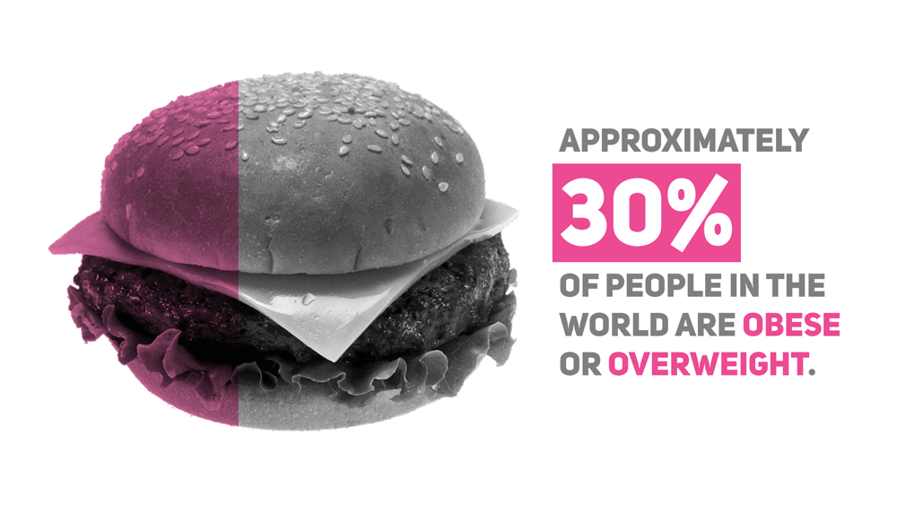
This is where things get interesting. Crop the image to reflect your statistic. If, for example, your statistic highlights 30% of something, then crop the image until you have 30% of it left.

Don’t bother being precise. Nobody is going to take out a ruler and start measuring whatever is on your slide. Just go for something indicative.
Now, press Ctrl + C to copy your cropped image. Head to your first slide (the one with the grayscaled image), and press Ctrl + V to paste it.

Voila, you just created a creative bar chart using images. You can now delete your second slide and move on.
3. Express Your Statistic With Text
So you’re done with the illustrative part. Awesome. Now, type out your statistic to reflect the illustration you made.
Don’t be afraid to be creative in this step. Use a combination of different fonts, font sizes, shapes and colors to really bring out your message.
A Creative Solution That Works Perfectly
See how powerful PowerPoint is? A lot of users don’t even know they can do something like this, let alone do it easily.
By going through these three easy steps, you too can create a slide that expresses key statistics in an intuitive way.
Now it’s your turn; go ahead and create a slide similar to the one in this tutorial.
If you run into any problems, or just want to show me what you’ve made, then just drop a line in the comments section.

Awesome! I loved that!
Thanks Toqeer!
Very cool!! Thanks so much for sharing !
very creative.. thank you !!
You’re welcome!
Thanks a bunch! <3
Got a project for us?
© Slide Cow. All rights reserved.
Session expired
Please log in again. The login page will open in a new tab. After logging in you can close it and return to this page.
Introduction to Statistics
(15 reviews)
David Lane, Rice University
Copyright Year: 2003
Publisher: David Lane
Language: English
Formats Available
Conditions of use.
Learn more about reviews.
Reviewed by Terri Torres, professor, Oregon Institute of Technology on 8/17/23
This author covers all the topics that would be covered in an introductory statistics course plus some. I could imagine using it for two courses at my university, which is on the quarter system. I would rather have the problem of too many topics... read more
Comprehensiveness rating: 5 see less
This author covers all the topics that would be covered in an introductory statistics course plus some. I could imagine using it for two courses at my university, which is on the quarter system. I would rather have the problem of too many topics rather than too few.
Content Accuracy rating: 5
Yes, Lane is both thorough and accurate.
Relevance/Longevity rating: 5
What is covered is what is usually covered in an introductory statistics book. The only topic I may, given sufficient time, cover is bootstrapping.
Clarity rating: 5
The book is clear and well-written. For the trickier topics, simulations are included to help with understanding.
Consistency rating: 5
All is organized in a way that is consistent with the previous topic.
Modularity rating: 5
The text is organized in a way that easily enables navigation.
Organization/Structure/Flow rating: 5
The text is organized like most statistics texts.
Interface rating: 5
Easy navigation.
Grammatical Errors rating: 5
I didn't see any grammatical errors.
Cultural Relevance rating: 5
Nothing is included that is culturally insensitive.
The videos that accompany this text are short and easy to watch and understand. Videos should be short enough to teach, but not so long that they are tiresome. This text includes almost everything: videos, simulations, case studies---all nicely organized in one spot. In addition, Lane has promised to send an instructor's manual and slide deck.
Reviewed by Professor Sandberg, Professor, Framingham State University on 6/29/21
This text covers all the usual topics in an Introduction to Statistics for college students. In addition, it has some additional topics that are useful. read more
This text covers all the usual topics in an Introduction to Statistics for college students. In addition, it has some additional topics that are useful.
I did not find any errors.
Some of the examples are dated. And the frequent use of male/female examples need updating in terms of current gender splits.
I found it was easy to read and understand and I expect that students would also find the writing clear and the explanations accessible.
Even with different authors of chapter, the writing is consistent.
The text is well organized into sections making it easy to assign individual topics and sections.
The topics are presented in the usual order. Regression comes later in the text but there is a difference of opinions about whether to present it early with descriptive statistics for bivariate data or later with inferential statistics.
I had no problem navigating the text online.
The writing is grammatical correct.
I saw no issues that would be offensive.
I did like this text. It seems like it would be a good choice for most introductory statistics courses. I liked that the Monty Hall problem was included in the probability section. The author offers to provide an instructor's manual, PowerPoint slides and additional questions. These additional resources are very helpful and not always available with online OER texts.
Reviewed by Emilio Vazquez, Associate Professor, Trine University on 4/23/21
This appears to be an excellent textbook for an Introductory Course in Statistics. It covers subjects in enough depth to fulfill the needs of a beginner in Statistics work yet is not so complex as to be overwhelming. read more
This appears to be an excellent textbook for an Introductory Course in Statistics. It covers subjects in enough depth to fulfill the needs of a beginner in Statistics work yet is not so complex as to be overwhelming.
I found no errors in their discussions. Did not work out all of the questions and answers but my sampling did not reveal any errors.
Some of the examples may need updating depending on the times but the examples are still relevant at this time.
This is a Statistics text so a little dry. I found that the derivation of some of the formulas was not explained. However the background is there to allow the instructor to derive these in class if desired.
The text is consistent throughout using the same verbiage in various sections.
The text dose lend itself to reasonable reading assignments. For example the chapter (Chapter 3) on Summarizing Distributions covers Central Tendency and its associated components in an easy 20 pages with Measures of Variability making up most of the rest of the chapter and covering approximately another 20 pages. Exercises are available at the end of each chapter making it easy for the instructor to assign reading and exercises to be discussed in class.
The textbook flows easily from Descriptive to Inferential Statistics with chapters on Sampling and Estimation preceding chapters on hypothesis testing
I had no problems with navigation
All textbooks have a few errors but certainly nothing glaring or making text difficult
I saw no issues and I am part of a cultural minority in the US
Overall I found this to be a excellent in-depth overview of Statistical Theory, Concepts and Analysis. The length of the textbook appears to be more than adequate for a one-semester course in Introduction to Statistics. As I no longer teach a full statistics course but simply a few lectures as part of our Research Curriculum, I am recommending this book to my students as a good reference. Especially as it is available on-line and in Open Access.
Reviewed by Audrey Hickert, Assistant Professor, Southern Illinois University Carbondale on 3/29/21
All of the major topics of an introductory level statistics course for social science are covered. Background areas include levels of measurement and research design basics. Descriptive statistics include all major measures of central tendency and... read more
All of the major topics of an introductory level statistics course for social science are covered. Background areas include levels of measurement and research design basics. Descriptive statistics include all major measures of central tendency and dispersion/variation. Building blocks for inferential statistics include sampling distributions, the standard normal curve (z scores), and hypothesis testing sections. Inferential statistics include how to calculate confidence intervals, as well as conduct tests of one-sample tests of the population mean (Z- and t-tests), two-sample tests of the difference in population means (Z- and t-tests), chi square test of independence, correlation, and regression. Doesn’t include full probability distribution tables (e.g., t or Z), but those can be easily found online in many places.
I did not find any errors or issues of inaccuracy. When a particular method or practice is debated in the field, the authors acknowledge it (and provide citations in some circumstances).
Relevance/Longevity rating: 4
Basic statistics are standard, so the core information will remain relevant in perpetuity. Some of the examples are dated (e.g., salaries from 1999), but not problematic.
Clarity rating: 4
All of the key terms, formulas, and logic for statistical tests are clearly explained. The book sometimes uses different notation than other entry-level books. For example, the variance formula uses "M" for mean, rather than x-bar.
The explanations are consistent and build from and relate to corresponding sections that are listed in each unit.
Modularity is a strength of this text in both the PDF and interactive online format. Students can easily navigate to the necessary sections and each starts with a “Prerequisites” list of other sections in the book for those who need the additional background material. Instructors could easily compile concise sub-sections of the book for readings.
The presentation of topics differs somewhat from the standard introductory social science statistics textbooks I have used before. However, the modularity allows the instructor and student to work through the discrete sections in the desired order.
Interface rating: 4
For the most part the display of all images/charts is good and navigation is straightforward. One concern is that the organization of the Table of Contents does not exactly match the organizational outline at the start of each chapter in the PDF version. For example, sometimes there are more detailed sub-headings at the start of chapter and occasionally slightly different section headings/titles. There are also inconsistencies in section listings at start of chapters vs. start of sub-sections.
The text is easy to read and free from any obvious grammatical errors.
Although some of the examples are outdated, I did not review any that were offensive. One example of an outdated reference is using descriptive data on “Men per 100 Women” in U.S. cities as “useful if we are looking for an opposite-sex partner”.
This is a good introduction level statistics text book if you have a course with students who may be intimated by longer texts with more detailed information. Just the core basics are provided here and it is easy to select the sections you need. It is a good text if you plan to supplement with an array of your own materials (lectures, practice, etc.) that are specifically tailored to your discipline (e.g., criminal justice and criminology). Be advised that some formulas use different notation than other standard texts, so you will need to point that out to students if they differ from your lectures or assessment materials.
Reviewed by Shahar Boneh, Professor, Metropolitan State University of Denver on 3/26/21, updated 4/22/21
The textbook is indeed quite comprehensive. It can accommodate any style of introductory statistics course. read more
The textbook is indeed quite comprehensive. It can accommodate any style of introductory statistics course.
The text seems to be statistically accurate.
It is a little too extensive, which requires instructors to cover it selectively, and has a potential to confuse the students.
It is written clearly.
Consistency rating: 4
The terminology is fairly consistent. There is room for some improvement.
By the nature of the subject, the topics have to be presented in a sequential and coherent order. However, the book breaks things down quite effectively.
Organization/Structure/Flow rating: 3
Some of the topics are interleaved and not presented in the order I would like to cover them.
Good interface.
The grammar is ok.
The book seems to be culturally neutral, and not offensive in any way.
I really liked the simulations that go with the book. Parts of the book are a little too advanced for students who are learning statistics for the first time.
Reviewed by Julie Gray, Adjunct Assistant Professor, University of Texas at Arlington on 2/26/21
The textbook is for beginner-level students. The concept development is appropriate--there is always room to grow to high higher level, but for an introduction, the basics are what is needed. This is a well-thought-through OER textbook project by... read more
The textbook is for beginner-level students. The concept development is appropriate--there is always room to grow to high higher level, but for an introduction, the basics are what is needed. This is a well-thought-through OER textbook project by Dr. Lane and colleagues. It is obvious that several iterations have only made it better.
I found all the material accurate.
Essentially, statistical concepts at the introductory level are accepted as universal. This suggests that the relevance of this textbook will continue for a long time.
The book is well written for introducing beginners to statistical concepts. The figures, tables, and animated examples reinforce the clarity of the written text.
Yes, the information is consistent; when it is introduced in early chapters it ties in well in later chapters that build on and add more understanding for the topic.
Modularity rating: 4
The book is well-written with attention to modularity where possible. Due to the nature of statistics, that is not always possible. The content is presented in the order that I usually teach these concepts.
The organization of the book is good, I particularly like the sample lecture slide presentations and the problem set with solutions for use in quizzes and exams. These are available by writing to the author. It is wonderful to have access to these helpful resources for instructors to use in preparation.
I did not find any interface issues.
The book is well written. In my reading I did not notice grammatical errors.
For this subject and in the examples given, I did not notice any cultural issues.
For the field of social work where qualitative data is as common as quantitative, the importance of giving students the rationale or the motivation to learn the quantitative side is understated. To use this text as an introductory statistics OER textbook in a social work curriculum, the instructor will want to bring in field-relevant examples to engage and motivate students. The field needs data-driven decision making and evidence-based practices to become more ubiquitous than not. Preparing future social workers by teaching introductory statistics is essential to meet that goal.
Reviewed by Mamata Marme, Assistant Professor, Augustana College on 6/25/19
This textbook offers a fairly comprehensive summary of what should be discussed in an introductory course in Statistics. The statistical literacy exercises are particularly interesting. It would be helpful to have the statistical tables... read more
Comprehensiveness rating: 4 see less
This textbook offers a fairly comprehensive summary of what should be discussed in an introductory course in Statistics. The statistical literacy exercises are particularly interesting. It would be helpful to have the statistical tables attached in the same package, even though they are available online.
The terminology and notation used in the textbook is pretty standard. The content is accurate.
The statistical literacy example are up to date but will need to be updated fairly regularly to keep the textbook fresh. The applications within the chapter are accessible and can be used fairly easily over a couple of editions.
The textbook does not necessarily explain the derivation of some of the formulae and this will need to be augmented by the instructor in class discussion. What is beneficial is that there are multiple ways that a topic is discussed using graphs, calculations and explanations of the results. Statistics textbooks have to cover a wide variety of topics with a fair amount of depth. To do this concisely is difficult. There is a fine line between being concise and clear, which this textbook does well, and being somewhat dry. It may be up to the instructor to bring case studies into the readings we are going through the topics rather than wait until the end of the chapter.
The textbook uses standard notation and terminology. The heading section of each chapter is closely tied to topics that are covered. The end of chapter problems and the statistical literacy applications are closely tied to the material covered.
The authors have done a good job treating each chapter as if they stand alone. The lack of connection to a past reference may create a sense of disconnect between the topics discussed
The text's "modularity" does make the flow of the material a little disconnected. If would be better if there was accountability of what a student should already have learnt in a different section. The earlier material is easy to find but not consistently referred to in the text.
I had no problem with the interface. The online version is more visually interesting than the pdf version.
I did not see any grammatical errors.
Cultural Relevance rating: 4
I am not sure how to evaluate this. The examples are mostly based on the American experience and the data alluded to mostly domestic. However, I am not sure if that creates a problem in understanding the methodology.
Overall, this textbook will cover most of the topics in a survey of statistics course.
Reviewed by Alexandra Verkhovtseva, Professor, Anoka-Ramsey Community College on 6/3/19
This is a comprehensive enough text, considering that it is not easy to create a comprehensive statistics textbook. It is suitable for an introductory statistics course for non-math majors. It contains twenty-one chapters, covering the wide range... read more
This is a comprehensive enough text, considering that it is not easy to create a comprehensive statistics textbook. It is suitable for an introductory statistics course for non-math majors. It contains twenty-one chapters, covering the wide range of intro stats topics (and some more), plus the case studies and the glossary.
The content is pretty accurate, I did not find any biases or errors.
The book contains fairly recent data presented in the form of exercises, examples and applications. The topics are up-to-date, and appropriate technology is used for examples, applications, and case studies.
The language is simple and clear, which is a good thing, since students are usually scared of this class, and instructors are looking for something to put them at ease. I would, however, try to make it a little more interesting, exciting, or may be even funny.
Consistency is good, the book has a great structure. I like how each chapter has prerequisites and learner outcomes, this gives students a good idea of what to expect. Material in this book is covered in good detail.
The text can be easily divided into sub-sections, some of which can be omitted if needed. The chapter on regression is covered towards the end (chapter 14), but part of it can be covered sooner in the course.
The book contains well organized chapters that makes reading through easy and understandable. The order of chapters and sections is clear and logical.
The online version has many functions and is easy to navigate. This book also comes with a PDF version. There is no distortion of images or charts. The text is clean and clear, the examples provided contain appropriate format of data presentation.
No grammatical errors found.
The text uses simple and clear language, which is helpful for non-native speakers. I would include more culturally-relevant examples and case studies. Overall, good text.
In all, this book is a good learning experience. It contains tools and techniques that free and easy to use and also easy to modify for both, students and instructors. I very much appreciate this opportunity to use this textbook at no cost for our students.
Reviewed by Dabrina Dutcher, Assistant Professor, Bucknell University on 3/4/19
This is a reasonably thorough first-semester statistics book for most classes. It would have worked well for the general statistics courses I have taught in the past but is not as suitable for specialized introductory statistics courses for... read more
This is a reasonably thorough first-semester statistics book for most classes. It would have worked well for the general statistics courses I have taught in the past but is not as suitable for specialized introductory statistics courses for engineers or business applications. That is OK, they have separate texts for that! The only sections that feel somewhat light in terms of content are the confidence intervals and ANOVA sections. Given that these topics are often sort of crammed in at the end of many introductory classes, that might not be problematic for many instructors. It should also be pointed out that while there are a couple of chapters on probability, this book spends presents most formulas as "black boxes" rather than worry about the derivation or origin of the formulas. The probability sections do not include any significant combinatorics work, which is sometimes included at this level.
I did not find any errors in the formulas presented but I did not work many end-of-chapter problems to gauge the accuracy of their answers.
There isn't much changing in the introductory stats world, so I have no concerns about the book becoming outdated rapidly. The examples and problems still feel relevant and reasonably modern. My only concern is that the statistical tool most often referenced in the book are TI-83/84 type calculators. As students increasingly buy TI-89s or Inspires, these sections of the book may lose relevance faster than other parts.
Solid. The book gives a list of key terms and their definitions at the end of each chapter which is a nice feature. It also has a formula review at the end of each chapter. I can imagine that these are heavily used by students when studying! Formulas are easy to find and read and are well defined. There are a few areas that I might have found frustrating as a student. For example, the explanation for the difference in formulas for a population vs sample standard deviation is quite weak. Again, this is a book that focuses on sort of a "black-box" approach but you may have to supplement such sections for some students.
I did not detect any problems with inconsistent symbol use or switches in terminology.
Modularity rating: 3
This low rating should not be taken as an indicator of an issue with this book but would be true of virtually any statistics book. Different books still use different variable symbols even for basic calculated statistics. So trying to use a chapter of this book without some sort of symbol/variable cheat-sheet would likely be frustrating to the students.
However, I think it would be possible to skip some chapters or use the chapters in a different order without any loss of functionality.
This book uses a very standard order for the material. The chapter on regressions comes later than it does in some texts but it doesn't really matter since that chapter never seems to fit smoothly anywhere.
There are numerous end of chapter problems, some with answers, available in this book. I'm vacillating on whether these problems would be more useful if they were distributed after each relevant section or are better clumped at the end of the whole chapter. That might be a matter of individual preference.
I did not detect any problems.
I found no errors. However, there were several sections where the punctuation seemed non-ideal. This did not affect the over-all useability of the book though
I'm not sure how well this book would work internationally as many of the examples contain domestic (American) references. However, I did not see anything offensive or biased in the book.
Reviewed by Ilgin Sager, Assistant Professor, University of Missouri - St. Louis on 1/14/19
As the title implies, this is a brief introduction textbook. It covers the fundamental of the introductory statistics, however not a comprehensive text on the subject. A teacher can use this book as the sole text of an introductory statistics.... read more
As the title implies, this is a brief introduction textbook. It covers the fundamental of the introductory statistics, however not a comprehensive text on the subject. A teacher can use this book as the sole text of an introductory statistics. The prose format of definitions and theorems make theoretical concepts accessible to non-math major students. The textbook covers all chapters required in this level course.
It is accurate; the subject matter in the examples to be up to date, is timeless and wouldn't need to be revised in future editions; there is no error except a few typographical errors. There are no logic errors or incorrect explanations.
This text will remain up to date for a long time since it has timeless examples and exercises, it wouldn't be outdated. The information is presented clearly with a simple way and the exercises are beneficial to follow the information.
The material is presented in a clear, concise manner. The text is easy readable for the first time statistics student.
The structure of the text is very consistent. Topics are presented with examples, followed by exercises. Problem sets are appropriate for the level of learner.
When the earlier matters need to be referenced, it is easy to find; no trouble reading the book and finding results, it has a consistent scheme. This book is set very well in sections.
The text presents the information in a logical order.
The learner can easily follow up the material; there is no interface problem.
There is no logic errors and incorrect explanations, a few typographical errors is just to be ignored.
Not applicable for this textbook.
Reviewed by Suhwon Lee, Associate Teaching Professor, University of Missouri on 6/19/18
This book is pretty comprehensive for being a brief introductory book. This book covers all necessary content areas for an introduction to Statistics course for non-math majors. The text book provides an effective index, plenty of exercises,... read more
This book is pretty comprehensive for being a brief introductory book. This book covers all necessary content areas for an introduction to Statistics course for non-math majors. The text book provides an effective index, plenty of exercises, review questions, and practice tests. It provides references and case studies. The glossary and index section is very helpful for students and can be used as a great resource.
Content appears to be accurate throughout. Being an introductory book, the book is unbiased and straight to the point. The terminology is standard.
The content in textbook is up to date. It will be very easy to update it or make changes at any point in time because of the well-structured contents in the textbook.
The author does a great job of explaining nearly every new term or concept. The book is easy to follow, clear and concise. The graphics are good to follow. The language in the book is easily understandable. I found most instructions in the book to be very detailed and clear for students to follow.
Overall consistency is good. It is consistent in terms of terminology and framework. The writing is straightforward and standardized throughout the text and it makes reading easier.
The authors do a great job of partitioning the text and labeling sections with appropriate headings. The table of contents is well organized and easily divisible into reading sections and it can be assigned at different points within the course.
Organization/Structure/Flow rating: 4
Overall, the topics are arranged in an order that follows natural progression in a statistics course with some exception. They are addressed logically and given adequate coverage.
The text is free of any issues. There are no navigation problems nor any display issues.
The text contains no grammatical errors.
The text is not culturally insensitive or offensive in any way most of time. Some examples might need to consider citing the sources or use differently to reflect current inclusive teaching strategies.
Overall, it's well-written and good recourse to be an introduction to statistical methods. Some materials may not need to be covered in an one-semester course. Various examples and quizzes can be a great recourse for instructor.
Reviewed by Jenna Kowalski, Mathematics Instructor, Anoka-Ramsey Community College on 3/27/18
The text includes the introductory statistics topics covered in a college-level semester course. An effective index and glossary are included, with functional hyperlinks. read more
The text includes the introductory statistics topics covered in a college-level semester course. An effective index and glossary are included, with functional hyperlinks.
Content Accuracy rating: 3
The content of this text is accurate and error-free, based on a random sampling of various pages throughout the text. Several examples included information without formal citation, leading the reader to potential bias and discrimination. These examples should be corrected to reflect current values of inclusive teaching.
The text contains relevant information that is current and will not become outdated in the near future. The statistical formulas and calculations have been used for centuries. The examples are direct applications of the formulas and accurately assess the conceptual knowledge of the reader.
The text is very clear and direct with the language used. The jargon does require a basic mathematical and/or statistical foundation to interpret, but this foundational requirement should be met with course prerequisites and placement testing. Graphs, tables, and visual displays are clearly labeled.
The terminology and framework of the text is consistent. The hyperlinks are working effectively, and the glossary is valuable. Each chapter contains modules that begin with prerequisite information and upcoming learning objectives for mastery.
The modules are clearly defined and can be used in conjunction with other modules, or individually to exemplify a choice topic. With the prerequisite information stated, the reader understands what prior mathematical understanding is required to successfully use the module.
The topics are presented well, but I recommend placing Sampling Distributions, Advanced Graphs, and Research Design ahead of Probability in the text. I think this rearranged version of the index would better align with current Introductory Statistics texts. The structure is very organized with the prerequisite information stated and upcoming learner outcomes highlighted. Each module is well-defined.
Adding an option of returning to the previous page would be of great value to the reader. While progressing through the text systematically, this is not an issue, but when the reader chooses to skip modules and read select pages then returning to the previous state of information is not easily accessible.
No grammatical errors were found while reviewing select pages of this text at random.
Cultural Relevance rating: 3
Several examples contained data that were not formally cited. These examples need to be corrected to reflect current inclusive teaching strategies. For example, one question stated that “while men are XX times more likely to commit murder than women, …” This data should be cited, otherwise the information can be interpreted as biased and offensive.
An included solutions manual for the exercises would be valuable to educators who choose to use this text.
Reviewed by Zaki Kuruppalil, Associate Professor, Ohio University on 2/1/18
This is a comprehensive book on statistical methods, its settings and most importantly the interpretation of the results. With the advent of computers and software’s, complex statistical analysis can be done very easily. But the challenge is the... read more
This is a comprehensive book on statistical methods, its settings and most importantly the interpretation of the results. With the advent of computers and software’s, complex statistical analysis can be done very easily. But the challenge is the knowledge of how to set the case, setting parameters (for example confidence intervals) and knowing its implication on the interpretation of the results. If not done properly this could lead to deceptive inferences, inadvertently or purposely. This book does a great job in explaining the above using many examples and real world case studies. If you are looking for a book to learn and apply statistical methods, this is a great one. I think the author could consider revising the title of the book to reflect the above, as it is more than just an introduction to statistics, may be include the word such as practical guide.
The contents of the book seems accurate. Some plots and calculations were randomly selected and checked for accuracy.
The book topics are up to date and in my opinion, will not be obsolete in the near future. I think the smartest thing the author has done is, not tied the book with any particular software such as minitab or spss . No matter what the software is, standard deviation is calculated the same way as it is always. The only noticeable exception in this case was using the Java Applet for calculating Z values in page 261 and in page 416 an excerpt of SPSS analysis is provided for ANOVA calculations.
The contents and examples cited are clear and explained in simple language. Data analysis and presentation of the results including mathematical calculations, graphical explanation using charts, tables, figures etc are presented with clarity.
Terminology is consistant. Framework for each chapter seems consistent with each chapter beginning with a set of defined topics, and each of the topic divided into modules with each module having a set of learning objectives and prerequisite chapters.
The text book is divided into chapters with each chapter further divided into modules. Each of the modules have detailed learning objectives and prerequisite required. So you can extract a portion of the book and use it as a standalone to teach certain topics or as a learning guide to apply a relevant topic.
Presentation of the topics are well thought and are presented in a logical fashion as if it would be introduced to someone who is learning the contents. However, there are some issues with table of contents and page numbers, for example chapter 17 starts in page 597 not 598. Also some tables and figures does not have a number, for instance the graph shown in page 114 does not have a number. Also it would have been better if the chapter number was included in table and figure identification, for example Figure 4-5 . Also in some cases, for instance page 109, the figures and titles are in two different pages.
No major issues. Only suggestion would be, since each chapter has several modules, any means such as a header to trace back where you are currently, would certainly help.
Grammatical Errors rating: 4
Easy to read and phrased correctly in most cases. Minor grammatical errors such as missing prepositions etc. In some cases the author seems to have the habbit of using a period after the decimal. For instance page 464, 467 etc. For X = 1, Y' = (0.425)(1) + 0.785 = 1.21. For X = 2, Y' = (0.425)(2) + 0.785 = 1.64.
However it contains some statements (even though given as examples) that could be perceived as subjective, which the author could consider citing the sources. For example from page 11: Statistics include numerical facts and figures. For instance: • The largest earthquake measured 9.2 on the Richter scale. • Men are at least 10 times more likely than women to commit murder. • One in every 8 South Africans is HIV positive. • By the year 2020, there will be 15 people aged 65 and over for every new baby born.
Solutions for the exercises would be a great teaching resource to have
Reviewed by Randy Vander Wal, Professor, The Pennsylvania State University on 2/1/18
As a text for an introductory course, standard topics are covered. It was nice to see some topics such as power, sampling, research design and distribution free methods covered, as these are often omitted in abbreviated texts. Each module... read more
As a text for an introductory course, standard topics are covered. It was nice to see some topics such as power, sampling, research design and distribution free methods covered, as these are often omitted in abbreviated texts. Each module introduces the topic, has appropriate graphics, illustration or worked example(s) as appropriate and concluding with many exercises. An instructor’s manual is available by contacting the author. A comprehensive glossary provides definitions for all the major terms and concepts. The case studies give examples of practical applications of statistical analyses. Many of the case studies contain the actual raw data. To note is that the on-line e-book provides several calculators for the essential distributions and tests. These are provided in lieu of printed tables which are not included in the pdf. (Such tables are readily available on the web.)
The content is accurate and error free. Notation is standard and terminology is used accurately, as are the videos and verbal explanations therein. Online links work properly as do all the calculators. The text appears neutral and unbiased in subject and content.
The text achieves contemporary relevance by ending each section with a Statistical Literacy example, drawn from contemporary headlines and issues. Of course, the core topics are time proven. There is no obvious material that may become “dated”.
The text is very readable. While the pdf text may appear “sparse” by absence varied colored and inset boxes, pictures etc., the essential illustrations and descriptions are provided. Meanwhile for this same content the on-line version appears streamlined, uncluttered, enhancing the value of the active links. Moreover, the videos provide nice short segments of “active” instruction that are clear and concise. Despite being a mathematical text, the text is not overly burdened by formulas and numbers but rather has “readable feel”.
This terminology and symbol use are consistent throughout the text and with common use in the field. The pdf text and online version are also consistent by content, but with the online e-book offering much greater functionality.
The chapters and topics may be used in a selective manner. Certain chapters have no pre-requisite chapter and in all cases, those required are listed at the beginning of each module. It would be straightforward to select portions of the text and reorganize as needed. The online version is highly modular offering students both ease of navigation and selection of topics.
Chapter topics are arranged appropriately. In an introductory statistics course, there is a logical flow given the buildup to the normal distribution, concept of sampling distributions, confidence intervals, hypothesis testing, regression and additional parametric and non-parametric tests. The normal distribution is central to an introductory course. Necessary precursor topics are covered in this text, while its use in significance and hypothesis testing follow, and thereafter more advanced topics, including multi-factor ANOVA.
Each chapter is structured with several modules, each beginning with pre-requisite chapter(s), learning objectives and concluding with Statistical Literacy sections providing a self-check question addressing the core concept, along with answer, followed by an extensive problem set. The clear and concise learning objectives will be of benefit to students and the course instructor. No solutions or answer key is provided to students. An instructor’s manual is available by request.
The on-line interface works well. In fact, I was pleasantly surprised by its options and functionality. The pdf appears somewhat sparse by comparison to publisher texts, lacking pictures, colored boxes, etc. But the on-line version has many active links providing definitions and graphic illustrations for key terms and topics. This can really facilitate learning as making such “refreshers” integral to the new material. Most sections also have short videos that are professionally done, with narration and smooth graphics. In this way, the text is interactive and flexible, offering varied tools for students. To note is that the interactive e-book works for both IOS and OS X.
The text in pdf form appeared to free of grammatical errors, as did the on-line version, text, graphics and videos.
This text contains no culturally insensitive or offensive content. The focus of the text is on concepts and explanation.
The text would be a great resource for students. The full content would be ambitious for a 1-semester course, such use would be unlikely. The text is clearly geared towards students with no statistics background nor calculus. The text could be used in two styles of course. For 1st year students early chapters on graphs and distributions would be the starting point, omitting later chapters on Chi-square, transformations, distribution-free and size effect chapters. Alternatively, for upper level students the introductory chapters could be bypassed with the latter chapters then covered to completion.
This text adopts a descriptive style of presentation with topics well and fully explained, much like the “Dummy series”. For this, it may seem a bit “wordy”, but this can well serve students and notably it complements powerpoint slides that are generally sparse on written content. This text could be used as the primary text, for regular lectures, or as reference for a “flipped” class. The e-book videos are an enabling tool if this approach is adopted.
Reviewed by David jabon, Associate Professor, DePaul University on 8/15/17
This text covers all the standard topics in a semester long introductory course in statistics. It is particularly well indexed and very easy to navigate. There is comprehensive hyperlinked glossary. read more
This text covers all the standard topics in a semester long introductory course in statistics. It is particularly well indexed and very easy to navigate. There is comprehensive hyperlinked glossary.
The material is completely accurate. There are no errors. The terminology is standard with one exception: the book calls what most people call the interquartile range, the H-spread in a number of places. Ideally, the term "interquartile range" would be used in place of every reference to "H-spread." "Interquartile range" is simply a better, more descriptive term of the concept that it describes. It is also more commonly used nowadays.
This book came out a number of years ago, but the material is still up to date. Some more recent case studies have been added.
The writing is very clear. There are also videos for almost every section. The section on boxplots uses a lot of technical terms that I don't find are very helpful for my students (hinge, H-spread, upper adjacent value).
The text is internally consistent with one exception that I noted (the use of the synonymous words "H-spread" and "interquartile range").
The text book is brokenly into very short sections, almost to a fault. Each section is at most two pages long. However at the end of each of these sections there are a few multiple choice questions to test yourself. These questions are a very appealing feature of the text.
The organization, in particular the ordering of the topics, is rather standard with a few exceptions. Boxplots are introduced in Chapter II before the discussion of measures of center and dispersion. Most books introduce them as part of discussion of summaries of data using measure of center and dispersion. Some statistics instructors may not like the way the text lumps all of the sampling distributions in a single chapter (sampling distribution of mean, sampling distribution for the difference of means, sampling distribution of a proportion, sampling distribution of r). I have tried this approach, and I now like this approach. But it is a very challenging chapter for students.
The book's interface has no features that distracted me. Overall the text is very clean and spare, with no additional distracting visual elements.
The book contains no grammatical errors.
The book's cultural relevance comes out in the case studies. As of this writing there are 33 such case studies, and they cover a wide range of issues from health to racial, ethnic, and gender disparity.
Each chapter as a nice set of exercises with selected answers. The thirty three case studies are excellent and can be supplement with some other online case studies. An instructor's manual and PowerPoint slides can be obtained by emailing the author. There are direct links to online simulations within the text. This text is very high quality textbook in every way.
Table of Contents
- 1. Introduction
- 2. Graphing Distributions
- 3. Summarizing Distributions
- 4. Describing Bivariate Data
- 5. Probability
- 6. Research Design
- 7. Normal Distributions
- 8. Advanced Graphs
- 9. Sampling Distributions
- 10. Estimation
- 11. Logic of Hypothesis Testing
- 12. Testing Means
- 14. Regression
- 15. Analysis of Variance
- 16. Transformations
- 17. Chi Square
- 18. Distribution-Free Tests
- 19. Effect Size
- 20. Case Studies
- 21. Glossary
Ancillary Material
- Ancillary materials are available by contacting the author or publisher .
About the Book
Introduction to Statistics is a resource for learning and teaching introductory statistics. This work is in the public domain. Therefore, it can be copied and reproduced without limitation. However, we would appreciate a citation where possible. Please cite as: Online Statistics Education: A Multimedia Course of Study (http://onlinestatbook.com/). Project Leader: David M. Lane, Rice University. Instructor's manual, PowerPoint Slides, and additional questions are available.
About the Contributors
David Lane is an Associate Professor in the Departments of Psychology, Statistics, and Management at the Rice University. Lane is the principal developer of this resource although many others have made substantial contributions. This site was developed at Rice University, University of Houston-Clear Lake, and Tufts University.
Contribute to this Page
Home PowerPoint Templates Statistics
Statistics PowerPoint Templates & Presentation Slides
Download Statistics PPT templates and presentation slides to communicate statistics to an audience. Our 100% editable statistics templates are fully compatible with PowerPoint and Google Slides.
These attractive-looking Statistics Templates can help you prepare slides for presentations illustrating your data without complications. Check these statistics slide templates for PowerPoint presentations, including lines, graphs, icons, shapes, and other aesthetics to illustrate your slides with powerful graphics.
Featured Templates
Waffle Charts PowerPoint Template
Statistical Bias PowerPoint Templates
Analytics Dashboard PowerPoint Template

Global Concept Slide for PowerPoint
Latest templates.
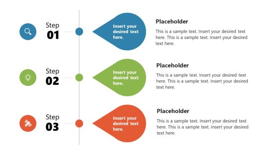
Business Statistics Infographic Template for PowerPoint
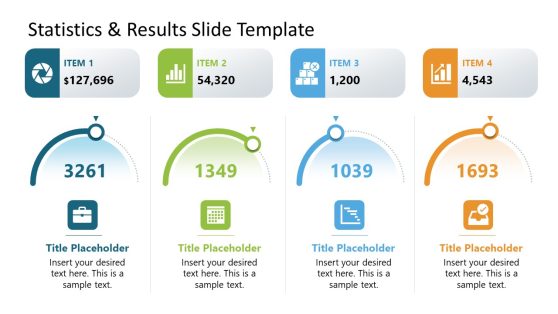
Statistics & Results PowerPoint Template
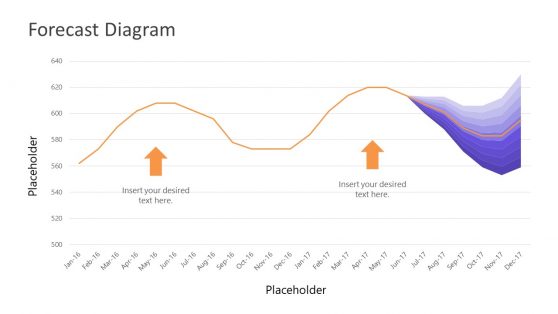
Data Driven Fan Chart PowerPoint Template

Customers Illustration PowerPoint Template
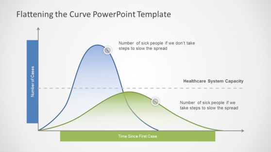
Coronavirus Flattening the Curve PowerPoint Template
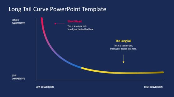
Long Tail PowerPoint Template
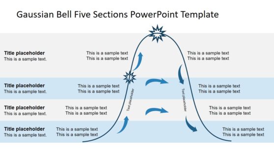
Gaussian Bell Five Sections PowerPoint Template
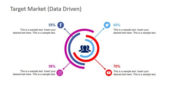
Social Media Analysis PowerPoint Template

Portland Oregon PowerPoint Map

Creative Dashboard UX Mockup PowerPoint Template

Materiality Matrix PowerPoint Template

Benelux Political Region PowerPoint Map
Whether you are a researcher, a business professional, an educator, or a student, these statistics templates for PowerPoint and Google slides are a great method for representing numbers. They feature bar graphs, pie charts, line plots, and scatter plots. You can pick the one that looks best for your project, customize its content, and complete a professional presentation in just minutes.
Additionally, these versatile presentation templates for statistics allow us to change their theme, regardless of whether you work in PowerPoint, Google Slides, or Apple Keynote. These time-saver tools for data representation are a must-have. Go through our extensive statistic template collection and complete your projects today!
What is a Stats Slide?
A “Stats Slide” is a slide within a presentation that visually presents statistical data, often in graphs, charts, tables, or other graphical representations. It conveys quantitative information, such as numbers, percentages, trends, comparisons, and other data-related insights, to the audience.
How do You Present Statistics in Slides?
To present statistics in slides effectively, follow these steps:
- Choose the right visuals, which include bar charts, line graphs, pie charts, and tables.
- Make it simple and focus your slide on the most relevant and important information; you don’t need to use all the data.
- Use clear labels and titles that convey the main message of the data.
- Explain the data by giving a piece of background information.
- Be consistent about the design theme throughout your presentation.
- Use your organization color(s) or thoughtfully choose color(s) to avoid excessive use of color that can distract from the main message.
- Avoid overwhelming the slide with too much text; use short, impactful bullet points to highlight key insights.
- Keep it Visually stunning.
- Make sure you cite sources where you get those statistics to maintain credibility.
What is the Purpose of a Statistics Slide?
The purpose of a statistics slide is to provide a clear and concise representation of complex data. It helps the presenter communicate key information quickly and effectively, making the data more understandable and memorable for the audience.
How to Show Statistics in PPT?
To show statistics in a PowerPoint (PPT) presentation:
- Create a new slide by clicking the “New Slide” button or pressing Ctrl + N.
- Select a slide layout that accommodates the statistics you want to present.
- If presenting numerical data, choose the “Chart or Graph” option, select the appropriate chart type (bar, line, pie, et cetera), and input your data into the chart.
- Customize the chart’s appearance, labels, colors, and other elements to make it stunning and informative.
- Add titles, labels, and necessary text to explain the data’s significance.
- Adjust fonts, colors, and layout as needed.
- Preview the slide to ensure the data is correctly presented and easily understood.
- Practice Delivery
Using statistics slides effectively can enhance your presentation by making complex data accessible and engaging to your audience.
Download Unlimited Content
Our annual unlimited plan let you download unlimited content from slidemodel. save hours of manual work and use awesome slide designs in your next presentation..
February 9, 2023
Can't find what you're looking for?
[UPDATED] Top Presentation Statistics for 2023
Decktopus shared a survey and collected data on presentation related trends and tendencies. The survey results reflect the responses of over 300+ participants, with significant participation from business professionals, academics and student bodies.
What's Inside?
Data is everything. Especially as 2022 is just around the corner, it is becoming increasingly important for companies to collect data from their users to gain valuable insights and improve their product offerings. Further, this data could be used to help develop the industry and user experience trends in general. For this very purpose, Decktopus shared a survey and collected data on presentation related trends and tendencies. The survey results reflect the responses of over 300+ participants, with significant participation from business professionals, academics and student bodies. The optimal length of a presentation for an audience member is about 10 slides.
1. The optimal length of a presentation for an audience member is about 10 slides.

Audience members do not prefer exorbitantly long presentations or super short presentations. When given the option, the average preference for slide numbers were either 5-9 slides or 10-14 slides as opposed to 5-9 or 15-19 slides. This shows that an average audience member prefers that you keep your slide number to about 10 slides.
2. People prefer about one fourth of the slide to be composed of text at most.

It is a super common pitfall for anyone creating a presentation. You want to deliver on content, and you think the best way to do it is overload your slides with text. But, you are wrong; most survey takers prioritize visual aids and design elements before text and absolutely HATE text-heavy slides. Why? Simple: it is difficult to follow and sustain the audience's attention. This is why about half the survey takers said they preferred the text to take up no more than a fourth of the slide. If you are having difficulty maintaining the text portion to a certain limit, consider using tools like Decktopus that offer limits on text per slide.
3. 100% of people think a slide should include visuals.

While there were variations in how much of the slide should be visuals, one thing was clear from the survey results: no visuals is not an option. While about 60% of participants said they prefer to see some visuals on slides, the remaining 40% said visuals are an absolute must in presentations. It is a known fact that visuals are becoming increasingly important elements in presentations, and you should consider them as key assets in your presentation. Refer to the visual aids in Decktopus for free image, gif and icon libraries.
4. About a fifth of the participants said they looked at another screen constantly during presentations.

The reasons may vary, but it seems that it is relatively easy to lose attention on the presentation with many technological gadgets lying around at your disposal. About half the participants said this tendency depended on either the presentation topic, or more importantly how engaging the presenter was. Thankfully, there are ways to keep your audience members engaged rather than looking at their phones. For tips on how to deliver an engaging presentation, follow our blog: “What makes for a good presentation?”
5. Most people have an attention span of 10 to 15 minutes for a standard presentation.

Survey takers said they preferred a presentation to be no longer than 15 but not shorter than 10 minutes long. If a presentation is too short, you might find yourself unclear about the message or the material. Conversely, if it is too long, it becomes ever more difficult to sustain audience attention and engagement.
6. People consider “the story” the most important and memorable part of a presentation.

A presentation should be telling a story. Evidently, participants agreed as they placed the story as the number one thing they remember after the presentation. The remainder of the participants said that video, statistics, images and questions were less important than stories, yet still essential elements of the presentation experience.
7. Audience members primarily expect a presenter to interact with them.

There are many things that make a presenter shine through as they deliver the content of their presentation. But, according to our survey results, proper audience interaction comes first. This is followed by clear speech, eye contact and loud voice. For more information on public speaking tips, refer to our blog on “How to Deliver the Perfect Presentation” .
8. Most people create at least one presentation per week.

This figure varies drastically from person to person; in fact, while about 10% of participants said they created presentations daily, about 30% of participants said they created presentations 1-3 times a month. The general numbers accounted for one presentation being created every week per member; which means 55 presentations a year per person! Can you imagine how many presentations that adds up to for, say, a company, or a country? Quite a lot…
9. The most amount of presentations are created for academic purposes.

There is, understandably, a huge variety when it comes to what kind of topics people create presentations for. While about 32% of participants said that they most often create presentations for homework or course assignments, around 21% said they used presentations for internal team and project updates. The remaining 12% most often created sales proposals, another 12% startup pitches, and finally 4% investor updates. This also means that about 2/3rds of presentations are created for business purposes or commercial needs. What an interesting bunch! Looking to find creative presentation ideas you had never heard of before? Read our blog on “Creative presentation ideas ”.
10. Most people don’t mind having to present remotely with the new conditions Covid-19 is imposing.

While it is clear that Covid-19 has brought on a whole new way of living and working, it seems it might have helped many people suffering with public speaking or presentation related anxieties. While 33% of participants said they found it somewhat difficult to present remotely, an overwhelming majority of the participants said that they didn’t mind having to present remotely. What’s more about a quarter of participants said they actually preferred it! This is a significant result showing that online presentation tools are actually super helpful in helping people who experience fear of public speaking.
11. Many fellow Decktopus users were extremely proud of their last presentation.

Almost all presentation statistics and figures published to this day show that many people are not proud of the latest presentation they made. Most account it to limited time for preparation or dislike of public speaking, but, nevertheless, they found their presentation performance unsatisfactory. But, about 80% of participants ranked their last presentation as a 4 or 5(5 being the proudest)! Thus, the result of our survey is an anomaly and there is only one explanation: most of our survey participants were Decktopus users and they are proud to use the best presentation tool out there .
12. Almost three quarters of people reuse the same slide deck at least once.

Previous surveys show that people find it difficult to locate appropriate and suitable templates for their decks and stick with one once it is remotely acceptable. Further, building a deck from scratch is severely daunting. That is perhaps why about 75% of participants said they reused the same slide deck at least once to this day, with around 30% of them reusing the same deck over 5 times.
13. It takes most people at least a couple of hours to put together a 10 slide presentation.

Preparing a decent looking presentation is no easy feat. Perhaps this is why over 60% of participants said it took them at least a couple hours to put together 10 slides, with a staggering 12% saying it took them about a week. You may be asking what all this time is being used on: we asked our participants the same question! Apparently while half of their time is spent on preparing the content, the entirety of their remaining effort is distributed across these dimensions: handling the design, integrity, theme, fonts, visuals of the presentation and collaborating with others on the presentation. There are ways to go around these hardships; check out alternative presentation tools like Decktopus to find the easiest way.
14. About half of people think content matters before anything else while preparing a presentation.

While we spend over half our time worrying about things like design elements, we are actually forgetting the main priority: content. While preparing slides 40% said they prioritize text and general content before anything. Further, about 25% said they focused on images, 15% on quotes and 10% on video. The reason why modern presentation tools like Decktopus are sought out as much is because they understand that when it comes to making a presentation, the creator wants to first and foremost focus on the content while not having to deal with design related secondary elements.
15. The biggest grievances modern presentation makers have are the time they spend and their design related efforts.

The gaps in current presentation tools are leading to exorbitant amounts of money, effort and time lost. When asked their biggest issue with presentation tools 31% said they take up too much time, while another 31% said they end up with bad presentation designs. The remaining participants pointed to high learning curves and limited usability. These facts and figures show that these gaps in the presentation industry required a solid replacement that would minimize the time and effort wasted on presentation preparation.
16. Most people think presentation tools should first and foremost offer design related aids.

Presentation tools should capitalize on design, while the user focuses on content. In fact, 42% of participants said presentation tools should offer many design, theme, template related options. The remaining portion of the participants said tools should either offer a limited amount of options specifically tiered to your presentation topic, or offer ready assets like images, gifs, icons. Thankfully, there is a presentation tool that offers them all; you guessed it, it is Decktopus!
17. A majority of people think presentations should be mandatory at school.

This idea is heavily debated. While previous findings suggest a duality between people who think pushing students to present will help them overcome their public speaking fear, the remainder thinks this is undue pressure on young adults. On our survey, 65% said that presentations should be mandatory at school, while 35% preferred that they weren’t, showing a preference for challenging students to work on their presentation skills. For more information on student accounts on presentation, read our blog: “Why Students Hate Giving Presentations”.
18. 1 in 2 people look for alternative solutions to not start their presentations from scratch.

About 50% of people start their presentations from scratch but find it extremely difficult to complete it from step 0. In contrast, 21% said they look for templates, 15% said they worked on an existing template, and 8% said they recycle a used presentation. This shows that about 50% of all presentation makers look for alternative solutions so that they don’t have to start from scratch. Thankfully, presentation tools like Decktopus allow you the options to both start from scratch and build from templates.
<cta-section data-ctaTitle="Sign upto get more insights about presentations!" data-ctaDescription="Start perfecting your presentation today!" data-ctaButtonText="Start now!" data-ctaButtonURL="https://www.decktopus.com/"></cta-section>
So, what does all of this mean for you and your next presentation? Well, we’ve found that the sweet spot seems to be around 10 slides. And remember, less is more when it comes to text on slides – aim for one fourth or less. Additionally, make sure each slide has a visual component to keep audience members’ attention focused on you. Finally, be aware that most people have an attention span of 10 to 15 minutes, so don’t overdo it! To get more tips about making successful presentations, subscribe to our newsletter. We promise not to overload your inbox but will send you interesting stats like these every few weeks.

Subscribe our newsletter to get more insights about presentations!
Don't waste your time designing your presentations by yourself!
Type your content and let our platform design your presentations automatically. No more wasting time for your presentations. Use hundreds of presentation templates to impress your audience. This is the only tool you need to prepare presentations. Try our Presentation Builder today >>
Don’t waste your time by trying to make a website for all your content
Place your content links and let our platform design your bio link automatically. No more wasting time for your social content distribution. Use hundreds of presentation biolink to impress your audience. This is the only tool you need to prepare good-looking bio links. Try our Bio Link Builder today >>
Do You Want To Create a Presentation?
Latest Articles

April 24, 2024
Expert Branding Help: Boost Your Small Business Identity
Unlock the power of branding with our expert assistance. Our streamlined process helps brands grow faster through comprehensive audits and tailored help. Discover how our branding help can elevate your brand's identity and impact.

April 23, 2024
Salesperson Tips: Mastering Modern Salesmanship with 10 Expert Strategies for Success in 2024
Unlock the secrets to sales success with these expert salesman tips! Learn how to navigate egos, leverage years of experience, and master the art of selling. From crafting compelling emails to mastering the art of the pitch, elevate your sales game with these essential selling tips.

April 19, 2024
How to Develop an AI-powered SaaS Product in 6 Steps
Discover the essential guide on how to develop an AI SaaS product in just six comprehensive steps. Dive deep into the world of artificial intelligence SaaS solutions and unlock the potential of integrating AI into your SaaS offerings.
Sign up for our newsletter to stay up-to-date on the latest news and tips from Decktopus.
Let’s create a form here to get visitors’ email addresses.
Ready to dive in? Start your free trial today.
Browse Course Material
Course info.
- Prof. Philippe Rigollet
Departments
- Mathematics
As Taught In
- Probability and Statistics
Learning Resource Types
Statistics for applications, lecture slides.

You are leaving MIT OpenCourseWare
We use essential cookies to make Venngage work. By clicking “Accept All Cookies”, you agree to the storing of cookies on your device to enhance site navigation, analyze site usage, and assist in our marketing efforts.
Manage Cookies
Cookies and similar technologies collect certain information about how you’re using our website. Some of them are essential, and without them you wouldn’t be able to use Venngage. But others are optional, and you get to choose whether we use them or not.
Strictly Necessary Cookies
These cookies are always on, as they’re essential for making Venngage work, and making it safe. Without these cookies, services you’ve asked for can’t be provided.
Show cookie providers
- Google Login
Functionality Cookies
These cookies help us provide enhanced functionality and personalisation, and remember your settings. They may be set by us or by third party providers.
Performance Cookies
These cookies help us analyze how many people are using Venngage, where they come from and how they're using it. If you opt out of these cookies, we can’t get feedback to make Venngage better for you and all our users.
- Google Analytics
Targeting Cookies
These cookies are set by our advertising partners to track your activity and show you relevant Venngage ads on other sites as you browse the internet.
- Google Tag Manager
- Infographics
- Daily Infographics
- Template Lists
- Graphic Design
- Graphs and Charts
- Data Visualization
- Human Resources
- Beginner Guides
Blog Graphic Design
15 Presentation Design Statistics to Know For 2019 [Infographic + Templates]
By Nadya Khoja , Jun 19, 2018

The ability to give a captivating presentation is something that seventy percent of American employees believe is a crucial skill required to finding success at work.

CREATE THIS SOCIAL MEDIA IMAGE
Whether you’re standing in front of 5 people, or 5000 people, it goes without saying that there is a lot of pressure that comes with delivering a talk and putting together a slide deck that effectively gets your thoughts across to an audience, and engages that audience.
I’ve attended many different conferences and panels, and spoken at many events in the past few years. It’s always a little bit daunting to get in front of a room full of strangers who, without a doubt, have high expectations of the content I’m about to share…as well as the delivery of my presentation.

Nearly every conference organizer I speak with tells me the same thing: that their audience typically responds best to actionable content. Plus, I should share something that is not only memorable, but that can be applied immediately by those in attendance .
Oh, but those aren’t the only requirements, of course…
I’ve got to present this information without access to any notes, I have a limited amount of time, I need to avoid incorporating too much text in my slides, and we can’t forget that every single person in the room, despite having the job title of “marketer”, comes from vastly different backgrounds and organizations.
So what’s the takeaway here? Well it’s clearly a lot harder than it seems to deliver a captivating and valuable presentation than may have previously been assumed .
Now I’ll be honest with you–I’m not the strongest public speaker, so it’s difficult for me to just “wing-it” when I get up on stage. I need a lot of cues and structure in my slide decks to help me stay on track, and keep a good pace in order to consistently grab the attention of my audience.
What I’ve learned from giving dozens of presentations in the past year is that every audience seems to respond very well and very strongly to the visual nature of my slide decks . I have almost no text, and in some cases, I have close to 150 slides in a 20 minute presentation.

Despite how many slides I use, I’ve been told specifically from a number of attendees that they are able to clearly remember almost everything I cover in that time. In fact, many have come up to me after a session to recap all of the things they learned and how they plan on applying those tactics to their own jobs.
Am I telling you this simply to brag about how great of a presenter I am? Maybe a little bit. But the main point I want to make is that I’m actually not the only speaker who places such a strong focus on creating visually appealing presentations .
I decided to reach out to speakers from all of the conferences I’ll be attending this year to find out what their processes are for compiling their slide decks in order to make them as engaging and actionable as possible.
They answered 15 different questions, and using those responses our design team actually created customized presentation templates that are available for you to use . Click on the link to check out these presentation templates .
The results from the survey are below.
Presentation Design Statistics to Know for 2019:

CREATE THIS INFOGRAPHIC TEMPLATE
1. What was the main goal that presenters were trying to achieve with their slide decks?
When asked, 47% of speakers surveyed stated that their main objective when designing their presentations was to summarize complex information so that it would be easier for their audience to digest the content.
Other goals that presenters had were to create slide decks that entertained and inspired their audiences (24.5%) and to tell a story or to share a case study of personal experiences with their audiences (16.7%).
Some speakers were also more focused on sharing specific statistics and facts with their audiences (2%) or breaking down specific topics or strategies into smaller inputs and tactics that their audience could take away (9.8%).

CREATE THIS TWITTER IMAGE
2. Did they typically design their own presentations and slides, or did they outsource the work to another designer?
The same speakers were also asked about the design process of their presentations, and if they had a tendency to design their decks on their own, or out-sourced their work to a freelancer, agency or an in-house designer.
What was surprising was that the majority, that being 65.7% of presenters, actually designed all of their presentations on their own , and only 4.9% would hire someone to do it for them. But 29.4% of speakers stated that they did some of the design work themselves, and also got some assistance from a designer.
3. How long did it take speakers to design their own slide decks and presentations?

CREATE THIS INSTAGRAM IMAGE Of those who designed a presentation on their own, 47% said that it took them more than 8 hours to simply design the deck , 28.5% said it took them between 5 and 8 hours to design their presentations and 19.6% said it took them between 1 and 3 hours.
After speaking to our support team to identify how long users on Venngage were spending on their presentation designs, on average those who used an existing presentation template spent between 45 minutes to 2 hours to complete a slide deck. However the users who started from scratch and chose to begin with a blank canvas took between 8 and 12 hours to complete a design.
Browse our library of professionally designed engaging presentation templates to save time creating engaging slide decks.
4. Were their slides typically more text-heavy or more visually focused?
Next we asked presenters whether their decks consisted primarily of visual content or were more text-heavy in nature, and a shocking 84.3% said that their presentations were highly visually focused .
When we surveyed marketers last year to identify how they were using visual content in their marketing efforts , on average the use of visual content in articles increased by 130% from 2015 to 2016 due to the higher engagement levels with visually-focused blog content.
5. What percentage of their slide decks consisted of text?
Only 15.7% of speakers surveyed said that their presentation decks were more text-heavy, and the majority (54.9%) stated that less than 25% of their presentations consisted of text.

CREATE THIS INSTAGRAM TEMPLATE
6. Which types of visuals were most frequently included in presentations?
When asked what types of visuals were used in their presentations, 34.3% of speakers and presenters reported that they predominantly used photographs and stock photos in their presentations, but as we learned from our survey on visual content, only 7.6% of marketers claimed that photography and stock photos resulted in high-engagement.

CREATE THIS CHART TEMPLATE
The majority (41.5%) had stated they had seen higher engagement rates from visuals such as infographics and original graphics.
But only 18.6% of presenters admitted to using original graphics, or charts in their presentations, and 15.7% said they primarily used illustrations and icons. One individual surveyed even went a step further and said:
“Charts and support elements are my biggest stumbling block. I am a practitioner and usually have a really good idea about the story I would like to tell but when it comes down to finding the right graph or free template to help me, I stumble. It’s really, really hard to find good support elements!”

A lot of emphasis is placed on incorporating good storytelling in a presentation, which admittedly is crucial to an engaging presentation, but unfortunately not enough focus is placed on data visualization and using graphs and charts as a supporting element in that story. You can read more about chart design best practices here .
In addition to this, 24.5% of speakers said they used a lot of screenshots and only 6.9% said they used mostly memes and gifs.
7. How many slides on average were included in their presentations?
As I mentioned above, I have a tendency to use a lot of slides in my presentations because it helps me stay on track, but it also keeps the pace of the presentation up, so I was surprised to see that only 3.9% of presenters surveyed used more than 120 slides in their talks, followed by 9.8% who used between 90 and 120 slides.
The majority, being 41.2% said that they only included between 21 and 40 slides in their presentations.

USE THIS BLOG HEADER TEMPLATE
Now if you’ve ever heard of the 10/20/30 rule by Guy Kawasaki, you know that he claims presentations should only have 10 slides and last 20 minutes, but this is a bit of an outdated belief system if you ask me.
The reason being that the modern audience has vastly shorter attention spans than they did even a decade ago .
In fact, apparently the average attention span has dropped from 12 seconds in the year 2000, down to 8 seconds in 2018.

8. How many minutes did their presentations run for?
Keeping this in mind, you need to keep your audience constantly stimulated and offer continuous visual cues to accompany each new thought. We see this a lot today in YouTube videos where frame changes and energy changes occur every 10 seconds , and a new point is made every 30 to 60 seconds.
And considering that 41.2% of speakers surveyed said they now have to give presentations that last anywhere between 45 and 60 minutes, and only 6.9% said their presentations last less than 25 minutes, you need to do everything in your power to avoid losing their interest.
9. What percentage of their presentations consisted of their brand colors?
We also asked how much of their presentations included their own brand colors, and 48% said that less than 25% of their presentations consisted of branded color schemes . That being said, 20.6% said that more than 80% of their presentations consisted of brand colors and only 6.9% said they used their branding between 40% to 60% of the time.
For the most part, slide decks were either incredibly brand focused, or not at all.

CREATE THIS SOCIAL MEDIA IMAGE
You can upload your own brand colors and fonts when you use Venngage’s Brand Kit. Click here to see.
10. Had they ever gotten feedback from their audience specifically for their presentation design?
If you’ve ever given a talk at a conference, you understand that audience feedback goes a long way. So we asked these speakers if they had ever received any feedback specifically about their presentation design itself.
For the most part, 64.7% of speakers said they had received positive feedback on their presentation designs and only 1% said they had received negative feedback on their design (if you’re the 1%, please let us help you).
But 34.3% said they actually never received any feedback on their designs at all .
Now I’d like to take this opportunity to brag again, if that’s okay, and it’s to say that 90% of the time the feedback I receive is on the engaging and memorable nature of my slides’ design and style .

What I’m getting at, is in many cases if the design of your presentation is truly outstanding, people will comment on it. If they say nothing, there is a strong chance that the design didn’t stand out in their minds.
Delivering a memorable presentation is something all speakers strive to achieve, and you need to keep in mind that your audience is spending anywhere between 25 and 60 minutes staring at your slides, not at you.
And if you’re slides contain valuable information and look good, the chances of your audience taking pictures and sharing those pictures online is much higher (and as marketers we all love shareable content, don’t we?).
11. How proud were they of the overall design of their slide decks, on a scale of 1 to 10?
We also asked these speakers how proud they were of their slide design on a scale of 1 to 10, and 52.8% said their pride fell somewhere between an 8 and a 10.
Only 3% rated themselves a 4 or lower, and 44.2% fell somewhere in between a 5 and a 7.
Explore a range of creative presentation templates so that you can create a slide deck you are truly proud of.
Unfortunately, design comes as an afterthought to many presenters, and that makes sense since conference attendees typically decided whether or not to sit in on a talk based on the content, not the look of the presentation.
But the use of visuals is an enhancement to that content that will in turn have an impact on information recall .
12. What kinds of color palettes did they prefer using in their presentation design?
Since we already addressed that most speakers shied away from using their brand colors in their presentations, we wanted to learn a bit more about what types of color schemes and palettes they were drawn to.
Bright and vibrant color palettes ranked the highest, with 35.3% of speakers leaning towards this option, followed by 16.7% who stated they prefered corporate, cool and blue tones in their presentations.

In addition to that, 11.8% said they liked bolder and darker color schemes, and 9.8% said they prefered more earthy and natural tones. Only 7.8% of people stated that they prefered fiery and red tones, and 3.9% said they liked color schemes that were more subtle and consisted of pastel tones.
The remaining 14.7% selected the “Other” option, and shared a much wider range of specific color schemes, most of which consisted of their specific brand colors, or variations of the above palettes (such as “Neon” or “Brown tones”).
13. How frequently did they reuse the same slide deck, or give the same presentation?
As mentioned above, many speakers spent over 8 hours when it came to designing a presentation, so it only makes sense that they would repurpose or reuse that presentation a few times.
In fact, 53% said they reused the same slide deck between 2 and 4 times , and 19.6% said that gave the same presentation more than 8 times. On top of that, 14.7% said they gave the same talk between 5 and 8 times, and 12.7% said they gave the talk only 1 time.

It’s also worth noting that some people commented that even if they didn’t use the exact same presentation multiple times, they would repurpose certain parts or ideas multiple times in different talks.
14. What was their process for getting a presentation ready?
I was interested in learning what the process was for preparing a presentation or slide deck, and 33.3% of those surveyed said they typically started with the content or an outline, and then broke down their script or notes to plug into a deck. For these individuals, design came as a last thought .
Similarly, 26.5% said they started with a skeleton of the entire presentation and then added the design elements to that.

Only 4.9% of people said they would think about the overall theme or design of the presentation, and figure out the exact content later on, whereas 32.4% actually built the content and the presentation simultaneously.
The remaining 2.9% had a variety of more specific processes for their own presentation design, such as determining the audience level first, or starting by talking out loud and letting their natural expertise guide the flow of the overall presentation.
15. What were the most difficult parts of putting together a slide deck?
Finally we asked speakers to tell us everything they found most difficult about putting together their slide decks and 45.1% said they struggled primarily with figuring out how to summarize and condense their content so it would fit in a good presentation.
Ironically, this was also one of the most common goals many of the speakers had. Then 42.2% said they struggled with formatting their presentations in a way that would keep their audience excited and engaged.
As I recommended of course, a possible solution to this struggle is to keep the pace up by changing the slide with every new thought.

And next 25.5% said they struggled with finding good visual assets to include in their presentation, such as charts, photographs and illustrations. Finally, 8.9% said they had a hard time finding a design or a template that stood out from all the noise and clutter.
There were some other results as well that ranged quite a bit where people stated that they struggled with the actual rehearsal of their presentations, or finding the right pacing and flow to accompany the format of their decks. Again I think a solution here is to structure the slide deck in a way so that with each new thought or phrase, the slide changes.
Venngage offers a range of customizable charts, an image library and unique illustrations that you can drag right into your presentation template . Sign up for free .
Based on the findings from this survey, it appears that overall the slide decks of MarTech speakers will continue to place a very strong focus on visual content and cues, rather than heavy use of text.
More and more presenters are spending a lot of time trying to summarize their content in a way that helps educate and engage their audiences, and a clear struggle that many presenters face is figuring out how to format and design their presentations in a way that can accomplish this.
How to make presentations that engage your audience: 5 proven presentation templates that will help
As promised, below you will find five custom templates that the Venngage Design Team put together based on the results of this survey . Our goal is to provide you with templates that not only save you time, but are fully equipped with all the components of an engaging presentation.
1. Use bright and vibrant color schemes to make your information pop
Based on the survey results, we learned that a lot of speakers and presenters are drawn towards brighter and more vibrant color schemes. So we took that into consideration in designing each of these custom engaging templates.

CREATE THIS PRESENTATION TEMPLATE
2. Avoid including too much text on your slides
As you can imagine, your audience doesn’t want to be bombarded with text when they are experiencing your presentation, so try not to include too much text in your slides. Get straight to the point or use photographs, screenshots and illustrations to help get your point across visually.

3. Include graphs and charts to help summarize complex data
If you have survey results , or a lot of data to share with your audience, rather than simply listing out the raw data in your presentation, try to use charts and graphs to help simplify and condense that complex information. It will make it a lot easier for your audience to interpret your findings, and keep them more engaged overall.

4. Use icons to provide visual cues and draw connections
If you’re struggling to figure out how to make your presentations more visual, you can use icons to create visual cues, or draw connections from the text-heavy content in your slides. Icons will help your audience better recall the information you cover during your talk.

5. Focus on summarizing the key points of your content
And if you’re still struggling to figure out how to summarize your key points in an effective and engaging way, try focusing on the “main headers” that structure your content. These are usually your key points and is ultimately the information your audience will want to walk away with at the end of your presentation.

You can explore a wide range of engaging presentation templates and designs here and ensure that the next time you deliver your own presentation, your audience leaves motivated and educated.
More presentation guides:
7 Tips for Designing a Persuasive Presentation [Presentation Design Guide + Templates]
- Uncategorized
How to Use Statistics and Numbers in Presentations
- By: Scott Schwertly
Most presentations involve the need to present numerical data. Sometimes those statistics are the result of research that needs to be communicated clearly and succinctly. Other times, those statistics provide the rationale for a change in action or policy, so it’s crucially important that the numbers make sense. But presenting data can be tough.
You’ve probably experienced a presentation in which the speaker goes on and on about numbers and data, and before long, his voice turns into the waa-waa-waa of the adults in a Peanuts cartoon. You hear the sounds, but they no longer mean anything to you.
Here’s the problem. The human brain doesn’t process numbers the same way it processes words. Numbers are simply representations of something else. Standing alone, they are generally devoid of meaning. So if a speaker launches into a presentation heavy with numerical data, the listener has to do extra work to attach those numbers to what they actually represent and to form meaningful connections.
One of the main rules of presenting is to reduce the burden on the audience, and nowhere is that more important than when you are presenting statistics. The presenter must do everything in his power to make the digestion of numerical data easy. Here are a few ways to do this:
Present numerical data visually. When an audience member sees a visual representation of the numbers while also listening to the presenter explain it, she will get a more complete picture of the data being presented and will be able to process it more easily. David McCandless explains this concept in his TED Talk, The Beauty of Data Visualization , reminding us that when the language of the eye and the language of the mind are used simultaneously, they enhance each other.
Move beyond statement to explanation. Numbers are good at answering the question what ? They are proof, numerical fact. But answering what may not be enough for an audience member who wants to know why those numbers matter within the larger framework of the presentation. A good presenter moves beyond simply stating the facts to explaining them, realizing that audience members don’t just want to know what the numbers are, they want to know what they mean and why they matter.
Show what the symbols represent . Numbers can feel distant because they are abstract symbols, so listeners will naturally process them at a shallow level or hold them at an arm’s length. Presenters who want the numbers to really sink in should move beyond abstract data by attaching the numbers to what they represent. If the statistics represent people, help the audience see faces instead of figures, tell customer stories, or show how a product changed a life. When the audience understands what the numbers represent, they can fully digest information that would otherwise be quickly forgotten.
Make them easy. If you can simplify the numerical data you need to present, do so. If you served 149,675 clients in the past year, consider telling your audience that you served just under 150,000 clients. If rounding to a closer, and more easily understood number will work for the purpose of your presentation, it’s a good way to help reduce the burden on your audience while also boosting their ability to retain that information beyond the presentation.
The next time your presentation involves numbers, keep in mind that the audience processes numbers and words differently. As the presenter, it’s your job to translate abstract numerical data into something the audience can both see and understand.
You can continue to improve your communication skills in our Presentation Mentor Online Course. Register here and learn more about how to present like a pro!

Scott Schwertly
Join our newsletter today.
© 2006-2024 Ethos3 – An Award Winning Presentation Design and Training Company ALL RIGHTS RESERVED
- Terms & Conditions
- Privacy Policy
- Diversity and Inclusion
- Customer Help
- X (Twitter)
Statistics Templates
In today’s digital age, statistics play a pivotal role in decision-making. Whether you’re showcasing survey results, presenting statistical data, or sharing data analysis, the right presentation can make all the difference. Dive into our extensive library of PowerPoint, Keynote, and Google Slides statistics templates to elevate your data representation.
Showing 1–12 of 40 results

Why Choose Our Statistics Templates?
- Professional and Modern Design: Our templates are crafted by experts, ensuring a professional and modern look. From sleek graphs to dynamic infographics, we’ve got you covered.
- Customizable to Your Needs: Every template is customizable. Whether you want to customize it to suit your brand or tweak the text, our tool offers flexibility.
- Diverse Selection: From statistical infographic templates to diagrammatic representations, our selection of statistical infographic templates caters to all your needs.
- Free and Premium Options: Whether you’re on a budget or looking for a commercial edge, we offer both ✓ free and paid templates. Download your desired design and get started!
Engage Your Audience with Visual Excellence
Visualize your data in a way that’s both creative and impactful. With our infographic templates, you can transform complex data into a visual masterpiece. Use icons, charts, and graphs to make your presentation more engaging.
Easy-to-Use and Versatile
No more fussing with complicated design tools. Our graphic templates are user-friendly, allowing you to add images, text, and icons with ease. Whether you’re preparing a report for management, or a statistical infographic for a presentation, our powerpoint templates cater to various needs. Plus, with ppt, slide, visualization and background options, you’re spoilt for choice.
Explore, Customize, Present
Dive into our resource and explore the vast selection of statistical infographic templates. Once you’ve made your selection, customize it to your liking. Then, present your statistical infographics with confidence, knowing you’re using a top-tier template.
In conclusion, for those seeking a professional, modern, and visual stats method to present their statistical data, our statistics templates are the ultimate option. Whether it’s for PowerPoint, Google Slides, or Keynote, our graphical library is your go-to resource for all things presentation.
- 🔍 Search All Categories
- Free PowerPoint Templates
- Free Google Slides Templates
- Free Keynote Templates
- Digital Marketing
- Diagrams and Charts
- DevOps Methodology
- Dashboard Templates
- Customer Acquisition Strategy
- Customer Journey CJM
- Crisis Management
- Competitive Analysis
- Comparison Templates
- Company Profile Templates
- Coaching Models
- Customer Lifetime Value CLV
- Change Management Models
- Calendar Templates
- Human Resources HR
- Brand Strategy
- Gantt Chart
- 30 60 90 Day Plan
- Product Launch Roadmap
- Process Flow Charts
- Pricing Tables
- PEST, PESTEL and PESTLE
- Milestones Timeline
- Maturity Models
- Marketing Mix 4Ps and 7Ps
- Market Research Analytics
- Kanban Board
- Harvey Ball Chart
- Gear Diagram
- Funnel Diagram
- Vision, Mission, Values
- Value Proposition
- Venn Diagrams
- Time Management
- Table of Contents
- SWOT Analysis
- Startup Pitch Deck
- Stakeholder Analysis
- SOSTAC Marketing Models
- Social Media Marketing SMM
- Scrum and Agile
- Sales Strategy
- Sales and Marketing Funnel
- Relationship Marketing
- Pyramid Diagrams

An official website of the United States government
The .gov means it’s official. Federal government websites often end in .gov or .mil. Before sharing sensitive information, make sure you’re on a federal government site.
The site is secure. The https:// ensures that you are connecting to the official website and that any information you provide is encrypted and transmitted securely.
- Publications
- Account settings
Preview improvements coming to the PMC website in October 2024. Learn More or Try it out now .
- Advanced Search
- Journal List
- Korean J Anesthesiol
- v.70(3); 2017 Jun
Statistical data presentation
1 Department of Anesthesiology and Pain Medicine, Dongguk University Ilsan Hospital, Goyang, Korea.
Sangseok Lee
2 Department of Anesthesiology and Pain Medicine, Sanggye Paik Hospital, Inje University College of Medicine, Seoul, Korea.
Data are usually collected in a raw format and thus the inherent information is difficult to understand. Therefore, raw data need to be summarized, processed, and analyzed. However, no matter how well manipulated, the information derived from the raw data should be presented in an effective format, otherwise, it would be a great loss for both authors and readers. In this article, the techniques of data and information presentation in textual, tabular, and graphical forms are introduced. Text is the principal method for explaining findings, outlining trends, and providing contextual information. A table is best suited for representing individual information and represents both quantitative and qualitative information. A graph is a very effective visual tool as it displays data at a glance, facilitates comparison, and can reveal trends and relationships within the data such as changes over time, frequency distribution, and correlation or relative share of a whole. Text, tables, and graphs for data and information presentation are very powerful communication tools. They can make an article easy to understand, attract and sustain the interest of readers, and efficiently present large amounts of complex information. Moreover, as journal editors and reviewers glance at these presentations before reading the whole article, their importance cannot be ignored.
Introduction
Data are a set of facts, and provide a partial picture of reality. Whether data are being collected with a certain purpose or collected data are being utilized, questions regarding what information the data are conveying, how the data can be used, and what must be done to include more useful information must constantly be kept in mind.
Since most data are available to researchers in a raw format, they must be summarized, organized, and analyzed to usefully derive information from them. Furthermore, each data set needs to be presented in a certain way depending on what it is used for. Planning how the data will be presented is essential before appropriately processing raw data.
First, a question for which an answer is desired must be clearly defined. The more detailed the question is, the more detailed and clearer the results are. A broad question results in vague answers and results that are hard to interpret. In other words, a well-defined question is crucial for the data to be well-understood later. Once a detailed question is ready, the raw data must be prepared before processing. These days, data are often summarized, organized, and analyzed with statistical packages or graphics software. Data must be prepared in such a way they are properly recognized by the program being used. The present study does not discuss this data preparation process, which involves creating a data frame, creating/changing rows and columns, changing the level of a factor, categorical variable, coding, dummy variables, variable transformation, data transformation, missing value, outlier treatment, and noise removal.
We describe the roles and appropriate use of text, tables, and graphs (graphs, plots, or charts), all of which are commonly used in reports, articles, posters, and presentations. Furthermore, we discuss the issues that must be addressed when presenting various kinds of information, and effective methods of presenting data, which are the end products of research, and of emphasizing specific information.
Data Presentation
Data can be presented in one of the three ways:
–as text;
–in tabular form; or
–in graphical form.
Methods of presentation must be determined according to the data format, the method of analysis to be used, and the information to be emphasized. Inappropriately presented data fail to clearly convey information to readers and reviewers. Even when the same information is being conveyed, different methods of presentation must be employed depending on what specific information is going to be emphasized. A method of presentation must be chosen after carefully weighing the advantages and disadvantages of different methods of presentation. For easy comparison of different methods of presentation, let us look at a table ( Table 1 ) and a line graph ( Fig. 1 ) that present the same information [ 1 ]. If one wishes to compare or introduce two values at a certain time point, it is appropriate to use text or the written language. However, a table is the most appropriate when all information requires equal attention, and it allows readers to selectively look at information of their own interest. Graphs allow readers to understand the overall trend in data, and intuitively understand the comparison results between two groups. One thing to always bear in mind regardless of what method is used, however, is the simplicity of presentation.

Values are expressed as mean ± SD. Group C: normal saline, Group D: dexmedetomidine. SBP: systolic blood pressure, DBP: diastolic blood pressure, MBP: mean blood pressure, HR: heart rate. * P < 0.05 indicates a significant increase in each group, compared with the baseline values. † P < 0.05 indicates a significant decrease noted in Group D, compared with the baseline values. ‡ P < 0.05 indicates a significant difference between the groups.
Text presentation
Text is the main method of conveying information as it is used to explain results and trends, and provide contextual information. Data are fundamentally presented in paragraphs or sentences. Text can be used to provide interpretation or emphasize certain data. If quantitative information to be conveyed consists of one or two numbers, it is more appropriate to use written language than tables or graphs. For instance, information about the incidence rates of delirium following anesthesia in 2016–2017 can be presented with the use of a few numbers: “The incidence rate of delirium following anesthesia was 11% in 2016 and 15% in 2017; no significant difference of incidence rates was found between the two years.” If this information were to be presented in a graph or a table, it would occupy an unnecessarily large space on the page, without enhancing the readers' understanding of the data. If more data are to be presented, or other information such as that regarding data trends are to be conveyed, a table or a graph would be more appropriate. By nature, data take longer to read when presented as texts and when the main text includes a long list of information, readers and reviewers may have difficulties in understanding the information.
Table presentation
Tables, which convey information that has been converted into words or numbers in rows and columns, have been used for nearly 2,000 years. Anyone with a sufficient level of literacy can easily understand the information presented in a table. Tables are the most appropriate for presenting individual information, and can present both quantitative and qualitative information. Examples of qualitative information are the level of sedation [ 2 ], statistical methods/functions [ 3 , 4 ], and intubation conditions [ 5 ].
The strength of tables is that they can accurately present information that cannot be presented with a graph. A number such as “132.145852” can be accurately expressed in a table. Another strength is that information with different units can be presented together. For instance, blood pressure, heart rate, number of drugs administered, and anesthesia time can be presented together in one table. Finally, tables are useful for summarizing and comparing quantitative information of different variables. However, the interpretation of information takes longer in tables than in graphs, and tables are not appropriate for studying data trends. Furthermore, since all data are of equal importance in a table, it is not easy to identify and selectively choose the information required.
For a general guideline for creating tables, refer to the journal submission requirements 1) .
Heat maps for better visualization of information than tables
Heat maps help to further visualize the information presented in a table by applying colors to the background of cells. By adjusting the colors or color saturation, information is conveyed in a more visible manner, and readers can quickly identify the information of interest ( Table 2 ). Software such as Excel (in Microsoft Office, Microsoft, WA, USA) have features that enable easy creation of heat maps through the options available on the “conditional formatting” menu.
All numbers were created by the author. SBP: systolic blood pressure, DBP: diastolic blood pressure, MBP: mean blood pressure, HR: heart rate.
Graph presentation
Whereas tables can be used for presenting all the information, graphs simplify complex information by using images and emphasizing data patterns or trends, and are useful for summarizing, explaining, or exploring quantitative data. While graphs are effective for presenting large amounts of data, they can be used in place of tables to present small sets of data. A graph format that best presents information must be chosen so that readers and reviewers can easily understand the information. In the following, we describe frequently used graph formats and the types of data that are appropriately presented with each format with examples.
Scatter plot
Scatter plots present data on the x - and y -axes and are used to investigate an association between two variables. A point represents each individual or object, and an association between two variables can be studied by analyzing patterns across multiple points. A regression line is added to a graph to determine whether the association between two variables can be explained or not. Fig. 2 illustrates correlations between pain scoring systems that are currently used (PSQ, Pain Sensitivity Questionnaire; PASS, Pain Anxiety Symptoms Scale; PCS, Pain Catastrophizing Scale) and Geop-Pain Questionnaire (GPQ) with the correlation coefficient, R, and regression line indicated on the scatter plot [ 6 ]. If multiple points exist at an identical location as in this example ( Fig. 2 ), the correlation level may not be clear. In this case, a correlation coefficient or regression line can be added to further elucidate the correlation.

Bar graph and histogram
A bar graph is used to indicate and compare values in a discrete category or group, and the frequency or other measurement parameters (i.e. mean). Depending on the number of categories, and the size or complexity of each category, bars may be created vertically or horizontally. The height (or length) of a bar represents the amount of information in a category. Bar graphs are flexible, and can be used in a grouped or subdivided bar format in cases of two or more data sets in each category. Fig. 3 is a representative example of a vertical bar graph, with the x -axis representing the length of recovery room stay and drug-treated group, and the y -axis representing the visual analog scale (VAS) score. The mean and standard deviation of the VAS scores are expressed as whiskers on the bars ( Fig. 3 ) [ 7 ].

By comparing the endpoints of bars, one can identify the largest and the smallest categories, and understand gradual differences between each category. It is advised to start the x - and y -axes from 0. Illustration of comparison results in the x - and y -axes that do not start from 0 can deceive readers' eyes and lead to overrepresentation of the results.
One form of vertical bar graph is the stacked vertical bar graph. A stack vertical bar graph is used to compare the sum of each category, and analyze parts of a category. While stacked vertical bar graphs are excellent from the aspect of visualization, they do not have a reference line, making comparison of parts of various categories challenging ( Fig. 4 ) [ 8 ].

A pie chart, which is used to represent nominal data (in other words, data classified in different categories), visually represents a distribution of categories. It is generally the most appropriate format for representing information grouped into a small number of categories. It is also used for data that have no other way of being represented aside from a table (i.e. frequency table). Fig. 5 illustrates the distribution of regular waste from operation rooms by their weight [ 8 ]. A pie chart is also commonly used to illustrate the number of votes each candidate won in an election.

Line plot with whiskers
A line plot is useful for representing time-series data such as monthly precipitation and yearly unemployment rates; in other words, it is used to study variables that are observed over time. Line graphs are especially useful for studying patterns and trends across data that include climatic influence, large changes or turning points, and are also appropriate for representing not only time-series data, but also data measured over the progression of a continuous variable such as distance. As can be seen in Fig. 1 , mean and standard deviation of systolic blood pressure are indicated for each time point, which enables readers to easily understand changes of systolic pressure over time [ 1 ]. If data are collected at a regular interval, values in between the measurements can be estimated. In a line graph, the x-axis represents the continuous variable, while the y-axis represents the scale and measurement values. It is also useful to represent multiple data sets on a single line graph to compare and analyze patterns across different data sets.
Box and whisker chart
A box and whisker chart does not make any assumptions about the underlying statistical distribution, and represents variations in samples of a population; therefore, it is appropriate for representing nonparametric data. AA box and whisker chart consists of boxes that represent interquartile range (one to three), the median and the mean of the data, and whiskers presented as lines outside of the boxes. Whiskers can be used to present the largest and smallest values in a set of data or only a part of the data (i.e. 95% of all the data). Data that are excluded from the data set are presented as individual points and are called outliers. The spacing at both ends of the box indicates dispersion in the data. The relative location of the median demonstrated within the box indicates skewness ( Fig. 6 ). The box and whisker chart provided as an example represents calculated volumes of an anesthetic, desflurane, consumed over the course of the observation period ( Fig. 7 ) [ 9 ].

Three-dimensional effects
Most of the recently introduced statistical packages and graphics software have the three-dimensional (3D) effect feature. The 3D effects can add depth and perspective to a graph. However, since they may make reading and interpreting data more difficult, they must only be used after careful consideration. The application of 3D effects on a pie chart makes distinguishing the size of each slice difficult. Even if slices are of similar sizes, slices farther from the front of the pie chart may appear smaller than the slices closer to the front ( Fig. 8 ).

Drawing a graph: example
Finally, we explain how to create a graph by using a line graph as an example ( Fig. 9 ). In Fig. 9 , the mean values of arterial pressure were randomly produced and assumed to have been measured on an hourly basis. In many graphs, the x- and y-axes meet at the zero point ( Fig. 9A ). In this case, information regarding the mean and standard deviation of mean arterial pressure measurements corresponding to t = 0 cannot be conveyed as the values overlap with the y-axis. The data can be clearly exposed by separating the zero point ( Fig. 9B ). In Fig. 9B , the mean and standard deviation of different groups overlap and cannot be clearly distinguished from each other. Separating the data sets and presenting standard deviations in a single direction prevents overlapping and, therefore, reduces the visual inconvenience. Doing so also reduces the excessive number of ticks on the y-axis, increasing the legibility of the graph ( Fig. 9C ). In the last graph, different shapes were used for the lines connecting different time points to further allow the data to be distinguished, and the y-axis was shortened to get rid of the unnecessary empty space present in the previous graphs ( Fig. 9D ). A graph can be made easier to interpret by assigning each group to a different color, changing the shape of a point, or including graphs of different formats [ 10 ]. The use of random settings for the scale in a graph may lead to inappropriate presentation or presentation of data that can deceive readers' eyes ( Fig. 10 ).

Owing to the lack of space, we could not discuss all types of graphs, but have focused on describing graphs that are frequently used in scholarly articles. We have summarized the commonly used types of graphs according to the method of data analysis in Table 3 . For general guidelines on graph designs, please refer to the journal submission requirements 2) .
Conclusions
Text, tables, and graphs are effective communication media that present and convey data and information. They aid readers in understanding the content of research, sustain their interest, and effectively present large quantities of complex information. As journal editors and reviewers will scan through these presentations before reading the entire text, their importance cannot be disregarded. For this reason, authors must pay as close attention to selecting appropriate methods of data presentation as when they were collecting data of good quality and analyzing them. In addition, having a well-established understanding of different methods of data presentation and their appropriate use will enable one to develop the ability to recognize and interpret inappropriately presented data or data presented in such a way that it deceives readers' eyes [ 11 ].
<Appendix>
Output for presentation.
Discovery and communication are the two objectives of data visualization. In the discovery phase, various types of graphs must be tried to understand the rough and overall information the data are conveying. The communication phase is focused on presenting the discovered information in a summarized form. During this phase, it is necessary to polish images including graphs, pictures, and videos, and consider the fact that the images may look different when printed than how appear on a computer screen. In this appendix, we discuss important concepts that one must be familiar with to print graphs appropriately.
The KJA asks that pictures and images meet the following requirement before submission 3)
“Figures and photographs should be submitted as ‘TIFF’ files. Submit files of figures and photographs separately from the text of the paper. Width of figure should be 84 mm (one column). Contrast of photos or graphs should be at least 600 dpi. Contrast of line drawings should be at least 1,200 dpi. The Powerpoint file (ppt, pptx) is also acceptable.”
Unfortunately, without sufficient knowledge of computer graphics, it is not easy to understand the submission requirement above. Therefore, it is necessary to develop an understanding of image resolution, image format (bitmap and vector images), and the corresponding file specifications.
Resolution is often mentioned to describe the quality of images containing graphs or CT/MRI scans, and video files. The higher the resolution, the clearer and closer to reality the image is, while the opposite is true for low resolutions. The most representative unit used to describe a resolution is “dpi” (dots per inch): this literally translates to the number of dots required to constitute 1 inch. The greater the number of dots, the higher the resolution. The KJA submission requirements recommend 600 dpi for images, and 1,200 dpi 4) for graphs. In other words, resolutions in which 600 or 1,200 dots constitute one inch are required for submission.
There are requirements for the horizontal length of an image in addition to the resolution requirements. While there are no requirements for the vertical length of an image, it must not exceed the vertical length of a page. The width of a column on one side of a printed page is 84 mm, or 3.3 inches (84/25.4 mm ≒ 3.3 inches). Therefore, a graph must have a resolution in which 1,200 dots constitute 1 inch, and have a width of 3.3 inches.
Bitmap and Vector
Methods of image construction are important. Bitmap images can be considered as images drawn on section paper. Enlarging the image will enlarge the picture along with the grid, resulting in a lower resolution; in other words, aliasing occurs. On the other hand, reducing the size of the image will reduce the size of the picture, while increasing the resolution. In other words, resolution and the size of an image are inversely proportionate to one another in bitmap images, and it is a drawback of bitmap images that resolution must be considered when adjusting the size of an image. To enlarge an image while maintaining the same resolution, the size and resolution of the image must be determined before saving the image. An image that has already been created cannot avoid changes to its resolution according to changes in size. Enlarging an image while maintaining the same resolution will increase the number of horizontal and vertical dots, ultimately increasing the number of pixels 5) of the image, and the file size. In other words, the file size of a bitmap image is affected by the size and resolution of the image (file extensions include JPG [JPEG] 6) , PNG 7) , GIF 8) , and TIF [TIFF] 9) . To avoid this complexity, the width of an image can be set to 4 inches and its resolution to 900 dpi to satisfy the submission requirements of most journals [ 12 ].
Vector images overcome the shortcomings of bitmap images. Vector images are created based on mathematical operations of line segments and areas between different points, and are not affected by aliasing or pixelation. Furthermore, they result in a smaller file size that is not affected by the size of the image. They are commonly used for drawings and illustrations (file extensions include EPS 10) , CGM 11) , and SVG 12) ).
Finally, the PDF 13) is a file format developed by Adobe Systems (Adobe Systems, CA, USA) for electronic documents, and can contain general documents, text, drawings, images, and fonts. They can also contain bitmap and vector images. While vector images are used by researchers when working in Powerpoint, they are saved as 960 × 720 dots when saved in TIFF format in Powerpoint. This results in a resolution that is inappropriate for printing on a paper medium. To save high-resolution bitmap images, the image must be saved as a PDF file instead of a TIFF, and the saved PDF file must be imported into an imaging processing program such as Photoshop™(Adobe Systems, CA, USA) to be saved in TIFF format [ 12 ].
1) Instructions to authors in KJA; section 5-(9) Table; https://ekja.org/index.php?body=instruction
2) Instructions to Authors in KJA; section 6-1)-(10) Figures and illustrations in Manuscript preparation; https://ekja.org/index.php?body=instruction
3) Instructions to Authors in KJA; section 6-1)-(10) Figures and illustrations in Manuscript preparation; https://ekja.org/index.php?body=instruction
4) Resolution; in KJA, it is represented by “contrast.”
5) Pixel is a minimum unit of an image and contains information of a dot and color. It is derived by multiplying the number of vertical and horizontal dots regardless of image size. For example, Full High Definition (FHD) monitor has 1920 × 1080 dots ≒ 2.07 million pixel.
6) Joint Photographic Experts Group.
7) Portable Network Graphics.
8) Graphics Interchange Format
9) Tagged Image File Format; TIFF
10) Encapsulated PostScript.
11) Computer Graphics Metafile.
12) Scalable Vector Graphics.
13) Portable Document Format.
Bennington College Curriculum Fall 2024
Presentation of statistics (mat2246.01).
Data can come to us in many forms: tables, charts, graphs, observations, experimental results, and other less formal avenues. To best understand the world around us, we must be able to take that data, answer questions, and then convey those answers to others in a clear, concise manner. This course will show different methods for presenting statistical data to others as well as interpreting the information and results accordingly.
This course will serve as an introduction to statistical reasoning and understanding as well as bolster the ability to think critically about data, its sources, and how to convey a clear message from data. It will focus on bringing clarity to data presented, choosing the correct presentation for a given data set, and avoidance of deception. There are no prerequisites and this course will be accessible to all interested and willing students.
This course is appropriate for any students wanting to understand, interpret, and present statistics. Students who plan to seriously create and analyze their own statistics for their work should take Creation of Statistics, which may either be taken as a sequel to this course, or on its own. There is some overlap between the two courses, but their focus and goals are different. Students who take Presentation of Statistics first will get a broader skill set and a more gentle introduction.

Comscore's 2024 State of Digital Commerce Report
Comscore has released its annual, research-based overview of key insights and trends from 2023 on digital e-commerce, mobile shopping, social and how brands are engaging consumers throughout the consumer journey.
Download the report to see the latest analysis on emerging trends and ways that brands are leveraging a cross-platform strategy to drive total awareness and engagement.
Key takeaways include:
- Record $1.3 Trillion spend in 2023
- Desktop growth outpaced mobile growth
- Q4 2023 achieved the highest quarter since Comscore reporting began
Download Report
To get in touch with our team about this report and how we can support your e-commerce growth, click on this link .
The 2024 State of Digital Commerce report was unveiled at ARF Shopper 2024 in Chicago on April 18.
Multi-Platform Content Measurement
Comscore MMX® Multi-Platform provides an deduplicated view of total audience behavior across desktops, smartphones and tablets.
Request a demo
Multi-Platform Video Measurement
Comscore Video Metrix® Multi-Platform delivers a total view of consumer digital video consumption across desktops, smartphones, tablets and CTV devices.
Numbers, Facts and Trends Shaping Your World
Read our research on:
Full Topic List
Regions & Countries
- Publications
- Our Methods
- Short Reads
- Tools & Resources
Read Our Research On:
Key facts about the abortion debate in America

The U.S. Supreme Court’s June 2022 ruling to overturn Roe v. Wade – the decision that had guaranteed a constitutional right to an abortion for nearly 50 years – has shifted the legal battle over abortion to the states, with some prohibiting the procedure and others moving to safeguard it.
As the nation’s post-Roe chapter begins, here are key facts about Americans’ views on abortion, based on two Pew Research Center polls: one conducted from June 25-July 4 , just after this year’s high court ruling, and one conducted in March , before an earlier leaked draft of the opinion became public.
This analysis primarily draws from two Pew Research Center surveys, one surveying 10,441 U.S. adults conducted March 7-13, 2022, and another surveying 6,174 U.S. adults conducted June 27-July 4, 2022. Here are the questions used for the March survey , along with responses, and the questions used for the survey from June and July , along with responses.
Everyone who took part in these surveys is a member of the Center’s American Trends Panel (ATP), an online survey panel that is recruited through national, random sampling of residential addresses. This way nearly all U.S. adults have a chance of selection. The survey is weighted to be representative of the U.S. adult population by gender, race, ethnicity, partisan affiliation, education and other categories. Read more about the ATP’s methodology .
A majority of the U.S. public disapproves of the Supreme Court’s decision to overturn Roe. About six-in-ten adults (57%) disapprove of the court’s decision that the U.S. Constitution does not guarantee a right to abortion and that abortion laws can be set by states, including 43% who strongly disapprove, according to the summer survey. About four-in-ten (41%) approve, including 25% who strongly approve.

About eight-in-ten Democrats and Democratic-leaning independents (82%) disapprove of the court’s decision, including nearly two-thirds (66%) who strongly disapprove. Most Republicans and GOP leaners (70%) approve , including 48% who strongly approve.
Most women (62%) disapprove of the decision to end the federal right to an abortion. More than twice as many women strongly disapprove of the court’s decision (47%) as strongly approve of it (21%). Opinion among men is more divided: 52% disapprove (37% strongly), while 47% approve (28% strongly).
About six-in-ten Americans (62%) say abortion should be legal in all or most cases, according to the summer survey – little changed since the March survey conducted just before the ruling. That includes 29% of Americans who say it should be legal in all cases and 33% who say it should be legal in most cases. About a third of U.S. adults (36%) say abortion should be illegal in all (8%) or most (28%) cases.

Generally, Americans’ views of whether abortion should be legal remained relatively unchanged in the past few years , though support fluctuated somewhat in previous decades.
Relatively few Americans take an absolutist view on the legality of abortion – either supporting or opposing it at all times, regardless of circumstances. The March survey found that support or opposition to abortion varies substantially depending on such circumstances as when an abortion takes place during a pregnancy, whether the pregnancy is life-threatening or whether a baby would have severe health problems.
While Republicans’ and Democrats’ views on the legality of abortion have long differed, the 46 percentage point partisan gap today is considerably larger than it was in the recent past, according to the survey conducted after the court’s ruling. The wider gap has been largely driven by Democrats: Today, 84% of Democrats say abortion should be legal in all or most cases, up from 72% in 2016 and 63% in 2007. Republicans’ views have shown far less change over time: Currently, 38% of Republicans say abortion should be legal in all or most cases, nearly identical to the 39% who said this in 2007.

However, the partisan divisions over whether abortion should generally be legal tell only part of the story. According to the March survey, sizable shares of Democrats favor restrictions on abortion under certain circumstances, while majorities of Republicans favor abortion being legal in some situations , such as in cases of rape or when the pregnancy is life-threatening.
There are wide religious divides in views of whether abortion should be legal , the summer survey found. An overwhelming share of religiously unaffiliated adults (83%) say abortion should be legal in all or most cases, as do six-in-ten Catholics. Protestants are divided in their views: 48% say it should be legal in all or most cases, while 50% say it should be illegal in all or most cases. Majorities of Black Protestants (71%) and White non-evangelical Protestants (61%) take the position that abortion should be legal in all or most cases, while about three-quarters of White evangelicals (73%) say it should be illegal in all (20%) or most cases (53%).

In the March survey, 72% of White evangelicals said that the statement “human life begins at conception, so a fetus is a person with rights” reflected their views extremely or very well . That’s much greater than the share of White non-evangelical Protestants (32%), Black Protestants (38%) and Catholics (44%) who said the same. Overall, 38% of Americans said that statement matched their views extremely or very well.
Catholics, meanwhile, are divided along religious and political lines in their attitudes about abortion, according to the same survey. Catholics who attend Mass regularly are among the country’s strongest opponents of abortion being legal, and they are also more likely than those who attend less frequently to believe that life begins at conception and that a fetus has rights. Catholic Republicans, meanwhile, are far more conservative on a range of abortion questions than are Catholic Democrats.
Women (66%) are more likely than men (57%) to say abortion should be legal in most or all cases, according to the survey conducted after the court’s ruling.
More than half of U.S. adults – including 60% of women and 51% of men – said in March that women should have a greater say than men in setting abortion policy . Just 3% of U.S. adults said men should have more influence over abortion policy than women, with the remainder (39%) saying women and men should have equal say.
The March survey also found that by some measures, women report being closer to the abortion issue than men . For example, women were more likely than men to say they had given “a lot” of thought to issues around abortion prior to taking the survey (40% vs. 30%). They were also considerably more likely than men to say they personally knew someone (such as a close friend, family member or themselves) who had had an abortion (66% vs. 51%) – a gender gap that was evident across age groups, political parties and religious groups.
Relatively few Americans view the morality of abortion in stark terms , the March survey found. Overall, just 7% of all U.S. adults say having an abortion is morally acceptable in all cases, and 13% say it is morally wrong in all cases. A third say that having an abortion is morally wrong in most cases, while about a quarter (24%) say it is morally acceptable in most cases. An additional 21% do not consider having an abortion a moral issue.

Among Republicans, most (68%) say that having an abortion is morally wrong either in most (48%) or all cases (20%). Only about three-in-ten Democrats (29%) hold a similar view. Instead, about four-in-ten Democrats say having an abortion is morally acceptable in most (32%) or all (11%) cases, while an additional 28% say it is not a moral issue.
White evangelical Protestants overwhelmingly say having an abortion is morally wrong in most (51%) or all cases (30%). A slim majority of Catholics (53%) also view having an abortion as morally wrong, but many also say it is morally acceptable in most (24%) or all cases (4%), or that it is not a moral issue (17%). Among religiously unaffiliated Americans, about three-quarters see having an abortion as morally acceptable (45%) or not a moral issue (32%).
- Religion & Abortion
Jane Doe is a a research analyst focusing on social and demographic research at Pew Research Center
What the data says about abortion in the U.S.
Support for legal abortion is widespread in many countries, especially in europe, nearly a year after roe’s demise, americans’ views of abortion access increasingly vary by where they live, by more than two-to-one, americans say medication abortion should be legal in their state, most latinos say democrats care about them and work hard for their vote, far fewer say so of gop, most popular.
1615 L St. NW, Suite 800 Washington, DC 20036 USA (+1) 202-419-4300 | Main (+1) 202-857-8562 | Fax (+1) 202-419-4372 | Media Inquiries
Research Topics
- Age & Generations
- Coronavirus (COVID-19)
- Economy & Work
- Family & Relationships
- Gender & LGBTQ
- Immigration & Migration
- International Affairs
- Internet & Technology
- Methodological Research
- News Habits & Media
- Non-U.S. Governments
- Other Topics
- Politics & Policy
- Race & Ethnicity
- Email Newsletters
ABOUT PEW RESEARCH CENTER Pew Research Center is a nonpartisan fact tank that informs the public about the issues, attitudes and trends shaping the world. It conducts public opinion polling, demographic research, media content analysis and other empirical social science research. Pew Research Center does not take policy positions. It is a subsidiary of The Pew Charitable Trusts .
Copyright 2024 Pew Research Center
Terms & Conditions
Privacy Policy
Cookie Settings
Reprints, Permissions & Use Policy
Statistics and Actuarial Science
Creative component presentations.

All students are invited to the annual creative component presentations in 177 SH starting at 1:50 p.m. on Tuesday, February 20.
All graduate students seeking their MS degrees are encouraged to fulfill 2 s.h. of STAT:6990, engaging in a project that aligns with their application and career interests. Typically, students register for two consecutive 1 s.h. enrollments in STAT:6990 during the fall and spring semesters of the second year. However, this can also be pursued one or two semesters earlier, based on the student’s readiness and motivation. Before enrolling in STAT:6990, each student is responsible for securing a faculty member who agrees to serve as their advisor for the project.
The project entails writing an 8-15 page report on a suitable topic and then presented orally in a public seminar. A faculty committee, in consultation with the advisor, evaluates the work and the presentation, and assigns a grade of satisfactory or unsatisfactory.
Starting at 1:50 p.m. in 177 Schaeffer Hall:
Got any suggestions?
We want to hear from you! Send us a message and help improve Slidesgo
Top searches
Trending searches

suicide prevention
8 templates

46 templates

tropical rainforest
29 templates

spring season
34 templates

american football
16 templates

32 templates
Statistics and Probability: Probability Distributions - Math - 11th Grade
Statistics and probability: probability distributions - math - 11th grade presentation, free google slides theme and powerpoint template.
Demystify the world of statistics and probability with this light blue Google Slides and PowerPoint template! This fully editable set makes explaining probability distributions simple and intuitive. It features a clean, easy-to-understand layout, allowing you to clearly communicate complex concepts with ease. The engaging visuals and diagrams aid in understanding, and the ready to use activities inspire dialogue among your class. Grasp probabilities and deepen your understanding of this fascinating subject!
Features of this template
- 100% editable and easy to modify
- Different slides to impress your audience
- Contains easy-to-edit graphics such as graphs, maps, tables, timelines and mockups
- Includes 500+ icons and Flaticon’s extension for customizing your slides
- Designed to be used in Google Slides and Microsoft PowerPoint
- Includes information about fonts, colors, and credits of the resources used
How can I use the template?
Am I free to use the templates?
How to attribute?
Attribution required If you are a free user, you must attribute Slidesgo by keeping the slide where the credits appear. How to attribute?
Related posts on our blog.

How to Add, Duplicate, Move, Delete or Hide Slides in Google Slides

How to Change Layouts in PowerPoint

How to Change the Slide Size in Google Slides
Related presentations.

Premium template
Unlock this template and gain unlimited access

Register for free and start editing online
Advertisement
Supported by
Dubai’s Extraordinary Flooding: Here’s What to Know
Images of a saturated desert metropolis startled the world, prompting talk of cloud seeding, climate change and designing cities for intensified weather.
- Share full article

By Raymond Zhong
Scenes of flood-ravaged neighborhoods in one of the planet’s driest regions have stunned the world this week. Heavy rains in the United Arab Emirates and Oman submerged cars, clogged highways and killed at least 21 people. Flights out of Dubai’s airport, a major global hub, were severely disrupted.
The downpours weren’t a freak event — forecasters anticipated the storms several days out and issued warnings. But they were certainly unusual. Here’s what to know.
Heavy rain there is rare, but not unheard-of.
On average, the Arabian Peninsula receives a scant few inches of rain a year, although scientists have found that a sizable chunk of that precipitation falls in infrequent but severe bursts, not as periodic showers.
U.A.E. officials said the 24-hour rain total on Tuesday was the country’s largest since records there began in 1949 . But parts of the nation had experienced an earlier round of thunderstorms just last month.
Oman, with its coastline on the Arabian Sea, is also vulnerable to tropical cyclones. Past storms there have brought torrential rain, powerful winds and mudslides, causing extensive damage.
Global warming is projected to intensify downpours.
Stronger storms are a key consequence of human-caused global warming. As the atmosphere gets hotter, it can hold more moisture, which can eventually make its way down to the earth as rain or snow.
But that doesn’t mean rainfall patterns are changing in precisely the same way across every corner of the globe.
In their latest assessment of climate research , scientists convened by the United Nations found there wasn’t enough data to have firm conclusions about rainfall trends in the Arabian Peninsula and how climate change was affecting them. The researchers said, however, that if global warming were to be allowed to continue worsening in the coming decades, extreme downpours in the region would quite likely become more intense and more frequent.
The role of cloud seeding isn’t clear.
The U.A.E. has for decades worked to increase rainfall and boost water supplies by seeding clouds. Essentially, this involves shooting particles into clouds to encourage the moisture to gather into larger, heavier droplets, ones that are more likely to fall as rain or snow.
Cloud seeding and other rain-enhancement methods have been tried across the world, including in Australia, China, India, Israel, South Africa and the United States. Studies have found that these operations can, at best, affect precipitation modestly — enough to turn a downpour into a bigger downpour, but probably not a drizzle into a deluge.
Still, experts said pinning down how much seeding might have contributed to this week’s storms would require detailed study.
“In general, it is quite a challenge to assess the impact of seeding,” said Luca Delle Monache, a climate scientist at the Scripps Institution of Oceanography in La Jolla, Calif. Dr. Delle Monache has been leading efforts to use artificial intelligence to improve the U.A.E.’s rain-enhancement program.
An official with the U.A.E.’s National Center of Meteorology, Omar Al Yazeedi, told news outlets this week that the agency didn’t conduct any seeding during the latest storms. His statements didn’t make clear, however, whether that was also true in the hours or days before.
Mr. Al Yazeedi didn’t respond to emailed questions from The New York Times on Thursday, and Adel Kamal, a spokesman for the center, didn’t immediately have further comment.
Cities in dry places just aren’t designed for floods.
Wherever it happens, flooding isn’t just a matter of how much rain comes down. It’s also about what happens to all that water once it’s on the ground — most critically, in the places people live.
Cities in arid regions often aren’t designed to drain very effectively. In these areas, paved surfaces block rain from seeping into the earth below, forcing it into drainage systems that can easily become overwhelmed.
One recent study of Sharjah , the capital of the third-largest emirate in the U.A.E., found that the city’s rapid growth over the past half century had made it vulnerable to flooding at far lower levels of rain than before.
Omnia Al Desoukie contributed reporting.
Raymond Zhong reports on climate and environmental issues for The Times. More about Raymond Zhong
IMAGES
VIDEO
COMMENTS
Presentation Statistics on Design. A beautiful presentation can not only help you create a great first impression in front of your audience, but can also make you feel more confident while you're presenting. In fact, studies show that 91% of presenters feel more confident when presenting with a well-designed slide deck.
Download the "Statistics and Probability: Statistical Models and Inference - 11th Grade" presentation for PowerPoint or Google Slides. High school students are approaching adulthood, and therefore, this template's design reflects the mature nature of their education. Customize the well-defined sections, integrate multimedia and interactive ...
This statistics PPT template helps you in conveying your message diagrammatically to the audience. Download Social Media Key Statistics. Template 2: Statistical Analysis Control PPT. Incorporate this ready-to-use statistics PowerPoint template to explain your company data to your stakeholders with ease.
General Presentation Statistics 1. About 75% of people are generally terrified of giving presentations (Journal of Education and Educational Development) Takeaway: Giving presentations sure is a daunting task for a few. For some people, it's enjoyable while for others, it's stress-inducing. According to this statistic, about 75% of people ...
Template 7: Key statistics PPT show the deck. This PPT Slide is an effective tool for presenting vital statistics that provide insight into security and user behavior. This presentation slide can serve as an invaluable asset to organizations and professionals looking to highlight key statistics on security vulnerabilities and user behaviors.
TheJoelTruth. While a good presentation has data, data alone doesn't guarantee a good presentation. It's all about how that data is presented. The quickest way to confuse your audience is by ...
Free Google Slides theme and PowerPoint template. Go ahead and include some statistics and the results of a campaign or a sales program by customizing these clean-cut infographics. We've got timelines, processes, steps, Gantt diagrams, maps and tons of percentages. Even some of the designs simulate a 3D effect. Understanding numeric data ...
GET THE 5 FREE SLIDES HERE: https://goo.gl/TBZibY CHECK OUT THE BUSINESS CASUAL PPT TEMPLATE: https://goo.gl/bNNbSjIn this week's PowerPoint tutorial, you...
Using statistics in public speaking is a powerful way to add a quantifiable and persuasive aspect to your message. It provides a basis on which you can build an argument, prove a statement, or support an idea. The key to using statistics is being able to extract meaning and patterns from data in a way that your audience can understand.
Head to your first slide (the one with the grayscaled image), and press Ctrl + V to paste it. Voila, you just created a creative bar chart using images. You can now delete your second slide and move on. 3. Express Your Statistic With Text. So you're done with the illustrative part. Awesome.
Introduction to Statistics is a resource for learning and teaching introductory statistics. This work is in the public domain. Therefore, it can be copied and reproduced without limitation. ... The presentation of topics differs somewhat from the standard introductory social science statistics textbooks I have used before. However, the ...
18.05 Introduction to Probability and Statistics (S22), Class 19 Slides: NHST III. pdf. 74 kB. 18.05 Introduction to Probability and Statistics (S22), Class 20 Slides: Comparison of Frequentist and Bayesian Inference. pdf. 29 kB. 18.05 Introduction to Probability and Statistics (S22), Class 21 Slides: Exam 2 Review.
To show statistics in a PowerPoint (PPT) presentation: Create a new slide by clicking the "New Slide" button or pressing Ctrl + N. Select a slide layout that accommodates the statistics you want to present. If presenting numerical data, choose the "Chart or Graph" option, select the appropriate chart type (bar, line, pie, et cetera ...
Definition by Croxton and Cowden "Statistics may be defined as the science of collection, presentation analysis and interpretation of numerical data from the logical analysis." 1. Collection of Data 2. Presentation of data 3. Analysis of data 4.
13. It takes most people at least a couple of hours to put together a 10 slide presentation. Preparing a decent looking presentation is no easy feat. Perhaps this is why over 60% of participants said it took them at least a couple hours to put together 10 slides, with a staggering 12% saying it took them about a week.
Regression (PDF - 1.2MB) 17-18. Bayesian Statistics (PDF) 19-20. Principal Component Analysis (PDF) 21-24. Generalized Linear Models (PDF) This section includes a full set of the lecture notes.
15 Presentation Design Statistics to Know For 2019 [Infographic + Templates] By Nadya Khoja, Jun 19, 2018. The ability to give a captivating presentation is something that seventy percent of American employees believe is a crucial skill required to finding success at work.
Most presentations involve the need to present numerical data. Sometimes those statistics are the result of research that needs to be communicated clearly and succinctly. Other times, those statistics provide the rationale for a change in action or policy, so it's crucially important that the numbers make sense. But presenting data can be tough.
Our graphic templates are user-friendly, allowing you to add images, text, and icons with ease. Whether you're preparing a report for management, or a statistical infographic for a presentation, our powerpoint templates cater to various needs. Plus, with ppt, slide, visualization and background options, you're spoilt for choice.
In this article, the techniques of data and information presentation in textual, tabular, and graphical forms are introduced. Text is the principal method for explaining findings, outlining trends, and providing contextual information. A table is best suited for representing individual information and represents both quantitative and ...
Free Google Slides theme and PowerPoint template. Exploring the world of probability and statistics can be challenging, but this Google Slides & PowerPoint template is here to simplify it. The design is simple, bold, and creative, predominantly featuring a professional shade of gray. Perfectly suited for educators or researchers, it's brimming ...
Most of the statistical presentations appearing in newspapers and magazines are descriptive in nature. Univariate methods of descriptive statistics use data to enhance the understanding of a single variable; multivariate methods focus on using statistics to understand the relationships among two or more variables. To illustrate methods of ...
Students who take Presentation of Statistics first will get a broader skill set and a more gentle introduction. Learning Outcomes: - Assess the validity of the experimental or sampling design and statistical analysis of others. - Identify misunderstandings about statistical reasoning and critique (mis)applications of data. ...
Comscore has released its annual, research-based overview of key insights and trends from 2023 on digital e-commerce, mobile shopping, social and engaging the consumer throughout their journey.
A majority of the U.S. public disapproves of the Supreme Court's decision to overturn Roe. About six-in-ten adults (57%) disapprove of the court's decision that the U.S. Constitution does not guarantee a right to abortion and that abortion laws can be set by states, including 43% who strongly disapprove, according to the summer survey.
All students are invited to the annual creative component presentations in 177 SH starting at 1:50 p.m. on Tuesday, February 20. All graduate students seeking their MS degrees are encouraged to fulfill 2 s.h. of STAT:6990, engaging in a project that aligns with their application and career interests.
Statistics; Trade; Transport; Urban Development, Housing & Land; Themes. Climate action; High-impact Areas; Gender; Circular Economy; SPECA; Technical cooperation; THE PEP; UN SG's Special Envoy for Road Safety; UN Road Safety Fund; UN cooperation in the UNECE region; Regional Forum on Sustainable Development; Artificial intelligence; SDGs ...
Demystify the world of statistics and probability with this light blue Google Slides and PowerPoint template! This fully editable set makes explaining probability distributions simple and intuitive. It features a clean, easy-to-understand layout, allowing you to clearly communicate complex concepts with ease. The engaging visuals and diagrams ...
Embargo subscribers will have access to these statistics beginning Sept. 13 at noon (EDT). ... The webinar will consist of a simultaneous audio conference and online presentation. News media will have the opportunity to ask questions following the presentation. Audio conference access information. Toll-free number: 1-888-324-9363 ...
Flooding in Oman and U.A.E. Advertisement Supported by Images of a saturated desert metropolis startled the world, prompting talk of cloud seeding, climate change and designing cities for ...