Excel Visualization: A Guide to Clear Data Presentation for Beginners
I once struggled with dull data tables.
Numbers clustered in rows and columns become a blur. But with Excel visualization , you can empower your audience to make informed decisions based on the data presented. Excel charts and graphs replace chaos, revealing patterns and trends.
Convey ideas efficiently with the right visual. It’s not just about creating a chart; it’s about making data understandable and engaging.
In this article, I’ll guide you step-by-step on transforming your Excel data into insightful visuals.
Let’s get started!
Table of Contents

Understanding the Basics of Excel Visualization
Excel provides various visualization options, whether 2D or 3D versions, standard, stacked, or 100% stacked options. It’s all about finding the right fit that best represents your data and message.
The Excel Charting Interface
Let’s start with creating a chart in Excel.
When you click on the Insert tab in Excel, you’ll see various chart types that you can use to visualize your data.

The Excel charting interface provides a wide range of options, from line and area charts to bar and column charts. When you click on a chart, the ‘ Chart Tools ’ contextual tab provides additional features for customizing your charts.
Types of Data for Visualization
Excel visualization data can be broadly categorized into numerical, categorical, and time-series data.
- Numerical data includes values that can be measured, such as sales figures or temperature readings.
- Categorical data includes information such as names, labels, or groups.
- Time-series data involves values measured over time, such as stock prices or website traffic.
Excel offers different chart types depending on your data type.
Selecting the Right Chart Type
Selecting the right chart type is half the battle for effective data visualization in Excel.
Pie charts are best for part-to-whole comparisons. Use line charts for time series or trends. Bar or column charts are the most suitable for categorical comparisons.
However, consider more advanced chart types for more complex data sets.
Scatter plots are excellent for correlation analysis , while histograms and box plots are ideal for distribution analysis of quantitative data.
It’s all about understanding your data and determining the best way to display it.
Steps for Visualizing Data in Excel – Creating Basic Charts
Creating basic charts in Excel is a fundamental skill for anyone looking to present data in a visual format.
Excel offers a variety of chart types, each with unique properties and use cases. The key to successful chart creation in Excel is understanding these different chart types and knowing how to present your data most effectively with them.
Organizing Your Data
Before you dive into creating Excel charts, it is crucial to organize your data correctly .
Well-organized data will make the charting process easier and the resulting charts more meaningful. Ensure your data is clean, error-free, and arranged clearly and logically.
This will make it easier to select the data for your charts and create visuals that effectively communicate your data analysis results.
Pie and Donut Chart
Pie charts are popular for showing the proportion of different categories within a whole. While visually appealing, they are often misused and can lead to misleading interpretations.
Generally, they are most effective when comparing a few categories representing parts of a whole.
On the other hand, donut charts are a variation of pie charts with a hole in the middle (as the name implies!). Like pie charts, they can display multiple data series, but they should be used sparingly.
To create a pie chart in Excel:
- Select the data you want to visualize
- From the “ Insert ” tab, choose “ Pie ” from the chart options.
- You can customize your chart by changing the colors, adding labels, and adjusting other settings in the “ Format Chart Area ” pane.
Here’s a video guide on how to create a donut chart:
Line and Area Chart
Line and area charts are handy when dealing with time-series data . These charts plot data points on a graph and connect them with a line, allowing you to see trends over time.
Check out this video for a step-by-step guide on how to create a line chart:
One of the business essentials when working with line and area charts is customizing the axis and gridlines. This can help make your chart more readable and meaningful .
The “ Format Axis ” pane allows you to customize the axis labels, adjust the scale, and add gridlines.
Column and Bar Graph
Bar and column charts are Excel’s most commonly used chart types. They are excellent for comparing different categories of data.
While bar charts and column charts are often used interchangeably, there is a difference: A bar chart presents data horizontally , while a column chart presents data vertically . This distinction can influence how easily your audience interprets the chart.
You can also choose between a stacked or clustered bar and column chart layout.
In a stacked chart , data series are stacked on each other, while in a clustered chart , they are placed side by side.
To create a bar or column chart:
- Select the data
- Then choose either “Bar” or “Column” from the chart options in the “ Insert ” tab
- Remember to format the chart and the axis labels to make the chart easier to understand
Advanced Charting Techniques
In this section, I’ll describe how to present complex data in a visually appealing and easily understandable format. Since each dataset is unique, treat these charts as ideas for meaningfully presenting your data.
Combination Charts
This type of chart combines the features of line and column charts, allowing you to present mixed data more comprehensively.
For example, when you have a target and actual data for comparison , a combination chart can be the perfect tool for visualization.
Clicking the Chart Design tab on the ribbon allows you to change the chart type and create a customized combination chart.

This allows you to have your target values in columns and the actual values marked along the line, which provides a clearer visualization of your data.
Trendlines and Data Analysis
Another essential feature of Excel charts is the ability to add trendlines. These can be linear, polynomial, or moving average trendlines.
A trendline graphically displays trends in your data , and you can extend it beyond the actual data to predict future values.
Along with trendlines, interpreting R-squared values is also crucial in data analysis. This will help you understand the relationship between your dependent and independent variables, thus enhancing your analysis results.
Check out our detailed how-to post on adding trendlines to Excel charts .
Conditional Formatting in Charts
Conditional formatting is another advanced charting technique in Excel that can enhance your data visualization. You can also add data bars, color scales, and icon sets.
These features allow you to customize your charts based on certain conditions, making it easier for your audience to understand your data. Applying these formatting options enables you to create more engaging and visually appealing charts for your data presentation.
Creating a Tornado Chart in Excel
Tornado charts are particularly effective when comparing and contrasting different variables . A well-crafted tornado chart can help you visualize how changes in several factors can impact a specific outcome – for example, the impact of inflation on NPV and IRR results.
Here’s a video showing you how to create a tornado chart:
Designing a Funnel Chart in Excel
Funnel Charts in Excel are highly effective tools for monitoring sales processes or any other process that narrows down over time.
Here are two quick methods for designing funnel charts in Excel:
Building a Waffle Chart in Excel
Waffle charts, also known as square pie or waffle bar charts, are a great way to visualize individual data points compared to the whole data set. They are a fun and engaging way to present percentages or proportions.
Here is a simple method for creating waffle charts:
Data Visualization Tips – Enhancing Chart Aesthetics
The aesthetics of your Excel chart play a significant role in how effectively your data is communicated.
A visually appealing chart is easier to understand and engages your audience. Enhancing chart aesthetics involves working with various chart elements and features, such as colors, styles, and data labels.
Adding data labels, for instance, provides additional information on your chart, making it easier to interpret.
Besides, you can customize the chart’s colors and styles to match your presentation theme or company branding.
Check out this post for more information on good dashboard design principles .
Working with Chart Elements
Working with chart elements can significantly improve the readability and effectiveness of your data visualization.
Some key chart elements you can manipulate include titles, legends, and data labels.
- Data labels provide additional context to your data and can be customized to suit your chart
- Modify axis labels and gridlines to adjust their appearance and improve readability. Check out this video on how to add gridlines to your Excel charts:
These chart elements can enhance your aesthetic appeal and make your data easier to interpret.
Customizing Chart Colors and Styles
Spicing up your Excel charts is easier than you think.
The ‘ Chart Design ‘ tab in the Excel ribbon allows you to alter your charts’ aesthetics significantly.
Navigate to the ‘ Chart Styles ‘ section, and you’ll see various styles for your chart.
Looking for a bit more customization? No problem! Simply click the ‘ Change Colors ‘ dropdown and choose a color scheme.

You can use Excel’s preset color schemes or create a custom color palette for brand consistency. Minor visual changes can significantly affect your chart’s overall look and feel.
3D Charts and Effects
Adding a third dimension to your charts can make them pop . But be careful.
While 3D effects can add a specific wow factor, they can also lead to misinterpretations of your data if they are not used properly.
To add 3D effects to your charts, click the ‘ Chart Styles ‘ and choose a style with 3D effects.
Remember, though, that 3D effects should be used sparingly and only when they can enhance the understanding of the data. Overuse of these effects can lead to cluttered, confusing charts. When it comes to 3D effects, less is often more .
Advanced Excel Graphics
Beyond the basic charts, Excel offers advanced graphics capabilities to take your data presentation to the next level.
This includes using Sparklines, shapes, and icons, among other features.
Sparklines are mini-charts within individual cells, each representing a row of data. They give a quick snapshot of trends, helping you understand your data at a glance.
Excel offers line, column, and win/loss types of Sparklines that you can add with the Quick Analysis tool.
Using Shapes and Icons

Remember to appropriately format these shapes and icons to convey the right message and not distract from the data.
Portraying a Story Through Data
Excel visualization is not just about creating charts or diagrams; it’s about telling a story with your data. This is where the concept of data storytelling comes in.
It’s about using visualization tools to highlight key points and trends in your data, making it easier for your audience to understand and absorb.
It’s not unlike creating a plot in a novel where rows and columns of data are the characters, and the chart is the narrative arc. Every element should convey your story effectively and compellingly, from simple bar charts to intricate trend analysis.
Exporting and Sharing Your Visualizations
Once you’ve created your data visualization in Excel, it’s important to know how to share it! This involves exporting the visual representation of data in a format that others can easily access.
Whether you’re sharing a simple bar graph or a complex infographic, the export method will depend on the intended use of the chart/graphic.
This process can be as simple as saving your chart as an image or embedding Excel visuals in PowerPoint presentations and documents.
Saving Charts as Images
One of the simplest ways to share visualizations is by saving them as images .
To do this, right-click the chart and select ‘Save as Picture.’ Several image formats are available, each with its uses.
For instance, JPEG is great for photographic images, while PNG is ideal for images with transparent backgrounds. However, it’s important to consider the resolution of your image. High resolution is crucial for clear, crisp images, especially if they’re intended for print.
Embedding Excel Visuals in Presentations and Documents
Embedding them in presentations and documents is another way to share your Excel visualizations.
This can be done in two ways: linking and embedding .
- Linking refers to connecting the original Excel file and the document where it’s inserted. Any changes made to the original file will automatically update in the document (assuming the link isn’t broken ).
- Embedding involves inserting a copy of the chart into the document. While this won’t update automatically, it ensures that the chart will always be available, regardless of the status of the original file.
Both methods have advantages and should be chosen based on your specific needs.
Frequently Asked Questions
What are some common mistakes for beginners to avoid in data visualization with excel.
Common mistakes include overcrowding the chart with too much data, using inappropriate chart types, neglecting to label axes or data points clearly, and choosing colors or styles that reduce readability.
What are the best practices for presenting Excel data visually to a non-technical audience?
Focus on simplicity and clarity .
Use straightforward chart types, avoid technical jargon, and highlight key takeaways. Ensure your charts are well-labeled, and use annotations or callouts to draw attention to important data points.
What are some resources to learn more about Excel visualization?
For more tips and tricks, visit my YouTube channel . Alternatively, look at Chandoo’s training, where I learned many excellent dashboard design ideas.
Can Excel visualization help in career development?
Absolutely! Proficiency in Excel visualization is a valuable skill in many industries.
It’s especially relevant in fields like data science, finance, marketing, and others involving large amounts of data. Effectively communicating data through graphical representation can give you a significant advantage in your professional journey.
Leave a Comment Cancel reply
Save my name, email, and website in this browser for the next time I comment.
How-To Geek
How to make a graph in microsoft excel.
Create a helpful chart to display your data and then customize it from top to bottom.
Quick Links
How to create a graph or chart in excel, how to customize a graph or chart in excel.
Graphs and charts are useful visuals for displaying data. They allow you or your audience to see things like a summary, patterns, or trends at glance. Here's how to make a chart, commonly referred to as a graph, in Microsoft Excel.
Excel offers many types of graphs from funnel charts to bar graphs to waterfall charts . You can review recommended charts for your data selection or choose a specific type. And once you create the graph, you can customize it with all sorts of options.
Start by selecting the data you want to use for your chart. Go to the Insert tab and the Charts section of the ribbon. You can then use a suggested chart or select one yourself.
Choose a Recommended Chart
You can see which types of charts Excel suggests by clicking "Recommended Charts."
On the Recommended Charts tab in the window, you can review the suggestions on the left and see a preview on the right. If you'd like to use a chart you see, select it and click "OK."
Choose Your Own Chart
If you would prefer to select a graph on your own, click the All Charts tab at the top of the window. You'll see the types listed on the left. Select one to view the styles for that type of chart on the right. To use one, select it and click "OK."
Another way to choose the type of chart you want to use is by selecting it in the Charts section of the ribbon.
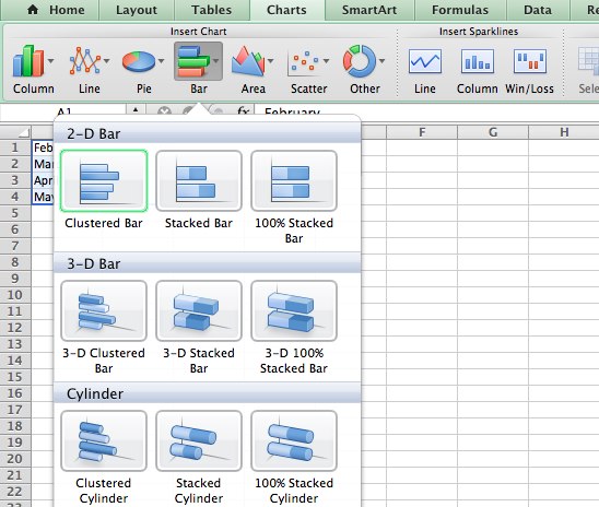
There is a drop-down arrow next to each chart type for you to pick the style. For example, if you choose a column or bar chart , you can select 2-D or 3-D column or 2-D or 3-D bar.
Whichever way you go about choosing the chart you want to use, it will pop right onto your sheet after you select it.
From there, you can customize everything from the colors and style to the elements that appear on the chart.
Related: How to Make a Bar Chart in Microsoft Excel
Just like there are various ways to select the type of chart you want to use in Excel, there are different methods for customizing it. You can use the Chart Design tab, the Format Chart sidebar, and on Windows, you can use the handy buttons on the right of the chart.
Use the Chart Design Tab
To display the Chart Design tab, select the chart. You'll then see many tools in the ribbon for adding chart elements, changing the layout, colors, or style, choosing different data, and switching rows and columns.
If you believe a different type of graph would work better for your data, simply click "Change Chart Type" and you'll see the same options as when you created the chart. So you can easily switch from a column chart to a combo chart , for instance.
Use the Format Chart Sidebar
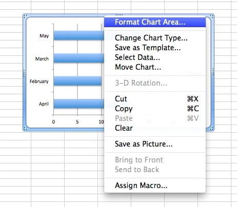
For customizing the font, size, positioning , border, series, and axes, the sidebar is your go-to spot. Either double-click the chart or right-click it and pick "Format Chart Area" from the shortcut menu. To work with the different areas of your chart, go to the top of the sidebar.
Related: How to Lock the Position of a Chart in Excel
Click "Chart Options" and you'll see three tabs for Fill & Line, Effects, and Size & Properties. These apply to the base of your chart.
Click the drop-down arrow next to Chart Options to select a specific part of the chart. You can choose things like Horizontal or Vertical Axis, Plot Area, or a Series of data.
Click "Text Options" for any of the above Chart Options areas and the sidebar tabs change to Text Fill & Outline, Text Effects, and Textbox.
For whichever area you work with, each tab has its options directly below. Simply expand to customize that particular item.
As an example, if you choose to create a Pareto chart , you can customize the Pareto line with the type, color, transparency, width, and more.
Use the Chart Options on Windows
If you use Excel on Windows, you'll get a bonus of three helpful buttons to the right when you select your chart. From top to bottom, you have Chart Elements, Chart Styles, and Chart Filters.
Chart Elements : Add, remove, or position elements of the chart such as the axis titles, data labels , gridlines, trendline, and legend.
Chart Styles : Select a theme for your chart with different effects and backgrounds. Or choose a color scheme from colorful and monochromatic color palettes.
Chart Filters : For viewing particular parts of the data in your chart, you can use filters. Check the boxes under Series or Categories and click "Apply" at the bottom to update your chart and only include your selections.
Chart Filters are only available for certain types of charts.
Hopefully this guide will get you off to a great start with your chart. And if you use Sheets in addition to Excel, learn how to make a graph in Google Sheets too.
Excel Charts: A Complete Overview
Charts in Excel are used to represent data graphically. There are many types of charts in Excel that you can use based on the data.
In this Excel tutorial, you will learn everything about charts in Excel. You can learn to create a chart, format, move, copy or filter it.
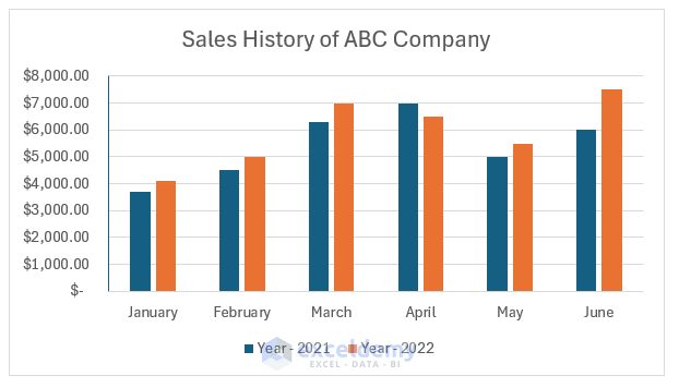
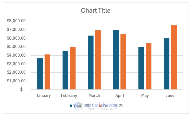
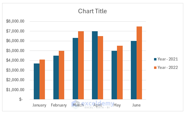
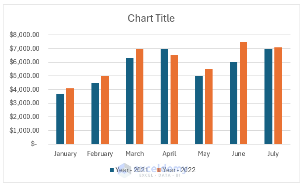
The image below shows a 2-D column chart in Excel. It represents the year-wise sales of the first six months of ABC company.
What Is a Chart in Excel?
A chart is a graphical and visual representation of data. In Excel, there are different kinds of charts. You can insert the data in a worksheet and Excel can provide you with beautiful and meaningful charts.
A chart can help viewers to understand the data, trends of the data, and future values easily. Column chart, pie chart, line chart, and bar chart are the most commonly used charts.
Types of Charts in Excel
1. column chart.
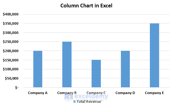
The chart that contains the categories on the horizontal axis and values on the vertical axis is called a column chart. It is also called a vertical bar chart. It helps to get an easy comparison between different categories and values.
2. Line Chart
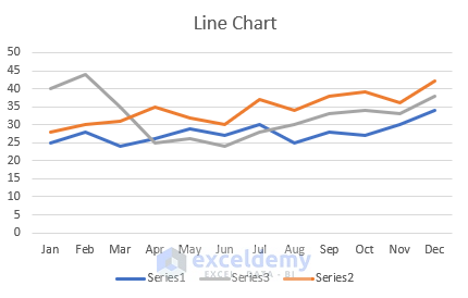
The chart where category data is evenly distributed on the horizontal or X-axis and values are evenly distributed on the vertical axis or Y-axis is called a line chart . A line chart is basically used to show the trend over time.
3. Pie Chart
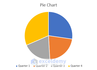
A pie chart displays one series of data through slices of a pie to understand the proportion or percentage of each item compared to the sum of all items. It is useful when you have only one data series and none of them are zero or less than zero.
4. Bar Chart
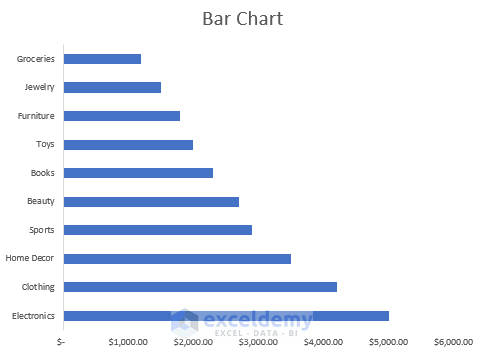
A chart where categories are plotted along a vertical axis and values are plotted along the horizontal axis is called a Bar chart . The Bar chart allows users to understand the comparison between individual items. It is available in 2-D and 3-D format in Excel.
5. Area Chart
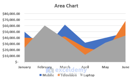
An area chart is basically a combination of a bar chart and a line chart. It illustrates the trends over time and total values across a trend. It allows us to compare the connection between parts of a whole. The 3-D format is also available for an area chart in Excel.
6. Scatter Chart
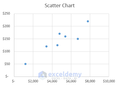
A scatter chart displays the data point for two variables in a two-dimensional plane. One variable is plotted along a horizontal axis and another is along a vertical axis. The data points are represented by dots in a scattered manner. You need to add more data to your scatter chart to get a better comparison.
7. Map Chart
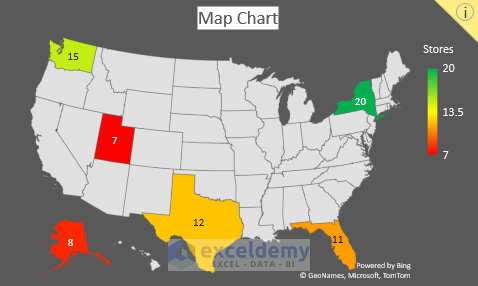
A map chart represents the values and categories across geographical regions. But there must be regions/countries/states or postal codes in your data.
8. Stock Chart
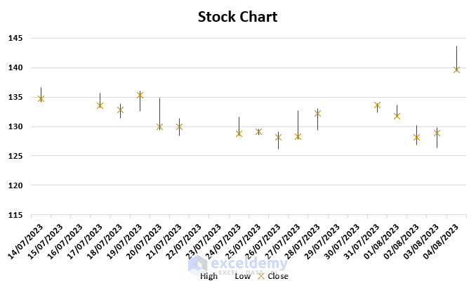
A stock chart displays the data of stock price like opening price, closing price, high price, low price, and volume. It helps to understand the fluctuations in stock prices.
9. Surface Chart
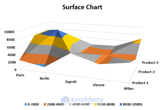
A surface chart is a three-dimensional chart that represents the relations among three sets of data. It uses a topographic map, colors, and patterns to highlight areas for the same range of values.
10. Radar Chart
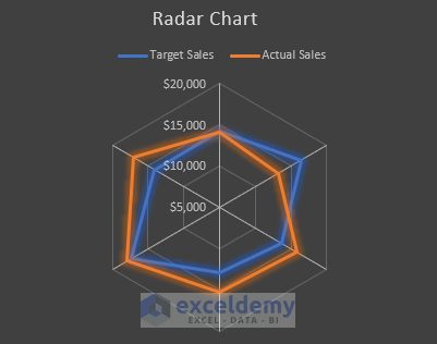
A radar chart is used to compare multiple series of data. It uses several axes to highlight data originating from a central point. And connects data points for each variable using lines and areas.
11. Treemap Chart
A treemap chart gives a hierarchical view of your data to compare different levels of category. It uses different colors for categories and is helpful for lots of data that is difficult to highlight in other charts.
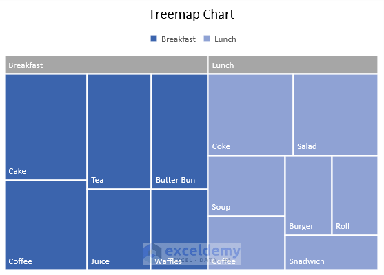
Note: Available on the newer versions since Office 2016.
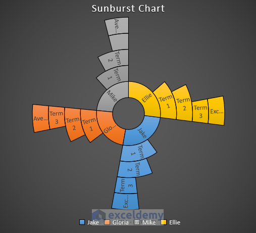
12. Sunburst Chart
The sunburst chart is also used for displaying hierarchical data. A ring or circle represents each level of the hierarchy and the innermost circle is considered as the top level of the hierarchy. For one level a sunburst chart will look like a doughnut chart.
13. Histogram Chart
A chart where data is plotted to show frequencies within a distribution is called a histogram chart . Each column of a histogram chart is called a bin.

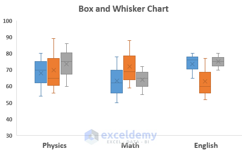
14. Box & Whisker Chart
A box and whisker chart is used to display the distribution of data into quartiles and highlight the mean. The vertical lines through boxes are called “whiskers”. The variability of quartiles is represented by the size of the lower or upper portion of the lines.
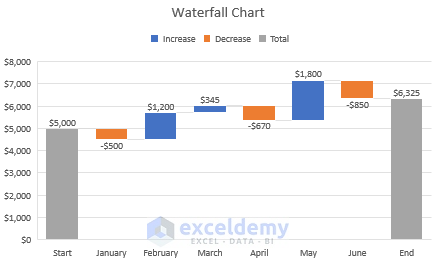
15. Waterfall Chart
A waterfall chart displays the running total of financial data. It helps to understand the effect of any addition or subtraction of data in the total. To differentiate between positive and negative data, color codes are used.
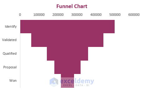
16. Funnel Chart
A chart that displays the values of multiple levels in a process is called a funnel chart . As the values are represented in descending order that’s why the shape of this chart looks like a funnel.
17. Combo Chart
When a chart combines different charts for a wide range of data for better understanding then it is called a combo chart . It includes a secondary axis.
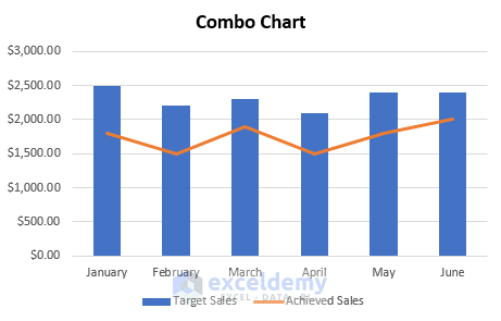
Note: Available on the newer versions since Office 2013.
How to Create a Chart in Excel
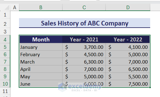
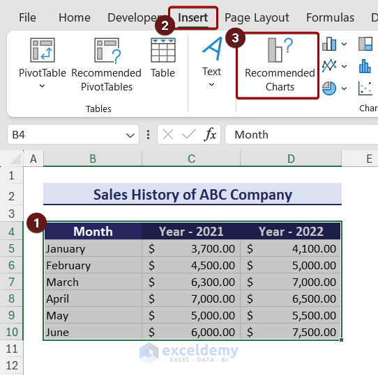
We can create a chart in Excel by following some easy steps. Suppose, we have a dataset in the range B4:D10 that contains the yearly sales history of a company.
Let’s follow the steps below to create a chart in Excel:
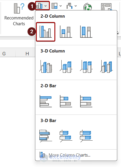
- Now, click on the Insert Column icon. A drop-down will appear.
As a result, a Clustered Column will appear on the worksheet.
Create a chart using Recommended Charts option:
The ‘Recommended Charts’ option gives different types of charts based on your data. To create a chart using the Recommended Charts, you can follow the steps below:
How to Change Chart Layout and Style in Excel
Changing the chart layout will change the arrangement of different chart elements. To change the layout, follow the steps below:
- Select the chart to get the Chart Design tab on the ribbon.
- After that, click on the Quick Layout option. A drop-down menu will appear.
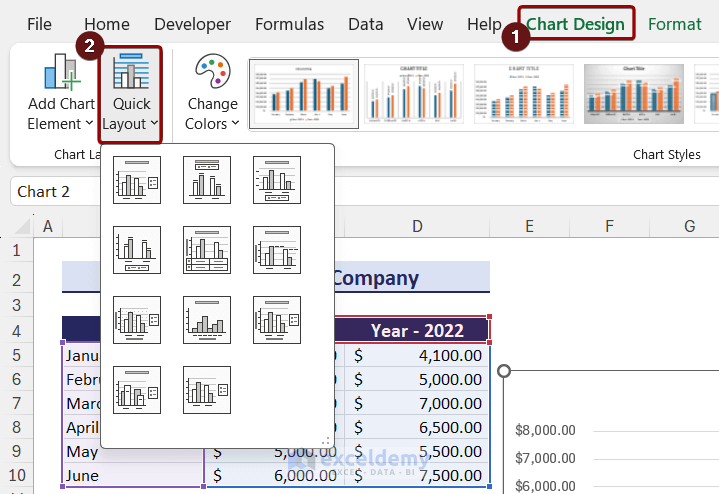
After selecting the desired layout, the chart will automatically change.
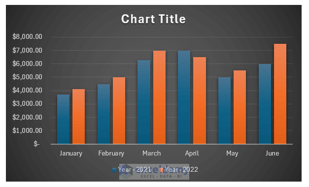
To change the chart style in Excel , you need to follow the steps below:

- Select a style from the Chart Styles group.
How to Add, Change or Remove Chart Elements in Excel
There are different kinds of elements in a chart in Excel. A chart in Excel contains Axes, Axis Titles, Chart Title, Data Table, Data Labels, Error Bars, Gridlines, Legend, Lines, Trendline, and Up/Down Bars. You can easily add, change, or remove these elements in Excel.
To add a chart element, you can follow the steps below:
- Click on the chart to get the Chart Design tab.
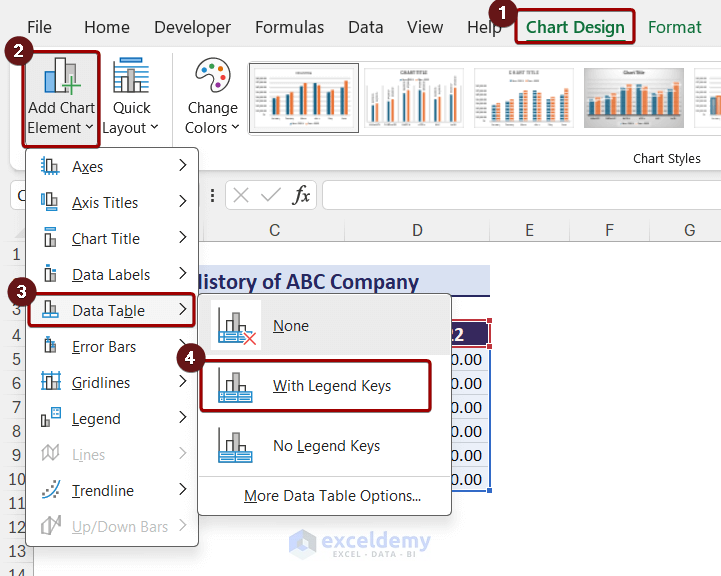
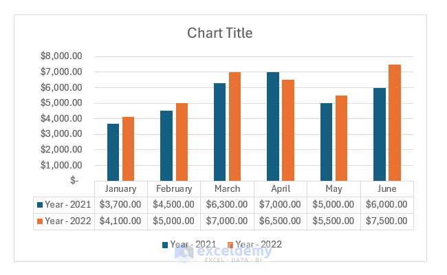
After that, you can see the chart with a data table.
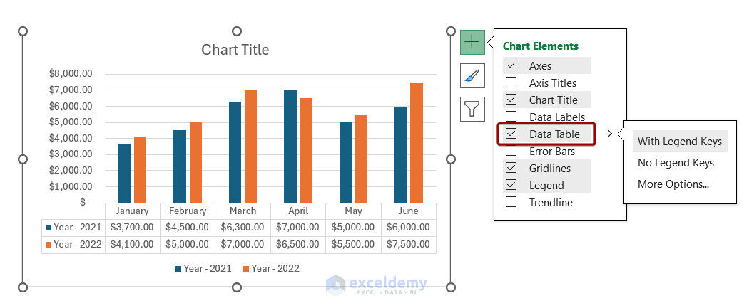
When you select a chart, a plus icon appears on the top-right side. If you click on the plus icon, you will see the chart elements. You can select or deselect the elements to add or remove them.
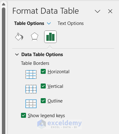
If you double-click on the Data Table, you will get a Format Data Table pane on the right side of the worksheet. You can select different options from there and format the data table.
To remove a chart element, select the element and press the Delete key from your keyboard.
How to Switch Row and Column Data in Excel Chart
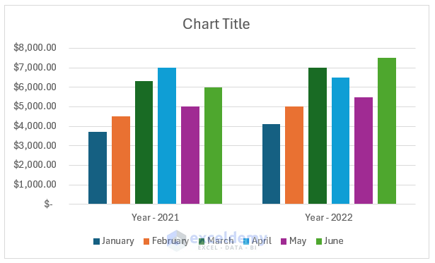
Sometimes, you may need to change the way a chart groups the data. In that case, you can use the Switch Row/Column option. For example, our chart shows year-wise sales data. To see month-wise data in a year, you can switch row/column.
To switch row/column, you can follow the steps below:
- Select the chart and go to the Chart Design tab.
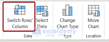
After selecting the Switch Row/Column option, the chart will look like the image below.
How to Change Chart Type in Excel
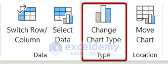
After creating a chart, you may need to change the chart type based on the requirement. To change the chart type follow the steps below:
How to Format Charts in Excel
After creating a chart, you need to format it to make it visually attractive. You can format different chart elements to give it a better look. Here are some basic chart formatting in Excel :
1. Format Chart Axis
A chart generally has two axes: X and Y. You can format the axes by following the steps below:
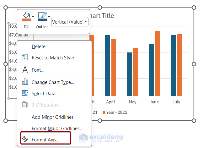
As a result, you will see the changes on the Y-axis. You can follow the same steps to format the X-axis.
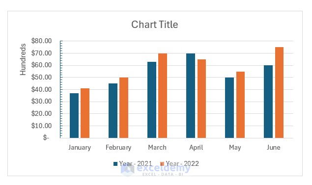
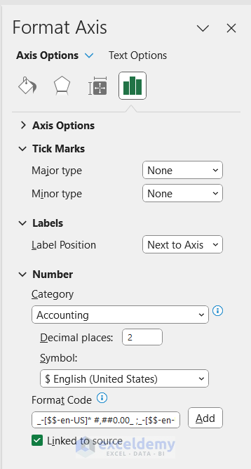
You can also change the position of the labels and number system of the axis from the Format Axis pane.
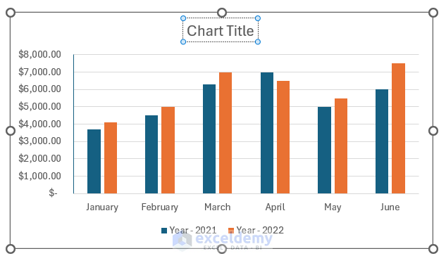
2. Format Chart Title
Chart title is an important element as it gives an overview of the chart. To add or edit a chart title, you can follow the steps below:
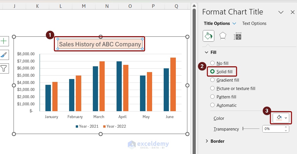
To format the chart title, you can double-click on it. It will open the Format Chart Title pane. Here, we have added a solid fill color to the chart title box. You can also explore different types of Title and Text options from here.
3. Format Legend
To format the legends, double-click on the legend. It will open the Format Legend pane. You can select different options from there.
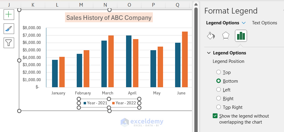
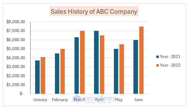
For example, if you select the Legend Position as Right , you will see legends like the image below.
4. Format Data Label
Before formatting the data label, you need to add them to the chart. To add data labels, you can follow the steps below:
- Select the chart > click on the plus icon.
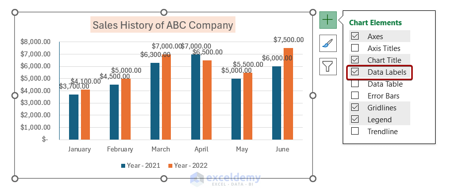
After adding data labels, you can format them using the following steps:
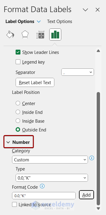
- Double-click on the data labels to open the Format Data Labels pane. You can select different options for different purposes. Here, we will change the number formatting of the data labels.
- To change the number formatting, go to the Number section.
5. Format Data Series
We can format the data series to make the charts look more attractive. To do so, you can follow the steps below:
- Double-click on the data series to open the Format Data Series pane.
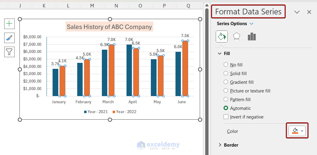
6. Format Chart Area
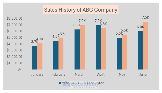
You can format the chart area and change its color to make the chart report-friendly. To format the chart area, follow the steps below:
- Double-click on the chart area to open the Format Chart Area pane.
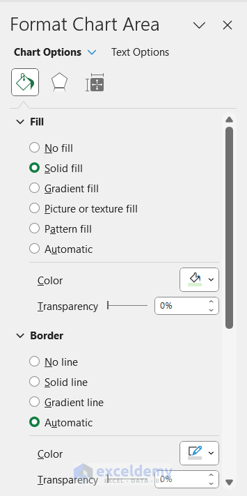
As a result, you will see the color of the chart area has been changed.
How to Move a Chart in Excel
In Excel, there are times when you need to move the chart to a different sheet. You can do that using the Move Chart option easily. Follow the steps below to move a chart in Excel:
- Select the chart to get the Chart Design option.
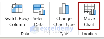
As a result, the chart will be moved into a new sheet.
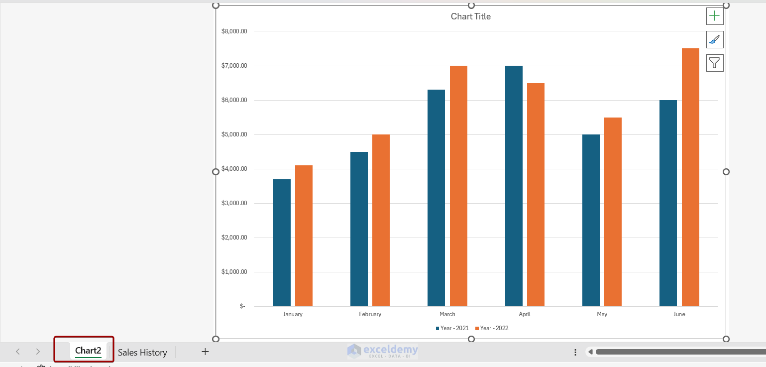
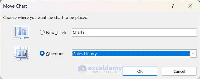
You can also move the chart as an object on a different sheet. You need to select the second option from the Move Chart box and choose the desired worksheet.
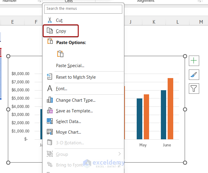
How to Copy a Chart in Excel
While creating dashboards or reports, you need to copy a chart . You can copy a chart and paste it on any location. Follow the steps below to copy a chart:
How to Resize a Chart in Excel
Resizing a chart is often necessary when you are working with a lot of data. You can resize the chart using the double-headed arrow. To resize a chart, follow the steps below:
- Select the chart and place the cursor on the small circle of the chart. The cursor will change into a double-headed arrow.
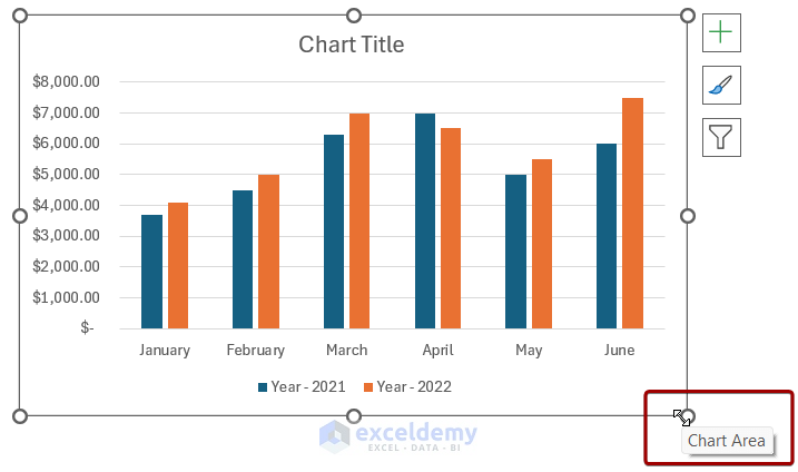
You can also resize the chart using the Format tab. Click on the chart and the Format tab will appear. You can resize the chart from the Size group.

How to Filter Chart in Excel
Filtering a chart can help you visualize a specific amount of data in Excel. To filter a chart, you can follow the steps below:
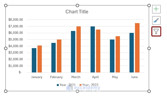
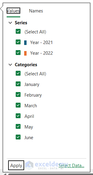
- You can check/uncheck Series and Categories from the filter options. Here, we unchecked April and May from the Categories section.
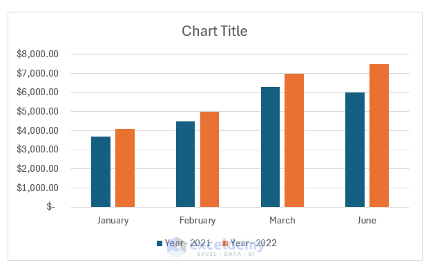
After applying the filter, the chart will show the selected data.
How to Keep Charts Up to Date in Excel
Sometimes, after creating a chart, we need to add new data to the chart. In that case, the chart doesn’t update the data automatically. For example, if we add the data for July to the chart, the chart doesn’t update the data.
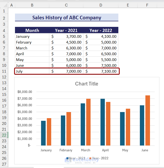
To keep charts up to date, you can follow the steps below:
- Select the chart area and the chart data will be selected automatically.
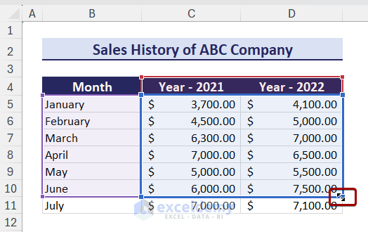
As a result, the chart will also show the new data.
Tips: Before creating a chart, you can convert the chart data range into a table and then, create a chart using the data. In this way, the new data will automatically be updated on the chart.
How to Select the Best Chart in Excel
There are many types of charts in Excel. To select the best type of chart, you need to understand what type of data you are working with. You need to keep the following things in mind while selecting the chart:
- Understand the data
- What you need to show through your chart
- Identify the chart type
- Determine patterns and trends
- Different charts for different data
Download Practice Workbook
In this article, we have described everything related to charts in Excel. You can create, format, and customize using different steps in Excel. You can also learn to move, copy, and resize charts from this article. In Excel, there are many types of charts and each one has different uses. This article will help you to learn everything. If you have any queries or suggestions, let us know in the comment section.
Excel Charts: Knowledge Hub
- Create Embedded Chart in Excel
- Refresh Chart in Excel
- Use Chart Elements in Excel
- Add a Trendline in Excel
- Customize Excel Charts
- Excel Axis Scale
- Data for Excel Chart
- Add Data Series in Excel Chart
- Add a Data Table with Legend Keys
- Create Dot Plot in Excel
- Create Thermometer Chart in Excel
- Bubble Chart in Excel
- Excel Doughnut Chart
- Excel Pareto Chart
- Burndown Chart in Excel
- Excel Distribution Chart
- Make a Comparison Chart in Excel
- Progress Chart in Excel
- Excel Control Chart
- How to Plot an Equation in Excel
- Excel Chart Not Working
- Excel Advanced Charting
- Find Intersection of Two Curves in Excel
- Show Intersection Point in Excel Graph
- Create a Weight Loss Graph in Excel
- Make a Budget Constraint Graph on Excel
- Create Mekko/Marimekko Chart in Excel
- Create Activity Relationship Chart in Excel
- Secondary Axis in Excel
- Markers in Excel
- Dynamic Excel Charts
- Matrix Chart in Excel
- Meter Chart in Excel
- Excel Standard Curve
- Gantt Chart in Excel
<< Go Back To Learn Excel
What is ExcelDemy?
Tags: Learn Excel

Mursalin Ibne Salehin holds a BSc in Electrical and Electronics Engineering from Bangladesh University of Engineering and Technology. Over the past 2 years, he has actively contributed to the ExcelDemy project, where he authored over 150 articles. He has also led a team with content development works. Currently, he is working as a Reviewer in the ExcelDemy Project. He likes using and learning about Microsoft Office, especially Excel. He is interested in data analysis with Excel, machine learning,... Read Full Bio
Leave a reply Cancel reply
ExcelDemy is a place where you can learn Excel, and get solutions to your Excel & Excel VBA-related problems, Data Analysis with Excel, etc. We provide tips, how to guide, provide online training, and also provide Excel solutions to your business problems.
Contact | Privacy Policy | TOS
- User Reviews
- List of Services
- Service Pricing

- Create Basic Excel Pivot Tables
- Excel Formulas and Functions
- Excel Charts and SmartArt Graphics
- Advanced Excel Training
- Data Analysis Excel for Beginners

Advanced Excel Exercises with Solutions PDF

10 Design Tips to Create Beautiful Excel Charts and Graphs in 2021
Updated: August 11, 2022
Published: September 24, 2015
It's really tempting to let terrible Excel graphs creep into your marketing. Your boss doesn't care about little things like how graphs look, right? And whatever Excel comes up with as the default is probably fine ... right?

Not really. You're using data to spur action. Maybe you pull data to convince your boss to adopt inbound marketing , give you an extra sliver of budget, or adjust your team's strategy -- among other things. Regardless of what you use data for, you need it to be convincing -- and if you display data poorly, the meaning of your data is more likely to get lost.

Note: I'm using Excel for Mac 2011. If you're using another version or operating system, implementing the following tips may look different.
.png)
Free Excel Graph Templates
Tired of struggling with spreadsheets? These free Microsoft Excel Graph Generator Templates can help.
- Simple, customizable graph designs.
- Data visualization tips & instructions.
- Templates for two, three, four, and five-variable graph templates.
You're all set!
Click this link to access this resource at any time.
Excel Design Tricks for Sprucing Up Ugly Charts and Graphs in Microsoft Excel
1) pick the right graph..
Before you start tweaking design elements, you need to know that your data is displayed in the optimal format. Bar, pie, and line charts all tell different stories about your data -- you need to choose the best one to tell the story you want.
Bar graphs and pie graphs help you compare categories. Pie graphs usually compare parts of a whole, while bar graphs can compare pretty much anything ... which means it's often best to just use a bar graph. Bar graphs are easier to read and highlight incremental differences between categories, so they're a good go-to. Pie graphs are best used when one of the categories is way larger than the other.
Want to see the difference? Here's an example of the same data set displayed as a pie graph and a bar graph:
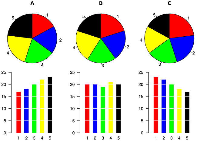
Image Credit: Wikimedia
Line charts, which look kind of like a horizontal version of bar charts, help you display a changing trend over time. You can track multiple values over that time, but the key to a line chart is the time component.
To turn your data into one of these charts in Excel, highlight the data you want to morph into a chart, then choose "Charts" in the top navigation (or select "Insert" > "Charts" if you have a different version). Then choose the chart most appropriate for your data.
2) Sort bar graph data so it's intuitive.
If you're using a bar graph to display your data, this tip can make a big difference. Most bar graphs look like this:
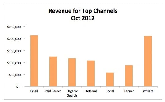
Image Credit: Search Engine Land
They're kinda random. You spend just a fraction of a second too long figuring out which ones are outliers. Instead, you should reorder your data points to go from largest to smallest. Here's what that looks like:
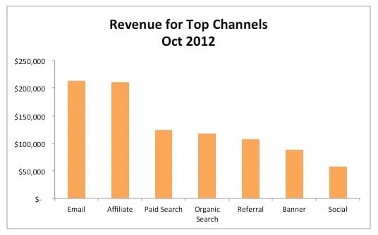
If your bar graph is horizontal, larger values should be at the top. If your bar graph is vertical, order them from left to right. Why? That's how people read English. (If you're presenting this data in another language where that isn't true, change up your order to better reflect reading patterns.)
To order the graphs in Excel, you'll need to sort the data from largest to smallest. Click 'Data,' choose 'Sort,' and select how you'd like to sort everything.
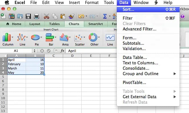
3) Shorten Y-axis labels.
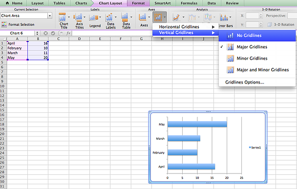
Long Y-axis labels, like large number values, take up a lot of space and can look a little messy, like in the chart below:
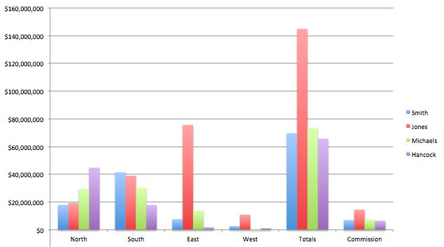
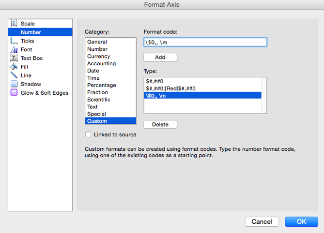
Enter the custom format code \$0,, \m (as shown below) and click "OK" to close.
5) Remove default line margins.
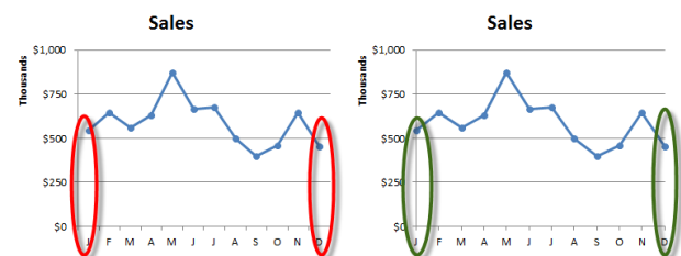
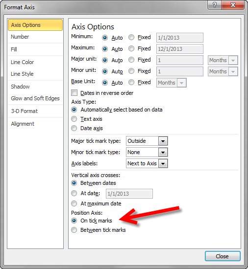
Unless you remove them from your line charts, Excel will automatically add margins before the first data point and after the last data point, as you can see on the left in the image below. But, as you can see on the right, line charts often look better without these margins:
7) Stay away from 3D effects.
This falls under the previous bullet point, but I wanted to include it as its own point because it's one of the most overused data visualization effects.
To make data look extra fancy, people will often make bar, line, and pie graphs 3D -- but it actually just makes the data harder to read. Because of the way the data is tilted, it gives the reader a skewed sense of what the data actually means. Since you're using data to tell a broad story, you don't want to weaken your argument due to poor design. See how different a pie chart looks when it's in 2D versus 3D?
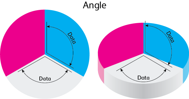
Image Credit: visual.ly
And if you actually look at the area each section takes up on the screen, you'll see why it's easy to misinterpret 3D graphs:

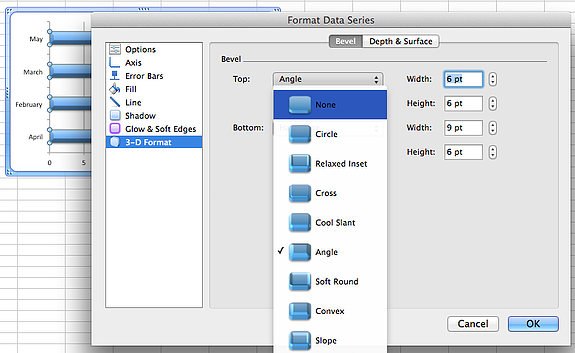
To remove the 3D styling from your graphs, double-click on the bars, lines, or pie sections you'd like to change, choose "3D Format" and set "Top'"and "Bottom" to "None."
8) Delete the legend if it's not necessary.
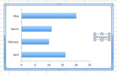
Legends tell you information you can read easily on the graph. If you have a ton of X-axis categories or multiple data points per category, then using legends makes sense. But if you're only comparing a few data points, they can be pretty useless. So if that's the case, just delete the legend altogether.
To delete a legend in Excel, you can just double-click on the legend text box, then hit "Delete" on your keyboard:
9) Include branded colors.
The colors that come preset in Excel are pretty drab. One quick way to spruce them up is to make them your brand's colors. It's a little detail that'll make your charts look slick and clean.
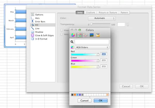
To ensure you're always using the proper brand colors, you'll need to grab the HEX color code of your brand's colors. Then, plop that code into this HEX --> RBG color converter . In Excel, double-click on the parts of your graph you'd like to change the color of. Under "Fill," choose "Color" > "More Colors."
In the popup window, select the second icon from the left with the sliders. See that little dropdown? Choose "RGB Sliders," then input the RGB numbers you found in the beginning. Voila! Perfectly on-brand colors and a gorgeous graph.
10) Add a shaded area to a line chart.
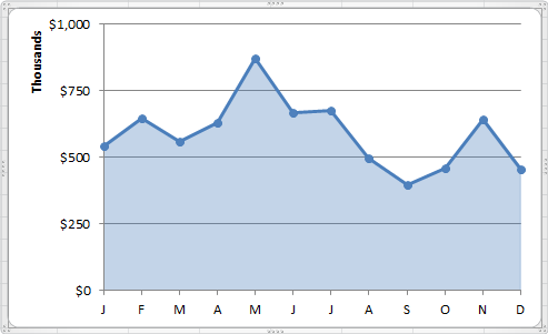
Ever seen a line chart with a shaded area below the line? They can make your line chart stand out.
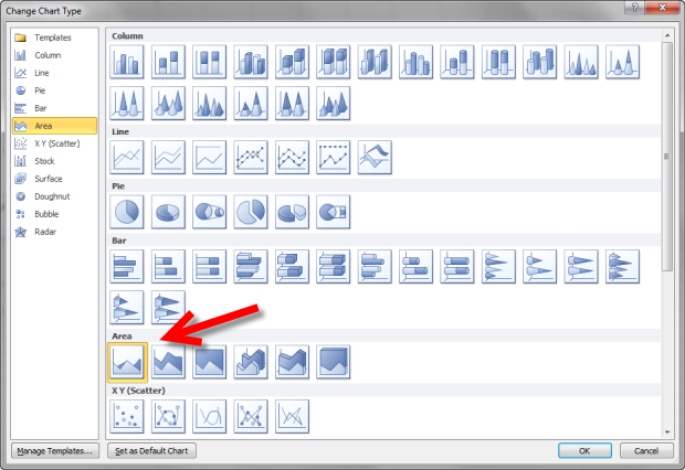
In the menu that appears, choose the first type under the "Area" category.
Then, under "Border Color," choose "Solid Fill." Under "Fill Color," choose the same color as the line in the chart. Change your transparency to the same transparency as the border color's transparency.
Want more Excel tips? Check out these resources for learning Excel online.
Editor's note: This post was originally published in 2014, and has since been updated for accuracy and comprehensiveness.

Don't forget to share this post!
Related articles.

How to Sort in Excel and Keep Your Data Organized

How to Use Power Queries in Excel
How to Create Excel Charts and Graphs

How to Use the SUBTRACT Function in Excel

How to Password Protect an Excel File

How to Use the COUNTIF Function in Excel

19 Best Free Marketing & Sales Templates for Microsoft Excel


How to Create a Pivot Table in Excel: A Step-by-Step Tutorial

How to Use Excel Like a Pro: 29 Easy Excel Tips, Tricks, & Shortcuts
![presentation charts in excel How to Use VLOOKUP Function in Microsoft Excel [+ Video Tutorial]](https://blog.hubspot.com/hubfs/VLOOKUP-hero.webp)
How to Use VLOOKUP Function in Microsoft Excel [+ Video Tutorial]
Tired of struggling with spreadsheets? These free Microsoft Excel Graph Generator Templates can help
Marketing software that helps you drive revenue, save time and resources, and measure and optimize your investments — all on one easy-to-use platform

- Tips and guides
- Microsoft 365
Tips for turning your Excel data into PowerPoint charts
- Courtney Owen
- Small business
As a presenter, you probably use charts (also called graphs) in your presentations. Charts display data in a visual format that audiences can easily grasp – if you design the chart and slide clearly and crisply.
A crisp chart has nothing to do with your toaster’s setting. Instead, it’s a chart that shows only the data necessary to make the desired point clear – no less, no more. Too much data (sometimes called “data dump”) will overwhelm your audience, blunting your message.
Limit the Data
Instead of creating a chart from data in an entire Excel spreadsheet, first edit your spreadsheet. One way to do this is to copy and paste data onto a separate Excel workbook tab. Then look at what you can eliminate. When you have only the data you need, you’re ready to create the chart in PowerPoint.
Tip: If your data just has to be huge, see if you can divide the data into two sets. For example, you could cover two related sets in one table and two other related sets in another. These two tables, or sets of data, would end up being two easily digestible slides, instead of one overloaded slide.
Creating the chart
There are several ways to generate a chart in PowerPoint from Excel data, but here we’ll talk about one way. Let’s assume that you’ve already edited an Excel spreadsheet so that it contains only the data that will support your message.
Here are the basic steps to create the chart in PowerPoint from a data set:
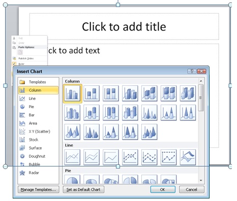
2. The Insert Chart dialog opens. Choose the type of chart you want. For this example, I’ll choose the default 2D column chart. Click OK .
Note: Some types of charts are appropriate for specific types of data; your chart type should match your data. For example, if you have one row of data showing percentages that make up a whole, a pie chart would work better than a column chart.
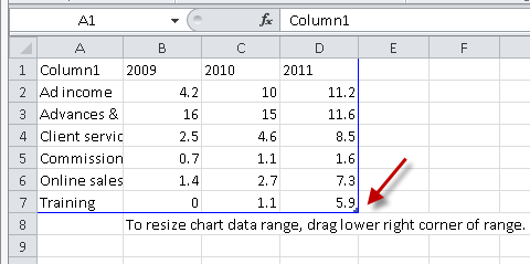
4. Go back to the temporary spreadsheet, click in cell A1, and paste.
5. If your data is smaller than the dummy data, you’ll need to drag the lower right corner of the blue border inward; in the figure, a red arrow points to this corner.
6. Go back to your PowerPoint slide to see the chart
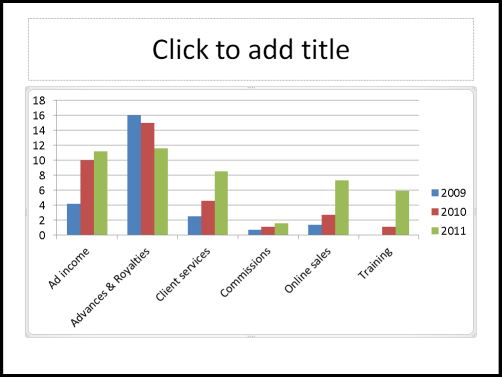
Formatting charts for clarity
You’re not finished yet! PowerPoint’s default charts are overly busy and are rarely formatted in a way that’s easy to understand. Also, PowerPoint has many useful features that you can take advantage of to help you communicate your points clearly.
I can give you some best practices for clear charts, but in the end, you have to decide what is best for your message, your data, and your audience. Here are some ideas that should help you get the results you want.
Use 2D charts
3D charts are notoriously hard to understand. Which is the true value, the front or the back of the column? People aren’t sure. The “walls” and “floor” of the chart make it seem overly complex. Finally, the 3D perspective makes quickly judging values harder. Just switching to a 2D chart instantly makes the chart look easier to understand.
Luckily, PowerPoint 2007 and 2010 default to the 2D style, but PowerPoint 2003 had a 3D default and many charts out there still use that style. To change to a 2D chart, select the chart. On the Chart Tools Design tab, choose Change Chart Type.
Consider changing the chart type
As I mentioned, you should choose your chart type based on your data and the point you are trying to make. Column charts are the most common, but that may be because they are the default. When you’re trying to show trends, a line chart can make the point clearer.
Many people don’t like line charts because the lines are too thin to show up clearly, but you can easily make them thicker. First, try one of the chart styles from the Style gallery; the options near the bottom use thicker lines.
If the lines still aren’t thick enough for your taste, follow these steps to make them as thick as you want:
2. Click the Chart Tools Format tab.
3. In the Shape Styles group, click the Shape Outline button, then choose Weight, More Lines to open the Format Data Series dialog box with the Line Style category active.
4. In the Width text box, type a larger width or use the Up arrow to increase the width.
5. With the dialog box still open, select each remaining line, click the Line Style category, and choose a new width. You can even vary the widths to emphasize one data series over others.
Widen the bars
If you choose a column or bar chart type, widening the bars can make the chart clearer. The steps to widen the bars are not intuitive, so many people miss them. Here they are:
1. Right-click any column or bar and choose Format Data Series. The Format Data Series dialog box opens. ( Tip: Drag the dialog box off the chart, so you can see the result as you do the next step.)
2. With the Series Options category selected, drag the Gap Width slider to the left, toward the No Gap label. All of the columns or bars widen.
3. Click Close to close the dialog box.
Remove the gridlines and use data labels if necessary
The purpose of gridlines is to help your audience figure out the exact value of the data points. Is that sales number $3.5 million or $3.4 million? But when you display a presentation on a screen, your audience can’t easily follow the gridlines. Moreover, the gridlines are a distraction from the chart itself.
In some situations, you need to convey exact numbers. In others, an approximation is fine because no one cares. So you should base your choice of whether to use gridlines on both the goal of your presentation and your audience’s needs.
One way to get rid of the gridlines and still provide exact data is to use data labels. In fact, data labels will show your audience the numbers much more clearly. The only trick is to make sure that you don’t have too many numbers on the screen.
Here you see the evolution of a chart from grid lines to data labels. Follow these steps:
1. Click the grid lines, but not the top or bottom ones (because you’ll select the plot area instead of the grid lines).
2. Press the Delete key on your keyboard to delete the grid lines.
3. With the chart selected, click the Chart Tools Layout tab, choose Data Labels, and then Outside End.
4. If the data labels are too long and overlap, try a bar chart. On the Chart Tools Design tab, click Change Chart Type, choose one of the bar charts, and click OK.
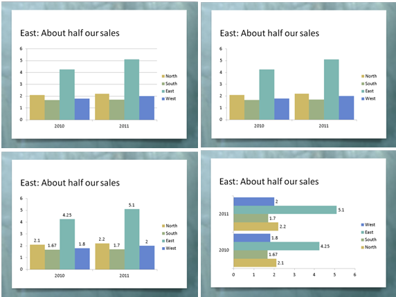
What other options are useful?
PowerPoint has so many options for formatting charts, so I’ll just make a few comments.
Tick marks are small lines along the axes and they are usually unnecessary. They aren’t very noticeable, but getting rid of them will make your chart look cleaner. The red arrows in the figure point to the tick marks. Here’s how to remove them:
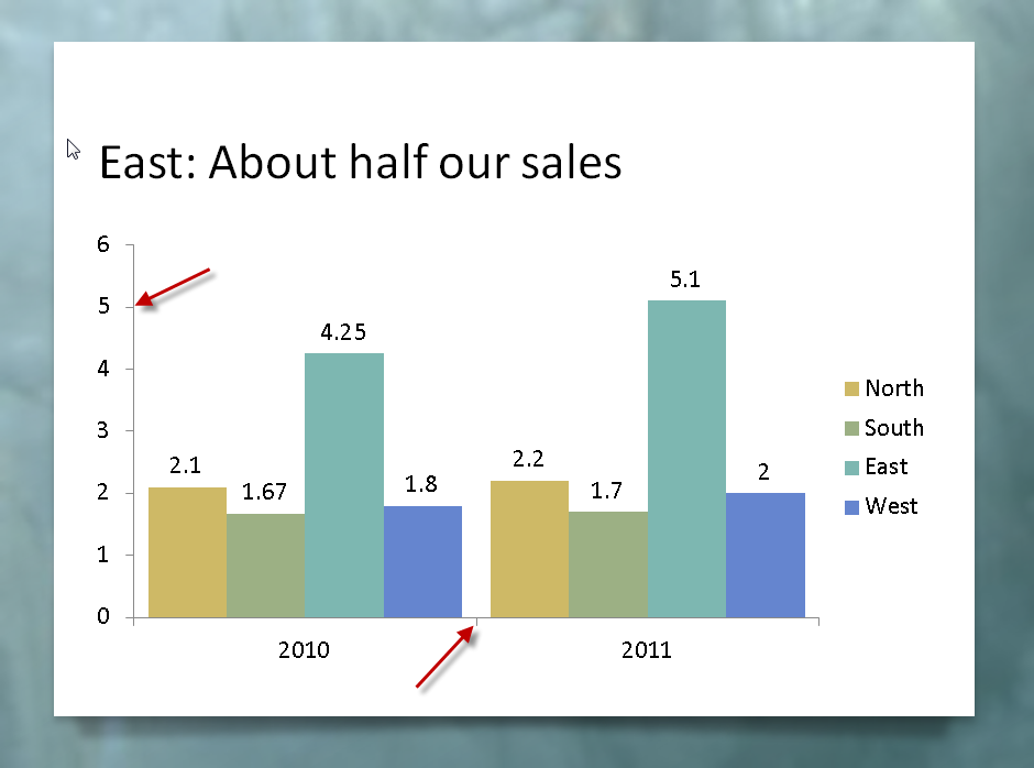
2. Right-click the axis and choose Format Axis.
3. In the Format Axis dialog box’s Axis Options category, from the Major Tick Mark Type drop-down list, choose None.
4. Select the next axis and repeat the previous step.
5. When you’re done, click Close.
Some charts have a chart title , but in most cases, I recommend using the slide’s title instead. To delete an existing chart title, just select it and press the Delete key.
Sometimes the legend is in the way of expanding the chart itself. You can select it and drag it to a better location. Then, to expand the rest of the chart, click the Plot Area (try clicking inside the main area of the chart) and drag its handles outward.
1. Click an axis to select it. The easiest way to make sure you select the axis is to click its labels.
3. In the Format Axis dialog box’s Axis Options category, from the Display Units drop-down list, choose the units you want. In the example, you would choose millions.
4. If you want to show the display units, check the Show Display Units Label on Chart checkbox.
5. If you want to show decimal values on the Y axis, click the Number category in the dialog box. From the Category list on the right, choose one of the options, such as Number, to set the decimal places and other number formatting.
6. Click Close to close the dialog box.
Calling out important points
No matter how simple you make your chart, it can seem overwhelming to your audience. You are familiar with the data, but the people watching aren’t. Also, you may need to point to specific sections of the chart as you discuss them. Walking up to the screen and pointing is usually awkward and ineffective, so you can use shapes and animation instead.
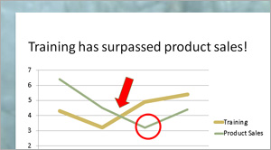
An arrow and a circle are two ways to point out sections of a chart, as you see here. I usually make them bright red, so that they stand out from the rest of the chart.
Here are the steps to insert a circle or arrow:
1. Make sure the chart is not selected. Then go to the Home tab and choose the arrow or circle from the Drawing group.
2. Click and drag to place the shape.
3. Format the circle so that it has no fill. To do so, select it, click the Format tab, click Shape Fill, and choose No Fill. To make it red, click Shape Outline and choose the red color swatch.
4. To format the arrow with a red fill, click the Format tab, click Shape Fill, and choose the red color swatch.
You may not want the audience to see the arrow or circle until you get to a specific part of your discussion, so you can add animation to make them appear when you click.
To add animation to the arrow in PowerPoint 2010, follow these steps:
1. Select the arrow.
2. Click the Animations tab.
3. Click Add Animation and choose Wipe from the Entrance section. (You can choose another entrance animation, but Wipe looks good with arrows.) If you don’t see the Wipe animation, choose More Entrance Effects from the bottom of the list to find it.
4. Click Effect Options and choose a direction. For a left-facing arrow, choose from Right. For a down-facing arrow, choose from Top.
To add animation to the circle in PowerPoint 2010, follow the same steps, except that I recommend the Wheel animation. Then choose 1 Spoke from the Effect Options list. This animation looks like you’re encircling the area within the circle.
Do a clarity test
When your chart is done, ask a friend or colleague to look at it. Ask what the chart means. If you get a correct answer, you’ve succeeded!
–Ellen Finkelstein
Ellen Finkelstein trains presenters to present more clearly and powerfully. For free tips and a free report, “From Death by PowerPoint to Life by PowerPoint,” go to www.ellenfinkelstein.com .

Excel Tutorial: How To Make Graphical Presentation In Excel
Introduction.
When it comes to analyzing and presenting data, graphical presentations in Excel can be a game-changer. These visual representations of data not only make it easier to understand complex information but also help in making informed decisions. In this tutorial, we will take you through the process of creating graphical presentations in Excel and explore the benefits of incorporating visuals into your data analysis.
Key Takeaways
- Graphical presentations in Excel are crucial for understanding complex data and making informed decisions.
- Understanding the basics of creating graphical presentations is essential, including the different types of graphs and charts available in Excel.
- Selecting the appropriate data and organizing it effectively is key to creating effective graphical presentations.
- Utilizing Excel's advanced features and customization options can elevate the visual appeal and insights provided by graphical presentations.
- Adding finishing touches such as visual elements and annotations can enhance the overall look and clarity of graphical presentations.
Understanding the basics of creating graphical presentations in Excel
Graphical presentations are an essential tool for visualizing data and conveying information in a clear and concise manner. In Microsoft Excel, creating graphical presentations is a straightforward process that can greatly enhance the impact of your data. In this tutorial, we will explore the basics of creating graphical presentations in Excel.
Excel offers a wide range of graph and chart types, each suited for different data sets and presentation purposes. Some of the most commonly used graph and chart types in Excel include:
- Column and Bar Charts: These charts are used to compare values across different categories.
- Line Charts: Line charts are useful for showing trends and changes over time.
- Pie Charts: Pie charts are ideal for displaying the proportion of different categories in a data set.
- Scatter Plots: Scatter plots are used to show the relationship between two variables.
When creating a graphical presentation in Excel, it's important to include key components that help convey the information effectively.
The title of the graph or chart should clearly indicate the subject of the presentation.
Axis Labels
Axis labels are essential for providing context to the data being presented. The x-axis and y-axis should be clearly labeled to indicate what each represents.
The data being used for the graphical presentation should be clearly defined and organized to ensure accuracy and relevance.
By understanding the different types of graphs and charts available in Excel and the key components of a graphical presentation, you can effectively create visual representations of your data that are both impactful and easy to understand.
Selecting the appropriate data for your graphical presentation
When creating graphical presentations in Excel, it is essential to carefully choose the data that best suits the intended visualization. Here are some key points to consider:
- Look for trends or patterns: Data that shows clear trends or patterns are ideal for graphical representation. This can include sales figures over time, survey responses, or market trends.
- Comparing data: Data that needs to be compared across different categories or variables, such as product sales by region or customer demographics, can be effectively presented graphically.
- Highlighting relationships: If you want to showcase the relationship between different sets of data, such as correlation between variables or cause-and-effect relationships, graphical representation can be very effective.
- Clean and structured data: Ensure that your data is clean and well-structured before importing it into Excel. This includes removing any unnecessary columns or rows, and organizing the data in a logical manner.
- Use proper labels and headers: Clearly label your data and use headers to identify different categories or variables. This will make it easier to interpret and visualize the data in Excel.
- Convert text to numerical values: If your data includes text that needs to be represented graphically, such as categories or labels, consider converting them to numerical values or using a numerical equivalent for easier graphing in Excel.
- Remove outliers or irrelevant data: If there are outliers or irrelevant data points that could skew the visualization, consider removing them or addressing them separately to ensure the accuracy of the graphical presentation.
Step-by-step guide to creating graphical presentations in Excel
Excel is a versatile tool not only for data analysis and calculations but also for creating visually appealing graphical presentations. In this tutorial, we will walk you through the process of creating simple bar or pie charts using Excel's chart tools and then show you how to utilize Excel's graph customization features to enhance the visual appeal of your presentation.
A. Creating a simple bar or pie chart using Excel's chart tools
Excel's chart tools make it easy to create visually stunning bar or pie charts to represent your data. Follow these simple steps:
- Select your data: Start by selecting the data that you want to include in your chart. This will typically be a range of cells containing your data.
- Insert a chart: Once you have selected your data, go to the "Insert" tab and select the type of chart you want to create, such as a bar chart or a pie chart.
- Customize your chart: Excel will automatically generate a basic chart based on your selected data. You can then customize the chart by adding titles, labels, and modifying the colors and styles to suit your presentation.
- Finalize your chart: Once you are happy with the appearance of your chart, you can further customize it by adding data labels, adjusting the axis scales, or adding a trendline.
B. Utilizing Excel's graph customization features to enhance the visual appeal of your presentation
Excel offers a range of graph customization features that allow you to enhance the visual appeal of your presentation. Here's how to make the most of these features:
- Modify chart elements: Excel allows you to modify various elements of your chart, such as the axis titles, data labels, and gridlines. You can also add or remove chart elements to make your chart more visually appealing.
- Change chart styles: Excel provides a range of pre-set chart styles that you can apply to your chart to change its appearance. You can also manually adjust the colors, fonts, and effects to create a custom look for your chart.
- Add visual effects: Excel allows you to add visual effects to your chart, such as shadows and glows, to make it stand out. You can also adjust the transparency of chart elements to create a more subtle and polished look.
- Format data series: Excel enables you to format individual data series within your chart, allowing you to highlight specific data points or make certain elements stand out.
Adding the finishing touches to your graphical presentation
Once you have created your graphical presentation in Excel, it's time to add the finishing touches to make it visually appealing and easy to understand for your audience.
Visual elements play a crucial role in making your graphical presentation stand out. Here are a few tips on how to use colors and fonts effectively:
- Use a cohesive color scheme: Select a color palette that complements your data and helps in conveying your message effectively. Avoid using too many colors that can make the presentation look cluttered.
- Choose readable fonts: Use clear and legible fonts for your titles, labels, and annotations. Make sure the font size is appropriate for the audience to read comfortably.
- Emphasize important data points: Use different colors or fonts to highlight important data points or trends in your presentation.
Titles, legends, and annotations help provide context and clarity to your graphical presentation. Here's how to effectively incorporate these elements:
- Include a descriptive title: A clear and concise title helps the audience understand the purpose of the graphical presentation. It should convey the main message or insight from the data.
- Utilize legends for clarity: If your graphical presentation includes multiple data series or categories, use a legend to provide clarity on what each element represents.
- Add annotations for additional information: Annotations can help provide additional context or explanations for specific data points. They can be used to highlight outliers, trends, or any other important details in the visualization.
Utilizing trendlines, sparklines, and other advanced chart elements to provide deeper insights
When creating graphical presentations in Excel, it's important to go beyond basic charts and graphs to provide deeper insights. Utilizing advanced features such as trendlines and sparklines can help you achieve this.
- Adding trendlines to your charts can help you identify and visualize patterns and trends in your data. This can be especially useful for predicting future values based on historical data.
- Customizing trendlines allows you to further refine your graphical presentation, adjusting the type of trendline (e.g., linear, exponential, polynomial) to best fit your data.
- Interpreting trendlines is essential for understanding the implications of the data. You can use the equation of the trendline to make predictions or analyze the relationship between variables.
- Integrating sparklines into your data tables or dashboards can provide a quick and concise visualization of trends and variations, without taking up too much space.
- Customizing sparklines allows you to adjust the appearance and layout to best suit your graphical presentation, ensuring clarity and effectiveness.
- Interpreting sparklines involves understanding the patterns and variations they display, providing quick insights into the data at a glance.
Exploring additional tools and features to further customize and polish your graphical presentation
Excel offers a range of additional tools and features to help you further customize and polish your graphical presentation, elevating it to a professional level.
Data Labels and Callouts
- Adding data labels to your charts can provide additional context and clarity, allowing viewers to easily interpret the data points.
- Using callouts to highlight specific data points or trends can draw attention to key insights, making your graphical presentation more impactful.
Interactive Elements
- Utilizing interactive elements such as drop-down menus, buttons, or sliders can make your graphical presentation more engaging and dynamic, allowing viewers to interact with the data.
- Creating interactive dashboards with linked charts and tables can provide a comprehensive view of the data, allowing for seamless exploration and analysis.
Formatting and Design
- Applying consistent formatting across all elements of your graphical presentation can create a cohesive and professional look, enhancing visual appeal and readability.
- Using design elements such as color schemes, fonts, and shapes can help convey a specific message or theme, adding depth and personality to your graphical presentation.
In conclusion, this tutorial covered the essential steps for creating graphical presentations in Excel . We discussed the process of selecting the data, choosing the appropriate chart type, customizing the design, and adding final touches to enhance the visual appeal. Now that you have the knowledge and tools at your disposal, I encourage you to start creating your own graphical presentations in Excel. Practice makes perfect, and with a little creativity, you can transform your data into compelling visuals that effectively communicate your message.

Immediate Download
MAC & PC Compatible
Free Email Support
Related aticles

The Benefits of Excel Dashboards for Data Analysts

Unlock the Power of Real-Time Data Visualization with Excel Dashboards

Unlocking the Potential of Excel's Data Dashboard

Unleashing the Benefits of a Dashboard with Maximum Impact in Excel

Exploring Data Easily and Securely: Essential Features for Excel Dashboards

Unlock the Benefits of Real-Time Dashboard Updates in Excel

Unleashing the Power of Excel Dashboards

Understanding the Benefits and Challenges of Excel Dashboard Design and Development

Leverage Your Data with Excel Dashboards

Crafting the Perfect Dashboard for Excel

An Introduction to Excel Dashboards

How to Create an Effective Excel Dashboard
- Choosing a selection results in a full page refresh.
#1 Excel tutorial on the net
Create a Chart | Change Chart Type | Switch Row/Column | Legend Position | Data Labels
A simple chart in Excel can say more than a sheet full of numbers. As you'll see, creating charts is very easy.
Create a Chart
To create a line chart, execute the following steps.
1. Select the range A1:D7.

2. On the Insert tab, in the Charts group, click the Line symbol.

3. Click Line with Markers.

Note: enter a title by clicking on Chart Title. For example, Wildlife Population.
Change Chart Type
You can easily change to a different type of chart at any time.
1. Select the chart.
2. On the Chart Design tab, in the Type group, click Change Chart Type.

3. On the left side, click Column.

4. Click OK.

Switch Row/Column
If you want to display the animals (instead of the months) on the horizontal axis, execute the following steps.
2. On the Chart Design tab, in the Data group, click Switch Row/Column.

Legend Position
To move the legend to the right side of the chart, execute the following steps.
2. Click the + button on the right side of the chart, click the arrow next to Legend and click Right.

Data Labels
You can use data labels to focus your readers' attention on a single data series or data point.
2. Click a green bar to select the Jun data series.
3. Hold down CTRL and use your arrow keys to select the population of Dolphins in June (tiny green bar).
4. Click the + button on the right side of the chart and click the check box next to Data Labels.

1/17 Completed! Learn much more about charts > Go to Next Chapter: Pivot Tables
Learn more, it's easy
- Column Chart
- Scatter Plot
- Data Series
- Combination Chart
- Gauge Chart
- Thermometer Chart
- Gantt Chart
- Pareto Chart
Download Excel File
- charts.xlsx
Next Chapter
- Pivot Tables
Follow Excel Easy
Most Popular
- Formulas and Functions
- Conditional Formatting
- Find Duplicates
- Drop-down List
- Index and Match
Become an Excel Pro
- 300 Examples
Charts • © 2010-2024 Popular Excel Topics: Pivot Tables • Vlookup • Formulas • Charts • Conditional Formatting
Microsoft Excel
11 minute read
Advanced Excel Charts: What to Know to Take Your Charts Up a Notch

Kat Boogaard
Facebook Twitter LinkedIn WhatsApp Email

Join the Excel conversation on Slack
Ask a question or join the conversation for all things Excel on our Slack channel.
You never thought you’d see the day, but you’ve slowly become obsessed with Excel charts. From your personal budget to your work projects, you look at almost everything and think, “Hey, I bet that’d make an awesome Excel chart!”
Alright, so maybe your enthusiasm for Excel charts hasn’t quite reached that level.
But, here’s the point: You’ve been playing around with the basics of Excel charts for a while (if not, stop here and read this post instead!) and now you’re ready to take things up a notch.
You’re in luck. In this post, we’re talking all about advanced Excel charts and some of the things you can do to take your simple charts to the next level.
Step up your Excel game
Download our print-ready shortcut cheatsheet for Excel.
What exactly is an advanced Excel chart?
Take a look in Excel, and you’ll quickly notice that there’s no shortage of charts available .
From the basics (like column charts , bar charts, line charts, and pie charts) to options you may have less familiarity with (like radar charts, stock charts, and surface charts), there are seemingly endless charts you can make within Excel.
That could be one of the more in-depth charts we just mentioned, like a surface chart, or it could be a combination chart—where you take two different chart types (like a bar chart and a line chart, for example) to visualize a more involved data set.
Creating an advanced Excel chart: A case study
With so many different chart types and the option to combine them, there’s no possible way to outline every single chart you could make in Excel.
So, for the sake of rolling up your sleeves and getting started, we’re going to pick one slightly more advanced chart and work on creating that.
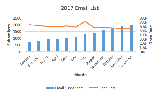
In our basic Excel charts article , we analyzed the growth of an email subscriber list. Now, we have some more data added to that: the average email open rate for each month. We want to analyze the relationship between open rate and subscriber count—basically, does open rate increase or decrease the larger our subscriber list gets?
We’re going to create a combination chart to understand this relationship. We’ll use a column chart to represent the number of subscribers and a line chart to represent the open rate.
Let’s get started!
1. Double-check and highlight your data
As always, it’s smart to take a quick look to check if there are any issues or blatant errors in your data set.
Remember, your chart is tied directly to your data set—meaning any mistakes that appear there will also show up in your chart. So, now’s a good time to make sure you don’t have any spelling errors, digits that look off, or any other problems that you could have to go back and fix later.
After that, to get started with your chart, you’re going to highlight all of your data (including column headers) to get ready to insert your chart.
2. Insert a chart
With your data set highlighted, head up to the “Insert” menu and then select the chart type you’d like to use to represent your first set of data. In this case, we’re going to start with a column chart to represent our total email subscribers.
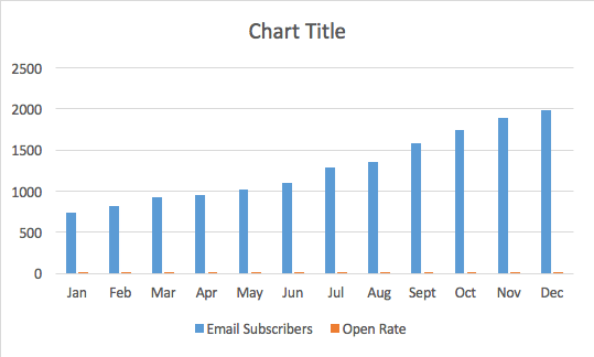
Don’t worry; we’re going to fix that in the following steps by inserting another chart type.
3. Select your second chart axis
Since we’re going to use the blue columns to represent our total number of email subscribers, we need to change the orange columns that represent open rate to a line.
To do so, you need to click on one of the orange bars to select that entire data series.
Fair warning: Because they’re so tiny on our current chart, they can be tough to click. To save you a ton of frustrated clicking around, here’s a helpful and straightforward trick to auto-select that orange data series:
- Click on the blue columns to start, since they’re bigger and much easier to click on
- Head to “Format,” select the “Series” drop-down in the upper left corner, and then change it to “Open Rate” (or whatever other variables you’re trying to select and adjust)
- That will auto-select all of the orange columns for us
Right-click with those orange columns selected, navigate to “Format Data Series,” and then in the right sidebar that appears select “Secondary Axis.”
4. Change your second chart type
At this point, you might panic a little—it looks like the orange bars just wholly overtook your beautiful chart, and you’re beginning to think you screwed everything up.
First of all, take a deep breath. This is supposed to happen, and getting things to look right again is a quick and simple step.
Right click on those newly created orange columns, head up to the “Chart Design” tab in the ribbon , click the “Change Chart Type” button, and then select your line chart.
5. Fine-tune your chart
With the bones of your chart in place, now you can do things like add a chart title, adjust your colors, and even add axis labels (all of which we went over in the basic chart article).
Now is also an excellent time to ensure that nothing looks off in your chart and that you didn’t let any mistakes or errors slip through.
After doing so, we end up with a chart that looks like this:
Three more advanced charting tips
You’ve mastered that combination chart, and now you want to know if there are any other more advanced tricks and hacks you can use with your charts.
Well, of course, there are! We’ve touched on just a few of them below.
1. Insert a table in a chart
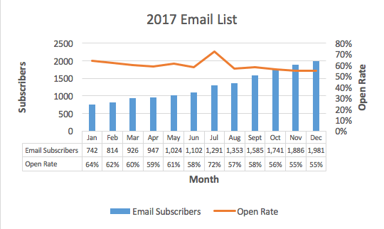
While the chart we’ve created is great for looking for any trends, it doesn’t show a tremendous amount of detail. For example, it’s hard to tell precisely what the open rate or subscriber count was during any given month—you can only get an estimate by looking at the columns and line.
Inserting a data table within your chart is handy if you also need to show detailed values and not just an overall trend.
To insert that table, click anywhere within your chart, go to the “Chart Design” tab in the ribbon, click the “Insert Chart Element” button, select “Data Table,” and then decide to display your table with or without a legend. In this case, we’re going to skip the legend.
It looks a little crowded to start, but you can make some edits to change that. Keep in mind that you’ll need to edit the text within your existing dataset (rather than within the table).
After doing so, here’s a look at our chart including the table:
2. Add data labels
Maybe you don’t want to clutter up your chart with a table, but you still want to display more detailed digits. Adding data labels puts a number at a point above your line or column to give a better indication of values.
Adding those data labels is simple. Just right-click on your line or your columns and select “Add Data Labels.” That’s it!
3. Add another variable
Remember, there’s only so much information you can display on a single chart—because you’re limited by three axes.
However, if you have another variable that has the same metric or unit of measure as one of your existing variables, you can add that to your chart.
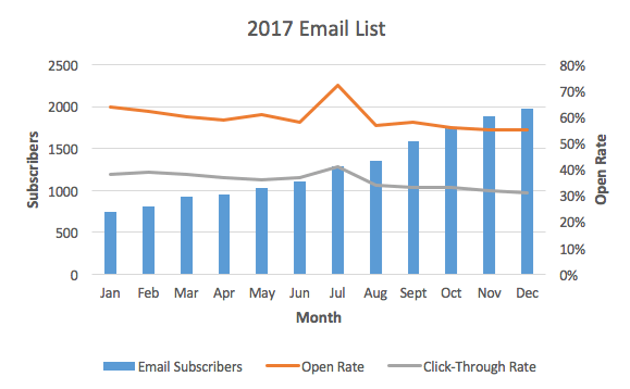
For example, if we also wanted to add click-through rate to our chart, we could do so because it’s a percentage just like the open rate. But, if you wanted to incorporate the time of day an email was sent, you’d need a separate chart—because there’s currently no axis available to display the measure of time.
Make sense? Alright, so let’s say we did want to add click-through rate to our chart. To do so, you need to make sure that data appears in your data set.
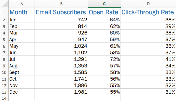
You’ll see that an additional line representing click-through rate has been added to your chart.
Click on your new series (which isn’t yet named and is just called “Series 3”), click in the “Name” field, click the little box that allows you to select from your data set, and then click the appropriate column header. Hit “Enter” and then click OK.
Want to learn even more about Excel charts?
Are you feeling like an Excel charts pro? We’ve covered a lot here that will help give your Excel charts game a boost.
But, if you’re looking to dig in even deeper, check out our advanced Excel course to sink your teeth into even more tips, tricks, and tutorials that will transform you into a total Excel whiz.
Ready to become a certified Excel ninja?
Start learning for free with GoSkills courses
Loved this? Subscribe, and join 451,358 others.
Get our latest content before everyone else. Unsubscribe whenever.

Kat is a writer specializing in career, self-development, and productivity topics. When she escapes her computer, she enjoys reading, hiking, golfing, and dishing out tips for prospective freelancers on her website.

Recommended
Excel Challenge 40: Create a Custom Excel Calculator
Would you like to build your own Excel calculator? It might be easier than you think! Take the challenge and see how our community members solved it.

Sort Functions in Excel — How to Use SORT and SORTBY
Excel sort functions are superior to manual sorting methods because they will automatically update the sort order without user intervention.

Excel Challenge 39: Generate Unique Random Values
What is the best way to generate random values in Excel? Better yet, can you make them unique? Put your skills to the test with this Excel challenge.
© 2024 GoSkills Ltd. Skills for career advancement
- Editor's Choice: Tech Gifts for Mom
- New! iPad Air 6 Details
How to Add an Excel Chart to a PowerPoint Presentation
Copy and paste, or use the Link Data command
- Brock University
Charts add a little extra punch to your PowerPoint presentation instead of listing bullet points of data. Conveniently, charts created in Excel can be copied and pasted into your PowerPoint presentations. As an added bonus, update charts in your PowerPoint presentation when changes are made to the original Excel data.
Instructions in this article apply to PowerPoint for Microsoft 365, PowerPoint 2019, PowerPoint 2016, PowerPoint 2013, PowerPoint 2010, and Excel.
Copy Your Chart From Excel
Any chart that you create in Excel can be copied and pasted into any Microsoft Office app.
Open the Excel file that contains the chart you want to copy and select the chart.
Select Home > Copy .
There are other ways to copy the chart. Right-click on the chart and select Copy . Or, use the Ctrl + C shortcut.
Close Excel.
Choose How to Paste Your Chart
The chart you copied in Excel is stored on the Clipboard. Now it's time to paste it into a PowerPoint slide.
Open PowerPoint and navigate to the slide where you wish to paste the Excel chart.
Select Home and select the Paste down arrow. Or, right-click the slide. The different options for pasting a chart display.
Choose Use Destination Theme & Embed Workbook to paste your chart into PowerPoint with the ability to edit it in PowerPoint and match your presentation's color scheme.
Choose Keep Source Formatting & Embed Workbook to be able to edit it in PowerPoint and keep the original color scheme from Excel.
Choose Use Destination Theme & Link Data to be able to edit it by making changes to your original data in Excel. The chart will match your PowerPoint presentation's color scheme.
Choose Keep Source Formatting & Link Data to edit it by making changes to your original data in Excel. The chart will keep the original color scheme from Excel.
Choose Picture to paste a picture of your chart into PowerPoint. The picture cannot be edited and is not tied to any data.
Update Excel Charts in PowerPoint
If you chose to Link Data when pasting your Excel chart into PowerPoint, changes made to the original spreadsheet file will update the chart in PowerPoint.
To manually update chart data:
Select the chart in PowerPoint.
Select Chart Tools Design .
Select Refresh Data .
Microsoft Office Update Prompt
Each time you open a PowerPoint presentation that is linked to another Microsoft Office app, such as Excel or Word, you're prompted to update the links in the presentation file. If you trust the source of the presentation, choose Update Links . All links to other documents are updated with any new changes.
Get the Latest Tech News Delivered Every Day
- Paste Links for Data, Charts, and Formulas in Excel, Word, PowerPoint
- How to Create a Timeline in PowerPoint
- How to Copy a PowerPoint Design Template to Another Presentation
- How to Insert PDF Files Into PowerPoint Presentations
- The 12 Best Tips for Using Excel for Android in 2024
- How to Link or Insert Excel Files to Word Documents
- How to Merge PowerPoints
- Copy Slides to Another PowerPoint Presentation
- How to Update PowerPoint on Windows and Mac
- How to Create a Column Chart in Excel
- Add Hyperlinks to PowerPoint Presentations
- How to Create an 8 Column Chart in Excel
- How to Make and Format a Column Chart in Excel
- Animate Specific Parts of a PowerPoint Chart
- How to Make a Gantt Chart in PowerPoint
- Creating Charts and Graphs From Table Data

Contribute to the Microsoft 365 and Office forum! Click here to learn more 💡
April 9, 2024
Contribute to the Microsoft 365 and Office forum!
Click here to learn more 💡
- Search the community and support articles
- Microsoft 365 and Office
- Search Community member
Ask a new question
how to export an excel data to generate an bar graph in ppt using openxml and c#
The process is read the excel data using maybe EPPlus and then use that data to create a new ppt and generate the bar graph using openxml and C#. I am testing out code which I will provide in this git link here - https://github.com/Bhaskar365/Excel_To_PPT_OpenXml_CSharp.git.
The things I have been trying is read excel data from EPPlus and then generate the chart after creating a new powerpoint. The problem is if I extract the generated powerpoint file using 7-zip I get this files -
[Content_Types].xml file -
<?xml version="1.0" encoding="utf-8"?>
<Types xmlns="http://schemas.openxmlformats.org/package/2006/content-types">
<Default Extension="xml" ContentType="application/vnd.openxmlformats-officedocument.presentationml.presentation.main+xml" />
<Default Extension="bin" ContentType="application/vnd.openxmlformats-officedocument.spreadsheetml.sheet" />
<Default Extension="rels" ContentType="application/vnd.openxmlformats-package.relationships+xml" />
<Override PartName="/ppt/slides/slide1.xml" ContentType="application/vnd.openxmlformats-officedocument.presentationml.slide+xml" />
<Override PartName="/ppt/slideLayouts/slideLayout1.xml" ContentType="application/vnd.openxmlformats-officedocument.presentationml.slideLayout+xml" />
<Override PartName="/ppt/slideLayouts/slideMasters/slideMaster1.xml" ContentType="application/vnd.openxmlformats-officedocument.presentationml.slideMaster+xml" />
<Override PartName="/ppt/slideLayouts/slideMasters/theme/theme1.xml" ContentType="application/vnd.openxmlformats-officedocument.theme+xml" />
<Override PartName="/ppt/slides/charts/chart1.xml" ContentType="application/vnd.openxmlformats-officedocument.drawingml.chart+xml" />
<Override PartName="/ppt/slides/charts/colors.xml" ContentType="application/vnd.ms-office.chartcolorstyle+xml" />
<Override PartName="/ppt/slides/charts/style.xml" ContentType="application/vnd.ms-office.chartstyle+xml" />
</Types>
Out of this this is the spreadsheet code whose extension is important - <Default Extension="bin" ContentType="application/vnd.openxmlformats-officedocument.spreadsheetml.sheet" />
Here extension is showing bin i.e., binary but the extension should be xlsx
If I generate one powerpoint with bar chart, then this is the xml extraction -
<?xml version="1.0" encoding="UTF-8" standalone="yes"?>
<Default Extension="jpeg" ContentType="image/jpeg"/>
<Default Extension="rels" ContentType="application/vnd.openxmlformats-package.relationships+xml"/>
<Default Extension="xlsx" ContentType="application/vnd.openxmlformats-officedocument.spreadsheetml.sheet"/>
<Default Extension="xml" ContentType="application/xml"/>
<Override PartName="/ppt/presentation.xml" ContentType="application/vnd.openxmlformats-officedocument.presentationml.presentation.main+xml"/>
<Override PartName="/ppt/slideMasters/slideMaster1.xml" ContentType="application/vnd.openxmlformats-officedocument.presentationml.slideMaster+xml"/>
<Override PartName="/ppt/slides/slide1.xml" ContentType="application/vnd.openxmlformats-officedocument.presentationml.slide+xml"/>
<Override PartName="/ppt/presProps.xml" ContentType="application/vnd.openxmlformats-officedocument.presentationml.presProps+xml"/>
<Override PartName="/ppt/viewProps.xml" ContentType="application/vnd.openxmlformats-officedocument.presentationml.viewProps+xml"/>
<Override PartName="/ppt/theme/theme1.xml" ContentType="application/vnd.openxmlformats-officedocument.theme+xml"/>
<Override PartName="/ppt/tableStyles.xml" ContentType="application/vnd.openxmlformats-officedocument.presentationml.tableStyles+xml"/>
<Override PartName="/ppt/slideLayouts/slideLayout1.xml" ContentType="application/vnd.openxmlformats-officedocument.presentationml.slideLayout+xml"/>
<Override PartName="/ppt/slideLayouts/slideLayout2.xml" ContentType="application/vnd.openxmlformats-officedocument.presentationml.slideLayout+xml"/>
<Override PartName="/ppt/slideLayouts/slideLayout3.xml" ContentType="application/vnd.openxmlformats-officedocument.presentationml.slideLayout+xml"/>
<Override PartName="/ppt/slideLayouts/slideLayout4.xml" ContentType="application/vnd.openxmlformats-officedocument.presentationml.slideLayout+xml"/>
<Override PartName="/ppt/slideLayouts/slideLayout5.xml" ContentType="application/vnd.openxmlformats-officedocument.presentationml.slideLayout+xml"/>
<Override PartName="/ppt/slideLayouts/slideLayout6.xml" ContentType="application/vnd.openxmlformats-officedocument.presentationml.slideLayout+xml"/>
<Override PartName="/ppt/slideLayouts/slideLayout7.xml" ContentType="application/vnd.openxmlformats-officedocument.presentationml.slideLayout+xml"/>
<Override PartName="/ppt/slideLayouts/slideLayout8.xml" ContentType="application/vnd.openxmlformats-officedocument.presentationml.slideLayout+xml"/>
<Override PartName="/ppt/slideLayouts/slideLayout9.xml" ContentType="application/vnd.openxmlformats-officedocument.presentationml.slideLayout+xml"/>
<Override PartName="/ppt/slideLayouts/slideLayout10.xml" ContentType="application/vnd.openxmlformats-officedocument.presentationml.slideLayout+xml"/>
<Override PartName="/ppt/slideLayouts/slideLayout11.xml" ContentType="application/vnd.openxmlformats-officedocument.presentationml.slideLayout+xml"/>
<Override PartName="/ppt/charts/chart1.xml" ContentType="application/vnd.openxmlformats-officedocument.drawingml.chart+xml"/>
<Override PartName="/ppt/charts/style1.xml" ContentType="application/vnd.ms-office.chartstyle+xml"/>
<Override PartName="/ppt/charts/colors1.xml" ContentType="application/vnd.ms-office.chartcolorstyle+xml"/>
<Override PartName="/docProps/core.xml" ContentType="application/vnd.openxmlformats-package.core-properties+xml"/>
<Override PartName="/docProps/app.xml" ContentType="application/vnd.openxmlformats-officedocument.extended-properties+xml"/>
This is the xml markup for a file that has file generated from the charts section in ppt which is done as Insert-> Chart -> Bar -> Stacked Bar -
<Default Extension="xlsx" ContentType="application/vnd.openxmlformats-officedocument.spreadsheetml.sheet"/>
Extension is xlsx not bin or binary as was generated from OpenXml and C#. Need the code to make the binary extension into xlsx using code correctly.
Any help is appreciated. *** Moved from Microsoft 365 and Office / Excel / Unknown / Other***
- Subscribe to RSS feed
Report abuse
Reported content has been submitted
Replies (2)
- Microsoft Agent |
Hi,Bhaskar Jyoti Das
Welcome to the Microsoft Community.
I understand that you are trying to use the EPPlus library to read Excel data and generate charts after creating a new PPT file via the OpenXML SDK. However, as an advanced user like you, this is beyond the scope of our regular support.
We recommend that you contact official EPPlus technical support directly, or seek help in the relevant development communities and forums.
Excel spreadsheet library for .NET Framework/Core - EPPlus Software
Disclaimer: Microsoft provides no assurances and/or warranties, implied or otherwise, and is not responsible for the information you receive from the third-party linked sites or any support NET Framework/Core for .
Thank you for your understanding and we wish you all the best in your technological endeavors
Zoro-MSFT | Microsoft Community Support Specialist
Was this reply helpful? Yes No
Sorry this didn't help.
Great! Thanks for your feedback.
How satisfied are you with this reply?
Thanks for your feedback, it helps us improve the site.
Thanks for your feedback.
Hello Zoro from MSFT,
Thank you for your valuable advice on this issue. However, I wish to ask you one thing, what is the best way to read data from excel and embed it to powerpoint so that it can generate the graph I am looking for and is EPPlus the best option to do that or you recommend something else that can embed that value to powerpoint.
I have one more thing to ask you, what will be your approach to generate graph using openxml and c# in powerpoint.
Question Info
- Out of scope
- Norsk Bokmål
- Ελληνικά
- Русский
- עברית
- العربية
- ไทย
- 한국어
- 中文(简体)
- 中文(繁體)
- 日本語
Free Excel Flowchart Templates
By Kate Eby | April 25, 2024
- Share on Facebook
- Share on LinkedIn
Link copied
In this guide, we’ve gathered the most useful flowchart templates in Excel. You’ll also learn how to create a flowchart using a template and how to create a flowchart in Excel from scratch. On this page, you’ll find a cross-functional flowchart template , a swimlane flowchart template , a decision flowchart template , a yes/no flowchart template , and more.
Excel Basic Flowchart Template
Download the Basic Flowchart Template for Excel
When to Use This Template: This basic flowchart template for Excel is good for documenting or planning a process using straightforward, linear steps. It's perfect for tasks that require clear and simple workflow visualization without complex branching. Notable Template Features: This template highlights each step of a process, big or small, making it easier to identify areas of improvement. Its simple design provides experts and beginners a clear picture of how work flows.
Check out these free flowchart templates in different formats to effortlessly map out your processes, making complex tasks simpler and more understandable.
Excel Cross-Functional Flowchart Template
Download the Cross-Functional Flowchart Template for Excel
When to Use This Template: This cross-functional flowchart template shows how different teams or departments are working on a project and how they fit into the big picture. Notable Template Features: This template uses defined columns to easily identify which team is responsible for work. The clear layout stops confusion about who's responsible for each part of a project.
Excel Swimlane Flowchart Template

Download the Swimlane Flowchart Template for Excel
When to Use This Template: This swimlane flowchart template is your top choice for quickly identifying who's doing what at each phase of a big project. Notable Template Features: This template sorts tasks into lanes for different team members or departments.
Excel Decision Flowchart Template
Download the Decision Flowchart Template for Excel
When to Use This Template: Turn to this flowchart template to map out the potential results for a decision you’re trying to make. Notable Template Features: This template simplifies complex decision-making processes by dividing them into straightforward yes or no options divided by decision level, so you can see how your choices at one point affect all those that follow. You can see the potential results of various decisions at every level of the process, clearly illustrating the outcomes of each choice.
Excel Yes/No Flowchart Template
Download the Yes/No Flowchart Template for Excel
When to Use This Template: Use this yes/no flowchart template to make clear-cut decisions fast. It breaks down complex questions into manageable yes or no choices. Notable Template Features: The decision path on this template starts with a yes or no question and guides you to the right outcome. It also plots how different answers lead to different results.
Excel Data Flowchart Template
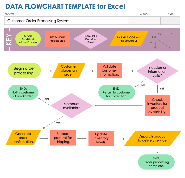
Download the Data Flowchart Template for Excel
When to Use This Template: Pick this data flowchart template to track how data moves and changes across a system or process. Use the template when setting up new systems or trying to improve existing ones. Notable Template Features: This template is designed specifically for data flow mapping, using distinct symbols to represent the collection, processing, storage, and sharing of data. It highlights each step of data interaction, making it easier to identify potential inefficiencies or security risks.
How to Create a Flowchart in Excel Using a Template
By creating a flowchart in Excel using a template, you streamline laying out processes or decisions. The elements you would use in a flowchart are already formatted and placed in the spreadsheet, making it easier to complete. Follow these steps to use a template for efficient and clear flowchart creation:
- Define Objectives Identify what to map out with your flowchart. You could use a flowchart to visualize a new project workflow, improve an existing process, or understand the steps involved in a task.
- Identify Key Steps Outline the main actions, decisions, and outcomes involved in your process. Consider the start point, the end point, and what happens in between in order to break down the process into manageable pieces.
- Gather Necessary Information Collect any details (understanding responsibilities, timeframes, or decision criteria, etc.) that need to be included in each step of the flowchart.
Use an Existing Flowchart Template Download a basic flowchart template for Excel , then rename and save the document.
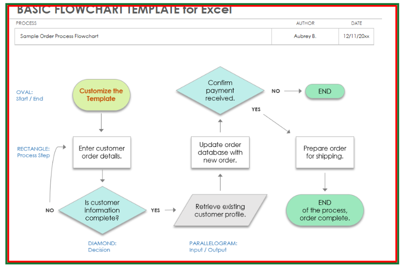
Name the Process Flow Open the template and click on the BLANK - Basic Flowchart tab. In the template’s header fields, enter the name of the process you want to chart, the flowchart’s author, and the creation date.

- Map Out the Process Mark the start of your process with the beginning shape (usually an oval). Click the START oval, select and highlight the existing text, and type the first step in your flowchart process. Repeat the same steps to change the content of each existing element in the flowchart. Use rectangles for actions or tasks, diamonds for decision points, and arrows to show the flow from one step to the next. Pro Tip: Access flowchart shapes in your Excel file by clicking on the Insert menu and clicking Shapes .

- Select the Shape: Click the flowchart shape containing the text you want to modify.
Change Shape Format and Size: Right-click the selected shape, and choose Format Shape . Click the Text Options tab in the formatting pane, and click the Text Box icon. Adjust the font, size, and color by selecting your preferences from the drop-down menus.

Change Shape Size: Click a shape. Click and drag the sizing handles on the corners or sides of the selected shape to resize.
- Review and Refine Once your flowchart is complete, review it for accuracy and clarity. Make sure it correctly reflects the process and is easy to understand. Adjust the layout or text as needed.
- Share Your Flowchart Save your completed Excel flowchart and share it with team members or stakeholders. You can export it as a PDF for easy sharing or print it for discussions and presentations.
How to Manually Create a Flowchart in Excel
You can create a flowchart in Excel by using the shapes feature to draw boxes and arrows to map your process. Making a flowchart in Excel is like drawing a guide to each step. It's helpful for understanding different tasks. Follow these steps to make a flowchart in Excel:
Open a Blank Excel Document Open Excel and click Blank Workbook . Name the workbook, choose a place to save it, and click the Save button.
Start with Shapes In the Excel workbook, click the Insert tab, click the Shapes drop-down arrow, and scroll to Flowchart options. Click on a shape, then click in your Excel spreadsheet to add the shape. Repeat for each shape you want to add to the flowchart.

Tip: Pick shapes, such as the square (for processes), diamond (for decisions), and circle (for start/end points) for your flowchart.
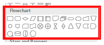
Make Shapes Bigger To provide enough room to write inside the selected shapes, you’ll need to make them bigger. Click a shape, and click Ctrl + A (on a PC and Command + A on a Mac) to select all the shapes. Click a corner on one of the shapes, and drag it to resize all the shapes together.
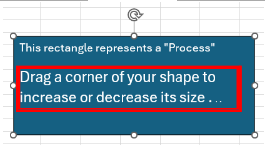
Personalize the Shapes After enlarging the shapes, double-click a shape to label it (e.g., Start , Task 1 , Process , etc.).
Adjust Font Size as Needed Highlight the text in the shape, and click the Home tab. Change the text size and color using the font collection and font size drop-down menus, respectively.
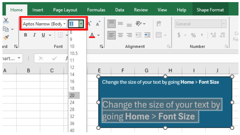
Connect the Dots Add arrows to the flowchart to draw connections between the shapes. Click the Insert tab, click the Shapes drop-down arrow, and scroll to the Arrow options. Click an arrow, then click the Excel workbook. Resize and re-orient the arrow, and drag it to where it should go in the flowchart.
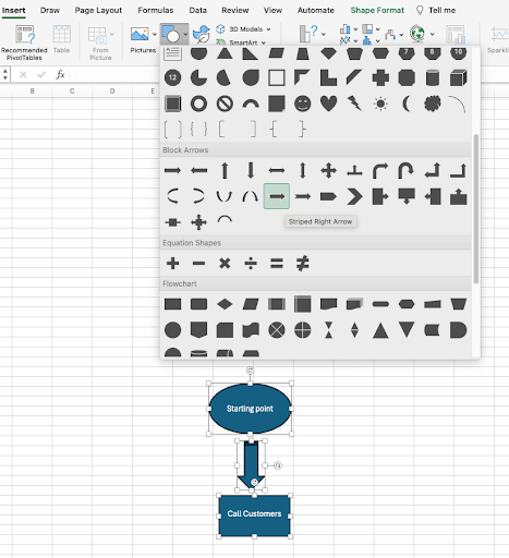
Title the Flowchart Click the Insert tab, and click Text Box in the toolbar. Click where you want the title to appear on the flowchart and enter a title.
Save and Share the Flowchart Once you've completed your flowchart, save and share it with others.
Related Flowchart Templates
These templates offer extra functionality for creating flowcharts and additional formats. Use any of these templates to improve organization, make decisions, or identify how processes and teams work together.
Free Workflow Templates for PowerPoint
Dive into our selection of PowerPoint workflow templates to show how your workflows boost productivity and enhance team collaboration.
Free Process Mapping Templates
These process mapping templates can help you outline every phase of your business operations clearly for better insight and refinement.
Free Workflow Templates
Explore our workflow templates and use them to improve task ordering and the overall flow of business activities.
Free Business Organizational Chart Templates
Check out these organizational chart templates for small businesses, designed to depict company structure, roles, and reporting lines with clarity.
Free Decision Matrix Templates
Complete one of these unique decision matrix templates to make informed decisions by evaluating various options and their possible outcomes.
Free SIPOC Template
See this suppliers, inputs, process, outputs, customers (SIPOC) diagram template to capture a high-level overview of business processes, from suppliers to customers, in a concise format.
Free Gantt Chart Templates

These Gantt chart templates are ideal for visually organizing project schedules, tasks, and deadlines in a clear, concise format.
Free Project Timeline Templates
Use one of these project timeline templates to present the key phases and milestones of your project from start to finish in an easy-to-understand format .
Get the Most Out of Your Flowcharts with Smartsheet
Empower your people to go above and beyond with a flexible platform designed to match the needs of your team — and adapt as those needs change.
The Smartsheet platform makes it easy to plan, capture, manage, and report on work from anywhere, helping your team be more effective and get more done. Report on key metrics and get real-time visibility into work as it happens with roll-up reports, dashboards, and automated workflows built to keep your team connected and informed.
When teams have clarity into the work getting done, there’s no telling how much more they can accomplish in the same amount of time. Try Smartsheet for free, today.
Improve your marketing efforts and deliver best-in-class campaigns.

Present your data in a Gantt chart in Excel
A Gantt chart helps you schedule your project tasks and then helps you track your progress.
Need to show status for a simple project schedule with a Gantt chart? Though Excel doesn’t have a predefined Gantt chart type, you can create one using these free Gantt chart templates .
Need to show status for a simple project schedule with a Gantt chart? Though Excel doesn’t have a predefined Gantt chart type, you can simulate one by customizing a stacked bar chart to show the start and finish dates of tasks, like this:

To create a Gantt chart like the one in our example that shows task progress in days:
Select the data you want to chart. In our example, that’s A1:C6
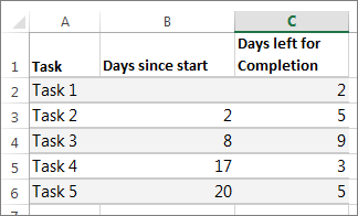
If your data is in a continuous range of cells, select any cell in that range to include all the data in that range.
If your data isn't in a continuous range, select the cells while holding down the COMMAND key.
Tip: If you don't want to include specific rows or columns of data you can hide them on the worksheet. Find out more about selecting data for your chart.
Click Insert > Insert Bar Chart > Stacked Bar chart.

Next, we’ll format the stacked bar chart to appear like a Gantt chart. In the chart, click the first data series (the Start part of the bar in blue) and then on the Format tab , select Shape Fill > No Fill .
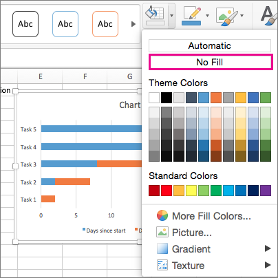
If you don’t need the legend or chart title, click it and press DELETE.
Let’s also reverse the task order so that it starts with Task1. Hold the CONTROL key and select the vertical axis (Tasks). Select Format Axis , and under Axis Position , choose Categories in reverse order .
Customize your chart
You can customize the Gantt type chart we created by adding gridlines, labels, changing the bar color, and more.
To add elements to the chart, click the chart area, and on the Chart Design tab, select Add Chart Element .

To select a layout, click Quick Layout.

To fine-tune the design, tab through the design options and select one.

To change the colors for the chart, click Change Colors .

To reuse your customized Gantt chart, save it as a template. Hold CONTROL and click in the chart, and then select Save as Template .
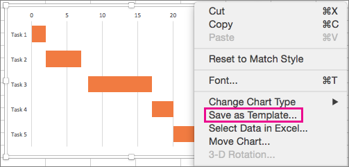
Did you know?
Microsoft 365 subscription offers Gantt chart templates designed to help you track project tasks with visual reminders and color-coded categories. If you don't have a Microsoft 365 subscription or the latest Office version, you can try it now:

Create a chart from start to finish
Save a chart as a template
PowerPoint presentation templates

Need more help?
Want more options.
Explore subscription benefits, browse training courses, learn how to secure your device, and more.

Microsoft 365 subscription benefits

Microsoft 365 training

Microsoft security

Accessibility center
Communities help you ask and answer questions, give feedback, and hear from experts with rich knowledge.

Ask the Microsoft Community

Microsoft Tech Community

Windows Insiders
Microsoft 365 Insiders
Was this information helpful?
Thank you for your feedback.

IMAGES
VIDEO
COMMENTS
However, the chart data is entered and saved in an Excel worksheet. If you insert a chart in Word or PowerPoint, a new sheet is opened in Excel. When you save a Word document or PowerPoint presentation that contains a chart, the chart's underlying Excel data is automatically saved within the Word document or PowerPoint presentation.
To create a pie chart in Excel: Select the data you want to visualize. From the " Insert " tab, choose " Pie " from the chart options. You can customize your chart by changing the colors, adding labels, and adjusting other settings in the " Format Chart Area " pane. Here's a video guide on how to create a donut chart:
Choose Your Own Chart. If you would prefer to select a graph on your own, click the All Charts tab at the top of the window. You'll see the types listed on the left. Select one to view the styles for that type of chart on the right. To use one, select it and click "OK."
6. Add an image. Whether it's a photograph, an artistic sketch or your logo, images go a long way in making your spreadsheet better. Images make your presentation look official and possess the professional feel in many of the beautiful presentations you have seen. Pictures speak a thousand words.
Sure, the numbers themselves show impressive growth, and she could simply spit out those digits during her presentation. But, she really wants to make an impact—so, she's going to use an Excel chart to display the subscriber growth she's worked so hard for. How to build an Excel chart: A step-by-step Excel chart tutorial 1. Get your data ...
Change chart type or location. If, after creating your chart, you find that you'd prefer to use a different type of chart you don't need to restart from Step 1. Simply select the chart image. Then click the Change Chart Type icon from the Design tab. Then you can select your new chart type.
Let's follow the steps below to create a chart in Excel: Select the range B4:D10. Then, go to the Insert tab. In the Insert tab, you need to go to the Charts group. You can find different types of charts in the Charts group. Now, click on the Insert Column icon.
Here is a list of the ten charts mentioned in the video. Each section includes a brief description of the chart and what type of data to use it with. There is also a link to the tutorials where you can learn how to create and implement the charts in your own projects. 1. Column Chart with Percentage Change.
Step 3: Add Chart Elements. Adding chart elements to your chart or graph will enhance it by clarifying data or providing additional context. You can select a chart element by clicking on the Add Chart Element dropdown menu in the top left-hand corner (beneath the Home tab). To Display or Hide Axes: Select Axes.
1) Pick the right graph. Before you start tweaking design elements, you need to know that your data is displayed in the optimal format. Bar, pie, and line charts all tell different stories about your data -- you need to choose the best one to tell the story you want. Bar graphs and pie graphs help you compare categories.
2. Click the Chart Tools Format tab. 3. In the Shape Styles group, click the Shape Outline button, then choose Weight, More Lines to open the Format Data Series dialog box with the Line Style category active. 4. In the Width text box, type a larger width or use the Up arrow to increase the width.
To create a simple chart from scratch in PowerPoint, click Insert > Chart and pick the chart you want. Click Insert > Chart. Click the chart type and then double-click the chart you want. Tip: For help deciding which chart is best for your data, see Available chart types. In the worksheet that appears, replace the placeholder data with your own ...
In this tutorial, we will explore the basics of creating graphical presentations in Excel. A. Exploring the different types of graphs and charts available in Excel. Excel offers a wide range of graph and chart types, each suited for different data sets and presentation purposes. Some of the most commonly used graph and chart types in Excel include:
1. Select the chart. 2. On the Chart Design tab, in the Data group, click Switch Row/Column. Result: Legend Position. To move the legend to the right side of the chart, execute the following steps. 1. Select the chart. 2. Click the + button on the right side of the chart, click the arrow next to Legend and click Right. Result: Data Labels
Right click on those newly created orange columns, head up to the "Chart Design" tab in the ribbon, click the "Change Chart Type" button, and then select your line chart. That's it—now your total number of email subscribers are displayed as columns, and your line chart shows the open rate. 5. Fine-tune your chart.
Select Home and select the Paste down arrow. Or, right-click the slide. The different options for pasting a chart display. Choose Use Destination Theme & Embed Workbook to paste your chart into PowerPoint with the ability to edit it in PowerPoint and match your presentation's color scheme. Choose Keep Source Formatting & Embed Workbook to be ...
The first step in creating an effective Excel dashboard is to analyze your data. Excel's built-in "Analyze Data" tool, located on the Home tab, is a great starting point. This feature helps ...
Type the data in EXCEL in 2 columns as shown - hair color in column 1, corresponding student count in column 2. To create a chart, you must first Select / Highlight the data. Second, Click INSERT from the menu bar and Select CHART. Alternately, you can select the Chart Button in the Standard Toolbar.
In this comprehensive video tutorial, we provide a step-by-step guide on creating column charts in Excel. We cover the process of selecting data, choosing the appropriate chart type, and customizing the visual elements of the column chart. Through practical examples and tips, viewers will learn how to effectively present and analyze data using column charts, enabling them to communicate ...
I understand that you are trying to use the EPPlus library to read Excel data and generate charts after creating a new PPT file via the OpenXML SDK. However, as an advanced user like you, this is beyond the scope of our regular support.
To create a simple chart from scratch in PowerPoint, click Insert > Chart and pick the chart you want. Click Insert > Chart. Click the chart type and then double-click the chart you want. Tip: For help deciding which chart is best for your data, see Available chart types. In the worksheet that appears, replace the placeholder data with your own ...
Add an image of the chart to a comment. Add a hyperlink to another worksheet that displays a chart when clicked. Add an image of the chart to the worksheet. Add a sparkline, a graphic that summarizes data visually within a single worksheet cell.
Here's how to do that: In Excel for the web or Excel desktop, press Print Screen, and save it as a picture using a picture editor application, such as Paint for Windows or iPhoto for Mac. In PowerPoint for the web, on the Insert tab, click Picture. In the Choose File to Upload box, find the picture of the Excel chart, and then click Open.
Open a Blank Excel Document Open Excel and click Blank Workbook. Name the workbook, choose a place to save it, and click the Save button. Start with Shapes In the Excel workbook, click the Insert tab, click the Shapes drop-down arrow, and scroll to Flowchart options. Click on a shape, then click in your Excel spreadsheet to add the shape.
Create a chart from start to finish. Save a chart as a template. PowerPoint presentation templates. Learn how to create a Gantt chart in Excel. Create a Gantt chart to present your data, schedule your project tasks, or track your progress in Excel.