How to Summarize a PowerPoint Presentation: A Step-by-Step Guide
Summarizing a PowerPoint presentation is a skill that can come in handy in various situations. Maybe you’ve just watched a colleague’s presentation and need to report back to your team, or perhaps you’re studying for an exam and want to condense the material. To summarize a PowerPoint effectively, you’ll need to identify the key points, understand the presentation’s purpose, and distill the information into a concise format. By mastering these steps, you’ll be able to communicate the essence of any presentation to your audience efficiently.
Once you’ve summarized the PowerPoint presentation, you’ll have a handy reference that captures the main ideas and supporting details without the fluff. This summary can serve as a study aid, a quick refresher, or a tool to brief others who may not have the time to go through the entire presentation.

Introduction
Let’s face it, sitting through a lengthy PowerPoint presentation can sometimes feel like a chore, especially when all you need are the highlights. Maybe you’re a busy professional with back-to-back meetings, a student juggling multiple assignments, or just someone who values efficiency. Whatever the case, being able to summarize a PowerPoint presentation is a valuable skill that can save you time and keep you informed.
Why is this ability so important? For starters, it helps you to quickly sift through information and focus on what’s essential. In our fast-paced world, time is of the essence, and being able to distill a lengthy presentation into a few key points can be a game-changer. Moreover, it’s not only about personal convenience; summarizing skills are crucial when you have to convey the gist of a presentation to others. Whether you’re briefing a colleague, preparing notes for a study group, or delivering a report to a client, a well-crafted summary can make all the difference. So, let’s dive into the how-to of summarizing a PowerPoint presentation, shall we?
Step by Step Tutorial: How to Summarize a PowerPoint Presentation
Before we jump into the steps, let’s establish what we’re aiming for. A good summary of a PowerPoint presentation should capture the main ideas, the supporting details, and the presenter’s intended message, all while being brief and easy to understand.
Step 1: Review the Entire Presentation
Start by going through the entire PowerPoint presentation.
Reviewing the presentation in its entirety allows you to get a sense of the overall flow and the key themes. Pay attention to the title slides and the concluding slides, as they often contain the main message and summary points.
Step 2: Identify the Key Points
Look for the main ideas in each slide.
Each slide usually focuses on a single main idea. Look for bullet points, bolded text, or headings as clues to what the presenter considers important. Make note of these points as they will form the backbone of your summary.
Step 3: Understand the Purpose
Determine the purpose of the presentation.
Understanding why the presentation was created helps to frame your summary. Was it to inform, persuade, or instruct? Knowing the intent will guide you in deciding what details are crucial for your summary.
Step 4: Condense the Information
- Condense the information into a concise format.
Now that you have the key points and the purpose, start writing your summary. Aim to express the ideas as simply and clearly as possible, without losing the original meaning. If a slide’s content can be said in one sentence instead of three, do it.
Step 5: Review and Edit
Review your summary and refine it.
Go through your summary to ensure it’s coherent and that it accurately reflects the presentation’s content and purpose. Edit out any redundancies or unclear statements.
Additional Information
When summarizing a PowerPoint presentation, it’s essential to keep the audience in mind. Who will be reading your summary? What do they need to know? Tailoring the summary to the needs of your audience can make it more effective. Additionally, consider using visual aids from the original presentation, such as charts or graphs, if they help illustrate a point more clearly.
Remember, a good summary is not just a list of points but a coherent mini-version of the presentation. It should flow logically and be engaging to read. Lastly, practice makes perfect. The more you practice summarizing presentations, the better you’ll become at capturing the essence of the content. So next time you sit through a PowerPoint, why not give it a try?
- Review the entire PowerPoint presentation.
- Identify the key points in each slide.
- Understand the purpose of the presentation.
- Review and edit your summary.
Frequently Asked Questions
What if the powerpoint presentation is very long.
Start by breaking it down into sections, and summarize each section before attempting to summarize the whole presentation. This will make the task more manageable.
Can I include quotes from the presentation in my summary?
Yes, but use them sparingly and only if they emphasize a key point effectively.
Should I use the same slide titles in my summary?
You can, but it’s not necessary. The aim is to capture the main ideas, not to replicate the presentation’s structure.
Is it okay to leave out examples used in the presentation?
If the examples are used to illustrate key points, briefly mention them. Otherwise, focus on the main ideas and leave out specific examples.
How long should my summary be?
There’s no one-size-fits-all answer, but a good rule of thumb is to make it as brief as possible while still covering all key points.
Summarizing a PowerPoint presentation is an art and a skill that can be honed with practice. Whether you’re a student, a professional, or simply someone who values brevity, being able to condense information efficiently is incredibly valuable. Remember, the goal is to capture the essence of the presentation, not to replicate it.
Use your judgment to determine what’s essential and what can be left out. With the steps and tips outlined in this article, you’re well on your way to becoming an expert summarizer. So next time you’re faced with a lengthy presentation, don’t despair. Embrace the challenge and flex those summarizing muscles!

Matthew Burleigh has been writing tech tutorials since 2008. His writing has appeared on dozens of different websites and been read over 50 million times.
After receiving his Bachelor’s and Master’s degrees in Computer Science he spent several years working in IT management for small businesses. However, he now works full time writing content online and creating websites.
His main writing topics include iPhones, Microsoft Office, Google Apps, Android, and Photoshop, but he has also written about many other tech topics as well.
Read his full bio here.
Share this:
Join our free newsletter.
Featured guides and deals
You may opt out at any time. Read our Privacy Policy
Related posts:
- How to Set Time for Slides in Powerpoint
- How to Save Powerpoint as PDF with Notes
- How to Add Page Numbers in Powerpoint 2010
- How to Loop a Slideshow on Powerpoint 2013
- How to Delete a Slide in Powerpoint 2010
- How to Unhide a Slide in Powerpoint 2013
- How to End Powerpoint on Last Slide in Powerpoint 2010
- How to Hide a Slide in Powerpoint 2010
- How to Make a Powerpoint Slide Vertical in Powerpoint 2013
- How to Rotate a Slide in PowerPoint: A Step-by-Step Guide
- How to Change Hyperlink Color in Powerpoint 2010 (An Easy 5 Step Guide)
- How Is Microsoft PowerPoint Used in Business: A Comprehensive Guide
- How to Drag Slides From One PowerPoint to Another: A Step-by-Step Guide
- How to Duplicate a Slide in Powerpoint 2010
- How to Insert Slides from Another Presentation in Powerpoint 2010
- How to Copy a PowerPoint to a New PowerPoint: A Step-by-Step Guide
- How to: Effortlessly Create PowerPoint Looping Presentations
- How to Embed a GIF in PowerPoint: A Step-by-Step Guide
- How to Insert Clipart in PowerPoint: A Step-by-Step Guide
- How to Hide a Selected Slide in Powerpoint 2013

- Tips & Tricks
- PowerPoint Templates
- Training Programs
- Free E-Courses
How to Summarize Presentations
Home > How To Present > How to Summarize
Does your audience seem lost during your long presentation? You can see this happening when you ask them to recall a point and they look blank.
Do they find it difficult to put your information in context?
Chances are you may not be summarizing your points frequently enough. We will see how you can summarize your presentation effectively to enhance audience retention.
Let’s start by asking a simple question:
When should you summarize your presentation?
Did I hear you saying, “Towards the end”?
Wrong! You would’ve lost your audience by then.
An effective presentation habit is to summarize at the end of every major point. It’s all the more important to do so, if your presentation is long and content-rich.
The logic behind summarizing your points:
Do you remember building a tower with playing cards when you were a child? Every time you added a new card on top, you carefully adjusted and aligned all the other cards under it. It helped you build a tall and stable tower.
The principle applies to your presentations as well. Every new point puts a strain on memory of what was covered earlier. Unless you summarize periodically, your audience can’t remember your points beyond a point (pun intended).
How to summarize your presentation in a structured way?

This simple structure allows you to refresh the memory of your audience periodically. It helps your audience to place new information in the right context. It lays the foundation for an effective ‘call to action’. Remember, the call to action and WIIFM has been set right at the start.
Example of an effective presentation summary:
A good summary is short and quick. Here is an example of a sales presentation summary:
“I understood that your main requirements in choosing a home loan are – interest rates, long tenure and high loan amount. So far, we saw how our scheme offers you a highly competitive rate and the longest tenure for your age. Now, we’ll talk about loan amount.”
This summary gives you a chance to showcase your main benefits over and over again- in a reassuring way. It maximizes your opportunity to win business in a sales presentation.
Some creative ways to summarize your presentations:
Here are 3 creative ways to summarize your presentations.
1. Use a quiz format to summarize a training presentation:
There can be many variations to this. Some presenters choose to show just the title and ask the participants to recollect the content. Some choose to use fill in the blanks format or true/false format to test the memory. Whichever way you choose, summarize your training presentations frequently.
We have found Quizzes to be an extremely effective way to summarize in a training. That is why we put together 45 different types of PowerPoint Quiz templates in a pack. Just select the type of quiz and add your questions. You can find out more about the Quiz pack and download it here:
2. Use a mid-session Q & A to summarize your business presentation:
We’ve seen presenters disguise their summary like – “We’ve covered Point A, Point B, and Point C – are there any questions in what we’ve covered so far?”
This helps them recollect their main benefits without sounding repetitive or pushy.
3. Repeat some key images and terms from earlier points to serve as memory hook:
Repeating images and key terms on your slides help you recount your points automatically. So, constantly referring to your earlier segments is a useful practice.
Finally, to summarize this article on ‘How to Summarize’ your presentation…
- Summarize at the end of every major point.
- Use your agenda slide to serve as guidepost.
- Let your summary be quick and short
- Explore creative ways to recall your key points
Return to: How to Present Main Page
Return to Top of How to Summarize Page
Share these tips & tutorials
Get 25 creative powerpoint ideas mini course & members-only tips & offers. sign up for free below:.
Home Blog Business Executive Summary: A Guide to Writing and Presentation
Executive Summary: A Guide to Writing and Presentation

Executive summaries precede nearly every type of business document. Despite being the shortest part, they often leave the biggest impression on the reader. Yet, many writers choose to treat an executive summary as an afterthought. (And some presenters too!). Why? Because writing an executive summary is a seemingly hard task. But our mission is to prove otherwise!
What is an Executive Summary?
An executive summary is a preface to a larger business document such as an annual report, business plan, or whitepaper, succinctly summarizing the key discussion points. Effectively, an executive summary offers a preview of the content, so that the reader could form a baseline opinion about the contents prior to diving into a deep reading session.

The University of Arizona offers a more elaborated executive summary definition which also notes that an executive summary should:
- Restate the purpose of the follow-up document
- Highlight the key discussion points and most notable facts
- Relay any notable results, conclusions, or recommendations
Though an executive summary is just a foreword to a bigger report, it’s one of the most labor-intensive items as you have to condense a lot of information into a high-level summary. Oftentimes, an executive summary also gets prominent placement in the follow-up presentation, done on the report.
Executive Summary Examples
Nearly every type of business document will have an executive summary. Some are better structured and presented than others. But it’s not just limited to business documents. Executive summaries are also used in scientific projects, articles, and education. Below are several admirable executive summary examples you may want to use as an inspiration for writing.
Accenture: Gaming: The Next Super Platform

This executive summary for an industry report opens with some big quantifiable claims, clearly communicating the main agenda — describing the size and state of the global gaming market. The gaming industry is a huge market. The pullout texts on the sidebar further detail the scope of the document. Plus clarify for whom this report is intended.
IBM: Cost of a Data Breach Report 2020

IBM conducts an annual joint report on cybersecurity with Ponemon Institute. They open the executive summary with a brief recap of their mission and past research. Then dwell on this year’s findings and methodology. If you are writing an executive summary for a similarly massive original research, it’s worth focusing more on your techniques for obtaining data and arriving at the conclusions as IBM did.
Deloitte Digital: Exploring the value of emotion-driven engagement

Deloitte selected a more narrative style for this executive summary, mixing some key data points and methodology with the core messaging of the report. This is a good example of structured data presentation . On one hand, you have an engaging narration flow. On the other, the summary covers all the important discussion points.
Executive Summary Format
As the above executive summary examples illustrated, there is no one fit-it-all format for writing an executive study. The best approach depends on your report type, purpose, and contents.
That being said, an executive summary needs to fulfill several earlier mentioned criteria — offer a preview, provide key information at glance, showcase any results, recommendations. That’s what most readers expect to see on the first page after all.
The easiest way to approach writing is to draft a preliminary executive summary outline featuring the following subsections:
- General introduction, explaining the key problems discussed
- Main problem statement(s)
- Selected findings or recommendations
- The importance of discussed points
Since you’d also be likely working on presenting the executive summary to other stakeholders , it helps you keep the above structured as bullet points at first. So that you could easily transfer the main ideas to your executive summary PowerPoint slide .
How Long Should an Executive Summary Be?
As a rule of thumb, an executive summary should not go longer than one vertical page. That is an equivalent of 300-500 words, depending on the typeface. For longer reports, two pages (a horizontal split) may be acceptable. But remember, brevity is key. You are working on a trailer for a movie (the full report).
How to Write an Executive Summary: a 3-Step Framework
You can start with the aforementioned loose format and then adapt it to your document type. Remember, you don’t need to follow all the recommendations to a T. Instead, mix some ideas to make your executive summary sound both professional and engaging. Here are several tips for that:

1. Start with a Problem Statement
Think of the first paragraph as if of an opening slide for a presentation : you need to make a big compelling statement that immediately communicates your agenda. Set the scene for the reader. There are several ways to do so:
- Answer the “why now” question in the opening paragraph
- Address the urgency of the matter
- Highlight the importance of the discussed issue
Alternatively, you can also go for a more traditional opening and explain the background of the research and discussed issue. For example, if you have conducted a go-to-market strategy evaluation for the team you can start by saying that “This report analyzed online furniture brand performance in 5 target EMEA markets in terms of market share, local brand recall, brand preference, and estimated online sales volumes.” Afterward, briefly communicate the main aim of the report.
2. Present the Main Discussion Points
Next, flesh out what’s included in the scope of this report to properly manage the reader’s expectations. You can use the report’s section subheads as key discussion points or come up with snappier, more descriptive statements.
Here are several good writing practices to follow:
- Use bullet points and numbered lists to break down text blocks.
- Quantify the biggest findings when possible. Style them as “call-outs”.
- Mention the limitations of your report and what it does not account for.
- Discuss the used research methods and data sources.
Finally, summarize the findings in one concluding paragraph if you have space. Or style it as a featured quote to draw the reader’s eye towards crucial information.
3. List the Recommendations or Next Steps
The bottom part of the page, around 100-150 words should be allocated towards underlining the results, conclusions, and follow-up action expected from the reader. Summarize what you have found during the course of your research. Mention if you have identified any specific type of solution or a type of recommended action.
Once you are done, send over an executive summary draft to a team member who hasn’t seen the complete report. Ask for their feedback. Can they tell what the report content is after reading the summary? Does the summary intrigue them? Is it descriptive enough for someone without any other context into the matter? Use the critique to further improve the document.

How to Prepare an Executive Summary Presentation
High chances are that you’ll also be asked to write the copy for the executive summary presentation, and perhaps even design it too. So let’s get you up to speed on this aspect as well.
How Does an Executive Summary Slide Look Like in PPT?
There’s no ultimate look for an executive summary slide as most presenters customize it to best reflect the content they’d want to showcase. But if you want some universal example, here’s our executive summary slide template :

You can build an entire slide deck tailored for an executive summary or business presentation by using our AI Presentation Maker . Fill the topic, analyze & edit the proposed outline, and select a design. That’s it! You can create an engaging executive summary slide deck with any number of slides.
What Makes a Good Executive Summary Slide?
A good executive summary slide visually communicates all the important information from the full report. Typically, it’s an even more condensed version of the written executive summary, prefacing the document. Thus to create a good executive summary slide, be prepared to do some ruthless editing.
Include a condensed version of the:
- Main problem statement or report agenda
- Key findings. Prioritize quantifiable ones
- Recommendations and next steps.
Also, you will need some PowerPoint design mastery to ensure that an executive summary in your PowerPoint presentation looks compelling, but not cluttered. Prioritize white space. Here is where a good executive summary template can make your life easier. To minimize the number of texts, add icons and other simple visualizations. Trim headers and subheads to give the slide even more breathing room.
For those looking to create an engaging and visually appealing presentation, consider utilizing professional presentation templates to enhance the visuals of your executive summary slide. These templates are specifically designed to help presenters convey their message effectively and with style, ensuring that your audience remains captivated and fully understands the key points of your report.
How to Write an Executive Summary for a Presentation
Most likely you won’t need to write a brand new copy for this slide, but rather adapt the text at hand. That already makes your job a lot easier when summarizing a presentation into an executive summary slide. Still, you don’t want to mess anything up. So stick with the executive summary template you’ve chosen and fill in the gaps using our tips.
1. Keep the Tone Consistent
Use the same tone of voice and word choices in your slide deck as you’ve adopted in the report. If the tone of your presentation speech differs too much with terms used on the slide and in the report copy, some audience members may get confused, and then disengaged.
2. Focus on Telling a Story
Stakeholders will have the extra time to read the “dry” report. During the presentation, your main goal is to draw their attention to the most important issue, showcase the value-packed inside the report, and make them eager to learn more by actually flipping the full copy afterward.
3. Chop Full Sentences into Bullet Points
Go snappy and present information in a snackable manner. Remember, our brain can only keep 3-5 items at once in the working memory. So you shouldn’t try to overload the audience with a long list of “very important points” in one sitting.
Also, per a recent presentation survey, among the 3 things that annoy audiences most about presentations are slides that include full sentences of text. So, when working on your presentation summary slide, trim those lengthy texts and move on some of the other points to separate slides.
4. Don’t Go Data Galore
Including numbers and data visualizations is a great way to present your executive summary. However, overloading your data slides with data nuggets makes your presentation less impactful.
As presentation design expert Nancy Duarte explains :
“Data slides aren’t really about the data. They’re about the meaning of the data. It’s up to you to make that meaning clear before you click away. Otherwise, the audience won’t process — let alone buy — your argument.”
It’s a good idea to spotlight 3 main data points on your executive summary slide. Then use some extra minutes to comment on why you’ve chosen to present these.
To Conclude
An executive summary is the first page and/or slide a reader will see. That’s why the stakes are high to make it look just right. Granted, that shouldn’t be an issue. Since you now know how to write, design, and present a compelling executive summary to others!
1. Project Summary PowerPoint Template
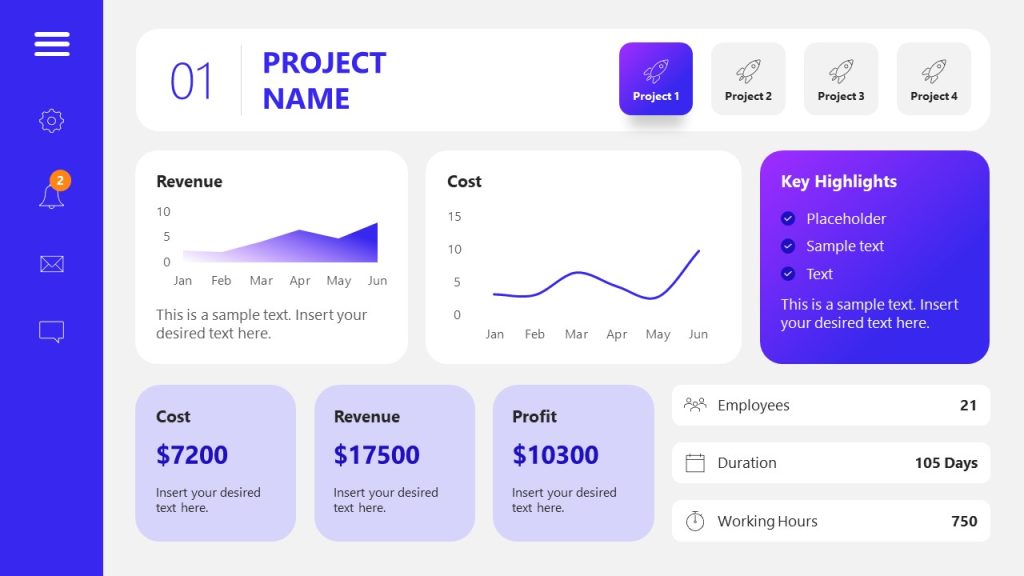
Use This Template
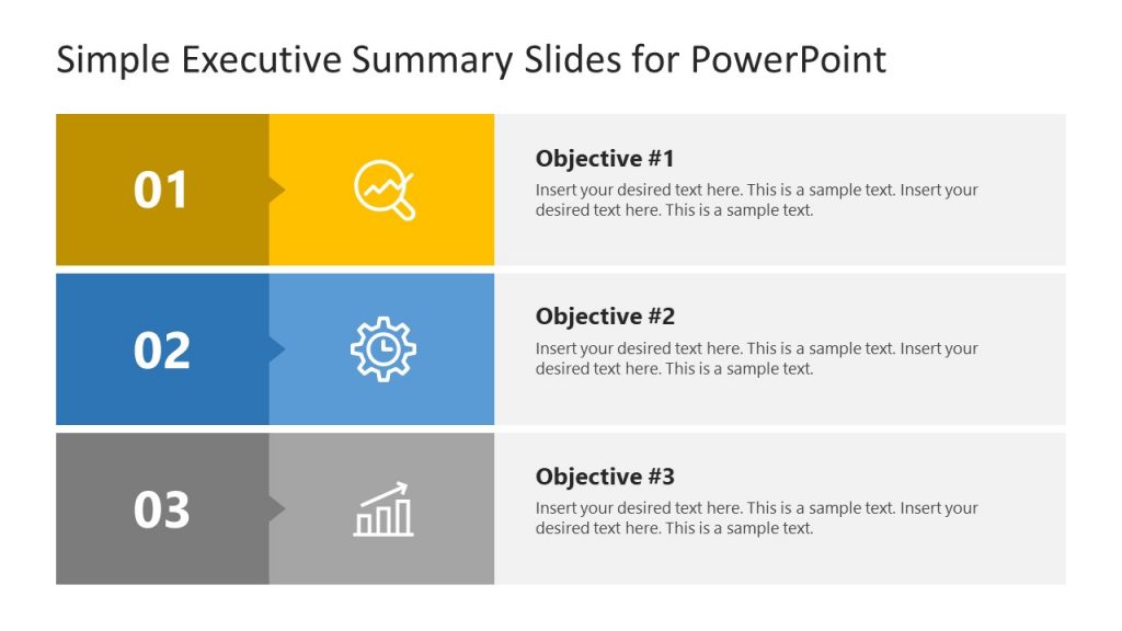
2. Simple Executive Summary Slide Template for PowerPoint
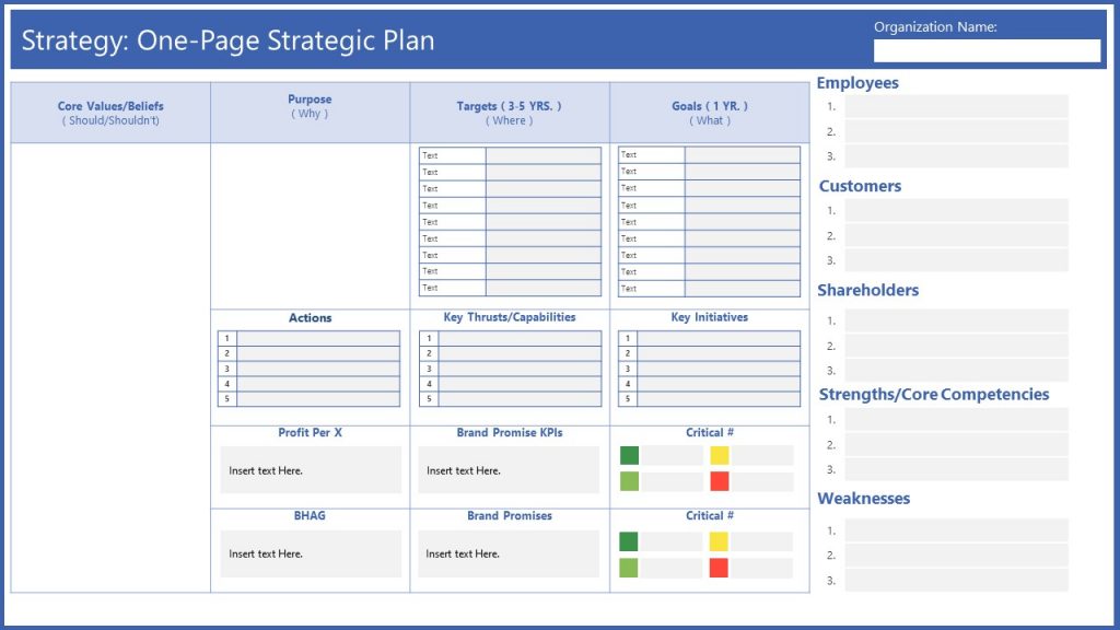
3. One Page Strategy Summary PowerPoint Template
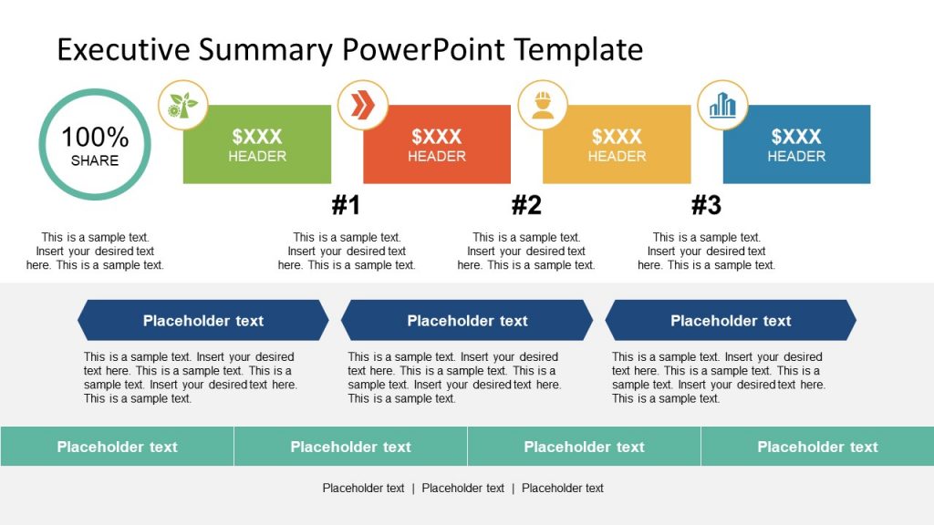
4. Executive Summary PowerPoint Template
5. Executive Business PowerPoint Template

Like this article? Please share
Executive Reports, Executive Summary Filed under Business
Related Articles

Filed under Business • August 31st, 2023
How to Build a Project Status Report Template: Complete Guide
Project status reports provide timely insights into project progress. Here are practical tips and a one-pager template for concise updates.

Filed under Business • October 25th, 2022
Business Presentation: The Ultimate Guide to Making Powerful Presentations (+ Examples)
A business presentation is a purpose-led summary of key information about your company’s plans, products, or practices, designed for either internal or external audiences. This guide teaches you how to design and deliver excellent business presentations. Plus, breaks down some best practices from business presentation examples by popular companies.

Filed under Business • October 7th, 2022
Consulting Report: How to Write and Present One
Consultants have many tools of the trade at their disposal: Frameworks, analytics dashboards, data science models, and more. Yet many clients still expect to receive a narrated consulting report. So how do you write one? This guide will show you.
Leave a Reply
How to make a great presentation
Stressed about an upcoming presentation? These talks are full of helpful tips on how to get up in front of an audience and make a lasting impression.

The secret structure of great talks

The beauty of data visualization

TED's secret to great public speaking

How to speak so that people want to listen

How great leaders inspire action
Princeton Correspondents on Undergraduate Research
How to Make a Successful Research Presentation
Turning a research paper into a visual presentation is difficult; there are pitfalls, and navigating the path to a brief, informative presentation takes time and practice. As a TA for GEO/WRI 201: Methods in Data Analysis & Scientific Writing this past fall, I saw how this process works from an instructor’s standpoint. I’ve presented my own research before, but helping others present theirs taught me a bit more about the process. Here are some tips I learned that may help you with your next research presentation:
More is more
In general, your presentation will always benefit from more practice, more feedback, and more revision. By practicing in front of friends, you can get comfortable with presenting your work while receiving feedback. It is hard to know how to revise your presentation if you never practice. If you are presenting to a general audience, getting feedback from someone outside of your discipline is crucial. Terms and ideas that seem intuitive to you may be completely foreign to someone else, and your well-crafted presentation could fall flat.
Less is more
Limit the scope of your presentation, the number of slides, and the text on each slide. In my experience, text works well for organizing slides, orienting the audience to key terms, and annotating important figures–not for explaining complex ideas. Having fewer slides is usually better as well. In general, about one slide per minute of presentation is an appropriate budget. Too many slides is usually a sign that your topic is too broad.

Limit the scope of your presentation
Don’t present your paper. Presentations are usually around 10 min long. You will not have time to explain all of the research you did in a semester (or a year!) in such a short span of time. Instead, focus on the highlight(s). Identify a single compelling research question which your work addressed, and craft a succinct but complete narrative around it.
You will not have time to explain all of the research you did. Instead, focus on the highlights. Identify a single compelling research question which your work addressed, and craft a succinct but complete narrative around it.
Craft a compelling research narrative
After identifying the focused research question, walk your audience through your research as if it were a story. Presentations with strong narrative arcs are clear, captivating, and compelling.
- Introduction (exposition — rising action)
Orient the audience and draw them in by demonstrating the relevance and importance of your research story with strong global motive. Provide them with the necessary vocabulary and background knowledge to understand the plot of your story. Introduce the key studies (characters) relevant in your story and build tension and conflict with scholarly and data motive. By the end of your introduction, your audience should clearly understand your research question and be dying to know how you resolve the tension built through motive.

- Methods (rising action)
The methods section should transition smoothly and logically from the introduction. Beware of presenting your methods in a boring, arc-killing, ‘this is what I did.’ Focus on the details that set your story apart from the stories other people have already told. Keep the audience interested by clearly motivating your decisions based on your original research question or the tension built in your introduction.
- Results (climax)
Less is usually more here. Only present results which are clearly related to the focused research question you are presenting. Make sure you explain the results clearly so that your audience understands what your research found. This is the peak of tension in your narrative arc, so don’t undercut it by quickly clicking through to your discussion.
- Discussion (falling action)
By now your audience should be dying for a satisfying resolution. Here is where you contextualize your results and begin resolving the tension between past research. Be thorough. If you have too many conflicts left unresolved, or you don’t have enough time to present all of the resolutions, you probably need to further narrow the scope of your presentation.
- Conclusion (denouement)
Return back to your initial research question and motive, resolving any final conflicts and tying up loose ends. Leave the audience with a clear resolution of your focus research question, and use unresolved tension to set up potential sequels (i.e. further research).
Use your medium to enhance the narrative
Visual presentations should be dominated by clear, intentional graphics. Subtle animation in key moments (usually during the results or discussion) can add drama to the narrative arc and make conflict resolutions more satisfying. You are narrating a story written in images, videos, cartoons, and graphs. While your paper is mostly text, with graphics to highlight crucial points, your slides should be the opposite. Adapting to the new medium may require you to create or acquire far more graphics than you included in your paper, but it is necessary to create an engaging presentation.
The most important thing you can do for your presentation is to practice and revise. Bother your friends, your roommates, TAs–anybody who will sit down and listen to your work. Beyond that, think about presentations you have found compelling and try to incorporate some of those elements into your own. Remember you want your work to be comprehensible; you aren’t creating experts in 10 minutes. Above all, try to stay passionate about what you did and why. You put the time in, so show your audience that it’s worth it.
For more insight into research presentations, check out these past PCUR posts written by Emma and Ellie .
— Alec Getraer, Natural Sciences Correspondent
Share this:
- Share on Tumblr

30 Examples: How to Conclude a Presentation (Effective Closing Techniques)
By Status.net Editorial Team on March 4, 2024 — 9 minutes to read
Ending a presentation on a high note is a skill that can set you apart from the rest. It’s the final chance to leave an impact on your audience, ensuring they walk away with the key messages embedded in their minds. This moment is about driving your points home and making sure they resonate. Crafting a memorable closing isn’t just about summarizing key points, though that’s part of it, but also about providing value that sticks with your listeners long after they’ve left the room.
Crafting Your Core Message
To leave a lasting impression, your presentation’s conclusion should clearly reflect your core message. This is your chance to reinforce the takeaways and leave the audience thinking about your presentation long after it ends.
Identifying Key Points
Start by recognizing what you want your audience to remember. Think about the main ideas that shaped your talk. Make a list like this:
- The problem your presentation addresses.
- The evidence that supports your argument.
- The solution you propose or the action you want the audience to take.
These key points become the pillars of your core message.
Contextualizing the Presentation
Provide context by briefly relating back to the content of the whole presentation. For example:
- Reference a statistic you shared in the opening, and how it ties into the conclusion.
- Mention a case study that underlines the importance of your message.
Connecting these elements gives your message cohesion and makes your conclusion resonate with the framework of your presentation.
30 Example Phrases: How to Conclude a Presentation
- 1. “In summary, let’s revisit the key takeaways from today’s presentation.”
- 2. “Thank you for your attention. Let’s move forward together.”
- 3. “That brings us to the end. I’m open to any questions you may have.”
- 4. “I’ll leave you with this final thought to ponder as we conclude.”
- 5. “Let’s recap the main points before we wrap up.”
- 6. “I appreciate your engagement. Now, let’s turn these ideas into action.”
- 7. “We’ve covered a lot today. To conclude, remember these crucial points.”
- 8. “As we reach the end, I’d like to emphasize our call to action.”
- 9. “Before we close, let’s quickly review what we’ve learned.”
- 10. “Thank you for joining me on this journey. I look forward to our next steps.”
- 11. “In closing, I’d like to thank everyone for their participation.”
- 12. “Let’s conclude with a reminder of the impact we can make together.”
- 13. “To wrap up our session, here’s a brief summary of our discussion.”
- 14. “I’m grateful for the opportunity to present to you. Any final thoughts?”
- 15. “And that’s a wrap. I welcome any final questions or comments.”
- 16. “As we conclude, let’s remember the objectives we’ve set today.”
- 17. “Thank you for your time. Let’s apply these insights to achieve success.”
- 18. “In conclusion, your feedback is valuable, and I’m here to listen.”
- 19. “Before we part, let’s take a moment to reflect on our key messages.”
- 20. “I’ll end with an invitation for all of us to take the next step.”
- 21. “As we close, let’s commit to the goals we’ve outlined today.”
- 22. “Thank you for your attention. Let’s keep the conversation going.”
- 23. “In conclusion, let’s make a difference, starting now.”
- 24. “I’ll leave you with these final words to consider as we end our time together.”
- 25. “Before we conclude, remember that change starts with our actions today.”
- 26. “Thank you for the lively discussion. Let’s continue to build on these ideas.”
- 27. “As we wrap up, I encourage you to reach out with any further questions.”
- 28. “In closing, I’d like to express my gratitude for your valuable input.”
- 29. “Let’s conclude on a high note and take these learnings forward.”
- 30. “Thank you for your time today. Let’s end with a commitment to progress.”
Summarizing the Main Points
When you reach the end of your presentation, summarizing the main points helps your audience retain the important information you’ve shared. Crafting a memorable summary enables your listeners to walk away with a clear understanding of your message.
Effective Methods of Summarization
To effectively summarize your presentation, you need to distill complex information into concise, digestible pieces. Start by revisiting the overarching theme of your talk and then narrow down to the core messages. Use plain language and imagery to make the enduring ideas stick. Here are some examples of how to do this:
- Use analogies that relate to common experiences to recap complex concepts.
- Incorporate visuals or gestures that reinforce your main arguments.
The Rule of Three
The Rule of Three is a classic writing and communication principle. It means presenting ideas in a trio, which is a pattern that’s easy for people to understand and remember. For instance, you might say, “Our plan will save time, cut costs, and improve quality.” This structure has a pleasing rhythm and makes the content more memorable. Some examples include:
- “This software is fast, user-friendly, and secure.”
- Pointing out a product’s “durability, affordability, and eco-friendliness.”
Reiterating the Main Points
Finally, you want to circle back to the key takeaways of your presentation. Rephrase your main points without introducing new information. This reinforcement supports your audience’s memory and understanding of the material. You might summarize key takeaways like this:
- Mention the problem you addressed, the solution you propose, and the benefits of this solution.
- Highlighting the outcomes of adopting your strategy: higher efficiency, greater satisfaction, and increased revenue.
Creating a Strong Conclusion
The final moments of your presentation are your chance to leave your audience with a powerful lasting impression. A strong conclusion is more than just summarizing—it’s your opportunity to invoke thought, inspire action, and make your message memorable.
Incorporating a Call to Action
A call to action is your parting request to your audience. You want to inspire them to take a specific action or think differently as a result of what they’ve heard. To do this effectively:
- Be clear about what you’re asking.
- Explain why their action is needed.
- Make it as simple as possible for them to take the next steps.
Example Phrases:
- “Start making a difference today by…”
- “Join us in this effort by…”
- “Take the leap and commit to…”
Leaving a Lasting Impression
End your presentation with something memorable. This can be a powerful quote, an inspirational statement, or a compelling story that underscores your main points. The goal here is to resonate with your audience on an emotional level so that your message sticks with them long after they leave.
- “In the words of [Influential Person], ‘…'”
- “Imagine a world where…”
- “This is more than just [Topic]; it’s about…”
Enhancing Audience Engagement
To hold your audience’s attention and ensure they leave with a lasting impression of your presentation, fostering interaction is key.
Q&A Sessions
It’s important to integrate a Q&A session because it allows for direct communication between you and your audience. This interactive segment helps clarify any uncertainties and encourages active participation. Plan for this by designating a time slot towards the end of your presentation and invite questions that promote discussion.
- “I’d love to hear your thoughts; what questions do you have?”
- “Let’s dive into any questions you might have. Who would like to start?”
- “Feel free to ask any questions, whether they’re clarifications or deeper inquiries about the topic.”
Encouraging Audience Participation
Getting your audience involved can transform a good presentation into a great one. Use open-ended questions that provoke thought and allow audience members to reflect on how your content relates to them. Additionally, inviting volunteers to participate in a demonstration or share their experiences keeps everyone engaged and adds a personal touch to your talk.
- “Could someone give me an example of how you’ve encountered this in your work?”
- “I’d appreciate a volunteer to help demonstrate this concept. Who’s interested?”
- “How do you see this information impacting your daily tasks? Let’s discuss!”
Delivering a Persuasive Ending
At the end of your presentation, you have the power to leave a lasting impact on your audience. A persuasive ending can drive home your key message and encourage action.
Sales and Persuasion Tactics
When you’re concluding a presentation with the goal of selling a product or idea, employ carefully chosen sales and persuasion tactics. One method is to summarize the key benefits of your offering, reminding your audience why it’s important to act. For example, if you’ve just presented a new software tool, recap how it will save time and increase productivity. Another tactic is the ‘call to action’, which should be clear and direct, such as “Start your free trial today to experience the benefits first-hand!” Furthermore, using a touch of urgency, like “Offer expires soon!”, can nudge your audience to act promptly.
Final Impressions and Professionalism
Your closing statement is a chance to solidify your professional image and leave a positive impression. It’s important to display confidence and poise. Consider thanking your audience for their time and offering to answer any questions. Make sure to end on a high note by summarizing your message in a concise and memorable way. If your topic was on renewable energy, you might conclude by saying, “Let’s take a leap towards a greener future by adopting these solutions today.” This reinforces your main points and encourages your listeners to think or act differently when they leave.
Frequently Asked Questions
What are some creative strategies for ending a presentation memorably.
To end your presentation in a memorable way, consider incorporating a call to action that engages your audience to take the next step. Another strategy is to finish with a thought-provoking question or a surprising fact that resonates with your listeners.
Can you suggest some powerful quotes suitable for concluding a presentation?
Yes, using a quote can be very effective. For example, Maya Angelou’s “People will forget what you said, people will forget what you did, but people will never forget how you made them feel,” can reinforce the emotional impact of your presentation.
What is an effective way to write a conclusion that summarizes a presentation?
An effective conclusion should recap the main points succinctly, highlighting what you want your audience to remember. A good way to conclude is by restating your thesis and then briefly summarizing the supporting points you made.
As a student, how can I leave a strong impression with my presentation’s closing remarks?
To leave a strong impression, consider sharing a personal anecdote related to your topic that demonstrates passion and conviction. This helps humanize your content and makes the message more relatable to your audience.
How can I appropriately thank my audience at the close of my presentation?
A simple and sincere expression of gratitude is always appropriate. You might say, “Thank you for your attention and engagement today,” to convey appreciation while also acknowledging their participation.
What are some examples of a compelling closing sentence in a presentation?
A compelling closing sentence could be something like, “Together, let’s take the leap towards a greener future,” if you’re presenting on sustainability. This sentence is impactful, calls for united action, and leaves your audience with a clear message.
- How to Build Rapport: Effective Techniques
- Active Listening (Techniques, Examples, Tips)
- Effective Nonverbal Communication in the Workplace (Examples)
- What is Problem Solving? (Steps, Techniques, Examples)
- 2 Examples of an Effective and Warm Letter of Welcome
- 8 Examples of Effective Interview Confirmation Emails
How to Create a Summary Slide in PowerPoint?

Creating a summary slide in PowerPoint is an essential part of putting together a presentation that grabs and holds your audience’s attention. Not only does it help to reinforce the key themes of your presentation, but it also serves as a powerful tool for summarizing complex information and data in an easy-to-understand format for your audience. In this article, we will explore the importance of a summary slide in PowerPoint presentations, how to plan and design an effective summary slide, and some best practices and tips for creating an engaging and informative summary slide.
Table of Contents
The Importance of a Summary Slide in PowerPoint Presentations
One of the key reasons why a summary slide is so important in PowerPoint presentations is its ability to reinforce the main themes and ideas of your presentation. By highlighting the most important points and takeaways, a summary slide can help to ensure that your audience remembers your presentation long after it is over. Additionally, a summary slide provides a clear and concise way to summarize complex data or information, helping to make your presentation more accessible and engaging for your audience.
Another benefit of including a summary slide in your PowerPoint presentation is that it can serve as a roadmap for your audience. By providing a clear overview of the topics covered in your presentation, a summary slide can help your audience to follow along and stay engaged throughout the entire presentation. This can be especially helpful for longer presentations or those that cover a lot of complex information.
Finally, a summary slide can also be a useful tool for reinforcing your call to action or key message. By summarizing the main points of your presentation and highlighting the key takeaways, you can help to ensure that your audience understands the importance of your message and is motivated to take action. This can be particularly important in business or marketing presentations, where the ultimate goal is to persuade your audience to take a specific action or make a purchase.
Understanding the Purpose of a Summary Slide in Your Presentation
Before you start creating your summary slide, it’s essential to understanding its purpose in your overall presentation. The summary slide is typically the last slide of your presentation, and it should summarize the most important points covered in your presentation along with a memorable final thought. For example, if you’re delivering a sales pitch, your summary slide should highlight the key benefits of your product or service and provide a clear call to action for your audience.
Another important aspect of a summary slide is that it helps your audience to remember the key takeaways from your presentation. By providing a concise summary of the main points, your audience is more likely to retain the information and be able to recall it later. Additionally, a well-crafted summary slide can also serve as a visual aid to reinforce your message and leave a lasting impression on your audience.
Planning Your Summary Slide: What to Include and What to Leave Out
When planning your summary slide, it’s important to strike the right balance between including enough information to summarize your presentation effectively while also avoiding overwhelming your audience with too much detail. Some key elements to consider including in your summary slide include the main themes and ideas covered in your presentation, key data points or statistics, any notable quotes or testimonials, and a final call to action. However, be sure to leave out any extraneous information that isn’t directly relevant to your main message or themes.
Another important factor to consider when planning your summary slide is the visual design. Your summary slide should be visually appealing and easy to read, with clear and concise text and graphics. Use a consistent color scheme and font throughout your presentation to create a cohesive and professional look. Additionally, consider using visual aids such as charts, graphs, or images to help illustrate your main points and make your summary slide more engaging for your audience.
Step-by-Step Guide to Creating a Summary Slide in PowerPoint
Creating a summary slide in PowerPoint is a straightforward process that can be accomplished using a few simple steps. First, choose the template or design for your summary slide. Most PowerPoint templates include a suitable summary slide layout, so you don’t need to start from scratch. Next, consider the key message and themes of your presentation and decide what information to include in your summary slide. Be sure to keep your text concise and focused, and use bullet points or other visual aids to help keep things clear and easy to understand. Finally, add any relevant images, charts, or graphs to your summary slide, and make sure to use fonts and colors that are consistent with your overall presentation design.
It’s important to note that the summary slide should be the last slide in your presentation. This slide should provide a quick overview of the key points and takeaways from your presentation. It’s also a good idea to include a call to action or next steps on this slide, so your audience knows what to do next. Remember, the summary slide is often the slide that your audience will remember the most, so make sure it’s clear, concise, and visually appealing.
Designing an Eye-Catching Summary Slide for Your Presentation
While the content of your summary slide is essential, the design also plays a crucial role in creating an engaging and memorable summary slide. To design an eye-catching summary slide, consider using bold colors and fonts, incorporating relevant images or graphics, and using animations or slide transitions to help emphasize key points. Remember to keep your design consistent with your overall presentation theme and style.
Another important aspect to consider when designing your summary slide is the placement of information. You want to make sure that the most important information is prominently displayed and easy to read. This can be achieved by using larger font sizes or bolding key words. Additionally, consider using bullet points or numbered lists to break up information and make it easier to digest.
Finally, don’t forget about the importance of white space. A cluttered summary slide can be overwhelming and difficult to read. Leave enough space between elements to create a clean and organized design. This will not only make your summary slide more visually appealing, but it will also make it easier for your audience to understand and remember the information presented.
Tips and Tricks for Creating an Effective Summary Slide in PowerPoint
When creating your summary slide, there are a few tips and tricks that can help you to ensure its effectiveness. First, consider using a strong headline or tagline that sums up the main message or takeaway from your presentation. Second, use bullets or numbers to break down complex information into manageable chunks, making it easier for your audience to understand. Finally, use visuals like images or charts to help illustrate your key points, making them more memorable and engaging for your audience.
Another important tip to keep in mind when creating a summary slide is to keep it simple and concise. Avoid cluttering the slide with too much information or unnecessary details. Stick to the most important points and use clear and concise language to convey your message effectively.
Additionally, it can be helpful to include a call to action on your summary slide. This could be a request for feedback, a call to visit your website or social media pages, or an invitation to continue the conversation after the presentation. Including a call to action can help to keep your audience engaged and interested in your message beyond the presentation itself.
How to Customize Your Summary Slide with Animations and Transitions
PowerPoint offers a wide range of options for customizing your summary slide with animations and transitions. Animations can be used to bring attention to key points or data, while transitions can help to create a seamless flow between slides. When using animations and transitions, be sure to use them sparingly and consistently throughout your entire presentation.
Best Practices for Using Images and Graphics on Your Summary Slide
Images and graphics can be powerful tools for enhancing the impact of your summary slide. When using images and graphics, be sure to choose visuals that are relevant to your presentation and that help to reinforce your main message or themes. Additionally, use high-quality images and graphics that are visually appealing and easy to understand for your audience.
Adding Charts and Graphs to Your Summary Slide: A Comprehensive Guide
If your presentation includes complex data or information, charts and graphs can be an effective way to present it in a clear and easy-to-understand format. When adding charts and graphs to your summary slide, consider using simple designs and labels that are easy to read and interpret. Additionally, be sure to only include the most important data points or information on your summary slide, leaving out any unnecessary information that could confuse your audience.
Creating a Memorable Conclusion with Your Summary Slide
The last slide of your presentation should leave a lasting impression on your audience. To create a memorable conclusion with your summary slide, consider including a final call to action or memorable quote that reinforces your presentation’s main message. Additionally, use images, graphics, or animations to help emphasize your main points and leave a lasting impression on your audience.
How to Use a Summary Slide to Engage Your Audience
A summary slide can also be an effective tool for engaging your audience throughout your presentation. By previewing your summary slide at the beginning of your presentation, your audience will have a clear understanding of what to expect and will be more engaged and attentive throughout the rest of your presentation. Additionally, use your summary slide to encourage audience participation by asking questions or soliciting feedback on your key messages.
Examples of Amazing Summary Slides: Inspiration for Your Next Presentation
Looking for some inspiration for your next summary slide? There are plenty of examples of amazing summary slides that you can draw inspiration from. Some great examples include TED Talks and other presentations from thought leaders in your industry. Take note of how they use visuals, text, and other design elements to create engaging and memorable summary slides.
Common Mistakes to Avoid When Creating a Summary Slide in PowerPoint
When creating your summary slide, there are a few common mistakes to avoid. These include including too much information or detail, using fonts or colors that are difficult to read, and failing to use visuals or other design elements effectively. Additionally, be sure to proofread your summary slide carefully to avoid any spelling or grammatical errors that could detract from your message.
Wrap Up: Final Thoughts on Creating a Perfect Summary Slide in PowerPoint
Creating an effective summary slide is a crucial part of any PowerPoint presentation. By following the tips and best practices outlined in this article, you can create a summary slide that not only reinforces the key themes and ideas of your presentation but also engages and informs your audience in a memorable and effective way.
By humans, for humans - Best rated articles:
Excel report templates: build better reports faster, top 9 power bi dashboard examples, excel waterfall charts: how to create one that doesn't suck, beyond ai - discover our handpicked bi resources.
Explore Zebra BI's expert-selected resources combining technology and insight for practical, in-depth BI strategies.

We’ve been experimenting with AI-generated content, and sometimes it gets carried away. Give us a feedback and help us learn and improve! 🤍
Note: This is an experimental AI-generated article. Your help is welcome. Share your feedback with us and help us improve.

Improve your practice.
Enhance your soft skills with a range of award-winning courses.
How to Structure your Presentation, with Examples
August 3, 2018 - Dom Barnard
For many people the thought of delivering a presentation is a daunting task and brings about a great deal of nerves . However, if you take some time to understand how effective presentations are structured and then apply this structure to your own presentation, you’ll appear much more confident and relaxed.
Here is our complete guide for structuring your presentation, with examples at the end of the article to demonstrate these points.
Why is structuring a presentation so important?
If you’ve ever sat through a great presentation, you’ll have left feeling either inspired or informed on a given topic. This isn’t because the speaker was the most knowledgeable or motivating person in the world. Instead, it’s because they know how to structure presentations – they have crafted their message in a logical and simple way that has allowed the audience can keep up with them and take away key messages.
Research has supported this, with studies showing that audiences retain structured information 40% more accurately than unstructured information.
In fact, not only is structuring a presentation important for the benefit of the audience’s understanding, it’s also important for you as the speaker. A good structure helps you remain calm, stay on topic, and avoid any awkward silences.
What will affect your presentation structure?
Generally speaking, there is a natural flow that any decent presentation will follow which we will go into shortly. However, you should be aware that all presentation structures will be different in their own unique way and this will be due to a number of factors, including:
- Whether you need to deliver any demonstrations
- How knowledgeable the audience already is on the given subject
- How much interaction you want from the audience
- Any time constraints there are for your talk
- What setting you are in
- Your ability to use any kinds of visual assistance
Before choosing the presentation’s structure answer these questions first:
- What is your presentation’s aim?
- Who are the audience?
- What are the main points your audience should remember afterwards?
When reading the points below, think critically about what things may cause your presentation structure to be slightly different. You can add in certain elements and add more focus to certain moments if that works better for your speech.

What is the typical presentation structure?
This is the usual flow of a presentation, which covers all the vital sections and is a good starting point for yours. It allows your audience to easily follow along and sets out a solid structure you can add your content to.
1. Greet the audience and introduce yourself
Before you start delivering your talk, introduce yourself to the audience and clarify who you are and your relevant expertise. This does not need to be long or incredibly detailed, but will help build an immediate relationship between you and the audience. It gives you the chance to briefly clarify your expertise and why you are worth listening to. This will help establish your ethos so the audience will trust you more and think you’re credible.
Read our tips on How to Start a Presentation Effectively
2. Introduction
In the introduction you need to explain the subject and purpose of your presentation whilst gaining the audience’s interest and confidence. It’s sometimes helpful to think of your introduction as funnel-shaped to help filter down your topic:
- Introduce your general topic
- Explain your topic area
- State the issues/challenges in this area you will be exploring
- State your presentation’s purpose – this is the basis of your presentation so ensure that you provide a statement explaining how the topic will be treated, for example, “I will argue that…” or maybe you will “compare”, “analyse”, “evaluate”, “describe” etc.
- Provide a statement of what you’re hoping the outcome of the presentation will be, for example, “I’m hoping this will be provide you with…”
- Show a preview of the organisation of your presentation
In this section also explain:
- The length of the talk.
- Signal whether you want audience interaction – some presenters prefer the audience to ask questions throughout whereas others allocate a specific section for this.
- If it applies, inform the audience whether to take notes or whether you will be providing handouts.
The way you structure your introduction can depend on the amount of time you have been given to present: a sales pitch may consist of a quick presentation so you may begin with your conclusion and then provide the evidence. Conversely, a speaker presenting their idea for change in the world would be better suited to start with the evidence and then conclude what this means for the audience.
Keep in mind that the main aim of the introduction is to grab the audience’s attention and connect with them.
3. The main body of your talk
The main body of your talk needs to meet the promises you made in the introduction. Depending on the nature of your presentation, clearly segment the different topics you will be discussing, and then work your way through them one at a time – it’s important for everything to be organised logically for the audience to fully understand. There are many different ways to organise your main points, such as, by priority, theme, chronologically etc.
- Main points should be addressed one by one with supporting evidence and examples.
- Before moving on to the next point you should provide a mini-summary.
- Links should be clearly stated between ideas and you must make it clear when you’re moving onto the next point.
- Allow time for people to take relevant notes and stick to the topics you have prepared beforehand rather than straying too far off topic.
When planning your presentation write a list of main points you want to make and ask yourself “What I am telling the audience? What should they understand from this?” refining your answers this way will help you produce clear messages.
4. Conclusion
In presentations the conclusion is frequently underdeveloped and lacks purpose which is a shame as it’s the best place to reinforce your messages. Typically, your presentation has a specific goal – that could be to convert a number of the audience members into customers, lead to a certain number of enquiries to make people knowledgeable on specific key points, or to motivate them towards a shared goal.
Regardless of what that goal is, be sure to summarise your main points and their implications. This clarifies the overall purpose of your talk and reinforces your reason for being there.
Follow these steps:
- Signal that it’s nearly the end of your presentation, for example, “As we wrap up/as we wind down the talk…”
- Restate the topic and purpose of your presentation – “In this speech I wanted to compare…”
- Summarise the main points, including their implications and conclusions
- Indicate what is next/a call to action/a thought-provoking takeaway
- Move on to the last section
5. Thank the audience and invite questions
Conclude your talk by thanking the audience for their time and invite them to ask any questions they may have. As mentioned earlier, personal circumstances will affect the structure of your presentation.
Many presenters prefer to make the Q&A session the key part of their talk and try to speed through the main body of the presentation. This is totally fine, but it is still best to focus on delivering some sort of initial presentation to set the tone and topics for discussion in the Q&A.

Other common presentation structures
The above was a description of a basic presentation, here are some more specific presentation layouts:
Demonstration
Use the demonstration structure when you have something useful to show. This is usually used when you want to show how a product works. Steve Jobs frequently used this technique in his presentations.
- Explain why the product is valuable.
- Describe why the product is necessary.
- Explain what problems it can solve for the audience.
- Demonstrate the product to support what you’ve been saying.
- Make suggestions of other things it can do to make the audience curious.
Problem-solution
This structure is particularly useful in persuading the audience.
- Briefly frame the issue.
- Go into the issue in detail showing why it ‘s such a problem. Use logos and pathos for this – the logical and emotional appeals.
- Provide the solution and explain why this would also help the audience.
- Call to action – something you want the audience to do which is straightforward and pertinent to the solution.
Storytelling
As well as incorporating stories in your presentation , you can organise your whole presentation as a story. There are lots of different type of story structures you can use – a popular choice is the monomyth – the hero’s journey. In a monomyth, a hero goes on a difficult journey or takes on a challenge – they move from the familiar into the unknown. After facing obstacles and ultimately succeeding the hero returns home, transformed and with newfound wisdom.
Storytelling for Business Success webinar , where well-know storyteller Javier Bernad shares strategies for crafting compelling narratives.
Another popular choice for using a story to structure your presentation is in media ras (in the middle of thing). In this type of story you launch right into the action by providing a snippet/teaser of what’s happening and then you start explaining the events that led to that event. This is engaging because you’re starting your story at the most exciting part which will make the audience curious – they’ll want to know how you got there.
- Great storytelling: Examples from Alibaba Founder, Jack Ma
Remaining method
The remaining method structure is good for situations where you’re presenting your perspective on a controversial topic which has split people’s opinions.
- Go into the issue in detail showing why it’s such a problem – use logos and pathos.
- Rebut your opponents’ solutions – explain why their solutions could be useful because the audience will see this as fair and will therefore think you’re trustworthy, and then explain why you think these solutions are not valid.
- After you’ve presented all the alternatives provide your solution, the remaining solution. This is very persuasive because it looks like the winning idea, especially with the audience believing that you’re fair and trustworthy.
Transitions
When delivering presentations it’s important for your words and ideas to flow so your audience can understand how everything links together and why it’s all relevant. This can be done using speech transitions which are words and phrases that allow you to smoothly move from one point to another so that your speech flows and your presentation is unified.
Transitions can be one word, a phrase or a full sentence – there are many different forms, here are some examples:
Moving from the introduction to the first point
Signify to the audience that you will now begin discussing the first main point:
- Now that you’re aware of the overview, let’s begin with…
- First, let’s begin with…
- I will first cover…
- My first point covers…
- To get started, let’s look at…
Shifting between similar points
Move from one point to a similar one:
- In the same way…
- Likewise…
- Equally…
- This is similar to…
- Similarly…
Internal summaries
Internal summarising consists of summarising before moving on to the next point. You must inform the audience:
- What part of the presentation you covered – “In the first part of this speech we’ve covered…”
- What the key points were – “Precisely how…”
- How this links in with the overall presentation – “So that’s the context…”
- What you’re moving on to – “Now I’d like to move on to the second part of presentation which looks at…”
Physical movement
You can move your body and your standing location when you transition to another point. The audience find it easier to follow your presentation and movement will increase their interest.
A common technique for incorporating movement into your presentation is to:
- Start your introduction by standing in the centre of the stage.
- For your first point you stand on the left side of the stage.
- You discuss your second point from the centre again.
- You stand on the right side of the stage for your third point.
- The conclusion occurs in the centre.
Key slides for your presentation
Slides are a useful tool for most presentations: they can greatly assist in the delivery of your message and help the audience follow along with what you are saying. Key slides include:
- An intro slide outlining your ideas
- A summary slide with core points to remember
- High quality image slides to supplement what you are saying
There are some presenters who choose not to use slides at all, though this is more of a rarity. Slides can be a powerful tool if used properly, but the problem is that many fail to do just that. Here are some golden rules to follow when using slides in a presentation:
- Don’t over fill them – your slides are there to assist your speech, rather than be the focal point. They should have as little information as possible, to avoid distracting people from your talk.
- A picture says a thousand words – instead of filling a slide with text, instead, focus on one or two images or diagrams to help support and explain the point you are discussing at that time.
- Make them readable – depending on the size of your audience, some may not be able to see small text or images, so make everything large enough to fill the space.
- Don’t rush through slides – give the audience enough time to digest each slide.
Guy Kawasaki, an entrepreneur and author, suggests that slideshows should follow a 10-20-30 rule :
- There should be a maximum of 10 slides – people rarely remember more than one concept afterwards so there’s no point overwhelming them with unnecessary information.
- The presentation should last no longer than 20 minutes as this will leave time for questions and discussion.
- The font size should be a minimum of 30pt because the audience reads faster than you talk so less information on the slides means that there is less chance of the audience being distracted.
Here are some additional resources for slide design:
- 7 design tips for effective, beautiful PowerPoint presentations
- 11 design tips for beautiful presentations
- 10 tips on how to make slides that communicate your idea
Group Presentations
Group presentations are structured in the same way as presentations with one speaker but usually require more rehearsal and practices. Clean transitioning between speakers is very important in producing a presentation that flows well. One way of doing this consists of:
- Briefly recap on what you covered in your section: “So that was a brief introduction on what health anxiety is and how it can affect somebody”
- Introduce the next speaker in the team and explain what they will discuss: “Now Elnaz will talk about the prevalence of health anxiety.”
- Then end by looking at the next speaker, gesturing towards them and saying their name: “Elnaz”.
- The next speaker should acknowledge this with a quick: “Thank you Joe.”
From this example you can see how the different sections of the presentations link which makes it easier for the audience to follow and remain engaged.
Example of great presentation structure and delivery
Having examples of great presentations will help inspire your own structures, here are a few such examples, each unique and inspiring in their own way.
How Google Works – by Eric Schmidt
This presentation by ex-Google CEO Eric Schmidt demonstrates some of the most important lessons he and his team have learnt with regards to working with some of the most talented individuals they hired. The simplistic yet cohesive style of all of the slides is something to be appreciated. They are relatively straightforward, yet add power and clarity to the narrative of the presentation.
Start with why – by Simon Sinek
Since being released in 2009, this presentation has been viewed almost four million times all around the world. The message itself is very powerful, however, it’s not an idea that hasn’t been heard before. What makes this presentation so powerful is the simple message he is getting across, and the straightforward and understandable manner in which he delivers it. Also note that he doesn’t use any slides, just a whiteboard where he creates a simple diagram of his opinion.
The Wisdom of a Third Grade Dropout – by Rick Rigsby
Here’s an example of a presentation given by a relatively unknown individual looking to inspire the next generation of graduates. Rick’s presentation is unique in many ways compared to the two above. Notably, he uses no visual prompts and includes a great deal of humour.
However, what is similar is the structure he uses. He first introduces his message that the wisest man he knew was a third-grade dropout. He then proceeds to deliver his main body of argument, and in the end, concludes with his message. This powerful speech keeps the viewer engaged throughout, through a mixture of heart-warming sentiment, powerful life advice and engaging humour.
As you can see from the examples above, and as it has been expressed throughout, a great presentation structure means analysing the core message of your presentation. Decide on a key message you want to impart the audience with, and then craft an engaging way of delivering it.
By preparing a solid structure, and practising your talk beforehand, you can walk into the presentation with confidence and deliver a meaningful message to an interested audience.
It’s important for a presentation to be well-structured so it can have the most impact on your audience. An unstructured presentation can be difficult to follow and even frustrating to listen to. The heart of your speech are your main points supported by evidence and your transitions should assist the movement between points and clarify how everything is linked.
Research suggests that the audience remember the first and last things you say so your introduction and conclusion are vital for reinforcing your points. Essentially, ensure you spend the time structuring your presentation and addressing all of the sections.

How to Summarize a Presentation with AI
Saving time and effort with Notta, starting from today!
Over the past ten years, I've created hundreds of presentations on PowerPoint (and sometimes on Google Slides) — and I know how important these are for different uses. Whether you want to give a speech, present a product, or share finances in a board meeting, everything is typically possible with a PowerPoint presentation.
But there's no point in watching a two-hour-long presentation only to know it does not contain any relevant information, right? Thankfully, that's where summarizing a presentation can help. It's like creating a short description that reveals what the viewers can expect from the long slideshow.
So, how to summarize a presentation , especially when you don't have enough time for it? In this guide, I'll reveal my tried and tested tips to create a short summary.
What is a Presentation Summary?
A presentation summary is a short, sweet, and meaningful version of the long video in which you introduce the different components of the presentation and a few key points that you’re talking about.
In other words, it typically includes the main points or key takeaways that'll provide you with the gist of the presentation — without you having to watch the presentation from start to end.
Here, you're not trying to convey the entire business strategy or selling points — instead, your goal here is to help the attendees understand the core concept of the presentation.

How to Summarize a Presentation
As a freelance writer who wears all the hats of the business, I try to save as much time as I can. As much as I value my time, I look for ways to save energy and effort for my audience. Writing a summary of lengthy videos , articles, documents, interviews , and presentations is one method to help everyone get all the important information in a clear and concise way. However, condensing all information into a few paragraphs (or one page) isn't an easy task.
Here's the process I follow to summarize presentations in a few paragraphs.
Identify the Main Goal
People love free stuff — but only if it's useful. Nobody wants to waste their time and/or effort watching a presentation that does not have the information they need. That's why your first step is to identify the main goal or objective . Here, you'll need to tell them what the presentation is about, what it includes, and what the key takeaways are.
Write the Summary
Your ultimate goal is to write the key points in the most concise, easy-to-read way possible. Before you're tempted to include everything in the summary, know that viewers are looking for specific information before they watch the presentation. Tell them why they should spend time on the presentation and fearlessly let them know who the presentation is not meant for.
Use Visual Aids
While summarizing the presentation, write as though you're talking to someone whose attention you don't want to lose. Get your ideas with the fewest, most effective words possible — but don't forget to add visual aids that keep the audience engaged. It's a great practice for every writer to help their audience not feel overwhelmed with a wall of texts.

Include Examples and Quotations
Any presentation is incomplete if you don't include proper examples and quotations. When you write the summary, allot some space for writing examples (two examples per page). Remember, holding onto the reader's attention is very important — and quotations can help you do just that.
Example of a Presentation Summary
The presentation summary begins with a hook that draws the audience in, helps them understand the value you offer, provides some proof, and finally ends with a strong CTA. It's relatively easy to incorporate these elements and create a summary. But if you're still finding it hard, here's a real-life presentation summary example for inspiration.
Today, we are excited to share with you our new Product X — the future of eyewear technology. At Company X, glasses aren't just for style — but it's a combination of comfort, innovation, and productivity. That's why we developed Product X, which combines two top technologies — AI and AR. The users reported a 20% boost in productivity and a 40% reduction in eye fatigue. It's now available for everyone — and anyone can place their orders on the website.
Tips for Summarizing a Presentation
Summaries can be incredibly effective for both hosts and audiences — only if you know how to craft attention-grabbing ones. Here, I'll show you how I summarize a presentation that gets positive responses from almost all the attendees.
Use Simple Language
The best presentation summary should be clear, concise, direct, and descriptive . Your main aim is to use simple language and give the attendees what they want.
My best tip is to: write for your audience, not yourself — and, for this, you need to put yourself in the shoes of a specific audience as you write.

Be Scannable
Use bullet points, numbers, and/or bolding to make your summary skimmable and digestible — that emphasizes the key points. The success of the summary will depend upon making the presentation's key takeaways easy for your readers to quickly process the main points.
Use AI Presentation Summarizer
If you struggle to condense information into a basic, short summary, give Notta a try. Unlike nearly all other AI presentation summarizer apps on the market, Notta is a more accurate transcriber and summarizer that can condense long audio/video files into an informative summary.
What I really found useful is Notta's ability to structure a summary into an overview, key chapters, and action items. You can even share this summarized version with the presentation attendees once the meeting is over — helping them understand what was covered in the presentation and what the next steps are.

Try Notta - the best online transcription & summarization tool. Transcribe and summarize your conversations and meetings quickly with high accuracy.
Start for Free
How to Do a Good Summary on PowerPoint?
PowerPoint has become synonymous with presentations — it's a free tool where you can make a slide deck and collaborate with your team. A good summary on PowerPoint can attract more audience to your presentation and even help the attendees get more clarity. Here, I'll reveal the three pillars of writing a good summary.
Include Key Points: The first thing is to write the key (or main) points in a concise and focused way. You can even use bullet points or some visual aids to keep things clear and uncluttered on slides.
Identify & Summarize Each Section: If you're giving a lengthy presentation, I'm assuming you've categorized it into different sections. While summarizing, you'll need to focus on each section and identify the key takeaway from it.
Highlight the Main Takeaway: If the presentation focuses on any problem and offers a solution, it's time to highlight it. As a presenter, you'll need to introduce the problem in the first line, followed by the solution that's offered in the presentation.
Is There an AI that Summarizes PowerPoint Slides?
Yes, there are many AI online summarizers that can summarize PowerPoint slides. Copilot in PowerPoint, for example, can read through the slides and provide a bulleted summary with key points. If you've pre-recorded presentation recordings, you are probably searching for a dedicated way to summarize the slides.
Notta is one powerful and popular AI note-taking application — and, that too, for a good reason. There's a summarizing feature for almost imaginable purposes: just upload the presentation audio/video, and Notta will automatically transcribe the spoken words and then summarize the content.
Key Takeaways
Once you discover the power of summaries, the temptation to create summaries for everything is real. But this can leave you with a new problem: a lot of manual work. So, how to summarize a presentation without much time and effort? That's where the third-party AI summary generators make it easy for you.
Notta is an AI note-taking and AI presentation summarizer tool, especially for people who are not making presentations for fun. It comes with a free generous plan and affordable paid plans that help you record, transcribe, and then summarize media files (including presentations) — with high accuracy.
Chrome Extension
Help Center
vs Otter.ai
vs Fireflies.ai
vs Happy Scribe
vs Sonix.ai
Integrations
Microsoft Teams
Google Meet
Google Drive
Audio to Text Converter
Video to Text Converter
Online Video Converter
Online Audio Converter
Online Vocal Remover
YouTube Video Summarizer
We use essential cookies to make Venngage work. By clicking “Accept All Cookies”, you agree to the storing of cookies on your device to enhance site navigation, analyze site usage, and assist in our marketing efforts.
Manage Cookies
Cookies and similar technologies collect certain information about how you’re using our website. Some of them are essential, and without them you wouldn’t be able to use Venngage. But others are optional, and you get to choose whether we use them or not.
Strictly Necessary Cookies
These cookies are always on, as they’re essential for making Venngage work, and making it safe. Without these cookies, services you’ve asked for can’t be provided.
Show cookie providers
- Google Login
Functionality Cookies
These cookies help us provide enhanced functionality and personalisation, and remember your settings. They may be set by us or by third party providers.
Performance Cookies
These cookies help us analyze how many people are using Venngage, where they come from and how they're using it. If you opt out of these cookies, we can’t get feedback to make Venngage better for you and all our users.
- Google Analytics
Targeting Cookies
These cookies are set by our advertising partners to track your activity and show you relevant Venngage ads on other sites as you browse the internet.
- Google Tag Manager
- Infographics
- Daily Infographics
- Popular Templates
- Accessibility
- Graphic Design
- Graphs and Charts
- Data Visualization
- Human Resources
- Beginner Guides
Blog Data Visualization 18 Presentation Design Tips For Success
18 Presentation Design Tips For Success
Written by: Midori Nediger May 15, 2023

Bad presentations. We’ve all had to sit through them. Heck, we’ve probably all given one or two. I know I have.
You know the type: twice as long as they need to be, slides chock-full of text, no visuals in sight.
How can you ensure you don’t fall victim to these presentation faux-pas when designing your next presentation for your team, class, or clients?
In this blog, I’ll walk you through tips on how to design an impactful presentation along with presentation templates that can help you deliver it with style to leave a lasting impression.
Tips for designing and delivering an impactful presentation
What makes a presentation memorable?
It usually comes down to three things:
- The main idea.
- The presenter.
- The visuals.
All three elements work together to create a successful presentation. Just like how different presentation styles serve different purposes, having a good presentation idea will give the audience a purpose for listening.
Here are some top tips to consider to help you design and deliver an impactful presentation:
- Include less text and more visuals in your presentation design
- Identify one core message to center your presentation design around
- Eliminate any information that doesn’t immediately support the core message
- Create a strong presentation outline to keep you focused
- Use text to reinforce, not repeat, what you’re saying
- Design your presentation with one major takeaway per slide
- Use visuals to highlight the key message on each slide
- Use scaffolding slides to orient your audience and keep them engaged
- Use text size, weight, and color for emphasis
- Apply design choices consistently to avoid distraction
- Split a group presentation by topic
- Use a variety of page layouts to maintain your audience’s interest
- Use presentation templates to help you get started
- Include examples of inspiring people
- Dedicate slides to poignant questions
- Find quotes that will inspire your audience
- Emphasize key points with text and images
- Label your slides to prompt your memory
1. Include less text and more visuals in your presentation design
According to David Paradi’s annual presentation survey , the 3 things that annoy audiences most about presentations are:
- Speakers reading their slides
- Slides that include full sentences of text
- Text that is too small to read
The common thread that ties all of these presentation annoyances is text. Audiences are very picky about the text found in presentation slide decks .
In my experiences speaking at conferences and in webinars over the past few years, audiences respond much more positively to presentations that use visuals in place of text.
Audiences are more engaged, ask more questions, and find my talks more memorable when I include lots of visual examples in my slide decks.
I’m not the only one who has found this. We recently surveyed nearly 400 conference speakers about their presentation designs and found that 84.3% create presentations that are highly visual.
A great example of a high visual presentation is the iconic AirBnB pitch deck design , which includes no more than 40 words per slide. Instead of repeating the speaker’s script on the slides, it makes an impact with keywords, large numbers, and icons:

Learn how to customize this presentation template:
To help you take your presentations to the next level, I’d like to share my process for creating a visually-focused presentation like the one above. I’ll give you my top presentation design tips that I’ve learned over years of presenting:
- Class presentations
- Online courses
You can then apply this process to our professional presentation templates or pitch decks , creating unique presentation decks with ease! Our user-friendly editor tools make customizing these templates a breeze.
To leave a lasting impression on your audience, consider transforming your slides into an interactive presentation. Here are 15 interactive presentation ideas to enhance interactivity and engagement.
We’ll cover the most important steps for summarizing lengthy text into a presentation-friendly format. Then we’ll touch on some presentation design tips to help you get visual with your slide decks. Read on for the best creative presentation ideas .
2. Identify one core message to center your presentation design around
We know from David Paradi’s survey that audiences are easily overwhelmed with lots of text and data, especially when presentations are long.

(You when you see a presentation with lots of text and data and it’s long)
So unlike in a white paper , report , or essay , you can’t expect to tackle many complex ideas within a single presentation.
That would be a recipe for disaster.
Instead, identify a single central message that you would like to communicate to your audience. Then build your presentation around that core message.
By identifying that core message, you can ensure that everything you include in your presentation supports the goal of the presentation .
As seen below, a great presentation tells you exactly what you’re going to learn (the core message), then gets right to the facts (the supporting information).

To ensure you create an asset that’s clear, concise, impactful, and easy to follow, design your presentation around a single core message.
3. Create a strong presentation outline to keep you focused
Think of your outline as a roadmap for your presentation. Creating a strong presentation outline straight away helps make sure that you’re hitting all of the key points you need to cover to convey a persuasive presentation .
Take this presentation outline example:
- Introduction and hellos
- Vision and value proposition
- Financial profit
- Your investment
- Thanks and questions
These are all things that we know we need to talk about within the presentation.
Creating a presentation outline makes it much easier to know what to say when it comes to creating the actual presentation slides.

You could even include your presentation outline as a separate slide so that your audience knows what to expect:

The opening moments of your presentation hold immense power – check out these 15 ways to start a presentation to set the stage and captivate your audience.
4. Eliminate any information that doesn’t support the core message
Next, use that core message to identify everything that doesn’t belong in the presentation.
Aim to eliminate everything that isn’t immediately relevant to the topic at hand, and anything remotely redundant. Cut any information that isn’t absolutely essential to understanding the core message.
By cutting these extra details, you can transform forgettable text-heavy slides:

Into memorable slides with minimal text:

Here’s a quick checklist to help you cut out any extra detail:
Get rid of:
- Detailed descriptions
- Background information
- Redundant statements
- Explanations of common knowledge
- Persuasive facts and figures
- Illustrative examples
- Impactful quotes

This step may seem obvious, but when you’re presenting on a topic that you’re passionate about, it’s easy to get carried away with extraneous detail. Use the recommendations above to keep your text in check.
Clarity is key, especially if you’re presenting virtually rather than in-person. However, Lisa Schneider (Chief Growth Officer at Merriam-Webster) has had plenty of experience making that adjustment. She recently shared her tips for adapting in-person presentations into virtual presentations on Venngage that you can check out.
Watch: How to design a presentation [10 ESSENTIAL TIPS]
5. Use text to reinforce, not repeat, what you’re saying
According to presentation guru Nancy Duarte , your audience should be able to discern the meaning of your slides in 6 seconds or less.
Since your audience will tend to read every word you place on each slide, you must keep your text to an absolute minimum. The text on your slides should provide support for what you’re saying without being distracting.
Never write out, word for word, what you’re going to be saying out loud. If you’re relying on text to remember certain points, resist the urge to cram them into your slides. Instead, use a tool like Venngage’s speaker notes to highlight particular talking points. These can be imported into PowerPoint — along with the rest of your presentation — and will only be viewable to you, not your audience.

For the actual slides, text should only be used to reinforce what you’re saying. Like in the presentation design below, paraphrase long paragraphs into short bulleted lists or statements by eliminating adjectives and articles (like “the” and “a”).

Pull out quotes and important numbers, and make them a focus of each slide.

6. Design your presentation with one major takeaway per slide
As I mentioned above, audiences struggle when too much information is presented on a single slide.
To make sure you don’t overwhelm your audiences with too much information, spread out your content to cover one major takeaway per slide.
By limiting each slide to a single simple statement, you focus your audience’s attention on the topic at hand.
My favorite way to do this is to pick out the core message of whatever I’m talking about and express it in a few keywords, as seen in this presentation slide below.

This helps ensure that the visuals remain the focus of the slide.

Using the text in this way, to simply state a single fact per slide, is a sure-fire way to make an impact in your presentation.
Alternatively, pull out a significant statistic that you want to stick in your audience’s minds and make it a visual focus of the slide, as seen in this popular presentation by Officevibe .

This might mean you end up with a slide deck with a ton of slides. But that’s totally ok!
I’ve talked to many professionals who are pressured by their management teams to create presentations with a specific number of slides (usually as few as 10 or 15 slides for a 30-minute presentation).
If you ask me, this approach is completely flawed. In my mind, the longer I spend sitting on a single slide, the more likely I am to lose the interest of my audience.
How many slides should I use for a 10 minute presentation?
A good rule of thumb is to have at least as many slides as minutes in your presentation. So for a 10 minute presentation you should have at least 10 slides .
Use as many slides as you need, as long as you are presenting a single message on each slide, (as seen in the lengthy presentation template below). This is especially important if you’re presenting your business, or delivering a product presentation. You want to wow your audience, not bore them.

7. Use visuals to highlight the key message on each slide
As important as having one major takeaway per slide is having visuals that highlight the major takeaway on each slide.
Unique visuals will help make your message memorable.
Visuals are a great way to eliminate extra text, too.
You can add visuals by creating a timeline infographic to group and integrate information into visual frameworks like this:

Or create a flowchart and funnels:

Or by representing simple concepts with icons, as seen in the modern presentation design below. Using the same color for every icon helps create a polished look.
Using visuals in this way is perfect for when you have to convey messages quickly to audiences that you aren’t familiar with – such as at conferences. This would also make the ideal interview presentation template.
You can alternatively use icons in different colors, like in the presentation templates below. Just make sure the colors are complimentary, and style is consistent throughout the presentation (i.e. don’t use sleek, modern icons on one slide and whimsically illustrated icons on another). In this example, presentation clipart style icons have been used.

Any time you have important stats or trends you want your audience to remember, consider using a chart or data visualization to drive your point home. Confident public speaking combined with strong visualizations can really make an impact, encouraging your audience to act upon your message.
One of my personal favorite presentations (created by a professional designer) takes this “key message plus a visual” concept to the extreme, resulting in a slide deck that’s downright irresistible.

When applying this concept, don’t fall into the trap of using bad stock photos . Irrelevant or poorly chosen visuals can hurt you as much as they help you.
Below is an example of how to use stock photos effectively. They are more thematic than literal and are customized with fun, bright icons that set a playful tone.

The content and visual design of a presentation should be seamless.
It should never seem like your text and visuals are plopped onto a template. The format and design of the slides should contribute to and support the audience’s understanding of the content.

8. Use scaffolding slides to orient your audience and keep them engaged
It’s easy for audiences to get lost during long presentations, especially if you have lots of slides. And audiences zone out when they get lost.
To help reorient your audience every once in a while, you can use something I like to call scaffolding slides. Scaffolding slides appear throughout a presentation to denote the start and end of major sections.
The core scaffolding slide is the agenda slide, which should appear right after the introduction or title slide. It outlines the major sections of the presentation.
At the beginning of each section, you should show that agenda again but highlight the relevant section title, as seen below.

This gives audiences the sense that you’re making progress through the presentation and helps keep them anchored and engaged.
Alternatively, you can achieve a similar effect by numbering your sections and showing that number on every slide. Or use a progress bar at the bottom of each slide to indicate how far along you are in your presentation. Just make sure it doesn’t distract from the main content of the slides.

You can imagine using this “progress bar” idea for a research presentation, or any presentation where you have a lot of information to get through.
Leila Janah, founder of Sama Group, is great at this. Her Innovation and Inspire talk about Sama Group is an example of a presentation that is well organized and very easy to follow.
Her presentation follows a logical, steady stream of ideas. She seems comfortable talking in front of a crowd but doesn’t make any attempts to engage directly with them.
9. Use text size, weight and color for emphasis
Every slide should have a visual focal point. Something that immediately draws the eye at first glance.
That focal point should be whatever is most important on that slide, be it an important number, a keyword, or simply the slide title.

We can create visual focal points by varying the size, weight, and color of each element on the slide. Larger, brighter, bolder elements will command our audience’s attention, while smaller, lighter elements will tend to fade into the background.

As seen in the presentation template above, this technique can be especially useful for drawing attention to important words within a long passage of text. Consider using this technique whenever you have more than 5 words on a slide.
And if you really want your audience to pay attention, pick a high-contrast color scheme like the one below.

When picking fonts for your presentation, keep this technique in mind. Pick a font that has a noticeable difference between the “bold” font face and the “regular” font face. Source Sans Pro, Times New Roman, Montserrat, Arvo, Roboto, and Open Sans are all good options.

The last thing to remember when using size, weight, and color to create emphasis on a slide: don’t try to emphasize too many things on one slide.
If everything is highlighted, nothing is highlighted.
10. Apply design choices consistently to avoid distraction
Audiences are quick to pick out, and focus on, any inconsistencies in your presentation design. As a result, messy, inconsistent slide decks lead to distracted, disengaged audiences.
Design choices (fonts and colors, especially), must be applied consistently across a slide deck. The last thing you want is for your audience to pay attention to your design choices before your content.
To keep your design in check, it can be helpful to create a color palette and type hierarchy before you start creating your deck, and outline it in a basic style guide like this one:

I know it can sometimes be tempting to fiddle around with text sizes to fit longer bits of text on a slide, but don’t do it! If the text is too long to fit on a slide, it should be split up onto multiple slides anyway.
And remember, a consistent design isn’t necessarily a boring one. This social media marketing presentation applies a bright color scheme to a variety of 3-column and 2-column layouts, remaining consistent but still using creative presentation ideas.

11. Split a group presentation by topic
When giving a group presentation it’s always difficult to find the right balance of who should present which part.
Splitting a group presentation by topic is the most natural way to give everybody the chance to attempt without it seeming disjointed.

When presenting this slide deck to investors or potential clients, the team can easily take one topic each. One person can discuss the business model slide, and somebody else can talk about the marketing strategy.
Top tips for group presentations:
- Split your group presentation by topic
- Introduce the next speaker at the end of your slide
- Become an ‘expert’ in the slide that you are presenting
- Rehearse your presentation in advance so that everybody knows their cue to start speaking
12. Use a variety of page layouts to maintain your audience’s interest
Page after page of the same layout can become repetitive and boring. Mix up the layout of your slides to keep your audience interested.
In this example, the designer has used a variety of combinations of images, text, and icons to create an interesting and varied style.

There are hundreds of different combinations of presentation layers and presentation styles that you can use to help create an engaging presentation . This style is great for when you need to present a variety of information and statistics, like if you were presenting to financial investors, or you were giving a research presentation.
Using a variety of layouts to keep an audience engaged is something that Elon Musk is an expert in. An engaged audience is a hyped audience. Check out this Elon Musk presentation revealing a new model Tesla for a masterclass on how to vary your slides in an interesting way:
13. Use presentation templates to help you get started
It can be overwhelming to build your own presentation from scratch. Fortunately, my team at Venngage has created hundreds of professional presentation templates , which make it easy to implement these design principles and ensure your audience isn’t deterred by text-heavy slides.
Using a presentation template is a quick and easy way to create professional-looking presentation skills, without any design experience. You can edit all of the text easily, as well as change the colors, fonts, or photos. Plus you can download your work in a PowerPoint or PDF Presentation format.
After your presentation, consider summarizing your presentation in an engaging manner to r each a wider audience through a LinkedIn presentation .
14. Include examples of inspiring people
People like having role models to look up to. If you want to motivate your audience, include examples of people who demonstrate the traits or achievements, or who have found success through the topic you are presenting.
15. Dedicate slides to poignant questions
While you might be tempted to fill your slides with decorative visuals and splashes of color, consider that sometimes simplicity is more effective than complexity. The simpler your slide is, the more you can focus on one thought-provoking idea.

16. Find quotes that will inspire your audience
A really good quote can stick in a person’s mind for weeks after your presentation. Ending your presentation with a quote can be a nice way to either begin or finish your presentation.
A great example of this is Tim Ferriss’ TED talk:

Check out the full talk below.
17. Emphasize key points with text and images
When you pair concise text with an image, you’re presenting the information to your audience in two simultaneous ways. This can make the information easier to remember, and more memorable.
Use your images and text on slides to reinforce what you’re saying out loud.
Doing this achieves two things:
- When the audience hears a point and simultaneously read it on the screen, it’s easier to retain.
- Audience members can photograph/ screencap the slide and share it with their networks.
Don’t believe us? See this tip in action with a presentation our Chief Marketing Officer Nadya gave recently at Unbounce’s CTA Conference . The combination of text and images on screen leads to a memorable presentation.

18. Label your slides to prompt your memory
Often, presenters will write out an entire script for their presentation and read it off a teleprompter. The problem is, that can often make your presentation seem too rehearsed and wooden.
But even if you don’t write a complete script, you can still put key phrases on your slides to prompt jog your memory. The one thing you have to be wary of is looking back at your slides too much.
A good presentation gets things moving! Check out the top qualities of awesome presentations and learn all about how to make a good presentation to help you nail that captivating delivery.
Audiences don’t want to watch presentations with slide decks jam-packed with text. Too much text only hurts audience engagement and understanding. Your presentation design is as important as your presentation style.
By summarizing our text and creating slides with a visual focus, we can give more exciting, memorable and impactful presentations.
Give it a try with one of our popular presentation templates:

Discover popular designs

Infographic maker

Brochure maker

White paper online

Newsletter creator

Flyer maker

Timeline maker

Letterhead maker

Mind map maker

Ebook maker
Knowt AI PowerPoint Summarizer
Upload any PPT & Kai will make notes & flashcards instantly. In < 30 seconds Kai will study your slides and tell you all the important stuff in it.
Drag & drop a PowerPoint or Google Slides file to upload
Tap to upload a PowerPoint or Google Slides file
select files
Or upload from Google Drive
1,300,000 +
students & teachers
1,100,000 +
notes created
4,000,000 +
flashcards created
Learn your powerpoints faster with our AI-powered PPT Summarizing Tool
The ppt summarizer built to help you learn..
It’s as simple as sending a text to Kai, and he’ll explain anything in your PPT to you like a tutor would.
Take practice tests generated from your PPT
Kai will read through your PPT and create a test that highlights the key concepts.
Upload a PPT now
Upload video
Upload PPTs from any site in seconds
Use our Chrome extension to upload a PPT from any webpage to Knowt in seconds.
Download the chrome extension
Do more in less time with the Knowt PPT Summarizer
We're all about helping you learn better, but quicker.
Instant PPT Summaries
Kai will read through your PPT, find the key details, and make you a summary of the important stuff.
AI PPT Summarizer
Flashcards ready for you
Kai will read through your PPT, find the key details, and make flashcards for you to practice.
Upload a PPT
Mark up your PPT with annotations and comments
Our PDF editor lets you write directly on your uploaded files.

I loved knowt for vocab flashcards! Especially to import from quizlet with a link literally chefs kisss.

I used knowt to study for my apush midterm and it saved my butt! The import from quizlet feature helped a ton too. Slayed that test with an A!! 😻😻😻
Trusted by millions across the globe
Our community of students and teachers trust Knowt to create and study on.
Knowt helped me tremendously with my AP exams, World History and Chem in particular. Taking notes and immediately having a study guide created was such a life saver when I was on a time crunch. I did way better than I expected thanks to Knowt!!

Knowt’s quiz and spaced repetition features have been a lifesaver. I’m going to Columbia now and studying with Knowt helped me get there!

This app really came in clutch when AP exams were around the corner. Especially with the spaced repetition method, it helped me remember the important concepts. :)

Knowt has been a lifesaver! The learn features in flashcards let me find time and make studying a little more digestible.

Absolutely excellent. Easy to use, much more visually pleasant than Cram and no rudimentary features are behind a paywall. It’s simply excellent.

I used Knowt to study for my APUSH midterm and it saved my butt! The import from Quizlet feature helped a ton too. Slayed that test with an A!! 😻😻😻

I loved the AI for flashcard writing, it saves so much time! The unique spaced repetition can really come in clutch for last minute studying and helps you remember everything!

I love Knowt so much! The platform is a dream and seeing all of the new features each update makes me so happy! Thank you, Knowt, for being so amazing :)

Knowt has been an absolute life-saver for me - no other revision methods worked for me. It’s also incredible considering Knowt is free! The variety of tools available is perfect for any learning or revision type. Thanks, Knowt!
Endless ways to use Knowt
Not a PowerPoint person? No problem -- you can do so much more.
Make flashcards from PDFs
Kai will read your PDF, find the key details for you and make notes and flashcards for you to practice
AI PDF Summarizer

Video Summarizer
Kai will watch your lecture videos, turn them into notes and flashcards instantly.
AI Video Summarizer
AI Flashcards
You can make flashcards and study them for free with learn mode, spaced repetition, and more.
Make flashcards from notes
You can take notes and Kai will make flashcards from them instantly.
Oh you’re an explorer?
We have over 2 million resources across various exams, and subjects to refer to at any point.
Browse by exam
Knowt AP Hub
AP Study Guides
Knowt IB Hub
IB Study Guides
Knowt GCSE Hub
GCSE Study Guides
Explore top flashcards
Explore top notes, explore subjects, engineering, social studies.
How-To Geek
How to create a summary zoom slide in microsoft powerpoint.
Create a summary slide with a zoom effect for a dynamic way to enhance your presentation.
Quick Links
Create a summary zoom in powerpoint, customize a summary zoom slide, edit a summary zoom slide.
Creating a table of contents in PowerPoint is one way to summarize your slideshow and move to certain slides easily. But another way that makes your presentation more dynamic is using a Summary Zoom slide.
A Summary Zoom in Microsoft PowerPoint is a slide containing thumbnails of slides or sections in your presentation. When you select a thumbnail, the zoom transition appears and then takes you to that slide or section. This is a fabulous way to enhance your presentation, especially a lengthy one or one using sections.
As of March 2022, you can create a Summary Zoom on Windows with Microsoft 365 and in PowerPoint 2019. For Mac and mobile PowerPoint users, you can play a Summary Zoom, but not create one.
If you already have sections in your PowerPoint slideshow , those sections will be used for your Summary Zoom. If you do not have sections, PowerPoint makes them for you when you create the Summary Zoom.
Related: How to Organize a Microsoft PowerPoint Slideshow Using Sections
Open PowerPoint to the presentation you want to use and go to the Insert tab. In the Links section of the ribbon, click the Zoom drop-down arrow and pick "Summary Zoom."
When the Insert Summary Zoom window opens, choose the slides to include and click "Insert." Each slide you pick creates the beginning of a section. This allows you to select a slide, move through its section, and then return to the summary slide.
You'll then see the summary slide with your thumbnails and a spot for a title at the top. Click the title box to insert your text or select it and press Delete to remove the title box.
You can also see the sections that are used in Normal or Slide Sorter view. By default, the name of the first slide in a section is the section name. To change this, right-click a section and choose "Rename Section."
Keep in mind that the Summary Zoom is the first slide in your presentation in its own section labeled Summary Section.
A Summary Zoom slide includes a few default settings that you can change if you like. Select the zoom section on the summary slide. Then, go to the Zoom tab that displays.
Related: How to Zoom In and Out on Part of a PowerPoint Presentation
On the left side of the ribbon, you'll see the following settings that you can adjust. For each one, you can select the entire zoom and change a setting for it as a whole or choose a particular thumbnail within the zoom and change the setting for it individually.
Return to Zoom : With this box checked, you'll return to the summary slide once you finish moving through each slide in a section. Otherwise, you'll advance the slides as normal.
Zoom Transition : With this box checked, the Zoom transition is used when you select a slide on the summary. Uncheck it if you prefer not to use the zoom effect.
Duration : If you keep the above Zoom Transition checked, you can adjust the duration for how long the transition appears. Enter a number in seconds or use the arrows to the right to increase or decrease the duration.
In addition to these default settings, you can use the other tools on the ribbon to customize the zoom further. For example, you can select a different Zoom Style, add a border, change the background, or include alt text.
You can also do things like add a shadow or reflection, adjust the line or fill color, and change the size or position. Right-click the zoom and choose "Format Summary Zoom" to open the sidebar for these adjustments.
If you want to add or remove slides or sections in your Summary Zoom, either right-click or go to the Zoom tab. Then choose "Edit Summary."
Check the boxes to add slides or sections and uncheck those you want to remove. Click "Update."
Keep in mind that adding or removing from the Summary Zoom does not affect the sections or slides that exist in your presentation.
For additional ways to enhance your slideshow, learn how to add a video to your presentation or record a voiceover narration in PowerPoint.
- SUGGESTED TOPICS
- The Magazine
- Newsletters
- Managing Yourself
- Managing Teams
- Work-life Balance
- The Big Idea
- Data & Visuals
- Reading Lists
- Case Selections
- HBR Learning
- Topic Feeds
- Account Settings
- Email Preferences
How to Present to an Audience That Knows More Than You
- Deborah Grayson Riegel

Lean into being a facilitator — not an expert.
What happens when you have to give a presentation to an audience that might have some professionals who have more expertise on the topic than you do? While it can be intimidating, it can also be an opportunity to leverage their deep and diverse expertise in service of the group’s learning. And it’s an opportunity to exercise some intellectual humility, which includes having respect for other viewpoints, not being intellectually overconfident, separating your ego from your intellect, and being willing to revise your own viewpoint — especially in the face of new information. This article offers several tips for how you might approach a roomful of experts, including how to invite them into the discussion without allowing them to completely take over, as well as how to pivot on the proposed topic when necessary.
I was five years into my executive coaching practice when I was invited to lead a workshop on “Coaching Skills for Human Resource Leaders” at a global conference. As the room filled up with participants, I identified a few colleagues who had already been coaching professionally for more than a decade. I felt self-doubt start to kick in: Why were they even here? What did they come to learn? Why do they want to hear from me?
- Deborah Grayson Riegel is a professional speaker and facilitator, as well as a communication and presentation skills coach. She teaches leadership communication at Duke University’s Fuqua School of Business and has taught for Wharton Business School, Columbia Business School’s Women in Leadership Program, and Peking University’s International MBA Program. She is the author of Overcoming Overthinking: 36 Ways to Tame Anxiety for Work, School, and Life and the best-selling Go To Help: 31 Strategies to Offer, Ask for, and Accept Help .
Partner Center
- Aboriginal and Torres Strait Islander Health Performance Framework
- Australian Mesothelioma Registry
- GEN Aged Care Data
- Housing data
- Indigenous Mental Health and Suicide Prevention Clearinghouse
- Metadata Online Registry (METEOR)
- Regional Insights for Indigenous Communities
- Help & tools
- Increase text size
- Decrease text size
Use of emergency departments for lower urgency care
Australian Institute of Health and Welfare (2024) Use of emergency departments for lower urgency care , AIHW, Australian Government, accessed 17 May 2024.
Australian Institute of Health and Welfare. (2024). Use of emergency departments for lower urgency care. Retrieved from https://www.aihw.gov.au/reports/primary-health-care/use-of-emergency-departments-lower-urgency-care
Use of emergency departments for lower urgency care. Australian Institute of Health and Welfare, 16 May 2024, https://www.aihw.gov.au/reports/primary-health-care/use-of-emergency-departments-lower-urgency-care
Australian Institute of Health and Welfare. Use of emergency departments for lower urgency care [Internet]. Canberra: Australian Institute of Health and Welfare, 2024 [cited 2024 May. 17]. Available from: https://www.aihw.gov.au/reports/primary-health-care/use-of-emergency-departments-lower-urgency-care
Australian Institute of Health and Welfare (AIHW) 2024, Use of emergency departments for lower urgency care , viewed 17 May 2024, https://www.aihw.gov.au/reports/primary-health-care/use-of-emergency-departments-lower-urgency-care
Get citations as an Endnote file : Endnote
PDF | 807Kb
On this page
- What is lower urgency care?
- Lower urgency presentation by age
- After-hours
- COVID-19 impact
Emergency departments (EDs) are a vital part of Australia’s health care system; they provide care for people who require urgent, and often life-saving, medical attention. People who attend EDs are managed according to the condition they are presenting with to ensure that the most urgent cases are dealt with most quickly. People are triaged into 1 of 5 categories on the Australasian Triage Scale (ACS). These vary on how soon people presenting to the ED need medical and/or nursing care. These categories are:
- Triage category 1 (Resuscitation): patient should be seen immediately (within seconds)
- Triage category 2 (Emergency): patient should be seen within 10 minutes
- Triage category 3 (Urgent): patient should be seen within 30 minutes
- Triage category 4 (Semi-urgent): patient should be seen within 60 minutes
- Triage category 5 (Non-urgent): patient should be seen within 120 minutes.
Understanding who uses emergency care services can inform health care planning, coordination, and delivery to ensure that people receive the best care for their circumstances.
The first section of this report explores ED presentations referred to as lower urgency care (Box 1). In 2021–22, about one-third of ED presentations were classified as lower urgency and about 4 in 10 of all lower urgency ED presentations were by people aged under 25.
Additional measures to understand the number of ED presentations per hour, arrivals by ambulance, and admissions to hospital by triage category have been included in the data tables to help inform services and initiatives which aim to ensure the best care for patients presenting for lower urgency care.
Box 1: What is lower urgency care?
Lower urgency ED presentations are defined as presentations at formal public hospital EDs where the person:
- had a type of visit to the ED of Emergency presentation
- had a triage category of semi-urgent (triage category 4: should be seen within 60 minutes) or non-urgent care (triage category 5: should be seen within 120 minutes)
- did not arrive by ambulance, or police or correctional vehicle
- was not admitted to the hospital, not referred to another hospital, and did not die.
These types of presentations are sometimes referred to as ‘avoidable GP type’ or ‘GP style’ however, there is nothing in the indicator specification that enables this kind of characterisation and so we do not present them as such. The indicator is based on the Australian College of Emergency Medicine’s Australasian Triage Scale for assessing emergency department patients. Further, more detailed work would need to be done, including by looking at various factors that influence the most appropriate model of care for such presentations, including for example the complexity of a presentation and the patient’s choice or condition.
Why measure lower urgency ED presentations?
Understanding how and when people use EDs can help to improve decision-making, service planning, and care coordination.
ED presentations that are lower urgency are sometimes used as a proxy measure of access to primary health care because some patients presenting in these categories may be better managed elsewhere in the health system. However, this measure is based only on the categories of the Australasian Triage Scale, which reflects urgency and does not reflect the complexity or severity of a person’s health condition, nor does it identify the most appropriate and cost-efficient model of care for the patient or in that region.
It is important not to assume that all lower urgency ED presentations could be more appropriately or efficiently treated in another setting. For instance, someone who fractures their arm may be more appropriately treated at an ED that has access to diagnostic imaging tests not readily available in all other settings.
Rates of lower urgency care admissions
Around 1 in 3 ED presentations (36%, or 3.1 million) were classified as lower urgency in 2021–22. ED presentations classified as lower urgency remained steady since 2020–21 (37%, or 3.2 million).
Higher rates of lower urgency presentations among children and young people
Around 4 in 10 lower urgency ED presentations in 2021–22 (42% or 1.3 million) were for people aged under 25. Children under 15 represented nearly 3 in 10 (26% or 807,000) lower urgency ED presentations and was the age group with the highest presentation rate (170 per 1,000 people). Conversely, people aged 65 and over accounted for about 1 in 10 (11%) lower urgency ED presentations (326,000 presentations, a rate of 74 per 1,000 people) (Figure 1).
Figure 1: Lower urgency ED presentations per 1,000 people, by age group, all-hours, 2021–22
Younger people were more likely than older people to present to ED for presentations that were considered lower urgency in 2021–22.
- Download table as CSV
- Download chart as PNG image
- Download chart as JPG image
- Download chart as SVG image
About the measure
In this data update, the PHN Program Performance and Quality Framework indicator, Rate of GP style emergency department presentations , is referred to as ED presentations for lower urgency care . It is based on the National Healthcare Agreement specifications PI 19-Selected potentially avoidable GP-type presentations to emergency departments .
The PI 19 definition is for presentations at formal public hospital EDs where the patient:
- had an Emergency presentation type of visit
- had a triage category of 4 (semi-urgent) or 5 (non-urgent)
- was not admitted to the hospital, not referred to another hospital, or did not die.
Presentations without these details (e.g. not stated arrival mode or episode end status) were excluded.
The following methodological issues should be considered when interpreting this data:
- Care should be taken when using this data to identify ‘avoidable GP type’ or ‘GP style’ presentations because it is based on urgency (triage) categories which may not reflect the various factors that influence the use of EDs such as the complexity of a presentation, the patient’s choice or condition, the most appropriate model of care for such presentations, or the accessibility and availability of primary and community health services.
- The NNAPEDCD is restricted to formal public EDs, and as such does not include all emergency or urgent care provided in Australian hospitals. In particular, this may affect comparability of results for regional and remote areas.
- Although there are national standards for data on non-admitted patient ED presentations, the way those presentations are defined and counted varies across states and territories, and over time, which may affect comparability across local areas.
Further information
For full details about the method, see the accompanying Technical notes .
Source: AIHW analysis of the National Non-admitted Patient Emergency Department Care Database (NNAPEDCD) 2021–22.
Less than half of all lower urgency ED presentations were after-hours
In 2021–22 over 4 in 10 (45%) lower urgency ED presentations occurred when general practices and other alternate health services are usually closed (after-hours, see Box 2). People aged under 65 were more likely to present to ED after-hours (45% of presentations for this age group) for presentations considered lower urgency, than people aged 65 and over (37% of presentations for this age group). Since 2020–21, the proportion of after-hours presentations for lower urgency care has remained steady (Figure 2; Box 2).
Figure 2: Proportion (%) of lower urgency ED presentations that occurred after-hours, by age group, 2020–21 and 2021–22
In 2020–21 and 2021–22, people aged under 65 were more likely to present to ED after-hours for lower urgency presentations than people aged 65 and over.
In this data update, the PHN Program Performance and Quality Framework indicator, Rate of GP style emergency department presentations , is referred to as ED presentations for lower urgency care . It is based on the National Healthcare Agreement specifications ' PI 19-Selected potentially avoidable GP-type presentations to emergency departments '.
- had an Emergency presentation type of visit
For full details about the method, see the accompanying Technical notes .
Source: AIHW analysis of the NNAPEDCD 2020–21; 2021–22.
Box 2: When is in-hours and after-hours for ED presentations?
In-hours includes weekdays from 8am to 8pm and Saturdays from 8am to 1pm (excluding public holidays).
After-hours includes Sundays, public holidays, weekdays before 8am and from 8pm, and Saturdays before 8am and from 1pm.
For further details refer to the Technical notes .
Impact of COVID-19 on emergency department activity
During the initial outbreak of COVID-19 in Australia, a range of restrictions on travel, business, social interaction and border control were introduced across most jurisdictions from February 2020 to prevent and reduce the spread of COVID‑19. In response to the ongoing COVID–19 pandemic, many restrictions have continued in some jurisdictions in 2020–21, and new restrictions put in place in 2021–22 in response to new variants of COVID-19. These restrictions have had effects on the delivery of emergency department care.
The specific factors that may have affected overall ED activity include:
- changes in patient behaviours, including changes in healthcare seeking behaviours and restricted activities that might reduce risks for some kinds of healthcare issues such as injuries or influenza
- patients being asked not to enter premises or re-directed to other services if they have symptoms consistent with COVID-19 or have been a close contact of someone who has been infected
- closure of, or restriction on, some types of healthcare services (for example, non-urgent surgery or dental care)
- establishment of testing facilities and fever clinics for COVID-19 – which, in some areas, may have been established as part of ED facilities
- establishment of new modes of delivery for healthcare services (for example, telehealth services funded through the Medicare Benefits Schedule) (AIHW 2023).
For more information about EDs, including the most common patient diagnoses and ED presentations by state and territory, see MyHospitals: Emergency department care .
AIHW (Australian Institute of Health and Welfare) 2023 Emergency department care activity , AIHW, Australian Government, accessed 21 February 2024.
This website needs JavaScript enabled in order to work correctly; currently it looks like it is disabled. Please enable JavaScript to use this website as intended.
We'd love to know any feedback that you have about the AIHW website, its contents or reports.
Required fields
The browser you are using to browse this website is outdated and some features may not display properly or be accessible to you. Please use a more recent browser for the best user experience.
site categories
The la screenings are back: talent returns & slates get international as buyers head for studio showcases, breaking news.
Upfronts 2024: Where & When They’re Happening
By Peter White
Peter White
Executive Editor, Television
More Stories By Peter
- The CW To Investigate Miss USA & Miss Teen USA Pageants Following Bullying & Harassment Allegations
‘Penn & Teller: Fool Us’ Among Many Unscripted Decisions To Be Made At The CW As Network Looks To Swipe Left On ‘FBoy Island’
- ‘Wild Cards’ Still Expected To Be Renewed For Season 2 At The CW

The traditional pilot process may be dying out but that’s not stopping the glitz and glamor of the TV Upfronts in New York.
Traditionally, broadcast networks would be scrambling to make dozens of last minute decisions on a crop of new shows as well as heavily negotiated renewals as we head into the week of Upfronts. However, that is now largely a thing of the past as ABC, CBS, Fox , NBC and The CW continue with their year-round development strategies.
Related Stories

At Rebooted TV Upfronts, The Show Must Go On
Upfronts 2024: Procedurals, Sitcoms & Missing Persons On 20th Anniversary Of Greatest TV Season
But that hasn’t stopped the majority of these networks – excluding CBS and The CW – as well as some of their streaming rivals in the shape of Amazon and Netflix from using the week of Upfronts to tout their latest wares and show off their talent in front of advertisers.
Netflix and Amazon are expected to unveil a number of new projects during their in-person debuts, while CBS recently unveiled its schedule at an event in LA and The CW has been missing since Stevie Wonder brought down the house before it was acquired by Nexstar.
As former NBCUniversal exec Andrew Schulman told Deadline, “The upfront is dead – long live the upfront.”
You can see the full schedule below; NBCUniversal will kick off the week on Monday at Radio City Music Hall followed by Fox later that day. Amazon is moving into Tuesday morning with its first ever TV Upfront, followed by Disney . Wednesday sees David Zaslav’s Warner Bros. Discovery kick things off, followed by Netflix’s debut (delayed from last year as a result of the actors and writers strikes) and YouTube.
There will still be a number of programming deals unveiled during the week, although as Nellie Andreeva points out , it is unlikely to look much like it did twenty years ago when shows such as Lost, Desperate Housewives, Grey’s Anatomy, House , The Office and Veronica Mars launched what may have been broadcast television’s greatest ever season.
Upfronts 2024 Schedule
(All times ET)
MONDAY, May 13
NBCUniversal (10:30 a.m., Radio City Music Hall) Fox (4 p.m., Manhattan Center, 311 W. 34 th St.)
TUESDAY, May 14
WEDNESDAY, May 15
Warner Bros Discovery (10 a.m., Theatre at Madison Square Garden) Netflix (2:30 p.m., Pier 59 Studios) YouTube (6 p.m., David Geffen Theatre, Lincoln Center)
Must Read Stories
‘megalopolis’ review; focus takes ‘last breath’; merlant on ‘balconettes’.
‘Shōgun’ Goes On: FX & Hulu Eye Two More Seasons Of James Clavell Adaptation
How ‘young sheldon’ and ‘so help me todd’ said goodbye, la screenings are back: talent returns & slates get global, 2024 upfronts, the cw scouts more sports rights, eyes sunday expansion and potential team-ups with espn.
Subscribe to Deadline Breaking News Alerts and keep your inbox happy.
Read More About:
No comments.
Deadline is a part of Penske Media Corporation. © 2024 Deadline Hollywood, LLC. All Rights Reserved.
Governor Newsom Unveils Revised State Budget, Prioritizing Balanced Solutions for a Leaner, More Efficient Government
Published: May 10, 2024
The Budget Proposal — Covering Two Years — Cuts Spending, Makes Government Leaner, and Preserves Core Services Without New Taxes on Hardworking Californians
Watch Governor Newsom’s May Revise presentation here
WHAT YOU NEED TO KNOW: The Governor’s revised budget proposal closes both this year’s remaining $27.6 billion budget shortfall and next year’s projected $28.4 billion deficit while preserving many key services that Californians rely on — including education, housing, health care, and food assistance.
SACRAMENTO – Governor Gavin Newsom today released a May Revision proposal for the 2024-25 fiscal year that ensures the budget is balanced over the next two fiscal years by tightening the state’s belt and stabilizing spending following the tumultuous COVID-19 pandemic, all while preserving key ongoing investments.
Under the Governor’s proposal, the state is projected to achieve a positive operating reserve balance not only in this budget year but also in the next. This “budget year, plus one” proposal is designed to bring longer-term stability to state finances without delay and create an operating surplus in the 2025-26 budget year.
In the years leading up to this May Revision, the Newsom Administration recognized the threats of an uncertain stock market and federal tax deadline delays – setting aside $38 billion in reserves that could be utilized for shortfalls. That has put California in a strong position to maintain fiscal stability.
“Even when revenues were booming, we were preparing for possible downturns by investing in reserves and paying down debts – that’s put us in a position to close budget gaps while protecting core services that Californians depend on. Without raising taxes on Californians, we’re delivering a balanced budget over two years that continues the progress we’ve fought so hard to achieve, from getting folks off the streets to addressing the climate crisis to keeping our communities safe.” – Governor Gavin Newsom
Below are the key takeaways from Governor Newsom’s proposed budget:
A BALANCED BUDGET OVER TWO YEARS. The Governor is solving two years of budget problems in a single budget, tightening the state’s belt to get the budget back to normal after the tumultuous years of the COVID-19 pandemic. By addressing the shortfall for this budget year — and next year — the Governor is eliminating the 2024-25 deficit and eliminating a projected deficit for the 2025-26 budget year that is $27.6 billion (after taking an early budget action) and $28.4 billion respectively.
CUTTING SPENDING, MAKING GOVERNMENT LEANER. Governor Newsom’s revised balanced state budget cuts one-time spending by $19.1 billion and ongoing spending by $13.7 billion through 2025-26. This includes a nearly 8% cut to state operations and a targeted elimination of 10,000 unfilled state positions, improving government efficiency and reducing non-essential spending — without raising taxes on individuals or proposing state worker furloughs. The budget makes California government more efficient, leaner, and modern — saving costs by streamlining procurement, cutting bureaucratic red tape, and reducing redundancies.
PRESERVING CORE SERVICES & SAFETY NETS. The budget maintains service levels for key housing, food, health care, and other assistance programs that Californians rely on while addressing the deficit by pausing the expansion of certain programs and decreasing numerous recent one-time and ongoing investments.
NO NEW TAXES & MORE RAINY DAY SAVINGS. Governor Newsom is balancing the budget by getting state spending under control — cutting costs, not proposing new taxes on hardworking Californians and small businesses — and reducing the reliance on the state’s “Rainy Day” reserves this year.
HOW WE GOT HERE: California’s budget shortfall is rooted in two separate but related developments over the past two years.
- First, the state’s revenue, heavily reliant on personal income taxes including capital gains, surged in 2021 due to a robust stock market but plummeted in 2022 following a market downturn. While the market bounced back by late 2023, the state continued to collect less tax revenue than projected in part due to something called “capital loss carryover,” which allows losses from previous years to reduce how much an individual is taxed.
- Second, the IRS extended the tax filing deadline for most California taxpayers in 2023 following severe winter storms, delaying the revelation of reduced tax receipts. When these receipts were able to eventually be processed, they were 22% below expectations. Without the filing delay, the revenue drop would have been incorporated into last year’s budget and the shortfall this year would be significantly smaller.
CALIFORNIA’S ECONOMY REMAINS STRONG: The Governor’s revised balanced budget sets the state up for continued economic success. California’s economy remains the 5th largest economy in the world and for the first time in years, the state’s population is increasing and tourism spending recently experienced a record high. California is #1 in the nation for new business starts , #1 for access to venture capital funding , and the #1 state for manufacturing , high-tech , and agriculture .
Additional details on the May Revise proposal can be found in this fact sheet and at www.ebudget.ca.gov .
OpenAI's big event: CTO Mira Murati announces GPT-4o, which gives ChatGPT a better voice and eyes
- OpenAI's "Spring Update" revealed new updates to ChatGPT.
- OpenAI CTO Mira Murati kicked off the event.
- She announced GPT-4o, its next flagship AI model, with improved voice and vision capabilities.
OpenAI just took the wraps off a big new update to ChatGPT.
Cofounder and CEO Sam Altman had teased "new stuff" coming to ChatGPT and GPT-4 , the AI model that powers its chatbot, and told his followers to tune in Monday at 1 p.m. ET for its "Spring Update" to learn more.
Also ahead of time, Altman ruled that the event would reveal GPT-5 or a new OpenAI search engine, which is reportedly in the works. OpenAI is reportedly planning to eventually take on internet search giant Google with its own AI-powered search product.
But the big news on Monday was OpenAI's new flagship AI model, GPT-4o, which will be free to all users and "can reason across audio, vision, and text in real time." It was CTO Mira Murati who delivered the updates with no appearance on the livestream from Altman.
There were a ton of demos intended to demonstrate the real-time smarts of GPT-4o.
OpenAI researchers showed how the new ChatGPT can quickly translate speech and help with basic linear algebra using its visual capabilities. The use of the tech on school assignments has been a polarizing topic in education since it first launched.
Say hello to GPT-4o, our new flagship model which can reason across audio, vision, and text in real time: https://t.co/MYHZB79UqN Text and image input rolling out today in API and ChatGPT with voice and video in the coming weeks. pic.twitter.com/uuthKZyzYx — OpenAI (@OpenAI) May 13, 2024
OpenAI posted another example to X of how one can interact with the new ChatGPT bot. It resembled a video call, and it got pretty meta.
In the video, ChatGPT takes in the room around it, discerns it's a recording setup, figures it might have something to do with OpenAI since the user is wearing a hoodie, and then gets told that the announcement has to do with the AI — it is the AI. It reacts with a voice that sounds more emotive.
OpenAI also announced the desktop version of ChatGPT, and a new and improved user interface.
In addition to GPT-4o and ChatGPT, OpenAI's other products include its AI-powered image generator DALL-E , its unreleased text-to-video generator Sora , and its GPT app store.
You can catch up on our liveblog of the event below.
That’s a wrap! OpenAI concludes the event without an appearance from Altman.
OpenAI says text and image input for GPT-4o-powered ChatGPT is launching today. Meanwhile, voice and video options will drop in the coming weeks, the company said.
Although Altman didn't step in front of the camera, the CEO posted videos from the audience on X.
He also teases "more stuff to share soon."
GPT-4o can also break down charts
The new AI model can interact with code bases, the OpenAI execs say. The next demo shows it analyzing a chart from some data.
It's a plot of global temperatures. GPT-4o gives some takeaways from what it sees, and CTO Mira Murati asks about the Y axis, which the AI explains.
ChatGPT reads human emotions — with a stumble
For the last live demo of the day, Zoph holds his phone up to his face and asks ChatGPT to tell him how he looks. Initially, it identifies him as a "wooden surface" — a reference to an earlier photo he had shared.
But after a second try, the model gives a better answer.
"It looks like you're feeling pretty happy and cheerful," ChatGPT says, noting the small smile on Zoph's face.
In one of the final tests, ChatGPT becomes a translator
In response to a request from an X user, Murati speaks to ChatGPT in Italian.
In turn, the bot translates her query into English for Zoph and Chen.
"Mike, she wonders if whales could talk, what would they tell us?" she said in English after hearing Murati's Italian.
It's pretty impressive.
The video demo shows how it could help with math homework, including basic linear algebra
OpenAI Research Lead Barret Zoph walks through an equation on a whiteboard (3x+1=4), and ChatGPT gives him hints as he finds the value of x — making it basically a real-time math tutor.
At the beginning, the bot jumped the gun.
"Whoops, I got too excited," it said after it tried to solve the math problem hadn't been uploaded yet.
But it then walked him through each step, recognizing his written work as he tried to solve the equation.
It was able to recognize math symbols, and even a heart.
OpenAI's first demo: Talking to GPT-4o
It's demo time!
The new bot has a voice that sounds like an American female, but no word yet if you can change it.
OpenAI Research Lead Mark Chen pulled out ChatGPT on his phone and asks for advice on giving a live presentation using Voice Mode.
"Mark, you're not a vacuum cleaner," it responds when he hyperventilates, appearing to perceive his nervousness. It then tells him to moderate his breathing.
Some big changes, you can interrupt the AI now, and there shouldn't be the usual 2 or 3-second delay with GPT-4o.
It can also detect emotion, according to OpenAI.
GPT-4o will have improved voice capabilities
Murati emphasizes the necessity of safety with the real-time voice and audio capabilities of the new GPT-4o model.
She says OpenAI is "continuing our iterative deployment to bring all the capabilities to you."
Murati says the big news is a "new flagship model" called GPT-4o.
The new model is called GPT-4o, and Murati says that OpenAI is making a "huge step forward" with ease of use with the new model.
It's free for users, and "allows us to bring GPT-4 class intelligence to our free users," Murati says.
And we're off!
The livestream began with CTO Mira Murati at OpenAI's offices.
OpenAI is going to be announcing 3 things today, she says. "That's it."
For those who want to watch live, you can view the whole event here.
OpenAI will be livestreaming its spring update, which kicks off in less than an hour.
Axel Springer, Business Insider's parent company, has a global deal to allow OpenAI to train its models on its media brands' reporting.
- Main content
IMAGES
VIDEO
COMMENTS
Step 1: Review the Entire Presentation. Start by going through the entire PowerPoint presentation. Reviewing the presentation in its entirety allows you to get a sense of the overall flow and the key themes. Pay attention to the title slides and the concluding slides, as they often contain the main message and summary points.
Here are 3 creative ways to summarize your presentations. 1. Use a quiz format to summarize a training presentation: There can be many variations to this. Some presenters choose to show just the title and ask the participants to recollect the content. Some choose to use fill in the blanks format or true/false format to test the memory.
5. Include a Compelling Call to Action. A compelling call to action at the end of your presentation summary is crucial in motivating your audience to take the desired next steps. To ensure effectiveness, it's essential to be specific and concrete, leaving no room for ambiguity.
A presentation summary emphasizes the core message of a talk that you want your audience to take away. Presentation summaries provide clarity on complex information. A presentation summary allows you, the speaker, to refresh your audience's memory and improve retention. Lastly, a presentation summary is a helpful reference for the audience to ...
Filed under Business • October 25th, 2022. Business Presentation: The Ultimate Guide to Making Powerful Presentations (+ Examples) A business presentation is a purpose-led summary of key information about your company's plans, products, or practices, designed for either internal or external audiences.
Use a simple structure. Be the first to add your personal experience. 4. Be concise and clear. Be the first to add your personal experience. 5. Adapt to your audience. Be the first to add your ...
Here's a genericized executive summary slide based on material provided by a recent client. This recap was created to give the VP of Sales a comprehensive overview of last quarter's sales performance across all three company brands (A, B, and C). The full presentation deck contained about 30 slides, with detailed sections for each brand.
Here are a few tips for business professionals who want to move from being good speakers to great ones: be concise (the fewer words, the better); never use bullet points (photos and images paired ...
The secret structure of great talks. From the "I have a dream" speech to Steve Jobs' iPhone launch, many great talks have a common structure that helps their message resonate with listeners. In this talk, presentation expert Nancy Duarte shares practical lessons on how to make a powerful call-to-action. 18:00.
In this video I'm going to show you how to easily summarize your presentation. You must always tell your audience what you talked about so they remember the ...
The point of the summary is to remind the audience about the essential core of the presentation. Concentrate on the major ideas and the argument you made that supported the ideas.. Inform the audience about future work that you are interested in pursuing. The subject matter of a presentation usually has room for growth,development or elaboration.
Before writing a summary for a presentation, make sure to time your talk! You only have fifteen minutes to deliver your presentation. Creating effective notes will help you get your point across in a short time. Don't write out your entire presentation - use your outline to create quick reminders of what you want to say.
Presentations with strong narrative arcs are clear, captivating, and compelling. Orient the audience and draw them in by demonstrating the relevance and importance of your research story with strong global motive. Provide them with the necessary vocabulary and background knowledge to understand the plot of your story.
Basic summary slide with main points and contact information on it. The key message of the presentation is highlighted on the right hand side. This summary slide is a little more visual, with the key points still mentioned on the slide. This diagram gives the audience a little more context to the information around it.
Table of contents. When to write a summary. Step 1: Read the text. Step 2: Break the text down into sections. Step 3: Identify the key points in each section. Step 4: Write the summary. Step 5: Check the summary against the article. Other interesting articles. Frequently asked questions about summarizing.
30 Example Phrases: How to Conclude a Presentation. 1. "In summary, let's revisit the key takeaways from today's presentation.". 2. "Thank you for your attention. Let's move forward together.". 3. "That brings us to the end. I'm open to any questions you may have.".
Designing an Eye-Catching Summary Slide for Your Presentation. While the content of your summary slide is essential, the design also plays a crucial role in creating an engaging and memorable summary slide. To design an eye-catching summary slide, consider using bold colors and fonts, incorporating relevant images or graphics, and using ...
In summary. It's important for a presentation to be well-structured so it can have the most impact on your audience. An unstructured presentation can be difficult to follow and even frustrating to listen to. The heart of your speech are your main points supported by evidence and your transitions should assist the movement between points and ...
How to summarize a presentation. 1. Identify the main goal. 2. Write the summary. 3. Use visual aids. 4. Include examples and quotations.
Emphasize key points with text and images. Label your slides to prompt your memory. 1. Include less text and more visuals in your presentation design. According to David Paradi's annual presentation survey, the 3 things that annoy audiences most about presentations are: Speakers reading their slides.
Step 1: Open your PowerPoint presentation. Step 2: Click on the "File" tab in the top-left corner of the PowerPoint window. Step 3: In the drop-down menu, click on "Save As". Step 4: In ...
The Knowt AI PPT Summarizer is a PPT Summarizing Tool build specifically for students to learn and understand their readings better. It saves students lots of time by outlining the key information from each slide in your powerpoint, elimininating all the fluff. Once you upload your slides and generate a summary from your PPT, you can also make ...
Open PowerPoint to the presentation you want to use and go to the Insert tab. In the Links section of the ribbon, click the Zoom drop-down arrow and pick "Summary Zoom." When the Insert Summary Zoom window opens, choose the slides to include and click "Insert." Each slide you pick creates the beginning of a section.
Summary. What happens when you have to give a presentation to an audience that might have some professionals who have more expertise on the topic than you do? While it can be intimidating, it can ...
New York CNN —. OpenAI on Monday announced its latest artificial intelligence large language model that it says will be easier and more intuitive to use. The new model, called GPT-4o, is an ...
Children under 15 represented nearly 3 in 10 (26% or 807,000) lower urgency ED presentations and was the age group with the highest presentation rate (170 per 1,000 people). Conversely, people aged 65 and over accounted for about 1 in 10 (11%) lower urgency ED presentations (326,000 presentations, a rate of 74 per 1,000 people) (Figure 1).
Prior to GPT-4o, you could use Voice Mode to talk to ChatGPT with latencies of 2.8 seconds (GPT-3.5) and 5.4 seconds (GPT-4) on average. To achieve this, Voice Mode is a pipeline of three separate models: one simple model transcribes audio to text, GPT-3.5 or GPT-4 takes in text and outputs text, and a third simple model converts that text back to audio.
The traditional pilot process may be dying out but that's not stopping the glitz and glamor of the TV Upfronts in New York. Traditionally, broadcast networks would be scrambling to make dozens ...
Watch Governor Newsom's May Revise presentation here WHAT YOU NEED TO KNOW: The Governor's revised budget proposal closes both this year's remaining $27.6 billion budget shortfall and next year's projected $28.4 billion deficit while preserving many key services that Californians rely on — including education, housing, health care ...
OpenAI is reportedly planning to eventually with its own AI-powered search product. But the big news on Monday was OpenAI's new flagship AI model, GPT-4o, which will be free to all users and "can ...