- Reviews / Why join our community?
- For companies
- Frequently asked questions

Design Systems
What are design systems.
A design system is a set of standards to manage and scale design. It includes reusable components, design principles and guidelines to achieve consistency and efficiency across a company's digital products.
Design systems streamline workflow, enhance collaboration and maintain brand identity. Design teams create them for scalable and cohesive digital experiences.
Design systems provide consistent styling and interaction guidelines for teams. For example, a design system might have:
Standard elements to use in interfaces. It includes input boxes, dropdown lists, and menu structures.
A list of approved brand colors and fonts. It also guides us on when to use them.
Standard buttons and other interactive affordances.
Interaction guidelines. The system includes decisions like using a slide-out panel. It also determines if expanding or pinching should resize images.
A flexible grid system lays out screens consistently. It comprises things like the styling of cards or content separators.
Rules about the placement of particular objects. For example, always keep the login/log out and profile icons in the top-right corner of the desktop.
Lists of icons and what they mean.
Content guidelines that specify how and when to use content. For example, decide if all menu items should be verbs or nouns. Or determine if the company refers to the user in the first or second person.
Rules about when to use icons and when to use text as labels.
Visual guidelines for where certain types of call-to-action buttons should be.
Rules about using things like auto-save vs explicit save/cancel buttons.
There are many other guidelines that a design system might have. Google's Material Design is an example of a consistent design system. It consists of different types of elements and guidance on when and how to use each element.
Design systems extend beyond visually driven tools; they apply to voice-controlled systems, too. These systems focus on content and behavior. They provide different but equally valuable features. Effective design systems evolve with time. They adapt as the needs of a product or product suite change.
Ideally, elements of a design system are code pieces developers can use in interfaces. This helps build features quicker or prototype faster. In other cases, they are design elements in prototyping tools for designers to reuse.
Advantages of Design Systems
Design systems are foundational tools in digital product design. They provide a unified approach to create user interfaces. These systems bring several advantages to the design and development process.
Improved consistency : Ensures uniformity in typography, spacing , and UI elements. This consistency extends across all platforms and devices.
In this video, Michal Malewicz gives some guidelines on typography on interfaces. A similar set of guidelines might be a part of a design system to ensure all designers and developers use the same styles.
- Transcript loading…
Enhanced efficiency : Streamlines the design process. Reusable components from the UI kit cut down design time. They also speed up front-end development.
Facilitate collaboration : Facilitates better communication between designers and developers. A shared language simplifies the design and development process.
Scalability : Makes scaling design efforts more manageable. As a project grows, the design system helps maintain design integrity.
Quality Control : Maintains high quality in design. Regular updates and maintenance keep the system relevant.
Inclusivity : Promotes inclusive design practices. A design system that includes accessibility and inclusive design guidelines will ensure everyone implements it in the final product. It creates inclusivity so that everyone can use the products.
Brand Reinforcement : Strengthens brand identity. Consistent use of design elements reinforces brand recognition.
Essential Elements of a Design System
A design system guides the creation of digital products. It ensures consistency and efficiency across design and development.
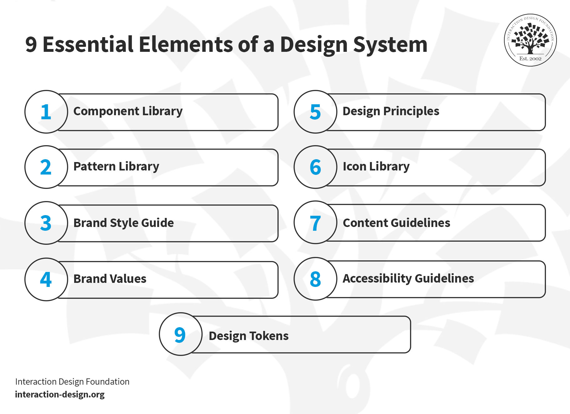
A design system includes a blend of standards, tools and best practices. It shapes the way teams build and maintain their digital presence.
© Interaction Design Foundation, CC BY-SA 4.0
1.Component Library
The component library includes UI elements like buttons, menus and input fields. Designers can reuse each element whenever they need it. The purpose of the component library is to ensure a consistent user interface. Tools like Figma aid in creating these libraries. A well-designed component library:
Streamlines front-end development
Enhances user experience
Maintains design consistency across products
Explore the essentials of user experience with this video. Ideal for anyone stepping into the world of UX design.
2. Pattern Library
A pattern library comprises specific design patterns or standard solutions to common design problems. Patterns help to create intuitive and consistent user experiences. For example, a pattern library might contain a contact form or a login flow (which, in turn, may include components, such as buttons and input fields). Front-end developers use these libraries to ensure that different parts of a website or app work well together and are easy to navigate.
3. Brand Style Guide
This guide outlines the visual representation of a brand. It includes typography, color schemes and logo usage. It's essential to maintain brand identity across various mediums. The guide also covers tone and voice for written content. It serves as a reference for designers and content creators. This ensures that all materials align with the brand's identity.
4. Brand Values
Brand values include the core principles that dictate a brand's identity and culture. They influence all design decisions. Brand values align each product or service with the brand's culture. Brand values create a coherent user experience and maintain brand integrity.
5.Design Principles
Design principles act as the foundational ideas that guide the design process. They ensure that all design decisions contribute to a functional, aesthetically pleasing and user-friendly product.
Principles like accessibility and typography are crucial to create attractive, easy-to-use designs.
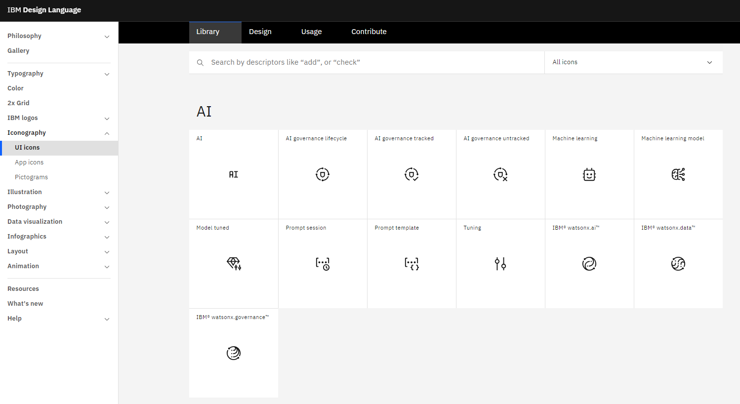
6.Icon Library
This library contains visual symbols used in design systems. Icons communicate actions and ideas efficiently. They guide users and enhance usability and interface navigation.
IBM's icon library, for example, includes detailed usage guidelines. These icons are integral to front-end design. They ensure a consistent visual language across platforms.
© IBM, Fair Use
7. Content Guidelines
Content guidelines dictate the tone, style, and language of textual content. They maintain consistency and clarity in communication. These rules cover grammar, vocabulary, and style. They help keep a uniform brand voice.
8. Accessibility Guidelines
Accessibility guidelines ensure that everyone can use the products, including people with disabilities. They cover aspects like color contrast, typography and spacing. Accessibility guidelines are a core part of front-end development. They help to create user-friendly and accessible interfaces.
9. Design Tokens
Design tokens represent specific design elements like colors, typography and dimensions. Instead of hard-coded values (such as hex codes, font styles or pixel values), the team uses design tokens.
For example, the design team might define a token named “primary-color” and give it the value of an indigo color, #4B0082. Whenever the developers need to use that color, they use “primary-color” instead of the hex value. If the design team decides to change the underlying specifications of the token—say, in this case, to a slightly different shade, with the hex code #2e5090—then the team only needs to change the value once, at the definition of the design token. Once the definition of “primary-color” changes, the design automatically gets updated.
As we see in this example, design tokens provide consistency, scalability and flexibility. These tokens maintain uniformity in a design system. They keep coherent applications across different media.
Each element contributes to a robust design system. They work together to create a unified and efficient design process.
When Not to Use a Design System? And Why?
A design system may not suit every project. Consider avoiding it in small, one-off projects. Here, a full-fledged system might slow down progress. For such projects, simple style guides or a pattern library may suffice.
A strict design system may limit creativity in unique and unconventional projects. In artistic or experimental websites, innovation takes priority over consistency. Designers often notice this difference in such scenarios. Here, the focus shifts to exploring new ideas rather than adhering to set standards.
While design systems provide structure and consistency, they also require maintenance. A small team may not have the capacity—time, budget and people—to maintain a design system. They will prefer to focus on crucial tasks, such as product development and customer engagement, without diverting resources.
The Difference Between a Design System and a Style Guide
A design system and a style guide serve different purposes in design. A design system comprehensively covers various design aspects. It includes a style guide as one of its components. Think of it as a master plan for creating a cohesive product experience.
On the other hand, a style guide focuses more narrowly. It outlines the visual design and brand elements like typography, color and logo usage. They are more about maintaining brand consistency. A style guide is a subset of a design system.

Learn More about Design Systems
Learn more about design systems and other methods and techniques used by agile teams in the Agile Methods UX Design Course .
The Inside Design Blog offers a comprehensive guide to Design Systems .
Explore Google’s Material Design to see the full potential of Design Systems .
See more examples of Design Systems here.
Learn about Material 3, the latest version of Google’s open-source design system .Learn More about Design Systems
You can learn more about design systems and other methods and techniques used by agile teams here.
Questions related to Design Systems
Figma can function as a foundational tool for a design system. Designers use Figma to create UI kits and templates. These are essential to achieve consistency in design projects.
Figma also helps maintain a pattern library. This library helps in front-end development. With Figma, teams can share and collaborate on design components. This includes spacing guidelines and style guides.
System design in UX (User Experience) design creates and organizes an interface's overall structure, behavior, and functionality. It creates a blueprint that outlines how different components and elements of the system will work together. A system design aims to enable people to interact swiftly with a product or service. Some essential aspects of a system design in UX include:
Information Architecture
Interaction Design
Navigation Design
Wireframing and Prototyping
Design Patterns
Consistency and Branding
Accessibility
Usability Testing
As a designer, building your design system involves the following steps:
Analyze the current design process: Review the existing design process within your organization and identify the current design tools. Also, evaluate the level of design maturity within product teams.
Identify the brand’s alphabet: Base the visual language on the brand's alphabet, including brand identity and language.
Conduct an audit: The audit will reveal inconsistencies in your design language and pinpoint the most important and used elements.
Establish clear rules and design principles: Create a shared value system answering what, why, and how questions. Coordinate teams around a set of goals to maintain consistency and balance.
Finalize the color palette and typography : Decide on the primary colors , system for building accent colors, and typefaces to ensure consistent information architecture across all products.
Create component library: Evaluate and finalize components based on project needs and user/business goals.
Standardize all style properties: Finalize grid styles and other properties like white space to avoid inconsistencies.
The four key categories of the system design are:
High-Level Design (HLD): It focuses on defining the overall structure and organization of the system by addressing system architecture, including subsystems or modules, their relationships, and how they interact.
Low-Level Design (LLD): It delves into the specifics of each module identified in the high-level design. It defines how each module will function, specifying algorithms, data structures, and interfaces.
Logical Design: It focuses on the logical relationships and operations within the system, irrespective of the physical implementation. It is more concerned with the conceptual and abstract aspects of the system.
Physical Design: It deals with the actual implementation of the logical design.
It includes decisions about hardware, software, networks, databases, and other physical components required to support the system.
Literature on Design Systems
Here’s the entire UX literature on Design Systems by the Interaction Design Foundation, collated in one place:
Learn more about Design Systems
Take a deep dive into Design Systems with our course Agile Methods for UX Design .
Agile, in one form or another, has taken over the software development world and is poised to move into almost every other industry. The problem is that a lot of teams and organizations that call themselves “agile” don’t seem to have much in common with each other. This can be extremely confusing to a new team member, especially if you’ve previously worked on an “agile” team that had an entirely different definition of “agility”!
Since the release of the Agile Manifesto in 2001, agile methodologies have become almost unrecognizable in many organizations, even as they have become wildly popular.
To understand the real-world challenges and best practices to work under the constraints of agile teams, we spoke with hundreds of professionals with experience working in agile environments. This research led us to create Agile Methods for UX Design .
In this course, we aim to show you what true agility is and how closely agile methodologies can map to design. You will learn both the theory and the real-world implementation of agile, its different flavors, and how you can work with different versions of agile teams.
You will learn about the key principles of agile, examples of teams that perform all the agile “rituals” but aren’t actually agile, and examples of teams that skip the rituals but actually embody the spirit.
You’ll learn about agile-specific techniques for research and design, such as designing smaller things, practicing continuous discovery, refactoring designs, and iterating.
You will also walk away with practical advice for working better with your team and improving processes at your company so that you can get some of the benefits of real agility.
This course is aimed at people who already know how to design or research (or who want to work with designers and researchers) but who want to learn how to operate better within a specific environment. There are lots of tools designers use within an agile environment that are no different from tools they’d use anywhere else, and we won’t be covering how to use those tools generally, but we will talk about how agile deliverables can differ from those you’d find in a more traditional UX team.
Your course instructor is product management and user experience design expert, Laura Klein. Laura is the author of Build Better Products and UX for Lean Startups and the co-host of the podcast What is Wrong with UX?
With over 20 years of experience in tech, Laura specializes in helping companies innovate responsibly and improve their product development process, and she especially enjoys working with lean startups and agile development teams.
In this course, you will also hear from industry experts Teresa Torres (Product Discovery Coach at Product Talk), Janna Bastow (CEO and Co-founder of ProdPad) and Adam Thomas (product management strategist and consultant).
All open-source articles on Design Systems
Google’s material design - android design language.

- 3 years ago
8 Talks by Women to Inspire UX Designers

How to Ensure a Smooth Design Handoff

Open Access—Link to us!
We believe in Open Access and the democratization of knowledge . Unfortunately, world-class educational materials such as this page are normally hidden behind paywalls or in expensive textbooks.
If you want this to change , cite this page , link to us, or join us to help us democratize design knowledge !
Privacy Settings
Our digital services use necessary tracking technologies, including third-party cookies, for security, functionality, and to uphold user rights. Optional cookies offer enhanced features, and analytics.
Experience the full potential of our site that remembers your preferences and supports secure sign-in.
Governs the storage of data necessary for maintaining website security, user authentication, and fraud prevention mechanisms.
Enhanced Functionality
Saves your settings and preferences, like your location, for a more personalized experience.
Referral Program
We use cookies to enable our referral program, giving you and your friends discounts.
Error Reporting
We share user ID with Bugsnag and NewRelic to help us track errors and fix issues.
Optimize your experience by allowing us to monitor site usage. You’ll enjoy a smoother, more personalized journey without compromising your privacy.
Analytics Storage
Collects anonymous data on how you navigate and interact, helping us make informed improvements.
Differentiates real visitors from automated bots, ensuring accurate usage data and improving your website experience.
Lets us tailor your digital ads to match your interests, making them more relevant and useful to you.
Advertising Storage
Stores information for better-targeted advertising, enhancing your online ad experience.
Personalization Storage
Permits storing data to personalize content and ads across Google services based on user behavior, enhancing overall user experience.
Advertising Personalization
Allows for content and ad personalization across Google services based on user behavior. This consent enhances user experiences.
Enables personalizing ads based on user data and interactions, allowing for more relevant advertising experiences across Google services.
Receive more relevant advertisements by sharing your interests and behavior with our trusted advertising partners.
Enables better ad targeting and measurement on Meta platforms, making ads you see more relevant.
Allows for improved ad effectiveness and measurement through Meta’s Conversions API, ensuring privacy-compliant data sharing.
LinkedIn Insights
Tracks conversions, retargeting, and web analytics for LinkedIn ad campaigns, enhancing ad relevance and performance.
LinkedIn CAPI
Enhances LinkedIn advertising through server-side event tracking, offering more accurate measurement and personalization.
Google Ads Tag
Tracks ad performance and user engagement, helping deliver ads that are most useful to you.
Share Knowledge, Get Respect!
or copy link
Cite according to academic standards
Simply copy and paste the text below into your bibliographic reference list, onto your blog, or anywhere else. You can also just hyperlink to this page.
New to UX Design? We’re Giving You a Free ebook!

Download our free ebook The Basics of User Experience Design to learn about core concepts of UX design.
In 9 chapters, we’ll cover: conducting user interviews, design thinking, interaction design, mobile UX design, usability, UX research, and many more!
InVisionApp, Inc.
Inside Design
A comprehensive guide to design systems
Will fanguy, • jun 24, 2019.
C ompanies like Airbnb, Uber, and IBM have changed the ways they design digital products by incorporating their own unique design systems . By utilizing a collection of repeatable components and a set of standards guiding the use of those components, each of these companies has been able to change the pace of creation and innovation within their teams.
Try Design System Manager for yourself.
Many organizations have what they consider to be a design system , but these collections typically amount to no more than a group of elements and code snippets. While a style guide or pattern library can be a starting point for a design system, they are not the only components. Let’s dig into the fundamentals of design systems, plan how you can build and implement one in your organization, and explore several examples of organizations that are using design systems to drive success.
“Design systems provide a convenient, centralized, and evolving map of a brand’s known product territories with directional pointers to help you explore new regions.” —Chris Messina, tech evangelist and former developer experience lead at Uber
The importance of design systems
What is a design system?
A design system is a collection of reusable components, guided by clear standards, that can be assembled together to build any number of applications.
What’s the difference between a design system and a style guide or pattern library?
A design system isn’t only a collection of the assets and components you use to build a digital product. According to Emmet Connolly, director of product design at Intercom, “… most Design Systems are really just Pattern Libraries: a big box of UI Lego pieces that can be assembled in near-infinite ways. All the pieces may be consistent, but that doesn’t mean the assembled results will be. Your product is more than just a pile of reusable UI elements. It has structure and meaning. It’s not a generic web page, it’s the embodiment of a system of concepts.”
Marco Suarez, one of our product designers here at InVision , adds that “understanding not only the what, but the why, behind the design of a system is critical to creating an exceptional user experience. Defining and adhering to standards is how we create that understanding.”
More simply put, the difference is in the standards and documentation that accompanies the assets. With a guide on why and how to use them, design components because easier to use and clearer to discern.
“Design systems are always evolving, and the way you share and encourage adoption of new iterations will evolve along the way as well.” –Diana Mounter, design systems manager at GitHub
More resources: Design systems overview
Design Systems, when and how much? from Diana Mounter, Design Systems Manager at Github
Examples from building design systems at GitHub, how this can improve the design and development workflow, and when you need to start building design systems and how much of a system you might need.
Designing at scale: How industry leaders leverage design systems from the InVision Blog
In order to quickly iterate with confidence, design teams need access to a single source of truth that allows for a scalable UI language and streamlined UX guidelines. With brand touchpoints reaching over multiple channels and platforms, consistent user experience can be assisted by leveraging a central design language.
Building a library of design patterns, rules, and UX guidelines prevent inconsistencies when shipping products at scale.
Designing Systems from Brad Frost’s Atomic Design
As the number of devices, browsers, and environments continues to increase at a staggering rate, the need to create thoughtful, deliberate interface design systems is becoming more apparent than ever.
Enter atomic design.
From Brad Frost’s Atomic Design methodology, 2013
The full stack design system from Intercom Blog
UI methodologies like Atomic Design bring logic and structure to individual screens. Now it’s time to extend that thinking to every aspect of your product.
On Design Systems: Sell The Output, Not The Workflow from Smashing Magazine
I’ve yet to encounter a client that would be genuinely, passionately excited about the atomic design methodology or a module naming workshop. However, everyone does get passionately excited about time-saving features and better, faster output that they can engage with … Next time you encounter somebody not seeing the benefits of a modular approach, try to convince them of the tangible benefits and the output, not the workflow you’re using.
On the Current State of Design Systems in UX from Innovatemap
I’ve been involved in no fewer than three different initiatives to create a design system in my career. 10 years ago, we simply called them pattern libraries. A few years ago, Atomic Design entered the scene and provided a more comprehensive grammar around design systems. Once Google unveiled Material Design in 2014, the concept of design systems had finally matured.
Now, the design system concept seems to spawn an article every day. The theme of these articles typically espouse values of systems as providing consistency, efficiency, and scale. But at what costs? Are design systems a panacea for all that ails UX design?
Design Systems’ Role in the Evolution of Enterprise User Experience from Projekt202
Projekt202 Senior UX Designer Anne Grundhoefer and Solutions Architect Drew Loomer provide an in-depth, informative look at the many ways that design systems have significantly impacted the enterprise user experience.
Your technical approach doesn’t matter as much as creating a living, breathing system that’s flexible, maintainable, stable, scalable, and successful in the long-term. —Katie Sylor-Miller, senior software engineer, design systems team at Etsy
Building a Design System
What are the key steps and benefits to building a design system.
- Conduct a visual audit The first step in building a design system is to do a visual audit of your current design, whether that’s the design of an app, a website, or some other digital product. Taking inventory of the CSS you’re using and the visual qualities of the elements can help you gauge how much of an undertaking this process might be.
- Color Common colors in a design system include 1–3 primaries that represent your brand. You may want to include a range of tints—a color mixed with white—and shades—a color mixed with black—to give your designers a few more options.
- Typography Most design systems include just 2 fonts: 1 font for both headings and body copy, and a monospace font for code. Keep it simple to avoid overloading and confusing your user. Keep the number of fonts low; it’s not only a best practice of typographic design, and it also prevents performance issues caused by excessive use of web fonts.
- Sizing and spacing The system you use for spacing and sizing looks best when you have rhythm and balance. A 4-based scale is growing in popularity as the recommended scale due to its use in iOS and Android standards, ICO size formats, and even the standard browser font size.
- Imagery The key to success with imagery in your visual design language is having a plan and sticking to it. Set guidelines for illustrations and icons, and use the best image format for the situation.
- Create a UI/pattern library Unlike the visual audit you’ve already conducted (which looked at the visual qualities of your design elements), this step in the process looks at the actual components of your UI. Collect all of the parts and pieces of your UI currently in production. That means every button, form, modal, and image. Merge and remove what you don’t need.
- Document what each component is and when to use it This step is important. Documentation and standards are what separate a pattern library from a true design system .
Before beginning work on your design system, take a moment to think about the team you’ll need to bring it to life. Who needs to be involved? Spoiler alert! You’re going to need more than just designers. Jina Anne, design systems advocate and former lead designer at Salesforce
For a great guide on getting started is our Design Systems Handbook, which will help you learn how you can create your design system and help your team improve product quality while reducing design debt. In tandem, we also have our Design Systems Manager .
Building a design system from scratch is a major undertaking. InVision DSM helps you start from best practices.
Here’s a preview of what you can do with InVision DSM:
- Create a single source of truth One place to manage brand and UX components, coded elements, detailed documentation, and more so teams can stay in sync
- Design with ease Integration with Sketch Libraries lets you upload files to DSM in a single click, sync changes, and push and pull design system assets.
- Iterate with confidence Changes sync to the whole team, and users can switch to the latest version or roll back changes at any time
- Manage updates collaboratively Roles and permissions provide complete control over who can view or edit the design system
- Share with external teams An automatically generated and customizable documentation site lets any stakeholder preview and use design and code
- Keep code in sync Spot existing components and styles with InVision Inspect. And get your production-ready code with a built-in Storybook integration.
- Protect your company’s most strategic assets Confidently create new versions knowing visual assets are safe and secure, with role-specific controls and design system-level permissions.
More Resources: Building a Design System
Paul Farino of Pivotal Labs “Design systems: Zero to one” Paul Farino will discuss the lifecycle and iterative nature of building a design system . He’ll cover creating buy-in with internal stakeholders and tactical ways to scale and maintain a design system.
Promoting a Design System Across Your Products From A List Apart
Approach a design system as you would a marathon, not a sprint. You’re laying the groundwork for an extensive effort. By understanding your organization through its product portfolio, you’ll strengthen a cornerstone—the design system—that will help you achieve a stronger and more cohesive experience.
Each screen isn’t a special snowflake: Brad Frost on design systems from the InVision Blog
Maintaining the system over time is extremely challenging. What happens when the horizontal tabs component gets a bug fix? What happens when that card pattern gets a visual design overhaul? What happens if the data table pattern gets a team 90% there, but needs tweaks in order to fully meet their needs? Establishing these processes before the system is complete is critical to its ongoing success.
Selling a Design System at Your Company from UXDesign.cc
Selling is a process, probably more than a single meeting. Look for teaching moments. Use your storytelling skills. Show your team that a better way is possible. Come up with a memorable name and say it a lot. Get people excited with a splashy presentation. Channel your inner Don Draper or 2007 Steve Jobs.
Designing a Design System | Jina Anne, Design Systems team at Salesforce UX From ‘You Gotta Love Frontend’ Conference 2016
Topics covered in this talk include strategies for how to approach, design and build an effective design system , how to successfully maintain the system to ensure ongoing usefulness, and elements that design systems need to be sustainable that are critical for success.
Examples of design systems (Who’s doing design systems right)
Atlassian’s design system.
Atlassian’s design system is about using personality to connect tools with people—or as they describe it, “practical with a wink.” It’s personal, peppy, and all about making a bold brand statement. “Dragon’s blood,” “cheezy blasters,” “hairy fairy,” “herky jerky,” and “sodium explosion” are all names of colors referenced in their secondary brand palette.
Accessibility is important to Atlassian and their design adheres to standard contrast ratios that ensure users with low vision can see and use their products. In essence, the Atlassian brand is optimistic and focused on being “human” over “humorous”.
Salesforce’s Lightning design system
Learn how the Salesforce UX team took it further with a living design system to help maintain brand alignment and quality.
Shopify’s design system
Shopify’s design system is called Polaris. It’s a system that reflects Shopify’s global, immense presence. It’s about scalability and ease of use. With precision in their copy and design, Shopify is solely focused on the experience of their merchants.
It’s easy to see how Shopify helps businesses manage global complexity, with an experience that gives “even the most inexperienced entrepreneur the best chance to succeed.”
Accessibility and intentional design are paramount in Polaris. Scaling a business is like climbing a mountain, so their design decisions seek to make any user feel like they’re up the challenge.
For more examples, check out our previous post on design systems from some of the world’s leading brands.
There are also some repositories of design systems , style guides, and pattern libraries at StyleGuides.io and collected in Alex Pate’s repository on GitHub .
More resources: Design system examples
Creating a design language that’s uniquely IBM from the InVision Blog
The overall structure of IBM’s corporate design program is “People + Practice + Places.” The motto represents the idea that “careful attention to those 3 things will bring the culture change we seek with respect to design in the company.”
Practice, the middle pillar, is a crucial part of the equation and the charge of the IBM Design Practices team. The team knew they wanted to build out 3 distinct Practices at first: Research, Language, and Thinking.
They started with the IBM Design Language .
Building a Visual Language from Airbnb Design
While this was a monumental task that ended up requiring efforts from many of our product teams, we found that creating our Design Language System was worth the investment and a huge leap forward.
“Here’s the simple truth: you can’t innovate on products without first innovating the way you build them.” —Alex Schleifer, VP of Design at Airbnb
An in-depth chat on design systems with Jina Anne, Brad Frost, Marco Suarez + Aarron Walter from InVision
Unlike cobbling together design components like pattern libraries and style guides, a design system functions as “ the official story of how an organization designs and builds products .” It includes ingredients, as design system expert and Atomic Design author Brad Frost says, like design principles, UI components, UX guidelines, code standards, processes, design toolkits, code repositories, resources, and more.
Design systems have the power to transform a typical organization into a powerful product design force. So we recently hosted a cozy fireside chat with design systems experts Brad Frost, Jina Anne, Marco Suarez, and Aarron Walter to unpack key insights—and answers to all your burning questions.
by Will Fanguy
Digital content wrangler | UX enthusiast | Recovering educator | Shameless nerd & GIF connoisseur | Hockey fan (Go Preds!) | Oxford comma or death | It’s pronounced FANG-ee
Collaborate in real time on a digital whiteboard Try Freehand
Get awesome design content in your inbox each week, give it a try—it only takes a click to unsubscribe., thanks for signing up, you should have a thank you gift in your inbox now-and you’ll hear from us again soon, get started designing better. faster. together. and free forever., give it a try. nothing’s holding you back..
Build the perfect design system: 6 key considerations
Key principles that will help you build a perfect design system for your organisation.

Design systems help large industry players to standardise the design process and make it more predictable. A lot of companies try to take on the initiative of building their own design system. But quite often, despite everyone's best intentions, all the effort that a product team puts into making a thoughtful design system can go straight down the drain.
Over the course of this article, we will define what a design system is, what to consider before building a design system and how best to introduce a design system in your organisation. For more great resources, see our roundup of web design tools .
What is a 'design system'?
The name 'design system' can create a false impression of something that provides value only for designers. But in reality a design system isn't something that just concerns designers; instead it's about how an entire organisation builds its products (if that includes a website, you'll need a top website builder and brilliant web hosting ).
Successful design processes usually depend on there being a tight cross-functional collaboration between all teams involved in the creation of the product. And a design system is about building a shared language that empowers teams to collaborate more effectively. It's a complete set of design principles, rules and standards along with the toolkit (design patterns, visual styles and a code library of reusable UI components) required to achieve those principles, rules and standards. A design system enables a product team to create a product faster – without having to sacrifice any quality – by making the design reusable (make sure you have reliable cloud storage to store your assets).
The ultimate purpose of going to the trouble of implementing a design system is to help the business learn and grow. That's why a design system should always be based on the objectives of a business. For the very same reason, not all design systems are built the same but nevertheless, most design systems share a few common elements:
- Design principles – values that ensure the design efforts head in the right direction.
- Components and pattern libraries – these are the building blocks of a design system.
- Design guides – specific rules on how to design a particular part of a product. These can include style guidelines (typography, colours, spacing, etc) and UX writing guidelines (voice and tone, language, writing principles, etc).
- Design practices – help to keep the system alive and valuable for the product team.
Key considerations before implementing a design system

01. Consider product and company maturity
Before you start building a design system, you need a clear understanding of why you need one. Many companies introduce design systems to reduce their technical debt and speed up the product development process (by spending less time on tedious, monotonous activities). But not all companies face such problems because companies have different levels of design maturity.
Creating a design system from scratch is a time-consuming activity and small, fast-moving teams likely don't need a design system because it would slow them down. A three-to-five–person startup that is still trying to find a product-market fit would probably spend a significant amount of time creating a system. When resources are being spent on building a design system, they aren't being spent on building the product. Therefore, until a company is in the position of having established a clear direction with its product, investing time in creating a design system risks producing a lot of waste.
Get the Creative Bloq Newsletter
Daily design news, reviews, how-tos and more, as picked by the editors.
02. Create a vision statement
A design system is about people – how they work together to achieve a shared goal. And people want to know the answers to the following questions:
- Where are we going?
- What do we want to achieve?
- Why do we want to achieve that?
Those are fundamental questions that you need to answer in order to build a shared vision. A shared vision will be a foundation for a design system that will give teams a guided way to build solutions for their product problems.
A vision statement defines what your team, product or company is attempting to achieve and, more importantly, why. It aligns teams around a clear set of shared goals and becomes a North Star for the entire organisation – it unites people involved in product development and guides them to a common destination.
If you're looking for a simple way to create a vision statement, consider describing what your product or organisation should look like in five years. By doing that, you'll define a target condition and it will be much easier to create a strategy that will help you to achieve it.
04. Establish guiding design principles
How do you define good design? How do you know when something is ready for implementation? When it comes to evaluating the quality of a design, designers often rely on their own set of standards. But following such an approach can introduce a lot of chaos in the product design process because every designer will have subjective ideas. That's where design principles can save the day.
Solid design principles are the foundation of any functioning system. They should capture the essence of what good design means for the company and provide practical recommendations for product teams on how to achieve it (design principles should always be actionable). Design principles act as standards for the product team and help them to measure their work.
Here are a few things to remember when working on design principles:
- Design principles should reflect the nature of the product. For example, when it comes to human-machine interface design for automobiles, the most important design principle should be 'Safety first' (the goal is to keep the driver and passengers safe). That's why every design decision should be measured for safety.
- Design principles should not sound like rules. They shouldn't block creative energy. Product creators should not feel limited or restrained.
- Design principles should be the result of an open discussion. In many cases, it's not hard to make people follow guidelines but rather it's hard to make people agree on guidelines. If an organisation has many design teams, then involving them in a discussion is vital. By getting their feedback on the design principles, you can adapt the principles to the needs of users.
05. Review the technology stack and conduct an interface inventory
Many companies tend to build a design system on top of the current interface but this approach is not the best for many reasons. Imagine that your company has been building a product for a long time without a system.
The product likely has some level of inconsistency in design. Inconsistency is usually caused by the duplication of design elements. Identifying duplication of design elements helps a team to avoid the scenario in which team members build an element from scratch and, after a while, find out that a version of it already exists.
That's why if you plan to introduce a design system, start with an audit – conduct an interface inventory to understand what's in use.
Explore existing interactions, collect all of the UI elements that make up the interface and review them. It's important to do this before building the actual design system because the procedure will help you to understand two things:
- How much design debt your organisation has and what are the areas that require more attention.
- The reasons for inconsistency and the changes you need to introduce in the design process in order to avoid such problems in the future. Maybe you will need to change the process or perhaps you will need to introduce new technology.
06. Establish a core team
Who should be involved in building a design system? Design is a team sport and creating a design system is no exception. The expertise and creative energy provided by cross-functional collaboration are required to build a design system. That's why the core team of people that actually creates a system usually includes engineers, designers, product managers and stakeholders. When you start building a design system, it's crucial to have a small size for the core team (six to eight people) because it will help you to create momentum and build something quickly.
Creating a design system

Consider implementing a design system as a project. And just like any other project, this one should have a solid process with the following steps:
- Sell the idea
- Complete a pilot project
- Design and build
- Launch and maintenance
01. Sell the idea
Selling the idea of a design system is the first and most crucial step in introducing a design system. Usually, it's hard to sell design systems due to the trade-offs – both management and product team members understand that resources spent on building a design system aren't being spent on shipping features. So it's natural to expect some pushback. In order to sell a design system, you need to do two things:
Get buy-in from stakeholders
A design system won't take off if the people who decide on funding don't approve it. It's much easier to get the buy-in from executives when you show that the system solves real business problems. Identify key business pain points (areas where the company loses money) and show how the design system can save the day. Write a strategy with a clear proposal and pitch it to the key people who make the decisions.
It's recommended you create a presentation (or series of presentations) to convince stakeholders to invest in this project. You can wrap your presentation in the form of a story. By telling success stories, you will have a better chance of engaging stakeholders.
Get support from your users
Getting buy-in from stakeholders is only half the battle. You need to get support from your potential users. First, you need to identify your target audience. Who will use your design system and how will they use it? Here are a few common groups of users:
- Product teams (ie designers, developers)
- Third parties (ie vendors)
- Business (ie marketing, sales, legal)
You will need to identify the pain points of different groups of users and show the value that the system will bring to them. Each group of users has different buying triggers – reasons why they would want to use a design system. For example, for developers, the trigger can be more consistency in implementation methods or spending less time refactoring code.
02. Select and complete a pilot project

As soon as you create a basic concept for your design system, it's important to validate it. The best way to validate the concept is to test it on a pilot project.
Select a sample real product and create a design system that powers a real solution. The project you select should be used as a foundation for your future design system, so you will be able to test whether or not the system is working for your organisation.
Here is a set of criteria you can use to determine a pilot's potential efficacy:
- A project should have the potential for common components and patterns. It should contain components and patterns that can be reused within other products.
- It should have good technical feasibility and not be hard to introduce all the required changes.
- The project should be accomplishable in a reasonable amount of time (ideally, a couple of weeks) and shouldn't require the involvement of many people from various departments (maintaining independence is essential).
- A project should have marketing potential. The project should inspire other teams to introduce design systems in their design process.
03. Design and build

Create reusable components
One mistake that I see time and time again is teams create components that are too focused on a single-use case. As a result, the system becomes too inflexible and its users have to create their own components each time they need to cover a particular scenario.
Try to develop components that are not tied to a single use case but can be reused in multiple contexts. To be reusable and scalable, components need to have the following properties:
- Modular: modular components are self-contained – they don't have any dependencies.
- Composable: it's possible to combine components to create new components.
- Customisable: it's possible to adjust and extend components to make them work in a variety of contexts.
Every time team members want to introduce a new component, they need to consider how it will work on the various platforms they are designing for. Ideally, every component they design should work on all platforms.
Show value through a sandbox environment
It's well known that the best way for people to see value is to experience it. So create a sandbox environment for product team members to prototype products using your design system.
04. Launch and maintain
Some product teams believe that once a design system is built, the work is complete. Not true. A design system is a product and it's vital to manage it as a product instead of a project – a design system requires ongoing maintenance and improvements as needs arise.
Encourage adoption of your design system
The same as any other product, a design system needs active users. You can create the best design system in the world but, if you don't actively promote it in your organisation, the entire effort will suffer greatly. That's why, from the first release of your system, you need to work hard to foster its adoption:
- Create a community of supporters. Put together a group of evangelists, led by authoritative influencers or designers, who will pitch and sell ideas about your design system. The evangelists should participate in activities like workshops and meetups that have a goal of raising awareness that the system exists and educating people on how to use it.
- Introduce updates. The waiting time for updates plays a key role in the adoption of the design system. Practise regular incremental releases, rather than big reveals and always ensure you ship updates with a changelog.
Analyse how people use the design system
Design systems rise and fall based on how easy they are to use. If you've just started incorporating a design system into your organisation's design process, conduct a series of interviews with users to understand how people use it. By doing that, you can pinpoint common problems that your target audience may be facing.
For systems that will be incorporated in a design process for some time, it's essential to measure the time required to keep the system up to date. If keeping the design system updated becomes difficult, it will quickly become outdated.
Test your design decisions
No matter how good you are at predicting things, it can be hard to predict how a particular change will affect the user experience. That's why it's important to validate your decisions.
Here are three types of testing that will help you:
- Usability testing
- Visual regression testing, which helps you to catch unintended visual changes to component styles
- Manual and automated accessibility testing, which ensures your components are accessible
Introduce versioning
Design systems should have versions because versioning makes it much easier to track changes. With versioned releases, users can reference a specific version as a dependency. They also have control over when and how upgrades to new versions are handled.
There are two types of versioning:
- Versioning the entire system. Here, everything in the system belongs to one version number. As users, we deal with versioning for the whole system when we update our mobile OS – when we update iOS, we're updating the entire piece of software.
- Versioning by modules. This involves having a version number for every component or style within the design system. Compared with versioning the entire system, versioning by module gives more flexibility – users can choose to upgrade just the elements they need.
Creating a design system is not a one- time activity; it's actually iterative. The people involved in creating a design system need to think of it as a living organism connecting the whole organisation. A successful design system becomes part of an organisation's DNA and helps produce consistent user experiences.
This content originally appeared in netmag.
- 14 best user testing software tools
- 19 really useful responsive web design tutorials
- The next big thing in web design: 7 trends you need to know
Thank you for reading 5 articles this month* Join now for unlimited access
Enjoy your first month for just £1 / $1 / €1
*Read 5 free articles per month without a subscription
Join now for unlimited access
Try first month for just £1 / $1 / €1
Related articles

Design Systems

A design system is a set of standards to manage design at scale by reducing redundancy while creating a shared language and visual consistency across different pages and channels.
This slide deck gives you a brief introduction on Design Systems and covers a range of topics like:
1. What is a Design System?
2. What’s inside a Design System?
3. Why Use a Design System?
4. Why Not Use a Design System?
5. Examples of Design Systems
References and Credits to:
Audrey Hacq

What Is a Design System & Why Use Them + Examples
Design systems can be found everywhere and in almost everything. They are in the operating system running on your smartphone, the laptop you’re using for work, and even on the websites you visit.
But what is a design system anyway? What goes into a design system? Why use them? We’re going to answer these questions in this article while taking a closer look at design systems and their importance.
Design systems are not something exclusively used by big brands and design agencies. Even if you’re a freelance designer or a small business, a design system can go a long way to improve the quality of your work, designs, and products.
Let’s dive in and see how you can integrate design systems into your own design projects.
2 Million+ Digital Assets, With Unlimited Downloads
Get unlimited downloads of 2 million+ design resources, themes, templates, photos, graphics and more. Envato Elements starts at $16 per month, and is the best creative subscription we've ever seen.

Graphic Templates
Logos, print & mockups.

Web Templates
Landing pages & email.

Presentation Templates
Powerpoint & keynote.
Icons, Vectors & More

CMS Templates
Shopify, tumblr & more.

Sans Serif, Script & More
Explore Envato Elements
What Is a Design System?

A design system can be defined in many different ways depending on how and what it’s used for. In general, it’s mainly a framework that you use to create standard guidelines for a specific project or product.
However, design systems are not just about style guides, UI kits, and component libraries. They are a combination of them all and more.
Take Apple App Store, for example. Apple has a set of rules and guidelines in place that makes every developer design and create apps in a specific way. This design system covers everything from how you design the interface of the app to the promo artworks you feature on the App Store page. This allows Apple to create a more consistent app experience throughout all the apps in the App Store.
It’s only one of many design systems Apple use. In fact, there are many different types of design systems you can use in various stages of a design project or product development.
Different Types of Design Systems
The word “design” in the design system refers to the overall process that goes into not just graphic and web designs, but also to various other product design and user experience designs. As a result, you’ll come across a few different types of design systems. We’re going to talk about the three major design systems that are commonly used today.
- Product Design Systems: A product design system is like a framework for creating a product. A good example of a product design system is the Salesforce Lightning Design System. It gives you a complete set of components for building apps.
- Brand Design Systems: Brand design systems are mainly used to create guidelines for designs being made by businesses. And it includes multiple sub-categories like identity design, visual design, style guides, and more.
- User Experience Design Systems: It’s important to use design systems to create user experiences that generate results. Like creating funnels to generate leads from website visitors to turn them into customers. That’s done with user experience design
Why Use Design Systems?
The main purpose of a design system is to create guidelines and components that you can reuse to create more designs, products, and experiences while maintaining consistency.
This actually leads to huge savings of your budget otherwise spent on rehiring the same agencies. As well as save time spent on creating the same components in each product development process.

According to a survey , many businesses opt-in for design systems for the benefit of reusability of code, efficiency in design, and UI/UX consistency.
Main Elements & Benefits of a Design System
A design system can be used in several different ways. You can use them to create consistent user experiences, create branded products, create scalable apps, and much more.
Create More Consistent Visual Designs
Depending on the type of product your making, the design system can be made up of many different elements. The main elements being a color system, typography system, code components, brand identity and guidelines, usage guidelines, etc.
It’s when you put all these elements together that you create a complete design system. However, as designers, the best benefit of using a design system is to be able to create more consistent visual designs.
Take an app design, for example. You need to create multiple screens, processes, and user interfaces that not only share the same design style but also offer the same user experience across each page. A design system helps you achieve this goal.
Provide Better User Experiences
Have you ever used a mobile app and then use the desktop version of the same app to find a completely different and confusing user experience? That’s a clear sign of a lack of a design system.
With a set of pre-made guidelines, visual elements, and code components in place, design systems allow you to keep consistency across any number of app or product designs. Which leads to more improved user experiences across platforms.
Make Easily Scalable Products
Products keep evolving and shifting focus. This is especially the case with modern startups. Your designs and user experiences usually change alongside these changes. A design system helps you scale and change your products while maintaining consistency.
Spotify’s recent shift of highlighting podcasts in the app is a good example of this. The app used a redesign to highlight the podcasts without interfering with the user experience. This was done with the Spotify’s GLUE design system.
Improve Efficiency of Your Teams
When you prepare your meals for a whole week, you no longer have to cook meals every day. The same can be said about using design systems.
When you have a color system, code components, and guidelines already thought out and in place, your teams can dive directly into the development of the designs and products. This will save a huge amount of time and effort that goes into product development. And in turn, make your teams more efficient and productive.
Outsource While Maintaining Quality
Outsourcing different parts of product development is very common these days. One of the most difficult parts of outsourcing is maintaining quality and communicating your requirements with external teams.
Design systems help you share your views with these teams better and maintain the quality of the product at each stage of the development.
Best Design System Examples
To understand what design systems look like, let’s take a look at some real-life examples of design systems in action.
GLUE – Spotify Design System

Spotify has developed its own unique design system called GLUE and even has a dedicated team just to make sure the design system gets improves and implemented properly with the app design.
Microsoft Fluent Design System

Microsoft’s Fluent Design System ensures that its user interfaces stay consistent across Desktop, Android, iOS, MacOS, and web apps.
Shopify Polaris

Shopify breaks down its Polaris design system into multiple sections including Content, Design, Components, and Experiences. Mainly to help craft a better product for its customers.
Google Material Design

Google introduced the Material Design system as a way to allow developers and designers to create better app experiences for Android, iOS, and the web.

Atlassian calls its design system an “end-to-end design language”. The company shares its design language with many of the apps they own, including its newest member, Trello.
How to Create Your Own Design System
Whether you’re a freelance web designer, a design agency, app developer, or even a corporate brand, creating a design system is one of the best investments you can make to create consistent designs with an effecient workflow.
Thankfully, there are now many different apps and frameworks you can use to easily create design systems without an effort. Here are just a few of the apps and frameworks you can use to create design systems.
InVision Design System Manager

InVision has one of the most comprehensive and dedicated tools available for creating complete design systems. It allows you to bring all the elements of your design system into one place to share your code components, visual styles, and everything with your entire team.

Storybook is a tool you can use to create UI components for your design systems. It allows you to keep all the UI components of your design system well-organized and in sync.
Lightning Design System

The Lightning Design System made by Salesforce is a complete system that allows you to effortlessly build enterprise-level apps while maintaining consistency and efficiency.

While Bootstrap is an HTML framework mainly used as a style guide for website designs, it can be the perfect starting point for web designers to create their own design systems. Such as creating your own themes for Bootstrap .

UXPin covers all aspects of product design from design to prototyping while collaborating with the team. It also supports the ability to create and organize code components. It’s the perfect tool for UX designers for creating more accessible design systems.
In Conclusion
A design system is not something that you create and forget about. It needs to be constantly improved alongside your product development. Even Spotify GLUE design system is constantly evolving with new components and elements being added to it from time to time.
Every designer, every agency, and every company should have their design systems. It’s an investment you make that keeps you in control and maintain quality.
There is so much more to learn about design systems. For starters, watch this introduction to Design Systems and this speech on design systems at Github .
The Benefits of a Design System: Making Better Products, Faster
Design systems increase collaboration, ensure consistency, and accelerate design and development cycles. Toptal product designer Molham Bakir lays out how—and shares insights and tips from his experience building them.

By Molham Bakir
Molham is a product designer who specializes in building design systems. His clients include Snap Inc. and e-commerce websites Dubizzle and Mumzworld, the largest online baby shop in the Middle East.
Previous Role
PREVIOUSLY AT
Technology leaders such as Google , IBM , and Salesforce rely on design systems to codify and scale design efforts across entire organizations. But design systems aren’t just for big-name brands: 65% of companies surveyed by Forrester in 2020 said they use one.
In essence, a design system is a set of patterns and practices that help teams across an organization—from designers to developers—create consistent, accessible digital products. There are different models , but most consist of a pattern library, design tokens , brand and style guidelines, and documentation on how to use the system.
The benefits of design systems are twofold. First, they speed up every stage of product development, from concept and design to production and testing. In a 2019 experiment , Figma found that designers working with a system completed their tasks 34% faster than those without one. Second, design systems improve the customer experience by ensuring consistency, familiarity, and accessibility at every touchpoint.
Recently another UI designer and I took a month to build a design system for a leading e-commerce site that provides baby products to mothers across the Middle East. Using insights from the experience of building a design system for this website and app–which I’ll refer to as “the baby product site” or “the baby product app”—I’ll lay out how design systems enable teams to improve products and increase efficiency.
Design Systems Speed Up Design and Development Cycles
Design systems save organizations time and money by codifying design decisions that can be replicated at scale. Let’s break down specifically how these systems support faster design and development cycles, and how to get the most of out of your design system.
A Streamlined Design-to-production Workflow
On the baby product site, before we implement a new design it goes through a series of stages. First, designers prototype and hand over a design to a UX researcher for validation, or alpha testing . Next, we share the prototype with stakeholders. Then we push the update to a small audience and track the results of the change with A/B testing. This learning cycle, also known as beta testing, repeats until we get a sufficiently high success metric. We may work on more than five variations of a design, discarding many of them throughout these stages to expedite finding the best solution.
These steps are crucial for ensuring that we only push quality work to our full audience. However, any process with multiple players and iterations is time consuming.
A design system streamlines various stages of this workflow. Designers can prototype screens in just minutes, instead of hours, because they can quickly search for components and patterns and then drag and drop them onto the screen. Designers across different teams can access shared components and styles in any new project. And engineers can quickly assemble new features without requiring a visual designer to lay out every single screen. For example, engineers can code patterns in a platform like Storybook , an open-source tool for building UI components and pages in isolation. Multiplying this efficiency across design and development teams in an organization can translate into real value for a business.

In your design system, linking each pattern with code that is performant and production-ready better facilitates experiments and updates. Developers should be involved in building design systems from the beginning and can create a variety of methods to distribute designs and patterns to teams. This resource offers a checklist for designers and developers to help them work together on creating a design system.
Streamlined product development means companies can launch, test, and iterate new features faster, which can be a huge competitive advantage.
Less Redundancy
Design solutions have to be prototyped, validated with users, approved by stakeholders, translated into code, and tested against existing designs—so any redundancy in the process wastes time, manpower, and money. Without a central repository for referencing past work, designers and developers must solve the same problems repeatedly and re-create solutions that already exist.
As Alla Kholmatova, author of Design Systems , notes: “Designers become frustrated always solving the same problems, or not being able to implement their designs properly. Developers are tired of custom styling every component and dealing with a messy codebase.”

A design system’s pattern library is cataloged by functionality. Each functionality should map to a single, production-ready pattern. Wherever that functionality appears in your product, that standardized pattern can be applied. Standardization eliminates the need for designers and developers to re-create similar solutions over and over, freeing their time to focus on new problems that do not yet have standardized solutions. We based our pattern library on atomic design , a well-known approach to creating design systems.

Once we implemented a design system for the baby product app, I could focus on more impactful design problems, such as creating new use cases, conducting user testing , and revisiting or creating new user scenarios.
A Shared Language From Code to Customer
When you have designers and developers working on products concurrently across an organization, a shared language for referring to design is critical for facilitating collaboration. A shared language consists of terms, phrases, and naming conventions that help cross-functional teams speak about a company’s product and streamline design decisions. The glossary in Google’s Material Design 3 is a great example of a shared language that’s easy for teams to access and understand.

Simply creating a language and imposing it on teams isn’t likely to succeed. Instead, it’s best to get input from all stakeholders. A shared language is most effective when contributions come from across an organization. For example, we relied heavily on input from product designers, UI designers , front-end developers, back-end developers, content designers, quality engineers, accessibility experts, and others.
You can encourage contribution to a design system in a number of creative ways. Atlassian's design principles and open-source contribution model offer effective examples for doing this. For instance, one of its principles focuses on facilitating collaboration across teams by prioritizing inclusion, accessibility, and openness in its products. A robust design system should contain and establish principles based on a company’s specific needs. For inspiration, check out these 195 examples of principles from well-known brands.
Design Systems Foster Higher Quality Products and Better User Experience
The process of building a design system allows you to consider how each pattern and practice helps achieve a product’s goal. To support the e-commerce UX in the baby product site and app, each element of the design system aims to decrease cognitive load for multitasking moms, make it as easy as possible to find and purchase items, and ensure that the products available to purchase are accessible and personalized to the user’s location.
A seamless and enjoyable user experience helps build customer trust and improve the likelihood that they’ll recommend products on a website or app to others. These are some of the design system benefits you can bring to your own customers, with examples from my own work on the baby product site.
A Familiar and Intuitive UI
Before creating a design system, the baby e-commerce site and app lacked standardized patterns and behaviors for each functionality. This meant users had to learn (or relearn) a new pattern each time they wanted to do the same thing, for example when selecting a category filter.
Below is an example of the filtering options for different baby product categories (such as “strollers,” “outdoor,” and “nursing”) on the app and mobile website. Each filter option looks and works a bit differently, creating a disjointed, inconsistent feel across these channels. For example, some of the filtering screens include buttons the user would press, others are tabs to toggle between. Some have images to represent the product categories whereas others have only text. The terms used for categories vary as well (for example “nursing” vs. “breastfeeding essentials”). It’s cognitively taxing for users to learn how new patterns behave, resulting in a frustrating experience.

We redesigned the pattern library based around UI standards found in Google’s original Material Design and IBM’s Carbon Design System . We chose Material and Carbon Design because they reflect our goal of showing users a simple and seamless interface to complete their tasks.
This approach allowed us to standardize each component’s behavior with globally recognized UI standards at the core. In addition to creating consistency across the site, implementing design patterns that behave in ways users are already familiar with reduces their cognitive load. As a result, when a user visits for the first time, the site feels predictable, familiar, and easy to use.
To create this intuitive UI experience, avoid reinventing the wheel. Although such standardization can seem limiting at first, it’s the way these components are combined and styled that offers competitive advantages.

Enhanced Product Quality
Before we developed a design system, the baby product site featured 184 unique colors and 299 total background colors. This created mixed visual messages and a scattered brand feel, which can reduce the perceived quality of a product. As Nielsen Norman Group notes : “A negative emotional reaction to some aspect of the design lowers the perceived value of the site and makes people abandon the site—often within a few seconds.”
A design system helps product teams define and standardize visual elements like color, typography, spacing, and imagery. These elements express the heart and soul of your brand and form a visual language. A well-defined visual language can enhance the perceived quality of your product.
Our goal for the baby products site is for it to be attractive and easy to use for busy moms, and we established a color palette that felt elegant, fresh, and inspired by nature. Creating our design system allowed us to select colors to shape how the product is perceived by customers in a reliable, scalable way. Of course, guidelines for how and when to use the colors in the palette—and how not to use them—are essential. This example from the University of Oxford’s digital style guide shows the level of detail that guidance can provide.

A well-defined visual language can also enhance the actual quality of your product, measured by speed and performance. I saw this firsthand: Each of the hundreds of unique colors on the old baby products site represented a piece of code that the browser had to load. Each one also introduced the possibility of a bug or error. Loading time and bugs affected the speed and performance of the site. After implementing the new design system, our checkout page went from a page load speed of four to six seconds to 2.8 seconds. When a design and its corresponding code are standardized, this can result in a lighter, faster-performing site , not to mention fewer bugs and breaks in the code.
Similarly, design systems improve the quality of interactive elements . Designing interactions outside a system makes it hard to replicate elsewhere in the product. In a design system, however, these interactions (and their corresponding animations and attributes) are defined and assigned to master components. So wherever you use a particular component or interaction within the product, it behaves the same. This way, developers and product managers can see how interactions work as you’re iterating. You don’t need to take time to explain the interaction for each use case to them.
This is particularly useful because some components have different sizes based on where they are in the templates and how they behave within a pattern. A design system allows you to easily see how the same component behaves and looks when it sits in different patterns.

Accessibility Prioritized From the Start
An estimated 15% of people worldwide have a disability. And even more experience temporary disabilities or situational limitations , such as not being able to see a screen in bright sunlight. Another part of accessibility for global products is localization—making sure that content is adapted for local contexts, including but not limited to language translation. A design system allows product teams to integrate accessible design and localization into each pattern.
It’s beneficial to first get to know your audience and the specific challenges they may face in using your product. For our audience of moms, we knew that 95% of users browse and shop from their phones. And they’re often shopping at 9 or 10 PM when their children are asleep, and the brightness on their phone is reduced. That’s why we built accessibility features like high color contrast into our design system.
A design system also helped us build in localization from the very beginning. We used internationalization best practices to ensure a genuinely cross-cultural experience, including flexible design for varying language length and font size, right-to-left language support, and support for local currencies, units, dates, times and address formats. Our UX writer ensured we had a consistent voice in each language with high-quality translations. In addition, we agreed that every team would contribute to supporting localization, and we built it into all new feature releases.
When building a design system, you should adhere patterns to the Web Content Accessibility Guidelines to ensure all designs prioritize accessibility from the start. For example, test to be sure your product works with assistive technologies . My team took inspiration from eBay MIND Patterns , which features guidelines on building accessible components for e-commerce websites.
The Lasting Benefits of a Design System
Design systems save organizations time and money by codifying design decisions that can be replicated at scale. A key goal of these systems is to prevent duplication of efforts, leading to quality work at efficient speeds . Improved efficiency creates a fulfilling work experience for designers and developers because they can focus on overcoming significant design challenges instead of repeatedly fixing the same issues. Design systems also improve the customer experience by ensuring consistency, familiarity, and accessibility at every touchpoint.
In my experience, creating e-commerce design systems is well worth the time and effort. With this particular app, the tangible benefits we saw—faster design and development cycles, page loading times, and checkout speeds—underscore its lasting value.
Further Reading on the Toptal Blog:
- The Power of Structure: A Guide to Design System Models
- Understanding Design Systems and Patterns
- Atomic Design and Sketch: A Guide to Improving Workflow
Understanding the basics
What is a design system used for.
A design system is a set of patterns and practices that help teams across an organization—from designers to developers—collaborate to create consistent, accessible digital products. A key goal of these systems is to standardize design decisions and prevent duplication of efforts, leading to quality work at efficient speeds.
What does a design system include?
A design system consists of a pattern library, design tokens, brand guidelines, and documentation on how to use the system.
Why is having a design system important?
Design systems save organizations time and money by codifying design decisions that can be replicated at scale. They also improve the customer experience by ensuring consistency, familiarity, and accessibility at every touchpoint.
- DesignSystem
Molham Bakir
Dubai, United Arab Emirates
Member since March 4, 2022
About the author
World-class articles, delivered weekly.
By entering your email, you are agreeing to our privacy policy .
Toptal Designers
- Adobe Creative Suite Experts
- Agile Designers
- AI Designers
- Art Direction Experts
- Augmented Reality Designers
- Axure Experts
- Brand Designers
- Creative Directors
- Dashboard Designers
- Digital Product Designers
- E-commerce Website Designers
- Full-Stack Designers
- Information Architecture Experts
- Interactive Designers
- Mobile App Designers
- Mockup Designers
- Presentation Designers
- Prototype Designers
- SaaS Designers
- Sketch Experts
- Squarespace Designers
- User Flow Designers
- User Research Designers
- Virtual Reality Designers
- Visual Designers
- Wireframing Experts
- View More Freelance Designers
Join the Toptal ® community.
The Anatomy of a Design System
04-13-22 Ben Callahan
A design system can unify different disciplines and lead to improved consistency, efficiency, and much more. Let’s define a shared understanding of how systems connect core brand elements with digital interfaces and empower teams to work together effectively.
Sparkbox has been fortunate to work with many exciting and innovative clients on projects related to their design systems: how to build them, grow them, and ensure they’re generating results. If there’s one thing we’ve learned in years of design system research and work, it’s that a necessary starting point is a shared understanding of the system. Even within a single organization, design systems can mean many things to many people. Without a clear and common definition of what a design system is, we can never achieve the potential for that system.
What Is the Context for a Design System?
Brand is where communication between an organization and its key audiences begins. Most organizations have established brand elements, such as a logo, a positioning statement, colors, typefaces, etc. To reach key audiences, brand elements are filtered through different media: advertising, print, digital experiences, and retail, to name a few.
The design system oversees and empowers that brand expression for digital experiences. Digital experiences can range from websites to native applications to kiosks. A single user will often interact with the organization using more than one of these touchpoints. When the experiences don’t align, it creates an erosion of trust in the brand. Consistency of brand expression isn’t the only reason to work with a design system, but it’s one of the most important .
So, What Is a Design System?
A design system is an internal tool and methodology used by product teams to create digital interfaces. A design system includes:
Assets, documentation, and processes that determine how an organization creates their digital interfaces
Foundations, tokens, core systems, and components that enable brand-aligned digital design at scale
A design system also provides a common language for your product teams that enables healthy collaboration and efficient delivery.
Because of the complexity in the anatomy of a design system, I’ve found it best to break systems down into a series of layers. These layers start more theoretically and—each layer building upon the next—become very practical. Let’s dig in.
The Four Design System Layers
Based on our experiences and observations, a design system can be broken down into these four layers:
Design systems can be broken down into four concentric layers starting with Foundations at the center, then Tokens, then Core Systems, then Components.
Foundations Layer
The goal of the Foundations Layer is to define a subset of the organization’s brand to be used in the design and development of digital interfaces. The best design systems clarify and focus brand guidelines in ways specific to digital interface work. For example, an organization might determine that only a subset of the colors permitted for the brand as a whole should be used in digital products. Or maybe there are special typefaces to be used in digital interface design. The Foundations Layer of the design system, its innermost core, captures those distinctions and the reasoning and principles behind the brand. This may include basics like logo, color, and photography styles, or even more details, like a point of view on animation.
Tokens Layer
The goal of the Tokens Layer is to take the design concepts expressed in the Foundations Layer and codify them for use in constructing digital interfaces. Those design concepts are given a name and a value and sometimes other attributes such as a role or state. Once tokens have been defined, they can be translated into formats for use with multiple platforms. This is the power of tokens—you have one place to manage design decisions and the ability to use those defined values wherever people using the design system need them. Once a brand element has been tokenized, it’s much easier to perpetuate change throughout the system and resulting interfaces.
Core Systems Layer
The goal of the Core Systems Layer is to offer a solution to common interface challenges such as layout, type scale, theming, etc. Core systems are the reusable “building-block” systems used to solve these challenges. One way to think of this is that codifying a single design decision results in a token, but codifying how those design decisions work together is a core system. Most of the time, core systems are built with tokens, which enables that “ease of change” described earlier. Core systems also make it easy to build components in a consistent way and give design system subscribers a tried and true approach for solving common interface challenges.
Components Layer
The goal of the Components Layer is to define and make available the reusable parts of a digital interface. Components can range from simple (a button or text input) to complex (a header or navigation). When built properly, they are constructed from foundations, tokens, and core systems. Many people think of a design system as primarily a set of components, and there may be some users who only interact with the Components Layer. Components are where much of the value of a system lives—they promote efficiency and reuse—but having the inner layers behind them gives them greater depth, reasoning, and flexibility.
The Three Parts of the Design System Layers
Each of these four layers is made up of three parts that work together to make a design system functional, educational, and sustainable. Those parts are Assets, Documentation, and Processes.
Let’s look at each of the three parts:
Assets are the things that make each layer of the design system usable: design kits, code libraries, software tools, or even install scripts and repositories. As the layers build upon one another, there are an increasing number of associated assets. For example, the Foundations Layer is mostly educational. It contains lots of documentation but few assets. On the other hand, the Components Layer has many assets that can be actively utilized to build digital interfaces.
Documentation
Documentation is just what you would expect: a detailed explanation of why something is the way it is and a breakdown of when and how to use it. Like assets, the style and scope of documentation vary from layer to layer. With the Foundations and Tokens Layers, documentation might include more information about the reasoning behind choices that the organization has made, while for the Core Systems and Components Layers, documentation is more instructional and practical.
Processes define human behaviors as we work on and with the design system. They answer the question, “who does what.” While assets are functional and documentation is educational, processes are what help us to create a sustainable design system. As a system matures, it becomes more complex and involves more people . Processes are intended to ensure that the system is trustworthy and stable while being used by cross-disciplinary teams. In many ways, a design system is as much about a community of people as it is the tools and technologies used. Processes tie the two together.
Altogether, this model offers a way to consider the pieces and parts of a design system. Every intersection of a layer and part should eventually be filled in, so it also gives you a roadmap of work to consider. But most importantly, the anatomy of a design system gives us all some common language to use as we’re striving to build truly valuable systems.
The Anatomy in Practice
From a purely theoretical standpoint, it can be hard to picture how all the layers and parts work together without more context. To help paint a clearer picture, let’s look at how two common elements make their way through the layers of a design system: color and buttons.
Foundations Layer: Color
Color at the Foundations Layer is where you articulate a subset of the brand colors for use in digital interface design. This layer is primarily comprised of Documentation and Processes. Let’s look at the three parts of the Foundations Layer.
Guidelines for the kinds of considerations needed (accessibility, consistency, etc.)
High-level explanations for things like multi-brand experiences, dark or light mode, or high contrast mode
Numerous color levels such as neutrals, primary brand colors, and secondary and tertiary colors
Explanations for the reasoning behind the color usage, such as communicating an emotion, ensuring brand consistency, using colors to communicate hover or focus states, etc.
Communication between the organizational brand team and the design system team
Ensuring information about color changes is shared appropriately
Adding new brand colors to the Foundations Layer
Removing or changing brand colors in the Foundations Layer
Due to the conceptual nature of the Foundations Layer, there are no assets for color
Tokens Layer: Color
With foundations in place, you can tokenize those colors. A token is a codified design decision, meaning we’re establishing a set of color names (along with other properties) and giving them values. Using color tokens gives you three distinct advantages: consistent color usage, ease of color changes, and multi-platform support. Let’s look at the three parts of the Tokens Layer.
How to name tokens
The values of each token and their attributes (like color role, color state, color variant, color theme, color family)
Levels and hierarchy of tokens
Best practices for using tokens and the intended use for each token
Ownership and status for each token
Adding new color tokens
Modifying existing color tokens
Deprecating color tokens
Testing color tokens
How subscribers log issues or request features
How to transform tokens for use in new platforms
A token management system
The tools and scripts used to translate the tokens
Token files for each platform
Core Systems Layer: Color
The Color Core Systems Layer is where you offer systematic solutions to the challenge of using color in interface design. These core systems should be built with the tokens defined in the previous layer. Let’s look at the three parts of the Core Systems Layer.
How each core system works
Best practices for using those systems
Information on migrating to and extending those systems
Identifying the current status of each system and who owns it
Keeping color systems in sync across platforms and tools
Adding, modifying, or deprecating color core systems
Testing color core systems
Reporting issues with current systems
Requesting new color core system features
Color use or theming systems built with SaaS, CSS, or other frameworks
Color contrast checkers
Color palette files for use in design tools
Components Layer: Color
Although color plays a critical role in every digital interface, you shouldn’t have to spend much time thinking about color beyond the first three layers. Once you reach the Components Layer, you’re taking advantage of all the work you’ve done in the previous three layers. So, color itself is not a component. Instead, it is built into the components that you’ve created.
We’ve observed that by the time you reach the outer layer of your system—the Components Layer—color doesn’t have an independent role. It is contained in the work that has already been completed.
You can think about buttons as the opposite. Buttons, though they will be a factor in almost every design system, don’t start at the Foundation Layer. An organization doesn’t make an executive-level decision about what a button looks like on an app. Instead, a button is the product of many decisions that come before it: organizational standards (Foundations Layer), tokens (Tokens Layer), and core systems (Core Systems Layer) that lead to components.
Components Layer: Buttons
For each component, you’ll need detailed documentation about what it is, when and how to use it, and all its variants. For a button, this might mean:
Breaking the button down and giving names to all of its pieces (the border, the background, the text, the icons, etc.)
Explaining when and when not to use a button
Explaining all of the button’s variations and their purposes
Explaining how to size the button
Explaining how to position the button (perhaps using core systems like layout or grid)
A breakdown of the interactions that are possible with the button
How content should be considered for the text of the button
You’ll also need documentation written specifically for the users of the design tools and development frameworks you are supporting (how to install, use, extend, within the specific tool or framework, etc.). Finally, it’s important to offer a way to indicate the current status and any future planned work for the component. This will build trust with your subscribers and create some accountability for you and your team.
Component-level documentation is where most of your subscribers will spend the bulk of their time. That means this content is absolutely critical to their success. As the components are adopted, keep track of the challenges your subscribers have using them and continue to add this information into the documentation. This work is never done, so go into it with that perspective in mind.
Processes in the Components Layer are also critical. Since you have created button component assets for all the tools and frameworks your team uses, you have to put a great process in place to keep all of those assets in sync. One of the most common areas where trust is broken between design system teams and their subscribers is when the design-focused assets are not in sync with the dev-focused ones. This issue represents a broken promise the design system was meant to keep. As components are being built or modified, there will be times when these assets are out of step, so a solid process for how to iterate them, release them, and communicate about their status is absolutely necessary.
You will also need processes to manage the situations where the component doesn’t meet all the needs of a particular subscriber. How do they communicate this to the design system team? How do they report issues and add new components or variants? How will you test when those changes occur? How do you capture the metrics you’ll use to verify that a new variant or modified component can be integrated back into the design system?
A button component should have assets available for use in all of the toolings your design system supports. This often includes things like a Figma or Sketch (etc.) file with the button and all its variants, coded versions of the button component and its variants in the frameworks your organization uses (React, Angular, iOS, etc.), even versions of the Button in prototyping tools like Axure or InVision.
Considering the Design System as a Whole
There are also assets, documentation, and processes that fall outside of any single layer and apply collectively to the system.
Design System Documentation
Documentation for the design system is focused on making various subscribers from different disciplines feel like they belong here—using the design system. It can feel welcoming to a user to see content that’s focused on their needs or challenges. Think: “How to get started as a Designer.”
Over time, there will also be a great deal of documentation needed to explain how components work together to create excellent digital experiences for your audience. What are the best practices for using your system? How should buttons live on a page together? How do you handle empty states? These guidelines (also called best practices or patterns) are really documentation for the system.
Finally, you should also take the time to document how folks can contribute to the system. Setting the expectation that part of using the system is contributing to the system will pay dividends over time.
Design System Processes
Of course, those ideas of contribution and communication result in processes that will need to be defined and shared. Many design systems teams have put in place a council or regular open doors to invite communication from subscribers. You may have concrete ideas about how you want people to contribute. All of these processes need to be explained.
Design System Assets
The primary asset of the design system itself is the documentation site. This is the repository for everything we’ve just discussed. Remember that if your documentation site is confusing, it reflects poorly on the system itself. Findability and an intuitive information architecture are necessary. Your subscribers will use the system in ways they aren’t supposed to: if they can’t find the components they need, they’ll make their own. These kinds of problems erode trust in the system. Investing in the documentation site is critical to the healthy maturity of any design system.
In Conclusion
Design systems have enormous potential to help elevate the creation of digital experiences for your company. But experience has proven to us that without a shared understanding of what a system is, the benefits will be very difficult to realize. Our hope is that this model—the anatomy of a design system—will help you define the necessary clarity for your team.
It’s also important to remember that a design system is more than just a set of components. The components are the product of layers of intentional work that begin with the most fundamental elements of brand and identity. Without solid foundations, the system will be unsteady, and you won’t realize the true value for your team.
And perhaps the most valuable aspect of design system work is the unifying aspect it can have on a team. Design systems bring together the needs of every discipline, all for the benefit of the organization. This lofty vision of a fully unified, cross-functional, multi-domain team is achievable. Your design system won’t make it absolute, but it can help move you in the right direction by giving everyone a shared understanding of the way your organization approaches interface work. And when your people are in agreement the work is better and your customers are happier. This is the promise of a design system.
Looking for more on design systems?
Sparkbox is dedicated to sharing our experiences and discoveries about design systems. Sign up to get updates on design system content including our annual Design Systems Survey!
Related Content
User-centered thinking: 7 things to consider and a free guide.
Want the benefits of UX but not sure where to start? Grab our guide to evaluate your needs, earn buy-in, and get hiring tips.
Get Email Updates
See everything in.
- Design Systems
More Like This
Leveling up with knoxville utilities board: interview with f. dewayne lane.
Katie Jennings
In this interview, learn first-hand how one of our clients made great strides with both their website and their internal expertise.
Building Buy-in at the University of Georgia: Interview with Nancy Byron
In this interview, learn first-hand how one department at UGA developed a design system that could impact the entire university after gaining buy-in from other departments.
Case Study: Lessons Learned from Design System Culture
Internal team culture can make or break a project—especially a design system. In this case study, learn about the challenges we faced working with a disconnected culture to jump-start a design system.
Want to talk about how we can work together?
Katie can help

Vice President of Business Development
We use essential cookies to make Venngage work. By clicking “Accept All Cookies”, you agree to the storing of cookies on your device to enhance site navigation, analyze site usage, and assist in our marketing efforts.
Manage Cookies
Cookies and similar technologies collect certain information about how you’re using our website. Some of them are essential, and without them you wouldn’t be able to use Venngage. But others are optional, and you get to choose whether we use them or not.
Strictly Necessary Cookies
These cookies are always on, as they’re essential for making Venngage work, and making it safe. Without these cookies, services you’ve asked for can’t be provided.
Show cookie providers
- Google Login
Functionality Cookies
These cookies help us provide enhanced functionality and personalisation, and remember your settings. They may be set by us or by third party providers.
Performance Cookies
These cookies help us analyze how many people are using Venngage, where they come from and how they're using it. If you opt out of these cookies, we can’t get feedback to make Venngage better for you and all our users.
- Google Analytics
Targeting Cookies
These cookies are set by our advertising partners to track your activity and show you relevant Venngage ads on other sites as you browse the internet.
- Google Tag Manager
- Infographics
- Daily Infographics
- Template Lists
- Graphic Design
- Graphs and Charts
- Data Visualization
- Human Resources
- Beginner Guides
Blog Data Visualization
18 Presentation Design Tips For Success
By Midori Nediger , May 15, 2023

Bad presentations. We’ve all had to sit through them. Heck, we’ve probably all given one or two. I know I have.
You know the type: twice as long as they need to be, slides chock-full of text, no visuals in sight.
How can you ensure you don’t fall victim to these presentation faux-pas when designing your next presentation for your team, class, or clients?
In this blog, I’ll walk you through tips on how to design an impactful presentation along with presentation templates that can help you deliver it with style to leave a lasting impression.
Tips for designing and delivering an impactful presentation
What makes a presentation memorable?
It usually comes down to three things:
- The main idea.
- The presenter.
- The visuals.
All three elements work together to create a successful presentation. Just like how different presentation styles serve different purposes, having a good presentation idea will give the audience a purpose for listening.
Here are some top tips to consider to help you design and deliver an impactful presentation:
- Include less text and more visuals in your presentation design
- Identify one core message to center your presentation design around
- Eliminate any information that doesn’t immediately support the core message
- Create a strong presentation outline to keep you focused
- Use text to reinforce, not repeat, what you’re saying
- Design your presentation with one major takeaway per slide
- Use visuals to highlight the key message on each slide
- Use scaffolding slides to orient your audience and keep them engaged
- Use text size, weight, and color for emphasis
- Apply design choices consistently to avoid distraction
- Split a group presentation by topic
- Use a variety of page layouts to maintain your audience’s interest
- Use presentation templates to help you get started
- Include examples of inspiring people
- Dedicate slides to poignant questions
- Find quotes that will inspire your audience
- Emphasize key points with text and images
- Label your slides to prompt your memory
1. Include less text and more visuals in your presentation design
According to David Paradi’s annual presentation survey , the 3 things that annoy audiences most about presentations are:
- Speakers reading their slides
- Slides that include full sentences of text
- Text that is too small to read
The common thread that ties all of these presentation annoyances is text. Audiences are very picky about the text found in presentation slide decks .
In my experiences speaking at conferences and in webinars over the past few years, audiences respond much more positively to presentations that use visuals in place of text.
Audiences are more engaged, ask more questions, and find my talks more memorable when I include lots of visual examples in my slide decks.
I’m not the only one who has found this. We recently surveyed nearly 400 conference speakers about their presentation designs and found that 84.3% create presentations that are highly visual.
A great example of a high visual presentation is the iconic AirBnB pitch deck design , which includes no more than 40 words per slide. Instead of repeating the speaker’s script on the slides, it makes an impact with keywords, large numbers, and icons:

Learn how to customize this presentation template:
To help you take your presentations to the next level, I’d like to share my process for creating a visually-focused presentation like the one above. I’ll give you my top presentation design tips that I’ve learned over years of presenting:
- Class presentations
- Online courses
You can then apply this process to our professional presentation templates or pitch decks , creating unique presentation decks with ease! Our user-friendly editor tools make customizing these templates a breeze.
To leave a lasting impression on your audience, consider transforming your slides into an interactive presentation. Here are 15 interactive presentation ideas to enhance interactivity and engagement.
We’ll cover the most important steps for summarizing lengthy text into a presentation-friendly format. Then we’ll touch on some presentation design tips to help you get visual with your slide decks. Read on for the best creative presentation ideas .
2. Identify one core message to center your presentation design around
We know from David Paradi’s survey that audiences are easily overwhelmed with lots of text and data, especially when presentations are long.

(You when you see a presentation with lots of text and data and it’s long)
So unlike in a white paper , report , or essay , you can’t expect to tackle many complex ideas within a single presentation.
That would be a recipe for disaster.
Instead, identify a single central message that you would like to communicate to your audience. Then build your presentation around that core message.
By identifying that core message, you can ensure that everything you include in your presentation supports the goal of the presentation .
As seen below, a great presentation tells you exactly what you’re going to learn (the core message), then gets right to the facts (the supporting information).

To ensure you create an asset that’s clear, concise, impactful, and easy to follow, design your presentation around a single core message.
3. Create a strong presentation outline to keep you focused
Think of your outline as a roadmap for your presentation. Creating a strong presentation outline straight away helps make sure that you’re hitting all of the key points you need to cover to convey a persuasive presentation .
Take this presentation outline example:
- Introduction and hellos
- Vision and value proposition
- Financial profit
- Your investment
- Thanks and questions
These are all things that we know we need to talk about within the presentation.
Creating a presentation outline makes it much easier to know what to say when it comes to creating the actual presentation slides.

You could even include your presentation outline as a separate slide so that your audience knows what to expect:

The opening moments of your presentation hold immense power – check out these 15 ways to start a presentation to set the stage and captivate your audience.
4. Eliminate any information that doesn’t support the core message
Next, use that core message to identify everything that doesn’t belong in the presentation.
Aim to eliminate everything that isn’t immediately relevant to the topic at hand, and anything remotely redundant. Cut any information that isn’t absolutely essential to understanding the core message.
By cutting these extra details, you can transform forgettable text-heavy slides:

Into memorable slides with minimal text:

Here’s a quick checklist to help you cut out any extra detail:
Get rid of:
- Detailed descriptions
- Background information
- Redundant statements
- Explanations of common knowledge
- Persuasive facts and figures
- Illustrative examples
- Impactful quotes

This step may seem obvious, but when you’re presenting on a topic that you’re passionate about, it’s easy to get carried away with extraneous detail. Use the recommendations above to keep your text in check.
Clarity is key, especially if you’re presenting virtually rather than in-person. However, Lisa Schneider (Chief Growth Officer at Merriam-Webster) has had plenty of experience making that adjustment. She recently shared her tips for adapting in-person presentations into virtual presentations on Venngage that you can check out.
Watch: How to design a presentation [10 ESSENTIAL TIPS]
5. Use text to reinforce, not repeat, what you’re saying
According to presentation guru Nancy Duarte , your audience should be able to discern the meaning of your slides in 6 seconds or less.
Since your audience will tend to read every word you place on each slide, you must keep your text to an absolute minimum. The text on your slides should provide support for what you’re saying without being distracting.
Never write out, word for word, what you’re going to be saying out loud. If you’re relying on text to remember certain points, resist the urge to cram them into your slides. Instead, use a tool like Venngage’s speaker notes to highlight particular talking points. These can be imported into PowerPoint — along with the rest of your presentation — and will only be viewable to you, not your audience.

For the actual slides, text should only be used to reinforce what you’re saying. Like in the presentation design below, paraphrase long paragraphs into short bulleted lists or statements by eliminating adjectives and articles (like “the” and “a”).

Pull out quotes and important numbers, and make them a focus of each slide.

6. Design your presentation with one major takeaway per slide
As I mentioned above, audiences struggle when too much information is presented on a single slide.
To make sure you don’t overwhelm your audiences with too much information, spread out your content to cover one major takeaway per slide.
By limiting each slide to a single simple statement, you focus your audience’s attention on the topic at hand.
My favorite way to do this is to pick out the core message of whatever I’m talking about and express it in a few keywords, as seen in this presentation slide below.

This helps ensure that the visuals remain the focus of the slide.

Using the text in this way, to simply state a single fact per slide, is a sure-fire way to make an impact in your presentation.
Alternatively, pull out a significant statistic that you want to stick in your audience’s minds and make it a visual focus of the slide, as seen in this popular presentation by Officevibe .

This might mean you end up with a slide deck with a ton of slides. But that’s totally ok!
I’ve talked to many professionals who are pressured by their management teams to create presentations with a specific number of slides (usually as few as 10 or 15 slides for a 30-minute presentation).
If you ask me, this approach is completely flawed. In my mind, the longer I spend sitting on a single slide, the more likely I am to lose the interest of my audience.
How many slides should I use for a 10 minute presentation?
A good rule of thumb is to have at least as many slides as minutes in your presentation. So for a 10 minute presentation you should have at least 10 slides .
Use as many slides as you need, as long as you are presenting a single message on each slide, (as seen in the lengthy presentation template below). This is especially important if you’re presenting your business, or delivering a product presentation. You want to wow your audience, not bore them.

7. Use visuals to highlight the key message on each slide
As important as having one major takeaway per slide is having visuals that highlight the major takeaway on each slide.
Unique visuals will help make your message memorable.
Visuals are a great way to eliminate extra text, too.
You can add visuals by creating a timeline infographic to group and integrate information into visual frameworks like this:

Or create a flowchart and funnels:

Or by representing simple concepts with icons, as seen in the modern presentation design below. Using the same color for every icon helps create a polished look.
Using visuals in this way is perfect for when you have to convey messages quickly to audiences that you aren’t familiar with – such as at conferences. This would also make the ideal interview presentation template.
You can alternatively use icons in different colors, like in the presentation templates below. Just make sure the colors are complimentary, and style is consistent throughout the presentation (i.e. don’t use sleek, modern icons on one slide and whimsically illustrated icons on another). In this example, presentation clipart style icons have been used.

Any time you have important stats or trends you want your audience to remember, consider using a chart or data visualization to drive your point home. Confident public speaking combined with strong visualizations can really make an impact, encouraging your audience to act upon your message.
One of my personal favorite presentations (created by a professional designer) takes this “key message plus a visual” concept to the extreme, resulting in a slide deck that’s downright irresistible.

When applying this concept, don’t fall into the trap of using bad stock photos . Irrelevant or poorly chosen visuals can hurt you as much as they help you.
Below is an example of how to use stock photos effectively. They are more thematic than literal and are customized with fun, bright icons that set a playful tone.

The content and visual design of a presentation should be seamless.
It should never seem like your text and visuals are plopped onto a template. The format and design of the slides should contribute to and support the audience’s understanding of the content.

8. Use scaffolding slides to orient your audience and keep them engaged
It’s easy for audiences to get lost during long presentations, especially if you have lots of slides. And audiences zone out when they get lost.
To help reorient your audience every once in a while, you can use something I like to call scaffolding slides. Scaffolding slides appear throughout a presentation to denote the start and end of major sections.
The core scaffolding slide is the agenda slide, which should appear right after the introduction or title slide. It outlines the major sections of the presentation.
At the beginning of each section, you should show that agenda again but highlight the relevant section title, as seen below.

This gives audiences the sense that you’re making progress through the presentation and helps keep them anchored and engaged.
Alternatively, you can achieve a similar effect by numbering your sections and showing that number on every slide. Or use a progress bar at the bottom of each slide to indicate how far along you are in your presentation. Just make sure it doesn’t distract from the main content of the slides.

You can imagine using this “progress bar” idea for a research presentation, or any presentation where you have a lot of information to get through.
Leila Janah, founder of Sama Group, is great at this. Her Innovation and Inspire talk about Sama Group is an example of a presentation that is well organized and very easy to follow.
Her presentation follows a logical, steady stream of ideas. She seems comfortable talking in front of a crowd but doesn’t make any attempts to engage directly with them.
9. Use text size, weight and color for emphasis
Every slide should have a visual focal point. Something that immediately draws the eye at first glance.
That focal point should be whatever is most important on that slide, be it an important number, a keyword, or simply the slide title.

We can create visual focal points by varying the size, weight, and color of each element on the slide. Larger, brighter, bolder elements will command our audience’s attention, while smaller, lighter elements will tend to fade into the background.

As seen in the presentation template above, this technique can be especially useful for drawing attention to important words within a long passage of text. Consider using this technique whenever you have more than 5 words on a slide.
And if you really want your audience to pay attention, pick a high-contrast color scheme like the one below.

When picking fonts for your presentation, keep this technique in mind. Pick a font that has a noticeable difference between the “bold” font face and the “regular” font face. Source Sans Pro, Times New Roman, Montserrat, Arvo, Roboto, and Open Sans are all good options.

The last thing to remember when using size, weight, and color to create emphasis on a slide: don’t try to emphasize too many things on one slide.
If everything is highlighted, nothing is highlighted.
10. Apply design choices consistently to avoid distraction
Audiences are quick to pick out, and focus on, any inconsistencies in your presentation design. As a result, messy, inconsistent slide decks lead to distracted, disengaged audiences.
Design choices (fonts and colors, especially), must be applied consistently across a slide deck. The last thing you want is for your audience to pay attention to your design choices before your content.
To keep your design in check, it can be helpful to create a color palette and type hierarchy before you start creating your deck, and outline it in a basic style guide like this one:

I know it can sometimes be tempting to fiddle around with text sizes to fit longer bits of text on a slide, but don’t do it! If the text is too long to fit on a slide, it should be split up onto multiple slides anyway.
And remember, a consistent design isn’t necessarily a boring one. This social media marketing presentation applies a bright color scheme to a variety of 3-column and 2-column layouts, remaining consistent but still using creative presentation ideas.

11. Split a group presentation by topic
When giving a group presentation it’s always difficult to find the right balance of who should present which part.
Splitting a group presentation by topic is the most natural way to give everybody the chance to attempt without it seeming disjointed.

When presenting this slide deck to investors or potential clients, the team can easily take one topic each. One person can discuss the business model slide, and somebody else can talk about the marketing strategy.
Top tips for group presentations:
- Split your group presentation by topic
- Introduce the next speaker at the end of your slide
- Become an ‘expert’ in the slide that you are presenting
- Rehearse your presentation in advance so that everybody knows their cue to start speaking
12. Use a variety of page layouts to maintain your audience’s interest
Page after page of the same layout can become repetitive and boring. Mix up the layout of your slides to keep your audience interested.
In this example, the designer has used a variety of combinations of images, text, and icons to create an interesting and varied style.

There are hundreds of different combinations of presentation layers and presentation styles that you can use to help create an engaging presentation . This style is great for when you need to present a variety of information and statistics, like if you were presenting to financial investors, or you were giving a research presentation.
Using a variety of layouts to keep an audience engaged is something that Elon Musk is an expert in. An engaged audience is a hyped audience. Check out this Elon Musk presentation revealing a new model Tesla for a masterclass on how to vary your slides in an interesting way:
13. Use presentation templates to help you get started
It can be overwhelming to build your own presentation from scratch. Fortunately, my team at Venngage has created hundreds of professional presentation templates , which make it easy to implement these design principles and ensure your audience isn’t deterred by text-heavy slides.
Using a presentation template is a quick and easy way to create professional-looking presentation skills, without any design experience. You can edit all of the text easily, as well as change the colors, fonts, or photos. Plus you can download your work in a PowerPoint or PDF Presentation format.
After your presentation, consider summarizing your presentation in an engaging manner to r each a wider audience through a LinkedIn presentation .
14. Include examples of inspiring people
People like having role models to look up to. If you want to motivate your audience, include examples of people who demonstrate the traits or achievements, or who have found success through the topic you are presenting.
15. Dedicate slides to poignant questions
While you might be tempted to fill your slides with decorative visuals and splashes of color, consider that sometimes simplicity is more effective than complexity. The simpler your slide is, the more you can focus on one thought-provoking idea.

16. Find quotes that will inspire your audience
A really good quote can stick in a person’s mind for weeks after your presentation. Ending your presentation with a quote can be a nice way to either begin or finish your presentation.
A great example of this is Tim Ferriss’ TED talk:

Check out the full talk below.
17. Emphasize key points with text and images
When you pair concise text with an image, you’re presenting the information to your audience in two simultaneous ways. This can make the information easier to remember, and more memorable.
Use your images and text on slides to reinforce what you’re saying out loud.
Doing this achieves two things:
- When the audience hears a point and simultaneously read it on the screen, it’s easier to retain.
- Audience members can photograph/ screencap the slide and share it with their networks.
Don’t believe us? See this tip in action with a presentation our Chief Marketing Officer Nadya gave recently at Unbounce’s CTA Conference . The combination of text and images on screen leads to a memorable presentation.

18. Label your slides to prompt your memory
Often, presenters will write out an entire script for their presentation and read it off a teleprompter. The problem is, that can often make your presentation seem too rehearsed and wooden.
But even if you don’t write a complete script, you can still put key phrases on your slides to prompt jog your memory. The one thing you have to be wary of is looking back at your slides too much.
A good presentation gets things moving! Check out the top qualities of awesome presentations and learn all about how to make a good presentation to help you nail that captivating delivery.
Audiences don’t want to watch presentations with slide decks jam-packed with text. Too much text only hurts audience engagement and understanding. Your presentation design is as important as your presentation style.
By summarizing our text and creating slides with a visual focus, we can give more exciting, memorable and impactful presentations.
Give it a try with one of our popular presentation templates:


Design System - UI Elements, Components, Styleguide

Creative Fields

Interaction Design

- Ui presentation
- user interface
No use is allowed without explicit permission from owner
Powerpoint Templates
Icon Bundle
Kpi Dashboard
Professional
Business Plans
Swot Analysis
Gantt Chart
Business Proposal
Marketing Plan
Project Management
Business Case
Business Model
Cyber Security
Business PPT
Digital Marketing
Digital Transformation
Human Resources
Product Management
Artificial Intelligence
Company Profile
Acknowledgement PPT
PPT Presentation
Reports Brochures
One Page Pitch
Interview PPT
All Categories

Systems Design Powerpoint Presentation Slides
Improve product quality and performance along with providing the value to the company using content-ready Systems Design PowerPoint Presentation Slides. Create a customize application or design with existing or new hardware through ready-to-use systems designs PPT presentation templates. This professionally designed systems integration PowerPoint presentation deck covers topics like star integration, common data format, vertical and horizontal integration, and more. Incorporate relevant system integration process steps to help your company save time and money. Choose the best system to manage business operations. With systems design PPT presentation, enhance employee communication and collaboration, increase productivity, intensify real time data visibility, etc. Improve data accuracy, organizational change readiness by executing the system design process accurately. Add system integration PowerPoint templates for better products and services. Not just this, it will help you evaluate your business, have all data in one place, improve system security, accelerate growth and innovation, and more. Get access to the system design PowerPoint presentation slides for improved systems to enhance performance of the business. Find the design that highlights your cause in our Systems Design Powerpoint Presentation Slides. Insert the image of your choice.
Improve product quality and performance along with providing the value to the company using content-ready Systems Design Po..

These PPT Slides are compatible with Google Slides
Compatible With Google Slides

- Google Slides is a new FREE Presentation software from Google.
- All our content is 100% compatible with Google Slides.
- Just download our designs, and upload them to Google Slides and they will work automatically.
- Amaze your audience with SlideTeam and Google Slides.

Want Changes to This PPT Slide? Check out our Presentation Design Services

Get Presentation Slides in WideScreen
Get This In WideScreen
- WideScreen Aspect ratio is becoming a very popular format. When you download this product, the downloaded ZIP will contain this product in both standard and widescreen format.

- Some older products that we have may only be in standard format, but they can easily be converted to widescreen.
- To do this, please open the SlideTeam product in Powerpoint, and go to
- Design ( On the top bar) -> Page Setup -> and select "On-screen Show (16:9)” in the drop down for "Slides Sized for".
- The slide or theme will change to widescreen, and all graphics will adjust automatically. You can similarly convert our content to any other desired screen aspect ratio.
- Add a user to your subscription for free
You must be logged in to download this presentation.
Do you want to remove this product from your favourites?
PowerPoint presentation slides
Presenting system designs PowerPoint presentation slides. This deck comprises of 28 uniquely designed slides. Our PowerPoint experts have included all the necessary templates, designs, icons, graphs and other essential material. This deck is curated after an extensive research. Slides consists of amazing visuals and appropriate content. These PPT slides can be instantly downloaded with just a click. Easily editable. Compatible with all screen types and monitors. Supports Google Slides. Premium Customer Support available.

People who downloaded this PowerPoint presentation also viewed the following :
- Business Slides , Flat Designs , Technology and Communication , Complete Decks , All Decks , General , Mini Decks , General
- System Integration ,
- Systems Design ,
- Systems Engineering
Content of this Powerpoint Presentation
Slide 1 : This slide introduces Systems Design. State Your Company Name and begin. Slide 2 : This slide shows Our Agenda. Use it to add your business agenda. Slide 3 : This slide showcases System Integration Template 1. We have mentioned some of the relavant icon with text boxes. You can use as per your requirement. Slide 4 : This slide presents System Integration Template 2. Given are some of the parameters in slide- Products from different vendors, Application from different vendors, Cloud (Private, Public, Hybrid), New feature Implementation, Customization, Data from diverse domains. Slide 5 : This slide shows System Integration Template 3. Some the important facors we have put in slide, you can add as per requirement. ERP, Internal Applications, Business Processes, Legacy Systems, Database, CRM. Slide 6 : This slide showcases System Integration Template 4. Major steps for integration we have mentioned such as- Planning, Implementation, Support, System Integration. Slide 7 : This slide presents System Integration Template 5. This is presenting in flow diagram with these parameters- System Integration Services, Understand Business Context, Identify Supporting Applications, Identify required Infrastructure, Gauge your Readiness, Create a Governance System. Slide 8 : This slide showcases System Integration Template 6 which is showing these main parameters- System Integration, Strategic Integration. Slide 9 : This slide displays System Integration Template 7 with relevant icons it is showing. You can add your content and use as per your requirement. Slide 10 : This slide showcases System Integration Template 8. This slide also include - Data Acquisition, Visualisation, Networking, Control & Automation. Slide 11 : This slide diplays Icons. You can use as per requirement. Slide 12 : This slide is a Coffee Break image for a halt. Slide 13 : This slide is titled Additional Slides. Slide 14 : This slide showcases Our Team with Name and Designation to fill. Slide 15 : This slide displays Our Target with a background image. Slide 16 : This is a Venn diagram image slide to show information, specifications etc. Slide 17 : This is a Quotes slide to convey message, beliefs etc. Slide 18 : This slide showcases a Puzzle with imagery. Slide 19 : This slide displays a Bulb or idea image. Slide 20 : This slide showcases Project Locations with a World map and text boxes to make it explicit. Slide 21 : This slide shows a Magnifying glass with text boxes. Slide 22 : This is a Timeline slide to show milestones, growth or highlighting factors. Slide 23 : This slide forwards to Charts & Graphs. Slide 24 : This slide diplays pie chart for comparison of four products. Slide 25 : This is a Bar Graph image slide to show product comparison, growth etc. Slide 26 : This slide shows Critical areas to be assessed and worked on. Slide 27 : This is a Radar Chart slide for product/entity comparison. Slide 28 : This is a Thank You slide with Address# street number, city, state, Contact Numbers, Email Address.
Systems Design Powerpoint Presentation Slides with all 28 slides:
Ensure gains all around with our Systems Design Powerpoint Presentation Slides. They help you dole it out.

Ratings and Reviews
by Taylor Hall
July 21, 2021
by Curtis Herrera
July 20, 2021

Design of a small fundus optical system based on aspherical and non-coaxial illumination
IMAGES
VIDEO
COMMENTS
A design system is a single source of truth that reduces design redundancy and accelerates the development process.By using the design system, designers spend less time remaking components, and instead pull from a library of brand-approved, development-friendly options to swiftly build out designs.
A design system is a set of standards to manage and scale design. It includes reusable components, design principles and guidelines to achieve consistency and efficiency across a company's digital products. Design systems streamline workflow, enhance collaboration and maintain brand identity. Design teams create them for scalable and cohesive ...
A comprehensive guide to design systems. C ompanies like Airbnb, Uber, and IBM have changed the ways they design digital products by incorporating their own unique design systems. By utilizing a collection of repeatable components and a set of standards guiding the use of those components, each of these companies has been able to change the ...
The SlideShare presentation consists of the summary of the Design System 101 Workshop, as presented by UX Gorilla with Mayank Dhawan. Link of the event: https://bit.ly/2RwN4RF The workshop took place on December 01, 2018 at 91springboard, Jhandewalan Extension, New Delhi. This event was for designers, developers or members of the product team ...
01. Consider product and company maturity. Before you start building a design system, you need a clear understanding of why you need one. Many companies introduce design systems to reduce their technical debt and speed up the product development process (by spending less time on tedious, monotonous activities).
Here, Gordon divides their system into assets, CSS components, react components and react containers. We also have a design system from Salesforce, this is called Lightning, and it's probably one of the most complete design systems that I've seen. As I mentioned, Adobe also has a design system, it's called Spectrum.
A design system is a set of standards to manage design at scale by reducing redundancy while creating a shared language and visual consistency across different pages and channels. This slide deck gives you a brief introduction on Design Systems and covers a range of topics like: 1. What is a De...
11-13-20 Ethan Muller. In this presentation, learn the difference between design systems, style guides, and pattern libraries and how to build more than just components in your design system. After this brief talk for Sparkbox's 2020 UnConference, you'll know the difference between design systems, style guides, and pattern libraries.
In this short course, you'll get an introduction to what design systems are, learn about the benefits, see some examples, and also learn the first steps of creating your own visual design system. In the end, you'll have all the information you need to create a design system for yourself or your team. Unlock The Power Of Design Systems.
Product Design Systems: A product design system is like a framework for creating a product. A good example of a product design system is the Salesforce Lightning Design System. It gives you a complete set of components for building apps. Brand Design Systems: Brand design systems are mainly used to create guidelines for designs being made by ...
Technology leaders such as Google, IBM, and Salesforce rely on design systems to codify and scale design efforts across entire organizations. But design systems aren't just for big-name brands: 65% of companies surveyed by Forrester in 2020 said they use one. In essence, a design system is a set of patterns and practices that help teams across an organization—from designers to developers ...
A Design System is a systematic approach to product development complete with guidelines, processes, components, and code. It is a single source of truth for teams that simplifies the product ...
Processes tie the two together. A complete picture of the anatomy of a design system includes all four concentric layers (Foundations, Tokens, Core Systems, Components) and the three parts that make up each (Assets, Processes, and Documentation). Altogether, this model offers a way to consider the pieces and parts of a design system.
Emphasize key points with text and images. Label your slides to prompt your memory. 1. Include less text and more visuals in your presentation design. According to David Paradi's annual presentation survey, the 3 things that annoy audiences most about presentations are: Speakers reading their slides.
Download now. System Analysis and Design. 1. System Analysis and Design Prepared By: Syed Aamir Abbas Muhammad Safdar MPhil Student (Semester-I) 2012-14 Minhaj University Lahore. 2. Objectives Define the terms system, system analysis, and system design. Types of systems. Describe the principal functions of the systems analyst. List and describe ...
Design presentation slides with a wide selection of gorgeous templates and pitch decks, millions of free stock images and thousands of icons. Tap into more than 50 charts & graphs, interactive maps, mind maps, plus multimedia features modern functionalities that other presentation apps and presentation programs don't offer.
ORDINARY PEOPLE. 1.1k 10.8k. HR Management Dashboard UI Design. Multiple Owners. 191 4.5k. Restaurant POS System (Retail Management System) Aastha Gupta. 201 4.7k. Behance is the world's largest creative network for showcasing and discovering creative work.
Design System - UI Elements, Components, Styleguide. Dhanish Shah • Follow Following Unfollow
Slide 1 of 28. Systems Design Powerpoint Presentation Slides. Presenting system designs PowerPoint presentation slides. This deck comprises of 28 uniquely designed slides. Our PowerPoint experts have included all the necessary templates, designs, icons, graphs and other essential material. This deck is curated after an extensive research.
A good presentation doesn't just rely on presentation design. There's your public speaking, the ability to connect with your audience and how well you understand your topic. However that doesn't mean that presentation design isn't important. Everything goes hand-in-hand when creating a presentation that will keep your audience engaged and talking about your topic for
If you choose to get their help on your presentation design, it starts at $29 per slide or $1,999 for the full project. Create a stunning ... Zuru, is an Artificial Intelligence system that creates creative presentations from simple PowerPoint files or outlines. Who Is It For. The Haiku Deck presentation software is geared mostly toward ...
With systems design PPT presentation, enhance employee communication and collaboration, increase productivity, intensify real time data visibility, etc. Improve data accuracy, organizational change readiness by executing the system design process accurately. Add system integration PowerPoint templates for better products and services.
A small fundus optical imaging system based on aspheric technology and non-coaxial illumination is proposed,which can resolve the structure of 6 um,realize miniaturized design, improve the versatility of fundus examination, and provide technical support for the intelligent diagnosis system.