
Presentation Drawing
The importance of presentation drawing.
Presentation drawing, also known as a rendering, is a crucial aspect of the design process. It's a means of visually communicating ideas to clients, colleagues, and contractors. Presentation drawings can take many forms, from quick sketches to highly detailed, realistic illustrations. Regardless of the format, the goal of presentation drawing is to convey the essence of a design in a visually compelling way.
The Types of Presentation Drawing
There are several types of presentation drawing, each with its own unique strengths and weaknesses. Here are four of the most common types of presentation drawing:
Sketches are quick, informal drawings that are used to explore ideas and communicate concepts. They are typically done by hand using pencil or pen and paper. Sketches are valuable because they allow designers to express their ideas quickly and without the need for expensive tools or software. That said, sketches are generally less polished than other forms of presentation drawing, so they may not be suitable for more formal presentations.
Concept Drawings
Concept drawings are more detailed than sketches and are intended to convey a more developed idea. They are still relatively informal, but they often incorporate color and shading to give the drawing depth and texture. Concept drawings can be done by hand or using digital tools like Photoshop or SketchUp.
Renderings are highly detailed, realistic illustrations of a design. They are typically created using 3D modeling software and are intended to give clients and colleagues a sense of what a finished project will look like. Renderings are often used in marketing materials and presentations because they are visually impressive and highly detailed.
Construction Documents
Construction documents are highly technical drawings that are used to communicate specific details about a project to contractors and builders. They include things like floor plans, elevations, and sections, and they are typically created using a combination of hand drawing and computer software.
Tips for Effective Presentation Drawing
Regardless of the type of presentation drawing you are creating, there are a few tips that can help ensure that your drawing is effective and communicates your ideas clearly.
Focus on Legibility
One of the most important aspects of presentation drawing is legibility. Your drawing should be easy to read and understand, even when viewed from a distance. Make sure that you use a font size and style that is easy to read, and avoid cluttering your drawing with unnecessary details that can distract from the main ideas you are trying to convey.
Choose the Right Format
Different types of presentation drawing are better suited to different formats. Sketches, for example, are best presented on paper or on a whiteboard. Renderings, on the other hand, are best viewed on a large screen or printed out at a high resolution. Make sure that you choose the right format for your drawing to ensure that it is presented in the most effective way possible.
Use Color Wisely
Color can be a powerful tool in presentation drawing, but it must be used wisely. Too much color can be distracting, while too little color can make your drawing look flat and lifeless. Use color to highlight important details and to create depth and texture in your drawing, but be sure to use it sparingly.
Be Consistent
Consistency is key in presentation drawing. Make sure that your drawing is consistent in terms of scale, proportion, and style. This will ensure that it is easy to read and that your ideas are communicated clearly.
Practice, Practice, Practice
Finally, the best way to improve your presentation drawing skills is to practice. Take the time to practice drawing different types of illustrations, and experiment with different tools and techniques to find what works best for you. The more you practice, the better you will become at conveying your ideas visually.
The Bottom Line
Presentation drawing is an essential aspect of the design process. It allows designers to communicate their ideas in a clear and compelling way and is crucial for getting buy-in from clients, colleagues, and contractors. Whether you're creating quick sketches or detailed renderings, there are a few key principles to keep in mind that can help ensure that your presentation drawing is effective and communicates your ideas clearly.
Share this:

Leave a Reply Cancel reply
Exploring the most sophisticated spatial concepts from across the globe. Discover innovative building techniques and materials available, worldwide.
System Status:
- Faculty Resources
- Instructional Resources
- Instructional Technology Guide
- Instructional Videos
- Best Practices for Video
Research-Based Presentation Design Guidelines
Effective multimedia design is based on what we know about cognitive psychology. If you use visual aids like PowerPoint in your course videos, read the tips below.

This guide leverages relevant cognitive psychology research (discussed in our other article " Multimedia Learning Principles ") to provide specific, evidence-based recommendations for designing and delivering effective presentations. But your PowerPoint deck is only one part of your "educational performance," which, broadly speaking, is a fusion of pictures, text, and spoken words. To maximize learners' engagement, retention, and transfer of the material, all three elements must be strategically deployed.
This guide relies heavily on Richard Mayer's Multimedia Learning and Stephen Kosslyn's Clear and to the Point: 8 Psychological Principles for Compelling PowerPoint Presentations . Both authors apply similar foundations in cognitive psychology to generate best practices for designing effective multimedia learning materials.
We hope this guide will be particularly helpful to instructors creating lecture videos but should prove useful to those delivering synchronous or in-person presentations.
The Short Version
Use images instead of text when possible., use high-resolution, royalty-free images., use no more than 4 bullets per slide., make objects appear only when mentioned., dim objects after they're discussed., draw attention to salient information., avoid using decorative images., when distributing, add alt text to images..

Based on his experiments investigating the efficacy of multimedia messages, Richard Mayer defines what he calls the Redundancy Principle: "People learn better from graphics and narration than from graphics, narration, and printed text" (118). Duplicative images and onscreen text lead to extraneous cognitive processing by learners both because they have more to look at onscreen and because they'll spend unconscious effort trying to compare what they're hearing and what they're seeing.
So what comes from Mayer appears to be a suggestion to use either an image OR words, but not both (though labels are fine if they're important). But we also know from neurological research that images and words end up getting encoded in different places in the brain, and that encoding imagery uses less cognitive effort than encoding words (Grady et al, 2706). (This is probably an evolutionary phenomenon, given the importance of retaining visual information in one's immediate environment.) So in some ways, research has proved that a picture really can be worth a thousand words.
What this boils down to is if you have an image that can represent your material, use that image exclusively on your slide and remove any text that might accompany it unless it's necessary for your students' understanding. It'll be "stickier" in the students' minds.
The bottom line: If an image can represent your slide content, use it exclusively on your slide without any onscreen text.

When using images, try to find the highest resolution you can. "Resolution" refers to the number of pixels that comprise the image. The more pixels there are, the more quality - and the greater the file size.
You can always shrink an image without reducing its quality, but don't increase its size over 100% or the original. If you do, the quality of the image will visibly decrease as it pixelates, which can either make it more difficult to understand or even unconsciously communicate "low quality" to your viewers!
In addition, when recording videos you should be particularly careful about using copyrighted images in your visual aids. While most course materials aren't public, Fair Use doesn't provide instructors with blanket protection from infringement and it's possible your video could get out. Try to use royalty-free image sites (such as Pixabay) to find an image that could work for you. You could also leverage the surprisingly robust features of your presentation software to design your own images, even by piecing together shapes. (Note that all of the imagery in this article was created using royalty-free images and PowerPoint.)
If it's truly necessary to use a copyrighted image in your slide, you should attempt to contact the publisher to obtain the appropriate permissions. If you find images under a Creative Commons license, be sure to abide by the license and cite appropriately.
The bottom line : Use high-resolution images if possible, and don't enlarge them above 100% of their original size. Use royalty-free imagery, attribute appropriately, or create your own images if needed.

If you've ever suffered from "Death by PowerPoint," you've probably experienced slides crammed full of text: sub-sub-bullets, complete sentences, entire paragraphs, or worse. This is most often the result of instructors using visual presentations as memory aids rather than as instructional tools for learners. We've all heard about the value of taking a student-centered approach to pedagogy; presentation design can embody that methodology.
With respect to determining how much text is appropriate, there are several cognitive psychology principles at work. As we discussed in our Multimedia Learning Principles article, we have two channels for processing a multimedia message. When presented with a large amount of text, the visual channel is oversaturated, and learners' verbal channels struggle to attend effectively to your words as they try to read what's on screen. They also spend cognitive effort comparing the printed and spoken words.
Also in our article on Multimedia Learning Principles, we discussed what occurs during active processing as well as the various types of cognitive load that learners experience. Given that active learning first necessitates the selection of relevant information from an instructional message, providing succinct text will help reduce students' germane load since you're doing some of the selection work for them.
So now that we know why less text is important, is it possible to quantify a recommendation?
A variety of studies have shown that humans can reliably retain 4 concepts in working memory - the so-called "rule of four." The brain can "chunk" information to improve retention, however, so each of these 4 concepts can have up to 4 component pieces of information.
To see the rule of four and chunking principles in effect, check out the video below.
So - we can retain information better when there are four or fewer units, and using recognizable groupings of more than four units helps to improve retention. With all of this in mind, a good rule of thumb is to try to restrict yourself to four or fewer bullets per slide, with four or fewer units of information contained within each bullet.
One way to quantify these "units" of information is to count the number of verbs and nouns (Kosslyn, 77). For example, the phrase "Use four bullets per slide" has 3 units of information: "use," "bullets," and "slide."
Another way to think about this: just use less text in your slides. It may not always be possible, but can be an important goal for which to strive, especially if it helps you break your presentation into more slides. Ultimately, though, remember that your visual aid is intended for your students - not to help you remember what you need to discuss. If possible (or if necessary), use your presentation software's "notes" feature to make sure you don't forget to discuss anything.
Remember what we discussed earlier, though: images tend to be "stickier" than words in long-term memory. If you can find a meaningful image that can replace some or all of the text on your slide, use that instead (using labels as needed, of course).
The bottom line : Try to use four or fewer bullets on a slide, each with four or fewer concepts. Favor images over text whenever appropriate.

Mayer's multimedia messaging experiments led him to what he termed the Temporal Contiguity Principle: "Students learn better when corresponding words and pictures are presented simultaneously rather than successively" (153). Mayer discusses this principle largely in the context of whether to present narration after or during a corresponding animation. While common sense might suggest that encountering the information twice in succession (in two different forms) would lead to better transfer and retention, it was instead when the narration and animation were presented simultaneously.
Now, chances are that you're not planning on narrating over a series of silent animated movies as your presentation - but it's important to remember that presentation software is, in and of itself, a kind of animation tool. Moving to a new slide is essentially a simple animation.
But in the context of the Temporal Contiguity Principle, think about a learner arriving on a slide that already has all of its visual content present at the start. With so much information for your learners to look at, you risk cognitive overload as they read the entire slide - including all the parts that may not yet be relevant or comprehensible - while also trying to process your spoken words.
Building your bullets and images one at a time provides visual cues to your learners about where you are in the presentation and what's relevant to the current moment of knowledge construction. Making clear what specific visual elements are related to what's being discussed maximizes your learners' ability to integrate what they see and what they hear simultaneously.
So, add simple animations to your slides. Leverage build-ins or entrance effects to have objects appear on your slide only when you mention them - bullets, images, graphs, shapes - anything. Stick to subtle effects like fade-ins or even just appearing unless a particular animation offers additional impact to your message.
The bottom line : Make objects appear only when you discuss them.

As we discussed earlier, Mayer's Temporal Contiguity Principle implies that we should make information appear only when mentioned. Well, the converse is true as well: information that's already been discussed should be visually de-emphasized. In reinforcing where exactly you are within the visual information on your slide, you're reducing your learners' cognitive load by encouraging them to focus their efforts on a smaller set of visual information while also maintaining the conceptual connection with the previous information.
In his book providing detailed presentation design guidelines based on a similar set of cognitive psychology principles as Mayer, Stephen Kosslyn identifies seven high-level principles, one of which is the Principle of Salience: "Attention is drawn to large perceptible differences" (7). Given that our brains are wired to notice strong differences in contrast (such as this bold text ), de-emphasizing past information provides a cue to learners that you're moving on to other visual information on the slide and helps direct their attention appropriately.
You can de-emphasize objects onscreen by adding an "emphasis" (PowerPoint) or "action" (Keynote) animation to a bullet, such as reducing the opacity of the object to 25% (or increasing its transparency to 75%). Add the animation at the same time a new object appears.
The bottom line : Visually de-emphasize items that have already been discussed.

The Signaling Principle indicates that "People learn better when cues that highlight the organization of the essential material are added" (Mayer, 108). These cues, Mayer writes, "are intended to guide learners' attention to essential material and to guide learners' organization of the essential material into a coherent structure" (117). Leveraging what we discussed in our article about multimedia learning , signaling can reduce extraneous load, foster germane load, and assist with the selection and organization of materials that must occur during active learning.
While these cues can be verbal (such as explicitly stating where you are in your presentation based on an outline you presented at the start) the visual cues within your presentation play an extremely strong role in facilitating your students' understanding. For example, if you present a complex graph, do something either when designing your presentation (e.g. add arrows, labels, zoom in, etc.) or during your presentation (e.g. use your mouse as a pointer) to draw your learners' attention to the most important or relevant pieces of information.
While making objects appear and dim at the appropriate times highlights salient information as well, for more complex images it's important to draw learners' attention to the most relevant parts. As is often the case in effective presentation design, this helps reduce learners' extraneous load when presented with a surfeit of visual information.
The bottom line : design your slides with arrows, circles, or other visual cues that draw viewers' attention to particularly important details. Failing that, leverage pointers or other indicators during your recording.

Richard Mayer identifies three main categories of images that are helpful to learners: representational images, which portray an individual object; organizational images, which illustrate relationships between objects (or between parts of an object); and explanative images, which illustrate how a system works (236).
Decorative images, on the other hand, are "illustrations that are intended to interest the reader but that do not enhance the message of the passage" (Mayer, 236). They distract students from learning goals, add to their extraneous load, and squander their limited cognitive resources.
Now, on the surface, it may seem like adding some decorative imagery to your more text-heavy slides might be a good thing, to give them some visual interest and foster a little more engagement with your presentation. As Mayer points out, this is arousal theory: "the idea that students learn better when they are emotionally aroused by the material" (93). Unfortunately, decorative images end up becoming "seductive illustrations": images added solely to add some visual interest. Unfortunately research has confirmed that these details are retained better than the presentation's central points (Mayer, 97).
So, if an image - indeed, if any content - doesn't directly support the completion of your students' learning objectives, don't include it. While we do recommend using images instead of text when possible as well as using less text overall, don't include imagery for imagery's sake.
Remember - an effective multimedia message should be designed to create the conditions for maximal learning. Some of your slides may end up being less visually interesting, but especially when paired with our other tips, you'll be helping your learners spend their cognitive resources more effectively.
The bottom line : Don't add images that don't directly support your students' learning.

Given how deleterious decorative imagery can be to our cognitive resources, all the images you've included in your presentation should support your students' learning. If there are students who can't perceive that visual content, however, their learning is compromised compared to their classmates.
If you intend to distribute your presentation file digitally (for example, uploading it to your LMS for students to download), you should ensure that all the images included in the presentation have what's called "alt text": text-based metadata embedded into the image that displays onscreen when the image fails to load and that describes it for screen reader software. These image descriptions are essential in ensuring that your materials are accessible to learners with visual disabilities.
Adding alt text within many applications is often just a matter of right-clicking an image, clicking the appropriate menu option, and typing in a description. A good alt tag should be specific and concise. And while it should communicate the relevant part(s) of the image, it shouldn't require the learner to listen to a lengthy description.
The bottom line : Add alt tags to all images in presentations you intend to distribute digitally.
PowerPoint shouldn't be vilified or glorified. Presentation software is just a tool, and it could be used effectively or poorly to communicate a message. Kosslyn sums it up well in his book Clear and to the Point : "PowerPoint presentations can help people understand by making both memory and processing easier for them" (12).
It is true that presentations designed this way require more effort to produce. If you're struggling to devote the time needed in pre-production to make your slides more pedagogically effective, some low-hanging fruit you can bite off (so to speak) is to use tools during your presentation to draw your students' attention, such as turning your mouse cursor into a laser pointer. Let Kosslyn's principles of Salience and Discriminability remind you that "attention is drawn to large perceptible differences," and those differences "must differ by a large enough proportion or they will not be distinguished" (7-8).
It's important to note that if you abide by these research-based best practices, it's likely that your presentation won't work as effectively as a standalone artifact. It's not meant to. Your slide deck is part of a larger presentation that includes pictures, text, and spoken words, all employed strategically to maximize learning. If it's important that your presentation be legible on its own, consider developing an alternate version.
Fiorella, L., Stull, A. T., Kuhlmann, S., & Mayer, R. E. (2019). Instructor presence in video lectures: The role of dynamic drawings, eye contact, and instructor visibility. Journal of Educational Psychology , 111(7), 1162–1171. https://doi.org/10.1037/edu0000325
Grady, C. L., McIntosh, A. R., Rajah, M. N., & Craik, F. I. M. (1998). Neural correlates of the episodic encoding of pictures and words. Proc. Natl. Acad. Sci . USA, 95, 2703–2708.
Kosslyn, S. (2007). Clear and to the point: 8 psychological principles for compelling PowerPoint presentations . New York: Oxford University Press.
Mayer, R. E. (2009). Multimedia learning (2nd ed.). Cambridge, England: Cambridge University Press.
Interested in consulting with a member of the Multimedia Services team? Contact us at [email protected] .
👀 Turn any prompt into captivating visuals in seconds with our AI-powered visual tool ✨ Try Piktochart AI!
- Piktochart Visual
- Video Editor
- Infographic Maker
- Banner Maker
- Brochure Maker
- Diagram Maker
- Flowchart Maker
- Flyer Maker
- Graph Maker
- Invitation Maker
- Pitch Deck Creator
- Poster Maker
- Presentation Maker
- Report Maker
- Resume Maker
- Social Media Graphic Maker
- Timeline Maker
- Venn Diagram Maker
- Screen Recorder
- Social Media Video Maker
- Video Cropper
- Video to Text Converter
- Video Views Calculator
- AI Flyer Generator
- AI Infographic
- AI Instagram Post Generator
- AI Newsletter Generator
- AI Report Generator
- AI Timeline Generator
- For Communications
- For Education
- For eLearning
- For Financial Services
- For Healthcare
- For Human Resources
- For Marketing
- For Nonprofits
- Brochure Templates
- Flyer Templates
- Infographic Templates
- Newsletter Templates
- Presentation Templates
- Resume Templates
- Business Infographics
- Business Proposals
- Education Templates
- Health Posters
- HR Templates
- Sales Presentations
- Community Template
- Explore all free templates on Piktochart
- The Business Storyteller Podcast
- User Stories
- Video Tutorials
- Visual Academy
- Need help? Check out our Help Center
- Earn money as a Piktochart Affiliate Partner
- Compare prices and features across Free, Pro, and Enterprise plans.
- For professionals and small teams looking for better brand management.
- For organizations seeking enterprise-grade onboarding, support, and SSO.
- Discounted plan for students, teachers, and education staff.
- Great causes deserve great pricing. Registered nonprofits pay less.
Presentations
Presentation Design: A Step-by-Step Guide
Nailing your presentation structure can have a big impact on your target audiences, whether they are investors, coworkers, partners, or potential customers. It helps get your ideas across and persuade others.
For a presentation to work, its contents must be paired with great design. In fact, 91% of presenters feel more confident with a well-designed slide deck.
Now, design may not be something that interests you or something you’re good at. But like it or not, the moment you fire up Powerpoint, or Keynote you are a designer. And there is no escape.
So instead of designing a poor presentation with lousy templates, why not learn the essentials of designing a beautiful presentation?
In this guide, we’ll discuss how to design a captivating presentation, and break down the whole process into small chunks so you can tackle each step easily.
If you’re eager to put these principles into practice, create a Piktochart account and start creating beautiful presentations in minutes.
What makes a presentation well designed?
A bad presentation can give the impression that you lack preparation, care, and credibility. A well-designed presentation, on the other hand, makes you look professional and trustworthy. Here’s what it means:
Less text and more visuals
Humans are visual beings. Our comprehension of visual elements is way more than just plain text. And we retain any information much better when it’s paired with imagery.
If you want your message to connect with your audience, remove the extra text in your slides and replace it with visual content .
There are many ways to add photos , one of which is visualizing your data into timelines , flowcharts, graphs , and other frameworks. For example, this presentation by Trinh Tu uses data visualization really well to convey key stats and details.

However, adding visuals doesn’t mean just throwing some fancy pictures and icons onto your slides. Your icons and photos need to be relevant.
Before you add a visual element, always check if it contributes to the message you are trying to communicate.
Well-placed pictures can go a long way in helping the audience connect with your presentation. So use them cautiously and strategically.
Summarize points instead of writing them all out
According to a survey by David Paradi , the three things that annoy audiences most about presentations are:
- Speakers reading their slides
- Slides that include full sentences of text
- Text that is too small to read

Notice what’s common to all these annoyances? The text. People have extremely short attention spans, especially when it comes to reading heaps of text.
So the text in your presentation slides should be just enough to complement the speaker, no more. It should not compete with what’s being said.
For example, this simple presentation does a great job of summarizing the message of each slide in just a few words and breaking up the text nicely into multiple slides.

Crowding your slides with all the information you have makes you unnecessary. You don’t want people to be distracted by reading when they’re trying to listen to you.
Instead, the slides should only be considered as a visual aid. So keep them simple. Focus on the message, not the slides themselves.
One takeaway per slide
As we discussed, people find it hard to absorb too much information from a single slide. So don’t overwhelm your audience, and remember that less is more. Make sure not to have more than one key point in each presentation slide.
For example, this presentation about startup weekend has minimalistic slides walking viewers through one message at a time. It also shows that you don’t need a ton of fancy elements to make your presentation visually appealing.

Limit each of your slides to a simple statement, and you’ll easily be able to direct your audience’s focus to the main topic and subtopics.
Arranging your text this way is one of the best ways to make a powerful impact on your presentation design.
Clear hierarchy in design
Visual hierarchy is easily one of the most important yet most overlooked design principles. Simply put, it means the color, size, contrast, alignment, and other factors related to each element of your slide should be based on its importance.
The most important elements should capture the attention of your audience first, followed by the second most important elements, and so on.
Needless to say, you must know the whole narrative and outline before you start planning the visual hierarchy. It’s all about the message you want each slide and your whole presentation to get across.
For example, in this presentation about building a good team, see how the header text, the description text, and the button text are different from each other. The header font is the largest and placed at the top, catching immediate attention.
Then your eyes go to the button text because it captures attention with a red background. And finally, you see the description, the illustration, and other elements.

So as you design your presentation, consider the narrative and plan the visual hierarchy needed to justify the story. This will ensure that your audience will not miss out on the key points you want to emphasize.
Design consistency across slides
People are quick to identify inconsistencies in a presentation design, and these inconsistencies prevent them from having a fully engaging experience. So keep your presentation design consistent with a single theme.
Consistency creates a better flow and shows that each slide in your presentation belongs to the same story. To understand this better, see the below slide from this presentation .

Notice how the slide primarily uses only two colors (white and red) for all the elements. And the image dimensions, fonts, and styling for each team member are exactly the same.
You’ll notice the same thing in other slides of this presentation too. The same colors, the same font family , and similar backgrounds have been used in the overall design . This is what we mean by consistency.
If the presentation you’re making is part of a company, the company may already have a style guide that dictates how to keep your presentation consistent with the company’s branding. If not, it’s never too late to create one .
Call to action
A presentation is not complete without a call to action (CTA). If there is no CTA, your audience will think, “Is that it?” and you’ll leave them wondering what they’re supposed to do next with the information you provided.
The best CTAs are simple and easy. For example, you can ask the audience to contact you, connect on social media, sign up for a product or webinar.

Also, make sure to highlight the incentive. Your audience should be clear on the main benefits they will get by following through with your call to action.
The bottom line is: Make it a no-brainer and make it easy for people to take action right away.
Designing a great presentation
Now that you know the ingredients of appealing presentation design, let’s see how to design a presentation that wows your audience, and also drives your key points home at the same time. Follow the below presentation, ideas, steps, and best practices to create a stunning presentation.
Prepare slide backgrounds and images
Backgrounds and pictures go a long way in setting the right mood and feel for your presentation. And there is no one right way to do this. Your options are limited only by your creativity.
For example, this presentation from Zuora makes masterful use of background images. Almost every slide has a beautiful background photo, along with a color overlay above the background to make the text easy to read.

Pay attention to the following best practices as you work on your backgrounds and photos:
- Make sure your images have enough contrast with your words.
- Use simple images that are closely relevant to your messages. You can use multiple free and paid stock photo sites to find photos that resonate with what you want to convey. These include Picography , Unsplash , Freepik , and Gratisography .
- Don’t pick common, generic stock images that people have already seen hundreds of times elsewhere. Also, avoid clipart for the same reasons.
- Don’t crowd too many pictures into a single slide.
- Ensure that your images are of high quality, with a resolution that allows a comfortable viewing experience. They should come off as clear and crisp on both small and large screens.
Zero in on your slide layouts
Contrary to what you may believe, great presentation design is not about being very artistic or creating complex layouts. Instead, your focus should be on communicating information in a nice, user-friendly way.
For example, this presentation has many slides that emphasize a great alternative to the conventional approach of putting text over an image. It leverages a split-screen layout for each slide, resulting in clean and elegant quotes paired with stunning visuals.

Pay attention to the following best practices as you work on slide layouts:
- Make sure you have a reason for aligning elements in a certain way for each slide. If possible, use frames or grids to align your images and text appropriately.
- When used too often, center alignment makes your design look amateurish. Use it only as a last resort.
- Don’t keep using the same layout for consecutive slides. It makes your presentation dull and repetitive. Mix up the layouts to keep your audience engaged.
- Have enough white space around each element. Don’t feel like you have to fill vacant spaces with more objects. Giving each visual room to breathe makes your whole design easier on the eyes, while a cluttered composition is hard to make sense of.
Pick your colors wisely
Colors influence emotions and contribute to the identity of your brand. They also lift the audience’s overall sense of enthusiasm and move people to action. So you must use colors strategically to pull the audience into your presentation.
For example, this colorful presentation for Adidas was designed to show how its deck could give a combination of fun and luxurious vibes.

Notice the colors used in the above slide. There is a lot of white, purple, and blue, with some variations used sparingly around the illustrations. Only three main colors are doing most of the heavy lifting. That’s why the overall design still works even with some extra colors thrown in.
Pay attention to the following best practices as you work on your presentation colors:
- If your company already has a color palette in place, stick to it. If not, pick a strong color scheme with no more than five colors to serve as a base for your presentation design. Too many colors can make your audience frantic.
- Use tools such as Adobe Color CC , Kuler , Piknik , and 0to255 to play around with different colors and color schemes and see what works with what.
- Make sure your color scheme has colors that can contrast and complement each other. Colors that don’t clash will make your presentation look clean and polished.
Select the right fonts
Typography is another factor that can make or break your presentation. Fonts have a subtle but powerful impact on how the audience views both your presentation and your brand.
But choosing fonts is a major challenge for those without any form of design education or experience. They mistakenly think that simple and basic fonts are too dull and boring. So they try to look for some fancy fonts to make their presentation exciting, eventually ending up with some hideous or outdated font such as Comic Sans.
Instead, you should consider the readability of the message you want to convey. For example, this presentation by With Company makes great use of modern typography .

Since many of the slides have lengthy quotes, they are split in ways to make the message easy to digest. In addition, see how all the text is super clean and concise.
Pay attention to the following best practices as you work on your presentation fonts:
- Just like with your color scheme, use the same set of fonts and the same font sizes in all the slides of your presentation. For example, if your slide heading is Verdana 40pt, then each slide heading should be Verdana 40pt. In fact, you don’t need more than three fonts that work well together.
- If you feel like using some animated text that bounces, soars, or glitters, just don’t. Curb the temptation. Hyperactive words and phrases are annoying and distracting.
- If you already have standard font pairs based on your company’s brand identity, use those. If not, choose fonts that convey the voice and tone you’re aiming for.
- The best fonts for presentations are simple, professional, modern, and readable. Pick a font such that there is a significant difference between its regular and bold font faces.
- Don’t shy away from using standard fonts. Avoid using some rare font that’s unlikely to be available on all computers and mobile devices.
- Pair fonts that work well with each other. Granted, this can be tricky and hard for an untrained eye to pull off. But there are many collections known to be effective. So you can pick from those. Resources like FontPair and FontJoy make it easy to find great font combinations.
- As discussed before, size the fonts based on visual hierarchy. For example, headlines should be larger than body text. But even the least significant texts should be large enough to read, with appropriate line and letter spacing.
Wrapping up
We know this may be a lot to take in. It’s not easy to design a mesmerizing presentation. But the final result is worth all the trouble. A great presentation can open doors that you may have never thought to be possible.
A clean design is much easier to take in. It makes you and your brand look more credible and professional. So use the above steps to push your design skills as far as you can.
Start improving one thing at a time, and your efforts will add up to a point where you’ll design stunning presentations without thinking. You can also accelerate the process with a tool like Piktochart that comes with hundreds of ready-made templates and intuitive features. So get started today.
About The Author

Hitesh Sahni is an editor, consultant, and founder of http://smemark.com/ , an upscale content marketing studio helping brands accelerate growth with superior and scalable SEO, PPC, and copywriting services.
Other Posts

Mastering the Craft: Presentation Design Strategies From a Pro

How to Make a Presentation (2023 Guide With Tips & Templates)

How to Nail Your Brand Presentation: Examples and Pro Tips
Do you want to be part of these success stories, join more than 11 million who already use piktochart to craft visual stories that stick..
Presentation Design: The Definitive Guide (2023)
Welcome to a huge resource on presentation design.
And let me be clear about something:
This is not another article loaded with obvious advice like “be consistent” or “use high-quality visuals”.
Instead, this guide is jam-packed with practical tips, techniques and ideas (illustrated with real examples) to help you design irresistible presentations from start to finish.
Let’s jump in…

The Definitive Guide to Killer Presentation Design
This guide is divided into three parts:
Let’s do it!
PART 1 Presentation Design Best Practices and Principles
Here are some of the things you will learn in this section:
👉 The 3 questions you MUST answer before starting to design your presentation 👉 How to create effective, audience-tailored color themes (including free tools and resources) 👉 The proven, most readable fonts for your presentations 👉 Simple principles of what makes something beautiful or functional (learn how to use “grid systems” or the CRAP principle to your advantage)

Get this 100% editable PPT illustration (along with many more) here
Use This 3-Item Checklist First
Let’s be honest:
Great design won’t cut it if your presentation hasn’t be prepared effectively first. So to ensure you’re starting off on the right foot, make sure you have identified:
- A specific goal for your presentation (Example: “I’m doing this presentation to convince my boss to double our advertising budget next quarter”)
- Who your audience is (Example: “B2B company C-level execs”)
- In which category your presentation falls into (Inform/Persuade/Educate). Example: “Q4 Sales Results” -> Inform; “Webinar: How to Get More Organic Traffic” -> Educate; “XYZ Company: Investor Pitch Deck” -> Educate/Persuade)
Quick Power Note 💪
If you want to design gorgeous slides fast, you’d be crazy not to check out PPTPOP’s premium template pack. It’s a set of ready-to-use slides you can use right away to make your presentations look 10x better. See details here .
Use This Color Meaning Table to Create a Consistent Presentation Theme
Your presentation colors should be:
- Associated with your organization (color increases brand recognition by up to 80%. Source )
- Aligned with your audience’s characteristics ( 76% of women prefer cool colors compared to 56% of men ).
- Limited to two or three colors ( because “the colors should be used to accentuate the information, not be the center of attention”). I recommend to use dark grey for your text, and then up to two additional, contrasting colors, either for headlines of specific info you want to highlight (e.g. figures or findings).
Below, you’ll find a research-backed table that details all color meanings and associations.
Use it to find the colors that work for your presentation:
Color Inspiration Tools ✨
Here are my two favorite resources when it comes to building color themes:
StylifyMe . A site website analyzer that allows you to check the style guide of any website, including colors, fonts and sizing. Great to give you a solid boost of design inspiration!
Kuler . A free color palette generator that’ll help you either build your own color palettes, or chose from thousands of pre-built schemes.
Okay…
So you’ve chosen your color theme, that’s awesome.
But that’s not enough:
How can you actually guarantee you’ve made a good job at integrating your colors in your slide deck?
There are two ways to make sure you’ve done a good job at “sprinkling” your chosen colors in your presentation…
Embed a Friendly Color “Reminder” in Each Slide
Embed a shape that includes the colors you’ve chosen for your presentation at the bottom corner of each slide.
Create rectangle shapes, color each of them with the colors you chose for your slide deck, group all your shapes, and copy paste it on each of your slides.
Here’s an example:
Use the Slide Sorter Tool to Ensure Your Color Theme Is Rock-Solid
View your deck in a “slide sorter” (PowerPoint) or “light table” (Keynote) mode and double check if you – or even better, if a colleague – can clearly identify the most used colors.
It should be a no-brainer.
Here’s an example for the this pitch deck template :
In this slide deck, it’s super clear that the theme is made out of three primary colors:
Use One of These Most Legible Fonts
What font should you actually use?
Well, let’s take a look at what the data says:
The Software Usability Research Laboratory has demonstrated that the most legible fonts are Arial, Courier, and Verdana.
Research also shows that the following fonts are good for people with dyslexia: Helvetica, Courier, Arial, Verdana.
People are more likely to engage in a given behavior the less effort it requires ( Source ). That means your text size should be big enough to be legible to the person seating the farthest from your location.
To validate your font size : put your presentation file into the “slide sorter” (on PowerPoint) or “Light table” (Keynote) view. Then, look at the slides at approx. 66% (PowerPoint) and 160% (Keynote) size. If you can still read them, so can your audience.
Now, here’s a great font resource:
Font Squirrel ♥
Use Grid Systems
Here are proven grid models you can use to organize your slides:
Grids help you position both text and visuals more precisely because they’re providing an invisible spine to which they can align.
Here’s an example:
Apply the CRAP Principle
There are not a hundred but one principle of design that I want you to get under your belt.
The CRAP principle : Contrast, Repetition, Alignment, Proximity.
Contrast is all about making things stand out. It can be achieved using three major tactics: manipulation of space (near / far, empty / filled), color choices (dark vs. light / cool vs. warm) and text (typography style / bold vs. narrow).
Repetition , for instance making a headline and a sub-message the same color, makes scanning your deck much easier. Repetition helps you create a cohesive look to your presentation.
Alignment . Newspapers use this to great effect. Aligning a whole bunch of elements with one another makes them scan faster. Alignment makes things easier to read.
Proximity means that things are associated with one another. Let me explain that for you: the closer things are, the more they are associated The farther they are away from one another, the less they are associated.
Tweet This Slide Design Tip !
Customize the Size of Your Slides
The idea here is to have more horizontal space, meaning more freedom to design your slides:
- For PowerPoint, open a PPT document, go to Design > Page Setup
- For Keynote, go to Document (top right corner) > Slide Size > Custom Slide Size
👏 Tweet This Slide Design Tip !
PART 2 Presentation Design Tips
Here’s what you will learn in this section:
👉 The 4 “types” of slides you need in most business presentations and how to design each of them 👉 Principles and strategies (like the “HSB” formula) to craft slides people can easily understand 👉 Simple shape and color effects you can leverage to make stunning slides 👉 Data visualization techniques to present figures the right way (these all are tips you can implement right way)
And much more!

Use These 3 Steps to Design Your Presentation Title Slide
Short on time?
Use the technique below to design beautiful cover slides fast:
👉 Use a plain color for your slide background 👉 Add your text on top of it. Use the Contrast principle to pick the color for your text (e.g. black background =white text). 👉 Use different font sizes to create contrast and hierarchy between the elements. For instance, the title of your presentation should be bigger than the name of your company department (because it’s logically more important).
On the left slide, there’s a great contrast between the background and text. However, the different elements of text are of the same size, making it difficult to scan it.
On the right slide, we’re using different font sizes to create a clear contrast between important and secondary information.
The color of the text is based on the color we chose for the slide background:
Use the HSB Formula to Make Crystal Clear Body Slides
For corporate decks and most business-world presentations, the content slides (a.k.a. body slides) will very likely be broken down in 3 core parts: Headlines, sub-headline, body text.
(Hence the HSB Formula)
Now, let’s see what each part actually include (and take a look at a specific example after that)…
Headlines are concise sentences used to summarize the content of a slide. Good headlines have three attributes:
- Short. A headline must be short to be easily remembered (it should fit into the 140 characters of a Tweet).
- To the point. A headline has to be specific (e.g. use numbers)
- Benefit the audience. Grab people’s attention and help them understand what’s the #1 message of the side.
Subheadline
They are secondary headlines that basically elaborate on the main headline above it. They ‘re optional (don’t include if you don’t need them) and should be used to reel the reader in.
Body text provides the meaty details. It is usually coupled with visuals and graphs to provide supporting materials and help you get your point across.
As you can see, the HSB formula is quite simple to remember.
Now, let’s take a look at an example:
👉 Tweet This Presentation Design Tip !
Embed Transition Slides
Investor decks , business plans , webinars, annual reports, and so on…
Adding transition slides allow you to clearly separate the different sections of your slide deck, while helping your audience identify where they are in your presentation. You can add crystal-clear transition slides by simply highlighting the text of the section you are about to cover next.
For example:
This transition slide allows the audience to instantly get two things:
- They’re just about to start the first section (“China at Glance”)
- The presentation has 3 sections.
Another way to design break slides for your presentations is to use plain background colors. And just insert headlines that refer to the topic you’re about to cover next.
For instance:
Working with Big Data by Seth Familian
Apply the Contrast principle to design effective transition slides. For instance, if your body slides all have a light color background, then make transition slides that use a dark color background. You can also use a bigger font size and change the color of your text.
Bottom line: You can never be surprised by the next slide, it needs to follow naturally .
Add a Closing “CTA” Slide
Here are three examples of CTAs:
- Q&A (if you’re doing a webinar or teaching a class to students for instance)
- Contact Us Today at 000-000-0000 (if you’re sending a sales deck to prospects by email)
- Click Here to Learn More About [Topic/Product] (if you’re driving traffic to your website to capture leads)
Here’s an example of a call-to-action by Growth Tribe, a training company that offers marketing and artificial intelligence courses:

Now, if you don’t want your audience to do anything specific, just drop a “Thank You!” along with your name and contact info (email, website, Twitter ID, etc).
Use Simple Words Everyone Can Understand
Unless you’re making a technical presentation geared toward a technical audience, use simple words people can understand.
See it this way:
People shouldn’t scratch their heads to try to figure out what you were trying to say. They shouldn’t have to think about it. It should be crystal clear.
Now, take a look at the different between a text that’s hard to understand, and one that’s fairly easy:
Stick to One Message Per Slide
Use this exercise to ensure each single slide is focused on delivering ONE core message, idea or concept to your audience:
The purpose of this slide is to [ ____ ]
Here are two examples:
Use the Grandma Test
Let’s take a look at an example:

Here, we quickly understand the slide deck will be covering details ( very likely tips) on how to build a successful team for your startup.
Apply the F-Shaped Pattern
Basically, our eyes are starting at the top-left corner, scan horizontally, then drop down to the next line and do the same until we reach the bottom.
This F-shaped reading pattern is usually in web design best practices, but since presentations are also digital assets that are often viewed on screens, you can also apply it to your slide designs.
Optimize Your Slide’s Layout With Alignment
First, make sure you’re using enough space between the different elements in your presentation slides.
To align elements on your slide, just select the ones you want to align, and then do this with Keynote:
And this with PowerPoint:
Use Color & Weight to Create Hierarchy
You probably already know that modifying the font size is a great way to control the hierarchy within your slides.
But what you may not know is that changing color or font weight is another smart way to separate the important text from secondary one. Here, take a look at the example below:
First, chose a dark color for the primary content (such as the headline and body text of a slide). Then, pick a contrasting color or/and bold font for important keywords you want to bring to your audience attention.
😍 Tweet This Presentation Design Tip !
Get to the Point and Use Space
First of all, you’re going to delete the content that’s not critical to helping your audience understand your message. To do that, you are going to make sure each piece of content on your slide gets a YES to the two following questions:
“Is adding this [Text/Illustration/Piece of Data] critical to helping me reach my presentation goal? “Is adding this [Text/Illustration/Piece of Data] critical to helping my audience understand my message (or, how does it benefit to them?)”
Then, after having filtered out what you don’t need, add space between the different groups of elements to make your slides breathe.
Having slides that are clean and pleasant to look at will help your audience scan them easier. And if they can scan your content easier, they’ll understand it faster.
Embed Your Slide’s Headline Into a Colored Shape
This simple technique will help you highlight the core message of every single body slide. To apply it, make sure to follow these two design principles:
- Contrast : the color of the rectangle shape clearly contrasts with the background color of your slide
- Repetition : use this lay-out across all your body slides for maximum consistency
Use a Text Color Close to Your Slide’s Background Color
It’s a simple, subtile design trick that can make a difference:
Using a text color that’s close to your background color. So the point here is to use a text color that’s has 1) a lighter chroma and 2) a lighter value than the original background color.
Now, let me explain:
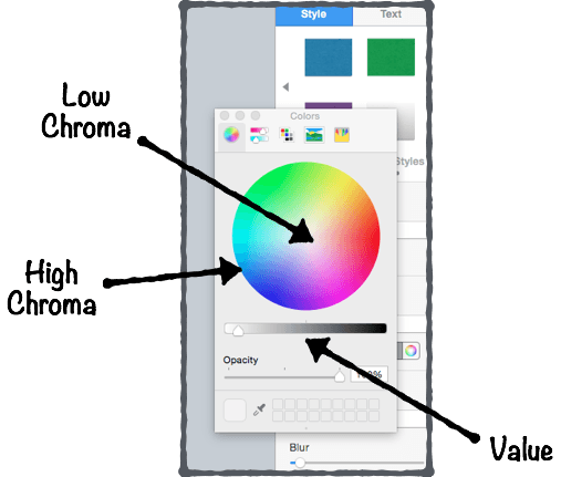
Image credit
Let’s take a look at an example:

Embed a Rectangle Shape With Your Text On Top Of a Visual
Here’s a variation of the 3-step technique mentioned earlier:
👉 Use a full-size photography that relates to the topic you will cover 👉 Add a rectangle shape on top of it with your text on of it (and make sure to apply the Contrast principle: if the shape is dark, use a light color for your text, and the other way around) 👉 Use different font sizes to create contrast and hierarchy between elements
Add a Layer On Top of Your Background Visual
Adding a “layer” between the visual and your text.
I’ll explain:
👉 First, find a visual related to your presentation topic 👉 Then, insert a rectangle shape that has the same size of your visual. Put this shape on top of your visual to cover it 👉Play with the opacity of the rectangle shape (I’m using 70% opacity in the example below) 👉 Finally, insert your text on top of it
Here’s an example of a pitch deck slide I designed in less than 5 minutes – following this exact process:
Your presentation title slide should instantly grab the attention of your audience and convey key information about the topic you will cover. Think: can anyone understand what my presentation is about in less than 5 seconds?
Use Repetition Between Text & Visuals to Create Consistency
Pick one visual (not twenty).
Instead of putting various of visuals on your slides in order to illustrate a simple point, try to stick to one.
If you want to integrate various visuals on your slide, then follow the repetition principle highlighted in the previous tip.
Use Plain Backgrounds For Body Slides
Use dark grey instead of black.
For that reason, choosing dark grey for the text on a white background will allow the change in brightness not be as drastic. As a result, the visual experience will be more comfortable for your audience:
Display Data the Right Way
First, start with defining what you want your audience to know about the data.
Ask yourself:
What type of relationship do I want to emphasize on?
Here’s a great framework you can use to identify which type of chart best fits:
For example, let’s say you want to compare sales volumes in different regions. Which of type of chart do you think would better present the sales across different regions:
A bar chart or a pie chart?
The bar chart instantly points out the top ranking countries, whereas it’s not so obvious with the pie chart. Bottom line: make your information easy to understand and digest for your audience.
Pro Tips 💪
Stick to the the following five principles to present your data in the clearest possible way:
Tell the truth Get to the point Pick the right tool for the job Highlight what’s important Keep it simple
Increase Space Between Columns For Maximum Clarity
You see, whitespace serve various essential functions , two of which are crucial for mastering slide design effectively:
Improving comprehension (because it makes scanning and reading your content easier and more predictable).
Remove all visual distractions that are not adding any value to your slides (read: shiny backgrounds, shadows, and other 3d effects).
Use This 3-Point Rule to Design Better Tables
How can you create better tables that are easier for your audience to read?
Here’s a simple, effective rule you can use:
1. Numerical data is right-aligned 2. Textual data is left-aligned 3. Headers (column names) are aligned with their data
PART 3 Creative Presentation Design Ideas & Ideas
In this section, I’ll share some fun ways to quickly improve the designs of your presentations.
Here are some of the things you are going to learn:
👉 Creative techniques to instantly make your slides look good (no matter the type of presentation you’re doing) 👉 How to use emojis or even Youtube to get your creative juices flowing… 👉 And more!

Embed Your Body Text in Rounded Shapes
Here’s a simple, effective hack to present information in a non-boring way:
Embedding your text content in rounded shapes. For instance, as in the example below, I’ve used use colored rounded shapes for headers (e.g. “Top Text 1”) and white ones for content shapes.
You can use this design technique to present company products or services, introduce the core elements of a business strategy, or even present research findings.
Add Colored Lines to Improve Your Slide Design
Adding a colored line on top of your text box is another simple way to better present information on your slides.
This technique both works with and without text box header (like in the example below) and will instantly make your slide look nicer:
Enclose Icons Inside Colored Shapes to Clearly Convey Information
Embedding icons is a great way to illustrate content, whether you need to present product features or introduce your services in a sales presentation .
While vector images won’t degrade in quality if you increase their size, you sometimes have to deal with small icons. And guess what, small icons are meant to be kept small (otherwise they’ll lack of detail and look pixelated).
So if small icons are all you’ve got, enclosing them inside colored shapes is a great way to go:
🗯 Tweet This Slide Design Tip !
Free icon resources 👉.
PPTPOP’s Free Icon Pack FlatIcons FreePik Icons8 The Noun Project
Enclose Data Points Inside Colored Shapes
Here are two great ways to highlight figures in your presentations:
Make them at least 5x bigger Enclose them in colored shapes (grab the ones I used in the example below right here )
This tip works very well when combined with the Alignment and Repetition principles together:
Use Unique, Fully Editable Illustrations
While standard icons are a great way to present information in a concise and organized manner, they won’t be your first choice if you’re looking to illustrate a message in a more unique way.
So how could you do that you might ask?
Here’s the answer:
Using fully editable illustrations.
Fully editable illustrations are basically visual elements made out of shapes and lines that are stuck together. They’re great for presentations because you can easily recolor and resize them for a truly unique look.
And them plug in your presentation slides to illustrate the content in a unique way:
If you like these illustrations, you can check out the bundle right here .
Here’s an example of a unique illustration I created for the slide below.
If you’re looking to get your hands on dozen of beautiful, 100% customizable illustrations for your slides, then check out the Massive X business presentation template bundle. You won’t be disappointed.
Use the Eyedropper Tool to Match Colors For a More Cohesive Look
The eyedropper is a powerful tool that basically allows you to pick up a color from anywhere on the screen.
A way to use it is to match the color of a visual on the slide to the text on that same slide (Note: it works very well for presentation cover slides ).
First, make sure you have the text already put on your slide.
Then, instead of picking a color from the color palette, just grab the eyedropper tool. Here’s how it looks like in both PowerPoint and Keynote:
Then, identify a color (pick a bright one if the background is dark, or dark one if the background is bright) you’d like to use for your entire text (or just a part of it):
Finally, check out the result:
🔶 Tweet This Smart Slide Design Hack !
Use Different Font Sizes to Create Hierarchy Between Primary & Secondary Text
Modifying the font sizes is a great way to control the hierarchy within your slides. Plus, it helps your audience to immediately identify the important content from the less important one.
Although you can apply this technique on all types of slides, it works especially well on cover slides.
⚡ Tweet This Cover Slide Design Technique !
Use One Of These Two Ways to Embed Visuals On Your Slides
The first one is simple:
Now, you might want to integrate various visuals on your slide. Luckily, there’s a simple way to do that while still making sure your slide looks coherent:
Group these visuals and making sure they’re aligned, both between each others and with the text that’s in your slide.
Here’s an example of bad and good practices:
Presentation Image Resources 📷
Here are my favorite ones:
Pexels (lots of options) ❤ Burst (a bit of everything) Gratisography (crisp, fun) Startup stock photos (genuine-looking) Unsplash (nature related) Little visuals (like Unsplash) Pic jumbo (urban-related mostly) Reshot (a bit of everything)
Dig Into Youtube Video Thumbnails
You can use Youtube to find solid presentation design inspiration ideas (Hint: this works very well for cover slides ). Here’s how to do it in three simple steps:
- Search for keywords (they can either be related or not to your topic)
- Identify good-looking video thumbnails in the search results
- Use the winning design patterns in your next cover slide
If you take a look at the second thumbnail, what do you see?
👉 A background visual (green color + headshot) 👉 A description (“Advanced SEO tutorial For 2018”). The text aligned vertically, integrated on top of a black background bold. It’s also bold and all-caps.
Now, we’re going to use these same patterns to create a cover slide for this article:
See, it doesn’t have to be complicated.
Note : Background visual –> found on Pexels (looking for the keyword “design”)
Another powerful way to get design inspiration for your slides is to head over to Slideshare and use the exact same process.
Reverse-Engineer Beautiful Web Pages’ UX
The point here is to check out website designs you like, identify the common patterns, and create slides inspired from them.
Here’s how to do it:
1. Create a “Swipe file” folder on your computer desktop 2. Add screenshots of web pages you like. It can be homepages, landing pages… Any design that caught your attention 3. When designing your slides, pick a screenshot you like, identify the most common patterns and copy them
Let’s take a look at the example below:
The left visual is a screenshot of a career page where the company highlights the peeks they offer.
The right visual is a slide that presents services a digital company offers to potential clients.
In this example, we have used…
👉 The same lay-out (4 boxes) 👉Similar colors and shade effects (white, slightly blurry box borders) 👉The emojis to illustrate the content of the boxes
Embed Emojis
Integrating emojis is an effective (and creative) way to convey feelings while bringing freshness to your presentation designs.
For example, you can use them to introduce paragraphs in your body slides:
Or to illustrate cover slides:
You can also integrate memes in your slides. Here’s an example:
When searching for emojis on Google images, make sure to add + “transparent” or “PNG” to your search query. For example: “emoji hand transparent” will help you find emojis that have transparent backgrounds (which makes easier for you to integrate in non-white background slides).
Meme Generator is a cool site that’ll help you create your own memes.
Integrate Shadow Effects On Text & Visuals
Shadow effects are subtle, tiny hacks that can allow any design to go from good to great.
Here’s a shadow effect example on a visual:

Now, you can also add shadow effects to your text:
Once you’ve typed your text, select the portion of the text you want to add effect on, click right, and select “format text effects”. Then tweak the shadow options until you get something you like.
Create Your Own “Swipe File”
Create a folder on your desktop and title it “Swipe File”.
Anytime you see a beautiful slide design, just add it to your swipe file.
Set up individual folders or labels to organize your findings well and save time (E.g. “Great Cover Slides”, “Business Slides”, etc). Pretty soon, you’ll have a huge bucket of inspiration that you can tap into when working on your own presentations.
Here’s how my own swipe file looks like:
Tweet This Design Inspiration Tip !
Invest In Presentation Templates
Ready-to-use templates help you create great presentations fast (and at the fraction of what a designer would cost you).
Most templates include everything you need, from gorgeous, easy-to-edit slides and icons to charts and ready-made color themes. In this article , I am reviewing my favorite designer-made PowerPoint and Keynote bundles that’ll help you clearly and concisely present information.
Plus, many business templates include fully editable graphics you can use to illustrate your slides in a professional manner.
For instance, I’ve used the graphics of Massive X , one of my favorite templates, to illustrate the chapters of this presentation guide.

Are You Spending a Lot of Time to Make Presentations? 🤓
What if you could design beautiful presentations FAST (and what if you could ALSO get beautiful, editable illustrations on top of it)?
For less than the price of a movie ticket, you could get immediate access to hundred of designer-made, beautiful slides at a fraction of what a designer would charge you (for just an hour of work).
If you want to make presentations that people will remember, then you should consider getting pre-built, fully editable templates….
See, top performers know that presentations can have a huge impact on their business. Because the truth is, when you start deliver top-tier business materials, you’re able to:
- Present clean slides that grab – and keep – people’s attention
- Confidently expressing ideas, concepts and messages with visual elements.
- Wow your prospects, get them to walk away knowing you’re the pros and eliminating other options.
Introducing Pre-Built Presentation Templates
With pre-built templates , you get your hands on a massive stash of editable resources – slides, vector icons, graphics, timelines, maps and so on – to build result-getting presentations. At a fraction of the time it takes to others.
If you’ve been looking to create quality presentations faster, then check out one of my favorite templates below, and start saving time so you can focus on things that really matter to you.
Massive X Template
With countless design options, practical slides and a recent bundle update, Massive X toke the business of presentation templates to a whole new level of professionalism and creativity.
Maybe you’d like to check out their intro video:
Now, what I love about this bundle is their 100% editable illustrations:
Just like the PowerPoint icons I’ve given away in this article, Massive X’s illustrations are made out of multiple, individual elements that are then put together.
And you can edit the color, size and shape of every single one.
And the great news is, Massive X comes with a ton of editable illustrations you can use for multiple purposes:
Now, let’s take a look into the details of the bundle…
Key Features
- 290 unique PowerPoint slides
- Animated slides
- 12,000 icons
- 15 color variations
See Massive X Template For PowerPoint
Not sure about what templates can do for you?
No worries, maybe you’d like to see my detailed review of the best presentation templates available on the market below.
👉 Affiliate disclosure. PPTPOP is a participant in the Envato Affiliate Program, and we get a commission on purchases made through our links (it doesn’t cost you anything).
Recommended For You

How to Make a Stunning PowerPoint Title Slide (in 5 Minutes)

How to Pitch an Idea: 21 Powerful, Science-Backed Tips
Privacy Policy Terms & Conditions
Copyright © 2023 All Rights Reserved
- Premium Template
- Scroll to top
Mastering PowerPoint presentation design principles: An expert agency’s guide.
In the realm of professional and educational presentations, PowerPoint stands out as a tool of immense popularity and versatility. However, the effectiveness of a PowerPoint presentation hinges not just on the content , but significantly on the design principles applied. In this comprehensive guide, we delve into the art and science of leveraging design principles to transform your PowerPoint slides from mundane to magnificent.
Understanding and applying these principles is not just about making slides aesthetically pleasing; it’s about enhancing the clarity, impact, and persuasiveness of your message. Whether you’re a seasoned presenter or new to PowerPoint, this guide offers invaluable insights into how design can be your ally in crafting presentations that captivate and communicate effectively.
As we explore the fundamentals of design principles, the effective utilisation of colour and typography, strategic incorporation of visuals and graphics, thoughtful slide layout and spatial arrangement, and purposeful animation, you will gain a toolkit of techniques to elevate your PowerPoint presentations. Each section is designed to build your understanding and skills, enabling you to apply these principles with confidence and creativity.
Embark on this journey with us to master the presentation design principles that will bring your PowerPoint presentations to life, making them not only more engaging but also more memorable and impactful.
Understanding the fundamentals of PowerPoint presentation design principles
When it comes to crafting effective PowerPoint presentations, the role of design principles cannot be overstated. These principles are the cornerstone of creating not only visually appealing slides but also ones that enhance the communication and retention of your message. In this section, we explore the three pivotal presentation design principles: balance, contrast, and alignment, and their application in PowerPoint presentations.
Balance: This principle refers to the distribution of visual elements in a slide. A balanced layout provides stability and structure, making the content easily digestible. In PowerPoint, balance can be achieved through symmetrical or asymmetrical layouts. A symmetrical layout offers a sense of harmony and formality, ideal for corporate presentations. On the other hand, an asymmetrical layout, which uses an uneven distribution of elements, can create a more dynamic and interesting visual appeal, perfect for creative or educational presentations.
Contrast: Contrast is the art of making elements stand out by using opposing characteristics, such as light and dark colours, large and small text, or different textures. In PowerPoint, effective contrast can be employed to draw attention to key points and guide the viewer’s eye through the slide. For example, using a bold colour for important text against a muted background can ensure that your audience focuses on the main message.
Alignment: This principle is about arranging elements in a slide in a way that creates a visual connection between them. Proper alignment in PowerPoint slides not only makes them more professional and polished but also aids in creating a logical flow of information. Aligning text and images along specific axes can help create a clean, organised look, making it easier for your audience to follow along.
Incorporating these fundamental presentation design principles in your PowerPoint presentations can significantly enhance their effectiveness. A well-designed slide not only captures attention but also helps convey your message in a clear, compelling manner. As you progress through your presentation creation process, keep these principles in mind to ensure that your content is not just seen but also remembered.
Effective utilisation of colour and typography
The strategic use of colour and typography is vital in creating engaging and effective PowerPoint presentations. This section delves into how these elements can be utilised to enhance the visual appeal and readability of your slides.
Colour psychology and palette selection: Colours are not just aesthetic choices; they evoke emotions and can significantly impact the perception of your presentation. Understanding colour psychology is crucial. For example, blue often conveys professionalism and trust, making it an excellent choice for business presentations, while green can be associated with growth and health. When selecting a colour palette, aim for a harmonious balance that aligns with the tone and content of your presentation. Tools like the colour wheel can help in choosing complementary colours that enhance visual coherence.
Consistency and brand alignment: Consistency in colour usage helps in creating a cohesive presentation. If your presentation is for a specific brand or organisation, aligning with its colour scheme can reinforce brand identity. This consistency also aids in audience retention as it provides a visually unified journey through your presentation.
Typography matters: The choice of font and text styling plays a crucial role in readability and audience engagement. While selecting fonts, consider the context and tone of your presentation. Serif fonts, like Times New Roman, often suggest formality and are suitable for traditional presentations. Sans-serif fonts, like Arial, offer a modern and clean look, ideal for more contemporary topics. Remember, legibility is key. Avoid overly decorative fonts and maintain a font size that is readable from a distance.
Balancing font styles and sizes: Use different font sizes and styles (like bold or italic) to create a visual hierarchy in your text, guiding the viewer’s attention to the most critical parts of your slide. However, maintain a limit on the number of different fonts used to avoid a cluttered or disjointed appearance.
By thoughtfully combining colours and typography, you can significantly elevate the impact of your PowerPoint slides. These elements, when used effectively, not only grab attention but also make the information more accessible and memorable to your audience.
Incorporating visuals and graphics strategically
Visuals and graphics, when incorporated correctly, can significantly enhance the effectiveness of your PowerPoint presentations. This section will explore how to select and integrate these elements for maximum impact.
The power of visual communication: Visuals can communicate complex information quickly and memorably. The key is to choose images and graphics that are directly relevant to your content. For instance, using a chart to depict statistical data can be far more impactful than simply listing the numbers.
Quality over quantity: Always opt for high-quality images and graphics. Blurry or pixelated visuals can detract from the professionalism of your presentation. However, be mindful of the quantity. Overloading slides with too many visuals can lead to clutter, making it hard for the audience to focus on the essential elements.
Consistency in style: Consistency is as important in visuals as it is in colour and typography. Ensure that all your visuals follow a similar style or theme. This could mean using the same filter for all images, similar illustration styles, or consistent iconography. This uniformity helps in creating a cohesive visual narrative throughout your presentation.
Graphs and charts for data representation: When presenting data, graphs and charts are invaluable. They provide a visual representation that can make complex information more digestible. Ensure these are clearly labelled and easy to understand at a glance. Tools like PowerPoint’s built-in chart features can be very effective for this purpose.
Integrating visuals with text: While visuals are powerful, they need to be balanced with the text. Use visuals to complement or emphasise your written content, not replace it. The text and visuals should work in tandem to convey your message effectively.
Incorporating visuals and graphics thoughtfully into your PowerPoint slides can transform the way your audience interacts with your content. It’s about finding the right balance and ensuring that each visual element serves a purpose in reinforcing your message.
Slide layout and spatial arrangement
The layout and spatial arrangement of elements on your PowerPoint slides play a crucial role in how your message is perceived and understood. This section focuses on strategies for organising content in an aesthetically pleasing and logical manner.
The importance of white space: One of the most overlooked aspects of slide design is the use of white space, or negative space. This space, free from text and graphics, is not wasted. Instead, it helps to reduce clutter and allows your audience to focus on the key elements of your slide. Proper use of white space can bring a sense of elegance and clarity to your presentation.
Logical flow of information: Arrange the elements on your slide in a way that guides the viewer’s eye naturally through the content. This can be achieved by aligning text and visuals in a logical sequence, such as left-to-right or top-to-bottom, following the natural reading pattern. Ensure that the most important information takes precedence both in size and positioning.
Consistent layout across slides: Consistency in the layout across different slides aids in maintaining a coherent narrative. Use a similar structure for each slide, whether it’s the placement of the title, text, or images. This consistency helps your audience to follow the presentation without getting lost or distracted by varying layouts.
Balancing elements: Balance is key in slide design. A slide that is too heavy on one side can feel unbalanced and distracting. Aim for an even distribution of text and visuals, ensuring that each slide feels harmonious and well-composed.
Responsive design for different displays: Keep in mind that your PowerPoint presentation might be viewed on various screens and devices. Ensure that your layout is responsive and looks good on different display sizes. This might mean avoiding overly intricate details that could get lost on smaller screens.
A well-thought-out slide layout and spatial arrangement can significantly enhance the effectiveness of your presentation. It’s not just about making slides look good; it’s about using design to guide and reinforce your message.
Animating with purpose
Animations and transitions in PowerPoint can be powerful tools when used purposefully. This section explores how to use these features to add value to your presentation without overcomplicating or distracting from the main message.
Selective use of animations: The key to effective use of animations is moderation. Choose animations that serve a specific purpose, such as emphasising a key point, illustrating a process, or showing changes over time. Avoid using animations merely for decorative purposes as they can distract from the content.
Consistency and subtlety: Maintain a consistent style of animations throughout your presentation. Using too many different types of animations can create a disjointed experience for your audience. Opt for subtle animations that complement the content rather than overpower it.
Timing is crucial: The timing of animations can significantly impact the flow of your presentation. Animations that are too slow can drag the pace, while too fast animations might confuse the audience. Adjust the timing to match the rhythm of your speech and ensure that each animation is synchronized with what you are saying.
Transitions between slides: Just like animations within slides, transitions between slides should also be used judiciously. Choose transitions that match the tone of your presentation and use them consistently. For most professional presentations, simple transitions like ‘Fade’ or ‘Push’ are preferable as they are less distracting.
Testing on different devices: Before finalising your presentation, test the animations on different devices and screens to ensure they work smoothly. This is especially important if you are presenting in a setting where you are not using your own device.
Using animations and transitions thoughtfully in PowerPoint can enhance the storytelling aspect of your presentation, making it more dynamic and engaging. Remember, the goal is to aid in the communication of your message, not to overshadow it.
In the world of PowerPoint presentations, presentation design principles are more than just guidelines; they are the framework that breathes life into your slides. Throughout this guide, we’ve explored the essentials of design—from the fundamental principles of balance, contrast, and alignment, to the nuanced use of colour, typography, visuals, and animations. Each element plays a pivotal role in transforming standard presentations into extraordinary visual narratives.
Remember, the goal of applying these design principles is not merely to create aesthetically pleasing slides, but to enhance the communication and impact of your message. A well-designed PowerPoint slide can captivate your audience, simplify complex information, and leave a lasting impression.
As you embark on your next PowerPoint project, keep these principles in mind. Experiment with balance, play with colours, choose your typography wisely, strategically place your visuals, and animate with purpose. With practice and attention to these guidelines, you’ll be able to craft presentations that are not only visually stunning but also effective in conveying your message.
In the dynamic landscape of presentation design, continuous learning and adaptation are key. Stay updated with the latest trends, technologies, and best practices in PowerPoint design to keep your presentations fresh and engaging. Remember, the best presentations are those that connect, communicate, and resonate with the audience.
Recent Posts

- Posted by hypepresentations
How many slides should I have in my PowerPoint presentation?
When you’re planning out your next big presentation, it can be hard...

Our quick presentation design cheat sheet.
20 presentation tips Working on a crucial presentation? Don’t deliver until you’ve...
- Join for Free
Principles of Presentation Design
A course by katya kovalenko , presentation & data designer.

Learn how to design beautiful and effective presentations from scratch
- Best seller
- 98% positive reviews ( 1.5K )
- 40392 students
- English , Spanish , Portuguese , German , French , Italian , Polish , Dutch
- Information

Remember the time you had to sit through an endless presentation full of charts and text and weird transition animations? Chances are you do. But do you remember anything about what was on it? Now that's a different story. The way we present information greatly influences how much of it we absorb, which is why presentation design is an art in and of itself.
Katya Kovalenko is a Barcelona-based data designer who helps businesses communicate visually, clearly, and more effectively. In this course, she'll share all the potential that she's found in presentation design, showing you the process that she uses with her clients, the methods of organizing information, as well as give you pro tips from a designer’s point of view.
What will you learn in this online course?
18 lessons & 22 downloads

- 18 lessons (2h 12m)
- 22 additional resources (2 files)
- Online and at your own pace
- Available on the app
- Audio: English, English
- Level: Beginner
- Unlimited access forever
Recommended software for this course
What is this course's project?
As a final project, you will have to choose a topic for your presentation, create the narrative structure, develop the content and the look & feel and finally, join everything you’ve learned into a complete and effective presentation.

Projects by course students

By msantoinettea
By ednita98
By itsalejandro
Who is this online course for?
This course is suitable for anyone who wants to learn about presentation design, from a complete beginner to an advanced designer.
Requirements and materials
You will need a computer with any presentation software installed (Katya will use Keynote, but you can use the software you prefer), basic notions of the chosen software, and a notepad for conceptualizing.

Muy buen cueso
View translation
Hide translation
as orientação foram muito pertinentes ao meu projeto. Tanto que aproveitei e, comprei outro curso que acho que pode agregar muito mais.
emir_jarquin
Un curso muy bien estructurado, Katya explica con una facilidad que entiendes muy rápido, sabe del tema y los recursos que utiliza son muy útiles, este curso refuerza conocimientos y esclarece otros que tal vez no se toman en cuenta al momento de diseñar presentaciones, todo es muy completo a la vez que básico para entender como desarrollar una buena presentación.
antoinetrot
Very good class for a beginner like me. Great sections on influences, the free tools available around the web and good summary of design principles. I am using Powerpoint so it was a bit of a challenge to "translate" from Keynote, but it worked great in the end. Thank you!
julianplasma94
- More reviews

Katya Kovalenko A course by Katya Kovalenko
Katya Kovalenko worked in advertising for nearly a decade before she embarked on what she calls “a quiet revolution.” After reading “Quiet” by Susan Cain, her notion of communication completely shifted. It led her to create Quiet Studio, which focuses on communicating in a more subtle and personal way.
As presentation and data designer at Quiet Studio, she creates presentations, infographics, and brand identities for businesses. She has worked with numerous brands and organizations like Meom, Article Group, Interesting Development, and Chelsea & Co.
- Introduction
- What We Will Do on the Course
Presentations, What About Them?
- Where Do the Presentations Come From?
- Presentation Do’s and Dont's
- Types of Presentations
Content & Narrative
- Choosing Your Presentation
- Content Structure
Let’s Create Our Presentation
- Mood Board 1
- Mood Board 2
- Slides Design
- Slides Design 2
- Slides Design 3
- Effects & Transitions
Take It Out There!
- Live Presentation
Final project
What to expect from a domestika course, learn at your own pace.
Enjoy learning from home without a set schedule and with an easy-to-follow method. You set your own pace.
Learn from the best professionals
Learn valuable methods and techniques explained by top experts in the creative sector.
Meet expert teachers
Each expert teaches what they do best, with clear guidelines, true passion, and professional insight in every lesson.
Certificates Plus
If you're a Plus member, get a custom certificate signed by your teacher for every course. Share it on your portfolio, social media, or wherever you like.
Get front-row seats
Videos of the highest quality, so you don't miss a single detail. With unlimited access, you can watch them as many times as you need to perfect your technique.
Share knowledge and ideas
Ask questions, request feedback, or offer solutions. Share your learning experience with other students in the community who are as passionate about creativity as you are.
Connect with a global creative community
The community is home to millions of people from around the world who are curious and passionate about exploring and expressing their creativity.
Watch professionally produced courses
Domestika curates its teacher roster and produces every course in-house to ensure a high-quality online learning experience.
Domestika's courses are online classes that provide you with the tools and skills you need to complete a specific project. Every step of the project combines video lessons with complementary instructional material, so you can learn by doing. Domestika's courses also allow you to share your own projects with the teacher and with other students, creating a dynamic course community.
All courses are 100% online, so once they're published, courses start and finish whenever you want. You set the pace of the class. You can go back to review what interests you most and skip what you already know, ask questions, answer questions, share your projects, and more.
The courses are divided into different units. Each one includes lessons, informational text, tasks, and practice exercises to help you carry out your project step by step, with additional complementary resources and downloads. You'll also have access to an exclusive forum where you can interact with the teacher and with other students, as well as share your work and your course project, creating a community around the course.
You can redeem the course you received by accessing the redeeming page and entering your gift code.
- Marketing & Business
- Communication
- Design Management
- Graphic Design
- Presentation Design
Courses you might be interested in
Presentation design principles for better PowerPoint design
- Written by: Richard Goring
- Categories: PowerPoint design , PowerPoint productivity
- Comments: 17

I’m often asked how to make presentations more effervescent. How they can have more fizz. Or, worst of all, “Can you make my presentation pop?” Well, the answer is yes. By applying some key principles of presentation design , you can make your PowerPoint design really standout and deliver both a more ‘popping’ – but also more effective – presentation.
I’ve split this out into a couple of topics, across two broad categories. One is presentation design, which is really the core graphic design principles that work across any form of visual communication. The other I’ve classed as PowerPoint design, which is a little more specific to using PowerPoint as a tool to create or deliver content. All the ideas have practical applications in PowerPoint, but I thought this breakdown was potentially useful.
Presentation design with images
What if I told you that your presentations could look like these examples?

They’re all using images to enhance your PowerPoint design, both by looking good, but also contributing to the story and helping your audience understand your messages. We’ll get more into the visual storytelling aspect of this later, so for now, just think about the quality of your images. All of these come from one of my favourite free stock photo sites, Unsplash , which gives you royalty free images for commercial use, and they’re all beautiful.

So, it’s not just a case of dropping nice images on the slide. You need to understand how to lay them out well, and use the crop, colour, and artistic effects tools in PowerPoint to treat the images appropriately, and give your presentation a professional look.

To see how we’ve created these kinds of slides, check out the image crop , and crop to zoom and full bleed step-by-step guides. Simple, but considered use of the crop tool can work wonders with your PowerPoint presentation design.
Presentation design incorporating white space
Big, bold, flood fill images are great, and an easy way to make your slides stand out. But it’s not all about pictures and Presentation Zen; inevitably you’ll need to place other content onto your slides, whether that’s facts, figures, charts, or even dare I say it… bullet points. This is where the use of white space in presentation design becomes crucial.
White space is not about purely adding ‘white space’ onto your slide. This one has plenty of it, but it still looks terrible:

It’s about creating areas of contrast, with clear focal points to draw your attention to the important parts, and even create a flow and hierarchy across your slide.

This example gives you that luxurious feel of the full bleed image, but crops it so that the focal point – the watch – is off to one side, leaving plenty of white, or ‘negative’ space around the arm for your content. The two sections work nicely together, and we’ve anchored the text in a content placeholder and given it some structure too, by actually reducing the size of the text to give it more room. Again, we’ve got a full tutorial on how to incorporate white space like this here .
Presentation design using grids
Grids are pretty much design 101, and to be honest, I’m surprised that we’ve got this far into presentation design without me having brought them up. You’ll likely be familiar with grids from magazines and newspapers – these mainly use column grids. The page is divided into columns and then content is designed to sit across these columns in any combination, which balances the content.
Well, the same thing applies to PowerPoint presentation design: a grid system helps to lay out your content in clear, easy to follow areas.
You can use a grid to create distinct sections, such as telling the start, middle, and end of a story. It’s much easier for your audience to follow, as everything is better organized.
And, it helps bring text into line – if you have any – which is important as it minimizes distractions for your audience when trying to read.
Using a grid also helps you decide where to position content, as there are only so many places that you can put things. Here, for example, one third of the slide has been taken up with the supporting image, so we’ve created a grid within a grid to lay out the three pie charts, which helps to create a feeling of harmony and sophistication:
And don’t think that your divisions have to be straight along the gridlines. Here’s an example that doesn’t apply the rule exactly, but still works really well.

Also, by using a grid, you achieve a consistent feel across all your slides for overall presentation design cohesion.
What does all of that mean? Well, you can transform a slide like this:
It’s really quick and easy to do in PowerPoint too, and you can see our tutorial on using grids and the guide tools in PowerPoint to bring your presentation design up a level.
Presentation design with colour themes
Another key presentation design principle is colour. Setting the right colour palette is essential, as it gives everything a consistent feel, allows you to adhere to your brand, and can give you the ability to assign meaning to specific colours to help your audience understand things. The best way to handle colours in PowerPoint is to set your template correctly and use a colour theme. You can find out how to change your PowerPoint colour theme here . It’s really quick and easy to do. Once you’ve done it, the theme will save with the file (or template), so you don’t need to worry about it again.
Once set, you can use colour in interesting ways to convey meaning.
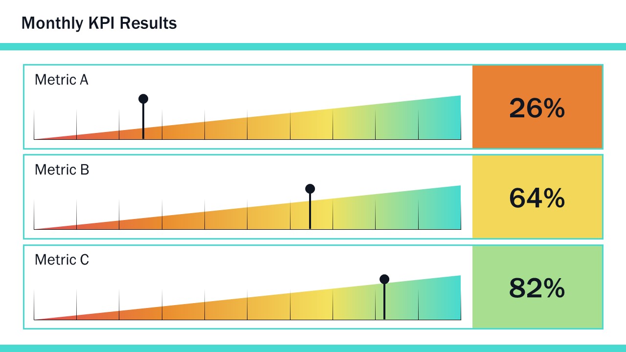
For example, a heat map is a great way to show data ranges, like metrics, using a scale, rather than just plain numbers. That’s more helpful to your audience, as it allows them to immediately see both the absolute and relative values, rather than having to spend time deciphering it.
You can also use colour to focus attention.
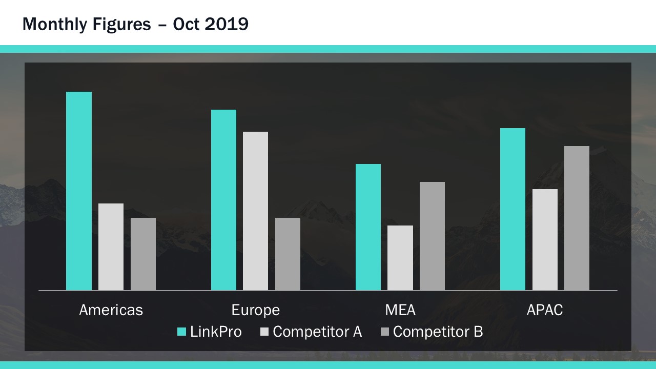
In complex data sets, using contrast colours can help to highlight primary datasets. Here, for instance, you can clearly see the main data series, compared to the ‘everything else’ data series.
Again, once you’ve set your colour theme, using these techniques as part of your presentation design is pretty easy, and you can find more specific guidance on how to manipulate colours in PowerPoint here .
PowerPoint design with text formatting
With your grids, colours, and white space considered from a high-level presentation design perspective, you now get into the specifics of creating slides in PowerPoint. As much as you, I, and your audiences, love presentations that make use of effective visuals, we know there are always going to be slides that are stuffed to the gills with boring text and even boring-er bullet points.
But, by applying the presentation design techniques already mentioned, you can fairly easily transform your text-heavy slide into something that’s far easier on the eye:
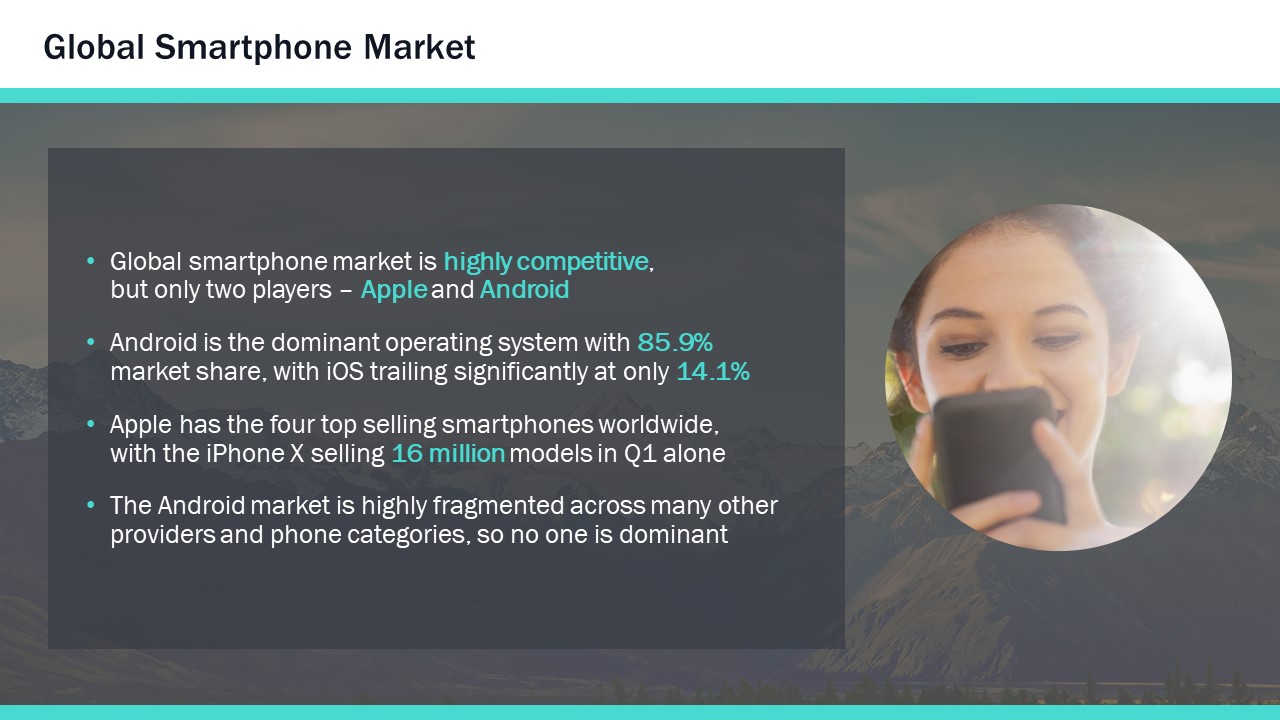
By using grids, appropriate colour, and white space, your PowerPoint slide design could look like this. Breaking out the text with decent paragraph spacing helps your audience parse the content more efficiently. Everything is easier to follow with consistent fonts and the use of colour highlighting. And the white space around the content actually gives the slide greater impact – particularly the use of the large margins around the text, created by the contrasting placeholder. There are a great many more options, and for ten in-depth typography techniques, check out this post . But if you’re just looking for nice fonts to use, this rundown of ten of our favourite fonts for presentations is a must-read.
As you’ve probably come to expect by now, this is something you can do using only PowerPoint, and you can see how in this tutorial on text formatting .
PowerPoint design to manipulate images
While it’s not Photoshop, PowerPoint has some neat tools to manipulate images.

What if I were to tell you the picture you see here had been constructed out of this…

PowerPoint design tools for images are all found on the Format tab on the ribbon. There are plenty of options to choose from, but only some actually enhance your design. For PowerPoint design tools, you should really focus on the left-hand side of the ribbon. The good features include the Remove Background tool, which does what its name suggests. The Color section allows you to put a colour wash over everything, but also, at the bottom of the menu, you can choose Set Transparent Color, which will remove a single colour from any image, which is how I’ve cut out the phone image in this example. Artistic Effects are generally terrible, except blur (which is great for changing focus on an image) and the Transparency tool – newly available in Office 365 – which makes pictures transparent. For a full tutorial on making the above example image, watch this short video .
PowerPoint design with visual storytelling
And finally, my favourite thing is to use these design techniques as part of visual storytelling, which helps dramatically improve your presentation.
Think about how you can use an image to convey meaning, as well as provide aesthetic appeal. For instance, you could use a skyscraper being constructed to show elements that are taking you higher, with labels up the building showing the key metrics:
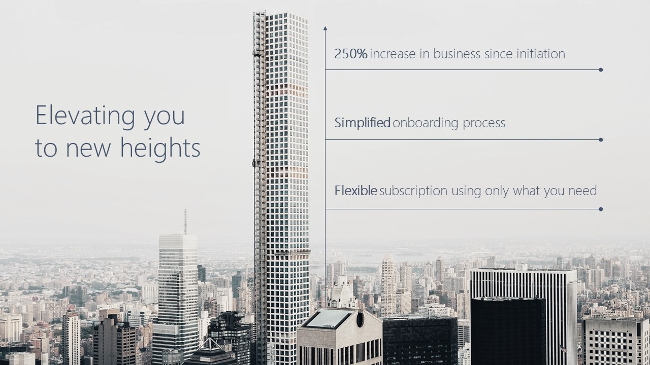
Or use a common sight from underground stations – the advertising boards on escalators – to show a data series increasing. The image also gives the figures room to breathe:
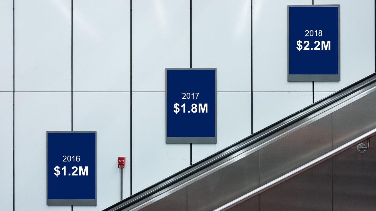
It doesn’t need to be complicated, and this example has been constructed from an image, some text, and an arrow, to show the 20% of business highlighted on the office photograph:

And of course, we have a short video tutorial to show you exactly how to do it. Sometimes, just finding the right image can be a real help coming up with the right PowerPoint design ideas, but you may also want to look to other design resources for inspiration .
The main thing to remember about effective presentation design is that you probably don’t have the time to create a totally new concept each time, or a mood board for your work. These ideas, especially the PowerPoint design ideas, are all about helping you create beautiful and effective presentations quickly, with minimal effort. A solid basis in design principles – coupled with a few PowerPoint tricks -will set you on your way. So, hopefully next time someone asks you to make a presentation ‘pop’ you can uncork the champagne and tell them you already have.

Richard Goring
Related articles, how to create powerpoint templates that work.
- PowerPoint design
Without a proper PowerPoint template, presentations can be a bit of a mess. Here are the building blocks for developing a PowerPoint template that works!

How to create visual presentations and eLearning
- PowerPoint design / Visual communication
- Comments: 4
Most presentations are a cascade of text-heavy Death-by-PowerPoint slides. Online learners suffer the torture of brochures converted to click-through-eLearning. Most people now recognize that using visuals is the way to go. But how do you make visual presentations and eLearning that work? We think there are six steps you need to follow.

How to print multiple slides on one page
- PowerPoint design / PowerPoint productivity
What’s the secret for how to print multiple PowerPoint slides on one page? We've got a few solutions up our sleeves, from simple and quick to completely custom!

LOVE LOVE this . .. so helpful and fun to work with. .
Your design concepts and tips were highly recommended by BiancaWoods.weebly.com and after downloading a template and reading your articles – now I see why.
Impressive resources!
Brilliant, thanks so much! Bianca is pretty awesome too. Glad that we’re all able to share with the community.
Nice way of explaining the information
Richard I have been following you since I met you at an ATD regional conference. You have always responded generously with the best in class PowerPoint tutorials and aids. Thank you for your excellence.
You’re most welcome, thanks so much!
Really useful and inspiring presentation.
It’s helped me see how to go beyond the mechanics of what PowerPoint can do towards creating a compelling and coherent design and story
This was really engaging, beautiful and extremely useful. Looking forward to using ideas into my slides.
The way you showed the Before and After is fantastic.
Very useful read .short video of 7 minutes on presentation is great to improve our presentation skills
Very creative and inspiring! You continue to amaze me with the quality of your desin6!
Really nice ideas – solid information. Thanks.
Amazing tutorials. Thank you for so generously sharing your skills, tips, and creativity!!
very interesting topic and very well presentation,thanks for this blog
very interesting topic
Excellent session as usual.
Thank you Richard for your amazing presentation! Very helpful.
Leave a Reply Cancel reply
Save my name and email in this browser for the next time I comment.
Join the BrightCarbon mailing list for monthly invites and resources
Thank you so much for conducting our advanced PowerPoint training workshop. We will definitely use BrightCarbon in the future – we really think that we would be hard pressed to find anywhere better! Emma Pring Iona Capital

Free Site Analysis Checklist
Every design project begins with site analysis … start it with confidence for free!
Architectural Drawing Standards and Types Explained
- Updated: February 15, 2024

Architectural drawing, a foundational element of architectural communication, serves as a bridge between an architect’s vision and the eventual physical form of a building.
This multifaceted tool encompasses a wide range of representations, from initial sketches that capture the essence of a design idea, to detailed construction drawings that guide the actual building process.
Historically, architectural drawing has evolved from simple hand-drawn sketches to complex digital representations, reflecting advancements in technology and shifts in architectural practices.
This article aims to delve into the significance of this in the design and construction process, exploring its various forms, functions, and the impact of technological advancements on its evolution.

AutoCAD Template Kit
Format your drawings with the correct set of tools. This CAD template enables you as a designer to spend your time on what matters – the design!

Stop searching for CAD blocks!
Standard architectural drawings.
There are many types of architectural drawings that are required during the process of designing, developing, and constructing a building, some are used at specific times and stages, and others such as the floor and site plans are continuously evolved and adapted as the project develops.
At their simplest level, architectural drawings ideally comprise of floor plans, sections, sizes and units of measurements, together with references and annotations, however there many additional drawings required depending the scope and complexity of the building.
Survey Drawings
Survey drawings are often the first type of drawing an architect or designer will work and engage with, and represent a measured and accurate record of the existing site and the buildings occupying it.
This helps the architects to identify existing site levels and features that can be adopted, removed or altered.
Record Drawings
Record drawings are made by architects to understand existing projects. For instance, in the renaissance period, architects would create record drawings of buildings that remained after the Greco-Roman civilizations.
They then use these drawings to influence their own designs and projects.
Demolition Plans
For projects involving renovation or retrofitting, demolition plans indicate parts of the building to be demolished or removed. These plans are essential for understanding the scope of demolition work and ensuring that it is carried out systematically and safely.
Concept Drawings and Sketches
Concept drawings and sketches are quick hand drawings that aim to communicate an idea or notion to help drive a project.
Often initially used internally among the design team, once established they can later be used to help communicate and present the project.
Schematic Drawings
Early in the design process, schematic drawings are used to explore concepts and ideas. They are less detailed than construction drawings and focus on the overall layout, function, and relationships between spaces , serving as a preliminary vision of the project.
Location Plans
Location plans offer a broader context than site plans, showing the proposed development in relation to its surrounding area.
This type of drawing is essential for planning applications and is used to give planners, clients, and other stakeholders a clear understanding of where the new building will sit within the local environment.
It typically includes roads, neighboring buildings, and natural features, providing a comprehensive view of the project’s immediate context.
Site Plans
Site plans are comprehensive drawings that provide a bird’s-eye view of the entire project in relation to its surroundings. They detail the location of buildings, access routes, landscaping, and site-specific features, crucial for planning and executing construction in context.
Floor Plans
A floor plan is essentially a map showing a buildings internal arrangement in relation to its external walls and environment.
Each floor or level of the building will require its own plan, which as a rule of thumb is a horizontal slice taken across the building at 1200mm above its floor level.
We have a whole article here , dedicated to drawing one.
Elevation
In short an elevation is a drawing of an interior or exterior vertical surface or plane, that forms the skin of the building.
Externally an elevation is most commonly used to describe the vertical interface between the interior and exterior of a building, where the external facing walls and surfaces of each side of the proposal are drawn.
Cross Section
A cross-section drawing refers to a vertical, horizontal, or diagonal cut that results in the removal of one of the selected parts to reveal the objects inner elements.
A good example of this is the process of cutting an apple in half to reveal its core and pips, or a cake with all its layers.
Reflected Ceiling Plans (RCPs)
These drawings show the ceiling as if it were reflected onto a mirror on the floor , detailing ceiling elements such as lighting fixtures, HVAC grilles, sprinkler heads, and ceiling finishes.
RCPs are crucial for planning the integration of ceiling-mounted elements with the rest of the interior design.
Electrical, Plumbing, and HVAC Plans
These specialized drawings show the layouts and details for electrical systems, plumbing, and heating, ventilation, and air conditioning (HVAC) systems.
They are crucial for ensuring that these critical systems are integrated smoothly into the building design, providing comfort and functionality for its occupants.
Landscape Drawings
For projects where the external environment is significant, landscape drawings detail the design of outdoor spaces, including plantings, hardscape elements, water features, and outdoor lighting.
These drawings ensure that the building’s exterior spaces are well integrated with the architecture and the site.
Detail Drawings
A detailed drawing shows a small section of a construction project in detail, and aims to demonstrate how the various elements and materials of a building come together. For example window openings, floor and wall junctions and structural connections.
Construction Drawings
A comprehensive set that includes all the detailed drawings and specifications for the construction of the building.
These are used by contractors to estimate costs, plan construction sequences, and build the structure. Construction drawings encompass all the above types of drawings, along with specifications for materials, finishes, and construction techniques.
Structural Drawings
These drawings detail the structural components of a building, such as beams, columns, foundations, and roofs, including materials, sizes, and connections.
Structural drawings are critical for ensuring the building’s stability and safety, complementing the architectural drawings with technical engineering information.
Energy Modeling Drawings
With the increasing focus on sustainability, energy modeling drawings provide insights into a building’s expected energy use and environmental impact.
These drawings are used to optimize the design for energy efficiency, incorporating elements like insulation, window placement, and shading devices.
As-built Drawings
Created after the completion of a construction project, as-built drawings reflect all changes made during the construction process. They show the building as it was actually built, incorporating any deviations from the original design drawings.
As-built drawings are invaluable for future renovation or maintenance work.
While not drawings in the traditional sense, schedules are an integral part of architectural documentation, listing elements such as windows, doors, finishes, and fixtures, along with their specifications.
Schedules complement the drawings, providing detailed information that helps ensure consistency and accuracy in construction.
Each type of standard architectural drawing plays a specific role in the design and construction process, ensuring that every aspect of the building is thoroughly planned and communicated.
Together, they form a comprehensive documentation package that guides a project from concept to completion.
Architecture drawing scales
All architecture drawings are drawn to a scale and as described here in great detail, there are set scales that should be used depending on which drawing is being produced, some of which are below:
1:500 (1”=40’0”) – Site plan
1:250 (1”=20’0”) – Site plan (note that 1:250 is not a common metric scale)
1:200 (1/16”=1’0”) – Site plan
1:100 (1/8”=1’0”) – Floor plans, elevations and sections
1:50 (1/4”=1’0”) – Floor plans, elevations and sections
1:20 (3/4”=1’0”) – Room plans, interior elevations
1:10 (1 1/2”=1’0”) – Joinery, component details, construction details
1:5 (3”= 1’0”) – Construction details
Architectural Drawing Types
Architectural drawings are not a monolith but a collection of diverse types, each serving distinct purposes throughout the life cycle of a building’s design and construction.
These drawings can be categorized into several primary types, with each playing a critical role in the architectural process. Understanding these types is essential for anyone involved in the construction industry, from architects and engineers to contractors and clients.
Hand drawings
Hand drawing is traditional sketching with a pen on paper, but can also be carried out via a drawing tablet . For a long time, architects have used hand drawings to explore ideas and assess multiple options during the design stage.
Unlike today where hand drawings are used to make rough sketches before fine tuning with computer software, traditional hand drawing had to be perfect.
The first-hand drawings in the history of architecture date back to 10,000 B.C.E. At this time the drawings were merely artistic, but then they gradually evolved to become architecturally meaningful.
Today hand drawings have been faded out, but in small instances, they exist side by side with computer-assisted drawings.
Computer Generated Imagery
Computer Generated Imagery (CGI) is as the name suggests the processes of using a computer application to create a representation of a project, with the soul purpose of communication.
As technology has progressed, so have CGI’s, and they now form a fundamental part of architectural presentations and documents at all scales.
Computer Aided Design
Computer-aided design (CAD) is used throughout the entire design and construction process of a project, having completely superseded older formal hand drawing methods.
The advantage among being a lot more precise and accurate, is the ability to revise and undo elements of the drawing with ease and speed, making it a much more efficient method of drafting.
Both architects and engineers use 2D and 3D CAD software. These programs enable in-depth exploration of design ideas. Architects can visualize concepts and simulate design performance in the real world.
Computer-assisted designs are highly beneficial in the construction world. Designers can collaborate over the cloud across oceans. The designs are easy to interpret even for non-professionals.

Presentation Drawings
Presentation drawings are used to communicate the final design to clients, stakeholders, and the public.
These can be rendered in various mediums and styles, from traditional watercolor to sophisticated digital 3D models, and are designed to convey the aesthetic and functional aspects of the project compellingly.
Working Drawings
Working drawings , also known as construction drawings , provide comprehensive instructions for the construction team. They detail every aspect of the construction process, from materials to measurements to installation methods, and are legally binding documents within the construction contract.
Tools and Media
The creation of architectural drawings has been revolutionized by the advancement of tools and media over the years. From traditional to digital, the tools used in architectural drawing have expanded the possibilities for architects to communicate their ideas effectively.
- Traditional Tools : Historically, architects relied on pencils, pens, rulers, compasses, and tracing paper to create their drawings. These manual tools required skill and precision, with different types of pencils and pens used for varying line weights and textures. Drafting tables provided a stable and angled surface for drawing.
- CAD Software : Computer-Aided Design (CAD) software has become the standard in the creation of architectural drawings. Programs like AutoCAD, Revit, and ArchiCAD allow for precise and efficient drawing, with the ability to easily modify designs. CAD software supports both 2D drawing and 3D modeling, enhancing the depth of design exploration and communication.
- BIM Tools : Building Information Modeling (BIM) represents a further evolution, integrating detailed information into the digital model of a building. Tools like Revit and BIM 360 facilitate a collaborative approach to design and construction, allowing architects, engineers, and contractors to work from a unified model that updates in real time.
- Rendering Software : For presenting architectural ideas, rendering software such as V-Ray and Lumion transforms drawings into lifelike images and animations. These tools help in visualizing materials, lighting, and the environment, making it easier for clients and stakeholders to understand the envisioned outcome.
- Digital Tablets and Styluses : For the initial stages of design, digital tablets and styluses replicate the hand-drawn experience with the advantage of digital technology. They allow for intuitive sketching and drawing, with the ease of editing and sharing digitally.
The choice of tools and media in architectural drawing depends on the project phase, the specific requirements of the drawing, and the personal preference of the architect or designer.
Each tool and medium brings its own strengths to the table, from the tactile feedback of traditional drawing to the versatility and efficiency of digital tools
Architectural drawing software
There are a lot architectural drawing packages to choose from, and all at varying prices and with different features, and quality of output.
The exact match for you will be dependant on your requirements and budget, however the programmes featured below are the major contenders.
Microstation – Microstation is a stable design platform that works better than the standard AutoCAD . Microstation is easier to use and has many features that relate to real-world architecture.
The only problem is that users might face AutoCAD compatibility issues with Microstation
Archicad – This software is both a 2D and 3D design application that can help you with total project output. It works well in modeling and rendering of computer-generated architectural imagery and can also be used to create 2D and 3D models, elevations and plans.
Archicad has a cloud platform that enables storage and design collaboration.
Chief Architect – Chief Architect is one of the most popular architectural software packages for residential design. It has useful but limited graphics with an acceptable output.
SketchUp – SketchUp is a fanatic tool for producing both complex and simple 3D models, it offers a free online version as well as paid license, making it the perfect tool for both students and licenced architects.
AutoCAD – AutoCAD is the standard architectural software. AutoCAD has the largest market share of architectural design applications. One would also have to be on the lookout for trends and technological advancements to keep their knowledge and skills relevant as time passes.
Architecture is a broad field that leans on technical skills in art, and mathematics . In the course of the study and during profession, one needs to continually adopt new technologies to keep their drawing knowledge and skills relevant.
Drawing Techniques and Methodologies
Architectural drawing is not just about the tools and media used; it’s fundamentally about the techniques and methodologies that architects employ to convey ideas, details, and instructions.
This section explores various approaches architects take in creating effective drawings, from traditional methods to advanced digital techniques.
Traditional Drawing Techniques
Before the advent of digital tools, architects relied on hand-drawing techniques to create their plans, sections, elevations, and details. These methods required a high level of skill and precision, with techniques including:
- Freehand Sketching : A fundamental skill for architects, freehand sketching allows for the rapid expression of ideas and concepts. It is often used in the initial stages of design to explore forms, spaces, and relationships.
- Drafting : Using tools such as T-squares, drafting boards, and set squares, drafting is a method for creating more precise and detailed drawings. This technique is essential for producing construction documents that require accuracy and clarity.
- Rendering : Traditional rendering techniques involve using a variety of media, such as pencil, ink, marker, and watercolor, to create visually appealing presentations of designs. These renderings communicate the texture, materiality, and light of the envisioned spaces.
Digital Drawing Techniques
The shift towards digitalization has transformed architectural drawing, introducing new methodologies and expanding the possibilities for representation and documentation:
- Computer-Aided Design (CAD) : CAD software has become a staple in architectural drawing, enabling the creation of precise and detailed plans, sections, and elevations. CAD drawings can be easily modified and are essential for producing the technical documents needed for construction.
- 3D Modeling : Beyond 2D drawings, 3D modeling software allows architects to build digital representations of their designs in three dimensions. These models can be used for visualization, exploring design alternatives, and creating renderings and animations.
- Building Information Modeling (BIM) : BIM goes a step further by incorporating detailed information into the 3D models, including materials, structural properties, and energy performance. This methodology facilitates a more integrated approach to design, construction, and facility management.
Collaborative Methodologies
With the complexity of contemporary architecture, collaboration across disciplines has become crucial. Techniques and methodologies that facilitate collaboration include:
- Integrated Project Delivery (IPD) : IPD involves a collaborative alliance of people, systems, and practices into a process that harnesses the talents and insights of all participants to optimize project results, increase value to the owner, reduce waste, and maximize efficiency through all phases of design, fabrication, and construction.
- Parametric Design : This methodology uses software to design complex geometries and systems that can adapt to changes through the use of algorithms. It enables a more dynamic design process where changes to parameters automatically update the model, facilitating a highly iterative and collaborative approach to design.
In conclusion, the techniques and methodologies of architectural drawing are diverse, each suited to different stages of the design and construction process.
From the tactile intimacy of hand-drawn sketches to the collaborative and data-rich environments of BIM, these approaches collectively enrich the architect’s toolkit, enabling the creation of buildings that are not only functional and sustainable but also meaningful and inspiring.
The Role of Architectural Drawing in the Design Process
Architectural drawing is not merely a means to document a design but is integral to the very process of design itself. This section explores the pivotal role these drawings play throughout the design process, from conceptualization to the final stages of construction, and how they facilitate collaboration, decision-making, and innovation.
Conceptualization and Initial Exploration
At the outset of a project, architects use sketching and diagramming to explore ideas, concepts, and spatial relationships. These initial drawings serve as a primary medium for creative expression, allowing architects to visualize and refine their thoughts.
They are instrumental in the brainstorming phase, where fluidity and the ability to rapidly generate and assess ideas are crucial. Conceptual drawings help in setting the direction for the project, embodying the architect’s vision and the intended experience for the users.
Development and Communication
As the design progresses, drawings become more detailed, evolving into tools for communication among the project’s stakeholders, including clients, engineers, contractors, and regulatory bodies.
Detailed plans, elevations, sections, and detailed drawings provide a comprehensive understanding of the project, encompassing aesthetic, functional, and technical aspects. These drawings ensure that all parties have a clear and shared understanding of the design, facilitating feedback and collaboration.
Technical Documentation and Construction
In the later stages, architectural drawings transform into highly detailed construction documents. These include technical specifications, dimensions, materials, and construction techniques, guiding contractors in bringing the design to life.
Accuracy and clarity in these documents are paramount to ensure that the construction aligns with the design intent. Moreover, these drawings play a critical role in obtaining building permits, adhering to codes, and ensuring safety and sustainability standards are met.
Facilitating Innovation and Problem-Solving
Throughout the design process, architectural drawing is a dynamic tool for problem-solving and innovation. It allows architects to experiment with different materials, structural solutions, and sustainability strategies, visualizing the outcomes of their choices.
By enabling architects to foresee potential issues and explore alternative solutions, drawings contribute significantly to the efficiency and quality of the design.
Collaboration and Iteration
Architectural drawing facilitates an iterative design process, where ideas are continuously refined and developed. This iterative process is essential for addressing complex design challenges, accommodating client feedback, and integrating contributions from multidisciplinary teams.
Drawings enable the seamless exchange of ideas, fostering a collaborative environment that enhances the project’s overall quality and innovation.
Architectural drawing is fundamental to the architecture design process, serving as both a creative catalyst and a rigorous tool for technical documentation. Its role extends beyond mere representation, acting as a crucial facilitator of exploration, communication, collaboration, and innovation.
Through drawings, architects navigate the complex journey from abstract ideas to concrete structures, shaping the built environment that surrounds us.
Architectural Drawing Tips
1. Use line thickness’s – When drawing a floor plan or section, the walls that are being cut through should always be a heavier line weight.
2. Minimize smudging – In order for hand drawn architectural drawings to convey their meaning, they need to be neat. Avoid smudging and making your sketches look messy.
3. Take your time – Creating a perfect architectural drawing takes time. Accept that fact and be ready to rework your pieces for as many times as it takes until you nail it.
4. Use layers – When drawing in a CAD package, divide your line weights into layers, for example you may have different layers for say walls, windows and joinery. These can then be saved as a template and used every time you start a new drawing.
5. Use hatches – Hatches add detail and depth, and can be used to identify and draw attention to elements and materials, for example to show floor finishes and/or light and shadow.
6.Use objects – Using objects such as furniture, cars and vegetation, adds scale and context to drawings as well identifies the limitations of the spaces created. i.e if a client has specialist furniture requirements.
7. Add annotations – Annotations help to draw attention and add additional information to the objects and elements in your drawing.
8. Add dimensions – Dimensions provide a quick reference to the scale and size of the spaces in your drawing, without the need for a scale rule
9. Work with a mouse and not touch pad – To create perfect CAD drawings, you need a mouse, touch screens are not CAD friendly.
Architecture is a broad field that leans on technical skills in art, and mathematics. In the course of the study and during profession, one needs to continually adopt new technologies to keep their drawing knowledge and skills relevant.
Architectural drawing, with its rich history and evolving nature, remains at the core of the architectural design and construction process. From the initial conceptual sketches to the detailed construction documents, each type of drawing serves a unique purpose, enabling architects to convey their ideas, intentions, and technical requirements effectively.
The advent of new tools and media has expanded the possibilities for expression and precision, allowing for more complex and detailed representations of architectural ideas. Moreover, the development of various techniques and methodologies has provided architects with the means to explore and communicate their designs in innovative ways.
The role of architectural drawing extends beyond mere representation; it is a fundamental part of the creative process that influences the conceptualization, development, and realization of architectural projects.
It facilitates communication among the various stakeholders involved, including architects, engineers, clients, and contractors, ensuring that the vision for a project is understood and executed as intended.
As we look towards the future, it is evident that architectural drawing will continue to evolve, influenced by technological advancements and changing architectural practices. However, its essence as a tool for visualization, communication, and documentation will undoubtedly remain unchanged.
Architectural drawing not only bridges the gap between imagination and reality but also serves as a testament to the architect’s skill, creativity, and vision, making it an indispensable aspect of the architectural profession.

Every design project begins with site analysis … start it with confidence for free!.
This Post Has One Comment

The list of “Architectural drawing software” looks very incomplete without mentioning Revit. True, Revit is not specifically “drawing” software, but so is Archicad. Both programs help architects create architectural models AND drawings.
Leave a Reply Cancel reply
You must be logged in to post a comment.
As seen on:

Providing a general introduction and overview into the subject, and life as a student and professional.
Study aid for both students and young architects, offering tutorials, tips, guides and resources.
Information and resources addressing the professional architectural environment and industry.
- Concept Design Skills
- Portfolio Creation
- Meet The Team
Where can we send the Checklist?
By entering your email address, you agree to receive emails from archisoup. We’ll respect your privacy, and you can unsubscribe anytime.
- Google Slides Presentation Design
- Pitch Deck Design
- Powerpoint Redesign
- Other Design Services

- Design Tips
- Guide & How to's
What is presentation design?
Presentation design is actually a combination of certain elements, which are text optimization, font selection, color and background selection, icon selection, and figures. If you want to have a perfect, totally polished presentation, you should pay close attention to each element. Here are five steps that will help you move rationally.
1. Optimize text
When crafting a presentation, try to present the summarized information, without complicated wording and formulas. If you speak in public, reduce the text in your presentation to the minimum (remember that you can tell your audience all the necessary information). These simple rules will improve the perception of your PowerPoint slides design .
Hierarchy of text
Create a hierarchy in the text using font size, color, or boldness. Decorative fonts work well for headings, but you’d better not to use them for body text. Also, you can prioritize using information layers (no more than 2-3).
In terms of meaning, try to build your presentation on the following hierarchy: the main idea, the main content of the slide, details, explanations, clarifications, readability, and font size. Try not to center large paragraphs of text; use left justification.
Tips: I recommend using from 24 to 28 points in presentations for public speaking, and from 12 to 14 points in presentations for sending and reading.

Spell Checking
Check the text, so that it does not turn out nonsense. Some mistakes can be fateful, as they are offensive to your audience. People notice these flaws, and they can even point it out loudly, shouting from the crowd.
Tips: I often found myself in a situation when I made a presentation with an error on the slide. It’s not the end of the world anyway, so don’t get too upset if it happened to you.
2. Select font
The basic rule for fonts in a presentation is the following:
Make it large and readable.
A font is actually a tone of voice that you are talking to your audience. It can scream, speak calmly, be playful, or strict. You can use the decorative font for the heading, but the rest of your text must be clear. There should be a visible difference between the header and the main font, although comments and notes can be simply in smaller type.
Tips: I recommend using no more than 2 or 3 fonts in one presentation.

3. Select color palette
Color is an essential visual component of the presentation. Color can change the attitude of the audience — from aggression and focus to relaxation and friendliness. When choosing a color, you need to build on the corporate style or theme of your presentation.
First, decide on the primary color, then select the color palette (or simply apply one). If you are performing in a dark room, try to use dark backgrounds, if in a light room, then light backgrounds are preferable. Focus color should not be used everywhere — it should stand out.
Tips: Integrate PowerPoint colors using the Eyedropper tool. The way the tool works is very simple — it copies the color and applies it to the selected object or figure.

4. Select icons
In three days, people remember only 10% of the information they heard. But if you illustrate the data with a picture or an icon, then the percentage will increase to 65%. Do not forget about this effect while crafting your slides.
Tips: There are many sites with icons, so you don’t need to be a designer to get them. The main thing is that you must use icons of the same style, in one color palette, complementing the text within the meaning.

5. Use figures
The first question that you may have is where to get these figures. Well, PowerPoint has plenty of them, and they are easy to find. Let’s see how they can complement and shape the presentation design. Some figures can help you assemble objects on a slide into semantic blocks. For example, you may use the line to separate the subtitled heading from the main text part. Focus can be created not only with color or size but also with graphic elements. Those elements can control the attention on your slide.
Tips: The lines do not have to be solid; you can set the stroke length, put arrows at the ends, choose other settings.

There are three main criteria for a successful presentation: what you tell, how you do it, and what you show . Poor design will not make your presentation a failure if you are a skillful storyteller. But a beautiful and functional presentation design will definitely enhance understanding of the material.
#ezw_tco-2 .ez-toc-widget-container ul.ez-toc-list li.active::before { background-color: #ededed; } Table of contents
- Presenting techniques
- 50 tips on how to improve PowerPoint presentations in 2022-2023 [Updated]
- Keynote VS PowerPoint
- Types of presentations
- Present financial information visually in PowerPoint to drive results

Excel-Linked presentations

How to make a presentation interactive

Inspiration for PPT: how to find design ideas
Design | Persuasion | Storytelling | Strategy
15 design principles for crafting persuasive presentations.

Written by Eugene Cheng

What do you think makes an impactful presentation deck? Many tend to think that it is the designing part that makes the cut. While this is somewhat true, there is no point of you having a beautifully designed presentation deck if it’s not designed in a functional way – where your message is able to be conveyed to your audience.
“What separates design from art is that design is meant to be functional” – Cameron Moll
An impactful presentation deck does not compromise the design or content. Or both. Instead, it reinforces the two so that the presentation deck has the best of both worlds – it is aesthetically pleasing to the eye while still being informative and succinct at the same time.
In short, it is a captivating visual presentation that sell .
So how do you make sure your presentation sells? There are so many different factors that come into play. From the structure and colour, to the typography and image used.
All of these elements have a part to play. Hence, it’s important to understand these design principles which can help make your presentation much more impactful.
To make this easier, we have broken down the principles of design in a step-by-step guide. This guide will give you a solid foundation to launch any impactful presentation if you follow it closely.
Design Principles:
1) structure your content.
First and foremost, it’s essential that you organise and structure your content. Many make the mistake of jumping right into designing their slides when they have not even created an outline for their content.
Even a great topic with the best content and ideas will be rendered useless if it’s not organised in a coherent manner. Not only will you confuse your audience, you’ll also find it difficult to design the slides – disorganised content entails an even more disorganised presentation deck.
One way to organise your content is to create an outline as it restructures your speech to make it clear and concise. After you’ve decided the points you’d like to bring up, start arranging them in a way where it can smoothly transition from one point to the other.
This leads me to my next point.
One idea per slide
Take a look at this slide:

Credits: http://slideplayer.com/slide/3850890/
Do you feel overwhelmed? Or as if you can’t tell what the slide is trying to convey? You aren’t the only one. The reason you may feel this way is because there are too many ideas placed on one slide.
Let’s face it. Everyone gets overwhelmed and blank out when bombarded with a sea of information. There is also a scientific reason behind this.
Low memory retention happens when your audience has to split their attention between reading the text on the slide and listening to you speak – an almost impossible task to absorb anything.
Therefore, ‘less is more’ when it comes to presentation slides. It all boils to breaking down the content in a way that your audience is able to digest and keep up with.
Here’s how to organise your points so that they are informative yet concise:
- Identify the main points
- Assign one slide per main point
- Elaborate the details – the sub points and etc – in your speech instead (or put it under your notes as reference)
Visual Hierarchy
It’s important to be attentive to visual hierarchy. Take a second to think about the eye movements of your audience as they look at your slides.
Are they reading from left to right? Or vice-versa?
Take note of where, you should position your text based on the language you use. In most western languages, people typically read from left to right. However, other languages like Arabic, Persian or even Japanese are read the other way round.
People are also conditioned to read from top to bottom. So it is best to adjust your visual elements to go with the flow of their eye movements.
2) Create a Moodboard
After you are done organising and structuring your content, comes the conceptualisation of the presentation deck. One of the difficult parts of designing is executing it. Even if you have great design ideas in mind, it can be tough to know how exactly you will execute it. This is the part where moodboards come in.
So what is a moodboard?
In simpler terms, it is a collage of images and colours that help inspire the beginning stages of your presentation deck. It gives a rough idea of the look, feel, and tone of your presentation – a roadmap that shows the outcome of your presentation deck.
Moodboards of presentation decks usually consist of the following:
- Colour Scheme
- Images/Icons
- Inspirations
a) Colour Scheme
It’s important not to underestimate the effect of colours. A recent study called the “ Impact of Color in Marketing ” discovered that 90% of quick judgments made about purchase can be based on colour alone.
Colours are able to evoke feelings, associations, and experiences in us. Knowing this, you should make use of the appropriate colours to use for your slides to bring out a certain feeling you have in mind so that you can further reinforce your message.
Here’s a video explaining the meaning behind certain colours and what they are associated to:
With that in mind, now ask yourself what is the emotion or feeling you wish to evoke in your audience? When you’ve decided, create a colour palette that meets the emotion you wish to evoke.
Coolors and paletton are great if you need inspiration to create a colour scheme.
Mix & Match Colours
When selecting colours, you need to choose a harmonious combination that accentuates the message of your slides.
A good strategy for selecting a colour palette is to choose three that represent the following:
- Accent Colour.
The rule is simple: background and base colours should be in a similar range of the colour wheel while the accent colour should represent a shade furthest away from the background and base.
Ensure that your background and base colours pale in comparison to your accent colour as the accent colour role is to captures your audience’s attention in the presentation. To make sure your accent colour remains in the limelight, it is best to make it the ‘loudest’ colour among the three.
You’ve probably heard this many time but a picture really is worth a thousand words.
According to brain research studies, we are six times more likely to remember visuals compared to text-based content.
With that being said, including images on your slides are not enough. This brings me to the next point.
Use High-Quality Images
When selecting images, it is essential you find high quality ones. Many speakers make the mistake of choosing low or medium quality images as from their laptop screen, it looks normal – fine even. However, if it gets showcased on a full-sized screen, it may end up looking grainy. So even if you provide great content, your slide designs will suggest otherwise.
Avoid going to Google Images and selecting the first image that appears on the search results – who’s to say the next person won’t do the same?
Visit this list of websites that offer free stock photos instead. If you are aiming to go full screen, we recommend that you go for pictures that are of at least least 1,000 pixels.
Apply The Rule of Thirds

Here’s a key principle to take note of when selecting an image.
Rule of thirds dictates that the most powerful images have their focal points at the intersection of the thirds of the lines on a given canvas.
So, if you divide your presentation slides into vertical and horizontal thirds, the intersections of those lines are like crosshairs, and you want to place those crosshairs right on top of the focal point of your image
Here are some insights by David Peterson, Digital Photo Secrets of why that is the case.
“If your subject is in the middle of the image, it’s considered static. Your eye is drawn to it then has nowhere to go from there because the object is equal distance from all sides. Therefore, when your subject is positioned closer to one of the edges, it forces your eye to follow it… to find it. This allows the viewer to linger on your image longer. It makes for a more captivating photo because it’s almost interactive. Like a conversation going on between the photo and you.”
In addition, the rule of thirds has been proven to be more aesthetically pleasing according to an experiment by Andrew Dulgan of Six Minutes Presentation and Speaking blog.

He showed his participants three images labelled ‘A’, ‘B’ and ‘C’.
Image ‘A’ did not abide by the rule of thirds while ‘B’ and ‘C’ did. When asked which of the three slides the audience felt were pleasing to the eye, many roughly chose Image ‘B’ or ‘C’ half of the time.
Less than 5% of the audience chose Image ‘A’. When asked why they chose Image ‘A’, some said “It’s boring.” or “I couldn’t decide what was important in the photo.”
One Image Per Slide
Just like the principle of one message per slide, it is also important to not overwhelm your audience with so many images per slide – which only makes them look cluttered and hard to focus on. Space the images out across several slides.
White Space

It’s simple, powerful and highly effective. Also known as ‘negative space’, white space is a design term referring to space that isn’t occupied by text, images or other visible page elements.
You’re probably thinking, shouldn’t you maximise every inch of your slide deck? Instead of wasting it with this ‘white space’?
Firstly, it creates separation. White space helps declutter your slides by creating separation between objects.
In addition, it emphasises or bring out the important points . White space, in simple terms, is a blank canvas. There is absolutely nothing to look at when it is fully being utilised. But, add in content surrounding this blank canvas and that content will stand out even more.
Last but not least, white space improves readability. Want your slides to be impactful? According to a research by Dmitry Fadeyev, (creator of Usaura), white space increases comprehension by almost 20%.
Turns out, whitespace around a block of text helps people comprehend what they are reading better – and therefore, make your slides easier to remember.
An icon can be defined as an image of a high symbolic value, used for the purpose to communicate ideas and messages without the use of words.
With icons you can also draw attention and list things without it being boring and repetitive. You can also add value to your presentation by making use of icons so things are more understandable for your audience.
Icons make content easier to understand as it contains meaning. Unlike bullet-points, icons contain a drawing or picture which in the audience’s mind will associate it with a task, function or is aligned with the point you are trying to convey. If the meaning of the icon is clear, your audience will be able to link it easily to the content.
For example, an icon of a phone will quickly help your audience associate it to contacts or communication.
In addition, icons help facilitate text skimming. Although drawing your audience’s attention to your presentation is important, making it easy to skim through it is equally important as well.
People just don’t have time or interest to fully read everything they see. But with icons, you can reinforce skimming while ensuring the message is still being conveyed. This is because icons quickly tell your audience what the presentation or point is about.
d) Select a Font
- Serif vs San Serif
Do you know the difference between serifs and san serifs? Urban Fonts describe the two types as the following.

Credits: http://shyfonts.com/when-to-use-serif-vs-sans-serif-fonts/
Serifs have small lines detailing the edge of letters and symbols. Serif fonts are usually associated with something serious – formal even. This is because of their traditional and conservative look and feel.
On the other hand, san serifs do not have the small lines projected out of the letters. This gives a more minimalistic and modern effect as a result.
Knowing this, make sure to understand what type of feel you want your presentation to invoke. Choosing a font according to the age group you will be speaking to is also vital.
For example: sans serifs are much more appropriate to use especially if your audience are young children. This is because the simplified letterforms are easier for them to identify with as they’re still learning how to recognise letters and words.
Given the strengths of each font type, it’s also not a bad idea to combine the two types which can bring out a unique combination. You can make use of serif in headlines for greater emphasis while serif can be used in the body text in order to give a more cohesive feel and easier readability in your slide.
Font Pairing
Imagine going to a speech where the speaker is speaking in a monotonous and rigid tone. There is a lack of intonation, speed change and excitement. Boring right?
The same applies to the usage of fonts. You need different fonts to add spice and texture to your presentation.
Experimenting the pairing of fonts can be fun, but time-consuming. As a rule of thumb, having contrasting font types help. Here are some examples:
- Wide vs Narrow
- Bold vs Light
- Big vs Small
With that being said, although pairing different fonts help spice up your visuals, do take note not to overdo it. Only use two to three fonts at most to keep it consistent. If not, it will end up looking overwhelming, distracting and messy.
Supersize Your Fonts
It’s important to remember that you are creating a presentation deck for a room full of people. That means ensuring your audience from the front all the way to the back of the room are able to see your slides and the content.
To ensure that they do, make use of Guy Kawasaki’s 10-20-30 rule – minimising the number of words on your presentation slides.
This gives you a chance to supersize your fonts as a result and yes, although it is better to have slides that are short and sweet, make sure not to compromise any important information just to hit that criteria.
Here’s a recommendation by our co-founder Eugene in his deck ‘ 7 Tips To Beautiful Powerpoint ’ to help kickstart yours.
3. Storyboard Your Presentation Slides

“Now at our studios we don’t write our stories, we DRAW them.” Walt Disney
A storyboard is a rough sketch of how you want your presentation deck to flow. It all boils down to two words – visual outline. Just like your content, even your designs and layouts need an outline.
Despite so, it also happens to be one of the most neglected practices in designing a PowerPoint presentation since many are unaware of this method.
Storyboards are important step to take as it helps you design you design a ‘deck that sells’ with minimal effort, time and money.
This is because it helps you to visualise the structure of your presentation- from the beginning, middle and end. Starting straight to designing your deck on PowerPoint or Keynote will only kill of any chances of how you want to layout your content and design.
Sketching your presentation deck also helps cut down the time taken for you to design your presentation deck. This is because it you are dumping all the ideas you have in mind as opposed to keeping all the information in your head – which you may forget about after a while.
If you are in a stump, however, there are many sites that you can visit to gather inspiration for your deck. Some examples include Creative Market and Dribbble .
And there you have it! Designing an aesthetically pleasing yet informative presentation deck requires a lot of patience, dedication and effort. To recap, remember that these are the design principles you should keep in mind the next time you craft your presentation deck:
- Identify the purpose of your presentation deck
- Organise the content structure
- Create a Mood board
- Sketch the Storyboard
- Experiment and Find Inspiration
Article Written By: Eugene Cheng
You may also like….

Val Yap: Delivering Success Through Effective Communication
by Kai Xin Koh
Success is not dictated by the hard work of one person alone. A great leader is also a great story-teller because effective communication is the foundation of any successful organisation.

Infographic Template Editor Site Review: Venngage
Introduction If you’re...

15 Pro Tips To Ace Your Keynote Presentation
by Shavinyaa Vijay
Keynote presentations can be terrifying for some of us. We fear messing up, looking bad on camera, forgetting our notes… The list of nightmares just...
Sign Up for Winning With Stories!
- First Name *
- Name This field is for validation purposes and should be left unchanged.
Module 7: Visual Aids
Design principles.
Slide and slide show design have a major impact on your ability to get your message across to your audience. Numerous books address various design fundamentals and slide design, but there isn’t always consensus on what is “best.” What research has shown, though, is that people have trouble grasping information when it comes at them simultaneously. “They will either listen to you or read your slides; they cannot do both.” [1] This leaves you, the presenter, with a lot of power to direct or scatter your audience’s attention. This section will serve as an overview of basic design considerations that even novices can use to improve their slides.

Figure 13.1 by the Public Speaking Project. CC-BY-NC-ND .
First and foremost, design with your audience in mind. Your slide show is not your outline. The show is also not your handout. As discussed earlier, you can make a significantly more meaningful, content-rich handout that complements your presentation if you do not try to save time by making a slide show that serves as both. Keep your slides short, create a separate handout if needed, and write as many notes for yourself as you need.
All decisions, from the images you use to their placement, should be done with a focus on your message, your medium, and your audience. Each slide should reinforce or enhance your message, so make conscious decisions about each element and concept you include [2] and edit mercilessly. Taken a step further, graphic designer Robin Williams [3] suggests each element be placed on the slide deliberately in relation to every other element on the slide.
Providing the right amount of information, neither too much nor too little, is one of the key aspects in effective communication. [4] See Figure 13.1 as an example of slides with too little or too much information. The foundation of this idea is that if the viewers have too little information, they must struggle to put the pieces of the presentation together. Most people, however, include too much information (e.g., slides full of text, meaningless images, overly complicated charts), which taxes the audience’s ability to process the message. “There is simply a limit to a person’s ability to process new information efficiently and effectively.” [5] As a presenter, reducing the amount of information directed at your audience (words, images, sounds, etc.) will help them to better remember your message. [6] In this case, less is actually more.

Figure 13.2 by the Public Speaking Project. CC-BY-NC-ND.
The first strategy to keeping it simple is to include only one concept or idea per slide. If you need more than one slide, use it, but don’t cram more than one idea on a slide. While many have tried to proscribe the number of slides you need based on the length of your talk, there is no formula that works for every presentation. Use only the number of slides necessary to communicate your message, and make sure the number of slides corresponds to the amount of time allotted for your speech. Practice with more and fewer slides and more and less content on each slide to find the balance between too much information and too little.
With simplicity in mind, the goal is to have a slide that can be understood in 3 seconds. Think of it like a billboard you are passing on the highway. [7] You can achieve this by reducing the amount of irrelevant information, also known as noise , in your slide as much as possible. This might include eliminating background images, using clear icons and images, or creating simplified graphs. Your approach should be to remove as much from your slide as possible until it no longer makes any sense if you remove more. [8]
Slide Layout

Figure 13.3 by the Public Speaking Project. CC-BY-NC-ND .
It is easy to simply open up your slideware and start typing in the bullet points that outline your talk. If you do this, you will likely fall into the traps for which PowerPoint is infamous. Presentation design experts Reynolds [9] and Duarte [10] both recommend starting with paper and pen. This will help you break away from the text-based, bullet-filled slide shows we all dread. Instead, consider how you can turn your words and concepts into images. Don’t let the software lead you into making a mediocre slide show.
Regarding slide design, focus on simplicity. Don’t over-crowd your slide with text and images. Cluttered slides are hard to understand (see Figure 13.2). Leaving empty space, also known as white space , gives breathing room to your design. The white space actually draws attention to your focus point and makes your slide appear more elegant and professional. Using repetition of color, font, images, and layout throughout your presentation will help tie all of your slides together. This is especially important if a group is putting visuals together collaboratively. If you have handouts, they should also match this formatting in order to convey a more professional look and tie all your pieces together. [11]
Another general principle is to use contrast to highlight your message. Contrast should not be subtle. Make type sizes significantly different. Make contrasting image placements, such as horizontal and vertical, glaringly obvious. A general principle to follow: if things are not the same, then make them very, very different, [12] as in Figure 13.3.
A common layout design is called the rule of thirds . If you divide the screen using two imaginary lines horizontally and two vertically, you end up with nine sections. The most visually interesting and pleasing portions of the screen will be at the points where the lines intersect.
Aligning your text and images with these points is preferred to centering everything on the screen. [13] [14] See Figure 13.4. Feel free to experiment with the right and left aligned content for contrast and interest. Sticking with a centered layout means more work trying to make the slide interesting. [15]
Understanding how people view images (and thus slides) can help you direct the viewer’s attention to the main point of your slide. In countries that read text from left to right and top to bottom, like English-speaking countries, people tend to also read images and slides the same way. Starting in the upper left of the screen, they read in a Z pattern , exiting the page in the bottom right corner unless their vision is side-tracked by the objects they are looking at (as in Figure 13.5).
Viewers’ eyes are scanning from focus point to focus point in an image, so you need to consciously create visual cues to direct them to the relevant information. Cues can be created subtly by the placement of objects in the slide, by showing movement, or more obviously by using a simple arrow. [16] Make sure all people and pets are facing into your slide and preferably at your main point, as in Figure 13.6. If your slide contains a road, path, car, plane, etc., have them also facing into your slide. When the natural motion or gaze of your images points away from your slide, your viewers look that way too. Being aware of this and addressing the natural tendencies of people when viewing images can help you select images and design slides that keep the viewer engaged in your message. [17]
Backgrounds and Effects
PowerPoint and other slideware has a variety of templates containing backgrounds that are easy to implement for a consistent slide show. Most of them, however, contain distracting graphics that are counter to the simplicity you are aiming for in order to produce a clear message. It is best to use solid colors, if you even need a background at all. For some slide shows, you can make the slides with full-screen images, thus eliminating the need for a background color.
Graphic design is the paradise of individuality, eccentricity, heresy, abnormality, hobbies and humors. – George Santayana
Should you choose to use a background color, make sure you are consistent throughout your presentation. Different colors portray different meanings, but much of this is cultural and contextual, so there are few hard and fast rules about the meaning of colors. One universal recommendation is to avoid the color red because it has been shown to reduce your ability to think clearly. Bright colors, such as yellow, pink, and orange, should also be avoided as background colors, as they are too distracting. Black, on the other hand, is generally associated with sophistication and can be a very effective background as long as there is sufficient contrast with the other elements on your slide. [18]
When designing your presentation, it is tempting to show off your tech skills with glitzy transitions, wipes, fades, moving text, sounds, and a variety of other actions. These are distracting to your audience and should be avoided. They draw attention away from you and your message, instead focusing the audience’s attention on the screen. Since people naturally look at what is moving and expect it to mean something, meaningless effects, no matter how subtle, distract your audience, and affect their ability to grasp the content. Make sure that all your changes are meaningful and reinforce your message [19] .
There are complicated and fascinating biological and psychological processes associated with color and color perception that are beyond the scope of this chapter. Because color can have such a huge impact on the ability to see and understand your visuals, this section will explore basic rules and recommendations for working with color.
Color does not add a pleasant quality to design — it reinforces it. – Pierre Bonnard

Figure 13.7 by the Public Speaking Project. CC-BY-NC-ND .
Much of what we perceive in terms of a color is based on what color is next to it. Be sure to use colors that contrast so they can be easily distinguished from each other (think yellow and dark blue for high contrast, not dark blue and purple).High contrast improves visibility, particularly at a distance. To ensure you have sufficient contrast, you can view your presentation in greyscale either in the software if available or by printing out your slides on a black and white printer. [20]
As seen in Figure 13.7, warm colors (reds, oranges, yellows) appear to come to the foreground when set next to a cool color (blues, grays, purples) which recede into the background. Tints (pure color mixed with white, think pink) stand out against a darker background. Shades (pure color mixed with black, think maroon ) recede into a light background. [21] If you want something to stand out, these color combination rules can act as a guide.

Figure 13.8 by the Public Speaking Project. CC-BY-NC-ND .
Avoid using red and green closely together. Red-green color blindness is the predominate form of color blindness, meaning that the person cannot distinguish between those two colors (Vorick, 2011). There are other forms of color blindness, and you can easily check to see if your visuals will be understandable to everyone using an online tool such as the Coblis Color Blindness Simulator to preview images as a color-blindperson would see it. Certain red-blue pairings can be difficult to look at for the non-color blind. These colors appear to vibrate when adjacent to each other and are distracting and sometimes unpleasant to view. [22]
With all these rules in place, selecting a color palette , the group of colors to use throughout your presentation, can be daunting. Some color pairs, like complementary colors or analogous colors as in Figure 13.8, are naturally pleasing to the eye and can be easy options for the color novice. There are also online tools for selecting pleasing color palettes using standard color pairings including Kuler and Color Scheme Designer . You can also use websites like Colorbrewer to help identify an appropriate palette of colors that are visually distinct, appropriate for the colorblind, and that will photocopy well, should you decide to also include this information in a handout.
I’m a visual thinker, not a language-based thinker. My brain is like Google Images. – Temple Grandin

Figure 13.9 by the Public Speaking Project. CC-BY-NC-ND .
There are thousands of fonts available today. One might even say there has been a renaissance in font design with the onset of the digital age. Despite many beautiful options, it is best to stick to standard fonts that are considered screen-friendly. These include the serif fonts Times New Roman, Georgia, and Palatino, and the sans serif fonts Ariel, Helvetica, Tahoma, and Veranda. [23] These fonts work well with the limitations of computer screens and are legible from a distance if sized appropriately. Other non-standard fonts, while attractive and eye-catching, may not display properly on all computers. If the font isn’t installed on the computer you are presenting from, the default font will be used which alters the text and design of the slide.
Readability is a top concern with font use, particularly for those at the back of your audience, furthest from the screen. After you have selected a font (see previous paragraph), make sure that the font size is large enough for everyone to read clearly. If you have the opportunity to use the presentation room before the event, view your slides from the back of the room. They should be clearly visible. This is not always possible and should not be done immediately preceding your talk, as you won’t have time to effectively edit your entire presentation. Presentation guru Duarte [24] describes an ingenious way to test visibility from your own computer. Measure your monitor diagonally in inches, display your slides, then step back the same number of feet as you measured on your monitor in inches. If you have a 17 inch screen, step back 17 feet to see what is legible.
Create your own visual style… let it be unique for yourself and yet identifiable for others. – Orson Welles
In addition to font style and size, there are other font “rules” to improve your slides. Don’t use decorative, script, or visually complex fonts. Never use the Comic Sans font if you want to retain any credibility with your audience. If you must use more than one font, use one serif font and one sansserif font. Use the same font(s) and size(s) consistently throughout your presentation. Don’t use all upper case or all bold. Avoid small caps and all word art, shadows, outlines, stretching text, and other visual effects. Use italics and underlines only for their intended purposes, not for design. While there are many rules listed here, they can be summarized as” keep it as simple as possible.” [25] See Figure 13.9 for examples of poor font choices.
Nothing is more hotly debated in slide design than the amount of text that should be on a slide. Godin says “no more than six words on a slide. EVER.” [26] Other common approaches include the 5×5 rule — 5 lines of text, 5 words per line—and similar 6×6 and 7×7 rules. [27] Even with these recommendations, it is still painfully common to see slides with so much text on them that they can’t be read by the audience. The type has to be so small to fit all the words on the slide that no one can read it. Duarte [28] keenly points out that if you have too many words, you no longer have a visual aid. You have either a paper or a teleprompter, and she recommends opting for a small number of words.
Once you understand that the words on the screen are competing for your audience’s attention, it will be easier to edit your slide text down to a minimum. The next time you are watching a presentation and the slide changes, notice how you aren’t really grasping what the speaker is saying, and you also aren’t really understanding what you are reading. Studies have proved this split-attention affects our ability to retain information; [29] so when presenting, you need to give your audience silent reading time when you display a new slide. That is: talk, advance to your next slide, wait for them to read the slide, and resume talking. If you consider how much time your audience is reading rather than listening, hopefully you will decide to reduce the text on your slide and return the focus back to you, the speaker, and your message.
There are several ways to reduce the number of words on your page, but don’t do it haphazardly. Tufte [30] warns against abbreviating your message just to make it fit. He says this dumbs down your message, which does a disservice to your purpose and insults your audience’s intelligence. Instead, Duarte [31] and Reynolds [32] recommend turning as many concepts as possible into images. Studies have shown that people retain more information when they see images that relate to the words they are hearing. [33] And when people are presented information for a very short time, they remember images better than words. [34]
An easy way to judge how much time your audience needs to read your slide silently, is to read the slide text to yourself in reverse order.

Figure 13.10 by the Public Speaking Project. CC-BY-NC-ND .
The ubiquitous use of bulleted lists is also hotly debated. PowerPoint is practically designed around the bulleted-list format, even though is it regularly blamed for dull, tedious presentations with either overly dense or overly superficial content. [35] Mostly this format is used (incorrectly) as a presenter’s outline. “ No one can do a good presentation with slide after slide of bullet points. No One. ” [36] Reserve bulleted lists for specifications or explaining the order of processes. In all other cases, look for ways to use images, a short phrase, or even no visual at all.
Quotes, on the other hand, are not as offensive to design when they are short, legible, and infrequently used. They can be a very powerful way to hammer a point home or to launch into your next topic. [37] See Figure 13.10 for an example. If you do use a quote in your slide show, immediately stop and read it out loud or allow time for it to be read silently. If the quote is important enough for you to include it in the talk, the quote deserves the audience’s time to read and think about it. Alternately, use a photo of the speaker or of the subject with a phrase from the quote you will be reading them, making the slide enhance the point of the quote.
Images can be powerful and efficient ways to tap into your audience’s emotions. Use photographs to introduce an abstract idea, to evoke emotion, to present evidence, or to direct the audience attention, just make sure it is compatible with your message. [38] Photos aren’t the only images available. You might consider using simplified images like silhouettes , line art , diagrams, enlargements, or exploded views , but these should be high quality and relevant. Simplified can be easier to understand, particularly if you are showing something that has a lot of detail. Simple images also translate better than words to a multicultural audience. [39] In all cases, choose only images that enhance your spoken words and are professional-quality. This generally rules out the clip art that comes with slideware, whose use is a sign of amateurism. Select high-quality images and don’t be afraid to use your entire slide to display the image. Boldness with images often adds impact.
When using images, do not enlarge them to the point that the image becomes blurry, also known as pixelation . Pixelation, (Figure 13.11) is caused when the resolution of your image is too low for your output device (e.g. printer, monitor, projector). When selecting images, look for clear ones that can be placed in your presentation without enlarging them. A good rule of thumb is to use images over 1,000 pixels wide for filling an entire slide. If your images begin to pixelate, either reduce the size of the image or select a different image.
Never use an image that has a watermark on it, as in Figure 13.2. A watermark is text or a logo that is placed in a digital image to prevent people from re-using it. It is common for companies that sell images to have a preview available that has a watermark on it. This allows you, the potential customer, to see the image, but prevents you from using the image until you have paid for it. Using a watermarked image in your presentation is unprofessional. Select another image without a watermark, take a similar photo yourself, or pay to get the watermark-free version.
You can create images yourself, use free images, or pay for images from companies like iStockphoto for your presentations. Purchasing images can get expensive quickly, and searching for free images is time consuming. Be sure to only use images that you have permission or rights to use and give proper credit for their use. If you are looking for free images, try searching the Creative Commons database for images from places like Flickr, Google, and others. The creators of images with a Creative Commons License allow others to use their work, but with specific restrictions. What is and isn’t allowed is described in the license for each image. Generally, images can be used in educational or non-commercial settings at no cost as long as you give the photographer credit. Also, images created by the U.S. government and its agencies are copyright free and can be used at no cost.
One final consideration with using images: having the same image on every page, be it part of the slide background or your company logo, can be distracting and should be removed or minimized. As mentioned earlier, the more you can simplify your slide, the easier it will be for your message to be understood.
Graphs and Charts
If you have numerical data that you want to present, consider using a graph or chart. You are trying to make a specific point with the data on the slide, so make sure that the point—the conclusion you want your audience to draw — is clear. This may mean that you reduce the amount of data you present, even though it is tempting to include all of your data on your slide.
It is best to minimize the amount of information and focus instead on the simple and clear conclusion. [40] You can include the complete data set in your handout if you feel it is necessary. [41] Particularly when it comes to numerical data, identify the meaning in the numbers and exclude the rest. “Audiences are screaming ‘make it clear,’ not ‘cram more in.’ You won’t often hear an audience member say, ‘That presentation would have been so much better if it were longer.” [42] In some cases you can even ditch the graph altogether and display the one relevant fact that is your conclusion.
Different charts have different purposes, and it is important to select the one that puts your data in the appropriate context to be clearly understood. [43] Pie charts show how the parts relate to the whole and are suitable for up to eight segments, as long as they remain visually distinct. [44] Start your first slice of the pie at 12:00 with your smallest portion and continue around the circle clockwise as the sections increase in size. Usea line graph to show trends over time or how data relates or interacts. Bar charts are good for showing comparisons of size or magnitude [45] and for showing precise comparisons. [46] There are other types of charts and graphs available, but these are the most common.
When designing charts, one should use easily distinguishable colors with clear labels. Be consistent with your colors and data groupings. [47] For clarity, avoid using 3-D graphs and charts, and remove as much of the background noise (lines, shading, etc.) as possible. [48] All components of your graph, once the clutter is removed, should be distinct from any background color. Finally, don’t get too complex in any one graph, make sure your message is as clear as possible, and make sure to visually highlight the conclusion you want the audience to draw.
- Duarte, N. (2008). Slide:ology: The art and science of creating great presentations. Sebastopol, CA : O’Reilly Media. ↵
- Reynolds, G. (2008). Presentation Zen: Simple ideas on presentation design and delivery. Berkeley, CA: New Riders. ↵
- Williams, R. (2004). The nondesigner’s design book: Design and typographic principles for the visual novice (2nd ed.). Berkeley, CA: Peachpit Press. ↵
- Kosslyn, S. M. (2007). Clear and to the point: 8 psychological principles for compelling PowerPoint presentations. New York, NY: Oxford University Press. ↵
- Reynolds 2008 ↵
- Mayer, R. E. (2001). Multimedia learning . Cambridge, UK: Cambridge University Press. ↵
- Duarte, N. (2010). Resonate: Present visual stories that transform audiences. Hoboken, NJ: John Wiley & Sons. ↵
- Reynolds 2008 ↵
- Duarte 2010 ↵
- Williams 2004 ↵
- Kadavy, D. (2011). Design for hackers: Reverse-engineering beauty. West Sussex, UK : John Wiley & Sons ↵
- Williams 2004 ↵
- Malamed, C. (2009). Visual language for designers: Principles for creating graphics that people understand. Beverly, MA: Rockport Publishers. ↵
- Duarte 2008 ↵
- Kadavy 2011 ↵
- Duarte 2008; Kosslyn 2007 ↵
- Bajaj, G. (2007). Cutting edge PowerPoint 2007 for dummies . Hoboken, NJ: Wiley Publishing. ↵
- Kosslyn 2007 ↵
- Kadavy 2011; Kosslyn 2007 ↵
- Weaver, M. (1999). Reach out through technology: Make your point with effective A/V. Computers in Libraries , 19 (4), 62. ↵
- Mayer 2001 ↵
- Tufte, E. R. (2003). The cognitive style of PowerPoint . Cheshire, CT: Graphics Press. ↵
- Tufte 2003 ↵
- Malamad 2009 ↵
- Tufte 2003 ↵
- Chapter 13 Design Principles. Authored by : Sheila Kasperek, MLIS, MSIT. Provided by : Mansfield University, Mansfield, PA. Located at : http://publicspeakingproject.org/psvirtualtext.html . Project : The Public Speaking Project. License : CC BY-NC-ND: Attribution-NonCommercial-NoDerivatives
- Figures 13.1-13.14. Authored by : Sheila Kasperek and Tom Oswald . Located at : http://publicspeakingproject.org/psvirtualtext.html . Project : The Public Speaking Project. License : CC BY-NC-ND: Attribution-NonCommercial-NoDerivatives

Privacy Policy

3 Great Examples of Slide Structure from McKinsey, Bain, and BCG

By Paul Moss
Consulting firms all around the world consistently rely on the pyramid principle to build high-quality presentations with proper slide structure..
Consulting firms like McKinsey, Bain, and BCG rely on proper slide structure to communicate insights to their clients. In this post, I’ll show you exactly how they use the Pyramid Principle to structure their slides, and why it makes such a big difference in the clarity of their presentations.
If you’re new to this blog, make sure you check out our other consulting slide breakdowns . And when you’re ready, take a look at our advanced PowerPoint and presentation building courses where you can learn to create presentations like a top-tier consultant.

FREE Slide Design Course
Enroll in our free 5-day email course and learn how to design slides like a McKinsey consultant.
Complete hands-on exercises , review a realistic consulting case study , and get personalized feedback from your instructor!
Plus get a free copy of our Top 50 PowerPoint Shortcuts for Consultants cheat sheet.
Learn More ➔
Success! Please check your email.
We respect your privacy. Unsubscribe anytime.
Table of Contents
What is the Pyramid Principle?
Put simply, the Pyramid Principle is just a structured way of communicating your ideas where you start with your main point and then work your way through the supporting details of that main point. It is represented pretty well with a pyramid because you start right at the top of the Pyramid and then move down to the bottom with more supporting details and data.

Let’s say I am trying to communicate the idea that LeBron James is my favorite player. I would first start with the main point, and then provide my three key arguments for why he is my favorite player. Then below that, I could provide supporting details for each key argument.
In this visualization, each idea is meant to summarize all the ideas below it. For example, the idea that Lebron James scores a lot of points summarizes the two supporting details about his career average of 27 points per game, and him being the 3rd highest all-time scorer.

This style of top-down communication works really well in a variety of settings, including email, face-to-face communication, and of course, PowerPoint presentations — which is what I’m going to focus on here.
BCG Example
The first example on our list is BCG . The slide is an excellent example of the Pyramid Principle because it is well-structured and clear. The slide title says “Melbourne seen as a cultural and creative city”, which is the main point the slide creator is trying to communicate (which is why it sits at the top of the slide in bold green letters).
Then they’ve split the main point into two key arguments: “Melbourne perceived by Australians as the country’s leading cultural city” and, “International travelers also perceive Melbourne as a creative city”. Then below each subtitle, there are four supporting points that are meant to provide support.

“Melbourne as a Global Cultural Destination” BCG
In this example the Pyramid Principle is quite easy to see. The title of the slide is the main point, the subtitles of the slide represent the key arguments, and the bullet points below that make up the supporting details and data. Each aspect of the slide fits into one of these three layers, and everything on the slide has a purpose.

By structuring the information in this way, BCG makes it easy for the audience to process the contents of the slide quickly and easily. There’s no question about what they’re trying to say, or why they’re trying to say it.
With data-heavy slides like this, it can be easy for the audience to get lost — especially if they’re trying to listen to a live speaker, read the words on the slide, and think critically about the slide’s message. Even for a smart person, this can be cognitive overload. Organizing the slide into digestible bites significantly reduces the mental load on the audience.
McKinsey Example
The next slide from McKinsey is also reasonably straightforward. It’s from a deck about high-growth emerging economies, which they refer to as “outperforming economies”.
The title of the slide says “A pro growth agenda of productivity, income, and demand propelled the outperforming economies”, and the slide itself shows the three areas that have propelled the growth for these emerging economies: productivity, growth, and demand.

“Outperformers: High-growth emerging economies and the companies that propel them” McKinsey, October 2018
There’s a few data points on the slide and a nice visual in the middle to break down the three main categories, making it pretty easy to spot the different layers in the Pyramid. So obviously, just like in our last slide, the main point will be represented by the title. That is what they want us to understand and take away from the slide first.
Then next the key argument level is also pretty clear with “higher productivity”, “boosting demand”, and “strong and inclusive growth” shown in bold text within each bracket (and also mentioned in the title). Then lastly, the bottom layer of the pyramid is represented by the various bullet points within each bracket (below the key arguments).

Altogether, it makes for a well structured slide with a clear message and clear supporting points. Despite not be organized visually in the same way as the BCG slide, the slide is very well structured and easy to understand.
Bain Example
Then lastly, we have a slide from Bain , and this one is slightly more complicated than the first two. The title says “Greater than 60% of growth in 2011 continues to come from new customers. However, share from existing customers improved.” The slide is all about the luxury goods market in China, and more specifically, they’re trying to show where the growth in the market is coming from.

“China Luxury Market Study” Bain & Company, December 2011
The BCG slide was organized neatly into the left and right sections of the slide, and in the McKinsey slide they were bolded with bullet points underneath. What’s tricky about this slide however, is that the Pyramid Principle is not clearly visible at first glance.
The title of the slide still represents the main point, and the key arguments are not emphasized visually, but logically they’re still present. The first key argument is that growth is coming from new customers, and the second key argument is that growth is coming from existing customers. Then if you look through the body of the slide, you’ll notice that everything falls into one of these two categories.

In the waterfall chart for example, notice how it is split into these two categories: new customers (as represented by the red columns), and then existing customers (as represented by the dark grey columns). Then on the right hand side of the slide, each of the bullet points can fit into one of the two categories.
For example, the first bullet says “China market is still supply driven; new store openings create new demand.” This clearly fits into the key argument about growth coming (in part) from new customers. Combined with the key argument about growth coming from existing customers, these two provide solid logical support for the main point.
So despite not having an easy visual layout like the previous two examples, this slide is well organized logically, and provides a nice structure that helps the audience clearly understand the main message, as well as the support for that main message.
You can watch a video version of this article on YouTube .
- Print Friendly
Universal Design Principles for Presentations
Principles of design.
Mikey Mioduski
Feb 28, 2022
Your PowerPoint presentation can be as captivating as an action movie or lifeless as an overdrawn speech from a tired bureaucratic honcho. While having natural charisma, great content, and excellent communication skills goes a long way, your presentation’s design is equally important. A well-designed presentation doubles down on your message by making every slide unique, appealing, and memorable.
The last thing you want is your audience falling asleep midway through your presentation, as happens to many speakers. Fortunately, you can reference universal design principles to polish up your presentation and leave a lasting impression on your audience.
Let’s talk about the principles of design, why they’re important, and how to incorporate them in your presentation.
What Are Universal Principles of Design?
The principles of design are general rules that provide a framework for designers across the board to make appealing and user-friendly designs. Design principles guide designers to package their message in an easy-to-digest format that’s universally accessible. These principles include contrast, repetition, balance, and alignment, emphasis, movement, white space, proportion, hierarchy, variety, pattern, rhythm, and unity.
Depending on the product you’re designing and your application field, you’ll find some design principles more relevant than others. In our case, we’ll discuss the five most useful design principles for PowerPoint (PPT) presentations.
Let’s jump in.
White Space is Your Friend
White space (negative space) is the blank space around elements on a PPT slide. These elements include logos, shapes, pictures, and text boxes. Simply, white space is the unused space in a design. You use white space to separate sections and create space between elements to avoid crowded or chaotic slides. This enhances the readability of your presentation.
Also, white space boosts comprehension by drawing your audience’s focus to the most important elements in your presentation. For instance, if you have ample white space around a picture, people will spend extra time on that picture because the white space indicates that it’s important. White space helps you design clutter-free and elegant-looking slides, making your presentation coherent and put together.

Movement: The Eyes Should Move
How you organize elements in your slide will dictate how your audience navigates through it visually. This is referred to as movement. You should position your elements harmoniously so the eye transitions from one element to the next without getting stuck on one section. Essentially, movement gives your presentation ebb and flow, enabling your slides to flow more naturally like a narrative or story.
Repetition and Consistency in Design
To reinforce an idea in your presentation, you may need to reuse certain elements like typefaces, fonts, logos, or shapes. Almost always, you’ll need to use multiple elements in your presentation for illustration and design aesthetics. Repetition helps you achieve consistency so that the repeated elements don’t come off as an error.
Say you use Fira Sans font for the body text in most slides, but use Libre-Baskerville font in a few slides for stylistic effect. If the Libre-Baskerville font appears only in one slide or body text, your audience may interpret it as a casual error rather than a stylistic effect. However, if you use Libre-Baskerville font in multiple slides, your audience will catch on.
Symmetry Keeps Your Presentation Balanced
Every element in your PPT presentation (symbols, pictures, 3D models, or SmartArt) has visual weight. The size, shape, and contrast contribute to the visual weight that must be balanced for the slides to look even. You can achieve balance through symmetry or asymmetry, as we explain below.
Symmetry
In your PPT presentation, you position elements of equal visual weight on opposite sides of an imaginary center line on your slide to get symmetrical balance. Here’s an illustration:

Asymmetry
To achieve asymmetrical balance, you position elements of varying visual weight without considering an imaginary center line.
Both symmetrical and asymmetrical design layouts help keep your presentation visually pleasing. If you have a creative bone in your body, you can capitalize on symmetrical and asymmetrical designs to make your PPT presentation stylish and unique. Here’s an illustration:

Hierarchy: What Is the Key Content?
Hierarchy refers to the order of importance of your presentation content. Visual hierarchy dictates that you prioritize your presentation’s most important design elements. The meaty sections explaining your core ideas should come first so the audience can get the broader picture within the first five minutes of your presentation.
Given the declining human attention span , it can be an uphill task to retain your audience’s attention throughout your presentation. That’s why you should strike the iron while it’s hot and explain your primary ideas while you have your audience’s attention. A good way to do this is by embedding key concepts in your headings, subheadings, and introductory slides.
Why Are Design Principles Important in Presentations?
Principles of presentation design are a source of guidance and reference for designers to create stand-out designs that are usable and accessible to all people. Likewise, design principles guide you through creating a powerful PPT presentation with design elements that will woo your audience.
You want to communicate to your audience in an interactive and captivating way. Referencing the principles of design when creating your PPT presentation will elevate your presentation. By applying these principles, you ensure that your presentation is world-class, right down to the last detail.
How Do These Principles Affect the Design Process?
Each design principle helps you achieve a specific impact. As such, you have to consider the design elements and the effects you want your presentation to exude. For the most part, you’ll integrate the design principles on the go while preparing your presentation. Even so, you may want to plan and note down the design elements you want to include to save time when applying them to your slides. This makes the design process more effective.
GhostRanch Communications Can Help
We know that creating a riveting PowerPoint presentation requires more than understanding and applying design principles. That’s why we go far beyond to design custom presentations that turn heads, save you time, and help you close more deals. Whether you want us to design your PPT presentation from scratch or provide some touch-ups to enhance readability and aesthetics, we are game.
Let GhostRanch be your go-to partner for all your design services . We deliver the results you need on time and on point.
Contact 'The Ranch' today to discuss how we can help with your presentation deck.
About The Author

Michael "Mikey" Mioduski founded GhostRanch Communications in 2015 after falling in love with the medium of presentation design. He holds an MFA in Advertising Design from SCAD, a BA in History from DePauw University, and currently lives with his family in Zionsville, Indiana.
You May Also Like…
Move content from an ugly table into a pretty table.
Feb 27, 2024
How do you write a powerful personal story? (Even when you don’t have a story to tell)
You don’t have to launch Xbox 360 in Europe or tour with rock bands to have a tale worth telling.
Feb 13, 2024
Transferring Themes - Colors and Fonts - from PowerPoint to Word and Excel and Vice Versa
Feb 12, 2024
A Top 5 Shortcut That Works in PowerPoint and Google Slides
The 2 secret powers of the redo shortcut
Want to create or adapt books like this? Learn more about how Pressbooks supports open publishing practices.
Chapter Fourteen – Presentation Aids

“Grifo mágico” by emijrp. CC-BY .
“I know you can’t read this from the back there,” the presenter apologizes to a screen so full of words you would think the entire speech had been crammed into one slide. This is just the first of a seemingly endless string of slides I can’t read, charts so full of numbers I can’t decipher the meaning, and clip art so clichéd I can’t help but roll my eyes and sigh. It is not long before I’m presented with an incredibly dense graph I can’t make any sense of since he keeps interrupting my concentration with actual talking. “When is he going to come to the point already?” I think to myself as I start to doodle in the margins of the handout of the PowerPoint slides for the very talk I’m currently sitting through. Why did he even bother with a presentation? He could have just emailed us all of the handout and saved us from this painful, dull spectacle. As he reads from his slides and belabors his statistics, my mind drifts to grocery lists and the upcoming weekend. I can think of a hundred better uses for an hour.
It seems nearly impossible to see a presentation that doesn’t revolve around a lengthy PowerPoint, so much so that you might think it was a requirement for giving a speech. The phrase “death by PowerPoint” was coined in response to the ubiquitous, wordy, and intellectually deadening presentations that focus on the slides rather than the content or the presenter. With the speaker reading directly from the slides, or worse, showing slides with text so small that it can’t be read, viewers are often left wondering what the need for the presentation is at all. A simple handout would convey the message and save everyone’s time. PowerPoint, however, is just one of the visual aids available to you as a speaker. Your ability to incorporate the right visual aid at the right time and in the right format can have a powerful effect on your audience. Because your message is the central focus of your speech, you only want to add visual aids that enhance your message, clarify the meaning of your words, target the emotions of your audience, and/or show what words fail to clearly describe.
A visual image is a simple thing, a picture that enters the eyes. – Roy H. Williams

“mwdCyborgLenses” by em den. CC-BY-NC-SA .
Learning how to create effective visuals that resonate with your audience is important for a quality presentation. Understanding basic principles of how visual information is processed alone and in combination with audio information can make or break your visuals’ effectiveness and impact. Incorporating visuals into your speech that complement your words rather than stand in place of them or distract from them, will set you apart from other presenters, increase your credibility, and make a bigger and more memorable impact on your audience.
Types of Visual Aids
In the past, transparencies displayed with overhead projectors, posters, and flip charts were common visual aids, but these have mostly been replaced with computer technology. For many people, the term “visual aids” for presentations or speeches is synonymous with PowerPoint (often long, dry, painful PowerPoint at that), but this is just one type of visual aid. You should consider all the available options to determine what will be most effective and appropriate for your presentation.
If you wear clothes that don’t suit you, you’re a fashion victim. You have to wear clothes that make you look better. – Vivienne Westwood
Personal Appearance
Some people choose to dress up as part of their presentation, and this can help set the tone of the speech or reinforce a specific point. A speaker may wear a handmade sweater in a talk about knitting in order to inspire others to begin the hobby. Another speaker may opt for a firefighter’s uniform in a speech about joining the local volunteer fire department in an effort to appeal to the respect most people have for people in uniform. As mentioned in the previous chapter, if you’re delivering a speech on sleep deprivation, wearing pj’s could be appropriate!
If you wear clothes that don’t suit you, you’re a fashion victim. You have to wear clothes that make you look better . – Vivienne Westwood

“Firefighters Onboard Royal Navy Destroyer HMS Edinburgh” by UK Ministry of Defence. CC-BY-NC .
If you aren’t dressing in relation to your topic, you should dress appropriately for your audience and venue. A presentation to a professional audience or at a professional conference would lend itself to appropriate business attire. If you are giving a presentation to your local Girl Scout troop, more casual clothing may be the best choice. Any time you are doing a demonstration, make sure you are dressed appropriately to give the demonstration. It is difficult for a speaker to show how to correctly put on a rock-climbing harness if she is wearing a skirt the day of the presentation.
Beyond dressing appropriately for your audience and topic, the audience will make judgments about you even before your presentation begins. Your dress, mannerisms, the way you greet the audience when they are arriving, how you are introduced, and the first words out of your mouth all impact your credibility and ability to connect with your audience. Make sure you are calm and welcoming to your audience when they arrive and greet them in a professional manner. Your credibility and professionalism suffer when the audience arrives and you are busy scrambling around attempting to finish your preparations. [1]
Objects and Props

“Honestly I Don’t Remember Much from This Lecture” by Daniel Lu. CC-BY-NC-ND .
Objects and props, such as a bicycle helmet for a speech on bike safety or an actual sample of the product you are trying to sell, can greatly enhance your presentation. Seeing the actual item will often make it easier for your audience to understand your meaning and will help you connect with your audience on an emotional level. Props can be used as part of demonstrations (discussed below) or as a stand-alone item that you refer to in your speech.
There are several important considerations for using props in your presentation. If you have a large audience, showing the prop at the front of the venue may mean that audience members can’t see the item. The alternative to this is to pass the item around, though Young and Travis [2] advise caution in passing objects around during your speech, as most people will be seeing the object after you have moved on with your talk. Having your prop out of sync with your presentation, either as it is passed around disrupting your audience’s attention or by having your prop visible when you aren’t talking about it, is distracting to your audience and message. To make the most effective use of props in your presentation, carefully consider how the object will be visible to your entire audience when you are speaking about it, and make sure it is out of sight when you are not.
Demonstration

“A dad teaches his daughter the hula hoop at the 2011 Downton Cuckoo Fair” by Anguskirk. CC-BY-NC-ND .
A demonstration can serve two different purposes in a speech. First, it can be used to “wow” the audience. Showing off the features of your new product, illustrating the catastrophic failure of a poorly tied climbing knot, or launching a cork across the room during a chemistry experiment are all ways of capturing the audience’s attention. Demonstration should not be gimmicky, but should add value to your presentation. When done well, it can be the memorable moment from your speech, so make sure it reinforces the central message of your talk.
Demonstration can also be used to show how something is done. People have different learning styles, and a process demonstration can help visual learners better understand the concept being taught. Consider for a moment the difference between reading the instructions on how to perform CPR, watching someone perform CPR, and trying CPR on the training dummy. As evidenced by the huge number of online videos illustrating how to do something, there is great value in watching while you learn a new task.
If your presentation includes a process where seeing will improve understanding, consider including a demonstration.
Because you have a limited time to present, make sure your demonstrations are succinct, well-rehearsed, and visible to the entire audience. Be prepared for the demonstration to fail and have a back-up plan in place. It is better to move forward with your presentation than to fret with trying to get your demonstration perfect or fixed. However, if you are providing a demonstration of your new product, make sure it is as error free as possible. If you can’t be positive the product will perform as expected, it is better to skip the demonstration.
Posters and Flip Charts
If you are presenting to a small audience, around a dozen people, you may choose to use a poster rather than PowerPoint. The focus of your poster should be to support your core message and can be left behind to remind those in attendance of your presentation after you have left. Posters should look professional (e.g., not handwritten), be visible to everyone in the room, and follow design rules covered later in this chapter. Before your presentation, you should ask whether posters must be hung or be free standing. For posters that will be hung from a wall, sturdy poster or matte boards will suffice. If your poster is going to be free standing or if you are going to use the same poster for multiple presentations, you should consider using a tri-fold display board.

“Dad’s Jr. Year Science Fair Project” by Rev. Xanatos Satanicos Bombasticos. CC-BY-NC-SA .
Other text-based visual aids include white boards and flip charts. Both can be used to write or draw on during the presentation and should be used with several caveats. Writing during your presentation actually takes away from your speaking time, so make sure to factor this into your speaking time. Speaking and writing at the same time can be tricky because the audience will have a difficult time processing what they are hearing when they are also trying to read what you write. Additionally, if you are writing, you need to be careful not to turn your back on your audience, which is makes it harder for them to hear you and for you to connect with your audience. Legible handwriting that can be seen at a distance is of prime importance, so using these kinds of visual aids should be limited to small audiences. While some speakers write and draw to highlight important points, this takes an enormous amount of skill and practice. For those with less developed skills, flip charts are best limited to situations where audience input is necessary for the direction or continuation of the presentation. [3]
The soul never thinks without a picture. – Aristotle
Audio and Video
A large amount of digitized audio and video is now available to be included and embedded in your presentation. Select short clips; Young and Travis [4] recommend only 10 – 20 seconds, but this will depend in part on the length of the presentation, the purpose of the presentation, and clip content and relevance. You should not have a presentation primarily composed of audio/video clips. Select only clips that reinforce the message or serve as an appropriate segue into your next topic.
When including audio or video in your speech, there are several technical considerations. It is important that the clip be properly cued to start at exactly where you want it to begin playing. It distracts from both your audience’s attention and your credibility when you are fumbling with technology during a speech. It is also important that your file format can be played on the computer you are using. Since not all computers will play all file formats, be sure to test playability and audio volume before your presentation. Again, going back to providing a professional appearance from your first interaction with your audience, you should iron out the technical details before they enter the room. As with a demonstration, if your clip isn’t playing properly, move on rather than attempt to correct the issue. Fumbling with technology is a waste of your audience’s valuable time.
There are many schools of thought on the use of handouts during a presentation. The most common current practice is that the presenters provide a copy of their PowerPoint slides to the participants before or after the presentation. This is so common that some academic and professional conferences require presenters to submit their slides prior to the event, so copies of the slides can be made for each attendee. Despite this prevailing trend, you should avoid using your slides as handouts because they serve different purposes. Using your presentation slides as the handout both shortchanges your slides and fails as a handout.

“Lt. Lydia Battey distributes handouts” by Kerryl Cacho. Public domain.
Handouts are best used to supplement the content of your talk. If you are providing statistical data, your slide may only show the relevant statistic focusing on the conclusion you want your audience to draw. Your handout, on the other hand, can contain the full table of data. If you need to show a complex diagram or chart, a handout will be more legible than trying to cram all that information on a slide. Since you need to simplify the data to make it understandable on a slide, the handout can contain the evidence for your message in a way that is legible, detailed, complex, and shows respect for the audience’s time and intelligence. [5]
You don’t need to include everything in your talk, and you don’t need to pack all your information into your slides. Write a handout document with as much detail as you want and keep the slides simple. Presenters often feel the need to display all the data and information they have so they will appear knowledgeable, informed, and thoroughly prepared. You can help ease this feeling by creating a handout with all of the detailed data you wish, which leaves your slides open to focus on your key message. [6]
There are many true statements about complex topics that are too long to fit on a PowerPoint slide. – Edward Tufte
Crafting an appropriate handout will take additional time for the presenter but doing so will result in a take-away document that will stand on its own and a slide show that focuses on effective visual content. Duarte (2008) and Tufte (2003) recommend handouts only for dense, detailed information. Reynolds [7] expands on this idea, noting that your handout needs to be complete enough to stand in your place since you won’t be there to present the information or answer questions.
When to distribute handouts is also heavily debated. So common is the practice of providing handouts at the beginning of a presentation that it may seem wrong to break the convention. It is important to understand, however, that if people have paper in front of them while you are speaking, their attention will be split between the handout, your other visual aids, and your words. To counter this, you might consider distributing handouts as they are needed during the presentation and allowing time for people to review them before continuing on. [8] This may not be a viable option for shorter presentations, and the interruption in the flow of the presentation may be hard to recover from. Unless having the documents in front of your audience is absolutely critical to the success of the presentation, handouts should be distributed at the end of the presentation.

“Steve Jobs Presentation” by Ken.gz. CC-BY .
Slideware is a generic term for the software used create and display slide shows such as Microsoft PowerPoint , Apple iWorks Keynote , Google Drive Presentation , Zoho Show and others. Composed of individual slides, collectively known as the slide deck , slideware is a de facto standard for presentation visual aids despite criticisms and complaints about the format. In truth, the problem is not with the software but in the use of the software. The focus of much of the remainder of this chapter will be suggestions and best practices for creating effective slide decks that will be high impact and avoid many of the complaints of slideware detractors. Before this discussion, there are two distinct slideware presentation styles that should be mentioned.
A picture is a poem without words. – Horace
Pecha Kucha
Pecha Kucha is a method of presenting using a slide deck of 20 slides that display for 20 seconds per slide, advance automatically, and generally contain no text. [9] This method began in 2003 as a way to contain the length of presentations of architects and continues to grow in popularity, but is still reserved mostly for people in creative industries. [10] Because of the restrictive format, Pecha Kucha-style presentations help the speaker practice editing, pacing, connecting with the audience, focusing on the message, and using images in place of words. [11]
While not quite slideware, Prezi is digital presentation software that breaks away from the standard slide deck presentation. It requires users to plot out their themes before adding primarily image-focused content. [12] Instead of flipping through the slide deck, the presenter zooms in and out of the presentation to visually demonstrate connections not available in other slideware. The design of the software lends itself toward more rapidly changing visuals. This helps to keep the viewer engaged but also lends itself to over-populating the blank canvas with images. [13]
Prezi’s fast-moving images and, at times, unusual movement can make users dizzy or disoriented. Careful work is needed during planning and practice so that the point of the talk isn’t the wow factor of the Prezi software, but that your visuals enhance your presentation. The best way to learn more about this emerging tool is to visit the Prezi website to view examples .
If opting to use Prezi in a corporate environment, you should strongly consider one of the paid options for the sole purpose of removing the Prezi logo from the presentation.
Now that you have a better understanding of the different types of presentation aids you could employ during your speech, let’s discuss effective design principles of visual aids.
Design Principles
Slide and slide show design have a major impact on your ability to get your message across to your audience. Research shows that people have trouble grasping information when it comes at them simultaneously. “They will either listen to you or read your slides; they cannot do both.” [14] This leaves you, the presenter, with a lot of power to direct or scatter your audience’s attention. This section will serve as an overview of basic design considerations that even novices can use to improve their slides.
Figure 13.1 by the Public Speaking Project. CC-BY-NC-ND .
First and foremost, design with your audience in mind. Your slide show is not your outline. The show is also not your handout. As discussed earlier, you can make a significantly more meaningful, content-rich handout that complements your presentation if you do not try to save time by making a slide show that serves as both. Keep your slides short, create a separate handout if needed, and write as many notes for yourself as you need.
All decisions, from the images you use to their placement, should be done with a focus on your message, your medium, and your audience. Each slide should reinforce or enhance your message, so make conscious decisions about each element and concept you include [15] and edit mercilessly. Taken a step further, graphic designer Robin Williams [16] suggests each element be placed on the slide deliberately in relation to every other element on the slide.
Providing the right amount of information, neither too much nor too little, is one of the key aspects in effective communication. [17] See Figure 13.1 as an example of slides with too little or too much information. The foundation of this idea is that if the viewers have too little information, they must struggle to put the pieces of the presentation together. Most people, however, include too much information (e.g., slides full of text, meaningless images, overly complicated charts), which taxes the audience’s ability to process the message. “There is simply a limit to a person’s ability to process new information efficiently and effectively.” [18] As a presenter, reducing the amount of information directed at your audience (words, images, sounds, etc.) will help them to better remember your message. [19] In this case, less is actually more.
Figure 13.2 by the Public Speaking Project. CC-BY-NC-ND .
The first strategy to keeping your slides simple is to include only one concept or idea per slide. If you need more than one slide, use it, but don’t cram more than one idea on a slide. While many have tried to prescribe the number of slides you need based on the length of your talk, there is no formula that works for every presentation. Use only the number of slides necessary to communicate your message, and make sure the number of slides corresponds to the amount of time allotted for your speech. Practice with more and fewer slides and more and less content on each slide to find the balance between too much information and too little.
With simplicity in mind, the goal is to have a slide that can be understood in 3 seconds. Think of it like a billboard you are passing on the highway. [20] You can achieve this by reducing the amount of irrelevant information, also known as noise , in your slide as much as possible. This might include eliminating background images, using clear icons and images, or creating simplified graphs. Your approach should be to remove as much from your slide as possible until it no longer makes any sense if you remove more. [21]
Slide Layout
Figure 13.3 by the Public Speaking Project. CC-BY-NC-ND .
It is easy to simply open up your slideware and start typing in the bullet points that outline your talk. If you do this, you will likely fall into the traps for which PowerPoint is infamous. Presentation design experts Reynolds [22] and Duarte [23] both recommend starting with paper and pen. This will help you break away from the text-based, bullet-filled slide shows we all dread. Instead, consider how you can turn your words and concepts into images. Don’t let the software lead you into making a mediocre slide show.
Regarding slide design, focus on simplicity. Don’t over-crowd your slide with text and images. Cluttered slides are hard to understand (see Figure 13.2). Leaving empty space, also known as white space , gives breathing room to your design. The white space actually draws attention to your focus point and makes your slide appear more elegant and professional. Using repetition of color, font, images, and layout throughout your presentation will help tie all of your slides together. This is especially important if a group is putting visuals together collaboratively. If you have handouts, they should also match this formatting in order to convey a more professional look and tie all your pieces together. [24]
Another general principle is to use contrast to highlight your message. Contrast should not be subtle. Make type sizes significantly different. Make contrasting image placements, such as horizontal and vertical, glaringly obvious. A general principle to follow: if things are not the same, then make them very, very different, [25] as in Figure 13.3.
A common layout design is called the rule of thirds . If you divide the screen using two imaginary lines horizontally and two vertically, you end up with nine sections. The most visually interesting and pleasing portions of the screen will be at the points where the lines intersect.
Aligning your text and images with these points is preferred to centering everything on the screen. [26] [27] See Figure 13.4. Feel free to experiment with the right and left aligned content for contrast and interest. Sticking with a centered layout means more work trying to make the slide interesting. [28]
Understanding how people view images (and thus slides) can help you direct the viewer’s attention to the main point of your slide. In countries that read text from left to right and top to bottom, like English-speaking countries, people tend to also read images and slides the same way. Starting in the upper left of the screen, they read in a Z pattern , exiting the page in the bottom right corner unless their vision is side-tracked by the objects they are looking at (as in Figure 13.5).
Viewers’ eyes are scanning from focus point to focus point in an image, so you need to consciously create visual cues to direct them to the relevant information. Cues can be created subtly by the placement of objects in the slide, by showing movement, or more obviously by using a simple arrow. [29] Make sure all people and pets are facing into your slide and preferably at your main point, as in Figure 13.6. If your slide contains a road, path, car, plane, etc., have them also facing into your slide. When the natural motion or gaze of your images points away from your slide, your viewers look that way too. Being aware of this and addressing the natural tendencies of people when viewing images can help you select images and design slides that keep the viewer engaged in your message. [30]
Backgrounds and Effects
PowerPoint and other slideware have a variety of templates containing backgrounds that are easy to implement for a consistent slide show. Most of them, however, contain distracting graphics that are counter to the simplicity you are aiming for in order to produce a clear message. It is best to use solid colors, if you even need a background at all. For some slide shows, you can make the slides with full-screen images, thus eliminating the need for a background color.
Graphic design is the paradise of individuality, eccentricity, heresy, abnormality, hobbies and humors. – George Santayana
Should you choose to use a background color, make sure you are consistent throughout your presentation. Different colors portray different meanings, but much of this is cultural and contextual, so there are few hard and fast rules about the meaning of colors. One universal recommendation is to avoid the color red because it has been shown to reduce your ability to think clearly. Bright colors, such as yellow, pink, and orange, should also be avoided as background colors, as they are too distracting. Black, on the other hand, is generally associated with sophistication and can be a very effective background as long as there is sufficient contrast with the other elements on your slide. [31]
When designing your presentation, it is tempting to show off your tech skills with glitzy transitions, wipes, fades, moving text, sounds, and a variety of other actions. These are distracting to your audience and should be avoided. They draw attention away from you and your message, instead focusing the audience’s attention on the screen. Since people naturally look at what is moving and expect it to mean something, meaningless effects, no matter how subtle, distract your audience, and affect their ability to grasp the content. Make sure that all your changes are meaningful and reinforce your message [32] .
There are complicated and fascinating biological and psychological processes associated with color and color perception that are beyond the scope of this chapter. Because color can have such a huge impact on the ability to see and understand your visuals, this section will explore basic rules and recommendations for working with color.
Figure 13.7 by the Public Speaking Project. CC-BY-NC-ND .
Much of what we perceive in terms of a color is based on what color is next to it. Be sure to use colors that contrast so they can be easily distinguished from each other (think yellow and dark blue for high contrast, not dark blue and purple). High contrast improves visibility, particularly at a distance. To ensure you have sufficient contrast, you can view your presentation in greyscale either in the software if available or by printing out your slides on a black and white printer. [33]
Color does not add a pleasant quality to design — it reinforces it. – Pierre Bonnard
As seen in Figure 13.7, warm colors (reds, oranges, yellows) appear to come to the foreground when set next to a cool color (blues, grays, purples) which recede into the background. Tints (pure color mixed with white, think pink) stand out against a darker background. Shades (pure color mixed with black, think maroon) recede into a light background. [34] If you want something to stand out, these color combination rules can act as a guide.
Figure 13.8 by the Public Speaking Project. CC-BY-NC-ND .
Avoid using red and green closely together. Red-green color blindness is the predominate form of color blindness, meaning that the person cannot distinguish between those two colors (Vorick, 2011). There are other forms of color blindness, and you can easily check to see if your visuals will be understandable to everyone using an online tool such as the Coblis Color Blindness Simulator to preview images as a color-blind person would see it. Certain red-blue pairings can be difficult to look at for the non-color blind. These colors appear to vibrate when adjacent to each other and are distracting and sometimes unpleasant to view. [35]
With all these rules in place, selecting a color palette , the group of colors to use throughout your presentation, can be daunting. Some color pairs, like complementary colors or analogous colors as in Figure 13.8, are naturally pleasing to the eye and can be easy options for the color novice. There are also online tools for selecting pleasing color palettes using standard color pairings including Kuler and Color Scheme Designer . You can also use websites like Colorbrewer to help identify an appropriate palette of colors that are visually distinct, appropriate for the colorblind, and that will photocopy well, should you decide to also include this information in a handout.
I’m a visual thinker, not a language-based thinker. My brain is like Google Images. – Temple Grandin
Figure 13.9 by the Public Speaking Project. CC-BY-NC-ND .
There are thousands of fonts available today. One might even say there has been a renaissance in font design with the onset of the digital age. Despite many beautiful options, it is best to stick to standard fonts that are considered screen friendly. These include the serif fonts Times New Roman, Georgia, and Palatino, and the sans serif fonts Ariel, Helvetica, Tahoma, and Veranda. [36] These fonts work well with the limitations of computer screens and are legible from a distance if sized appropriately. Other non-standard fonts, while attractive and eye-catching, may not display properly on all computers. If the font isn’t installed on the computer you are presenting from, the default font will be used which alters the text and design of the slide.
Readability is a top concern with font use, particularly for those at the back of your audience, furthest from the screen. After you have selected a font (see previous paragraph), make sure that the font size is large enough for everyone to read clearly. If you have the opportunity to use the presentation room before the event, view your slides from the back of the room. They should be clearly visible. This is not always possible and should not be done immediately preceding your talk, as you won’t have time to effectively edit your entire presentation. Presentation guru Duarte [37] describes an ingenious way to test visibility from your own computer.
Measure your monitor diagonally in inches, display your slides, then step back the same number of feet as you measured on your monitor in inches. For example, if you have a 17-inch screen, step back 17 feet to see what is legible.
Create your own visual style… let it be unique for yourself and yet identifiable for others. – Orson Welles
In addition to font style and size, there are other font “rules” to improve your slides:
- Don’t use decorative, script, or visually complex fonts.
- Never use the Comic Sans font if you want to retain any credibility with your audience.
- If you must use more than one font, use one serif font and one sans serif font.
- Use the same font(s) and size(s) consistently throughout your presentation.
- Don’t use all upper case or all bold.
- Avoid small caps and all word art, shadows, outlines, stretching text, and other visual effects.
- Use italics and underlines only for their intended purposes, not for design.
While there are many rules listed here, they can be summarized as” keep it as simple as possible.” [38] See Figure 13.9 for examples of poor font choices.
Nothing is more hotly debated in slide design than the amount of text that should be on a slide. Godin says “no more than six words on a slide. EVER.” [39] Other common approaches include the 5×5 rule — 5 lines of text, 5 words per line—and similar 6×6 and 7×7 rules. [40] Even with these recommendations, it is still painfully common to see slides with so much text on them that they can’t be read by the audience. The type has to be so small to fit all the words on the slide that no one can read it. Duarte [41] keenly points out that if you have too many words, you no longer have a visual aid. You have either a paper or a teleprompter, and she recommends opting for a small number of words.
Once you understand that the words on the screen are competing for your audience’s attention, it will be easier to edit your slide text down to a minimum. The next time you are watching a presentation and the slide changes, notice how you aren’t really grasping what the speaker is saying, and you also aren’t really understanding what you are reading. Studies have proved this split-attention affects our ability to retain information; [42] so when presenting, you need to give your audience silent reading time when you display a new slide. That is: talk, advance to your next slide, wait for them to read the slide, and resume talking. If you consider how much time your audience is reading rather than listening, hopefully you will decide to reduce the text on your slide and return the focus back to you, the speaker, and your message.
There are several ways to reduce the number of words on your page, but don’t do it haphazardly. As previously discussed, instead of simply abbreviating your message to make it “fit,” consider turning as many concepts as possible into images. Studies have shown that people retain more information when they see images that relate to the words they are hearing. [43] And when people are presented information for a very short time, they remember images better than words. [44]
An easy way to judge how much time your audience needs to read your slide silently, is to read the slide text to yourself in reverse order.
Figure 13.10 by the Public Speaking Project. CC-BY-NC-ND .
The ubiquitous use of bulleted lists is also hotly debated. PowerPoint is practically designed around the bulleted-list format, even though is it regularly blamed for dull, tedious presentations with either overly dense or overly superficial content. [45] Mostly this format is used (incorrectly) as a presenter’s outline. “ No one can do a good presentation with slide after slide of bullet points. No One. ” [46] Reserve bulleted lists for specifications or explaining the order of processes. In all other cases, look for ways to use images, a short phrase, or even no visual at all.
Quotes, on the other hand, are not as offensive to design when they are short, legible, and infrequently used. They can be a very powerful way to hammer a point home or to launch into your next topic. [47] See Figure 13.10 for an example. If you do use a quote in your slide show, immediately stop and read it out loud or allow time for it to be read silently. If the quote is important enough for you to include it in the talk, the quote deserves the audience’s time to read and think about it. Alternately, use a photo of the speaker or of the subject with a phrase from the quote you will be reading them, making the slide enhance the point of the quote.
Images can be powerful and efficient ways to tap into your audience’s emotions. Use photographs to introduce an abstract idea, to evoke emotion, to present evidence, or to direct the audience attention, just make sure it is compatible with your message. [48] Photos aren’t the only images available. You might consider using simplified images like silhouettes, line art, diagrams, enlargements, or exploded views, but these should be high quality and relevant. Simplified can be easier to understand, particularly if you are showing something that has a lot of detail. Simple images also translate better than words to a multicultural audience. [49] In all cases, choose only images that enhance your spoken words and are professional quality. This generally rules out the clip art that comes with slideware, whose use is a sign of amateurism. Select high-quality images and don’t be afraid to use your entire slide to display the image. Boldness with images often adds impact.
When using images, do not enlarge them to the point that the image becomes blurry, also known as pixelation . Pixelation, (Figure 13.11) is caused when the resolution of your image is too low for your output device (e.g. printer, monitor, projector). When selecting images, look for clear ones that can be placed in your presentation without enlarging them. A common practice is to use images over 1,000 pixels wide for filling an entire slide. If your images begin to pixelate, either reduce the size of the image or select a different image.
Never use an image that has a watermark on it, as in Figure 13.2. A watermark is text or a logo that is placed in a digital image to prevent people from re-using it. It is common for companies that sell images to have a preview available that has a watermark on it. This allows you, the potential customer, to see the image, but prevents you from using the image until you have paid for it. Using a watermarked image in your presentation is unprofessional. Select another image without a watermark, take a similar photo yourself, or pay to get the watermark-free version.
You can create images yourself, use free images from places like Pexels, or pay for images from companies like iStockphoto for your presentations. Purchasing images can get expensive quickly and searching for free images is time consuming. Be sure to only use images that you have permission or rights to use and give proper credit for their use. If you are looking for free images, try searching the Creative Commons database for images from places like Flickr, Google, and others. The creators of images with a Creative Commons License allow others to use their work, but with specific restrictions. What is and isn’t allowed is described in the license for each image. Generally, images can be used in educational or non-commercial settings at no cost as long as you give the photographer credit. Also, images created by the U.S. government and its agencies are copyright free and can be used at no cost.
One final consideration with using images: having the same image on every page, be it part of the slide background or your company logo, can be distracting and should be removed or minimized. As mentioned earlier, the more you can simplify your slide, the easier it will be for your audience to understand your message.
Graphs and Charts
As we mentioned in the chapter on support materials, if you have numerical data that you want to present, consider using a graph or chart. You are trying to make a specific point with the data on the slide, so make sure that the point—the conclusion you want your audience to draw — is clear. This may mean that you reduce the amount of data you present, even though it is tempting to include all of your data on your slide.
It is best to minimize the amount of information and focus instead on the simple and clear conclusion. [50] You can include the complete data set in your handout if you feel it is necessary. [51] Particularly when it comes to numerical data, identify the meaning in the numbers and exclude the rest. “Audiences are screaming ‘make it clear,’ not ‘cram more in.’ You won’t often hear an audience member say, ‘That presentation would have been so much better if it were longer.” [52] In some cases you can even ditch the graph altogether and display the one relevant fact that is your conclusion.
Different charts have different purposes, and it is important to select the one that puts your data in the appropriate context to be clearly understood. [53] Pie charts show how the parts relate to the whole and are suitable for up to eight segments, as long as they remain visually distinct. [54] Start your first slice of the pie at 12:00 with your smallest portion and continue around the circle clockwise as the sections increase in size. Usea line graph to show trends over time or how data relates or interacts. Bar charts are good for showing comparisons of size or magnitude [55] and for showing precise comparisons. [56] There are other types of charts and graphs available, but these are the most common.
When designing charts, one should use easily distinguishable colors with clear labels. Be consistent with your colors and data groupings. [57] For clarity, avoid using 3-D graphs and charts, and remove as much of the background noise (lines, shading, etc.) as possible. [58] All components of your graph, once the clutter is removed, should be distinct from any background color. Finally, don’t get too complex in any one graph, make sure your message is as clear as possible, and make sure to visually highlight the conclusion you want the audience to draw.
- Duarte, N. (2010). Resonate: Present visual stories that transform audiences . Hoboken, NJ: John Wiley & Sons. ↵
- Young, K. S., & Travis, H. P. (2008). Oral communication: Skills, choices, and consequences (2nd ed.). Long Grove, IL: Waveland Press. ↵
- Duarte, N. (2008). Slide:ology: The art and science of creating great presentations. Sebastopol, CA : O’Reilly Media. ↵
- Tufte, E. R. (2003). The cognitive style of PowerPoint . Cheshire, CT: Graphics Press. ↵
- Reynolds, G. (2008). Presentation Zen: Simple ideas on presentation design and delivery. Berkeley, CA: New Riders. ↵
- Vasile, A. J. (2004). Speak with confidence: A practical guide (9th ed.). Boston, MA: Pearson. ↵
- Duarte, N. (2008). Slide:ology: The art and science of creating great presentations . Sebastopol, CA : O’Reilly Media. ↵
- Lehtonen, M. (2011). Communicating competence through PechaKucha presentations. Journal of Business Communication , 48 (4), 464 – 481. ↵
- Beyer, A. (2011). Improving student presentations: Pecha Kucha and just plain PowerPoint. Teaching of Psychology , 38 (2), 122 – 126. ↵
- Panag, S. (2010). A Web 2.0 Toolkit for Educators. Youth Media Reporter , 489 – 91. ↵
- Yee, K., & Hargis, J. (2010). PREZI: A different way to present. Turkish Online Journal of Distance Education (TOJDE) , 11 (4), 9–11. ↵
- Williams, R. (2004). The nondesigner’s design book: Design and typographic principles for the visual novice (2nd ed.). Berkeley, CA: Peachpit Press. ↵
- Kosslyn, S. M. (2007). Clear and to the point: 8 psychological principles for compelling PowerPoint presentations. New York, NY: Oxford University Press. ↵
- Reynolds 2008 ↵
- Mayer, R. E. (2001). Multimedia learning . Cambridge, UK: Cambridge University Press. ↵
- Duarte, N. (2010). Resonate: Present visual stories that transform audiences. Hoboken, NJ: John Wiley & Sons. ↵
- Reynolds 2008 ↵
- Duarte 2010 ↵
- Williams 2004 ↵
- Kadavy, D. (2011). Design for hackers: Reverse-engineering beauty. West Sussex, UK : John Wiley & Sons ↵
- Williams 2004 ↵
- Malamed, C. (2009). Visual language for designers: Principles for creating graphics that people understand. Beverly, MA: Rockport Publishers. ↵
- Duarte 2008 ↵
- Kadavy 2011 ↵
- Duarte 2008; Kosslyn 2007 ↵
- Bajaj, G. (2007). Cutting edge PowerPoint 2007 for dummies . Hoboken, NJ: Wiley Publishing. ↵
- Kosslyn 2007 ↵
- Kadavy 2011; Kosslyn 2007 ↵
- Weaver, M. (1999). Reach out through technology: Make your point with effective A/V. Computers in Libraries , 19 (4), 62. ↵
- Mayer 2001 ↵
- Tufte 2003 ↵
- Malamad 2009 ↵
- Tufte 2003 ↵
LICENSES AND ATTRIBUTIONS
- Chapter 13 Design Principles. Authored by : Sheila Kasperek, MLIS, MSIT. Provided by : Mansfield University, Mansfield, PA. Located at : http://publicspeakingproject.org/psvirtualtext.html . Project : The Public Speaking Project. License : CC BY-NC-ND: Attribution-NonCommercial-NoDerivatives
- Figures 13.1-13.14. Authored by : Sheila Kasperek and Tom Oswald . Located at : http://publicspeakingproject.org/psvirtualtext.html . Project : The Public Speaking Project. License : CC BY-NC-ND: Attribution-NonCommercial-NoDerivative
- Chapter 13 Objectives, Outline, and Introduction. Authored by : Sheila Kasperek, MLIS, MSIT. Provided by : Mansfield University, Mansfield, PA. Located at : http://publicspeakingproject.org/psvirtualtext.html . Project : The Public Speaking Project. License : CC BY-NC-ND: Attribution-NonCommercial-NoDerivatives
- Grifo magico. Authored by : emijrp. Located at : http://commons.wikimedia.org/wiki/File:Grifo_m%C3%A1gico.JPG . License : CC BY-SA: Attribution-ShareAlike
- mwdCyborgLenses. Authored by : emden09. Located at : https://www.flickr.com/photos/emden09/16356102352/ . License : CC BY-NC-SA: Attribution-NonCommercial-ShareAlike
- Chapter 13 Types of Visual Aids. Authored by : Sheila Kasperek, MLIS, MSIT. Provided by : Mansfield University, Mansfield, PA. Located at : http://publicspeakingproject.org/psvirtualtext.html . Project : The Public Speaking Project. License : CC BY-NC-ND: Attribution-NonCommercial-NoDerivatives
- Firefighters Onboard Royal Navy Destroyer HMS Edinburgh. Provided by : UK Ministry of Defence. Located at : https://flic.kr/p/aijcYa . License : CC BY-NC: Attribution-NonCommercial
- Honestly I Don’t Remember Much from This Lecture. Authored by : Daniel Lu. Located at : https://flic.kr/p/58GKQt . License : CC BY-NC-ND: Attribution-NonCommercial-NoDerivatives
- A dad teaches his daughter the hula hoop at the 2011 Downton Cuckoo Fair. Authored by : Anguskirk. Located at : https://flic.kr/p/9DRxFa . License : CC BY-NC-ND: Attribution-NonCommercial-NoDerivatives
- Image of poster presentation. Authored by : Rev. Xanatos Satanicos Bombasticos (ClintJCL). Located at : https://flic.kr/p/dt1umd . License : CC BY-NC-SA: Attribution-NonCommercial-ShareAlike
- Steve Jobs Presentation 2. Authored by : Ken.gz. Located at : http://commons.wikimedia.org/wiki/File:Steve_Jobs_Presentation_2.jpg . License : CC BY: Attribution
PUBLIC DOMAIN CONTENT
- Image of distributing handouts. Authored by : Mass Communication Specialist 2nd Class Kerryl Cacho. Provided by : U.S. Navy. Located at : http://commons.wikimedia.org/wiki/File:US_Navy_070808-N-9421C-143_Lt._Lydia_Battey_distributes_handouts_explaining_the_symptoms_of_tuberculosis_to_local_residents_at_Bunabun_Health_Center_in_Madang,_Papua_New_Guinea.jpg . License : Public Domain: No Known Copyright
Principles of Public Speaking Copyright © 2022 by Katie Gruber is licensed under a Creative Commons Attribution-NonCommercial-ShareAlike 4.0 International License , except where otherwise noted.
Share This Book
Master productivity and efficiency with interactive think-cell courses. Get started >
- Using the Pyramid Principle to build better PowerPoint presentations
- Content hub

When you have an important PowerPoint presentation to give and a lot of information to cover, it can be difficult to know where to start. Whether it’s a monthly report, pitch deck, or research findings, you need to craft a clear and simple message without losing the essential details. What’s more, you need to do it in a way that grabs—and keeps—your audience’s attention.
So where should PowerPoint users begin when starting with a blank slide deck, and how can you structure your presentation for maximum impact?
The answer is by using the Pyramid Principle, a method for improving clarity of communications created by former McKinsey consultant Barbara Minto. Minto spent decades training McKinsey recruits on how to use this technique, eventually publishing her work in her book, The Pyramid Principle .
While you can apply this principle to any type of communication, this article focuses on its use in PowerPoint presentations. Here you’ll get a basic overview of how the Pyramid Principle works, key strategies for structuring your deck and tips for creating more effective slides and presentations.
What is the Pyramid Principle?
The Pyramid Principle focuses on presenting your top-level conclusion first, followed by supporting arguments, data and facts. The ideas presented can be mapped out as a hierarchy, with the level of detail increasing as you move down the pyramid.

Why you should use the Pyramid Principle in Your PowerPoint presentations
Most people tend to present ideas in a bottom-up fashion. That is, you start by presenting all of your facts and arguments, ending with your conclusion. However, presenting your conclusion first and then delving into the detail is more effective for several reasons:
- Starting from a high level and moving into greater detail makes it easier for your audiences to understand your story or argument
- Business leaders think from a big-picture perspective, and generally want to know the solution before digging into the data behind it
- If you start with your conclusion, it serves as a reference point or north star and you are less likely to lose the thread of your story
Structuring your introduction
Your presentation introduction, typically represented by an executive summary slide, is the top of the pyramid and should include your key conclusion or recommendation. Crafting this executive summary first can help you organize the body of your presentation.
Your executive summary slide should include three key elements:
- Situation : Start with a self-sufficient and uncontroversial statement on the topic which the reader can automatically understand and agree with.
- Complication : What is the change or problem you will address? In other words, you want to answer the question, “Who cares?”
- Resolution : This is the main point you’re trying to make. Here you may also summarize your main supporting arguments to help orient your audience to where your presentation is going.
These elements mirror classic storytelling principles, providing a structure the brain already recognizes. Here’s an example of what this might look like in practice:
Organizing your supporting thoughts
Your supporting thoughts should form the middle of the pyramid, sequencing your main arguments in logical order. According to Minto, there are four ways to order your ideas:
- Deductively, as in presenting the premises of an argument
- Chronologically, for example a month-by-month comparison
- Structurally, for instance comparing business performance in several different locations
- Comparatively, or in order of importance
Each main argument raises the question of why, which you then answer with supporting data and facts. Every level of the pyramid should summarize the details that follow, with the points presented at each level grouped into consistent categories.
As you lay out your supporting thoughts, each slide should have just one message supported by one action title. You can even outline your presentation starting with your action titles and then fill in supporting facts and data.
Understanding the MECE Principle
The MECE Principle is a strategy for organizing information in a way that is Mutually Exclusive and Collectively Exhaustive (MECE) and helps you adhere to the Pyramid Principle. In other words, all points are covered and grouped logically without overlap.
Let’s look at a visual example to illustrate.
Example 1: Microsoft products and services
The above provides a basic overview of Microsoft products and services. In theory, all products and services would fall into these categories. You could then further break down each type of product or service into specific products or services, for example Microsoft 365, Microsoft Surface, Xbox and Azure.
When applying MECE to the Pyramid Principle, each level of the pyramid can use the MECE principle to ensure insights and ideas are grouped such that they are distinct and easy to comprehend.
Presenting data and facts
PowerPoint users should also apply the Pyramid Principle to slides comprised of data and facts. Here the title represents the most important takeaway from your data, as opposed to presenting standalone data without context. You can then list key arguments, with your data providing the evidence that supports them.
Here’s an example of what this type of slide might look like:
Example 2: Slide with pyramid messaging structure

When it comes to data slides, it’s important to present data in a way that highlights your main point. PowerPoint add-ins like think-cell can help you quickly create sophisticated charts that you can easily adjust to emphasize the key point. Not only does this help get your message across more effectively, but it also lets you focus more on refining your argument than struggling to build a good chart.
Ultimately, using the Pyramid Principle is akin to starting at a 10,000-foot view, circling down into ever greater levels of detail. Using this principle to present your conclusion, sequence your arguments and support them with facts helps your audience better digest your message and avoid confusion. Moreover, it can help you make polished slide decks faster with less stress, helping you present with confidence for a better result overall.
Download your free PowerPoint Best Practices eBook for an in-depth guide to creating more effective presentations.
- Barbara Minto, The Pyramid Principle
- PowerPoint Best Practices eBook (think-cell)
- Slide Science, Mastering The Pyramid Principle to Structure Your Slide Deck
- CNBC, China, ‘factory of the world,’ is losing more of its manufacturing and export dominance, latest data shows

How to apply the MECE principle to PowerPoint presentations
Learn about the MECE principle and examples of how to apply it, plus how to use it to create stronger PowerPoint presentations faster.
May 17, 2023 | 11 min read

7 steps to building a compelling PowerPoint presentation
Learn the 7 steps to build an effective PowerPoint presentation, including how to structure your story, lay out slides and create clearer, more impactful charts.
June 12, 2023 | 7 min read
- Why think-cell?
- All features
- Continuous improvement
- Customer references
- New customer
- Renew licenses
- Find a reseller
- Academic program
- Startup program
- Existing customer
- Video tutorials
- Tips and tricks
- User manual
- Knowledge base
- think-cell academy
- C++ Developer (f/m/d)
- C++ Internship (f/m/d)
- All job offers
- Talks and publications
- Developer blog
Presentation Principles: Foundations of Effective Presentations
by SBRobinson | Presentations
There are multiple pathways to great presentations.
S ome presenters are fortunate enough to be naturally possessed of stage presence, charisma, or a je ne sais quois that keeps their audience hanging on their every word. Amelia Earhart, Steve Jobs, Martin Luther King, Jr. … The rest of us, though, are just not there. We’re presenting to the board, our colleagues, university students, fellow conference-goers, or some other audience who may or may not know us or be familiar with our work. “Star quality” is not something we can rely on for a successful presentation.
What is an everyday presenter to do?
Leverage the power of principles . You can find hundreds of books, articles, websites, and even courses on effective presentations with any number of strategies, recipes, steps, tips, tricks, hacks, or rules devoted to helping you design and deliver effective presentations. How do you choose what’s right for you? Rely on your principles .
Why principles?
There are certainly any number of definitions for the word “principles,” but I’m framing them here as the synthesis of fundamental rules and values that guide our decisions and actions. As such, principles are descriptive , rather than prescriptive . Principles can be shared in common with others, but in practice, may look quite different from presenter to presenter when applied. You and I could each be guided by the principle that audience engagement is necessary for effective presentations, but we will likely go about applying this principle in very different ways.
Under principles we can certainly suggest strategies, models, formulas, or step-by-step plans for adhering to them, but these do not need to be applied assiduously in a “take as directed” sort of way. The broad principles we choose guide our work and our decisions about how to use suggested strategies.
What principles might guide presentation work?
The American Evaluation Association’s Potent Presentations (p2i) Initiative rests on the principle that the way in which you structure your message, design your presentation, and deliver it are key elements to success.
Here are others from presentation experts:
Every presentation worth doing has just one purpose: To make a change happen . – Seth Godin
Great content is a necessary condition, but not a sufficient one. – Garr Reynolds
Make it Understandable; Make it Logical; Make it Real…to be more persuasive. – Andrew Dlugan
Conceptualizing and framing what you want to say is the most vital part of preparation. – Chris Anderson
What key presentation principle guides my work?
I’m a career educator who has taught everything from algebra to piano lessons, and my number one guiding principle is this: All presentations are lessons and all presenters are teachers. This principle guides my thinking as I develop presentations with participants’ needs in mind: what do they need to know, understand, or be able to do as a result of attending my presentation?
Look for upcoming blog posts on presentation principles, along with ideas, strategies, and steps you can apply in your own ways as you are guided by your presentation principles.

Share this:
- Click to share on Twitter (Opens in new window)
- Click to share on Facebook (Opens in new window)
What are your thoughts? Cancel reply
This site uses Akismet to reduce spam. Learn how your comment data is processed .
Blog Topics
- AEA Conference
- Data Visualization
- Evaluation Resources
- Evaluation Terminology
- Evaluations
- Miscellaneous
- Past Speaking Events
- Presentations
- Professional Development
- Professional Development & Learning
- Professional Learning
- Survey Design
Subscribe to my Newsletter
Be the first to know about new blog posts, resources, tips & tricks, food for thought and other bonus content! And don’t worry, I’ll never share your info.

Want to create or adapt books like this? Learn more about how Pressbooks supports open publishing practices.
7.3 Structuring Your Presentation
Lucinda Atwood; Christian Westin; [Author removed at request of original publisher]; and Linda Macdonald
Presentations can be organized in many different ways. The choice of an organizing principle, or a core assumption around which everything else is arranged, depends on the subject matter, the speaking situation, and many other factors, including your preference as a speaker.
Presentation Structure
The simple structure outlined below is adaptable to most topics. The presentation begins with an attention-getter, a claim, and an overview of key points that will be addressed. The main part of the speech follows with two to five main points; and concludes with a summary and, in a persuasive speech, a call to action.
Introduction
In the Introduction of your presentation, you will capture the audience’s attention, tell them who you are, state the main point of your presentation, and provide a preview.
- Attention-getter/grabber A very brief and interesting statement or question that grabs the audience’s attention. See Grabber Types below for more details.
- Self-introduction (Place before or after the grabber ) Tell the audience your name and credentials. For example: I’m Minh and I’ve been a professional career coach for 10 years.
- Thesis The main point or argument of your presentation. Be brief and precise, not general or vague. For example: I’m going to show you how practicing your presentation 10 times will improve your level of comfort by 50%.
- Overview of main points Briefly outline the main points that you will cover in your presentation. To help your audience, list these in the same order that you will deliver them later on. For example: First, we’ll talk about what makes presentations great, then I’ll share some data on how practice affects your confidence and performance, and finally, we’ll look at how to practice.
Attention-getter/grabber types
Remember that the job is grabbing the audience’s attention, so it must be surprising, fascinating or intriguing. It must also be related to your presentation’s topic. Some descriptions and examples are presented here:
You can also mix and match grabbers. For example, you could show an image and ask the audience to guess what it is.
The length of your grabber is relative to your total presentation time. For a 2-minute presentation, it should be quite brief – maybe one sentence. For a 16-minute team presentation, a 45-60 second grabber would be appropriate.
In this part of your presentation, you will deliver detailed information. Depending on the length of the presentation and your purpose, you might have two to five points in the body.
- Key point 1 A major point that supports your thesis and may have supporting sub-points
- Key point 2 Another major point that supports your thesis and may have supporting sub-points
- Key point 3 The final major point that supports your thesis and may have supporting sub-points
Your points can be arranged in a variety of ways. In her TED Talk The Secret Structure of Great Talks and her Harvard Business Review article titled “ Structure your presentation like a story” (click here for direct link to her article) , Nancy Duarte advocates organizing a presentation according to what is and what could be . Before reading on, take a moment to read the Duarte article, then check your knowledge.
Other ways to organize the body of your presentation are presented in Table 7.1 The center column explains how the principle works, and the right column provides an applied example based on a sample presentation about the United States’ First Transcontinental Railroad. For example, using a biographical organizing principle, you might describe the journey of the Lewis and Clark expedition in 1804, Lincoln’s signing of the Pacific Railroad Act in 1862, and the completion of the first Transcontinental Express train trip in 1876. As another example, using a spatial organizing principle, you might describe the mechanics of how a steam locomotive engine works to turn the train wheels, which move on a track to travel across distances.
As you read each organizational structure, consider how the main points and subheadings change or adapt to meet each pattern.
Sample Organizing Principles for a Presentation
Transitions
The structure of your presentation should be clear to your listeners at the start of the presentation and reinforced throughout with transitions. Transitions both connect to your thesis and indicate a shift to your next point.
As part of your introduction, you should make clear the structure of your points. For example,
“Slack Desktop offers three time-saving benefits for our team collaborations.” “First, I will discuss the current inefficiencies in our collaborations and then explain how Slack Desktop can resolve these problems.” “Slack Desktop’s built-in notification system, keyboard shortcuts, and convenience in switching between workspaces are advantages for team collaborations.”
Provide a transition as you move from the introduction to the first point. For example,
“The first advantage for our teams in using Slack Desktop…” “First, I will provide an overview of Slack’s capabilities before addressing the two features that are most compelling for our teams…” “Let’s begin with the built-in notification system…”
As you move to the second and third points, you can reinforce the structure of the presentation for your listener by stating where you have been and where you are going. For example,
“We have covered the benefits of the notification system and the range of keyboard shortcuts and will now discuss the greatest benefit for our work– the simplicity in moving between teams.” “A final benefit of Slack Desktop for collaborations is the ease in switching between teams.” “Now that I have demonstrated the problems with the current system, I will demonstrate the solutions to these problems with Slack.” “It is clear that the notifications systems and keyboard shortcuts are time-saving features, but the greatest time-saving feature is the ease and convenience in switching between teams.” “Although Slack has several beneficial features, team collaborations in our company may be better facilitated through Chanty.” “Just as keyboard shortcuts provide added convenience, so too does the notification system.”
Finally, transition to the conclusion:
“In summary, Slack has indisputable advantages.” “In conclusion,..” “What I would most like you to take from this presentation is…”
Transitions connect your points and ensure the audience follows you. The audience will clearly see where you have been and where you are going next. Practice your transitions so that the content flows naturally. As we will discuss in Chapter 3.12 , moving as you transition between points can help you remember the order of points as well as engage your audience.
At the end of your presentations, you’ll remind the audience of what you told them, and tell them what to do next.
- Summary of main points (can be merged with your conclusion) Clearly restate your three main points in the same order you delivered them. It is the same as your overview but in past tense. First, I described what makes presentations great, then I shared data on how practice affects confidence and performance, and finally, we looked at how to practice.
- Conclusion Restate your thesis in past tense. For example: I’m showed you that practicing your presentation 10 times will improve your grade by 20%.
- Call to action Give your audience clear, active and compelling direction, based on what you told them. For example: Practice your presentations ten times and start collecting those A-plusses!
Now that you have some ideas of how you might structure your presentation, move on to creating an outline, the subject of the next chapter section.
7.3 Structuring Your Presentation Copyright © 2022 by Lucinda Atwood; Christian Westin; [Author removed at request of original publisher]; and Linda Macdonald is licensed under a Creative Commons Attribution-NonCommercial 4.0 International License , except where otherwise noted.
Share This Book
Home Blog Guide to Presenting Using the Pyramid Principle
Guide to Presenting Using the Pyramid Principle
The conventional method for presenting a PowerPoint presentation entails reflecting upon the facts and fine details to draw the audience towards a conclusion. This can result in a lengthy Q&A session at the end of the presentation, where the audience might appear confused, unsatisfied, and at times, feel manipulated into being led towards a conclusion of the presenter’s choosing. A better alternative can be to use the Pyramid Principle .
Present using the Pyramid Principle: An Excellent Tool to Communicate Logical Information
The Pyramid Principle can be used for structuring communication to have a meaningful impact. Whether you’re making reports, delivering a presentation, or preparing an analysis, the Pyramid Principle can be an excellent tool to communicate logical information . The structured format in which the communication relays the answer prior to facts and data can help create an environment where critical thinking can be stimulated at the very start, instead of the end.
What is the Pyramid Principle?
Developed by an ex-McKinsey consultant, Barbara Minto, the Pyramid Principle is considered as one of the most important concepts of executive communication often taught in strategic communications and leadership programs . Unlike conventional modes of presenting information, the Pyramid Principle presents the answer at the beginning, followed by supporting arguments, data, and facts. The concept was documented in her book published in 1985 titled; The Pyramid Principle: Logic in Writing and Thinking .
The information is presented in the form of a pyramid, with the core idea at the top, which is then broken down by revealing fine details. The top of the pyramid contains the answer, which is the starting point. The middle of the pyramid represents supporting arguments. Whereas the bottom of the pyramid gives the supporting data and facts.
What are the 3 Rules When Creating Pyramid Structure?
When sitting through a lengthy PowerPoint presentation bloated with facts and data and a leading conclusion, one can feel unsatisfied with the presenter. However, when given the answer at the very beginning, you might feel a need to think through its merits from the very start. As you are presented with supporting arguments and facts, you can determine whether you agree or disagree with the statement or feel a need to raise important questions.
This approach makes it possible to aid structured thinking and stimulate critical thinking at the very start of a presentation or when reading through a report or research. Rather than feeling that you are being led towards a conclusion with convoluted information.
Supporting Arguments
Once the audience has been given the answer or hypothesis at the start, they can begin critically analyzing the supporting argument that follows. This is the second stage of the Pyramid Principle, where the answer is supported with relevant arguments to help test the validity of the hypothesis or to present it for critical analysis.
Supporting Data and Facts
Unlike conventional approaches to presenting data, the Pyramid Principle makes it possible to see supporting facts and data after a hypothesis. Rather than wondering what the long bits of information might be leading to. The one reading through the information or sitting in the audience does not need to wonder about the suggested conclusion, as it has already been presented at the start. Enabling critical analysis of the data and facts, as they are presented.
Why Does the Pyramid Principle Work?
Before the Pyramid Principle, Barbara Minto developed the MECE principle in the 1960s, which is a grouping principle that separates items into subsets. These subsets are mutually exclusive and collectively exhaustive, hence the name MECE. This concept underlies what was later known as the Pyramid Principle during the 1980s. Providing a mechanism to structure information for maximum impact. Making the principle practical and useful.
The Pyramid Principle suggests that ideas should be presented as a pyramid. Using the pyramid structure, the information is grouped together with similar, low-level facts, drawing insights from the similarity, and forming a group of related insights.
How is the Pyramid Principle used for Effective Writing?
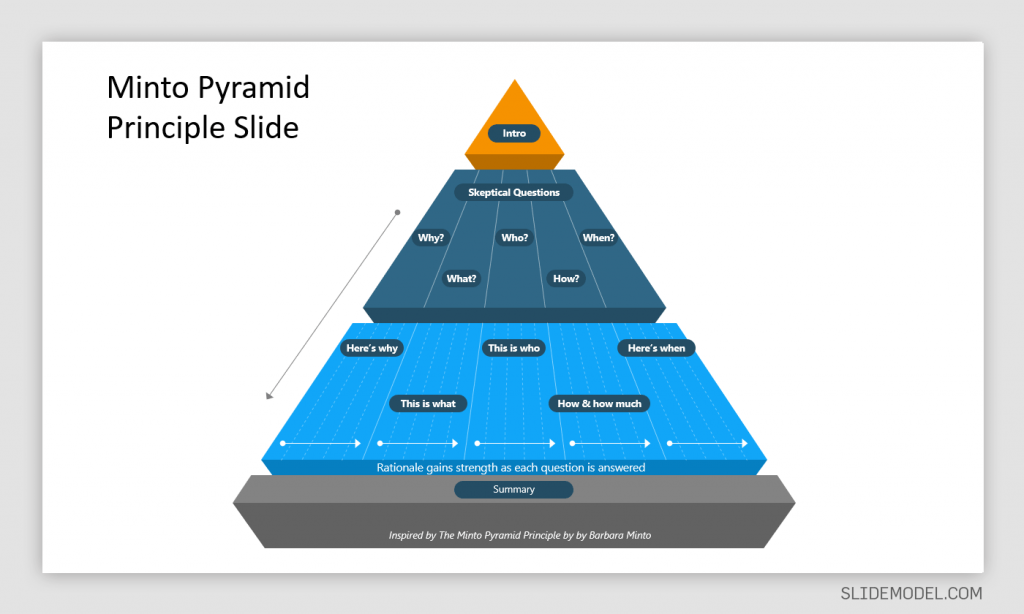
Effective writing produces content that is clear, accurate, and concise. The writing is focused, coherent, correct, supporting the central idea. When incorporating the Pyramid Principle for effective writing, the same rules apply. You need to start with the central idea. The ‘answer’ serves as a single thought, supported by arguments, data, and facts. You should present the ideas using the pyramid structure, summarizing the ideas grouped below each other, while remaining true to the ‘single thought’, i.e. the central idea (the answer).
An example of the structure for content produced using the Pyramid Principle would be as follows:
Answer -> Supporting Argument -> Evidence.
The answer shall remain at the top or at the heart of the content you are writing, whereas the supporting argument will be backed by evidence at each instance. If you have more than one supporting argument, you should take the time to structure each argument. For example, write the first supporting argument, followed by its evidence, before moving on to the second supporting argument and its related evidence.
How to Apply the Pyramid Principle in Preparing Presentations
When applying the Pyramid Principle, you must first start with the hypothesis and break it down with supporting arguments, backed by facts and data. It’s quite likely that during the course of the presentation, your audience would want to ask tough questions. Using this concept, you can enable those questions to be asked sooner and provide your breakdown of the information in a structured manner to ensure all your arguments are covered.
Begin with the Hypothesis
It is common to present the hypothesis at the very end after data, facts, and different ideas related to the potential hypothesis have been presented. The Pyramid Principle flips this conventional approach by presenting the hypothesis (answer) at the beginning.
Example: In our example, a mobile operator called ABC Telecom wants to enter a new market in Country X, located in Central Africa. The conventional approach would be to provide data and facts before mentioning why it’s a good idea to invest in a specific country. The presenter might even take the time to mention the country at the very end. The Pyramid Principle would require this information to be shared at the very beginning instead. In our example, the presenter would start the presentation by mentioning the hypothesis or answer.
In this case, the hypothesis might be something as follows: ‘investing in Country X would be profitable and lead to 30% increase in revenue for ABC Telecom over the next 5 years’.
Presenting the hypothesis at the start will stimulate critical thinking and aid structured communication, where there might be people for and against the argument scrambling to ask tough questions. That’s one of the benefits of the Pyramid Principle, as it helps bring out critical questions from the very start instead of at the end of a bloated presentation or report.
Present Arguments to Support Your Answer
It is essential to back the answer with supporting arguments to enable a meaningful discussion or to raise key questions regarding the accuracy of the hypothesis. For a business, this can have dire implications and major investment decisions might hinge on such information.
Example: The presenter proceeds to mention why investing in Country X by ABC Telecom is important for the long-term sustainability of the company. We assume that the argument for this investment is that ABC Telecom is already operating in a saturated market, where profit margins are projected to decline, and it is essential to move into a new market to increase revenue and profitability.
Present the Data to Support Your Argument
A supporting argument is only as good as the data and facts that are presented to back it up. The bottom of the pyramid, therefore, is the foundation of the Pyramid Principle. The foundation needs to contain accurate and reliable information that can back the hypothesis.
Example: In our example, ABC Telecom conducted research across 3 potential markets (Country X, Country Y, and Country Z) to look for countries to expand their operations in. During the research, it was revealed that only Country X appeared to be a lucrative market for investment.
The research revealed that Country Y and Country Z already have a saturated telecom industry with heavy taxes, rigid government policies, and very low ease of doing business ratings. Moreover, the population and telecom density of both these countries does not appear to indicate the potential for growth. On the contrary, Country X with a large population and low competition serves as a lucrative market. The market competition is slim, the government is looking to expand its telecom infrastructure, giving tax concessions to companies looking to set up their operations. The country also has a better ease of doing business ranking.
Another factor that goes in favor of ABC Telecom investing in Country X is that they are already operating in the neighboring country (Country W), making it easier to expand operations due to familiarity with the region. Furthermore, other global telecom operators are looking towards expanding into Asia Pacific, instead of Central Africa, leaving the market open for a new operator to rapidly expand. The recent rise in purchasing power, increased use of smartphones, and the demand for 4G and 5G services (currently not available in Country X) make another compelling argument for an efficient mobile operator to start operations in the country.
What are the Benefits of Applying the Pyramid Principle?
1. be better at structured thinking.
The idea behind structured thinking is to be efficient at problem-solving and critically analyzing things in an organized manner. The Pyramid Principle provides this formula in its pyramid-like structure, where important questions can be asked right from the start.
2. Focus on Core issues
Lengthy reports and presentations can lead to a lot of confusion and might even deviate the people in charge of making decisions from the core issue. By placing the core issue at the very heart and elaborating upon it at the start, the Pyramid Principle can help keep everyone involved in the discussion on point.
3. Placing the Solutions at the Start Initiates Critical Analysis
When exploring solutions, such as in our example above, (the expansion of a telecom operator into a new market), it is essential to initiate critical analysis. Key decisions related to investment, expansion into new markets, or changes to products or services can make or break a business. Placing the solution at the start of the discussion leaves ample room for critical analysis to see if the presented solution can be applied or if better alternatives can be explored.
4. Hypothesis Backed by Data can Aid Better Decision Making
How would you feel if you are presented with 1 hour of slides filled with data, with a solution at the end? It is likely that such a presentation would leave you weary and tired, unable to connect the data with the solution at the end. Now imagine, you are given the solution at the start of the presentation, and each bit of information related to the answer that you would see after that can be connected with the solution when analyzing its practical implications. The latter is an approach that will help you connect with the arguments, facts, and data, as they are presented. Since you are already aware of the answer or hypothesis that you need to focus on.
Is Barbara Minto’s Pyramid Principle Still Valid?
The short answer to the question would be, yes! Barbara Minto’s Pyramid Principle is considered as one of the most important methodologies for structured communication. Since its initial revelation during 1985 to the revised edition of Minto’s book in 1996; ‘The Minto Pyramid Principle: Logic in Writing, Thinking and Problem Solving’, the principle still remains effective. It is widely used for making business executives absorb information quickly, in a structured manner, and aiding executive communication.
Final Words
The Pyramid Principle can be used effectively for structured thinking, problem-solving, and presenting information in a palatable format for busy business executives. Moreover, presenting the information true to the core idea presented at the very start can help make it easier to keep the audience abreast with the arguments, data, and facts that follow.
At the very core of decision making, be it decisions made by businesses or individuals, everyone wants to find the solution that works best for them. But complex data analysis and information overload can hinder good decisions and obscure solutions. By starting with the potential solution, its merits and demerits can be critically analyzed with ease.
1. Minto Pyramid Principle PowerPoint Template

Use This Template
2. 3 Levels 3D Pyramid Template for PowerPoint

Like this article? Please share
Communication, Communication Skills, Presentation Approaches, Presentations
Related Articles

Filed under Design • March 27th, 2024
How to Make a Presentation Graph
Detailed step-by-step instructions to master the art of how to make a presentation graph in PowerPoint and Google Slides. Check it out!

Filed under Presentation Ideas • February 29th, 2024
How to Make a Fundraising Presentation (with Thermometer Templates & Slides)
Meet a new framework to design fundraising presentations by harnessing the power of fundraising thermometer templates. Detailed guide with examples.

Filed under Presentation Ideas • February 15th, 2024
How to Create a 5 Minutes Presentation
Master the art of short-format speeches like the 5 minutes presentation with this article. Insights on content structure, audience engagement and more.
Leave a Reply
IMAGES
VIDEO
COMMENTS
Presentation drawing is an essential aspect of the design process. It allows designers to communicate their ideas in a clear and compelling way and is crucial for getting buy-in from clients, colleagues, and contractors. Whether you're creating quick sketches or detailed renderings, there are a few key principles to keep in mind that can help ...
The Short Version. Use images instead of text when possible. Use high-resolution, royalty-free images. Use no more than 4 bullets per slide. Make objects appear only when mentioned. Dim objects after they're discussed. Draw attention to salient information. Avoid using decorative images. When distributing, add alt text to images.
In this guide, we'll discuss how to design a captivating presentation, and break down the whole process into small chunks so you can tackle each step easily. If you're eager to put these principles into practice, create a Piktochart account and start creating beautiful presentations in minutes.
The Definitive Guide to Killer Presentation Design. This guide is divided into three parts: Part. 1: Presentation Design Principles. From choosing the perfect colors and fonts to leveraging simple design best practices (like "Grid systems"), you'll learn exactly how to start your presentations off the right foot. Part. 2: Presentation ...
*For more ideas, check out PC World's list of the 10 worst PowerPoint presentations! Images Mayer's Image Principle: People don't necessarily benefit from the speaker's image being added to a presentation Mayer's Multimedia Principle: People learn better from words paired with pictures than from words alone
In the realm of professional and educational presentations, PowerPoint stands out as a tool of immense popularity and versatility. However, the effectiveness of a PowerPoint presentation hinges not just on the content, but significantly on the design principles applied.In this comprehensive guide, we delve into the art and science of leveraging design principles to transform your PowerPoint ...
Katya Kovalenko is a Barcelona-based data designer who helps businesses communicate visually, clearly, and more effectively. In this course, she'll share all the potential that she's found in presentation design, showing you the process that she uses with her clients, the methods of organizing information, as well as give you pro tips from a ...
Well, the same thing applies to PowerPoint presentation design: a grid system helps to lay out your content in clear, easy to follow areas. You can use a grid to create distinct sections, such as telling the start, middle, and end of a story. It's much easier for your audience to follow, as everything is better organized.
Architecture drawing scales. All architecture drawings are drawn to a scale and as described here in great detail, there are set scales that should be used depending on which drawing is being produced, some of which are below: 1:500 (1"=40'0") - Site plan. 1:250 (1"=20'0") - Site plan (note that 1:250 is not a common metric ...
share. Presentation design is actually a combination of certain elements, which are text optimization, font selection, color and background selection, icon selection, and figures. If you want to have a perfect, totally polished presentation, you should pay close attention to each element. Here are five steps that will help you move rationally. 1.
2) Create a Moodboard. After you are done organising and structuring your content, comes the conceptualisation of the presentation deck. One of the difficult parts of designing is executing it. Even if you have great design ideas in mind, it can be tough to know how exactly you will execute it.
Make type sizes significantly different. Make contrasting image placements, such as horizontal and vertical, glaringly obvious. A general principle to follow: if things are not the same, then make them very, very different, [12] as in Figure 13.3. A common layout design is called the rule of thirds.
Design Principle - Repetition. Also known as consistency, repetition is about repeating elements in a graphic design to add visual appeal and emphasize the style you want to keep in your presentation. Purpose: Aside from aesthetics purposes, consistency draws your readers' attention to certain elements. Creating repetition enhances your ...
Design your visuals. 5. Practice your delivery. 6. Engage your audience. 7. Here's what else to consider. Be the first to add your personal experience. Designing a presentation can be a daunting ...
BCG Example. The first example on our list is BCG. The slide is an excellent example of the Pyramid Principle because it is well-structured and clear. The slide title says "Melbourne seen as a cultural and creative city", which is the main point the slide creator is trying to communicate (which is why it sits at the top of the slide in bold ...
Design principles guide designers to package their message in an easy-to-digest format that's universally accessible. These principles include contrast, repetition, balance, and alignment, emphasis, movement, white space, proportion, hierarchy, variety, pattern, rhythm, and unity. Depending on the product you're designing and your ...
Chapter Fourteen - Presentation Aids. "Grifo mágico" by emijrp. CC-BY. "I know you can't read this from the back there," the presenter apologizes to a screen so full of words you would think the entire speech had been crammed into one slide. This is just the first of a seemingly endless string of slides I can't read, charts so ...
The answer is by using the Pyramid Principle, a method for improving clarity of communications created by former McKinsey consultant Barbara Minto. Minto spent decades training McKinsey recruits on how to use this technique, eventually publishing her work in her book, The Pyramid Principle. While you can apply this principle to any type of ...
Under principles we can certainly suggest strategies, models, formulas, or step-by-step plans for adhering to them, but these do not need to be applied assiduously in a "take as directed" sort of way. The broad principles we choose guide our work and our decisions about how to use suggested strategies.
For a 2-minute presentation, it should be quite brief - maybe one sentence. For a 16-minute team presentation, a 45-60 second grabber would be appropriate. Body. In this part of your presentation, you will deliver detailed information. Depending on the length of the presentation and your purpose, you might have two to five points in the body.
Guide to Presenting Using the Pyramid Principle. • October 1st, 2021. The conventional method for presenting a PowerPoint presentation entails reflecting upon the facts and fine details to draw the audience towards a conclusion. This can result in a lengthy Q&A session at the end of the presentation, where the audience might appear confused ...
drawing, the art or technique of producing images on a surface, usually paper, by means of marks, usually of ink, graphite, chalk, charcoal, or crayon. Drawing as formal artistic creation might be defined as the primarily linear rendition of objects in the visible world, as well as of concepts, thoughts, attitudes, emotions, and fantasies given ...
5. Introduction O O André Masson Ink on paper Instruments used for drawing include graphite pencils, pen and ink, inked brushes, wax color pencils, Crayons, Charcoal, Chalk, P astels, Markers, styluses and various metals (such as silverpoint). Other materials used for drawing include various kinds of erasers, pencil sharpeners, geometric apparatus such as rulers, protractors, compass etc. O ...