Home Blog Business How to Design a Dashboard Presentation: A Step-by-Step Guide

How to Design a Dashboard Presentation: A Step-by-Step Guide

What do all businesses have in common? They all create data. Nevertheless, they differ in how they use the data to make informed business decisions.
Are you ready to make better decisions for your business? Do you want to use the data your business piles up effectively? It’s time to start using dashboard presentations.
This quick guide will take you on a journey to create a data dashboard presentation highlighting metrics and KPIs needed to make essential decisions about any business scenario.
Table of Contents
- What is a Dashboard Presentation?
- Why do you need a Dashboard for your business?
Anatomy of an Effective Dashboard Presentation
- Metrics and KPIs to include in your dashboard
Step-by-Step Guide to creating a dashboard presentation
How to present a dashboard in powerpoint, recommended state-of-the-art tools to create a dashboard, a quick look at excel dashboards, closing thoughts, what is a dashboard presentation .
A data dashboard is a versatile and practical tool for making important decisions. It’s the solution to time-consuming data research that expands across multiple locations.
In business, you have various tools to keep you informed on performance and growth. Your sales platforms, marketing applications, and customer service software collect data. Looking through data on different locations takes up time, and that’s where custom dashboards come in.
Dashboards bring together data in one place to answer specific questions and tell stories about your business. Data dashboards can be created in several ways, depending on their level of interactivity and real-time data updates.
To be truly effective, a dashboard needs a hierarchical strategy. One or more main dashboards answer the big questions, while others answer specific questions per team, time frame, or campaign.
Live dashboards update at regular intervals, pulling data from many sources simultaneously, offering a real-time overview of the big picture.
Dashboard presentations display data for a specific point in time, a snapshot to share with stakeholders and managers. This is the type of presentation you can create today using PowerPoint and editable presentation templates by SlideModel.
Why do you need a Dashboard for your business?
Every business generates data about customers, employees, production lines, communication platforms, etc. All the collected data is valuable information for making informed business decisions. That said, only some in a company know how to manually dig into data spreadsheets to find trends, sudden changes, and other business metrics. A dashboard fixes that.
Not all business data lives in the same place, most of which isn’t visual. In a dashboard, you bring together data from different sources, choose the metrics you need for that dashboard and make it all look coherent and easy to understand.
There are more benefits than setbacks when using dashboards, especially when they’re created efficiently and follow a straightforward data story.
Here’s a list of the most significant benefits of using dashboard presentations in your meetings and strategy sessions:
- Data dashboard presentations help you and your team make better, more informed decisions.
- They provide a coherent and detailed overview of your business’ KPIs and metrics for a specific strategy, campaign, or hypothesis.
- Dashboard presentations facilitate analysis and understanding of how different metrics and dimensions have different outcomes.
- They improve accountability in a team as everyone can see what needs improvement and what is reaching set benchmarks.
- Using data dashboards as a team makes sense. To work together towards a common goal, everyone must know what’s at stake.
How to Design an Efficient Dashboard Presentation

Creating a dashboard presentation for the first time can feel a bit daunting. This guide takes you step-by-step through the process from strategy to completion.
Click on the sections below if you’d like to skip ahead.
The layout for a dashboard presentation depends on the aspect ratio you need to work with. The aspect ratio will depend on how your audience views and uses the dashboard.

For a desktop or computer view, a horizontal 16:9 ratio is suitable. A scrolling dashboard is better on mobile devices—just remember to highlight the hierarchy in the data. The optimal dashboard presentation is responsive to different screen sizes.
Before we get into the KPIs and the step-by-step guide, let’s visualize the anatomy of a dashboard presentation. Here are some actionable guidelines to help you.
Giving the dashboard a title
The dashboard title doesn’t need to be too large; remember that you need space in the canvas to display the data. If necessary, include a subtitle with essential information. Don’t add it if it’s not needed to understand the dashboard.
The location of the title is preferably at the top left or top center. To the left, leaves space to the right for a couple of data points; the centered option will have white space on the sides.
Grouping Big numbers and data visualizations
The most efficient way to organize the information on your dashboard is to group the data points into relevant categories. Creating these groups has two purposes; it helps with the overall layout and hierarchy of the dashboard, and it supports the cognitive analysis done by the viewer.

As you create groups of data points, place similar visualizations inside groups to maintain a visual balance. For example, at the very top, it’s common to have a horizontal section with a group of big numbers.
Big numbers are data points that highlight an exact number or value at a specific time. Some big numbers include; overall revenue, profit, number of followers, number of support calls completed, etc. Likewise, big numbers can be the percentage reached towards a goal or the progress of a specific action.
Group data visualizations or similar charts into more sections to place below the big numbers. This technique uses human reading patterns to create a visual hierarchy for the dashboard, making it easier to understand at a glance.
Adding visual metaphors
There’s no need to use just numbers and charts inside a dashboard. Take advantage of visual metaphors to help highlight the data in their sections. This is a common technique for creating infographics .

A dashboard’s most used visual metaphor is a data point’s negative or positive impact. For this purpose, you can add arrows , color labels, up and down thumbs, happy and sad faces, or a visual thermometer highlighting the current amount of money collected in a fundraising campaign. Which style, depends on the dashboard’s business tone. For a financial dashboard, color labels are enough, but emojis are just as adequate for a young startup’s sales rep dashboard.
Crafting legends and captions
Data points and data point groups will be more precise with a caption or label accompanying them. Place short labels in the exact location in each group, and place legends in similar areas to each data point. This visual consistency makes the data easier to review.
We can’t stress enough how important it is to choose the right font for your dashboard. It needs to be easy to read at small sizes and consistent throughout the layout. Forget about using two fonts or more. Use one and highlight selected text with bold or italic styling.
Supporting analysis with filters
Adding filters to a dashboard is a choice you’ll have to make with your team. First, why filters? A filter is a selection tool to choose between views in the dashboard. Standard filters include time frame, location, people, etc.
Regarding dashboard presentations, filters don’t work the same way as they do on Excel dashboards. In an Excel dashboard, filters are integrated into the data points. When used, the data in the dashboard changes dynamically. You’ll have to create separate views on different slides in a dashboard presentation.
Metrics and KPIs to include in your dashboard
The content in a dashboard is metrics, dimensions, and KPIs , but how do you know which ones to include? There’s no one answer to this question; every dashboard is different. But thankfully, there are some general foundations you can follow.
First, you need to know the strategy to determine what metrics and KPIs you’ll need. Think of this as a playbook for every dashboard you create.
- Have a clear grasp of the dashboard’s purpose and goal. Know the answers to the questions in Step 1 of the step-by-step guide.
- Formulate one or more hypotheses or questions as a base for the analysis.
- Study the data you have on hand and select the metrics and KPIs that highlight what you need to know about your hypothesis or question.
- Outline the data sets in a hierarchy of importance and relevance.
This playbook will guide your decision on what metrics and KPIs to use, regardless of your profession and industry. Here are some example KPIs and templates to help give you a better idea
A social media dashboard that asks questions about engagement and brand awareness would use weekly KPIs like:
- Follower growth
- Engagement to follower count ratio
- Measurement of clicks on links
- Hashtag tracking
- Comment and DM tracking
- Best all-around post
The marketing dashboard template below highlights the following:
- Conversions
- Browser preference
- Performance

Download it to start using it with PowerPoint to create your following marketing dashboard. If you’re looking for marketing campaign dashboards, browse our template gallery.
A retail company asks for a dashboard highlighting how online and in-store sales are leveling up after the pandemic. These would be good KPIs to include:
- Overall sales in the stores and online
- Product category sales that differ in online and in-store purchases
- Trends over time
- Return rates for online and in-store sales
- Demographic data about the customer

Below is one of our sales dashboard templates . There’s a summary dashboard on the first slide and consecutive slides with detailed data. These are some of the metrics it highlights:
- Weekly sales
- Product share
- Predicted vs. actual sales
- Sales over time
Customer Service/Support
A dashboard highlighting the successes and fails of the customer support team would use metrics like these :
- Customer satisfaction score
- Customer effort score
- Total tickets + tickets per customer
- Volume by channel (chat, phone, email, etc.)
- First response time
- Average handle time
- Cost per resolution
- Net promoter score

Look at this customer service KPI dashboard template that uses most KPIs mentioned above. Note that first response time and average handle time are all metrics you can get from your business phone system .
Project Management
These are the common metrics in a project dashboard , you can add or take away depending on your particular dashboard purpose:
- Planned Value
- Actual Cost
- Earned Value
- Cost Variance (Planned Budget vs. Actual Budget)
- Cost Performance Index
- Planned hours of work vs. actual situation

Alternatively, you can use a roadmap dashboard with a Gantt chart and other important KPIs highlighting progress.
Financial Operations
Financial dashboards tend to get very busy visually. They usually also have more line charts than others. Here are a few of the most common KPIs for a financial dashboard presentation.
- Operating Cash Flow (OCF)
- Current Ratio
- Net Profit Margin
- Sales Growth
- Vendor Expenses

This financial dashboard template , for example, has 12 data points in one space. It’s a great example of how design and dashboard storytelling techniques help create a beautiful dashboard.
Now it’s time to get into the nitty-gritty, the how-to for creating a dashboard presentation
These steps cover what you need to know to create an efficient dashboard presentation with PowerPoint and SlideModel.
Step 1: Define the purpose of your dashboard presentation

Dashboards are born from a business need, a way to quickly analyze data and make informed decisions. That’s why it’s essential to know your dashboard’s purpose before you do anything.
It could be as broad as a CEO saying they have 30 seconds to see a dashboard once a week. Or a high-level manager wants to see an overview of the activity in their department at the Monday morning meetings. And yet another could be the social media manager’s need to show progress over time regarding a specific campaign.
Here are the questions you need to answer before continuing:
- Who will be the end users?
- What are their key business goals and objectives?
- What are the most important questions they need answers to?
- How frequently will the dashboard be reviewed?
With the answers to this checklist, you’re ready to go on to the next step.
Step 2: Choose the right metrics for your purpose

Above, we show you how to choose the KPIs for your dashboard. You might already have some data inside several business platforms’ analytics sections. Others you might have to source in other ways.
As you collect the data, analyze the level of detail you’ll need to visualize. It will help later when transforming the data from its original form to a data visualization on the dashboard.
For each data point, take note of what it’s highlighting. What exact question is it answering? These will turn into legends and captions when you put them all together.
Step 3: Present the data effectively

With the metrics and KPIs collected, it’s time to present them on the dashboard. It’s essential to write down a hierarchical outline of the data points. Start with the most critical data according to the question the dashboard aims to answer.
For each data point, select a style of visualization; big numbers, percentages, bar charts, simplified line graphs, and arrays. Write it all down on the outline. Use big numbers at the top of the dashboard to highlight the most influential data. Don’t use too many data visualization of the same style together; the repetition affects the viewer’s attention.
Before adding the data to PowerPoint, prepare your charts to export them easily. Ensure the data is cleaned and revised, and there’s no extra irrelevant information.
Step 4: Eliminate visual clutter and noise

Once you have all the KPIs on the dashboard, check for unnecessary visual material. Are you using the same font for all data points? Is the color unified across the design? How about text size and alignment?
Give each data point a margin of space around it. Keep the distance between data points and groups similar in size. Keep lines as straight as possible without much overlap between data points. Resize and shape each data point so it aligns neatly on the dashboard.
Check the text in the chart and graph legends. Make sure to keep all legends and labels similar in size and easy to read. Don’t use colored text or styled text unless it serves a purpose.
Step 5: Use the layout to focus attention

To structure the layout of your dashboard, take note of the human act of reading. People read from left to right, starting in the top left corner of the page or screen. Their gaze continues in a back-and-forth motion that resembles the letters Z and F. Knowing where your viewer will most likely look first, place your most important, high-level data in their line of sight.
Remember to combine similar data points to create visual separations in the layout. Help the viewer follow the flow of information with subtle design elements like color, size, and position. Apply Gestalt principles like proximity and similarity to group elements together.
Step 6: Tell a clear story

Why is it important to tell a story with data on your dashboard? If you were to phrase your dashboard’s purpose as a question or hypothesis, the data would be the answer. Use descriptive titles and labels to help the viewer understand the data in order of importance.
As the viewer scans the data on the dashboard, comprehension must start at the top with the top-level data points. These answer the most immediate question of the dashboard’s purpose, like the opener of a story or essay. The story continues with the rest of the data points, which will complete the analysis.
When you tell a clear story with the help of a hierarchic layout, descriptive titles, and labels, the data story flows naturally. To achieve a compelling data story for your dashboard, ask for feedback from your team and edit the layout until it makes sense.
Presenting a dashboard on PowerPoint is simple. Depending on what type of dashboard you need, there’s a way to do it.
You only need the collected data and one of our dashboard templates to create and present a static dashboard presentation with PowerPoint. The step-by-step guide above will help.
For dynamic and interactive dashboards in PowerPoint, you’ll have to connect to your live data on Excel using a tool like Presentation Point . Alternatively, you can embed Power BI and Excel dashboards into your PowerPoint slides.
Let’s take a quick look at the recommended data dashboard tools. For a static dashboard presentation, our preferred tool is PowerPoint. But for highly interactive and dynamic dashboards with live data updates, you’ll need something else.
Looker Studio (previously Google Data Studio)
Looker Studio is the new name of Google Data Studio. With this tool, you can create dashboards and reports to showcase and highlight KPIs regardless of your business type. Adding a Looker Studio dashboard to a PowerPoint presentation isn’t ideal. There’s no intuitive process, and it isn’t recommended. Looker Studio is better suited for teams that work with the G-Suite.
Microsoft Excel
Excel dashboards are a classic reporting staple in the world of business. You can create elaborate dashboards with dynamic and interactive features using data sources, reference tables, and pivot tables. Stay tuned if you have ever wondered how to create an Excel dashboard that updates automatically.
Power BI (Business Intelligence) is a Microsoft tool for visualizing data insights that help make better business decisions. It is the tool of choice for big companies with large amounts of data to be analyzed. Connecting and embedding Power BI dashboards to PowerPoint is simple since they’re both from Microsoft.
Tableau is similar to Power BI in that they are both data visualization platforms that improve business intelligence. Tableau dashboards are a great alternative to Power BI and can also be embedded into a PowerPoint presentation.
SlideModel + PowerPoint
Finally, the combo between SlideModel and PowerPoint comes into the picture. This duo is your best friend when creating static dashboard presentations.
Use SlideModel dashboard presentation templates to create a static dashboard that gives an insightful overview of some aspects of your business. Share the dashboard with your team and make better decisions together.

To create a live data dashboard presentation with SlideModel and PowerPoint, try Presentation Point, a tool to help bring live data into your presentations. Alternatively, you can try our AI PowerPoint generator to create a custom companion slide deck for your presentation topic.
As we mentioned above, Excel is an epic tool for business dashboards. It’s more accessible than Power BI and easier to use than Tableau (especially if you’re already an Excel pro). To create an Excel dashboard, you need to set up at least four sheets that work together to highlight the KPIs. They are:
- Data source sheets
- Reference tables sheets
- Pivot Tables sheets
- The Dashboard sheet

The best part about creating Excel dashboards is the possibility of building dynamic dashboards with data that updates automatically. Our favorite part? You can then embed it in PowerPoint and use SlideModel templates to make it all visually cohesive.
If you didn’t already know, dashboards are unique. They’ve been fantastic business tools for years. It’s no surprise they’ve jumped to other information design fields. For example, dashboard-style CVs!
Creating a static data dashboard presentation (as a CV or for your business) is much easier when you know your needed tools. Some are easier than others, while others are too much for your needs.
Since you’re creating a data dashboard presentation with static data, you only need a PowerPoint and SlideModel. Browse our library to find digital marketing dashboard templates, HR dashboard templates, and lots more.
Here’s to your next presentation dashboard. May it be the best you’ve ever made.

Like this article? Please share
Dashboard, Data Visualization, Visualization Ideas Filed under Business
Related Articles

Filed under Design • March 27th, 2024
How to Make a Presentation Graph
Detailed step-by-step instructions to master the art of how to make a presentation graph in PowerPoint and Google Slides. Check it out!

Filed under Design • March 20th, 2024
Understanding Data Presentations (Guide + Examples)
Elevate the quality of your message by learning how to work in data presentations effectively. Insights, examples, and PPT templates here.

Filed under Presentation Ideas • January 6th, 2024
All About Using Harvey Balls
Among the many tools in the arsenal of the modern presenter, Harvey Balls have a special place. In this article we will tell you all about using Harvey Balls.
Leave a Reply

Top 10 Power BI Dashboard Examples + Free Template

Introduction
This handbook shares 10 purpose-built Power BI dashboards that follow design best practices, featuring unique datasets to provide inspiration for building and designing your own reports. It can be a great way to kick start the process.
You can also view the live version of each Power BI dashboard by clicking their corresponding header. Visit our Power BI content hub to view even more power BI examples for visualizations , themes , headers , and dashboard templates with live examples.
We will cover three criteria to provide a high-level overview of each dashboard:
- The intended audience for the Power BI dashboard.
- The purpose of the dashboard.
- The key insights for the dashboard.
For reference, all the dashboards below were built using the Numerro Toolkit , allowing for an effortless build/design process whilst implementing design best practice every step of the way. Furthermore, the Toolkit includes all the dashboards as templates to assist you in getting started.
Power BI Dashboard Examples
1 - Finance Dashboard 2 - HR Dashboard 3 - Logistics Dashboard 4 - Social Media Dashboard 5 - Sales Dashboard 6 - Marketing Dashboard 7 - Customer Analysis Dashboard 8 - Customer Satisfaction Dashboard 9 - Executive Dashboard 10 - Website Analytics Dashboard Free Template
1 - Power BI Finance Dashboard

Intended Audience for Power BI Example Dashboard:
The finance dashboard was built as an executive-level report to showcase an organization's financial insights. As the intended users are executive-level employees, the dashboard presents high-level insights that allow users to easily scan the report. Users then have the additional option to dive into the granular metrics, should a high-level matrix trigger an insight worth exploring.
Purpose of Power BI Example Dashboard:
The purpose of the dashboard is to provide a high-level overview of the business's financial performance over time. Additionally, it allows users to dive into financial performance by location and product category. Both of these focus areas allow users to determine financial trends and areas of over/under performance. Users can then use these initial insights to determine where to focus their efforts.
Key Insights for Power BI Example Dashboard:
- KPI's - Revenue, Profit, Orders, Customers, Quantity: Provides a snapshot of the business's financial position
- Area Chart - Revenue over time (12 months): Helps users identify the seasonal flow of business
- Stacked Bar Chart - Revenue by region, split by product category: Helps users understand their financial performance by geography and category
- Table - Sub-category performance: Provides insights into how each product performs
- 100% Stacked Bar Chart - Revenue to Profit ratio: Provides a clear indication of their financial position based on a common accounting metric.
2 - HR Dashboard

The HR dashboard is for HR managers who want to understand the demographics of employees, keep up with new employees, and ensure they are meeting industries diversity standards.
High-level insights, including average salary, average duration, and average age, help the HR team understand who their employees are. These insights allow HR to better accommodate employees in future company decisions. Additionally, the insights help the HR team carefully craft a diverse workforce that meets the companies mission.
- KPI's - No. Employees, Av. Salary, Av. Duration at Company, Av. Age: To better understand the average employee profile
- Area Chart - New Employees per year: To measure the rate of recruitment
- Bar Chart - No. of employees by region: To uncover the geographical distribution of employees
- Table - Latest employees: To keep track of new employees
3 - Logistics Dashboard

The logistics dashboard is used by logistics managers to help them understand the flow of goods. The report also provides a view by product, delivery method, and location for further insights.
The purpose of the logistics dashboard is to help logistics managers with product flow. The dashboard identifies areas of high/low product flow to helps managers allocate resources in order to meet delivery standards and run a smooth operation.
Overall, this helps the organisation become more efficient by better utilising their resources, essentially saving them time and money.
- KPI's - No. Order, No. Quantity, No. Customers: To provide context relating to the scale of the operation.
- Decomposition Tree - Flow of orders by category and sub-category: To prioritize each products shipping process.
- Shape Map - Orders by state: Helps managers allocate resources based on demand.
- Matrix - Order by month, by shipping mode: Helps users better allocate resources throughout the year and prioritize shipping method development.
4 - Social Media Dashboard

The social media dashboard is for social media managers and is used to help them understand the high-level impact each of their social networks has on their audience.
The purpose of the report is to provide an overview of how the social media teams efforts are impacting the number of impressions over time. Additionally, the dashboard is designed to help identify the best performing social networks. In return, this helps the team better understand where to focus their marketing efforts.
- Ribbon chart - Impressions by month, split by platform: To help prioritize which platforms to focus on throughout the year.
- Table - Impressions by content type: To determine which content types perform the best.
- Stacked Column Chart - Impressions by quarter, split by platform.: To provide a high level view of impressions across the year to help resource allocation.
- Bar Chart - Impressions by platform: To determine the highest performing platform and prioritise accordingly (supports the below).
- Donut Chart - Impressions % by platform: To determine the split of impressions and prioritise accordingly (supports the above).
5 - Sales Dashboard

The sales dashboard was built for sales managers to help them visualize their sales data, including opportunity values, count and velocity.
The purpose of the dashboard is to help sales managers understand how the business is performing and where they need to focus their efforts if they are to meet their sales targets.
The dashboard provides sales managers with an overview of their sales to date, along with granular details relating to each opportunity. Additionally, all metrics are presented in a high-level format to help sales managers identify areas of focus.
- KPI's - Sales, No. Opportunities, Av. Opportunity Size, Av Velocity: Help managers gauge an overview of their current sales position
- Area Chart - Sales & Opportunities by month: Help managers measure the flow of deals by month in relation to targets.
- Donut Chart - Total sales split by marketing channel: Allow managers to identify which channels require additional focus based on performance.
- Clustered Bar Chart - Opportunities by sales stage, split by marketing channel: Helps managers monitor the flow of opportunities and assist with progression
- Bar Chart - Sales grouped by opportunity size: Helps managers understand the dynamics of their sales business
6 - Marketing Dashboard

The marketing dashboard was built for a banks marketing team to visualize a set of market research the bank carried out with its customers.
The purpose of the dashboard is to help a banks marketing team identify trends and patterns within a set of market research carried out with customers.
The dashboard provides the marketing team with a visual representation of their research, allowing them to spot correlations between various customer data points. These insights help them understand their customers and therefore learn how to better accommodate them.
- Scatterplot - Av. bank balance by age, split but education level: Helps the bank identify the profile of their more lucrative customers.
- 100% Stacked Bar Chart - Total subjects by education, split by marital status: Helps the bank better understand their customer demographics.
- Multi-card Row - Job type breakdown: Helps the bank better understand their customer portfolio, as well the more lucrative job types.
- Treemap - Av. bank balance by education level: Helps the bank target future customer, as they know which customer type is more valuable.
7 - Customer Analysis Dashboard

The customer analysis dashboard was built for the management of a food retailer to better understand their customer's demographics and how these impact their relationship with the retailer.
The purpose of the dashboard is to help the food retailer understand which type of customers are more valuable, and which ones are less valuable. These insights allow the retailer to focus their efforts on specific customers that provide a higher ROI.
- KPI's - Av. Age, Av. Duration as Customer, Av. Income, Av. No. Purchases, Av. 2y Spend: These insights allow the retailer to understand their average customers activity.
- Scatterplot - Correlation between age and average 2y spend: Profiles the retailers customers by spend and age, helping them spot more lucrative customer demographics for future targeting.
- Matrix - Customer breakdown by age: Provides insights into how a customers age impacts their activity with the retailer.
8 - Customer Satisfaction Dashboard

The customer satisfaction dashboard was built for the management of an airline company to help them understand insights collected from customer feedback surveys.
The purpose of the dashboard is to help the airline understand how customers rate the service provided. The insights allow the airline to determine whether they are improving their service with customer expectations. Additionally, it helps them better understand how specific service offerings are performing in regards to customer satisfaction.
- Gauges - Users, Av. Score, Av. Delay: Provides the airline with benchmark stats that gauge the overall satisfaction levels vs targets.
- Stacked Bar Chart - Participants by satisfaction level, split by class: Helps the airline identify the performance of service offerings on customer satisfaction, allowing them to better prioritise resources to high/low performing areas.
- Line Chart - Av. Customer Rating by Class and Year: Helps the airline identify how decisions impact the level of customer satisfaction over a period of 8 years.
- Table - All stats by year: Supports the above on a granular level.
9 - Executive Dashboard

The executive dashboard was built for executive level employees to understand how their business has performed year to date.
The purpose of the dashboard is to provide a snapshot of the businesses performance, focusing only on high-level insights that are easily digestible. The aim is for executive level employees to track key metrics and gauge whether a deep dive is necessary to improve/sustain a certain performance metric.
- KPI's - COGS, Profit, Discounts, Av. Unit Cost High-level snapshot of key metrics
- KPI/Area Chart - Sales, Units Sold, Av. Sales Price, Av. Units Per Order High level snapshot of key metrics + monthly trend for further visual representation
10 - Website Analytics Dashboard

The website analytics dashboard was built for a companies marketing department to understand how customers were interacting with their website.
The purpose of the dashboard is to collect website analytics data a present it in an easier format to help the marketing team digest key insights about how their customers are interacting with their website.
The aim is to showcase key KPI's that help gauge how the website is performing against benchmark metrics. It also uncovers which pages perform better than others so that the team can improve their customers website experience.
- KPI/Area Chart - Pageview, Unique Pageviews, Bounce Rate, Exit Rate: Key stats to gauge performance vs benchmark stats
- Clustered Column Chart - Pageviews/Unique Pageview by month: To understand how their website performs throughout the year, which they can use to identify the effectiveness of marketing campaigns.
- Donut Chart - Pageviews split by year half: High level view of the above insight.
- Table - Exit Rate & Pageviews by Page: Uncovers how specific pages perform to help the marketing team optimize user experience.
Free Demo Template

If you're looking to get a feel for how we've built the reports above, why not try out our demo template . The demo template and dashboards above were all built using the Numerro Toolkit . We built the Toolkit to make it easier and faster for Power BI users like yourself to build great looking reports that reap the benefits of implementing design best practice. If you're interested in learning how it works, check it out here .
Ready to improve your reports? Get free access today.
Additional guides.

The Complete Guide to Power BI Themes + 12 Examples
Learn how to use themes in Power BI, including creating custom themes, themes examples and free themes to help get you started.

The Complete Guide to Power BI Visuals + Custom Visuals
Learn how to pick, position, size, and design standard/custom Power BI visualizations in your report.

The Complete Guide to Designing Power BI Reports
Learn how to build and design reports in Power BI, including a step by step building process and our top 10 design tips.
Additional Blog Posts

How Your Company Can Benefit From a Data Driven Culture
5 ways your company can benefit from a data driven culture

Designing Power BI Dashboards in Dark Mode
Top considerations for designing dashboards in in dark mode

Power BI Dashboard Design Best Practice
Power BI dashboard design best practices.
Additional Tips

Sizing Guide
Sizing Power BI visuals for dashboard design and layout.

Limit Data Model Before Building
Limit your data model to enhance Power BI dashboard performance. Faster refresh and faster calculations.

Accessible Colors
Use gradient colors in Power BI dashboards to ensure accessibility.
.png "power bi dashboard presentation")
18 Best Power BI Dashboard Examples in 2024
- Reporting & analytics

Olga Cheban
Feb 29, 2024
Automate data exports from your source to Power BI with Coupler.io
From marketing and finance to logistics and project management, let’s explore the best Power BI dashboard examples. Our collection will help you understand what metrics to include, which visual elements to use, and even how to make your Power BI dashboard live.
18 best Power BI dashboard examples
Before we see the best dashboard examples in Power BI, let’s first clarify what we mean by “the best”.
A good dashboard must:
- be focused on a specific topic/goal
- cover the topic comprehensively
- be clear and easy to read
- offer interactivity
- include various filters
- be tailored to the audience.
A dashboard that meets these criteria can become an indispensable tool for monitoring progress, overseeing processes, and making data-driven decisions.
Now, let’s move on to the examples we’ve selected for you.
1. PPC Dashboard in Power BI
The first example in our collection is the automated PPC dashboard created by Coupler.io.
Here you’ll find insights into the amount spent on your advertising campaign and the other essential PPC metrics. This way, you can define how your ad spend correlates with the ad performance.

You can analyze the performance based on the aggregated numbers or break down the report by a specific filter. This can be the ad type, campaign type, a particular campaign, or a data source from the following list:
- Twitter Ads
- LinkedIn Ads
- Facebook Ads
- Instagram Ads
The dashboard is available as a template. This means that you can connect it to your data sources and populate the dashboard with your data without any hassle.
Dashboard metrics:
- Amount spent
- Impressions
- Clicks
Pros:
- Interactive and customizable
- Can be automatically updated on a chosen schedule
- Includes different kinds of visuals
- Overtime analysis available
Cons:
- Additional metrics would allow for a broader analysis
2. SEO Dashboard in Power BI
Next comes the automated dashboard that enables you to analyze your SEO performance based on data from Google Search Console. The dashboard includes various visuals demonstrating how the results on the SEO metrics have changed over time.
You can also check out the top pages by clicks or impressions, metrics by device, and the best- or worst-performing pages. With this performance data, you can analyze success factors and timely update pages that underperform.

- Indexed pages
- Pages with clicks
- Impressions
- Average position
- Ability to schedule regular self-updates
- Interactivity and customization
- Multiple ways to visualize your data
- Historical analysis of metrics
- You can get automated data refreshes as frequently as every 15 minutes, minimum
3. Sales Dashboard in Power BI
This dashboard provides a comprehensive overview of a sales team’s efforts and their achieved results. The interactive funnel charts provide a visual representation of how leads transform into won deals, walking you through each stage of the funnel.
It includes various filters that allow you to view data by country, sales representative, and lost reason. This, in turn, gives you an opportunity to explore your data from various angles.
You can define which geographic regions bring the most results, which sales representatives are the most effective and those that may need help, and so on. You can also analyze the reasons for lost deals in different regions to devise countermeasures and adjust your strategy.

- Lost amount
- Funnel stages
- Comprehensive
- Automated, can be connected to multiple data sources
- Self-updating
- Interactive dashboard
- Includes filtered
- Clear and concise dashboard design
- Useful for sales analysis
- Some professionals might want to include more metrics to analyze sales performance
4. Sales Lead Overview dashboard
Here’s another dashboard that will be useful for sales teams. This Sales Leads Overview dashboard is a handy instrument that allows you to explore your customer base and gain insights to improve your results.
You can use it to analyze where your leads are coming from, track dynamics to manage your sales efforts, and make accurate predictions.

This Power BI dashboard is also automated. For example, it can collect data from Pipedrive and other apps so you can analyze it as one dataset.
- Leads per channel
- Leads by country
- Leads dynamic
- Lead quality
- Customer breakdown
- Includes different visuals (pie chart, interactive map, line graph, scorecards)
- Tailored for analyzing sales data
- A useful instrument for data-driven decision-making
- Handy for sales managers
- More filters could be added
- Conversion rates by different dimensions (channel, country, date period) can give more insights about the leads quality
5. KPI dashboard in Power BI
Below, you can see an example of a KPI dashboard. In this case, this dashboard is focused specifically on analyzing one of the main business KPIs (key performance indicators), MMR.

This data visualization shows the current MRR value along with the other significant metrics, such as ARR and total sales for the current month. Apart from that, it allows you to explore MRR dynamics through time, tracking the changes over the course of several weeks. The line chart also shows the results for the previous month for comparison. The new MMR and churn MRR line graphs offer additional insights into the factors that contribute to changes in the MRR.
Such a dashboard will be useful for marketing and sales professionals, as well as product owners and other roles.
- Active customers
- Sales this month
- Sales overview
- A very detailed overview of one metric, a strong focus
- Over time analysis
- Clear and uncluttered design
- Automated connection with data sources
- An ability to self-update on a schedule
- Allows to gain actionable insights
- The latest sales overview could be additionally presented as a map
6. Power BI financial dashboard
This dashboard allows financial professionals and business owners to evaluate financial performance, estimate the financial health of an organization, and keep track of the progress toward the company’s financial objectives. The dashboard includes the most relevant financial KPIs and metrics and can provide a solid basis for informed decisions.
It gives an in-depth overview of the income, expenses, and the profitability of the operations. The bar graphs and combo graphs allow you to analyze the metrics over time. You can compare actual income and expenses to the forecasted figures and see how this correlates with the planned budget.

- Gross profit margin
- Net profit margin
- Operating profit margin
- Total income by month
- Total expenses by month
- Includes the most important KPIs
- Communicates month-to-date and year-to-date statistics
- Well-tailored to conducting analysis
- Focused and informative
- Needs to be tailored to a specific case
7. Power BI business dashboard for an ecommerce store
This ecommerce dashboard is tailored to online stores and service providers. It gives a full picture of the sales funnel and includes a set of scorecards reflecting the most important ecommerce KPIs, such as conversion dynamics, user lifetime value, and more – all this, on a single dashboard. Keeping track of these numbers allows you to better understand how your website visitors are converting into customers. This, in turn, helps you identify potential issues and best-performing strategies to improve your store’s performance.

- Cart abandonment rate
- Total daily users
- Daily sales
- Total orders
- Average order
- Return rate
- Lifetime value
- Total sessions
- Funnel Overview
- All the main KPIs in one dashboard
- A handy tool for monitoring sales and conversion
- Helps analyze your metrics and obtain valuable insights
- Scorecards could be accompanied by icons and comparison with a previous period for easier reading at a glance
8. Power BI operations dashboard
This is a detailed operational dashboard showing the day-to-day operations of a customer support department. It allows the team and stakeholders to monitor the status of ongoing activities and make adjustments based on data. This dashboard is also automated with the help of Coupler.io and can display information in real time.
Of course, it can also be tailored to visualize data for other departments or for the whole organization.
In this case, the dashboard shows how many times users contacted the support department (open cases) and what channels they use most actively to reach out (channel popularity overview). The dashboard also allows you to track the performance of the team members.

- Customer satisfaction level
- Channels popularity rate
- Top case closers
- Closed cases
- New cases – weekly
- Comprehensive and informative
- Data is well-presented, includes a variety of different graphical elements (a gauge chart, bar chart, table, line chart, and scorecard)
- A good example of an operational dashboard
- Some professionals might wish to add more filters
- More metrics can be added, for example, how much time it takes to close a ticket
9. Power BI healthcare dashboard
This is a hospital emergency response dashboard. It collects information from the hospital administration and reports submitted by hospital staff. This data is then displayed in the dashboard in the form of graphs, tables, and scorecards. This allows personnel to instantly check information on available beds, equipment in use, and patient status. It’s a great tool to quickly estimate the situation and see what’s needed and what’s available across the facility.

- Total long-stay patients
- COVID patients
- Equipment in use
- Supply by days on hand
- Nurse staffing management metrics
- Gives a concise overview
- Provides separate reports for different areas
- All key metrics included
- The design is a bit cluttered
10. Power BI inventory dashboard
Next, let’s see an example of an inventory dashboard created by Enterprise DNA. This dashboard was designed to enable organizations to manage their inventory efficiently. It allows you to track inventory costs and analyze trends.
By looking at historical data, you can estimate how much new inventory you will need for the upcoming period. This helps ensure that all your outlets are properly stocked in time and are ready to meet the demand.

- Inventory value
- Total vendors
- Inventory restocking costs
- Inventory value by item name
- Inventory value by vendor
- Inventory purchased in the last 30 days
- A useful solution for managing your inventory
- Provides insights for optimization
- Allows tracking in real-time
- enables you to monitor inventory
- Allows you to analyze key vendors
- Can require some learning curve to conduct insightful analysis
11. Power BI executive dashboard
Our next example is the Executive Insights dashboard by Decisive Data. This dashboard can be useful for estimating business performance at a glance. You can quickly read the most important metrics and instantly see how well the company is doing and what drives the most profit.
The dashboard offers a holistic overview at the intersection of several key dimensions: order type, geographical distribution, period, and products. Also, importantly, it provides the right level of detail for the executive-level stakeholders, who typically don’t need to immerse themselves in the nuances of day-to-day operations.
This data visualization is designed to facilitate visual analysis. It’s equipped with a useful set of filters, provides hover-over details, and includes a variety of visuals (bar charts, line charts, donut charts, and custom visuals).

- Total profit
- Profit margin
- Total profit distribution
- Average order quantity
- Total order quantity
- Total revenue
- Top products by driving profits
- Useful hints to help you with analysis
- Each section answers a specific question
- A concise high-level overview
- Additional detailed information (hover over details)
- Useful set of metrics
- A more complete ranking of top products (not just the top 5) could give more insights
- Clearly stated date range is missing, especially for the scorecards
12. Power BI HR dashboard
This dashboard is created by obviEnce and is meant for human resources departments. It explores employee hiring and history, based on sample data.
This data visualization gives an overview of new hires, active employees, and employees who left the company. The main purpose is to reveal the dominating trends and uncover biases in your hiring strategy. As it explores the hires by age, gender, and ethnicity, using such a dashboard can be crucial for ensuring equality and implementing a balanced, unbiased approach to hiring professionals.

- Hires by type
- New hires by region
- New hires by age and gender
- Provides a useful overview of the hiring trends
- Allows for historical analysis
- Does not include information about professional experience level (junior/senior, etc.)
- Lack of filters to work with the information
- Lack of conversion data (how many candidates vs how many hires)
13. Power BI budget dashboard
This dashboard allows you to explore and analyze product budgeting in-depth. Using a variety of charts, graphs, tables, and helpful filters, you can monitor the main KPIs in real-time, track product performance, and plan budget allocation.

- Monthly budget
- Cumulative budget
- Product performance
- Top clients
- Top salespeople
- Budget allocation
- Analysis-focused visualization
- A useful set of metrics
- The color palette is not contrasting enough. Different colors for different metrics would improve readability
- Slider for date range filter may be hard to use
14. Power BI project management dashboard
Efficient project management requires handling multiple contexts and taking into account dozens of factors. That’s why a really comprehensive dashboard should reflect this complexity, although in a simple visualization.
This dashboard can help you manage projects and allocate resources effectively. The main focus here is on tracking project status, estimating at a glance whether everything is going according to the schedule, and allocating resources efficiently.

- Project status
- Schedule insight
- Cost insight
- Available resource
- Billable resource
- Resource occupancy
- A useful tool for monitoring project status
- Helpful in allocating resources
- Gives a concise and clear overview
- Will require significant tailoring for a specific organization and its goals
- Doughnut charts in this configuration can be confusing
15. Power BI marketing dashboard
There is a huge variety of marketing activities, from social media marketing and email marketing to comprehensive advertising campaigns. To make data-driven decisions, marketing professionals can use a whole set of dashboards for different types of marketing activities. In our example, we have a competitive marketing analysis report. It allows you to track how marketing efforts drive sales across different channels over time.

- Total sales
- Online sales
- Total sales by channel
- Clear design and easy-to-read palette
- Analysis-ready overview
- Tailored for marketing teams
- Will require adapting for a specific organization
16. Power BI IT dashboard
The next example in our collection is an IT Spend Analysis dashboard. It provides an extensive analysis of the planned vs. actual costs of an IT department. A dashboard like this will help better plan expenses and track changes in IT spend over time.
This dashboard is an officially provided sample offered by the Microsoft Power BI team. So you can download this template and dataset and play around with numbers to see more.

- Planned IT spend
- Variance to the plan
- Spend amount by month
- Practice-oriented
- Allows analysis over time
- A handy planning instrument
- Clear design and clean layout
- More filters would allow for easier analysis
17. Power BI logistics dashboard
This logistics dashboard is designed for logistics managers. Its main purpose is to provide an easy-to-use visualization for monitoring the flow of goods and making informed decisions on allocating resources. It allows you to explore data related to your orders sorted by product, delivery method, and location.

- Number of Orders
- Number of Customers
- Orders by state
- Orders by month
- Orders by shipping mode
- Tailored for managing the logistics processes
- Interactive and easy to use
- Allows filtering by ship mode, period, and more
- More metrics and aspects would give a more accurate picture
18. Google Analytics Power BI dashboard
While Google Analytics provides you with native reporting capabilities, for some purposes, it can be useful to build your Google Analytics dashboard in Power BI. The reason for this can be the need to create a cross-channel dashboard or simply build a tailored report and calculate custom metrics.
In the example below, you can see a Google Analytics dashboard built in Power BI. It shows website traffic data, along with insights on when and how users visit the site the most actively.

- Website traffic
- Hits by browser
- Average daily new users
- New users growth
- Concise and clear
- Well-designed
- Includes the key metrics
- Misses some useful information, like session duration.
How to automate your Power BI dashboard in three steps
To make your dashboard live, you need automation. This will keep your dashboard up-to-date and give you access to fresh data. In this example, we will explain how to do this using Coupler.io, a popular data analytics and automation platform.
Coupler.io is very easy to use: you don’t need any special knowledge for that. Any business user with no tech background can connect the needed data source to Power BI or another app in a matter of minutes.
Let’s see how to do this in three steps.
1. Collect your data
Use the form below to select your preferred data source and click Proceed . You’ll need to sign up for Coupler.io for free with no credit card required.
Then, connect your data source and specify what data you want to extract.
2. Preview and transform data
In the next step, you can check your data and make edits. For example, you can:
- Hide, rename, and rearrange columns.
- Add new columns.
- Split and merge columns.
- Use formulas and perform calculations.
- Blend data from several accounts or sources into one dataset.
- Sort and filter data.

Then, follow the instructions to connect your Power BI account.
3. Schedule data updates
To make your data visualization self-updating, toggle on the Automatic data refresh and schedule your data exports. You can select an update interval from once per month to every 15 minutes. The latter allows you to monitor data in near-real time.

Finally, click Run Importer . After this, you can start working with your data in Power BI.
Automate data export with Coupler.io
What if the best Power BI dashboard examples are not enough?
We did our best to select top Microsoft Power BI dashboard examples that can be helpful for you. We hope they have given you enough information and inspiration to start building your own Power BI dashboard. This business intelligence tool and data visualization tool can be very helpful in performing data analysis. Its functionality, from a wide range of visuals and drill-down features to DAX capabilities, allow you to visualize your data with flexibility. Visualized Power BI reports can become important instruments for data-driven decision-making.
We also recommend checking our article on Data visualization best practices . This will help you to create an actionable dashboard while avoiding typical mistakes and benefitting from useful pro tips.
But what if you haven’t found what you’re looking for? While our dashboard examples cover a wide range of cases, still, every company and team has its own unique goal and challenges. In this case, you can request help from a professional data analytics team . They will help you build pro-level dashboards and reports and guide you through the main approaches to analyzing your data, understanding it, and eventually using it for data-driven decision-making.
Technical Content Writer at Coupler.io. I’ve been writing about data, tech solutions, and business for years, and this passion never fades. I find technology fascinating and hope that the content I create helps people discover new solutions and ideas. My other passions are birdwatching, swimming, and reading📚
Get analysis-ready data to build insightful reports!
Take your data analytics to the next level
By signing up to Coupler.io, you agree to our Privacy Policy and Terms of Use .
- Courses Excel Essentials for the Real World Master Excel Power Query – Beginner to Pro Fast Track to Power BI View all Courses
- For Business
- Power Excel
- Dashboards, Charts & Features
- VBA & Scripts
Business Charts in Excel course is coming soon! Click to stay in the loop.

Learn time-saving hacks to work smarter in Excel. Our members also consistently report a newfound enthusiasm for using Excel after taking our course.

Power Query is essential for Excel users who work with lots of data. This course teaches you how to use Excel in Power Mode and create meaningful reports with far less effort.

Stay ahead of the game in 2024. Get access to our best-selling Power BI course now and become a highly sought-after Power BI professional. This course gets you started in Power BI – Fast!

Present Power BI Reports in PowerPoint
Building a super-cool Power BI dashboard with full interactivity (slicers, bookmarks, drill-through, etc.) can be quite satisfying.
But what do you do if you need to present this interactive dashboard in a meeting where PowerPoint is your only means of presentation?
Power BI does have a feature that allows you to export the screen as an image, but the image lacks all the wonderful interactivity. Plus, if you must give the presentation at a later date, you’ll need to update all the exported images because the data will likely have changed.
Hope is just around the corner.
Power BI released a feature that allows you to export the dashboard to PowerPoint while retaining most if not all the functionalities.
Let’s give a warm, XelPlus welcome to Embed Live Data .

Watch video tutorial
In this tutorial:
- Obtaining the Power BI Add-In for PowerPoint
- Testing Report Interactivity
- Adding a Power BI Report to an Existing Presentation
- Deeper Analysis During a Presentation
- Additional Presentation Features
- Sharing the Report
Working with the Power BI service online, we have a dashboard with the following interactive features:
- Slicers that allow us to filter by years
- Buttons that switch us between pages
- Slicers that allow us to select departments and channels

We want to export this dashboard to PowerPoint and retain interactivity.
Power BI now has an option behind the Export button called Embed Live Data .

When selected, we have the option to open the dashboard in PowerPoint with or without the current filter selections.

NOTE: As of this post’s publish date (July 2022), this feature was still in preview release. It has since become generally available with the March 2023 release .
Selecting the Open in PowerPoint option presents the following message.

Clicking the “ Trust this add-in ” will load the Power BI report into a PowerPoint slide.

Featured Course
Fast Track to Power BI

We need to take a step back and talk about obtaining the Power BI add-in for PowerPoint.
Before we can just drop a Power BI report into PowerPoint as easily as has been demonstrated, you need to first visit the Microsoft Store and download and install the Power BI add-in for PowerPoint.
- Launch the Microsoft Office Add-Ins feature by selecting Insert (tab) -> Add-ins -> Get Add-ins .
- Search the Office Add-Ins for “ Power BI ”.

Once added to PowerPoint, you will see the add-in on the Insert ribbon.

Power Excel Bundle

By having the Power BI add-in as part of PowerPoint, we have full interactivity in our PowerPoint slide, both in Presentation Mode and standard Slide Design Mode.

Notice that the only page we have from our report was the page displayed when we performed the Embed Live Data action.
If you need other pages from the report, those pages will need to be inserted separately.
One workaround to this is to include a page navigation interface on the needed pages.

Buttons and bookmarks are fully operational.

Excel Essentials for the Real World

When working with an existing presentation, we can easily add a Power BI report by creating a new, blank slide and selecting Insert (tab) -> Power BI .
Our slide presents a placeholder that requests the link we saw earlier from the Power Bi service when we perform the initial export routine.
Click the Copy button to place the Power BI report link on the Clipboard.
Return to PowerPoint and paste the link in the placeholder and click Insert .

In addition to the report’s slicers and buttons working during the presentation, we can also leverage Power BI’s filter controls.

This embedded report is arguably superior to embedding Excel dashboards as Excel’s interactivity does not carry over to PowerPoint.

Capturing a Screenshot
If you need to capture a screenshot of the report during the presentation, click the arrow button in the upper-right corner and select Show as Saved image .

You can then right-click the report and copy it to the Clipboard for pasting it onto another slide or any other application.
To return to the interactive version of the report, click the arrow button in the upper-right corner and deselect Show as Saved image .
Report Options
In the lower-right corner reside controls for hiding the filter pane, refreshing the data, and resetting the report.

Changing the Report’s Story
Any changes made to the Power Bi report in the PowerPoint slide do not flow back to Power BI.
However, changes to the Power BI report at the source will flow down to PowerPoint when the slide link is refreshed.

Deleting a Report from a Slide
Clicking a Power BI report on a slide and pressing the Delete key will not remove the report from the slide.
To remove the report from the slide, click the arrow button in the upper-right corner and select Delete .

Hiding the Status Bar
If you don’t wish to display the bottom banner with the report add-in controls, click the down-arrow button in the lower-right of the report.

Viewing Report Status
The lower-left corner of the report displays the name of the Power BI report file as well as the date and time of the last refresh.

Clicking the report’s name will take you to the full report on the Power BI website.
If you share the report with an associate, the person with which you are sharing must have a Power BI account and have been granted access to the report and its underlying dataset.
The report and its data are not stored in the PowerPoint file, only a connection is created between PowerPoint and Power BI. The interactivity is displayed in real-time as the presentation is being used.
All security permissions are retained and respected.

Leila Gharani
I'm a 6x Microsoft MVP with over 15 years of experience implementing and professionals on Management Information Systems of different sizes and nature.
My background is Masters in Economics, Economist, Consultant, Oracle HFM Accounting Systems Expert, SAP BW Project Manager. My passion is teaching, experimenting and sharing. I am also addicted to learning and enjoy taking online courses on a variety of topics.
Need help deciding?
Find your ideal course with this quick quiz. Takes one minute.

Automate With Power Query – Recipes to solve business data challenges
Featured tutorials.

Black Belt Excel Package

You might also like...

Import Power BI Data into Excel

How to Add a Slicer in Power BI

Power BI – How to add Drill Through to Reports

EXCLUSIVE FREE NEWSLETTER
Join between the sheets.
Kickstart your week with our free newsletter covering Excel hacks, Power BI tips, and the latest in AI. You get to stay updated and get all the insights you need, delivered straight to your inbox.
You can unsubscribe anytime of course.
Stay Ahead with Weekly Insights!
Dive into Excel, AI and other essential tech news:
carefully crafted for the modern professional.
Success! Now check your email to confirm your subscription.
There was an error submitting your subscription. Please try again.
Next Gen Data Learning – Amplify Your Skills

Top 18 Microsoft Power BI Dashboard Examples 2024
by Enterprise DNA Experts | Power BI

We all know that data is a key part of any business . But, it is not so much the data and more what you do with the data that is the make or break in your business, and that’s where a Microsoft Power BI Dashboard comes in.
See, just having the data itself is not enough to really create valuable insights and key performance indicators; it comes back to how well you visualize the data and how well your business changemakers utilize the data.
Microsoft Power BI Dashboards, whether with a KPI or Key Insights focus, will give you the visualized data metrics you need to make changes for the better.
We have curated the ultimate collection of power bi dashboard examples from this powerful data visualization tool from tracking financial performance to showcasing relevant data, we have got you covered.
Now, let’s get on with it.
Table of Contents
What is a Microsoft BI Dashboard?
Very simply, we are referring to a dashboard created with best practices that showcases the KPIs (Key Performance Indicators) or key data insights of a company.
That’s it.
Sound simple? Well, it can be, that’s if you understand how to use Power BI or at least know how to edit a Power BI Showcase or dashboard example.
But, for now, irrelevant of how experienced you are, let’s check out some awesome examples of how you can use Power BI dashboards to track everything from financial performance to business growth, conversion rates, and everything in between.
Remember, whatever data sources we draw from, we are always looking to take away the most actionable insights possible.
18 Incredible Power BI Dashboard Examples for Inspiration
We have 101+ Power BI Dashboards available for you to test live on our website, but for this article, we are going to show your 18 of our favorites.
Let’s jump in!
1) Football Transfer Power BI Dashboard Example
Sometimes it amazes us how a business intelligence tool like Microsoft Power BI can be used, and this is one of them. Stemming away from traditional business use, this clean and intuitive dashboard focuses on football.
Well, precisely on data related to transfers, metrics include most expensive transfers, biggest fee transfers, player stats inc age, nationality, club, fees, and position.

2) Substance Abuse Analysis Dashboard
The health and medical industries have huge amounts of big data to crunch; hence Power BI is present in both private and public health and medical businesses globally.
This dashboard showcases a detailed summary of patient data and goes deep into specifics, including, patients, patients by medical condition, race, ethnicity, and by substance abuse.
Although only minimal color has been used, this Power BI dashboard is clear and clean and makes data very easy to understand.

More examples of dashboards can be found in our Power BI Dashboard Gallery.
3) Hotel Revenue Management Power BI Dashboard Example
Now it’s time to round up your sales team and bring in your sales managers; this dashboard shows you very clearly the metrics of a Hotel you need to be monitoring.
This interactive dashboard enables you to both has incorporated key figures, graph styles, and visual elements to give an incredible overview. A great element are its’ offering of visualization options. From bar charts to pie graphs and global maps.
Using a dark background can really help you showcase your business metrics in a clean and clear way.
Furthermore, multiple pages allow you to showcase KPIs alongside other key metrics.

4) YouTube Data Power BI Dashboard Example
Striking, clean, and clear, this YouTube dashboard is packed full of information and gives a great overview of a successful youtube channel.
As well as showing key publishing metrics, it cleverly drills down to posting times of day and showcases the relationships between likes, dislikes, and subscribers gained and lost.
A great use of data and design, blending brand colors with generous white space to make things stand out.
This dashboard has been designed in a portrait orientation which is less common but also highly effective.

5) Sales and Production Analytics Dashboard
One of the leading uses and a great example of Power BI is sales performance and production analysis. This Power BI dashboard example showcases clear performance metrics in a clean and organized manner, plus forecasts future sales too.
Not so common, but a great addition for presentation purposes is the initial page of the dashboard.

Clicking on the “Start” button takes you through to a very well laid out dashboard with multiple sort options.

Find out more about this sales dashboard and see many more power bi dashboard examples here .
6) Sales and Production Dashboard Power BI Dashboard Example
Clear, concise, and easy to digest when presenting to business leaders, no matter the industry.
This sales and production dashboard showcases the facts clearly and incorporates a color theme that is very easy on the eye.
Designing a dashboard within a contrasting border is always effective in bringing clarity and punch to your design.

7) Sales and Production Insights
Another example of data analytics visualization at its best. This professionally designed analytics dashboard is well thought out and developed using best design practices.
It is smooth, clear, and intuitive and makes for a great dashboard for business owners in any industry.
Plenty of Power BI dashboard examples can be created with a Power BI template, from a sales dashboard to an analytics dashboard; we have plenty of BI dashboards for you to take a look at here .

8) Equipment Effectiveness Report
One of our favorite power bi dashboard examples. A well-organized, clear, and concise Power BI analytics dashboard showcasing OEE or Overall Equipment Effectiveness with creative visualization techniques.
Again, the true power of data is shown here, making something so simple and clean for anyone in the company to understand, irrelevant of whether they are the sales manager or the CEO.
Anyone can understand and use the data shown here, showcasing important metrics quickly and efficiently.

Power BI is great for OEE-type reports for all different product lines, have a look at our Power BI dashboard examples here .
9) Overall Equipment Effectiveness (OEE)
I don’t love the term “next level”, but I am going to use it here. This design is ‘”next level”! As well as an abundance of data being displayed clearly, it is done so beautifully! Who said data is not attractive…. especially when it is about biscuits!
This is a brilliant example of taking a lot of important information and making it clear and clean, making it easy to make decisions and maximize business performance.
White is always a clean place to start, especially when against dark blue. There is so much delicious biscuit information packed in here.
Furthermore, hints of color highlight and reinforce key data points.

To find out more about this analytics dashboard, check out this and many other BI dashboard examples click here .
10) Environmental Insights
A simple, clean, and clear reporting dashboard brings in raw data to create a visually attractive and informative analysis.
Dark themes can be very impactful, as you will see when you start testing out different options; colors are a powerful way to capture an audience, so be daring!

11) Power BI KPI Showcase
Sometimes it is just best to keep things simple; remember the old KISS principle? This compact yet effective Power BI dashboard utilizes custom visuals and an intuitive UI.
With a solid focus on earnings, you will always know where you stand with this quality of reporting.
Adding on a moving element, such as the scrolling KPIs, can be a great way to get interaction and get people’s attention.

Try this Power BI Dashboard and view our collection here .
12) Formula 1 Performance Analysis Power BI Dashboard
Who said data visualization tools had to just be used for company key insights or total sales. Start your data engines, ready, set, and let’s calculate big data! Sorry, I had to.
Select your favorite driver or your favorite circuit to see facts and figures. Clearly designed by a serious F1 fan and showcases another interesting way to use custom visuals.

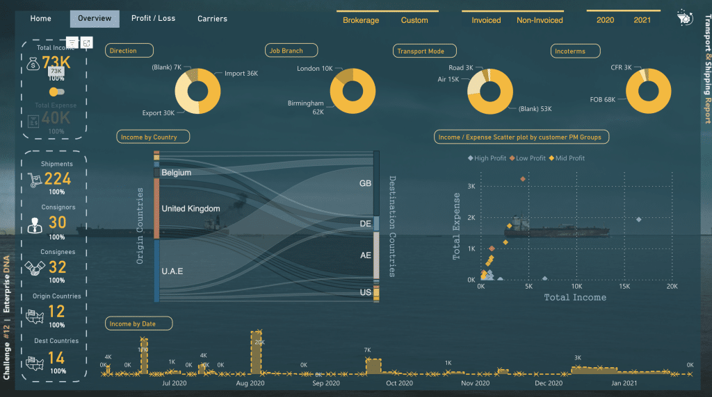
13) Transport and Shipping KPI Dashboard Example
This multipage KPI dashboard shows endless amounts of usable information and critical insight, complimented by a tasteful design that is easy to interpret.
There is no doubt that such reports showcasing crucial sales data, total revenue, and logistics are absolutely crucial to data analysis and, ultimately, business success.
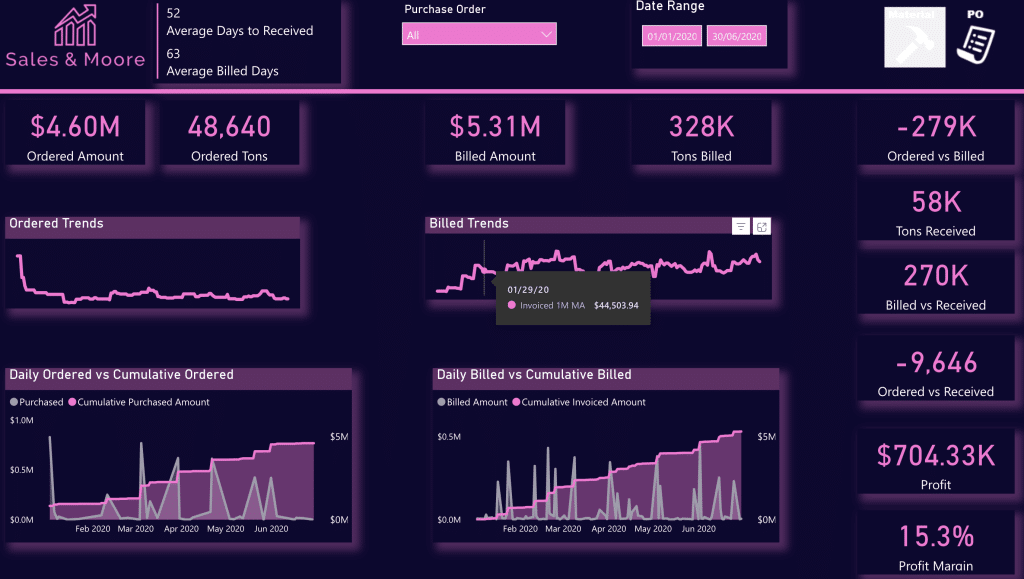
14) Purchase, Sales, and Inventory Trends Dashboard
A well-designed dashboard showcasing a dynamic narrative summary that utilizes both Bookmarks and Selection Pane to create a comprehensive data snapshot in a one-page report.
Again, great use of brand colors is shown here.
We have a large collection of Sales and Inventory dashboards you can check out here .
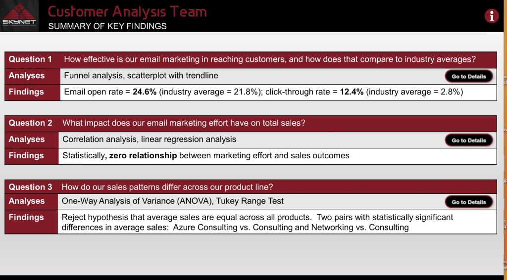
15) Customer Analysis Dashboard
Understanding customer engagement is crucial to success. This specific dashboard focuses on showcasing the relationship between customer sales and marketing engagement based on email marketing open and CTRs (click-through rates).
This report is well made and makes for one of the best ways to showcase data analytics in this type of data in a power bi report.
Structured simply and effectively, you have one main page as a menu or guide which links out to highly detailed findings.
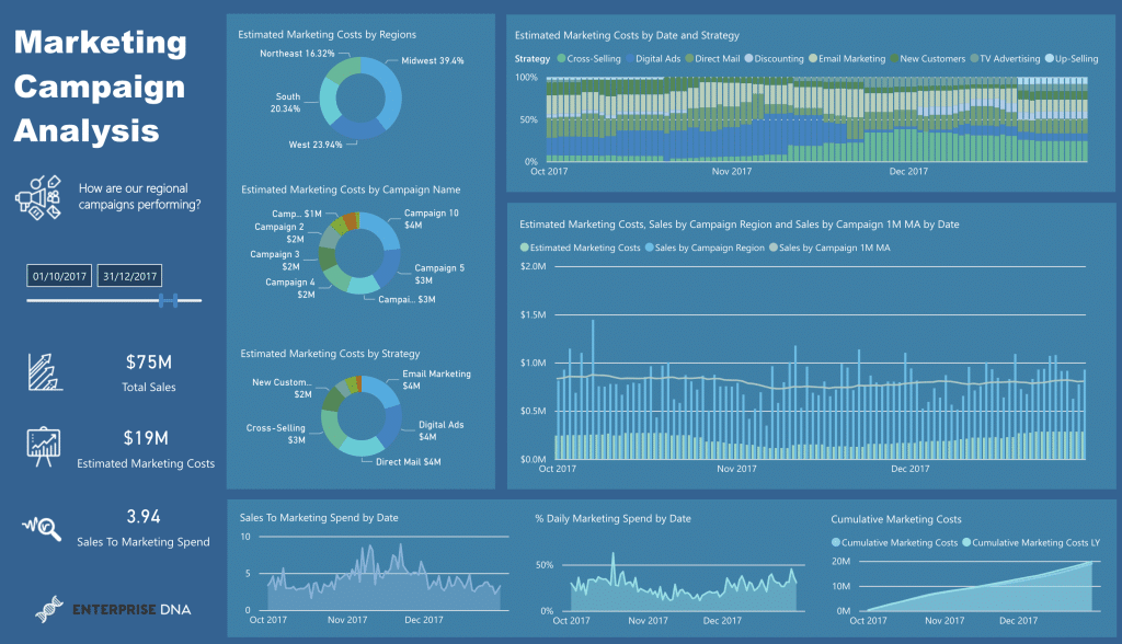
16) Marketing Campaign Performance
Power BI enables you to get clarity and showcase how your marketing budget was spent and the results you got for it are often overlooked.
But, when drilling down on product sales, total sales, and showcasing the marketing spend and split, there is no doubt you are setting yourself up for success.
This dashboard is another excellent use of Power BI and how it can help a business gain clarity and actionable insights into its data set.
We have a huge collection of free Power BI dashboard examples for you to try whether you are tracking financial performance or marketing metrics; you can check them out in our Power BI Gallery .
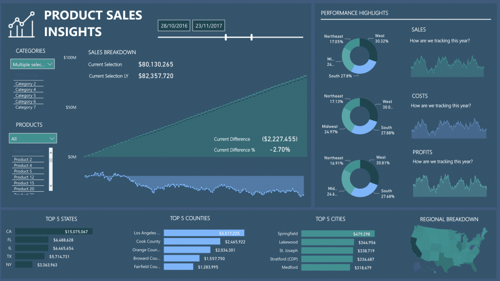
17) Product Sales KPI Dashboard
This is a perfect example of simplicity and effectiveness at its finest. Power BI dashboard examples like this are used o give your marketing team insights into more than just sales
In fact, interactive designs like this dashboard take the guesswork out of business and showcase the simple facts.
With multiple categories and products, sales performance is also broken down into Top 5 States, Top 5 CountriesTop, and Top 5 Cities
There is also a regional breakdown too.
To top it off, it features charts and line graphs to enable easier strategic decisions; this is one of the simplest and best power bi dashboard examples for a clear snapshot of the business.
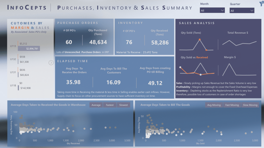
18) Purchases, Inventory, and Sales Summary
Last on our list today is this “moody” styled summary of key business metrics blending in design with data analytics
Data visualization dashboards like this featuring solid power bi elements with key metrics are critical for marketing managers and business owners to gain a clear snapshot of business health. Many opt for solid colors to stress their points, but the option to get really creative is always there with Power BI
Click here to see our entire collection of Power BI dashboards.
Compilation Of The Best Power BI Reporting Applications We’ve Seen
Check out this video for further design inspo!
How to Access The Ultimate Collection of Microsoft Power BI Dashboards
Over the years teaching 220,00+ people real-world data skills, we have been fortunate enough to work with some of the most outstanding minds and talents in the business.
We never stop learning, and nor should you. But it doesn’t mean you have to start by yourself; we offer the largest collection of Power BI KPI Dashboards on the internet!
To top it off, we welcome you to a fun, progressive, and interactive data community to learn with.
You can check out our collection of Power BI Dashboards, test them out, and download them here .
Also, if you are just starting out in the world of data analytics , we’d love to help you on your journey.
Check out our Free Courses on Power BI ; it’s a great place to start and will give you the solid foundations to get you on your way to creating awesome Dashboards and reports like the ones in this article.
Want to start learning how to create power bi reports and dashboards ? Check out our Free Resources to get you started.
Got a good understanding of Power BI? You have to dive into our Advanced Power BI Course and take your data skills to the next level.

Related Posts

Ultimate Guide To Multiple IF Statements In Power BI
DAX , Power BI
If you are looking to create more complex logic, then using multiple if statements in Power BI is a...

How Will AI Affect Data Analysis in the Future
AI , Power BI
As the world becomes increasingly data-driven, the role of artificial intelligence (AI) in data...

How to Use Switch True Logic in Power BI
Using logic functions to create accurate, efficient calculations is a fundamental skill in data...

How to Use ChatGPT for SharePoint: Effective Integration Guide
If you’re part of a business that relies heavily on collaboration, chances are you've encountered...

How to Speed Up Your SQL Queries
Databases are an essential part of modern data management, and Structured Query Language (SQL) is one...

Navigating the World of Data – Best Practices in Data Visualization
In today’s data-driven world, the ability to effectively communicate information through visuals is...

How To Transition to a Career in Artificial Intelligence
Career , Power BI
Are you a professional seeking a more advanced, exciting, and lucrative career? Are you a student or...

The Art of Data Visualization: From Beginner to Expert
Data visualization is a powerful tool that allows you to transform complex data sets into easily...

How To Build Data Visualizations That Tell A Compelling Story
Data is everywhere and it tells a story. But sometimes, the story can get lost in all the numbers. This...

How To Build a Portfolio And Showcase Your Data Projects to Employers
Power BI , Power BI Showcase
In today’s data-driven world, the ability to work with data has become an essential skill. Whether...

How To Network And Create Connections in Data Science and AI
Careers , Power BI
The field of data science and artificial intelligence (AI) is constantly evolving, and the demand for...

The Importance of Data Analytics in Today’s World
Data Analytics , Power BI
In today’s data-driven world, the role of data analytics has never been more crucial. Data analytics is...

How to Put Power BI Visuals in PowerPoint

If you’re a business professional who frequently presents data insights to team members, stakeholders, or clients, you know how important it is to create visually compelling and engaging presentations. Fortunately, Microsoft has made it incredibly easy to combine the power of Power BI and PowerPoint to create stunning presentations that showcase data in real-time.
Table of Contents
Understanding the Importance of Integrating Power BI Visuals with PowerPoint
By integrating Power BI visuals with PowerPoint, you can impress your audience and make your presentations more impactful. This integration allows you to create dynamic, data-driven presentations that help you tell a story and draw attention to important business insights. It’s also a great way to save time and effort by automating the process of updating data visualizations in PowerPoint. Instead of manually updating each slide with new data, you can link your PowerPoint presentation to a Power BI report and have the visuals automatically update in real-time.
Another benefit of integrating Power BI visuals with PowerPoint is that it allows you to easily share your data insights with others. You can export your PowerPoint presentation as a PDF or share it online, making it accessible to a wider audience. This can be especially useful for businesses that need to share data with stakeholders or clients who may not have access to Power BI.
Furthermore, by using Power BI visuals in your PowerPoint presentations, you can create more engaging and interactive content. You can add filters, slicers, and other interactive elements to your visuals, allowing your audience to explore the data on their own. This can help to increase engagement and understanding, as well as encourage further exploration of the data beyond the presentation.
Step-by-Step Guide: How to Embed Power BI Visuals in PowerPoint
The process of embedding Power BI visuals in PowerPoint is straightforward and easy to follow. Here are the steps you need to take:
Step 1: Open the Power BI report you want to embed in PowerPoint.
Step 2: Click on the “File” menu and select “Embed in SharePoint Online or Webpage.”
Step 3: Choose the visual you want to embed and customize its size and appearance.
Step 4: Copy the embed code for the visual.
Step 5: In PowerPoint, select the slide where you want to add the visual and click on the “Insert” tab.
Step 6: Click on the “Get Data” option or “Insert” > “Online Pictures” for static images.
Step 7: Paste the embed code in the dialogue box and click “Insert.”
Step 8: Resize and position the visual as desired.
Once you have embedded the Power BI visual in PowerPoint, you can easily update it with the latest data from the Power BI report. Simply click on the visual in PowerPoint and select “Update” from the “Power BI” tab. This will refresh the visual with the latest data from the report.
Another useful feature of embedding Power BI visuals in PowerPoint is the ability to interact with the visual during a presentation. You can use the mouse to hover over data points and see additional information, or click on elements to filter the data in real-time. This can be a powerful tool for presenting complex data in a clear and engaging way.
Benefits of Adding Power BI Visuals in Your PowerPoint Presentations
There are several benefits to adding Power BI visuals in your PowerPoint presentations:
- Make your presentations more engaging and interactive.
- Save time by automating the process of updating data visualizations.
- Draw attention to important insights and trends in your data.
- Create dynamic, data-driven presentations.
- Reinforce the credibility of your presentations through data-backed insights.
Additionally, Power BI visuals can help you communicate complex data in a more digestible way. With the ability to create interactive charts, graphs, and maps, you can easily highlight key data points and allow your audience to explore the data on their own. This not only makes your presentation more engaging, but it also helps ensure that your audience understands the information you are presenting.
Choosing the Best Power BI Visuals for Your PowerPoint Presentation
When choosing the best Power BI visuals for your PowerPoint presentation, you need to consider the type of data you want to present, the level of interactivity you want to achieve, and the overall tone of your presentation. Some of the most popular Power BI visuals include:
- Line charts
- Scatter charts
It’s important to note that while these visuals are popular, they may not always be the best choice for your specific presentation. For example, if you’re presenting complex data with multiple variables, a scatter chart may be more effective than a bar chart. Additionally, if you want to highlight a specific metric or goal, a KPI may be the best choice. Ultimately, the key is to choose visuals that effectively communicate your data and support your overall message.
Customizing Power BI Visuals to Match Your PowerPoint Theme
To ensure that your Power BI visuals match the overall theme and design of your PowerPoint presentation, you can customize the visuals in several ways:
- Change the color palette to match your PowerPoint theme.
- Adjust fonts and font sizes to match your PowerPoint presentation.
- Customize the formatting of data labels and axes.
- Choose from a variety of visual styles and types.
Another way to customize your Power BI visuals is to add your company logo or branding to the visuals. This can be done by adding an image to the visual or by using custom visuals that allow for branding.
Additionally, you can customize the interactivity of your Power BI visuals to match your PowerPoint presentation. This can be done by adjusting the drill-through behavior, adding tooltips, or enabling cross-filtering between visuals.
How to Resize and Position Power BI Visuals in PowerPoint
When adding Power BI visuals to your PowerPoint presentation, you may need to resize and position them to fit your slides. To do this, simply click on the visual and use the sizing handles to adjust its size and shape. You can also use the alignment tools in PowerPoint to center, left- or right-align your visuals.
It’s important to note that resizing and repositioning your Power BI visuals can affect their readability and overall impact on your audience. Be sure to test your visuals on different screen sizes and adjust accordingly to ensure they are easily visible and understandable. Additionally, consider the placement of your visuals in relation to other content on your slide to create a cohesive and visually appealing presentation.
Tips for Optimizing the Performance of Power BI Visuals in PowerPoint
When embedding Power BI visuals in PowerPoint, you may encounter performance issues such as slow load times or visualizations failing to update. Here are a few tips to optimize the performance of Power BI visuals in PowerPoint:
- Limit the number of visuals per slide to reduce load times.
- Use high-resolution images to ensure that visuals are clear and crisp.
- Optimize your Power BI report by simplifying queries and removing unnecessary data.
- Test your presentation on various devices and browsers to ensure compatibility and performance.
Troubleshooting Common Issues When Adding Power BI Visuals to PowerPoint
If you run into issues when embedding Power BI visuals in PowerPoint, here are a few common problems and solutions:
- Visuals fail to update: Refresh the data in the report and ensure that it is connected to the correct data source.
- Visuals appear distorted or blurry: Increase the resolution of the visuals or adjust the scaling in PowerPoint.
- Visuals appear too large or too small: Resize the visuals in PowerPoint using the sizing handles.
- Embedded code doesn’t work: Ensure that the embed code is correct and that you have the necessary permissions to access the report.
Best Practices for Using Power BI Visuals in Your PowerPoint Presentations
Here are a few best practices for using Power BI visuals in your PowerPoint presentations:
- Keep your visuals simple and easy to understand.
- Use visuals that complement your data insights.
- Choose a consistent design and formatting style for all visuals used in your presentation.
- Use animations and transitions to make your presentation more engaging.
Advanced Techniques for Creating Interactive Dashboards in PowerPoint with Power BI Visuals
If you want to take your PowerPoint presentations to the next level, you can use Power BI to create interactive dashboards that can be embedded in your presentations. This allows you to give your audience control over the data they see and enables them to explore insights on their own. To do this, you’ll need to create a Power BI dashboard and then embed it in your PowerPoint presentation using the same process as before.
Comparing Different Methods of Integrating Power BI with PowerPoint
While the process of embedding Power BI visuals in PowerPoint is relatively straightforward, there are several ways to achieve this integration. Some methods include:
- Embedding visuals as web pages
- Exporting visuals from Power BI as image files and inserting them into PowerPoint
- Using Power BI Publisher for Excel to embed visuals in Excel spreadsheets, which can then be inserted into PowerPoint
Showcasing Data Insights through Stunning Power BI Visualizations in a PowerPoint Deck
With the powerful combination of Power BI and PowerPoint, you can create stunning data visualizations that showcase important business insights. By following the steps outlined in this article and using best practices for presenting data, you’ll be able to create impactful presentations that engage and inform your audience.
Enhancing the Credibility and Impact of Your Presentations with Power BI-Powered Slides
Power BI-Powered slides can help you enhance the credibility and impact of your presentations by presenting data insights in real-time. By using this powerful integration, you can create dynamic, data-driven presentations that showcase your expertise and impress your audience.
Using Embedded Codes to Add Dynamic Live Reports from Power Bi Desktop to your Presentation Slides
If you’re looking to take your PowerPoint presentations to the next level, you can use embedded codes to add dynamic live reports from Power Bi Desktop to your presentation slides. However, this process requires specific steps and permissions. It’s important to ensure that you have the necessary permissions to access the report and that the embed code is correct. With this powerful integration, you can create real-time presentations that keep your audience engaged and informed.
By humans, for humans - Best rated articles:
Excel report templates: build better reports faster, top 9 power bi dashboard examples, excel waterfall charts: how to create one that doesn't suck, beyond ai - discover our handpicked bi resources.
Explore Zebra BI's expert-selected resources combining technology and insight for practical, in-depth BI strategies.

We’ve been experimenting with AI-generated content, and sometimes it gets carried away. Give us a feedback and help us learn and improve! 🤍
Note: This is an experimental AI-generated article. Your help is welcome. Share your feedback with us and help us improve.

Dashboard Presentation and Storytelling: 6 Best Practices to Start With

Table of contents
“Sometimes reality is too complex. Stories give it form,” said Jean Luc Godard. A quote fully applicable to data.
Data may often seem complex and challenging to present in a comprehensible way, especially when your audience doesn’t have a high level of data knowledge. However, more and more companies aim to make data-driven decisions nowadays, so you’re likely to be in a situation where you need data to make your case or justify your budget.
Whether you’re presenting to your manager, senior management, or shareholders, your best bet is to create a compelling story using your data.
That’s where dashboard presentations and storytelling step in.
In this article, you’ll learn:
What Is Dashboard Storytelling?
Benefits of using dashboards to tell stories about your data, what is more important: storytelling or data presentation, how to get started with dashboard storytelling 3 tips, how to present a dashboard: 6 best practices to make a meaningful dashboard storytelling presentation, dashboard storytelling examples.

Dashboard storytelling is the process of creating a compelling narrative around your data and KPIs to illustrate your business performance and influence your audience in a way, usually through interactive, engaging visualizations.
Dashboards allow you to present your narrative in an easy-to-understand manner and adapt it to the audience you’re reporting to. Through dashboard storytelling, you combine the power of stories to engage the listeners and the conclusiveness of the real-time data presented through graphs, charts, tables, and more.
Related : How to Visualize Data: 6 Rules, Tips and Best Practices
Storytelling is a powerful marketing tool because it helps you relate to your audience and sound compelling. So, what are the benefits of using dashboards to tell stories about your data? Here are 4 ways dashboard storytelling helps you present your data in a more convincing way.
- You can make the report easy to follow and understand. Your audience may get lost in a 20-page report with too much text. When you use a dashboard, you can get your point across in a more comprehensive way without losing your audience’s attention. Clear visuals allow you to illustrate your findings and corroborate your arguments.
- You can use color-coding. Dashboards allow you to use colors to give meaning to your data. For example, figures written in green mean a positive outcome, while any data displayed in red would mean a negative result.
- You can make the report interactive. While the traditional reports are static and don’t allow for changes once you create them, dashboards are interactive. You can click on your charts and tables to compare current with previous performance, set a custom date range, etc, and uncover more details about a specific KPI.
- You can provide valuable information about your performance at a glance. Dashboards are designed to let you draw conclusions quickly. By taking one look at the dashboard, you can understand what’s happening in your business, which makes your data storytelling engaging and dynamic.
We surveyed 46 companies about dashboards and storytelling. The respondents come from:
- B2C services or products (41.30%)
- B2B services or products (34.78%)
- Agency/Consultant: Marketing, Digital or Media (23.91%)
Over 96% of survey participants have been using both dashboards and storytelling to convey their messages, while the rest of the participants would like to try.

The companies we surveyed give almost equal importance to both dashboards and storytelling: 52% of respondents gave their vote to storytelling, while 48% of them consider dashboard presentations should have more emphasis. However, almost all participants in the survey agree that data visualization is very important for overall success of dashboard storytelling.

If you’re only getting started with dashboard storytelling and ditch the basic reports, these three tips will help you fast-track your first presentation.
Match the Data with the Right Visualizations
Not every type of data will work with every type of visualization, so take your time to carefully review your options and choose the most suitable chart, graph, table, or another visualization for your data. For example, bar charts are excellent for showing progress over time, while pie charts work best to display data distribution.
Don’t Go Overboard with Industry Jargon
Your narrative should be simple, which means too much industry jargon may make you sound incomprehensible. Your audience may not understand all the terms you use, especially if you’re presenting to other teams or the C-suite. Technical jargon and popular buzzwords don’t contribute any value to your presentation, while simple language can boost its efficiency and clarity.
Make Sure Your Story Follows a Logical Order
People love to listen to stories regardless of the topic, but can only follow if there’s a logical order of events. A well-organized dashboard will make sure your report tells a story explaining the causes, and consequences of different activities that impacted your performance. Keeping your focus on point and clearly communicating the purpose of your presentation will help you deliver value.
PRO TIP: Need Help Building a Custom Dashboard?
Not sure which metrics to track or dashboards to build? Have old reports you want to recreate in Databox? Share your dashboard needs with one of Databox’s product experts and we’ll build you a customized dashboard for free.
Here is an example of what your dashboard can look like… (just imagine your data populating here)

And here’s another one…

We get it. You may not have the time to build out the perfect dashboard before your next meeting.
Luckily, we do.
Connect with someone on our team, share the metrics or areas that you need to track, and we’ll build your dashboards for you in just 24 hours.
Learn more about our free dashboard setup here , reach out for assistance via email or chat, or book a call.
To collect the best tips on making a meaningful dashboard presentation, we asked companies from various industries to share their experience. Among our respondents, there are almost 24% of marketing, digital, and media consultants and agencies, around 35% of B2B companies, and around 41% of B2C products or service providers.
The participants in our survey consider marketing dashboards the most inspiring one for storytelling: 39% of companies gave it their vote. Other common answers included overall business, customer support, and sales dashboards.

Here are the 6 best practices we singled out to ensure you make a meaningful dashboard presentation.
Outline Your Presentation to Visualize the Structure
Mix up the facts with real-life anecdotes and examples, encourage interaction while telling the story, highlight the value of the presentation, test multiple approaches to storytelling with data, focus on consistency in your presentation.
Structure gives your presentation clarity and logical flow, so before you dive deep into the data itself and storytelling, create a presentation outline. The outline will help you build your story around key points and maintain focus throughout.
Vishal Srivastava of Trainedge Consulting Pvt Ltd recommends the GIFBP framework for this purpose.
“It stands for Goals, Issues, Features, Benefits and Proof. I pick data/visualization from dashboards to go with each section of the story. The key is to keep the story short and focused, which means using the most appropriate chart/illustration. Using too many can cause data overload and confusion, so you need to be careful about what you represent,” explains Srivastava and gives an example:
“Let’s say I am sharing monthly inbound performance for a self-service SaaS product. The goal here is the monthly growth in MRR or a target MRR. So the first slide will compare the actual MRR with the target. The Issues element focuses on what is preventing us from achieving the goal or could do that in the coming months. No more than 3 Issues, backed by data – falling trial signup rate/paid conversion rates, slower traffic growth, topping out high converting traffic from search, etc.
The Features section will highlight what we are doing to stay the course or pre-empt future issues. Back that up with data about progress made. The benefits section lists out how the actions will help us hit the goal in the future. The Proof section lists out evidence, in the form of charts/data, to show that the actions are actually moving the needle in the right direction.”
Asking the right data analysis questions can help you determine which top issues you will present in your dashboard. For example:
- What exactly do I want to learn from this?
- Where does my data come from and is it reliable?
- Which KPIs will I include, and more.
Your dashboard presentation doesn’t need to occur in a solemn atmosphere: storytelling works better if intertwined with anecdotes and real-life examples and experiences. The human touch makes your story more relatable.
Showing a bit of emotion will make your message more compelling, especially if you focus on personalizing the story. Whether it’s your own anecdote or a funny story from your client, adding an emotional aspect to it can help connect all story elements together in a more effective way. Peter Lee of Famlee Digital confirms that adding a personal touch can boost the presentation:
“For my business, I’ve found that being able to tell the story of what has happened, what is happening, and what we predict will happen has been really beneficial. Each client is addressed on a personal basis relevant to their business,” says Peter.
Audience should come first—while creating the presentation, think about what’s in it for your listeners, whether they’re your team members, business partners, shareholders, managers, or clients. Answer the questions such as who they are and what they’re expecting from the presentation.
“Once you know that, you can start planning your presentation. You should focus on metrics and results. How did things go? What did we achieve? What changes will we make in order to improve future processes? This way, audience members will not only be informed but also inspired by what they heard or saw. I also recommend keeping an eye on future steps and keeping them in mind when planning your presentation because it will help you stay focused on what really matters: goals,” says Masha Mahdavi of SEM Dynamics .
Leszek Dudkiewicz of Passport Photo Online agrees that “listening to a presentation containing only text and illustrations is tedious. The more boring the presentation is, the harder it is for the audience to keep their attention on its content.” Stories you can base on interactive dashboards help you keep your audience engaged.
Before you start telling the story, the audience should know what its purpose is and what value you’re going to deliver.
“In my experience, the most important practice to use in dashboard storytelling is to put the audience first. At the end of the day, your audience will always ask, “What’s in it for me?”, says Caitlyn Parish of Cicinia Bridesmaid Dresses .
To make the value of the presentation clear to your audience, state the purpose right at the beginning.
“Every story needs to start with a purpose. We ask questions concerning the major takeaway that our data story presents. We always ensure that our end goal is to influence our audience to take specific action”, says David Antoni of Virtocommerce .
The more actionable the presentation, the better. After all, the main reporting goal is to plan the next steps to maintain great performance or improve it as needed.
Multiple approaches may work for different audiences, so be prepared to test several ways to tell a story with your data. Some audiences will love to participate and ask questions, while others will want you to be as concise as possible and give them the main takeaways only.
We already mentioned one possible framework for a dashboard presentation. Here’s another suggestion from Vanda Mahas of Code200 :
“We prefer using the CAR framework – analyze context, hypothesis and take action, and review results. We use graphs or other visuals from the dashboard for providing context to the hypotheses”, shares Mahas.
The story based on the data on your dashboard should have a logical flow and lead to specific conclusions.
That can also include the use of visualizations and colors—make sure you use the same visualization types for similar data sets, as it’ll allow the audience to understand the dashboard better. That way, your listeners will be able to understand the key points: what is happening, why it might be happening, and what should be done about it.
Maria McDowell of EasySearchPeople explains what her process of preparing a dashboard presentation looks like:
“I usually start collecting and arranging the data I have, setting an outline and flow for the presentation, then I start building my presentation. I like to keep an eye on consistency and flow. I like to be sure that the copy remains on topic and that the story flows well for the audience.”
Again, the key is to focus on the audience—if you lose the flow in your story, the lack of clarity may also cost you the engagement from your audience.
“I also keep the audience in mind, who is the audience? What are their needs? What am I presenting to them? In what format would they prefer to see it?”, asks McDowell.
To illustrate the points we’ve made so far, we’re sharing a few dashboard presentation examples of storytelling opportunities that will help you create memorable interactive reports.
Single Metric Performance Over Time
Progress towards goals, multi-parameter comparisons.
The Single Metric Performance over Time dashboard allows you to create a narrative around the progress of a chosen metric. From this dashboard, you can easily evaluate your efforts over a specific time period and determine whether they’ve given the desired results.

If you need to track the efficiency of your strategy, whether it’s marketing or sales, and present your performance in front of your managers, the Progress Towards Goals dashboard is ideal. Here, you can track even short-term goals and make sure you’re on the right track every step of the way.

When you need to deep dive into the details of why traffic drops or spikes are happening on your website, so you can fix the issue or grab the opportunity, you need a drill-down report . The Multi-Parameter Comparisons dashboard is a great choice to analyze several metrics that influence your overall performance, all at once.

Share Meaningful Data Stories with Databox
Reports don’t have to be endless, boring, and monotonous. They can be fun, engaging, and beautiful.
By using dashboards to tell stories about your performance, successes, and lessons, you can streamline your reporting process, make it more interactive, and speed up the actionable steps that will follow each dashboard presentation.
But do you need to create dashboards and reports from scratch every time you have a presentation?
With Databox, you don’t. You can choose from hundreds of templates available in our library and customize the dashboard to fit your requirements. Connect your dashboard to virtually any data source from our list of 100+ integrations and track your performance from any device.
Want to learn more about how Databox works? Create a free account today and start telling memorable stories with your data.
Get practical strategies that drive consistent growth
12 Tips for Developing a Successful Data Analytics Strategy

What Is Data Reporting and How to Create Data Reports for Your Business
What is kpi reporting kpi report examples, tips, and best practices.

Build your first dashboard in 5 minutes or less
Latest from our blog
- Playmaker Spotlight: Tory Ferrall, Director of Revenue Operations March 27, 2024
- New in Databox: Safeguard Your Data With Advanced Security Settings March 18, 2024
- Metrics & KPIs
- vs. Tableau
- vs. Looker Studio
- vs. Klipfolio
- vs. Power BI
- vs. Whatagraph
- vs. AgencyAnalytics
- Product & Engineering
- Inside Databox
- Terms of Service
- Privacy Policy
- Talent Resources
- We're Hiring!
- Help Center
- API Documentation
- Power BI forums
- News & Announcements
- Get Help with Power BI
- Report Server
- Power Query
- Mobile Apps
- DAX Commands and Tips
- Custom Visuals Development Discussion
- Health and Life Sciences
- Power BI Spanish forums
- Translated Spanish Desktop
- Power Platform Integration - Better Together!
- Power Platform Integrations
- Power Platform and Dynamics 365 Integrations
- Training and Consulting
- Instructor Led Training
- Dashboard in a Day for Women, by Women
- Community Connections & How-To Videos
- COVID-19 Data Stories Gallery
- Themes Gallery
- Data Stories Gallery
- R Script Showcase
- Webinars and Video Gallery
- Quick Measures Gallery
- 2021 MSBizAppsSummit Gallery
- 2020 MSBizAppsSummit Gallery
- 2019 MSBizAppsSummit Gallery
- Custom Visuals Ideas
- Upcoming Events
- Community Blog
- Power BI Community Blog
- Custom Visuals Community Blog
- Community Support
- Community Accounts & Registration
- Using the Community
- Community Feedback
Register now to learn Fabric in free live sessions led by the best Microsoft experts. From Apr 16 to May 9, in English and Spanish.
- Power BI Report Server Licensing - Can we get a do...
- Subscribe to RSS Feed
- Mark Topic as New
- Mark Topic as Read
- Float this Topic for Current User
- Printer Friendly Page
- All forum topics
- Previous Topic

- Mark as New
- Report Inappropriate Content
Power BI Report Server Licensing - Can we get a documented answer?
- PBI On-Prem license

Helpful resources

Microsoft Fabric Learn Together
Covering the world! 9:00-10:30 AM Sydney, 4:00-5:30 PM CET (Paris/Berlin), 7:00-8:30 PM Mexico City

Power BI Monthly Update - March 2024
Check out the March 2024 Power BI update to learn about new features.

This browser is no longer supported.
Upgrade to Microsoft Edge to take advantage of the latest features, security updates, and technical support.
View reports and dashboards in presentation mode on Windows devices
- 9 contributors
The Power BI Windows app was retired on December 31st, 2023, and is no longer supported. It's been removed from the Microsoft apps store, and no further product updates for it will be released. Please use the Power BI service to view your Power BI content on Windows devices.
This notice only applies to the Power BI Windows app. It does not affect the Power BI Desktop app.
You can use presentation mode to display reports and dashboards in full-screen on Windows devices. Presentation mode is useful for displaying Power BI at meetings or conferences, or on a dedicated projector at the office, or even just for maximizing space on a small screen.

In presentation mode:
- All the "chrome" (such as the navigation and menu bars) disappears, making it easier to focus on the data in your report.
- An action toolbar becomes available to enable you to interact with your data and to control the presentation.
- You can play a slideshow that cycles automatically between pages, bookmarks, or both pages and bookmarks.
Use presentation mode
From the toolbar you can tap to perform the following actions:
You can undock the toolbar and drag and drop it to anywhere on the screen. This is useful for large screens, when you want to focus on a specific area in your report and want to have the tools available next to it. Just place your finger on the toolbar and swipe it into the report canvas.

You can play a slideshow to automatically cycle through your presentation. You can set the slideshow to cycle through pages, bookmarks, or both pages and bookmarks. During the slideshow, report pages with auto page refresh will continue to automatically refresh as configured, ensuring that the most current data is always shown.
When you select the Play button on the action toolbar, the slideshow begins. A controller appears that allows you to pause the slideshow or to change what's being played: pages, bookmarks, or both pages and bookmarks.

The controller shows the name of the currently displayed view (page or bookmark and page). In the image above, we see that in the report called Sales , we are currently viewing the Asia Pacific bookmark on the Sales Performance page.
By default, a slideshow cycles through pages only, at a rate of one every 30 seconds. You can change the default behavior in the Slideshow settings .
Auto play a slideshow on startup
You can set up the Power BI Windows app to start playing a slideshow automatically whenever the app is launched. This option is useful for creating a kiosk-like experience that runs a report in public displays without any manual intervention. See Slideshow settings for detail about setting up a report for autoplay.
Slideshow settings
By default, a slideshow cycles through pages only, at a rate of one every 30 seconds. You can change this default behavior by going to Settings > Options , as illustrated below. You can also turn on autoplay and choose a report to play.
Select the settings icon.
Open the options page.
If desired, change the default settings for what the slideshow will cycle over (pages, bookmarks, or both) and how frequently the slides will transition.
If you want your report to start playing automatically when the app is launched, turn on the toggle and choose Select Report . You will be able to search for reports you have access to.

Related content
- Display dashboards and reports in full-screen mode from the Power BI service
- Questions? Try asking the Power BI Community
Was this page helpful?
Coming soon: Throughout 2024 we will be phasing out GitHub Issues as the feedback mechanism for content and replacing it with a new feedback system. For more information see: https://aka.ms/ContentUserFeedback .
Submit and view feedback for
Additional resources
Microsoft Power BI Blog
Power bi april 2024 feature summary.

Welcome to the April 2024 update! Here are a few, select highlights of the many we have for Power BI. There are new updates for line enhancements, supporting folders in workspace, dynamic subscriptions for Power BI and paginated reports.
There is more to explore, please continue to read on.
Fabric Conference Day 1 Keynote is now available!
Did you miss it, or want to hear it again? We are excited to release the FabCon Day 1 Keynote to the Microsoft Fabric YouTube Channel !
If you aren’t already, be sure to subscribe to the Microsoft Fabric Channel! Check out the amazing announcements & demos from Arun, Amir, Wangui, and other awesome presenters. The Day 3 keynotes will be released later this month, and more content will be released regularly moving forward.
Make sure you check out the blog post from Arun, that highlights the announcements from FabCon you can find that here: Announcements from the Microsoft Fabric Community Conference
Earn a free Microsoft Fabric certification exam!
We are thrilled to announce the general availability of Exam DP-600 , which leads to the Microsoft Certified: Fabric Analytics Engineer Associate certification.
Microsoft Fabric’s common analytics platform is built on the instantly familiar Power BI experience , making your transition to Fabric Analytics Engineer easier. With Fabric, you can build on your prior knowledge – whether that is Power BI, SQL, or Python – and master how to enrich data for analytics in the era of AI.
To help you learn quickly and get certified, we created the Fabric Career Hub. We have curated the best free on-demand and live training, exam crams, practice tests and more .
And because the best way to learn is live, we will have free live learning sessions led by the best Microsoft Fabric experts from Apr 16 to May 8, in English and Spanish. Register now at the Learn Together page.
Also, become eligible for a free certification exam by completing the Fabric AI Skills Challenge. But hurry, the challenge only runs from March 19 – April 19 and free certs are first-come, first-served! (limit one per participant, terms and conditions apply).

- Version number: v: 2.128.751.0
- Date published: 4/8/24
- New Visual – 100% Stacked Area Chart
- Line enhancements
- Enhance Q&A with Copilot-generated Linguistic Relationships
Storytelling in PowerPoint – Improved image mode in the Power BI add-in for PowerPoint
Storytelling in powerpoint – continuous slide show auto refresh, storytelling in powerpoint – auto populating the slide title.
- Introducing the Fabric metadata scanning sample app
- Dynamic Subscriptions for Power BI and paginated reports
Supporting Folders in workspace
New “clear barcode” action in the report footer, open power bi items in full screen mode.
- New Visuals in AppSourceKPI MatrixGrowth Rate Chart by DJEENI v1.4Aimplan Comment Visual
Financial Reporting Matrix by Profitbase
Horizon chart by powerviz, drill down scatter pro by zoomcharts, image gallery, horizontal bar chart, multi-pane card 1.1.
New Visual – 100% Stacked Area Chart
Introducing the new 100% Stacked Area Chart, now available in our core visuals gallery. These visuals display the relative percentage of multiple data series in stacked areas, where the total always equals 100%. It’s perfect for showing the proportion of individual series to the whole and how they change over time. Find it in the visual gallery, on-object dialog, or format pane, right next to the Stacked Area Chart. Give it a try and share your feedback with us!
Line enhancements
Take your line charts to the next level with our new line control features.
- Adjust line color transparency under Lines > Colors > Transparency.
- Control the color and transparency of each series by selecting them in the ‘Apply settings to’ dropdown.
- Use Monotone and the new Cardinal smooth type for full control of smooth lines.
- Choose from before, center, and after step lines to align your visual with your story.
Try out these new features and enhance your line charts.

Enhance Q&A with Copilot-generated Linguistic Relationships
Improving your linguistic schema is an important step in making sure that the Q&A visual can understand the wide range of questions people might ask about their data. This is why, back in September , we added a new section into the Q&A setup menu to help you add linguistic relationships to teach Q&A about words which qualify or relate your data.
But we also know that coming up with all the different words people might be using to refer to your data can take time and effort, and we’ve been working on ways to make that process easier for you! In November , we introduced a way for you to quickly generate new synonyms for the names of tables and columns in your model; this month, we’ve introduced the same functionality for linguistic relationships!
When you open a report with a Q&A visual, if you have Copilot enabled and you’ve already added synonyms, you’ll now see a banner prompting you to get relationships with Copilot as well.

Unlike with synonyms, Copilot-generated relationships will not be used to understand natural language inputs until you have approved them, so make sure you accept the ones which work for your model!
Allow Copilot to help interpret Q&A questions.
You can also now use Copilot to improve the Q&A engine’s term recognition when you ask questions! This new feature will trigger when you ask Q&A a question which uses words or phrases which Q&A doesn’t recognize, but which it detects might be referring to data entities like tables or columns. Then, Copilot will also check those unknown words or phrases to see if there is any reasonable match — and, if so, return the answer as a visual as though a suggested synonym had been applied.

This feature is not a replacement for synonyms! In fact, adding synonyms for the entities in your semantic model is even more important to create good matches, as they increase the surface area to check for similarities. It will widen the range of inputs Q&A will recognize, but like a multiplier, it will improve recognition for well-modeled data much better than it will for poorly modeled data.
This feature will be automatically enabled when you choose to get synonyms with Copilot, but you can also turn it on or off manually in the suggestion settings menu in the Synonyms tab in Q&A setup.

We’ve made saving Power BI content as an image simpler and more powerful.
First, we’ve added a new dropdown menu to the add-in’s footer. In that menu, you can choose whether you want to see live data or a snapshot. So now it is much easier to find where to switch between live data and a static image.
Second, for snapshots, you now have two options:
- Public snapshot: Anyone who can view the presentation can view the image.
- Snapshot: Only those who have permission to view the report in Power BI will be able to see the snapshot.
Third, we’ve disabled the default snapshot, so that the slide thumbnail doesn’t show the image by default (this also applies when you copy & paste the slide into an email for example), but only after the add-in is loaded and the required permissions have been checked.
And lastly, we honor this setting also when you open the presentation in PowerPoint for the web. You still cannot change a live view into a snapshot in PowerPoint for the web, but if you or someone else has changed the view to snapshot in the PowerPoint desktop app, this will be respected, and you will see the snapshot also in PowerPoint for the web.
PowerPoint allows you to continuously playback a presentation. This is especially useful when you want to present information in public displays without any human interaction.
If a presentation that is running continuously has slides that include the Power BI add-in, the data in the add-in might become outdated, since the add-in gets the data from Power BI when the slide is loaded, or when the user manually refreshes the data being presented.
With the new automatic refresh in slide show feature, you can set the add-in to automatically pull fresh data from Power BI while the presentation is in slide show mode, ensuring that the presentation will always show the most recent data.

Note that auto refresh only happens in slide show mode and not while you’re editing the presentation.
When you add the Power BI add-in to an empty slide that doesn’t have a title yet, the Power BI add-in is here to help. It offers you suggestions for the slide title based on the content of you add-in. The title can be the report name, the page/visual name, or both. Just select the desired option and hit Add title .
Introducing the Fabric metadata scanning sample app
We’re delighted to announce the availability of the new Fabric metadata scanning app. This sample application builds upon the metadata scanning capabilities of Fabric’s set of Admin REST APIs collectively known as the scanner APIs. This new app can be used as a reference for admins interested in utilizing the Scanner API to catalog and report on all the metadata of their organization’s Fabric items.
The Fabric metadata scanning sample app handles all the steps for calling the scanner API including authentication, parallelism, throttling, and incremental scanning. In addition, it provides a central configuration file which can be easily modified to suit the specific needs of the caller. Currently authentication is supported both by using a service principal and a delegated token.
The app is available as a Microsoft open-source project, and is open for suggestions and improvements here:
https://github.com/microsoft/Fabric-metadata-scanning/
Dynamic Subscriptions for Power BI and paginated reports
We’re pleased to announce that you can now send dynamic per recipient subscriptions to up to 1000 recipients instead of the earlier limit of 50 recipients from the data in the Power BI semantic model. For existing subscriptions, we will automatically send subscriptions up to 1000 recipients if your Power BI semantic model contains that many rows of data. You need to edit the subscription if you don’t want to automatically send subscriptions. Learn more about creating dynamic per recipient subscriptions for Power BI Reports and paginated reports .

The Power BI Mobile apps support folders in workspace. So, you can access items that are organized in folders inside of your workspace directly from the mobile app.

Workspace and folders are Fabric entities, which means that you can add items that are not necessarily Power BI items to a workspace. But the Power BI Mobile apps only support a subset of Power BI items. Therefore, only the Power BI item will be accessible when you are browsing the folder content from the app. If a folder contains only non-Power BI items, it will appear empty in the mobile app.
When a field in your model is marked as a barcode, you can use your mobile device camera to scan the barcodes of real objects to filter reports that are built on this model. This feature is extremely useful for retail, where you can scan the barcode on a piece of merchandise to get a report showing data about the item directly in your mobile app (for example, inventory information, product selling data, etc.).
To make it easier and more intuitive to use barcodes and based on feedback we’ve gotten from our users in stores, we’ve added a new button to the report footer that makes it a one-click action to clear any previously scanned barcode from the report’s filter.
Learn more about scanning barcode from the mobile app

We continue to simplify the experience of using the Power BI Mobile apps, always keeping in mind the frontline workers who need quick access to their content. In this monthly update we’ve made it possible to open Power BI items on full screen, so users can view their data at its max.
Opening an item on full screen is supported both for launch items and when using a universal link.
A launch item is a Power BI item (report, page, app, etc.) that the user has selected to automatically open when they open the app. Now, you can also tell the Power BI Mobile app to open this item in full screen mode.
To set a launch item to open in full screen mode, go to Settings > Launch item and enable the Open in full screen toggle.
Using an MDM tool that supports an AppConfig file, mobile device administrators can also configure a launch item to be opened in full screen mode for their users.
You can also add the query parameter? fullscreen =1 to a Power BI item’s link. When you use a link with this parameter on your mobile device, the mobile app will open the item in full screen mode.

Visualizations
New visuals in appsource kpi matrix growth rate chart by djeeni v1.4 aimplan comment visual.
Making financial statements with a proper layout has just become easier with the latest version of the Financial Reporting Matrix.
Users are now able to specify which rows should be classified as cost-rows, which will make it easier to get the conditional formatting of variances correctly:

Selecting a row, and ticking “is cost” will tag the row as cost. This can be used in conditional formatting to make sure that positive variances on expenses are a bad for the result, while a positive variance on an income row is good for the result.
The new version also includes more flexibility in measuring placement and column subtotals.
Measures can be placed either:
- Default (below column headers)
- Above column headers

If you have multiple fields showing on your column headers, you can now decide which of these fields you want a column subtotal for.
This is in addition to the already existing features of the Financial Reporting Matrix:
- Adding custom rows
- Applying company/customer specific themes
- Expand/collapse columns
- Conditionally hide columns
- + much more
Highlighted new features:
- New Format Pane design
- Measure placement – In rows
- Select Column Subtotals
- Row Options
Get the visual from AppSource and find more videos here !
A Horizon Chart is an advanced visual, for time-series data, revealing trends and anomalies. It displays stacked data layers, allowing users to compare multiple categories while maintaining data clarity. Horizon Charts are particularly useful to monitor and analyze complex data over time, making this a valuable visual for data analysis and decision-making.
Key Features:
- Horizon Styles: Choose Natural, Linear, or Step with adjustable scaling.
- Layer: Layer data by range or custom criteria. Display positive and negative values together or separately on top.
- Reference Line : Highlight patterns with X-axis lines and labels.
- Colors: Apply 30+ color palettes and use FX rules for dynamic coloring.
- Ranking: Filter Top/Bottom N values, with “Others”.
- Gridline: Add gridlines to the X and Y axis.
- Custom Tooltip: Add highest, lowest, mean, and median points without additional DAX.
- Themes: Save designs and share seamlessly with JSON files.
Other features included are ranking, annotation, grid view, show condition, and accessibility support.
Business Use Cases: Time-Series Data Comparison, Environmental Monitoring, Anomaly Detection
🔗 Try Horizon Chart for FREE from AppSource
📊 Check out all features of the visual: Demo file
📃 Step-by-step instructions: Documentation
💡 YouTube Video: Video Link
📍 Learn more about visuals: https://powerviz.ai/
✅ Follow Powerviz : https://lnkd.in/gN_9Sa6U

ZoomCharts has just launched the latest addition to their suite of user-friendly custom visuals – Drill Down Scatter PRO . It provides all the features you would expect from a great scatter chart visual, but what sets Scatter PRO apart is the ability to easily drill down . Simply click on a data point and see all the values underneath it.
This way, you can quickly find your answers while also gaining a full understanding of where they come from. Furthermore, the visual’s UI is designed to be smooth and user-friendly for PCs and touch devices , and with cross-chart filtering you can use Scatter PRO to build incredible reports for immersive data exploration.
Main features:
- Drill Down: Create a multi-level hierarchy and drill down with just a click.
- Dynamic formatting : Apply custom marker colors, shapes, or images to each data point directly from data.
- Trendlines: Show a linear or polynomial regression line on the chart.
- Thresholds: Display up to 4 line or area thresholds on each axis.
- Area Shading: Highlight up to 8 custom areas with rectangles or ellipses.
🌐 Learn more about Drill Down Scatter PRO
Documentation | ZoomCharts Website | Follow ZoomCharts on LinkedIn

The Image Gallery is the first visual to be certified by Microsoft that allows for the display of high-quality images and their exportation along with other report content. There is no need to upload images to the Cloud, a CDN, or use any datasets . Simply import your images directly into the visual and share them instantly with your colleagues.
This visual boasts several impressive capabilities:
- Microsoft certification ensures that the visual doesn’t interact with external services , ensuring that your images are securely stored and encrypted within the report, consistent with your report’s sensitivity settings.
- Automatically saves your selected image in preview mode , allowing your colleagues to view the exact image you have highlighted.
- Images can be uploaded or removed exclusively in Edit Mode. Users in View Mode can only view the images.
- The visual is compatible with Power BI’s export functionality to PDF and PowerPoint.

LINK: https://appsource.microsoft.com/en-us/product/power-bi-visuals/pbicraft1694192953706.imagegallery?tab=Overview
A space-saving horizontal bar chart designed with category labels placed inside the bars for clarity
This horizontal bar chart serves as an efficient filter to navigate through your data more effectively, optimizing space by placing the category labels within the bars themselves.
- Adjustable Bar Thickness and Spacing: Offers the flexibility to adjust the thickness of the bars and the spacing between them. This allows for optimal use of space and improves readability, especially when dealing with large datasets.
- Tooltip Details on Hover: Displays detailed information about each category when the user hovers over a bar. This feature provides additional context and insights without cluttering the visual.
- Data-Driven Category Labels: Automatically updates category labels based on the data source. This ensures that the chart remains accurate and up to date, reflecting any changes in the underlying data.
- Support for Hierarchical Data: Allows users to drill down into hierarchical categories within the chart. This functionality enables a more detailed data analysis without leaving the context of the initial visual.
- Export Options: Offers the ability to export the chart as an image or PDF, facilitating easy sharing and reporting outside of Power BI.

Link: https://appsource.microsoft.com/en-us/product/power-bi-visuals/pbicraft1694192953706.horizontalbarchart?tab=Overview
Introducing the “ Trends ” visual for Power BI – your gateway to leveraging Google Trends data for strategic business analysis. This innovative visual tool allows you to compare brand popularity, monitor market trends, and gain insights into consumer search behaviors directly within your Power BI environment.
With Trends visual, you can:
- Analyze the ebb and flow of brand interest over time to identify market opportunities and competitive threats.
- Compare the popularity of products to inform marketing strategies and product development decisions.
- Understand seasonal trends to optimize your marketing campaigns and inventory planning.
Securely integrated and easy to use, “Trends” transforms your Power BI reports into a dynamic analysis tool, offering a comprehensive view of the market landscape. Dive into data-driven decision-making with “Trends” and stay one step ahead in the competitive business environment.

New visual: Multi-pane Card can be used to group and show data in multiple collapsible panes in Power BI reports. It is an alternative to multi-row card visual, but it can combine columns into a few groups and put each group’s data in each pane. It is suitable to show data in detail with a reduced number of report pages.
Screenshot 1 (Show data in 3 groups: Area and Population, GDP and Foreign Exchange Reserves for countries)

Data can be sorted by a specified column and numbers can be converted to a human readable string. You can also set up how many rows that you want to show on the card. Using these features, it will be very easy to show “Top 10 best performing stores” or “Top 10 worst performing stores” for retail businesses.
Screenshot2 (Combined with drilldown choropleth map to show the top 10 richest countries by GDP per capita for each continent and subregion)

You can go to Microsoft AppSource( https://appsource.microsoft.com/en-us/product/power-bi-visuals/mylocsinc1648311649136.tcard )to download and try it.
To learn more on how to use it, please read tutorials ( https://www.mylocs.ca/tutorials.html#multi-pane-card ).
Introducing Copilot pane in Power BI Desktop
Earlier this year, we announced preview of Copilot for all customers with Premium/Fabric capacity in Power BI web . We’re thrilled to share that the same Copilot experience for report creation is now available for preview in Power BI Desktop. With our current preview, users can create reports faster and easier in the Power BI Desktop experience. You can now open the Copilot pane in report view and ask Copilot to:
- Create a report page – Copilot will create an entire report page for you by identifying the tables, fields, measures, and charts that would help you get started.
- Summarize a semantic model – Copilot will help you understand your Power BI semantic model by summarizing the data in your model.
- Suggest a topic – Copilot will suggest topics for your report pages.
Click here to learn more about how to get started.
That is all for this month! Please continue sending us your feedback and do not forget to vote for other features that you would like to see in Power BI! We hope that you enjoy the update! If you installed Power BI Desktop from the Microsoft Store, please leave us a review .
Also, don’t forget to vote on your favorite feature this month on our community website.
As always, keep voting on Ideas to help us determine what to build next. We are looking forward to hearing from you!
- paginated reports
- power bi desktop
- Visualization
IMAGES
VIDEO
COMMENTS
If you're new to Power BI, see Basic concepts for designers in the Power BI service. You can pin many kinds of tiles to dashboards: Pin a tile from a report. Pin a tile from another dashboard. Pin a tile from Excel. Create a tile in Q&A and pin it. Pin an entire report page. Add images, videos, and more to a dashboard.
👉 Join our popular FREE Power BI QuickStart course today: https://link.xelplus.com/yt-d-pp-powerbi-freecourseHow do you embed your interactive dashboard in ...
As soon as you add a live Power BI report page or visual to PowerPoint, you can start interacting with your data just as you would in Power BI. The initial view is determined by the URL you used. The following image shows a report page loaded into the add-in, with the add-in features labeled. The same add-in features are available when you load ...
Use titles, labels, and other customization to help the reader. Here are some helpful tips: Avoid visuals that are hard to read, such as 3D charts. Pie charts, donut charts, gauges, and other circular chart types aren't ideal data visualizations. Bar and column charts are better for comparing values because humans can compare values side by side.
Step 1: Define the purpose of your dashboard presentation. Dashboard Design Process. Step 1: Define the Purpose of the Dashboard. Dashboards are born from a business need, a way to quickly analyze data and make informed decisions. That's why it's essential to know your dashboard's purpose before you do anything.
Key Insights for Power BI Example Dashboard: Scatterplot - Av. bank balance by age, split but education level: Helps the bank identify the profile of their more lucrative customers. 100% Stacked Bar Chart - Total subjects by education, split by marital status: Helps the bank better understand their customer demographics.
Understanding the Power BI Dashboard Interface. ... Interactivity is the secret sauce that transforms dashboards from static presentations to immersive experiences. Power BI offers features like ...
1. PPC Dashboard in Power BI. The first example in our collection is the automated PPC dashboard created by Coupler.io. Here you'll find insights into the amount spent on your advertising campaign and the other essential PPC metrics. This way, you can define how your ad spend correlates with the ad performance.
When you share the presentation with others, they'll need an active Power BI account and access to the report to view the data in the presentation, unless you've frozen the view as an image. To make sure people in your org can access the report and enjoy the live data experience, use the link generated in Power BI from the Share ...
Let's begin our step-by-step guide to embedding a Power BI dashboard in PowerPoint. Step 1: Create a customized Power BI dashboard. To create a dashboard in Power BI, you need to connect to a dataset and then add visualizations to your canvas. Power BI offers a wide range of data visualization options, including charts, tables, and maps.
Before we can just drop a Power BI report into PowerPoint as easily as has been demonstrated, you need to first visit the Microsoft Store and download and install the Power BI add-in for PowerPoint. Launch the Microsoft Office Add-Ins feature by selecting Insert (tab) -> Add-ins -> Get Add-ins. Search the Office Add-Ins for " Power BI ".
5) Sales and Production Analytics Dashboard. One of the leading uses and a great example of Power BI is sales performance and production analysis. This Power BI dashboard example showcases clear performance metrics in a clean and organized manner, plus forecasts future sales too. Not so common, but a great addition for presentation purposes is ...
The dashboard is accessible in the Power BI service under the workspace, with pages for each component of the dashboard. To make the dashboard interactive in PowerPoint, a Power BI Pro license is required. In the Power BI service, the sharing options include copying the link or opening the dashboard directly in PowerPoint.
The process of embedding Power BI visuals in PowerPoint is straightforward and easy to follow. Here are the steps you need to take: Step 1: Open the Power BI report you want to embed in PowerPoint. Step 2: Click on the "File" menu and select "Embed in SharePoint Online or Webpage.". Step 3: Choose the visual you want to embed and ...
Few months back we released Presentation mode in our Power BI Mobile app for Windows devices, which better allows you to focus on your data during meetings. Using Power BI Windows app with presentation mode enables you to present, collaborate, and have productive discussions while using your data in your Power BI dashboards and reports.
Here are the 6 best practices we singled out to ensure you make a meaningful dashboard presentation. Outline Your Presentation to Visualize the Structure. Mix up the Facts with Real-Life Anecdotes and Examples. Encourage Interaction While Telling the Story. Highlight the Value of the Presentation.
After you copy the URL with one of the previously mentioned methods, go to your PowerPoint Presentation. Go to the slide you want to add the data. Select the Power BI add-in from the ribbon. Paste the URL into the text box. Select the Insert button and the visual will load into the slide.
According to Microsoft's licensing documentation, the licensing requirements for Power BI Report Server depend on the edition of SQL Server being used. Here's a summary: 1. **For SQL Server Enterprise Edition with Software Assurance (SA)**: - With SQL Server Enterprise Edition with SA, you are entitled to use Power BI Report Server without any ...
Use presentation mode. In the Power BI Windows app, tap the Switch to presentation mode icon. The app chrome disappears and the action toolbar appears at the bottom of the screen or on the right and left sides (depending on your screen size). From the toolbar you can tap to perform the following actions: Go back to the previous page.
A launch item is a Power BI item (report, page, app, etc.) that the user has selected to automatically open when they open the app. Now, you can also tell the Power BI Mobile app to open this item in full screen mode. To set a launch item to open in full screen mode, go to Settings > Launch item and enable the Open in full screen toggle.