Home Blog Business How To Create a Project Presentation: A Guide for Impactful Content

How To Create a Project Presentation: A Guide for Impactful Content
Corporate, academic, and business meetings share one common factor: successfully delivering project presentations. This is one skill professionals should harness in terms of articulating ideas, presenting plans, and sharing outcomes through an effective project presentation.
In this fast-paced reality where new tools and frameworks make us question the human factor value, we believe there’s much to be said about how working towards building presentation skills can make a difference, especially for making a project stand out from the crowd and have a lasting impact on stakeholders. We can no longer talk about simply disclosing information, the manner in which the narrative is built, how data is introduced, and several other factors that speak of your expertise in the subject.
This article will explore the art of project presentation, giving insights to presenters to deliver a memorable project plan presentation. Whether you are new to this experience or a seasoned presenter, this article promises to give you valuable information on how to build and present a project presentation that resonates with your target audience and will convert into your expected results for the project. Let’s get started.
Table of Contents
- Who is the audience of a project presentation?
Executive Summary
Project overview, the project process model, the project scope, the project resources, the project roadmap, the project activities plan, the project risks, quality control, project execution and monitoring.
- The Project Team
What Is a Project Presentation?
A project presentation is a business activity that brings together stakeholders and team members to oversee a project from execution to completion. During a project presentation, one or two people present a document or slide deck with an overview of all the project’s details.
During a project presentation, the project manager highlights key data about the project initiation and planning activities, like the project scope, requirements gathering, a deliverable list, timelines, and milestones.
The first instance of a project presentation is right before the execution of the project itself. Then, during the project process life cycle, you present it again with timely updates and news about the progress.
Who is the audience of a project presentation?
A project-related audience is made up of stakeholders – all individuals and entities that affect or are affected by the project’s existence.
Discuss the project presentation with team members that’ll work on the project so they know what’s at stake and what’s expected of them. They’ll need information like requirements, the roadmap, the work breakdown structure, and deliverables.
Stakeholders
Present your project to the stakeholders that can authorize resources and expenditures. Show them how the project will offer the solutions they want under the conditions they impose in a set amount of time.
Stakeholders want to know details like project scope, budget breakdowns, timing calculations, risk assessments, and how you plan to confront these risks and be ready for changes.
The Structure of a Project Presentation
Project presentations follow a standard structure covering all critical elements. Follow this guideline to ensure that you cover everything with the slides, the speech, and the discussion.
In the next section, we describe a project presentation structure you can build with SlideModel templates or working with our AI PowerPoint generator . As you will see, most sections in the structure are summaries or overviews of project management practices completed during initiation and planning.
At the start of your presentation, add an executive summary slide . This section is meant to welcome the viewer to the presentation and give an idea of what’s to come. To differentiate your executive summary from the project overview that comes right after it, use the opportunity to place the project into context.
In an executive summary , show how this particular project fits into the overall strategy for the company or the section it belongs to. If, for example, your project is about TikTok Marketing, offer information as to how it fits in the overall marketing strategy.
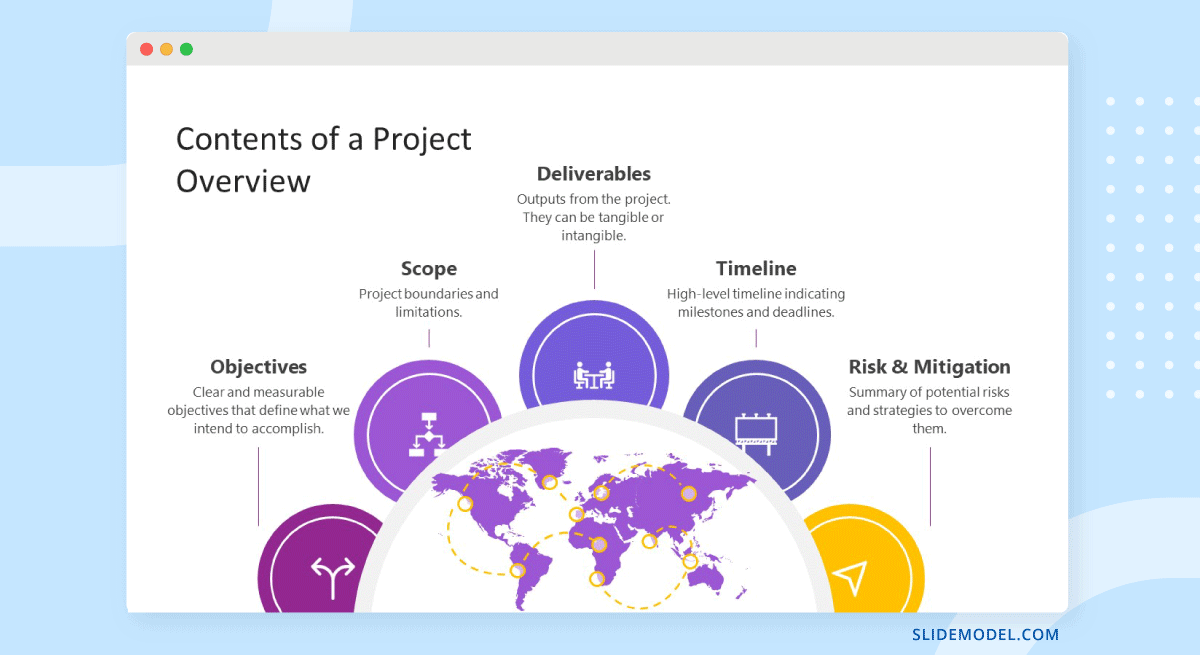
Continue the presentation with a project overview to show the audience what to expect. This section covers one slide or a combination of slides depending on the layout. The project overview slide serves as the introduction to a project presentation and what’s inside.
Include these items:
- An Introduction with a brief background about the project.
- A short explanation of the project’s objectives and completion goals.
- A quick overview of the timeline with start and end dates.
The project life cycle is the series of phases that a project goes through from its inception to its completion. The project process model is the group of knowledge areas, processes, and their relationships that will guide the activities along the project lifecycle. The next slide should display the chosen project process model and explain how it’ll be carried out along the different lifecycle phases. Project process models examples include Waterfall, Scrum, and V Model for software development, and Business Process Modeling Notation (BPMN) and Swimlane for general business-related projects.
Process models are important for the team to understand execution processes. Stakeholders need to see the process model to understand the systematic process of activities and how long they will take.
Use one slide for the model, show only high-level components, and offer details during the presentation if the audience asks for them.
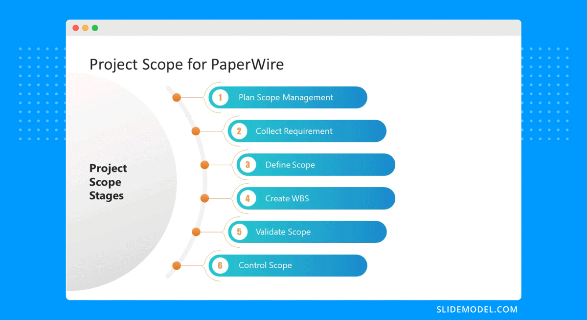
The scope is a crucial element of any project and needs its own section in the presentation. The scoping process begins with requirements gathering and includes the creation of a work breakdown structure , an analysis of what’s in and out of scope, plus validation and scope management plans.
One or two slides are enough to highlight key scope details in a dashboard-style layout mirroring the information on your project scope statement. Preferably, place the scope slides towards the start of the project presentation close to the process model and project resources.
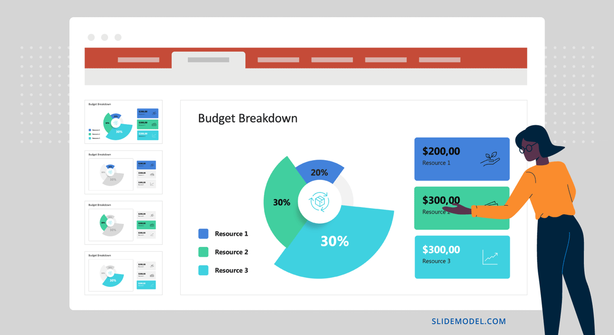
Every project needs resources, and that assessment must be included in the project presentation as well. In a general sense, all resources are what make up the overall budget for the project. In turn, you’ll need to show a budget breakdown that shows high-level resources.
Like many aspects of a project presentation, what you include depends on the industry you’re working for. Construction projects use constructors, materials, machinery, etc. Software projects use programmers, designers, software licenses, computers, etc.
Time is the main resource of any project. During project planning, the project management team estimates the required effort needed to complete the defined scope. Using the Project Process Model, Scope, and Resources, a plan is built. Present a roadmap to highlight the expected time for project completion and where each milestone falls along that line.
Roadmaps can be constructed with an infinite variety of visual layouts, from highly creative and illustrative to structured formats resembling spreadsheets and tables with color-coded roadmaps across the cells. Use one slide to show the roadmap highlighting time estimates, constraints, and projections. For updated project presentations, mark where the project is on the roadmap at that particular moment in time.
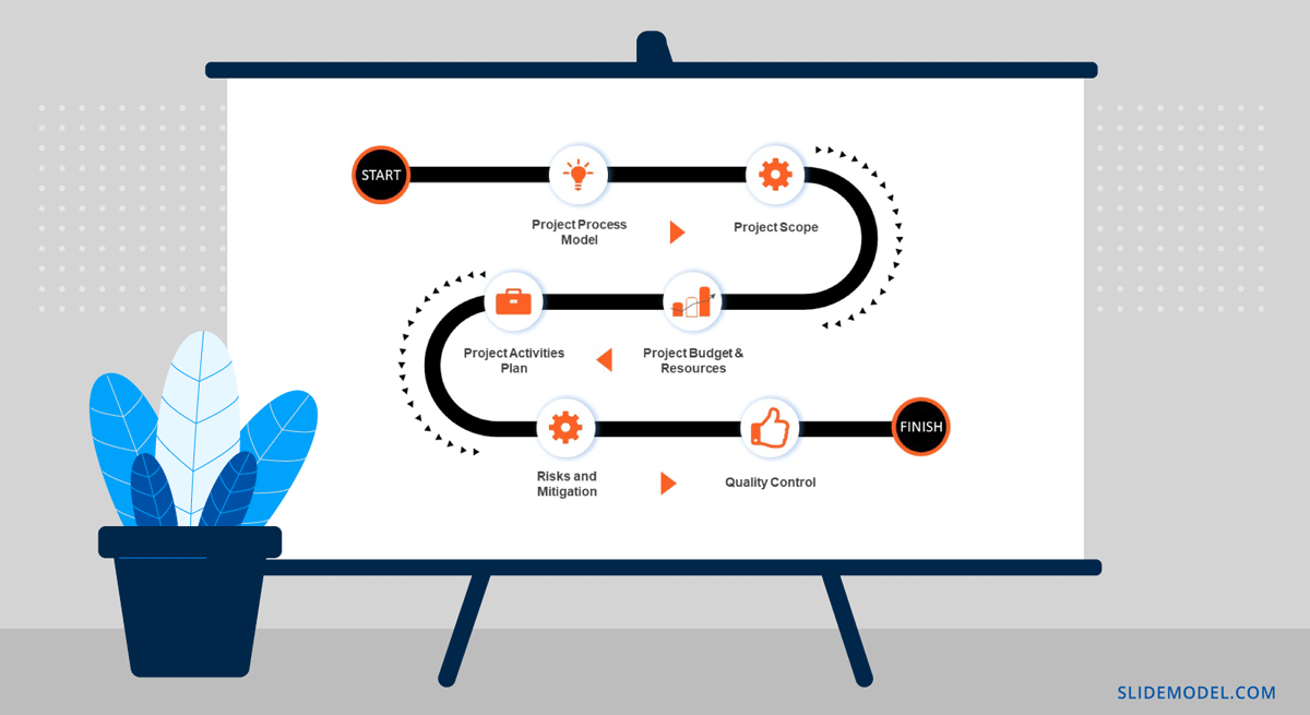
Every phase of the roadmap is broken down into action plans . Action plans list activities, their duration, allocated resources (human, material, and financial), and the relationship between activities.
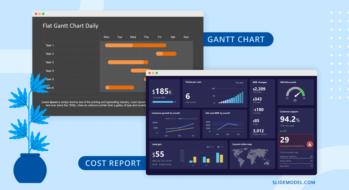
Present your project activities plan with a Gantt Chart and a Costs Report. The Gantt Chart will show the activities to execute, how long they will take, and who (person or team) will be responsible for them. The costs reports will show how much the execution of activities will cost.
During the presentation, you’ll spend the most time on this section, as this is when and where your entire plan is outlined. To show more detail than the roadmap overview, use a few slides to show specific sections of the main Gantt chart and show key activities per phase or milestone.
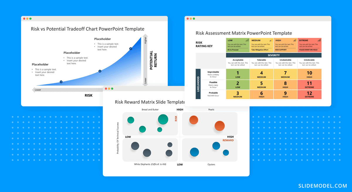
All projects present risks, and to control them, they must be identified, assessed, evaluated, and mitigated . Visualize your risk assessment with a risk matrix and include it in the project presentation.
Use this slide to explain to stakeholders how you plan to mitigate the identified risks. Share with team members what’s expected of them in order to keep the risks under control. Risk management is a critical component of project management and something stakeholders will always be looking at.
Controlling the quality of project deliverables is critical for positive project outcomes and continued success with the deliverable. This process is called quality control or quality assurance.
The project process model includes which quality control techniques the team will use and when. Some quality assurance (QA) techniques include statistical process control (SPC), Six Sigma, ISO 9000, and Total Quality Management (TQM). Use one slide to visualize the process and your plan to execute it.
Once the project starts, the project plan is a living entity and evolves over time. This section will need to be regularly updated with progress reports, performance KPIs, and status updates.
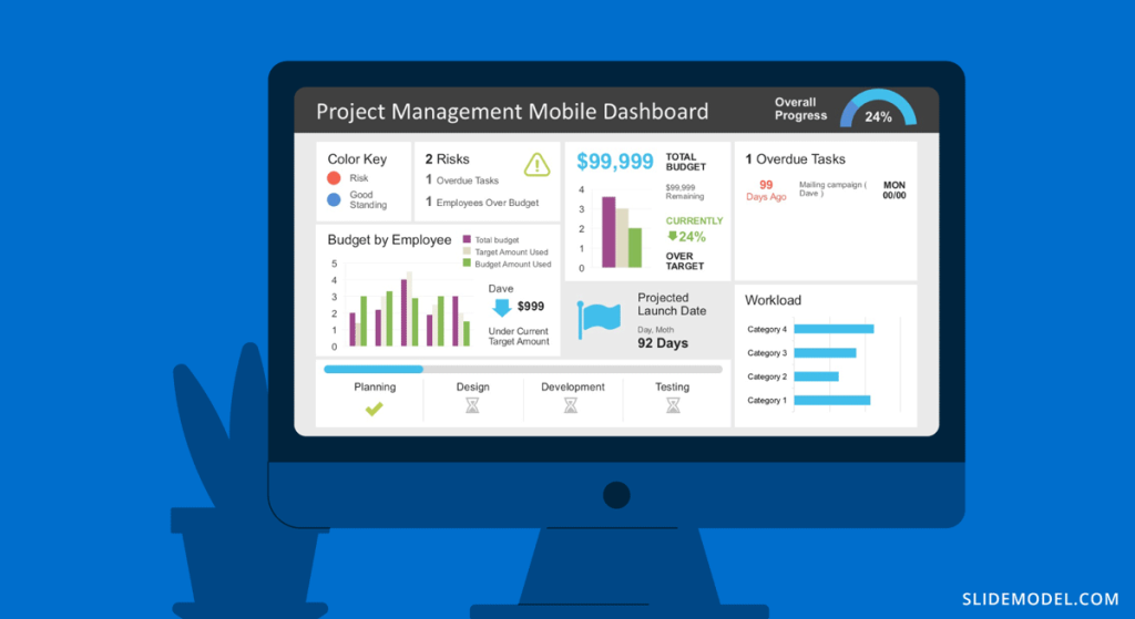
Across these slides, explain how activities will be monitored and deliverable outcomes measured. Show exactly how you will determine if the project is on course or has deviations. Visualize all execution activities with a Gantt chart to show the current progress. Use big numbers and data points to highlight performance metrics. Use a comparison slide to visualize the completeness percentage vs. planned progress and budget consumption vs. planned budget.
Explain all monitoring activities for the execution phase using a calendar or schedule that shows on what days activities will take place and who is involved.
The Project Team
When presenting a project, include a stakeholder map to describe the management team, the sponsors, the main stakeholders, and the implementation team or teams. Depending on the size of the project, this will be an org chart or multiple org charts across a few slides.
Why is it important to present the project team to the stakeholders and vice versa? So that everyone involved knows the other parties and their responsibilities.
Another use for the team slide or slides is to present the next person who will speak during the project presentation. This gives the audience some background on that person’s role in the project.

Case Study – Project Presentation Example
Using the structure we present above, we outlined a case study of a realistic project and how the project manager puts together the project presentation using SlideModel templates. The project presentation example is based on a complex project of building a bridge (Cline Avenue Bridge). For the educational purpose of this article, we are not delivering all the elements of the project presentation, as it is out of scope. Still, we illustrate the more representative slides of each section, show how to prepare a PowerPoint Presentation for a project and how simple it is to adapt the templates to the content that needs to be presented. As a disclaimer, all information we present is an adaptation and reinterpretation of the real project, modified by SlideModel to fit the use case learning goals. This information and presentation should not be considered a source of information related to the Cline Avenue Bridge Project.
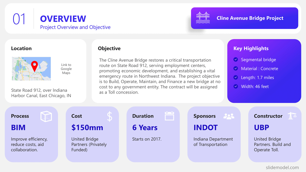
In this slide, the presenter summarises the project highlights in a project charter style. The Project Manager can extend this introduction all over the project lifecycle, and the speech can jump from different knowledge areas without the need to change slides or get deeper into details. Specifically, in the Cline Bridge Project, the objective is narrated, the location is just mentioned and linked to a map for further details, and a set of important facts are presented (Building Information Modelling Process, Budget, Duration, Sponsor, and Constructor). Key Highlights of the final deliverable are listed (Segmental Bridge, Material Concrete, 1.7 miles of length and 46 feet of width)
Process Model
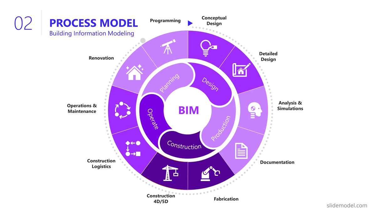
The Process Model slide illustrates the framework for the project lifecycle, processes, planning, and execution. In this slide, the Project Manager will describe the model and how it is tailored to the specifics of the project. In this case, for the development and construction of the Cline Bridge, the builder has defined the use of BIM (Building Information Modelling) as the process model. During this slide, the presenter can describe the lifecycle phases (Design, Production, Construction, Operation, and Planning) and drill down one level over the knowledge practices involved. For example, the initial stage consists of “Design”, which has two main knowledge areas, Conceptual Design, and Detailed Design. The project manager is able to explain this definition without the need to outline detailed processes and activities within them.
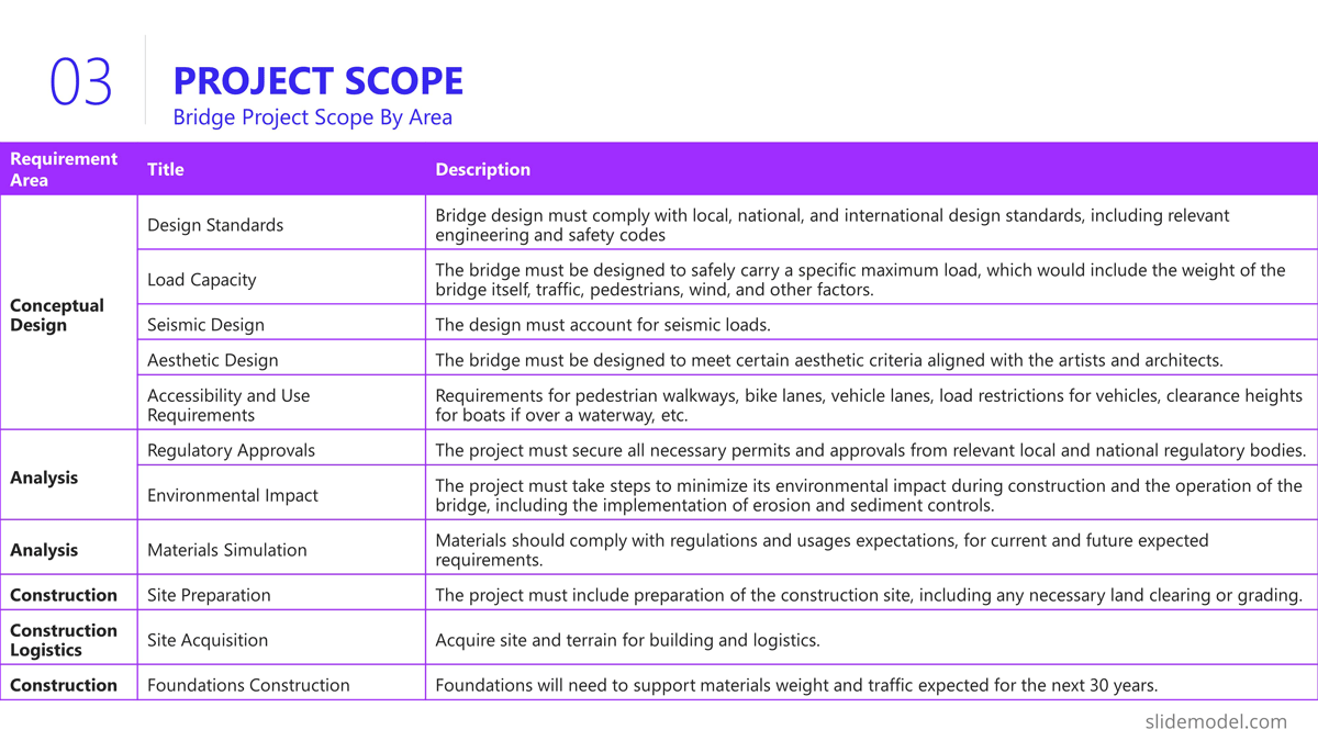
The Scope section of the presentation generally involves several slides, as the content layout is a list of “requirements.” Based on this fact, a table layout is suggested to make good use of space. It is important to avoid abusing the “list” and present the group of requirements rather than specific requirements. Otherwise, the project manager ends up transcribing the requirements document.
In this project presentation example, we present 10 groups of requirements traversing different stages of the project lifecycle.
- Design Standards: Bridge design must comply with local, national, and international design standards, including relevant engineering and safety codes
- Load Capacity: The bridge must be designed to safely carry a specific maximum load, which would include the weight of the bridge itself, traffic, pedestrians, wind, and other factors.
- Seismic Design: The design must account for seismic loads.
- Aesthetic Design: The bridge must be designed to meet certain aesthetic criteria aligned with the artists and architects.
- Accessibility and Use Requirements: Requirements for pedestrian walkways, bike lanes, vehicle lanes, load restrictions for vehicles, clearance heights for boats if over a waterway, etc.
- Regulatory Approvals: The project must secure all necessary permits and approvals from relevant local and national regulatory bodies.
- Environmental Impact: The project must take steps to minimize its environmental impact during construction and the operation of the bridge, including implementing erosion and sediment controls.
- Materials Simulation: Materials should comply with regulations and usage expectations for current and future expected requirements.
- Site Preparation: The project must include preparation of the construction site, including any necessary land clearing or grading.
- Foundations Construction: Foundations will need to support materials weight and traffic expected for the next 30 years.
- Site Acquisition: Acquire site and terrain for building and logistics.
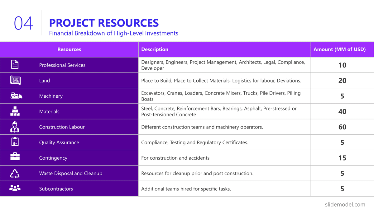
Building a bridge involves a high level of resource usage. In an executive meeting of a project presentation, the recommendation is to structure this section as a Financial table with only one level of detail. Further details are delegated to specific resources and cost analysis presentations.
The resources list presented is:
- Professional Services
- Construction Labour
- Quality Assurance
- Contingency
- Waste Disposal and Cleanup
- Subcontractors
In order to break the style of table after table during the project presentation, we suggest using visual elements as icons and colors metaphorically related to each of the elements listed.
Project Roadmap
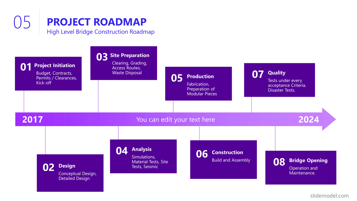
As explained earlier in the article, the project roadmap serves to offer a comprehensive overview of the significant milestones that will happen over the course of time. Given the magnitude of a bridge construction project and its prolonged duration, it is advisable, particularly for such extensive endeavours, to present a roadmap that aligns milestones with corresponding lifecycle phases in a discernible manner. This approach enables the audience to mentally envision the sequential progression of the construction process.
Aligned with previous slides, in the example we created a roadmap with the following high level milestones, and sub componentes:
- Project Budgeting and Financing
- Land Purchase & Renting
- Conceptual Design
- Detailed Design
- Access Routes
- Waste Disposal
- Simulations
- Materials Tests
- Seismic Tests
- Fabrication
- Preparation of Modular Pieces
- Build and Assembly
- Test under Acceptance Criteria
- Stress Test
- Operation and Maintenance
As you can see, the Project Manager decided over a sequential roadmap, presented with little detail in timings, with start and end dates to picture dimension over the diagram.
Action Plan
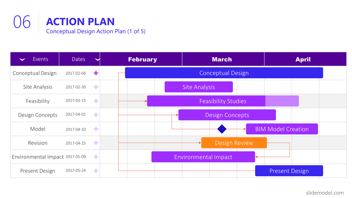
In the bridge construction project of the example, there will be plenty of activity plans. All along the project several of these slides will be created and updated. The most suitable option for presentation tasks, durations, precedence relationship and resource allocation is the Gantt Chart Template. We present the first Quarter of the project, over the Conceptual Design Activities.
As displayed in the PowerPoint Slide , the subtitle clarifies the number of slides that will be used for this purpose.
The activities presented are:
- Site Analysis
- Feasibility Analysis
- Design Concepts
- BIM Model Creation
- Model Revision
- Environmental Impact
- Present Design
Project Risks
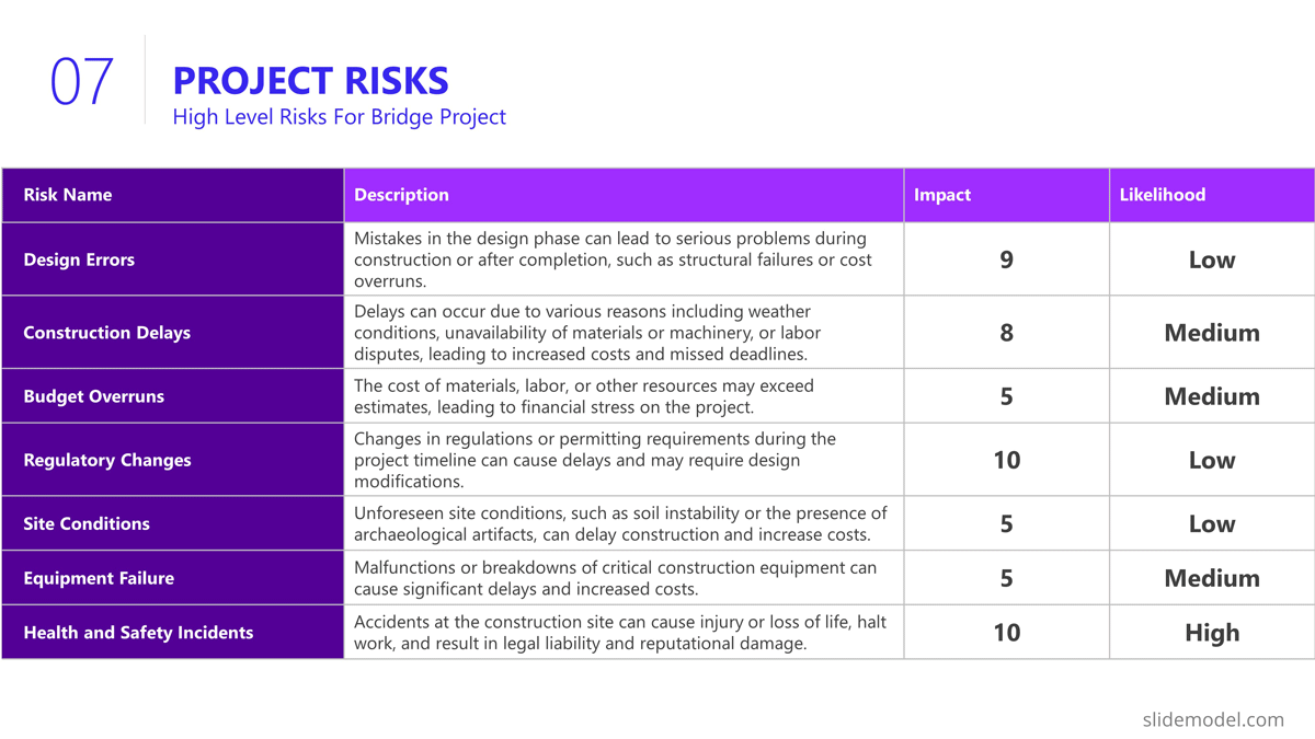
Risk management is an iterative process all over the project life cycle. When presenting your projects, the risks will vary depending on the progress over the roadmap. For this specific example we decided to present the risks being discussed during the Ideation stage, where the developer is exchanging risks with contractors and the company that will build the bridge.
Our suggested layout for this kind of information is a simple table, where the risks are clearly readable and visible, while the description is a hint for discussion rather than an in depth explanation.
It is very important to classify the presented risks, at least with two dimensions; “Impact” and “Probability”. This will generate quality conversations around them.
Outlined Risks during the Initiation Phase:
- Design Errors
- Construction Delays
- Budget Overruns
- Regulatory Changes
- Site Conditions
- Equipment Failures
- Health and Safety Incidents
As the reader can spot, the risks outlined, are very high level, and each of them will trigger specific Risk Analysis Reports.
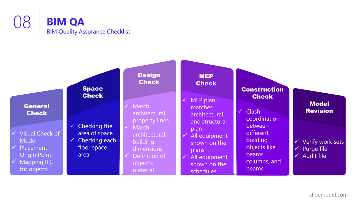
The quality control section of the project presentation may vary depending on the quality process adopted. For large scale companies with a uniform portfolio of projects , it is common to see a continuous improvement quality model, which iteratively builds quality over the different projects (for example software companies) For construction companies like the example, the situation is not different, and the quality control model is aligned with the specific building process model. In this specific case, the project manager is presenting the quality control process to be applied over the BIM model and the Quality Control process to be followed for the physical construction of the bridge:
Execution and Monitoring
During the project, several status meetings will be carried out. During the project presentation the manager can establish the pattern to be used along the project.
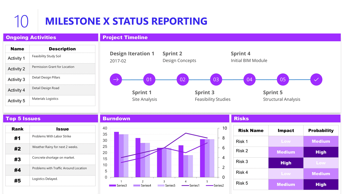
For this example, we set a basic progress dashboard where the project manager can present :
- The current timeline
- Top 5 issues
- Current Burndown
- Top 5 risks.
The art of project presentation goes beyond listing data in random slides. A project presentation is a powerful tool to align stakeholders and foster an environment of trust and collaboration over factual information.
With a structured approach, all members involved in the project design and execution can understand the direction that’s being taken and the importance behind certain decisions. We hope these insights can turn your project into a powerful presentation that inspires and deliver results.
Like this article? Please share
Project Management, Project Planning Filed under Business
Related Articles
Filed under Google Slides Tutorials • July 15th, 2024
How to Export Trello Board to Google Slides
In this article you will learn how to export Trello Boards and convert them instantly into Google Slides, in a step by step tutorial.
Filed under Business • April 24th, 2024
How to Create and Present a Project Timeline
Building a project timeline is an essential aspect of project management. Stay tuned to our detailed guide with examples and templates.
Filed under Business • February 16th, 2024
All about Stage-Gate Process for Product Development
How to develop a product through Stage-Gate Process? In this guide, we explain all about this product development methodology, its pros and cons, and each step to apply it effectively in your project.
Leave a Reply
We use essential cookies to make Venngage work. By clicking “Accept All Cookies”, you agree to the storing of cookies on your device to enhance site navigation, analyze site usage, and assist in our marketing efforts.
Manage Cookies
Cookies and similar technologies collect certain information about how you’re using our website. Some of them are essential, and without them you wouldn’t be able to use Venngage. But others are optional, and you get to choose whether we use them or not.
Strictly Necessary Cookies
These cookies are always on, as they’re essential for making Venngage work, and making it safe. Without these cookies, services you’ve asked for can’t be provided.
Show cookie providers
- Google Login
Functionality Cookies
These cookies help us provide enhanced functionality and personalisation, and remember your settings. They may be set by us or by third party providers.
Performance Cookies
These cookies help us analyze how many people are using Venngage, where they come from and how they're using it. If you opt out of these cookies, we can’t get feedback to make Venngage better for you and all our users.
- Google Analytics
Targeting Cookies
These cookies are set by our advertising partners to track your activity and show you relevant Venngage ads on other sites as you browse the internet.
- Google Tag Manager
- Infographics
- Daily Infographics
- Popular Templates
- Accessibility
- Graphic Design
- Graphs and Charts
- Data Visualization
- Human Resources
- Beginner Guides
Blog Data Visualization 120+ Presentation Ideas, Topics & Example
120+ Presentation Ideas, Topics & Example
Written by: Ryan McCready May 08, 2023
Did you know that 46% of people can’t sit through a presentation without losing focus?
That’s why I wanted to learn how to make a presentation that will captivate an audience. After looking at hundreds of different authors, topics and designs, I’ve assembled over 100 presentation ideas and tips on how to design a compelling presentation for:
- Social media
- Online courses
- Pitch decks
- Lead generation
In this blog, you’ll find 120+ presentation ideas, design tips and examples to help you create an awesome presentations slide deck for your next presentation.
To start off, here’s a video on the 10 essential presentation design tips to make sure that your presentations don’t fall under the YAWN category.
1. Use a minimalist presentation theme
CREATE THIS PRESENTATION TEMPLATE
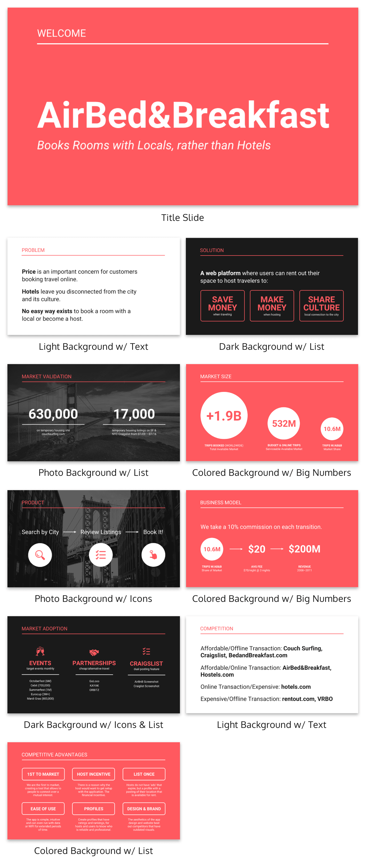
The best designs can also be some of the simplest you see. In the Airbnb pitch deck below, they use a minimalist color scheme and font selection.

A minimalist design is sleek, organized and places the most important thing in focus: your information. There are no distracting stock images, icons, or content. Everything on this unique presentation feels like it belongs and works together perfectly.
Learn how to customize this template:
2. Use a consistent design motif throughout your presentation
Here’s a go-to tip to for a cohesive presentation design: use a design motif. The motif could be a recurring shape (like circles, lines or arrows) or symbol (like a leaf for “growth” or a mountain for “goals”). For more ideas, check out our guide to common symbols and meanings used in design .
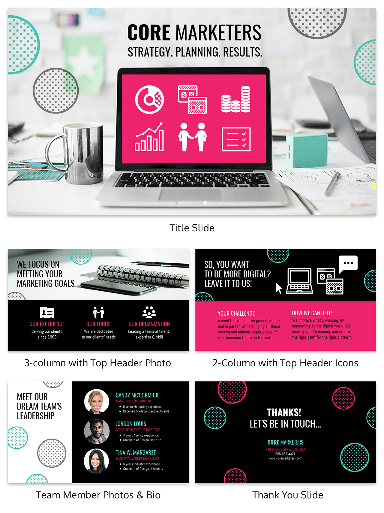
For example, this presentation template uses circles as a design motif. The same circle icon is used in three different colors to add a bubbly touch to the design. The team photos are also incorporated using circle frames:
3. Use an eye-catching presentation background image
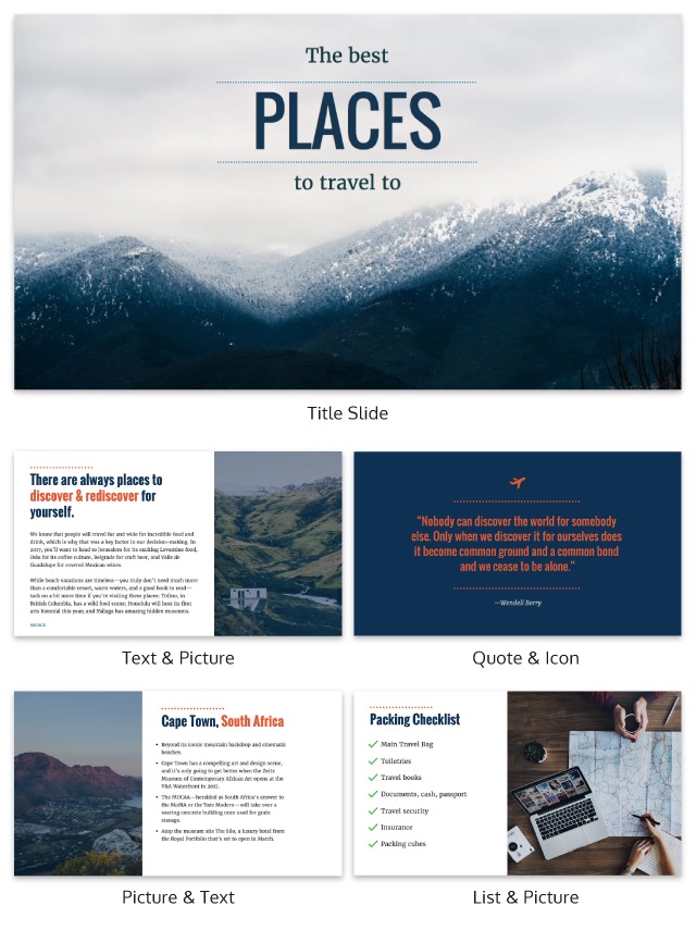
Like with any type of design work, you should want to catch the eye of your audience. In a presentation, this should be done from the beginning with a compelling background image or a color gradient.

In this presentation template, the creators were able to do just that with a landscape photo. When a presentation like this is seen on social media, during a webinar or in person, your audience will definitely listen up.
4. Visualize your points with icons
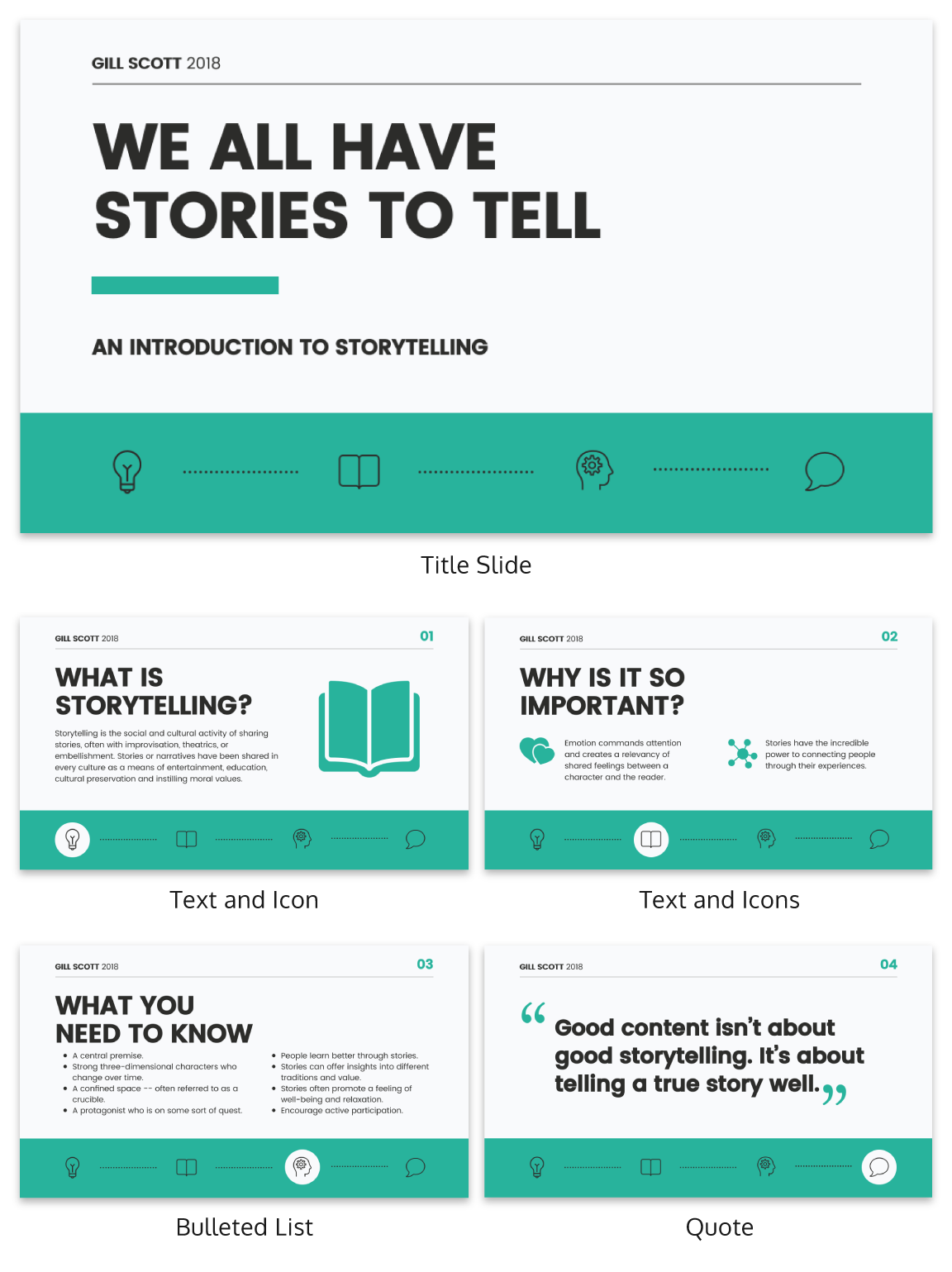
Icons are the perfect visuals to include in presentations. They’re compact and can convey a concept to your audience at a glance. You can even combine multiple icons to create custom illustrations for your slides.
Use the Icon Search in Venngage to find illustrated and flat icons:
5. Use a black & white color scheme for a corporate presentation design
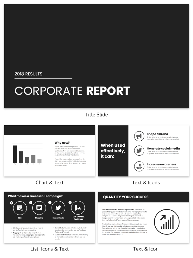
In the presentation below there are only two colors used: black and white. Now, you might be worried that only using two colors is boring, but it all comes down to balance.
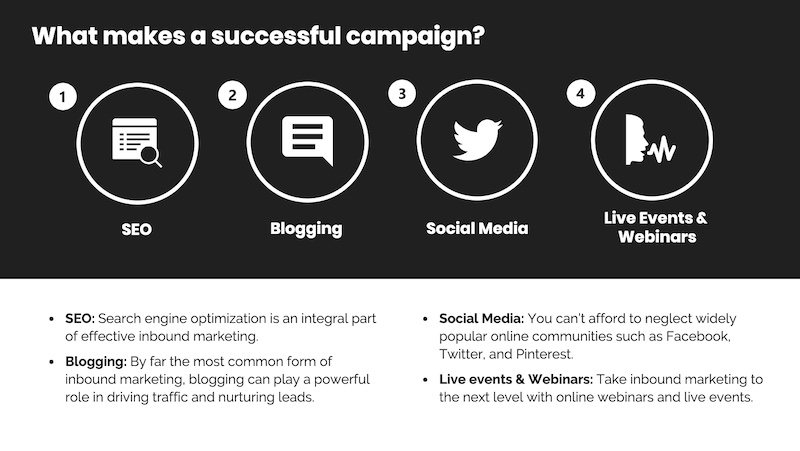
Playing off the ideas of classic minimalism, the designer made this presentation look sleek and professional. And now your content can be the main attraction of your presentation as well!
6. Repurpose your slide deck into an infographic
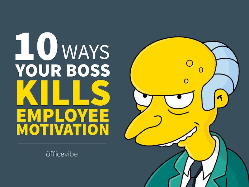
Different types of presentations serve different purposes and sometimes it helps to work smarter, not harder when you are creating a unique presentation. In fact, the spacing, layout, and style used in this presentation makes it easy to repurpose the same images into an infographic.
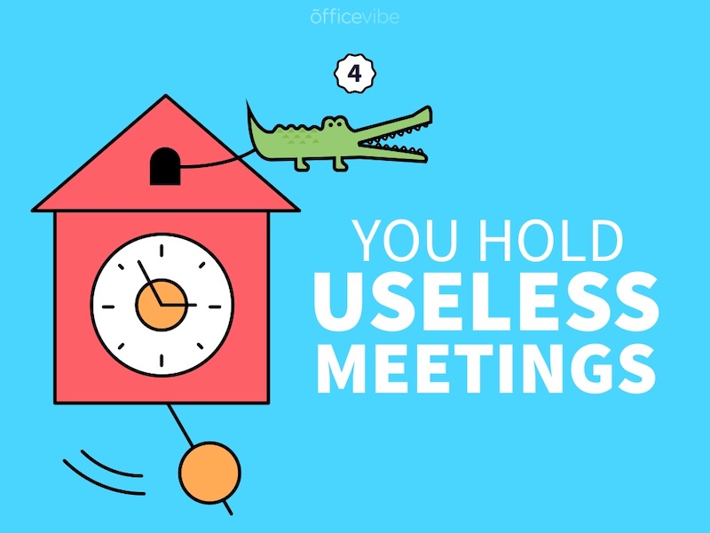
This allows you to create two unique pieces of content from one idea! Which is exactly what Officevibe did .

Join Venngage’s CEO, Eugene Woo, to learn how you can design impactful infographics that will help maintain trust, increase productivity and inspire action in your team.
SIGN UP NOW
7. Break your genre mold for a fun presentation idea
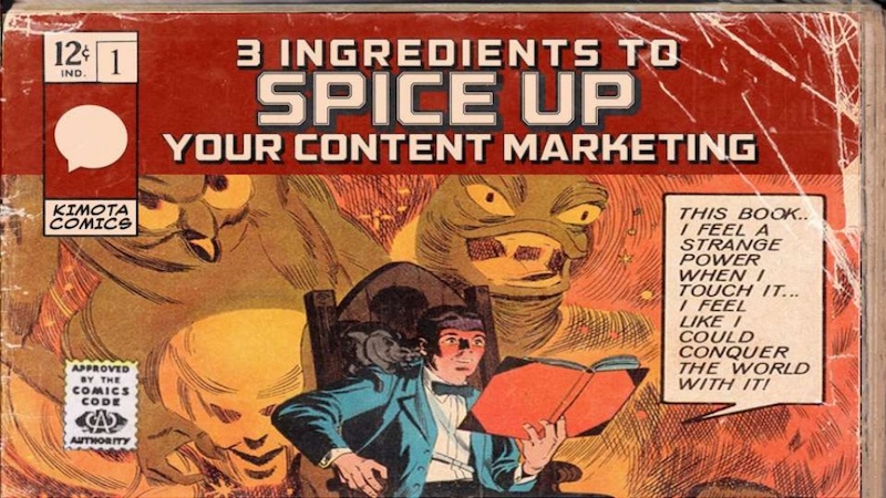
When I first clicked on this creative presentation from SEMrush, I was not expecting to be transported into a comic book. I’m glad I clicked because it may be the most unique slide deck I have ever seen. Going this extreme with your presentation ideas may seem a bit risky, but to be able to break the mold in this age of cookie-cutter presentations is worth it.
To leave a lasting impression on your audience, consider transforming your slides into an interactive presentation. Here are 15 interactive presentation ideas to enhance interactivity and engagement.
8. Make your presentation cover slide count
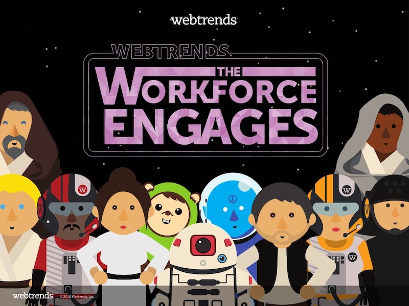
As I was scrolling through all of the presentations, this one made me stop in my tracks. It could be that I have a life-long love of Star Wars, or it could be that their presentation cover slide was designed to do just that: grab your attention. That’s why you should not stick with a boring, text-only title slide. Don’t be afraid to use icons and illustrations to make a statement.
9. Alternate slide layouts to keep your presentation engaging
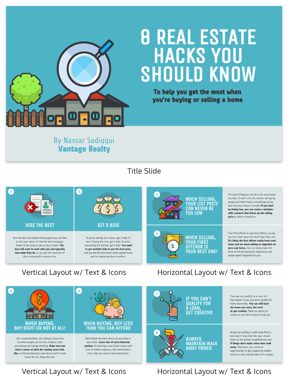
Keeping your audience engaged throughout an entire presentation is hard, even if you have been working on your presentation skills . No one wants to look at slides that look exactly the same for an hour. But on the other hand, you can’t create a unique masterpiece for each slide.

That’s why I’m very impressed with what the designers did in the presentation example above. They use a consistent visual theme on each slide, but alternate between vertical and horizontal orientations.
The swapping of orientations will show people that the presentation is progressing nicely. It can help you make a strong, almost physical, distinction between ideas, sections or topics.
10. Make your audience laugh, or at least chuckle

Sometimes you need to not take your business presentations too seriously. Not sure what I mean? Go check out slide number 10 on this slide deck below.

If you did not actually laugh out loud, then I don’t know what to tell you. Small illustrated embellishments can be very powerful because they evoke an emotional response and to gain your audience’s trust.
Did you know 70% of employees think that giving a good presentation is an essential workplace skill? Check out the top qualities of awesome presentations and learn all about how to make a good presentation to help you nail that captivating delivery.
11. Supplement your presentation with printed materials

Printed takeaways (such as brochures and business cards ) give audience members a chance to take home the most important elements of your presentation in a format they can easily access without using a computer. Make sure you brand these materials in a way that’s visually consistent with your slide deck, with the same color scheme, icons, and other iconic features; otherwise, your recipients will just end up scratching their heads.
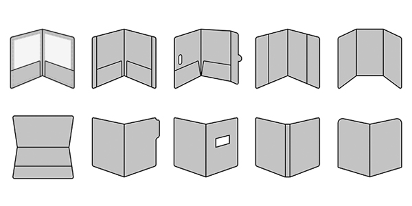
If you’re giving people multiple materials, try packaging them all into one convenient presentation folder. There are over 100 styles with a wide range of custom options, so feel free to get creative and make your folder stand out. Sometimes a unique die cut or an unusual stock is all you need to make something truly memorable. Here are some brochure templates to get you started.
12. Only use one chart or graphic per slide
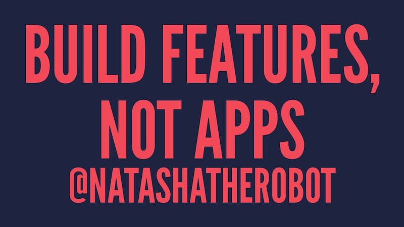
Having too much information on a slide is the easiest way to lose the focus of your audience. This is especially common when people are using graphs, charts or tables .

In this creative slide deck, the author made sure to only include one focal point per slide, and I applaud them for it. I know this may sound like a simple presentation tip, but I have seen many people lose their audience because the slides are too complex.
13. Keep your employee engagement presentations light
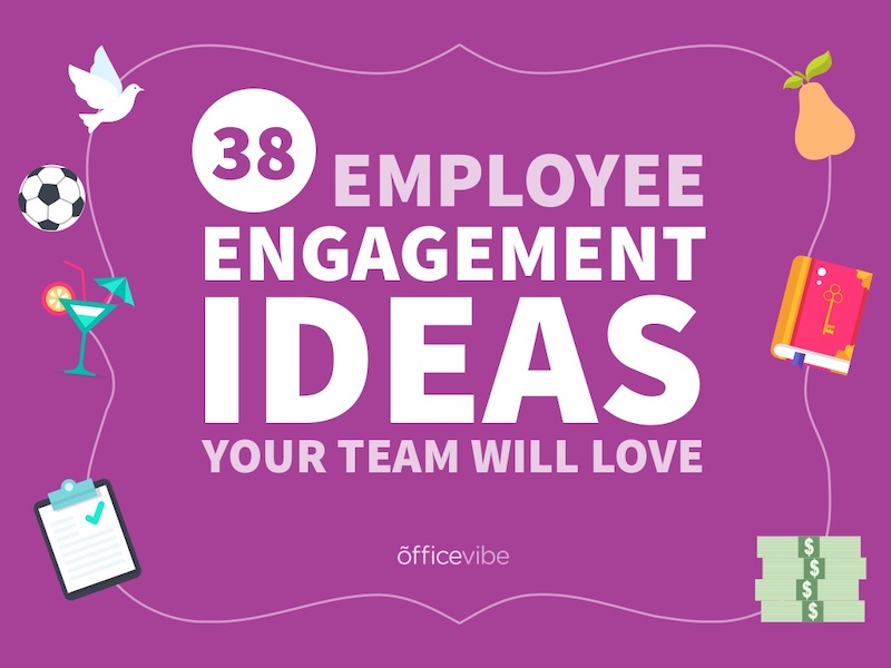
Sometimes you need to get away from stuffy, professional presentation ideas to capture your audience’s attention. In this case, Officevibe used some very colorful and playful illustrations to stand out from the crowd.

I mean, who could not love the plant with a face on slide number 9? And if you want to see some more icons and illustrations like this, be sure to check out our article on how to tell a story with icons.
14. Feature a map when talking about locations
Including a map in your creative presentations is a fantastic idea! Not only do they make an interesting focal point for your slide layout, they also make location-based information easier to understand.
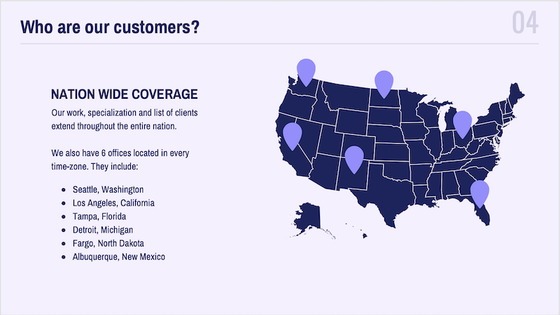
This cool presentation example by our pro designers at Venngage uses maps to visualize information. This map both dominates the screen, and also displays all the locations being covered.
15. Use a font that is large and in charge

If you are presenting to a small group or a packed stadium, make sure your audience can see your text! Use a large and in charge font that can be read from even the nosebleed seats.
Honestly, you really never know where your unique presentation will be seen. It could be seen in a conference room or conference hall, and everything in between. Be ready to present almost anywhere with a bold and easy to read font.
16. Use pop culture references to build a fun presentation

Using a meme or pop culture reference is another way that you can jive with your audience. It can be used to quickly get a point across without saying a word or create a moment that you can connect with the room. For example in this presentation, they used Napoleon Dynamite to give the audience feelings of nostalgia.
17. Use more than one font weight on your presentation cover slide
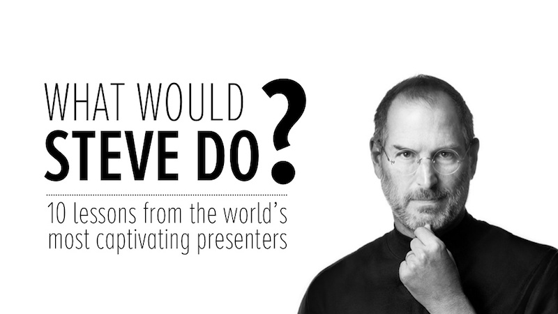
Just like you would never use one font on an infographic, you should never use just one font on your presentation (for more tips, read our guide on how to choose fonts ). In this presentation example from HubSpot, they use a bunch of different font weights to add emphasis to key words and ideas.
As you can see, they use a bold font on the presentation cover to bring attention to Steve Jobs name. This makes it easy for the audience to know what your presentation is going to be about from the beginning as well.
18. Use a color theme for each idea

Color is another extremely powerful nonverbal tool that you can use to guide your audience. By using a different color for each section of your creative presentation, Dell is able to clearly indicate when they are switching points or ideas. Going from green to orange, and even red almost effortlessly.

This is a great way to design a list, guide, or a how-to presentation as well. And each color can be assigned to a different step or number with ease.
Need help picking the perfect color palette? Start here !
19. Use illustrations instead of pictures

An easy way to keep your design consistent throughout your unique presentation is to use illustrations like in this slide deck by Domo.
They used illustrations instead of pictures to show off their subject on slide numbers 4-10 and it looks fantastic. This will ensure that the audience focuses on the content, instead of just the photo they could have used.
It also helps that illustrations are a top design trend for 2020 .
20. Use contrasting colors to compare two perspectives or sides of an argument
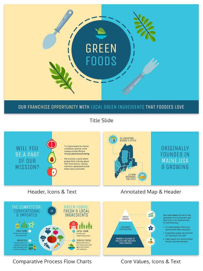
Contrasting colors can be used to quickly show each side of topic or an argument. For example in this presentation, they use this trick to show the difference between their company and the competition.
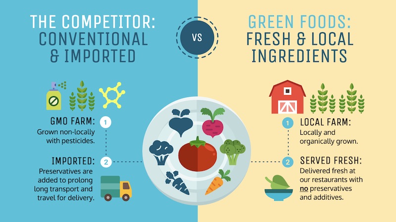
They use color very effectively in this example to show their company is better, in a nonverbal way. With a lighter color and illustrated icons, the company is able to position them as the better choice. All without saying a word.
Now if they would have used similar colors, or a single color the effect wouldn’t have been as strong or noticeable.
21. Include your own personal interests
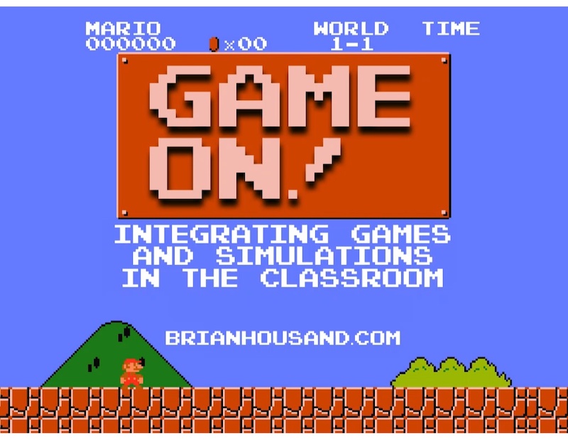
This example is one of the most interesting and cool presentations I have seen in awhile, so I suggest checking out the entire thing. The creator inserts a bunch of his personal interests into the slide to make his presentation about education fun and relatable. And they even use a Super Mario Bros inspired presentation cover, so you know it has to be fantastic!
22. Try to stick to groups of three
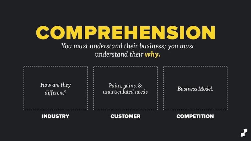
How many major ideas should be present on your presentation aid? Never break your presentation layout down into anything more than thirds. This means there should be at most three columns, three icons, three ideas and so on. A great example of this idea starts on slide number 9 in this slide deck and continues throughout the rest of the presentation.
Here is a great three columned slide template to get started with.
23. Add a timeline to help visualize ideas
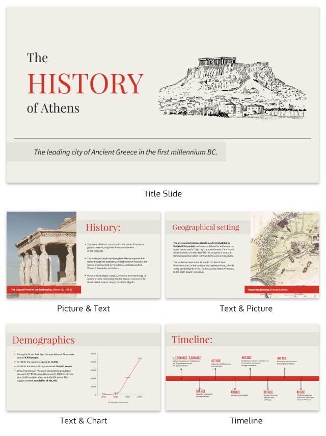
One of the best ways to visualize a complex process or historical event is to use a timeline presentation. A list of all the steps or events is just not going to cut it in a professional setting. You need to find an engaging way to visualize the information.
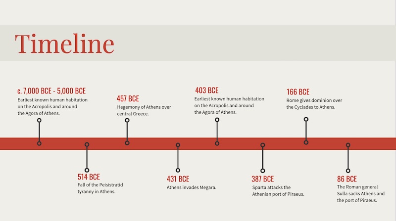
Take the presentation example above , where they outline the rise and fall of Athens in a visually stimulating way.
24. Label your graphs & charts
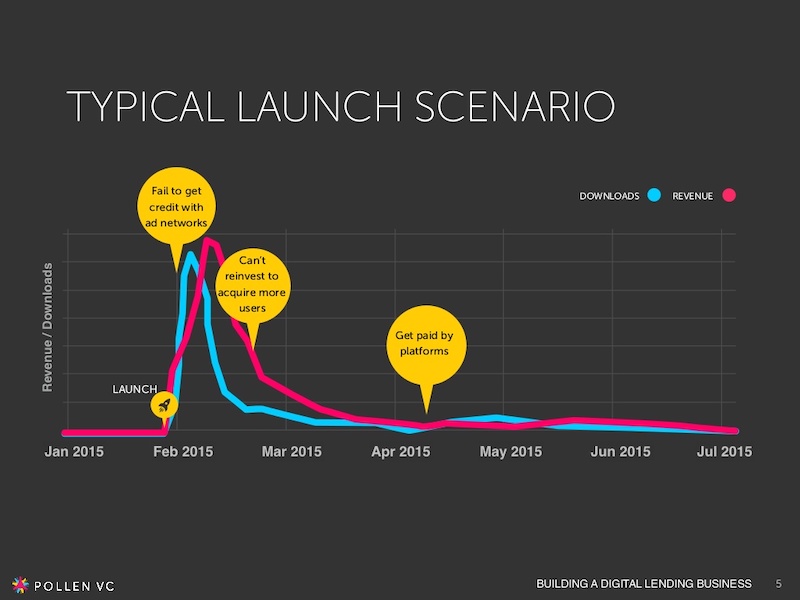
If the people at Pollen VC had not added those annotations to the graphs on slide number 5, I would have definitely not known what to make of that graph.
But when you combine the visuals on a graph with descriptive text, the graph is able to paint a picture for your audience. So make your graphs easy to understand by annotating them (this is a chart design best practice ).
Create a free graph right here, right now!
25. White font over pictures just works
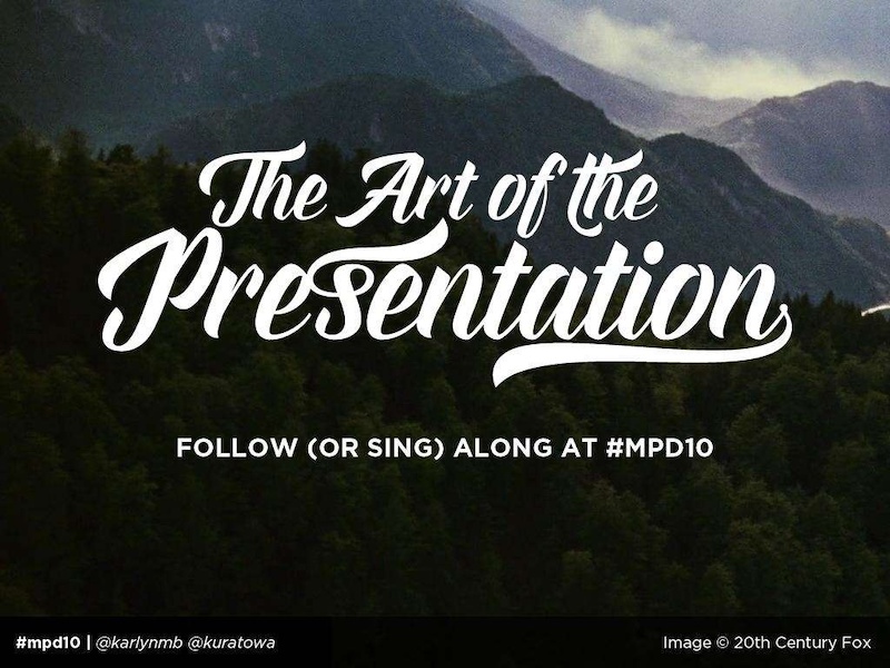
There is a reason that you see so many quotes or sayings in a white font that are then overlaid on an image. That it is because it just works in so many situations and the text is very easy to read on any image.
If you do not believe me, look at the slide deck example above where they use a white font with a few different fonts and about 100 images. Plus the presentation template is chocked full of other tips on how to create a winning slideshow.
26. Color code your points across the whole presentation

Here is another example of a presentation that uses color to keep their points organized. In this case, they use 10 different pastel colors to match the 10 different tips for employee engagement .
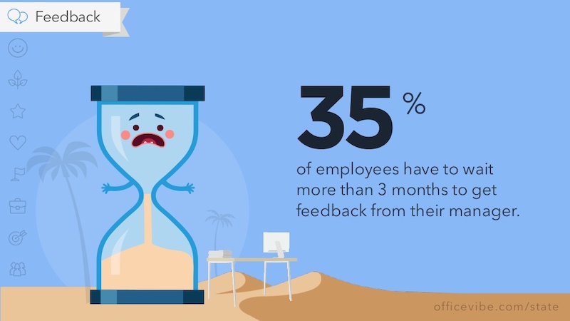
Check out our guide for how to pick the best colors for your visuals .
27. Use a simple flow chart to break down a process
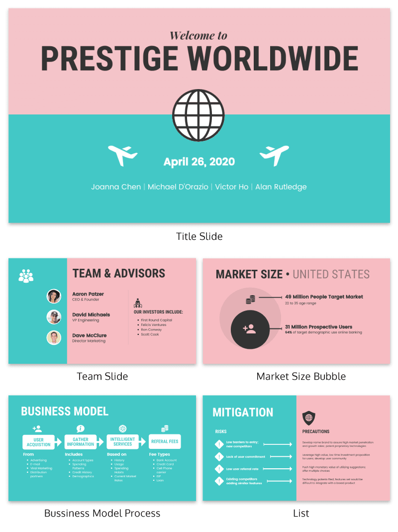
If you’re a fan of the movie Step Brothers , you may have heard of Prestige Worldwide before. In this fun presentation example they are back to sell you on their business model and growth plans.
This time, the presentation will be effective because it actually talks about what the business does.
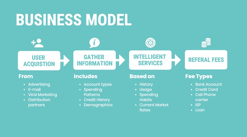
Instead of making a music video, they use a helpful flowchart template to explain their business model. I would recommend following their lead and creating a dynamic flow chart to visually break down any process. Try making your own flowchart with Venngage.
28. Make your slide deck mobile friendly
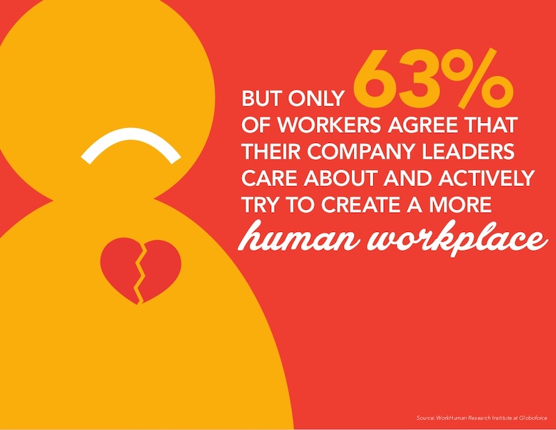
As more people move to mobile as their main device each year, making your presentations mobile-friendly is becoming increasingly important. This means that the text is large and there aren’t too many small details, so everything can scale down. Just like in this presentation example from the creators at Globoforce.
29. Don’t be afraid to include too many examples
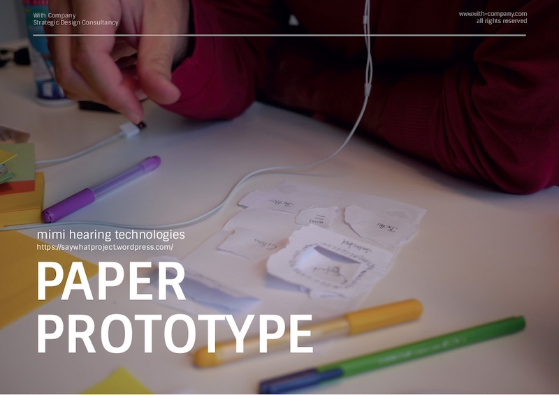
If you are presenting a complex idea to a group, especially a large audience, I would recommend having a ton of good examples. Now, I would try not to overdo it, but having too many it is better than having too few.
In this creative presentation, the people at With Company spend about 20 slides just giving great examples of prototyping. It doesn’t feel too repetitive because they all are useful and informative examples.
30. Use consistent visual styles for an elegant presentation design
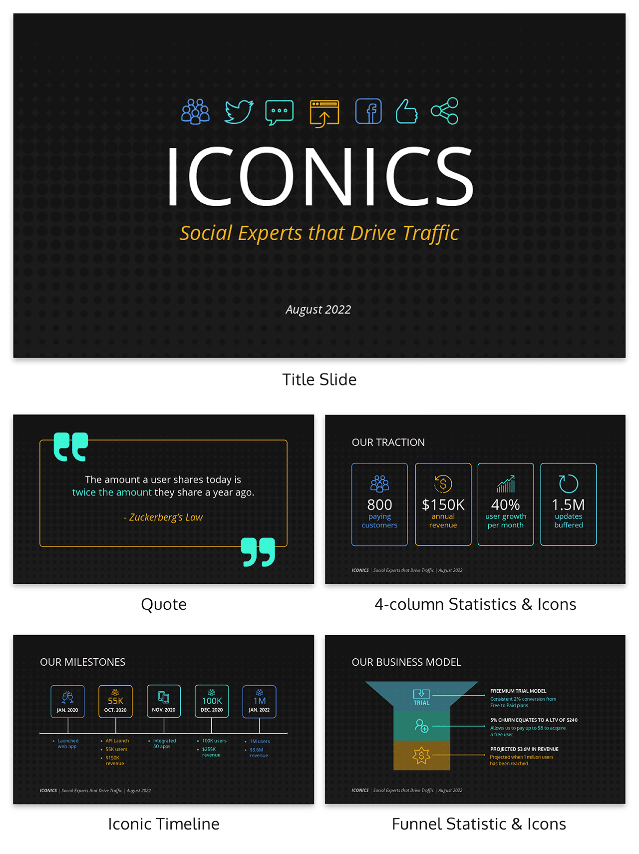
I have already written extensively about using icons in all of your design projects . I haven’t talked as much about matching icons to your presentation template.

But that’s just as important, especially if you want to create a professional presentation for your audience.
As you can see in the example above, the designer used minimalist icons that fit the slide designs. All of the other graphics, charts and visual elements fit together nicely as well.
Plus the icons don’t distract from the content, which could ruin a stellar presentation.
31. Use a consistent presentation layout

In this example from Bannersnack, they use a consistent layout on each of their slides to help with the flow by using the same margins and text layout.

It’s a solid presentation example because they help the user know where to look immediately. It may seem like they are playing it safe, but anything that can speed up the time it takes for a user to read the content of the slides, the better.
32. Use loud colors as much as possible

This is one of my favorite presentations because of the highlighter yellow they chose to use as their main color. It is actually very similar to one that I saw presented live a few years ago and I have used this same approach in a few presentations ideas of my own.
33. Pull your design motif from your content
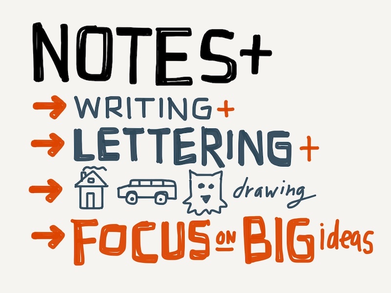
If you are talking about an interesting topic, why not use the topic as the main design motif in your creative slide deck? For example, in this presentation about sketchbooks, the creator uses a sketchy, handwritten motif. It is something simple that helps the audience connect with the topic. Plus, it allows you to include a ton of great examples.
34. Utilize a call & answer cadence
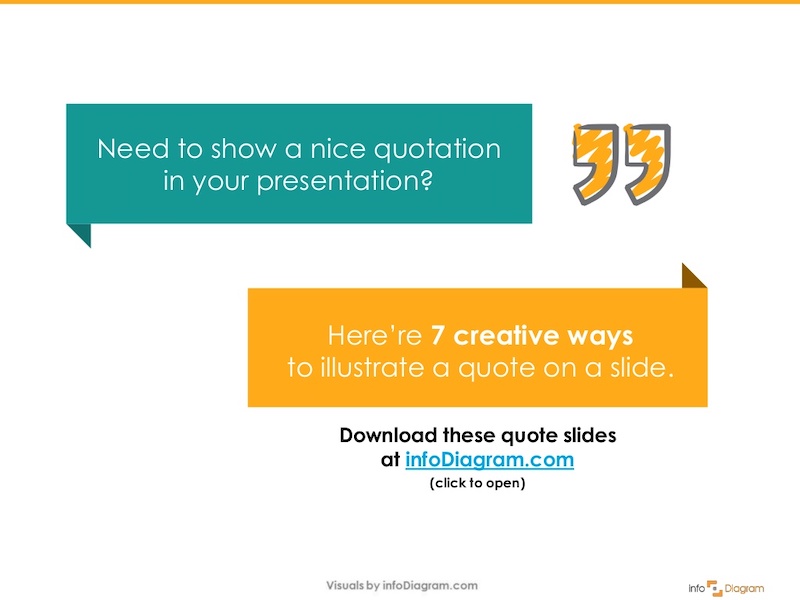
In this SlideShare about how to create a presentation, Peter Zvirinsky uses a two-step process to present a point. First, he presents the header presentation tip in a speech bubble. Then he shows a supporting point in a responding speech bubble. This gives the presentation a conversational flow.
35. Repurpose ebook content into a creative presentation

This slide deck was adapted perfectly from a Seth Godin ebook into the presentation example you see above. In the slide deck, they take a piece of content that would usually take a while to read and cut it down to a few minutes. Just remember to include only the most important ideas, and try to present them in a fresh way.
36. Add a timed outline to your presentation
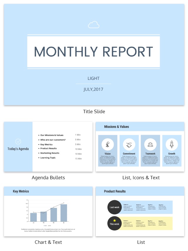
We have already covered how important it is to have a table of contents in your slides but this takes it a bit further. On the second slide of the presentation below, the creator added how long each of the slides should take.
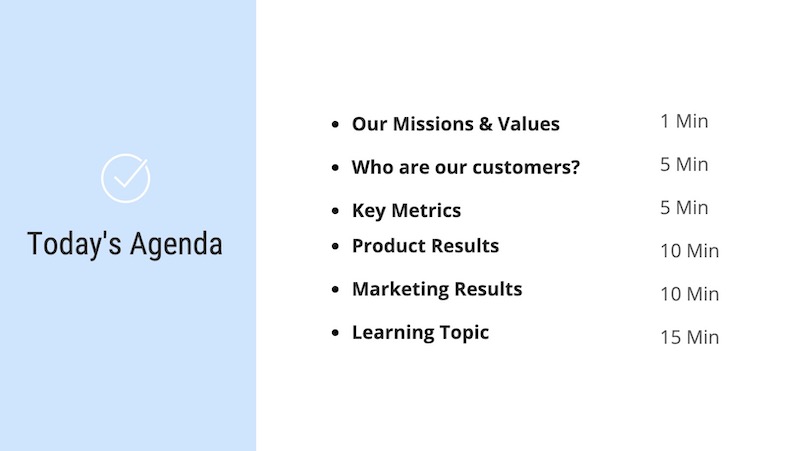
This is great because it helps your audience know the pace the presentation will take and will help keep them engaged. It also will help them identify the most important and in-depth parts of the presentation from the beginning.
37. Use a “next steps” slide to direct your audience
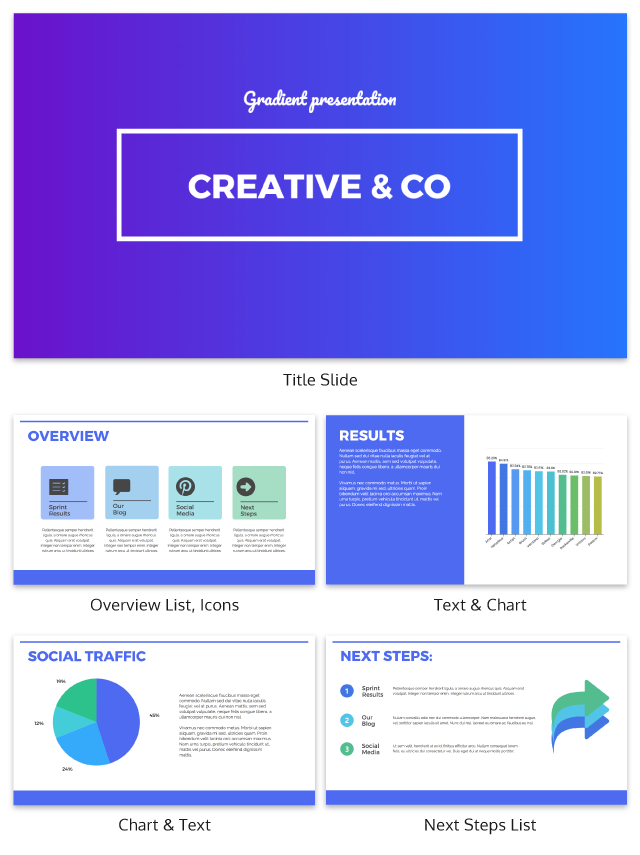
One of the worst things you can do as a presenter is to leave your audience without any idea of what to do next. A presentation should never just end because you ran out of slides.
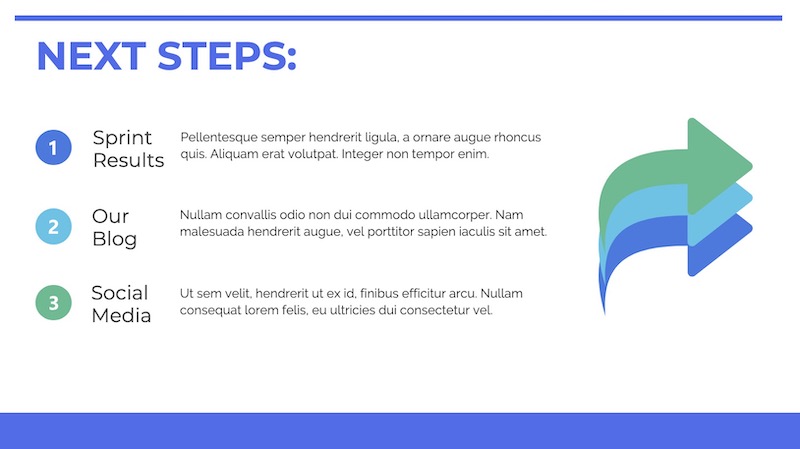
Instead, use a conclusion or “next steps” slide like in the example above to finish your presentation. Sum up some of your main points, tell your audience where they can get more information, and push them to take action.
38. Go a bit crazy with the design

Sometimes you need to throw convention to the wind to create something unforgettable. This presentation from Velocity Partners does just that, and I think it is one of my favorite ones from this entire roundup.
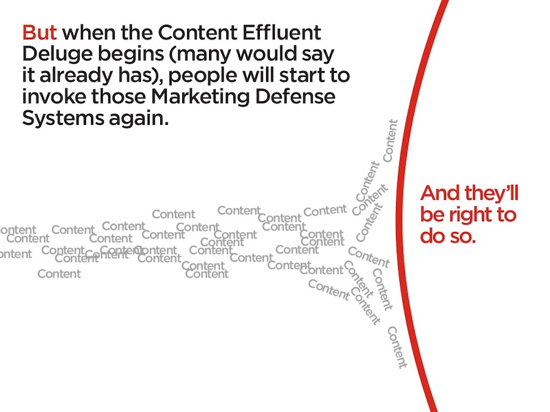
They use unconventional typography, quirky icons, and unusual presentation layout to make each slide surprising.
39. Make your slide deck easy to share
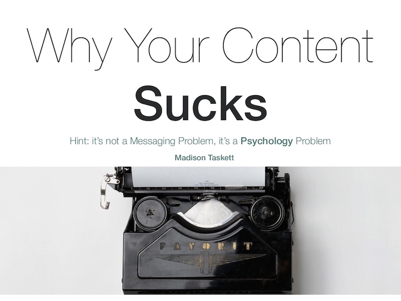
If you are looking to get a lot of eyes on your presentation I would make sure people will want to share it on social media. How do you do that? By presenting new and interesting value. This means your content needs to answer a common question and your design needs to be clutter-free. For example, look at this very social media-friendly. The slides are simple and answer questions directly.
40. Use shapes to integrate your photos into the slides
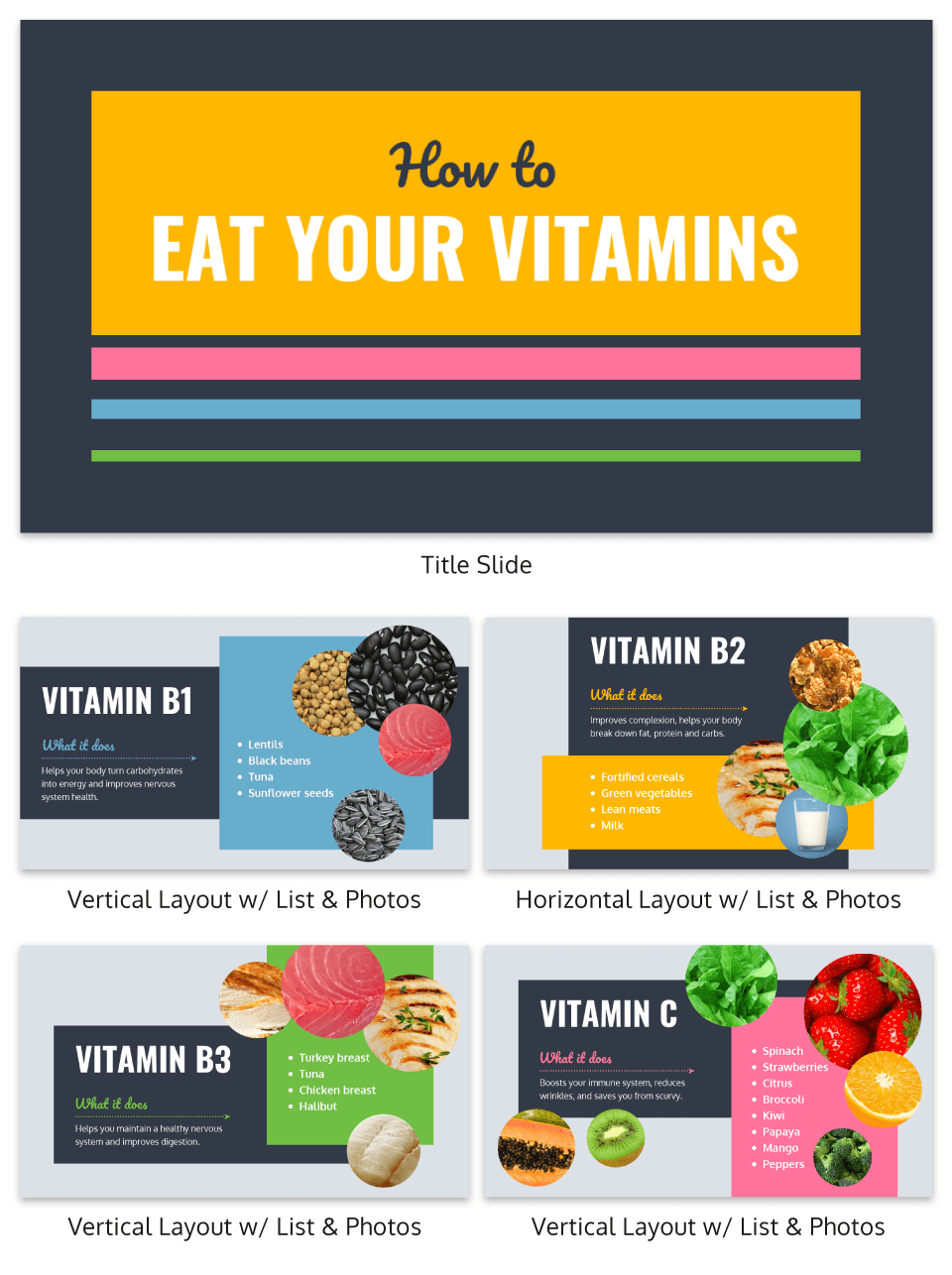
Want to include a bunch of images in your presentation? I say do it!
Now most of the time you would add a raw image directly to your slide. However, if you want to present images in a professional way I would recommend using an image frame .
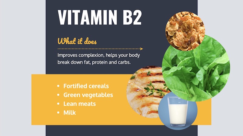
Like in the example above, you can use these frame to create a collage of images almost instantly. Or provide a similar visual theme to all of your slides.
Overall, I believe it’s a great way to add a new visual component to your presentation.
41. Hijack someone’s influence in your marketing slides

If you are stuck in the brainstorming phase of your presentation, focusing on a brand or influencer is a great place to start. It could be a case study, a collection of ideas or just some quotes from the influencer. But what makes it effective is that the audience knows the influencer and trusts them. And you are able to hijack their awareness or influence.
42. Put y our logo on every slide

Whether you have a brand as powerful as Moz, or you are just getting started, you should always have your logo on each slide. You really never know where a presentation is going to end up–or what parts of it will! In this presentation template, Moz does a good job of including their branding and such to get others interested in Moz Local. Don’t have a logo yet? Our logo design tips will help you create a logo that’s iconic and will stand the test of time.
43. Lead your audience to it

In this example, the creator uses something very similar to the call and answer approach I mentioned above, but with a little twist. Instead of just throwing all the info up at once, they use three slides to build to a particular point and include a subtle call to action in the third slide.
44. Make visuals the focal point of your presentation slides
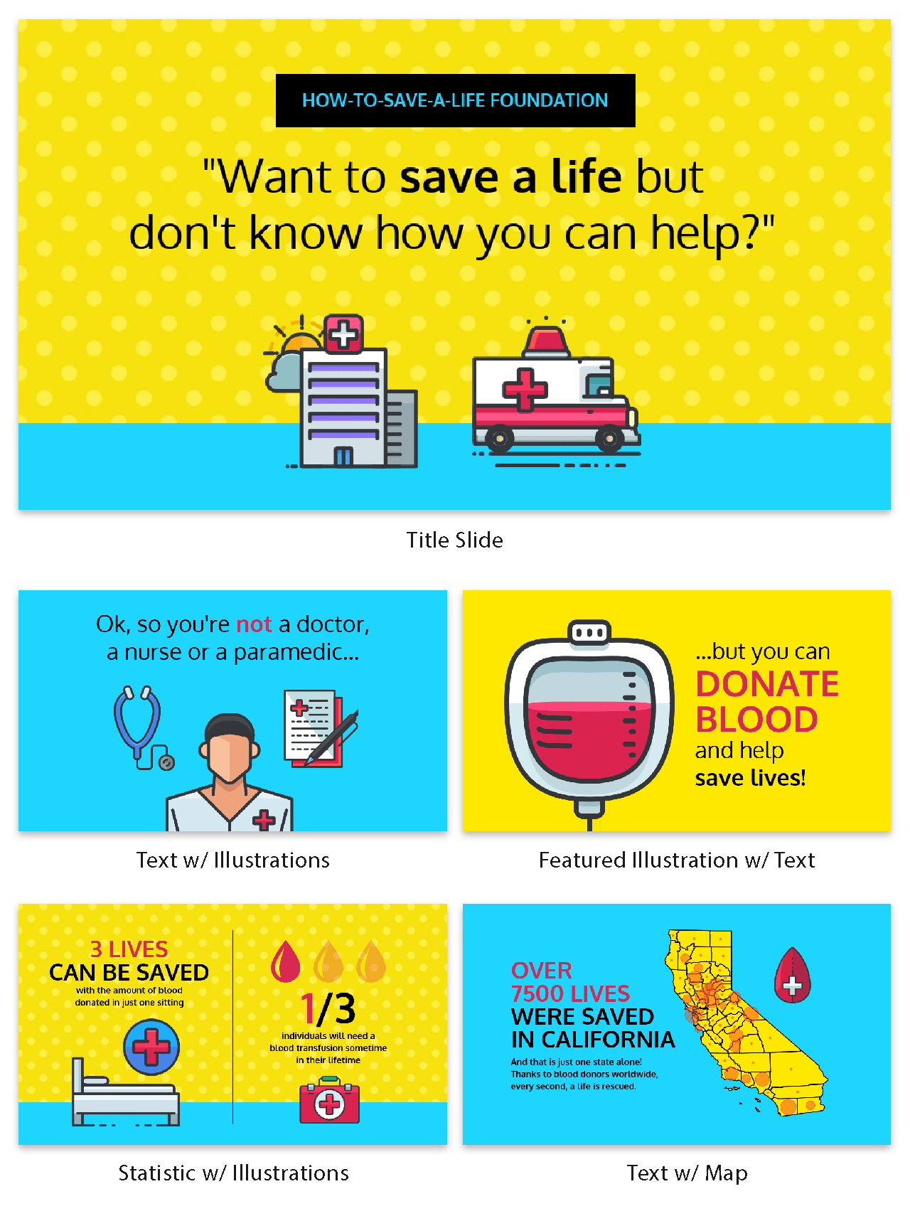
If you haven’t noticed, illustrated icons are having a revival in 2020 and beyond. This is likely because minimalist icons dominated the design world for the past decade. And now people want something new.
Brands also like using illustrated icons because they are seen as genuine and fun.

And because they are so eye-catching you can use them as focal points in your presentation slides. Just like they did in the creative presentation example above.
Picking the perfect icon is tough, learn how you can use infographic icons like a pro.
45. Use a quirky presentation theme

In this slide deck, the authors show you how to become an Animation Ninja…and they use ninja graphics and icons extensively. This caught my eye immediately because of the amount of work that I knew was behind this. It takes a lot of time and effort to line all of the content and graphic up to create a cohesive theme, but the payoff can be massively worth it.
46. Use a consistent background image

I am a big fan of the way that Aleyda Solís uses only a single presentation background image throughout her presentation.

By using this tactic the audience is able to focus on what is happening in the foreground. Plus it gives the whole presentation a different feel than all the other ones I have looked at.
47. Summarize your points at the end
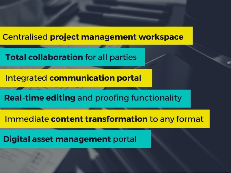
It’s a good idea to summarize your points before you end your presentation , especially if you’ve covered a lot of information. In this presentation example, Deanta summarizes exactly what they do on slide numbers 16-18. They also provide their contact information in case their audience has any more questions. I think that every presentation should use this same approach, especially the ones you are presenting outside of your company.
48. Use a minimalist presentation template
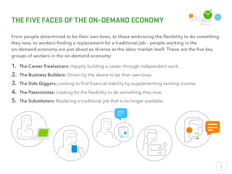
This slide deck from QuickBooks uses a minimalist theme to help the audience focus on what is important, the content.
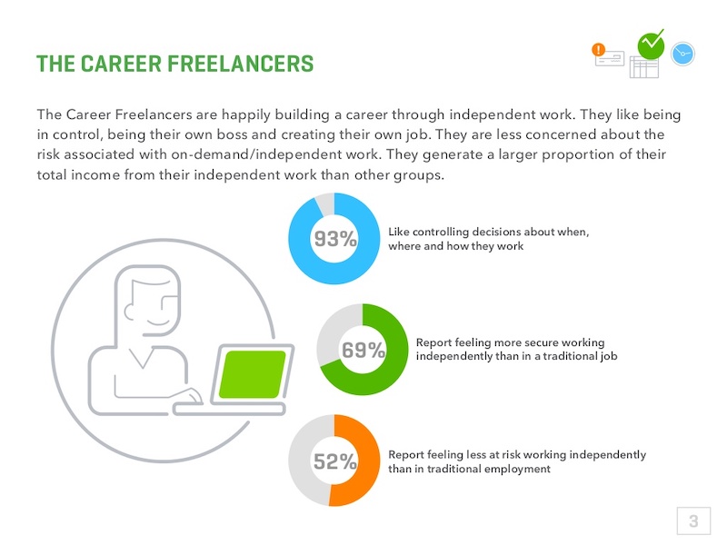
There were only five colors used in the entire presentation and the graphics were simple line drawings. This made it easy to read and very pleasing to the eyes.
49. Split your slides length-wise
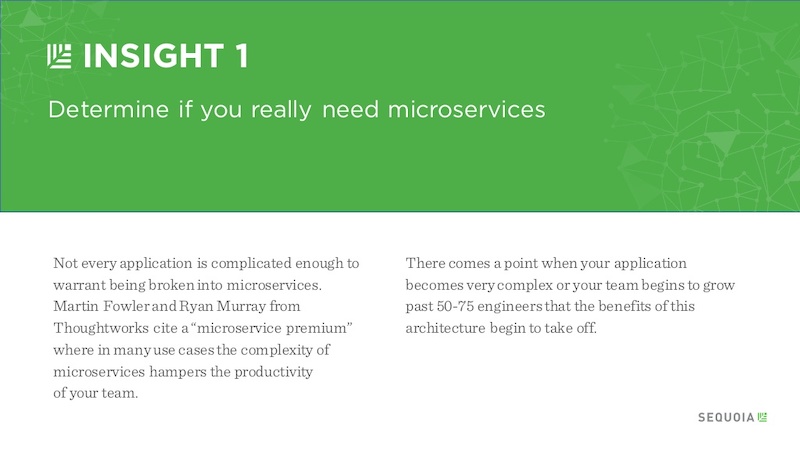
Here is a simple template you can use to separate your headers, or main points, from your body text in a presentation.
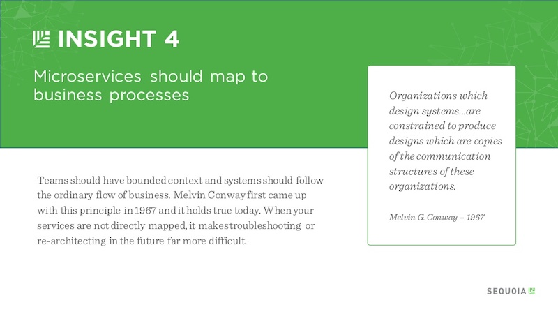
Instead of using a solid presentation background, split the slide in half like Sequoia did in their slide deck. They used their brand color for the title portion and a neutral white for the supporting content.
Use this company report template to create a very similar slide right now!
50. Embrace a bold color scheme throughout your presentation
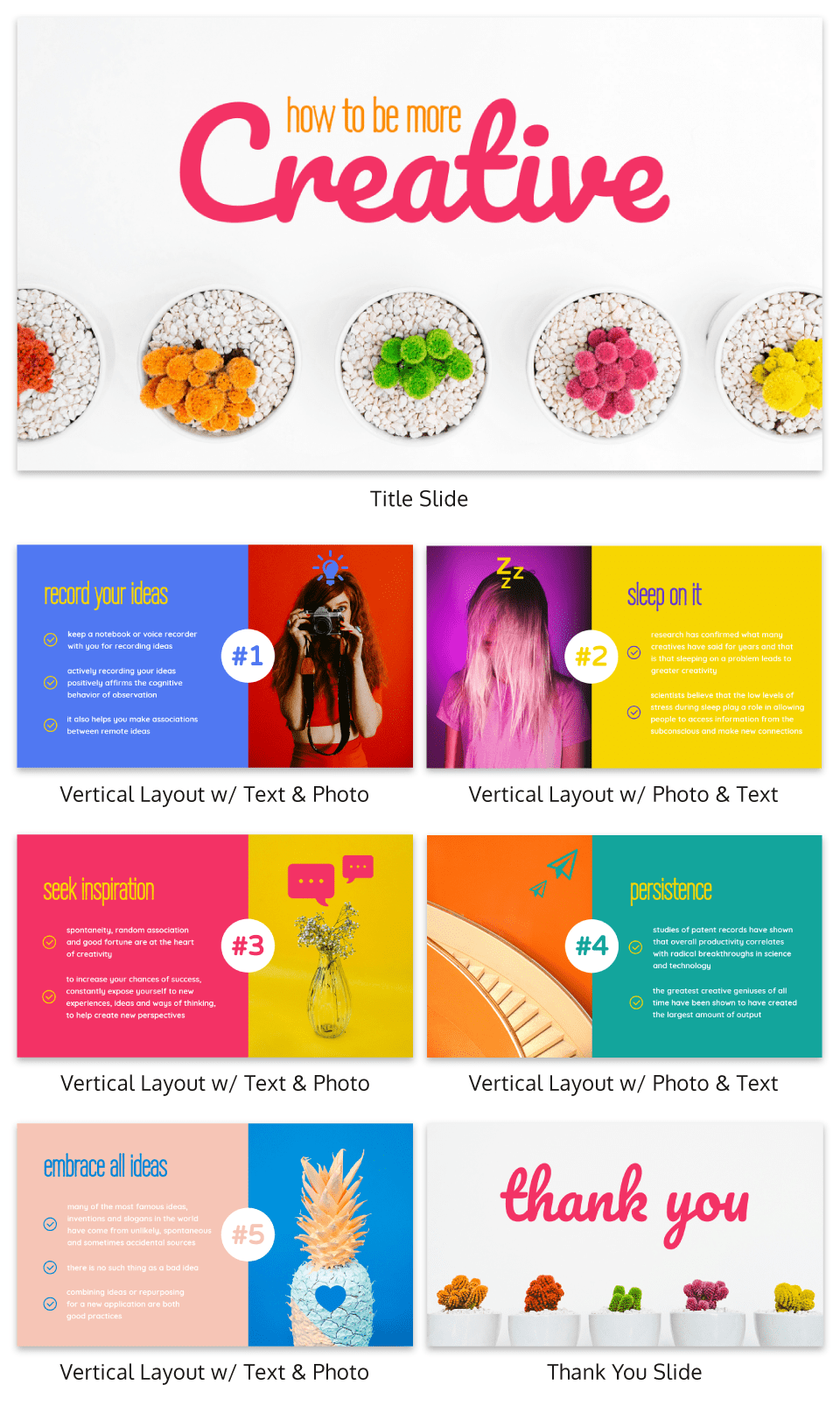
My favorite part of the creative presentation example above is the use of complementary colors in each slide. As you can see, not one of the slides use the same color scheme but they all feel related connected.
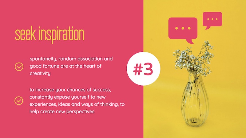
This approach can be used to make your presentation visually unique, without abandoning a cohesive theme or idea.
51. Put text in the top left corner
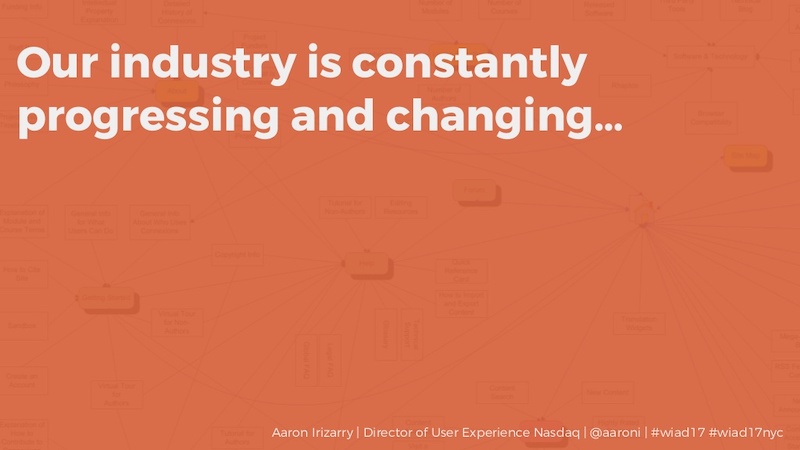
English speakers will instinctively try to read text from a top to bottom, left to right orientation. I would recommend using a left alignment for your text and adding additional things from top to bottom, just like Aaron Irizarry did in this presentation layout.
52. Break up your tables
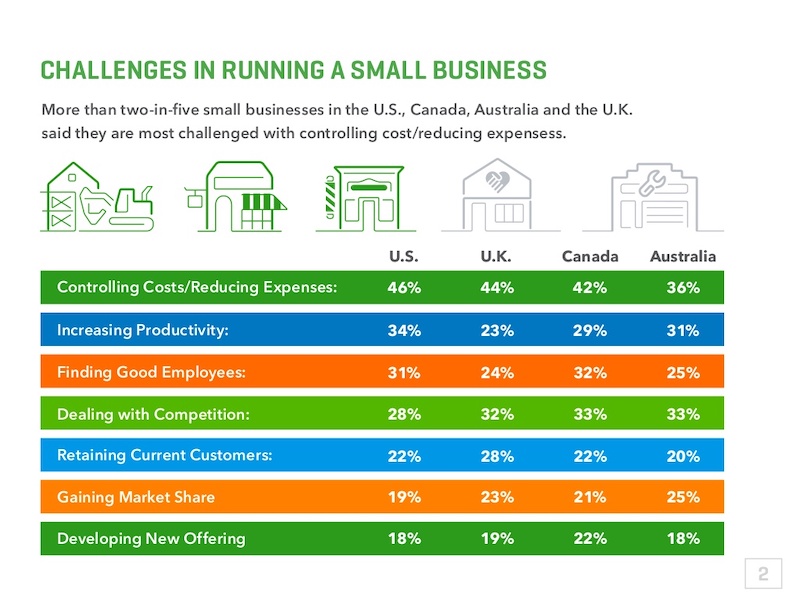
A plain table with a white background with black or gray lines are difficult to read on a computer screen, so why would you create one for viewing on a large presentation screen? You shouldn’t!
Instead, follow Intuit’s lead and break up the rows with a bit of color. This applies to data visualization in general , but think it is even more important when it comes to presentations.
53. Present connected information in a visually similar way
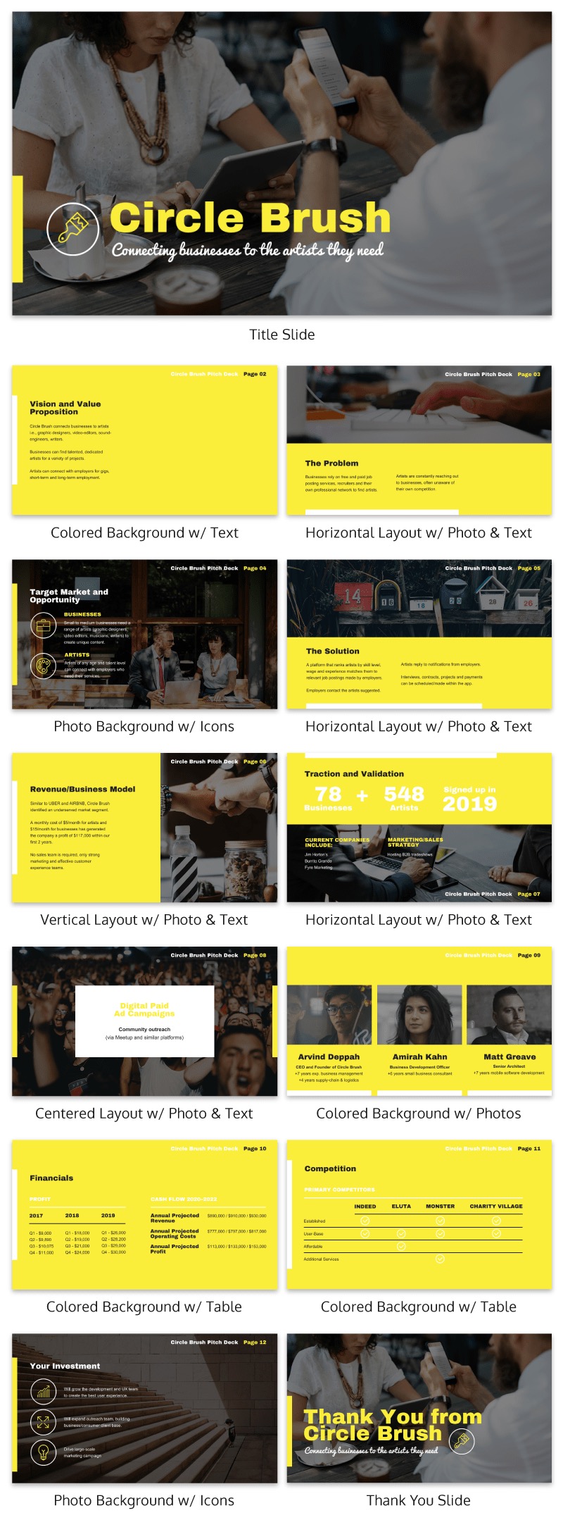
In this startup pitch presentation example, they have a ton of information to get through. But they present their most important slides, the problem and solution, in a visually similar way.
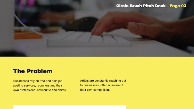
By using a similar layout on each slide, the audience will be able to quickly make a connection. If you want to present two connected pieces of information, use this tactic.
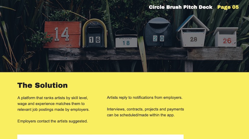
From the font to the layout, it’s all basically the same. The main message they’re trying to impart is a lot more impactful to the reader.
If they would have used two wildly different presentation layouts, the message may have been lost.
54. Roundup expert tips into one presentation
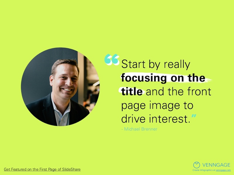
If you are looking for useful insights into the topic of your presentation, talk to some influencers in your niche. These are called “expert roundups” in the content marketing world and they are incredibly shareable.
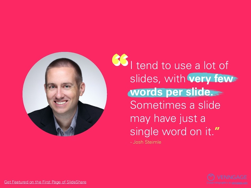
Plus, they are pretty easy to create and have a great shelf life. In the example above, we talked to a gaggle of marketing experts about what makes a SlideShare great.
55. Use bold & brash colors throughout
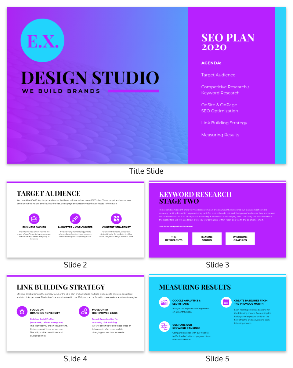
B old colors usually make your presentation template a lot easier to read and remember. Like at this slide deck made by our talented designers, which doesn’t shy away from bright, bold colors.
Want to pick a perfect color palette for your presentation? Read this blog on the do’s and don’ts of infographic color selection .
56. Make your graphs easy to read & interpret
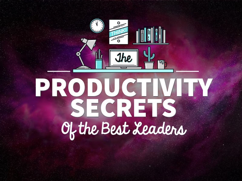
It should not require a Master’s degree in statistics to understand the graphs that someone uses in a presentation. Instead, the axis should be easy to read, the colors should enforce the point, and the data should be clearly plotted.
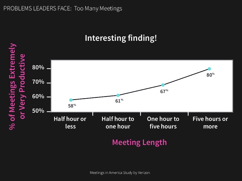
For example, in this presentation on slide numbers 14 and 25, the graphs nail all of those tips perfectly.
57. Condense your presentation into a memorable line

If you can, try condensing your information into a simple one-liner to help the message stick with your audience. In slide number 36 of this presentation, Mika Aldaba does just that and shows that “Facts + Feelings = Data Storytelling.”
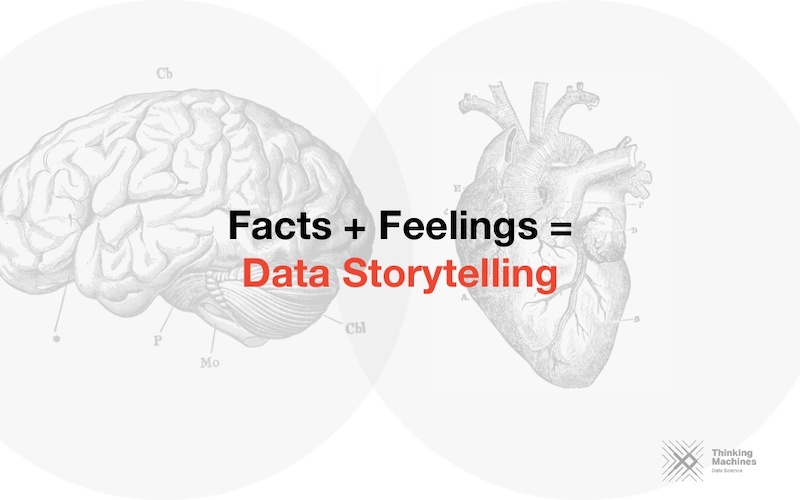
He does this again a few times throughout the presentation with other memorable one-liners.
58. Bring attention to important figures with colorful icons
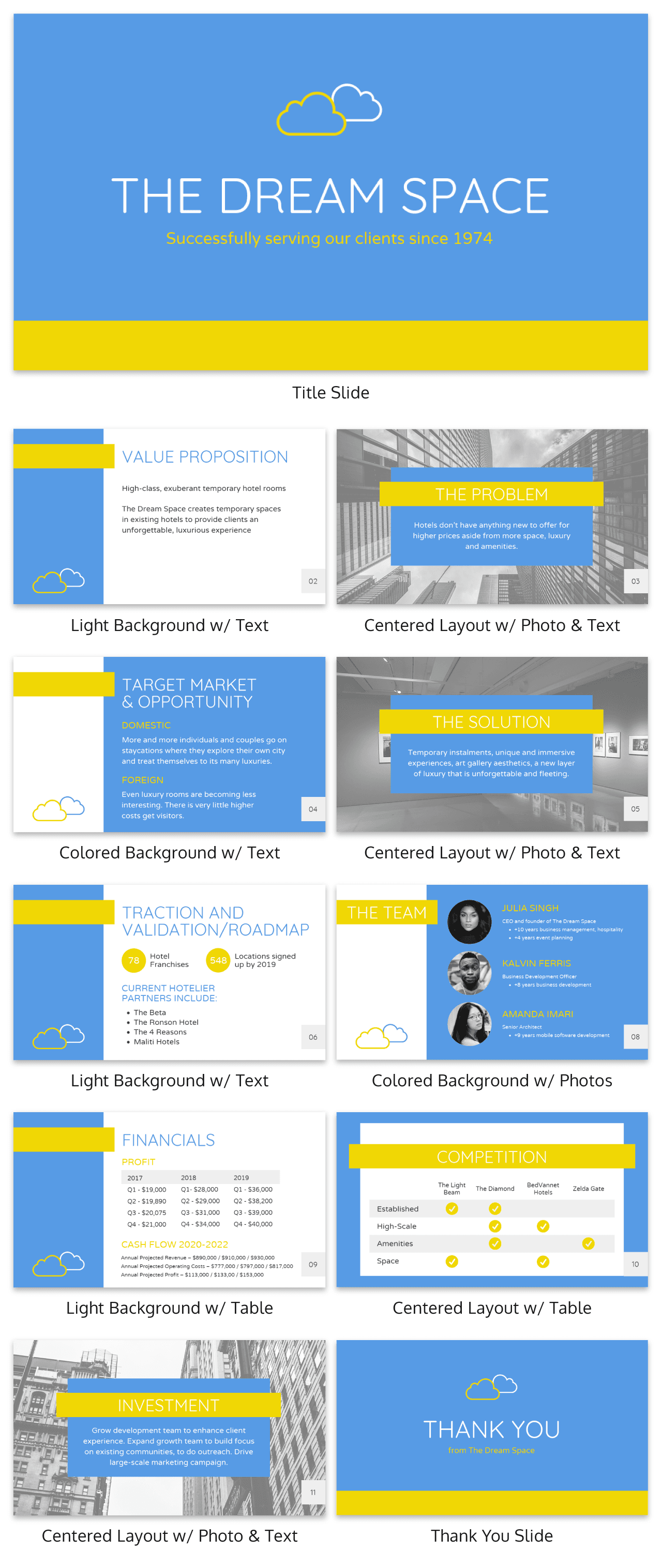
If you’re including a figure or number on your slides, I’m guessing you want the audience to actually see it.
That’s why I would recommend using an icon or graphic to highlight that figure. Maybe use a color or icon that isn’t used anywhere else in the presentation to make sure it really jumps off the screen.
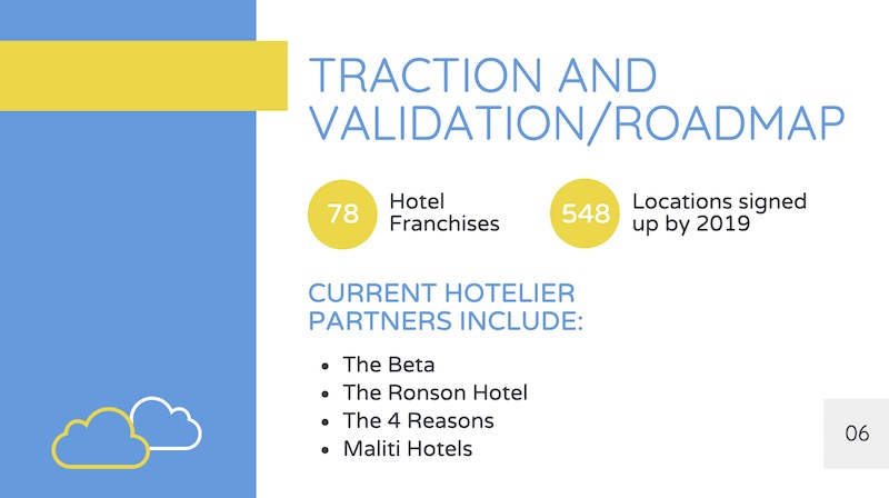
In the presentation example above, all that’s used is a simple circle to make each figure a focal point. It’s really that easy, but many people leave it out of their presentations.
59. Anchor Your Text With Icons

Having your text or content floating out in the white space of your presentation is not a good look.
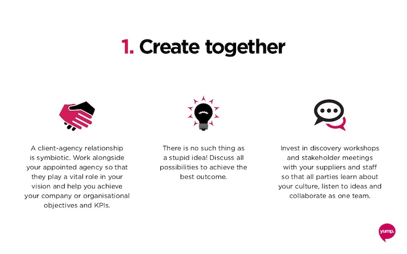
Instead, you should use anchor icons to give the text something to hold onto and draw the audience’s eye. If you need some examples of good anchor icons, check out slide numbers 4, 7 and 9 in this presentation example.
60. Add semi-opaque lettering as a presentation background

A neat way to keep your slide deck organized is to number your slides or points using semi-opaque lettering in the background.
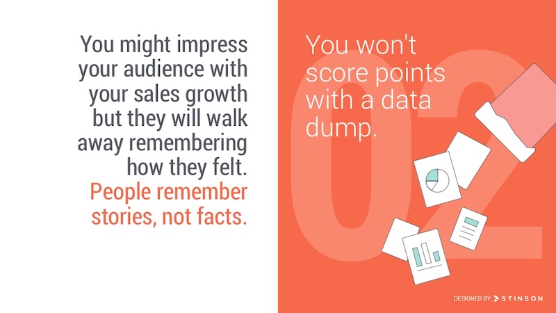
Then, place your slide content on top of the opaque lettering. This helps your audience know that you are on the same point or idea, plus it just looks really good when done right.
61. Use simple or minimalist borders
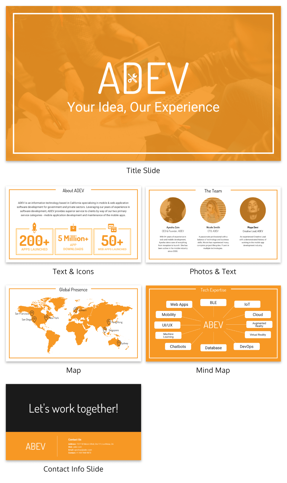
An easy way to class up your slides is to put a border around your text. Take this presentation from Venngage that uses a couple of different types of borders to make their slides look professional.

Plus it helps keep all of your content contained on the slide!
62. Feature one idea per slide
Nothing is worse than a confusing, cluttered slide. Instead of trying to pack a bunch of ideas into one slide, focus on one core idea on each slide. If you need to flesh the idea out, just make another slide.
Having trouble condensing your slides? Our presentation design guide can help you summarize your presentations and convey a singular idea with a clear focus.
63. Keep your style consistent with your brand

You might be tempted to switch up the style of your creative presentations each time, but think again. If your brand is known for fun and lighthearted content, like Officevibe, let that be your style throughout all of the presentations you publish under that brand. This will make your slide decks recognizable and will enforce your brand’s message .
64. Use accent fonts to emphasize important numbers
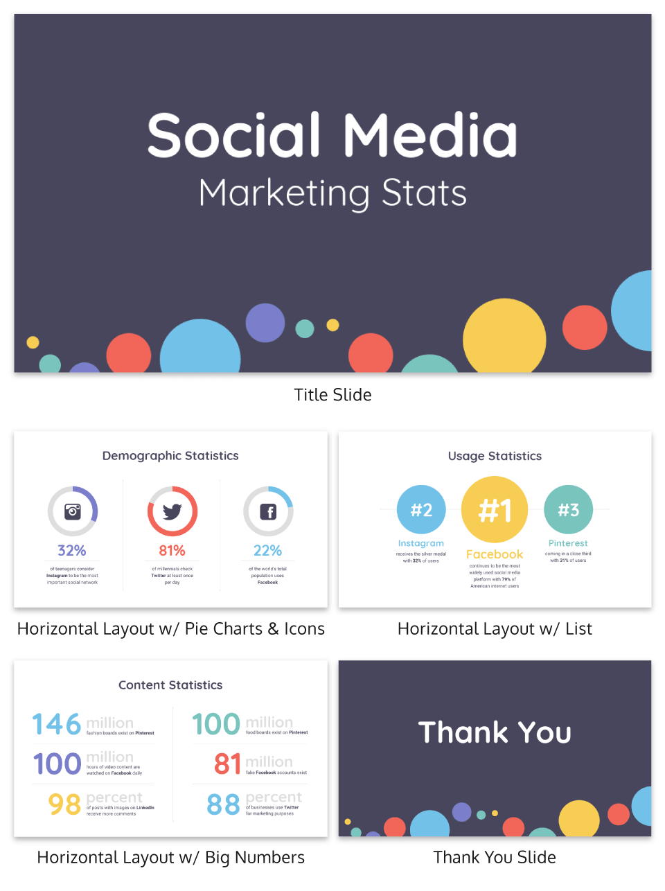
Some people hate pie charts with a passion, but I think they are perfect for presentations. Especially if you want to bring attention to a figure or percentage point .
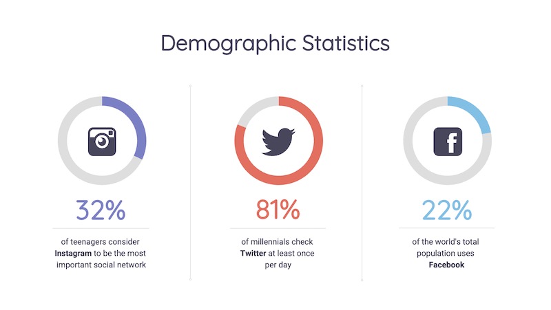
In this simple example, the pie charts are used to visualize each figure in an interesting way. Plus the pie charts fit the circular and fun theme of the rest of the presentation very well.
65. Use patterned and textured presentation backgrounds
Source
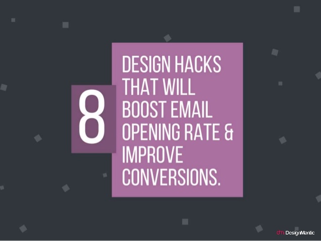
Adding some subtle textures, icons or shapes to the presentation background can help make your slides more interesting. This is especially effective when you are only showing one point per slide, because it makes the slide design less sparse.

You can even switch up the colors on your shapes or textures to match the theme of the slide like DesignMantic did in this presentation.
66. Illustrate complex or confusing concepts with icons

Ideally, you don’t want every slide in your deck to just be text. Instead, switch things up every few slides by using just pictures.
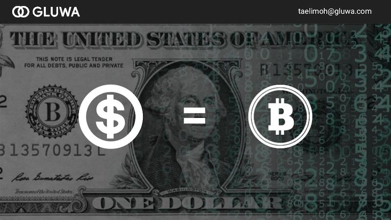
This slide deck by Gluwa uses icons to create little diagrams to illustrate their presentation ideas. Their slides still communicate concepts to the audience, but in a new way.
67. Overlay stock photos with color

One problem many people encounter when creating a presentation or slide decks are finding photos with a consistent style. An easy way to edit photos to make them consistent is to add a transparent color overlay. In this example, Change Sciences uses a blue overlay on all of their photos. Plus, the color you choose can also help convey a particular mood.
68. Use black and white blocks

An easy way to make your text pop, particularly on a photo background, is to use white font on a black blog background (and vise-versa). Check out this slide deck by Abhishek Shah, which uses this trick in an effective way.
Now if you want to become a better leader this year, check out some of our favorite leadership infographics .
69. Use photos with similar filters
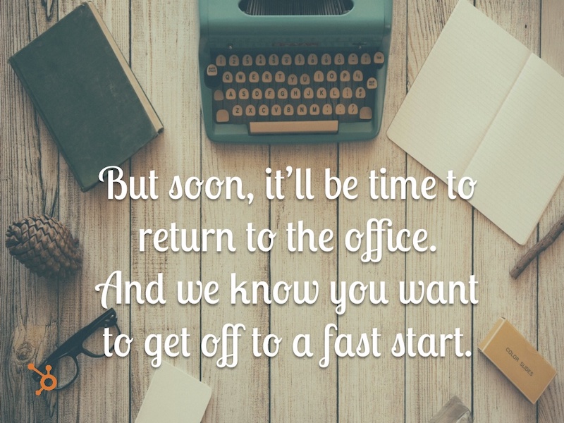
Using a bunch of photos with wildly different filters can be jarring in a business presentation. To maintain a consistent flow, use photos with a similar filter and color saturation.

Take a look at this example from HubSpot across slide numbers 1-6 and you can see what I mean.
70. Visualize your points with diagrams
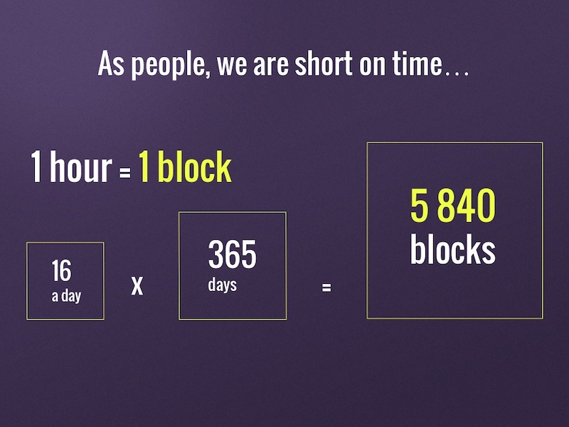
Sometimes the best way to get your point across is to throw some diagrams into the presentation mix. But be sure to make is something that the audience can pick up on in three to five seconds tops.
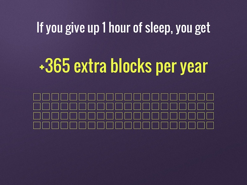
For example, Jan Rezab uses a diagram to illustrate what takes up time in our lives on slide numbers 4, 5, 7 and 9!
71. Get experts to share tips

If you want to provide even more value to your audience than you can offer yourself, why not call in some expert reinforcement? See what experts in your field have to say on the topic of your presentation and include their tips and insights. Plus you can hijack their influence and expand your audience fairly quickly.
72. Mimic a popular presentation style
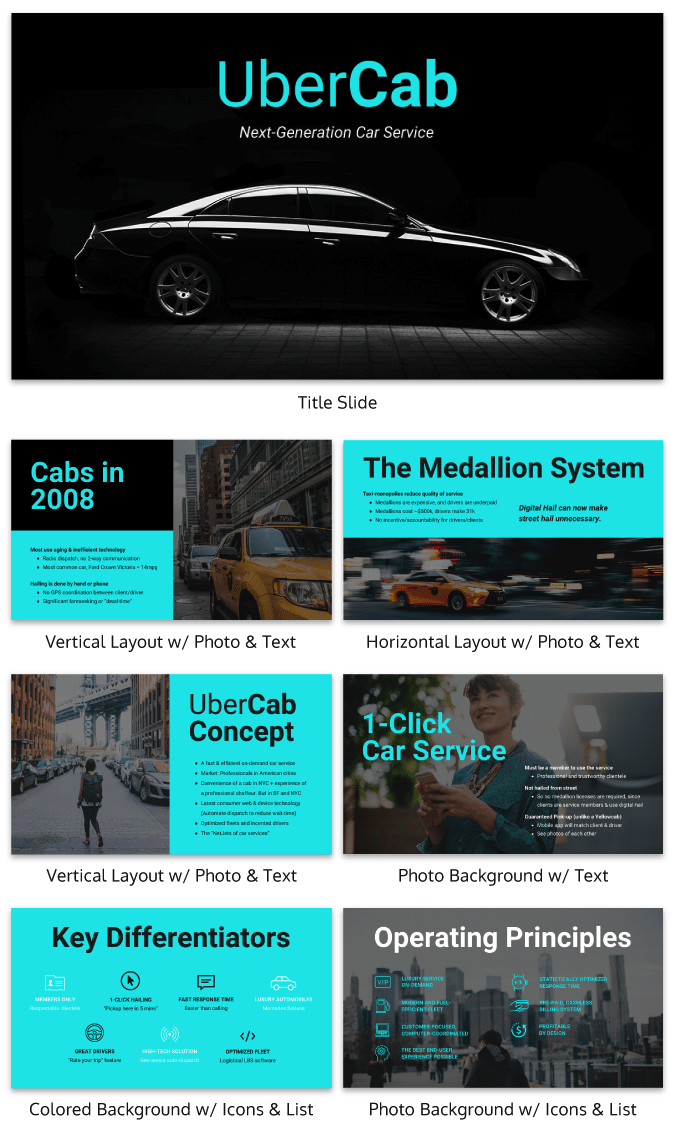
Uber’s pitch deck helped them raise millions of dollars in venture capital eventually leading to the glorious moment when they IPOed this year.
Aside from our sleek design upgrade (hey, we love good design!), this pitch deck template is the exact same one that Uber used to go from Idea to IPO.
And who knows? Maybe you might start the next Uber. But to raise money, you will need to create flawless business pitch decks to impress investors and raise those dollars.
73. Plan your presentation idea ahead of time
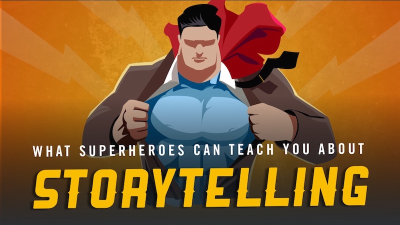
I know that minimalist designs are all the rage this year, but there is a big difference between a well-thought-out minimalist design and a lazy design without the finish touches. The same goes for a cluttered design with too many things going on at once.
That’s why it’s worth it to take the time to really plan out your presentation ideas and design concepts. Take this slide deck about storytelling by HighSpark. A quick glance will tell you that they put a lot of thought into designing their slides.
74. Use tables to compare your brand to the competition in sales presentations/pitch decks
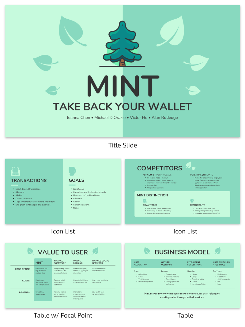
There are a lot of ways to visually compare similar things in this day and age. You could use a comparison infographic , or even a venn diagram!
However, when it comes to presentations I think that the simple table is best. Especially if you are comparing more than two things, like in this presentation example.
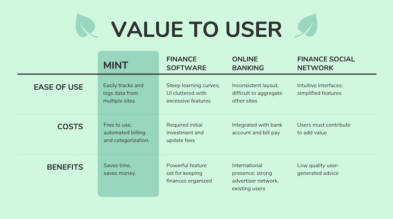
With a table, you can clearly lay out all the pros and cons of each idea, brand or topic without it being overwhelming to the audience. Plus, virtually everyone knows how to follow a table, so your information will be easy to consume.
See more examples of the best pitch decks .
75. Blend icons & content effortlessly
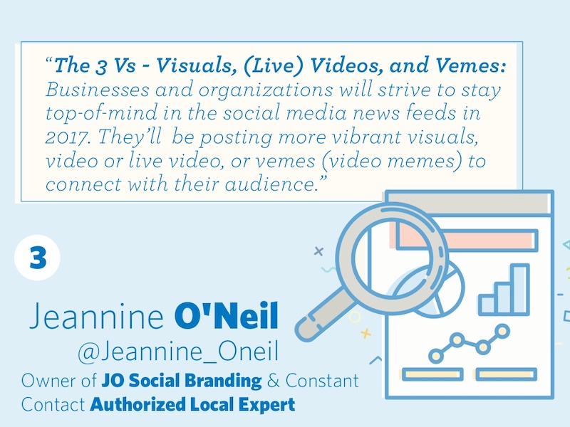
Usually, icons are used as eye-catching objects detectors or anchors for text in a slideshow. But they can be used for so much more than that!

Like in this marketing presentation from Constant Contact they are very large but do not distract from the content.
76. Make your audience want more

This tactic has been used by everyone since the idea of marketing was invented (or close to that). In this presentation example called “100 Growth Hacks, 100 Days” the creator only shows the audience the first 10 days of it and then uses a call to action at the end of the presentation to encourage them to seek out the rest.

The only risk with these kinds of presentation ideas is if your initial content is not great, you can’t expect your audience to seek out more information.
77. Use memes (for real, though)

Usually, memes do not have a place in a serious business setting, so maybe don’t use them for formal presentations. But if you’re covering a lighter topic, or if you’re going for a fun presentation that will connect with your audience, don’t be afraid to throw a meme or two into the mix.
The audience immediately knows what you are trying to say when you use a popular meme in your presentation. For example, on slide number 7, the creator uses a meme to show that it will be hard to create great content
78. Include a slide that introduces your team in pitch decks
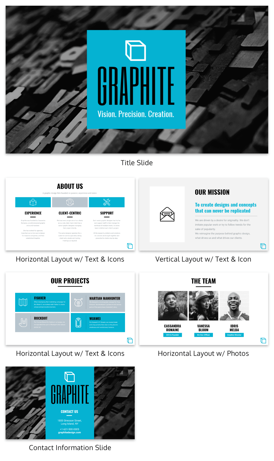
In this presentation example, the creators decided to include their team on a slide. I think it’s a great gesture.
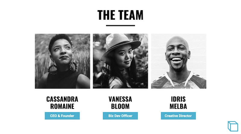
Showing your team can help the audience put a face to your brand and make the whole company feel more genuine. So if there is a team that has helped you get where you are today, give them some recognition!
79. Feature a complementary color palette

Even though I am not a formally trained designer, I still understand that proper color usage is the base of any good design. Although not all of the tenets of color theory work great for presentations, complementary colors are always a great pick.

Take a look at the color usage in this business presentation from Gary Vaynerchuk below . The purple and Snapchat yellow, which are complementary colors, look fantastic and the content jumps off the screen.
80. Use a heavy or bold font

The very back of the room should be able to read your content if you are giving a group presentation. To ensure that your entire audience can read the slides I would not only use a large font, but also use a heavy font. If you are confused by what I mean by a heavy font take a look at this unique presentation example by Slides That Rock.
81. Do the math for your audience
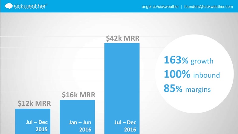
If you are going to use a graph in your presentation to compare data you should do the match for your audience. Do not make them do the calculations in their head because you will quickly lose their attention. For example, on slide number 5 the people at Sickweather lay out exactly what figures they want the audience to take from the slide.
82. Use unique colors for different sections
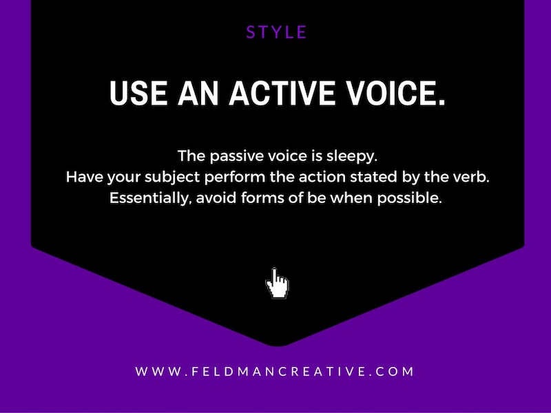
The example below has 145 slides but it does not feel overwhelming or confusing.
That’s because each section has a different corresponding color, which makes it easier to flip through the slide deck and find a particular part.
83. Give your presentation a catchy title that anyone can remember
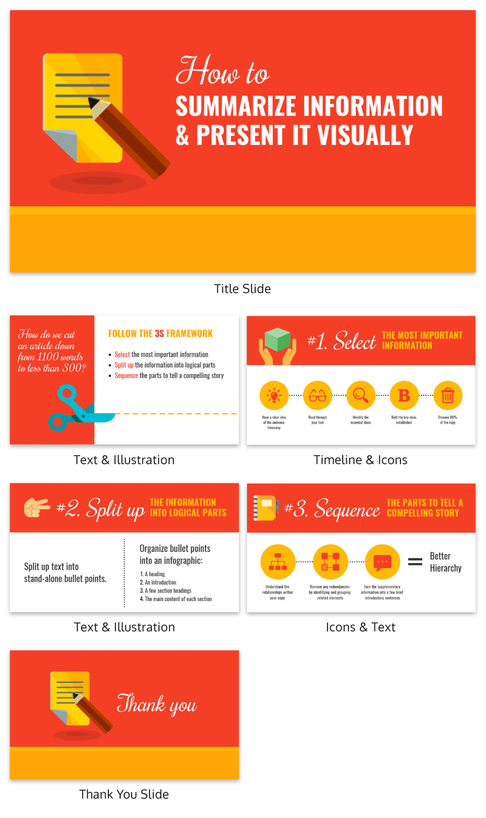
What I really love about the presentation example above is that it features a catchy tagline on the second slide–“The 3S Framework.” It’s simple but it works!
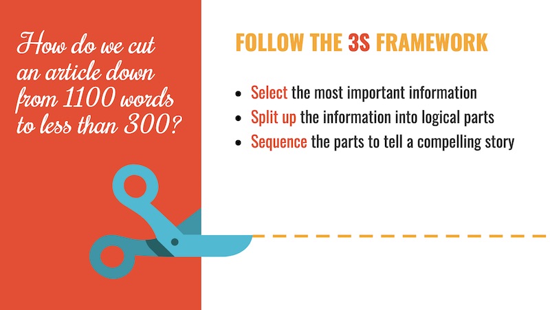
This motto helps outline the structure of the presentation, and each slide referring back to it. Plus, the tagline will give the audience something to latch onto and remember from the presentation.
84. White backgrounds are not always bad

A lot of people think that plain white background is a boring presentation faux pas. So the first thing they do is add color or image, which is not a bad thing at all.

But I also think that when used correctly, like in this example, plain white backgrounds can lead to beautiful presentations.
85. Split the header text from the body text

This idea is very similar to the one-two punch tactic that I talked about above, but it spreads the content over two slides as opposed to a single slide.
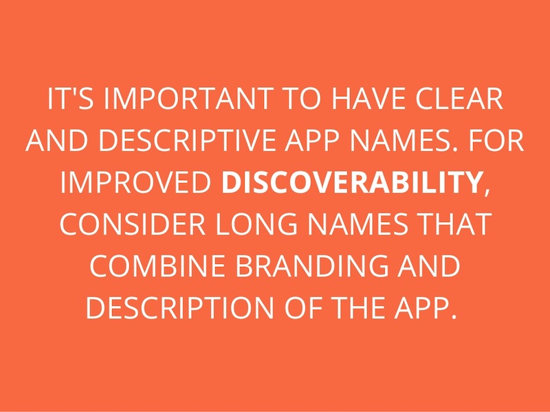
Use this design choice when you have fairly easy to follow presentations, like the one below from Steve Young. I know that this is effective because it allows the audience to focus on the main point before he drives it home with the supporting details.
86. Feature circle image frames

I am a big fan of the design choices that Frank Delmelle uses in this slide deck about content strategy. He uses circles as his main design motif and frames his images in circles as well.
87. Talk directly to your audience

This slideshow tops out at 70 slides but it’s a breeze to flip through. That’s because the creator, Ian Lurie, decided to present it in the form of a conversation instead of a classic slide deck.
While each slide only has one or two sentences, it flows just like a friendly chat. He also includes the necessary pauses, breaks and other conversational tics that helps make it even more convincing.
88. Illustrated icons are key this year
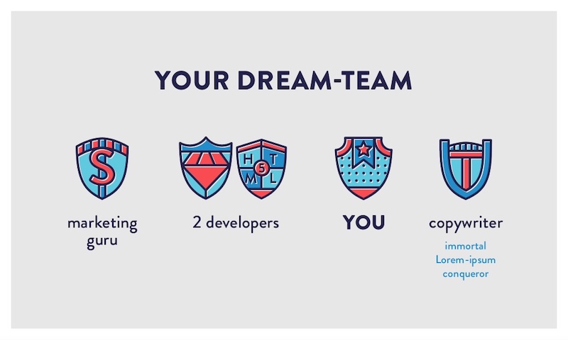
Icons add a fun and functional element to your designs. In this presentation by Iryna Nezhynska, they use illustrated icons to make a potentially intimidating topic seem manageable.
89. Highlight key numbers and percentages
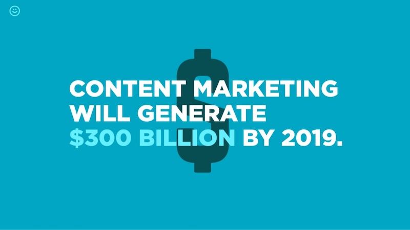
Surprising percentages have the ability to excite and shock an audience. To make the percentages on your slides even more impactful, present them in a different color or font than the rest of the text.

In the presentation example above, Contently uses that exact tactic to bring more attention to key numbers.
90. Use a gradient as your presentation background
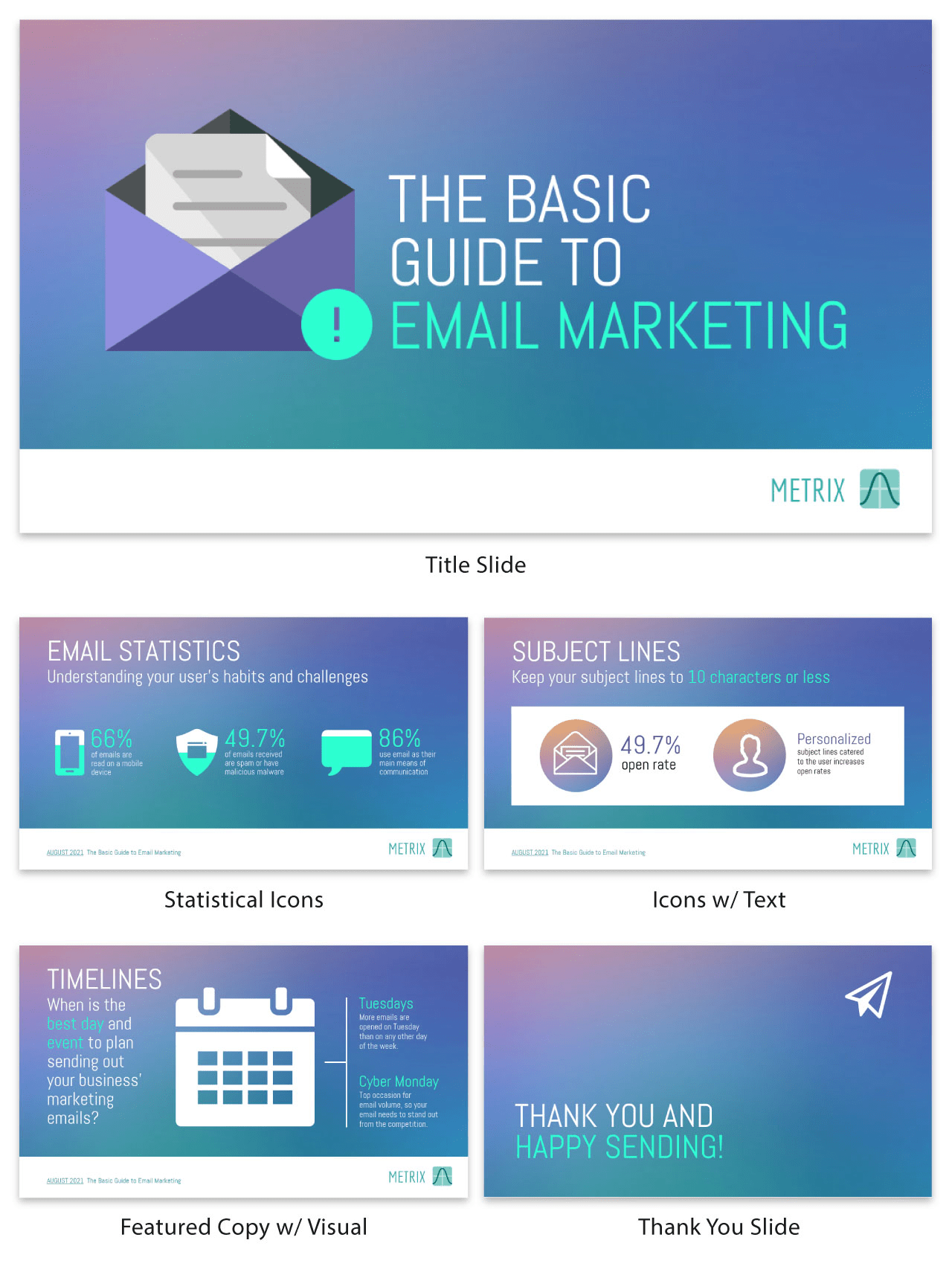
Just like bold color schemes, gradients are a current social media graphic design trend . They may feel retro to some, but I believe they will be around well into the future.
Gradients are perfect for presentation backgrounds because they are so versatile and eye-catching. I mean, you can literally create a gradient with any colors you can think of! And they look a lot more interesting than a simple flat background.
So embrace the future and use a gradient in your next presentation!
91. Track the steps in a process
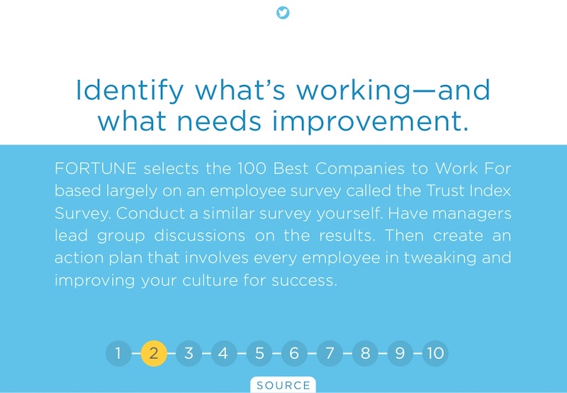
In this example, the creators from O.C. Tanner add a very interesting feature to their slides, starting on slide number 6. If you take a look at this business presentation template, you will see that they number the steps in a process and track which step they’re on at the bottom of the slides.
92. Use mind blowing font pairings

The creator of this slide deck uses at least 10 different types of fonts. And it looks fantastic because they know that one font choice is boring. But this does not mean that you should use a bunch of random fonts–pick font pairs that play well together and keep your font choices for different types of information consistent throughout the presentation.
93. Make your ideas as obvious as possible
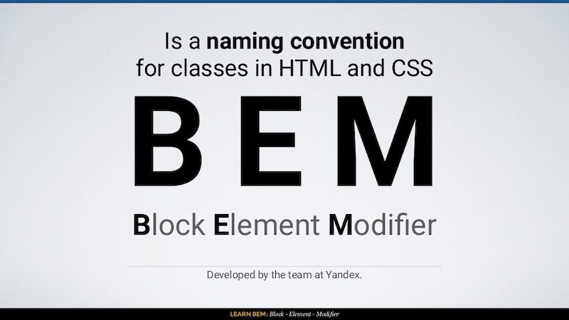
Your audience shouldn’t be guessing at what you mean. That is why I think that this presentation example from In a Rocket is so powerful because they make the information easy to digest.
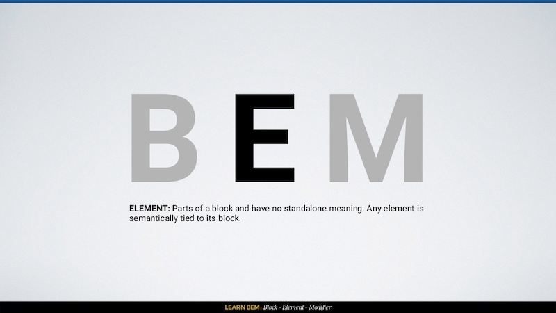
Learning to code can be challenging, but they break the information down with simple diagrams and clear examples. Heck, I have not touched CSS in a few years and I could still follow what they were instructing.
94. Use images that will actually scale

A large mistake that you can make in your slide deck is using low-quality images. They may look great on your computer, but as soon as the slides are put up on a screen, the low quality will show. In this example by ThoughtWorks, all of their presentation background images look great and will scale well to a bigger screen. And that is even after the image compression that LinkedIn most likely does!
95. Take risks with your presentation layout
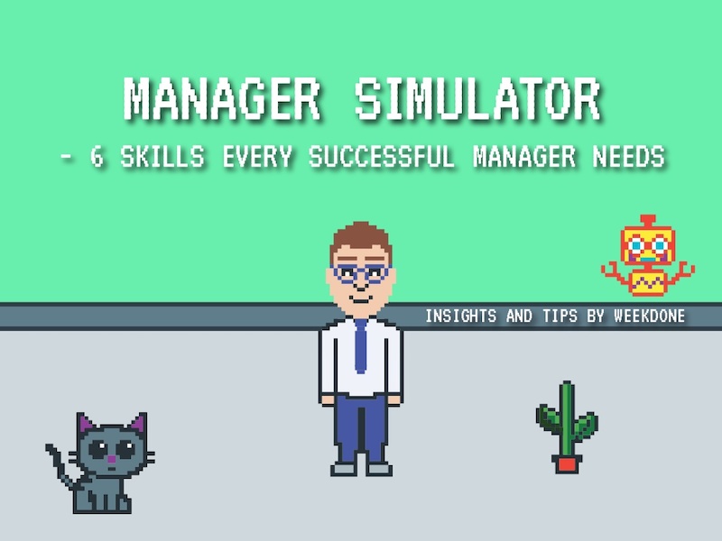
I honestly was blown away the first time I saw this presentation because it capitalized on such a risky design idea. The creators from Weekdone literally turned their presentation into an 8-Bit video game. A nd if you are looking for something that will stick with your audience, I would take a few creative cues from them!
96. Seriously, you better use memes

In this day and age memes are mainstream, so why wouldn’t you use them in a creative presentation? These do not have to be the coolest meme that all the hip kids are sharing, they can be some of the classics. Like the one that Dana DiTomaso uses on slide 16 to emphasize that it’s a trap!
97. Follow a clear design rhythm
I really like how this presentation introduced each new point in three or four steps, using the same design. It gave the presentation a rhythm that flowed almost like a song!
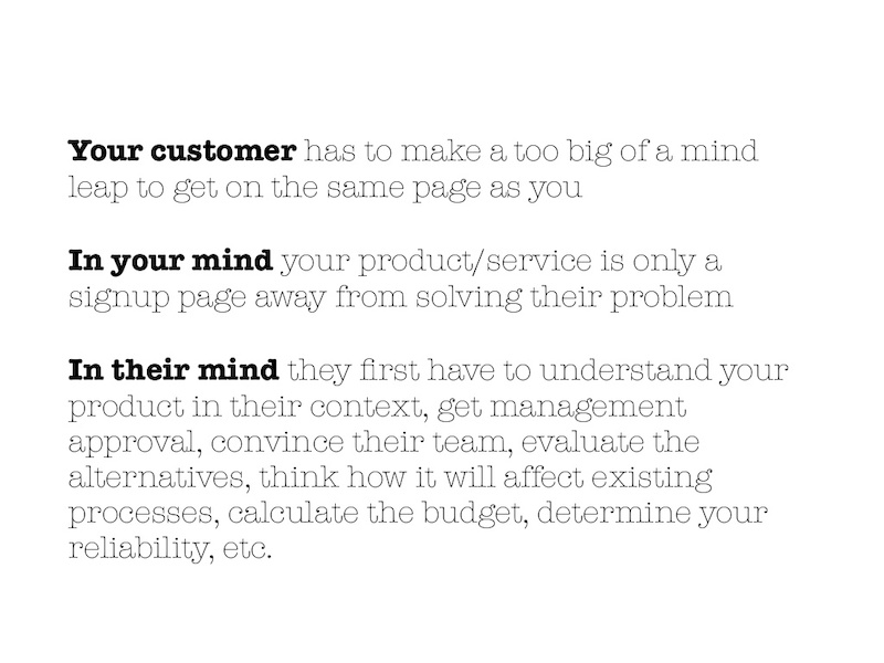
I would recommend using this approach if you have to introduce multiple points per slide.
98. Use LOTS of icons
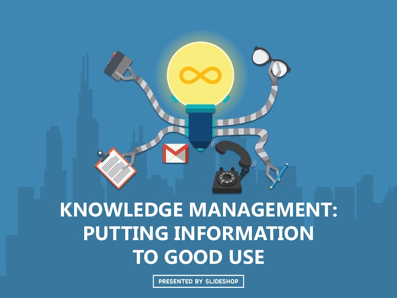
If you have made it this far in the list you have already probably seen how effective icons are in presentations. They are the perfect way to support your ideas and make your presentation more pleasing to the eyes.
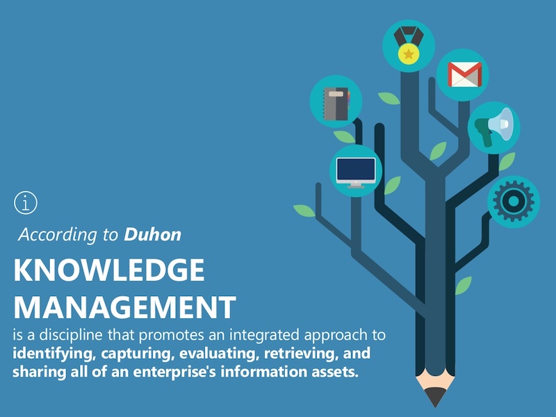
For example, take a look at all the icons SlideShop uses in this presentation. Almost every slide has at least one icon and a few have more than ten!
99. Give each slide its own spark
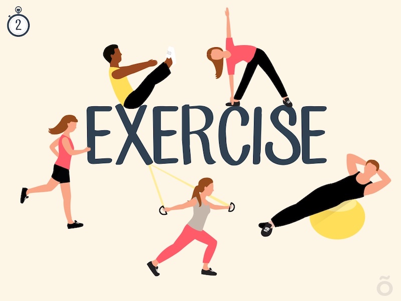
I know this goes against earlier points I had about creating a cohesive theme in your presentation layout, but everyone knows that rules are made to be broken (if you can do it better)!
In this slide deck, the team at Officevibe literally created different designs for all 27 of their slides. And to top it off, each of the designs fit the quotes they used extremely well.
100. Use LARGE header cards

An easy way to stick to that “one piece of content on each slide rule” is to use header cards. They are basically the header that you would normally use in a blog post or article, but it gets is own slide before the content. Here is an example of that idea in the real world in this presentation from Brian Downard.
101. Ask your audience questions
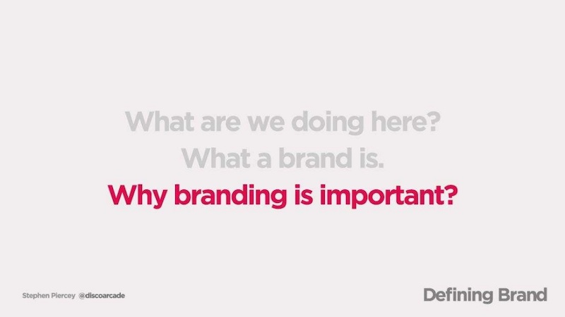
I think one of the most common elements I saw in all the slide decks was that they asked the audience questions. You can use questions to engage with your audience and get them thinking a bit harder about the topic. The Site By Norex team did an exceptional job of this when they explored what the topic of what makes up a brand.
Need some more info about creating a memorable brand? Check out some of the best branding stats for 2020 and beyond!
102. Introduce yourself and your brand
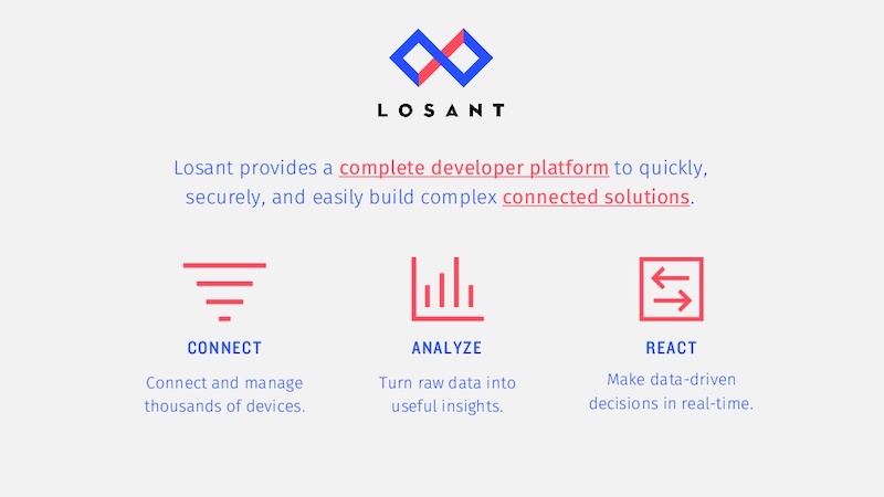
I would say that a majority of presentations that I looked at in this list just jumped right into the content without an introduction to the author or brand in the actual slide deck.
This introduction is very important because it establishes your credentials from the beginning, especially if someone is just reading the slide deck. In this example from Losant, they do just that by spending the first few slides telling the audience who they are.
103. Mix up your mediums
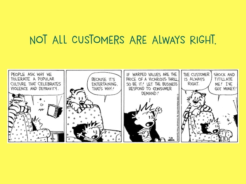
Finally, this slide deck effectively marries two very distinct content forms together: digital images and hand-drawn illustrations. In this example, Freshdesk uses the timeless classic of a comic strip, Calvin & Hobbes, in something so modern to inform the audience in a fun way.
104. Show off your credentials
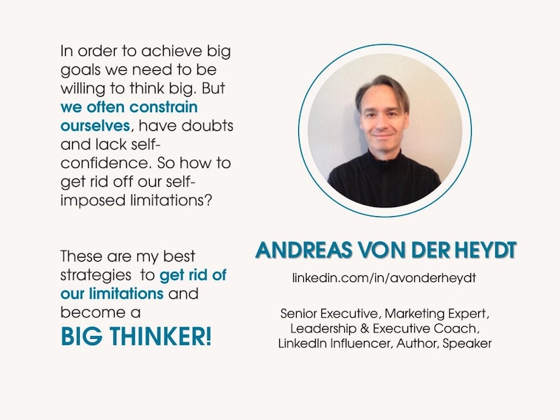
Just like with any piece of content, people are more likely to believe what you are saying if they know what your company does. That is why I really like when people insert their qualifications right into the presentation slides. Just like Andreas von der Heydt, from Amazon, did at the beginning of this presentation about thinking big.
105. Highlight key data points
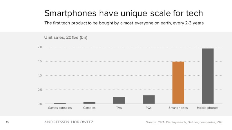
If you are presenting a chart or graph on a dry topic, I would recommend using a single color to highlight the most important data point. For example, the investment firm a16z uses orange to highlight the data points they want their audience to focus on in each of their charts.
Check out some examples of how to highlight your key information in bar charts .
106. Show your audience where to find more information
A lot of people end their presentations by literally just running out of slides, and that is the wrong way to do it. Instead, CBInsights consistently pushes their readers towards another piece of content at the end. This is also where you can insert a call to action!
107. Tell your origin story
Source
This idea is kinda similar to showing off your company qualifications at the beginning of your presentation. But with this approach, you are trying to make an emotional connection with your audience instead of just showing off accolades.

And Rand from Moz does this extremely well in the presentation example above.
108. Use one focused visual
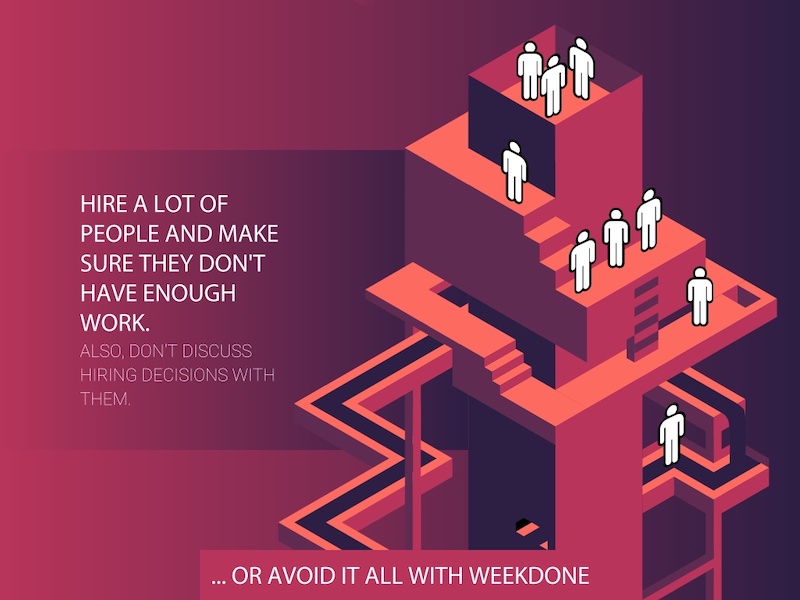
This presentation uses a central visual of a structure, with each slide moving down the levels of the structure. This is incredibly powerful because the entire presentation is about sinking your company, and the visual they designed mirrors that idea perfectly. Using one focus visual also makes your slide deck design cohesive.
109. Don’t take presentation design too seriously

Sometimes we get caught up trying to make the perfect presentation and it ends up making us crazy!
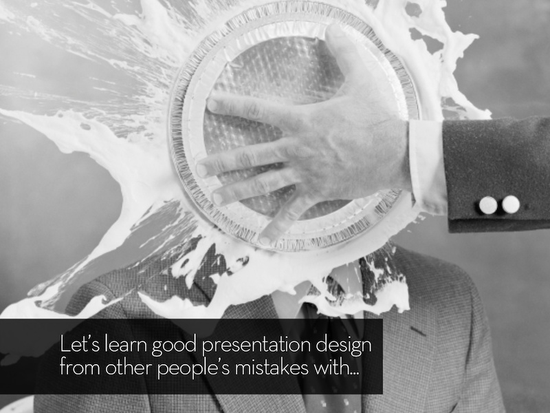
But in this presentation example, Jesse Desjardins uses a mix of wit and hilarious retro images to create a memorable and light-hearted presentation.
110. Use size to your advantage
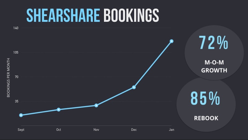
I am a big fan of using bubble charts and other charts that use size to compare two pieces of data. That is why I like this pitch deck from the ShearShare team that utilizes a size-based chart on slide number 9. The chart is used to illustrate the massive growth potential in their industry.
111. Split section headers from the main content with different background colors
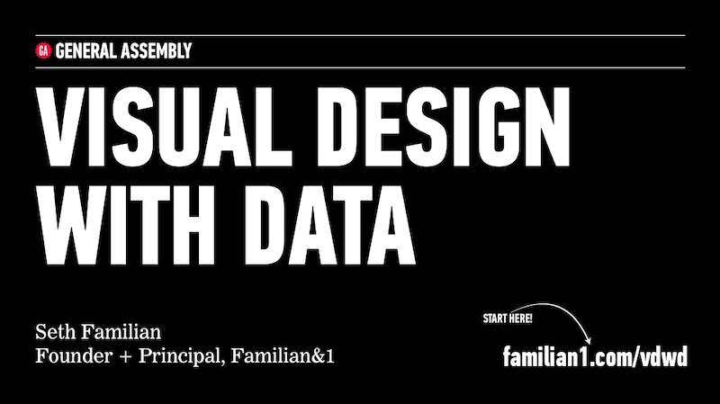
In this presentation, Seth Familian uses alternating colors in a very interesting way. For each of the title slides, he uses a black color background, but for the content slides he uses a white background.
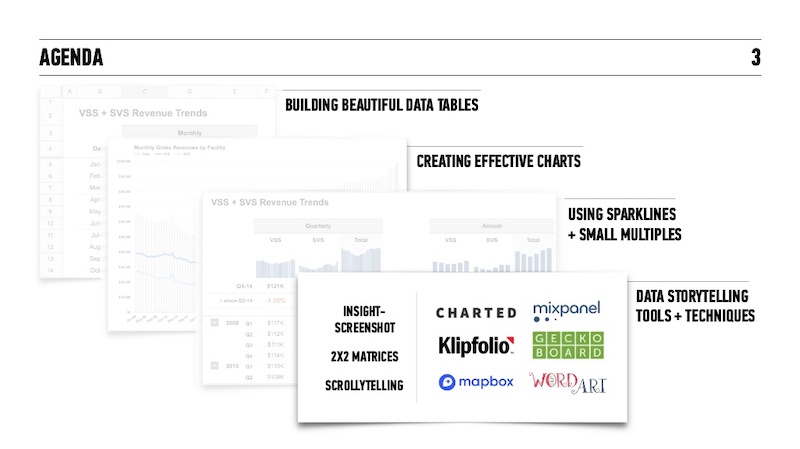
This helped the readers follow along and comprehend what was on the page even faster. And when you are presenting to hundreds of different types of people, this can make or break your presentation.
112. Have a conversation with your audience

Take a conversational tone in your presentation is a great way to encourage your audience to participate.
In this slide deck example, we presented a simple storyline and use questions to engage with the audience throughout. And it helped create a flow throughout the presentation template that is easy to follow.
113. Include your branding throughout your presentation ideas

Another thing that people seem to forget when they are working on a presentation is to include their business’s branding. You honestly never know where your work is going to be shared, so it is important to make sure people know it’s yours. HubSpot does an outstanding job of this on all their presentations, as you can see in the bottom left corner of each slide.
Plus you have spent a ton of time creating your brand guidelines , might as well use them.
114. Include multiple slides to build to your main point
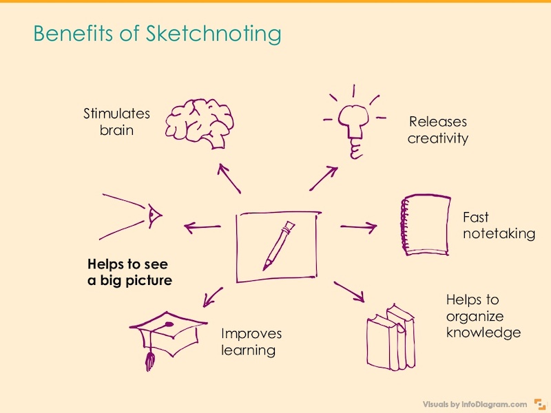
Try using multiple slides to build to your main point. This helps you walk through the components of one overarching point while also building suspense. In this slide deck, the creator uses 6 slides to build up to one main point, adding a new illustration to the diagram on each slide.
115. Split the difference
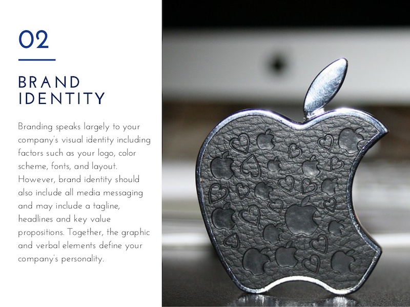
Use either the left or right side of the slide to hold your text and the opposite to display an image. If you are using a photo or graphic as the main background in your slides, this is a great way to keep things organized.
116. There are millions of fonts out there…use them
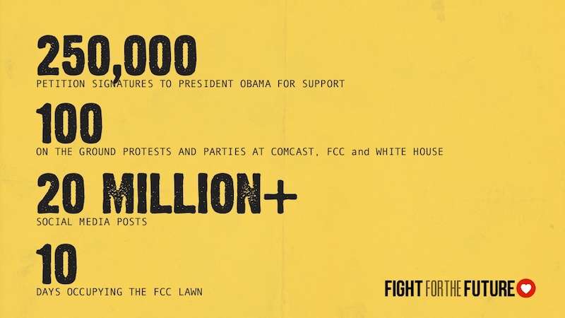
Hey, I love simple fonts just as much as the next guy, but sometimes you need to step up your font game to stand out. For example, WebVisions uses a very gritty, probably custom font in their unique presentation that fits the topic extremely well. Take a look!
117. Build your presentation content around icons
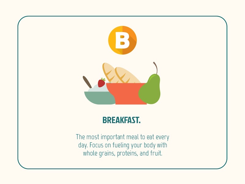
Try using icons as the focal points of your presentation layout. This example from Omer Hameed uses icons to draw the audience’s eyes right to the middle of the presentation, where the main points and headers are located.
118. Mix up font style to emphasize important points
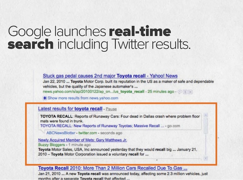
If you would like to draw some extra attention to a certain word or idea, switch up the font to one that is bolder. For example, in this oldie but goodie presentation from HubSpot they use a heavy sans-serif font to highlight ideas, as opposed to the serif font for the other text.
119. Add personal touches to your presentation

If you want to create a truly unique presentation, add personal touches. In the slide numbers 6-13 from this presentation, the creator adds something to their design that no one else could ever have: they use original drawings they did themselves.
120. Harness the power of your own brand colors

Sometimes people forget that they already have a battle-tested color palette that they can use in their brand colors . I try to incorporate one of our brand colors in most of my designs and it makes so much easier to choose colors.
In this simple presentation example, Spitfire Creative used a palette that had both of their brand colors throughout the slideshow.
121. Used dark-colored blocks to highlight words

I have seen this trick used in a lot of presentations and it works well. Highlight certain words or phrases by laying them overtop a colored rectangle. Take slide number 7 in this presentation example as a great guide. Use it to bring attention to a saying or idea you really want your audience to remember.
122. Show the audience your mug
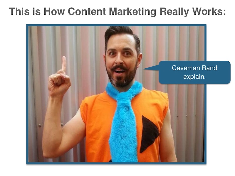
This presentation example comes from the same presentation as a previous one, but it was too good not to share. Throughout the slides, you will see Rand from Moz pop up to add a human element to the design. Using an image of your team or yourself can put the audience at ease and make it easier to connect with the presenter.
123. Include a helpful table of contents
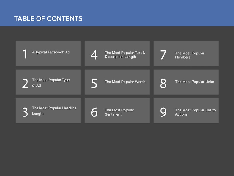
I only saw this presentation idea used a few times throughout my research, but I believe it should be used a lot more. A table of contents will help the audience know what to expect and keep their focus throughout. Especially if you are creating a presentation that is a bit longer than normal.
124. Do not post just screenshots, do more
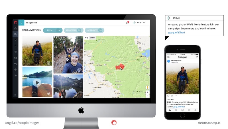
Screenshots of a program or app are very common in any blog post, but I think you can do a little better when it comes to presentations.
So instead of just posting a boring screenshot, add a little more to the slide by using illustrations and product shots. If you are not sure what I am talking about, just check out how great the screenshots look at slide numbers 7 and 8 in this presentation.
125. Highlight keywords using BOLD color
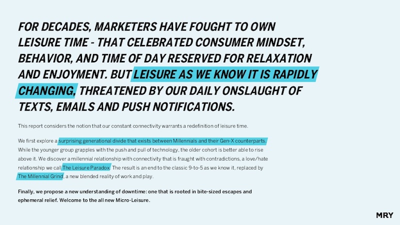
Here’s another slide deck that uses different colors and blocks to highlight keywords. If you are going to use text-heavy slides, then make sure the key points are easy to pick out. Take this slide deck: starting in slide number 4, they highlight exactly what they want you to take away from the text on each slide!
Enough presentation ideas for you?
You made it! I applaud you for making it through all those presentations. Hopefully, now you have a few nifty presentation ideas ready for when you need them.
The next step is to create a presentation that will captivate a meeting room, an amphitheater, and even the world (hey, it doesn’t hurt to dream big).
Discover popular designs

Infographic maker

Brochure maker

White paper online

Newsletter creator

Flyer maker

Timeline maker

Letterhead maker

Mind map maker

Ebook maker
Got any suggestions?
We want to hear from you! Send us a message and help improve Slidesgo
Top searches
Trending searches

fall pumpkin
61 templates

fall background
24 templates

15 templates
renewable energy
20 templates

11 templates

spinal cord
31 templates
Project Proposal Presentation templates
Download and customize these free and easy-to-edit templates for google slides and powerpoint to present your new project proposal. your partners will appreciate the nice slide designs and appealing backgrounds..
- Calendar & Weather
- Infographics
- Marketing Plan
- Project Proposal
- Social Media
- Thesis Defense
- Black & White
- Craft & Notebook
- Floral & Plants
- Illustration
- Interactive & Animated
- Professional
- Career & Technical Education
- Emotional Intelligence
- Foreign Language
- High School Electives
- Language Arts
- Physical Education
- Practical Life
- Social Skills
- Social Studies
- Instagram Post
- Instagram Stories

It seems that you like this template!
Create your presentation create personalized presentation content, writing tone, number of slides.

Register for free and start downloading now
Engineering project proposal.
What is the best way to build your own successful future? Giving a presentation made thanks to our new free business template! Your audience will appreciate your engineering project proposal, paving the way for new deals and investments.

Premium template
Unlock this template and gain unlimited access
AI Tech Project
Download the "AI Tech Project" presentation for PowerPoint or Google Slides. A well-crafted proposal can be the key factor in determining the success of your project. It's an opportunity to showcase your ideas, objectives, and plans in a clear and concise manner, and to convince others to invest their time,...

Research Project Proposal
Before embarking yourself on a new project, especially if it’s about research, you need to set out a proposal to explain its viability. Here at Slidesgo we’re offering this theme that you can actually use for any kind of project, regardless of the topic.

Succession Planning Project Proposal
Download the "Succession Planning Project Proposal" presentation for PowerPoint or Google Slides. A well-crafted proposal can be the key factor in determining the success of your project. It's an opportunity to showcase your ideas, objectives, and plans in a clear and concise manner, and to convince others to invest their...

Simple Project Proposal
Leonardo Da Vinci said that “simplicity is the ultimate sophistication.” This is a universal truth, but even more when it comes to the project proposal arena. Making a simple presentation about your proposal will trigger a positive response from your audience, without diverting their attention to other issues. Try this...

Solar Power Project Proposal
More and more people are becoming aware of the environment and global warming. If you need to present a project proposal and want a little help with the design, you’ve come to the right place! With this new template, your work will shine by itself.

Corporate Identity Renewal Project Proposal
A company's corporate identity is a crucial element in its success, as it creates a visual image and brand recognition in the minds of customers and stakeholders. However, over time, corporate identities can become outdated, losing their relevance and appeal. If that happens... time for a fresh new image! With...

AI Tech Project Proposal
Download the "AI Tech Project Proposal" presentation for PowerPoint or Google Slides. A well-crafted proposal can be the key factor in determining the success of your project. It's an opportunity to showcase your ideas, objectives, and plans in a clear and concise manner, and to convince others to invest their...

Industrial Preliminary Project
Download the "Industrial Preliminary Project" presentation for PowerPoint or Google Slides. A well-crafted proposal can be the key factor in determining the success of your project. It's an opportunity to showcase your ideas, objectives, and plans in a clear and concise manner, and to convince others to invest their time,...
Construction Project Proposal
Are you an architect? Do you like designing new buildings and supervising their construction? If you need to present a project proposal related to the construction industry, let Slidesgo help you with your slide deck.

Project Proposal with Waves
You want to make a project proposal? Alright, then we also have a proposal for you: this beautiful template made specially with your needs in mind. First of all, the most surprising part of it: its abstract design with waves in pastel colors. Isn’t it beautiful? It will attract the...

Implementation Plan Project Proposal
Download the "Implementation Plan Project Proposal" presentation for PowerPoint or Google Slides. A well-crafted proposal can be the key factor in determining the success of your project. It's an opportunity to showcase your ideas, objectives, and plans in a clear and concise manner, and to convince others to invest their...

Cycle Diagrams Theme for a Project Proposal
Download the "Cycle Diagrams Theme for a Project Proposal" presentation for PowerPoint or Google Slides. A well-crafted proposal can be the key factor in determining the success of your project. It's an opportunity to showcase your ideas, objectives, and plans in a clear and concise manner, and to convince others...

Minimalist Commercial Proposal
Download the "Minimalist Commercial Proposal" presentation for PowerPoint or Google Slides. A well-crafted proposal can be the key factor in determining the success of your project. It's an opportunity to showcase your ideas, objectives, and plans in a clear and concise manner, and to convince others to invest their time,...

Scientific Project Proposal
Impress everybody with this cool scientific project proposal template that’s a good reflection of all things systematic and methodical—just as science should be. Gentle on the eye and with a wide spectrum of layouts, it’s going to be hard to reject your proposal!

Minimalist Grayscale Project Proposal
If you have a business idea and need a good presentation to go with it, this project proposal template is just what you are looking for. It has a formal and serious style, with gray as the main color, which gives it versatility. And to make it dynamic we have...

Product Commercialisation Project Proposal
Download the Product Commercialisation Project Proposal presentation for PowerPoint or Google Slides. A well-crafted proposal can be the key factor in determining the success of your project. It's an opportunity to showcase your ideas, objectives, and plans in a clear and concise manner, and to convince others to invest their...

Refinery Project Proposal
Are you ready to pitch a refinery project? Showcase your unique vision with this Google Slides theme and PowerPoint template. With an abstract and geometric look, it features a grey and orange color palette, infographics, and illustrations. It's the perfect way to present your project in a professional and captivating...
- Page 1 of 38
Register for free and start editing online
- Become a partner
- Customer stories
- Gantt chart
- Roadmapping
- How-tos and guides
- Project management
- GanttPRO news
- Microsoft Project Tutorial
How to Present a Project: 18-Step Formula for Purpose-Driven Teams
Audio version:
Presenting a project requires studying dozens of sources, from books and lectures to innovative methodologies. How to present a project so that your team members, stakeholders, executives, or clients say “wow!”?
It can be a challenge. But there is nothing impossible for managers who consider a project timeline presentation a part of their daily job.
Project success directly depends on its presentation. According to the latest research , effective presentations are 38% of your voice, 55% non-verbal communication, and only 7% your content. If you do it thoroughly, you have many chances to grab your audience’s attention and take them to an agreement.
Below you’ll find reliable tips on how to present a timeline of your project following some consistent steps. You’ll also discover some creative ways to create a project presentation using online Gantt charts. Let’s dive in!
- Steps for presenting a project .
- Best ways to present a project .
- Presenting projects with GanttPRO .
18 steps for presenting a project
Sometimes a project presentation is a nerve-racking activity. However, it doesn’t mean it has to be complicated. You can prepare a creative project presentation that will open many doors following essential guiding principles and practices.
Here we recommend 18 simple steps for presenting your high-level plan with all project tasks, dependencies , project milestones , attachments, comments, and other attributes. You may use them while presenting your masterpiece to clients, managers, executives, your team, or the stakeholders who have a specific interest in your project.
Let’s figure them out starting with the foundation of all activities in the project management world – setting goals.
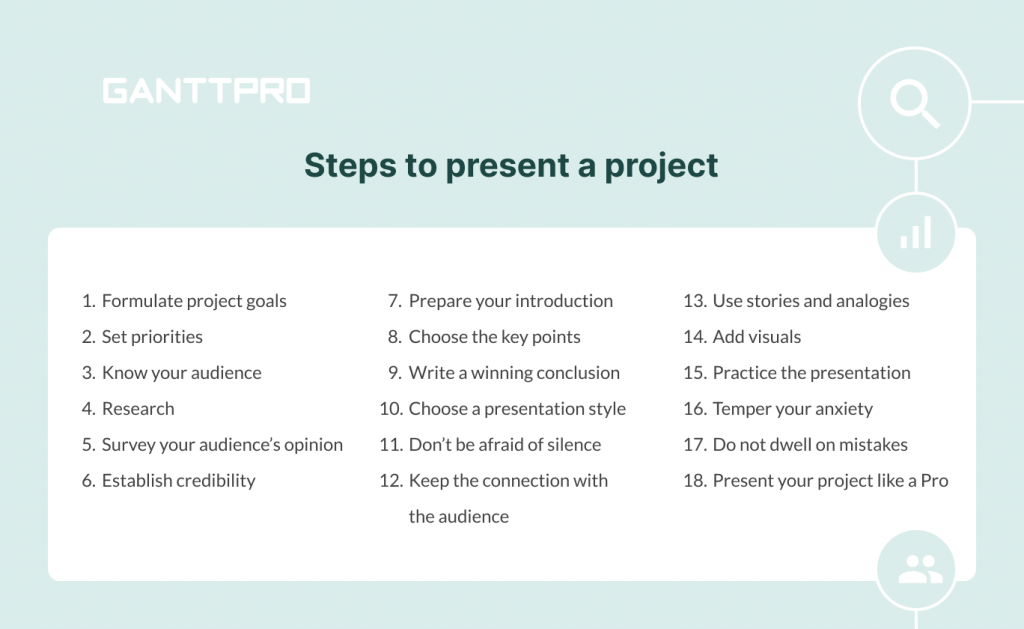
1. Formulate your project goals
Before you start finding the answer to the question “ how to create a project plan ,” communicate the goals of your project. When you hold a presentation, you should define what effect you would like to reach beforehand. Discuss all necessary details and fix the goals by arranging a call-up meeting with your team members and the product owner. If you do not do this, you will not have the direction to go, and your efforts will be useless.
Project goals can be trivially similar, but a business college presentation will be differently built than a pitch by a construction project manager. You can explain the goals of your project verbally, with the help of visuals, models, special documentation, or can create a project timeline.
In some cases, you will have to share information clearly and, in other cases, present a more emotional overview. Anyway, make sure you set clear and achievable goals while you prepare your project.
2. Set priorities
After determining the goals, give priority to specific tasks within your project. It is crucial to communicate with the managers from different departments, such as marketing, customer support, sales, etc. Discuss their priorities and decide together how these priorities fit into the general strategic goals.
3. Know your target audience
Considering relationships between yourself and your audience will help you define what points are critical to them and what can be left out. Knowing your audience will also help you determine how to present your ideas more effectively.
Pay special attention to how many people you’ll present your thoughts to. Talking to ten people is a conversation. Getting up in front of a group of twenty is already a speech. When you talk to more individuals, it’s a full-fledged performance.
4. Research
When you know your goals and the audience, ask yourself, “What do these people care about?”
Your presentation will probably cover many project management metrics . Make sure you have your technical and financial info available. Try to compile your research into one place. Even simple word docs and timelines will help you organize your findings and research.
Or use a helpful online Gantt chart maker to help identify project progression, set all necessary dates, assign tasks, and consider risk points.
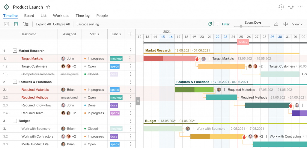
5. Survey your audience’s opinion
By studying what your audience thinks about a subject partway into your presentation, you will get a chance to turn your project into a forum for discussion.
New ideas and insights from the people who may be hearing about your subject for the first time will add an organic quality to the presentation.
6. Establish credability
When you run a presentation, you are the expert in the room. Your goal is to convince the audience to know your stuff, so try to impress them. To boost the audience’s trust, mention your background, first points of contact with the topic, nuances, exciting cases, or even rewards you have been given. It will help you to establish a greater degree of credibility and raise interest in the subject.
7. Prepare your introduction
An efficient introduction consists of three parts:
- A preview, outlining your main points.
- A thesis – a summary of your main points based on a big picture.
- An attention-getter – the most critical part of your presentation speech as it encompasses the first few seconds that your audience will judge you as a performer.
It is recommended to start your speech with statistical facts, a quote, or an exciting story. Remember that goofy jokes can jeopardize your credibility.
8. Choose the key points
Pick up your main points that will compose your thesis statements. Choosing these points should be apparent if you’ve done your research and know what and why you’re presenting.
Write down the essential topics that need to be presented and brainstorm what facts should be used to support your claims.
9. Write a winning conclusion
All presenters strive to end their performances with a bang. However, it isn’t easy to do it with a business presentation.
The best way to keep your audience on track is to simply summarize and close. Prepare a brief and informative summary, or reiterate what you’ve already said in the preview. Asking for questions or thanking your audience are both great ways to end.
10. Choose an appropriate presentation style
Some people make their presentations funny or dry; some try to make them as exciting as possible. It depends on the presenter’s style. Keep in mind that the quality presentation should be clear, concise, and concrete.
11. Don’t be afraid of silence
Even silence can be an essential ally in impressing your audience.
Give people enough time to internalize what you’re presenting. If you allow for some silence, they will be able to absorb and retain more information. Practice pauses after giving big problems or your unique solution. Allow presentation visuals to speak for themselves when you demonstrate necessary diagrams or meaningful images.
12. Keep the connection with your audience
Another key to a successful project presentation is connecting with the audience. Most people don’t have enough attention span to stay engaged for an entire presentation. They will remember only the most interesting (not necessarily important) facts.
To catch their attention, use outline notes, avoid reading from a script, talk to one person who is the most interested in the audience. Make sure that the people who want to know your information aren’t disappointed.
13. Use stories and analogies
Numbers and statistics work well. However, they can also scare off your audience.
Add interesting stories to engage people. The stories with analogies will allow participants to extrapolate the relevant meaning for their personal application. After all, people remember stories much better than boring facts.
14. Use visuals
Images, graphics, timelines, and other visual aids will help keep your audience engaged and ensure the key points remain.
Use images that clarify what is said verbally. Avoid complicated slides that could distract people, and remember to keep your prospective audience’s age in mind if you use humor and funny images.
Support your statements with charts. Charts and diagrams are the lifeblood of any successful presentation. You may say that it takes time to produce them.
However, such great solutions as online Gantt chart makers help to do this quickly and reliably.

Gantt charts for visual project presentation
Apply Gantt chart graphics to present your project professionally.
15. Practice the presentation
Just because you’ve designed your creative slides and timelines does not mean you are prepared to perform a stunning presentation. Some people never practice their speeches, by the way.
Review your presentation, talk it out, get comfortable with the delivery, and find good ways to present a project. Consider the tone, the speed, and the moments you wish to emphasize.
16. Temper your anxiety
When a speaker is relaxed, the audience will also relax, making for an overall comfortable experience.
Use notecards to ease your anxiety. Write them well, and you won’t forget anything. Get a whole night’s sleep, eat well the day before, and exercise – it will make you feel better. Do not forget to bring in a glass of water. Make pauses and allow yourself to regroup.
Give yourself a mindset that you will rock this presentation. Don’t let your anxiety get in the way of your success.
17. Do not dwell on mistakes
Mistakes can happen at any time. Your equipment may fail, or you can even forget the critical idea from your presentation. Do not panic. Your audience will evaluate the way how you recover. Don’t dwell on mistakes or failures and continue to perform.
18. Present your projest like a Pro
You’ve covered a lot of ground, and now you know almost everything about an effective project management presentation.
You will do well because you’ve rehearsed everything, and now the presentation of your project looks organized, clear, and entertaining. Your coworkers, executives, stakeholders, and clients will thank you for it.
The only thing you miss is a reliable project management tool to impress your audience. Below, we will talk about this.
Well, that was a lot of tips, but each one is worth your attention if you care about presenting your project in the best possible way.
Analyze all these steps and recommendations and choose the best way to present a project to your audience. Here are some thoughts on this matter.
Best ways to present a project
Knowing different ways to present a project makes managers true professionals. This skill is essential for any industry, no matter you want to present it to clients, stakeholders, or teammates.
Every experienced PM has their own best way to present a project. This exclusive method can be a real secret, but we will share the easy way to turn project management presentation ideas into a masterpiece.
As with many project management practices, your presentation requires the right tools. One of the good ways to present a project is to rely on powerful project planning software .
And now you will be pleasantly surprised when you find out how comfortable and easy it is to hold presentations with the help of Gantt charts.
Presenting your projects with GanttPRO
Project presentation with the help of GanttPRO is a true godsend for project managers and their teams who like comfort, order, system, attractive visualization, and ease of use.
Use the reliable online Gantt chart maker to present your project to your colleagues, top management, stakeholders, partners, or clients. To anyone! A set of the most essential and innovative features makes GanttPRO one of the most powerful tools for high-quality presentations.
There are several ways of how you can present your project with the help of GanttPRO.
1. Sharing via URL
You may need to showcase your project to a third party (even if they are not registered in GanttPRO). How to do it? The Gantt chart platform allows sharing your projects using a Public URL .
To include a project in your presentation, open the Public URL window by clicking on the three dots on the right corner.

Demonstrate your project with/without filters applied, choosing the corresponding option.
You can share a dynamic URL to keep any changes you make active. If you don’t want to share a dynamic URL, choose a Snapshot option . It will allow getting a static picture of your Gantt diagram taken when creating the URL (if you do not want to showcase any updates in your presentation).

Then push the Create Public URL button. By the way, you can leave a description of it.
The great news is that once the link is created, you can manage it. For example, select any of the following options:
- Copy and send it to anyone you want.
- Make it timely inactive if needed.
- Finally, delete the URL if required.

Note : you can share your project with the URL at any stage.
2. Advanced export
Another way to present a project with GanttPRO is to export it. This feature allows having your project always at hand as you can export your diagram to PNG, XML, PDF, Excel, and apply lots of other advanced options.
To export your project, find the Export button at the right corner.

On your right, you will see a dashboard where you can choose the export options:
- A paper size.
- An orientation.
Then you can also set the additional options.
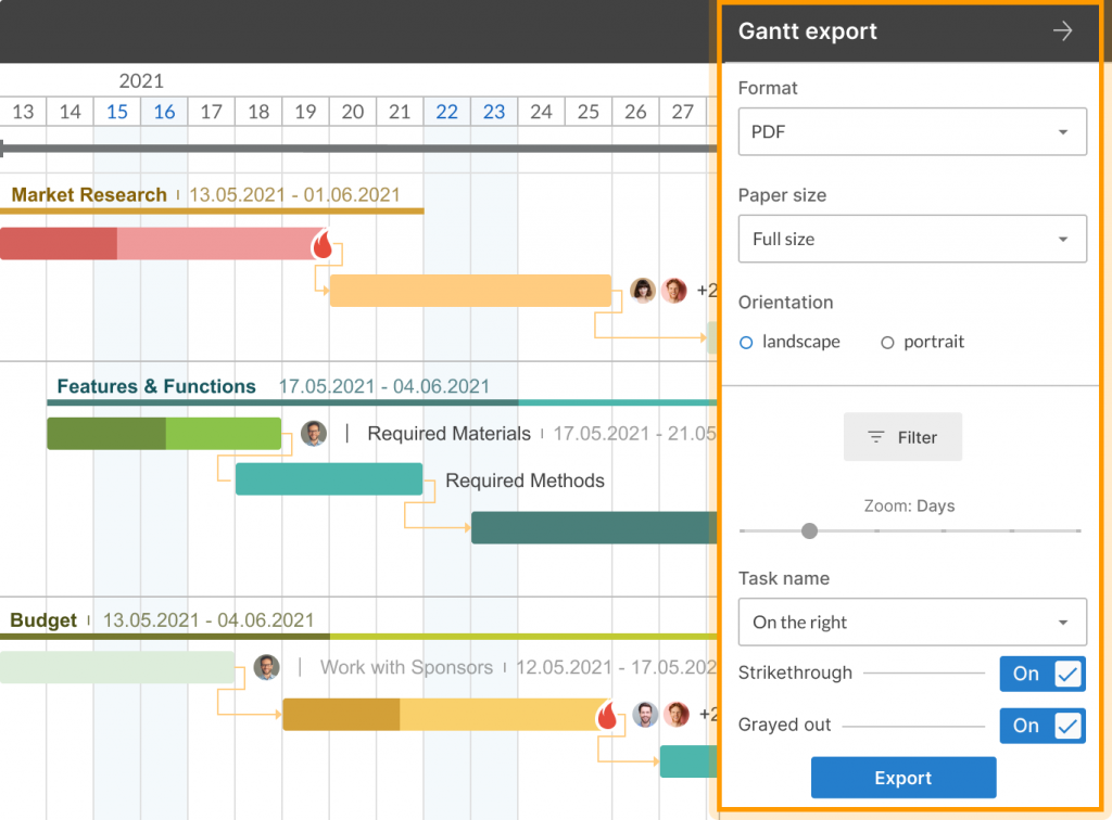
Nothing complicated, right? Hopefully, you’ll figure it out in seconds. If not, take another look to understand this feature better:
3. Importing Excel and .mpp files to GanttPRO
Using GanttPRO, you also have an opportunity to import different format files. If you have projects in .xlsx, .csv, or .mpp formats and want to present them more beautifully and professionally, you can easily import them to GanttPRO.
To do it, press Import when creating a new project.
Then drag & drop or upload it from your computer.
If you manage a project in MS Project, it will also be easy for you to import your .mpp file to GanttPRO.
Follow the steps described above, open an mpp file without any headache, and present it with GanttPRO like a real professional.
It seems like this is all we wanted to tell you about how to present a project and use a robust PM tool for this purpose.
Your ability to attract the audience’s attention is what makes or breaks a presentation, no matter how good your material is. Although virtually all practical project management presentation ideas are based on careful planning, you should put equal thought into how you’ll communicate your ideas to others.
When looking for your best ways to present a project, make sure you are passionate about it. After all, an attentive audience can tell whether or not presenters are engaged with the material they’re talking about.
Now you know how to present a project. Organize the order of all steps you will discuss, do practice, work on grabbing public attention, and do not forget to choose the appropriate project management tool for succeeding in your efforts.
It is not a big deal if you haven’t caught all the details about presenting projects using a convenient Gantt chart maker. Here you will find short video tutorials on how to do it quickly and easily:
Sharing your project with “Public URL”
Paolo Kukhnavets
Paolo writes about the exciting world of project management, innovative tools, planning strategies, time management, productivity, and more. He has a professional journalism education, over ten years of writing experience, and a vast bag of enthusiasm to comprehend and learn new things every day. In his other life, he is addicted to traveling, gym, and sci-fi movies. He cycles and runs a lot.
More about project management — straight to your inbox
Join 800,000+ project managers!
Create Gantt charts in minutes with GanttPRO and reduce time spent on managing tasks by 40%
No credit cards required. No obligation.
Connect with us
How to structure your “big idea” pitch for maximum impact
Get inspired.
- Flat Design
- Minimalist Design
- Colorful, Bright, and Bold Design
- Infographic-Style Slides in Presentations
- Bold Typography Design

Do you have a Big Idea? If you're anything like the thousands of people, you've fallen in love with your idea and you're finally ready to start pitching it. A good presentation requires a strong… ... read more Do you have a Big Idea? If you're anything like the thousands of people, you've fallen in love with your idea and you're finally ready to start pitching it. A good presentation requires a strong introduction, a big idea, and a solid conclusion. This article shows how to structure a pitch to ensure that your audience gets the most out of it. close
When pitching and presenting big ideas, it’s important to consider the structure of your presentation from the very beginning. In this blog post about presentation design , we will lay out a pitch structure you can use when presenting an idea for a new project. We’ll call this presentation approach “The Big Thing,” a six-step method for winning the hearts and minds of your audience.
The structure for a powerful pitch presentation includes the following:
Step 1: the primer.
Take your audience back to a time before a certain technology existed, one similar to yours but not quite what you are pitching. Here is where you set up the context of your “big pitch.” For instance, let’s go back to the beginning of cloud computing. Before the cloud existed, did you ever think that Dropbox could grow into a company with over 400 million users? The “big thing” in this scenario is pointing out the potential growth of cloud computing and how it will substantially change the business landscape.
Step 2: The Ups & Downs
Once you’ve established that the cloud is a big deal, use this section to talk about how some current companies are doing well by embracing it while others completely ignore it. Since your idea is to create a storage platform in the cloud, this section sets you up nicely for your next step: suggesting all the good things to come for those who have embraced the new technology. The key here is to try to drive your point home by indicating how things will improve even more in the future. The more you emphasize this idea, the better you will do in the rest of the presentation.
Step 3: The Benefits
Next, hint at the idea of a happy ending without going into details about your company yet (Dropbox). You’ll want to make sure that your audience is aware that happiness is not a guarantee unless they take part in or support your new project. This is where you capitalize on their FOMO (fear of missing out).
Step 4: The Specifics
Now that you have laid down a solid foundation, the next step is to get into the crude details of the project. The trick here is to package everything into 3 memorable talking points – no more, no less. These three talking points should address how the company will deal with current and future challenges and maximize the next great opportunity.
Step 5: The Proof
If you have proof of success, such as early customer beta data, customer testing that you have conducted, peer reviews, or anything else that would showcase your project as primed for success, then this is the step where you put it on display. The idea here is to show data-driven evidence to prove that success is just a matter of time.
Step 6: The Ask
Once you have gone through all the previous steps correctly and compellingly, the final step is almost natural—The Ask. Lay out your request clearly and concisely while briefly going over how you will use the money (or any other resource being requested) to take the project over the finish line.
And lastly, a quote from Albert Einstein that we think is fitting when it comes to pitching big ideas: “ If you can’t explain it simply, you don’t understand it well enough. ”

As a presentation design company in Dubai , we love sharing our knowledge of what works and what doesn’t. If you have enjoyed this post then you might also like to read:
McKinsey-style business presentations
How you can make your sales presentation “pitch-perfect”
How to avoid the dreaded “Death by PowerPoint”
Recommended for you..

13 June 2024
How Apple leverages white space for brand success

15 September 2024
Creating visual balance in presentation design

22 February 2024
Data Visualization: Choosing the right chart for your data
Like what you're reading?
20 creative presentation ideas to captivate your audience
Get your team on prezi – watch this on demand video.

Michael Lee June 17, 2019
The ultimate aim of every presentation is to etch a memorable mark that lingers in the minds of your audience long after the final slide fades away. Memorable presentations should be a creative blend of captivating design, innovative elements, and engaging delivery. To ignite your presentation prowess and set your creativity on fire, we’ve handpicked a treasure trove of 20 ingenious creative presentation ideas that will transform your presentations from bland to brilliantly unforgettable:
1. Experiment with color
It’s surprising what a little color can do. The way you use and pair colors in your presentation design can grab an otherwise disinterested audience member’s attention. Just make sure you do it tastefully and carry the theme across all frames. When in doubt, you can simply choose from one of Prezi’s existing content layouts , each with an appealing color palette.
Try experimenting with a two-toned design by adding different accents to your presentation background and other visual elements. You might start with a black-and-white design, then add a bright pop of one color throughout. Contrasting color palettes (think yellow and blue, pink and mint green, etc.) can also create this eye-popping effect. Alternatively, you can use neutral shades to give off a more subdued vibe.
Another idea? Add a color filter to your images to tie them into your color theme. Learn more about presentation colors in our guide.
2. Use a striking background theme

Looking for more presentation ideas and creative ways to present? Put some thought into your background image, as it’s what your audience will be looking at during the entire presentation. If you want to use a photo, choose one that’s beautiful, sentimental, or has action and flow. Just make sure you pick an image that has enough negative space on which to place text. You can also play around with textures and patterns, such as ripples or wood, or themes that are symbolic of your message, such as a passport, billboard, rocket launch, road trip, etc.
Additionally, make sure your chosen background image isn’t distracting. You want to keep your audience’s focus on the foreground — the graphics, text, and special effects you’ve created. Prezi already has a large library of effective and high-quality backgrounds and images you can search for when designing your presentation, so no need to source them from somewhere else.
3. Put thoughts into speech bubbles
Other creative ways to present information include using speech bubbles to communicate key points to audience members. Use them to illustrate an idea or to reveal a character’s thoughts or fears in your story. Have them pop up as notes or commentary in the frame you’re presenting. Similarly, you can use speech bubbles to show milestones on a timeline. If you’re revealing poll or survey results about a product or service, for instance, place data or participant feedback in bubbles.
But, like anything in a presentation, don’t go overboard with it. While speech bubbles can be a fantastic addition, excessive use might divert your audience’s focus from the core message. So, using speech bubbles in the right places to create impact can be effective for engaging your listeners, but scattering them throughout every slide might be a little excessive and cause the opposite effect. Balance is key when using speech bubbles.
4. Abandon the slide-by-slide style
Free your presentations from the confines of slides. As an interactive presentation tool, Prezi allows for dynamic designs to take your audience on a journey as you tell your story. Zoom in and out on key points. Navigate between topics and sections of your presentation in any order. Go vertical instead of horizontal. Make transitions between ideas look like pathways or scenes instead of simply clicking sequentially from frame to frame. All of these elements come together to make a memorable presentation.
These types of tactics will give your presentation a cinematic feel that will captivate and inspire your audience. An open canvas design also makes it easier for you to tell a story , which people tend to process and remember more easily than straight facts. Prezi’s ready-made templates and striking graphics make it simple for you to share your narrative via one of these seemingly complex designs. If you want to transform a static PowerPoint presentation into a dynamic moving story, simply upload your file and try Prezi’s PowerPoint Converter feature .
5. Tell your story with a video

Presenters have been incorporating video into their slide decks for decades. Video is one of the most creative ways to present projects. It allows you to tell your story using visuals instead of big blocks of text. Now, however, it’s time to elevate the video so it captures your audience’s attention and enhances your narrative. Embed videos that play automatically when you navigate to certain parts of your Prezi canvas.
Just be sure to use videos that aren’t distracting and that work with the rest of your presentation’s flow. They should still complement your presentation’s overall design theme and message. If you’re not producing a video yourself, you can find thematic ones from stock video sites or on YouTube. Just be aware that you might need permission to use some videos.
It’s important to select videos beforehand and place them strategically so that they hit hard in the right places. Selecting the perfect videos is like choosing gems to adorn your presentation’s crown. These videos should harmonize seamlessly with your content, elevating the story you’re weaving.
Imagine, for instance, using a time-lapse video of a bustling cityscape to represent the rapid pace of change in the business world during your presentation on industry trends. Blending your videos with the theme of your topic in this way goes beyond just catching your audience’s eye, it actually adds depth to your story while also making your message more impactful.
6. Bring your story to life with audio
Another presentation idea to minimize text and maximize audience engagement is to add sound to your presentation. Tell your story using pre-recorded audio. This creative presentation style turns the viewer experience into just that — an experience. While the audio plays, you can move around the stage and navigate to various parts of the presentation that support the narrative visually. Again, the effect is almost movie-like.
Another auditory presentation tool is music. Use music to set the tone of your talk, or inject it periodically to regain the audience’s attention. The appropriate song choice can get the entire audience into the mood of your presentation. Choose upbeat tunes to convey excitement or dramatic ones that will trigger an emotional response . Plus, if you play a catchy tune that sticks in people’s heads, that’ll help them remember your presentation that much more.
7. Add animations
Another creative way to present is by bringing an otherwise static design to life is animation. Go beyond video by borrowing from stop-motion principles for your presentation. Stop motion is a technique in which you film objects one frame at a time to simulate motion in a scene or a story. You can recreate this effect in Prezi by using zoom, fade, and pan animations to tell a moving story frame by frame.
Animations can inspire and engage your audience, but just be sure to use them sparingly and as a complement to your story or message.
7.1. Make it fun with GIFs
Adding animated GIFs to your presentation can not only make it more fun but also help catch your audience’s eye. Because they’re trendy and often reference pop culture or common emotions, GIFs can help you get your point across without having to use just words.
However, it’s crucial to exercise moderation when employing these elements. While animations and GIFs can enhance engagement, excessive use of them can become distracting. There’ll be certain presentation topics or subjects where GIFs will look misplaced, so just make sure you think carefully about whether they correlate with your message before you use them. However, GIFs are a great way to inject humor and light-heartedness right after slides filled with heavy information. When executed skillfully, animations and GIFs transform your presentation into a dynamic and interactive visual journey, leaving an enduring impression on your audience.
8. Create a timeline
The timeline is nothing new. It’s how you apply it to a presentation that can really wow an audience. Prezi’s dynamic designs let you use the timeline as the basis or focal point of the presentation and then navigate along as you tell your story or plan of action.
Zooming in on specific elements of your timeline as you discuss them adds another layer of clarity and focus. It helps make sure your audience stays on track with your story and doesn’t get lost in the details or complexities. This laid-back way of highlighting key moments or steps keeps people interested and makes it easier for them to remember what you’re talking about.
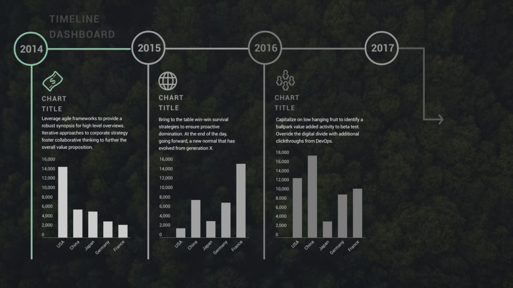
9. Use maps
Deliver a creative presentation with maps, especially if there’s a geographic or location-based topic in your content. Set a map as your background or focal point, and prompt different regions to change colors or pop out as you navigate over them. When it comes to designing maps , make sure you’re purposefully selecting colors, as the color palette you choose can change the way people respond to your data. Don’t pick colors that are too similar when you’re making comparisons, for example. Use Prezi’s zoom function to zero in on areas for more details, or pull back to reveal the larger context.
You can also go the thinking map route, which is a visual learning technique that can convey complex ideas simply and creatively. Start with a central theme, then branch out into paths or surrounding points. The eight variations of thinking maps include circle maps, bubble maps, flow maps, treemaps, and more. These can be effective interactive aids in educational presentations as well as for small businesses.
10. Do away with bulleted lists
To truly transform your presentations, consider stepping away from the conventional bullet-point lists that often lead to passive learning. Instead, harness the power of visuals to inspire active engagement from your audience. Visual content stimulates the brain’s cognitive processes, making your message more memorable. Engage your listeners by replacing bullet points with visuals .
Prezi’s open canvas design is a valuable tool in this transformation. It shifts the focus from passive delivery to interactive engagement. By using visuals, you prompt your audience to actively process and respond to your content, fostering a deeper understanding and connection with your message. This shift from traditional bullet points to a visually driven, interactive approach can significantly enhance the impact of your presentations.
11. Communicate with images
Presentation images are nothing new. However, when standing alone, photographs, paintings, and other images can have a really powerful effect. Instead of trying to talk over an image, use it as a stepping stone in your presentation, a point of reflection. Once in a while, let visuals do the talking.
Also, a study has found that people process visuals 60,000 times faster than text . So, incorporating more images will make your presentation more memorable.

However, be careful with your selection of images – make sure that they’re relevant to the topic and aren’t just filling up an empty space.
Also, If you’re using Prezi for your presentation, you can access a huge library of images that takes away the headache of finding that one perfect shot. It’s like having a cheat code for making your presentation pop. So dive into the library and pick out visuals that’ll make your presentation not just informative, but engaging.
12. Play with transitions
Using slide transitions is one of the simple yet creative ways to present a project. They create visual continuity and add movement to slides. However, choosing the right page transition for your slides is truly a form of art. You have to consider the topic, tone of voice, and your presentation design. Page transitions should match the overall design, create flawless continuity, highlight key areas in your presentation, and do all that without stealing the show. Ultimately, you want it to compliment your presentation.
If you are looking for inspiration, check out Prezi Present ‘s wide selection of templates . You can play with transitions by adding additional animated elements that will make your presentation even more dynamic.
13. Swap for an infographic
To truly stand out and make a lasting impression, consider departing from the traditional slide-based approach and exploring infographics. Infographics are powerful visual tools that condense complex information into digestible, visually appealing formats. Instead of the conventional slide-by-slide progression, imagine scrolling through your presentation, seamlessly transitioning from one section to the next. This fluid movement allows you to verbally expand on key points while displaying the core information visually.

When you’re adding infographics, aim for designs that are easy to understand but also match your brand’s vibe. You want something that looks good and fits well with the rest of your presentation, so everything feels like it’s part of the same story. This helps make your presentation both easy to follow and hard to forget.
14. Get social
Employing a unique hashtag associated with your brand can significantly amplify the impact of your presentation, extending its reach far beyond the confines of the physical venue. This hashtag acts as a vital link between your presentation and the vast world of social media. Inviting your audience to dive into the live-tweet action with a dedicated hashtag during your talk isn’t just a savvy move; it’s a dynamic double play. You expand your reach, drawing in more eager participants, while simultaneously igniting a thriving online symphony of ongoing discussions and insights.
This approach effectively transforms your presentation into an active, two-way conversation. As you speak, people can immediately share their thoughts, favorite parts, and main lessons, creating a sense of togetherness and active involvement. Furthermore, the utilization of a branded hashtag allows you to monitor and engage in these conversations, strengthening your connection with your audience and providing an avenue for addressing questions or feedback.
Even after your presentation concludes, these online discussions continue to thrive, ensuring that your message remains fresh in the minds of your audience members long after they’ve left the physical venue. This lively and extended interaction adds an exciting twist to your presentations, transforming them from just informative sessions into lively hubs of ongoing conversation and learning.
15. Use creative props
Physical props add a memorable dimension to your talk. Props serve as powerful visual aids, helping to illustrate key points, provide tangible examples, and offer visual cues. Props can be particularly useful for educational presentations, especially if you need to demonstrate an example. Another situation where props are paramount is if you are a brand that’s launching a new product and doing a promotional presentation.

With Prezi’s creative tools at the forefront of your presentation along with your latest product at hand- you’re bound to persuade your audience. Integrating props at the right time in connection to your current presentation can really create a connection between you and your listeners. Put yourself in your audience’s shoes, would you take in the information by just reading and listening, or would seeing and touching physical props add a layer of interest that enhances your mental absorption?
16. Utilize virtual reality (VR)
VR technology allows you to transport your audience into a different environment or scenario closely related to your presentation topic. Transforming your presentation into a new virtual world takes it far beyond the expectations of mundane slide-by-slide presentations.
With VR, you can engage your audience with a dynamic three-dimensional world where they become active explorers, engaging directly with your content. Picture this: You’re showing off architectural wonders, recreating epic historical events, or unraveling the inner workings of intricate systems. VR takes your presentations to a whole new level, letting your audience not only see and hear but also experience and genuinely feel your message. It’s like inviting them to step right into the heart of your story.
17. Use gamification
Picture turning your presentation into an exhilarating game that dares to captivate and thrill your audience. When you add a little playfulness to your presentation, your audience is going to absorb your information without it feeling like a chore. Making aspects of your talk into fun learning experiences is going to keep your audience switched on throughout the whole presentation.
You can achieve this by incorporating various interactive elements like puzzles, questions, or interactive storytelling that turn your presentation into an immersive and educational game. Encouraging your audience to think and respond will result in active participants rather than passive observers.

18. Employ live demonstrations
Incorporating live demonstrations into your presentation is a potent strategy for effectively conveying your message. Whether you’re showcasing a product’s functionality, conducting a captivating science experiment, or engaging your audience in a hands-on activity, live demonstrations actively involve your audience and leave an enduring mark.
Live demonstrations can transform presentations into captivating journeys where your audience doesn’t just listen but also witnesses concepts coming to life before their eyes. This physical approach creates curiosity and entices active participation, effectively transforming your message into something tangible. When people can see, touch, or take part in live demonstrations, it makes a strong connection. It brings your audience right into your content and makes sure they take the message away with them afterward.
19. Design comic-style frames
Using comic strips as a presentation style is great when you want to make your presentation engaging and easy to remember. It works well for topics where you want to tell a story, explain things step by step, or simplify complex information. Comic strips contain the best of both worlds, combining visuals with storytelling. This means they’re versatile for various topics, such as education, marketing, and product demos.
The clever approach of comic strips crafts an animated, captivating experience that keeps your audience glued to their seats and sparks their eagerness to participate. Not only that, but it also makes your message highly memorable.

Creating a comic strip in Prezi is straightforward. Start by planning your content and breaking it down into bite-size sections that will be arranged in sequence. Then, use Prezi’s features to design each section as a comic frame, inserting relevant visuals and images. Prezi’s text and shape tools help you add speech bubbles or captions to guide the story you’re telling. As you present, take on the role of a storyteller, guiding your audience through each frame of your comic strip presentation with captivating explanations that hold their attention.

20. Emulate the style of TED talks
The TED-style approach is a powerful method of delivering presentations that revolves around the core principles of clarity, simplicity, emotional resonance, and compelling storytelling. In this approach, speakers focus on distilling complex ideas into easily digestible narratives, using relatable language and impactful visuals to engage their audience. TED-style talks typically center on a single compelling idea , conveyed with passion and authenticity, making them concise, memorable, and inspiring for a wide range of viewers.
Learn how you can excel in storytelling and develop TED Talk presentation skills in the following video:
Staying current with creative presentation ideas
Just as technology and communication methods constantly change, so do presentation audience preferences and expectations. Keeping your creative presentation ideas fresh and aligned with contemporary trends can significantly impact your effectiveness as a presenter.
Why keeping up matters
Adapting to audience expectations.
This is the key to making a memorable impact with your presentations. In the modern world, audiences want more than the ordinary; they seek thrilling, dynamic experiences. To make this happen, you must wholeheartedly embrace cutting-edge technologies and innovative concepts to make your presentations highly engaging. So, why stick with the mundane when you can captivate your audience’s imagination and curiosity with creative presentation ideas? Break free from the conventional and explore new concepts using Prezi.
Maintaining relevance
Staying relevant is the cornerstone of success. To connect deeply with your audience, demonstrate your strong dedication to delivering top-notch content consistently. Your presentations should stand out with innovation and creativity, signaling that you’re not merely keeping pace with the times – you’re setting the tempo. With Prezi’s toolbox, you’ll be ready to explore a range of creative presentation ideas that leave a lasting impression on your audience.
Fueling engagement
Elevating your presentations from mere information-sharing sessions to immersive experiences can be a game-changer. By staying in the loop on fresh creative presentation ideas and cool interactive tricks, you’re all set to captivate your audience. Adding some of these new, interactive touches can help you grab and keep people’s attention way better than just repeating the same slideshows.
Where to get your inspo
If you’re ready to improve your creative game, there are plenty of helpful blogs, webinars, and online courses about fun presentation ideas you can dive into. Prezi offers a lot of useful tips for making your presentations stand out. Think of Prezi as your toolbox, always within reach to unlock your presentation’s potential and make a lasting impression. For presentation inspiration , check out Prezi’s presentation gallery and explore our highly engaging and creative templates .
Watch this video and learn more about creative presentation ideas:
Get inspired for more presentation ideas
The world isn’t flat, and your presentations shouldn’t be, either. Step outside your comfort zone, and play around with these 20 creative ways to present. Better yet, come up with your own creative ways to present and incorporate them into one of Prezi’s dynamic content layouts. Using this presentation software’s open canvas approach, you can tell your story conversationally and spontaneously so that audience members will engage with and remember.

Give your team the tools they need to engage
Like what you’re reading join the mailing list..
- Prezi for Teams
- Top Presentations
Video Editing
- Animation Tips
- Website Tips
100+ Creative Presentation Ideas You Can Steal Today

Renderforest Staff
20 Aug 2023
11 min read

Have you ever struggled with forcing yourself to stay awake during a presentation? Don’t worry, you are not alone.
In essence, a presentation is nothing but sharing ideas with others. Whether you intrigue and interest your audience or not depends on how interesting the topic is and how well you present it.
Whether you plan on making a PowerPoint presentation with neatly designed slides or a video presentation with dynamic transitions, you first need creative presentation ideas.
That’s why we’ve created a comprehensive list of the most captivating and creative presentation ideas you can put to use. We have separated them into three main categories to make things easier for you.
Let’s dive right in!
Business and Management Presentation Ideas
Education presentation ideas, general presentation ideas.

In business, presenting information and complex ideas in an easy-to-digest manner is crucial. If you already have a presentation idea, you only need to find a presentation template to bring it to life. But if you’re still looking for creative presentation ideas, read the list we’ve prepared below.
- Corporate Presentation : Have you ever wondered what the best way is to build and communicate your company’s identity? Corporate presentations are great for promoting your brand, services, and products by simply talking about them.
- Company Profiling : Introduce your team. Who are you? What are you passionate about? Your audience is interested to know more about your team members.
- Company Story : What can strengthen the ties between you and your audience better than a compelling success story told through creative presentations?

Use Template
- Product Promos : Create a buzz around your new product with an engaging promo presentation.
- Sales Pitch : Close that sale you’ve worked so hard for with a well-built sales presentation.
- Office Tour : Present the cool interior design of your office. Show your favorite spots where you like to wind down with a cup of coffee or, hey, maybe a beer.
- Product Features : Does your product have interesting features that not everyone knows about? Make a detailed presentation on all the hidden features of your product. Use images and videos, using the corporate video templates , to explain how everything functions.
- Fundamental Principles : Choose a general topic in Business and Management and discuss it through your creative presentation. Here’s an idea: “Fundamental Principles of Strategic Planning.” Could be a great prompt to start with, right?
- Best Strategies: Be it marketing, financial, or any other type of strategy, an overview of the best strategies can make for informative and useful presentation content.
- Industry Introduction : Make a presentation about the industry your business operates. Use strong visuals to complement your content and introduce your industry in the best light possible.
- Comparing Tactics : Make a presentation reflecting on and comparing various tactics.
- Calculated Risks : We are all worried about possible risks when taking action. Risks are unavoidable. It’s a great idea to prepare your audience for the risks before they come across them. There is a multitude of ways to do it through creative presentations. Cover “Risks in Investing,” “Risks Associated With Trading Derivatives,” and so forth.
- Advantages and Disadvantages : One never comes without the other. Introduce your team to the pros and cons of your plans, actions, and anything else you consider important.
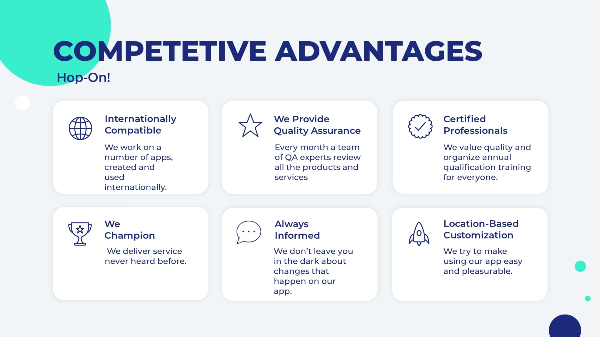
USE TEMPLATE
- Debates : Make your presentation even more interactive by involving the audience in debates. Plus, debates and discussions are always helpful in establishing a better understanding of a topic.
- SWOT Analysis : You can never go wrong with a proper analysis of business strategies, marketing plans, and more. So consider making an analysis presentation to identify the strengths, weaknesses, opportunities, and threats of a specific business strategy.
- Portfolio Presentation : Showcase your best projects and works. Why should anyone be interested in you if they haven’t seen your work? Presenting your best projects in a compelling and attractive format will increase your reputation quickly.
- Current Trends : What are the current trends in business and management. Always keep an eye on them to stay one step ahead of your competitors.
- Challenges : Who doesn’t agree that challenges are tough? Making a creative presentation on challenges and the ways that you have overcome them will help you keep track of your development and also prepare for the future.
- Reporting Progress : Why don’t you make weekly or monthly presentations on your performance, such as financial statements? Measuring and reporting your performance will smooth your path toward your goals.
- Customer Testimonials : Present your customers’ responses and feedback on your product/service to see what steps you need to take to improve your offerings.
- Profiles of Successful People : Encourage your team by introducing them to the experiences and achievements of successful people.
- Tips and Tricks : If you want to cheer your audience up, provide them with hacks and tricks to deal with certain issues. This can include technical tricks and some tips on teamwork, for example.
- Rules and Regulations : What are some of the rules that your company never breaks? Discuss the rules and regulations that apply to your team.
- Top Criteria : Selecting a new quality management system is not easy, is it? Introducing the top criteria for a specific task can be a great presentation topic. How about making a presentation on “Top Criteria for Selecting a New Quality Management System?”
- Product Development Process : Sometimes, we are interested to see how a product was created. Showcase the development process of your product through a presentation.
- Most Effective Ways : It’s always good to be introduced not only to what to do but also to how to do it. So make a presentation on the best ways of conducting surveys, research, or anything else.
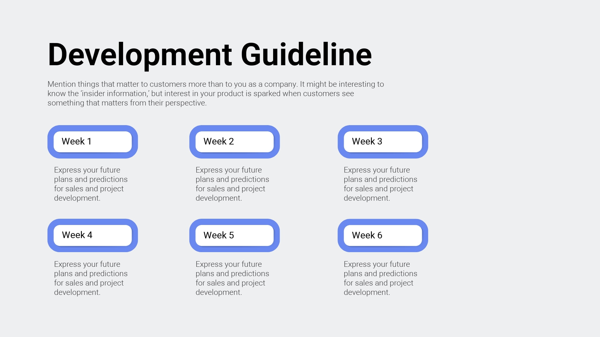
- Success Factors : This is something all of us are interested in. Introduce the success factors in different areas such as managing successful teams or product design tips.
- Cause and Effect : This simple and informative presentation structure will be ideal to dive deeper into the intricate world of cause and effect.
- Past vs. Present vs. Future : Growth will become more visible and obvious once you start comparing what you had before to what you have now. This can turn into a great summary of the major changes within a certain time period.
- Comparisons : Compare different products/services. It’s a good strategy that will help you emphasize the good and the bad sides of a particular thing.
- Positive and Negative Effects : It’s always important to show the two sides of a coin. Consider presenting the positive and negative effects of a certain thing. For example, the positive and negative effects of social media are a debated topic nowadays. Pick your topic and reveal it from both perspectives.
- Problem-Solution Presentation : Identify a relevant problem. A great presentation format would be to introduce not only the complicated problem but its solution as well.
- Training : Your presentation can become a training session. You can organize a theoretical part and add a practical portion, too, like quizzes and discussions.
- Graphs and Charts : One of the best ways to introduce your info is through statistical graphs and charts, combining survey and observational data. You can use visual animated scenes and infographics.
- Popular Misconceptions : People are often mistakenly drawn from one end to another due to inaccurate data. Help your audience avoid misunderstandings about entrepreneurs, investors, and business management in general. Your presentation will guide them in the right direction, drawing the line between truth and lie.
- Introduction to Business Topics : No matter the topic, it’s always useful to present basic ideas. Keep it short and clear. This can include an introduction to income statements, or any other important business concept.
- Stages of a Process : Don’t leave your audience confused with theory but let them see the practical stages of how things are accomplished. (e.g., “The Stages of User Journey”)

- Management : How do you efficiently manage a business? You can prepare dozens of presentations on management: be it resources, public relations, time, money, or anything else.
- Competitor Analysis : Know your enemy! You’ve probably heard the famous saying, haven’t you? Track down your competitors and share the info with your team.
- Appreciation : This presentation should be devoted to the team members who have done an exceptional job.
- Unknown Facts : Pick a topic and reveal facts that are unknown to most people. What are some of the interesting and truthful facts that they don’t know about branding?
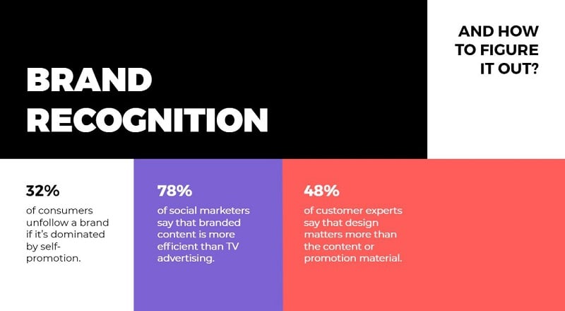
- Restrictions : No matter what business you have, restrictions are guaranteed. Make a presentation on the restrictions and limitations you face. (e.g. “Restrictions in Integrated Web Design”)
- Big Breakthroughs : Want to feel proud of yourself and your team? Here is how you can do it: Reveal some cases when you have successfully overcome the toughest of obstacles and learned lessons as a result. Talk about the long path you have been on with your company.
- Partners and Investors : Tell about your partners. Give info about investors. Cooperation is way more successful when team members are acquainted with the investors. Your presentation can have a strong influence on the performance of your team.
- Business Ethics : As a significant part of business, it’s important to understand ethics. How about “Ethics in Marketing Research?” There are countless ethical issues.
- Theories : Gather some of the most important theories that you find useful and prepare a good presentation with examples and visuals.
- Product/Service Improvement : A briefing like this might include a recap of your product or service or a discussion of any possible improvement before the product is ready for the market.
- The Rise and Fall of Brands : Don’t avoid talking about the failures and successes of other brands. Doing so can help you with your own journey.
- Upcoming or Recent Events : Talk about exciting events that you are planning to organize or already have. For upcoming events, you can make a welcoming presentation, announcing the date and venue. Check out an example below:
- Inspiration : Get ready to give a professional and motivational talk to inspire your audience to take action towards targeted goals.
- Explain Business Concepts : How does a certain idea or concept work? Give a specific and clear presentation on the concepts that not everyone is familiar with. How does a franchise work? How do partnerships work?
- QA Presentation : Assure that your audience knows that your product/service is of the best quality.
- Announcements : Is there a cool and intriguing event that’s coming? Give an announcement through your presentation. It can be short and clear, covering all the key points.
- Discovery, Invention, Innovation : Share the most interesting discoveries and recent innovations in the business world.
- How-to Presentations : If you are skilled at something, then you can make a presentation to guide others. Present a step-by-step guide for a specific task, such as conducting surveys or managing conflicts.
Whether it’s a school project or an online class presentation, you need to make it attractive and engaging. So, choose the topic wisely. Below are some education presentation ideas you can use for your next project.
- Academic Presentation : If you want to educate and share info, then academic presentations with supporting visuals, presentation slides, and videos are what you need.
- Explainer : Explainers are a powerful way of sharing essential information. You can make short and engaging explainer videos to include in your presentations.
- Pros and Cons : Make a presentation explaining both pros and cons of a certain issue at stake.
- Best Methods : Talk about various effective methods, be it methods of teaching, learning, or preparing for an exam.
- Dos and Don’ts of Making Presentations : You can make a whole presentation just talking about presentation best practices . Separate what’s recommended and what’s not and then present those to your audience in a simple way.
- Guidelines : Present the most effective guidelines for teaching, studying, and co-working.
- Personal Experience : What can be more helpful for an audience than to learn from someone’s real-life experience? Make a presentation on your personal experience and share your most valuable insights.
- Quiz-Presentation : Test your students. Make a presentation quizzing their knowledge and competence in a certain field. Why presentation? Because it’s both visually and technically effective.
- Research : An attractive slideshow is one of the best ways to present your research. Try working on a visual and multimedia presentation to showcase the whole potential of your research in a visually appealing format.
- Problem-Solving : Decide on an issue and prepare a set of solutions to offer. Don’t leave any questions uncovered. If a problem exists, so does its solution.
- Project Proposal : How are you planning to get approval for your projects if you don’t propose the main idea and expected outcomes in a professional way? Give your project a classy presentation with this Minimal Titles Pack .
- Listing Presentation : Lists always work when you have big sorted data to introduce to your audience.
- Controversial Topics : Attract your audience’s attention and keep them engaged with a controversial slide deck. Bring forward debatable issues such as euthanasia, AI, and more. Let your audience join you or argue against you.
- Textbook Presentation : Introduce a textbook in a creative way through interesting visuals and supporting multimedia.
- Curriculum : What if presentations are the best way of getting your audience acquainted with a curriculum. Alternatively, you can make your next presentation about how to develop a well-organized curriculum.
- Dissertation : Prepare a presentation for your dissertation. But keep in mind that it has to be accompanied by proper supportive media.
- Predictions Presentation : What will happen next? It’s fun to predict, isn’t it?
- Instructions : Do you like giving instructions? Sometimes that’s what you need to do. Structure your presentation in a how-to format, giving instructions for certain actions, like “How to Work Out the Best Schedule?”
- Precautions : Prepare your audience for the worst and hope for the best. Make a presentation on a set of warnings.
- Case Studies : What’s the best way of demonstrating your case study? A multimedia presentation can be the answer.
- Tricks and Hacks : Tips and tricks are always appreciated by your audience. Create an informative presentation on studying tips, time management tips, or anything else you might find interesting.
- Success Stories : We are always eager to hear success stories. Why? Because they motivate us to move forward with hope for what’s to come. So, make a presentation, telling success stories to motivate teachers, learners, and everyone else.
- Fact or Fiction : Draw a line between truth and lie, fact and fiction. Bust some myths about a topic of your choice to educate your listeners.
- Data Analysis : Is a presentation the right place to start with data analysis? Not really. But once you have analyzed your data, showcase it in your presentation, demonstrating your analysis through charts and graphs.
- Techniques : What kind of techniques can you cover? How about “Techniques for Memory Improvement,” or “ Teaching Techniques ?” You can make up a number of similar topics to share.
- Recent Advancements : Share the recent advancement in the field of education. What are some of the newest teaching methods? What advanced methods do we need to implement to make the learning process more effective?
- Steps in the Process : What are the best steps to take towards certain goals? Each path is different and thus requires different steps.
- Interesting Facts : Gather a set of creative ideas and facts to cover in your presentations.
Recommended Reading
- 35+ Best Presentation Software: Ultimate List 2023
- The Art of Consulting Presentations
- Timeline Presentations: Extensive Guide to Creating Visual Narratives
Here we have random presentation ideas that can inspire you. Make your next presentation a blast by introducing a new creative topic through a unique presentation design.
- Introduction to a Topic : Often, we don’t really want to go deep into complex concepts but just need a short and clear intro to get a grasp of them. Make a presentation on the basics of the most intriguing and puzzling themes.
- Ethics of a Certain Field : There are a number of important fields that need to be discussed in terms of ethics. For example, ethics in journalism is a very trendy and essential topic to discuss nowadays.
- The Future : We are always interested in the future, aren’t we? We make plans for it. We carry hopes for it. Let’s make a compelling presentation that discusses the future of various fields, such as AI or the Internet.
- Benefits : What are the benefits of a bilingual brain? Try to cover the benefits of a number of issues, such as digital transformation, or a healthy diet.
- Risks : Discuss the risks of taking certain steps. When we know the risks we can circumvent them, can’t we?
- Evolution : How do things evolve? It’s super important to present the ways that certain things unfold and change. How did artificial intelligence grow and evolve to such degrees?
- Components: Pick some topics to discuss the components of. How about making a presentation on “Components of Web Applications?” Pretty interesting, isn’t it?
- Alternatives : We always feel a need for alternatives. Make a presentation offering alternatives for different tools and objects. One example could be a presentation covering “The Best Free Alternatives to Microsoft Office.”
- Memoir : Tell the stories of influential people or your own in a value-packed presentation.
- Video Games : You can reveal the pros and cons of a game or just talk about the trendiest games as of now. You could also reveal statistics about the influence they have on gamers.
- Music Album Presentation : Present a music album, composers, and musicians. You can talk about their tours, also including videos and audio files of the tracks.
- Reviews and Reports : Do a book or a film review. Present your criticism and reflections on a book or movie of interest.
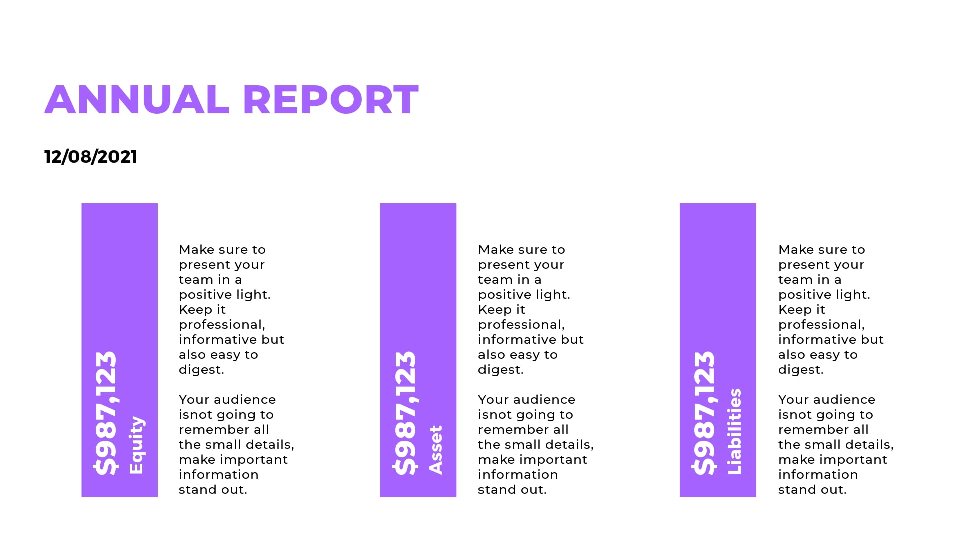
- Scientific Presentation : What are the recent scientific discoveries? Not all people are aware, right? Bring forward some intriguing info about the latest discoveries in the form of presentations or even animated educational videos .
- Job Interview Presentation : Impress your potential employers with a structured and clean job interview presentation. Our video portfolio editor can come in handy here.
- Important Skills : What are the top skills needed in your industry? Create your list and share it.
- Requirements and Qualifications : What are some requirements for a specific job position or a field in general? Share your experience and knowledge on this topic.
- “Best of ” Compilation : Gather a list of the best movies, games, books, tools, meals, and anything else, really.
- News : Sometimes, people don’t care to sit and listen to an hour-long news report. So, how about making a brief and informative summary of the most noteworthy news?
- Experiments : Make a scientific or social experiment and reveal your results; they might be different from what you expected.
- Life Story : Use presentation slides to tell about the life of a famous or personal story of an influential person. Use images, videos, and any other visual elements to make your story more vivid.
Making a compelling presentation doesn’t purely depend on presentation software , even though that’s also very important. To make an impactful presentation, one has to first figure out how to approach the topic and decide on the presentation design.
We hope you found your topic on the list of creative presentation ideas presented above. Best of luck with creating presentations!
Ready to create your video presentation? Find hundreds of slideshow video template options, browse stock images to find a background image, use hand-drawn illustrations, add your color palette, customize your entire presentation the way you want, and share your creative presentation idea in an interesting way. You can also use a recap video template to present the main takeaways of an event or a session in the form of a summary. Click the button to get started:
Article by: Renderforest Staff
Dive into our Forestblog of exclusive interviews, handy tutorials and interesting articles published every week!

Top 12 Spotify visualizer software for 2024
13 min read
20 Sep 2024
How to make an explainer video in 4 steps
11 min read
How to make a video presentation in 3 steps

How to Give a Stunning Project Presentation
April 3, 2019 by Bernie Roseke, P.Eng., PMP 2 Comments

Many projects require a presentation, whether at the beginning, end, or somewhere in the middle. Sometimes it is given to the managers or executives, sometimes to the project team , and sometimes to stakeholders who have a specific interest in the project.
Project presentations can be very nerve racking and difficult for many people, but that doesn’t mean they have to be difficult. With practice and some basic guiding principles, you can give a stunning project presentation that will knock their socks off. I’ve given many project presentations, and I’m going to share my secrets with you.
Present the Problem and Solution
- Repeat the main point 3 times
- Include an analogy or story
- Keep slides short
- Include pictures and Diagrams
- Connect with the audience
Many audience members assume that you know what you’re talking about, and most of the time you do. But somehow, if the presenter doesn’t include the topic of the presentation directly, the audience doesn’t want to decide what it is for themselves.
It’s similar to a sales pitch in that it’s the presenter’s job to keep the audience engaged. If you wish to maximize the communication of the message, you need to state it directly.
Include an Analogy or Story

- An analogy is a comparison to a similar real life thing, for example, This product works like a rocket ship taking off to the moon. It takes a bit of preparation time which might seem a bit daunting at times only to have a very quick experience that over relatively quickly, but the experience is worth every second in the end. I’ve become a true believer in the immense power of analogy. Analogies engage audiences in milliseconds and give them something to remember the presentation by. I’ve incorporated analogies in my writing at every opportunity, and the results have been truly amazing. Many project presentations come in groups, that is, they are one out of many. In this case, the presentation with an analogy is the one that will be remembered by the audience.
- A story is an experience that relates to the topic being presented, for example, Last year I had the privilege of working with sick kids at the hospital. These kids needed life saving medical care, and the doctors were fantastic. It made me realize that this product really has the potential to impact people, and maybe even save lives. A story is a personal experience, either yours or somebody else’s. They work just like an analogy by engaging the audience and giving them something to remember the project by. But they have the potential to drag on when the audience starts to feel like it’s not about them. The key to pulling off a successful story is to keep it short and relevant. If the audience can’t connect it to the project, they will lose interest.
Ideas for analogies are surprisingly easy to find with internet searches. Personal story ideas require brainstorming and thinking about the relationship between the topic and real world experiences.
Repeat the Main Point 3 Times

- Tell them what you’re going to say
- Tell them what you just said
In most presentations, this takes the form of an introduction, main body, and conclusion. But all three parts need to spell out the main point in a prominent place, clearly and succinctly. You want to make sure the audience doesn’t need to think, that people can be daydreaming about what they’re going to be doing that evening but they’ll perk up and get hit with a short but prominent main conclusion that they won’t forget.
In most presentations, audiences are not in a position where they want to exercise their thought muscles. Similar to a sales presentation, they don’t want to think for themselves, they figure it’s the presenters job to tell them what to think. Hence, they forget what they are told very quickly.
Speaking of which, did you notice the analogy? I’ll bet that if you remember nothing else from this article, you’ll remember that the audience doesn’t want to exercise their thought muscles.
Keep Slides Short
Many presentations contain long winded verbiage that requires long form reading while the presenter is talking. I see this time and time again in presentations that I attend, and I’ve even done this myself when it seemed like there was no other way to get the point across. But in hindsight this is a waste of good presentation time. Nobody is going to read long paragraphs. In fact, nobody is going to read long sentences either.
The idea is simple. When writing presentation slides, keep bullet points under two lines of text. Any more and it should be said verbally or placed into the next bullet.
Include Pictures and Diagrams

This idea is self explanatory. Make sure no more than about half of the presentation slides contain only written words.
Connect with the Audience
The previous 5 bullets contained advice for good presentation slides and planning, but what are some ideas to deliver the presentation in a stunning way?
There are a few secrets, but the key to all of them is connecting with the audience.
Remember first that the audience wants to hear your presentation. They wouldn’t be there if they didn’t. However, most people don’t have the attention span to stay engaged for an entire presentation unless they have a very high interest in the subject matter. They will move in and out of attention, remembering only the most interesting (not necessarily important) parts.
Here are a few pointers:
- Use Outline notes Don’t read from a script. Although it is permissible to read for some of the time, extensive reading from a written script disconnects from the audience and loses the message because people stop listening.
- Talk to one person I’ve found it helpful to pick one person in the audience and deliver the presentation to them. Don’t look only at them, of course, but let it sink in that you are not so much talking to a larger audience as you are giving many presentations to individual people, simultaneously.
- Don’t let down the most interested person in the audience Here’s another tip I’ve used in my presentations as well as my musical performances. There’s guaranteed to be at least one person in the audience who loves what you’re saying and wants to learn all about it. So wouldn’t it be a huge disappointment if you let them down? Let all your presentation anxiety submit to the desire to make sure that that one person who really wants to know your information isn’t disappointed. I mean, why are you even talking to everyone else, that doesn’t care, anyway?
Those are my secrets for stunning presentations! Let me know how it goes and what other tips you have in the comments section below. I’d love to hear from you!
Related posts:

About Bernie Roseke, P.Eng., PMP
Bernie Roseke, P.Eng., PMP, is the president of Roseke Engineering . As a bridge engineer and project manager, he manages projects ranging from small, local bridges to multi-million dollar projects. He is also the technical brains behind ProjectEngineer , the online project management system for engineers. He is a licensed professional engineer, certified project manager, and six sigma black belt. He lives in Lethbridge, Alberta, Canada, with his wife and two kids.
Awesome post! I instantly shared this with my presentation writing service and they found your content quite in-depth and informative. Do share some similar knowledgeable content in the near future. Cheers!
Brilliant and effective tips! Your tips are very effective and I am going to make use of every tip spelled out here. Thanks for the knowledge and I pray that you share more of such with the public.
Leave a Reply Cancel reply
Your email address will not be published. Required fields are marked *
- Project Management
- Project Initiation
- Project Planning
- Project Execution
- Monitoring and Controlling
- Project Closure
- Project Management Tutorial
- Project Scheduling Tutorial
- Earned Value Tutorial
- PMP Exam Tutorial
- Find Talent
- PRINCE2 Foundation
- PRINCE2 Practitioner
- PRINCE2 Professional
- IPMA Level A
- IPMA Level B
- IPMA Level C
- IPMA Level D
- Learning Videos
Certification
Recent posts.
- 4 Types of Project Offices
- 10 Famous Project Managers: Leaders Who Shaped Success
- Guide to Project Document Control
- PMI Project Knowledge Areas, Intro
- 10 Roles and Responsibilities of a PMO
- PMI Project Knowledge Areas, Video 1: Project Integration
- What is a Project Management Office?
- Guide to Project Management Methodologies
- When Scope Creep Becomes Scope Gallop
FIND IT HERE
Subscibe to ProjectEngineer.NET channel – YouTube
- WordPress.org
- Documentation
- Support Forums
- Contact sales
Start free trial
How to Write a Project Proposal (Examples & Template Included)

Table of Contents
Types of project proposals, project proposal vs. project charter, project proposal vs. business case, project proposal vs. project plan, project proposal outline, how to write a project proposal, project proposal example, project proposal tips, what is a project proposal.
A project proposal is a project management document that’s used to define the objectives and requirements of a project. It helps organizations and external project stakeholders agree on an initial project planning framework.
The main purpose of a project proposal is to get buy-in from decision-makers. That’s why a project proposal outlines your project’s core value proposition; it sells value to both internal and external project stakeholders. The intent of the proposal is to grab the attention of stakeholders and project sponsors. Then, the next step is getting them excited about the project summary.
Getting into the heads of the audience for which you’re writing the project proposal is vital: you need to think like the project’s stakeholders to deliver a proposal that meets their needs.
We’ve created a free project proposal template for Word to help structure documents, so you don’t have to remember the process each time.
Get your free
Project Proposal Template
Use this free Project Proposal Template for Word to manage your projects better.
In terms of types of project proposals, you can have one that’s formally solicited, informally solicited or a combination. There can also be renewal and supplemental proposals. Here’s a brief description of each of them.
- Solicited project proposal: This is sent as a response to a request for proposal (RFP) . Here, you’ll need to adhere to the RFP guidelines of the project owner.
- Unsolicited project proposal: You can send project proposals without having received a request for a proposal. This can happen in open bids for construction projects , where a project owner receives unsolicited project proposals from many contractors.
- Informal project proposal: This type of project proposal is created when a client asks for an informal proposal without an RFP.
- Renewal project proposal: You can use a renewal project proposal when you’re reaching out to past customers. The advantage is that you can highlight past positive results and future benefits.
- Continuation project proposal: A continuation project proposal is sent to investors and stakeholders to communicate project progress.
- Supplemental project proposal: This proposal is sent to investors to ask for additional resources during the project execution phase.
All the elements in the above project proposal outline are present in our template. This free project proposal template for Word will provide you with everything you need to write an excellent project proposal. It will help you with the executive summary, project process, deliverables, costs—even terms and conditions. Download your free template today.
A project proposal is a detailed project document that’s used to convince the project sponsor that the project being proposed is worth the time, money and effort to deliver it. This is done by showing how the project will address a business problem or opportunity. It also outlines the work that will be done and how it will be done.
A project charter can seem like the same thing as a project proposal as it also defines the project in a document. It identifies the project objectives, scope, goals, stakeholders and team. But it’s done after the project has been agreed upon by all stakeholders and the project has been accepted. The project charter authorizes the project and documents its requirements to meet stakeholders’ needs.
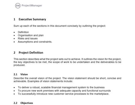
A business case is used to explain why the proposed project is justified. It shows that the project is worth the investment of time and money. It’s more commonly used in larger companies in the decision-making process when prioritizing one project over another.
The business case answers the questions: what is the project, why should it be taken up, who will be involved and how much will it cost? It’s therefore related to a project proposal, but the project proposal comes before the business case and is usually part of the larger proposal.
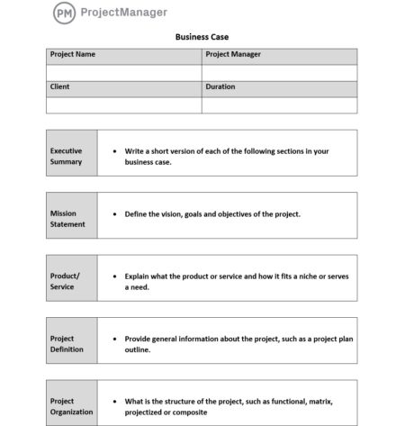
Again, the project proposal and the project plan in this case are very similar documents. It’s understandable that there would be some confusion between these two project terms. They both show how the project will be run and what the results will be. However, they’re not the same.
The project proposal is a document that aims to get a project approved and funded. It’s used to convince stakeholders of the viability of the project and their investment. The project plan, on the other hand, is made during the planning phase of the project, once it’s been approved. It’s a detailed outline of how the project will be implemented, including schedule, budget, resources and more.

There are several key operational and strategic questions to consider, including:
- Executive summary: This is the elevator pitch that outlines the project being proposed and why it makes business sense. While it also touches on the information that’ll follow in the project proposal, the executive summary should be brief and to the point.
- Project background: This is another short part of the proposal, usually only one page, which explains the problem you’ll solve or the opportunity you’re taking advantage of with the proposed project. Also, provide a short history of the business to put the company in context to the project and why it’s a good fit.
- Project vision & success criteria: State the goal of the project and how it aligns with the goals of the company. Be specific. Also, note the metrics used to measure the success of the project.
- Potential risks and mitigation strategies: There are always risks. Detail them here and what strategies you’ll employ to mitigate any negative impact as well as take advantage of any positive risk.
- Project scope & deliverables: Define the project scope, which is all the work that has to be done and how it will be done. Also, detail the various deliverables that the project will have.
- Set SMART goals: When setting goals, be SMART. That’s an acronym for specific, measurable, achievable, relevant and time-bound. All your goals would be defined by those five things.
- Project approach: Define the approach you’ll use for the contract. There are several different types of contracts used in construction , for example, such as lump sum, cost plus, time and materials, etc. This is also a good place to describe the delivery method you’ll use.
- Expected benefits: Outline the benefits that will come from the successful completion of the project.
- Project resource requirements: List the resources, such as labor, materials, equipment, etc., that you’ll need to execute the project if approved.
- Project costs & budget: Detail all the costs, including resources, that’ll be required to complete the project and set up a budget to show how those costs will be spent over the course of the project.
- Project timeline: Lay out the project timeline , which shows the project from start to finish, including the duration of each phase and the tasks within it, milestones, etc.
In addition to these elements, it’s advisable to use a cover letter, which is a one-page document that helps you introduce your project proposal and grab the attention of potential clients and stakeholders.
To make the best proposal possible, you’ll want to be thorough and hit on all the points we’ve listed above. Here’s a step-by-step guide to writing a persuasive priority proposal.
1. Write an Executive Summary
The executive summary provides a quick overview of the main elements of your project proposal, such as your project background, project objectives and project deliverables, among other things. The goal is to capture the attention of your audience and get them excited about the project you’re proposing. It’s essentially the “elevator pitch” for the project life cycle. It should be short and to the point.
The executive summary should be descriptive and paint a picture of what project success looks like for the client. Most importantly, it should motivate the project client; after all, the goal is getting them to sign on the dotted line to get the project moving!
2. Provide a Project Background
The project background is a one-page section of your project proposal that explains the problem that your project will solve. You should explain when this issue started, its current state and how your project will be the ideal solution.
- Historic data: The history section outlines previously successful projects and those that could have run more smoothly. By doing so, this section establishes precedents and how the next project can be more effective using information from previous projects.
- Solution: The solution section addresses how your project will solve the client’s problem. Accordingly, this section includes any project management techniques , skills and procedures your team will use to work efficiently.
3. Establish a Project Vision & Success Criteria
You’ll need to define your project vision. This is best done with a vision statement, which acts as the north star for your project. It’s not specific as much as it’s a way to describe the impact your company plans to make with the project.
It’s also important to set up success criteria to show that the project is in fact doing what it’s proposed to do. Three obvious project success criteria are the triple constraint of cost, scope and time. But you’ll need to set up a way to measure these metrics and respond to them if they’re not meeting your plan.
4. Identify Potential Risks and Mitigation Strategies
To reduce the impact of risk in your project, you need to identify what those risks might be and develop a plan to mitigate them . List all the risks, prioritize them, describe what you’ll do to mitigate or take advantage of them and who on the team is responsible for keeping an eye out for them and resolving them.
5. Define Your Project Scope and Project Deliverables
The project scope refers to all the work that’ll be executed. It defines the work items, work packages and deliverables that’ll be delivered during the execution phase of your project life cycle. It’s important to use a work breakdown structure (WBS) to define your tasks and subtasks and prioritize them.
6. Set SMART Goals for Your Project Proposal
The best mindset when developing goals and objectives for your project proposal is to use the SMART system :
- Specific – Make sure your goals and objectives are clear, concise and specific to the task at hand.
- Measurable – Ensure your goals and objectives are measurable so it’s obvious to see when things are on track and going well, and conversely, when things are off track and issues need to be addressed. Measurable goals make it easy to develop the milestones you’ll use to track the progress of the project and identify a reasonable date for completion and/or closure.
- Attainable – It’s important every project has a “reach” goal. Hitting this goal would mean an outstanding project that extends above and beyond expectations. However, it’s important that the project’s core goal is attainable, so morale stays high and the job gets done with time and resources to spare.
- Relevant – Make sure all of your goals are directly relevant to the project and address the scope within which you’re working.
- Time-Based – Timelines and specific dates should be at the core of all goals and objectives. This helps keep the project on track and ensures all project team members can manage the work that’s ahead of them.
7. Explain What’s Your Project Approach
Your project approach defines the project management methodology , tools and governance for your project. In simple terms, it allows project managers to explain to stakeholders how the project will be planned, executed and controlled successfully.
8. Outline The Expected Benefits of Your Project Proposal
If you want to convince internal stakeholders and external investors, you’ll need to show them the financial benefits that your project could bring to their organization. You can use cost-benefit analysis and projected financial statements to demonstrate why your project is profitable.
9. Identify Project Resource Requirements
Project resources are critical for the execution of your project. The project proposal briefly describes what resources are needed and how they’ll be used. Later, during the planning phase, you’ll need to create a resource management plan that’ll be an important element of your project plan. Project requirements are the items, materials and resources needed for the project. This section should cover both internal and external needs.
10. Estimate Project Costs and Project Budget
All the resources that you’ll need for your project have a price tag. That’s why you need to estimate those costs and create a project budget . The project budget needs to cover all your project expenses, and as a project manager, you’ll need to make sure that you adhere to the budget.
11. Define a Project Timeline
Once you’ve defined your project scope, you’ll need to estimate the duration of each task to create a project timeline. Later during the project planning phase , you’ll need to create a schedule baseline, which estimates the total length of your project. Once the project starts, you’ll compare your actual project schedule to the schedule baseline to monitor progress.
Now let’s explore some project proposal examples to get a better understanding of how a project proposal would work in the real world. For this example, let’s imagine a city that’s about to build a rapid transit system. The city government has the funds to invest but lacks the technical expertise and resources that are needed to build it, so it issues a request for proposal (RFP) document and sends it to potential builders.
Then, the construction companies that are interested in executing this rapid transit project will prepare a project proposal for the city government. Here are some of the key elements they should include.
- Project background: The construction firm will provide an explanation of the challenges that the project presents from a technical perspective, along with historical data from similar projects that have been completed successfully by the company.
- Project vision & success criteria: Write a vision statement and explain how you’ll track the triple constraint to ensure the successful delivery of the project.
- Potential risks and mitigation strategies: List all risks and how they’ll be mitigated, and be sure to prioritize them.
- Project scope & deliverables: The work that’ll be done is outlined in the scope, including all the deliverables that’ll be completed over the life cycle of the project.
- Set SMART goals: Use the SMART technique to define your project goals by whether they’re specific, measurable, achievable, relevant and time-bound.
- Project approach: Define the methodology that the project manager will employ to manage the project. Also, figure out what type of contract will be used to define the project.
- Expected benefits: Show how the project will deliver advantages to the company and define what these benefits are in a quantifiable way.
- Project resource requirements: List all the resources, such as labor, materials, equipment, etc., needed to execute the project.
- Project costs & budget: Estimate the cost of the project and lay that out in a project budget that covers everything from start to finish.
- Project timeline: Outline the project schedule, including phases, milestones and task duration on a visual timeline.
Whatever project proposal you’re working on, there are a few tips that apply as best practices for all. While above we suggested a project proposal template that would have a table of contents, meaning it would be many pages long, the best-case scenario is keeping the proposal to one or two pages max. Remember, you’re trying to win over stakeholders, not bore them.
Speaking of project stakeholders , do the research. You want to address the right ones. There’s no point in doing all the work necessary to write a great proposal only to have it directed to the wrong target audience. Whoever is going to read it, though, should be able to comprehend the proposal. Keep the language simple and direct.
When it comes to writing, get a professional. Even a business document like a project proposal, business case or executive summary will suffer if it’s poorly constructed or has typos. If you don’t want to hire a professional business writer, make sure you get someone on your project team to copy, edit and proof the document. The more eyes on it, the less likely mistakes will make it to the final edition.
While you want to keep the proposal short and sweet, it helps to sweeten the pot by adding customer testimonials to the attachments. Nothing sells a project plan better than a customer base looking for your product or service.
ProjectManager & Project Proposals
ProjectManager allows you to plan proposals within our software. You can update tasks for the project proposal to signify where things stand and what’s left to be done. The columns allow you to organize your proposal by section, creating a work breakdown structure (WBS) of sorts.
When building a project proposal, it’s vital to remember your target audience. Your audience includes those who are excited about the project, and see completion as a gain for their organization. Conversely, others in your audience will see the project as a pain and something to which they aren’t looking forward. To keep both parties satisfied, it’s essential to keep language factual and concise.
Our online kanban boards help you think through that language and collaborate on it effectively with other team members, if necessary. Each card shows the percentage completed so everyone in the project management team is aware of the work done and what’s left to be done.
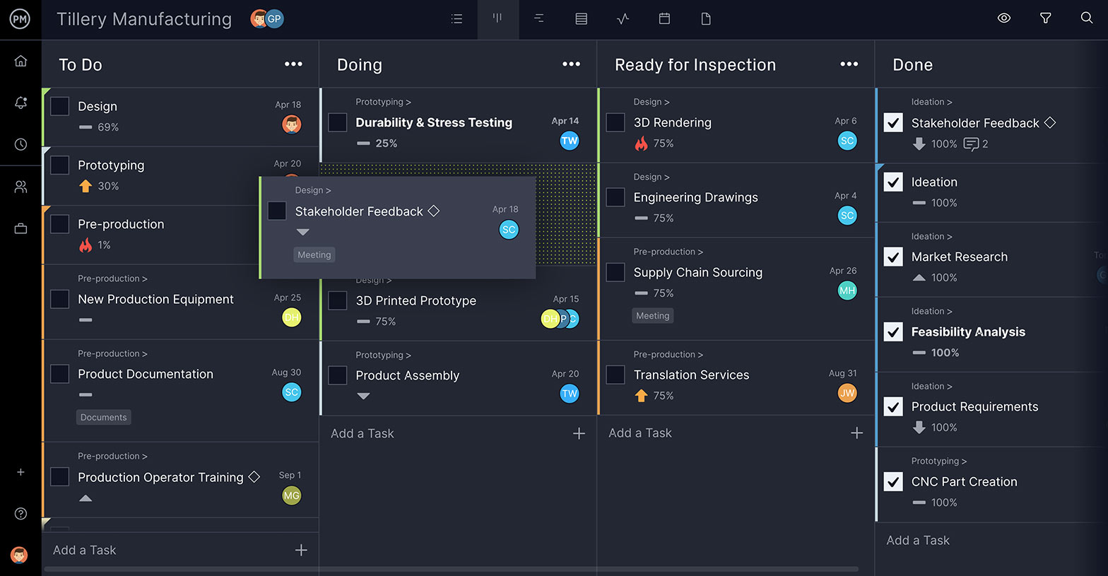
As you can see from the kanban board above, work has begun on tasks such as product documentation and design. Tasks regarding stakeholder feedback, ideation, market research and more have been completed, and there’s a good start on the engineering drawings, 3D rendering, supply chain sourcing and translation services.
A PDF is then attached to the card, and everyone added to the task receives an email notifying them of the change. This same process can be used throughout the life-cycle of the project to keep the team updated, collaborating, and producing a first-class project proposal. In addition to kanban boards, you can also use other project management tools such as Gantt charts , project dashboards, task lists and project calendars to plan, schedule and track your projects.
Project proposals are just the first step in the project planning process. Once your project is approved, you’ll have to solidify the plan, allocate and manage resources, monitor the project, and finally hand in your deliverables. This process requires a flexible, dynamic and robust project management software package. ProjectManager is online project management software that helps all your team members collaborate and manage this process in real-time. Try our award-winning software with this free 30-day trial .

Deliver your projects on time and on budget
Start planning your projects.
20 Great Examples of PowerPoint Presentation Design [+ Templates]
Updated: August 06, 2024
Published: May 24, 2010
When it comes to PowerPoint presentation design, there's no shortage of avenues you can take.

While all that choice — colors, formats, visuals, fonts — can feel liberating, it‘s important that you’re careful in your selection as not all design combinations add up to success.
In this blog post, I’m sharing some of my favorite PowerPoint tips and templates to help you nail your next presentation.
Table of Contents
What makes a good PowerPoint presentation?
Powerpoint design ideas, best powerpoint presentation slides, good examples of powerpoint presentation design.

10 Free PowerPoint Templates
Download ten free PowerPoint templates for a better presentation.
- Creative templates.
- Data-driven templates.
- Professional templates.
Download Free
All fields are required.
You're all set!
Click this link to access this resource at any time.
In my opinion, a great PowerPoint presentation gets the point across succinctly while using a design that doesn't detract from it.
Here are some of the elements I like to keep in mind when I’m building my own.
1. Minimal Animations and Transitions
Believe it or not, animations and transitions can take away from your PowerPoint presentation. Why? Well, they distract from the content you worked so hard on.
A good PowerPoint presentation keeps the focus on your argument by keeping animations and transitions to a minimum. I suggest using them tastefully and sparingly to emphasize a point or bring attention to a certain part of an image.
2. Cohesive Color Palette
I like to refresh my memory on color theory when creating a new PowerPoint presentation.
A cohesive color palette uses complementary and analogous colors to draw the audience’s attention and help emphasize certain aspects at the right time.
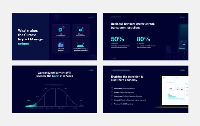
Image source
Mesmerize your audience by adding some neon colors and effects to your PowerPoint slides. Adding pops of color to your presentation will create visual interest and keep your audience engaged.
What I like: Neon will add personality and depth to your presentation and will help the information you're providing stand out and be more memorable.
2. Use an interesting background image.

Do you have some interesting nature photos from a recent road trip? Or maybe a holiday passed, and you have gorgeous photos to share? If so, consider incorporating them into your PowerPoint.
What I like: PowerPoints don't have to be stuffy and boring. They can be fun and a unique or interesting background will enhance the experience of your presentation.
3. Or be minimal.
Have you ever heard of K.I.S.S.? Not the band! I mean, Keep It Simple, Sweetheart. If you're worried too many colors or visuals could take attention away from the message of your presentation, consider going minimal.
Pro tip: Stick to no more than three colors if you're going for a minimalist design in your slides.
4. Incorporate illustrations.

Illustrations are a great way to highlight or break down a point in your presentation. They can also add a bit of whimsy and fun to keep viewers engaged.
5. Use all caps.
Using all capital letters can draw your audience's eyes to where you need them, helping cement your message in their minds. It can also just be aesthetically pleasing.
Pro tip: If you choose to use all capital letters, use varying fonts so readers can tell which information is important and which are supporting details.
6. Alternate slide layouts
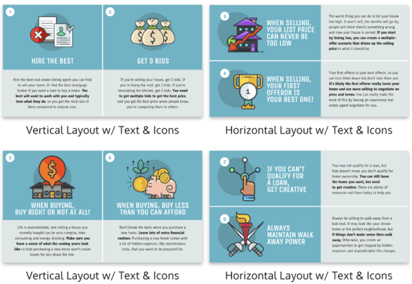
You don't want readers to grow bored with your presentation. So, to retain visual interest, use alternating slide layouts. The example above shows PowerPoint slides alternating between vertical and horizontal layouts.
This keeps things interesting and ensures your presentation isn't monotonous.
7. Inject a little humor.
Humor is a great way to drive a point home and help people remember the information you're presenting. People remember a good joke, so if you have a funny pun to connect to a concept in a presentation, why not use it in a slide?
Pro tip: Remember you're in a professional setting, so keep your jokes appropriate. If you're worried a joke can get you a meeting with HR, then keep it to yourself.
8. Use duotones.

Duotones (or gradience) can take the aesthetic of your PowerPoint to new levels. They can provide a calming energy to your presentation and make viewers feel relaxed and eager to stay focused.
9. Include printed materials.
Let's say you have a PowerPoint you're proud of, but you want to go that extra mile to ensure your audience understands the material. A great way to do this would be to supplement your presentation with printed materials, as such as:
- Pamphlets
- Printed slides
- Short quizzes on the material
10. Keep it to one chart or graph per slide.
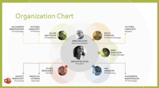
This is both a design example and a warning. Graphs and charts are an excellent way of displaying quantitative data in a digestible format.
However, you should have no more than one graph or chart per slide so your presentation doesn't get too confusing or muddled.
11. Use a large font.
Just like capital letters, a large font will help your shift your audience's focus to key points in your presentation.
Pro tip: You can combine large fonts and capital letters to boost its effectiveness.
12. Include videos.
Embedding a video into your PowerPoint can help you expand on a point or effectively break down a complex topic. You can either embed a video from a platform like YouTube or TikTok or use HubSpot's Clip Creator to make your own.
Pro tip: Try to keep videos short, like, under a minute, and don't use more than one or two.
13. Use GIFs.
GIFs add more visual interest, and they can be a great way to add humor or personal touch to your PowerPoint presentation.
14. Use contrasting colors when comparing two ideas or arguments.

Contrasting colors can convey the difference between two opposing thoughts or arguments in a way that is visually appealing.
15. Add a touch of nature.

If you want your presentation to exude a calming energy to your audience, including images of trees, flowers, and natural landscapes can do the trick.
PowerPoint Theme Ideas
Atlas (theme).
Covering a more creative subject for a younger or more energetic audience? I’d recommend using the cover slide design below. Its vibrant red color blocks and fun lines will appeal to your audience.
This simplistic presentation example employs several different colors and font weights, but instead of coming off as disconnected, the varied colors work with one another to create contrast and call out specific concepts.
What I like: The big, bold numbers help set the reader's expectations, as they clearly signify how far along the viewer is in the list of tips.
10. “Pixar's 22 Rules to Phenomenal Storytelling,” Gavin McMahon
This presentation by Gavin McMahon features color in all the right places. While each of the background images boasts a bright, spotlight-like design, all the characters are intentionally blacked out.
What I like: This helps keep the focus on the tips, while still incorporating visuals. Not to mention, it's still easy for me to identify each character without the details. (I found you on slide eight, Nemo.)
11. “Facebook Engagement and Activity Report,” We Are Social
Here's another great example of data visualization in the wild.
What I like: Rather than displaying numbers and statistics straight up, this presentation calls upon interesting, colorful graphs, and charts to present the information in a way that just makes sense.
12. “The GaryVee Content Model,” Gary Vaynerchuk
This wouldn‘t be a true Gary Vaynerchuk presentation if it wasn’t a little loud, am I right?
What I like: Aside from the fact that I love the eye-catching, bright yellow background, Vaynerchuk does a great job of incorporating screenshots on each slide to create a visual tutorial that coincides with the tips. He also does a great job including a visual table of contents that shows your progress as you go .
13. “20 Tweetable Quotes to Inspire Marketing & Design Creative Genius,” IMPACT Branding & Design
We‘ve all seen our fair share of quote-chronicling presentations but that isn’t to say they were all done well. Often the background images are poor quality, the text is too small, or there isn't enough contrast.
Well, this professional presentation from IMPACT Branding & Design suffers from none of said challenges.
What I like: The colorful filters over each background image create just enough contrast for the quotes to stand out.
14. “The Great State of Design,” Stacy Kvernmo
This presentation offers up a lot of information in a way that doesn't feel overwhelming.
What I like: The contrasting colors create visual interest and “pop,” and the comic images (slides 6 through 12) are used to make the information seem less buttoned-up and overwhelming.
15. “Clickbait: A Guide To Writing Un-Ignorable Headlines,” Ethos3
Not going to lie, it was the title that convinced me to click through to this presentation but the awesome design kept me there once I arrived.
What I like: This simple design adheres to a consistent color pattern and leverages bullet points and varied fonts to break up the text nicely.
16. “Digital Transformation in 50 Soundbites,” Julie Dodd
This design highlights a great alternative to the “text-over-image” display we've grown used to seeing.
What I like: By leveraging a split-screen approach to each presentation slide, Julie Dodd was able to serve up a clean, legible quote without sacrificing the power of a strong visual.
17. “Fix Your Really Bad PowerPoint,” Slide Comet
When you‘re creating a PowerPoint about how everyone’s PowerPoints stink, yours had better be terrific. The one above, based on the ebook by Seth Godin, keeps it simple without boring its audience.
What I like: Its clever combinations of fonts, together with consistent color across each slide, ensure you're neither overwhelmed nor unengaged.
18. “How Google Works,” Eric Schmidt
Simple, clever doodles tell the story of Google in a fun and creative way. This presentation reads almost like a storybook, making it easy to move from one slide to the next.
What I like: This uncluttered approach provides viewers with an easy-to-understand explanation of a complicated topic.
19. “What Really Differentiates the Best Content Marketers From The Rest,” Ross Simmonds
Let‘s be honest: These graphics are hard not to love. I especially appreciate the author’s cartoonified self-portrait that closes out the presentation. Well played, Ross Simmonds.
What I like: Rather than employing the same old stock photos, this unique design serves as a refreshing way to present information that's both valuable and fun.
20. “Be A Great Product Leader,” Adam Nash
This presentation by Adam Nash immediately draws attention by putting the company's logo first — a great move if your company is well known.
What I like: He uses popular images, such as ones of Megatron and Pinocchio, to drive his points home. In the same way, you can take advantage of popular images and media to keep your audience engaged.
And if you want more templates and examples, you can download them here .
PowerPoint Presentation Examples for the Best Slide Presentation
Mastering a PowerPoint presentation begins with the design itself.
Get inspired by my ideas above to create a presentation that engages your audience, builds upon your point, and helps you generate leads for your brand.
Editor's note: This post was originally published in March 2013 and has been updated for comprehensiveness. This article was written by a human, but our team uses AI in our editorial process. Check out our full disclosure to learn more about how we use AI.
Don't forget to share this post!
Related articles.
![new project idea presentation How to Create an Infographic in Under an Hour — the 2024 Guide [+ Free Templates]](https://www.hubspot.com/hubfs/Make-infographic-hero%20%28598%20%C3%97%20398%20px%29.jpg)
How to Create an Infographic in Under an Hour — the 2024 Guide [+ Free Templates]
![new project idea presentation How to Create the Best PowerPoint Presentations [Examples & Templates]](https://knowledge.hubspot.com/hubfs/powerpoint.webp)
How to Create the Best PowerPoint Presentations [Examples & Templates]
![new project idea presentation 17 PowerPoint Presentation Tips From Pro Presenters [+ Templates]](https://www.hubspot.com/hubfs/powerpoint-design-tricks_7.webp)
17 PowerPoint Presentation Tips From Pro Presenters [+ Templates]
![new project idea presentation How to Write an Ecommerce Business Plan [Examples & Template]](https://www.hubspot.com/hubfs/ecommerce%20business%20plan.png)
How to Write an Ecommerce Business Plan [Examples & Template]

Get Buyers to Do What You Want: The Power of Temptation Bundling in Sales

How to Create an Engaging 5-Minute Presentation
![new project idea presentation How to Start a Presentation [+ Examples]](https://www.hubspot.com/hubfs/how-to-start-presenting.webp)
How to Start a Presentation [+ Examples]

120 Presentation Topic Ideas Help You Hook Your Audience

The Presenter's Guide to Nailing Your Next PowerPoint
![new project idea presentation How to Create a Stunning Presentation Cover Page [+ Examples]](https://www.hubspot.com/hubfs/presentation-cover-page_3.webp)
How to Create a Stunning Presentation Cover Page [+ Examples]
Marketing software that helps you drive revenue, save time and resources, and measure and optimize your investments — all on one easy-to-use platform
- Presentations
How to Create a Business Plan Presentation [Plus Templates]
![new project idea presentation How to Create a Business Plan Presentation [Plus Templates]](https://visme.co/blog/wp-content/uploads/2020/07/How-to-Create-a-Business-Plan-Presentation.jpg)
Written by: Masooma Memon

You know your business idea is strong, but presenting it in a way that captivates your audience and inspires them to take the desired action? That’s a different story.
But don’t worry. With the right approach and resources, you can create a business plan presentation that not only conveys your idea in the best possible way but also wins over potential investors, partners and clients.
In this article, we’ll cover everything you have in mind like how many slides does your business idea presentation need, what goes into those slides, and how to create, design and present an impressive business plan presentation.
Along the way, we’ll also show you a series of ready-to-use business plan presentation templates that you can customize to use as your own. See? We did say creating a presentation isn’t rocket science.
Ready to learn how to create a business presentation?
Let’s get started already.
Here's a short selection of 8 easy-to-edit business plan presentation templates you can edit, share and download with Visme

Tired of creating boring slides? Check out Visme's presentation software for free. Browse through our extensive collection of ready-made templates , millions of design assets, data visualization, AI-powered tools, branding, animation, interactivity and more.
Don't worry if you're pressed for time; Visme's AI Presentation Maker can help you create stunning slide decks for your business idea.
Table of Contents
- What Is a Business Plan Presentation?
- What Should Be In a Business Plan Presentation?
How to Create a Business Plan Presentation
- How to Design a Business Plan Presentation With Visme
Business Plan Presentation Best Practices
How to present a business plan presentation, business plan presentation faqs.
- A business plan presentation is a formal slide deck that includes your goals, mission, strategy, pricing model, financial projections, teams and other information about your new business.
- Typically, a business plan presentation includes a title slide, problem, solution, pricing plan, business operations information, marketing plan, industry overview, financial projections, team and a concluding slide with your contact details.
- To create a business plan presentation, identify your goals, conduct research, create an outline, develop the content, design your slides, prepare supporting material, and finalize and polish.
- Design a business plan presentation easily in Visme by picking a template, adjusting the slides, customizing the template, and then downloading and sharing your presentation.
- Some tips for creating impressive business plan presentations include drawing attention to your core message, making your slides easy to read and understand, sticking to one or two fonts, picking a nice color scheme, using minimal text and paying attention to the visuals.
- To effectively present a business plan presentation, keep your presentation concise, add interactivity, pay attention to the design and incorporate data visualization.
- Visme makes it easy to create a professional business plan presentation that leaves a solid impression on your audience. Use features like ready-made templates, built-in graphics, animations, branding and AI-powered tools to create stunning presentations.
What is a Business Plan Presentation?
We know a business plan as a formal document that includes your business goals, mission, strategy and the rest of the starting-a-business shebang.
A business plan presentation is all that with added pressure since you’ve to convey the entire information in slides – clearly and concisely.
Hey executives! Looking to cut design costs?
- Spend less time on presentations and more time strategizing
- Ensure your brand looks and feels visually consistent across all your organization's documents
- Impress clients and stakeholders with boardroom ready presentations
Sign up. It’s free.
Put another way, you don’t have wordy documents to convey your ideas. Instead, you’ll need to be clear about selling your idea to investors by sharing all the important details in an engaging and succinct manner.
What Should Be in a Business Presentation?
Now that you know how your slides need to look, let’s talk about another important point—your presentation’s slides and what they need to talk about.
The bare minimum slides you need are 10. Remember, cover only one business aspect per slide. Here’s what your slides should be about.
Slide 1: The Title Slide
This needs no explanation — it’s your introductory page that should include your business’s name, any slogan that you may have, and a logo as well (if it’s ready). Don’t forget to add your name to the slide.
Since this is the first slide, it needs to be an impression maker. One way to create such a slide is to rely on a powerful image that showcases your business idea.
Take, for example, this presentation template by Visme. It pretty much speaks for itself, narrating the business idea is related to social media scheduling.

Looking for the perfect image for your presentation? Grab one from a pool of 700+ free presentation images .
Slide 2: The Problem Your Business Solves
Dedicate your second slide to diving into the pain point your business solves. You can use facts to make things convincing. But, there’s nothing that beats a good story.
Here is an amazing business plan presentation example that does just that.
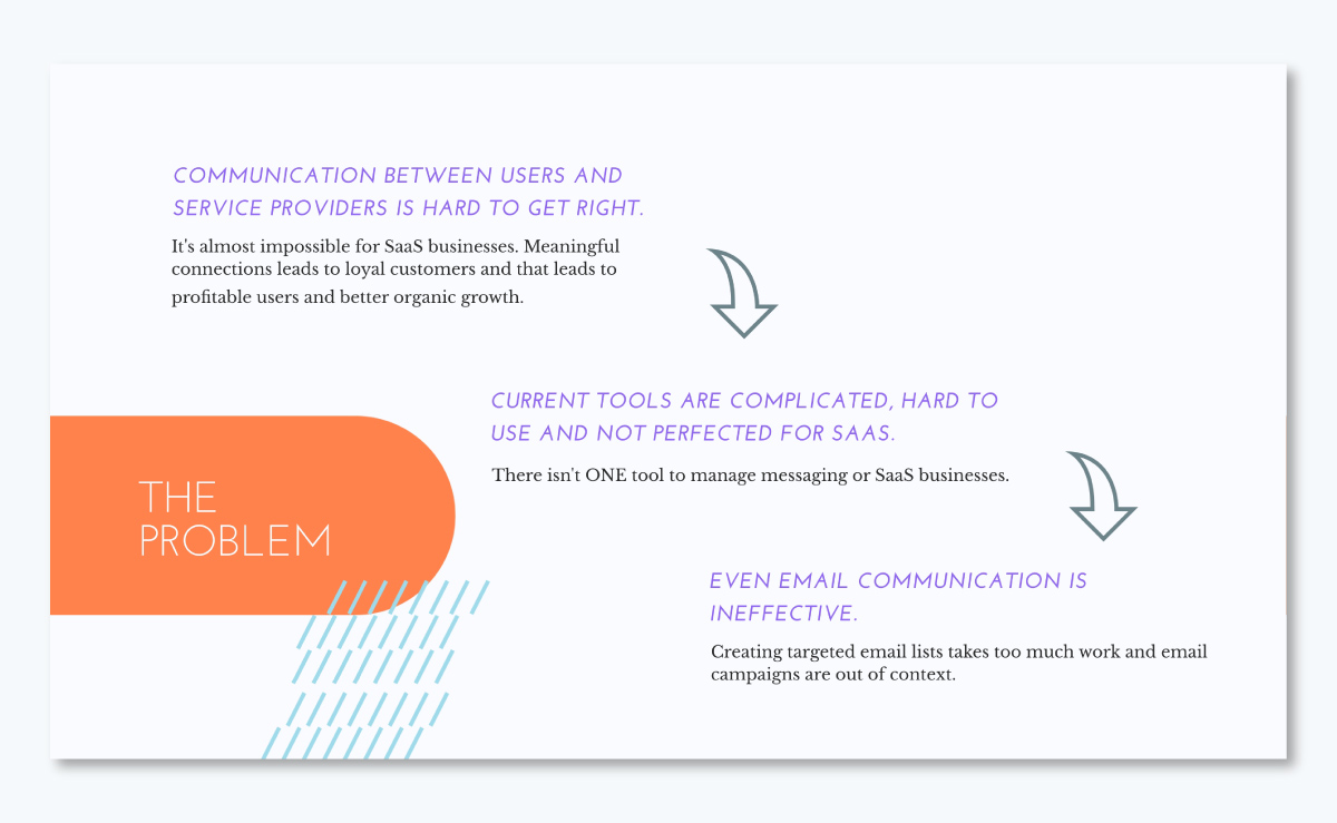
Additionally, make sure you let your design do the talking. For instance, this presentation template uses a few words and pairs them with icons that explain facts.
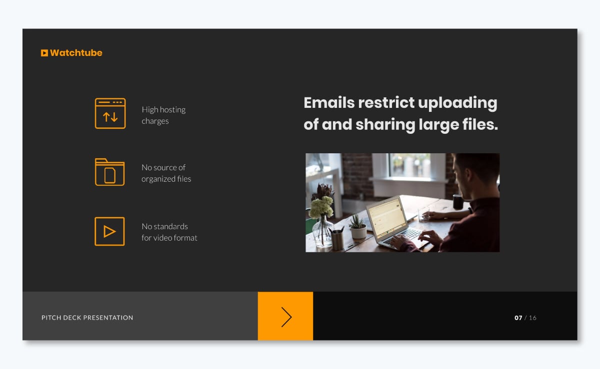
Slide 3: Your Business’s Solution
Now that you’ve introduced the problem, give the solution.
This is the part where your story comes to its happy ending. And what’s the happy ending? Your business idea.
Again, make sure your solution-offering slide isn’t wordy, but digestible. Try a diagram or sketch to explain your idea like here.
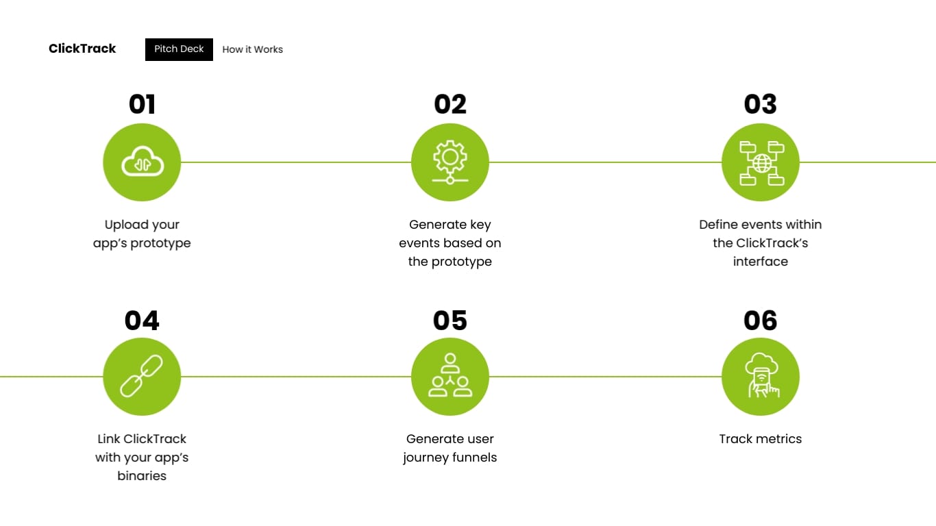
Slide 4: Your Pricing Plan
Okay, so investors know you’ve a great idea that you’ve delivered in an even greater story format. They’re impressed. What’s next? Your pricing structure.
In your business model slide, go on to tell who your customers are, what your revenue sources are going to be, and how much you expect customers to pay for your product/service?
But, instead of writing it all, present your pricing plans in a simple-to-grasp chart.
Here’s what I mean.
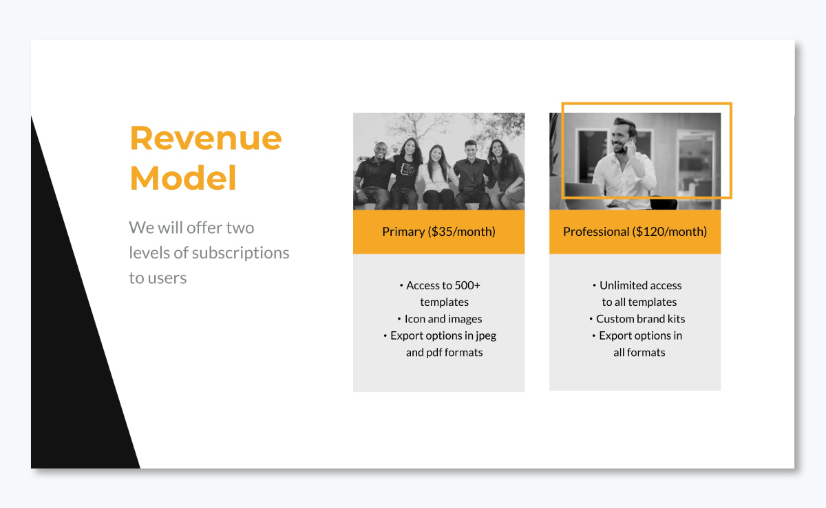
Slide 5: Business Operations Information
Now is the time you give your audience an inside peep into the operating nuts and bolts of your business.
Where will your business headquarters be located? What about the staff that runs the show in the background. What equipment will you need? Answer all that in this slide.
Just make sure you offer all this info in a chart or diagram.
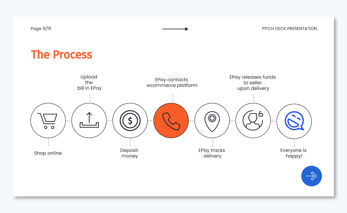
Slide 6: Your Marketing Plan
Next, tell your audience how you plan to market your business.
Nope, "TV and ads" is not the right answer. Instead, share your marketing plan including the channels you’ll use and how you plan to do so.
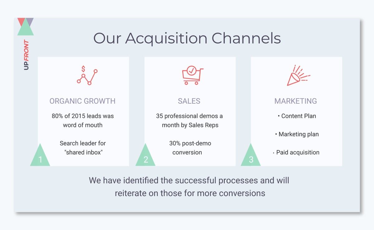
Planning to make a separate marketing presentation? Dig into this guide to create one with free templates.
Slide 7: Industry Overview
In other words, this slide is for competitor analysis. Make sure you keep it clipped and use a positive approach.
Defaming or bad-mouthing competitors won’t help. What’ll make a difference in your favor though is how well you explain your unique selling proposition (USP) or what makes your business a winner.
Share this information in a chart or outline the key pointers like this template below does.
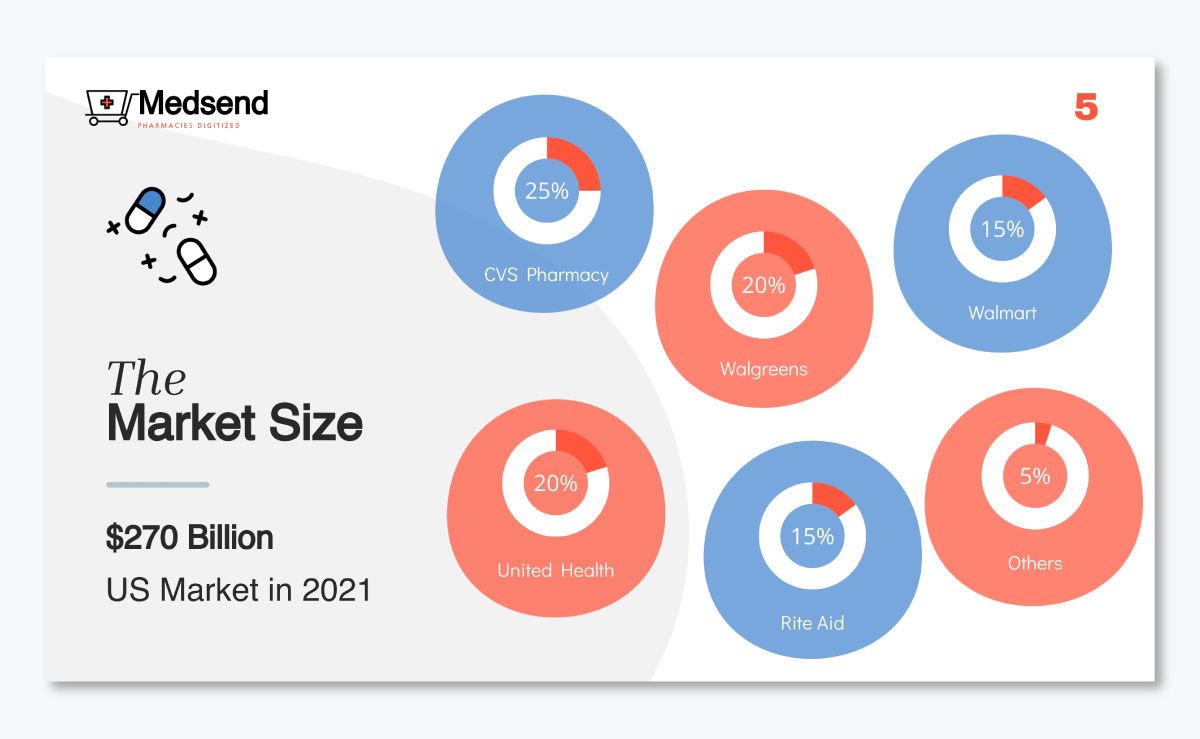
Slide 8: Financial Projections
Time to pull out the crystal ball that shows the future!
Answer the following in this slide: what financial projections do you’ve for the next 3 years and 5 years to come. Then, explain how you reached those numbers.
Here’s a template that does that well:
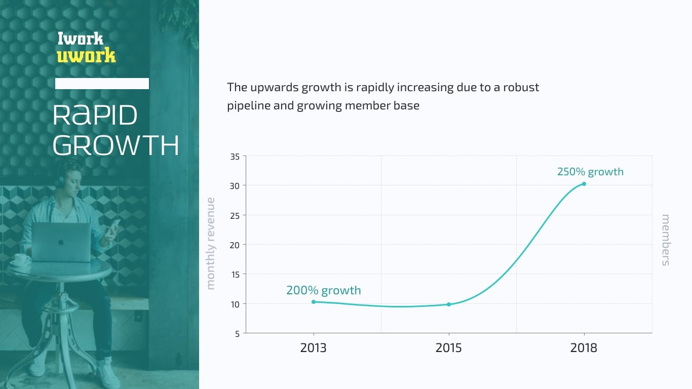
Slide 9: Your Team
Here’s the part when you talk about the key players who’ll help you build your business.
See how this template intros teammates.

Slide 10: Concluding Slide
This is your last slide. It’s best to close your presentation with your contact details (check out the slide below for an idea) and a sense of urgency.
But why the urgency, you ask? Because you want to tell your audience that now is the right time for your business to enter the market.
1. Identify Your Goals
Before diving into your presentation, take a step back and clarify your purpose.
Are you seeking investment, looking for partners or pitching to potential clients. Knowing your aim helps shape your entire approach.
Then, set clear goals for your presentation. Maybe you want to secure a certain amount of funding or land a specific partnership. Having these objectives in mind keeps you focused and helps you measure success later on.
2. Research and Gather Information
Now it's time to roll up your sleeves and dig into the nitty-gritty.
Start with thorough market research—understand your industry inside out and know your competitors like the back of your hand.
Also, get a solid grasp on your target audience. Research their backgrounds, interests and what they're looking for. This insight is gold when tailoring your content.
Don't just skim the surface; dive deep. Collect hard data, compelling statistics and solid financial information that backs up your claims.
As you gather all this information, keep it organized. Use spreadsheets, mind maps or whatever system works for you. The point is to have this valuable intel at your fingertips when you need it.
For example, you can use Visme’s whiteboard tool for this purpose. Or design an engaging mind map that you can easily share with your team.
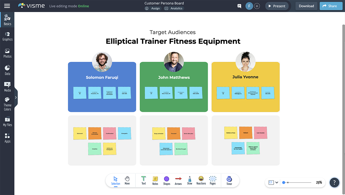
3. Outline Your Presentation Structure
Think of your presentation as a story—it needs a beginning, middle and end. And all of these parts need to flow seamlessly.
Start by mapping out the key points and sections you want to cover. Then, arrange them in a logical order that builds momentum. Make sure each section naturally leads into the next, creating a compelling narrative.
As you plan, consider how much time and emphasis each part deserves. Your game-changing product might warrant more time than your office location, for instance. A well-structured presentation keeps your audience engaged and helps them follow your vision effortlessly.
Want to learn more? Here’s a detailed guide on the different types of presentation structures you might want to use for your business plan presentation.
4. Develop Your Content
Here's where you breathe life into your presentation.
Craft content that's not just informative, but captivating. Think about what makes your business unique and exciting— that's the story you want to tell.
Develop a clear, punchy value proposition that instantly communicates your worth. As you write, keep your audience in mind. What matters to them? Align your content with their interests and needs. If you need help with crafting the perfect words, use Visme’s AI Writer for assistance.
For each slide, aim for concise, impactful statements. Back up your claims with solid data and facts—investors love numbers. And while it's good to show you know your stuff with industry jargon, remember to explain complex terms. You want to impress, not confuse.
5. Design Your Slides
Now it's time to make your presentation visually appealing. If you’re using a template, choose a design theme that's professional and aligns with your business idea.
Ideally, your presentation design should be clean, modern and easy on the eyes. Use high-quality visuals, charts and graphics to illustrate your points. We’ll discuss more about how to design a business plan presentation in the next section.
Be careful not to go overboard. Keep your slides uncluttered and easy to read. A good rule of thumb is no more than six bullet points per slide. Use them to highlight key points and provide visual interest, not to display every word you're going to say.
6. Prepare Supporting Materials
Your presentation is just one part of the package. Create handouts or leave-behind documents that reinforce your key points and provide additional details. These could include executive summaries, product specifications or financial projections.
Also, develop a one-page business plan or a more detailed one for those who want to dive deeper. These materials show you're thorough and prepared, and they give interested parties something concrete to review after your presentation.
Visme offers a bunch of business plan templates to help you in that area. Here’s a business plan template you can use right away:

The best part about using Visme is you can ensure your document design is consistent with your presentation. Simply upload your brand elements like fonts, colors and logo, and our Brand Kit will apply your unique style across any project you create.
In fact, you don’t even have to manually upload anything if you’re short on time and have a website. Input your site URL into our Brand Design Tool and let the AI pull the brand elements automatically and apply them to your designs.
7. Finalize and Polish
You're almost done! But before you call it a day, revisit and fine-tune your presentation so it’s free from any potential issues. Proofread everything meticulously and check for spelling errors, consistency in formatting and accuracy in your data and projections.
Make sure all your information is up-to-date and relevant. Also, pay attention to any animations and transitions between your slides—they should be smooth and logical.
This is also a great time to get some outside perspective. Present to trusted advisors, mentors or colleagues who can give you honest, constructive feedback. They might catch things you've missed or have ideas to make your presentation even stronger.
If you’re creating your business plan presentation in Visme, you can invite team members to review your slides, leave feedback by commenting or annotating and even work on the content with you using our collaboration and workflow features.
How to Design a Business Plan Presentation with Visme
So far, you’ve learned a lot of theory on making a business plan presentation. It’s time to put all that and more into practice.
Start off with writing your content. And, go on to design your slides next.
With Visme, you’ve two ways to go about creating your presentation: either start with a template or work from the scratch.
Have you already started making your presentation in PowerPoint, but only just discovered Visme? No worries! Nobody’s going to ask you to start over.
Instead, simply follow the steps in here to import your PowerPoint presentation in Visme . Or, watch this video to understand how do so.
Now, let’s start designing.
1. Pick a Template
Visme offers templates in various categories, so you’ll be sure to find a template that fits your business idea.
For instance, here’s a business presentation template.
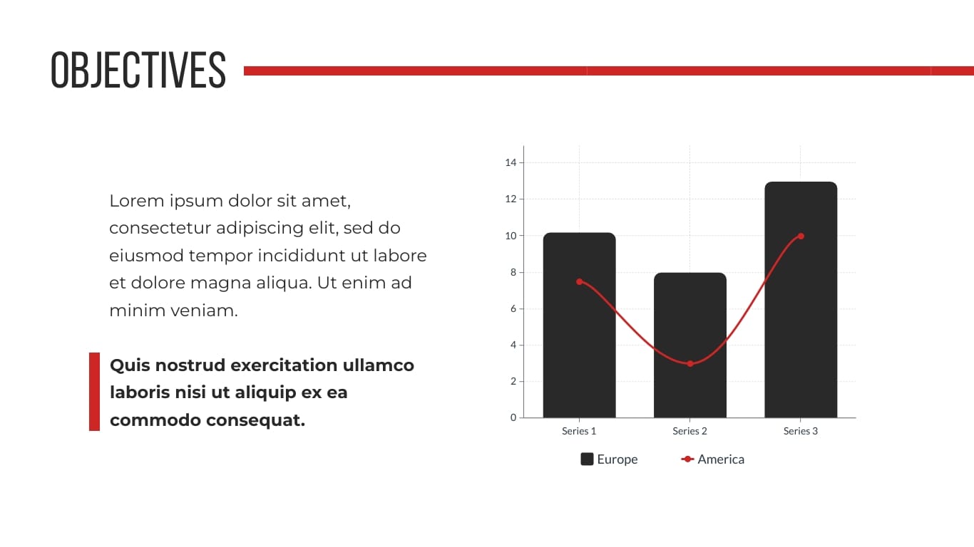
Here’s something for those of you with an idea in the finance sector.
Plus, a template for a product idea.

Each of the available templates are editable, which means if there’s something you want to change about it, you can easily do so.
Looking for something that takes creativity to a whole new level? Pick from one of our animated presentation templates. And if you’re short on time, you can use Visme’s AI Presentation Maker to whip up a custom design tailored to your business idea and vision.
2. Adjust the Slides
Once you’ve picked your template, click Add New Slide to bring other slides from the template into your presentation. Pick and choose any and all of the slides you need to use in your business plan presentation.
You can also bring in slides that you've previously saved to your slide library to help customize your presentation even further.
3. Customize the Template
Lastly, customize your template’s font and color.
If you already haven’t settled on your brand colors, dive into color psychology to pick colors for your presentation that inspire trust.
If you plan to power your first slide with images, you can either select images from Visme’s stock photo library or upload your own image. You can also add icons , shapes, animated graphics, illustrations, 3D characters , gestures and more to spruce up your slides.
And if you can’t find the perfect image, whip one up using the AI Image Generator or edit existing images using the AI Image Editing tool . It can unblur, upscale and remove unwanted backgrounds in seconds.
Pro Tip : Take advantage of Dynamic Fields to always keep important data like names, dates and contact information accurate. Once you've customized the fields and assigned values , your data will be pulled in throughout your project.
Alternatively, you can create your presentation from the ground up using a blank canvas or by starting with a presentation theme .
4. Download and Share
Finally, it’s time to share your business plan presentation.
You have several options to do that in Visme. Here they are:
- Download: Save your presentation in PDF or PPTX (PowerPoint) format. You can also download in HTML5 (offline web) format to preserve animation and interactivity,
- Share online: Publish and share your presentation online using a public or private link. No need to download any files—your presentation will be hosted on Visme.
- Embed: Generate an embed code for your presentation to add it to a website or portal.
Also, fun fact: when you share your presentation online with Visme, you can track built-in analytics to understand how people are interacting with your slide deck.
With the recap out of the way, let’s talk about the fundamentals of preparing a business presentation that you need to keep front and center as you plan.
1. Draw attention to your core message.
This is the heart of any successful presentation — one that makes it a winner. To ensure your message comes off coherently, explain your business idea to yourself.
The stronger your grip on your idea, the better you’d be able to explain it in a few sentences, or paragraphs at most.
In other words, make sure you can summarize your plans into an elevator pitch. Also, don’t forget, use simple language — can a child understand your business idea? If so, you’re in the right direction.
2. Make your slides easy to read and understand.
If a clear message is the heart of a prizewinning (read: investor winning) presentation, good readability and ease in understanding are the lungs, working to keep your presentation alive and breathing.
The question now is, how do you go about creating digestible slides? Here are a couple of things that can help.
3. Stick to one or two fonts.
Garamond, Helvetica and Gill Sans are some of the best fonts to use in a presentation .
And while you’re at it, select a readable font size. 30 points is a good benchmark size to keep in mind like we discussed above.
Take a look at how well the font size is adjusted in this template. The changing font size also creates a visual flow that navigates viewers’ attention.

4. Pick a nice color scheme.
Know those bright colors that hurt the eye and are hard to look at? Steer away from them. A subtle color combination works best like in the Visme presentation template below.

5. Use minimal text.
To do so, read each word carefully and ask yourself: can I do just fine without this word? If you find yourself replying in the affirmative to this question, remove the word. In short, make each word earn its keep.
Here’s a template using only as many words as needed to get the message across.
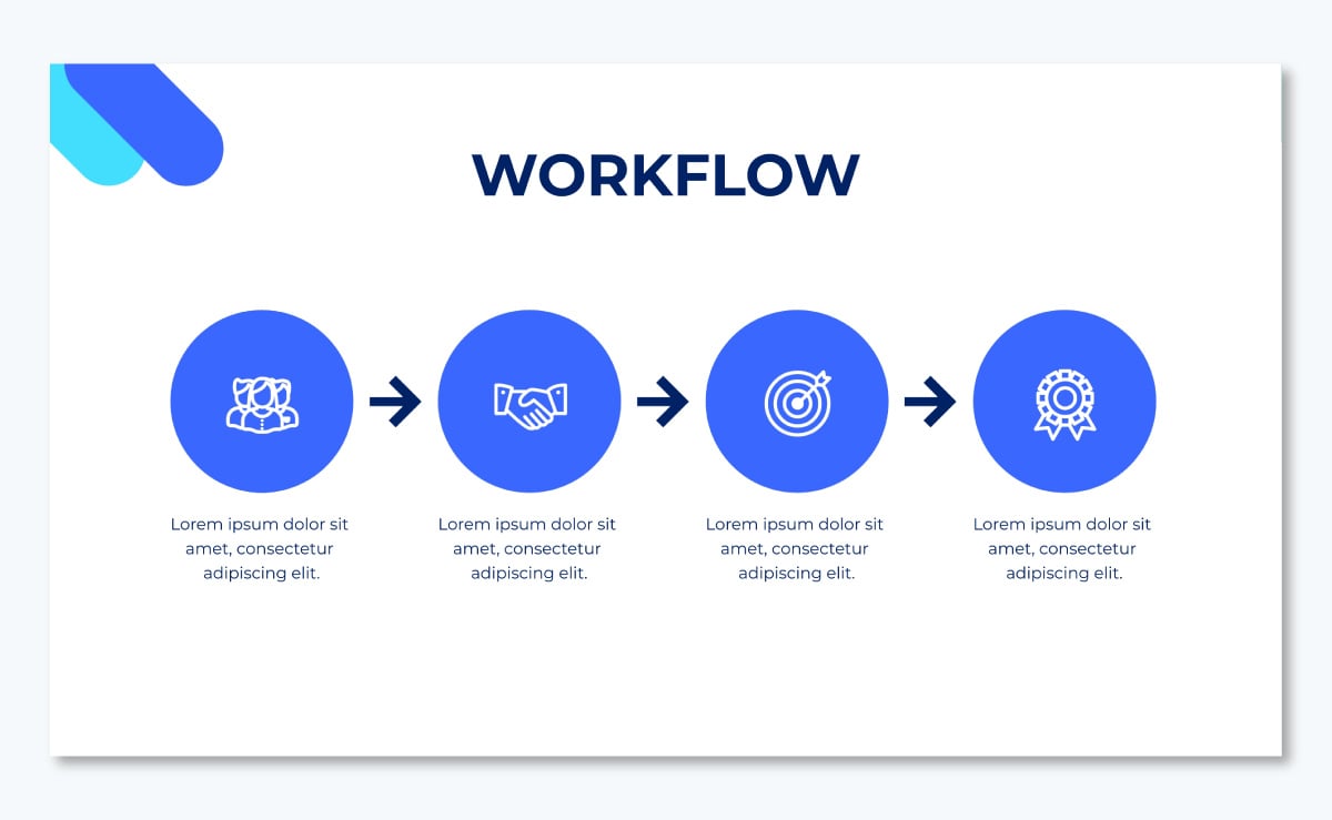
6. Pay attention to the visual elements in each slide.
The goal is simple: you’ve got to use design elements smartly without overdoing them. Sure, you’ve heard a picture is worth a thousand words, but nailing visual components in your presentation can take some effort.
Put another way, it isn’t about throwing in a bunch of thumbnail images and icons to each slide and calling it a day. Instead, it’s about adding them thoughtfully so they’re impactful rather than extra baggage.
Check out this template from Visme to get an idea of what we’re talking about here.
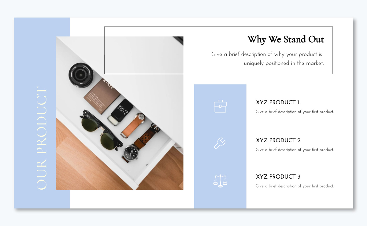
On the whole, aim to create a business plan presentation that’s readable, comprehensible and clutter-free.
Before we wrap this up, here are some tips to help you deliver more memorable presentations:
Keep Your Presentation Concise
Short, powerful messages leave a far deeper impression than long, rambling presentations.
Follow the 9-minute rule —originally for salespeople but equally valuable for presenters—to deliver more impactful presentations.
Aim to deliver 2-3 slides per minute, keeping your key points within about 9 minutes. This helps maintain your audience’s attention and ensures your core message is communicated without overwhelming the listeners with excessive information.
Add Interactivity to Your Presentation
Breathe life into your business presentations and stand out by incorporating interactive elements, such as animated icons, popups, clickable buttons, embedded videos and more.
Interested in creating an interactive business presentation? Here are 20 tips to get you started.
You can also take a look at how to create an interactive quiz within your presentation below.
Create engaging interactive content with Visme.
- Add interactive pop-ups and hover effects
- Increase interest and engagement on your design
- Lead your audience to specific content with interactivity
Pay Attention to Your Presentation’s Design
Not only is visual design an important component of any presentation , but it’s also what hooks your audience. It takes about 50 milliseconds for your audience to assess a design’s visual appeal so aim to leave a strong visual impression.
Use a powerful image as this template does.

Or try a color-based design with a modern layout like the one in this business presentation template:

Incorporate Data Visualization
Wherever possible, use any of the various chart types at your disposal to present your data. These could be line or bar graphs, pie charts, Gantt charts, Venn diagrams, pictograms, population pyramids and much more.
But why should you use charts to share your data? Simple: data visualization makes complex numbers easy to understand at a glance and more interesting to look at.
Check out this funnel chart template by Visme that you can add to your business plan presentation:
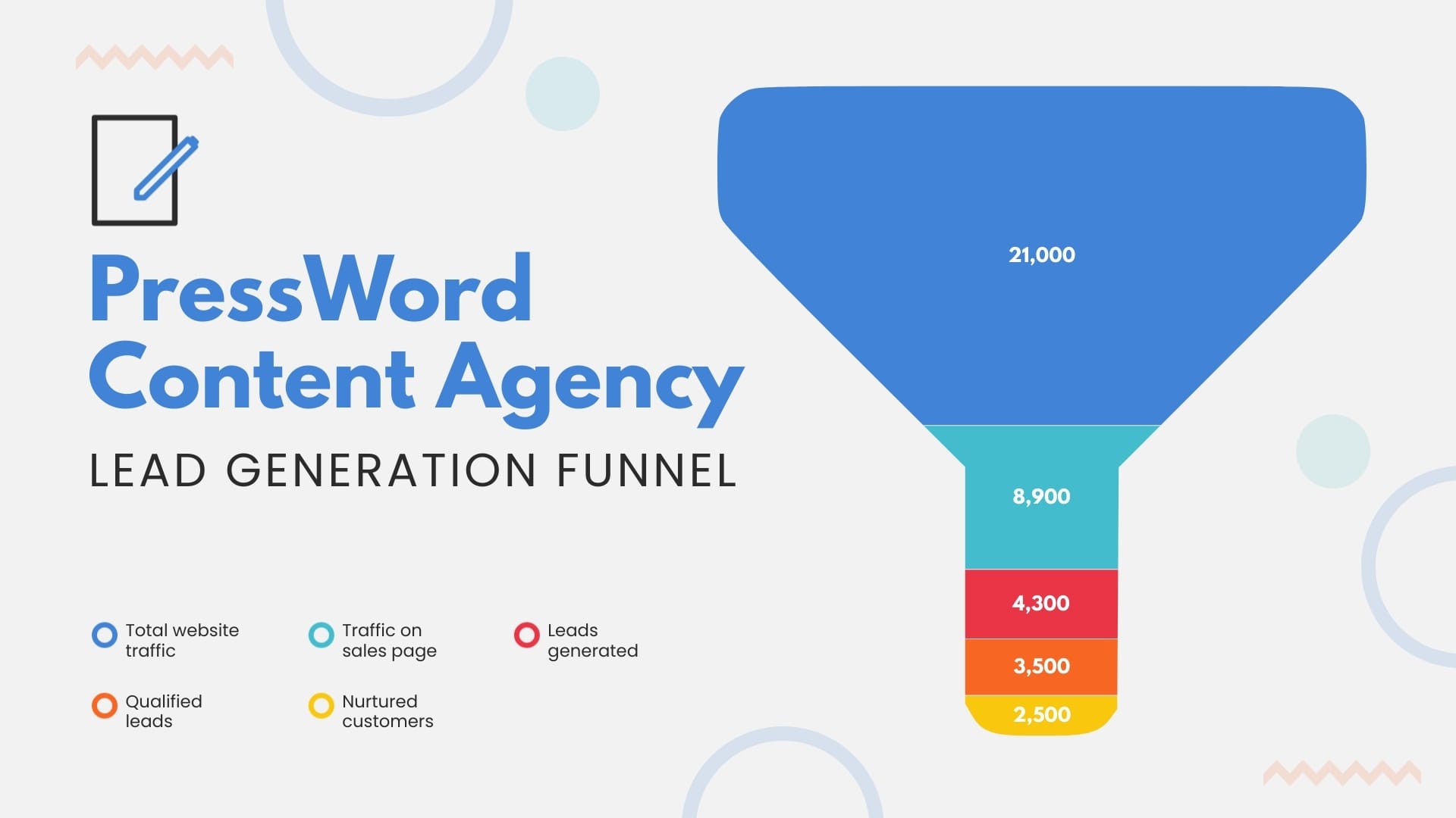
Or this cool gauge chart to track the achievements of your sales staff:
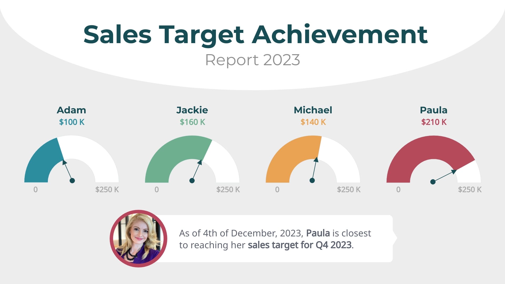
With a few clicks of a button, add creative infographics to your Visme presentations and take them to a whole new level.
Q. How Many Slides Does Your Business Presentation Need?
Aim for 10-12 slides in your business presentation. This aligns with Guy Kawasaki's 10-20-30 rule: 10 slides max, presented in 20 minutes, using at least 30-point font. This approach helps you stay focused and keep your audience hooked to your presentation till the end.
Made with Visme Infographic Maker
If absolutely necessary, you can stretch to 13 slides, but try not to go beyond this to prevent overwhelming your audience. Remember, a concise presentation often has more impact than a lengthy one.
Create a Business Plan Presentation That Wins Investors
Creating a business plan presentation really isn’t much of a tough nut to crack. Consider half your work done if you’re cent percent clear about your business idea. This way your presentation’s content will come easy to you.
As for the design? Leave that to Visme. Our online presentation software makes it easy to create a beautiful and professional business plan presentation that leaves a solid impression on your audience.
Use features like built-in graphics, custom 3D characters, animations, branding and AI-powered tools to create the best business plan presentation you could envision.
Create beautiful presentations faster with Visme.

Trusted by leading brands
Recommended content for you:

Create Stunning Content!
Design visual brand experiences for your business whether you are a seasoned designer or a total novice.
About the Author
Masooma Memon is a pizza-loving freelance writer by day and a novel nerd by night. She crafts research-backed, actionable blog posts for SaaS and marketing brands who aim to employ quality content to educate and engage with their audience.
Unsupported browser
This site was designed for modern browsers and tested with Internet Explorer version 10 and later.
It may not look or work correctly on your browser.
Quick Creative Presentation Ideas & How to PPT Tips (Video)
Watch this quick video to learn some easy PowerPoint tips and creative presentation ideas.

Discover even more tips and PowerPoint ideas in the written tutorial below:
Jump to creative presentation ideas in these sections:
- Use Speech Bubbles
- Create a Timeline
- Audio Narration
- Use Bright Colors
- Use Repetition
- Tell a Story
- Ask Questions at Crucial Moments
- Prepare and Practice
- Organize Your Presentation Into 3 Clear Points
- Break It Up With Humor
- Design Your PowerPoint for Persuasion, Not Distraction
- Don’t Read From Your Slides
- Use Visuals to Ground Abstract Ideas
- Highlight Important Points With Visual Metaphors
- Make Your Examples Personal
- Use an On-Topic Template to Guide Your Presentation
- Don’t Go it Alone: Embrace Teams and Collaborate
- Build for Big Rooms
- Watch Your Animations
- Style With SmartArt
- Turn to Videos to Add Interest
- Align Objects
- Create Quizzes
- Pay Attention to Body Language
- Address Audience Questions
- 27. Turn to Props
- Use Social Media
- Close Strong!
- Share Your Slide Deck After Presenting
30 Creative Presentation Ideas for 2024
Here are 30 cool presentations ideas you can use for your next presentation:
1. Use Speech Bubbles

A creative presentation idea is to put your thoughts or key points into speech bubbles. You can also use them to add notes, commentary, or milestones to a timeline.
When you use speech bubbles, be careful not to overuse them. The point of the speech bubbles is to make the text stand out. The text won't stand out if you use too many speech bubbles. Instead, it'll lose its effect.
2. Create a Timeline
A cool presentation idea that is great for organizing thoughts, facts, or information it to use a timeline.
Each step in a timeline is typically marked with an image icon or shape. So, a timeline can add visual interest to your information. They also help guide the audience through a narrative while also allowing you the ability to talk through specific points.
3. Audio Narration
Another unique presentation idea is to use pre-recorded audio in your presentation.
When you add narration to your presentation, you’re creating more of an immersive experience. Using narration with matching visuals can be more emotional and impact your audience more.
4. Use Bright Colors

A way to have fun presentations is to add bright colors. There are two ways you can do this:
- Use a colorful and exciting background that'll grab the audience's attention. Or use pops of color. When using pops of color, it's best to place your color strategically.
- If you've got an important bit of text that you want your audience to pay attention to, put your pop of color behind that text.
5. Use Repetition
Another creative presentation idea is to use repetition.
Repetition is the oldest trick to remember something. So, if you want your audience to remember a specific phrase, try using repetition.
Choose a phrase that's short and simple. If the phrase is too long, it’ll be harder to remember. Also, don’t repeat the phrase too often. If you do people could tune you out.
6. Tell a Story
The human brain is designed to respond to stories as both a survival mechanism and as an entertainment mechanism. That double role has helped develop it into one of the most powerful communication tools humans have known.
Stories are much more interesting than facts because stories entertain us. Storytelling grabs and maintains attention. It helps the audience understand and remember what was said long after the story’s over.
Instead of presenting your work as a series of facts that'll bore even the most kind-hearted audiences, organize your facts into a story.
And use a professional design with captivating photo layouts and graphics. This connects your audience visually to your story. Consider the stylish Polarity PowerPoint Template :

What interesting connections can you make between your facts? What story can you build around them that'll help your audience stay engaged from start to finish? Tell your story.
Learn more about the presentation writing process:

7. Ask Questions at Crucial Moments
Statements sound trite and expected. Especially during a presentation. A presentation essentially consists of a series of statements strung together. So, one more statement isn’t likely to intrigue the audience—not even an exceptional one.
But what if you ask a question instead?
A question breaks up your regular presentation rhythm and helps mark what you’re saying as important. It turns your presentation from a passive story into an active quest that the audience can explore on their own through their answers.

Answering a question (even if only in their heads) makes your audience feel involved in your presentation and keeps them glued to your words.
8. Prepare and Practice
Ever wonder how the best presenters always seem relaxed, focused, and engaging? It’s easy to think that to be a great presenter, you need to be completely self-assured and comfortable in front of a crowd.
Preparation really starts at the very beginning. To succeed, take your presentation topics and map them out. This happens before you ever open your favorite presentation app to edit slides.
A big part of that is outlining your presentations. Just as novelists outline their books, great presenters map out big ideas in advance.
Think of your outline " roadmap " as a way to get your audience exactly where you want them to go. Following that outline as you build your slides helps you stay focused.

Once you've outlined and built your slides, it's time to rehearse relentlessly. It's not much fun, but it serves to build your self-confidence. You learn your content and become comfortable with it.
This translates directly into a confident stage presence. By feeling better about yourself (and your presentation topics), you'll give a better presentation. And in turn, this fuels audience engagement. Your self-assurance ensures their involvement.

9. Organize Your Presentation Into 3 Clear Points
The number three has been considered somewhat of a magical number in many cultures since antiquity. Something about things in threes fascinates the human mind and helps it retain information better. Consider these phrases:
- body, mind, and soul
- lock, stock, and barrel
- pb and j (two ingredients, but three consonants in this abbreviated form)
- blood, sweat, and tears
Magical or not, the number three works like a charm. At the end of the presentation, we can all remember three things that were said.
So instead of leaving those precious three things to luck, why not take charge? Organize your presentation into three main points or takeaways. Then you can be sure that your audience is paying attention to the important things and not the insignificant details.
Even if you’re making more than three points, which you likely will be, you can find ways to organize all your minor points into three main categories. That way, you can easily address and summarize the gist of your presentation at the end.
Cost, timeline, results. Problem, suggestions, solution. Beginning, middle, and end. Just remember to divide it into three!
10. Break It Up With Humor
Humor makes the world go around. And the same holds true for the business world. At the end of the day, no one likes to work with a stiff.
So even when you’re presenting in front of a “serious” client or investor, remember to use humor in your presentation. This doesn’t mean you've got to crack jokes the entire time. It simply means being cheerful, lighthearted, and personable.
Humor not your strong point? No worries. You can even find presentations on creating presentations with humor!
While it can be challenging to nail the right tone with your use of humor it's one of the best presentation ideas to work on. Humor works to:
- break the ice between you and your audience
- puts everyone at ease, and helps them feel friendly, and well-disposed towards you (which can lead to improved results from your presentation)
- open people up to the fun presentation ideas you’re offering in your presentation
11. Design Your PowerPoint for Persuasion, Not Distraction
If you’re using a slide deck, have a goal in mind. That goal is typically to inform or to persuade (or both.)
People see a ton of presentations - especially those key audiences like potential investors and customers! That means it's essential to stand out.
This is where Envato Elements comes in. It's loaded with designs that work perfectly for creative ways to present a project . Elements is the ultimate resource for presenters who need creative ways to present a project.
Elements offers thousands of PowerPoint templates . Each one is available for a flat monthly rate. That’s right: join today and you’ll have unlimited downloads of all the amazing templates you can ever use.

These templates are built by creative experts with you in mind. Many offer advanced features impossible to find in any free template.
With Elements, you gain peace of mind thanks to the ease of use. You’ll save time and money and will impress even the most discerning audience.
This is a powerful offer. And Elements has far more than presentation templates. Your membership also includes stock photos, music, fonts, and more.
All these are useful to build unforgettable fun presentations in 2024. Join today!
12. Don’t Read From Your Slides
Reading from a slide that everyone in the room can see (and read for themselves) is boring and makes you look unprepared. Your PowerPoint isn’t there to remind you what to say, but to help your audience better understand the point you're making.
When you read off your PPT presentation, your audience will inevitably read along with you. And it's been shown that our minds wander 20-40% of the time while reading.
That means that while you’re reading your slides, your audience is distracted. They may be wondering if they’ve left the iron on or what they're having for dinner. And that’s not what you want them to be thinking about!

Keep the text of your slides short. Only use it to highlight important points you’re making or to mark the headlines of different sections of your presentation.
Your slides should never be a crutch to your presentation when you can’t remember what to say. And they should never contain more than a few lines of text on them.
Slides aren't for reading, but for emphasizing your points quickly.
13. Use Visuals to Ground Abstract Ideas
If you can’t use a million bullet points to summarize your presentation on your slides, then what should your slides contain?
Visuals! Lots of visuals!
Graphs, charts, and pies that illustrate your point and help emphasize it. Also, include images that make an impact on the audience and make the gist of your argument memorable.
There’s a difference between saying that your solution will cut costs by 20% and showing what that looks like on a graph with real numbers. It helps bring the idea from the abstract domain of theory into the concrete domain of facts.
And don’t just stick to traditional presentation visuals. This isn’t 2010, after all. Remember that cool presentation ideas today aren't the same as a decade ago.
Bring your presentation into the current era by including a variety of your visual elements. Using graphics, emojis, and even GIFs where appropriate will help give currency to your presentation and bring it to life.
If you want to make it even more dynamic, consider converting your presentation to a digital flip book , which will add more interactive options and real-page transitions on top of it.
Here’s one of our most popular PowerPoint templates, The X Note . It includes many innovative slide design options, from photo layouts, to timelines, and more:

Discover the best PowerPoint templates with great infographics in this curated article:

14. Highlight Important Points With Visual Metaphors
Visuals, whether emojis, graphics, or images, shouldn’t be used gratuitously in your presentation. Instead, everything you put into your slideshow should have a specific purpose.
A powerful way to use images is through visual metaphors. Don’t just tell your client that with your plan new followers will come to them like bees to honey. Illustrate it with an image to help the point stick in their mind.
Visual images of a situation we’re already familiar with help retain points longer in our memory. They give us something easy to refer to.
15. Make Your Examples Personal
Another creative presentation idea is to personalize your talk for the specific audience you’re talking to on each occasion. You can always adjust and personalize your presentation experience to the specific audience.
Give examples in your presentation that involve the audience and show how your solution will benefit them.
People may not care (or may think they don’t care) about your solution or talk if it just discusses the general. As soon as people realize that something can directly affect and benefit them personally, they start paying attention!
Show your audience the direct effects of your presentation by including them in your examples. You’ll have their full attention and work your way halfway to that yes!
16. Use an On-Topic Template to Guide Your Presentation
Premium templates like those found on Envato Elements deliver unmatched style and content choices. Many focus on being flexible, offering the ability to quickly adapt to any topic.
Some of the most useful templates, though, take the opposite approach. These focus on a specific theme to offer creative ways to present a project.
Imagine for a moment you're launching a new mobile app. There are templates for that. Or perhaps you're opening a new restaurant and want to bring in customers. You're covered, thanks to custom templates.

The advantage here is twofold:
- You'll find razor-focused slides built for your industry or specialty. These help you to brainstorm new PPT presentation ideas and share them in creative ways.
- These very same slides save you valuable time and effort. How? Well, you don't have to build custom layouts from scratch. The tedious art of slide design transforms into a quick drag-and-drop exercise.
In other words, you can plan and build your next creative presentation more quickly, all thanks to on-topic templates.
Even better: your audience will be “wowed” by focused layouts that look tailored for you.

17. Add Music!
This may not be common practice in most presentations you've seen, but it's been proven to work by science. According to research done by Ronald A. Berk of John Hopkins University:
“Music embedded throughout a PowerPoint presentation can sustain attention, while slipping the content into long-term memory.”
And it isn’t new science! We’ve all known this for many decades. Case in point: can you think of how many movies you’ve seen in your lifetime that had no music? I ’ll give you a hint: Zero!
Ever since we discovered how to add sound to movies, we’ve not only been recording dialogue but also music from them. Because music helps set the mood, gives the right emotional effect, and adds excitement.
What's another way you can use music? To lighten up the mood and give everyone a mini dance break!
If you decide to use it, adding music can make for a really cool presentation that stands out in your audience’s mind.
So, try this innovative presentation idea and add the appropriate music to your next presentation to help bring it to life.
18. Don’t Go it Alone: Embrace Teams and Collaborate
Do you sometimes struggle to dream up unique topics for presentation use? You're not alone.
Nor should you be. Successful presentations are often fueled by collaboration. In other words, teamwork. There's no reason to do everything by yourself.
This can happen at any stage of the process, from brainstorming to the public delivery. By enlisting collaborators, your audience will enjoy the very best your team has to offer.

Suppose you've got a colleague who's a wizard with building amazing charts. Or you're presenting about a project and want your audience to hear from its architect. The possibilities for teamwork are endless.
Sometimes, it's great to add collaborators to break up the monotony. No matter how fabulous you are in front of a crowd, audiences may lose focus if you talk for too long. If you've got a lot to share, bringing in other voices helps them stay engaged.
Don't forget that you don't have to be in direct proximity to collaborate. With online team features, you can share files with others around the globe.
And even as you present, you can bring in other speakers with online tools like Zoom. In today's world, this is more powerful (and useful) than ever before.

19. Build for Big Rooms
As you explore unique topics for a presentation, it’s easy to get caught up in the big idea. But that should never distract you from key tactical details. Chances are, as you build your slides, you’re working on a single screen. That means you might forget that major PowerPoint presentations are delivered in large spaces.
What looks great on your screen may be impossible to read for a viewer standing in the back of a lecture hall. Or, your slide might be too crowded, just like we’ve already seen. The takeaway here is: always build presentations for big rooms .
That means to keep slides neat and clean, use large and readable fonts, and linger on each slide to give every viewer the chance to absorb it. No matter what presentation topics you’re discussing, taking your time helps audiences engage with your creative mission.
Also, explore contrast. Often, dark backgrounds and light text are more readable than the reverse.
As you can see in this slide from The X Note PowerPoint Template, contrast is easier on the eyes. It also delivers bold and unconventional styling to your slide deck! Truly, a win-win for you and your team.

Above all, make sure viewers can see and understand your inspirational presentation topics—even from a distance.
20. Watch Your Animations
Many presentation topics will include a lot of different slides. And each of those slides might hold several different types of content. Thanks to PowerPoint, it’s easy to add custom animations and transitions with a few clicks.
These motions really pull your audience in by unveiling new items with a cool flourish. Plus, they’ll help you bring focus to key areas and ensure viewers engage with you.
But be careful.
Opt for clean and simple movements that don’t detract from your narrative. Fades and pushes are top choices for stylish and simple animations.
It’s just as important to organize your animations. If they happen at the wrong time, or in the wrong order, it can absolutely derail your presentation in a flash. Luckily, this is amazingly easy to avoid. In fact, learn to do it in only 60 seconds with our quick tutorial!
21. Style With SmartArt
PowerPoint is built to bring your fun presentation ideas to life. One great way is by using SmartArt. We’ve already looked at some infographics and charts you may find built into PowerPoint templates. SmartArt takes this to a higher level. In a few clicks, you can build your very own custom infographics on any slide. Let’s add SmartArt to a slide.
SmartArt lives on the Insert tab on PowerPoint’s ribbon. You’ll find it under the Illustrations group. To add SmartArt, simply click on the button and launch the menu seen here.

You’ll see several creative categories for how to present ideas. These include:
- relationships
- hierarchies
Simply click on one, then fill in your relevant information. PowerPoint includes a host of built-in design options to help you fully customize your fun presentation ideas.
For example, you can add new steps to a process chart. Or you can change SmartArt colors to precisely match your branding.
Of course, like any slide feature, overusing SmartArt can distract. But, when used carefully, it’s a powerful tool to visualize relationships. Many infographics take a numerical focus, whereas SmartArt is more about ideas and how they connect with each other.
For more on using SmartArt, check out our post and screencast showing you exactly how to get started!

22. Turn to Videos to Add Interest
As you can already see, plain text is no way to inspire audiences to take action in 2024. It's essential to use other mediums, like photos, charts, infographics, and more.
One of these is video, and it's a category all its own. Have unique topics for presentation use? Bring them to life with video.

Imagine for a moment that you want viewers to hear from an expert on a given topic. Maybe they're unavailable to attend the presentation, or present live remotely. Here's your easy fix. Pre-record their narration and add it right to your slides.
Or perhaps you want to show off a scene that photos alone can't capture. Add a video to your slides. It instantly boosts audience interest - and it might give you a little break while they watch!
Your favorite presentation apps often include easy-to-use video features. In fact, you can add YouTube videos right to PowerPoint slides.
In-slide video is becoming increasingly popular, and it’s a great way to add a bit of flair to your next slide deck for 2024. Learn more below:

23. Align Objects
Design for persuasion, not distraction. Organize. Use visuals. All those are big creative presentation ideas we’ve already explored. But they don’t tell the full story.
Let’s build a slide in the Neo PowerPoint Template to show you what I mean.
See the slide below? It features a cool infographic and bold text blocks.
It’s also a mess. Nothing is aligned, and content is thrown all around the slide. Any self-respecting viewer will take a single look and recognize sloppy work when they see it. All it takes is a few clicks to totally transform the layout.

Alignment means what it says: pieces of content on the slide are neatly arranged relative to:
- the borders of the slide and
- other content.
As you can see here, changing this layout makes the very same slide instantly appear neat and clean. The audience will now focus on the content, not your messy style.

24. Create Quizzes

Quizzes can liven up a presentation and help engage your audience by adding a game like element. Many viewers will enjoy interacting with the quiz. But don't forget to make it fun.
A creative PowerPoint presentation idea is to create little quizzes throughout your presentation if it's long. If your presentation isn’t long, you can create a quiz at the end of your presentation.
Asking questions ensures that people listen to your presentation. If you're offering a prize to the quiz winner, tell the audience about the quiz and prize at the beginning of your presentation.
25. Pay Attention to Body Language
Body language is essential when giving your creative presentation. If you’re hiding behind a stand, then you look nervous.
But if you walk around on stage and engage the audience, you’ll look confident and knowledgeable. Learn more about body language in this tutorial:
.jpg)
26. Address Audience Questions

If your presentation topic is complicated, then let the audience to ask questions anonymously. This makes the audience feel heard and allows you to make sure they understand the topic.
Plus, letting the audience to anonymously ask questions takes the pressure off the individual audience member.
27. Turn to Props
A creative presentation idea is to use props. This works well if you aren’t presenting to a large audience.
Props can prove or reinforce a point. They'll make the presentation more interesting for your audience.
Besides, people are naturally more visual. So, using props allows them to visualize what you’re discussing.
28. Use Social Media

If your presentation audience is large, then it might be hard to do a quiz effectively.
If you use Twitter hashtags, you can read audience opinions to questions on Twitter. Just make sure you create a unique hashtag for your event.
29. Close Strong!
So, you’ve delivered an amazing presentation and shared stunning slides along the way. Now it’s time to wrap up with a strong finish.
No matter how good your slide deck, it’s absolutely key to recap and summarize at the end. After all, that’s one of the best ways to ensure retention and action.
There are a few things to keep in mind. Remember how you should organize your presentation into three clear points? It’s time to revisit those.
Highlight key points, touching on each one and briefly recapping how it fits into the message. This locks your message into memory. As you can see in this slide from our MILD PowerPoint Template, a single slide will do the trick.

These interesting presentation topics for work truly drove the entire slide deck. Give them the attention they deserve.
The other big element of a strong close is the call to action. Chances are, you’re sharing slides to get an audience reaction. If it’s simply to educate them, your three clear points will suffice. But if you’re, say, fundraising or recruiting, the close is where you ask the audience to do something.
The call to action follows all the normal rules you now know well. Make it clear, bold, and concise. Make your intentions known and make your pitch inspirational. Like any good cause, people need to believe in you and your message.
30. Share Your Slide Deck After Presenting
We began by talking about presentation topics and their goals. Whenever you present, you're trying to inform and/or persuade your audience.
Either way, you want them to take your message home with them to be remembered, considered, and acted upon.
Think of your favorite speeches, or the best presentations you've ever seen. Chances are, you remember a few key details be they quotes or memorable visuals.
In other words, no audience can be expected to remember everything. And if you expect them to take detailed notes, you'll find them falling more and more behind you.
Your solution is simple: share your slides after the presentation is over. This is now easier than ever.
You can upload slides to YouTube or share them in PDF format. It's digital, easy to access, and saves a few trees, too!
.jpg)
The Best Source for Simple PowerPoint Templates
Envato Elements is a subscription service where you can find top-notch premium presentation templates . To become a subscriber, pay a flat low monthly fee. Once you’ve subscribed, you get unlimited access to presentation templates, audio, stock images, and much more.
Discover how to create with Envato Elements .

Envato Elements is an excellent value if you need presentation templates or other digital assets often.
How to Come Up With Interesting PowerPoint Presentation Ideas (With Creative Examples)
Presentations have a place in nearly every environment. In this section, I'll share three of my favorite template options that give you fun PowerPoint presentation ideas. You'll see that there are templates for practically every purpose that you can use to launch your next presentation.
1. Educational and Scientific Topics
In the educational world, teachers and students alike put their presentation topics in PowerPoint presentations. When you're cramming for a presentation, you need creative presentation topics to be successful.
Check out these two articles with PowerPoint ideas for educational and scientific PPT presentation ideas:

2. Pitch Decks
Next, maybe you've heard of a pitch deck. This is a specific type of presentation that startups and founders use to launch a new company or business.
Your potential investors have likely already seen every idea under the sun. So, it helps to use creative presentation topics to frame your company differently. Try these templates show you how to present an idea for a new company:

3. Marketing Presentation Topics
Another popular arena for presenting creative presentation topics is in marketing PowerPoints. No matter what you're marketing, you can use these two resources to put together creative presentations with a solid approach:
For every presentation you build, using a template is one of the best ways to get creative presentation ideas. You'll find pre-built slides that spark the writing process.
How to Create Unique Topics For a Presentation
Still not inspired? It's possible to use techniques to generate interesting presentation topics for work.
Here are three tips that I use to generate presentation topics:
- Start with brainstorming . At first, you don't need to create structured ideas. A piece of paper and a pen away from your daily distractions can help you generate creative presentation topics. I typically start with a freeform mind map, connecting ideas that I want to share with my audience. Naturally, connections between these creative presentation ideas will form and the story will develop naturally.
- Draw on personal experience . Not every presentation is personal in nature. But connecting the topic to your personal experience is a powerful storytelling tool. Think about how your personal story connects to the topic to generate creative presentation ideas.
- Take an unconventional view . Even if it isn't your personal view, thought-provoking presentations sometimes take unconventional views. You don't have to take a controversial topic to take an unconventional view. Instead, take a commonly accepted belief and challenge it to get creative.
Dig deep and you might be surprised how many creative presentation topics you might be able to generate. Creative presentation topics are easier to generate when you use this three-step approach.
How to Quickly Customize Creative Presentations That Inspire (In 2024)
Premium templates are one of the best creative ways to present a project. They’re quick and easy to use and deliver inspiring results. Let’s learn how to customize a slide deck to bring presentation topics to life.
Want to follow along? Start crafting creative ways to present a project with the help of Momentum from Envato Elements.

Let's get started:
1. Choose Slides to Work With
As you think about unique topics for presentation designs, it pays to consider your goal. That means choosing only the slides that work best for your idea. In PowerPoint, find the View tab, then click on Slide Sorter .

Here, you can click on slides and drag them around to change up the sequence. Or you can hold down Shift on your keyboard and select those that you don’t want to use. Then, press Delete . Once you’re finished, click Normal on the View tab to start editing.
2. Add Your Text
Adding your own text is the best place to start. Slide decks like this include an array of text placeholders. All you've got to do is “fill in the blanks” - replacing the existing text with words of your own.

Begin by highlighting any text you see on a slide. Then, start typing. Repeat throughout the slide deck as needed.
3. Customize Fonts
You might not think of text when you imagine creative, inspiring presentation topics. But it’s really one of the best ways to stand out! Any font can be changed, resized, or customized with things like bolds and underlines, along with different colors.

To do that, select some text on the slide. Then, on the Home tab, find the Fonts group just left of center. You’ll see an array of buttons for every text effect and font change imaginable. Click on each to explore and apply.
4. Show Off Your Photos
Of all the creative ways to present a project, adding images is at the top of the list. And custom PPT themes like this make it easy. Many slides include pre-built image placeholders.

To use one, simply browse to an image file on your computer. Then, drag it over the placeholder, and drop it into place. That’s all it takes. PowerPoint imports the image and adds it to your slide. What’s more: it’s scaled to fit perfectly.
5. Change Shape Colors
Most templates are going to have a default color palette. They look great, but you don’t have to stick to them on every slide. In fact, changing a shape color is a creative way to add contrast.

Click on a shape, then choose Shape Format on the menu. On the left side, click Shape Fill . You’ll see a color chooser drop-down, from which you can apply any custom color that you want.
5 Top Creative PowerPoint Presentation Template Designs for 2024
Want to bring your presentation topics to life? Turn to these five templates that are trending on Envato Elements. They’re the best out there for creative presentations today:
1. Rotario Creative PowerPoint

Need a winning way to explore unique topics for presentation decks? Rotario is ready for you. With a retro color theme and minimalist style, it’s one of the best ways to share your favorite content. In total, there are 35 slides included.
2. Inspiring PowerPoint Presentation Template

Inspire your audience with this powerful presentation deck for PPT. Over 70 unique slides feature every type of layout conceivable. Light and dark versions help you choose a color palette that’s right every time. Plus, you’ll benefit from included vector icons and many aspect ratios. It’s versatile, flexible, and easy to use.
3. Lakewood Professional PowerPoint Template

For business presentation topics, you can still be creative and inspire your audience. In fact, inspiration may lead to funding, support for your projects, and more. Let Lakewood do the talking for you, in elegant and readable style. It includes a full set of infographics and diagrams to help bring data to life.
4. Halogue - Creative PowerPoint Presentation

With unmatched style and funky graphics, Halogue is a top creative choice for 2024. Over 40 slides center around master layouts, making bulk edits a breeze. A unique custom icon pack lets you bring new life to every slide. In fact, each design element is totally customizable. This gives you the ultimate creative control.
5. Reddo Modern PowerPoint

Think all the creative ways to present a project involve bright, flashy slides? Think again. Reddo proves the opposite, delivering a sleek and beautiful slide deck for your next project. You’ll find 120 layouts inside, some featuring modern infographics, Excel-based charts, and more. It’s a fashionable way to make that great first impression.
Learn More About Presentations
Want to give the best presentation? Read these articles to learn more:

More Creative PowerPoint Templates
If you're still looking for premium templates, check these articles out:

Download Our Free PDF eBook on Making Great Presentations
Want even more skills to make great presentations? Download our free eBook: The Complete Guide to Making Great Presentations , which comes with a subscription to the Tuts+ Business Newsletter.

This 30-page PDF guide with included checklist will help you with the complete presentation process. Learn how to write your presentation, design it like a pro, and quickly prepare it to present powerfully.
Make Your Next Presentation Memorable!
Simply presenting the facts makes for a baseline presentation. To impress, convince, and convert your audience with your presentation you’ll need to build some structure and excitement into your talk both verbally and visually.
Take advantage of these creative ideas for making your presentation better.
For even more ideas on how to improve your presentation, check out this article featuring presentation tips or browse through our featured presentation material :
How do you structure and design your presentations? And what will you do differently in your next presentation given these unique presentation ideas?
Use these creative presentation ideas now. Download a template. And start your next great presentation today!
Editorial Note : This tutorial was originally published in September of 2016. It's been updated to include new information—with special help from Andrew Childress and Sarah Joy .

Newly Launched - AI Presentation Maker

Researched by Consultants from Top-Tier Management Companies
AI PPT Maker
Powerpoint Templates
PPT Bundles
Kpi Dashboard
Professional
Business Plans
Swot Analysis
Gantt Chart
Business Proposal
Marketing Plan
Project Management
Business Case
Business Model
Cyber Security
Business PPT
Digital Marketing
Digital Transformation
Human Resources
Product Management
Artificial Intelligence
Company Profile
Acknowledgement PPT
PPT Presentation
Reports Brochures
One Page Pitch
Interview PPT
All Categories
10 Business Idea Presentation Templates to Spark Revolutionary Innovations
Mohit Sabharwal
When starting your business, effectively pitching its core idea to angel investors is crucial. You've put in the effort to do thorough research, and now you need to present your idea to create recall and impress potential investors enough to take out their cheque book. Creating a compelling pitch is challenging, but you can make a substantial impact with the right approach.
Present your unique value proposition, which differentiates your business from competitors. Use data and evidence to support your claims and illustrate your business’ sure-shot potential for growth and profitability. Engage your audience with a well-structured and engaging presentation that conveys your passion. By effectively pitching your idea to angel investors, you increase your chances of securing the funding and support to turn your business idea into reality.
Yet, how does one create effective templates for your business idea.
At SlideTeam, we have a collection of best business idea PowerPoint Templates to help you create purposeful presentations that
do the job. These templates include essential elements like an executive summary, problem statement, Unique Selling Proposition (USP), and financial forecasting.
With these templates, you can showcase your business idea and grab the attention of investors. Whether you are new to presentations or an experienced user, these templates will provide you with a solid foundation for creating engaging slides that highlight the potential of your business idea.
Each of the slides is 100% editable and customizable. Let us explore these templates now!
Template 1:- Restaurant Cafe Business Idea PowerPoint Presentation Slides
Use this professionally-created Restaurant Cafe Business Idea PPT Template to develop and carry out a successful cafe business. This sample emphasizes experience od novelty using seasonal ingredients as the mainstay of the food menu. It comprises an executive summary, problems, recommendations, USPs, and financial forecasts, among other things. We use tables, charts, and infographics to present a startup summary with data and team information. The template also instructs businesses on giving their location on a map of the world with a suitable layout and style for a restaurant.

Download Now!
Template 2:- Business I dea Funding Proposal PPT Presentation Slides
We provide the ideal solution, if your business requires funding and you are looking for content-ready aesthetic templates to make your point. Our template is painstakingly created based on intensive study and analysis of tens of thousands of successful proposals. Download our template, type in information about your business, and send it to your clients with assurance, knowing that it will communicate your ideas and enhance the likelihood that they will respond favorably.

Template 3:- Business Idea Generation PPT Template Bundles
Use the Business Idea Generation PPT Template Bundles to confidently convey your idea. This presentation deck has 20 slides with symbols, pictures, and more to improve teamwork and your ability to communicate ideas. It presents graphs, figures, and statistics to represent facts in a refreshing manner. Both the regular and widescreen aspect ratios of the template are included in to ensure there is no technical issue when presenting. Get it now!
Template 4:- Event Management Startup Business Idea PPT Template Bundles
This PPT Template bundles will enhance your presentation. This template has 11 slides with eye-catching graphics, pictures, symbols, and more to help you convey your ideas and encourage successful cooperation. Present materials for a compelling presentation, including stats, statistics, data charts, and more.

Template 5:- Goals and Objectives Business Idea Data Operations Team Structure
Our Goals And Objectives Business Idea Data Operations Team Structure template enhances your presentation. This comprehensive deck has 12 slides, each with eye-catching images and a thoughtful layout that will help you convey your thoughts. It is customizable and adheres to excellent design practices, making it ideal for expert discussion groups. Download it right away to enthrall your audience.
Template 6: 1-1 Meeting W ork Performance Future Business Ideas Project Design
Increase the quality of your presentation by using the 1-1 Meeting Work Performance Future Business Ideas Project Design template, which is both professional and impressive. This deck of 12 slides is ideal for effectively expressing your thoughts and vision because of its excellent design and well-structured style. This template is perfect for expert discussion gatherings or for expressing your opinions. It provides a thorough bundle using the best design principles, with thematic representation across slides. Click the download now to give your presentation library a major boost.
Template 7:- Product Lifecycle in Business Idea Funding Proposal
This presentation template, which comprises four steps, is made to instruct and hold your audience's attention. Use this layout to explain the introduction, growth, and maturity phases effectively. To enjoy all its benefits and get more than ample sources for your business, grab it right away.
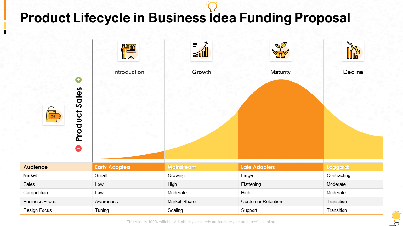
Template 8: Budget Allocation in Business Idea Funding Proposal
Use this adaptable PPT Template to learn about how to frame budget allocation in a convincing manner to ensure your project appeals to investors. Use it as a helpful resource for conversation and navigation around business, fundraising, and proposal-related issues. Download this presentation template now, and take advantage of its adaptability.
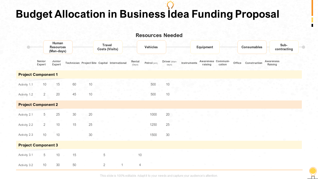
Template 9: Three-circle Process for Business Idea and Research
We introduce our library of presentations on the three-circle method for research and business ideas. Use our in-depth PowerPoint Template to explore the three phases of this process in depth. This template is ideal for emphasizing crucial components like market research, business ideas, and company goals or objectives because of how simple it is to alter and how creative the design is.
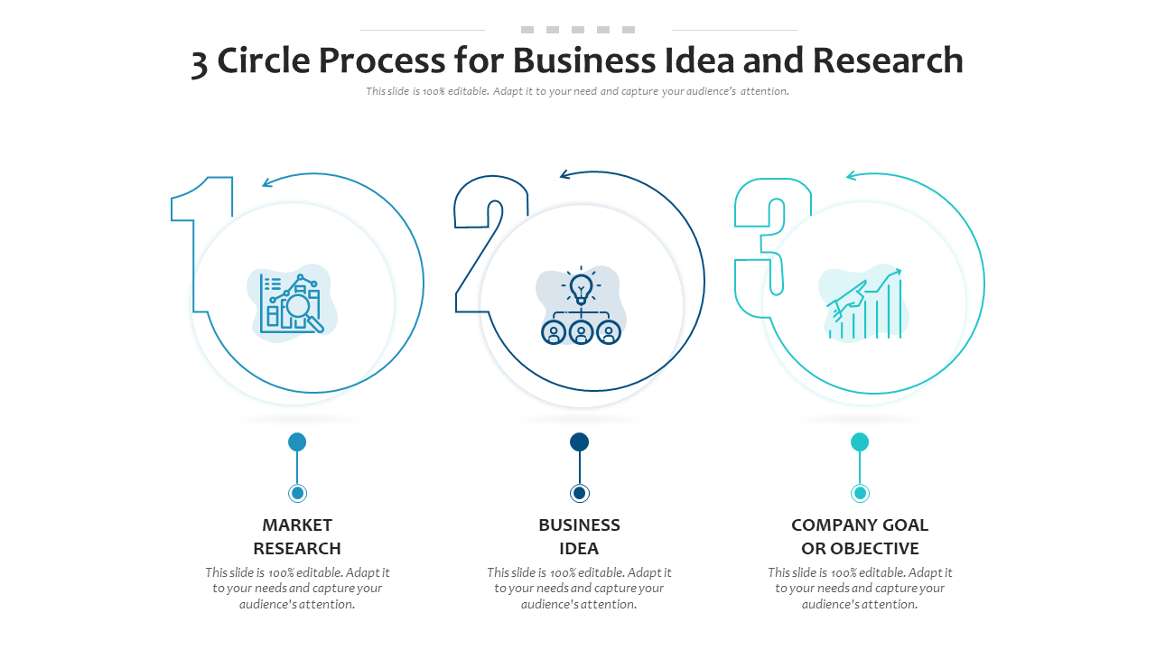
Template 10:- One-pager Coffee Cafe Business Idea Presentation Report Infographic PPT PDF Document
Get our one-pager on coffee cafe business ideas to establish specific goals for your new coffee shop firm. This thorough template includes an executive summary, market analysis, customer target, USPs, competition analysis, financial predictions, pricing, and advertising and promotion tactics. Download it right now.
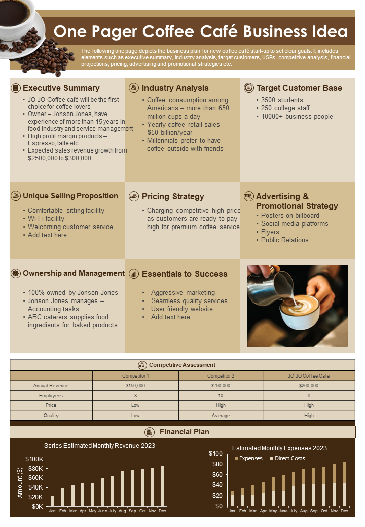
BE PREPARED FOR SUCCESS
Preparing an impressive pitch for your business idea is essential while seeking support from angel investors. Enhance your presentation with these eye-catching PPT Templates that express your vision. State the problem you want to solve and demonstrate current market demand. Emphasize your USP. Use data and evidence to prove your claims and demonstrate the potential for growth and profitability. Ensure your presentation is well-structured, engaging and conveys your passion and confidence. Using these templates, you can increase your chances of getting necessary funding and turning your business idea into a successful reality.
FAQs on Business Ideas
What are the 10 types of business ideas.
Entrepreneurs have access to many company ideas that have the chance to transform into well-run businesses with adequate funding and vision. These are:
- Opening an actual or online store to sell goods in retail.
- Offering a range of expert services, such as graphic design, marketing, or consultancy.
- E-commerce which is an online store to sell goods or services.
- Franchise: Purchasing the right to use a successful company model with a well-known brand.
- Establishing a food and beverage company.
- Technology: Making and distributing software, mobile applications, or cutting-edge technological solutions.
- A social enterprise is a company that seeks to address environmental or social problems, while earning a profit
- Offering specialized services or expertise as a freelancer
- Offering continuing services or goods via a subscription model is subscription-based.
- Home-based: Conducting business from the convenience of one's home,
What are some good business ideas?
Here are a few solid business ideas to consider:
- Online retail store : start an online retail store selling products in a niche market or category. You can purchase things from suppliers or design your own.
- Digital Marketing Agency : Provide digital marketing services to businesses like social media management, content production, search engine optimization (SEO), and online advertising.
- Food Delivery Service : Establish a service that collaborates with local businesses to serve meals to consumers' homes. You can use a mobile app or a website to operate.
- Subscription Box Service : Regularly curate and send customers subscription boxes with specialty products or samples.
- Personal Fitness Training : Become a personal fitness trainer and provide clients customized workout plans, nutrition advice, and one-on-one in-person or online training sessions.
- Mobile applications Development : create software applications for various objectives, such as productivity, entertainment, or health and well-being.
- Green & Sustainable Products : Capitalize on the increased demand for eco-friendly and sustainable products by selling recyclable items,
- Home Cleaning Services : Provide homeowners or businesses with expert cleaning services. Example: Carpet or window cleaning.
- Virtual Assistant Services: Provide administrative support, scheduling, email management, and other activities to busy professionals or entrepreneurs.
How do I get startup ideas?
Here are some quick techniques to develop startup ideas:
- Identify Problems : Look for problems or obstacles and devise solutions.
- Follow Your Passions: Consider your passions and hobbies to uncover business opportunities.
- Investigate Emerging Trends: Stay engaged with current trends in technology, society, and industry.
- Conduct Market Research : Examine markets, speak with potential customers, and analyze data to identify unmet needs.
- Brainstorm with Others: Engage in talks with friends, coworkers, or like-minded others to produce ideas.
- Seek Inspiration : Study successful startups and find inspiration in their techniques and products.
- Utilize Your Skills : Create a startup by using your skills and knowledge in a novel and original way.
- Maintain an Idea Journal : Keep a record of ideas and insights that come to mind, and examine and expand on these.
Related posts:
- Top 10 Business Pitch Deck Templates with Samples and Examples
- How to Design the Perfect Service Launch Presentation [Custom Launch Deck Included]
- Quarterly Business Review Presentation: All the Essential Slides You Need in Your Deck
- [Updated 2023] How to Design The Perfect Product Launch Presentation [Best Templates Included]
Liked this blog? Please recommend us

[Updated 2023] Top 10 Innovation Funnel Templates To Propagate The Best Business Ideas
10 Idea Generation PPT Templates to Chase the Business of Your Dreams
This form is protected by reCAPTCHA - the Google Privacy Policy and Terms of Service apply.


IMAGES
VIDEO
COMMENTS
The project proposal includes a lot of details in many of the same categories as a project charter or a complete project plan. However, it is not the same document. The project proposal is not a detailed execution plan. There are lots of details that may change between the proposal presentation and the final, approved project plan.
2 Lay Out Your Project Plan. Once you've set your goals, the next big step is to outline how you'll achieve them. An excellent place to start is by organizing your project into an actionable plan and steps for execution. You might wonder why this step is important for creating a successful project presentation.
With our Project Idea PowerPoint templates, you can effectively communicate your project's purpose, objectives, methodology, timeline, and expected outcomes. The templates also feature dedicated sections for presenting market analysis, competitive landscape, and financial projections, providing a holistic view of your project. In a nutshell ...
The Project Risks. All projects present risks, and to control them, they must be identified, assessed, evaluated, and mitigated. Visualize your risk assessment with a risk matrix and include it in the project presentation. Use this slide to explain to stakeholders how you plan to mitigate the identified risks.
The swapping of orientations will show people that the presentation is progressing nicely. It can help you make a strong, almost physical, distinction between ideas, sections or topics. 10. Make your audience laugh, or at least chuckle. Source. Sometimes you need to not take your business presentations too seriously.
Project Proposal Presentation templates. Download and customize these free and easy-to-edit templates for Google Slides and PowerPoint to present your new Project Proposal. Your partners will appreciate the nice slide designs and appealing backgrounds. Industry.
Review your presentation, talk it out, get comfortable with the delivery, and find good ways to present a project. Consider the tone, the speed, and the moments you wish to emphasize. 16. Temper your anxiety. When a speaker is relaxed, the audience will also relax, making for an overall comfortable experience.
When pitching and presenting big ideas, it's important to consider the structure of your presentation from the very beginning. In this blog post about presentation design, we will lay out a pitch structure you can use when presenting an idea for a new project.We'll call this presentation approach "The Big Thing," a six-step method for winning the hearts and minds of your audience.
6. Bring your story to life with audio. Another presentation idea to minimize text and maximize audience engagement is to add sound to your presentation. Tell your story using pre-recorded audio. This creative presentation style turns the viewer experience into just that — an experience.
21 Get crafty (ripped paper details) Sometimes to tell a story, visual details can really help get a mood across. Ripped paper shapes and edges can give a presentation a special feel, almost as if it was done by hand. This visual technique works for any type of presentation except maybe in a corporate setting.
Below are some education presentation ideas you can use for your next project. Academic Presentation: If you want to educate and share info, then academic presentations with supporting visuals, presentation slides, and videos are what you need. Explainer: Explainers are a powerful way of sharing essential information.
With practice and some basic guiding principles, you can give a stunning project presentation that will knock their socks off. I've given many project presentations, and I'm going to share my secrets with you. Present the Problem and Solution. Repeat the main point 3 times. Include an analogy or story.
Here's a step-by-step guide to writing a persuasive priority proposal. 1. Write an Executive Summary. The executive summary provides a quick overview of the main elements of your project proposal, such as your project background, project objectives and project deliverables, among other things.
Don't know where to start on your presentation? Here are 31 excellent presentation ideas to inspire your next winning PowerPoint.
6. "Blitzscaling: Book Trailer," Reid Hoffman. If you're going to go the minimalistic route, I'd take note of this PowerPoint presentation example from Reid Hoffman. This clean design adheres to a simple, consistent color scheme with clean graphics peppered throughout to make the slides more visually interesting.
To create a business plan presentation, identify your goals, conduct research, create an outline, develop the content, design your slides, prepare supporting material, and finalize and polish. Design a business plan presentation easily in Visme by picking a template, adjusting the slides, customizing the template, and then downloading and ...
Here are 30 cool presentations ideas you can use for your next presentation: 1. Use Speech Bubbles. Speech bubbles add a fun element to your slide. (Presentation template Source: Envato Elements) (Graphic Source: Envato Elements) A creative presentation idea is to put your thoughts or key points into speech bubbles.
Idea #21: Make It Colorful. Use vibrant colors when designing your presentation or choosing your presentation template. Colors give your presentation life and create unique psychological reactions in people. For example, use more red in your slides to evoke intense and excited emotions in your audience.
1. Gather information. Before you present your idea, gather as much information as you can about your idea. Common ideas that individuals approach their supervisors with include the workload at the company, production issues or improvements, company culture and more. Narrow down your discussion topic so your boss knows what to expect from the ...
Template 1:- Restaurant Cafe Business Idea PowerPoint Presentation Slides. Use this professionally-created Restaurant Cafe Business Idea PPT Template to develop and carry out a successful cafe business. This sample emphasizes experience od novelty using seasonal ingredients as the mainstay of the food menu. It comprises an executive summary ...