- Privacy Policy
Buy Me a Coffee
Home » Figures in Research Paper – Examples and Guide

Figures in Research Paper – Examples and Guide
Table of Contents

Figures in Research Paper
Figures play an essential role in research papers as they provide a visual representation of data, results, and concepts presented in the text. Figures can include graphs, charts, diagrams, photographs, and other visual aids that enhance the reader’s understanding of the research.
Importance of Figures in Research Paper
Here are some specific ways in which figures can be important in a research paper:
- Visual representation of data : Figures can be used to present data in a clear and concise way. This makes it easier for readers to understand the results of experiments and studies.
- Simplify complex ideas: Some concepts can be difficult to explain using words alone. Figures can be used to simplify complex ideas and make them more accessible to a wider audience.
- Increase reader engagement : Figures can make a research paper more engaging and interesting to read. They break up long blocks of text and can make the paper more visually appealing.
- Support arguments: Figures can be used to support arguments made in the paper. For example, a graph or chart can be used to show a correlation between two variables, providing evidence for a particular hypothesis.
- Convey important information: Figures can be used to convey important information quickly and efficiently. This is particularly useful when the paper is being read by someone who is short on time and needs to quickly understand the main points.
Types of Figures in Research Paper
There are several types of figures commonly used in research papers, including:
- Line graphs: These are used to show trends or changes in data over time.
- Bar graphs: These are used to compare data across different categories or groups.
- Pie charts: These are used to show proportions or percentages of data.
- Scatterplots : These are used to show the relationship between two variables.
- Tables : These are used to present large amounts of data in a structured format.
- Photographs or images : These are used to provide visual context or examples of the research being presented.
- Diagrams or schematics : These are used to illustrate complex processes or systems.
How to add Figures to Research Paper
Adding figures to a research paper can be a great way to visually convey important information to the reader. Here are some general guidelines for adding figures to your research paper:
- Determine the appropriate type of figure: Depending on the information you want to convey, you may want to use a graph, chart, table, photograph, or other type of figure.
- Label the figure: Give your figure a descriptive title and number it. Also, include a brief caption that explains what the figure shows.
- Place the figure in the appropriate location : Generally, figures should be placed as close as possible to the text that refers to them. For example, if you mention a figure in the middle of a paragraph, it should be placed within that paragraph.
- Format the figure appropriately: Ensure that the figure is clear and easy to read. Use consistent fonts and font sizes, and make sure the figure is large enough to be easily seen.
- Cite the source of the figure: If the figure was not created by you, you must cite the source of the figure in your paper. This includes citing the author or creator, the date of creation, and any relevant publication information.
- Consider copyright : Ensure that you have permission to use any figures that are copyrighted. If the figure is copyrighted, you may need to obtain permission from the copyright holder to use it in your paper.
How to Label Figures in Research Paper
Labeling figures in a research paper is an important task that helps readers to understand the content of the paper. Here are the steps to label figures in a research paper:
- Decide on the numbering system: Before labeling the figures, decide on the numbering system that you want to use. Typically, figures are numbered consecutively throughout the paper, with the first figure being labeled as “Figure 1,” the second figure as “Figure 2,” and so on.
- Choose a clear and concise caption: A caption is a brief description of the figure that appears below the figure. It should be clear and concise and should describe the content of the figure accurately. The caption should be written in a way that readers can understand the figure without having to read the entire paper.
- Place the label and caption appropriately: The label and caption should be placed below the figure. The label should be centered and should include the figure number and a brief title. The caption should be placed below the label and should describe the figure in detail.
- Use consistent formatting: Make sure that the formatting of the labels and captions is consistent throughout the paper. Use the same font, size, and style for all figures in the paper.
- Reference figures in the text : When referring to a figure in the text, use the figure number and label. For example, “As shown in Figure 1, the results indicate that…”
Figure 1. Distribution of survey responses
In this example, “Figure 1” is the figure number, and “Distribution of survey responses” is a brief title or description of the figure.
The label should be placed at the top of the figure and should be centered. It should be clear and easy to read. It’s important to use a consistent format for all figures in the paper to make it easier for readers to follow.
Examples of Figures in Research Paper
Examples of Figures in Research Papers or Thesis are as follows:
Line graphs Example

Bar graphs Example

Pie charts Example

Scatterplots Example

Tables Example

Photographs or images Example

Diagrams or schematics Example

Purpose of Figures in Research Paper
Some common purposes of figures in research papers are:
- To summarize data: Figures can be used to present data in a concise and easy-to-understand manner. For example, graphs can be used to show trends or patterns in data, while tables can be used to summarize numerical information.
- To support arguments : Figures can be used to support arguments made in the text of the research paper. For example, a figure showing the results of an experiment can help to demonstrate the validity of the conclusions drawn from the experiment.
- To illustrate concepts: Figures can be used to illustrate abstract or complex concepts that are difficult to explain in words. For example, diagrams or illustrations can be used to show the structure of a complex molecule or the workings of a machine.
- To enhance readability: Figures can make a research paper more engaging and easier to read. By breaking up long blocks of text, figures can help to make the paper more visually appealing and easier to understand.
- To provide context : Figures can be used to provide context for the research being presented. For example, a map or diagram can help to show the location or layout of a study site or experimental setup.
- To compare results : Figures can be used to compare results from different experiments or studies. This can help to highlight similarities or differences in the data and draw comparisons between different research findings.
- To show relationships : Figures can be used to show relationships between different variables or factors. For example, a scatter plot can be used to show the correlation between two variables, while a network diagram can be used to show how different elements are connected to each other.
- To present raw data: Figures can be used to present raw data in a way that is easier to understand. For example, a heat map can be used to show the distribution of data over a geographic region, while a histogram can be used to show the distribution of data within a single variable.
Advantages of Figures in Research Paper
Figures (such as charts, graphs, diagrams, and photographs) are an important component of research papers and offer several advantages, including:
- Enhancing clarity : Figures can help to visually communicate complex data or information in a clear and concise manner. They can help readers better understand the research and its findings.
- Saving space : Figures can often convey information more efficiently than text, allowing researchers to present more information in less space.
- Improving readability : Figures can break up large blocks of text and make a paper more visually appealing and easier to read.
- Supporting arguments: Figures can be used to support arguments made in the text and help to strengthen the overall message of the paper.
- Enabling comparisons: Figures can be used to compare different data points, which can be difficult to do with text alone. This can help readers to see patterns and relationships in the data more easily.
- Providing context : Figures can provide context for the research, such as showing the geographic location of study sites or providing a visual representation of the study population.
About the author

Muhammad Hassan
Researcher, Academic Writer, Web developer
You may also like

How to Cite Research Paper – All Formats and...

Data Collection – Methods Types and Examples

Delimitations in Research – Types, Examples and...

Research Paper Format – Types, Examples and...

Research Process – Steps, Examples and Tips

Research Design – Types, Methods and Examples
Get in touch
555-555-5555

Limited time offer: 20% off all templates ➞

How to Make Good Figures for Scientific Papers
Creating good figures for scientific publications requires using design best practices to make each figure clearly show the main point of your data story.
This article reviews important design principles that will help you create effective figures. However, if you want step-by-step tutorials on how to create the scientific illustrations and Excel graphs using Adobe Illustrator and PowerPoint, read these articles instead:
- Free Graphical Abstract Templates and Tutorials
- Free Research Poster Templates and Tutorials

Four Rules to Create High-Quality Figures
The best data visualizations for scientific papers use a combination of good design principles and storytelling that allows the audience to quickly understand the results of a scientific study. Below are four rules that will help you make effective research figures and save you time with the final journal formatting. There are also practical tips on how to find the purpose of your figure and how to apply design best practices to graphs, images, and tables.

Rule 1: Clearly show the main purpose to your audience
For every graph or figure you create, the first step is to answer the question: what is the purpose of my data? Clearly defining the main purpose of your scientific design is essential so that you can create and format the data in ways that are easy to understand.
The most common purposes for scientific publications are to explain a process or method, compare or contrast, show a change, or to establish a relationship. Each of these purposes should then lead you to select graph types. For example, if the goal of your figure is to explain a method, you will likely want to choose process-focused graph types such as flow charts, diagrams, infographics, illustrations, gantt charts, timelines, parallel sets, or Sankey diagrams. Below are examples of the most common graph types that you can use for different data purposes. Read more articles to learn how to choose the right data visualizations and data storytelling .

Rule 2: Use composition to simplify the information
After you define the purpose of your graph or figure, the next step is to make sure you follow composition best practices that make the information clear. Composition best practices include following the journal rules and formatting from left to right, top to bottom, or in a circle. You should also review your designs to remove or adjust distracting data, lines, shadows, and repeated elements. Applying good composition means spending time reviewing your layout and simplifying the story using these techniques.
Data Composition Best Practices:
- Design flow should be left to right, top to bottom, or in a circle
- Make sure most important data is the focus of the design
- Remove or adjust excess data and text
- Make text easy to read
- Reduce contrast of bold lines
- Remove repeated elements
- Remove shadows

The example below shows how to design a figure that applies the composition best practices by taking an initial layout of a figure on the left and then use formatting to fill the space, simplify information, and reorder the data to more clearly show the main purpose of the research.

Follow Science Journal Formatting Requirements:
In order to organize the graphs, charts, and figures, you will also need to know the requirements of the scientific journal. You will need to know the limits of the figure sizes, the maximum number of figures, as well as color, fonts, resolution, and file type requirements. You can find different journal requirements by going to the Journal’s homepage and then finding the link to the author’s guidelines from there. If you Google the journal’s formatting requirements, make sure you find the most up-to-date page.
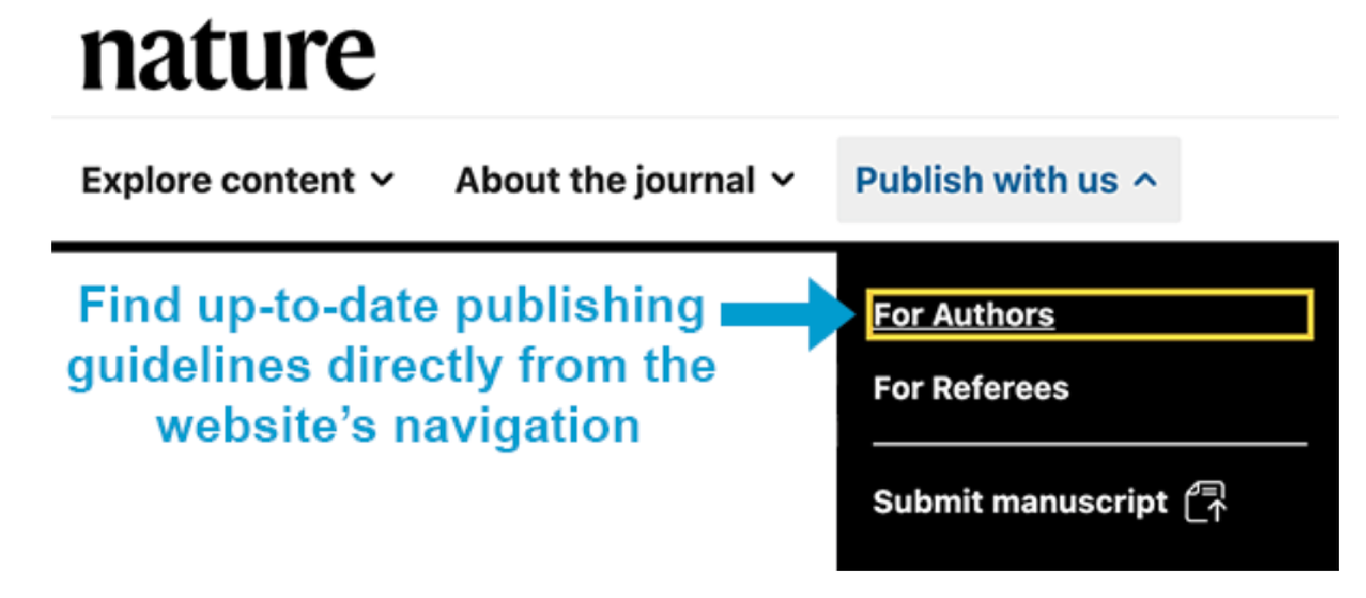
For example, the academic journal Science allows a maximum of 6 figures and requires that they have a width of 55 mm (single column) or 230 mm (double column). In contrast, the journal Nature only allows 3-4 figures or tables with maximum widths of 89 mm (single column) and 183 mm (double column). If you planned to submit your scientific publication to Nature, you would need to carefully plan which graphs and tables will best tell your scientific story within only four figures.
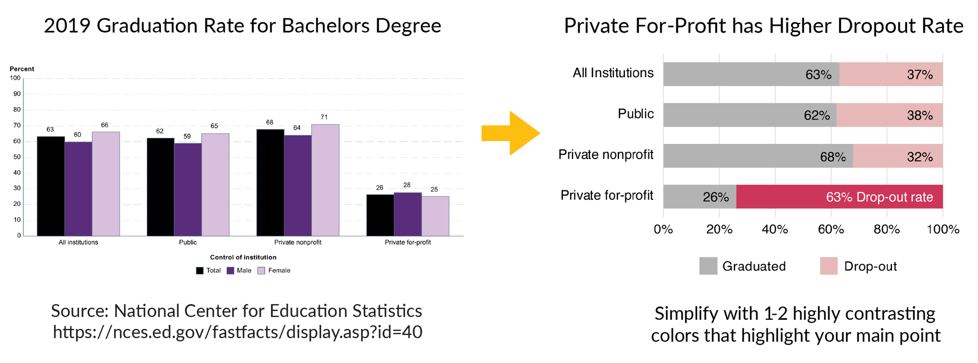
Rule 3: Use colors or grayscale to highlight the purpose
Color is one of the most powerful data storytelling tools. When used properly, color enhances understanding of your graphs and when used poorly, it can be very distracting.
Scientific Color Design Tips:
- If possible, limit your design to 1-2 colors that make the main point of the data stand out from the rest
- Make colors accessible to people with color blindness

The example below shows a graph on the left that has a lot of information about graduation rates for bachelor’s degrees in 2019. The text is small and the color design makes it difficult to understand the main results of the data. One way to improve this figure is to use colors to highlight the main story of the data, which is that private for-profit institutions have a much higher drop-out rate than all other institutions. The figure on the right improves this design using the bold pink color and clearer text to highlight the main point of the dataset.
Rule 4: Refine and repeat until the story is clear
The goal of good figure design is to have your audience clearly understand the main point of your research. That is why the final rule is to spend time refining the figure using the purpose, composition, and color tools so that the final design is clear.
It is normal to make 2-3 versions of a figure before you settle on the final design that works best. I recommend using the three clarity checkpoints below to improve your refinement process.

Design Clarity Checkpoints:
- Checkpoint 1. Does the figure show the overall story or main point when you hide the text? If not, improve the data visualization designs to more clearly show the main purpose.
- Checkpoint 2. Can you remove or adjust unnecessary elements that attract your attention? Remove repetitive elements, bounding boxes, background colors, extra lines, extra colors, repeated text, shadows/shading, either remove or adjust excess data, and consider moving information to supplementary figures.
- Checkpoint 3. Does the color palette enhance or distract from the story? Limit the use of color and pick a color palette that improves audience understanding of the main purpose of the figure. If the color doesn’t serve an obvious purpose, change to grayscale.
Scientific Figure Design Summary
For every scientific publication, follow the four rules of good scientific figure design to help you create effective graphics that engage and impress your audience:
- Clearly show the main purpose to your audience
- Use composition to simplify the information
- Use colors or grayscale to highlight the main points of the figure
- Refine and repeat the process until the story is clear
Related Content:
- Best Color Palettes for Scientific Figures and Data Visualizations
- Graphical Abstract Examples with Free Templates
- Free Research Poster Templates and Tutorials
- BioRender Alternatives: Scientific Illustration Software Comparisons
Create professional science figures with illustration services or use the online courses and templates to quickly learn how to make your own designs.
Interested in free design templates and training.
Explore scientific illustration templates and courses by creating a Simplified Science Publishing Log In. Whether you are new to data visualization design or have some experience, these resources will improve your ability to use both basic and advanced design tools.
Interested in reading more articles on scientific design? Learn more below:

Scientific Presentation Guide: How to Create an Engaging Research Talk

Data Storytelling Techniques: How to Tell a Great Data Story in 4 Steps

Best Science PowerPoint Templates and Slide Design Examples
Content is protected by Copyright license. Website visitors are welcome to share images and articles, however they must include the Simplified Science Publishing URL source link when shared. Thank you!
Online Courses
Stay up-to-date for new simplified science courses, subscribe to our newsletter.
Thank you for signing up!
You have been added to the emailing list and will only recieve updates when there are new courses or templates added to the website.
We use cookies on this site to enhance your user experience and we do not sell data. By using this website, you are giving your consent for us to set cookies: View Privacy Policy
Simplified Science Publishing, LLC
- Affiliate Program

- UNITED STATES
- 台灣 (TAIWAN)
- TÜRKIYE (TURKEY)
- Academic Editing Services
- - Research Paper
- - Journal Manuscript
- - Dissertation
- - College & University Assignments
- Admissions Editing Services
- - Application Essay
- - Personal Statement
- - Recommendation Letter
- - Cover Letter
- - CV/Resume
- Business Editing Services
- - Business Documents
- - Report & Brochure
- - Website & Blog
- Writer Editing Services
- - Script & Screenplay
- Our Editors
- Client Reviews
- Editing & Proofreading Prices
- Wordvice Points
- Partner Discount
- Plagiarism Checker
- APA Citation Generator
- MLA Citation Generator
- Chicago Citation Generator
- Vancouver Citation Generator
- - APA Style
- - MLA Style
- - Chicago Style
- - Vancouver Style
- Writing & Editing Guide
- Academic Resources
- Admissions Resources
How to Use Tables & Graphs in a Research Paper
It might not seem very relevant to the story and outcome of your study, but how you visually present your experimental or statistical results can play an important role during the review and publication process of your article. A presentation that is in line with the overall logical flow of your story helps you guide the reader effectively from your introduction to your conclusion.
If your results (and the way you organize and present them) don’t follow the story you outlined in the beginning, then you might confuse the reader and they might end up doubting the validity of your research, which can increase the chance of your manuscript being rejected at an early stage. This article illustrates the options you have when organizing and writing your results and will help you make the best choice for presenting your study data in a research paper.
Why does data visualization matter?
Your data and the results of your analysis are the core of your study. Of course, you need to put your findings and what you think your findings mean into words in the text of your article. But you also need to present the same information visually, in the results section of your manuscript, so that the reader can follow and verify that they agree with your observations and conclusions.
The way you visualize your data can either help the reader to comprehend quickly and identify the patterns you describe and the predictions you make, or it can leave them wondering what you are trying to say or whether your claims are supported by evidence. Different types of data therefore need to be presented in different ways, and whatever way you choose needs to be in line with your story.
Another thing to keep in mind is that many journals have specific rules or limitations (e.g., how many tables and graphs you are allowed to include, what kind of data needs to go on what kind of graph) and specific instructions on how to generate and format data tables and graphs (e.g., maximum number of subpanels, length and detail level of tables). In the following, we will go into the main points that you need to consider when organizing your data and writing your result section .
Table of Contents:
Types of data , when to use data tables .
- When to Use Data Graphs
Common Types of Graphs in Research Papers
Journal guidelines: what to consider before submission.
Depending on the aim of your research and the methods and procedures you use, your data can be quantitative or qualitative. Quantitative data, whether objective (e.g., size measurements) or subjective (e.g., rating one’s own happiness on a scale), is what is usually collected in experimental research. Quantitative data are expressed in numbers and analyzed with the most common statistical methods. Qualitative data, on the other hand, can consist of case studies or historical documents, or it can be collected through surveys and interviews. Qualitative data are expressed in words and needs to be categorized and interpreted to yield meaningful outcomes.
Quantitative data example: Height differences between two groups of participants Qualitative data example: Subjective feedback on the food quality in the work cafeteria
Depending on what kind of data you have collected and what story you want to tell with it, you have to find the best way of organizing and visualizing your results.
When you want to show the reader in detail how your independent and dependent variables interact, then a table (with data arranged in columns and rows) is your best choice. In a table, readers can look up exact values, compare those values between pairs or groups of related measurements (e.g., growth rates or outcomes of a medical procedure over several years), look at ranges and intervals, and select specific factors to search for patterns.
Tables are not restrained to a specific type of data or measurement. Since tables really need to be read, they activate the verbal system. This requires focus and some time (depending on how much data you are presenting), but it gives the reader the freedom to explore the data according to their own interest. Depending on your audience, this might be exactly what your readers want. If you explain and discuss all the variables that your table lists in detail in your manuscript text, then you definitely need to give the reader the chance to look at the details for themselves and follow your arguments. If your analysis only consists of simple t-tests to assess differences between two groups, you can report these results in the text (in this case: mean, standard deviation, t-statistic, and p-value), and do not necessarily need to include a table that simply states the same numbers again. If you did extensive analyses but focus on only part of that data (and clearly explain why, so that the reader does not think you forgot to talk about the rest), then a graph that illustrates and emphasizes the specific result or relationship that you consider the main point of your story might be a better choice.

When to Use Data Graphs
Graphs are a visual display of information and show the overall shape of your results rather than the details. If used correctly, a visual representation helps your (or your reader’s) brain to quickly understand large amounts of data and spot patterns, trends, and exceptions or outliers. Graphs also make it easier to illustrate relationships between entire data sets. This is why, when you analyze your results, you usually don’t just look at the numbers and the statistical values of your tests, but also at histograms, box plots, and distribution plots, to quickly get an overview of what is going on in your data.
Line graphs
When you want to illustrate a change over a continuous range or time, a line graph is your best choice. Changes in different groups or samples over the same range or time can be shown by lines of different colors or with different symbols.
Example: Let’s collapse across the different food types and look at the growth of our four fish species over time.

You should use a bar graph when your data is not continuous but divided into categories that are not necessarily connected, such as different samples, methods, or setups. In our example, the different fish types or the different types of food are such non-continuous categories.
Example: Let’s collapse across the food types again and also across time, and only compare the overall weight increase of our four fish types at the end of the feeding period.

Scatter plots
Scatter plots can be used to illustrate the relationship between two variables — but note that both have to be continuous. The following example displays “fish length” as an additional variable–none of the variables in our table above (fish type, fish food, time) are continuous, and they can therefore not be used for this kind of graph.

As you see, these example graphs all contain less data than the table above, but they lead the reader to exactly the key point of your results or the finding you want to emphasize. If you let your readers search for these observations in a big table full of details that are not necessarily relevant to the claims you want to make, you can create unnecessary confusion. Most journals allow you to provide bigger datasets as supplementary information, and some even require you to upload all your raw data at submission. When you write up your manuscript, however, matching the data presentation to the storyline is more important than throwing everything you have at the reader.
Don’t forget that every graph needs to have clear x and y axis labels , a title that summarizes what is shown above the figure, and a descriptive legend/caption below. Since your caption needs to stand alone and the reader needs to be able to understand it without looking at the text, you need to explain what you measured/tested and spell out all labels and abbreviations you use in any of your graphs once more in the caption (even if you think the reader “should” remember everything by now, make it easy for them and guide them through your results once more). Have a look at this article if you need help on how to write strong and effective figure legends .
Even if you have thought about the data you have, the story you want to tell, and how to guide the reader most effectively through your results, you need to check whether the journal you plan to submit to has specific guidelines and limitations when it comes to tables and graphs. Some journals allow you to submit any tables and graphs initially (as long as tables are editable (for example in Word format, not an image) and graphs of high enough resolution.
Some others, however, have very specific instructions even at the submission stage, and almost all journals will ask you to follow their formatting guidelines once your manuscript is accepted. The closer your figures are already to those guidelines, the faster your article can be published. This PLOS One Figure Preparation Checklist is a good example of how extensive these instructions can be – don’t wait until the last minute to realize that you have to completely reorganize your results because your target journal does not accept tables above a certain length or graphs with more than 4 panels per figure.
Some things you should always pay attention to (and look at already published articles in the same journal if you are unsure or if the author instructions seem confusing) are the following:
- How many tables and graphs are you allowed to include?
- What file formats are you allowed to submit?
- Are there specific rules on resolution/dimension/file size?
- Should your figure files be uploaded separately or placed into the text?
- If figures are uploaded separately, do the files have to be named in a specific way?
- Are there rules on what fonts to use or to avoid and how to label subpanels?
- Are you allowed to use color? If not, make sure your data sets are distinguishable.
If you are dealing with digital image data, then it might also be a good idea to familiarize yourself with the difference between “adjusting” for clarity and visibility and image manipulation, which constitutes scientific misconduct . And to fully prepare your research paper for publication before submitting it, be sure to receive proofreading services , including journal manuscript editing and research paper editing , from Wordvice’s professional academic editors .
- Research article
- Open access
- Published: 27 January 2011
A multidisciplinary systematic review of the use of diagrams as a means of collecting data from research subjects: application, benefits and recommendations
- Muriah J Umoquit 1 ,
- Peggy Tso 1 , 2 ,
- Helen ED Burchett 3 &
- Mark J Dobrow 1 , 2
BMC Medical Research Methodology volume 11 , Article number: 11 ( 2011 ) Cite this article
17k Accesses
35 Citations
4 Altmetric
Metrics details
In research, diagrams are most commonly used in the analysis of data and visual presentation of results. However there has been a substantial growth in the use of diagrams in earlier stages of the research process to collect data. Despite this growth, guidance on this technique is often isolated within disciplines.
A multidisciplinary systematic review was performed, which included 13 traditional healthcare and non-health-focused indexes, non-indexed searches and contacting experts in the field. English-language articles that used diagrams as a data collection tool and reflected on the process were included in the review, with no restriction on publication date.
The search identified 2690 documents, of which 80 were included in the final analysis. The choice to use diagrams for data collection is often determined by requirements of the research topic, such as the need to understand research subjects' knowledge or cognitive structure, to overcome cultural and linguistic differences, or to understand highly complex subject matter. How diagrams were used for data collection varied by the degrees of instruction for, and freedom in, diagram creation, the number of diagrams created or edited and the use of diagrams in conjunction with other data collection methods. Depending on how data collection is structured, a variety of options for qualitative and quantitative analysis are available to the researcher. The review identified a number of benefits to using diagrams in data collection, including the ease with which the method can be adapted to complement other data collection methods and its ability to focus discussion. However it is clear that the benefits and challenges of diagramming depend on the nature of its application and the type of diagrams used.
Discussion/Conclusion
The results of this multidisciplinary systematic review examine the application of diagrams in data collection and the methods for analyzing the unique datasets elicited. Three recommendations are presented. Firstly, the diagrammatic approach should be chosen based on the type of data needed. Secondly, appropriate instructions will depend on the approach chosen. And thirdly, the final results should present examples of original or recreated diagrams. This review also highlighted the need for a standardized terminology of the method and a supporting theoretical framework.
Peer Review reports
Diagrams are graphic representations used to explain the relationships and connections between the parts it illustrates. There are many subcategories of the broader term 'diagram', which are distinguished by the elements they incorporate or their overall topic. Two dominant subcategories include 'concept maps' and 'mind maps'[ 1 ]. Diagrams are typically brought into the research process in later stages of data analysis or when summarizing and presenting final results. It is commonplace to see a diagram illustrating how concepts or themes relate to each other or to explain how the research data relates to an underlying theory. These diagrams can be developed through the researchers' inductive reasoning of the data collected or may be assisted by computer software[ 2 ].
The use of diagrams in earlier stages of the research process (i.e. to collect data) is a relatively new method and is not a common data collection approach at present. However, their use is developing in multiple disciplines, including healthcare research. Diagrams have been used to collect data from research subjects by asking them to either draw a diagram themselves or modify a prototypic diagram supplied by the researcher. The use of diagrams in data collection has been viewed favorably in helping to gather rich data on healthcare topics. These research topics are widely varied and include collecting information to improve patient safety with medication[ 3 ], understanding neighborhood characteristics related to mental well-being[ 4 ], mapping out healthcare networks[ 5 ], evaluating patient educational programs[ 6 , 7 ], understanding how different populations view microbial illnesses[ 8 ], diagramming as part of nursing education that is evidence-based[ 9 ] and involves critical thinking[ 10 , 11 ], to engage youth in healthcare consultations[ 12 ], and to gain insights on physician professional growth[ 13 ] and their accountability relationships[ 14 ].
Despite the increasing use of diagrams in data collection, there lacks a strong "supportive structure" (pg. 343) for researchers choosing this method[ 15 ]. The use of diagrams in data collection has developed independently in multiple disciplines under a number of different names, making knowledge transfer regarding this technique difficult. For example, little has been published on process mapping outside of the organizational literature until fairly recently[ 5 , 16 , 17 ]. This has limited the exchange of best practices between disciplines. Researchers are often starting from scratch when designing their diagramming data collection approaches and their analysis of the unique data collected[ 15 ].
By conducting a multidisciplinary systematic review, as defined in the PRISMA statement[ 18 ], we hope to consolidate lessons learned and offer recommendations for researchers in healthcare and other disciplines about how diagrams may be incorporated into their data collection process. The questions that guided our search for relevant studies were:
(1) What drives the selection of a diagramming approach for data collection?
(2) What are the different approaches to diagramming for data collection?
(3) What are the different approaches to analyzing data collected with diagramming?
(4) What are the benefits and challenges of using diagramming for data collection?
Diagramming techniques used for data collection in the research process is a challenging area to review, given the variable terminology across, and even within, fields. A preliminary survey of the literature helped identify some key terminology used in different disciplines (e.g. "graphic elicitation" or "participatory diagramming"). The terms used in the titles and abstracts of the preliminary articles identified, as well as the keywords used to index them in databases, formed the basis of our multidisciplinary search strategy. We combined these specific terms with general 'diagram' terms and with general 'data collection' and/or 'analysis' terms.
In December 2009, we electronically searched 13 indexed sources, including traditional health care related indexes and non-health focused indexes (EMBASE; HealthSTAR; Medline; Cumulative Index to Nursing and Allied Health Literature; GEOBASE; InfoTrac Environmental Issues & Policy eCollection; ProQUEST Dissertations; Design and Applied Arts Index; Education Resources Information Center; International Bibliography of the Social Sciences; PsychINFO; Public Affairs Information Services; and Social Science Citation Index). To ensure that all appropriate references were identified and to limit publication bias, non-indexed sources were also searched via general search tools (i.e. Google Scholar and Google Books) to uncover any additional publications. To supplement the search, 35 experts, identified by our searches, were contacted and asked to identify additional relevant articles and grey literature.
Reference Manager 11 was used to support the review. Following the removal of duplicates, articles were screened based on their title and abstract. The full-text was then screened for articles not excluded based on their title/abstract. Articles were excluded if they were not written in English, did not use diagramming techniques in the data collection process (i.e. research subjects did not create or edit diagrams) or were not evaluative or reflective about the data collection process and/or analysis of data collected from diagramming methods. No publication date or publication type restrictions were imposed; research studies, theoretical articles, method articles and opinion pieces were included if they met the above criteria.
The screening was undertaken by two authors (MJU, PT). Double screening was done at regular intervals to ensure inter-rater reliability. Further, the two researchers met weekly during the screening and data extraction phases to discuss the nuances of the articles and to resolve differences by deliberation until consensus was reached.
A total of 2690 references were identified, after the removal of duplicates. Given our search had no publication date restrictions and included dissertations, full-text articles were sometimes difficult to retrieve. Authors were contacted when the article could not be found online or through the University of Toronto's library system. While 4 articles were retrieved in this manner, 27 full-text articles still could not be found and were ultimately excluded. In total, 233 full-text articles were screened and a total of 80 articles were included in the study's review. Figure 1 presents a flow diagram of our search and screening. Data was extracted on the general characteristics of the articles and the four objectives detailed earlier (see Table 1 ).

Flow of articles through the systematic review .
General characteristics
Of the 80 articles included in our review, 53 were published studies[ 1 , 4 – 15 , 19 – 58 ], 19 were dissertations[ 59 – 77 ], 2 were books[ 78 , 79 ] and 6 represented grey literature[ 3 , 80 – 84 ], including unpublished working papers submitted by key experts and reports available on the internet. These articles were published between 1986 and 2010, with the majority published after 2000 and a substantial increase after 2006. This suggests that interest in these techniques has been increasing in recent years.
The most common discipline, determined by the lead author's affiliation and/or publication title, was from the education field. Other disciplines included healthcare, engineering, environmental science, geography, industrial design, psychology, and social science. The majority of articles clearly specified the study sample size, which averaged 36 research subjects, with a range of 2 to 243. Diagramming methods were used with a wide variety of research subjects, including students (elementary to graduate school), farmers, nurses, physicians, engineers, administrators and graphic designers.
What drives the selection of a diagramming approach for data collection?
The majority of articles specified at least one explicit reason why a form of diagramming was selected for data collection. These reasons fall into two broad categories: requirements or challenges of the research topic and the unique dataset that results from using diagrams.
The specific research topic examined was the most common reason for researchers choosing a diagramming technique for data collection. For some research topics, past studies have validated diagramming data collection techniques as a useful way to collect data. For example, research has established the usefulness of diagrams in collecting data about research subjects' knowledge or cognitive structures[ 19 – 22 , 59 , 80 ]. Diagrams in data collection have also been validated as a means of measuring changes over time[ 6 , 10 , 20 , 22 – 24 , 60 , 85 ] and differences between participant groups[ 20 , 25 , 61 , 81 ]. Diagramming methods were also sought out when research topics were not conducive to the more common qualitative data collection methods, such as interviews alone. These reasons include a research topic that deals with a population with linguistic, cultural, social or intuitional barriers the researcher wants to overcome[ 12 , 14 , 15 , 26 – 29 , 79 ] or with highly complex subject matter[ 12 , 14 , 25 , 30 – 32 , 85 ]. Examples of highly complex subject matters include the abstract nature of the research topic of 'pedagogical constructs'[ 25 ] and the multifaceted and diverse nature of 'clinical accountability relationships'[ 14 ].
Secondly, researchers sought out diagramming data collection methods because of the benefits previous studies found regarding the quality and uniqueness of the collected dataset. When research subjects drew diagrams without prompts, previous studies concluded that it minimized the influence of the researcher on the participant and their responses[ 1 , 33 – 35 , 61 , 62 , 81 , 82 ]. Studies have also found that diagramming is a reflective tool for the research subjects[ 28 , 29 , 36 , 63 ]. Since diagrams can represent both concrete and theoretical notions[ 37 ], diagramming offers a more holistic coverage of the topic[ 29 , 38 , 61 ], with more uncensored and unique data gathered[ 1 , 24 , 28 , 35 , 39 , 40 , 58 ] than more traditional qualitative data collection methods.
What are the different approaches to diagramming for data collection?
A range of applications were identified, which varied widely based on the degree of instruction, degree of freedom in diagram creation, the number of diagrams created or edited and the use of diagram in conjunction with other data collection methods.
Half of the studies did not report the details of the instructions provided to the research subjects, except for describing the basic request to create a diagram. One study explicitly observed that specific instructions are needed to ensure the research participants create a diagram and not another form of written material[ 32 ], such as a drawing or table. Simple or short instructions were often given to research subjects when the diagram sought by the researchers did not have to conform to a rigid structure, such as life-cycle[ 13 ] and professional practice diagrams[ 32 ].
When the researcher sought highly structured diagrams, the degree of instruction provided to the research subjects ranged from the preferred method of giving specific and detailed instructions on what elements should be included (e.g. hierarchies, arrows) to showing an example of the type of diagram the researcher would like the participant to create. For example, in comparison to other diagramming techniques, concept maps have a fairly rigid definition and a very specific set of elements that the end diagram should contain. Such diagrams may require more detailed instructions. One study had associate nursing degree students draw their own concept maps after a 20-minute introductory tutorial, presentation of a sample diagram, discussion and question period, and instructions listing all elements to be included (e.g. arrangement of items, hierarchal order, linking concepts with arrow, labeling propositions, identifying cross-links/relationships)[ 9 ]. In some instances, research subjects were given the opportunity to practice the diagramming method and receive corrective feedback prior to data collection[ 19 , 23 , 41 , 64 ].
It was most common for research subjects to create an original diagram on their own, in groups or a combination of both. Alternatively, some studies had the participant edit either a designated diagram provided by the researcher[ 3 , 14 , 15 , 42 ] or a researcher-created diagram generated by the researcher during the interview with participant input[ 4 , 5 , 7 , 43 ]. A few studies also chose the middle ground between original and prepared diagrams. For example, some provided a central concept or word to create the diagram around[ 14 , 44 ], or included some words or shapes to fill in on a prepared diagram[ 45 ] and others gave research subjects a list of words to use in the creation of their diagram[ 65 , 80 ].
Half of the studies used diagrams at multiple times within the data collection process as a means of comparison. A subset used a pre-/post- (or time series) approach to data collection, allowing researchers to track changes before, after, and sometimes during an intervention. This was found primarily within the discipline of education. For example, Rios asked a sample of teachers to create concept maps at multiple time intervals in order to identify their conceptual models and examine the impact of student interactions on the teachers' subject matter structure or vice versa[ 66 ].
Some researchers explicitly expressed the idea that diagrams alone would not capture complete perspectives from the research subjects[ 57 , 77 ], suggesting that diagrams should be used in combination with other data collection methods. The majority of the studies did use diagramming data collection techniques in addition to other methods. In some cases the additional data collection methods were used explicitly in conjunction with the diagramming techniques, such as creating the diagram within interviews or discussion of the diagrams in later focus groups or interviews[ 8 , 23 , 39 , 59 , 60 , 67 ].
What are the different approaches to analyzing data collected with diagramming?
The majority of the articles reported details about the analysis of diagram data. The use of only quantitative or qualitative analysis, or a mixture of both types of analysis was fairly equally distributed among the articles. Within each of these three categories of analysis, there were a variety of different techniques used that are briefly outlined below.
The majority of studies comparing diagrams across time or across research subjects chose either quantitative techniques only or a mix of qualitative and quantitative techniques for their analysis. Quantitative analysis techniques included counting (e.g. number of concepts identified, number of links between concepts, number of examples given, levels in hierarchy) and scoring. The two most common scoring methods were structural scoring and relational scoring[ 22 ]. Structural scoring refers to when weights are assigned to hierarchical structures, links between concepts and other elements. For example, a link between two concepts may be 10 points, an example 1 point and invalid examples and cross links 0 points[ 40 ]. Relational scoring reflects the quality or importance of each concept or link as determined by the researcher, by comparison to a similar diagram created by an expert or by other research subjects[ 36 , 38 , 60 , 62 , 68 ]. Some studies using quantitative analysis showed diagrams to illustrate how the final counting and scoring of a diagram was completed in the presentation of final study results[ 35 , 40 , 41 , 46 – 49 , 54 , 62 ]. For example, Kesby had focus groups in Zimbabwe create scored diagrams with local materials of rocks, string and bottle caps[ 54 ]. These diagrams were photographed and also reproduced on computer for legibility. Including an original diagram in the presentation of results also helps to orient the reader to the type of diagram that was used.
Studies which had diagrams completed or edited in the presence of the researcher, included additional data collection methods, and/or studies using less structured diagrams to collect data were likely to use either qualitative techniques only or a mix of qualitative and quantitative techniques for their analysis. For example, Haidet et al. gave medical school research subjects less structure and encouraged creativity in their diagramming exercise within interviews[ 13 ]. The diagram was used as a prompt to stimulate discussion, which was then analyzed through the interview transcripts. The diagram itself was then displayed in the final results to visually summarize the verbal exchange. Qualitative analysis included thematic and content analysis of the diagrams and additional data sources, such as transcripts, to identify prominent topics, themes and patterns in the diagrams[ 13 , 25 , 26 , 34 , 63 , 66 , 69 – 71 ].
In some studies that used mixed-methods, the collected diagrams were the primary source of data and guided the analysis of additional data sources, for example, by providing the core themes for transcript analysis. In other cases the additional data sources played the dominant role in analysis and the diagrams were used almost as verification or visual representation to illustrate conclusions[ 72 ].
What are the benefits and challenges of using diagramming for data collection?
Some of the benefits to using diagrams for data collection have already been discussed in the section on why researchers chose diagramming data collection approaches. In addition to these, diagramming approaches that were seen as complementary to other data collection approaches were commonly used in interviews and focus groups[ 60 , 73 ]. They were found to help focus discussions on particular themes[ 32 ] and enabled research subjects to more easily reflect on a topic or their beliefs by helping them to express thoughts in a more structured and organized manner[ 50 , 51 ]. The use of diagrams was also seen to increase recall[ 52 ] and self-reflectiveness[ 53 , 54 ]. In 1992, Powell found that interviews which made use of diagramming approaches were more introspective and tended to be more theoretical and philosophical than those that did not use diagramming methods[ 25 ].
Over half of the articles discussed at least one challenge of using a diagramming method for data collection. Interestingly, these challenges were often contradicted by other articles. All studies completed their data collection with diagrams, with some reporting that the diagramming allowed research subjects to overcome challenges of verbal communication[ 12 , 14 , 15 , 26 – 29 , 75 , 79 ]. However, many studies found that at least some of the research subjects expressed difficulty or discomfort with the diagramming task[ 1 , 9 , 10 , 14 , 28 , 35 , 55 , 56 , 58 , 62 , 74 , 76 , 83 ]. Some identified the ease and speed of data collection as benefits of using diagramming approaches[ 24 , 31 , 54 ], while others saw it as being time-intensive, particularly for analysis[ 6 , 11 , 26 , 62 ]. Related to the visual organization and structure of knowledge that the diagrams presented, an advantage to using diagramming approaches for data collection is their ability to obtain unique and unsolicited data[ 7 , 14 , 15 , 26 , 29 , 33 , 42 , 43 , 58 ]. In contrast, there were also concerns regarding the data it did not collect, such as non-verbal communication, that require the discretion and experience of researchers to identify and interpret[ 15 , 24 , 84 ]. These contradictions illustrate that the benefits and challenges to using diagramming approaches for data collection depend on the application and type of diagram used in each research study.
This systematic review represents the first overview of diagrams being used as a data collection approach in multiple disciplines. In 2006, Nesbit & Adesope[ 86 ] conducted a widely cited meta-analysis looking at peer-reviewed articles focusing on learning with concept and knowledge maps and found that the interest in using diagrams appeared to be on the rise[ 86 ]. While our systematic review concurs that interest is growing, it differs from their meta-analysis in two ways. Firstly our definition of a diagram is much broader, encompassing a variety of diagrams that extend beyond concept and knowledge maps. As well as the structured diagrams that Nesbit & Adescope focused on, our review also includes less structured diagrams, such as the life-cycle and professional practice discussed in our results section. Secondly, our focus is solely on diagrams being used as a data collection approach, whereas their meta-analysis included diagrams used as analysis techniques as well.
Given our broad definition of a diagram, we have reviewed approaches for collecting data through a wide spectrum of diagrams, from highly structured concept maps to less defined diagrams. We have provided an overview of the instruction options for research subjects, the creation and analysis of diagramming as a data collection approach, as well as highlighted some of the benefits and challenges. While there is variation regarding the guidance in instructions and approaches to the construction of different diagrams, use of diagrams as a data collection tool as a whole is clearly increasing in healthcare and in other disciplines. This systematic review is the first step in consolidating this information to assist in the refinement of this approach. For those considering using diagramming as a data collection approach, we offer three recommendations. Firstly, the diagrammatic approach should be chosen based on the type of data needed to answer the research question(s). Secondly, based on the diagrammatic approach chosen, it is important to select the appropriate instructions needed. Finally, presentation of final results should include examples of the original or recreated diagrams.
Choice of Diagramming Approach
The most important considerations for choosing the diagramming approach is the type of data needed to answer the research question (e.g., examining change over time, exploring people's experiences or views) and the type of analysis preferred by the researcher. For example, highly structured diagrams allowed for valid quantitative analysis, such as counting and ranking, which could be compared across research subjects. It should be noted that there is some controversy whether items should even be counted and that both an over- or under-reliance may be dangerous to the final research conclusions[ 28 ]. In comparison, other approaches that used a less structured diagrams relied heavily on qualitative analysis.
Instruction and Creation
The appropriateness of different approaches to instructions to guide diagram creation is an important consideration in ensuring the validity of data. It is clear from our review that the initial instructions given to research subjects varied in structure but had a great impact on the resulting diagrams and their potential for different analysis techniques. If researchers require highly structured diagrams it may be useful to give research subjects more detailed instructions and the opportunity for practice and feedback[ 30 , 64 ].
Presentation of results
The last recommendation is that studies using diagramming data collection approaches should include visual presentations of the findings in their results sections. The use of diagrams often results in the collection of unique and unsolicited data through a visual component, which can then be displayed along with the final analysis. Just as diagrams can provide data not easily obtained through verbal data collection techniques, visual presentation of the collected diagrams may provide insights not as easily grasped through verbal communication of study results. While providing a scanned image of the original diagram can be difficult at times, it is also possible to present a photograph of the original diagram or a computer-generated recreation of the diagram. This is especially important given the variation in terminology between disciplines, as it relays to the reader the type and structure of diagrams created or used.
In addition to the recommendations for researchers considering the use of diagramming data collection approaches, this multidisciplinary review also identifies areas where future research is needed. This review required a substantial amount of preliminary work to understand the terminology used to describe diagrams and this data collection approach across different disciplines and fields. The intent was to devise a sensitive search, so as to cast a wide net in order to capture articles in a range of disciplines where the terminology is not standardized. Cole et al. illustrate this issue by identifying over a dozen different terms that are used to describe concept maps[ 56 ]. Thus far, development of terminology has focused on the end result, i.e. what type of diagram is created based on the elements it contains, rather than focusing on the actual data collection approach itself. This has created different data collection approaches that use diagrams separately, isolating research done across disciplines and even within disciplines. Therefore, it is our recommendation that efforts are directed towards standardizing the terminology for this data collection method. This would allow researchers to maintain the work they have done regarding specific types of diagrams, whilst providing an umbrella term to help with the sharing of best practices. Future research should also be directed at identification of the underpinning theory of the method as the review demonstrated a gap in this area[ 15 , 32 , 35 ]. Such a theory may help to further inform researchers regarding the appropriate use and applications for diagramming data collection approaches.
A limitation of our review is that the database search strategy did not capture general articles on visual data collection methods, which may include specific information on diagramming data collection approaches. However the non-indexed searches and articles identified by experts did pick up some of these articles. While efforts were made to contact authors to retrieve articles from our search, twenty-seven full-text articles were irretrievable. Ten of these were dissertations and five were books. This may have contributed to an incomplete representation of what the literature has to offer about diagramming data collection approaches.
There has been a growing interest in the use of diagrams for data collection in the research process over recent years, as shown by the increase in publications and the wide range of approaches developed for diagramming data collection and diagram data analysis. As noted earlier, diagrams have been used to collect rich data on a variety of healthcare topics and it is expected that the use of this method will continue to grow. The results of this multidisciplinary systematic review provide an overview of the application of diagrams in research data collection and the methods for analyzing the unique datasets elicited. Recommendations are presented to assist researchers considering the use of diagrams in their data collection process. This review also highlighted the need for a standardized terminology of the method and a supporting theoretical framework.
Wheeldon J, Faubert J: Framing experience: concept maps, mind maps, and data collection in qualitative research. International Journal of Qualitative Methods. 2009, 8: 68-83.
Google Scholar
Forbes MA: Hope in the older adult with chronic illness: A comparison of two research methods in theory building. Advances in Nursing Science. 1999, 22: 74-87.
Article CAS PubMed Google Scholar
Jafri T, Lyons MN, Clarkson PJ: The supply of medicines in the NHS. 2008, Improving Patient Safety: Cambridge, UK
O'Campo P, Salmon C, Burke J: Neighbourhoods and mental well-being: what are the pathways?. Health and Place. 2009, 15: 56-68.
Article PubMed Google Scholar
Pluto DM, Hirshorn BA: Process mapping as a tool for home health network analysis. Home Health Care Services Quarterly. 2003, 22: 1-16. 10.1300/J027v22n02_01.
Franca S, d'Ivernois JF, Marchand C, Haenni C, Ybarra J, Golay A: Evaluation of nutritional education using concept mapping. Patient Education and Counseling. 2004, 52: 183-192. 10.1016/S0738-3991(03)00037-5.
Marchand C, d'Ivernois JF, Assal JP, Slama G, Hivon R: An analysis, using concept mapping, of diabetic patients' knowledge, before and after patient education. Medical Teacher. 2002, 24: 90-99. 10.1080/01421590120091087.
Jones MG, Rua MJ: Conceptual representations of flu and microbial illness held by students, teachers, and medical professionals. Social Science and Mathematics. 2008, 108: 263-278.
Article Google Scholar
Abel WM, Freeze M: Evaluation of concept mapping in an associate degree nursing program. Journal of Nursing Education. 2006, 45: 356-364.
PubMed Google Scholar
Daley BJ, Shaw CR, Balistrieri T, Glasenapp K, Piacentine L: Concept maps: a strategy to teach and evaluate critical thinking. Journal of Nursing Education. 1999, 38: 42-47.
CAS PubMed Google Scholar
Hicks-Moore SL, Pastirik PJ: Evaluating critical thinking in clinical concept maps: A pilot study. International Journal of Nursing Education Scholarship. 2006, 3: 1-15. 10.2202/1548-923X.1314.
Coad J: Using art-based techniques in engaging children and young people in health care consultations and/or research... including commentary by Bishop V and Picard C. Journal of Research in Nursing. 2007, 12: 487-497. 10.1177/1744987107081250.
Haidet P, Hatem DS, Fecile ML, Stein HF, Haley H-L, Kimmel B, et al: The role of relationships in the professional formation of physicians: Case report and illustration of an elicitation technique. Patient Education and Counseling. 2008, 72: 382-387. 10.1016/j.pec.2008.05.016.
Umoquit MJ, Dobrow MJ, Lemieux-Charles L, Ritvo PG, Urbach DR, Wodchis WP: The efficiency and effectiveness of utilizing diagrams in interviews: An assessment of participatory diagramming and graphic elicitation. BMC Medical Research Methodology. 2008, 8-
Crilly N, Blackwell A, Clarkson P: Graphic elicitation: using research diagrams as interview stimuli. Qualitative Research. 2006, 6: 341-366. 10.1177/1468794106065007.
Jun GT, Ward JR, Morris ZS, Clarkson PJ: Health care process modelling: which method when?. International Journal for Quality in Health Care. 2009, 21: 214-224. 10.1093/intqhc/mzp016.
Jun GT, Ward JR, Clarkson PJ: Systems modelling approaches to the design of safe healthcare delivery:ease of use and usefulness percived by healthcare works. Ergonomics. 2010, 53: 829-847. 10.1080/00140139.2010.489653.
Liberati A, Altman DG, Tetzlaff J, Mulrow C, Gotzsche PC, Ioannidis JP, et al: The PRISMA statement for reporting systematic reviews and meta-analyses of studies that evaluate health care interventions: explanation and elaboration. PLoS Medicine. 2009, 6: e100100-10.1371/journal.pmed.1000100.
Zhang L, Wang Y, Dong B, Zhou Z: The comparison study of Chinese and American secondary school students' knowledge structure--An experimental research based on concept map assessment technique. Frontiers of Education in China. 2009, 4: 286-297. 10.1007/s11516-009-0015-0.
Hay DB: Using concept maps to measure deep, surface and non-learning outcomes. Studies in Higher Education. 2007, 32: 39-57. 10.1080/03075070601099432.
Lavigne NC, Salkind SJ, Yan J: Exploring college students' mental representations of inferential statistics. The Journal of Mathematical Behavior. 2008, 27: 11-32. 10.1016/j.jmathb.2007.10.003.
West DC, Park JK, Pomeroy JR, Sandoval J: Concept mapping assessment in medical education: A comparison of two scoring systems. Medical Education. 2002, 36: 820-826. 10.1046/j.1365-2923.2002.01292.x.
Carter G, Jones MG, Rua M: Effects of partner's ability on the achievement and conceptual organization of high-achieving fifth-grade students. Science Education. 2002, 87: 94-111. 10.1002/sce.10031.
Hay DB, Wells H, Kinchin IM: Quantitative and qualitative measures of student learning at university level. Higher Education. 2008, 56: 221-240. 10.1007/s10734-007-9099-8.
Powell RR: The influence of prior experiences on pedagogical constructs of traditional and nontraditional preservice teachers. Teaching and Teacher Education. 1992, 8: 225-238. 10.1016/0742-051X(92)90022-U.
Kesby M: Participatory diagramming as a means to improve communication about sex in rural Zimbabwe: a pilot study. Social Science & Medicine. 2000, 50: 1723-1741.
Article CAS Google Scholar
Van der Riet M: Diagramming as mediational means: Vygotskian theory and participatory research. South African Journal of Psychology. 2008, 38: 455-465.
Wheeldon J: Is a picture worth a thousand words? Using mind maps to facilitate participant recall in qualitative research. Qualitative Report.
Bagnoli A: Beyond the standard interview: The use of graphic elicitation and arts-based methods. Qualitative Research. 2009, 9: 547-571. 10.1177/1468794109343625.
Lim SE, Chan Cheng PW, Lam MS, Ngan SF: Developing reflective and thinking skills by means of semantic mapping strategies in kindergarten teacher education. Early Child Development and Care. 2003, 173 (1): 55-72. 10.1080/0300443022000022422.
Ozesmi U, Ozesmi SL: Ecological models based on people's knowledge: A multi-step fuzzy cognitive mapping approach. Ecological Modeling. 2004, 176: 43-64. 10.1016/j.ecolmodel.2003.10.027.
Varga-Atkins T, O'Brien M: From drawings to diagrams: Maintaining researcher control during graphic elicitation in qualitative interviews. International Journal of Research & Methods in Education. 2009, 32: 53-67.
Williams CG: Using concept maps to assess conceptual knowledge of function. Journal for Research in Mathematics Education. 1998, 29: 414-421. 10.2307/749858.
Strean WB, Holt NL: Coaches', athletes', and parents' perceptions of fun in youth sports: assumptions about learning and implications for practice. AVANTE. 2000, 6: 83-98.
Wheeldon J: Mapping mixed methods research: Methods, measures, and meaning. Journal of Mixed Methods Research. 2010, 48: 87-102. 10.1177/1558689809358755.
Rye JA, Rubba PA: An exploration of the concept map as an interview tool to facilitate the externalization of students' understandings about global atmospheric change. Journal of Research in Science Teaching. 1998, 35: 521-546. 10.1002/(SICI)1098-2736(199805)35:5<521::AID-TEA4>3.0.CO;2-R.
Lourdel N, Gondran N, Laforest V, Debray B, Brodhag C: Sustainable development cognitive map: A new method of evaluating student understanding. International Journal of Sustainability in Higher Education. 2007, 8: 170-182. 10.1108/14676370710726634.
Koul R, Clariana RB, Salehi R: Comparing several human and computer-based methods for scoring concept maps and essays. Journal of Educational Computing Research. 2005, 32: 227-239. 10.2190/5X9Y-0ETN-213U-8FV7.
Shymansky JA, Yore LD, Treagust DF, Thiele RB, Harrison A, Waldrip BG, et al: Examining the construction process: A study of changes in level 10 students' understanding of classical mechanics. Journal of Research in Science Teaching. 1997, 34: 571-593. 10.1002/(SICI)1098-2736(199708)34:6<571::AID-TEA3>3.0.CO;2-K.
West DC, Pomeroy JR, Park JK, Gerstenberger EA, Sandoval J: Critical thinking in graduate medical education: A role for concept mapping assessment?. Journal of the American Medical Association. 2000, 284: 1105-1110. 10.1001/jama.284.9.1105.
Lian MWS: An investigation into high-achiever and low-achiever knowledge organisation and knowledge processing in concept mapping: A case study. Research in Science Education. 1998, 28: 337-352. 10.1007/BF02461567.
Crilly N, Clarkson P, Blackwell A: Using research diagrams for member validation in qualitative research. Diagrams. 2006, 4045: 258-262.
Cox P, Niewoehner J, Pidgeon N, Gerrard S, Fischhoff B, Riley D: The use of mental models in chemical risk protection: Developing a generic workplace methodology. Risk Analysis. 2003, 23: 311-324. 10.1111/1539-6924.00311.
Koury K, Hollingsead C, Fitzgerald G, Miller K, Mitchem K, Tsai HH, et al: Case-based instruction in different delivery contexts: The impact of time in cases. Journal of Interactive Learning Research. 2009, 20: 445-467.
Gill PE, Persson M: On using concept-maps to study school-children's understanding of leisure-time. Leisure Studies. 2008, 27: 213-220. 10.1080/02614360802048795.
Wheeldon J: To guide or provoke? Maps, pedagogy, and the value(s) of teaching criminal justice ethics. Criminal Justice Education.
Mouratiadou I, Moran D: Mapping public participation in the Water Framework Directive: A case study of the Pinios River Basin, Greece. Ecological Economics. 2007, 62: 66-76. 10.1016/j.ecolecon.2007.01.009.
Kimber K, Pillay H, Richards C: Technoliteracy and learning: An analysis of the quality of knowledge in electronic representations of understanding. Computers & Education. 2007, 48: 59-79.
Artiles AJ, Barreto RM, Pena L, McClafferty K: Pathways to teacher learning in multicultural contexts - A longitudinal case study of two novice bilingual teachers in urban schools. Remedial and Special Education. 1998, 19: 70-90. 10.1177/074193259801900203.
Farrell TSC: Critical reflection in a TESL Course: Mapping conceptual change. ELT Journal. 2008, 63: 221-229. 10.1093/elt/ccn058.
Lourdel N, Gondran N, Laforest V, Brodhag C: Introduction of sustainable development in engineers' curricula: Problematic and evaluation methods. International Journal of Sustainability in Higher Education. 2005, 6: 254-264. 10.1108/14676370510607223.
Naykki P, Jarvela S: How pictorial knowledge representations mediate collaborative knowledge construction in groups. Journal of Research on Technology in Education. 2008, 40: 359-
Conceicao SC, Taylor LD: Using a constructivist approach with online concept maps: relationship between theory and nursing education. Nursing Education Perspectives. 2007, 28: 268-275.
Kesby M: Participatory diagramming: Deploying qualitative methods through an action research epistemology. Area. 2000, 32: 423-435. 10.1111/j.1475-4762.2000.tb00158.x.
Ahmed R, Ali NA: Performance appraisal decision in Malaysian public service. International Journal of Public Sector Management. 17: 48-64. 10.1108/09513550410515565. 4 A.D
Cole C, Lin Y, Leide J, Large A, Beheshti J: A classification of mental models of undergraduates seeking information for a course essay in history and psychology: preliminary investigations into aligning their mental models with online thesauri. Journal of the American Society for Information Science & Technology. 2007, 58: 2092-2104.
Rowe AL, Cooke NJ: Measuring mental models: Choosing the right tools for the job. Human Resources Development Quarterly. 1995, 6: 243-255. 10.1002/hrdq.3920060303.
Wheeldon J: Learning from Latvia: Adoption, adaptation, and evidence based justice reform. Journal of Baltic Studies.
Garegae KGM: . Teachers, beliefs about mathematics, its teaching and learning and the communication of these beliefs to students: A case study in Botswana. Ph.D. 2002, Canada: The University of Manitoba
McWhirter LJ: Conceptual development and retention within the learning cycle. Ph.D. 1998, United States -- Oklahoma: The University of Oklahoma
Williams CG: . Using concepts maps to determine differences in the concept image of function held by students in reform and traditional calculus classes. Ph.D. 1994, United States -- California: University of California
Puukari S: . Video programmes as learning tools: Teaching the gas laws and behaviour of gases in Finnish and Canadian senior high schools. Ed.D. 2003, Finland: Jyvaskylan Yliopisto
Mathews S: An ethnographic examination of perspective consciousness and intercultural competence among social studies student-teachers in Kenya, East Africa. Ph.D. 2008, United States -- Indiana: Indiana University
Skidmore L: Concept mapping to promote meaningful learning at the community college level. 2008, United States -- Minnesota: Walden University, Ed.D
Yin Y, Vanides J, Ruiz-Primo MA, Ayala CC, Shavelson R: A Comparison of Two Construct-a-Concept-Map Science Assessments: Created Linking Phrases and Selected Linking Phrases. 2004, The Regents of the University of California, 1-28. unknown CSE Report 624
Rios JM: Studies of contrast: Relationships between subject matter structures and teaching. 1995, United States -- Wisconsin: The University of Wisconsin, Ph.D
Feldsine JE: The construction of concept maps facilitates the learning of general college chemistry: A case study. 1987, United States -- New York: Cornell University, Ph.D
Butler KA: Scaffolding software: How does it influence student conceptual understanding and motivation?. 2004, United States -- Illinois: Southern Illinois University at Carbondale, Ph.D
Alexander LM: Variations of professional identity over time: A study of physician assistants. 2003, United States -- District of Columbia: The George Washington University, Ed.D
Cantu DA: A naturalistic investigation of the relationship between secondary social studies teachers' beliefs and practice. 1997, United States -- Illinois: Southern Illinois University at Carbondale, Ph.D
Cozza B: Concept mapping through logs and metacognitive reflection during third graders' scientific problem-solving. 1996, United States -- New York: Fordham University, Ph.D
Ballard BG: Preservice teachers' beliefs about classroom management before and after student teaching. 2002, United States -- Nevada: University of Nevada, Las Vegas, Ed.D
Lowe M: Continuing medical education for physicians: Key factors contributing to learning and change. 2007, United States -- Connecticut: University of Connecticut, Ph.D
Yue H: Concept maps as assessment tools in mathematics: Comparison with clinical interviews. 2008, United States -- Texas: The University of Texas at El Paso, MAT
White E: Institutional effectiveness: The integration of program review, strategic planning and budgeting processes in two California community colleges. 2007, Andrews University, Berrien Springs, MI
Grunow JEM: Using concept maps in a professional development program to assess and enhance teachers' understanding of rational number. 1998, United States -- Wisconsin: The University of Wisconsin, Ph.D
Rowe AL: Mental models of physical systems: Examining the relationship between knowing and doing. 1995, Rice University
Kane M, Trochim WMK: Concept mapping for planning and evaluation. 2007, Thousand Oaks, CA, US: Sage Publications, Inc
Chapter Google Scholar
Kesby M: Participatory diagramming and the ethical and practical challenges of helping Africans themselves to move HIV work 'beyond epidemiology'. HIV/AIDS in Africa: Beyond Epidemiology. Edited by: Kalipendi E, Craddock S, Oppong J, Ghosh J. 2004, Blackwell, 217-228.
Schreiber DA, Abegg GL: Scoring Student-Generated Concept Maps in Introductory College Chemistry. 1991, The National Association for Research in Science Teaching, 1-19. Annual meeting
Williams CG: Concept Maps as Research Tools in Mathematics. 18 April, 1995. 1995, 1-65.
Varga-Atkins T, O'Brien M: Graphic elicitation as a research technique: reflecting on drawings and diagrams as complementary methods. 2008, 1-22. Ref Type: Report
Emmel N: Participatory Mapping: An innovative sociological method. Toolkit #3. 2008, ESRC National Centre for Research Methods, 1-8. Ref Type: Report
Beyerbach BA: Concept Mapping in Assessing Prospective Teachers' Concept Development. n/a, 1-16. 1986, US Department of Education, Ref Type: Report
Kane M, Trochim WMK: Concept Mapping for Planning and Evaluation. 2007, Thousand Oaks, CA, US: Sage Publications, Inc
Nesbit JC, Adescope O: Learning with concept and knowledge maps: A meta-analysis. Review of Education Research. 2006, 76: 413-448. 10.3102/00346543076003413.
Pre-publication history
The pre-publication history for this paper can be accessed here: http://www.biomedcentral.com/1471-2288/11/11/prepub
Download references
Acknowledgements
This study was supported by funding from a grant from the Canadian Institutes of Health Research.
Author information
Authors and affiliations.
Cancer Services & Policy Research Unit, Cancer Care Ontario, (620 University Ave), Toronto, (M5G 2L7), Canada
Muriah J Umoquit, Peggy Tso & Mark J Dobrow
Department of Health Policy, Management and Evaluation, University of Toronto, (155 College Street), Toronto, (M5T 3M6), Canada
Peggy Tso & Mark J Dobrow
Department of Global Health and Development, Faculty of Public Health and Policy, London School of Hygiene and Tropical Medicine, (15-17 Tavistock Place), London, (WC1H 9SH), UK
Helen ED Burchett
You can also search for this author in PubMed Google Scholar
Corresponding author
Correspondence to Mark J Dobrow .
Additional information
Competing interests.
The authors declare that they have no competing interests.
Authors' contributions
MJU, MJD, HEDB participated in the conception and design of the study. Data collection, abstraction and analysis was carried out by MJU and PT. MJU and PT prepared the original draft of the manuscript, and all authors reviewed and critically revised the original and subsequent manuscript drafts and approved the final manuscript.
Authors’ original submitted files for images
Below are the links to the authors’ original submitted files for images.
Authors’ original file for figure 1
Rights and permissions.
Open Access This article is published under license to BioMed Central Ltd. This is an Open Access article is distributed under the terms of the Creative Commons Attribution License ( https://creativecommons.org/licenses/by/2.0 ), which permits unrestricted use, distribution, and reproduction in any medium, provided the original work is properly cited.
Reprints and permissions
About this article
Cite this article.
Umoquit, M.J., Tso, P., Burchett, H.E. et al. A multidisciplinary systematic review of the use of diagrams as a means of collecting data from research subjects: application, benefits and recommendations. BMC Med Res Methodol 11 , 11 (2011). https://doi.org/10.1186/1471-2288-11-11
Download citation
Received : 31 August 2010
Accepted : 27 January 2011
Published : 27 January 2011
DOI : https://doi.org/10.1186/1471-2288-11-11
Share this article
Anyone you share the following link with will be able to read this content:
Sorry, a shareable link is not currently available for this article.
Provided by the Springer Nature SharedIt content-sharing initiative
- Research Subject
- Data Collection Method
- Data Collection Process
- Structure Diagram
- Data Collection Approach
BMC Medical Research Methodology
ISSN: 1471-2288
- General enquiries: [email protected]

Effective Use of Tables and Figures in Research Papers
Research papers are often based on copious amounts of data that can be summarized and easily read through tables and graphs. When writing a research paper , it is important for data to be presented to the reader in a visually appealing way. The data in figures and tables, however, should not be a repetition of the data found in the text. There are many ways of presenting data in tables and figures, governed by a few simple rules. An APA research paper and MLA research paper both require tables and figures, but the rules around them are different. When writing a research paper, the importance of tables and figures cannot be underestimated. How do you know if you need a table or figure? The rule of thumb is that if you cannot present your data in one or two sentences, then you need a table .
Using Tables
Tables are easily created using programs such as Excel. Tables and figures in scientific papers are wonderful ways of presenting data. Effective data presentation in research papers requires understanding your reader and the elements that comprise a table. Tables have several elements, including the legend, column titles, and body. As with academic writing, it is also just as important to structure tables so that readers can easily understand them. Tables that are disorganized or otherwise confusing will make the reader lose interest in your work.
- Title: Tables should have a clear, descriptive title, which functions as the “topic sentence” of the table. The titles can be lengthy or short, depending on the discipline.
- Column Titles: The goal of these title headings is to simplify the table. The reader’s attention moves from the title to the column title sequentially. A good set of column titles will allow the reader to quickly grasp what the table is about.
- Table Body: This is the main area of the table where numerical or textual data is located. Construct your table so that elements read from up to down, and not across.
Related: Done organizing your research data effectively in tables? Check out this post on tips for citing tables in your manuscript now!
The placement of figures and tables should be at the center of the page. It should be properly referenced and ordered in the number that it appears in the text. In addition, tables should be set apart from the text. Text wrapping should not be used. Sometimes, tables and figures are presented after the references in selected journals.
Using Figures
Figures can take many forms, such as bar graphs, frequency histograms, scatterplots, drawings, maps, etc. When using figures in a research paper, always think of your reader. What is the easiest figure for your reader to understand? How can you present the data in the simplest and most effective way? For instance, a photograph may be the best choice if you want your reader to understand spatial relationships.
- Figure Captions: Figures should be numbered and have descriptive titles or captions. The captions should be succinct enough to understand at the first glance. Captions are placed under the figure and are left justified.
- Image: Choose an image that is simple and easily understandable. Consider the size, resolution, and the image’s overall visual attractiveness.
- Additional Information: Illustrations in manuscripts are numbered separately from tables. Include any information that the reader needs to understand your figure, such as legends.
Common Errors in Research Papers
Effective data presentation in research papers requires understanding the common errors that make data presentation ineffective. These common mistakes include using the wrong type of figure for the data. For instance, using a scatterplot instead of a bar graph for showing levels of hydration is a mistake. Another common mistake is that some authors tend to italicize the table number. Remember, only the table title should be italicized . Another common mistake is failing to attribute the table. If the table/figure is from another source, simply put “ Note. Adapted from…” underneath the table. This should help avoid any issues with plagiarism.
Using tables and figures in research papers is essential for the paper’s readability. The reader is given a chance to understand data through visual content. When writing a research paper, these elements should be considered as part of good research writing. APA research papers, MLA research papers, and other manuscripts require visual content if the data is too complex or voluminous. The importance of tables and graphs is underscored by the main purpose of writing, and that is to be understood.
Frequently Asked Questions
"Consider the following points when creating figures for research papers: Determine purpose: Clarify the message or information to be conveyed. Choose figure type: Select the appropriate type for data representation. Prepare and organize data: Collect and arrange accurate and relevant data. Select software: Use suitable software for figure creation and editing. Design figure: Focus on clarity, labeling, and visual elements. Create the figure: Plot data or generate the figure using the chosen software. Label and annotate: Clearly identify and explain all elements in the figure. Review and revise: Verify accuracy, coherence, and alignment with the paper. Format and export: Adjust format to meet publication guidelines and export as suitable file."
"To create tables for a research paper, follow these steps: 1) Determine the purpose and information to be conveyed. 2) Plan the layout, including rows, columns, and headings. 3) Use spreadsheet software like Excel to design and format the table. 4) Input accurate data into cells, aligning it logically. 5) Include column and row headers for context. 6) Format the table for readability using consistent styles. 7) Add a descriptive title and caption to summarize and provide context. 8) Number and reference the table in the paper. 9) Review and revise for accuracy and clarity before finalizing."
"Including figures in a research paper enhances clarity and visual appeal. Follow these steps: Determine the need for figures based on data trends or to explain complex processes. Choose the right type of figure, such as graphs, charts, or images, to convey your message effectively. Create or obtain the figure, properly citing the source if needed. Number and caption each figure, providing concise and informative descriptions. Place figures logically in the paper and reference them in the text. Format and label figures clearly for better understanding. Provide detailed figure captions to aid comprehension. Cite the source for non-original figures or images. Review and revise figures for accuracy and consistency."
"Research papers use various types of tables to present data: Descriptive tables: Summarize main data characteristics, often presenting demographic information. Frequency tables: Display distribution of categorical variables, showing counts or percentages in different categories. Cross-tabulation tables: Explore relationships between categorical variables by presenting joint frequencies or percentages. Summary statistics tables: Present key statistics (mean, standard deviation, etc.) for numerical variables. Comparative tables: Compare different groups or conditions, displaying key statistics side by side. Correlation or regression tables: Display results of statistical analyses, such as coefficients and p-values. Longitudinal or time-series tables: Show data collected over multiple time points with columns for periods and rows for variables/subjects. Data matrix tables: Present raw data or matrices, common in experimental psychology or biology. Label tables clearly, include titles, and use footnotes or captions for explanations."

Enago is a very useful site. It covers nearly all topics of research writing and publishing in a simple, clear, attractive way. Though I’m a journal editor having much knowledge and training in these issues, I always find something new in this site. Thank you
“Thank You, your contents really help me :)”
Rate this article Cancel Reply
Your email address will not be published.

Enago Academy's Most Popular Articles

- Reporting Research
Explanatory & Response Variable in Statistics — A quick guide for early career researchers!
Often researchers have a difficult time choosing the parameters and variables (like explanatory and response…

- Manuscript Preparation
- Publishing Research
How to Use Creative Data Visualization Techniques for Easy Comprehension of Qualitative Research
“A picture is worth a thousand words!”—an adage used so often stands true even whilst…

- Figures & Tables
Effective Use of Statistics in Research – Methods and Tools for Data Analysis
Remember that impending feeling you get when you are asked to analyze your data! Now…
- Old Webinars
- Webinar Mobile App
SCI中稿技巧: 提升研究数据的说服力
如何寻找原创研究课题 快速定位目标文献的有效搜索策略 如何根据期刊指南准备手稿的对应部分 论文手稿语言润色实用技巧分享,快速提高论文质量

Distill: A Journal With Interactive Images for Machine Learning Research
Research is a wide and extensive field of study. This field has welcomed a plethora…
Explanatory & Response Variable in Statistics — A quick guide for early career…
How to Create and Use Gantt Charts

Sign-up to read more
Subscribe for free to get unrestricted access to all our resources on research writing and academic publishing including:
- 2000+ blog articles
- 50+ Webinars
- 10+ Expert podcasts
- 50+ Infographics
- 10+ Checklists
- Research Guides
We hate spam too. We promise to protect your privacy and never spam you.
I am looking for Editing/ Proofreading services for my manuscript Tentative date of next journal submission:

What should universities' stance be on AI tools in research and academic writing?
Scientific modelling with diagrams
- Open access
- Published: 13 May 2019
- Volume 198 , pages 2675–2694, ( 2021 )
Cite this article
You have full access to this open access article
- Ulrich E. Stegmann 1
2235 Accesses
6 Altmetric
Explore all metrics
Diagrams can serve as representational models in scientific research, yet important questions remain about how they do so. I address some of these questions with a historical case study, in which diagrams were modified extensively in order to elaborate an early hypothesis of protein synthesis. The diagrams’ modelling role relied mainly on two features: diagrams were modified according to syntactic rules, which temporarily replaced physico-chemical reasoning, and diagram-to-target inferences were based on semantic interpretations. I then explore the lessons for the relative roles of syntax, semantics, external marks, and mental images, for justifying diagram-to-target inferences, and for the “artefactual approach” to scientific models.
Visual Reasoning in Science and Mathematics

Diagrammatic Reasoning

Interpreting Diagrammatic Reasoning – Between Empiricism and Realism
Avoid common mistakes on your manuscript.
1 Introduction
Many scientific diagrams purport to depict features of the world. Some diagrams can also be employed as “representational models” (Frigg and Hartmann 2012 ), i.e. as systems that aim to represent the world and, in addition, enable scientific investigations to be carried out on the model, rather than on reality itself. As representational models, diagrams are manipulated in lieu of their representational targets (Giere 2002 ; Downes 2012 ). Chemical formulas have received particular attention in this respect. Berzelian formulas like ‘H 2 O’ depicted chemical substances and allowed that marks on paper, like ‘H’ and ‘2’, be re-arranged in order to learn about the chemical reactions in which the substances were involved (Klein 2001 , 2003 ). Another example are structural formulas of cyclical compounds, where the compounds’ stability was investigated by measuring on paper geometric features of the formulas (Goodwin 2008 ).
While such studies have demonstrated that diagrams can function as representational models (or ‘models’ in what follows), much remains open about how they do so. This paper aims to address this gap by focusing on four central questions:
What does a diagram’s syntax and semantics contribute to its modelling role? Diagrams have syntactic and semantic properties (Goodman 1976 ; Perini 2005b ) and both are probably relevant when diagrams are employed as models (Klein 2001 , 2003 ). But the specific contributions of these properties are unclear. It is possible, for instance, that both syntax and semantics guide the manipulation of diagrams, as Klein ( 2001 ) maintains for Berzelian formulas. But another possibility is a division of labour, whereby (1) manipulating diagrams is a matter of following syntactic rules and (2) drawing inferences is a matter of attributing meanings to syntactic marks. Adjudicating between these options requires a closer look at the respective roles of syntax and semantics. I will argue that a strict division of labour can underpin the modelling role of diagrams.
What justifies diagram - to - target inferences? Scientists employ models because they allow inferences about what they represent. Understanding what justifies the inferences is therefore important. In the case of scale models, part of the story is the ease/difficulty with which it is possible to contort them into certain shapes (Goodwin 2008 ; Toon 2011 ). But diagrams like chemical formulas offer no physical resistance to removing a letter here, a numeral there, or adding a baroque squiggle for good measure. In the absence of constraints on permissible modifications, it is therefore hard to see how diagrams could yield valuable inferences about their targets. The challenge, which received little attention so far, is to identify constraints that are functionally analogous to the physical constraints of scale models. In this paper, I will argue that analogous constraints arise when diagrams have the properties of ‘interpreted formal systems’ (Haugeland 1985 ), i.e. when they are sets of meaningful symbols, which are modified according to syntactic rules that respect the symbols’ meanings. This guarantees that manipulations to diagrams are non-arbitrary and yield meaningful results.
What functions as the model: physical marks or mental images? The external, physical format of Berzelian formulas made them easy to modify and turned them into efficient research tools (Klein 2003 ). Insofar as they are physical entities, chemical formulas seem to function much like two-dimensional versions of scale models (Goodwin 2008 , 2009 ). But manipulating diagrams on paper also involves mental manipulations. In fact, Perini ( 2012 ) maintains that chemical formulas are mostly modified in the chemists’ minds, not on paper. If true, then modelling with diagrams is quite unlike modelling with scale models, where the physical object is manipulated. Perini ( 2012 ) concludes from such considerations that, strictly speaking and contrary to first appearances, diagrams as physical entities do not serve a modelling function. Against Perini, I will argue that they do.
Do diagrams vindicate the “artefactual approach” to models? Knuuttila ( 2011 ) has rightly emphasised the material aspect of models. But she takes the emphasis a step further by advocating an “artefactual approach” to models, according to which scientists learn from models primarily because models are readily manipulated “concrete artefacts”, not because they correctly represent their targets (although they can do that, too). On her view, manipulability is more important for modelling than representation. Conceivably, however, the two capacities do not differ in their overall importance (however defined), but rather in being associated with distinct stages of the modelling process. I will explore and defend the latter view.
I will address these questions with the help of a case study that, as I will argue, provides specific answers. The case study allows a particularly detailed understanding how one type of diagram functioned as a model. And it therefore also indicates how other diagrams may function. The case study approach is appropriate, not because it justifies quick extrapolations to diagrams in general, but rather because it provides specific working hypotheses.
My case study is taken from the early days of molecular biology and concerns diagrams that were used to elaborate an early hypothesis about protein synthesis. The hypothesis postulated a mechanism for arranging amino acids, the components of proteins, into a unique sequence (Gamow 1954 ). I chose this example because it allows exploring the four questions together and because it involves a biological mechanism. Diagrams of biological mechanisms are known to play explanatory (e.g. Bechtel and Abrahamsen 2005 ; Perini 2005a ) and heuristic roles (e.g. Sheredos et al. 2013 ; Bechtel 2016 ), but to my knowledge they have not yet been found to function as models.
The paper is structured as follows. Section 2 presents the case study. Sections 3 takes a closer look at the syntax and semantics of the diagrams used. Section 4 details how the diagrams served as models. Section 5 answers the four questions in the light of the case study.
2 Gamow’s diagrammatic method
2.1 background.
Protein synthesis is the process by which proteins are built up from their constituents, amino acids. The question of how amino acids are arranged into a linear chain emerged as an important research problem by the early 1950s. According to template hypotheses, the linear chain of amino acids is determined by a pre-existing molecule composed of a linear series of units, where each unit determines the position of one amino acid (‘template units’ in what follows). The cosmologist George Gamow ( 1954 ) proposed an early hypothesis of this kind. Footnote 1 He suggested that the pre-existing molecule is DNA and that the template units were cavities arranged in a continuous spiral around the outer surface of the double helix. Each cavity was thought to attract one amino acid, by means of an unspecified lock-and-key mechanism, and hold it in place until it would be linked to the neighbouring amino acids on either side. Iterating this process would eventually generate an amino acid chain. I shall refer to this idea as Gamow’s ‘hypothesis’ or ‘proposal’.
Gamow ( 1954 ) depicted the cavities in two ways. One type of diagram showed a rod with circles surrounding irregular shapes with concave sides (Fig. 1 ). The irregular shapes depicted the cavities, and each circle depicted one DNA base. The cross-shaped arrangement of the bases was supposed to form the cavity. It is easy to see from this diagram how the cavities were meant to line up around the surface of the double helix. The second type of diagram was employed in a table (Fig. 2 ). The table contained 20 ♢-shapes (or diamonds) with different combinations of numerals. Each diamond depicted one cavity, each numeral one base, and the horizontal diagonal depicted the hydrogen bonds connecting one complementary base pair ( x – x ʹ). There were 20 different diamonds because it was assumed that proteins were composed of 20 different kinds of amino acids and because Gamow conjectured that each cavity specified exactly one amino acid.

Diamond-shaped cavities on the surface of a DNA double helix (Gamow 1954 [his Fig. 1]). Circles—bases; shapes with concave sides—cavities. Reprinted with permission from Nature

The twenty diamonds (Gamow 1954 [his Fig. 2]). Reprinted with permission from Nature
A crucial aspect was missing from Gamow’s ( 1954 ) proposal. It did not include any information about which of the 20 cavities specified which of the 20 amino acids. This issue was, however, addressed in subsequent research. One line of inquiry employed the second type of diagram, the ♢-shape, and was briefly described in a review article (Gamow et al. 1956 ). In the following I refer to this line of inquiry as Gamow’s ‘diagrammatic method’ or ‘procedure’. Its task was to establish a one-to-one assignment between the 20 ♢-shapes and the 20 amino acids. In other words, the procedure was meant to determine precisely which diamond depicted the leucine-specifying cavity, which diamond depicted the tyrosine-specifying cavity, and so on for all diamonds.
2.2 Overview
Gamow et al.’s ( 1956 ) description of the diagrammatic procedure was compressed and fragmentary, and only one figure illustrated the central process of modifying diagrams. Nevertheless, the description and figure contain sufficient clues for reconstructing the method. Here I summarize its main features (a more detailed reconstruction is given in Online Resource 1).
The starting point of the procedure was an empirical finding, namely that the protein insulin contained the amino acid sequence leucine-tyrosine-leucine. This finding had an immediate and obvious implication for Gamow’s ( 1954 ) hypothesis: the existence of a sequence of three DNA cavities in which the middle cavity specified tyrosine and the other two specified leucine. The procedure began by representing this implication in visual form: three ♢-shapes were concatenated and labelled ‘Leu’ or ‘Tyr’. The resulting diagram (Fig. 3 , but without the corner labels) depicted one tyrosine-specifying cavity flanked by two leucine-specifying cavities.

Diagrams summarising the first steps of the diagrammatic method (Gamow et al. 1956 , p. 46 [their Fig. 6]). Reprinted with permission from Elsevier
The next stage was adding corner labels to the three ♢-shapes. Of course, this could not be done by simply copying any two configurations of numerals from Gamow’s ( 1954 ) table (Fig. 2 ). It was, after all, unclear which of the 20 configurations were appropriate for the Leu- and Tyr-diamonds. Instead, the configurations had to be worked out in a painstaking process involving many individual steps.
Initially, the corners were labelled with letters a, b, c in alphabetical order (Tyr-diamond in the left diagram of Fig. 3 ). A given letter stood for any of the four DNA bases (adenine, guanine, cytosine, and thymine) and different letters could designate both different and identical bases. So, by labelling one corner a and the next b it was left open, not only which of the four bases a and b denoted, but even whether they denoted the same base. Any given letter-labelled corner revealed no more than a DNA base in that corner of the cavity.
Nevertheless, letter-labelling conveyed additional assumptions of Gamow’s ( 1954 ) hypothesis. One assumption was that each cavity contained one complementary base pair (depicted as x – x ʹ). Another was that two adjacent cavities share two bases. This assumption was depicted by two adjacent ♢-shapes sharing two letters. For instance, the Tyr-diamond and its upper Leu-neighbour in the left panel of Fig. 3 shared letters b and a’ . The fact that neighbouring diamonds shared letters was crucial for labelling them. It allowed applying what might be called the ‘complementarity rule’ for labelling the neighbours’ horizontal corner: since the upper Leu-diamond had b in its left horizontal corner (because its neighbour was the Tyr-diamond), one could add a b ʹ, and only a b ʹ, to the other (left panel of Fig. 3 ). Furthermore, label-sharing allowed applying the ‘matching rule’: since the bottom corner of the upper Leu-diamond had an a ʹ (again, because its neighbour was the Tyr-diamond), one could add an a ʹ, and only an a ʹ, to the same corner of any other Leu-diamond, here to the lower Leu-diamond (the a’ inside the lower circle, middle panel of Fig. 3 ). In this way, the Leu-diamond was found to have letters b ʹ– b horizontally, a at the top, and a ʹ at the bottom.
However, the letter configuration b·a/a ʹ ·b ʹ of the Leu-diamond did not yet represent the base configuration of a specific cavity, since the letters were deliberately ambiguous. The next task was therefore to reduce the ambiguity by replacing letters with a different set of symbols, i.e. numerals (1, 2, 3, 4). Unlike letters, different numerals always stood for different DNA bases. This convention enabled Gamow to render visually explicit the fact that the two bases forming a complementary base pair were distinct. Thus, letters x – x ʹ were replaced with 1–2 or 3–4. While in this respect numerals were more restrictive than letters, they were equally ambiguous in another respect: a given numeral could stand for any of the four DNA bases, just like a letter. Replacing letters with numerals was therefore guided by the ‘replacement rule’, according to which a given letter could be replaced with any of the four numerals. This feature was employed in order to disambiguate the letter configuration b·a/a ʹ ·b ʹ of the Leu-diamond. For instance, replacing both a – a ʹ and b – b ʹ in the Leu-diamond ( b·a/a ʹ ·b ʹ) with 3–4 yielded the β -configuration 3 · 3/4 · 4 (see Fig. 4 ). Enumerating all possible letter-to-numeral replacements revealed three additional numeral configurations for the Leu-diamond, α, γ, and δ (Fig. 4 ).

The four possible numeral configurations of the Leu-diamond (Gamow et al. 1956 , p. 47 [their Fig. 7]). Reprinted with permission from Elsevier
A comparison showed that the four numeral configurations α, β, γ, and δ were identical with configurations i , t , o , and n (respectively) from Gamow’s ( 1954 ) table. It should be noted that it is possible to derive additional configurations for the Leu-diamond. For example, replacing both a – a ʹ and b – b ʹ with 4–3 (instead of 3–4) would yield an additional configuration, 4 · 4/3 · 3. But Gamow did not count that configuration as distinct due to the ‘rotation rule’ for modifying diamonds: two configurations count as the same configuration if (and only if) they can be transformed into one another by mentally rotating the diamond sideways or bottom-up by 180 ° (see Online Resource 2). This rule expressed Gamow’s assumption that swapping bases of a cavity sideways or bottom-up would make no functional difference, i.e. the cavity would specify the same amino acid.
Next, Gamow et al. ( 1956 ) sought to determine which diamonds represented the cavities for tyrosine, glutamic acid, and phenylalanine (see Online Resource 3). For this purpose, they used several additional amino acid sequences, among them phenylalanine–phenylalanine-tyrosine. Synthesizing this sequence required, on Gamow’s ( 1954 ) hypothesis, a corresponding series of cavities, which was represented as a series of Phe–Phe-Tyr diamonds. Gamow’s derivations revealed that the middle diamond was either the i or a -diamond from Gamow’s ( 1954 ) table. However, these diamonds needed to be assigned to the cavities for leucine, tyrosine, and/or glutamic acid during the derivation. They could therefore not be the configurations of a Phe-specifying cavity. So, Gamow and his co-workers performed further derivations based on the remaining possible configurations for Leu. But the outcome was always the same: any configuration derived for the middle diamond had already been attributed to other diamonds in earlier steps of the derivation. No configuration was left for the Phe-diamond. The consequences for Gamow’s proposal will be explored in Sect. 4.4 .
This completes my summary of the diagrammatic method.
3 The syntax and semantics of diamond diagrams
Let us take a closer look at the syntactic and semantic features of diamond diagrams. Syntactic features of diamonds were shapes like ♢ and ‘4’. These shapes belonged to a set of elementary characters that could be combined into fully labelled diamonds. The fully labelled diamonds were complex characters that constituted “well-formed figures” (Perini 2005b ). Online Resource 4 gives the definition of a well-formed figure for diamond diagrams. An important aspect of being well-formed was the exclusion of many potential shapes, such as ∇ and ‘5’. The fact that the elementary characters could be combined in a specific way into complex characters is important, because it rendered diamonds syntactically articulate in Goodman’s ( 1976 ) sense. Footnote 2
The diamonds also had semantic features (see Online Resource 5). Constituents such as ‘4’, the ♢-shape, and ‘Leu’ stood for a DNA base, a cavity, and the ability to specify leucine, respectively. A fully labelled diamond represented a template unit, i.e. an entity responsible for attracting one type of amino acid. The diamond-shape and corner labels reflected Gamow’s ( 1954 ) hypothesis that the template units were diamond-shaped cavities, each formed by four DNA bases. Concatenations of several diamonds depicted the linear arrangement of cavities along the surface of the DNA double helix. Furthermore, diamonds were semantically articulate. That is, the meaning of complex characters was determined by the meaning of its elementary characters and their spatial arrangement. For instance, the complex character that resulted from writing ‘Leu’ inside a ♢-shape represented a leucine-specifying cavity. Footnote 3
Clearly, Gamow’s ( 1954 ) diamonds had representational targets, namely the template units for amino acids. But as we know today, the actual template units are base triplets, not cavities. Since the diamonds depicted template units as diamond-shaped entities, each composed of four bases across both DNA strands, the diamonds mis represented their targets. So, the diamonds failed to represent correctly, but this does not mean that they failed to represent simpliciter, in the sense of lacking representational content. It is widely acknowledged that misrepresentations are a subset of representations. To deny this would be to require that representations be veridical, which is an implausible requirement for models (Suárez 2015 ). In short, diamonds did represent the template units of amino acids, albeit incorrectly.
4 Modelling with diamond diagrams
We can now proceed to the central issue, the use of diagrams as models. By models I mean systems that (1) represent a target, whether correctly or incorrectly, and that (2) are the subjects of modifications that, ultimately, allow learning about targets (Frigg & Hartmann 2012 ). Footnote 4 The process of learning from models is often taken to involve three stages (Hughes 1997 ; Frigg and Hartmann 2012 ). Roughly, scientists construct a model that represents the target (‘denotation’); they explore the model in order to learn more about the model’s own features and behaviours (‘demonstration’); and they draw inferences from the model to the target (‘interpretation’). I endorse one important modification to Hughes’ ( 1997 ) account Footnote 5 : ‘denotation’ and ‘interpretation’ should be interpreted non-veridically. That is, denotation need not imply the target’s existence, and interpretation need not imply truth (Suárez 2015 ).
The aim of the following sections is to show that and how Gamow’s diamond diagrams were employed as models in Gamow et al.’s ( 1956 ) diagrammatic procedure. I structure the discussion along Hughes’ three modelling stages.
4.1 Denotation
Recall the first stage of the diagrammatic procedure (Sect. 2.2 ). The first stage consisted in concatenating three ♢-shapes and adding to each shape one label, such as ‘Leu’ or ‘Tyr’. Combining a ♢-shape with a label like ‘Leu’ sufficed to establish a representational relation between the shape and its target, a template unit. That is, the combination was sufficient to stipulate the shape as representing a leucine-specifying cavity. Specifying amino acids was the cavities’ main function. So, by representing the cavity as specifying leucine, the cavity was individuated in terms of its function; the cavity’s physical properties were left open, especially its base configuration.
In short, the first stage of the diagrammatic procedure established a representational relation between a diamond diagram and its target. This stage is a distinct phase of modelling, which Hughes ( 1997 ) called ‘denotation’. For Hughes ( 1997 ), however, denotation involved additional features. Denotation presupposed the existence of the target and the need to test denotation through demonstration and interpretation. But neither was required for learning from diamond diagrams. The feature of ‘denotation’ I wish to retain from Hughes’ account is the establishment of a ‘stand-in’ (or representational) relation between model and target.
4.2 Demonstration
During the next phase of modelling, a model is manipulated and explored with the aim of learning about it (‘demonstration’, Hughes 1997 ). The gradual addition and replacement of corner labels exemplifies this phase. This section explores how the modifications were implemented and what was learned as a result.
Consider first how the diagrams were modified. One important aspect of modifying diamonds was the use of a restricted symbol set. Only symbols from that set were added. Another key aspect was that adding corner labels to one diamond was not just relevant for that diamond, but also for labelling its neighbours. Since two neighbours shared two bases, labelling one diamond was tantamount to labelling two of the neighbour’s corners. Its two remaining corners were then labelled by taking the already assigned labels as inputs to the rules that guided the modifications. There were four such rules (Table 1 ). Although Gamow et al. ( 1956 ) did not articulate them explicitly, they can be shown to be operative by reconstructing the diagrammatic procedure and aiming to replicate its results.
The rules exhibited two features that deserve closer attention. First, the rules were sensitive only to the form or shape of the ‘input’ symbol, not to its meaning. For instance, when one horizontal corner of a diamond was labelled with an a -shape, then and only then should a’ be added to its opposite corner. The fact that a represented a nucleic acid base was irrelevant for determining what mark to add. Equally irrelevant were the physico-chemical properties of the depicted entities (bases), e.g. the effect of a base on the ability of a cavity to interact with amino acids. Rules for modifying symbols that are sensitive to the syntactic properties of a symbol, while insensitive to its semantic properties, are commonly known as “syntactic rules” (e.g. Haugeland 1985 ). The rules of Gamow’s diagrammatic method were syntactic in this sense.
Second, the rules were designed to reflect Gamow’s ( 1954 ) assumptions about protein synthesis (Table 1 ). The complementarity rule, for example, prescribed an x’ -shape to one horizontal corner just in case there already was an x -shape in the other. The rule thus guaranteed the addition of labels for complementary bases. Note that the rules were purely syntactic even though they reflected Gamow’s assumptions. This is because a syntactic rule in the technical sense is simply one whose output symbol (e.g. a ʹ) depends exclusively on the syntactic properties of the ‘input’ symbol (here, the a -shape). And the rules satisfied this condition.
I now turn to the second question: what did the modifications reveal about the diamond diagrams themselves? The main findings concerned the numeral configurations of functionally individuated ♢-shapes. The Leu-diamond, for example, was shown to have four possible configurations of numerals, α, β, γ, and δ (Fig. 4 ). And since identifying the possible configurations also revealed the impossible ones, it followed that the Leu-diamond could not have any of the other 20 − 4 = 16 configurations present in Gamow’s table (Fig. 2 ). Similar sets of possible and (larger) sets of impossible configurations were identified for the Tyr-, Glu-, and Phe-diamonds. None of these results were predictable from the initial, functionally defined ♢-shapes alone. Another, more specific finding concerned the Phe-diamond. The Phe-diamond turned out to have two possible configurations, both of which had already been assigned to other diamonds. So, although possible configurations of the Phe-diamond could be identified, an inconsistency ensued.
4.3 Interpretation
Gamow and his co-workers moved quickly from findings about diagrams to conclusions about their targets. The configurations of the Leu-diamond, for example, were taken to reveal something about the leucine-specifying cavity . In this section I consider how diagram-to-target inferences were achieved and how they were justified. The inferential step from the model to its target is the final stage of modelling (‘interpretation’, Hughes 1997 ).
Let us first look at how diagram-to-target inferences were implemented. Consider the inference from the Leu-diamond: the leucine-specifying cavity can have only one of the base configurations depicted by α, β, γ, and δ (Fig. 4 ). It is helpful to distinguish between two aspects of this inference and of analogous inferences from other diamond diagrams. First, the inference was about one specific type of cavity and, second, the cavity could have only one base configuration.
The first aspect was a matter of semantically interpreting physical marks on paper. Recall that the derived diagrams were semantically articulate complex characters, and so their meaning could be derived from their elementary marks. In the case at hand, the complex characters α, β, γ, and δ were each composed of the following elementary marks: a ♢-shape and a combination of numerals ‘1’, ‘2’, ‘3’, and/or ‘4’ in the corners (Fig. 4 ). Given the meanings of these marks and their arrangement, it followed that each complex character represented a leucine-specifying cavity with four distinct configurations of DNA bases. It might be objected that drawing this inference could not have been only a matter of semantic interpretation, but also required attending to the symbols’ syntactic properties. After all, different marks meant different things. And it is true that the inferences were, in this sense, affected by both semantics and syntax. But note that semantic interpretation included, and indeed commenced with, ascertaining the syntactic properties of derived, complex characters. Only then could it be decided what they depicted (and what they depicted was determined by the meaning of the elementary characters and their arrangement). Here I am concerned with identifying the meaning of the diagrams after they had been derived during the previous modeling phase.
The second aspect of the inference, i.e. the claim that the cavity could have only one base configuration, was not a matter of semantic interpretation. It was, instead, a consequence of Gamow’s ( 1954 ) assumption that each of the 20 amino acids were specified by only one of the 20 cavities, rather than by several. Hence, only one of the four complex characters could represent the leucine-specifying cavity. In conclusion, diagram-to-target inferences were achieved by means of combining parts of Gamow’s hypothesis with semantic interpretations of syntactic marks.
So far, we focused on the mechanics of diagram-to-target inferences. Now we ask how they were justified. Justification becomes an issue mainly because of the earlier stage of deriving diagrams. As noted in the introduction, diagrams offer no physical resistance to arbitrary changes. But the latter need to be prevented somehow in order to secure scientifically valuable inferences.
Two factors for preventing arbitrary changes involved syntax. One factor was the adherence to syntactic rules. Each modification, every addition of a letter and every replacement by a numeral, followed one of the rules. All other potential modifications were therefore illegitimate. In addition, all modifications drew on a pre-defined set of elementary marks and their combinations. All and only the marks and combinations taken from that set qualified as well-formed. Hence, baroque squiggles were prevented because they did not belong to the relevant set.
Yet, while adherence to these constraints was important, it was insufficient. For the constraints might themselves have been arbitrary. One can easily invent syntactic rules that draw from the same pre-defined set of marks but nevertheless generate nonsense (e.g. a rule to replace ‘ a ’ with ‘Phe’). Similarly, the meaning of individual marks might be inappropriate (e.g. ‘ a ’ denotes arm ). Such pitfalls were avoided by strictly limiting what the marks and rules could express.
Marks with inappropriate meanings were excluded by requiring marks to reflect the assumptions of Gamow’s ( 1954 ) hypothesis. For instance, given the assumption that the template units were composed of DNA bases, there had to be marks that represented those bases (e.g. the numeral a ). Nonsensical conclusions about, say, arms were thus avoided. Similarly, the syntactic rules were designed to express various parts of Gamow’s proposal. For example, his assumption that cavities contain one complementary base pair was reflected by the complementarity rule (Table 1 ). Implementing this rule was therefore the means for visualising the corresponding assumption.
The final ingredient for ensuring meaningful results were empirical data, i.e. the few known amino acid sequences. On Gamow’s proposal, these data immediately required the existence of a series of DNA cavities for exactly the amino acid sequence that had been found. We saw that the first stage of the diagrammatic procedure was to produce a diagram of these cavities. The significance of this move is now apparent: it ensured that the initial diagram (of concatenated diamonds) expressed both the data and Gamow’s proposal, rather than anything else; and it tied all subsequent modifications to the known sequence data.
4.4 The scientific value of modelling with diamond diagrams
Gamow’s ( 1954 ) original proposal for protein synthesis had a significant gap. While the proposal stipulated that each of the 20 cavities attracted one of the 20 amino acids, it remained silent about which cavity specified which amino acid. Gamow et al. ( 1956 ) sought to close this gap by manipulating diagrammatic representations of cavities, and they succeeded to some extent. For some amino acids it was possible to narrow down the set of possible cavities to a few candidates. The method revealed, for example, that the amino acid leucine was (purportedly) specified by one of four cavities (those represented by diagrams α, β, γ, and δ), although it could not determine the particular one. But the method had at least narrowed down the options from 20 to 4. Similar findings were made for the cavities (purportedly) specifying tyrosine, glutamic acid, and phenylalanine. The diagrammatic method therefore significantly elaborated Gamow’s original proposal. And elaborating hypotheses about biological mechanisms is recognized as an important part of mechanistic research.
It is worth pausing for a moment and consider how the diagrammatic procedure served to elaborate Gamow’s ( 1954 ) hypothesis. The key was to exploit as fully as possible the empirical data by working out what they meant for Gamow’s proposal. The means for working out the implications was the diagrammatic method. Obvious implications, i.e. the existence of cavities that could specify a known sequence of amino acids, could be depicted immediately as a series of functionally individuated diamonds. This made the implications explicit in visual form. The less obvious implications, i.e. a cavity’s base configuration, had to be worked out step-by-step. But again, the purpose of working with diagrams was to render these implications visually explicit, as well as Gamow’s theoretical assumptions. For instance, a diamond whose left corner had been labelled with mark c required, via the complementarity rule, that its opposite corner be labelled cʹ . Adding the mark c ʹ to this diamond made visually explicit Gamow’s assumption that the cavity depicted by the diamond had a complementary base pair. Since each modification brought out an assumption of Gamow’s proposal or an implication from the empirical data, the final diagrams represented everything that could be learned from the sequence about Gamow’s hypothesis (and only that).
Another feature of the diagrammatic method worth emphasizing was the reliance on syntactic symbol manipulation. During the ‘demonstration phase’, the diagrams were modified based on the symbols’ syntactic properties and a set of syntactic rules. It was unnecessary to remember the symbols’ meanings or the rules’ assumptions; in fact, this might have been distracting. By contrast, diagram-to-target inferences relied on recovering the symbols’ semantics, a recovery enabled by the fact that the derived, complex character were semantically articulate.
Eventually, the method led to the refutation of Gamow’s ( 1954 ) hypothesis. The fact that the diagrammatic procedure was able to do so further underscores its scientific import. But what was the basis for this capacity? Recall the attempt to identify the cavity for phenylalanine (Sect. 2.2 and Online Resource 3). Working out the corner labels of the middle diamond in the series Phe-Phe-Tyr showed that it was impossible for that diamond to depict a phenylalanine-specifying cavity. It was therefore impossible for two phenylalanine-specifying cavities to occur next to a tyrosine-specifying cavity. Such a sequence of cavities could not exist. But without that sequence, the amino acid sequence phenylalanine–phenylalanine-tyrosine could not be synthesized in the way Gamow had proposed. Gamow’s ( 1954 ) proposal was thus refuted. Francis Crick employed the diagrammatic method to reach the same conclusion (Stegmann online first).
How the diagrammatic method contributed to this refutation can be clarified with a semi-formal reconstruction:
The amino acid sequence phenylalanine–phenylalanine-tyrosine exists
[Sanger’s sequence data]
The amino acid sequence phenylalanine–phenylalanine-tyrosine is caused by a corresponding sequence of DNA cavities
[application of Gamow’s ( 1954 ) hypothesis to Sanger’s sequence data]
The corresponding sequence of cavities does not exist
[Inference from diagrams]
The amino acid sequence phenylalanine–phenylalanine-tyrosine is not caused by a corresponding sequence of cavities
Gamow’s ( 1954 ) hypothesis is false
Sanger’s data demonstrated the existence of a specific sequence of amino acids (premise 1), whose production would have required a corresponding sequence of DNA cavities (premise 2). However, the diamond diagrams implied that this sequence could not exist (premise 3). Premise 3 was an inference both generated and justified by diamond diagrams, and the diagrams had been derived via the diagrammatic method. So, the method contributed to the refutation of Gamow’s hypothesis in virtue of supplying one of its premises.
5 Implications
It is time to apply the lessons of diamond diagrams to the general questions about modelling with diagrams.
What does a diagram’s syntax and semantics contribute to its modelling role?
The presence of syntactic and semantic features in diagrams is well-established (Goodman 1976 ; Klein 2003 ; Perini 2005b ), but their specific contributions to modelling received little attention. One exception is Klein’s ( 2003 ) work on Berzelian formulas. According to Klein,
“Berzelian formulas were easy to manipulate. The only syntactic rule which had to be followed was the additivity of the symbols.” 276 “[T]he syntax of these tools [Berzelian formulas] and aspects of their semantics which had been black-boxed in their first practical applications guided chemists’ work on paper and contributed to conceptual development” 267
For Klein, both syntactic and semantic properties of Berzelian formulas contributed to “conceptual development”. In addition, Klein maintains that both syntax and semantics “guided chemists’ work on paper”, which I take to mean that they affected how Berzelian formulas were manipulated on paper: manipulating Berzelian formulas depended on one syntactic rule (“additivity”) and on their meaning (“aspects of their semantics”). However, Klein leaves open which semantic aspects were involved and how they contributed to manipulating the formulas.
The general importance of both syntax and semantics is manifest in the case of diamond diagrams, too. But the diamond diagrams show that syntax and semantics became important at different stages of modelling. The modification of diamond diagrams (‘demonstration’) depended only on their syntactic properties insofar as their semantic properties had no influence on how they were modified. Semantic properties became important once the changes had been made and scientists wanted to draw inferences from the amended diagrams (‘interpretation’). These inferences relied on the fact that the shapes had pre-specified meanings and were semantically articulate.
This division of labour between syntax and semantics may apply to other types of diagrams, as well. For instance, the additivity rule of Berzelian formulas was sensitive to the syntactic properties of the marks, but it is unclear precisely which aspects of their semantics, if any, co-determined the rule’s outcome. On closer inspection it may therefore turn out that Berzelian formulas implemented the same division of labour. Moreover, the division makes sense in the light of what is known about the psychology of reasoning with diagrams. Several psychological studies have shown that diagrammatic reasoning eases the cognitive load by replacing explicit propositional with visuo-spatial reasoning (reviewed in Hegarty et al. 2015 ). Francis Crick’s handwritten notes strongly suggest that the diagrammatic method supported visuo-spatial reasoning and external information storage (Stegmann online first). Presumably, Gamow and his co-workers also exploited these advantages when they relied on visual shapes and syntactic rules, while bracketing the symbols’ meanings and physico-chemical considerations. The ease with which Berzelian formulas could be manipulated (Klein 2003 ) indicates that they, too, may have afforded similar benefits.
What justifies diagram - to - target inferences?
Unlike scale models, diagrams offer no physical resistance to arbitrary modifications. In the absence of analogous constraints, it is therefore hard to see how diagrams could serve as models. As we saw, however, Gamow et al.’s ( 1956 ) diagrammatic procedure did provide such constraints. The constraints consisted in the limitations that were imposed, by fiat, on the syntax and semantics of both the symbols and their transformation rules. Viewed in its entirety, the procedure was the sort of formalism that is well captured by Haugeland’s ( 1985 ) notion of ‘interpreted formal systems’. Interpreted formal systems are composed of a set of tokens to which are assigned meanings (hence ‘interpreted’); they can be modified according to purely syntactic rules (hence ‘formal’) in order to derive possible token configurations; the latter are themselves meaningful (e.g. the truth-preserving formalisms of predicate logic). The power of interpreted formal systems is mainly due to the fact that “simply playing by the rules is itself a surefire way to make sense.” (106) In just this way, playing by the rules of diamond diagrams was bound to generate meaningful results. Footnote 6 The benefits that formalisms and notational systems provide for modeling have been recognized for mathematical formalisms and other systems, like Feynman diagrams (Gelfert 2016 ). It is a distinct possibility that other diagrams, especially chemical formulas, are powerful diagrammatic tools for the same reason.
A comparison with “mature mathematical formalisms” (Gelfert 2011 , MMFs in what follows) is instructive. MMFs are composed of a mathematical framework, a fundamental physical theory, and rules for applying the framework to specific physical systems. An example is the formalism of so-called creation and annihilation operators (using the mathematical framework of operator algebra) in quantum physics (the physical theory). The framework can be deployed for modelling, say, the behavior of delocalized electrons in a metal. Deploying it for this task requires adherence to certain notational rules, e.g. that the operators only occur in pairs in mathematical equations. Such rules are crucial because they embody theoretical commitments about the target system, in this case a commitment to conservation of particle number. This brief sketch of MMFs suggests interesting parallels with the diagrammatic method. Both systems include rules for constructing and interpreting notations; the rules embody theoretical assumptions pertinent to the modelling task; and following the rules ensures that the results of notational manipulations are empirically meaningful. In other respects, however, the two systems appear to differ. The rules of MMFs are not part of their mathematical frameworks. They rather arise from, and are entrenched by, successful applications. By contrast, the diagrammatic method neither deployed pre-existing formalisms, nor added target-specific rules. Instead, the method was highly localized from the start. It was a unified and tailor-made device for modelling Gamow’s hypothetical DNA cavities.
What functions as the model: physical marks or mental images?
Perhaps the most explicit argument for the modelling role of chemical formulas has been provided by Goodwin ( 2008 , 2009 ). Chemical formulas can be manipulated easily as marks on paper, and they are sources of model-to-target inferences. For Goodwin, they function much like two-dimensional versions of scale models. Perini ( 2012 ) objected that the model consists in the scientists’ mental images of external marks, not in the marks themselves. This is because in contrast to scale models, chemical formulas are mostly modified in the chemists’ minds, not on paper. In order to address the disagreement, let us return to diamond diagrams and ask which entities played the roles of models: external marks, mental images, or some combination thereof? Following Hughes ( 1997 ), I focus on two essential roles of models, namely (1) acting as the object of inquiry and (2) being the source of inferences to targets.
Consider, first, the source of diamond-to-cavity inferences. Take the conclusion that the leucine-specifying cavity has one out of four possible base configurations (Sect. 2.2 ). This conclusion was based on the Leu-diamond having four possible configurations of labels (α, β, γ, or δ). Each of these configurations needed to be derived via a series of modifications and then compared to the others in order to confirm their distinctness. For example, α needed to be compared with β, γ, and δ, and each comparison might involve manipulations like rotating diamonds around their axes. It is hard to see how such complex and multiple comparisons could have been achieved without externally recording the result of each series of modifications, so as to make the result permanently available. In practice, therefore, the source of diagram-to-cavity inferences were external diagrams.
Next, consider the object of investigation when amending diamond diagrams, e.g. when deriving numeral- from letter-labelled Leu-diamonds (Sect. 2.2 ). One recognizes the letters in the diamond’s four corners and asks how that complex character, the external diamond, should and can be changed. One chooses a letter-to-numeral mapping, mentally replaces the letters with the corresponding numerals, and finally draws a diamond with numerals. The next step is to ask how the resulting diagram should and can be amended further, and so on. Mental manipulations are clearly important here. But note how they interact with external marks. The external marks are the input into a mental manipulation; this manipulation yields an output that is drawn on paper, which then becomes the input to the subsequent mental manipulation, and so on. At each step, we consider the external diagrams and inquire which changes are permissible and/or obligatory. The immediate object of this inquiry into permissible changes is the series of external marks. This is true even if Perini ( 2012 ) is correct in maintaining that the changes themselves are performed in the mind, and even if the differences between consecutive stages of external marks result from repeatedly manipulating the mental image of a given external mark.
An objection can be raised here. I described the modelling process as a repeated inspection of external diagrams. Yet someone with exceptional memory and skill may be able to proceed without fixing the results of a given mental manipulation on paper. They may be able to simply hold the resulting diagram in their mind and proceed immediately to the next mental manipulation. In the extreme, modelling with diagrams could be an entirely mental affair. But this objection would miss the mark. At stake is the question of how external marks are used when and to the extent they are employed when amending diamond diagrams. And when they are employed it is evident that they are the object of investigation and the source of inferences, and therefore play the roles of models.
Perhaps more importantly, psychological research suggests that modifying diamonds should have relied on external marks. Amending corner labels and rotating diamonds sideways or bottom-up were instances of visuospatial reasoning, which is a capacity that is known to be facilitated by external representations. External representations improve especially the efficiency (speed and accuracy) of task decomposition (Hegarty et al. 2015 ). Task decomposition is the strategy of dividing complex mental manipulations into manageable units and solving them individually (reviewed in Hegarty and Stull 2012 ). The many steps of Gamow’s diagrammatic method are a case in point. So, the most efficient and reliable application of the diagrammatic method would maximise the use of external marks. Since the psychological findings hold for a broad range of diagrams, manipulating (say) chemical formulas via external marks has probably similar advantages.
Do diagrams vindicate the “artefactual approach” to models?
Knuuttila ( 2011 ) rightly emphasized the concrete, material nature of models. Diamond diagrams illustrate the material aspect well because they were, in Knuuttila’s terminology, “concrete artefacts” and served as “external tools for thinking”. We saw above that psychological research has shown the importance of utilizing external tools for visuospatial reasoning. However, Knuuttila takes this emphasis a step further by contrasting her “artefactual approach” with the “representational view”: the artefactual approach “provides an alternative to the representational view” of models and is, moreover, superior because it “better capture[s] many of their [the models’] epistemic qualities” (Knuuttila 2011 , p. 270 and 263, respectively). For Knuuttila, the representational view maintains that a system can model a target when (and because) it represents the target correctly. On her artefactual view, a system serves as a model to the extent it is an external artefact that is readily manipulated (which is compatible with the system also having representational functions, e.g. p. 270).
We have seen the importance of external, physical marks for modifying diamond diagrams. The marks on paper were clearly “external tools for thinking”. But this does not mean that Gamow’s diagrammatic procedure supports the artefactual view as opposed to the representational view. This is because diamond diagrams had both artefactual and representational aspects, and both were equally essential for modelling. The difference between the two aspects was not that one was more important than the other, but rather that they were associated with different stages of the overall modeling process. During the second phase of the process (‘demonstration’), diamonds functioned as external thinking tools because their representational properties were irrelevant for modifying them; what mattered were their syntactic features. But during the third phase (‘interpretation’), diamonds needed to be considered as representations, for otherwise it would have been impossible to infer anything about DNA cavities. Hence, there was no contrast, and no difference in importance, between diamonds functioning as external tools as opposed to representations. Knuuttila’s distinction is not so much a description of two competing views about how models work. Instead, it points to two distinct, but complementary uses of a model.
6 Conclusion
This article sought to answer several questions about how diagrams can be employed for the purposes of scientific modelling. One question is about what the syntactic and semantic properties of diagrams contribute to modelling. Based on a historical case study, I argue that there can be a strict division of labour in the sense that the two classes of properties are essential for distinct stages of the modelling process (i.e. ‘demonstration’ and ‘interpretation’, respectively) and that, furthermore, this division is likely to facilitate modelling. A second question concerns the justification for using variously modified marks on paper as the basis for inferences about real-world targets. I found that diagrams and their modifications constituted an ‘interpreted formal system’ and that, consequently, modifying marks can be a reliable way of generating diagrammatic results that are interpretable in terms of real-world targets. The third question is whether, in the case of diagrams, the role of a scientific model is played by the external marks or by their mental images. It was found that external marks played two characteristic roles of models, whereas their mental images did not. This suggests that the external marks functioned as the model. Given that diagrams are material artefacts, the final question addressed in this article is whether diagrams vindicate the artefactual approach to scientific models. I argue that they do not. For the representational features of diagrams were as important for modelling as their capacity to serve as external reasoning tools. Overall, the case study demonstrates in some detail how a specific diagrammatic system was deployed for scientific modelling and, therefore, how diagrams may be used for modelling more generally. Whether other diagrammatic systems, like chemical formulas, are in fact deployed in the same way remains to be seen.
For the history of early research on protein synthesis see (e.g. Olby 1994 ; Judson 1996 ; Kay 2000 ; Stegmann 2016 ).
Characterizing the diamond diagrams as syntactically and semantically articulate does not imply that they are truth-apt and/or express propositional content. Perini’s ( 2005b ) claims to this effect are controversial (Goodwin 2009 ) and, moreover, orthogonal to the issue addressed here.
The emphasis in this paper on semantics, syntax, and models may be reminiscent of the syntax-semantics debate about scientific theories. But my goal is to identify features of a type of diagram that are important for modelling, and I make no claims about whether they are relevant to the ontology of diagrams. I also do not aim to contribute to an ontological account of scientific theories or of models in the sense of non-linguistic, set-theoretical structures that interpret theories.
Following Frigg and Hartmann ( 2012 ), I focus on the epistemic aspect of Hughes’ ( 1997 ) account. Hughes also intended it as an analysis of scientific representation (Gelfert 2016 ), an analysis I bracket for the purposes of this paper.
Interestingly, diagrammatic reasoning figures prominently in Hughes’ ( 1997 ) argument. His argument is based on Galileo’s use of diagrams for investigating the movement of objects. Galileo’s diagrammatic method differs markedly from Gamow et al.’s ( 1956 ). Gamow’s diagrams represented physical objects and components of a mechanism; Galileo represented physical properties (e.g. speed) of a generic object that was not part of a mechanism. Furthermore, while Galileo’s investigated how properties interrelate, Gamow conducted mechanistic research by identifying physical properties of functionally defined entities. And whereas Gamow’s method relied on the successive transformation of diagrams according to syntactic rules, Galileo’s appears to have relied on comparing the properties of two diagrams. A more detailed comparison between these methods is a topic for another time.
The formalism of modifying diamonds can raise the question of whether the diagrammatic form of representation was essential for modelling or whether it was merely a convenient way of representing a hypothesis whose content might just as well have been expressed with a set of axioms. Psychological research suggests that the diagrammatic form was essential, because that form was what allowed tackling the problem by means of visuo-spatial reasoning. But this does not exclude the possibility of expressing the content in axiomatic form. In this context it is worth mentioning the notorious difficulty of drawing a principled distinction between language-like and image-like representations.
Bechtel, W. (2016). Using computational models to discover and understand mechanisms. Studies in History and Philosophy of Science, 56, 113–121.
Article Google Scholar
Bechtel, W., & Abrahamsen, A. (2005). Explanation: a mechanist alternative. Studies in History and Philosophy of Biological and Biomedical Sciences, 36 (2), 421–441.
Downes, S. M. (2012). How much work do scientific images do? Spontaneous Generations: A Journal for the History and Philosophy of Science, 6 (1), 115–130.
Google Scholar
Frigg, R., & Hartmann, S. (2012). Models in science. In E. N. Zalta (Ed.), The Stanford Encyclopedia of Philosophy . https://plato.stanford.edu/archives/sum2018/entries/models-science/ .
Gamow, G. (1954). Possible relation between deoxyribonucleic acid and protein structures. Nature, 173, 318.
Gamow, G., Rich, A., & Yčas, M. (1956). The problem of information transfer from the nucleic acids to proteins. Advances in Biological and Medical Physics, 4, 23–68.
Gelfert, A. (2011). Mathematical formalisms in scientific practice: from denotation to model-based representation. Studies in History and Philosophy of Science, 42 (2), 272–286.
Gelfert, A. (2016). How to do science with models: A philosophical primer . Dordrecht: Springer.
Book Google Scholar
Giere, R. N. (2002). Models as parts of distributed cognitive systems. In L. Magnani & N. J. Nersessian (Eds.), Model-based reasoning: Science, technology, values (pp. 227–241). New York: Kluwer Academic.
Chapter Google Scholar
Goodman, N. (1976). Languages of art . Indianapolis: Hackett.
Goodwin, W. (2008). Structural formulas and explanation in organic chemistry. Foundations of Chemistry, 10 (2), 117–127.
Goodwin, W. (2009). Visual representations in science. Philosophy of Science, 76 (3), 372–390.
Haugeland, J. (1985). Artificial intelligence: The very idea . Cambridge: MIT Press.
Hegarty, M., Stieff, M., & Dixon, B. (2015). Reasoning with diagrams: Towards a broad ontology of spatial thinking strategies. In D. R. Montello, K. E. Grossner, & D. G. Janelle (Eds.), Space in mind: Concepts for spatial learning and education (pp. 75–98). Cambridge: MIT Press.
Hegarty, M., & Stull, A. T. (2012). Visuospatial thinking. In K. J. Holyoak & R. G. Morrison (Eds.), The Oxford handbook of thinking and reasoning (pp. 606–630). Oxford: Oxford University Press.
Hughes, R. I. G. (1997). Models and representation. Philosophy of Science, 64, S325–S336.
Judson, H. F. (1996). The eighth day of creation . Cold Spring Harbor: Cold Spring Harbor Laboratory Press.
Kay, L. E. (2000). Who wrote the book of life? A history of the genetic code . Stanford: Stanford University Press.
Klein, U. (2001). Paper tools in experimental cultures. Studies in the History and Philosophy of the Biological and Biomedical Sciences, 32 (2), 265–302.
Klein, U. (2003). Experiments, models, paper tools: Cultures of organic chemistry in the nineteenth century . Stanford: Stanford University Press.
Knuuttila, T. (2011). Modelling and representing: An artefactual approach to model-based representation. Studies in History and Philosophy of Science, 42 (2), 262–271.
Olby, R. (1994). The path to the double helix: The discovery of DNA . New York: Dover Publications.
Perini, L. (2005a). Explanation in two dimensions: diagrams and biological explanation. Biology and Philosophy, 20 (2–3), 257–269.
Perini, L. (2005b). The truth in pictures. Philosophy of Science, 72 (1), 262–285.
Perini, L. (2012). Truth-bearers or truth-makers? Spontaneous Generations: A Journal for the History and Philosophy of Science, 6 (1), 142–147.
Sheredos, B., Burnston, D., Abrahamsen, A., & Bechtel, W. (2013). Why do biologists use so many diagrams? Philosophy of Science, 80 (5), 931–944.
Stegmann, U. E. (2016). ‘Genetic coding’ reconsidered: An analysis of actual usage. British Journal for the Philosophy of Science, 67 (3), 707–730.
Stegmann, U. E. (online first). Physical models and embodied cognition. Synthese. https://doi.org/10.1007/s11229-018-01927-7 .
Suárez, M. (2015). Scientific representation, denotation, and fictional entities. In U. Mäki, I. Votsis, S. Ruphy, & G. Schurz (Eds.), Recent developments in the philosophy of science: EPSA13 Helsinki (pp. 331–341). Dordrecht: Springer.
Toon, A. (2011). Playing with molecules. Studies in History and Philosophy of Science Part A, 42 (4), 580–589.
Download references
Acknowledgements
An earlier version of this paper was presented at two workshops in 2016 (“Many Methods, One Biology?”, Munich, and “Representing Scientific Results”, Kassel). I thank participants for stimulating discussions. Special thanks to Christian Joas, Tilmann Massey, Robert Meunier, Kärin Nickelsen, and Raphael Scholl. I would also like to acknowledge the helpful comments by three anonymous reviewers. Springer/Nature and Elsevier granted permissions to reproduce copyrighted material.
Author information
Authors and affiliations.
School of Divinity, History and Philosophy, University of Aberdeen, 50-52 College Bounds, Aberdeen, AB24 3DS, UK
Ulrich E. Stegmann
You can also search for this author in PubMed Google Scholar
Corresponding author
Correspondence to Ulrich E. Stegmann .
Ethics declarations
Conflict of interest.
The authors declare that they have no conflict of interest.
Additional information
Publisher's note.
Springer Nature remains neutral with regard to jurisdictional claims in published maps and institutional affiliations.
Electronic supplementary material
Below is the link to the electronic supplementary material.
Supplementary material 1 (DOCX 190 kb)
Supplementary material 2 (docx 139 kb), supplementary material 3 (docx 411 kb), supplementary material 4 (docx 43 kb), supplementary material 5 (pdf 189 kb), rights and permissions.
Open Access This article is distributed under the terms of the Creative Commons Attribution 4.0 International License ( http://creativecommons.org/licenses/by/4.0/ ), which permits unrestricted use, distribution, and reproduction in any medium, provided you give appropriate credit to the original author(s) and the source, provide a link to the Creative Commons license, and indicate if changes were made.
Reprints and permissions
About this article
Stegmann, U.E. Scientific modelling with diagrams. Synthese 198 , 2675–2694 (2021). https://doi.org/10.1007/s11229-019-02239-0
Download citation
Received : 25 October 2018
Accepted : 02 May 2019
Published : 13 May 2019
Issue Date : March 2021
DOI : https://doi.org/10.1007/s11229-019-02239-0
Share this article
Anyone you share the following link with will be able to read this content:
Sorry, a shareable link is not currently available for this article.
Provided by the Springer Nature SharedIt content-sharing initiative
- Representational models
- Mental images
- Physical models
- Syntactic symbol manipulation
- George Gamow
- Francis Crick
- Protein synthesis
- Find a journal
- Publish with us
- Track your research
- AUT Library
- Library Guides
- Referencing styles and applications
APA 7th Referencing Style Guide
- Figures (graphs and images)
- Referencing & APA style
- In-text citation
- Elements of a reference
- Format & examples of a reference list
- Conferences
- Reports & grey literature
General guidelines
From a book, from an article, from a library database, from a website, citing your own work.
- Theses and dissertations
- Audio works
- Films, TV & video
- Visual works
- Computer software, games & apps
- Lecture notes & Intranet resources
- Legal resources
- Personal communications
- PowerPoint slides
- Social media
- Specific health examples
- Standards & patents
- Websites & webpages
- Footnotes and appendices
- Frequently asked questions
A figure may be a chart, a graph, a photograph, a drawing, or any other illustration or nontextual depiction. Any type of illustration or image other than a table is referred to as a figure.
Figure Components
- Number: The figure number (e.g., Figure 1 ) appears above the figure in bold (no period finishing).
- Title: The figure title appears one double-spaced line below the figure number in Italic Title Case (no period finishing).
- Image: The image portion of the figure is the chart, graph, photograph, drawing, or illustration itself.
- Legend: A figure legend, or key, if present, should be positioned within the borders of the figure and explain any symbols used in the figure image.
- Note: A note may appear below the figure to describe contents of the figure that cannot be understood from the figure title, image, and/or legend alone (e.g., definitions of abbreviations, copyright attribution). Not all figures include notes. Notes are flush left, non-italicised. If present they begin with Note. (italicised, period ending). The notes area will include reference information if not an original figure, and copyright information as required.
General rules
- In the text, refer to every figure by its number, no italics, but with a capital "F" for "Figure". For example, "As shown in Figure 1, ..."
- There are two options for the placement of figures in a paper. The first option is to place all figures on separate pages after the reference list. The second option is to embed each figure within the text.
- If you reproduce or adapt a figure from another source (e.g., an image you found on the internet), you should include a copyright attribution in the figure note, indicating the origin of the reproduced or adapted material, in addition to a reference list entry for the work. Include a permission statement (Reprinted or Adapted with permission) only if you have sought and obtained permission to reproduce or adapt material in your figure. A permission statement is not required for material in the public domain or openly licensed material. For student course work, AUT assignments and internal assessments, a permission statement is also not needed, but copyright attribution is still required.
- Important note for postgraduate students and researchers: If you wish to reproduce or adapt figures that you did not create yourself in your thesis, dissertation, exegesis, or other published work, you must obtain permission from the copyright holder/s, unless the figure is in the public domain (copyright free), or licensed for use with a Creative Commons or other open license. Works under a Creative Commons licence should be cited accordingly. See Using works created by others for more information.
Please check the APA style website for an illustration of the basic figure component & placement of figure in a text.
More information & examples from the APA Style Manual , s. 7.22-7.36, pp. 225–250
Figure reproduced in your text
Note format - for notes below the figure

In-text citation:
Reference list entry:
Referring to a figure in a book
If you refer to a figure included in a book but do not include it in your text, format the in-text citation and the reference list entry in the usual way, citing the page number where the figure appears.
Note format - for notes below the figure

Referring to a figure in an article
If you refer to a figure in an article but do not include it in your text, format the in-text citation and the reference list entry in the usual way for an article, citing the page number where the figure appears.
Note format - for notes below the figure

Reference list:

Referring to a figure on a webpage
If you refer to a figure on a webpage and do not include it in your text, format the in-text citation and the reference list entry in the usual way for a webpage,
Not every reference to an artwork needs a reference list entry. For example, if you refer to a famous painting, as below, it would not need a reference.
Finding image details for your figure caption or reference
- clicking on or hovering your mouse over the image
- looking at the bottom of the image
- looking at the URL
- If there is no title, create a short descriptive one yourself and put it in square brackets e.g. [...]
- For more guidance, see Visual works
If it has been formally published reference your work as you would any other published work.
If the work is available on a website reference it as a webpage (see examples in the webpage section ).
Citing your own figures, graphs or images in an assignment:
- Include the title
- Add a note explaining the content. No copyright attribution is required.
- You can, if you wish, add a statement that it is your own work
- You do not need an in-text citation or add it to your reference list
- See example in APA manual p.247, Figure 7.17 Sample photograph
Great Barrier Island

Note. Photo of Great Barrier Island taken from Orewa at sunrise. Own work.
- << Previous: Reports & grey literature
- Next: Tables >>
- Last Updated: Mar 5, 2024 3:25 PM
- URL: https://aut.ac.nz.libguides.com/APA7th

An official website of the United States government
The .gov means it’s official. Federal government websites often end in .gov or .mil. Before sharing sensitive information, make sure you’re on a federal government site.
The site is secure. The https:// ensures that you are connecting to the official website and that any information you provide is encrypted and transmitted securely.
- Publications
- Account settings
Preview improvements coming to the PMC website in October 2024. Learn More or Try it out now .
- Advanced Search
- Journal List
- HHS Author Manuscripts
A Figure One Web Tool for Visualization of Experimental Designs
The chi consortium.
2 NIH (Yuri Kotliarov, Julián Candia, Katherine Stagliano, Angélique Biancotto and John S. Tsang), US
This manuscript introduces a user-friendly, point and click open source and platform-independent software tool that aids the graphical representation of experimental studies. A graphical summary can give a high-level view of a study and represent in one illustration the important features of the data. Examples include sample collections, the time of each data collection, perturbations, and analysis performed. Graphical summaries can be useful in clarifying and documenting the complex relationships within an experiment by breaking down the component parts and expressing them visually. Commonly used cases for this tool include generating summary figures for presentation and publications. This tool was used either alone or in conjunction with other tools to generate schematic diagrams for talks and publications on several different on-going research projects.
(1) Overview
Introduction.
Experimental designs can be both complex and time-consuming. However, they provide useful information by improving transparency and documenting key experimental steps such as the collecting and the analysis of large datasets using different tests over time where subjects or animals are exposed to certain treatments [ 1 , 2 , 3 , 4 ].
Currently, there is a variety of drawing programs that can be used to draw diagrams, including Gimp ( https://www.gimp.org/ ), Inkscape ( https://inkscape.org/en/ ), PowerPoint ( https://products.office.com/en-us/powerpoint ) and TikZ ( https://sourceforge.net/projects/pgf/ ).
Experimental studies involving multiple tests, perturbation (disturbance on the biological system that causes it to change e.g.: Vaccination) and timepoints (points in time) can be complex and error prone to follow without the aid of an experimental design. We have seen a need for a web tool that can quickly generate schematic diagrams in a point and click manner. Here we present such a tool that avoids time-consuming tasks like drawing circles or arrows using primitive tools. This tool has already been successfully used to generate numerous experimental designs from several on-going research projects.
Although there is a minimal learning curve and an investment in development time, this tool was created with the aim of being easy to use, highly portable and containing useful features. There is not a method to hand-draw shapes, this tool is focused on specifying the exact locations of text (e.g.: labels, Timepoints, titles etc), lines, arrows and shapes by selecting coordinates. There is no programming functionality but the user is able to run loops that creates a series of lines, arrows, shapes with a varying parameter by selecting x-coordinates (time points) and y-coordinates.
The first step towards creating an experimental design requires the user to decide on whether to start from scratch or from one of the available templates.
Creating a Diagram
There are several options available in order to create a schematic of an experimental design. The first method involves using a pre-existing template, and second method involves using a blank canvas.
Using a Template
Our tool allows a user to create a diagram based on a pre-existing template ( Figure 1 ), then edit and add your own content which can save time and effort. The user can start a new diagram by editing an existing template, which consists of a URL that specifies the styles, settings, and layouts. The template can also serve as a useful reminder on how to create certain designs. Custom templates can be created by copying the URLs which then can be saved, reused and shared with collaborators. A selection of templates is available on the landing page. Click on the template link above each template that you would like to open and then navigate to the template window on your computer. Once the web page loads, the user would click the ‘Draw Figure!’ button to generate the visualization and then start editing. It is unlikely that you will find a template that precisely matches your needs, but you can select the closest fit and then modify it.

Creating a diagram based upon a pre-existing template.
Creating a Blank Canvas
The user starts by setting up the initial scope of the framework by selecting the total number of time points. Once the time points are selected the user can browse a library of shapes. The shapes and coordinates now represent the relationships between key steps such as the blood draws, time points, vaccinations, medication, transcriptomics, proteomics, etc. The first step requires the user to select and click on the ‘Draw from Scratch’ button or link to start a new visualization. Click on the button ‘Draw Figure!’ to create a blank canvas with a placeholder for the title, sub-title, captions, timepoints, x and y labels as shown in Figure 2 , default values for Timepoints are initially set to ten Timepoints.

Creating a diagram from scratch.
Creating Content
Users can select the number of timepoints or columns with the central slider. If a user needs to make adjustments, they can add or delete timepoints by moving and adjusting the slider.
Titles and labels can be added to the canvas by completing the automatically generated text boxes, found within the navigation side bar or remove the default text to leave it blank.
Click on ‘Add Item’ to add content. The user can place multiple shapes, icons and images by specifying precise coordinates which will reflect the locations across columns and rows on the canvas. Content can include different colours and sizes of arrows, circles, boxes, images, icons and rectangles. Rows and column coordinates will decide the location of content on a canvas and pressing the button ‘Draw Figure!’ will update the diagram.
Proof of Concept
As proof of concept we used the web tool to create a schematic diagram based on an actual experimental design for a clinical trial as shown in Figure 3 .

An example of a diagram output.
Output As PDF
Click on the “Output Plot To PDF” and follow the download link to a high resolution of your illustration.
Bookmark and Helpful Hints
The best way to avoid losing work is to save the URL early and save often. The bookmark feature allows the user to recreate the diagram from the URL and enables sharing with collaborators. We also implemented a dynamic interactive help system by clicking on the “Press for instruction button” which will then walk through and explain each feature.
Implementation and architecture
This web application is written using the shiny framework [ 5 ], a package from RStudio that can be used to build interactive web pages with R [ 6 ]. The code is split into two parts, (1) the user interface and (2) the server-side containing the logic. Numerous R packages were used including shinydashboard [ 7 ], ggplot2 [ 8 ]. See code for complete list.
Quality control
The software has been through several rounds of functional and usability testing. Each feature is tested by typing the input and examining the output making sure it operates according to the requirement specification. Usability testing was carried out by user feedback and manually checking completed diagrams. We have successfully created numerous diagrams with this tool to date. Support through this web tool is by feedback, bug reports and feature wishes from numerous users. The application runs in most modern web browsers, including Google Chrome, Safari, Firefox, and IE10+ and several operating systems, including Windows, Mac, Linux and Chrome.
(2) Availability
Operating system.
A platform-independent software package, compatible with modern web browsers (IE10+, Google Chrome, Firefox, Safari, etc.).
Programming language
Additional system requirements, dependencies.
Imports a number of R packages (see code for most up-to-date list).
Installation
We expect that most users will use the web tool directly from the website https://github.com/foocheung/figureone/blob/master/README_deploy.txt but users can also install this web tool from source code https://github.com/foocheung/figureone if required.
List of contributors
Software location, code repository.
Name: GitHub
Identifier: https://github.com/foocheung/figureone
License: Apache
Date published: 08/02/2018
(3) Reuse potential
As a standalone program, this web tool provides researchers with a way to draw experimental designs or summaries which in an intuitive, ‘clickable’ manner. This program has a high reuse potential “as is” and has already been a useful tool for several clinical projects from a wide spectrum of biology regardless of coding experience.
Funding statement:
This research was supported by the Intramural Research Program of the NIH, NIAID and CHI.
Competing Interests
The authors have no competing interests to declare.
How To Make A Schematic Diagram In Research Paper
Creating a schematic diagram in a research paper can be an effective way to explain complex concepts and theories to the reader. A schematic diagram is a visual representation of information, and it is used to visualize relationships between different ideas or objects. It is often used to illustrate the structure or processes of a particular system. In research papers, it can help demonstrate how different components work together or provide a comparison between different systems. If you are writing a research paper and want to include a schematic diagram, the first step is to choose the type of diagram that best fits your needs. Common types of diagrams include flow charts, org charts, network diagrams, and process diagrams. Each diagram type has its own conventions and symbols, so make sure you understand the conventions before you begin. Once you have chosen the type of diagram, you can begin creating your diagram. There are several tools available to help you create a schematic diagram. Online tools like Gliffy and Draw.io are popular choices for creating diagrams, as they have a large library of shapes and symbols to choose from. Additionally, many software programs like Microsoft Visio are designed specifically for creating diagrams. If you are familiar with these programs, you can use them to quickly create a schematic diagram. When creating your diagram, make sure it is legible and easy to read. Avoid including too much detail, as this can make the diagram difficult to follow. Instead, focus on the main points and relationships between concepts. Be sure to label all parts of the diagram clearly and concisely. Finally, check the grammar and spelling to ensure accuracy. Once you are satisfied with your diagram, you can include it in your research paper. Make sure to explain the diagram clearly to the reader by providing a caption or a brief description. You should also discuss the elements of the diagram and how they interact with one another. Providing additional sources or documentation to further explain the diagram will also help to strengthen your argument. Including a schematic diagram in your research paper can be an effective way to help readers visualize complex concepts and relationships. With a few simple steps and some careful planning, you can quickly create a schematic diagram that will enhance your argument and make it easier for the reader to follow.

The Schematic Diagram Of Research Methodology

Improved Conditional Diffeial S On Lightweight Hash Family Quark Cybersecurity Full Text

Developing A Conceptual Framework For Research Example

Schematic Diagram Of The Research Design Scientific

Eliminating Plasmodium Falrum In Hainan China A Study On The Use Of Behavioural Change Communication Intervention To Promote Malaria Prevention Mountain Worker Potions Journal Full Text
System Block Diagram An Overview Sciencedirect Topics

Control Of Design Springerlink

Fpga Machine Vision Utilizes Learning Digikey

Schematic Diagram Of A Basic Convolutional Neural Network Cnn Scientific

What Is An Example Of A Schematic Diagram And Its Explanation Quora

Schematic Diagram Of Papers I V In This Thesis And Related Scientific

Schematic Diagram Maker Free Online App

Schematic Diagram Of A Nuclear Power Plant Source Institute Scientific

Crusher An Overview Sciencedirect Topics

Schematic Diagram Of Data Collection Procedure Scientific

Deep Learning Based School Attendance Prediction For Autistic Students Scientific Reports

Featured Visio Templates And Diagrams

Machine Learning And Knowledge Extraction An Open Access Journal From Mdpi

Schematic Diagrams For Hvac Systems Modernize

What Is The Meaning Of Schematic Diagram Sierra Circuits
Have a language expert improve your writing
Run a free plagiarism check in 10 minutes, generate accurate citations for free.
- Knowledge Base
- Starting the research process
A Beginner's Guide to Starting the Research Process

When you have to write a thesis or dissertation , it can be hard to know where to begin, but there are some clear steps you can follow.
The research process often begins with a very broad idea for a topic you’d like to know more about. You do some preliminary research to identify a problem . After refining your research questions , you can lay out the foundations of your research design , leading to a proposal that outlines your ideas and plans.
This article takes you through the first steps of the research process, helping you narrow down your ideas and build up a strong foundation for your research project.
Table of contents
Step 1: choose your topic, step 2: identify a problem, step 3: formulate research questions, step 4: create a research design, step 5: write a research proposal, other interesting articles.
First you have to come up with some ideas. Your thesis or dissertation topic can start out very broad. Think about the general area or field you’re interested in—maybe you already have specific research interests based on classes you’ve taken, or maybe you had to consider your topic when applying to graduate school and writing a statement of purpose .
Even if you already have a good sense of your topic, you’ll need to read widely to build background knowledge and begin narrowing down your ideas. Conduct an initial literature review to begin gathering relevant sources. As you read, take notes and try to identify problems, questions, debates, contradictions and gaps. Your aim is to narrow down from a broad area of interest to a specific niche.
Make sure to consider the practicalities: the requirements of your programme, the amount of time you have to complete the research, and how difficult it will be to access sources and data on the topic. Before moving onto the next stage, it’s a good idea to discuss the topic with your thesis supervisor.
>>Read more about narrowing down a research topic
Prevent plagiarism. Run a free check.
So you’ve settled on a topic and found a niche—but what exactly will your research investigate, and why does it matter? To give your project focus and purpose, you have to define a research problem .
The problem might be a practical issue—for example, a process or practice that isn’t working well, an area of concern in an organization’s performance, or a difficulty faced by a specific group of people in society.
Alternatively, you might choose to investigate a theoretical problem—for example, an underexplored phenomenon or relationship, a contradiction between different models or theories, or an unresolved debate among scholars.
To put the problem in context and set your objectives, you can write a problem statement . This describes who the problem affects, why research is needed, and how your research project will contribute to solving it.
>>Read more about defining a research problem
Next, based on the problem statement, you need to write one or more research questions . These target exactly what you want to find out. They might focus on describing, comparing, evaluating, or explaining the research problem.
A strong research question should be specific enough that you can answer it thoroughly using appropriate qualitative or quantitative research methods. It should also be complex enough to require in-depth investigation, analysis, and argument. Questions that can be answered with “yes/no” or with easily available facts are not complex enough for a thesis or dissertation.
In some types of research, at this stage you might also have to develop a conceptual framework and testable hypotheses .
>>See research question examples
The research design is a practical framework for answering your research questions. It involves making decisions about the type of data you need, the methods you’ll use to collect and analyze it, and the location and timescale of your research.
There are often many possible paths you can take to answering your questions. The decisions you make will partly be based on your priorities. For example, do you want to determine causes and effects, draw generalizable conclusions, or understand the details of a specific context?
You need to decide whether you will use primary or secondary data and qualitative or quantitative methods . You also need to determine the specific tools, procedures, and materials you’ll use to collect and analyze your data, as well as your criteria for selecting participants or sources.
>>Read more about creating a research design
Here's why students love Scribbr's proofreading services
Discover proofreading & editing
Finally, after completing these steps, you are ready to complete a research proposal . The proposal outlines the context, relevance, purpose, and plan of your research.
As well as outlining the background, problem statement, and research questions, the proposal should also include a literature review that shows how your project will fit into existing work on the topic. The research design section describes your approach and explains exactly what you will do.
You might have to get the proposal approved by your supervisor before you get started, and it will guide the process of writing your thesis or dissertation.
>>Read more about writing a research proposal
If you want to know more about the research process , methodology , research bias , or statistics , make sure to check out some of our other articles with explanations and examples.
Methodology
- Sampling methods
- Simple random sampling
- Stratified sampling
- Cluster sampling
- Likert scales
- Reproducibility
Statistics
- Null hypothesis
- Statistical power
- Probability distribution
- Effect size
- Poisson distribution
Research bias
- Optimism bias
- Cognitive bias
- Implicit bias
- Hawthorne effect
- Anchoring bias
- Explicit bias
Is this article helpful?
Other students also liked.
- Writing Strong Research Questions | Criteria & Examples
What Is a Research Design | Types, Guide & Examples
- How to Write a Research Proposal | Examples & Templates
More interesting articles
- 10 Research Question Examples to Guide Your Research Project
- How to Choose a Dissertation Topic | 8 Steps to Follow
- How to Define a Research Problem | Ideas & Examples
- How to Write a Problem Statement | Guide & Examples
- Relevance of Your Dissertation Topic | Criteria & Tips
- Research Objectives | Definition & Examples
- What Is a Fishbone Diagram? | Templates & Examples
- What Is Root Cause Analysis? | Definition & Examples
What is your plagiarism score?
Diag2graph: Representing Deep Learning Diagrams In Research Papers As Knowledge Graphs
Ieee account.
- Change Username/Password
- Update Address
Purchase Details
- Payment Options
- Order History
- View Purchased Documents
Profile Information
- Communications Preferences
- Profession and Education
- Technical Interests
- US & Canada: +1 800 678 4333
- Worldwide: +1 732 981 0060
- Contact & Support
- About IEEE Xplore
- Accessibility
- Terms of Use
- Nondiscrimination Policy
- Privacy & Opting Out of Cookies
A not-for-profit organization, IEEE is the world's largest technical professional organization dedicated to advancing technology for the benefit of humanity. © Copyright 2024 IEEE - All rights reserved. Use of this web site signifies your agreement to the terms and conditions.
IMAGES
VIDEO
COMMENTS
Figures in Research Paper. Figures play an essential role in research papers as they provide a visual representation of data, results, and concepts presented in the text. Figures can include graphs, charts, diagrams, photographs, and other visual aids that enhance the reader's understanding of the research. Importance of Figures in Research Paper
A research paper is usually a combination of written and visual information. We can assume that those who have a predominant linguistic intelligence would focus on written information, whereas those with a visual-spatial intelligence would feel more comfortable focusing on graphs, diagrams, or images.
Rule 4: Refine and repeat until the story is clear. The goal of good figure design is to have your audience clearly understand the main point of your research. That is why the final rule is to spend time refining the figure using the purpose, composition, and color tools so that the final design is clear. It is normal to make 2-3 versions of a ...
In a table, readers can look up exact values, compare those values between pairs or groups of related measurements (e.g., growth rates or outcomes of a medical procedure over several years), look at ranges and intervals, and select specific factors to search for patterns. Tables are not restrained to a specific type of data or measurement.
A fishbone diagram is a problem-solving approach that uses a fish-shaped diagram to model possible root causes of problems and troubleshoot possible solutions. It is also called an Ishikawa diagram, after its creator, Kaoru Ishikawa, as well as a herringbone diagram or cause-and-effect diagram. Fishbone diagrams are often used in root cause ...
SUBMIT PAPER. Qualitative Research. Impact Factor: 3.6 / 5-Year Impact Factor: 4.1 . JOURNAL HOMEPAGE. SUBMIT PAPER. Close ... Clarkson PJ (2006) Graphic elicitation: using research diagrams as interview stimuli. Qualitative Research 6(3): 341-366. Crossref. Google Scholar. David M, Sutton CD (2004) Social Research: The Basics. London: Sage ...
In this video I talk about what I recommend most people should use to generate graphs, plots, diagrams and charts for use in submissions such as research pap...
In research, diagrams are most commonly used in the analysis of data and visual presentation of results. However there has been a substantial growth in the use of diagrams in earlier stages of the research process to collect data. Despite this growth, guidance on this technique is often isolated within disciplines. A multidisciplinary systematic review was performed, which included 13 ...
Flow diagram can be utilized in the 'Results' section. This diagram facilitates comprehension of the results obtained at certain steps of monitorization during the research process. ... As an example elucidating the abovementioned issues, graphics, and flow diagram in the 'Results' section of a research paper written by the authors of ...
Scientific Illustrations are an important part of research papers in today's modern age of graphics and images. Researchers also need to know how to create and edit scientific figures using commonly available tools online. ... EDrawSoft offers professional scientific diagrams and templates and is great for physics, mathematics, and chemistry.
In summary, schematic diagrams play a crucial role in qualitative research by illustrating relationships and patterns within the data. They provide a visual representation of the connections between different variables or themes, help to identify patterns and trends, and facilitate the communication of research findings.
1) Determine the purpose and information to be conveyed. 2) Plan the layout, including rows, columns, and headings. 3) Use spreadsheet software like Excel to design and format the table. 4) Input accurate data into cells, aligning it logically. 5) Include column and row headers for context.
Diagrams can act as an effective instrument of thought and a valuable tool in convey-ing thoughts to others. As such, they may be usefully employed to act as representations of a research domain and provide for stimulus materials in interviews (Crilly et al., 2006). Diagrams can thus be an extremely powerful tool in that they can have relevance
19. GeoGebra is free and multi-platform dynamic mathematics software for all levels of education that joins geometry, algebra, tables, graphing, statistics and calculus in one easy-to-use package. Constructions can be made with points, vectors, segments, lines, polygons, conic sections, inequalities, implicit polynomials and functions.
Diagrams can serve as representational models in scientific research, yet important questions remain about how they do so. I address some of these questions with a historical case study, in which diagrams were modified extensively in order to elaborate an early hypothesis of protein synthesis. The diagrams' modelling role relied mainly on two features: diagrams were modified according to ...
The first option is to place all figures on separate pages after the reference list. The second option is to embed each figure within the text. If you reproduce or adapt a figure from another source (e.g., an image you found on the internet), you should include a copyright attribution in the figure note, indicating the origin of the reproduced ...
This manuscript introduces a user-friendly, point and click open source and platform-independent software tool that aids the graphical representation of experimental studies. A graphical summary can give a high-level view of a study and represent in one illustration the important features of the data. Examples include sample collections, the ...
Among several papers, 128 were selected and examined. The main findings showed that UML diagrams were mostly used for the purpose of design and modeling, and class diagrams were the most commonly ...
Creating a schematic diagram in a research paper can be an effective way to explain complex concepts and theories to the reader. A schematic diagram is a visual representation of information, and it is used to visualize relationships between different ideas or objects. It is often used to illustrate the structure or processes of a particular system.
Step 1: Choose your topic. First you have to come up with some ideas. Your thesis or dissertation topic can start out very broad. Think about the general area or field you're interested in—maybe you already have specific research interests based on classes you've taken, or maybe you had to consider your topic when applying to graduate school and writing a statement of purpose.
In this paper, we introduce Diag2Graph, an end-to-end framework for parsing deep learning diagram-figures, that enables powerful search and retrieval of architectural details in research papers. Our proposed approach automatically localizes figures from research papers, classifies them, and analyses the content of the diagram-figures.
Create a diagram online. Diagrams come in all shapes and sizes—and Canva Whiteboards lets you design them all. From simple Venn diagrams to complex process flows, this diagram maker offers endless customization options and handy collaboration tools, so you can seamlessly design diagrams with your team. Infinite space made for unlimited ideas.
Download scientific diagram | The flow diagram of the research papers. from publication: Work engagement or burnout: Which comes first? A meta-analysis of longitudinal evidence | Currently ...