- How It Works

Descriptive Statististics in SPSS
Discover Descriptive Statistics in SPSS ! Learn how to perform, understand SPSS output , and report results in APA style. Check out this simple, easy-to-follow guide below for a quick read!
Struggling with Descriptive Statistics in SPSS? We’re here to help . We offer comprehensive assistance to students , covering assignments , dissertations , research, and more. Request Quote Now !

Introduction
Welcome to our exploration of Descriptive Statistics in SPSS ! In the realm of statistical analysis, understanding the basics is paramount, and that’s precisely what descriptive statistics offer. These analytical tools provide a comprehensive overview of data, aiding researchers and analysts in drawing meaningful insights. This blog post will unravel the intricacies of descriptive statistics , focusing specifically on its application within the Statistical Package for the Social Sciences (SPSS). Whether you’re a seasoned researcher or someone just starting their statistical journey, this guide will equip you with the knowledge needed to navigate and leverage descriptive statistics effectively.
Descriptive Statistics
Descriptive statistics serves as the bedrock of statistical analysis, acting as a means to summarise, organize, and present raw data in a meaningful and interpretable manner. Unlike inferential statistics which conclude populations based on sample data, descriptive statistics concentrate on the characteristics of the data itself. It involves measures of central tendency such as mean, median, and mode, as well as measures of variability like range and standard deviation. Essentially, descriptive statistics provide a snapshot of the essential features of a dataset, enabling researchers to identify patterns, trends, and outliers. This fundamental understanding serves as the cornerstone for more advanced statistical analyses, making it an indispensable tool in the researcher’s toolkit.
The Aim of Descriptive Statistics
The primary aim of descriptive statistics is to distill complex datasets into manageable and insightful information . By offering a snapshot of key characteristics, it facilitates a clearer comprehension of the underlying patterns within the data. Researchers employ descriptive statistics to summarise large datasets succinctly, enabling them to communicate essential features to both technical and non-technical audiences. These statistical measures serve as a foundation for making informed decisions, guiding subsequent analyses, and, ultimately, extracting meaningful conclusions from the data at hand.
Assumptions for Descriptive Statistics
Before delving into the intricacies of descriptive statistics, it’s crucial to acknowledge the underlying assumptions.
- Numerical: Descriptive statistics assume that the data under examination is numerical, as these measures primarily deal with quantitative information.
- Random: These statistics operate under the assumption of a random and representative sample, ensuring that the calculated values accurately reflect the broader population.
Understanding these assumptions is pivotal for accurate interpretation and application, reinforcing the importance of meticulous data collection and the consideration of the statistical context in which descriptive statistics are employed.
How to Perform Descriptive Statistics in SPSS

Step by Step: Running Descriptive Statistics in SPSS Statistics
Performing Descriptive Statistics in SPSS involves several steps. Here’s a step-by-step guide to assist you through the procedure:
1. STEP: Load Data into SPSS
Commence by launching SPSS and loading your dataset, which should encompass the variables of interest – a categorical independent variable (if any) and the continuous dependent variable. If your data is not already in SPSS format, you can import it by navigating to File > Open > Data and selecting your data file.
2. STEP: Access the Analyze Menu
In the top menu, locate and click on “ Analyze .” Within the “Analyze” menu, navigate to “ Descriptive Statistics ” and choose “ Descriptives .” Analyze > Descriptive Statistics > Descriptives
3. STEP: Specify Variables
Upon selecting “Descriptives,” a dialog box will appear. Transfer the continuous variable you wish to analyse into the “Variable(s)” box.
4. STEP: Define Options
Click on the “ Options ” button within the “ Descriptives ” dialog box to access additional settings. Here, you can request various descriptive statistics such as mean, median, mode, standard deviation, and more. Adjust the settings according to your analytical requirements.
5. STEP: Generate Descriptive Statistics :
Once you have specified your variables and chosen options, click the “ OK ” button to execute the analysis. SPSS will generate a comprehensive output, including the requested descriptive statistics for your dataset.
Conducting descriptive statistics in SPSS provides a robust foundation for understanding the key features of your data. Always ensure that you consult the documentation corresponding to your SPSS version, as steps might slightly differ based on the software version in use. This guide is tailored for SPSS version 25 , and for any variations, it’s recommended to refer to the software’s documentation for accurate and updated instructions.
SPSS Output for Descriptive Statistics
How to Interpret SPSS Output of Descriptive Statistics
Interpreting the SPSS output for descriptive statistics is pivotal for drawing meaningful conclusions. Firstly, focus on the measures of central tendency , such as the mean, median, and mode. These values provide insights into the typical or average score in your dataset. Next, examine measures of variability, including the range and standard deviation. The range indicates the spread of scores from the lowest to the highest, while the standard deviation quantifies the average amount of variation in your data.
SPSS Statistics for Descriptive
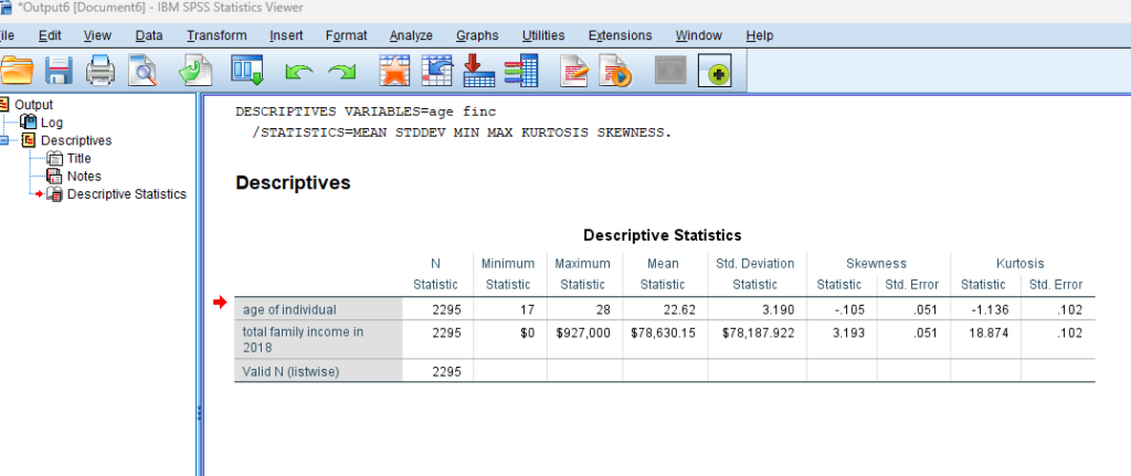
In our example, SPSS Output for Descriptive Statistics, the descriptive statistics provided describe two variables: “age of individual” and “total family income in 2018” based on a sample of 2295 individuals. Here’s an interpretation of age statistic:
Age of Individual:
- Mean : The average age of the individuals in the sample is approximately 22.62 years.
- Standard Deviation : The standard deviation of the ages is 3.190, indicating the extent of variability or dispersion around the mean.
- Skewness : The skewness is approximately -0.105. A negative skewness suggests that the distribution of ages is slightly skewed to the left, meaning there may be a longer tail on the left side of the distribution.
- Kurtosis : The kurtosis is -1.136. A negative kurtosis indicates that the distribution has lighter tails and is slightly less peaked than a normal distribution.
These descriptive statistics provide a summary of the central tendency, variability, skewness, and kurtosis for both the ages in the dataset.
How to Report Results of Descriptive Statistics in APA
Accurate reporting of descriptive statistics is crucial, especially when adhering to the guidelines of the American Psychological Association (APA). When presenting results, start with a brief description of the sample, including the total number of participants and any relevant demographics. Subsequently, report the key descriptive statistics, such as means and standard deviations, in a concise and organised manner. Ensure clarity by using appropriate tables and figures, and be mindful of APA formatting rules for statistical notation. Importantly, supplement your numerical results with brief interpretations, highlighting significant findings and their implications. By following APA guidelines, your reporting becomes not just a presentation of numbers but a narrative that communicates the story embedded within your data.
Example of Descriptive Statistics Results in APA Style

Embark on a seamless research journey with SPSSAnalysis.com , where our dedicated team provides expert data analysis assistance for students, academicians, and individuals. We ensure your research is elevated with precision. Explore our pages;
- SPSS Data Analysis Help – SPSS Helper ,
- Quantitative Analysis Help ,
- Qualitative Analysis Help ,
- SPSS Dissertation Analysis Help ,
- Dissertation Statistics Help ,
- Statistical Analysis Help ,
- Medical Data Analysis Help .
Connect with us at SPSSAnalysis.com to empower your research endeavors and achieve impactful results. Get a Free Quote Today !
Expert SPSS data analysis assistance available.
How to Do Descriptive Statistics on SPSS

Data Science is the most popular and revolutionary technology in the current scenario. The first step in every data science project is to describe, visualize and summarize the data. Those people who examine the features and attributes of data by descriptive statistics always create the best models. Descriptive statistics provide insights and numerical summaries of data that help anyone handle and understand data more efficiently. SPSS is very popular software that most statisticians use to analyze a big data set and run multiple tests. Therefore, beginners generally search for how to do descriptive statistics on SPSS. And, this blog will describe the steps to perform descriptive statistics on SPSS. Moreover, you can also hire our experts for SPSS Assignments at an affordable price.
First of all, it is necessary to understand what descriptive statistics and SPSS are.
What is Descriptive Statistics?
Table of Contents
Descriptive statistics are the descriptive coefficients that are used to summarize the given data set. This can be the representation of entire data or a sample of a population. In short, Descriptive statistics describes the features of a particular data by providing short summaries about data.
The measures of the center are the most recognized types of descriptive statistics. These measures, i.e., mean, median, and mode, are used mostly in every level of math and statistics.
Descriptive statistics is mainly used for two purposes.
- Firstly, For providing the basic information of the variables in the dataset.
- Secondly, For highlighting the possible relationships between variables.
Descriptive Statistics can represent difficult to understand insights of large data sets into small size descriptions. For instance, the GPA (Grade Point Average) of a student is the small number representing the overall performance of a student.
What is SPSS Software?
SPSS stands for Statistical Package for Social Science. It is a software package that is very useful in complex statistics data analysis. SPSS Inc. launched SPSS in 1968, which IBM later acquired in 2009.
Due to its English-like commands and simple user manual, it is widely used by marketing organizations, education researchers, government, data miners, and many others for processing and analyzing data. Most of the successful research agencies use SPSS to mine text data and analyze survey data for best results. Therefore, it is preferable to perform descriptive statistics on SPSS.
Steps to Perform Descriptive statistics on SPSS
The various Steps to calculate Descriptive statistics on SPSS are given below-
Input Data in SPSS
SPSS allows manual data insertion as well as data import from various sources. The steps to import data from excel are as follows-

- Firstly, Select ‘File’ from the menu.
- Secondly, Choose Import Data>Excel.
- Thirdly, Look for data in the file manager and click ‘Open’.
- Lastly, Select the range of cells and click ‘OK’.

After importing the data in SPSS, click on the ‘Variable View’, and this sheet will open.

SPSS allows anyone to perform changes here according to his convenience to set up the variables correctly. After making the necessary changes click on the ‘Data View’ option in the bottom corner of the screen, and this screen will appear.

Descriptive Analysis SPSS
After inserting the data in SPSS software, the next step is to perform descriptive statistics using SPSS. To calculate descriptive statistics the various steps are given below-
- Firstly, Go to the ‘Analyze’ in the top menu and select ‘Descriptive Statistics’ > ‘Explore’.

2. Now a pop-up window will appear. Click on the variable and select the blue arrow to insert the targeted variables in the ‘Dependent List’ box.

3. Thirdly, click on ‘Statistics’, tick the ‘ Descriptives ‘, and press ‘ Continue ‘.

4. Lastly, click on ‘OK’, and SPSS will produce the final results.

Steps On How To Calculate Descriptive Statistics for Variables in SPSS
Here are the steps on how to calculate descriptive statistics for variables in SPSS:
Step 1: Open Data File
Load your data file in SPSS containing the variables for which you want to calculate descriptive statistics. Go to “File” and select “Open” to load your data.
Step 2: Select Analyze
Click on the “Analyze” menu at the top, then choose “Descriptive Statistics” and finally, “Descriptives.” This opens up the Descriptives dialog box.
Step 3: Choose Variables
Select the variables from the list you want to analyze and move them to the “Variables” box. You can either double-click on the variable names or use the arrow buttons.
Step 4: Options and Statistics
In the Descriptives dialog box, you can choose additional options like calculating percentiles, quartiles, and other statistics. Click on the “Options” button to access these choices.
Step 5: Run Descriptive Analysis
Click the “OK” to run the analysis. SPSS will generate a new output window containing the descriptive statistics for the selected variables, including measures of central tendency, dispersion, and other relevant information.
Applying these simple steps lets you easily generate descriptive statistics for your variables in SPSS and learn important things about your data.
Why is SPSS best for Descriptive Statistics?
There are several software options available that can produce descriptive statistics. Now, the question is why SPSS is a good choice for performing descriptive statistics.
Some of the reasons supporting this argument are as follows-
1. Simplicity
SPSS is very easy to use for every community. Even beginners who don’t have any knowledge of coding or statistics can comfortably use SPSS.
2. Complete Numerical Analysis
SPSS provides the whole descriptive statistics analysis in numerical form.
Anyone can easily produce a measure of dispersion, i.e., standard error, variance, range, standard variance, kurtosis, and skewness. Moreover, anyone can also measure central tendency that consists of mean, median, and mode as the necessary and most popular analysis.
Furthermore, Quartile, minimum, maximum, and percentile are also possible as a measure of position.
3. Customization
SPSS provides full control over the descriptive statistic. Therefore, It is completely the choice of the user about what to display and whatnot. Anyone can easily customize it with few clicks.
4. User-Friendly Interface
SPSS offers an intuitive and user-friendly interface that streamlines the process of generating descriptive statistics. Its well-designed layout and clear options provide a seamless experience, even for those relatively new to statistical analysis. This interface minimizes the learning curve and accelerates the proficiency with which users can perform descriptive statistics, making it an attractive choice for many users.
5. Established and Widely Used
SPSS has a strong reputation and a long history of being utilized for data analysis, including descriptive statistics. Its popularity and widespread adoption in various fields, such as social sciences, business, and research, testify to its effectiveness and reliability. Many educational institutions, professionals, and researchers are familiar with SPSS, which enhances its appeal as a go-to tool for performing descriptive statistics, especially in scenarios where compatibility and familiarity are essential.
This blog has given every information about how to do descriptive statistics on SPSS. The information about why SPSS is a great choice for performing descriptive statistics is also mention. Descriptive statistics is also known as summary statistics as it summarizes the large data sets. Moreover, it helps the data analysts in understanding the data better.Therefore, newbies generally want to know the process of calculating descriptive statistics on SPSS. To help them out, we included all the steps to generate descriptive statistics on SPSS. We also provide help with spss service to help you in every SPSS difficulty.
Frequently Asked Questions
Q1. can you compare two data sets in spss.
SPSS allows you to compare two sets of data. You can employ tools like t-tests or ANOVA (Analysis of Variance) to determine if there are noteworthy differences between these sets. These tests help you understand if the variations you observe are likely due to actual differences or if they could have happened by chance.
Q2. What are the three types of variables in SPSS?
Within SPSS, variables come in three main types. Categorical variables deal with groups or labels like “yes” or “no.” Ordinal variables involve ranked values, such as survey responses with levels like “strongly disagree” to “strongly agree.” Lastly, continuous variables encompass measured quantities like height or weight, which can take any numeric value. Recognizing these variable types aids in selecting the right analyses for your data.
Related Posts

The Best Guide on the Comparison Between SPSS vs SAS

SPSS vs Stata: All You Need to Know
Want to create or adapt books like this? Learn more about how Pressbooks supports open publishing practices.
14 Quantitative analysis: Descriptive statistics
Numeric data collected in a research project can be analysed quantitatively using statistical tools in two different ways. Descriptive analysis refers to statistically describing, aggregating, and presenting the constructs of interest or associations between these constructs. Inferential analysis refers to the statistical testing of hypotheses (theory testing). In this chapter, we will examine statistical techniques used for descriptive analysis, and the next chapter will examine statistical techniques for inferential analysis. Much of today’s quantitative data analysis is conducted using software programs such as SPSS or SAS. Readers are advised to familiarise themselves with one of these programs for understanding the concepts described in this chapter.
Data preparation
In research projects, data may be collected from a variety of sources: postal surveys, interviews, pretest or posttest experimental data, observational data, and so forth. This data must be converted into a machine-readable, numeric format, such as in a spreadsheet or a text file, so that they can be analysed by computer programs like SPSS or SAS. Data preparation usually follows the following steps:
Data coding. Coding is the process of converting data into numeric format. A codebook should be created to guide the coding process. A codebook is a comprehensive document containing a detailed description of each variable in a research study, items or measures for that variable, the format of each item (numeric, text, etc.), the response scale for each item (i.e., whether it is measured on a nominal, ordinal, interval, or ratio scale, and whether this scale is a five-point, seven-point scale, etc.), and how to code each value into a numeric format. For instance, if we have a measurement item on a seven-point Likert scale with anchors ranging from ‘strongly disagree’ to ‘strongly agree’, we may code that item as 1 for strongly disagree, 4 for neutral, and 7 for strongly agree, with the intermediate anchors in between. Nominal data such as industry type can be coded in numeric form using a coding scheme such as: 1 for manufacturing, 2 for retailing, 3 for financial, 4 for healthcare, and so forth (of course, nominal data cannot be analysed statistically). Ratio scale data such as age, income, or test scores can be coded as entered by the respondent. Sometimes, data may need to be aggregated into a different form than the format used for data collection. For instance, if a survey measuring a construct such as ‘benefits of computers’ provided respondents with a checklist of benefits that they could select from, and respondents were encouraged to choose as many of those benefits as they wanted, then the total number of checked items could be used as an aggregate measure of benefits. Note that many other forms of data—such as interview transcripts—cannot be converted into a numeric format for statistical analysis. Codebooks are especially important for large complex studies involving many variables and measurement items, where the coding process is conducted by different people, to help the coding team code data in a consistent manner, and also to help others understand and interpret the coded data.
Data entry. Coded data can be entered into a spreadsheet, database, text file, or directly into a statistical program like SPSS. Most statistical programs provide a data editor for entering data. However, these programs store data in their own native format—e.g., SPSS stores data as .sav files—which makes it difficult to share that data with other statistical programs. Hence, it is often better to enter data into a spreadsheet or database where it can be reorganised as needed, shared across programs, and subsets of data can be extracted for analysis. Smaller data sets with less than 65,000 observations and 256 items can be stored in a spreadsheet created using a program such as Microsoft Excel, while larger datasets with millions of observations will require a database. Each observation can be entered as one row in the spreadsheet, and each measurement item can be represented as one column. Data should be checked for accuracy during and after entry via occasional spot checks on a set of items or observations. Furthermore, while entering data, the coder should watch out for obvious evidence of bad data, such as the respondent selecting the ‘strongly agree’ response to all items irrespective of content, including reverse-coded items. If so, such data can be entered but should be excluded from subsequent analysis.

Data transformation. Sometimes, it is necessary to transform data values before they can be meaningfully interpreted. For instance, reverse coded items—where items convey the opposite meaning of that of their underlying construct—should be reversed (e.g., in a 1-7 interval scale, 8 minus the observed value will reverse the value) before they can be compared or combined with items that are not reverse coded. Other kinds of transformations may include creating scale measures by adding individual scale items, creating a weighted index from a set of observed measures, and collapsing multiple values into fewer categories (e.g., collapsing incomes into income ranges).
Univariate analysis
Univariate analysis—or analysis of a single variable—refers to a set of statistical techniques that can describe the general properties of one variable. Univariate statistics include: frequency distribution, central tendency, and dispersion. The frequency distribution of a variable is a summary of the frequency—or percentages—of individual values or ranges of values for that variable. For instance, we can measure how many times a sample of respondents attend religious services—as a gauge of their ‘religiosity’—using a categorical scale: never, once per year, several times per year, about once a month, several times per month, several times per week, and an optional category for ‘did not answer’. If we count the number or percentage of observations within each category—except ‘did not answer’ which is really a missing value rather than a category—and display it in the form of a table, as shown in Figure 14.1, what we have is a frequency distribution. This distribution can also be depicted in the form of a bar chart, as shown on the right panel of Figure 14.1, with the horizontal axis representing each category of that variable and the vertical axis representing the frequency or percentage of observations within each category.

With very large samples, where observations are independent and random, the frequency distribution tends to follow a plot that looks like a bell-shaped curve—a smoothed bar chart of the frequency distribution—similar to that shown in Figure 14.2. Here most observations are clustered toward the centre of the range of values, with fewer and fewer observations clustered toward the extreme ends of the range. Such a curve is called a normal distribution .

Lastly, the mode is the most frequently occurring value in a distribution of values. In the previous example, the most frequently occurring value is 15, which is the mode of the above set of test scores. Note that any value that is estimated from a sample, such as mean, median, mode, or any of the later estimates are called a statistic .

Bivariate analysis
Bivariate analysis examines how two variables are related to one another. The most common bivariate statistic is the bivariate correlation —often, simply called ‘correlation’—which is a number between -1 and +1 denoting the strength of the relationship between two variables. Say that we wish to study how age is related to self-esteem in a sample of 20 respondents—i.e., as age increases, does self-esteem increase, decrease, or remain unchanged?. If self-esteem increases, then we have a positive correlation between the two variables, if self-esteem decreases, then we have a negative correlation, and if it remains the same, we have a zero correlation. To calculate the value of this correlation, consider the hypothetical dataset shown in Table 14.1.

After computing bivariate correlation, researchers are often interested in knowing whether the correlation is significant (i.e., a real one) or caused by mere chance. Answering such a question would require testing the following hypothesis:
![\[H_0:\quad r = 0 \]](https://usq.pressbooks.pub/app/uploads/quicklatex/quicklatex.com-74bb8e9e674477ba33a9eb751bfd254d_l3.png "Rendered by QuickLaTeX.com")
Social Science Research: Principles, Methods and Practices (Revised edition) Copyright © 2019 by Anol Bhattacherjee is licensed under a Creative Commons Attribution-NonCommercial-ShareAlike 4.0 International License , except where otherwise noted.
Share This Book

Statistics Made Easy
How to Calculate Descriptive Statistics for Variables in SPSS
The best way to understand a dataset is to calculate descriptive statistics for the variables within the dataset. There are three common forms of descriptive statistics:
1. Summary statistics – Numbers that summarize a variable using a single number. Examples include the mean, median, standard deviation, and range.
2. Tables – Tables can help us understand how data is distributed. One example is a frequency table, which tells us how many data values fall within certain ranges.
3. Graphs – These help us visualize data. An example would be a histogram .
This tutorial explains how to calculate descriptive statistics for variables in SPSS.
Example: Descriptive Statistics in SPSS
Suppose we have the following dataset that contains four variables for 20 students in a certain class:
- Hours spent studying
- Prep exams taken
- Current grade in the class

Here is how to calculate descriptive statistics for each of these four variables:
Summary Statistics
To calculate summary statistics for each variable, click the Analyze tab, then Descriptive Statistics , then Descriptives :

In the new window that pops up, drag each of the four variables into the box labelled Variable(s). If you’d like, you can click the Options button and select the specific descriptive statistics you’d like SPSS to calculate. Then click Continue . Then click OK .

Once you click OK , a table will appear that displays the following descriptive statistics for each variable:

Here is how to interpret the numbers in this table for the variable score :
- N: The total number of observations. In this case there are 20.
- Minimum: The minimum value for exam score. In this case it’s 68.
- Maximum: The maximum value for exam score. In this case it’s 99.
- Mean: The mean exam score. In this case it’s 82.75.
- Std. Deviation: The standard deviation in exam scores. In this case it’s 8.985.
This table allows us to quickly understand the range of each variable (using the minimum and maximum), the central location of each variable (using the mean), and how spread out the values are for each variable (using the standard deviation).
To produce a frequency table for each variable, click the Analyze tab, then Descriptive Statistics , then Frequencies .

In the new window that pops up, drag each variable into the box labelled Variable(s). Then click OK .

A frequency table for each variable will appear. For example, here’s the one for the variable hours :

The way to interpret the table is as follows:
- The first column displays each unique value for the variable hours . In this case, the unique values are 1, 2, 3, 4, 5, 6, and 16.
- The second column displays the frequency of each value. For example, the value 1 appears 1 time, the value 2 appear 4 times, and so on.
- The third column displays the percent for each value. For example, the value 1 makes up 5% of all values in the dataset. The value 2 makes up 20% of all values in the dataset, and so on.
- The last column displays the cumulative percent. For example the values 1 and 2 make up a cumulative 25% of the total dataset. The values 1, 2, and 3 make up a cumulative 60% of the dataset, and so on.
This table gives us a nice idea about the distribution of the data values for each variable.
Graphs also help us understand the distribution of data values for each variable in a dataset. One of the most popular graphs for doing so is a histogram.
To create a histogram for a given variable in a dataset, click the Graphs tab, then Chart Builder .
In the new window that pops up, choose Histogram from the “Choose from” panel. Then drag the first histogram option into the main editing window. Then drag your variable of interest onto the x-axis. We’ll use score for this example. Then click OK .

Once you click OK , a histogram will appear that displays the distribution of values for the variable score :

From the histogram we can see that the range of exam scores varies between 65 and 100, with most of the scores being between 70 and 90.
We can repeat this process to create a histogram for each of the other variables in the dataset as well.
Hey there. My name is Zach Bobbitt. I have a Master of Science degree in Applied Statistics and I’ve worked on machine learning algorithms for professional businesses in both healthcare and retail. I’m passionate about statistics, machine learning, and data visualization and I created Statology to be a resource for both students and teachers alike. My goal with this site is to help you learn statistics through using simple terms, plenty of real-world examples, and helpful illustrations.
Leave a Reply Cancel reply
Your email address will not be published. Required fields are marked *

An official website of the United States government
The .gov means it’s official. Federal government websites often end in .gov or .mil. Before sharing sensitive information, make sure you’re on a federal government site.
The site is secure. The https:// ensures that you are connecting to the official website and that any information you provide is encrypted and transmitted securely.
- Publications
- Account settings
Preview improvements coming to the PMC website in October 2024. Learn More or Try it out now .
- Advanced Search
- Journal List
- Springer Nature - PMC COVID-19 Collection
Descriptive Statistics for Summarising Data
Ray w. cooksey.
UNE Business School, University of New England, Armidale, NSW Australia
This chapter discusses and illustrates descriptive statistics . The purpose of the procedures and fundamental concepts reviewed in this chapter is quite straightforward: to facilitate the description and summarisation of data. By ‘describe’ we generally mean either the use of some pictorial or graphical representation of the data (e.g. a histogram, box plot, radar plot, stem-and-leaf display, icon plot or line graph) or the computation of an index or number designed to summarise a specific characteristic of a variable or measurement (e.g., frequency counts, measures of central tendency, variability, standard scores). Along the way, we explore the fundamental concepts of probability and the normal distribution. We seldom interpret individual data points or observations primarily because it is too difficult for the human brain to extract or identify the essential nature, patterns, or trends evident in the data, particularly if the sample is large. Rather we utilise procedures and measures which provide a general depiction of how the data are behaving. These statistical procedures are designed to identify or display specific patterns or trends in the data. What remains after their application is simply for us to interpret and tell the story.
The first broad category of statistics we discuss concerns descriptive statistics . The purpose of the procedures and fundamental concepts in this category is quite straightforward: to facilitate the description and summarisation of data. By ‘describe’ we generally mean either the use of some pictorial or graphical representation of the data or the computation of an index or number designed to summarise a specific characteristic of a variable or measurement.
We seldom interpret individual data points or observations primarily because it is too difficult for the human brain to extract or identify the essential nature, patterns, or trends evident in the data, particularly if the sample is large. Rather we utilise procedures and measures which provide a general depiction of how the data are behaving. These statistical procedures are designed to identify or display specific patterns or trends in the data. What remains after their application is simply for us to interpret and tell the story.
Reflect on the QCI research scenario and the associated data set discussed in Chap. 10.1007/978-981-15-2537-7_4. Consider the following questions that Maree might wish to address with respect to decision accuracy and speed scores:
- What was the typical level of accuracy and decision speed for inspectors in the sample? [see Procedure 5.4 – Assessing central tendency.]
- What was the most common accuracy and speed score amongst the inspectors? [see Procedure 5.4 – Assessing central tendency.]
- What was the range of accuracy and speed scores; the lowest and the highest scores? [see Procedure 5.5 – Assessing variability.]
- How frequently were different levels of inspection accuracy and speed observed? What was the shape of the distribution of inspection accuracy and speed scores? [see Procedure 5.1 – Frequency tabulation, distributions & crosstabulation.]
- What percentage of inspectors would have ‘failed’ to ‘make the cut’ assuming the industry standard for acceptable inspection accuracy and speed combined was set at 95%? [see Procedure 5.7 – Standard ( z ) scores.]
- How variable were the inspectors in their accuracy and speed scores? Were all the accuracy and speed levels relatively close to each other in magnitude or were the scores widely spread out over the range of possible test outcomes? [see Procedure 5.5 – Assessing variability.]
- What patterns might be visually detected when looking at various QCI variables singly and together as a set? [see Procedure 5.2 – Graphical methods for dispaying data, Procedure 5.3 – Multivariate graphs & displays, and Procedure 5.6 – Exploratory data analysis.]
This chapter includes discussions and illustrations of a number of procedures available for answering questions about data like those posed above. In addition, you will find discussions of two fundamental concepts, namely probability and the normal distribution ; concepts that provide building blocks for Chaps. 10.1007/978-981-15-2537-7_6 and 10.1007/978-981-15-2537-7_7.
Procedure 5.1: Frequency Tabulation, Distributions & Crosstabulation
Frequency tabulation and distributions.
Frequency tabulation serves to provide a convenient counting summary for a set of data that facilitates interpretation of various aspects of those data. Basically, frequency tabulation occurs in two stages:
- First, the scores in a set of data are rank ordered from the lowest value to the highest value.
- Second, the number of times each specific score occurs in the sample is counted. This count records the frequency of occurrence for that specific data value.
Consider the overall job satisfaction variable, jobsat , from the QCI data scenario. Performing frequency tabulation across the 112 Quality Control Inspectors on this variable using the SPSS Frequencies procedure (Allen et al. 2019 , ch. 3; George and Mallery 2019 , ch. 6) produces the frequency tabulation shown in Table 5.1 . Note that three of the inspectors in the sample did not provide a rating for jobsat thereby producing three missing values (= 2.7% of the sample of 112) and leaving 109 inspectors with valid data for the analysis.
Frequency tabulation of overall job satisfaction scores

The display of frequency tabulation is often referred to as the frequency distribution for the sample of scores. For each value of a variable, the frequency of its occurrence in the sample of data is reported. It is possible to compute various percentages and percentile values from a frequency distribution.
Table 5.1 shows the ‘Percent’ or relative frequency of each score (the percentage of the 112 inspectors obtaining each score, including those inspectors who were missing scores, which SPSS labels as ‘System’ missing). Table 5.1 also shows the ‘Valid Percent’ which is computed only for those inspectors in the sample who gave a valid or non-missing response.
Finally, it is possible to add up the ‘Valid Percent’ values, starting at the low score end of the distribution, to form the cumulative distribution or ‘Cumulative Percent’ . A cumulative distribution is useful for finding percentiles which reflect what percentage of the sample scored at a specific value or below.
We can see in Table 5.1 that 4 of the 109 valid inspectors (a ‘Valid Percent’ of 3.7%) indicated the lowest possible level of job satisfaction—a value of 1 (Very Low) – whereas 18 of the 109 valid inspectors (a ‘Valid Percent’ of 16.5%) indicated the highest possible level of job satisfaction—a value of 7 (Very High). The ‘Cumulative Percent’ number of 18.3 in the row for the job satisfaction score of 3 can be interpreted as “roughly 18% of the sample of inspectors reported a job satisfaction score of 3 or less”; that is, nearly a fifth of the sample expressed some degree of negative satisfaction with their job as a quality control inspector in their particular company.
If you have a large data set having many different scores for a particular variable, it may be more useful to tabulate frequencies on the basis of intervals of scores.
For the accuracy scores in the QCI database, you could count scores occurring in intervals such as ‘less than 75% accuracy’, ‘between 75% but less than 85% accuracy’, ‘between 85% but less than 95% accuracy’, and ‘95% accuracy or greater’, rather than counting the individual scores themselves. This would yield what is termed a ‘grouped’ frequency distribution since the data have been grouped into intervals or score classes. Producing such an analysis using SPSS would involve extra steps to create the new category or ‘grouping’ system for scores prior to conducting the frequency tabulation.
Crosstabulation
In a frequency crosstabulation , we count frequencies on the basis of two variables simultaneously rather than one; thus we have a bivariate situation.
For example, Maree might be interested in the number of male and female inspectors in the sample of 112 who obtained each jobsat score. Here there are two variables to consider: inspector’s gender and inspector’s j obsat score. Table 5.2 shows such a crosstabulation as compiled by the SPSS Crosstabs procedure (George and Mallery 2019 , ch. 8). Note that inspectors who did not report a score for jobsat and/or gender have been omitted as missing values, leaving 106 valid inspectors for the analysis.
Frequency crosstabulation of jobsat scores by gender category for the QCI data

The crosstabulation shown in Table 5.2 gives a composite picture of the distribution of satisfaction levels for male inspectors and for female inspectors. If frequencies or ‘Counts’ are added across the gender categories, we obtain the numbers in the ‘Total’ column (the percentages or relative frequencies are also shown immediately below each count) for each discrete value of jobsat (note this column of statistics differs from that in Table 5.1 because the gender variable was missing for certain inspectors). By adding down each gender column, we obtain, in the bottom row labelled ‘Total’, the number of males and the number of females that comprised the sample of 106 valid inspectors.
The totals, either across the rows or down the columns of the crosstabulation, are termed the marginal distributions of the table. These marginal distributions are equivalent to frequency tabulations for each of the variables jobsat and gender . As with frequency tabulation, various percentage measures can be computed in a crosstabulation, including the percentage of the sample associated with a specific count within either a row (‘% within jobsat ’) or a column (‘% within gender ’). You can see in Table 5.2 that 18 inspectors indicated a job satisfaction level of 7 (Very High); of these 18 inspectors reported in the ‘Total’ column, 8 (44.4%) were male and 10 (55.6%) were female. The marginal distribution for gender in the ‘Total’ row shows that 57 inspectors (53.8% of the 106 valid inspectors) were male and 49 inspectors (46.2%) were female. Of the 57 male inspectors in the sample, 8 (14.0%) indicated a job satisfaction level of 7 (Very High). Furthermore, we could generate some additional interpretive information of value by adding the ‘% within gender’ values for job satisfaction levels of 5, 6 and 7 (i.e. differing degrees of positive job satisfaction). Here we would find that 68.4% (= 24.6% + 29.8% + 14.0%) of male inspectors indicated some degree of positive job satisfaction compared to 61.2% (= 10.2% + 30.6% + 20.4%) of female inspectors.
This helps to build a picture of the possible relationship between an inspector’s gender and their level of job satisfaction (a relationship that, as we will see later, can be quantified and tested using Procedure 10.1007/978-981-15-2537-7_6#Sec14 and Procedure 10.1007/978-981-15-2537-7_7#Sec17).
It should be noted that a crosstabulation table such as that shown in Table 5.2 is often referred to as a contingency table about which more will be said later (see Procedure 10.1007/978-981-15-2537-7_7#Sec17 and Procedure 10.1007/978-981-15-2537-7_7#Sec115).
Frequency tabulation is useful for providing convenient data summaries which can aid in interpreting trends in a sample, particularly where the number of discrete values for a variable is relatively small. A cumulative percent distribution provides additional interpretive information about the relative positioning of specific scores within the overall distribution for the sample.
Crosstabulation permits the simultaneous examination of the distributions of values for two variables obtained from the same sample of observations. This examination can yield some useful information about the possible relationship between the two variables. More complex crosstabulations can be also done where the values of three or more variables are tracked in a single systematic summary. The use of frequency tabulation or cross-tabulation in conjunction with various other statistical measures, such as measures of central tendency (see Procedure 5.4 ) and measures of variability (see Procedure 5.5 ), can provide a relatively complete descriptive summary of any data set.
Disadvantages
Frequency tabulations can get messy if interval or ratio-level measures are tabulated simply because of the large number of possible data values. Grouped frequency distributions really should be used in such cases. However, certain choices, such as the size of the score interval (group size), must be made, often arbitrarily, and such choices can affect the nature of the final frequency distribution.
Additionally, percentage measures have certain problems associated with them, most notably, the potential for their misinterpretation in small samples. One should be sure to know the sample size on which percentage measures are based in order to obtain an interpretive reference point for the actual percentage values.
For example
In a sample of 10 individuals, 20% represents only two individuals whereas in a sample of 300 individuals, 20% represents 60 individuals. If all that is reported is the 20%, then the mental inference drawn by readers is likely to be that a sizeable number of individuals had a score or scores of a particular value—but what is ‘sizeable’ depends upon the total number of observations on which the percentage is based.
Where Is This Procedure Useful?
Frequency tabulation and crosstabulation are very commonly applied procedures used to summarise information from questionnaires, both in terms of tabulating various demographic characteristics (e.g. gender, age, education level, occupation) and in terms of actual responses to questions (e.g. numbers responding ‘yes’ or ‘no’ to a particular question). They can be particularly useful in helping to build up the data screening and demographic stories discussed in Chap. 10.1007/978-981-15-2537-7_4. Categorical data from observational studies can also be analysed with this technique (e.g. the number of times Suzy talks to Frank, to Billy, and to John in a study of children’s social interactions).
Certain types of experimental research designs may also be amenable to analysis by crosstabulation with a view to drawing inferences about distribution differences across the sets of categories for the two variables being tracked.
You could employ crosstabulation in conjunction with the tests described in Procedure 10.1007/978-981-15-2537-7_7#Sec17 to see if two different styles of advertising campaign differentially affect the product purchasing patterns of male and female consumers.
In the QCI database, Maree could employ crosstabulation to help her answer the question “do different types of electronic manufacturing firms ( company ) differ in terms of their tendency to employ male versus female quality control inspectors ( gender )?”
Software Procedures
Procedure 5.2: graphical methods for displaying data.
Graphical methods for displaying data include bar and pie charts, histograms and frequency polygons, line graphs and scatterplots. It is important to note that what is presented here is a small but representative sampling of the types of simple graphs one can produce to summarise and display trends in data. Generally speaking, SPSS offers the easiest facility for producing and editing graphs, but with a rather limited range of styles and types. SYSTAT, STATGRAPHICS and NCSS offer a much wider range of graphs (including graphs unique to each package), but with the drawback that it takes somewhat more effort to get the graphs in exactly the form you want.
Bar and Pie Charts
These two types of graphs are useful for summarising the frequency of occurrence of various values (or ranges of values) where the data are categorical (nominal or ordinal level of measurement).
- A bar chart uses vertical and horizontal axes to summarise the data. The vertical axis is used to represent frequency (number) of occurrence or the relative frequency (percentage) of occurrence; the horizontal axis is used to indicate the data categories of interest.
- A pie chart gives a simpler visual representation of category frequencies by cutting a circular plot into wedges or slices whose sizes are proportional to the relative frequency (percentage) of occurrence of specific data categories. Some pie charts can have a one or more slices emphasised by ‘exploding’ them out from the rest of the pie.
Consider the company variable from the QCI database. This variable depicts the types of manufacturing firms that the quality control inspectors worked for. Figure 5.1 illustrates a bar chart summarising the percentage of female inspectors in the sample coming from each type of firm. Figure 5.2 shows a pie chart representation of the same data, with an ‘exploded slice’ highlighting the percentage of female inspectors in the sample who worked for large business computer manufacturers – the lowest percentage of the five types of companies. Both graphs were produced using SPSS.

Bar chart: Percentage of female inspectors

Pie chart: Percentage of female inspectors
The pie chart was modified with an option to show the actual percentage along with the label for each category. The bar chart shows that computer manufacturing firms have relatively fewer female inspectors compared to the automotive and electrical appliance (large and small) firms. This trend is less clear from the pie chart which suggests that pie charts may be less visually interpretable when the data categories occur with rather similar frequencies. However, the ‘exploded slice’ option can help interpretation in some circumstances.
Certain software programs, such as SPSS, STATGRAPHICS, NCSS and Microsoft Excel, offer the option of generating 3-dimensional bar charts and pie charts and incorporating other ‘bells and whistles’ that can potentially add visual richness to the graphic representation of the data. However, you should generally be careful with these fancier options as they can produce distortions and create ambiguities in interpretation (e.g. see discussions in Jacoby 1997 ; Smithson 2000 ; Wilkinson 2009 ). Such distortions and ambiguities could ultimately end up providing misinformation to researchers as well as to those who read their research.
Histograms and Frequency Polygons
These two types of graphs are useful for summarising the frequency of occurrence of various values (or ranges of values) where the data are essentially continuous (interval or ratio level of measurement) in nature. Both histograms and frequency polygons use vertical and horizontal axes to summarise the data. The vertical axis is used to represent the frequency (number) of occurrence or the relative frequency (percentage) of occurrences; the horizontal axis is used for the data values or ranges of values of interest. The histogram uses bars of varying heights to depict frequency; the frequency polygon uses lines and points.
There is a visual difference between a histogram and a bar chart: the bar chart uses bars that do not physically touch, signifying the discrete and categorical nature of the data, whereas the bars in a histogram physically touch to signal the potentially continuous nature of the data.
Suppose Maree wanted to graphically summarise the distribution of speed scores for the 112 inspectors in the QCI database. Figure 5.3 (produced using NCSS) illustrates a histogram representation of this variable. Figure 5.3 also illustrates another representational device called the ‘density plot’ (the solid tracing line overlaying the histogram) which gives a smoothed impression of the overall shape of the distribution of speed scores. Figure 5.4 (produced using STATGRAPHICS) illustrates the frequency polygon representation for the same data.

Histogram of the speed variable (with density plot overlaid)

Frequency polygon plot of the speed variable
These graphs employ a grouped format where speed scores which fall within specific intervals are counted as being essentially the same score. The shape of the data distribution is reflected in these plots. Each graph tells us that the inspection speed scores are positively skewed with only a few inspectors taking very long times to make their inspection judgments and the majority of inspectors taking rather shorter amounts of time to make their decisions.
Both representations tell a similar story; the choice between them is largely a matter of personal preference. However, if the number of bars to be plotted in a histogram is potentially very large (and this is usually directly controllable in most statistical software packages), then a frequency polygon would be the preferred representation simply because the amount of visual clutter in the graph will be much reduced.
It is somewhat of an art to choose an appropriate definition for the width of the score grouping intervals (or ‘bins’ as they are often termed) to be used in the plot: choose too many and the plot may look too lumpy and the overall distributional trend may not be obvious; choose too few and the plot will be too coarse to give a useful depiction. Programs like SPSS, SYSTAT, STATGRAPHICS and NCSS are designed to choose an ‘appropriate’ number of bins to be used, but the analyst’s eye is often a better judge than any statistical rule that a software package would use.
There are several interesting variations of the histogram which can highlight key data features or facilitate interpretation of certain trends in the data. One such variation is a graph is called a dual histogram (available in SYSTAT; a variation called a ‘comparative histogram’ can be created in NCSS) – a graph that facilitates visual comparison of the frequency distributions for a specific variable for participants from two distinct groups.
Suppose Maree wanted to graphically compare the distributions of speed scores for inspectors in the two categories of education level ( educlev ) in the QCI database. Figure 5.5 shows a dual histogram (produced using SYSTAT) that accomplishes this goal. This graph still employs the grouped format where speed scores falling within particular intervals are counted as being essentially the same score. The shape of the data distribution within each group is also clearly reflected in this plot. However, the story conveyed by the dual histogram is that, while the inspection speed scores are positively skewed for inspectors in both categories of educlev, the comparison suggests that inspectors with a high school level of education (= 1) tend to take slightly longer to make their inspection decisions than do their colleagues who have a tertiary qualification (= 2).

Dual histogram of speed for the two categories of educlev
Line Graphs
The line graph is similar in style to the frequency polygon but is much more general in its potential for summarising data. In a line graph, we seldom deal with percentage or frequency data. Instead we can summarise other types of information about data such as averages or means (see Procedure 5.4 for a discussion of this measure), often for different groups of participants. Thus, one important use of the line graph is to break down scores on a specific variable according to membership in the categories of a second variable.
In the context of the QCI database, Maree might wish to summarise the average inspection accuracy scores for the inspectors from different types of manufacturing companies. Figure 5.6 was produced using SPSS and shows such a line graph.

Line graph comparison of companies in terms of average inspection accuracy
Note how the trend in performance across the different companies becomes clearer with such a visual representation. It appears that the inspectors from the Large Business Computer and PC manufacturing companies have better average inspection accuracy compared to the inspectors from the remaining three industries.
With many software packages, it is possible to further elaborate a line graph by including error or confidence intervals bars (see Procedure 10.1007/978-981-15-2537-7_8#Sec18). These give some indication of the precision with which the average level for each category in the population has been estimated (narrow bars signal a more precise estimate; wide bars signal a less precise estimate).
Figure 5.7 shows such an elaborated line graph, using 95% confidence interval bars, which can be used to help make more defensible judgments (compared to Fig. 5.6 ) about whether the companies are substantively different from each other in average inspection performance. Companies whose confidence interval bars do not overlap each other can be inferred to be substantively different in performance characteristics.

Line graph using confidence interval bars to compare accuracy across companies
The accuracy confidence interval bars for participants from the Large Business Computer manufacturing firms do not overlap those from the Large or Small Electrical Appliance manufacturers or the Automobile manufacturers.
We might conclude that quality control inspection accuracy is substantially better in the Large Business Computer manufacturing companies than in these other industries but is not substantially better than the PC manufacturing companies. We might also conclude that inspection accuracy in PC manufacturing companies is not substantially different from Small Electrical Appliance manufacturers.
Scatterplots
Scatterplots are useful in displaying the relationship between two interval- or ratio-scaled variables or measures of interest obtained on the same individuals, particularly in correlational research (see Fundamental Concept 10.1007/978-981-15-2537-7_6#Sec1 and Procedure 10.1007/978-981-15-2537-7_6#Sec4).
In a scatterplot, one variable is chosen to be represented on the horizontal axis; the second variable is represented on the vertical axis. In this type of plot, all data point pairs in the sample are graphed. The shape and tilt of the cloud of points in a scatterplot provide visual information about the strength and direction of the relationship between the two variables. A very compact elliptical cloud of points signals a strong relationship; a very loose or nearly circular cloud signals a weak or non-existent relationship. A cloud of points generally tilted upward toward the right side of the graph signals a positive relationship (higher scores on one variable associated with higher scores on the other and vice-versa). A cloud of points generally tilted downward toward the right side of the graph signals a negative relationship (higher scores on one variable associated with lower scores on the other and vice-versa).
Maree might be interested in displaying the relationship between inspection accuracy and inspection speed in the QCI database. Figure 5.8 , produced using SPSS, shows what such a scatterplot might look like. Several characteristics of the data for these two variables can be noted in Fig. 5.8 . The shape of the distribution of data points is evident. The plot has a fan-shaped characteristic to it which indicates that accuracy scores are highly variable (exhibit a very wide range of possible scores) at very fast inspection speeds but get much less variable and tend to be somewhat higher as inspection speed increases (where inspectors take longer to make their quality control decisions). Thus, there does appear to be some relationship between inspection accuracy and inspection speed (a weak positive relationship since the cloud of points tends to be very loose but tilted generally upward toward the right side of the graph – slower speeds tend to be slightly associated with higher accuracy.

Scatterplot relating inspection accuracy to inspection speed
However, it is not the case that the inspection decisions which take longest to make are necessarily the most accurate (see the labelled points for inspectors 7 and 62 in Fig. 5.8 ). Thus, Fig. 5.8 does not show a simple relationship that can be unambiguously summarised by a statement like “the longer an inspector takes to make a quality control decision, the more accurate that decision is likely to be”. The story is more complicated.
Some software packages, such as SPSS, STATGRAPHICS and SYSTAT, offer the option of using different plotting symbols or markers to represent the members of different groups so that the relationship between the two focal variables (the ones anchoring the X and Y axes) can be clarified with reference to a third categorical measure.
Maree might want to see if the relationship depicted in Fig. 5.8 changes depending upon whether the inspector was tertiary-qualified or not (this information is represented in the educlev variable of the QCI database).
Figure 5.9 shows what such a modified scatterplot might look like; the legend in the upper corner of the figure defines the marker symbols for each category of the educlev variable. Note that for both High School only-educated inspectors and Tertiary-qualified inspectors, the general fan-shaped relationship between accuracy and speed is the same. However, it appears that the distribution of points for the High School only-educated inspectors is shifted somewhat upward and toward the right of the plot suggesting that these inspectors tend to be somewhat more accurate as well as slower in their decision processes.

Scatterplot displaying accuracy vs speed conditional on educlev group
There are many other styles of graphs available, often dependent upon the specific statistical package you are using. Interestingly, NCSS and, particularly, SYSTAT and STATGRAPHICS, appear to offer the most variety in terms of types of graphs available for visually representing data. A reading of the user’s manuals for these programs (see the Useful additional readings) would expose you to the great diversity of plotting techniques available to researchers. Many of these techniques go by rather interesting names such as: Chernoff’s faces, radar plots, sunflower plots, violin plots, star plots, Fourier blobs, and dot plots.
These graphical methods provide summary techniques for visually presenting certain characteristics of a set of data. Visual representations are generally easier to understand than a tabular representation and when these plots are combined with available numerical statistics, they can give a very complete picture of a sample of data. Newer methods have become available which permit more complex representations to be depicted, opening possibilities for creatively visually representing more aspects and features of the data (leading to a style of visual data storytelling called infographics ; see, for example, McCandless 2014 ; Toseland and Toseland 2012 ). Many of these newer methods can display data patterns from multiple variables in the same graph (several of these newer graphical methods are illustrated and discussed in Procedure 5.3 ).
Graphs tend to be cumbersome and space consuming if a great many variables need to be summarised. In such cases, using numerical summary statistics (such as means or correlations) in tabular form alone will provide a more economical and efficient summary. Also, it can be very easy to give a misleading picture of data trends using graphical methods by simply choosing the ‘correct’ scaling for maximum effect or choosing a display option (such as a 3-D effect) that ‘looks’ presentable but which actually obscures a clear interpretation (see Smithson 2000 ; Wilkinson 2009 ).
Thus, you must be careful in creating and interpreting visual representations so that the influence of aesthetic choices for sake of appearance do not become more important than obtaining a faithful and valid representation of the data—a very real danger with many of today’s statistical packages where ‘default’ drawing options have been pre-programmed in. No single plot can completely summarise all possible characteristics of a sample of data. Thus, choosing a specific method of graphical display may, of necessity, force a behavioural researcher to represent certain data characteristics (such as frequency) at the expense of others (such as averages).
Virtually any research design which produces quantitative data and statistics (even to the extent of just counting the number of occurrences of several events) provides opportunities for graphical data display which may help to clarify or illustrate important data characteristics or relationships. Remember, graphical displays are communication tools just like numbers—which tool to choose depends upon the message to be conveyed. Visual representations of data are generally more useful in communicating to lay persons who are unfamiliar with statistics. Care must be taken though as these same lay people are precisely the people most likely to misinterpret a graph if it has been incorrectly drawn or scaled.
Procedure 5.3: Multivariate Graphs & Displays
Graphical methods for displaying multivariate data (i.e. many variables at once) include scatterplot matrices, radar (or spider) plots, multiplots, parallel coordinate displays, and icon plots. Multivariate graphs are useful for visualising broad trends and patterns across many variables (Cleveland 1995 ; Jacoby 1998 ). Such graphs typically sacrifice precision in representation in favour of a snapshot pictorial summary that can help you form general impressions of data patterns.
It is important to note that what is presented here is a small but reasonably representative sampling of the types of graphs one can produce to summarise and display trends in multivariate data. Generally speaking, SYSTAT offers the best facilities for producing multivariate graphs, followed by STATGRAPHICS, but with the drawback that it is somewhat tricky to get the graphs in exactly the form you want. SYSTAT also has excellent facilities for creating new forms and combinations of graphs – essentially allowing graphs to be tailor-made for a specific communication purpose. Both SPSS and NCSS offer a more limited range of multivariate graphs, generally restricted to scatterplot matrices and variations of multiplots. Microsoft Excel or STATGRAPHICS are the packages to use if radar or spider plots are desired.
Scatterplot Matrices
A scatterplot matrix is a useful multivariate graph designed to show relationships between pairs of many variables in the same display.
Figure 5.10 illustrates a scatterplot matrix, produced using SYSTAT, for the mentabil , accuracy , speed , jobsat and workcond variables in the QCI database. It is easy to see that all the scatterplot matrix does is stack all pairs of scatterplots into a format where it is easy to pick out the graph for any ‘row’ variable that intersects a column ‘variable’.

Scatterplot matrix relating mentabil , accuracy , speed , jobsat & workcond
In those plots where a ‘row’ variable intersects itself in a column of the matrix (along the so-called ‘diagonal’), SYSTAT permits a range of univariate displays to be shown. Figure 5.10 shows univariate histograms for each variable (recall Procedure 5.2 ). One obvious drawback of the scatterplot matrix is that, if many variables are to be displayed (say ten or more); the graph gets very crowded and becomes very hard to visually appreciate.
Looking at the first column of graphs in Fig. 5.10 , we can see the scatterplot relationships between mentabil and each of the other variables. We can get a visual impression that mentabil seems to be slightly negatively related to accuracy (the cloud of scatter points tends to angle downward to the right, suggesting, very slightly, that higher mentabil scores are associated with lower levels of accuracy ).
Conversely, the visual impression of the relationship between mentabil and speed is that the relationship is slightly positive (higher mentabil scores tend to be associated with higher speed scores = longer inspection times). Similar types of visual impressions can be formed for other parts of Fig. 5.10 . Notice that the histogram plots along the diagonal give a clear impression of the shape of the distribution for each variable.
Radar Plots
The radar plot (also known as a spider graph for obvious reasons) is a simple and effective device for displaying scores on many variables. Microsoft Excel offers a range of options and capabilities for producing radar plots, such as the plot shown in Fig. 5.11 . Radar plots are generally easy to interpret and provide a good visual basis for comparing plots from different individuals or groups, even if a fairly large number of variables (say, up to about 25) are being displayed. Like a clock face, variables are evenly spaced around the centre of the plot in clockwise order starting at the 12 o’clock position. Visual interpretation of a radar plot primarily relies on shape comparisons, i.e. the rise and fall of peaks and valleys along the spokes around the plot. Valleys near the centre display low scores on specific variables, peaks near the outside of the plot display high scores on specific variables. [Note that, technically, radar plots employ polar coordinates.] SYSTAT can draw graphs using polar coordinates but not as easily as Excel can, from the user’s perspective. Radar plots work best if all the variables represented are measured on the same scale (e.g. a 1 to 7 Likert-type scale or 0% to 100% scale). Individuals who are missing any scores on the variables being plotted are typically omitted.

Radar plot comparing attitude ratings for inspectors 66 and 104
The radar plot in Fig. 5.11 , produced using Excel, compares two specific inspectors, 66 and 104, on the nine attitude rating scales. Inspector 66 gave the highest rating (= 7) on the cultqual variable and inspector 104 gave the lowest rating (= 1). The plot shows that inspector 104 tended to provide very low ratings on all nine attitude variables, whereas inspector 66 tended to give very high ratings on all variables except acctrain and trainapp , where the scores were similar to those for inspector 104. Thus, in general, inspector 66 tended to show much more positive attitudes toward their workplace compared to inspector 104.
While Fig. 5.11 was generated to compare the scores for two individuals in the QCI database, it would be just as easy to produce a radar plot that compared the five types of companies in terms of their average ratings on the nine variables, as shown in Fig. 5.12 .

Radar plot comparing average attitude ratings for five types of company
Here we can form the visual impression that the five types of companies differ most in their average ratings of mgmtcomm and least in the average ratings of polsatis . Overall, the average ratings from inspectors from PC manufacturers (black diamonds with solid lines) seem to be generally the most positive as their scores lie on or near the outer ring of scores and those from Automobile manufacturers tend to be least positive on many variables (except the training-related variables).
Extrapolating from Fig. 5.12 , you may rightly conclude that including too many groups and/or too many variables in a radar plot comparison can lead to so much clutter that any visual comparison would be severely degraded. You may have to experiment with using colour-coded lines to represent different groups versus line and marker shape variations (as used in Fig. 5.12 ), because choice of coding method for groups can influence the interpretability of a radar plot.
A multiplot is simply a hybrid style of graph that can display group comparisons across a number of variables. There are a wide variety of possible multiplots one could potentially design (SYSTAT offers great capabilities with respect to multiplots). Figure 5.13 shows a multiplot comprising a side-by-side series of profile-based line graphs – one graph for each type of company in the QCI database.

Multiplot comparing profiles of average attitude ratings for five company types
The multiplot in Fig. 5.13 , produced using SYSTAT, graphs the profile of average attitude ratings for all inspectors within a specific type of company. This multiplot shows the same story as the radar plot in Fig. 5.12 , but in a different graphical format. It is still fairly clear that the average ratings from inspectors from PC manufacturers tend to be higher than for the other types of companies and the profile for inspectors from automobile manufacturers tends to be lower than for the other types of companies.
The profile for inspectors from large electrical appliance manufacturers is the flattest, meaning that their average attitude ratings were less variable than for other types of companies. Comparing the ease with which you can glean the visual impressions from Figs. 5.12 and 5.13 may lead you to prefer one style of graph over another. If you have such preferences, chances are others will also, which may mean you need to carefully consider your options when deciding how best to display data for effect.
Frequently, choice of graph is less a matter of which style is right or wrong, but more a matter of which style will suit specific purposes or convey a specific story, i.e. the choice is often strategic.
Parallel Coordinate Displays
A parallel coordinate display is useful for displaying individual scores on a range of variables, all measured using the same scale. Furthermore, such graphs can be combined side-by-side to facilitate very broad visual comparisons among groups, while retaining individual profile variability in scores. Each line in a parallel coordinate display represents one individual, e.g. an inspector.
The interpretation of a parallel coordinate display, such as the two shown in Fig. 5.14 , depends on visual impressions of the peaks and valleys (highs and lows) in the profiles as well as on the density of similar profile lines. The graph is called ‘parallel coordinate’ simply because it assumes that all variables are measured on the same scale and that scores for each variable can therefore be located along vertical axes that are parallel to each other (imagine vertical lines on Fig. 5.14 running from bottom to top for each variable on the X-axis). The main drawback of this method of data display is that only those individuals in the sample who provided legitimate scores on all of the variables being plotted (i.e. who have no missing scores) can be displayed.

Parallel coordinate displays comparing profiles of average attitude ratings for five company types
The parallel coordinate display in Fig. 5.14 , produced using SYSTAT, graphs the profile of average attitude ratings for all inspectors within two specific types of company: the left graph for inspectors from PC manufacturers and the right graph for automobile manufacturers.
There are fewer lines in each display than the number of inspectors from each type of company simply because several inspectors from each type of company were missing a rating on at least one of the nine attitude variables. The graphs show great variability in scores amongst inspectors within a company type, but there are some overall patterns evident.
For example, inspectors from automobile companies clearly and fairly uniformly rated mgmtcomm toward the low end of the scale, whereas the reverse was generally true for that variable for inspectors from PC manufacturers. Conversely, inspectors from automobile companies tend to rate acctrain and trainapp more toward the middle to high end of the scale, whereas the reverse is generally true for those variables for inspectors from PC manufacturers.
Perhaps the most creative types of multivariate displays are the so-called icon plots . SYSTAT and STATGRAPHICS offer an impressive array of different types of icon plots, including, amongst others, Chernoff’s faces, profile plots, histogram plots, star glyphs and sunray plots (Jacoby 1998 provides a detailed discussion of icon plots).
Icon plots generally use a specific visual construction to represent variables scores obtained by each individual within a sample or group. All icon plots are thus methods for displaying the response patterns for individual members of a sample, as long as those individuals are not missing any scores on the variables to be displayed (note that this is the same limitation as for radar plots and parallel coordinate displays). To illustrate icon plots, without generating too many icons to focus on, Figs. 5.15 , 5.16 , 5.17 and 5.18 present four different icon plots for QCI inspectors classified, using a new variable called BEST_WORST , as either the worst performers (= 1 where their accuracy scores were less than 70%) or the best performers (= 2 where their accuracy scores were 90% or greater).

Chernoff’s faces icon plot comparing individual attitude ratings for best and worst performing inspectors

Profile plot comparing individual attitude ratings for best and worst performing inspectors

Histogram plot comparing individual attitude ratings for best and worst performing inspectors

Sunray plot comparing individual attitude ratings for best and worst performing inspectors
The Chernoff’s faces plot gets its name from the visual icon used to represent variable scores – a cartoon-type face. This icon tries to capitalise on our natural human ability to recognise and differentiate faces. Each feature of the face is controlled by the scores on a single variable. In SYSTAT, up to 20 facial features are controllable; the first five being curvature of mouth, angle of brow, width of nose, length of nose and length of mouth (SYSTAT Software Inc., 2009 , p. 259). The theory behind Chernoff’s faces is that similar patterns of variable scores will produce similar looking faces, thereby making similarities and differences between individuals more apparent.
The profile plot and histogram plot are actually two variants of the same type of icon plot. A profile plot represents individuals’ scores for a set of variables using simplified line graphs, one per individual. The profile is scaled so that the vertical height of the peaks and valleys correspond to actual values for variables where the variables anchor the X-axis in a fashion similar to the parallel coordinate display. So, as you examine a profile from left to right across the X-axis of each graph, you are looking across the set of variables. A histogram plot represents the same information in the same way as for the profile plot but using histogram bars instead.
Figure 5.15 , produced using SYSTAT, shows a Chernoff’s faces plot for the best and worst performing inspectors using their ratings of job satisfaction, working conditions and the nine general attitude statements.
Each face is labelled with the inspector number it represents. The gaps indicate where an inspector had missing data on at least one of the variables, meaning a face could not be generated for them. The worst performers are drawn using red lines; the best using blue lines. The first variable is jobsat and this variable controls mouth curvature; the second variable is workcond and this controls angle of brow, and so on. It seems clear that there are differences in the faces between the best and worst performers with, for example, best performers tending to be more satisfied (smiling) and with higher ratings for working conditions (brow angle).
Beyond a broad visual impression, there is little in terms of precise inferences you can draw from a Chernoff’s faces plot. It really provides a visual sketch, nothing more. The fact that there is no obvious link between facial features, variables and score levels means that the Chernoff’s faces icon plot is difficult to interpret at the level of individual variables – a holistic impression of similarity and difference is what this type of plot facilitates.
Figure 5.16 produced using SYSTAT, shows a profile plot for the best and worst performing inspectors using their ratings of job satisfaction, working conditions and the nine attitude variables.
Like the Chernoff’s faces plot (Fig. 5.15 ), as you read across the rows of the plot from left to right, each plot corresponds respectively to a inspector in the sample who was either in the worst performer (red) or best performer (blue) category. The first attitude variable is jobsat and anchors the left end of each line graph; the last variable is polsatis and anchors the right end of the line graph. The remaining variables are represented in order from left to right across the X-axis of each graph. Figure 5.16 shows that these inspectors are rather different in their attitude profiles, with best performers tending to show taller profiles on the first two variables, for example.
Figure 5.17 produced using SYSTAT, shows a histogram plot for the best and worst performing inspectors based on their ratings of job satisfaction, working conditions and the nine attitude variables. This plot tells the same story as the profile plot, only using histogram bars. Some people would prefer the histogram icon plot to the profile plot because each histogram bar corresponds to one variable, making the visual linking of a specific bar to a specific variable much easier than visually linking a specific position along the profile line to a specific variable.
The sunray plot is actually a simplified adaptation of the radar plot (called a “star glyph”) used to represent scores on a set of variables for each individual within a sample or group. Remember that a radar plot basically arranges the variables around a central point like a clock face; the first variable is represented at the 12 o’clock position and the remaining variables follow around the plot in a clockwise direction.
Unlike a radar plot, while the spokes (the actual ‘star’ of the glyph’s name) of the plot are visible, no interpretive scale is evident. A variable’s score is visually represented by its distance from the central point. Thus, the star glyphs in a sunray plot are designed, like Chernoff’s faces, to provide a general visual impression, based on icon shape. A wide diameter well-rounded plot indicates an individual with high scores on all variables and a small diameter well-rounded plot vice-versa. Jagged plots represent individuals with highly variable scores across the variables. ‘Stars’ of similar size, shape and orientation represent similar individuals.
Figure 5.18 , produced using STATGRAPHICS, shows a sunray plot for the best and worst performing inspectors. An interpretation glyph is also shown in the lower right corner of Fig. 5.18 , where variables are aligned with the spokes of a star (e.g. jobsat is at the 12 o’clock position). This sunray plot could lead you to form the visual impression that the worst performing inspectors (group 1) have rather less rounded rating profiles than do the best performing inspectors (group 2) and that the jobsat and workcond spokes are generally lower for the worst performing inspectors.
Comparatively speaking, the sunray plot makes identifying similar individuals a bit easier (perhaps even easier than Chernoff’s faces) and, when ordered as STATGRAPHICS showed in Fig. 5.18 , permits easier visual comparisons between groups of individuals, but at the expense of precise knowledge about variable scores. Remember, a holistic impression is the goal pursued using a sunray plot.
Multivariate graphical methods provide summary techniques for visually presenting certain characteristics of a complex array of data on variables. Such visual representations are generally better at helping us to form holistic impressions of multivariate data rather than any sort of tabular representation or numerical index. They also allow us to compress many numerical measures into a finite representation that is generally easy to understand. Multivariate graphical displays can add interest to an otherwise dry statistical reporting of numerical data. They are designed to appeal to our pattern recognition skills, focusing our attention on features of the data such as shape, level, variability and orientation. Some multivariate graphs (e.g. radar plots, sunray plots and multiplots) are useful not only for representing score patterns for individuals but also providing summaries of score patterns across groups of individuals.
Multivariate graphs tend to get very busy-looking and are hard to interpret if a great many variables or a large number of individuals need to be displayed (imagine any of the icon plots, for a sample of 200 questionnaire participants, displayed on a A4 page – each icon would be so small that its features could not be easily distinguished, thereby defeating the purpose of the display). In such cases, using numerical summary statistics (such as averages or correlations) in tabular form alone will provide a more economical and efficient summary. Also, some multivariate displays will work better for conveying certain types of information than others.
Information about variable relationships may be better displayed using a scatterplot matrix. Information about individual similarities and difference on a set of variables may be better conveyed using a histogram or sunray plot. Multiplots may be better suited to displaying information about group differences across a set of variables. Information about the overall similarity of individual entities in a sample might best be displayed using Chernoff’s faces.
Because people differ greatly in their visual capacities and preferences, certain types of multivariate displays will work for some people and not others. Sometimes, people will not see what you see in the plots. Some plots, such as Chernoff’s faces, may not strike a reader as a serious statistical procedure and this could adversely influence how convinced they will be by the story the plot conveys. None of the multivariate displays described here provide sufficiently precise information for solid inferences or interpretations; all are designed to simply facilitate the formation of holistic visual impressions. In fact, you may have noticed that some displays (scatterplot matrices and the icon plots, for example) provide no numerical scaling information that would help make precise interpretations. If precision in summary information is desired, the types of multivariate displays discussed here would not be the best strategic choices.
Virtually any research design which produces quantitative data/statistics for multiple variables provides opportunities for multivariate graphical data display which may help to clarify or illustrate important data characteristics or relationships. Thus, for survey research involving many identically-scaled attitudinal questions, a multivariate display may be just the device needed to communicate something about patterns in the data. Multivariate graphical displays are simply specialised communication tools designed to compress a lot of information into a meaningful and efficient format for interpretation—which tool to choose depends upon the message to be conveyed.
Generally speaking, visual representations of multivariate data could prove more useful in communicating to lay persons who are unfamiliar with statistics or who prefer visual as opposed to numerical information. However, these displays would probably require some interpretive discussion so that the reader clearly understands their intent.
Procedure 5.4: Assessing Central Tendency
The three most commonly reported measures of central tendency are the mean, median and mode. Each measure reflects a specific way of defining central tendency in a distribution of scores on a variable and each has its own advantages and disadvantages.
The mean is the most widely used measure of central tendency (also called the arithmetic average). Very simply, a mean is the sum of all the scores for a specific variable in a sample divided by the number of scores used in obtaining the sum. The resulting number reflects the average score for the sample of individuals on which the scores were obtained. If one were asked to predict the score that any single individual in the sample would obtain, the best prediction, in the absence of any other relevant information, would be the sample mean. Many parametric statistical methods (such as Procedures 10.1007/978-981-15-2537-7_7#Sec22 , 10.1007/978-981-15-2537-7_7#Sec32 , 10.1007/978-981-15-2537-7_7#Sec42 and 10.1007/978-981-15-2537-7_7#Sec68) deal with sample means in one way or another. For any sample of data, there is one and only one possible value for the mean in a specific distribution. For most purposes, the mean is the preferred measure of central tendency because it utilises all the available information in a sample.
In the context of the QCI database, Maree could quite reasonably ask what inspectors scored on the average in terms of mental ability ( mentabil ), inspection accuracy ( accuracy ), inspection speed ( speed ), overall job satisfaction ( jobsat ), and perceived quality of their working conditions ( workcond ). Table 5.3 shows the mean scores for the sample of 112 quality control inspectors on each of these variables. The statistics shown in Table 5.3 were computed using the SPSS Frequencies ... procedure. Notice that the table indicates how many of the 112 inspectors had a valid score for each variable and how many were missing a score (e.g. 109 inspectors provided a valid rating for jobsat; 3 inspectors did not).
Measures of central tendency for specific QCI variables

Each mean needs to be interpreted in terms of the original units of measurement for each variable. Thus, the inspectors in the sample showed an average mental ability score of 109.84 (higher than the general population mean of 100 for the test), an average inspection accuracy of 82.14%, and an average speed for making quality control decisions of 4.48 s. Furthermore, in terms of their work context, inspectors reported an average overall job satisfaction of 4.96 (on the 7-point scale, or a level of satisfaction nearly one full scale point above the Neutral point of 4—indicating a generally positive but not strong level of job satisfaction, and an average perceived quality of work conditions of 4.21 (on the 7-point scale which is just about at the level of Stressful but Tolerable.
The mean is sensitive to the presence of extreme values, which can distort its value, giving a biased indication of central tendency. As we will see below, the median is an alternative statistic to use in such circumstances. However, it is also possible to compute what is called a trimmed mean where the mean is calculated after a certain percentage (say, 5% or 10%) of the lowest and highest scores in a distribution have been ignored (a process called ‘trimming’; see, for example, the discussion in Field 2018 , pp. 262–264). This yields a statistic less influenced by extreme scores. The drawbacks are that the decision as to what percentage to trim can be somewhat subjective and trimming necessarily sacrifices information (i.e. the extreme scores) in order to achieve a less biased measure. Some software packages, such as SPSS, SYSTAT or NCSS, can report a specific percentage trimmed mean, if that option is selected for descriptive statistics or exploratory data analysis (see Procedure 5.6 ) procedures. Comparing the original mean with a trimmed mean can provide an indication of the degree to which the original mean has been biased by extreme values.
Very simply, the median is the centre or middle score of a set of scores. By ‘centre’ or ‘middle’ is meant that 50% of the data values are smaller than or equal to the median and 50% of the data values are larger when the entire distribution of scores is rank ordered from the lowest to highest value. Thus, we can say that the median is that score in the sample which occurs at the 50th percentile. [Note that a ‘percentile’ is attached to a specific score that a specific percentage of the sample scored at or below. Thus, a score at the 25th percentile means that 25% of the sample achieved this score or a lower score.] Table 5.3 shows the 25th, 50th and 75th percentile scores for each variable – note how the 50th percentile score is exactly equal to the median in each case .
The median is reported somewhat less frequently than the mean but does have some advantages over the mean in certain circumstances. One such circumstance is when the sample of data has a few extreme values in one direction (either very large or very small relative to all other scores). In this case, the mean would be influenced (biased) to a much greater degree than would the median since all of the data are used to calculate the mean (including the extreme scores) whereas only the single centre score is needed for the median. For this reason, many nonparametric statistical procedures (such as Procedures 10.1007/978-981-15-2537-7_7#Sec27 , 10.1007/978-981-15-2537-7_7#Sec37 and 10.1007/978-981-15-2537-7_7#Sec63) focus on the median as the comparison statistic rather than on the mean.
A discrepancy between the values for the mean and median of a variable provides some insight to the degree to which the mean is being influenced by the presence of extreme data values. In a distribution where there are no extreme values on either side of the distribution (or where extreme values balance each other out on either side of the distribution, as happens in a normal distribution – see Fundamental Concept II ), the mean and the median will coincide at the same value and the mean will not be biased.
For highly skewed distributions, however, the value of the mean will be pulled toward the long tail of the distribution because that is where the extreme values lie. However, in such skewed distributions, the median will be insensitive (statisticians call this property ‘robustness’) to extreme values in the long tail. For this reason, the direction of the discrepancy between the mean and median can give a very rough indication of the direction of skew in a distribution (‘mean larger than median’ signals possible positive skewness; ‘mean smaller than median’ signals possible negative skewness). Like the mean, there is one and only one possible value for the median in a specific distribution.
In Fig. 5.19 , the left graph shows the distribution of speed scores and the right-hand graph shows the distribution of accuracy scores. The speed distribution clearly shows the mean being pulled toward the right tail of the distribution whereas the accuracy distribution shows the mean being just slightly pulled toward the left tail. The effect on the mean is stronger in the speed distribution indicating a greater biasing effect due to some very long inspection decision times.

Effects of skewness in a distribution on the values for the mean and median
If we refer to Table 5.3 , we can see that the median score for each of the five variables has also been computed. Like the mean, the median must be interpreted in the original units of measurement for the variable. We can see that for mentabil , accuracy , and workcond , the value of the median is very close to the value of the mean, suggesting that these distributions are not strongly influenced by extreme data values in either the high or low direction. However, note that the median speed was 3.89 s compared to the mean of 4.48 s, suggesting that the distribution of speed scores is positively skewed (the mean is larger than the median—refer to Fig. 5.19 ). Conversely, the median jobsat score was 5.00 whereas the mean score was 4.96 suggesting very little substantive skewness in the distribution (mean and median are nearly equal).
The mode is the simplest measure of central tendency. It is defined as the most frequently occurring score in a distribution. Put another way, it is the score that more individuals in the sample obtain than any other score. An interesting problem associated with the mode is that there may be more than one in a specific distribution. In the case where multiple modes exist, the issue becomes which value do you report? The answer is that you must report all of them. In a ‘normal’ bell-shaped distribution, there is only one mode and it is indeed at the centre of the distribution, coinciding with both the mean and the median.
Table 5.3 also shows the mode for each of the five variables. For example, more inspectors achieved a mentabil score of 111 more often than any other score and inspectors reported a jobsat rating of 6 more often than any other rating. SPSS only ever reports one mode even if several are present, so one must be careful and look at a histogram plot for each variable to make a final determination of the mode(s) for that variable.
All three measures of central tendency yield information about what is going on in the centre of a distribution of scores. The mean and median provide a single number which can summarise the central tendency in the entire distribution. The mode can yield one or multiple indices. With many measurements on individuals in a sample, it is advantageous to have single number indices which can describe the distributions in summary fashion. In a normal or near-normal distribution of sample data, the mean, the median, and the mode will all generally coincide at the one point. In this instance, all three statistics will provide approximately the same indication of central tendency. Note however that it is seldom the case that all three statistics would yield exactly the same number for any particular distribution. The mean is the most useful statistic, unless the data distribution is skewed by extreme scores, in which case the median should be reported.
While measures of central tendency are useful descriptors of distributions, summarising data using a single numerical index necessarily reduces the amount of information available about the sample. Not only do we need to know what is going on in the centre of a distribution, we also need to know what is going on around the centre of the distribution. For this reason, most social and behavioural researchers report not only measures of central tendency, but also measures of variability (see Procedure 5.5 ). The mode is the least informative of the three statistics because of its potential for producing multiple values.
Measures of central tendency are useful in almost any type of experimental design, survey or interview study, and in any observational studies where quantitative data are available and must be summarised. The decision as to whether the mean or median should be reported depends upon the nature of the data which should ideally be ascertained by visual inspection of the data distribution. Some researchers opt to report both measures routinely. Computation of means is a prelude to many parametric statistical methods (see, for example, Procedure 10.1007/978-981-15-2537-7_7#Sec22 , 10.1007/978-981-15-2537-7_7#Sec32 , 10.1007/978-981-15-2537-7_7#Sec42 , 10.1007/978-981-15-2537-7_7#Sec52 , 10.1007/978-981-15-2537-7_7#Sec68 , 10.1007/978-981-15-2537-7_7#Sec76 and 10.1007/978-981-15-2537-7_7#Sec105); comparison of medians is associated with many nonparametric statistical methods (see, for example, Procedure 10.1007/978-981-15-2537-7_7#Sec27 , 10.1007/978-981-15-2537-7_7#Sec37 , 10.1007/978-981-15-2537-7_7#Sec63 and 10.1007/978-981-15-2537-7_7#Sec81).
Procedure 5.5: Assessing Variability
There are a variety of measures of variability to choose from including the range, interquartile range, variance and standard deviation. Each measure reflects a specific way of defining variability in a distribution of scores on a variable and each has its own advantages and disadvantages. Most measures of variability are associated with a specific measure of central tendency so that researchers are now commonly expected to report both a measure of central tendency and its associated measure of variability whenever they display numerical descriptive statistics on continuous or ranked-ordered variables.
This is the simplest measure of variability for a sample of data scores. The range is merely the largest score in the sample minus the smallest score in the sample. The range is the one measure of variability not explicitly associated with any measure of central tendency. It gives a very rough indication as to the extent of spread in the scores. However, since the range uses only two of the total available scores in the sample, the rest of the scores are ignored, which means that a lot of potentially useful information is being sacrificed. There are also problems if either the highest or lowest (or both) scores are atypical or too extreme in their value (as in highly skewed distributions). When this happens, the range gives a very inflated picture of the typical variability in the scores. Thus, the range tends not be a frequently reported measure of variability.
Table 5.4 shows a set of descriptive statistics, produced by the SPSS Frequencies procedure, for the mentabil, accuracy, speed, jobsat and workcond measures in the QCI database. In the table, you will find three rows labelled ‘Range’, ‘Minimum’ and ‘Maximum’.
Measures of central tendency and variability for specific QCI variables

Using the data from these three rows, we can draw the following descriptive picture. Mentabil scores spanned a range of 50 (from a minimum score of 85 to a maximum score of 135). Speed scores had a range of 16.05 s (from 1.05 s – the fastest quality decision to 17.10 – the slowest quality decision). Accuracy scores had a range of 43 (from 57% – the least accurate inspector to 100% – the most accurate inspector). Both work context measures ( jobsat and workcond ) exhibited a range of 6 – the largest possible range given the 1 to 7 scale of measurement for these two variables.
Interquartile Range
The Interquartile Range ( IQR ) is a measure of variability that is specifically designed to be used in conjunction with the median. The IQR also takes care of the extreme data problem which typically plagues the range measure. The IQR is defined as the range that is covered by the middle 50% of scores in a distribution once the scores have been ranked in order from lowest value to highest value. It is found by locating the value in the distribution at or below which 25% of the sample scored and subtracting this number from the value in the distribution at or below which 75% of the sample scored. The IQR can also be thought of as the range one would compute after the bottom 25% of scores and the top 25% of scores in the distribution have been ‘chopped off’ (or ‘trimmed’ as statisticians call it).
The IQR gives a much more stable picture of the variability of scores and, like the median, is relatively insensitive to the biasing effects of extreme data values. Some behavioural researchers prefer to divide the IQR in half which gives a measure called the Semi-Interquartile Range ( S-IQR ) . The S-IQR can be interpreted as the distance one must travel away from the median, in either direction, to reach the value which separates the top (or bottom) 25% of scores in the distribution from the remaining 75%.
The IQR or S-IQR is typically not produced by descriptive statistics procedures by default in many computer software packages; however, it can usually be requested as an optional statistic to report or it can easily be computed by hand using percentile scores. Both the median and the IQR figure prominently in Exploratory Data Analysis, particularly in the production of boxplots (see Procedure 5.6 ).
Figure 5.20 illustrates the conceptual nature of the IQR and S-IQR compared to that of the range. Assume that 100% of data values are covered by the distribution curve in the figure. It is clear that these three measures would provide very different values for a measure of variability. Your choice would depend on your purpose. If you simply want to signal the overall span of scores between the minimum and maximum, the range is the measure of choice. But if you want to signal the variability around the median, the IQR or S-IQR would be the measure of choice.

How the range, IQR and S-IQR measures of variability conceptually differ
Note: Some behavioural researchers refer to the IQR as the hinge-spread (or H-spread ) because of its use in the production of boxplots:
- the 25th percentile data value is referred to as the ‘lower hinge’;
- the 75th percentile data value is referred to as the ‘upper hinge’; and
- their difference gives the H-spread.
Midspread is another term you may see used as a synonym for interquartile range.
Referring back to Table 5.4 , we can find statistics reported for the median and for the ‘quartiles’ (25th, 50th and 75th percentile scores) for each of the five variables of interest. The ‘quartile’ values are useful for finding the IQR or S-IQR because SPSS does not report these measures directly. The median clearly equals the 50th percentile data value in the table.
If we focus, for example, on the speed variable, we could find its IQR by subtracting the 25th percentile score of 2.19 s from the 75th percentile score of 5.71 s to give a value for the IQR of 3.52 s (the S-IQR would simply be 3.52 divided by 2 or 1.76 s). Thus, we could report that the median decision speed for inspectors was 3.89 s and that the middle 50% of inspectors showed scores spanning a range of 3.52 s. Alternatively, we could report that the median decision speed for inspectors was 3.89 s and that the middle 50% of inspectors showed scores which ranged 1.76 s either side of the median value.
Note: We could compare the ‘Minimum’ or ‘Maximum’ scores to the 25th percentile score and 75th percentile score respectively to get a feeling for whether the minimum or maximum might be considered extreme or uncharacteristic data values.
The variance uses information from every individual in the sample to assess the variability of scores relative to the sample mean. Variance assesses the average squared deviation of each score from the mean of the sample. Deviation refers to the difference between an observed score value and the mean of the sample—they are squared simply because adding them up in their naturally occurring unsquared form (where some differences are positive and others are negative) always gives a total of zero, which is useless for an index purporting to measure something.
If many scores are quite different from the mean, we would expect the variance to be large. If all the scores lie fairly close to the sample mean, we would expect a small variance. If all scores exactly equal the mean (i.e. all the scores in the sample have the same value), then we would expect the variance to be zero.
Figure 5.21 illustrates some possibilities regarding variance of a distribution of scores having a mean of 100. The very tall curve illustrates a distribution with small variance. The distribution of medium height illustrates a distribution with medium variance and the flattest distribution ia a distribution with large variance.

The concept of variance
If we had a distribution with no variance, the curve would simply be a vertical line at a score of 100 (meaning that all scores were equal to the mean). You can see that as variance increases, the tails of the distribution extend further outward and the concentration of scores around the mean decreases. You may have noticed that variance and range (as well as the IQR) will be related, since the range focuses on the difference between the ends of the two tails in the distribution and larger variances extend the tails. So, a larger variance will generally be associated with a larger range and IQR compared to a smaller variance.
It is generally difficult to descriptively interpret the variance measure in a meaningful fashion since it involves squared deviations around the sample mean. [Note: If you look back at Table 5.4 , you will see the variance listed for each of the variables (e.g. the variance of accuracy scores is 84.118), but the numbers themselves make little sense and do not relate to the original measurement scale for the variables (which, for the accuracy variable, went from 0% to 100% accuracy).] Instead, we use the variance as a steppingstone for obtaining a measure of variability that we can clearly interpret, namely the standard deviation . However, you should know that variance is an important concept in its own right simply because it provides the statistical foundation for many of the correlational procedures and statistical inference procedures described in Chaps. 10.1007/978-981-15-2537-7_6 , 10.1007/978-981-15-2537-7_7 and 10.1007/978-981-15-2537-7_8.
When considering either correlations or tests of statistical hypotheses, we frequently speak of one variable explaining or sharing variance with another (see Procedure 10.1007/978-981-15-2537-7_6#Sec27 and 10.1007/978-981-15-2537-7_7#Sec47 ). In doing so, we are invoking the concept of variance as set out here—what we are saying is that variability in the behaviour of scores on one particular variable may be associated with or predictive of variability in scores on another variable of interest (e.g. it could explain why those scores have a non-zero variance).
Standard Deviation
The standard deviation (often abbreviated as SD, sd or Std. Dev.) is the most commonly reported measure of variability because it has a meaningful interpretation and is used in conjunction with reports of sample means. Variance and standard deviation are closely related measures in that the standard deviation is found by taking the square root of the variance. The standard deviation, very simply, is a summary number that reflects the ‘average distance of each score from the mean of the sample’. In many parametric statistical methods, both the sample mean and sample standard deviation are employed in some form. Thus, the standard deviation is a very important measure, not only for data description, but also for hypothesis testing and the establishment of relationships as well.
Referring again back to Table 5.4 , we’ll focus on the results for the speed variable for discussion purposes. Table 5.4 shows that the mean inspection speed for the QCI sample was 4.48 s. We can also see that the standard deviation (in the row labelled ‘Std Deviation’) for speed was 2.89 s.
This standard deviation has a straightforward interpretation: we would say that ‘on the average, an inspector’s quality inspection decision speed differed from the mean of the sample by about 2.89 s in either direction’. In a normal distribution of scores (see Fundamental Concept II ), we would expect to see about 68% of all inspectors having decision speeds between 1.59 s (the mean minus one amount of the standard deviation) and 7.37 s (the mean plus one amount of the standard deviation).
We noted earlier that the range of the speed scores was 16.05 s. However, the fact that the maximum speed score was 17.1 s compared to the 75th percentile score of just 5.71 s seems to suggest that this maximum speed might be rather atypically large compared to the bulk of speed scores. This means that the range is likely to be giving us a false impression of the overall variability of the inspectors’ decision speeds.
Furthermore, given that the mean speed score was higher than the median speed score, suggesting that speed scores were positively skewed (this was confirmed by the histogram for speed shown in Fig. 5.19 in Procedure 5.4 ), we might consider emphasising the median and its associated IQR or S-IQR rather than the mean and standard deviation. Of course, similar diagnostic and interpretive work could be done for each of the other four variables in Table 5.4 .
Measures of variability (particularly the standard deviation) provide a summary measure that gives an indication of how variable (spread out) a particular sample of scores is. When used in conjunction with a relevant measure of central tendency (particularly the mean), a reasonable yet economical description of a set of data emerges. When there are extreme data values or severe skewness is present in the data, the IQR (or S-IQR) becomes the preferred measure of variability to be reported in conjunction with the sample median (or 50th percentile value). These latter measures are much more resistant (‘robust’) to influence by data anomalies than are the mean and standard deviation.
As mentioned above, the range is a very cursory index of variability, thus, it is not as useful as variance or standard deviation. Variance has little meaningful interpretation as a descriptive index; hence, standard deviation is most often reported. However, the standard deviation (or IQR) has little meaning if the sample mean (or median) is not reported along with it.
Knowing that the standard deviation for accuracy is 9.17 tells you little unless you know the mean accuracy (82.14) that it is the standard deviation from.
Like the sample mean, the standard deviation can be strongly biased by the presence of extreme data values or severe skewness in a distribution in which case the median and IQR (or S-IQR) become the preferred measures. The biasing effect will be most noticeable in samples which are small in size (say, less than 30 individuals) and far less noticeable in large samples (say, in excess of 200 or 300 individuals). [Note that, in a manner similar to a trimmed mean, it is possible to compute a trimmed standard deviation to reduce the biasing effect of extreme data values, see Field 2018 , p. 263.]
It is important to realise that the resistance of the median and IQR (or S-IQR) to extreme values is only gained by deliberately sacrificing a good deal of the information available in the sample (nothing is obtained without a cost in statistics). What is sacrificed is information from all other members of the sample other than those members who scored at the median and 25th and 75th percentile points on a variable of interest; information from all members of the sample would automatically be incorporated in mean and standard deviation for that variable.
Any investigation where you might report on or read about measures of central tendency on certain variables should also report measures of variability. This is particularly true for data from experiments, quasi-experiments, observational studies and questionnaires. It is important to consider measures of central tendency and measures of variability to be inextricably linked—one should never report one without the other if an adequate descriptive summary of a variable is to be communicated.
Other descriptive measures, such as those for skewness and kurtosis 1 may also be of interest if a more complete description of any variable is desired. Most good statistical packages can be instructed to report these additional descriptive measures as well.
Of all the statistics you are likely to encounter in the business, behavioural and social science research literature, means and standard deviations will dominate as measures for describing data. Additionally, these statistics will usually be reported when any parametric tests of statistical hypotheses are presented as the mean and standard deviation provide an appropriate basis for summarising and evaluating group differences.
Fundamental Concept I: Basic Concepts in Probability
The concept of simple probability.
In Procedures 5.1 and 5.2 , you encountered the idea of the frequency of occurrence of specific events such as particular scores within a sample distribution. Furthermore, it is a simple operation to convert the frequency of occurrence of a specific event into a number representing the relative frequency of that event. The relative frequency of an observed event is merely the number of times the event is observed divided by the total number of times one makes an observation. The resulting number ranges between 0 and 1 but we typically re-express this number as a percentage by multiplying it by 100%.
In the QCI database, Maree Lakota observed data from 112 quality control inspectors of which 58 were male and 51 were female (gender indications were missing for three inspectors). The statistics 58 and 51 are thus the frequencies of occurrence for two specific types of research participant, a male inspector or a female inspector.
If she divided each frequency by the total number of observations (i.e. 112), whe would obtain .52 for males and .46 for females (leaving .02 of observations with unknown gender). These statistics are relative frequencies which indicate the proportion of times that Maree obtained data from a male or female inspector. Multiplying each relative frequency by 100% would yield 52% and 46% which she could interpret as indicating that 52% of her sample was male and 46% was female (leaving 2% of the sample with unknown gender).
It does not take much of a leap in logic to move from the concept of ‘relative frequency’ to the concept of ‘probability’. In our discussion above, we focused on relative frequency as indicating the proportion or percentage of times a specific category of participant was obtained in a sample. The emphasis here is on data from a sample.
Imagine now that Maree had infinite resources and research time and was able to obtain ever larger samples of quality control inspectors for her study. She could still compute the relative frequencies for obtaining data from males and females in her sample but as her sample size grew larger and larger, she would notice these relative frequencies converging toward some fixed values.
If, by some miracle, Maree could observe all of the quality control inspectors on the planet today, she would have measured the entire population and her computations of relative frequency for males and females would yield two precise numbers, each indicating the proportion of the population of inspectors that was male and the proportion that was female.
If Maree were then to list all of these inspectors and randomly choose one from the list, the chances that she would choose a male inspector would be equal to the proportion of the population of inspectors that was male and this logic extends to choosing a female inspector. The number used to quantify this notion of ‘chances’ is called a probability. Maree would therefore have established the probability of randomly observing a male or a female inspector in the population on any specific occasion.
Probability is expressed on a 0.0 (the observation or event will certainly not be seen) to 1.0 (the observation or event will certainly be seen) scale where values close to 0.0 indicate observations that are less certain to be seen and values close to 1.0 indicate observations that are more certain to be seen (a value of .5 indicates an even chance that an observation or event will or will not be seen – a state of maximum uncertainty). Statisticians often interpret a probability as the likelihood of observing an event or type of individual in the population.
In the QCI database, we noted that the relative frequency of observing males was .52 and for females was .46. If we take these relative frequencies as estimates of the proportions of each gender in the population of inspectors, then .52 and .46 represent the probability of observing a male or female inspector, respectively.
Statisticians would state this as “the probability of observing a male quality control inspector is .52” or in a more commonly used shorthand code, the likelihood of observing a male quality control inspector is p = .52 (p for probability). For some, probabilities make more sense if they are converted to percentages (by multiplying by 100%). Thus, p = .52 can also understood as a 52% chance of observing a male quality control inspector.
We have seen that relative frequency is a sample statistic that can be used to estimate the population probability. Our estimate will get more precise as we use larger and larger samples (technically, as the size of our samples more closely approximates the size of our population). In most behavioural research, we never have access to entire populations so we must always estimate our probabilities.
In some very special populations, having a known number of fixed possible outcomes, such as results of coin tosses or rolls of a die, we can analytically establish event probabilities without doing an infinite number of observations; all we must do is assume that we have a fair coin or die. Thus, with a fair coin, the probability of observing a H or a T on any single coin toss is ½ or .5 or 50%; the probability of observing a 6 on any single throw of a die is 1/6 or .16667 or 16.667%. With behavioural data, though, we can never measure all possible behavioural outcomes, which thereby forces researchers to depend on samples of observations in order to make estimates of population values.
The concept of probability is central to much of what is done in the statistical analysis of behavioural data. Whenever a behavioural scientist wishes to establish whether a particular relationship exists between variables or whether two groups, treated differently, actually show different behaviours, he/she is playing a probability game. Given a sample of observations, the behavioural scientist must decide whether what he/she has observed is providing sufficient information to conclude something about the population from which the sample was drawn.
This decision always has a non-zero probability of being in error simply because in samples that are much smaller than the population, there is always the chance or probability that we are observing something rare and atypical instead of something which is indicative of a consistent population trend. Thus, the concept of probability forms the cornerstone for statistical inference about which we will have more to say later (see Fundamental Concept 10.1007/978-981-15-2537-7_7#Sec6). Probability also plays an important role in helping us to understand theoretical statistical distributions (e.g. the normal distribution) and what they can tell us about our observations. We will explore this idea further in Fundamental Concept II .
The Concept of Conditional Probability
It is important to understand that the concept of probability as described above focuses upon the likelihood or chances of observing a specific event or type of observation for a specific variable relative to a population or sample of observations. However, many important behavioural research issues may focus on the question of the probability of observing a specific event given that the researcher has knowledge that some other event has occurred or been observed (this latter event is usually measured by a second variable). Here, the focus is on the potential relationship or link between two variables or two events.
With respect to the QCI database, Maree could ask the quite reasonable question “what is the probability (estimated in the QCI sample by a relative frequency) of observing an inspector being female given that she knows that an inspector works for a Large Business Computer manufacturer.
To address this question, all she needs to know is:
- how many inspectors from Large Business Computer manufacturers are in the sample ( 22 ); and
- how many of those inspectors were female ( 7 ) (inspectors who were missing a score for either company or gender have been ignored here).
If she divides 7 by 22, she would obtain the probability that an inspector is female given that they work for a Large Business Computer manufacturer – that is, p = .32 .
This type of question points to the important concept of conditional probability (‘conditional’ because we are asking “what is the probability of observing one event conditional upon our knowledge of some other event”).
Continuing with the previous example, Maree would say that the conditional probability of observing a female inspector working for a Large Business Computer manufacturer is .32 or, equivalently, a 32% chance. Compare this conditional probability of p = .32 to the overall probability of observing a female inspector in the entire sample ( p = .46 as shown above).
This means that there is evidence for a connection or relationship between gender and the type of company an inspector works for. That is, the chances are lower for observing a female inspector from a Large Business Computer manufacturer than they are for simply observing a female inspector at all.
Maree therefore has evidence suggesting that females may be relatively under-represented in Large Business Computer manufacturing companies compared to the overall population. Knowing something about the company an inspector works for therefore can help us make a better prediction about their likely gender.
Suppose, however, that Maree’s conditional probability had been exactly equal to p = .46. This would mean that there was exactly the same chance of observing a female inspector working for a Large Business Computer manufacturer as there was of observing a female inspector in the general population. Here, knowing something about the company an inspector works doesn’t help Maree make any better prediction about their likely gender. This would mean that the two variables are statistically independent of each other.
A classic case of events that are statistically independent is two successive throws of a fair die: rolling a six on the first throw gives us no information for predicting how likely it will be that we would roll a six on the second throw. The conditional probability of observing a six on the second throw given that I have observed a six on the first throw is 0.16667 (= 1 divided by 6) which is the same as the simple probability of observing a six on any specific throw. This statistical independence also means that if we wanted to know what the probability of throwing two sixes on two successive throws of a fair die, we would just multiply the probabilities for each independent event (i.e., throw) together; that is, .16667 × .16667 = .02789 (this is known as the multiplication rule of probability, see, for example, Smithson 2000 , p. 114).
Finally, you should know that conditional probabilities are often asymmetric. This means that for many types of behavioural variables, reversing the conditional arrangement will change the story about the relationship. Bayesian statistics (see Fundamental Concept 10.1007/978-981-15-2537-7_7#Sec73) relies heavily upon this asymmetric relationship between conditional probabilities.
Maree has already learned that the conditional probability that an inspector is female given that they worked for a Large Business Computer manufacturer is p = .32. She could easily turn the conditional relationship around and ask what is the conditional probability that an inspector works for a Large Business Computer manufacturer given that the inspector is female?
From the QCI database, she can find that 51 inspectors in her total sample were female and of those 51, 7 worked for a Large Business Computer manufacturer. If she divided 7 by 51, she would get p = .14 (did you notice that all that changed was the number she divided by?). Thus, there is only a 14% chance of observing an inspector working for a Large Business Computer manufacturer given that the inspector is female – a rather different probability from p = .32, which tells a different story.
As you will see in Procedures 10.1007/978-981-15-2537-7_6#Sec14 and 10.1007/978-981-15-2537-7_7#Sec17, conditional relationships between categorical variables are precisely what crosstabulation contingency tables are designed to reveal.
Procedure 5.6: Exploratory Data Analysis
There are a variety of visual display methods for EDA, including stem & leaf displays, boxplots and violin plots. Each method reflects a specific way of displaying features of a distribution of scores or measurements and, of course, each has its own advantages and disadvantages. In addition, EDA displays are surprisingly flexible and can combine features in various ways to enhance the story conveyed by the plot.
Stem & Leaf Displays
The stem & leaf display is a simple data summary technique which not only rank orders the data points in a sample but presents them visually so that the shape of the data distribution is reflected. Stem & leaf displays are formed from data scores by splitting each score into two parts: the first part of each score serving as the ‘stem’, the second part as the ‘leaf’ (e.g. for 2-digit data values, the ‘stem’ is the number in the tens position; the ‘leaf’ is the number in the ones position). Each stem is then listed vertically, in ascending order, followed horizontally by all the leaves in ascending order associated with it. The resulting display thus shows all of the scores in the sample, but reorganised so that a rough idea of the shape of the distribution emerges. As well, extreme scores can be easily identified in a stem & leaf display.
Consider the accuracy and speed scores for the 112 quality control inspectors in the QCI sample. Figure 5.22 (produced by the R Commander Stem-and-leaf display … procedure) shows the stem & leaf displays for inspection accuracy (left display) and speed (right display) data.

Stem & leaf displays produced by R Commander
[The first six lines reflect information from R Commander about each display: lines 1 and 2 show the actual R command used to produce the plot (the variable name has been highlighted in bold); line 3 gives a warning indicating that inspectors with missing values (= NA in R ) on the variable have been omitted from the display; line 4 shows how the stems and leaves have been defined; line 5 indicates what a leaf unit represents in value; and line 6 indicates the total number (n) of inspectors included in the display).] In Fig. 5.22 , for the accuracy display on the left-hand side, the ‘stems’ have been split into ‘half-stems’—one (which is starred) associated with the ‘leaves’ 0 through 4 and the other associated with the ‘leaves’ 5 through 9—a strategy that gives the display better balance and visual appeal.
Notice how the left stem & leaf display conveys a fairly clear (yet sideways) picture of the shape of the distribution of accuracy scores. It has a rather symmetrical bell-shape to it with only a slight suggestion of negative skewness (toward the extreme score at the top). The right stem & leaf display clearly depicts the highly positively skewed nature of the distribution of speed scores. Importantly, we could reconstruct the entire sample of scores for each variable using its display, which means that unlike most other graphical procedures, we didn’t have to sacrifice any information to produce the visual summary.
Some programs, such as SYSTAT, embellish their stem & leaf displays by indicating in which stem or half-stem the ‘median’ (50th percentile), the ‘upper hinge score’ (75th percentile), and ‘lower hinge score’ (25th percentile) occur in the distribution (recall the discussion of interquartile range in Procedure 5.5 ). This is shown in Fig. 5.23 , produced by SYSTAT, where M and H indicate the stem locations for the median and hinge points, respectively. This stem & leaf display labels a single extreme accuracy score as an ‘outside value’ and clearly shows that this actual score was 57.

Stem & leaf display, produced by SYSTAT, of the accuracy QCI variable
Another important EDA technique is the boxplot or, as it is sometimes known, the box-and-whisker plot . This plot provides a symbolic representation that preserves less of the original nature of the data (compared to a stem & leaf display) but typically gives a better picture of the distributional characteristics. The basic boxplot, shown in Fig. 5.24 , utilises information about the median (50th percentile score) and the upper (75th percentile score) and lower (25th percentile score) hinge points in the construction of the ‘box’ portion of the graph (the ‘median’ defines the centre line in the box; the ‘upper’ and ‘lower hinge values’ define the end boundaries of the box—thus the box encompasses the middle 50% of data values).

Boxplots for the accuracy and speed QCI variables
Additionally, the boxplot utilises the IQR (recall Procedure 5.5 ) as a way of defining what are called ‘fences’ which are used to indicate score boundaries beyond which we would consider a score in a distribution to be an ‘outlier’ (or an extreme or unusual value). In SPSS, the inner fence is typically defined as 1.5 times the IQR in each direction and a ‘far’ outlier or extreme case is typically defined as 3 times the IQR in either direction (Field 2018 , p. 193). The ‘whiskers’ in a boxplot extend out to the data values which are closest to the upper and lower inner fences (in most cases, the vast majority of data values will be contained within the fences). Outliers beyond these ‘whiskers’ are then individually listed. ‘Near’ outliers are those lying just beyond the inner fences and ‘far’ outliers lie well beyond the inner fences.
Figure 5.24 shows two simple boxplots (produced using SPSS), one for the accuracy QCI variable and one for the speed QCI variable. The accuracy plot shows a median value of about 83, roughly 50% of the data fall between about 77 and 89 and there is one outlier, inspector 83, in the lower ‘tail’ of the distribution. The accuracy boxplot illustrates data that are relatively symmetrically distributed without substantial skewness. Such data will tend to have their median in the middle of the box, whiskers of roughly equal length extending out from the box and few or no outliers.
The speed plot shows a median value of about 4 s, roughly 50% of the data fall between 2 s and 6 s and there are four outliers, inspectors 7, 62, 65 and 75 (although inspectors 65 and 75 fall at the same place and are rather difficult to read), all falling in the slow speed ‘tail’ of the distribution. Inspectors 65, 75 and 7 are shown as ‘near’ outliers (open circles) whereas inspector 62 is shown as a ‘far’ outlier (asterisk). The speed boxplot illustrates data which are asymmetrically distributed because of skewness in one direction. Such data may have their median offset from the middle of the box and/or whiskers of unequal length extending out from the box and outliers in the direction of the longer whisker. In the speed boxplot, the data are clearly positively skewed (the longer whisker and extreme values are in the slow speed ‘tail’).
Boxplots are very versatile representations in that side-by-side displays for sub-groups of data within a sample can permit easy visual comparisons of groups with respect to central tendency and variability. Boxplots can also be modified to incorporate information about error bands associated with the median producing what is called a ‘notched boxplot’. This helps in the visual detection of meaningful subgroup differences, where boxplot ‘notches’ don’t overlap.
Figure 5.25 (produced using NCSS), compares the distributions of accuracy and speed scores for QCI inspectors from the five types of companies, plotted side-by-side.

Comparisons of the accuracy (regular boxplots) and speed (notched boxplots) QCI variables for different types of companies
Focus first on the left graph in Fig. 5.25 which plots the distribution of accuracy scores broken down by company using regular boxplots. This plot clearly shows the differing degree of skewness in each type of company (indicated by one or more outliers in one ‘tail’, whiskers which are not the same length and/or the median line being offset from the centre of a box), the differing variability of scores within each type of company (indicated by the overall length of each plot—box and whiskers), and the differing central tendency in each type of company (the median lines do not all fall at the same level of accuracy score). From the left graph in Fig. 5.25 , we could conclude that: inspection accuracy scores are most variable in PC and Large Electrical Appliance manufacturing companies and least variable in the Large Business Computer manufacturing companies; Large Business Computer and PC manufacturing companies have the highest median level of inspection accuracy; and inspection accuracy scores tend to be negatively skewed (many inspectors toward higher levels, relatively fewer who are poorer in inspection performance) in the Automotive manufacturing companies. One inspector, working for an Automotive manufacturing company, shows extremely poor inspection accuracy performance.
The right display compares types of companies in terms of their inspection speed scores, using’ notched’ boxplots. The notches define upper and lower error limits around each median. Aside from the very obvious positive skewness for speed scores (with a number of slow speed outliers) in every type of company (least so for Large Electrical Appliance manufacturing companies), the story conveyed by this comparison is that inspectors from Large Electrical Appliance and Automotive manufacturing companies have substantially faster median decision speeds compared to inspectors from Large Business Computer and PC manufacturing companies (i.e. their ‘notches’ do not overlap, in terms of speed scores, on the display).
Boxplots can also add interpretive value to other graphical display methods through the creation of hybrid displays. Such displays might combine a standard histogram with a boxplot along the X-axis to provide an enhanced picture of the data distribution as illustrated for the mentabil variable in Fig. 5.26 (produced using NCSS). This hybrid plot also employs a data ‘smoothing’ method called a density trace to outline an approximate overall shape for the data distribution. Any one graphical method would tell some of the story, but combined in the hybrid display, the story of a relatively symmetrical set of mentabil scores becomes quite visually compelling.

A hybrid histogram-density-boxplot of the mentabil QCI variable
Violin Plots
Violin plots are a more recent and interesting EDA innovation, implemented in the NCSS software package (Hintze 2012 ). The violin plot gets its name from the rough shape that the plots tend to take on. Violin plots are another type of hybrid plot, this time combining density traces (mirror-imaged right and left so that the plots have a sense of symmetry and visual balance) with boxplot-type information (median, IQR and upper and lower inner ‘fences’, but not outliers). The goal of the violin plot is to provide a quick visual impression of the shape, central tendency and variability of a distribution (the length of the violin conveys a sense of the overall variability whereas the width of the violin conveys a sense of the frequency of scores occurring in a specific region).
Figure 5.27 (produced using NCSS), compares the distributions of speed scores for QCI inspectors across the five types of companies, plotted side-by-side. The violin plot conveys a similar story to the boxplot comparison for speed in the right graph of Fig. 5.25 . However, notice that with the violin plot, unlike with a boxplot, you also get a sense of distributions that have ‘clumps’ of scores in specific areas. Some violin plots, like that for Automobile manufacturing companies in Fig. 5.27 , have a shape suggesting a multi-modal distribution (recall Procedure 5.4 and the discussion of the fact that a distribution may have multiple modes). The violin plot in Fig. 5.27 has also been produced to show where the median (solid line) and mean (dashed line) would fall within each violin. This facilitates two interpretations: (1) a relative comparison of central tendency across the five companies and (2) relative degree of skewness in the distribution for each company (indicated by the separation of the two lines within a violin; skewness is particularly bad for the Large Business Computer manufacturing companies).

Violin plot comparisons of the speed QCI variable for different types of companies
EDA methods (of which we have illustrated only a small subset; we have not reviewed dot density diagrams, for example) provide summary techniques for visually displaying certain characteristics of a set of data. The advantage of the EDA methods over more traditional graphing techniques such as those described in Procedure 5.2 is that as much of the original integrity of the data is maintained as possible while maximising the amount of summary information available about distributional characteristics.
Stem & leaf displays maintain the data in as close to their original form as possible whereas boxplots and violin plots provide more symbolic and flexible representations. EDA methods are best thought of as communication devices designed to facilitate quick visual impressions and they can add interest to any statistical story being conveyed about a sample of data. NCSS, SYSTAT, STATGRAPHICS and R Commander generally offer more options and flexibility in the generation of EDA displays than SPSS.
EDA methods tend to get cumbersome if a great many variables or groups need to be summarised. In such cases, using numerical summary statistics (such as means and standard deviations) will provide a more economical and efficient summary. Boxplots or violin plots are generally more space efficient summary techniques than stem & leaf displays.
Often, EDA techniques are used as data screening devices, which are typically not reported in actual write-ups of research (we will discuss data screening in more detail in Procedure 10.1007/978-981-15-2537-7_8#Sec11). This is a perfectly legitimate use for the methods although there is an argument for researchers to put these techniques to greater use in published literature.
Software packages may use different rules for constructing EDA plots which means that you might get rather different looking plots and different information from different programs (you saw some evidence of this in Figs. 5.22 and 5.23 ). It is important to understand what the programs are using as decision rules for locating fences and outliers so that you are clear on how best to interpret the resulting plot—such information is generally contained in the user’s guides or manuals for NCSS (Hintze 2012 ), SYSTAT (SYSTAT Inc. 2009a , b ), STATGRAPHICS (StatPoint Technologies Inc. 2010 ) and SPSS (Norušis 2012 ).
Virtually any research design which produces numerical measures (even to the extent of just counting the number of occurrences of several events) provides opportunities for employing EDA displays which may help to clarify data characteristics or relationships. One extremely important use of EDA methods is as data screening devices for detecting outliers and other data anomalies, such as non-normality and skewness, before proceeding to parametric statistical analyses. In some cases, EDA methods can help the researcher to decide whether parametric or nonparametric statistical tests would be best to apply to his or her data because critical data characteristics such as distributional shape and spread are directly reflected.
Procedure 5.7: Standard ( z ) Scores
In certain practical situations in behavioural research, it may be desirable to know where a specific individual’s score lies relative to all other scores in a distribution. A convenient measure is to observe how many standard deviations (see Procedure 5.5 ) above or below the sample mean a specific score lies. This measure is called a standard score or z -score . Very simply, any raw score can be converted to a z -score by subtracting the sample mean from the raw score and dividing that result by the sample’s standard deviation. z -scores can be positive or negative and their sign simply indicates whether the score lies above (+) or below (−) the mean in value. A z -score has a very simple interpretation: it measures the number of standard deviations above or below the sample mean a specific raw score lies.
In the QCI database, we have a sample mean for speed scores of 4.48 s, a standard deviation for speed scores of 2.89 s (recall Table 5.4 in Procedure 5.5 ). If we are interested in the z -score for Inspector 65’s raw speed score of 11.94 s, we would obtain a z -score of +2.58 using the method described above (subtract 4.48 from 11.94 and divide the result by 2.89). The interpretation of this number is that a raw decision speed score of 11.94 s lies about 2.9 standard deviations above the mean decision speed for the sample.
z -scores have some interesting properties. First, if one converts (statisticians would say ‘transforms’) every available raw score in a sample to z -scores, the mean of these z -scores will always be zero and the standard deviation of these z -scores will always be 1.0. These two facts about z -scores (mean = 0; standard deviation = 1) will be true no matter what sample you are dealing with and no matter what the original units of measurement are (e.g. seconds, percentages, number of widgets assembled, amount of preference for a product, attitude rating, amount of money spent). This is because transforming raw scores to z -scores automatically changes the measurement units from whatever they originally were to a new system of measurements expressed in standard deviation units.
Suppose Maree was interested in the performance statistics for the top 25% most accurate quality control inspectors in the sample. Given a sample size of 112, this would mean finding the top 28 inspectors in terms of their accuracy scores. Since Maree is interested in performance statistics, speed scores would also be of interest. Table 5.5 (generated using the SPSS Descriptives … procedure, listed using the Case Summaries … procedure and formatted for presentation using Excel) shows accuracy and speed scores for the top 28 inspectors in descending order of accuracy scores. The z -score transformation for each of these scores is also shown (last two columns) as are the type of company, education level and gender for each inspector.
Listing of the 28 (top 25%) most accurate QCI inspectors’ accuracy and speed scores as well as standard ( z ) score transformations for each score
There are three inspectors (8, 9 and 14) who scored maximum accuracy of 100%. Such accuracy converts to a z -score of +1.95. Thus 100% accuracy is 1.95 standard deviations above the sample’s mean accuracy level. Interestingly, all three inspectors worked for PC manufacturers and all three had only high school-level education. The least accurate inspector in the top 25% had a z -score for accuracy that was .75 standard deviations above the sample mean.
Interestingly, the top three inspectors in terms of accuracy had decision speeds that fell below the sample’s mean speed; inspector 8 was the fastest inspector of the three with a speed just over 1 standard deviation ( z = −1.03) below the sample mean. The slowest inspector in the top 25% was inspector 75 (case #28 in the list) with a speed z -score of +2.62; i.e., he was over two and a half standard deviations slower in making inspection decisions relative to the sample’s mean speed.
The fact that z -scores always have a common measurement scale having a mean of 0 and a standard deviation of 1.0 leads to an interesting application of standard scores. Suppose we focus on inspector number 65 (case #8 in the list) in Table 5.5 . It might be of interest to compare this inspector’s quality control performance in terms of both his decision accuracy and decision speed. Such a comparison is impossible using raw scores since the inspector’s accuracy score and speed scores are different measures which have differing means and standard deviations expressed in fundamentally different units of measurement (percentages and seconds). However, if we are willing to assume that the score distributions for both variables are approximately the same shape and that both accuracy and speed are measured with about the same level of reliability or consistency (see Procedure 10.1007/978-981-15-2537-7_8#Sec1), we can compare the inspector’s two scores by first converting them to z -scores within their own respective distributions as shown in Table 5.5 .
Inspector 65 looks rather anomalous in that he demonstrated a relatively high level of accuracy (raw score = 94%; z = +1.29) but took a very long time to make those accurate decisions (raw score = 11.94 s; z = +2.58). Contrast this with inspector 106 (case #17 in the list) who demonstrated a similar level of accuracy (raw score = 92%; z = +1.08) but took a much shorter time to make those accurate decisions (raw score = 1.70 s; z = −.96). In terms of evaluating performance, from a company perspective, we might conclude that inspector 106 is performing at an overall higher level than inspector 65 because he can achieve a very high level of accuracy but much more quickly; accurate and fast is more cost effective and efficient than accurate and slow.
Note: We should be cautious here since we know from our previous explorations of the speed variable in Procedure 5.6 , that accuracy scores look fairly symmetrical and speed scores are positively skewed, so assuming that the two variables have the same distribution shape, so that z -score comparisons are permitted, would be problematic.
You might have noticed that as you scanned down the two columns of z -scores in Table 5.5 , there was a suggestion of a pattern between the signs attached to the respective z -scores for each person. There seems to be a very slight preponderance of pairs of z -scores where the signs are reversed (12 out of 22 pairs). This observation provides some very preliminary evidence to suggest that there may be a relationship between inspection accuracy and decision speed, namely that a more accurate decision tends to be associated with a faster decision speed. Of course, this pattern would be better verified using the entire sample rather than the top 25% of inspectors. However, you may find it interesting to learn that it is precisely this sort of suggestive evidence (about agreement or disagreement between z -score signs for pairs of variable scores throughout a sample) that is captured and summarised by a single statistical indicator called a ‘correlation coefficient’ (see Fundamental Concept 10.1007/978-981-15-2537-7_6#Sec1 and Procedure 10.1007/978-981-15-2537-7_6#Sec4).
z -scores are not the only type of standard score that is commonly used. Three other types of standard scores are: stanines (standard nines), IQ scores and T-scores (not to be confused with the t -test described in Procedure 10.1007/978-981-15-2537-7_7#Sec22). These other types of scores have the advantage of producing only positive integer scores rather than positive and negative decimal scores. This makes interpretation somewhat easier for certain applications. However, you should know that almost all other types of standard scores come from a specific transformation of z -scores. This is because once you have converted raw scores into z -scores, they can then be quite readily transformed into any other system of measurement by simply multiplying a person’s z -score by the new desired standard deviation for the measure and adding to that product the new desired mean for the measure.
T-scores are simply z-scores transformed to have a mean of 50.0 and a standard deviation of 10.0; IQ scores are simply z-scores transformed to have a mean of 100 and a standard deviation of 15 (or 16 in some systems). For more information, see Fundamental Concept II .
Standard scores are useful for representing the position of each raw score within a sample distribution relative to the mean of that distribution. The unit of measurement becomes the number of standard deviations a specific score is away from the sample mean. As such, z -scores can permit cautious comparisons across samples or across different variables having vastly differing means and standard deviations within the constraints of the comparison samples having similarly shaped distributions and roughly equivalent levels of measurement reliability. z -scores also form the basis for establishing the degree of correlation between two variables. Transforming raw scores into z -scores does not change the shape of a distribution or rank ordering of individuals within that distribution. For this reason, a z -score is referred to as a linear transformation of a raw score. Interestingly, z -scores provide an important foundational element for more complex analytical procedures such as factor analysis ( Procedure 10.1007/978-981-15-2537-7_6#Sec36), cluster analysis ( Procedure 10.1007/978-981-15-2537-7_6#Sec41) and multiple regression analysis (see, for example, Procedure 10.1007/978-981-15-2537-7_6#Sec27 and 10.1007/978-981-15-2537-7_7#Sec86).
While standard scores are useful indices, they are subject to restrictions if used to compare scores across samples or across different variables. The samples must have similar distribution shapes for the comparisons to be meaningful and the measures must have similar levels of reliability in each sample. The groups used to generate the z -scores should also be similar in composition (with respect to age, gender distribution, and so on). Because z -scores are not an intuitively meaningful way of presenting scores to lay-persons, many other types of standard score schemes have been devised to improve interpretability. However, most of these schemes produce scores that run a greater risk of facilitating lay-person misinterpretations simply because their connection with z -scores is hidden or because the resulting numbers ‘look’ like a more familiar type of score which people do intuitively understand.
It is extremely rare for a T-score to exceed 100 or go below 0 because this would mean that the raw score was in excess of 5 standard deviations away from the sample mean. This unfortunately means that T-scores are often misinterpreted as percentages because they typically range between 0 and 100 and therefore ‘look’ like percentages. However, T-scores are definitely not percentages.
Finally, a common misunderstanding of z -scores is that transforming raw scores into z -scores makes them follow a normal distribution (see Fundamental Concept II ). This is not the case. The distribution of z -scores will have exactly the same shape as that for the raw scores; if the raw scores are positively skewed, then the corresponding z -scores will also be positively skewed.
z -scores are particularly useful in evaluative studies where relative performance indices are of interest. Whenever you compute a correlation coefficient ( Procedure 10.1007/978-981-15-2537-7_6#Sec4), you are implicitly transforming the two variables involved into z -scores (which equates the variables in terms of mean and standard deviation), so that only the patterning in the relationship between the variables is represented. z -scores are also useful as a preliminary step to more advanced parametric statistical methods when variables differing in scale, range and/or measurement units must be equated for means and standard deviations prior to analysis.
Fundamental Concept II: The Normal Distribution
Arguably the most fundamental distribution used in the statistical analysis of quantitative data in the behavioural and social sciences is the normal distribution (also known as the Gaussian or bell-shaped distribution ). Many behavioural phenomena, if measured on a large enough sample of people, tend to produce ‘normally distributed’ variable scores. This includes most measures of ability, performance and productivity, personality characteristics and attitudes. The normal distribution is important because it is the one form of distribution that you must assume describes the scores of a variable in the population when parametric tests of statistical inference are undertaken. The standard normal distribution is defined as having a population mean of 0.0 and a population standard deviation of 1.0. The normal distribution is also important as a means of interpreting various types of scoring systems.
Figure 5.28 displays the standard normal distribution (mean = 0; standard deviation = 1.0) and shows that there is a clear link between z -scores and the normal distribution. Statisticians have analytically calculated the probability (also expressed as percentages or percentiles) that observations will fall above or below any specific z -score in the theoretical standard normal distribution. Thus, a z -score of +1.0 in the standard normal distribution will have 84.13% (equals a probability of .8413) of observations in the population falling at or below one standard deviation above the mean and 15.87% falling above that point. A z -score of −2.0 will have 2.28% of observations falling at that point or below and 97.72% of observations falling above that point. It is clear then that, in a standard normal distribution, z -scores have a direct relationship with percentiles .

The normal (bell-shaped or Gaussian) distribution
Figure 5.28 also shows how T-scores relate to the standard normal distribution and to z -scores. The mean T-score falls at 50 and each increment or decrement of 10 T-score units means a movement of another standard deviation away from this mean of 50. Thus, a T-score of 80 corresponds to a z -score of +3.0—a score 3 standard deviations higher than the mean of 50.
Of special interest to behavioural researchers are the values for z -scores in a standard normal distribution that encompass 90% of observations ( z = ±1.645—isolating 5% of the distribution in each tail), 95% of observations ( z = ±1.96—isolating 2.5% of the distribution in each tail), and 99% of observations ( z = ±2.58—isolating 0.5% of the distribution in each tail).
Depending upon the degree of certainty required by the researcher, these bands describe regions outside of which one might define an observation as being atypical or as perhaps not belonging to a distribution being centred at a mean of 0.0. Most often, what is taken as atypical or rare in the standard normal distribution is a score at least two standard deviations away from the mean, in either direction. Why choose two standard deviations? Since in the standard normal distribution, only about 5% of observations will fall outside a band defined by z -scores of ±1.96 (rounded to 2 for simplicity), this equates to data values that are 2 standard deviations away from their mean. This can give us a defensible way to identify outliers or extreme values in a distribution.
Thinking ahead to what you will encounter in Chap. 10.1007/978-981-15-2537-7_7, this ‘banding’ logic can be extended into the world of statistics (like means and percentages) as opposed to just the world of observations. You will frequently hear researchers speak of some statistic estimating a specific value (a parameter ) in a population, plus or minus some other value.
A survey organisation might report political polling results in terms of a percentage and an error band, e.g. 59% of Australians indicated that they would vote Labour at the next federal election, plus or minus 2%.
Most commonly, this error band (±2%) is defined by possible values for the population parameter that are about two standard deviations (or two standard errors—a concept discussed further in Fundamental Concept 10.1007/978-981-15-2537-7_7#Sec14) away from the reported or estimated statistical value. In effect, the researcher is saying that on 95% of the occasions he/she would theoretically conduct his/her study, the population value estimated by the statistic being reported would fall between the limits imposed by the endpoints of the error band (the official name for this error band is a confidence interval ; see Procedure 10.1007/978-981-15-2537-7_8#Sec18). The well-understood mathematical properties of the standard normal distribution are what make such precise statements about levels of error in statistical estimates possible.
Checking for Normality
It is important to understand that transforming the raw scores for a variable to z -scores (recall Procedure 5.7 ) does not produce z -scores which follow a normal distribution; rather they will have the same distributional shape as the original scores. However, if you are willing to assume that the normal distribution is the correct reference distribution in the population, then you are justified is interpreting z -scores in light of the known characteristics of the normal distribution.
In order to justify this assumption, not only to enhance the interpretability of z -scores but more generally to enhance the integrity of parametric statistical analyses, it is helpful to actually look at the sample frequency distributions for variables (using a histogram (illustrated in Procedure 5.2 ) or a boxplot (illustrated in Procedure 5.6 ), for example), since non-normality can often be visually detected. It is important to note that in the social and behavioural sciences as well as in economics and finance, certain variables tend to be non-normal by their very nature. This includes variables that measure time taken to complete a task, achieve a goal or make decisions and variables that measure, for example, income, occurrence of rare or extreme events or organisational size. Such variables tend to be positively skewed in the population, a pattern that can often be confirmed by graphing the distribution.
If you cannot justify an assumption of ‘normality’, you may be able to force the data to be normally distributed by using what is called a ‘normalising transformation’. Such transformations will usually involve a nonlinear mathematical conversion (such as computing the logarithm, square root or reciprocal) of the raw scores. Such transformations will force the data to take on a more normal appearance so that the assumption of ‘normality’ can be reasonably justified, but at the cost of creating a new variable whose units of measurement and interpretation are more complicated. [For some non-normal variables, such as the occurrence of rare, extreme or catastrophic events (e.g. a 100-year flood or forest fire, coronavirus pandemic, the Global Financial Crisis or other type of financial crisis, man-made or natural disaster), the distributions cannot be ‘normalised’. In such cases, the researcher needs to model the distribution as it stands. For such events, extreme value theory (e.g. see Diebold et al. 2000 ) has proven very useful in recent years. This theory uses a variation of the Pareto or Weibull distribution as a reference, rather than the normal distribution, when making predictions.]
Figure 5.29 displays before and after pictures of the effects of a logarithmic transformation on the positively skewed speed variable from the QCI database. Each graph, produced using NCSS, is of the hybrid histogram-density trace-boxplot type first illustrated in Procedure 5.6 . The left graph clearly shows the strong positive skew in the speed scores and the right graph shows the result of taking the log 10 of each raw score.

Combined histogram-density trace-boxplot graphs displaying the before and after effects of a ‘normalising’ log 10 transformation of the speed variable
Notice how the long tail toward slow speed scores is pulled in toward the mean and the very short tail toward fast speed scores is extended away from the mean. The result is a more ‘normal’ appearing distribution. The assumption would then be that we could assume normality of speed scores, but only in a log 10 format (i.e. it is the log of speed scores that we assume is normally distributed in the population). In general, taking the logarithm of raw scores provides a satisfactory remedy for positively skewed distributions (but not for negatively skewed ones). Furthermore, anything we do with the transformed speed scores now has to be interpreted in units of log 10 (seconds) which is a more complex interpretation to make.
Another visual method for detecting non-normality is to graph what is called a normal Q-Q plot (the Q-Q stands for Quantile-Quantile). This plots the percentiles for the observed data against the percentiles for the standard normal distribution (see Cleveland 1995 for more detailed discussion; also see Lane 2007 , http://onlinestatbook.com/2/advanced_graphs/ q-q_plots.html) . If the pattern for the observed data follows a normal distribution, then all the points on the graph will fall approximately along a diagonal line.
Figure 5.30 shows the normal Q-Q plots for the original speed variable and the transformed log-speed variable, produced using the SPSS Explore... procedure. The diagnostic diagonal line is shown on each graph. In the left-hand plot, for speed , the plot points clearly deviate from the diagonal in a way that signals positive skewness. The right-hand plot, for log_speed, shows the plot points generally falling along the diagonal line thereby conforming much more closely to what is expected in a normal distribution.

Normal Q-Q plots for the original speed variable and the new log_speed variable
In addition to visual ways of detecting non-normality, there are also numerical ways. As highlighted in Chap. 10.1007/978-981-15-2537-7_1, there are two additional characteristics of any distribution, namely skewness (asymmetric distribution tails) and kurtosis (peakedness of the distribution). Both have an associated statistic that provides a measure of that characteristic, similar to the mean and standard deviation statistics. In a normal distribution, the values for the skewness and kurtosis statistics are both zero (skewness = 0 means a symmetric distribution; kurtosis = 0 means a mesokurtic distribution). The further away each statistic is from zero, the more the distribution deviates from a normal shape. Both the skewness statistic and the kurtosis statistic have standard errors (see Fundamental Concept 10.1007/978-981-15-2537-7_7#Sec14) associated with them (which work very much like the standard deviation, only for a statistic rather than for observations); these can be routinely computed by almost any statistical package when you request a descriptive analysis. Without going into the logic right now (this will come in Fundamental Concept 10.1007/978-981-15-2537-7_7#Sec1), a rough rule of thumb you can use to check for normality using the skewness and kurtosis statistics is to do the following:
- Prepare : Take the standard error for the statistic and multiply it by 2 (or 3 if you want to be more conservative).
- Interval : Add the result from the Prepare step to the value of the statistic and subtract the result from the value of the statistic. You will end up with two numbers, one low - one high, that define the ends of an interval (what you have just created approximates what is called a ‘confidence interval’, see Procedure 10.1007/978-981-15-2537-7_8#Sec18).
- Check : If zero falls inside of this interval (i.e. between the low and high endpoints from the Interval step), then there is likely to be no significant issue with that characteristic of the distribution. If zero falls outside of the interval (i.e. lower than the low value endpoint or higher than the high value endpoint), then you likely have an issue with non-normality with respect to that characteristic.
Visually, we saw in the left graph in Fig. 5.29 that the speed variable was highly positively skewed. What if Maree wanted to check some numbers to support this judgment? She could ask SPSS to produce the skewness and kurtosis statistics for both the original speed variable and the new log_speed variable using the Frequencies... or the Explore... procedure. Table 5.6 shows what SPSS would produce if the Frequencies ... procedure were used.
Skewness and kurtosis statistics and their standard errors for both the original speed variable and the new log_speed variable

Using the 3-step check rule described above, Maree could roughly evaluate the normality of the two variables as follows:
- skewness : [Prepare] 2 × .229 = .458 ➔ [Interval] 1.487 − .458 = 1.029 and 1.487 + .458 = 1.945 ➔ [Check] zero does not fall inside the interval bounded by 1.029 and 1.945, so there appears to be a significant problem with skewness. Since the value for the skewness statistic (1.487) is positive, this means the problem is positive skewness, confirming what the left graph in Fig. 5.29 showed.
- kurtosis : [Prepare] 2 × .455 = .91 ➔ [Interval] 3.071 − .91 = 2.161 and 3.071 + .91 = 3.981 ➔ [Check] zero does not fall in interval bounded by 2.161 and 3.981, so there appears to be a significant problem with kurtosis. Since the value for the kurtosis statistic (1.487) is positive, this means the problem is leptokurtosis—the peakedness of the distribution is too tall relative to what is expected in a normal distribution.
- skewness : [Prepare] 2 × .229 = .458 ➔ [Interval] −.050 − .458 = −.508 and −.050 + .458 = .408 ➔ [Check] zero falls within interval bounded by −.508 and .408, so there appears to be no problem with skewness. The log transform appears to have corrected the problem, confirming what the right graph in Fig. 5.29 showed.
- kurtosis : [Prepare] 2 × .455 = .91 ➔ [Interval] −.672 – .91 = −1.582 and −.672 + .91 = .238 ➔ [Check] zero falls within interval bounded by −1.582 and .238, so there appears to be no problem with kurtosis. The log transform appears to have corrected this problem as well, rendering the distribution more approximately mesokurtic (i.e. normal) in shape.
There are also more formal tests of significance (see Fundamental Concept 10.1007/978-981-15-2537-7_7#Sec1) that one can use to numerically evaluate normality, such as the Kolmogorov-Smirnov test and the Shapiro-Wilk’s test . Each of these tests, for example, can be produced by SPSS on request, via the Explore... procedure.
1 For more information, see Chap. 10.1007/978-981-15-2537-7_1 – The language of statistics .
References for Procedure 5.1
- Allen P, Bennett K, Heritage B. SPSS statistics: A practical guide. 4. South Melbourne, VIC: Cengage Learning Australia Pty; 2019. [ Google Scholar ]
- George D, Mallery P. IBM SPSS statistics 25 step by step: A simple guide and reference. 15. New York: Routledge; 2019. [ Google Scholar ]
Useful Additional Readings for Procedure 5.1
- Agresti A. Statistical methods for the social sciences. 5. Boston: Pearson; 2018. [ Google Scholar ]
- Argyrous G. Statistics for research: With a guide to SPSS. 3. London: Sage; 2011. [ Google Scholar ]
- De Vaus D. Analyzing social science data: 50 key problems in data analysis. London: Sage; 2002. [ Google Scholar ]
- Glass GV, Hopkins KD. Statistical methods in education and psychology. 3. Upper Saddle River, NJ: Pearson; 1996. [ Google Scholar ]
- Gravetter FJ, Wallnau LB. Statistics for the behavioural sciences. 10. Belmont, CA: Wadsworth Cengage; 2017. [ Google Scholar ]
- Steinberg WJ. Statistics alive. 2. Los Angeles: Sage; 2011. [ Google Scholar ]
References for Procedure 5.2
- Chang W. R graphics cookbook: Practical recipes for visualizing data. 2. Sebastopol, CA: O’Reilly Media; 2019. [ Google Scholar ]
- Jacoby WG. Statistical graphics for univariate and bivariate data. Thousand Oaks, CA: Sage; 1997. [ Google Scholar ]
- McCandless D. Knowledge is beautiful. London: William Collins; 2014. [ Google Scholar ]
- Smithson MJ. Statistics with confidence. London: Sage; 2000. [ Google Scholar ]
- Toseland M, Toseland S. Infographica: The world as you have never seen it before. London: Quercus Books; 2012. [ Google Scholar ]
- Wilkinson L. Cognitive science and graphic design. In: SYSTAT Software Inc, editor. SYSTAT 13: Graphics. Chicago, IL: SYSTAT Software Inc; 2009. pp. 1–21. [ Google Scholar ]
Useful Additional Readings for Procedure 5.2
- Field A. Discovering statistics using SPSS for windows. 5. Los Angeles: Sage; 2018. [ Google Scholar ]
- George D, Mallery P. IBM SPSS statistics 25 step by step: A simple guide and reference. 15. Boston, MA: Pearson Education; 2019. [ Google Scholar ]
- Hintze JL. NCSS 8 help system: Graphics. Kaysville, UT: Number Cruncher Statistical Systems; 2012. [ Google Scholar ]
- StatPoint Technologies, Inc . STATGRAPHICS Centurion XVI user manual. Warrenton, VA: StatPoint Technologies Inc.; 2010. [ Google Scholar ]
- SYSTAT Software Inc . SYSTAT 13: Graphics. Chicago, IL: SYSTAT Software Inc; 2009. [ Google Scholar ]
References for Procedure 5.3
- Cleveland WR. Visualizing data. Summit, NJ: Hobart Press; 1995. [ Google Scholar ]
- Jacoby WJ. Statistical graphics for visualizing multivariate data. Thousand Oaks, CA: Sage; 1998. [ Google Scholar ]
Useful Additional Readings for Procedure 5.3
- Kirk A. Data visualisation: A handbook for data driven design. Los Angeles: Sage; 2016. [ Google Scholar ]
- Knaflic CN. Storytelling with data: A data visualization guide for business professionals. Hoboken, NJ: Wiley; 2015. [ Google Scholar ]
- Tufte E. The visual display of quantitative information. 2. Cheshire, CN: Graphics Press; 2001. [ Google Scholar ]
Reference for Procedure 5.4
Useful additional readings for procedure 5.4.
- Rosenthal R, Rosnow RL. Essentials of behavioral research: Methods and data analysis. 2. New York: McGraw-Hill Inc; 1991. [ Google Scholar ]
References for Procedure 5.5
Useful additional readings for procedure 5.5.
- Gravetter FJ, Wallnau LB. Statistics for the behavioural sciences. 9. Belmont, CA: Wadsworth Cengage; 2012. [ Google Scholar ]
References for Fundamental Concept I
Useful additional readings for fundamental concept i.
- Howell DC. Statistical methods for psychology. 8. Belmont, CA: Cengage Wadsworth; 2013. [ Google Scholar ]
References for Procedure 5.6
- Norušis MJ. IBM SPSS statistics 19 guide to data analysis. Upper Saddle River, NJ: Prentice Hall; 2012. [ Google Scholar ]
- Field A. Discovering statistics using SPSS for Windows. 5. Los Angeles: Sage; 2018. [ Google Scholar ]
- Hintze JL. NCSS 8 help system: Introduction. Kaysville, UT: Number Cruncher Statistical System; 2012. [ Google Scholar ]
- SYSTAT Software Inc . SYSTAT 13: Statistics - I. Chicago, IL: SYSTAT Software Inc; 2009. [ Google Scholar ]
Useful Additional Readings for Procedure 5.6
- Hartwig F, Dearing BE. Exploratory data analysis. Beverly Hills, CA: Sage; 1979. [ Google Scholar ]
- Leinhardt G, Leinhardt L. Exploratory data analysis. In: Keeves JP, editor. Educational research, methodology, and measurement: An international handbook. 2. Oxford: Pergamon Press; 1997. pp. 519–528. [ Google Scholar ]
- Rosenthal R, Rosnow RL. Essentials of behavioral research: Methods and data analysis. 2. New York: McGraw-Hill, Inc.; 1991. [ Google Scholar ]
- Tukey JW. Exploratory data analysis. Reading, MA: Addison-Wesley Publishing; 1977. [ Google Scholar ]
- Velleman PF, Hoaglin DC. ABC’s of EDA. Boston: Duxbury Press; 1981. [ Google Scholar ]
Useful Additional Readings for Procedure 5.7
References for fundemental concept ii.
- Diebold FX, Schuermann T, Stroughair D. Pitfalls and opportunities in the use of extreme value theory in risk management. The Journal of Risk Finance. 2000; 1 (2):30–35. doi: 10.1108/eb043443. [ CrossRef ] [ Google Scholar ]
- Lane D. Online statistics education: A multimedia course of study. Houston, TX: Rice University; 2007. [ Google Scholar ]
Useful Additional Readings for Fundemental Concept II
- Keller DK. The tao of statistics: A path to understanding (with no math) Thousand Oaks, CA: Sage; 2006. [ Google Scholar ]

- school Campus Bookshelves
- menu_book Bookshelves
- perm_media Learning Objects
- login Login
- how_to_reg Request Instructor Account
- hub Instructor Commons
- Download Page (PDF)
- Download Full Book (PDF)
- Periodic Table
- Physics Constants
- Scientific Calculator
- Reference & Cite
- Tools expand_more
- Readability
selected template will load here
This action is not available.
1.14: Chapter 14 Quantitative Analysis Descriptive Statistics
- Last updated
- Save as PDF
- Page ID 84790

- William Pelz
- Herkimer College via Lumen Learning
Numeric data collected in a research project can be analyzed quantitatively using statistical tools in two different ways. Descriptive analysis refers to statistically describing, aggregating, and presenting the constructs of interest or associations between these constructs. Inferential analysis refers to the statistical testing of hypotheses (theory testing). In this chapter, we will examine statistical techniques used for descriptive analysis, and the next chapter will examine statistical techniques for inferential analysis. Much of today’s quantitative data analysis is conducted using software programs such as SPSS or SAS. Readers are advised to familiarize themselves with one of these programs for understanding the concepts described in this chapter.
Data Preparation
In research projects, data may be collected from a variety of sources: mail-in surveys, interviews, pretest or posttest experimental data, observational data, and so forth. This data must be converted into a machine -readable, numeric format, such as in a spreadsheet or a text file, so that they can be analyzed by computer programs like SPSS or SAS. Data preparation usually follows the following steps.
Data coding. Coding is the process of converting data into numeric format. A codebook should be created to guide the coding process. A codebook is a comprehensive document containing detailed description of each variable in a research study, items or measures for that variable, the format of each item (numeric, text, etc.), the response scale for each item (i.e., whether it is measured on a nominal, ordinal, interval, or ratio scale; whether such scale is a five-point, seven-point, or some other type of scale), and how to code each value into a numeric format. For instance, if we have a measurement item on a seven-point Likert scale with anchors ranging from “strongly disagree” to “strongly agree”, we may code that item as 1 for strongly disagree, 4 for neutral, and 7 for strongly agree, with the intermediate anchors in between. Nominal data such as industry type can be coded in numeric form using a coding scheme such as: 1 for manufacturing, 2 for retailing, 3 for financial, 4 for healthcare, and so forth (of course, nominal data cannot be analyzed statistically). Ratio scale data such as age, income, or test scores can be coded as entered by the respondent. Sometimes, data may need to be aggregated into a different form than the format used for data collection. For instance, for measuring a construct such as “benefits of computers,” if a survey provided respondents with a checklist of b enefits that they could select from (i.e., they could choose as many of those benefits as they wanted), then the total number of checked items can be used as an aggregate measure of benefits. Note that many other forms of data, such as interview transcripts, cannot be converted into a numeric format for statistical analysis. Coding is especially important for large complex studies involving many variables and measurement items, where the coding process is conducted by different people, to help the coding team code data in a consistent manner, and also to help others understand and interpret the coded data.
Data entry. Coded data can be entered into a spreadsheet, database, text file, or directly into a statistical program like SPSS. Most statistical programs provide a data editor for entering data. However, these programs store data in their own native format (e.g., SPSS stores data as .sav files), which makes it difficult to share that data with other statistical programs. Hence, it is often better to enter data into a spreadsheet or database, where they can be reorganized as needed, shared across programs, and subsets of data can be extracted for analysis. Smaller data sets with less than 65,000 observations and 256 items can be stored in a spreadsheet such as Microsoft Excel, while larger dataset with millions of observations will require a database. Each observation can be entered as one row in the spreadsheet and each measurement item can be represented as one column. The entered data should be frequently checked for accuracy, via occasional spot checks on a set of items or observations, during and after entry. Furthermore, while entering data, the coder should watch out for obvious evidence of bad data, such as the respondent selecting the “strongly agree” response to all items irrespective of content, including reverse-coded items. If so, such data can be entered but should be excluded from subsequent analysis.
Missing values. Missing data is an inevitable part of any empirical data set. Respondents may not answer certain questions if they are ambiguously worded or too sensitive. Such problems should be detected earlier during pretests and corrected before the main data collection process begins. During data entry, some statistical programs automatically treat blank entries as missing values, while others require a specific numeric value such as -1 or 999 to be entered to denote a missing value. During data analysis, the default mode of handling missing values in most software programs is to simply drop the entire observation containing even a single missing value, in a technique called listwise deletion . Such deletion can significantly shrink the sample size and make it extremely difficult to detect small effects. Hence, some software programs allow the option of replacing missing values with an estimated value via a process called imputation . For instance, if the missing value is one item in a multi-item scale, the imputed value may be the average of the respondent’s responses to remaining items on that scale. If the missing value belongs to a single-item scale, many researchers use the average of other respondent’s responses to that item as the imputed value. Such imputation may be biased if the missing value is of a systematic nature rather than a random nature. Two methods that can produce relatively unbiased estimates for imputation are the maximum likelihood procedures and multiple imputation methods, both of which are supported in popular software programs such as SPSS and SAS.
Data transformation. Sometimes, it is necessary to transform data values before they can be meaningfully interpreted. For instance, reverse coded items, where items convey the opposite meaning of that of their underlying construct, should be reversed (e.g., in a 1-7 interval scale, 8 minus the observed value will reverse the value) before they can be compared or combined with items that are not reverse coded. Other kinds of transformations may include creating scale measures by adding individual scale items, creating a weighted index from a set of observed measures, and collapsing multiple values into fewer categories (e.g., collapsing incomes into income ranges).
Univariate Analysis
Univariate analysis, or analysis of a single variable, refers to a set of statistical techniques that can describe the general properties of one variable. Univariate statistics include: (1) frequency distribution, (2) central tendency, and (3) dispersion. The frequency distribution of a variable is a summary of the frequency (or percentages) of individual values or ranges of values for that variable. For instance, we can measure how many times a sample of respondents attend religious services (as a measure of their “religiosity”) using a categorical scale: never, once per year, several times per year, about once a month, several times per month, several times per week, and an optional category for “did not answer.” If we count the number (or percentage) of observations within each category (except “did not answer” which is really a missing value rather than a category), and display it in the form of a table as shown in Figure 14.1, what we have is a frequency distribution. This distribution can also be depicted in the form of a bar chart, as shown on the right panel of Figure 14.1, with the horizontal axis representing each category of that variable and the vertical axis representing the frequency or percentage of observations within each category.

- Building Guide
- Departments
- Directions & Parking
- Faculty & Staff
- Give to University Libraries
- Library Instructional Spaces
- Mission & Vision
- Newsletters
- Circulation
- Course Reserves / Core Textbooks
- Equipment for Checkout
- Interlibrary Loan
- Library Instruction
- Library Tutorials
- My Library Account
- Open Access Kent State
- Research Support Services
- Statistical Consulting
- Student Multimedia Studio
- Citation Tools
- Databases A-to-Z
- Databases By Subject
- Digital Collections
- Discovery@Kent State
- Government Information
- Journal Finder
- Library Guides
- Connect from Off-Campus
- Library Workshops
- Subject Librarians Directory
- Suggestions/Feedback
- Writing Commons
- Academic Integrity
- Jobs for Students
- International Students
- Meet with a Librarian
- Study Spaces
- University Libraries Student Scholarship
- Affordable Course Materials
- Copyright Services
- Selection Manager
- Suggest a Purchase
Library Locations at the Kent Campus
- Architecture Library
- Fashion Library
- Map Library
- Performing Arts Library
- Special Collections and Archives
Regional Campus Libraries
- East Liverpool
- College of Podiatric Medicine
- Kent State University
- SPSS Tutorials
- Descriptive Stats for Many Numeric Variables (Descriptives)
SPSS Tutorials: Descriptive Stats for Many Numeric Variables (Descriptives)
- The SPSS Environment
- The Data View Window
- Using SPSS Syntax
- Data Creation in SPSS
- Importing Data into SPSS
- Variable Types
- Date-Time Variables in SPSS
- Defining Variables
- Creating a Codebook
- Computing Variables
- Recoding Variables
- Recoding String Variables (Automatic Recode)
- Weighting Cases
- rank transform converts a set of data values by ordering them from smallest to largest, and then assigning a rank to each value. In SPSS, the Rank Cases procedure can be used to compute the rank transform of a variable." href="https://libguides.library.kent.edu/SPSS/RankCases" style="" >Rank Cases
- Sorting Data
- Grouping Data
- Descriptive Stats for One Numeric Variable (Explore)
- Descriptive Stats for One Numeric Variable (Frequencies)
- Descriptive Stats by Group (Compare Means)
- Frequency Tables
- Working with "Check All That Apply" Survey Data (Multiple Response Sets)
- Chi-Square Test of Independence
- Pearson Correlation
- One Sample t Test
- Paired Samples t Test
- Independent Samples t Test
- One-Way ANOVA
- How to Cite the Tutorials
Sample Data Files
Our tutorials reference a dataset called "sample" in many examples. If you'd like to download the sample dataset to work through the examples, choose one of the files below:
- Data definitions (*.pdf)
- Data - Comma delimited (*.csv)
- Data - Tab delimited (*.txt)
- Data - Excel format (*.xlsx)
- Data - SAS format (*.sas7bdat)
- Data - SPSS format (*.sav)
- SPSS Syntax (*.sps) Syntax to add variable labels, value labels, set variable types, and compute several recoded variables used in later tutorials.
- SAS Syntax (*.sas) Syntax to read the CSV-format sample data and set variable labels and formats/value labels.
Introduction
When summarizing quantitative (continuous/interval/ratio) variables, we are typically interested in questions like:
- What is the "center" of the data? (Mean, median)
- How spread out is the data? (Standard deviation/variance)
- What are the extremes of the data? (Minimum, maximum; Outliers)
- What is the "shape" of the distribution? Is it symmetric or asymmetric? Are the values mostly clustered about the mean, or are there many values in the "tails" of the distribution? (Skewness, kurtosis)
In SPSS, the Descriptives procedure computes a select set of basic descriptive statistics for one or more continuous numeric variables. In all, the statistics it can produce are:
- N valid responses
- Standard deviation
- Standard error of the mean (or S.E. mean )
Additionally, the Descriptives procedure can optionally compute Z scores as new variables in your dataset.
Notice that the Descriptives procedure can't compute medians or quartiles. If you need those statistics, you'll need to use the Frequencies , Explore , or Compare Means procedures. The Descriptives procedure is best used when you want to compare the descriptive statistics of several numeric variables side-by-side.
Descriptives
To run the Descriptives procedure, select Analyze > Descriptive Statistics > Descriptives .
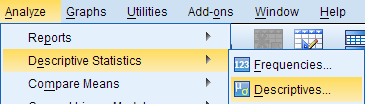
The Descriptives window lists all of the variables in your dataset in the left column. To select variables for analysis, click on the variable name to highlight it, then click on the arrow button to move the variable to the column on the right. Alternatively, you can double-click on the name of a variable to move it to the column on the right.

Selecting the Save standardized values as variables check box will compute new variables containing the standardized values (also known as Z scores ) of each of the input variables. Recall that the standardized value of a variable is computed by subtracting its mean and then dividing that difference by the standard deviation:
$$ Z = \frac{X - \mu}{\sigma} $$
By default, the Descriptives procedure computes the mean, standard deviation, minimum, and maximum of the variable. Clicking Options will allow you to disable any of the aforementioned statistics, or enable sum, variance, range, standard error of the mean (S.E. mean), kurtosis, and skewness. You can also choose how you want the output to be organized:
- Variable list will print the variables in the same order that they are specified in the Descriptives window.
- Alphabetically will arrange the variables in alphabetical order.
- Ascending means will order the output so that the variables with the smallest means are first and the variables with the largest means last.
- Descending means will order the output so that the variables with the largest means are first and the variables with the smallest means are last.

The Descriptives dialog window will let you enter any numeric variables in your dataset -- including nominal and ordinal variables. Means and standard deviations are not appropriate or meaningful for nominal and ordinal variables. Make sure that you understand how your variables are coded and what they represent before you start your analysis.
Example: Comparing average test scores side-by-side
Problem statement.
The sample dataset has test scores (out of 100) on four placement tests: English, Reading, Math, and Writing. We want to compare the summary statistics of these four tests so we can determine which tests the students tended to do the best and the worst on.
Running the Procedure
Using the descriptives dialog window.
- Click Analyze > Descriptive Statistics > Descriptives .
- Double click on the variables English , Reading , Math , and Writing in the left column to move them to the Variables box.
- Click OK when finished.
Using Syntax
Here we see a side-by-side comparison of the descriptive statistics for the four numeric variables. This allows us to quickly make the following observations about the data:
- Some students were missing scores for the English test.
- The maximum scores observed on the English and the Reading tests exceed 100 points, which was supposed to be the maximum possible score. This could indicate a problem with data entry, or could indicate an issue with the scoring method. Before proceeding with any other data analysis, we would need to resolve the issues with these measurements.
- The minimum Math score was far lower than the minimum scores for the other sections of the test.
- The averages of the English and Reading scores were very close.
- Math had the lowest average score of the four sections, but the highest standard deviation in scores.
Example: Computing and Interpreting Z-Scores
Recall that a Z score for an observation of some variable X is computed as
$$ Z_i = \frac{X_i - \mu}{\sigma} $$
x i is the i th observed value of X μ is the population mean of X σ is the population standard deviation of X Z i is the computed z-score corresponding to x i .
Stated another way, a Z score is simply an observation that has been centered about its mean and scaled to its standard deviation. The end result is a standardized version of the variable, whose units are now in terms of "standard deviation units". (A Z score of 1 means that it is one standard deviation above the mean; a Z score of -1 means that it is one standard deviation below the mean.)
In SPSS, you can compute standardized scores for numeric variables automatically using the Descriptives procedure. One important distinction is that the standardized values of the "raw" scores will be centered about their sample means and scaled (divided by) their sample standard deviations; that is:
$$ z = \frac{x - \bar{x}}{s} $$
- Add the variables English , Reading , Math , and Writing to the Variables box.
- Check the box Save standardized values as variables .
If the computation is successful, then the syntax will be printed in the Output window, and new variables called ZEnglish , ZReading , ZMath , and ZWriting will be added to the Data View.
If you want to compute Z scores for a variable using a known population mean and population standard deviation, use the Compute Variables procedure instead, and enter the Z score formula using the desired population mean and standard deviation values in the expression.
- << Previous: Descriptive Stats for One Numeric Variable (Frequencies)
- Next: Descriptive Stats by Group (Compare Means) >>
- Last Updated: Apr 10, 2024 4:50 PM
- URL: https://libguides.library.kent.edu/SPSS
Street Address
Mailing address, quick links.
- How Are We Doing?
- Student Jobs
Information
- Accessibility
- Emergency Information
- For Our Alumni
- For the Media
- Jobs & Employment
- Life at KSU
- Privacy Statement
- Technology Support
- Website Feedback
+84909850699
Descriptive Statistics in SPSS
Descriptive statistics is a branch of statistics that deals with the collection, organization, analysis, and interpretation of data. It is used to describe the characteristics of a given population or sample. Descriptive statistics can be used to summarize data, such as the mean, median, mode, and standard deviation. It can also be used to describe relationships between variables, such as correlation and regression. In SPSS, descriptive statistics can be used to quickly and easily summarize data and to create graphical representations of the data. This can be useful for exploring data and understanding relationships between variables.
Exploring Descriptive Statistics in SPSS: A Step-by-Step Guide
Introduction
Descriptive statistics are a powerful tool for summarizing and understanding data. They provide a way to quickly and accurately summarize large amounts of data, allowing researchers to draw meaningful conclusions from their data. This guide provides a step-by-step approach to using SPSS to explore descriptive statistics. It will cover the basics of descriptive statistics, how to access and use the SPSS software, and how to interpret the results.
What are Descriptive Statistics?
Descriptive statistics are a set of techniques used to summarize and describe data. They provide a way to quickly and accurately summarize large amounts of data, allowing researchers to draw meaningful conclusions from their data. Descriptive statistics can be used to describe the overall characteristics of a dataset, such as the mean, median, mode, range, and standard deviation. They can also be used to compare different groups of data, such as the differences between males and females or between different age groups.
Using SPSS for Descriptive Statistics
SPSS is a powerful statistical software package that can be used to explore descriptive statistics. To access the SPSS software, open the program and select the “Analyze” tab. From there, select the “Descriptive Statistics” option. This will open a window with several options for exploring descriptive statistics.
The first step is to select the variables that you want to analyze. To do this, click the “Variables” button and select the variables that you want to analyze. Once you have selected the variables, click the “OK” button to continue.
The next step is to select the type of descriptive statistics that you want to explore. To do this, click the “Statistics” button and select the type of descriptive statistics that you want to explore. Once you have selected the type of descriptive statistics, click the “OK” button to continue.
The final step is to interpret the results. To do this, click the “Output” button and select the type of output that you want to view. This will open a window with the results of your analysis. The results will include the descriptive statistics that you selected, as well as any other relevant information.
Descriptive statistics are a powerful tool for summarizing and understanding data. They provide a way to quickly and accurately summarize large amounts of data, allowing researchers to draw meaningful conclusions from their data. This guide provides a step-by-step approach to using SPSS to explore descriptive statistics. It covers the basics of descriptive statistics, how to access and use the SPSS software, and how to interpret the results. With this guide, researchers can easily and accurately explore descriptive statistics in SPSS.
How to Interpret Descriptive Statistics in SPSS
Interpreting descriptive statistics in SPSS involves analyzing the data to gain insight into the characteristics of the sample. Descriptive statistics provide a summary of the data, including measures of central tendency (mean, median, and mode) and measures of variability (standard deviation, range, and interquartile range).
To interpret descriptive statistics in SPSS, begin by selecting the appropriate descriptive statistic to analyze. For example, if the data is normally distributed, the mean is the best measure of central tendency. If the data is skewed, the median is the best measure of central tendency. Once the appropriate descriptive statistic has been selected, the data can be analyzed to gain insight into the characteristics of the sample.
For example, if the mean is used to analyze the data, the mean can be compared to the median to determine if the data is skewed. If the mean is significantly higher than the median, the data is positively skewed. If the mean is significantly lower than the median, the data is negatively skewed.
In addition to comparing the mean and median, the standard deviation can be used to determine the spread of the data. A low standard deviation indicates that the data is clustered around the mean, while a high standard deviation indicates that the data is spread out.
Finally, the range and interquartile range can be used to determine the variability of the data. The range is the difference between the highest and lowest values in the data set, while the interquartile range is the difference between the upper and lower quartiles. A large range and interquartile range indicate that the data is highly variable, while a small range and interquartile range indicate that the data is relatively consistent.
By analyzing the descriptive statistics in SPSS, it is possible to gain insight into the characteristics of the sample. This can be used to make informed decisions about the data and draw meaningful conclusions.
Using Descriptive Statistics to Analyze Data in SPSS
Descriptive statistics are a powerful tool for analyzing data in SPSS. They provide a way to summarize and interpret data, allowing researchers to gain insight into the data set. Descriptive statistics can be used to describe the overall characteristics of a data set, such as the mean, median, mode, range, and standard deviation. They can also be used to compare different groups of data, such as the differences between males and females or between different age groups.
In SPSS, descriptive statistics can be generated by selecting the “Descriptives” option from the “Analyze” menu. This will open a dialog box where the user can select the variables to be analyzed. Once the variables have been selected, the user can choose the type of descriptive statistics to be generated. These include measures of central tendency (mean, median, and mode), measures of dispersion (range, standard deviation, and variance), and measures of skewness and kurtosis.
Once the descriptive statistics have been generated, they can be used to interpret the data. For example, the mean can be used to determine the average value of a variable, while the standard deviation can be used to measure the spread of the data. The range can be used to determine the minimum and maximum values of a variable, while the skewness and kurtosis can be used to determine the shape of the data.
Descriptive statistics are a powerful tool for analyzing data in SPSS. They provide a way to summarize and interpret data, allowing researchers to gain insight into the data set. By using descriptive statistics, researchers can gain a better understanding of the data and make more informed decisions.
Tips and Tricks for Working with Descriptive Statistics in SPSS
1. Use the Explore command to quickly generate descriptive statistics. This command can be used to generate a variety of descriptive statistics, including means, standard deviations, and frequencies.
2. Use the Descriptives command to generate more detailed descriptive statistics. This command can be used to generate a variety of descriptive statistics, including means, standard deviations, skewness, kurtosis, and confidence intervals.
3. Use the Crosstabs command to generate cross-tabulations of two or more variables. This command can be used to generate a variety of descriptive statistics, including frequencies, percentages, and chi-square tests.
4. Use the Compare Means command to compare the means of two or more groups. This command can be used to generate a variety of descriptive statistics, including means, standard deviations, t-tests, and confidence intervals.
5. Use the Correlate command to generate correlations between two or more variables. This command can be used to generate a variety of descriptive statistics, including Pearson correlations, Spearman correlations, and partial correlations.
6. Use the Regression command to generate linear regression models. This command can be used to generate a variety of descriptive statistics, including regression coefficients, standard errors, and R-squared values.
7. Use the One-Way ANOVA command to generate one-way analysis of variance models. This command can be used to generate a variety of descriptive statistics, including means, standard deviations, F-tests, and confidence intervals.
8. Use the Factor command to generate factor analysis models. This command can be used to generate a variety of descriptive statistics, including factor loadings, communalities, and eigenvalues.
Common Mistakes to Avoid When Working with Descriptive Statistics in SPSS
1. Not double-checking the data for accuracy: Before running any descriptive statistics in SPSS, it is important to double-check the data for accuracy. This includes ensuring that all data points are entered correctly and that any missing values are accounted for.
2. Not understanding the assumptions of the test: Descriptive statistics in SPSS require certain assumptions to be met in order for the results to be valid. It is important to understand these assumptions and to ensure that they are met before running the test.
3. Not interpreting the results correctly: It is important to understand how to interpret the results of the descriptive statistics in SPSS. This includes understanding the meaning of the various statistics and how to interpret them in the context of the data.
4. Not using the correct test: Different descriptive statistics tests are appropriate for different types of data. It is important to select the correct test for the data in order to get accurate results.
5. Not using the correct parameters: Descriptive statistics in SPSS require certain parameters to be set in order to get accurate results. It is important to understand these parameters and to set them correctly before running the test.
Descriptive statistics in SPSS is a powerful tool for summarizing and analyzing data. It can be used to quickly and easily generate descriptive statistics such as means, standard deviations, frequencies, and correlations. It can also be used to create charts and graphs to visualize data. Descriptive statistics in SPSS is a great way to quickly and easily summarize and analyze data, and can be used to gain valuable insights into the data.
[wpaicg_chatgpt]
Related Post

One-Sample t-tests in SPSS One-Sample t-tests in SPSS
One-sample t-tests in SPSS are a type of statistical test used to compare a sample mean to a known population mean. This test is used to determine if the sample

How to use SPSS for analyzing data in research How to use SPSS for analyzing data in research
SPSS (Statistical Package for the Social Sciences) is a powerful software package used for data analysis in research. It is used by researchers in many different fields, including psychology, sociology,
Correlation in SPSS Correlation in SPSS
Correlation is a statistical technique used to measure the strength of the relationship between two variables. It is used to determine how closely two variables are related to each other.

Analyze Data: SPSS
- How the use SPSS: The basics
Descriptives
Frequencies.
- How the use SPSS: Parametric inferential statistics
- How to use SPSS: Non-parametric inferential statistics
Ask Us: Chat, email, visit or call

Get assistance
The library offers a range of helpful services. All of our appointments are free of charge and confidential.
- Book an appointment
The Descriptives procedure is used to find the measures of central tendency (mean, median, mode) and measures of dispersion (range, standard deviation, variance, minimum and maximum) and measures of kurtosis and skewness. This procedure is best suited to describe continuous variables.
How to run descriptives
- Click on Analyze. Select Descriptive Statistics. Select Descriptives.
- Add whichever variable(s) you would like to calculate descriptive statistics for into the “Variable(s)” column.
- Click on Options and check the boxes for which statistics you would like to be generated. Click Continue to save your choices.
- Click OK to run the test (results will appear in the output window).

The Frequencies procedure is used to generate statistics (similar to the Descriptives procedure) and graph summaries. Graph options include bar charts (best for categorical variables), pie charts, and histograms (best for continuous variables).
How to run frequencies
- Click on Analyze. Select Descriptive Statistics. Select Frequencies.
- Add whichever variable(s) you would like to calculate descriptive statistics or create plots for into the “Variables” column.
- Click Statistics to select which descriptive statistics to generate the output, and / or click Charts to generate plots using frequencies or percentages. Click Continue to save your choices.

The Explore procedure is used to examine whether a variable is normally distributed with statistics ( Kolmogorov-Smirnov and Shapiro-Wilk ) and plots (Q-Q Plot, Stem and Leaf Plot, and Box Plot). You can also run certain descriptive statistics (similar to the Descriptives procedure).
How to run explore
- Click on Analyze. Select Descriptive Statistics. Select Explore.
- To generate descriptive statistics, click Statistics and check the “Descriptives” box. Click Continue to save your choices.
- To assess whether a variable is normally distributed, click Plots and check the “Normality plots with tests” box. Click Continue to save your choices.

Interpreting the Output

The histogram is a visual depiction of the distribution of your selected variable(s). If the data approximately resemble a normal distribution (also sometimes called an inverted “U” or a “bell-shaped curve”), then your data are approximately normally distributed. Similarly, the Q-Q plot is a visual depiction of your residuals (i.e., the difference between your expected value if the data are normally distributed, and the actual observed values in your data). If the residuals approximately fall along the 45 degree line, then your residuals are approximately normally distributed. Note that normality can be formally assessed in the “Explore” procedure using the Kolmogorov-Smirnov and Shapiro-Wilk statistics (mentioned above).

The boxplot is a visual depiction to determine if your selected variable(s) includes outliers. If there are data points that fall beyond the “whiskers” of the plot, these might represent extreme values and should be further assessed to determine if they are outliers. Note that outliers are not formally assessed with statistics in the “Explore” procedure, and there are no outliers present in this example. A circle with a number indicates an outlier (and the row of respective data); a star with a number indicates an extreme outlier (and the row of the respective data).

The Crosstabs procedure is used to create a crosstabulation or contingency table. It is used to show the relationship between two or more categorical (nominal) variables. This procedure is often used to calculate the Chi-Square test and correlations (see “Inferential Statistics” section for details).
How to run crosstabs
- Click on Analyze. Select Descriptive Statistics. Select Crosstabs.
- Place one or more variables in “Row(s)” and one or more variables in “Columns”.
- Click Cells to ensure the “Observed” box is checked. Click Continue to save your choices.

- << Previous: How the use SPSS: The basics
- Next: How the use SPSS: Parametric inferential statistics >>
- Last Updated: Feb 23, 2024 10:03 AM
- URL: https://guides.lib.uoguelph.ca/SPSS
Suggest an edit to this guide
This work is licensed under a Creative Commons Attribution-NonCommercial-ShareAlike 4.0 International License.

Intelligent Systems Modeling and Simulation II pp 597–626 Cite as
The Full Process in Modeling and Quantitative Methods by Using SPSS
- Phuong Do-Thi 3 &
- First Online: 13 October 2022
642 Accesses
Part of the book series: Studies in Systems, Decision and Control ((SSDC,volume 444))
The chapter illustrates a full process in modeling and quantitative methods by using SPSS version 20. This document is appropriate for students, researchers, and doers who intend to use Statistical Package for the Social Sciences (SPSS) for their thesis, capstone, dissertation, or other similar research with quantitative methodology. There are ten initial step-by-step would be provided in the chapter, take aim to serve the data processing and analysis needs of colleges, universities, and masters for related subjects such as statistics, econometrics, research methods, data analysis, and applications of data analysis it in business. The application of SPSS requires an install SPSS software with version 20 or newer, a data set, and a research objective. However, the document solely focuses on the utilization of SPSS software for quantitative research and addressing hypotheses, which does not include the answers relate to building research objectives.
This is a preview of subscription content, log in via an institution .
Buying options
- Available as PDF
- Read on any device
- Instant download
- Own it forever
- Available as EPUB and PDF
- Compact, lightweight edition
- Dispatched in 3 to 5 business days
- Free shipping worldwide - see info
Tax calculation will be finalised at checkout
Purchases are for personal use only
David: Logistic Regression: Binary & Multinomial: 2016 Edition (Statistical Associates “Blue Book” Series Book 2). Kindle Edition (2014)
Google Scholar
Hutcheson, G.D., Sofroniou, N.: The Multivariate Social Scientist. Introductory Statistics Using Generalized Linear Models, pp. 152–178. SAGE Publications (1999)
Nunnally, J.C., Nunnaly, J.C.: Psychometric Theory. McGraw-Hill, New York (1978)
Durbin, J., Watson, G.S.: Testing for serial correlation in least squares regression III. Biometrika 58 (1), 1–19 (1971)
MathSciNet MATH Google Scholar
Hair, J.F.: Multivariate Data Analysis, 7th edn. Pearson, New York (2010)
Download references
Author information
Authors and affiliations.
FPT University, Hoa Lac High-tech Park, Km29, Thang Long Boulevard, Thach That, Hanoi, Vietnam
Phuong Do-Thi
Trent University, 1600 West Bank Drive, Peterborough, ON, K9L 0G2, Canada
You can also search for this author in PubMed Google Scholar
Corresponding author
Correspondence to Ivy Do .
Editor information
Editors and affiliations.
Software Engineering Programme, Faculty of Computing and Informatics, Universiti Malaysia Sabah, Kota Kinabalu, Sabah, Malaysia
Samsul Ariffin Abdul Karim
Rights and permissions
Reprints and permissions
Copyright information
© 2022 The Author(s), under exclusive license to Springer Nature Switzerland AG
About this chapter
Cite this chapter.
Do-Thi, P., Do, I. (2022). The Full Process in Modeling and Quantitative Methods by Using SPSS. In: Abdul Karim, S.A. (eds) Intelligent Systems Modeling and Simulation II. Studies in Systems, Decision and Control, vol 444. Springer, Cham. https://doi.org/10.1007/978-3-031-04028-3_38
Download citation
DOI : https://doi.org/10.1007/978-3-031-04028-3_38
Published : 13 October 2022
Publisher Name : Springer, Cham
Print ISBN : 978-3-031-04027-6
Online ISBN : 978-3-031-04028-3
eBook Packages : Intelligent Technologies and Robotics Intelligent Technologies and Robotics (R0)
Share this chapter
Anyone you share the following link with will be able to read this content:
Sorry, a shareable link is not currently available for this article.
Provided by the Springer Nature SharedIt content-sharing initiative
- Publish with us
Policies and ethics
- Find a journal
- Track your research
Chapter 14 Quantitative Analysis Descriptive Statistics
Numeric data collected in a research project can be analyzed quantitatively using statistical tools in two different ways. Descriptive analysis refers to statistically describing, aggregating, and presenting the constructs of interest or associations between these constructs. Inferential analysis refers to the statistical testing of hypotheses (theory testing). In this chapter, we will examine statistical techniques used for descriptive analysis, and the next chapter will examine statistical techniques for inferential analysis. Much of today’s quantitative data analysis is conducted using software programs such as SPSS or SAS. Readers are advised to familiarize themselves with one of these programs for understanding the concepts described in this chapter.
Data Preparation
In research projects, data may be collected from a variety of sources: mail-in surveys, interviews, pretest or posttest experimental data, observational data, and so forth. This data must be converted into a machine -readable, numeric format, such as in a spreadsheet or a text file, so that they can be analyzed by computer programs like SPSS or SAS. Data preparation usually follows the following steps.
Data coding. Coding is the process of converting data into numeric format. A codebook should be created to guide the coding process. A codebook is a comprehensive document containing detailed description of each variable in a research study, items or measures for that variable, the format of each item (numeric, text, etc.), the response scale for each item (i.e., whether it is measured on a nominal, ordinal, interval, or ratio scale; whether such scale is a five-point, seven-point, or some other type of scale), and how to code each value into a numeric format. For instance, if we have a measurement item on a seven-point Likert scale with anchors ranging from “strongly disagree” to “strongly agree”, we may code that item as 1 for strongly disagree, 4 for neutral, and 7 for strongly agree, with the intermediate anchors in between. Nominal data such as industry type can be coded in numeric form using a coding scheme such as: 1 for manufacturing, 2 for retailing, 3 for financial, 4 for healthcare, and so forth (of course, nominal data cannot be analyzed statistically). Ratio scale data such as age, income, or test scores can be coded as entered by the respondent. Sometimes, data may need to be aggregated into a different form than the format used for data collection. For instance, for measuring a construct such as “benefits of computers,” if a survey provided respondents with a checklist of b enefits that they could select from (i.e., they could choose as many of those benefits as they wanted), then the total number of checked items can be used as an aggregate measure of benefits. Note that many other forms of data, such as interview transcripts, cannot be converted into a numeric format for statistical analysis. Coding is especially important for large complex studies involving many variables and measurement items, where the coding process is conducted by different people, to help the coding team code data in a consistent manner, and also to help others understand and interpret the coded data.
Data entry. Coded data can be entered into a spreadsheet, database, text file, or directly into a statistical program like SPSS. Most statistical programs provide a data editor for entering data. However, these programs store data in their own native format (e.g., SPSS stores data as .sav files), which makes it difficult to share that data with other statistical programs. Hence, it is often better to enter data into a spreadsheet or database, where they can be reorganized as needed, shared across programs, and subsets of data can be extracted for analysis. Smaller data sets with less than 65,000 observations and 256 items can be stored in a spreadsheet such as Microsoft Excel, while larger dataset with millions of observations will require a database. Each observation can be entered as one row in the spreadsheet and each measurement item can be represented as one column. The entered data should be frequently checked for accuracy, via occasional spot checks on a set of items or observations, during and after entry. Furthermore, while entering data, the coder should watch out for obvious evidence of bad data, such as the respondent selecting the “strongly agree” response to all items irrespective of content, including reverse-coded items. If so, such data can be entered but should be excluded from subsequent analysis.
Missing values. Missing data is an inevitable part of any empirical data set. Respondents may not answer certain questions if they are ambiguously worded or too sensitive. Such problems should be detected earlier during pretests and corrected before the main data collection process begins. During data entry, some statistical programs automatically treat blank entries as missing values, while others require a specific numeric value such as -1 or 999 to be entered to denote a missing value. During data analysis, the default mode of handling missing values in most software programs is to simply drop the entire observation containing even a single missing value, in a technique called listwise deletion . Such deletion can significantly shrink the sample size and make it extremely difficult to detect small effects. Hence, some software programs allow the option of replacing missing values with an estimated value via a process called imputation . For instance, if the missing value is one item in a multi-item scale, the imputed value may be the average of the respondent’s responses to remaining items on that scale. If the missing value belongs to a single-item scale, many researchers use the average of other respondent’s responses to that item as the imputed value. Such imputation may be biased if the missing value is of a systematic nature rather than a random nature. Two methods that can produce relatively unbiased estimates for imputation are the maximum likelihood procedures and multiple imputation methods, both of which are supported in popular software programs such as SPSS and SAS.
Data transformation. Sometimes, it is necessary to transform data values before they can be meaningfully interpreted. For instance, reverse coded items, where items convey the opposite meaning of that of their underlying construct, should be reversed (e.g., in a 1-7 interval scale, 8 minus the observed value will reverse the value) before they can be compared or combined with items that are not reverse coded. Other kinds of transformations may include creating scale measures by adding individual scale items, creating a weighted index from a set of observed measures, and collapsing multiple values into fewer categories (e.g., collapsing incomes into income ranges).
Univariate Analysis
Univariate analysis, or analysis of a single variable, refers to a set of statistical techniques that can describe the general properties of one variable. Univariate statistics include: (1) frequency distribution, (2) central tendency, and (3) dispersion. The frequency distribution of a variable is a summary of the frequency (or percentages) of individual values or ranges of values for that variable. For instance, we can measure how many times a sample of respondents attend religious services (as a measure of their “religiosity”) using a categorical scale: never, once per year, several times per year, about once a month, several times per month, several times per week, and an optional category for “did not answer.” If we count the number (or percentage) of observations within each category (except “did not answer” which is really a missing value rather than a category), and display it in the form of a table as shown in Figure 14.1, what we have is a frequency distribution. This distribution can also be depicted in the form of a bar chart, as shown on the right panel of Figure 14.1, with the horizontal axis representing each category of that variable and the vertical axis representing the frequency or percentage of observations within each category.
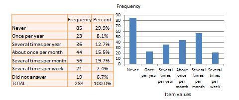
Figure 14.1. Frequency distribution of religiosity.
With very large samples where observations are independent and random, the frequency distribution tends to follow a plot that looked like a bell-shaped curve (a smoothed bar chart of the frequency distribution) similar to that shown in Figure 14.2, where most observations are clustered toward the center of the range of values, and fewer and fewer observations toward the extreme ends of the range. Such a curve is called a normal distribution.
Central tendency is an estimate of the center of a distribution of values. There are three major estimates of central tendency: mean, median, and mode. The arithmetic mean (often simply called the “mean”) is the simple average of all values in a given distribution. Consider a set of eight test scores: 15, 22, 21, 18, 36, 15, 25, 15. The arithmetic mean of these values is (15 + 20 + 21 + 20 + 36 + 15 + 25 + 15)/8 = 20.875. Other types of means include geometric mean (n th root of the product of n numbers in a distribution) and harmonic mean (the reciprocal of the arithmetic means of the reciprocal of each value in a distribution), but these means are not very popular for statistical analysis of social research data.
The second measure of central tendency, the median , is the middle value within a range of values in a distribution. This is computed by sorting all values in a distribution in increasing order and selecting the middle value. In case there are two middle values (if there is an even number of values in a distribution), the average of the two middle values represent the median. In the above example, the sorted values are: 15, 15, 15, 18, 22, 21, 25, 36. The two middle values are 18 and 22, and hence the median is (18 + 22)/2 = 20.
Lastly, the mode is the most frequently occurring value in a distribution of values. In the previous example, the most frequently occurring value is 15, which is the mode of the above set of test scores. Note that any value that is estimated from a sample, such as mean, median, mode, or any of the later estimates are called a statistic .
Dispersion refers to the way values are spread around the central tendency, for example, how tightly or how widely are the values clustered around the mean. Two common measures of dispersion are the range and standard deviation. The range is the difference between the highest and lowest values in a distribution. The range in our previous example is 36-15 = 21.
The range is particularly sensitive to the presence of outliers. For instance, if the highest value in the above distribution was 85 and the other vales remained the same, the range would be 85-15 = 70. Standard deviation , the second measure of dispersion, corrects for such outliers by using a formula that takes into account how close or how far each value from the distribution mean:

Figure 14.2. Normal distribution.
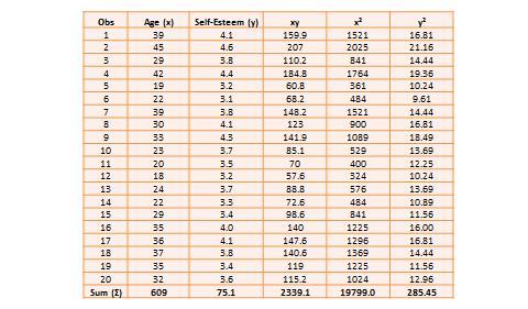
Table 14.1. Hypothetical data on age and self-esteem.
The two variables in this dataset are age (x) and self-esteem (y). Age is a ratio-scale variable, while self-esteem is an average score computed from a multi-item self-esteem scale measured using a 7-point Likert scale, ranging from “strongly disagree” to “strongly agree.” The histogram of each variable is shown on the left side of Figure 14.3. The formula for calculating bivariate correlation is:

Figure 14.3. Histogram and correlation plot of age and self-esteem.
After computing bivariate correlation, researchers are often interested in knowing whether the correlation is significant (i.e., a real one) or caused by mere chance. Answering such a question would require testing the following hypothesis:
H 0 : r = 0
H 1 : r ≠ 0
H 0 is called the null hypotheses , and H 1 is called the alternative hypothesis (sometimes, also represented as H a ). Although they may seem like two hypotheses, H 0 and H 1 actually represent a single hypothesis since they are direct opposites of each other. We are interested in testing H 1 rather than H 0 . Also note that H 1 is a non-directional hypotheses since it does not specify whether r is greater than or less than zero. Directional hypotheses will be specified as H 0 : r ≤ 0; H 1 : r > 0 (if we are testing for a positive correlation). Significance testing of directional hypothesis is done using a one-tailed t-test, while that for non-directional hypothesis is done using a two-tailed t-test.
In statistical testing, the alternative hypothesis cannot be tested directly. Rather, it is tested indirectly by rejecting the null hypotheses with a certain level of probability. Statistical testing is always probabilistic, because we are never sure if our inferences, based on sample data, apply to the population, since our sample never equals the population. The probability that a statistical inference is caused pure chance is called the p-value . The p-value is compared with the significance level (α), which represents the maximum level of risk that we are willing to take that our inference is incorrect. For most statistical analysis, α is set to 0.05. A p-value less than α=0.05 indicates that we have enough statistical evidence to reject the null hypothesis, and thereby, indirectly accept the alternative hypothesis. If p>0.05, then we do not have adequate statistical evidence to reject the null hypothesis or accept the alternative hypothesis.
The easiest way to test for the above hypothesis is to look up critical values of r from statistical tables available in any standard text book on statistics or on the Internet (most software programs also perform significance testing). The critical value of r depends on our desired significance level (α = 0.05), the degrees of freedom (df), and whether the desired test is a one-tailed or two-tailed test. The degree of freedom is the number of values that can vary freely in any calculation of a statistic. In case of correlation, the df simply equals n – 2, or for the data in Table 14.1, df is 20 – 2 = 18. There are two different statistical tables for one-tailed and two -tailed test. In the two -tailed table, the critical value of r for α = 0.05 and df = 18 is 0.44. For our computed correlation of 0.79 to be significant, it must be larger than the critical value of 0.44 or less than -0.44. Since our computed value of 0.79 is greater than 0.44, we conclude that there is a significant correlation between age and self-esteem in our data set, or in other words, the odds are less than 5% that this correlation is a chance occurrence. Therefore, we can reject the null hypotheses that r ≤ 0, which is an indirect way of saying that the alternative hypothesis r > 0 is probably correct.
Most research studies involve more than two variables. If there are n variables, then we will have a total of n*(n-1)/2 possible correlations between these n variables. Such correlations are easily computed using a software program like SPSS, rather than manually using the formula for correlation (as we did in Table 14.1), and represented using a correlation matrix, as shown in Table 14.2. A correlation matrix is a matrix that lists the variable names along the first row and the first column, and depicts bivariate correlations between pairs of variables in the appropriate cell in the matrix. The values along the principal diagonal (from the top left to the bottom right corner) of this matrix are always 1, because any variable is always perfectly correlated with itself. Further, since correlations are non-directional, the correlation between variables V1 and V2 is the same as that between V2 and V1. Hence, the lower triangular matrix (values below the principal diagonal) is a mirror reflection of the upper triangular matrix (values above the principal diagonal), and therefore, we often list only the lower triangular matrix for simplicity. If the correlations involve variables measured using interval scales, then this specific type of correlations are called Pearson product moment correlations .
Another useful way of presenting bivariate data is cross-tabulation (often abbreviated to cross-tab, and sometimes called more formally as a contingency table). A cross-tab is a table that describes the frequency (or percentage) of all combinations of two or more nominal or categorical variables. As an example, let us assume that we have the following observations of gender and grade for a sample of 20 students, as shown in Figure 14.3. Gender is a nominal variable (male/female or M/F), and grade is a categorical variable with three levels (A, B, and C). A simple cross-tabulation of the data may display the joint distribution of gender and grades (i.e., how many students of each gender are in each grade category, as a raw frequency count or as a percentage) in a 2 x 3 matrix. This matrix will help us see if A, B, and C grades are equally distributed across male and female students. The cross-tab data in Table 14.3 shows that the distribution of A grades is biased heavily toward female students: in a sample of 10 male and 10 female students, five female students received the A grade compared to only one male students. In contrast, the distribution of C grades is biased toward male students: three male students received a C grade, compared to only one female student. However, the distribution of B grades was somewhat uniform, with six male students and five female students. The last row and the last column of this table are called marginal totals because they indicate the totals across each category and displayed along the margins of the table.
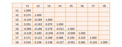
Table 14.2. A hypothetical correlation matrix for eight variables.
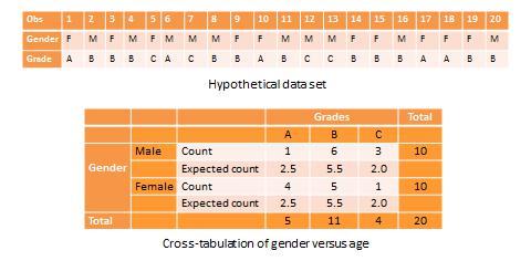
Table 14.3. Example of cross-tab analysis.
Although we can see a distinct pattern of grade distribution between male and female students in Table 14.3, is this pattern real or “statistically significant”? In other words, do the above frequency counts differ from that that may be expected from pure chance? To answer this question, we should compute the expected count of observation in each cell of the 2 x 3 cross-tab matrix. This is done by multiplying the marginal column total and the marginal row total for each cell and dividing it by the total number of observations. For example, for the male/A grade cell, expected count = 5 * 10 / 20 = 2.5. In other words, we were expecting 2.5 male students to receive an A grade, but in reality, only one student received the A grade. Whether this difference between expected and actual count is significant can be tested using a chi-square test . The chi-square statistic can be computed as the average difference between observed and expected counts across all cells. We can then compare this number to the critical value associated with a desired probability level (p < 0.05) and the degrees of freedom, which is simply (m-1)*(n-1), where m and n are the number of rows and columns respectively. In this example, df = (2 – 1) * (3 – 1) = 2. From standard chi-square tables in any statistics book, the critical chi-square value for p=0.05 and df=2 is 5.99. The computed chi -square value, based on our observed data, is 1.00, which is less than the critical value. Hence, we must conclude that the observed grade pattern is not statistically different from the pattern that can be expected by pure chance.
- Social Science Research: Principles, Methods, and Practices. Authored by : Anol Bhattacherjee. Provided by : University of South Florida. Located at : http://scholarcommons.usf.edu/oa_textbooks/3/ . License : CC BY-NC-SA: Attribution-NonCommercial-ShareAlike
Want to create or adapt books like this? Learn more about how Pressbooks supports open publishing practices.
Quantitative Data Analysis With SPSS
10 Quantitative Analysis with SPSS: Getting Started
Mikaila Mariel Lemonik Arthur
This chapter focuses on getting started with SPSS. Note that before you can start to work with SPSS, you need to get your data into an appropriate format, as discussed in the chapter on Preparing Quantitative Data and Data Management . It is possible to enter data directly into SPSS, but the interface is not conducive to data entry and so researchers are better off entering their data using a spreadsheet program and then importing it.
Importing Data Into SPSS
In some cases, existing data will be able to be downloaded in SPSS format (*.sav is the file extension for an SPSS datafile), in which case it can be opened in SPSS by going to File → Open → Data and then locating the location of the file. However, in most cases, researchers will need to import data stored in another file format into SPSS. To import data, go to the file menu, then select import data. Next, choose the type of data you wish to import from the menu that appears. In most cases, researchers will be importing Excel or CSV data (when they have entered it themselves or are downloading it from a general-purpose site like the Census Bureau) or SAS or Stata data (when they are downloading it from a site that makes prepared statistical data files available).

Once you click on a data type, a window will pop up for you to select the file you wish to import. Be sure it is of the file type you have chosen. If you import a file in a format that is already designed to work with statistical software, such as Stata, the importation process will be as seamless as opening a file. Researchers should be sure that immediately after importing, they save their file (File → Save As) so that it is stored in SPSS format and can be opened in SPSS, rather than imported, in the future. It is essential to remember that SPSS is not cloud-resident software and does not have an autosave function, so any time a file is changed, it must be manually saved.

If you import a file in Excel, CSV (comma-separated values) or text format, SPSS will open an import wizard with a number of steps. The steps vary slightly depending on which file type you are importing. For instance, to import an Excel file, as shown in Figure 2, you first need to specify the worksheet (if the file has multiple worksheets—SPSS can only import one worksheet at a time). You can choose to specify a limited range of cells. Checking the checkbox next to “Read variable names from first row of data” will replace the V1, V2, V3, and so on column headers with whatever appears in the top row of data in the Excel file. You can also choose to change the percentage of values that are used to determine data type, remove leading and trailing spaces from string values, and—if your Excel file has hidden rows or columns—you can choose to ignore them. Below the options, a preview of your Excel file will be shown; you can scroll through the preview to see that data is being displayed correctly. Clicking OK will finalize the import.

A different set of options appears when you import a CSV file, as shown in Figure 3. The top of the popup window shows a preview of the data in CSV format. While toggles related to whether the first line contains variable names, removing leading and trailing spaces, and indicating the percentage of values that determine the data type are the same as for importing data from Excel, there are additional options that are important for the proper importing of CSV data. First of all, the user must specify whether values are delimited by a comma, a semicolon, or a tab. While commas are the most common delimiters in CSV files, the other delimiters are possible, and looking at the preview should make clear which of the delimiters is being used in a given file, as shown in the example below.
Second, the user must specify whether the period or the comma is the decimal symbol. Data produced in the United States typically uses the period (as in 1238.67), as does data produced in many other English-speaking countries, while most of Europe and Latin America use the comma. Third, the user must specify the text qualifier (single quotes, double quotes, or none). This is the character used to note that the contents of a particular entry in the CSV file are textual (string variables) in nature, not numerical. If your data includes text, it should be clear from the preview which qualifier is being used. Users can also toggle whether data is cached locally or not; caching locally speeds the importation process.
Finally, there is a button for Advanced Options (Text Wizard). The text wizard offers the same window and options that users see if they are importing a text file directly, and this wizard offers more direct control over the importation process over a series of six steps. First, users can specify a predefined format if they have a *.tpf file on their computers (this is rare) and see a preview of what the data in the file looks like. In step two, they can indicate if the file is delimited (as above) or fixed-width (where values are stored in columns of constant size specified within the file); which—if any—row contains the variable names; and the decimal symbol. Note that some forms of fixed-width files may not be supported. Third, they indicate which line of the file contains the first line of data, whether each line represents a case or a specific given number of variables represents a case, and how many cases to import. This last choice includes the option to import a random sample of cases. Fourth, users specify the delimiter and the text qualifier and determine how to handle leading and trailing spaces in string values. Fifth, users can double-check variable names and formats. Finally, before clicking the “Finish” button, users can choose to save their selections as a *.tpf file to be reused or to paste the syntax (to be discussed later in this chapter).
In all cases, once the importation options have been selected and OK or Finish has been clicked, the data is imported. An output window (see Figure 4) may open with various warnings and details about the importation process, and the Data View window (see Figure 5) will show the data, with variable names at the top of each column. At this point, be sure to save the dataset in a location and with a name you will be able to locate later.
Before users are done setting up their dataset, they must be sure that appropriate variable information is included. When datasets are imported from other statistical programs, they will typically come with variable information. But when they are imported from Excel or CSV files, the variable information must be manually entered, typically from a codebook or related document. Variable information is entered using Variable View. Users can switch between Data View and Variable View by clicking the tabs at the bottom of the screen or using the Ctrl+T key combination. As you can see in Figure 6, a screenshot of a completed dataset, Variable View shows each variable in a row, with a variety of information about that variable. When a dataset is imported, each of these pieces of information need to be entered by hand for each variable. To move between columns by key commands, use the tab key; to open variable information that requires a menu for entry, click the space bar twice.

- Name requires that each variable be given a short name, without any spaces. There are additional rules about names, but in short, names should be primarily alphanumeric in nature and cannot be words or use symbols that have meaning for the underlying computer processing. Names can be entered directly.
- Type specifies the variable type. To open up the menu allowing the selection of variable types, click on the cell, then click on the three dots [.…] that appear on the right side of the cell. Users can then choose from among numeric, dollar, date, numeric with leading zeros, string, and other variable types.
- Width specifies the number of characters of width for the variable itself in data storage, while decimals specifies how many decimal places the variable will have. These can both be entered or edited directly or in the dialog box for Type.

more completely what the variable is measuring. It can be entered directly.

- Missing provides for the indication that particular values—like “refused to answer”—should be treated by the SPSS software as missing data rather than as analytically useful categories. Clicking the three dots [.…] opens a dialog box for specifying missing values. When there are no missing values, “no missing values” should be selected. Otherwise, users can select “discrete missing values” and then enter three specific missing values—the numerical values, not the value labels—or they can elect “range plus one optional discrete missing value” to specific a range from low to high of missing values, optionally adding an additional single discrete value.
- Columns specifies the width of the display column for the variable. It can be entered directly.
- Align specifies whether the variable data will be aligned right, center, or left. Users can click in the cell to make a menu appear or can press spacebar twice and then use arrows to select the desired alignment.
- Measure permits the indication of level of measurement from among nominal, ordinal, and scale variables. Users can click in the cell to make a menu appear or can press spacebar twice and then use arrows to select the desired level of measurement. Note that measure is often wrong in datasets and analysts should not rely on it in determining the level of measurement for selection of statistical tests; SPSS does not use this characteristic when running tests.
- Some datasets will have additional criteria. For example, the dataset shown in Figure 6 has a column called origsort which displays the original sort order of the dataset, so that if an analyst sorts the variables they can be returned to their original order.
When entering variable information, it is especially important to include Name, Label, and Values and be sure Type is correct and any Missing values are specified. Other variable information is less crucial, though clearly it is better to fully specify all variable information. Once all variable information is entered and double-checked and the dataset has been saved, it is ready for use.
When a user first opens SPSS, they are greeted with the “Welcome Dialog” (see figure 9). This dialog provides tips, links to help resources, and options for creating a new file (by selecting “new dataset”) or opening recently used files. There is a checkbox for turning off the Welcome Dialog so that it will not be shown in the future.

When the Welcome Dialog is turned off, SPSS opens with a blank file. Going to File → Open → Data (Alt+F, O, D) brings up the dialog for opening a data file; the Open menu also provides for opening other types of files, which will be discussed below. Earlier in this chapter, the differences between Data View and Variable view were discussed; when you open a data file, be sure to observe which view you are using.

It can be useful to be able to search for a variable or case in the datafile. There are two main ways to do this, both under the Edit menu (Alt+E). [1] The Edit menu offers Find and Go To. Find, which can also be accessed by pressing Ctrl+F, allows users to search for all or part of a variable name. Figure 10 displays the Search dialog, with options shown after clicking on the “show options” button. (Users can also use the Replace function, but this carries the risk of writing over data and so should be avoided in almost all cases.) Be sure to select the column you wish to search—the Find function can only examine one column in Variable View at a time. Most typically, users will want to search variable names or labels. The checkbox for Match Case toggles whether or not case (in other words, capitalization) matters to the search. Expanding the options permits users to specify how much and which part of a cell must be matched as well as search order.
Users can also navigate to specific variables by using the Edit → Go to Case (to navigate to a specific case—or row in data view) and Edit → Go to Variable (to navigate to a specific variable—a row in variable view or a column in data view). Users can also access detailed variable information via the tool Utilities → Variables.
Another useful feature is the ability to sort variables and cases. Both types of sorting can be found in the data menu. Variables can be sorted by any of the characteristics in variable view; when sorting, the original sort order can be saved as a new characteristic. Cases can be sorted on any variable.
SPSS Options
The Options dialog can be reached by going to Edit → Options (or Alt+E, Alt+N). There are a wide variety of options available to help users customize their SPSS experience, a few of which are particularly important. First of all, using various dialogs and menus in the program is much easier if the options Variable List—Display Names (Alt+N) and Alphabetical (Alt+H) are selected under General. You can also change the display language for both the user interface and for output under Language, change fonts and colors for output under Viewer, set number options under Data; change currency options under Currency; set default output for graphs and charts under Charts; and set default file locations for saving files under File locations. While most of these options can be left on their default settings, it is really important for most users to set variables to display names and alphabetical before use. Options will be preserved if you use the same computer and user account, but if you are working on a public computer you should get in the habit of checking every time you start the program.
Getting More Out of SPSS
So far, we have been working only with Data View and Variable View in the main dataset window. But when researchers produce the results of an analysis, these results appear in a new window called Output—IBM SPSS Statistics Viewer. New Output windows can be opened from the File menu by going to Open → Output or from the Window menu by selecting “Go to Designated Viewer Window” (the later command also brings the output window to the foreground if one is already open). Output will be discussed in more detail when the results of different tests are discussed. For now, note that output can be saved in *.spv format, but this format can only be viewed in SPSS. To save output in a format viewable in other applications, go to File → Export, where you can choose a file location and a file format (like Word, PowerPoint, HTML, or PDF). Individual output items can also be copied and pasted.
SPSS also offers a Syntax viewer and editor, which can also be accessed from both the File and Window menus. While syntax is beyond the scope of this text, it provides the option for writing code (kind of like a computer program) to control SPSS rather than using menus and buttons in a graphical user interface. Experienced users, or those doing many similar repetitive tasks, often find working via syntax to be faster and more efficient, but the learning curve is quite steep. If you are interested in learning more about how to write syntax in SPSS, Help → Command Syntax Reference brings up a very long document detailing the commands available.
Finally, the Help menu in SPSS offers a variety of options for getting help in using the program, including links to web resource guides, PDF documentation, and help forums. These tools can also be reached directly via the SPSS website. In addition, many dialog boxes contain a “Help” button that takes users to webpages with more detail on the tool in question.
Go to https://www.baseball-reference.com/ and select 10 baseball players of your choice. In an Excel or other spreadsheet, enter the name, position, batting arm, throwing arm, weight in pounds, and height in inches, as well as, from the Summary: Career section, HR (home runs) and WAR (wins above replacement). Each player should get one row of the Excel spreadsheet. Once you have entered the data, import it into SPSS. Then use Variable View to enter the relevant information about each variable—including value labels for position, batting arm, and throwing arm. Sort your cases by home runs. Finally, save your file.
Media Attributions
- import menu
- import excel © IBM SPSS is licensed under a All Rights Reserved license
- import csv © IBM SPSS is licensed under a All Rights Reserved license
- output window © IBM SPSS is licensed under a All Rights Reserved license
- spss data view © IBM SPSS is licensed under a All Rights Reserved license
- variable-view © IBM SPSS is licensed under a All Rights Reserved license
- value labels © IBM SPSS is licensed under a All Rights Reserved license
- missing values © IBM SPSS is licensed under a All Rights Reserved license
- welcome dialog © IBSM SPSS is licensed under a All Rights Reserved license
- find and replace © IBM SPSS is licensed under a All Rights Reserved license
- Note that "Search," another option under the Edit menu, does not search variables or cases but instead launches a search of SPSS web resources and help files. ↵
A data type that represents non-numerical data; string values can include any sequence of letters, numbers, and spaces.
The possible levels or response choices of a given variable.
Social Data Analysis Copyright © 2021 by Mikaila Mariel Lemonik Arthur is licensed under a Creative Commons Attribution-NonCommercial-ShareAlike 4.0 International License , except where otherwise noted.
Quantitative Data Analysis
How to install, learning resources.
- Quant Data & Methods Resources
SPSS is a software package used for statistical analysis. It can
- take data from almost any type of file
- generate tabulated reports
- plot distributions and trends
- create charts and graphs
- perform descriptive and complex statistical analyses
JMU community members can download SPSS to their computing resources.
- PC Instructions
- Mac Instructions
- SPSS Statistics Essential Training In this course, Barton Poulson takes a practical, visual, and non-mathematical approach to SPSS Statistics, explaining how to use the popular program to analyze data. This course is ideal for first-time researchers and those who want to make the most of data in their professional and academic work.
- SPSS for Academic Research Topics include t-tests, analysis of variance (ANOVA), and understanding the statistical measurements behind academic research. Yash Patel provides some general guidelines and assumptions, along with a challenge and solution exercise to practice what you've learned.
- << Previous: Home
- Next: R >>
- Last Updated: Feb 13, 2024 10:15 AM
- URL: https://guides.lib.jmu.edu/quant
- Skip to main content
- Skip to primary sidebar
- Skip to footer
- QuestionPro

- Solutions Industries Gaming Automotive Sports and events Education Government Travel & Hospitality Financial Services Healthcare Cannabis Technology Use Case NPS+ Communities Audience Contactless surveys Mobile LivePolls Member Experience GDPR Positive People Science 360 Feedback Surveys
- Resources Blog eBooks Survey Templates Case Studies Training Help center
Home Market Research
10 Quantitative Data Analysis Software for Every Data Scientist

Are you curious about digging into data but not sure where to start? Don’t worry; we’ve got you covered! As a data scientist, you know that having the right tools can make all the difference in the world. When it comes to analyzing quantitative data, having the right quantitative data analysis software can help you extract insights faster and more efficiently.
From spotting trends to making smart decisions, quantitative analysis helps us unlock the secrets hidden within our data and chart a course for success.
In this blog post, we’ll introduce you to 10 quantitative data analysis software that every data scientist should know about.
What is Quantitative Data Analysis?
Quantitative data analysis refers to the process of systematically examining numerical data to uncover patterns, trends, relationships, and insights.
Unlike analyzing qualitative data, which deals with non-numeric data like text or images, quantitative research focuses on data that can be quantified, measured, and analyzed using statistical techniques.
What is Quantitative Data Analysis Software?
Quantitative data analysis software refers to specialized computer programs or tools designed to assist researchers, analysts, and professionals in analyzing numerical data.
These software applications are tailored to handle quantitative data, which consists of measurable quantities, counts, or numerical values. Quantitative data analysis software provides a range of features and functionalities to manage, analyze, visualize, and interpret numerical data effectively.
Key features commonly found in quantitative data analysis software include:
- Data Import and Management: Capability to import data from various sources such as spreadsheets, databases, text files, or online repositories.
- Descriptive Statistics: Tools for computing basic descriptive statistics such as measures of central tendency (e.g., mean, median, mode) and measures of dispersion (e.g., standard deviation, variance).
- Data Visualization: Functionality to create visual representations of data through charts, graphs, histograms, scatter plots, or heatmaps.
- Statistical Analysis: Support for conducting a wide range of statistical tests and analyses to explore relationships, test hypotheses, make predictions, or infer population characteristics from sample data.
- Advanced Analytics: Advanced analytical techniques for more complex data exploration and modeling, such as cluster analysis, principal component analysis (PCA), time series analysis, survival analysis, and structural equation modeling (SEM).
- Automation and Reproducibility: Features for automating analysis workflows, scripting repetitive tasks, and ensuring the reproducibility of results.
- Reporting and Collaboration: Tools for generating customizable reports, summaries, or presentations to communicate analysis results effectively to stakeholders.
Benefits of Quantitative Data Analysis
Quantitative data analysis offers numerous benefits across various fields and disciplines. Here are some of the key advantages:
Making Confident Decisions
Quantitative data analysis provides solid, evidence-based insights that support decision-making. By relying on data rather than intuition, you can reduce the risk of making incorrect decisions. This not only increases confidence in your choices but also fosters buy-in from stakeholders and team members.
Cost Reduction
Analyzing quantitative data helps identify areas where costs can be reduced or optimized. For instance, if certain marketing campaigns yield lower-than-average results, reallocating resources to more effective channels can lead to cost savings and improved ROI.
Personalizing User Experience
Quantitative analysis allows for the mapping of customer journeys and the identification of preferences and behaviors. By understanding these patterns, businesses can tailor their offerings, content, and communication to specific user segments, leading to enhanced user satisfaction and engagement.
Improving User Satisfaction and Delight
Quantitative data analysis highlights areas of success and areas for improvement in products or services. For instance, if a webpage shows high engagement but low conversion rates, further investigation can uncover user pain points or friction in the conversion process. Addressing these issues can lead to improved user satisfaction and increased conversion rates.
Best 10 Quantitative Data Analysis Software
1. questionpro.
Known for its robust survey and research capabilities, QuestionPro is a versatile platform that offers powerful data analysis tools tailored for market research, customer feedback, and academic studies. With features like advanced survey logic, data segmentation, and customizable reports, QuestionPro empowers users to derive actionable insights from their quantitative data.
Features of QuestionPro
- Customizable Surveys
- Advanced Question Types:
- Survey Logic and Branching
- Data Segmentation
- Real-Time Reporting
- Mobile Optimization
- Integration Options
- Multi-Language Support
- Data Export
- User-friendly interface.
- Extensive question types.
- Seamless data export capabilities.
- Limited free version.
Pricing :
Starts at $99 per month per user.
2. SPSS (Statistical Package for the Social Sciences
SPSS is a venerable software package widely used in the social sciences for statistical analysis. Its intuitive interface and comprehensive range of statistical techniques make it a favorite among researchers and analysts for hypothesis testing, regression analysis, and data visualization tasks.
- Advanced statistical analysis capabilities.
- Data management and manipulation tools.
- Customizable graphs and charts.
- Syntax-based programming for automation.
- Extensive statistical procedures.
- Flexible data handling.
- Integration with other statistical software package
- High cost for the full version.
- Steep learning curve for beginners.
Pricing:
- Starts at $99 per month.
3. Google Analytics
Primarily used for web analytics, Google Analytics provides invaluable insights into website traffic, user behavior, and conversion metrics. By tracking key performance indicators such as page views, bounce rates, and traffic sources, Google Analytics helps businesses optimize their online presence and maximize their digital marketing efforts.
- Real-time tracking of website visitors.
- Conversion tracking and goal setting.
- Customizable reports and dashboards.
- Integration with Google Ads and other Google products.
- Free version available.
- Easy to set up and use.
- Comprehensive insights into website performance.
- Limited customization options in the free version.
- Free for basic features.
Hotjar is a powerful tool for understanding user behavior on websites and digital platforms. Hotjar enables businesses to visualize how users interact with their websites, identify pain points, and optimize the user experience for better conversion rates and customer satisfaction through features like heatmaps, session recordings, and on-site surveys.
- Heatmaps to visualize user clicks, taps, and scrolling behavior.
- Session recordings for in-depth user interaction analysis.
- Feedback polls and surveys.
- Funnel and form analysis.
- Easy to install and set up.
- Comprehensive insights into user behavior.
- Affordable pricing plans.
- Limited customization options for surveys.
Starts at $39 per month.
While not a dedicated data analysis software, Python is a versatile programming language widely used for data analysis, machine learning, and scientific computing. With libraries such as NumPy, pandas, and matplotlib, Python provides a comprehensive ecosystem for data manipulation, visualization, and statistical analysis, making it a favorite among data scientists and analysts.
- The rich ecosystem of data analysis libraries.
- Flexible and scalable for large datasets.
- Integration with other tools and platforms.
- Open-source with a supportive community.
- Free and open-source.
- High performance and scalability.
- Great for automation and customization.
- Requires programming knowledge.
- It is Free for the beginners.
6. SAS (Statistical Analysis System)
SAS is a comprehensive software suite renowned for its advanced analytics, business intelligence, and data management capabilities. With a wide range of statistical techniques, predictive modeling tools, and data visualization options, SAS is trusted by organizations across industries for complex data analysis tasks and decision support.
- Wide range of statistical procedures.
- Data integration and cleansing tools.
- Advanced analytics and machine learning capabilities.
- Scalable for enterprise-level data analysis.
- Powerful statistical modeling capabilities.
- Excellent support for large datasets.
- Trusted by industries for decades.
- Expensive licensing fees.
- Steep learning curve.
- Contact sales for pricing details.
Despite its simplicity compared to specialized data analysis software, Excel remains popular for basic quantitative analysis and data visualization. With features like pivot tables, functions, and charting tools, Excel provides a familiar and accessible platform for users to perform tasks such as data cleaning, summarization, and exploratory analysis.
- Formulas and functions for calculations.
- Pivot tables and charts for data visualization.
- Data sorting and filtering capabilities.
- Integration with other Microsoft Office applications.
- Widely available and familiar interface.
- Affordable for basic analysis tasks.
- Versatile for various data formats.
- Limited statistical functions compared to specialized software.
- Not suitable for handling large datasets.
- Included in Microsoft 365 subscription plans, starts at $6.99 per month.
8. IBM SPSS Statistics
Building on the foundation of SPSS, IBM SPSS Statistics offers enhanced features and capabilities for advanced statistical analysis and predictive modeling. With modules for data preparation, regression analysis, and survival analysis, IBM SPSS Statistics is well-suited for researchers and analysts tackling complex data analysis challenges.
- Advanced statistical procedures.
- Data preparation and transformation tools.
- Automated model building and deployment.
- Integration with other IBM products.
- Extensive statistical capabilities.
- User-friendly interface for beginners.
- Enterprise-grade security and scalability.
- Limited support for open-source integration.
Minitab is a specialized software package designed for quality improvement and statistical analysis in manufacturing, engineering, and healthcare industries. With tools for experiment design, statistical process control, and reliability analysis, Minitab empowers users to optimize processes, reduce defects, and improve product quality.
- Basic and advanced statistical analysis.
- Graphical analysis tools for data visualization.
- Statistical methods improvement.
- DOE (Design of Experiments) capabilities.
- Streamlined interface for statistical analysis.
- Comprehensive quality improvement tools.
- Excellent customer support.
- Limited flexibility for customization.
Pricing:
- Starts at $29 per month.
JMP is a dynamic data visualization and statistical analysis tool developed by SAS Institute. Known for its interactive graphics and exploratory data analysis capabilities, JMP enables users to uncover patterns, trends, and relationships in their data, facilitating deeper insights and informed decision-making.
- Interactive data visualization.
- Statistical modeling and analysis.
- Predictive analytics and machine learning.
- Integration with SAS and other data sources.
- Intuitive interface for exploratory data analysis.
- Dynamic graphics for better insights.
- Integration with SAS for advanced analytics.
- Limited scripting capabilities.
- Less customizable compared to other SAS products.
QuestionPro is Your Right Quantitative Data Analysis Software?
QuestionPro offers a range of features specifically designed for quantitative data analysis, making it a suitable choice for various research, survey, and data-driven decision-making needs. Here’s why it might be the right fit for you:
Comprehensive Survey Capabilities
QuestionPro provides extensive tools for creating surveys with quantitative questions, allowing you to gather structured data from respondents. Whether you need Likert scale questions, multiple-choice questions, or numerical input fields, QuestionPro offers the flexibility to design surveys tailored to your research objectives.
Real-Time Data Analysis
With QuestionPro’s real-time data collection and analysis features, you can access and analyze survey responses as soon as they are submitted. This enables you to quickly identify trends, patterns, and insights without delay, facilitating agile decision-making based on up-to-date information.
Advanced Statistical Analysis
QuestionPro includes advanced statistical analysis tools that allow you to perform in-depth quantitative analysis of survey data. Whether you need to calculate means, medians, standard deviations, correlations, or conduct regression analysis, QuestionPro offers the functionality to derive meaningful insights from your data.
Data Visualization
Visualizing quantitative data is crucial for understanding trends and communicating findings effectively. QuestionPro offers a variety of visualization options, including charts, graphs, and dashboards, to help you visually represent your survey data and make it easier to interpret and share with stakeholders.
Segmentation and Filtering
QuestionPro enables you to segment and filter survey data based on various criteria, such as demographics, responses to specific questions, or custom variables. This segmentation capability allows you to analyze different subgroups within your dataset separately, gaining deeper insights into specific audience segments or patterns.
Cost-Effective Solutions
QuestionPro offers pricing plans tailored to different user needs and budgets, including options for individuals, businesses, and enterprise-level organizations. Whether conducting a one-time survey or needing ongoing access to advanced features, QuestionPro provides cost-effective solutions to meet your requirements.
Choosing the right quantitative data analysis software depends on your specific needs, budget, and level of expertise. Whether you’re a researcher, marketer, or business analyst, these top 10 software options offer diverse features and capabilities to help you unlock valuable insights from your data.
If you’re looking for a comprehensive, user-friendly, and cost-effective solution for quantitative data analysis, QuestionPro could be the right choice for your research, survey, or data-driven decision-making needs. With its powerful features, intuitive interface, and flexible pricing options, QuestionPro empowers users to derive valuable insights from their survey data efficiently and effectively.
So go ahead, explore QuestionPro, and empower yourself to unlock valuable insights from your data!
LEARN MORE FREE TRIAL
MORE LIKE THIS

QuestionPro BI: From Research Data to Actionable Dashboards
Apr 22, 2024

21 Best Customer Advocacy Software for Customers in 2024
Apr 19, 2024
Apr 18, 2024

11 Best Enterprise Feedback Management Software in 2024
Other categories.
- Academic Research
- Artificial Intelligence
- Assessments
- Brand Awareness
- Case Studies
- Communities
- Consumer Insights
- Customer effort score
- Customer Engagement
- Customer Experience
- Customer Loyalty
- Customer Research
- Customer Satisfaction
- Employee Benefits
- Employee Engagement
- Employee Retention
- Friday Five
- General Data Protection Regulation
- Insights Hub
- Life@QuestionPro
- Market Research
- Mobile diaries
- Mobile Surveys
- New Features
- Online Communities
- Question Types
- Questionnaire
- QuestionPro Products
- Release Notes
- Research Tools and Apps
- Revenue at Risk
- Survey Templates
- Training Tips
- Uncategorized
- Video Learning Series
- What’s Coming Up
- Workforce Intelligence

Want to create or adapt books like this? Learn more about how Pressbooks supports open publishing practices.
14 Quantitative analysis: Descriptive statistics
[latexpage] Numeric data collected in a research project can be analysed quantitatively using statistical tools in two different ways. Descriptive analysis refers to statistically describing, aggregating, and presenting the constructs of interest or associations between these constructs. Inferential analysis refers to the statistical testing of hypotheses (theory testing). In this chapter, we will examine statistical techniques used for descriptive analysis, and the next chapter will examine statistical techniques for inferential analysis. Much of today’s quantitative data analysis is conducted using software programs such as SPSS or SAS. Readers are advised to familiarise themselves with one of these programs for understanding the concepts described in this chapter.
Data preparation
In research projects, data may be collected from a variety of sources: postal surveys, interviews, pretest or posttest experimental data, observational data, and so forth. This data must be converted into a machine-readable, numeric format, such as in a spreadsheet or a text file, so that they can be analysed by computer programs like SPSS or SAS. Data preparation usually follows the following steps:
Data coding. Coding is the process of converting data into numeric format. A codebook should be created to guide the coding process. A codebook is a comprehensive document containing a detailed description of each variable in a research study, items or measures for that variable, the format of each item (numeric, text, etc.), the response scale for each item (i.e., whether it is measured on a nominal, ordinal, interval, or ratio scale, and whether this scale is a five-point, seven-point scale, etc.), and how to code each value into a numeric format. For instance, if we have a measurement item on a seven-point Likert scale with anchors ranging from ‘strongly disagree’ to ‘strongly agree’, we may code that item as 1 for strongly disagree, 4 for neutral, and 7 for strongly agree, with the intermediate anchors in between. Nominal data such as industry type can be coded in numeric form using a coding scheme such as: 1 for manufacturing, 2 for retailing, 3 for financial, 4 for healthcare, and so forth (of course, nominal data cannot be analysed statistically). Ratio scale data such as age, income, or test scores can be coded as entered by the respondent. Sometimes, data may need to be aggregated into a different form than the format used for data collection. For instance, if a survey measuring a construct such as ‘benefits of computers’ provided respondents with a checklist of benefits that they could select from, and respondents were encouraged to choose as many of those benefits as they wanted, then the total number of checked items could be used as an aggregate measure of benefits. Note that many other forms of data—such as interview transcripts—cannot be converted into a numeric format for statistical analysis. Codebooks are especially important for large complex studies involving many variables and measurement items, where the coding process is conducted by different people, to help the coding team code data in a consistent manner, and also to help others understand and interpret the coded data.
Data entry. Coded data can be entered into a spreadsheet, database, text file, or directly into a statistical program like SPSS. Most statistical programs provide a data editor for entering data. However, these programs store data in their own native format—e.g., SPSS stores data as .sav files—which makes it difficult to share that data with other statistical programs. Hence, it is often better to enter data into a spreadsheet or database where it can be reorganised as needed, shared across programs, and subsets of data can be extracted for analysis. Smaller data sets with less than 65,000 observations and 256 items can be stored in a spreadsheet created using a program such as Microsoft Excel, while larger datasets with millions of observations will require a database. Each observation can be entered as one row in the spreadsheet, and each measurement item can be represented as one column. Data should be checked for accuracy during and after entry via occasional spot checks on a set of items or observations. Furthermore, while entering data, the coder should watch out for obvious evidence of bad data, such as the respondent selecting the ‘strongly agree’ response to all items irrespective of content, including reverse-coded items. If so, such data can be entered but should be excluded from subsequent analysis.
Missing values. Missing data is an inevitable part of any empirical dataset. Respondents may not answer certain questions if they are ambiguously worded or too sensitive. Such problems should be detected during pretests and corrected before the main data collection process begins. During data entry, some statistical programs automatically treat blank entries as missing values, while others require a specific numeric value such as \(-1\) or \(999\) to be entered to denote a missing value. During data analysis, the default mode for handling missing values in most software programs is to simply drop any observation containing even a single missing value, in a technique called listwise deletion . Such deletion can significantly shrink the sample size and make it extremely difficult to detect small effects. Hence, some software programs provide the option of replacing missing values with an estimated value via a process called imputation . For instance, if the missing value is one item in a multi-item scale, the imputed value may be the average of the respondent’s responses to remaining items on that scale. If the missing value belongs to a single-item scale, many researchers use the average of other respondents’ responses to that item as the imputed value. Such imputation may be biased if the missing value is of a systematic nature rather than a random nature. Two methods that can produce relatively unbiased estimates for imputation are the maximum likelihood procedures and multiple imputation methods, both of which are supported in popular software programs such as SPSS and SAS.
Data transformation. Sometimes, it is necessary to transform data values before they can be meaningfully interpreted. For instance, reverse coded items—where items convey the opposite meaning of that of their underlying construct—should be reversed (e.g., in a 1-7 interval scale, 8 minus the observed value will reverse the value) before they can be compared or combined with items that are not reverse coded. Other kinds of transformations may include creating scale measures by adding individual scale items, creating a weighted index from a set of observed measures, and collapsing multiple values into fewer categories (e.g., collapsing incomes into income ranges).
Univariate analysis
Univariate analysis—or analysis of a single variable—refers to a set of statistical techniques that can describe the general properties of one variable. Univariate statistics include: frequency distribution, central tendency, and dispersion. The frequency distribution of a variable is a summary of the frequency—or percentages—of individual values or ranges of values for that variable. For instance, we can measure how many times a sample of respondents attend religious services—as a gauge of their ‘religiosity’—using a categorical scale: never, once per year, several times per year, about once a month, several times per month, several times per week, and an optional category for ‘did not answer’. If we count the number or percentage of observations within each category—except ‘did not answer’ which is really a missing value rather than a category—and display it in the form of a table, as shown in Figure 14.1, what we have is a frequency distribution. This distribution can also be depicted in the form of a bar chart, as shown on the right panel of Figure 14.1, with the horizontal axis representing each category of that variable and the vertical axis representing the frequency or percentage of observations within each category.

With very large samples, where observations are independent and random, the frequency distribution tends to follow a plot that looks like a bell-shaped curve—a smoothed bar chart of the frequency distribution—similar to that shown in Figure 14.2. Here most observations are clustered toward the centre of the range of values, with fewer and fewer observations clustered toward the extreme ends of the range. Such a curve is called a normal distribution .
Central tendency is an estimate of the centre of a distribution of values. There are three major estimates of central tendency: mean, median, and mode. The arithmetic mean —often simply called the ‘mean’—is the simple average of all values in a given distribution. Consider a set of eight test scores: 15, 22, 21, 18, 36, 15, 25, and 15. The arithmetic mean of these values can be calculated using the sum divided by the number of values \((15 + 20 + 21 + 20 + 36 + 15 + 25 + 15)/8=20.875\). In this example, the mean would be 20.875. Other types of means include geometric mean (\(n\) th root of the product of \(n\) numbers in a distribution) and harmonic mean (the reciprocal of the arithmetic means of the reciprocal of each value in a distribution), but these means are not very popular for statistical analysis of social research data.The second measure of central tendency, the median , is the middle value within a range of values in a distribution. This is computed by sorting all values in a distribution in increasing order and selecting the middle value. In cases where an even number of values in a distribution means there are two middle values, the average of those two values represents the median. In the above example, the sorted values are: 15, 15, 15, 18, 22, 21, 25, and 36. The two middle values are 18 and 22, and hence the median is \((18+22)/2=20\).
Lastly, the mode is the most frequently occurring value in a distribution of values. In the previous example, the most frequently occurring value is 15, which is the mode of the above set of test scores. Note that any value that is estimated from a sample, such as mean, median, mode, or any of the later estimates are called a statistic .
Dispersion refers to the way values are spread around the central tendency—for example, how tightly or how widely the values are clustered around the mean. Two common measures of dispersion are the range and standard deviation. The range is the difference between the highest and lowest values in a distribution. The range in our previous example is \(36-15=21\).
The range is particularly sensitive to the presence of outliers. For instance, if the highest value in the above distribution was 85, and the other vales remained the same, the range would be \(85-15=70\). Standard deviation —the second measure of dispersion—corrects for such outliers by using a formula that takes into account how close or how far each value is from the distribution mean:
\[\sigma = \sqrt{\frac{\sum^{n}_{i=1} (x_{i}-\mu) }{n-1}}\,, \]
where \(\sigma\) is the standard deviation, \(x_{i}\) is the \(i\) th observation (or value), \(\mu\) is the arithmetic mean, \(n\) is the total number of observations, and \(\sum\) means summation across all observations. The square of the standard deviation is called the variance of a distribution. In a normally distributed frequency distribution, 68% of the observations lie within one standard deviation of the mean \((\mu+1\sigma)\), 95% of the observations lie within two standard deviations \((\mu+2\sigma)\), and 99.7% of the observations lie within three standard deviations \((\mu+3\sigma)\), as shown in Figure 14.2.
Bivariate analysis
Bivariate analysis examines how two variables are related to one another. The most common bivariate statistic is the bivariate correlation —often, simply called ‘correlation’—which is a number between -1 and +1 denoting the strength of the relationship between two variables. Say that we wish to study how age is related to self-esteem in a sample of 20 respondents—i.e., as age increases, does self-esteem increase, decrease, or remain unchanged?. If self-esteem increases, then we have a positive correlation between the two variables, if self-esteem decreases, then we have a negative correlation, and if it remains the same, we have a zero correlation. To calculate the value of this correlation, consider the hypothetical dataset shown in Table 14.1.

The two variables in this dataset are age (\(x\)) and self-esteem (\(y\)). Age is a ratio-scale variable, while self-esteem is an average score computed from a multi-item self-esteem scale measured using a 7-point Likert scale, ranging from ‘strongly disagree’ to ‘strongly agree’. The histogram of each variable is shown on the left side of Figure 14.3. The formula for calculating bivariate correlation is:
\[ r_{xy} = \frac{\sum x_iy_i – n\bar{x} \bar{y} }{(n-1)s_x s_y } = \frac{n \sum x_i y_i – \sum x_i \sum y_i }{\sqrt{n \sum x_i^2 – (\sum x_i)^2} \sqrt{n \sum y_i^2 – (\sum y_i)^2}}\,, \]
where \(r_{xy}\) is the correlation, \(\bar{x}\) and \(\bar{y}\) are the sample means of \(x\) and \(y\), and \(s_x\) and \(s_y\) are the standard deviations of \(x\) and \(y\). Using the above formula, as shown in Table 14.1, the manually computed value of correlation between age and self-esteem is 0.79. This figure indicates that age has a strong positive correlation with self-esteem—i.e., self-esteem tends to increase with increasing age, and decrease with decreasing age. The same pattern can be seen when comparing the age and self-esteem histograms shown in Figure 14.3, where it appears that the top of the two histograms generally follow each other. Note here that the vertical axes in Figure 14.3 represent actual observation values, and not the frequency of observations as in Figure 14.1—hence, these are not frequency distributions, but rather histograms. The bivariate scatter plot in the right panel of Figure 14.3 is essentially a plot of self-esteem on the vertical axis, against age on the horizontal axis. This plot roughly resembles an upward sloping line—i.e., positive slope—which is also indicative of a positive correlation. If the two variables were negatively correlated, the scatter plot would slope down—i.e., negative slope—implying that an increase in age would be related to a decrease in self-esteem, and vice versa. If the two variables were uncorrelated, the scatter plot would approximate a horizontal line—i.e., zero slope—implying than an increase in age would have no systematic bearing on self-esteem.

After computing bivariate correlation, researchers are often interested in knowing whether the correlation is significant (i.e., a real one) or caused by mere chance. Answering such a question would require testing the following hypothesis:
\[H_0:\quad r = 0 \]
\[H_1:\quad r \neq 0 \]
\(H_0\) is called the null hypotheses , and \(H_1\) is called the alternative hypothesis —sometimes, also represented as \(H_a\). Although they may seem like two hypotheses, \(H_0\) and \(H_1\) actually represent a single hypothesis since they are direct opposites of one another. We are interested in testing \(H_1\) rather than \(H_0\). Also note that \(H_1\) is a non-directional hypotheses since it does not specify whether \(r\) is greater than or less than zero. If we are testing for a positive correlation, directional hypotheses will be specified as \(H_0: r \leq 0\); \(H_1: r > 0\). Significance testing of directional hypotheses is done using a one-tailed \(t\)-test, while that for non-directional hypotheses is done using a two-tailed \(t\)-test.
In statistical testing, the alternative hypothesis cannot be tested directly. Rather, it is tested indirectly by rejecting the null hypotheses with a certain level of probability. Statistical testing is always probabilistic, because we are never sure if our inferences, based on sample data, apply to the population, since our sample never equals the population. The probability that a statistical inference is caused by pure chance is called the \(p\)-value . The \(p\)-value is compared with the significance level (\(\alpha\)), which represents the maximum level of risk that we are willing to take that our inference is incorrect. For most statistical analysis, \(\alpha\) is set to 0.05. A \(p\)-value less than \(\alpha=0.05\) indicates that we have enough statistical evidence to reject the null hypothesis, and thereby, indirectly accept the alternative hypothesis. If \(p>0.05\), then we do not have adequate statistical evidence to reject the null hypothesis or accept the alternative hypothesis.
The easiest way to test for the above hypothesis is to look up critical values of \(r\) from statistical tables available in any standard textbook on statistics, or on the Internet—most software programs also perform significance testing. The critical value of \(r\) depends on our desired significance level (\(\alpha=0.05\)), the degrees of freedom (df), and whether the desired test is a one-tailed or two-tailed test. The degree of freedom is the number of values that can vary freely in any calculation of a statistic. In case of correlation, the df simply equals \((n –2)\), or for the data in Table 14.1, df is \(20–2=18\). There are two different statistical tables for one-tailed and two-tailed tests. In the two-tailed table, the critical value of \(r\) for \(\alpha =0.05\) and df\(=18\) is 0.44. For our computed correlation of 0.79 to be significant, it must be larger than the critical value of 0.44 or less than \(-0.44\). Since our computed value of 0.79 is greater than 0.44, we conclude that there is a significant correlation between age and self-esteem in our dataset, or in other words, the odds are less than 5% that this correlation is a chance occurrence. Therefore, we can reject the null hypotheses that \(r\leq 0\), which is an indirect way of saying that the alternative hypothesis \(r>0\) is probably correct.
Most research studies involve more than two variables. If there are \(n\) variables, then we will have a total of \(n\times (n-1)/2\) possible correlations between these \(n\) variables. Such correlations are easily computed using a software program like SPSS—rather than manually using the formula for correlation as we did in Table 14.1—and represented using a correlation matrix, as shown in Table 14.2. A correlation matrix is a matrix that lists the variable names along the first row and the first column, and depicts bivariate correlations between pairs of variables in the appropriate cell in the matrix. The values along the principal diagonal—from the top left to the bottom right corner—of this matrix are always 1, because any variable is always perfectly correlated with itself. Furthermore, since correlations are non-directional, the correlation between variables V1 and V2 is the same as that between V2 and V1. Hence, the lower triangular matrix (values below the principal diagonal) is a mirror reflection of the upper triangular matrix (values above the principal diagonal), and therefore, we often list only the lower triangular matrix for simplicity. If the correlations involve variables measured using interval scales, then these correlations are called Pearson product moment correlations .
Another useful way of presenting bivariate data is cross tabulation—often abbreviated to crosstab—or more formally, a contingency table. A crosstab is a table that describes the frequency or percentage of all combinations of two or more nominal or categorical variables. As an example, let us assume that we have the following observations of gender and grade for a sample of 20 students, as shown in Figure 14.3. Gender is a nominal variable (male/female or M/F), and grade is a categorical variable with three levels (A, B, and C). A simple cross tabulation of the data may display the joint distribution of gender and grades—i.e., how many students of each gender are in each grade category, as a raw frequency count or as a percentage—in a \(2 \times 3\) matrix. This matrix will help us see if A, B, and C grades are equally distributed across male and female students. The crosstab data in Table 14.3 shows that the distribution of A grades is biased heavily toward female students: in a sample of 10 male and 10 female students, five female students received the A grade compared to only one male student. In contrast, the distribution of C grades is biased toward male students: three male students received a C grade, compared to only one female student. However, the distribution of B grades was somewhat uniform, with six male students and five female students. The last row and the last column of this table are called marginal totals because they indicate the totals across each category and displayed along the margins of the table.

Although we can see a distinct pattern of grade distribution between male and female students in Table 14.3, is this pattern real or ‘statistically significant’? In other words, do the above frequency counts differ from what may be expected from pure chance? To answer this question, we should compute the expected count of observation in each cell of the \(2\times3\) crosstab matrix. This is done by multiplying the marginal column total and the marginal row total for each cell, and dividing it by the total number of observations. For example, for the male/A grade cell, the expected count is \((5\times 10)/20=2.5\). In other words, we were expecting 2.5 male students to receive an A grade, but in reality, only one student received the A grade. Whether this difference between expected and actual count is significant can be tested using a chi-square test . The chi-square statistic can be computed as the average difference between observed and expected counts across all cells. We can then compare this number to the critical value associated with a desired probability level \((p<0.05)\) and the degrees of freedom, which is simply \((m-1)(n-1)\), where \(m\) and \(n\) are the number of rows and columns respectively. In this example, \(\mbox{df} =(2–1)(3–1)=2\). From standard chi-square tables in any statistics book, the critical chi-square value for \(p=0.05\) and \(\mbox{df}=2\) is 5.99. The computed chi-square value—based on our observed data—is 1.00, which is less than the critical value. Hence, we must conclude that the observed grade pattern is not statistically different from the pattern that can be expected by pure chance.
Social Science Research: Principles, Methods and Practices (Revised edition) Copyright © 2019 by Anol Bhattacherjee is licensed under a Creative Commons Attribution-NonCommercial-ShareAlike 4.0 International License , except where otherwise noted.
Share This Book
IMAGES
VIDEO
COMMENTS
If your data is not already in SPSS format, you can import it by navigating to File > Open > Data and selecting your data file. 2. STEP: Access the Analyze Menu. In the top menu, locate and click on " Analyze .". Within the "Analyze" menu, navigate to " Descriptive Statistics " and choose " Descriptives .". Analyze > Descriptive ...
To calculate descriptive statistics the various steps are given below-. Firstly, Go to the 'Analyze' in the top menu and select 'Descriptive Statistics' > 'Explore'. 2. Now a pop-up window will appear. Click on the variable and select the blue arrow to insert the targeted variables in the 'Dependent List' box.
Numeric data collected in a research project can be analysed quantitatively using statistical tools in two different ways. Descriptive analysis refers to statistically describing, aggregating, and presenting the constructs of interest or associations between these constructs.Inferential analysis refers to the statistical testing of hypotheses (theory testing).
To calculate summary statistics for each variable, click the Analyze tab, then Descriptive Statistics, then Descriptives: In the new window that pops up, drag each of the four variables into the box labelled Variable (s). If you'd like, you can click the Options button and select the specific descriptive statistics you'd like SPSS to calculate.
There are 3 main types of descriptive statistics: The distribution concerns the frequency of each value. The central tendency concerns the averages of the values. The variability or dispersion concerns how spread out the values are. You can apply these to assess only one variable at a time, in univariate analysis, or to compare two or more, in ...
Using the data from these three rows, we can draw the following descriptive picture. Mentabil scores spanned a range of 50 (from a minimum score of 85 to a maximum score of 135). Speed scores had a range of 16.05 s (from 1.05 s - the fastest quality decision to 17.10 - the slowest quality decision).
Univariate analysis, or analysis of a single variable, refers to a set of statistical techniques that can describe the general properties of one variable. Univariate statistics include: (1) frequency distribution, (2) central tendency, and (3) dispersion. The frequency distribution of a variable is a summary of the frequency (or percentages) of ...
Using Syntax DESCRIPTIVES VARIABLES=English Reading Math Writing /STATISTICS=MEAN STDDEV MIN MAX. Output. Here we see a side-by-side comparison of the descriptive statistics for the four numeric variables. This allows us to quickly make the following observations about the data: Some students were missing scores for the English test.
The first step in any quantitative analysis project is univariate analysis, also known as descriptive statistics. Producing these measures is an important part of understanding the data as well as important for preparing for subsequent bivariate and multivariate analysis. This chapter will detail how to produce frequency distributions (also ...
SPSS. Descriptive statistics is a branch of statistics that deals with the collection, organization, analysis, and interpretation of data. It is used to describe the characteristics of a given population or sample. Descriptive statistics can be used to summarize data, such as the mean, median, mode, and standard deviation.
To generate descriptive statistics, click Statistics and check the "Descriptives" box. Click Continue to save your choices. To assess whether a variable is normally distributed, click Plots and check the "Normality plots with tests" box. Click Continue to save your choices. Click OK to run the test (results will appear in the output ...
Step 1: Click Analyze, mouse over Descriptive Statistics, and then click Descriptives to open the Descriptives box. Step 2: Select the variables you want descriptive statistics in SPSS for. If you have multiple variables, you can select one at a time or hold down the Ctrl key and click to select all of your variables of interest.
Abstract and Figures. The purpose of this guide is to provide both basic understanding of statistical concepts (know-why) as well as practical tools to analyse quantitative data in SPSS (know-how ...
The quantitative data obtained from the survey were analyzed statistically using the SPSS 23 version which resulted in descriptive statistics, such as mean, standard deviation, and maximum-minimum ...
STATISTICAL ANALYSIS WITH SPSS FOR RESEARCH. January 2017. Edition: First Edition. Publisher: ECRTD Publication. Editor: European Center for Research Training and Development. ISBN: Hardcover 978 ...
Abstract. The chapter illustrates a full process in modeling and quantitative methods by using SPSS version 20. This document is appropriate for students, researchers, and doers who intend to use Statistical Package for the Social Sciences (SPSS) for their thesis, capstone, dissertation, or other similar research with quantitative methodology.
Univariate analysis, or analysis of a single variable, refers to a set of statistical techniques that can describe the general properties of one variable. Univariate statistics include: (1) frequency distribution, (2) central tendency, and (3) dispersion. The frequency distribution of a variable is a summary of the frequency (or percentages) of ...
Figure 1. The Import Data Menu in SPSS. Once you click on a data type, a window will pop up for you to select the file you wish to import. Be sure it is of the file type you have chosen. If you import a file in a format that is already designed to work with statistical software, such as Stata, the importation process will be as seamless as ...
SPSS is a software package used for statistical analysis. It can. take data from almost any type of file. generate tabulated reports. plot distributions and trends. create charts and graphs. perform descriptive and complex statistical analyses. JMU community members can download SPSS to their computing resources.
Measure Central Tendency, Variability, z-Scores, Normal Distribution, and Correlation. Interpret and Use Data Easily and Effectively with IBM SPSS. IBM SPSS is a software program designed for analyzing data. You can use it to perform every aspect of the analytical process, including planning, data collection, analysis, reporting, and deployment.
Types of quantitative research designs: ! Experimental group research design ... These research designs used quantitative statistics to analyze study findings QUANTITATIVE RESEARCH DESIGNS 2 ! Concepts are abstract ideas ! Variables are concepts that are specific and defined ... DESCRIPTIVE STATISTICS USING SPSS The variable names in the ...
Quantitative Data Analysis Using SPSS is the ideal text for any students in health and social sciences with little or no experience of quantitative data analysis and statistics. Pete Greasley is a lecturer at the School of Health Studies, University of Bradford, UK. Cover design: Mike Stones.
2. SPSS (Statistical Package for the Social Sciences. SPSS is a venerable software package widely used in the social sciences for statistical analysis. Its intuitive interface and comprehensive range of statistical techniques make it a favorite among researchers and analysts for hypothesis testing, regression analysis, and data visualization tasks.
Much of today's quantitative data analysis is conducted using software programs such as SPSS or SAS. Readers are advised to familiarise themselves with one of these programs for understanding the concepts described in this chapter. Data preparation. In research projects, data may be collected from a variety of sources: postal surveys ...