Graphical Representation of Data
Graphical representation of data is an attractive method of showcasing numerical data that help in analyzing and representing quantitative data visually. A graph is a kind of a chart where data are plotted as variables across the coordinate. It became easy to analyze the extent of change of one variable based on the change of other variables. Graphical representation of data is done through different mediums such as lines, plots, diagrams, etc. Let us learn more about this interesting concept of graphical representation of data, the different types, and solve a few examples.

Definition of Graphical Representation of Data
A graphical representation is a visual representation of data statistics-based results using graphs, plots, and charts. This kind of representation is more effective in understanding and comparing data than seen in a tabular form. Graphical representation helps to qualify, sort, and present data in a method that is simple to understand for a larger audience. Graphs enable in studying the cause and effect relationship between two variables through both time series and frequency distribution. The data that is obtained from different surveying is infused into a graphical representation by the use of some symbols, such as lines on a line graph, bars on a bar chart, or slices of a pie chart. This visual representation helps in clarity, comparison, and understanding of numerical data.
Representation of Data
The word data is from the Latin word Datum, which means something given. The numerical figures collected through a survey are called data and can be represented in two forms - tabular form and visual form through graphs. Once the data is collected through constant observations, it is arranged, summarized, and classified to finally represented in the form of a graph. There are two kinds of data - quantitative and qualitative. Quantitative data is more structured, continuous, and discrete with statistical data whereas qualitative is unstructured where the data cannot be analyzed.
Principles of Graphical Representation of Data
The principles of graphical representation are algebraic. In a graph, there are two lines known as Axis or Coordinate axis. These are the X-axis and Y-axis. The horizontal axis is the X-axis and the vertical axis is the Y-axis. They are perpendicular to each other and intersect at O or point of Origin. On the right side of the Origin, the Xaxis has a positive value and on the left side, it has a negative value. In the same way, the upper side of the Origin Y-axis has a positive value where the down one is with a negative value. When -axis and y-axis intersect each other at the origin it divides the plane into four parts which are called Quadrant I, Quadrant II, Quadrant III, Quadrant IV. This form of representation is seen in a frequency distribution that is represented in four methods, namely Histogram, Smoothed frequency graph, Pie diagram or Pie chart, Cumulative or ogive frequency graph, and Frequency Polygon.

Advantages and Disadvantages of Graphical Representation of Data
Listed below are some advantages and disadvantages of using a graphical representation of data:
- It improves the way of analyzing and learning as the graphical representation makes the data easy to understand.
- It can be used in almost all fields from mathematics to physics to psychology and so on.
- It is easy to understand for its visual impacts.
- It shows the whole and huge data in an instance.
- It is mainly used in statistics to determine the mean, median, and mode for different data
The main disadvantage of graphical representation of data is that it takes a lot of effort as well as resources to find the most appropriate data and then represent it graphically.
Rules of Graphical Representation of Data
While presenting data graphically, there are certain rules that need to be followed. They are listed below:
- Suitable Title: The title of the graph should be appropriate that indicate the subject of the presentation.
- Measurement Unit: The measurement unit in the graph should be mentioned.
- Proper Scale: A proper scale needs to be chosen to represent the data accurately.
- Index: For better understanding, index the appropriate colors, shades, lines, designs in the graphs.
- Data Sources: Data should be included wherever it is necessary at the bottom of the graph.
- Simple: The construction of a graph should be easily understood.
- Neat: The graph should be visually neat in terms of size and font to read the data accurately.
Uses of Graphical Representation of Data
The main use of a graphical representation of data is understanding and identifying the trends and patterns of the data. It helps in analyzing large quantities, comparing two or more data, making predictions, and building a firm decision. The visual display of data also helps in avoiding confusion and overlapping of any information. Graphs like line graphs and bar graphs, display two or more data clearly for easy comparison. This is important in communicating our findings to others and our understanding and analysis of the data.
Types of Graphical Representation of Data
Data is represented in different types of graphs such as plots, pies, diagrams, etc. They are as follows,
Related Topics
Listed below are a few interesting topics that are related to the graphical representation of data, take a look.
- x and y graph
- Frequency Polygon
- Cumulative Frequency
Examples on Graphical Representation of Data
Example 1 : A pie chart is divided into 3 parts with the angles measuring as 2x, 8x, and 10x respectively. Find the value of x in degrees.
We know, the sum of all angles in a pie chart would give 360º as result. ⇒ 2x + 8x + 10x = 360º ⇒ 20 x = 360º ⇒ x = 360º/20 ⇒ x = 18º Therefore, the value of x is 18º.
Example 2: Ben is trying to read the plot given below. His teacher has given him stem and leaf plot worksheets. Can you help him answer the questions? i) What is the mode of the plot? ii) What is the mean of the plot? iii) Find the range.
Solution: i) Mode is the number that appears often in the data. Leaf 4 occurs twice on the plot against stem 5.
Hence, mode = 54
ii) The sum of all data values is 12 + 14 + 21 + 25 + 28 + 32 + 34 + 36 + 50 + 53 + 54 + 54 + 62 + 65 + 67 + 83 + 88 + 89 + 91 = 958
To find the mean, we have to divide the sum by the total number of values.
Mean = Sum of all data values ÷ 19 = 958 ÷ 19 = 50.42
iii) Range = the highest value - the lowest value = 91 - 12 = 79
go to slide go to slide

Book a Free Trial Class
Practice Questions on Graphical Representation of Data
Faqs on graphical representation of data, what is graphical representation.
Graphical representation is a form of visually displaying data through various methods like graphs, diagrams, charts, and plots. It helps in sorting, visualizing, and presenting data in a clear manner through different types of graphs. Statistics mainly use graphical representation to show data.
What are the Different Types of Graphical Representation?
The different types of graphical representation of data are:
- Stem and leaf plot
- Scatter diagrams
- Frequency Distribution
Is the Graphical Representation of Numerical Data?
Yes, these graphical representations are numerical data that has been accumulated through various surveys and observations. The method of presenting these numerical data is called a chart. There are different kinds of charts such as a pie chart, bar graph, line graph, etc, that help in clearly showcasing the data.
What is the Use of Graphical Representation of Data?
Graphical representation of data is useful in clarifying, interpreting, and analyzing data plotting points and drawing line segments , surfaces, and other geometric forms or symbols.
What are the Ways to Represent Data?
Tables, charts, and graphs are all ways of representing data, and they can be used for two broad purposes. The first is to support the collection, organization, and analysis of data as part of the process of a scientific study.
What is the Objective of Graphical Representation of Data?
The main objective of representing data graphically is to display information visually that helps in understanding the information efficiently, clearly, and accurately. This is important to communicate the findings as well as analyze the data.
What Is Data Visualization: Brief Theory, Useful Tips and Awesome Examples
- Share on Facebook
- Share on Twitter
By Al Boicheva
in Insights , Inspiration
3 years ago
Viewed 10,368 times
Spread the word about this article:

Updated: June 23, 2022
To create data visualization in order to present your data is no longer just a nice to have skill. Now, the skill to effectively sort and communicate your data through charts is a must-have for any business in any field that deals with data. Data visualization helps businesses quickly make sense of complex data and start making decisions based on that data. This is why today we’ll talk about what is data visualization. We’ll discuss how and why does it work, what type of charts to choose in what cases, how to create effective charts, and, of course, end with beautiful examples.
So let’s jump right in. As usual, don’t hesitate to fast-travel to a particular section of your interest.
Article overview: 1. What Does Data Visualization Mean? 2. How Does it Work? 3. When to Use it? 4. Why Use it? 5. Types of Data Visualization 6. Data Visualization VS Infographics: 5 Main Differences 7. How to Create Effective Data Visualization?: 5 Useful Tips 8. Examples of Data Visualization
1. What is Data Visualization?
Data Visualization is a graphic representation of data that aims to communicate numerous heavy data in an efficient way that is easier to grasp and understand . In a way, data visualization is the mapping between the original data and graphic elements that determine how the attributes of these elements vary. The visualization is usually made by the use of charts, lines, or points, bars, and maps.
- Data Viz is a branch of Descriptive statistics but it requires both design, computer, and statistical skills.
- Aesthetics and functionality go hand in hand to communicate complex statistics in an intuitive way.
- Data Viz tools and technologies are essential for making data-driven decisions.
- It’s a fine balance between form and functionality.
- Every STEM field benefits from understanding data.
2. How Does it Work?
If we can see it, our brains can internalize and reflect on it. This is why it’s much easier and more effective to make sense of a chart and see trends than to read a massive document that would take a lot of time and focus to rationalize. We wouldn’t want to repeat the cliche that humans are visual creatures, but it’s a fact that visualization is much more effective and comprehensive.
In a way, we can say that data Viz is a form of storytelling with the purpose to help us make decisions based on data. Such data might include:
- Tracking sales
- Identifying trends
- Identifying changes
- Monitoring goals
- Monitoring results
- Combining data
3. When to Use it?
Data visualization is useful for companies that deal with lots of data on a daily basis. It’s essential to have your data and trends instantly visible. Better than scrolling through colossal spreadsheets. When the trends stand out instantly this also helps your clients or viewers to understand them instead of getting lost in the clutter of numbers.
With that being said, Data Viz is suitable for:
- Annual reports
- Presentations
- Social media micronarratives
- Informational brochures
- Trend-trafficking
- Candlestick chart for financial analysis
- Determining routes
Common cases when data visualization sees use are in sales, marketing, healthcare, science, finances, politics, and logistics.
4. Why Use it?
Short answer: decision making. Data Visualization comes with the undeniable benefits of quickly recognizing patterns and interpret data. More specifically, it is an invaluable tool to determine the following cases.
- Identifying correlations between the relationship of variables.
- Getting market insights about audience behavior.
- Determining value vs risk metrics.
- Monitoring trends over time.
- Examining rates and potential through frequency.
- Ability to react to changes.
5. Types of Data Visualization
As you probably already guessed, Data Viz is much more than simple pie charts and graphs styled in a visually appealing way. The methods that this branch uses to visualize statistics include a series of effective types.
Map visualization is a great method to analyze and display geographically related information and present it accurately via maps. This intuitive way aims to distribute data by region. Since maps can be 2D or 3D, static or dynamic, there are numerous combinations one can use in order to create a Data Viz map.
COVID-19 Spending Data Visualization POGO by George Railean
The most common ones, however, are:
- Regional Maps: Classic maps that display countries, cities, or districts. They often represent data in different colors for different characteristics in each region.
- Line Maps: They usually contain space and time and are ideal for routing, especially for driving or taxi routes in the area due to their analysis of specific scenes.
- Point Maps: These maps distribute data of geographic information. They are ideal for businesses to pinpoint the exact locations of their buildings in a region.
- Heat Maps: They indicate the weight of a geographical area based on a specific property. For example, a heat map may distribute the saturation of infected people by area.
Charts present data in the form of graphs, diagrams, and tables. They are often confused with graphs since graphs are indeed a subcategory of charts. However, there is a small difference: graphs show the mathematical relationship between groups of data and is only one of the chart methods to represent data.

Infographic Data Visualization by Madeline VanRemmen
With that out of the way, let’s talk about the most basic types of charts in data visualization.

They use a series of bars that illustrate data development. They are ideal for lighter data and follow trends of no more than three variables or else, the bars become cluttered and hard to comprehend. Ideal for year-on-year comparisons and monthly breakdowns.

These familiar circular graphs divide data into portions. The bigger the slice, the bigger the portion. They are ideal for depicting sections of a whole and their sum must always be 100%. Avoid pie charts when you need to show data development over time or lack a value for any of the portions. Doughnut charts have the same use as pie charts.

They use a line or more than one lines that show development over time. It allows tracking multiple variables at the same time. A great example is tracking product sales by a brand over the years. Area charts have the same use as line charts.
Scatter Plot

These charts allow you to see patterns through data visualization. They have an x-axis and a y-axis for two different values. For example, if your x-axis contains information about car prices while the y-axis is about salaries, the positive or negative relationship will tell you about what a person’s car tells about their salary.
Unlike the charts we just discussed, tables show data in almost a raw format. They are ideal when your data is hard to present visually and aim to show specific numerical data that one is supposed to read rather than visualize.

Data Visualisation | To bee or not to bee by Aishwarya Anand Singh
For example, charts are perfect to display data about a particular illness over a time period in a particular area, but a table comes to better use when you also need to understand specifics such as causes, outcomes, relapses, a period of treatment, and so on.
6. Data Visualization VS Infographics
5 main differences.
They are not that different as both visually represent data. It is often you search for infographics and find images titled Data Visualization and the other way around. In many cases, however, these titles aren’t misleading. Why is that?
- Data visualization is made of just one element. It could be a map, a chart, or a table. Infographics , on the other hand, often include multiple Data Viz elements.
- Unlike data visualizations that can be simple or extremely complex and heavy, infographics are simple and target wider audiences. The latter is usually comprehensible even to people outside of the field of research the infographic represents.
- Interestingly enough, data Viz doesn’t offer narratives and conclusions, it’s a tool and basis for reaching those. While infographics, in most cases offer a story and a narrative. For example, a data visualization map may have the title “Air pollution saturation by region”, while an infographic with the same data would go “Areas A and B are the most polluted in Country C”.
- Data visualizations can be made in Excel or use other tools that automatically generate the design unless they are set for presentation or publishing. The aesthetics of infographics , however, are of great importance and the designs must be appealing to wider audiences.
- In terms of interaction, data visualizations often offer interactive charts, especially in an online form. Infographics, on the other hand, rarely have interaction and are usually static images.
While on topic, you could also be interested to check out these 50 engaging infographic examples that make complex data look great.
7. Tips to Create Effective Data Visualization
The process is naturally similar to creating Infographics and it revolves around understanding your data and audience. To be more precise, these are the main steps and best practices when it comes to preparing an effective visualization of data for your viewers to instantly understand.
1. Do Your Homework
Preparation is half the work already done. Before you even start visualizing data, you have to be sure you understand that data to the last detail.
Knowing your audience is undeniable another important part of the homework, as different audiences process information differently. Who are the people you’re visualizing data for? How do they process visual data? Is it enough to hand them a single pie chart or you’ll need a more in-depth visual report?
The third part of preparing is to determine exactly what you want to communicate to the audience. What kind of information you’re visualizing and does it reflect your goal?
And last, think about how much data you’ll be working with and take it into account.
2. Choose the Right Type of Chart
In a previous section, we listed the basic chart types that find use in data visualization. To determine best which one suits your work, there are a few things to consider.
- How many variables will you have in a chart?
- How many items will you place for each of your variables?
- What will be the relation between the values (time period, comparison, distributions, etc.)
With that being said, a pie chart would be ideal if you need to present what portions of a whole takes each item. For example, you can use it to showcase what percent of the market share takes a particular product. Pie charts, however, are unsuitable for distributions, comparisons, and following trends through time periods. Bar graphs, scatter plots,s and line graphs are much more effective in those cases.
Another example is how to use time in your charts. It’s way more accurate to use a horizontal axis because time should run left to right. It’s way more visually intuitive.
3. Sort your Data
Start with removing every piece of data that does not add value and is basically excess for the chart. Sometimes, you have to work with a huge amount of data which will inevitably make your chart pretty complex and hard to read. Don’t hesitate to split your information into two or more charts. If that won’t work for you, you could use highlights or change the entire type of chart with something that would fit better.
Tip: When you use bar charts and columns for comparison, sort the information in an ascending or a descending way by value instead of alphabetical order.
4. Use Colors to Your Advantage
In every form of visualization, colors are your best friend and the most powerful tool. They create contrasts, accents, and emphasis and lead the eye intuitively. Even here, color theory is important.
When you design your chart, make sure you don’t use more than 5 or 6 colors. Anything more than that will make your graph overwhelming and hard to read for your viewers. However, color intensity is a different thing that you can use to your advantage. For example, when you compare the same concept in different periods of time, you could sort your data from the lightest shade of your chosen color to its darker one. It creates a strong visual progression, proper to your timeline.
Things to consider when you choose colors:
- Different colors for different categories.
- A consistent color palette for all charts in a series that you will later compare.
- It’s appropriate to use color blind-friendly palettes.
5. Get Inspired
Always put your inspiration to work when you want to be at the top of your game. Look through examples, infographics, and other people’s work and see what works best for each type of data you need to implement.
This Twitter account Data Visualization Society is a great way to start. In the meantime, we’ll also handpick some amazing examples that will get you in the mood to start creating the visuals for your data.
8. Examples for Data Visualization
As another art form, Data Viz is a fertile ground for some amazing well-designed graphs that prove that data is beautiful. Now let’s check out some.
Dark Souls III Experience Data
We start with Meng Hsiao Wei’s personal project presenting his experience with playing Dark Souls 3. It’s a perfect example that infographics and data visualization are tools for personal designs as well. The research is pretty massive yet very professionally sorted into different types of charts for the different concepts. All data visualizations are made with the same color palette and look great in infographics.

My dark souls 3 playing data by Meng Hsiao Wei
Greatest Movies of all Time
Katie Silver has compiled a list of the 100 greatest movies of all time based on critics and crowd reviews. The visualization shows key data points for every movie such as year of release, oscar nominations and wins, budget, gross, IMDB score, genre, filming location, setting of the film, and production studio. All movies are ordered by the release date.

100 Greatest Movies Data Visualization by Katie Silver
The Most Violent Cities
Federica Fragapane shows data for the 50 most violent cities in the world in 2017. The items are arranged on a vertical axis based on population and ordered along the horizontal axis according to the homicide rate.

The Most Violent Cities by Federica Fragapane
Family Businesses as Data
These data visualizations and illustrations were made by Valerio Pellegrini for Perspectives Magazine. They show a pie chart with sector breakdown as well as a scatter plot for contribution for employment.

PERSPECTIVES MAGAZINE – Family Businesses by Valerio Pellegrini
Orbit Map of the Solar System
The map shows data on the orbits of more than 18000 asteroids in the solar system. Each asteroid is shown at its position on New Years’ Eve 1999, colored by type of asteroid.

An Orbit Map of the Solar System by Eleanor Lutz
The Semantics Of Headlines
Katja Flükiger has a take on how headlines tell the story. The data visualization aims to communicate how much is the selling influencing the telling. The project was completed at Maryland Institute College of Art to visualize references to immigration and color-coding the value judgments implied by word choice and context.

The Semantics of Headlines by Katja Flükiger
Moon and Earthquakes
This data visualization works on answering whether the moon is responsible for earthquakes. The chart features the time and intensity of earthquakes in response to the phase and orbit location of the moon.

Moon and Earthquakes by Aishwarya Anand Singh
Dawn of the Nanosats
The visualization shows the satellites launched from 2003 to 2015. The graph represents the type of institutions focused on projects as well as the nations that financed them. On the left, it is shown the number of launches per year and satellite applications.

WIRED UK – Dawn of the by Nanosats by Valerio Pellegrini
Final Words
Data visualization is not only a form of science but also a form of art. Its purpose is to help businesses in any field quickly make sense of complex data and start making decisions based on that data. To make your graphs efficient and easy to read, it’s all about knowing your data and audience. This way you’ll be able to choose the right type of chart and use visual techniques to your advantage.
You may also be interested in some of these related articles:
Infographics for Marketing: How to Grab and Hold the Attention
- 12 Animated Infographics That Will Engage Your Mind from Start to Finish
- 50 Engaging Infographic Examples That Make Complex Ideas Look Great
- Good Color Combinations That Go Beyond Trends: Inspirational Examples and Ideas

Add some character to your visuals
Cartoon Characters, Design Bundles, Illustrations, Backgrounds and more...
Like us on Facebook
Subscribe to our newsletter
Be the first to know what’s new in the world of graphic design and illustrations.
- [email protected]
Browse High Quality Vector Graphics
E.g.: businessman, lion, girl…
Related Articles
27 visual content marketing statistics for a game-changing 2017, 14 great infographic examples for education you should definitely check, visual storytelling: what it is and how to do it right, the best free animation software options on the market right now, check out our infographics bundle with 500+ infographic templates:, enjoyed this article.
Don’t forget to share!
- Comments (2)

Al Boicheva
Al is an illustrator at GraphicMama with out-of-the-box thinking and a passion for anything creative. In her free time, you will see her drooling over tattoo art, Manga, and horror movies.

Thousands of vector graphics for your projects.
Hey! You made it all the way to the bottom!
Here are some other articles we think you may like:

Inspiration
Magnificent children’s book covers that ignite every child’s imagination.
by Al Boicheva

Best Places Where You Can Find Web Design Inspiration
by Lyudmil Enchev

Instagram Marketing: Tips & Tricks to Boost Your Visual Content
by Guest Author
Looking for Design Bundles or Cartoon Characters?
A source of high-quality vector graphics offering a huge variety of premade character designs, graphic design bundles, Adobe Character Animator puppets, and more.
- Business Essentials
- Leadership & Management
- Credential of Leadership, Impact, and Management in Business (CLIMB)
- Entrepreneurship & Innovation
- Digital Transformation
- Finance & Accounting
- Business in Society
- For Organizations
- Support Portal
- Media Coverage
- Founding Donors
- Leadership Team

- Harvard Business School →
- HBS Online →
- Business Insights →
Business Insights
Harvard Business School Online's Business Insights Blog provides the career insights you need to achieve your goals and gain confidence in your business skills.
- Career Development
- Communication
- Decision-Making
- Earning Your MBA
- Negotiation
- News & Events
- Productivity
- Staff Spotlight
- Student Profiles
- Work-Life Balance
- AI Essentials for Business
- Alternative Investments
- Business Analytics
- Business Strategy
- Business and Climate Change
- Design Thinking and Innovation
- Digital Marketing Strategy
- Disruptive Strategy
- Economics for Managers
- Entrepreneurship Essentials
- Financial Accounting
- Global Business
- Launching Tech Ventures
- Leadership Principles
- Leadership, Ethics, and Corporate Accountability
- Leading Change and Organizational Renewal
- Leading with Finance
- Management Essentials
- Negotiation Mastery
- Organizational Leadership
- Power and Influence for Positive Impact
- Strategy Execution
- Sustainable Business Strategy
- Sustainable Investing
- Winning with Digital Platforms
17 Data Visualization Techniques All Professionals Should Know

- 17 Sep 2019
There’s a growing demand for business analytics and data expertise in the workforce. But you don’t need to be a professional analyst to benefit from data-related skills.
Becoming skilled at common data visualization techniques can help you reap the rewards of data-driven decision-making , including increased confidence and potential cost savings. Learning how to effectively visualize data could be the first step toward using data analytics and data science to your advantage to add value to your organization.
Several data visualization techniques can help you become more effective in your role. Here are 17 essential data visualization techniques all professionals should know, as well as tips to help you effectively present your data.
Access your free e-book today.
What Is Data Visualization?
Data visualization is the process of creating graphical representations of information. This process helps the presenter communicate data in a way that’s easy for the viewer to interpret and draw conclusions.
There are many different techniques and tools you can leverage to visualize data, so you want to know which ones to use and when. Here are some of the most important data visualization techniques all professionals should know.
Data Visualization Techniques
The type of data visualization technique you leverage will vary based on the type of data you’re working with, in addition to the story you’re telling with your data .
Here are some important data visualization techniques to know:
- Gantt Chart
- Box and Whisker Plot
- Waterfall Chart
- Scatter Plot
- Pictogram Chart
- Highlight Table
- Bullet Graph
- Choropleth Map
- Network Diagram
- Correlation Matrices
1. Pie Chart

Pie charts are one of the most common and basic data visualization techniques, used across a wide range of applications. Pie charts are ideal for illustrating proportions, or part-to-whole comparisons.
Because pie charts are relatively simple and easy to read, they’re best suited for audiences who might be unfamiliar with the information or are only interested in the key takeaways. For viewers who require a more thorough explanation of the data, pie charts fall short in their ability to display complex information.
2. Bar Chart

The classic bar chart , or bar graph, is another common and easy-to-use method of data visualization. In this type of visualization, one axis of the chart shows the categories being compared, and the other, a measured value. The length of the bar indicates how each group measures according to the value.
One drawback is that labeling and clarity can become problematic when there are too many categories included. Like pie charts, they can also be too simple for more complex data sets.
3. Histogram

Unlike bar charts, histograms illustrate the distribution of data over a continuous interval or defined period. These visualizations are helpful in identifying where values are concentrated, as well as where there are gaps or unusual values.
Histograms are especially useful for showing the frequency of a particular occurrence. For instance, if you’d like to show how many clicks your website received each day over the last week, you can use a histogram. From this visualization, you can quickly determine which days your website saw the greatest and fewest number of clicks.
4. Gantt Chart

Gantt charts are particularly common in project management, as they’re useful in illustrating a project timeline or progression of tasks. In this type of chart, tasks to be performed are listed on the vertical axis and time intervals on the horizontal axis. Horizontal bars in the body of the chart represent the duration of each activity.
Utilizing Gantt charts to display timelines can be incredibly helpful, and enable team members to keep track of every aspect of a project. Even if you’re not a project management professional, familiarizing yourself with Gantt charts can help you stay organized.
5. Heat Map

A heat map is a type of visualization used to show differences in data through variations in color. These charts use color to communicate values in a way that makes it easy for the viewer to quickly identify trends. Having a clear legend is necessary in order for a user to successfully read and interpret a heatmap.
There are many possible applications of heat maps. For example, if you want to analyze which time of day a retail store makes the most sales, you can use a heat map that shows the day of the week on the vertical axis and time of day on the horizontal axis. Then, by shading in the matrix with colors that correspond to the number of sales at each time of day, you can identify trends in the data that allow you to determine the exact times your store experiences the most sales.
6. A Box and Whisker Plot

A box and whisker plot , or box plot, provides a visual summary of data through its quartiles. First, a box is drawn from the first quartile to the third of the data set. A line within the box represents the median. “Whiskers,” or lines, are then drawn extending from the box to the minimum (lower extreme) and maximum (upper extreme). Outliers are represented by individual points that are in-line with the whiskers.
This type of chart is helpful in quickly identifying whether or not the data is symmetrical or skewed, as well as providing a visual summary of the data set that can be easily interpreted.
7. Waterfall Chart

A waterfall chart is a visual representation that illustrates how a value changes as it’s influenced by different factors, such as time. The main goal of this chart is to show the viewer how a value has grown or declined over a defined period. For example, waterfall charts are popular for showing spending or earnings over time.
8. Area Chart

An area chart , or area graph, is a variation on a basic line graph in which the area underneath the line is shaded to represent the total value of each data point. When several data series must be compared on the same graph, stacked area charts are used.
This method of data visualization is useful for showing changes in one or more quantities over time, as well as showing how each quantity combines to make up the whole. Stacked area charts are effective in showing part-to-whole comparisons.
9. Scatter Plot

Another technique commonly used to display data is a scatter plot . A scatter plot displays data for two variables as represented by points plotted against the horizontal and vertical axis. This type of data visualization is useful in illustrating the relationships that exist between variables and can be used to identify trends or correlations in data.
Scatter plots are most effective for fairly large data sets, since it’s often easier to identify trends when there are more data points present. Additionally, the closer the data points are grouped together, the stronger the correlation or trend tends to be.
10. Pictogram Chart

Pictogram charts , or pictograph charts, are particularly useful for presenting simple data in a more visual and engaging way. These charts use icons to visualize data, with each icon representing a different value or category. For example, data about time might be represented by icons of clocks or watches. Each icon can correspond to either a single unit or a set number of units (for example, each icon represents 100 units).
In addition to making the data more engaging, pictogram charts are helpful in situations where language or cultural differences might be a barrier to the audience’s understanding of the data.
11. Timeline

Timelines are the most effective way to visualize a sequence of events in chronological order. They’re typically linear, with key events outlined along the axis. Timelines are used to communicate time-related information and display historical data.
Timelines allow you to highlight the most important events that occurred, or need to occur in the future, and make it easy for the viewer to identify any patterns appearing within the selected time period. While timelines are often relatively simple linear visualizations, they can be made more visually appealing by adding images, colors, fonts, and decorative shapes.
12. Highlight Table

A highlight table is a more engaging alternative to traditional tables. By highlighting cells in the table with color, you can make it easier for viewers to quickly spot trends and patterns in the data. These visualizations are useful for comparing categorical data.
Depending on the data visualization tool you’re using, you may be able to add conditional formatting rules to the table that automatically color cells that meet specified conditions. For instance, when using a highlight table to visualize a company’s sales data, you may color cells red if the sales data is below the goal, or green if sales were above the goal. Unlike a heat map, the colors in a highlight table are discrete and represent a single meaning or value.
13. Bullet Graph

A bullet graph is a variation of a bar graph that can act as an alternative to dashboard gauges to represent performance data. The main use for a bullet graph is to inform the viewer of how a business is performing in comparison to benchmarks that are in place for key business metrics.
In a bullet graph, the darker horizontal bar in the middle of the chart represents the actual value, while the vertical line represents a comparative value, or target. If the horizontal bar passes the vertical line, the target for that metric has been surpassed. Additionally, the segmented colored sections behind the horizontal bar represent range scores, such as “poor,” “fair,” or “good.”
14. Choropleth Maps

A choropleth map uses color, shading, and other patterns to visualize numerical values across geographic regions. These visualizations use a progression of color (or shading) on a spectrum to distinguish high values from low.
Choropleth maps allow viewers to see how a variable changes from one region to the next. A potential downside to this type of visualization is that the exact numerical values aren’t easily accessible because the colors represent a range of values. Some data visualization tools, however, allow you to add interactivity to your map so the exact values are accessible.
15. Word Cloud

A word cloud , or tag cloud, is a visual representation of text data in which the size of the word is proportional to its frequency. The more often a specific word appears in a dataset, the larger it appears in the visualization. In addition to size, words often appear bolder or follow a specific color scheme depending on their frequency.
Word clouds are often used on websites and blogs to identify significant keywords and compare differences in textual data between two sources. They are also useful when analyzing qualitative datasets, such as the specific words consumers used to describe a product.
16. Network Diagram

Network diagrams are a type of data visualization that represent relationships between qualitative data points. These visualizations are composed of nodes and links, also called edges. Nodes are singular data points that are connected to other nodes through edges, which show the relationship between multiple nodes.
There are many use cases for network diagrams, including depicting social networks, highlighting the relationships between employees at an organization, or visualizing product sales across geographic regions.
17. Correlation Matrix

A correlation matrix is a table that shows correlation coefficients between variables. Each cell represents the relationship between two variables, and a color scale is used to communicate whether the variables are correlated and to what extent.
Correlation matrices are useful to summarize and find patterns in large data sets. In business, a correlation matrix might be used to analyze how different data points about a specific product might be related, such as price, advertising spend, launch date, etc.
Other Data Visualization Options
While the examples listed above are some of the most commonly used techniques, there are many other ways you can visualize data to become a more effective communicator. Some other data visualization options include:
- Bubble clouds
- Circle views
- Dendrograms
- Dot distribution maps
- Open-high-low-close charts
- Polar areas
- Radial trees
- Ring Charts
- Sankey diagram
- Span charts
- Streamgraphs
- Wedge stack graphs
- Violin plots

Tips For Creating Effective Visualizations
Creating effective data visualizations requires more than just knowing how to choose the best technique for your needs. There are several considerations you should take into account to maximize your effectiveness when it comes to presenting data.
Related : What to Keep in Mind When Creating Data Visualizations in Excel
One of the most important steps is to evaluate your audience. For example, if you’re presenting financial data to a team that works in an unrelated department, you’ll want to choose a fairly simple illustration. On the other hand, if you’re presenting financial data to a team of finance experts, it’s likely you can safely include more complex information.
Another helpful tip is to avoid unnecessary distractions. Although visual elements like animation can be a great way to add interest, they can also distract from the key points the illustration is trying to convey and hinder the viewer’s ability to quickly understand the information.
Finally, be mindful of the colors you utilize, as well as your overall design. While it’s important that your graphs or charts are visually appealing, there are more practical reasons you might choose one color palette over another. For instance, using low contrast colors can make it difficult for your audience to discern differences between data points. Using colors that are too bold, however, can make the illustration overwhelming or distracting for the viewer.
Related : Bad Data Visualization: 5 Examples of Misleading Data
Visuals to Interpret and Share Information
No matter your role or title within an organization, data visualization is a skill that’s important for all professionals. Being able to effectively present complex data through easy-to-understand visual representations is invaluable when it comes to communicating information with members both inside and outside your business.
There’s no shortage in how data visualization can be applied in the real world. Data is playing an increasingly important role in the marketplace today, and data literacy is the first step in understanding how analytics can be used in business.
Are you interested in improving your analytical skills? Learn more about Business Analytics , our eight-week online course that can help you use data to generate insights and tackle business decisions.
This post was updated on January 20, 2022. It was originally published on September 17, 2019.

About the Author
tableau.com is not available in your region.

Data visualization is the representation of data through use of common graphics, such as charts, plots, infographics and even animations. These visual displays of information communicate complex data relationships and data-driven insights in a way that is easy to understand.
Data visualization can be utilized for a variety of purposes, and it’s important to note that is not only reserved for use by data teams. Management also leverages it to convey organizational structure and hierarchy while data analysts and data scientists use it to discover and explain patterns and trends. Harvard Business Review (link resides outside ibm.com) categorizes data visualization into four key purposes: idea generation, idea illustration, visual discovery, and everyday dataviz. We’ll delve deeper into these below:
Idea generation
Data visualization is commonly used to spur idea generation across teams. They are frequently leveraged during brainstorming or Design Thinking sessions at the start of a project by supporting the collection of different perspectives and highlighting the common concerns of the collective. While these visualizations are usually unpolished and unrefined, they help set the foundation within the project to ensure that the team is aligned on the problem that they’re looking to address for key stakeholders.
Idea illustration
Data visualization for idea illustration assists in conveying an idea, such as a tactic or process. It is commonly used in learning settings, such as tutorials, certification courses, centers of excellence, but it can also be used to represent organization structures or processes, facilitating communication between the right individuals for specific tasks. Project managers frequently use Gantt charts and waterfall charts to illustrate workflows . Data modeling also uses abstraction to represent and better understand data flow within an enterprise’s information system, making it easier for developers, business analysts, data architects, and others to understand the relationships in a database or data warehouse.
Visual discovery
Visual discovery and every day data viz are more closely aligned with data teams. While visual discovery helps data analysts, data scientists, and other data professionals identify patterns and trends within a dataset, every day data viz supports the subsequent storytelling after a new insight has been found.
Data visualization
Data visualization is a critical step in the data science process, helping teams and individuals convey data more effectively to colleagues and decision makers. Teams that manage reporting systems typically leverage defined template views to monitor performance. However, data visualization isn’t limited to performance dashboards. For example, while text mining an analyst may use a word cloud to to capture key concepts, trends, and hidden relationships within this unstructured data. Alternatively, they may utilize a graph structure to illustrate relationships between entities in a knowledge graph. There are a number of ways to represent different types of data, and it’s important to remember that it is a skillset that should extend beyond your core analytics team.
Use this model selection framework to choose the most appropriate model while balancing your performance requirements with cost, risks and deployment needs.
Register for the ebook on generative AI
The earliest form of data visualization can be traced back the Egyptians in the pre-17th century, largely used to assist in navigation. As time progressed, people leveraged data visualizations for broader applications, such as in economic, social, health disciplines. Perhaps most notably, Edward Tufte published The Visual Display of Quantitative Information (link resides outside ibm.com), which illustrated that individuals could utilize data visualization to present data in a more effective manner. His book continues to stand the test of time, especially as companies turn to dashboards to report their performance metrics in real-time. Dashboards are effective data visualization tools for tracking and visualizing data from multiple data sources, providing visibility into the effects of specific behaviors by a team or an adjacent one on performance. Dashboards include common visualization techniques, such as:
- Tables: This consists of rows and columns used to compare variables. Tables can show a great deal of information in a structured way, but they can also overwhelm users that are simply looking for high-level trends.
- Pie charts and stacked bar charts: These graphs are divided into sections that represent parts of a whole. They provide a simple way to organize data and compare the size of each component to one other.
- Line charts and area charts: These visuals show change in one or more quantities by plotting a series of data points over time and are frequently used within predictive analytics. Line graphs utilize lines to demonstrate these changes while area charts connect data points with line segments, stacking variables on top of one another and using color to distinguish between variables.
- Histograms: This graph plots a distribution of numbers using a bar chart (with no spaces between the bars), representing the quantity of data that falls within a particular range. This visual makes it easy for an end user to identify outliers within a given dataset.
- Scatter plots: These visuals are beneficial in reveling the relationship between two variables, and they are commonly used within regression data analysis. However, these can sometimes be confused with bubble charts, which are used to visualize three variables via the x-axis, the y-axis, and the size of the bubble.
- Heat maps: These graphical representation displays are helpful in visualizing behavioral data by location. This can be a location on a map, or even a webpage.
- Tree maps, which display hierarchical data as a set of nested shapes, typically rectangles. Treemaps are great for comparing the proportions between categories via their area size.
Access to data visualization tools has never been easier. Open source libraries, such as D3.js, provide a way for analysts to present data in an interactive way, allowing them to engage a broader audience with new data. Some of the most popular open source visualization libraries include:
- D3.js: It is a front-end JavaScript library for producing dynamic, interactive data visualizations in web browsers. D3.js (link resides outside ibm.com) uses HTML, CSS, and SVG to create visual representations of data that can be viewed on any browser. It also provides features for interactions and animations.
- ECharts: A powerful charting and visualization library that offers an easy way to add intuitive, interactive, and highly customizable charts to products, research papers, presentations, etc. Echarts (link resides outside ibm.com) is based in JavaScript and ZRender, a lightweight canvas library.
- Vega: Vega (link resides outside ibm.com) defines itself as “visualization grammar,” providing support to customize visualizations across large datasets which are accessible from the web.
- deck.gl: It is part of Uber's open source visualization framework suite. deck.gl (link resides outside ibm.com) is a framework, which is used for exploratory data analysis on big data. It helps build high-performance GPU-powered visualization on the web.
With so many data visualization tools readily available, there has also been a rise in ineffective information visualization. Visual communication should be simple and deliberate to ensure that your data visualization helps your target audience arrive at your intended insight or conclusion. The following best practices can help ensure your data visualization is useful and clear:
Set the context: It’s important to provide general background information to ground the audience around why this particular data point is important. For example, if e-mail open rates were underperforming, we may want to illustrate how a company’s open rate compares to the overall industry, demonstrating that the company has a problem within this marketing channel. To drive an action, the audience needs to understand how current performance compares to something tangible, like a goal, benchmark, or other key performance indicators (KPIs).
Know your audience(s): Think about who your visualization is designed for and then make sure your data visualization fits their needs. What is that person trying to accomplish? What kind of questions do they care about? Does your visualization address their concerns? You’ll want the data that you provide to motivate people to act within their scope of their role. If you’re unsure if the visualization is clear, present it to one or two people within your target audience to get feedback, allowing you to make additional edits prior to a large presentation.
Choose an effective visual: Specific visuals are designed for specific types of datasets. For instance, scatter plots display the relationship between two variables well, while line graphs display time series data well. Ensure that the visual actually assists the audience in understanding your main takeaway. Misalignment of charts and data can result in the opposite, confusing your audience further versus providing clarity.
Keep it simple: Data visualization tools can make it easy to add all sorts of information to your visual. However, just because you can, it doesn’t mean that you should! In data visualization, you want to be very deliberate about the additional information that you add to focus user attention. For example, do you need data labels on every bar in your bar chart? Perhaps you only need one or two to help illustrate your point. Do you need a variety of colors to communicate your idea? Are you using colors that are accessible to a wide range of audiences (e.g. accounting for color blind audiences)? Design your data visualization for maximum impact by eliminating information that may distract your target audience.
An AI-infused integrated planning solution that helps you transcend the limits of manual planning.
Build, run and manage AI models. Prepare data and build models on any cloud using open source code or visual modeling. Predict and optimize your outcomes.
Unlock the value of enterprise data and build an insight-driven organization that delivers business advantage with IBM Consulting.
Your trusted Watson co-pilot for smarter analytics and confident decisions.
Use features within IBM Watson® Studio that help you visualize and gain insights into your data, then cleanse and transform your data to build high-quality predictive models.
Data Refinery makes it easy to explore, prepare, and deliver data that people across your organization can trust.
Learn how to use Apache Superset (a modern, enterprise-ready business intelligence web application) with Netezza database to uncover the story behind the data.
Predict outcomes with flexible AI-infused forecasting and analyze what-if scenarios in real-time. IBM Planning Analytics is an integrated business planning solution that turns raw data into actionable insights. Deploy as you need, on-premises or on cloud.
16 Best Types of Charts and Graphs for Data Visualization [+ Guide]
Published: June 08, 2023
There are more type of charts and graphs than ever before because there's more data. In fact, the volume of data in 2025 will be almost double the data we create, capture, copy, and consume today.

This makes data visualization essential for businesses. Different types of graphs and charts can help you:
- Motivate your team to take action.
- Impress stakeholders with goal progress.
- Show your audience what you value as a business.
Data visualization builds trust and can organize diverse teams around new initiatives. Let's talk about the types of graphs and charts that you can use to grow your business.
.png)
Free Excel Graph Templates
Tired of struggling with spreadsheets? These free Microsoft Excel Graph Generator Templates can help.
- Simple, customizable graph designs.
- Data visualization tips & instructions.
- Templates for two, three, four, and five-variable graph templates.
You're all set!
Click this link to access this resource at any time.
Different Types of Graphs for Data Visualization
1. bar graph.
A bar graph should be used to avoid clutter when one data label is long or if you have more than 10 items to compare.

Best Use Cases for These Types of Graphs
Bar graphs can help you compare data between different groups or to track changes over time. Bar graphs are most useful when there are big changes or to show how one group compares against other groups.
The example above compares the number of customers by business role. It makes it easy to see that there is more than twice the number of customers per role for individual contributors than any other group.
A bar graph also makes it easy to see which group of data is highest or most common.
For example, at the start of the pandemic, online businesses saw a big jump in traffic. So, if you want to look at monthly traffic for an online business, a bar graph would make it easy to see that jump.
Other use cases for bar graphs include:
- Product comparisons.
- Product usage.
- Category comparisons.
- Marketing traffic by month or year.
- Marketing conversions.
Design Best Practices for Bar Graphs
- Use consistent colors throughout the chart, selecting accent colors to highlight meaningful data points or changes over time.
- Use horizontal labels to improve readability.
- Start the y-axis at 0 to appropriately reflect the values in your graph.
2. Line Graph
A line graph reveals trends or progress over time, and you can use it to show many different categories of data. You should use it when you chart a continuous data set.

Line graphs help users track changes over short and long periods. Because of this, these types of graphs are good for seeing small changes.
Line graphs can help you compare changes for more than one group over the same period. They're also helpful for measuring how different groups relate to each other.
A business might use this graph to compare sales rates for different products or services over time.
These charts are also helpful for measuring service channel performance. For example, a line graph that tracks how many chats or emails your team responds to per month.
Design Best Practices for Line Graphs
- Use solid lines only.
- Don't plot more than four lines to avoid visual distractions.
- Use the right height so the lines take up roughly 2/3 of the y-axis' height.
3. Bullet Graph
A bullet graph reveals progress towards a goal, compares this to another measure, and provides context in the form of a rating or performance.

In the example above, the bullet graph shows the number of new customers against a set customer goal. Bullet graphs are great for comparing performance against goals like this.
These types of graphs can also help teams assess possible roadblocks because you can analyze data in a tight visual display.
For example, you could create a series of bullet graphs measuring performance against benchmarks or use a single bullet graph to visualize these KPIs against their goals:
- Customer satisfaction.
- Average order size.
- New customers.
Seeing this data at a glance and alongside each other can help teams make quick decisions.
Bullet graphs are one of the best ways to display year-over-year data analysis. You can also use bullet graphs to visualize:
- Customer satisfaction scores.
- Customer shopping habits.
- Social media usage by platform.
Design Best Practices for Bullet Graphs
- Use contrasting colors to highlight how the data is progressing.
- Use one color in different shades to gauge progress.
Different Types of Charts for Data Visualization
To better understand these chart types and how you can use them, here's an overview of each:
1. Column Chart
Use a column chart to show a comparison among different items or to show a comparison of items over time. You could use this format to see the revenue per landing page or customers by close date.

Best Use Cases for This Type of Chart
You can use both column charts and bar graphs to display changes in data, but column charts are best for negative data. The main difference, of course, is that column charts show information vertically while bar graphs show data horizontally.
For example, warehouses often track the number of accidents on the shop floor. When the number of incidents falls below the monthly average, a column chart can make that change easier to see in a presentation.
In the example above, this column chart measures the number of customers by close date. Column charts make it easy to see data changes over a period of time. This means that they have many use cases, including:
- Customer survey data, like showing how many customers prefer a specific product or how much a customer uses a product each day.
- Sales volume, like showing which services are the top sellers each month or the number of sales per week.
- Profit and loss, showing where business investments are growing or falling.
Design Best Practices for Column Charts
2. dual-axis chart.
A dual-axis chart allows you to plot data using two y-axes and a shared x-axis. It has three data sets. One is a continuous data set, and the other is better suited to grouping by category. Use this chart to visualize a correlation or the lack thereof between these three data sets.

A dual-axis chart makes it easy to see relationships between different data sets. They can also help with comparing trends.
For example, the chart above shows how many new customers this company brings in each month. It also shows how much revenue those customers are bringing the company.
This makes it simple to see the connection between the number of customers and increased revenue.
You can use dual-axis charts to compare:
- Price and volume of your products.
- Revenue and units sold.
- Sales and profit margin.
- Individual sales performance.
Design Best Practices for Dual-Axis Charts
- Use the y-axis on the left side for the primary variable because brains naturally look left first.
- Use different graphing styles to illustrate the two data sets, as illustrated above.
- Choose contrasting colors for the two data sets.
3. Area Chart
An area chart is basically a line chart, but the space between the x-axis and the line is filled with a color or pattern. It is useful for showing part-to-whole relations, like showing individual sales reps’ contributions to total sales for a year. It helps you analyze both overall and individual trend information.

Best Use Cases for These Types of Charts
Area charts help show changes over time. They work best for big differences between data sets and help visualize big trends.
For example, the chart above shows users by creation date and life cycle stage.
A line chart could show more subscribers than marketing qualified leads. But this area chart emphasizes how much bigger the number of subscribers is than any other group.
These charts make the size of a group and how groups relate to each other more visually important than data changes over time.
Area graphs can help your business to:
- Visualize which product categories or products within a category are most popular.
- Show key performance indicator (KPI) goals vs. outcomes.
- Spot and analyze industry trends.
Design Best Practices for Area Charts
- Use transparent colors so information isn't obscured in the background.
- Don't display more than four categories to avoid clutter.
- Organize highly variable data at the top of the chart to make it easy to read.
4. Stacked Bar Chart
Use this chart to compare many different items and show the composition of each item you’re comparing.

These graphs are helpful when a group starts in one column and moves to another over time.
For example, the difference between a marketing qualified lead (MQL) and a sales qualified lead (SQL) is sometimes hard to see. The chart above helps stakeholders see these two lead types from a single point of view — when a lead changes from MQL to SQL.
Stacked bar charts are excellent for marketing. They make it simple to add a lot of data on a single chart or to make a point with limited space.
These graphs can show multiple takeaways, so they're also super for quarterly meetings when you have a lot to say but not a lot of time to say it.
Stacked bar charts are also a smart option for planning or strategy meetings. This is because these charts can show a lot of information at once, but they also make it easy to focus on one stack at a time or move data as needed.
You can also use these charts to:
- Show the frequency of survey responses.
- Identify outliers in historical data.
- Compare a part of a strategy to its performance as a whole.
Design Best Practices for Stacked Bar Graphs
- Best used to illustrate part-to-whole relationships.
- Use contrasting colors for greater clarity.
- Make the chart scale large enough to view group sizes in relation to one another.
5. Mekko Chart
Also known as a Marimekko chart, this type of graph can compare values, measure each one's composition, and show data distribution across each one.
It's similar to a stacked bar, except the Mekko's x-axis can capture another dimension of your values — instead of time progression, like column charts often do. In the graphic below, the x-axis compares the cities to one another.

Image Source
You can use a Mekko chart to show growth, market share, or competitor analysis.
For example, the Mekko chart above shows the market share of asset managers grouped by location and the value of their assets. This chart clarifies which firms manage the most assets in different areas.
It's also easy to see which asset managers are the largest and how they relate to each other.
Mekko charts can seem more complex than other types of charts and graphs, so it's best to use these in situations where you want to emphasize scale or differences between groups of data.
Other use cases for Mekko charts include:
- Detailed profit and loss statements.
- Revenue by brand and region.
- Product profitability.
- Share of voice by industry or niche.
Design Best Practices for Mekko Charts
- Vary your bar heights if the portion size is an important point of comparison.
- Don't include too many composite values within each bar. Consider reevaluating your presentation if you have a lot of data.
- Order your bars from left to right in such a way that exposes a relevant trend or message.
6. Pie Chart
A pie chart shows a static number and how categories represent part of a whole — the composition of something. A pie chart represents numbers in percentages, and the total sum of all segments needs to equal 100%.

The image above shows another example of customers by role in the company.
The bar graph example shows you that there are more individual contributors than any other role. But this pie chart makes it clear that they make up over 50% of customer roles.
Pie charts make it easy to see a section in relation to the whole, so they are good for showing:
- Customer personas in relation to all customers.
- Revenue from your most popular products or product types in relation to all product sales.
- Percent of total profit from different store locations.
Design Best Practices for Pie Charts
- Don't illustrate too many categories to ensure differentiation between slices.
- Ensure that the slice values add up to 100%.
- Order slices according to their size.
7. Scatter Plot Chart
A scatter plot or scattergram chart will show the relationship between two different variables or reveal distribution trends.
Use this chart when there are many different data points, and you want to highlight similarities in the data set. This is useful when looking for outliers or understanding your data's distribution.

Scatter plots are helpful in situations where you have too much data to see a pattern quickly. They are best when you use them to show relationships between two large data sets.
In the example above, this chart shows how customer happiness relates to the time it takes for them to get a response.
This type of graph makes it easy to compare two data sets. Use cases might include:
- Employment and manufacturing output.
- Retail sales and inflation.
- Visitor numbers and outdoor temperature.
- Sales growth and tax laws.
Try to choose two data sets that already have a positive or negative relationship. That said, this type of graph can also make it easier to see data that falls outside of normal patterns.
Design Best Practices for Scatter Plots
- Include more variables, like different sizes, to incorporate more data.
- Start the y-axis at 0 to represent data accurately.
- If you use trend lines, only use a maximum of two to make your plot easy to understand.
8. Bubble Chart
A bubble chart is similar to a scatter plot in that it can show distribution or relationship. There is a third data set shown by the size of the bubble or circle.

In the example above, the number of hours spent online isn't just compared to the user's age, as it would be on a scatter plot chart.
Instead, you can also see how the gender of the user impacts time spent online.
This makes bubble charts useful for seeing the rise or fall of trends over time. It also lets you add another option when you're trying to understand relationships between different segments or categories.
For example, if you want to launch a new product, this chart could help you quickly see your new product's cost, risk, and value. This can help you focus your energies on a low-risk new product with a high potential return.
You can also use bubble charts for:
- Top sales by month and location.
- Customer satisfaction surveys.
- Store performance tracking.
- Marketing campaign reviews.
Design Best Practices for Bubble Charts
- Scale bubbles according to area, not diameter.
- Make sure labels are clear and visible.
- Use circular shapes only.
9. Waterfall Chart
Use a waterfall chart to show how an initial value changes with intermediate values — either positive or negative — and results in a final value.
Use this chart to reveal the composition of a number. An example of this would be to showcase how different departments influence overall company revenue and lead to a specific profit number.

The most common use case for a funnel chart is the marketing or sales funnel. But there are many other ways to use this versatile chart.
If you have at least four stages of sequential data, this chart can help you easily see what inputs or outputs impact the final results.
For example, a funnel chart can help you see how to improve your buyer journey or shopping cart workflow. This is because it can help pinpoint major drop-off points.
Other stellar options for these types of charts include:
- Deal pipelines.
- Conversion and retention analysis.
- Bottlenecks in manufacturing and other multi-step processes.
- Marketing campaign performance.
- Website conversion tracking.
Design Best Practices for Funnel Charts
- Scale the size of each section to accurately reflect the size of the data set.
- Use contrasting colors or one color in graduated hues, from darkest to lightest, as the size of the funnel decreases.
11. Heat Map
A heat map shows the relationship between two items and provides rating information, such as high to low or poor to excellent. This chart displays the rating information using varying colors or saturation.

Best Use Cases for Heat Maps
In the example above, the darker the shade of green shows where the majority of people agree.
With enough data, heat maps can make a viewpoint that might seem subjective more concrete. This makes it easier for a business to act on customer sentiment.
There are many uses for these types of charts. In fact, many tech companies use heat map tools to gauge user experience for apps, online tools, and website design .
Another common use for heat map graphs is location assessment. If you're trying to find the right location for your new store, these maps can give you an idea of what the area is like in ways that a visit can't communicate.
Heat maps can also help with spotting patterns, so they're good for analyzing trends that change quickly, like ad conversions. They can also help with:
- Competitor research.
- Customer sentiment.
- Sales outreach.
- Campaign impact.
- Customer demographics.
Design Best Practices for Heat Map
- Use a basic and clear map outline to avoid distracting from the data.
- Use a single color in varying shades to show changes in data.
- Avoid using multiple patterns.
12. Gantt Chart
The Gantt chart is a horizontal chart that dates back to 1917. This chart maps the different tasks completed over a period of time.
Gantt charting is one of the most essential tools for project managers. It brings all the completed and uncompleted tasks into one place and tracks the progress of each.
While the left side of the chart displays all the tasks, the right side shows the progress and schedule for each of these tasks.
This chart type allows you to:
- Break projects into tasks.
- Track the start and end of the tasks.
- Set important events, meetings, and announcements.
- Assign tasks to the team and individuals.

Download the Excel templates mentioned in the video here.
5 Questions to Ask When Deciding Which Type of Chart to Use
1. do you want to compare values.
Charts and graphs are perfect for comparing one or many value sets, and they can easily show the low and high values in the data sets. To create a comparison chart, use these types of graphs:
- Scatter plot
2. Do you want to show the composition of something?
Use this type of chart to show how individual parts make up the whole of something, like the device type used for mobile visitors to your website or total sales broken down by sales rep.
To show composition, use these charts:
- Stacked bar
3. Do you want to understand the distribution of your data?
Distribution charts help you to understand outliers, the normal tendency, and the range of information in your values.
Use these charts to show distribution:
4. Are you interested in analyzing trends in your data set?
If you want more information about how a data set performed during a specific time, there are specific chart types that do extremely well.
You should choose one of the following:
- Dual-axis line
5. Do you want to better understand the relationship between value sets?
Relationship charts can show how one variable relates to one or many different variables. You could use this to show how something positively affects, has no effect, or negatively affects another variable.
When trying to establish the relationship between things, use these charts:
Featured Resource: The Marketer's Guide to Data Visualization

Don't forget to share this post!
Related articles.

9 Great Ways to Use Data in Content Creation

Data Visualization: Tips and Examples to Inspire You

17 Data Visualization Resources You Should Bookmark
![An Introduction to Data Visualization: How to Create Compelling Charts & Graphs [Ebook]](https://blog.hubspot.com/hubfs/data-visualization-guide.jpg "graphical presentation of data")
An Introduction to Data Visualization: How to Create Compelling Charts & Graphs [Ebook]

Why Data Is The Real MVP: 7 Examples of Data-Driven Storytelling by Leading Brands
![How to Create an Infographic Using Poll & Survey Data [Infographic]](https://blog.hubspot.com/hubfs/00-Blog_Thinkstock_Images/Survey_Data_Infographic.jpg "graphical presentation of data")
How to Create an Infographic Using Poll & Survey Data [Infographic]

Data Storytelling 101: Helpful Tools for Gathering Ideas, Designing Content & More

What Great Data Visualization Looks Like: 12 Complex Concepts Made Easy

Stats Shouldn't Stand Alone: Why You Need Data Visualization to Teach and Convince

How to Harness the Power of Data to Elevate Your Content
Tired of struggling with spreadsheets? These free Microsoft Excel Graph Generator Templates can help
Marketing software that helps you drive revenue, save time and resources, and measure and optimize your investments — all on one easy-to-use platform
- SUGGESTED TOPICS
- The Magazine
- Newsletters
- Managing Yourself
- Managing Teams
- Work-life Balance
- The Big Idea
- Data & Visuals
- Reading Lists
- Case Selections
- HBR Learning
- Topic Feeds
- Account Settings
- Email Preferences
Present Your Data Like a Pro
- Joel Schwartzberg

Demystify the numbers. Your audience will thank you.
While a good presentation has data, data alone doesn’t guarantee a good presentation. It’s all about how that data is presented. The quickest way to confuse your audience is by sharing too many details at once. The only data points you should share are those that significantly support your point — and ideally, one point per chart. To avoid the debacle of sheepishly translating hard-to-see numbers and labels, rehearse your presentation with colleagues sitting as far away as the actual audience would. While you’ve been working with the same chart for weeks or months, your audience will be exposed to it for mere seconds. Give them the best chance of comprehending your data by using simple, clear, and complete language to identify X and Y axes, pie pieces, bars, and other diagrammatic elements. Try to avoid abbreviations that aren’t obvious, and don’t assume labeled components on one slide will be remembered on subsequent slides. Every valuable chart or pie graph has an “Aha!” zone — a number or range of data that reveals something crucial to your point. Make sure you visually highlight the “Aha!” zone, reinforcing the moment by explaining it to your audience.
With so many ways to spin and distort information these days, a presentation needs to do more than simply share great ideas — it needs to support those ideas with credible data. That’s true whether you’re an executive pitching new business clients, a vendor selling her services, or a CEO making a case for change.
- JS Joel Schwartzberg oversees executive communications for a major national nonprofit, is a professional presentation coach, and is the author of Get to the Point! Sharpen Your Message and Make Your Words Matter and The Language of Leadership: How to Engage and Inspire Your Team . You can find him on LinkedIn and X. TheJoelTruth
Partner Center
Data Topics
- Data Architecture
- Data Literacy
- Data Science
- Data Strategy
- Data Modeling
- Governance & Quality
- Education Resources For Use & Management of Data
Types of Data Visualization and Their Uses
In today’s data-first business environment, the ability to convey complex information in an understandable and visually appealing manner is paramount. Different types of data visualization help transform analyzed data into comprehensible visuals for all types of audiences, from novices to experts. In fact, research has shown that the human brain can process images in as little as […]

In today’s data-first business environment, the ability to convey complex information in an understandable and visually appealing manner is paramount. Different types of data visualization help transform analyzed data into comprehensible visuals for all types of audiences, from novices to experts. In fact, research has shown that the human brain can process images in as little as 13 milliseconds.

In essence, data visualization is indispensable for distilling complex information into digestible formats that support both quick comprehension and informed decision-making. Its role in analysis and reporting underscores its value as a critical tool in any data-centric activity.
Types of Data Visualization: Charts, Graphs, Infographics, and Dashboards
The diverse landscape of data visualization begins with simple charts and graphs but moves beyond infographics and animated dashboards. Charts , in their various forms – be it bar charts for comparing quantities across categories or line charts depicting trends over time – serve as efficient tools for data representation. Graphs extend this utility further: Scatter plots reveal correlations between variables, while pie graphs offer a visual slice of proportional relationships within a dataset.
Venturing beyond these traditional forms, infographics emerge as powerful storytelling tools, combining graphical elements with narrative to enlighten audiences on complex subjects. Unlike standard charts or graphs that focus on numerical data representation, infographics can incorporate timelines, flowcharts, and comparative images to weave a more comprehensive story around the data.
A dashboard, when effectively designed , serves as an instrument for synthesizing complex data into accessible and actionable insights. Dashboards very often encapsulate a wide array of information, from real-time data streams to historical trends, and present it through an amalgamation of charts, graphs, and indicators.
A dashboard’s efficacy lies in its ability to tailor the visual narrative to the specific needs and objectives of its audience. By selectively filtering and highlighting critical data points, dashboards facilitate a focused analysis that aligns with organizational goals or individual projects.
The best type of data visualization to use depends on the data at hand and the purpose of its presentation. Whether aiming to highlight trends, compare values, or elucidate complex relationships, selecting the appropriate visual form is crucial for effectively communicating insights buried within datasets. Through thoughtful design and strategic selection among these varied types of visualizations, one can illuminate patterns and narratives hidden within numbers – transforming raw data into meaningful knowledge.
Other Types of Data Visualization: Maps and Geospatial Visualization
Utilizing maps and geospatial visualization serves as a powerful method for uncovering and displaying insightful patterns hidden within complex datasets. At the intersection of geography and data analysis, this technique transforms numerical and categorical data into visual formats that are easily interpretable, such as heat maps, choropleths, or symbolic representations on geographical layouts. This approach enables viewers to quickly grasp spatial relationships, distributions, trends, and anomalies that might be overlooked in traditional tabular data presentations.
For instance, in public health, geospatial visualizations can highlight regions with high incidences of certain diseases, guiding targeted interventions. In environmental studies, they can illustrate changes in land use or the impact of climate change across different areas over time. By embedding data within its geographical context, these visualizations foster a deeper understanding of how location influences the phenomena being studied.
Furthermore, the advent of interactive web-based mapping tools has enhanced the accessibility and utility of geospatial visualizations. Users can now engage with the data more directly – zooming in on areas of interest, filtering layers to refine their focus, or even contributing their own data points – making these visualizations an indispensable tool for researchers and decision-makers alike who are looking to extract meaningful patterns from spatially oriented datasets.
Additionally, scatter plots excel in revealing correlations between two variables. By plotting data points on a two-dimensional graph, they allow analysts to discern potential relationships or trends that might not be evident from raw data alone. This makes scatter plots a staple in statistical analysis and scientific research where establishing cause-and-effect relationships is crucial.
Bubble charts take the concept of scatter plots further by introducing a third dimension – typically represented by the size of the bubbles – thereby enabling an even more layered understanding of data relationships. Whether it’s comparing economic indicators across countries or visualizing population demographics, bubble charts provide a dynamic means to encapsulate complex interrelations within datasets, making them an indispensable tool for advanced data visualization.
Innovative Data Visualization Techniques: Word Clouds and Network Diagrams
Some innovative techniques have emerged in the realm of data visualization that not only simplify complex datasets but also enhance engagement and understanding. Among these, word clouds and network diagrams stand out for their unique approaches to presenting information.
Word clouds represent textual data with size variations to emphasize the frequency or importance of words within a dataset. This technique transforms qualitative data into a visually appealing format, making it easier to identify dominant themes or sentiments in large text segments.
Network diagrams introduce an entirely different dimension by illustrating relationships between entities. Through nodes and connecting lines, they depict how individual components interact within a system – be it social networks, organizational structures, or technological infrastructures. This visualization method excels in uncovering patterns of connectivity and influence that might remain hidden in traditional charts or tables.
Purpose and Uses of Each Type of Data Visualization
The various types of data visualization – from bar graphs and line charts to heat maps and scatter plots – cater to different analytical needs and objectives. Each type is meticulously designed to highlight specific aspects of the data, making it imperative to understand their unique applications and strengths. This foundational knowledge empowers users to select the most effective visualization technique for their specific dataset and analysis goals.
Line Charts: Tracking Changes Over Time Line charts are quintessential in the realm of data visualization for their simplicity and effectiveness in showcasing trends and changes over time. By connecting individual data points with straight lines, they offer a clear depiction of how values rise and fall across a chronological axis. This makes line charts particularly useful for tracking the evolution of quantities – be it the fluctuating stock prices in financial markets, the ebb and flow of temperatures across seasons, or the gradual growth of a company’s revenue over successive quarters. The visual narrative that line charts provide helps analysts, researchers, and casual observers alike to discern patterns within the data, such as cycles or anomalies.
Bar Charts and Histograms: Comparing Categories and Distributions Bar charts are highly suitable for representing comparative data. By plotting each category of comparison with a bar whose height or length reflects its value, bar charts make it easy to visualize relative values at a glance.
Histograms show the distribution of groups of data in a dataset. This is particularly useful for understanding the shape of data distributions – whether they are skewed, normal, or have any outliers. Histograms provide insight into the underlying structure of data, revealing patterns that might not be apparent.
Pie Charts: Visualizing Proportional Data Pie charts serve as a compelling visualization tool for representing proportional data, offering a clear snapshot of how different parts contribute to a whole. By dividing a circle into slices whose sizes are proportional to their quantity, pie charts provide an immediate visual comparison among various categories. This makes them especially useful in illustrating market shares, budget allocations, or the distribution of population segments.
The simplicity of pie charts allows for quick interpretation, making it easier for viewers to grasp complex data at a glance. However, when dealing with numerous categories or when precise comparisons are necessary, the effectiveness of pie charts may diminish. Despite this limitation, their ability to succinctly convey the relative significance of parts within a whole ensures their enduring popularity in data visualization across diverse fields.
Scatter Plots: Identifying Relationship and Correlations Between Variables Scatter plots are primarily used for spotting relationships and correlations between variables. These plots show data points related to one variable on one axis and a different variable on another axis. This visual arrangement allows viewers to determine patterns or trends that might indicate a correlation or relationship between the variables in question.
For instance, if an increase in one variable consistently causes an increase (or decrease) in the other, this suggests a potential correlation. Scatter plots are particularly valuable for preliminary analyses where researchers seek to identify variables that warrant further investigation. Their straightforward yet powerful nature makes them indispensable for exploring complex datasets, providing clear insights into the dynamics between different factors at play.
Heat Maps: Representing Complex Data Matrices through Color Gradients Heat maps serve as a powerful tool in representing complex data matrices, using color gradients to convey information that might otherwise be challenging to digest. At their core, heat maps transform numerical values into a visual spectrum of colors, enabling viewers to quickly grasp patterns, outliers, and trends within the data. This method becomes more effective when the complex relationships between multiple variables need to be reviewed.
For instance, in fields like genomics or meteorology, heat maps can illustrate gene expression levels or temperature fluctuations across different regions and times. By assigning warmer colors to higher values and cooler colors to lower ones, heat maps facilitate an intuitive understanding of data distribution and concentration areas, making them indispensable for exploratory data analysis and decision-making processes.
Dashboards and Infographics: Integrating Multiple Data Visualizations Dashboards and infographics represent a synergistic approach in data visualization, blending various graphical elements to offer a holistic view of complex datasets. Dashboards, with their capacity to integrate multiple data visualizations such as charts, graphs, and maps onto a single interface, are instrumental in monitoring real-time data and tracking performance metrics across different parameters. They serve as an essential tool for decision-makers who require a comprehensive overview to identify trends and anomalies swiftly.
Infographics, on the other hand, transform intricate data sets into engaging, easily digestible visual stories. By illustrating strong narratives with striking visuals and solid statistics, infographics make complex information easily digestible to any type of audience.
Together, dashboards and infographics convey multifaceted data insights in an integrated manner – facilitating informed decisions through comprehensive yet clear snapshots of data landscapes.

- school Campus Bookshelves
- menu_book Bookshelves
- perm_media Learning Objects
- login Login
- how_to_reg Request Instructor Account
- hub Instructor Commons
Margin Size
- Download Page (PDF)
- Download Full Book (PDF)
- Periodic Table
- Physics Constants
- Scientific Calculator
- Reference & Cite
- Tools expand_more
- Readability
selected template will load here
This action is not available.
2: Graphical Representations of Data
- Last updated
- Save as PDF
- Page ID 22222

\( \newcommand{\vecs}[1]{\overset { \scriptstyle \rightharpoonup} {\mathbf{#1}} } \)
\( \newcommand{\vecd}[1]{\overset{-\!-\!\rightharpoonup}{\vphantom{a}\smash {#1}}} \)
\( \newcommand{\id}{\mathrm{id}}\) \( \newcommand{\Span}{\mathrm{span}}\)
( \newcommand{\kernel}{\mathrm{null}\,}\) \( \newcommand{\range}{\mathrm{range}\,}\)
\( \newcommand{\RealPart}{\mathrm{Re}}\) \( \newcommand{\ImaginaryPart}{\mathrm{Im}}\)
\( \newcommand{\Argument}{\mathrm{Arg}}\) \( \newcommand{\norm}[1]{\| #1 \|}\)
\( \newcommand{\inner}[2]{\langle #1, #2 \rangle}\)
\( \newcommand{\Span}{\mathrm{span}}\)
\( \newcommand{\id}{\mathrm{id}}\)
\( \newcommand{\kernel}{\mathrm{null}\,}\)
\( \newcommand{\range}{\mathrm{range}\,}\)
\( \newcommand{\RealPart}{\mathrm{Re}}\)
\( \newcommand{\ImaginaryPart}{\mathrm{Im}}\)
\( \newcommand{\Argument}{\mathrm{Arg}}\)
\( \newcommand{\norm}[1]{\| #1 \|}\)
\( \newcommand{\Span}{\mathrm{span}}\) \( \newcommand{\AA}{\unicode[.8,0]{x212B}}\)
\( \newcommand{\vectorA}[1]{\vec{#1}} % arrow\)
\( \newcommand{\vectorAt}[1]{\vec{\text{#1}}} % arrow\)
\( \newcommand{\vectorB}[1]{\overset { \scriptstyle \rightharpoonup} {\mathbf{#1}} } \)
\( \newcommand{\vectorC}[1]{\textbf{#1}} \)
\( \newcommand{\vectorD}[1]{\overrightarrow{#1}} \)
\( \newcommand{\vectorDt}[1]{\overrightarrow{\text{#1}}} \)
\( \newcommand{\vectE}[1]{\overset{-\!-\!\rightharpoonup}{\vphantom{a}\smash{\mathbf {#1}}}} \)
In this chapter, you will study numerical and graphical ways to describe and display your data. This area of statistics is called "Descriptive Statistics." You will learn how to calculate, and even more importantly, how to interpret these measurements and graphs.
- 2.1: Introduction In this chapter, you will study numerical and graphical ways to describe and display your data. This area of statistics is called "Descriptive Statistics." You will learn how to calculate, and even more importantly, how to interpret these measurements and graphs. In this chapter, we will briefly look at stem-and-leaf plots, line graphs, and bar graphs, as well as frequency polygons, and time series graphs. Our emphasis will be on histograms and box plots.
- 2.2: Stem-and-Leaf Graphs (Stemplots), Line Graphs, and Bar Graphs A stem-and-leaf plot is a way to plot data and look at the distribution, where all data values within a class are visible. The advantage in a stem-and-leaf plot is that all values are listed, unlike a histogram, which gives classes of data values. A line graph is often used to represent a set of data values in which a quantity varies with time. These graphs are useful for finding trends. A bar graph is a chart that uses either horizontal or vertical bars to show comparisons among categories.
- 2.3: Histograms, Frequency Polygons, and Time Series Graphs A histogram is a graphic version of a frequency distribution. The graph consists of bars of equal width drawn adjacent to each other. The horizontal scale represents classes of quantitative data values and the vertical scale represents frequencies. The heights of the bars correspond to frequency values. Histograms are typically used for large, continuous, quantitative data sets. A frequency polygon can also be used when graphing large data sets with data points that repeat.
- 2.4: Using Excel to Create Graphs Using technology to create graphs will make the graphs faster to create, more precise, and give the ability to use larger amounts of data. This section focuses on using Excel to create graphs.
- 2.5: Graphs that Deceive It's common to see graphs displayed in a misleading manner in social media and other instances. This could be done purposefully to make a point, or it could be accidental. Either way, it's important to recognize these instances to ensure you are not misled.
- 2.E: Graphical Representations of Data (Exercises) These are homework exercises to accompany the Textmap created for "Introductory Statistics" by OpenStax.
Contributors and Attributions
Barbara Illowsky and Susan Dean (De Anza College) with many other contributing authors. Content produced by OpenStax College is licensed under a Creative Commons Attribution License 4.0 license. Download for free at http://cnx.org/contents/[email protected] .
Home Blog Design How to Make a Presentation Graph
How to Make a Presentation Graph

Visuals are a core element of effective communication, and regardless of the niche, graphs facilitate understanding data and trends. Data visualization techniques aim to make data engaging, easy to recall and contextualize while posing as a medium to simplify complex concepts .
In this article, we’ll guide you through the process of creating a presentation graph, briefly covering the types of graphs you can use in presentations, and how to customize them for maximum effectiveness. Additionally, you can find references on how to narrate your graphs while delivering a presentation.
Table of Contents
What is a Presentation Graph?
Types of graphs commonly used in presentations, how to select a presentation graph type, design principles for effective presentation graphs, working with presentation graph templates, integrating the graph into your presentation, common mistakes to avoid when making a presentation graph, final words.
A presentation graph is a visual representation of data, crafted in either 2D or 3D format, designed to illustrate relationships among two or more variables. Its primary purpose is to facilitate understanding of complex information, trends, and patterns, making it easier for an audience to grasp insights during a presentation.
By visually encoding data, presentation graphs help highlight correlations, distributions, and anomalies within the dataset, thereby supporting more informed decision-making and discussion.
Various types of graphs are commonly used in presentations. Each type serves specific purposes, allowing presenters to choose the most suitable format for conveying their data accurately. Here, we’ll discuss some common examples of presentation graphs.
Check our guide for more information about the differences between charts vs. graphs .
A bar chart is a visual tool that represents data using horizontal bars, where the length of each bar correlates with the data value it represents. This type of chart is used to compare discrete categories or groups, highlighting differences in quantities or frequencies across these categories.
For more information check our collection of bar chart PowerPoint templates .

Column Graphs
Column graphs are a variation of bar charts. They display data through vertical columns, allowing for comparing values across different categories or over time. Each column’s height indicates the data value, making it straightforward to observe differences and trends.

Line Graphs
Line graphs depict information as a series of data points connected by straight lines. They are primarily used to show trends over time or continuous data, with the x-axis typically representing time intervals and the y-axis representing the measured values. Line graphs highlight the rate of change between the data points, indicating trends and fluctuations.
For more information check our collection of line chart PowerPoint templates .

Circle Graphs
Circle graphs, commonly known as pie charts or donut charts, present the data distribution as fractions of an entity. They provide a quick understanding of the relative sizes of each component within a dataset. Pie charts are particularly effective when the goal is to highlight the contribution of each part to the whole data.
For more information check our collection of circle diagram templates .

Area Graphs
Area graphs are similar to line graphs, but the space below the line is filled in, emphasizing the volume beneath the curve. They represent cumulative totals over time through the use of sequential data points, making it easier to see total values and the relative significance of different parts of the data.
For more information check our collection of area chart PowerPoint templates .

Cone, Cylinder, and Pyramid Graphs
Three-dimensional graphs, such as cones, cylinders, and pyramids, create a dynamic visual impact on presentations. While not as common as the other types, they are used for their ability to add depth and dimension to data representation. These graphs create a visually engaging experience for the audience, although sometimes they sacrifice accuracy for the sake of visuals.
For more information check our collection of pyramid diagram PowerPoint templates .
As a presenter, you must be aware of both the topic’s requirements to discuss and your audience’s needs. Different graphs fulfill distinct purposes, and selecting the right one is critical for effective communication.
Line Graphs for Trends Over Time
A line graph is effective when you want to present trends or changes over a continuous period, like sales performance over months. Each point on the line represents a specific time, offering a clear visual representation of the data’s progression.
Bar Graphs for Comparing Quantities
If your goal is to compare quantities or values across different categories, such as sales figures for various products, a bar graph is suitable. The varying lengths of bars make it easy to compare the magnitudes of different categories.
Pie Charts for Showing Proportions
Use pie charts when you want to illustrate parts of a whole. For example, to represent the percentage distribution of expenses in a budget, a pie chart divides the total into segments, each corresponding to a category.
Follow these guidelines to create your presentation graph for the data you intend to represent.
How to Make a Presentation Graph in PowerPoint
Start by opening your presentation slide deck. For this tutorial’s purpose, we’ll work with a blank slide.

Switch to the Insert tab and click on Chart .

A new dialogue window will open, where you have to select the chart type and the specific representation type—i.e., for area charts, you can choose from 2D or 3D area charts and their distribution method.

If you hover over the selected chart, it will zoom in to check the details. Double-click to insert the chosen graph into the slide.

As we can see, a spreadsheet to edit the data is now available. If you accidentally close it, go to Chart Design > Edit Data.
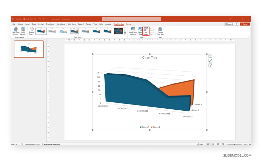
Replace the data in the numbers to reflect the data you need to showcase. The columns’ titles indicate the text the legend shows for each series. Then, we can close the spreadsheet and continue customizing it.

By clicking on the paintbrush, we access the Style options for the graph. We can change the background color, layout style, and more.

If we switch to the Color tab inside of Style , we can modify the color scheme for the presentation graph. And as simple as that is how to make a graph in PowerPoint.

How to Make a Presentation Graph in Google Slides
Now, let’s see how to create a graph in Google Slides. We start once again from a blank slide.

Go to Insert > Chart . Select your desired presentation graph option. In our case, we will work with a Pie Chart.

To change the placeholder data, click on Edit Data .

If you missed the emergent tab, you can go to the three points in the graph, click on them, and select Open Source .

The graph will most likely cover the data spreadsheet, so move it to one side to see the entire data range. In this case, the auto-generated graph is wrong as the sum gives 110%. We’ll correct that now.

And this is how it looks with the corrected data.

Next, we click on the three dots on the chart and select Edit the Chart . This shall open all customization options.

At the Setup tab, we can change the chart style and select from various options.
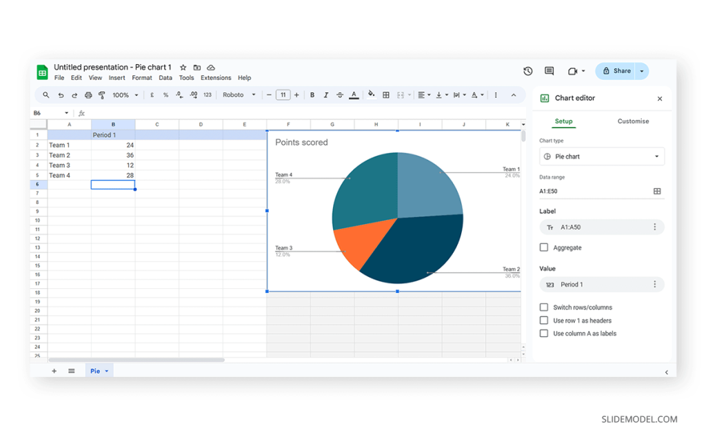
The data will refresh in that case and adapt its representation to the new style.

If we switch to the Customize tab (it says Customise, as the selected language is UK English), we can fine-tune our presentation graph starting from the background color.

Activate the 3D checkbox to change to a 3D pie chart (applicable to any graph).

We can find tailored settings for the Pie Chart to convert it to a donut chart, with settings like the donut hole size.

The Pie Slice section helps us change the color scheme for each one of the slices.

We can change the title and axis titles in the Chart and axis titles section.

Finally, the Legend section offers many customization options to alter the legend’s format.

Once the customization process is completed, close the Google Spreadsheets tab, go to your presentation chart, and click Update .

Google Slides will refresh the data for your created presentation graph with the last synced data.

Adhering to certain design principles is imperative for creating graphs and communicating information effectively.
Simplicity and Clarity
A graph should be clean and free from unnecessary details. Clear graphs have visible data points and helpful short texts for better understanding. Even if it looks simple, it can still show important information. To make it easy to understand, avoid adding distortions, shading, weird perspectives, too many colors, unnecessary decorations, or 3D effects [2]. It is also essential to ensure the plotted data points are clear, not hidden or covered.
Use of Color and Contrast
Thoughtful use of color and contrast enhances visual appeal and distinguishes different elements within the graph. Colors can effectively improve the chart presentation in three ways: highlighting specific data, grouping items, and encoding quantitative values. However, do not use fancy or varying colors in the background. We suggest resisting decorating graphs excessively, as it can hinder clear data presentation [4]. Only use different colors when they highlight important differences in the data.
Labeling and Legends
Accurate labeling is crucial to provide context and understanding. While designing graphs, we don’t expect the viewer to guess. Instead, we clearly label titles and axes. Clear labeling means displaying both axes on your graph, including measurement units if needed. Identify symbols and patterns in a legend or caption [3]. Legends explain symbols and patterns in a graph.
Scale and Proportion
For more clarity, we keep the measurement scales consistent and avoid distortions for accuracy. This ensures the exact difference between all the values. It will present data relationships and prevent misinterpretation due to skewed visual perceptions.
Tips for Customizing Graphs
PowerPoint provides various customization options—Right-click on elements like axes, data points, or legends to format them. You can also change colors, fonts, and styles to match your presentation’s look.
Coloring Your Data
When you want to make different parts of your chart stand out, click on a bar or line. Then, right-click and choose “Format Data Series.” Here, you can pick a color that helps each set of data pop. Do this for each part of your chart to make it visually appealing.
Changing the Chart Background
If you want to change the background color around your chart, right-click on the white space. Choose “Format Chart Area” and change the background color to something that complements your data.
Customizing Line Styles
Change the appearance of your lines for a unique look. Click on a line in your chart, right-click, and select “Format Data Series.” Experiment with different line styles, such as solid, dashed, or dotted.
Fine-tuning Axis Appearance
To make your chart axes look polished, right-click on the X or Y axis and choose “Format Axis.” Adjust properties like line color, tick marks, and label font to suit your design.
Perfecting Legends
Legends can be tweaked for a more integrated look. Right-click on the legend, select “Format Legend,” and adjust options like placement, font size, and background color to enhance the overall appearance.
Creating graphs in PowerPoint or Google Slides from scratch can be time-consuming, and ultimately, it won’t yield the same results as professional-made designs. We invite you to discover some cool designs for presentation graphs PPT templates made by SlideModel.
1. Dashboard Presentation Graph for PowerPoint & Google Slides
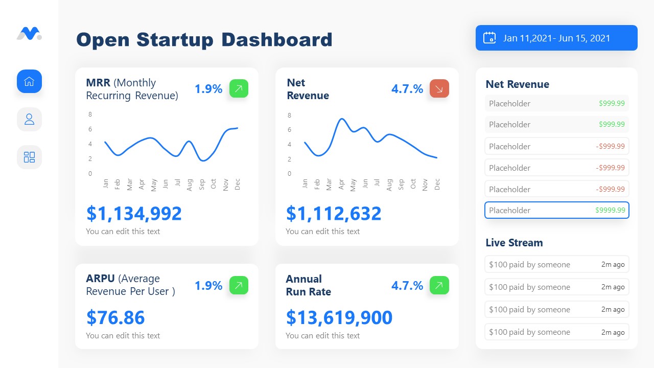
Don’t worry about how to make a graph in PowerPoint – let’s us bring the resources in the shape of a cool dashboard layout. Ideal for any kind of e-commerce business, you can track expenses or income, evaluate metrics, and much more.
Use This Template
2. Infographic Donut Chart Presentation Template
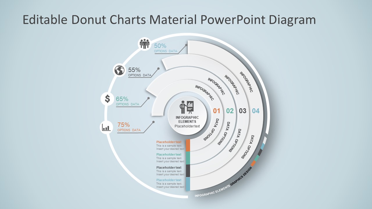
Explain concepts in different hierarchy levels, or processes that require a set of sequential steps by implementing this donut chart PPT template. Each segment has a bubble callout to expand further information for the areas required.
3. Presentation Graph Slide Deck PPT Template
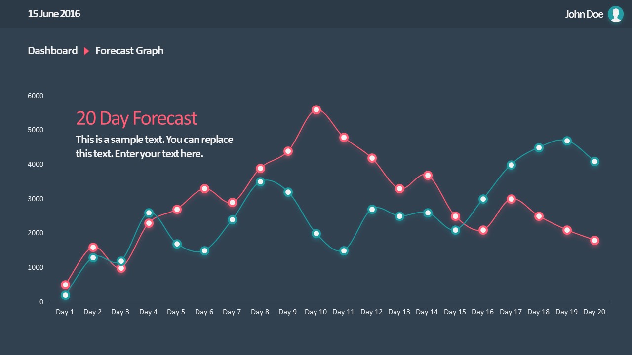
All that’s required to create a data-driven presentation is here. Customize donut charts, funnels, histograms, point & figure charts, and more to create professionally-designed presentation slides.
4. PowerPoint Charts Slide Deck
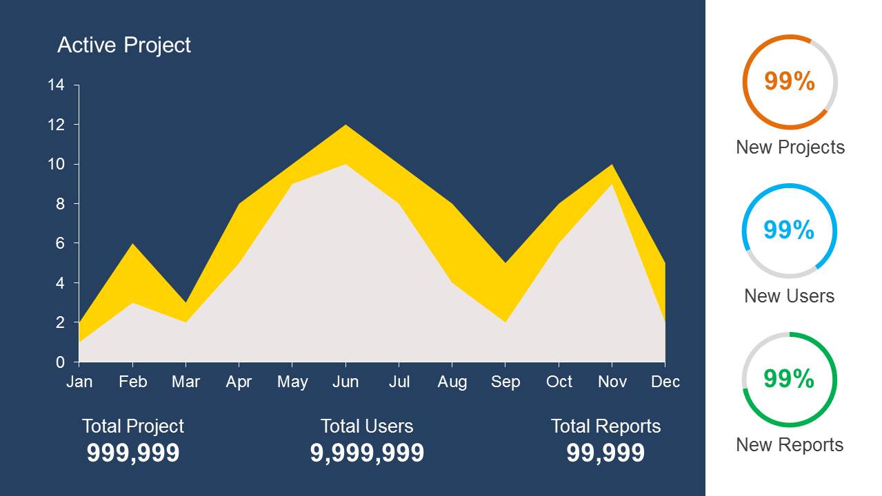
If you’re looking for clean layouts for column graphs, area charts, line graphs and donut charts, this is the template you need in your toolbox. Perfect for marketing, financial and academic reports.
Consider its relevance to the content when incorporating your graph into the presentation. Insert the graph in a slide where it logically fits within the flow of information.
Positioning the Graph Appropriately in the Presentation
Deciding where to put your graph in the presentation is essential. You want it to be where everyone can see it easily and where it makes sense. Usually, you place the graph on a slide that talks about the data or topic related to the graph. This way, people can look at the graph simultaneously when you talk about it. Make sure it is not too small. If needed, you can make it bigger or smaller to fit nicely on the slide. The goal is to position the graph so that it helps your audience understand your information better.
Ensuring Consistency with the Overall Design of the Presentation
Align the graph with the overall design of your presentation to maintain a cohesive visual appeal. You can use consistent colors, fonts, and styles to integrate the graph seamlessly. The graph must complement the theme and tone of your slides. Therefore, you should avoid flashy or distracting elements that may deviate from the established design. The goal is to create a harmonious and professional presentation where the graph blends naturally without causing visual disruptions. However, we recommend you use bar chart templates already available for presentation.
Narrating Your Graph
When explaining your graph during the presentation, start by providing context. Clearly state what the graph illustrates and its significance to the audience. Use simple and direct language, avoiding unnecessary jargon. It is important to walk through the axes, data points, and any trends you want to highlight. Speaking moderately allows the audience to absorb the information without feeling rushed. You can take pause when needed to emphasize crucial points or transitions.
You can learn more about creative techniques to narrate your graph in our data storytelling guide.
Overloading with Information
One common mistake is presenting too much information on a single graph. Avoid filling the graph with excessive data points or unnecessary details.
Misleading Scales or Axes
Scale mistakes, such as uneven intervals or a bar chart with zero baselines, are common graphical mistakes [5]. Misleading scales can distort the interpretation of the graph and lead to incorrect conclusions. Scales should accurately present the data without exaggerating certain aspects.
Inappropriate Graph Types for the Data
Selecting an inappropriate graph type for your data is a mistake to avoid. Choose a graph type that effectively communicates the nature of your data. For instance, a pie chart for time-based trends might not be the most suitable choice. Match the graph type to the data characteristics to convey information accurately.
Working with presentation graphs may feel challenging for a beginner in presentation design software. Still, practice makes the master. Start by clearly stating your objectives in terms of data representation—this will make the presentation graph-type selection process much easier. Customize the graph by working with appropriate color combinations (you can learn more about this in our color theory guide), as this can also help highlight relevant data sections that may influence an informed decision.
Everything depends on your creative skills and how you want to showcase information. As a final piece of advice, we highly recommend working with one graph per slide, unless you opted for a dashboard layout. Ideally, graphs should be seen from a distance, and working with reduced sizes may hinder accurate data representation.
[1] https://uogqueensmcf.com/wp-content/uploads/2020/BA Modules/Medical Laboratory/Medical Laboratory Courses PPT/Year III Sem II/Biostatistics/lecture 1.pdf (Accessed: 06 March 2024).
[2] Five Principles of Good Graphs. https://scc.ms.unimelb.edu.au/resources/data-visualisation-and-exploration/data-visualisation
[3} Guide to fairly good graphs. Statistics LibreTexts. https://stats.libretexts.org/Bookshelves/Applied_Statistics/Biological_Statistics_(McDonald)/07%3A_Miscellany/7.02%3A_Guide_to_Fairly_Good_Graphs
[4] Practical rules for using color in charts. https://nbisweden.github.io/Rcourse/files/rules_for_using_color.pdf
[5] https://iase-web.org/islp/documents/Media/How%20To%20Avoid.pdf [6] Duquia, R.P. et al. (2014) Presenting data in tables and charts , Anais brasileiros de dermatologia . 10.1590/abd1806-4841.20143388

Like this article? Please share
Data Analysis, Data Science, Data Visualization, Presentation Approaches Filed under Design
Related Articles

Filed under Design • March 20th, 2024
Understanding Data Presentations (Guide + Examples)
Elevate the quality of your message by learning how to work in data presentations effectively. Insights, examples, and PPT templates here.

Filed under Presentation Ideas • February 29th, 2024
How to Make a Fundraising Presentation (with Thermometer Templates & Slides)
Meet a new framework to design fundraising presentations by harnessing the power of fundraising thermometer templates. Detailed guide with examples.

Filed under Presentation Ideas • February 15th, 2024
How to Create a 5 Minutes Presentation
Master the art of short-format speeches like the 5 minutes presentation with this article. Insights on content structure, audience engagement and more.
Leave a Reply
We use essential cookies to make Venngage work. By clicking “Accept All Cookies”, you agree to the storing of cookies on your device to enhance site navigation, analyze site usage, and assist in our marketing efforts.
Manage Cookies
Cookies and similar technologies collect certain information about how you’re using our website. Some of them are essential, and without them you wouldn’t be able to use Venngage. But others are optional, and you get to choose whether we use them or not.
Strictly Necessary Cookies
These cookies are always on, as they’re essential for making Venngage work, and making it safe. Without these cookies, services you’ve asked for can’t be provided.
Show cookie providers
- Google Login
Functionality Cookies
These cookies help us provide enhanced functionality and personalisation, and remember your settings. They may be set by us or by third party providers.
Performance Cookies
These cookies help us analyze how many people are using Venngage, where they come from and how they're using it. If you opt out of these cookies, we can’t get feedback to make Venngage better for you and all our users.
- Google Analytics
Targeting Cookies
These cookies are set by our advertising partners to track your activity and show you relevant Venngage ads on other sites as you browse the internet.
- Google Tag Manager
- Infographics
- Daily Infographics
- Popular Templates
- Accessibility
- Graphic Design
- Graphs and Charts
- Data Visualization
- Human Resources
- Beginner Guides
Blog Data Visualization 10 Data Presentation Examples For Strategic Communication
10 Data Presentation Examples For Strategic Communication
Written by: Krystle Wong Sep 28, 2023

Knowing how to present data is like having a superpower.
Data presentation today is no longer just about numbers on a screen; it’s storytelling with a purpose. It’s about captivating your audience, making complex stuff look simple and inspiring action.
To help turn your data into stories that stick, influence decisions and make an impact, check out Venngage’s free chart maker or follow me on a tour into the world of data storytelling along with data presentation templates that work across different fields, from business boardrooms to the classroom and beyond. Keep scrolling to learn more!
Click to jump ahead:
10 Essential data presentation examples + methods you should know
What should be included in a data presentation, what are some common mistakes to avoid when presenting data, faqs on data presentation examples, transform your message with impactful data storytelling.
Data presentation is a vital skill in today’s information-driven world. Whether you’re in business, academia, or simply want to convey information effectively, knowing the different ways of presenting data is crucial. For impactful data storytelling, consider these essential data presentation methods:
1. Bar graph
Ideal for comparing data across categories or showing trends over time.
Bar graphs, also known as bar charts are workhorses of data presentation. They’re like the Swiss Army knives of visualization methods because they can be used to compare data in different categories or display data changes over time.
In a bar chart, categories are displayed on the x-axis and the corresponding values are represented by the height of the bars on the y-axis.

It’s a straightforward and effective way to showcase raw data, making it a staple in business reports, academic presentations and beyond.
Make sure your bar charts are concise with easy-to-read labels. Whether your bars go up or sideways, keep it simple by not overloading with too many categories.

2. Line graph
Great for displaying trends and variations in data points over time or continuous variables.
Line charts or line graphs are your go-to when you want to visualize trends and variations in data sets over time.
One of the best quantitative data presentation examples, they work exceptionally well for showing continuous data, such as sales projections over the last couple of years or supply and demand fluctuations.

The x-axis represents time or a continuous variable and the y-axis represents the data values. By connecting the data points with lines, you can easily spot trends and fluctuations.
A tip when presenting data with line charts is to minimize the lines and not make it too crowded. Highlight the big changes, put on some labels and give it a catchy title.

3. Pie chart
Useful for illustrating parts of a whole, such as percentages or proportions.
Pie charts are perfect for showing how a whole is divided into parts. They’re commonly used to represent percentages or proportions and are great for presenting survey results that involve demographic data.
Each “slice” of the pie represents a portion of the whole and the size of each slice corresponds to its share of the total.

While pie charts are handy for illustrating simple distributions, they can become confusing when dealing with too many categories or when the differences in proportions are subtle.
Don’t get too carried away with slices — label those slices with percentages or values so people know what’s what and consider using a legend for more categories.

4. Scatter plot
Effective for showing the relationship between two variables and identifying correlations.
Scatter plots are all about exploring relationships between two variables. They’re great for uncovering correlations, trends or patterns in data.
In a scatter plot, every data point appears as a dot on the chart, with one variable marked on the horizontal x-axis and the other on the vertical y-axis.

By examining the scatter of points, you can discern the nature of the relationship between the variables, whether it’s positive, negative or no correlation at all.
If you’re using scatter plots to reveal relationships between two variables, be sure to add trendlines or regression analysis when appropriate to clarify patterns. Label data points selectively or provide tooltips for detailed information.

5. Histogram
Best for visualizing the distribution and frequency of a single variable.
Histograms are your choice when you want to understand the distribution and frequency of a single variable.
They divide the data into “bins” or intervals and the height of each bar represents the frequency or count of data points falling into that interval.

Histograms are excellent for helping to identify trends in data distributions, such as peaks, gaps or skewness.
Here’s something to take note of — ensure that your histogram bins are appropriately sized to capture meaningful data patterns. Using clear axis labels and titles can also help explain the distribution of the data effectively.

6. Stacked bar chart
Useful for showing how different components contribute to a whole over multiple categories.
Stacked bar charts are a handy choice when you want to illustrate how different components contribute to a whole across multiple categories.
Each bar represents a category and the bars are divided into segments to show the contribution of various components within each category.

This method is ideal for highlighting both the individual and collective significance of each component, making it a valuable tool for comparative analysis.
Stacked bar charts are like data sandwiches—label each layer so people know what’s what. Keep the order logical and don’t forget the paintbrush for snazzy colors. Here’s a data analysis presentation example on writers’ productivity using stacked bar charts:

7. Area chart
Similar to line charts but with the area below the lines filled, making them suitable for showing cumulative data.
Area charts are close cousins of line charts but come with a twist.
Imagine plotting the sales of a product over several months. In an area chart, the space between the line and the x-axis is filled, providing a visual representation of the cumulative total.

This makes it easy to see how values stack up over time, making area charts a valuable tool for tracking trends in data.
For area charts, use them to visualize cumulative data and trends, but avoid overcrowding the chart. Add labels, especially at significant points and make sure the area under the lines is filled with a visually appealing color gradient.

8. Tabular presentation
Presenting data in rows and columns, often used for precise data values and comparisons.
Tabular data presentation is all about clarity and precision. Think of it as presenting numerical data in a structured grid, with rows and columns clearly displaying individual data points.
A table is invaluable for showcasing detailed data, facilitating comparisons and presenting numerical information that needs to be exact. They’re commonly used in reports, spreadsheets and academic papers.

When presenting tabular data, organize it neatly with clear headers and appropriate column widths. Highlight important data points or patterns using shading or font formatting for better readability.
9. Textual data
Utilizing written or descriptive content to explain or complement data, such as annotations or explanatory text.
Textual data presentation may not involve charts or graphs, but it’s one of the most used qualitative data presentation examples.
It involves using written content to provide context, explanations or annotations alongside data visuals. Think of it as the narrative that guides your audience through the data.
Well-crafted textual data can make complex information more accessible and help your audience understand the significance of the numbers and visuals.
Textual data is your chance to tell a story. Break down complex information into bullet points or short paragraphs and use headings to guide the reader’s attention.
10. Pictogram
Using simple icons or images to represent data is especially useful for conveying information in a visually intuitive manner.
Pictograms are all about harnessing the power of images to convey data in an easy-to-understand way.
Instead of using numbers or complex graphs, you use simple icons or images to represent data points.
For instance, you could use a thumbs up emoji to illustrate customer satisfaction levels, where each face represents a different level of satisfaction.

Pictograms are great for conveying data visually, so choose symbols that are easy to interpret and relevant to the data. Use consistent scaling and a legend to explain the symbols’ meanings, ensuring clarity in your presentation.

Looking for more data presentation ideas? Use the Venngage graph maker or browse through our gallery of chart templates to pick a template and get started!
A comprehensive data presentation should include several key elements to effectively convey information and insights to your audience. Here’s a list of what should be included in a data presentation:
1. Title and objective
- Begin with a clear and informative title that sets the context for your presentation.
- State the primary objective or purpose of the presentation to provide a clear focus.

2. Key data points
- Present the most essential data points or findings that align with your objective.
- Use charts, graphical presentations or visuals to illustrate these key points for better comprehension.

3. Context and significance
- Provide a brief overview of the context in which the data was collected and why it’s significant.
- Explain how the data relates to the larger picture or the problem you’re addressing.
4. Key takeaways
- Summarize the main insights or conclusions that can be drawn from the data.
- Highlight the key takeaways that the audience should remember.
5. Visuals and charts
- Use clear and appropriate visual aids to complement the data.
- Ensure that visuals are easy to understand and support your narrative.

6. Implications or actions
- Discuss the practical implications of the data or any recommended actions.
- If applicable, outline next steps or decisions that should be taken based on the data.

7. Q&A and discussion
- Allocate time for questions and open discussion to engage the audience.
- Address queries and provide additional insights or context as needed.
Presenting data is a crucial skill in various professional fields, from business to academia and beyond. To ensure your data presentations hit the mark, here are some common mistakes that you should steer clear of:
Overloading with data
Presenting too much data at once can overwhelm your audience. Focus on the key points and relevant information to keep the presentation concise and focused. Here are some free data visualization tools you can use to convey data in an engaging and impactful way.
Assuming everyone’s on the same page
It’s easy to assume that your audience understands as much about the topic as you do. But this can lead to either dumbing things down too much or diving into a bunch of jargon that leaves folks scratching their heads. Take a beat to figure out where your audience is coming from and tailor your presentation accordingly.
Misleading visuals
Using misleading visuals, such as distorted scales or inappropriate chart types can distort the data’s meaning. Pick the right data infographics and understandable charts to ensure that your visual representations accurately reflect the data.
Not providing context
Data without context is like a puzzle piece with no picture on it. Without proper context, data may be meaningless or misinterpreted. Explain the background, methodology and significance of the data.
Not citing sources properly
Neglecting to cite sources and provide citations for your data can erode its credibility. Always attribute data to its source and utilize reliable sources for your presentation.
Not telling a story
Avoid simply presenting numbers. If your presentation lacks a clear, engaging story that takes your audience on a journey from the beginning (setting the scene) through the middle (data analysis) to the end (the big insights and recommendations), you’re likely to lose their interest.
Infographics are great for storytelling because they mix cool visuals with short and sweet text to explain complicated stuff in a fun and easy way. Create one with Venngage’s free infographic maker to create a memorable story that your audience will remember.
Ignoring data quality
Presenting data without first checking its quality and accuracy can lead to misinformation. Validate and clean your data before presenting it.
Simplify your visuals
Fancy charts might look cool, but if they confuse people, what’s the point? Go for the simplest visual that gets your message across. Having a dilemma between presenting data with infographics v.s data design? This article on the difference between data design and infographics might help you out.
Missing the emotional connection
Data isn’t just about numbers; it’s about people and real-life situations. Don’t forget to sprinkle in some human touch, whether it’s through relatable stories, examples or showing how the data impacts real lives.
Skipping the actionable insights
At the end of the day, your audience wants to know what they should do with all the data. If you don’t wrap up with clear, actionable insights or recommendations, you’re leaving them hanging. Always finish up with practical takeaways and the next steps.
Can you provide some data presentation examples for business reports?
Business reports often benefit from data presentation through bar charts showing sales trends over time, pie charts displaying market share,or tables presenting financial performance metrics like revenue and profit margins.
What are some creative data presentation examples for academic presentations?
Creative data presentation ideas for academic presentations include using statistical infographics to illustrate research findings and statistical data, incorporating storytelling techniques to engage the audience or utilizing heat maps to visualize data patterns.
What are the key considerations when choosing the right data presentation format?
When choosing a chart format , consider factors like data complexity, audience expertise and the message you want to convey. Options include charts (e.g., bar, line, pie), tables, heat maps, data visualization infographics and interactive dashboards.
Knowing the type of data visualization that best serves your data is just half the battle. Here are some best practices for data visualization to make sure that the final output is optimized.
How can I choose the right data presentation method for my data?
To select the right data presentation method, start by defining your presentation’s purpose and audience. Then, match your data type (e.g., quantitative, qualitative) with suitable visualization techniques (e.g., histograms, word clouds) and choose an appropriate presentation format (e.g., slide deck, report, live demo).
For more presentation ideas , check out this guide on how to make a good presentation or use a presentation software to simplify the process.
How can I make my data presentations more engaging and informative?
To enhance data presentations, use compelling narratives, relatable examples and fun data infographics that simplify complex data. Encourage audience interaction, offer actionable insights and incorporate storytelling elements to engage and inform effectively.
The opening of your presentation holds immense power in setting the stage for your audience. To design a presentation and convey your data in an engaging and informative, try out Venngage’s free presentation maker to pick the right presentation design for your audience and topic.
What is the difference between data visualization and data presentation?
Data presentation typically involves conveying data reports and insights to an audience, often using visuals like charts and graphs. Data visualization , on the other hand, focuses on creating those visual representations of data to facilitate understanding and analysis.
Now that you’ve learned a thing or two about how to use these methods of data presentation to tell a compelling data story , it’s time to take these strategies and make them your own.
But here’s the deal: these aren’t just one-size-fits-all solutions. Remember that each example we’ve uncovered here is not a rigid template but a source of inspiration. It’s all about making your audience go, “Wow, I get it now!”
Think of your data presentations as your canvas – it’s where you paint your story, convey meaningful insights and make real change happen.
So, go forth, present your data with confidence and purpose and watch as your strategic influence grows, one compelling presentation at a time.
Discover popular designs

Infographic maker

Brochure maker

White paper online

Newsletter creator

Flyer maker

Timeline maker

Letterhead maker

Mind map maker

Ebook maker
- Privacy Policy
Home » Graphical Methods – Types, Examples and Guide
Graphical Methods – Types, Examples and Guide
Table of Contents

Graphical Methods
Definition:
Graphical methods refer to techniques used to visually represent data, relationships, or processes using charts, graphs, diagrams, or other graphical formats. These methods are widely used in various fields such as science, engineering, business, and social sciences, among others, to analyze, interpret and communicate complex information in a concise and understandable way.
Types of Graphical Methods
Here are some of the most common types of graphical methods for data analysis and visual presentation:
Line Graphs
These are commonly used to show trends over time, such as the stock prices of a particular company or the temperature over a certain period. They consist of a series of data points connected by a line that shows the trend of the data over time. Line graphs are useful for identifying patterns in data, such as seasonal changes or long-term trends.
These are commonly used to compare values of different categories, such as sales figures for different products or the number of students in different grade levels. Bar charts use bars that are either horizontal or vertical and represent the data values. They are useful for comparing data visually and identifying differences between categories.
These are used to show how a whole is divided into parts, such as the percentage of students in a school who are enrolled in different programs. Pie charts use a circle that is divided into sectors, with each sector representing a portion of the whole. They are useful for showing proportions and identifying which parts of a whole are larger or smaller.
Scatter Plots
These are used to visualize the relationship between two variables, such as the correlation between a person’s height and weight. Scatter plots consist of a series of data points that are plotted on a graph and connected by a line or curve. They are useful for identifying trends and relationships between variables.
These are used to show the distribution of data across a two-dimensional plane, such as a map of a city showing the density of population in different areas. Heat maps use color-coded cells to represent different levels of data, with darker colors indicating higher values. They are useful for identifying areas of high or low density and for highlighting patterns in data.
These are used to show the distribution of data in a single variable, such as the distribution of ages of a group of people. Histograms use bars that represent the frequency of each data value, with taller bars indicating a higher frequency. They are useful for identifying the shape of a distribution and for identifying outliers or unusual data values.
Network Diagrams
These are used to show the relationships between different entities or nodes, such as the relationships between people in a social network. Network diagrams consist of nodes that are connected by lines that represent the relationship. They are useful for identifying patterns in complex data and for understanding the structure of a network.
Box plots, also known as box-and-whisker plots, are a type of graphical method used to show the distribution of data in a single variable. They consist of a box with whiskers extending from the top and bottom of the box. The box represents the middle 50% of the data, with the median value indicated by a line inside the box. The whiskers represent the range of the data, with any data points outside the whiskers indicated as outliers. Box plots are useful for identifying the spread and shape of a distribution and for identifying outliers or unusual data values.
Applications of Graphical Methods
Graphical methods have a wide range of applications in various fields, including:
- Business : Graphical methods are commonly used in business to analyze sales data, financial data, and other types of data. They are useful for identifying trends, patterns, and outliers, as well as for presenting data in a clear and concise manner to stakeholders.
- Science and engineering: Graphical methods are used extensively in scientific and engineering fields to analyze data and to present research findings. They are useful for visualizing complex data sets and for identifying relationships between variables.
- Social sciences: Graphical methods are used in social sciences to analyze and present data related to human behavior, such as demographics, survey results, and statistical analyses. They are useful for identifying trends and patterns in large data sets and for communicating findings to a broader audience.
- Education : Graphical methods are used in education to present information to students and to help them understand complex concepts. They are useful for visualizing data and for presenting information in a way that is easy to understand.
- Healthcare : Graphical methods are used in healthcare to analyze patient data, to track disease outbreaks, and to present medical information to patients. They are useful for identifying patterns and trends in patient data and for communicating medical information in a clear and concise manner.
- Sports : Graphical methods are used in sports to analyze and present data related to player performance, team statistics, and game outcomes. They are useful for identifying trends and patterns in player and team data and for communicating this information to coaches, players, and fans.
Examples of Graphical Methods
Here are some examples of real-time applications of graphical methods:
- Stock Market: Line graphs, candlestick charts, and bar charts are widely used in real-time trading systems to display stock prices and trends over time. Traders use these charts to analyze historical data and make informed decisions about buying and selling stocks in real-time.
- Weather Forecasting : Heat maps and radar maps are commonly used in weather forecasting to display current weather conditions and to predict future weather patterns. These maps are useful for tracking the movement of storms, identifying areas of high and low pressure, and predicting the likelihood of severe weather events.
- Social Media Analytics: Scatter plots and network diagrams are commonly used in social media analytics to track the spread of information across social networks. Analysts use these graphs to identify patterns in user behavior, to track the popularity of specific topics or hashtags, and to monitor the influence of key opinion leaders.
- Traffic Analysis: Heat maps and network diagrams are used in traffic analysis to visualize traffic flow patterns and to identify areas of congestion or accidents. These graphs are useful for predicting traffic patterns, optimizing traffic flow, and improving transportation infrastructure.
- Medical Diagnostics: Box plots and histograms are commonly used in medical diagnostics to display the distribution of patient data, such as blood pressure, heart rate, or blood sugar levels. These graphs are useful for identifying patterns in patient data, diagnosing medical conditions, and monitoring the effectiveness of treatments in real-time.
- Cybersecurity: Heat maps and network diagrams are used in cybersecurity to visualize network traffic patterns and to identify potential security threats. These graphs are useful for identifying anomalies in network traffic, detecting and mitigating cyber attacks, and improving network security protocols.
How to use Graphical Methods
Here are some general steps to follow when using graphical methods to analyze and present data:
- Identify the research question: Before creating any graphs, it’s important to identify the research question or hypothesis you want to explore. This will help you select the appropriate type of graph and ensure that the data you collect is relevant to your research question.
- Collect and organize the data: Collect the data you need to answer your research question and organize it in a way that makes it easy to work with. This may involve sorting, filtering, or cleaning the data to ensure that it is accurate and relevant.
- Select the appropriate graph : There are many different types of graphs available, each with its own strengths and weaknesses. Select the appropriate graph based on the type of data you have and the research question you are exploring. For example, a scatterplot may be appropriate for exploring the relationship between two continuous variables, while a bar chart may be appropriate for comparing categorical data.
- Create the graph: Once you have selected the appropriate graph, create it using software or a tool that allows you to customize the graph based on your needs. Be sure to include appropriate labels and titles, and ensure that the graph is clearly legible.
- Analyze the graph: Once you have created the graph, analyze it to identify patterns, trends, and relationships in the data. Look for outliers or other anomalies that may require further investigation.
- Draw conclusions: Based on your analysis of the graph, draw conclusions about the research question you are exploring. Use the graph to support your conclusions and to communicate your findings to others.
- Iterate and refine: Finally, refine your graph or create additional graphs as needed to further explore your research question. Iteratively refining and revising your graphs can help to ensure that you are accurately representing the data and that you are drawing the appropriate conclusions.
When to use Graphical Methods
Graphical methods can be used in a variety of situations to help analyze, interpret, and communicate data. Here are some general guidelines on when to use graphical methods:
- To identify patterns and trends: Graphical methods are useful for identifying patterns and trends in data, which may be difficult to see in raw data tables or spreadsheets. Graphs can reveal trends that may not be immediately apparent in the data, making it easier to draw conclusions and make predictions.
- To compare data: Graphs can be used to compare data from different sources or over different time periods. Graphical comparisons can make it easier to identify differences or similarities in the data, which can be useful for making decisions and taking action.
- To summarize data : Graphs can be used to summarize large amounts of data in a single visual display. This can be particularly useful when presenting data to a broad audience, as it can help to simplify complex data sets and make them more accessible.
- To communicate data: Graphs can be used to communicate data and findings to a variety of audiences, including stakeholders, colleagues, and the general public. Graphs can be particularly useful in situations where data needs to be presented quickly and in a way that is easy to understand.
- To identify outliers: Graphical methods are useful for identifying outliers or anomalies in the data. Outliers can be indicative of errors or unusual events, and may warrant further investigation.
Purpose of Graphical Methods
The purpose of graphical methods is to help people analyze, interpret, and communicate data in a way that is both accurate and understandable. Graphical methods provide visual representations of data that can be easier to interpret than tables of numbers or raw data sets. Graphical methods help to reveal patterns and trends that may not be immediately apparent in the data, making it easier to draw conclusions and make predictions. They can also help to identify outliers or unusual data points that may warrant further investigation.
In addition to helping people analyze and interpret data, graphical methods also serve an important communication function. Graphs can be used to present data to a wide range of audiences, including stakeholders, colleagues, and the general public. Graphs can help to simplify complex data sets, making them more accessible and easier to understand. By presenting data in a clear and concise way, graphical methods can help people make informed decisions and take action based on the data.
Overall, the purpose of graphical methods is to provide a powerful tool for analyzing, interpreting, and communicating data. Graphical methods help people to better understand the data they are working with, to identify patterns and trends, and to make informed decisions based on the data.
Characteristics of Graphical Methods
Here are some characteristics of graphical methods:
- Visual Representation: Graphical methods provide a visual representation of data, which can be easier to interpret than tables of numbers or raw data sets. Graphs can help to reveal patterns and trends that may not be immediately apparent in the data.
- Simplicity : Graphical methods simplify complex data sets, making them more accessible and easier to understand. By presenting data in a clear and concise way, graphical methods can help people make informed decisions and take action based on the data.
- Comparability : Graphical methods can be used to compare data from different sources or over different time periods. This can help to identify differences or similarities in the data, which can be useful for making decisions and taking action.
- Flexibility : Graphical methods can be adapted to different types of data, including continuous, categorical, and ordinal data. Different types of graphs can be used to display different types of data, depending on the characteristics of the data and the research question.
- Accuracy : Graphical methods should accurately represent the data being analyzed. Graphs should be properly scaled and labeled to avoid distorting the data or misleading viewers.
- Clarity : Graphical methods should be clear and easy to read. Graphs should be designed with the viewer in mind, using appropriate colors, labels, and titles to ensure that the message of the graph is conveyed effectively.
Advantages of Graphical Methods
Graphical methods offer several advantages for analyzing and presenting data, including:
- Clear visualization: Graphical methods provide a clear and intuitive visual representation of data that can help people understand complex relationships, trends, and patterns in the data. This can be particularly useful when dealing with large and complex data sets.
- Efficient communication: Graphical methods can help to communicate complex data sets in an efficient and accessible way. Visual representations can be easier to understand than numerical data alone, and can help to convey key messages quickly.
- Effective comparison: Graphical methods allow for easy comparison between different data sets, making it easier to identify trends, patterns, and differences. This can help in making decisions, identifying areas for improvement, or developing new insights.
- Improved decision-making: Graphical methods can help to inform decision-making by presenting data in a clear and easy-to-understand format. They can also help to identify key areas of focus, enabling individuals or teams to make more informed decisions.
- Increased engagement: Graphical methods can help to engage audiences by presenting data in an engaging and interactive way. This can be particularly useful in presentations or reports, where visual representations can help to maintain audience attention and interest.
- Better understanding: Graphical methods can help individuals to better understand the data they are working with, by providing a clear and intuitive visual representation of the data. This can lead to improved insights and decision-making, as well as better understanding of the implications of the data.
Limitations of Graphical Methods
Here are a few limitations to consider:
- Misleading representation: Graphical methods can potentially misrepresent data if they are not designed properly. For example, inappropriate scaling or labeling of the axes or the use of certain types of graphs can create a distorted view of the data.
- Limited scope: Graphical methods can only display a limited amount of data, which can make it difficult to capture the full complexity of a data set. Additionally, some types of data may be difficult to represent visually.
- Time-consuming : Creating graphs can be a time-consuming process, particularly if multiple graphs need to be created and analyzed. This can be a limitation in situations where time is limited or resources are scarce.
- Technical skills: Some graphical methods require technical skills to create and interpret. For example, certain types of graphs may require knowledge of specialized software or programming languages.
- Interpretation : Interpreting graphs can be subjective, and the same graph can be interpreted in different ways by different people. This can lead to confusion or disagreements when using graphs to communicate data.
- Accessibility : Some graphical methods may not be accessible to all audiences, particularly those with visual impairments. Additionally, some types of graphs may not be accessible to those with limited literacy or numeracy skills.
About the author

Muhammad Hassan
Researcher, Academic Writer, Web developer
You may also like

Cluster Analysis – Types, Methods and Examples

Discriminant Analysis – Methods, Types and...

MANOVA (Multivariate Analysis of Variance) –...

Documentary Analysis – Methods, Applications and...

ANOVA (Analysis of variance) – Formulas, Types...

Substantive Framework – Types, Methods and...
- Graphic Presentation of Data
Apart from diagrams, Graphic presentation is another way of the presentation of data and information. Usually, graphs are used to present time series and frequency distributions. In this article, we will look at the graphic presentation of data and information along with its merits, limitations , and types.
Suggested Videos
Construction of a graph.
The graphic presentation of data and information offers a quick and simple way of understanding the features and drawing comparisons. Further, it is an effective analytical tool and a graph can help us in finding the mode, median, etc.
We can locate a point in a plane using two mutually perpendicular lines – the X-axis (the horizontal line) and the Y-axis (the vertical line). Their point of intersection is the Origin .
We can locate the position of a point in terms of its distance from both these axes. For example, if a point P is 3 units away from the Y-axis and 5 units away from the X-axis, then its location is as follows:

Browse more Topics under Descriptive Statistics
- Definition and Characteristics of Statistics
- Stages of Statistical Enquiry
- Importance and Functions of Statistics
- Nature of Statistics – Science or Art?
- Application of Statistics
- Law of Statistics and Distrust of Statistics
- Meaning and Types of Data
- Methods of Collecting Data
- Sample Investigation
- Classification of Data
- Tabulation of Data
- Frequency Distribution of Data
- Diagrammatic Presentation of Data
- Measures of Central Tendency
- Mean Median Mode
- Measures of Dispersion
- Standard Deviation
- Variance Analysis
Some points to remember:
- We measure the distance of the point from the Y-axis along the X-axis. Similarly, we measure the distance of the point from the X-axis along the Y-axis. Therefore, to measure 3 units from the Y-axis, we move 3 units along the X-axis and likewise for the other coordinate .
- We then draw perpendicular lines from these two points.
- The point where the perpendiculars intersect is the position of the point P.
- We denote it as follows (3,5) or (abscissa, ordinate). Together, they are the coordinates of the point P.
- The four parts of the plane are Quadrants.
- Also, we can plot different points for a different pair of values.
General Rules for Graphic Presentation of Data and Information
There are certain guidelines for an attractive and effective graphic presentation of data and information. These are as follows:
- Suitable Title – Ensure that you give a suitable title to the graph which clearly indicates the subject for which you are presenting it.
- Unit of Measurement – Clearly state the unit of measurement below the title.
- Suitable Scale – Choose a suitable scale so that you can represent the entire data in an accurate manner.
- Index – Include a brief index which explains the different colors and shades, lines and designs that you have used in the graph. Also, include a scale of interpretation for better understanding.
- Data Sources – Wherever possible, include the sources of information at the bottom of the graph.
- Keep it Simple – You should construct a graph which even a layman (without any exposure in the areas of statistics or mathematics) can understand.
- Neat – A graph is a visual aid for the presentation of data and information. Therefore, you must keep it neat and attractive. Choose the right size, right lettering, and appropriate lines, colors, dashes, etc.
Merits of a Graph
- The graph presents data in a manner which is easier to understand.
- It allows us to present statistical data in an attractive manner as compared to tables. Users can understand the main features, trends, and fluctuations of the data at a glance.
- A graph saves time.
- It allows the viewer to compare data relating to two different time-periods or regions.
- The viewer does not require prior knowledge of mathematics or statistics to understand a graph.
- We can use a graph to locate the mode, median, and mean values of the data.
- It is useful in forecasting, interpolation, and extrapolation of data.
Limitations of a Graph
- A graph lacks complete accuracy of facts.
- It depicts only a few selected characteristics of the data.
- We cannot use a graph in support of a statement.
- A graph is not a substitute for tables.
- Usually, laymen find it difficult to understand and interpret a graph.
- Typically, a graph shows the unreasonable tendency of the data and the actual values are not clear.
Types of Graphs
Graphs are of two types:
- Time Series graphs
- Frequency Distribution graphs
Time Series Graphs
A time series graph or a “ histogram ” is a graph which depicts the value of a variable over a different point of time. In a time series graph, time is the most important factor and the variable is related to time. It helps in the understanding and analysis of the changes in the variable at a different point of time. Many statisticians and businessmen use these graphs because they are easy to understand and also because they offer complex information in a simple manner.
Further, constructing a time series graph does not require a user with technical skills. Here are some major steps in the construction of a time series graph:
- Represent time on the X-axis and the value of the variable on the Y-axis.
- Start the Y-value with zero and devise a suitable scale which helps you present the whole data in the given space.
- Plot the values of the variable and join different point with a straight line.
- You can plot multiple variables through different lines.
You can use a line graph to summarize how two pieces of information are related and how they vary with each other.
- You can compare multiple continuous data-sets easily
- You can infer the interim data from the graph line
Disadvantages
- It is only used with continuous data.
Use of a false Base Line
Usually, in a graph, the vertical line starts from the Origin. However, in some cases, a false Base Line is used for a better representation of the data. There are two scenarios where you should use a false Base Line:
- To magnify the minor fluctuation in the time series data
- To economize the space
Net Balance Graph
If you have to show the net balance of income and expenditure or revenue and costs or imports and exports, etc., then you must use a net balance graph. You can use different colors or shades for positive and negative differences.
Frequency Distribution Graphs
Let’s look at the different types of frequency distribution graphs.
A histogram is a graph of a grouped frequency distribution. In a histogram, we plot the class intervals on the X-axis and their respective frequencies on the Y-axis. Further, we create a rectangle on each class interval with its height proportional to the frequency density of the class.

Frequency Polygon or Histograph
A frequency polygon or a Histograph is another way of representing a frequency distribution on a graph. You draw a frequency polygon by joining the midpoints of the upper widths of the adjacent rectangles of the histogram with straight lines.

Frequency Curve
When you join the verticals of a polygon using a smooth curve, then the resulting figure is a Frequency Curve. As the number of observations increase, we need to accommodate more classes. Therefore, the width of each class reduces. In such a scenario, the variable tends to become continuous and the frequency polygon starts taking the shape of a frequency curve.
Cumulative Frequency Curve or Ogive
A cumulative frequency curve or Ogive is the graphical representation of a cumulative frequency distribution. Since a cumulative frequency is either of a ‘less than’ or a ‘more than’ type, Ogives are of two types too – ‘less than ogive’ and ‘more than ogive’.

Scatter Diagram
A scatter diagram or a dot chart enables us to find the nature of the relationship between the variables. If the plotted points are scattered a lot, then the relationship between the two variables is lesser.

Solved Question
Q1. What are the general rules for the graphic presentation of data and information?
Answer: The general rules for the graphic presentation of data are:
- Use a suitable title
- Clearly specify the unit of measurement
- Ensure that you choose a suitable scale
- Provide an index specifying the colors, lines, and designs used in the graph
- If possible, provide the sources of information at the bottom of the graph
- Keep the graph simple and neat.
Customize your course in 30 seconds
Which class are you in.

Descriptive Statistics
- Nature of Statistics – Science or Art?
2 responses to “Stages of Statistical Enquiry”
Im trying to find out if my mother ALICE Desjarlais is registered with the Red Pheasant Reserve, I applied with Metie Urban Housing and I need my Metie card. Is there anyway you can help me.
Quite useful details about statistics. I’d also like to add one point. If you need professional help with a statistics project? Find a professional in minutes!
Leave a Reply Cancel reply
Your email address will not be published. Required fields are marked *
Download the App

- School Guide
- Mathematics
- Number System and Arithmetic
- Trigonometry
- Probability
- Mensuration
- Maths Formulas
- Class 8 Maths Notes
- Class 9 Maths Notes
- Class 10 Maths Notes
- Class 11 Maths Notes
- Class 12 Maths Notes
- CBSE Class 9 Maths Revision Notes
Chapter 1: Number System
- Number System in Maths
- Natural Numbers | Definition, Examples, Properties
- Whole Numbers - Definition, Properties and Examples
- Rational Number: Definition, Examples, Worksheet
- Irrational Numbers: Definition, Examples, Symbol, Properties
- Real Numbers
- Decimal Expansion of Real Numbers
- Decimal Expansions of Rational Numbers
- Representation of Rational Numbers on the Number Line | Class 8 Maths
- Represent √3 on the number line
- Operations on Real Numbers
- Rationalization of Denominators
- Laws of Exponents for Real Numbers
Chapter 2: Polynomials
- Polynomials in One Variable | Polynomials Class 9 Maths
- Polynomial Formula
- Types of Polynomials
- Zeros of Polynomial
- Factorization of Polynomial
- Remainder Theorem
- Factor Theorem
- Algebraic Identities
Chapter 3: Coordinate Geometry
- Coordinate Geometry
- Cartesian Coordinate System
- Cartesian Plane
Chapter 4: Linear equations in two variables
- Linear Equations in One Variable
- Linear Equation in Two Variables
- Graph of Linear Equations in Two Variables
- Graphical Methods of Solving Pair of Linear Equations in Two Variables
- Equations of Lines Parallel to the x-axis and y-axis
Chapter 5: Introduction to Euclid's Geometry
- Euclidean Geometry
- Equivalent Version of Euclid’s Fifth Postulate
Chapter 6: Lines and Angles
- Lines and Angles
- Types of Angles
- Pairs of Angles - Lines & Angles
- Transversal Lines
- Angle Sum Property of a Triangle
Chapter 7: Triangles
- Triangles in Geometry
- Congruence of Triangles |SSS, SAS, ASA, and RHS Rules
- Theorem - Angle opposite to equal sides of an isosceles triangle are equal | Class 9 Maths
- Triangle Inequality Theorem, Proof & Applications
Chapter 8: Quadrilateral
- Angle Sum Property of a Quadrilateral
- Quadrilateral - Definition, Properties, Types, Formulas, Examples
- Introduction to Parallelogram: Properties, Types, and Theorem
- Rhombus: Definition, Properties, Formula, Examples
- Trapezium in Maths | Formulas, Properties & Examples
- Square in Maths - Area, Perimeter, Examples & Applications
- Kite - Quadrilaterals
- Properties of Parallelograms
- Mid Point Theorem
Chapter 9: Areas of Parallelograms and Triangles
- Area of Triangle | Formula and Examples
- Area of Parallelogram (Definition, Formulas & Examples)
- Figures on the Same Base and between the Same Parallels
Chapter 10: Circles
- Circles in Maths
- Radius of Circle
- Tangent to a Circle
- What is the longest chord of a Circle?
- Circumference of Circle - Definition, Perimeter Formula, and Examples
- Angle subtended by an arc at the centre of a circle
- What is Cyclic Quadrilateral
- Theorem - The sum of opposite angles of a cyclic quadrilateral is 180° | Class 9 Maths
Chapter 11: Construction
- Basic Constructions - Angle Bisector, Perpendicular Bisector, Angle of 60°
- Construction of Triangles
Chapter 12: Heron's Formula
- Area of Equilateral Triangle
- Area of Isosceles Triangle
- Heron's Formula
- Applications of Heron's Formula
- Area of Quadrilateral
- Area of Polygons
Chapter 13: Surface Areas and Volumes
- Surface Area of Cuboid
- Volume of Cuboid | Formula and Examples
- Surface Area of Cube
- Volume of a Cube
- Surface Area of Cylinder
- Volume of a Cylinder: Formula, Definition and Examples
- Surface Area of Cone
- Volume of Cone: Formula, Derivation and Examples
- Surface Area of Sphere: Formula, Derivation and Solved Examples
- Volume of a Sphere
- Surface Area of a Hemisphere
- Volume of Hemisphere
Chapter 14: Statistics
- Collection and Presentation of Data
Graphical Representation of Data
- Bar Graphs and Histograms
- Central Tendency
- Mean, Median and Mode
Chapter 15: Probability
- Experimental Probability
- Empirical Probability
- CBSE Class 9 Maths Formulas
- NCERT Solutions for Class 9 Maths: Chapter Wise PDF 2024
- RD Sharma Class 9 Solutions
Graphical Representation of Data: In today’s world of the internet and connectivity, there is a lot of data available, and some or other method is needed for looking at large data, the patterns, and trends in it.
There is an entire branch in mathematics dedicated to dealing with collecting, analyzing, interpreting, and presenting numerical data in visual form in such a way that it becomes easy to understand and the data becomes easy to compare as well, the branch is known as Statistics .

The branch is widely spread and has a plethora of real-life applications such as Business Analytics, demography, Astro statistics, and so on. In this article, we have provided everything about the graphical representation of data, including its types, rules, advantages, etc.
Table of Content
- What is Graphical Representation?
Types of Graphical Representations
Graphical representations used in maths, principles of graphical representations, advantages and disadvantages of using graphical system, general rules for graphical representation of data, solved examples on graphical representation of data, what is graphical representation.
Graphics Representation is a way of representing any data in picturized form. It helps a reader to understand the large set of data very easily as it gives us various data patterns in visualized form.
There are two ways of representing data,
- Pictorial Representation through graphs.
They say, “A picture is worth a thousand words”. It’s always better to represent data in a graphical format. Even in Practical Evidence and Surveys, scientists have found that the restoration and understanding of any information is better when it is available in the form of visuals as Human beings process data better in visual form than any other form.
Does it increase the ability 2 times or 3 times? The answer is it increases the Power of understanding 60,000 times for a normal Human being, the fact is amusing and true at the same time.
Comparison between different items is best shown with graphs, it becomes easier to compare the crux of the data about different items. Let’s look at all the different types of graphical representations briefly:
Line Graphs
A line graph is used to show how the value of a particular variable changes with time. We plot this graph by connecting the points at different values of the variable. It can be useful for analyzing the trends in the data and predicting further trends.

A bar graph is a type of graphical representation of the data in which bars of uniform width are drawn with equal spacing between them on one axis (x-axis usually), depicting the variable. The values of the variables are represented by the height of the bars.

Histograms
This is similar to bar graphs, but it is based frequency of numerical values rather than their actual values. The data is organized into intervals and the bars represent the frequency of the values in that range. That is, it counts how many values of the data lie in a particular range.

It is a plot that displays data as points and checkmarks above a number line, showing the frequency of the point.

Stem and Leaf Plot
This is a type of plot in which each value is split into a “leaf”(in most cases, it is the last digit) and “stem”(the other remaining digits). For example: the number 42 is split into leaf (2) and stem (4).

Box and Whisker Plot
These plots divide the data into four parts to show their summary. They are more concerned about the spread, average, and median of the data.

It is a type of graph which represents the data in form of a circular graph. The circle is divided such that each portion represents a proportion of the whole.

Graphs in Math are used to study the relationships between two or more variables that are changing. Statistical data can be summarized in a better way using graphs. There are basically two lines of thoughts of making graphs in maths:
- Value-Based or Time Series Graphs
Frequency Based
Value-based or time series graphs .
These graphs allow us to study the change of a variable with respect to another variable within a given interval of time. The variables can be anything. Time Series graphs study the change of variable with time. They study the trends, periodic behavior, and patterns in the series. We are more concerned with the values of the variables here rather than the frequency of those values.
Example: Line Graph
These kinds of graphs are more concerned with the distribution of data. How many values lie between a particular range of the variables, and which range has the maximum frequency of the values. They are used to judge a spread and average and sometimes median of a variable under study.
Example: Frequency Polygon, Histograms.
All types of graphical representations require some rule/principles which are to be followed. These are some algebraic principles. When we plot a graph, there is an origin, and we have our two axes. These two axes divide the plane into four parts called quadrants. The horizontal one is usually called the x-axis and the other one is called the y-axis. The origin is the point where these two axes intersect.
The thing we need to keep in mind about the values of the variable on the x-axis is that positive values need to be on the right side of the origin and negative values should be on the left side of the origin. Similarly, for the variable on the y-axis, we need to make sure that the positive values of this variable should be above the x-axis and negative values of this variable must be below the y-axis.

- It gives us a summary of the data which is easier to look at and analyze.
- It saves time.
- We can compare and study more than one variable at a time.
Disadvantages
It usually takes only one aspect of the data and ignores the other. For example, A bar graph does not represent the mean, median, and other statistics of the data.
We should keep in mind some things while plotting and designing these graphs. The goal should be a better and clear picture of the data. Following things should be kept in mind while plotting the above graphs:
- Whenever possible, the data source must be mentioned for the viewer.
- Always choose the proper colors and font sizes. They should be chosen to keep in mind that the graphs should look neat.
- The measurement Unit should be mentioned in the top right corner of the graph.
- The proper scale should be chosen while making the graph, it should be chosen such that the graph looks accurate.
- Last but not the least, a suitable title should be chosen.
Frequency Polygon
A frequency polygon is a graph that is constructed by joining the midpoint of the intervals. The height of the interval or the bin represents the frequency of the values that lie in that interval.

- Diagrammatic and Graphic Presentation of Data
- What are the different ways of Data Representation?
Question 1: What are different types of frequency-based plots?
Types of frequency based plots: Histogram Frequency Polygon Box Plots
Question 2: A company with an advertising budget of Rs 10,00,00,000 has planned the following expenditure in the different advertising channels such as TV Advertisement, Radio, Facebook, Instagram, and Printed media. The table represents the money spent on different channels.
Draw a bar graph for the following data.
- Put each of the channels on the x-axis
- The height of the bars is decided by the value of each channel.

Question 3: Draw a line plot for the following data
- Put each of the x-axis row value on the x-axis
- joint the value corresponding to the each value of the x-axis.

Question 4: Make a frequency plot of the following data:
- Draw the class intervals on the x-axis and frequencies on the y-axis.
- Calculate the mid point of each class interval.
Now join the mid points of the intervals and their corresponding frequencies on the graph.

This graph shows both the histogram and frequency polygon for the given distribution.
Graphical Representation of Data – FAQs
What are the advantages of using graphs to represent data.
Graphs offer visualization, clarity, and easy comparison of data, aiding in outlier identification and predictive analysis.
What are the common types of graphs used for data representation?
Common graph types include bar, line, pie, histogram, and scatter plots, each suited for different data representations and analysis purposes.
How do you choose the most appropriate type of graph for your data?
Select a graph type based on data type, analysis objective, and audience familiarity to effectively convey information and insights.
How do you create effective labels and titles for graphs?
Use descriptive titles, clear axis labels with units, and legends to ensure the graph communicates information clearly and concisely.
How do you interpret graphs to extract meaningful insights from data?
Interpret graphs by examining trends, identifying outliers, comparing data across categories, and considering the broader context to draw meaningful insights and conclusions.
Please Login to comment...
Similar reads.
- School Learning
Improve your Coding Skills with Practice
What kind of Experience do you want to share?
Presentation of Data
Statistics deals with the collection, presentation and analysis of the data, as well as drawing meaningful conclusions from the given data. Generally, the data can be classified into two different types, namely primary data and secondary data. If the information is collected by the investigator with a definite objective in their mind, then the data obtained is called the primary data. If the information is gathered from a source, which already had the information stored, then the data obtained is called secondary data. Once the data is collected, the presentation of data plays a major role in concluding the result. Here, we will discuss how to present the data with many solved examples.
What is Meant by Presentation of Data?
As soon as the data collection is over, the investigator needs to find a way of presenting the data in a meaningful, efficient and easily understood way to identify the main features of the data at a glance using a suitable presentation method. Generally, the data in the statistics can be presented in three different forms, such as textual method, tabular method and graphical method.
Presentation of Data Examples
Now, let us discuss how to present the data in a meaningful way with the help of examples.
Consider the marks given below, which are obtained by 10 students in Mathematics:
36, 55, 73, 95, 42, 60, 78, 25, 62, 75.
Find the range for the given data.
Given Data: 36, 55, 73, 95, 42, 60, 78, 25, 62, 75.
The data given is called the raw data.
First, arrange the data in the ascending order : 25, 36, 42, 55, 60, 62, 73, 75, 78, 95.
Therefore, the lowest mark is 25 and the highest mark is 95.
We know that the range of the data is the difference between the highest and the lowest value in the dataset.
Therefore, Range = 95-25 = 70.
Note: Presentation of data in ascending or descending order can be time-consuming if we have a larger number of observations in an experiment.
Now, let us discuss how to present the data if we have a comparatively more number of observations in an experiment.
Consider the marks obtained by 30 students in Mathematics subject (out of 100 marks)
10, 20, 36, 92, 95, 40, 50, 56, 60, 70, 92, 88, 80, 70, 72, 70, 36, 40, 36, 40, 92, 40, 50, 50, 56, 60, 70, 60, 60, 88.
In this example, the number of observations is larger compared to example 1. So, the presentation of data in ascending or descending order is a bit time-consuming. Hence, we can go for the method called ungrouped frequency distribution table or simply frequency distribution table . In this method, we can arrange the data in tabular form in terms of frequency.
For example, 3 students scored 50 marks. Hence, the frequency of 50 marks is 3. Now, let us construct the frequency distribution table for the given data.
Therefore, the presentation of data is given as below:
The following example shows the presentation of data for the larger number of observations in an experiment.
Consider the marks obtained by 100 students in a Mathematics subject (out of 100 marks)
95, 67, 28, 32, 65, 65, 69, 33, 98, 96,76, 42, 32, 38, 42, 40, 40, 69, 95, 92, 75, 83, 76, 83, 85, 62, 37, 65, 63, 42, 89, 65, 73, 81, 49, 52, 64, 76, 83, 92, 93, 68, 52, 79, 81, 83, 59, 82, 75, 82, 86, 90, 44, 62, 31, 36, 38, 42, 39, 83, 87, 56, 58, 23, 35, 76, 83, 85, 30, 68, 69, 83, 86, 43, 45, 39, 83, 75, 66, 83, 92, 75, 89, 66, 91, 27, 88, 89, 93, 42, 53, 69, 90, 55, 66, 49, 52, 83, 34, 36.
Now, we have 100 observations to present the data. In this case, we have more data when compared to example 1 and example 2. So, these data can be arranged in the tabular form called the grouped frequency table. Hence, we group the given data like 20-29, 30-39, 40-49, ….,90-99 (As our data is from 23 to 98). The grouping of data is called the “class interval” or “classes”, and the size of the class is called “class-size” or “class-width”.
In this case, the class size is 10. In each class, we have a lower-class limit and an upper-class limit. For example, if the class interval is 30-39, the lower-class limit is 30, and the upper-class limit is 39. Therefore, the least number in the class interval is called the lower-class limit and the greatest limit in the class interval is called upper-class limit.
Hence, the presentation of data in the grouped frequency table is given below:
Hence, the presentation of data in this form simplifies the data and it helps to enable the observer to understand the main feature of data at a glance.
Practice Problems
- The heights of 50 students (in cms) are given below. Present the data using the grouped frequency table by taking the class intervals as 160 -165, 165 -170, and so on. Data: 161, 150, 154, 165, 168, 161, 154, 162, 150, 151, 162, 164, 171, 165, 158, 154, 156, 172, 160, 170, 153, 159, 161, 170, 162, 165, 166, 168, 165, 164, 154, 152, 153, 156, 158, 162, 160, 161, 173, 166, 161, 159, 162, 167, 168, 159, 158, 153, 154, 159.
- Three coins are tossed simultaneously and each time the number of heads occurring is noted and it is given below. Present the data using the frequency distribution table. Data: 0, 1, 2, 2, 1, 2, 3, 1, 3, 0, 1, 3, 1, 1, 2, 2, 0, 1, 2, 1, 3, 0, 0, 1, 1, 2, 3, 2, 2, 0.
To learn more Maths-related concepts, stay tuned with BYJU’S – The Learning App and download the app today!
Leave a Comment Cancel reply
Your Mobile number and Email id will not be published. Required fields are marked *
Request OTP on Voice Call
Post My Comment
- Share Share
Register with BYJU'S & Download Free PDFs
Register with byju's & watch live videos.

COMMENTS
Learn how to showcase numerical data visually using graphs, plots, and charts. Explore the principles, rules, advantages, and disadvantages of graphical representation of data with examples and worksheets.
Initiating a discussion on data presentation types involves thoughtful consideration of the nature of your data and the message you aim to convey. ... To present data via a line graph, you will complete these steps. Step 1: Selecting Data. First, you need to gather the data. In this case, your data will be the sales numbers. For example ...
Data visualization involves the use of graphical representations of data, such as graphs, charts, and maps. Compared to descriptive statistics or tables, visuals provide a more effective way to analyze data, including identifying patterns, distributions, and correlations and spotting outliers in complex datasets.
Data Visualization is a graphic representation of data that aims to communicate numerous heavy data in an efficient way that is easier to grasp and understand. In a way, data visualization is the mapping between the original data and graphic elements that determine how the attributes of these elements vary. The visualization is usually made by ...
Learn what data visualization is, why it is important, and how to create and use different types of visualizations. Explore examples of data visualization in various fields and industries, and discover tools and software to help you visualize data.
Learn what data visualization is and how to use it for different purposes. Explore various types of data visualizations and see examples of effective and engaging designs.
Learn 17 essential data visualization techniques to communicate data effectively and make data-driven decisions. Explore different types of charts, maps, diagrams and matrices with examples and tips.
Learn how to display data using charts, graphs, maps, and other visual tools to tell a story with data. Explore the benefits, types, and tools of data visualization, and see examples from different fields and contexts.
Learn what data visualisation is, why it's important and how to create effective visualisations. Explore examples, types, resources and tools for data visualisation.
Data visualization is the representation of data through use of common graphics, such as charts, plots, infographics and even animations. ... allowing you to make additional edits prior to a large presentation. Choose an effective visual: Specific visuals are designed for specific types of datasets. For instance, scatter plots display the ...
Try to choose two data sets that already have a positive or negative relationship. That said, this type of graph can also make it easier to see data that falls outside of normal patterns. Design Best Practices for Scatter Plots. Include more variables, like different sizes, to incorporate more data. Start the y-axis at 0 to represent data ...
TheJoelTruth. While a good presentation has data, data alone doesn't guarantee a good presentation. It's all about how that data is presented. The quickest way to confuse your audience is by ...
Graphical displays are useful tools for organizing and summarizing data in statistics. This webpage introduces different types of graphs, such as histograms, bar charts, pie charts, and scatterplots, and explains how to choose the appropriate one for your data. You will also learn how to create and interpret graphs using LibreTexts, a free online platform for learning science and math.
Types of Data Visualization: Charts, Graphs, Infographics, and Dashboards. The diverse landscape of data visualization begins with simple charts and graphs but moves beyond infographics and animated dashboards. Charts, in their various forms - be it bar charts for comparing quantities across categories or line charts depicting trends over ...
A histogram is a graphic version of a frequency distribution. The graph consists of bars of equal width drawn adjacent to each other. The horizontal scale represents classes of quantitative data values and the vertical scale represents frequencies. The heights of the bars correspond to frequency values. Histograms are typically used for large ...
A presentation graph is a visual representation of data, crafted in either 2D or 3D format, designed to illustrate relationships among two or more variables. Its primary purpose is to facilitate understanding of complex information, trends, and patterns, making it easier for an audience to grasp insights during a presentation.
CUSTOMIZE THIS BAR GRAPH 2. Line graph. Great for displaying trends and variations in data points over time or continuous variables. Line charts or line graphs are your go-to when you want to visualize trends and variations in data sets over time.. One of the best quantitative data presentation examples, they work exceptionally well for showing continuous data, such as sales projections over ...
Here are some examples of real-time applications of graphical methods: Stock Market: Line graphs, candlestick charts, and bar charts are widely used in real-time trading systems to display stock prices and trends over time. Traders use these charts to analyze historical data and make informed decisions about buying and selling stocks in real-time.
Learn how to construct and interpret graphs for descriptive statistics, such as time series and frequency distribution graphs. Find out the advantages and disadvantages of graphic presentation of data and information.
Learn how to represent data in pictorial form using various graphs, such as line graphs, bar graphs, histograms, pie charts, and more. Find out the advantages, disadvantages, and rules of graphical representation of data with examples and solved problems.
Guidelines for Making Graphs. Remove stray lines, legends, points, and any other unintended additions by the computer that does not add to your graph. The scales should be chosen such that the data covers most of the area of the graph. The origin 0,0 is oftentimes included, but not always.
Learn how to analyse numerical data using different types of graphs, such as line graphs, bar graphs, histograms, circle graphs and more. Find out the general rules, principles and merits of graphical representation in maths and statistics.
1 Nasa's Eyes on Asteroids. Image Source. If you are interested in exploring data visualization topics in space exploration, check out this striking data visualization created by NASA. NASA's Eyes on Asteroids is one of the best data visualizations due to its exceptional design and functionality.
Graph 2 Same data as in Graph 1, but in 2‐D. Better Representation of the data. •Values are not distorted by the skewed perspective. • Category labels are more space‐efficient. •The graph, not its title, occupies the most space. •Colors can be distin‐ guished, even by a color‐ blind reader Graph 3
Presentation of data is an important process in statistics, which helps to easily understand the main features of data at a glance. Visit BYJU'S to learn how to present the data in a meaningful way with examples. ... tabular method and graphical method. Presentation of Data Examples. Now, let us discuss how to present the data in a meaningful ...
Here's a recap of the top highlights from this year's conference. Takeaways from our CEO. With Empower officially in its 10 th year, CEO Ed Jennings shared how work has evolved over the last decade, and where it's heading in the future. Point solutions that once aided businesses are now creating new instances of Gray Work and data fragmentation. . Businesses now operate in a world where ...