- Diagrammatic Representation of Data
Suppose you are interested to compare the marks of your mates in a test. How can you make the comparison interesting? It can be done by the diagrammatic representations of data. You can use a bar diagram, histograms, pie-charts etc for this. You will be able to answer questions like –
How will you find out the number of students in the various categories of marks in a certain test? What can you say about the marks obtained by the maximum students? Also, how can you compare the marks of your classmates in five other tests? Is it possible for you to remember the marks of each and every student in all subjects? No! Also, you don’t have the time to compare the marks of every student. Merely noting down the marks and doing comparisons is not interesting at all. Let us study them in detail.

Suggested Videos
Bar diagram.
This is one of the simplest techniques to do the comparison for a given set of data. A bar graph is a graphical representation of the data in the form of rectangular bars or columns of equal width. It is the simplest one and easily understandable among the graphs by a group of people.
Browse more Topics under Statistical Description Of Data
- Introduction to Statistics
- Textual and Tabular Representation of Data
- Frequency Distribution
- Frequency Polygon
- Cumulative Frequency Graph or Ogive
Construction of a Bar Diagram
- Draw two perpendicular lines intersecting each other at a point O. The vertical line is the y-axis and the horizontal is the x-axis.
- Choose a suitable scale to determine the height of each bar.
- On the horizontal line, draw the bars at equal distance with corresponding heights.
- The space between the bars should be equal.
Properties of a Bar Diagram
- Each bar or column in a bar graph is of equal width.
- All bars have a common base.
- The height of the bar corresponds to the value of the data.
- The distance between each bar is the same.
Types of Bar Diagram
A bar graph can be either vertical or horizontal depending upon the choice of the axis as the base. The horizontal bar diagram is used for qualitative data. The vertical bar diagram is used for the quantitative data or time series data. Let us take an example of a bar graph showing the comparison of marks of a student in all subjects out of 100 marks for two tests.

With the bar graph, we can also compare the marks of students in each subject other than the marks of one student in every subject. Also, we can draw the bar graph for every student in all subjects.
We can use another way of diagrammatical representation of data. If we are working with a continuous data set or grouped dataset, we can use a histogram for the representation of data.
- A histogram is similar to a bar graph except for the fact that there is no gap between the rectangular bars. The rectangular bars show the area proportional to the frequency of a variable and the width of the bars represents the class width or class interval.
- Frequency means the number of times a variable is occurring or is present. It is an area graph. The heights of the rectangles are proportional to the corresponding frequencies of similar classes.
Construction of Histogram
- Choose a suitable scale for both the axes to determine the height and width of each bar
- On the horizontal line, draw the bars with corresponding heights
- There should be no gap between two consecutive bars showing the continuity of the data
- If the grouped frequencies are not continuous, the first thing to do is to make them continuous
It is done by adding the average of the difference between the lower limit of the class interval and the upper limit of the preceding class width to the upper limits of all the classes. The same quantity is subtracted from the lower limits of the classes.
Properties of Histogram
- Each bar or column in a bar graph is of equal width and corresponds to the equal class interval
- If the classes are of unequal width then the height of the bars will be proportional to the ration of the frequencies to the width of the classes
- All bars have a common base
- The height of the bar corresponds to the frequency of the data
Suppose we have a data set showing the marks obtained out of 100 by a group of 35 students in statistics. We can find the number of students in the various marks category with the help of the histogram.

A line graph is a type of chart or graph which shows information when a series of data is joined by a line. It shows the changes in the data over a period of time. In a simple line graph, we plot each pair of values of (x, y). Here, the x-axis denotes the various time point (t), and the y-axis denotes the observation based on the time.
Properties of a Line Graph
- It consists of Vertical and Horizontal scales. These scales may or may not be uniform.
- Data point corresponds to the change over a period of time.
- The line joining these data points shows the trend of change.
Below is the line graph showing the number of buses passing through a particular street over a period of time:

Solved Examples for diagrammatic Representation of Data
Problem 1: Draw the histogram for the given data.
Solution: This grouped frequency distribution is not continuous. We need to convert it into a continuous distribution with exclusive type classes. This is done by averaging the difference of the lower limit of one class and the upper limit of the preceding class. Here, d = ½ (19 – 18) = ½ = 0.5. We add 0.5 to all the upper limits and we subtract 0.5 from all the lower limits.
The corresponding histogram is
Draw a line graph for the production of two types of crops for the given years.
Solution: The required graph is
Customize your course in 30 seconds
Which class are you in.

Statistical Description of Data
Leave a reply cancel reply.
Your email address will not be published. Required fields are marked *
Download the App

Graphical Representation of Data
Graphical representation of data is an attractive method of showcasing numerical data that help in analyzing and representing quantitative data visually. A graph is a kind of a chart where data are plotted as variables across the coordinate. It became easy to analyze the extent of change of one variable based on the change of other variables. Graphical representation of data is done through different mediums such as lines, plots, diagrams, etc. Let us learn more about this interesting concept of graphical representation of data, the different types, and solve a few examples.
Definition of Graphical Representation of Data
A graphical representation is a visual representation of data statistics-based results using graphs, plots, and charts. This kind of representation is more effective in understanding and comparing data than seen in a tabular form. Graphical representation helps to qualify, sort, and present data in a method that is simple to understand for a larger audience. Graphs enable in studying the cause and effect relationship between two variables through both time series and frequency distribution. The data that is obtained from different surveying is infused into a graphical representation by the use of some symbols, such as lines on a line graph, bars on a bar chart, or slices of a pie chart. This visual representation helps in clarity, comparison, and understanding of numerical data.
Representation of Data
The word data is from the Latin word Datum, which means something given. The numerical figures collected through a survey are called data and can be represented in two forms - tabular form and visual form through graphs. Once the data is collected through constant observations, it is arranged, summarized, and classified to finally represented in the form of a graph. There are two kinds of data - quantitative and qualitative. Quantitative data is more structured, continuous, and discrete with statistical data whereas qualitative is unstructured where the data cannot be analyzed.
Principles of Graphical Representation of Data
The principles of graphical representation are algebraic. In a graph, there are two lines known as Axis or Coordinate axis. These are the X-axis and Y-axis. The horizontal axis is the X-axis and the vertical axis is the Y-axis. They are perpendicular to each other and intersect at O or point of Origin. On the right side of the Origin, the Xaxis has a positive value and on the left side, it has a negative value. In the same way, the upper side of the Origin Y-axis has a positive value where the down one is with a negative value. When -axis and y-axis intersect each other at the origin it divides the plane into four parts which are called Quadrant I, Quadrant II, Quadrant III, Quadrant IV. This form of representation is seen in a frequency distribution that is represented in four methods, namely Histogram, Smoothed frequency graph, Pie diagram or Pie chart, Cumulative or ogive frequency graph, and Frequency Polygon.

Advantages and Disadvantages of Graphical Representation of Data
Listed below are some advantages and disadvantages of using a graphical representation of data:
- It improves the way of analyzing and learning as the graphical representation makes the data easy to understand.
- It can be used in almost all fields from mathematics to physics to psychology and so on.
- It is easy to understand for its visual impacts.
- It shows the whole and huge data in an instance.
- It is mainly used in statistics to determine the mean, median, and mode for different data
The main disadvantage of graphical representation of data is that it takes a lot of effort as well as resources to find the most appropriate data and then represent it graphically.
Rules of Graphical Representation of Data
While presenting data graphically, there are certain rules that need to be followed. They are listed below:
- Suitable Title: The title of the graph should be appropriate that indicate the subject of the presentation.
- Measurement Unit: The measurement unit in the graph should be mentioned.
- Proper Scale: A proper scale needs to be chosen to represent the data accurately.
- Index: For better understanding, index the appropriate colors, shades, lines, designs in the graphs.
- Data Sources: Data should be included wherever it is necessary at the bottom of the graph.
- Simple: The construction of a graph should be easily understood.
- Neat: The graph should be visually neat in terms of size and font to read the data accurately.
Uses of Graphical Representation of Data
The main use of a graphical representation of data is understanding and identifying the trends and patterns of the data. It helps in analyzing large quantities, comparing two or more data, making predictions, and building a firm decision. The visual display of data also helps in avoiding confusion and overlapping of any information. Graphs like line graphs and bar graphs, display two or more data clearly for easy comparison. This is important in communicating our findings to others and our understanding and analysis of the data.
Types of Graphical Representation of Data
Data is represented in different types of graphs such as plots, pies, diagrams, etc. They are as follows,
Related Topics
Listed below are a few interesting topics that are related to the graphical representation of data, take a look.
- x and y graph
- Frequency Polygon
- Cumulative Frequency
Examples on Graphical Representation of Data
Example 1 : A pie chart is divided into 3 parts with the angles measuring as 2x, 8x, and 10x respectively. Find the value of x in degrees.
We know, the sum of all angles in a pie chart would give 360º as result. ⇒ 2x + 8x + 10x = 360º ⇒ 20 x = 360º ⇒ x = 360º/20 ⇒ x = 18º Therefore, the value of x is 18º.
Example 2: Ben is trying to read the plot given below. His teacher has given him stem and leaf plot worksheets. Can you help him answer the questions? i) What is the mode of the plot? ii) What is the mean of the plot? iii) Find the range.
Solution: i) Mode is the number that appears often in the data. Leaf 4 occurs twice on the plot against stem 5.
Hence, mode = 54
ii) The sum of all data values is 12 + 14 + 21 + 25 + 28 + 32 + 34 + 36 + 50 + 53 + 54 + 54 + 62 + 65 + 67 + 83 + 88 + 89 + 91 = 958
To find the mean, we have to divide the sum by the total number of values.
Mean = Sum of all data values ÷ 19 = 958 ÷ 19 = 50.42
iii) Range = the highest value - the lowest value = 91 - 12 = 79
go to slide go to slide

Book a Free Trial Class
Practice Questions on Graphical Representation of Data
Faqs on graphical representation of data, what is graphical representation.
Graphical representation is a form of visually displaying data through various methods like graphs, diagrams, charts, and plots. It helps in sorting, visualizing, and presenting data in a clear manner through different types of graphs. Statistics mainly use graphical representation to show data.
What are the Different Types of Graphical Representation?
The different types of graphical representation of data are:
- Stem and leaf plot
- Scatter diagrams
- Frequency Distribution
Is the Graphical Representation of Numerical Data?
Yes, these graphical representations are numerical data that has been accumulated through various surveys and observations. The method of presenting these numerical data is called a chart. There are different kinds of charts such as a pie chart, bar graph, line graph, etc, that help in clearly showcasing the data.
What is the Use of Graphical Representation of Data?
Graphical representation of data is useful in clarifying, interpreting, and analyzing data plotting points and drawing line segments , surfaces, and other geometric forms or symbols.
What are the Ways to Represent Data?
Tables, charts, and graphs are all ways of representing data, and they can be used for two broad purposes. The first is to support the collection, organization, and analysis of data as part of the process of a scientific study.
What is the Objective of Graphical Representation of Data?
The main objective of representing data graphically is to display information visually that helps in understanding the information efficiently, clearly, and accurately. This is important to communicate the findings as well as analyze the data.
- Accountancy
- Business Studies
- Commercial Law
- Organisational Behaviour
- Human Resource Management
- Entrepreneurship
- CBSE Class 11 Statistics for Economics Notes
Chapter 1: Concept of Economics and Significance of Statistics in Economics
- Statistics for Economics | Functions, Importance, and Limitations
Chapter 2: Collection of Data
- Data Collection & Its Methods
- Sources of Data Collection | Primary and Secondary Sources
- Direct Personal Investigation: Meaning, Suitability, Merits, Demerits and Precautions
- Indirect Oral Investigation : Suitability, Merits, Demerits and Precautions
- Difference between Direct Personal Investigation and Indirect Oral Investigation
- Information from Local Source or Correspondents: Meaning, Suitability, Merits, and Demerits
- Questionnaires and Schedules Method of Data Collection
- Difference between Questionnaire and Schedule
- Qualities of a Good Questionnaire and types of Questions
- What are the Published Sources of Collecting Secondary Data?
- What Precautions should be taken before using Secondary Data?
- Two Important Sources of Secondary Data: Census of India and Reports & Publications of NSSO
- What is National Sample Survey Organisation (NSSO)?
- What is Census Method of Collecting Data?
- Sample Method of Collection of Data
- Methods of Sampling
- Father of Indian Census
- What makes a Sampling Data Reliable?
- Difference between Census Method and Sampling Method of Collecting Data
- What are Statistical Errors?
Chapter 3: Organisation of Data
- Organization of Data
- Objectives and Characteristics of Classification of Data
- Classification of Data in Statistics | Meaning and Basis of Classification of Data
- Concept of Variable and Raw Data
- Types of Statistical Series
- Difference between Frequency Array and Frequency Distribution
- Types of Frequency Distribution
Chapter 4: Presentation of Data: Textual and Tabular
- Textual Presentation of Data: Meaning, Suitability, and Drawbacks
- Tabular Presentation of Data: Meaning, Objectives, Features and Merits
- Different Types of Tables
- Classification and Tabulation of Data
Chapter 5: Diagrammatic Presentation of Data
- Diagrammatic Presentation of Data: Meaning , Features, Guidelines, Advantages and Disadvantages
- Types of Diagrams
- Bar Graph | Meaning, Types, and Examples
- Pie Diagrams | Meaning, Example and Steps to Construct
- Histogram | Meaning, Example, Types and Steps to Draw
- Frequency Polygon | Meaning, Steps to Draw and Examples
- Ogive (Cumulative Frequency Curve) and its Types
- What is Arithmetic Line-Graph or Time-Series Graph?
Diagrammatic and Graphic Presentation of Data
Chapter 6: measures of central tendency: arithmetic mean.
- Measures of Central Tendency in Statistics
- Arithmetic Mean: Meaning, Example, Types, Merits, and Demerits
- What is Simple Arithmetic Mean?
- Calculation of Mean in Individual Series | Formula of Mean
- Calculation of Mean in Discrete Series | Formula of Mean
- Calculation of Mean in Continuous Series | Formula of Mean
- Calculation of Arithmetic Mean in Special Cases
- Weighted Arithmetic Mean
Chapter 7: Measures of Central Tendency: Median and Mode
- Median(Measures of Central Tendency): Meaning, Formula, Merits, Demerits, and Examples
- Calculation of Median for Different Types of Statistical Series
- Calculation of Median in Individual Series | Formula of Median
- Calculation of Median in Discrete Series | Formula of Median
- Calculation of Median in Continuous Series | Formula of Median
- Graphical determination of Median
- Mode: Meaning, Formula, Merits, Demerits, and Examples
- Calculation of Mode in Individual Series | Formula of Mode
- Calculation of Mode in Discrete Series | Formula of Mode
- Grouping Method of Calculating Mode in Discrete Series | Formula of Mode
- Calculation of Mode in Continuous Series | Formula of Mode
- Calculation of Mode in Special Cases
- Calculation of Mode by Graphical Method
- Mean, Median and Mode| Comparison, Relationship and Calculation
Chapter 8: Measures of Dispersion
- Measures of Dispersion | Meaning, Absolute and Relative Measures of Dispersion
- Range | Meaning, Coefficient of Range, Merits and Demerits, Calculation of Range
- Calculation of Range and Coefficient of Range
- Interquartile Range and Quartile Deviation
- Partition Value | Quartiles, Deciles and Percentiles
- Quartile Deviation and Coefficient of Quartile Deviation: Meaning, Formula, Calculation, and Examples
- Calculation of Mean Deviation for different types of Statistical Series
- Mean Deviation from Mean | Individual, Discrete, and Continuous Series
- Standard Deviation: Meaning, Coefficient of Standard Deviation, Merits, and Demerits
- Standard Deviation in Individual Series
- Methods of Calculating Standard Deviation in Discrete Series
- Methods of calculation of Standard Deviation in frequency distribution series
- Combined Standard Deviation: Meaning, Formula, and Example
- How to calculate Variance?
- Coefficient of Variation: Meaning, Formula and Examples
- Lorenz Curveb : Meaning, Construction, and Application
Chapter 9: Correlation
- Correlation: Meaning, Significance, Types and Degree of Correlation
- Methods of measurements of Correlation
- Calculation of Correlation with Scattered Diagram
- Spearman's Rank Correlation Coefficient
- Karl Pearson's Coefficient of Correlation
- Karl Pearson's Coefficient of Correlation | Methods and Examples
Chapter 10: Index Number
- Index Number | Meaning, Characteristics, Uses and Limitations
- Methods of Construction of Index Number
- Unweighted or Simple Index Numbers: Meaning and Methods
- Methods of calculating Weighted Index Numbers
- Fisher's Index Number as an Ideal Method
- Fisher's Method of calculating Weighted Index Number
- Paasche's Method of calculating Weighted Index Number
- Laspeyre's Method of calculating Weighted Index Number
- Laspeyre's, Paasche's, and Fisher's Methods of Calculating Index Number
- Consumer Price Index (CPI) or Cost of Living Index Number: Construction of Consumer Price Index|Difficulties and Uses of Consumer Price Index
- Methods of Constructing Consumer Price Index (CPI)
- Wholesale Price Index (WPI) | Meaning, Uses, Merits, and Demerits
- Index Number of Industrial Production : Characteristics, Construction & Example
- Inflation and Index Number
Important Formulas in Statistics for Economics
- Important Formulas in Statistics for Economics | Class 11
Diagrammatic and graphic presentation of data means visual representation of the data. It shows a comparison between two or more sets of data and helps in the presentation of highly complex data in its simplest form. Diagrams and graphs are clear and easy to read and understand. In the diagrammatic presentation of data, bar charts, rectangles, sub-divided rectangles, pie charts, or circle diagrams are used. In the graphic presentation of data, graphs like histograms, frequency polygon, frequency curves, cumulative frequency polygon, and graphs of time series are used.
General Rules for Construction of Diagrammatic and Graphic Presentations:
1. Chronic Number: Each outline or chart should have a chronic number. It is important to recognize one from the other.
2. Title: A title should be given to each outline or chart. From the title, one can understand what the graph or diagram is. The title ought to be brief and simple. It is normally positioned at the top.
3. Legitimate size and scale: An outline or chart ought to be of ordinary size and drawn with an appropriate scale. The scale in a chart indicates the size of the unit.
4. Neatness: Outlines should be pretty much as straightforward as could be expected. Further, they should be very perfect and clean. They ought to likewise be dropped to check out.
5. File: Each outline or chart should be joined by a record. This outlines various sorts of lines, shades or tones utilized in the graph.
6. Commentary: Commentaries might be given at the lower part of an outline. It explains specific focuses in the chart.
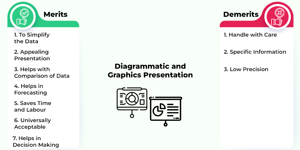
Merits of Diagrammatic and Graphics Presentation:
The fundamental benefits or merits of a diagrammatic and graphical representation of data are as follows:
1. To simplify the data: Outlines and charts present information in a simple manner that can be perceived by anyone without any problem. Huge volume of data can be easily presented using graphs and diagrams.
2. Appealing presentation: Outlines and charts present complex information and data in an understandable and engaging manner and leave a great visual effect. In this way, the diagrammatic and graphical representation of information effectively draws the attention of users.
3. Helps with comparison of data: With the help of outlines and charts, comparison and examination data between various arrangements of information is possible.
4. Helps in forecasting: The diagrammatic and graphical representation of information has past patterns, which helps in forecasting and making various policies for the future.
5. Saves time and labour: Charts and graphs make the complex data into a simple form, which can be easily understood by anyone without having prior knowledge of the data. It gives ready to use information, and the user can use it accordingly. In this way, it saves a lot of time and labour.
6. Universally acceptable: Graphs and diagrams are used in every field and can be easily understood by anyone. Hence they are universally acceptable.
7. Helps in decision making: Diagrams and graphs give the real data about the past patterns, trends, outcomes, etc., which helps in future preparation.
Demerits of Diagrammatic and Graphics Presentation:
The demerits of diagrammatic and graphics presentation of data are as follows:
1. Handle with care: Drawing, surmising and understanding from graphs and diagrams needs proper insight and care. A person with little knowledge of statistics cannot analyze or use the data properly.
2. Specific information: Graphs and diagrams do not depict true or precise information. They are generally founded on approximations. The information provided is limited and specific.
3. Low precision: Graphs and diagrams can give misleading results, as they are mostly based on approximation of data. Personal judgement is used to study or analyze the data, which can make the information biased. Also, data can easily be manipulated.
Please Login to comment...
- Statistics for Economics
- 10 Best Tools to Convert DOC to DOCX
- How To Summarize PDF Documents Using Google Bard for Free
- Best free Android apps for Meditation and Mindfulness
- TikTok Is Paying Creators To Up Its Search Game
- 30 OOPs Interview Questions and Answers (2024)
Improve your Coding Skills with Practice
What kind of Experience do you want to share?
- Trending Categories

- Selected Reading
- UPSC IAS Exams Notes
- Developer's Best Practices
- Questions and Answers
- Effective Resume Writing
- HR Interview Questions
- Computer Glossary
Diagrammatic Presentation Of Data
Introduction.
The diagrammatic representation also helps in having a bird’s eye view or overall view of the differentiation of data. It is a norm to present statistical data in the form of diagrams so that it becomes easier to comprehend and understand them. Therefore, diagrammatic representation is an important tool in statistics.
What is a Diagrammatic Presentation of Data?
Diagrammatic representation refers to a representation of statistical data in the form of diagrams. The diagrams used in representing statistical data are geometrical figures, such as lines, bars, and circles. The intention of using geometrical figures in statistical presentation is to make the study more interesting and easy to understand. Diagrammatic representations are widely used in statistics, economics, and many other fields of study.
Types of Diagrammatic Presentations of Data
Various types of diagrammatic representations of data depend on the dataset and the particular statistical elements in them. Data presentation can be made in different types and forms.
These can be broadly classified into the following one-dimensional types −
Line Diagram
In a line diagram, straight lines are used to indicate various parameters. Here, a line represents the sequence of data associated with the changing of a particular variable.
Properties of Line Diagram −
The Lines are either in vertical or horizontal directions.
There may be uniform scaling but this is not mandatory.
The lines that connect the data points offer the statistical representation of data.
The following is an example of a line diagram that shows profits in Rs crore from 2002 till 2008. Profit in 2002 was Rs 5 Crore while in 2008 it was Rs 24 Crore.

Bar Diagram
Bar diagrams have rectangular shapes of equal width that represent statistical data in a straightforward manner. Bar diagrams are one of the most widely used diagrammatic representations.
Properties of Bar Diagram −
The Bars can be vertical or horizontal in directions.
All bars in a diagram have a uniform width.
All the Bars have a common and same base.
The height or width of the Bar shows the required value.
The following is an example of a Bar Chart that has time on the X axis and profits on the Y axis.

Also known as a "circle chart" , the pie chart divides the circular statistical graphic into sectors or sections to illustrate the numerical data. Each sector in the circle denotes a proportionate part of the whole. Pie-chart works the best at the time when we want to denote the composition of something. In most cases, the pie chart replaces other diagrammatic representations, such as the bar graph, line plots, histograms, etc.
In practice, the various sections in a pie chart are derived according to their ratio to the total area of the circle. Then according to their individual contributions, sections are divided into parts derived from 360 degrees of the circle.
Advantages of Diagrammatic Presentation of Data
Easier to understand.
Pictorial representations are usually easier to understand than statistical text or representation in tabular form. One can easily understand which portion or part has more contribution toward the overall dataset. This helps in understanding the data better.
The creators of diagrams usually keep the simplicity of presentation in mind to offer more information to readers. That is why diagrams are easier to comprehend than texts and tables.
More attractive
Pictorial or diagrammatic representations of datasets are more attractive than normal representations. As colors and various other tools can be incorporated into diagrams, they become more attractive and comprehensible for the readers.
Moreover, as diagrams can be made more interactive with the help of computer graphics, they have become more acceptable and attractive currently.
Simpler presentations
Data can be presented more simply in diagrammatic form. Both extensive unstable data and smaller complex data can be represented by diagrammatic representations more easily. This helps statisticians offer more value to their findings.
Comparison is easier
When two or more data are compared, it is easier to do so in pictorial form. As diagrams clearly show the portion of data consumed, it can be easily understood from the diagrams which part of the data is consuming more area in the diagrams. This can help one to understand the real differences through pictorial comparison.
Universal acceptance
Diagrammatic representation of data is used in many fields of study, such as statistics, science, commerce, economics, etc. So, the diagrams are accepted universally and hence are used everywhere.
Moreover, since there are the same procedures for forming diagrams, the representations mean the same thing to everyone. So, there is nothing to alter when we obtain the diagrams to check the real values. It helps analysts solve problems universally.
Improvement in presentation
Diagrammatic representations improve the overall representation of data to a large extent. As the data is classified into several groups and presented in a systematic manner in diagrams, the whole presentation of data gets improved during the diagrammatic representation.
Moreover, as diagrams can be made more interactive than texts or tables, diagrammatic presentations are one step ahead in presenting the data in a simpler yet recognizable manner.
More organized and classified data
To represent data in diagrams, they must be organized and classified into comprehensive categories. This helps the data to be organized in a given fashion which makes them orderly and creates a sequence. This in turn helps realize diagrammatic data better than text forms.
Relevance Diagrammatic Presentation of Data
Diagrams are a great way of representing data because they are visually attractive and they can make large, complex datasets look simpler. The otherwise heavy data can be simply and easily represented by line and bar diagrams, and pie charts. This makes data organization simpler and neater.
Moreover, as data must be classified before representation, one must organize them according to the norms required. So, diagrammatic representations save lots of time and resources.
Diagrams also have universal acceptance and so can be used to express data in different forms. This provides the analysts and researchers flexibility to present data in any required form.
Diagrams also remove confusion and offer a simpler tactic to present data. As no special skill has to be learned to represent data in diagrams, they can be used by most to show statistical data and results of various types of research and experiments.
Therefore, diagrammatic representation has great relevance that can be used for the benefit of economists, statisticians, marketing analysts, and a lot of other professionals.
The diagrams are a central part of statistics and their importance can be known from the fact that almost all statistical researchers use them in one way or the other. The diagrammatical representations make inferring statistical data much simpler and easier. It is a much easier way to visualize and understand data in simpler forms too.
To represent data in diagrammatic form, only a simple understanding of Mathematics is required. So, no special skills are needed to use diagrams and this makes them very popular tools for the representation of data sets. Learning how to present data in diagrams, therefore, should be a priority for everyone.
Q1. Which is the simplest diagrammatic presentation of data?
Ans. The simplest diagrammatic presentation of data is a line diagram that shows data in terms of straight lines.
Q2. What are the two characteristics of bar diagrams?
Ans. Bar diagrams have uniform width and their base remains the same.
Q3. How are the sections in a pie chart formed?
Ans. In practice, the various sections in a pie chart are derived according to their ratio to the total area of the circle. Then according to their individual contributions, sections are divided into parts derived from 360 degrees of the circle.
For example, if a section requires 25% of the presentation, it will consume degrees on the chart.

Related Articles
- The Presentation Layer of OSI Model
- Explain the functions of Presentation Layer.
- What is Presentation Layer?
- Share Powerpoint Presentation through Facebook
- What is a presentation layer?
- The best presentation tools for business
- Antigen Presentation: A Vital Immune Process
- Impression Management and Self-Presentation Online
- Importing/Exporting ABAP packages to Presentation server
- Difference Between Presentation Skills and Public Speaking
- Tips for Using PowerPoint Presentation More Efficiently
- How to add and remove encryption for MS Powerpoint Presentation?
- How to make an impressive PPT presentation for a college activity?
- Figure shows a diagrammatic representation of trees in the afternoon along a sea coast.State on which side is the sea; A or B? Give reasons for your choice."
- Distribution of Test Data vs. Distribution of Training Data
Kickstart Your Career
Get certified by completing the course
- Increase Font Size
5 Diagrammatic and Graphical Representation of Data II
Dr. Harmanpreet Singh Kapoor
Learning Objectives
- Introduction.
- Graphical presentation of frequency distribution
- Stem and Leaf Plot
- Suggested Readings
1. Learning Objectives
In this module, a complete explanation about different types of representation of data will be discussed. This module helps to learn different methods of diagrammatic and graphical presentation and their properties. Through this module, one can learn about which method to use under what conditions. Questions with answers are included to give an in-depth knowledge of the topic.
2. Introduction
In this module, one can get a depth knowledge of different types of diagram like pie chart and graphical representations of the data like histogram, frequency polygon etc. This module is continuation of the previous module. Hence it is desired that reader must go through the previous module before further reading. We have already discussed about the frequency distribution and its different forms in the previous module. In this module, graphical representation of the frequency distribution and its types will be discussed. Other diagrammatic and graphical methods and their properties are also discussed. This module will help to develop an understanding of different methods of graphical and diagrammatic presentation of the data. In the following section, graphical presentation of frequency distributions are discussed in detail.
3. Graphical presentation of frequency distribution
Graphs which consider the frequencies for the presentation of the data are called frequency graphs. These graphs are used to describe the characteristic feature of the frequency data. The methods for the preparation of the frequency table is already discussed in the previous module. The frequency graphs usually depends on the type of data whether it is discrete or continuous. Discrete data are usually represented in the form of bar diagrams or discontinuous curves while the continuous data are represented by means of curves.
While constructing the frequency graphs, usually the value of the variables are taken on the x-axis and the corresponding frequencies are represented on y-axis. The graphs that are used for this purpose are:-
(i) Histogram
(ii) Frequency Polygon
(iii) Ogives
(i) Histogram: It is among the most commonly used method for the diagrammatic representation of a grouped frequency distribution. On one axis it consists of bars with height proportional to class frequencies and the width of the bar is defined through the class boundaries presented on the horizontal scale. In general, same width is considered for all the bars but it is not essential as it depend on the class width. In histogram , there is difference in terms of height only due to the class frequencies. The area of each bar is calculated by multiplying the width of the class and the frequency.
Sometime people are confused about bar diagram and histogram. The main difference between the bar diagram and histogram is that there is no difference between the bars in histogram while in bar diagram there is a gap between the bars. Also the bars in the bar diagram are of equal width but in histogram it depends on the width of classes and may be unequal due to unequal class width. Also it should be remember that histogram can only be constructed for open ended class width if magnitude of first open class is same as next class and the magnitude of the last class is same as preceding class.
The following example helps to get an idea about the construction of the histogram. The data is given in the following table:
From the above figure, one can observe that class marks are shown on the x-axis and the corresponding frequency is available on y-axis. The height of the bar is based on the frequency value. Also from the Figure 1, one can notice that there is no gap between the bars because values in the tables are shown in intervals and there is no gap in the upper limit of one class and the lower limit of the succeeding class. So to represent the continuous data in an exact manner bars are represented in the figure without any gap. On the other hand bar diagram is basically used to show the frequency of individual observations. Hence there is gap in the bars due to difference between the observations to maintain the difference. This is the major difference between histogram and the bar diagram. The following example will help to understand the differences between the two in detail.
From the above bar diagram, one can observe that there is gap in the bars that justify our discussion on histogram and bar diagram.
Hence, one can understand the difference between histogram and bar chart by keeping in mind the above examples.
Now as we are familiar with histogram, another most commonly used method for the graphical presentation of the data is frequency polygon.
(ii) Frequency Polygon: Frequency Polygon is considered as another method, other then histogram for graphical representation of the data. It is generally plotted when all the classes have same width. It is obtained by joining the mid value of the class interval corresponding to the class frequency. The end points of the polygon are joined to the x-axis that is basically the mid-point of classes at end of the frequency distribution. Hence frequency polygon is used in the situation of same class width and covered similar area as histogram.
Frequency polygon helps in understanding the skewness property of the data. One can detect the mode value from frequency polygon by drawing a perpendicular from the highest point on the curve to the x-axis. The frequency polygon of various distributions can be plotted on the same axis for comparison purpose but this is not possible in the case of histogram. In Histogram, if we have to compare two histogram of different data sets then we require two separate graphs. Also frequency polygon is a continuous curve and it has other benefits like determination of the slope, rough estimates of a particular value on the x-axis, at what rate observations are changing. Another important feature of the frequency polygon is that it can be drawn without plotting the histogram only when the mid-points of the classes are known.
In the following graph shown in Figure 3, a frequency polygon is constructed from Table 1 data. In the graph, one can observe that it is a curve that is represented with the joining of mid points of class interval and corresponding class frequency on the y-axis.
Frequency Curve
Frequency curve is the term that is basically used for the presentation of the probability distribution of continuous variable. As continuous variable takes values in small interval and the range of these variables approaches to infinite. So if we decrease the width of class intervals and at the same time increase the total frequency of the data that approaches to infinite then the shape of the histogram and the frequency polygon is approximate close to the shape of the frequency curve. In that case, the horizontal axis will represent the range of the variable and the vertical axis will show the frequency of a values in an interval. If it is feasible to present the relative frequency of the dataset on the vertical axis then it shows the percentage of particular class interval. This method of representing the data will help you to understand the concept of probability distribution function in future where we have probability values on the vertical axis that is derived from a mathematical function. On the other hand, the range of continuous variable is shown on horizontal axis. As the variable is continuous so the probability of a particular point is zero. So probability are evaluated in terms of intervals. So one can correlate the
probability distribution curve and the frequency curve from the concept. The topic of probability distribution function will be discussed in the further modules.
As we already discussed about the frequency curve, there are basically five types of frequency curves in the literature. These are (a) Symmetrical bell shaped (b) Uniform (c) U-shaped (d) J shaped and (e) asymmetric (Positive or negative skew)
(a) Symmetrical bell shaped: In this type of curve, the class frequency values keep on increasing steadily and after attaining a maximum value it keep on decreasing in the same pace as while increasing. It can be checked whether the curve is symmetric if we fold the curve from the centre then the two half the frequency curve must coincide. This is the reason that such type of curve is called symmetrical curve that has same area under curve on both side of the middle part or centre value. Another feature of symmetric curve is that it has single peakness at the middle and lessen slowly on both end.
Link for resource
http://slideplayer.com/slide/4929425/
(b) Uniform Curve: This type of curve will only occur if all the observations have same frequency. So it means when occurrence of each observation in the dataset is same then such type of curve appear. For example, in Figure 4 (b) figure represent the score of students of class. If these is a great possibility that all students score equal marks in the class test or examination. In such the uniform frequency curve will appear.
(c) U-Shaped: In this type of frequency curve, the highest value of the frequency occurs at the end or extreme point and the frequency keep on decreasing as the till the central part of the data and keep on increasing at the same pace of decreasing before reaching the middle part. This curve is just the opposite of the symmetric curve in shape. In this curve the most of the values occur at the extreme point and the less values come from intermediate point.
(d) J-Shaped: In this curve, the value of the variable attains the maximum frequency at one of its extreme points only. Hence it is different from U-shaped curve where maximum value attained at both extreme values. In a J-shaped curve, the values has less frequency in the lower class interval and then frequency keep on increasing steadily as the value of variable increases. Hence at the extreme point the distribution attains its maximum value.
(e) Asymmetric: This type of frequency curve has the highest frequency not in the central part of the data but on the either side of the central value. If the curve has longer tail toward the right side then the distribution is said to be positively skewed. If the curve has longer tail towards the left side then the distribution is said to be negative skewed.
(iii) Ogive: Ogive curve is constructed from the cumulative values of frequency i.e. cumulative frequency values are plotted against the x-axis. There are two types of ogive curves less than or more than. Less than ogive curve begin from the first interval and keep on increasing upwards corresponding to the next interval as the frequency are cumulated that means frequency values of previous frequency are added in next frequency values. Hence it keeps on increasing and at the last interval it shows the total frequency of data plotted against the last interval. Similarly, more than ogive curve begin from the total cumulative value from the first interval and keep on decreasing at next interval by subtracting the previous interval frequency from the total frequency value. If we repeat this process till the last interval then one can observe that the curve seem to be like a elongated S and is sometimes calls a double curve with one portion being concave and the other being convex. Also ogive curve can be constructed for unequal width of classes in the frequency distribution.
It is also possible to construct more than or less than ogive curve on the same graph and one can observe that if both curve are drawn on the same graph, these curve intersect at a point. X-axis value of that point is the median value of the frequency distribution. Hence ogive curve will help to get an idea about characteristics of the data as it is only the diagrammatic representation of the cumulative frequency distribution. There are some of the uses of the ogive which are as follows:
(a) Ogive curve is used to find out the median of the frequency distribution. It is also used to find out quartiles, deciles and percentiles etc.
(b) It is used to observe the cumulative frequency of a particular class interval of more than and less than type.
(c) From the shape of the curve one can observe the number of observations which are expected to lie between two given values.
It should be noted that it may be possible that one may not be able to estimate the correct value from the ogive curve. Hence, one should be careful while using ogives.
An example will help to understand the concept in depth. The cumulative frequency distribution (less than type) of data used in previous examples are shown below:
In Figure 5, ogive curve represents the cumulative frequency of less than type and it is of increasing type. We use the same data for graphical representation of the more than type of ogive type to see the difference of two type of ogive curve.
In Figure 7, ogive curve of two types are plotted graphically. From intersection point of these curve draw a perpendicular to the cumulative frequency polygon, horizontal scale i.e. these two curves intersect at point value 49 at y-axis and approx. 30 at x-axis. This approximate value is considered as the median value of the data. In the next section, we will discuss Stem and leaf display that is considered as another method for the.representation of the data.
4. Stem and Leaf plot
It is considered as an alternative to the histogram. Although it gives a visual representation similar to the histogram but it does not lose the details of the individual data points in the grouping. For example, the data of expenditure on calls in a week of 30 persons are given below:
11,22,22,25,27,28,29,34,35,36,37,37,38,39,39,39,43,46,49,49,49,49,52,56,58,64,65,74,82,91
The stems on the left represent the 10 units and the leaves on the right represent the units of ones. So the individual data points can be represented in the diagram. From the diagram, one can observe that it seems like a histogram but the difference here is that the values are used in place of bars. Hence the major drawback of this diagram is that when we have large amount of then it is difficult to make stem and leaf diagram.
In the next section, we will discuss about the diagrammatical representation of the data through the pie chart.
5. Pie-Chart
When the total values can be represented by a big circle and the various components by sectors cut inside it. This type of diagram is known as pie diagram and it is also used to show the percentage breakdown. The total is represented by 360 degree angle. It can be divided into a number of small angles whose degree is according to the values of the categories in the data. There are some steps for the construction of pie diagram. These are
(a) The category or items values are expressed either in percentage or degree. For example, number of males/females in the data are expressed either in percentage or in degrees.
(b) One can find the percentage of the items by dividing its value by the aggregate one and multiple each of them by 3.6.
Hence one can find two forms of pie chart, one is in percentage form and other in degree term.
For example, the following data represent the expenditure on entertainment and communication of household
Hence one can easily understand the expenditure on items through percentages from the pie diagram. This is the reason that pie chart is mostly used to present the data as it is easily understandable even by a layman.
In the real world large type of diagrammatic methods are used for the presentation of the statistical data. Some of the types are like one- dimensional diagram, two-dimensional diagram, three-dimensional diagram and pictogram etc. In this module, we discussed some of its types like histogram, bar diagram, frequency polygon, frequency curve, ogives and pie charts. Differences between histogram and bar diagram are discussed. Importance of all these graphical and diagrammatical representation is discussed with examples. Frequency curve and its different types are also discussed. These diagrams and graphical representations are useful as they present the data in an attractive manner that appeal more to the mind of the spectators. These forms are more attractive, fascinating and impressive than the other methods. The best part of diagrammatic representation method is that even a layman can understand this without any previous knowledge of statistics. This is the reason that diagrams, pictures and graphs are used to give primary education to the kids.
7. Suggested Readings
Agresti, A. and B. Finlay, Statistical Methods for the Social Science, 3rd Edition, Prentice Hall, 1997.
Daniel, W. W. and C. L. Cross, C. L., Biostatistics: A Foundation for Analysis in the Health Sciences, 10th Edition, John Wiley & Sons, 2013.
Hogg, R. V., J. Mckean and A. Craig, Introduction to Mathematical Statistics, Macmillan Pub. Co. Inc., 1978.
Meyer, P. L., Introductory Probability and Statistical Applications, Oxford & IBH Pub, 1975.
Triola, M. F., Elementary Statistics, 13th Edition, Pearson, 2017.
Weiss, N. A., Introductory Statistics, 10th Edition, Pearson, 2017.
One can refer to the following links for further understanding of the statistics terms.
http://biostat.mc.vanderbilt.edu/wiki/pub/Main/ClinStat/glossary.pdf
http://www.stats.gla.ac.uk/steps/glossary/alphabet.html
http://www.reading.ac.uk/ssc/resources/Docs/Statistical_Glossary.pdf
https://stats.oecd.org/glossary/
http://www.statsoft.com/Textbook/Statistics-Glossary
https://www.stat.berkeley.edu/~stark/SticiGui/Text/gloss.htm
https://stats.oecd.org/glossary/alpha.asp?Let=A

- school Campus Bookshelves
- menu_book Bookshelves
- perm_media Learning Objects
- login Login
- how_to_reg Request Instructor Account
- hub Instructor Commons
- Download Page (PDF)
- Download Full Book (PDF)
- Periodic Table
- Physics Constants
- Scientific Calculator
- Reference & Cite
- Tools expand_more
- Readability
selected template will load here
This action is not available.
2.E: Graphical Representations of Data (Exercises)
- Last updated
- Save as PDF
- Page ID 22228

2.2: Stem-and-Leaf Graphs (Stemplots), Line Graphs, and Bar Graphs
Student grades on a chemistry exam were: 77, 78, 76, 81, 86, 51, 79, 82, 84, 99
- Construct a stem-and-leaf plot of the data.
- Are there any potential outliers? If so, which scores are they? Why do you consider them outliers?
The table below contains the 2010 obesity rates in U.S. states and Washington, DC.
- Use a random number generator to randomly pick eight states. Construct a bar graph of the obesity rates of those eight states.
- Construct a bar graph for all the states beginning with the letter "A."
- Construct a bar graph for all the states beginning with the letter "M."
- Number the entries in the table 1–51 (Includes Washington, DC; Numbered vertically)
- Arrow over to PRB
- Press 5:randInt(
- Enter 51,1,8)
Eight numbers are generated (use the right arrow key to scroll through the numbers). The numbers correspond to the numbered states (for this example: {47 21 9 23 51 13 25 4}. If any numbers are repeated, generate a different number by using 5:randInt(51,1)). Here, the states (and Washington DC) are {Arkansas, Washington DC, Idaho, Maryland, Michigan, Mississippi, Virginia, Wyoming}.
Corresponding percents are {30.1, 22.2, 26.5, 27.1, 30.9, 34.0, 26.0, 25.1}.

Figure \(\PageIndex{1}\): (a)

Figure \(\PageIndex{1}\): (b)

Figure \(\PageIndex{1}\): (c)
For each of the following data sets, create a stem plot and identify any outliers.
Exercise 2.2.7
The miles per gallon rating for 30 cars are shown below (lowest to highest).
19, 19, 19, 20, 21, 21, 25, 25, 25, 26, 26, 28, 29, 31, 31, 32, 32, 33, 34, 35, 36, 37, 37, 38, 38, 38, 38, 41, 43, 43
The height in feet of 25 trees is shown below (lowest to highest).
25, 27, 33, 34, 34, 34, 35, 37, 37, 38, 39, 39, 39, 40, 41, 45, 46, 47, 49, 50, 50, 53, 53, 54, 54
The data are the prices of different laptops at an electronics store. Round each value to the nearest ten.
249, 249, 260, 265, 265, 280, 299, 299, 309, 319, 325, 326, 350, 350, 350, 365, 369, 389, 409, 459, 489, 559, 569, 570, 610
The data are daily high temperatures in a town for one month.
61, 61, 62, 64, 66, 67, 67, 67, 68, 69, 70, 70, 70, 71, 71, 72, 74, 74, 74, 75, 75, 75, 76, 76, 77, 78, 78, 79, 79, 95
For the next three exercises, use the data to construct a line graph.
Exercise 2.2.8
In a survey, 40 people were asked how many times they visited a store before making a major purchase. The results are shown in the Table below.
Exercise 2.2.9
In a survey, several people were asked how many years it has been since they purchased a mattress. The results are shown in Table .
Exercise 2.2.10
Several children were asked how many TV shows they watch each day. The results of the survey are shown in the Table below.
Exercise 2.2.11
The students in Ms. Ramirez’s math class have birthdays in each of the four seasons. Table shows the four seasons, the number of students who have birthdays in each season, and the percentage (%) of students in each group. Construct a bar graph showing the number of students.
Using the data from Mrs. Ramirez’s math class supplied in the table above, construct a bar graph showing the percentages.
Exercise 2.2.12
David County has six high schools. Each school sent students to participate in a county-wide science competition. Table shows the percentage breakdown of competitors from each school, and the percentage of the entire student population of the county that goes to each school. Construct a bar graph that shows the population percentage of competitors from each school.
Use the data from the David County science competition supplied in Exercise . Construct a bar graph that shows the county-wide population percentage of students at each school.
2.3: Histograms, Frequency, Polygons, and Time Series Graphs
Suppose that three book publishers were interested in the number of fiction paperbacks adult consumers purchase per month. Each publisher conducted a survey. In the survey, adult consumers were asked the number of fiction paperbacks they had purchased the previous month. The results are as follows:
- Find the relative frequencies for each survey. Write them in the charts.
- Using either a graphing calculator, computer, or by hand, use the frequency column to construct a histogram for each publisher's survey. For Publishers A and B, make bar widths of one. For Publisher C, make bar widths of two.
- In complete sentences, give two reasons why the graphs for Publishers A and B are not identical.
- Would you have expected the graph for Publisher C to look like the other two graphs? Why or why not?
- Make new histograms for Publisher A and Publisher B. This time, make bar widths of two.
- Now, compare the graph for Publisher C to the new graphs for Publishers A and B. Are the graphs more similar or more different? Explain your answer.
Often, cruise ships conduct all on-board transactions, with the exception of gambling, on a cashless basis. At the end of the cruise, guests pay one bill that covers all onboard transactions. Suppose that 60 single travelers and 70 couples were surveyed as to their on-board bills for a seven-day cruise from Los Angeles to the Mexican Riviera. Following is a summary of the bills for each group.
- Fill in the relative frequency for each group.
- Construct a histogram for the singles group. Scale the x -axis by $50 widths. Use relative frequency on the y -axis.
- Construct a histogram for the couples group. Scale the x -axis by $50 widths. Use relative frequency on the y -axis.
- List two similarities between the graphs.
- List two differences between the graphs.
- Overall, are the graphs more similar or different?
- Construct a new graph for the couples by hand. Since each couple is paying for two individuals, instead of scaling the x -axis by $50, scale it by $100. Use relative frequency on the y -axis.
- How did scaling the couples graph differently change the way you compared it to the singles graph?
- Based on the graphs, do you think that individuals spend the same amount, more or less, as singles as they do person by person as a couple? Explain why in one or two complete sentences.
- See the tables above

- Both graphs have a single peak.
- Both graphs use class intervals with width equal to $50.
- The couples graph has a class interval with no values.
- It takes almost twice as many class intervals to display the data for couples.
- Answers may vary. Possible answers include: The graphs are more similar than different because the overall patterns for the graphs are the same.
- Check student's solution.
- Both graphs display 6 class intervals.
- Both graphs show the same general pattern.
- Answers may vary. Possible answers include: Although the width of the class intervals for couples is double that of the class intervals for singles, the graphs are more similar than they are different.
- Answers may vary. Possible answers include: You are able to compare the graphs interval by interval. It is easier to compare the overall patterns with the new scale on the Couples graph. Because a couple represents two individuals, the new scale leads to a more accurate comparison.
- Answers may vary. Possible answers include: Based on the histograms, it seems that spending does not vary much from singles to individuals who are part of a couple. The overall patterns are the same. The range of spending for couples is approximately double the range for individuals.
Twenty-five randomly selected students were asked the number of movies they watched the previous week. The results are as follows.
- Construct a histogram of the data.
- Complete the columns of the chart.
Use the following information to answer the next two exercises: Suppose one hundred eleven people who shopped in a special t-shirt store were asked the number of t-shirts they own costing more than $19 each.
The percentage of people who own at most three t-shirts costing more than $19 each is approximately:
- Cannot be determined
If the data were collected by asking the first 111 people who entered the store, then the type of sampling is:
- simple random
- convenience
Following are the 2010 obesity rates by U.S. states and Washington, DC.
Construct a bar graph of obesity rates of your state and the four states closest to your state. Hint: Label the \(x\)-axis with the states.
Answers will vary.
Exercise 2.3.6
Sixty-five randomly selected car salespersons were asked the number of cars they generally sell in one week. Fourteen people answered that they generally sell three cars; nineteen generally sell four cars; twelve generally sell five cars; nine generally sell six cars; eleven generally sell seven cars. Complete the table.
Exercise 2.3.7
What does the frequency column in the Table above sum to? Why?
Exercise 2.3.8
What does the relative frequency column in in the Table above sum to? Why?
Exercise 2.3.9
What is the difference between relative frequency and frequency for each data value in in the Table above ?
The relative frequency shows the proportion of data points that have each value. The frequency tells the number of data points that have each value.
Exercise 2.3.10
What is the difference between cumulative relative frequency and relative frequency for each data value?
Exercise 2.3.11
To construct the histogram for the data in in the Table above , determine appropriate minimum and maximum x and y values and the scaling. Sketch the histogram. Label the horizontal and vertical axes with words. Include numerical scaling.

Answers will vary. One possible histogram is shown:
Exercise 2.3.12
Construct a frequency polygon for the following:
Exercise 2.3.13
Construct a frequency polygon from the frequency distribution for the 50 highest ranked countries for depth of hunger.
Find the midpoint for each class. These will be graphed on the x -axis. The frequency values will be graphed on the y -axis values.

Exercise 2.3.14
Use the two frequency tables to compare the life expectancy of men and women from 20 randomly selected countries. Include an overlayed frequency polygon and discuss the shapes of the distributions, the center, the spread, and any outliers. What can we conclude about the life expectancy of women compared to men?
Exercise 2.3.15
Construct a times series graph for (a) the number of male births, (b) the number of female births, and (c) the total number of births.
Exercise 2.3.16
The following data sets list full time police per 100,000 citizens along with homicides per 100,000 citizens for the city of Detroit, Michigan during the period from 1961 to 1973.
- Construct a double time series graph using a common x -axis for both sets of data.
- Which variable increased the fastest? Explain.
- Did Detroit’s increase in police officers have an impact on the murder rate? Explain.
2.4: Measures of the Location of the Data
The median age for U.S. blacks currently is 30.9 years; for U.S. whites it is 42.3 years.
- Based upon this information, give two reasons why the black median age could be lower than the white median age.
- Does the lower median age for blacks necessarily mean that blacks die younger than whites? Why or why not?
- How might it be possible for blacks and whites to die at approximately the same age, but for the median age for whites to be higher?
Six hundred adult Americans were asked by telephone poll, "What do you think constitutes a middle-class income?" The results are in the Table below. Also, include left endpoint, but not the right endpoint.
- What percentage of the survey answered "not sure"?
- What percentage think that middle-class is from $25,000 to $50,000?
- Should all bars have the same width, based on the data? Why or why not?
- How should the <20,000 and the 100,000+ intervals be handled? Why?
- Find the 40 th and 80 th percentiles
- Construct a bar graph of the data
- \(1 - (0.02 + 0.09 + 0.19 + 0.26 + 0.18 + 0.17 + 0.02 + 0.01) = 0.06\)
- \(0.19 + 0.26 + 0.18 = 0.63\)
- Check student’s solution.
80 th percentile will fall between 50,000 and 75,000
Given the following box plot:

- which quarter has the smallest spread of data? What is that spread?
- which quarter has the largest spread of data? What is that spread?
- find the interquartile range ( IQR ).
- are there more data in the interval 5–10 or in the interval 10–13? How do you know this?
- 10–12
- 12–13
- need more information
The following box plot shows the U.S. population for 1990, the latest available year.

- Are there fewer or more children (age 17 and under) than senior citizens (age 65 and over)? How do you know?
- 12.6% are age 65 and over. Approximately what percentage of the population are working age adults (above age 17 to age 65)?
- more children; the left whisker shows that 25% of the population are children 17 and younger. The right whisker shows that 25% of the population are adults 50 and older, so adults 65 and over represent less than 25%.
2.5: Box Plots
In a survey of 20-year-olds in China, Germany, and the United States, people were asked the number of foreign countries they had visited in their lifetime. The following box plots display the results.

- In complete sentences, describe what the shape of each box plot implies about the distribution of the data collected.
- Have more Americans or more Germans surveyed been to over eight foreign countries?
- Compare the three box plots. What do they imply about the foreign travel of 20-year-old residents of the three countries when compared to each other?
Given the following box plot, answer the questions.

- Think of an example (in words) where the data might fit into the above box plot. In 2–5 sentences, write down the example.
- What does it mean to have the first and second quartiles so close together, while the second to third quartiles are far apart?
- Answers will vary. Possible answer: State University conducted a survey to see how involved its students are in community service. The box plot shows the number of community service hours logged by participants over the past year.
- Because the first and second quartiles are close, the data in this quarter is very similar. There is not much variation in the values. The data in the third quarter is much more variable, or spread out. This is clear because the second quartile is so far away from the third quartile.
Given the following box plots, answer the questions.

- Data 1 has more data values above two than Data 2 has above two.
- The data sets cannot have the same mode.
- For Data 1 , there are more data values below four than there are above four.
- For which group, Data 1 or Data 2, is the value of “7” more likely to be an outlier? Explain why in complete sentences.
A survey was conducted of 130 purchasers of new BMW 3 series cars, 130 purchasers of new BMW 5 series cars, and 130 purchasers of new BMW 7 series cars. In it, people were asked the age they were when they purchased their car. The following box plots display the results.

- In complete sentences, describe what the shape of each box plot implies about the distribution of the data collected for that car series.
- Which group is most likely to have an outlier? Explain how you determined that.
- Compare the three box plots. What do they imply about the age of purchasing a BMW from the series when compared to each other?
- Look at the BMW 5 series. Which quarter has the smallest spread of data? What is the spread?
- Look at the BMW 5 series. Which quarter has the largest spread of data? What is the spread?
- Look at the BMW 5 series. Estimate the interquartile range (IQR).
- Look at the BMW 5 series. Are there more data in the interval 31 to 38 or in the interval 45 to 55? How do you know this?
- 31–35
- 38–41
- 41–64
- Each box plot is spread out more in the greater values. Each plot is skewed to the right, so the ages of the top 50% of buyers are more variable than the ages of the lower 50%.
- The BMW 3 series is most likely to have an outlier. It has the longest whisker.
- Comparing the median ages, younger people tend to buy the BMW 3 series, while older people tend to buy the BMW 7 series. However, this is not a rule, because there is so much variability in each data set.
- The second quarter has the smallest spread. There seems to be only a three-year difference between the first quartile and the median.
- The third quarter has the largest spread. There seems to be approximately a 14-year difference between the median and the third quartile.
- IQR ~ 17 years
- There is not enough information to tell. Each interval lies within a quarter, so we cannot tell exactly where the data in that quarter is concentrated.
- The interval from 31 to 35 years has the fewest data values. Twenty-five percent of the values fall in the interval 38 to 41, and 25% fall between 41 and 64. Since 25% of values fall between 31 and 38, we know that fewer than 25% fall between 31 and 35.
Twenty-five randomly selected students were asked the number of movies they watched the previous week. The results are as follows:
Construct a box plot of the data.
2.6: Measures of the Center of the Data
The most obese countries in the world have obesity rates that range from 11.4% to 74.6%. This data is summarized in the following table.
- What is the best estimate of the average obesity percentage for these countries?
- The United States has an average obesity rate of 33.9%. Is this rate above average or below?
- How does the United States compare to other countries?
The table below gives the percent of children under five considered to be underweight. What is the best estimate for the mean percentage of underweight children?
The mean percentage, \(\bar{x} = \frac{1328.65}{50} = 26.75\)
2.7: Skewness and the Mean, Median, and Mode
The median age of the U.S. population in 1980 was 30.0 years. In 1991, the median age was 33.1 years.
- What does it mean for the median age to rise?
- Give two reasons why the median age could rise.
- For the median age to rise, is the actual number of children less in 1991 than it was in 1980? Why or why not?
2.8: Measures of the Spread of the Data
Use the following information to answer the next nine exercises: The population parameters below describe the full-time equivalent number of students (FTES) each year at Lake Tahoe Community College from 1976–1977 through 2004–2005.
- \(\mu = 1000\) FTES
- median = 1,014 FTES
- \(\sigma = 474\) FTES
- first quartile = 528.5 FTES
- third quartile = 1,447.5 FTES
- \(n = 29\) years
A sample of 11 years is taken. About how many are expected to have a FTES of 1014 or above? Explain how you determined your answer.
The median value is the middle value in the ordered list of data values. The median value of a set of 11 will be the 6th number in order. Six years will have totals at or below the median.
75% of all years have an FTES:
- at or below: _____
- at or above: _____
The population standard deviation = _____
What percent of the FTES were from 528.5 to 1447.5? How do you know?
What is the IQR ? What does the IQR represent?
How many standard deviations away from the mean is the median?
Additional Information: The population FTES for 2005–2006 through 2010–2011 was given in an updated report. The data are reported here.
Calculate the mean, median, standard deviation, the first quartile, the third quartile and the IQR . Round to one decimal place.
- mean = 1,809.3
- median = 1,812.5
- standard deviation = 151.2
- first quartile = 1,690
- third quartile = 1,935
Construct a box plot for the FTES for 2005–2006 through 2010–2011 and a box plot for the FTES for 1976–1977 through 2004–2005.
Compare the IQR for the FTES for 1976–77 through 2004–2005 with the IQR for the FTES for 2005-2006 through 2010–2011. Why do you suppose the IQR s are so different?
Hint: Think about the number of years covered by each time period and what happened to higher education during those periods.
Three students were applying to the same graduate school. They came from schools with different grading systems. Which student had the best GPA when compared to other students at his school? Explain how you determined your answer.
A music school has budgeted to purchase three musical instruments. They plan to purchase a piano costing $3,000, a guitar costing $550, and a drum set costing $600. The mean cost for a piano is $4,000 with a standard deviation of $2,500. The mean cost for a guitar is $500 with a standard deviation of $200. The mean cost for drums is $700 with a standard deviation of $100. Which cost is the lowest, when compared to other instruments of the same type? Which cost is the highest when compared to other instruments of the same type. Justify your answer.
For pianos, the cost of the piano is 0.4 standard deviations BELOW the mean. For guitars, the cost of the guitar is 0.25 standard deviations ABOVE the mean. For drums, the cost of the drum set is 1.0 standard deviations BELOW the mean. Of the three, the drums cost the lowest in comparison to the cost of other instruments of the same type. The guitar costs the most in comparison to the cost of other instruments of the same type.
An elementary school class ran one mile with a mean of 11 minutes and a standard deviation of three minutes. Rachel, a student in the class, ran one mile in eight minutes. A junior high school class ran one mile with a mean of nine minutes and a standard deviation of two minutes. Kenji, a student in the class, ran 1 mile in 8.5 minutes. A high school class ran one mile with a mean of seven minutes and a standard deviation of four minutes. Nedda, a student in the class, ran one mile in eight minutes.
- Why is Kenji considered a better runner than Nedda, even though Nedda ran faster than he?
- Who is the fastest runner with respect to his or her class? Explain why.
The most obese countries in the world have obesity rates that range from 11.4% to 74.6%. This data is summarized in the table belo2
What is the best estimate of the average obesity percentage for these countries? What is the standard deviation for the listed obesity rates? The United States has an average obesity rate of 33.9%. Is this rate above average or below? How “unusual” is the United States’ obesity rate compared to the average rate? Explain.
- \(\bar{x} = 23.32\)
- Using the TI 83/84, we obtain a standard deviation of: \(s_{x} = 12.95\).
- The obesity rate of the United States is 10.58% higher than the average obesity rate.
- Since the standard deviation is 12.95, we see that \(23.32 + 12.95 = 36.27\) is the obesity percentage that is one standard deviation from the mean. The United States obesity rate is slightly less than one standard deviation from the mean. Therefore, we can assume that the United States, while 34% obese, does not have an unusually high percentage of obese people.
The Table below gives the percent of children under five considered to be underweight.
What is the best estimate for the mean percentage of underweight children? What is the standard deviation? Which interval(s) could be considered unusual? Explain.
Talk to our experts
1800-120-456-456
- Diagrammatic Presentation of Data

Introduction - Diagrammatic Presentation of Data
Diagrams are an essential operational tool for the presentation of statistical data. They are objects, mainly geometrical figures such as lines, circles, bars, etc. Statistics elaborated with the help of diagrams make it easier and simpler, thereby enhancing the representation of any type of data.
What is Diagrammatic Representation of Data?
Representation of data assisted by diagrams to increase the simplicity of the statistics surrounding the concerned data is defined as a diagrammatic representation of data. These diagrams are nothing but the use of geometrical figures to improve the overall presentation and offer visual assistance for the reader.
What are the Types of Diagrams used in Data Presentation?
The type of diagram suitable for data presentation solely depends on the particular dataset and its statistical elements. There are multiple types of diagrams used in data presentation. They can be broadly categorized in the following types of one-dimensional diagrams –
A. Line Diagram
Line diagram is used to represent specific data across varying parameters. A line represents the sequence of data connected against a particular variable.
Properties of Line Diagram –
The Lines can be used in vertical and horizontal directions.
They may or may not have uniform scaling
The line connecting the data points state the statistical representation of data.
Example: Arjun, Sayak and Mainak started monitoring their time of reporting for duty for a certain week. A-Line diagram to represent their observed data on average reporting time for those days would look like –
(Image will be Uploaded Soon)
So, as per the Line Diagram, it can be easily determined that Arjun reported for work mostly at 9:30 AM while Sayak and Mainak’s most frequent times of entry at work is 10:30 AM and 10:50 AM respectively.
B. Bar Diagram
Bar Diagram is used mostly for the comparison of statistical data. It is one of the most straightforward representations of data with the use of rectangular objects of equal width.
Properties of Bar Diagram –
The Bars can be used in vertical and horizontal directions.
These Bars all have a uniform width.
All the Bars have a common base.
The height of the Bar usually corresponds to the required value.
Example: A dataset comparing the percentile marks obtained by Shreyasi and Monika in Science subjects in the examination can be represented with the help of a Bar diagram as –
From this diagram, we can easily compare the percentile marks obtained by Shreyasi and Monika in the subjects Mathematics, Physics, Chemistry and Computer Science.
C. Pie Chart
To know what a Pie Diagram is, it is advised to brush up on the fundamentals of the geometrical theories and formula of a Circle. For the statistical representation of data, the sectors of a circle are used as the data points of a particular dataset. A sector is the area of a circle formed by the several divisions done by the radii of the same circle.
Example: In a recent survey, a dataset was created to figure how many participants of the survey thought that Tenure or Tenor is the correct spelling in the field of Banking . A Pie Chart would present the collected data as –
With the help of this Pie Chart, it can be easily determined that the percentage of participants in the survey who chose ‘Tenor’, to be the correct spelling of the word for use in the field of banking, is 25% whereas 45% picked ‘Tenure’ as the correct answer. 20% opted for both to be correct while 10% of them were not sure with their attempt.
Advantages of Diagrammatic Presentation
There are several advantages in the presentation of data with the various types of diagrams. They are –
1. Makes it Much Easier to Understand
The presentation of data with the help of diagrams makes it easier for everybody to understand, which thereby makes it easier to grasp the statistics behind the data presented. Diagrammatic data presentation is quite common in newspapers, magazines and even in advertising campaigns so that the common mass can understand what the data is trying to reveal.
2. Presentation is Much Simpler
With the help of diagrams, presentation of extreme values – extensive unstable data as well as small complicated data complex can be simplified exponentially.
3. Comparison Operations are More Interactive
Datasets that require comparison of their elements use the application of diagrams for representation. Not only is the presentation attractive, but it is also ideal for showcasing a comparison in statistics.
4. Accepted Universally
Every academic and professional field, let it be Economics, Commerce, Science, Engineering, Statistics, etc. make use of diagrams across the world. Hence, this metric of data presentation is universally accepted.
5. Improves the Representation of Data as a Whole
Statistics are incomplete if diagrams are tables that are not implemented for the presentation of data. Hence, the use of diagrams helps in the overall statistical concept of data representation.
Students who are looking forward to diving deep into the theories and principles of Diagrammatic representation of data, make sure to visit the official website of Vedantu and join a live online tutoring class!
Relevance of Diagrammatic Presentation of Data
Diagrams are visually pleasing and are a great way of representing any form of data. The heavy statistics that we generate can be easily represented via diagrams such as bar charts, pie charts etc. It makes the presentation look neater and more organized. They visually aid the reader in understanding the exact situation and are also very easy to look at. They save a lot of time and confusion and have a universal utility . All students must learn how to represent data through diagrams so that they can present facts and figures in an organized manner.
Does Vedantu have Anything on the Diagrammatic Presentation of Data?
Vedantu has ample study material on the diagrammatic representation of data. All students can read from Diagrammatic Presentation of Data and know more. This is available completely free of cost on the platform so that the students do not hesitate before accessing them.
FAQs on Diagrammatic Presentation of Data
1. Which are the types of diagrams used in data representation?
The types of diagrams used in the representation of data are line diagrams, bar diagrams, pie charts and a few others. These are used to represent facts as they make it easier for the students to understand certain information. More about this has been explained in the Diagrammatic Presentation of Data. This page has relevant information that the students can use to understand these diagrams. After having gone through this page, they will know how to represent certain information in the form of diagrams.
2. Are there any merits of the diagrammatic representation of data?
There are a couple of merits of the diagrammatic representation of data. Some of which is that it makes it much easier to understand data, the presentation is simpler, it becomes easier to compare and correlate, and it is universally accepted.
This page has all the details that are needed by the students to know. It is always better to present data in the form of diagrams as it makes it much more systematic. An organized manner of depicting figures makes anything simpler to understand.
3. Is a pie chart an accurate way of representing data diagrammatically?
In a pie chart, the sectors of a circle are used as the data points of a particular dataset. It is indeed an accurate method of representing data as the correct percentage can be found out. All students can check out the Diagrammatic Presentation of Data on Vedantu. This page has all the information that’s needed by the participants. The other forms of diagrams that can be utilized for data presentations have also been talked about. This page has been created by expert Commerce teachers who know the topic inside out and can be read by all those who wish to do well in the tests.
4. Difference between the Diagrammatic and Graphical Presentation of Data.
All graphical representations of data can be a diagram, but all diagrams are not a graph. Graphs are represented on a scale, but diagrams are required to be constructed to a scale. Construction of graphs requires two more axes, but none is a necessity in case of diagrams.
5. What are the different Types of Diagrams in Statistics?
The different types of diagrams used in statistics are line diagram, bar diagram, and pie chart. Bar diagrams can further be classified into simple bar diagrams, multiple bar diagrams and component or sub-divided bar diagrams.
Diagrammatic Representation of Geographical Data
- First Online: 30 November 2021
Cite this chapter

- Swapan Kumar Maity 3
Part of the book series: Advances in Geographical and Environmental Sciences ((AGES))
239 Accesses
Diagrammatic representation and visualization of geographical data is very simple, attractive and easy to understand and explain to the geographers as well as to the common literate people. It helps to explore the nature of data, the pattern of their spatial and temporal variations and understanding their relationships to accurately recognize and analyse features on or near the earth’s surface. This chapter focuses on the detailed discussion of various types of diagrams classified on a different basis. All types of one-dimensional (bar, pyramid etc.), two-dimensional (circular, triangular, square etc.), three-dimensional (cube, sphere etc.) and other diagrams (pictograms and kite diagram) have been discussed with suitable examples in terms of their appropriate data structure, necessary numerical (geometrical) calculations, methods of construction, appropriate illustrations, and advantages and disadvantages of their use. It includes all the fundamental geometric principles and derivation of formulae used for the construction of these diagrams. A step-by-step and logical explanation of their construction methods becomes helpful for the readers for an easy and quick understanding of the essence of the diagrams. Each diagram represents a perfect co-relation between the theoretical knowledge of various geographical events and phenomena and their proper practical application with suitable examples.
- Diagrammatic representation
- Geometric principles
- One-dimensional diagram
- Two-dimensional diagram
- Three-dimensional diagram
This is a preview of subscription content, log in via an institution to check access.
Access this chapter
- Available as PDF
- Read on any device
- Instant download
- Own it forever
- Available as EPUB and PDF
- Compact, lightweight edition
- Dispatched in 3 to 5 business days
- Free shipping worldwide - see info
- Durable hardcover edition
Tax calculation will be finalised at checkout
Purchases are for personal use only
Institutional subscriptions
Saksena RS (1981) A handbook of statistics. Indological Publishers & Booksellers
Google Scholar
Sarkar A (2015) Practical geography: a systematic approach. Orient Blackswan Private Limited, Hyderabad, Telengana, India. ISBN: 978-81-250-5903-5
Sharma PD (1975) Ecology and environment. Rastogi Publications, Gangitri, Shivaji Road, Meerut-250002, ISBN: 978–93–5078–122–7
Singh RL, Singh RPB (1991) Elements of practical geography. Kalyani Publishers, New Delhi
Download references
Author information
Authors and affiliations.
Department of Geography, Nayagram P.R.M. Government College, Jhargram, West Bengal, India
Swapan Kumar Maity
You can also search for this author in PubMed Google Scholar
Rights and permissions
Reprints and permissions
Copyright information
© 2021 The Author(s), under exclusive license to Springer Nature Singapore Pte Ltd.
About this chapter
Maity, S.K. (2021). Diagrammatic Representation of Geographical Data. In: Essential Graphical Techniques in Geography. Advances in Geographical and Environmental Sciences. Springer, Singapore. https://doi.org/10.1007/978-981-16-6585-1_3
Download citation
DOI : https://doi.org/10.1007/978-981-16-6585-1_3
Published : 30 November 2021
Publisher Name : Springer, Singapore
Print ISBN : 978-981-16-6584-4
Online ISBN : 978-981-16-6585-1
eBook Packages : Earth and Environmental Science Earth and Environmental Science (R0)
Share this chapter
Anyone you share the following link with will be able to read this content:
Sorry, a shareable link is not currently available for this article.
Provided by the Springer Nature SharedIt content-sharing initiative
- Publish with us
Policies and ethics
- Find a journal
- Track your research
- List of Commerce Articles
- Diagrammatic Presentation Of Data
Diagrammatic Presentation of Data
The diagrammatic presentation of data gives an immediate understanding of the real situation to be defined by the data in comparison to the tabular presentation of data or textual representations. It translates the highly complex ideas included in numbers into a more concrete and quickly understandable form pretty effectively. Diagrams may be less certain but are much more efficient than tables in displaying the data. There are many kinds of diagrams in general use. Amongst them the significant ones are the following:
(i) Geometric diagram
(ii) Frequency diagram
(iii) Arithmetic line graph
Also check: Meaning and Objective of Tabulation
Basics of Diagrammatic Presentation
Concept of Diagrammatic Presentation
- It is a technique of presenting numeric data through pictograms, cartograms, bar diagrams, and pie diagrams. It is the most attractive and appealing way to represent statistical data. Diagrams help in visual comparison and they have a bird’s eye view.
- Under pictograms, we use pictures to present data. For example, if we have to show the production of cars, we can draw cars. Suppose the production of cars is 40,000, we can show it by a picture having four cars, where 1 car represents 10,000 units.
- Under cartograms, we make use of maps to show the geographical allocation of certain things.
- Bar diagrams are rectangular and placed on the same base. Their heights represent the magnitude/value of the variable. The width of all the bars and the gaps between the two bars are kept the same.
- Pie diagram is a circle that is subdivided or partitioned to show the proportion of various components of the data.
- Out of the given diagrams, only one-dimensional bar diagrams and pie diagrams are there in our scope.
General Guidelines
Title: Every diagram must be given a suitable title which should be small and self-explanatory.
Size: The size of the diagram should be appropriate, i.e., neither too small nor too big.
Paper used: Diagrams are generally prepared on blank paper.
Scale: Under one-dimensional diagrams, especially bar diagrams, the y-axis is more important from the point of view of the decision of scale because we represent magnitude along this axis.
Index: When two or more variables are presented and different types of line/shading patterns are used to distinguish, an index must be given to show their details.
Selection of proper type of diagram: It is very important to select the correct type of diagram to represent data effectively.
Advantages of Diagrammatic Presentation
(1) Diagrams are attractive and impressive: The data presented in the form of diagrams can attract the attention of even a common man.
(2) Easy to remember: (a) Diagrams have a great memorising effect. (b) The picture created in mind by the diagrams last much longer than those created by figures presented through the tabular forms.
(3) Diagrams save time : (a) They present complex mass data in a simplified manner. (b) The data presented in the form of diagrams can be understood by the user very quickly.
(4) Diagrams simplify data: Diagrams are used to represent a huge mass of complex data in a simplified and intelligible form which is easy to understand.
(5) Diagrams are useful in making comparison: It becomes easier to compare two sets of data visually by presenting them through diagrams.
(6) More informative : Diagrams not only depict the characteristics of data but also bring out other hidden facts and relations which are not possible from the classified and tabulated data.
Types of One-Dimensional Diagram
One-dimensional diagram is a diagram in which only the length of the diagram is considered. It can be drawn in the form of a line or various types of bars.
The following are the types of one-dimensional diagram.
(1) Simple bar diagram
Simple bar diagram consists of a group of rectangular bars of equal width for each class or category of data.
(2) Multiple bar diagram
This diagram is used when we have to make a comparison between two or more variables like income and expenditure, import and export for different years, marks obtained in different subjects in different classes, etc.
(3) Subdivided bar diagram
This diagram is constructed by subdividing the bars in the ratio of various components.
(4) Percentage bar diagram
The subdivided bar diagram presented on a percentage basis is known as the percentage bar diagram.
(5) Broken-scale bar diagram
This diagram is used when the value of one observation is very high as compared to the other.
To gain space for the smaller bars of the series, the larger bars may be broken.
The value of each bar is written at the top of the bar.
(6) Deviation bar diagram
Deviation bars are used to represent net changes in the data like net profit, net loss, net exports, net imports, etc.
Meaning of Pie Diagram
A pie diagram is a circle that is divided into sections. The size of each section indicates the magnitude of each component as a part of the whole.
Steps involved in constructing pie diagram
- Convert the given values into percentage form and multiply it with 3.6’ to get the amount of angle for each item.
- Draw a circle and start the diagram at the 12 O‘clock position.
- Take the highest angle first with the protector (D) and mark the lower angles successively.
- Shade different angles differently to show distinction in each item.
Solved Questions
Q.1. Why is a diagrammatic presentation better than tabulation of data?
It makes the data more attractive as compared to tabulation and helps in visual comparison.
Q.2. Why do media persons prefer diagrammatic presentation of data?
Because it has an eye-catching effect and a long-lasting impact upon its readers/viewers.
Q.3. What will be the degree of an angle in the pie diagram if a family spends 50% of its income in food?
(50 ÷ 100) X 360 (Or) 50 x 3.6 = 180’
Q.4. Which bar diagram is used to show two or more characteristics of the data?
Multiple bar diagram
Q.5. Mention the sum of all the angles formed at the centre of a circle.
Q.6. Name a bar diagram where the height of all the bars is the same.
Percentage bar diagram
Q.7. Which diagram can be used to depict various components of a variable?
Subdivided bar diagram
Q.8. What is a multiple bar diagram?
A multiple bar diagram is one that shows more than one characteristic of data.
Q.9. Which bar diagram is used to represent the net changes in data?
Deviation bar diagram
Q.10. What is the other name of the subdivided bar Diagram?
Component bar diagram
The above-mentioned concept is for CBSE Class 11 Statistics for Economics – Diagrammatic Presentation of Data. For solutions and study materials, visit our website or download the app for more information and the best learning experience.
Leave a Comment Cancel reply
Your Mobile number and Email id will not be published. Required fields are marked *
Request OTP on Voice Call
Post My Comment
Byjus is a good learning app
- Share Share
Register with BYJU'S & Download Free PDFs
Register with byju's & watch live videos.
COMMENTS
A bar graph is a graphical representation of the data in the form of rectangular bars or columns of equal width. It is the simplest one and easily understandable among the graphs by a group of people. Browse more Topics under Statistical Description Of Data. Introduction to Statistics; Textual and Tabular Representation of Data; Frequency ...
Graphical representation is a form of visually displaying data through various methods like graphs, diagrams, charts, and plots. It helps in sorting, visualizing, and presenting data in a clear manner through different types of graphs. Statistics mainly use graphical representation to show data.
The fundamental benefits or merits of a diagrammatic and graphical representation of data are as follows: 1. To simplify the data: Outlines and charts present information in a simple manner that can be perceived by anyone without any problem. Huge volume of data can be easily presented using graphs and diagrams. 2.
2.3: Histograms, Frequency Polygons, and Time Series Graphs. A histogram is a graphic version of a frequency distribution. The graph consists of bars of equal width drawn adjacent to each other. The horizontal scale represents classes of quantitative data values and the vertical scale represents frequencies. The heights of the bars correspond ...
Then patterns can more easily be discerned. Figure 2.1.1 2.1. 1: When you have large amounts of data, you will need to organize it in a way that makes sense. These ballots from an election are rolled together with similar ballots to keep them organized. (credit: William Greeson) In this chapter, you will study graphical ways to describe and ...
The diagrams are used for facilitating comparisons between two or more sets of data. The diagrams are more suitable to illustrate the discrete data. The diagrams should be clear and easy to read and understand. A large number of diagrams are used to present statistical data. The choice of a particular diagram to present a given set of numerical ...
The diagrammatic representation also helps in having a bird's eye view or overall view of the differentiation of data. It is a norm to present statistical data in the form of diagrams so that it becomes easier to comprehend and understand them. Therefore, diagrammatic representation is an important tool in statistics.
1. Diagrams are meant only to give a pictorial representation to the quantitative data with a view to make them comprehensive. 2. Diagrams do not approve or disapprove a particular fact. 3. Diagrams are not suitable for further analysis of data which could only be possible from tables with numeric values. 4.
4. Use of Diagrammatic and Graphical Presentation of the Data. Diagrammatic and Graphical presentation of the data are useful in practice due to the following reasons. These are: (1) The information that we acquire from the graphical and diagrammatic representation of the data is easy to understand even for a layman person due to its simplicity.
A graph is a pictorial representation of data. In fact, it is a mathematical picture which presents the data in a visual mode. ... Bar diagram is a graphical representation of data in the form of rectangular bars shown vertically or horizontally proportional to their ... J.P. (2019). Graphical Presentation of Data. In: Statistics and Research ...
In this module, graphical representation of the frequency distribution and its types will be discussed. Other diagrammatic and graphical methods and their properties are also discussed. This module will help to develop an understanding of different methods of graphical and diagrammatic presentation of the data.
Graphical Representation is a way of analysing numerical data. It exhibits the relation between data, ideas, information and concepts in a diagram. It is easy to understand and it is one of the most important learning strategies. It always depends on the type of information in a particular domain. There are different types of graphical ...
Diagrammatic and Graphic Presentation 29 6) They have become an integral part of research: In fact, now a days it is difficult to find any research work without visual support. The reason is that this is the most convincing and appealing way of presenting the data. You can find diagrammatic and graphic presentation of data in journals, magazines,
Construct a histogram of the data. Complete the columns of the chart. Use the following information to answer the next two exercises: Suppose one hundred eleven people who shopped in a special t-shirt store were asked the number of t-shirts they own costing more than $19 each. Figure 2.E. 8 2.
In the construction of pie diagram the following steps are involved. Step 1: Whenever one set of actual value or percentage are given, find the corresponding angles in degrees using the following formula. Angle =. (or) Angle =. Step 2: Find the radius using the area of the circle π r2 where value of π is 22/7 or 3.14.
The diagrammatic representation of data is a method used in the analysis and exploration of information with the help of diagrams. It refers to different methods that convert numbers into graphic forms, such as bar graphs, circle charts, and histograms. This also includes the use of color, layout, and shape to encode data.
Advantages of Diagrammatic Presentation. There are several advantages in the presentation of data with the various types of diagrams. They are -. 1. Makes it Much Easier to Understand. The presentation of data with the help of diagrams makes it easier for everybody to understand, which thereby makes it easier to grasp the statistics behind ...
Histogram refers to the graphical representation of statistical data by rectangles or bars drawn on a horizontal baseline to show the frequency of numerical data. 1. Bar diagram is the diagrammatic representation of statistical data in the form of bars to compare different categories of data. 2. It indicates the distribution of different ...
Concept of Diagrammatic Presentation. It is a technique of presenting numeric data through pictograms, cartograms, bar diagrams, and pie diagrams. It is the most attractive and appealing way to represent statistical data. Diagrams help in visual comparison and they have a bird's eye view. Under pictograms, we use pictures to present data.
The success of any decision largely based on how data is converted into useful information. In order to convert raw data into useful information one has to use many statistical methods. Use of statistics will give you central essence of the data. A Diagram is worth 1000 words and every researcher use diagrams as a part of their analysis.