Home Blog Design Understanding Data Presentations (Guide + Examples)

Understanding Data Presentations (Guide + Examples)

In this age of overwhelming information, the skill to effectively convey data has become extremely valuable. Initiating a discussion on data presentation types involves thoughtful consideration of the nature of your data and the message you aim to convey. Different types of visualizations serve distinct purposes. Whether you’re dealing with how to develop a report or simply trying to communicate complex information, how you present data influences how well your audience understands and engages with it. This extensive guide leads you through the different ways of data presentation.
Table of Contents
What is a Data Presentation?
What should a data presentation include, line graphs, treemap chart, scatter plot, how to choose a data presentation type, recommended data presentation templates, common mistakes done in data presentation.
A data presentation is a slide deck that aims to disclose quantitative information to an audience through the use of visual formats and narrative techniques derived from data analysis, making complex data understandable and actionable. This process requires a series of tools, such as charts, graphs, tables, infographics, dashboards, and so on, supported by concise textual explanations to improve understanding and boost retention rate.
Data presentations require us to cull data in a format that allows the presenter to highlight trends, patterns, and insights so that the audience can act upon the shared information. In a few words, the goal of data presentations is to enable viewers to grasp complicated concepts or trends quickly, facilitating informed decision-making or deeper analysis.
Data presentations go beyond the mere usage of graphical elements. Seasoned presenters encompass visuals with the art of data storytelling , so the speech skillfully connects the points through a narrative that resonates with the audience. Depending on the purpose – inspire, persuade, inform, support decision-making processes, etc. – is the data presentation format that is better suited to help us in this journey.
To nail your upcoming data presentation, ensure to count with the following elements:
- Clear Objectives: Understand the intent of your presentation before selecting the graphical layout and metaphors to make content easier to grasp.
- Engaging introduction: Use a powerful hook from the get-go. For instance, you can ask a big question or present a problem that your data will answer. Take a look at our guide on how to start a presentation for tips & insights.
- Structured Narrative: Your data presentation must tell a coherent story. This means a beginning where you present the context, a middle section in which you present the data, and an ending that uses a call-to-action. Check our guide on presentation structure for further information.
- Visual Elements: These are the charts, graphs, and other elements of visual communication we ought to use to present data. This article will cover one by one the different types of data representation methods we can use, and provide further guidance on choosing between them.
- Insights and Analysis: This is not just showcasing a graph and letting people get an idea about it. A proper data presentation includes the interpretation of that data, the reason why it’s included, and why it matters to your research.
- Conclusion & CTA: Ending your presentation with a call to action is necessary. Whether you intend to wow your audience into acquiring your services, inspire them to change the world, or whatever the purpose of your presentation, there must be a stage in which you convey all that you shared and show the path to staying in touch. Plan ahead whether you want to use a thank-you slide, a video presentation, or which method is apt and tailored to the kind of presentation you deliver.
- Q&A Session: After your speech is concluded, allocate 3-5 minutes for the audience to raise any questions about the information you disclosed. This is an extra chance to establish your authority on the topic. Check our guide on questions and answer sessions in presentations here.
Bar charts are a graphical representation of data using rectangular bars to show quantities or frequencies in an established category. They make it easy for readers to spot patterns or trends. Bar charts can be horizontal or vertical, although the vertical format is commonly known as a column chart. They display categorical, discrete, or continuous variables grouped in class intervals [1] . They include an axis and a set of labeled bars horizontally or vertically. These bars represent the frequencies of variable values or the values themselves. Numbers on the y-axis of a vertical bar chart or the x-axis of a horizontal bar chart are called the scale.

Real-Life Application of Bar Charts
Let’s say a sales manager is presenting sales to their audience. Using a bar chart, he follows these steps.
Step 1: Selecting Data
The first step is to identify the specific data you will present to your audience.
The sales manager has highlighted these products for the presentation.
- Product A: Men’s Shoes
- Product B: Women’s Apparel
- Product C: Electronics
- Product D: Home Decor
Step 2: Choosing Orientation
Opt for a vertical layout for simplicity. Vertical bar charts help compare different categories in case there are not too many categories [1] . They can also help show different trends. A vertical bar chart is used where each bar represents one of the four chosen products. After plotting the data, it is seen that the height of each bar directly represents the sales performance of the respective product.
It is visible that the tallest bar (Electronics – Product C) is showing the highest sales. However, the shorter bars (Women’s Apparel – Product B and Home Decor – Product D) need attention. It indicates areas that require further analysis or strategies for improvement.
Step 3: Colorful Insights
Different colors are used to differentiate each product. It is essential to show a color-coded chart where the audience can distinguish between products.
- Men’s Shoes (Product A): Yellow
- Women’s Apparel (Product B): Orange
- Electronics (Product C): Violet
- Home Decor (Product D): Blue

Bar charts are straightforward and easily understandable for presenting data. They are versatile when comparing products or any categorical data [2] . Bar charts adapt seamlessly to retail scenarios. Despite that, bar charts have a few shortcomings. They cannot illustrate data trends over time. Besides, overloading the chart with numerous products can lead to visual clutter, diminishing its effectiveness.
For more information, check our collection of bar chart templates for PowerPoint .
Line graphs help illustrate data trends, progressions, or fluctuations by connecting a series of data points called ‘markers’ with straight line segments. This provides a straightforward representation of how values change [5] . Their versatility makes them invaluable for scenarios requiring a visual understanding of continuous data. In addition, line graphs are also useful for comparing multiple datasets over the same timeline. Using multiple line graphs allows us to compare more than one data set. They simplify complex information so the audience can quickly grasp the ups and downs of values. From tracking stock prices to analyzing experimental results, you can use line graphs to show how data changes over a continuous timeline. They show trends with simplicity and clarity.
Real-life Application of Line Graphs
To understand line graphs thoroughly, we will use a real case. Imagine you’re a financial analyst presenting a tech company’s monthly sales for a licensed product over the past year. Investors want insights into sales behavior by month, how market trends may have influenced sales performance and reception to the new pricing strategy. To present data via a line graph, you will complete these steps.
First, you need to gather the data. In this case, your data will be the sales numbers. For example:
- January: $45,000
- February: $55,000
- March: $45,000
- April: $60,000
- May: $ 70,000
- June: $65,000
- July: $62,000
- August: $68,000
- September: $81,000
- October: $76,000
- November: $87,000
- December: $91,000
After choosing the data, the next step is to select the orientation. Like bar charts, you can use vertical or horizontal line graphs. However, we want to keep this simple, so we will keep the timeline (x-axis) horizontal while the sales numbers (y-axis) vertical.
Step 3: Connecting Trends
After adding the data to your preferred software, you will plot a line graph. In the graph, each month’s sales are represented by data points connected by a line.

Step 4: Adding Clarity with Color
If there are multiple lines, you can also add colors to highlight each one, making it easier to follow.
Line graphs excel at visually presenting trends over time. These presentation aids identify patterns, like upward or downward trends. However, too many data points can clutter the graph, making it harder to interpret. Line graphs work best with continuous data but are not suitable for categories.
For more information, check our collection of line chart templates for PowerPoint and our article about how to make a presentation graph .
A data dashboard is a visual tool for analyzing information. Different graphs, charts, and tables are consolidated in a layout to showcase the information required to achieve one or more objectives. Dashboards help quickly see Key Performance Indicators (KPIs). You don’t make new visuals in the dashboard; instead, you use it to display visuals you’ve already made in worksheets [3] .
Keeping the number of visuals on a dashboard to three or four is recommended. Adding too many can make it hard to see the main points [4]. Dashboards can be used for business analytics to analyze sales, revenue, and marketing metrics at a time. They are also used in the manufacturing industry, as they allow users to grasp the entire production scenario at the moment while tracking the core KPIs for each line.
Real-Life Application of a Dashboard
Consider a project manager presenting a software development project’s progress to a tech company’s leadership team. He follows the following steps.
Step 1: Defining Key Metrics
To effectively communicate the project’s status, identify key metrics such as completion status, budget, and bug resolution rates. Then, choose measurable metrics aligned with project objectives.
Step 2: Choosing Visualization Widgets
After finalizing the data, presentation aids that align with each metric are selected. For this project, the project manager chooses a progress bar for the completion status and uses bar charts for budget allocation. Likewise, he implements line charts for bug resolution rates.

Step 3: Dashboard Layout
Key metrics are prominently placed in the dashboard for easy visibility, and the manager ensures that it appears clean and organized.
Dashboards provide a comprehensive view of key project metrics. Users can interact with data, customize views, and drill down for detailed analysis. However, creating an effective dashboard requires careful planning to avoid clutter. Besides, dashboards rely on the availability and accuracy of underlying data sources.
For more information, check our article on how to design a dashboard presentation , and discover our collection of dashboard PowerPoint templates .
Treemap charts represent hierarchical data structured in a series of nested rectangles [6] . As each branch of the ‘tree’ is given a rectangle, smaller tiles can be seen representing sub-branches, meaning elements on a lower hierarchical level than the parent rectangle. Each one of those rectangular nodes is built by representing an area proportional to the specified data dimension.
Treemaps are useful for visualizing large datasets in compact space. It is easy to identify patterns, such as which categories are dominant. Common applications of the treemap chart are seen in the IT industry, such as resource allocation, disk space management, website analytics, etc. Also, they can be used in multiple industries like healthcare data analysis, market share across different product categories, or even in finance to visualize portfolios.
Real-Life Application of a Treemap Chart
Let’s consider a financial scenario where a financial team wants to represent the budget allocation of a company. There is a hierarchy in the process, so it is helpful to use a treemap chart. In the chart, the top-level rectangle could represent the total budget, and it would be subdivided into smaller rectangles, each denoting a specific department. Further subdivisions within these smaller rectangles might represent individual projects or cost categories.
Step 1: Define Your Data Hierarchy
While presenting data on the budget allocation, start by outlining the hierarchical structure. The sequence will be like the overall budget at the top, followed by departments, projects within each department, and finally, individual cost categories for each project.
- Top-level rectangle: Total Budget
- Second-level rectangles: Departments (Engineering, Marketing, Sales)
- Third-level rectangles: Projects within each department
- Fourth-level rectangles: Cost categories for each project (Personnel, Marketing Expenses, Equipment)
Step 2: Choose a Suitable Tool
It’s time to select a data visualization tool supporting Treemaps. Popular choices include Tableau, Microsoft Power BI, PowerPoint, or even coding with libraries like D3.js. It is vital to ensure that the chosen tool provides customization options for colors, labels, and hierarchical structures.
Here, the team uses PowerPoint for this guide because of its user-friendly interface and robust Treemap capabilities.
Step 3: Make a Treemap Chart with PowerPoint
After opening the PowerPoint presentation, they chose “SmartArt” to form the chart. The SmartArt Graphic window has a “Hierarchy” category on the left. Here, you will see multiple options. You can choose any layout that resembles a Treemap. The “Table Hierarchy” or “Organization Chart” options can be adapted. The team selects the Table Hierarchy as it looks close to a Treemap.
Step 5: Input Your Data
After that, a new window will open with a basic structure. They add the data one by one by clicking on the text boxes. They start with the top-level rectangle, representing the total budget.

Step 6: Customize the Treemap
By clicking on each shape, they customize its color, size, and label. At the same time, they can adjust the font size, style, and color of labels by using the options in the “Format” tab in PowerPoint. Using different colors for each level enhances the visual difference.
Treemaps excel at illustrating hierarchical structures. These charts make it easy to understand relationships and dependencies. They efficiently use space, compactly displaying a large amount of data, reducing the need for excessive scrolling or navigation. Additionally, using colors enhances the understanding of data by representing different variables or categories.
In some cases, treemaps might become complex, especially with deep hierarchies. It becomes challenging for some users to interpret the chart. At the same time, displaying detailed information within each rectangle might be constrained by space. It potentially limits the amount of data that can be shown clearly. Without proper labeling and color coding, there’s a risk of misinterpretation.
A heatmap is a data visualization tool that uses color coding to represent values across a two-dimensional surface. In these, colors replace numbers to indicate the magnitude of each cell. This color-shaded matrix display is valuable for summarizing and understanding data sets with a glance [7] . The intensity of the color corresponds to the value it represents, making it easy to identify patterns, trends, and variations in the data.
As a tool, heatmaps help businesses analyze website interactions, revealing user behavior patterns and preferences to enhance overall user experience. In addition, companies use heatmaps to assess content engagement, identifying popular sections and areas of improvement for more effective communication. They excel at highlighting patterns and trends in large datasets, making it easy to identify areas of interest.
We can implement heatmaps to express multiple data types, such as numerical values, percentages, or even categorical data. Heatmaps help us easily spot areas with lots of activity, making them helpful in figuring out clusters [8] . When making these maps, it is important to pick colors carefully. The colors need to show the differences between groups or levels of something. And it is good to use colors that people with colorblindness can easily see.
Check our detailed guide on how to create a heatmap here. Also discover our collection of heatmap PowerPoint templates .
Pie charts are circular statistical graphics divided into slices to illustrate numerical proportions. Each slice represents a proportionate part of the whole, making it easy to visualize the contribution of each component to the total.
The size of the pie charts is influenced by the value of data points within each pie. The total of all data points in a pie determines its size. The pie with the highest data points appears as the largest, whereas the others are proportionally smaller. However, you can present all pies of the same size if proportional representation is not required [9] . Sometimes, pie charts are difficult to read, or additional information is required. A variation of this tool can be used instead, known as the donut chart , which has the same structure but a blank center, creating a ring shape. Presenters can add extra information, and the ring shape helps to declutter the graph.
Pie charts are used in business to show percentage distribution, compare relative sizes of categories, or present straightforward data sets where visualizing ratios is essential.
Real-Life Application of Pie Charts
Consider a scenario where you want to represent the distribution of the data. Each slice of the pie chart would represent a different category, and the size of each slice would indicate the percentage of the total portion allocated to that category.
Step 1: Define Your Data Structure
Imagine you are presenting the distribution of a project budget among different expense categories.
- Column A: Expense Categories (Personnel, Equipment, Marketing, Miscellaneous)
- Column B: Budget Amounts ($40,000, $30,000, $20,000, $10,000) Column B represents the values of your categories in Column A.
Step 2: Insert a Pie Chart
Using any of the accessible tools, you can create a pie chart. The most convenient tools for forming a pie chart in a presentation are presentation tools such as PowerPoint or Google Slides. You will notice that the pie chart assigns each expense category a percentage of the total budget by dividing it by the total budget.
For instance:
- Personnel: $40,000 / ($40,000 + $30,000 + $20,000 + $10,000) = 40%
- Equipment: $30,000 / ($40,000 + $30,000 + $20,000 + $10,000) = 30%
- Marketing: $20,000 / ($40,000 + $30,000 + $20,000 + $10,000) = 20%
- Miscellaneous: $10,000 / ($40,000 + $30,000 + $20,000 + $10,000) = 10%
You can make a chart out of this or just pull out the pie chart from the data.

3D pie charts and 3D donut charts are quite popular among the audience. They stand out as visual elements in any presentation slide, so let’s take a look at how our pie chart example would look in 3D pie chart format.

Step 03: Results Interpretation
The pie chart visually illustrates the distribution of the project budget among different expense categories. Personnel constitutes the largest portion at 40%, followed by equipment at 30%, marketing at 20%, and miscellaneous at 10%. This breakdown provides a clear overview of where the project funds are allocated, which helps in informed decision-making and resource management. It is evident that personnel are a significant investment, emphasizing their importance in the overall project budget.
Pie charts provide a straightforward way to represent proportions and percentages. They are easy to understand, even for individuals with limited data analysis experience. These charts work well for small datasets with a limited number of categories.
However, a pie chart can become cluttered and less effective in situations with many categories. Accurate interpretation may be challenging, especially when dealing with slight differences in slice sizes. In addition, these charts are static and do not effectively convey trends over time.
For more information, check our collection of pie chart templates for PowerPoint .
Histograms present the distribution of numerical variables. Unlike a bar chart that records each unique response separately, histograms organize numeric responses into bins and show the frequency of reactions within each bin [10] . The x-axis of a histogram shows the range of values for a numeric variable. At the same time, the y-axis indicates the relative frequencies (percentage of the total counts) for that range of values.
Whenever you want to understand the distribution of your data, check which values are more common, or identify outliers, histograms are your go-to. Think of them as a spotlight on the story your data is telling. A histogram can provide a quick and insightful overview if you’re curious about exam scores, sales figures, or any numerical data distribution.
Real-Life Application of a Histogram
In the histogram data analysis presentation example, imagine an instructor analyzing a class’s grades to identify the most common score range. A histogram could effectively display the distribution. It will show whether most students scored in the average range or if there are significant outliers.
Step 1: Gather Data
He begins by gathering the data. The scores of each student in class are gathered to analyze exam scores.
After arranging the scores in ascending order, bin ranges are set.
Step 2: Define Bins
Bins are like categories that group similar values. Think of them as buckets that organize your data. The presenter decides how wide each bin should be based on the range of the values. For instance, the instructor sets the bin ranges based on score intervals: 60-69, 70-79, 80-89, and 90-100.
Step 3: Count Frequency
Now, he counts how many data points fall into each bin. This step is crucial because it tells you how often specific ranges of values occur. The result is the frequency distribution, showing the occurrences of each group.
Here, the instructor counts the number of students in each category.
- 60-69: 1 student (Kate)
- 70-79: 4 students (David, Emma, Grace, Jack)
- 80-89: 7 students (Alice, Bob, Frank, Isabel, Liam, Mia, Noah)
- 90-100: 3 students (Clara, Henry, Olivia)
Step 4: Create the Histogram
It’s time to turn the data into a visual representation. Draw a bar for each bin on a graph. The width of the bar should correspond to the range of the bin, and the height should correspond to the frequency. To make your histogram understandable, label the X and Y axes.
In this case, the X-axis should represent the bins (e.g., test score ranges), and the Y-axis represents the frequency.

The histogram of the class grades reveals insightful patterns in the distribution. Most students, with seven students, fall within the 80-89 score range. The histogram provides a clear visualization of the class’s performance. It showcases a concentration of grades in the upper-middle range with few outliers at both ends. This analysis helps in understanding the overall academic standing of the class. It also identifies the areas for potential improvement or recognition.
Thus, histograms provide a clear visual representation of data distribution. They are easy to interpret, even for those without a statistical background. They apply to various types of data, including continuous and discrete variables. One weak point is that histograms do not capture detailed patterns in students’ data, with seven compared to other visualization methods.
A scatter plot is a graphical representation of the relationship between two variables. It consists of individual data points on a two-dimensional plane. This plane plots one variable on the x-axis and the other on the y-axis. Each point represents a unique observation. It visualizes patterns, trends, or correlations between the two variables.
Scatter plots are also effective in revealing the strength and direction of relationships. They identify outliers and assess the overall distribution of data points. The points’ dispersion and clustering reflect the relationship’s nature, whether it is positive, negative, or lacks a discernible pattern. In business, scatter plots assess relationships between variables such as marketing cost and sales revenue. They help present data correlations and decision-making.
Real-Life Application of Scatter Plot
A group of scientists is conducting a study on the relationship between daily hours of screen time and sleep quality. After reviewing the data, they managed to create this table to help them build a scatter plot graph:
In the provided example, the x-axis represents Daily Hours of Screen Time, and the y-axis represents the Sleep Quality Rating.

The scientists observe a negative correlation between the amount of screen time and the quality of sleep. This is consistent with their hypothesis that blue light, especially before bedtime, has a significant impact on sleep quality and metabolic processes.
There are a few things to remember when using a scatter plot. Even when a scatter diagram indicates a relationship, it doesn’t mean one variable affects the other. A third factor can influence both variables. The more the plot resembles a straight line, the stronger the relationship is perceived [11] . If it suggests no ties, the observed pattern might be due to random fluctuations in data. When the scatter diagram depicts no correlation, whether the data might be stratified is worth considering.
Choosing the appropriate data presentation type is crucial when making a presentation . Understanding the nature of your data and the message you intend to convey will guide this selection process. For instance, when showcasing quantitative relationships, scatter plots become instrumental in revealing correlations between variables. If the focus is on emphasizing parts of a whole, pie charts offer a concise display of proportions. Histograms, on the other hand, prove valuable for illustrating distributions and frequency patterns.
Bar charts provide a clear visual comparison of different categories. Likewise, line charts excel in showcasing trends over time, while tables are ideal for detailed data examination. Starting a presentation on data presentation types involves evaluating the specific information you want to communicate and selecting the format that aligns with your message. This ensures clarity and resonance with your audience from the beginning of your presentation.
1. Fact Sheet Dashboard for Data Presentation

Convey all the data you need to present in this one-pager format, an ideal solution tailored for users looking for presentation aids. Global maps, donut chats, column graphs, and text neatly arranged in a clean layout presented in light and dark themes.
Use This Template
2. 3D Column Chart Infographic PPT Template

Represent column charts in a highly visual 3D format with this PPT template. A creative way to present data, this template is entirely editable, and we can craft either a one-page infographic or a series of slides explaining what we intend to disclose point by point.
3. Data Circles Infographic PowerPoint Template

An alternative to the pie chart and donut chart diagrams, this template features a series of curved shapes with bubble callouts as ways of presenting data. Expand the information for each arch in the text placeholder areas.
4. Colorful Metrics Dashboard for Data Presentation

This versatile dashboard template helps us in the presentation of the data by offering several graphs and methods to convert numbers into graphics. Implement it for e-commerce projects, financial projections, project development, and more.
5. Animated Data Presentation Tools for PowerPoint & Google Slides

A slide deck filled with most of the tools mentioned in this article, from bar charts, column charts, treemap graphs, pie charts, histogram, etc. Animated effects make each slide look dynamic when sharing data with stakeholders.
6. Statistics Waffle Charts PPT Template for Data Presentations

This PPT template helps us how to present data beyond the typical pie chart representation. It is widely used for demographics, so it’s a great fit for marketing teams, data science professionals, HR personnel, and more.
7. Data Presentation Dashboard Template for Google Slides

A compendium of tools in dashboard format featuring line graphs, bar charts, column charts, and neatly arranged placeholder text areas.
8. Weather Dashboard for Data Presentation

Share weather data for agricultural presentation topics, environmental studies, or any kind of presentation that requires a highly visual layout for weather forecasting on a single day. Two color themes are available.
9. Social Media Marketing Dashboard Data Presentation Template

Intended for marketing professionals, this dashboard template for data presentation is a tool for presenting data analytics from social media channels. Two slide layouts featuring line graphs and column charts.
10. Project Management Summary Dashboard Template

A tool crafted for project managers to deliver highly visual reports on a project’s completion, the profits it delivered for the company, and expenses/time required to execute it. 4 different color layouts are available.
11. Profit & Loss Dashboard for PowerPoint and Google Slides

A must-have for finance professionals. This typical profit & loss dashboard includes progress bars, donut charts, column charts, line graphs, and everything that’s required to deliver a comprehensive report about a company’s financial situation.
Overwhelming visuals
One of the mistakes related to using data-presenting methods is including too much data or using overly complex visualizations. They can confuse the audience and dilute the key message.
Inappropriate chart types
Choosing the wrong type of chart for the data at hand can lead to misinterpretation. For example, using a pie chart for data that doesn’t represent parts of a whole is not right.
Lack of context
Failing to provide context or sufficient labeling can make it challenging for the audience to understand the significance of the presented data.
Inconsistency in design
Using inconsistent design elements and color schemes across different visualizations can create confusion and visual disarray.
Failure to provide details
Simply presenting raw data without offering clear insights or takeaways can leave the audience without a meaningful conclusion.
Lack of focus
Not having a clear focus on the key message or main takeaway can result in a presentation that lacks a central theme.
Visual accessibility issues
Overlooking the visual accessibility of charts and graphs can exclude certain audience members who may have difficulty interpreting visual information.
In order to avoid these mistakes in data presentation, presenters can benefit from using presentation templates . These templates provide a structured framework. They ensure consistency, clarity, and an aesthetically pleasing design, enhancing data communication’s overall impact.
Understanding and choosing data presentation types are pivotal in effective communication. Each method serves a unique purpose, so selecting the appropriate one depends on the nature of the data and the message to be conveyed. The diverse array of presentation types offers versatility in visually representing information, from bar charts showing values to pie charts illustrating proportions.
Using the proper method enhances clarity, engages the audience, and ensures that data sets are not just presented but comprehensively understood. By appreciating the strengths and limitations of different presentation types, communicators can tailor their approach to convey information accurately, developing a deeper connection between data and audience understanding.
[1] Government of Canada, S.C. (2021) 5 Data Visualization 5.2 Bar Chart , 5.2 Bar chart . https://www150.statcan.gc.ca/n1/edu/power-pouvoir/ch9/bargraph-diagrammeabarres/5214818-eng.htm
[2] Kosslyn, S.M., 1989. Understanding charts and graphs. Applied cognitive psychology, 3(3), pp.185-225. https://apps.dtic.mil/sti/pdfs/ADA183409.pdf
[3] Creating a Dashboard . https://it.tufts.edu/book/export/html/1870
[4] https://www.goldenwestcollege.edu/research/data-and-more/data-dashboards/index.html
[5] https://www.mit.edu/course/21/21.guide/grf-line.htm
[6] Jadeja, M. and Shah, K., 2015, January. Tree-Map: A Visualization Tool for Large Data. In GSB@ SIGIR (pp. 9-13). https://ceur-ws.org/Vol-1393/gsb15proceedings.pdf#page=15
[7] Heat Maps and Quilt Plots. https://www.publichealth.columbia.edu/research/population-health-methods/heat-maps-and-quilt-plots
[8] EIU QGIS WORKSHOP. https://www.eiu.edu/qgisworkshop/heatmaps.php
[9] About Pie Charts. https://www.mit.edu/~mbarker/formula1/f1help/11-ch-c8.htm
[10] Histograms. https://sites.utexas.edu/sos/guided/descriptive/numericaldd/descriptiven2/histogram/ [11] https://asq.org/quality-resources/scatter-diagram

Like this article? Please share
Data Analysis, Data Science, Data Visualization Filed under Design
Related Articles

Filed under Design • March 27th, 2024
How to Make a Presentation Graph
Detailed step-by-step instructions to master the art of how to make a presentation graph in PowerPoint and Google Slides. Check it out!

Filed under Presentation Ideas • January 6th, 2024
All About Using Harvey Balls
Among the many tools in the arsenal of the modern presenter, Harvey Balls have a special place. In this article we will tell you all about using Harvey Balls.

Filed under Business • December 8th, 2023
How to Design a Dashboard Presentation: A Step-by-Step Guide
Take a step further in your professional presentation skills by learning what a dashboard presentation is and how to properly design one in PowerPoint. A detailed step-by-step guide is here!
Leave a Reply
- SUGGESTED TOPICS
- The Magazine
- Newsletters
- Managing Yourself
- Managing Teams
- Work-life Balance
- The Big Idea
- Data & Visuals
- Reading Lists
- Case Selections
- HBR Learning
- Topic Feeds
- Account Settings
- Email Preferences
Present Your Data Like a Pro
- Joel Schwartzberg

Demystify the numbers. Your audience will thank you.
While a good presentation has data, data alone doesn’t guarantee a good presentation. It’s all about how that data is presented. The quickest way to confuse your audience is by sharing too many details at once. The only data points you should share are those that significantly support your point — and ideally, one point per chart. To avoid the debacle of sheepishly translating hard-to-see numbers and labels, rehearse your presentation with colleagues sitting as far away as the actual audience would. While you’ve been working with the same chart for weeks or months, your audience will be exposed to it for mere seconds. Give them the best chance of comprehending your data by using simple, clear, and complete language to identify X and Y axes, pie pieces, bars, and other diagrammatic elements. Try to avoid abbreviations that aren’t obvious, and don’t assume labeled components on one slide will be remembered on subsequent slides. Every valuable chart or pie graph has an “Aha!” zone — a number or range of data that reveals something crucial to your point. Make sure you visually highlight the “Aha!” zone, reinforcing the moment by explaining it to your audience.
With so many ways to spin and distort information these days, a presentation needs to do more than simply share great ideas — it needs to support those ideas with credible data. That’s true whether you’re an executive pitching new business clients, a vendor selling her services, or a CEO making a case for change.
- JS Joel Schwartzberg oversees executive communications for a major national nonprofit, is a professional presentation coach, and is the author of Get to the Point! Sharpen Your Message and Make Your Words Matter and The Language of Leadership: How to Engage and Inspire Your Team . You can find him on LinkedIn and X. TheJoelTruth
Partner Center
Data presentation: A comprehensive guide
Learn how to create data presentation effectively and communicate your insights in a way that is clear, concise, and engaging.
Raja Bothra
Building presentations

Hey there, fellow data enthusiast!
Welcome to our comprehensive guide on data presentation.
Whether you're an experienced presenter or just starting, this guide will help you present your data like a pro.
We'll dive deep into what data presentation is, why it's crucial, and how to master it. So, let's embark on this data-driven journey together.
What is data presentation?
Data presentation is the art of transforming raw data into a visual format that's easy to understand and interpret. It's like turning numbers and statistics into a captivating story that your audience can quickly grasp. When done right, data presentation can be a game-changer, enabling you to convey complex information effectively.
Why are data presentations important?
Imagine drowning in a sea of numbers and figures. That's how your audience might feel without proper data presentation. Here's why it's essential:
- Clarity : Data presentations make complex information clear and concise.
- Engagement : Visuals, such as charts and graphs, grab your audience's attention.
- Comprehension : Visual data is easier to understand than long, numerical reports.
- Decision-making : Well-presented data aids informed decision-making.
- Impact : It leaves a lasting impression on your audience.
Types of data presentation
Now, let's delve into the diverse array of data presentation methods, each with its own unique strengths and applications. We have three primary types of data presentation, and within these categories, numerous specific visualization techniques can be employed to effectively convey your data.
1. Textual presentation
Textual presentation harnesses the power of words and sentences to elucidate and contextualize your data. This method is commonly used to provide a narrative framework for the data, offering explanations, insights, and the broader implications of your findings. It serves as a foundation for a deeper understanding of the data's significance.
2. Tabular presentation
Tabular presentation employs tables to arrange and structure your data systematically. These tables are invaluable for comparing various data groups or illustrating how data evolves over time. They present information in a neat and organized format, facilitating straightforward comparisons and reference points.
3. Graphical presentation
Graphical presentation harnesses the visual impact of charts and graphs to breathe life into your data. Charts and graphs are powerful tools for spotlighting trends, patterns, and relationships hidden within the data. Let's explore some common graphical presentation methods:
- Bar charts: They are ideal for comparing different categories of data. In this method, each category is represented by a distinct bar, and the height of the bar corresponds to the value it represents. Bar charts provide a clear and intuitive way to discern differences between categories.
- Pie charts: It excel at illustrating the relative proportions of different data categories. Each category is depicted as a slice of the pie, with the size of each slice corresponding to the percentage of the total value it represents. Pie charts are particularly effective for showcasing the distribution of data.
- Line graphs: They are the go-to choice when showcasing how data evolves over time. Each point on the line represents a specific value at a particular time period. This method enables viewers to track trends and fluctuations effortlessly, making it perfect for visualizing data with temporal dimensions.
- Scatter plots: They are the tool of choice when exploring the relationship between two variables. In this method, each point on the plot represents a pair of values for the two variables in question. Scatter plots help identify correlations, outliers, and patterns within data pairs.
The selection of the most suitable data presentation method hinges on the specific dataset and the presentation's objectives. For instance, when comparing sales figures of different products, a bar chart shines in its simplicity and clarity. On the other hand, if your aim is to display how a product's sales have changed over time, a line graph provides the ideal visual narrative.
Additionally, it's crucial to factor in your audience's level of familiarity with data presentations. For a technical audience, more intricate visualization methods may be appropriate. However, when presenting to a general audience, opting for straightforward and easily understandable visuals is often the wisest choice.
In the world of data presentation, choosing the right method is akin to selecting the perfect brush for a masterpiece. Each tool has its place, and understanding when and how to use them is key to crafting compelling and insightful presentations. So, consider your data carefully, align your purpose, and paint a vivid picture that resonates with your audience.
What to include in data presentation
When creating your data presentation, remember these key components:
- Data points : Clearly state the data points you're presenting.
- Comparison : Highlight comparisons and trends in your data.
- Graphical methods : Choose the right chart or graph for your data.
- Infographics : Use visuals like infographics to make information more digestible.
- Numerical values : Include numerical values to support your visuals.
- Qualitative information : Explain the significance of the data.
- Source citation : Always cite your data sources.
How to structure an effective data presentation
Creating a well-structured data presentation is not just important; it's the backbone of a successful presentation. Here's a step-by-step guide to help you craft a compelling and organized presentation that captivates your audience:
1. Know your audience
Understanding your audience is paramount. Consider their needs, interests, and existing knowledge about your topic. Tailor your presentation to their level of understanding, ensuring that it resonates with them on a personal level. Relevance is the key.
2. Have a clear message
Every effective data presentation should convey a clear and concise message. Determine what you want your audience to learn or take away from your presentation, and make sure your message is the guiding light throughout your presentation. Ensure that all your data points align with and support this central message.
3. Tell a compelling story
Human beings are naturally wired to remember stories. Incorporate storytelling techniques into your presentation to make your data more relatable and memorable. Your data can be the backbone of a captivating narrative, whether it's about a trend, a problem, or a solution. Take your audience on a journey through your data.
4. Leverage visuals
Visuals are a powerful tool in data presentation. They make complex information accessible and engaging. Utilize charts, graphs, and images to illustrate your points and enhance the visual appeal of your presentation. Visuals should not just be an accessory; they should be an integral part of your storytelling.
5. Be clear and concise
Avoid jargon or technical language that your audience may not comprehend. Use plain language and explain your data points clearly. Remember, clarity is king. Each piece of information should be easy for your audience to digest.
6. Practice your delivery
Practice makes perfect. Rehearse your presentation multiple times before the actual delivery. This will help you deliver it smoothly and confidently, reducing the chances of stumbling over your words or losing track of your message.
A basic structure for an effective data presentation
Armed with a comprehensive comprehension of how to construct a compelling data presentation, you can now utilize this fundamental template for guidance:
In the introduction, initiate your presentation by introducing both yourself and the topic at hand. Clearly articulate your main message or the fundamental concept you intend to communicate.
Moving on to the body of your presentation, organize your data in a coherent and easily understandable sequence. Employ visuals generously to elucidate your points and weave a narrative that enhances the overall story. Ensure that the arrangement of your data aligns with and reinforces your central message.
As you approach the conclusion, succinctly recapitulate your key points and emphasize your core message once more. Conclude by leaving your audience with a distinct and memorable takeaway, ensuring that your presentation has a lasting impact.
Additional tips for enhancing your data presentation
To take your data presentation to the next level, consider these additional tips:
- Consistent design : Maintain a uniform design throughout your presentation. This not only enhances visual appeal but also aids in seamless comprehension.
- High-quality visuals : Ensure that your visuals are of high quality, easy to read, and directly relevant to your topic.
- Concise text : Avoid overwhelming your slides with excessive text. Focus on the most critical points, using visuals to support and elaborate.
- Anticipate questions : Think ahead about the questions your audience might pose. Be prepared with well-thought-out answers to foster productive discussions.
By following these guidelines, you can structure an effective data presentation that not only informs but also engages and inspires your audience. Remember, a well-structured presentation is the bridge that connects your data to your audience's understanding and appreciation.
Do’s and don'ts on a data presentation
- Use visuals : Incorporate charts and graphs to enhance understanding.
- Keep it simple : Avoid clutter and complexity.
- Highlight key points : Emphasize crucial data.
- Engage the audience : Encourage questions and discussions.
- Practice : Rehearse your presentation.
Don'ts:
- Overload with data : Less is often more; don't overwhelm your audience.
- Fit Unrelated data : Stay on topic; don't include irrelevant information.
- Neglect the audience : Ensure your presentation suits your audience's level of expertise.
- Read word-for-word : Avoid reading directly from slides.
- Lose focus : Stick to your presentation's purpose.
Summarizing key takeaways
- Definition : Data presentation is the art of visualizing complex data for better understanding.
- Importance : Data presentations enhance clarity, engage the audience, aid decision-making, and leave a lasting impact.
- Types : Textual, Tabular, and Graphical presentations offer various ways to present data.
- Choosing methods : Select the right method based on data, audience, and purpose.
- Components : Include data points, comparisons, visuals, infographics, numerical values, and source citations.
- Structure : Know your audience, have a clear message, tell a compelling story, use visuals, be concise, and practice.
- Do's and don'ts : Do use visuals, keep it simple, highlight key points, engage the audience, and practice. Don't overload with data, include unrelated information, neglect the audience's expertise, read word-for-word, or lose focus.
1. What is data presentation, and why is it important in 2023?
Data presentation is the process of visually representing data sets to convey information effectively to an audience. In an era where the amount of data generated is vast, visually presenting data using methods such as diagrams, graphs, and charts has become crucial. By simplifying complex data sets, presentation of the data may helps your audience quickly grasp much information without drowning in a sea of chart's, analytics, facts and figures.
2. What are some common methods of data presentation?
There are various methods of data presentation, including graphs and charts, histograms, and cumulative frequency polygons. Each method has its strengths and is often used depending on the type of data you're using and the message you want to convey. For instance, if you want to show data over time, try using a line graph. If you're presenting geographical data, consider to use a heat map.
3. How can I ensure that my data presentation is clear and readable?
To ensure that your data presentation is clear and readable, pay attention to the design and labeling of your charts. Don't forget to label the axes appropriately, as they are critical for understanding the values they represent. Don't fit all the information in one slide or in a single paragraph. Presentation software like Prezent and PowerPoint can help you simplify your vertical axis, charts and tables, making them much easier to understand.
4. What are some common mistakes presenters make when presenting data?
One common mistake is trying to fit too much data into a single chart, which can distort the information and confuse the audience. Another mistake is not considering the needs of the audience. Remember that your audience won't have the same level of familiarity with the data as you do, so it's essential to present the data effectively and respond to questions during a Q&A session.
5. How can I use data visualization to present important data effectively on platforms like LinkedIn?
When presenting data on platforms like LinkedIn, consider using eye-catching visuals like bar graphs or charts. Use concise captions and e.g., examples to highlight the single most important information in your data report. Visuals, such as graphs and tables, can help you stand out in the sea of textual content, making your data presentation more engaging and shareable among your LinkedIn connections.
Create your data presentation with prezent
Prezent can be a valuable tool for creating data presentations. Here's how Prezent can help you in this regard:
- Time savings : Prezent saves up to 70% of presentation creation time, allowing you to focus on data analysis and insights.
- On-brand consistency : Ensure 100% brand alignment with Prezent's brand-approved designs for professional-looking data presentations.
- Effortless collaboration : Real-time sharing and collaboration features make it easy for teams to work together on data presentations.
- Data storytelling : Choose from 50+ storylines to effectively communicate data insights and engage your audience.
- Personalization : Create tailored data presentations that resonate with your audience's preferences, enhancing the impact of your data.
In summary, Prezent streamlines the process of creating data presentations by offering time-saving features, ensuring brand consistency, promoting collaboration, and providing tools for effective data storytelling. Whether you need to present data to clients, stakeholders, or within your organization, Prezent can significantly enhance your presentation-making process.
So, go ahead, present your data with confidence, and watch your audience be wowed by your expertise.
Thank you for joining us on this data-driven journey. Stay tuned for more insights, and remember, data presentation is your ticket to making numbers come alive!
Sign up for our free trial or book a demo !
More zenpedia articles

Empathy in communication: The role of empathetic communication for successful business

Speak to their minds: Understand the psychology of the audience

Strategic planning presentation: A comprehensive guide
Get the latest from Prezent community
Join thousands of subscribers who receive our best practices on communication, storytelling, presentation design, and more. New tips weekly. (No spam, we promise!)
- Slidesgo School
- Presentation Tips
How to Present Data Effectively

You’re sitting in front of your computer and ready to put together a presentation involving data. The numbers stare at you from your screen, jumbled and raw. How do you start? Numbers on their own can be difficult to digest. Without any context, they’re just that—numbers. But organize them well and they tell a story. In this blog post, we’ll go into the importance of structuring data in a presentation and provide tips on how to do it well. These tips are practical and applicable for all sorts of presentations—from marketing plans and medical breakthroughs to project proposals and portfolios.
What is data presentation?
3 essential tips on data presentation, use the right chart, keep it simple, use text wisely and sparingly.
In many ways, data presentation is like storytelling—only you do them with a series of graphs and charts. One of the most common mistakes presenters make is being so submerged in the data that they fail to view it from an outsider’s point of view. Always keep this in mind: What makes sense to you may not make sense to your audience. To portray figures and statistics in a way that’s comprehensible to your viewers, step back, put yourself in their shoes, and consider the following:
- How much do they know about the topic?
- How much information will they need?
- What data will impress them?
Providing a context helps your audience visualize and understand the numbers. To help you achieve that, here are three tips on how to represent data effectively.
Whether you’re using Google Slides or PowerPoint, both come equipped with a range of design tools that help you help your viewers make sense of your qualitative data. The key here is to know how to use them and how to use them well. In these tips, we’ll cover the basics of data presentation that are often overlooked but also go beyond basics for more professional advice.
The downside of having too many tools at your disposal is that it makes selecting an uphill task. Pie and bar charts are by far the most commonly used methods as they are versatile and easy to understand.

If you’re looking to kick things up a notch, think outside the box. When the numbers allow for it, opt for something different. For example, donut charts can sometimes be used to execute the same effect as pie charts.

But these conventional graphs and charts aren’t applicable to all types of data. For example, if you’re comparing numerous variables and factors, a bar chart would do no good. A table, on the other hand, offers a much cleaner look.

Pro tip : If you want to go beyond basics, create your own shapes and use their sizes to reflect proportion, as seen in this next image.

Their sizes don’t have to be an exact reflection of their proportions. What’s important here is that they’re discernible and are of the same shape so that your viewers can grasp its concept at first glance. Note that this should only be used for comparisons with large enough contrasts. For instance, it’d be difficult to use this to compare two market sizes of 25 percent and 26 percent.
When it comes to making qualitative data digestible, simplicity does the trick. Limit the number of elements on the slide as much as possible and provide only the bare essentials.

See how simple this slide is? In one glance, your eye immediately goes to the percentages of the donut because there are no text boxes, illustrations, graphics, etc. to distract you. Sometimes, more context is needed for your numbers to make sense. In the spirit of keeping your slides neat, you may be tempted to spread the data across two slides. But that makes it complicated, so putting it all on one slide is your only option. In such cases, our mantra of “keep it simple” still applies. The trick lies in neat positioning and clever formatting.

In the above slides, we’ve used boxes to highlight supporting figures while giving enough attention to the main chart. This separates them visually and helps the audience focus better. With the slide already pretty full, it’s crucial to use a plain background or risk overwhelming your viewers.
Last but certainly not least, our final tip involves the use of text. Just because you’re telling a story with numbers doesn’t mean text cannot be used. In fact, the contrary proves true: Text plays a vital role in data presentation and should be used strategically. To highlight a particular statistic, do not hesitate to go all out and have that be the focal point of your slide for emphasis. Keep text to a minimum and as a supporting element.

Make sure your numbers are formatted clearly. Large figures should have thousands separated with commas. For example, 4,498,300,000 makes for a much easier read than “4498300000”. Any corresponding units should also be clear. With data presentation, don’t forget that numbers are still your protagonist, so they must be highlighted with a larger or bolder font. Where there are numbers and graphics, space is scarce so every single word must be chosen wisely. The key here is to ensure your viewers understand what your data represents in one glance but to leave it sufficiently vague, like a teaser, so that they pay attention to your speech for more information. → Slidesgo’s free presentation templates come included with specially designed and created charts and graphs that you can easily personalize according to your data. Give them a try now!

Do you find this article useful?
Related tutorials.

How to Use the Presenter View in Google Slides
Google Slides, like PowerPoint, has different presentation modes that can come in handy when you’re presenting and you want your slideshow to look smooth. Whether you’re looking for slides only, speaker notes or the Q&A feature, in this new Google Slides tutorial, you’ll learn about these and their respective settings. Ready? Then let’s explore the presenter view!

Top 10 tips and tricks for creating a business presentation!
Slidesgo is back with a new post! We want your presentations and oral expositions to never be the same again, but to go to the next level of presentations. Success comes from a combination of two main ingredients: a presentation template suitable for the topic and a correct development of the spoken part. For templates, just take a look at the Slidesgo website, where you are sure to find your ideal design. For tips and tricks on how to make a presentation, our blog contains a lot of information, for example, this post. We have focused these tips on business presentations, so that, no matter what type of company or...

How to present survey results in PowerPoint or Google Slides
A survey is a technique that is applied by conducting a questionnaire to a significant sample of a group of people. When we carry out the survey, we start from a hypothesis and it is this survey activity that will allow us to confirm the hypothesis or to see where the problem and solution of what we are investigating lies.We know: fieldwork is hard work. Many hours collecting data, analyzing and organizing it until we have our survey results.Well, we don't want to discourage you (at Slidesgo we stand for positivism) but this is only 50% of the survey work....

Best 10 tips for webinar presentations
During the last couple of years, the popularity of webinars has skyrocketed. Thousands of people have taken advantage of the shift to online learning and have prepared their own webinars where they have both taught and learned new skills while getting to know more people from their fields. Thanks to online resources like Google Meet and Slidesgo, now you can also prepare your own webinar. Here are 10 webinar presentation tips that will make your speech stand out!
Top Features
- Web Governance Overview
- Privacy Validation
- Technology Governance
- Landing Page Validation
- Cookie Governance
- Tag Initiators
Featured Content
- Resource Library
- TagDebugger
- 2022 Digital Governance Report
- Forrester Report
- Privacy Report
Get to Know Us better
- News & Media
10 Tips for Presenting Data

Big data. Analytics. Data science. Businesses are clamoring to use data to get a competitive edge, but all the data in the world won’t help if your stakeholders can’t understand, or if their eyes glaze over as you present your incredibly insightful analysis . This post outlines my top ten tips for presenting data.
It’s worth noting that these tips are tool agnostic—whether you use Data Studio, Domo, Tableau or another data viz tool, the principles are the same. However, don’t assume your vendors are in lock-step with data visualization best practices! Vendor defaults frequently violate key principles of data visualization, so it’s up to the analyst to put these principles in practice.
Here are my 10 tips for presenting data:
- Recognize that presentation matters
- Don’t scare people with numbers
- Maximize the data pixel ratio
- Save 3D for the movies
- Friends don’t let friends use pie charts
- Choose the appropriate chart
- Don’t mix chart types for no reason
- Don’t use axes to mislead
- Never rely solely on color
- Use color with intention
1) Recognize That Presentation Matters
The first step to presenting data is to understand that how you present data matters . It’s common for analysts to feel they’re not being heard by stakeholders, or that their analysis or recommendations never generate action. The problem is, if you’re not communicating data clearly for business users, it’s really easy for them to tune out.
Analysts may ask, “But I’m so busy with the actual work of putting together these reports. Why should I take the time to ‘make it pretty’?”
Because it’s not about “making things pretty.” It’s about making your data understandable.
My very first boss in Analytics told me, “As an analyst, you are an information architect.” It’s so true. Our job is to take a mass of information and architect it in such a way that people can easily comprehend it.
Take these two visuals. The infographic style shows Top 10 Salaries at Google. The first one is certainly “prettier.” However, the visual is pretty meaningless, and you have to actually read the information to understand any of it. (That defeats the purpose of a data viz!)
Pretty, but not helpful
On the flip side, the simpler (but far less pretty) visualization makes it very easy to see:
- Which job category pays the most
- Which pays the least
- Which has the greatest range of salaries
- Which roles have similar ranges
It’s not about pretty. When it comes to presenting data clearly, “informative” is more important than “beautiful.”
Just as we optimize our digital experiences, our analyses must be optimized to how people perceive and process information. You can think of this as a three-step process:
- Information passes through the Visual Sensory Register . This is pre-attentive processing—it’s what we process before we’re even aware we’re doing so. Certain things will stand out to us, objects may get unconsciously grouped together.
- From there, information passes to Short Term Memory. This is a limited capacity system, and information not considered “useful” will be discarded. We will only retain 3-9 “chunks” of visual information. However, a “chunk” can be defined differently based on how information is grouped. For example, we might be able to remember 3-9 letters. But, we could also remember 3-9 words, or 3-9 song lyrics! Your goal, therefore, is to present information in such a way that people can easily “chunk” information, to allow greater retention through short-term memory. (For example, a table of data ensures the numbers themselves can’t possibly all be retained, but a chart that shows our conversion rate trending down may be retained as one chunk of information—“trending down.”)
- From short-term memory, information is passed to Long-Term Memory. The goal here is to retain meaningful information—but not the precise details.
2) Don’t Scare People with Numbers
Analysts like numbers. Not everybody does! Many of your stakeholders may feel overwhelmed by numbers, data, charts. But when presenting data, there are little things you can do to make numbers immediately more “friendly.”
Simple formatting
Don’t make people count zeros in numbers! (e.g. 1000000 vs. 100,000,000).
Skip unnecessary decimals
How many decimals are “necessary” depends on the range of your values. If your values range from 2 to 90 percent, you don’t need two decimals places.
But on the flip side, if you have numbers that are really close (for example, all values are within a few percent of each other) it’s important to include decimal places.
Too often, this comes from confusing “precision” with “accuracy.” Just because you are more precise (in including more decimal places) doesn’t make your data more accurate. It just gives the illusion of it.
Right align numbers
Always right-align columns of numbers. This is the default in many solutions, but not always. What it allows for is your data to form a “quasi bar chart” where people can easily scan for the biggest number, by the number of characters. This can be harder to do if you center-align.
3) Maximize the Data-Pixel Ratio
The Data-Pixel Ratio originally stems from Edward Tufte’s “Data-Ink Ratio”, later renamed the “Data-Pixel Ratio” by Stephen Few. The more complicated explanation (with an equation, GAH!) is:
A simpler way of thinking of it: Your pixels (or ink) should be used for data display, and not for fluff or decoration. (I like to explain that I’m just really stingy with printer ink—so, I don’t want to print a ton of wasted decorations.)
Here are some quick transformations to maximize the data-pixel ratio:
Avoid repeating information
For example, if you include the word “Region” in the column header, there’s no need to repeat the word in each cell within the column. You don’t even need to repeat the dollar sign. Once we know the column is in dollars, we know all the values are too.
Avoid repeating information when presenting data
For bar and column charts:
- Remove borders (that Excel loves to put in by default, and Google Sheets still doesn’t let you remove them, grumble grumble.)
- Display information horizontally. Choosing a bar over a column chart can make the axis easier to read.
- Condense axes, to show values “in Millions” or “in K”, rather than unnecessarily repeating zeros (“,000”)
For line charts:
- Remove unnecessary legends. If you only have one series in a line chart, the title will explain what the chart is—a legend is duplicated information.
- Grey (or even remove) grid lines. While sometimes grid lines can be useful to help users track across to see the value on the y-axis, the lines don’t need to be heavy to guide the eyes (and certainly not as visually important as the data).
4) Save 3D for the Movies
These two charts have the same information. In the top left one, you can see at a glance that the bar is slightly above $150,000. In the bottom one, you can “kind of sort of tell” that it’s at $150,000, but you have to work much harder to figure that out. With a 3D chart you’re adding an extra cognitive step, where someone has to think about what they’re looking at.
And don't even get me started on this one:
However, I’ll concede: there is an exception to every rule. When is 3D okay? When it does a better job telling the story , and isn’t just there to make it “snazzy.” For example, take this recent chart from the 2016 election: 3D adds a critical element of information, that a 2D version would miss.
5) Friends Don’t Let Friends Use Pie Charts
It’s easy to hate on pie charts (and yet, every vendor is excited to announce that they have ZOMG EXPLODING DONUT CHARTS! just added in their recent release).
However, there are some justified reasons for the backlash against the use (and especially, the overuse) of pie charts when presenting data:
- We aren’t as good at judging the relative differences in area or circles, versus lines . For example, if we look at a line, we’re more easily able to say “that line is about a third bigger.”We are not adept at doing this same thing with area or circles, so often a bar or column chart is simply easier for us to process.
- They’re used incorrectly . Pie charts are intended to show “parts of a whole”, so a pie chart that adds up to more than 100% is a misuse of the visualization.
- They have too many pieces . Perhaps they do add up to 100%, but there’s little a pie chart like this will do to help you understand the data.
With that understood, if you feel you must use pie charts, the following stipulations apply:
- The pie chart shouldn’t represent more than three items.
- The data has to represent parts of a whole (aka, the pieces must add to 100%).
- You can only use one. As soon as you need to compare data (for example, three series across multiple years) then pie charts are a no-go. Instead, go for a stacked bar chart.
Like 3D, pie charts are acceptable when they are the best possible way for presenting data and getting your message across. This is an example of where, hands-down, a pie chart is the right visualization:
6) Choose the Appropriate Chart for Presenting Data
A chart should be carefully chosen, to convey the message you want someone to take from your data presentation. For example, are you trying to show that the United States and India’s average order value are similar? Or that India’s revenue is trending up more quickly? Or that Asia is twice the rest of the world?
For a more comprehensive guide, check out Extreme Presentation’s Chart Chooser. But in the meantime, here is a quick version for some commonly used charts:
Line charts
Use line charts to demonstrate trends. If there are important things that happened, you can also highlight specific point
Bar or column charts
Bar or column charts should be used to emphasize the differences between things.
If you don’t have much space, you might consider using sparklines for presenting data trends. Sparklines are a small chart contained within a single cell of a table. (You can also choose to use bar charts within your data table.)
Here are some resources on how to build sparklines into the different data viz platforms:
Google Sheets
7) Don’t Mix Chart Types for No Reason
I repeat. Don’t mix chart types for no reason . Presenting data sets together should tell a story or reveal insights together, that isn’t possible if left apart. Unfortunately, far too many charts involving cramming multiple data series on them is purely to conserve the space of adding another chart. The problem is, as soon as you put those two series of data together, your end users are going to assume there’s a connection between them (and waste valuable brain power trying to figure out what it is).
Below are good and bad examples of mixing chart types when presenting data. On the first, we have a column and line chart together, because we’re trying to demonstrate that the two metrics trend similarly. Together they are telling a story, that they wouldn’t tell on two separate charts.
The second, however, is an example of “just trying to fit two series onto a chart.”
For the second chart, a better option for presenting the data might be to have two side-by-side bar or column charts.
8) Don’t Use Axes to Mislead
“If you torture the data long enough, it will confess to anything” – Ronald Coase
One easy way to mislead readers is to change the axes of your data. Doing so quickly magnifies what might be small differences, and can distort the story your data is telling you. For example, starting the axis at 155,000 makes the differences between the highs and lows look more dramatic.
In the next example, the line chart doesn’t actually correspond to the axis! (Did you know 8.6 is more than 8.8?!)
The most truthful option is to always start your axes at zero. But sometimes, we need to show differences in metrics that don’t shift much over time. (For example, our conversion rate might range between 1.0% and 1.3% from month to month.) In that case, my recommendation would be to show the more truthful axis starting at zero, but provide a second view of the chart (a “zoomed in view”, so to speak) that shows a smaller range on the axis, so you can see the month-to-month change.
9) Never Rely Solely on Color When Presenting Data
Color is commonly used as a way to differentiate “good” vs. “bad” results, or “above” or “below” target. The problem is, about ten percent of the population is colorblind! And it’s not just red/green colorblind (though that’s the most common). There are many other kinds of colorblindness. As a result, ten percent of your stakeholders may actually not be comprehending your color scheme. (Not to mention, all black and white printers are “colorblind.”)
That doesn’t mean you can’t use any red or green (it can be an easily understood color scheme) when presenting data. But you do have to check that your data visualization is understandable by those with colorblindness, or if someone prints your document in black and white.
Additionally, there are also differences in how colors are perceived in different cultures. (For example, red means “death” in some cultures.) If you are distributing your data presentation globally, this is an additional factor to be conscious of.
10) Use Color with Intention
In the below chart, the colors are completely meaningless. (Or, as I like to call it, “rainbow barf.”)
Being careful with color also means using it consistently. If you are using multiple charts with the same values, you have to keep the colors consistent. Consider the tax on someone’s interpretation of your visualization if they constantly have to think “Okay, Facebook is blue on this chart, but it’s green on this other one.” Not only are you making them think really hard to do those comparisons, but more likely, they’re going to draw an incorrect conclusion.
So be thoughtful with how you use color! A good option can be to use brand colors. These are typically well-understood uses of color (for example, Facebook is blue, YouTube is red.) This may help readers understand the chart more intuitively.
(Data Studio only recently added a feature where you can keep the colors of data consistent across charts!)
Another user-friendly method of using color intentionally is to match your series color to your axis (where you have a dual-axis chart). This makes it very easy for a user to understand which series relates to which axis, without much thought.
Bonus Tip 11. Dashboards Should Follow The Above Data Visualization Rules
So, what about dashboards? Dashboards should follow all the same basic rules of presenting data, plus one important rule:
“A dashboard is a visual display of the most important information needed to achieve one or more objectives; consolidated and arranged on a single screen so the information can be monitored at a glance.” -Stephen Few (Emphasis added.)
Key phrase: “on a single screen.” If you are expecting someone to look at your dashboard, and make connections between different data points, you are relying on their short-term memory. (Which, as discussed before, is a limited-capacity system.) So, dashboards must follow all the same data viz rules, but additionally, to be called a “dashboard”, it must be one page/screen/view. (So, that 8 page report is not a “dashboard”! You can have longer “reports”, but to truly be considered a “dashboard”, they must fit into one view.)
I hope these tips for presenting data have been useful! If you’re interested in learning more, these are some books I’d recommend checking out:
The Wall Street Journal Guide to Information Graphics
Information Dashboard Design
Related Posts

Beyond Setup: Key Steps to Continuous Compliance in Consent Management
May 16, 2024.

ObservePoint and AI: Using AI to help you innovate with ObservePoint
April 23, 2024.

Top News from IAPP Global Privacy Summit 2024
April 22, 2024.

How to Interpret an Audit Report
March 19, 2024.

Getting to Know the ObservePoint Audit Report
March 18, 2024.

ObservePoint + NP Digital: How Digital Marketers Should Prepare for 3rd-Party Cookie Deprecation
March 11, 2024.
10 Methods of Data Presentation with 5 Great Tips to Practice, Best in 2024
Leah Nguyen • 05 April, 2024 • 17 min read
There are different ways of presenting data, so which one is suited you the most? You can end deathly boring and ineffective data presentation right now with our 10 methods of data presentation . Check out the examples from each technique!
Have you ever presented a data report to your boss/coworkers/teachers thinking it was super dope like you’re some cyber hacker living in the Matrix, but all they saw was a pile of static numbers that seemed pointless and didn’t make sense to them?
Understanding digits is rigid . Making people from non-analytical backgrounds understand those digits is even more challenging.
How can you clear up those confusing numbers in the types of presentation that have the flawless clarity of a diamond? So, let’s check out best way to present data. 💎
Table of Contents
- What are Methods of Data Presentations?
- #1 – Tabular
#3 – Pie chart
#4 – bar chart, #5 – histogram, #6 – line graph, #7 – pictogram graph, #8 – radar chart, #9 – heat map, #10 – scatter plot.
- 5 Mistakes to Avoid
- Best Method of Data Presentation
Frequently Asked Questions
More tips with ahaslides.
- Marketing Presentation
- Survey Result Presentation
- Types of Presentation

Start in seconds.
Get any of the above examples as templates. Sign up for free and take what you want from the template library!
What are Methods of Data Presentation?
The term ’data presentation’ relates to the way you present data in a way that makes even the most clueless person in the room understand.
Some say it’s witchcraft (you’re manipulating the numbers in some ways), but we’ll just say it’s the power of turning dry, hard numbers or digits into a visual showcase that is easy for people to digest.
Presenting data correctly can help your audience understand complicated processes, identify trends, and instantly pinpoint whatever is going on without exhausting their brains.
Good data presentation helps…
- Make informed decisions and arrive at positive outcomes . If you see the sales of your product steadily increase throughout the years, it’s best to keep milking it or start turning it into a bunch of spin-offs (shoutout to Star Wars👀).
- Reduce the time spent processing data . Humans can digest information graphically 60,000 times faster than in the form of text. Grant them the power of skimming through a decade of data in minutes with some extra spicy graphs and charts.
- Communicate the results clearly . Data does not lie. They’re based on factual evidence and therefore if anyone keeps whining that you might be wrong, slap them with some hard data to keep their mouths shut.
- Add to or expand the current research . You can see what areas need improvement, as well as what details often go unnoticed while surfing through those little lines, dots or icons that appear on the data board.
Methods of Data Presentation and Examples
Imagine you have a delicious pepperoni, extra-cheese pizza. You can decide to cut it into the classic 8 triangle slices, the party style 12 square slices, or get creative and abstract on those slices.
There are various ways for cutting a pizza and you get the same variety with how you present your data. In this section, we will bring you the 10 ways to slice a pizza – we mean to present your data – that will make your company’s most important asset as clear as day. Let’s dive into 10 ways to present data efficiently.
#1 – Tabular
Among various types of data presentation, tabular is the most fundamental method, with data presented in rows and columns. Excel or Google Sheets would qualify for the job. Nothing fancy.

This is an example of a tabular presentation of data on Google Sheets. Each row and column has an attribute (year, region, revenue, etc.), and you can do a custom format to see the change in revenue throughout the year.
When presenting data as text, all you do is write your findings down in paragraphs and bullet points, and that’s it. A piece of cake to you, a tough nut to crack for whoever has to go through all of the reading to get to the point.
- 65% of email users worldwide access their email via a mobile device.
- Emails that are optimised for mobile generate 15% higher click-through rates.
- 56% of brands using emojis in their email subject lines had a higher open rate.
(Source: CustomerThermometer )
All the above quotes present statistical information in textual form. Since not many people like going through a wall of texts, you’ll have to figure out another route when deciding to use this method, such as breaking the data down into short, clear statements, or even as catchy puns if you’ve got the time to think of them.
A pie chart (or a ‘donut chart’ if you stick a hole in the middle of it) is a circle divided into slices that show the relative sizes of data within a whole. If you’re using it to show percentages, make sure all the slices add up to 100%.

The pie chart is a familiar face at every party and is usually recognised by most people. However, one setback of using this method is our eyes sometimes can’t identify the differences in slices of a circle, and it’s nearly impossible to compare similar slices from two different pie charts, making them the villains in the eyes of data analysts.

Bonus example: A literal ‘pie’ chart! 🥧
The bar chart is a chart that presents a bunch of items from the same category, usually in the form of rectangular bars that are placed at an equal distance from each other. Their heights or lengths depict the values they represent.
They can be as simple as this:

Or more complex and detailed like this example of presentation of data. Contributing to an effective statistic presentation, this one is a grouped bar chart that not only allows you to compare categories but also the groups within them as well.

Similar in appearance to the bar chart but the rectangular bars in histograms don’t often have the gap like their counterparts.
Instead of measuring categories like weather preferences or favourite films as a bar chart does, a histogram only measures things that can be put into numbers.

Teachers can use presentation graphs like a histogram to see which score group most of the students fall into, like in this example above.
Recordings to ways of displaying data, we shouldn’t overlook the effectiveness of line graphs. Line graphs are represented by a group of data points joined together by a straight line. There can be one or more lines to compare how several related things change over time.

On a line chart’s horizontal axis, you usually have text labels, dates or years, while the vertical axis usually represents the quantity (e.g.: budget, temperature or percentage).
A pictogram graph uses pictures or icons relating to the main topic to visualise a small dataset. The fun combination of colours and illustrations makes it a frequent use at schools.
Pictograms are a breath of fresh air if you want to stay away from the monotonous line chart or bar chart for a while. However, they can present a very limited amount of data and sometimes they are only there for displays and do not represent real statistics.
If presenting five or more variables in the form of a bar chart is too stuffy then you should try using a radar chart, which is one of the most creative ways to present data.
Radar charts show data in terms of how they compare to each other starting from the same point. Some also call them ‘spider charts’ because each aspect combined looks like a spider web.

Radar charts can be a great use for parents who’d like to compare their child’s grades with their peers to lower their self-esteem. You can see that each angular represents a subject with a score value ranging from 0 to 100. Each student’s score across 5 subjects is highlighted in a different colour.

If you think that this method of data presentation somehow feels familiar, then you’ve probably encountered one while playing Pokémon .
A heat map represents data density in colours. The bigger the number, the more colour intense that data will be represented.

Most U.S citizens would be familiar with this data presentation method in geography. For elections, many news outlets assign a specific colour code to a state, with blue representing one candidate and red representing the other. The shade of either blue or red in each state shows the strength of the overall vote in that state.

Another great thing you can use a heat map for is to map what visitors to your site click on. The more a particular section is clicked the ‘hotter’ the colour will turn, from blue to bright yellow to red.
If you present your data in dots instead of chunky bars, you’ll have a scatter plot.
A scatter plot is a grid with several inputs showing the relationship between two variables. It’s good at collecting seemingly random data and revealing some telling trends.

For example, in this graph, each dot shows the average daily temperature versus the number of beach visitors across several days. You can see that the dots get higher as the temperature increases, so it’s likely that hotter weather leads to more visitors.
5 Data Presentation Mistakes to Avoid
#1 – assume your audience understands what the numbers represent.
You may know all the behind-the-scenes of your data since you’ve worked with them for weeks, but your audience doesn’t.

Showing without telling only invites more and more questions from your audience, as they have to constantly make sense of your data, wasting the time of both sides as a result.
While showing your data presentations, you should tell them what the data are about before hitting them with waves of numbers first. You can use interactive activities such as polls , word clouds , online quiz and Q&A sections , combined with icebreaker games , to assess their understanding of the data and address any confusion beforehand.
#2 – Use the wrong type of chart
Charts such as pie charts must have a total of 100% so if your numbers accumulate to 193% like this example below, you’re definitely doing it wrong.

Before making a chart, ask yourself: what do I want to accomplish with my data? Do you want to see the relationship between the data sets, show the up and down trends of your data, or see how segments of one thing make up a whole?
Remember, clarity always comes first. Some data visualisations may look cool, but if they don’t fit your data, steer clear of them.
#3 – Make it 3D
3D is a fascinating graphical presentation example. The third dimension is cool, but full of risks.

Can you see what’s behind those red bars? Because we can’t either. You may think that 3D charts add more depth to the design, but they can create false perceptions as our eyes see 3D objects closer and bigger than they appear, not to mention they cannot be seen from multiple angles.
#4 – Use different types of charts to compare contents in the same category

This is like comparing a fish to a monkey. Your audience won’t be able to identify the differences and make an appropriate correlation between the two data sets.
Next time, stick to one type of data presentation only. Avoid the temptation of trying various data visualisation methods in one go and make your data as accessible as possible.
#5 – Bombard the audience with too much information
The goal of data presentation is to make complex topics much easier to understand, and if you’re bringing too much information to the table, you’re missing the point.

The more information you give, the more time it will take for your audience to process it all. If you want to make your data understandable and give your audience a chance to remember it, keep the information within it to an absolute minimum. You should set your session with open-ended questions , to avoid dead-communication!
What are the Best Methods of Data Presentation?
Finally, which is the best way to present data?
The answer is…
There is none 😄 Each type of presentation has its own strengths and weaknesses and the one you choose greatly depends on what you’re trying to do.
For example:
- Go for a scatter plot if you’re exploring the relationship between different data values, like seeing whether the sales of ice cream go up because of the temperature or because people are just getting more hungry and greedy each day?
- Go for a line graph if you want to mark a trend over time.
- Go for a heat map if you like some fancy visualisation of the changes in a geographical location, or to see your visitors’ behaviour on your website.
- Go for a pie chart (especially in 3D) if you want to be shunned by others because it was never a good idea👇

What is chart presentation?
A chart presentation is a way of presenting data or information using visual aids such as charts, graphs, and diagrams. The purpose of a chart presentation is to make complex information more accessible and understandable for the audience.
When can I use charts for presentation?
Charts can be used to compare data, show trends over time, highlight patterns, and simplify complex information.
Why should use charts for presentation?
You should use charts to ensure your contents and visual look clean, as they are the visual representative, provide clarity, simplicity, comparison, contrast and super time-saving!
What are the 4 graphical methods of presenting data?
Histogram, Smoothed frequency graph, Pie diagram or Pie chart, Cumulative or ogive frequency graph, and Frequency Polygon.

Leah Nguyen
Words that convert, stories that stick. I turn complex ideas into engaging narratives - helping audiences learn, remember, and take action.
Tips to Engage with Polls & Trivia
More from AhaSlides

3 simple steps to ace your data presentation

Presenting data means accepting some hard truths.
Not every presentation is a TED Talk. You’re not Edward Tufte , and I’m not Nancy Duarte . We rarely get to create a stylized presentation that’s high concept and low detail.
Instead, you spend days (weeks? months?) pulling numbers and running analyses that must fit into a 30-minute presentation for an audience that has little idea what you’ve done. How are you supposed to communicate your findings in a succinct, but compelling, way?
Data presentation is a skill – one I’ve honed through years of practice. The techniques I’ve developed will help you maximize the impact of your data. Anyone can show a slide full of charts and numbers. A great presenter will explain their findings in a way that captures attention and fosters understanding. They help people internalize why the data matters.
After discussing these data presentation techniques, I’ll cover a data slide I’ve presented in the past. We’ll see what made that slide effective and close with some general advice.
How to organize any data slide
Data is the least important part of the slide. support it with conclusions..
A graph is first and foremost a picture. Before your brain can parse the meaning of the graph, it recognizes it as an image. There are basic principles of composition you can use to guide the viewer towards important information.
These include using background highlights to focus on important data points, using the color red to guide attention towards certain parts of the graph, and arranging data so that progress is showing moving up and to the right. But the graph is not the whole story. It is only a piece of the larger narrative you’re presenting.
A graph is only as valuable as the conclusion(s) it reveals.
Conclusions are actionable. That’s why we’re going to surround our graph with them. The graph itself is simply the proof that supports these conclusions. The audience shouldn’t even focus on it. They should take it as fact, and concentrate on what the graph is saying.

Take a look at the example slide above. This is my basic template for any sort of data presentation. There are three parts: Takeaway, Data, and Observations.
1. Takeaway: This is the most important piece of the puzzle. If your audience remembers one thing from your data presentation, it should be this. Try to sum up this point as succinctly as possible. This is what the data means.
2. Data: A great presenter takes the burden of comprehending all this data off the audience. You explain just enough so that everyone understands how you arrived at your Takeaway and Observations.
3. Observations: Don’t put anything here that isn’t observable from the chart. These are points of interest. Noteable. Maybe they help explain the Takeaway; maybe they’re just interesting observations.
Of course, visuals are only half the battle. You also have to discuss what you’re presenting. Don’t worry, I cover exactly what to say in the next section.
How to present your data slide
Talk through how to read the data, then focus primarily on what the data means..
It’s rare that the audience needs to understand every single data point in your graph.
That’s your job. You should know the data inside and out. You’re not just offering it up wholesale – you’re curating it. Doing so gives you an opinion on what the data means, and why it is important. That opinion is what you share with the audience.
What to say before your data slide
A presentation lives or dies by its transitions. Your transition into the data slide is more important than the slide itself. You have to nail it.
One of my favorite transitions is to give some context on the “Why” and “How” of my data slide. Why did I collect this data? How did I do it? Set up the problem your data will solve, then show that data – problem and solution. This setup gives the audience the tools they need to fully appreciate what you’re about to show them.
What to say about your data slide
Once you’ve established the problem your data is going to solve, it’s time for the big reveal. Present your data slide and say… nothing. Just let the audience absorb the information for about 10 seconds. That way, they’re not attempting to read the slide and listen to you all at once.
After that, you want to do four things:
1. State the Takeaway. The most important part. Summarize the data into a single point. What does it reveal?
2. Explain the layout of your chart. Help orient the audience. What do the axis represent? What trends are there?
3. Discuss one or two data points. This subtly trains the audience on how to interpret the rest (on their own time).
4. Finish with Observations. Could be suggested next steps based on findings, or explanations of outliers.
Even though you’re only speaking to one or two data points, you should be prepared to discuss them all – just in case. Part of the purpose of this presentation is to prove to the audience that you’ve done your homework. You know that data, including any outliers, and are ready to speak to any of them should someone ask.
Example slide from a data presentation
As the presenter, you are a storyteller. take the audience on a journey.
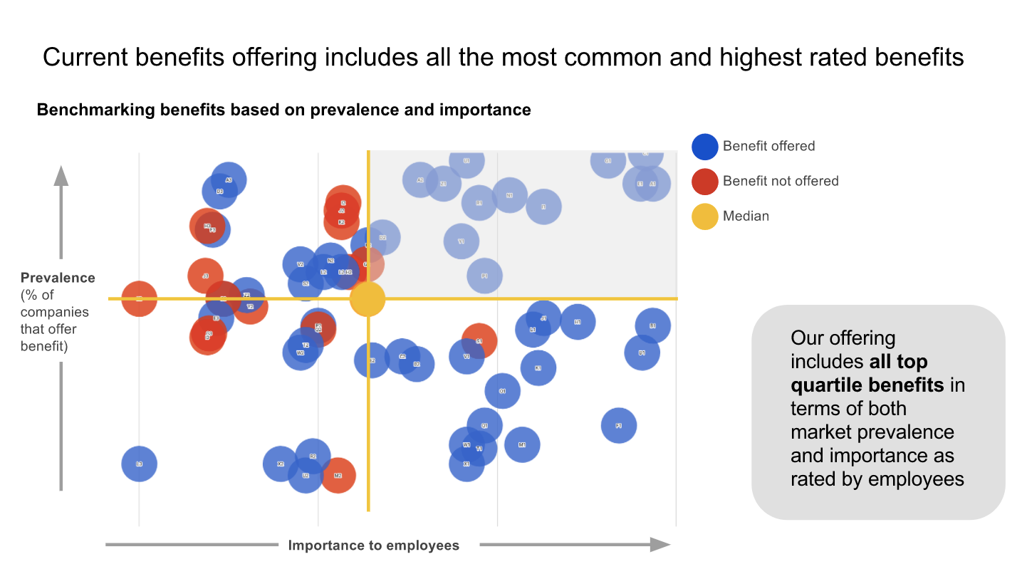
Above is an example slide from a data presentation our team gave. The topic of the presentation was employee benefits. Poll Everywhere’s operations team wanted to check for opportunities to improve our benefits package with an eye towards efficiency, recruiting, and retention.
As you can see, the data is pretty dense. I knew the audience could easily get distracted by all the bubbles. So, the first thing I did was state the Takeaway. This brought everyone back to what was most important.
Next, I said, “Let me orient you to what you’re seeing.” I walked over to the chart and introduced both axis. Then I pointed out how the bubbles in the top-right represented benefits that were the most prevalent in the market and desirable to our employees. To drive that point home, I also called out the lone bubble in the bottom-left as being the total opposite. These two explanations enabled the audience to navigate the rest of the chart on their own.
Finally, I used that Observation about reducing spending to transition to the next slide. There I outlined my suggested next steps for the company based on this data.
For me, giving a data presentation feels like telling a story. A decent storyteller won’t dump their entire narrative on you like a child’s book report. They take you on a journey. The story unfolds methodically so you can comprehend, and appreciate, the deeper meaning within.
Data presentation has a deeper meaning too. Don’t lose it between the numbers. Walk the audience through the data, and guide them towards the same conclusion you reached.
Related articles
Excel Visualization: A Guide to Clear Data Presentation for Beginners
I once struggled with dull data tables.
Numbers clustered in rows and columns become a blur. But with Excel visualization , you can empower your audience to make informed decisions based on the data presented. Excel charts and graphs replace chaos, revealing patterns and trends.
Convey ideas efficiently with the right visual. It’s not just about creating a chart; it’s about making data understandable and engaging.
In this article, I’ll guide you step-by-step on transforming your Excel data into insightful visuals.
Let’s get started!
Table of Contents
Understanding the Basics of Excel Visualization
Excel provides various visualization options, whether 2D or 3D versions, standard, stacked, or 100% stacked options. It’s all about finding the right fit that best represents your data and message.
The Excel Charting Interface
Let’s start with creating a chart in Excel.
When you click on the Insert tab in Excel, you’ll see various chart types that you can use to visualize your data.

The Excel charting interface provides a wide range of options, from line and area charts to bar and column charts. When you click on a chart, the ‘ Chart Tools ’ contextual tab provides additional features for customizing your charts.
Types of Data for Visualization
Excel visualization data can be broadly categorized into numerical, categorical, and time-series data.
- Numerical data includes values that can be measured, such as sales figures or temperature readings.
- Categorical data includes information such as names, labels, or groups.
- Time-series data involves values measured over time, such as stock prices or website traffic.
Excel offers different chart types depending on your data type.
Selecting the Right Chart Type
Selecting the right chart type is half the battle for effective data visualization in Excel.
Pie charts are best for part-to-whole comparisons. Use line charts for time series or trends. Bar or column charts are the most suitable for categorical comparisons.
However, consider more advanced chart types for more complex data sets.
Scatter plots are excellent for correlation analysis , while histograms and box plots are ideal for distribution analysis of quantitative data.
It’s all about understanding your data and determining the best way to display it.
Steps for Visualizing Data in Excel – Creating Basic Charts
Creating basic charts in Excel is a fundamental skill for anyone looking to present data in a visual format.
Excel offers a variety of chart types, each with unique properties and use cases. The key to successful chart creation in Excel is understanding these different chart types and knowing how to present your data most effectively with them.
Organizing Your Data
Before you dive into creating Excel charts, it is crucial to organize your data correctly .
Well-organized data will make the charting process easier and the resulting charts more meaningful. Ensure your data is clean, error-free, and arranged clearly and logically.
This will make it easier to select the data for your charts and create visuals that effectively communicate your data analysis results.
Pie and Donut Chart
Pie charts are popular for showing the proportion of different categories within a whole. While visually appealing, they are often misused and can lead to misleading interpretations.
Generally, they are most effective when comparing a few categories representing parts of a whole.
On the other hand, donut charts are a variation of pie charts with a hole in the middle (as the name implies!). Like pie charts, they can display multiple data series, but they should be used sparingly.
To create a pie chart in Excel:
- Select the data you want to visualize
- From the “ Insert ” tab, choose “ Pie ” from the chart options.
- You can customize your chart by changing the colors, adding labels, and adjusting other settings in the “ Format Chart Area ” pane.
Here’s a video guide on how to create a donut chart:
Line and Area Chart
Line and area charts are handy when dealing with time-series data . These charts plot data points on a graph and connect them with a line, allowing you to see trends over time.
Check out this video for a step-by-step guide on how to create a line chart:
One of the business essentials when working with line and area charts is customizing the axis and gridlines. This can help make your chart more readable and meaningful .
The “ Format Axis ” pane allows you to customize the axis labels, adjust the scale, and add gridlines.
Column and Bar Graph
Bar and column charts are Excel’s most commonly used chart types. They are excellent for comparing different categories of data.
While bar charts and column charts are often used interchangeably, there is a difference: A bar chart presents data horizontally , while a column chart presents data vertically . This distinction can influence how easily your audience interprets the chart.
You can also choose between a stacked or clustered bar and column chart layout.
In a stacked chart , data series are stacked on each other, while in a clustered chart , they are placed side by side.
To create a bar or column chart:
- Select the data
- Then choose either “Bar” or “Column” from the chart options in the “ Insert ” tab
- Remember to format the chart and the axis labels to make the chart easier to understand
Advanced Charting Techniques
In this section, I’ll describe how to present complex data in a visually appealing and easily understandable format. Since each dataset is unique, treat these charts as ideas for meaningfully presenting your data.
Combination Charts
This type of chart combines the features of line and column charts, allowing you to present mixed data more comprehensively.
For example, when you have a target and actual data for comparison , a combination chart can be the perfect tool for visualization.
Clicking the Chart Design tab on the ribbon allows you to change the chart type and create a customized combination chart.

This allows you to have your target values in columns and the actual values marked along the line, which provides a clearer visualization of your data.
Trendlines and Data Analysis
Another essential feature of Excel charts is the ability to add trendlines. These can be linear, polynomial, or moving average trendlines.
A trendline graphically displays trends in your data , and you can extend it beyond the actual data to predict future values.
Along with trendlines, interpreting R-squared values is also crucial in data analysis. This will help you understand the relationship between your dependent and independent variables, thus enhancing your analysis results.
Check out our detailed how-to post on adding trendlines to Excel charts .
Conditional Formatting in Charts
Conditional formatting is another advanced charting technique in Excel that can enhance your data visualization. You can also add data bars, color scales, and icon sets.
These features allow you to customize your charts based on certain conditions, making it easier for your audience to understand your data. Applying these formatting options enables you to create more engaging and visually appealing charts for your data presentation.
Creating a Tornado Chart in Excel
Tornado charts are particularly effective when comparing and contrasting different variables . A well-crafted tornado chart can help you visualize how changes in several factors can impact a specific outcome – for example, the impact of inflation on NPV and IRR results.
Here’s a video showing you how to create a tornado chart:
Designing a Funnel Chart in Excel
Funnel Charts in Excel are highly effective tools for monitoring sales processes or any other process that narrows down over time.
Here are two quick methods for designing funnel charts in Excel:
Building a Waffle Chart in Excel
Waffle charts, also known as square pie or waffle bar charts, are a great way to visualize individual data points compared to the whole data set. They are a fun and engaging way to present percentages or proportions.
Here is a simple method for creating waffle charts:
Data Visualization Tips – Enhancing Chart Aesthetics
The aesthetics of your Excel chart play a significant role in how effectively your data is communicated.
A visually appealing chart is easier to understand and engages your audience. Enhancing chart aesthetics involves working with various chart elements and features, such as colors, styles, and data labels.
Adding data labels, for instance, provides additional information on your chart, making it easier to interpret.
Besides, you can customize the chart’s colors and styles to match your presentation theme or company branding.
Check out this post for more information on good dashboard design principles .
Working with Chart Elements
Working with chart elements can significantly improve the readability and effectiveness of your data visualization.
Some key chart elements you can manipulate include titles, legends, and data labels.
- Data labels provide additional context to your data and can be customized to suit your chart
- Modify axis labels and gridlines to adjust their appearance and improve readability. Check out this video on how to add gridlines to your Excel charts:
These chart elements can enhance your aesthetic appeal and make your data easier to interpret.
Customizing Chart Colors and Styles
Spicing up your Excel charts is easier than you think.
The ‘ Chart Design ‘ tab in the Excel ribbon allows you to alter your charts’ aesthetics significantly.
Navigate to the ‘ Chart Styles ‘ section, and you’ll see various styles for your chart.
Looking for a bit more customization? No problem! Simply click the ‘ Change Colors ‘ dropdown and choose a color scheme.

You can use Excel’s preset color schemes or create a custom color palette for brand consistency. Minor visual changes can significantly affect your chart’s overall look and feel.
3D Charts and Effects
Adding a third dimension to your charts can make them pop . But be careful.
While 3D effects can add a specific wow factor, they can also lead to misinterpretations of your data if they are not used properly.
To add 3D effects to your charts, click the ‘ Chart Styles ‘ and choose a style with 3D effects.
Remember, though, that 3D effects should be used sparingly and only when they can enhance the understanding of the data. Overuse of these effects can lead to cluttered, confusing charts. When it comes to 3D effects, less is often more .
Advanced Excel Graphics
Beyond the basic charts, Excel offers advanced graphics capabilities to take your data presentation to the next level.
This includes using Sparklines, shapes, and icons, among other features.
Sparklines are mini-charts within individual cells, each representing a row of data. They give a quick snapshot of trends, helping you understand your data at a glance.
Excel offers line, column, and win/loss types of Sparklines that you can add with the Quick Analysis tool.
Using Shapes and Icons

Remember to appropriately format these shapes and icons to convey the right message and not distract from the data.
Portraying a Story Through Data
Excel visualization is not just about creating charts or diagrams; it’s about telling a story with your data. This is where the concept of data storytelling comes in.
It’s about using visualization tools to highlight key points and trends in your data, making it easier for your audience to understand and absorb.
It’s not unlike creating a plot in a novel where rows and columns of data are the characters, and the chart is the narrative arc. Every element should convey your story effectively and compellingly, from simple bar charts to intricate trend analysis.
Exporting and Sharing Your Visualizations
Once you’ve created your data visualization in Excel, it’s important to know how to share it! This involves exporting the visual representation of data in a format that others can easily access.
Whether you’re sharing a simple bar graph or a complex infographic, the export method will depend on the intended use of the chart/graphic.
This process can be as simple as saving your chart as an image or embedding Excel visuals in PowerPoint presentations and documents.
Saving Charts as Images
One of the simplest ways to share visualizations is by saving them as images .
To do this, right-click the chart and select ‘Save as Picture.’ Several image formats are available, each with its uses.
For instance, JPEG is great for photographic images, while PNG is ideal for images with transparent backgrounds. However, it’s important to consider the resolution of your image. High resolution is crucial for clear, crisp images, especially if they’re intended for print.
Embedding Excel Visuals in Presentations and Documents
Embedding them in presentations and documents is another way to share your Excel visualizations.
This can be done in two ways: linking and embedding .
- Linking refers to connecting the original Excel file and the document where it’s inserted. Any changes made to the original file will automatically update in the document (assuming the link isn’t broken ).
- Embedding involves inserting a copy of the chart into the document. While this won’t update automatically, it ensures that the chart will always be available, regardless of the status of the original file.
Both methods have advantages and should be chosen based on your specific needs.
Frequently Asked Questions
What are some common mistakes for beginners to avoid in data visualization with excel.
Common mistakes include overcrowding the chart with too much data, using inappropriate chart types, neglecting to label axes or data points clearly, and choosing colors or styles that reduce readability.
What are the best practices for presenting Excel data visually to a non-technical audience?
Focus on simplicity and clarity .
Use straightforward chart types, avoid technical jargon, and highlight key takeaways. Ensure your charts are well-labeled, and use annotations or callouts to draw attention to important data points.
What are some resources to learn more about Excel visualization?
For more tips and tricks, visit my YouTube channel . Alternatively, look at Chandoo’s training, where I learned many excellent dashboard design ideas.
Can Excel visualization help in career development?
Absolutely! Proficiency in Excel visualization is a valuable skill in many industries.
It’s especially relevant in fields like data science, finance, marketing, and others involving large amounts of data. Effectively communicating data through graphical representation can give you a significant advantage in your professional journey.
Leave a Comment Cancel reply
Save my name, email, and website in this browser for the next time I comment.
Call Us Today! +91 99907 48956 | [email protected]
It is the simplest form of data Presentation often used in schools or universities to provide a clearer picture to students, who are better able to capture the concepts effectively through a pictorial Presentation of simple data.
2. Column chart

It is a simplified version of the pictorial Presentation which involves the management of a larger amount of data being shared during the presentations and providing suitable clarity to the insights of the data.
3. Pie Charts

Pie charts provide a very descriptive & a 2D depiction of the data pertaining to comparisons or resemblance of data in two separate fields.
4. Bar charts

A bar chart that shows the accumulation of data with cuboid bars with different dimensions & lengths which are directly proportionate to the values they represent. The bars can be placed either vertically or horizontally depending on the data being represented.
5. Histograms

It is a perfect Presentation of the spread of numerical data. The main differentiation that separates data graphs and histograms are the gaps in the data graphs.
6. Box plots

Box plot or Box-plot is a way of representing groups of numerical data through quartiles. Data Presentation is easier with this style of graph dealing with the extraction of data to the minutes of difference.

Map Data graphs help you with data Presentation over an area to display the areas of concern. Map graphs are useful to make an exact depiction of data over a vast case scenario.
All these visual presentations share a common goal of creating meaningful insights and a platform to understand and manage the data in relation to the growth and expansion of one’s in-depth understanding of data & details to plan or execute future decisions or actions.
Importance of Data Presentation
Data Presentation could be both can be a deal maker or deal breaker based on the delivery of the content in the context of visual depiction.
Data Presentation tools are powerful communication tools that can simplify the data by making it easily understandable & readable at the same time while attracting & keeping the interest of its readers and effectively showcase large amounts of complex data in a simplified manner.
If the user can create an insightful presentation of the data in hand with the same sets of facts and figures, then the results promise to be impressive.
There have been situations where the user has had a great amount of data and vision for expansion but the presentation drowned his/her vision.
To impress the higher management and top brass of a firm, effective presentation of data is needed.
Data Presentation helps the clients or the audience to not spend time grasping the concept and the future alternatives of the business and to convince them to invest in the company & turn it profitable both for the investors & the company.
Although data presentation has a lot to offer, the following are some of the major reason behind the essence of an effective presentation:-
- Many consumers or higher authorities are interested in the interpretation of data, not the raw data itself. Therefore, after the analysis of the data, users should represent the data with a visual aspect for better understanding and knowledge.
- The user should not overwhelm the audience with a number of slides of the presentation and inject an ample amount of texts as pictures that will speak for themselves.
- Data presentation often happens in a nutshell with each department showcasing their achievements towards company growth through a graph or a histogram.
- Providing a brief description would help the user to attain attention in a small amount of time while informing the audience about the context of the presentation
- The inclusion of pictures, charts, graphs and tables in the presentation help for better understanding the potential outcomes.
- An effective presentation would allow the organization to determine the difference with the fellow organization and acknowledge its flaws. Comparison of data would assist them in decision making.
Recommended Courses

Data Visualization
Using powerbi &tableau.

Tableau for Data Analysis

MySQL Certification Program
The PowerBI Masterclass
Need help call our support team 7:00 am to 10:00 pm (ist) at (+91 999-074-8956 | 9650-308-956), keep in touch, email: [email protected].
WhatsApp us

How to Present a Data Science Project
After passing a company’s take-home challenge, you might get asked to present your data science project to data scientists and the hiring manager. Presentations are high-pressure, especially if public speaking is not a strong skill for you.
Fortunately, making your data science presentation more engaging (and using it to land you the job) is a straightforward process. Whether you have a data science project presentation for a job interview or you are presenting the final project for a data science course, the key is to:
- Align the presentation to engage the audience
- Create slides to summarize the project
- Rehearse and refine your presentation
- Relax and speak confidently during the presentation
Data Science Presentations: Where to Start
Design your presentation for the audience and their goals. For example, if you’re presenting to non-technical stakeholders, your project shouldn’t be loaded with technical jargon. Or, conversely, if you’re presenting to a group of data professionals, don’t bore them with beginner definitions.
Before you put together a data science project, ask yourself these questions about the audience:
- Who is your audience? How technical are they? Why are they attending the presentation?
- What potential questions will they have about your project?
- What types of data/analysis will be most interesting for the audience?
- What do they want to learn about you or your work during the presentation?
For a Job: If this presentation occurs after a take-home challenge , usually you have 45 minutes to present, followed by 15 minutes of Q&A.
Don’t forget to prepare for the Q&A: List all of the possible questions the audience might have and develop answers for each of them.
What to Include in Data Science Presentations

You should use the slides you create to tell a data story. At the very least, you’ll want to include the following in slides for your presentation:
- Overview - Summarize the problem statement and convey the importance of the project. This could be split into two, with a brief overview of the problem on Slide 1 and a bulleted list on Slide 2 with the potential impact of your findings.
- Methodology - Summarize how you approached the problem, including initial assumptions, clarifying questions you asked, challenges faced, and steps taken in investigating the problem. Keep this high-level, unless you’re talking to a non-technical audience.
- Your Findings - Explain what you discovered. Did you find support for your hypothesis? How did your machine learning model perform? Support your findings with data, visualizations, key observations, etc. This is the most important information for your audience to have, so make this a focus of your presentation.
- Recommendations - Answer these questions: What does your analysis say about the business? What recommendations would you make? Presentations are a chance to showcase how you would apply data science to the sample problem, and your recommendations show your product and business sense in action.
- Conclusion - Reiterate important takeaways, but also take the time to discuss the next steps, such as if further analysis is needed, improvements you might make, or if you would have done something differently with more time or resources.
Designing Slides: Use clean, simple designs for your slides, including large headlines, very short texts (less than 20 words), and visualizations that help you tell a story.
Rehearsing Your Presentation: What to Do
Practicing provides a chance to work out any potential tech-related issues (slides, audio, and visuals) and speaking-related problems. During rehearsals, practice exactly what you want to say. However, keep it conversational.
Ideally, do some practice runs of the presentation for colleagues and record your initial takes. From there, work on refining the presentation and finish off with another session to polish your work.
Here are a few tips for getting the most out of your rehearsal time:
Create a script - Don’t create a word-for-word script. Instead, have speaking notes for each slide that provide a general idea of what you want to convey. Relying too much on a script will make your presentation sound over-rehearsed, and may trip you up if you end up deviating from it.
Do mock presentations - Present to friends and colleagues, and ask for feedback, questions, and overall comments. Ideally, you should practice with both technical and non-technical audiences. Their feedback will help improve flow, improve clarity, and remove extraneous info.
Record yourself - At a minimum, record audio of your practice, though adding video is even better. Review the audio for flaws in your speaking – Are you talking too fast? Do you say “um” too much? Video will help you review body language – Are you hunched over? Do you have your face glued to the slides?
Rehearse the Q&A - Forgoing this step is a big mistake. It’s not a good look to nail the presentation, only to bomb the Q&A right after. In particular, you’ll want to prepare answers to questions about your models like:
- Did you have any benchmark performance to compare to?
- Why did you choose the model you did? What were the limitations?
- Were there biases? How did you account for these biases?
- How would you improve the model?
Do a tech run-through - Practice using your slides, audio, and video. If this is a video-based presentation, do all of your mock presentations via video conference. Practice using a microphone or headset, ensure you are properly lit, and practice sharing your screen.
Tips for a Data Science Project Presentation
As you build your presentation slides and rehearse, here are some of the best practices and tips to make your performance even stronger:
Keep it concise - Keep your presentation simple and to the point. You can’t show every step you took. Instead, keep it brief and to the point, focusing only on key details.
Choose your best visualizations - Images and charts make your presentation easier to follow and clearly display the impact/findings of your project. Include only vital information in the chart, and be sure to consider fonts, color theory, and other good practices of visualization design . A general rule of thumb : It should be clear to a layman what a chart is conveying.
Focus on the impact - If you’re presenting on a project from a previous job, show the impact it had using metrics. Increased revenue, reduced churn, customer acquisition, and other factors will illustrate how your work impacted the bottom line.
Include limitations - Every project has limitations and challenges. Although it might seem counterintuitive to talk about what went wrong, discussing limitations will make your presentation stronger. It shows you can identify potential flaws in reasoning and that you care about quality controls.
Talk through your decisions - Explain why you made the technical decisions you did. This will help the audience understand your approach, what factors lead to you making a certain decision, and how you personally use creative problem-solving.
Make it accessible - Explain the technical details of your project in layman’s terms. Examples and analogies can be helpful for audiences, and ideally, you should be able to explain an algorithm or complex data science technique in one or two sentences for a non-technical audience.
For the Presentation: Final Tips
Public speaking is nerve-wracking. But there are strategies you can take to calm your nerves and make the most of your presentation time. Here are public speaking tips for your data science presentation:
Make eye contact - Eye contact connects you with your audience and makes your presentation more engaging and impactful. One strategy: sustain eye contact with one person per thought. Be sure to practice this during your rehearsals.
Allow space for questions - Although there’s usually a Q&A at the end, questions can come up throughout. If you’re not sure if the audience has questions, take a pause and ask, “Does anyone have any questions?” Remember, you don’t want to talk AT them.
Avoid rushing - Focus on pacing. You should be talking at a normal conversational speed. Too fast, and you’ll end up losing the audience. Too slow, and you will bore them.
Breath, relax, and collect your thoughts - Before you begin, take some deep breaths. One strategy: reframe the focus from you (e.g., “What if I blow it?” ) to the audience ( “My focus is helping the audience understand and learn.” ).
More Data Science Interview Prep Resources
If you’re looking for data science project ideas, see our guides for analytics projects and machine learning projects . You can also practice for your interview with these resources from Interview Query:
- 500+ Data Science Interview Questions
- 35 Practice Takehomes
- Company Interview Guides
What Is Data Visualization?

Data visualization efforts must include the insights received from data, trends and patterns found within the data, as well as a way to discern complex data in a simplified manner. Data visualization comes in two basic forms: static visualization and interactive visualization.
2 Types of Data Visualization
- Static visualization refers to a method of displaying data that tells focuses on only a single data relationship.
- Interactive visualization allow users to select specific data points in order to present findings and create customized visual stories to compare against each other.
Why Is Data Visualization Important?
Data visualization is important for communicating complex business insights and analysis results to all stakeholders in a simplified manner.
Data visualization is a method of understanding and displaying complex data and powerful insights. Strong data visualization allows for better communication with stakeholders throughout an organization, which is crucial to growing a business and capitalizing on new opportunities. The amount of raw enterprise data multiplies yearly and continually presents new information that, when analyzed, can help uncover trends regarding customer behavior, market evolution, overall consumer habits and more.
Data visualization , when preceded by the use of data mining and data modeling techniques, allows analysts to discover vital insights within large data sets. Data visualization helps analysts easily communicate those insights for immediate action.
Related Reading From Built In Experts 7 Ways to Tell Powerful Stories With Your Data Visualization
What Are the 2 Types of Data Visualization?
The two basic types of data visualization are static visualization and interactive visualization.
Static Visualization
Static visualization refers to a method of displaying data that tells a specific story and focuses on only a single data relationship. A common example of static visualization is an engaging single-page layout like an infographic.
Interactive Visualization
Interactive visualizations , for the most part, only exist within software or web applications. This model allows users to select specific data points in order to present findings and create customized visual stories to compare against each other, thereby creating the opportunity for stakeholders to choose from a selection of insights to determine the best path forward, rather than deciding based on a single insight.
Both static and interactive visualization methods present opportunities to display data clearly and accurately. Data analysts should use their best judgment based on the target customer, data story and ROI when deciding on which visualization method to use.
What Are Data Visualization Best Practices?
Some best practices for data visualization include speaking to a specific audience, choosing a proper visualization and providing context.
It is crucial to follow best practices when presenting data visualizations:
- Know Your Audience: Data should always be used to tell a story and uncover trends. It’s vital to know who will be most interested in the information and tailor your visualizations so they can digest the data.
- Choose the Correct Visual: Data visualizations should always present the data in a way that makes it easy to understand. For example, a chart may be the best method of displaying data with a high degree of variability, while graphs may be better for displaying changes in data over time.
- Provide Context: Data without context isn't very helpful, so the data visualizations you choose to put the information in perspective is important. A good visualization will not only show the data is relevant and easily provable, but will also tell a cohesive story.
- Keep It Simple: Simple visualizations and dashboards go a long way in data visualization because they allow stakeholders to easily reference data and make informed decisions without becoming confused by the data’s purpose.
- Engage the User: Lastly, engagement is important when presenting complicated data to stakeholders. To prevent users from becoming overwhelmed or intimidated, the overall design and user experience should be graspable without being intimidating.
Built In’s expert contributor network publishes thoughtful, solutions-oriented stories written by innovative tech professionals. It is the tech industry’s definitive destination for sharing compelling, first-person accounts of problem-solving on the road to innovation.
Great Companies Need Great People. That's Where We Come In.
Data Presentation Techniques that Make an Impact
Create beautiful charts & infographics get started, 10.05.2016 by anete ezera.
Presenting data doesn’t need to be boring. In fact, it is a great way to spice up your presentations and share important facts and figures with your audience. Data has the power to be engaging, persuasive and memorable.
If you have a compelling story to tell with data, you should present it in a clear and powerful way. We will help you get started with a few effective data presentation techniques!
If you’d like more information about designing great presentations, download our new eBook ‘How to Design PowerPoint Presentations that Pack a Punch in 5 Easy Steps.’

What Presentations Benefit from Data?
Data doesn’t necessarily make all presentations better, but certain types of presentations are prime for the incorporation of data visualizations:
- Sales Reports
- PR and Marketing Research
- Marketing and Advertising Campaigns
- Executive and CEO Presentations
- Educational Reports
- Political Speeches
- Annual Reports
- Shareholder Presentations
- Financial Reports
- Product Launches, and more!
Why Use Charts in Presentations?
Visuals make information stick in our brains . A study from the Wharton School of Business found that 67% of the audience surveyed were persuaded by verbal presentations that had accompanying visuals. Charts are great visual aids for multiple reasons:
- Charts are easy to read
- Charts are visually appealing
- Charts simplify complex information
- Charts make it possible to quickly make comparisons and spot trends
- Charts are memorable and make an impact
- Charts give your presentation credibility
How to Add Data to Your Presentation
1) define your message.
Before you can even think about adding data to your presentation, you need to ask yourself, ‘what story am I trying to tell?’ Once you have a concrete idea of what your message is, you’ll have an easier time crafting the right visualization to share with your audience.
2) Clean and Organize Your Data
Now that you know what point you want to make with your data, it’s time to make sure your numbers are ready to be visualized. Every good data visualization starts with good data. Make sure your spreadsheet is formatted and labeled exactly how you want it. Think about the message you want to share with your data and get rid of anything that doesn’t help you tell your story.
Data that is clean and organized is easier to display and analyze. Here are five awesome free data analysis tools to help you extract, clean, and share your data.
3) Pick the Right Chart Type
We can’t emphasize enough how important it is to make sure you pick the right chart type for the data you want to present. While your data might technically work with multiple chart types, you need to pick the one that ensures your message is clear, accurate, and concise.

4) Simplicity is Key
Charts and graphs turn complex ideas or data sets into easy-to-understand visual concepts. Remember that your data is the star of the show, so keep it simple. Avoid visual clutter, excessive text, poor color selection, and unnecessary animations. Make sure your legend and data labels are printed in a large, visible font. You don’t want your audience to get distracted. Less is more!
5) Create a Narrative
People understand stories better than they understand spreadsheets. Craft a compelling story around your data to make it memorable. Find a way to drive emotion from the numbers. Give your audience something they can relate to and resonate with. Data visualization speaker Bill Shander offers five tips to make you a better data storyteller.
6) Visualize Data with Infogram
Before you add data to your presentation you need to visualize it. While many presentation tools allow you to create charts , they often leave much to be desired. Infogram makes it easy to create beautiful, engaging data visualizations your audience won’t forget.
You can embed interactive and responsive data visualizations into your presentations if you’re using Bunkr or any other HTML based presentation platform. Or, if you upgrade to one of our paid plans , you can download static versions of your charts and graphs to enhance your work. You can even make the background of PNG downloads transparent so they slip seamlessly into your presentation.

Would you like to experience the full power of data visualization ? Try Infogram for Teams or Enterprise for free! With a Team or Enterprise account, you can create up to 10,000+ projects, collaborate with your team in real time, use our engagement analytics feature, and more. Request your free demo here .
7) Make a Handout
Leave your audience with a physical or virtual copy of your charts. This makes it possible for them to look at the numbers more closely after your presentation. It’s also nice to include extra information, beyond what you covered, in case someone wants to delve deeper into the material.
Now that you know how to add data to your presentations, it’s time to learn how to design a PowerPoint that really gets people talking. Download our latest eBook ‘How to Design PowerPoint Presentations that Pack a Punch in 5 Easy Steps’ – for free!
Get data visualization tips every week:
New features, special offers, and exciting news about the world of data visualization.
Join more than 200,000 readers and receive the latest data visualization news, tips and trends every week.
Create infographics with ai: fast, easy, and powerful, the art of making a how-to guide, the best data visualization tools.
Blog – Creative Presentations Ideas
infoDiagram visual slide examples, PowerPoint diagrams & icons , PPT tricks & guides
Creating Impactful Slides: PowerPoint Chart Improvement Tips
As a slide designer, I frequently work on enhancing charts to make them more impactful for business presentations. Today, I want to share several practical chart improvement tips on how to creatively customize your PowerPoint graphs for a more professional look.
Chart Improvement 1: Broadening Bars
The first step in upgrading a bar chart I usually do is adjusting the width of the bars . The default width proposed by PowerPoint or Excel often makes the bars appear too narrow. Since these bars are crucial for conveying information in PowerPoint presentations, I make them wider for better visual presentation of underlying data values.
To do this, I simply right-click on a bar, select ‘Format Series’, and then adjust the Gap Width. A good rule of thumb is to aim for a Gap Width of around 70-80%. This simple adjustment makes a significant difference in how your bar chart in PowerPoint is perceived.

Chart Improvement 2: Enhancing Clarity with Data Labels
Another data chart area worth customizing, after adjusting the bar widths are the data labels . The default location of data values is not always optimal. They may be too small or not visible. In my example placing these data labels inside the bars can significantly improve readability. Thanks to wider bars, we now have a space to embed numbers inside. This positioning, close to the bar ends, conveniently shows the value.
To ensure they stand out, I increased the font size to 20 and adjusted the color to white for better contrast against the colored background. Depending on the font used, making these labels bold can further improve visibility. This makes your bar chart in PowerPoint not only more readable but also more visually engaging.

Chart Improvement 3: Simplifying Your Bar Chart, Removing Unnecessary Information
A key part of making a slide more readable is removing unnecessary elements . For instance, if the vertical axis (Y-axis) is providing practically the same information as data labels, then simply delete it. You will not lose information because it’s mentioned inside bars.
Alternatively, you can keep only the axis and remove the bar data labels. You don’t need to have the same data expressed twice.
This step, along with removing gridlines, contributes to a cleaner and more focused bar chart in PowerPoint, ensuring that the viewer’s attention is solely on the data being presented.
Chart Improvement 4: Tailoring the Graph Legend
The final touch I usually do in optimizing a bar chart in PowerPoint is adjusting the legend’s position . The legend placement depends on your presentation context.
If your audience is already familiar with presented data categories, the legend can be placed in a less prominent position e.g. on the right side or under the data chart. However, for newcomers who seek first to learn what data categories you present, I recommend placing the legend where they see it first. For example at the top of the bar chart in PowerPoint or from the left side. This ensures an immediate understanding of what each bar represents, enhancing the overall effectiveness of your presentation.
Legend position can be adjusted either from chart options or manually by moving it.

Conclusion: Enhance Your PowerPoint Bar Charts for Audience Engagement
To sum up, customizing a bar chart in PowerPoint for better clarity involves several key steps:
- widen the bars (applying the 80-20 rule)
- enhance data value visibility
- eliminate unnecessary elements – axis data if they are already expressed other way
- choose the legend’s position based on your audience’s familiarity
By following these simple yet effective tips, you can transform a standard chart into a more engaging and informative visual tool for your business presentations. Explore more practical tips on how to ensure the slide reading flow is natural and easy to follow.

Watch the movie with full instructions here:
Explore another article related to bar chart design, where I share how to effectively address the common mistakes in PowerPoint chart design .
Follow our YouTube channel if you want to see more of such guides, and subscribe to the newsletter to get more design tips and slide inspiration.
Author: Peter Zvirinsky, slide design trainer and the founder of infoDiagram Reach out to Peter on LinkedIn or via his slide design & training website.
Published by

Chief Diagram Designer, infoDiagram co-founder View all posts by Peter Z

The Research Process | Steps, How to Start & Tips

Introduction
Basic steps in the research process, conducting a literature review, designing the research project, collecting and analyzing data.
- Interpretation, conclusion and presentation of findings
Key principles for conducting research
The research process is a systematic method used to gather information and answer specific questions. The process ensures the findings are credible, high-quality, and applicable to a broader context. It can vary slightly between disciplines but typically follows a structured pathway from initial inquiry to final presentation of results.
What is the research process?
At its core, the research process involves several fundamental activities: identifying a topic that needs further investigation, reviewing existing knowledge on the subject, forming a precise research question , and designing a method to investigate it. This is followed by collecting and analyzing data , interpreting the results, and reporting the findings. Each step is crucial and builds upon the previous one, requiring meticulous attention to detail and rigorous methodology.
The research process is important because it provides a scientific basis for decision-making. Whether in academic, scientific, or commercial fields, research helps us understand complex issues, develop new tools or products, and improve existing practices. By adhering to a structured research process , researchers can produce results that are not only insightful but also transparent so that others can understand how the findings were developed and build on them in future studies. The integrity of the research process is essential for advancing knowledge and making informed decisions that can have significant social, economic, and scientific impacts.
The research process fosters critical thinking and problem-solving skills. It demands a clear articulation of a problem, thorough investigation, and thoughtful interpretation of data, all of which are valuable skills in any professional field. By following this process, researchers are better equipped to tackle complex questions and contribute meaningful solutions to real-world problems.

From finding the key theoretical concepts to presenting the research findings in a report, every step in the research process forms a cohesive pathway that supports researchers in systematically uncovering deep insights and generating meaningful knowledge, which is crucial for the success of any qualitative investigation.
Identifying key theoretical concepts
The first step in the research process involves finding the key theoretical concepts or words that specify the research topic and are always included in the title of the investigation. Without a definition, these words have no sense or meaning (Daft, 1995). To identify these concepts, a researcher must ask which theoretical keywords are implicit in the investigation. To answer this question a researcher should identify the logical relationships among the two words that catch the focus of the investigation. It is also crucial that researchers provide clear definitions for their theoretical keywords. The title of the research can then include these theoretical keywords and signal how they are being studied.
A piece of useful advice is to draw a conceptual map to visualize the direct or indirect relationships between the key theoretical words and choose a relationship between them as the focus of the investigation.
Developing a research question
One of the most important steps in the research endeavor is identifying a research question. Research questions answer aspects of the topic that need more knowledge or shed light on information that has to be prioritized before others. It is the first step in identifying which participants or type of data collection methods. Research questions put into practice the conceptual framework and make the initial theoretical concepts more explicit.
A research question carries a different implicit meaning depending on how it is framed. Questions starting with what, who, and where usually identify a phenomenon or elements of one, while how, why, when and how much describe, explain, predict or control a phenomenon.
Overall, research questions must be clear, focused and complex. They must also generate knowledge relevant to society and the answers must pose a comprehensive understanding that contributes to the scientific community.
Make the most of your data with ATLAS.ti
Powerful tools in an intuitive interface, ready for you with a free trial today.
A literature review is the synthesis of the existing body of research relevant to a research topic. It allows researchers to identify the current state of the art of knowledge of a particular topic. When conducting research, it is the foundation and guides the researcher to the knowledge gaps that need to be covered to best contribute to the scientific community.
Common methodologies include miniaturized or complete reviews, descriptive or integrated reviews, narrative reviews, theoretical reviews, methodological reviews and systematic reviews.
When navigating through the literature, researchers must try to answer their research question with the most current peer-reviewed research when finding relevant data for a research project. It is important to use the existing literature in at least two different databases and adapt the key concepts to amplify their search. Researchers also pay attention to the titles, summaries and references of each article. It is recommended to have a research diary for useful previous research as it could be the researcher´s go-to source when writing the final report.

A good research design involves data analysis methods suited to the research question, and where data collection generates appropriate data for the analysis method (Willig, 2001).
Designing a qualitative study is a critical step in the research process, serving as the blueprint for the research study. This phase is a fundamental part of the planning process, ensuring that the chosen research methods align perfectly with the research's purpose. During this stage, a researcher decides on a specific approach—such as narrative , phenomenological , grounded theory , ethnographic , or case study —tailoring the design to the unique research problem and needs of the research project. By carefully selecting the research method and planning how to approach the data, researchers can ensure that their work remains focused and relevant to the intended study area.
A well-constructed research design is vital for maintaining the integrity and credibility of the study. It guides the researcher through the research process steps, from data collection to analysis, helping to manage and mitigate potential interpretations and errors. This detailed planning is crucial, particularly in qualitative studies, where the depth of understanding and interpretive nature of analysis can significantly influence outcomes.
The design of a qualitative study is more than a procedural formality; it is a strategic component of the research that enhances the quality of the results. It requires thoughtful consideration of the research question, ensuring that every aspect of the methodology contributes effectively to the overarching goals of the project.

Collecting data
Gathering data can involve various methods tailored to the study's specific needs. To collect data , techniques may include interviews , focus groups, surveys and observations , each chosen for its ability to target a specific group relevant to the research population. For example, focus groups might explore attitudes within a specific age group, while observations might analyze behaviours in a community for population research projects. Data may also come from secondary sources with quantitative and qualitative approaches such as library resources, market research, customer feedback or employee evaluations.
Effective data management is crucial, ensuring that primary data from direct collection and secondary data from sources like public health records are organized and maintained properly. This step is vital for maintaining the integrity of the data throughout the research process steps, supporting the overall goal of conducting thorough and coherent research.
Analyzing data
Once research data has been collected, the next critical step is to analyze the data. This phase is crucial for transforming raw data into high-quality information for meaningful research findings.
Analyzing qualitative data often involves coding and thematic analysis , which helps identify patterns and themes within the data. While qualitative research typically does not focus on drawing statistical conclusions, integrating basic statistical methods can sometimes add depth to the data interpretation, especially in mixed-methods research where quantitative data complements qualitative insights.
In each of the research process steps, researchers utilize various research tools and techniques to conduct research and analyze the data systematically. This may include computer-assisted qualitative data analysis software (CAQDAS) such as ATLAS.ti, which assists in organizing, sorting, and coding the data efficiently. It can also host the research diary and apply analysis methods such as word frequencies and network visualizations.

Interpretation, conclusion and presentation of research findings
Interpreting research findings.
By meticulously following systematic procedures and working through the data, researchers can ensure that their interpretations are grounded in the actual data collected, enhancing the trustworthiness and credibility of the research findings.
The interpretation of data is not merely about extracting information but also involves making sense of the data in the context of the existing literature and research objectives. This step is not only about what the data is, but what it means in the broader context of the study, enabling researchers to draw insightful conclusions that contribute to the academic and practical understanding of the field.
Concluding and presenting research findings
The final step is concluding and presenting the research data which are crucial for transforming analyzed data into meaningful insights and credible findings.
The results are typically shared in a research report or academic paper, detailing the findings and contextualizing them within the broader field. This document outlines how the insights contribute to existing knowledge, suggests areas for future research, and may propose practical applications.
Effective presentation is key to ensuring that these findings reach and impact the intended audience. This involves not just articulating the conclusions clearly but also using engaging formats and visual aids to enhance comprehension and engagement with the research.

The research process is a dynamic journey, characterized by a series of systematic research process steps designed to guide researchers successfully from inception to conclusion. Each step—from designing the study and collecting data to analyzing results and drawing conclusions—plays a critical role in ensuring the integrity and credibility of the research.
Qualitative research is guided by key principles designed to ensure the rigour and depth of the research study. Credibility is crucial, achieved through accurate representations of participant experiences, often verified by peer-review revision. Transferability is addressed by providing rich context, allowing others to evaluate the applicability of findings to similar settings. Dependability emphasizes the stability and consistency of data, maintained through detailed documentation of the research process (such as in a research diary), facilitating an audit trail. This aligns with confirmability, where the neutrality of the data is safeguarded by documenting researcher interpretations and decisions, ensuring findings are shaped by participants and not researcher predispositions.
Ethical integrity is paramount, upholding standards like informed consent and confidentiality to protect participant rights throughout the research journey. Qualitative research also strives for a richness and depth of data that captures the complex nature of human experiences and interactions, often exploring these phenomena through an iterative learning process. This involves cycles of data collection and analysis, allowing for ongoing adjustments based on emerging insights. Lastly, a holistic perspective is adopted to view phenomena in their entirety, considering all aspects of the context and environment, which enriches the understanding and relevance of the research outcomes. Together, these principles ensure qualitative research is both profound and ethically conducted, yielding meaningful and applicable insights.

Daft, R. L. (1995). Organization Theory and Design. West Publishing Company.
Willig, C. (2001). Introducing Qualitative Research in Psychology: Adventures in Theory and Method. McGraw-Hill Companies, Incorporated.

Whatever your research objectives, make it happen with ATLAS.ti. Download a free trial today.

IMAGES
VIDEO
COMMENTS
Step 1: Define Your Data Hierarchy. While presenting data on the budget allocation, start by outlining the hierarchical structure. The sequence will be like the overall budget at the top, followed by departments, projects within each department, and finally, individual cost categories for each project. Example:
TheJoelTruth. While a good presentation has data, data alone doesn't guarantee a good presentation. It's all about how that data is presented. The quickest way to confuse your audience is by ...
Definition: Data presentation is the art of visualizing complex data for better understanding. Importance: Data presentations enhance clarity, engage the audience, aid decision-making, and leave a lasting impact. Types: Textual, Tabular, and Graphical presentations offer various ways to present data.
Storytelling with data is a highly valued skill in the workforce today and translating data and insights for a non-technical audience is rare to see than it is expected. Here's my five-step routine to make and deliver your data presentation right where it is intended —. 1. Understand Your Data & Make It Seen.
Large figures should have thousands separated with commas. For example, 4,498,300,000 makes for a much easier read than "4498300000". Any corresponding units should also be clear. With data presentation, don't forget that numbers are still your protagonist, so they must be highlighted with a larger or bolder font.
How to create data presentations. If you're ready to create your data presentation, here are some steps you can take: 1. Collect your data. The first step to creating a data presentation is to collect the data you want to use in your share. You might have some guidance about what audience members are looking for in your talk.
Make sure your data is accurate, up-to-date, and relevant to your presentation topic. Your goal will be to create clear conclusions based on your data and highlight trends. 2. Know your audience. Knowing who your audience is and the one thing you want them to get from your data is vital.
Here are my 10 tips for presenting data: Recognize that presentation matters. Don't scare people with numbers. Maximize the data pixel ratio. Save 3D for the movies. Friends don't let friends use pie charts. Choose the appropriate chart. Don't mix chart types for no reason. Don't use axes to mislead.
Presentation length. This is my formula to determine how many slides to include in my main presentation assuming I spend about five minutes per slide. (Presentation length in minutes-10 minutes for questions ) / 5 minutes per slide. For an hour presentation that comes out to ( 60-10 ) / 5 = 10 slides.
Thankfully, we're here to help. Here are 10 data presentation tips to effectively communicate with executives, senior managers, marketing managers, and other stakeholders. 1. Choose a Communication Style. Every data professional has a different way of presenting data to their audience. Some people like to tell stories with data, illustrating ...
Histogram, Smoothed frequency graph, Pie diagram or Pie chart, Cumulative or ogive frequency graph, and Frequency Polygon. Tags: Types of Presentation. How to present the data in a way that even the clueless person in the room can understand? Check out our 10 methods of data presentation for a better idea.
1. Takeaway: This is the most important piece of the puzzle. If your audience remembers one thing from your data presentation, it should be this. Try to sum up this point as succinctly as possible. This is what the data means. 2. Data: A great presenter takes the burden of comprehending all this data off the audience.
Data Presentation. Tools for effective data presentation. Over 1.8 million professionals use CFI to learn accounting, financial analysis, modeling and more. Start with a free account to explore 20+ always-free courses and hundreds of finance templates and cheat sheets. ... To learn the step-by-step process of creating these essential tools in ...
This is because while you may have available data that supports a position, an effective presentation method is crucial to ensure others can understand the available data. Read more: Steps on Creating an Effective Presentation for Sales How to present data Follow these steps when presenting data to improve accessibility and understanding: 1.
2) Clean and Organize Your Data. Now that you know what point you want to make with your data, it's time to make sure your numbers are ready to be visualized. Every good data visualization ...
Illustrate your conclusions with data visualizations, but let your own explanation - not the charts - drive your presentation. Keep it simple, and leave out unnecessary detail in both your explanations and your charts. Don't exceed 10 to 15 minutes for the whole presentation. Data Visualization. About the author.
8. Tabular presentation. Presenting data in rows and columns, often used for precise data values and comparisons. Tabular data presentation is all about clarity and precision. Think of it as presenting numerical data in a structured grid, with rows and columns clearly displaying individual data points.
This method of displaying data uses diagrams and images. It is the most visual type for presenting data and provides a quick glance at statistical data. There are four basic types of diagrams, including: Pictograms: This diagram uses images to represent data. For example, to show the number of books sold in the first release week, you may draw ...
To create a pie chart in Excel: Select the data you want to visualize. From the " Insert " tab, choose " Pie " from the chart options. You can customize your chart by changing the colors, adding labels, and adjusting other settings in the " Format Chart Area " pane. Here's a video guide on how to create a donut chart:
There're 5 solid and reliable data presentation methods: textual, statistical data presentation, measures of dispersion, tabular, and graphical data representation. Besides, some of the tested and proven charts for data presentation include: Waterfall Chart. Double Bar Graph. Slope Chart. Treemap Charts. Radar Chart.
Data Analysis and Data Presentation have a practical implementation in every possible field. It can range from academic studies, commercial, industrial and marketing activities to professional practices. In its raw form, data can be extremely complicated to decipher and in order to extract meaningful insights from the data, data analysis is an important step towards breaking down data into ...
Whether you have a data science project presentation for a job interview or you are presenting the final project for a data science course, the key is to: Align the presentation to engage the audience. Create slides to summarize the project. Rehearse and refine your presentation. Relax and speak confidently during the presentation.
Data visualization is a method of displaying data in graphs, ... Take the next step in your career by earning a data science certification from Udacity. ... You'll also practice communicating your results and insights by compiling technical documentation and a stakeholder presentation. Throughout this expert-designed program, you'll:
3) Pick the Right Chart Type. We can't emphasize enough how important it is to make sure you pick the right chart type for the data you want to present. While your data might technically work with multiple chart types, you need to pick the one that ensures your message is clear, accurate, and concise. 4) Simplicity is Key.
One of the most influential data visualization booksupdated with new techniques, technologies, and examples Visualize This demonstrates how to explain data visually, so that you can present and communicate information in a way that is appealing and easy to understand. Today, there is a continuous flow of data available to answer almost any question. Thoughtful charts, maps, and analysis can ...
Step 5: Add Animated Charts, Graphs and Data Widgets To Your Animated PowerPoint Visme turns your animated PowerPoint templates into amazing data visualization presentations. All charts and graphs created with the Graph Engine can not only be animated, but they can also have interactivity.
If you change your mind, follow the same steps and you will be able to click "Unfreeze" to remove the block. Using Filters. What if we wanted to see only a specific set of data? We would use the filter option. To activate filters for your data, simply click anywhere on the data, then in the top menu click Data > Create a filter.
The first step in upgrading a bar chart I usually do is adjusting the width of the bars. The default width proposed by PowerPoint or Excel often makes the bars appear too narrow. Since these bars are crucial for conveying information in PowerPoint presentations, I make them wider for better visual presentation of underlying data values.
Step-by-Step: Import data from spreadsheets and databases ... SQL, presentation tools (Powerpoint or Google Slides), Tableau, RStudio, and Kaggle. Which "spreadsheet" platform is being taught? Learners can self-select which platform they want to use throughout the program: Google Sheets or Microsoft Excel. It's up to the learner's ...
Once research data has been collected, the next critical step is to analyze the data. This phase is crucial for transforming raw data into high-quality information for meaningful research findings. ... Effective presentation is key to ensuring that these findings reach and impact the intended audience. This involves not just articulating the ...