gradsapp.in

CBSE NCERT Notes Class 12 Practical Work in Geography Part II Chapter 3 Graphical Representation of Data
Chapter 3: Graphical Representation of Data
Introduction
Graphical representation of data is an important aspect of geographical analysis and research. It involves presenting data in visual formats such as graphs, charts, maps, and diagrams to facilitate understanding, comparison, and interpretation of the data. This chapter explores various techniques and methods for effectively representing data graphically.
I. Importance of Graphical Representation
Graphical representation of data offers several advantages over numerical or textual data presentation. It helps in:
1. Visualizing Patterns : Graphical representation allows researchers to visually identify patterns, trends, and relationships within the data. It provides a clear and concise representation of complex information, making it easier to interpret and understand.
2. Comparing Data : Graphical representations enable easy comparison between different variables or datasets. By plotting data on a common scale, researchers can quickly identify similarities, differences, and outliers.
3. Communicating Information : Visual representations are more accessible and appealing to the audience. They simplify complex information and enhance communication of research findings to a wider audience, including policymakers, stakeholders, and the general public.
4. Supporting Decision-Making : Graphical representations provide a visual basis for decision-making. They assist in identifying key areas of concern, prioritizing actions, and formulating effective strategies based on data insights.
II. Types of Graphical Representation
1. Bar Graphs : Bar graphs use rectangular bars to represent data. They are suitable for comparing categorical or discrete variables and their frequencies or values. Bar graphs can be vertical (column graph) or horizontal (bar graph).
2. Line Graphs : Line graphs display the relationship between two continuous variables. They are useful for showing trends, changes, or patterns over time or across different conditions. Line graphs depict data points connected by lines.
3. Pie Charts : Pie charts represent the composition or distribution of a whole by dividing it into sectors or slices. Each sector represents a different category or proportion of the whole, and the size of the sector corresponds to its relative magnitude.
4. Histograms : Histograms display the distribution of continuous variables by grouping data into intervals or bins. They provide a visual representation of the frequency or count of observations within each interval.
5. Scatter Plots : Scatter plots show the relationship between two continuous variables. They represent data points as individual dots on a Cartesian coordinate system, with one variable plotted on the x-axis and the other on the y-axis.
6. Maps : Maps are graphical representations of spatial data. They depict geographic features, boundaries, and spatial patterns using symbols, colors, and shading. Maps allow for the visualization of data in a spatial context.
III. Guidelines for Effective Graphical Representation
1. Select Appropriate Graph Type : Choose the graph type that best suits the data and research objectives. Consider the nature of the variables, their level of measurement, and the intended message to be conveyed.
2. Simplify and Label : Keep the graph simple and clutter-free. Avoid excessive colors, labels, and unnecessary elements that may distract or confuse the audience. Clearly label axes, data points, and categories to provide context and facilitate understanding.
3. Use Consistent Scales : Maintain consistent scales on axes to ensure accurate representation and comparison of data. Use appropriate intervals, labels, and units to provide clarity and prevent misinterpretation.
4. Provide Captions and Titles : Include clear captions, titles, and legends to explain the purpose and content of the graph. Provide relevant context and explanations to guide the audience in understanding the data representation.
5. Ensure Accuracy and Data Integrity : Double-check data accuracy and integrity before creating the graph. Ensure that the data is correctly represented and reflects the intended message without distortion or manipulation.
IV. Software and Tools for Graphical Representation
Various software and tools are available for creating and editing graphical representations of data. Some commonly used tools include:
1. Microsoft Excel : Excel provides a wide range of charting options, allowing users to create different types of graphs and customize them as per their requirements.
2. Tableau : Tableau is a powerful data visualization tool that enables the creation of interactive and dynamic graphs, charts, and dashboards. It offers advanced features for data exploration and storytelling.
3. Python Libraries : Python libraries such as Matplotlib, Seaborn, and Plotly provide extensive capabilities for data visualization and graph creation. They offer flexibility and customization options for creating visually appealing and informative graphs.
Graphical representation of data plays a crucial role in geography research and analysis. It helps in visualizing patterns, comparing data, communicating information, and supporting decision-making. By selecting appropriate graph types, simplifying the representation, and using consistent scales, researchers can create effective and informative graphical representations. Utilizing software and tools such as Excel, Tableau, and Python libraries further enhances the capabilities of creating visually appealing and insightful graphs.
CBSE NCERT Class 12 Practical Work in Geography Part II Chapter 3 Graphical Representation of Data Chapter Notes, Revision Notes, Chapter Summary, Notes PDF, CBSE, NCERT.
Leave a Reply Cancel reply
Your email address will not be published. Required fields are marked *
Save my name, email, and website in this browser for the next time I comment.
Talk to our experts
1800-120-456-456
- Graphical Representation of Data

Overview to Graphical Representation of Data
Mathematics is a field that deals with the gathering, analysis, interpretation, and presentation of numerical information in a very approach that's straightforward to know and compare. Business statistics, demographics, statistics, and in other spheres of work graphical representation is used.
Tables and graphs show the area of information. People capture more information as soon as it is presented in a more attractive way than in any other format. Graphs are an effective way for showing comparisons between things completely as it has always been straightforward to explore the full information associated with different things.
The use of accurate charts to properly visualize and modify information sets is called image processing. The information is redirected to a computer image code and is represented by a variety of symbols, such as lines on a line chart, bar charts, or chart items, wherever users will gain more insight than numbers. analysis only.
Standalone images will help, predict and create advanced data-driven options by quickly depicting common behaviours and simple, unusual events, and interactions between information objects that cannot be marked. The categories of graphic images used are determined by the type of information being investigated.
Data charts are available in a variety of formats, as well as maps, diagrams, and graphs, and often contain written articles and fables to show the purpose of the chart, units of measurement, and variations, type of information, target chart and whether or not a general image in choosing the most effective chart.
Different Formats
1. Line Graphs - A line graph could be a visual illustration of how the worth of variables changes over time. Points with completely different variable values are coupled to create this graph. It may help evaluate information trends and predict future trends.
2. Graphs Bars - A bar chart could be a form of illustration of knowledge during which bars of a similar dimension are drawn on one axis (usually x-axis) with an equal area between them, showing dynamics. The length of the bars represents the variable values.
3. Histograms - this is often just like bar graphs, except that it supports the numbers' frequency instead of their actual values. The info is broken into intervals, and also the bars represent the frequency vary at intervals. That is, it calculates what percentage information values fall at intervals a given distance.
4. Pie Chart - A kind of graph during which information is pictured as a circular graph. A circle is split into sections, each representing a share of the full.
5. Heatmap - A heatmap could be a two-dimensional, matrix-coloured matrix during which every cell represents a group of knowledge and also the colour of every cell indicates its relative importance.
6. Purpose Map - Point map could be a contract answer for CAD and GIS for writing and an answer that edits the world and line of longitude inform variables to check information mapping.
Benefits of Graphics Illustration
The ability to investigate and perceive giant amounts of numerical information and also the relationship between information points needs table usage and graphical illustration of knowledge. One of the foremost vital ways to investigate information is to check information, providing a straightforward and comprehensive way to represent, visualize, and discuss advanced information patterns.
1. Graphics build information easier to interpret and clear language and learning barriers, simplifying and rising learning.
2. Content comprehension is easily done by human understanding.
3. Performance flexibility: Image displays may be employed in nearly any data-related field.
4. Increase organized thinking: visual aids enable users to create quicker, data-driven selections at a look.
5. Supports engaging and fun visual displays by permitting inventive, relevant reports.
6. Improves communication: reading graphics that emphasize key themes is quicker than reading a close line-by-line report.
7. Shows the full picture: all dynamics, time frames, information behaviour, and relationships are displayed in real-time.
Understanding and distinguishing patterns and trends within the ever-increasing flow of knowledge need a transparent visual illustration of the info. The employment of image displays permits speedy synchronous testing of massive information, which might facilitate the formation of foreseeable predictions and knowledgeable selections.
Graphical representation is a method of numerical data analysis. It shows a diagram of the relationship between knowledge, ideas, information, and concepts. It is easy to understand and one of the key learning strategies. The knowledge in a particular domain always depends on the type of information.
The visual representation forms are distinct. Some of the following are:
1. Line Graphs: Linear graphs display the continuous data and are useful for the prediction of future events over time.
2. Bar Graphs: Bar Graph is used for displaying the classification of details and compares data to the amounts by using solid bars.
3. Histograms: This chart, which uses bars to represent the frequency of numerical data, which are grouped in intervals, has the same width. Since all intervals are similar and continuous.
4. Line Plot: It shows the data frequency on a given line.
5. Frequency Table: The table shows the number of data pieces within the interval given.
6. Circle Graph: Circle graph is a diagram which shows the relationships of the entire component. The circle shall be 100% and the categories occupied shall be represented by a certain percentage, such as 15%, 56%, etc.
7. Stem and Leaf Plot: Data from the lowest value to the highest value are arranged in the stem and leaf plot. The pictures of the lowest places in the sheets and the next places are the numbers.
8. Box and Whisker Plot: The diagram sums up the data in four sections. The graph is shown. Box and whisker indicate the range of information (distribution) and the medium data range.
General Rules for Graphical Representation of Data
There are some rules to display the data and information effectively in the graphical picture. They are as stated below:
Suitable Title: Ensure that the chart showing the topic of the presentation is given the appropriate title.
Measurement Unit: Make sure to mention the unit of measurement in the graph.
Proper Scale: Choose a proper scale to represent the data in an accurate manner.
Index: Index the corresponding colours, shades, rows, graphs format to better understand.
Data Sources: Include the information source at the bottom of the graph wherever necessary.
Keep it Simple: Construct a graph in an easy way that everyone can understand.
Neat: Choose the correct size, lettering, colours, etc. so that the chart is a visual aid to the screen.
Graphical Representation in Maths:
For mathematics, a diagram is a graph with statistical data represented by curves or lines across the coordinate point on its surface. It helps to research the relation between two variables whereby the change of the variable amount in respect of another variable can be calculated within a certain time interval. The distribution of the sequence and the frequency distribution can be analysed for a particular problem.
The data can be visually represented with two types of graphs. As listed below, they are as follows:
Time Series Graphs
Example: Line Graph.
Frequency Distribution Graphs
Example: Frequency Polygon Graph.
Principles of Graphical Representation:
All forms of graphical data representation are governed by algebraic principles. For diagrams, the co-ordinate axis is represented with two rows. The X-axis is a horizontal axis, while the Y-axis is indicated on the vertical axis. The intersecting point of two lines is called ‘O’. Take x-axis into account that the distance between origin and right is good and the distance between the source and left is good. The distance above the origin is also positive for the y-axis, and the distance below the origin is negative.
Generally, frequency distribution is represented in the following methods, namely:
Smoothed frequency graph.
Pie diagram.
Cumulative or ogive frequency graph.
Frequency Polygon.
Merits of Using Graphs.
Advantages of Graphical Representation of Data
The visual depiction of documents has different advantages that are as follows:
This report is suitable for busy people because it emphasizes the subject of the report comfortably. It helps to avoid wasting time.
Data can be contrasted in terms of graphic representation. This kind of comparative analysis helps to understand and focus easily.
It takes a lot of time to correctly present concise data.
Corporate managers study the diagrams and very easily decide about the feasibility of the document.
A logical sequence is developed to clarify the public definition when tables, models, and graphs are used for data.
Poorly trained or illiterate people can easily understand graphics because a line-by-line diagram does not require a concise text.
Tables need less effort and less time for modelling, graphs, and pictures. This approach is always easy to understand the details.
Errors are reliable, insightful or descriptive. Since graphic figures, tablets and diagrams show less error and error usually.
The viewer gets a simple, complete idea from this depiction. There can be no place to judge 100 words.
Disadvantages of Graphical Representation of Data:
Document graphic representation is not unrestricted. The graphical representation problems of data or reports are as follows:
The reports of graphical representation are costly because of the images, and colours. Combining content with human effort is costly in terms of visual layout.
It takes less time to represent a normal file, but the representation of the graph takes time since graphs and figures rely on more time.
Inconsistencies are all likely to occur due to the sophistication of the graphical representations. It leads to community awareness problems.
Graphs show the complete view of data that can keep anything from being kept secret.
Sample Example for Frequency polygon:
Here are the steps to be followed in order to find the frequency distribution of a polygon and it is graphically represented.
Get the frequency distribution and find the intervals of each group.
Mark the middle points along with the X-axis and y-axis frequencies.
At each mid-point, draw the points that are the same as the frequency.
Using lines in order to incorporate these details.
To complete the polygon, attach the point to the bottom or high-class points in the X-axis immediately at each end.

NCERT Study Material
- Math Article
Graphical Representation

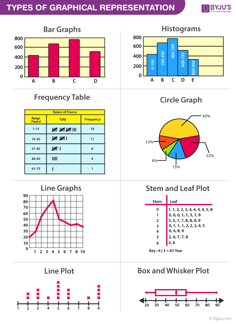
Graphical Representation is a way of analysing numerical data. It exhibits the relation between data, ideas, information and concepts in a diagram. It is easy to understand and it is one of the most important learning strategies. It always depends on the type of information in a particular domain. There are different types of graphical representation. Some of them are as follows:
- Line Graphs – Line graph or the linear graph is used to display the continuous data and it is useful for predicting future events over time.
- Bar Graphs – Bar Graph is used to display the category of data and it compares the data using solid bars to represent the quantities.
- Histograms – The graph that uses bars to represent the frequency of numerical data that are organised into intervals. Since all the intervals are equal and continuous, all the bars have the same width.
- Line Plot – It shows the frequency of data on a given number line. ‘ x ‘ is placed above a number line each time when that data occurs again.
- Frequency Table – The table shows the number of pieces of data that falls within the given interval.
- Circle Graph – Also known as the pie chart that shows the relationships of the parts of the whole. The circle is considered with 100% and the categories occupied is represented with that specific percentage like 15%, 56%, etc.
- Stem and Leaf Plot – In the stem and leaf plot, the data are organised from least value to the greatest value. The digits of the least place values from the leaves and the next place value digit forms the stems.
- Box and Whisker Plot – The plot diagram summarises the data by dividing into four parts. Box and whisker show the range (spread) and the middle ( median) of the data.
General Rules for Graphical Representation of Data
There are certain rules to effectively present the information in the graphical representation. They are:
- Suitable Title: Make sure that the appropriate title is given to the graph which indicates the subject of the presentation.
- Measurement Unit: Mention the measurement unit in the graph.
- Proper Scale: To represent the data in an accurate manner, choose a proper scale.
- Index: Index the appropriate colours, shades, lines, design in the graphs for better understanding.
- Data Sources: Include the source of information wherever it is necessary at the bottom of the graph.
- Keep it Simple: Construct a graph in an easy way that everyone can understand.
- Neat: Choose the correct size, fonts, colours etc in such a way that the graph should be a visual aid for the presentation of information.
Graphical Representation in Maths
In Mathematics, a graph is defined as a chart with statistical data, which are represented in the form of curves or lines drawn across the coordinate point plotted on its surface. It helps to study the relationship between two variables where it helps to measure the change in the variable amount with respect to another variable within a given interval of time. It helps to study the series distribution and frequency distribution for a given problem. There are two types of graphs to visually depict the information. They are:
- Time Series Graphs – Example: Line Graph
- Frequency Distribution Graphs – Example: Frequency Polygon Graph
Principles of Graphical Representation
Algebraic principles are applied to all types of graphical representation of data. In graphs, it is represented using two lines called coordinate axes. The horizontal axis is denoted as the x-axis and the vertical axis is denoted as the y-axis. The point at which two lines intersect is called an origin ‘O’. Consider x-axis, the distance from the origin to the right side will take a positive value and the distance from the origin to the left side will take a negative value. Similarly, for the y-axis, the points above the origin will take a positive value, and the points below the origin will a negative value.
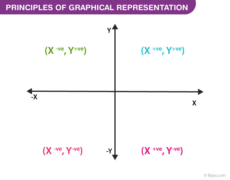
Generally, the frequency distribution is represented in four methods, namely
- Smoothed frequency graph
- Pie diagram
- Cumulative or ogive frequency graph
- Frequency Polygon
Merits of Using Graphs
Some of the merits of using graphs are as follows:
- The graph is easily understood by everyone without any prior knowledge.
- It saves time
- It allows us to relate and compare the data for different time periods
- It is used in statistics to determine the mean, median and mode for different data, as well as in the interpolation and the extrapolation of data.
Example for Frequency polygonGraph
Here are the steps to follow to find the frequency distribution of a frequency polygon and it is represented in a graphical way.
- Obtain the frequency distribution and find the midpoints of each class interval.
- Represent the midpoints along x-axis and frequencies along the y-axis.
- Plot the points corresponding to the frequency at each midpoint.
- Join these points, using lines in order.
- To complete the polygon, join the point at each end immediately to the lower or higher class marks on the x-axis.
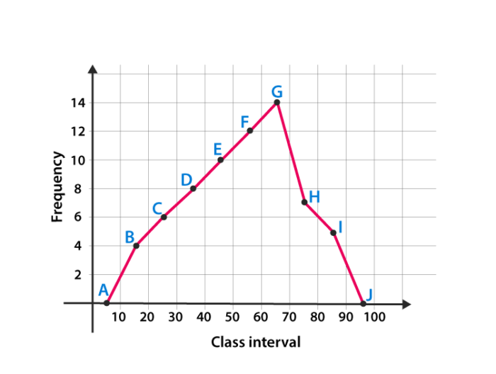
Draw the frequency polygon for the following data
Mark the class interval along x-axis and frequencies along the y-axis.
Let assume that class interval 0-10 with frequency zero and 90-100 with frequency zero.
Now calculate the midpoint of the class interval.
Using the midpoint and the frequency value from the above table, plot the points A (5, 0), B (15, 4), C (25, 6), D (35, 8), E (45, 10), F (55, 12), G (65, 14), H (75, 7), I (85, 5) and J (95, 0).
To obtain the frequency polygon ABCDEFGHIJ, draw the line segments AB, BC, CD, DE, EF, FG, GH, HI, IJ, and connect all the points.
Frequently Asked Questions
What are the different types of graphical representation.
Some of the various types of graphical representation include:
- Line Graphs
- Frequency Table
- Circle Graph, etc.
Read More: Types of Graphs
What are the Advantages of Graphical Method?
Some of the advantages of graphical representation are:
- It makes data more easily understandable.
- It saves time.
- It makes the comparison of data more efficient.
Leave a Comment Cancel reply
Your Mobile number and Email id will not be published. Required fields are marked *
Request OTP on Voice Call
Post My Comment
Very useful for understand the basic concepts in simple and easy way. Its very useful to all students whether they are school students or college sudents
Thanks very much for the information
Register with BYJU'S & Download Free PDFs
Register with byju's & watch live videos.
Graphical Representation of Data
Graphical representation of data is an attractive method of showcasing numerical data that help in analyzing and representing quantitative data visually. A graph is a kind of a chart where data are plotted as variables across the coordinate. It became easy to analyze the extent of change of one variable based on the change of other variables. Graphical representation of data is done through different mediums such as lines, plots, diagrams, etc. Let us learn more about this interesting concept of graphical representation of data, the different types, and solve a few examples.
Definition of Graphical Representation of Data
A graphical representation is a visual representation of data statistics-based results using graphs, plots, and charts. This kind of representation is more effective in understanding and comparing data than seen in a tabular form. Graphical representation helps to qualify, sort, and present data in a method that is simple to understand for a larger audience. Graphs enable in studying the cause and effect relationship between two variables through both time series and frequency distribution. The data that is obtained from different surveying is infused into a graphical representation by the use of some symbols, such as lines on a line graph, bars on a bar chart, or slices of a pie chart. This visual representation helps in clarity, comparison, and understanding of numerical data.
Representation of Data
The word data is from the Latin word Datum, which means something given. The numerical figures collected through a survey are called data and can be represented in two forms - tabular form and visual form through graphs. Once the data is collected through constant observations, it is arranged, summarized, and classified to finally represented in the form of a graph. There are two kinds of data - quantitative and qualitative. Quantitative data is more structured, continuous, and discrete with statistical data whereas qualitative is unstructured where the data cannot be analyzed.
Principles of Graphical Representation of Data
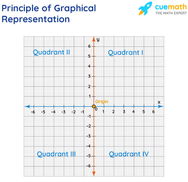
The principles of graphical representation are algebraic. In a graph, there are two lines known as Axis or Coordinate axis. These are the X-axis and Y-axis. The horizontal axis is the X-axis and the vertical axis is the Y-axis. They are perpendicular to each other and intersect at O or point of Origin. On the right side of the Origin, the Xaxis has a positive value and on the left side, it has a negative value. In the same way, the upper side of the Origin Y-axis has a positive value where the down one is with a negative value. When -axis and y-axis intersect each other at the origin it divides the plane into four parts which are called Quadrant I, Quadrant II, Quadrant III, Quadrant IV. This form of representation is seen in a frequency distribution that is represented in four methods, namely Histogram, Smoothed frequency graph, Pie diagram or Pie chart, Cumulative or ogive frequency graph, and Frequency Polygon.
Advantages and Disadvantages of Graphical Representation of Data
Listed below are some advantages and disadvantages of using a graphical representation of data:
- It improves the way of analyzing and learning as the graphical representation makes the data easy to understand.
- It can be used in almost all fields from mathematics to physics to psychology and so on.
- It is easy to understand for its visual impacts.
- It shows the whole and huge data in an instance.
- It is mainly used in statistics to determine the mean, median, and mode for different data
The main disadvantage of graphical representation of data is that it takes a lot of effort as well as resources to find the most appropriate data and then represent it graphically.
Rules of Graphical Representation of Data
While presenting data graphically, there are certain rules that need to be followed. They are listed below:
- Suitable Title: The title of the graph should be appropriate that indicate the subject of the presentation.
- Measurement Unit: The measurement unit in the graph should be mentioned.
- Proper Scale: A proper scale needs to be chosen to represent the data accurately.
- Index: For better understanding, index the appropriate colors, shades, lines, designs in the graphs.
- Data Sources: Data should be included wherever it is necessary at the bottom of the graph.
- Simple: The construction of a graph should be easily understood.
- Neat: The graph should be visually neat in terms of size and font to read the data accurately.
Uses of Graphical Representation of Data
The main use of a graphical representation of data is understanding and identifying the trends and patterns of the data. It helps in analyzing large quantities, comparing two or more data, making predictions, and building a firm decision. The visual display of data also helps in avoiding confusion and overlapping of any information. Graphs like line graphs and bar graphs, display two or more data clearly for easy comparison. This is important in communicating our findings to others and our understanding and analysis of the data.
Types of Graphical Representation of Data
Data is represented in different types of graphs such as plots, pies, diagrams, etc. They are as follows,
Related Topics
Listed below are a few interesting topics that are related to the graphical representation of data, take a look.
- x and y graph
- Frequency Polygon
- Cumulative Frequency
Examples on Graphical Representation of Data
Example 1 : A pie chart is divided into 3 parts with the angles measuring as 2x, 8x, and 10x respectively. Find the value of x in degrees.
We know, the sum of all angles in a pie chart would give 360º as result. ⇒ 2x + 8x + 10x = 360º ⇒ 20 x = 360º ⇒ x = 360º/20 ⇒ x = 18º Therefore, the value of x is 18º.
Example 2: Ben is trying to read the plot given below. His teacher has given him stem and leaf plot worksheets. Can you help him answer the questions? i) What is the mode of the plot? ii) What is the mean of the plot? iii) Find the range.
Solution: i) Mode is the number that appears often in the data. Leaf 4 occurs twice on the plot against stem 5.
Hence, mode = 54
ii) The sum of all data values is 12 + 14 + 21 + 25 + 28 + 32 + 34 + 36 + 50 + 53 + 54 + 54 + 62 + 65 + 67 + 83 + 88 + 89 + 91 = 958
To find the mean, we have to divide the sum by the total number of values.
Mean = Sum of all data values ÷ 19 = 958 ÷ 19 = 50.42
iii) Range = the highest value - the lowest value = 91 - 12 = 79
go to slide go to slide

Book a Free Trial Class
Practice Questions on Graphical Representation of Data
Faqs on graphical representation of data, what is graphical representation.
Graphical representation is a form of visually displaying data through various methods like graphs, diagrams, charts, and plots. It helps in sorting, visualizing, and presenting data in a clear manner through different types of graphs. Statistics mainly use graphical representation to show data.
What are the Different Types of Graphical Representation?
The different types of graphical representation of data are:
- Stem and leaf plot
- Scatter diagrams
- Frequency Distribution
Is the Graphical Representation of Numerical Data?
Yes, these graphical representations are numerical data that has been accumulated through various surveys and observations. The method of presenting these numerical data is called a chart. There are different kinds of charts such as a pie chart, bar graph, line graph, etc, that help in clearly showcasing the data.
What is the Use of Graphical Representation of Data?
Graphical representation of data is useful in clarifying, interpreting, and analyzing data plotting points and drawing line segments , surfaces, and other geometric forms or symbols.
What are the Ways to Represent Data?
Tables, charts, and graphs are all ways of representing data, and they can be used for two broad purposes. The first is to support the collection, organization, and analysis of data as part of the process of a scientific study.
What is the Objective of Graphical Representation of Data?
The main objective of representing data graphically is to display information visually that helps in understanding the information efficiently, clearly, and accurately. This is important to communicate the findings as well as analyze the data.
Safalta Exam Preparation Online
Ncert book class 12 graphical representation of data chapter 3 practical work in geography part ii pdf.
- Whatsapp Channel
Safalta expert Published by: Sheryl Updated Sat, 09 Jul 2022 12:02 AM IST
On this blog you can access the link for chapter 11 of NCERT class 3 Geography, Practical work in geography part II. You can get access to the pdf by simply clicking on the link which will open a new window where you can find the pdf.
Free Demo Classes
Register here for Free Demo Classes
Waw! Just one step away to get free demo classes.
Ncert pdf | geography | class 12, practical work in geography part ii, graphical representation of data.

Source: safalta.com
These books can be used not only for learning the required material for various boards' regular curricula, but also by candidates for competitive exams administered by the Staff Selection Commission, UPSC, PSUs, Railways, and PSC.
NCERT Class 12 Geography Practical work in geography part II Chapter: 3 PDF
On this page, you can read or download Chapter 3 Graphical Representation of Data of the NCERT Book for Class 12 Geography. Students in Class 12 or preparing for any exam based on Class 12 Geography might use the NCERT Book to supplement their studies. When you don't have access to a physical copy, digital NCERT Books Class 12 Geography pdf are always useful.
The NCERT Class 12 Books are simple to obtain. Simply click the link to open a new window with all of the NCERT Book Class 12 Geography pdf files organised by chapter. Choose the chapter you want to download, and you're done. You'll be able to study offline with the PDF on your device.
NCERT Class 12 Geography India people and economy Chapter 3 : Graphical Representation of Data
At safalta, you can access FREE E-BOOKS . These books are not just free of cost, but they are also packed with ample knowledge and information related to your studies.
We also provide FREE MOCK PAPERS , which can help you test your own self. These papers can help you prepare for your exams in a better way.
Important Question from chapter 3 : Graphical Representation of Data
Q-Differentiate between multiple bar diagram and compound bar diagram.
A- Multiple Bar Diagram: For comparative purposes, multiple bar diagrams are created to depict two or more variables.
Compound Bar Diagram: A compound bar diagram is used to illustrate different components that are combined into one set of variables or different variables of one component. With this approach, various variables are displayed in a single bar with various rectangles.
Can students download NCERT Class 12 geography PDF for free?

Start Learning & Earning
- Digital Marketing
- Job Ready Courses
- Graphic Designing
- Advance Excel

Trending Courses

Professional Certification Programme in Digital Marketing (Batch-7)
Now at just ₹ 49999 ₹ 99999 50% off

Master Certification in Digital Marketing Programme (Batch-13)
Now at just ₹ 64999 ₹ 125000 48% off

Advanced Certification in Digital Marketing Online Programme (Batch-24)
Now at just ₹ 24999 ₹ 35999 31% off

Advance Graphic Designing Course (Batch-10) : 100 Hours of Learning
Now at just ₹ 19999 ₹ 35999 44% off


Flipkart Hot Selling Course in 2024
Now at just ₹ 10000 ₹ 30000 67% off

Advanced Certification in Digital Marketing Classroom Programme (Batch-3)
Now at just ₹ 29999 ₹ 99999 70% off

Basic Digital Marketing Course (Batch-24): 50 Hours Live+ Recorded Classes!
Now at just ₹ 1499 ₹ 9999 85% off

WhatsApp Business Marketing Course
Now at just ₹ 599 ₹ 1599 63% off

Advance Excel Course
Now at just ₹ 2499 ₹ 8000 69% off
अपनी वेबसाइट पर हम डाटा संग्रह टूल्स, जैसे की कुकीज के माध्यम से आपकी जानकारी एकत्र करते हैं ताकि आपको बेहतर अनुभव प्रदान कर सकें, वेबसाइट के ट्रैफिक का विश्लेषण कर सकें, कॉन्टेंट व्यक्तिगत तरीके से पेश कर सकें और हमारे पार्टनर्स, जैसे की Google, और सोशल मीडिया साइट्स, जैसे की Facebook, के साथ लक्षित विज्ञापन पेश करने के लिए उपयोग कर सकें। साथ ही, अगर आप साइन-अप करते हैं, तो हम आपका ईमेल पता, फोन नंबर और अन्य विवरण पूरी तरह सुरक्षित तरीके से स्टोर करते हैं। आप कुकीज नीति पृष्ठ से अपनी कुकीज हटा सकते है और रजिस्टर्ड यूजर अपने प्रोफाइल पेज से अपना व्यक्तिगत डाटा हटा या एक्सपोर्ट कर सकते हैं। हमारी Cookies Policy , Privacy Policy और Terms & Conditions के बारे में पढ़ें और अपनी सहमति देने के लिए Agree पर क्लिक करें।
Download App for Live stream
Live stream is currently not available on web. Kindly download our app.
Popular Searches
- Current Affairs
Most Popular Exams
- CBSE Term 2

You have awarded with Avid Reader-3 for reading 50 ebooks on safalta.com. Keep learning and earn coins and badges.
- School Guide
- Mathematics
- Number System and Arithmetic
- Trigonometry
- Probability
- Mensuration
- Maths Formulas
- Class 8 Maths Notes
- Class 9 Maths Notes
- Class 10 Maths Notes
- Class 11 Maths Notes
- Class 12 Maths Notes
- CBSE Class 9 Maths Revision Notes
Chapter 1: Number System
- Number System in Maths
- Natural Numbers | Definition, Examples & Properties
- Whole Numbers - Definition, Properties and Examples
- Rational Numbers: Definition, Examples, Worksheet
- Irrational Numbers: Definition, Examples, Symbol, Properties
- Real Numbers
- Decimal Expansion of Real Numbers
- Decimal Expansions of Rational Numbers
- Representation of Rational Numbers on the Number Line | Class 8 Maths
- Represent √3 on the number line
- Operations on Real Numbers
- Rationalization of Denominators
- Laws of Exponents for Real Numbers
Chapter 2: Polynomials
- Polynomials in One Variable | Polynomials Class 9 Maths
- Polynomial Formula
- Types of Polynomials (Based on Terms and Degrees)
- Zeros of Polynomial
- Factorization of Polynomial
- Remainder Theorem
- Factor Theorem
- Algebraic Identities
Chapter 3: Coordinate Geometry
- Coordinate Geometry
- Cartesian Coordinate System
- Cartesian Plane
Chapter 4: Linear equations in two variables
- Linear Equations in One Variable
- Linear Equation in Two Variables
- Graph of Linear Equations in Two Variables
- Graphical Methods of Solving Pair of Linear Equations in Two Variables
- Equations of Lines Parallel to the x-axis and y-axis
Chapter 5: Introduction to Euclid's Geometry
- Euclidean Geometry
- Equivalent Version of Euclid’s Fifth Postulate
Chapter 6: Lines and Angles
- Lines and Angles
- Types of Angles
- Pairs of Angles - Lines & Angles
- Transversal Lines
- Angle Sum Property of a Triangle
Chapter 7: Triangles
- Triangles in Geometry
- Congruence of Triangles |SSS, SAS, ASA, and RHS Rules
- Theorem - Angle opposite to equal sides of an isosceles triangle are equal | Class 9 Maths
- Triangle Inequality Theorem, Proof & Applications
Chapter 8: Quadrilateral
- Angle Sum Property of a Quadrilateral
- Quadrilateral - Definition, Properties, Types, Formulas, Examples
- Introduction to Parallelogram: Properties, Types, and Theorem
- Rhombus: Definition, Properties, Formula, Examples
- Trapezium in Maths | Formulas, Properties & Examples
- Square in Maths - Area, Perimeter, Examples & Applications
- Kite - Quadrilaterals
- Properties of Parallelograms
- Mid Point Theorem
Chapter 9: Areas of Parallelograms and Triangles
- Area of Triangle | Formula and Examples
- Area of Parallelogram (Definition, Formulas & Examples)
- Figures on the Same Base and between the Same Parallels
Chapter 10: Circles
- Circles in Maths
- Radius of Circle
- Tangent to a Circle
- What is the longest chord of a Circle?
- Circumference of Circle - Definition, Perimeter Formula, and Examples
- Angle subtended by an arc at the centre of a circle
- What is Cyclic Quadrilateral
- The sum of opposite angles of a cyclic quadrilateral is 180° | Class 9 Maths Theorem
Chapter 11: Construction
- Basic Constructions - Angle Bisector, Perpendicular Bisector, Angle of 60°
- Construction of Triangles
Chapter 12: Heron's Formula
- Area of Equilateral Triangle
- Area of Isosceles Triangle
- Heron's Formula
- Applications of Heron's Formula
- Area of Quadrilateral
- Area of Polygons
Chapter 13: Surface Areas and Volumes
- Surface Area of Cuboid
- Volume of Cuboid | Formula and Examples
- Surface Area of Cube
- Volume of a Cube
- Surface Area of Cylinder
- Volume of a Cylinder: Formula, Definition and Examples
- Surface Area of Cone
- Volume of Cone: Formula, Derivation and Examples
- Surface Area of Sphere: Formula, Derivation and Solved Examples
- Volume of a Sphere
- Surface Area of a Hemisphere
- Volume of Hemisphere
Chapter 14: Statistics
- Collection and Presentation of Data
Graphical Representation of Data
- Bar Graphs and Histograms
- Central Tendency
- Mean, Median and Mode
Chapter 15: Probability
- Experimental Probability
- Empirical Probability
- CBSE Class 9 Maths Formulas
- NCERT Solutions for Class 9 Maths: Chapter Wise PDF 2024
- RD Sharma Class 9 Solutions
Graphical Representation of Data: In today’s world of the internet and connectivity, there is a lot of data available, and some or other method is needed for looking at large data, the patterns, and trends in it.
There is an entire branch in mathematics dedicated to dealing with collecting, analyzing, interpreting, and presenting numerical data in visual form in such a way that it becomes easy to understand and the data becomes easy to compare as well, the branch is known as Statistics .
The branch is widely spread and has a plethora of real-life applications such as Business Analytics, demography, Astro statistics, and so on. In this article, we have provided everything about the graphical representation of data, including its types, rules, advantages, etc.
Table of Content
- What is Graphical Representation?
Types of Graphical Representations
Graphical representations used in maths, principles of graphical representations, advantages and disadvantages of using graphical system, general rules for graphical representation of data, solved examples on graphical representation of data, what is graphical representation.
Graphics Representation is a way of representing any data in picturized form. It helps a reader to understand the large set of data very easily as it gives us various data patterns in visualized form.
There are two ways of representing data,
- Pictorial Representation through graphs.
They say, “A picture is worth a thousand words”. It’s always better to represent data in a graphical format. Even in Practical Evidence and Surveys, scientists have found that the restoration and understanding of any information is better when it is available in the form of visuals as Human beings process data better in visual form than any other form.
Does it increase the ability 2 times or 3 times? The answer is it increases the Power of understanding 60,000 times for a normal Human being, the fact is amusing and true at the same time.
Comparison between different items is best shown with graphs, it becomes easier to compare the crux of the data about different items. Let’s look at all the different types of graphical representations briefly:
Line Graphs
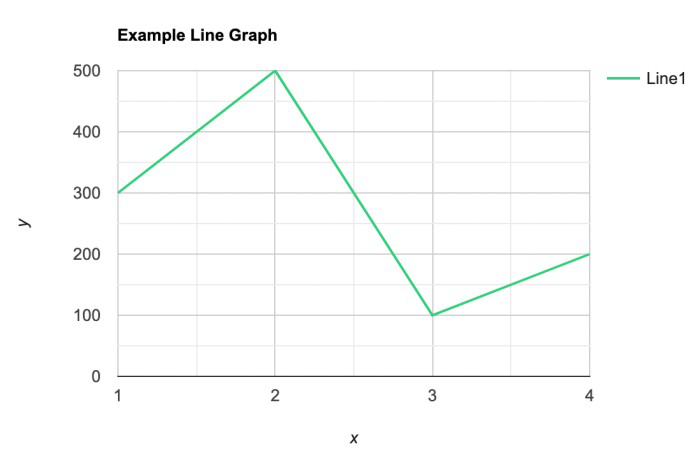
A line graph is used to show how the value of a particular variable changes with time. We plot this graph by connecting the points at different values of the variable. It can be useful for analyzing the trends in the data and predicting further trends.
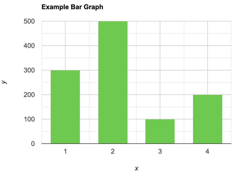
A bar graph is a type of graphical representation of the data in which bars of uniform width are drawn with equal spacing between them on one axis (x-axis usually), depicting the variable. The values of the variables are represented by the height of the bars.
Histograms
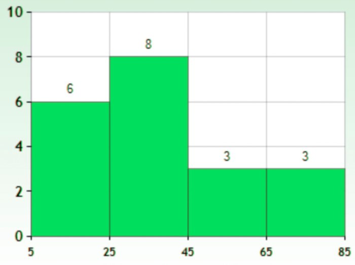
This is similar to bar graphs, but it is based frequency of numerical values rather than their actual values. The data is organized into intervals and the bars represent the frequency of the values in that range. That is, it counts how many values of the data lie in a particular range.
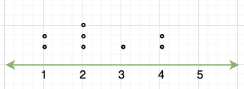
It is a plot that displays data as points and checkmarks above a number line, showing the frequency of the point.
Stem and Leaf Plot
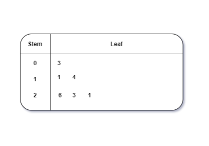
This is a type of plot in which each value is split into a “leaf”(in most cases, it is the last digit) and “stem”(the other remaining digits). For example: the number 42 is split into leaf (2) and stem (4).
Box and Whisker Plot
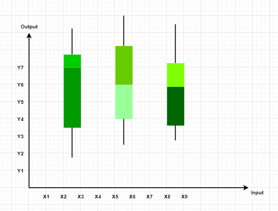
These plots divide the data into four parts to show their summary. They are more concerned about the spread, average, and median of the data.
It is a type of graph which represents the data in form of a circular graph. The circle is divided such that each portion represents a proportion of the whole.

Graphs in Math are used to study the relationships between two or more variables that are changing. Statistical data can be summarized in a better way using graphs. There are basically two lines of thoughts of making graphs in maths:
- Value-Based or Time Series Graphs
Frequency Based
Value-based or time series graphs .
These graphs allow us to study the change of a variable with respect to another variable within a given interval of time. The variables can be anything. Time Series graphs study the change of variable with time. They study the trends, periodic behavior, and patterns in the series. We are more concerned with the values of the variables here rather than the frequency of those values.
Example: Line Graph
These kinds of graphs are more concerned with the distribution of data. How many values lie between a particular range of the variables, and which range has the maximum frequency of the values. They are used to judge a spread and average and sometimes median of a variable under study.
Example: Frequency Polygon, Histograms.
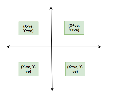
All types of graphical representations require some rule/principles which are to be followed. These are some algebraic principles. When we plot a graph, there is an origin, and we have our two axes. These two axes divide the plane into four parts called quadrants. The horizontal one is usually called the x-axis and the other one is called the y-axis. The origin is the point where these two axes intersect.
The thing we need to keep in mind about the values of the variable on the x-axis is that positive values need to be on the right side of the origin and negative values should be on the left side of the origin. Similarly, for the variable on the y-axis, we need to make sure that the positive values of this variable should be above the x-axis and negative values of this variable must be below the y-axis.
- It gives us a summary of the data which is easier to look at and analyze.
- It saves time.
- We can compare and study more than one variable at a time.
Disadvantages
It usually takes only one aspect of the data and ignores the other. For example, A bar graph does not represent the mean, median, and other statistics of the data.
We should keep in mind some things while plotting and designing these graphs. The goal should be a better and clear picture of the data. Following things should be kept in mind while plotting the above graphs:
- Whenever possible, the data source must be mentioned for the viewer.
- Always choose the proper colors and font sizes. They should be chosen to keep in mind that the graphs should look neat.
- The measurement Unit should be mentioned in the top right corner of the graph.
- The proper scale should be chosen while making the graph, it should be chosen such that the graph looks accurate.
- Last but not the least, a suitable title should be chosen.
Frequency Polygon
A frequency polygon is a graph that is constructed by joining the midpoint of the intervals. The height of the interval or the bin represents the frequency of the values that lie in that interval.
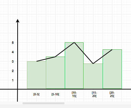
- Diagrammatic and Graphic Presentation of Data
- What are the different ways of Data Representation?
Question 1: What are different types of frequency-based plots?
Types of frequency based plots: Histogram Frequency Polygon Box Plots
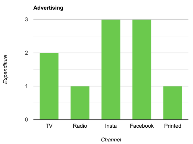
Question 2: A company with an advertising budget of Rs 10,00,00,000 has planned the following expenditure in the different advertising channels such as TV Advertisement, Radio, Facebook, Instagram, and Printed media. The table represents the money spent on different channels.
Draw a bar graph for the following data.
- Put each of the channels on the x-axis
- The height of the bars is decided by the value of each channel.
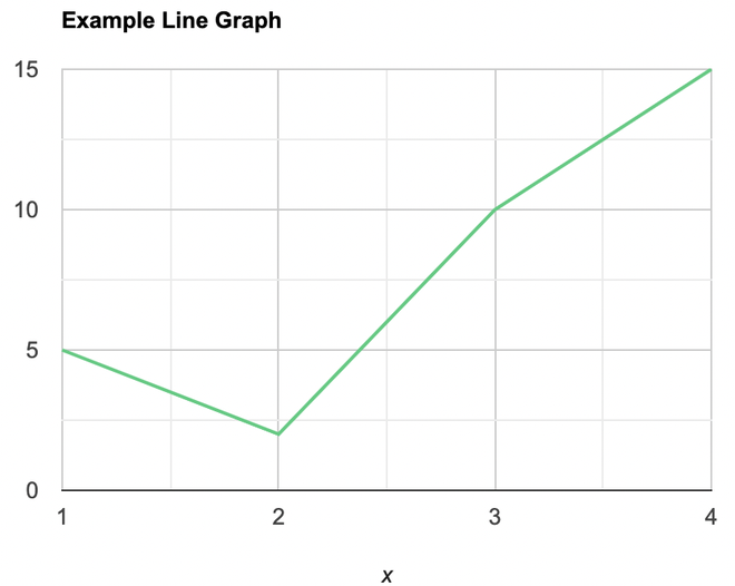
Question 3: Draw a line plot for the following data
- Put each of the x-axis row value on the x-axis
- joint the value corresponding to the each value of the x-axis.
Question 4: Make a frequency plot of the following data:
- Draw the class intervals on the x-axis and frequencies on the y-axis.
- Calculate the mid point of each class interval.
Now join the mid points of the intervals and their corresponding frequencies on the graph.
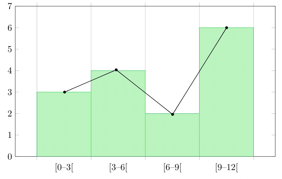
This graph shows both the histogram and frequency polygon for the given distribution.
Graphical Representation of Data – FAQs
What are the advantages of using graphs to represent data.
Graphs offer visualization, clarity, and easy comparison of data, aiding in outlier identification and predictive analysis.
What are the common types of graphs used for data representation?
Common graph types include bar, line, pie, histogram, and scatter plots, each suited for different data representations and analysis purposes.
How do you choose the most appropriate type of graph for your data?
Select a graph type based on data type, analysis objective, and audience familiarity to effectively convey information and insights.
How do you create effective labels and titles for graphs?
Use descriptive titles, clear axis labels with units, and legends to ensure the graph communicates information clearly and concisely.
How do you interpret graphs to extract meaningful insights from data?
Interpret graphs by examining trends, identifying outliers, comparing data across categories, and considering the broader context to draw meaningful insights and conclusions.
Please Login to comment...
Similar reads.
- Maths-Class-9
- School Learning
Improve your Coding Skills with Practice
What kind of Experience do you want to share?

Practical Work in Geography Class 12 Solutions Chapter 3 Graphical Representation of Data

Table of Contents
Class 12 Practical Work in Geography Chapter 3 NCERT Textbook Questions Solved
1. Choose the right answer from the four alternatives given below:
Fill Out the Form for Expert Academic Guidance!
Please indicate your interest Live Classes Books Test Series Self Learning
Verify OTP Code (required)
I agree to the terms and conditions and privacy policy .
Fill complete details
Target Exam ---
Question1(i). Which one of the following map shows the population distribution? (a) Choropleth maps (b) Isopleth maps (c) Dot maps (d) Square root map Answer: (c) Dot maps
Question1(ii). Which one of the following is best suited to represent the decadal growth of population? (a) Line graph (b) Bar diagram (c) Circle diagram (d) Flow diagram Answer: (a) Line Graph
Question1(iii). Polygraph is constructed to represent: (a) Only one variable (b) Two variables only (c) More than two variables (d) None of the above Answer: (c) More than two variables
Question1(iv). Which one of the following maps is known as “Dynamic Map”? (a) Dot map (b) Choropleth (c) Isopleth (d) Flow map Answer: (d) Flow map
2. Answer the following questions in about 30 words:
Question 2(i). What is a thematic map? Answer: Maps drawn to study a particular theme like rainfall, temperature, soil type, etc. is called a thematic map. Thematic maps, graphs and diagrams serve a useful purpose in providing a comparison between the internal variations within the data of different characteristics represented.
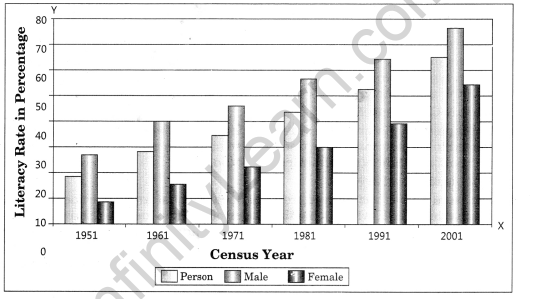
Question 2(ii). Differentiate between multiple bar diagram and compound bar diagram. Answer: Multiple Bar Diagram: Multiple bar diagrams are constructed to represent two or more than two variables for the purpose of comparison. For example, we can draw two bars one indicating literacy rate of males and other literacy rate of females.
Compound Bar Diagram: When different components are grouped in one set of variables or different variables of one component are put together, their representation is made by a compound bar diagram. In this method, different variables are shown in a single bar with different rectangles. For example, total electricity produced in India is sub-divided into hydro power, thermal power, nuclear power, etc.
Question 2(iii). What are the requirements to construct a dot map? Answer: The dot maps are drawn to show the distribution of phenomena such as population, cattle, types of crops, etc. The dots of same size as per the chosen scale are marked over the given administrative units to highlight the patterns of distribution.
Requirements:
- An administrative map of the given area showing state/district/block boundaries.
- Statistical data on selected theme for the chosen administrative units, i.e. total population, cattle, etc.
- Selection of a scale to determine the value of a dot.
- Physiographic map of the region especially relief and drainage maps.
Precautions:
- The lines demarcating the boundaries of various administrative units should not be very thick and bold.
- All dots should be of same size.
Question 2(iv). Describe the method of constructing a traffic flow map. Answer: Traffic flow map is a combination of graph and map. It is drawn to show the flow of commodities or people between the places of origin and destination. It is also called Dynamic Map. Transport map, which shows number of passengers, vehicles, etc., is the best example of a flow chart. These charts are drawn using lines of proportional width. Many government agencies prepare traffic flow maps to show density of the means of transportation on different routes.
Methods for the Preparation of a Traffic Flow Map:
- A route map depicting the desired transport routes along with the connecting stations.
- The data pertaining to the flow of goods, services, number of vehicles, etc. along with the point of origin and destination of the movements.
- The selection of a scale through which the data related to the quantity of passengers and goods or the number of vehicles is to be represented.
Question 2(v). What is an Isopleth map? How an interpolation is carried out? Answer: The word Isopleth is derived from Iso meaning equal and pleth means lines. Thus, an imaginary line, which joins the places of equal values, is referred as Isopleth.The more frequently drawn isopleths include Isotherm (equal temperature), Isobar (equal pressure), Isohyets (equal rainfall), Isonephs (equal cloudiness), Isohels (equal sunshine), contours (equal heights), Isobaths (equal depths), Isohaline (equal salinity), etc. Interpolation is used to insert the intermediate values between the observed values of two stations/locations, such as temperature recorded at Chennai and Hyderabad or the spot heights of two points. Generally, drawing of isopleths joining the places of the same value is also termed as interpolation.
Methods of Interpolation:
- Firstly, determine the minimum and maximum values given on the map.
- Calculate the range of value, i.e. range = maximum value – minimum value.
- Based on range, determine the interval in a whole number like 5, 10, 15, etc.
- The exact point of drawing an isopleth is determined by using the following formula
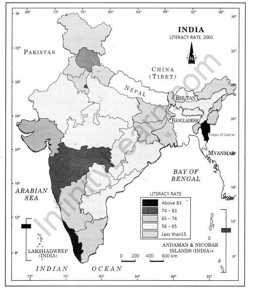
Question 2(vi). Describe and illustrate important steps to be followed in preparing a Choropleth map. Answer: The Choropleth maps are drawn to prepare the characteristics of data as they are related to the administrative units. These means are used to represent the literacy rate, sex ratio and density of population. Steps to be followed:
- Arrange the data in ascending or descending order.
- Group the data into 5 categories to represent very high, high, medium, low and very low concentrations.
- The interval between the categories may be identified on the following formula, i.e. Range/5 and Range = maximum value – minimum value.
- Patterns, shades or colour to be used to depict the chosen categories should be marked in an increasing or decreasing order.
Construction:
- Arrange the data in ascending order as shown above.
- Identify the range within the data. The states recording the lowest and highest literacy rates are Bihar (47%) and the Kerala (90.9%) respectively. Hence, the range would be 91.0 – 47.0 = 44.0.
- Divide the range by 5 to get categories from very low to veiy high. (44.0/ 5 = 8.80. We can convert this value to a round number say 9.0.
- Determine the number of the categories along with range of each category. Add 9.0 to the lowest value of 47.0 as so on.
Following categories will be obtained:
(i) 47 – 56 Very low (Bihar, Jharkhand, Arunachal Pradesh, Jammu and Kashmir) (ii) 56 – 65 Low (Uttar Pradesh, Rajasthan, Andhra Pradesh, Meghalaya, Odisha, Assam, Madhya Pradesh, Chhattisgarh) (iii) 65 – 74 Medium (Nagaland, Karnataka, Haryana, West Bengal, Sikkim, Gujarat, Punjab, Manipur, Uttarakhand, Tripura, Tamil Nadu) (iv) 74 – 83 High (Himachal Pradesh, Maharashtra, Delhi, Goa) (v) 83 – 92 Very High (Mizoram, Kerala)
- Assign the shades/pattern to each category ranging from lower to higher hues
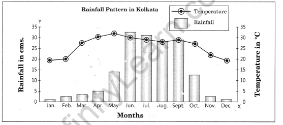
Question 5. Show the following data of temperature and rainfall of Kolkata with a suitable diagram.
Class 12 Practical Work in Geography Chapter 3 NCERT Extra Questions
Class 12 practical work in geography chapter 3 very short answer type questions.
Question 1. What are data? How are these important? Answer: Numerical and quantitative measurement of geographical events, human activities and their interrelationship are called data. In other words, quantitative information is called datum. Therefore, data are also called quantitative information.
Question 2. What is the Chinese proverb in context of diagrams, graphs and maps? Answer: There is a Chinese proverb that ‘a picture is equivalent to thousands of words’. Hence, the graphic method of the representation of data enhances our understanding, and makes the comparisons easy.
Question 3. Why is statistics needed? Answer: Statistics are used by geographers, economists, statisticians, resource scientists, planners, decision-makers and some other persons who need to do comparative study and to derive findings.
Question 4. What are the general rules related to construction of graphs, maps and diagrams? Answer: General rules for drawing graphs, maps and drawing are: (a) Selection of a Suitable Method (b) Selection of Suitable Scale (c) Design: It includes title, legend, and direction.
Question 5. Name the most commonly used graphs and maps. Answer: The most commonly drawn diagrams and maps and the way they are constructed are:
(a) Line graphs (b) Bar diagrams (c) Pie-diagram (d) Wind rose and star diagram (e) Flow charts
Question 6. When are thematic maps drawn? Answer: Thematic maps, graphs and diagrams serve a useful purpose in providing a comparison between the internal variations within the data of different characteristics represented.
Question 7. What are different types of quantitative thematic maps? Answer: There are three types of quantitative thematic maps:
(a) Dot map (b) Choropleth map (c) Isopleth map
Question 8. What are dot maps? Answer: The dot maps are drawn to show the distribution of phenomena such as population, cattle, types of crops, etc. The dots of same size as per the chosen scale are marked over the given administrative units to highlight the patterns of distribution.
Question 9. What are choropleth maps? Answer: The choropleth maps are also drawn to depict the data characteristics as they are related to the administrative units. These maps are used to represent the density of population, literacy/growth rates, sex-ratio, etc.
Question 10. What are more frequently drawn isopleths? Answer: The more frequently drawn isopleths include isotherm (equal temperature), isobar (equal pressure), isohyets (equal rainfall), isonephs (equal cloudiness), isohels (equal sunshine), contours (equal heights), isobaths (equal depths), isohaline (equal salinity), etc.
Question 11. Why is a flow map called a dynamic map? Answer: Flow map is drawn to show the flow of commodities or people between the places of origin and destination. Since it shows many variables together and deals with flow phenomenon, it is also called dynamic map.
Class 12 Practical Work in Geography Chapter 3 Short Answer Type Questions
Question 1. In how many categories are maps and graphs used to present data? Answer: The diagrams and the maps to represent data can be grouped into the following types: (a) One-dimensional diagrams such as line graph, polygraph, bar diagram, histogram, age, sex, pyramid, etc.; (b) Two-dimensional diagram such as pie-diagram and rectangular diagram; (c) Three-dimensional diagrams such as cube and spherical diagrams.
Question 2. What do you mean by isopleth? Answer: The word Isopleth is derived from. Iso means equal and pleth means lines. Thus, an imaginary line, which joins the places of equal values, is referred to as isopleth. The more frequently drawn isopleths include isotherm (equal temperature), isobar (equal pressure), isohyets (equalrainfall), isonephs (equal cloudiness), isohels (equal sunshine), contours (equal heights), isobaths (equal depths), isohaline (equal salinity), etc.
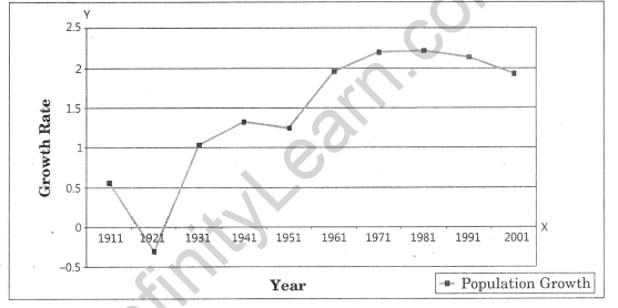
Question 3. What is a line graph? For which type of data are they used? Answer: In line graph data are presented using a line on graph paper. The line graphs are usually drawn to represent the time series data related to the temperature, rainfall, population growth, birth rates and death rates. More than one variable can also be presented through line graph to do a comparative analysis. For example, temperature and pressure of an area can be presented in the same graph to make a comparison.
Class 12 Practical Work in Geography Chapter 3 Long Answer Type Questions
Question 1. How are data presented using ploygraphs? Answer: Polygraph is a line graph in which two or more than two variables are shown by an equal number of lines for an immediate comparison, such as the growth rate of different crops like rice, pulses or the birth rates and life expectancy or sex ratio in different states or countries. A different line pattern such as straight line(___), broken line (—) dotted line(….) or a combination of dotted and broken line (…–…) or line of different colours may be used to indicate the value of different variables.
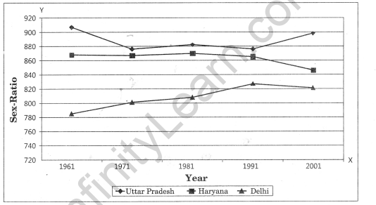
Question 2. Define and construct a line graph to represent the growth rate of population in India during 1901-2001. Answer: The line graph is drawn to represent the time series data related to temperature, rainfall, population growth, birth rates, etc.
Question 3. Draft a multiple bar diagram. Answer: Multiple bar diagram is constructed to represent two or more than two variables for the purpose of comparison.
Class 12 Practical Work in Geography Chapter 3 Viva Questions
Question 1. In which case histogram is prepared? Answer: Continuous series
Question 2. In what type of graph comparison among the class frequencies is possible? Answer: Histogram
Question 3. Data represented through a histogram can help in finding graphically which measure of central tendency? Answer: Mode
Question 4. Histogram is drawn on what? Answer: Graph paper
Question 5. To find the number of observations less than any given value, we use what type of frequency? Answer: Cumulative frequency distribution.
Question 6. While preparing time series graph, we show which variable on the X-axis? Answer: Time
Question 7. By which type of graph Mode is found graphically? Answer: Histogram
Question 8. A simple frequency distribution of a discrete variable is represented by what? Answer: Line Graph
Question 9. How is a frequency polygon obtained? Answer: By constructing a frequency histogram and linking the mid-points from a frequency histogram.
Question 10. Ogives can be helpful in locating graphically which measure of central tendency? Answer: Median
Question 11. Ogive curve can be drawn for which type of frequency? Answer: For More than type distribution and Less than type distribution of commulative frequency.
Question 12. In which graph the breadth of a rectangle is equal to the length of the class-interval? Answer: Histogram
Question 13. What are Dot maps? Answer: The dot maps are drawn to show the distribution of phenomena such as population, cattle, types of crops, etc. The dots of same size as per the chosen scale are marked over the given administrative units to highlight the patterns of distribution.
Question 14. What is Choropleth Map? Answer: Choropleth maps are also drawn to depict the data characteristics as they are related to the administrative units. These maps are used to represent the density of population, literacy/growth rates, sex-ratio, etc.
Question 15. What is an Isopleth Map? Answer: The word Isopleth is derived from Iso means equal and pleth means lines. Thus, an imaginary line, which joins the places of equal values, is referred to as Isopleth. The more frequently drawn isopleths include Isotherm (equal temperature), Isobar (equal pressure), Isohyets (equal rainfall), Isonephs (equal cloudiness), Isohels (equal sunshine), contours (equal heights), Isobaths (equal depths), Isohaline (equal salinity), etc.
Graphical Representation of Data Notes
- Data can be presented either in text or tabular or semi-tabular or diagrams or graphs or pictures. Diagrams and graphs are more efficient than any other method. Graphs and charts occupy an important place in statistical analysis and inferences. Data are dry and dull for most of the people. It becomes attractive and impressive through diagrammatic and graphical presentation.
- The transformation of data through visual methods like graphs, diagrams, maps and charts is called representation of data.
- Data can be compared and meaningful results can be derived from well-organised and presented data.
- The geographers, economists, resource scientists and the decision-makers use a lot of data these days. Besides the tabular form, the data may also be presented in some graphic or diagrammatic form.
- There is a Chinese proverb that ‘a picture is equivalent to thousands of words’. Hence, the graphic method of the representation of data enhances our understanding, and makes the comparisons easier.
- In Geography, we use presentation of data to understand the patterns of population growth, distribution and the density, sex ratio, age-sex composition, occupational structure, etc. within a geographical territory.
- General rules for drawing graphs, maps and drawing are: (a) Selection of a Suitable Method (b) Selection of Suitable Scale (c) Design—It includes title, legend, and direction.
- The data possess measurable characteristics such as length, width and volume. The diagrams and the maps that are drawn to represent these data related characteristics may be grouped into the following types: (a) One-dimensional diagrams such as Line Graph, polygraph, bar diagram, histogram, age, sex, pyramid, etc. (b) Two-dimensional diagrams such as pie diagram and rectangular diagram. (c) Three-dimensional diagrams such as cube and spherical diagrams.
- The most commonly drawn diagrams and maps and the way they are constructed are: (a) Line graphs (b) Bar diagrams (c) Pie diagram (d) Wind rose and star diagram (e) Flow charts
- Thematic maps, graphs and diagrams serve a useful purpose in providing a comparison between the internal variations within the data of different characteristics represented.
Graphical Representation of Data Important Terms
- Title: The title of the diagram/map indicates the name of the area, reference year of the data used and the caption of the diagram. These components are represented using letters and numbers of different font sizes and thickness. Besides, their placing also matters. Normally, title, subtitle and the corresponding year are shown in the centre at the top of the map /diagram.
- Legend: A legend or index is an important component of any diagram/map. It explains the colours, shades, symbols and signs used in the map and diagram. It should also be carefully drawn and must correspond to the contents of the map/diagram. Besides, it also needs to be properly positioned. Normally, a legend is shown either at the lower left or lower right side of the map sheet.
- Line Graph: The line graphs are usually drawn to represent the time series data related to the temperature, rainfall, population growth, birth rates and death rates.
- Multiple Bar Diagram: Multiple bar diagrams are constructed to represent two or more than two variables for the purpose of comparison.
- Compound Bar Diagram: When different components are grouped in one set of variable or different variables of one component are put together, their representation is made by a compound bar diagram. In this method, different variables are shown in a single bar with different rectangles.
- Quantitative Maps: Maps depicting quantitative variables like areas receiving more than 200 cm, 100 to 200 cm, 50 to 100 cm and less than 50 cm of rainfall are referred as quantitative maps. These maps are also called statistical maps.
- Qualitative Maps: Map depicting non-measurable characteristics in the distribution of given information such as a map showing high and low rainfall-receiving areas are called non quantitative maps. These maps are also called qualitative maps.
- Dot maps: The dot maps are drawn to show the distribution of phenomena such as population, cattle, types of crops, etc. The dots of same size as per the chosen scale are marked over the given administrative units to highlight the patterns of distribution.
- Choropleth Map: The choropleth maps are also drawn to depict the data characteristics as they are related to the administrative units. These maps are used to represent the density of population, literacy/growth rates, sex-ratio, etc.
- Isopleth Map: The word ‘Isopleth’ is derived from Iso means equal and pleth means lines. Thus, an imaginary line, which joins the places of equal values, is referred as Isopleth. The more frequently drawn Isopleths include Isotherm (equal temperature), Isobar (equal pressure), Isohyets (equal rainfall), Isonephs (equal cloudiness), Isohels (equal sunshine), contours (equal heights), Isobaths (equal depths), Isohaline (equal salinity), etc.
Related content
Talk to our academic expert!
Language --- English Hindi Marathi Tamil Telugu Malayalam
Get access to free Mock Test and Master Class
Register to Get Free Mock Test and Study Material
Offer Ends in 5:00

- school Campus Bookshelves
- menu_book Bookshelves
- perm_media Learning Objects
- login Login
- how_to_reg Request Instructor Account
- hub Instructor Commons
Margin Size
- Download Page (PDF)
- Download Full Book (PDF)
- Periodic Table
- Physics Constants
- Scientific Calculator
- Reference & Cite
- Tools expand_more
- Readability
selected template will load here
This action is not available.

2: Graphical Representations of Data
- Last updated
- Save as PDF
- Page ID 22222

\( \newcommand{\vecs}[1]{\overset { \scriptstyle \rightharpoonup} {\mathbf{#1}} } \)
\( \newcommand{\vecd}[1]{\overset{-\!-\!\rightharpoonup}{\vphantom{a}\smash {#1}}} \)
\( \newcommand{\id}{\mathrm{id}}\) \( \newcommand{\Span}{\mathrm{span}}\)
( \newcommand{\kernel}{\mathrm{null}\,}\) \( \newcommand{\range}{\mathrm{range}\,}\)
\( \newcommand{\RealPart}{\mathrm{Re}}\) \( \newcommand{\ImaginaryPart}{\mathrm{Im}}\)
\( \newcommand{\Argument}{\mathrm{Arg}}\) \( \newcommand{\norm}[1]{\| #1 \|}\)
\( \newcommand{\inner}[2]{\langle #1, #2 \rangle}\)
\( \newcommand{\Span}{\mathrm{span}}\)
\( \newcommand{\id}{\mathrm{id}}\)
\( \newcommand{\kernel}{\mathrm{null}\,}\)
\( \newcommand{\range}{\mathrm{range}\,}\)
\( \newcommand{\RealPart}{\mathrm{Re}}\)
\( \newcommand{\ImaginaryPart}{\mathrm{Im}}\)
\( \newcommand{\Argument}{\mathrm{Arg}}\)
\( \newcommand{\norm}[1]{\| #1 \|}\)
\( \newcommand{\Span}{\mathrm{span}}\) \( \newcommand{\AA}{\unicode[.8,0]{x212B}}\)
\( \newcommand{\vectorA}[1]{\vec{#1}} % arrow\)
\( \newcommand{\vectorAt}[1]{\vec{\text{#1}}} % arrow\)
\( \newcommand{\vectorB}[1]{\overset { \scriptstyle \rightharpoonup} {\mathbf{#1}} } \)
\( \newcommand{\vectorC}[1]{\textbf{#1}} \)
\( \newcommand{\vectorD}[1]{\overrightarrow{#1}} \)
\( \newcommand{\vectorDt}[1]{\overrightarrow{\text{#1}}} \)
\( \newcommand{\vectE}[1]{\overset{-\!-\!\rightharpoonup}{\vphantom{a}\smash{\mathbf {#1}}}} \)
In this chapter, you will study numerical and graphical ways to describe and display your data. This area of statistics is called "Descriptive Statistics." You will learn how to calculate, and even more importantly, how to interpret these measurements and graphs.
- 2.1: Introduction In this chapter, you will study numerical and graphical ways to describe and display your data. This area of statistics is called "Descriptive Statistics." You will learn how to calculate, and even more importantly, how to interpret these measurements and graphs. In this chapter, we will briefly look at stem-and-leaf plots, line graphs, and bar graphs, as well as frequency polygons, and time series graphs. Our emphasis will be on histograms and box plots.
- 2.2: Stem-and-Leaf Graphs (Stemplots), Line Graphs, and Bar Graphs A stem-and-leaf plot is a way to plot data and look at the distribution, where all data values within a class are visible. The advantage in a stem-and-leaf plot is that all values are listed, unlike a histogram, which gives classes of data values. A line graph is often used to represent a set of data values in which a quantity varies with time. These graphs are useful for finding trends. A bar graph is a chart that uses either horizontal or vertical bars to show comparisons among categories.
- 2.3: Histograms, Frequency Polygons, and Time Series Graphs A histogram is a graphic version of a frequency distribution. The graph consists of bars of equal width drawn adjacent to each other. The horizontal scale represents classes of quantitative data values and the vertical scale represents frequencies. The heights of the bars correspond to frequency values. Histograms are typically used for large, continuous, quantitative data sets. A frequency polygon can also be used when graphing large data sets with data points that repeat.
- 2.4: Using Excel to Create Graphs Using technology to create graphs will make the graphs faster to create, more precise, and give the ability to use larger amounts of data. This section focuses on using Excel to create graphs.
- 2.5: Graphs that Deceive It's common to see graphs displayed in a misleading manner in social media and other instances. This could be done purposefully to make a point, or it could be accidental. Either way, it's important to recognize these instances to ensure you are not misled.
- 2.E: Graphical Representations of Data (Exercises) These are homework exercises to accompany the Textmap created for "Introductory Statistics" by OpenStax.
Contributors and Attributions
Barbara Illowsky and Susan Dean (De Anza College) with many other contributing authors. Content produced by OpenStax College is licensed under a Creative Commons Attribution License 4.0 license. Download for free at http://cnx.org/contents/[email protected] .

IMAGES
VIDEO
COMMENTS
Chapter 3: Graphical Representation of Data. Introduction. Graphical representation of data is an important aspect of geographical analysis and research. It involves presenting data in visual formats such as graphs, charts, maps, and diagrams to facilitate understanding, comparison, and interpretation of the data.
Practical Work in Geography Class 12 Solutions Chapter 3 Graphical Representation of Data Class 12 Practical Work in Geography Chapter 3 NCERT Textbook Questions Solved 1. Choose the right answer from the four alternatives given below: Question1(i). Which one of the following map shows the population distribution? (a) Choropleth maps (b) Isopleth maps (c) Dot […]
Graphical Representation of Data Construction Draw X and Y -axes on a graph paper . T ake an interval of 5 cm and mark it on Y - axis to plot rainfall data in cm. Divide X-axis into 12 equal parts to represent 12 months. The actual rainfall values for each month will be plotted according to the selected scale as shown in Fig. 3.4.
Mains Lectures organized in topics and subtopics: https://www.doorsteptutor.com/Exams/IAS/Mains/ For IAS Prelims visit https://www.doorsteptutor.com/Exams/I...
This is a form of representation like the bar graph, but it is used for continuous class intervals. For instance, consider the frequency distribution Table 12.2, representing the weights of 36 students of a class: Table 12.2 Weights (in kg) Number of students 30.5 - 35.5 9 35.5 - 40.5 6 40.5 - 45.5 15 45.5 - 50.5 3 50.5 - 55.5 1 55.5 - 60.5 2 ...
Conclusion - Practical Work in Geography Class 12 Representation of Data. In this article, we're diving into the topic of "Representation of Data" from the NCERT Class 12 Practical Work Geography book. These notes are put together by the experts at GeeksforGeeks to help students understand how data can be shown visually.
Graphical Representation Of Data is English. These class 12 3. Graphical Representation Of Data book are prepared with the help of ncert book Practical Work in Geography Part-II. These book for class 12 3. Graphical Representation Of Data will definitely help the student in scoring good marks in examination.
Chapters 0:00What are the advantages of a graphical representation of data?What are the advantages of a line graph? Phase I: The period from 1901-1921 is ref... CBSE Exam, class 12
Click the Download PDF link to obtain the Graphical Representation of Data questions with answers document. NCERT Solutions for Class 12 Geography . There are more chapters to study besides Graphical Representation of Data in this subject. So here are NCERT solutions for all topics of Geography taught in 12th class here at aglasem.
Chapter 1: https://youtu.be/KQ5_IWeiohIChapter 2: (Mean, median, mode and range) https://youtu.be/rhj7V1mFlBw (Full Chapter)- https://yout...
Graphical Representation of Data means to analyze the numerical data sources through different types of graphs. It creates a relation between the data set with a diagram. The graphical representation is simple and easy to understand which is a part of the important learning technique. The Graphical Representation process is totally dependent ...
Using NCERT Class 12 Geography - Practical Work in Geography solutions Graphical Representation of Data exercise by students is an easy way to prepare for the exams, as they involve solutions arranged chapter-wise and also page-wise. The questions involved in NCERT Solutions are essential questions that can be asked in the final exam.
The graphical representation problems of data or reports are as follows: The reports of graphical representation are costly because of the images, and colours. Combining content with human effort is costly in terms of visual layout. It takes less time to represent a normal file, but the representation of the graph takes time since graphs and ...
General Rules for Graphical Representation of Data. There are certain rules to effectively present the information in the graphical representation. They are: Suitable Title: Make sure that the appropriate title is given to the graph which indicates the subject of the presentation. Measurement Unit: Mention the measurement unit in the graph.
Examples on Graphical Representation of Data. Example 1: A pie chart is divided into 3 parts with the angles measuring as 2x, 8x, and 10x respectively. Find the value of x in degrees. Solution: We know, the sum of all angles in a pie chart would give 360º as result. ⇒ 2x + 8x + 10x = 360º. ⇒ 20 x = 360º.
On this page, you can read or download Chapter 3 Graphical Representation of Data of the NCERT Book for Class 12 Geography. Students in Class 12 or preparing for any exam based on Class 12 Geography might use the NCERT Book to supplement their studies. When you don't have access to a physical copy, digital NCERT Books Class 12 Geography pdf are ...
NCERT Book Class 12 Geography (Practical Work In Geography) Chapter 1 : Data - Its Source and Compilation. Chapter : 2 Data Processing. Chapter : 3 Graphical Representation of Data. Chapter : 4 Use of Computer in Data Processing and Mapping. Chapter : 5 Field Surveys.
Geography Class 12 Chapter 3 talks about the Graphical Representation of Data. It includes all types of representation processes of data through different types of graphs like line, bar, pie, dot, and isopleth maps. Graphical representation gives us a visual of the raw data which helps us to understand to analyze it through different numeric format
Practical Work in Geography Class 12 Solutions Chapter 3 Graphical Representation of Data. Class 12 Practical Work in Geography Chapter 3 NCERT Textbook Questions Solved; ... Graphical Representation of Data Notes. Data can be presented either in text or tabular or semi-tabular or diagrams or graphs or pictures. Diagrams and graphs are more ...
Construction: (i) Make round figure for population. Show the years on x-axis taking a suitable scale. (ii) Draw vertical lines on ends of x-axis. (iii) On the left hand side, select a scale of 1″:10 crores to show population. (iv) Find out the height of bars for different years. (v) Shade the bars. Census year.
Step 1: Rank both sets of data. Give the largest value rank 1, the second largest value rank 2, etc. Step 2: Calculate the differences in the ranks, d. Step 3: Work out the squares of the differences (d 2 ). Step 4: Calculate the sum of these squared differences, ∑d2. Step 5: Spearman's Rank Correlation Coefficient is found by substituting ...
2.3: Histograms, Frequency Polygons, and Time Series Graphs. A histogram is a graphic version of a frequency distribution. The graph consists of bars of equal width drawn adjacent to each other. The horizontal scale represents classes of quantitative data values and the vertical scale represents frequencies. The heights of the bars correspond ...