

10 Tips for Creating Stunning Architecture Project Presentation
Architectural design projects are the life and soul of architecture school . As a student, you are always working on one, and somehow it becomes what your life is revolving around.
You would give it every possible effort and believe you have done your best, but on jury day, when you see everyone else’s project you could lose a bit of your confidence, not because your project is any less, but because your presentation is lacking.
The architecture project presentation might not be the core of the project, but it surely influences the viewer. It can also be considered an indicator of your artistic skills and sense as a designer.

[irp posts=’151929′]
While you shouldn’t be completely dependable on positive results from a merely eye-catching architecture project presentation, you still need to give an adequate amount of time to properly plan it in a way that communicates your idea best. Your architecture professor might credit you for a creative design regardless of the presentation, but your future client might only see the presentation, so make it a habit, to involve your design skills in all aspects of your project, starting now.
Besides the essential tips and tutorials for photoshop architectural rendering that will definitely improve your board, here, we will give you some basic tips on how to create a Stunning Architecture Project Presentation . So, let’s get started.
Architecture Project Presentation Board Tips
1) size and orientation.
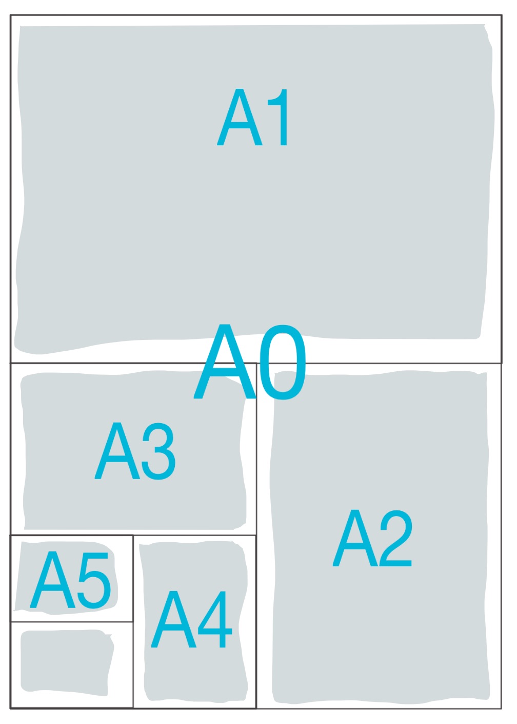
Most of the time your professors restrict you to specific board sizes and the number of boards. If that is the case then you need to confirm if your boards should be presented in Landscape or Portrait orientation. You, also, need to decide if you will be presenting your board side by side as one big board, one poster of equivalent size, or as separate boards that come in sequence.
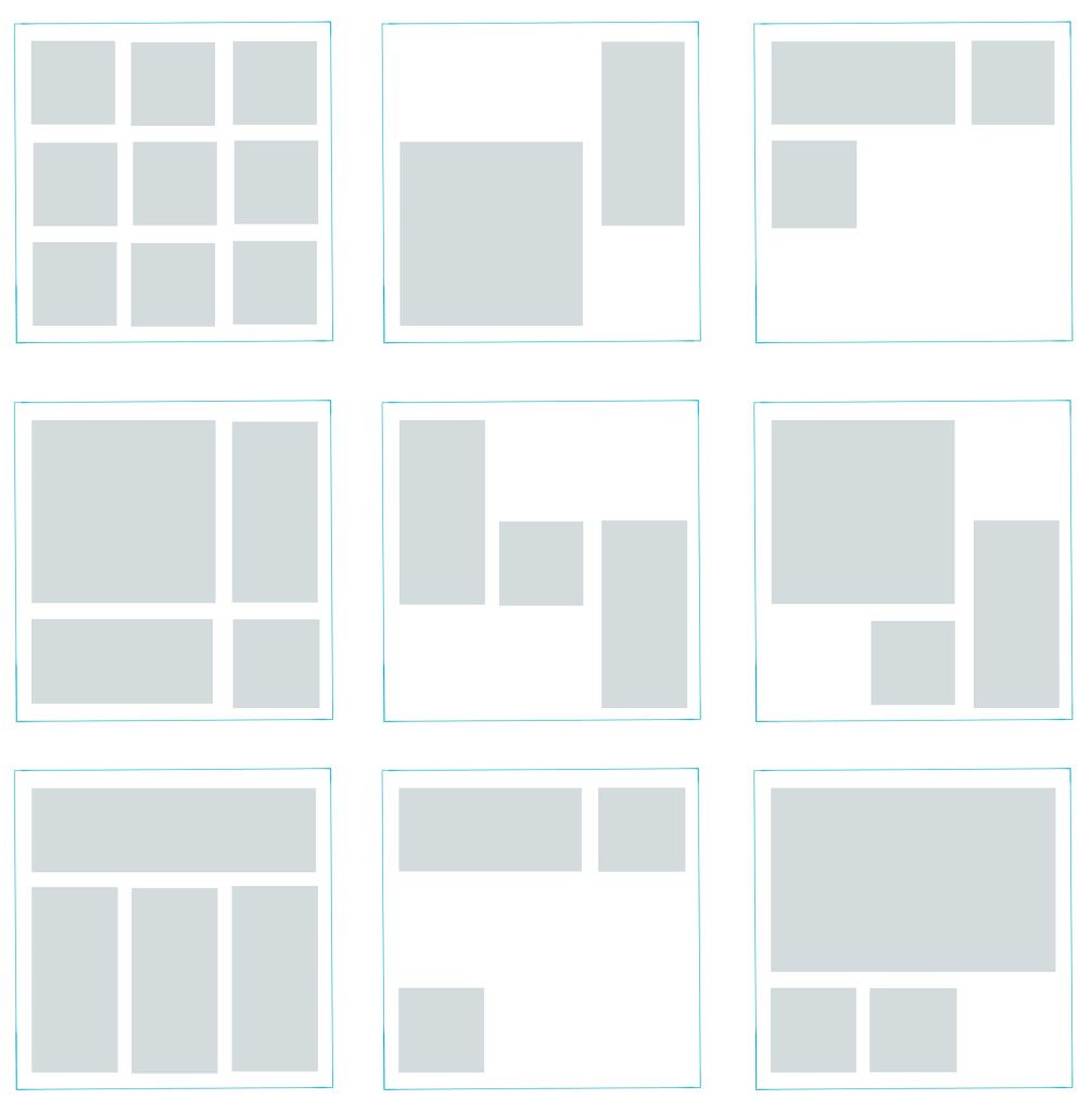
Now, that you have a base to work on you need to start planning the layout of your boards or poster:
- If you are presenting hand drawings then you can do prior planning on one or more A4 paper sheets for example. Try to make an accurate estimation of the space needed per each drawing and the buffering space you would like to leave around each.
- If you will be presenting CAD drawings, then this might be easier. You can experiment with the actual drawings on CAD Layout or Photoshop if you will be rendering your project digitally.
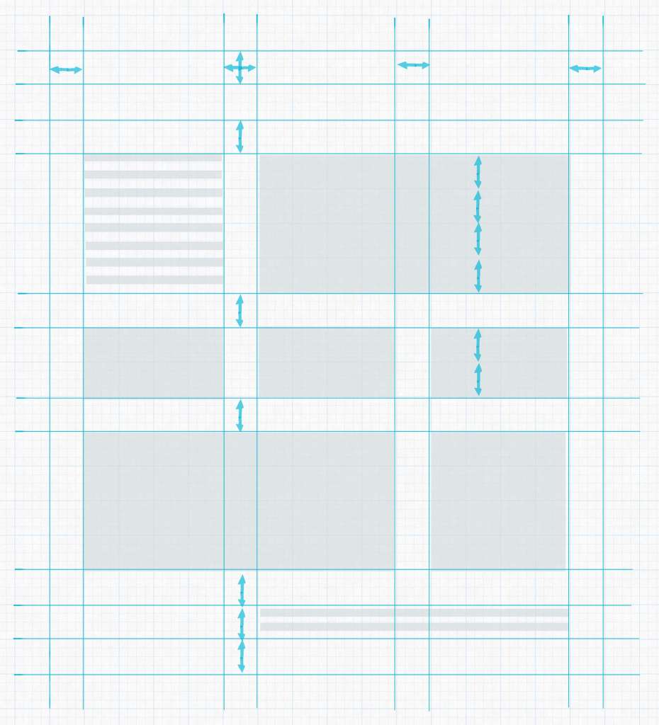
- You can use a grid system to organize your drawings. Decide on a unit width, for example, 6cm, then use its multiples to create unit areas to contain your drawings, like for instance, 12cm for outer frame buffering, 36cm for main drawings and so.
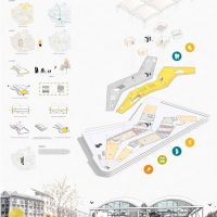
Do This Or that! Here is an example!
3) placement and zoning.
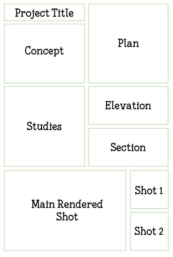
Think of the way you would like the viewers to circulate through your presentation, what you would like them to see first, how they would best understand your project. For example, you may start by brief site analysis, then move to the concept statement and its illustrative sketches if needed.
- If your concept is form-based you may need to show the form first, before the plan, then move to the plan to reveal how the form has functionally worked out.
- If your concept is in the plan itself, then you may move directly to the plan and conclude with the rendered exterior form as usual.
Drawing and Rendering Tips
4) background.
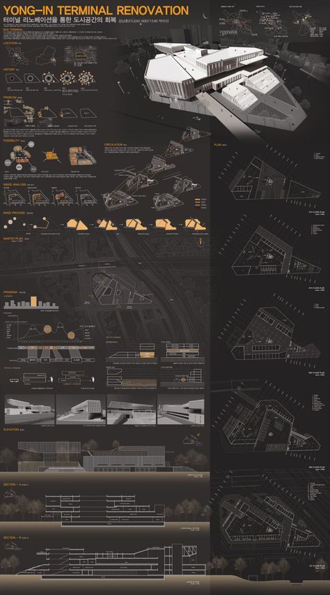
Dark Background
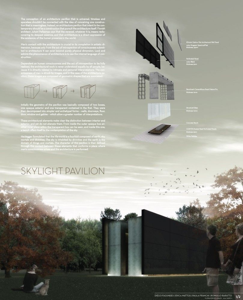
It is called “background” for a reason. It should be a platform to feature your drawings as the main focus, clear of any distractions. Some students use faded renderings of their own projects as background, but this can be seriously diverting. White backgrounds are best, as they show the true colors of your project.
Some opt to use a black background to stand out, however, that doesn’t usually turn out so well. It may cause halation and strain for sensitive eyes.
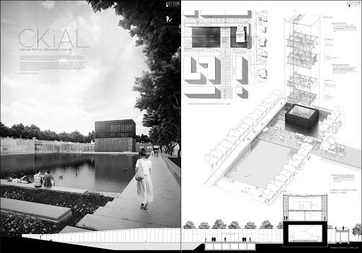
Black and white presentation
There are many ways you can render your projects, choose the one you excel at and shows your project best.
- There is the Black & White or Greyscale presentation where you only show lines with various thicknesses, in addition to shade and shadow.
- There is the greyscale presentation with an element of color where you would choose one bright color, for example, green for landscape and greenery, to contrast with the, generally, achromatic drawings.
- One color might become two colors revealing different materials like wood or bricks and glass for example.

Presentation with a Color Scheme on Greyscale
All, these previous techniques would work out fine if colors are not the main focus in your project, however, if there is an idea behind your color scheme or the used materials, or there are many details that will go lost in greyscale, then there is no way out.
You need to fully color or at least broaden the color palette for your presentation.
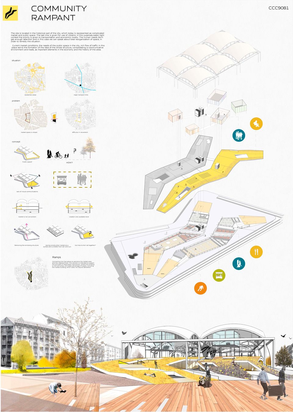
Colored Presentation
The manual achromatic presentation can be via graphic pencils and ink, and the colored elements can be executed using watercolor, markers, brush pens, or pastels. For digital presentations, you can use Adobe Photoshop as the most commonly used tool. You can even mimic the aesthetic of the manual presentation in Photoshop using downloadable brushes and a mix of effects.
6) Visual Hierarchy

Black and White Contrast Color
What is your strongest point, the highlight of your project? Grab the attention from far away with that. There are many ways to grab the attention of a specific drawing, using color or size. For example, if the main idea is in your cross-section, you can present it on large scale with full-hue colors, against black and white plan drawings. That is mixing between two of the color presentation techniques mentioned in the previous point to get emphasis by contrast.
General Tips
7) Minimize text on your presentation board. Write a short and concise concept statement and add a very brief explanation, if needed. Don’t waste your time composing elongated descriptive text because no one will read it.
8) Replace words, whenever possible, with simple illustrative sketches and figures. After all, a picture is worth a thousand words. You may use colors and keys to further clarify your illustrations.
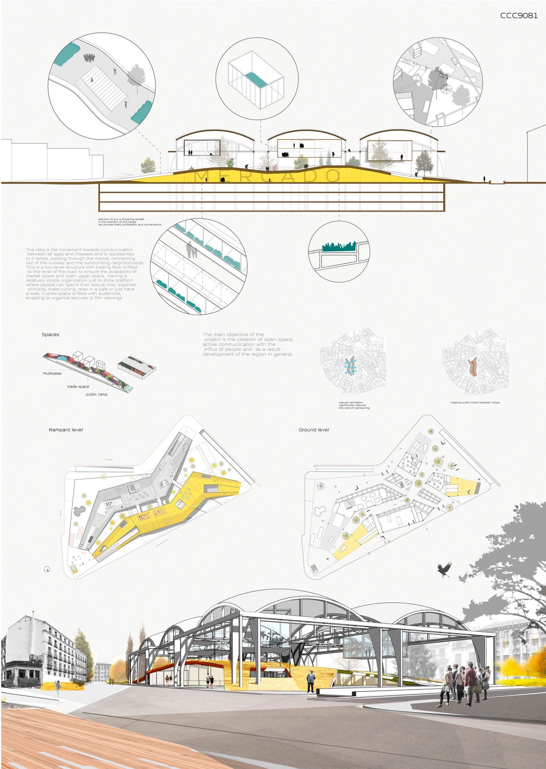
9) Use a suitable font for your title and text and, preferably, don’t use more than one font type per project. You can vary between the title, the concept statement, and the labeling by size. Sans Serif fonts like Century Gothic and Helvetica may be good for headlines; their slick minimalism befits modern high-tech designs.

10) Finally, don’t overdo it.
- Don’t pack your boards with drawings and text at every corner. Leave some breathing space but not too much, that it would look like a) you couldn’t finish your work, b) you didn’t well plan your boards or c) you haven’t worked hard enough.
- Don’t overuse colors to the extent that they would become a distraction but also don’t make your presentation too light and faded, or it might exhaust the eyes of the viewer and give an impression of weak effort.
Tags: Architecture Drawing Architecture presentation Architecture Project Presentation Presentation Presentation Tutorials Project Presentation Simple Projects Architecture
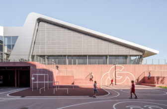
Gigantium Urban Space | JAJA Architects
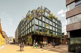
Mercado in Groningen | De Zwarte Hond + Loer Architecten
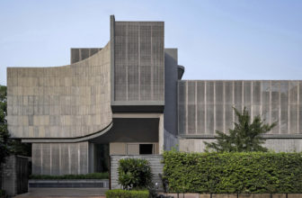
Zen Spaces Residence | Sanjay Puri Architects

Cyprus International University Masterplan | Arup


12 Tips on Architecture Presentation (for Beginners)
No matter how great your design is, it is ultimately only as valuable as others determine it. This assessment is not based solely on your design’s inherent characteristics but also on how you prompt others to see it.
In other words, improving your presentation skills will be an incredibly valuable skill, not just in school but in the professional field of architecture.
The design itself is important, and while there is nothing you will read here that will negate that, it is crucial to know that your work does not end when the drawings are complete.
While it is undoubtedly appealing to utter that classy phrase, “My work can speak for itself,” it is not always true. Your work can say a great deal, certainly, but you are there to build it up even higher so that your audience cannot easily overlook it.
If you are a student, you may want to be aware of some useful tips for architecture presentation, along with some things you should include.
1. Get a Grasp of Your Audience
Interest levels are going to vary between audiences based on the context of your presentation. If you are a practicing architect, your design is the keystone of the presentation.
In this scenario, your professional success depends not just on how good your designs are but how well you can sell them to clients.
If you are a student, you are unlikely to be selling your design as much as you are trying to get a grade. It would help if you considered why your audience is sitting in front of you at that time.
Chances are students who, like you, are also trying to get a grade and ultimately will spend more time in their heads going over their own talking points than paying attention to you.
It is hard to entertain everyone in such a situation (although you will reap benefits if you manage to do it), so you will ultimately want to target the ones giving you a formal review.
So, focus on demonstrating your knowledge, dedication, and creativity. Prove that you worked hard on the presentation, and you will draw respect.
2. Plan and Structure Your Presentation
Unless you are incredibly gifted (maybe you are), you are not likely going to be able to ‘wing it’ with an architectural presentation without jumping unmethodically from point to point like an inebriated cricket.
It would help if you had a plan.
More specifically, you need an outline.
If you have ever taken a writing class, you should already be familiar with what an outline is and the purpose of doing one. Get a sheet of paper or open a word document/sticky note on your computer or phone and lay it out.
Have a series of steps that break down what you are going to present in which order. For example:
- Introduction
- Define criteria
- Present design
Keep in mind, the above is only a rudimentary example, and you should structure your presentation appropriately to make it relevant to any given requirements.
Add additional details that could help you more comfortably present your design in an informative and easy-to-follow manner.
3. Structure the Visuals as You Would Telling a Story
You are an architect, after all. Words are your wheels, but compelling visuals are the car you are driving.
You want to present your design in a way that involves your audience’s eyes more so than their ears – like how you’d structure your architecture school portfolio , in a way.
If all you do is stand up there and talk, you will quickly find yourself in a room of bored faces in any presentation. This is especially true in a visually dominant subject like architecture.
Lay out your design in easily digestible chunks, which could include significant freehand sketches , artistic 3d renderings, and the study models you spent nights building.
Arrange them on the presentation board where you start with the macro-view or overarching concept on the far left; progress with other visuals as you explain and reveal details that support your ideas.
Whatever you do, base your presentation on those visuals and use your words to enhance them, don’t just add them in as a distraction from your persistent rambling.
4. Speak Clearly and Confidently
It is so blatant it’s cliché. But don’t overlook it.
Practice if this is an area in which you struggle. Your design is great, so speak clearly and confidently to back it up.
If you mumble your way through a presentation of the next Eifel Tower, but nobody understood enough of what you said to recognize that, you are not going to score very well.
Appearing unconfident during the presentation will likely attract more negative critique than if you sounded self-assured.
The concept is your brainchild; stand by it; defend it.
You need to relax because anxiety will ruin you if you let it – okay, that statement might not help.
Nevertheless, being comfortable when you have the floor will enable thoughts to flow through your head more clearly by blocking out potentially stressful outside stimuli and make the situation just about you and the design you are presenting.
It may be hard for you to get to this point, but once you do, you might find yourself looking forward to sharing your brilliant work rather than dreading it.
Easier said than done, but research deep-breathing techniques and meditation practice if you need to – find something that works for you.
Another method to train yourself in this regard is grabbing every opportunity during presentations and crits to get involved (even when it is not your turn to present) – ask questions, participate in discussions, and be an active participant.
6. Rehearse
Practice, identify weaknesses, and practice more to correct those weaknesses; recognize more areas for improvement and practice some more.
You cannot over-practice; the only thing you can gain from rehearsing is confidence and clarity, which will help with the presentation and achieve relaxation.
7. Dress Nice
For a practicing architect, a snazzy suit is a tool of the trade when presenting to clients because it demonstrates a nod to professionalism and conveys sincerity.
If you are a student, you may consider investing in high-quality garb for when you present your final project because, ultimately, putting effort into presenting yourself only aids the effort you put into presenting your project.
Should you always wear a suit when presenting a design?
Casual clothing is usually sufficient, but it certainly does not hurt to have something stashed away for those special occasions.
8. Be Concise
Short-and-straightforward beats long-and-convoluted when you consider that people seem to be developing shorter and shorter attention spans these days.
You will want to include all of the pertinent information that pertains to your design and your purpose in creating it.
But if you have to ask yourself whether or not the audience needs to know blatant fact 1 and useless detail 2, chances are you can leave them out for your presentation’s betterment.
9. Include Humor
It is entirely optional, so if you don’t have the humor gene, do not force it because that will backfire.
However, if you have a habit of making others laugh easily through your wit, it is not unprofessional to bring some of that humor to your presentation to add extra depth and color.
Also, people are more likely to remember experiences that make them laugh.
10. Be Personable
You are not a design machine; you are a human being who is creative and methodical.
If people see that you worked hard to put your presentation together, being open and sharing your experience will not bring you down.
Some people might even find the obstacles you faced and overcome as a test of your character and a tribute to your hard work. So, don’t be afraid to share your moments of weakness, observations, or whatever else that applies to human nature.
It adds a dimension of entertainment to your design project, and it adds a layer of likeability to yourself.
11. Recognize Imperfections
It does not matter how many times you revise, rehearse, or plan – if you are a student, it is virtually impossible for you to achieve perfection at such an early point in your architectural endeavor.
You need room to grow no matter how long you have been designing buildings because it is that opportunity to get better that ultimately keeps you engaged.
As an architect, if you know it all, you won’t be driven to innovate and whoever is judging your presentation is likely to know this.
All you have to do is what you can, and do not expect any more than that. If someone viewing your presentation calls you out on something or questions a component of your design, respond openly to the criticism, and don’t beat yourself up.
12. Include a Chance for Questions
The iconic last words of a solid presentation are “Any questions?”
You cannot expect to cover everything the human mind could contemplate asking, so inserting a brief Q&A as you wrap things up provides you an opportunity to cover anything you could have left out.
When you take on the challenge of encouraging questions – even if nobody asks any – it is a credible way to state that you know, in detail, everything you presented. Well enough to talk about it even when torn away from a guiding outline.
Furthermore, while it is no guarantee, you should anticipate questions if you have intrigued your audience enough with your design for them to want to dig deeper.
So, before any major design presentation, up your question-and-answering game by getting friends, colleagues, or anyone interested to ask you some impromptu questions so you can optimize how you respond to the unexpected.
You may also consider asking yourself questions, and in doing so, you may further understand your purposes in creating your design.

Introduction
The Architecture Presentation Board is a means of producing visually captivating summaries of design projects. They can be used for a variety of purposes. On an academic level, students use them for their architecture school submissions but they can also assist a client’s imagination or help win a commission on the professional side.
Your drawings, graphics and architecture presentation boards have one main purpose – to communicate your design in all its entirety from the concept to final renderings. If your presentation boards look good, but don’t do their job – you may need to think again.
In order to win over a tutor, client, planning officer or committee it is vital that your scheme is clearly conveyed and easy to understand. In a way it is like a sales pitch, you are selling your design, ideas, concept. So read through this post for some essential tips on designing the best architecture presentation boards!
And remember a great design can be mediocre if it is not presented well.
Scroll to the end to download this article as a handy PDF guide!

Our Top Important Tips for Architecture Presentation Boards
Brief requirements .
A project brief whether it is for a university project or for an architecture competition will typically outline what you need to include in your architecture presentation boards. So make sure you read this through and note down the non negotiables.
Architecture presentation boards usually include floor plans, elevations, and sections along with some sort of perspective views, 3d drawings or renders. There may be a focus on some of the key features of your design, perhaps with brief sentences explaining your scheme. Hand drawings and development work can be good to include if relevant/required.
Going through the brief will also help you determine what content to assign to your boards. For architecture school projects, there may be more than one presentation board to curate. Try to determine each board’s key focus – it could either be to depict your site analysis, conceptual development, material application, technical resolution or final scheme. Generally for competitions you will have to compile all of these key stages on one or two presentation boards.
For more helpful tips on how to dissect your briefs, check out our Architecture Assignments Brief Guide post. It includes a cool Architecture Assignment Planner:
Architecture Assignment Brief Guide – First In Architecture

When you start to plan your architecture presentation board is also crucial. If you begin planning out your boards immediately after reading through your brief, you will get an idea of what you are working towards. You can get as specific as you like with the details. Revisiting this rough plan throughout your design process may help you work on perfecting the images that will best represent your project.
On the other hand, if you plan your boards after completing your project, all the work you have done until then will determine your end result. It would sort of be like piecing all your work together as you would a puzzle. You may end up editing your existing work or even having to create more work to place on your presentation boards.
Either way, take a moment to organise your work. Think of what you are trying to convey. What drawings / images do you have to show as part of your brief/criteria? What are the key elements in your design that you would like to portray?
Collect all this information – list out all the images to be included and what text you would like to put in, then you can start planning the structure of your boards. This will really help you visualise what information will be on your boards and how you are going to communicate your design.

Inspiration
Similar to having precedents for your design, we recommend having an idea of what graphic style you would like to use for your architecture presentation board. Try to bring your work together as a unified selection of drawings with a format, scale and style that work together to create a logical and comprehensive view of the project. Different graphic styles and inconsistencies can cause a lack of clarity and confusion.
For this you can seek inspiration from a variety of sources like Pinterest or Instagram.
If you are finding it difficult to come up with a graphic style for your architecture presentation boards, check out our Pinterest board here:
https://www.pinterest.co.uk/1starchitecture/architecture-presentation-boards/

Representing Architecture
Your architecture presentation board must use graphics and text to represent your design idea and clearly communicate the details and essential aspects of the scheme. It is important to be efficient with the production of drawings, and only use what is necessary to convey your idea. Quality is better than quantity as quantity can lead to confusion.
View your project as if for the first time, and consider how easy or difficult it is to understand the concept and the main elements of the scheme. Only add work you would be confident presenting in person and avoid any unnecessary information.
Architectural Notation
When you plan your architecture presentation boards make sure that you can see the relationship between the drawings.
For example sections and plans should be aligned so it is clear to read. You can even use dashed/dotted lines to highlight these connections.
Every instance of a plan needs to be of the same orientation (north point always in the same place) otherwise it can get very confusing for someone who has not seen the project before.
When showing plans and elevations/sections together, it is beneficial if they are of the same scale and in line. However, if one drawing is more important than the others then it makes sense to show it on a different scale.
Just because it’s a pretty architecture presentation board, don’t forget to include your symbols! Scale bars, section lines and north points often get forgotten, but are important to be included in order to make your drawings and information clear.

We would recommend sketching out the structure of your architecture presentation board before you start, so you can get an idea of the possible configurations you can use and what might work best. A small storyboard sketch or small scale mock up of the presentation can work well as you can adjust the layout until you are happy with the arrangement and alignment.
In general we read design presentations from left to right and from top to bottom, so consider the story of your design and how it will be read. Show the progression and don’t be afraid to experiment.

Use a program you know. The last thing you need to be doing is learning a whole new software program whilst in the panic of putting your boards together. If you have allowed yourself enough time, fair enough. We would recommend InDesign or Photoshop, but Microsoft Word or Pages on the Mac will still give you good results if you are more comfortable using them. Powerpoint or Keynote on the Mac, can be good options, but do check they can print to the size you require the boards to be.
Orientation, setting and size
Confirm whether your architecture presentation boards are supposed to be presented in landscape or portrait orientation. Think of the size your presentation boards are going to be. Ensure you have the right resolution and print settings applied. Check if you are limited by the number of boards and don’t forget to explore relationships between each board, and how they will be read together. Consider numbering the boards to show what comes next.
Ensuring you have set up your presentation board files correctly will help save you loads of time in the end.

Key Information – Title, story, content
Do you need to have a title bar? If so, consider keeping it consistent throughout your architecture presentation boards. This gives a sense of professionalism, and orderliness. Don’t forget to include your details – name, title of project etc and whatever else is applicable.
It’s tempting to get carried away with multiple fonts but please, don’t! Stick to one font, a maximum of two. You can consider using fonts from the same font family for visual coherence.
Use font sizes to create a hierarchy on your architecture presentation boards – e.g. a large font for your titles, a bit smaller for subtitles and standard size for the remainder of your content.
Make sure your chosen font and size is readable. Keep your sentences short and punchy. No one is going to want to read an essay on your presentation board. A picture paints a thousand words!
Consider how to align your text within its text box. What is easier to read? Think about text spacing, and hyphenation and how it appears on your architecture presentation board.
For more advice on fonts and to discover some cool font recommendations, feel free to check out our blog post on the Best Fonts for Architects:
Best Fonts for Architects – First In Architecture
Try to keep your background plain, unless it is featuring one of your key images. Architecture presentation board backgrounds can get a little busy and it can be difficult to see the key details of the board.
A white background will make your images and text stand out and look professional. Most of the board images we are sharing in this post feature white backgrounds, it is clear to see why. The information comes across well, and the background makes the visuals pop on the page.
A background image can often be distracting, so make sure all the information is crystal clear if you decide to go down that route.
The standard architectural style particularly for students appears to be black, white and grey! Grey grey grey! We understand why people sway that way, but sometimes it’s good to break out and use a bit of colour. Agreed there is a place for simplicity, and grey can give a professional atmospheric board, but try to inject some colour.
Think how colour is reflected in your design. If the architecture presentation board is predominantly in black and white or grey, does this make the design feel cold? Consider how colour will have an impact on the overall feel of the scheme. Imagine the function and users of your design. What colours would resonate with these?
As a starting point you can insert colours for natural elements such as the sky, vegetation on your site etc. Experiment with accent colours to highlight key design elements or ideas.
You will also find numerous ready made colour palettes online that you can work with.
Layout options

Consider using a grid to help you organise the visual elements on your architecture presentation board. You can use a simple grid or something more complex. A grid helps you to organise the elements on your page and produce consistency across the architecture presentation board set.
Once you have set up your page size and orientation you can start creating a grid that suits your needs. The grid can include space for title bars, page numbers, and other information that needs to appear on each board. Using a program like InDesign is great as you can set up master pages as templates so you only need to create the grid once and it can then be used on numerous pages.
Keep in mind that the grid can also be used as a guide, so you don’t have to strictly aim for perpendicular lines. You can have elements and images that blend into one another if you want.

Visual Hierarchy
You will want some of your images to receive more visual attention than others, in order to communicate your idea. You can do this by giving certain images more space in the grid than others. If you wish to showcase one compelling visualisation, you can centre this image or make your other content fit around this image. It often works best when this type of image has elements that form the background of the architecture presentation board, for instance an extended sky or landscape.
When you view your architecture presentation board, you want something viewable from a distance (an impact image) 6ft away, and up close. This communicates your visual hierarchy.
Also if you plan to use precedent images on your architecture presentation boards, remember to distinguish them from your proposal images to avoid confusion for the readers.

Example Layouts
There are numerous ways to organise your work onto boards, here are some options to help you visualise:

Landscape Examples:

Portrait Examples:

Give yourself time

It’s a real shame when you have spent weeks/months on a design project, and leave yourself an hour or two to put it together for your architecture presentation boards. It is such a waste. By denying your project the time and care of developing a structure and a plan for how you present your work, you are effectively deducting grades/points there and then. By showing a well thought out presentation, with a clear process and design result, which is easy to engage with you will greatly increase your chances of showing how good your design is and why it should receive a stellar grade!
Our Architecture Presentation Board Templates

We are excited to present a selection of 14 Architecture Presentation Board Templates in Photoshop and Indesign that all have varying layouts and fonts. They are designed to help speed up your process, create a strong design identity, and save you a huge amount of time. This bundle also includes some textured backgrounds to help you experiment!
You can find out more about these here:
Architecture Presentation Board Templates – First In Architecture
You might also be interested in…
We have a dedicated Pinterest board full of architecture presentation board ideas and styles that will really help inspire you:
We also have lots of incredible architecture content. Be sure to check it out:

Download the Guide!
Download this helpful article as a pdf to keep for reference later!

We hope this post helps you come up with some really good architecture presentation boards, and to show off your work to its best.
If you have got some tips and advice to offer to our readers, let us know in the comments below.
And finally, if you found this post useful, do share it with a friend.
Thank you!

Image Credits
Landscape Example 1
https://www.arkxsite.com/site-chapel-_-winners
Landscape Example 2
https://architecturecompetitions.com/teamakersguesthouse
Landscape Example 3
https://archidose.tumblr.com/tagged/student
Landscape Example 4
https://www.kairalooro.com/competition_emergencyoperationcenter/winningproject_mentions.html
Landscape Example 5
https://www.archdaily.com/257270/buenos-aires-new-contemporary-art-museum-competition-results/0412750?next_project=no
Landscape Example 6
https://www.presidentsmedals.com/Entry-49001
Portrait Example 1
http://www.arquideas.net/es/vof1170
Portrait Example 2
https://www.pinterest.es/pin/488710997053933680/
Portrait Example 3
https://www.dezeen.com/2020/06/08/carleton-university-graduates-architecture-vdf-school-shows/
Portrait Example 4
https://www.behance.net/gallery/47245227/The-First-Half-A-War-to-Eywa
Portrait Example 5
https://www.archidiaries.com/result-announced-bauhaus-campus/
Portrait Example 6
http://www.arquideas.net/es/mesc1258
Other recent posts…

Permitted Development Rights for House Extensions
Introduction to Permitted Development Rights When extending a house in the UK, understanding Permitted Development rights is essential for architects and homeowners alike. These rights allow certain building works and changes to be carried out without the need for a...

Detail Library – New Details March 2024
New Details This month we are excited to share another set of details that have been requested regularly by our members. This set consists of external wall insulation details. In this set we explore a solid blockwork wall with 190mm mineral wool insulation and a...

Understanding and Applying Architectural Parti in Design
In architecture, the term "parti" refers to the central idea or concept of a building design. It's essentially the starting point or organising thought that guides the design process. The parti can be a specific shape, a structural system, a key relationship in the...
24 Comments
Really great Emma,
Both in the tips and tricks but also in the observation and selection of images used. (nice to see them properly credited).
An extra tip; when including precedent studies, make it clear what is precedent rather than proposal by grouping, using a background colour or outline, and if they are on multiple pages keep them to the same place on each page.
Although your tutors are familiar with most precedents, confusing a precedent with proposal is embarrassing for all of us!
Hi Caine, Thanks for your comments – much appreciated.
I WAS ABLE TO USE THIS IN MY CLASS EMMA. WITH DUE RESPECT AND PERMISSION. MY STUDENTS WERE IMPRESSED WITH YOUR COLLECTION OF IDEAS. TNKS.
Thank you so much for this post, I’ve always had a bit of a problem with my boards and this will surely help me in the long run.
with what for a program do u make these portfolios ?
Those presentation boards look awesome! 🙂 what for a program is used to do something like that ?
Hi Jeffry, Boards like these can be achieved using a number of programs, most commonly inDesign or Photoshop. If you don’t have access to this software you can also use things like powerpoint or keynote – although you may be more limited with functionality.
Hi, just wondering what do you recommend to be the best way of getting images onto presentation boards? drawing/ rendering the design then scanning, then editing/ enhancing on photoshop? or using revit to draw and render and transferring these to the boards?
If you could reply to this, it would be muchly appreciated! thank you
Hi Stephanie, Thanks for your comment. I think a lot of it is down to what you are comfortable with, and what stage of your project you are presenting. If you are presenting initial ideas then hand drawings / sketches would be suitable for your boards. These would be best scanned in, and adapted in photoshop, adjust the levels and so on, to get the effect you are looking for. However, if you are presenting final work, perhaps some digital renders would be more relevant. Having said that, if you are comfortable with your drawing skills and have chosen to present your project as hand drawn work, then by all means you should draw and hand render your work to then scan in. I would recommend digitising all hand work and putting together on photoshop/inDesign, as it creates a more professional outcome – and also means you can adjust things as you wish. So, consider your time constraints, what can you achieve in the time you have. Consider what you want the desired outcome to be, and what stage of the project are you presenting. It may be that you use a combination of hand drawings, sketch up models, and final revit renders. There is no correct answer, just do what works well for you, and what you will be able to do at the best of your ability. Hope this helps – and best of luck with your work!! Emma
Heyyy how about capitalisation? Does all the writing should be in caps or it could include lower and upper case??? Thanksss
I think that is down to personal choice and how you want it to look. No strict rules on this. Just make sure you are consistent.
how about manual presentation formats?
thank you so much for all the tips! Appreciate it:)
You’re welcome 🙂
I had receive the pdf copy.however it doesnt contain any image
Hi Nurul, the pdf doesn’t have any images as it is for printing without using too much ink. If you want images you can print directly from the article web page.
Great post..Very helpful. Thanks
Hey, Thank you so much, this has been really very helpful as it has always been a task to understand the requirements and needs that have to be considered for architectural sheet presentation as we have a lot of information to put in but what matters is giving the information a hierarchy as to what needs to be included or not . Appreciate it.
Thank you Anand.
Hello Emma, thanks… I have a presentation next week, could you please send me a downloadable copy of that, thanks
can I take your post because your post very exelent
can i know what is a standard word size for an a1 size presentation board???
Hi, it will depend on many factors, like the font you are using, the intended purpose of the presentation board, how much text you are putting on there etc.
Submit a Comment Cancel reply
Your email address will not be published. Required fields are marked *
Submit Comment
This site uses Akismet to reduce spam. Learn how your comment data is processed .
This website uses cookies to improve your experience. We'll assume you're ok with this, but you can opt-out if you wish. Read More
Best Architecture Presentation Board Ideas
- AEC Marketing
- Digital Asset Management
Posted by: Cinthya Soto
If you’re an architect, you know that one of the most impactful methods for expressing your ideas is creating architecture presentation boards. These boards serve as more than just showcasing your project; they effectively portray your concepts and narrate the story of your design.
However, creating your architecture presentation board can prove challenging. It’s crucial to establish a well-designed layout that maintains a cohesive and engaging narrative. This will enable you to effectively communicate your ideas and elevate the impact of your architecture proposal .
In this blog, we’ll explore ten architecture presentation board concepts, encompassing vital elements necessary for crafting a polished and visually captivating presentation. These ideas include various aspects such as layout, structure, visual hierarchy, color, and more, all contributing to the creation of a professional and visually engaging presentation.
By the end of this blog, you’ll possess the knowledge and confidence necessary to produce a creative and impactful architecture presentation board. This will allow you to showcase your architecture projects accurately and secure new projects.
What Is an Architecture Presentation Board?
Applying all of this information to your architecture presentation board may seem challenging, but with the help of a well-designed layout, you can effortlessly tackle this task.
An architecture presentation board is a visually appealing graphic that effectively summarizes all the ideas of your project. It provides a condensed and clear representation of your design. Architects use architecture presentation boards to showcase their projects and work.
The purpose of a presentation board is to construct a narrative that effectively conveys the essential information of your project in a self-explanatory manner. This enables readers to comprehend each of the proposed solutions with ease.
An architecture presentation board fulfills multiple objectives, including:
- Serving as a tool for presenting designs to clients, superiors, or colleagues
- Assisting in attracting clients and securing commissions
- Contributing to the advancement of your career and elevating your architectural projects to new heights
Architecture presentation boards serve various purposes, being used by both students and professionals. During your time as a student, these presentations are crafted for juries and submissions, allowing you to present your work to professors and peers. In your professional life as an architect, these boards are used to present designs to clients, committees, shareholders, and exhibitions.
In many ways, an architecture presentation board resembles a sales pitch, as you are essentially promoting your design, ideas, and concept to win clients over.
10 Architecture Presentation Board Ideas
While the architecture presentation board may not be the only aspect of the project itself, it certainly has an impact on the audience. Additionally, it can showcase your artistic abilities and design skills.
The structure of an architecture presentation board serves as the platform for combining the key ideas of your project, presenting only the essential elements required for a clear understanding of the proposed concept. Remember, there is no need to incorporate every single detail into the presentation board. It is equally important to be careful with the amount of text used and to maintain focus on the central idea of the project.
To help you get started, let’s take a look at some of the essential concepts (with examples) that must be considered when creating your architecture presentation board. This will help you create a flawless presentation board for clients.
1. Size and Orientation
When designing your architecture presentation board, you will have to determine whether you will be presenting them in landscape or portrait orientation. You can explore different formats to enhance the presentation of your proposal.
However, it’s not certain you’ll get to choose the size or orientation of your presentation boards. You’ll most likely encounter limitations that restrict you to a particular board size and a specific number of boards. Sometimes you will have the opportunity to choose the size and orientation of your presentation boards. However, more often than not, these decisions will be decided by your director, client, or professor. It’s important to ensure that you are aware of the parameters beforehand to avoid any inconsistencies.
If you’re a student, it is common for professors to impose restrictions regarding board sizes and the number of boards. In such cases, you should verify whether your boards should be presented in landscape or portrait orientation.
However, if you have been allowed to decide for yourself, take some time to think about it. Consider which orientation will make your graphics stand out the most and which one will best tell the story of your project.
Apart from deciding whether your board will be in the landscape or portrait orientation, you will have to decide which way you will present your board. Some options include:
- Side by side as a single large board
- As one equivalent-sized poster
- As separate boards arranged in a sequence
Keep in mind, the orientation and size of your boards can also have an impact on the structure and layout of your presentation.
2. Layout
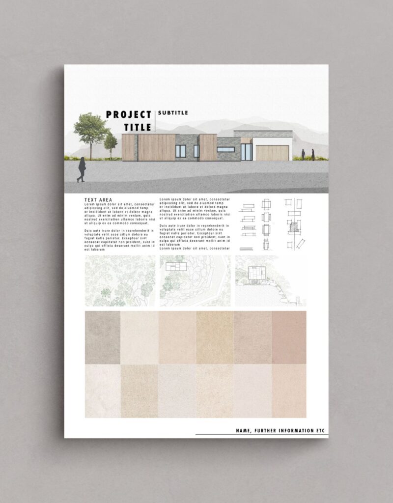
When arranging your architecture presentation board, think about the main ideas you want to express. Then, decide on the images and graphics that will best showcase those concepts. Collect all the required information and take note of the graphics and text that will best convey your concepts effectively.
Before starting the actual layout of your boards, take time to sketch out different versions to identify the most suitable arrangement. Create small-scale sketches to capture the basic flow of each board, enabling you to experiment with different element placements before finalizing your design on the boards themselves. This process allows for flexibility and adjustments to ensure you achieve a complete overview of your ideal layout.
Once you have decided on the layout you want, think about how much space each element will require on the page. Make sure each graphic is big enough to make an impact and consider the amount of space you want to leave between each graphic. Leave enough space so that it doesn’t look crowded or messy, but, avoid leaving too much space as well, as it may give the wrong impression.
3. Structure
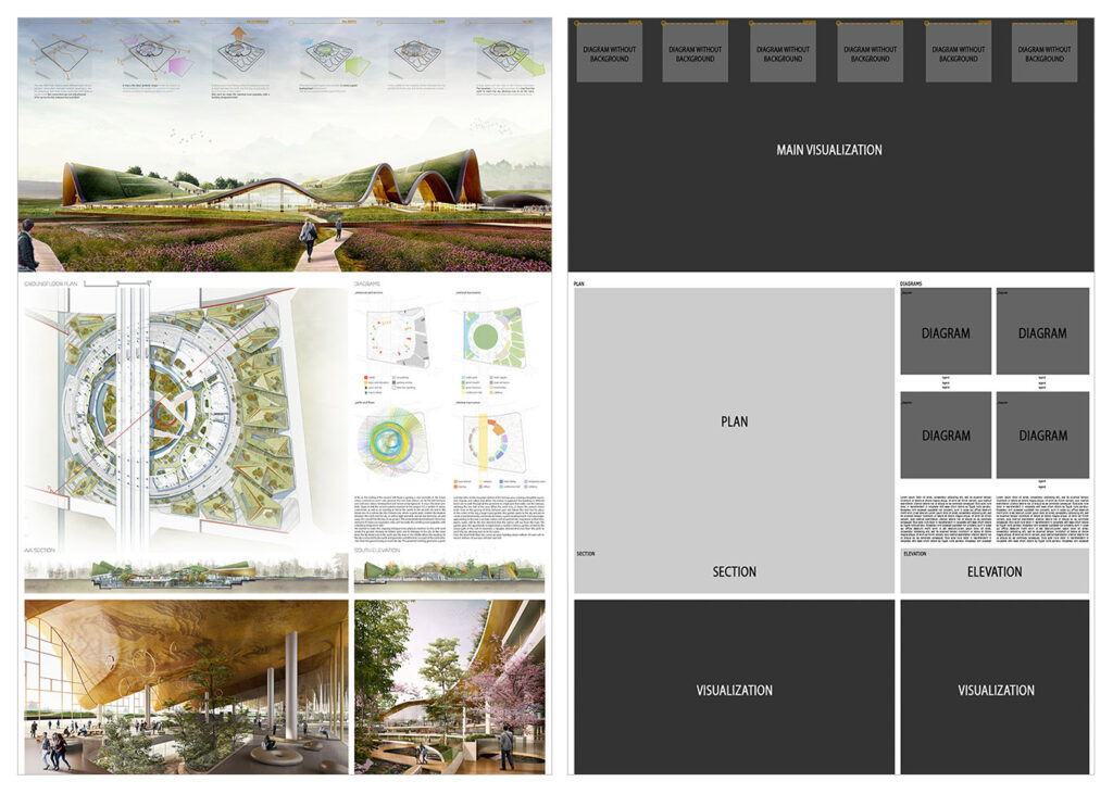
Using a grid structure is the most common layout method used among architects because it simplifies the organization of visual elements in your presentation. Several compositions can be used when using a grid structure, such as square or rectangular grids, mixing texts, and images, or even adopting an organic structure.
The grid serves as the fundamental framework for diagramming. Diagramming an architectural presentation board involves the organization and arrangement of graphic and textual elements that deliver comprehensive information about your project. This process ensures a well-structured and cohesive representation of your proposal, providing viewers with an accurate representation of your architectural vision.
Keep in mind, you are essentially narrating a story, therefore you must carefully consider the flow of the narrative as you organize your presentation board. To help you get started, follow these steps:
- Consider the perspective of the individual observing your presentation
- Prioritize what you want them to see first
- Strategize the most effective approach to displaying your project’s story to them
- Evaluate if your structure and layout successfully achieve this objective
Remember, normally, we read presentations from left to right and from top to bottom, so consider the story of your project and how it will be read.
You should also consider how each board in your presentation relates to each other. Assess whether there is a logical progression from one board to the next, ensuring that the sequence flows seamlessly. In case you will not display all the boards simultaneously, consider numbering them to guide your viewers and ensure they follow the correct sequence.
4. Background
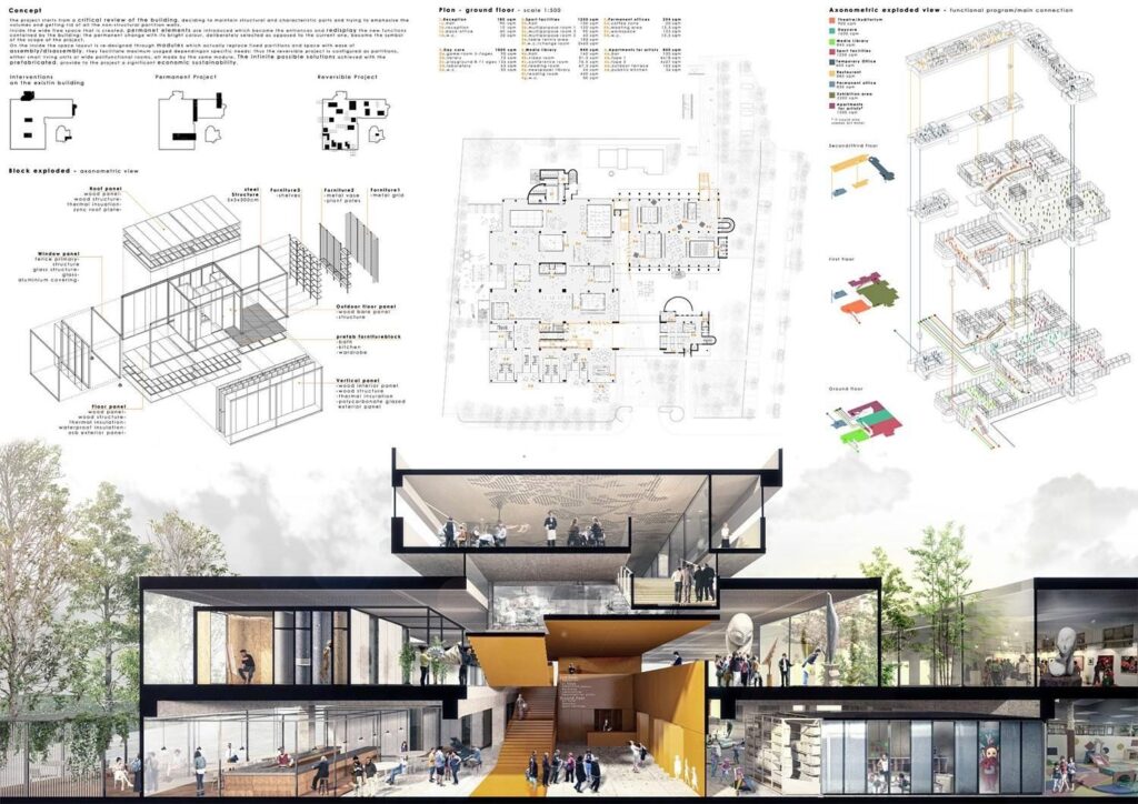
The background of your architecture presentation board should not be complex or cause difficulty. We want the viewer to easily see all the elements without any distractions from a busy background. It’s important to avoid anything that may draw attention away from the crucial details of the board. Let your graphics and text take center stage, refraining from using bold colors or textures that may take away the focus from them.
With that being said, be very careful when choosing a black background. It may diminish the readability of text and potentially reduce the impact of your graphics. Moreover, background images, if chosen, can often be distracting. A black background could also set a cold and boring tone. Therefore, if you opt for this approach, make sure that all the information remains easily comprehensible.
On the other hand, going for a white or light gray background will enhance the visibility of your graphics and text, allowing them to stand out effectively. This choice gives your presentation a professional appearance without overwhelming the viewer. While you can incorporate other colors that align with your central concept, ensure that the background remains plain enough for the viewer’s attention to be primarily directed towards the design rather than the background itself.
Regardless of the color you select for your background, use it strategically to your benefit. Embrace the concept of negative space and leverage its power. Include only essential information in your presentation, resisting the temptation to fill empty spaces with irrelevant details. The skillful use of negative space enhances the impact of your design, creating a clean and professional feel.
5. Colors
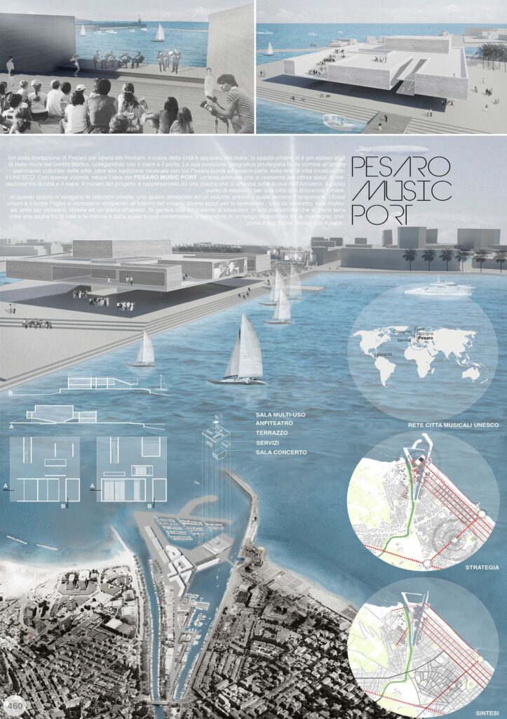
While we discussed the use of the typical black, white, and gray colors in an architecture presentation board, don’t hesitate to include some colors. However, be mindful of your color choices to strike the right balance, ensuring that your board doesn’t appear dull or overwhelming. Introducing hints of color can bring life to your presentation boards and draw attention to the elements you want to highlight. This will help guide your viewers’ focus to the key aspects of your presentation board.
How you can use colors to make your design more lively? One example is you can add a contrasting color like green for landscaping to a mostly single-color presentation. You can also use a different color to represent specific building materials, such as brick, glass, or wood. These color choices bring visual appeal and improve the overall look of your design.
You can also consider opting for a bold and attention-grabbing color, such as pink or red, to serve as a prominent feature in your diagrams. If you aren’t feeling inspired, there are many pre-made color palettes available online for you to work with.
The choice is yours and whichever color you decide to continue with, make sure to always ensure consistency by using the same color across all of your boards. This approach will help maintain a cohesive and seamless flow throughout your presentation.
6. Visual Hierarchy
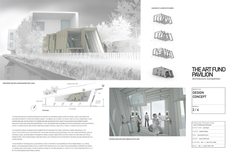
When creating your architecture presentation board, leverage visual hierarchy to highlight specific images on your presentation boards. This means you should select which image deserves the most visual attention within the hierarchy. Identify your project’s strongest point that you want to highlight, and make it the main focus that catches the viewer’s eye from far away. You should also incorporate other images that reveal their details when viewed up close.
So, how can you do this effectively? There are various techniques to draw attention to a specific drawing, such as playing with color or size. Don’t be afraid to use up the space you need to display the images that are crucial for your vision. For example, you can make the image you wish to highlight the largest, ensuring it can be viewed clearly from a distance of 6ft. This effectively communicates the visual hierarchy and emphasizes the importance of the highlighted image.
Another method is to use color to direct the viewer’s attention to a specific graphic. By using color in a targeted manner, you can effectively guide the viewer’s eye toward the main idea on the board.
You also have the option to center the image you want to highlight and arrange the surrounding content to complement it. This technique is particularly effective when the image contains elements that serve as the background of the architecture presentation board, such as a large sky or landscape.
For the best outcome, focus on keeping the overall vision of your project in mind and selecting images that directly display and strongly support that idea.
7. Image Selection
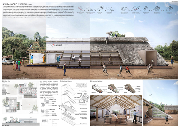
Choosing the right images is an important aspect of creating your architecture presentation board. The graphics you select can either make or break your entire presentation board. Throughout the architectural design process, you will generate various sketches, models, renderings, and drawings. Make sure to carefully select the images that effectively communicate the important details of your project.
Keep in mind, using an excessive number of images in your presentation can lead to a cluttered and confusing visual experience for the viewer. However, using enough images may give the impression that you needed to invest more effort into your presentation. Strive for a balanced representation that showcases your project effectively.
8. Content
Not only should your architecture presentation board be easy to understand but it should also demonstrate your full commitment and dedication to your project.
When it comes to planning out the content for your presentation board, consider the following elements to ensure a clear understanding:
- Internal and external images
- Isometric views and exploded views
- Perspective cut
- Diagrams
- Volumetry studies
- Descriptive memorial
- Technical drawings (plans, cuts, and details)
It’s important to note that not all the mentioned items need to be included in every project, as this depends on the specific requirements and nature of each project. However, these elements are valuable resources that can enhance the understanding of your architecture proposal whenever applicable.
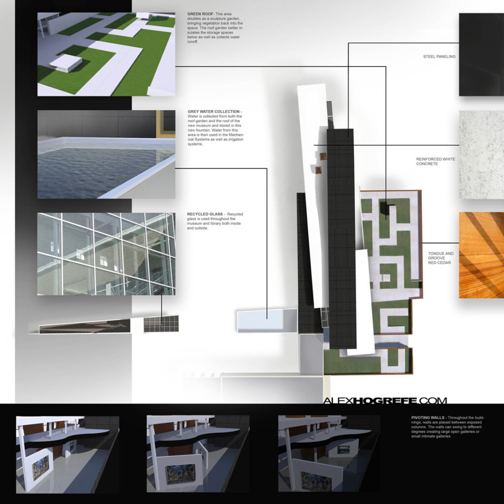
9. Text
It’s important to keep text at a minimum on your architecture presentation board. You should write a concise and focused concept statement, avoiding wasting time on lengthy descriptive text that is unlikely to be read. Shoot for a clear and short message that effectively communicates your concept.
Some questions to consider when organizing the text sections in your architecture presentation board include:
- What is easier to read?
- What flows best?
- What is pleasing to the eye?
Moreover, when creating the text for your architecture presentation board, consider the alignment of your text within its designated text box. Think about which alignment is easier to read and pay attention to text spacing and hyphenation to ensure they appear visually pleasing on your presentation board. Don’t forget that the size and alignment of your text boxes should complement your graphics. They are important elements of the visual hierarchy in your presentation.
Some tips to consider when creating the text for your architecture presentation board:
- Do not use all capitals in your text, unless it’s for the title
- Follow the standard rules of capitalization for a professional and easy-to-read presentation board
- When possible, replace text with simple illustrative sketches and figures
Remember, your presentation serves as your sales pitch. Therefore, avoid lengthy explanations that would cause you to lose your audience’s attention and keep your message concise and engaging to effectively capture and maintain their interest.
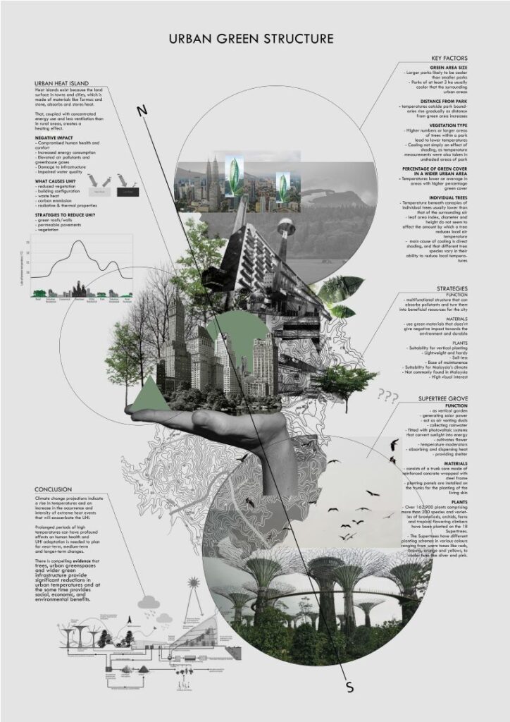
10. Font
Select an appropriate font for your title and text, using only one font type per project whenever possible. However, you can create variations by adjusting the font size for the title, concept statement, and labeling. Consider using Sans Serif fonts such as Futura or Helvetica, as their sleek and minimalistic style complements modern high-tech designs.
When choosing a font for your architecture presentation board, consider the following:
- Avoid script or handwriting fonts to achieve a clean and professional look
- Keep the color of your font dark (ex. black or dark gray) to provide contrast to a light background
- Choose a font and size that will be easy to read
- Make sure the title font and placement are consistent from board to board
- Use font sizes to create a hierarchy (e.g. a large font for titles, a slightly smaller font for subtitles, and a standard size for the rest of the content.)
The font you choose for your architecture presentation board can significantly impact its success or failure and greatly influence its level of engagement, which is why it’s important to make sure you find the best architecture font .
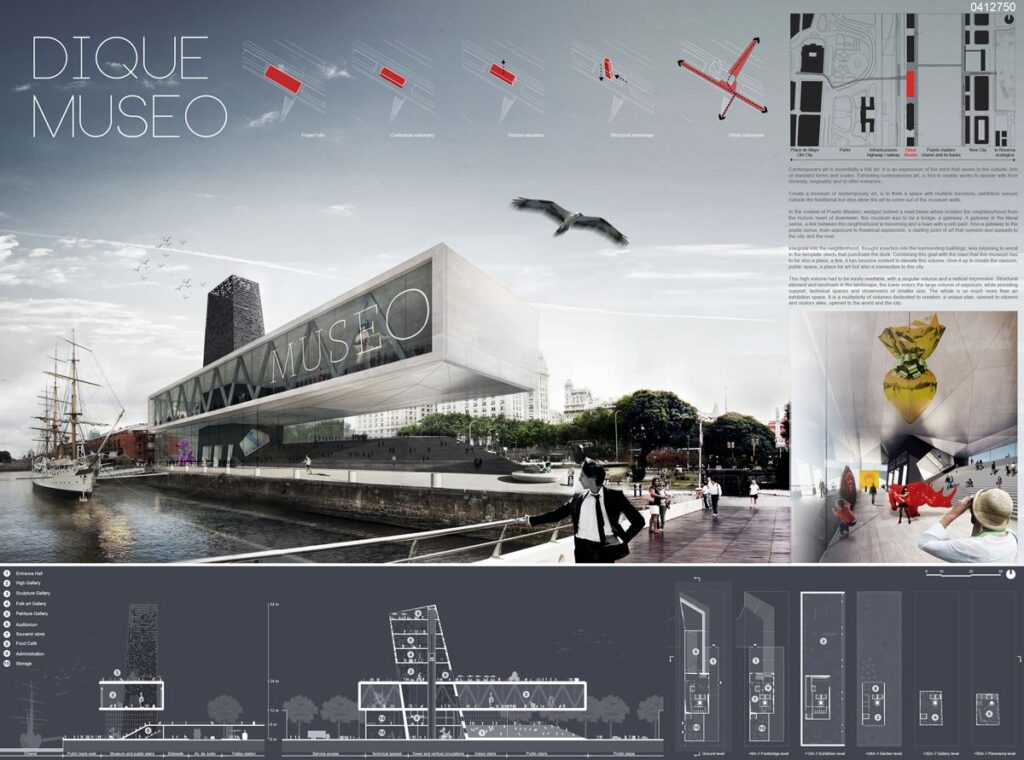
Choosing the Right Elements
Unless specific instructions are provided to you when creating your architecture presentation board, the choice of elements to include will be up to you. When making these important and creative decisions, consider what elements will effectively express and explain your design most compellingly. Remember to prioritize clarity and coherence to create a successful architectural presentation.
Next Steps
We hope this guide on the best architecture presentation board ideas was helpful. As you begin creating your architecture presentation board, remember that there are several solutions out there to help you make better presentation boards and win more business. When it comes to asset management for AEC and real estate professionals, OpenAsset provides a high-quality software solution.
At OpenAsset, the only Digital Asset Management (DAM) solution designed specifically for firms in the built world, we make it easy to find the digital assets you need. With OpenAsset, you can easily find assets by project or person using keywords or file type. Our secure platform also helps you protect your digital assets by keeping them safe from unauthorized access and accidental deletion. You can also easily share files with team members, clients, and partners using controlled access to files.
To ensure consistency and manage your ever-growing number of digital assets, request a demo with us and learn how OpenAsset can help you manage your digital assets today.
Get OpenAsset DAM Insights

How to Create Winning Proposals
What to read next.

Air vs. OpenAsset
Choosing the right Digital Asset Management (DAM) system can be a game-changer for businesses aiming to streamline their digital asset organ...

OpenAsset Achieves Best Meets Requirements Award in G2 Report
OpenAsset is proud to announce that our Digital Asset Management (DAM) software has achieved the Best Meets Requirements Small-Business Awar...

Engineering Websites: 10 Web Design Tips + 30 Examples
For those passionate about engineering and looking to draw more clients to their firm, a website is undoubtedly the top tool for marketing. ...
Got any suggestions?
We want to hear from you! Send us a message and help improve Slidesgo
Top searches
Trending searches
infertility
30 templates

linguistics
89 templates

15 templates

28 templates

public health
35 templates

holy spirit
38 templates
Architecture Presentation templates
Build your own successful presentation with the use of these free nicely designed templates about architecture. work in google slides or download them as ppt files to customize them in powerpoint or keynote..

Building Positive Relationships and Conflict Resolution - 3rd Grade
Download the Building Positive Relationships and Conflict Resolution - 3rd Grade presentation for PowerPoint or Google Slides and easily edit it to fit your own lesson plan! Designed specifically for elementary school education, this eye-catching design features engaging graphics and age-appropriate fonts; elements that capture the students' attention and make...
Construction Project Proposal
Are you an architect? Do you like designing new buildings and supervising their construction? If you need to present a project proposal related to the construction industry, let Slidesgo help you with your slide deck.
Premium template
Unlock this template and gain unlimited access
Construction Projects and Activities for Pre-K
Pre-K students are fascinated by construction work and construction equipment, and this template full of projects and activities takes advantage of this fact to help you put together a great lesson! Its colorful design is full of illustrations of people in hard hats and all the tools needed to design...
Architecture Studio
Designing new offices, skyscrapers, stadiums, bridges and any other kind of building is what architecture studios are about. Help spread the word giving a professional presentation thanks to this new free company profile template, totally customizable, formal and nicely designed.
Traditional German Architecture
Get ready to dazzle the thesis committee with this Slidesgo template. It's perfect for you if your research is related to German architecture. We have included illustrations and images of typical buildings from the Central European country. Its design is elegant, with white background and wave shapes in brown tones....

Design Inspiration Project Proposal
Download the Design Inspiration Project Proposal presentation for PowerPoint or Google Slides. A well-crafted proposal can be the key factor in determining the success of your project. It's an opportunity to showcase your ideas, objectives, and plans in a clear and concise manner, and to convince others to invest their...
Architectural Studies Degree for College
Attention! Dedicated template for all architects in the room! Slidesgo brings you this professional style design for you to make a presentation about Architecture university studies. This template fits perfectly with the theme, as it is full of isometric illustrations of buildings. Super cool! Also, at the end of the...

Construction Engineering Business Plan
Do you need to bring order to your enterprise? If you answered yes, we have the solution for you: a business plan! This document is key to the good health of your company. In it you can always have at hand the market analysis, develop the operations plan, define marketing...

Spring Cleaning Tips!
Download the Spring Cleaning Tips! presentation for PowerPoint or Google Slides and start impressing your audience with a creative and original design. Slidesgo templates like this one here offer the possibility to convey a concept, idea or topic in a clear, concise and visual way, by using different graphic resources....

Daily Routines and Personal Hygiene - French - 6th Grade
Download the Daily Routines and Personal Hygiene - French - 6th Grade presentation for PowerPoint or Google Slides. If you’re looking for a way to motivate and engage students who are undergoing significant physical, social, and emotional development, then you can’t go wrong with an educational template designed for Middle...
Architecture Major for College: Landscape Architecture
Floor plans, rough lines, numbers and rulers… We’re talking about architecture! You can speak about this major with photos of awesome buildings and floor plans to inspire future architects! The soft colors with a pop of color green will make your presentation seem so professional and attractive. Write down all...

Spring Cleaning Products Campaign
Download the Spring Cleaning Products Campaign presentation for PowerPoint or Google Slides. Improve your campaign management with this template that will definitely make a difference. It will empower you to organize, execute, and track the effectiveness of your campaign. Enriched with innovative resources, it facilitates seamless communication, meticulous planning, and...
Real Estate Open House Website Design
Come on in! It’s time to show everyone this house! When you're ready to show off your property, you want it to look its best. With a Google Slides or PowerPoint template presentation, you can create an engaging and inviting virtual open house experience for potential buyers. And with the...

Environmental Impact of Residential Areas Construction
Download the Environmental Impact of Residential Areas Construction presentation for PowerPoint or Google Slides. The world of business encompasses a lot of things! From reports to customer profiles, from brainstorming sessions to sales—there's always something to do or something to analyze. This customizable design, available for Google Slides and PowerPoint,...
Civil Construction Company Profile
Download the Civil Construction Company Profile presentation for PowerPoint or Google Slides. Presenting a comprehensive company profile can be a game-changer for your business. A well-crafted profile connects with potential clients and vendors on another level, giving them a deep understanding of your organization. This company profile template can help...
Architecture and Environmental Design Major for College
Why are cities built the way they are? It's probably due to environmental design, combined with architecture. Sounds like a headache? For us, it sounds like a great degree to study! If you agree with us, download this template and prepare future students for what's to come! What will they...

Rural and Urban Areas
Download the Rural and Urban Areas presentation for PowerPoint or Google Slides and start impressing your audience with a creative and original design. Slidesgo templates like this one here offer the possibility to convey a concept, idea or topic in a clear, concise and visual way, by using different graphic...


Engineering Project Proposal
What is the best way to build your own successful future? Giving a presentation made thanks to our new free business template! Your audience will appreciate your engineering project proposal, paving the way for new deals and investments.
- Page 1 of 19
New! Make quick presentations with AI
Slidesgo AI presentation maker puts the power of design and creativity in your hands, so you can effortlessly craft stunning slideshows in minutes.

Register for free and start editing online
- News & Events
- Architecture & Interiors
- Fashion & Lifestyle
- Interviews/Features

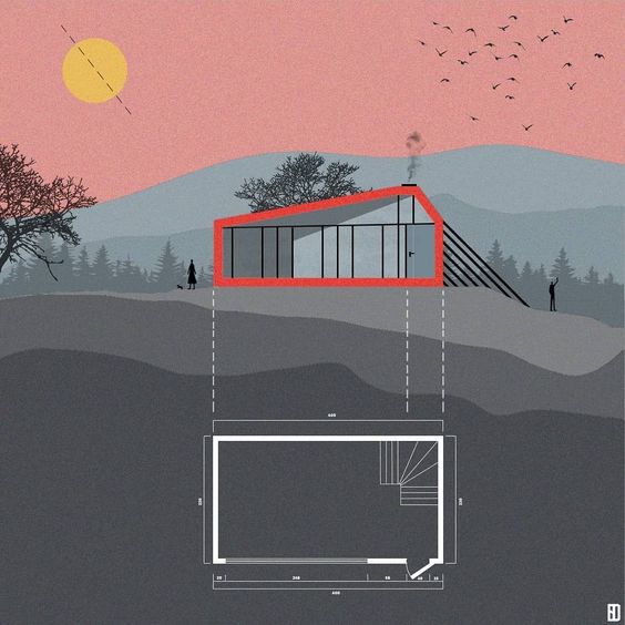
Color Blocking – Using colors for dominance
A very elegant example of how colors can be used in architectural presentation styles to make elements stand out. Mostly used to denote massing in a 2d drawing, the color blocking technique is very obvious, but very attractive. Designers can chose colors depending on the number of elements, or based on the heirarchy of masses. So, the colors can be a variation of shades, for eg. one color used in different hues, or the same color tone, for eg. neutral or earthy shades, or bright colors used in the background with the drawing in plain white in the foreground etc. etc. There are n number of permutations and combinations which can be tried in this style and each would give an interesting result.
Axonometric Style – All in one drawing style
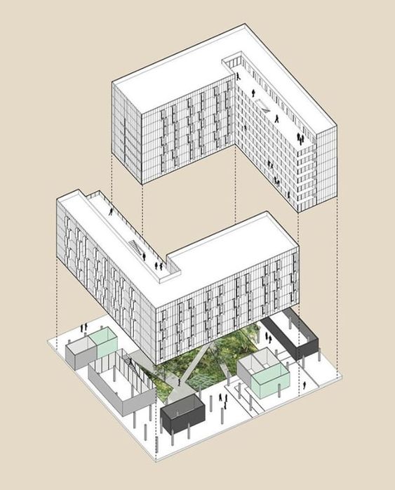
One of my favourite techniques for presentation, the axonometric or simply axo style is according to me the easiest to read. Using an axo view, the designer can very well explain the concept and the inter-relationship between various stories, the play of levels or heights, as well as function of every space of the project. An all in one technique, this one diagram is enough to explain the plan, the facade, the inner details, sections and view of a single building. The axo can also be drawn in a variety of ways like sectional axo or floor plan axo etc. to explain further details. This technique is especially useful when the floor plate needs to be explained in minute detail, whereas the facade is a continuous element on all sides. It also conveys the process of design, for instance the steps in the making of the building. What’s more is, this style is the easiest to achieve on software, making it a go-to for students and small firms.
Perspective Drawing – 3D visualization
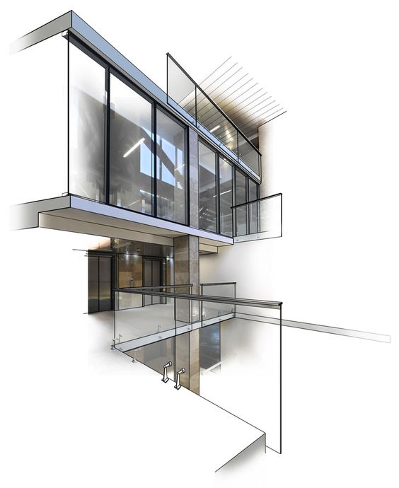
A 3D render is the best way to express what a designer has in his/her mind. The client understands the atmosphere of a space more than a 2D drawing. The sense of scale, colors, textures and feel of a space is best conveyed in this technique. There are a lot of ways to achieve 3D renders, especially with the tools available nowadays. It can be a photo-realistic render or a photoshop collage or a wireframe or white render. However a perspective drawing, where one has the sense of actually being in the space is my top pick. The angle or the camera placed is the most important thing in this style. Where the view gets cut and the kind of textures and colors one uses, with the correct light and shadow setting is also very essential.
Info-graphic – Minimalist drawing style
The single line drawing presentation styles is used extensively these days, where the presentation appears to be more an info-graphic than an architectural drawing. This style is used mostly when the 3D view expresses the major portion of the design and the elevation and section drawings are merely present for further understanding. Often, drawings are not even part of the scheme, only a few details or plans are expressed, in single line for conveying the volumes. This style is perfect for architectural portfolios, where one project is to be displayed on one sheet, where there isn’t much scope for a lot of drawings.
Geometric Style – Clean lines and shapes
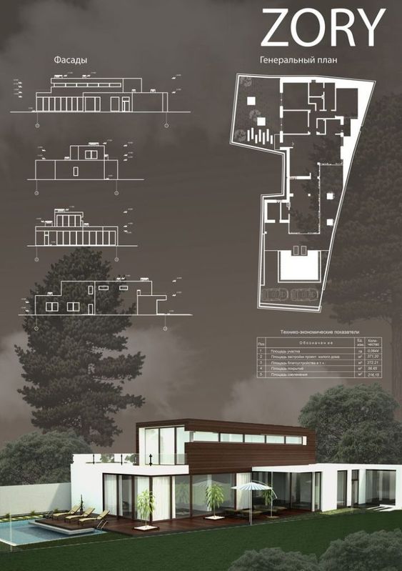
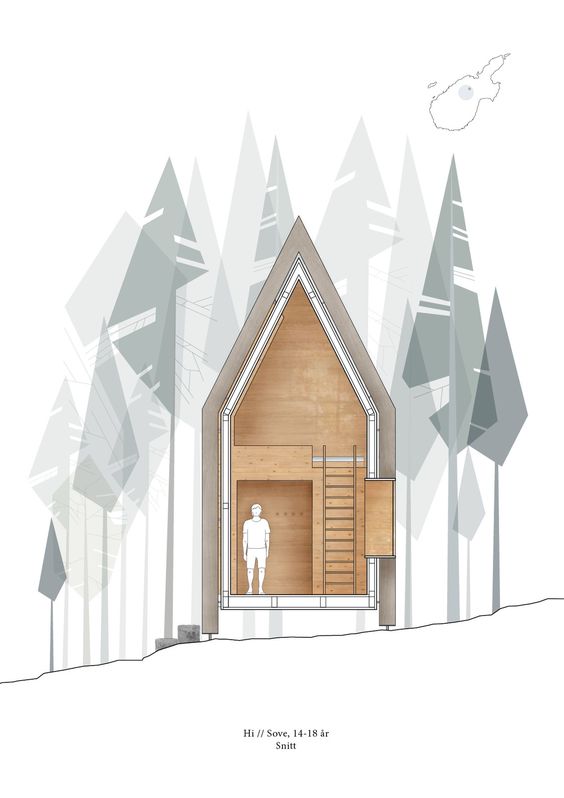
Sometimes, the drawing or the main focus of the project is lost in context with too many shapes on the sheet. The geometric style expresses everything in sharp straight lines. The absense of organic drawings in the form of trees, cars, etc. or expressing them in lines makes it more interesting to look at and doesn’t distract from the main project. This style is very eye-catching and extremely easy to achieve. Another way to add to this style, is by playing with the opacity of elements. For example, elements which have a more complex shape, like humans or trees, can have a very low opacity as opposed to the main components of the sheet like the facade etc. In this way, the project is highlighted and other elements, while present, do not overpower the sheet.
LEAVE A REPLY Cancel reply
Save my name, email, and website in this browser for the next time I comment.
Cindrebay Locations
- Interior Design College in Bangalore
- Interior Design College in Coimbatore
- Interior Design College in Indore
- Interior Design College in Nagpur
- Interior Design College in Kochi
- Interior Design College in Calicut
- Interior Design College in Kannur
- Interior Design College in Trivandrum
- Interior Design College in Thodupuzha
- Interior Design College in Kollam
- Interior Design College in Mangalore
- Interior Design College in Thrissur
- Interior Design College in Malappuram
- Interior Design College in Chennai
Stay in Touch
Please subscribe to our newsletter to get the latest news in your domain of interest. Don't forget to follow us on social networks!
How Parametric Architecture is Reinterpreting Building Design
How to get the best bollywood looks, graphic design – expressing through design and imagery, top 10 interior designers in bangalore, interior design – premium potential career for aspiring students, all about columns – interior column treatments, the future of interior design, residential architecture in south india – 5 best contemporary houses, career options after fashion design, creating boundaries – fences, compound and border walls, the right & wrong reasons to choose architecture, italy – art and architecture, visual communication for designers, sensory design: architecture for the senses, top 15 architectural marvels of modern india: from tradition to tech, our courses.
- BSc Interior Design
- Diploma in Interior Design
- BSc Fashion Design
- BSc Animation & VFX
- BDes – Interior Design
- MDes – Furniture & Interior design
© Cindrebay | All rights reserved

The Architecture Student’s Presentation Roadmap
If you’re an architecture student, then you’ve probably had to endure the daunting arena that is the critique, or the pin-up, or the review. Whatever it’s called for you, one thing is for sure: the quality of your presentations in school significantly impact how your work is received. Most students spend hours on their projects but then sell them short by not communicating them well to others. There’s nothing more frustrating than knowing you have a great project and not being prepared enough to help a professor or juror see that as well. Having a roadmap to guide you can provide just what you need to enter a presentation confident and ready for action. This is your roadmap.
Start in the Beginning
Before anything, you must understand your project better than anyone else. When you’re at a review and the person you’re presenting to has to tell you what your project is really about, it’s not the best position to be in. From the beginning of the semester, you’ll be developing your idea with your instructor and probably talking about it with your studio mates. Use this time to find out what the core concepts are within your work. What is the main idea? How has that influenced your design decisions? Why did you situate your program in a particular way? Is there a driving force behind your formal moves?
These are the kinds of questions that will enable you to dive deeper into what you’ve created. Design is a fluid process and our intuition often discovers things that our minds don’t entirely understand . We must deliberately address why a decision was made. As one grows in their ability, design moves can be made more from this intuitive process, but in school, the student benefits from a more methodical approach to their creations. “I just thought it looked cool,” may not fly in your first three years of school, but, depending on your place of study, it might be more acceptable in upper-level studios. The justifications are more to give those teaching you the space to help you develop than a putdown of your abilities. And it will make the communication of your work that much stronger.
Build a Plan of Attack
Architects, in the grand scheme of things, are master communicators. It is our primary function to present information clearly, concisely, and absent of confusion. When an architect hands a set of drawings to a contractor there is an expectation of thoroughness. Or when a designer presents an idea to a client, it must be understood. Even in the coordination of the entire project team (your consultants, engineers, specialists, etc.), it is the job of the architect to ensure all information is unified and cohesive. Every step of the process of architecture involves elite-level communication, and as a student, this is one of the most valuable skills you will develop in school.
Building a plan of attack, or an outline, before your presentation day will help you tremendously in conveying your ideas. This is just a simple guide of what you are going to cover during your exhibition. It doesn’t have to be super detailed, in fact, the simpler the better. You just want to know beforehand how you plan to move through your points. After a long night of work, you’re not going to be able to wing it the way you might imagine. Here’s an example of something that could work:
Introduce program / design problem - 1 minute
Explain my approach to the solution - 4 minutes total
How I identified the problem - 2 minutes
My formal method for addressing the problem / my concept - 2 minutes
Walkthrough of drawings and tie to concept - 4 minutes
Close and recap - 2 minutes
It’s only a basic sequence of ideas to help me touch all of the major points and to move me along in my explanations in a logical and fluid fashion.
An outline gives us the big picture, but it’s up to us to know the details. TED conferences have become a standard to strive for in public speaking. The talks are meticulously crafted and leave a lasting impact. According to TED , a basic outline and thesis of a presentation should be completed six months before the talk is scheduled and rehearsals should begin as early as four months before. This is drastically different from the one hour or thirty-minute rehearsals most practice in school.
The aim is to stand in front of the jurors with confidence, feeling prepared, and knowing exactly what you have to say
Six months isn’t realistic, but even pinning up early and practicing the day before will help give you an edge. The aim is to stand in front of the jurors with confidence, feeling prepared, and knowing exactly what you have to say. This gives you the ultimate power over how your work is perceived rather than leaving it up for interpretation. Remember, you are the CEO of your project, it is up to you to control and frame how others will see it.
Quality Over Quantity
At the end of the day, there are going to be certain drawings and visuals that are vital to your project and others that are more in line with the deliverables your professor has asked you to have. If it comes down to having all of your deliverables and preparing for your presentation, forget the deliverables. If you’ve managed your time well throughout the semester, you should be able to finish everything, but if you have to leave out a couple of diagrams, or a process study so that you can ensure you have a great talk go ahead and do it.
Think about it. Does it help you to have a bunch of work on the wall and not be able to explain it? Or would it be better to have a little less and be able to communicate it flawlessly, resulting in an engaging and meaningful conversation? When you graduate and working in your first job, no one is going to care that you didn’t pin up your axon drawing in third year. But everyone will love your awesome communication skills.
Lastly, go into the review day humble and ready to learn. School is a place for you to make mistakes and grow. You won’t always have perfect presentations, and there will always be people who don’t like you, that comes with any creative pursuit. Often students go into presentations feeling the need to prove themselves. You’re there as a student, it actually lifts a weight off of your shoulders. If you give one hundred percent of your effort on your work, chances are that it will be okay.
Approach the review as a kind of workshop, you have the opportunity to get one-on-one feedback from a hand-picked group of people. Receive what they tell you even if you don’t agree. If someone destroys the work you’ve done, try not to take it to heart, just accept that they don’t like it. If the jurors have strong disagreements amongst themselves about what you’ve pinned up, you should be happy in knowing that you’ve produced a truly thoughtful piece of work. When you're in your final year, if you’ve walked away learning something from all of your presentations the four years prior, you are sure to be a formidable force.
Here are some quick tips to help you out. You can skim through these or reference them as you desire:
Your appearance matters. Contrary to what people say, they care what you look like.
Speak clearly and audibly.
The presentation is not the time to think about what you’ve done. It’s the time to convey and discuss. Be sure to have your thoughts clear before imparting them to your audience.
Practice silence when you are trying to find the right word. This is better than “umm” and “uhh.”
Guide with your hands. This works wonders.
It’s okay to pause and regroup.
It’s okay to answer a question with a question.
Your drawings are merely a means to communicate your ideas, they are not an end in themselves. Use them as a tool.
Have someone record a video of you presenting. Watch it after and critique yourself.
Accept that some jurors enjoy hearing themselves talk more than helping you get better.
Be open-minded and relax.
Don’t put your hands in your pockets or behind your back.
When rehearsing, memorize big points instead of a long script.
Rest in the fact that most people will forget about your presentation the following day. This should relieve some pressure.
If you have any thoughts or questions, always feel free to email me or leave a comment below. Cheers!
Similar articles on Archinect that may interest you...

About the Author
Sean Joyner
Sean Joyner is a writer and essayist based in Los Angeles. His work explores themes spanning architecture, culture, and everyday life. Sean's essays and articles have been featured in The Architect's Newspaper, ARCHITECT Magazine, Dwell Magazine, and Archinect. He also works as an ...

1 Featured Comment
Wonderful, resonant advice; I will forward this to my daughter; she is beginning her architectural journey this fall.
I'd also like to add that attitude counts. For one of my undergraduate design presentations, I was frustrated by some injustice and presented my project from a pessimistic perspective. At the end of my presentation, one of my professors gently asked if he could present my project from a contrasting perspective. He then launched into a twenty minute whirlwind, full of sunshine and light. It dawned on me that I had merely re-presented the problem while he taken an important step and suggested an inspiring solution to the problem. Exactly the same project, totally different conclusion. Then, my professor turned to me and asked with a wry smile: "Now, my friend: would you like an A or a D for your project?".
Adriana Ciotau
All 3 Comments
Also, make sure the ideas you are presenting are your own. They might have started as a professor's idea or an image or concept you saw somewhere else, but digest if fully if that's the case. Don't think that because the professor gave you the concept that they will be your guardian angel at the crit. And most importantly, be proud of your work. Whatever others think about it, if you don't love what you've done, it will be hard to show it off to a prospective employer down the road with conviction. Be open minded and listen to others, but own your work as it will be the basis of your future employment.
So true! Well said!
PerpendicularBisector, this is a really good point! Sounds like you had an awesome professor. Thanks a lot for adding this to the discussion!
I have no idea what to do until ýou! this is just what i need for next week! Praise God for people like you. Great,
Block this user
Are you sure you want to block this user and hide all related comments throughout the site?
This is your first comment on Archinect. Your comment will be visible once approved.
- Back to Features List... Back to Top ↑
- » Architectural Issues
- » Culture
- » Architects
- » Design
- » Academia
- ↓ More
- » Buildings
- » Business
- » Employment
- » Technology
- » Film/Video/Photography
- » Urban Planning
- » Sustainability
- » Events
- » Landscape
- » Web
- » Competition
- » Furniture
- » View All
- × Search in:
- All of Archinect

- 020 8146 5629
Architecture Presentation Board Ideas
- Request a Quote
Being an architect, you understand that showcasing your project effectively to the stakeholders is very essential. The architecture presentation board examples helps make that right impact in the first go. These architecture presentation board drawings ensure that your idea is beautifully expressed and is conceived the same way as you have thought.
But creating and designing the architectural presentation is a challenging task as a slight mismatch or mistake can completely ruin your architectural project. It’s very important to design the presentation board in such a way that it can communicate your ideas cohesively and engagingly.
Best Architecture Presentation Board Ideas
Let’s have a look at 8 critical elements of architectural presentation boards design that’ll help you craft a polished and visually captivating presentation. Just go through these tips and enhance your ability to showcase your architecture projects impactfully and impressively.
What do you mean by an architecture presentation board? How it is helpful?
An architecture presentation board is a visual summary of a project, used by architects to showcase their designs to clients, superiors, or colleagues. It serves as a tool for presenting ideas, attracting clients, and advancing careers. The purpose of an architectural presentation model is to convey essential project information in a self-explanatory manner.
Key elements of an effective architecture presentation board layout include:
- A well-designed layout that organizes and presents information in a logical and visually appealing way.
- Clear and concise text that explains the project’s concept, goals, and solutions.
- High-quality visuals, such as drawings, renderings, and photographs, that illustrate the project’s design and features.
- A consistent visual style that creates a unified and professional look.
Architecture presentation drawings are used by both students and professionals. Students use them to present their work to professors and peers, while professionals use them to present designs to clients, committees, shareholders, and exhibitions.
Top 8 Architecture Presentation Board Tips and Techniques
To help you get started, Renderspoint has exclusively curated some of the best architectural presentation board techniques and tips that must be considered when creating your architecture presentation board. So, let’s get started in our journey to create flawless architecture presentation board tips for clients.
1. Size and Orientation of the Architecture Presentation Board
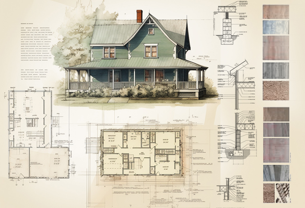
When creating an architecture presentation model, consider the size and orientation that will best showcase your project. You may have limited options due to restrictions imposed by your director, client, or professor. If you have the freedom to choose, think about which orientation will make your graphics stand out and tell the story of your project most effectively.
Presentation Options:
- Single Large Board : Present your boards side by side as a single large board. You may choose horizontal or vertical architectural presentation boards depending on the requirements of the project.
- Equivalent-Sized Poster : Present your boards as one poster of equal size.
- Separate Boards : Arrange your boards in a sequence, with each board presenting a different aspect of your project.
The orientation and size of your architecture presentation board can influence the structure and layout of your presentation. Choose the option that best suits your project and allows you to communicate your ideas clearly and effectively.
2. Choosing the Right Layout for your Architectural Presentation Board Drawings
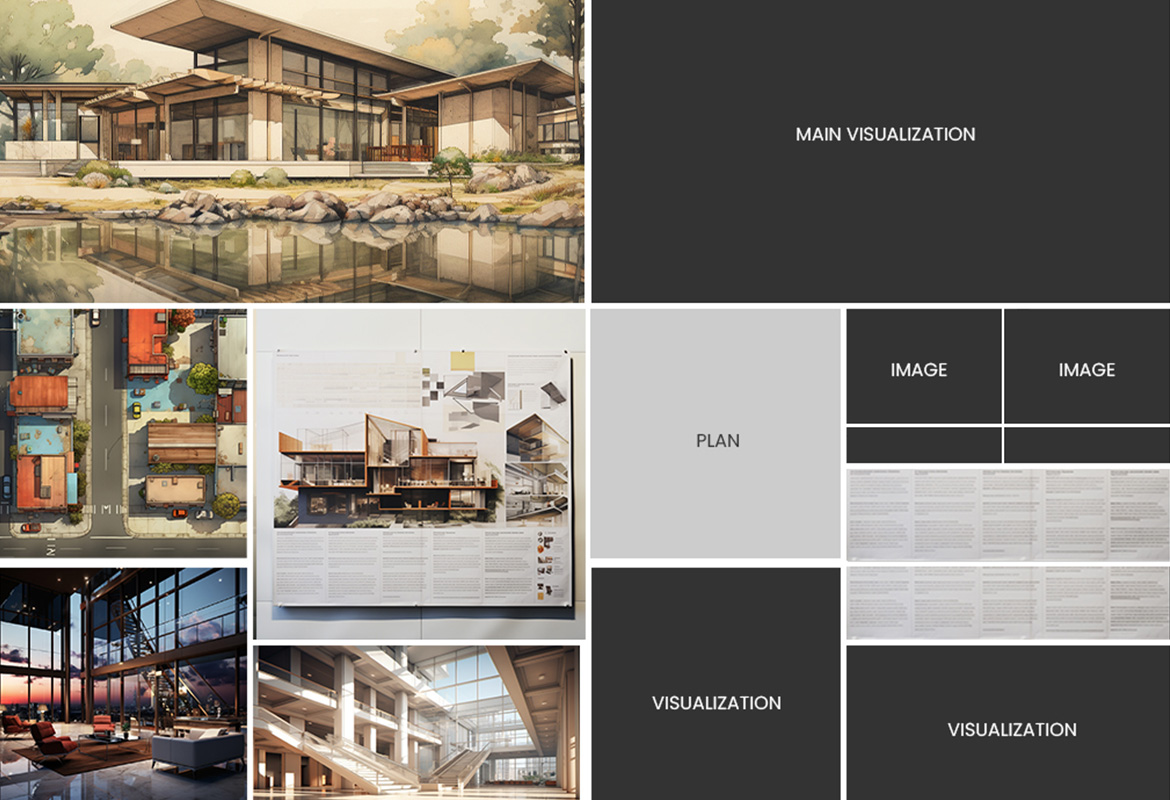
It all starts with brainstorming for the right layout. Brainstorm and jot down the main ideas you want to express. Also, work on the images and graphics that will best showcase those concepts. Now start creating small-scale sketches to capture the basic flow of each architecture presentation board. Before finalizing your design, keep experimenting with different element placements until you get the perfect one. You may explore some architectural presentation board layout examples online for some cool and best ideas.
Be very diligent regarding the space allocation. Determine how much space each element will require on the page. Ensure each graphic is impactful and consider the amount of space between elements. Avoid overcrowding or excessive space. By carefully planning the layout of your architecture presentation board, you can ensure that your ideas are communicated clearly and effectively.
Also, work on the size of images. Too small an image will fail to make that impact. Try to go for big and visually appealing images/graphics. You can even approach a 3D architectural rendering firm as 3D renders give a more photorealistic option to impress the stakeholders. Remember, the goal is to create a visually appealing and informative presentation that effectively conveys your project’s message.
3. Structure and Flow for a cohesive Architecture Presentation Board Style
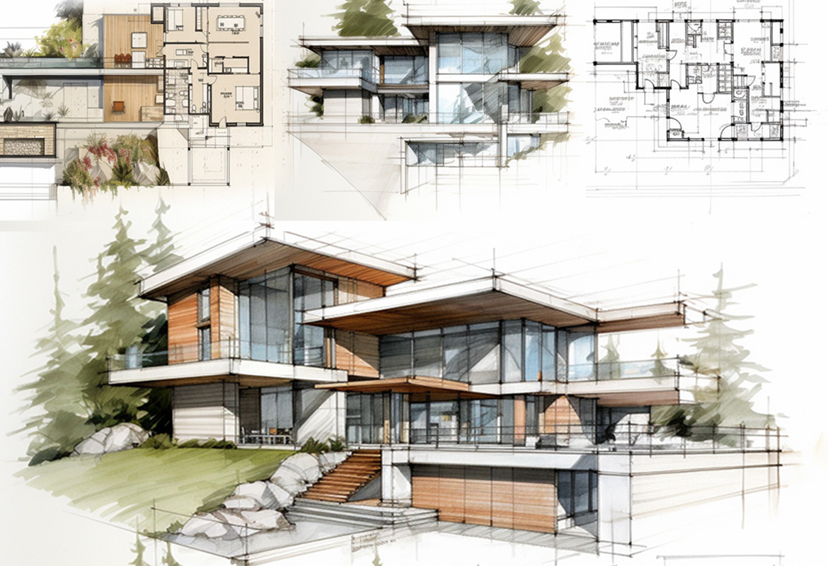
The structure and flow of your architecture presentation board are crucial for effectively communicating your project’s vision. Using a grid structure can simplify the organization of visual elements, while diagramming helps deliver comprehensive information. Consider the narrative flow of your project, ensuring a logical progression from one architecture presentation board to the next. Number your boards if they won’t be displayed simultaneously.
Remember, viewers typically read presentations from left to right and top to bottom. Use visual cues to guide their eyes through your architectural presentation models. Maintain consistency in font, colour, and style throughout your architectural presentation boards. Leave sufficient white space to avoid overcrowding. Finally, proofread your text carefully for errors. By carefully following these professional architectural presentation board techniques, you can create a visually appealing and informative presentation that effectively conveys your architectural vision to your audience.
4. Visual Hierarchy of Architecture Presentation Board: Guiding the Viewer’s Eye
In architecture presentation board, visual hierarchy plays a crucial role in directing the viewer’s attention to specific images. This involves identifying the strongest point of your project and making it the primary focus that catches the eye from a distance. Other images should reveal their details upon closer examination.
Techniques to Create Visual Hierarchy:
- Size : Make the image you want to highlight the largest, ensuring it can be viewed clearly from a distance.
- Colour : Use colour strategically to guide the viewer’s eye toward the main idea on the board.
- Placement : Centre the image you want to highlight and arrange the surrounding content to complement it.
Additional Tips:
- Keep the overall vision of your project in mind when selecting images.
- Choose images that directly display and strongly support your project’s idea.
- Avoid using too many images that will make the board look cluttered and messy.
- Maintain consistency in the style and tone of your images.
By carefully considering visual hierarchy, you can create conversion-ready architectural presentation drawings that effectively communicate your architectural vision and guide the viewer’s eye to the most important elements of your project.
5. Choosing Perfect Colours: Bringing Life and Focus to Your Architecture Presentation Board
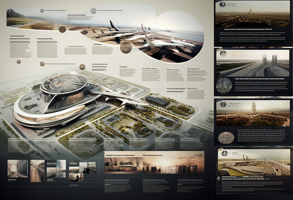
This is one of the most critical architectural presentation board techniques that you need to decide very wisely. While black, white, and grey are commonly used in architecture presentation boards, don’t shy away from incorporating colours. However, be mindful of your choices to strike the right balance and avoid overwhelming the viewer. Here’s how you can make strategic use of the colours in your presentation architecture style.
- Introduce hints of colour to bring life to your architecture presentation board.
- Use colour contrast as it helps to draw attention to elements you need to focus on.
- Represent different building materials with unique colours.
- Consider bold colours for diagrams to create a focal point.
Maintain consistency by using the same colour across all architectural presentation boards. This approach ensures a cohesive and seamless flow throughout your presentation. Also, you may explore pre-made colour palettes online for inspiration. Experiment with different colour combinations to find the best fit for your project.
6. Selecting Background Colour: Enhancing Clarity and Focus
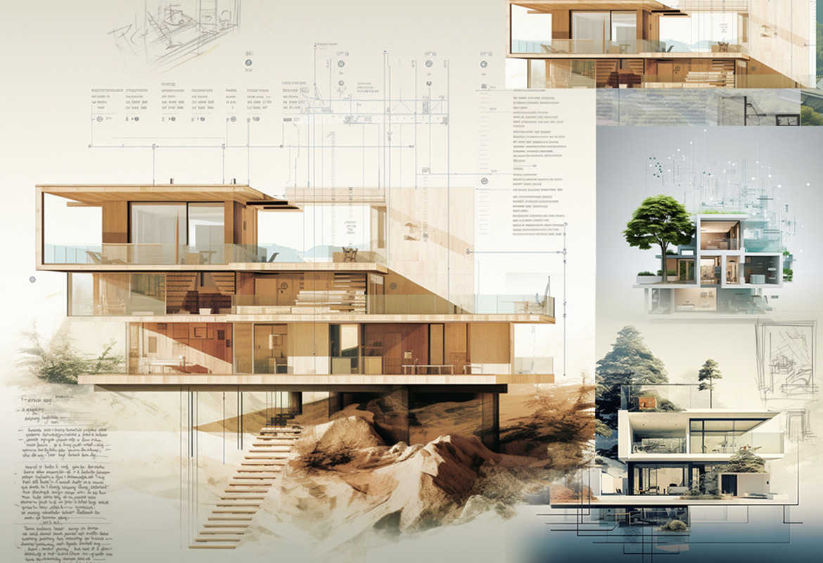
The background of your architecture presentation board should be a supporting element, not a distraction. Avoid complex or busy backgrounds that may draw attention away from your graphics and text. Bold colours and textures should be used sparingly, if at all. Here are three key things that you need to keep in mind while selecting a background colour for your architectural presentation board.
- Black Background: Use with Caution
Black backgrounds can be challenging to work with. They can diminish text readability and reduce the impact of graphics. Additionally, black backgrounds can create a cold and boring tone. If you choose to use a black background, ensure that all information remains easily comprehensible.
- White or Light Gray: A Professional Choice
White or light grey backgrounds are typically the best choice for an architecture presentation board. They enhance the visibility of graphics and text, creating a professional and clean appearance. Other colours can be incorporated to align with your central concept but ensure that the background remains plain enough to direct the viewer’s attention to the design.
- Embrace Negative Space
Negative space is your friend. Resist the temptation to fill every space with information. The strategic use of negative space enhances the impact of your design, creating a clean and professional feel.
7. Image Selection: Striking the Right Balance
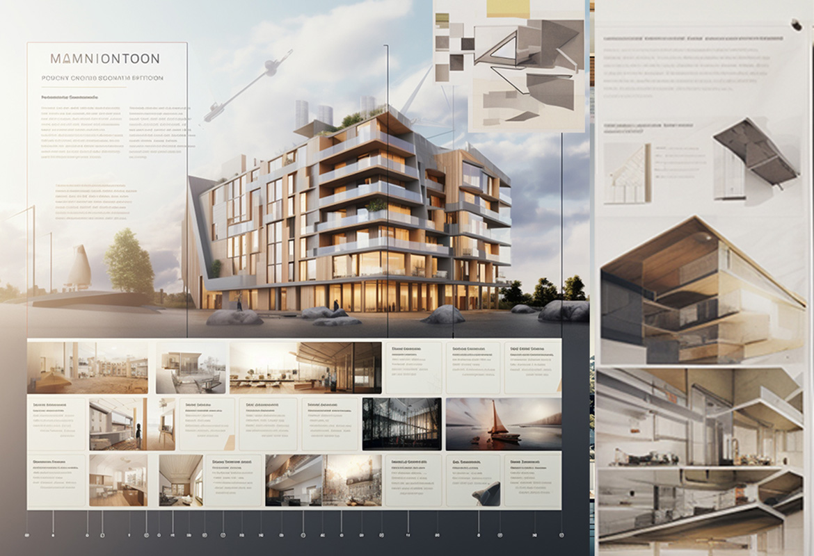
Choosing the right images is crucial for creating an effective architecture presentation board. Your graphics can either enhance or detract from your overall presentation. Always go for high-quality images/CGI and ensure that they are relevant, engaging, and catchy.
As already stated just use enough images to effectively communicate your project. Avoid overcrowding your architecture presentation board with too many images. strive for a balanced representation that showcases your project’s key aspects.
You may include a variety of images, such as sketches, models, renderings, and drawings. This approach provides a comprehensive overview of your project.
8. Content, Text, and Font: The Impression Makers
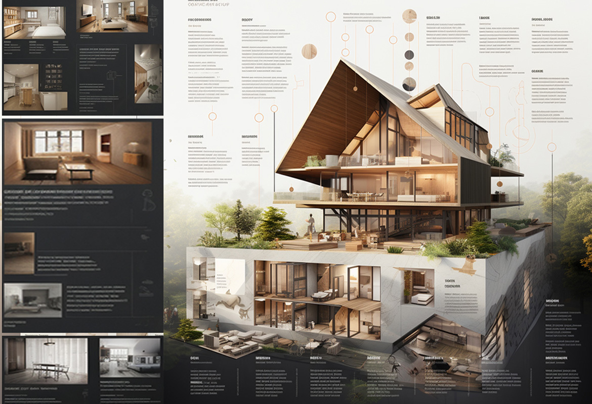
An effective architecture presentation board should convey a clear understanding of the project and demonstrate the designer’s commitment and dedication. Key elements to include are internal and external images, isometric and exploded views, perspective cuts, diagrams, volumetry studies, descriptive memorials, and technical drawings. The specific elements used may vary depending on the project’s requirements and nature.
Make sure the text that you place on the architecture presentation board should complement the layout and try to keep it minimum. A crisp, concise, and focused concept statement will make your architecture presentation board more impressive and attention-grabbing.
Additional tips that will enhance your communication power using texts on the architecture presentation board.
- Consider readability, flow, and visual appeal.
- Align text within text boxes for easy reading.
- Complement graphics/images/CGI with text box size and alignment.
- Avoid all capitals except for titles and follow standard capitalization rules.
- Use simple sketches and figures instead of text when possible.
Select a single font type that complements your project’s style. Sans Serif fonts like Futura or Helvetica are popular choices for their clean and modern look. Avoid script or handwriting fonts for a professional appearance. Use dark hues for your font to ensure contrast against a light background. Choose a font and size that is easy to read and create a hierarchy using different font sizes for titles, subtitles, and body text.
Win More Clients with Perfect Architectural Presentation Boards
Hope you liked our tips and techniques to make your architecture presentation board impressive and converting. At, Renderspoint, we offer you the best 3D CGI that will ace up your architecture presentation board styles and help you communicate in a never-like-before way. Reach out to us for eye-catching and engaging 3D visualization such as 3D rendering, modelling, floor plans and more. Feel the magic that our 3D rendering studio experts cast on your images.

Color Psychology in Architectural Design: Meaning & Importance,

Virtual Reality in Architecture: Use, Benefits, Case Study
Get started, make a request.
Open up a new world of Opportunities with Renderspoint. Connect Now!
We’re always excited to hear about new opportunities to make great work

High-Quality & Budget-friendly 3D Rendering Services
Get Impactful, detailed and authentic 3D renders to make your designs resonate with client`s expectations and needs. Partner with us for fully integrated rendering services that make you stand above your competitors!

10 Successful Presentation Sheets By Architecture Students #2
- by Elif Ayse Fidanci
- 30 November 2022
Sheet 1- Gray Stay
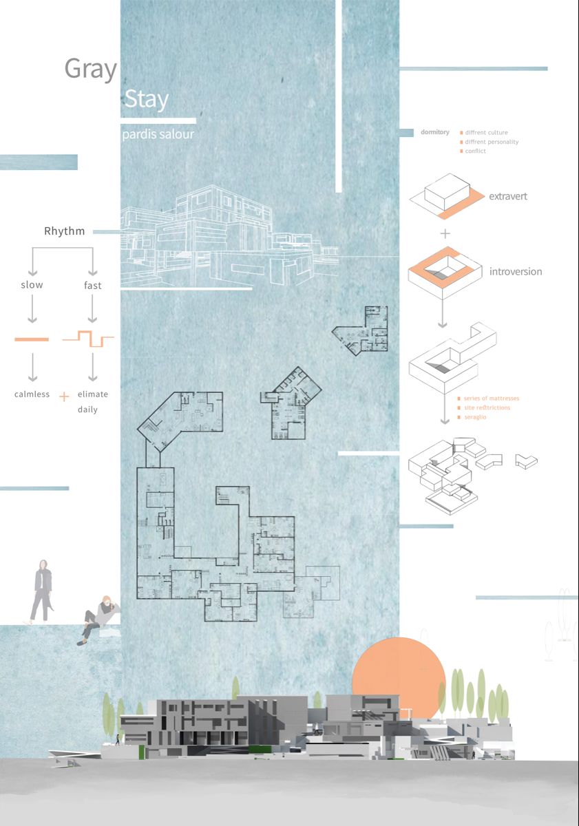
“Gray Stay” is a Project that made by a student. It is one of the most successful presentation sheets due to the perfect explanations in the content. The first features while we are looking at the sheet, color selection and balance, clear drawings and correct proportion of the layout.
Sheet 2- Plasebo

Sheet 3- Topophilia
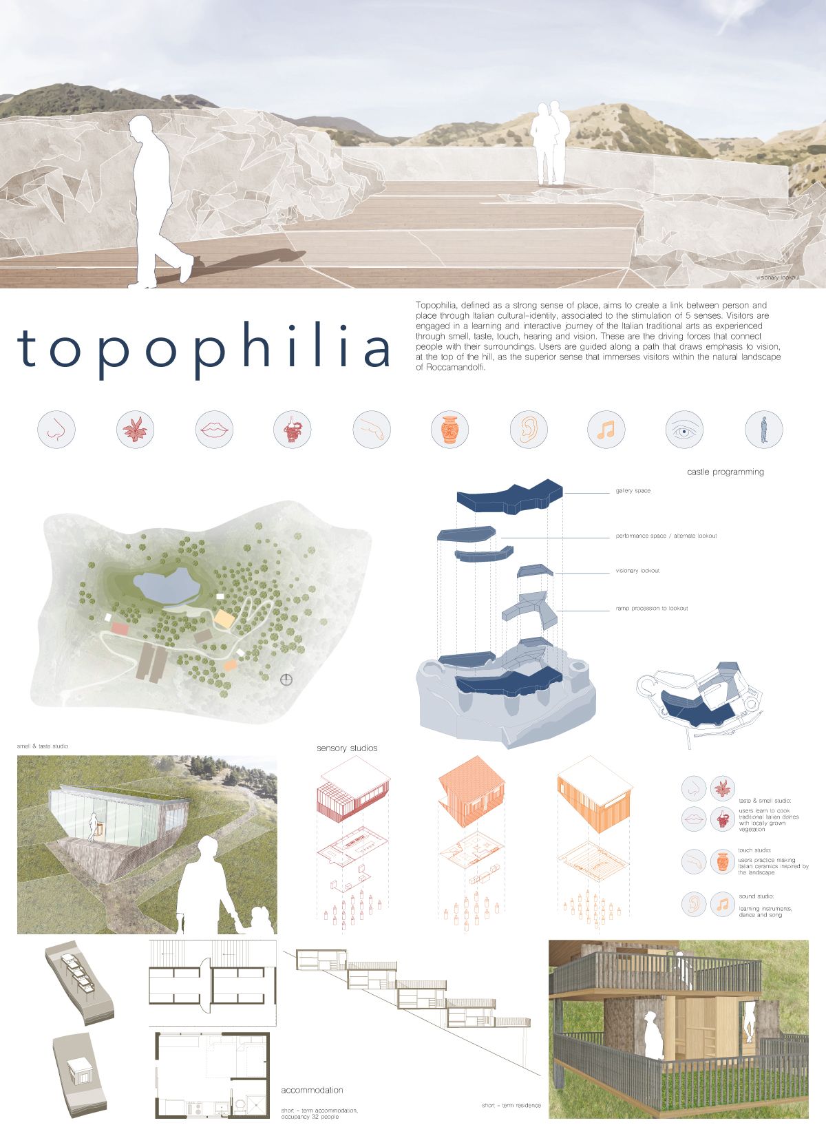
“Topophilia” is a small scale project’s presentation sheet which is done by very successful diagrams and technical drawings. The drawings are clear and understandable in the presentation sheet. Colors are soft and compatible with each other.
Sheet 4- Torchlights

The design of the presentation sheet should be done according to the characteristics of the project. The “Torchlights” projects has extreme topography conditions. Due to these features, topography lines and concept is stand out on the presentation sheet.
Sheet 5- Pano

“Pano” is the interesting project’s presentation sheet. We see the characteristics and the most important features of the projects when we look at the presentation sheet easily. The concept and details of the projects are shown with very clear drawings and diagrams on the presentation sheet. The realistic render and clear lines of technical drawings are very compatible with each other. There are not too many paragraphs for explanation. The subtitle has used as a explanation text which is very understandable and short.
Sheet 6- InSEASide
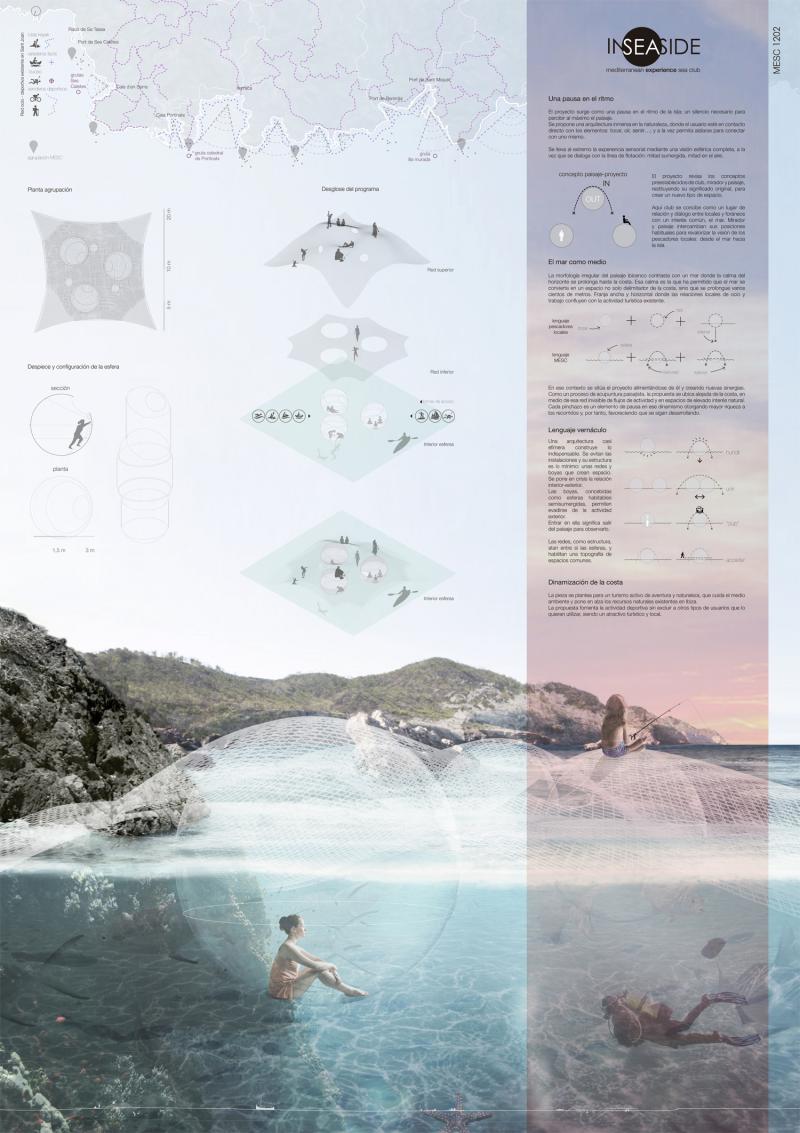
InSEASide, like in the name of the project, a project that is designed for in the middle of water. Due to the context and concept of the project, designer has used a very successful render with the aspect of color, quality and simpleness. A good render represents the atmosphere well, that’s why other drawings should be at the background. The most important thing on this presentation sheet is using diagrams and drawings in very clear way.
Sheet 7- Rachut School

It is good to be different! In this presentation sheet, we see the successful usage of black background. Using a different background color is a little bit risky. However, in this presentation sheet black color is well-organized with the atmosphere of the render and other drawings. Even we see the axonometric diagram in a clear way. It is good to use contrast which is one of the principles of basic design on top of the sheet as an elevation of the project.
Sheet 8- Beyond the diff

“Beyond the stuff” seems like enjoyable project and presentation sheet because of its color and visuals. The proportions of visuals and the balance between drawings and renders are made this presentation sheet very successful. It is important to use diagrams instead of explanation texts in a presentation sheet. We see the very good example of these rule in this presentation.
Sheet 9- A Courtyard in Laveno
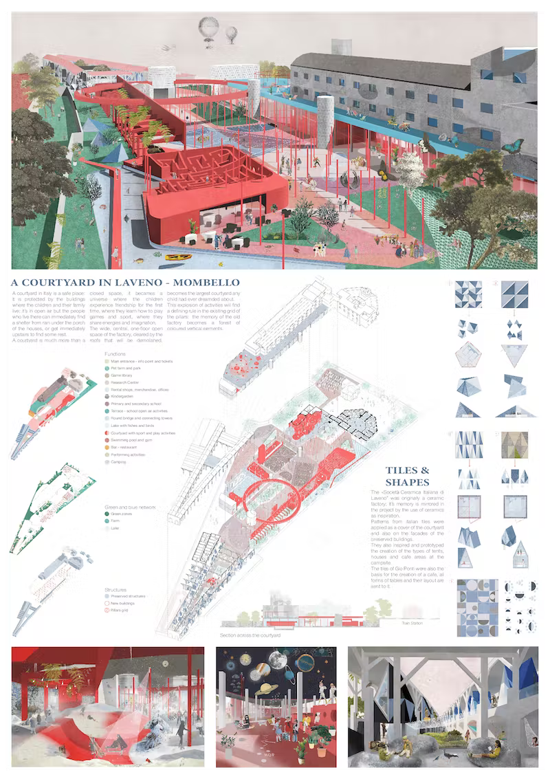
Can you say that, it is not a successful presentation? In our opinion, this kind of successful projects need this kind of simple, well-organized layout design for presentations. The designr presents the project of “A courtyard in Laveno” in very unique and good way. The layout design of the presentation sheet is correct undoubtable. The designer use urban-scaled diagrams, perspective air render, interior renders from different spaces, elevations and some important details that the project contains in a very simple design language.
In addition, even the color selections of texts, titles and diagrams are very different from each other, the presentation does not look complex.
Sheet 10- Back to the Future

In this presentation sheet, we see the well-designed building in very different perspectives and ways. Master plan approaches, exploded diagrams, urban-scaled situations and beautiful realistics renders are placed on the presentation sheet. The relation of the renders and other drawings are very compatible even the explanation texts are a little long and have small puntos.
- architectural presentation
- Architectural Presentation Boards
- architectural presentation boards guide
- architectural presentation sheets
- Architecture Student Presentation
- How to create architectural presentation
Elif Ayse Fidanci
architect, writer
Thank you Elief, you are inspiring my art. I will like to have session with you.
Tips for Creating Architectural Plans
5 different home styles, you may also like.

- 3 minute read
Qualifications To Be An Architect
- 22 September 2022
Transparency in Architecture
- 11 November 2022

Relations of Archaeology and Architecture
- 16 May 2023

The Evolution of Digging Equipment: From Shovels to Excavators
- by illustrarch Editorial Team
- 11 January 2024

- 2 minute read
What is New in Keyshot 11
- 26 February 2022

Best Websites for Downloading 3D Models
- 6 November 2021
Privacy Overview

Free Site Analysis Checklist
Every design project begins with site analysis … start it with confidence for free!
The Best 12 Architecture Fonts
- Updated: April 9, 2024

Choosing the right font for your next or current project can be a timely and stressful process, especially if you don’t already have a few go to options. Whilst there isn’t strictly a specific category for architecture fonts, there are certain type faces that work better than others.
A good or bad font can make or break a presentation and severally contribute to its level of engagement.
…So here we offer a list of our favorite architecture fonts (and the ones that we consider to be the best) that will hopefully help you to decide a little quicker and stop the endless scrolling through all the “free” font sites!
But firstly…
What is an architecture font?
The term font comes from metal typesetting and was a specific size, weight and style of a typeface. The typeface would consist of a range of these fonts that would all share the overall design (the typeface) .
Today however with digital typography now very dominant, the term font is more commonly associated with/to a typeface, where each font file is a different design.
For example the typeface “ Futura ” may include the fonts “ Futura light”, “ Futura italic”, “ Futura bold” and “ Futura extended”, but the term “font” might be applied either to one of these on their own or to the Futura font as a whole.
As well as the above variations (light, italic and bold), fonts can be categorized by their type of box (higher and lower case), by source, Sans – serif (without serif), Serif (with serif), Script (cursive) and Dingbat (ornamental), in addition to numerous other identity features of the same style.
Why are fonts important for architects?
In terms of architecture, fonts form a fundamental graphic communication device for presentations with nonverbal reading.
This is particularly relevant when a project is publicaly presented and on show, or for competitions and critiques where the work presented is assessed without its author present.
…The go to architecture font s
Hopefully you have never experienced a architectural presentation written in Comic Sans! but we can almost guarantee that you have seen (maybe even without knowing) a lot in Helvetica.
It’s an obvious one to font nerds but when you’re pressed for time and/or struggling to find the perfect scenario, Helvetica will rarely let you down.
For those that haven’t come across this font before, there is an excellent film about typography, graphic design and visual culture, that looks at the proliferation of Helvetica.
It explores the way the font affects our daily lives and invites everyone to take a second look at the thousands of words written in it that we see and experience every day.
Trailer below:
Our favorite architecture fonts
The below selection of fonts are the architecture fonts that we have had the most success with, and that we feel can be used in just about any architectural situation.
A few of them are paid fonts, and so if don’t wont to pay and cant find a free version hiding somewhere, then Google have a huge array of free fonts where you’ll be able to find something similar here
DIN 1451 font
Designed in 1931 for the German standards body DIN – Deutsches Institut für Normung (German Institute for Standardization) – this font uses all of the principles of the Bauhaus and as a result has not dated in anyway.
It has strong characteristics that make it perfect for architectural use, the first is its condensed nature, that’s means the font creates a strong mass and form when used as text in paragraphs. This results in the type becoming more of a shape on the page and presentation board .

Franklin Gothic font
Produced by the American type designer Morris Fuller Benton (1872–1948) in 1902, it reflects and speaks of confidence, boldness and expressiveness.
Franklin Gothic has more character than other sans serif fonts, and works best when accompanying a more subtle and sensitive font, forming either the title or sub-titles of text.

Gotham font
Released in 2000 by Hoefler and Frere-Jones, this clean and modern sans serif typeface was inspired by the lettering found on the architecture of New York City, and has become one of the most popular fonts for designers over the last 13 years.

Futura font
Created by Paul Renner in the 1920s, this font is a favorite for architects with its classic modern design. Similar to Din 1451 this is inspired by Bauhaus techniques, and uses straight lines and curves that provide balance when used in short paragraph grouping.
It’s best however to avoid using this for long text, as it can it certain circumstances appear over powering and visually distracting.
So adopt this font for titles, subtitles and short paragraphs on your architectural boards and drawings .

Designed by Lucas deGroot, This fonts clean aesthetics and proportions make it a great option for long texts that won’t tire the reader.
It’s widely used in books and specialized Architecture magazines , making it perfect for descriptive texts on presentation boards and for competition entries.

As described above this is a personal go to of ours and widely used due to its minimalistic and straight lined appearance by architects and firms everywhere.
Together with Colsolas this is among one of the most used texts, and is notorious among professionals. Built in the twentieth century, by Max Miedinger and Eduard Hoffmann, it is strongly associated with modern graphic design, due to its set of lines and layout its designer sought a neutral and concise design.

Developed by Mike Abbink at IBM in collaboration with Dutch type foundry Bold Monday who are in their own words “the typographical equivalent of a so called “indie” record company”.
The front aims to IBM’s brand spirit, beliefs and design principles.
It is the corporate typeface for IBM worldwide. Plex was released as an open source project in 2017 and includes Sans, Sans Condensed, Mono and Serif.

Released in 2015, Lato is a free humanist sans-serif typeface designed by font designer Łukasz Dziedzic . The name “Lato” is Polish for “summer”.
As of August 2018, Lato is thought to be used on more than 9.6 million websites, and is the third most served font on Google Fonts , with over one billion views per day.

Best fonts for architecture portfolio’s
When it comes to choosing a font for an architecture portfolio , it’s important to consider both readability and aesthetic appeal.
A font that is easy to read will help ensure that the content of your portfolio is easily understood by your audience, while a font that is aesthetically pleasing will help make your portfolio more visually appealing.
Any of above architecture fonts can be used for any type of architectural presentation , document, or drawing, and that certainly includes architectural portfolios. The best one will ultimately depend on your personal preferences and the overall design aesthetic of the portfolio itself.
And you certainly don’t need to opt for any of these slightly more bespoke and harder to come by fonts and typefaces, as there are of course many “standard” fonts that are also very good options to consider such as:
- Arial: Arial is a sans-serif font that is widely used in print and online. It’s a clean, modern font that is easy to read and looks professional.
- Calibri: Calibri is another sans-serif font that is popular for its readability and versatility. It’s a good choice for an architecture portfolio due to it working well in both print and online formats.
- Times New Roman: Times New Roman is a classic serif font that is often used in professional documents, including portfolios. It’s a good choice if you want to convey a sense of tradition and professionalism.
- Verdana: Verdana is a sans-serif font that is designed to be easy to read on screens. It’s a good choice for an online architecture portfolio because it’s legible at small sizes and looks clean and modern.

Stand out from the competition, and create an interview ready portfolio.
As touched on, don’t be scared to combine two fonts together (this is a very normal process), one for your titles and one for the main body of your text.
As much like layering your scaled drawings together to form a coherent presentation, layering architecture fonts achieves the same principle.
Here are four more fonts that architects use for both portfolios and drawings:
Bauhaus fonts
The Bauhaus font, also known as the “universal typeface,” is a geometric sans-serif typeface designed by László Moholy-Nagy in 1923.
It was created as part of the Bauhaus school’s philosophy of promoting functional, unadorned design that focused on the essential elements of form and function.
It’s characterized by its simple, geometric forms and lack of decorative elements. It features circular letterforms with smooth, straight lines and sharp angles. The letters are evenly spaced and have a uniform height, which gives the typeface a balanced, harmonious appearance.
Today, the Bauhaus typeface is considered a classic and is widely used in design projects around the world. It is considered a timeless and versatile typeface that is well-suited for a wide range of applications.

Garamond Font
Garamond is a classic, elegant font with a long history dating back to the 16th century. It is named after the French typographer Claude Garamond, who developed the font based on the handwriting of Renaissance scribes.
The font has a timeless, refined look and is often used in formal documents, such as books, reports, and resumes .
This font is characterized by its relatively small x-height (the distance between the baseline and the top of lowercase letters), which gives it a delicate, graceful appearance.
It also has a relatively large counter (the space enclosed by the letters “o” and “e”) and long, thin serifs (the decorative strokes at the ends of letterforms). These features contribute to the font’s elegant, readable look.
Garamond is generally considered a classic, timeless font that is well-suited for a wide range of architecture projects.

Montserrat fonts
Montserrat is a sans-serif font designed by Julieta Ulanovsky in 2011. It is named after the neighborhood of Montserrat in Buenos Aires, Argentina, where Ulanovsky grew up.
The font was inspired by the typography of the neighborhood’s old shop signs, and was intended to be a modern, geometric alternative to traditional sans-serif fonts.
Montserrat is known for its clean, minimalistic design, which is characterized by its relatively large x-height (the distance between the baseline and the top of lowercase letters) and low contrast between thick and thin strokes.
It has a geometric, symmetrical appearance, with circular letters and straight, simple lines.
Montserrat is widely used in a variety of medias, including websites, logos, and print materials. It is often paired with serif fonts to create a contrast between the two styles, and is well-suited for both display and body text.
Overall, Montserrat is a versatile, modern font that is widely popular among designers and architects.

Gill Sans Font
Gill Sans is a sans-serif font designed by Eric Gill in the 1920s. It is named after Gill, who was a British artist, typeface designer, and writer.
Gill Sans is known for its clean, elegant design, which is characterized by its relatively large x-height (the distance between the baseline and the top of lowercase letters) and horizontal strokes that are thicker than the vertical strokes.
This font has a humanist, geometric appearance, with rounded letters and a mix of straight and curved lines. It is often described as a “warm” font, as it has a softer, more organic feel compared to some other sans-serif fonts.
Gill Sans is often paired with serif fonts to create a contrast between the two styles, and is well-suited for both display and body text. Overall, Gill Sans is a classic, elegant font that is popular among designers for its versatility and timeless appeal.

Where can you find the best architectural fonts?
There are many places where you can find high-quality architecture fonts. Some of which include:
- Professional type foundries: Professional type foundries are companies that specialize in creating and selling high-quality fonts. Many of these foundries offer a wide range of architectural fonts that are designed to be easy to read and to clearly convey information.
- Online font marketplaces: Online font marketplaces are websites that offer a wide variety of fonts for purchase. These marketplaces often have a large selection of architecture fonts, including both free and premium options.
- Professional design software: Professional design software, such as Adobe Creative Cloud , often includes a wide selection of high-quality typefaces, including architecture fonts. These are often included as part of the software subscription, or can be purchased separately.
- Font websites: There are many websites that offer a wide variety of fonts for download, including architecture fonts. Some of these websites offer free fonts, while others charge a fee.
When looking for architectural fonts, it’s important to consider the quality and readability of the font, as well as any licensing restrictions that may apply.
Where can you find the best free architecture fonts?
If you’re looking for free architecture fonts, there are several reputable online platforms where you can discover a variety of typefaces. Here are some of the best places to begin your search:
- Google Fonts : Google Fonts is an extensive collection of free and open-source fonts. Although it isn’t tailored specifically to architecture, you can find a vast selection that could fit architectural presentations or graphics.
- DaFont : DaFont features a wide variety of fonts uploaded by their creators. You can find fonts categorized by theme, including those that might be suitable for architectural purposes.
- Font Squirrel : Font Squirrel offers a curated selection of high-quality free fonts, all of which are available for commercial use. They also provide a useful font identifier tool and font generator.
- 1001 Free Fonts : As the name suggests, this site offers a wide range of architecture fonts for free, and you might find some suitable for architectural designs or presentations.
- FontSpace : With over 32,000 free fonts shared by designers, you can filter your search by style, theme, or even popularity to find something fitting.
- Behance : Many designers and typographers share their creations on Behance. By searching for “free architecture fonts” or something similar, you may come across unique typefaces not available on other platforms.
- ArchDaily : As one of the most visited architecture websites, ArchDaily occasionally publishes articles on fonts suited for architects and designers. Although not a font repository itself, it can point you in the direction of some great resources.
A few tips when looking for and using free fonts:
- Always check the license . While many fonts are free for personal use, they may not be free for commercial use. If you’re using a font for a professional project or something that will be distributed or sold, ensure you have the right permissions.
- Download fonts from reputable sources to avoid malware or poorly designed fonts.
- Remember, the right font can greatly enhance your presentation or design, so it’s worth spending some time choosing the perfect one for your needs.
Lastly, if you have a specific style in mind, consider investing in a premium font. Paid fonts often come with more weights, styles, and glyphs, and their purchase supports typographers in their craft.
Is there a architecture font generator?
Yes, there are various font generators available online that allow you to create custom text using a specified font, which can then be used in architectural presentations, diagrams , or any other graphic work.
While these tools typically don’t allow you to design a new font from scratch, they do let you see how your text would appear in a chosen typeface. Some of these platforms might have a collection of fonts that could be suited for architectural purposes.
Here are a few options to consider:
- Font Meme : This website offers a “Fonts in Use” section where you can generate text using different fonts, including some that might be suitable for architectural projects.
- Calligraphy Font Generator : While primarily focused on calligraphy fonts, this can be a fun tool to experiment with for headers or specific architectural presentations.
- FontSpace : Apart from offering free fonts, FontSpace has a text generator where you can preview text in various fonts available on the platform.
- FontStruct : This is a more in-depth tool that allows you to actually create new fonts. While it’s more involved than a simple generator, it might be of interest if you’re looking to design a custom font for architectural purposes.
- MockoFun : An online graphic design tool where you can choose from many fonts and see how your text looks. It’s versatile and might be helpful for architectural graphics.
Remember, while generating and previewing text in different fonts can be valuable, always ensure you have the right permissions or licenses to use a font in your final project, especially if it’s for commercial purposes.
If you’re interested in creating a new font from scratch, there are software options like FontForge , Glyphs , and FontLab that allow you to design and build custom typefaces.
These are more complex tools and may have a steeper learning curve, but they provide much more flexibility and depth than simple online generators.
FAQs about architecture fonts
What is the best font for architecture in autocad.
Choosing the best font for architectural drawings in AutoCAD often depends on clarity, legibility, and professionalism. Here are a few widely recommended options that balance these aspects effectively:
- Arial : A sans-serif font that is very clear and easy to read at various sizes, making it a popular choice for technical documents.
- Helvetica : Similar to Arial, Helvetica is known for its clean and legible appearance. It’s widely used in professional settings due to its neat and uncluttered design.
- Calibri : Another sans-serif font that is designed for clarity and readability. Its slightly rounded corners can give your drawings a modern and approachable look.
- Roboto : This sans-serif typeface offers a geometric appearance that is both efficient and friendly. It’s well-suited for digital screens and prints.
- Consolas : A monospaced font favored for its clear distinction between letters and numbers, which reduces the risk of misreading. This is particularly useful for technical drawings that include lots of annotations.
Each of these fonts has its strengths, and the choice often comes down to personal preference and the specific requirements of your project. For instance, if your drawings are densely annotated, a monospaced font like Consolas can enhance readability.
For a more contemporary look, Roboto or Calibri might be preferable.
What is the best font combination for architecture?
Choosing the right font combination for architectural presentations, portfolios, and documents is crucial for conveying clarity, professionalism, and a sense of style.
A well-considered font pairing can enhance the readability of your content while also reflecting the character of your design work. Here are some effective font combinations:
- Headings : Helvetica or Arial (Sans-Serif)
- Body Text : Times New Roman or Garamond (Serif)
- Headings : Futura or Avenir (Geometric Sans-Serif)
- Body Text : Palatino or Georgia (Humanist Serif)
- Annotations/Captions : Consolas or Courier New (Monospaced)
- Body Text/Headings : Roboto or Calibri (Contemporary Sans-Serif)
- Headings/Labels : Gotham or Montserrat (Sans-Serif, All Caps)
- Highlights/Quotes : Brush Script or Zapfino (Script)
When selecting font combinations, consider the following tips:
- Contrast is Key : Ensure there is enough contrast between your chosen fonts to create visual interest and hierarchy, but not so much that it becomes jarring.
- Limit the Number : Stick to two or maybe three fonts at most to avoid cluttering your design.
- Consistency Across Projects : Consistency in font usage across different projects can help in building a recognizable brand or personal style.
- Test for Legibility : Always test your font combinations in various formats and sizes to ensure they are legible and look good both on screen and in print.
Remember, the context of your project and the message you wish to convey should guide your font choices. Experiment with different combinations to see what best complements your architectural work.
Further reading on architecture fonts…
For some further reading we recommend both “ Just My Type: A Book About Fonts ” by Simon Garfield and “ Thinking with Type: A Critical Guide for Designers, Writers, Editors, & Students” by Ellen Lupton

Every design project begins with site analysis … start it with confidence for free!.
Leave a Reply Cancel reply
You must be logged in to post a comment.
As seen on:

Providing a general introduction and overview into the subject, and life as a student and professional.
Study aid for both students and young architects, offering tutorials, tips, guides and resources.
Information and resources addressing the professional architectural environment and industry.
- Concept Design Skills
- Portfolio Creation
- Meet The Team
Where can we send the Checklist?
By entering your email address, you agree to receive emails from archisoup. We’ll respect your privacy, and you can unsubscribe anytime.

Floor Plans :5 Ways to represent (Different styles of presentation)

Unlike sculptors and painters who work directly on the final product of their creative endeavor, the architectural practice requires a distinct medium that can translate ideas from conceptualization to realization, and architectural representation itself becomes a work of architecture . The floor plans serve as a means of exploration within the body of an architect’s practice and at the same time, it is the record of work that communicates with others.
The evolution of architectural representation is analogous with the evolution of architecture itself that from the purist paintings to virtual reality ; architects devised diverse kinds of representation modes according to the complexity and objectives of their design. Hence, despite the myriad of digital tools, no representation technique could be considered obsolete and architects have to carefully choose their representation style to enhance their design translation.
Here are five creative ways of representing a floor plan in architecture:
1. Federico Babina’s Archiplan Illustration | Floor Plans
Floor plans are abstracted into simplified geometric elements with walls extruded from the base surface. Even though abstracted, the archiplans speak multitudes about the building such as the spatial volume, configuration of built mass, degree of intimacy, and exposure of spaces, quality of light and shades, etc., due to the added third dimension.
Moreover, it is emblematic of the architects’ artistic and aesthetic approach to the particular building, even in its minimal abstracted form. Representation of floor plans using this technique is most apt for depicting the projects which involve a play of volumes and geometry of spaces.

2. Artist Book
The Artist book is a medium of expression that creatively utilizes the features of the book as a physical object or induces ‘bookness’ in presenting an architectural design . Each page of the book is considered as a site on which spaces are crafted by manipulating the paper using different techniques such as laser cutting, embossing, etching, etc. The drawings are endowed with a conceptual character and a page becomes a three-dimensional space.
These pages could be related through creative formats and its cumulation offers a codex-based sequence of not pages but spaces, thus documenting time and movement as well. It can be three-dimensional to accommodate the volume of spaces, acting even as a folded model. The tactility of turning the pages makes the representation a narrative experience by inviting, disclosing, and imbibing textural qualities to the presentation . Artist books are most adaptable for architectural documentation.

3. Axonometric drawings
Axonometric drawings serve as a technique to explore, express, and investigate complex architectural concepts. It is a type of orthographic projection in which the object is rotated about one or more of its axes to reveal multiple sides and dimensions. This type of representation provides scope to appreciate the volume, facades, and context of the building along with it. Depicting architectural elements beyond the foreground suggests a revelation of the dynamics of the neighborhood, thus accentuating the response of the building to its surrounding.
The exploded axonometric representation of the floor plan has an unparalleled quality to present the spatial volume and organization of floors at multiple levels, their relationship, connectivity, and layers of the spaces within the building. These are extremely useful to depict the components of the building, materials , construction, and joinery details. Axonometric representation has both conceptual and technical quality.

4. Representing Plan as GIF Images
Graphics Interchange Format (GIF) images support animation in presentation, thus, helping to incorporate movement. This format allows for the presentation of floor plans from its evolving stage to the finished phase, therefore, extending the functionality and meaning of the plan by presenting the process of the genesis of the building. GIF format for plans could also be used to present exploded views out of floor plans. Moreover, the time sequence of the GIF enables to make the representations lucid by presenting each of the components of a space turn by turn.

5. Virtual Reality and Augmented Reality | Floor Plans
With the evolution of architecture into more complex forms and geometry, the plans have turned into a game of multiple relationships among the connected surfaces of the forms. Hence, to understand the quality and functionality of spaces, conventional orthographic projections cannot succeed to communicate the complexity inherent in those kinds of spaces. Presenting a floor plan as a virtual 3D model enables the users to physically engage with space the same way as he does with the real world. This advanced technological aid helps one to change, reform, and reorganize it, and also to rethink any design moves.
In augmented reality and hologram, virtual reality invades the material world, bringing both them closer and converting it into a hybrid space where both realities exist in the same environment. These are preludes to the future opportunities for architects and clients to device a man-to-space relationship, in which space evolves in front of them with the intended accurate forms, textures, and environment.

A student architect who is deeply interested in architectural journalism, research and education. She is a classical dancer along with a profound passion for music and literature. This ardent reader firmly believes in ones karma and strives to forge a self identity in her mastering domains.

What Indian sitcoms teache us about domestic architecture?

10 Ways to increase productivity in your office
Related posts.

Severe air pollution in Delhi or North India and how citizen are serious about it?

An Interdisciplinary Rendezvous- Art in Architecture

Uncovering the Brilliance of Healthcare Architecture: Carcavelos Health Complex

Heritage Conservation and Gentrification

The decline of crypto art

Why architecture is difficult these days
- Architectural Community
- Architectural Facts
- RTF Architectural Reviews
- Architectural styles
- City and Architecture
- Fun & Architecture
- History of Architecture
- Design Studio Portfolios
- Designing for typologies
- RTF Design Inspiration
- Architecture News
- Career Advice
- Case Studies
- Construction & Materials
- Covid and Architecture
- Interior Design
- Know Your Architects
- Landscape Architecture
- Materials & Construction
- Product Design
- RTF Fresh Perspectives
- Sustainable Architecture
- Top Architects
- Travel and Architecture
- Rethinking The Future Awards 2022
- RTF Awards 2021 | Results
- GADA 2021 | Results
- RTF Awards 2020 | Results
- ACD Awards 2020 | Results
- GADA 2019 | Results
- ACD Awards 2018 | Results
- GADA 2018 | Results
- RTF Awards 2017 | Results
- RTF Sustainability Awards 2017 | Results
- RTF Sustainability Awards 2016 | Results
- RTF Sustainability Awards 2015 | Results
- RTF Awards 2014 | Results
- RTF Architectural Visualization Competition 2020 – Results
- Architectural Photography Competition 2020 – Results
- Designer’s Days of Quarantine Contest – Results
- Urban Sketching Competition May 2020 – Results
- RTF Essay Writing Competition April 2020 – Results
- Architectural Photography Competition 2019 – Finalists
- The Ultimate Thesis Guide
- Introduction to Landscape Architecture
- Perfect Guide to Architecting Your Career
- How to Design Architecture Portfolio
- How to Design Streets
- Introduction to Urban Design
- Introduction to Product Design
- Complete Guide to Dissertation Writing
- Introduction to Skyscraper Design
- Educational
- Hospitality
- Institutional
- Office Buildings
- Public Building
- Residential
- Sports & Recreation
- Temporary Structure
- Commercial Interior Design
- Corporate Interior Design
- Healthcare Interior Design
- Hospitality Interior Design
- Residential Interior Design
- Sustainability
- Transportation
- Urban Design
- Host your Course with RTF
- Architectural Writing Training Programme | WFH
- Editorial Internship | In-office
- Graphic Design Internship
- Research Internship | WFH
- Research Internship | New Delhi
- RTF | About RTF
- Submit Your Story
Looking for Job/ Internship?
Rtf will connect you with right design studios.


- SUGGESTED TOPICS
- The Magazine
- Newsletters
- Managing Yourself
- Managing Teams
- Work-life Balance
- The Big Idea
- Data & Visuals
- Reading Lists
- Case Selections
- HBR Learning
- Topic Feeds
- Account Settings
- Email Preferences
How to Make a “Good” Presentation “Great”
- Guy Kawasaki

Remember: Less is more.
A strong presentation is so much more than information pasted onto a series of slides with fancy backgrounds. Whether you’re pitching an idea, reporting market research, or sharing something else, a great presentation can give you a competitive advantage, and be a powerful tool when aiming to persuade, educate, or inspire others. Here are some unique elements that make a presentation stand out.
- Fonts: Sans Serif fonts such as Helvetica or Arial are preferred for their clean lines, which make them easy to digest at various sizes and distances. Limit the number of font styles to two: one for headings and another for body text, to avoid visual confusion or distractions.
- Colors: Colors can evoke emotions and highlight critical points, but their overuse can lead to a cluttered and confusing presentation. A limited palette of two to three main colors, complemented by a simple background, can help you draw attention to key elements without overwhelming the audience.
- Pictures: Pictures can communicate complex ideas quickly and memorably but choosing the right images is key. Images or pictures should be big (perhaps 20-25% of the page), bold, and have a clear purpose that complements the slide’s text.
- Layout: Don’t overcrowd your slides with too much information. When in doubt, adhere to the principle of simplicity, and aim for a clean and uncluttered layout with plenty of white space around text and images. Think phrases and bullets, not sentences.
As an intern or early career professional, chances are that you’ll be tasked with making or giving a presentation in the near future. Whether you’re pitching an idea, reporting market research, or sharing something else, a great presentation can give you a competitive advantage, and be a powerful tool when aiming to persuade, educate, or inspire others.
- Guy Kawasaki is the chief evangelist at Canva and was the former chief evangelist at Apple. Guy is the author of 16 books including Think Remarkable : 9 Paths to Transform Your Life and Make a Difference.
Partner Center
- Hispanoamérica
- Work at ArchDaily
- Terms of Use
- Privacy Policy
- Cookie Policy
10 Fonts For Architects
- Written by Eduardo Souza | Translated by Guilherme Carvalho
- Published on November 27, 2019
Have you ever been stuck for hours obsessing over a font that matched your work? Before starting a project, do you already think about which font you will use? Do you get annoyed when you read an important message written in Comic Sans? Or do you feel offended when a mundane sentence is written in all caps? Rest assured, you are not alone.
Architects and designers constantly use graphic elements as expressive means in the schematization of their works. Among them, the most common are the drawings, in a constant variety of techniques, styles, and patterns. But among the elements that make up the boards, panels and drawings, techniques and models, there is a particular fragment that helps them in composition and identity: the font.

Fonts establish one of the pillars of Graphic Design and can be defined as a set of systems to the impression of types. Types are the designs assumed by a particular family of letters in their pattern. Within the family, there are variations between the letters (light, italic and bold), by the type of box (high - upper and lower - lowercase), by source classification, including Sans - serif (without serif), Serif (with serif), Script (cursive) and Dingbat (ornamental), in addition to numerous other identity features of the same.

It is worth mentioning that the importance of fonts in the graphics schemes of designers and especially of architects is fundamental in graphic communication to nonverbal reading. The correct choice of typography leads to mental logic in reading certain graphics piece, whether a drawing, text or even a scheme, an inviting act the reader through imaginary bridges between the real and the imaginary.
In architecture, font models are not restricted to the papers and graphic presentations of architects, but also in the composition of facades, projects of visual identity of buildings and, above all, in the use of vernacular typography by the people as a cultural manifestation in approach to the popular, revealing the need for varied expression in the different layers and poles.

We have selected some font models used by architects, from technical drawings to diagrams. Many of them are paid fonts, there is also the option to find good free fonts here . Check out our selection below:
Created by Paul Renner in the 1920s, this font is a classic Modern Graphic Design . Inspired by Bauhaus techniques, it uses straight lines and curves in syntony, providing balance in the textual set. However, despite the visual cleaning, this font should not be used in long texts, due to the visual exhaustion provoked. Indicated to punctual texts in the architectural boards, such as titles and subtitles. It is highly used for visual identity in corporate buildings.
By this font here .
Developed by the graphic designer Herbert Bayer, in 1925, its conception is perceived with, timelessness, transcending time. Its creator studied at Bauhaus between 1921 and 1923 under the direction of Kandinsky and Moholy-Nagy . Used until the present day, it is mostly attributed to titles and subtitles in the composition of boards.
This font is usually installed with Windows and can be purchased here.
In honor of the important modernist architect Richard Neutra, graphic designer Christian Schwartz took care of designing the alphabet according to the architect's layout. Julius Schulman and Dion Neutra also participated in the process. It is highly used in the works of Architecture and Design as a competitor for Futura.
Buy the font here.
Created in 1767, by Giambattista Bodoni, this font is characterized by its high aesthetic strength and should be used with caution. Due to the set of lines and striking presence of its letters, it is not indicated for long texts, but for highlights, such as titles and details.
Inspired by the typical letters used in signage and architectural visual identity, it was conceived in the 2000s by designer Tobias Frere-Jones. Widely used for publicity, due to the idea of credibility transmitted by its lines, in architecture, this font should be used in business cards and logos.
Download this font here.
Between Bodoni and Dala Floda, Butler consists of a modern typography along curvilinear lines. Due to its strong personality, it is indicated for titles and logos.
Widely used for long texts, this font is ideal for competitions and university boards, or even text boxes in graphic details, because of its clean aesthetics and proportion of lines allows long readings without tiring the reader. The typography, designed by Lucas deGroot, is also widely used in books and specialized Architecture magazines.
On Windows, this font along with other five (Cambria, Constantia, Corbel, Candara, and Calibri) are among the most used typologies, with no need for external acquisition.
The majority of architects, even without advanced knowledge of graphic design, intuitively select sans serif typefaces, due to its minimalism and straight lines. Among the most used texts, as well as the previous case, Helvetica is notorious among professionals. Built in the twentieth century, by Max Miedinger and Eduard Hoffmann , it is strongly associated with modern graphic design, due to its set of lines and layout its designer sought a neutral and concise design.
Buy this font here.
For those who like versatile and yet subtle fonts to compose their boards, this typography is ideal for that. In a system of hybrid lines, between rationalism of straight lines and the break of staticity of the curved line, this font created by Gatis vilaks, privileges a harmonious set. It is suggested for titles, subtitles and textual details in the graphic composition of boards and drawings.
Designed by Barbara Lind, this font is part of Adobe, its use presents personality and strength in its composition, ideal for a wide range of applications, such as boards, diagrams, and schemes. This font would be well used in titles, subtitles, and details.
This font belongs to Adobe. It can be purchased here.
Originally published on October 16th, 2017; updated on November 21st, 2019.

- Sustainability
想阅读文章的中文版本吗?

10种英文字体,无论做方案还是作品集都用得上
You've started following your first account, did you know.
You'll now receive updates based on what you follow! Personalize your stream and start following your favorite authors, offices and users.

COMMENTS
General Tips. 7) Minimize text on your presentation board. Write a short and concise concept statement and add a very brief explanation, if needed. Don't waste your time composing elongated descriptive text because no one will read it. 8) Replace words, whenever possible, with simple illustrative sketches and figures.
Architecture presentation boards are a tool to showcase your work. They are a way to draw your viewers into your design process and methods, providing an overall summary and vision for the project. You are communicating your design and showcasing your artistic skills, and your sense as a designer. Every successful project has a central concept ...
If you are a student, you may want to be aware of some useful tips for architecture presentation, along with some things you should include. 1. Get a Grasp of Your Audience. 2. Plan and Structure Your Presentation. 3. Structure the Visuals as You Would Telling a Story.
The way to create an architectural presentation is to follow your story and practice in advance the delivery time. 01_Baroque topologies by andrew saunders_baroque topologies. 02_Babel Swing_ illustrarch. Sectional elevation showcasing textures _©www.behance.net. architectural presentations architectural visuals careers advice time management.
Representing Architecture. Your architecture presentation board must use graphics and text to represent your design idea and clearly communicate the details and essential aspects of the scheme. It is important to be efficient with the production of drawings, and only use what is necessary to convey your idea. Quality is better than quantity as ...
Finally, be confident and engaging during your presentation. Speak clearly and loudly, maintain eye contact with your audience, and use body language to emphasize your points. Engage your audience by asking questions, encouraging discussion, and providing examples. In conclusion, creating an effective architectural presentation requires careful ...
Put your architecture presentation ideas and styles front and center by uploading graphic illustrations of your floor plans, 3D drawings, and architectural renders. Aside from your own photos, you can also drag and drop stock images to your template. Take your design to the next level by animating your pages or texts with panning, fading, and ...
10 Architecture Presentation Board Ideas . While the architecture presentation board may not be the only aspect of the project itself, it certainly has an impact on the audience. ... Consider using Sans Serif fonts such as Futura or Helvetica, as their sleek and minimalistic style complements modern high-tech designs. When choosing a font for ...
Dedicated template for all architects in the room! Slidesgo brings you this professional style design for you to make a presentation about Architecture university studies. This template fits perfectly with the theme, as it is full of isometric illustrations of buildings. Super cool!
Our profession is all about presentations. It all started at university in the architecture studio, a whole semester had to be condensed into a 10-minute precise presentation in order to get the ...
A fine example of architectural presentation is the pen and ink style. It can also be called the manual style, whereas one isn't restricted to only pen and ink, but is also open to water-colors, pencil sketches or any other manual technique. This style has somewhere gotten lost with all the softwares available these days to an extent that ...
"Drawing architecture is a schizoid act: It involves reducing the world to a piece of paper"- Eduardo Souto De Moura. Digital presentation of architectural projects is one of the most commonly used tools to communicate our designs to the viewers. They give the viewers an insight into our process of ideation to developing the project. They are often the primary indicators of an architect ...
Use a consistent layout and formatting throughout your sheets, including fonts, colors, and styles. This will help create a cohesive and professional-looking presentation. Credit: Urban Design Presentation Ideas (urbandesignlab.in) Focus on the key elements. When creating your presentation sheets, focus on the key elements of your design.
These architecture presentation templates are suitable for architects, urban planners, and construction professionals. They can be used for presentations at conferences, design meetings, or educational settings to showcase architectural designs, project proposals, and construction plans.
Every step of the process of architecture involves elite-level communication, and as a student, this is one of the most valuable skills you will develop in school. Building a plan of attack, or an outline, before your presentation day will help you tremendously in conveying your ideas. This is just a simple guide of what you are going to cover ...
5. Layout Presentation. Layout presentation also known as Storyboard presentation is all about the visual narration of the design development journey. There should be an equal balance of two dimensional and three-dimensional representation of the project which not only attracts the viewer but also makes the presentation self-explanatory.
Win More Clients with Perfect Architectural Presentation Boards. Hope you liked our tips and techniques to make your architecture presentation board impressive and converting. At, Renderspoint, we offer you the best 3D CGI that will ace up your architecture presentation board styles and help you communicate in a never-like-before way.
Sheet 1- Gray Stay. "Gray Stay" is a Project that made by a student. It is one of the most successful presentation sheets due to the perfect explanations in the content. The first features while we are looking at the sheet, color selection and balance, clear drawings and correct proportion of the layout. Sheet 2- Plasebo.
Cite: Baratto, Romullo. "Trends in Architectural Representation: Understanding The Techniques" 09 May 2017. ArchDaily. (Trans. Valletta, Matthew) Accessed 12 Apr 2024. <https://www.archdaily.com ...
1001 Free Fonts: As the name suggests, this site offers a wide range of architecture fonts for free, and you might find some suitable for architectural designs or presentations. FontSpace : With over 32,000 free fonts shared by designers, you can filter your search by style, theme, or even popularity to find something fitting.
Cenotaph for Newton by Boullée. Image via ChrisO- From w-en-Newton_memorial_boulle [wikipedia] bajo licencia [CC BY-SA 3.0] In this sense, and many others, all images share this component of ...
Here are five creative ways of representing a floor plan in architecture: 1. Federico Babina's Archiplan Illustration | Floor Plans. Floor plans are abstracted into simplified geometric elements with walls extruded from the base surface. Even though abstracted, the archiplans speak multitudes about the building such as the spatial volume ...
When in doubt, adhere to the principle of simplicity, and aim for a clean and uncluttered layout with plenty of white space around text and images. Think phrases and bullets, not sentences. As an ...
Be the first to add your personal experience. Architectural presentations have evolved significantly with the advent of virtual reality (VR), a technology that creates a simulated environment. VR ...
Gotham. Inspired by the typical letters used in signage and architectural visual identity, it was conceived in the 2000s by designer Tobias Frere-Jones. Widely used for publicity, due to the idea ...