20+ CSS Speech Bubbles
Welcome to our collection of CSS speech bubbles ! Here, we have curated a comprehensive selection of hand-picked free HTML and CSS speech bubble code examples, sourced from reputable platforms such as CodePen, GitHub , and other valuable resources.
With our April 2023 update , we are thrilled to present six new additions to our collection, ensuring that you have access to the latest and most innovative speech bubble designs available. Speech bubbles are versatile elements that can add a touch of interactivity, engagement, and personality to your website or application. They are commonly used to display conversations, tooltips, comments, or any other form of textual communication .
Each speech bubble example in our collection showcases the power of CSS to create visually appealing and dynamic designs. From simple and minimalistic speech bubbles to more elaborate and animated ones, our collection offers a wide range of options to suit different design preferences and project requirements.
Whether you are a web designer or developer, our collection offers a wealth of resources to elevate the speech bubble system of your website or application. Start exploring our collection now and discover the creative ways to incorporate CSS speech bubbles into your design, adding that extra touch of interactivity and visual appeal.

Related Articles
- CSS Blockquotes

- Temani Afif
- August 18, 2022
- demo and code
About a code
Css only speech bubble.
Compatible browsers: Chrome, Edge, Firefox, Opera, Safari
Responsive: yes
Dependencies: -

- March 6, 2022
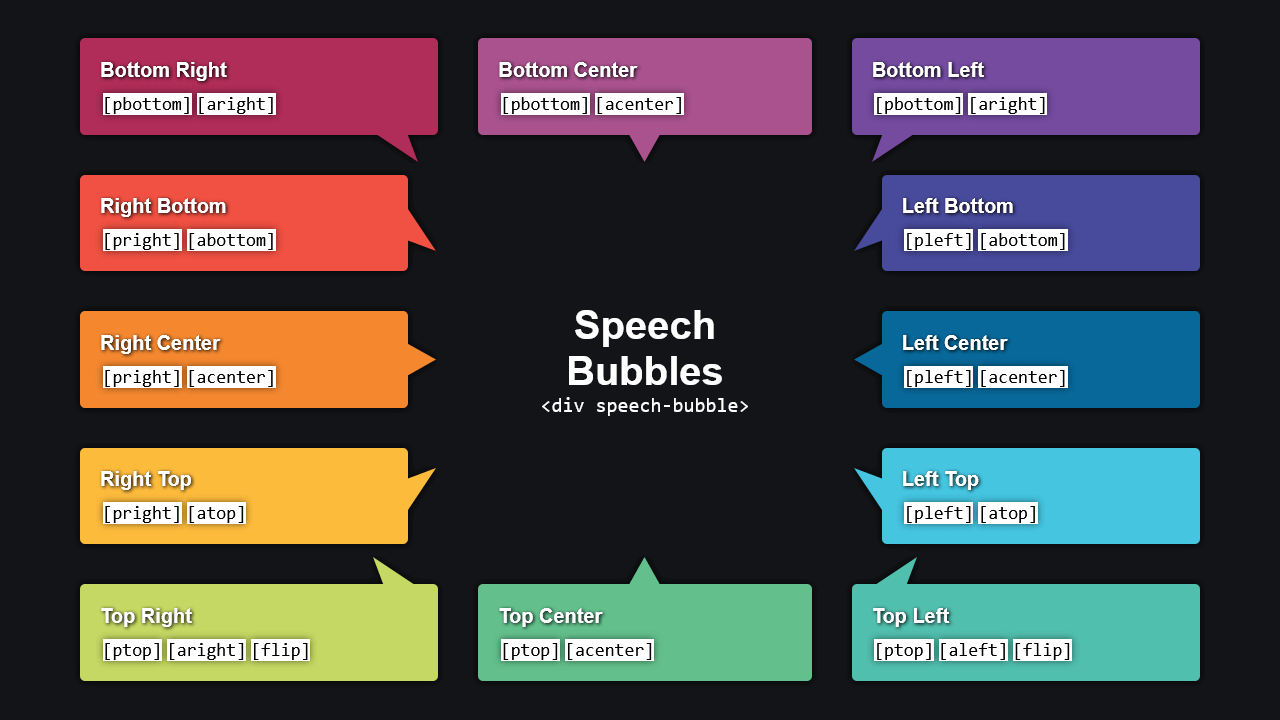
Pure CSS Responsive Speech Bubble
- December 3, 2021
Speech Bubbles

- September 16, 2021
- HTML (Haml) / CSS (SCSS)

- Alvaro Montoro
- August 30, 2020
Hello... I guess...

- Remix Protocol
- June 15, 2020
Black Lives Matter Dialog Boxes
A minimalist illustration of two dialog boxes in pure CSS.
Responsive: no
- kirsten allen
- March 23, 2020
- HTML / CSS / JS
Hello, World
- July 11, 2019
- HTML / CSS (SCSS)
8-bit Pixel Speech Bubble Text Balloon
Responsive: partial

- May 16, 2019
Apple iMessage in CSS
Recreating an iMessage chat with CSS.

- April 28, 2019
Chat Bubbles

- Rik Schennink
- July 11, 2018
About the code
Speech bubble.
HTML and CSS simple responsive speech bubble.

- June 2, 2018
Pure CSS Thought Bubbles

- September 23, 2017
Responsive Speech Bubble
Box section can change dimensions independently of pointer. Pointer can be moved to different positions around box. Rounded corners. Glow or shadow around the whole thing that changes along with component shapes.

- August 12, 2016
Speech Bubble Caret
Making a triangle for a speech bubble and using transforms to help create the position.

- Kevin Østerkilde
- March 19, 2016
Alternating Speech Bubbles
- Dudley Storey
- February 20, 2016
Comic Book Speech Bubbles with SVG
A pattern for creating comic book speech bubbles using SVG.

- Joe Hastings
- December 17, 2015
- HTML / CSS (Less)
Pure CSS Speech and Thought Bubbles
Pure CSS thought and speech bubbles that grow to fit the text.

- December 28, 2013
CSS Speech Bubble
Simple speech bubble with CSS.

- Adam Argyle
- March 21, 2013
Comic Director Splash Animation
Comic Director is a Windows 8 app written in HTML and CSS. The first time run experience has a nifty little animation, here's how we did it.

- February 14, 2013
A complex CSS shape speaking bubble.

- Oliver Turner
- January 18, 2013
Single-element 3D Speech Bubble
Uses :before and :after pseudo elements with negative margin to generate effect.
35 CSS Speech Bubbles
Here is a list of some beautiful CSS speech bubbles examples.
Pure CSS Chat Bubble Animations [WIP]
Dev: Alissa
A depressed CSS chat bubble
Dev: Jennifer Hedgcock
Pure CSS Chat Bubble shape
Dev: CodingDecoding
CSS Chat Bubble
Dev: Jamie Le Souef
Hello… I guess…
Dev: Alvaro Montoro
CSS Message Bubble
Dev: Daniel Kovacs
iMessage gradient effect
Dev: Lucas Bebber
Message Bubbles
Dev: Michael Rouse
Chat Bubbles
Dev: Alex Wright
Apple iMessage in CSS
Dev: Matt Smith
Pure CSS Thought Bubbles
Dev: florent
Chat Bubbles in CSS
Dev: Jason Founts
Direct Messaging
Dev: Momcilo Popov
iOS 13 Chat bubbles
Dev: Samuel Kraft
Pure CSS Speech Bubbles
Dev: Michael Chernin
Dev: Dave Alger
Comic Book Speech Bubbles with SVG
Dev: Dudley Storey
Hello, World
Dev: kirsten allen
CSS speech bubbles
Dev: JP de la Torre
Comic Sans Criminal
Dev: Jesse Shawl
Flex chat bubbles | Responsive chat bubbles
Dev: Kristina
Chat Window Concept Bubbles
Dev: Ashwin Saxena
Speech bubbles
Dev: rajeshdn
Dev: Tanner
CSS stacked chat bubbles (Messenger style)
Dev: J.M. CIery
Speech Bubbles
Dev: Daniel Mackay
Pure CSS speech and thought bubbles
Dev: Joe Hastings
Alternating speech bubbles
Dev: Kevin Østerkilde
Speech bubble
Dev: Ana Tudor
Comic Director Splash Animation
Dev: Adam Argyle
CSS Speech Bubble
Dev: Ga Satrya ??
Speech Bubble Caret
Dev: GRAY GHOST

25 Incredible CSS Speech Bubbles - Open Source
These are the best html and css speech bubble code examples we could find. they are perfect for adding a little spunk to your website / app., 1. pure css thought bubbles, 2. chat bubbles, 3. speech bubble, 4. speech bubble caret.
Making a triangle for a speech bubble and using transforms to help create the position. Fork this pen and share your solution in the comments. Note the angles of the triangle as you create your solution.
5. Comic Director Splash Animation
Comic Director is a Windows 8 app written in HTML and CSS. The first time run experience has a nifty little animation, here's how we did it.
6. Alternating Speech Bubbles
7. comic book speech bubbles with svg.
A pattern for creating comic book speech bubbles using SVG. Uses Nate Piekos' Sequentialist BB font. Full explanatory article on my site.
8. Pure CSS Speech And Thought Bubbles
Pure CSS thought and speech bubbles that grow to fit the text Adapted from http://codepen.io/shaman_tito/pen/GIdoy
9. Responsive Speech Bubble
quick demo to answer a question posed by an acquaintance: "How to make a speech bubble to fit into a responsive design?" Criteria: - box section can change dimensions independently of pointer - pointer can be moved to different positions around box - rounded corners - glow or shadow arou... Read More
10. CSS Speech Bubble
11. speech bubble, 12. pure css speech bubbles.
Examples of CSS speech bubbles. Originally made by Nicolas Gallagher.
13. Speech Bubble
14. speech bubbles, 15. comic speech bubbles.
simple speech & think bubbles. (IE9 support) Now with yell-bubbles
16. Pure CSS WhatsApp Desktop Speech Bubble
WhatsApp Desktop Speech Bubble made from pure CSS...
17. CSS Speech Bubble With Animation Inside
18. css / sass speech bubbles, 19. simple css speech bubble.
CSS speech bubble w/ a text area, forked from example here http://css-tricks.com/examples/ShapesOfCSS/
20. Responsive Testimonial Quote Bubble (CSS)
21. chat bubbles in css.
Chat bubbles built in CSS with classes to customize the look and location of talk arrow. *Only tested in Chrome Built off the work of these fine fellows: Nicolas Gallagher https://twitter.com/necolas Craig Buckler https://twitter.com/craigbuckler and Chris Coyier https://twitter.com/chris... Read More
- Privacy Policy
30+ CSS Speech Bubbles

If you’re looking for a diverse collection of CSS speech bubbles, look nowhere else!
In this post, we present a comprehensive collection of free HTML and CSS code examples of speech bubbles sourced from reputable repositories like GitHub and CodePen. These websites have meticulously crafted speech bubble shapes, catering to diverse website themes and design needs.
Our little endeavor makes sure you always have access to the most versatile and latest speech bubble designs.
Speech bubbles are conversation-like boxes commonly used in user interfaces to display text, comments, or messages in a visually appealing manner. Each speech bubble is carefully selected, offers a touch of freshness, and creates a unique visual appeal for your websites and web applications.
This comprehensive collection not only provides interactive design inspiration but also plays a crucial role in boosting user engagement on your projects.
Let’s explore the compilation of interactive CSS speech bubble code examples and get inspired to create dynamic layouts using unique and innovative speech bubble shapes.
1. CSS Speech Bubble With Animation Inside
See the Pen CSS speech bubble with animation inside by Susanna ( @sushimi ) on CodePen .
2. Speech Bubble
See the Pen Speech bubble by Rik Schennink ( @rikschennink ) on CodePen .
3. Pure CSS Responsive Speech Bubble
See the Pen Pure CSS Responsive Speech Bubble by Code Boxx ( @code-boxx ) on CodePen .
4. Comic Book Speech Bubbles With SVG
See the Pen Comic Book Speech Bubbles with SVG by Dudley Storey ( @dudleystorey ) on CodePen .
5. Speech Bubbles
See the Pen Speech Bubbles by Mark Boots ( @MarkBoots ) on CodePen .
6. Pure CSS Thought Bubbles
See the Pen Pure CSS Thought Bubbles by Grant ( @quadbaup ) on CodePen .
7. CSS / SASS Speech Bubbles
See the Pen CSS / SASS Speech Bubbles by nolastan ( @nolastan ) on CodePen .
8. Alternating Speech Bubbles
See the Pen Alternating speech bubbles by Kevin Østerkilde ( @Kosai106 ) on CodePen .
9. Pure CSS Speech Bubbles
See the Pen Pure CSS Speech Bubbles by Michael Chernin ( @mchernin34 ) on CodePen .
10. Speech Bubble Caret
See the Pen Speech Bubble Caret by GRAY GHOST ( @grayghostvisuals ) on CodePen .
11. Speech Bubbles
See the Pen Speech Bubbles by Daniel Mackay ( @danielmackay ) on CodePen .
12. Pure CSS Speech And Thought Bubbles
See the Pen Pure CSS speech and thought bubbles by Joe Hastings ( @JoeHastings ) on CodePen .
13. Comic Director Splash Animation
See the Pen Comic Director Splash Animation by Adam Argyle ( @argyleink ) on CodePen .
14. Speech Bubble
See the Pen Speech bubble by Ana Tudor ( @thebabydino ) on CodePen .
15. Chat Bubbles
See the Pen chat bubbles by Dave Alger ( @run-time ) on CodePen .
16. Comic Speech Bubbles
See the Pen comic speech bubbles by quatmo ( @quatmo ) on CodePen .
17. Responsive Speech Bubble
See the Pen responsive speech bubble by peros ( @perossing ) on CodePen .
18. Speech Bubble
See the Pen Speech Bubbles by NANOUU ( @antoniasymeonidou ) on CodePen .
19. Speech Bubble
20. pure css whatsapp desktop speech bubble.
See the Pen Pure CSS WhatsApp Desktop Speech Bubble by Benni ( @8eni ) on CodePen .
21. CSS Speech Bubble
See the Pen CSS Speech Bubble by Ga Satrya 🇮🇩 ( @satrya ) on CodePen .
22. Hello… I guess…
See the Pen Hello… I guess… by Alvaro Montoro ( @alvaromontoro ) on CodePen .
23. Simple CSS Speech Bubble
See the Pen CSS speech bubble by James Barnett ( @jamesbarnett ) on CodePen .
24. CSS only Speech Bubble
See the Pen CSS only Speech Bubble by Temani Afif ( @t_afif ) on CodePen .
25. Responsive Testimonial Quote Bubble (CSS)
See the Pen Responsive Testimonial Quote Bubble (CSS) by JC ( @jeremycaris ) on CodePen .
26. Black Lives Matter Dialog Boxes
See the Pen Black Lives Matter Dialog Boxes by Rio Jos ( @riojosdev ) on CodePen .
27. Chat Bubbles In CSS
See the Pen Chat Bubbles in CSS by Jason Founts ( @Founts ) on CodePen .
28. 8-bit pixel speech bubble text balloon
See the Pen 8-bit pixel speech bubble text balloon by Jos Faber ( @josfabre ) on CodePen .
29. Hello, World
See the Pen Hello, World by kirsten allen ( @kirstenallen ) on CodePen .
30. Single-element 3d speech bubble
See the Pen Single-element 3d speech bubble by Oliver Turner ( @oliverturner ) on CodePen .
31. Apple iMessage in CSS
See the Pen Apple iMessage in CSS by Matt Smith ( @AllThingsSmitty ) on CodePen .
Checkout Popular CSS Collection

Hi, I'm Digamber Singh, a New Delhi-based full-stack developer, and tech author with 10+ years' experience in HTML, CSS, JavaScript, PHP, and WordPress.
- CSS Animations
- CodeIgniter
- Angular Material
- React Native
CSS speech bubbles made easy!
Pointer triangle, pointer size, background color.

Press ESC to close
Or check our popular categories....
43 CSS Speech Bubble Design Examples
Imagine landing on a webpage and being greeted by a plain chunk of text—boring, right? Now, picture a stylish CSS speech bubble that seems to pop off the screen, guiding you through a conversation or highlighting key information. That’s web design with personality!
In the digital landscape, interactive elements like speech bubbles can transform a user interface from mundane to memorable.
Crafting these CSS tooltips or chat boxes not only enriches the user experience but showcases a savvy blend of aesthetics and function in web design.
By the end of this read, you’ll be equipped with the know-how to implement your very own CSS speech bubble —those snazzy, eye-catching pieces of UI that make users take notice.
Diving into everything from pure CSS talk bubbles to responsive designs adaptable to various devices, you’ll become the maestro of dynamic, on-screen conversations.
Expect to explore HTML speech bubble integration, CSS3 animations , and even scalable shapes that make responsiveness a breeze. Strap in; your UI is about to get a whole lot livelier.
CSS Speech Bubble Examples To Check Out
Pure css speech bubble by chonnychu.
See the Pen pure css speech bubble by ChonnyChu ( @chonny ) on CodePen .
Alternating Speech Bubbles by Kevin Østerkilde
See the Pen Alternating speech bubbles by Kevin Østerkilde ( @Kosai106 ) on CodePen .
This ain’t your typical speech bubble. Kevin spun it around, giving it a dash of mystery. Seriously, you gotta check it out.
Speech Bubble by skoupidia12000
See the Pen speech bubble by Panos ( @skoupidia12000 ) on CodePen .
Mad props to skoupidia12000. They whipped up this snazzy script and turned it into a bubble of brilliance.
Clean CSS Speech Bubble by projectxmatt
See the Pen Clean CSS Speech Bubble. by projectxmatt ( @projectxmatt ) on CodePen .
Yo, shout out to projectxmatt. He served up this sleek CSS speech bubble, whipped up using just HTML and CSS.
Speech Bubble Caret by grayghostvisuals
See the Pen Speech Bubble Caret by GRAY GHOST ( @grayghostvisuals ) on CodePen .
Got an online store? Need a sleek way for peeps to drop comments? This pen’s got you. That dark blue? Pops against the light blue speech bubble.
Pure CSS Speech Bubble with a Shadow by Ron
See the Pen Pure CSS Speech Bubble with a Shadow by Ron ( @keith0305 ) on CodePen .
Ron’s on the scene with this one. It’s pure, it’s CSS, and it’s rocking a subtle shadow. All done with HTML and CSS.
Speech Bubble Testimonial by Symbolic
See the Pen Speech bubble testimonial by Symbolic ( @symbolicx ) on CodePen .
Online sellers, where you at? Symbolic’s got this bubble that’s just perfect for showcasing customer love.
Animated Speech Bubble (Bouncy) by KhaledAhmedYounes
See the Pen Animated Speech Bubble (Bouncy) by Khaled Ahmed Younes ( @KhaledAhmedYounes ) on CodePen .
KhaledAhmedYounes has this bubble bouncing around using some jQuery and CSS magic. It’s alive!
Speech Bubble Outline by Florian Geierstanger
See the Pen CSS Speech Bubble Outline (svg data uri) by Florian Geierstanger ( @fgeierst ) on CodePen .
Florian’s got the game on lock with this outlined gem. Sleek, stylish and popping with just HTML and CSS.
Animated Speech Bubble Nav
See the Pen Animated Speech Bubble Nav by schadeck ( @schadeck ) on CodePen .
Online merchants, want something quirky? This speech bubble animation is all the rage right now.
Speech Bubble Wow by bchiang7
See the Pen Speech Bubble wow by Brittany Chiang ( @bchiang7 ) on CodePen .
bchiang7 jumped in and said “Wow!” with this jaw-dropping script.
Circular Speech Bubbles
See the Pen circular speech bubbles by rajeshdn ( @RajRajeshDn ) on CodePen .
RajRajeshDn’s circular masterpieces? A game changer. Boost sales, delight customers.
Speech Bubbles 3 by cool_lazyboy
See the Pen speech bubbles 3 by rajeshdn ( @RajRajeshDn ) on CodePen .
cool_lazyboy’s in the house! This script? Pure gold.
Speech Bubble Slider by Marc
See the Pen Speech Bubble Slider by Marc ( @mburgess0899 ) on CodePen .
Slide into Marc’s world with this slider speech bubble. A work of art for online shops.
Shakespearean Insult Generator by Kris Bocz
See the Pen Shakespearean Insult Generator – CodePen challenge by Kris Bocz ( @kbocz ) on CodePen .
A bit off-topic but, Kris Bocz went all Shakespeare on us with this one. Respect!
Flat Responsive Speech Bubbles by Faunk
See the Pen Flat Responsive Speech Bubbles by Fabian Fink ( @Faunk ) on CodePen .
Faunk’s doing things right. Simple, yet oh-so effective speech bubbles for client testimonials.
Responsive Speech Bubble by Peros
See the Pen responsive speech bubble by peros ( @perossing ) on CodePen .
Peros’ creation? It’s easy on the eyes. Super useful, super stylish speech bubbles.
Chat Bubbles by Dave Alger
See the Pen chat bubbles by Dave Alger ( @run-time ) on CodePen .
Chat it up with Dave’s creation. Chat bubbles made simple with HTML and CSS.
CSS Speech Bubble by Rm.satrya
See the Pen CSS Speech Bubble by Ga Satrya 🇮🇩 ( @satrya ) on CodePen .
Need something snappy? Rm.satrya’s got the answer. This CSS speech bubble? Minimal, yet so effective. The color play? Spot on!
Pure CSS Speech And Thought Bubbles by Joe Hastings
See the Pen Pure CSS speech and thought bubbles by Joe Hastings ( @JoeHastings ) on CodePen .
Alright, so, Joe nailed it with this one. A speech bubble that’s just straight up different from the rest. Fresh, neat and super user-friendly.
Speech Bubble W/ Drop Shadow by Syahrasi
See the Pen CSS speech bubble w/ dropshadow by Syahrasi ( @syahrasi ) on CodePen .
Whoa! A speech bubble with some sweet shadow action going on? Yep, that’s right. Stylin’ with just some good ol’ HTML and CSS.
Rik Schennink’s Speech Bubble
See the Pen Speech bubble by Rik Schennink ( @rikschennink ) on CodePen .
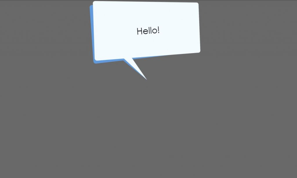
Picture this: A background that’s smooth with shades of grey and white. And then, BAM! That super lit white box in the middle. Super eye-catching and definitely does wonders for any conversation.
Skew’d Bubble Dink by Jase
See the Pen Skew’d Bubble Dink (CSS) by Jase ( @jasesmith ) on CodePen .
So Jase went all out and decided, “Why stay inside the box?” This design? Completely breaks it. It’s got that edgy skew thing going on. Funky, right?
SVG Speech Bubble by Timothy Miller
See the Pen SVG speech bubble by Timothy Miller ( @webinspect ) on CodePen .
Timothy dropped this bomb design. Straight up masterpiece.
Comic Book Speech Bubbles with Dudley Storey
See the Pen Comic Book Speech Bubbles with SVG by Dudley Storey ( @dudleystorey ) on CodePen .
For real, if you’re into popping designs, Dudley’s got you covered. It’s like a trip straight into a comic book. Super nostalgic.
Hello, World by kirsten allen
See the Pen Hello, World by kirsten allen ( @kirstenallen ) on CodePen .
kirsten brought this to the table. It’s sleek. It’s simple. It just works.
Black Lives Matter Dialog Boxes by Rio Jos
See the Pen Black Lives Matter Dialog Boxes by Rio Jos ( @riojosdev ) on CodePen .
Rio came through with a design that’s more than just a style. It’s a statement. Crafted beautifully with HTML and CSS.
CSS Stacked Chat Bubbles by J.M. CIery
See the Pen CSS stacked chat bubbles (Messenger style) by J.M. CIery ( @jmpp ) on CodePen .
Okay, here’s a thing by J.M. – Stacked chat bubbles that are so on point, they remind you of those messenger chats. Love it!
Dustin Dowell’s Pure CSS iOS Chat Bubbles Sass Mixin
See the Pen Pure CSS iOS Chat Bubbles Sass Mixin by Dustin Dowell ( @dustindowell ) on CodePen .
Dustin decided to sprinkle some of his magic on the iOS style. And guess what? It’s all CSS. Mind = blown.
Ana Tudor’s Speech Bubble
See the Pen Speech bubble by Ana Tudor ( @thebabydino ) on CodePen .
Ana’s creation? Off the charts! It’s got a dark backdrop, a popping square bubble, and the word “Hello” packed right in. It’s like 3D but better.
Pure CSS WhatsApp Desktop Speech Bubble by Benni
See the Pen Pure CSS WhatsApp Desktop Speech Bubble by Benni ( @8eni ) on CodePen .
And lastly, Benni served us with a speech bubble that screams WhatsApp Desktop vibes. And guess what? No extra stuff, just CSS.
CSS Chat Bubbles by Andrew
See the Pen CSS Chat Bubbles by Andrew ( @andrewerrico ) on CodePen .
Okay, you know those super engaging full-page chat convos? Andrew’s got you. This theme? Perfect to show off those back-and-forths. Whether you’re building a chat app or adding some chat vibes to your site, this one’s a keeper.
Sassy Right Triangles? Katherine G Shaw’s Speech Bubble Blockquote
See the Pen Speech Bubble Blockquote with Sassy Right Triangles by Katherine G Shaw ( @KatherineGShaw ) on CodePen .
Katherine’s come up with something slick. It’s not just a project, it’s the project.
Mrbnsn’s Clip-Path Magic: Speech Bubble W/ Hover Effects
See the Pen Clip-path speech bubble w/ hover effects by Michael Robinson ( @mrbnsn ) on CodePen .
If you want your online shop visitors to stick around, mrbnsn’s got the trick. Simplicity + a splash of hover effects? Sold!
Just the Speech Bubble by Fivera
See the Pen Speech bubble by Fivera ( @fivera ) on CodePen .
Clean. Simple. Done right with HTML and CSS. It’s not just any bubble; it’s Fivera’s vision.
Jamesbarnett’s Take on CSS Speech Bubble
See the Pen CSS speech bubble by James Barnett ( @jamesbarnett ) on CodePen .
James dropped this super cool script. No biggie, just some stellar speech bubble action.
Convo Boxes Galore with Carles Codony
See the Pen speech bubbles by Carles Codony ( @bitblitter ) on CodePen .
Talk about leveling up stores with speech bubbles! Carles’ technique is killer. Grey boxes, a pop of green and red, and a design that feels like a list but looks a hundred times cooler.
Depthdev’s Callouts & Speech Bubbles
See the Pen CSS Callouts/Speech Bubbles by Adam ( @depthdev ) on CodePen .
Depthdev’s doing things differently. Four directions, one element, all CSS. It’s kind of the Swiss Army knife of speech bubbles.
Chat Bubbles on an iPhone by Stephen Zuniga
See the Pen Chat bubbles in iPhone by Stephen Zuniga ( @stezu ) on CodePen .
If you’re after that iPhone look but with a speech bubble twist, Stephen’s got your back. For those perfect two-party chats.
Grant’s Pure CSS Thought Bubbles
See the Pen Pure CSS Thought Bubbles by Grant ( @quadbaup ) on CodePen .
Thought bubbles? With just HTML and CSS? Yep, Grant went there and crushed it.
Apple iMessage Vibes by Matt Smith
See the Pen Apple iMessage in CSS by Matt Smith ( @AllThingsSmitty ) on CodePen .
Imagine the sleekness of Apple’s iMessage, but made by Matt. Done with HTML and CSS. Super chic.

Patrick Kleckner’s 8-Bit Balloon
See the Pen 8-Bit by Patrick Kleckner ( @pkleckner ) on CodePen .
Patrick’s hitting us with some nostalgic vibes. An 8-bit speech balloon? Count us in.
Argyleink’s Animated Comic Director Splash
See the Pen Comic Director Splash Animation by Adam Argyle ( @argyleink ) on CodePen .
It’s comic. It’s splashy. It’s animated. Argyleink’s mixing things up with HTML and CSS for this super fun piece.
Wanna jazz up your site or app? Dive into these CSS speech bubbles. Different vibes for different tribes!
FAQ On CSS Speech Bubble
How do i create a css speech bubble.
Alright, let’s get this show on the road. Crafting that nifty CSS speech bubble is all about the fine art of styling. You’re gonna play with CSS properties—think borders, pseudo-elements like ::after and ::before for that slick tail, and position to place it just right.
Use border-radius for rounded corners to soften the edges, and remember to add a pinch of box-shadow for depth.
Can I make speech bubbles responsive?
Absolutely. Welcome to the era of responsive design . Make sure your bubbles are flexible by using relative units like percentages or ems for width, and max-width for scaling smarts.
Media queries are your best pals here; they’ll help you adjust the bubble size based on the device’s screen.
What’s the simplest method for adding arrows to speech bubbles?
Keep it simple, folks. Use the CSS pseudo-element ::after to create a small triangle that acts as the arrow. Position it snugly against your bubble with position: absolute and let border-width and border-color do the heavy lifting.
It’s like origami with code—folding edges to point the way.
Are CSS speech bubbles accessible for screen readers?
Now, we’re speaking the right language—accessibility matters. While the visuals are cool, ensure screen readers understand by using proper HTML structure.
Put your speech bubble text within an element that conveys its importance, like an aria-live region for dynamic content. It’s a blend of form and function.
How do animations enhance CSS speech bubbles?
Here’s where it gets vivid. CSS animations bring that pop to your bubbles, giving them life. Whether it’s fading in, bouncing, or sliding—it’s about grabbing attention smoothly.
Just a couple of keyframes for entrance or attention, and you’ve got movement that’s both eye-catching and professional.
Is it possible to have multi-line CSS speech bubbles?
Why stop at one when you can have more, right? Dynamic speech bubbles handle that chat-like look with ease.
Use display: inline-block and white-space: pre-wrap to respect line breaks and let your bubble grow with each new line, keeping those conversations flowing and natural.
How can CSS pseudo-elements be used in speech bubbles?
Think of pseudo-elements as your special toolkit. ::before and ::after make for crafty craftsmen in creating those extra details like tails or decorative marks, without additional HTML .
With CSS, they position and style seamlessly, adding layers to your speech bubble masterpiece.
Do I need images to create speech bubbles in CSS?
Wave goodbye to image files! Pure CSS speech bubbles are totally doable and definitely recommended. Borders, shadows, and the magical pseudo-elements handle all the visuals.
It’s a performance-friendly approach—faster load times, and better scalability. A win-win scenario for today’s sleek web.
Can CSS speech bubbles include interactive elements?
Certainly! It’s the digital age; static is so last season. Make those interactive web components play nice within your speech bubbles. Think buttons, forms, or even links. With a dab of JavaScript, trigger them to appear on click or hover—interactivity is king.
What’s the best practice for positioning CSS speech bubbles?
Positioning can be tricky, but it’s all about context. Relative and absolute combos work wonders.
Nest your bubble inside a positioned container (hello, position: relative ) and then, give yourself the freedom to move that bubble to your heart’s content with position: absolute . Keep it contained, yet free-floating.
And that’s a wrap on the CSS speech bubble journey. You’ve crossed the bridge from simple text blocks to engaging conversational UI pieces. Throwing in some CSS3 sparkle has hopefully felt like mixing just the right ingredients for a gourmet visual dish.
Here’s the rundown:
- Crafted bubbles with tailor-made CSS tooltips ? Check.
- Navigated the responsiveness rapids using media queries? Done.
- Aimed for the stars with accessible web design ? Absolutely.
You’ve come a long way. Those bubbles are now less of a mystery and more of a tool in your belt, ready to be whipped out when your web page starts feeling like a silent movie that’s dying for dialogue. Whether it’s the party pop of an animation or the slick stealth of a tooltip, user conversations on your sites just got a whole lot snazzier.
Remember, it’s all about breathing life into pages. With these tips, go on, make the web not just informative but also undeniably interactive.
If you liked this article about CSS speech bubbles, you should check out this article about CSS range sliders .
There are also similar articles discussing javascript text animation , CSS dashboard , product card design , and CSS pagination .
And let’s not forget about articles on CSS scroll effects , CSS shadow effects , CSS lists , and CSS search boxes .
Categorized in:
Share Article:
Bogdan Sandu
I've been passionately working with WordPress since 2008 both as a publisher and as a theme developer. I know, the grey hairs on my head say that's a long time ago.
Related Articles
34 css tooltip examples to enhance user experience, 42 stunning css animation examples to inspire you, 38 effective css headers examples you can use, 37 inspiring css carousels for modern websites, other stories, 18 bootstrap tooltips you need to check out, 39 creative css masonry layouts.

3 Steps Simple Responsive CSS Speech Bubbles
Welcome to a step-by-step tutorial on how to create simple responsive CSS speech bubbles. Once upon a time in the Stone Age of the Internet, we created speech bubbles by putting several pieces of background images together… Like it’s some sort of a jigsaw puzzle. But today, it is totally possible to create a speech bubble using pure CSS only – Read on for the example!
TABLE OF CONTENTS
Download & notes.
Here is the download link to the example code, so you don’t have to copy-paste everything.
EXAMPLE CODE DOWNLOAD
Click here to download | Example on CodePen
The example code is released under the MIT license, so feel free to build on top of it or use it in your own project.
SORRY FOR THE ADS...
But someone has to pay the bills, and sponsors are paying for it. I insist on not turning Code Boxx into a "paid scripts" business, and I don't "block people with Adblock". Every little bit of support helps.
Buy Me A Coffee Code Boxx eBooks
RESPONSIVE SPEECH BUBBLE
All right, let us get into the steps of creating a speech bubble using pure HTML and CSS.
TUTORIAL VIDEO
STEP 1) SIMPLE SPEECH BOX

Aye, all we need to create a speech bubble is just a normal <div> . The CSS shouldn’t be any trouble either. We are just creating a “normal rectangle box” by setting the background color, padding, font size, font color, etc…
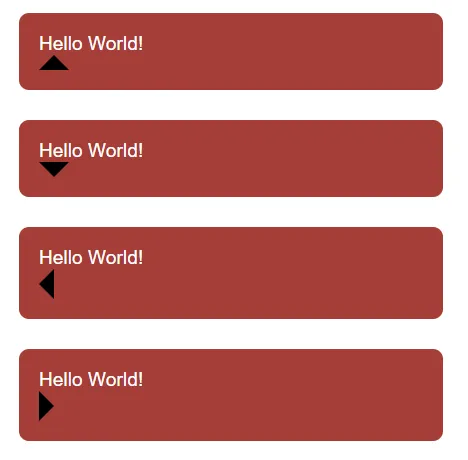
STEP 2) ADD SPEECH BUBBLE “CALLOUT”
STEP 3) POSITION THE “CALLOUT”
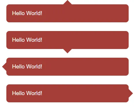
That’s all for the CSS speech bubble, here are some extras that may be useful.
THE “MAGIC TRIANGLE”

- As you can see, the borders around HTML elements are “cut” at 45 degrees.
- So very simply – We set a solid color on the required side, and the rest will be transparent.
INFOGRAPHIC CHEATSHEET
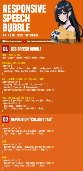
LINKS & REFERENCES
- Responsive Timeline – Code Boxx
- Simple Show/Hide Animations – Code Boxx
Thank you for reading, and we have come to the end of this short tutorial. I hope that it has helped you to build a better project, and if you have anything to add to this project, please feel free to comment below. Good luck and happy coding!
1 thought on “3 Steps Simple Responsive CSS Speech Bubbles”
Great tutorial! Easy to follow and works great!
Leave a Comment Cancel Reply
Your email address will not be published. Required fields are marked *

- Temani Afif
- Mar 1, 2024
Modern CSS Tooltips And Speech Bubbles (Part 1)
- 18 min read
- CSS , Techniques , Design
- Share on Twitter , LinkedIn
About The Author
Temani was a regular contributor at CSS-Tricks who wrote perhaps more articles than anyone who was not on staff. He loves experimenting with CSS and trying to … More about Temani ↬
Email Newsletter
Weekly tips on front-end & UX . Trusted by 200,000+ folks.
In a previous article , we explored ribbon shapes and different ways to approach them using clever combinations of CSS gradients and clip-path() . This time, I’d like to explore another shape, one that you’ve likely had to tackle at least once in your front-end life: tooltips . You know what we’re talking about, those little things that look like speech bubbles from comic books. They’re everywhere in the wild, from a hover effect for buttons to the text messaging app on your phone .
The shapes may look easy to make in CSS at first glance, but it always ends with a lot of struggles. For example, how do you adjust the position of the tail to indicate whether the tooltip is coming from a left, right, or center position? There are plenty of considerations to take into account when making tooltips — including overflowage , collision detection , and semantics — but it’s the shape and direction of the tail that I want to focus on because I often see inflexible fixed units used to position them.
Forget what you already know about tooltips because in this article, we will start from zero, and you will learn how to build a tooltip with minimal markup powered by modern CSS that provides flexibility to configure the component by adjusting CSS variables. We are not going to build one or two shapes, but… 100 different shapes!
That may sound like we’re getting into a super-long article, but actually, we can easily get there by adjusting a few values. In the end, you will have a back pocket full of CSS tricks that can be combined to create any shape you want.
And guess what? I’ve already created an online collection of 100 different tooltip shapes where you can easily copy and paste the code for your own use, but stay with me. You’re going to want to know the secret to unlocking hundreds of possibilities with the least possible code.
We’ll start with the shapes themselves, discussing how we can cut out the bubble and tail by combining CSS gradients and clipping. Then, we’ll pick things back up in a second article dedicated to improving another common approach to tooltips using borders and custom shapes.
We’re only working with a single element:
That’s the challenge: Create hundreds of tooltip variations in CSS with only a single element to hook into in the HTML.
A Simple Tooltip Tail
I’m going to skip right over the basic rectangular shape; you know how to set a width and height (or aspect-ratio ) on elements. Let’s start with the simplest shape for the tooltip’s tail, one that can be accomplished with only two CSS properties:
The border-image property creates an “overflowing color” while clip-path defines the shape of the tooltip with polygon() coordinates. (Speaking of border-image , I wrote a deep-dive on it and explain how it might be the only CSS property that supports double slashes in the syntax!)
The tooltip’s tail is placed at the bottom center, and we have two variables to control its dimensions:
We can do the exact same thing in more intuitive ways, like defining a background and then border (or padding) to create space for the tail:
…or using box-shadow (or outline ) for the outside color:
While these approaches are indeed easier, they require an extra declaration compared to the single border-image declaration we used. Plus, we’ll see later that border-image is really useful for accomplishing more complex shapes.
Here is a demo with the different directions so you can see how easy it is to adjust the above code to change the tail’s position.
See the Pen [A simple Tooltip using 2 CSS properties](https://codepen.io/smashingmag/pen/ExrEXoO) by Temani Afif .
Next, we’re going to study shapes that include the tail at the bottom, but you can easily find the other variations in my online collection .
Adjusting The Tail Position
Let’s add a third variable, --p , that we can use to control the tooltip’s tail position. In the last example, we used 50% in the clip-path , which positions the tail directly in the horizontal center along the bottom of the tooltip’s rectangular shape. If we assign a variable to it, we can easily change the direction of the tooltip to face left or right by updating 50% to a smaller or larger value, respectively.
The --p variable can go from 0% to 100% , where 0% is aligned with the left side of the tooltip and 100% is aligned with the right side. Here is an interactive demo where you can update the variable using a range slider:
See the Pen [Updating the tail position](https://codepen.io/smashingmag/pen/mdoLOGJ) by Temani Afif .
Nice, right?! It’s definitely cool, but there’s a glitch. When the tail’s position is set to the extremes, it appears to slide right off the edge of the bubble. Go ahead and toggle the range slider in the demo between 0% and 100% to see the issue.
We can fix this by setting limits to some values so the tail never falls outside the container. Two points of the polygon are concerned with the fix.
The first calc() needs to be clamped to 100% to avoid the overflow from the right side, and the second one needs to be clamped to 0% to avoid the overflow from the left side. We can use the min() and max() functions to establish the range limits:
See the Pen [Fixing the overflow issue](https://codepen.io/smashingmag/pen/mdoLRVr) by Temani Afif .
Tada! We’ve fixed the edge cases, and now the tail gets a different shape instead of overflowing!
Adjusting The Tail Shape
Let’s integrate another variable, --x , into the clip-path() and use it to adjust the shape of the tail:
The --x variable can be either positive or negative (using whatever unit you want, including percentages). What we’re doing is adding the variable that establishes the tail’s shape, --x , to the tail’s position, --p . In other words, we’ve updated this:
And here is the outcome:
The tooltip’s tail points in either the right or left direction, depending on whether --x is a positive or negative value. Go ahead and use the range sliders in the following demo to see how the tooltip’s tail is re-positioned ( --p ) and re-shaped ( --x ) when adjusting two variables.
See the Pen [Updating the tail shape](https://codepen.io/smashingmag/pen/ExMLZZB) by Temani Afif .
Cool, right? If you’ve ever attempted tooltips on your own, I’m sure you will appreciate the way this approach eliminates the need to use magic numbers to tweak the tooltip’s appearance. That’s one significant headache we no longer have to worry about!
And did you notice how the tail, when stretched, is allowed to overflow the container? That’s perfect! Using min() and max() , we’re correctly fixing the overflow issue while allowing the tail to stretch further away from the container.
Note that I have updated the border-image outset to an impractically large value ( 9999px ) instead of using the --h variable. The shape of the tail can be any type of triangle and can take a bigger area. Since there’s no way for us to know the exact value of the outset, we use that big value to make sure we have enough room to fill the tail in with color, no matter its shape.
Does the outset concept look strange to you? I know that working with border-image isn’t something many of us do all that often, so if this approach is tough to wrap your head around, definitely go check out my border-image article for a thorough demonstration of how it works.
Working With Gradients
Most of the trouble starts when we want to color the tooltip with a gradient instead of a flat color. Applying one color is simple — even with older techniques — but when it comes to gradients, it’s not easy to make the tail color flow smoothly into the container’s color.
But guess what? That’s no problem for us because we are already using a gradient in our border-image declaration!
border-image only accepts gradients or images, so to produce a solid color, I had to use a gradient consisting of just one color. But if you change it into a “real” gradient that transitions between two or more colors, then you get your tooltip gradient. That’s all!
See the Pen [Adding gradient coloration](https://codepen.io/smashingmag/pen/GRedryE) by Temani Afif .
The only thing we need to pay attention to is the outset value. When using one color, we don’t really care what the outset value is; it just needs to be as big as possible to cover the clip-path area, as we did when setting it to 9999px . However, when working with multiple colors, we should not use too big of a value so that we avoid clipping the gradient by accident.
In the last demo, you will notice I am using a value equal to 0 0 var(--h) 0 , which means that we are setting only a bottom outset; the tail is at the bottom, and the gradient will not extend in all the directions as it did in the other examples. I don’t want to get into all of the various edge cases that could come up, but if you have trouble working with the gradient’s color, it’s usually the border-image ’s outset value that you need to check.
Working With Rounded Corners
If we try to add a border-radius to the previous examples, nothing happens. That’s because the border-radius and border-image properties aren’t really all that good of friends. We need to tweak border-image and combine it with background to get things working right.
We start by declaring a background and border-radius on the .tooltip . Nothing fancy. Then, we move to the border-image property so that we can add a bar (highlighted in red in the last figure) that slightly overflows the container from the bottom. This part is a bit tricky, and here I invite you to read my previous article about border-image to understand this bit of CSS magic. From there, we add the clip-path and get our final shape.
See the Pen [Adding border radius](https://codepen.io/smashingmag/pen/MWxGvYg) by Temani Afif .
We are good but still have a tiny issue when the tail gets close to the extreme edges.
This visual glitch happens when the border-image overlaps with the rounded corners. To fix this, we need to adjust the border-radius value based on the tail’s position ( --p ).
We are not going to update all the radii, only the bottom ones and, more precisely, the horizontal values. I want to remind you that border-radius accepts up to eight values — each corner takes two values that set the horizontal and vertical directions — and in our case, we will update the horizontal value of the bottom-left and bottom-right corners:
All the corner values are equal to --r , except for the bottom-left and bottom-right corners. Notice the forward slash ( / ), as it is part of the syntax that separates the horizontal and vertical radii values.
Now, let’s dig in and understand what is happening here. For the bottom-left corner, when the position of the tail is on the right, the position ( --p ) variable value will be big in order to keep the radius equal to the radius ( --r ), which serves as the minimum value. But when the position gets closer to the left, the value of --p decreases and, at some point, becomes smaller than the value of --r . The result is the value of the radius slowly decreasing until it reaches 0 . It adjusts as the position updates!
I know that’s a lot to process, and a visual aid usually helps. Try slowly updating the tail’s position in the following demo to get a clearer picture of what’s happening.
See the Pen [Fixing the edge cases](https://codepen.io/smashingmag/pen/ZEPoJpG) by Temani Afif .
What about instances when we want a custom shape for the tail? The technique we just used will only work when the tail has two equal sides — you know, an isosceles triangle. We need to adjust the border-image value and consider another trick to get things working correctly again.
This time, the border image creates a horizontal bar along the bottom that is positioned directly under the element and extends outside of its boundary so that we have enough color for the tail when it’s closer to the edge.
See the Pen [Custom tail with border radius](https://codepen.io/smashingmag/pen/MWxGEpv) by Temani Afif .
Again, the border-image declaration looks strange and difficult because, well, it is! Please do yourself a favor and check my previous article if you want to dig deeper into this approach — you definitely won’t regret it.
“Why not use this approach for the first example we looked at?” you might ask. You are right that we can use this same approach for the first example, even if we don’t have the --x variable. That said, the reason we’re not going in that direction is that there is a tiny drawback to it in some particular cases, as you can see in the figure below.
That’s why I do not use this approach when working with a simple isosceles triangle. This said, the method is perfectly fine, and in most cases, you may not see any visual glitches.
Putting Everything Together
We’ve looked at tooltips with tails that have equal sides, ones with tails that change shape, ones where the tail changes position and direction, ones with rounded corners, and ones that are filled in with gradients. What would it look like if we combined all of these examples into one mega-demo?
We can do it, but not by combining the approaches we’ve covered. We need another method, this time using a pseudo-element. No border-image for this one, I promise!
The pseudo-element is used to create the tail at the bottom and notice how it inherits the gradient from the main element to simulate a continuous gradient that covers the entire shape.
Another important thing to note is the background-size declared in the .tooltip . The pseudo-element is covering a bigger area due to the negative bottom value, so we have to increase the height of the gradient so it covers the same area.
See the Pen [Gradient and border radius](https://codepen.io/smashingmag/pen/ZEPoayw) by Temani Afif .
For the custom tail shape, we have to update the code slightly to consider the overflow on the left and right sides of the tooltip. The idea is to increase the gradient’s area when the tail is about to leave the container.
Alongside the --x variable that controls the tail’s shape and direction, I have introduced a new variable, --_e , that defines the gradient’s width for covering the .tooltip as well as the pseudo-element’s inline padding and its left and right values. It may look like a complex configuration, but the idea is that --_e will, in most cases, be equal to 0 , which gives us the same code as the last example we made. But when the tail overflows the .tooltip container, the --_e value increases, which increases the area of the gradient as well in order to cover the overflow.
Play with the position and shape of the tail in the following demo and notice how the gradient changes when the tail overflows the sides.
See the Pen [Custom tail with border radius and gradient](https://codepen.io/smashingmag/pen/RwdyExJ) by Temani Afif .
I know this last code may look complex (same for some of the previous ones), and for this reason, I created an online collection of tooltips from where you can easily grab the code. I’ve tried to cover as many cases as possible, even the ones you will probably never need. That said, it’s good to have an idea of how to build various tooltip shapes.
One Last Thought
If we do the count, we have made 32 different tooltip shapes. That’s two types of color (solid or gradient), two types of corners (sharp or rounded) that produce four more variations, and two types of tail shapes (isosceles triangle and custom) for two additional variations, and four different tail positions (top, bottom, left, and right) which brings the final tally to 32 tooltip variations.
The last example we studied can be used to produce all the shapes simply by adjusting the different variables.
I know what you’re thinking: Why didn’t I simply share the last snippet and call it a day? Did this article really have to be so long when we could have jumped straight into the solution?
Sure, we could have done that, but If you compare the first example with only two CSS properties with the last example, the code for the last example is far too complex to create what can otherwise be accomplished in fewer lines. We started with a basic tooltip shape and embarked on a journey to make it account for more complex types of tooltips. Plus, we have learned a lot of tricks that can be useful in other situations and not necessarily for creating tooltips.
That’s all for Part 1 of this brief two-part series. We still have many more shapes to cover in Part 2 , so take the time to digest what we covered in Part 1 before jumping ahead. In fact, here’s a little homework to help prepare you for Part 2: try creating the following tooltips using the CSS tricks you learned from this article.
Can you figure it out? The code for all of them is included in my tooltip collection if you need a reference, but do try to make them yourself — it’s good exercise! Maybe you will find a different (or perhaps better) approach than mine.
Smashing Newsletter
Tips on front-end & UX, delivered weekly in your inbox. Just the things you can actually use.
Front-End & UX Workshops, Online
With practical takeaways, live sessions, video recordings and a friendly Q&A.
TypeScript in 50 Lessons
Everything TypeScript, with code walkthroughs and examples. And other printed books.
- 👨💻 Master CSS
- 🗺️ Roadmaps
- 🏷️ Categories
How to Make Speech Bubbles in CSS
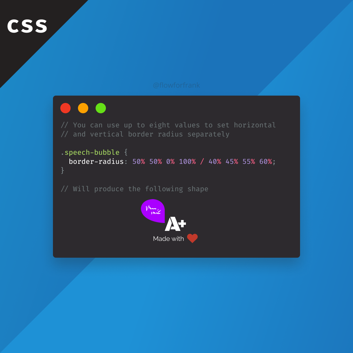
Did you know that the border-radius property in CSS can take up multiple values? This way, you can create various different effects, like speech bubbles.
The example above, will create the following effect:
To break it down, this works by:
- Setting each border-radius value individually by the first four percentages (top-left, top-right, bottom-right, bottom-left in order)
- This is followed by a / and four different values again for each corner to create elliptical corners.
To play around with custom border-radius values, I recommend checking out the
Fancy Border Radius Generator

Level up your skills and master the art of frontend development with bite-sized tutorials.
We don't spam. Unsubscribe anytime.
- The border-radius property in CSS

Rocket Launch Your Career
Speed up your learning progress with our mentorship program. Join as a mentee to unlock the full potential of Webtips and get a personalized learning experience by experts to master the following frontend technologies:

CSS - The Complete Guide (including Flexbox, Grid and Sass)

The HTML & CSS Bootcamp

The Creative HTML5 & CSS3 Course
Recommended.
The Difference Between Lexical and Dynamic Scoping
How to Force Rerender With Hooks in React
How to Style Broken Images in CSS

Free Web Design Code & Scripts
Home / HTML5 & CSS3 / 9+ Simple Speech Bubble in CSS
9+ Simple Speech Bubble in CSS
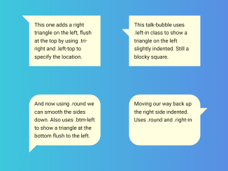
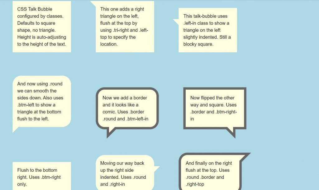
This code provides a simple way to create a simple speech bubble in CSS. It allows you to style speech bubbles with various shapes, including square, round, and triangular, at different locations on the screen. This code is helpful for adding visually appealing speech bubbles to your web content.
You can use this code in your website’s design to create eye-catching speech bubbles for comments, tooltips, or messages. Moreover, it’s easy to customize and can improve the overall design of your web pages.
How to Create Simple Speech Bubble in CSS
1. First, include the HTML structure for your speech bubbles. You can create multiple bubbles by duplicating the provided HTML code blocks. Each code block represents a separate speech bubble.
2. The CSS code in the provided snippet defines the appearance of your speech bubbles. You can customize the bubble’s shape, border, and position by adding or modifying CSS classes.
For example, adding the “.round” class will give your bubble rounded corners, while “.border” adds a border to it.
To make your speech bubbles unique, adjust the CSS properties in the ".talk-bubble" and ".talktext" classes. You can change the background color, text alignment, padding, and more. Experiment with different styles until you achieve the desired look.
Use classes like ".tri-right," ".left-top," ".right-in," and others to position your speech bubbles as needed. For example, ".tri-right.left-top" will place a right triangle on the left side at the top of the bubble.
That’s all! hopefully, you have successfully created a Simple Speech Bubble in CSS. If you have any questions or suggestions, feel free to comment below.
Similar Code Snippets:
I code and create web elements for amazing people around the world. I like work with new people. New people new Experiences. I truly enjoy what I’m doing, which makes me more passionate about web development and coding. I am always ready to do challenging tasks whether it is about creating a custom CMS from scratch or customizing an existing system.
Leave a Comment Cancel reply
This site uses Akismet to reduce spam. Learn how your comment data is processed .
Free Web Design Code & Scripts - CodeHim is one of the BEST developer websites that provide web designers and developers with a simple way to preview and download a variety of free code & scripts. All codes published on CodeHim are open source, distributed under OSD-compliant license which grants all the rights to use, study, change and share the software in modified and unmodified form. Before publishing, we test and review each code snippet to avoid errors, but we cannot warrant the full correctness of all content. All trademarks, trade names, logos, and icons are the property of their respective owners... find out more...
Please Rel0ad/PressF5 this page if you can't click the download/preview link

18 CSS Speech Bubble Awesome Examples
by Sanjog | Sep 13, 2019 | HTML/CSS

Speech bubbles are the exceptionally pleasant approach to demonstrate the contents on the web and these days the speech bubbles are generally utilized in the chat rooms. What’s more, we can see the speech bubbles utilized in the WhatsApp talk confine and numerous different applications. Speech bubble gives an incredible and exceptionally successful look. In past making a speech bubbles was as an extremely troublesome undertaking because of the use of the pictures in it. However, these days we can make the speech bubbles effectively by utilizing CSS3 Properties.You can find various CSS speech bubble generator in the web also. However, in this article, we will be talking about different examples of speech bubble with text using html, css and js. We will also talk about some css responsive speech bubble.
Prior to bouncing into the coding — let me clarify the essential idea driving making a speech bubble, First we have to make a square shape/box/circle utilizing div component or some other HTML components and after that we have to consolidate the various states of triangles/circles to frame the various types of the speech bubbles.
18 Great HTML and CSS Speech Bubble Awesome Examples with Source Code
Down underneath we have brought some magnificent speech bubble designs today. Your site addresses your business in the electronic media and in this manner your site ought to be set up for passing on everything. Eventually without expending at whatever point let me direct acclimate you with a portion of those models.
- CSS Water Effect Examples
- Amazing CSS Buttons Hover Effects Examples
- Awesome Range Slider with CSS and JavaScript
Here are some gathering of hand-picked free HTML and CSS speech bubble models with source code. The codes are free to use. So feel free to use them.
1. HTML CSS Speech Text Bubble Caret
This is one of the most down to earth Speech bubble which you can use on any site and application. No any animation happens however with the straightforwardness the clients will love it. The entire idea uses the CSS3 content, thus you can without much of a stretch alter the code and use it even on your current site. Triangles are used for speech bubble and transforms used to help create the position.

Text dimension and the shading advances are done impeccably in the default structure itself, so on the off chance that you are in a rush, you can use the code accordingly and can spare your time. This is one of the examples of responsive speech bubble with text using html and css.
2. Comic Book Speech Bubbles with SVG
In the event that you are a comic fan you ought to definately look at this. In this model, the maker has given a comic based svg speech bubble plan. There are 3 comic structures in an entirety. Each of the three structures are unique. Since this plan uses CSS3 content, the ideas is quick. The maker has figured out how to combine the idea appropriately by utilizing flawless planning. You can also find similar css speech bubble generator in the web.
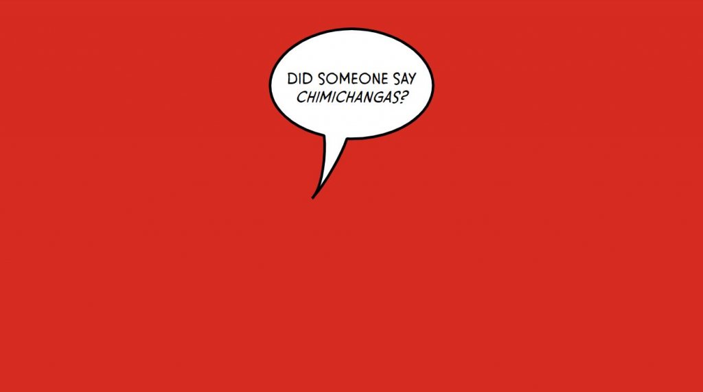
To enable you to comprehend the code completely, the designer has shared the code content on the CodePen editor. You can alter the code and imagine the outcomes on the CodePen editor itself. So you can get a reasonable thought before utilizing this structure on your site.
3. Speech Bubble with HTML and CSS
In the event that you are searching for contemporary style intuitive speech bubble to give a vivid encounter to your clients, this plan will dazzle you. As the name infers, the maker has utilized just HTML and CSS on the structure. The substance with a triangle in the crate can be seen. This can be utilized for various chatboxes also.
The compatible browsers are Chrome, Opera,Safari,Firefox. The plan is responsive too. To make this structure, the maker has utilized HTML5 and CSS. Utilizing CSS ideas like this in your structure will give a character to your general plan.
4. CSS Speech Bubble Example
The maker of this speech bubble configuration has utilized an essential impact. Like most different CSS speech bubbles in this rundown, this one additionally utilizes the CSS3 content. As found in the demo itself, there are two speech bubble ideas. One is a basic one while the other is the one with outskirts and drop shadow. You can also find similar css speech bubble generator in the web.
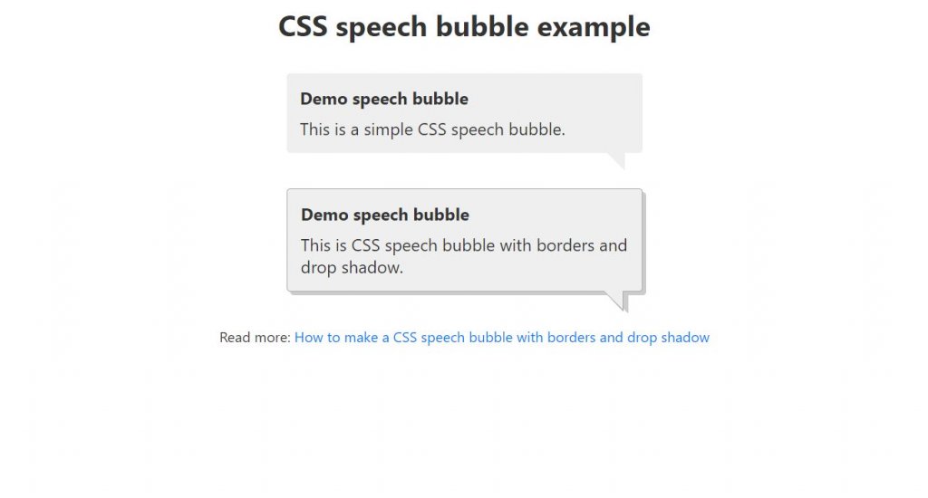
Since it is a demo, the maker has utilized basic hues. Be that as it may, you can utilize increasingly popular hues and slope hues to make this impact considerably progressively alluring and lively. Another favorable position of this plan is it simply uses the CSS3 content. Consequently, altering and using the code on your venture will be a basic assignment.
5. HTMl CSS Speech Bubble
If you are a UI fashioner, you will realize how small scale collaborations are taking the plan to the following level. In the event that you are searching for speech bubble plans with unobtrusive smaller scale association, structures like this may intrigue you. In this impact, the originator has given fundamental shading.
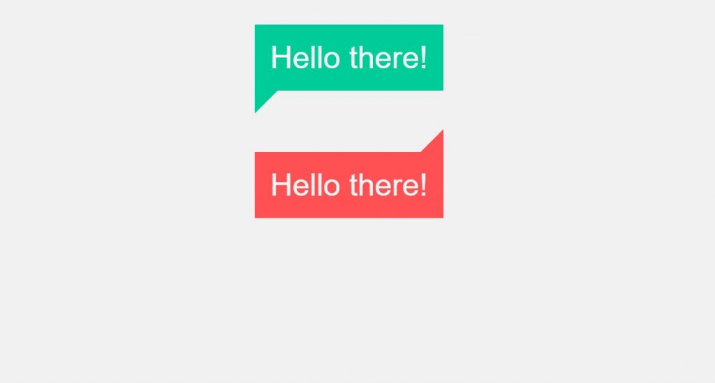
Speech bubbles like this will make the client stop for a second before they intuitively attempt to close a pop-menu or exchange box. The maker has shared the whole code content with you, consequently you can without much of a stretch work with this plan and modify it according to your needs.
6. Really Simple Speech Bubble
As the name suggests, this speech bubble is an exceptionally basic one. Inside the given space we need to keep up our substance. Little speech bubbles like this will enable you to spare space and simultaneously, you stand out enough to be noticed. You can also find similar css speech bubble generator in the web.

The best part about this CSS catch is it is absolutely structured utilizing the CSS3 content. So you can without much of a stretch fuse this structure even on your current site. You can utilize it for different sites and applications too.
7. Pure CSS Speech Bubbles Testimonials
In this set, the maker has given you enough of the speech bubble plans. In spite of the fact that this idea does not have any animations, you can utilize the eye catching cool animation impact to make the extraordinary speech bubbles some additional uncommon and unmistakable from others. You have such a significant number of choices to browse.
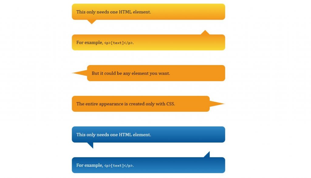
Every one of them are structured utilizing the most recent HTML5 and CSS3 content. Subsequently, working with it won’t be an issue for an engineer. Additionally, you can without much of a stretch coordinate this on your task. The demo along with the source code is underneath.
8. Chat Bubbles CSS Examples
Nine kinds of speech bubbles for visit ideas are given in this set. The world is secured with digitial stages. Who does not utilize talk boxes? So with that execution this speech bubbles has been roused. All the speech bubbles uses the CSS3 content.
Since it is a rectangular fit as a fiddle, without taking a great part of the space it effectively fits in a level style structure. Regardless of whether you need you can change the size of the catch since it is planned utilizing the most recent HTML5 and CSS3 content.
9. Pure CSS speech Thought Bubbles
This is a Pure CSS thought and speech bubbles that develop to fit the text. This structure looks exceptionally easy to the clients. These impacts don’t just look proficient yet additionally have an expert code structure. So different designers can utilize it effectively on their tasks. As it is utilizing the CSS3 content, you can alter the impacts dependent on your structure needs. Or on the other hand you can utilize this model as a motivation for your own custom design.
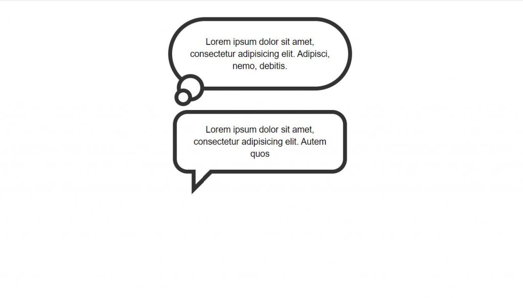
The configuration is ideal for Chrome, Edge, Firefox, Opera, Safari and without a doubt is responsive too. The source code alongside the demo is underneath.
10. CSS Speech Bubble
This speech bubble configuration looks basic and clean, which makes them effectively fit on any sites and on any pages. For the demo reason, the maker has utilized basic rectangular catches. Be that as it may, you can reshape the catches dependent on your structure needs. The designer of this CSS catches has utilized the most recent HTML and CSS content, subsequently working with it will be a simple activity for different engineers too.
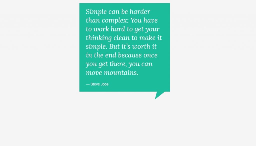
The compatible browsers are Chrome, Edge, Firefox, Opera, Safari. The main awful thing about the structure is this not responsive. Be that as it may, as the codes are adjustable, extra magics can make them responsive also.
11. Speech Bubble Input Text
The designer has given us a progressively intuitive CSS Speech Bubble on this set. With the CSS we get increasingly alluring and intelligent effects. Since the vast majority of the impacts use CSS, there is no compelling reason to work with different contents. Accordingly, you get a quick stacking page with intuitive special visualizations. In this set, in contrast to other people, you can type your very own text inside the speech bubble structure.
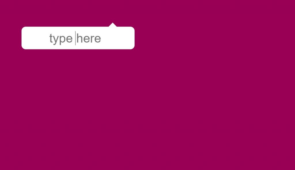
By making a couple of customizations, you can utilize these in your undertaking structures. The engineer has shared the whole code used to make this structure. Subsequently working with it won’t be an issue for you. You can also find similar css speech bubble generator in the web.
12. Comic Speech Bubbles
By and by, we came to the comic idea. In the past one we got 3 of the compic ideas. In this plan, there are some chatboxes in the comic style. The foundation shading alongside the state of the speech bubbles makes it look increasingly practical. The designer in this structure has utilized an appropriate plan to separate the catch from the remainder of the web components.
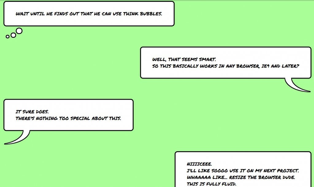
Since the idea is basic, you can utilize it effectively on any piece of the site. This is one of the examples of responsive speech bubble with text using html and css. The demo alongside the source code is beneath.
13. Speech Bubble text with HTML and CSS
To make this look increasingly intelligent and clean, the maker has utilized CSS(SCSS). The speech bubble looks great than rest of the plans we talked about till now. The foundation shading likewise suits. The final product is smooth and clean that fits splendidly in any business sites and innovative sites. You get the whole code content used to make this lovely catch plan and the best part is you get the code in the CodePen editor.
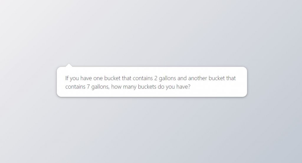
Prior to utilizing the code on your task, you can modify and imagine your customization results. As the whole code is shared legitimately, you can even trim the impact depended on your needs.
14. Responsive Speech Bubble CSS
As the name infers responsive, this plans can be appropriate for different gadgets also. Rather than utilizing a text, the designer has set a shout mark inside the speech bubble.Designs like this may take your space yet you can tweak them without anyone else’s input. Shadow and profundity impacts are utilized to separate and feature the idea from the remainder of the web components.
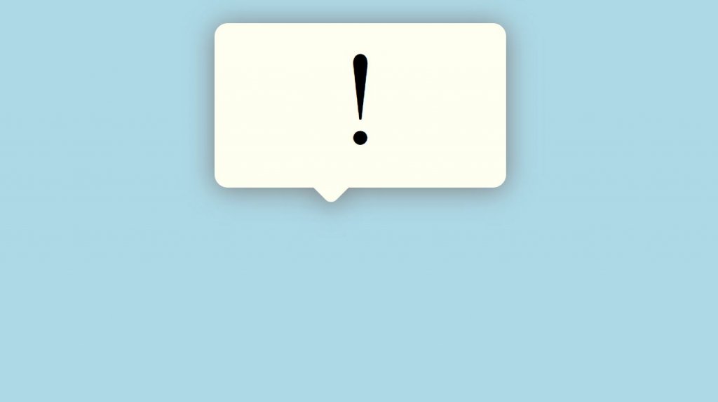
You can expect indistinguishable outcome in little screen gadgets from well. This is one of the examples of responsive speech bubble with text using html and css. You can also find similar css speech bubble generator in the web. The demo along with the source code is underneath.
15. Alternating Speech Bubbles
As found in the demo itself, the shaded outskirt of the speech bubbles can be seen on alternate position. The wrapper is utilized to focus the format on the page and shields it from looking excessively wide or excessively restricted, contingent upon the gadget or viewport width. The structure is responsive too. This is one of the examples of responsive speech bubble with text using html and css.
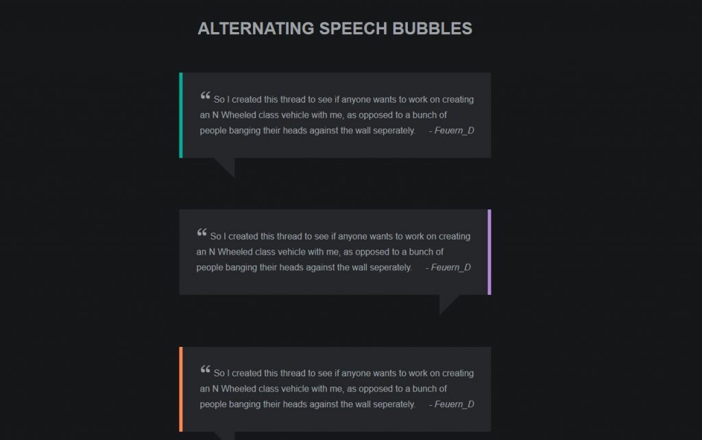
As the advanced cell phones are having ground-breaking processors and mammoth RAM space, even impacts like this will perform better on cell phones too; be that as it may, you need to do little enhancements before utilizing this structure for a versatile application.
16. Simple CSS Speech Bubbles
In this the designer has given the speech bubbles of various shapes and sizes. Based on the states of speech bubbles, the length of the text fits in. As found in the demo, there is an ordinary speech bubble. At that point there is a round edge speech bubble. Another is the speech bubble of a different shading. Additionally we have a speech bubble of enormous size.
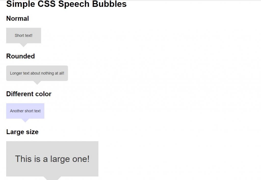
In conclusion we have the one which consolidates the majority of the factor we just discussed in a solitary plan. As a matter of course, it isn’t intelligent, however you can make it intuitive on the off chance that you need. The demo along with the source code is underneath.
17. Pure CSS Speech Bubbles
The developer has given three unique variations of the speech bubble. They are square, bubble and round. a triangular shape to the speech bubble is provided to speak to the particular guidance. The best part is all the three variation structures are uses the CSS and JS content. Consequently, you can utilize them and tweak them effortlessly. You should simply to pick a catch configuration, change its plan dependent on your venture.
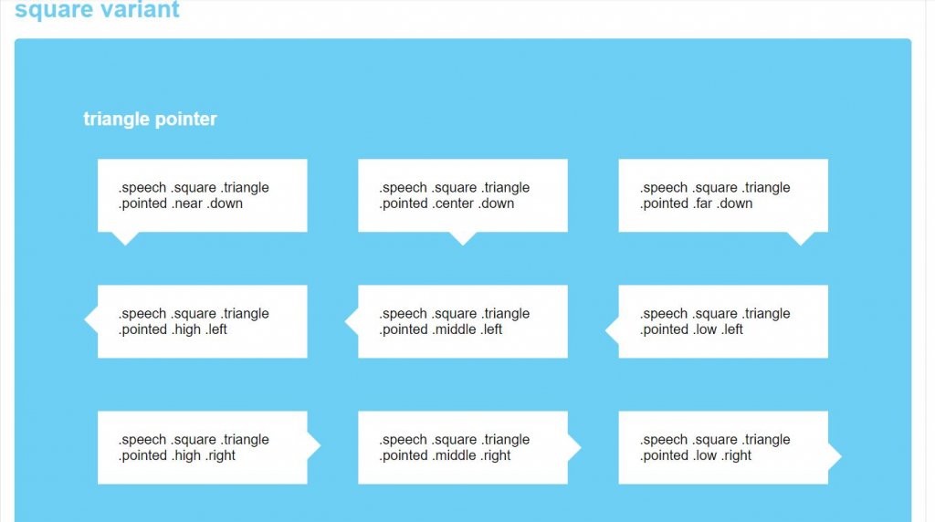
This is one of the examples of responsive speech bubble with text using html and css.
18. Animated Effect Speech Bubble with JavaScript
This plan is the best choice when you have space limitations. Without taking a significant part of the screen space you can demonstrate your idea to the clients. As found in the demo, you can see a red square shape. On floating to the square shape will give you a rectangular speech bubble. For a rich smooth animation impact, the maker of this catch has utilized Javascript.
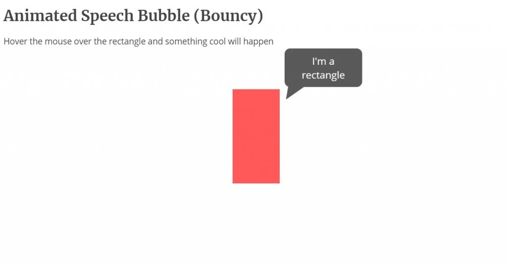
Yet, you can modify the code content dependent on the code structure you pursue. To get the hands-on understanding on the code, check the information connection given underneath.
As you saw, playing around with the speech bubbles is definitely not a major deal. In any case, modifying them and making them catch the eye of clients is a genuine objective. You can also find similar css speech bubble generator in the web. We examined a large portion of examples of the css speech bubble in todays article. You can utilize them in your landing pages, or likewise as a pop up box for your website design. You can likewise alter them and use them as a chat box.
In case you are looking for a well-arranged speech bubble, at that point you can definately use any of them that we discussed a short time back. In addition, still we will invigorate you with some new and top-recorded css speech bubble utilizing html5, css3, bootstrap, jquery and some more.
Pin It on Pinterest
How to Create CSS3 Speech Bubbles Without Images
Share this article

Have you used similar techniques to create other effects?
Frequently Asked Questions (FAQs) about Pure CSS3 Speech Bubbles
How can i create a speech bubble with a border in css3.
Creating a speech bubble with a border in CSS3 involves using the border property. First, you need to create a div for the speech bubble and assign it a class. Then, in your CSS, you can define the border property for that class. You can specify the border color, width, and style. For example: .bubble { border: 2px solid black; } This will create a black border around your speech bubble. You can customize the color, width, and style to suit your needs.
Can I add a shadow to my CSS3 speech bubble?
Yes, you can add a shadow to your CSS3 speech bubble using the box-shadow property. This property allows you to create a shadow effect around the box. You can specify the horizontal and vertical offsets, blur radius, spread radius, and color of the shadow. For example: .bubble { box-shadow: 5px 5px 10px rgba(0, 0, 0, 0.5); } This will create a shadow that is offset 5px to the right and 5px down from the bubble, with a blur radius of 10px and a color of semi-transparent black.
How can I position the arrow of the speech bubble?
The position of the arrow of the speech bubble can be adjusted using the “top”, “bottom”, “left”, or “right” properties in CSS3. For instance, if you want the arrow to appear at the bottom of the bubble, you can use the “bottom” property and set it to a negative value. Here’s an example: .bubble:after { bottom: -20px; } This will position the arrow 20px up from the bottom of the bubble.
Can I create a speech bubble with rounded corners in CSS3?
Yes, you can create a speech bubble with rounded corners using the border-radius property in CSS3. This property allows you to define how rounded the border corners should be. For example: .bubble { border-radius: 10px; } This will create a speech bubble with corners that are rounded by 10px.
How can I change the color of the speech bubble?
The color of the speech bubble can be changed using the background-color property in CSS3. This property sets the background color of an element. For example: .bubble { background-color: #f00; } This will change the background color of the speech bubble to red.
Can I add text to the speech bubble?
Yes, you can add text to the speech bubble by simply including it within the div in your HTML. For example: <div class="bubble">This is a speech bubble.</div> This will display the text “This is a speech bubble.” inside the speech bubble.
How can I adjust the size of the speech bubble?
The size of the speech bubble can be adjusted using the width and height properties in CSS3. These properties set the width and height of an element. For example: .bubble { width: 200px; height: 100px; } This will create a speech bubble that is 200px wide and 100px tall.
Can I create a speech bubble with a gradient background in CSS3?
Yes, you can create a speech bubble with a gradient background using the linear-gradient function in CSS3. This function creates an image consisting of a progressive transition between two or more colors along a straight line. For example: .bubble { background: linear-gradient(to right, red, orange); } This will create a speech bubble with a background that transitions from red to orange from left to right.
How can I make the speech bubble responsive?
You can make the speech bubble responsive by using relative units such as percentages for the width and height properties instead of absolute units like pixels. This will allow the size of the speech bubble to adjust based on the size of the viewport. For example: .bubble { width: 50%; height: 30%; } This will create a speech bubble that takes up 50% of the width and 30% of the height of the viewport.
Can I animate the speech bubble in CSS3?
Yes, you can animate the speech bubble using keyframes in CSS3. Keyframes are used to specify the behavior of one cycle of a CSS animation. For example, you can create a simple fade-in animation like this: @keyframes fadeIn { from {opacity: 0;} to {opacity: 1;} } .bubble { animation: fadeIn 2s; } This will make the speech bubble fade in over a period of 2 seconds.
Craig is a freelance UK web consultant who built his first page for IE2.0 in 1995. Since that time he's been advocating standards, accessibility, and best-practice HTML5 techniques. He's created enterprise specifications, websites and online applications for companies and organisations including the UK Parliament, the European Parliament, the Department of Energy & Climate Change, Microsoft, and more. He's written more than 1,000 articles for SitePoint and you can find him @craigbuckler .

Position - 50%
Width - 20px, length - 20px, fluid positioning, width - 250px, height - 120px, padding - 0px, corner radius - 10px, thickness - 0px.
ilikepixels.co.uk @ilikepixels
Pure CSS speech bubbles
Speech bubbles are a popular effect but many tutorials rely on presentational HTML or JavaScript. This tutorial contains various forms of speech bubble effect created with CSS 2.1 and enhanced with CSS3. No images, no JavaScript and it can be applied to your existing semantic HTML.
The CSS file used in the demo page is heavily commented so that you can see which lines of code are responsible for each part of the effects.
Demo: Pure CSS speech bubbles
Support : Firefox 3.5+, Safari 4+, Chrome 4+, Opera 10+, IE8+.
Progressive enhancement with pseudo-elements
With HTML as simple as <div>Content</div> or <p>Content</p> you can produce speech bubble effects like this:

Add a child element, for example, <blockquote><p>Quote</p></blockquote> and you can even produce speech bubble effects like this:

I’d encourage you to adapt the examples to your needs and use any other associated elements available to you in your existing HTML document. The key is to use the :before and/or :after pseudo-elements to produce basic shapes.
By applying CSS3 properties such as border-radius and transform you can produce more complex shapes and orientations. This is how the heart-shape in my CSS typography experiment was created.
Example code
This is an example of how to create a basic speech bubble with a few enhancements. For further examples see the demo page and the heavily commented CSS file that it uses.
A note on progressive enhancement
This approach is one of progressive enhancement. Styles are built up in layers from simple coloured boxes, to boxes with a “speech tick” of some kind, to rounded rectangles or circles with gradient backgrounds. Browsers render the styles that they are capable of rendering.
Browsers (such as IE6 and IE7) that do not adequately support CSS 2.1 or those (such as IE8) without support for the necessary CSS3 properties will not look broken; they will simply not get the full speech bubble effect. However…
A warning about Firefox 3.0
Firefox 3.0 supports the necessary CSS 2.1 pseudo-elements but does not support the positioning of generated content.
Some of the examples are close to what I consider to be unacceptably broken in Firefox 3.0. It is the only browser above 2% market share — currently at ~4% as of March 2010 according to NetApplications — that cannot handle even the basic speech bubble effects.
Before applying this technique, consider the importance of Firefox 3.0 support and the percentage of your visitors currently using this browser. Eventually it will become a rare browser but due to it’s partial CSS 2.1 support you should be aware that there is no graceful fallback for Firefox 3.0 when using this technique.

Speech Bubble Generator Share On: -->
Position ( %)
Width ( px)
Length ( px)
Fluid Positioning
2 Bubble Background
Height ( px)
Padding ( px)
Corner Radius ( px)
3 Bubble Border
Thickness ( px)
Preview download
Snippet copy, html code copy, speech bubble generator, featured snippets, design tools, css3 generator.
- Border Radius
- Text Shadow
- Multiple Columns
CSS Effects
- CSS Filters
- CSS Filter Generator
- CSS Text Effects
- CSS Animations
Image Tools
- Image to Data -
- Email to Image Generator -
- Signature to Image Generator -
Website Tools
- Responsive Calculator
- Responsive Website Test
- Cron Job Generator
- Error Page Generator
- Fav Icon Generator -
- Form Generator -
- Mod Rewrite Generator -
- HTA Access Generator
Bootstrap Generator
- Bootstrap Button Generator
- Bootstrap 4 Generator
CSS Generator
- Overflow (x, y)
- Textarea Resize
- Text Rotate
CSS Elements
- Speech Bubble
- CSS Triangle
- Tooltip Generator -
- Ribbon Generator -
- Ribbon Tag Generator -
Html Controls
- Textbox Generator
- Dropdown Generator
- Checkbox Generator
- Radio Button Generator
- Input Range Generator -
- Button Generator -
- Flip Switch -
Layout Generator
- Layout Generator -
- CSS3 Menu Generator -
CSS Preprocessors
- Less Compiler
- SCSS Compiler
- SASS Compiler
- Stylus Compiler
- CSS to LESS Converter
- CSS to SCSS Converter
- CSS to Stylus Converter
- Pattern Generator
- Plaid Designer
- Figlet Generator
- Barcode Generator
- QR Code Generator
- GPS Coordinates
- Whois Lookup
- Meta Tag Viewer
- Link Extractor
- Broken Link Checker
- Text To Code Ratio
- Html Text Content
- Google Search Position
- Http Header Check
- Website Speed Test
- Wesbsite IP Appress
- Generate Robots
- My Browser Details
Color Tools
- CSS Color Converter
- RGBA Generator
- Color Palette Generator -
- Color Scheme Generator
- PX to EM Converter
- CSS length convert
- CSS Font Preview
- CSS Validator
- CSS Sprite Generator -
- Format CSS Code
- Optimize CSS Code -
CSS Editors
- Online CSS Editor -
- CSS Visual Style Editor -
Free online tools for developers
Save to repository.

IMAGES
VIDEO
COMMENTS
Welcome to our collection of CSS speech bubbles!Here, we have curated a comprehensive selection of hand-picked free HTML and CSS speech bubble code examples, sourced from reputable platforms such as CodePen, GitHub, and other valuable resources.. With our April 2023 update, we are thrilled to present six new additions to our collection, ensuring that you have access to the latest and most ...
Here is a list of some beautiful CSS speech bubbles examples. Pure CSS Chat Bubble Animations [WIP] Dev: Alissa. Download Code. A depressed CSS chat bubble Dev: Jennifer Hedgcock. Download Code. Pure CSS Chat Bubble shape. Dev: CodingDecoding ...
A collection of HTML and CSS code examples for creating speech bubbles with various effects, such as thought bubbles, comic book bubbles, and responsive bubbles. Learn how to use CSS shapes, transforms, animations, and SVG to make your own speech bubbles or customize the existing ones.
Let's explore the compilation of interactive CSS speech bubble code examples and get inspired to create dynamic layouts using unique and innovative speech bubble shapes. 1. CSS Speech Bubble With Animation Inside. 2. Speech Bubble. 3. Pure CSS Responsive Speech Bubble. 4. Comic Book Speech Bubbles With SVG.
Bubbly CSS speech bubbles made easy! Side Top Right Bottom Left Pointer triangle Symmetrical Right Left Pointer size Use ems Background color
Crafting that nifty CSS speech bubble is all about the fine art of styling. You're gonna play with CSS properties—think borders, pseudo-elements like ::after and ::before for that slick tail, and position to place it just right. Use border-radius for rounded corners to soften the edges, and remember to add a pinch of box-shadow for depth.
Stretchable CSS speech bubbles for shorter text messages. Handy classes for easy styling. ... Pen Settings. HTML CSS JS Behavior Editor HTML. HTML Preprocessor About HTML Preprocessors. HTML preprocessors can make writing HTML more powerful or convenient. For instance, Markdown is designed to be easier to write and read for text documents and ...
Welcome to a step-by-step tutorial on how to create simple responsive CSS speech bubbles. Once upon a time in the Stone Age of the Internet, we created speech bubbles by putting several pieces of background images together… Like it's some sort of a jigsaw puzzle. But today, it is totally possible to create a speech bubble using pure CSS ...
Modern CSS Tooltips And Speech Bubbles (Part 1) Tooltips are a very common pattern used in CSS for years. There are a lot of ways to approach tooltips in CSS, though some evoke headaches with all the magic numbers they require. In this article, Temani Afif presents modern techniques to create tooltips with the smallest amount of markup and the ...
You can apply CSS to your Pen from any stylesheet on the web. Just put a URL to it here and we'll apply it, in the order you have them, before the CSS in the Pen itself. You can also link to another Pen here (use the .css URL Extension) and we'll pull the CSS from that Pen and include it.
To create a basic speech bubble, we just need to make use of a HTML element and the ::after pseudo element. See the below codepen for the full code and how it looks. So for the above example we will start with the following HTML. A basic DIV with some text in the middle. Now we style the CSS speech-bubble class.
This way, you can create various different effects, like speech bubbles. .speech-bubble { border-radius: 50% 50% 0% 100% / 40% 45% 55% 60%; } speech-bubbles.css. The example above, will create the following effect: To break it down, this works by: Setting each border-radius value individually by the first four percentages (top-left, top-right ...
The CSS code in the provided snippet defines the appearance of your speech bubbles. You can customize the bubble's shape, border, and position by adding or modifying CSS classes. For example, adding the ".round" class will give your bubble rounded corners, while ".border" adds a border to it.
4. CSS Speech Bubble Example. The maker of this speech bubble configuration has utilized an essential impact. Like most different CSS speech bubbles in this rundown, this one additionally utilizes the CSS3 content. As found in the demo itself, there are two speech bubble ideas. One is a basic one while the other is the one with outskirts and ...
First, you need to create a div for the speech bubble and assign it a class. Then, in your CSS, you can define the border property for that class. You can specify the border color, width, and ...
Width - 250px. Height - 120px. Padding - 0px. Corner Radius - 10px. Background. Thickness - 0px. Color. ilikepixels.co.uk @ilikepixels. A simple CSS speech bubble generator to create speech bubbles using a single element and :before and :after CSS rules.
Do you want to create a speech bubble with CSS for your web design? Learn how to do it with this question and answer on Stack Overflow, where you can find a detailed explanation and a code example. You can also check out other related questions for more tips and tricks on CSS speech bubbles.
Creating Tooltip/Speech Bubble using CSS mask. Now, if we want to consider rounded corners we have to use CSS mask. The trick is similar to the previous one. We will build the whole shape using one element but with gradients this time. Here is a figure to illustrate the gradients configuration: We use a radial gradient and a conic gradient to ...
By Nicolas Gallagher. The demo page for Pure CSS speech bubbles. For a detailed explanation view the CSS file. It is heavily commented. All examples use simple, semantic HTML. No empty elements, no unnecessary extra elements, no JavaScript, no images (apart from that Twitter logo). Have a look at the source code.
Pure CSS speech bubbles. Speech bubbles are a popular effect but many tutorials rely on presentational HTML or JavaScript. This tutorial contains various forms of speech bubble effect created with CSS 2.1 and enhanced with CSS3. No images, no JavaScript and it can be applied to your existing semantic HTML. The CSS file used in the demo page is ...
Putting it all together. You can also add a border radius to your message box or speech bubble by again, using the border-radius property: div {. height: 100px; width: 200px; background: gray; position: relative; cursor:pointer; border:3px double black;
CSS speech bubble generator or comment box generator lets you create speech bubbles with purely css using a single element and :before and :after CSS rules.
Examples of CSS speech bubbles. Originally made by Nicolas Gallagher.... Pen Settings. HTML CSS JS Behavior Editor HTML. HTML Preprocessor About HTML Preprocessors. HTML preprocessors can make writing HTML more powerful or convenient. For instance, Markdown is designed to be easier to write and read for text documents and you could write a loop ...