Click to copy
Email copied!

18 presentation mistakes you probably make (and how to avoid them)
July 11, 2017

Almost exactly one year ago I was in Paris with a colleague and his team of presentation coaches. We were gonna hold a presentation workshop for an international company and their senior managers. What unfolded in that workshop was eye-opening. We asked the attendees to reflect on what makes a presentation great versus awful, and the consensus was clear - bad slides can ruin even the most brilliant presenter's performance.
As we delved into the workshop, it became evident that the common pitfalls were "bad slides," "too much text on slides," and "ugly PowerPoint slides." Aha! The attendees understood the significance of clean design in business presentations. This was great news for me who was growing my presentation design agency.
Bad slides can make the greatest presenter fail
One might argue that as long as you're a captivating speaker, the slides are secondary. However, reality struck us during a 5-minute presentation exercise. One of the senior managers, let’s call him John, had great stage presence and his outgoing and fun personality caught my attention straight away. John was not talking about a super exciting topic, but his impressive way of presenting it made me actually want to listen and see if I could learn anything.
The issue was that John's slides kept pulling my attention away from him and what he was saying, and my focus was instead on reading his bullet points. And it didn't take long before I had lost him and what he was talking about. This happened over and over again with several of the other managers. It became clear that the details crammed into his slides were working against him, not for him.
Most of the senior managers were good at communicating their ideas but they didn't need all the content that they had stuffed in their slides. The details in their presentation slides worked against the speaker rather than supporting them. And this is a fact that most speakers neglect: do my slides enhance or detract from my message?
When you are preparing a presentation, try asking yourself these three questions:
Do I really need all these points on my slide? Embrace simplicity and let your speech fill in the gaps.
What can I delete from my slides and convey through my words? Less is often more when it comes to impactful presentations.
Do my slides support me, or are they stealing the spotlight? Ensure your slides complement your narrative, not compete with it.

The 18 most common presentation mistakes people do, and how to avoid them
On the second day of the workshop we worked together with the participants, did some role plays, critiqued their slides and how they gave their presentations. From these exercises we developed a big list of the most common mistakes people make when giving presentations. We also gave suggestions on how to stop making those mistakes. Here are the top 18 from that list.
1. Ignoring the Power of Design
Mistake : Underestimating the impact of presentation design.
Solution : Embrace clean, visually appealing slides that complement your message. Consider color psychology, visual hierarchy, and maintain consistency throughout. It's hard to tell stories with bullet points.
2. Overlooking the Psychology of Colors
Mistake : Neglecting the influence of colors on audience perception.
Solution : Choose colors wisely to evoke the right emotions. Warm tones for passion, cool tones for trust. Align your color palette with the mood and message of your presentation.
3. Neglecting Visual Hierarchy
Mistake : Failing to guide the audience's attention through visual hierarchy.
Solution : Use larger fonts, bold colors, and strategic layouts to highlight key points. Guide your audiences' attention with visual hierarchy.
4. Inconsistency in Design
Mistake : Not maintaining a consistent design throughout the presentation.
Solution : From fonts to color schemes, consistency breeds professionalism. Create a cohesive narrative by ensuring all design elements align with your brand.
5. Underestimating the Power of Storytelling
Mistake : Overlooking the impact of a compelling narrative.
Solution : Tailor your story to resonate with your audience. Craft a narrative arc with a captivating introduction, core content, and a memorable takeaway. Humanize your presentation with real-life anecdotes.
6. Not Knowing Your Audience
Mistake : Failing to tailor your presentation to your audience.
Solution : Understand their needs, challenges, and aspirations. Make your message more relatable by addressing their specific interests.
7. Neglecting Virtual Presentation Skills
Mistake : Ignoring the nuances of virtual presentations.
Solution : Master the art of virtual communication. Leverage tools, optimize visuals for screens, and maintain an engaging tone to keep your audience actively participating.

8. Avoiding Interaction in Presentations
Mistake : Sticking to a one-way communication approach.
Solution : Break away from monotone presentations with interactive elements. Incorporate polls, Q&A sessions, and multimedia to keep your audience engaged and participating actively.
9. Underestimating the Impact of Presentation Design Agencies
Mistake : Overlooking the expertise of presentation design agencies.
Solution : Collaborate with specialized presentation and/or PowerPoint agencies for visually stunning presentations. They understand the nuances of effective design and can transform your ideas into captivating visuals.
10. DIY Design Mistakes
Mistake : Thinking effective design requires a hefty budget.
Solution : Explore user-friendly design tools like Canva. Invest in online courses to enhance your skills and gather feedback from peers to uncover areas for improvement.
11. Ignoring Rehearsals
Mistake : Neglecting the importance of rehearsing your presentation.
Solution : Practice your delivery to enhance confidence and identify areas for improvement. Record yourself and watch it back. Seek feedback from a colleague.
12. Overloading Slides with Information
Mistake : Cramming too much information onto slides.
Solution : Embrace simplicity. Focus on key points and let your speech fill in the details. A clutter-free slide enhances audience understanding.
13. Disregarding Body Language
Mistake : Ignoring the impact of body language during presentations.
Solution : Be mindful of your gestures, posture, and facial expressions. Positive body language enhances your credibility and engages the audience.

14. Neglecting the Opening Hook
Mistake : Starting your presentation with a weak or generic opening.
Solution : Capture your audience's attention from the start. Begin with a compelling question, quote, or anecdote to hook your audience and set the tone.
15. Poor Time Management
Mistake : Overrunning or rushing through your presentation.
Solution : Practice pacing to ensure your presentation fits the allotted time. Be mindful of your audience's attention span and adjust your content accordingly.
16. Ignoring Feedback Loops
Mistake : Disregarding the importance of feedback.
Solution : Seek feedback from peers, mentors, or the audience. Constructive criticism helps refine your presentation skills and address blind spots.
17. Using Overly Complex Jargon
Mistake : Assuming your audience understands complex industry jargon.
Solution : Simplify your language to ensure universal understanding. Clear communication enhances engagement and relatability.
18. Lack of Adaptability
Mistake : Failing to adapt your presentation style to different audiences or settings.
Solution : Understand the context and preferences of your audience. Tailor your delivery to resonate with diverse groups, whether in a boardroom or a virtual setting.
Mastering the art of presentation goes beyond being a captivating speaker. It involves understanding the marriage of design and storytelling, navigating the technological landscape, and adapting to evolving presentation styles. Whether you collaborate with a presentation design agency or take the DIY route, the goal remains the same - to captivate your audience and leave a lasting impression. Embrace the power of design, craft compelling narratives, and watch as your presentations become not just informative sessions but memorable experiences.
Recent articles
View all articles
Figma Slides: A new presentation tool taking on PowerPoint and co
Presentation tools

How to prepare a great conference keynote presentation
Public speaking

10 Common Presentation Mistakes – How to Avoid
January 02, 2024
Many of us make common mistakes in our business presentations. Often these presentation mistakes are ways of working that seem efficient (but are not) such as: (1) planning your talk with PowerPoint, (2) writing your talk without planning, (3) skipping practise sessions and (4) narrating dull slides.
So, what makes a bad presentation? And how do you avoid common presentation errors?
Each of these presenting mistakes are ‘false friends’ – where you feel as if you are making progress but in reality you are diverting from the true path and giving yourself more work than necessary.
Study these bad presentation mistakes and identify where you can improve.
- Do you avoid planning your presentation up front?
- Are you too quick to start producing presentation slides?
- Are you reluctant to try out your presentation ideas on others early in the process?
- Do you use boring safe language?
- Do you try and say too much in your presentations?
- Are you unsure how to bring your presentation to life with levity.
These are all simple, natural presenting mistakes that cause thousands of presentations every day to be less effective than they should be.
While avoiding these traps will not make you a brilliant presenter, each trap you identify will take you much nearer to being a confident and convincing presenter.
Top ten ways to avoid common presentation mistakes
- Don’t start with PowerPoint. Leave creating visual aids until the end of the process
- Don’t start writing before planning. Have a clear plan first
- Don’t be the centre of attention. Make your talk about your audience.
- Don’t use written language. Translate everything you write into compelling spoken language.
- Don’t try and say too much. Say less, but say it better.
- Don’t be boring. Say something interesting every 10 words.
- Don’t be subtle. Be big, bold, clear and compelling.
- Don’t speak too fast. Leave a pause every 5-10 words.
- Don’t lead with slides or narrate slides. Speak directly to your audience and only use visual aids when they help your audience
- Don’t avoid practising. Dedicate time perfecting your talk and perfecting your performance.
Presentation Mistakes #1 – Do you waste time with PowerPoint?
Summary: powerpoint is a poor planning tool. only open powerpoint after you have decided what you are saying..
Most people, when they start writing a presentation, they open PowerPoint. They create slides, perhaps use old slides, design new ones and feel as if they are making progress because they can see ‘progress’ – something they can print and share.
BUT: Starting with PowerPoint is the equivalent of creating a movie by filming before you have a story or a script. You end up with a lot of footage, but it is near impossible to turn this into anything usable. You waste time and you waste money.
Instead, Create a powerful talk that barely uses any visual aids. Use the planning and language tools outlined in this blog article to create a talk that can work on its own without slides. You may realise that your presentation does not need slides. If you do want visual aids, only start creating them at the end of the presentation process, not at the start.
And why not rename ‘slides’ as Visual Aids. This change of language will help you think differently. Each Visual Aid must help your audience interpret what you say. Only create Visual Aids where they are absolutely necessary. Make life easier for your audience.
“Failing to prepare is preparing to fail”. – Benjamin Franklin
Avoid Presentation Mistakes – Top Tips
- Stop using PowerPoint to plan
- Only use PowerPoint to create your visual aids or handouts after you have decided what to say.
Get a free consultation now
Presentation Mistakes #2 – Do you make yourself or your idea the focus of your presentation?
Summary: while your presentation might be about your product or your business, you will be more effective if you make your audience the centre of attention..
A typical bad presentation starts: “In today’s presentation I will talk about how we performed last month, what our plans are for this month and how we are changing the way numbers are reported. I’ll talk about project Pegasus and give an update on the latest company sales figures”
Why is this not good? This presentation opening is more like a table of contents than anything else – and it contains little that is useful for the audience.
The art of communication is translating what you want to say into what it means for your audience. You’ll grab your audience if you talk about them and their interests. If what you say is useful, your audience is more likely to pay attention.
Instead, start like this: “As we all know, this has been a tough month. You’ll hear more about last month’s disappointing performance and learn about our plans for this month and what that means for your departments. I’ll also share with you the changes you can expect to see in how we report our numbers. You’ll also be pleased to know that project Pegasus is on track. We can already see a positive impact on our sales numbers – which I am sure we are all very pleased to hear.”
What has changed?
- Each ‘I will talk about’ has been translated into a ‘you will….’
- By using many more personal pronouns (we/ our/your) the talk is easier to listen to.
- In the revised text you hear much more useful information (is it good news, bad news) and
- The audience is involved in the story (‘we are all very pleased to hear’).
In short, the audience is now the centre of attention of this talk.
“Nobody cares what you think until they think that you care” – Maya Angelou
- Give your audience useful information from the start.
- Talk about them and what your information means for them
- Avoid ‘tables of contents’. Say something interesting in every phrase.
Presentation Mistakes #3 – Is your presentation a data dump?
Summary – a data dump is not a presentation. the real job of a presentation is to analyse and interpret information so it means something for your audience. you must add value..
A typical bad presentation sounds like: “Sales last quarter were 3.6m, this is up 3.2% on last quarter and down 2.8% on the previous year. This is 4.6% behind budget and 4.5% better than forecast. Breaking it down by division we can see that North was 8.2% over budget while South was 1.2% behind budget…….”
What’s wrong with this? If you compile data then it’s tempting to share your hard work. But talking through raw numbers is a waste of everyone’s time. Instead, you want to look impressive.
That means, you must add value. You should describe what those numbers are saying. For example, you might say:
“As we can see, sales at 3.2m last month were as expected. The important thing to note is that North won the new IBM contract, which was unexpected, while South had three customer delays which pushed their sales back by a month. We are still pretty confident of reaching our end of year numbers.”
By speaking in this way you are giving your audience valuable information throughout (sales: “as expected” …. North: Unexpected IBM contract….South: customer delays,… pushed sales back by a month…’confident of reaching end of year numbers”).
The real art here is doing the hard work for your audience. If you make it easy for the audience you’ll not only have a better presentation, you will also look more impressive in front of your audience.
“Give me six hours to chop down a tree and I’ll spend the first four sharpening the axe.” – Abraham Lincoln
- When you report data, add value.
- It’s your job to do the hard work.
- Explain what the data means for your audience.
- Make it easy for your audience.

Presentation Mistakes #4 – Do you use written language in your talk?
Summary – the written word and the spoken word are two different languages. one belongs on the page, the other in the mouth..
A typical bad start: “It is a pleasure to welcome you to this symposium, which is part of our programme to mark the 75th anniversary of the Central Bank of Ireland. I am especially delighted that Francois Villeroy de Galhau is joining us today to give a keynote address. I am looking forward also to learning from the excellent lineup of speakers later in the afternoon. “The topic of financial globalisation is a natural theme for the Central Bank of Ireland. At a macroeconomic level, the global financial cycle is a primary determinant of financial stability conditions in small open economies. This lesson was painfully learned across the advanced economies during the international credit boom that occurred over 2003-2008.” Remarks by Governor of the Central Bank of Ireland, to the Financial Globalisation Symposium as part of the programme to commemorate the 75th anniversary of the Central Bank of Ireland, Dublin, 2 February 2018
What is wrong with this? When you preparing words for a talk or presentation, you want to avoid planning through typing. The spoken word and the written word are like different languages. If you type first, you’ll probably find:
- The sentences are too long,
- The words are too complicated
- The rhythm of spoken language is lost
- You miss powerful rhetorical tools that make spoken language interesting and easy to listen to.
Written language must be translated into spoken language.
So, instead, say it first then write it. Then say it out loud again. Check that you are using plenty of rhetorical tools. Listen for the rhythm of your speech and whether it’s easy to say (and easy to listen to). For example, this might have been a speech writer’s first draft for the Governor of the Central Bank of Ireland.
“Welcome everyone to this great occasion. It’s 75 years since the Central Bank of Ireland was born. In that time we have grown up. – We were born as a new institution in a new country – and we are now standing tall alongside our brothers and sisters in Europe and around the world, a full participant in the global economy. In our busy life we’ve lived through financial cycles, a few near misses and, most recently, an international credit boom. “Financial globalisation is a topic close to our heart. What happens globally determines what happens locally. The global credit boom that ended in 2008 showed us how our financial stability is at the mercy of global forces.”
“Everything becomes a little different as soon as it is spoken out loud.” – Herman Hesse
- Always speak words before writing them down
- Use plenty of rhetorical tools
- Use an audience to test that it’s easy to understand
Presentation Mistakes #5 – Are you trying to say too much?
Summary – great talks usually say less, but use more reinforcement, illustration and examples.. the art of presenting is knowing what to take out..
Imagine an over-enthusiastic primary school teacher explaining atoms to her students.
“Atoms are the basic building blocks of everything around us. And each atom is made up of protons, neutrons and electrons. These atoms are very small – you can fit 10^19 atoms into a grain of sand. The really interesting thing about electrons is that they are both particles and waves – they have a duality. In fact all matter demonstrates duality – but it is most easily seen in electrons. Now let’s look at protons and neutrons. These are made up of more elementary particles call quarks. The Standard Model of particle physics contains 12 flavours of elementary fermions and their antiparticles……”
By now the children are very confused.
What went wrong? When you say too much you give your audience a problem. If your audience has to work hard to interpret what you say, you have failed in your job as a presenter. Your job as a presenter is to make it easy for your audience.
Great communication involves simplifying, reinforcing and giving examples. Imagine this alternative start:
“Atoms are the basic building blocks of everything around us. The air we breathe is made of atoms. The ground we walk on is made of atoms and we are all made of atoms. Atoms are very small. See this grain of sand here? Guess how many atoms are in this grain of sand? It’s a big number: a one followed by nineteen zeros. That’s a lot of atoms. There are roughly as many atoms in this grain of sand as the total number of stars in the observable universe. To look at it another way. If this apple were magnified to the size of the Earth, then each atom in the apple would be approximately the size of the original apple……”
“Simplify, then exaggerate” – Geoffrey Crowther, Editor, Economist Magazi ne
- Say less, but say it better
- Cut out non-essential information from your talk
- Don’t be afraid of reinforcing, illustrating and repeating what’s important
Learn these techniques and more to improve your presentation skills with intensive presentation training

Presentation Mistakes #6 – Are you guilty of Death by PowerPoint?
Summary – death by powerpoint happens when bad presenters let their slides lead. they ‘talk through’ what’s on the screen. instead, you want to talk directly to your audience, using visual aids as support..
Imagine this bad, and typical presentation: “As you can see on this page, we have looked at fifteen initiatives to revitalise the businesses. We examined the pros and cons of each initiative, as outlined in the table below. Following our analysis, it looks like initiatives 3, 7, and 8 are the most interesting. We’ll now look at each of the fifteen initiatives and explain why we came to our conclusions.”
That’s what death by PowerPoint feels like.
Death by PowerPoint has three causes.
- The speaker is narrating slides rather than speaking directly to the audience. i.e. the speaker expects the audience to both read and listen at the same time.
- The speaker talks about HOW they have done the work they have done rather than WHY this work matters and WHAT their work means.
- The speaker adds little value in what they say.
To Avoid Death By PowerPoint, get straight to the point.
Try this alternative start (read it out loud) “As you know, we were asked to find ways to revitalise the business. After speaking to everyone in this room, we identified the three projects that will make a real difference. We’ve chosen these because they deliver the greatest return on effort, they have the lowest risk and they can be implemented fastest. By the end of this meeting, we want all of us to agree that these are the right projects and to get your full support for rolling these out over the next 6 weeks. Is that OK?”
“I hate the way people use slide presentations instead of thinking. People confront a problem by creating a presentation. I wanted them to engage, to hash things out at the table, rather than show a bunch of slides” – Steve Jobs
- Get to the point immediately.
- Don’t rely on your audience reading. Tell them directly what’s important.
- WHY is more important than WHAT is more important than HOW
Become an impressive presenter with bespoke presentation coaching. Learn more about intensive presentation training
Presentation Mistakes #7 – Do you use meta-speak?
Summary – meta-speak is talking about talking. avoid it. speak directly to your audience..
Imagine this bad presentation: “I was asked today to talk about our new factory. In putting together this talk I wanted to tell you how we designed it and went about planning it. I also wanted to cover the process we used to get it delivered on time and on budget.”
What wrong with this? It’s as if the speaker is narrating their thought processes about planning this talk. While that might be interesting to the speaker, it is of little value to the audience. Avoid.
Instead, get right to the point, Speak directly.
“We have just opened our new factory. And we did this in just 12 months from board approval to the cutting of the ribbon in the loading bay. How did we achieve this? And how did we deliver it on time and on budget? Today I’ll share some of the lessons we leaned over the last 12 months. And I’ll reveal some of the mistakes we nearly made. And I’m doing this because it just might help you when you are faced with what seems like an impossible problem…”
“If you can’t explain it simply, you don’t understand it well enough.” – Albert Einstein
- If you see meta-speak creeping in, cut it out
- Make your language direct.
- Get right to the point.
Presenting Mistakes #8 – Do you gabble or speak too fast?
Summary – speaking too fast helps nobody. you should learn how to incorporate pauses – many pauses – long pauses – throughout your talk..
Try saying this out loud: “A-typical-speaker-will-speak-in-long-sentences-and-keep-speaking-linking-phrases-together-so-that-there-is-no-gap-and-no-time-for-the-audience-to-absorb-what-the-speaker-has-said-and-no-time-to-plan-what-to-say-next-this-causes-the-speaker-to-feel-more-nervous-so-they-speed-up-and-it-frustrates-the-audience-because-they-have-no-time-to-process-what-they-have-heard-before-the-speaker-is-onto-their-next-point…”
This typically happens when a speaker is nervous. So they rush. And it is then hard for the audience to listen.
Instead, try speaking this out loud: “Good speakers use short phrases — They share one thought at a time — — By leaving gaps — it’s easier for the audience. — The good news is — it’s also easier for the speaker. — When a speaker uses pauses — they have time to compose their next sentence. — This helps the speaker look more thoughtful — and more convincing. — It also helps the speaker feel more confident.
“The most precious things in speech are….. the pause.” – Ralph Richardson
- Pausing takes practice. Few people do it instinctively.
- Use shorter phrases – one idea at a time.
- Aim for a pause at least every ten words
- Record yourself, listen to your pauses and hear how they add gravitas
- Keep practising until your pauses feel natural and sound natural.
You can learn these techniques quickly with bespoke presentation coaching
Presentation Mistakes #9 – Are you too serious?
Summary – levity can help you look more professional and will help your audience pay attention to what you say..
Too many presentations overly serious, dull and un-engaging.
Why? When we have something important to say we want to look ‘professional.’ But professional and serious are not the same. When you are too serious it’s harder for your audience to connect with you.
If you really want to look professional, bring the audience into your world. Levity and humour helps you achieve this. This does not mean you should tell jokes, but you should help the audience smile and feel clever for understanding what you say.
See how you can do it differently. This is the third paragraph of Apple CEO Tim Cook’s EU Privacy speech . He uses humour followed by flattery to get his audience open and receptive to what he is about to say.
“Now Italy has produced more than its share of great leaders and public servants. Machiavelli taught us how leaders can get away with evil deeds…And Dante showed us what happens when they get caught.
“Giovanni has done something very different. Through his values, his dedication, his thoughtful work, Giovanni, his predecessor Peter Hustinx—and all of you—have set an example for the world. We are deeply grateful.”
“Inform, Educate & Entertain”. – Sir John Reith, BBC
- Have a smile on your face when preparing your talk
- Look for opportunities to introduce humour and lighten the tone
- Play with ideas.

Presenting Mistakes #10 – Do you avoid practising?
Summary – it’s tempting to avoid practise and to wing it on the day. this is the amateur approach..
The best presenters, like great athletes, do all their practising in advance , so that their performance on the day looks effortless.
People make excuses to avoid essential practise:
- “I’m always better without practice”
- “I don’t want to over-prepare”
- “I sound wooden when I over-rehearse”
- “I’m more natural on the day”
- “This is an artificial environment. I’m much better in front of a real audience.”
But many people are deluded. They believe themselves to be good speakers.
So, instead, think of yourself as a professional athlete, actor, pilot or dentist. These professionals make their work appear effortless only because of hours of preparation. A great presenter should think the same.
Use your rehearsal to try out every aspect of your talk and to iron out what works. Use a critical audience. Keep changing and improving it until it’s as good as it can be. If you are not a brilliant speaker, then spend time building your skills. This practice includes:
- Cut any waffle or anything boring
- Say something interesting at least every 10 words
- Use more rhetorical tools (see Chapter x)
- Keep reinforcing your key points
- Start strong, end strong
“The more I practise, the luckier I get”. – Gary Player, champion golfer
- Dedicate proper practise time – at least three sessions for an important talk.
- Use a critical audience
- Keep cutting, changing, fixing and tweaking
- Only stop when you are able to pay attention to your audience’s reaction rather than remembering what you want to say.
Summary – key presentation mistakes to avoid
When you understand the common mistakes presenters make, you will find it easier to create and give a compelling, successful presentation.
Reminder: Top ten ways to avoid common presentation mistakes
How to avoid presentation mistakes – for ever, if you really want to improve your presentation skills, then get in touch. our team of expert presentation coaches has been helping business executives polish their presentation skills for over 15 years. we are trusted by some of the world’s largest businesses. click on the link below to discuss your needs., transform your pitches and presentation with tailored coaching.

We can help you present brilliantly. Thousands of people have benefitted from our tailored in-house coaching and advice – and we can help you too .
“I honestly thought it was the most valuable 3 hours I’ve spent with anyone in a long time.” Mick May, CEO, Blue Sky
For 15+ years we’ve been the trusted choice for leading businesses and executives throughout the UK, Europe and the Middle East to improve corporate presentations through presentation coaching, public speaking training and expert advice on pitching to investors.
Unlock your full potential and take your presentations to the next level with Benjamin Ball Associates.
Speak to Louise on +44 20 7018 0922 or email [email protected] to transform your speeches, pitches and presentations.
Or read another article..., impromptu speech for business success: how to shine in unexpected presentations.
Imagine this. You have just turned up for a business meeting. First thing,…
How to Start a PowerPoint Presentation – The Best Way
To start a PowerPoint presentation can be daunting, but when done right, it…
How To Write a Speech that Matters – 10 top tips
To write a speech that works, you need to know the tricks of…
Brilliant Presentation Skills Training for Business – 8 Top Tips
Great presenters stand out. They have had training in presentation skills. You too…
Contact us for a chat about how we can help you with your presenting.
What leaders say about Benjamin Ball Associates
Ceo, plunkett uk.
"Thank you so much for an absolutely brilliant session yesterday! It was exactly what we were hoping for, and you did an incredibly job covering such a range of issues with four very different people in such short a session. It really was fantastic - thank you!"
James Alcock, Chief Executive, Plunkett UK
Manager, ubs.
"Essential if you are going to be a spokesperson for your business"
Senior Analyst, Sloane Robinson
"Being an effective communicator is essential to get your stock ideas across. This course is exactly what's needed to help you do just that!"
CEO, Blast! Films
“Our investment in the coaching has paid for itself many times over.”
Ed Coulthard
Corporate finance house.
“You address 95% of the issues in a quarter of the time of your competitor.”
Partner International
“Good insight and a great toolbox to improve on my presentations and delivery of messages to not only boards, analysts and shareholders but to all audiences”
CEO, Eurocamp
“We had a good story to tell, but you helped us deliver it more coherently and more positively.”
Steve Whitfield
Ceo, ipso ventures.
“Ben did a great job on our presentation. He transformed an ordinary set of slides into a great presentation with a clear message. Would definitely use him again and recommend him highly.”
Nick Rogers
“Moved our presentation into a different league and undoubtedly improved the outcome and offer we received.”
Let's talk about your presentation training needs
+44 20 7018 0922, [email protected], our bespoke presentation coaching services, investor pitch coaching, executive presentation coaching, public speaking training, executive media training, new business pitch coaching, privacy overview.
| Cookie | Duration | Description |
|---|---|---|
| cookielawinfo-checkbox-analytics | 11 months | This cookie is set by GDPR Cookie Consent plugin. The cookie is used to store the user consent for the cookies in the category "Analytics". |
| cookielawinfo-checkbox-functional | 11 months | The cookie is set by GDPR cookie consent to record the user consent for the cookies in the category "Functional". |
| cookielawinfo-checkbox-necessary | 11 months | This cookie is set by GDPR Cookie Consent plugin. The cookies is used to store the user consent for the cookies in the category "Necessary". |
| cookielawinfo-checkbox-others | 11 months | This cookie is set by GDPR Cookie Consent plugin. The cookie is used to store the user consent for the cookies in the category "Other. |
| cookielawinfo-checkbox-performance | 11 months | This cookie is set by GDPR Cookie Consent plugin. The cookie is used to store the user consent for the cookies in the category "Performance". |
| viewed_cookie_policy | 11 months | The cookie is set by the GDPR Cookie Consent plugin and is used to store whether or not user has consented to the use of cookies. It does not store any personal data. |
- Open training
- Team training
28 Common Presentation Mistakes. Which are you making?
- Articles and Resources
- > Interpersonal and Communication Skills
- > 28 Common Presentation Mistakes. Which are you making?
The best presenters and speakers continually hone their skills and test out new material. Regardless of how much presenting experience you have, don’t assume you have nothing new to learn. But don’t strive for perfection either. Instead, identify a few issues that you could improve upon and work on those first – starting with whatever will have the biggest impact on your presentations.
So how do you go from average to outstanding presenter? Have a look at our list of the 28 biggest presentation mistakes that most presenters make. Is there anything we missed?
1. Starting poorly
Make sure to start your presentations with impact. Saying, “Welcome, my name is ___. Today we will be talking about…” is boring . Do something different – be bold, creative, inspiring! And arrive early so you won’t feel flustered, which will carry over into your presentation. Most importantly, be interesting!
2. Failing to address the audience’s concerns
Before you even think about creating a presentation, know what your audience is struggling with so that you can solve their problem or address their concerns.
3. Boring your audience
If you can’t be interesting, don’t bother speaking in front of people.
4. Failing to engage emotionally
We like to think that humans make rational decisions, but studies show that people make decisions based on emotion, and then rationalize their decisions afterwards.
5. Using too much jargon
Your language needs to be appropriate for your audience. They can’t listen to you while they’re trying to figure out what you said. If you speak in circles around them, they may never fully catch up. If you can’t avoid the use of jargon or a technical term, be sure to explain what it means when you introduce it, and don’t introduce too many at once.
6. Being too wordy or rambling
Don’t use up an hour of time when 20 minutes will do. Respect people’s time and get to the point. Be concise and don’t ramble. But don’t rush, either. Yes, it’s a fine line.
7. Going over your allotted time
This is a simple matter of respect. If your presentation goes over your allotted time, there’s a good chance your audience will lose interest and leave anyway – or at the very least, stop listening because they’ll be focused on other commitments and trying to figure out how they will adjust.
8. Lack of focus
Your slide deck should help you stay on track. Use it as a guide to make sure you move logically from one point to another.
9. Reading slides verbatim
In all likelihood, your audience can read perfectly well without your assistance. If you’re just going to read to them, you might as well save everyone some time and just send them a copy of your slide deck. This isn’t the place for a bedtime story.
Challenge yourself to put as few words on the slides as possible, so that you can’t read from them. Could you do your entire presentation with only one word on each slide? If not, this is an indication that you may not know your materials well enough.
10. Poor slide design
PowerPoint gets a bad rap because 99% of slides are very poorly designed, but it’s not Bill Gates’ fault that the world lacks design skills! Just because a feature is available in PowerPoint, doesn’t mean you need to use it.
In fact, when you start designing a presentation, it’s best if you don’t even open PowerPoint. Use Microsoft Word to create an outline first. Focus on the content and structure, and only when that is outstanding, move to PowerPoint and start designing your slides.
If you don’t know how to design good slides, find someone who does or learn. While poor slide design probably won’t make or break your presentation, it can undermine your credibility and distract your audience – or worse – help put them to sleep.
Depending on the type of presentation, you may want to consider the 10/20/30 rule from Guy Kawasaki . Ten slides for a 20-minute presentation with fonts no smaller than 30 points. It’s not appropriate for all types of presentations, but it’s a nice guideline and slide-to-duration ratio.
Be careful when buying PowerPoint templates – while they may look pretty, more often than not, the design is not conducive to great presentations. The fonts are almost always too light and/or small to be read at the back of a room and the designers often cram too much on one slide. Buying presentation templates only works if you understand good design. Don’t trust that just because a “professional” designed it, that it’s any good. It can take longer to fix a poorly designed slide than to just build one from scratch.
11. Cramming in too much information
If the audience can’t make sense of the data, or if they have to stop listening to you so they can read, you’re doing it wrong. Simplicity and white space are your friends. Think, “How would Apple design a slide deck?”
12. Incorporating too much data
Ask yourself, “Why am I including this data?”, “What action do I want to inspire?”, and “If I removed this, could I still make my point?” to help determine if the data relevant enough to include.
“We have met the Devil of Information Overload and his impish underlings, the computer virus, the busy signal, the dead link, and the PowerPoint presentation.” – James Gleick
13. Relying on PowerPoint as your only presentation tool
Even when used correctly, PowerPoint should not be your only tool. Use flip charts, white boards, post-it notes, and other tools to engage your audience. Try to break up the amount of time the audience spends staring at a screen.
14. Making it about you
As the presenter, you are the least important person in the room. When you understand that and focus on the goal of helping your audience, you can eliminate a lot of the nervousness that comes with presenting.
15. Being a Diva
To be a great presenter, one could argue that you have to have a slightly inflated sense of ego and tough skin. It’s not easy standing in front of a room full of people (often complete strangers) who will critique your performance without knowing anything about you or the kind of day you’ve had. That inflated ego can be useful in protecting you when things don’t go well.
But your ego doesn’t give you permission to act like you’re more important than everyone else. You’re the least important person in the room, remember?
The best presenters are those who are authentic and who truly want to help people. Try to accommodate the organizers and see things from their perspective when they need you to adapt. Make it easy for people to work with you and they will ask you to come back.
“I’ve learned that people will forget what you said, people will forget what you did, but people will never forget how you made them feel.” – Maya Angelou
16. Not practicing enough (or at all!)
“Winging it” works well for very few people. The people who successfully speak without much practice are those who are fantastic natural speakers and who know their material inside out and upside down. Even if you’re one of the lucky few, you need to get the timing right – so practice anyway!
17. Apologizing or drawing attention to your fears or shortcomings
When you’re having an “off day” it’s natural to want to say something like, “I didn’t sleep well last night so forgive me if I seem tired.” But when you do that, you’re undermining your own credibility because your audience might not have even noticed you were tired. But now that you’ve drawn attention to it, they will focus on it, look for clues, and may even include a comment on your feedback form. Don’t give them reasons to complain!
18. Technical difficulties
There are no excuses for not preparing technology ahead of time. Make sure you’ve tested everything before your presentation. Always carry extra batteries for your presenter remote (if you use one).
If you arrive late, you’re setting yourself up for failure and run the risk of starting off stressed, which can have a domino effect on the rest of your presentation.
19. Overusing animations and transitions
Many people struggle with vertigo, motion sickness, and nausea. Out of respect for those people, never move text; if you must animate it, the text should remain static on the screen as it fades or wipes in. This allows people to fix their eyes on a focal point and start reading before the animation finishes. Don’t make your audience follow bouncing, flying, zooming, spinning, growing, or floating text… or anything else for that matter!
Transitions are quite unnecessary, but if you must use them, only use a quick fade. If your transitions are too slow, they’ll interfere with your normal speech pattern.
Remember – no one will leave your presentation and think, “Wow, those animations were great!”. They will comment on the content and your ability to present it. And the food… or lack thereof.
20. Not using enough relevant stories
Connect with people on a personal level to build rapport and trust. People will remember your stories much more easily than they will remember any facts you present. Just make sure the stories are relevant to your presentation or you’ll risk annoying people for wasting their time.
21. Making your stories too long
Don’t drag out your stories with useless details. The worst stories begin something like this:
“So last Tuesday I was walking the dog and… or wait, was it Wednesday? No, it must have been Tuesday. Hmm, now I’m not sure. Oh, wait. I was wrong. Actually, it was Monday and I know that because I had just come back from the gym. Right. So, last Monday, I was walking the dog and…”.
By now your audience is ready to pull their hair out. To make your stories more interesting, keep them succinct and only include relevant information. If you mess up unimportant details that don’t affect the outcome of the story, don’t correct it – just keep going.
End strong with a punch line, a twist, a lesson, or a call to action.
22. Lack of eye contact
Obviously, you want to be sensitive to different cultures, but In North America, lack of eye-contact can make people distrust you. If making eye contact adds to your nerves, pick three main focal points around the room (one on the left, one in the centre, and one on the right). Move from one focal point to the other as you speak, making eye contact with a few people from each area.
23. Failing to pause
A pause is like the mount on a diamond ring. The diamond is the message, but the mount is what presents it to the world and helps it shine! Help your message shine with a well-placed pause.
24. Poor use of humour
Humour can enrich any presentation, as long as it’s appropriate. Self-deprecating humour is almost always safe. Poking fun at yourself also helps put people at ease, and when you hear laughter, it can help you relax.
25. Ending with Q&A
This is a mistake that almost everyone makes. If you end with a Question and Answer session, what happens if you can’t answer the last question? What if the answer isn’t one the audience likes or wants to hear? Ending with Q&A risks ending on a negative note. Instead, do your Q&A a few slides before finishing up so that you can end strong.
26. Summarizing the entire presentation
If you can recap your entire presentation in 5-10 minutes, why did you waste an hour of the audience’s time? Emphasize only the main ideas very briefly.
27. Not including a call to action
What was the purpose of your presentation? Were you trying to teach something? Did you wan to persuade the audience to take an action? Whatever the goal, make sure to tell people what you want them to do next.
28. Not asking for (anonymous) feedback from the audience
Feedback is useless unless it’s anonymous. If you just want people to tell you how great you are, ask them in person. You’ll rarely find anyone who won’t be willing to tell a little white lie to save face. But if you actually want to improve your presentation skills, ask for honest, anonymous feedback in writing. This is where that tough skin comes in handy, but it’s the best way to learn. And over time, as your presentation skills improve, so will your feedback.
“There are always three speeches for every one you actually gave. The one you practiced, the one you gave, and the one you wish you gave.” – Dale Carnegie
************
To improve your presentation skills in a safe environment with the guidance and feedback of an experienced presenter, register for PMC’s Skills for Effective Presentations course. This workshop will help you gain the confidence you need to go from average to outstanding presenter – sign up today!
“The instructor was welcoming and knew how to provide feedback without intimidating or embarrassing participants.” – Anonymous participant
“This workshop was well structured. The number of students was perfect, don’t need more as small group is excellent. The instructor was well informed – very interesting and would recommend this course for sure!” – Carol
- 4 Ways To Have More Effective Meetings
- 6 Facilitation Strategies to Solicit Participation in Meetings
Related workshops
Let us help you create your training solution, hello we'd love to hear from you.
Complete the form below or reach us at: [email protected] , or 613-234-2020
Contact details
To help you.
- I wish to subscribe to PMC Training content.
Welcome to our new website!
We appreciate your patience as we add the finishing touches. In the meantime, go and explore!
Cookie Usage Disclaimer: This website uses cookies to enhance your browsing experience. By continuing to use this site, you consent to our use of cookies. For more information, please review our Privacy Policy .
- SUGGESTED TOPICS
- The Magazine
- Newsletters
- Managing Yourself
- Managing Teams
- Work-life Balance
- The Big Idea
- Data & Visuals
- Case Selections
- HBR Learning
- Topic Feeds
- Account Settings
- Email Preferences
What It Takes to Give a Great Presentation
- Carmine Gallo

Five tips to set yourself apart.
Never underestimate the power of great communication. It can help you land the job of your dreams, attract investors to back your idea, or elevate your stature within your organization. But while there are plenty of good speakers in the world, you can set yourself apart out by being the person who can deliver something great over and over. Here are a few tips for business professionals who want to move from being good speakers to great ones: be concise (the fewer words, the better); never use bullet points (photos and images paired together are more memorable); don’t underestimate the power of your voice (raise and lower it for emphasis); give your audience something extra (unexpected moments will grab their attention); rehearse (the best speakers are the best because they practice — a lot).
I was sitting across the table from a Silicon Valley CEO who had pioneered a technology that touches many of our lives — the flash memory that stores data on smartphones, digital cameras, and computers. He was a frequent guest on CNBC and had been delivering business presentations for at least 20 years before we met. And yet, the CEO wanted to sharpen his public speaking skills.
- Carmine Gallo is a Harvard University instructor, keynote speaker, and author of 10 books translated into 40 languages. Gallo is the author of The Bezos Blueprint: Communication Secrets of the World’s Greatest Salesman (St. Martin’s Press).
Partner Center
- Presentation Skills Two Day Course 21 October 2024
- Line Management Two Day Course 24 October 2024
- Better Remote Meetings Course 30 October 2024
- Building Resilience Course 01 November 2024
- Call: +44(0)20 7226 1877
- Email: [email protected]
- My basket ({{$root.cartInfo.count}})
What Makes a Bad Presentation: Top 9 Mistakes to Avoid

Bad presentations waste great ideas. Have you ever watched someone stumble through their slides, losing everyone’s attention?
9 Common Presentation Mistakes and How to Avoid Them
What makes a bad presentation? Common presentation mistakes can turn even the most well-prepared talk into a disaster.
Bad presentations waste great ideas. Have you ever watched someone stumble through their slides, losing everyone’s attention? That’s a bad presentation. Common mistakes include not preparing enough, mixing up information, and boring your audience. These errors can turn exciting topics into snooze-fests. But don’t worry! Improving your presentation skills and learning to avoid these mistakes will help you give great presentations.

Book individuals on our:
We’ll explore nine common presentation mistakes and show you how to fix them. Whether you’re preparing for a school project or a work meeting, these tips will help you speak with confidence and keep your audience interested.
Key Takeaways
- Bad presentations often result from poor preparation and structure.
- Engaging your audience is crucial for effective communication.
- Technology and visual aids should support, not overshadow, your message.
- Understanding your audience’s needs and cultural background improves impact.

If you are looking for In-House Presentation Skills Training for a group or teams, please see our
What Makes a Bad Presentation?
Lack of preparation.
Imagine standing up to give a talk without practicing. Your hands get sweaty, your mind goes blank, and you wish you could disappear. This happens when you don’t prepare and it could be very difficult to calm your nerves .
Not preparing is like trying to cook without a recipe – it usually ends badly. Start working on your presentation early. Think about what you want to say and how you’ll say it. Ask yourself:
- Who will I be talking to?
- What do they care about?
- How can I make my topic interesting for them?
Good preparation means knowing your topic so well you can talk about it like you’re chatting with a friend. When you’re well-prepared, you’ll feel more confident, and your audience will want to listen.
Poor Structure
A presentation without structure is like a book with mixed-up pages. It confuses people and makes them stop listening. To keep your audience engaged , organise your ideas before you start talking.
When outlining your presentation , think of your presentation as a story with a beginning, middle, and end. You could:
- Start by describing a problem
- Explain why it matters
- Share your ideas for solving it
Use simple tricks to help people remember your main points. For example, if you’re talking about study tips, you might use “ABC”:
- Always take notes
- Break big tasks into smaller ones
- Create a study schedule
Whatever structure you choose, make it easy for your audience to follow. Tell them what you’ll cover at the start, go through your main points one by one, and finish by summing everything up. This helps your listeners understand and remember what you’ve said.
Overloading Slides with Information
Too much information on slides confuses your audience. Use slides to highlight key points, not tell the whole story. To create impactful presentation slides , keep them simple:
- Use big, easy-to-read text
- Include one main idea per slide
- Add pictures or graphs that explain your points
Don’t read from your slides. Your audience can read faster than you can speak. Instead, use slides to support what you’re saying.
Lack of Audience Engagement
Talking at your audience makes them lose interest. Instead, make your presentation a conversation. Try these:
- Ask questions to get them thinking
- Use examples they understand
- Tell stories that explain your points
- Let them share their own experiences
When you involve your audience , they’ll remember your message better.
Neglecting to Rehearse
Practice improves your presentation. Without it, you might stumble over words or run out of time. Here’s how to practice well:
- Speak in front of a mirror to see how you look
- Record yourself and listen to improve how you talk
- Time yourself to make sure you fit everything in
- Ask friends or family to watch and give advice
The more you practice, the more comfortable you’ll feel when it’s time to present for real. Even expert speakers practice many times before a presentation.
Misuse of Technology and Multimedia
Technology can enhance your presentation, but it can also cause problems if not used well. Don’t rely too much on fancy effects or complicated software. You can always just stick to the classic PowerPoint . Keep it simple:
- Test your equipment before presenting
- Have a backup plan in case technology fails
- Use videos or animations only when they add value
- Make sure everyone can see and hear your multimedia
Remember, technology should support your message, not distract from it.

If you are looking for In-House PowerPoint Presentation Training for a group or teams, please see our
Ignoring Emotional Intelligence
Emotional intelligence means understanding and responding to how others feel. In presentations, it helps you connect with your audience. Pay attention to:
- Your audience’s reactions
- The mood in the room
- How fast or slow you’re speaking
- Your own body language and tone of voice
A common presentation mistake is to deliver a prepared speech without regard to the audience that turns up.
If people look confused, explain things differently. If they seem bored, try to make your content more interesting. Adjust your presentation based on what you see and feel from your audience.
Lack of Cultural Sensitivity
When presenting to people from different backgrounds , be aware of cultural differences. What’s normal in one culture might be offensive in another. To be culturally sensitive:
- Research your audience’s cultural background
- Avoid jokes or examples that might offend
- Be careful with hand gestures – they can mean different things in different cultures
- Use simple language and avoid idioms that might not translate well
Being culturally aware shows respect and helps your message reach everyone in your audience.

Basic tips to minimise misunderstandings
Failure to Address Audience Needs
Every audience is different. A presentation that works for one group might not work for another. To make your presentation effective:
- Find out who your audience is before you present
- Learn what they care about and what they need to know
- Adjust your content to match their interests and knowledge level
- Use examples that relate to their experiences
When you address your audience’s needs, they’ll find your presentation more useful and interesting.
Improving Presentation Skills
Becoming a better presenter takes practice and attention to detail. Here are key ways to improve:
- Plan your content well before your presentation
- Organise your ideas in a clear, logical order
- Design simple slides that support your message
- Engage your audience by asking questions and encouraging participation
- Practice your presentation multiple times
- Learn to use technology effectively, but have a backup plan
- Pay attention to your audience’s reactions and adjust accordingly
- Be aware of cultural differences in your audience
- Always focus on what your audience needs to know
Remember, the goal of your presentation is to communicate your ideas clearly and effectively. Keep practicing and learning from each presentation you give.
How Impact Factory Can Help
At Impact Factory , we specialise in helping people become better presenters. Our training programs can help you overcome nervousness when speaking in public . We teach you how to structure your presentations effectively and develop skills to engage your audience. You’ll also learn to improve your body language and voice projection, as well as handle difficult questions confidently.
We offer different types of training to suit your needs. Our one-day workshops bring groups together to learn and practice presentation skills. For more personalised attention, we provide one-on-one coaching sessions .
Becoming a more confident and effective presenter is within your reach. Get in touch with us at Impact Factory. We’ll help you develop the skills you need to make your presentations stand out and deliver your message with impact.
What should I avoid in a presentation?
Avoid reading directly from your slides, overloading them with information, or ignoring your audience’s reactions. Don’t use complicated language or technical terms without explaining them. Also, steer clear of relying too heavily on technology without a backup plan.
What are the qualities of a good presentation?
A good presentation is well-prepared, clearly structured, and engaging. It addresses the audience’s needs, uses simple and understandable language, and includes relevant examples or stories. Good presenters also show confidence, maintain eye contact, and respond to their audience’s reactions.
What is the 5-5-5 rule for better presentations?
The 5-5-5 rule suggests using no more than five bullet points per slide, with no more than five words per bullet point and no more than five text-heavy slides in a row. This rule helps keep your slides simple, and your audience focused on your message rather than reading dense text.
What are the 5 P’s of an effective presentation?
The 5 P’s stand for Purpose, Passion, Preparation, Practice, and Performance. Know why you’re presenting (Purpose), show enthusiasm for your topic (Passion), plan your content thoroughly (Preparation), rehearse multiple times (Practice), and deliver with confidence (Performance).
What makes for bad visuals in a presentation?
Bad visuals include slides crammed with too much text, hard-to-read fonts or colours, irrelevant images, and overly complex charts or graphs. Avoid using distracting animations or transitions. Instead, use visuals that support and clarify your message without overwhelming your audience.
Related Articles:
You won’t become an expert in presentations overnight. But you can take immediate steps to move you closer to the goal:
- Presentation With Impact: How to Stand Out from the Crowd – If you’re looking to achieve mastery, sign up for our 5-Day Intensive program Presentation with Impact.
- What Tools and Software to Use to Create the Best Work Presentations – Find the right tools and software to make your work presentation shine.
- How To Use Body Language To Enhance Your Presentation Skills – Learn how to use body language effectively and radiate confidence.
Common Presentation Mistakes
Related articles.

10 Expert Tips for Delivering Powerful Business Presentations
- Presentation
Business presentations can make or break deals, inspire teams, and drive change.

How to Prepare for a Presentation: 10 Essential Tips
Effective preparation is an important part of your presentation skills that goes way beyond memorising your slides.

How to Structure a Presentation: Tips for Success
How to structure a presentation? Start with a clear introduction, present your main points, and end with a strong conclusion.
Discuss your requirements
If you like what you've seen, please call us on +44 (0)20 7226 1877 or click the button below to contact us via our contact form.
Privacy Overview
| Cookie | Duration | Description |
|---|---|---|
| __hssc | 30 minutes | HubSpot sets this cookie to keep track of sessions and to determine if HubSpot should increment the session number and timestamps in the __hstc cookie. |
| __hssrc | session | This cookie is set by Hubspot whenever it changes the session cookie. The __hssrc cookie set to 1 indicates that the user has restarted the browser, and if the cookie does not exist, it is assumed to be a new session. |
| __stripe_mid | 1 year | Stripe sets this cookie to process payments. |
| __stripe_sid | 30 minutes | Stripe sets this cookie to process payments. |
| _wpfuuid | 1 year 1 month 4 days | This cookie is used by the WPForms WordPress plugin. The cookie is used to allows the paid version of the plugin to connect entries by the same user and is used for some additional features like the Form Abandonment addon. |
| cookielawinfo-checkbox-advertisement | 1 year | Set by the GDPR Cookie Consent plugin, this cookie records the user consent for the cookies in the "Advertisement" category. |
| cookielawinfo-checkbox-analytics | 11 months | This cookie is set by GDPR Cookie Consent plugin. The cookie is used to store the user consent for the cookies in the category "Analytics". |
| cookielawinfo-checkbox-functional | 11 months | The cookie is set by GDPR cookie consent to record the user consent for the cookies in the category "Functional". |
| cookielawinfo-checkbox-necessary | 11 months | This cookie is set by GDPR Cookie Consent plugin. The cookies is used to store the user consent for the cookies in the category "Necessary". |
| cookielawinfo-checkbox-others | 11 months | This cookie is set by GDPR Cookie Consent plugin. The cookie is used to store the user consent for the cookies in the category "Other. |
| cookielawinfo-checkbox-performance | 11 months | This cookie is set by GDPR Cookie Consent plugin. The cookie is used to store the user consent for the cookies in the category "Performance". |
| CookieLawInfoConsent | 1 year | CookieYes sets this cookie to record the default button state of the corresponding category and the status of CCPA. It works only in coordination with the primary cookie. |
| viewed_cookie_policy | 11 months | The cookie is set by the GDPR Cookie Consent plugin and is used to store whether or not user has consented to the use of cookies. It does not store any personal data. |
| Cookie | Duration | Description |
|---|---|---|
| __cf_bm | 30 minutes | Cloudflare set the cookie to support Cloudflare Bot Management. |
| _hjAbsoluteSessionInProgress | 30 minutes | Hotjar sets this cookie to detect a user's first pageview session, which is a True/False flag set by the cookie. |
| locale | 31 years 8 months 7 days 2 hours | Facebook sets this cookie to enhance the user's browsing experience on the website, and to provide the user with relevant advertising while using Facebook’s social media platforms. |
| Cookie | Duration | Description |
|---|---|---|
| countryCode | 31 years 8 months 7 days 2 hours | This cookie is used for storing country code selected from country selector. |
| Cookie | Duration | Description |
|---|---|---|
| __hstc | 5 months 27 days | Hubspot set this main cookie for tracking visitors. It contains the domain, initial timestamp (first visit), last timestamp (last visit), current timestamp (this visit), and session number (increments for each subsequent session). |
| _fbp | 3 months | Facebook sets this cookie to display advertisements when either on Facebook or on a digital platform powered by Facebook advertising after visiting the website. |
| _ga | 1 year 1 month 4 days | Google Analytics sets this cookie to calculate visitor, session and campaign data and track site usage for the site's analytics report. The cookie stores information anonymously and assigns a randomly generated number to recognise unique visitors. |
| _ga_* | 1 year 1 month 4 days | Google Analytics sets this cookie to store and count page views. |
| _gat_gtag_UA_* | 1 minute | Google Analytics sets this cookie to store a unique user ID. |
| _gcl_au | 3 months | Google Tag Manager sets the cookie to experiment advertisement efficiency of websites using their services. |
| _gid | 1 day | Google Analytics sets this cookie to store information on how visitors use a website while also creating an analytics report of the website's performance. Some of the collected data includes the number of visitors, their source, and the pages they visit anonymously. |
| _hjFirstSeen | 30 minutes | Hotjar sets this cookie to identify a new user’s first session. It stores the true/false value, indicating whether it was the first time Hotjar saw this user. |
| _hjRecordingEnabled | never | Hotjar sets this cookie when a Recording starts and is read when the recording module is initialized, to see if the user is already in a recording in a particular session. |
| _hjRecordingLastActivity | never | Hotjar sets this cookie when a user recording starts and when data is sent through the WebSocket. |
| _hjSession_* | 30 minutes | Hotjar sets this cookie to ensure data from subsequent visits to the same site is attributed to the same user ID, which persists in the Hotjar User ID, which is unique to that site. |
| _hjSessionUser_* | 1 year | Hotjar sets this cookie to ensure data from subsequent visits to the same site is attributed to the same user ID, which persists in the Hotjar User ID, which is unique to that site. |
| _hjTLDTest | session | To determine the most generic cookie path that has to be used instead of the page hostname, Hotjar sets the _hjTLDTest cookie to store different URL substring alternatives until it fails. |
| CONSENT | 2 years | YouTube sets this cookie via embedded YouTube videos and registers anonymous statistical data. |
| hubspotutk | 5 months 27 days | HubSpot sets this cookie to keep track of the visitors to the website. This cookie is passed to HubSpot on form submission and used when deduplicating contacts. |
| UID | 1 year 1 month 4 days | Scorecard Research sets this cookie for browser behaviour research. |
| Cookie | Duration | Description |
|---|---|---|
| cto_bundle | 1 year 24 days | Criterio sets this cookie to provide functions across pages. |
| fr | 3 months | Facebook sets this cookie to show relevant advertisements by tracking user behaviour across the web, on sites with Facebook pixel or Facebook social plugin. |
| i | 1 year | This cookie is set by OpenX to record anonymized user data, such as IP address, geographical location, websites visited, ads clicked by the user etc., for relevant advertising. |
| IDE | 1 year 24 days | Google DoubleClick IDE cookies store information about how the user uses the website to present them with relevant ads according to the user profile. |
| test_cookie | 15 minutes | doubleclick.net sets this cookie to determine if the user's browser supports cookies. |
| VISITOR_INFO1_LIVE | 5 months 27 days | YouTube sets this cookie to measure bandwidth, determining whether the user gets the new or old player interface. |
| YSC | session | Youtube sets this cookie to track the views of embedded videos on Youtube pages. |
| yt-remote-connected-devices | never | YouTube sets this cookie to store the user's video preferences using embedded YouTube videos. |
| yt-remote-device-id | never | YouTube sets this cookie to store the user's video preferences using embedded YouTube videos. |
| yt.innertube::nextId | never | YouTube sets this cookie to register a unique ID to store data on what videos from YouTube the user has seen. |
| yt.innertube::requests | never | YouTube sets this cookie to register a unique ID to store data on what videos from YouTube the user has seen. |
| Cookie | Duration | Description |
|---|---|---|
| _hjIncludedInSessionSample_3525404 | 2 minutes | Description is currently not available. |
| _hjSession_3525404 | 30 minutes | Description is currently not available. |
| _hjSessionUser_3525404 | 1 year | Description is currently not available. |
| country_id | 31 years 8 months 7 days 2 hours | No description available. |
| country_tsp | 31 years 8 months 7 days 2 hours | Description is currently not available. |
| countryId | 31 years 8 months 7 days 2 hours | No description available. |
| i18n_tsp | 31 years 8 months 7 days 2 hours | Description is currently not available. |
| libsyn-paywall-s | 1 day | Description is currently not available. |
| location | 31 years 8 months 7 days 2 hours | No description available. |
| loglevel | never | No description available. |
| m | 1 year 1 month 4 days | No description available. |
| optout | past | No description available. |
| VISITOR_PRIVACY_METADATA | 5 months 27 days | Description is currently not available. |
| visitor-id | 1 year | No description available. |

7 PowerPoint mistakes that are killing your presentation

By Paul Moss
Join 100k+ subscribers on our YouTube channel and enjoy highly engaging lessons packed full of best practices.
A few careless powerpoint mistakes can dramatically impact both the effectiveness and professionalism of your presentation..
Over the course of my career in consulting and strategy (and as a PowerPoint instructor for those industries), I’ve seen a lot of slides – great slides, terrible slides, and everything in-between. And what I’ve come to learn is that there’s a handful of common PowerPoint mistakes that many people don’t realize are hurting their presentation.
In this post I’m going to talk about the mistakes I see most often. I’ll give some basic examples of each mistake, explain why it hurts the presentation, and show you what you should be doing instead.
For the list, I’ll mostly be focusing on corporate style presentations, like what you’re likely to see day to day in the business world, but many of the lessons can be applied to other types of presentations as well.
If you’re interested in learning more about how to build your own high-quality PowerPoint slides, make sure you check our our advanced courses.

FREE Slide Design Course
Enroll in our free 5-day email course and learn how to design slides like a McKinsey consultant.
Complete hands-on exercises , review a realistic consulting case study , and get personalized feedback from your instructor!
Plus get a free copy of our Top 50 PowerPoint Shortcuts for Consultants cheat sheet.
Learn More ➔
Success! Please check your email.
We respect your privacy. Unsubscribe anytime.
Table of Contents
1. Complicated Visualizations
Your job as a slide creator is to make it as easy as possible for the audience to understand your message, and unnecessarily complicated visuals don’t help you do that. Instead, they just confuse the audience.
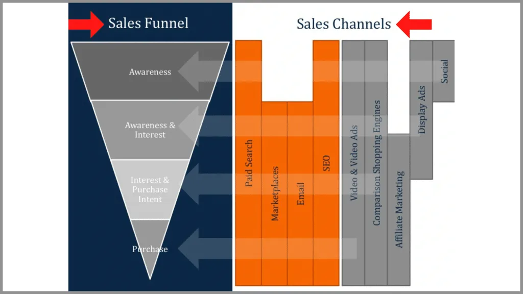
In this slide from Muckerlab there is a simple sales funnel on the left, with various sales channels on the right. With enough time I can figure out the message, but it’s a bit challenging for my brain to map sales channels to the various stages of the funnel.
“Ecommerce & Digital Marketing” Muckerlab, 2014
You might think that your visual is easy enough to understand, but remember that the audience hasn’t had the same amount of time to look at the slide as you have, so it’s much more difficult for them to grasp the key takeaway quickly.
In the slide below from Edelman there are four different charts, but each one is communicating the same type of information. By mixing up the chart style like this it makes the slide overly complicated. Instead of showing four simple column charts, they’ve forced the audience to understand and interpret each type independently. This just makes it harder for the audience to grasp the key takeaways of the slide.

“Global Deck” Edelman Trust Barometer, 2012
Instead, ask yourself, what’s the key takeaway of the slide, and how does my chart or graphic help support that key takeaway. Avoid trying to make yourself look smart, and instead figure out the simplest way to communicate the idea you’re trying to communicate.
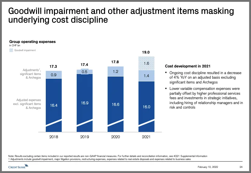
This slide from Credit Suisse is a great example of keeping the chart simple and clear. It’s just a normal-looking stacked column chart with easy to read data labels, a clear background, and a simple takeaway. The result is an effective and professional looking slide that’s easy for the audience to understand.
“Analyst and Investor Call” Credit Suisse, 2022
2. Simple Titles
The point of a title on a slide is to get a quick summary of the slide’s main takeaway, so the audience can better read and understand the details.
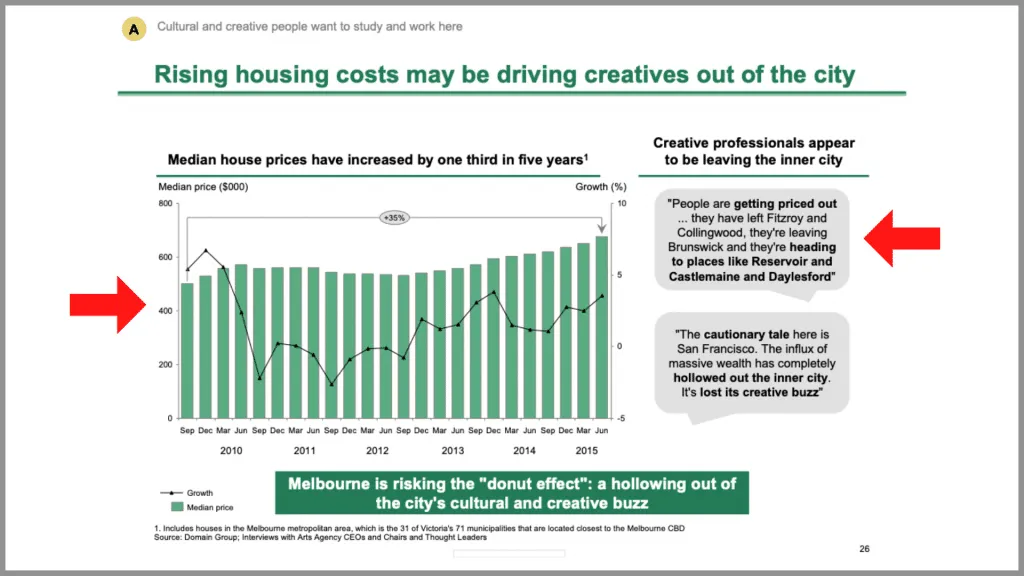
In this slide from BCG for example, the title says “Rising housing costs may be driving creatives out of the city”. So naturally, the audience is going to skim through the content looking for evidence of rising housing costs and creatives leaving the city, which makes for more effective delivery. (
“Melbourne as a Global Cultural Destination” BCG. For more BCG content be sure to check out our full BCG slide breakdown
But unfortunately, many titles aren’t this descriptive. Instead what I see are titles that tell me the topic of the slide and nothing else . I get an idea of what the slide is about, but I’m forced to come up with my own takeaway.
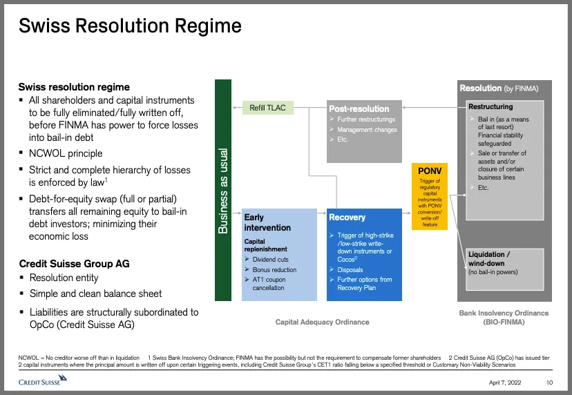
“Fixed Income Investor presentation” Credit Suisse, 2022
You see this especially on slides with summaries of data, like this slide from Salesforce about its finances. But even on these slides it’s usually a good idea to put a takeaway in the title.
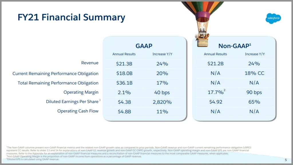
“Finance Update Q4 FY21” Salesforce
In this example from Orsted , they’ve shown some annual financial data, but they’ve also summarized what they want the audience to take away from the slide – that they are in line with expectations.
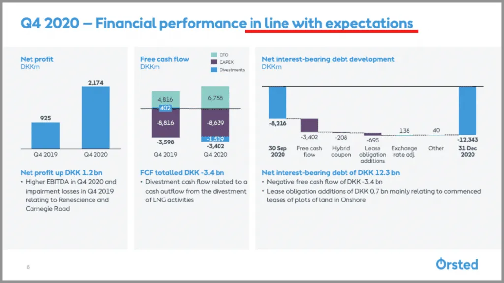
“Investor presentation Q4 and full-year 2020” Orsted, 2021
By including a full sentence for your title, ideally one that summarizes the main takeaway of the slide, you make it much easier for the audience to understand what it is you’re trying to tell them.
3. Default PowerPoint Designs
The third mistake I see more often than I’d like is using default PowerPoint designs. The worst case of this is using old slide themes, like in this example. Anyone who has spent any amount of time in PowerPoint recognizes this design, and aesthetics aside, it just looks like the slide was thrown together last minute.
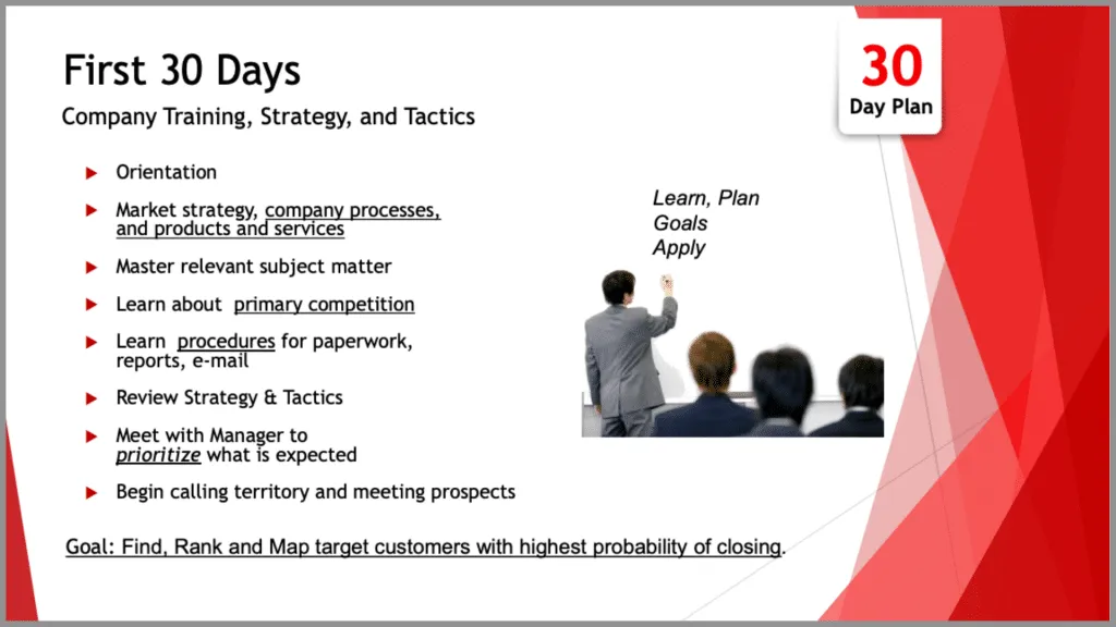
“First 30 Days” Markstar, 2017
You certainly don’t want to overdesign your slide, but at the very least try to avoid the out-of-the-box designs PowerPoint provides for you. Many of these designs haven’t changed in years, and usually they’re meant for a different kind of presentation (like a school project).
And the same goes for PowerPoint shapes, graphics, and even colors. They all come across as unprofessional and overused, so it’s in your best interest to avoid them altogether.
But where I think this is most easy to mess up is with tables. A table like this for example looks fine enough, but with just a few tweaks it can be made to look significantly better.

In this example, all I did was bold the titles, turn the negative values red, left align the first column and right align the others, make the top line extra thick, then add other lines to separate the regions. The result is a much better looking, and much easier to read table.

When it comes to design, even just a little bit of extra effort can help you avoid cliche, unprofessional looking slides.
4. Unrelated Content
In corporate style presentations, it’s completely okay to have lots of content, so long as each piece of content has a purpose. What I see way too often is stuff that’s just there to fill space, and doesn’t have an actual purpose.
In this Starboard Value slide , there are a lot of unnecessary distractions. For example, the box at the bottom is really just a repeat of what’s in the subtitle. Likewise, there’s a lot of text in the bullet points that could be trimmed down or eliminated without changing the message of the slide. It would help the audience focus more on the key takeaways, without getting distracted by all the fluff.
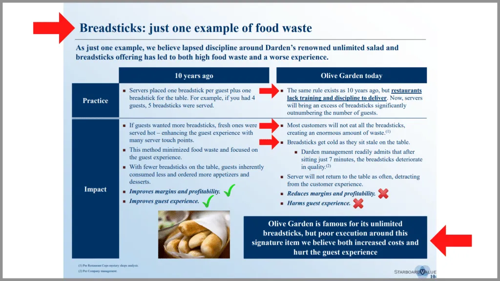
“Transforming Darden Restaurants” Starboard Value, 2014 See our full breakdown of this slide here .
But what bothers me the most is the picture at the bottom, which really isn’t adding to the slide in any meaningful way. Yes, it’s on topic – the slide is about breadsticks after all – but it’s not giving me any useful information. We all know what breadsticks look like, and this doesn’t help me understand the key takeaway any better.
Pictures are typically the most common culprit when it comes to unrelated content. It can be really tempting to throw a picture on a slide to fill up the extra space – especially if that picture looks professional and seems to loosely match the topic of the slide.
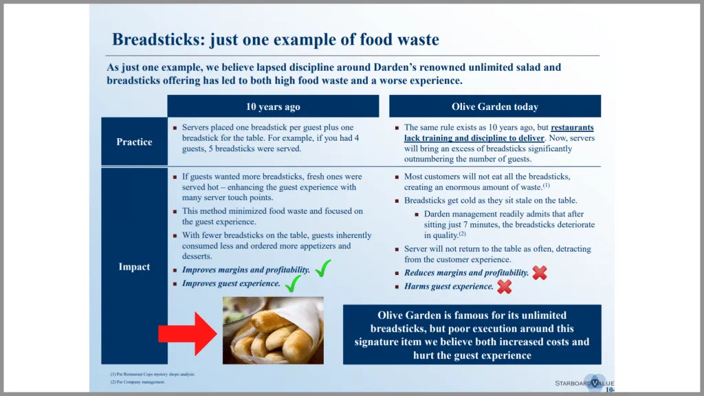
Even McKinsey is guilty of this sometimes, as in this example . The picture looks great, but it doesn’t help the audience understand the main message of the slide about digital manufacturing being a high priority for a majority of companies. Instead, it just distracts the audience.

“Moving Laggards to Early Adopters” McKinsey & Co., 2018 Learn more about how McKinsey designs data heavy PowerPoint slides.
In this example from a different presentation, they kept the slide fairly simple, with only information that supports the main takeaway of the slide, and nothing else. The result is a clear and easy to understand slide with a well-supported takeaway.
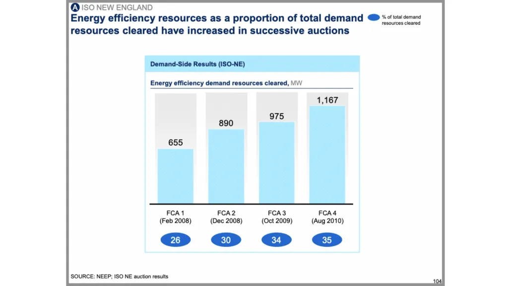
“Capturing the full electricity potential of the U.K.” McKinsey & Co., 2012
So when you’re adding content to your slide, whether that’s a picture, chart, or anything else, make sure it contributes to the message in some way. And if it doesn’t then just leave that part blank and adjust the other parts of the slide accordingly.
5. Distracting Backgrounds
This is related to the last mistake about unrelated content but is important in and of itself. A bad background can completely ruin a presentation. At best it’s distracting, but at worst it looks horribly unprofessional and makes the content hard to look at.
Once again this is where PowerPoint is to blame. Some of the default backgrounds make it almost impossible to read the text, especially if that text doesn’t provide any contrast.
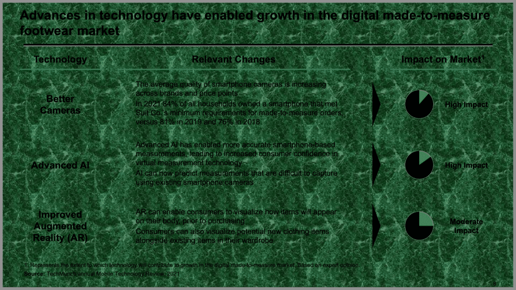
But even simple backgrounds can be distracting, as in our previous example from Starboard Value . Shading the background makes it difficult for my eyes to know where to focus my attention. Not to mention it makes some of the text slightly harder to read.

Even subtle text or images in the background can be distracting, as in this BCG example .

“Projecting US Mail volumes to 2020” BCG, 2010
The general rule of thumb with backgrounds is if you notice it, you should change it. The idea is you want to reduce the number of distractions on your slide so that the audience can focus on the insights. In that regard, you can almost never go wrong with a plain white background. This keeps the audience focused on your content, and ultimately on your message.
This slide from Accenture is a great example of a non-distracting background that keeps the emphasis on the content. Nothing is diverting my attention and I can focus on what they’re trying to tell me.

“Fintech New York: Partnerships, Platforms and Open Innovation” Accenture, 2015
But of course, the background doesn’t always have to be white. Sometimes darker backgrounds work better for longer, live presentations, especially when those presentations are given on a large screen.
In another example from later in the presentation, Accenture uses a darker blue background that’s simple, clear, and professional. And most importantly, it doesn’t take my attention away from the content on the slide.

6. Not Guiding the Audience
Most modern business presentations are full of text and data, which can make it difficult for the audience to process the information on a slide and see the key insights . In a live presentation, it is even more difficult – the audience has to simultaneously listen to the speaker, read through the content on the slide, and think critically about the information.
The easy way to manage this challenge is to guide the audience through your slide with visual cues – things like text, callouts, and boxes. Unfortunately, it is something that many people just don’t think to do. What this leads to is dense, difficult to read slides , as in these two examples:
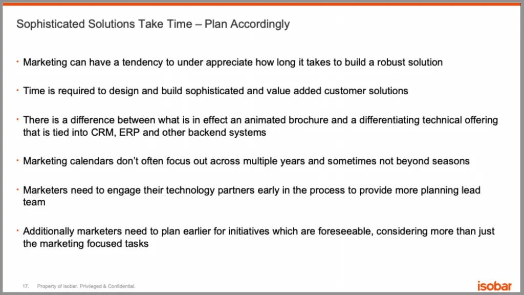
“Bridging the Gap Between CIO and CMO” Isobar, 2014
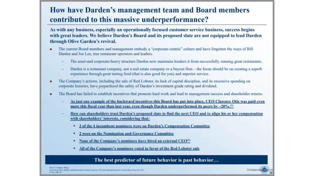
“Transforming Darden Restaurants” Starboard Value, 2014
And the same thing can happen with charts . By just putting up a chart with no real commentary or guidance, you make it hard for the audience to understand what it is you’re trying to tell them.

“Fifth Assessment Report- Synthesis Report” IPCC, 2014
In many ways, this is the counterpoint to the last mistake. Whereas you don’t want unimportant pieces like your background to be distracting, you do want the important parts of your slide to be distracting, because it helps the audience quickly grasp the key takeaways.
Returning to our Accenture example, notice how they’ve used bolded text to help call attention to what’s important. Likewise, they’ve also used a line to put emphasis on the title of the slide.

Check out our full breakdown of this slide here .
This BCG slide has quite a bit of information on it, but they’ve made it easy to work through by drawing the most attention to the title with green font and large text, then the next amount of attention to the subtitles with bold black text and green lines underneath, and then the least amount of attention to the bullet points. It helps the process the information on the slide in the way they want them to – starting with the highest level idea, and working their way through the details.
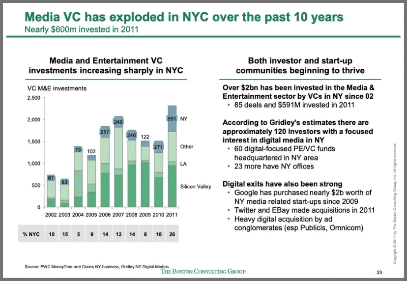
“Evaluating NYC media sector development and setting the stage for future growth” BCG, 2012
This chart from McKinsey is another good example of guiding the audience. Instead of just keeping the chart plain, they’ve added callouts that help emphasize the message in the title.

“Jobs lost, jobs gained: Workforce transitions in a time of automation” McKinsey, 2017
Guiding the audience can be as simple as adding an arrow or bolding important text. But even small changes like this can make a big difference in your presentation.
7. Too Many Colors
It can be tempting to use a variety of colors on your slide, but doing so just distracts the audience and takes attention away from the important parts. And not only that, it can look really unprofessional.
On this slide for example they’ve decided to separate each of these sections by color to make it easier to distinguish between them. But instead of making it easier to read, the slide is difficult to understand and hard to look at. The sections are already naturally separated, with lines, titles, and even icons. But by adding bright colors, in addition to the orange and green that’s already on the slide, they’ve reduced the slide’s readability considerably.

“Harnessing the Power of Entrepreneurs to Open Innovation” Accenture, 2015
The best slides use color strategically, to help highlight key points and ideas.
In this Bain slide for example, they’ve decided to highlight the important columns in red, while keeping the less important columns in grey. It provides a nice contrasting effect that helps emphasize the message.

“2011 China Luxury Market Study” Bain, 2011
Likewise, this Deloitte slide contains a minimal amount of color, making it easy to sift through the data and focus on only what’s important. Not to mention it keeps the visuals of the slide clean and professional.
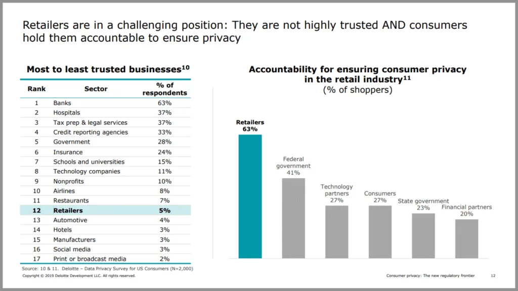
“Consumer privacy in retail” Deloitte, 2019
It’s a bit counterintuitive, but when it comes to color, sometimes less is more.
Final Thoughts
A few simple tweaks to your presentation can really make a difference in both its quality and overall professionalism. Above all, be sure to focus on your main message, and avoid any distractions that might take away from that message. If you can keep an eye out for cliché, unprofessional, and meaningless content, you’ll be well on your way to creating high-quality, insight-rich presentations.
P.S. – If you’re really looking to up your PowerPoint game, be sure to check out our full courses: Advanced PowerPoint for Consultants and Advanced Presentations for Consultants .
You can watch a video version of this article on YouTube .
- Print Friendly
Blog > Common mistakes in PowerPoint and what makes a bad presentation
Common mistakes in PowerPoint and what makes a bad presentation
08.09.21 • #powerpoint #tips.
Creating and giving a good presentation is actually not that difficult. If you know how to do it. Otherwise, no matter how much effort you put into it, it can quickly turn out to be a bad presentation.
Here we show you some examples of bad PowerPoint slides and common mistakes that are often made in presentations so that you won’t make them in your next presentation and avoid "Death by PowerPoint".
1. Reading aloud instead of speaking freely
One aspect in bad presentations is often that the text is simply read out. Prepare your presentation so well that you can speak freely. The goal is to build a connection with your audience and get them excited about your topic. However, this will hardly be possible if you only read from a piece of paper or your computer the whole time. Your audience should feel addressed, if you just read off, they will be bored and perceive your presentation as bad, even if your content and your PowerPoint are actually good.
2. Technical Problems
The sound of the video you inserted on a slide is not on, your laptop does not connect to the beamer, or your microphone does not work. These are just some of the problems that could occur during your presentation.
But nothing is more annoying than when technical problems suddenly occur during a presentation or even before, when everyone is waiting for it to start. It interrupts your flow of speech, only distracts the audience from the topic and breaks concentration. So before you get started with your presentation, it is important to first start your PowerPoint in the place where you will give it later, practice there and familiarize yourself with the technology.
- Don't forget the charging cable for your laptop
- Find out beforehand how you can connect your laptop to the beamer. Find out which connection the beamer has and which connection your laptop has. To be on the safe side, take an adapter with you.
- Always have backups of your presentation. Save them on a USB stick and preferably also online in a cloud.
- Take a second laptop and maybe even your own small projector for emergencies. Even if it's not the latest model and the quality is not that good: better bad quality than no presentation at all.
3. Losing the attention of your audience
One of the most common mistakes in presentations is to lose the attention of your audience. Especially in long presentations it is often difficult to keep your audience’s attention and to avoid “Death by PowerPoint”. Anyone who has had this experience knows how uncomfortable it is to give a presentation where you notice that no one is actually really listening to you. Especially if your presentation is an eternally long monologue, it is difficult to get the topic across in an exciting way and to captivate the audience.
Our tip: Include interactive polls or quizzes in your presentation to involve your audience and increase their attention. With the help of SlideLizard, you can ask questions in PowerPoint and your audience can easily vote on their own smartphone. Plus, you can even get anonymous feedback at the end, so you know right away what you can improve next time.
Here we have also summarized further tips for you on how to increase audience engagement.
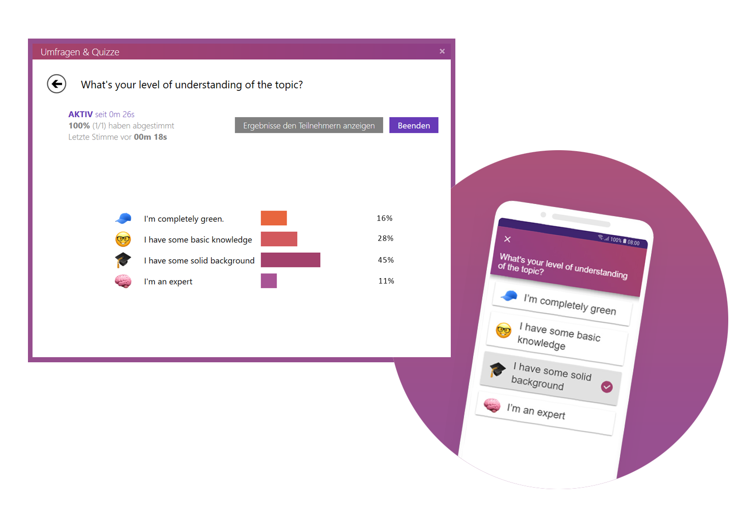
4. Avoid eye contact
You want your audience to feel engaged in your presentation, but if you avoid eye contact the whole time, they certainly won't. Avoid staring at just one part of the wall, at your paper or your computer. If the participants have the feeling that you are just talking to the wall, it is a bad presentation. Speak to your audience, involve them in your presentation and make it more exciting for them.
But also make sure you don't always look at the same two or three people, but address everyone. If the audience is large, it is often difficult to include everyone, but still try to let your eyes wander a little between your listeners and look into every corner of the room.
5. Speaking incoherently
Avoid jumping from one topic to the next and back again shortly afterwards. Otherwise your audience will not be able to follow you after a while and their thoughts will wander. To prevent this, it is important that your presentation has a good structure and that you work through one topic after the other.
Nervousness can cause even the best to mumble or talk too fast in order to get the presentation over with as quickly as possible. Try to avoid this by taking short pauses to collect yourself, to breathe and to remind yourself to speak slowly.

6. Many colors mixed with each other
Make sure that your presentation is not too colorful. If you mix too many colours, bad presentation slides will result very quickly. A PowerPoint in which all kinds of colors are combined with each other does not look professional, but rather suitable for a children's birthday party.
Think about a rough color palette in advance, which you can then use in your presentation. Colors such as orange or neon green do not look so good in your PowerPoint. Use colors specifically to emphasize important information.
It is also essential to choose colors that help the text to read well. You should have as much contrast as possible between the font and the background. Black writing on a white background is always easy to read, while yellow writing on a white background is probably hard to read.
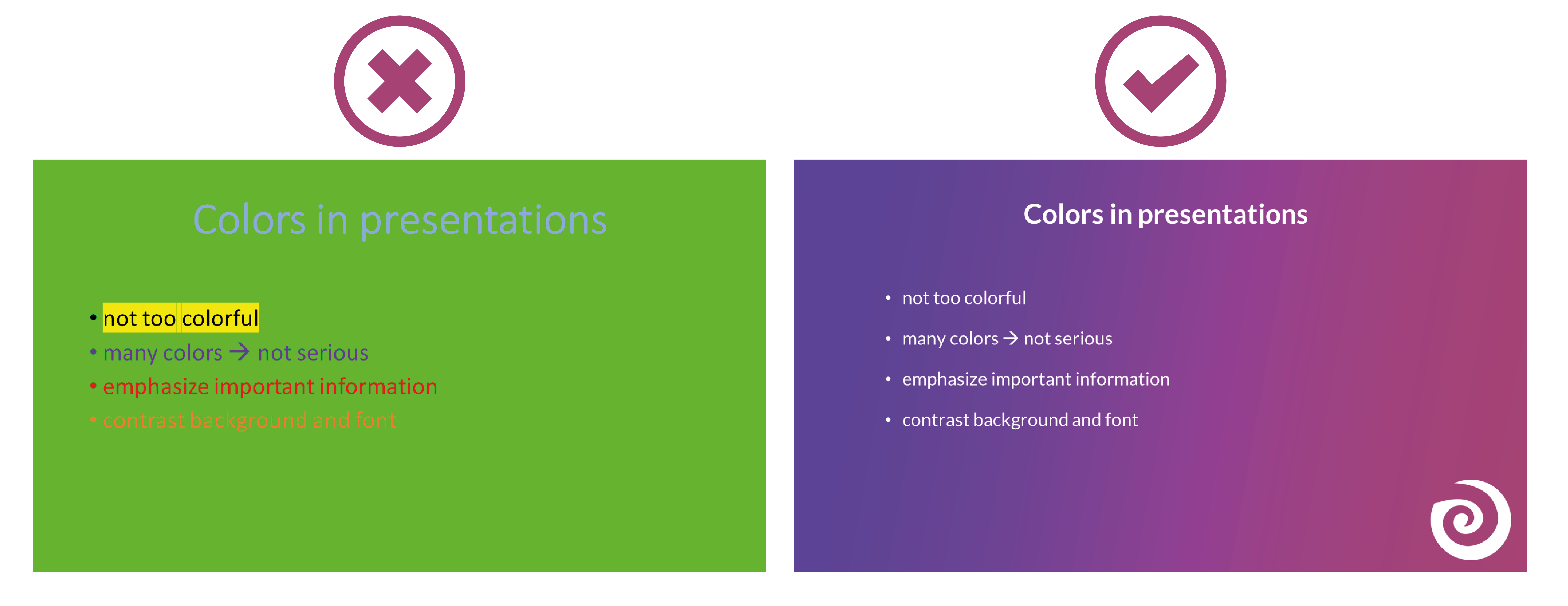
7. Too minimalistic design
Even though it is often said that "less is more", you should not be too minimalistic in the design of your presentation. A presentation where your slides are blank and only black text on a white background is likely to go down just as badly as if you use too many colors.
Empty presentations are boring and don't really help to capture the attention of your audience. It also looks like you are too lazy to care about the design of your presentation and that you have not put any effort into the preparation. Your PowerPoint doesn't have to be overflowing with colors, animations and images to make it look interesting. Make it simple, but also professional.
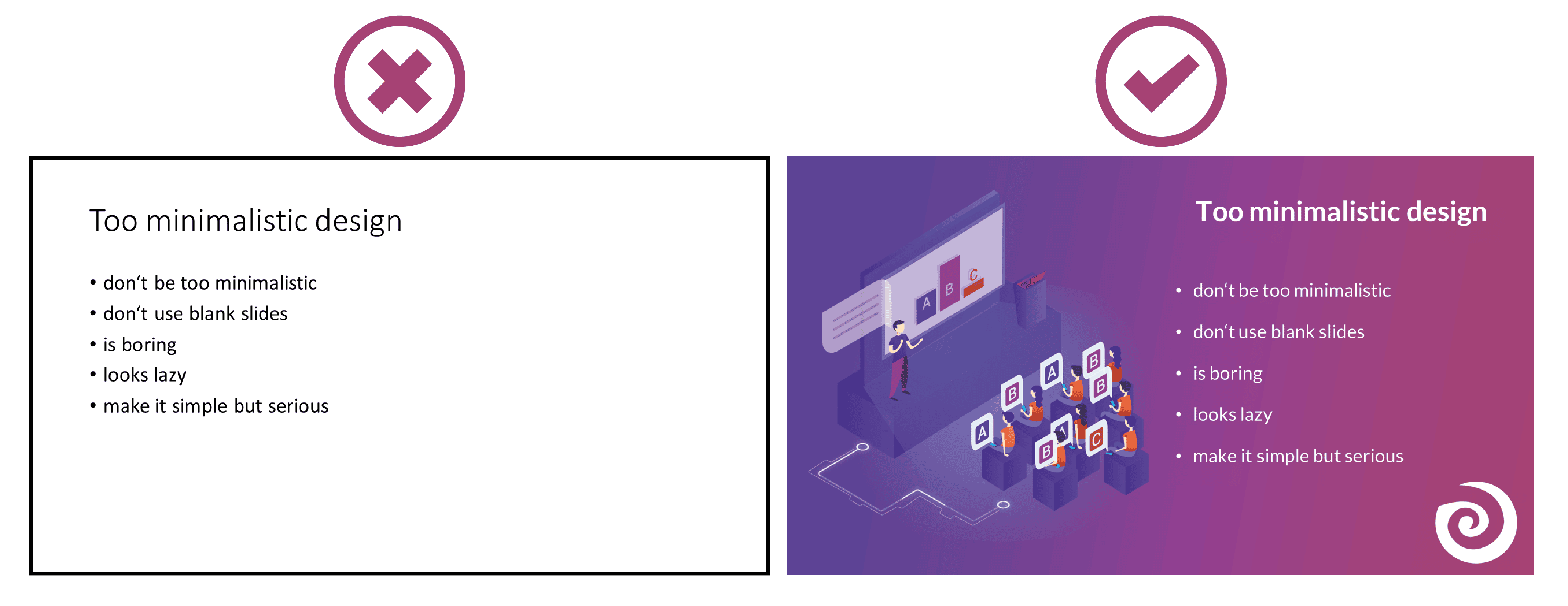
8. Too much text
The slides of your presentation should never be overcrowded. Write only the most important key points on your slides and never entire sentences. Your audience should not be able to read exactly the text you are speaking in your PowerPoint. This is rather annoying and leads to being bored quickly. Summarize the most important points that your audience should remember and write them down in short bullet points on your presentation.
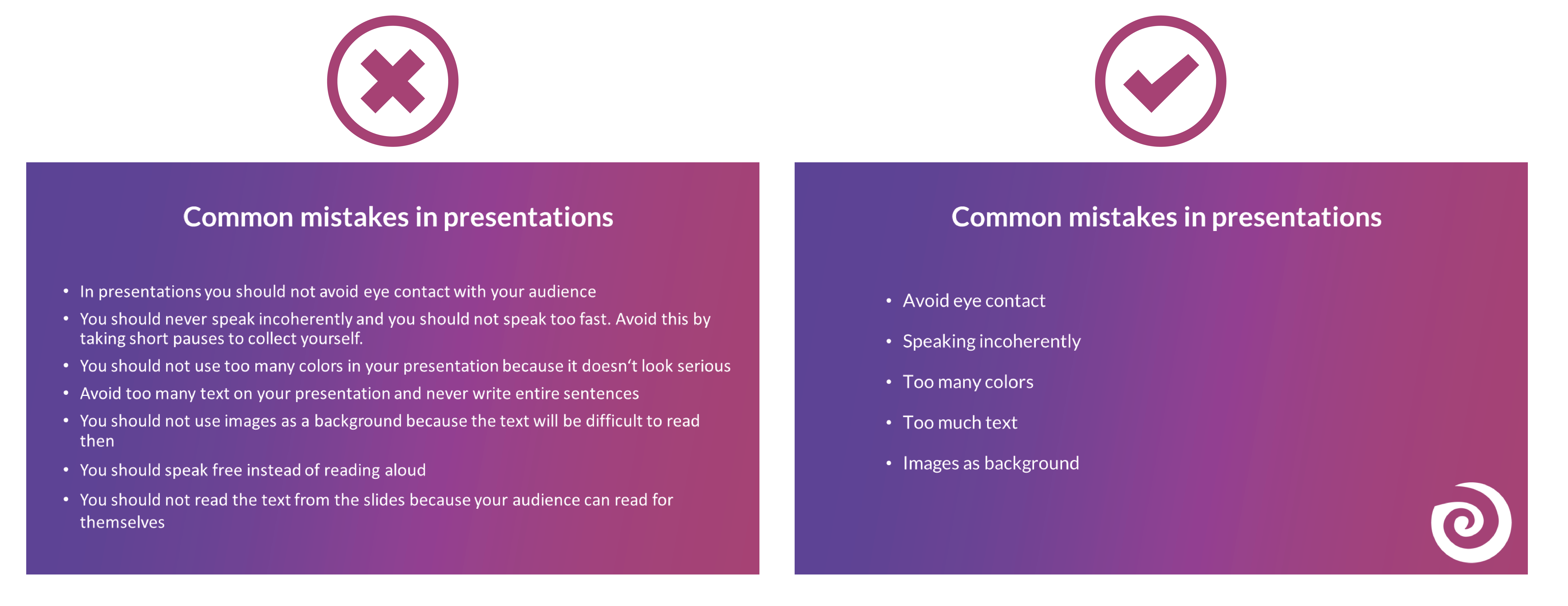
9. Many different animations
To avoid bad presentations it is important to never use too many animations. It looks messy and confusing if every text and image is displayed with a different animation. Just leave out animations at all or if you really want to use them then use them only very rarely when you want to draw attention to something specific. Make sure that if you use animations, they are consistent. If you use transitions between the individual slides, these should also always be kept consistent and simple.
10. Too many images
Bad presentation slides often occur when their design ist unclear and unorganised. Images and graphics in presentations are always a good idea to illustrate something and to add some variety. But don't overdo it with them. Too many images can distract from your presentation and look messy. Make sure that the graphics also fit the content and, if you have used several pictures on one slide, ask yourself whether you really need all of them.
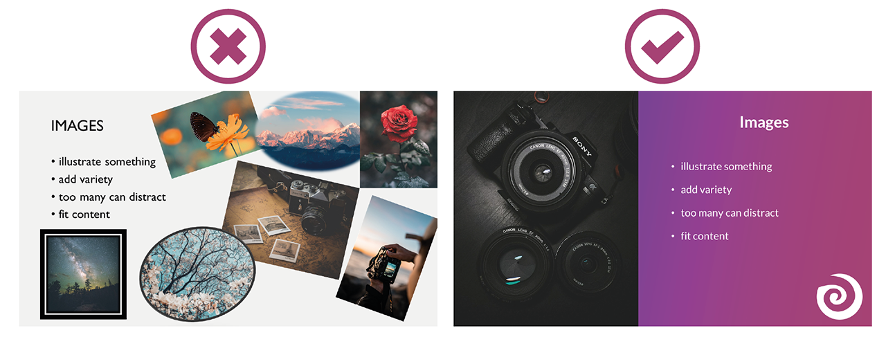
11. Too many or unreadable fonts
Never combine too many fonts so that your presentation does not look messy. Use at most two: one for headings and one for text. When choosing fonts, you should also make sure that they are still legible at long distances. Script, italic and decorative fonts are very slow to read, which is why they should be avoided in presentations.
It is not so easy to choose the right font. Therefore, we have summarized for you how to find the best font for your PowerPoint presentation.
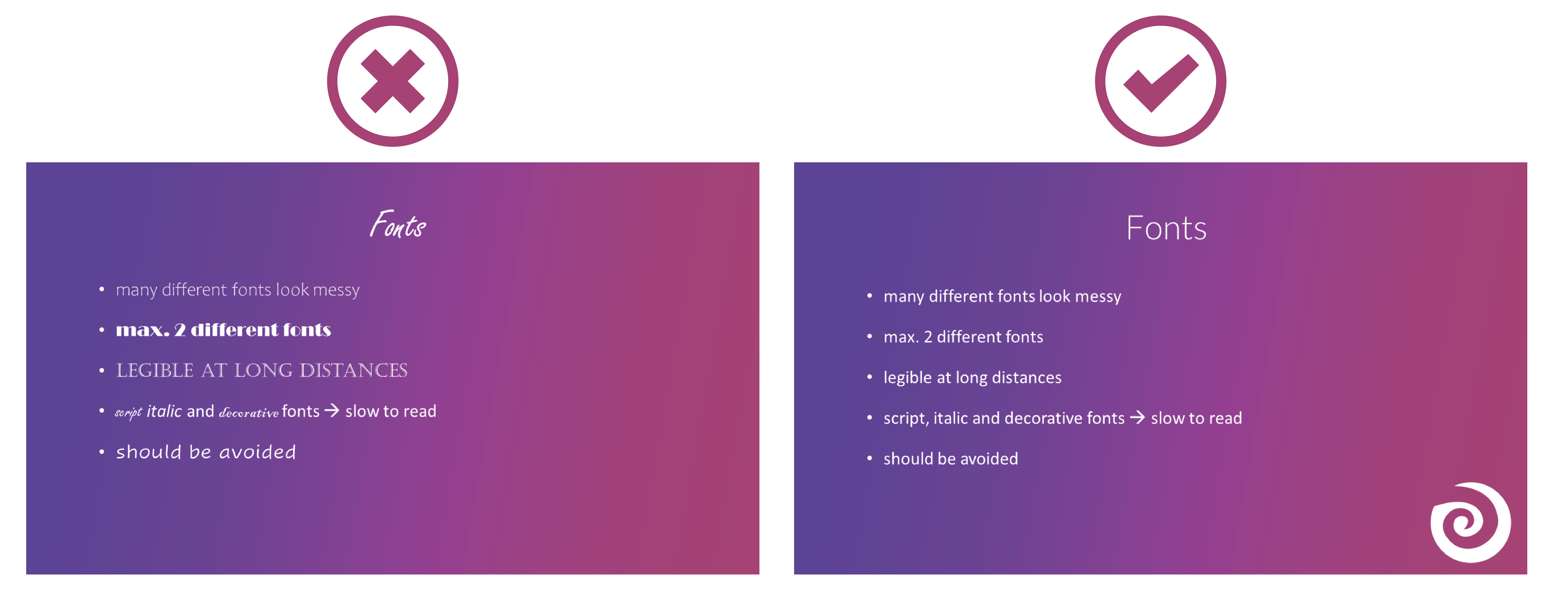

12. Images as background
To avoid bad presentations, do not use images as slide backgrounds if there should be also text on them. The picture only distracts from the text and it is difficult to read it because there is not much contrast with the background. It is also harder to see the image because the text in the foreground is distracting. The whole thing looks messy and distracting rather than informative and clear.
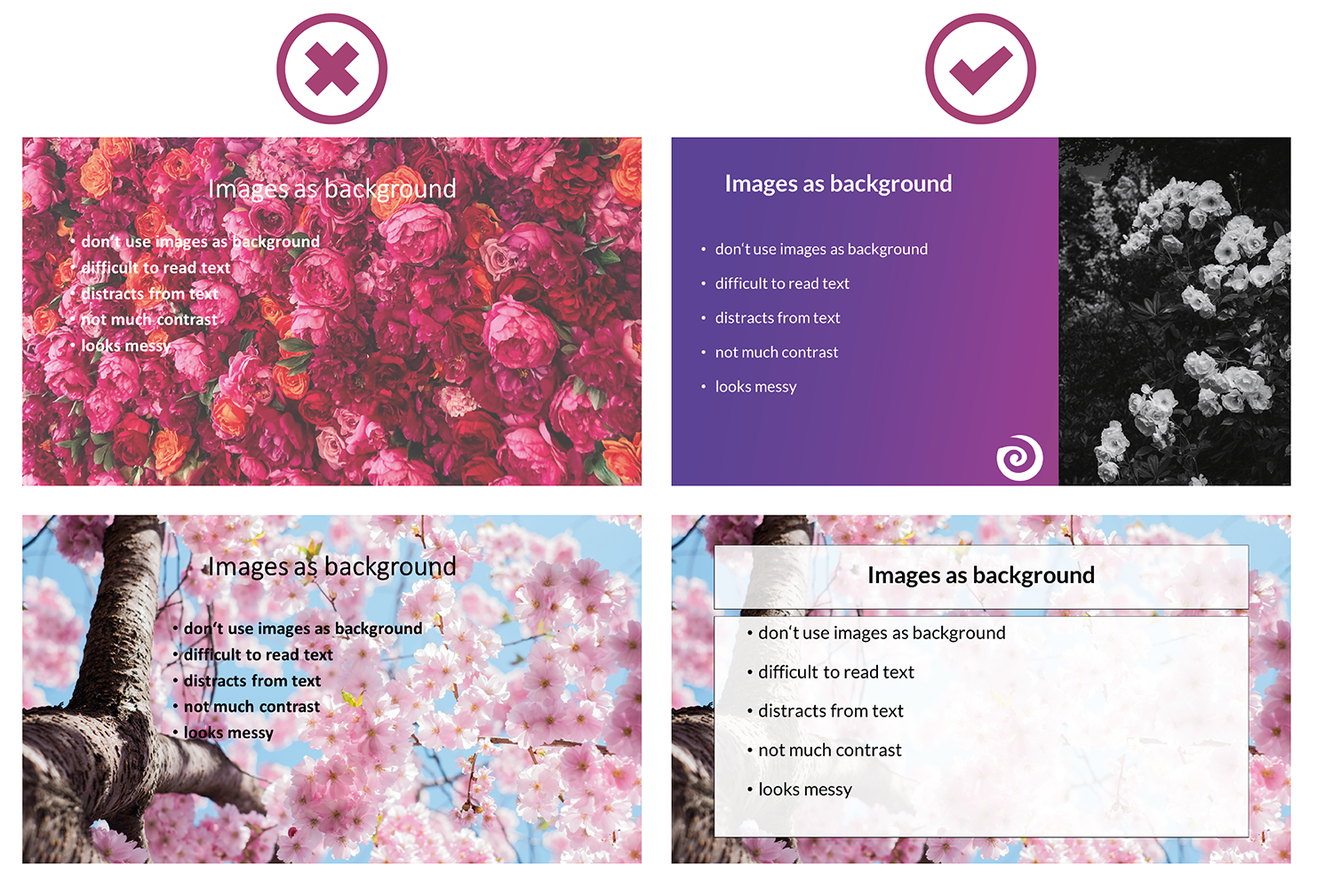
13. Reading from the slides
Never just read the exact text from your slides. Your audience can read for themselves, so they will only get bored and in the worst case it will lead to "Death by PowerPoint". You may also give them the feeling that you think they are not able to read for themselves. In addition, you should avoid whole sentences on your slides anyway and only have listed key points that you go into more detail then.
14. Turn your back
Never turn around during your presentation to look at your projected PowerPoint. Not to read from your slides, but also not to make sure the next slide is already displayed. It looks unprofessional and only distracts your audience. In PowerPoint's Speaker View, you can always see which slide is currently being displayed and which one is coming next. Use this to make sure the order fits. You can even take notes in PowerPoint, which are then displayed during your presentation. You can read all about notes in PowerPoint here.
15. Forgetting the time
Always pay attention to the time given. It is annoying when your presentation takes much longer than actually planned and your audience is just waiting for you to stop talking or you are not able to finish your presentation at all. It is just as awkward if your presentation is too short. You have already told everything about your topic, but you should actually talk for at least another ten minutes.
Practice your presentation often enough at home. Talk through your text and time yourself as you go. Then adjust the length so that you can keep to the time given on the day of your presentation.

16. Complicated Structure
The structure of your presentation should not be complicated. Your audience should be able to follow you easily and remember the essential information by the end. When you have finished a part, briefly summarize and repeat the main points before moving on to the next topic. Mention important information more than once to make sure it really gets across to your audience.
However, if the whole thing gets too complicated, it can be easy for your audience to disengage after a while and not take away much new information from your presentation. So a complicated structure can lead to bad presentations and "Death by PowerPoint" pretty quickly.
17. Inappropriate clothes
On the day of your presentation, be sure to choose appropriate clothing. Your appearance should be formal, so avoid casual clothes and stick to professional dress codes. When choosing your clothes, also make sure that they are rather unobtrusive. Your audience should focus on your presentation, not on your appearance.

18. Inappropriate content
Think about who your audience is and adapt your presentation to them. Find out how much they already know about the topic, what they want to learn about it and why they are here in the first place. If you only talk about things your audience already knows, they will get bored pretty soon, but if you throw around a lot of technical terms when your audience has hardly dealt with the topic at all, they will also have a hard time following you. So to avoid "Death by PowerPoint" in this case, it is important to adapt your presentation to your audience.
You can also ask a few questions at the beginning of your presentation to learn more about your audience and then adapt your presentation. With SlideLizard , you can integrate polls directly into your PowerPoint and participants can then easily answer anonymously from their smartphone.
19. Too much or unimportant information
Keep it short and limit yourself to the essentials. The more facts and information you present to your audience, the less they will remember.
Also be sure to leave out information that does not fit the topic or is not relevant. You will only distract from the actual topic and lose the attention of your audience.
20. Monotone voice
If you speak in a monotone voice all the time, you are likely to lose the attention of your audience. Make your narration lively and exciting. Also, be careful not to speak too quietly, but not too loudly either. People should be able to understand you well throughout the whole room. Even if it is not easy for many people, try to deliver your speech with confidence. If you are not enthusiastic about the topic or do not seem enthusiastic, you will not be able to get your audience excited about it.

Examples of bad presentations to download
We have created a PowerPoint with examples of bad presentation slides and how to do it right. You can download it here for free.
Related articles
About the author.

Helena Reitinger
Helena supports the SlideLizard team in marketing and design. She loves to express her creativity in texts and graphics.

Get 1 Month for free!
Do you want to make your presentations more interactive.
With SlideLizard you can engage your audience with live polls, questions and feedback . Directly within your PowerPoint Presentation. Learn more

Top blog articles More posts

10 creative Ideas for your Title- and End-Slides in Presentations

SlideLizard 1.5 Update
Get started with Live Polls, Q&A and slides
for your PowerPoint Presentations
The big SlideLizard presentation glossary
Leading questions.
Leading questions subconsciously make the respondent think in a certain direction.
Co-located Audience
Co-located Audience means that the speaker talks to the audience in person. It is used verbal and non-verbal methods to communicate a message. The speaker makes gestures with their hands, changes their face expression and shows images.
Process Questions
Process questions are similar to recall questions but they need some deeper thoughts and maybe also analysis.
Recall Questions
With recall questions, you have to remember something or something has to be recalled. Example: A teacher asks his students a question so that they remember the material from the last lesson.
Be the first to know!
The latest SlideLizard news, articles, and resources, sent straight to your inbox.
- or follow us on -
We use cookies to personalize content and analyze traffic to our website. You can choose to accept only cookies that are necessary for the website to function or to also allow tracking cookies. For more information, please see our privacy policy .
Cookie Settings
Necessary cookies are required for the proper functioning of the website. These cookies ensure basic functionalities and security features of the website.
Analytical cookies are used to understand how visitors interact with the website. These cookies help provide information about the number of visitors, etc.
Retraction Watch
Tracking retractions as a window into the scientific process
18 tips for giving a horrible presentation

Too many of us have sat through too many bad presentations. And no one wants to give one, either.
Someone who’s seen his fair share of bad talks is David Sholl , of the Georgia Institute of Technology. In this helpful video , “The Secrets of Memorably Bad Presentations,” he presents some tongue-in-cheek advice on how to torture your audience.
(If it’s not immediately obvious — Sholl wants you to do the exact opposite of what he’s suggesting, below.)
- Everyone always says lead with a joke. Instead of that, spend the first few minutes of your talk fiddling around with the computer , loading up the right presentation, etc. Don’t bother checking all that ahead of time — awkward silence is a good ice-breaker.
- If you do want to start on a light note, include a time-wasting — and completely unfunny — anecdote .
- Provide a long-winded introduction that includes stock art and unnecessary explanations. Talking about geochemical engineering? Why not start with the Industrial Revolution, and work your way to the present?
- List only your own citations (particularly if you’re first author, so all the citations say “your name, et al”) — if you end up ignoring the work of other people listening to your talk, so be it.
- Include a generic slide that provides an outline of your talk . The less specific the better: Introduction/Method/Results/Conclusion, etc.
- If you get nervous, don’t worry. Just talk really quickly .
- This goes without saying — make bad slides . Suggestions include using different fonts in different places, and cramming in as many acronyms and as much jargon as you can.
- When presenting data, include multiple, dense tables. The smaller the font, the better .
- Don’t bother explaining why certain data points are more significant than others — let the numbers speak for themselves .
- The same advice holds for figures and images on slides — don’t waste space by including words that explain what the images are depicting , or why certain features are important — let the audience do the work to figure it out for themselves.
- Check the clock — if you realize you’re short on time but still want to make a point, just click through some slides quickly . Your audience will get it.
- If you want to include text on a slide, just copy the long figure legends from a few of your images.
- Keep everyone guessing. In the corner of a slide labeled “conclusions,” note that it’s only slide 27 out of 104, so they’ll never know when the talk will truly end.
- On that note, talk about something totally different after your “conclusion” slide — maybe throw up some new data from an entirely different project, which you haven’t analyzed yet .
- When you really do end up concluding your talk, just assemble a bullet-point list of everything you discussed , and read it off, line by line.
- When acknowledging people and places who contributed to your project, mention everything — extensive acknowledgments are a great climax to a talk .
- Of course, continue talking long past your allotted time, showing no sign of ever stopping . This is particularly important if your talk is followed by refreshments, which should be plainly visible to the audience — but out of reach until the talk is over.
- If you have time for questions, use a question to talk further about another topic, unrelated to what the person was asking . (As a shortcut: Cut off the question before the person has finished, so you can really say whatever you want.) Even if the question appears to have a simple answer, make it long and complicated.
Some of this should seem painfully familiar to readers who attend multiple talks. If you foresee having to sit through some painful ones in the future, you can download “ bad talk bingo ” from Sholl’s website , which enables you to check off every negative element as it appears.
Like Retraction Watch? Consider making a tax-deductible contribution to support our growth . You can also follow us on Twitter , like us on Facebook , add us to your RSS reader , sign up on our homepage for an email every time there’s a new post, or subscribe to our daily digest . Click here to review our Comments Policy . For a sneak peek at what we’re working on, click here .
Share this:
22 thoughts on “18 tips for giving a horrible presentation”.
Use the word “basically” every 15 seconds. Read the text off the slides, word for word. Face the wall the presentation is projected on, so no one can hear you. Insert spelling mistakes. Think that it’s cool to have flashing visuals on your slides. Get definitions off Wikipedia. In other words, present like my grad school professors did.
For graduate students- try to impress the audience with how much you know and every step of your methods. Because everyone at conferences is secretly a member of your thesis committee, trying to decide whether you really deserve a Ph.D.
You missed one; as slides project each page of the publication you are presenting.
He also conveniently provides a summary in the form of a bingo sheet found [here]( http://sholl.chbe.gatech.edu/download_supplements/Bad_Talk%20_Bingo.pdf )
Excellent! I must admit that I myself fell into the trap of at least seven of the Sholl’s bullets. Two more: 19. If you have a 1000 mW powerful green laser pointer, use it to describe a frenzied Brownian-like motion on any available surface: the screen, the roof, the walls, the floor, your body, your audience (the eyes are a target of choice), etc. 20. If the presentation takes place in a closed location, ensure that all lights are turned off, in order to prevent the audience to take notes and steal your good ideas.
And don’t forget to interject an “uh” or other similar filler sound every, uh, 10 seconds.
use a company/university laptop with automatic updates implemented by the IT department so that the computer has a better chance of rebooting in the middle of your talk….
Here is an “excellent” presentation of Lincoln’s Gettysburg Address done in PowerPoint – https://people.eecs.berkeley.edu/~russell/gettysburg/
Avoid saying “That’s an excellent question ” after EVERY question. Not all questions are excellent. Simply thank them for their not so excellent question. Avoid asking if they were paying attention.
– use yellow and light green to highlight what is *really* important to understand your talk – talk to the wall or the floor, preferably facing away from the audience as much as possible. This also makes it easier to ignore any question during your talk as a good side-benefit. – don’t practice! ever! – use changing numbers of total slides – on each slide! – when using a microphone, feel free to fiddle around with it as much as you like.
Here is one of my favourite ones:
Check the slides in your talk on the train, or 5 mins before you are up, or in the previous talk, but use the rehearse tool to do this. This then automatically embeds the timing into each slide, if you are not careful. Of course you have now just blasted through your slides in seconds, so now….
Then wonder why your slides keep moving forward after a second or two, when to come to give your talk.
You then start blaming the “broken” trackpad, mouse, keyboard or computer. Of course in that time you talk has moved on more slides.
So start thinking the computer is possessed!
Then I kid you not I have seen this, think the audience is playing tricks on you and someone else is moving the slides, and start looking accusingly at the audience.
17 needs some modification: make sure you have several final points to keep the audience and the moderator guessing about when you’re actually going to finish.
I have seen all of these happen:
– Give a keynote talk where you cover mostly elementary topics suitable for an undergraduate lecture when the audience consists of renowned experts in the field.
– Inversion of the “ignore others’ contributions” – discuss extensively what others have done but forget to actually mention what it is that you have done yourself.
– Move back and forth the slide stack constantly because all your arguments are spread over multiple slides.
– Have two presenters who switch in the middle of the presentation. For an extra challenge, try it with three people (professor, post-doc, grad student).
– Ignore the chair’s attempts to tell you your time is finished and instead keep on talking to the wall or your shoes.
– Realize you’re running out of time so start speaking three times as fast for the last five minutes.
– Ignore the chair’s directions when taking questions and start an extended conversation about minutiae of your research with your friend in the audience when you’ve already exceeded your allotted time by 10 minutes.
Not so sure the “generic slide” is necessarily useless. OK, a conference room is not a restaurant but having the menu can prove helpful to the audience. Of course if the menu just says “starter-main dish-dessert”, it IS useless. Another good thing to do is to point the laser in the face of the audience, random selection of faces works well, but targeted pointing – e.g. someone falling asleep – is way better!
Remember, yellow Comic Sans on a dark blue background is the most visually pleasing slide format. Failing that, you could use a dark gray font on a dark gray background on your lab website (cough cough… http://sholl.chbe.gatech.edu/ )
@Paul Brookes Good point Paul. I will see what we can do about the color scheme of our website……
The flipside:
7 Tips For Being A Horrible Audience Member At A Presentation:
1. Tap away loudly on a laptop keyboard throughout the entire presentation. 2. Use a large camera to take photos of every slide as it comes up, complete with loud click and flash. Completely ignore any attempt by the speaker or organizers to explain that photography is forbidden/discouraged or that the slides will be available online later. 3. Fall asleep after a big lunch, snore loudly and blame the speaker for not being interesting enough. 4. When asking questions, say “I actually have two questions…” 5. When asking questions, blatantly accuse the speaker of plagiarism/unoriginality because their work is vaguely similar to that of others working in the same field. 5b. Do the above when the people you’re accusing them of ripping off are in the room. (Why yes, this has indeed happened to me.) 6. When asking questions, spend 5 minutes describing your own research or telling a tenuously related anecdote. 7. When asking questions, betray the fact that you weren’t listening during most of the presentation.
Also, have a long-winded comment, poorly disguised as a question and with minimal relevance to the presentation you have just listened to, on every presentation, all day, every day of the meeting. After all, the most important aspect of any meeting is that everyone realizes how clever you are.
Indeed. To be honest, I’m much more often annoyed by horrible audience than horrible presentation.
Apologize for every bad slide and never fix them next time. You don’t have time to do it right.
Never provide a URL for access to your slides, handouts, etc. It takes too much effort for you and not enough for the audience.
Use red and green all the time. It’s fun to harass the disabled. http://www.somersault1824.com/tips-for-designing-scientific-figures-for-color-blind-readers/
If some of the work is published, why make new slides? Just slap that 16-graph figure with axes labeled in 2 point acronyms into the middle of the slide, wave the pointer around, and say “as you can see here …”
Don’t bother embedding the videos in the presentation. Everyone will be happy to wait as you fumble through the folder full of files labelled “viudeo1.mpg” “video_2_.old.mpg”, “F.flv” and “zzzNotThisOne.docx.mp4” and watch them at postage-stamp resolution at random positions on the screen. Bonus points: lose your place in the presentation and decide that the best way to get back is to start at the beginning and click through every transition from slide 1 to slide 44.
Leave a Reply Cancel reply
Your email address will not be published. Required fields are marked *
This site uses Akismet to reduce spam. Learn how your comment data is processed .
Unsupported browser
This site was designed for modern browsers and tested with Internet Explorer version 10 and later.
It may not look or work correctly on your browser.
- Presentations
15 Pro Tips to Design a Good (Vs Bad) PowerPoint (That Doesn't Suck)
Over the years, PowerPoint has gained a bad reputation. There's even a trending hashtag #DeathbyPowerPoint on Twitter and Instagram. Why? There are hundreds of bad PowerPoint presentation examples that went a little like this presentation:

Don't let your next PowerPoint presentation fall victim to one of several missteps. This collection of tips from experts will set you on the right path. Learn how to avoid death by PowerPoint by following the good PowerPoint design tips in this article.
Good PowerPoint presentations can be a great way to connect with your target audience and improve your bottom line. Bad PowerPoint slides are easier to avoid than you might think.
In this article, we’ll share what makes a bad PowerPoint presentation. You'll also learn why you should avoid making people sit through one at all costs. Then, we'll give you a handful of tips from the presentation pros that'll help you design a good PowerPoint . Best of all, you'll learn how to avoid death by PowerPoint.
What Makes a "Bad" PowerPoint Presentation?
As rude as it might sound, in most cases, PowerPoint isn't the main reason behind a bad presentation. After all, PowerPoint is just a tool. It's used to create great slides, and it's also used to create bad PowerPoint slides.
Our Envato authors have designed hundreds of PowerPoint templates. According to their expertise, the main reason for bad PowerPoint presentations is design-related.
Slide design with poor layout that uses fonts and colors that detract from the message on the slide is one of the main reasons why PowerPoint gets such a bad reputation .
A classic mistake in PowerPoint slideshow design is to include too much information on a single slide. Take a look at this presentation on Lung Cancer from SlideShare. Not only will you find information overwhelm, but they also decided to add 100 charts on one slide!
A couple of other reasons that lead to bad PowerPoint presentations include:
- a topic that's got nothing to do with your audience’s interest
- failing to make a connection with your audience
- reading directly from the slides
Envato author, Celsius Designs , recommends paying extra attention to the layout and sketching out the presentation on the paper before going into PowerPoint and creating the final presentation. They also suggest studying successful presentations online.

Another team of our Envato authors, AQR Studio , says that every bad presentation they witnessed had the same thing in common:
"...too much text on individual slides and bad layout."
Their advice is to take a look at presentation templates created by professionals and study them to find common elements that make for an attractive presentation. They also suggest adding in your own style instead of copying someone else’s.

Lastly, don’t forget that nerves and knowing your audience plays an important role in your presentation delivery as well. According to David Beckett , a TEDx speech coach,
“[...]two major reasons for poor presentations: nerves, and not paying enough attention to the audience.”
Now that you know what makes a bad PowerPoint presentation, let’s discuss why you should avoid making your audience sit through it.
Why a Bad PowerPoint Presentation Hurts Your Message
A bad presentation will not only leave a sour taste in your mouth, but it'll also bore your audience. Once your audience gets bored, chances are they'll disengage from the presentation. They'll stop paying attention to what you've got to say (also known sarcastically as death by PowerPoint).

Also, once your audience becomes disengaged, chances are they won’t remember the topic, much less the content of your presentation. If you’re presenting in front of potential business partners or investors, you run the risk of not closing the deal or getting the necessary funding.
Ultimately, a bad presentation will result in a bad impression of your brand and business. Luckily, we’ve gathered the best PowerPoint design tips from the experts that'll help you create good PowerPoint presentations and avoid death by PowerPoint.
15 Tips from Professionals for Creating Good PowerPoint Presentations
No matter how experienced you are, the truth is, bad PowerPoint presentations can happen to anyone. Even successful speech coaches aren’t immune to delivering bad presentations.

Consider this story from Michelle Mazur, speech coach from Communication Rebel :
“Once I was invited to give a presentation on cultural trends. I worked closely with the meeting planner. In fact, she approved every slide I was going to present. This was an executive-level audience and she wanted the content to be perfect. I researched, I prepped, I practiced, I had great examples.
Five minutes into my presentation, one executive raised his hand and asked “Are these trends based on quantitative research?” My reply was, “No, they are qualitative cultural trends.” He and half the room tuned out. The presentation flopped. My mistake was basing my whole speech on information from one person. That question killed me and there was no way to save the presentation in the moment...
I recovered. You can too when your presentation sucks. The most important point is: Keep Speaking. Learn from your mistakes and don't let them hold you back.”
As Dr. Mazur says, the good news is that you can recover from a bad presentation and go on to successfully create good PowerPoints that don’t suck. Below, you’ll find 15 tips from the experts that'll help you rock your PowerPoint design and your presentation skills.
1. Graphics for Visual Aid
Bad PowerPoint slides are cluttered, wordy, and boring. They lose sight of the focus of a PowerPoint presentation. Remember, your goal is to present information in clear, understandable ways. By adding graphics for visual aid, you can do exactly that. For example, consider infographics. These are illustrations built to share ideas.

Rather than packing a slide with words to explain a concept, map it out with an infographic. This might be a process flow chart, or a 3D hierarchy diagram. In fact, premium infographic templates from Envato Elements offer thousands of options. Choose one that works well for your topic, then drop in your details.
2. Stick to Readable Fonts
Top examples of bad PowerPoint slides often share something in common: strange fonts . Sure, unique fonts can be fun and amusing. But they don’t have a place in a professional slide deck. It’s bad PowerPoint form to use these fonts.
Instead, you need to choose a clear, stylish font that’s easy to read. Remember, audiences might be reading your slides from the back of a large room.

This doesn’t mean fonts have to be boring. Far from it - and again, Envato Elements is here to help. As a member, you've got access to thousands of custom font designs with unlimited downloads.
Each one will work in your PowerPoint. Avoid becoming an example of bad PowerPoint form and choose a premium custom font today! They look great and help you succeed.
3. Consistency Is Key
The number one tip for your PowerPoint design is to be consistent. This simply refers to using the same fonts and colors throughout your presentation instead of changing them up every other slide.
It’s a good idea to use the same fonts and colors used in the rest of your brand assets. But if you aren’t sure which colors and fonts are a part of your brand identity, you can’t go wrong with keeping it simple.
Speaker and author Hugh Culver is proof that simplicity works:
“A consistent theme pulls together the variety in your images and message, as you move from problem to solution. You could use the baked-in themes supplied in PowerPoint or Keynote – I don’t because I want a simpler, more unique look.
I create a custom theme simply with my titles, a consistent white background, and sometimes with my logo or my client’s logo.”
4. When It Comes to Text, Less Is Always More
As mentioned earlier, too much text will overwhelm your audience. Another downside of using too much text is that your audience will read the content of the slide before you’re done talking about it and then tune you out.
TEDx in-house presentation expert, Aaron Weyenberg , makes an excellent argument for using less text in your PowerPoints:
“With text, less is almost always more. One thing to avoid—slides with a lot of text, especially if it’s a repeat of what you’re saying out loud. It’s like if you give a paper handout in a meeting—everyone’s head goes down and they read, rather than staying heads-up and listening. If there are a lot of words on your slide, you’re asking your audience to split their attention between what they’re reading and what they’re hearing. That’s really hard for a brain to do, and it compromises the effectiveness of both your slide text and your spoken words. If you can’t avoid having text-y slides, try to progressively reveal text (like unveiling bullet points one by one) as you need it.”
5. Use the Presentation as an Aid, Not the Main Tool

Don’t forget that you, the presenter, are the star of the presentation. Your presentation is there to reinforce your ideas and help you sell your point. Take advice from Seth Godin :
“[...]make slides that reinforce your words, not repeat them. Create slides that demonstrate, with emotional proof, that what you’re saying is true not just accurate.”
6. Use Guides to Make Sure Everything Aligns Properly
PowerPoint experts from Nuts and Bolts Speedtraining firmly believe you should add guides to your slides.
“When creating a template in PowerPoint, add guides around the placeholders of the parent slide layout.
That way if you accidentally made a mistake or if you want to make things easier to align in the normal view, then you can just turn those on again and see where everything is supposed to be placed.”
7. Contrast Always Wins
Bad PowerPoint presentation examples don’t stand out. They’re hard to follow, both in style and delivery. You need your slides to stand out to succeed.
Contrast is your best design bet to do exactly that. By styling with contrast, your key ideas will be instantly recognizable.

They’ll never fade into the background. This keeps your audience focused and engaged. Plus, it looks great. This is crucial to remember.
Your slides go beyond real-time viewing while you’re presenting. They need to be stylish and understandable for later too.
8. Memorize the Concepts & the Scripts
Inc.500 entrepreneur and speaker, Kevin Daum says you should memorize both your presentation content and script. Memorizing your script and the concept also helps in case there are technical difficulties with your presentation.
“Audiences know an amateur the second the notes come out or the presenter looks at the screen as a reminder. This is your material. If you don't own it, you can't expect the audience to respect you as an expert.”
9. Use Relevant Imagery
There is no doubt that images and visual elements can enhance your presentation and make it even more impactful. But those images and other visuals need to be relevant. According to visual communications expert, Curtis Newbold :
“You may, for instance, need to give a presentation on dairy production in your community.[...]What I need to see are images that tell a story about the dying industry and its challenges, and infographics that explain processes for overcoming the hurdles. You need a lot of visual information, yes. But it also needs to be relevant.”

10. One Message Per Slide
Your presentation needs to pique curiosity in your audience and get them interested in the topic. Once you've got their attention, you need to keep it and the best way to do that is to stick to one message per slide.
Professional training and coaching expert David JP Phillips even goes so far to state presenters should focus on one key message per slide and include no more than six objects (or lines) on each.
11. Use Animation Carefully
Animation can certainly make a good PowerPoint design more dynamic, but only when used correctly. Otherwise, it’s a distraction that can ruin the impression of your presentation. Learn from Konrad Schroth , PowerPoint expert:
“Like a lot of other PowerPoint features, animation can be distracting if used badly. However, if used rationally, animation can grab your audience's attention at strategic points, allow you to "chunk" information for better comprehension, and help explain complex systems and relationships. After all, we are "wired" to pay attention to movement.”
Learn the basics of using animation:

12. Pay Attention to the Structure
Your presentation needs to have a good flow. It’s important to include all the necessary elements if you want your presentation to be compelling. More specifically, a good presentation resembles a stage production, according to leadership development and executive coaching expert Jeff Black .
“You have to have all the elements: You’ve got to have a great opening act, you’ve got to have something in the middle to pull it through and you’ve got to have a great curtain’s finale at the end.”
13. Practice Is the Key to Success
Don’t forget to practice, practice, and then practice some more the delivery of your presentation. Nancy Duarte , the author of Resonate , shares this as her best advice for new presenters:
“Nothing worthwhile is easy, and the best communicators aren’t always born that way. Many of them saw the importance of improving their skills and put the work in. It will be work. But if you become a golden communicator, your life is in your hands.”
Learn some valuable tips for practicing your presentation:
.jpg)
14. Build for Online Sharing
Learn about online-focused slide decks, and look at some of the best templates now:

15. Build Presentations to Engage
Examples of bad PowerPoint slides may take many forms. But they all tend to bore an audience. Maybe they’re overloaded with content, hard to understand, or just aren’t interesting. That’s why you should always engage with your audience.
This can take many forms. If nothing else, always include a Q&A slide at the end of your deck. This gives your audience the chance to clarify anything they might’ve missed.

An even better option is to be engaging and interactive throughout. By using a game or quiz, you can make presentations fun! And a happy audience is always a more engaged audience.
Learn more about interactive quiz game PowerPoints with the help of this tutorial:
How to Quickly Customize Good PowerPoint Designs (With Premium Templates)
Want to know the ultimate way to avoid bad PowerPoint slides? Two words: premium templates.
By using a premium Envato Elements PowerPoint template , you can impress any audience. Elements has thousands of stunning options available now.
Premium templates offer stunning styles, unlike free templates. Plus, they save you time thanks to their ease of use. In fact, you can customize one in just five quick steps. Let’s look at how.

Want to follow along and learn more? Download the great Virtually PowerPoint template from Envato Elements now.
1. Select Your Key Slides
Bad PowerPoint examples are often overloaded with dozens of slides in a row. Even the most fascinating topics will eventually lose an audience if they drag on too long. That’s why you should choose only a few key slides to get your points across.

This is easy with a premium template in PowerPoint. Find the View tab, then click on Slide Sorter. Here, you’ll see a thumbnail for every slide in the deck. You can remove unwanted slides by right-clicking on them and choosing Delete Slide . Once you’re finished, click Normal on the View tab to start editing.
2. Edit Text Features
Words are the backbone of winning PowerPoint decks. And thanks to premium templates, they’re easy to add. Notice how slide layouts have text already in place. To change it out, click into one of the text boxes. Select the contents, then type over them using your keyboard. Repeat throughout your slide deck.

Keep in mind: bad PowerPoint presentation examples are often too wordy. Avoid this by deleting any unwanted text boxes to free up some space on your slides.
3. Explore Font Effects
Once you’ve added text, you can customize it. Go to the Home tab on PowerPoint’s ribbon and find the Font section on the left. Here, you’ll see many buttons and dropdowns.

The dropdowns control the size and style of your font. The buttons drive custom effects like underlines, italics, and more. Click through them and watch your choices apply to the text that you have selected.
4. Customize Photos
Another example of bad PowerPoint technique: a lack of images. Don’t forget to add illustrations at regular intervals. These boost visual interest and keep viewers and readers focused on you.
Premium templates, once again, make this easy. On many slides, you’ll see shaped image placeholders. Browse to a stored image file on your computer, then drag it over your slide.

Drop it into place, and watch PowerPoint import it. Notice it'll scale to fit perfectly. It’s an effortless way to build a good PowerPoint slide.
5. Style Shapes with Color
A bad PowerPoint deck often will lack in color and style. A bland aesthetic is a quick way to lose an audience. That’s why the use of color is so important. And a premium template like Virtually makes creative use of color.

You can also change shape colors in PPT to fit your own style. Click on a shape, then find the Shape Format tab on the ribbon. On it, you’ll see the Shape Fill dropdown color chooser. Explore the countless options and click one to apply it. This is one of the top ways to build a great slide layout with plenty of cool colors.
Find Even More Good PowerPoint Examples
If you're trying to make a PowerPoint that doesn't suck, you'll want plenty of good PowerPoint examples for inspiration. Here are some good PowerPoint designs to inspire you:

The Top Source for Great PowerPoint Templates (To Build Good Presentations)
Want the best source for great PowerPoint templates? Envato Elements is your answer. For a flat monthly rate, you’ll have access to unlimited downloads of the world’s best PowerPoint templates . These help you make great slides every day. Plus, you’ll find other resources like stock photos, custom fonts, and much more.

Elements is the top creative value today. The unlimited downloads included give you unlimited possibilities. You can try out as many stunning PowerPoint designs as you want to find the one that’s right for you.

Envato Elements helps you build great PowerPoint slides. It avoids the pitfalls of bad PowerPoint designs. That’s because every template is designed by creative experts. You’ll benefit from:
- pre-built text placeholders
- room for images and illustrations
- custom infographics to illustrate data
- unique fonts used throughout
- animated options for smooth transitions
As you can see, Elements templates save you from building bad PowerPoint slides. In moments, you can build amazing layouts that audiences will adore.
Check Out Our Free Online Presentation Guide
Do you want to learn even more about making great PowerPoint presentations? We've got the resource for you! We'll take you through the complete process to get you ready for your next business presentation—from start to finish.

Don't miss our free online presentation guide, The Complete Guide to Making Great Business Presentations . It's chock full of powerful business presentation advice to help you make your next business presentation your best yet.
Avoid Making PowerPoints That Suck By Applying These Pro Tips
Death by PowerPoint is a real thing that can happen to anyone. If you want to make sure that your presentations leave a positive impact, keep these tips in mind. Great content and stellar design pair together to help you avoid bad PowerPoint presentation examples. Follow the PowerPoint design tips and good PowerPoint examples in this article.
If you need a good PowerPoint design template for your presentation, make sure to check out our sites. Grab PowerPoint templates and design away today. Both are sure to help you avoid the curse of bad PowerPoint slides!
Editorial Note: This post has been updated with contributions from Andrew Childress . Andrew is a freelance instructor for Envato Tuts+.


VisualStory®
- Duarte DataStory®
- Presentation Principles™
Slide:ology®
- Slide Design
Speaker Coaching
- Presenting Virtually™
- Illuminate™
- Adaptive Listening™
- Team training
- Learning journeys
- Brand and product storytelling
- Keynotes and events
- Sales enablement
- Communication systems
- Accelerator Lab™
- Our culture
- Our leaders
- Case studies
- Media mentions
- Guides and tools
- Learner support
6 presentation mistakes every professional should avoid
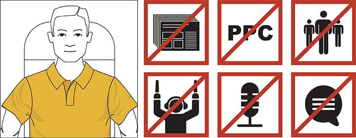
Mike Pacchione
“There’s this one guy at my company who … ”
So began my in-flight conversation about presentations and presentation mistakes. This happens a lot. The surprising thing about this conversation was the rest of the sentence.
“ … is way too exuberant when he presents.”
Wait, what? Nobody says that.
We talked for a while. I explained how to fix the problem. Then we talked about how rare that problem is.
See, for the past four years, I’ve flown all over the world to bring Duarte methodology to companies via our storytelling workshops .
When I started, I assumed every company would have its own set of problems. So, I began every workshop by asking attendees to jot down presentation challenges at their company. Turns out I was wrong. People across all companies repeatedly make the same presentation mistakes. It doesn’t matter what industry, the age of the company, or the caliber of employees, a bad presentation is bad for the same reasons.
Steer clear of these 6 presentation pitfalls
The following list includes all the most common presentation mistakes, which are easy to avoid by the way.
1. Your presentation covers too much information (TMI!)
I have facilitated 211 workshops in the past five years.
In every single one, I have asked: “what happens in a bad presentation?”
In literally every single workshop, someone responds “too much information.”
That’s right: 211 times out of 211. You couldn’t get that many people to agree on what day of the week it is.
It’s difficult to give instruction on exactly how much information you need in a presentation – but it’s probably less than you think. Put simply, the more facts we hear, the less any of them stick. Choose wisely.
A good, yet seldom implemented tactic is to focus on what the facts mean rather than the facts themselves.
Instead of just reciting the results or the data, give me an analysis; explain why something happened, and what the ramifications are in the future. We call that balancing information with insight.

A data presentation I love sharing is David Epstein’s TED talk . He is so good at walking you through only the essential information, then telling you why that information matters.
An excerpt:
“Take a look at the record for the 100-meter freestyle swim. The record is always trending downward [information] but it’s punctuated by these steep cliffs. The first cliff, in 1956, is the introduction of the flip turn [insight] .”
2. You distract your audience with acronyms, abbreviations, and jargon This one is tricky. To save time, most people at most companies have a slew of acronyms they regularly use. Saving time is a good thing, right? But here’s the problem: acronyms only work when everyone’s been brainwashed to memorize them. If you haven’t memorized a term, your brain spends extra time and energy figuring out what it means. That leads to distraction. Example: I sat in on a rehearsal for a company’s big marketing presentation. They kept using acronyms like PPC, but never explained what it meant, probably because they use the term 79 times a day. I, however, don’t live, eat, and breathe marketing acronyms. It took me a few seconds to remember what that meant (pay-per-click). That might not sound like a big deal, but do the math. The average rate of speech is about 130 words per minute. Five seconds to decode an acronym means I’ve missed out on ten words, basically a whole sentence. Every time the presenter used an acronym, it was the equivalent of me putting on earmuffs for the next five seconds. Don’t do that to your audience. Pretty please. As good as it may seem, I promise, it’s a presentation mistake. 3. Presenting irrelevant information guarantees a bad presentation
A couple years back I hosted our VisualStory ® workshop for a compliance department that presents to the company’s sales team. I asked them to think about the stakes of their presentation. What is in it for the audience? Almost every single attendee said the same thing: “It will allow us to remain compliant.”

Can you see the problem here? Is a salesperson motivated by the goal of remaining compliant?
So, we stopped and thought like salespeople. Eventually, we came up with different stakes: “It will help us avoid an Enron situation.” That’s something a salesperson would listen to.
Make the audience the hero of your presentation. Everything must be catered to them because if they do not adopt the idea you propose in your presentation, your idea dies. At the very least, consider what motivates them, what they already know about your topic, and what a walk in their shoes looks like.
4. Your Call to Action (CTA) is confusing or vague
It is amazing how many presentations, even good ones, end without telling the audience what they should now go do . Or, they do give direction, but it’s vague (i.e., “I need your support,” which, depending on how you hear it, could be asking for money, a pat on the back, or an inspiring cat poster). To fix this, picture your audience loving your presentation. Now that they’re bought in, what specific action do you want them to take when they return to their desk?
The best call to action I’ve seen in person was at a productivity seminar. The presenter asked everyone to pull out their phone, she waited until everyone had done so, then she asked them to schedule a reminder one month from that date. Boom. Call to action, answered.
5. Your monotone presentation style is soporific

Most of the time, this mistake is paired with another classic: the presenter reading their slides to the audience. Just in case the audience couldn’t handle that by themselves.
Look, speaking confidently doesn’t come easily to most of us (though, shameless plug alert: We’ve got a great workshop if you’d like help with that). It can feel awkward, it can feel scary, it can feel like your audience is judging you. It’s not easy, especially if you’re not a naturally ebullient person. But here’s the deal: If you don’t seem excited by your talk, there’s no chance the audience get excited.
Ridiculous as this feels, one of the best things you can do is record yourself. Pull out your phone, open your voice memo app, and talk about your topic for a minute. Odds are the expressiveness you feel internally does not match how it sounds externally. A monotone presentation is a presentation mistake that pretty much guarantees a bad performance.
6. Your presentation lacks a clear point or purpose
In one of my first presentation workshops, I sat down with a participant to help him with his point of view.
“What do you have so far?” I asked.
“The team made a lot of mistakes,” he said.
“That’s not a point of view,” I said.
He looked confused. I explained the difference between a point of view and a fact. Let’s try again.
“The team keeps making mistakes.”
Round and round we went. Did he have an opinion as to how the team could get better? Was there a particular mistake the team needed to stop making?
Eventually, he came up with something. But, for the rest of the day I pictured him going through life making factual, opinion-less statements:
- Green is a combination of yellow and blue.
- Socks can be made of either cotton or wool.
- Not many people speak Greek anymore.
You know what still surprises me the most about this?
He is not alone. An incredible number of people have trouble expressing a point of view. They have plenty of facts. Facts are safe. But a point of view is a huge problem. You give your audience an idea to adopt, that often includes taking a chance that they’ll disagree with you. Use your data to back up the opinion, that’ll keep it dynamic, that’ll separate you from the pack.
So, after all those presentation mistakes, we need a happy ending, right? The good news is that bar for presentations in your organization is probably low. If you can avoid making even a few of the very natural presentation mistakes I described, you can easily avoid giving a bad presentation and even stand out as good presenter.
As for that exuberant guy at the beginning of this post? I made that up. Not once have I encountered that person in the corporate world. Odds are that person exists somewhere. If it’s you, consider yourself lucky. You have the opposite issue from most presenters in the world.

Check out these related courses
Captivate™
Improve your public speaking
Overcome bad habits, conquer fears, and increase your confidence in any speaking setting. Discover your strengths and build on them to improve your delivery.
Structure and storyboard a talk
Analyze your audience and organize your ideas into a story structure that will move them. Transform content into visual concepts and build a storyboard for your presentation.
Personalized help for speakers
Up-level your speaking skills with one-on-one support. We’ll help you rehearse your talk, polish your presence, and transform your message delivery.
Craft a persuasive talk
Learn how the world’s greatest speakers use story to persuade. Develop a story structure that powerfully expresses your ideas, applying the principles of empathy, contrast, and variety.
Presentation Principles™
Learn presentation basics
Follow a step-by-step method to write compelling stories, amplify ideas visually, and present with confidence while learning at your own pace.
Turn ideas into visuals
Use visual thinking and design principles to transform information into effective and memorable graphics for presentations.
Create “skimmable” documents
Build helpful pre-reads and impactful leave-behinds with presentation software to support knowledge sharing and decision-making.
Check out these related resources

Improving your public speaking makes you invaluable at work
Improving your public speaking skills can help you in every area at work. Learn 10 reasons why you should master the #1 in-demand skill for yourself and how to get started.

What does it mean to resonate?
Your next speech or presentation can move and inspire audiences too. Learn from the research that went into our Resonate® book tips and tools to use to make every speech, one that resonates.

11 audience engagement strategies for all presentations
Need help keeping your audience engaged? It could be your presentation structure, delivery, or both! Dive into these strategies to keep your audience engaged the entire time you take the stage.

17 rhetorical devices that will make you sound like Steve Jobs
Want to communicate like Steve Jobs? Join us in an analysis of one of his most famous speeches and how he employed rhetorical devices to make it memorable and moving.

The ultimate guide to contrast: What your presentation is missing
Need to deliver a great presentation? Master the art of contrast to make sure it’s unforgettable and met with success, every time.

The secret to writing a call to action in a persuasive speech
Struggling to write a call-to-action for your speech or presentation? Make sure you address the 4 audience types so your CTAs are met with success.
More From Forbes
5 predictable mistakes that result in dreadful presentations.
- Share to Facebook
- Share to Twitter
- Share to Linkedin
Fear of public speaking is related to a lack of understanding of how to prepare for public speaking. ... [+]
By most measures, Liam is an outstanding professional. As Head of Operations for a global manufacturer, he’s used his expertise in process engineering to help grow the business exponentially. However, Liam has an Achilles heel: his presentations are awful. His internal and external audiences tune him out even before he gets to his second slide.
In the most recent Chapman University Survey of American Fears, 34% of Americans report being afraid or very afraid of public speaking. That number likely pales in comparison to the number of people who regularly experience ‘Death by PowerPoint’. Millions of presentations are given every day. Most of those presentations are mediocre, at best.
Over the past 25 years, I’ve coached hundreds of leaders on their presentation skills. Given that data set, I’ve seen a consistent pattern of mistakes that well-intentioned executives make that lead to dreadful presentations. Becoming aware of these mistakes is the first step in eliminating them.
Mistake #1: Building The Wrong Agenda
Most people start planning for their presentation by thinking about what they hope to get across to the audience. Some of these hopes can include: “I want to impress them. I want them to buy from me. I want them to buy-in to my plan. I want them to appreciate all the work my team did.”
There’s a major problem here. These thoughts are all speaker-centered. Speaker-centered thoughts lead to creating a speaker-centered agenda. Pardon the bluntness, but no one cares about your agenda. They care about their agenda.
Best High-Yield Savings Accounts Of September 2023
Best 5% interest savings accounts of september 2023.
Here’s the secret to proper presentation planning: Build your presentation from your audience’s perspective, not yours. Ask yourself: What’s in it for them to listen to you? For example, are you going to:
- Help them navigate a change?
- Make their workday easier?
- Reveal an exciting new opportunity?
Work backwards from their desired outcome to crafting their agenda. Then you can begin structuring your content accordingly.
Mistake #2: Thinking the Slides are the Presentation
Once you have figured out your audience’s agenda, clarify: What’s the purpose of your presentation? To educate? Motivate? Inspire?
If all you can come up with for a purpose is “just to share information”, then scrap your presentation, and send an email instead. The biggest pet peeve people have with bad presentations is presenters who project PowerPoint slides and then only read the text that’s written on the slide.
The PowerPoint slides are not the presentation. The interactive experience between you and your audience is the presentation. PowerPoint is just a tool to help you in that exchange.
Mistake #3: Doing a Data Dump
Understandably, data is important in your business. It helps you make good decisions. But when it comes to presenting information, a data dump is deathly dull. It’s extremely difficult to engage and inspire an audience only using rows and columns of spreadsheets.
If you want your presentation to move beyond bland and boring, spice your data up. Stories, analogies, even props are great ways to bring your data points to life. Researchers Chip and Dan Heath found that after a presentation, 63% of attendees remembered stories, while only 5% remembered statistics.
Mistake #4: Telling
Your presentation isn’t a talk. It’s an experience. Ideally, a very engaging one. If you want to up your chances at engaging your audience, find ways to turn your one-way monologue into a two-way dialogue. Ask questions and listen to responses. Build in breakout discussion groups, and even better, have those discussion groups stand up at a flipchart and scribe their answers and report back.
Include interactive polling, facilitate discussions, use appropriate humor. The possibilities are endless. The more active your audience is, the better.
Mistake #5: Confusing Reviewing with Rehearsing
Silently reading through your slide content in advance does not count as preparing to give a presentation. When I asked Liam why he read through his content like a book (and many leaders do), he said, “I want to make sure it all makes sense.” If you are a subject matter expert (SME), rest assured, the content will make sense to you. Sadly, if that’s your goal, you’re aiming at the wrong target.
Understanding your own content is one thing. Communicating it in a way so that other people understand and remember is a completely different skill set. This was a big part of Liam’s issue. Like many SMEs, Liam thought if it made sense to him, it would make sense to others. That’s now how public speaking works. This discovery helped Liam realize learn that he had never learned how to properly prepare to give a presentation.
How do you prepare? Assuming that you’ve effectively structured your content, then you rehearse your delivery.
The word rehearsal means to re-hear . Which means to practice by speaking out loud. Not just silently in your head. Yes, awkwardly out into the room.
The point of rehearsal is to connect the ideas in your brain to the muscles of your mouth. As a rule of thumb, speak the whole presentation out loud at least six times before you go live. If the stakes are high, rehearse even more. Rehearsal is your number one confidence builder. Most business presenters are dreadfully under rehearsed. And most of their presentations show it.
Communication lies at the core of effective leadership. Being able to present to others is an essential communication skill. Once Liam learned how to prepare, his communication skills improved to the level of his technical expertise. Eradicate these five mistakes, and your presentation skills will improve, too.

- Editorial Standards
- Forbes Accolades
Join The Conversation
One Community. Many Voices. Create a free account to share your thoughts.
Forbes Community Guidelines
Our community is about connecting people through open and thoughtful conversations. We want our readers to share their views and exchange ideas and facts in a safe space.
In order to do so, please follow the posting rules in our site's Terms of Service. We've summarized some of those key rules below. Simply put, keep it civil.
Your post will be rejected if we notice that it seems to contain:
- False or intentionally out-of-context or misleading information
- Insults, profanity, incoherent, obscene or inflammatory language or threats of any kind
- Attacks on the identity of other commenters or the article's author
- Content that otherwise violates our site's terms.
User accounts will be blocked if we notice or believe that users are engaged in:
- Continuous attempts to re-post comments that have been previously moderated/rejected
- Racist, sexist, homophobic or other discriminatory comments
- Attempts or tactics that put the site security at risk
- Actions that otherwise violate our site's terms.
So, how can you be a power user?
- Stay on topic and share your insights
- Feel free to be clear and thoughtful to get your point across
- ‘Like’ or ‘Dislike’ to show your point of view.
- Protect your community.
- Use the report tool to alert us when someone breaks the rules.
Thanks for reading our community guidelines. Please read the full list of posting rules found in our site's Terms of Service.
how to give the perfect presentation
10 most common presentation mistakes, avoid these basic presentation errors, 1. lack of preparation.
Too often a good presentation is ruined because the speaker has not taken the time to prepare. Preparation involves attention to both the personal and professional aspects of the presentation. Personal elements include body language, voice, and appearance. Professional aspects include researching the subject, organizing the content, and preparing the visuals. So, whether your presentation lasts for five minutes, five hours, or five days, you owe it to yourself and your audience to prepare thoroughly.
2. Poor Use of Visuals
Visuals should enhance your presentation, not detract from it. Most business people around the world today have learned how to use PowerPoint technically, but not professionally. Slides are overcrowded, unattractive, and inconsistent. They are loaded with lengthy, unnecessary words, written in sentences, instead of bullets. They include detailed information that should be provided to participants in the form of handouts. They underutilize the power of images. By taking the time to learn how to create powerful visuals, you will have a creative edge over the competition.
3. Inappropriate Humor
Off-color jokes could doom your presentation, because you are taking the risk of offending someone in the audience. Humor is culture-sensitive. What is considered funny in one part of the world may be considered private and taboo in another. So, avoid using humor in professional presentations, and consider other ways of breaking the ice and establishing rapport with your audience members.
4. Inappropriate Dress
The best advice is to dress conservatively so that the audience can pay attention to what you are saying, not what you are wearing. In your private life, feel free to express your individuality. In professional arenas, it can be disastrous to show your true colors. Like it or not, professionals around the world expect to see you dressed a certain way. It is best not to surprise them; otherwise they will be concentrating on your unusual appearance instead of your worthwhile message. Women in particular should be extra careful to present a professional appearance, and stay away from low necklines, short skirts, jangly jewelry, wacky hairstyles, and flashy colors.
5. Not Knowing the Audience
Custom-design your presentation to fit the needs of your audience. Find out the size and demographics of your audience beforehand. What are the ranks and positions of the people who will be attending? Who are the decision-makers? How much knowledge do they have of the subject you will be presenting? What is their native language? What other cultural expectations or protocol should you be aware of? By considering such factors beforehand, you increase the effectiveness of your presentation dramatically.
6. Non-Functioning Equipment
Since so much of our business world is dependent on technology, always check your equipment beforehand. There is nothing more frustrating than malfunctioning equipment, which can cause unnecessary delays and frustration. One solution is to have a printout of your visuals for yourself. That way, you will have the necessary information you need to deliver a presentation, even if you do not have the necessary equipment. If you solve the problem in this way, you will also gain the empathy and appreciation of the audience, who may have been in your shoes at some point in their own professional careers.
7. Starting or Ending a Presentation Late
Like you, the members of the audience have time restrictions. Respect them. In the United States and Canada, the mark of a professional is one who starts and finishes the presentation on time. However, time is viewed differently in eastern and western cultures. When traveling or presenting in an international context, consult a local partner or colleague to find out what is considered “normal”, even if it seems strange or differs from your own practices back home.
8. Using a Monotone Voice
Your voice is the primary means of communicating with your audience. No matter how interesting your material, if you speak in a monotone voice, you will lose your audience. An effective voice should be vital, audible, and clear. Of course, voice will be affected by age, gender, physiology, health, motivation, and past experience. Nevertheless, people of all kinds can learn how to make their voices more effective by learning about voice production, breathing techniques, vocal exercises and voice care. If necessary, work with a voice coach to learn how to improve your voice.
9. Too Much Material in Too Short a Time
If you have too much material, cut back or cut out. It is annoying and pointless for a speaker to try to rush through a presentation. If you have strict time restraints, be selective about what information to include. Pass on extra information in the handouts. Remove a number of detailed slides and keep only the most basic ones. Allow for the fact that you may have less time available to make your presentation due to interruptions, malfunctions, delays or other circumstances. By restricting the information flow, you will have a greater impact on your audience. They will remember more and be in a better position to speak to their superiors or take action on your recommendations.
10. Not Clarifying the Topic
Make sure you know clearly what you are expected to speak about. Second, don’t assume the audience knows what you are going to speak about. To avoid confusion, always include information about the topic of your presentation in your introduction. Get into the habit of saying, “Today, I’ll be explaining…” or ”My presentation today will show…” Do this without exception. Some members of your audience may also be global learners, who need to know the destination before they can follow along the detailed path of your presentation.
how can I custom design my presentation to an audience from another country?
By reading! There are several excellent books available that provide information about the cultural norms, habits, values and expectations of various countries. One especially useful book is When Cultures Collide by Richard Lewis, an experienced cross-cultural expert. There are also many websites that provide cross-cultural insight. You could also look for information produced by the foreign ministries of various countries, or visit a consulate / embassy and request further information. Today, depending on where you are, it may also be possible to simply talk to someone from the host culture.
I have a lot of information I need to provide in an upcoming presentation. I know I will run short on time. Is there anything I can do?
Looks like you have no choice but to reduce the amount of material. There is nothing to be gained by overloading your audience with information. Include only the most critical information on your slides and put the rest into a handout which you distribute after your presentation is over. If you hand it out beforehand, you will lose the attention of the audience as some of them will be leafing through the handout instead of paying attention to your presentation.
i am good in grammar but when i start a presentation then my voice quality is not good.means i am not a good speaker.so please tell me the best way to improve it.
About Presentation Prep

Being able to speak in public can change your life! Presentation Prep is your complete, free guide to delivering speeches, lectures, and presentations more successfully and confidently. Whether you're a native English-speaker who suffers from public speaking anxiety, or a non-native speaker who needs guidelines for presenting to international audiences, this site will give you everything you need. Presentation Prep is written by Rebecca Ezekiel, an experienced corporate trainer who specializes in the areas of communications, presentations, and cross-cultural skills. Her online English language training videos are watched by millions of students worldwide.
Bad PowerPoint Examples You Should Avoid at All Costs

There is a lot of information online on how to better your PowerPoint presentations. But sometimes an example of what you should not do can be very useful in the way of avoiding mistakes. So, what does a really bad presentation look like? Here I’ll show you the worst of the worst PowerPoint sins you can commit when designing your presentation. These bad PowerPoint examples will show you exactly what you don’t want your presentation to look like.
From slides so ugly they cause eye strain, to just plain boring, if your presentation looks anything like this, then you have some work to do! But to prove that everything has a solution, we asked our team of in-house designers to show us how they would fix some of these terrible PowerPoint slides.
Too much text
PowerPoint is a great tool, but it’s just that: a tool. It should not overshadow you. To exploit the presentation as a visual aid, you want it to complement the speaker, not to repeat word for word everything it’s being said. Too much text can be an important factor in the “death by PowerPoint” phenomenon. Just from seeing whole blocks of text, people watching your presentation can feel immediately overwhelmed. Surely you can relate to feeling annoyed just from finding out that the presentation you’re sitting through has way too much text on its slides.

People are usually visually-focused since, as a species, it’s the sense we have developed the most. Chances are that, as soon as people see the slide, they’re going to start reading it from start to finish. And doing so, they’ll be paying less (or no) attention to the speaker in front of them – in this case, you! And, if you’re just repeating what’s being said in the slide, why should they? Even when it’s not exactly the same, as a speaker you’ll be competing with your own presentation for your audience’s attention.
Having the speech word for word on the presentation can also worsen the abilities of even the most experienced public speaker. It’s too tempting to read, instead of going with the flow and accommodating your audience’s mood. Most likely, your presentation will feel stiff and not very engaging. After all, timing is a great part of becoming a successful presenter.
This is a bad PowerPoint example that clearly has too much text. When the text is this long, PowerPoint will immediately lower the size of your fonts to make it fit on the slide. In the end, you’ll find yourself with text so small that even if the audience wanted to read it they wouldn’t be able to.
So, how do you avoid lengthy text slides? Think caveman-like speech. Do not, by any means, dump complete paragraphs in your presentation. Some even say to even avoid complete sentences . Focus on your keywords, in the most important concepts or ideas that you want your public to take with them. People have limited capacity for retention, and focusing on key points will make your presentation easier to digest.
For example, check out the slide our designers fixed:
Animations are a tricky topic. PowerPoint has over 150 animations, and some presentations seem to have made it their personal goal to try all of them. As a general rule, too many animations are an easy way to make your PowerPoint look unprofessional and outdated. When every single element in a slide is animated, it’s distracting (and even tiring) for your audience.
Even for the presenter, animations can become a nuisance. Animating a slide in a way that every single element needs a click to appear or disappear is probably not the best idea. It’ll have you worried and distracted thinking if you have already shown all the points you were meaning to show, or if you have shown too many. Many times presenters can even give away their next slides too early. This will not only ruin your timing but probably distract your audience too, as they will remain thinking of the next point rather than focusing on what you’re speaking.
Of course, using animations doesn’t mean your presentation becomes immediately awful. Here at 24Slides, our designers use them often in our free templates. For example, check out this great Project Management Template . It has animations for several elements, but they work automatically, without the need of clicking. This way, the presenter doesn’t have to distract themselves with it.
Compare it to this bad PowerPoint example. Each element of the slide is animated separately, so it takes much longer to finally show them all. Also, each element has more than one animation. It makes the slide look overloaded, and distracts the audience.
So, how many animations are too many? There is no “correct” amount of animations. Most presentations can be more than fine with none at all. The key to work with animations without overusing them is to give them an emphasis purpose. See what I did there? If the whole paragraph was in bold letters, it would be difficult to pick out quickly which was the most important idea behind it. But since it is just one word, now “ emphasis” is the idea that will stand out.
Think of animations as a highlighter. It makes little sense for you to highlight every single word on a page. It will be unhelpful, and most likely, annoying. But if you highlight just the main ideas, it can be extremely useful. You can even use animation to highlight shock value or unexpected changes. Just remember: when talking about animations, less is always more.
For example, in this slide, the animations are used to shift the focus from topic to topic. Having all these arrows around might be confusing for the public, but with the colors and the arrow shifting, you can redirect your audience’s attention to wherever you like.
“Rainbow” Presentations
Color and its use is a whole other topic. But you don’t need to be an expert in color theory to be able to make a decent looking presentation (though it sure helps). You can summarize the general rules of using color in just one point: make it easy to read! Loud, bright colors , like orange, or lime green, are probably not the best for a presentation.

Also, take into consideration that for your public to be able to read easily you need to contrast your colors. For example, black letters on a white background, despite looking very simple, is also very easy to read. While something like light grey on white will probably give your audience problems. For example, check out this yellow text on a lime green background. It’s not very friendly, is it?
Now, if you want to go a step further and give your PowerPoint a more professional look, you should pick a color palette. Microsoft Office has thousands of templates you can pick from, and even some of our own. But if you don’t wish to use one, you can also pick a premade color palette. This will ensure that the colors on your presentation don’t clash together. Something as easy as this can give your presentation a much more polished look.
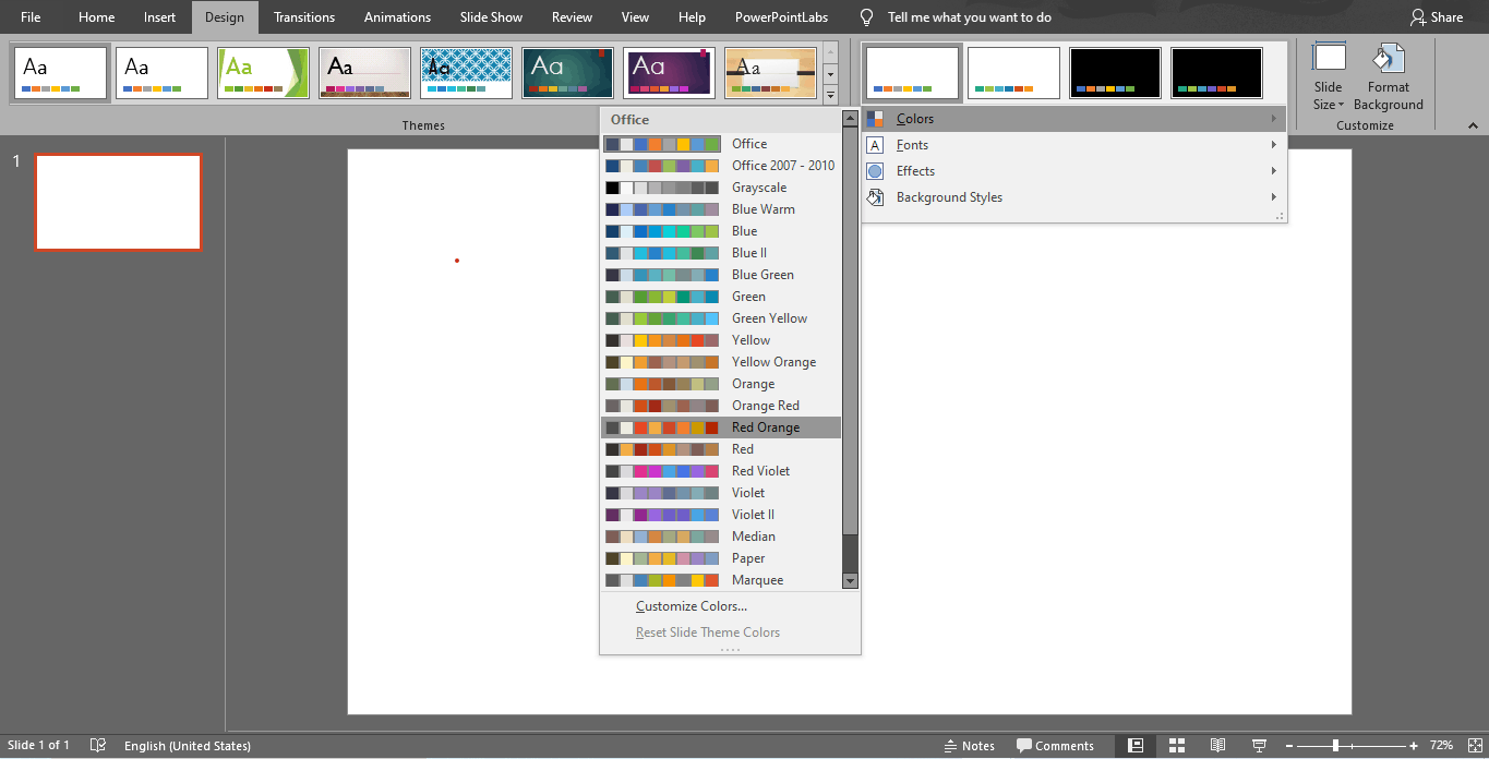
The Fake Minimalistic
Sometimes people can take too far the saying “less is more”. While having different color palettes in one single presentation may make it look unprofessional and eye-straining, an all-white presentation is not the answer either. PowerPoint’s blank templates are a good place to start since you can edit them to your taste and according to your own necessities. But they are not meant to be left like that for a serious presentation. Blank presentations are just plain boring, and that can be as distracting as too many colors.
Sobriety is different than being simplistic. Even if you feel you’re taking the “safe” route when designing a presentation, it can backfire. An all-white presentation can make you look lazy, or that you didn’t put any effort into it. It can affect the way people perceive your work too.
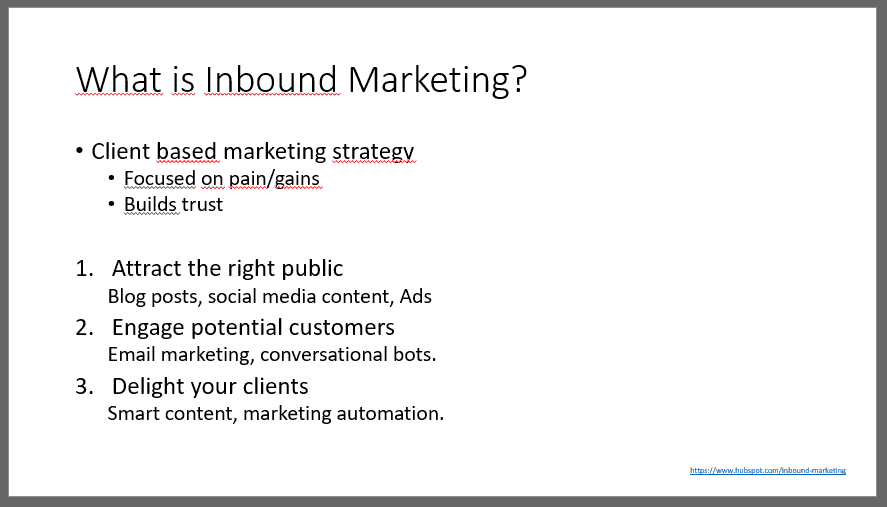
Take this bad PowerPoint example of an all-white presentation with just bullet points. As you can see, it becomes predictable and boring very fast. Plain PowerPoint presentations can also lead to the common “death by PowerPoint”. It just doesn’t give the audience any motivation to keep paying attention. It doesn’t have to be filled with colors, animations or graphics. Keep it simple, but elegant!
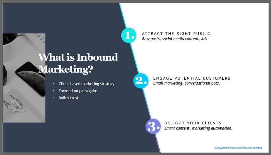
This is the slide fixed by our designers. No one can say it isn’t professional, but it’s not boring either. You can check out this Minimalistic Design Template for more inspiration.
Pictures and Fonts
As with colors and animations, here also applies the “less is more” rule. Your priority should be your audience’s ease when reading. For example, a font like Impact , which has too little space between the letters, is probably not the best choice. Over-stylized fonts can also be a problem, especially those that imitate italics. This also applies to font size too. In general, it should never go below 20 pts. The easiest way to see if your font size is good enough is to go to the farthest possible point of the room where you’ll be giving your presentation in. You should still be able to read it easily.
Choose your images smartly! Too many images can also be distracting to the public, especially if they overlap. When considering several images, ask yourself if you really need all of them, or if one can stand for some of the others as well. Check this bad PowerPoint example with too many pictures. It looks messy, right? Even if images are great to illustrate a point and to avoid using too much text, too many of them will make the presentation look outdated.

Also, avoid clipart! It has been a while since the 2000s, so there is no reason for you to be using Screen Beans.
What all these bad PowerPoint examples have in common
In summary, there are two basic rules for a great PowerPoint presentation. It must be visually engaging and it must be clear. Sometimes people can feel tempted to sacrifice one of these points to make the other stand out. For example, adding too many images or animations in hopes of making it more engaging to the public. But this will only make it look confusing and unprofessional. Or, on the other end, add too much text to make their every point clear. This will make a boring, overwhelming presentation that will distract your audience from the speaker.
What all these bad PowerPoint examples have in common is that they lack the balance between engaging and clarity. Avoid “death by PowerPoint” and engage your audience. Use everything in your power to catch their attention and keep it. Microsoft offers a lot of resources to do that: colors, graphics, pictures, embedded videos, animations and so on. It is up to you to use them smartly. Ask yourself, can I change this complete sentence for a picture or a keyword?
But also, review your own presentation as a spectator would. Is it clear? Are the pictures or animations distracting? Are the colors clashing which each other or are they eye-straining? Only when you consider both you’ll be able to design a truly great PowerPoint presentation.
If you want more tips on how to become a better presenter, you may like to read this article on the 15 most common presentation mistakes you want to avoid .
Create professional presentations online
Other people also read

6 Presentation Styles of Famous Presenters

How to create and deliver a powerful presentation introducti...

The seven worst presentations of all time and why they went ...


10 Bad PowerPoint Slides Examples to Avoid
A presentation serves two purposes: 1) it teaches your audience something new and 2) motivates them to take action. However, achieving these goals is only possible if your audience is engaged in your presentation. Your presentation is your story, whether hosting a webinar, teaching an online course, training a new employee, pitching a business idea, or sharing a project with your team.
What you say matters; your audience’s attention matters. A successful presentation determines how many people connect with your story, how much they remember, and improvements for next time. Various elements in a presentation can make or break its look. Knowing and avoiding practices that can make your presentation dull and non-engaging is vital.
We’ll walk through some examples of bad PowerPoint Slides to help you avoid common mistakes while creating a presentation.
What Makes a Bad PowerPoint Presentation?
Everyone talks about good examples, but even a basic mistake can make your fantastic-looking presentation bad. Learning from really bad PowerPoint examples can be as valuable as following the best practices of good PowerPoint examples . Let’s walk through some of the bad PowerPoint presentation slides that would make your eyes ache and content so dull it could put an insomniac to sleep.
With these really bad powerpoint examples, you can save your presentation from being a disaster and turn them into engaging slides:
- Too much text on slides
- Too many animations
- Using too many colors on one slide
- Being too minimalistic
- Using only pictures and difficult-to-understand fonts
- Keeping the image behind the text
- Flow charts on the slides do not make sense
- No symmetry in texts and pointers
- Using only bullet points and no paragraphs
- Keeping the size of the font too small
1. Too much text on slides
PowerPoint is a handy tool, but remember, it’s there to enhance your presentation, not steal the spotlight from you. The key here is to make it a visual assistant that doesn’t simply mimic your words but assists you in giving visual suggestions. Overloading your slides with text is the fastest way to make your presentations dull and monotonous. Those walls of text can instantly overwhelm your audience, and we’ve all been there, irritated by text-heavy slides.
Going further, scripting your entire speech on the slides can trip up even the smoothest talkers. We all know it seems easy to read word to word while giving presentations, but it kills the natural flow and direct interaction with your audience. Moreover, such text-heavy bad PowerPoint slides will result in a rigid, unengaging presentation and steal your spotlight.
Bad PowerPoint Slide Example with Excessive Text:
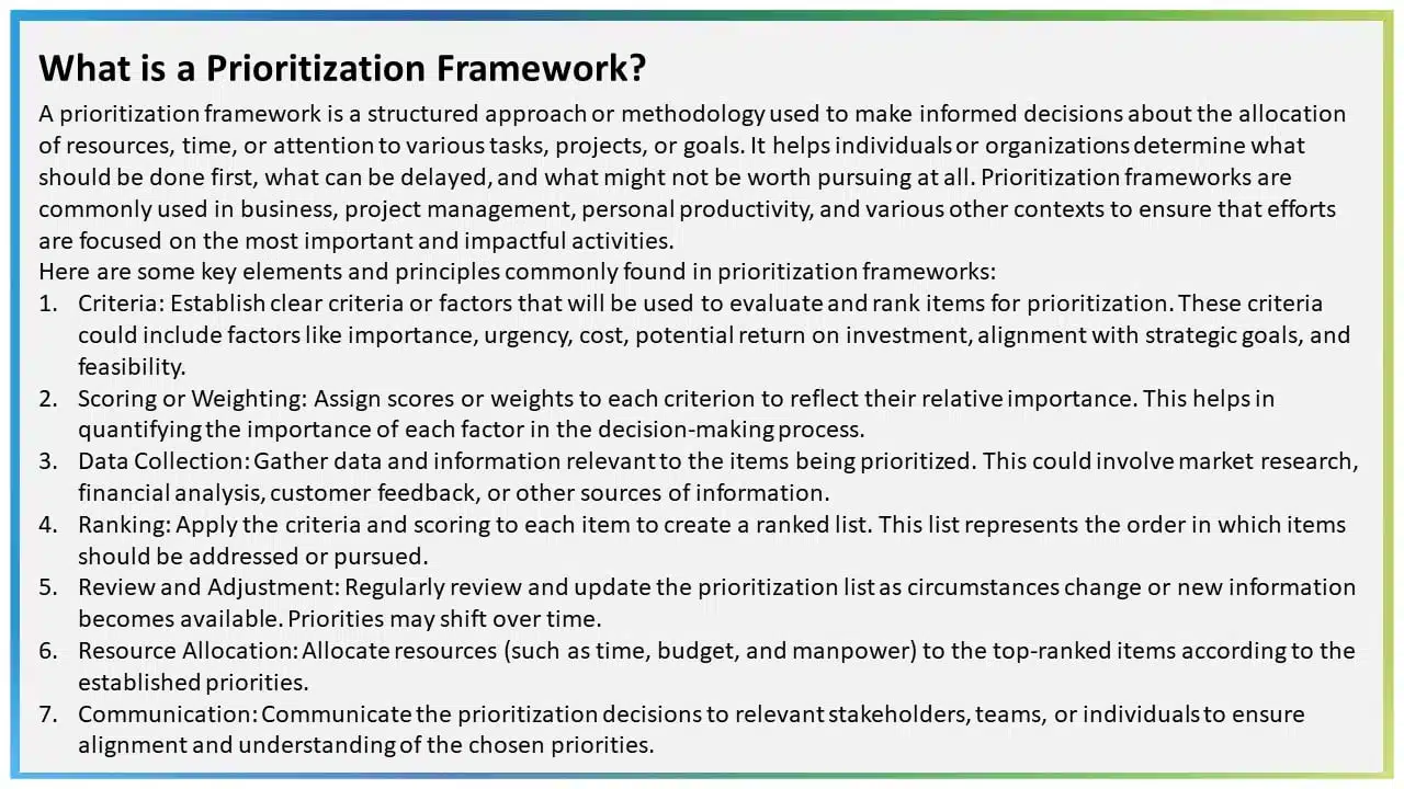
2. Too many animations
There are plenty of PowerPoint animations , and they can be tricky to use. There are more than 150 animations in PowerPoint, and some presentations seem determined to test them all. However, it is vital to note that using a lot of animations and transitions can make your presentations look less polished and outdated. When everything on a slide is animated, it can be distracting and even exhausting for your audience.
Moreover, excessive animations can be a headache for the presenter, too. If each element requires a click to appear or disappear, it’s not the most efficient approach, and it makes for a bad PowerPoint presentation example. Due to many animations and transitions, presenters inadvertently give away what’s coming next, disrupting their timing and distracting the audience, who start anticipating the next point instead of focusing on your words.
Bad PowerPoint Slide Example with Heavy Animation:
3. using too many colors on one slide.
Do not treat your PowerPoint presentation as a canvas. It is not a color pallet to mix and present different colors. Talking about color might seem like a deep dive, but you can be something other than a color theory guru to nail a good-looking presentation (though it’s a plus). Here’s the golden rule: KEEP IT EASY TO READ!
Bright and flashy colors like red or neon might not be your best bet for a presentation.
Also, think about contrast to ensure your audience can read effortlessly. Simple combos, like black text on a white background or vice versa, work like a charm. Conversely, white text on a grey background can be a readability nightmare. Having non-contrasting colors can make for bad PPT examples, and nobody wants colors in their presentation to clash, right?
Example of Worst PowerPoint Slide with Too Many Colors:
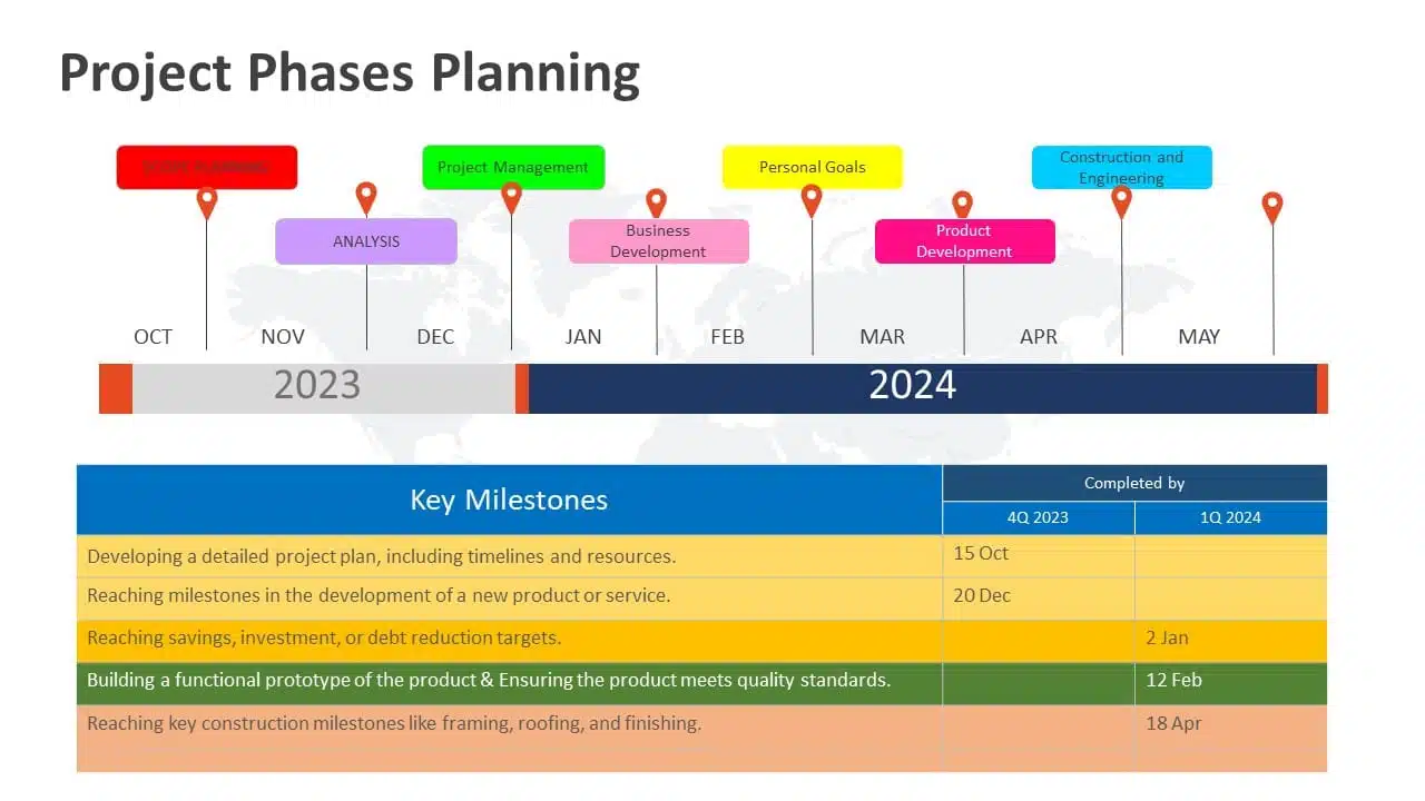
READ MORE: Effective Colour Palette Combination for Presentations
4. Being too minimalistic
Adding everything to your presentation is a problem, but not adding the required colors, graphics, and text is a bigger problem. It can make the slide look dull and empty. Sometimes, professionals can get carried away with the “less is more” idea. While using a variety of color palettes in one presentation can make it look unprofessional and strain the eyes, there are better options than going all-white.
Keeping presentations too minimalistic might give off the impression – that you didn’t put in the effort. Plain slides are an example of a bad PowerPoint presentation and don’t motivate the audience to pay attention.
Example of Bad PowerPoint Slide with Too Much Minimalism:

EXPLORE: 40,000+ PowerPoint Templates and Google Slides Themes
5. Using only pictures and difficult-to-understand fonts
Another example of bad PPT slides is cluttering the presentation with only graphics and difficult-to-understand fonts. Like with colors and animations, the “less is more” principle holds here. Your primary focus should be making your presentation easy to read and understand for your audience. Take fonts, for instance. Avoid ones like “Impact Typeface,” which have cramped letters. Fancy fonts, especially those that mimic italics, can be problematic too.
Example of Ugly PowerPoint Slide with Difficult To-Read Font:

READ MORE: Best Presentation Fonts
Now, onto images. Stay moderate; too many images can distract your audience significantly if they overlap. When considering multiple photos, ask yourself if you need them all or if one can represent the others. Slides with an excessive number of pictures can be a visual mess. While images are great for illustrating points and reducing text, an overload makes your presentation look outdated.
6. Keeping the image behind the text
Whoever thought of using an image as a background probably missed the memo. Images and text simply don’t go well together. Overlaying text on an image makes for one of the worst PowerPoint presentation examples. Keeping the image in the background makes reading the text complex, and the main image needs to be clarified. With the mix-up of colors in the background, finding a text color that stands out is nearly impossible, and all those colors just pull your attention away from the words. To save your presentation from this disaster, avoid using images as slide backgrounds when you’ve got text to showcase.
Really Bad PowerPoint Slide Example with Invisible Text:

EXPLORE: Best PowerPoint Backgrounds Collection
7. Flow charts on the slides do not make sense
If you want to use flow charts in your PowerPoint presentation, this one’s for you. The first rule for flowcharts is simple: they should be easy to understand. A flowchart can explain things in a presentation, but a well-crafted PowerPoint should make sense. The flowchart, like the one shown below, will destroy the look of your slide and needs to be clarified. By seeing this bad PowerPoint presentation example below, you need to help understand what’s happening. What is connected to what? Therefore, even if you intend to simplify the information, it will only reach your audience with a clear flowchart.
Bad PowerPoint Presentation Example with Messed up Flowcharts:

EXPLORE: Customizable Flowchart PowerPoint Templates
8. No symmetry in texts and pointers
The lack of balance or alignment between textual content and accompanying visual elements like arrows , bullets, or other pointers can make your presentations look unprofessional and unappealing. When text and pointers are haphazardly placed, it’s challenging for the audience to follow a logical flow of information, making up for a bad PowerPoint slide example. Without symmetry in your presentation, you’re only distracting your audience; they will be preoccupied with deciphering the relationship between the text and visuals.
Example of Bad PowerPoint Presentation with No Symmetry:
9. Using only bullet points and no paragraphs
Using only bullet points in your slide is one of the worst PowerPoint presentation ideas! In a PowerPoint presentation, simplifying paragraphs into bullet points is a smart move to make it more audience-friendly. However, it’s essential to clarify that this means more than merely slapping only bullet points and not including any paragraphs.
Here’s a helpful rule of thumb: “Only use 5-8 bullet points”, and if you find yourself shrinking text to 12 or 10 points, you’ve got too much text on your hands, and you can’t put all of it in the bullets. Having overly lengthy bullet points might not be to everyone’s liking, and some even read like full-blown paragraphs.
Ugly PowerPoint Presentation Example with Just Bullets and No Paragraphs:
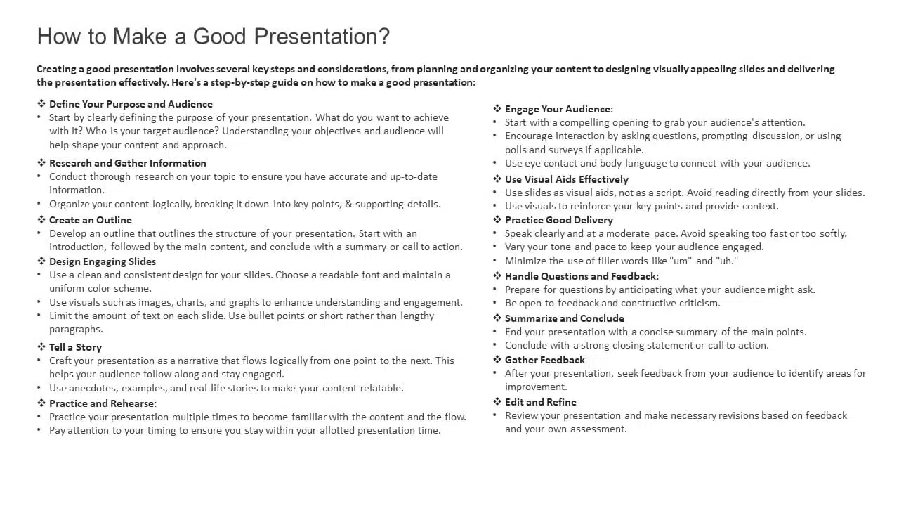
10. Keeping the size of the font too small
Last on this list of bad PowerPoint examples is keeping the font size too small, making it look invisible. Font size plays a very crucial role in the presentation. Imagine being served a delicious pizza and handed a magnifying glass to find the toppings. Wouldn’t it kill the mood? The same applies to your PowerPoint presentation. Imagine everything in your slide is on point: the colors, the graphics, the animation, the information, but your audience can’t even read what you are presenting. A quick test is to stand at the back of the room where you’ll present, and if you can still read the font comfortably, then you’re good to go.
Worst PowerPoint Presentation Example with Small Font:
Tips to Avoid Making the Worst PowerPoint Slides!
Creating a standout PowerPoint presentation boils down to two fundamental principles: 1) it must captivate visually and 2) convey clarity of message. Sometimes, the temptation arises to favor one at the expense of the other. The absence of a delicate balance between engagement and transparency unites all these ugly PowerPoint slides examples. Here are some things you should keep in mind:
- Avoid stuffing slides with too much text in an effort for clarity, which often results in a boring, overwhelming presentation that distracts from the speaker.
- Refrain from overloading slides with excessive images or animations to boost engagement; it can backfire, resulting in confusion and an unprofessional look.
- Microsoft provides numerous resources to achieve a well-balanced look for your presentation, including colors, graphics, images, embedded videos, and animations. The key is to use them wisely.
- Before finalizing any presentation, you can ask a few questions from a spectator’s perspective. Can I replace this lengthy sentence with a picture or a keyword? Are the fonts crystal clear? Do the visuals or animations prove distracting? Are the colors harmonious, or do they strain the eyes?
READ MORE: Most Important Presentation Tips
You can craft an exceptional PowerPoint presentation by balancing engagement and clarity perfectly. However, striking this balance requires a lot of practice. The best and worst PowerPoint presentation examples clearly show how to keep this equilibrium.
As we’ve seen, it’s easy to take a presentation from good to worse by neglecting one side in favor of the other; the next time you’re gearing up to create a presentation, consider getting the help of professional presentation services .
Presentation service providers like SlideUpLift can help you strike the perfect balance of engagement and clarity, ensuring your audience stays focused while your message shines through. Whether you want to tweak every part of your presentation or adjust the fonts and colors, going for a presentation service provider like SlideUpLift ensures that your unique style is consistently reflected in your slides. You can book a consultation call to learn more about these services.
Explore SlideUpLift presentation design services to create eye-catching PPTs. You can give the custom-slides service a shot.
Why are bad PowerPoint slides a problem?
Bad PowerPoint slides can hinder effective communication, leading to audience disengagement and a failure to convey your message. They can distract, confuse, or even bore your audience, ultimately defeating the purpose of your presentation.
What common mistakes result in a really bad PowerPoint Presentation?
Common mistakes that result in bad PowerPoint slides include overcrowding slides with excessive text or complex graphics, using small fonts, lacking visual consistency, and neglecting the balance between engagement and clarity. You can avoid this by engaging your audience, conveying your message clearly, and creating a visually appealing and well-structured presentation that supports your content effectively.
How can I improve my PowerPoint slides and avoid making bad ones?
You must focus on simplicity, use visuals wisely, maintain consistency in design and fonts, and balance engagement and clarity. In addition to all these points, getting help from professional presentation providers can help you make top-class presentations easily.
. Are there resources or services available to help improve PowerPoint presentations?
Yes, SlideUpLift is one of the most trusted professional presentation service providers. They provide design and content layout expertise, including PowerPoint templates , Google Slides templates , presentation services , custom slide services , etc. You can book a consultation call with us to learn more about these services.
Table Of Content
Related presentations.
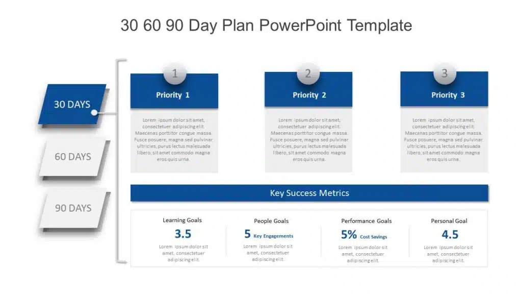
30 60 90 Day Plan PowerPoint Template
FlowChart Templates Collection Of PowerPoint & Google Slides
Arrows Templates Collection For PowerPoint & Google Slides
Related posts from the same category.

4 Oct, 2023 | SlideUpLift
The Best And Worst PowerPoint Presentation Examples
Engaging presentations are the lifeblood of effective communication in today's information-driven world. Whether you're in a boardroom pitching a new idea, standing in front of a classroom of curious learners,

23 Aug, 2024 | SlideUpLift
The Best PowerPoint Presentation Examples To Get Inspired By!
Engaging presentations are the secret sauce of effective communication. They bring life to your ideas and transform information into inspiration. They are the heartbeat of any memorable message, connecting with

22 Aug, 2024 | SlideUpLift
Best Professional Presentation Examples To Inspire You [+ Premium Templates]
It’s crucial for professionals to deliver outstanding and engaging presentations that convey essential information to their teams and stakeholders. Most professional PowerPoint themes are the backbone of corporate presentations and

22 Jul, 2024 | SlideUpLift
10 Best Financial Presentation Examples For PowerPoint
Presenting large data in a concise format in a presentation is just as important as it affects the efficiency of your business decision-making process. To make your work easy, we

21 Aug, 2024 | SlideUpLift
10 Tips On How To End A Presentation [Examples + Templates]
Everyone agrees that the beginning of a presentation is crucial as it catches your audience's attention and keeps them engaged, but what about the ending? The end of a presentation
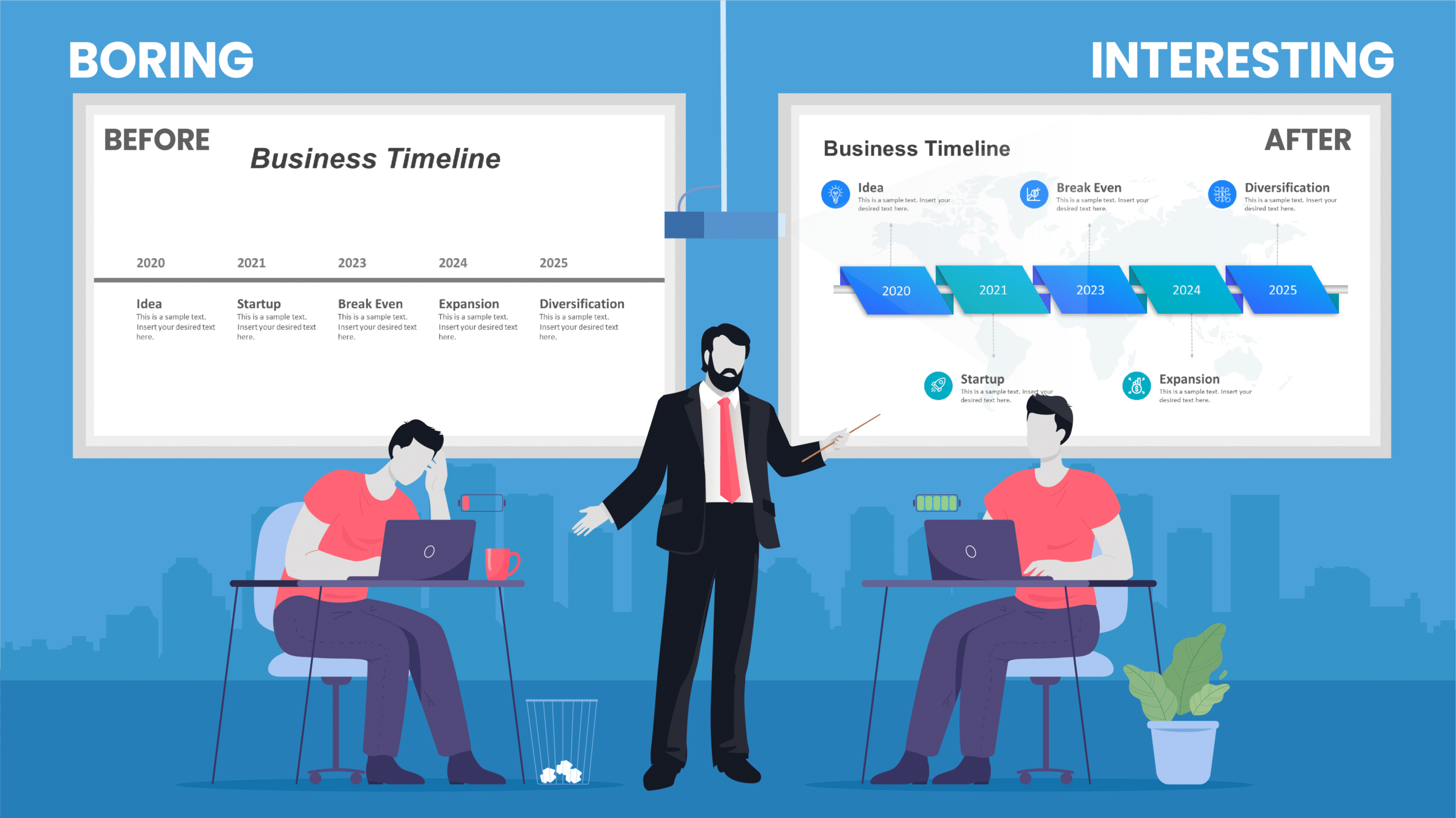
6 Jan, 2020 | SlideUpLift
Top 10 Hacks On How To Make PowerPoint Presentation Attractive
Per experts, the audience gets hooked and pays more attention to the visual content of your PowerPoint slides than drab-looking, text-heavy content. This article answers the well to know question

8 Dec, 2023 | SlideUpLift
10 Best Presentation Softwares
Having access to appropriate presenting tools can benefit anyone, whether a business owner, a working professional, or a student. Using the best tools for presentations can increase the recall value

18 Aug, 2023 | SlideUpLift
10 Best PowerPoint Templates for Presentations
In today's landscape of the corporate industry, an effective PowerPoint presentation speaks volumes and is paramount. Presentations have evolved into more than just slides and bullet points—they've become powerful tools

11 Aug, 2023 | SlideUpLift
10 Best Marketing PowerPoint Templates
In today’s day and age, where communication is paramount and impressions are everything, a compelling marketing PowerPoint presentation can be the key that unlocks success. Whether you're aiming to captivate

13 Sep, 2022 | SlideUpLift
10 Ways To Make Interactive And Engaging Presentations In PowerPoint
Professionals across the spectrum will stand by the fact that compelling presentations can be an important force of influence at the workplace. Many people at the same time also struggle
Related Tags And Categories
Forgot Password?
Privacy Overview
Necessary cookies are absolutely essential for the website to function properly. This category only includes cookies that ensures basic functionalities and security features of the website. These cookies do not store any personal information
Any cookies that may not be particularly necessary for the website to function and is used specifically to collect user personal data via ads, other embedded contents are termed as non-necessary cookies. It is mandatory to procure user consent prior to running these cookies on your website.
An official website of the United States government
Official websites use .gov A .gov website belongs to an official government organization in the United States.
Secure .gov websites use HTTPS A lock ( Lock Locked padlock icon ) or https:// means you've safely connected to the .gov website. Share sensitive information only on official, secure websites.
- Publications
- Account settings
- Advanced Search
- Journal List
Review of bacterial and viral zoonotic infections transmitted by dogs
I ghasemzadeh.
- Author information
- Article notes
- Copyright and License information
Correspondence to: Sh. Namazi, MD, PhD student, Student Research Committee, Hormozgan University of Medical Sciences, Bandar Abbas, Iran, Phone: +98 76 33334275-6, Fax: +98 76 33331991, E-mail: [email protected]
Received 2015 Jul 28; Accepted 2015 Dec 15.
This is an open-access article distributed under the terms of the Creative Commons Attribution License, which permits unrestricted use, distribution, and reproduction in any medium, provided the original work is properly cited.
Dogs are a major reservoir for zoonotic infections. Dogs transmit several viral and bacterial diseases to humans. Zoonotic diseases can be transmitted to human by infected saliva, aerosols, contaminated urine or feces and direct contact with the dog. Viral infections such as rabies and norovirus and bacterial infections including Pasteurella, Salmonella, Brucella, Yersinia enterocolitica, Campylobacter, Capnocytophaga, Bordetella bronchiseptica, Coxiella burnetii, Leptospira, Staphylococcus intermedius and Methicillin resistance staphylococcus aureus are the most common viral and bacterial zoonotic infections transmitted to humans by dogs. This review, focused on the mentioned infectious diseases by describing general information, signs and symptoms, transmission ways, prevention and treatment of the infection. As far as the infections are concerned, the increase of the knowledge and the awareness of dog owners and the general population regarding zoonotic infections could significantly mitigate zoonoses transmission and consequently their fatal complications.
Keywords: bacterial and zoonotic infections, viral infections, dogs, rabies, noroviruses
Introduction
It is estimated that over 60% of the western families own a pet. The majority of these households keep a dog. Dogs have been kept as pets for over 14 centuries. Many studies have confirmed the precious roles of pets in the human life. Evidence has shown that owning a pet can increase the activity of pet owners and consequently reduced serum cholesterol, low triglyceride levels, and fewer cardiovascular events [ 1 , 2 ]. Also, some other studies demonstrated that pet owners suffer from depression and mental stress less and have a higher self esteem compared to others. Although dogs have several positive effects on the psychosocial and psychical health of their owners, many diseases among humans are attributed to them [ 3 ]. Children and immunocompromised individuals are especially at an increased risk of developing zoonoses infections. Several studies demonstrated that domestic dogs have a dramatic role in developing zoonoses disease and hospitalization [ 4 , 5 ].
Regarding domestic dogs, the increase in the population of stray and semi domestic dogs in urban areas has increased the risk of zoonoses diseases. About 5 million people throughout the world are annually bitten by dogs. Many parasitic and zoonotic pathogens are transmitted by dogs [ 6 , 7 ]. This review focused on the most important viral and bacterial zoonotic diseases, which can be transmitted by dogs.
Rabies is a single strand RNA virus belonging to the Rhabdoviridae family. Rabies infection is an ancient disease with a high mortality rate in human and animal population. Based on the World Health Organization reports, annually between 30000 and 70000 deaths occurred throughout the world due to rabies infection [ 8 ]. Dogs are the major animal reservoirs for rabies infection. The majority of the infected patients in developing countries are infected by dog bites while, in developed countries, wild animals including raccoons, bats and foxes are the main cause for rabies transmission [ 9 ]. In a study in the United States, a rabies control program was conducted by using extensive vaccination in domestic dogs and reducing the rabies infection [ 8 ]. The incubation period for rabies varies between 4 days to several years depending on the location of the inoculating wound and the amount of induced viruses. Patients may present agitation, anxiety, confusion, hallucination, and hydrophobia. Post exposure prophylaxis with frequent doses of human rabies immunoglobulin (HRIG) within 14 days after the suspected dog bite can prevent the disease. Washing the wound with water and liquid soap can dramatically reduce the viral lead and consequently the probability of rabies infection [ 10 ].
Noroviruses
Noroviruses are a heterogeneous single strand RNA virus belonging to the Caliciviridae family. Noroviruses are the main cause of sporadic and epidemic gastroenteritis in humans [ 11 ]. This virus can affect humans of all ages. The virus can be found in the gastrointestinal tract and consequently in the feces or diarrhea of the infected dogs. It can be transmitted from contaminated food or water to humans and the infection can rapidly spread in the human population by fecal oral rate. Serum therapy should be considered for patients with acute gastroenteritis [ 12 ].
Pasteurella
Pasteurella species are Gram-negative coccobacilli, which were primarily found in animals. Pasteurella spp are normal flora of the upper respiratory tract of dogs and cats. Pasteurella infection can be transmitted to humans by direct and indirect contact such as dog or cat bites or licks and even cat scratches [ 6 ]. Several infectious diseases in humans are attributed to Pasteurella spp. The soft tissue infection is the most important infection transmitted by Pasteurella spp. However, meningitis, bone and joint infections and respiratory infection can be transmitted by Pasteurella spp [ 13 ]. In a prospective study in United States, the author demonstrated that Pasteurella spp. was the most frequent organism isolated from dog and cat bites [ 2 ]. Pasteurella infection can be treated by second and third generation cephalosporin, macrolides, fluoroquinolones, cotrimoxazole, and penicillin [ 14 ].
Salmonella species are anaerobic and motile gram-negative bacilli that colonize in the large intestine of a variety of mammals, especially in the distal part of the colon and the mesenteric lymph nodes of the canine. Humans can also get infected through the gastrointestinal tract [fecal transmission] and develop several infectious diseases such as gastroenteritis, enteric fever, bacteremia and osteomyelitis. Gastrointestinal diseases are the most prevalent clinical presentations of salmonella in human and dogs; however, the majority of infected animals or humans is asymptomatic and may shed the pathogen through feces for a period of 6 weeks and transmit the pathogen to other animals or individuals. In developing nations, Salmonella spp. is also more prevalent than in developed countries [ 15 , 16 ]. An antibiogram should be considered for patients infected with Salmonella spp. however, it could be treated by various families of antibiotics including fluoroquinolones, beta-lactams, and macrolides [ 17 ].
Brucellosis is one of the most prevalent zoonoses, which imposes a heavy burden on the national health services. It is commonly transmitted to humans by consuming unpasteurized dairy products. Various types of brucella spp. have been recognized; that resulted in human brucellosis such as B. melitensis, B. abortus and B. suis but, B. canis has been less known as an usual pathogen in brucellosis infection in humans [ 18 , 19 ]. Although B. canis is not responsible for the brucellosis infection in humans, the reported cases were more often seen among farmer populations who had a history of exposure to body fluids of dogs, which were infected with B. canis. The incubation period may last for one to four weeks up to several months [ 19 ]. The patients may be asymptomatic or may even present serious clinical symptoms especially fever, night sweats and low back pain in the endemic region that should be differentiated from tuberculosis and other malignancies [ 20 ]. Brucellosis should be treated in order to avoid complications and sequelae of the disease. Combination therapies, which are widely employed in the treatment of brucellosis, consisted of doxycycline plus streptomycin or rifampin for 6 weeks [ 21 ].
Yersinia enterocolitica
Y. enterocolitica is a gram-negative coccobacillus zoonotic pathogen that causes yersiniosis in human and animals. Several animals are main reservoirs for Y. enterocolitica including birds, pigs, deer, and cattle. The pathogen has been isolated from dog bite wound in some studies [ 22 ]. The patients may be asymptomatic in early stage and when the pathogen invades the mucosal surface of the intestine, watery or bloody diarrhea may be present. The pathogen can also involve the peyer’s patches and represent the appendicitis symptoms [ 23 , 24 ]. Y. enterocolitica is mostly a self-limiting disease that does not need antibiotic therapy, however, patients with severe infection and immunocompromised patients should be treated with a combination of an aminoglycoside and doxycycline [ 24 ].
Campylobacter
Campylobacter spp. including campylobacter jejuni and campylobacter coli are gram-negative bacteria that usually result in campylobacter enteritis. This organism normally lives in the gastrointestinal tract of many animals. Direct contact with infected animals or their products is a leading cause of campylobacter transmission. Dogs and puppies are the major reservoirs for campylobacter. For example, in a study it was demonstrated that about 47% of the fecal specimens of dogs’ campylobacter was isolated [ 25 , 26 ]. The incubation period in campylobacter enteritis varies from one to seven days. Most of the patients present fever, vomiting, diarrhea, and abdominal pain. Also, bloody diarrhea may be present in more than 50 percent of the infected patients. Convulsion and seizure may be observed in some patients [ 27 ]. This infection is usually self-limited and does not need antimicrobial therapy. Focus on correction of electrolyte imbalance and hydration should be considered. Antibiotic therapy with fluoroquinolones, macrolides, or aminoglycosides is indicated in patients with severe disease [ 28 ].
Capnocytophaga
Capnocytophaga canimorsus is a gram-negative bacterium, which is found in the normal flora of the oropharyngeal tract of dogs and cats. The pathogen is mostly transmitted to human by dogs bite and causes an overwhelming sepsis, particularly in elderly, immunocompromised or asplenic patients [ 25 ]. The pathogen can also lead to other fatal infections including meningitis, osteomyelitis, arthritis, lung abscess or empyema and endocarditis. In addition, thrombotic thrombocytopenic purpura and hemolytic uremic syndrome can be associated with capnocytophaga septicemia especially in immunocompromised patients [ 25 , 29 ]. The literature data have demonstrated that the mortality rate due to capnocytophaga septicemia is estimated to be of one third of the infected patients. Accordingly, early empirical therapy with third generation cephalosporins in patients who received a dog bite should be considered [ 30 ].
Bordetella bronchiseptica
Bordetella bronchiseptica is a gram-negative rod bacterium belonging to the genus Bordetella. The pathogen normally lives in the upper respiratory tract of the mammals such as dogs and cats and is transmitted to humans by aerosol. B. bronchiseptica can lead to acute tracheobronchitis in dogs, which presents with harsh and kennel cough [ 31 , 32 ]. Human infection with B. bronchiseptica is very rare; however, the pathogen can also cause pneumonia and upper respiratory tract infection in dog owners [ 33 ]. Evidences demonstrated that this organism is resistant to macrolides and cephalosporins; however, in several studies, the organism was sensitive to fluoroquinolones and Trimethoprim/ sulfamethoxazole [ 34 ].
Coxiella burnetii
C. burnetii is an obligate intracellular gram-negative bacterium that causes Q fever in humans. The pathogen normally infects individuals via aerosol and direct contact with the body fluids of the infected animals. Although dogs are not the main reservoirs for C. burnetii, however, in a study it was demonstrated that C. burnetii was isolated from approximately 10 percent of farm dogs [ 35 ]. In addition, in another study by Buhariwalla and colleagues, it was reported that C. burnetii could be transmitted to human from an infected parturient dog. In addition, the patients developed the symptoms of Q fever including fever, chills, nausea, vomiting and productive cough. Opacity is a common finding in chest radiography, and, in physical examination, crackles may be heard during auscultation. The incubation period in this study was estimated to be between 8 and 12 days after the exposure to the infected animal. The patients with C. burnetii can be treated with fluoroquinolones or doxycycline successfully [ 36 ].
L. interrogans is an aerobic spirochete, which is the major cause of Leptospirosis in human. Leptospirosis is worldwide zoonoses that are mostly transmitted to human by environmental sources including contaminated soil, water, urine, or tissue of the infected animals. Rodents are the major reservoirs for Leptospirosis; however, domestic animals including dogs can play an important role in leptospirosis transmission in endemic regions [ 37 ]. Mucosal surfaces of the human body including eye, vagina, nose, mouth, or erosive lesions, which have a direct contact with the contaminated urine, are the main ways of Leptospirosis transmission. The incubation period for this infection is averagely of about 10 days (ranging from 2 to 26 days) [ 38 , 39 ]. Leptospirosis may present with a variety of symptoms from no symptom to fever, nonproductive cough, headache, musculoskeletal pain, diarrhea, nausea, vomiting, alveolar hemorrhage, and even meningitis [ 39 ]. Several antibiotics such as doxycycline, ceftriaxone, cefotaxime, penicillin, amoxicillin, and ampicilin have been successfully employed for the treatment of Leptospirosis [ 40 ].
Staphylococcus intermedius
S. intermedius is a gram-positive bacterium with a coagulase activity that normally lives in the anterior part of the nasal cavity of several animals such as dogs, pigeons, and horses. Some evidences demonstrated that this pathogen could also be isolated from the gingival of healthy dogs [ 41 ]. S. intermedius is not a common zoonotic pathogen in humans; however, several studies demonstrated that this bacterium is a potential pathogen associated with dog bite wounds and cellulitis can develop in inflicted humans [ 42 , 43 ]. This pathogen should be discriminated from staphylococcus aureus. Penicillin and amoxicillin-clavulanate are effective in the treatment of this infection [ 44 ].
Methicillin resistance staphylococcus aureus
Methicillin resistance staphylococcus aureus (MRSA) is a major cause of fatal infection in humans. Several investigations have reported that this pathogen has been isolated from some animals such as pigs, horses, cattle, cats and dogs. Of them, some believed that companion animals were the main reservoirs for the transmission of MRSA, being able to transmit the bacterium by direct contact with their owners. However, it seems that animal to human infection of MRSA is more seen in immunocompromised patients. Nevertheless, some evidences showed that this bacterium could be transmitted to healthy humans who own an infected animal [ 45 , 46 ]. Traditional anti staphylococcal antibiotics are not more effective in the treatment of infections caused by MRSA. Accordingly, newer drugs including vancomycin, linezolid and daptomycin are widely used in the treatment of MRSA infections [ 47 ].
Zoonoses are diseases that implicate both humans and animals and can be transmitted either by domestic pets or by wildlife animals. Many animals and their products can be reservoirs of zoonoses pathogens. Among them, dogs are responsible for the transmission of several zoonotic diseases to their owners. Thus, dog owners should be informed regarding the zoonotic diseases and their ways of transmission to reduce these infections in human population. Several prophylactic and therapeutic strategies have been introduced in order to decrease the zoonotic diseases. Dog owners are recommended to wash their hands after any direct contact with their dogs, their products, urine, or feces. Most of the viral and bacterial infections are transmitted from dogs to humans by dog bite; however, other infections caused by protozoa have a fecal oral transmission. Thus, food hygiene such as washing vegetables well and cooking meats adequately should be carefully done in order to eliminate the rate of zoonotic infections.
In addition, dogs should also be treated for diarrheal infections. Moreover, dog owners should feed their dogs with cooked meat to prevent campylobacter and salmonella infections. Raw meat and eggs should not be fed to dogs due to higher rate of infection susceptibility. Rabies vaccination should be considered for domestic dogs and the dog owners should also be aware of benefits of rabies vaccination before and after dogs bites. Many authors reported that increasing the knowledge of dog owners regarding dog associated zoonotic infections and prevention strategies can dramatically reduce the zoonotic infections in dog owners and their families.
- 1. Katagiri S, Oliveira-Sequeira T. Prevalence of dog intestinal parasites and risk perception of zoonotic infection by dog owners in São Paulo State, Brazil. Zoonoses and Public Health. 2008;55(8-10):406–413. doi: 10.1111/j.1863-2378.2008.01163.x. [ DOI ] [ PubMed ] [ Google Scholar ]
- 2. Talan DA, Citron DM, Abrahamian FM, Moran GJ, Goldstein EJ. Bacteriologic analysis of infected dog and cat bites. New England Journal of Medicine. 1999;340(2):85–92. doi: 10.1056/NEJM199901143400202. [ DOI ] [ PubMed ] [ Google Scholar ]
- 3. Beth Tower R, Nokota M. Pet companionship and depression: results from a United States Internet sample. Anthrozoos: A Multidisciplinary Journal of The Interactions of People & Animals. 2006;19(1):50–64. [ Google Scholar ]
- 4. Vengust M, Anderson M, Rousseau J, Weese J. Methicillin-resistant staphylococcal colonization in clinically normal dogs and horses in the community. Letters in Applied Microbiology. 2006;43(6):602–606. doi: 10.1111/j.1472-765X.2006.02018.x. [ DOI ] [ PubMed ] [ Google Scholar ]
- 5. Moriello KA. Zoonotic skin diseases of dogs and cats. Animal Health Research Reviews. 2003;4(02):157–168. doi: 10.1079/ahr200355. [ DOI ] [ PubMed ] [ Google Scholar ]
- 6. Oehler RL, Velez AP, Mizrachi M, Lamarche J, Gompf S. Bite-related and septic syndromes caused by cats and dogs. The Lancet Infectious Diseases. 2009;9(7):439–447. doi: 10.1016/S1473-3099(09)70110-0. [ DOI ] [ PubMed ] [ Google Scholar ]
- 7. Ghasemzadeh I, Sadeghi P, Shahri RZ. A review of viruses related to prostatic cancer. Life Science Journal. 2014;11(8s) [ Google Scholar ]
- 8. Krebs JW, Mandel EJ, Swerdlow DL, Rupprecht CE. Rabies surveillance in the United States during 2003. Journal of the American Veterinary Medical Association. 2004;225(12):1837–1849. doi: 10.2460/javma.2004.225.1837. [ DOI ] [ PubMed ] [ Google Scholar ]
- 9. Tang X, Luo M, Zhang S, Fooks AR, Hu R, Tu C. Pivotal role of dogs in rabies transmission, China. Emerg Infect Dis. 2005;11(12):1970–1972. doi: 10.3201/eid1112.050271. [ DOI ] [ PMC free article ] [ PubMed ] [ Google Scholar ]
- 10. Lucas C, Pino F, Baer G, Morales P, Cedillo V, Blanco M, et al. Rabies control in Mexico. Developments in Biologicals. 2007;131:167–175. [ PubMed ] [ Google Scholar ]
- 11. Summa M, von Bonsdorff C-H, Maunula L. Pet dogs—A transmission route for human noroviruses? Journal of Clinical Virology. 2012;53(3):244–247. doi: 10.1016/j.jcv.2011.12.014. [ DOI ] [ PubMed ] [ Google Scholar ]
- 12. Wolf JM, Dawson L, Mountcastle SB, Owens BD. The incidence of scaphoid fracture in a military population. Injury. 2009;40(12):1316–1319. doi: 10.1016/j.injury.2009.03.045. [ DOI ] [ PubMed ] [ Google Scholar ]
- 13. Kristinsson G. Pasteurella multocida infections. Pediatrics in Review. 2007;28(12):472–473. doi: 10.1542/pir.28-12-472. [ DOI ] [ PubMed ] [ Google Scholar ]
- 14. Lloret A, Egberink H, Addie D, Belák S, Boucraut-Baralon C, Frymus T, et al. Pasteurella Multocida Infection in Cats ABCD guidelines on prevention and management. Journal of Feline Medicine and Surgery. 2013;15(7):570–572. doi: 10.1177/1098612X13489215. [ DOI ] [ PMC free article ] [ PubMed ] [ Google Scholar ]
- 15. Leonard F. Salmonella infection and carriage: the importance of dogs and their owners. Veterinary Record. 2014;174(4):92–93. doi: 10.1136/vr.g367. [ DOI ] [ PubMed ] [ Google Scholar ]
- 16. Cobb M, Stavisky J, Barrow P, Methner U. Salmonella infections in dogs and cats. Salmonella in Domestic Animals. 2013;2:318–336. [ Google Scholar ]
- 17. Leonard E, Pearl D, Finley R, Janecko N, Peregrine A, Reid-Smith R, et al. Evaluation of Pet-Related Management Factors and the Risk of Salmonella spp. Carriage in Pet Dogs from Volunteer Households in Ontario (2005–2006) Zoonoses and Public Health. 2011;58(2):140–149. doi: 10.1111/j.1863-2378.2009.01320.x. [ DOI ] [ PubMed ] [ Google Scholar ]
- 18. Seleem MN, Boyle SM, Sriranganathan N. Brucellosis: a re-emerging zoonosis. Veterinary Microbiology. 2010;140(3):392–398. doi: 10.1016/j.vetmic.2009.06.021. [ DOI ] [ PubMed ] [ Google Scholar ]
- 19. Lucero N, Corazza R, Almuzara M, Reynes E, Escobar G, Boeri E, et al. Human Brucella canis outbreak linked to infection in dogs. Epidemiology and Infection. 2010;138(2):280. doi: 10.1017/S0950268809990525. [ DOI ] [ PubMed ] [ Google Scholar ]
- 20. Hasanjani Roushan M, Mohrez M, Smailnejad Gangi S, Soleimani Amiri M, Hajiahmadi M. Epidemiological features and clinical manifestations in 469 adult patients with brucellosis in Babol, Northern Iran. Epidemiology and Infection. 2004;132(06):1109–1114. doi: 10.1017/s0950268804002833. [ DOI ] [ PMC free article ] [ PubMed ] [ Google Scholar ]
- 21. Pappas G, Akritidis N, Tsianos E. Effective treatments in the management of brucellosis. Expert Opinion on Pharmacotherapy. 2005;6(2):201–209. doi: 10.1517/14656566.6.2.201. [ DOI ] [ PubMed ] [ Google Scholar ]
- 22. Fredriksson-Ahomaa M. Yersinia enterocolitica and Yersinia pseudotuberculosis. Foodborne Diseases. Springer; 2007. pp. 79–113. [ Google Scholar ]
- 23. Abdel-Haq NM, Asmar BI, Abuhammour WM, Brown WJ. Yersinia enterocolitica infection in children. The Pediatric Infectious Disease Journal. 2000;19(10):954–958. doi: 10.1097/00006454-200010000-00002. [ DOI ] [ PubMed ] [ Google Scholar ]
- 24. Casburn-Jones A, Farthing M. Management of infectious diarrhoea. Gut. 2004;53(2):296–305. doi: 10.1136/gut.2003.022103. [ DOI ] [ PMC free article ] [ PubMed ] [ Google Scholar ]
- 25. Janda JM, Graves MH, Lindquist D, Probert WS. Diagnosing Capnocytophaga canimorsus infections. Emerging Infectious Diseases. 2006;12(2):340. doi: 10.3201/eid1202.050783. [ DOI ] [ PMC free article ] [ PubMed ] [ Google Scholar ]
- 26. Hermans D, Pasmans F, Messens W, Martel A, Van Immerseel F, Rasschaert G, et al. Poultry as a host for the zoonotic pathogen Campylobacter jejuni. Vector-Borne and Zoonotic Diseases. 2012;12(2):89–98. doi: 10.1089/vbz.2011.0676. [ DOI ] [ PubMed ] [ Google Scholar ]
- 27. Gazaigne L, Legrand P, Renaud B, Bourra B, Taillandier E, Brun-Buisson C, et al. Campylobacter fetus bloodstream infection: risk factors and clinical features. European Journal of Clinical Microbiology & Infectious Diseases. 2008;27(3):185–189. doi: 10.1007/s10096-007-0415-0. [ DOI ] [ PubMed ] [ Google Scholar ]
- 28. Ternhag A, Asikainen T, Giesecke J, Ekdahl K. A meta-analysis on the effects of antibiotic treatment on duration of symptoms caused by infection with Campylobacter species. Clinical Infectious Diseases. 2007;44(5):696–700. doi: 10.1086/509924. [ DOI ] [ PubMed ] [ Google Scholar ]
- 29. Biedermann P, Deligne D. Meningitis due to Capnocytophaga canimorsus with misleading initial digestive symptom. Annales de Biologie Clinique. 2003 [ PubMed ] [ Google Scholar ]
- 30. Jolivet-Gougeon A, Sixou J-L, Tamanai-Shacoori Z, Bonnaure-Mallet M. Antimicrobial treatment of Capnocytophaga infections. International Journal of Antimicrobial Agents. 2007;29(4):367–373. doi: 10.1016/j.ijantimicag.2006.10.005. [ DOI ] [ PubMed ] [ Google Scholar ]
- 31. Woolfrey BF, Moody JA. Human infections associated with Bordetella bronchiseptica. Clinical Microbiology Reviews. 1991;4(3):243–255. doi: 10.1128/cmr.4.3.243. [ DOI ] [ PMC free article ] [ PubMed ] [ Google Scholar ]
- 32. Ner Z, A Ross L, Horn MV, Keens TG, MacLaughlin EF, Starnes VA, et al. Bordetella bronchiseptica infection in pediatric lung transplant recipients. Pediatric Transplantation. 2003;7(5):413–417. doi: 10.1034/j.1399-3046.2003.00074.x. [ DOI ] [ PubMed ] [ Google Scholar ]
- 33. Hemsworth S, Pizer B. Pet ownership in immunocompromised children—a review of the literature and survey of existing guidelines. European Journal of Oncology Nursing. 2006;10(2):117–127. doi: 10.1016/j.ejon.2005.08.001. [ DOI ] [ PubMed ] [ Google Scholar ]
- 34. Egberink H, Addie D, Belák S, Boucraut-Baralon C, Frymus T, Gruffydd-Jones T, et al. Bordetella bronchiseptica infection in cats. ABCD guidelines on prevention and management. Journal of Feline Medicine & Surgery. 2009;11(7):610–614. doi: 10.1016/j.jfms.2009.05.010. [ DOI ] [ PMC free article ] [ PubMed ] [ Google Scholar ]
- 35. Cosman F, Ruffing J, Zion M, Uhorchak J, Ralston S, Tendy S, et al. Determinants of stress fracture risk in United States Military Academy cadets. Bone. 2013;55(2):359–366. doi: 10.1016/j.bone.2013.04.011. [ DOI ] [ PubMed ] [ Google Scholar ]
- 36. Patel DS, Roth M, Kapil N. Stress fractures: diagnosis, treatment, and prevention. American Family Physician. 2011;83(1):39–46. [ PubMed ] [ Google Scholar ]
- 37. Moore GE, Guptill LF, Glickman NW, Caldanaro RJ, Aucoin D, Glickman LT. Canine leptospirosis, United States, 2002–2004. Emerging Infectious Diseases. 2006;12(3):501. doi: 10.3201/eid1203.050809. [ DOI ] [ PMC free article ] [ PubMed ] [ Google Scholar ]
- 38. Sehgal S. Epidemiological patterns of leptospirosis. Indian Journal of Medical Microbiology. 2006;24(4):310. doi: 10.4103/0255-0857.29405. [ DOI ] [ PubMed ] [ Google Scholar ]
- 39. Organization WH. Human leptospirosis: guidance for diagnosis, surveillance and control. World Health Organization Malta. 2003 [ Google Scholar ]
- 40. Kobayashi Y. Clinical observation and treatment of leptospirosis. Journal of Infection and Chemotherapy. 2001;7(2):59–68. doi: 10.1007/s101560100011. [ DOI ] [ PubMed ] [ Google Scholar ]
- 41. Hoekstra K, Paulton R. Clinical prevalence and antimicrobial susceptibility of Staphylococcus aureus and Staph. intermedius in dogs. Journal of Applied Microbiology. 2002;93(3):406–413. doi: 10.1046/j.1365-2672.2002.01708.x. [ DOI ] [ PubMed ] [ Google Scholar ]
- 42. Tanner MA, Everett CL, Youvan DC. Molecular phylogenetic evidence for noninvasive zoonotic transmission of Staphylococcus intermedius from a canine pet to a human. Journal of Clinical Microbiology. 2000;38(4):1628–1631. doi: 10.1128/jcm.38.4.1628-1631.2000. [ DOI ] [ PMC free article ] [ PubMed ] [ Google Scholar ]
- 43. Talan DA, Staatz D, Staatz A, Overturf GD. Frequency of Staphylococcus intermedius as human nasopharyngeal flora. Journal of Clinical Microbiology. 1989;27(10):23–93. doi: 10.1128/jcm.27.10.2393-.1989. [ DOI ] [ PMC free article ] [ PubMed ] [ Google Scholar ]
- 44. Barr JS, Elliston WA, Musnick H, Delorme TL, Hanelin J, Thibodeau AA. Fracture of the Carpal Navicular (Scaphoid) Bone An End-Result Study in Military Personnel. The Journal of Bone & Joint Surgery. 1953;35(3):609–625. [ PubMed ] [ Google Scholar ]
- 45. Armstrong III DW, Rue J-PH, Wilckens JH, Frassica FJ. Stress fracture injury in young military men and women. Bone. 2004;35(3):806–816. doi: 10.1016/j.bone.2004.05.014. [ DOI ] [ PubMed ] [ Google Scholar ]
- 46. Välimäki V-V, Alfthan H, Lehmuskallio E, Löyttyniemi E, Sahi T, Suominen H, et al. Risk factors for clinical stress fractures in male military recruits: a prospective cohort study. Bone. 2005;37(2):267–273. doi: 10.1016/j.bone.2005.04.016. [ DOI ] [ PubMed ] [ Google Scholar ]
- 47. Morgan M. Methicillin-resistant Staphylococcus aureus and animals: zoonosis or humanosis? Journal of Antimicrobial Chemotherapy. 2008;62(6):1181–1187. doi: 10.1093/jac/dkn405. [ DOI ] [ PubMed ] [ Google Scholar ]
- PDF (173.1 KB)
- Collections
Similar articles
Cited by other articles, links to ncbi databases.
- Download .nbib .nbib
- Format: AMA APA MLA NLM
Add to Collections

IMAGES
VIDEO
COMMENTS
Warm tones for passion, cool tones for trust. Align your color palette with the mood and message of your presentation. 3. Neglecting Visual Hierarchy. Mistake: Failing to guide the audience's attention through visual hierarchy. Solution: Use larger fonts, bold colors, and strategic layouts to highlight key points.
10. 'Death by PowerPoint'. Don't quote me on this, but I don't think anyone's literally died yet just by watching a PowerPoint presentation. ' Death by PowerPoint' is a phenomenon brought about by the millions of PowerPoint presenters who bore their audiences to tears, or in this case, death.
Five Presentation Mistakes Everyone Makes. We all know what it's like to sit through a bad presentation. We can easily spot the flaws — too long, too boring, indecipherable, what have you ...
Top ten ways to avoid common presentation mistakes. Don't start with PowerPoint. Leave creating visual aids until the end of the process. Don't start writing before planning. Have a clear plan first. Don't be the centre of attention. Make your talk about your audience. Don't use written language.
2. Failing to address the audience's concerns. Before you even think about creating a presentation, know what your audience is struggling with so that you can solve their problem or address their concerns. 3. Boring your audience. If you can't be interesting, don't bother speaking in front of people. 4.
Here are a few tips for business professionals who want to move from being good speakers to great ones: be concise (the fewer words, the better); never use bullet points (photos and images paired ...
In presentations, it helps you connect with your audience. Pay attention to: Your audience's reactions. The mood in the room. How fast or slow you're speaking. Your own body language and tone of voice. A common presentation mistake is to deliver a prepared speech without regard to the audience that turns up.
A bad background can completely ruin a presentation. At best it's distracting, but at worst it looks horribly unprofessional and makes the content hard to look at. Once again this is where PowerPoint is to blame. Some of the default backgrounds make it almost impossible to read the text, especially if that text doesn't provide any contrast.
Here we show you some examples of bad PowerPoint slides and common mistakes that are often made in presentations so that you won't make them in your next presentation and avoid "Death by PowerPoint". 1. Reading aloud instead of speaking freely. One aspect in bad presentations is often that the text is simply read out.
You should know, before you even get to presentation day, exactly how long your presentation will take to deliver (within a minute or two). Mistake 5. Boring, Unprofessional Design. It only takes people about 50 milliseconds to form a first impression, and incredibly about 94% of that comes down to your design.
Learn the mistakes and how to avoid them! Mistake #1 - Not Practicing Enough. The best speakers often seem like they just glided on the stage and gave the presentation of their lives without ...
We have collected some real life examples, in order to analyze and learn lessons of how to avoid the bad presentation trap. So, here is our list of the five worst presentations of all time - and why they went wrong. 1. Lung Cancer Surgery PowerPoint. Kshivets O. Lung Cancer Surgery from Oleg Kshivets.
David Sholl. Too many of us have sat through too many bad presentations. And no one wants to give one, either. Someone who's seen his fair share of bad talks is David Sholl, of the Georgia Institute of Technology.In this helpful video, "The Secrets of Memorably Bad Presentations," he presents some tongue-in-cheek advice on how to torture your audience.
Use color to steer clear of bad PowerPoint slides with no style or contrast. You can also change shape colors in PPT to fit your own style. Click on a shape, then find the Shape Format tab on the ribbon. On it, you'll see the Shape Fill dropdown color chooser. Explore the countless options and click one to apply it.
It doesn't matter what industry, the age of the company, or the caliber of employees, a bad presentation is bad for the same reasons. Steer clear of these 6 presentation pitfalls. The following list includes all the most common presentation mistakes, which are easy to avoid by the way. 1. Your presentation covers too much information (TMI!)
The biggest pet peeve people have with bad presentations is presenters who project PowerPoint slides and then only read the text that's written on the slide. The PowerPoint slides are not the ...
They underutilize the power of images. By taking the time to learn how to create powerful visuals, you will have a creative edge over the competition. 3. Inappropriate Humor. Off-color jokes could doom your presentation, because you are taking the risk of offending someone in the audience. Humor is culture-sensitive.
People have limited capacity for retention, and focusing on key points will make your presentation easier to digest. For example, check out the slide our designers fixed: Animations. Animations are a tricky topic. PowerPoint has over 150 animations, and some presentations seem to have made it their personal goal to try all of them.
Mistake 2: Not Familiarizing Yourself With the Venue and Equipment. Imagine that your presentation starts in an hour. You arrive at the venue and, to your horror, the projector won't work with your laptop. The slides you spent hours preparing are useless.
10. Keeping the size of the font too small. Last on this list of bad PowerPoint examples is keeping the font size too small, making it look invisible. Font size plays a very crucial role in the presentation. Imagine being served a delicious pizza and handed a magnifying glass to find the toppings.
Dogs have been kept as pets for over 14 centuries. Many studies have confirmed the precious roles of pets in the human life. Evidence has shown that owning a pet can increase the activity of pet owners and consequently reduced serum cholesterol, low triglyceride levels, and fewer cardiovascular events [ 1 , 2 ].