- Math Article

Graphical Representation
Graphical Representation is a way of analysing numerical data. It exhibits the relation between data, ideas, information and concepts in a diagram. It is easy to understand and it is one of the most important learning strategies. It always depends on the type of information in a particular domain. There are different types of graphical representation. Some of them are as follows:
- Line Graphs – Line graph or the linear graph is used to display the continuous data and it is useful for predicting future events over time.
- Bar Graphs – Bar Graph is used to display the category of data and it compares the data using solid bars to represent the quantities.
- Histograms – The graph that uses bars to represent the frequency of numerical data that are organised into intervals. Since all the intervals are equal and continuous, all the bars have the same width.
- Line Plot – It shows the frequency of data on a given number line. ‘ x ‘ is placed above a number line each time when that data occurs again.
- Frequency Table – The table shows the number of pieces of data that falls within the given interval.
- Circle Graph – Also known as the pie chart that shows the relationships of the parts of the whole. The circle is considered with 100% and the categories occupied is represented with that specific percentage like 15%, 56%, etc.
- Stem and Leaf Plot – In the stem and leaf plot, the data are organised from least value to the greatest value. The digits of the least place values from the leaves and the next place value digit forms the stems.
- Box and Whisker Plot – The plot diagram summarises the data by dividing into four parts. Box and whisker show the range (spread) and the middle ( median) of the data.

General Rules for Graphical Representation of Data
There are certain rules to effectively present the information in the graphical representation. They are:
- Suitable Title: Make sure that the appropriate title is given to the graph which indicates the subject of the presentation.
- Measurement Unit: Mention the measurement unit in the graph.
- Proper Scale: To represent the data in an accurate manner, choose a proper scale.
- Index: Index the appropriate colours, shades, lines, design in the graphs for better understanding.
- Data Sources: Include the source of information wherever it is necessary at the bottom of the graph.
- Keep it Simple: Construct a graph in an easy way that everyone can understand.
- Neat: Choose the correct size, fonts, colours etc in such a way that the graph should be a visual aid for the presentation of information.
Graphical Representation in Maths
In Mathematics, a graph is defined as a chart with statistical data, which are represented in the form of curves or lines drawn across the coordinate point plotted on its surface. It helps to study the relationship between two variables where it helps to measure the change in the variable amount with respect to another variable within a given interval of time. It helps to study the series distribution and frequency distribution for a given problem. There are two types of graphs to visually depict the information. They are:
- Time Series Graphs – Example: Line Graph
- Frequency Distribution Graphs – Example: Frequency Polygon Graph
Principles of Graphical Representation
Algebraic principles are applied to all types of graphical representation of data. In graphs, it is represented using two lines called coordinate axes. The horizontal axis is denoted as the x-axis and the vertical axis is denoted as the y-axis. The point at which two lines intersect is called an origin ‘O’. Consider x-axis, the distance from the origin to the right side will take a positive value and the distance from the origin to the left side will take a negative value. Similarly, for the y-axis, the points above the origin will take a positive value, and the points below the origin will a negative value.

Generally, the frequency distribution is represented in four methods, namely
- Smoothed frequency graph
- Pie diagram
- Cumulative or ogive frequency graph
- Frequency Polygon
Merits of Using Graphs
Some of the merits of using graphs are as follows:
- The graph is easily understood by everyone without any prior knowledge.
- It saves time
- It allows us to relate and compare the data for different time periods
- It is used in statistics to determine the mean, median and mode for different data, as well as in the interpolation and the extrapolation of data.
Example for Frequency polygonGraph
Here are the steps to follow to find the frequency distribution of a frequency polygon and it is represented in a graphical way.
- Obtain the frequency distribution and find the midpoints of each class interval.
- Represent the midpoints along x-axis and frequencies along the y-axis.
- Plot the points corresponding to the frequency at each midpoint.
- Join these points, using lines in order.
- To complete the polygon, join the point at each end immediately to the lower or higher class marks on the x-axis.
Draw the frequency polygon for the following data
Mark the class interval along x-axis and frequencies along the y-axis.
Let assume that class interval 0-10 with frequency zero and 90-100 with frequency zero.
Now calculate the midpoint of the class interval.
Using the midpoint and the frequency value from the above table, plot the points A (5, 0), B (15, 4), C (25, 6), D (35, 8), E (45, 10), F (55, 12), G (65, 14), H (75, 7), I (85, 5) and J (95, 0).
To obtain the frequency polygon ABCDEFGHIJ, draw the line segments AB, BC, CD, DE, EF, FG, GH, HI, IJ, and connect all the points.

Frequently Asked Questions
What are the different types of graphical representation.
Some of the various types of graphical representation include:
- Line Graphs
- Frequency Table
- Circle Graph, etc.
Read More: Types of Graphs
What are the Advantages of Graphical Method?
Some of the advantages of graphical representation are:
- It makes data more easily understandable.
- It saves time.
- It makes the comparison of data more efficient.
Leave a Comment Cancel reply
Your Mobile number and Email id will not be published. Required fields are marked *
Request OTP on Voice Call
Post My Comment
Very useful for understand the basic concepts in simple and easy way. Its very useful to all students whether they are school students or college sudents
Thanks very much for the information
- Share Share
Register with BYJU'S & Download Free PDFs
Register with byju's & watch live videos.

- 1st Grade Math
- 2nd Grade Math
- 3rd Grade Math
- 4th Grade Math
- 5th Grade Math
- 6th Grade Math
- 7th Grade Math
- 8th Grade Math
- Knowledge Base
- Math for kids
Graph – Definition, Types, Practice Problems, Examples
Created: December 16, 2023
Last updated: January 9, 2024
Welcome to the exciting world of Brighterly ! Today, we’re diving into the captivating realm of graphs. Graphs are a fundamental tool in mathematics, helping us bring numbers, data, and functions to life through visual representations. As young mathematicians, understanding graphs will empower you to make better sense of relationships between various mathematical elements. In this article, we’ll embark on a fascinating journey through the different types of graphs, their graphical representations, the principles governing their creation, and the methods used to make them. Along the way, we’ll also examine the pros and cons of using graphs to represent data. Plus, we’ve got some amazing examples and practice problems for you to explore and master your graph-related skills!
At Brighterly, we’re committed to making math fun, engaging, and accessible for children. With our colorful and interactive approach, we believe that learning about graphs can spark your curiosity and ignite a lifelong love for mathematics. So, let’s begin our adventure and discover the wonderful world of graphs together!
What is a Graph?
A graph is a visual representation of a relationship between two sets of data, usually expressed using points connected by lines or curves on a coordinate plane. In other words, it’s a way of displaying information that helps us understand and interpret complex mathematical concepts more easily. Graphs are widely used in various fields such as science, economics, and social sciences to analyze and communicate data.
Graph Inequalities Worksheet PDF
Graph Inequalities Worksheet
Graph Worksheets For Kindergarten PDF
Graph Worksheets For Kindergarten
Remember that Brighterly has math worksheets for kids to help you practice and master the concept of the graph. So, keep practicing and have fun with math!
Types of Graphs
There are several different types of graphs, each with their own unique characteristics and applications. Some of the most common types include:
- Line graphs: These graphs represent a continuous data set, showing how one variable changes with respect to another. Line graphs are commonly used to display trends over time or compare different sets of data.
- Bar graphs: Bar graphs use rectangular bars of varying lengths to represent data. They are useful for comparing discrete categories or illustrating changes over time.
- Pie charts: Pie charts display data as a proportion of a whole, using segments of a circle to represent different categories. They are helpful for understanding the distribution of data across categories.
- Histograms: Histograms are similar to bar graphs, but they display continuous data by dividing it into intervals and representing the frequency of data points within each interval.
- Scatter plots: Scatter plots represent data as individual points on a coordinate plane, allowing for the identification of patterns and correlations between two variables.
Different Types of Graphical Representations
In addition to the types of graphs mentioned above, there are many other ways to represent data graphically. Some of these include:
- Box plots: Box plots provide a summary of data distribution by displaying the median, quartiles, and outliers of a data set.
- Stem-and-leaf plots: Stem-and-leaf plots organize data by separating each data point into a stem (typically the first digit) and a leaf (the remaining digits), making it easy to identify patterns and trends.
- Dot plots: Dot plots use dots or other symbols to represent data points on a single axis, illustrating the distribution of data and allowing for easy comparisons between different data sets.
- Area charts: Area charts display data as a series of connected points, with the area between the points and the axis filled in. They are useful for illustrating trends and changes over time.
- Radar charts: Radar charts represent data as a series of connected points plotted on a circular grid, making it easy to compare multiple variables simultaneously.
What is the meaning of Graphical representation?
Graphical representation refers to the use of visual elements like lines, bars, and points to display information and data in a way that is easy to understand and interpret. By representing data graphically, we can better understand trends, patterns, and relationships between variables, allowing us to make more informed decisions and draw more accurate conclusions.
Principles of graphical representation
There are several key principles to consider when creating a graphical representation of data. These principles help ensure that the graph is clear, accurate, and easy to understand:
- Simplicity: Graphs should be as simple as possible, using only the necessary elements to convey the intended message.
- Accuracy: Data should be accurately represented, with attention paid to scale, proportions, and labeling.
- Clarity: Graphs should be easy to read and understand, with clear labels, titles, and legends to guide the viewer.
- Consistency: Consistent design elements, such as colors and symbols, should be used throughout the graph to maintain a cohesive visual presentation.
- Relevance: The graphical representation should be relevant to the data and the intended message, using appropriate types and styles of graphs to best represent the information.
Methods of representing a frequency distribution
Frequency distribution is a way of organizing data by grouping it into categories or intervals and displaying the number of occurrences (frequency) within each group. There are several methods for representing a frequency distribution graphically, including:
- Histograms: As mentioned earlier, histograms use bars to represent the frequency of data points within continuous intervals.
- Frequency polygons: Frequency polygons are line graphs that connect the midpoints of each interval, showing the frequency of each category.
- Ogive: An ogive is a cumulative frequency graph that displays the total number of data points below a certain value, typically represented as a curve or line graph.
- Pie charts: Pie charts can be used to represent the frequency distribution of categorical data, with each segment representing a different category.
Advantages and Disadvantages of Graphical representation of data
Graphical representation of data has both advantages and disadvantages, which should be considered when deciding whether to use a graph to convey information.
Advantages:
- Ease of understanding: Graphs make it easier to understand and interpret complex data by visually displaying patterns, trends, and relationships.
- Comparison: Graphs allow for easy comparison of different sets of data or variables.
- Visual appeal: Graphs can be more engaging and visually appealing than tables or text, which can help maintain interest and attention.
Disadvantages:
- Misinterpretation: If a graph is poorly designed or not accurately scaled, it can lead to misinterpretation of the data.
- Limited detail: Graphs can sometimes lack the level of detail provided by tables or raw data, which may be necessary for certain analyses.
- Time-consuming: Creating high-quality graphs can be time-consuming, particularly for large or complex data sets.
Solved Examples On Graph
Ready to see some real-life examples of different types of graphs? We’ve prepared a collection of fun and interactive examples just for you! These Brighterly-style examples will help you understand how to create and interpret graphs with ease:
- Line Graph Example: Explore how temperatures change over time with this colorful line graph that tracks daily temperatures in a week.
- Bar Graph Example: Dive into the world of books with this engaging bar graph comparing the number of books read by kids in a month.
- Pie Chart Example: Get a slice of the action with this delicious pie chart showing the favorite ice cream flavors at a school.
- Histogram Example: Learn about nature with this dynamic histogram displaying the height distribution of trees in a park.
- Scatter Plot Example: Discover the relationship between time spent on homework and test scores with this intriguing scatter plot.

Graph Inequality On Number Line Worksheet

Free Graph Worksheet
Practice Problems On Graph
Now that you’ve learned about graphs and their various types, it’s time to put your knowledge to the test with some practice problems designed just for you! With our Brighterly-themed exercises, you can sharpen your graph-reading and -creating skills in a fun and interactive way:
- Line Graph Practice Problems: Can you create a line graph to represent the growth of a plant? Try these line graph practice problems to find out!
- Bar Graph Practice Problems: Are you ready to create a bar graph comparing the number of visitors at different amusement park attractions? Give these bar graph practice problems a go!
- Pie Chart Practice Problems: Show off your skills by creating a pie chart to display the favorite snacks of your classmates. Check out these pie chart practice problems to get started!
- Histogram Practice Problems: Can you make a histogram to represent the distribution of scores on a math test? Test your abilities with these histogram practice problems.
- Scatter Plot Practice Problems: Discover the relationship between the number of hours spent practicing a musical instrument and performance quality. Try your hand at these scatter plot practice problems.
Congratulations on your fantastic journey through the world of graphs with Brighterly Math for Kids! In this article, we’ve delved into the various types of graphs, their graphical representations, and the principles behind creating effective and engaging graphs. We’ve also discussed the advantages and disadvantages of using graphs to represent data.
By understanding and mastering these concepts, you’re now better equipped to analyze, interpret, and communicate data using graphs in your studies and future endeavors. We hope that our fun and colorful approach has ignited your passion for mathematics and inspired you to continue exploring the amazing world of graphs and beyond. Keep shining bright with Brighterly!
Frequently Asked Questions On Graph
What is a graph.
A graph is a visual representation of a relationship between two sets of data, usually expressed using points connected by lines or curves on a coordinate plane.
What are the main types of graphs?
Some common types of graphs include line graphs, bar graphs, pie charts, histograms, and scatter plots.
What is the purpose of graphical representation?
Graphical representation helps make complex data easier to understand and interpret by visually displaying patterns, trends, and relationships between variables.
What are the key principles of graphical representation?
The key principles of graphical representation include simplicity, accuracy, clarity, consistency, and relevance.
What are some advantages and disadvantages of using graphs to represent data?
Advantages of using graphs include ease of understanding, comparison, and visual appeal. Disadvantages include potential for misinterpretation, limited detail, and time-consuming creation.
For more information on graphs and graphical representation, visit these trusted sources:
- Graphs – Wikipedia
- Graphs – National Center for Education Statistics
- Graphs – Wolfram MathWorld
I am a seasoned math tutor with over seven years of experience in the field. Holding a Master’s Degree in Education, I take great joy in nurturing young math enthusiasts, regardless of their age, grade, and skill level. Beyond teaching, I am passionate about spending time with my family, reading, and watching movies. My background also includes knowledge in child psychology, which aids in delivering personalized and effective teaching strategies.
Need help with Geometry?

- Does your child need additional support with understanding geometry lessons?
- Start lessons with an online tutor.
Kid’s grade
Is your child finding it challenging to understand the basics of geometry? An online tutor could be the answer.

After-School Math Program
Related math, decompose fractions.
Welcome to Brighterly, where learning math is made fun and engaging for children! In this article, we will delve into the fascinating world of fractions and learn how to decompose them. Understanding how to decompose fractions is a crucial skill that will strengthen your child’s grasp of fractional concepts and enhance their problem-solving abilities. So […]
Rectangular Prism – Definition With Examples
Welcome to Brighterly, where learning is fun and exciting! Today, we invite you to join us on an adventure to explore the incredible world of rectangular prisms. These 3D shapes are not only visually interesting, but they also hold secrets waiting to be discovered. With Brighterly by your side, we will uncover the properties, formulas, […]
Types of Angles – Formula, Based on Measurement
Welcome to Brighterly, your trusted source for making math learning engaging and accessible for children. In this article, we delve into the world of angles—a key concept in geometry. We’ll explore various types of angles, their measurements, and practical applications. Brighterly is dedicated to simplifying complex math topics, making them easy and fun for kids […]
We use cookies to help give you the best service possible. If you continue to use the website we will understand that you consent to the Terms and Conditions. These cookies are safe and secure. We will not share your history logs with third parties. Learn More
Talk to our experts
1800-120-456-456
- Graphs and Graphical Representation

What are Graphs and Graphical Representation?
Graphical representation refers to the use of charts and graphs to visually analyze and display, interpret numerical value, clarify the qualitative structures. The data is represented by a variety of symbols such as line charts, bars, circles, ratios. Through this, greater insight is stuck in the mind while analyzing the information.
Graphs can easily illustrate the behavior, highlight changes, and can study data points that may sometimes be overlooked. The type of data presentation depends upon the type of data being used.
Graphical Representation of Data
The graphical representation is simply a way of analyzing numerical data. It comprises a relation between data, information, and ideas in a diagram. Anything portrayed in a graphical manner is easy to understand and is also termed as the most important learning technique. The graphical presentation is always dependent on the type of information conveyed. There are different types of graphical representation. These are as follows:
Line Graphs:
Also denoted as linear graphs are used to examine continuous data and are also useful in predicting future events in time.
Histograms:
This graph uses bars to represent the information. The bars represent the frequency of numerical data. All intervals are equal and hence, the width of each bar is also equal.
Bar Graphs:
These are used to display the categories and compare the data using solid bars. These bars represent the quantities.
Frequency Table:
This table shows the frequency of data that falls within that given time interval.
Line Plot:
It shows the frequency of data on a given line number.
Circle Graph:
It is also known as a pie chart and shows the relationship between the parts of the whole. The circle consists of 100% and other parts shown are in different proportions.
Scatter Plot:
The diagram shows the relationship between two sets of data. Each dot represents individual information of the data.
Venn Diagram:
It consists of overlapping circles, each depicting a set. The inner-circle made is a graphical representation.
Stem and Leaf Plot:
The data is organized from the least value to the highest value. The digits of the least place value form the leaf and that of the highest place value form the stem.
Box and Whisker Plot:
The data is summarised by dividing it into four parts. Box and whisker show the spread and median of the data.
Graphical Presentation of Data - Definition
It is a way of analyzing numerical data. It is a sort of chart which shows statistical data in the form of lines or curves which are plotted on the surface. It enables studying the cause and effect relationships between two variables . It helps to measure the extent of change in one variable when another variable changes.
Principles of Graphical Representation
The variables in the graph are represented using two lines called coordinate axes. The horizontal and vertical axes are denoted by x and y respectively. Their point of intersection is called an origin ‘O’. Considering x-axes, the distance from the origin to the right will take a positive value, and the distance from the origin to the left will take a negative value. Taking the same procedure on y-axes. The points above origin will take the positive values and the points below origin will take negative values. As discussed in the earlier section about the types of graphical representation. There are four most widely used graphs namely histogram, pie diagram, frequency polygon, and ogive frequency graph.
Rules for Graphical Representation of Data
There are certain rules to effectively represent the information in graphical form. Certain rules are discussed below:
Title: One has to make sure that a suitable title is given to the graph which indicates the presentation subject.
Scale: It should be used efficiently to represent data in an accurate manner.
Measurement unit: It is used to calculate the distance between the box
Index: Differentiate appropriate colors, shades, and design I graph for a better understanding of the information conveyed.
Data sources: Include the source of information at the bottom graph wherever necessary. It adds to the authenticity of the information.
Keep it simple: Construct the graph in an easy to understand manner and keep it simple for the reader to understand. Looking at the graph the information portrayed is easily understandable.
Importance of Graphical Representation of Data
Some of the importance and advantages of using graphs to interpret data are listed below:
The graph is easiest to understand as the information portrayed is in facts and figures. Any information depicted in facts, figures, comparison grabs our attention, due to which they are memorizable for the long term.
It allows us to relate and compare data for different time periods.
It is used in statistics to determine the mean , mode, and median of different data.
It saves a lot of time as it covers most of the information in facts and figures. This in turn compacts the information.
FAQs on Graphs and Graphical Representation
Q1. State the Advantages and Disadvantages of Graphical Representation of Data?
Ans: These graphical presentations of data are vital components in analyzing the information. Data visualization is one of the most fundamental approaches to data representation. Its advantages include the following points:
Facilitates and improves learning
Flexibility of use
Understands content
Increase structure thinking
Supports creative thinking
Portrays the whole picture
Improves communication
With advantages, certain disadvantages are also linked to the graphical representation. The disadvantages concern the high cost of human effort, the process of selecting the most appropriate graphical and tabular presentation, creative thinking, greater design to interpret information, visualizing data, and as human resource is used. The potential for human bias plays a huge role.
Q2. What is the Graphical Representation of Data in Statistics?
Graphs are powerful data evaluation tools. They provide a quick visual summary of the information. In statistics information depicted is of mean, mode, and median. Box plots, histograms are used to depict the information. These graphs provide information about ranges, shapes, concentration, extreme values, etc. It studies information between different sets and trends whether increasing or decreasing. Since graphical methods are qualitative, they are not only the basis of comparison and information.

- school Campus Bookshelves
- menu_book Bookshelves
- perm_media Learning Objects
- login Login
- how_to_reg Request Instructor Account
- hub Instructor Commons
- Download Page (PDF)
- Download Full Book (PDF)
- Periodic Table
- Physics Constants
- Scientific Calculator
- Reference & Cite
- Tools expand_more
- Readability
selected template will load here
This action is not available.
10.2: An Introduction to Vectors
- Last updated
- Save as PDF
- Page ID 4214

- Gregory Hartman et al.
- Virginia Military Institute
Many quantities we think about daily can be described by a single number: temperature, speed, cost, weight and height. There are also many other concepts we encounter daily that cannot be described with just one number. For instance, a weather forecaster often describes wind with its speed and its direction ("\(\ldots\) with winds from the southeast gusting up to 30 mph \(\ldots\)"). When applying a force, we are concerned with both the magnitude and direction of that force. In both of these examples, direction is important. Because of this, we study vectors , mathematical objects that convey both magnitude and direction information.
One "bare--bones'' definition of a vector is based on what we wrote above: "a vector is a mathematical object with magnitude and direction parameters.'' This definition leaves much to be desired, as it gives no indication as to how such an object is to be used. Several other definitions exist; we choose here a definition rooted in a geometric visualization of vectors. It is very simplistic but readily permits further investigation.
Definition 51 Vector
A vector is a directed line segment.
Given points \(P\) and \(Q\) (either in the plane or in space), we denote with \(\vec{PQ}\) the vector from \(P\) to \(Q\). The point \(P\) is said to be the initial point of the vector, and the point \(Q\) is the terminal point .
The magnitude , length or norm of \(\vec{PQ}\) is the length of the line segment \(\overline{PQ}\):
\[\norm{\vec{PQ}} = \norm{\overline{PQ}}.\]
Two vectors are equal if they have the same magnitude and direction.
Figure 10.18 shows multiple instances of the same vector. Each directed line segment has the same direction and length (magnitude), hence each is the same vector.

We use \(\mathbb{R}^2\) (pronounced "r two'') to represent all the vectors in the plane, and use \(\mathbb{R}^3\) (pronounced "r three'') to represent all the vectors in space.

Consider the vectors \(\vec{PQ}\) and \(\vec{RS}\) as shown in Figure 10.19. The vectors look to be equal; that is, they seem to have the same length and direction. Indeed, they are. Both vectors move 2 units to the right and 1 unit up from the initial point to reach the terminal point. One can analyze this movement to measure the magnitude of the vector, and the movement itself gives direction information (one could also measure the slope of the line passing through \(P\) and \(Q\) or \(R\) and \(S\)). Since they have the same length and direction, these two vectors are equal.
This demonstrates that inherently all we care about is displacement ; that is, how far in the \(x\), \(y\) and possibly \(z\) directions the terminal point is from the initial point. Both the vectors \(\vec{PQ}\) and \(\vec{RS}\) in Figure 10.19 have an \(x\)-displacement of 2 and a \(y\)-displacement of 1. This suggests a standard way of describing vectors in the plane. A vector whose \(x\)-displacement is \(a\) and whose \(y\)-displacement is \(b\) will have terminal point \((a,b)\) when the initial point is the origin, \((0,0)\). This leads us to a definition of a standard and concise way of referring to vectors.
Definition 52 Component Form of a Vector
- The component form of a vector \(\vec{v}\) in \(\mathbb{R}^2\), whose terminal point is \((a,\,b)\) when its initial point is \((0,\,0)\), is \(\langle a,b\rangle.\)
- The component form of a vector \(\vec{v}\) in \(\mathbb{R}^3\), whose terminal point is \((a,\,b,\,c)\) when its initial point is \((0,\,0,\,0)\), is \(\langle a,b,c\rangle.\)
The numbers \(a\), \(b\) (and \(c\), respectively) are the components of \(\vec v\).
It follows from the definition that the component form of the vector \(\vec{PQ}\), where \(P=(x_1,y_1)\) and \(Q=(x_2,y_2)\) is
\[\vec{PQ} = \langle x_2-x_1, y_2-y_1\rangle;\]
in space, where \(P=(x_1,y_1,z_1)\) and \(Q=(x_2,y_2,z_2)\), the component form of \(\vec{PQ}\) is
\[\vec{PQ} = \langle x_2-x_1, y_2-y_1,z_2-z_1\rangle.\]
We practice using this notation in the following example.
Example \(\PageIndex{1}\): Using component form notation for vectors
- Sketch the vector \(\vec v=\langle 2,-1\rangle\) starting at \(P=(3,2)\) and find its magnitude.
- Find the component form of the vector \(\vec w\) whose initial point is \(R=(-3,-2)\) and whose terminal point is \(S=(-1,2)\).
- Sketch the vector \(\vec u = \langle 2,-1,3\rangle\) starting at the point \(Q = (1,1,1)\) and find its magnitude.
- Using \(P\) as the initial point, we move 2 units in the positive \(x\)-direction and \(-1\) units in the positive \(y\)-direction to arrive at the terminal point \(P\,'=(5,1)\), as drawn in Figure 10.20(a). The magnitude of \(\vec v\) is determined directly from the component form: \[\norm{\vec v} =\sqrt{2^2+(-1)^2} = \sqrt{5}. \]
- Using the note following Definition 52, we have \[\vec{RS} = \langle -1-(-3), 2-(-2)\rangle = \langle 2,4\rangle.\] One can readily see from Figure 10.20(a) that the \(x\)- and \(y\)-displacement of \(\vec{RS}\) is 2 and 4, respectively, as the component form suggests.
- Using \(Q\) as the initial point, we move 2 units in the positive \(x\)-direction, \(-1\) unit in the positive \(y\)-direction, and 3 units in the positive \(z\)-direction to arrive at the terminal point \(Q' = (3,0,4)\), illustrated in Figure 10.20(b). The magnitude of \(\vec u\) is: \[\norm{\vec u} = \sqrt{2^2+(-1)^2+3^2} = \sqrt{14}.\]

Now that we have defined vectors, and have created a nice notation by which to describe them, we start considering how vectors interact with each other. That is, we define an algebra on vectors.
Definition 53 VECTOR ALGEBRA
- Let \(\vec u = \langle u_1,u_2\rangle\) and \(\vec v = \langle v_1,v_2\rangle\) be vectors in \(\mathbb{R}^2\), and let \(c\) be a scalar. (a) The addition, or sum, of the vectors \(\vec u\) and \(\vec v\) is the vector \[\vec u+\vec v = \langle u_1+v_1, u_2+v_2\rangle.\] (b) The scalar product of \(c\) and \(\vec v\) is the vector \[c\vec v = c\langle v_1,v_2\rangle = \langle cv_1,cv_2\rangle.\]
- Let \(\vec u = \langle u_1,u_2,u_3\rangle\) and \(\vec v = \langle v_1,v_2,v_3\rangle\) be vectors in \(\mathbb{R}^3\), and let \(c\) be a scalar. (a) The addition, or sum, of the vectors \(\vec u\) and \(\vec v\) is the vector \[\vec u+\vec v = \langle u_1+v_1, u_2+v_2, u_3+v_3\rangle.\] (b) The scalar product of \(c\) and \(\vec v\) is the vector \[c\vec v = c\langle v_1,v_2,v_3\rangle = \langle cv_1,cv_2,cv_3\rangle.\]
In short, we say addition and scalar multiplication are computed "component--wise.''
Example \(\PageIndex{2}\): Adding vectors
Sketch the vectors \(\vec u = \langle1,3\rangle\), \(\vec v = \langle 2,1\rangle\) and \(\vec u+\vec v\) all with initial point at the origin. Solution
We first compute \(\vec u +\vec v\).
\[\begin{align*} \vec u+\vec v &= \langle 1,3\rangle + \langle 2,1\rangle\\ &= \langle 3,4\rangle. \end{align*}\] These are all sketched in Figure 10.21.

As vectors convey magnitude and direction information, the sum of vectors also convey length and magnitude information. Adding \(\vec u+\vec v\) suggests the following idea:
\[\text{"Starting at an initial point, go out \(\vec u\), then go out \(\vec v\)."}\]
This idea is sketched in Figure 10.22, where the initial point of \(\vec v\) is the terminal point of \(\vec u\). This is known as the "Head to Tail Rule'' of adding vectors. Vector addition is very important. For instance, if the vectors \(\vec u\) and \(\vec v\) represent forces acting on a body, the sum \(\vec u+\vec v\) gives the resulting force. Because of various physical applications of vector addition, the sum \(\vec u+\vec v\) is often referred to as the resultant vector , or just the "resultant.''

Analytically, it is easy to see that \(\vec u+\vec v = \vec v+\vec u\). Figure 10.22 also gives a graphical representation of this, using gray vectors. Note that the vectors \(\vec u\) and \(\vec v\), when arranged as in the figure, form a parallelogram. Because of this, the Head to Tail Rule is also known as the Parallelogram Law: the vector \(\vec u+\vec v\) is defined by forming the parallelogram defined by the vectors \(\vec u\) and \(\vec v\); the initial point of \(\vec u+\vec v\) is the common initial point of parallelogram, and the terminal point of the sum is the common terminal point of the parallelogram.
While not illustrated here, the Head to Tail Rule and Parallelogram Law hold for vectors in \(\mathbb{R}^3\) as well.
It follows from the properties of the real numbers and Definition 53 that \[\vec u-\vec v = \vec u + (-1)\vec v.\] The Parallelogram Law gives us a good way to visualize this subtraction. We demonstrate this in the following example.
Example \(\PageIndex{3}\): Vector Subtraction
Let \(\vec u = \langle 3,1\rangle\) and \(\vec v=\langle 1,2\rangle.\) Compute and sketch \(\vec u-\vec v\).
The computation of \(\vec u-\vec v\) is straightforward, and we show all steps below. Usually the formal step of multiplying by \((-1)\) is omitted and we "just subtract.''
\[\begin{align*} \vec u-\vec v &= \vec u + (-1)\vec v \\ &= \langle 3,1\rangle + \langle -1,-2\rangle\\ &= \langle 2,-1\rangle. \end{align*}\]

Figure 10.23 illustrates, using the Head to Tail Rule, how the subtraction can be viewed as the sum \(\vec u + (-\vec v)\). The figure also illustrates how \(\vec u-\vec v\) can be obtained by looking only at the terminal points of \(\vec u\) and \(\vec v\) (when their initial points are the same).
Example \(\PageIndex{4}\): Scaling vectors
- Sketch the vectors \(\vec v = \langle 2,1\rangle\) and \(2\vec v\) with initial point at the origin.
- Compute the magnitudes of \(\vec v\) and \(2\vec v\).
- We compute \(2\vec v\): \[\begin{align*}2\vec v &= 2\langle 2,1\rangle\\&= \langle 4,2\rangle.\end{align*}\] Both \(\vec v\) and \(2\vec v\) are sketched in Figure10.24. Make note that \(2\vec v\) does not start at the terminal point of \(\vec v\); rather, its initial point is also the origin.
- The figure suggests that \(2\vec v\) is twice as long as \(\vec v\). We compute their magnitudes to confirm this. \[\begin{align*}\norm{\vec v} &= \sqrt{2^2+1^2}\\&= \sqrt{5}.\\\norm{2\vec v}&=\sqrt{4^2+2^2} \\&= \sqrt{20}\\&= \sqrt{4\cdot 5} = 2\sqrt{5}.\end{align*}\] As we suspected, \(2\vec v\) is twice as long as \(\vec v\).

The zero vector is the vector whose initial point is also its terminal point. It is denoted by \(\vec 0\). Its component form, in \(\mathbb{R}^2\), is \(\langle 0,0\rangle\); in \(\mathbb{R}^3\), it is \(\langle 0,0,0\rangle\). Usually the context makes is clear whether \(\vec 0\) is referring to a vector in the plane or in space.
Our examples have illustrated key principles in vector algebra: how to add and subtract vectors and how to multiply vectors by a scalar. The following theorem states formally the properties of these operations.
THEOREM 84 PROPERTIES OF VECTOR OPERATIONS
The following are true for all scalars \(c\) and \(d\), and for all vectors \(\vec u\), \(\vec v\) and \(\vec w\), where \(\vec u\), \(\vec v\) and \(\vec w\) are all in \(\mathbb{R}^2\) or where \(\vec u\), \(\vec v\) and \(\vec w\) are all in \(\mathbb{R}^3\):
- \(\underbrace{\vec u+\vec v = \vec v+\vec u}_{Commutative Property}\)
- \(\underbrace{\vec u+\vec v)+\vec w = \vec u+(\vec v+\vec w)}_{Associative Property}\)
- \(\underbrace{\vec v+\vec 0 = \vec v}_{Additive Identity}\)
- \((cd)\vec v= c(d\vec v)\)
- \(\underbrace{c(\vec u+\vec v) = c\vec u+c\vec v}_{Distributive Property}\)
- \(\underbrace{(c+d)\vec v = c\vec v+d\vec v}_{Distributive Property}\)
- \(0\vec v = \vec 0\)
- \(\norm{c\vec v} = |c|\cdot\norm{\vec v}\)
- \(\norm u = 0\) if, and only if, \(\vec u = \vec 0\).
As stated before, each vector \(\vec v\) conveys magnitude and direction information. We have a method of extracting the magnitude, which we write as \(\norm{\vec v}\). Unit vectors are a way of extracting just the direction information from a vector.
Definition 54 Unit Vector
A unit vector is a vector \(\vec v\) with a magnitude of 1; that is,
\[\norm{\vec v}=1.\]
Consider this scenario: you are given a vector \(\vec v\) and are told to create a vector of length 10 in the direction of \(\vec v\). How does one do that? If we knew that \(\vec u\) was the unit vector in the direction of \(\vec v\), the answer would be easy: \(10\vec u\). So how do we find \(\vec u\)?
Property 8 of Theorem 84 holds the key. If we divide \(\vec v\) by its magnitude, it becomes a vector of length 1. Consider:
\[\begin{align*} \Big\| \frac{1}{\norm{\vec v}}\vec v\Big\| &= \frac{1}{\norm{\vec v}}\norm{\vec v} & \text{ (we can pull out \( \frac{1}{\norm{\vec v}}\) as it is a scalar)}\\ &= 1. \end{align*} \]
So the vector of length 10 in the direction of \(\vec v\) is \( 10\frac{1}{\norm{\vec v}}\vec v.\) An example will make this more clear.
Example \(\PageIndex{5}\): Using Unit Vectors
Let \(\vec v= \langle 3,1\rangle\) and let \(\vec w = \langle 1,2,2\rangle\).
- Find the unit vector in the direction of \(\vec v\).
- Find the unit vector in the direction of \(\vec w\).
- Find the vector in the direction of \(\vec v\) with magnitude 5.
- We find \(\norm{\vec v} = \sqrt{10}\). So the unit vector \(\vec u\) in the direction of \(\vec v\) is \[\vec u = \frac{1}{\sqrt{10}}\vec v = \langle \frac{3}{\sqrt{10}},\frac{1}{\sqrt{10}}\rangle.\]
- We find \(\norm{\vec w} = 3\), so the unit vector \(\vec z\) in the direction of \(\vec w\) is \[\vec u = \frac13\vec w = \langle \frac13,\frac23,\frac23\rangle.\]
- To create a vector with magnitude 5 in the direction of \(\vec v\), we multiply the unit vector \(\vec u\) by 5. Thus \(5\vec u = \langle 15/\sqrt{10},5/\sqrt{10}\rangle\) is the vector we seek. This is sketched in Figure 10.25.

The basic formation of the unit vector \(\vec u\) in the direction of a vector \(\vec v\) leads to a interesting equation. It is: \[\vec v = \norm{\vec v}\frac{1}{\norm{\vec v}}\vec v.\] We rewrite the equation with parentheses to make a point:

This equation illustrates the fact that a vector has both magnitude and direction, where we view a unit vector as supplying only direction information. Identifying unit vectors with direction allows us to define parallel vectors .
Definition 55 Parallel Vectors
- Unit vectors \(\vec u_1\) and \(\vec u_2\) are parallel if \(\vec u_1 = \pm \vec u_2\).
- Nonzero vectors \(\vec v_1\) and \(\vec v_2\) are parallel if their respective unit vectors are parallel.
It is equivalent to say that vectors \(\vec v_1\) and \(\vec v_2\) are parallel if there is a scalar \(c\neq 0\) such that \(\vec v_1 = c\vec v_2\) (see marginal note).
Note : \(\vec 0\) is directionless; because \(\norm{0}=0\), there is no unit vector in the "direction'' of \(\vec 0\).
Some texts define two vectors as being parallel if one is a scalar multiple of the other. By this definition, \(\vec 0\) is parallel to all vectors as \(\vec 0 = 0\vec v\) for all \(\vec v\).
We prefer the given definition of parallel as it is grounded in the fact that unit vectors provide direction information. One may adopt the convention that \(\vec 0\) is parallel to all vectors if they desire.
If one graphed all unit vectors in \(\mathbb{R}^2\) with the initial point at the origin, then the terminal points would all lie on the unit circle. Based on what we know from trigonometry, we can then say that the component form of all unit vectors in \(\mathbb{R}^2\) is \(\langle \cos\theta,\sin\theta\rangle\) for some angle \(\theta\).
A similar construction in \(\mathbb{R}^3\) shows that the terminal points all lie on the unit sphere. These vectors also have a particular component form, but its derivation is not as straightforward as the one for unit vectors in \(\mathbb{R}^2\). Important concepts about unit vectors are given in the following Key Idea.
KEY IDEA 48 UNIT VECTORS
- The unit vector in the direction of \(\vec v\) is \[ \vec u = \frac1{\norm{\vec v}} \vec v.\]
- A vector \(\vec u\) in \(\mathbb{R}^2\) is a unit vector if, and only if, its component form is \(\langle \cos\theta,\sin\theta\rangle\) for some angle \(\theta\).
- A vector \(\vec u\) in \(\mathbb{R}^3\) is a unit vector if, and only if, its component form is \(\langle \sin\theta\cos\varphi,\sin\theta\sin\varphi,\cos\theta\rangle\) for some angles \(\theta\) and \(\varphi\).
These formulas can come in handy in a variety of situations, especially the formula for unit vectors in the plane.
Example \(\PageIndex{6}\): Finding Component Forces
Consider a weight of 50lb hanging from two chains, as shown in Figure 10.26. One chain makes an angle of \(30^\circ\) with the vertical, and the other an angle of \(45^\circ\). Find the force applied to each chain.

Solution Knowing that gravity is pulling the 50lb weight straight down, we can create a vector \(\vec F\) to represent this force. \[\vec F = 50\langle 0,-1\rangle = \langle 0,-50\rangle.\]
We can view each chain as "pulling'' the weight up, preventing it from falling. We can represent the force from each chain with a vector. Let \(\vec F_1\) represent the force from the chain making an angle of \(30^\circ\) with the vertical, and let \(\vec F_2\) represent the force form the other chain. Convert all angles to be measured from the horizontal (as shown in Figure 10.27), and apply Key Idea 48. As we do not yet know the magnitudes of these vectors, (that is the problem at hand), we use \(m_1\) and \(m_2\) to represent them.
\[\vec F_1 = m_1\langle \cos 120^\circ,\sin120^\circ\rangle\]
\[\vec F_2 = m_2\langle \cos 45^\circ,\sin45^\circ\rangle\]
As the weight is not moving, we know the sum of the forces is \(\vec 0\). This gives:
\[\begin{align*} \vec F + \vec F_1 + \vec F_2 & = \vec 0\\ \langle 0,-50\rangle + m_1\langle \cos 120^\circ,\sin120^\circ\rangle + m_2\langle \cos 45^\circ,\sin45^\circ\rangle &=\vec 0 \end{align*}\]

The sum of the entries in the first component is 0, and the sum of the entries in the second component is also 0. This leads us to the following two equations: \[\begin{align*} m_1\cos120^\circ + m_2\cos45^\circ &=0 \\ m_1\sin120^\circ + m_2\sin45^\circ &=50 \end{align*}\] This is a simple 2-equation, 2-unkown system of linear equations. We leave it to the reader to verify that the solution is \[m_1=50(\sqrt{3}-1) \approx 36.6;\qquad m_2=\frac{50\sqrt{2}}{1+\sqrt{3}} \approx 25.88.\]
It might seem odd that the sum of the forces applied to the chains is more than 50lb. We leave it to a physics class to discuss the full details, but offer this short explanation. Our equations were established so that the vertical components of each force sums to 50lb, thus supporting the weight. Since the chains are at an angle, they also pull against each other, creating an "additional'' horizontal force while holding the weight in place.
Unit vectors were very important in the previous calculation; they allowed us to define a vector in the proper direction but with an unknown magnitude. Our computations were then computed component--wise. Because such calculations are often necessary, the standard unit vectors can be useful.
Definition 56 STANDARD UNIT VECTORS
- In \(\mathbb{R}^2\), the standard unit vectors are \[\vec i = \langle 1,0\rangle \quad \text{and}\quad \vec j = \langle 0,1\rangle.\]
- In \(\mathbb{R}^3\), the standard unit vectors are \[\vec i = \langle 1,0,0\rangle \quad \text{and}\quad \vec j = \langle 0,1,0\rangle \quad \text{and}\quad \vec k = \langle 0,0,1\rangle.\]
Example \(\PageIndex{7}\): Using standard unit vectors
- Rewrite \(\vec v = \langle 2,-3\rangle\) using the standard unit vectors.
- Rewrite \(\vec w = 4\vec i - 5\vec j +2\vec k\) in component form.
- \[\begin{align}\vec v &= \langle 2,-3\rangle \\&= \langle 2,0\rangle + \langle 0,-3\rangle \\&= 2\langle 1,0\rangle -3\langle 0,1\rangle\\&= 2\vec i - 3\vec j\end{align}\]
- \[\begin{align}\vec w &= 4\vec i - 5\vec j +2\vec k\\&= \langle 4,0,0\rangle +\langle 0,-5,0\rangle + \langle 0,0,2\rangle \\&= \langle 4,-5,2\rangle\end{align}\]
These two examples demonstrate that converting between component form and the standard unit vectors is rather straightforward. Many mathematicians prefer component form, and it is the preferred notation in this text. Many engineers prefer using the standard unit vectors, and many engineering text use that notation.
Example \(\PageIndex{8}\): Finding Component Force
A weight of 25lb is suspended from a chain of length 2ft while a wind pushes the weight to the right with constant force of 5lb as shown in Figure 10.28. What angle will the chain make with the vertical as a result of the wind's pushing? How much higher will the weight be?

Solution The force of the wind is represented by the vector \(\vec F_w = 5\vec i\). The force of gravity on the weight is represented by \(\vec F_g = -25\vec j\). The direction and magnitude of the vector representing the force on the chain are both unknown. We represent this force with \[\vec F_c = m\langle \cos\varphi,\sin\varphi\rangle = m\cos\varphi\, \vec i + m\sin\varphi\,\vec j\] for some magnitude \(m\) and some angle with the horizontal \(\varphi\). (Note: \(\theta\) is the angle the chain makes with the vertical ; \(\varphi\) is the angle with the horizontal .)
As the weight is at equilibrium, the sum of the forces is \(\vec0\): \[\begin{align*} \vec F_c + \vec F_w + \vec F_g &= \vec 0\\ m\cos\varphi\, \vec i + m\sin\varphi\,\vec j + 5\vec i - 25\vec j &=\vec 0 \end{align*}\]
Thus the sum of the \(\vec i\) and \(\vec j\) components are 0, leading us to the following system of equations: \[5+m\cos\varphi = 0\] \[-25+m\sin\varphi = 0\label{eq:vect8}\]
This is enough to determine \(\vec F_c\) already, as we know \(m\cos \varphi = -5\) and \(m\sin\varphi =25\). Thus \(F_c = \langle -5,25\rangle.\) We can use this to find the magnitude \(m\): \[m = \sqrt{(-5)^2+25^2} = 5\sqrt{26}\approx 25.5\text{lb}.\] We can then use either equality from Equation \ref{eq:vect8} to solve for \(\varphi\). We choose the first equality as using arccosine will return an angle in the \(2^\text{nd}\) quadrant: \[5 + 5\sqrt{26}\cos \varphi = 0 \quad \Rightarrow \quad \varphi = \cos^{-1}\left(\frac{-5}{5\sqrt{26}}\right) \approx 1.7682\approx 101.31^\circ.\]
Subtracting \(90^\circ\) from this angle gives us an angle of \(11.31^\circ\) with the vertical.
We can now use trigonometry to find out how high the weight is lifted. The diagram shows that a right triangle is formed with the 2ft chain as the hypotenuse with an interior angle of \(11.31^\circ\). The length of the adjacent side (in the diagram, the dashed vertical line) is \(2\cos 11.31^\circ \approx 1.96\)ft. Thus the weight is lifted by about \(0.04\)ft, almost 1/2in.
The algebra we have applied to vectors is already demonstrating itself to be very useful. There are two more fundamental operations we can perform with vectors, the dot product and the cross product. The next two sections explore each in turn.
Contributors and Attributions
Gregory Hartman (Virginia Military Institute). Contributions were made by Troy Siemers and Dimplekumar Chalishajar of VMI and Brian Heinold of Mount Saint Mary's University. This content is copyrighted by a Creative Commons Attribution - Noncommercial (BY-NC) License. http://www.apexcalculus.com/

Understanding and Representing Functions: Verbal, Numerical, Graphical, and Algebraic Approaches
Four ways to represent a function.
There are four common ways to represent a function: verbally, numerically, graphically, and algebraically.
1. Verbal representation: This involves describing the function using words. You can explain what the function does, its input and output values, and any patterns or relationships it exhibits. For example, you might say “This function doubles any input number” or “The function returns the square root of the input number.”
2. Numerical representation: This method involves listing the input-output pairs of the function in a table. You would provide a set of input values and their corresponding output values. For example, if the function is f(x) = 2x, you might list the values as:
x | f(x) ——— 0 | 0 1 | 2 2 | 4 3 | 6
3. Graphical representation: This involves plotting the input-output pairs on a graph. The input values are placed on the x-axis and the output values on the y-axis. Each point represents a pair of input and output values, and connecting the points creates a visual representation of the function. For example, if the function is f(x) = 2x, the graph would be a straight line passing through the origin, with a slope of 2.
4. Algebraic representation: This method involves expressing the function using algebraic equations or formulas. You might use variables, symbols, and mathematical operations to represent the function. For example, if the function is f(x) = 2x, the algebraic representation would be an equation stating that the output value (f(x)) is equal to twice the input value (2x).
Overall, these four ways of representing a function provide different perspectives and tools for understanding and analyzing its behavior. It is often helpful to utilize multiple representations in order to gain a comprehensive understanding of a function and its properties.
More Answers:
Recent posts, ramses ii a prominent pharaoh and legacy of ancient egypt.
Ramses II (c. 1279–1213 BCE) Ramses II, also known as Ramses the Great, was one of the most prominent and powerful pharaohs of ancient Egypt.
Formula for cyclic adenosine monophosphate & Its Significance
Is the formula of cyclic adenosine monophosphate (cAMP) $ce{C_{10}H_{11}N_{5}O_{6}P}$ or $ce{C_{10}H_{12}N_{5}O_{6}P}$? Does it matter? The correct formula for cyclic adenosine monophosphate (cAMP) is $ce{C_{10}H_{11}N_{5}O_{6}P}$. The
Development of a Turtle Inside its Egg
How does a turtle develop inside its egg? The development of a turtle inside its egg is a fascinating process that involves several stages and
The Essential Molecule in Photosynthesis for Energy and Biomass
Why does photosynthesis specifically produce glucose? Photosynthesis is the biological process by which plants, algae, and some bacteria convert sunlight, carbon dioxide (CO2), and water
How the Human Body Recycles its Energy Currency
Source for “The human body recycles its body weight of ATP each day”? The statement that “the human body recycles its body weight of ATP
Don't Miss Out! Sign Up Now!
Sign up now to get started for free!
Data Handling
Data handling is considered one of the most important topics in statistics as it deals with collecting sets of data, maintaining security, and the preservation of the research data. The data here is a set of numbers that help in analyzing that particular set or sets of data. Data handling can be represented visually in the form of graphs. Let us learn more about this interesting concept, the different graphs used, and solve a few examples for better understanding.
Definition of Data Handling
Data Handling is the process of gathering, recording, and presenting information in a way that is helpful to analyze, make predictions and choices. Anything that can be grouped based on certain comparable parameters can be thought of as data . Parameters mean the context in which the comparison is made between the objects. Data handling usually represent in the form of pictographs, bar graphs, pie charts, histograms , line graphs, stem and leaf plots , etc. All of them have a different purpose to serve. Have a look at the composition of the air that we have learned about in our science classes.

The constituents of air are presented with different colors in the form of parts of a pie. Do you think, a bar chart, line graph, or any other graphical representation would be able to communicate the information as effectively as this one. Definitely no. With a detailed study of each of them, you can clearly understand the purpose of each of them and use them suitably.
Types of Data
Data handling is performed depending on the types of data. Data is classified into two types, such as Quantitative Data and Qualitative Data. Quantitive data gives numerical information, while qualitative data gives descriptive information about anything. Quantitative can be either discrete or continuous data.
Important Terms in Data Handling
In data handling, there are 4 important terms or most frequently used terms that make it simple to understand the concept better. The terms are:
- Data: It is the collection of numerical figures of any kind of information
- Raw Data: The observation gathered initially is called the raw data.
- Range: It is the difference between the highest and lowest values in the data collection.
- Statistics : It deals with the collection, representation, analysis, and interpretation of numerical data.
Steps Involved in Data Handling
Following are the steps to follow in data handling:
Graphical Representation of Data Handling
Data handling can be represented in a number of graphical ways. Here is a list of various types of graphical representations of data that are very effective in data handling.
Bar graphs represent data in the form of vertical or horizontal bars showing data with rectangular bars and the heights of bars are proportional to the values that they represent. Bar graphs help in the comparison of data and this type of graph is most widely used in statistics. Look at the image below as an example.

Pictographs or Picture Graphs
Pictograph is a type of graph where information is represented in the form of pictures, icons, or symbols. It is the simplest form of representing data in statistics and data handling. Since the use of images and symbols are more in a pictograph, interpreting data is made easy along with representing a large number of data. Look at the example below for a better understanding.

Line Graphs
In data handling the data represented in the form of a line on a graph is the line graph . The graph helps in showcasing the different trends or changes in the data. The line segment plotted on the graph is constructed by connecting individual data points together. Look at the example below to understand it better.

A pie chart is data represented in a circular graph divided into smaller sectors to denote certain information. Pie charts help in showcasing the profit and loss for a business, while in school in showcasing the number depending on the data. This kind of chart is widely used in marketing sales. Look at the example below, the pie chart shows how people like the mentioned fruits from a group of 360.

Scatter Plot
Scatter plot represents the points and then the best fit line is drawn through some of the points. Any 3D data in data handling can be represented by a scatter plot. Look at the example below to understand it better.

Related Topic
Listed below are a few interesting topics related to data handling. Take a look.
- Absolute Value Graph
- Frequency Distribution Table
- Probability and Statistics
Examples on Data Handling
Example 1: Henry wants to introduce his 5-year-old daughter to data handling. Which type of graphical representation can he use for this?
As his daughter is just 5 years old, he should prefer using Pictograph to introduce data handling. In this representation, simple pictures like circles, stars are drawn to represent different data.
Example 2: How is data represented graphically?
Solution: Various types of graphs that can be used for representing data are:
- Scatter plot
- Pie chart/ Circle chart
- Picture graph
Depending on the purpose, a suitable graph can be chosen.
Example 3: Here is a review of an electronic product. Out of all the people who gave their reviews, 16 of them gave a 5-star rating to the product. Can you find out how many people provided their feedback in all?

Let the total reviews be x.
Number of people who gave 5 star = 16
Percentage of people who gave 5 star = 64%
So, number of people who gave 5 star = 64 % × x
16 = 64/100 × x
x = (16 × 64)/100
Therefore, 25 people gave reviews for the product
go to slide go to slide go to slide

Book a Free Trial Class
Practice Questions on Data Handling
go to slide go to slide
FAQs on Data Handling
What is data handling.
Data Handling is the process of gathering, recording, and presenting information in a way that is helpful to analyze, make predictions and choices. There are two types of data handling namely quantitative data and qualitative data. Data handling can be represented through various graphs.
What are the Two Types of Data Handling?
The two types of data handling are qualitative data and quantitative data. Quantitive data gives numerical information, while qualitative data gives descriptive information about anything. Quantitative can be either discrete or continuous data.
What are the Steps Involved in Data Handling?
The six steps that are involved in data handling are:
- Collection of Data
- Presentation of Data
- Graphical Representation of Data
- Analyzing the Data
What are the Types of Graphical Representations in Data Handling?
There are numerous types of graphical representation for the data that are available. Some of the most extensively used graphical representations are :
What is the Difference Between Data and Information in Data Handling?
The term data refers to the collection of certain facts that are quantitive in nature like height, number of children, etc. Information on the other hand is a form of data after being processed, arranged, and presented in a form that gives meaning to the data.
What is the Difference Between the Chart and Graph?
The difference between chart and graph can be understood from the fact that - All graphs are charts but every chart is not a graph. Charts display data in the form of a diagram, table, or graph. So, the graph is just a pictorial way of presentation of information.
Mathematical Representations
- Reference work entry
- First Online: 01 January 2020
- Cite this reference work entry

- Gerald A. Goldin 2
730 Accesses
6 Citations
This is a preview of subscription content, log in via an institution to check access.
Access this chapter
- Available as PDF
- Read on any device
- Instant download
- Own it forever
- Available as EPUB and PDF
- Durable hardcover edition
- Dispatched in 3 to 5 business days
- Free shipping worldwide - see info
Tax calculation will be finalised at checkout
Purchases are for personal use only
Institutional subscriptions
Anderson C, Scheuer N, Pérez Echeverría MP, Teubal EV (eds) (2009) Representational systems and practices as learning tools. Sense, Rotterdam
Google Scholar
Bruner JS (1966) Toward a theory of instruction. The Belknap Press – Harvard University Press, Cambridge, MA
Common Core State Standards Initiative (2018) Preparing America’s students for success. Retrieved June 2018 from http://www.corestandards.org/
Cuoco AA, Curcio FR (2001) The roles of representation in school mathematics: NCTM 2001 yearbook. National Council of Teachers of Mathematics, Reston
Davis RB (1984) Learning mathematics: the cognitive science approach to mathematics education. Ablex, Norwood
Duval R (2006) A cognitive analysis of problems of comprehension in a learning of mathematics. Educ Stud Math 61:103–131
Article Google Scholar
Goldin GA (1998) Representational systems, learning, and problem solving in mathematics. J Math Behav 17:137–165
Goldin GA (2008) Perspectives on representation in mathematical learning and problem solving. In: English LD (ed) Handbook of international research in mathematics education, 2nd edn. Routledge – Taylor and Francis, London, pp 176–201
Goldin GA, Janvier, C (eds) (1998) Representations and the psychology of mathematics education: parts I and II (special issues). J Math Behav 17(1 & 2)
Goldin GA, Kaput JJ (1996) A joint perspective on the idea of representation in learning and doing mathematics. In: Steffe L, Nesher P, Cobb P, Goldin GA, Greer B (eds) Theories of mathematical learning. Erlbaum, Hillsdale, pp 397–430
Gravemeijer K, Doorman M, Drijvers P (2010) Symbolizing and the development of meaning in computer-supported algebra education. In: Verschaffel L, De Corte E, de Jong T, Elen J (eds) Use of representations in reasoning and problem solving: analysis and improvement. Routledge – Taylor and Francis, London, pp 191–208
Heinze A, Star JR, Verschaffel L (2009) Flexible and adaptive use of strategies and representations in mathematics education. ZDM 41:535–540
Hitt F (ed) (2002) Representations and mathematics visualization. Departamento de Matemática Educativa del Cinvestav – IPN, México
Janvier C (ed) (1987) Problems of representation in the teaching and learning of mathematics. Erlbaum, Hillsdale
Kaput J, Noss R, Hoyles C (2002) Developing new notations for a learnable mathematics in the computational era. In: English LD (ed) Handbook of international research in mathematics education. Erlbaum, Mahwah, pp 51–75
Lesh RA, Doerr HM (eds) (2003) Beyond constructivism: models and modeling perspectives on mathematics problem solving, learning, and teaching. Erlbaum, Mahwah
McClelland JL, Mickey K, Hansen S, Yuan A, Lu Q (2016) A parallel-distributed processing approach to mathematical cognition. Manuscript, Stanford University. Retrieved June 2018 from https://stanford.edu/~jlmcc/papers/
Moreno-Armella L, Sriraman B (2010) Symbols and mediation in mathematics education. In: Sriraman B, English L (eds) Advances in mathematics education: seeking new frontiers. Springer, Berlin, pp 213–232
Moreno-Armella L, Hegedus SJ, Kaput JJ (2008) From static to dynamic mathematics: historical and representational perspectives. Educ Stud Math 68:99–111
National Council of Teachers of Mathematics (2000) Principles and standards for school mathematics. NCTM, Reston
Newell A, Simon HA (1972) Human problem solving. Prentice-Hall, Englewood Cliffs
Novack MA, Congdon EL, Hermani-Lopez N, Goldin-Meadow S (2014) From action to abstraction: using the hands to learn math. Psychol Sci 25:903–910
Palmer SE (1978) Fundamental aspects of cognitive representation. In: Rosch E, Lloyd B (eds) Cognition and categorization. Erlbaum, Hillsdale, pp 259–303
Roth W-M (ed) (2009) Mathematical representation at the interface of body and culture. Information Age, Charlotte
Skemp RR (ed) (1982) Understanding the symbolism of mathematics (special issue). Visible Language 26(3)
van Garderen D, Scheuermann A, Poch A, Murray MM (2018) Visual representation in mathematics: special education teachers’ knowledge and emphasis for instruction. Teach Educ Spec Educ 41:7–23
Download references
Author information
Authors and affiliations.
Graduate School of Education, Rutgers University, New Brunswick, NJ, USA
Gerald A. Goldin
You can also search for this author in PubMed Google Scholar
Corresponding author
Correspondence to Gerald A. Goldin .
Editor information
Editors and affiliations.
Department of Education, Centre for Mathematics Education, London South Bank University, London, UK
Stephen Lerman
Section Editor information
Department of Science Teaching, The Weizmann Institute of Science, Rehovot, Israel
Ruhama Even
Rights and permissions
Reprints and permissions
Copyright information
© 2020 Springer Nature Switzerland AG
About this entry
Cite this entry.
Goldin, G.A. (2020). Mathematical Representations. In: Lerman, S. (eds) Encyclopedia of Mathematics Education. Springer, Cham. https://doi.org/10.1007/978-3-030-15789-0_103
Download citation
DOI : https://doi.org/10.1007/978-3-030-15789-0_103
Published : 23 February 2020
Publisher Name : Springer, Cham
Print ISBN : 978-3-030-15788-3
Online ISBN : 978-3-030-15789-0
eBook Packages : Education Reference Module Humanities and Social Sciences Reference Module Education
Share this entry
Anyone you share the following link with will be able to read this content:
Sorry, a shareable link is not currently available for this article.
Provided by the Springer Nature SharedIt content-sharing initiative
- Publish with us
Policies and ethics
- Find a journal
- Track your research
- Mathematicians
- Math Lessons
- Square Roots
- Math Calculators
- Diagram | Definition & Meaning
JUMP TO TOPIC
What Are Mathematical Diagrams?
Summary of mathematical diagrams, how do diagrams facilitate mathematical visualization, why math diagrams are helpful, representation of mathematical diagrams, diagram|definition & meaning.
A diagram is a visual representation that employs symbols and visuals to portray relationships, concepts, processes, or objects. Diagrams can be used in science, engineering, and mathematics. It is frequently used to provide a visual illustration of an idea and to simplify the understanding of difficult subjects.
A diagram can be used for a variety of purposes, including clarifying a topic, simplifying a process, and illustrating the relationships between pieces. The contents of a diagram can determine its classification. There are four significant types of diagrams: flowcharts, organization charts, mind maps, and infographics.
Diagrams are very helpful in explaining concepts. The following diagram represents the illustration of two different polygons of different sizes.

Figure 1 – Representation of two different polygons
Flowcharts are used to depict the sequence or flow of events that comprise a process. The organizational structure of a corporation or organization is represented through org charts. Mind maps are visual depictions of concepts, ideas, or procedures. Infographics are utilized to visually communicate complex data or information.
Diagrams in mathematics are graphical representations of mathematical concepts. They can be used to demonstrate relationships between variables, equations, and the outcomes of calculations. Moreover, mathematical diagrams can be used to represent abstract notions such as the four-dimensional space of general relativity.
Let’s begin by examining the simplest sort of mathematical diagrams: equation diagrams. Equations are the core of mathematics and can be visually depicted in a variety of ways. A linear equation, for instance, can be represented by a line that passes through two points, one of which represents the left-hand side of the equation and the other representing the right-hand side. Similarly, a parabola can represent a quadratic equation. This style of graphic is excellent for illustrating the relationship between the equation’s variables.
In addition to diagrams of equations, mathematical diagrams can also be employed to depict the relationships between various variables. A Venn diagram, for instance, can be used to illustrate the links among two or more sets of items. This sort of diagram is excellent for depicting logical relationships, such as subset relationships. Similar to a Venn diagram, a spider diagram can be used to show the relationships between related concepts, such as the steps of a process.
In summary, mathematical diagrams are valuable visualization tools for mathematical topics. They can be used to demonstrate equations, indicate relationships between variables, display calculation results, and visualize abstract concepts.
Diagrams are an effective method for visualizing mathematical concepts and elucidating difficult ideas. By presenting a visual depiction of mathematical ideas, diagrams can facilitate comprehension and memorization. Additionally, diagrams provide information in a manner that is more intuitive as well as simpler to comprehend than words alone.
Numerous mathematical concepts can be illustrated using diagrams. For instance, they can be used to illustrate algebra, geometry, calculus, as well as trigonometry ideas. Also represented by diagrams are equations as well as other mathematical equations. They can be used to illustrate the relationships between various variables and the attributes of different functions.
Diagrams may often be used to illustrate the relationship between various mathematical topics. Diagrams can be used, for instance, to demonstrate how two distinct functions might be joined to give a new result. Diagrams may also be utilized to demonstrate how two distinct equations might be solved to obtain a specific answer.
To conclude, diagrams are an effective method for visualizing mathematical concepts and contributing to the explanation of complicated topics. It is possible to use them to demonstrate a wide range of mathematical ideas, to symbolize equations as well as other mathematical equations, and also to depict the relationships that exist between the various variables. Not only may data be represented through the use of diagrams, but mathematical concepts can also be represented through the use of diagrams in a way that is more easily understood than through the use of words alone. Diagrams, which offer a graphical depiction of mathematical ideas, can make it much simpler to comprehend and retain mathematical information.
When it comes to math, diagrams can be very helpful because they provide a visual illustration of ideas and equations that might be hard to understand. Diagrams can be employed to show how problems work, show how different things are connected, and help people understand math better.
Diagrams can be employed to break up hard problems into parts that are easier to understand. A diagram can show how the different parts of an equation fit together, making it simpler to understand how they work. This could help students figure out why some things have to be done in a particular order. It can also help figure out what steps need to be taken to solve the problem.
Diagrams may also be employed to show how different parts relate to each other. Diagrams can be employed to show, for example, how points, lines, as well as shapes connect to each other. Diagrams can also be employed to illustrate the relationships among variables, like the relationship between both the width and height of a triangle.
The complexity of mathematical concepts can also be illustrated via diagrams. The concept of infinity, for instance, is difficult to grasp without a visual representation, which can be provided through a diagram. To better grasp the likelihood of an event, diagrams can be used to visually represent the notion of probability.
Answers to arithmetic problems can also be represented graphically using diagrams. Equation solutions can be shown using diagrams, which aids in comprehending the reasoning behind the correctness of the answers.
To sum up, diagrams are great tools for grasping complex mathematical concepts. You can use a diagram to visualize the solution to a math problem, examine data, emphasize relationships between components, and more. Students can improve their mathematical understanding and problem-solving abilities through the use of diagrams.
When it comes to elucidating ideas, diagrams are of great assistance. The following diagram is an illustration of different functions, one of which is a sin function and the other is a natural log function.

Figure 2 – Illustration of different functions
The diagram below represents the cos and sin function graphically.

Figure 3 – Graphical representation of sin and cos function.
The graphical depiction of the various functions is shown in the figure below.

Figure 4 – Visual representation of different functions
Example of a Diagram
Represent 2sin(50) with the help of a graph.
Given the expression 2sin(50), we have to represent it with the help of a diagram. Here, we will use a Cartesian Graph to show the result.

Figure 5 – Visual representation of a function
All mathematical drawings and images were created with GeoGebra.
Diagonal Definition < Glossary Index > Difference Definition
Pictograph – Definition, Examples, Facts, FAQs, How to Make
What is a pictograph in math, what are the parts of a pictograph, how to make a pictograph, solved examples on pictographs, practice problems on pictographs, frequently asked questions about pictographs.
A pictograph is a graphical representation that employs images or symbols to represent data or information. It visually presents data, making understanding and evaluating the information easier.
Graphs are a more attractive and captivating means of presenting data. They shape and form numbers. A single graph communicates crucial data aspects more vividly and memorably than columns of data.
Pictograph: Definition
A pictograph is a type of graph or a visual representation of information using pictures, icons, or symbols. It uses images or symbols to convey numerical or categorical information in a more visually attractive and accessible way.
- Symbols or pictures : Represents data in the form of icons or images.
- Key : Explains the symbols and their corresponding values or categories.
(Data values: The numerical quantities or the actual numbers that the symbols represent.)
- Scale : The scale of a pictograph is the number the symbols represent.
- Title : Describing the main subject or theme of the pictograph.
- Data categories : The distinct groups or labels that the data is organized into.
One symbol represents 2 students. It means that the scale of the pictograph is 2.

Key of a Pictograph
- A pictograph key serves as a guide for interpreting a pictograph’s symbols or pictures.
- It provides descriptions of the symbols used and their corresponding values or meanings.
- The key helps the reader understand the data representation and interpret the information accurately.
- By associating symbols with specific quantities or categories, the key adds clarity and context to the pictograph.
- Choose a topic or dataset and use pictures or symbols to visually represent the information.
- Identify categories or groups within your dataset, like students’ favorite fruits (e.g., apple, banana, orange).
- Determine a suitable key or scale to represent the quantity associated with each symbol. Observe the given data to decide the suitable key.
- Assign data values to each category using the key.
- Draw the pictograph on paper or use computer software, arranging symbols based on the dataset and established scale.
- Label the horizontal and vertical axes of the chart with appropriate titles and units if needed.
- Include a descriptive title for the pictograph, reflecting the depicted data or topic.
When making a pictograph, remember to use symbols and icons that are the same size. You can also show data by using only a part of an icon.
Example : Draw a pictograph chart representing the number of visits to an art gallery in 5 days.
Title: Number of Visits to an Art Gallery
Let’s use key of One symbol = 100 people
Show a half symbol to represent 50 people.
Pictograph:

How to Read and Interpret Pictographs
- Understand the type of the data by reading the title.
- Note down the provided key in the pictograph to grasp the scale or what each symbol represents.
- Count the symbols in each category to determine the frequency or quantity of each data point.
- Calculate the data values or the real quantity by multiplying the number of symbols in a category by the scale value.
A basic formula is used to calculate the value of the data in the categories.
Value of a category = N × S
Here, N is the number of times, and S is the value of each symbol.
- Extract specific information from the pictograph, such as identifying the most common or least common category, or comparing quantities between categories.
- Draw conclusions and make inferences based on the information shown in the pictograph.
- Analyze the data and offer insights or observations about the represented dataset.
Example: Let us consider a pictograph that represents the number of books read by four students in a class over a month.

Each book symbol represents 5 books.
The categories are names of students.
Interpretation :
- Student A read 5 × 4 = 20 books.
- Student B read 5 × 6 = 30 books.
- Student C read 5 × 1 = 5 books.
- Student D read 5 × 5 = 25 books.
- Student B read the highest number of books.
- Student C read the least number of books.
Facts about Pictographs
- Pictographs are particularly useful for representing data to young children and individuals with limited literacy skills, making information accessible to diverse audiences.
- Pictographs are one of the oldest forms of data visualization, dating back to ancient civilizations like the Egyptians and Sumerians.
- Pictographs can effectively convey complex information using simple and easily understandable visuals.
- While pictographs are effective for displaying simple data, more complex datasets may require other types of charts or graphs for accurate representation
In this article, we learned about pictographs, which are powerful tools for visually representing data using pictures or symbols. Pictographs offer an engaging and accessible way to present information, making complex data easier to understand. Now, let’s enhance our comprehension by practicing some examples and solving MCQs on pictographs.
1. The following pictograph represents the number of fruits sold in a day by a fruit shop. Determine the total number of fruits sold by the shop.
Key: Each Mango icon represents ten fruits

Each Mango icon represents 10 fruits.
Number of apples sold = 3 × 10 = 30
Number of oranges sold = 4 × 10 = 40
Therefore, the shop sold 30 apples and 40 oranges, which makes a total of 70 fruits.
2. The pictograph below depicts the number of cars in a parking lot at various times of the day. Each car icon indicates five vehicles. Tell the number of cars parked on a day.
Each car icon indicates five vehicles.
Through this pictograph, we can determine that-
Number of cars parked at-
8 AM = 3 × 5 = 15 cars
12 PM = 6 × 5 = 30 cars
4 PM = 2 × 5 = 10 cars
8 PM = 4 × 5 = 20 cars
Therefore, there were a total of 75 cars parked in the parking lot on a day.
3. Draw a pictogram to represent the number of dogs that belong to four families.
Let’s choose a Dog image to represent the data.
Let’s take one symbol = 2 dogs
Pictograph of Number of Dogs owned by Four Families:

Pet owned by Family A = 3 × 2 = 6
Pet owned by Family B = 2 × 2 = 4
Pet owned by Family C = 5 × 2 = 10
Pet owned by Family D = 1 × 2 = 2
Pictograph - Definition, Examples, Facts, FAQs, How to Make
Attend this quiz & Test your knowledge.
How are categories represented in a pictograph?
What does the key in a pictograph do, what does the scale in a pictograph determine, a pictograph shows how many cars were sold at a dealership. each car symbol indicates ten vehicles. how many cars were sold if there are ‘three and a half’ car symbols in the pictograph.
Why is a pictograph used?
A pictograph is a visual representation of data or information that is easy to understand and clear. It aids in the swift exchange of information, making numerical or categorical data simpler to understand and analyze using visual symbols or pictures.
How are pictographs different from bar graphs or line graphs?
Pictographs use pictures or symbols instead of bars or lines to represent data visually.
What are other names for pictographs?
Other names for pictographs are picture graphs, pictogramme, pictograph, pictograms, icon charts.
What is the best use for a pictograph?
A pictograph is best used to deliver data or information in a visually appealing and easily accessible style. It is useful for communicating numerical or categorical data, comparing quantities or categories, and offering a fast summary of the information depicted.
What does a pictograph look like?
A pictograph is similar to a graph or chart in that it employs simple visual symbols or pictures to describe data. It consists of a grid or axes on which the symbols are set, as well as a key or text explaining the meaning of the symbols. The symbols can be icons, drawings, or other graphical representations that are immediately recognizable and relate to the data they represent.
What types of data are best suited for pictographs?
Pictographs work well for showing categorical data or data that can be counted
State the difference: picture graph vs. pictograph
A picture graph and a pictograph both use visual symbols to represent data, but a pictograph typically involves using a key and scale to depict quantities, whereas a picture graph directly represents items with images. However, many times these terms are used interchangeably.
RELATED POSTS
- Same Weight – Definition with Examples
- Hexagonal Prism – Definition With Examples
- Speed Formula – Definition, Examples, Practice Problems, FAQs
- Scale On a Graph – Definition with Examples
- Perpendicular Lines – Definition with Examples

Math & ELA | PreK To Grade 5
Kids see fun., you see real learning outcomes..
Make study-time fun with 14,000+ games & activities, 450+ lesson plans, and more—free forever.
Parents, Try for Free Teachers, Use for Free
- Skip to main content
Welcome, Fellow Math Enthusiast! I’m so happy you’re here!
- Counting & Cardinality
- Addition & Subtraction
- Multiplication & Division
- Place Value & Base Ten
- Measurement & Data
- Geometry & Fractions
- Vocabulary & Discourse
- Math Manipulatives
- Classroom Management
- Classroom Organization
- Holidays & Seasonal
- Social-Emotional Learning
- Privacy Policy
- Terms of Use
- SHOP RESOURCES
- BECOME A MEMBER
- Search this website
Teaching with Jillian Starr
teaching little stars to shine brightly
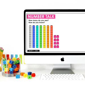
FREE Number Talks
First grade teachers, access 20 FREE Number Talk Prompts to enhance your place value unit and get your students engaged in conversation.
Mathematical Representations Series Part 4: Verbal Representation

Welcome back to our deep dive into mathematical representations! Today, we are taking a look at symbolic representations and how we can translate between symbolic, concrete, and visual representations. First, let’s do a two-sentence recap of this series so far:
We have already focused on concrete representations and the immense value of manipulatives, the range of visual representations we want to encourage with our students, and how we can use numerals and operations to represent thinking symbolically . We are centering our conversation around Lesh’s Translation Model, which encompasses the range of ways we represent our thinking, and stresses the importance of making connections between representations.
Today we are talking about verbal representations. While it’s an essential form of representation for our students, it is often less discussed. This is likely due to the fact that it is not explicitly called out in the Concrete-Pictorial Abstract model . This is just another reason why I love introducing teachers to Lesh’s translation model alongside the CPA (often called CRA) model.
Verbal Representation
The language we use to communicate our thoughts and ideas is another equally important representation. This can be oral, written, signed, or any way that a student would look to communicate language. James Heddens writes that students “need to be given opportunities to verbalize their thought processes: verbal interaction with peers will help learners clarify their own thinking.”
If we go back to our previous examples from concrete, visual, and abstract thinking, we have a student with five yellow counters and four red counters. The student then sketched their counters and wrote the number sentence 5+4=9 on their paper.

So how does verbal representation come into play? Perhaps after the activity, a student shows you their sketch of the counters. When you ask them about their drawing, they may share “I had nine counters. Four of them were red and five of them were yellow, and that makes nine.” That statement is a verbal representation of the concept. They have also just translated their visual representation to a verbal representation.
Connecting Two Verbal Representations
If wanted, we could take it a step further by asking the student to write their thoughts down. This will require the student to revisit their thoughts communicated orally and condense them into a written description, like “Four counters and five counters make nine counters.” This extra step of condensing their language into a second form, allowed students to connect two verbal representations. WOW!

Verbal representation is essential to our work, especially in the early grades. Our students who may not have the ability to write words or numbers will often communicate their understanding orally. This NEEDS to be a part of the discussion when we talk about deepening student understanding, and it’s a huge reason why I make sure to consider Lesh’s Translation Model in addition to the Concrete-Pictorial-Abstract model.
What’s Up Next?
This series is going to dive deep into each of the representations discussed in Lesh’s Translation Model, and then we are going to put it all together so we can make a big impact on your math teaching this year.
If you missed Part One about Concrete Representations , Part Two about Visual Representations , or Part Three about Symbolic Representations , check them out so you have all of the info you need before we move on!
Math Vocabulary Resources

You May Also Enjoy These Posts:
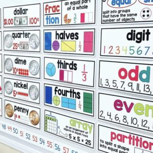
Reader Interactions
Leave a comment.
Your email address will not be published. Required fields are marked *
This site uses Akismet to reduce spam. Learn how your comment data is processed .

Ready to go deeper?
JOIN MEANINGFUL MATH

hello I'm Jillian
I’m so happy you’re here. I want every child to feel confident in their math abilities, and that happens when every teacher feels confident in their ability to teach math.
In my fifteen years of teaching, I sought every opportunity to learn more about teaching math. I wanted to know HOW students develop math concepts, just like I had been taught how students learn to read. I want every teacher to experience the same math transformation I did, and have the confidence to teach any student that steps foot in their classroom. I’m excited to be alongside you in your math journey!
Follow Me on Instagram!

IMAGES
VIDEO
COMMENTS
Graphical representation is a form of visually displaying data through various methods like graphs, diagrams, charts, and plots. It helps in sorting, visualizing, and presenting data in a clear manner through different types of graphs. Statistics mainly use graphical representation to show data.
Graphical Representation is a way of analysing numerical data. It exhibits the relation between data, ideas, information and concepts in a diagram. ... In Mathematics, a graph is defined as a chart with statistical data, which are represented in the form of curves or lines drawn across the coordinate point plotted on its surface. It helps to ...
Principles of graphical representation . The principles of graphical representation are algebraic. In a graph, there are two lines known as Axis or Coordinate axis. These are the X-axis and Y-axis. The horizontal axis is the X-axis and the vertical axis is the Y-axis. They are perpendicular to each other and intersect at O or point of Origin.
In mathematics, a graph is a diagrammatic illustration that is used to represent data values in a systematic, organized and understandable manner. It is indeed a very tedious task to analyze lots of data. However, when the same numerical data is represented in a pictorial form, it becomes easy to understand the relationship between the provided ...
Graphical representation in mathematics refers to the visual depiction of data or mathematical functions using graphs, charts, or diagrams. It provides a clear and intuitive way to understand and analyze mathematical relationships, trends, and patterns. By representing mathematical concepts visually, graphical representation helps in making ...
A graphical representation is the geometrical image of a set of data that preserves its characteristics and displays them at a glance. It is a mathematical picture of data points. It enables us to think about a statistical problem in visual terms. It is an effective tool for the preparation, understanding and interpretation of the collected data.
A graph is a visual representation of a relationship between two sets of data, usually expressed using points connected by lines or curves on a coordinate plane. In other words, it's a way of displaying information that helps us understand and interpret complex mathematical concepts more easily.
Definition. In mathematics, a graph is a graphical representation (also known as a diagram) that conveys information (such as data or values) in an orderly way. Most of the time, the dots on the graph demonstrate the connection between two or more different things.
Definitions. As most commonly interpreted in education, mathematical representations are visible or tangible productions - such as diagrams, number lines, graphs, arrangements of concrete objects or manipulatives, physical models, mathematical expressions, formulas and equations, or depictions on the screen of a computer or calculator ...
To make this graph less misleading, a y-axis with salary information should be included. Even when both axes are present and labeled correctly, graphical representations of data can be misleading. This is shown in the set of attendance graphs that follow. In the graph on the left, the scale begins at 0 and goes to 20,000.
Graphical Representation Principles. We use algebraic concepts in all kinds of graphical data representation. Two lines on the graph are known as coordinate axes. Of the two lines, we refer to the horizontal axis as the x-axis, while we refer to the vertical axis as the y-axis. An origin O is the point at which two lines intersect.
Graphical representation refers to the use of charts and graphs to visually analyze and display, interpret numerical value, clarify the qualitative structures. The data is represented by a variety of symbols such as line charts, bars, circles, ratios. Through this, greater insight is stuck in the mind while analyzing the information.
Figure 10.22: Illustrating how to add vectors using the Head to Tail Rule and Parallelogram Law. Analytically, it is easy to see that →u + →v = →v + →u. Figure 10.22 also gives a graphical representation of this, using gray vectors. Note that the vectors →u and →v, when arranged as in the figure, form a parallelogram.
The input values are placed on the x-axis and the output values on the y-axis. Each point represents a pair of input and output values, and connecting the points creates a visual representation of the function. For example, if the function is f(x) = 2x, the graph would be a straight line passing through the origin, with a slope of 2. 4.
Graphical Representation In kinematics, graphs, specifically motion graphs , are used to easily visualize an object's motion. The most common kinematic motion graphs are displacement-time and ...
Representation (mathematics) In mathematics, a representation is a very general relationship that expresses similarities (or equivalences) between mathematical objects or structures. Roughly speaking, a collection Y of mathematical objects may be said to represent another collection X of objects, provided that the properties and relationships ...
Data Handling is the process of gathering, recording, and presenting information in a way that is helpful to analyze, make predictions and choices. There are two types of data handling namely quantitative data and qualitative data. Data handling can be represented through various graphs.
A graph with six vertices and seven edges. In discrete mathematics, and more specifically in graph theory, a graph is a structure amounting to a set of objects in which some pairs of the objects are in some sense "related". The objects are represented by abstractions called vertices (also called nodes or points) and each of the related pairs of vertices is called an edge (also called link or ...
Definitions. As most commonly interpreted in education, mathematical representations are visible or tangible productions - such as diagrams, number lines, graphs, arrangements of concrete objects or manipulatives, physical models, written words, mathematical expressions, formulas and equations, or depictions on the screen of a computer or ...
Definition. A diagram is a visual representation that employs symbols and visuals to portray relationships, concepts, processes, or objects. Diagrams can be used in science, engineering, and mathematics. It is frequently used to provide a visual illustration of an idea and to simplify the understanding of difficult subjects. A diagram can be ...
Comparing graphical representations in mathematics, science, and engineering textbooks and practitioner journals. Teo Paoletti a School of ... We conclude by discussing implications of this study in relation to the teaching and learning of graphical representations across these fields and directions for future research. KEYWORDS: Coordinate ...
What Is a Pictograph in Math? A pictograph is a graphical representation that employs images or symbols to represent data or information. It visually presents data, making understanding and evaluating the information easier. Graphs are a more attractive and captivating means of presenting data.
Verbal Representation. The language we use to communicate our thoughts and ideas is another equally important representation. This can be oral, written, signed, or any way that a student would look to communicate language. James Heddens writes that students "need to be given opportunities to verbalize their thought processes: verbal ...