- DNA/RNA Analysis
- Lab Recipes
- GraphPad Prism
- Calculators


How To Perform A Linear Regression Test In Microsoft Excel
In this article, I will show you how to perform a simple linear regression test in Microsoft Excel.
Not only will I show you how to perform the linear regression, but I’ll show you how to analyse the outputs of the regression test.
My example data
For this example, I just have two variables of data:
- Weight (kg)
- Height (cm)
I have these measures for 49 different participants; each row represents a different participant.
So, for the first participant, I can see that they had a weight of 51.24 kg and a height of 167.08 cm.
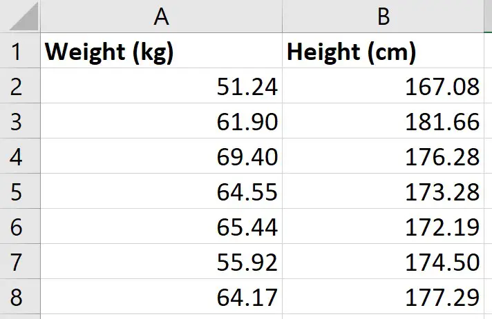
What I want to do is to perform a simple linear regression to see how well the measures of height in my sample can predict the measures of weight.
Installing the Analysis ToolPak
There are a few ways you can perform a linear regression in Excel, but perhaps the easiest method is to use the Analysis ToolPak. This is an add-on created by Microsoft to provide data analysis tools for statistical analyses.
Here are the intrustions for installing the Analysis Toolpak:
- Go to File>Options
- Then click on Add-ins
- At the bottom, you want to manage the Excel add-ins and click the Go button
- Then, ensure you tick the Analysis ToolPak add-in, and click OK
Now, when you click on the Data ribbon, you should see a Data Analysis button in a sub-section called Analyze

We are now ready to perform the linear regression in Excel.
Performing the linear regression in Excel
To perform the linear regression, click on the Data Analysis button.
Then, select Regression from the list.
You must then enter the following:
- Input Y Range – this is the data for the Y variable, otherwise known as the dependent variable. The Y variable is the one that you want to predict in the regression model. For me, this will be the weight data
- Input X Range – this is the data for the X variable, otherwise known as the independent variable. For me, this will be the height data
If you have highlighted the labels of the columns when selecting the data, then tick the Labels options. If you didn’t have any labels when you selected your data, then you should not tick this option.
The next option called Constant is Zero is used if you want the regression line to start at 0, otherwise known as the origin. Doing so would mean there is no Y intercept in the model. Generally, for linear regression, this option is not selected, so I will leave it unchecked for this example.
It is also possible to specify the confidence level for the test. By default, the results will return the 95% confidence intervals without having to change any options. However, if you want to use a different confidence level than 95%, then you need to select this option and enter the desired value here.
Output options
For the Output Options, you can specify where you want the regression results to be placed.
- Output Range – you can highlight where you want the results to be placed in that worksheet
- New Worksheet Ply – lets you place the results in a new worksheet
- New Workbook – lets you save the results in an entirely separate workbook
For my example, I’m going to select the second option and have the results placed in a new worksheet.
The final set of options concerns the residuals in the analysis.
- Residuals – will return the list of predicted dependent values, based on the regression line, as well as the residual values for each point
- Standardized Residuals – will return the standardized residuals; these values can be useful when identifying potential outliers
- Residual Plots – will create a scatter graph where the residuals are plotted on the Y axis and the X variable is plotted on the X axis
- Line Fit Plots – will create another scatter graph where the Y and X variables are plotted, but it will also add the predicted Y values onto the graph
Finally, the Normal Probability Plots option plots another scatter plot, which is used to determine whether the Y variable data fits a normal distribution.
Interpretation of the linear regression results
Depending on the options selected in the set-up window, you will have quite a lot of information in the results sheet.
I’ll now break down the output and go through each in more detail.
Summary Output table
Anova table, coefficients table.
- Residual Output table
- Residual plot
Standardized Residuals
- Line Fits plot
Normal Probability plot
In the first table called Summary Output, there are some regression statistics from the test.
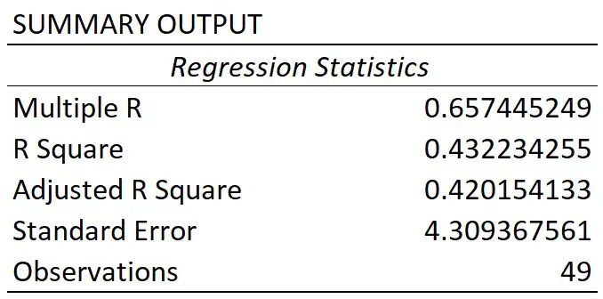
This is the absolute value of the correlation coefficient between the two variables of interest. Briefly, it is a value that tells you how strong the linear relationship is.
A value of 0.65 in this case indicates a fairly strong linear correlation between height and weight measures.
If you’re interested to learn more about correlation, then I suggest you refer to the What is Pearson Correlation post.
You may sometimes see the R square being referred to as the coefficient of determination.
To get this value, you simple square the multiple R value.
The R square value tells you how much variance the dependent variable can be accounted for by the values of the independent variable. Researchers often multiple this value by 100 to get a percentage value.
So, for my example, I can say that 43% of the variance in weight can be accounted for by the height measures. The other 57% of the variance is therefore caused by other factors, such as measurements errors.
Adjusted R square
The adjusted R square takes into account the number of independent variables in the regression analysis, and corrects for bias.
Usually, this value is only relevant when you are performing multiple linear regression, where there are more than 1 independent variables in the model.
Standard error
The standard error of the regression is the average distance that the observed values fall from the regression line.
What’s useful about the standard error is that it is in the same units as the dependent variable. So, here my standard error is 4.31 kg, when rounded. This means, on average, my observed values were 4.31 kg from the regression line.
The smaller the standard error, the more precise the linear regression model is.
Observations
Finally, we have the number of observations. This is just the number of subjects in the test.
So, for my example, I had 49 participants.
The main thing you will be concerned with when looking at this table is the value under the Significance F header; this is in fact the P value for the regression model.

To be able to interpret this, we need our hypotheses:
- Null hypothesis – there is no linear relationship between the height and weight measures
- Alternative hypothesis – there is a linear relationship between the height and weight measures
If my alpha was 0.05, this means I will reject the null and accept the alternative hypothesis if P≤0.05. The opposite will be true if P>0.05; in this case, I would fail to reject the null hypothesis.
As you can see, the P value (Significance F) for the model was considerably lower than my alpha value of 0.05. So, I can conclude that the linear regression model is significant.
Let me now move on to the final table of results regarding the coefficients.

The first row displays the results for the intercept, this is the point where the line of best fit (regression line) crosses the Y axis when the value of X is zero.
The second row displays the results for the slope.
For a simple linear regression model, the most basic version of the equation is Y = m.X + b.
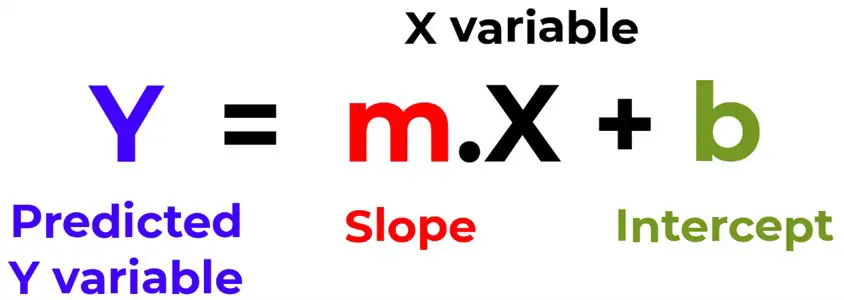
Using the information reported from the results, we can then say:
Y = 0.800264.X – 79.599
So, in this example, if we knew a participants height (in cm), we can predict their weight (in kg) by using this equation. For example, if a participant measured 175 cm, the model estimates their height to be 60.45 kg.
Looking back at the coefficient results table, we can see there are other columns which tells us the standard error, as well as the lower and upper 95% confidence intervals, or a different confidence interval if a different confidence level was entered. And these values are for the intercept and slope values.
You will also notice each also has a T-statistic. This value is used to compute the P value.
Again, to interpret this P value we need our hypotheses:
- Null hypothesis – the intercept or slope is 0
- Alternative hypothesis – the slope of the line is not 0
As you can see, both values are less than my alpha of 0.05. However, we usually ignore the P value for the intercept.
For the slope, this means that height is a significant variable that impacts weight in this case.
Residual options
So, that’s an overview of the regression model results, let me know cover the other outputs from the regression test.
Residual Output
If you selected to have the Residuals option during the regression set-up, you will have a table titled Residual Output.

For each observation from your data that was entered into the regression test, you will get a predicted value of Y based on the regression model.
For example, if you look at the first observation in my original data, you see this participant had a height of 167.08 cm. If I put this into the regression equation, along with the slope and intercept values, I get the predicted weight value of 54.10999 kg.
This is what the Predicted column represents; Excel does this for each of the observations.
Using the predicted values, Excel can then calculate the residuals.
A residual is simply the distance between the actual data point and the line of best fit.
For my first participant they had a height of 167.08 cm and a weight of 51.24 kg. As calculated above, the predicted weight value based on the model was 54.10999 kg. The residual for this point therefore is the difference between the actual weight value (51.24 kg), and the predicted weight value (54.10999 kg), which comes out at around -2.867 kg.
Excel then repeats this process for the rest of the observations.
Residual Plot
If you also selected the Residual Plots option in the Regression set-up window, you will also get a graph returned.
Here is my Residual Plot.
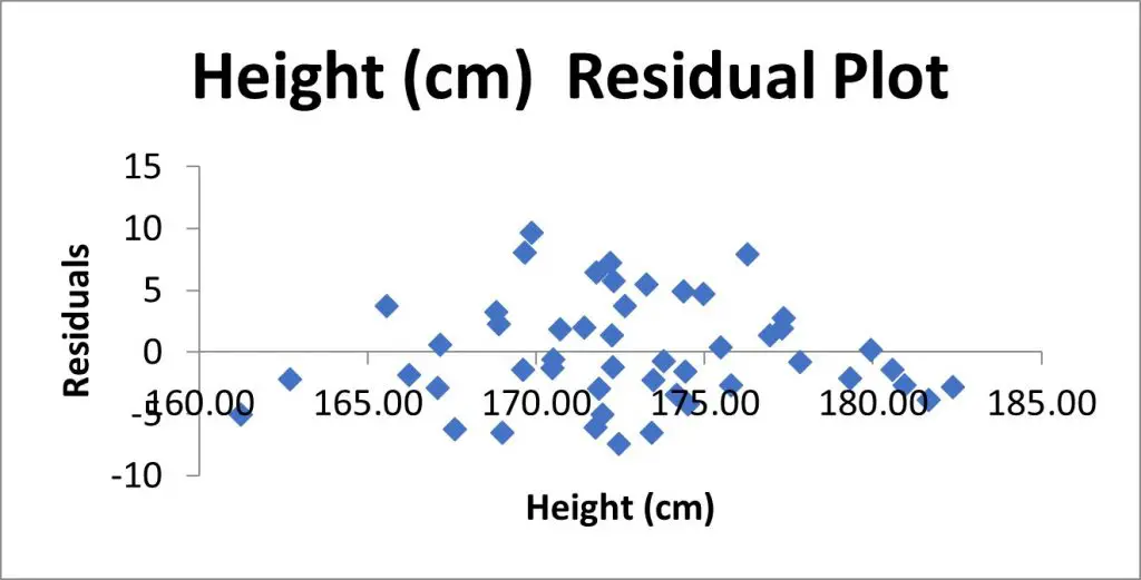
This is a scatter plot of the residuals on the Y axis and the values of the independent variable on the X axis.
Residual plots are useful to look at when investigating homogeneity of variance, which is an assumption of the linear regression test.
What you are looking for here is a random pattern to the graph; there should be roughly half the number of data points above 0 and below 0, and there vertical spread of the data points should be roughly constant the further along the X axis you go.
If you selected the Standardized Residuals option in the regression options, you will also see a column called Standard Residuals in the residuals table.

The standardized residual is the residual divided by an estimate of its standard deviation. You can think of them as Z scores.
These values are useful to look at when trying to identify potential outliers in your sample.
Generally, any standardized residuals with a value greater than 3 or -3 is a sign that it may be an outlier.
Line Fits Plot
If you selected to have the Line Fit Plots option, you will also see a scatter plot containing the data that was entered into the regression test.
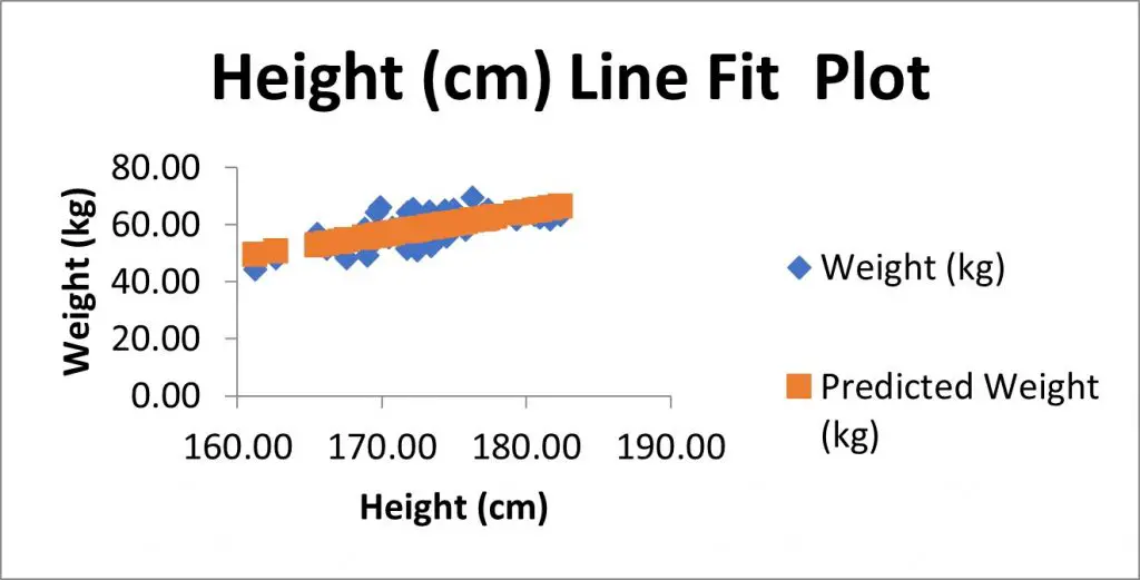
In my example, I have the height measures on the X axis and the weight measures on the Y axis.
There is also another set of data, as shown in orange here, which are in fact the predicted Y value based on the model. These are the Predicted values from the residuals table.
If instead of showing the Predicted values on the graph, but you instead wanted to plot the line of best fit (which will pass through the predicted values), then you could remove the predicted values from the graph.
To do this:
- Right-click on on the graph, and go to Select Data
- Highlight the predicted Y variable in the legend entry, select remove, and click Okay
- Select the graph, then go to Add Chart Element>Trendline, and select the Linear option
- If you also want to show the equation of the line, then double-click on the line
- Then, in the Format Trendline options that have opened to the right, scroll down and select Display Equation on Chart
Finally, if you selected the Normal Probability plots option in the regression setup window, you will also see a table called Probability Output and a graph, called the Normal Probability Plot, which is a scatter plot of this data in the graph.
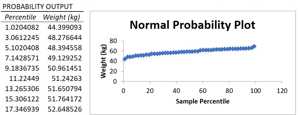
The X axis plots the percentile value ranging from 0 to 100 and the Y axis plots the Y variable data.
The normal probability plot is used to determine whether the data fits a normal distribution.
Essentially, what you are looking for is a straight line of data. And, as you can see, there is a nice straight line of data for my example, which suggests the weight data are normally distributed.
However, it’s worth noting that the Y variable does not actually have to be normally distributed when fitting a linear regression model. I’ll go into a bit more detail about the assumptions of linear regression in a future tutorial.
Wrapping up
You now know how to perform a simple linear regression test in Microsoft Excel, and how to interpret the output of results.
Microsoft Excel version used: 365 ProPlus
RELATED ARTICLES MORE FROM AUTHOR
How To Perform Descriptive Statistics In Microsoft Excel

How To Do Basic Math In Excel (Add, Subtract, Multiply & Divide)

How To Calculate A Weighted Average In Microsoft Excel
Leave a reply cancel reply.
Save my name, email, and website in this browser for the next time I comment.
Other Excel tutorials
How to perform random sampling in microsoft excel, how to perform a chi-square test of independence in excel, stay connected.
- Ablebits blog
- Excel charts
Linear regression analysis in Excel

The tutorial explains the basics of regression analysis and shows a few different ways to do linear regression in Excel.
Imagine this: you are provided with a whole lot of different data and are asked to predict next year's sales numbers for your company. You have discovered dozens, perhaps even hundreds, of factors that can possibly affect the numbers. But how do you know which ones are really important? Run regression analysis in Excel. It will give you an answer to this and many more questions: Which factors matter and which can be ignored? How closely are these factors related to each other? And how certain can you be about the predictions?
Regression analysis in Excel - the basics
In statistical modeling, regression analysis is used to estimate the relationships between two or more variables:
Dependent variable (aka criterion variable) is the main factor you are trying to understand and predict.
Independent variables (aka explanatory variables, or predictors ) are the factors that might influence the dependent variable.
Regression analysis helps you understand how the dependent variable changes when one of the independent variables varies and allows to mathematically determine which of those variables really has an impact.
Technically, a regression analysis model is based on the sum of squares , which is a mathematical way to find the dispersion of data points. The goal of a model is to get the smallest possible sum of squares and draw a line that comes closest to the data.
In statistics, they differentiate between a simple and multiple linear regression. Simple linear regression models the relationship between a dependent variable and one independent variables using a linear function. If you use two or more explanatory variables to predict the dependent variable, you deal with multiple linear regression . If the dependent variable is modeled as a non-linear function because the data relationships do not follow a straight line, use nonlinear regression instead. The focus of this tutorial will be on a simple linear regression.
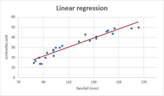
Linear regression equation
Mathematically, a linear regression is defined by this equation:
- x is an independent variable.
- y is a dependent variable.
- a is the Y-intercept , which is the expected mean value of y when all x variables are equal to 0. On a regression graph, it's the point where the line crosses the Y axis.
- b is the slope of a regression line, which is the rate of change for y as x changes.
- ε is the random error term, which is the difference between the actual value of a dependent variable and its predicted value.
The linear regression equation always has an error term because, in real life, predictors are never perfectly precise. However, some programs, including Excel, do the error term calculation behind the scenes. So, in Excel, you do linear regression using the least squares method and seek coefficients a and b such that:
For our example, the linear regression equation takes the following shape:
Umbrellas sold = b * rainfall + a
There exist a handful of different ways to find a and b . The three main methods to perform linear regression analysis in Excel are:
- Regression tool included with Analysis ToolPak
- Scatter chart with a trendline
- Linear regression formula
How to do linear regression in Excel with Analysis ToolPak
This example shows how to run regression in Excel by using a special tool included with the Analysis ToolPak add-in.
Enable the Analysis ToolPak add-in
Analysis ToolPak is available in all versions of Excel 365 to 2003 but is not enabled by default. So, you need to turn it on manually. Here's how:
- In your Excel, click File > Options .
Run regression analysis
With Analysis Toolpak added enabled, carry out these steps to perform regression analysis in Excel:
- Select the Input Y Range , which is your dependent variable . In our case, it's umbrella sales (C1:C25).
- Select the Input X Range , i.e. your independent variable . In this example, it's the average monthly rainfall (B1:B25).
If you are building a multiple regression model, select two or more adjacent columns with different independent variables.
- Check the Labels box if there are headers at the top of your X and Y ranges.
- Choose your preferred Output option, a new worksheet in our case.
- Click OK and observe the regression analysis output created by Excel.
Interpret regression analysis output
As you have just seen, running regression in Excel is easy because all calculations are preformed automatically. The interpretation of the results is a bit trickier because you need to know what is behind each number. Below you will find a breakdown of 4 major parts of the regression analysis output.
Regression analysis output: Summary Output
Here's what each piece of information means:
Multiple R . It is the C orrelation Coefficient that measures the strength of a linear relationship between two variables. The correlation coefficient can be any value between -1 and 1, and its absolute value indicates the relationship strength. The larger the absolute value, the stronger the relationship:
- 1 means a strong positive relationship
- -1 means a strong negative relationship
- 0 means no relationship at all
R Square . It is the Coefficient of Determination , which is used as an indicator of the goodness of fit. It shows how many points fall on the regression line. The R 2 value is calculated from the total sum of squares, more precisely, it is the sum of the squared deviations of the original data from the mean.
In our example, R 2 is 0.91 (rounded to 2 digits), which is fairy good. It means that 91% of our values fit the regression analysis model. In other words, 91% of the dependent variables (y-values) are explained by the independent variables (x-values). Generally, R Squared of 95% or more is considered a good fit.
Adjusted R Square . It is the R square adjusted for the number of independent variable in the model. You will want to use this value instead of R square for multiple regression analysis.
Standard Error . It is another goodness-of-fit measure that shows the precision of your regression analysis - the smaller the number, the more certain you can be about your regression equation. While R 2 represents the percentage of the dependent variables variance that is explained by the model, Standard Error is an absolute measure that shows the average distance that the data points fall from the regression line.
Regression analysis output: ANOVA
Basically, it splits the sum of squares into individual components that give information about the levels of variability within your regression model:
- df is the number of the degrees of freedom associated with the sources of variance.
- SS is the sum of squares. The smaller the Residual SS compared with the Total SS, the better your model fits the data.
- MS is the mean square.
- F is the F statistic, or F-test for the null hypothesis. It is used to test the overall significance of the model.
- Significance F is the P-value of F.
Regression analysis output: coefficients
The most useful component in this section is Coefficients . It enables you to build a linear regression equation in Excel:
For our data set, where y is the number of umbrellas sold and x is an average monthly rainfall, our linear regression formula goes as follows:
Y = Rainfall Coefficient * x + Intercept
Equipped with a and b values rounded to three decimal places, it turns into:
Y=0.45*x-19.074
For example, with the average monthly rainfall equal to 82 mm, the umbrella sales would be approximately 17.8:
0.45*82-19.074=17.8
Regression analysis output: residuals
If you compare the estimated and actual number of sold umbrellas corresponding to the monthly rainfall of 82 mm, you will see that these numbers are slightly different:
- Estimated: 17.8 (calculated above)
- Actual: 15 (row 2 of the source data)
How to make a linear regression graph in Excel
If you need to quickly visualize the relationship between the two variables, draw a linear regression chart. That's very easy! Here's how:
- Select the two columns with your data, including headers.
Still, you may want to make a few more improvements:
- Drag the equation wherever you see fit.
- Add axes titles ( Chart Elements button > Axis Titles ).
Important note! In the regression graph, the independent variable should always be on the X axis and the dependent variable on the Y axis. If your graph is plotted in the reverse order, swap the columns in your worksheet, and then draw the chart anew. If you are not allowed to rearrange the source data, then you can switch the X and Y axes directly in a chart.
How to do regression in Excel using formulas
Microsoft Excel has a few statistical functions that can help you to do linear regression analysis such as LINEST, SLOPE, INTERCEPT, and CORREL.
The LINEST function uses the least squares regression method to calculate a straight line that best explains the relationship between your variables and returns an array describing that line. You can find the detailed explanation of the function's syntax in this tutorial . For now, let's just make a formula for our sample dataset:
=LINEST(C2:C25, B2:B25)
Because the LINEST function returns an array of values, you must enter it as an array formula . Select two adjacent cells in the same row, E2:F2 in our case, type the formula, and press Ctrl + Shift + Enter to complete it.
The formula returns the b coefficient (E1) and the a constant (F1) for the already familiar linear regression equation:
If you avoid using array formulas in your worksheets, you can calculate a and b individually with regular formulas:
Get the Y-intercept (a):
=INTERCEPT(C2:C25, B2:B25)
Get the slope (b):
=SLOPE(C2:C25, B2:B25)
Additionally, you can find the correlation coefficient ( Multiple R in the regression analysis summary output ) that indicates how strongly the two variables are related to each other:
=CORREL(B2:B25,C2:C25)

Tip. If you'd like to get additional statistics for your regression analysis, use the LINEST function with the s tats parameter set to TRUE as shown in this example .
To have a closer look at our linear regression formulas and other techniques discussed in this tutorial, you are welcome to download our sample workbook below. Thank you for reading!
Practice workbook
You may also be interested in.
- How to use Solver in Excel with examples
- What-If analysis with Excel Goal Seek
- Pearson correlation in Excel
- Spearman correlation in Excel
- Insert error bars in Excel: standard and custom
Table of contents
152 comments
Thank you. Really helped me a lot. I got an assignment on this exact work. I've written many notes following your tutorial. Please make more and let us know if there's any way we can support you going forward.
its good to study and refer. Actually i have values of few features ie independent variables and want calculate profit out of that and then plot the graph forf ilinear regression. plz suggest the method .
Hi! I can't build a chart for you in your workbook. If you have a specific question about the operation of a function or formula, I will try to answer it.
You guys are wonderful. With you I can go places
W artykule znajduje się niepełna informacja dotycząca analizy danych.
"Multiple R. It is the Correlation Coefficient that measures the strength of a linear relationship between two variables."
Multiple R nie jest współczynnikiem korelacji Pearsona, chociaż w przypadku regresji liniowej dwóch zmiennych rzeczywiście będzie miał taką samą wartość.
Multiple R to współczynnik korelacji w modelach wielowymiarowych, gdy wielkość y zależy od wielu zmiennych objaśniających.
very helpful thank you
Wow... very insightful. Thank you.
Thank you very much for sharing this information
thanks a lot! very clearly explained
It is really time saving. very clear and well explained. Thank you
I must say, this is a life saver. Had a quiz in less than w hours and needed to understand some data info. And this took me to the core of it. I've full understood it. Thank you...
i dont think i would be able to pass this class if is not because of this site
Good stuff thoroughly enjoyed this.
I need further explanation to where you obtained the 82. How was that figure arrived at? Thank you.
they are assuming it to be 82, its written there
Any diagram or video to explain linear regression?
Search in YouTube: LINEST, SLOPE, INTERCEPT, RSQ, STEYX...you will find complete solution in matrix form.
As a less-than- average leaner, I find all relevant points self- explained. It has become an appetizer for me. I would very much want to know whether the trend line could be extended for prediction of y values for x values beyond those used in the dataset .
This awesome
Extremely excellent
Great article! Knowledge-filled and hands-on mode enabled.
Thank you so much for this very very helpful Knowledge.
is this valid for non-linear regression
Thank you it's well explained.
Excellet, thanks for sharing!!
Thanks so very much for these knowledge transfer.
Excellent explanation.. Thanks a lot.
Excellent, very useful, so much grateful for this article.
Thank You For Your Well Detailed And Explicit Explanation. God Bless You, Amen.
Outstanding
very useful, so much grateful for this article.
Thanks a lot. Very useful.
Thank you so much. very useful tutorial...!
Great Lesson! I used the SLOPE function, and created a scatter-plot with a trend line, both using the same data set. The SLOPE function gives a slightly different result from the equation displayed on the graph by formatting the trendline. Why? Do they use different methods to calculate the slope?
Thank you for great explanation
Any chance to update it for the last version of Windows? Thank you :)
Very useful tutorial
Just one thing that I can't get my head around. When I calculate slope and coefficient of correlation (and square it or use the =RSQ() to get the coefficient of determination) I do not get exactly the same slope or R-squared as when I use the "add Trendline" in excel. How can that be? And can I get the same result somehow?
Thank you so much. very useful tutorial.
I lie, the slope and intercept functions but a neat thing with the graph regression is being able to hid rows that may have outliers and see the regression line and equation update. The slope and intercept functions use the entire data set regardless of whether rows are hidden or not.
Excellent, Thank you very much for the explanations.
Very useful sir.
Post a comment
Teach yourself statistics
Hypothesis Test for Regression Slope
This lesson describes how to conduct a hypothesis test to determine whether there is a significant linear relationship between an independent variable X and a dependent variable Y .
The test focuses on the slope of the regression line
Y = Β 0 + Β 1 X
where Β 0 is a constant, Β 1 is the slope (also called the regression coefficient), X is the value of the independent variable, and Y is the value of the dependent variable.
If we find that the slope of the regression line is significantly different from zero, we will conclude that there is a significant relationship between the independent and dependent variables.
Test Requirements
The approach described in this lesson is valid whenever the standard requirements for simple linear regression are met.
- The dependent variable Y has a linear relationship to the independent variable X .
- For each value of X, the probability distribution of Y has the same standard deviation σ.
- The Y values are independent.
- The Y values are roughly normally distributed (i.e., symmetric and unimodal ). A little skewness is ok if the sample size is large.
The test procedure consists of four steps: (1) state the hypotheses, (2) formulate an analysis plan, (3) analyze sample data, and (4) interpret results.
State the Hypotheses
If there is a significant linear relationship between the independent variable X and the dependent variable Y , the slope will not equal zero.
H o : Β 1 = 0
H a : Β 1 ≠ 0
The null hypothesis states that the slope is equal to zero, and the alternative hypothesis states that the slope is not equal to zero.
Formulate an Analysis Plan
The analysis plan describes how to use sample data to accept or reject the null hypothesis. The plan should specify the following elements.
- Significance level. Often, researchers choose significance levels equal to 0.01, 0.05, or 0.10; but any value between 0 and 1 can be used.
- Test method. Use a linear regression t-test (described in the next section) to determine whether the slope of the regression line differs significantly from zero.
Analyze Sample Data
Using sample data, find the standard error of the slope, the slope of the regression line, the degrees of freedom, the test statistic, and the P-value associated with the test statistic. The approach described in this section is illustrated in the sample problem at the end of this lesson.
SE = s b 1 = sqrt [ Σ(y i - ŷ i ) 2 / (n - 2) ] / sqrt [ Σ(x i - x ) 2 ]
- Slope. Like the standard error, the slope of the regression line will be provided by most statistics software packages. In the hypothetical output above, the slope is equal to 35.
t = b 1 / SE
- P-value. The P-value is the probability of observing a sample statistic as extreme as the test statistic. Since the test statistic is a t statistic, use the t Distribution Calculator to assess the probability associated with the test statistic. Use the degrees of freedom computed above.
Interpret Results
If the sample findings are unlikely, given the null hypothesis, the researcher rejects the null hypothesis. Typically, this involves comparing the P-value to the significance level , and rejecting the null hypothesis when the P-value is less than the significance level.
Test Your Understanding
The local utility company surveys 101 randomly selected customers. For each survey participant, the company collects the following: annual electric bill (in dollars) and home size (in square feet). Output from a regression analysis appears below.
Is there a significant linear relationship between annual bill and home size? Use a 0.05 level of significance.
The solution to this problem takes four steps: (1) state the hypotheses, (2) formulate an analysis plan, (3) analyze sample data, and (4) interpret results. We work through those steps below:
H o : The slope of the regression line is equal to zero.
H a : The slope of the regression line is not equal to zero.
- Formulate an analysis plan . For this analysis, the significance level is 0.05. Using sample data, we will conduct a linear regression t-test to determine whether the slope of the regression line differs significantly from zero.
We get the slope (b 1 ) and the standard error (SE) from the regression output.
b 1 = 0.55 SE = 0.24
We compute the degrees of freedom and the t statistic, using the following equations.
DF = n - 2 = 101 - 2 = 99
t = b 1 /SE = 0.55/0.24 = 2.29
where DF is the degrees of freedom, n is the number of observations in the sample, b 1 is the slope of the regression line, and SE is the standard error of the slope.
- Interpret results . Since the P-value (0.0242) is less than the significance level (0.05), we cannot accept the null hypothesis.

- school Campus Bookshelves
- menu_book Bookshelves
- perm_media Learning Objects
- login Login
- how_to_reg Request Instructor Account
- hub Instructor Commons
- Download Page (PDF)
- Download Full Book (PDF)
- Periodic Table
- Physics Constants
- Scientific Calculator
- Reference & Cite
- Tools expand_more
- Readability
selected template will load here
This action is not available.

12.2.1: Hypothesis Test for Linear Regression
- Last updated
- Save as PDF
- Page ID 34850

- Rachel Webb
- Portland State University
\( \newcommand{\vecs}[1]{\overset { \scriptstyle \rightharpoonup} {\mathbf{#1}} } \)
\( \newcommand{\vecd}[1]{\overset{-\!-\!\rightharpoonup}{\vphantom{a}\smash {#1}}} \)
\( \newcommand{\id}{\mathrm{id}}\) \( \newcommand{\Span}{\mathrm{span}}\)
( \newcommand{\kernel}{\mathrm{null}\,}\) \( \newcommand{\range}{\mathrm{range}\,}\)
\( \newcommand{\RealPart}{\mathrm{Re}}\) \( \newcommand{\ImaginaryPart}{\mathrm{Im}}\)
\( \newcommand{\Argument}{\mathrm{Arg}}\) \( \newcommand{\norm}[1]{\| #1 \|}\)
\( \newcommand{\inner}[2]{\langle #1, #2 \rangle}\)
\( \newcommand{\Span}{\mathrm{span}}\)
\( \newcommand{\id}{\mathrm{id}}\)
\( \newcommand{\kernel}{\mathrm{null}\,}\)
\( \newcommand{\range}{\mathrm{range}\,}\)
\( \newcommand{\RealPart}{\mathrm{Re}}\)
\( \newcommand{\ImaginaryPart}{\mathrm{Im}}\)
\( \newcommand{\Argument}{\mathrm{Arg}}\)
\( \newcommand{\norm}[1]{\| #1 \|}\)
\( \newcommand{\Span}{\mathrm{span}}\) \( \newcommand{\AA}{\unicode[.8,0]{x212B}}\)
\( \newcommand{\vectorA}[1]{\vec{#1}} % arrow\)
\( \newcommand{\vectorAt}[1]{\vec{\text{#1}}} % arrow\)
\( \newcommand{\vectorB}[1]{\overset { \scriptstyle \rightharpoonup} {\mathbf{#1}} } \)
\( \newcommand{\vectorC}[1]{\textbf{#1}} \)
\( \newcommand{\vectorD}[1]{\overrightarrow{#1}} \)
\( \newcommand{\vectorDt}[1]{\overrightarrow{\text{#1}}} \)
\( \newcommand{\vectE}[1]{\overset{-\!-\!\rightharpoonup}{\vphantom{a}\smash{\mathbf {#1}}}} \)
To test to see if the slope is significant we will be doing a two-tailed test with hypotheses. The population least squares regression line would be \(y = \beta_{0} + \beta_{1} + \varepsilon\) where \(\beta_{0}\) (pronounced “beta-naught”) is the population \(y\)-intercept, \(\beta_{1}\) (pronounced “beta-one”) is the population slope and \(\varepsilon\) is called the error term.
If the slope were horizontal (equal to zero), the regression line would give the same \(y\)-value for every input of \(x\) and would be of no use. If there is a statistically significant linear relationship then the slope needs to be different from zero. We will only do the two-tailed test, but the same rules for hypothesis testing apply for a one-tailed test.
We will only be using the two-tailed test for a population slope.
The hypotheses are:
\(H_{0}: \beta_{1} = 0\) \(H_{1}: \beta_{1} \neq 0\)
The null hypothesis of a two-tailed test states that there is not a linear relationship between \(x\) and \(y\). The alternative hypothesis of a two-tailed test states that there is a significant linear relationship between \(x\) and \(y\).
Either a t-test or an F-test may be used to see if the slope is significantly different from zero. The population of the variable \(y\) must be normally distributed.
F-Test for Regression
An F-test can be used instead of a t-test. Both tests will yield the same results, so it is a matter of preference and what technology is available. Figure 12-12 is a template for a regression ANOVA table,
.png?revision=1)
where \(n\) is the number of pairs in the sample and \(p\) is the number of predictor (independent) variables; for now this is just \(p = 1\). Use the F-distribution with degrees of freedom for regression = \(df_{R} = p\), and degrees of freedom for error = \(df_{E} = n - p - 1\). This F-test is always a right-tailed test since ANOVA is testing the variation in the regression model is larger than the variation in the error.
Use an F-test to see if there is a significant relationship between hours studied and grade on the exam. Use \(\alpha\) = 0.05.
T-Test for Regression
If the regression equation has a slope of zero, then every \(x\) value will give the same \(y\) value and the regression equation would be useless for prediction. We should perform a t-test to see if the slope is significantly different from zero before using the regression equation for prediction. The numeric value of t will be the same as the t-test for a correlation. The two test statistic formulas are algebraically equal; however, the formulas are different and we use a different parameter in the hypotheses.
The formula for the t-test statistic is \(t = \frac{b_{1}}{\sqrt{ \left(\frac{MSE}{SS_{xx}}\right) }}\)
Use the t-distribution with degrees of freedom equal to \(n - p - 1\).
The t-test for slope has the same hypotheses as the F-test:
Use a t-test to see if there is a significant relationship between hours studied and grade on the exam, use \(\alpha\) = 0.05.
How to Do a T Test in Excel (2 Ways with Interpretation of Results)
The article will show you how to do a T Test in Excel. T-Tests are hypothesis tests that evaluate one or two groups’ means. Hypothesis tests employ sample data to infer population traits. In this lesson, we will look at the different types of T-Tests , and how to run T-Tests in Excel. We’ll go over both paired and two sample T-Tests , with detailed instructions on how to prepare your data, run the test, and interpret the findings.
Understanding how to use the T.TEST function in Excel will improve your ability to draw significant insights and make data-driven decisions, whether you’re a student, researcher, business analyst, or anybody else who works with data. Let’s say, you’re doing education research to assess the efficacy between traditional and new approaches. T-tests will guide you through providing the mean scores of students based on the approaches that they were taught. So that, you can make a decision based on the students’ performance.
Download Practice Workbook
T Test.xlsx
T Test Type
There are basically two types of t-tests. They are:
- One-tailed t-test
- Two-tailed t-test
Each of them has 3 types. They are:
- Two sample equal variance
- Two sample unequal variance
We will show you the application of some of these types. The procedure of getting the results for all types of t-tests in Excel are the same. Let’s dig into some details and see how it can be done.
How to Do a T Test in Excel: 2 Effective Ways
1. using excel t.test or ttest function to do t test.
Here, we are going to show you how to determine the T Test result by using formulas. Excel has T.TEST and TTEST functions to operate t-test on different variables. Both functions work similarly. First, we will cover how to determine the t-test value of two sample variables with equal variance.
1.1 Two Sample Equal Variance T Test
In the dataset, you will see the prices of different laptops and smartphones. Here is a formula that performs a T Test on the prices of these products and returns the t-test result.
=T.TEST(B5:B14,C5:C14,2,2)
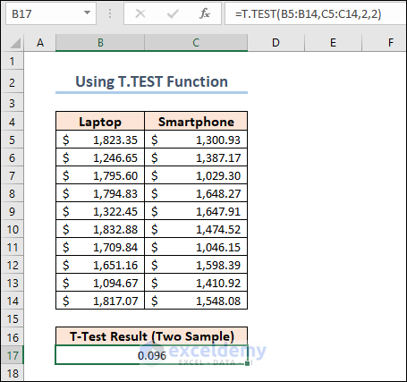
We set the 3rd argument of the function to 2 as we are doing a two tailed t-test on the dataset. The 4th argument should be 2 for a two sample equal variance t-test.
1.2 Paired T Test
Now, we are going to apply another formula to calculate the Paired T-Test . The following dataset shows the performance mark of some employees in two different criteria.
=T.TEST(C5:C13,D5:D13,2,1)
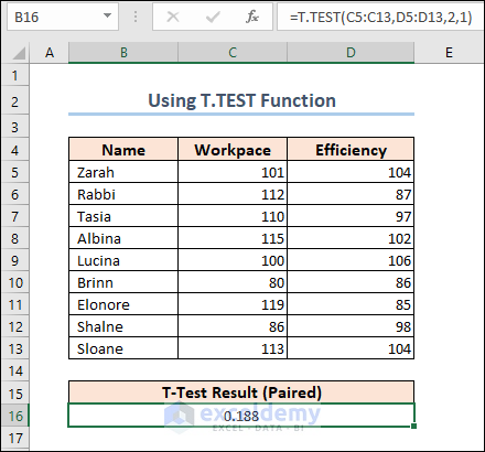
Note: The explanation of the results is described in the following sections.
2. Using Analysis Toolpak
The above tasks can be done with the Analysis Toolpak Add-in too. The Analysis Toolpak Add-in is not available in the ribbon by default. To initiate it,
- Go to the Options window first.
- Next, select Add-ins and click on the Go button beside the Manage section.
- After that, click OK .

- Thereafter, the Add-ins window will appear. Select Analysis Toolpak >> click OK again.
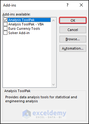
This Add-in will be added to the ribbon of the Data tab.
2.1 Two Sample Equal Variance T Test
We will do a two sample equal variance t-test using the Analysis Toolpak here. We used the dataset that contains the prices of laptops and smartphones. For this purpose,
- Click on the Data Analysis button from the ribbon of the Data tab.
- The Data Analysis features will appear. Select t-Test: Two Sample Assuming Equal Variances and click OK .
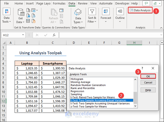
- After that, you need to set up the parameters for the t-test operation. Insert the Laptop and Smartphone prices as Variable 1 Range and Variable 2 Range Include the headings in the range and check Labels.
- Next, set the value of Hypothesized Mean Difference to 0 .
- Finally, select an Output option of your preference and click OK .
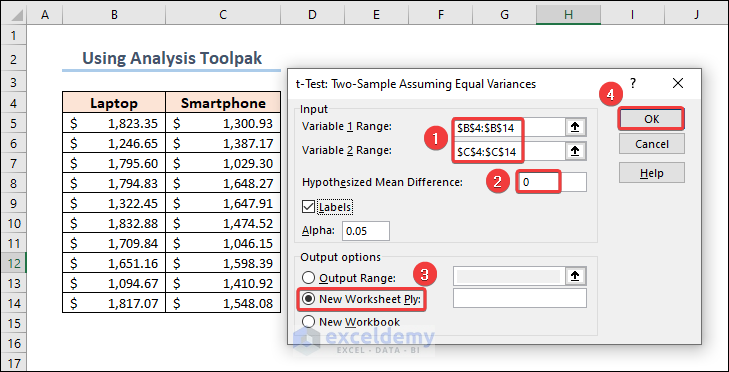
As we have chosen a New Worksheet for the outputs, we will see the results in a new sheet.
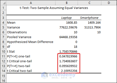
Now, let’s get to the discussion on the results.
Comments on Results
The output shows that the mean values for Laptops and Smartphones are 1608.85 and 1409.164 respectively. We can see from the Variances row that they are not precisely equal, but they are close enough to be assumed to have equal variances. The most relevant metric is the p-value .
The difference between means is statistically significant if the p-value is less than your significance level. Excel calculates p-values for one- and two-tailed T Tests .
One-tailed T Tests can detect only one direction of difference between means. A one-tailed test, for example, might only evaluate whether Smartphones have higher prices than Laptops . Two-tailed tests can reveal differences that are larger or smaller than. There are some other disadvantages to utilizing one-tailed testing, so I’ll continue with the conventional two-tailed results.
For our results, we’ll utilize P(T=t) two-tail, which is the p-value for the t-test’s two-tailed version. We cannot reject the null hypothesis because our p-value ( 0.095639932 ) is greater than the conventional significance level of 0.05 . The hypothesis that the population means differ is supported by our sample data. The mean price of Laptops is greater than the mean price of Smartphones’ .
The Analysis Toolpak operation also returns results for one-tailed t-test . Here, the one-tailed P value of two sample equal variance t-test is 1.734 .
2.2 Paired T Test
Similarly, you can find out the Paired t-Test result for the dataset containing employee performances. Just select the t-Test: Paired Two Samples for Mean when you open the Data Analysis window.
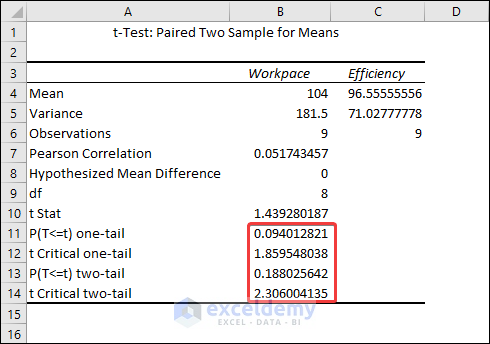
The result shows that the mean for the Workpace is 104 and the mean for the Efficiency is 96.56 .
The difference between means is statistically significant if the p-value is less than your significance level. For our results, we’ll utilize P(T=t) two-tail, which is the p-value for the t-test’s two-tailed version. We cannot reject the null hypothesis because our p-value ( 0.188 ) is greater than the conventional significance level of 0.05 . The hypothesis that the population means differ is supported by our sample data. In particular, the Workpace mean exceeds the Efficiency mean.
How to Interpret t-Test Results in Excel
Although we explained the results of the t-Test earlier, we didn’t show the proper interpretation. So here, I’ll show you the interpretation of the two sample equal variance t-test.
Let’s bring out the results again first.
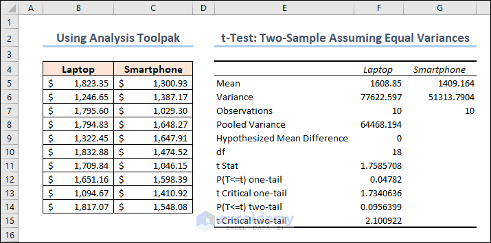
- The mean of laptop prices = 1608.85
- The mean of smartphone prices = 1409.164
ii. Variance
- The variance of laptop prices = 77622.597
- The variance of smartphone prices = 51313.7904
iii. Observations
The number of observations for both laptops and smartphones are 10 .
iv. Pooled Variance
The samples’ average variance, calculated by pooling the variances of each sample.
The mathematical formula for this parameter is:
((No of observations of Sample 1-1)*(Variance of Sample 1) + (No of observations of Sample 2-1)*(Variance of Sample 2))/(No of observations of Sample 1 + No of observations of Sample 2 – 2)
So it becomes: ((10-1)*77622.59676+(10-1)*51313.7904)/(10+10-2) = 64468.19358
v. Hypothesized Mean Difference
We “hypothesize” that the number is the difference between the two population means. In this situation, we chose 0 because we want to see if the difference between the means of the two populations is zero.
It indicates the value of the Degrees of Freedom. Formula for this parameter is:
No of observations of Sample 1 + No of observations of Sample 2 – 2 = 10 + 10 – 2 = 18
vii. t Stat
The test statistic value of the t-Test operation.
The formula for this parameter is given below.
(Mean of Sample 1 – Mean of Sample 2)/(Square root of (Pooling Variance* (1/No of observations of Sample 1 + 1/No of observations of Sample 2)))
So it becomes: (1608.85 – 1409.164)/Sqrt(64468.19358 * (1/10 + 1/10)) = 1.758570846
viii. P(T<=t) two-tail
A two-tailed t-test’s p-value. This value can be found by entering t = 1.758570846 with 18 degrees of freedom into any T Score to P Value Calculator.
In this situation, the value of p is 0.095639932 . Because this is greater than 0.05 , we cannot reject the null hypothesis. This suggests that we lack adequate evidence to conclude that the two population means differ.
ix. t Critical two-tail
This is the test’s crucial value. A t Critical value Calculator with 18 degrees of freedom and a 95% confidence level can be used to calculate this number.
In this instance, the critical value is 2.10092204 . We cannot reject the null hypothesis because our test statistic t is less than this number. Again, we lack adequate information to conclude that the two population means are distinct.
Things to Remember
- Excel demands that your data be arranged in columns, with data from each group in a separate column. The first row should have labels or headers.
- Clearly state your null hypothesis (usually that there is no significant difference between the group means) and your alternative hypothesis (the opposite of the null hypothesis).
- As a result of the t-test, Excel returns the p-value. A little p-value (usually less than the specified alpha level) indicates that the null hypothesis may be rejected and that there is a substantial difference between the group means.
Frequently Asked Questions
1. Can I perform a t-test on unequal sample sizes in Excel?
Answer: Yes, you can use the T.TEST function to do a t-test on unequal sample sizes. When calculating the test statistic, Excel automatically accounts for unequal sample sizes.
2. What is the difference between a one-tailed and a two-tailed t-test?
Answer: A one-tailed t-test determines if the means of the two groups differ substantially in a given direction (e.g., greater or smaller). A two-tailed t-test looks for any significant difference, regardless of direction.
3. Can I calculate effect size in Excel for t-tests?
Answer: While there is no built-in tool in Excel to calculate effect size, you may manually compute Cohen’s d for independent t-tests and paired sample correlations for paired t-tests using Excel’s basic mathematical operations.
In the end, we can conclude that you will learn some basic ideas on how to do a t Test in Excel. If you have any questions or feedback regarding this article, please share them in the comment section. Your valuable ideas will enrich my Excel expertise and hence the content of my upcoming articles.
<< Go Back to Statistical Significance in Excel | Excel for Statistics | Learn Excel
What is ExcelDemy?
Tags: Statistical Significance in Excel

Md. Meraz Al Nahian has worked with the ExcelDemy project for over 1.5 years. He wrote 140+ articles for ExcelDemy. He also solved a lot of user problems and worked on dashboards. He is interested in data analysis, advanced Excel, statistics, and dashboards. He also likes to explore various Excel and VBA applications. He completed his graduation in Electrical & Electronic Engineering from Bangladesh University of Engineering & Technology (BUET). He enjoys exploring Excel-related features to gain efficiency... Read Full Bio

Leave a reply Cancel reply
ExcelDemy is a place where you can learn Excel, and get solutions to your Excel & Excel VBA-related problems, Data Analysis with Excel, etc. We provide tips, how to guide, provide online training, and also provide Excel solutions to your business problems.
Contact | Privacy Policy | TOS
- User Reviews
- List of Services
- Service Pricing

- Create Basic Excel Pivot Tables
- Excel Formulas and Functions
- Excel Charts and SmartArt Graphics
- Advanced Excel Training
- Data Analysis Excel for Beginners

Advanced Excel Exercises with Solutions PDF


Six Sigma & SPC Excel Add-in
- Questions? Contact Us
- 888-468-1537
Statistical Analysis in QI Macros
Statistics wizard, data normality, hypothesis tests, test of means, equivalence tests, test of variances, test for outliers, test of proportion, test relationship, non-parametric tests.
Hypothesis Testing Cheat Sheet
Knowledge Base | Online User Guide
- Free 30-Day Trial
- Powerful SPC Software for Excel
- SPC - Smart Performance Charts
- Who Uses QI Macros?
- What Do Our Customers Say?
- QI Macros SPC Software Reviews
- SPC Software Comparison
- Control Chart
- Histogram with Cp Cpk
- Pareto Chart
- Automated Fishbone Diagram
- Gage R&R MSA
- Data Mining Tools
- Statistical Analysis - Hypothesis Testing
- Chart and Stat Wizards
- Lean Six Sigma Excel Templates
- Technical Support - PC
- Technical Support - Mac
- QI Macros FAQs
- Upgrade History
- Submit Enhancement Request
- Data Analysis Services
- Free QI Macros Webinar
- Free QI Macros Video Tutorials
- How to Setup Excel for QI Macros
- Free Healthcare Data Analytics Course
- Free Lean Six Sigma Webinars
- Animated Lean Six Sigma Video Tutorials
- Free Agile Lean Six Sigma Trainer Training
- Free White Belt Training
- Free Yellow Belt Training
- Free Green Belt Training
- QI Macros Resources
- QI Macros Knowledge Base | User Guide
- Excel Tips and Tricks
- Lean Six Sigma Resources
- QI Macros Monthly Newsletter
- Improvement Insights Blog
- Buy QI Macros
- Quantity Discounts and W9
- Hassle Free Guarantee
QI Macros Reviews CNET Five Star Review Industry Leaders Our Customers
Home » Statistical Analysis Excel » Regression Analysis
Want to Do Regression Analysis in Excel?
Qi macros can do it for you.
Run Regression Analysis using QI Macros
- Select your data.
- Click on QI Macros menu > Statistical Tools > Regression.
- QI Macros will do the math and analysis for you.
You Don't Have to be a Expert to Run Regression Analysis!
The purpose of regression analysis is to evaluate the effects of one or more independent variables on a single dependent variable. Regression arrives at an equation to predict performance based on each of the inputs.
Regression Analysis Example
This sample data is found in QI Macros Test Data > statistical.xlsx > Regression Data :
- Enter your data into Excel with the independent variable in the left column and the dependent variable in the right column.
- Next, select your data and click on QI Macros > Statistical Tools > Regression & Other Statistics > Regression:

- QI Macros will automatically perform the regression analysis calculations for you:
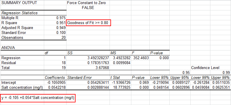
NOTE: If the first cell of your y values column is blank, that column of data will be omitted from your Regression output.
Evaluate the R Square value (0.951)
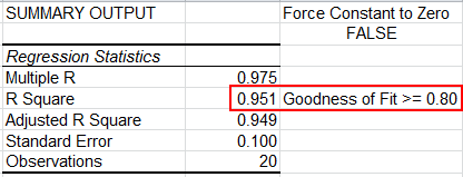
Analysis: If R Square is greater than 0.80, as it is in this case, there is a good fit to the data. Some statistics references recommend using the Adjusted R Square value.
Interpretation: R Square of .951 means that 95.1% of the variation in salt concentration can be explained by roadway area. The adjusted R Square of .949 means 94.9%.
Evaluate the p Value

Since the p value ( 0 < 0.05), we "Reject the Null Hypothesis" that the two variables are unrelated. In other words, there is a relation between the two variables.
Use the Equation for Prediction and Estimation
Using the equation, y = Salt concentration = 2.677 + 17.547*(% paved roadway area), you could predict the salt concentration based on the percent of paved roadway. For example, if the % of paved roadway = 1% the Salt concentration could be estimated as 17.547* (1%) +2.6765 = 20.2235 mg/l.
Residuals Output, Probability Output and Charts
In addition to the Summary Output above, QI Macros also calculates Residuals and Probability Data and creates scatter plots in Excel for you:
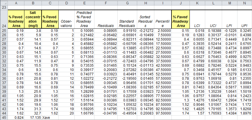
NOTE: The straight lines found in your first chart (Salt concentration) represent the Upper and Lower Prediction Intervals, while the more curved lines are the Upper and Lower Confidence Intervals
Confidence Intervals provide a view into the uncertainty when estimating the mean , while Prediction Intervals account for variation in the Y values around the mean .
The 95% and 99% Confidence Levels reference when your alpha value is set at .05 (95%) or .01 (99%). This provides you with information on how the confidence level can impact your results, depending on where alpha is set.
QI Macros also performs Multiple Regression Analysis and Binary Logistic Regression Analysis .
Stop Struggling with Regression Analysis! Start conducting Regression Analysis in just minutes.
Download a free 30-day trial. run regression analysis now, qi macros can draw these charts too.
- SPC Software for Excel
- Free 30 Day Trial
- On-line Tech Support
- QI Macros Reviews
- Free QI Macros Training
- Privacy Policy

KnowWare International, Inc. 2696 S. Colorado Blvd., Ste. 555 Denver, CO 80222 USA Toll-Free: 1-888-468-1537 Local: (303) 756-9144
How to do Linear Regression in Excel: Full Guide (2024)
Linear regression is an easy way of evaluating the relationship between two variables.
Previously, performing linear regression in Excel was nothing less than a complex task. But with advanced Excel data analysis tools, it is now only a matter of a few clicks.
The guide below will not only teach you how to perform linear regression in Excel but also how you may analyze a linear regression graph in Excel.
So, without further ado, let’s dive right in 👇
Download our free sample workbook here as you continue reading.
Table of Contents
Linear Regression Equation
How to Do Linear Regression Through Graph
How to Analyze the Linear Regression Graph
Linear regression equation
Simple linear regression draws the relationship between a dependent and an independent variable.
👉 The dependent variable is the variable that needs to be predicted (or whose value is to be found).
👉 The independent variable explains (or causes) the change in the dependent variable.
Simply put, the dependent variable depends upon the independent variable. And as the independent variable changes, the dependent variable changes too.
Mathematically, the linear relationship between these two variables is explained as follows:
Y = dependent variable
a = regression intercept term
b = regression slope coefficient
x = independent variable
“a” and “b” are also called regression coefficients. And Excel returns the predicted values of these regression coefficients too.
How to do linear regression through a graph
Imagine a company that sells sweaters in a cold region. And the sale of sweaters is directly linked to the temperatures in that region.
The colder it is (low temperatures 🥶), the higher the sales of sweaters 🧣 go. This means sales (the dependent variable) depend upon the temperature (the independent variable).
Now, to predict the company’s sales for the future, you must analyze the sales trend in the past. This can be done by drawing a trendline.
Drawing this trendline between a dependent variable Y (the sales) and an independent variable X (the temperature) is called running linear regression.
So let’s do it!
The image above contains the historical data for both variables (temperatures and sales) for a few months.
To explain the relationship between these variables, we need to make a scatter plot .
To plot the above data in a scatter plot in Excel:
- Select the data.
- Go to the Insert Tab > Charts Group
- Click on the scatterplot part icon.
- Choose a scatter plot type from the drop-down menu.
Excel plots the data in a scatter plot.
Note that each dot in the scatter plot above is formed at the intersection of Variable X and Y.
For example, the first dot is plotted at the point where Y = 625 and X = 2 .
Next, we must draw a trend line out of this scatter plot. To do so:
- Click anywhere on the chart to select it.
- Click on the “+” icon on the top right of the chart.
- Hover your cursor over the option “Trendline”📈
A drop-down menu appears.
- Select More Options. This will take you to the Format Trendline Pane.
- Choose the linear trendline option to draw a trendline between the scatter points.
And there you go! Excel draws a linear trendline on the scatterplot.
The above image shows a downward regression line which represents a negative trend. But why is that?
To understand that, you must know how to analyze the results of a linear regression graph. And don’t worry – it’s only a section ahead.
Adding the equation and R-squared
We also want Excel to show the equation and R-squared for this graph. For that:
- Scroll down the Task pane.
- Check the option for “Equation” and “R-squared” on the graph.
And Excel will display the following regression statistics on the graph:
Equation: y= -19.622x + 612.77
R-squared= 0.7456
What are these? And what do they tell? We will discuss this shortly.
How to quickly interpret the relationship between two variables? By checking the sign of the x variable 💡
A positive sign means a positive relationship. And a negative sign means a negative relationship between the two variables.
Since our equation shows a “-19.622x”, the relation between our variables is negative.
Formatting the trendline
Do you also find the trendline a little overshadowed? Not to worry – You can always format it in Excel.
For example, to change the color of the trendline:
- Select the trendline and right-click on it to launch the context menu.
- Go to Format Trendline.
- Under the Format Trendline pane, select “Fill & Line”.
- To change the color of the trendline, choose a color as shown below.
Guess we will go with red for now 🚩 What do you think about it?
Trendline Style
Not only the color, but you can also change the style of the trendline.
Say, we want to change our dotted trendline to a solid one. To do so:
- Click on Format Trendline to launch the Format Trendline Pane.
- Go to “Dash type” from the fill & line menu.
- Select a solid line type.
This will change the style of the trendline from a dotted line to a perfectly solid line.
Chart Title
To enhance the readability of the graph, you may add graph titles and axes titles to it as follows:
- Select the graph.
- Go to Chart Elements > Chart Title > above chart .
- Type in a Graph/Chart title as desired.
Axis titles
How about adding the Axis titles too?
To add a vertical title (for the Y-axis) to your chart:
- Click Chart Elements > Axis Titles > Primary Vertical .
- Type in a suitable title for the subject axis.
We have set the title for the Y-axis to “Sale of Sweaters”.
To add a horizontal Axis Title (for the X-axis):
- Go to Chart elements > Axis Titles > Primary Horizontal .
We have set the title for the X-axis to “Avg. Temperature”
And that’s it. We’ve successfully run linear regression in Excel 🥳
How to analyze the linear regression graph
Good job with running linear regression in Excel.
Now is the time that we analyze the linear regression trendline formed above.
A linear trendline in Excel can take the following three shapes:
Positive trendline (upward facing)
If your trendline is upward facing (it elevates as it goes from left to right), it denotes a positive trend.
This means that there exists a positive relationship between both variables. An increase in the independent variable causes the dependent variable to increase.
This is how your graph will look with a positive trendline to it.
Negative trendline (downward sloping)
If your trendline is downward sloping (it slopes down as it goes from left to right), it denotes a negative trend.
A negative trendline means a negative relationship between both variables.
When there is a negative relationship between two variables, an increase in the independent variable causes the dependent variable to decrease.
This is how your graph will look with a negative trendline to it.
Jog down your memory lane to remember the trendline type in our example above. It was also a downward-sloping (negative) trendline.
That’s because there exists a negative relationship between sales and temperature. As the temperature falls, sales increase.
The two variables can also be independent of each other. In this case, movement in both variables is random with no relation to each other.
As there exists no relationship between them (neither positive nor negative), there is no particular slope for the trendline between them (neither upward facing nor downward sloping).
Such a trendline might look like this.
The trendline above is not exactly horizontal but very close to that. This is because there is no relation between the variables.
The slope of the graph
What if we want to know the percentage of change in Y caused by a change in X?
For example, for every 1% decrease in temperature, sales increase by what percentage?
The slope of the graph is an answer to this. Remember the linear regression equation?
In the above equation, the slope is represented by “b”. And the linear regression equation for our example turned out as follows:
Y= 612.77 – 19.622x
Here, the value for b is -19.622 and so is our slope. This means that a 1% change in the X variable (the temperature) causes a -19.622% change in the Y variable (the sales).
Also, as the sign with the value for b is a minus sign, this means that a 1% decrease in Variable X (temperature) causes a 19.622% increase in Variable Y (Sales) .
An easy way to remember the slope is to remember Rise over Run . Rise means vertical axis. Run means horizontal axis. So the slope defines the change in variable Y caused by a change in variable X.
Another important output of our scatterplot is the R-squared value 👀
It tells us how much variation of the dependent variable comes from the change in the independent variable.
The R-squared for our example is 0.7456.
This tells that only 74.56% variation of Variable Y can be explained by Variable X.
Another statistical measure relevant to the linear regression model is the p value . However, it is totally opposite to the concept of R-squared.
That’s it – Now what?
The above guide explains how to perform a linear regression analysis in Excel. And then, how to analyze the linear regression trendline and other relevant statistics.
👉 In addition to that, it also explains how you may format a trendline in Excel in different ways.
Performing linear regression in Excel through a scatter plot is super smart. But this is only one feature of Excel.
And there are many more smart functions in Excel. Like the VLOOKUP, SUMF, and IF functions.
Want to learn them already? Enroll in my 30-minute free email course that teaches you these and many more functions of Excel.
Other resources
Linear regression can be challenging to understand. But once you get a hold of it, you can run it for any possible dataset with sheer ease.
In addition to linear regression, Excel offers other forecasting functions too. Like the data analysis tools in Excel and the Excel FORECAST function .
#1 Excel tutorial on the net
R Square | Significance F and P-Values | Coefficients | Residuals
This example teaches you how to run a linear regression analysis in Excel and how to interpret the Summary Output.
Below you can find our data. The big question is: is there a relation between Quantity Sold (Output) and Price and Advertising (Input). In other words: can we predict Quantity Sold if we know Price and Advertising?

1. On the Data tab, in the Analysis group, click Data Analysis.

Note: can't find the Data Analysis button? Click here to load the Analysis ToolPak add-in .
2. Select Regression and click OK.

3. Select the Y Range (A1:A8). This is the predictor variable (also called dependent variable).
4. Select the X Range(B1:C8). These are the explanatory variables (also called independent variables). These columns must be adjacent to each other.
5. Check Labels.
6. Click in the Output Range box and select cell A11.
7. Check Residuals.
8. Click OK.

Excel produces the following Summary Output (rounded to 3 decimal places).
R Square equals 0.962 , which is a very good fit. 96% of the variation in Quantity Sold is explained by the independent variables Price and Advertising. The closer to 1, the better the regression line (read on) fits the data.

Significance F and P-values
To check if your results are reliable (statistically significant), look at Significance F ( 0.001 ). If this value is less than 0.05, you're OK. If Significance F is greater than 0.05, it's probably better to stop using this set of independent variables. Delete a variable with a high P-value (greater than 0.05) and rerun the regression until Significance F drops below 0.05.
Most or all P-values should be below below 0.05. In our example this is the case. ( 0.000 , 0.001 and 0.005 ).

Coefficients
The regression line is: y = Quantity Sold = 8536.214 -835.722 * Price + 0.592 * Advertising. In other words, for each unit increase in price, Quantity Sold decreases with 835.722 units. For each unit increase in Advertising, Quantity Sold increases with 0.592 units. This is valuable information.
You can also use these coefficients to do a forecast. For example, if price equals $4 and Advertising equals $3000, you might be able to achieve a Quantity Sold of 8536.214 -835.722 * 4 + 0.592 * 3000 = 6970.
The residuals show you how far away the actual data points are fom the predicted data points (using the equation). For example, the first data point equals 8500. Using the equation, the predicted data point equals 8536.214 -835.722 * 2 + 0.592 * 2800 = 8523.009, giving a residual of 8500 - 8523.009 = -23.009 .

You can also create a scatter plot of these residuals.

- Analysis ToolPak
Learn more, it's easy
- Descriptive Statistics
- Moving Average
- Exponential Smoothing
- Correlation
Download Excel File
- regression.xlsx
Next Chapter
- Create a Macro
Follow Excel Easy
Become an Excel Pro
- 300 Examples
Regression • © 2010-2024 Popular Excel Topics: Pivot Tables • Vlookup • Formulas • Charts • Conditional Formatting
The Complete Guide: Hypothesis Testing in Excel
In statistics, a hypothesis test is used to test some assumption about a population parameter .
There are many different types of hypothesis tests you can perform depending on the type of data you’re working with and the goal of your analysis.
This tutorial explains how to perform the following types of hypothesis tests in Excel:
- One sample t-test
- Two sample t-test
- Paired samples t-test
- One proportion z-test
- Two proportion z-test
Let’s jump in!
Example 1: One Sample t-test in Excel
A one sample t-test is used to test whether or not the mean of a population is equal to some value.
For example, suppose a botanist wants to know if the mean height of a certain species of plant is equal to 15 inches.
To test this, she collects a random sample of 12 plants and records each of their heights in inches.
She would write the hypotheses for this particular one sample t-test as follows:
- H 0 : µ = 15
- H A : µ ≠15
Refer to this tutorial for a step-by-step explanation of how to perform this hypothesis test in Excel.
Example 2: Two Sample t-test in Excel
A two sample t-test is used to test whether or not the means of two populations are equal.
For example, suppose researchers want to know whether or not two different species of plants have the same mean height.
To test this, they collect a random sample of 20 plants from each species and measure their heights.
The researchers would write the hypotheses for this particular two sample t-test as follows:
- H 0 : µ 1 = µ 2
- H A : µ 1 ≠ µ 2
Example 3: Paired Samples t-test in Excel
A paired samples t-test is used to compare the means of two samples when each observation in one sample can be paired with an observation in the other sample.
For example, suppose we want to know whether a certain study program significantly impacts student performance on a particular exam.
To test this, we have 20 students in a class take a pre-test. Then, we have each of the students participate in the study program for two weeks. Then, the students retake a post-test of similar difficulty.
We would write the hypotheses for this particular two sample t-test as follows:
- H 0 : µ pre = µ post
- H A : µ pre ≠ µ post
Example 4: One Proportion z-test in Excel
A one proportion z-test is used to compare an observed proportion to a theoretical one.
For example, suppose a phone company claims that 90% of its customers are satisfied with their service.
To test this claim, an independent researcher gathered a simple random sample of 200 customers and asked them if they are satisfied with their service.
- H 0 : p = 0.90
- H A : p ≠ 0.90
Example 5: Two Proportion z-test in Excel
A two proportion z-test is used to test for a difference between two population proportions.
For example, suppose a s uperintendent of a school district claims that the percentage of students who prefer chocolate milk over regular milk in school cafeterias is the same for school 1 and school 2.
To test this claim, an independent researcher obtains a simple random sample of 100 students from each school and surveys them about their preferences.
- H 0 : p 1 = p 2
- H A : p 1 ≠ p 2
How to Change Axis Scales in Google Sheets Plots
Statistics vs. analytics: what’s the difference, related posts, how to create a stem-and-leaf plot in spss, how to create a correlation matrix in spss, how to convert date of birth to age..., excel: how to highlight entire row based on..., how to add target line to graph in..., excel: how to use if function with negative..., excel: how to use if function with text..., excel: how to use greater than or equal..., excel: how to use if function with multiple..., how to extract number from string in pandas.
- Prompt Library
- DS/AI Trends
- Stats Tools
- Interview Questions
- Generative AI
- Machine Learning
- Deep Learning
Linear regression hypothesis testing: Concepts, Examples
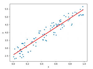
In relation to machine learning , linear regression is defined as a predictive modeling technique that allows us to build a model which can help predict continuous response variables as a function of a linear combination of explanatory or predictor variables. While training linear regression models, we need to rely on hypothesis testing in relation to determining the relationship between the response and predictor variables. In the case of the linear regression model, two types of hypothesis testing are done. They are T-tests and F-tests . In other words, there are two types of statistics that are used to assess whether linear regression models exist representing response and predictor variables. They are t-statistics and f-statistics. As data scientists , it is of utmost importance to determine if linear regression is the correct choice of model for our particular problem and this can be done by performing hypothesis testing related to linear regression response and predictor variables. Many times, it is found that these concepts are not very clear with a lot many data scientists. In this blog post, we will discuss linear regression and hypothesis testing related to t-statistics and f-statistics . We will also provide an example to help illustrate how these concepts work.
Table of Contents
What are linear regression models?
A linear regression model can be defined as the function approximation that represents a continuous response variable as a function of one or more predictor variables. While building a linear regression model, the goal is to identify a linear equation that best predicts or models the relationship between the response or dependent variable and one or more predictor or independent variables.
There are two different kinds of linear regression models. They are as follows:
- Simple or Univariate linear regression models : These are linear regression models that are used to build a linear relationship between one response or dependent variable and one predictor or independent variable. The form of the equation that represents a simple linear regression model is Y=mX+b, where m is the coefficients of the predictor variable and b is bias. When considering the linear regression line, m represents the slope and b represents the intercept.
- Multiple or Multi-variate linear regression models : These are linear regression models that are used to build a linear relationship between one response or dependent variable and more than one predictor or independent variable. The form of the equation that represents a multiple linear regression model is Y=b0+b1X1+ b2X2 + … + bnXn, where bi represents the coefficients of the ith predictor variable. In this type of linear regression model, each predictor variable has its own coefficient that is used to calculate the predicted value of the response variable.
While training linear regression models, the requirement is to determine the coefficients which can result in the best-fitted linear regression line. The learning algorithm used to find the most appropriate coefficients is known as least squares regression . In the least-squares regression method, the coefficients are calculated using the least-squares error function. The main objective of this method is to minimize or reduce the sum of squared residuals between actual and predicted response values. The sum of squared residuals is also called the residual sum of squares (RSS). The outcome of executing the least-squares regression method is coefficients that minimize the linear regression cost function .
The residual e of the ith observation is represented as the following where [latex]Y_i[/latex] is the ith observation and [latex]\hat{Y_i}[/latex] is the prediction for ith observation or the value of response variable for ith observation.
[latex]e_i = Y_i – \hat{Y_i}[/latex]
The residual sum of squares can be represented as the following:
[latex]RSS = e_1^2 + e_2^2 + e_3^2 + … + e_n^2[/latex]
The least-squares method represents the algorithm that minimizes the above term, RSS.
Once the coefficients are determined, can it be claimed that these coefficients are the most appropriate ones for linear regression? The answer is no. After all, the coefficients are only the estimates and thus, there will be standard errors associated with each of the coefficients. Recall that the standard error is used to calculate the confidence interval in which the mean value of the population parameter would exist. In other words, it represents the error of estimating a population parameter based on the sample data. The value of the standard error is calculated as the standard deviation of the sample divided by the square root of the sample size. The formula below represents the standard error of a mean.
[latex]SE(\mu) = \frac{\sigma}{\sqrt(N)}[/latex]
Thus, without analyzing aspects such as the standard error associated with the coefficients, it cannot be claimed that the linear regression coefficients are the most suitable ones without performing hypothesis testing. This is where hypothesis testing is needed . Before we get into why we need hypothesis testing with the linear regression model, let’s briefly learn about what is hypothesis testing?
Train a Multiple Linear Regression Model using R
Before getting into understanding the hypothesis testing concepts in relation to the linear regression model, let’s train a multi-variate or multiple linear regression model and print the summary output of the model which will be referred to, in the next section.
The data used for creating a multi-linear regression model is BostonHousing which can be loaded in RStudioby installing mlbench package. The code is shown below:
install.packages(“mlbench”) library(mlbench) data(“BostonHousing”)
Once the data is loaded, the code shown below can be used to create the linear regression model.
attach(BostonHousing) BostonHousing.lm <- lm(log(medv) ~ crim + chas + rad + lstat) summary(BostonHousing.lm)
Executing the above command will result in the creation of a linear regression model with the response variable as medv and predictor variables as crim, chas, rad, and lstat. The following represents the details related to the response and predictor variables:
- log(medv) : Log of the median value of owner-occupied homes in USD 1000’s
- crim : Per capita crime rate by town
- chas : Charles River dummy variable (= 1 if tract bounds river; 0 otherwise)
- rad : Index of accessibility to radial highways
- lstat : Percentage of the lower status of the population
The following will be the output of the summary command that prints the details relating to the model including hypothesis testing details for coefficients (t-statistics) and the model as a whole (f-statistics)
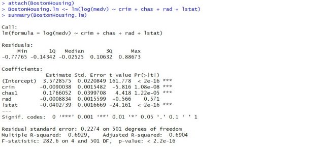
Hypothesis tests & Linear Regression Models
Hypothesis tests are the statistical procedure that is used to test a claim or assumption about the underlying distribution of a population based on the sample data. Here are key steps of doing hypothesis tests with linear regression models:
- Hypothesis formulation for T-tests: In the case of linear regression, the claim is made that there exists a relationship between response and predictor variables, and the claim is represented using the non-zero value of coefficients of predictor variables in the linear equation or regression model. This is formulated as an alternate hypothesis. Thus, the null hypothesis is set that there is no relationship between response and the predictor variables . Hence, the coefficients related to each of the predictor variables is equal to zero (0). So, if the linear regression model is Y = a0 + a1x1 + a2x2 + a3x3, then the null hypothesis for each test states that a1 = 0, a2 = 0, a3 = 0 etc. For all the predictor variables, individual hypothesis testing is done to determine whether the relationship between response and that particular predictor variable is statistically significant based on the sample data used for training the model. Thus, if there are, say, 5 features, there will be five hypothesis tests and each will have an associated null and alternate hypothesis.
- Hypothesis formulation for F-test : In addition, there is a hypothesis test done around the claim that there is a linear regression model representing the response variable and all the predictor variables. The null hypothesis is that the linear regression model does not exist . This essentially means that the value of all the coefficients is equal to zero. So, if the linear regression model is Y = a0 + a1x1 + a2x2 + a3x3, then the null hypothesis states that a1 = a2 = a3 = 0.
- F-statistics for testing hypothesis for linear regression model : F-test is used to test the null hypothesis that a linear regression model does not exist, representing the relationship between the response variable y and the predictor variables x1, x2, x3, x4 and x5. The null hypothesis can also be represented as x1 = x2 = x3 = x4 = x5 = 0. F-statistics is calculated as a function of sum of squares residuals for restricted regression (representing linear regression model with only intercept or bias and all the values of coefficients as zero) and sum of squares residuals for unrestricted regression (representing linear regression model). In the above diagram, note the value of f-statistics as 15.66 against the degrees of freedom as 5 and 194.
- Evaluate t-statistics against the critical value/region : After calculating the value of t-statistics for each coefficient, it is now time to make a decision about whether to accept or reject the null hypothesis. In order for this decision to be made, one needs to set a significance level, which is also known as the alpha level. The significance level of 0.05 is usually set for rejecting the null hypothesis or otherwise. If the value of t-statistics fall in the critical region, the null hypothesis is rejected. Or, if the p-value comes out to be less than 0.05, the null hypothesis is rejected.
- Evaluate f-statistics against the critical value/region : The value of F-statistics and the p-value is evaluated for testing the null hypothesis that the linear regression model representing response and predictor variables does not exist. If the value of f-statistics is more than the critical value at the level of significance as 0.05, the null hypothesis is rejected. This means that the linear model exists with at least one valid coefficients.
- Draw conclusions : The final step of hypothesis testing is to draw a conclusion by interpreting the results in terms of the original claim or hypothesis. If the null hypothesis of one or more predictor variables is rejected, it represents the fact that the relationship between the response and the predictor variable is not statistically significant based on the evidence or the sample data we used for training the model. Similarly, if the f-statistics value lies in the critical region and the value of the p-value is less than the alpha value usually set as 0.05, one can say that there exists a linear regression model.
Why hypothesis tests for linear regression models?
The reasons why we need to do hypothesis tests in case of a linear regression model are following:
- By creating the model, we are establishing a new truth (claims) about the relationship between response or dependent variable with one or more predictor or independent variables. In order to justify the truth, there are needed one or more tests. These tests can be termed as an act of testing the claim (or new truth) or in other words, hypothesis tests.
- One kind of test is required to test the relationship between response and each of the predictor variables (hence, T-tests)
- Another kind of test is required to test the linear regression model representation as a whole. This is called F-test.
While training linear regression models, hypothesis testing is done to determine whether the relationship between the response and each of the predictor variables is statistically significant or otherwise. The coefficients related to each of the predictor variables is determined. Then, individual hypothesis tests are done to determine whether the relationship between response and that particular predictor variable is statistically significant based on the sample data used for training the model. If at least one of the null hypotheses is rejected, it represents the fact that there exists no relationship between response and that particular predictor variable. T-statistics is used for performing the hypothesis testing because the standard deviation of the sampling distribution is unknown. The value of t-statistics is compared with the critical value from the t-distribution table in order to make a decision about whether to accept or reject the null hypothesis regarding the relationship between the response and predictor variables. If the value falls in the critical region, then the null hypothesis is rejected which means that there is no relationship between response and that predictor variable. In addition to T-tests, F-test is performed to test the null hypothesis that the linear regression model does not exist and that the value of all the coefficients is zero (0). Learn more about the linear regression and t-test in this blog – Linear regression t-test: formula, example .
Recent Posts
- How to Learn Effectively: A Holistic Approach - May 13, 2024
- How to Choose Right Statistical Tests: Examples - May 13, 2024
- Data Lakehouses Fundamentals & Examples - May 12, 2024
Ajitesh Kumar
One response.
Very informative
Leave a Reply Cancel reply
Your email address will not be published. Required fields are marked *
- Search for:
- Excellence Awaits: IITs, NITs & IIITs Journey
ChatGPT Prompts (250+)
- Generate Design Ideas for App
- Expand Feature Set of App
- Create a User Journey Map for App
- Generate Visual Design Ideas for App
- Generate a List of Competitors for App
- How to Learn Effectively: A Holistic Approach
- How to Choose Right Statistical Tests: Examples
- Data Lakehouses Fundamentals & Examples
- Machine Learning Lifecycle: Data to Deployment Example
- Autoencoder vs Variational Autoencoder (VAE): Differences, Example
Data Science / AI Trends
- • Prepend any arxiv.org link with talk2 to load the paper into a responsive chat application
- • Custom LLM and AI Agents (RAG) On Structured + Unstructured Data - AI Brain For Your Organization
- • Guides, papers, lecture, notebooks and resources for prompt engineering
- • Common tricks to make LLMs efficient and stable
- • Machine learning in finance
Free Online Tools
- Create Scatter Plots Online for your Excel Data
- Histogram / Frequency Distribution Creation Tool
- Online Pie Chart Maker Tool
- Z-test vs T-test Decision Tool
- Independent samples t-test calculator
Recent Comments
I found it very helpful. However the differences are not too understandable for me
Very Nice Explaination. Thankyiu very much,
in your case E respresent Member or Oraganization which include on e or more peers?
Such a informative post. Keep it up
Thank you....for your support. you given a good solution for me.

Statistics Made Easy
Understanding the Null Hypothesis for Linear Regression
Linear regression is a technique we can use to understand the relationship between one or more predictor variables and a response variable .
If we only have one predictor variable and one response variable, we can use simple linear regression , which uses the following formula to estimate the relationship between the variables:
ŷ = β 0 + β 1 x
- ŷ: The estimated response value.
- β 0 : The average value of y when x is zero.
- β 1 : The average change in y associated with a one unit increase in x.
- x: The value of the predictor variable.
Simple linear regression uses the following null and alternative hypotheses:
- H 0 : β 1 = 0
- H A : β 1 ≠ 0
The null hypothesis states that the coefficient β 1 is equal to zero. In other words, there is no statistically significant relationship between the predictor variable, x, and the response variable, y.
The alternative hypothesis states that β 1 is not equal to zero. In other words, there is a statistically significant relationship between x and y.
If we have multiple predictor variables and one response variable, we can use multiple linear regression , which uses the following formula to estimate the relationship between the variables:
ŷ = β 0 + β 1 x 1 + β 2 x 2 + … + β k x k
- β 0 : The average value of y when all predictor variables are equal to zero.
- β i : The average change in y associated with a one unit increase in x i .
- x i : The value of the predictor variable x i .
Multiple linear regression uses the following null and alternative hypotheses:
- H 0 : β 1 = β 2 = … = β k = 0
- H A : β 1 = β 2 = … = β k ≠ 0
The null hypothesis states that all coefficients in the model are equal to zero. In other words, none of the predictor variables have a statistically significant relationship with the response variable, y.
The alternative hypothesis states that not every coefficient is simultaneously equal to zero.
The following examples show how to decide to reject or fail to reject the null hypothesis in both simple linear regression and multiple linear regression models.
Example 1: Simple Linear Regression
Suppose a professor would like to use the number of hours studied to predict the exam score that students will receive in his class. He collects data for 20 students and fits a simple linear regression model.
The following screenshot shows the output of the regression model:

The fitted simple linear regression model is:
Exam Score = 67.1617 + 5.2503*(hours studied)
To determine if there is a statistically significant relationship between hours studied and exam score, we need to analyze the overall F value of the model and the corresponding p-value:
- Overall F-Value: 47.9952
- P-value: 0.000
Since this p-value is less than .05, we can reject the null hypothesis. In other words, there is a statistically significant relationship between hours studied and exam score received.
Example 2: Multiple Linear Regression
Suppose a professor would like to use the number of hours studied and the number of prep exams taken to predict the exam score that students will receive in his class. He collects data for 20 students and fits a multiple linear regression model.

The fitted multiple linear regression model is:
Exam Score = 67.67 + 5.56*(hours studied) – 0.60*(prep exams taken)
To determine if there is a jointly statistically significant relationship between the two predictor variables and the response variable, we need to analyze the overall F value of the model and the corresponding p-value:
- Overall F-Value: 23.46
- P-value: 0.00
Since this p-value is less than .05, we can reject the null hypothesis. In other words, hours studied and prep exams taken have a jointly statistically significant relationship with exam score.
Note: Although the p-value for prep exams taken (p = 0.52) is not significant, prep exams combined with hours studied has a significant relationship with exam score.
Additional Resources
Understanding the F-Test of Overall Significance in Regression How to Read and Interpret a Regression Table How to Report Regression Results How to Perform Simple Linear Regression in Excel How to Perform Multiple Linear Regression in Excel
Featured Posts

Hey there. My name is Zach Bobbitt. I have a Masters of Science degree in Applied Statistics and I’ve worked on machine learning algorithms for professional businesses in both healthcare and retail. I’m passionate about statistics, machine learning, and data visualization and I created Statology to be a resource for both students and teachers alike. My goal with this site is to help you learn statistics through using simple terms, plenty of real-world examples, and helpful illustrations.
2 Replies to “Understanding the Null Hypothesis for Linear Regression”
Thank you Zach, this helped me on homework!
Great articles, Zach.
I would like to cite your work in a research paper.
Could you provide me with your last name and initials.
Leave a Reply Cancel reply
Your email address will not be published. Required fields are marked *
Join the Statology Community
I have read and agree to the terms & conditions

IMAGES
VIDEO
COMMENTS
Download the Excel file that contains the data for this example: MultipleRegression. In Excel, click Data Analysis on the Data tab, as shown above. In the Data Analysis popup, choose Regression, and then follow the steps below. Specifying the correct model is an iterative process where you fit a model, check the results, and possibly modify it.
The creation of a regression line and hypothesis testing of the type described in this section can be carried out using this tool. Figure 3 displays the principal output of this tool for the data in Example 1. ... Excel's Regression data analysis tool is limited to 16 independent variables. You can use the Real Statistics Linear Regression ...
Method 3 - Perform Regression Analysis in Excel Using Data Analysis ToolPak Case 3.1 Simple Linear Regression in Excel with Analysis ToolPak. To enable Analysis ToolPak: Go to the File tab and select Options. Excel Options window will appear. Select Add-ins. Choose Excel Add-ins option from the Manage drop-down list. Click on Go.
To test this, they collect a random sample of 20 plants from each species and measure their heights. The researchers would write the hypotheses for this particular two sample t-test as follows: H 0: µ 1 = µ 2; H A: µ 1 ≠ µ 2; Refer to this tutorial for a step-by-step explanation of how to perform this hypothesis test in Excel. Example 3 ...
In this video, we conduct hypothesis tests on the regression coefficients in a simple linear regression model using the Data Analysis Tool Pack.
This is a public companion video for THE STATISTICS SURVIVAL GUIDE (with Excel) available on https://app.tophat.com/e/524914 for $55. Most of the tutorials a...
To do this: Right-click on on the graph, and go to Select Data. Highlight the predicted Y variable in the legend entry, select remove, and click Okay. Select the graph, then go to Add Chart Element>Trendline, and select the Linear option. If you also want to show the equation of the line, then double-click on the line.
Comparing the slopes for two independent samples. On this webpage, we show how to test whether the slopes for two independent populations are equal, i.e. we test the following null and alternative hypotheses: H0: β1 = β2 i.e. β1 - β2 = 0. H1: β1 ≠ β2 i.e. β1 - β2 ≠ 0.
F is the F statistic, or F-test for the null hypothesis. It is used to test the overall significance of the model. Significance F is the P-value of F. The ANOVA part is rarely used for a simple linear regression analysis in Excel, but you should definitely have a close look at the last component.
Hypothesis Test for Regression Slope. This lesson describes how to conduct a hypothesis test to determine whether there is a significant linear relationship between an independent variable X and a dependent variable Y.. The test focuses on the slope of the regression line Y = Β 0 + Β 1 X. where Β 0 is a constant, Β 1 is the slope (also called the regression coefficient), X is the value of ...
The two test statistic formulas are algebraically equal; however, the formulas are different and we use a different parameter in the hypotheses. The formula for the t-test statistic is t = b1 (MSE SSxx)√ t = b 1 ( M S E S S x x) Use the t-distribution with degrees of freedom equal to n − p − 1 n − p − 1.
Here is a formula that performs a T Test on the prices of these products and returns the t-test result. =T.TEST(B5:B14,C5:C14,2,2) We set the 3rd argument of the function to 2 as we are doing a two tailed t-test on the dataset. The 4th argument should be 2 for a two sample equal variance t-test.
Linear Regression. The goal of linear regression analysis is to describe the relationship between two variables based on observed data and to predict the value of the dependent variable based on the value of the independent variable. How to construct and use linear regression models in Excel.
Enter your data into Excel with the independent variable in the left column and the dependent variable in the right column. Next, select your data and click on QI Macros > Statistical Tools > Regression & Other Statistics > Regression: QI Macros will automatically perform the regression analysis calculations for you: NOTE: If the first cell of ...
We can use this estimated regression equation to calculate the expected exam score for a student, based on the number of hours they study and the number of prep exams they take. For example, a student who studies for three hours and takes one prep exam is expected to receive a score of 83.75: Exam score = 67.67 + 5.56* (3) - 0.60* (1) = 83.75.
Mathematically, the linear relationship between these two variables is explained as follows: Y= a + bx. Where, Y = dependent variable. a = regression intercept term. b = regression slope coefficient. x = independent variable. "a" and "b" are also called regression coefficients.
Click here to load the Analysis ToolPak add-in. 2. Select Regression and click OK. 3. Select the Y Range (A1:A8). This is the predictor variable (also called dependent variable). 4. Select the X Range (B1:C8). These are the explanatory variables (also called independent variables).
To test this, they collect a random sample of 20 plants from each species and measure their heights. The researchers would write the hypotheses for this particular two sample t-test as follows: H0: µ1 = µ2. HA: µ1 ≠ µ2. Refer to this tutorial for a step-by-step explanation of how to perform this hypothesis test in Excel.
On the Data tab along the top ribbon, click "Data Analysis.". If you don't see this as an option to click on, you need to first download the Analysis ToolPak, which is completely free. Step 3: Select the appropriate test to use. Select the option that says t-Test: Two-Sample Assuming Equal Variances and then click OK.
This essentially means that the value of all the coefficients is equal to zero. So, if the linear regression model is Y = a0 + a1x1 + a2x2 + a3x3, then the null hypothesis states that a1 = a2 = a3 = 0. Determine the test statistics: The next step is to determine the test statistics and calculate the value.
Link to the Excel file: https://agrimetsoft.com/excelExcel Tutorial YouTube: https://bit.ly/34TTYcpNull #Hypothesis for #Linear_Regression in #Excel===What i...
xi: The value of the predictor variable xi. Multiple linear regression uses the following null and alternative hypotheses: H0: β1 = β2 = … = βk = 0. HA: β1 = β2 = … = βk ≠ 0. The null hypothesis states that all coefficients in the model are equal to zero. In other words, none of the predictor variables have a statistically ...