7 Presentation Styles to Make Your Presentation Shine

Although making a presentation may seem like something easy to do, it actually implies lots of time and effort. It’s not as easy as in just standing in front of a group of people and talking. There is an art in doing a good presentation that captures your audience’s attention and turns a dull topic into something interesting and exciting. Good thing is, you can always improve your presentation techniques. Whether it is for speaking in public or designing better presentations, practice makes perfect. So here there are 9 presentation styles that you can try out to take your skills to new heights.


Presentation Design Styles
You might think that presentation design is a secondary element in a presentation. After all, the speaker’s ability to convey the information is what makes the presentation a success or a fail. While this is true, there is much more than presentation design contributes. The presentation’s design can tell the audience an important message about the business or the speaker. Design can be the difference between an incredible presentation and a terrible one.
Over the years, PowerPoint has gained something of a bad reputation. This is precisely because of bad presentation design. All-white template presentations, too much text on the slides, clashing colors… All of these are presentation design characteristics that can drive the audience into the “Death by PowerPoint” syndrome.
PowerPoint is supposed to be a visual aid to complement your presentation. The problem is, in many cases, the PowerPoint is competing with the speaker, rather than complementing him. Slides with too much text, or even just complete sentences can make the audience feel like they’re going through everything two times. Bullet points can work fine as a summary at the end of a presentation. But when every single slide is filled with bullet points, it is not only boring, but it also spoils your presentation’s intrigue. Your audience will be more focused on reading al the following points that actually listening to what you’re saying about your current topic.
There are many elements that can make your presentation a distraction rather than an aid. Check out these bad PowerPoint examples that you should avoid at all costs . But in any case, a good (or bad) presentation design can really make a difference. These 4 presentation design styles can help you when you’re planning your next presentation.
-Minimalist Presentation Design
Minimalist started as an art movement in the second half of the 20th century. Since then, it has expanded to different areas, like literature, architecture, and even as a lifestyle . So why not use it as a presentation style too?
It’s hard to define minimalism in just a few words, but it can be summarized in the “less is more” philosophy. Usually, we think that the more complex and detailed something is, the more time it has been invested in it, meaning that it is more valuable. Minimalism goes against this idea. This style is all about cleanliness and effectiveness. Why use 5 different words when you can say exactly the same with one?

One of the most basic characteristics is the use of negative space. Sometimes we tend to feel the need to fill every single space with something. It’s not uncommon to feel that, otherwise, it’ll look to “empty” or too “simple”. Minimalism shows us that this is not always true. On the contrary, having just one element that contrasts with the background will help our audience to focus better on it. And even if it looks simple, that it’s its beauty!
Minimalism may look simple, but it’s actually not easy to achieve. It demands that you know clearly what are the most important elements that you have to showcase, and which ones you can dispense of. This is exactly why it’s such a great style for presentations. Not only it helps your audience focus better on what you wish them to, but it also helps you organize and think twice your own presentation while you’re designing it.
-Takahashi Presentation Style
In some way, the Takahashi presentation style is similar to the minimalism. However, it has its own characteristics that make it worth it to talk into more detail about it. It was created by Masayoshi Takahashi, hence its name. His presentation style is based on the idea of having just word-based slides, instead of pictures or graphs. Takahashi presentations usually have few words on each slide, with very big characters, like a headline.
lldecade2012 from masayoshi takahashi
Takahashi even makes his presentations with black text among a white background, to take simplicity to the extreme. He suggests that this way, the audience can understand better and faster. The trick is to ask yourself: if I have to summarize this slide in just one word, what should it be?
Obviously, this presentation style also demands a very specific way to speak in public. Takahashi created this design precisely so people can start focusing more on the presenter, not in the PowerPoint. But the design is a vital part of this style, so it made sense to put it right next to minimalism. Like this last presentation style, Takahashi presentations demand that you think through and through your presentations and what exactly are you trying to convey.
This presentation style demands a lot of confidence in the speaker, but when it works, it works! Are you daring enough to try to make your own Takahashi presentation?
-Colorful/Playful Presentation Styles
On the complete opposite side of minimalism, there is the Colorful presentation style. Sometimes, the key to making a presentation more easy to digest goes through the design style too. You can make a presentation funny and easy-going as a speaker, but if the presentation is all black and white bullet points, it’ll still be difficult to keep the audience’s attention. Having an eye-catching, colorful presentation certainly helps.
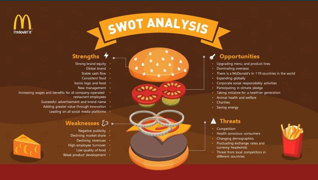
Here at 24Slides, our designers work with the style they call “ playful ”. It’s defined in contraposition to their other two styles, corporate and creative. These last two are more serious and business-like. The Playful style, on the other hand, uses bright colors and customized illustrations to catch the audience’s attention. The “playful” layout is also an essential part of this presentation style. The key is to present the information in new, innovative ways that will make the audience feeling like it’s the first presentation of its kind, instead of “just another boring report”.
Doing a playful presentation may be a little bit hard if you’re not an experienced designer. But you can still add elements of this presentation style, like for example color . Many people are afraid to use colors, thinking it will look unprofessional, or eye-straining. But they are many online tools to make sure your color scheme looks clean, instead of colors clashing with each other. Session College’s Color Calculator , for example, is great to make customized color palettes.
If it proved to be too much effort for you, however, or you just one a presentation with professional illustrations and icons, you can always contact our designers at 24Slides . They’ll be more than happy to help you create a beautiful playful-style presentation (or in any presentation style really).
-Jump and other non-traditional outlines
Want to make a more interactive PowerPoint presentation? One of the main criticisms of PowerPoint is that it’s too linear, too rigid. If you want to go back and forth from different topics, you’ll be forced to go through all the previous slides until you find the one you were looking for. This is one of the main plus points of Prezi . But very few people know you can make something very similar with PowerPoint.
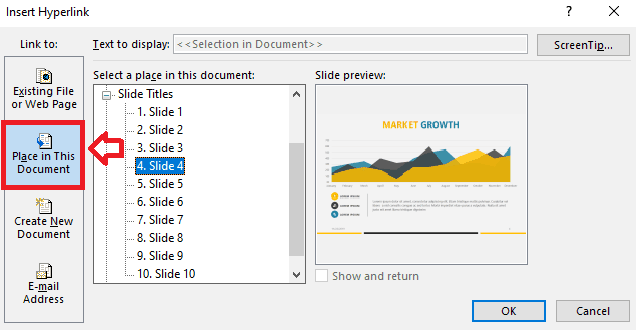
You can jump from a slide to another with the use of internal hyperlinks . All you need to do is to select what you want to be the trigger, and then select the option Insert ribbon > Links > Link. Then, in the “Insert Hyperlink” window that will pop-up, choose the option of “Place in This Document”, and choose your destination slide. It’s not difficult at all when you get the hang of it, though it can be time consuming. It also demands that you have a very good knowledge of your own presentation. You need to know from where slide you can jump to which. But it can certainly give a different look to an otherwise plain presentation.
Another option for designing non-traditional PowerPoint is to use the new features Microsoft Office has added. Zoom and Morph are great features to give your PowerPoint a completely different feel. Add-ins like PowerPointLabs also give you a wide range of options to make your presentations feel less like a PowerPoint and more like an interactive video. These options will certainly keep your audience’s attention!
Presentation styles
Aside from the presentation design styles, there are also certain techniques you can use to improve your skills when talking in public. Speaking in a monotone tone, or speaking too fast or too slow, fidgeting… all these are elements that can affect the audience reacts to your presentation. But really good speakers also make sure that they have a certain tone or “style” when presenting. This gives a unified feel to the whole presentation.
Here I’ve divided presentation styles according to the speaker’s objective. The first thing to do when planning a presentation is to ask yourself: what am I trying to achieve with this presentation? Am I trying to sell something? To inform my audience about a certain topic? Am I trying to inspire them to do something or change something?
Whichever objective you pick, the first and foremost point of all of them is to make your audience care about what you’re talking about. Once you know what exactly you want to accomplish with your presentation, it’s easier to think how to make them care about it. For example, if you’re trying to sell something, you need to make them care about the product. Make your audience care about what they’re losing without it, what could they accomplish with it.
Here you’ll find 3 presentation styles that can help you make your audience care more.
– Storytelling
Storytelling is actually more of a resource than a presentation style. But it’s worth mentioning since it’s such a great way to make your audience care about your presentation. You can mix storytelling with any of the following presentation styles, and it will give them the extra push to really believe in what you’re selling.
Storytelling is great because it invites your audience to empathize with what you’re presenting. Abstract thinking and general facts are difficult for people to relate to. You may say something like “extreme poverty affects almost 10% of the global population”. While this might be shocking, it’s still just a number. With storytelling, you put a face to the cold, hard facts. You present your audience with someone who is experiencing extreme poverty, what does this mean for this person, how do they live. I’ll assure that it will stay in your audience’s minds way longer than just a number.
TED Talks are a great example of this technique. Whether they’re presenting an inspiring case, a new scientific discovery, or a business skill you should have, they are all grounded in personal experiences. This allows the audience to really see how individual lives are impacted and empathize with them. TED Talks also has a great article on why storytelling is such a powerful too l.
If you want to know more about how to incorporate the storytelling technique to your presentations, you should definitely take a look at the 7 essential storytelling techniques for presentations .
– Data/Statistician
There is the preconception that data-driven presentations are always boring. This is certainly true in many cases. After all, hearing a long list of numbers and percentages is not particularly fun. Plus, it’s probably completely useless. Most people won’t remember even one of all those numbers you threw after the presentation has just ended. In this type of presentation, it is important that you showcase what all this data means .
Just like with storytelling, numbers are just numbers. You need to anchor that data in something more concrete. To make your audience care, you need to show what is behind the data, and how it might affect them. Another great technique is to relate their work with the data you’re showing. How did the team’s work impact in these statistics? Giving credit where credit is due is not only fair but also an incredibly useful tool.
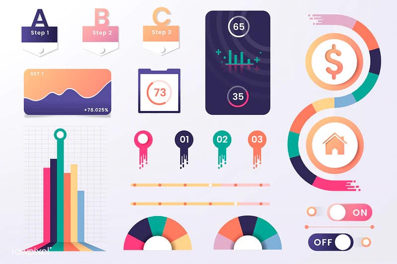
In this presentation style, the way you showcase your data is vital. Just talking about the numbers is hard to understand and to process. Graphs, charts, and diagrams are popular because of a reason: they are effective. Seen data in a visual way makes it so much more easy to understand and digest.
– Pecha Kucha
Finally, we have the Pecha Kucha presentation style. While this one is in a way connected to the “storytelling” presentation style, it certainly deserves its own section due to its unique setup. Pecha Kucha is also called the 20×20 presentation. Architects Astrid Klein and Mark Dytham created this presentation style in 2003, and it has gotten a huge following ever since. While this one might not apply to every single presentation out there, it’s a great option to have around.
Pecha Kucha presentations consist of 20 images. Each of these has exactly 20 seconds, and they should transition automatically. This way, the speaker won’t have the temptation of staying in one for too long. Because of all this, Pecha Kucha is a highly visual, concise presentation style. As you can probably imagine, It is a really hard presentation style to use. It demands you know your presentation as the back of your hand, and to know very well what are you planning on saying on each slide. But precisely because of that, if it’s done well, it really works. It combines the charm of casual smalltalk (“pecha kucha” actually means chit-chat after all), with precision and conciseness.
It’s certainly not the presentation style to use for a sales report, but mixed with the storytelling technique, it can work wonders.
Designing presentations is hard work
You may be thinking “This is way too much work”, and it is sadly true. Doing presentations is not easy. It’s up to you to step up your game and improve your speaking abilities so you can connect better with your audience. However, there is one thing we can help you with and that is presentation design . Our team of designers here at 24Slides will make sure your presentation look the best, while you focus on yourself. You can pick whichever presentation style you think will fit best, and the designers will take care of it!
Create professional presentations online
Other people also read

6 Presentation Styles of Famous Presenters

How to create and deliver a powerful presentation introducti...

The seven worst presentations of all time and why they went ...

Presentation Types and Styles Explained
Table of Contents
From high school, then all through college, and now in the workplace — presentations have been a pillar of passing down knowledge to various audiences.
But, what are presentations?
They are a tool used to inform and educate audiences in a fun and informative way.
Well, that is the simple way of explaining their purpose and meaning.
We want to dig in deeper, and that is what this article will bring to you — a deeper understanding of different types and styles of presentation, so you never get overwhelmed or confused when you need to make a presentation.
We will discuss:
- Different types and styles of presentations,
- The purpose of using presentations in the workplace, and
- How to utilize and recognize types and styles of presentations.
We will also show you:
- Famous presenters for each style,
- How you can use each presentation style, and
- A quote for each style to work as a useful reminder if you ever get confused.
Let’s dive in, shall we?

What are the purposes of presentations?
Sometimes, when a term is widely used, to the point where we subconsciously know the meaning and its purpose, it’s hard to pinpoint the true definition from memory.
So, let’s start with the basics — what is the definition of presentations?
Presentation is a manner of passing down knowledge from the speaker to the audience. A presentation can be a:
- Demonstration,
- Lecture, or
- Speech.
The purpose of a presentation is whatever goal you set up to achieve. Those goals can be:
- To educate,
- To persuade, and/or
- To entertain.
According to LinkedIn’s article 4 goals for any speech, pitch or presentation , when you combine the goals we mentioned, your presentation will become powerful, meaningful, and impactful. The goals mentioned above are general and can be applied to any situation. Different types and styles of presentation can lead to different results. With the right type and style, you can:
- Better your work and image with clients,
- Be more effective when presenting new ideas or solutions, and
- Ensure more progressive career growth.
These are only some of the business goals you can achieve with the right presentation type and presenting style. The more types and styles you try out, the more skillful you become, which helps you achieve your goals more efficiently.
Free team communication software
Try Pumble, a secure, reliable, and easy-to-use communication tool.
FREE FOREVER • UNLIMITED COMMUNICATION

What are the different presentation types?
Presentation types illustrate the way you structure your presentation .
We’ve mentioned the 4 purposes of presentations — every goal or purpose corresponds to a certain type. Before you can choose a structure, you need to answer the question “ What is the purpose of this presentation? ”
And methods and techniques, which we’ll talk about later, help you maintain that structure.
Once you know what you want to achieve with your presentation, you can choose its type.
Here’s what you need to know about each presentation type:
Type #1: Informative presentations
Informative presentations are analytical and, as the name states, informative. With this type of presentation, your end goal is to inform and educate .
Your audience only has to listen and soak up all the knowledge that is given by you.
With this type of presentation, you can report on new findings and new data or deliver a lecture.
Since the goal is to educate, your presentation must be precise and correct. Make sure that the information you are communicating has real value. When presenting, try to engage your audience with visuals of your data to help them understand.
Type #2: Persuasive presentations
To use persuasive presentations, you must answer the question “ What do I want my audience to do after listening to me ?”
The point of this type of presentation is to persuade your audience, change their minds, or offer a new point of view, so that they take action .
Persuasive presentation comes in handy if you are presenting a new product or a service and you want your audience to feel the urge to buy said product.
When you use this presentation type you must exude confidence, since you are your audience’s only source of information for your product.
Type #3: Motivational presentations
You’ve probably heard of motivational speakers, and if you haven’t, here’s a quick crash course. Motivational presentations have a purpose to inspire and change people’s minds .
Most people who use this type of presentation have a story to tell. These people use their own experiences as key points in their presentations to help the audience to relate to them.
Since the goal is to inspire and change people’s minds, you have to have a powerful topic to discuss.
Remember to cater to your audience and adjust your presentation to them and their level.
Type #4: Instructive presentations
Instructive presentation is technical, precise, and often longer than other types we mentioned. This type is here to offer instructions to an audience.
So, if your goal is to explain step by step how to achieve a goal or do a task— an instructive presentation should be your choice.
When you are delivering this type of presentation you need to make sure that every instruction is clear, understandable, and easy to follow.
How to determine which presentation type you should use?
To choose the correct type for your presentation, you must determine your goal. Once you have your goals clear, it will be easy to see which type works best with your presentation.
Here are some helpful questions that will help you to narrow it down to one type:
- What do I want the audience to take away from my presentation?’
- What am I trying to give the audience? Is it information, a lecture, or a look into a new product/feature?
- What obstacles are keeping me from delivering my presentation effectively?
Determining the correct type for your presentation is a trial-and-error process. You will find that some types are more your speed, while others might give you trouble. But, keep in mind that the end goal should always be to give your audience what they came for.
No matter which type you prefer, they all exist for a reason. Give them all a chance, and remember that practice makes perfect.
Presentation methods and techniques
When you define the type of your presentation, it’s time to get into methods and techniques for delivering a presentation.
There are a lot of ways you can deliver your presentation, and here is our take on it.
Presentation methods
A method is how you approach your problem .
When it comes to presentation methods, we linked them with public speaking. Methods cover:
- How you choose to deliver your presentation and
- How you structure your speech.
Here are the 4 main methods:
Method #1: Impromptu or unscripted
The impromptu method applies to speeches that are:
- Not prepared ,
- Emotionally charged, and
- ‘Given on the spot’.
This method of speaking is purely done by improvising, so there are no written rules on how it should be done.
Improvising and making up your speech as you go is not a wrong way to deliver your presentation. Still, instead of basing your entire speech on your ability to ramble on, incorporate this method in segments where you see fit or feel inspired to do so.
Method #2: Memorizing
The memorizing method implies that the speaker needs to know their speech word for word.
It is mostly used in oratory contests for high school and college students. This method is difficult, and you would need to spend a lot of time reading and memorizing your text.
But, this method is the easiest when it comes to performance anxiety. Since the text is perfectly constructed and your only job is to memorize and relay it to the audience, it’s less nerve-racking.
💡 Pumble Pro-Tip
If you struggle with anxiety before a presentation, we have an article to help you with that:
- How not to be nervous for a presentation
The memorizing method, while being challenging at its core, can be freeing once the speaker is on stage. With this method, you can practice your body language to go with the text. And since the text is scripted and perfected, the speaker can move around the stage as they see fit.
Method #3: Extemporaneous
Extemporaneous is a synonym for impromptu and unscripted — so why is a synonym to a method we’ve already covered, now a completely new method?
Well, that is because when it comes to the extemporaneous method, we think of a speaker that allows help during their performance .
The extemporaneous method is a combination of the first two methods we mentioned. This method allows the speaker to prepare their speech and use notes and key points as an aid to keep on course. However, they will not learn their presentation by heart, but use their own words and speak in a conversational manner.
Method #4: Scripting
The scripting method used to require a written speech from which the orator reads to the audience. Nowadays, we can see this method used by news outlets, with a teleprompter.
So, to make use of this method, you need to write down your speech and read it proficiently to your audience.
When it comes to in-person presentations and public speaking, this method is not the go-to.
You shouldn’t spend the whole presentation just reading off of papers. When we present, we need to maintain eye contact and overall connection with the audience — and holding a piece of paper in front of the audience will get in the way of that connection.
Presentation techniques
Presentation techniques are what you use before and during the presentation to make it compelling, informative, and easier to understand .
Here are some of the techniques that we find quite useful:
Technique #1: Practice
As a presenter, you want to make sure that everything goes smoothly — and for that to happen, you need to practice. The key to giving the best presentation is to practice relentlessly.
Some useful tips to help you make the most of your practice are to:
- Practice in front of a friend. — Practicing in front of a friend will not only help you with performance anxiety, but a friend might also have some useful tips on how to perform better.
- Film yourself practicing. — When you film yourself giving your presentation aloud, it will help you to get used to cameras and the spotlight. Also, the camera will capture every mistake you make, and from there you can see what needs to be worked on.
- Practice in the auditorium. — It will do you good if you can practice giving your presentation in a meeting room or the auditorium. If you practice in the place you will be presenting, you will get used to the space, and it will be familiar to you on the day of your presentation.
Technique #2: Use visuals
There is no need to overwhelm your audience with endless blocks of text. Think about how you can transform the data or information into a simple visual .
The important thing to remember is that your audience might not be on the same level of knowledge as you. So, use visuals to help them follow your point.
Technique #3: Incorporate stories
No matter how informative and to the point your presentation is, including a story that is illustrating your point can be very helpful to your audience.
Not only is storytelling a great way to engage and entertain your audience, but it is also a great way to show how your information is relevant to real-world events.
If you are curious to see what more you can do to prepare for your presentation, check out our article:
- How to prepare for a presentation: Your 9-step guide to a successful presentation
Technique #4: Incorporate appropriate style
Your presentation style is how you choose to deliver your presentation as a speaker. Style builds on the methods we have mentioned earlier, and it comes down to how you choose to speak to your audience. You can be a storyteller or a coach to your audience, and with each style comes a different influence.
Methods and techniques are a great starting point when you are approaching your presentation structure and topic.
But, there are different styles of presentation that you also should consider before walking up to that stage. Let’s learn more about them.
What is a presentation style?
A style is your preferred way of doing things, and when it comes to presentations, a style is how you choose to deliver your speech . Everything from your vocabulary to your tone defines your presenting style.
If you are not sure what your personal presentation style is, you can always pick and choose from the already-established styles. Those include:
- Storyteller,
- Instructor,
- Closer,
- Connector,
- Coach,
- Lessig style, and
- Visual style.
Let’s get into more detail about each one of them.
Style #1: The Storyteller
The storytelling style consists of a (usually personal) story or anecdote.
This style is used when the presentation doesn’t have any data or numbers that need to be explained.
You can use this style to emphasize your point and to easily relay your goal to the audience.
The storytelling style is great for the beginning of the presentation, as it is there to capture the audience’s attention.
Formality level for the Storyteller style: Low
Since this style uses the speaker’s personal experiences and anecdotes to help the audience relate to the topic easily, the language used is conversational. There is no need for any excessive formality , and the speaker can address the audience in a friendly and familiar tone.
The Storyteller style characteristics
What characteristics should you be aware of when you want to utilize this style?
The vocabulary that storytellers use is simple and conversational. Think about how you tell a story to your friends, colleagues, or family. Once you have that in mind, becoming a storyteller on stage won’t be a problem.
Since the formality level is low, there is no need to overcomplicate things or to use synonyms for words that already have simpler and more known versions.
Your story should have an introduction, where you will introduce the problem. Then, you can move into the main plot point that explains your topic. And finally, you should have a conclusion where you can circle back to the beginning and where you will untangle the web you cast and leave your audience with a final thought.
The pros of the Storyteller style
Now let’s look at some of the pros of this style:
- It’s easy to follow.
- It illustrates your problem and solution in a creative way.
- It’s relatable and, therefore, more influential to the audience.
The cons of the Storyteller style
Here are the cons of being the storyteller type:
- A story that’s too long or not interesting enough can leave your audience bored.
- Getting too caught up in the story can make your presentation longer than it should be.
Who is the Storyteller style best suitable for?
This style is great if you want to truly connect with your audience and have them feel as if you speak to them, rather than at them. Many people don’t like to be lectured, and if you are trying to make a point or a message stick out, try out the storytelling style.
Famous presenter with the Storyteller style
The storytelling style is preferred among TED talk speakers.
But, when we think of storytelling, one particular speaker comes to mind — Nick Vujicic. He overcame great obstacles and has learned how to take what’s best from life. So now, when he tries to spread his message of endurance, he puts his trust into the storytelling style and lets his emotions and experiences speak to his audience.
Quote by Nik Vujicic that embodies the Storyteller style
“ What really matters are the lives you touch along the way and how you finish your journey .” ― Nick Vujicic
Secure, real-time communication for professionals.
Style #2: The Instructor
The instructing style of presenting shares some traits of the storytelling style. It still uses the power of metaphors to get the message across to the audience.
But, the difference is that the instructing style has more of a commanding voice . The instructor can carefully align the story and the data in a logical and compelling manner, leaving the audience convinced and educated.
Formality level for the Instructor style: Medium
A lot of politicians use the Instructor style when they are trying to influence a larger crowd. Since this style has a higher formality level than the storytelling one, it allows the speaker to use more serious vocabulary and address the audience as superior.
The Instructor style characteristics:
The Instructor’s style is characterized by logic and command. As we mentioned, the speaker who is fond of the Instructor’s style needs to be able to handle the facts and connect with the audience.
So, the main characteristics of this style would be:
- More formal use of language,
- Commanding voice, and
- Persuasive nature.
The pros of the Instructor style
Let’s take a look at some of the pros of this style:
- It helps get a complicated message across.
- It’s persuasive.
- It’s fairly easy to use.
The cons of the Instructor style
Here are some of the cons to be aware of:
- The speaker could be deemed distant or cold.
- The audience can lose interest if the presentation is too focused on pure data.
Who is the Instructor style best suitable for?
This style is great if the speaker has a complicated topic to discuss with a less knowledgeable audience. This style is used mainly for lectures and political speeches.
Famous presenter with the Instructor style
A famous presenter with the Instructor style is none other than the former Vice President of the United States, Al Gore. He uses metaphors, data, his own personal experience, and even visuals to bring complex issues closer to a wide audience.
Quote by Al Gore that embodies the Instructor style
“ When you have the facts on your side, argue the facts. When you have the law on your side, argue the law. When you have neither, holler. ” — Al Gore
Style #3: The Closer style
The Closer style of presenting is a style that demands action from the audience . Presenters who opt for this style want their audience to not only learn something new but to get up from their seats with a newfound urge to make a change.
This style is a personification of a call to action. The presentations made in this style are short, since the speaker has a goal in mind. They then use this style to convincingly reach said goal.
Formality level for the Closer style: Medium
This style is a great tool to connect with the audience. So, to make a connection between the speaker and the audience, the formality level drops. But instead of treating the audience as friends, the speaker simply talks to them.
The Closer style characteristics
The Closer style is persuasive and somewhat commanding. People who are fond of the Closer style cut right to the chase and make their audience get to a decision. With this presentation style, there are no boring statistics or data. The key points are clear and delivered with a short and clear explanation.
The pros of the Closer style
Here are some of the pros of the Closer style:
- The presentation is short.
- The Closer is confident and knows how to deliver a point.
- The audience rarely gets bored with this style.
The cons of the Closer style
Take a look at some of the cons of this style:
- Some audiences aren’t ready to make a quick decision.
- Some audiences might feel that this style is too harsh or rash.
Who is the Closer style best suitable for?
The Closer style is best to use when you need your audience to make a decision or to give them the urge to make things happen.
This style is mainly used by CEOs and salesmen.
Famous presenter with the Closer style
Many presenters use this style, but the one that stands out the most is the philosopher Ruth Chang. She has delivered great presentations on how to make hard decisions. She keeps her presentations short, sweet, and straight to the point.
Quote by Ruth Chang that embodies the Closer style
“A world full of only easy choices would enslave us to reasons.” — Ruth Chang
Style #4: The Connector style
The Connector style speaker is most comfortable engaging with the audience . Some could say that the storytelling style is very similar to the Connector in that sense. Both styles base their presentations on the connection with the audience. The difference here is that the Connector is both a presenter and a member of the audience — and they are comfortable in both roles.
This style of presentation (as the name suggests) allows the speaker to connect to the audience, and therefore deliver the materials easier. One way that this style connects the speaker and the audience is through Q&A.
Formality level for the Connector: Low
Since this style’s main purpose is to connect the speaker to the audience, the formality level is low. The speaker appears as one of the audience, even though they are on stage. To keep the audience engaged and get them to ask questions, the Connector treats the audience as friends and acquaintances.
The Connector style characteristics
The user of this style needs to appear as if they are one of the members of the audience, but they just happen to be on the stage instead in a seat. One of the main characteristics that stand out for this style is the eagerness of the speaker to engage with the audience. When a speaker is a Connector, they will constantly ask questions and listen to the audience’s opinions.
The pros of the Connector style
Let’s take a look at the pros of this style:
- The audience is engaged and encouraged to participate.
- The presentation flows at a relaxed pace.
- The audience feels connected to the subject.
The cons of the Connector style
- Audience might not be comfortable with asking questions.
- The presentation might be longer than planned.
- Too many opinions will derail the presentation.
Who is the Connector style best suitable for?
The great thing about the Connector style is that it can be used in any presentation and any setting. Since the main goal of this style is to connect the speaker and the topic with the audience, there are no rules or limits as to where it can and where cannot be used.
Famous presenter with the Connector style
Padraig Hyland is a TED Talk speaker and a specialist in audience engagement, so it is only natural that he uses the Connector style. He has delivered countless speeches on how to be a great presenter and how to connect with any audience.
Quote by Padraig Hyland that embodies the Connector style
“ To successfully navigate the current disruption, organizations need to nourish their authentic leadership voice and create a new story that engages their people on the journey .” — Padraig Hyland
Style #5: The Coach style
What is a coach? In every sense of the word, a coach is a person who guides you, teaches you, and helps you achieve your goals.
It is the same with the coaching style. The person who uses this style guides their audience with their own enthusiasm for the subject. The Coach style is mainly used in motivational speeches, as it allows the coaches to interact with the audience and share knowledge on a topic they feel passionate about.
Formality level for the Coach style: Medium
The Coach style serves as a guide . It gives the speaker freedom to use their knowledge and personal experience to drive the audience to feel the same passion about the subject as the speaker does. To achieve that level of familiarity with the audience, the formality level drops, and the speaker talks to the audience as a teacher and, well, as a coach would.
The Coach style characteristics
The Coach style allows the speaker to guide their audience from point A to point Z, through knowledge and passion, which makes the presentation interactive and informative.
This style of presentation can be seen in motivational speeches, lectures, and speeches delivered by sports coaches. The main characteristic that follows this style is that it is delivered by enthusiastic speakers.
The pros of the Coach style
Here are some of the pros of this style to look into:
- It allows the speaker to connect to the audience through enthusiasm.
- Presentations in this style are interactive and engaging.
- It gives the audience step-by-step instructions on the topic.
The cons of the Coach style
Let’s examine some of the cons:
- The speaker’s passion can be overwhelming to the audience.
- The speaker can forget to ask for feedback .
Who is the Coach style best suitable for?
The Coach style, since it serves as a guide, is commonly used by motivational speakers and in self-help presentations.
They tend to choose this presentation style because it allows them to connect with the audience while still delivering a detailed step-by-step on the topic they are discussing.
Famous presenter with this style
There are a lot of motivational speakers today that are a fan of the Coach style, but the one that caught our attention is Mel Robbins. She is a lawyer and a motivational speaker that helps her audience to form healthy habits and attain discipline to achieve their goals.
Quote by Mel Robbins that embodies the Coach style
“ You have been assigned this mountain so you can show others that it can be moved .” — Mel Robbins
Style #6: The Lessig style
If you are in a time crunch, but you have a lot of material to cover, then the Lessig style is the perfect style for you.
The Lessig style was invented by Lawrence Lessig, and it states that a speaker should spend only 15 seconds on each slide or point during a presentation . This style usually agrees very well with the visual style.
Since not all presentations have slides, this style cannot be used with any type of presentation. However, if you have too many slides and too many points to make, then the Lessig style can help you use your time slot well.
Formality level for the Lessig style: Depends
The Lessig style is not a style of speaking per se, but a style for presentation time management . So, the formality of the language you use will be up to you and your topic. You can decrease or increase the formality level and the Lessig style would still be the same.
The Lessig style characteristics
The main characteristic of this style is that it includes slides or at least some visual aid.
This style is also the one that is not concerned with your verbal cues and style of speaking. If you choose to try out this style you can combine it with any of the styles we previously mentioned.
The pros of the Lessig style
Here are the pros of this style:
- It’s easy to use.
- It helps you keep track.
- It saves time.
The cons of the Lessig style
Here are some of the cons of this style:
- It is not applicable to presentations without slides.
- Sometimes the suggested 15-second rule isn’t enough.
- The presentation may feel rushed or unfinished.
Who is the Lessig style best suitable for?
The Lessig style bases its rules on slides and visual aids, so it’s best suitable for presentations that consist of slides. The topics for this style are endless, and it is up to the speaker to see where this style works best in their presentation.
The most logical choice is, of course, the founder of this style — Lawrence Lessig, a lawyer and a political activist.
Quote by Lawrence Lessig that embodies the Lessig style
“ Technology means you can now do amazing things easily .” — Lawrence Lessig
Style #7: The Visual style
Presentations can be all about the slides, data, or videos, and there are also powerful presentations that are delivered with only the speaker on the stage. But, technology is not something to shy away from . There are great advantages to using technology and feeding your audience with visuals that will support your claims. As they say, a picture is worth a thousand words.
Formality level for the Visual style: Depends
The formality of this style doesn’t depend on the visuals used, but on the speaker and the topic. The great thing about the visual style is that it can be used with almost any topic and type of data. So, when using this style of presentation, you can choose the level of formality you feel comfortable with.
The Visual style characteristics
The Visual presentation style’s main characteristics are the visuals, as the name suggests. The visuals can be anything from a picture, video, or creatively shown data and statistics.
This style can be used together with any other style that we mentioned, as long as you add some pictures or other visual elements.
The pros of the Visual style
Here are the pros of the Visual style:
- Visuals help the audience understand the presentation better — sometimes, they can illustrate your point better than your own words.
- Visuals can help you move your presentation forward.
The cons of the Visual style
Here are some of the cons of the Visual style:
- Overusing visuals in your presentation can take focus away from you.
- Visuals can be redundant.
Who is the Visual style best suitable for?
If you are creative enough or confident enough to not let the glamor of visuals take over your spotlight, you can incorporate visuals into any workplace presentation. Visuals can be helpful almost everywhere, and they can aid your audience if the topic is too complicated for them to follow.
Famous presenter with the Visual style
One of the best visual presenters is Steve Jobs. He was one of the founders of Apple, and every year he used to give a great visual presentation or a rundown of Apple’s new product releases.
Quote by Steve Jobs that embodies the Visual style
“ For you to sleep well at night, the aesthetic, the quality, has to be carried all the way through .” — Steve Jobs
How to determine which presentation style to use?
If you are wondering which style to use, first you need to ask yourself what kind of audience will be attending your presentation . Once you have an idea of who you will be talking to, you can start to think about your presentation style.
Also, you need to know what is the purpose of your presentation and what you wish to achieve.
Beyond that, try out different styles until you find the one you are comfortable with.
Collaborate easily with Pumble — Even when creating presentations
If you’re working on a presentation with your colleagues — no matter what type of a presentation it might be — you’ll probably find yourself in need of an efficient communication tool.
Luckily, Pumble, a team communication app , makes your collaboration more simple and efficient, while keeping communication lines open at all times.
Here are all the ways Pumble can help you create various types of presentations:
- Thanks to the voice call feature, you can stay connected to your colleagues while you work together on the presentation.
- If there is a problem you have to address , you can always give them a quick video call and share your screen with them so you can brainstorm or problem-solve together.
- If you need a second (or third, fourth, etc.) opinion , you can always ask for it on some of the Pumble channels .
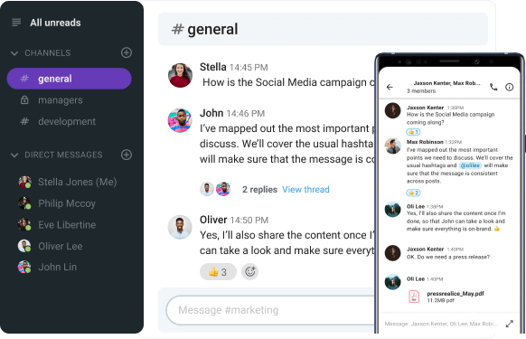
- If you have to provide further explanations or continue the discussion without cramming the channel space, you can continue your conversation in threads or reach out to particular colleagues via direct messages .
Finally, one of the best things about Pumble is that you can never lose important information or shared files because it has unlimited history .

Jana Pavlovic is a communication author and researcher. She enjoys educating herself and others on various team collaboration and technology topics. She found that working from home in a hybrid-type company is her perfect combination for work-life balance, and she’s eager to share her new-found knowledge with you.
What's on your to-do?
START COLLABORATING
with Pumble
What Is Deep Work? A Full Guide to Boosting Focus & Productivity
Deep work is a productivity framework that boosts mental capacity, helping you master new skills and work smarter. Learn simple steps to apply it in your work.
3 Steps to Align Your Team With Company Goals
Boost your team success by aligning your employees with your company’s goals, keeping everyone on the right track.
How to Stand Out at Work: 15 Tips for Getting Noticed
Want to know how to stand out at work? Start by focusing on your professional development and improving your work performance.
Turn Down The Noise: How to Reduce Workplace Distractions
Discover practical tips to reduce workplace distractions and boost productivity.
Mastering Brainwriting: The Key to Team Innovation
Boost team creativity and collaboration with brainwriting. Learn how this technique can enhance idea generation and streamline workflows using Pumble.
Mastering Written Communication Skills for Professional Success
Struggling with workplace writing? Discover essential tips to improve clarity, avoid errors, and enhance your written communication skills.
Free team chat app
Improve collaboration and cut down on emails by moving your team communication to Pumble.
- Presentations
Presentation Design: Beginner’s Guide (Tips, Tools & Templates)

Written by: Chloe West

A good presentation doesn’t just rely on presentation design. There’s your public speaking , the ability to connect with your audience and how well you understand your topic.
However, that doesn’t mean that presentation design isn’t important. Everything goes hand-in-hand when creating a presentation that will keep your audience engaged and talking about your topic for days to come.
Ready to design a presentation that knocks the audience’s socks off? We’ve put together a beginner’s guide to help you understand the types of presentations, beginner design tips and more.
You'll find some incredible presentation templates to help you get the ball rolling on your design. You can customize them however you want, and the best part is you don't have to be a design pro to make them pop!
In this video, we've put together our top 13 presentation design tips to help you wow your audience and create the most epic slide deck they've ever seen.
Here's a short selection of 8 presentation design guidelines you can use when you edit, share and download your content with Visme. View them below:
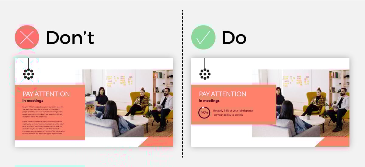
Table of Contents
Why presentation design is important, what are the different types of presentations.
- 20 Presentation Design Tips for Beginners
5 Presentation Design Trends to Inspire You
15 presentation templates for various use cases.
A presentation is so much more than a simple stack of slides with text and images on it; or at least, it should be. Especially since creative, colorful visuals are so much more memorable than simple text on a screen.
Presentation design is important because with it, you can envelop your ideas, narrative, visuals, data and statistics all into one place and tell a compelling story that leads your audience to the conclusion you want them to reach.
When you create a presentation with proper design, you then have the opportunity to share your point of view, grow your business and get your audience to see your vision and hear you loud and clear.
The sad truth is that many people dread going to presentation meetings because of the long, visually lacking and non-stimulating slideshow designs.
Although what someone has to say during their presentation might be crucial to the business or even life-changing, a listener might lose all interest simply due to the poor design of the presentation.
Hey marketers! Need to create scroll-stopping visual content fast?
- Transform your visual content with Visme’s easy-to-use content creation platform
- Produce beautiful, effective marketing content quickly even without an extensive design skillset
- Inspire your sales team to create their own content with branded templates for easy customization
Sign up. It’s free.
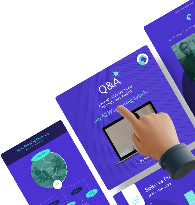
With proper presentation design, you can tell your story clearly, inspire your audience to take your next steps and have them engaged with what you’re saying all the way through.
Don’t miss a massive business opportunity just because of poor presentation design.
If you have an upcoming presentation but you don’t have the skillset of a professional designer, don’t worry. Just because you aren’t a designer doesn’t mean you can’t have a professional presentation like one.
With a tool like Visme, you can access professionally designed templates that will act as a guide for you to create your next inspiring presentation . Get started today for free.
There are a variety of different types of presentations and reasons that you would need one. Let’s cover the most common types so you know what to expect and when you might want to consider putting together your own presentation.
Type #1: Educational Presentations
There are a lot of reasons you might need to create a presentation for school – giving a book report, presenting an idea, sharing a hypothesis and study results, etc.
Additionally, teachers have to give presentations all the time, and are always looking for ways to create more engaging slides that keep students interested.
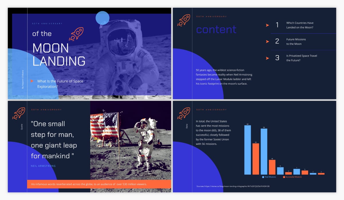
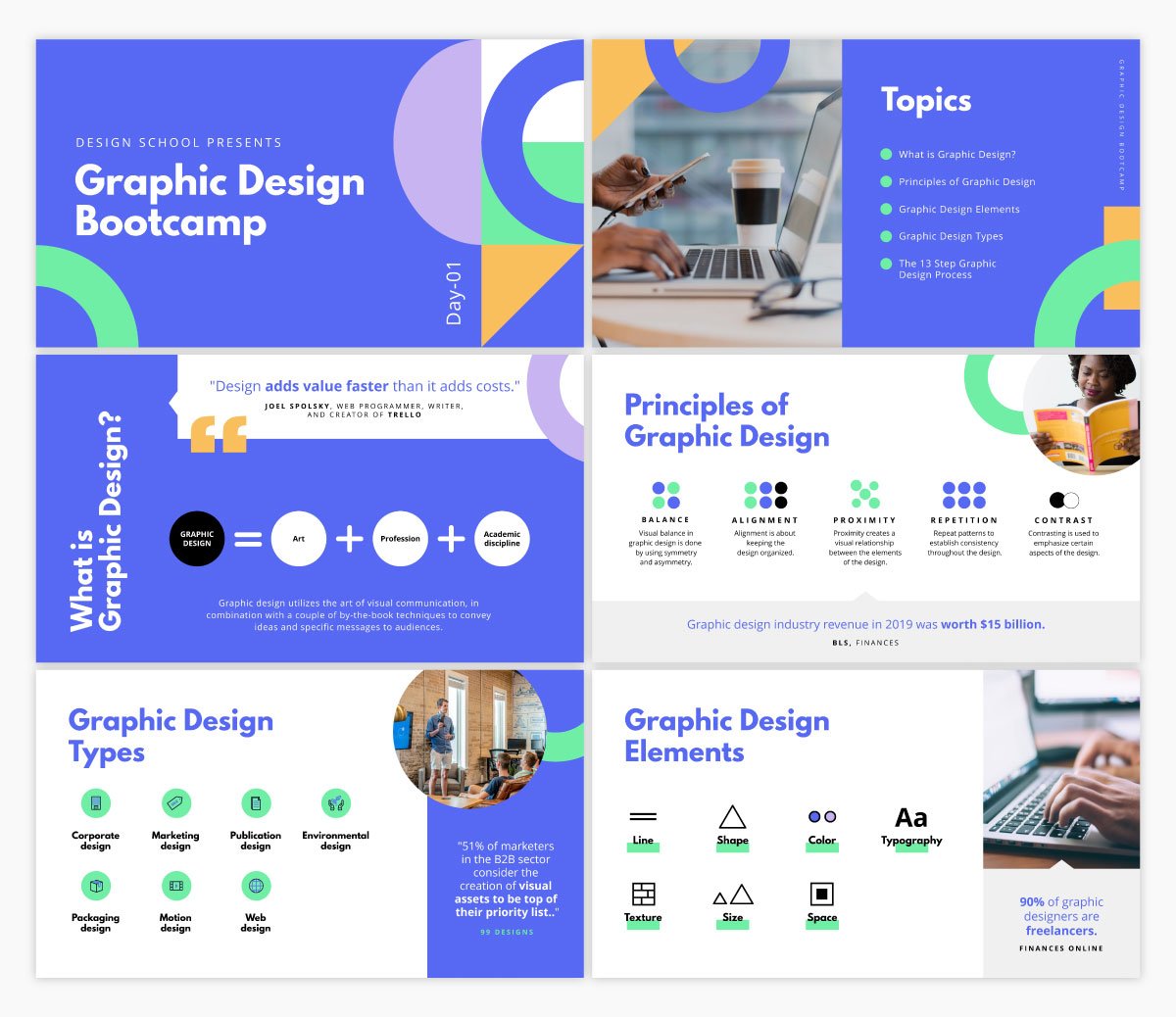
To help ensure your presentation is stunning, try using an educational presentation template like the one below.
Type #2: Investor Pitch Decks
This is an incredibly important type of presentation for startups and small businesses. Trying to get funding for your business idea? You’re going to need to create an investor pitch deck .
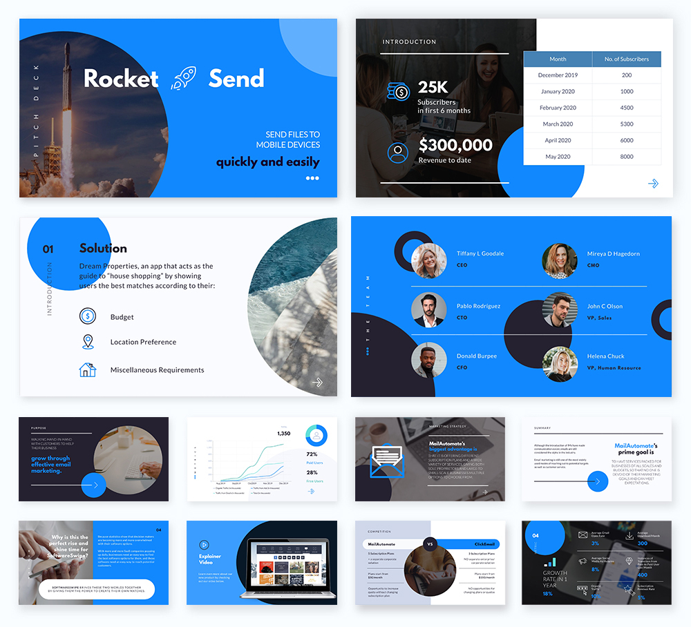
At Visme, we’ve actually put together the quintessential pitch deck theme with a variety of different slide ideas to help you craft the ideal, completely professional pitch.
Type #3: Webinar Presentations
Webinars are popular online presentations used for lead magnets and generating new sales and sign-ups. These tend to be informational presentations that lead to a sales pitch towards the end.
Here’s a great webinar presentation template you can use to get started with your own.
Type #4: Sales Presentations
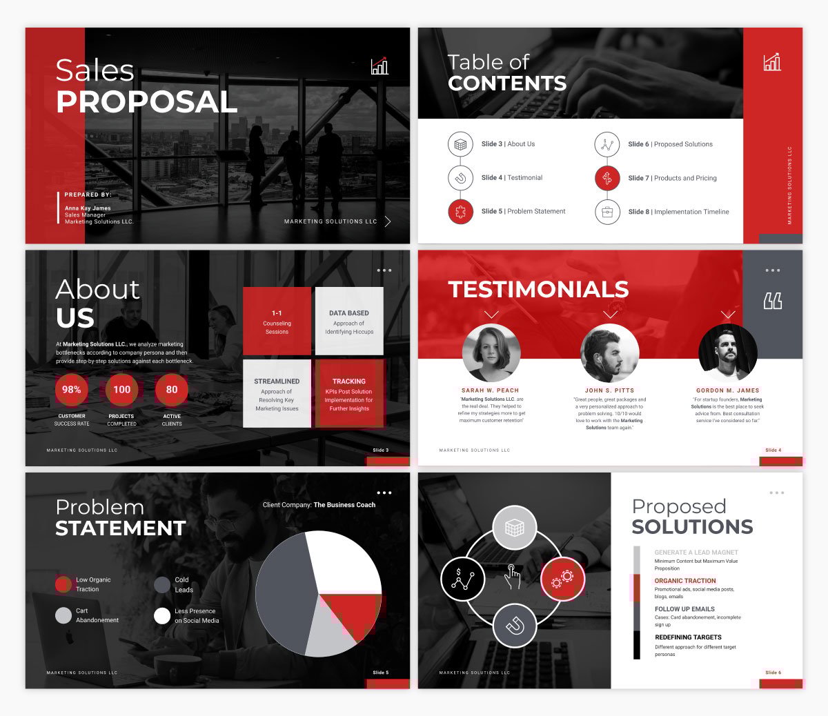
A sales presentation or sales pitch deck is a type of presentation you might need to give if you’re pitching a product or service to a potential customer or client.
These often share your company’s unique selling propositions, pricing information, testimonials and the like.
Here’s an interactive sales presentation template you can use to get started.
Type #5: Report Presentations
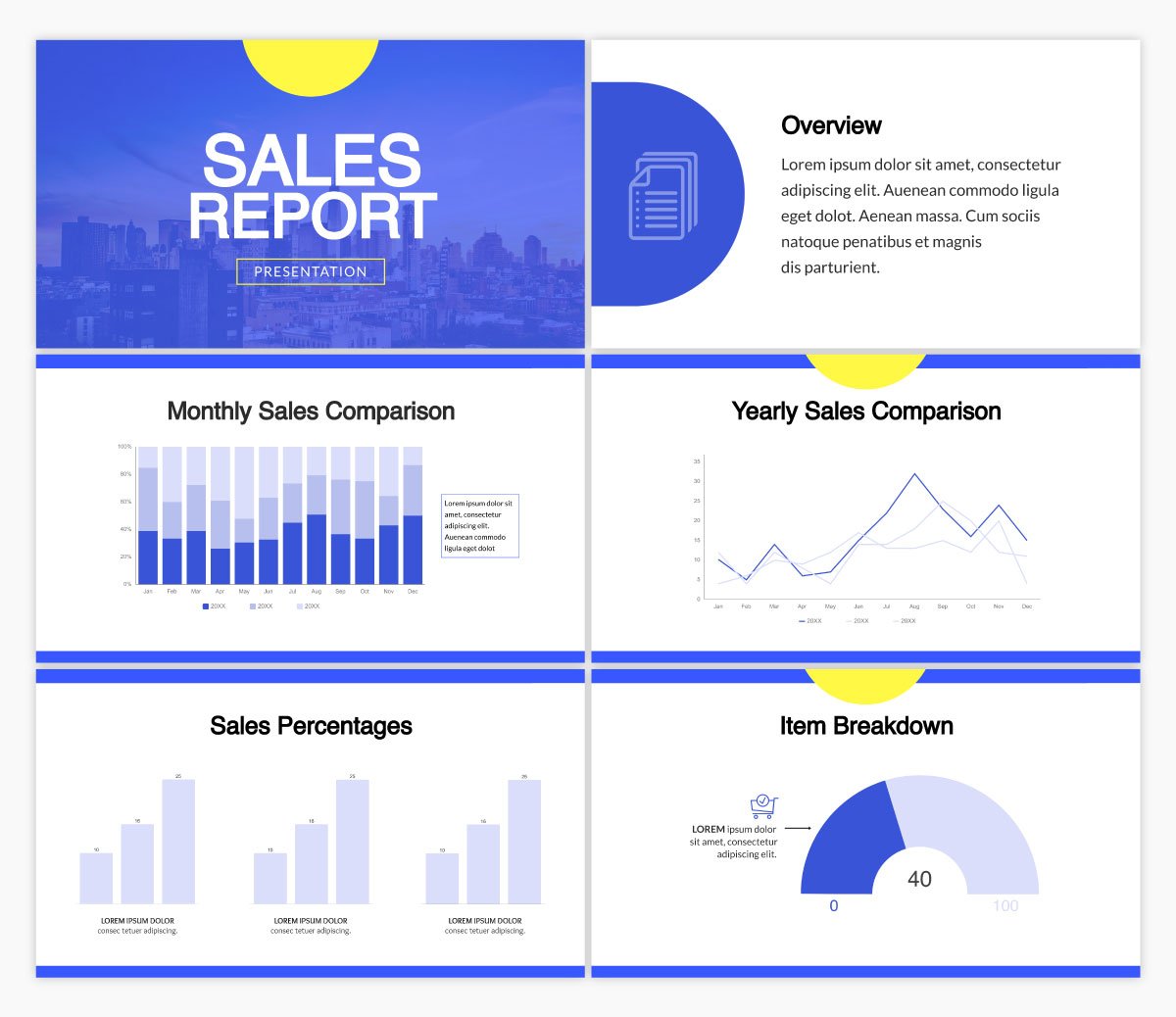
Oftentimes, you’ll be asked to present a report based on sales and marketing performance, website data, revenue or some other data that your team or supervisors want to learn more about.
This can come in many different forms, like a business report document or even an infographic, but many people also love to give simple report presentations.
Utilize a template like the one below to set the stage for your report data.
Type #6: Keynote Presentations
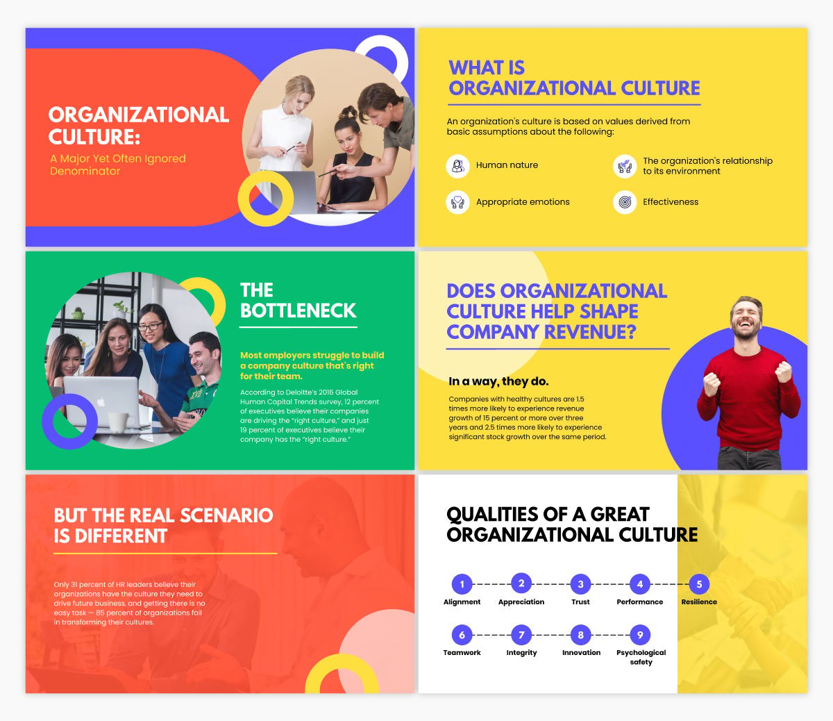
A keynote presentation is more like a speech that is given in front of a larger audience. Think TED Talks and keynote speakers at conferences and events. While most of the speech is done by the presenter, slides are still helpful for keeping the audience engaged and on track.
A keynote presentation can use a template like the one below, that’s bright and includes only the main points from the presentation.
12 Presentation Design Tips for Beginners
Are you ready to master presentation design? We’ve got 12 easy-to-follow tips to help you create a slide deck that keeps your audience’s attention and has every audience member handing on to every word.
For other tips to help you create and deliver the best presentation possible, become a certified presenter with our free online course.
Let’s dig in.
Ready to create your own presentation in minutes?
- Add your own text, images and more
- Customize colors, fonts and everything else
- Choose from hundreds of slide designs and templates
- Add interactive buttons and animations
Tip #1: Use No More Than 6 Lines of Text
An effective presentation isn’t filled with copy. You won’t be reading straight off your slides, so you want to include only your main points and must-know information on your slides. Your speech fills in the rest.
Not only does this help make your presentation as a whole much more engaging, but it also improves your presentation design.
Take a look at the example below. The minimal text option looks way better than the slide with paragraphs of copy.

Tip #2: Stick to 2-3 Fonts and Colors
Our next tip focuses on your presentation’s typography and color scheme. While it may be exciting to use as many different fonts and colors as possible, design best practices dictate that you should only utilize two or three total.
Your fonts and colors should have jobs, as well.
Choose one font for your headers and another for your body copy. You might work in a third accent font as well.
Your color choices should be similar. Use one or two main colors throughout, then throw in an accent color for good measure. Make sure your colors work well together and help convey the right message.
Not sure why this is so important? Let’s show you an example of what we mean.
The slide on the left has too much going on. With all of those fonts and colors, it looks cluttered, and it’s hard to pay attention to the actual concept the slide is trying to convey.
But on the right, we see a nice mixture of three fonts and three colors, pulling the entire slide design together.

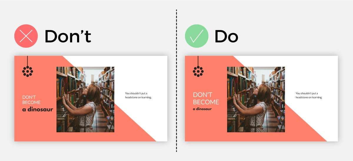
Tip #3: Pay Attention to Visual Hierarchy
One big thing to remember when adding text to your next presentation is visual hierarchy . Essentially, this means that the order someone reads something on your slide should be obvious, based on font size, color or weight.
Take a look at this example below. On the right, it’s easy to read and makes sense. On the left, the visual hierarchy is all out of whack, leaving the reader confused.
Tip #4: Take Advantage of Powerful Visuals
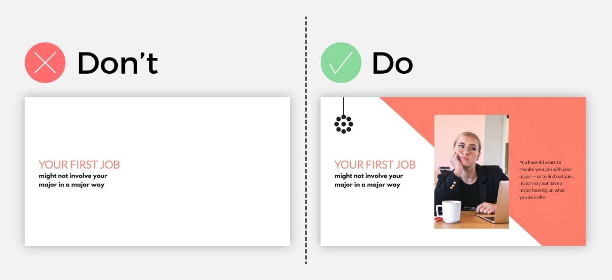
An engaging presentation takes advantage of visual elements. Think stock photos, icons, illustrations, videos, even charts and graphs. All of those can level up your Visme or PowerPoint presentation design.
You want to make sure that your visuals perfectly represent the words on your slides as well. Or, if you have no words on the slide, make sure they perfectly represent the words that you’re saying in your speech.
Visuals should always add to your presentation, rather than take away. But you also want to make sure that each of your slides has some kind of visual representation so you’re not sharing boring words on a slide, like in the example below.
The left slide is dull and boring. Sure, we can read what it says, but do we want to? On the other hand, the slide on the right is engaging, incorporating a high-quality image that visualizes the words on the slide.
Tip #5: Stay Away From Bullet Points
When learning how to create your first presentation using Microsoft PowerPoint way back in elementary school, one of the typical PowerPoint design tips was to use bullet points for each slide’s main points.
Don’t do that.
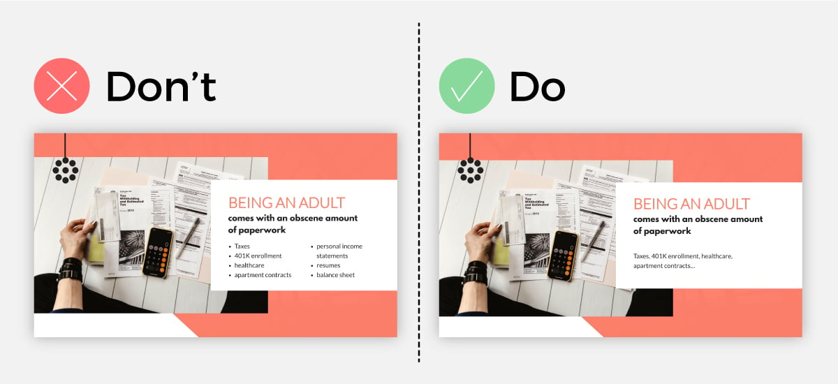
Any good presentation design tutorial these days will tell you that you should stay away from bullet points as best you can. They’re boring and outdated and there are better ways to showcase your content.
Take a look at the examples below. The left slide is already putting you to sleep. As we can see on the right, the bullet points aren’t necessary.
It’s more engaging and conversational when the list is laid out in paragraph form, and it doesn’t look like the traditional PowerPoint template that we’ve all come to dread.
Tip #6: Insert a Single Animation Style
Our next tip for creating a memorable presentation is to only use one single animation style throughout the entire slideshow.
With a presentation tool like Visme, you can easily access custom animation capabilities that make your design elements seem like they’re floating on the slide. However, you don’t want to throw too many different animation styles into a single slide or presentation.
This can overwhelm your viewer and take attention away from your value proposition and the story you’re trying to tell.
Instead, find one animation style that works and stick with it throughout your presentation.
Tip #7: Highlight Key Points
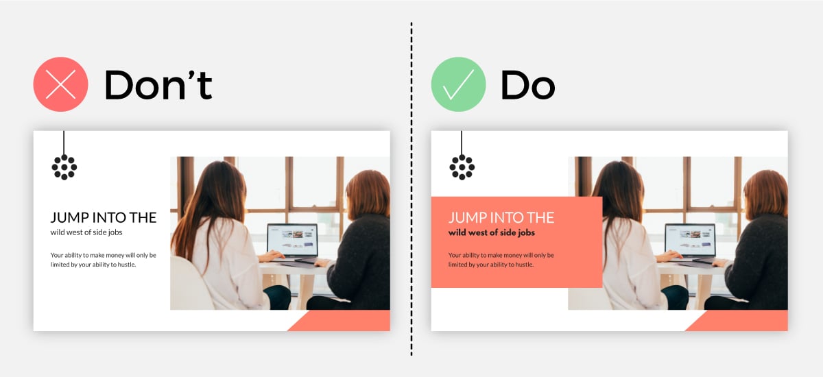
Using shapes, bright fonts, characters pointing to your copy and similar elements is a great way to highlight your key information on each side.
Not only does this help keep attention on the page, but it makes your design even easier. Take a look at the example below.
Adding the pink rectangle around the page content helps to highlight the point you’re trying to make and allow your audience to more easily understand your message.
Tip #8: Incorporate Data Visualization
Another important presentation design tip is to incorporate data visualization when showcasing numbers and statistics in your slides.
This can be anything from a bar graph or pie chart visualizing different data in a chart or graph all the way to a percentage radial or a pictogram visualizing basic numbers.
Take a look at this example below. Look at how much more engaging the slide with the data widget is. Using design elements like these make both complex and simple numbers and statistics easier to understand and remember.
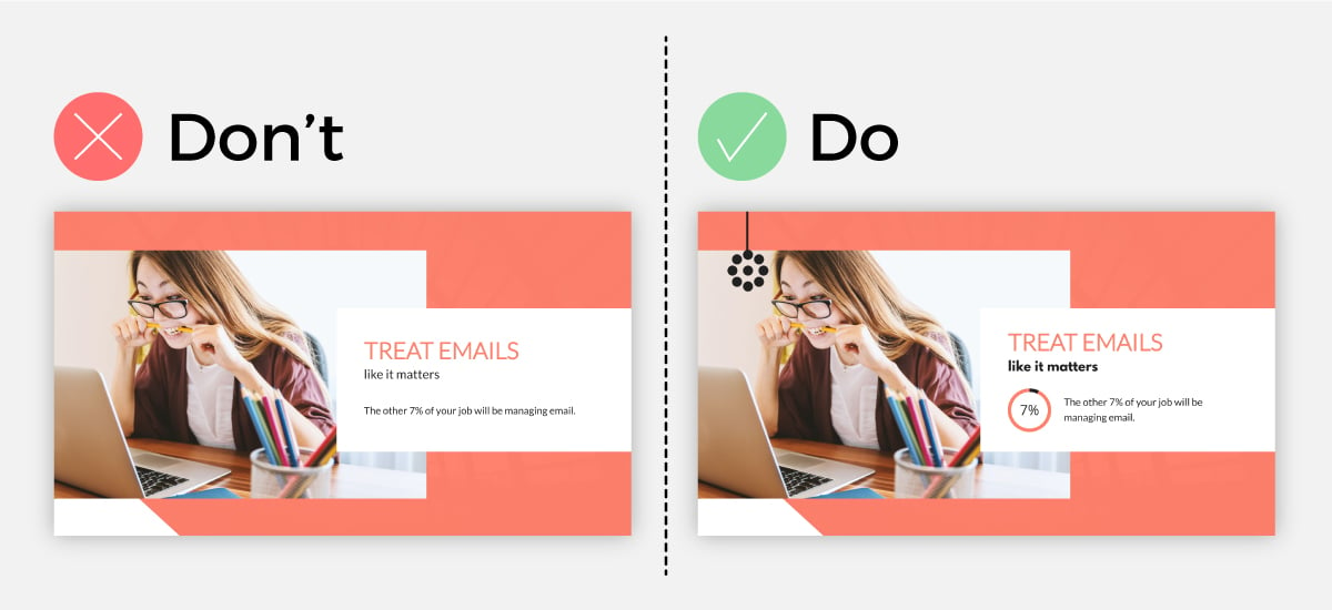
Tip #9: Keep Your Slide Design Consistent
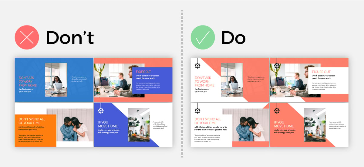
Our next tip involves your slide design. This goes back to your fonts and colors as well as other design elements like icon styles, lines, shapes and more.
Each slide throughout your presentation should have a similar look and feel. You want to keep the design cohesive so that it’s obvious to your audience that your slides go together and you’re still talking about the same topic.
Take a look at the example below. On the right, we see a stunning, cohesive presentation design; on the left, we see a smorgasbord of colors, fonts and design elements that make no sense whatsoever.
You want your presentation to look like the example on the right.
Tip #10: Break Up Sections
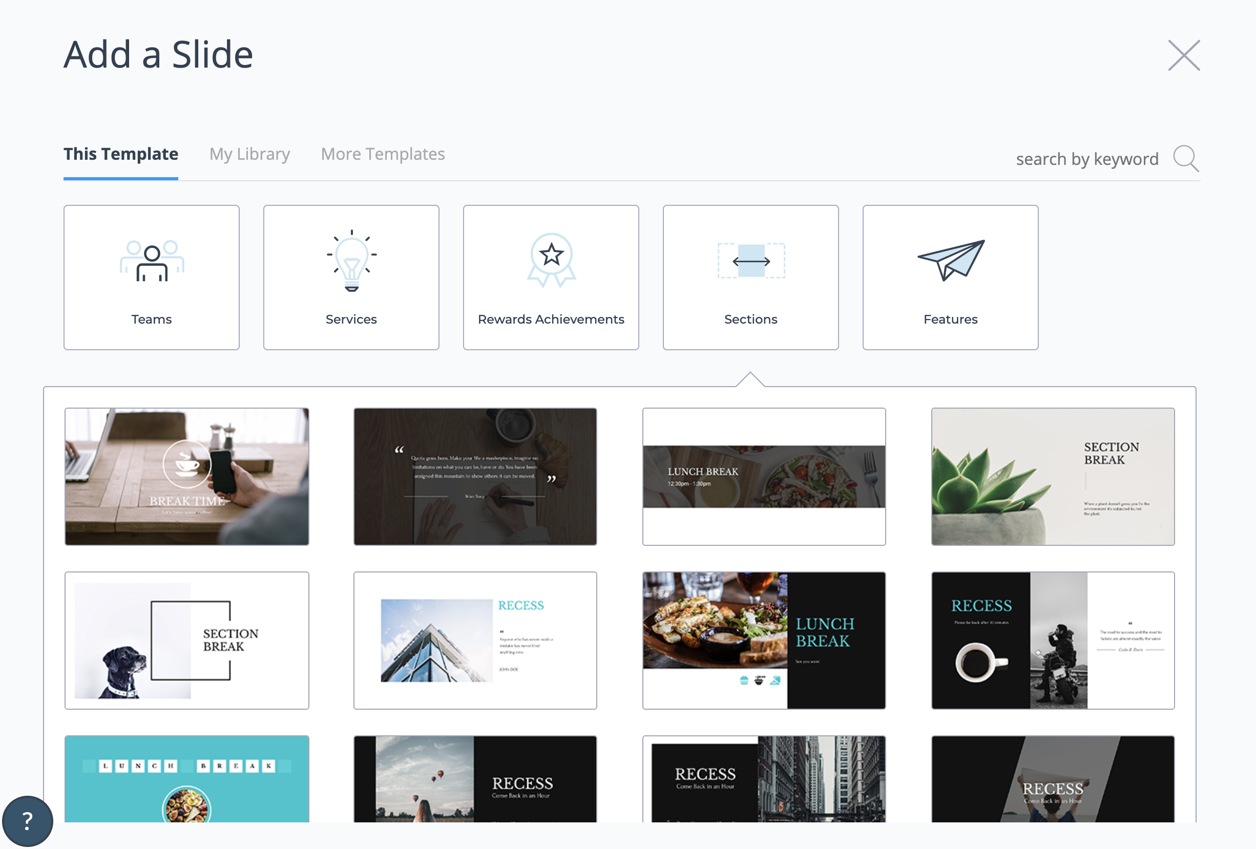
Another pro tip is to break up the different sections of your presentation with section header slides. These can be anything from a blank slide with only a background photo, include a quote, share your new section’s title and more.
Take a look at the variety of section break slides we offer alongside our Modern presentation theme below.
Tip #11: Stick to a Single Transition Style
Your transition is how one slide exits off the screen and the next slide appears. While tools like Visme and PowerPoint offer a variety of transition options, it’s important to remember that simple is best.
With that being said, you only want to utilize one transition style throughout. Find a favorite or at least one you like for this presentation. If you have a few favorites, switch between them for each presentation you give.
Tip #12: Limit A Single Takeaway Per Slide
When creating a clean, crisp and clear slide design, you’ll want to center all your text and visuals around one single takeaway or idea.
If you crowd your slide with multiple main ideas, things look messy and unorganized, thus giving your presentation a poor design.
As you can see in our example below, when there are multiple main ideas and lots of crowded text, your slide will be immediately overwhelming and you’ll lose your crowd almost immediately.
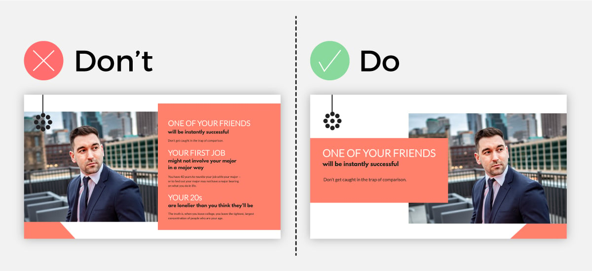
But on the other hand, when you have a single takeaway with a few points to go along with your main idea, your slide is easily digestible and looks sleek.
If your presentation is on the longer spectrum, then it’s good to keep your slides moving and changing constantly as to not bore your crowd.
Tip #13: Adjust The Size, Weight and Color of Your Font to Emphasize An Idea
To enhance your presentation design, you need to ensure that each slide has a focal point; a place where the eye is immediately drawn to.
Typically, you want this focal point to be on your main idea. This way, your audience will immediately be guided to what you have to say next and what they can expect.
One way you can manipulate and direct the eye to go where you want it to is by adjusting the size, color and weight of your font, as you can see in our example.
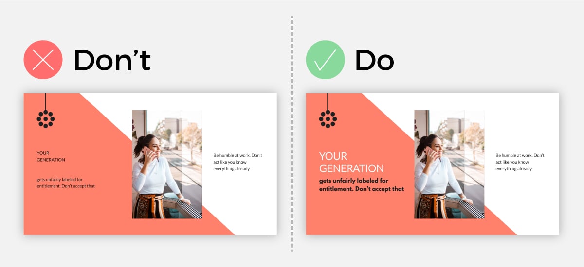
To highlight your main point or the driving force of your statement, you can change the color of a single word or adjust the font weight to bold.
This will bring your idea to the forefront of your slide design, thus making it your focal point and emphasizing your main idea.
The opposite of this idea stands true as well. If you have less important ideas that you need to have on your slide to jog your memory, you can use a lighter font-weight or complementary color to the background to make it stand out less.
Tip #14: Keep Your Presentation Notes Separate
The main rule for having a visually appealing presentation design is to keep things simple. This means that the less text you have on the slide, the better.
Your slide should highlight only your main idea, as we mentioned in a previous point, a few supportive statements and visual elements.
Thus, you should not have your presentation notes written plainly on the slide for all to see. This will make your slide look and feel chaotic for your audience.
If you are worried that you’ll forget your main idea or supporting arguments, then you can use a presentation presenter like Visme that keeps your presentation notes separate.
This way, you can still rest assured that all the information you need to convey for each slide is stored carefully away and you can quickly access it, without overcrowding your slide and forfeiting beautiful slide design.
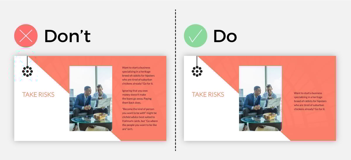
Tip #15: Dedicate an Entire Slide to a Crucial Question or Remark
No one likes presentations that are limited to just a few slides, therefore obliging them to stare at the same slide for 10 minutes.
To keep up a pleasant presentation design and pace, and to keep things visually interesting, you can create slides that are dedicated solely to an impactful quote or a crucial question that supports your entire presentation scope.
So while you may be tempted to add all the answers to your question and supportive data to your slide, it may be best to keep things simple and let your statement do just that; make a statement.
Tip #16: Embed Videos to Your Slides
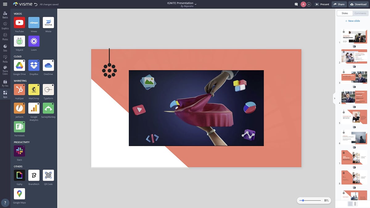
If you have a video to share with your audience, don’t just boringly add the link to it to your slide; embed the video right within your presentation.
This will bring your slide to life and will make things easier for you as a presenter, so you don’t have to leave your presentation and do the awkward dance of loading your video.
You can use a presentation tool like Visme to help you create beautiful slides and embed your videos right into them.
Tip #17: Use Negative Space to Your Advantage
Negative space, or white space, is your best friend when it comes to making a visually appealing presentation slide.
While many times overlooked or seen as a design inconvenience, you can use extra space to actually make your design look ten times better.
Let me show you an example.
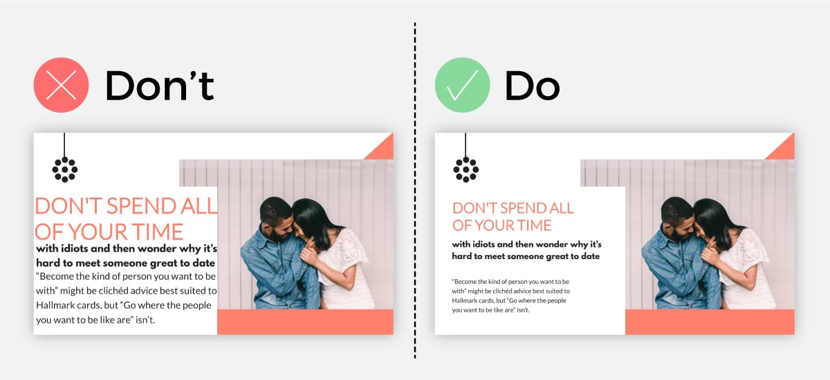
As you can see, by simply decreasing the size of the design elements and without changing anything else, we were able to achieve a more minimal and professional-looking slide.
Make sure that you maintain the same amount of space between elements to create design cohesiveness.
Tip #18: Use a Contrasted Background to Make Text Jump Out
One common mistake we see in presentation design is the failure to use color contrast to make your text pop.
Many times, the text gets lost or mixed in with the background because of complementary color usage.
While staying within the grounds of a color palette is a great idea, you want to make sure that you use contrasting backgrounds and font colors in order to get your text to stand out to the reader.
As you can see in our example, when the text has a complementary color to the background, it’s hard to read. But when the text has a contrasting color, it’s appealing to the eye and is easy for the reader to see.

You can use a design tool like Visme to find professionally chosen, complementary-yet-contrasting color palettes to use for your presentation design.
Tip #19: Use Backgrounds to Bring Depth to A Visual
Why use a plain background when you can use shapes, photos, textures and more?
If you want to bring some depth to your slide and really get your text and visuals to stand out, you can use high-resolution images or shapes as a background.
As you can see in our example, when you use a simple one-color background, it looks much plainer than if you were to add more to your background.
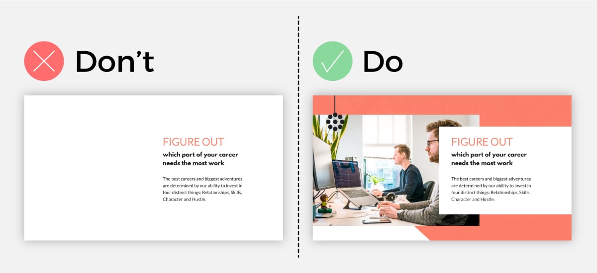
Do choose a background that matches your slide design, though. If you pick a busy design, you risk overwhelming your viewer and losing their attention.
So make sure you choose a “calm” design if you have a lot of texts and visuals and a more bold design if you have less text and visuals to display.
Tip #20: Use a Presentation Template
Want a presentation design tip that will never go out of style? Start with a template rather than trying to create your own slide deck from scratch!
With a presentation software like Visme, you can start with a stunning presentation template that has been professionally designed by our team of graphic designers.
Browse our presentation template library below.
Presentation Templates

Ecommerce Webinar Presentation

Buyer Presentation

Company Ethics Presentation

Technology Presentation
PixelGo Marketing Plan Presentation

Work+Biz Pitch Deck - Presentation
Create your presentation View more templates
Sometimes you just need a little inspiration to kick off your presentation design.
If you want to create a show-stopping and attention-grabbing presentation, then it’s good to know what presentation design trends are in right now.
Here are 5 of the hottest presentation design trends that are popular amongst presenters.
B+W with a Splash of Color
One popular presentation design trend right now is to create your entire presentation in black and white and then to add a single pop of color to each slide.
Take the presentation below.
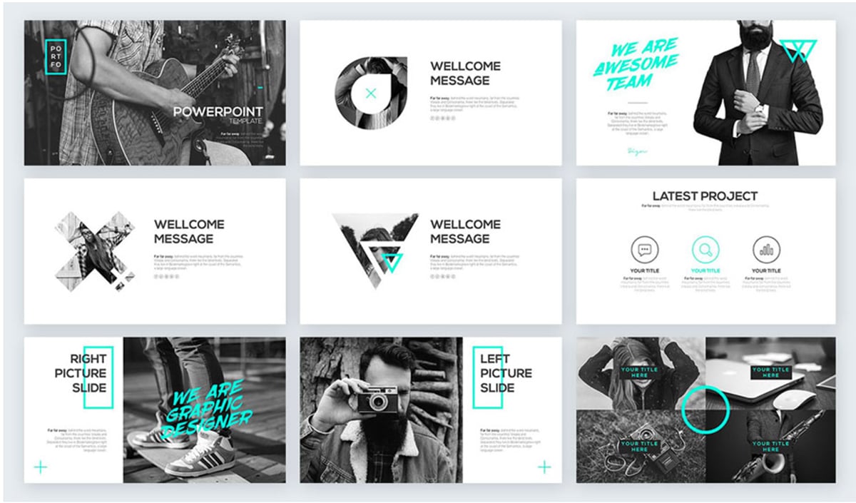
Image Source
By using a black and white color palette and using a bold choice of color, you can bring attention where it is needed and create a strong focal point for your viewer.
It’s up to you to decide where, how often and how much color you will use per slide.
Sometimes you only need to add in a tiny colored shape to bring attention to your slide, and other times you may want to add in two to three large colored visuals to your slide. The choice is completely up to you.
Unexpected Neon Colors
You heard it here first, bold and contrasting neon colors are the way of the future for presentation design.
This design trend is great for product presentation and pitch decks, but not only. You can use this technique to spice up any presentation that you’re worried could be potentially lacking in the speech department.
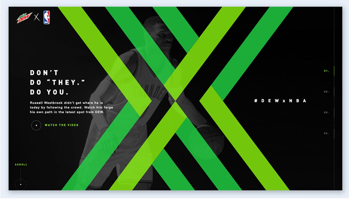
Because using neon colors is so unexpected, you can use this technique to grab your viewer’s attention and keep them wanting to see more.
The trick is to not use an overwhelming amount of different neon colors, but instead to choose one or two and use them as accents against a contrasting background.
Monochrome Color Palette
Monochrome color palettes that are used in presentation design are always seen as sleek and professional.
A monochrome color palette is a single color displayed in different strengths, for example, lighter or darker variants of the color blue.
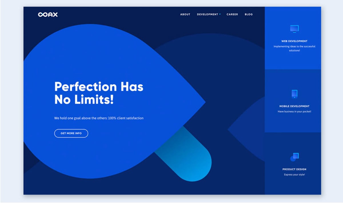
One way to use the monochrome color palette technique is to use the darkest color for the background and the lighter variants of the color for the text, visuals and graphic design elements.
You can also try it the other way around and use the lightest colors for the background and the darkest ones in the foreground.
Play around with the monochromatic design until you find the perfect fit for your slide.
Isometric Illustrations
If you haven’t noticed already, many companies have been transitioning from a minimal design approach to using isometric illustrations for their branding.
If you want to have a professional-looking presentation design and make a statement to your team, you can use isometric illustrations to achieve that.
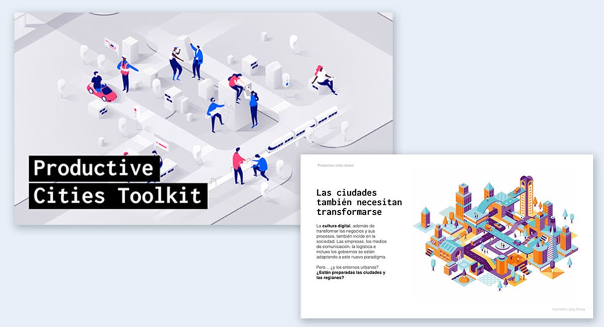
Because isometric illustration design is so versatile, what you choose to present while using this design technique is equally as versatile.
Isometric illustrations will work perfectly for any type of presentation, from product presentations and corporate presentations to technical presentations and monthly reports.
Simple Minimalism
And finally, a design trend that will likely never go out of style is simple minimalism.
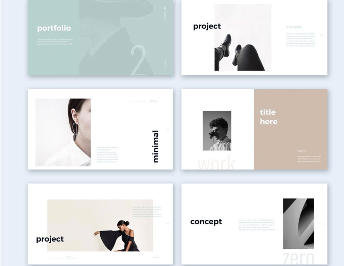
Just because it’s simple doesn’t mean it isn’t complex. Minimalism has always been show-stopping and that is because of the rule “Less is more.”
For each slide, a good rule of thumb is to convey just enough information for the reader to understand what’s going on and use a neutral color palette.
Showcase your most important ideas in bold, use modern fonts and your minimal slideshow will have your audience captivated immediately.
If you’re still hungry to find more presentation design trends, then no worries. We have an entire list of 100+ creative presentation ideas and design trends that we created just for you to draw inspiration from.
Ready to put some of these presentation design tips into action? At Visme, we have hundreds of presentation templates to help you get started. Take a look at these 15 presentation templates for various use cases below.
Template #1: Brand Guidelines Presentation Template
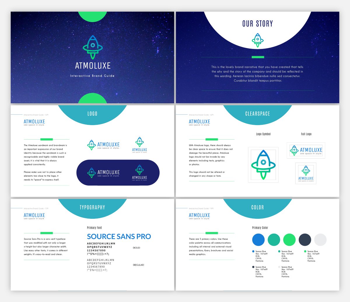
If you have brand guidelines created for your business, one great way to share them with your team and stakeholders is to put together a custom presentation showing off your style guide.
This presentation template makes it easy to display your font combinations and color palette for your brand. And if you’re just starting out or looking to rebrand, you can even design a logo in Visme.
Our Dynamic Field feature makes your presentation design quick and painless. You can create dynamic fields and change their values across your projects and presentations with a single click.
Template #2: Pitch Deck Presentation Template
New businesses who are looking to secure funding for their startup need a clean and eye-catching pitch deck design for pitching investors.
Using a theme like the one above gives you access to a variety of different startup stories for you to choose from when creating your presentation and highlighting the most important aspects of your business.
Made in partnership with FounderSuite, this pitch deck presentation template is perfect for your next investor pitch.
Template #3: Competitor Analysis Interactive Presentation Template
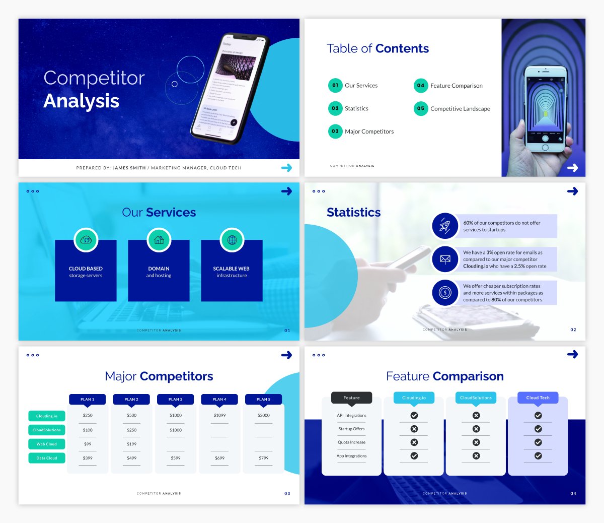
If you’re going to have a successful business, you need to have a firm understanding of who your competition is and what they bring to the table. This will be essential in marketing, for your sales team and just as a general understanding for your company.
This competitor analysis presentation template comes with built-in interactive features to help you get a good understanding of who your competitors are and what potential threats they pose.
Template #4: Business Plan Presentation Template
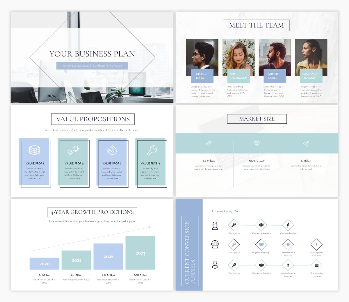
Another essential business presentation is your business plan. This template offers the exact presentation structure you need to build out your business plan. All you need to do is replace the placeholder text with your own!
Template #5: Marketing Plan Presentation Template
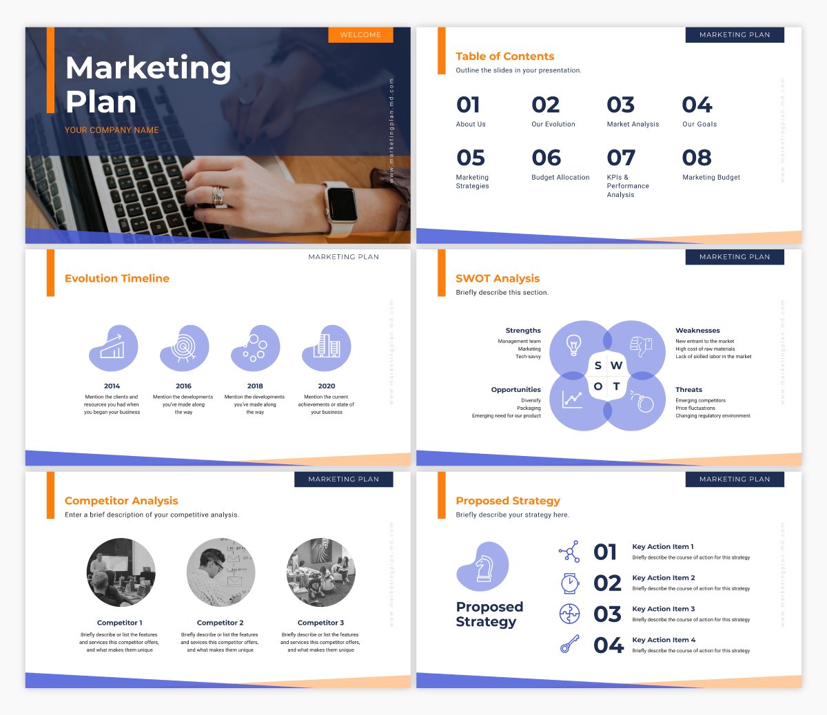
And any good marketing team needs a thorough marketing plan. This presentation template is similar to our business plan presentation template in that we’ve laid out the entire presentation outline for you. All you need to do is input your own strategy.
Template #6: Webinar Presentation Template
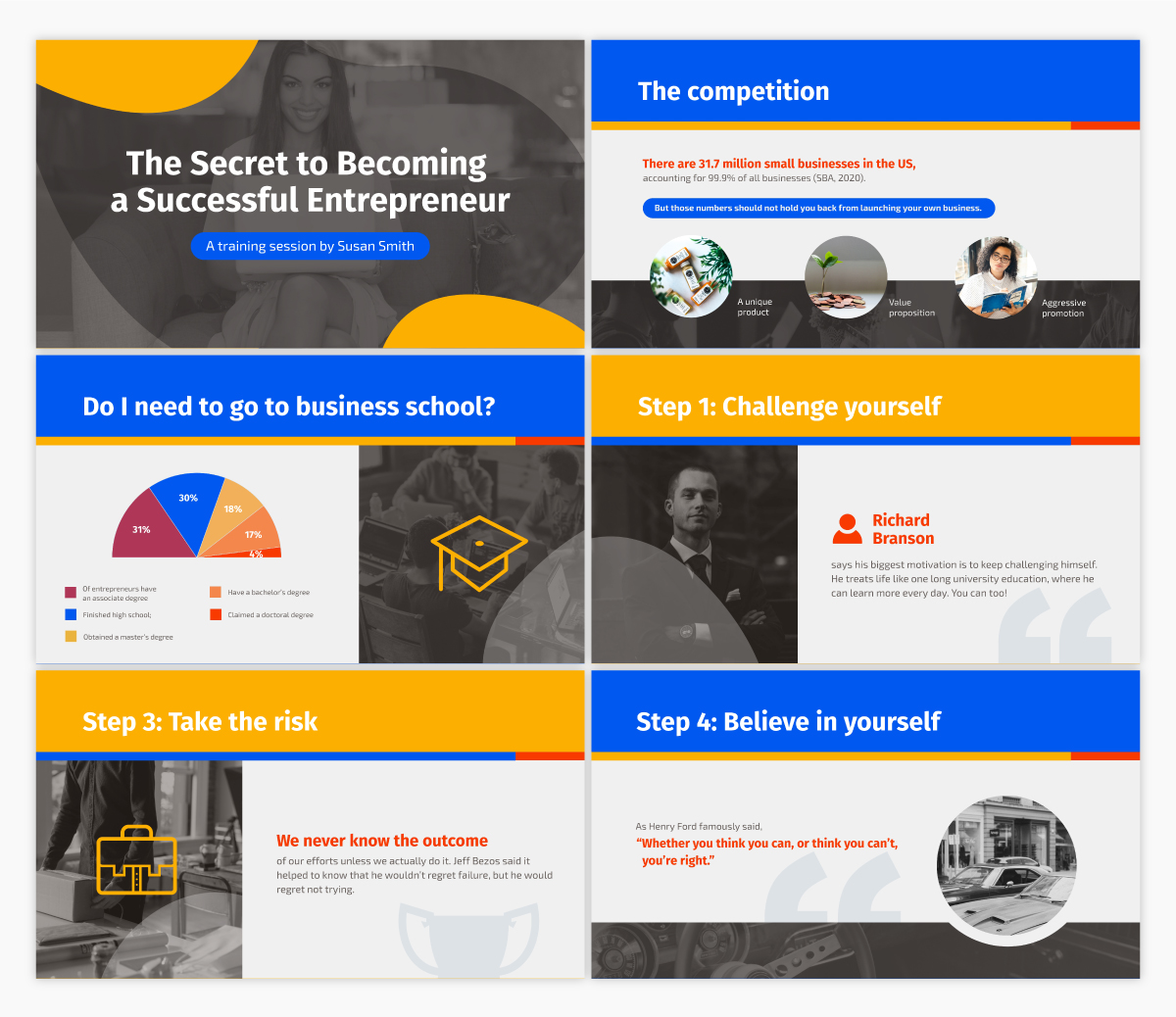
One great form of lead generation is hosting a webinar . This webinar template allows you to insert all of the information and sales pitch you want to share with your webinar attendees, all in a stunning, cohesive design.
Simply insert your own info, then brand the design so it matches your company’s fonts, colors and other style guide elements.
Template #7: SWOT Analysis Presentation Template
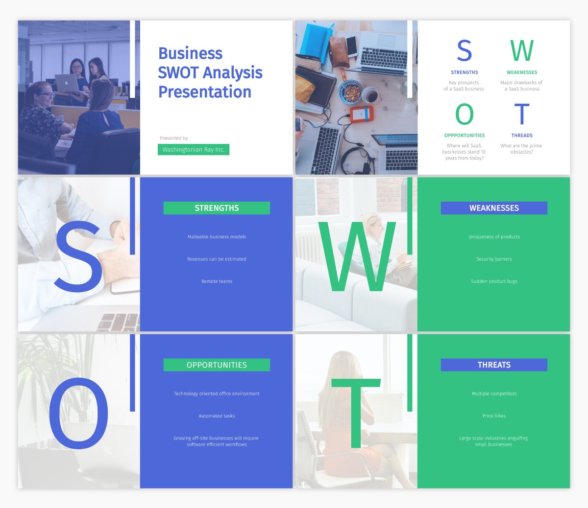
Have you ever conducted a SWOT analysis for your business? It covers the strengths, weaknesses, opportunities and threats that your company faces.
Putting together a SWOT analysis is a great idea when starting a business or adjusting your marketing plan, and this template dedicated to laying out each section is the perfect place to start.
Template #8: Keynote Presentation Template
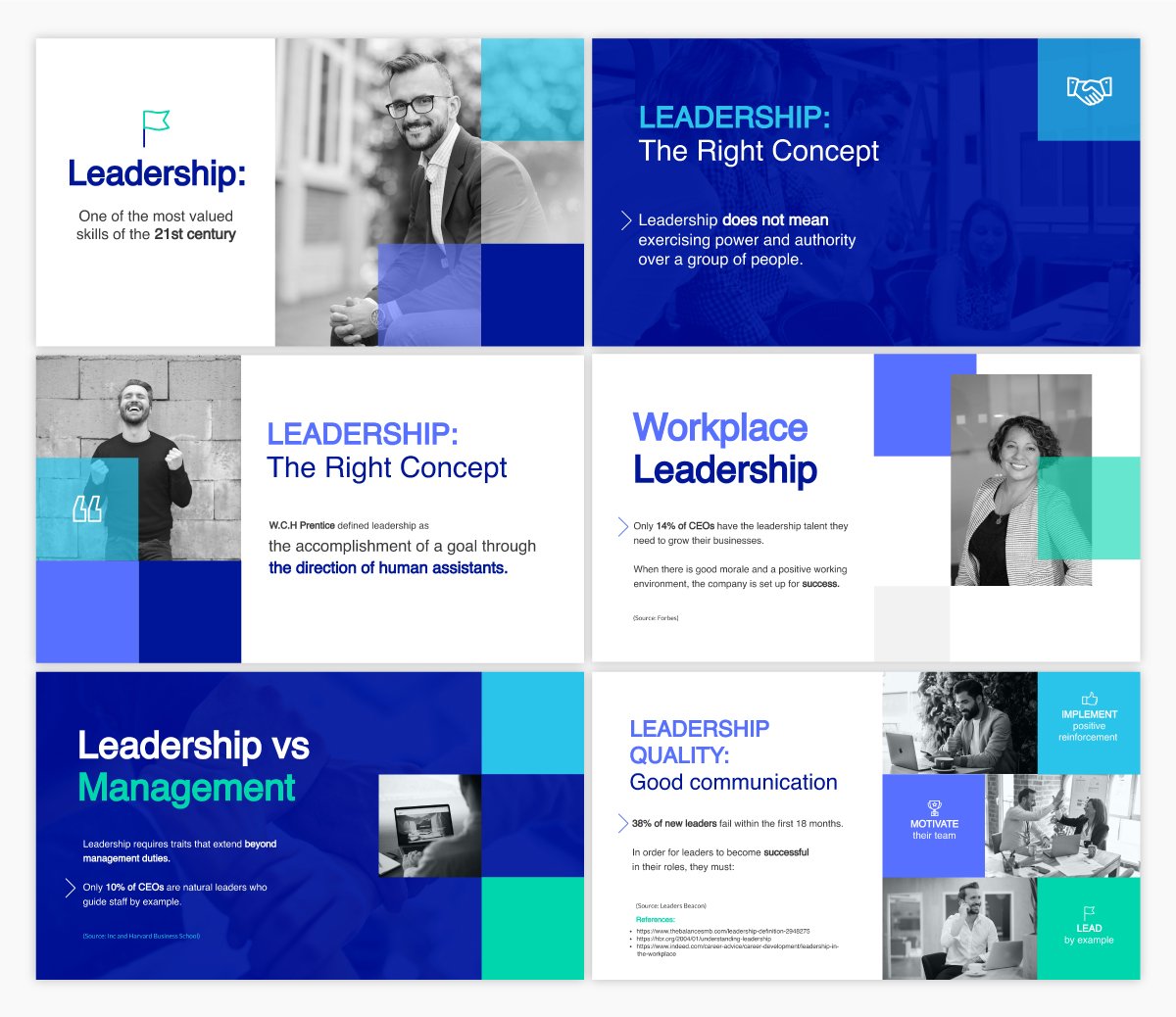
Are you going to be a keynote speaker at an upcoming event? You should only be focusing on creating stellar content that will wow your audience, rather than how to create your design. Use a template like this to make sure your design is eye-catching no matter what.
Template #9: Employee Handbook Interactive Presentation Template
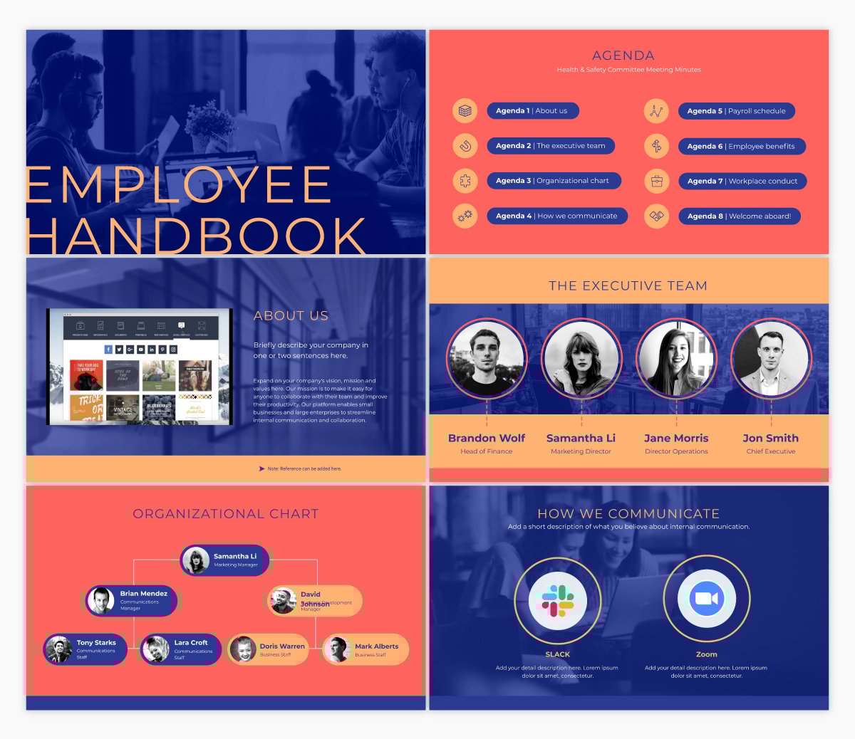
If your business is bringing on new employees, you’ll likely need to put together an employee handbook to make sure everyone understands your company’s mission and the overall guidelines for working with your business.
An interactive presentation template like this one is a great starting point for creating and distributing your own employee handbook.
Not only can you insert helpful information within this presentation, but you can also link back to resources on your intranet or website and simply share the digital version of this presentation via a private or password protected link.
Template #10: Training Manual Presentation Template
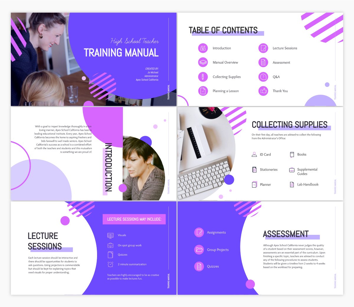
In a similar vein, it can also be helpful to create a training manual for the different roles and departments that your company hires for.
Training manuals like this help new employees start off on the right foot, understanding exactly what’s expected of them in their role and day-to-day tasks. Customize this template with your own training information to share with new team members.
Template #11: Case Study Presentation Template
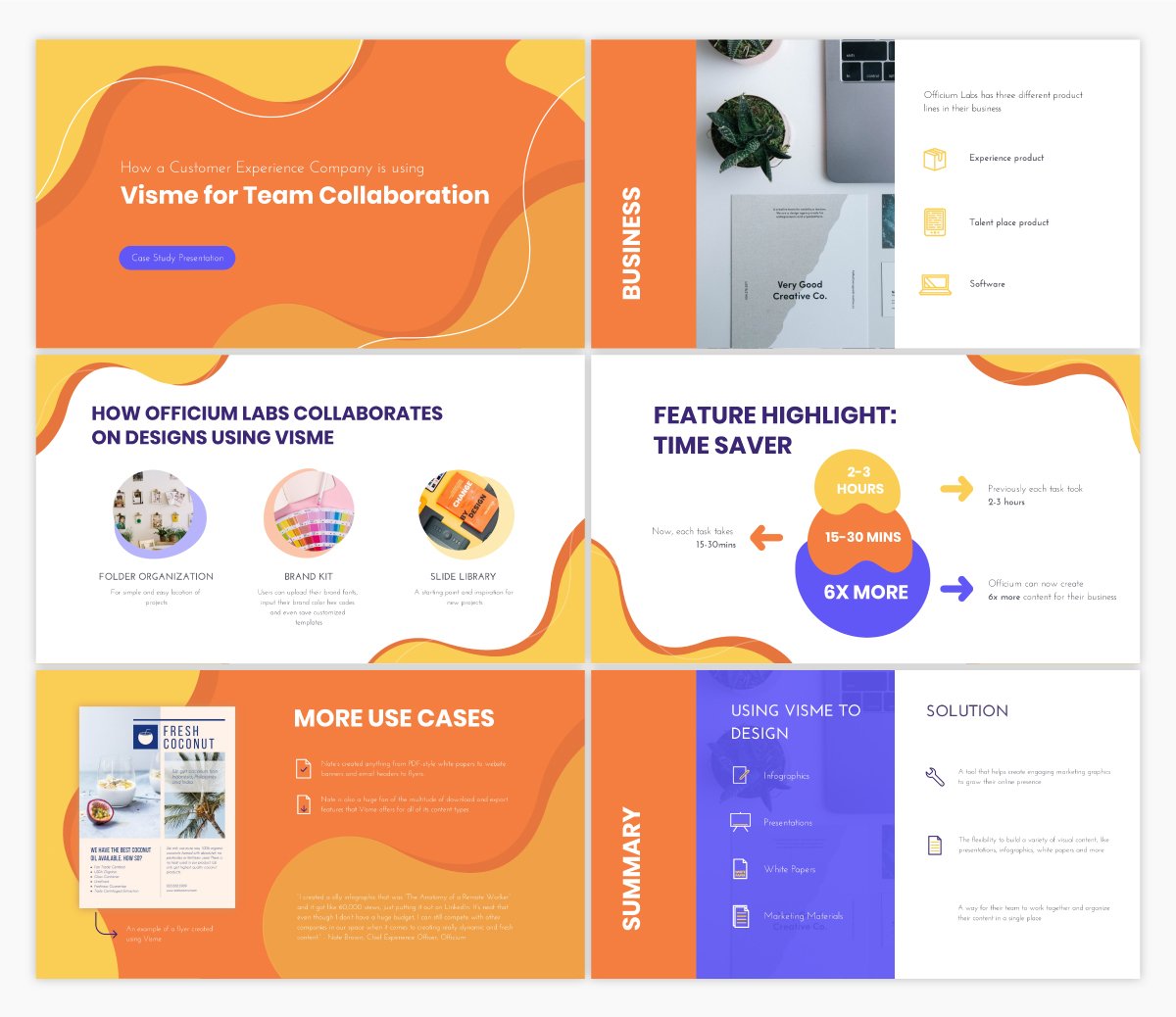
Another great use case for your next presentation is to share a case study . Showcase how your customers are using your tool and highlight success stories that could drive potential customers to sign up for your product or service.
Template #12: Informational Presentation Template
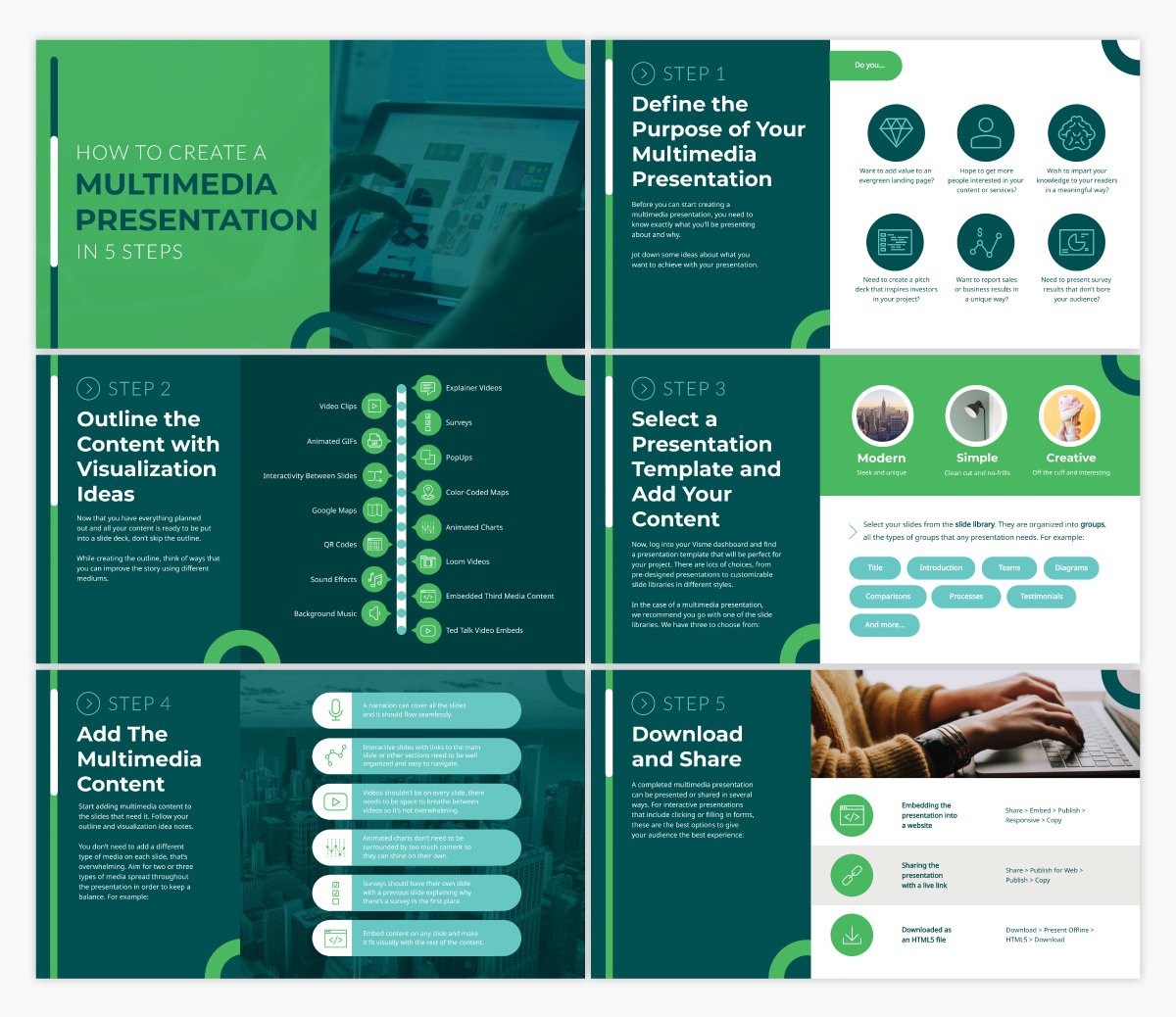
Regardless of who your audience is, presentations are the perfect format for sharing information. Create an informational presentation to embed in a blog post or share on SlideShare. Present important information to your team. Create presentations to share useful information at conferences and events.
There are so many different reasons you might need to create an informational presentation, and this template is the perfect fit.
Template #13: Creative Brief Interactive Presentation Template
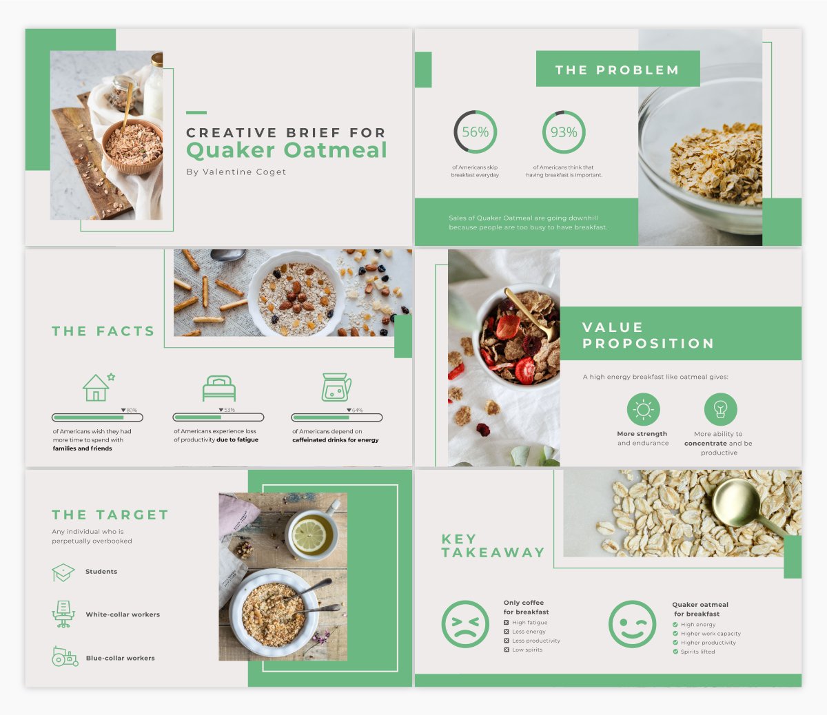
When working with a freelancer, contractor or designer, sometimes you’ll need to present a creative brief so everyone working on the project knows exactly what the outcome is supposed to be.
Using an interactive presentation template like the one above is a great idea for conveying the information in an engaging way that will be easy to remember.
Template #14: Guy Kawasaki Presentation Template
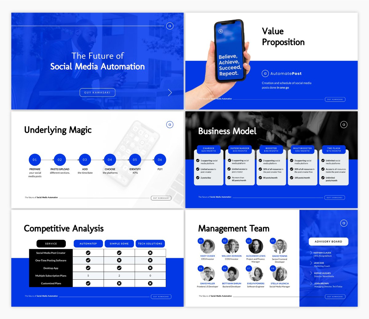
Guy Kawasaki coined the 10-20-30 rule when it comes to presentations. 10 slides, 20 minute presentation, with fonts no smaller than 30pt.
If that’s what you’re looking for, this presentation template is exactly what you need.
Template #15: Ignite Presentation Template
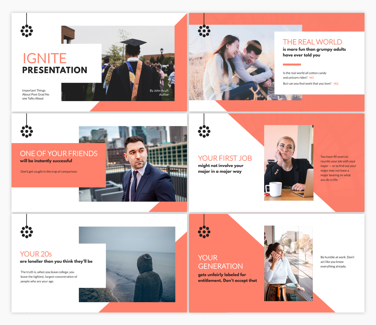
Ignite is a special type of presentation. Speakers give a 5-minute presentation on their topic alongside 20 slides that auto-advance every 15 seconds.
This means you can’t have too much text on any given slide, as you need to keep the tempo of the presentation.
If you’re planning to give an Ignite presentation, this template offers up the perfect starting point for ensuring you’re not using too much text.
Create Your Own Stunning Presentation Design
Ready to get started designing your own presentation? Give Visme’s presentation software a try and create the best presentation design you’ve ever made. We can’t wait to see what you come up with!
Create beautiful presentations faster with Visme.

Trusted by leading brands
Recommended content for you:

Create Stunning Content!
Design visual brand experiences for your business whether you are a seasoned designer or a total novice.
About the Author
Chloe West is the content marketing manager at Visme. Her experience in digital marketing includes everything from social media, blogging, email marketing to graphic design, strategy creation and implementation, and more. During her spare time, she enjoys exploring her home city of Charleston with her son.
Like what you're reading?
Presentation design guide: tips, examples, and templates
Get your team on prezi – watch this on demand video.
Anete Ezera January 09, 2023
Presentation design defines how your content will be received and remembered. It’s responsible for that crucial first impression and sets the tone for your presentation before you’ve even introduced the topic . It’s also what holds your presentation together and guides the viewer through it. That’s why visually appealing, easily understandable, and memorable presentation design is what you should be striving for. But how can you create a visually striking presentation without an eye for design? Creating a visually appealing presentation can be challenging without prior knowledge of design or helpful tools.
With this presentation design guide accompanied by Prezi presentation examples , templates , and AI functionalities , you’ll have no problem creating stunning and impactful presentations that’ll wow your audience.

In this guide, we’ll start by looking at the basics of presentation design. We’ll provide a simple guide on creating a presentation from scratch and offer helpful tips for different presentation types . In addition, you’ll discover how to organize information into a logical order and present it in a way that resonates with listeners. Finally, we’ll share tips and tricks to create an eye-catching presentation, and showcase some great presentation examples and templates you can get inspired by!
With our comprehensive guide to the best presentation design techniques, you’ll be able to develop an engaging and professional presentation that gets results!
What is presentation design?
Presentation design encompasses a variety of elements that make up the overall feel and look of the presentation. It’s a combination of certain elements, like text, font, color, background, imagery, and animations.
Presentation design focuses on finding ways to make the presentation more visually appealing and easy to process, as it is often an important tool for communicating a message. It involves using design principles like color, hierarchy, white space, contrast, and visual flow to create an effective communication piece.
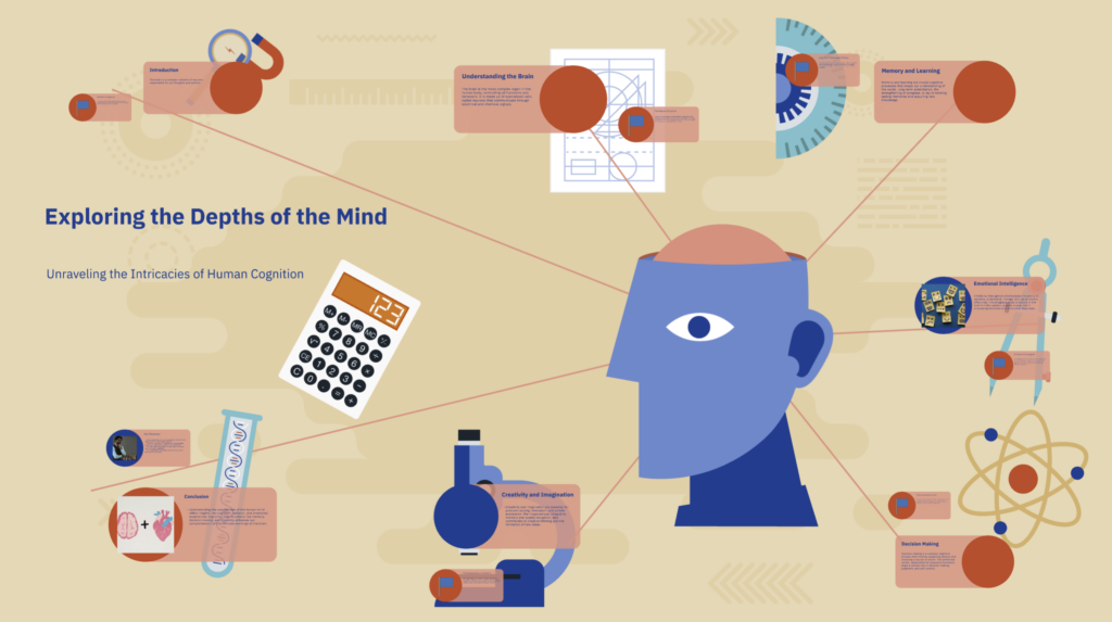
Creating an effective presentation design is important for delivering your message efficiently and leaving a memorable impact on your audience. Most of all, you want your presentation design to support your topic and make it easier to understand and digest. A great presentation design guides the viewer through your presentation and highlights its essential aspects.
If you’re interested in learning more about presentation design and its best practices , watch the following video and get practical insights on designing your next presentation:
Types of presentations
When creating a presentation design, you have to keep in mind several types of presentations that shape the initial design you want to have. Depending on your presentation type, you’ll want to match it with a fitting presentation design.
1. Informative
An informative presentation provides the audience with facts and data to educate them on a certain subject matter. This could be done through visual aids such as graphs, diagrams, and charts. In an informative presentation, you want to highlight data visualizations and make them more engaging with interactive features or animations. On Prezi Design, you can create different engaging data visualizations from line charts to interactive maps to showcase your data.
2. Instructive
Instructive presentations teach the audience something new. Whether it’s about science, business strategies, or culture, this type of presentation is meant to help people gain knowledge and understand a topic better.
With a focus on transmitting knowledge, your presentation design should incorporate a variety of visuals and easy-to-understand data visualizations. Most people are visual learners, so you’ll benefit from swapping text-based slides for more visually rich content.

3. Motivational
Motivational presentations try to inspire the audience by giving examples of successful projects, stories, or experiences. This type of presentation is often used in marketing or promotional events because it seeks to get the audience inspired and engaged with a product or service. That’s why the presentation design needs to capture and hold the attention of your audience using a variety of animations and visuals. Go beyond plain images – include videos for a more immersive experience.
4. Persuasive
Persuasive presentations are designed to sway an audience with arguments that lead to an actionable decision (i.e., buy the product). Audiences learn facts and figures relevant to the point being made and explore possible solutions based on evidence provided during the speech or presentation.
In a persuasive presentation design, you need to capture your audience’s attention right away with compelling statistics wrapped up in interactive and engaging data visualizations. Also, the design needs to look and feel dynamic with smooth transitions and fitting visuals, like images, stickers, and GIFs.

To learn more about different types of presentations and how to structure them accordingly, read our article on presentation types .
How to design a presentation
When you first open a blank presentation page, you might need some inspiration to start creating your design. For this reason, we created a simple guide that’ll help you make your own presentation from scratch without headaches.
1. Opt for a motion-based presentation
You can make an outstanding presentation using Prezi Present, a software program that lets you create interactive presentations that capture your viewer’s attention. Prezi’s zooming feature allows you to add movement to your presentation and create smooth transitions. Prezi’s non-linear format allows you to jump between topics instead of flipping through slides, so your presentation feels more like a conversation than a speech. A motion-based presentation will elevate your content and ideas, and make it a much more engaging viewing experience for your audience.
Watch this video to learn how to make a Prezi presentation:
2. Create a structure & start writing content
Confidence is key in presenting. You can feel more confident going into your presentation if you structure your thoughts and plan what you will say. To do that, first, choose the purpose of your presentation before you structure it. There are four main types of presentations: informative, instructive, motivational, and persuasive. Think about the end goal of your presentation – what do you want your audience to do when you finish your presentation – and structure it accordingly.
Next, start writing the content of your presentation (script). We recommend using a storytelling framework, which will enable you to present a conflict and show what could be possible. In addition to creating compelling narratives for persuasive presentations, this framework is also effective for other types of presentations.

Tip: Keep your audience in mind. If you’re presenting a data-driven report to someone new to the field or from a different department, don’t use a lot of technical jargon if you don’t know their knowledge base and/or point of view.
3. Research & analyze
Knowing your topic inside and out will make you feel more confident going into your presentation. That’s why it’s important to take the time to understand your topic fully. In return, you’ll be able to answer questions on the fly and get yourself back on track even if you forget what you were going to say when presenting. In case you have extra time at the end of your presentation, you can also provide more information for your audience and really showcase your expertise. For comprehensive research, turn to the internet, and library, and reach out to experts if possible.

4. Get to design
Keeping your audience engaged and interested in your topic depends on the design of your presentation.
Now that you’ve done your research and have a proper presentation structure in place, it’s time to visualize it.
4.1. Presentation design layout
What you want to do is use your presentation structure as a presentation design layout. Apply the structure to how you want to tell your story and think about how each point will lead to the next one. Now you can either choose to use one of Prezi’s pre-designed templates that resemble your presentation structure the most or start to add topics on your canvas as you go.
Tip: When adding content, visualize the relation between topics by using visual hierarchy – hide smaller topics within larger themes or use the zooming feature to zoom in and out of supplementary topics or details that connect to the larger story you’re telling.
4.2. Color scheme
Now it’s time to choose your color scheme to give a certain look and feel to your presentation. Make sure to use contrasting colors to clearly separate text from the background, and use a maximum of 2 to 3 dominating colors to avoid an overwhelming presentation design.
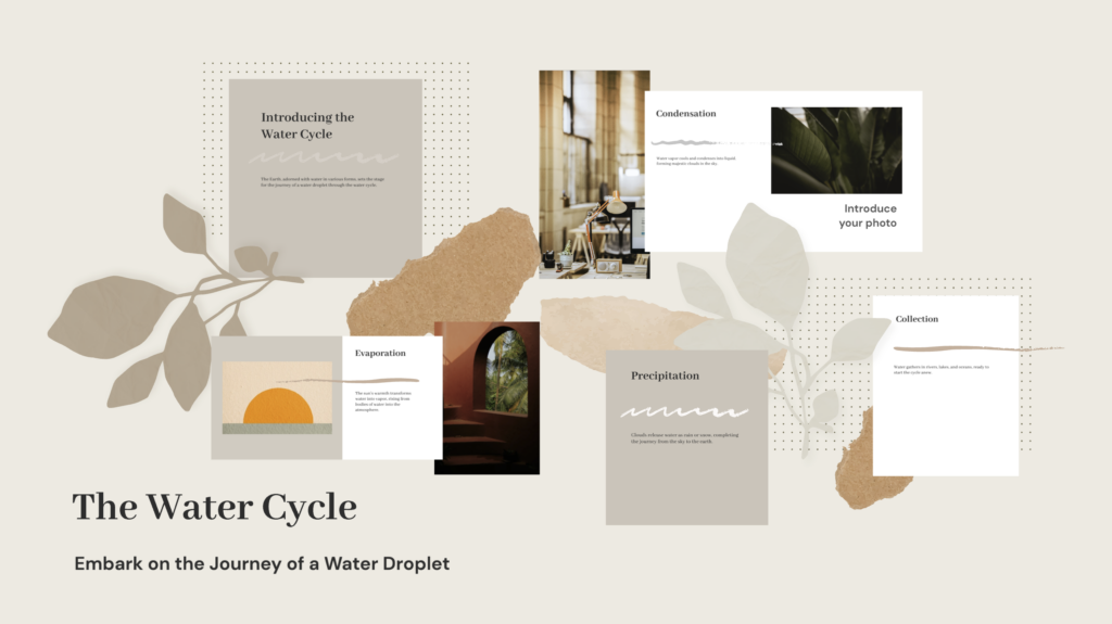
4.2. Content (visuals + text)
Add content that you want to highlight in your presentation. Select from a wide range of images, stickers, GIFs, videos, data visualizations, and more from the content library, or upload your own. To provide more context, add short-format text, like bullet points or headlines that spotlight the major themes, topics, and ideas in your presentation.
Also, here you’ll want to make a final decision on your font choice. Select a font that’s easy to read and goes well with your brand and topic.

Tip: Be careful not to turn your presentation into a script. Only display text that holds significant value – expand on the ideas when presenting.
4.3. Transitions
Last but not least, bring your presentation design to life by adding smooth, attractive, and engaging transitions that take the viewer from one topic to another without disrupting the narrative.
On Prezi, you can choose from a range of transitions that take you into the story world and provide an immersive presentation experience for your audience.
5. Practice your delivery
Even with a great presentation design, how you deliver it is crucial in leaving an impression. Practice your presentation’s timing to become familiar with the rhythm and pace. It might help to record yourself to pinpoint areas for enhancement. Practicing in front of a friend or family member can also offer insights. Keep in mind the more you rehearse, the more self-assured and at ease you’ll be when giving the presentation.
6. Engage your audience
Engaging with your audience can enhance the impact of your presentation. You could prompt discussions, invite participation, or incorporate features such as surveys or puzzles. For instance, when introducing a marketing plan you could kick off with a survey to assess how well the audience grasps the subject. This boosts interactivity in your presentation and also fosters a connection with your listeners and sustains their interest throughout.

7. Use storytelling techniques
Using stories can be a way to captivate your audience and ensure that your message sticks with them. When creating a presentation, consider incorporating a narrative structure that incorporates a beginning, middle, and end. For example, when outlining a business strategy, kick off with a story that highlights a challenge in need of resolution. Then delve into your proposed solution before illustrating the results that can be achieved. This storytelling approach can foster a connection with your audience and enhance their grasp of the main ideas you’re conveying.
8. Prepare for technical difficulties
It’s common to encounter glitches, so being ready is key. Make sure you have a strategy in place if things go south during your presentation. For instance, store your presentation on devices like a USB drive and online storage, and keep hard copies of important slides handy. Also, get acquainted with the equipment and software you’ll use for the presentation. Planning ahead for any issues can help you navigate them smoothly and maintain the flow of your presentation.
9. Include high-quality visuals
Good visuals play a role in the success of your presentation. Incorporate top-notch pictures, graphics,3 and videos to ensure your slides are visually captivating and interesting. Steer clear of using low-quality images that may come off as pixelated and amateurish. When presenting data, think about using charts or infographics to present the information clearly. Prezi provides access to a selection of high-quality visuals that can elevate the design impact of your presentation.
10. Be unique
It’s crucial to make sure your design is original to set yourself apart from the crowd. If you’re a student, aim to craft a presentation that showcases your flair and avoid imitating others. This approach helps you differentiate yourself and ensures that your work is more memorable. In the business field, make sure that your design elements, such as colors, fonts, and overall aesthetics are different from those used by similar companies. Steer clear of templates that might give your presentation a generic feel. By developing a unique design, you establish your identity and leave a lasting impact on your audience.

For more practical tips read our article on how to make a presentation .
Presentation design tips
When it comes to presentations, design is key. A well-designed presentation can communicate your ideas clearly and engage your audience, while a poorly designed one can do the opposite.
To ensure your presentation is designed for success, note the following presentation design tips that’ll help you design better presentations that wow your audience.

1. Keep it simple
Too many elements on a slide can be overwhelming and distract from your message. While you want your content to be visually compelling, don’t let the design of the presentation get in the way of communicating your ideas. Presentation design elements need to elevate your message instead of overshadowing it.
2. Use contrasting text colors
Draw attention to important points with contrasted text colors. Instead of using bold or italics, use a contrasting color in your chosen palette to emphasize the text.
3. Be clear and concise
Avoid writing long paragraphs that are difficult to read. Limit paragraphs and sections of text for optimum readability.
4. Make sure your slide deck is visually appealing
Use high-quality images and graphics, and limit the use of text to only the most important information. For engaging and diverse visuals, go to Prezi’s content library and discover a wide range of stock images, GIFs, stickers, and more.
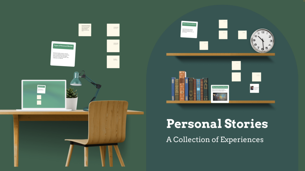
5. Pay attention to detail
Small details like font choice and alignments can make a big difference in how professional and polished your presentation looks. Make sure to pay attention to image and text size, image alignment with text, font choice, background color, and more details that create the overall look of your presentation.
6. Use templates sparingly
While templates can help create a consistent look for your slides, overusing them can make your presentation look generic and boring. Use them for inspiration but don’t be afraid to mix things up with some custom designs as well.
7. Design for clarity
Create a presentation layout that is easy to use and navigate, with clear labels and instructions. This is important for ensuring people can find the information they need quickly and easily if you end up sharing your presentation with others.
8. Opt for a conversational presentation design
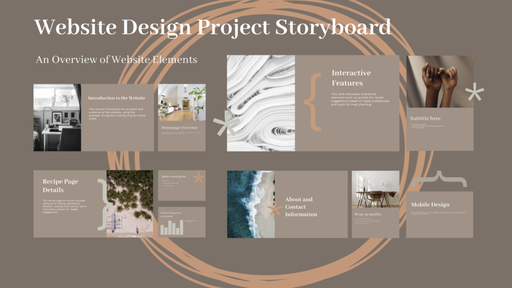
Conversational presenting allows you to adjust your presentation on the fly to make it more relevant and engaging. Create a map-like arrangement that’ll encourage you to move through your presentation at your own pace. With a map-like design, each presentation will be customized to match different audiences’ needs. This can be helpful for people who have different levels of expertise or knowledge about the subject matter.
9. Be consistent
Design consistency holds your presentation together and makes it easy to read and navigate. Create consistency by repeating colors, fonts, and design elements that clearly distinguish your presentation from others.
10. Have context in mind
A great presentation design is always dependent on the context. Your audience and objective influence everything from color scheme to fonts and use of imagery. Make sure to always have your audience in mind when designing your presentations.

11. Use white space effectively
In slide design, whitespace, also known as negative space, refers to the areas surrounding elements. It plays a role in decluttering your slides, enhancing readability, and directing focus towards content. Utilizing whitespace results in a sophisticated appearance for your slides. Remember, simplicity is key – avoid overwhelming your audience with information on each slide.
12. Incorporate visual hierarchy
When it comes to visuals, the key is to organize elements in a manner that naturally directs the viewer’s attention towards the crucial parts of the presentation. Utilize variations in size, color, and positioning to establish a flow for the viewer to navigate through. For instance, opt for fonts to highlight headings, colors for significant points, and position essential elements at the top of the slide. These tactics aid in ensuring that your audience grasps the ideas promptly and effortlessly.
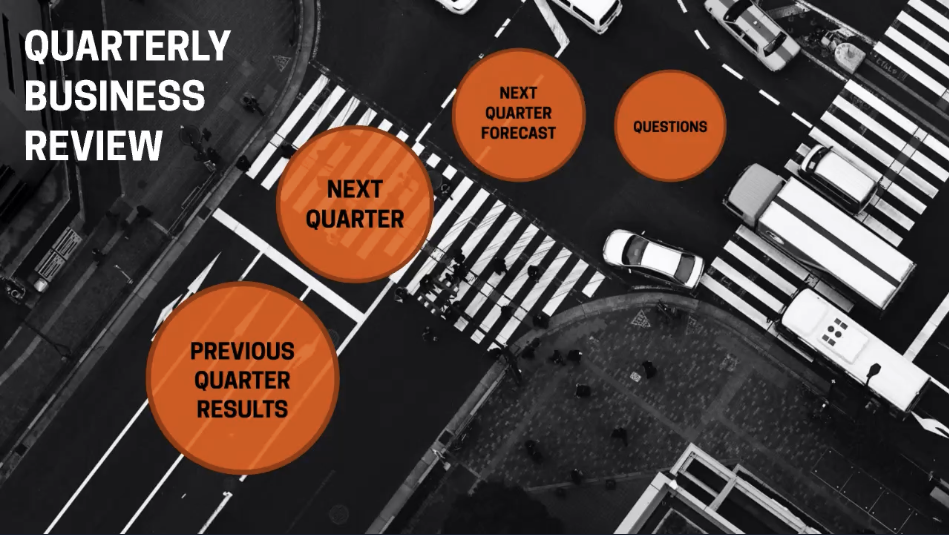
For more presentation tips, read the Q&A with presentation design experts and get valuable insights on visual storytelling.
Make the presentation design process easier by pairing up with Prezi AI
Presentation design may not come naturally to everyone, and time constraints often limit our ability to dedicate hours to perfecting our designs. Enter Prezi AI , a tool that streamlines the presentation design process enabling users to prioritize content over appeal. Let’s explore some ways in which Prezi AI can elevate your presentation design.
- Template suggestions: Prezi AI provides a range of crafted templates that are customized to match your presentation’s theme, guaranteeing that your slides have a unified appearance with minimal hassle.
- Smart formatting: When using Prezi AI , your text and images will be formatted automatically, eliminating the need for layout adjustments. This results in a professional appearance without the hassle.
- Design consistency: Prezi AI ensures that your presentation maintains a design by keeping color schemes and fonts consistent, eliminating the need to fret over discrepancies.
- Image and media integration: Enhance the appeal and engagement of your slides by adding relevant images, videos, and graphics with the help of Prezi AI smart media recommendations.
- Customizable animations: Enhance your slides with custom animations using Prezi AI to create transitions and captivate your audience. These dynamic animations can emphasize points and ensure a smooth flow throughout your presentation.
Using Prezi AI allows you to simplify the design process and craft appealing presentations, even if you lack time or design skills.
Presentation templates
Creating a presentation from scratch isn’t easy. Sometimes, it’s better to start with a template and dedicate your time to the presentation’s content. To make your life easier, here are 10 useful and stunning presentation templates that score in design and engagement. If you want to start creating with any of the following templates, simply go to our Prezi presentation template gallery , select your template, and start creating! Also, you can get inspired by the top Prezi presentations , curated by our editors. There you can discover presentation examples for a wide range of topics, and get motivated to create your own.
Business meeting presentation
The work desk presentation templates have a simple and clean design, perfectly made for a team or business meeting. With all the topics visible from the start, everyone will be on the same page about what you’re going to cover in the presentation. If you want, you can add or remove topics as well as edit the visuals and color scheme to match your needs.
Small business presentation
This template is great for an introductory meeting or pitch, where you have to summarize what you or your business does in a few, highly engaging slides. The interactive layout allows you to choose what topic bubble you’re going to select next, so instead of a one-way interaction, you can have a conversation and ask your audience what exactly they’re interested in knowing about your company.
Mindfulness at work presentation
How can you capture employees’ attention to explain important company values or practices? This engaging presentation template will help you do just that. With a wide range of impactful visuals, this presentation design helps you communicate your ideas more effectively.
Business review template
Make your next quarterly business review memorable with this vibrant business presentation template. With eye-capturing visuals and an engaging layout, you’ll communicate important stats and hold everyone’s attention until the end.
History timeline template
With black-and-white sketches of the Colosseum in the background, this timeline template makes history come alive. The displayed time periods provide an overview that’ll help your audience to grasp the bigger picture. After, you can go into detail about each time frame and event.
Storytelling presentation template
Share stories about your business that make a lasting impact with this stunning, customizable presentation template. To showcase each story, use the zooming feature and choose to tell your stories in whatever order you want.
Design concept exploration template
Not all meetings happen in person nowadays. To keep that face-to-face interaction even when presenting online, choose from a variety of Prezi Video templates or simply import your already-existing Prezi template into Prezi Video for remote meetings. This professional-looking Prezi Video template helps you set the tone for your meeting, making your designs stand out.

Employee perks and benefits video template
You can use the employee benefits video template to pitch potential job candidates the perks of working in your company. The Prezi Video template allows you to keep a face-to-face connection with potential job candidates while interviewing them remotely.
Sales plan presentation template
Using a clear metaphor that everyone can relate to, this football-inspired sales plan presentation template communicates a sense of team unity and strategy. You can customize this Prezi business presentation template with your brand colors and content.
Flashcard template
How can you engage students in an online classroom? This and many other Prezi Video templates will help you create interactive and highly engaging lessons. Using the flashcard template, you can quiz your students, review vocabulary, and gamify learning.
Great presentation design examples
If you’re still looking for presentation design ideas, check out the following Prezi presentations made by our creative users.
Social media presentation
This presentation is a great example of visual storytelling. The use of visual hierarchy and spatial relationships creates a unique viewing experience and makes it easier to understand how one topic or point is related to another. Also, images provide an engaging and visually appealing experience.
Leadership books presentation
Do you want to share your learnings? This interactive presentation offers great insights in an entertaining and visually compelling way. Instead of compiling leadership books in a slide-based presentation, the creator has illustrated each book and added a zooming feature that allows you to peek inside of each book’s content.
Remote workforce presentation
This is a visually rich and engaging presentation example that offers an interactive experience for the viewer. A noteworthy aspect of this presentation design is its color consistency and matching visual elements.
A presentation about the teenage brain
Another great presentation design example that stands out is an engaging viewing experience. The zooming feature allows the user to dive into each topic and choose what subject to view first. It’s a great example of an educational presentation that holds the students’ attention with impactful visuals and compelling transitions.
Remote work policy presentation
This presentation design stands out with its visually rich content. It depicts exactly what the presentation is about and uses the illustrated window frames in the background image as topic placements. This type of presentation design simplifies complex concepts and makes it easier for the viewer to understand and digest the information.
Everyone can create visually appealing presentations with the right tools and knowledge. With the presentation design tips, templates, and examples, you’re equipped to make your next presentation a success. If you’re new to Prezi, we encourage you to discover everything it has to offer. With this presentation design guide and Prezi, we hope you’ll get inspired to create meaningful, engaging, and memorable content for your audience!

Give your team the tools they need to engage
Like what you’re reading join the mailing list..
- Prezi for Teams
- Top Presentations
11 Types Of Presentations To Engage Your Audience
- By Judhajit Sen
- April 28, 2024
Key Takeaways
- Presentations serve diverse purposes, from educating and persuading to motivating and problem-solving, and various styles are offered to engage audiences effectively.
- Educational presentations foster understanding through structured learning objectives and interactive elements like quizzes, while persuasive style of PowerPoint presentations sway opinions with compelling narratives and strategic visuals.
- Motivational style of presentations inspire action through personal stories and powerful messages, while progress report presentations track advancements transparently, aiding informed decision-making.
- Demonstrations and instructional presentations guide audiences step-by-step, fostering interaction and skill acquisition, while sales presentations blend charm and persuasion to showcase solutions effectively. Storytelling presentations captivate with relatable narratives, fostering genuine connections, and problem-solution presentations tackle challenges strategically, proposing viable solutions.
- Informative style of presentations empower audiences with valuable insights, simplifying complex topics with clear visuals and relatable examples, while visual presentations enhance understanding concisely, leveraging the power of images to engage effectively.
- Mastering these engaging presentation styles unlocks the potential to inform and inspire, ensuring audience engagement and success in dynamic environments.
Presentations serve various purposes in the business world, catering to different needs and goals. They inform by sharing strategies and educating about organizational goals, instruct employees with directions and new skills, induce with emotion and logic to drive action, and aid decision-making by presenting crucial information.
The essential purposes of presentations lie in their ability to transfer knowledge from speaker to audience. They encompass demonstrations, lectures, or speeches aiming to inform, educate, or entertain. Combining these goals enhances a presentation’s power and impact, improving outcomes in various situations.
Informing involves updating on projects, sharing research, or presenting data. Persuading seeks to sway opinions or prompt specific actions, such as proposing ideas or making sales pitches. Educating aims to teach new skills, demonstrate product usage, or share insights. Entertaining captivates audiences through humor, storytelling, or engaging performances.
Different presentation types and styles lead to diverse results, improving work relationships with clients, effectiveness in proposing ideas, and career growth. Experimenting with various approaches enhances skills, enabling more efficient goal achievement. When wielded adeptly, different presentation styles become potent tools for success in the dynamic business landscape.
The following are 11 types of presentation styles that can be used to engage your audience.
Educational Presentations
Educational presentations introduce unfamiliar audiences to specific topics, making them invaluable for explaining complex processes and sharing crucial information. They are instrumental in teaching audiences about various subjects and fostering understanding and engagement.
Educational presentations are structured around clear learning objectives. They aim to facilitate comprehension and retention of the material being presented. They often incorporate detailed visuals and instructions, which is beneficial for teaching new employees company procedures and policies.
Aids like charts, graphs, images, and videos are commonly used to illustrate and reinforce key concepts, enhancing audience understanding. Additionally, interactive elements like quizzes, activities, or group discussions deepen learning and engagement.
Lectures, workshops, training sessions, webinars, and e-learning modules exemplify educational presentations. These versatile formats cater to diverse learning needs and preferences, providing interactive learning experiences and knowledge acquisition opportunities.
Persuasive Presentations

Persuasive presentations wield the power of conviction to sway audiences towards a particular viewpoint or action. These presentations function as verbal negotiations, employing compelling arguments, logical reasoning, and emotional appeals to win over listeners.
Understanding your audience’s motivations is vital to tailoring your message to their interests and concerns. Crafting a narrative with a strong opening, solid arguments, and a memorable close enhances persuasion. Strategic use of visuals reinforces key points, aiding in audience engagement .
Examples of this style of presentations abound, from pitches for environmental conservation to advocacy for policy change or addressing social issues. They aim to influence beliefs, attitudes, or behaviors, urging audiences towards specific actions or adopting new perspectives.
In business, these kinds of presentations are ubiquitous, whether pitching for funding, advocating for technology adoption, or pushing educational reform. They articulate problems and propose solutions backed by data to compel stakeholders towards desired outcomes.
These presentations demand confidence as they seek to prompt action, such as purchasing a product or embracing a new idea. Unlike informative type of presentations, persuasive ones inform and seek to change minds and inspire action. They utilize research findings, storytelling, and emotional connections to bolster their case.
Persuasive presentations are effective tools for sales pitches, marketing initiatives, or political speeches. They utilize rhetorical devices, metaphors, and aids to engage audiences, offering new perspectives while appealing to emotions and logic. Ultimately, they aim to influence decisions and drive desired outcomes, making them indispensable in various contexts.
Motivational Presentations
Motivational presentations inspire and uplift audiences, urging them to overcome challenges and embrace positive change. They employ personal stories and powerful messages to resonate with listeners and spark enthusiasm.
These inspirational presentations are effective tools for organizational leaders to motivate employees and boost morale. Recruiters also leverage motivational kind of presentations, sharing success stories to attract new candidates.
Utilizing personal experiences as focal points, motivational speakers captivate audiences and drive them to action. Adapting to the audience’s level of engagement is crucial for maximum impact.
These types of presentations foster excitement and empowerment through storytelling, encouraging individuals to pursue personal or professional growth. Aids like slides and videos enhance key points and emotional connections.
Keynote speeches, team-building events, and personal development workshops exemplify motivational style of presentations. While not as dramatic as TED Talks, company overview presentations serve to connect with audiences, boost morale, and inspire action.
In various fields, like sports and entertainment, these presentations stir emotions and inspire audiences to achieve excellence. Athletes share stories of resilience, while industry professionals discuss creative journeys and societal impacts.
Motivational style of presentations typically inspire confidence, encourage change, and uplift spirits by forming emotional connections and delivering clear calls to action, making them invaluable tools for personal and professional development.
Progress Report Presentations

Progress report presentations update stakeholders on the advancement of projects, campaigns, or initiatives, akin to progress reports. These presentations encompass vital metrics, status updates, potential hurdles, and pending tasks. They offer a platform for project teams to share their progress, inviting questions and contributions.
Consider a company implementing a marketing strategy. In such cases, progress presentations become essential. They offer insights into the campaign’s journey, including status updates, data collection, and task adjustments. Take, for instance, the team stand-up presentation, characterized by its structured agenda, updates, discussions, and Q&A sessions, ensuring alignment and focus.
Projects and businesses evolve continuously, like living organisms. Status presentations act as navigational aids, providing updates on achievements, challenges, and future plans, like a team GPS. Transparency reigns supreme, utilizing visuals like infographics and charts to simplify complex data, facilitating trend identification and informed decision-making. Visual representation enhances comprehension, aiding prediction and strategy formulation grounded in evidence.
Demonstration Presentations
Demonstration presentations, also known as How-To presentations, guide audiences through step-by-step processes or techniques, offering clear instructions for replication. They excel in teaching practical skills and hands-on procedures, commonly found in workshops, training sessions, and cooking classes. Creative slides enhance engagement and aid information retention.
Incorporating visuals, props, and live demonstrations, speakers break down complex tasks into manageable steps, fostering audience interaction and effectively addressing queries.
Demonstration presentations elucidate complex concepts using visuals and demonstrations. They cater to diverse audiences, from internal employees seeking software insights to potential investors exploring technological innovations.
Preparation is vital, involving extensive research to distill intricate topics into digestible sections. Aids like graphs and charts simplify complex information, ensuring accessibility for all audience members. This meticulous approach ensures comprehension and engagement across varied knowledge levels.
Instructional Presentations
Instructional presentations guide audiences through specific tasks or processes to enhance understanding and facilitate action. Similar to educational presentations but more focused on providing instructions, they offer step-by-step guidance on achieving goals or performing activities.
Webinars, workshops, and training sessions exemplify instructive presentations, which deliver new information and teach new skills. For instance, a human resources instructional presentation might detail how employees can enroll in a new insurance plan.
Technical and detailed, instructional presentations explain tasks systematically, ensuring clarity and ease of comprehension. Each instruction must be clear, understandable, and actionable, fostering successful implementation.
Presenters may use aids like diagrams and videos to elucidate each step, making complex processes accessible. Tutorials, product demonstrations, and how-to guides exemplify instructional presentations, empowering audiences to learn and apply new knowledge effectively.
In corporate settings, instructional presentations train employees on software usage or policy changes, fostering practical skills acquisition. Similarly, they break down complex concepts into manageable parts in educational contexts, encouraging engagement through interactive elements and practical demonstrations.
Whether guiding new employees through software usage or instructing chefs on culinary techniques, instructional presentations aim to transform novices into experts. By breaking down concepts, using real-life examples, and incorporating interactive elements, they maximize learning and practical application, ensuring audiences leave equipped with valuable skills and knowledge.
Sales Presentations
Sales presentations are the cornerstone for businesses seeking to win over potential clients or customers, blending charm and charisma to showcase products, services, or ideas. They prioritize a clear value proposition, engaging storytelling, confidence, and a compelling call to action. Emphasizing benefits over features, adept presenters preempt objections and employ storytelling to demonstrate solutions to audience-specific problems. Visual aids enhance memorability and impact.
In the sports industry, sales presentations often involve sponsorship proposals, leveraging demographic data, engagement statistics, and past successes to illustrate potential returns. Similarly, presentations pitch new projects or content distribution deals in the media and entertainment sector. For instance, production companies pitch series concepts to streaming platforms, highlighting creative aspects and market analysis to align with the platform’s brand and audience demographics.
Sales presentations infuse enthusiasm with persuasion, aiming to translate it into tangible business outcomes. They are versatile tools for promoting service offerings, product launches, or consultancy proposals, leveraging industry expertise and experience to captivate stakeholders and secure deals.
Storytelling Presentations

Storytelling presentations captivate audiences by weaving narratives to convey information effectively. This approach finds utility across academic and business domains, fostering engagement and resonance with specific audiences. Incorporating personal anecdotes or relevant examples enhances relevance and understanding.
This style revolves around personal stories or anecdotes, eschewing data-heavy content. Its conversational tone facilitates easy comprehension and audience connection. Storytellers employ simple, familiar language akin to casual conversation, ensuring accessibility and relatability.
Presenters structure their stories with an introduction that presents the problem, followed by the main plot point elucidating the topic, and concluding with a reflection that resonates with the audience. This approach fosters genuine connection and audience engagement, steering clear of a lecturing tone.
While effective for conference speaking and networking events, storytelling may not suit sales discovery phases, where the focus should remain on the prospect. However, it shines in settings, allowing ample time for storytelling without detracting from audience interaction.
Ultimately, storytelling presentations breathe life into learning points, adhering to principles like TED’s Commandments to evoke genuine emotions and honesty. This style fosters a profound connection with the audience, transcending mere dissemination of information.
Problem-Solution Presentations

Problem-solution presentations offer a strategic approach to tackling organizational or client-centric challenges. They begin by identifying and analyzing a problem before proposing one or more solutions, a format prevalent in the consulting and tech industries.
In consulting scenarios, presentations delve into operational inefficiencies backed by data analysis or market research, offering tailored solutions like new technologies or process enhancements. Similarly, tech companies pitch software solutions to address data management or security challenges.
Problem-solution presentations expedite internal decision processes by outlining problems, solution options, and potential outcomes. For instance, a company aiming to boost social media engagement explores strategies like giveaways or enhanced content creation, using marketing presentation templates to organize discussions and guide decisions.
These presentations follow a logical approach, identifying root causes, proposing solutions, and detailing implementation plans and timelines. They serve diverse purposes, from business proposals to project plans and research reports, aiding decision-making efforts by presenting problems and offering viable solutions for consideration.
Informative Presentations
Informative presentations serve as foundational tools in public speaking , aiming to educate and enlighten audiences on specific topics. Unlike presentations designed to entertain or inspire, the primary objective here is to share valuable information clearly and concisely.
These presentations rely on factual accuracy and clarity, often incorporating data and research to support the information presented. They follow a logical structure, starting with an introduction, explaining the primary information in the body, and concluding with a summary or conclusion.
Language in informative kind of presentations should be clear and straightforward, avoiding confusing jargon. Visual aids like charts and graphs enhance audience understanding.
Examples of informative type of presentations span various contexts, from academic lectures on scientific findings to business workshops explaining software features. In educational settings, professors impart knowledge on historical events or scientific discoveries. In business, financial analysts present market trends to inform strategic decisions.
The audience’s enhanced understanding and knowledge retention measure informative style of presentations’ success. They empower audiences with valuable insights, making complex topics accessible and relevant. Effective delivery involves simplifying content, providing relatable examples, and encouraging audience engagement through questions for clarity.
Visual Presentations
Visual presentations include infographics, images, charts, and other visual elements and offer concise and engaging ways to convey information. They are ideal for time-constrained topics or those needing minimal explanation. They aim to enhance audience understanding and attention and are often used by businesses to showcase product benefits, such as before-and-after images in a hair product presentation.
Technology complements visual presentations, offering advantages in supporting claims with compelling visuals. This style recognizes the adage that “a picture is worth a thousand words.” Formality in this style hinges more on the speaker and topic than the visuals, providing flexibility in adapting to different contexts.
Key characteristics include the emphasis on visuals, ranging from images to creatively presented data, and the ability to adapt to various presentation styles. Visuals can supplement any presentation, aiding comprehension of complex topics.
Various forms, including slideshows, videos, infographics, or posters, serve as vehicles for visual presentations, facilitating quick comprehension and creating memorable experiences. Techniques like color schemes and layout design enhance visual appeal and are suitable for marketing campaigns, educational materials, and scientific presentations.
Mastering Different Types of Presentations: A Guide for Engaging Audiences
Presentations are versatile tools, offering a spectrum of styles to captivate audiences. Each approach serves a unique purpose, from educating and persuading to motivating and solving problems.
Educational presentations foster understanding through structured learning objectives and interactive elements like quizzes. Persuasive presentations sway opinions with compelling narratives and strategic visuals.
Motivational presentations inspire action through personal anecdotes and powerful messages. Progress report presentations track advancements transparently, aiding informed decision-making.
Demonstration presentations guide audiences step-by-step, fostering interaction and comprehension. Instructional presentations offer practical guidance, empowering skill acquisition.
Sales presentations blend charm and persuasion to showcase solutions effectively. Storytelling presentations captivate with relatable narratives, fostering genuine connections. Problem-solution presentations tackle challenges strategically, proposing viable solutions.
Informative type of presentations empower audiences with valuable insights, simplifying complex topics with clear visuals and relatable examples. Visual presentations concisely enhance understanding, leveraging images’ power to engage effectively.
Mastering these successful presentation styles unlocks the potential to inform and inspire, ensuring audience engagement and success in dynamic environments.
Frequently Asked Questions (FAQs)
1. What are educational presentations, and why are they important?
Educational presentations introduce unfamiliar audiences to specific topics, aiming to explain complex processes and share crucial information. They are instrumental in teaching audiences various subjects, fostering understanding and engagement. Examples include lectures, workshops, training sessions, webinars, and e-learning modules. These presentations use structured learning objectives and interactive elements like quizzes to facilitate comprehension and retention.
2. How do informative style of presentations differ from other types of presentations?
Informative type of presentations focus on sharing valuable information clearly and concisely. Unlike presentations designed to entertain or inspire, their primary objective is to educate and enlighten audiences on specific topics. They rely on factual accuracy and clarity, often incorporating data and research. Language should be clear and straightforward, avoiding confusing jargon. Visual aids like charts and graphs enhance audience understanding.
3. What are some examples of informative presentations, and where are they commonly used?
Examples of informative presentations span various contexts, from academic lectures on scientific findings to business workshops explaining software features. In academic settings, professors impart knowledge on historical events or scientific discoveries. In business, financial analysts present market trends to inform strategic decisions. The success of informative presentations is measured by the audience’s enhanced understanding and knowledge retention.
4. How can visual presentations enhance audience engagement?
Visual presentations rely primarily on infographics, images, charts, and other visual elements to offer concise and engaging ways to convey information. They aim to enhance audience understanding and attention, suitable for time-constrained topics or those needing minimal explanation. Visuals can supplement any presentation, aiding comprehension of complex issues. Techniques like color schemes and layout design enhance visual appeal and are suitable for marketing campaigns, educational materials, and scientific presentations.
Unlock the Power of Effective Presentations with Prezentium
Are you ready to captivate your audience and achieve your goals? Let Prezentium be your partner in mastering the best presentation styles tailored to your needs.
Overnight Presentations : Need to make a presentation ASAP? Email us your requirements by 5:30 pm PST, and we’ll deliver a top-notch presentation to your inbox by 9:30 am PST the next business day.
Prezentation Specialist : Let our team of experts transform your ideas into exquisite presentations. From refining meeting notes to creating new designs, we’ve got you covered.
Zenith Learning : Elevate your communication skills with our interactive workshops and training programs. Discover the best of structured problem-solving and visual storytelling to engage and enlighten your audience.
Whether you’re educating, persuading, motivating, or solving problems, Prezentium has the expertise and tools to help you succeed. Don’t miss out on the opportunity to unlock the full potential of your presentations. Contact us today!
Why wait? Avail a complimentary 1-on-1 session with our presentation expert. See how other enterprise leaders are creating impactful presentations with us.
Asynchronous Communication: Advantages and Disadvantages
4 types of communication styles for success at the workplace, types of noise and ways to reduce noise in communication.
8 Effective Types of Presentation Style to Keep the Audience Hooked
Let’s indulge in reminiscence of school days and recall the subject delivery style of the same teacher during history and geography classes. The storytelling approach while delivering history lessons and the visual and instructor style of the teacher while teaching concepts of geography made these boring subjects interesting for you, right? Had the teacher used a similar teaching style for both subjects, learning would not have been fun!
Likewise, when it comes to public speaking, one presentation style doesn’t fit all messages and information. Some presentations require you to inspire the audience through analytics and facts, while others can be delivered successfully by making emotional connections with viewers. Based on the subject matter, purpose, context, and audience size, a presenter has to choose the appropriate style and assume the roles of a storyteller, connector, coach, or instructor.
In this blog post, we have explained some most effective presentation styles. Learn about them and choose the one that can work wonders for your next presentation!
1. Coach Style
If you are an energetic and charismatic speaker having a passion for the topic on which you are going to talk, this approach will suit you the best. You can use listener interaction or role play to put your audience at ease and engage with them. You can count on this style when presenting to a group or addressing a conference. For instance, project managers or team leads can use it while explaining a task or project to subordinates or speaking to a group of executives who want to know the details about what your company does instead of how you do it.
Expert Tip: Control your tone and voice; avoid speaking too fast. Strike a balance between talking and getting feedback from your audience.
Example: Linda Edgecombe used coach style in her TED Talk on “Breaking Busy: Changing our Culture from Chaos to Calm.”
3. Instructor Style
This style is mostly used by teachers/professors to teach complex topics to students. The concept is presented in a logical order and explained using figures, metaphors, high-impact visuals, and lots of relevant content. Business professionals can use this style to present a large set of statistical data or the information with which they are unfamiliar (such as features of a newly launched product or an updated version of an app).
Expert Tip: If not used appropriately, this style can backfire, making your audience distracted and lose connection. So, while using this approach, ensure you balance attention between the spectators and the material.
Example: The founder and chairman of The Climate Reality Project, AI Gore, used instructor style in his TED Talk on “The Case for Optimism on Climate Change.”
3. Visual Style
This style is perfect if you have to explain a complex topic to a mass audience with broad interests. The presenter complements the discussion points with high-definition graphics , such as charts, images, infographics, graphs, icons, diagrams, etc., making the overall presentation a gripping visual feast. The right ratio of text and visuals in the slides makes comprehension easy and effortless for viewers.
Example: Steve Jobs used this presentation style while introducing the iPhone at MacWorld Conference 2007.
4. Lessig Style
Choose this style if you want to progress with your presentation at a quick pace and keep the audience intrigued and focused. This style was founded by a law and leadership professor at Harvard Law School, Lawrence Lessig. The presenter spends only 15 seconds on each slide, and the text in the slides is synchronized with the spoken words of the presenter. This is a perfect approach if you have many points to discuss in a limited time.
Example: Lawrence Lessig used this style in his TED Talk on “Laws that Choke Creativity.”
5. Freeform Style
If you are well-acquainted with your subject/topic and have a relatively short time to put forth your points, this impromptu, unscripted, and little structured presentation style is for you! You can weave a strong story around each key message and narrate it without using slides. You can choose this less rehearsed and more conversational freeform style for unplanned meetings, networking events, and elevator pitches. The audience who prefers personal and creative elements in the talk over structured and overly rehearsed speech will definitely like this presentation style of yours.
Example: This style was used by Sir Ken Robinson in his TED Talk on “Bring on the learning revolution!” Watch it here –
6. Takahashi Style
This Japanese style of presentation is named after its creator, Masayoshi Takahashi. Rather than visuals and graphics, this approach counts on text and speech. The main word, which is the focal point of the slide, is showcased in bold text. The short and concise phrases are used sparingly. You can use this style for short presentations.
Here are some slides from one of Takahashi’s presentations:
7. Connector Style
Leverage this style if you want to make your presentation interactive instead of keeping it a one-sided talk. The presenter encourages the active participation of the audience by asking them questions and feedback and identifying common grounds to connect with them at a deeper level. Sales executives can rely on this approach to help the audience understand their challenges and how the product solves the problems.
Expert Tip: You must have excellent control over your gestures and body language to establish a quick rapport with the audience.
Example: Connie Dieken used this style in his opening FlashPoint keynote at MPI World Education Conference.
8. Storytelling Style
This anecdotal presentation style relies on examples, case studies, and stories to emotionally connect and engage with the audience. You can use it if you don’t have statistics, data, or charts to support your points and have enough time to tell your stories (for example, in sales presentations, networking events, and conference speaking).
Expert Tip: Your stories must have logical connections with your core message; otherwise, you will lose your trustworthiness and credibility.
Example: In her TED Talk on “My Stroke of Insight,” Jill Bolte Taylor grabbed the audience’s attention with her astonishing story.
The Inference
There is no universal perfect way to deliver a presentation . You can use any of the styles that best fit the objective of your speech. You can also combine two or three styles to make your talk more engaging and memorable. No matter what style you pick, you can win the audience’s heart and leave a lasting impression with the right preparation and practice.
How did you find this blog post? Do share your thoughts in the “Comment” section below!
Leave a Response Cancel reply
Save my name, email, and website in this browser for the next time I comment.
Please enter an answer in digits: fourteen + thirteen =
Ashish Arora
You might also like.

Essential Tips to Find the Right Audience for Your Next Presentation

Expert Tips to Handle Distractions When You Speak on Stage
9 Tips to Craft the Perfect Title for Your Next PowerPoint Presentation

Unleash the Power of Agile Communication in the Fast-Changing Digital Realm
We use essential cookies to make Venngage work. By clicking “Accept All Cookies”, you agree to the storing of cookies on your device to enhance site navigation, analyze site usage, and assist in our marketing efforts.
Manage Cookies
Cookies and similar technologies collect certain information about how you’re using our website. Some of them are essential, and without them you wouldn’t be able to use Venngage. But others are optional, and you get to choose whether we use them or not.
Strictly Necessary Cookies
These cookies are always on, as they’re essential for making Venngage work, and making it safe. Without these cookies, services you’ve asked for can’t be provided.
Show cookie providers
- Google Login
Functionality Cookies
These cookies help us provide enhanced functionality and personalisation, and remember your settings. They may be set by us or by third party providers.
Performance Cookies
These cookies help us analyze how many people are using Venngage, where they come from and how they're using it. If you opt out of these cookies, we can’t get feedback to make Venngage better for you and all our users.
- Google Analytics
Targeting Cookies
These cookies are set by our advertising partners to track your activity and show you relevant Venngage ads on other sites as you browse the internet.
- Google Tag Manager
- Infographics
- Daily Infographics
- Popular Templates
- Accessibility
- Graphic Design
- Graphs and Charts
- Data Visualization
- Human Resources
- Beginner Guides
Blog Beginner Guides How To Make a Good Presentation [A Complete Guide]
How To Make a Good Presentation [A Complete Guide]
Written by: Krystle Wong Jul 20, 2023

A top-notch presentation possesses the power to drive action. From winning stakeholders over and conveying a powerful message to securing funding — your secret weapon lies within the realm of creating an effective presentation .
Being an excellent presenter isn’t confined to the boardroom. Whether you’re delivering a presentation at work, pursuing an academic career, involved in a non-profit organization or even a student, nailing the presentation game is a game-changer.
In this article, I’ll cover the top qualities of compelling presentations and walk you through a step-by-step guide on how to give a good presentation. Here’s a little tip to kick things off: for a headstart, check out Venngage’s collection of free presentation templates . They are fully customizable, and the best part is you don’t need professional design skills to make them shine!
These valuable presentation tips cater to individuals from diverse professional backgrounds, encompassing business professionals, sales and marketing teams, educators, trainers, students, researchers, non-profit organizations, public speakers and presenters.
No matter your field or role, these tips for presenting will equip you with the skills to deliver effective presentations that leave a lasting impression on any audience.
Click to jump ahead:
What are the 10 qualities of a good presentation?
Step-by-step guide on how to prepare an effective presentation, 9 effective techniques to deliver a memorable presentation, faqs on making a good presentation, how to create a presentation with venngage in 5 steps.
When it comes to giving an engaging presentation that leaves a lasting impression, it’s not just about the content — it’s also about how you deliver it. Wondering what makes a good presentation? Well, the best presentations I’ve seen consistently exhibit these 10 qualities:
1. Clear structure
No one likes to get lost in a maze of information. Organize your thoughts into a logical flow, complete with an introduction, main points and a solid conclusion. A structured presentation helps your audience follow along effortlessly, leaving them with a sense of satisfaction at the end.
Regardless of your presentation style , a quality presentation starts with a clear roadmap. Browse through Venngage’s template library and select a presentation template that aligns with your content and presentation goals. Here’s a good presentation example template with a logical layout that includes sections for the introduction, main points, supporting information and a conclusion:

2. Engaging opening
Hook your audience right from the start with an attention-grabbing statement, a fascinating question or maybe even a captivating anecdote. Set the stage for a killer presentation!
The opening moments of your presentation hold immense power – check out these 15 ways to start a presentation to set the stage and captivate your audience.
3. Relevant content
Make sure your content aligns with their interests and needs. Your audience is there for a reason, and that’s to get valuable insights. Avoid fluff and get straight to the point, your audience will be genuinely excited.
4. Effective visual aids
Picture this: a slide with walls of text and tiny charts, yawn! Visual aids should be just that—aiding your presentation. Opt for clear and visually appealing slides, engaging images and informative charts that add value and help reinforce your message.
With Venngage, visualizing data takes no effort at all. You can import data from CSV or Google Sheets seamlessly and create stunning charts, graphs and icon stories effortlessly to showcase your data in a captivating and impactful way.
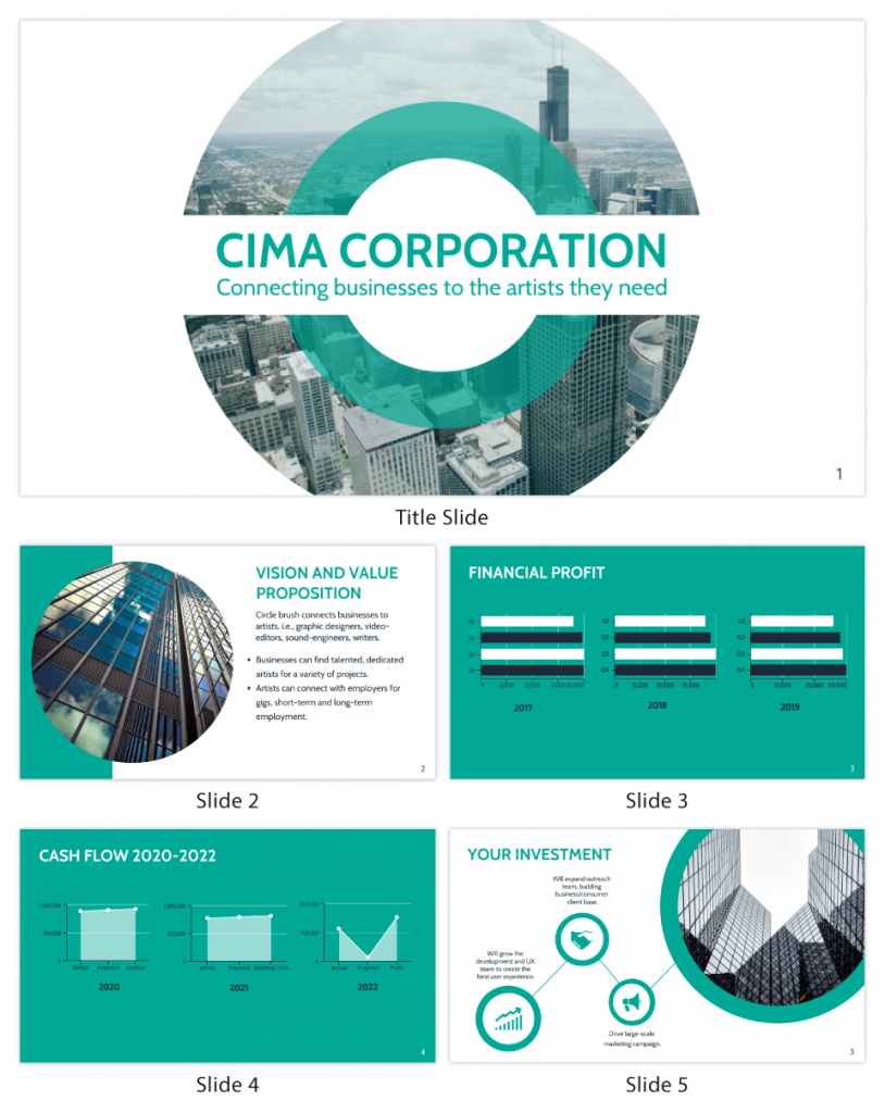
5. Clear and concise communication
Keep your language simple, and avoid jargon or complicated terms. Communicate your ideas clearly, so your audience can easily grasp and retain the information being conveyed. This can prevent confusion and enhance the overall effectiveness of the message.
6. Engaging delivery
Spice up your presentation with a sprinkle of enthusiasm! Maintain eye contact, use expressive gestures and vary your tone of voice to keep your audience glued to the edge of their seats. A touch of charisma goes a long way!
7. Interaction and audience engagement
Turn your presentation into an interactive experience — encourage questions, foster discussions and maybe even throw in a fun activity. Engaged audiences are more likely to remember and embrace your message.
Transform your slides into an interactive presentation with Venngage’s dynamic features like pop-ups, clickable icons and animated elements. Engage your audience with interactive content that lets them explore and interact with your presentation for a truly immersive experience.
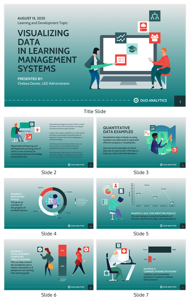
8. Effective storytelling
Who doesn’t love a good story? Weaving relevant anecdotes, case studies or even a personal story into your presentation can captivate your audience and create a lasting impact. Stories build connections and make your message memorable.
A great presentation background is also essential as it sets the tone, creates visual interest and reinforces your message. Enhance the overall aesthetics of your presentation with these 15 presentation background examples and captivate your audience’s attention.
9. Well-timed pacing
Pace your presentation thoughtfully with well-designed presentation slides, neither rushing through nor dragging it out. Respect your audience’s time and ensure you cover all the essential points without losing their interest.
10. Strong conclusion
Last impressions linger! Summarize your main points and leave your audience with a clear takeaway. End your presentation with a bang , a call to action or an inspiring thought that resonates long after the conclusion.
In-person presentations aside, acing a virtual presentation is of paramount importance in today’s digital world. Check out this guide to learn how you can adapt your in-person presentations into virtual presentations .
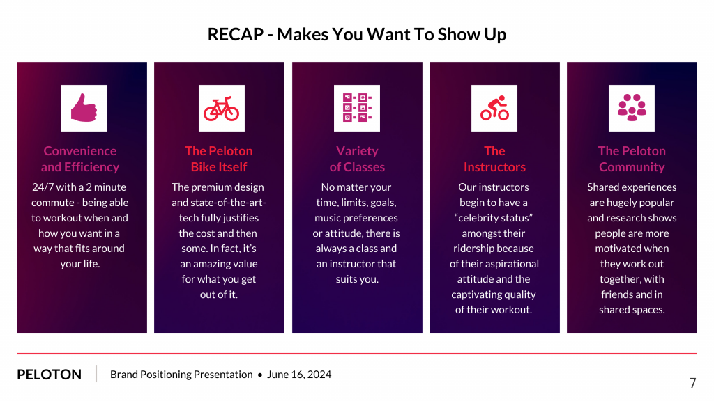
Preparing an effective presentation starts with laying a strong foundation that goes beyond just creating slides and notes. One of the quickest and best ways to make a presentation would be with the help of a good presentation software .
Otherwise, let me walk you to how to prepare for a presentation step by step and unlock the secrets of crafting a professional presentation that sets you apart.
1. Understand the audience and their needs
Before you dive into preparing your masterpiece, take a moment to get to know your target audience. Tailor your presentation to meet their needs and expectations , and you’ll have them hooked from the start!
2. Conduct thorough research on the topic
Time to hit the books (or the internet)! Don’t skimp on the research with your presentation materials — dive deep into the subject matter and gather valuable insights . The more you know, the more confident you’ll feel in delivering your presentation.
3. Organize the content with a clear structure
No one wants to stumble through a chaotic mess of information. Outline your presentation with a clear and logical flow. Start with a captivating introduction, follow up with main points that build on each other and wrap it up with a powerful conclusion that leaves a lasting impression.
Delivering an effective business presentation hinges on captivating your audience, and Venngage’s professionally designed business presentation templates are tailor-made for this purpose. With thoughtfully structured layouts, these templates enhance your message’s clarity and coherence, ensuring a memorable and engaging experience for your audience members.
Don’t want to build your presentation layout from scratch? pick from these 5 foolproof presentation layout ideas that won’t go wrong.
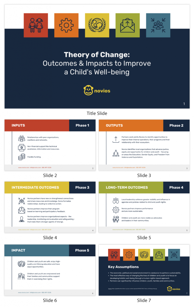
4. Develop visually appealing and supportive visual aids
Spice up your presentation with eye-catching visuals! Create slides that complement your message, not overshadow it. Remember, a picture is worth a thousand words, but that doesn’t mean you need to overload your slides with text.
Well-chosen designs create a cohesive and professional look, capturing your audience’s attention and enhancing the overall effectiveness of your message. Here’s a list of carefully curated PowerPoint presentation templates and great background graphics that will significantly influence the visual appeal and engagement of your presentation.
5. Practice, practice and practice
Practice makes perfect — rehearse your presentation and arrive early to your presentation to help overcome stage fright. Familiarity with your material will boost your presentation skills and help you handle curveballs with ease.
6. Seek feedback and make necessary adjustments
Don’t be afraid to ask for help and seek feedback from friends and colleagues. Constructive criticism can help you identify blind spots and fine-tune your presentation to perfection.
With Venngage’s real-time collaboration feature , receiving feedback and editing your presentation is a seamless process. Group members can access and work on the presentation simultaneously and edit content side by side in real-time. Changes will be reflected immediately to the entire team, promoting seamless teamwork.
7. Prepare for potential technical or logistical issues
Prepare for the unexpected by checking your equipment, internet connection and any other potential hiccups. If you’re worried that you’ll miss out on any important points, you could always have note cards prepared. Remember to remain focused and rehearse potential answers to anticipated questions.
8. Fine-tune and polish your presentation
As the big day approaches, give your presentation one last shine. Review your talking points, practice how to present a presentation and make any final tweaks. Deep breaths — you’re on the brink of delivering a successful presentation!
In competitive environments, persuasive presentations set individuals and organizations apart. To brush up on your presentation skills, read these guides on how to make a persuasive presentation and tips to presenting effectively .
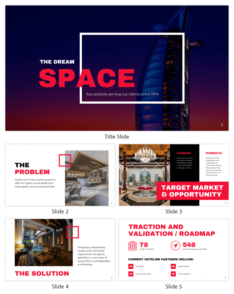
Whether you’re an experienced presenter or a novice, the right techniques will let your presentation skills soar to new heights!
From public speaking hacks to interactive elements and storytelling prowess, these 9 effective presentation techniques will empower you to leave a lasting impression on your audience and make your presentations unforgettable.
1. Confidence and positive body language
Positive body language instantly captivates your audience, making them believe in your message as much as you do. Strengthen your stage presence and own that stage like it’s your second home! Stand tall, shoulders back and exude confidence.
2. Eye contact with the audience
Break down that invisible barrier and connect with your audience through their eyes. Maintaining eye contact when giving a presentation builds trust and shows that you’re present and engaged with them.
3. Effective use of hand gestures and movement
A little movement goes a long way! Emphasize key points with purposeful gestures and don’t be afraid to walk around the stage. Your energy will be contagious!
4. Utilize storytelling techniques
Weave the magic of storytelling into your presentation. Share relatable anecdotes, inspiring success stories or even personal experiences that tug at the heartstrings of your audience. Adjust your pitch, pace and volume to match the emotions and intensity of the story. Varying your speaking voice adds depth and enhances your stage presence.
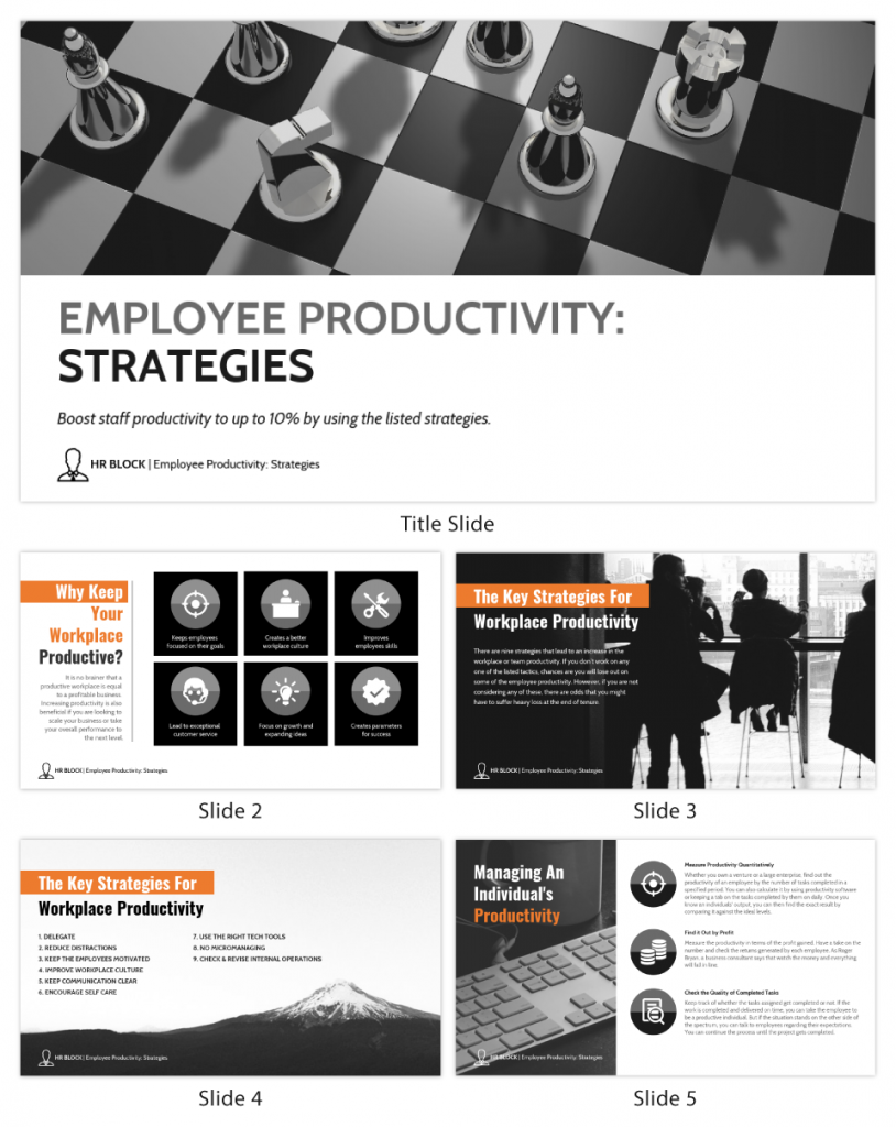
5. Incorporate multimedia elements
Spice up your presentation with a dash of visual pizzazz! Use slides, images and video clips to add depth and clarity to your message. Just remember, less is more—don’t overwhelm them with information overload.
Turn your presentations into an interactive party! Involve your audience with questions, polls or group activities. When they actively participate, they become invested in your presentation’s success. Bring your design to life with animated elements. Venngage allows you to apply animations to icons, images and text to create dynamic and engaging visual content.
6. Utilize humor strategically
Laughter is the best medicine—and a fantastic presentation enhancer! A well-placed joke or lighthearted moment can break the ice and create a warm atmosphere , making your audience more receptive to your message.
7. Practice active listening and respond to feedback
Be attentive to your audience’s reactions and feedback. If they have questions or concerns, address them with genuine interest and respect. Your responsiveness builds rapport and shows that you genuinely care about their experience.
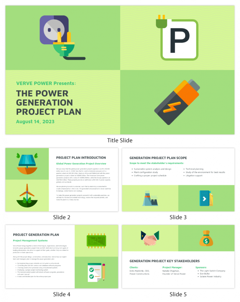
8. Apply the 10-20-30 rule
Apply the 10-20-30 presentation rule and keep it short, sweet and impactful! Stick to ten slides, deliver your presentation within 20 minutes and use a 30-point font to ensure clarity and focus. Less is more, and your audience will thank you for it!
9. Implement the 5-5-5 rule
Simplicity is key. Limit each slide to five bullet points, with only five words per bullet point and allow each slide to remain visible for about five seconds. This rule keeps your presentation concise and prevents information overload.
Simple presentations are more engaging because they are easier to follow. Summarize your presentations and keep them simple with Venngage’s gallery of simple presentation templates and ensure that your message is delivered effectively across your audience.
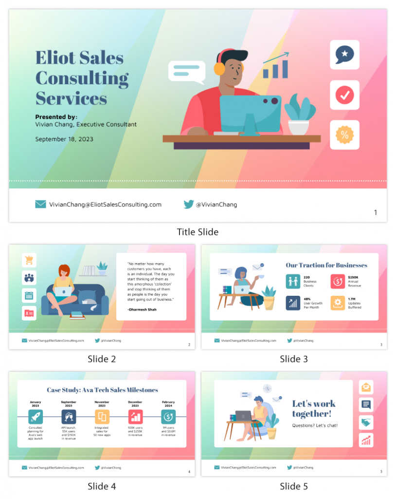
1. How to start a presentation?
To kick off your presentation effectively, begin with an attention-grabbing statement or a powerful quote. Introduce yourself, establish credibility and clearly state the purpose and relevance of your presentation.
2. How to end a presentation?
For a strong conclusion, summarize your talking points and key takeaways. End with a compelling call to action or a thought-provoking question and remember to thank your audience and invite any final questions or interactions.
3. How to make a presentation interactive?
To make your presentation interactive, encourage questions and discussion throughout your talk. Utilize multimedia elements like videos or images and consider including polls, quizzes or group activities to actively involve your audience.
In need of inspiration for your next presentation? I’ve got your back! Pick from these 120+ presentation ideas, topics and examples to get started.
Creating a stunning presentation with Venngage is a breeze with our user-friendly drag-and-drop editor and professionally designed templates for all your communication needs.
Here’s how to make a presentation in just 5 simple steps with the help of Venngage:
Step 1: Sign up for Venngage for free using your email, Gmail or Facebook account or simply log in to access your account.
Step 2: Pick a design from our selection of free presentation templates (they’re all created by our expert in-house designers).
Step 3: Make the template your own by customizing it to fit your content and branding. With Venngage’s intuitive drag-and-drop editor, you can easily modify text, change colors and adjust the layout to create a unique and eye-catching design.
Step 4: Elevate your presentation by incorporating captivating visuals. You can upload your images or choose from Venngage’s vast library of high-quality photos, icons and illustrations.
Step 5: Upgrade to a premium or business account to export your presentation in PDF and print it for in-person presentations or share it digitally for free!
By following these five simple steps, you’ll have a professionally designed and visually engaging presentation ready in no time. With Venngage’s user-friendly platform, your presentation is sure to make a lasting impression. So, let your creativity flow and get ready to shine in your next presentation!
Discover popular designs

Infographic maker

Brochure maker

White paper online

Newsletter creator

Flyer maker

Timeline maker

Letterhead maker

Mind map maker

Ebook maker
- SUGGESTED TOPICS
- The Magazine
- Newsletters
- Managing Yourself
- Managing Teams
- Work-life Balance
- The Big Idea
- Data & Visuals
- Case Selections
- HBR Learning
- Topic Feeds
- Account Settings
- Email Preferences
What It Takes to Give a Great Presentation
- Carmine Gallo

Five tips to set yourself apart.
Never underestimate the power of great communication. It can help you land the job of your dreams, attract investors to back your idea, or elevate your stature within your organization. But while there are plenty of good speakers in the world, you can set yourself apart out by being the person who can deliver something great over and over. Here are a few tips for business professionals who want to move from being good speakers to great ones: be concise (the fewer words, the better); never use bullet points (photos and images paired together are more memorable); don’t underestimate the power of your voice (raise and lower it for emphasis); give your audience something extra (unexpected moments will grab their attention); rehearse (the best speakers are the best because they practice — a lot).
I was sitting across the table from a Silicon Valley CEO who had pioneered a technology that touches many of our lives — the flash memory that stores data on smartphones, digital cameras, and computers. He was a frequent guest on CNBC and had been delivering business presentations for at least 20 years before we met. And yet, the CEO wanted to sharpen his public speaking skills.
- Carmine Gallo is a Harvard University instructor, keynote speaker, and author of 10 books translated into 40 languages. Gallo is the author of The Bezos Blueprint: Communication Secrets of the World’s Greatest Salesman (St. Martin’s Press).
Partner Center
17 PowerPoint Presentation Tips From Pro Presenters [+ Templates]
Updated: April 26, 2024
Published: September 18, 2013
PowerPoint presentations can be professional, attractive, and really help your audience remember your message.

If you don’t have much experience, that’s okay — I’m going to arm you with PowerPoint design tips from pro presenters, the steps you need to build an engaging deck, and templates to help you nail great slide design.
![style options presentation → Free Download: 10 PowerPoint Presentation Templates [Access Now]](https://no-cache.hubspot.com/cta/default/53/2d0b5298-2daa-4812-b2d4-fa65cd354a8e.png)
Download Now
Buckle up for a variety of step-by-step explanations as well as tips and tricks to help you start mastering this program. There are additional resources woven in, and you’ll find expert perspectives from other HubSpotters along the way.
Table of Contents
How to Make a PowerPoint Presentation
Powerpoint presentation tips.
Microsoft PowerPoint is like a test of basic professional skills, and each PowerPoint is basically a presentation made of multiple slides.
Successful PowerPoints depend on three main factors: your command of PowerPoint's design tools, your attention to presentation processes, and being consistent with your style.
Keep those in mind as we jump into PowerPoint's capabilities.
Getting Started
1. open powerpoint and click ‘new.’.
A page with templates will usually open automatically, but if not, go to the top left pane of your screen and click New . If you’ve already created a presentation, select Open and then double-click the icon to open the existing file.
10 Free PowerPoint Templates
Download ten free PowerPoint templates for a better presentation.
- Creative templates.
- Data-driven templates.
- Professional templates.
Download Free
All fields are required.
You're all set!
Click this link to access this resource at any time.
Creating PowerPoint Slides
3. insert a slide..
Insert a new slide by clicking on the Home tab and then the New Slide button. Consider what content you want to put on the slide, including heading, text, and imagery.
- Finally, PowerPoint Live is a new tool that enables you to do more seamless presentations during video calls and may be a better overall match for doing presentations remotely. Check out this video:
11. Try Using GIFs.
12 Free Customizable Resume Templates
Fill out this form to access your free professionally-designed templates, available on:
- Microsoft Word
- Google Docs
- Microsoft PowerPoint
- Google Slides
15. Embed multimedia.
PowerPoint allows you to either link to video/audio files externally or to embed the media directly in your presentation. For PCs, two great reasons for embedding are:
- Embedding allows you to play media directly in your presentation. It will look much more professional than switching between windows.
- Embedding also means that the file stays within the PowerPoint presentation, so it should play normally without extra work (except on a Mac).
If you use PowerPoint for Mac it gets a bit complicated, but it can be done:
- Always bring the video and/or audio file with you in the same folder as the PowerPoint presentation.
- Only insert video or audio files once the presentation and the containing folder have been saved on a portable drive in their permanent folder.
- If the presentation will be played on a Windows computer, then Mac users need to make sure their multimedia files are in WMV format.
- Consider using the same operating system for designing and presenting, no matter what.
16. Bring your own hardware.
Between operating systems, PowerPoint is still a bit jumpy. Even between differing PPT versions, things can change. The easiest fix? Just bring along your own laptop when you're presenting.
The next easiest fix is to upload your PowerPoint presentation into Google Slides as a backup option — just make sure there is a good internet connection and a browser available where you plan to present.
Google Slides is a cloud-based presentation software that will show up the same way on all operating systems.
To import your PowerPoint presentation into Google Slides:
- Navigate to slides.google.com . Make sure you’re signed in to a Google account (preferably your own).
- Under Start a new presentation , click the empty box with a plus sign. This will open up a blank presentation.
- Go to File , then Import slides .
- A dialog box will come up. Tap Upload.
- Click Select a file from your device .
- Select your presentation and click Open .
- Select the slides you’d like to import. If you want to import all of them, click All in the upper right-hand corner of the dialog box.
- Click Import slides.
When I tested this out, Google Slides imported everything perfectly, including a shape whose points I had manipulated. This is a good backup option to have if you’ll be presenting across different operating systems.
17. Use Presenter View.
In most presentation situations, there will be both a presenter’s screen and the main projected display for your presentation.
PowerPoint has a great tool called Presenter View, which can be found in the Slide Show tab of PowerPoint. Included in the Presenter View is an area for notes, a timer/clock, and a presentation display.
For many presenters, this tool can help unify their spoken presentation and their visual aid. You never want to make the PowerPoint seem like a stack of notes that you’re reading off of.
Use the Presenter View option to help create a more natural presentation.
Pro Tip: At the start of the presentation, you should also hit CTRL + H to make the cursor disappear. Hitting the “A” key will bring it back if you need it.
Your Next Great PowerPoint Presentation Starts Here
Now that you have these style, design, and presentation tips under your belt, you should feel confident to create your PowerPoint presentation.
But if you can explore other resources to make sure your content hits the mark. After all, you need a strong presentation to land your point and make an impression.
With several templates to choose from — both in PowerPoint and available for free download — you can swiftly be on your way to creating presentations that wow your audiences.
Editor's note: This post was originally published in September 2013 and has been updated for comprehensiveness.
Don't forget to share this post!
Related articles.
![style options presentation How to Create an Infographic in Under an Hour — the 2024 Guide [+ Free Templates]](https://www.hubspot.com/hubfs/Make-infographic-hero%20%28598%20%C3%97%20398%20px%29.jpg)
How to Create an Infographic in Under an Hour — the 2024 Guide [+ Free Templates]
![style options presentation 20 Great Examples of PowerPoint Presentation Design [+ Templates]](https://www.hubspot.com/hubfs/powerpoint-presentation-examples.webp)
20 Great Examples of PowerPoint Presentation Design [+ Templates]
![style options presentation How to Create the Best PowerPoint Presentations [Examples & Templates]](https://knowledge.hubspot.com/hubfs/powerpoint.webp)
How to Create the Best PowerPoint Presentations [Examples & Templates]
![style options presentation How to Write an Ecommerce Business Plan [Examples & Template]](https://www.hubspot.com/hubfs/ecommerce%20business%20plan.png)
How to Write an Ecommerce Business Plan [Examples & Template]

Get Buyers to Do What You Want: The Power of Temptation Bundling in Sales

How to Create an Engaging 5-Minute Presentation
![style options presentation How to Start a Presentation [+ Examples]](https://www.hubspot.com/hubfs/how-to-start-presenting.webp)
How to Start a Presentation [+ Examples]

120 Presentation Topic Ideas Help You Hook Your Audience

The Presenter's Guide to Nailing Your Next PowerPoint
![style options presentation How to Create a Stunning Presentation Cover Page [+ Examples]](https://www.hubspot.com/hubfs/presentation-cover-page_3.webp)
How to Create a Stunning Presentation Cover Page [+ Examples]
Marketing software that helps you drive revenue, save time and resources, and measure and optimize your investments — all on one easy-to-use platform
A step-by-step guide to captivating PowerPoint presentation design
november 20, 2023
by Corporate PowerPoint Girl
Do you often find yourself stuck with a lackluster PowerPoint presentation, desperately seeking ways to make it more engaging and visually appealing? If your boss has ever told you to "please fix" a presentation and you didn't know where to start, you're not alone. In this article, we'll walk you through a straightforward method to transform your PowerPoint slides into a visually captivating masterpiece.
Let's dive right in!
Clean up your slides
The first step in this journey to presentation excellence is all about decluttering your slides and elevating their impact. Say goodbye to those uninspiring bullet points that often dominate presentations. Instead, focus on what truly matters – the key call-out numbers. By increasing the font size of these numbers, you ensure they take center stage, immediately drawing your audience's attention.
To make those numbers pop, consider breaking the text after the numbers into the next line and adding a touch of color. The contrast created by pairing a dark color with a lighter shade, like dark teal and light teal or burnt orange with peach, can work wonders. This simple adjustment makes your data more engaging , enhancing the overall impact of your presentation.
Add dimension with boxes
Now, let's introduce an element of depth and organization to your slides. By adding boxes, you'll create a visually pleasing structure that guides your audience through the content. In the "Insert" menu, select "Table" and opt for a one-by-one table. Change the table color to a light gray shade, elongate it, and position it neatly to the left of your text.
To improve readability and aesthetics, increase the spacing between text phrases. A small adjustment in the before spacing setting (setting it to 48) significantly enhances the visual appeal of your slides.
Insert circles
To further enhance the visual appeal and engagement of your slides, let's introduce circles. In the Insert menu, navigate to Shapes and choose the circle. Adjust the circle's height and width to 1.2, ensuring it complements your content seamlessly. Match the circle's shape fill color with the corresponding text color for a harmonious look.
Avoid using colored outlines for the circles, as they may distract from the overall aesthetic. This simple addition of circles adds an element of visual interest to your presentation, making it more captivating.
Choose icons
Now, it's time for a touch of creativity. Selecting icons to complement your text can elevate the clarity and appeal of your slides. In the "Insert" menu, you can search for relevant keywords to find the perfect icon from PowerPoint's extensive library .
For instance, if your text discusses investment portfolio yield, search for "growth" and choose an upward arrow growth icon. These icons add an extra layer of visual appeal and clarity to your content, making it more engaging and informative.
Final touches
To wrap up the transformation process, we come to the final touches that give your presentation a polished, professional finish. Align your icons with their corresponding circles and change the shape fill color to white. This simple adjustment creates a crisp, cohesive look that ties everything together seamlessly.
In conclusion, by following these steps, you've embarked on a journey to enhance your PowerPoint presentation . These initial steps are just the beginning of your exploration into the world of design elements and styles that can cater to your specific presentation needs. The key to a stunning PowerPoint presentation lies in the details. By following these steps, you can turn a lackluster set of slides into a visually engaging and dynamic presentation that will captivate your audience. So, the next time your boss says, "Please fix," you'll know exactly where to start. Happy presenting!
Related topics
6 Most Effective Presentation Styles
Hrideep barot.
- Presentation , Public Speaking

Have you ever been an audience member who was not wholly involved in a speech or a speaker who discovered their audience dozing off? Both scenarios have the potential to be disheartening and fruitless.
What can you then do to improve the effectiveness of your presentation?
There are various styles in which you can present your content. Out of a plethora of choices, some of the most effective ones include – the Visual, Storytelling, freeform and instructor style of presentation. Each of them has their own set of methods and guidelines, however, they are known to be extremely beneficial and are used by speakers all over the world.
What is a Presentation Style?
Let us first take a brief look at what a presentation style is before moving on to the most effective techniques that you can use.
A Presentation style is a way of giving a presentation orally. In other words, a particular presenting type is an approach you adopt or employ to deliver your content. There are numerous presenting styles or methods you can use when giving public speeches or presentations such as –
- Visual Presentation Style
- Coach Presentation Style
- Instructor Presentation Style
- Lessig Presentation Style
Out of hundreds of methods and ways, there are a few that are more effective and yield better much better results when used appropriately. They include –
| 1. Visual | involves using images, graphs, charts and other visuals to complement the speech. |
| 2. Storytelling | involves using stories, anecdotes and experiences to connect with the audience. |
| 3. Connector | involves frequent interaction via QnA’s and feedbacks to connect with the audience. |
| 4. Instructor | involves the use of phrases, metaphors, and pictures to ease a complex subject. |
| 5. Takahashi | involves using only text on slides to convey important messages to the audience. |
| 6. Lessig | involves the use of a single word, quote or picture that is read by the speaker. |
1. Visual Style
The visual presentation style uses visual components to support the verbal subject. In other words, this approach uses charts, photos, graphs, and other visual aids in addition to speaking to assist the audience in visualizing and comprehending the material.
Advantages of Using a Visual Presentation Style
The relevance and effectiveness of visual and verbal communication are well known, making the visual style of presentation one of the finest to adopt. This is also a remarkably effective strategy as it aids the audience in more easily understanding complicated or in-depth talking points. When used in conjunction, visual and verbal communication aid in better understanding and retention.

How Can You Use a Visual Presentation Style?
If you plan to use this style in your upcoming presentation, then these are some steps you can follow-
1] Be thorough with your content – it is essential to know your content well to prepare visuals related to it.
2] Pick up only the key points and add them on slides – key pointers can be one sentence that conveys the primary information you want to share.
3] Use graphs or charts to convey numbers or statistics – Simply saying numbers can confuse consumers. Therefore, charts and graphs make it easier to comprehend when you speak about them.
4] Include relevant pictures or videos in each slide or alternative ones – Using images and videos can be beneficial because they give your audience something to look at while you speak, which helps them understand and retain what you are saying.
Things To Avoid When Using a Visual Presentation Style
Now that you know how to use a visual style, it is equally imperative to be mindful of a few common mistakes so that you do not make them.
1] Slides only complement your speech – do not put-up paragraphs and read from them. It will only bore the audience and disengage them from it. Instead, only add critical words or phrases on which you can verbally elaborate.
2] Don’t use a fancy unreadable font – a visually presenting slide does help but using a fancy font will only make it not understandable. Thus, it is crucial to stick to standard readable fonts and sizes.
3] Don’t rush through – just because you have a slide that allows people to read and understand some of the content does not mean you can speed up. Allocate sufficient time to each topic so that the audience has time to grasp and understand.
Example of a Speech That Uses a Visual Presentation Style
Wondering what a visual presentation style looks like? Check out this video where Steve Jobs introduces Mac Air to the world. This is an apt video showcasing what a visual presentation should be like!
2. Storytelling Style
The storytelling style of presentation is a method where the speaker uses anecdotes and examples to connect with the audience. This technique is among the greatest and most effective because it enables the audience to relate to another lay person’s experiences, thereby allowing them to understand the practicality and reality of the topic.
Advantages Of Using a Storytelling Style
Using a storytelling style allows you to –
1] Share real-life experiences on the topic , letting people know its practicality. For instance, if your topic is “optimism and positivity in life,” you can offer examples of how being positive has benefited you in various circumstances and examples of how things have gone when you haven’t been hopeful.
2] It allows the audience to provide their input , which helps you understand if the audience is grasping the message you want to convey. This is a subtle yet constructive way of engaging the audience and gaining feedback.
3] It also permits for an informal and naturally flowing talk . Most of the speeches are very structured and formal. Even though this has a construct, you can adapt it to the conversations and knowledge of the audience.

How To Use the Storytelling Presentation Style?
Using the storytelling method also requires backend work. If you wish to adopt this style for your upcoming presentation, here are steps that you can follow –
1] Develop the structure of your speech – first, it is helpful to write down the topic and each subtopic you will cover.
2] Include relevant stories, anecdotes, and experiences – once you have the overall flow of your speech, then you can fill the relevant gaps with your own stories and experiences.
3] Keep some time for an audience input – allocate 1-2 minutes wherein you take the backend and allow the members from the audience to comment or share their experiences that are relevant to the topic.
Things to avoid when using the storytelling method
Every method has specific pointers to be careful of, and storytelling is no exception. Here make sure to –
1] Not make it like a formal delivery – Try not to overly formalize and grandiloquent it since this will take away from the storytelling element.
2] Only share the positives – Sharing real experiences is one benefit of the storytelling technique. Thus, use this approach to communicate the topic’s applicability by outlining its advantages and disadvantages.
Here is a video of Andrea Gibbs, who talks about “The Power of Storytelling” by sharing anecdotes and experiences from her personal life.
The storytelling format is much popular among motivational speakers who use personal experiences to motivate people for the better.
3. Connector Style
The connector style of presenting, as its name suggests, includes the speaker establishing a connection with the audience. This indicates that the speaker actively engages the audience by asking frequent follow-up questions and seeking meaningful feedback. Speakers widely use this strategy to strengthen connections with audiences by demonstrating how they all are similar.
Advantages Of Using a Connector Style of Presentation
The connector style of presentation, much like the storyteller, has a lot of benefits. Among the many, the most important ones include –
1] It allows you to establish a deeper connection with the audience , which helps you understand them and if they can comprehend the message you want to convey.
2] The audience is able to participate actively . Usually, the audience only listens passively, but this format allows them to respond and express their opinions, keeping them actively engaged the entire time.
3] You can receive immediate feedback . In most other presentation methods, this perk is not present. It’s beneficial to get insightful feedback because it enables you to comprehend your audience’s viewpoint and adapt your information for contextual understanding. Furthermore, it enlightens you as to which areas require more effort.

Guidelines While Using the Connector Presentation Style
1] Start with a personal story or connecting activity that grabs the audience – this method helps keep the audience engaged from the very start.
2] Practice nonverbal gestures – keeping eye contact with the audience, smile, and use your hand gestures to convey your presence and complete attention to the audience.
3] Cater to the audience throughout – this form of presentation means that you and the audience are entirely involved. Thus, keeping a check on them is of utmost importance. Keep checking if they are interested and if not, include relevant activities to gain their attention back.
Things to Avoid When Using the Connector Style
When using the connector style, do not take up most of the time telling self-stories or doing self-talking. It is vital to keep your content brief but meaningful while allowing the audience to give their inputs and viewpoints on it.
1] Don’t read from scripts or recite the information . Keep the content naturally flowing like a back-and-forth conversation that can be moulded as per the answers and feedback of the audience.
2] Don’t use visuals to complement your talks. The connector style relies primarily on you and your stories, so don’t use graphics to convey any messages unless they are some pictures to show on a relevant topic.
Many speakers use the connector style because it helps them connect deeply with the audience, when used correctly, it does allow the speaker to develop meaningful relations with the audience and convey relevant and helpful messages.
4. Instructor Style
Many presenters adopt the instructor style of presenting when educating their audience on a challenging or complicated subject. To simplify a complex issue so that the audience may more readily grasp, this method entails the use of well-known phrases, figurative language, metaphors, and pictures.

Advantages of the Instructor Style of Presentation
The instructor presentation style is more formal, like a teacher or professor delivering a lecture. But this format, for reasons of its own, is beneficial because –
1] It allows you to logically explain the subject with the help of relevant visuals, examples, and supplements. For example, if you take up the topic of “Investing in your 20’s”, you can start by explaining what an investment is, the types of investments available, pros and cons of each etc. while supporting it with relevant videos, stats, and graphics.
2] When used correctly, the method can be highly persuasive as it builds decks in a logical order and uses impactful visuals as evidence to support the ideas. Continuing the same example, if you logically go on explaining and supporting, most of the audience will have been convinced to make some sort of investments.
3] Lastly, this method allows you to educate and aware the audience appropriately . You can use your knowledge and skills on the subject matter to convey the message effectively. If you have personally had some experiences, this method allows you to share them to help the audience become aware.
Things to Avoid When Using the Instructor Style of Presentation
When employed improperly, this formal presentation can prevent a speech from succeeding. As a result, it’s crucial to use the procedure correctly by avoiding the following:
1] Skipping the basics on the assumption that the audience will already know – it is essential to start and cover the basics and then make your way up to the complex topics.
2] Don’t only go on speaking from one topic to the other – even though there isn’t a lot of audience participation, including small segments with quizzes and discussions to know if the audience understands the content.
3] Don’t use jargon or complex language to communicate – the topic might be challenging to comprehend. Hence, you should avoid using difficult words or jargon that people are largely unaware of. Instead, using straightforward and basic terms will be beneficial.
The instructor style is much used by a famous speaker Al Gore who advocated and educated people on climate change. This is one video where you can see the effective use of instructor presentation style.
5. Takahashi Style
Named after its creator, Masayoshi Takahashi, Text is the main component of a Takahashi presentation. It is a technique that employs simple visuals, mainly large block fonts. A Takahashi presentation doesn’t include charts, photos, or pictures, just a few essential big font words.
Advantages of using a Takahashi Presentation Style
There are several benefits that make it desirable to adopt this highly distinctive style. Some of them include –
1] The speaker can easily elaborate on a topic because the slides, which have a few essential key phrases, provide the audience with brief information beforehand.
2] The slides include simple and unambiguous phrases concerning the speaker’s topic, preventing any distraction or deviance from the subject.
3] It combines the two essential components of a presentation—clear, concise text and eye-catching visuals—making it ultimately beneficial for everyone’s use.
Guidelines when using a Takahashi Presentation Style
If you want an actual Takahashi presentation, there are some key pointers to keep in mind –
1] Do not include text more than needed – make sure to add a few words or a maximum of 2 sentences. Anything beyond that will make it crowded and messy, and unappealing to the audience.
2] Keep the slides simple – an authentic Takahashi presentation is black and white to avoid distraction. Therefore, it is best to avoid any colours and stick to this standard format.
3] Keep the font as large as possible – once you have put the content on the slide, make sure to increase the font as much as it can fit best on the slide. The reason is that large fonts attract attention and can embed the core messages in the reader’s mind.
If you found this method interesting and want to learn more about it, tap on this video where Luminita Florea tells you all about the Takahashi style of presentation.
6. The Lessig Style
Much similar to the Takahashi Method, The Lessig Presentation Style has been inspired by the work of Stanford law professor, Lawrence Lessig. This style employs the use of a single word, short quote, or photos that are in sync with the speaker’s speech.
Advantages of using The Lessig Presentation Style
1] Each slide in a Lessig presentation concentrates on one concept or topic. This makes it simple for the audience to understand and absorb each idea separately.
2] This presentation method functions like a movie, with each slide presenting succinct information for only 10 to 15 seconds. Because of its conciseness and pace, this style works well in keeping the audience hooked to the content.
3] This method allows for much better retention and memory because of dual coding, i.e., via the visual and verbal mode of communication. More often than not, the word or quote put up is read aloud by the speaker, allowing the audience to hear and see it, thus etching a strong memory for the same.
Guidelines to remember when using the Lessig Presentation Style
This minimalistic presentation has much to be careful of. Some of the important guidelines include –
1] Not more than a word or quote – it is important to keep the slides less with only a key word or quote or picture in rare cases. Adding more than that will take away the essence and quality of the Lessig Style.
2] Use contrast – since the slide contains just one word, quote or picture it is important to highlight and enlarge it so that it doesn’t skip the eye of the audience in any way. Although this kind of presentation allows you to use colour, using a standard black and white is recommended.
The Lessig style of presentation is one of the most effective and captivating approaches, and many presenters use it in their speeches. Tap below to see an example of such a presentation and its effect!
Regardless of the style you choose, there are several styles that you should absolutely avoid using because they could make your presentation go awry. Tap on this video where we tell you exactly what to styles you have to say a BIG NO to.
Presentations are an integral part of the professional life. Whether you are a professional speaker or a corporate employee, or a teacher, every role will at some point require you to present, persuade or educate an audience. It is thus helpful to know about some of the most effective styles so that you can make the most of them in your next presentation!
We hope that this article has helped you learn the most effective presentation styles, ways to adopt it and pitfalls to avoid!
Happy Presenting!
Enroll in our transformative 1:1 Coaching Program
Schedule a call with our expert communication coach to know if this program would be the right fit for you

9 Tips for Writing a Maid of Honor Speech That Tugs at Heartstrings

How the 10,000-Hour Rule Applies to Public Speaking

Go From Passive to Assertive with These 6 Top Tips

- [email protected]
- +91 98203 57888
Get our latest tips and tricks in your inbox always
Copyright © 2023 Frantically Speaking All rights reserved

Tips for creating and delivering an effective presentation
In this article.
Creating an effective presentation
Delivering an effective presentation
Tips for creating an effective presentation
|
|
|
|---|---|
| Choose a font style that your audience can read from a distance. | Choosing a simple font style, such as Arial or Calibri, helps to get your message across. Avoid very thin or decorative fonts that might impair readability, especially at small sizes. |
| Choose a font size that your audience can read from a distance. | Try to avoid using font sizes smaller than 18 pt, and you may need to go larger for a large room where the audience is far away. |
| Keep your text simple and minimize the amount of text on your slides | Use bullets or short sentences, and try to keep each to one line; that is, without text wrapping. You want your audience to listen to you present your information, rather than read the screen. Some projectors crop slides at the edges, so long sentences may be cropped. You can remove articles such as "a" and "the" to help reduce the word count on a line. |
| Use art to help convey your message. | Use graphics to help tell your story. Don't overwhelm your audience by adding too many graphics to a slide, however. |
| Make labels for charts and graphs understandable. | Use only enough text to make label elements in a chart or graph comprehensible. |
| Make slide backgrounds subtle and keep them consistent. | Choose an appealing, consistent template or theme that is not too eye-catching. You don't want the background or design to detract from your message. See . For information about using themes, see . |
| Use high contrast between background color and text color. | Themes automatically set the contrast between a light background with dark colored text or dark background with light colored text. See . |
| Check the spelling and grammar. | To earn and maintain the respect of your audience, always check the spelling and grammar in your presentation. |
Top of Page
Tips for delivering an effective presentation
|
|
|
|---|---|
| Show up early and verify that your equipment works properly. | Make sure that all equipment is connected and running. |
| Don't assume that your presentation will work fine on another computer. | Disk failures, software version mismatches, lack of disk space, low memory, and many other factors can ruin a presentation. Turn off screen savers, and ensure you have the appropriate files and versions of software that you need, including PowerPoint. To ensure all files are accounted for when you copy them to a USB drive and carry them to your presentation location, see Consider storing your presentation on OneDrive so it can be accessible to you from any device with an internet connection. |
| Verify that the projector's resolution is the same as the computer on which you created your presentation. | If the resolutions don't match, your slides may be cropped, or other display problems can occur. |
| Turn your screen saver off. | Keep your audience focused on the content of your presentation. |
| Check all colors on a projection screen before giving the actual presentation. | The colors may project differently than what appears on your monitor. |
| Ask your audience to hold questions until the end. | Questions are an excellent indicator that people are engaged by your subject matter and presentation skills. But if you save questions until the end of the presentation, you will get through your material uninterrupted. Also, early questions are often answered by ensuing slides and commentary. |
| Avoid moving the pointer unconsciously. | When you are not using the pointer, remove your hand from the mouse. This helps to stop you from moving the pointer unconsciously, which can be distracting. |
| Don't read the presentation. | Practice the presentation so that you can speak from bullet points. The text should be a cue for the presenter rather than the full message for the audience. |
| Stay on time. | If you plan a certain amount of time for your presentation, do not go over. If there is no time limit, take less time rather than more to ensure that people stay engaged. |
| Monitor your audience's behavior. | Each time that you deliver a presentation, monitor your audience's behavior. If you observe people focusing on your slides, the slides may contain too much data or be confusing or distracting in some other way. Use the information you learn each time to improve your future presentations. |
| Practice makes perfect. | Consider rehearsing your presentation with . |

Need more help?
Want more options.
Explore subscription benefits, browse training courses, learn how to secure your device, and more.

Microsoft 365 subscription benefits

Microsoft 365 training

Microsoft security

Accessibility center
Communities help you ask and answer questions, give feedback, and hear from experts with rich knowledge.

Ask the Microsoft Community

Microsoft Tech Community

Windows Insiders
Microsoft 365 Insiders
Was this information helpful?
Thank you for your feedback.
PowerPoint Layout: Tips & Tricks Plus 6 Modern Ideas for Your Slide Layout!
A well-designed PowerPoint layout is essential for any presentation. Why? Simple: a visually interesting and coherent slide grabs your audience’s attention and makes you and your content look professional.
A good PowerPoint layout creates a common thread running through your presentation by coordinating design elements. This allows your audience to easily follow the content of your presentations without getting distracted, meaning your ideas come across clearly and you can deliver your message effectively.
Creating a PowerPoint layout is easy, and allows you to customize your presentations to best effect. In this article, we show you which aspects you need to pay attention to in order to guarantee a good slide layout.
PowerPoint Layouts: What exactly do they involve?
A PowerPoint layout basically contains important formatting, placeholders and positioning for your slide content. Using these guidelines, you can easily build a great presentation, inserting the images, text, and charts you need to persuade the audience of your ideas.
PowerPoint slide layouts pull together the design elements which are so important to a coordinated presentation: colors, fonts, backgrounds and effects are preset for you. They can of course be modified individually once you’ve decided on your layout, but setting them leaves you time to concentrate on the content you want to present, rather than fiddling with design. Here is an example of the design elements which might make up a slide:
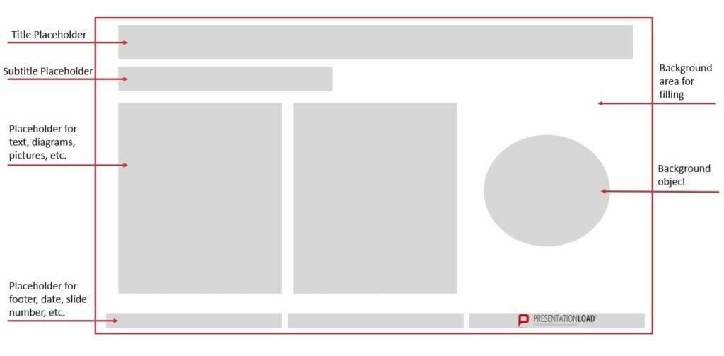
Why use a PowerPoint Layout? The advantages
PowerPoint layouts help you build a presentation quickly and easily with preset placeholders, designs and positioning. Because the elements of your slides are already coordinated, you don’t have spend time trying to make your slides look uniformly professional, attempting to line up content perfectly, or messing about trying to balance different elements.
A PowerPoint layout means one thing above else: saving you time. And that‘s a huge advantage: the time you save can now be used to concentrate on the actual content of your presentation.
What’s more, using a preset slide layout makes you look professional. Your slides are coordinated throughout, letting your audience follow the thread of your arguments without getting distracted.
PowerPoint layouts can be really eye-catching, too. Preset designs up the visual impact of your presentations, but allow you to make individual modifications when needed, guaranteeing brand recognition value. Read more about how to do this below!
Creating PowerPoint Layout: Here’s how!
- Open Microsoft PowerPoint.
- Click Start , then in the Slides group, select Layout .

3. A window will open with a selection of slide layouts.
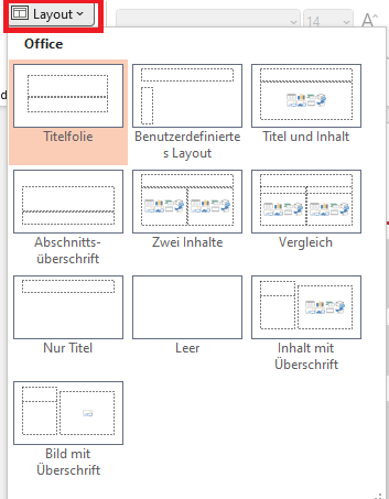
4. Choose the template which best suits your needs; you can use it as it is or change individual elements (see below).
Modifying a Preset PowerPoint Layout
So you like the layout you’ve chosen, but want to customize it by changing some of the elements? No problem. This is where the Slide Master function in PowerPoint comes in:
1. Select Slide Master in the View tab.
2. When the thumbnail area pops up, select the slide that comes closest to the layout you want.
(Tip: If you don’t like any of the layouts on offer, select Blank and make up your own layout with placeholders, etc. We’ve set out how to do this in the chapter “Nothing in the preset options appeals? Just create your own personal PowerPoint layout!” below.)
3. To change the layout, just read on:
Adding a Placeholder
Simply click Insert Placeholder in the Slide Master tab. Select the type of placeholder you want. Then decide where you want to put it on the layout, and drag the cursor to insert the placeholder.

Resizing a Placeholder
Select the slide on which you want to change the placeholder in the View tab in Slide Master , then click the placeholder. Click on a corner and drag (the cursor will change to a crossed arrow) until the placeholder is the size you want.
Changing a Placeholder’s Position
To move a placeholder, hover the cursor over it. Once the cursor changes to the double arrow, just click and drag to the right place.
Deleting a Placeholder
To remove a placeholder, select Slide Master in the View tab, and click on the slide containing the placeholder you want to remove. Select the placeholder in the layout and then press delete.
Rotating a Placeholder
Click on the placeholder; an arrow curving round in a circle will appear at the top. Just click on that and drag it round to rotate the element any way you want.
Bring particular elements into the foreground, or send them to the background
Right-click on the element you want to highlight or mute, and a drop-down menu will open. Select either Bring to Front or Send to Back , and save.
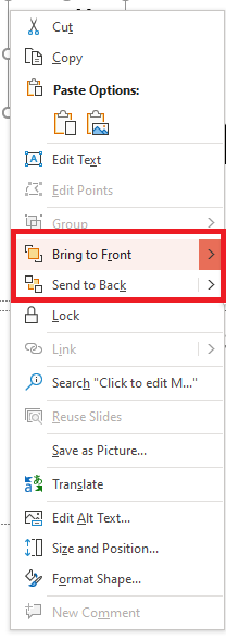
When you’ve made the changes you want, click Close Master View in the Slide Master tab.

- In Normal view, in the Thumbnails pane, select all the slides you’ve just revised. (To select multiple slides, hold down Ctrl and click to select the slides you want.)
- Next, select Layout from the Home tab and select the layout containing the placeholders you just changed. This step finalizes the placeholder change by re-inserting the changed slide layout onto a final edited slide.
Duplicating a PowerPoint Layout
Once you’ve got a slide layout exactly to your liking, it’s easy to duplicate it so that you can use the same layout on multiple slides. This also applies to preset slide layouts, of course. Here’s how: In the View tab, click on the Normal option:

- An overview of all your slides will now appear on the left. Right-click the slide whose layout you want to duplicate.
- Then select Duplicate Slide in the menu that opens. A slide with an identical layout will appear.
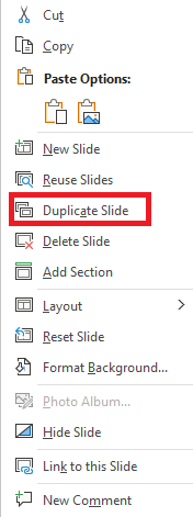
Nothing in the Preset Options Appeals? Just create Your Own Personal PowerPoint Layout!
So you already know that using the preset slide layouts saves time and allows you to modify where needed, you really don’t like any of the preset slide layouts. No worries – you can create a custom layout that’s exactly what you need in just a few steps:
- Select Slide Master in the View tab.
- Slides with suggested layouts will now appear on the left.
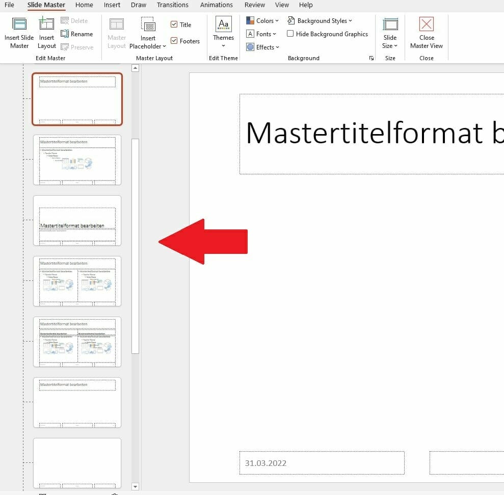
- Right-click on any of the options (don’t worry about it not being what you want; you can change what you need later) and select Insert Layout, or click on Insert Layout from the menu at the top.
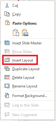
- Renaming the layout helps you to keep track and to find it later. To do this, right-click it again and select Rename Layout , then type in the new name.

- Now you can start editing. Delete all the preset placeholders if you don’t want them, or leave some in and edit them (see above) – it’s up to you.
- Insert the placeholders you want for your layout using the Insert Placeholders option. You can choose text, content, chart, or other layouts in the drop-down menu. After selecting a layout, drag the placeholder to the position you need. You can rotate it, resize it and edit it as shown in the paragraph “Modifying a preset PowerPoint layout” above.
- Done with your editing? Then close the master view – select Close Master View in the Slide Master tab under Close .
- Now save and close your presentation.
- When you open the presentation again, you can now search for your personalized layout – select the New Slide option from the Start menu under Slides . Just search for your renamed PowerPoint layout in the selection that opens..
Tip: If you want to use your layout in an existing presentation, you have to make a small detour. Open the relevant presentation and select the Browse for Designs option in the Design tab. You will find this under Designs when you open the drop-down menu to the right of the selection (see screenshot).

Save Your Personalized PowerPoint Layout as a Template!
Saving your layout as a template makes it really easy to use in future presentations. Here’s how:
- While in the layout, go to the File tab. This will take you to the PowerPoint start menu.
- Select Save As .

- Find your template in C:\Users\<your username>\Documents\Custom Office templates.
- Select the file type PowerPoint Template and save.
Next time you open PowerPoint, you can use your template by clicking New when you open PowerPoint, selecting Custom Office Templates , and clicking on Create once you’ve selected your individualized PowerPoint template.
Professional Design for Your Slide Layout: 6 PowerPoint Layout Ideas that will make Your Presentation a Real Eye-Catcher!
Persuading your audience of your ideas, so achieving your goals, and really standing out with your presentation, is so much easier with an excellent layout. We’ve put together six professionally designed and effective PowerPoint layout ideas for you, illustrated with reference pictures of slides we’ve designed for clients:
1. PowerPoint Layouts for Title Slides
Every presentation needs a title slide. Since this slide is always the first slide you present, and so the first slide that your audience sees – often as soon as they enter the presentation room – you need to design this slide for maximum impact.
In 2022, the trend for title slides is toward large-format images. When selecting your background image, be sure to choose one that will appeal to your audience right from the get-go. For example, go for a theme related to your topic or business. In this example, the steering wheel motif is appropriate for the automotive group GG:

Using large-format images doesn‘t mean missing out on a powerful headline. This needs to stand out.
So either use an area of your image that is neutral, or opt for modern overlays or transparent designs. With the latter you bring some color into play, so you need to adjust the contrast to the background image to make your headline stand out effectively. Here are some examples:

Using overlays or transparent design allows you to create just the slide you need. You can use color gradients (see the GG Group title slide above), whole areas (see the Uni Per slide) or shapes (below). How you compose the slide that’s right for your presentation is completely up to you.

2. PowerPoint Layouts for Agenda Slides
Your agenda slide reflects the content of your presentation and so it’s important to get it right. Info and tips about these in PowerPoint can be found in this article .
Looking for professional templates? We’ve a whole range in our store .
Agenda slide layouts can either be structured traditionally as a tabulated list, or presented as a process. Large-format images can make an impact here, too. You can use them either in portrait format or as a complete background. It‘s important to leave enough space to get your agenda points over. You can also use a grid as a guide for agenda layouts. To do this, take a look at the slide below. Here you see a three-part grid: 1/3 space for the agenda items, 2/3 space for the picture. (Or, for agendas with more points, in reverse (i.e. 1/3 image and 2/3 agenda).

There’s also the option of a quad grid, as below:
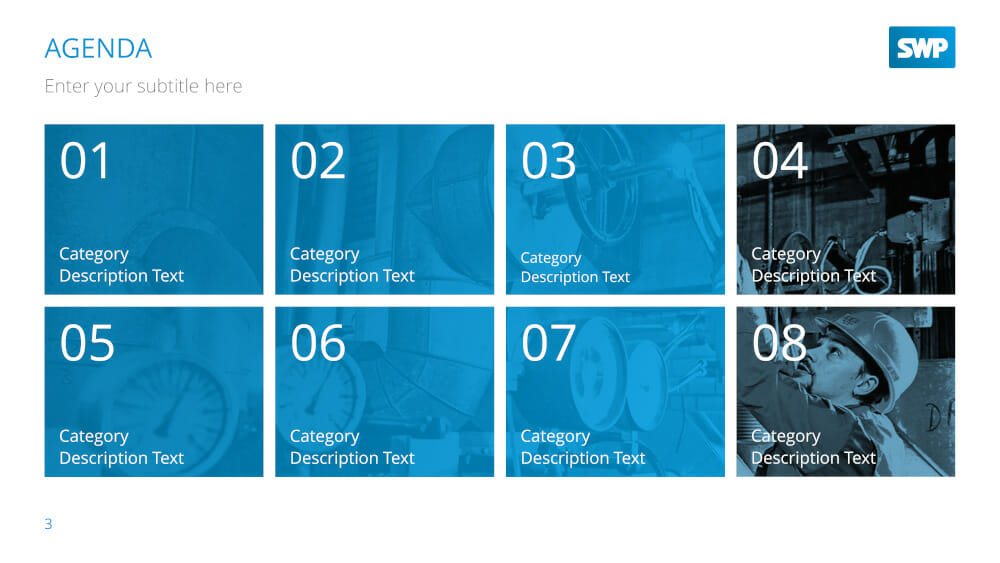
This shows eight equally sized image boxes, going from left to right, in two rows. Obviously, you can customize the background image and layout to your exact needs.
3. PowerPoint Layouts for Slides combining Images and Text
Layouts for image-text combinations are especially important in the body of your presentation. These can include bulleted lists, product presentations or even portfolios. What’s important here is how image and text interact within the slide.
One classic layout which works well is an image with your text underneath. An interesting modern variant on this is to put several images alongside each other, as below:
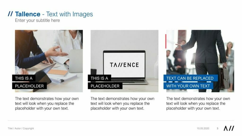
Using large-format images can be really fresh and impactful. For example:

You can also use a grid as a guide for image-text combinations. In general, this works best with a three, four or five images. Using more than that means your slide will look cluttered and your content will be difficult to read.

4. PowerPoint Layouts for a Combination of Icons and Text
Icons are a great way to illustrate complex content in a simple way. They also add impact to your presentation and are visually interesting. We offer a wide selection of icon templates in our store. Here are a couple of examples:
In general, layouts combining icons and text work well with layouts similar to those used in image-text combinations. PowerPoint lets you place icons in gridded or non-gridded combinations, with their text by them. Here are some examples:
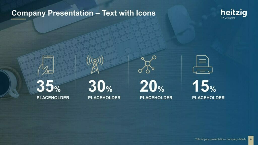
5. PowerPoint Layouts for Lists
When you want to present lists of items, bullet points are of course the classic choice, but increasingly people are choosing to visualize them as a process form, right up-to-date and attention-grabbing. The layout below, visualizing the process from left to right, makes your list easily comprehensible.
For this type of layout, use the entire width of the slide for maximum impact.
You can also make great use of a circular form; more and more people are moving away from the old rectangular box.
6. Further Options for Image/Text Layouts
We’ve already covered image-text layouts above, but here are a few more ideas to make your presentations get noticed.
Option 1: Text on the left, image on the right
This option is a classic layout, as it works with the fact that English is read from left to right. So your audience grasps the content first, then it’s reinforced by the image. This also makes your text easier to read, as the lines are shorter.
Option 2: Image on the left, text on the right

Option 3: Text above, large-scale image below
Option 4: Full-format image, with overlays
You’ve seen above how much of an impact this can make with title slides, and of course there’s nothing stopping you using a layout like this within your presentation. It’s always important to make sure that the colour and contrast of the text is chosen with the image in mind, so that can be read easily. Here are some examples:

Conclusion: A Great PowerPoint Layout can Really Support Your Content!
If you want to create a really professional and effective presentation, it pays to try modern layouts that will grab your audience’s attention. You have free rein to be as creative as you like, but do remember – especially with image-text combinations – to contrast your text properly with any images or icons, for maximum legibility.
Why not try a change of layout for your next presentation? We at PresentationLoad offer a whole range of slide templates to help you create a really impactful presentation in just a few clicks.
If you’re looking for professionally designed slides with a really polished layout for your presentation, feel free to get in touch, and we’ll create a slide layout perfect for your particular needs.
Got more questions about PowerPoint layout or PowerPoint in general? Just email us on [email protected] and we’ll be happy to help!
You might also be interested in the following template sets:
- Preparing a PowerPoint Presentation: 11 Tips
- Create a PowerPoint Presentation: That’s how it works!
- The best Structure for Your Presentations!
Share this post
- share
- save
Design Thinking: Problem Solving with a Difference

Why Corporate Mission Statements Are So Important

7 Tips & Learnings from the Apple Keynote
Table Style in PowerPoint [What is it & How to Use It?]
By: Author Shrot Katewa
![style options presentation Table Style in PowerPoint [What is it & How to Use It?]](https://artofpresentations.com/wp-content/uploads/2022/06/Featured-Image-Table-Styles-in-PowerPoint.webp)
Table Styles are a cool way to add color and variations to the boring-looking tables that no one wants to read. They immediately draw the attention of the readers and make your presentation more interesting.
But, how do you add a table style to your tables in PowerPoint?
To add a table style in PowerPoint, first, select the table. Then, click on the “Table Design” tab. From the ribbon, click on the “More” button in the “Table Styles” section to open a dropdown with more options. Choose your preferred table style option to apply it to the selected table in PowerPoint.
In this article, you will get to learn the process in a step-by-step manner. Plus, I’ll also show you how to copy table styles from one table to another, how to customize a table style, and remove table styles! That, and much more!
So, let’s get started!
1. What is a Table Style in PowerPoint? (also known as Quick Style)
The table style or quick style in Microsoft PowerPoint is a gallery of predesigned table designs that you can use for tables inside your presentation slide.
The table styles suggested by PowerPoint in each presentation file are automatically curated to match the theme of the presentation. You can access the table style options in the “Table Style” group of the “Table Design” tab.
2. How to Apply a Table Style in PowerPoint?
In Microsoft PowerPoint, you can add any preformatted table style very easily using the “Table Design” tab. Here’s how to do it –
Step-1: Click on the “Table Design” tab
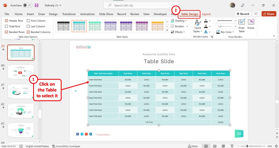
In the open slide, you have to first select the table. Then click on the contextual tab “Table Design” from the menu ribbon located at the top of the screen.
Step-2: Click on your preferred table style
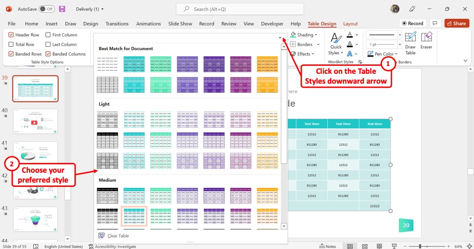
In the “Table Design” tab, you have to now click on the downward arrow on the “Table Styles” gallery to expand it. Then select your preferred table style for the selected table.
3. How to Copy a Table Style in PowerPoint?
Microsoft PowerPoint does not have any feature that you can use to copy a table style. However, you can copy a table with a customized style and paste it into a different location. To do so, follow the 3 simple steps.
Step-1: Click on the “Copy” option
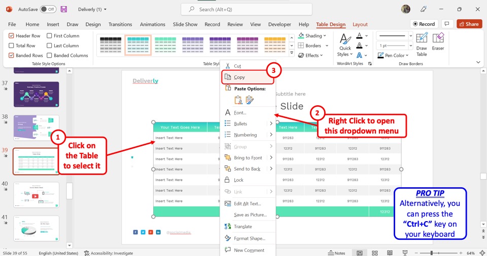
The first step is to copy a table with the preferred table style applied to it. Click on the table to first select it. Then “Right Click” on the table and select the “Copy” option from the right-click menu. Alternatively, you can press the “Ctrl+C” keys on your keyboard.
Step-2: Paste the table
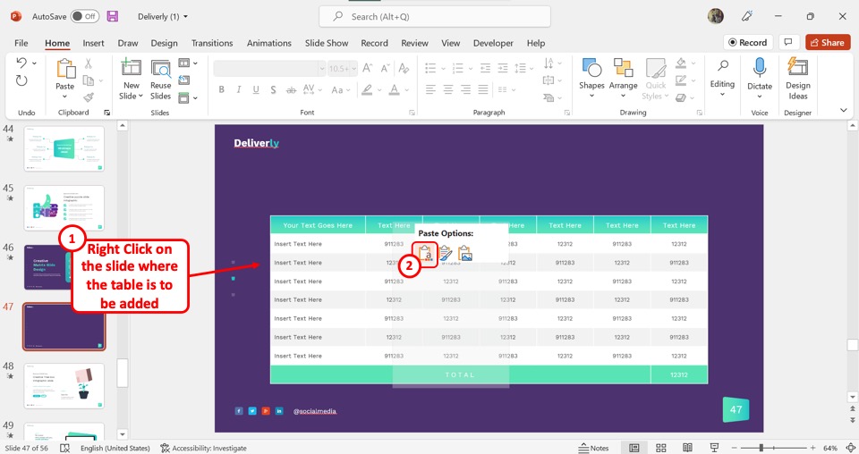
The next step is to open the presentation slide where you want to copy the table style. Then “Right Click” on the slide and click on the “Keep Source Formatting” option under “Paste Options” in the right-click menu.
Step-3: Add contents to the table
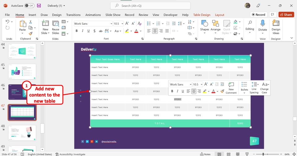
Finally, all you have to do is add new content to the pasted table. This will create a new table with the same table style.
4. How to Customize a Table Style in PowerPoint?
In Microsoft PowerPoint, the table styles are generated based on the theme of the presentation slides. However, you can also customize the table design after selecting a style.
4.1 Customize Border of a Table in PowerPoint [Link to Existing Article]
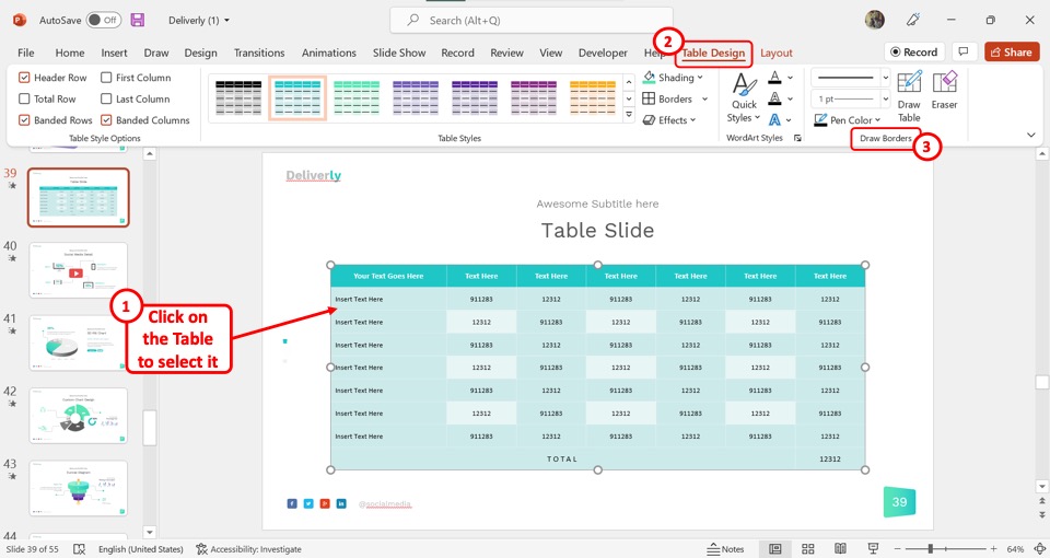
To customize the table border in PowerPoint, you have to first select the table. Then click on the “Table Design” tab. Now all you have to do is use the options in the “Draw Borders” group to customize the table borders.
If you want to know more, check out my other article on how to add a table border in PowerPoint where I go in-depth into this topic!
4.2 Change Table Shading in PowerPoint
The “Shading” option in PowerPoint allows you to add texture, pattern, picture, etc. to highlight any table information. To change the table shading, follow the 2 easy steps.
Step-1: Click on the “Shading” option
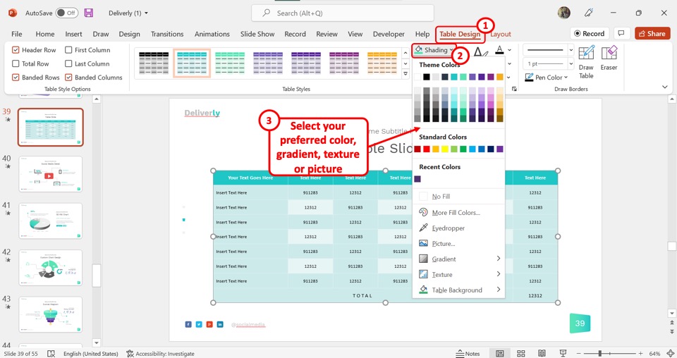
In the “Table Design” tab, the first step is to click on the “Shading” option. It is the first option in the right column of the “Table Styles” group.
Step-2: Select your preferred color for shading
Now all you have to do is select your preferred shading options from the dropdown menu under the “Shading” option. You can select a color, gradient, texture, or picture for table shading (shown above).
4.3 Change Table Border Color in PowerPoint
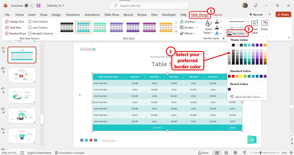
To change the color of the table border in PowerPoint, you have to first click on the “Table Design” tab. In the “Draw Borders” group, click on the “Pen Color” option and select your preferred border color for the table from the dropdown menu.
Check out my other article on changing the border color of tables in Microsoft PowerPoint for more details.
5. Can You Save a Table Style in PowerPoint?
In Microsoft PowerPoint, you cannot save a table style as a template. The application only allows you to use the automatically generated table styles. While you can customize the table styles, you cannot save them as a template.
6. How to Apply a New Table Style in PowerPoint?
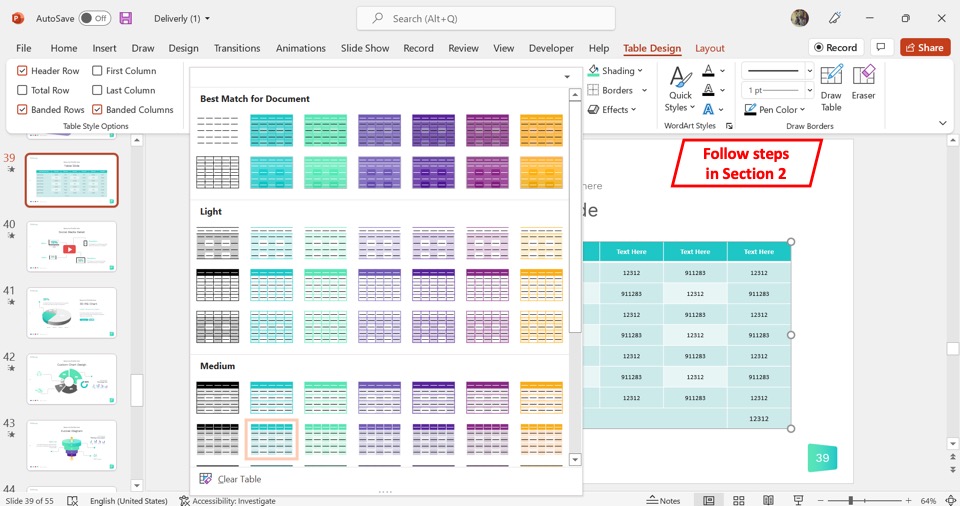
Microsoft PowerPoint offers a very easy process to apply a new table style to an existing table on a presentation slide. The process of applying a new table style or changing a table style is the same. All you have to do is follow the steps detailed in section 2 of this article .
7. Table Style Options in PowerPoint
The “Table Style Options” in the “Table Design” tab in Microsoft PowerPoint allows you to choose which part of the table to emphasize. You can select any or all of the six options available in the group.
7.1 Header Row
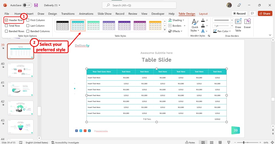
The “Header Row” option in the “Table Style Options” group will highlight the top row of the table. Depending on the table style, you can use this option to highlight and bold the text in the first row to put emphasis on it.
7.2 Total Row
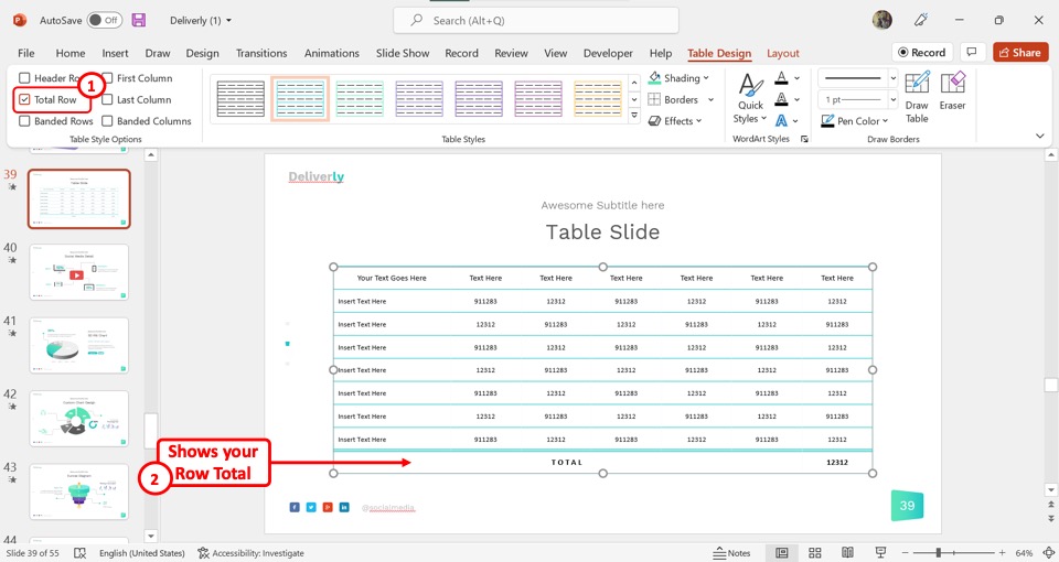
The second option in the “Table Style Options” group is the “Total Row” option. You can select this option only when there is a “Total” row in the PowerPoint table. The “Total Row” option will highlight the row that shows the total of the table values.
7.3 Banded Rows
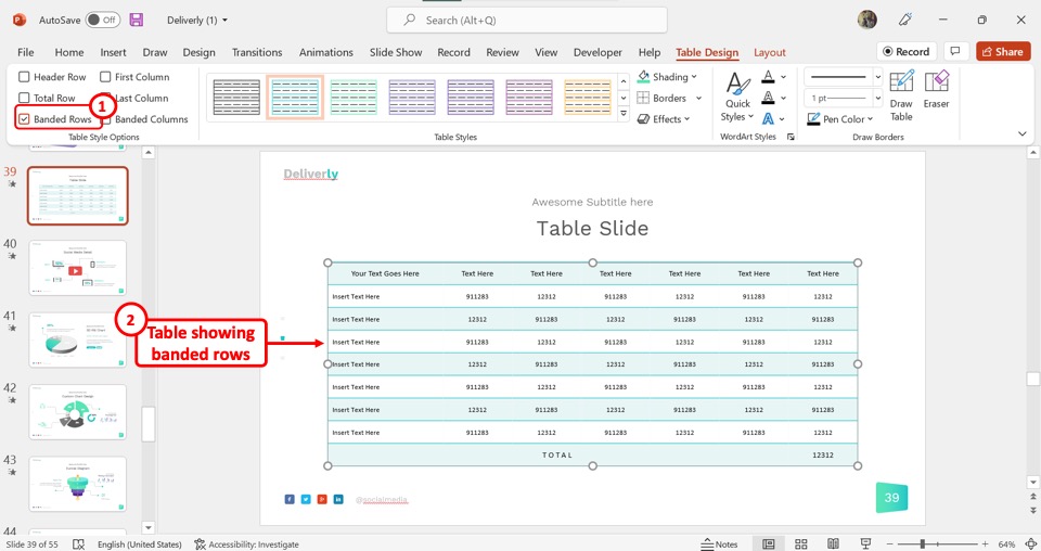
The “Banded Rows” option will add separate shades of color for alternating rows. This helps to visually separate the rows in the selected table.
7.4 First Column
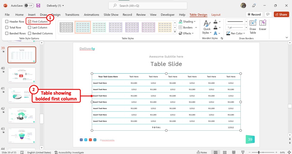
The “First Column” option will turn the text on the first column of the PowerPoint table into bold font. This will help you to emphasize the information in the first column.
7.5 Last Column
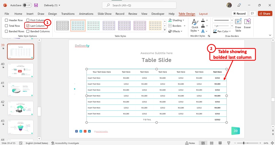
In the “Table Style Options” group, you can select the “Last Column” option to highlight the information in the last column of the table. This will turn the text on the last column into bold fonts.
7.6 Banded Columns
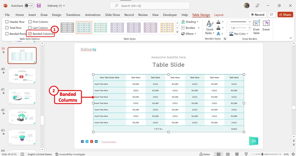
The “Banded Columns” option in the “Table Styles Options” will create a separate look for alternating columns in the PowerPoint table. The banded columns make it easier to clearly separate the information on each column.
8. How to Remove Table Style in PowerPoint?
In Microsoft PowerPoint, you can remove the applied table style to revert a selected table back to the default look. To remove the table style, follow the 3 simple steps.
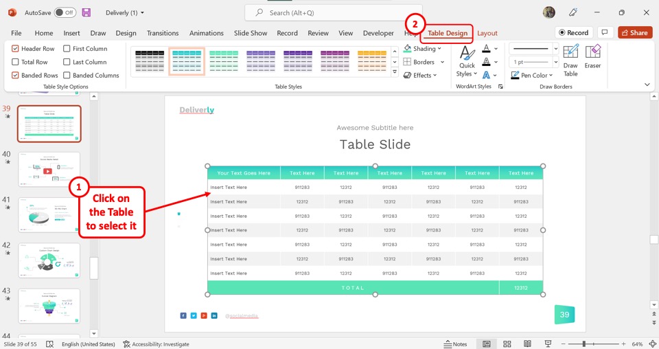
The first step is to select the table for which you want to remove the style. Then click on the “Table Design” tab in the menu ribbon located at the top of the menu ribbon.
Step-2: Click on the “Table Styles” gallery
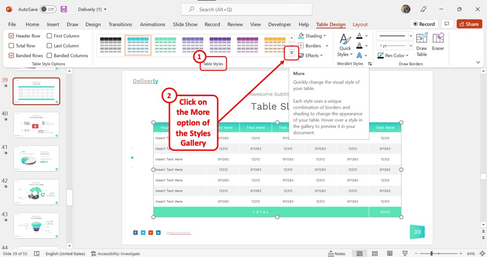
In the “Table Styles” group of the “Table Design” tab, click on the “More” option which is the downward arrow. This will open the “Table Styles” gallery.
Step-3: Click on the “Clear Table” option
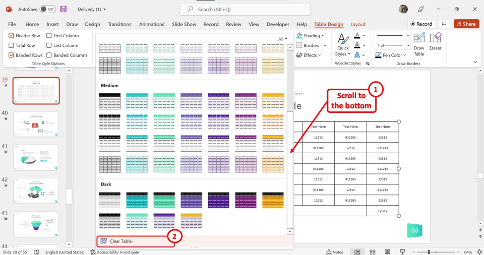
Scroll all the way down to the bottom of the “Table Style” gallery. Then all you have to do is click on the “Clear Table” option to remove the table style.
Credit to drobotdean (on Freepik) for the featured image of this article (further edited).

IMAGES
VIDEO
COMMENTS
Instructor Style. Coach Style. Storytelling Style. Connector Style. Lessig Style. Takahashi Style. Everyone on the internet has an opinion on how to give the "perfect" presentation. One group champions visual aids, another thinks visual aids are a threat to society as we know it. One expert preaches the benefits of speaking loudly, while ...
Freeform. When a speaker has extensive experience in the topic they're discussing, they often use a freeform style to expand upon it. The style involves personal storytelling through short stories about their personal experiences regarding the specific topic. When using this style, speakers rarely use slides or statistics.
CREATE THIS PRESENTATION. 2. Persuasive presentation. If you've ever been swayed by a passionate speaker armed with compelling arguments, you've experienced a persuasive presentation. This type of presentation is like a verbal tug-of-war, aiming to convince the audience to see things from a specific perspective.
Classic presentation style. The classic style of presentation serves as the foundation for many public speeches and business presentations. It follows a structured and logical approach, with a clear introduction, main points, and conclusion. This style often utilizes bullet points, accompanied by concise explanations.
Each of these has exactly 20 seconds, and they should transition automatically. This way, the speaker won't have the temptation of staying in one for too long. Because of all this, Pecha Kucha is a highly visual, concise presentation style. As you can probably imagine, It is a really hard presentation style to use.
Style #1: The Storyteller. The storytelling style consists of a (usually personal) story or anecdote. This style is used when the presentation doesn't have any data or numbers that need to be explained. You can use this style to emphasize your point and to easily relay your goal to the audience.
The budget can determine the resources available for the presentation. Presenting to a large crowd may require larger screens and speakers than a small crowd. Factoring in your budget during style selection allows you to determine the most cost-friendly option. Discussion topic The discussion topic may influence your presentation style choice.
Quick Read. Using different types of presentations helps you to adapt to different settings, improves audience interest and response, enhances the quality of presentations and increases the likelihood of recognition and promotion. The different types of presentations include; Educational, Instructional, Motivational, Persuasive and Problem ...
Tip #2: Stick to 2-3 Fonts and Colors. Our next tip focuses on your presentation's typography and color scheme. While it may be exciting to use as many different fonts and colors as possible, design best practices dictate that you should only utilize two or three total. Your fonts and colors should have jobs, as well.
This presentation design stands out with its visually rich content. It depicts exactly what the presentation is about and uses the illustrated window frames in the background image as topic placements. This type of presentation design simplifies complex concepts and makes it easier for the viewer to understand and digest the information. Conclusion
When in doubt, adhere to the principle of simplicity, and aim for a clean and uncluttered layout with plenty of white space around text and images. Think phrases and bullets, not sentences. As an ...
Presentations serve diverse purposes, from educating and persuading to motivating and problem-solving, and various styles are offered to engage audiences effectively. Educational presentations foster understanding through structured learning objectives and interactive elements like quizzes, while persuasive style of PowerPoint presentations ...
3. Visual Style. This style is perfect if you have to explain a complex topic to a mass audience with broad interests. The presenter complements the discussion points with high-definition graphics, such as charts, images, infographics, graphs, icons, diagrams, etc., making the overall presentation a gripping visual feast.The right ratio of text and visuals in the slides makes comprehension ...
Emphasize key points with text and images. Label your slides to prompt your memory. 1. Include less text and more visuals in your presentation design. According to David Paradi's annual presentation survey, the 3 things that annoy audiences most about presentations are: Speakers reading their slides.
Apply the 10-20-30 rule. Apply the 10-20-30 presentation rule and keep it short, sweet and impactful! Stick to ten slides, deliver your presentation within 20 minutes and use a 30-point font to ensure clarity and focus. Less is more, and your audience will thank you for it! 9. Implement the 5-5-5 rule. Simplicity is key.
Here are a few tips for business professionals who want to move from being good speakers to great ones: be concise (the fewer words, the better); never use bullet points (photos and images paired ...
Getting Started. 1. Open PowerPoint and click 'New.'. A page with templates will usually open automatically, but if not, go to the top left pane of your screen and click New. If you've already created a presentation, select Open and then double-click the icon to open the existing file. Image Source.
In the "Insert" menu, select "Table" and opt for a one-by-one table. Change the table color to a light gray shade, elongate it, and position it neatly to the left of your text. To improve readability and aesthetics, increase the spacing between text phrases. A small adjustment in the before spacing setting (setting it to 48) significantly ...
A Presentation style is a way of giving a presentation orally. In other words, a particular presenting type is an approach you adopt or employ to deliver your content. There are numerous presenting styles or methods you can use when giving public speeches or presentations such as -
Tips for creating an effective presentation. Tip. Details. Choose a font style that your audience can read from a distance. Choosing a simple font style, such as Arial or Calibri, helps to get your message across. Avoid very thin or decorative fonts that might impair readability, especially at small sizes. Choose a font size that your audience ...
6. Further Options for Image/Text Layouts. We've already covered image-text layouts above, but here are a few more ideas to make your presentations get noticed. Option 1: Text on the left, image on the right. This option is a classic layout, as it works with the fact that English is read from left to right.
Step-1: Click on the "Table Design" tab. In the open slide, you have to first select the table. Then click on the contextual tab "Table Design" from the menu ribbon located at the top of the screen. Step-2: Click on your preferred table style. In the "Table Design" tab, you have to now click on the downward arrow on the "Table ...