- Texas Go Math
- Big Ideas Math
- enVision Math
- EngageNY Math
- McGraw Hill My Math
- 180 Days of Math
- Math in Focus Answer Key
- Math Expressions Answer Key
- Privacy Policy

Go Math Grade 8 Answer Key Chapter 14 Scatter Plots
A great selection will give you a happy ending. Such best selection to learn maths is Go Math Grade 8 Answer Key Chapter 14 Scatter Plots. Yes. Go Math Grade 8 Chapter 14 Scatter Plots Answer Key is the only choice for students who wants the easy and best learning of maths. To help every student to practice maths, we provided questions and answers along with the explanation in an easy way. Therefore, start practicing the maths with the help of Go Math Grade 8 Answer Key .
It is an open place to learn maths. You need not pay anything to anyone to learn maths. We are offering a free PDF of Go Math Grade 8 Answer Key Chapter 14 Scatter Plots. So, students can learn offline with the help of Go Math Grade 8 Chapter 14 Scatter Plots Answer Key if they want. Or else, it is also easy to learn maths with the HMH Go Math guide. What are you waiting for? Immediately start practicing maths now using GO Math Grade 8 Answer Key.
Lesson 1: Scatter Plots and Association
- Scatter Plots and Association – Page No. 436
- Scatter Plots and Association – Page No. 437
Scatter Plots and Association – Page No. 438
Lesson 2: Trend Lines and Predictions
- Trend Lines and Predictions – Page No. 442
- Trend Lines and Predictions – Page No. 443
- Trend Lines and Predictions – Page No. 444
- Model Quiz – Page No. 445
Mixed Review
- Mixed Review – Page No. 446
Guided Practice – Scatter Plots and Association – Page No. 436

Explanation: As Bob gets older, his height increases along with the straight line on the graph. So, the association is positive and linear.
Scatter Plots and Data Analysis Answer Key Question 2. Describe the association between Bob’s age and his height. Explain the association. Type below: _____________
Answer: The association is positive and linear. Bob’s height increases as he gets older. We would see that Bob’s height eventually stops increasing if the data continues.

Answer: There is an outlier at (35,18)
Explanation: There is a cluster in the “20 – 25” shots attempted range and a smaller cluster in the “5 – 14” shots attempted range. There is an outlier at (35,18)
ESSENTIAL QUESTION CHECK-IN
Question 4. Explain how you can make a scatter plot from a set of bivariate data. Type below: _____________
Answer: Bivariate data – data that has two variables per observation, An x variable and y variable. Scatterplot – The graph displaying categorical data, with an x and y-axis. Response Variable – the variable that is explained by the other. Explanatory Variable – the variable which explains the other.
14.1 Independent Practice – Scatter Plots and Association – Page No. 437
Sports Use the scatter plot for 5–8.

Question 5. Describe the association between the year and the distance jumped for the years 1960 to 1988. Type below: _____________
Answer: The data shows a positive linear association. If the year increases, the winning distance increases.
Question 6. Describe the association between the year and the distance jumped for the years after 1988. Type below: _____________
Answer: Between 1996 and 2004, there was a slight increase in distance over time. The data from 1988 to 2012 will show a negative association.
Question 7. For the entire scatter plot, is the association between the year and the distance jumped linear or nonlinear? _____________
Answer: The data show a rise between 1960 and 1988. The data also show a fall between 1988 and 2012. Therefore, overall, there is no linear pattern.
Scatter Plots and Data Unit Test Answer Key Question 8. Identify the outlier and interpret its meaning. Type below: _____________
Answer: The outlier is at (1968, 8.9). It represents a long jump of 8.9 meters in 1968 that exceeds the other jumps made in the surrounding years.
Question 9. Communicate Mathematical Ideas Compare a scatter plot that shows no association to one that shows a negative association. Type below: _____________
Answer: Randomly scattered data points with no apparent pattern define a scatter plot with no association. Data points that fall from left to right and has data set values that increase as the other decreases define a scatter plot with a negative association.
For 10–11, describe a set of real-world bivariate data that the given scatter plot could represent. Define the variable represented on each axis.

Answer: The x-axis represents the number of containers. The y-&is represents the price per container.

Answer: The x-axis represents the number of hours spent watching tv. The y-axis represents the number of TVs owned.
FOCUS ON HIGHER ORDER THINKING
Question 12. Multiple Representations Describe what you might see in a table of bivariate data that would lead you to conclude that the scatter plot of the data would show a cluster. Type below: _____________
Answer: A cluster in a scatter plot is when there are a lot of points all grouped around the same location. Look for points that have the same input and output values. If there are a lot of points together, you must have a cluster in your scatter plot.
Question 13. Justify Reasoning Is it possible for a scatter plot to have a positive or negative association that is not linear? Explain. Type below: _____________
Answer: Yes
Explanation: Yes; it is possible for a scatter plot to have a positive or negative association that is not linear. The data points may have a falling or rising curve that will exhibit a nonlinear association.
Question 14. Critical Thinking To try to increase profits, a theater owner increases the price of a ticket by $25 every month. Describe what a scatter plot might look like if x represents the number of months and y represents the profits. Explain your reasoning. Type below: _____________
Answer: Initially, the number of tickets sold might decline a little, but the price increase would offset the loss in sales. That means that profits would increase, showing a positive association. When the price would get too high, ticket sales would decline rapidly, so profits would fall giving a negative association.
Guided Practice – Trend Lines and Predictions – Page No. 442
Angela recorded the price of different weights of several bulk grains. She made a scatter plot of her data. Use the scatter plot for 1–4.

Question 2. How do you know whether your trend line is a good fit for the data? Type below: _____________
Answer: Most of the data points are close to the trend line. The trend line has about the same number of points above and below it.
Scatter Plots and Trend Lines Quiz 1 Answer Key Question 3. Write an equation for your trend line. Type below: _____________
Answer: y = 0.09x
Explanation: The trend line passes through (0, 0) and (19, 1.80). Find the slope by using the slope formula. slope = m = (y2 – y1)/(x2 – x1) = 1.80/19 = 0.09 The line passes through the origin. So, the y-intercept is 0. From an equation for the trend line substituting the slope value for m and the value of the y-intercept b in the slope-intercept formula. y = mx + b y = 0.09x + 0 y = 0.09x
Question 4. Use the equation for your trend line to interpolate the price of 7 ounces and extrapolate the price of 50 ounces. Type below: _____________
Answer: The price for 7 and 50 ounces is $0.63 and $4.50
Explanation: Use the equation for the trend line (y = 0.09x) to interpolate the price of 7 ounces by substituting 7 for x (y= 0.09 • 7) and solving for y. Use the equation for the trend line (y = 0.09x) to interpolate the price of 50 ounces by substituting 50 for x (y= 0.09 • 50) and solving for y.
Question 5. A trend line passes through two points on a scatter plot. How can you use the trend line to make a prediction between or outside the given data points? Type below: _____________
Answer: Use two points on the line. rind the slope and y-intercept. Substitute the values of the slope (m) and y-intercept (b) to form an equation using y = mx + b. Substitute the value of x for which you want to make a prediction and solve for y OR substitute your prediction for y and solve to find its value.
14.2 Independent Practice – Trend Lines and Predictions – Page No. 443

Question 7. What type of association does the trend line show? Type below: _____________
Answer: Negative Association
Explanation: One data set increases – Wind Speed and the other – Wind Chill decreases. So, the trend line shows a Negative Association.
Scatter Plots and Trend Lines Answer Key Question 8. Write an equation for your trend line. Type below: _____________
Answer: y = -0.25x + 2.5
Explanation: Find the slope using the Slope Formula m = (y2 – y1)/(x2 – x1) = ((-10) – 5)/(50 – 30) = -5/20 = -0.25 Find the y-intercept using the Slope-Intercept Formula y = mx + b -5 = -0.25(30) + b -5 = -7.5 + b 2.5 = b Substitute the value of m and b into the Slope-Intercept Formula to form an equation for the trend line. y = -0.25x + 2.5
Question 9. Make a Prediction Use the trend line to predict the wind chill at these wind speeds. a. 36 mi/h _________ °F
Answer: -6.5°F
Explanation: Use the trend line to predict the wind chill at 36mi/h y = -0.25x + 2.5 y = -0.25(36) + 2.5 y = -9 + 2.5 y = -6.5 The wind chill at 36mi/h is -6.5ºF
Question 9. b. 100 mi/h _________ °F
Answer: -22.5°F
Explanation: Use the trend line to predict the wind chill at 100mi/h y = -0.25x + 2.5 y = -0.25(100) + 2.5 y = -25 + 2.5 y = -22.5 The wind chill at 100mi/h is -22.5ºF
Question 10. What is the meaning of the slope of the line? Type below: _____________
Answer: The slope means that the wind chill falls about 1°F for every 4 mph increase in wind speed.

Problem Solving with Trend Lines Worksheet Answers Question 12. Write an equation for your trend line. Type below: _____________
Answer: y = -(2/15)x + 64
Explanation: Find the slope using the Slope Formula m = (y2 – y1)/(x2 – x1) = (72 – 64)/(60 – 0) = 8/60 = -2/15 Find the y-intercept using the Slope-Intercept Formula at (0, 64) y = mx + b b = 64 Substitute the value of m and b into the Slope-Intercept Formula to form an equation for the trend line. y = -2/15x + 64
Question 13. Make a Prediction Use the trend line to predict the apparent temperature at 70% humidity. Type below: _____________
Answer: 73.3º F
Explanation: Use the equation of the trend line. Substitute 70(for 70%) into the equation for x. y = -(2/15)x + 64 y = -(2/15)(70) + 64 y = -140/15 + 64 y = -9.3 + 64 y = 73.3 The apparent temperature is 73.3º F
Question 14. What is the meaning of the y-intercept of the line? Type below: _____________
Answer: The y-intercept explains that at 0% humidity, the apparent temperature is 64ºF
FOCUS ON HIGHER ORDER THINKING – Trend Lines and Predictions – Page No. 444
Question 15. Communicate Mathematical Ideas Is it possible to draw a trend line on a scatter plot that shows no association? Explain. _____________
Explanation: It is not possible to draw a trend line on a scatter plot that shows no association. If the scatter plot shows no association, the data points have no relationships with one another. You can draw a trend line if a linear association is available.
Question 16. Critique Reasoning Sam drew a trend line that had about the same number of data points above it as below it, but did not pass through any data points. He then picked two data points to write the equation for the line. Is this a correct way to write the equation? Explain. _____________
Explanation: Sam did not use the correct way to write an equation. Sam may have drawn a correct trend line but using the data points that are not on the trend line may have an incorrect equation for the line. He should use two points on that trend line to write the equation.
Problem Solving with Trend Lines Homework 4 Answer Key Question 17. Marlene wanted to find a relationship between the areas and populations of counties in Texas. She plotted x (area in square miles) and y (population) for two counties on a scatter plot: Kent County (903, 808) Edwards County (2118, 2002) She concluded that the population of Texas counties is approximately equal to their area in square miles and drew a trend line through her points. a. Critique Reasoning Do you agree with Marlene’s method of creating a scatter plot and a trend line? Explain why or why not. _____________
Answer: I do not agree with Marlene’s method of creating a scatter plot and a trend line. She did not have enough data. Marlene should have collected and plotted data for many more counties.
Question 17. b. Counterexamples Harris County has an area of 1778 square miles and a population of about 4.3 million people. Dallas County has an area of 908 square miles and a population of about 2.5 million people. What does this data show about Marlene’s conjecture that the population of Texas counties is approximately equal to their area? Type below: _____________
Answer: The data collected are only of two counties whose populations are nearly equal to their area. The fact that the populations of Harris and Dallas counties are in the millions, Marlene’s conjecture about the population of Texas counties being equivalent to their area is invalid.
Ready to Go On? – Model Quiz – Page No. 445
14.1 Scatter Plots and Association

Unit Scatter Plots and Data Homework 1 Answer Key Question 2. Describe the association you see between the number of quarts purchased and the price per quart. Explain. Type below: _____________
Answer: Negative nonlinear association
Explanation: The association seen between the number of quarts purchased and the price per quart is negative and nonlinear. As the number of quarts rises, the price per quart decreases but you can see a data curve.
14.2 Trend Lines and Predictions
The scatter plot below shows data comparing wind speed and wind chill for an air temperature of 20 °F. Use the scatter plot for Exs. 3–5.

Question 4. Write an equation for your trend line. Type below: _____________
Answer: y = -0.35x + 12.25
Explanation: The line passes through (10, 8.75) and (35, 0) so we can use these points to find the slope. The slope of the line is : Slope = m = (y2 – y1)/(x2 – x1) = (0 – 8.75)/(35 – 10) = -8.75/25 = -0.35 Find the y-intercept using the slope-intercept formula : y = mx + b 0 = -0.35 . 35 + b 0 = -12.25 + b b = 12.25 Substitute the slope m and the y-intercept b in the slope-intercept formula. The equation for the trend line is : y = mx + b y = -0.35x + 12.25
Problem-Solving with Trend Lines Homework 4 Answers Question 5. Use your equation to predict the wind chill to the nearest degree for a wind speed of 60 mi/h. ________ °F
Answer: 9°F
Explanation: y = −0.35x + 12.25 y = -0.35(60) + 12.25 y = -21 + 12.25 y = -8.75 The wind chill to the nearest degree for a wind speed of 60 mi/h is 9°F.
ESSENTIAL QUESTION
Question 6. How can you use scatter plots to solve real-world problems? Type below: _____________
Answer: Using a scatter plot, you can see positive and negative trends such as prices over time. You can also make predictions such as height at a certain age.
Selected Response – Mixed Review – Page No. 446

Answer: b. B
Question 2. What type of association would you expect between a person’s age and hair length? Options: a. linear b. negative c. none d. positive
Answer: c. none
Explanation: The length of their hair reduces. This is because the length of hair changes with the growth phase of the hair follicles. When one is young, the cells of the papilla divide more rapidly, and hence the length of the hair is long before reaching the transitional phase and then shedding off in the telogen phase. The older one gets, the papilla cells do not divide as rapidly and the length of the hair shortens with age.

Answer: d. positive association
Explanation: The scatter plot shows a cluster, some outliers, and a negative association. It does not show a positive association.
Unit Scatter Plots and Data Homework 3 Answer Key Question 4. A restaurant claims to have served 352,000,000 hamburgers. What is this number in scientific notation? Options: a. 3.52 × 10 6 b. 3.52 × 10 8 c. 35.2 × 10 7 d. 352 × 10 6
Answer: b. 3.52 × 10 8
Explanation: 100,000,000 So, 3.52 × 10 8

Answer: b. y = −\(\frac{1}{4}\)x
Explanation: In order to find out the relationship between x and y, we have to use the values in the question and substitute them into the solution options. So, y = -1/4x

Question 6. b. Which data point is an outlier? Type below: ______________
Answer: The outlier is the point (92, 135).
Question 6. c. Predict the number of visitors on a day when the high temperature is 102 °F. Type below: ______________
Answer: Based on the cluster around 100°F, I would expect that on a day with a temperature of 102 °F, the pool would have between 350 and 400 visitors.
Conclusion:
Go Math Grade 8 Answer Key Chapter 14 Scatter Plots for free. Get your copy and start practicing now. Become a member of learning maths in the best and easy way with the help of the Go Math Grade 8 Chapter 14 Scatter Plots Answer Key. Enjoy learning maths with the help of the HMH Go Maths Grade 8 Solution Key.
Share this:
Leave a comment cancel reply.
You must be logged in to post a comment.
Math Worksheets Land
Math Worksheets For All Ages
- Math Topics
- Grade Levels
Scatter Plots and Trend Line Worksheets
Graphs are visual representations of information and data. You may often see graphs in business presentations and infographics. They summarize information by arranging data visually and creating a visual representation from charts. Demographics, price points, and other information are used to create these visualizations. Plots are not just used in math; they are also used in several other math-related subjects. Algebra, geometry, topology, and trigonometry all use plots in operations. A plot is a graph that a new or old point generates relative to an existing line. Data entry is typically represented as a point with a position, a scale, and many X-Y coordinates. This means whenever we have a scatter plot, we have a structure where we can see the data represented graphically. Scatter plots are a way of representing data by graphing two sets of data on the same picture. The two data sets are graphed against each other, and the resulting data points are sometimes grouped or shown as a trend line that connects all the data points. If we are able to make sense of the prevailing direction of the data, we can create a trend line which can help us explain a relationship that exists within the data. This is a series of worksheets that helps students learn to identify and interpret scatter plots of linear functions to see what relationships may exist and what we can learn from them.
Aligned Standard: HSS-ID.B.6c
- Trend Line Equations Step-by-step Lesson - Where the previous standard had us understand the trend line, now we find the equation for it.
- Guided Lesson - I'm trying to be positive here! See if you get what I mean. That should be an extra credit question.
- Guided Lesson Explanation - This is a bit lengthy four page explanation of the problems for you.
- Practice Worksheet - Yes, these trends are a bit on the side of all over the place.
- Matching Worksheet - Match the graphs and their trend line equations.
- Answer Keys - These are for all the unlocked materials above.
Homework Sheets
Time to mathematically breakdown the trends on lines.
- Homework 1 - A trend line roughly describes the relationship between two variables in a set of data.
- Homework 2 - Plug (1, 2) and (0, -6) into the slope formula.
- Homework 3 - Plug the slope m = 3 and the y-intercept b = -4 into the slope-intercept formula. y = 3x - 4.
Practice Worksheets
With the basic trend plotted for you, it is pretty is to make conclusions here.
- Practice 1 - What is the equation of the trend line shown?
- Practice 2 - We can use a trend line to make predictions from a scatter plot.
- Practice 3 - It is change in y-values divided by the change in x-values.
Math Skill Quizzes
Describe the trends you see of the lines.
- Quiz 1 - Can you smell the trend that exists here?
- Quiz 2 - The top heavy lines may confuse some.
- Quiz 3 - I like to ask students to evaluate the lines by answer if we are in better or worse state from where the line starts (being the far left of the graph).
What Is a Scatter Plot?

A scatter plot is a chart that displays multiple sets of data (typically 2 or 3 sets) in horizontal bars. It shows how a particular variable (or variables) changes over time. The bars are arranged to show the time for collecting the data. As the data in these plots are scattered, these plots are named as scatter plots. They are sometimes referred to as scatter grams, scatter charts, or even scatter graphs. They use cartesian coordinates to represent the data, and the concept is to determine the correlation between two quantities. A linear correlation will make a straight line with the given set of data whereas, a non-linear depicts a curve or any other shape through these data sets. A weak correlation refers to the plot where data points are far apart, whereas a strong correlation means the data points are near. Positive correlations represent that both variables x and y variate directly, meaning values of both x and y are increasing. On the other hand, negative correlation refers to the quantities varying in an indirect proportion (values of x are increasing and y are decreasing).

Here, sampled data has been collected to check if it can represent the relationship between two quantities. The above scatter plot has depicted the height and diameter of a collection of fictional trees. In this plot, each point represents the vertical position of a tree in terms of height (measured in meters) and the horizontal position in terms of diameter (measured in centimeters). It has been observed that the above plot shows a positive correlation as both the quantities on the x and y-axis are increasing.
What are Scatter Plots Used For?
A scatter plot uses dots to represent the values of two numeric variables in a plot with a horizontal and a vertical axis. The purpose of these plots is to identify the relationship between numeric variables. Not only does a scatter plot report the value of individual points of data, but even helps in reporting the trends and patterns in a data set.
Scatter plots can be used to identify correlational relationships. It helps in predicting the effect on one variable when we make changes to the other variable. We can use the scatter plots to determine if a relationship between two numeric variables is positive, negative, strong, weak, linear, or non-linear.
We can use the scatter plots to determine how close the points in the data set lie and if they can be broken into groups. It helps in identifying any gaps, missed values, or outlier points in the data set.
A scatter plot can be used to determine the relationship or correlation between two quantities which normally come in the form of experimental data. When an independent variable has more than one value corresponding to its dependent variable, an example of that can be a relation between the weight and height of a group of people as there can be many people of the same height with different weights. This visualization helps us to understand the connection between these variables. It also helps us spot situations where variables variate simultaneously. This is not commonly, but very helpful when we need it.
When To Avoid Using Them
A scatter plot should be avoided when the data is unrelated, which means you can't compare two quantities like a person's weight and the number of electronic gadgets in the house. The two quantities are not related, so their graph is not possible. Another case in which you must avoid a scatter plot is when you have a large set of data. This can result in overplotting, and you won't be able to conclude the relationship between the two quantities.
Points to Consider When using Them
If your plot depicts a positive or negative correlation, it does not always mean that one quantity changes in proportion to the other quantity. It might sometimes be true that the independent variable will cause some effect. To understand this, let us consider an example of sales of ice cream bars during winter. There's a common thought that people do not eat ice cream during winters which is why there are not many sales during the winter season. While it may be true, there can be other factors that might have affected the business, including the opening of a new ice cream bar in the same area. Just because there's somehow a connection does not mean that it works every time.
A Scatter plot can be used when there is more than one dependent variable. Suppose there are two dependent variables, then you can assign different colors that differentiate the two and plot the two separately against the independent variable to understand their relation. This can also help avoid the problem of overplotting.
Get Access to Answers, Tests, and Worksheets
Become a paid member and get:
- Answer keys to everything
- Unlimited access - All Grades
- 64,000 printable Common Core worksheets, quizzes, and tests
- Used by 1000s of teachers!
Worksheets By Email:
Get Our Free Email Now!
We send out a monthly email of all our new free worksheets. Just tell us your email above. We hate spam! We will never sell or rent your email.
Thanks and Don't Forget To Tell Your Friends!
I would appreciate everyone letting me know if you find any errors. I'm getting a little older these days and my eyes are going. Please contact me, to let me know. I'll fix it ASAP.
- Privacy Policy
- Other Education Resource
© MathWorksheetsLand.com, All Rights Reserved
Unit Resources
by Hall, Prentice
Chapter 5 - linear functions - 5-7 scatter plots and trend lines - lesson check - page 337: 5, work step by step, update this answer.
You can help us out by revising, improving and updating this answer.
After you claim an answer you’ll have 24 hours to send in a draft. An editor will review the submission and either publish your submission or provide feedback.

- Student Login
- Educator Login
- Find Gizmos
- Lesson Info
Solving Using Trend Lines
Examine the scatter plots for data related to weather at different latitudes. The Gizmo includes three different data sets, one with negative correlation, one positive, and one with no correlation. Compare the least squares best-fit line.
Lesson Materials
Student Exploration Sheet
Exploration Sheet Answer Key
Assessment Questions
Teacher Guide
Vocabulary Sheet
Cell Energy Cycle
Explore the processes of photosynthesis and respiration that occur within plant and animal cells. The cyclical nature of the two processes can be constructed visually, and the simplified photosynthesis and respiration formulae can be balanced.
Flower Pollination
Observe the steps of pollination and fertilization in flowering plants. Help with many parts of the process by dragging pollen grains to the stigma, dragging sperm to the ovules, and removing petals as the fruit begins to grow. Quiz yourself when you are done by dragging vocabulary words to the correct plant structure.
Growing Plants
Investigate the growth of three common garden plants: tomatoes, beans, and turnips. You can change the amount of light each plant gets, the amount of water added each day, and the type of soil the seed is planted in. Observe the effect of each variable on plant height, plant mass, leaf color and leaf size. Determine what conditions produce the tallest and healthiest plants. Height and mass data are displayed on tables and graphs.
Plants and Snails
Study the production and use of gases by plants and animals. Measure the oxygen and carbon dioxide levels in a test tube containing snails and elodea (a type of plant) in both light and dark conditions. Learn about the interdependence of plants and animals.
Find Your Solution
Start playing, exploring and learning today with a free account. Or contact us for a quote or demo.
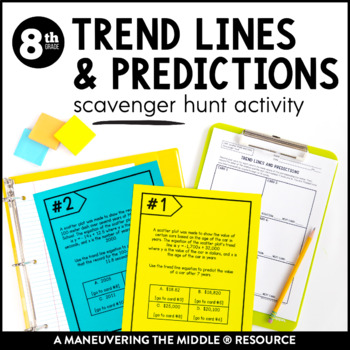
Trend Lines and Predictions Scavenger Hunt Activity | Trend Line Word Problems
What educators are saying
Also included in.
Description
This Trend Lines and Predictions Scavenger Hunt consists of 10 clue cards where students must use the clue to solve problems using the equations of trend lines. This activity focuses on writing and interpreting equations of trend lines as well as using the equations to problem solve and make predictions.
This activity is great for in class practice! Students can get out of their seats and move around, while still applying their understanding of making predictions from trend lines.
Students are able to practice and apply concepts with this trend lines and predictions activity, while collaborating and having fun! Math can be fun and interactive!
Standards: CCSS (8.SP.3) and TEKS (8.5D)
More details on what is included:
10 Clue Cards that can be utilized in pairs or groups of 3-4 and any necessary recording sheets and answer keys.
- 10 Clue Cards: Trend Lines and Predictions
- Recording Sheet
- Teacher Directions
***Please download a preview to see sample pages and more information.***
How to use this resource:
- Use as a whole group classroom activity
- Use in a small group for additional remediation, tutoring, or enrichment
- Use as an alternative homework or independent practice assignment
- Incorporate within our Scatter Plots and Data Unit to support the mastery of concepts and skills.
Time to Complete:
- Most activities can be utilized within one class period. Performance tasks summarize the entire unit and may need 2-3 class periods. However, feel free to review the activities and select specific problems to meet your students’ needs and time specifications. There are multiple problems to practice the same concepts, so you can adjust as needed.
Looking for instructional materials?
- Check out the corresponding Scatter Plots and Data Unit , which includes student handouts, independent practice, assessments, and answer keys.
More 8th Grade Activity Bundles:
Unit 1: Real Number System
Unit 2: Exponents and Scientific Notation
Unit 3: Linear Equations
Unit 4: Linear Relationships
Unit 5: Functions
Unit 6: Systems of Equations
Unit 7: Transformations
Unit 8: Angle Relationships
Unit 9: Pythagorean Theorem
Unit 10: Volume Unit 11: Scatter Plots and Data
More 8th Grade Units:
Looking for more helpful teaching tips, ideas, and support? Check out Maneuveringthemiddle.com and join our online FB community MTM VIPS!
Try out a FREE math resource! Grab your freebie here!
Licensing:
This file is a license for ONE teacher and their students. Please purchase the appropriate number of licenses if you plan to use this resource with your team. Thank you!
Customer Service:
If you have any questions, please feel free to reach out for assistance . We aim to provide quality resources to help teachers and students alike, so contact me before leaving feedback if you have a need.
Maneuvering the Middle ® Terms of Use
Products by Maneuvering the Middle®, LLC may be used by the purchaser for their classroom use only. This is a single classroom license only. All rights reserved. Resources may only be posted online in an LMS such as Google Classroom, Canvas, or Schoology. Students should be the only ones able to access the resources. It is a copyright violation to upload the files to school/district servers or shared Google Drives. See more information on our terms of use here .
If you are interested in a personalized quote for campus and district licenses, please click here .
©Maneuvering the Middle® LLC, 2012-present
Questions & Answers
Maneuvering the middle.
- We're hiring
- Help & FAQ
- Privacy policy
- Student privacy
- Terms of service
- Tell us what you think
SCATTER PLOTS AND TREND LINES WORKSHEET
Problem 1 :
The table shows the number of species added to the list of endangered and threatened species in the United States during the given years. Graph a scatter plot using the given data.

Source: U.S. Fish and Wildlife Service.
Problem 2 :
Describe the correlation between TV watching and test score illustrated by the scatter plot.

Problem 3 :
Describe the correlation illustrated by the scatter plot.

Problem 4-6 : Identify the correlation you would expect to see between each pair of data sets. Explain.
Problem 4 :
The number of empty seats in a classroom and the number of students seated in the class.
Problem 5 :
The number of pets a person owns and the number of books that person read last year.
Problem 6 :
The monthly rainfall and the depth of water in a reservoir.
Problem 7 :
Choose the scatter plot that best represents the relationship between the number of days since a sunflower seed was planted and the height of the plant. Explain. The x-value represents time (days) and the y-value represents the height (in.).

Problem 8 :
Choose the scatter plot that best represents the relationship between the number of minutes since a pie has been taken out of the oven and the temperature of the oven. Explain.

Draw a trend line and use it to make a prediction.
Problem 9 :
The scatter plot shows a relationship between the total amount of money collected and the total number of rolls of wrapping paper sold as a school fund-raiser. Based on this relationship, predict how much money will be collected when 175 rolls have been sold.

Problem 10 :
Based on the trend line in problem 9 above, predict how many wrapping paper rolls need to be sold to raise $500.

Detailed Answer Key
1. Answer :
Use the table to make ordered pairs like (1996, 91) for the scatter plot.
The x-value represents the calendar year and the y-value represents the number of species added.
Plot the ordered pairs.

2. Answer :
As the number of hours spent watching TV increased, test scores decreased.
There is a negative correlation between the two data sets.
3. Answer :
As the year increased, number of participants increased.
There is a positive correlation between the two data sets.
4.Answer :
You would expect to see a negative correlation. As the number of students increases, the number of empty seats decreases.
5. Answer :
You would expect to see no correlation. The number of pets a person owns has nothing to do with how many books the person has read.
6. Answer :
You would expect to see a positive correlation. As more rain falls, there is more water in the reservoir.
7. Answer :
Graph A :
There will be a positive correlation between the number of days and the height because the plant will grow each day.
Graph A has a negative correlation, so it is incorrect.
Graph B :
Neither the number of days nor the plant heights can be negative.
Graph B shows negative values, so it is incorrect.
Graph C :
This graph shows all positive coordinates and a positive correlation, so it could represent the data sets.
Graph C is the correct scatter plot.
8. Answer :
It shows that the pie is cooling steadily after it is taken out of the oven, so it is correct.
It shows the pie cooling while it is in the oven, so it is incorrect.
It shows the temperature of the pie is increasing after it is taken out of the oven, so it is incorrect.
9. Answer :
Draw a line that has about the same number of points above and below it. Your line may or may not go through data points.
Find the point on the line whose x-value is 175. The corresponding y-value is 1200.

Based on the data, $1200 is a reasonable prediction of how much money will be collected when 175 rolls have been sold.
10. Answer :
Find the point on the line whose y-value is 500. The corresponding x-value is about 75.

Based on the data, about 75 wrapping paper rolls is a reasonable prediction of how many rolls need to be sold to raise $500.

Apart from the stuff given above, if you need any other stuff in math, please use our google custom search here.
Kindly mail your feedback to [email protected]
We always appreciate your feedback.
© All rights reserved. onlinemath4all.com
- Sat Math Practice
- SAT Math Worksheets
- PEMDAS Rule
- BODMAS rule
- GEMDAS Order of Operations
- Math Calculators
- Transformations of Functions
- Order of rotational symmetry
- Lines of symmetry
- Compound Angles
- Quantitative Aptitude Tricks
- Trigonometric ratio table
- Word Problems
- Times Table Shortcuts
- 10th CBSE solution
- PSAT Math Preparation
- Privacy Policy
- Laws of Exponents
Recent Articles
How to Find the Vertex of a Quadratic Function in General Form
Apr 26, 24 11:54 PM
Sum of the Three Angles of a Triangle
Apr 26, 24 09:20 PM

Writing Quadratic Functions in Standard Form
Apr 26, 24 12:39 PM
COMMENTS
Sam may have drawn a correct trend line but using the data points that are not on the trend line may have an incorrect equation for the line. He should use two points on that trend line to write the equation. Problem Solving with Trend Lines Homework 4 Answer Key Question 17.
Scatter plots and trend lines ©Maneuvering the Middle LLC, 2016. ... Answer Key. linear. straight. straight. points. No; the scatter plot is positive but the trend line is negative. ... Problem solving with trend lines. Use the equation to answer the questions below. In 1960, about 45% of the U.S. population smoked cigarettes. ...
Homework Sheets. Time to mathematically breakdown the trends on lines. Homework 1 - A trend line roughly describes the relationship between two variables in a set of data. Homework 2 - Plug (1, 2) and (0, -6) into the slope formula. Homework 3 - Plug the slope m = 3 and the y-intercept b = -4 into the slope-intercept formula. y = 3x - 4.
4-3 Problem Solving w/ Trend Lines Name _____ Per. ___ The scatter plot shows the cost of gas per gallon during certain years. Use the scatter plot to answer questions 1-5. 1. Use the trend line shown on the scatter plot to answer a-c. a. Write an equation for the trend line: b. What does "x" represent in the equation? c.
The Cost of College. Methods of Payment. Financial Responsibility. Personal Financial Literacy Study Guide. Tax, Tip & Discount. Turos Math Class. Problem SOlving with Trend Lines. 11.4 - Problem Solving with Trend Lines - Video Notes. Proudly powered by Weebly.
Write a linear equation to describe the given model. Step 1: Find the slope. This line goes through ( 0, 40) and ( 10, 35) , so the slope is 35 − 40 10 − 0 = − 1 2 . Step 2: Find the y -intercept. We can see that the line passes through ( 0, 40) , so the y -intercept is 40 . Step 3: Write the equation in y = m x + b form.
Answers Additional Practice 1. 2. negative 3. none 4. positive correlation; having more pets means needing more food, toys, etc. 5-6. 7. positive 8. about 10 minutes Problem Solving 1. 2. positive correlation 3. about 320 wpm 4. negative correlation 5. C 6. J 7. B 8. F ADDITIONAL PRACTICE AND PROBLEM SOLVING Chapter 3 155 Lesson 5. 380 360 ...
5-7 Scatter Plots and trend Lines Online Resouces: Homework answer key HW-5-7-Key.pdf problems 7 - 29, with more details for the even problems 20-28. This is a pdf of the answers reviewed in class. Summary and Reminders: Summary Slope-Intercept form of an equation: y = mx + b
Algebra 1 answers to Chapter 5 - Linear Functions - 5-7 Scatter Plots and Trend Lines - Lesson Check - Page 337 5 including work step by step written by community members like you. Textbook Authors: Hall, Prentice, ISBN-10: 0133500403, ISBN-13: 978--13350-040-0, Publisher: Prentice Hall
Description. This Scatter Plots and Trend Lines Cut and Paste is a great way for students to practice writing equations of trend lines. Students will use the scatter plots and trend lines provided to cut and paste the correct trend line equation. This activity is great for extra practice, as a station or center, and can be used to add variety ...
Trend Lines and Predictions Success for English Learners To write an equation for a trend line: • Select two ordered pairs. • Find the slope for those points. • Write the equation. Here are two ways to write an equation for the trend line in the scatter plot at the right. Problem 1 Problem 2 Method: Method: 1. Select two ordered pairs. 1.
Scatterplots & Linear Regression ( Trend Line) on Ti-84 (student notes) Created by. Deepdishpi. This is a simple step-by-step list for student interactive notebooks. Steps walk students through entering data, graphing the scatterplot and linear regression (tend line) in the Ti-83/84 family of graphing calculators.
The x axis is labeled Time spent on phone in hours. Points fall diagonally in a narrow pattern between the points points (1, 8) and (9, 2 and 1 half). All values estimated. Line A decreases through the points (0, 9) and (8, 3). Line B decreases through the points (0, 6) and (8, 0). Line C decreases passing through the points (0, 5) and (10, 4).
Lesson info for Solving Using Trend Lines. Examine the scatter plots for data related to weather at different latitudes. The Gizmo includes three different data sets, one with negative correlation, one positive, and one with no correlation. Compare the least squares best-fit line.
This problem has been solved! You'll get a detailed solution from a subject matter expert that helps you learn core concepts. Question: LESSON 14-2 Trend Lines and Predictions Practice and Problem Solving: A/B Time and Distance Traveled 300 Use the scatter plot for Exercises 1-6. 1. Does the pattern of association between time (number of hours ...
For scatter plots that suggest a linear association, informally fit a straight line, and informally assess the model fit by judging the closeness of the data points to the line. 8.SP.3 Use the equation of a linear model to solve problems in the context of bivariate measurement data, interpreting the slope and intercept.
Scatter Plots and Trend Lines Graph a scatter plot using the given data. 1. The table shows the average salary (rounded to the nearest hundred) for one type of worker, listed by decade. Graph a scatter plot using the given data. Decade 1950 1960 1970 1980 1990 Avg. Salary $2800 $4800 $8300 $15,400 $23,700
Description. This Trend Lines and Predictions Scavenger Hunt consists of 10 clue cards where students must use the clue to solve problems using the equations of trend lines. This activity focuses on writing and interpreting equations of trend lines as well as using the equations to problem solve and make predictions.
SCATTER PLOTS AND TREND LINES WORKSHEET. Problem 1 : The table shows the number of species added to the list of endangered and threatened species in the United States during the given years. Graph a scatter plot using the given data. Source: U.S. Fish and Wildlife Service. Problem 2 : Describe the correlation between TV watching and test score ...
Based on the trend line you drew, predict the amount ... 3-5 Problem Solving Scatter Plots and Trend Lines Fawn is trying to improve her reading skills by taking a speed- reading class. She is measuring how many words per minute (wpm) she can read after each week of the class. 1. Graph a scatter plot using the given