27 Super Hidden PowerPoint Tips and Tricks Only The Pros Know!
Ausbert Generoso

Ever felt like your PowerPoint presentations could use a little magic? You’re not alone. Whether you’re a seasoned presenter or just getting started, there’s a world of PowerPoint tips and tricks waiting for you. In this guide, we’re diving into the nitty-gritty of Microsoft PowerPoint to uncover 30 hidden gems that’ll transform the way you create and deliver slides.
From making your designs pop to streamlining your workflow, these PowerPoint hacks are designed for real-world impact. No jargon, just practical insights that’ll have you presenting like a pro in no time.
Let’s cut through the noise and get straight to the good stuff – your next presentation is about to level up. Ready? Let’s get started.

27 PowerPoint Tips and Tricks That Put The Power in PowerPoint
1. Morph Transition for Seamless Animation
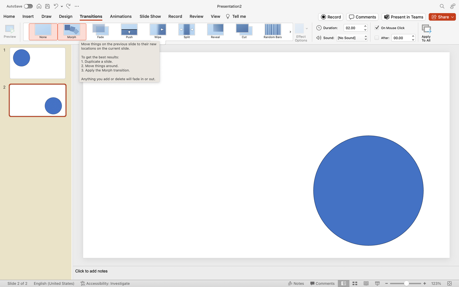
What’s it for: Elevate your presentation by seamlessly animating objects and creating smooth transitions between slides. Morph transition is your key to a dynamic and visually engaging storytelling experience, allowing you to captivate your audience effortlessly.
How to do it:
- Position the same object in different parts on multiple slides
- Select all slides, and go to the Transitions tab.
- Choose “Morph” as the transition effect.
2. SVG Image Integration
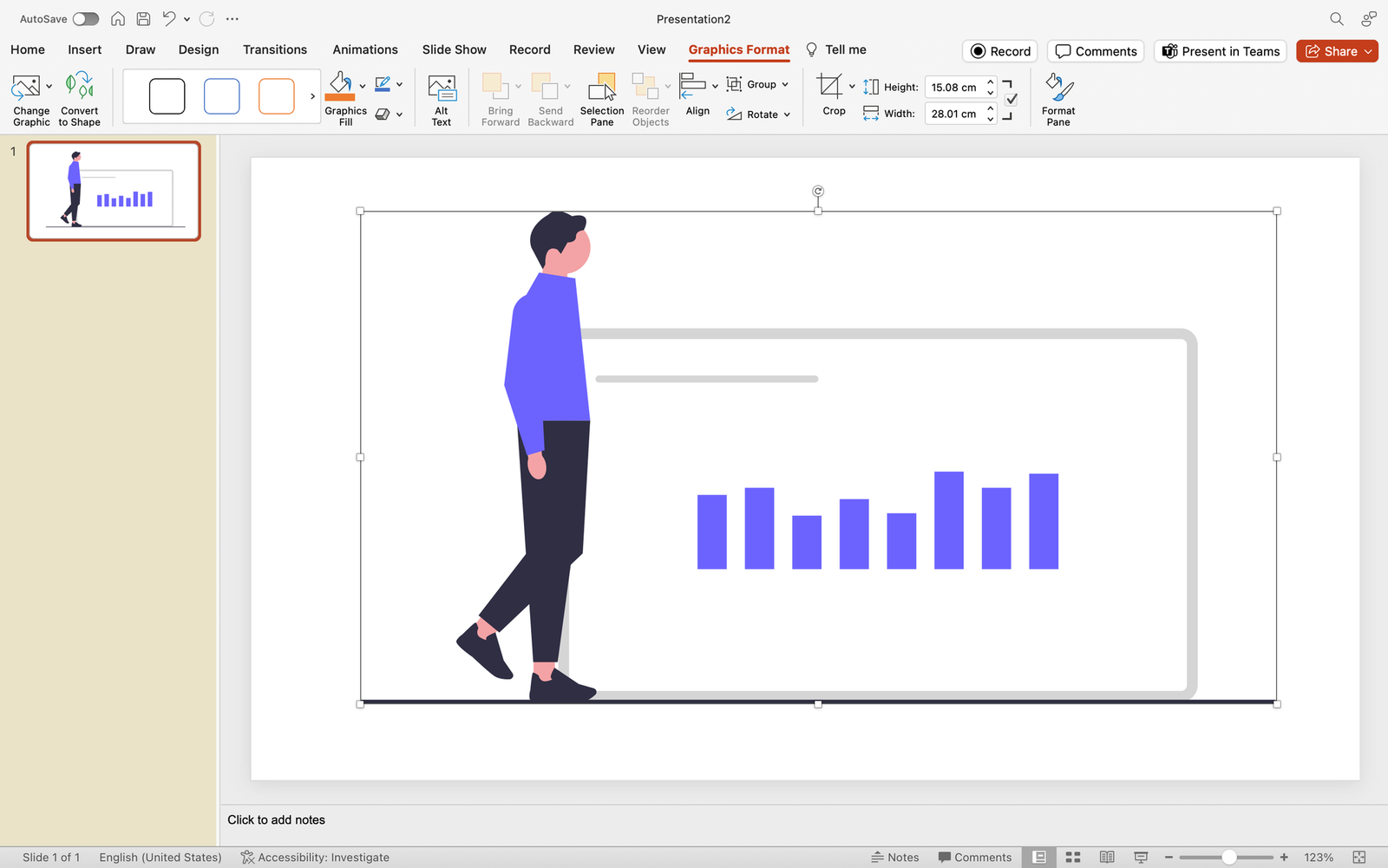
What’s it for: Did you think SVG’s only work for websites and professional photo editing tools? They do, too, in PowerPoint! Import high-quality Scalable Vector Graphics (SVG). Maintain image clarity, resize without loss, and enhance your presentations with crisp logos and icons.
- Save your chosen SVG on your device.
- Click on the Insert tab.
- Choose “Pictures” and select your SVG file.
- Adjust the size without compromising image quality.
3. Designer Feature for Quick Layouts
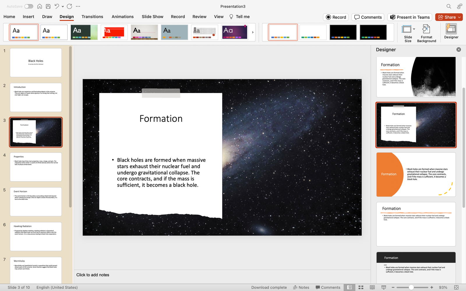
What’s it for: Effortlessly create professional-looking slides with the Designer feature. Receive instant layout suggestions based on your content, saving time and ensuring your presentation looks polished.
- Select a slide.
- Go to the Design tab and click Designer on the far right along the ribbon.
- Select through ready-made slide designs for instant layouts.
4. Insert 3D Models
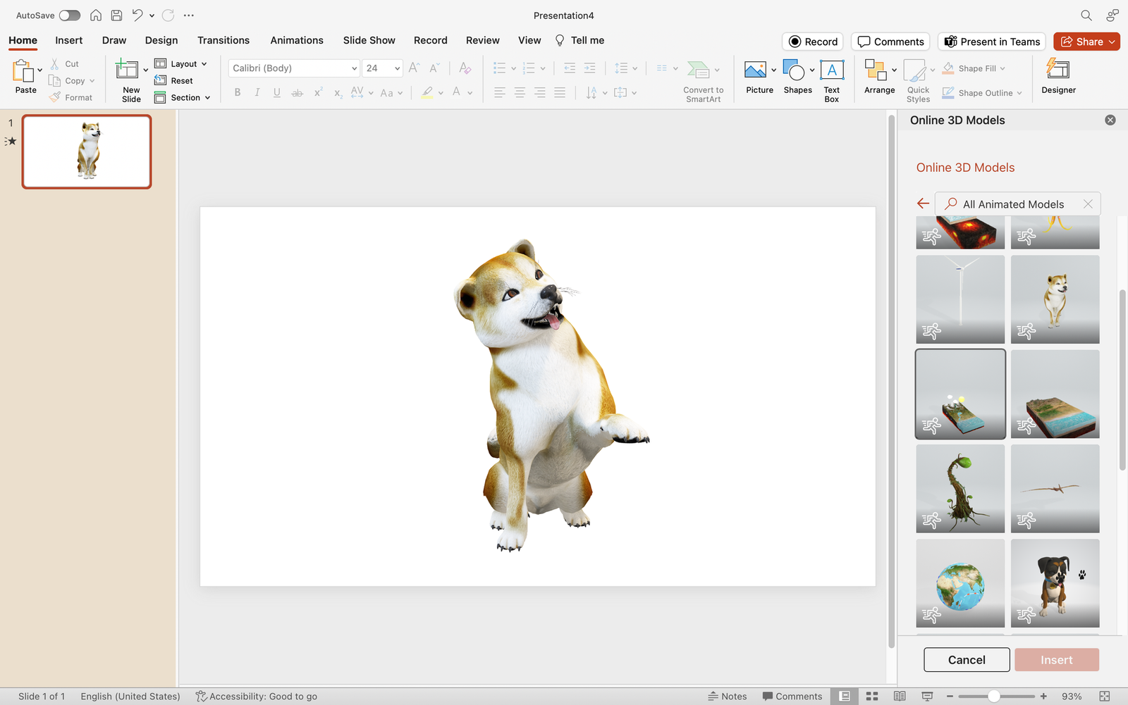
What’s it for: Amp up your presentations with manipulable 3D models, adding a dynamic dimension. Whether it’s showcasing products or visualizing data, 3D models bring your slides to life.
- Click on the “3D Models” dropdown and proceed to Stock 3D Models.
- Search for a 3D model of your choice and insert.
- Manipulate and customize as needed.
5. SmartArt Graphics for Visual Hierarchy
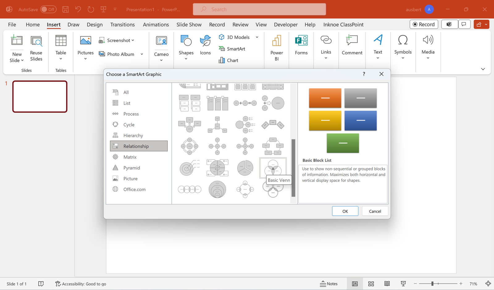
What’s it for: Convey complex ideas with visual hierarchy using SmartArt graphics. These graphics offer a structured and visually appealing way to organize information, making your content more digestible.
- Go to the Insert tab.
- Select “SmartArt” and navigate through the available categories.
- Select a graphic template that fits your presentation needs.
- Enter your content and customize as needed.
6. Eyedropper Tool for Color Matching
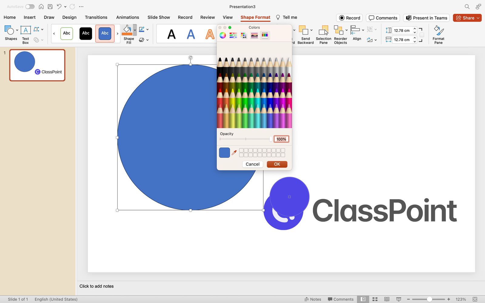
What’s it for: Maintain a cohesive design by using the Eyedropper tool to pick colors from images or elements within your presentation. Ensure consistency and professional aesthetics in every slide.
- Select the editable, native PowerPoint object you wish to customize.
- Go to the Shape Format tab and click on the Shape Fill dropdown.
- Select “More Fill Colors…” and click the eyedropper icon to begin color appropriating.
7. Record and Insert Audio
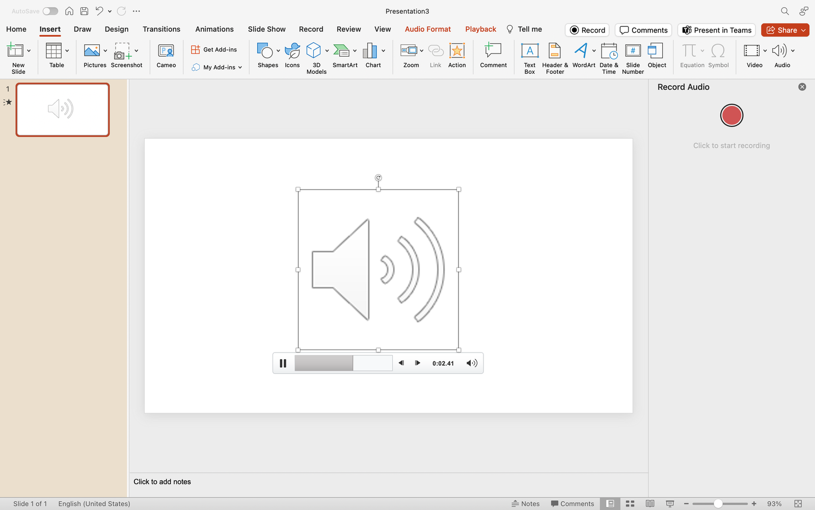
What’s it for: Infuse personality into your presentation by recording audio directly within PowerPoint. Ideal for adding voiceovers, explanations, or personal touches that enhance audience engagement.
- Click on “Audio” and choose “Record Audio.”
- Record your audio and insert it into the slide.
8. Presenter Coach for Rehearsing
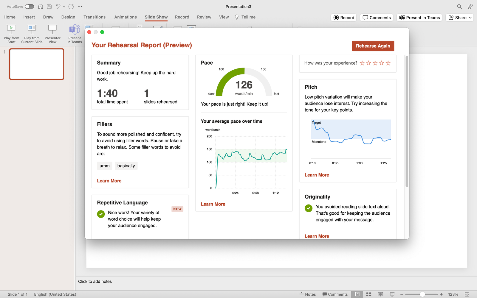
What’s it for: Elevate your presentation skills with Presenter Coach. Receive valuable feedback on pacing, filler words, and more, refining your delivery for a confident and impactful performance.
- Click on the Slide Show tab.
- Choose “Rehearse with Coach” to start practicing.
9. Hyperlink Navigation for Seamless Transitions
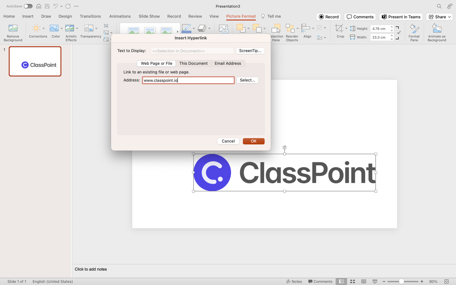
What’s it for: Streamline your presentation flow by implementing Hyperlink Navigation. This trick allows you to create clickable links within your slides, enabling effortless transitions between related content or external resources, enhancing the overall navigational experience.
- Select the text or object you want to hyperlink.
- Right-click and choose “Hyperlink” or use the Ctrl+K shortcut.
- Specify the destination, whether it’s another slide, a website, or a file, to create a seamless navigational experience.
10. Alt Text for Accessibility
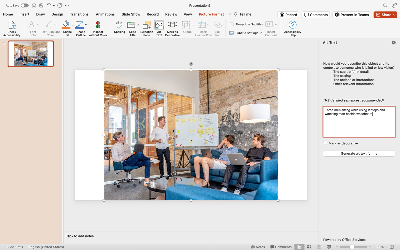
What’s it for: Improve accessibility by adding descriptive alternative text to images and objects. Ensure inclusivity for visually impaired individuals, making your presentation accessible to a wider audience.
- Right-click on the image or object.
- Choose “Edit Alt Text” and enter a descriptive text.
11. Slide Zoom for Dynamic Navigation
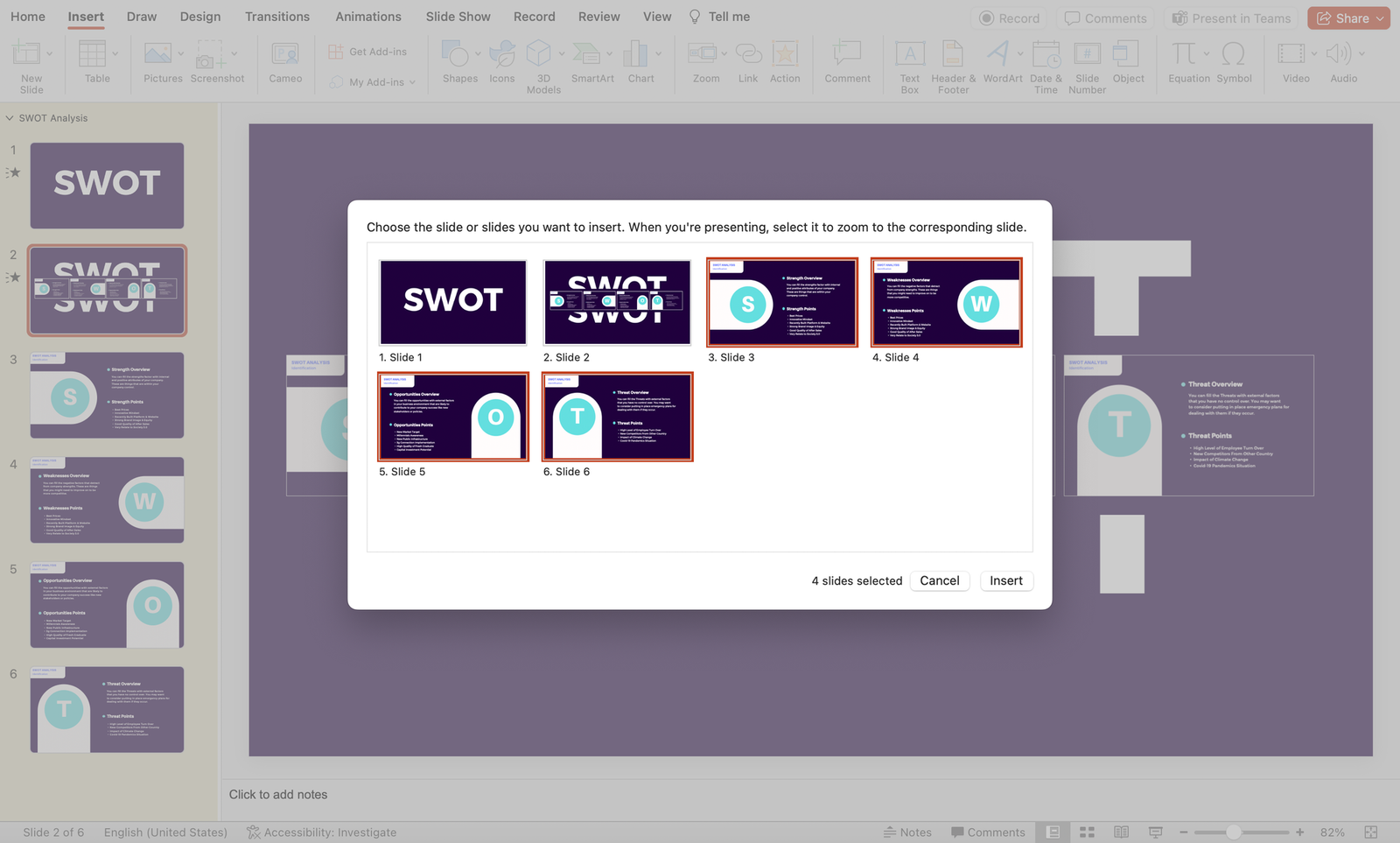
What’s it for: Elevate your presentation’s navigation with Slide Zoom, offering the flexibility to jump to specific slides during a presentation without adhering to a linear sequence. This dynamic feature ensures a more engaging and tailored audience experience.
- Set a master slide where you’d like to put your “mini slides” altogether.
- Navigate to the Insert tab > Zoom dropdown > Slide Zoom.
- Select the slides you want to link onto your master slide and insert.
12. Live Captions and Subtitles

What’s it for: Foster inclusivity by enabling live captions and subtitles in multiple languages. This feature enhances accessibility, making your presentation more engaging and comprehensible for a diverse global audience.
- Go to the Slide Show tab.
- Select “Always Use Subtitles” and choose your language.
13. Password Protection for Security
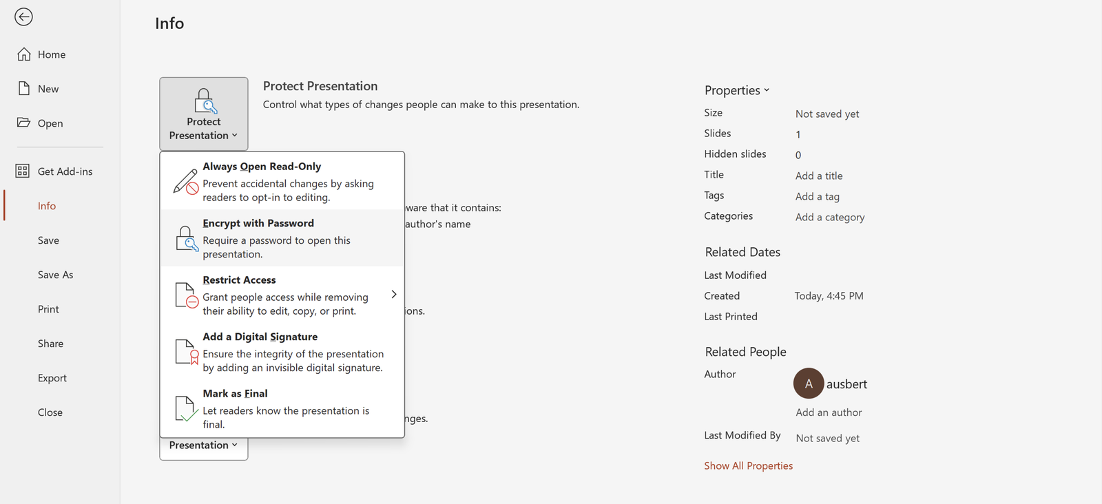
What’s it for: Safeguard your presentation’s sensitive content by adding a password. This security measure ensures that only authorized individuals can access and view the information, adding an extra layer of protection.
- Navigate to the File tab.
- Select “Info” and click on “Protect Presentation.”
- Choose “Encrypt with Password” and set your password.
14. Animation Painter for Consistent Animations

What’s it for: Maintain a polished and consistent look throughout your presentation by using the Animation Painter. Copy and apply animations across different objects with ease, ensuring a cohesive visual experience.
- Select the object with the same, desired animation as the others.
- Go to the Animation tab.
- Click on “Animation Painter” and apply to other objects.
15. Linked Excel Charts for Real-Time Updates
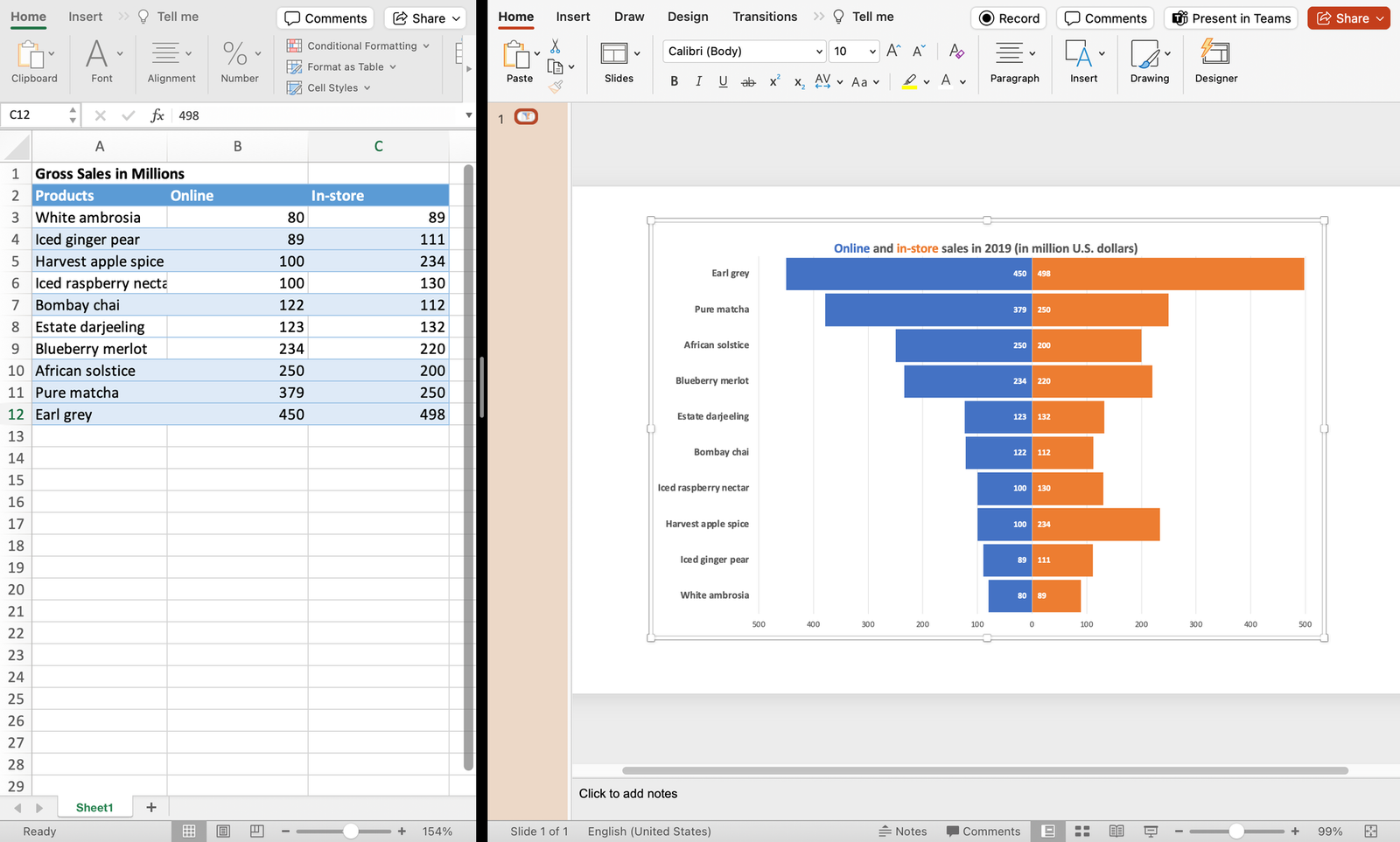
What’s it for: Integrate linked Excel charts for real-time updates in your PowerPoint presentation. Any modifications made to the linked Excel file automatically reflect in your slides, ensuring data accuracy.
- Copy your Excel chart.
- In PowerPoint, use “Paste Special” and choose “Microsoft Excel Worksheet Object.”
16. Custom Slide Sizes
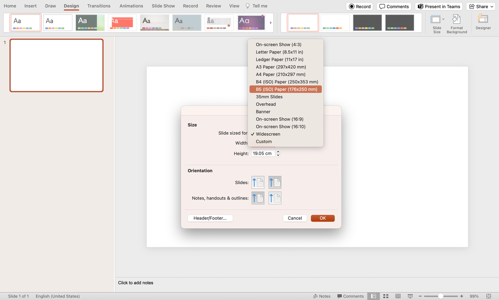
What’s it for: Tailor your presentation to various screen dimensions by customizing slide sizes. This feature, accessible through the Design tab, ensures your content fits seamlessly across different display settings.
- Navigate to the Design tab.
- Click on the “Slide Size” dropdown and choose “Page Setup”.
- Change “Slide sized for” to Custom.
17. Grid and Guidelines for Precision
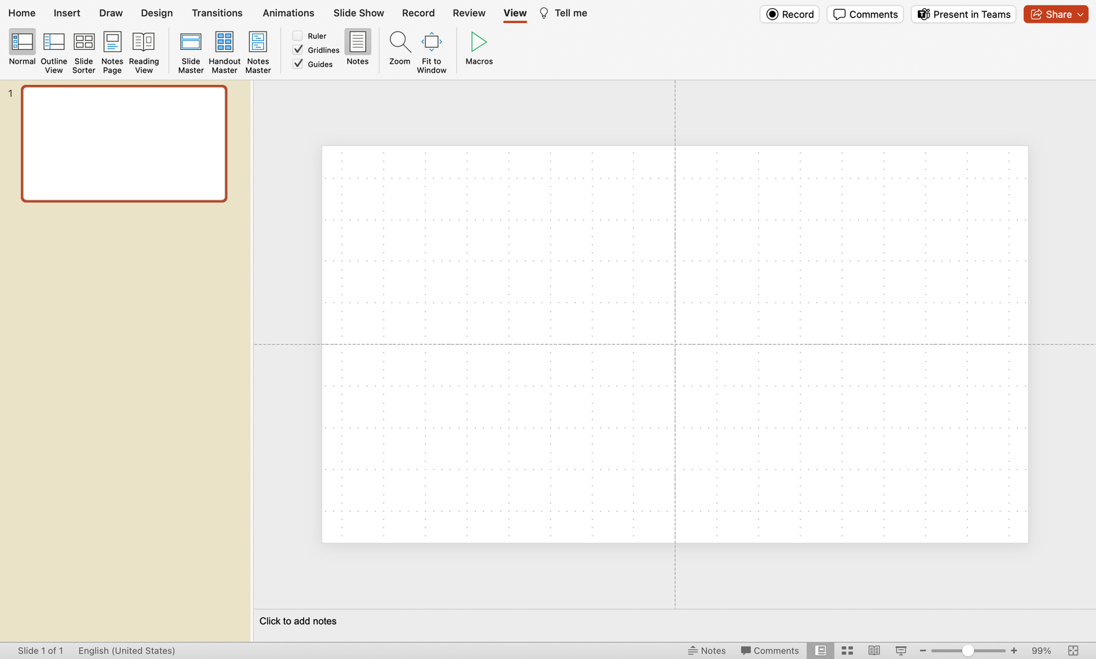
What’s it for: Achieve precise object alignment with gridlines and guides. This feature, essential for creating visually polished and organized presentations, ensures your content is visually appealing and professionally structured.
- Go to the View tab.
- Check the “Grids” and “Guidelines” toggles for display options and customization.
18. Slide Master for Consistent Design
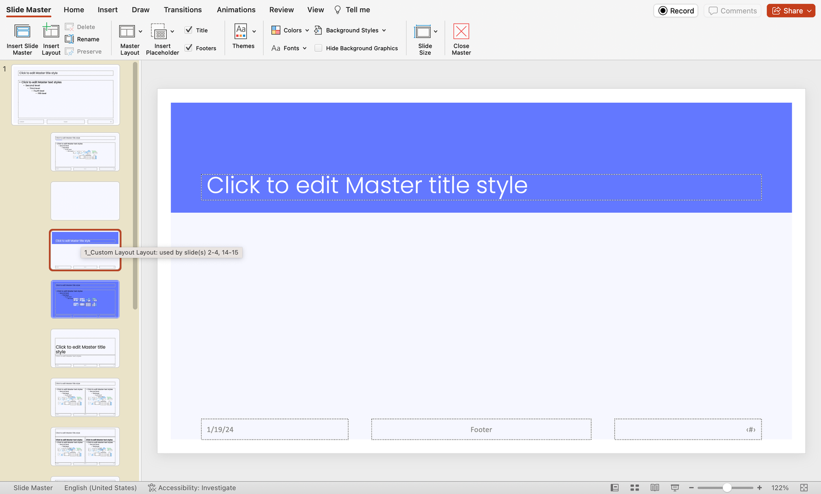
What’s it for: Establish a cohesive presentation design by utilizing the Slide Master. This time-saving feature enables you to set consistent layouts, fonts, and colors throughout your presentation.
- Click on “Slide Master” to access and customize master slides.
19. Quick Access Toolbar Customization
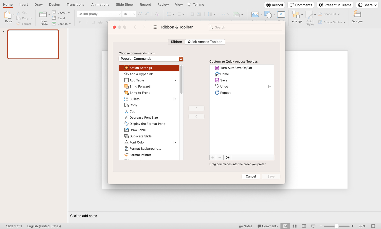
What’s it for: Streamline your workflow by personalizing the Quick Access Toolbar with your most-used commands. This customization ensures quick access to essential tools, enhancing efficiency during presentation creation.
- Click on the dropdown arrow on the Quick Access Toolbar.
- Select “More Commands” to customize your toolbar.
20. Ink Annotations for Handwriting
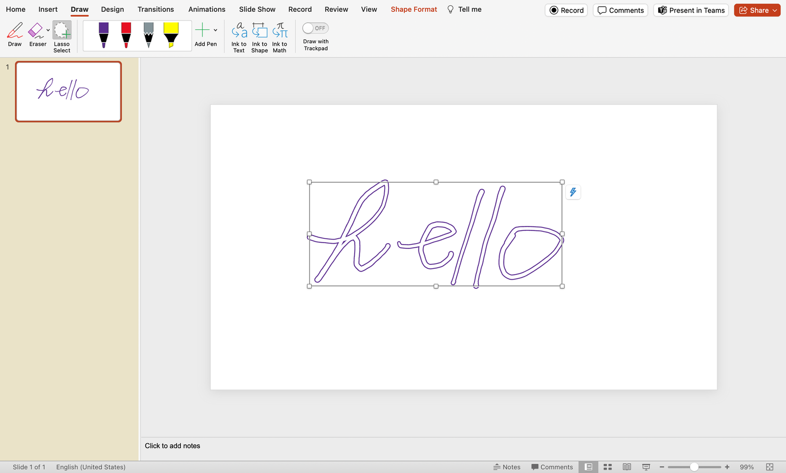
What’s it for: Personalize your presentations with a touch-enabled device using ink annotations. This feature allows you to draw or write directly on slides, adding a unique and handwritten touch to your content.
- Go to the Draw tab and click on Draw to begin drawing.
- Choose “Ink to Text” or “Ink to Shape” for handwriting annotations.
21. Crop to Shape for Image Customization
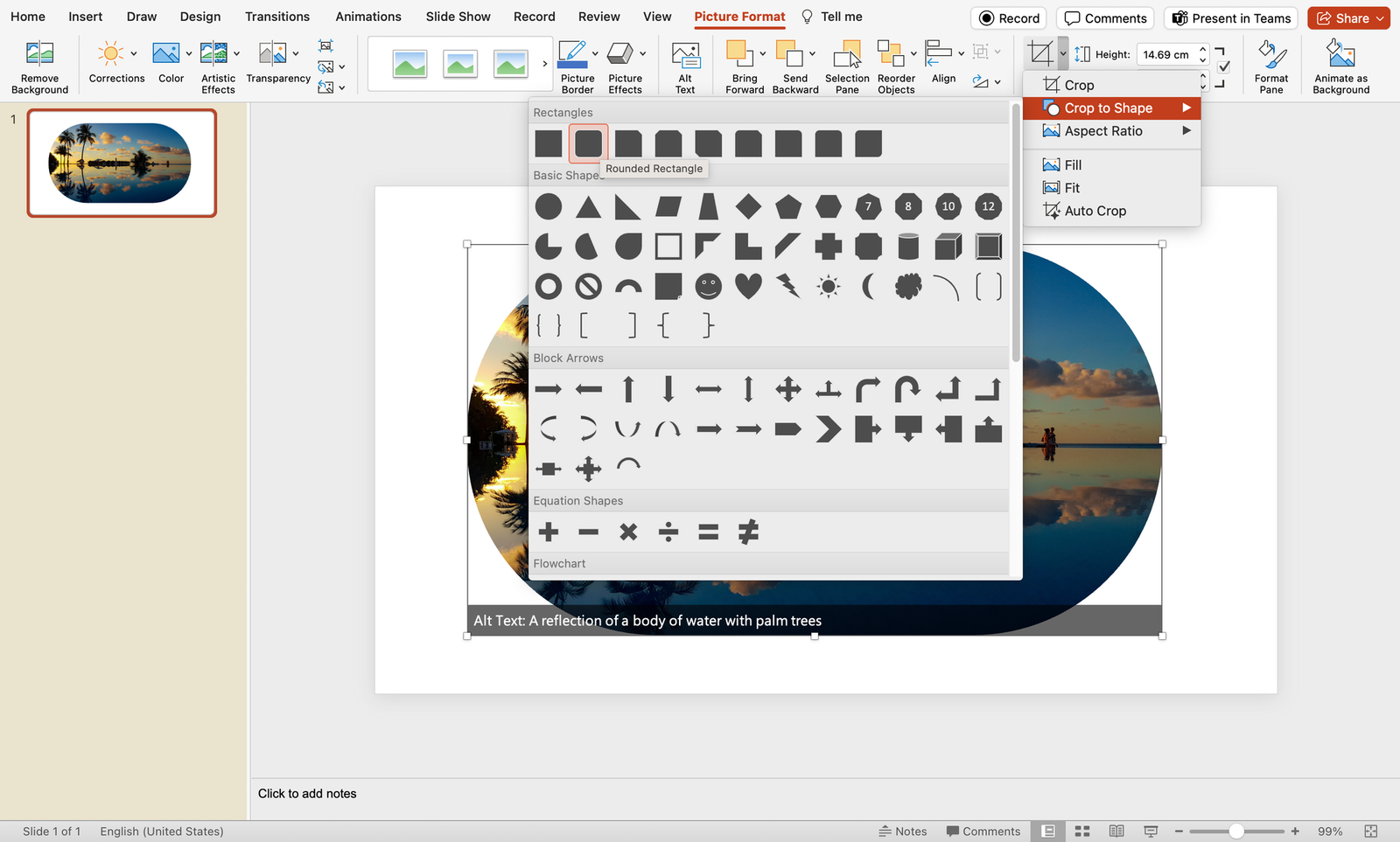
What’s it for: Unleash your creativity by utilizing the Crop to Shape feature, allowing you to create custom image shapes. This adds a distinctive flair to your presentation, providing a visually dynamic and engaging experience.
- Select the image.
- Navigate to the Picture Format tab.
- Click on “Crop” and choose “Crop to Shape.”
- Select the shape you want your image to have as frame.
22. Slide Show Recording with Narration
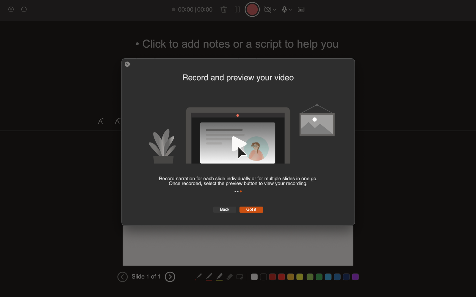
What’s it for: Capture your entire presentation, including narration and animations, by recording a self-running slideshow. This feature is invaluable for sharing presentations with a wider audience, ensuring a consistent and engaging delivery.
- Click on “Record Slide Show” and choose recording options.
23. Dynamic Color Scheme Switch for Vibrant Slides
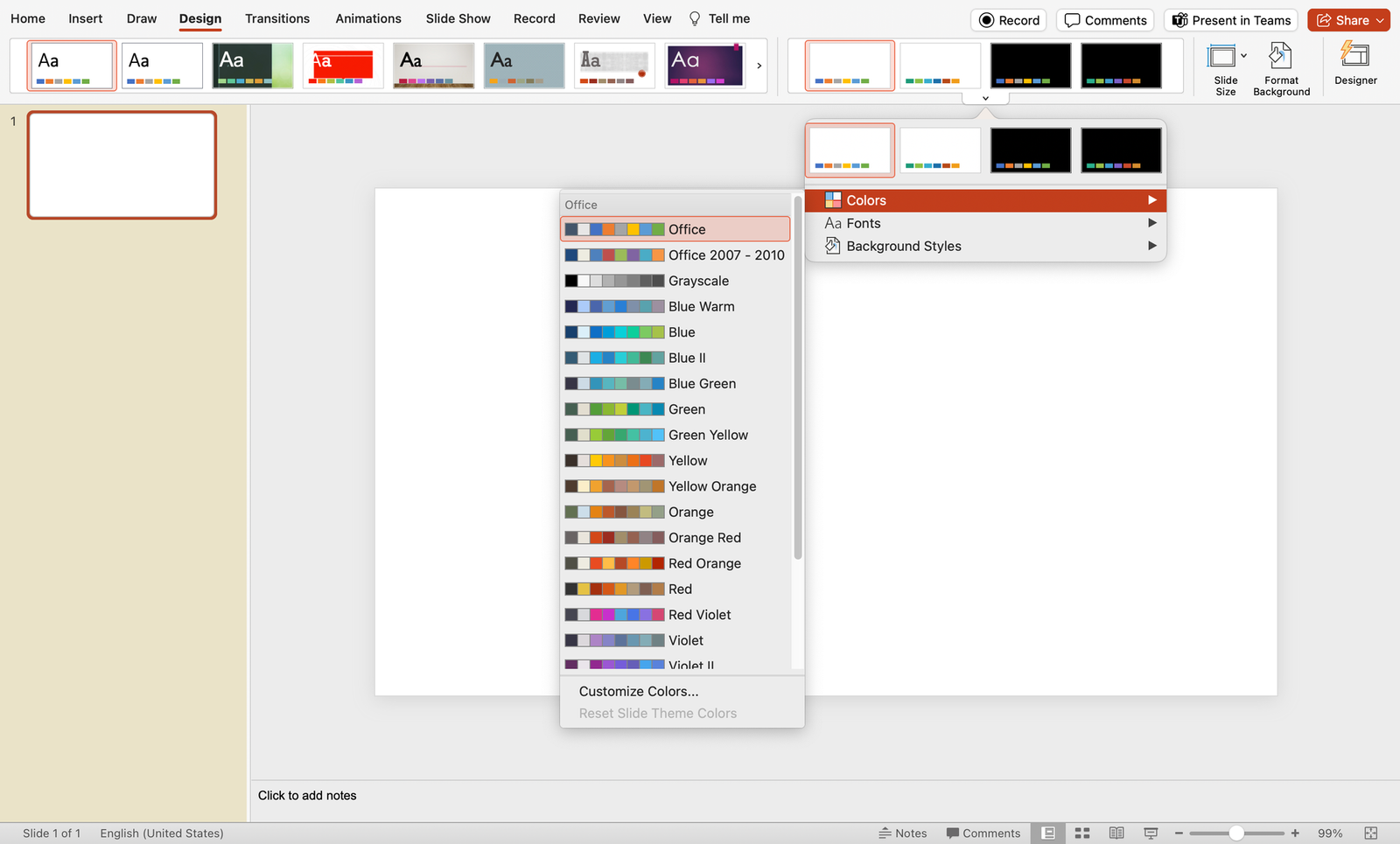
What’s it for: Infuse energy into your presentation by dynamically switching color schemes. This handy trick allows you to quickly experiment with various color palettes, giving your slides a vibrant and fresh appearance in just a few clicks.
- Explore different color options by selecting “Colors” and experimenting with the available palettes. Instantly transform the look of your presentation to match your desired mood and style.
24. Smart Alignment and Distribution for Pixel-Perfect Precision
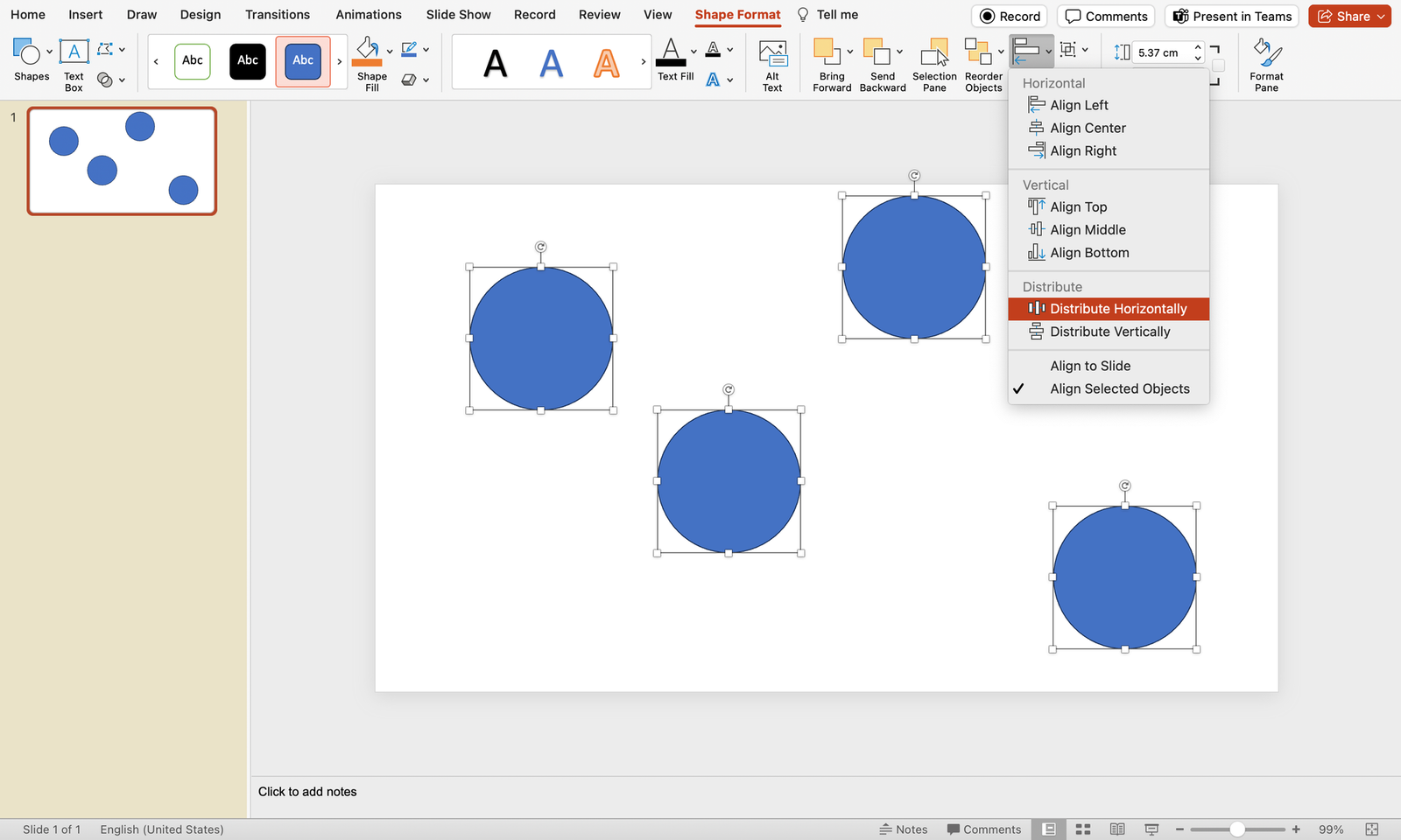
What’s it for: Attain pixel-perfect precision in your presentation design with the Smart Alignment and Distribution trick. This technique allows you to not only align objects with accuracy but also evenly distribute them horizontally, ensuring a polished and visually appealing layout.
- Select the objects you want to align.
- Navigate to the Format tab.
- Click on “Align” to access options like Align Left, Center, or Right for precise alignment.
- Further refine your layout by choosing “Distribute Horizontally,” ensuring equal spacing between objects and achieving a professional design.
25. Insert Online Videos
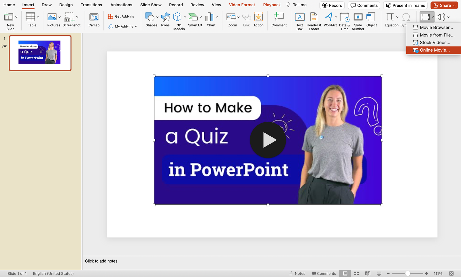
What’s it for: Seamlessly integrate online videos directly into your presentation. This feature eliminates the need for external players, offering a smooth and immersive viewing experience for your audience.
- Click on the “Video” dropdown and select Online Movie.
- Paste the video link and your video should be embedded onto your PowerPoint slide.
26. Embed Fonts for Portability
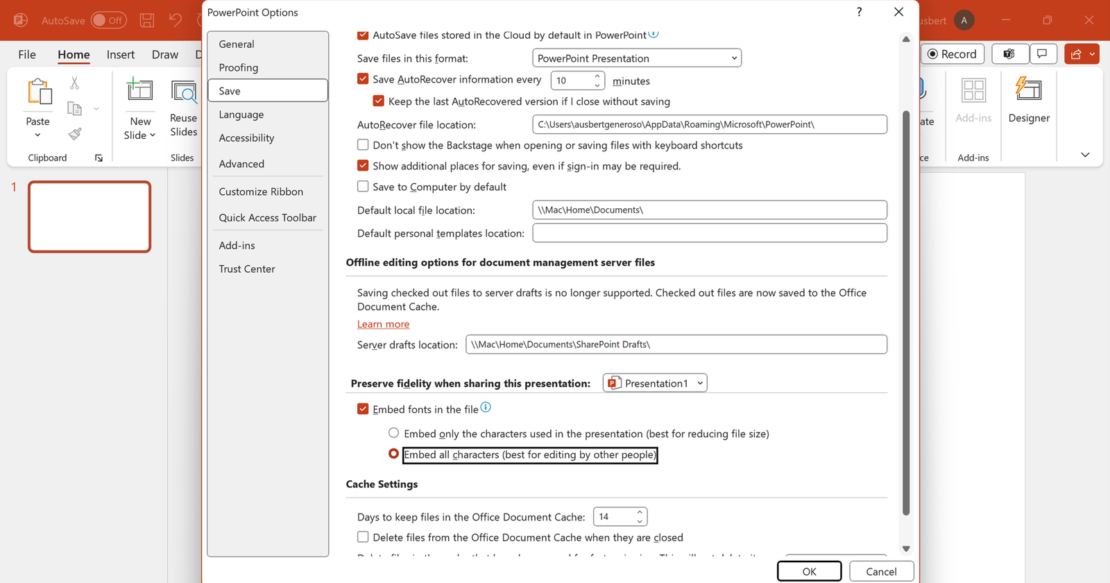
What’s it for: Ensure consistent visual appeal on any device by embedding fonts in your presentation. This is particularly useful when sharing your work with others who may not have the same fonts installed, enhancing portability.
- Go to the File tab.
- Select “Options” and go to the Save tab from the window popup.
- Check “Embed fonts in the file” as well as “Embed all characters”.
27. Text Transformation
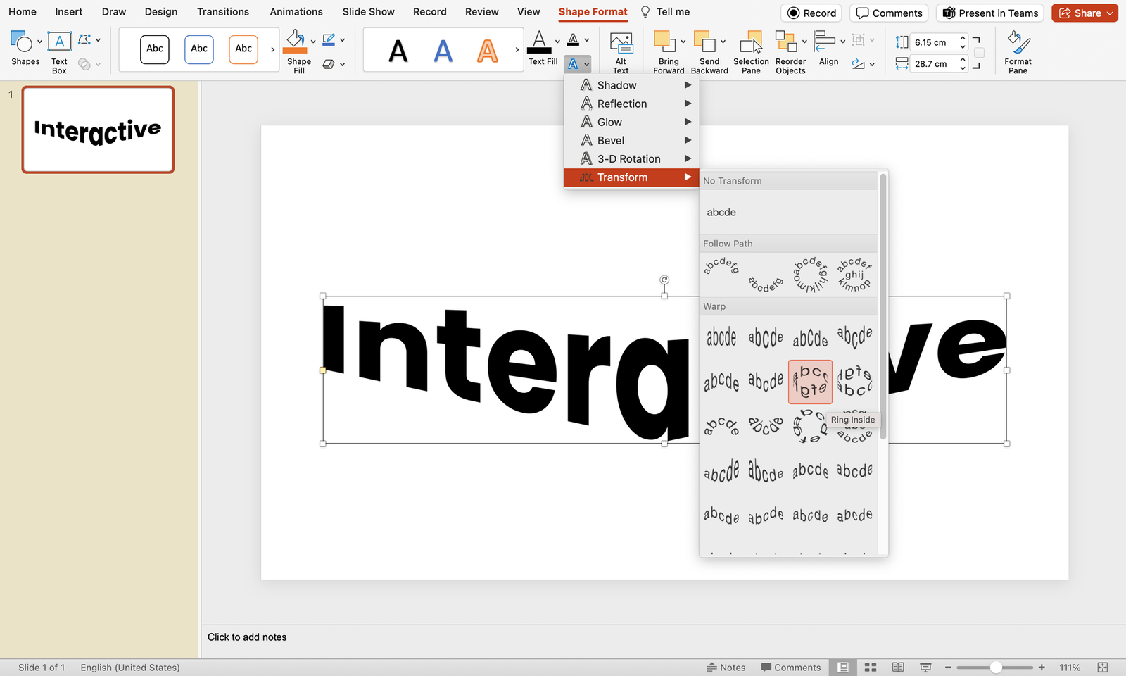
What’s it for: Uncover the elegance of text transformation with the Shape Format trick. This hack allows you to access a myriad of text transformation designs, offering a swift and sophisticated way to elevate the visual appeal of your presentation.
- Select the text you want to transform.
- Navigate to the Shape Format tab.
- Click on “Text Effects” and explore the “Transform” options for a variety of stylish text designs. Instantly apply a transformation that suits the tone and style of your presentation.
5 Critical Best Practices to Implement These Pro PowerPoint Tips and Tricks for a Technically Proficient Presentation
Enhance the technical brilliance of your presentation by focusing on these crucial best practices:
1. Streamlined Font Selection
- Practice: Limit your font styles to a maximum of three per slide.
- Why: Simplifying fonts enhances readability, maintains visual consistency, and prevents distraction, ensuring your message is clear and impactful.
2. High-Resolution Images
- Practice: Source HD images from reputable free resource websites like Freepik or Unsplash .
- Why: High-resolution images prevent pixelation, ensuring clarity and professionalism. Crisp visuals contribute to a visually appealing presentation.
3. Cohesive Color Palette
- Practice: Stick to a consistent color palette throughout your slides; use the eyedropper tool for precise color matching.
- Why: A unified color scheme enhances visual harmony, reinforces brand identity, and elevates the overall aesthetics of your presentation.
4. Efficient Data Visualization
- Practice: Use charts and graphs for data-driven slides, choosing appropriate chart types for different data sets.
- Why: Visualizing data through charts improves comprehension, making complex information more accessible and engaging for your audience.
5. Transitions with Purpose
- Practice: Apply slide transitions judiciously. Choose transitions that complement the content and avoid excessive animations.
- Why: Subtle transitions maintain audience focus, while excessive animations may distract from the core message.
Final Thoughts
In presentation-making, technical practices harmonized with thoughtful design is the key to delivering an impactful message. Whether it may be as simple as considering font choices, to incorporating high-resolution visuals, you do not only get to enhance the aesthetics but also ensure your audience’s undivided attention.
Remember, a technically proficient presentation is not just a showcase of information, but also one that leaves a rather immersive experience for those who will see. But at the end of the day, it comes down to your delivery. So, no sweat! You’re doing amazing, rockstar!
Find them useful? Save them, or share these PowerPoint tips and tricks with others to make their day!
About Ausbert Generoso
Supercharge your powerpoint. start today..
800,000+ people like you use ClassPoint to boost student engagement in PowerPoint presentations.
10 Cool PowerPoint Tips and Tricks You (Probably) Didn’t Know About
PowerPoint is a versatile tool capable of many amazing tasks. It has lots of great features but unfortunately, most users aren’t even utilizing half of the software’s capabilities.
Today, we’re going to change that. In this guide, we share some of the best PowerPoint tips and tricks for doing cool things with the presentation maker.
You’ll learn cool tricks like inserting QR codes in PowerPoint slides, converting presentations to videos, removing the background of images, and much more.
These PowerPoint tips will not only allow you to design presentations more easily but they will also help impress your audience. Let’s dive in.
How Does Unlimited PowerPoint Templates Sound?
Download thousands of PowerPoint templates, and many other design elements, with an Envato membership. It starts at $16 per month, and gives you unlimited access to a growing library of over 19+ million presentation templates, fonts, photos, graphics, and more.
Pitch Deck Templates
Startup pitch deck.
Minimal PPT Templates
Clean & clear.

Mystify Presentation
Explore PowerPoint Templates
Third-Party PowerPoint Templates
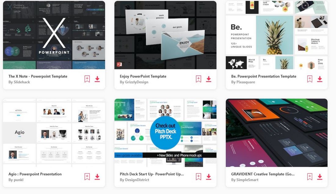
We wanted to start the list with a bit of an obvious but important tip: Use third-party PowerPoint templates!
Microsoft PowerPoint comes with a set of default templates pre-packaged with the software. These free templates are pretty good but they have been used by everyone, over and over again, to the point that anyone could immediately recognize which template you’re using by looking at the slide design.
The worst part is that it will allow your audience to tell how little effort you’ve put into designing the presentation.
What most users don’t realize is that you can download templates from third-party marketplaces and use them to create unique presentations. These templates are made by professional designers and they will immediately make your slideshows look ten times better.
You can check out our best PowerPoint template collection for some inspiration.
Use ChatGPT to Write the Slides
ChatGPT is an AI tool that revolutionized the way we work and made our everyday tasks so much easier and simpler. Now, you can use it to write the slides of your presentations. Here’s how it works:
First, go to the ChatGPT website and start a new chat. Create an account if you don’t have one already. It’s free!
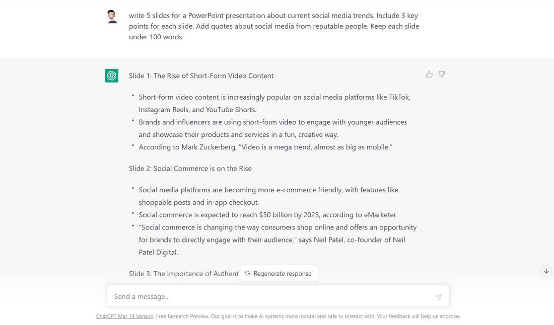
Now ask ChatGPT to write the slides of your presentation. Give it as many details as you can. Specify the topic, how many slides your presentation has, ask it to include quotes and statistics, break down information into bullet points, etc.
Once it generates the copy, you can simply copy and paste the text directly into your slideshow. Make any adjustments as necessary.

You can take this a step further and use AI art generators to create unique illustrations, icons, and infographics for your presentation. Midjourney and DALL-E are some of the top tools you can use for this task. Just be mindful of their copyright policies if you plan on using the images for commercial projects.
This tip is not exclusive to PowerPoint. But if designing presentations is part of your job, it will make your life so much easier. Don’t be afraid of the AI tools, learn to take advantage of them.
Experiment With Color Schemes

Colors play a key role in every presentation. It helps set the mood and tone of your slideshow and has a huge impact on the success of your presentation.
As you know, there are psychological effects behind the colors you use. With the right colors, you can evoke emotions in your audience to make each slide in your presentation more impactful.
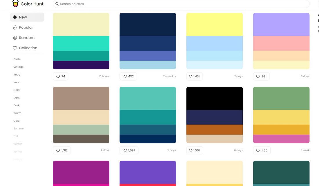
Experiment with different color schemes for your presentation designs. You can use a tool like Color Hunt to find beautiful color palettes for your slideshows. But always keep in mind to pick colors that are appropriate for your topic, audience, and your brand.
Contrast Is Key
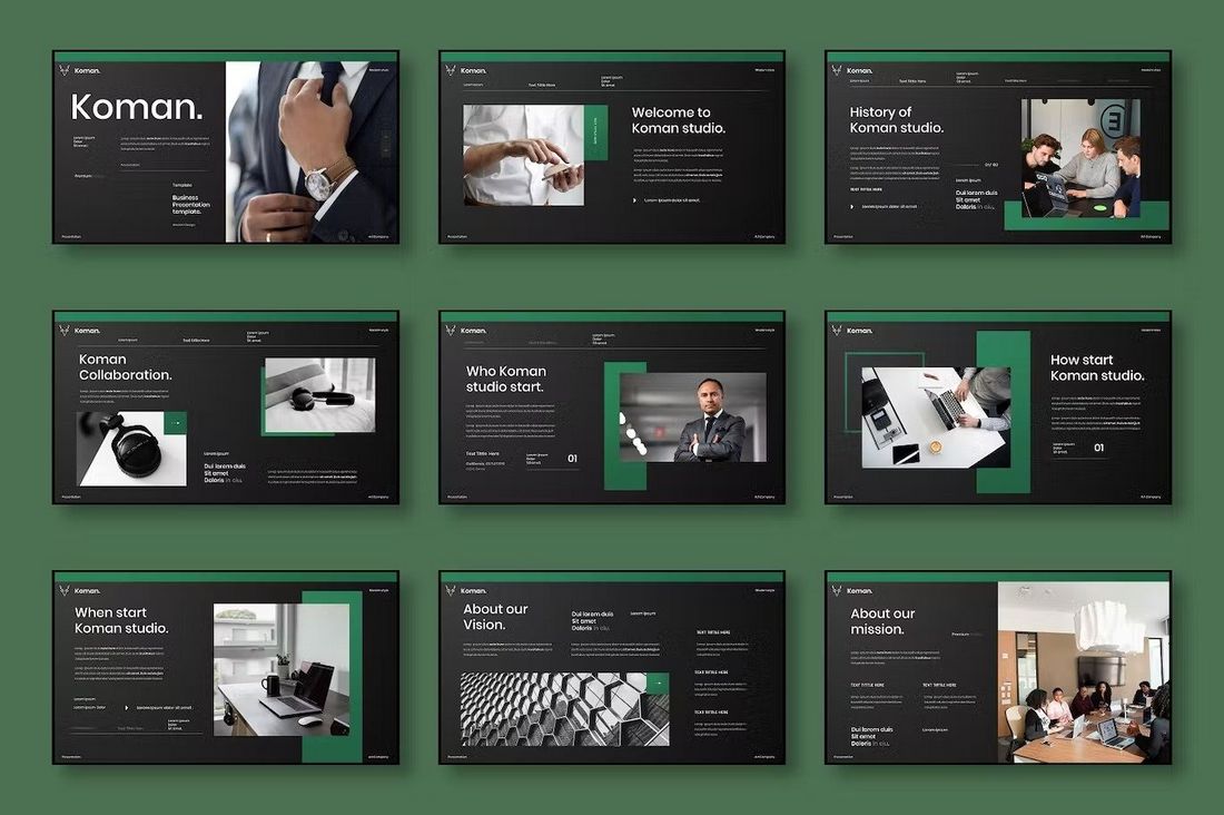
Speaking of colors, you can also use them to create a strong contrast between the content and the background. For example, using a dark color for typography on a light background will highlight the text much more effectively. Or you can use colored shapes to bring attention to specific parts of a slide.
The same can be said about fonts. Using unique fonts will go a long way to help create contrast in your presentation. Check out our guide on choosing fonts for PowerPoint to learn more.
Take Advantage of Add-Ins
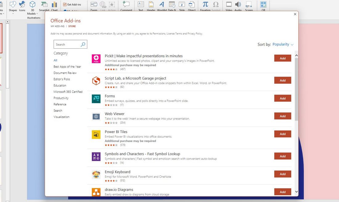
PowerPoint has a built-in store full of add-ons (or add-ins as it’s called in the software). And it’s one of the most underused features of PowerPoint.
This store is filled with amazing third-party tools that can supercharge your work and slideshows. There are hundreds of tools in this store you can install and use for free.
Explore the PowerPoint Add-Ins store and see what you can find. One of our favorites is the tool for adding QR codes to slides directly from the slide editor. We’ll explain it more in the next tip.
Add QR Codes In Slides
Using QR codes in PowerPoint presentations has two great benefits. One, it will make things much easier for you to share links, apps, and resources with your entire audience. Two, it will encourage the audience to engage and interact with your presentation.
Normally, you have to use online tools or apps to generate QR codes. But you can use a PowerPoint add-in to create QR codes directly from the slide editor.
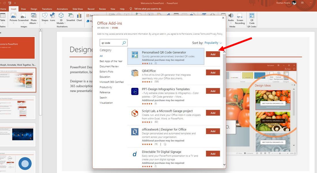
Simply go to Insert > Get Add-ins and search for the Personalized QR Code Generator.
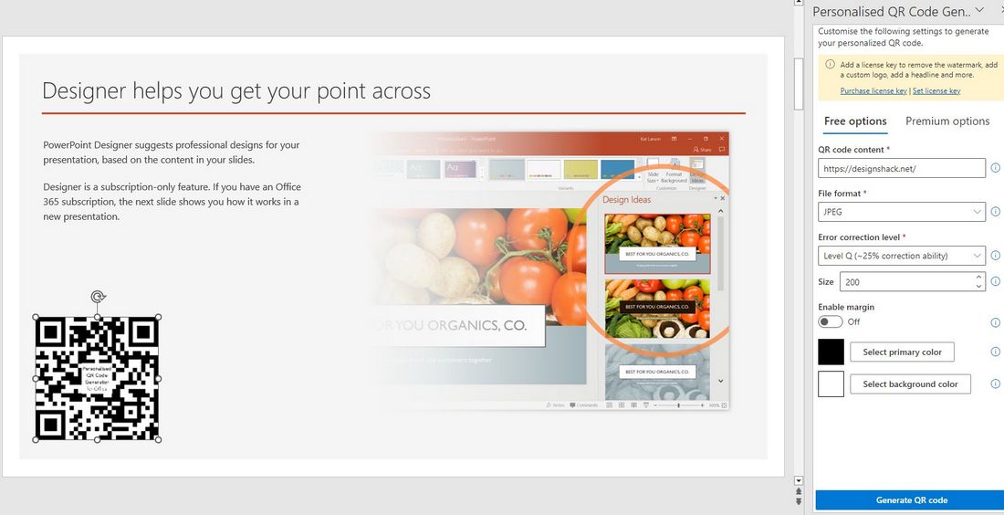
After installing the QR code tool, you can instantly generate QR codes and embed them into your slides to share links. The free version of this plugin will leave a small watermark in the QR code but it’s barely visible. Using QR codes is much cooler and more effective than sharing links as plain text.
Design Cool Image & Text Masks
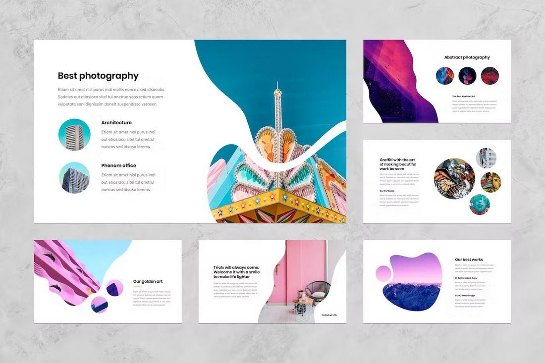
Image masking is a popular effect used in graphic design for making photos and images appear more creative. With image masks, you can give unique shapes to images rather than boring and old square shapes. You can use it to make your slides look more interesting.
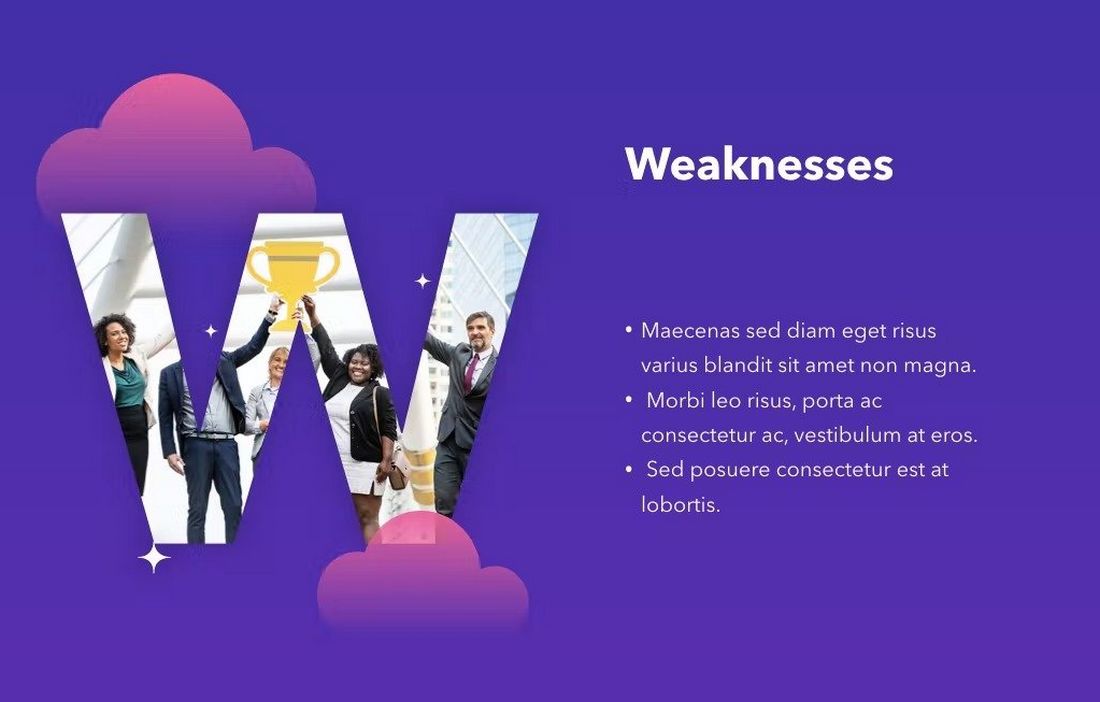
We found a simple YouTube tutorial that shows you how to design liquid image masks in PowerPoint.
You can also use text masks to create cool typography effects in PowerPoint. And yes, there’s a YouTube tutorial for that too. Try using these effects in your next presentation.
Instantly Remove Image Backgrounds
Have you been using Photoshop to remove the backgrounds of images? Well, now you don’t have to. Because PowerPoint has a tool that lets you get rid of image backgrounds with just a few clicks. Here’s how it works.
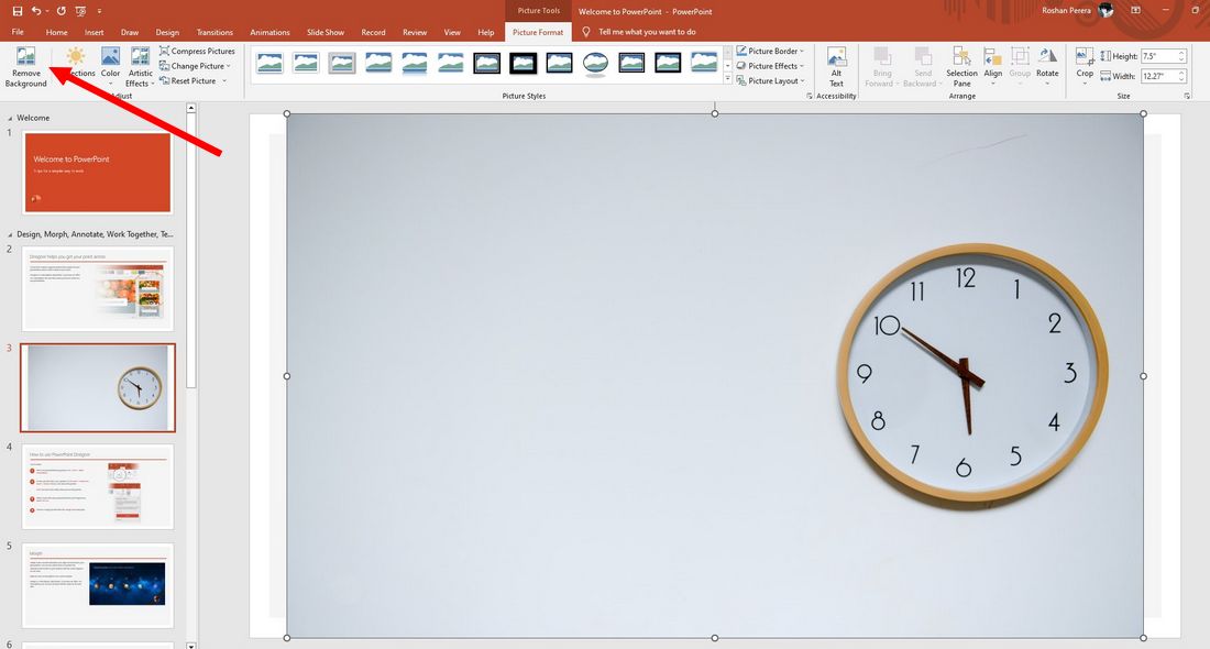
Select an image in your slideshow and go to the Picture Format tab then select the Remove Background option on the top-left side.
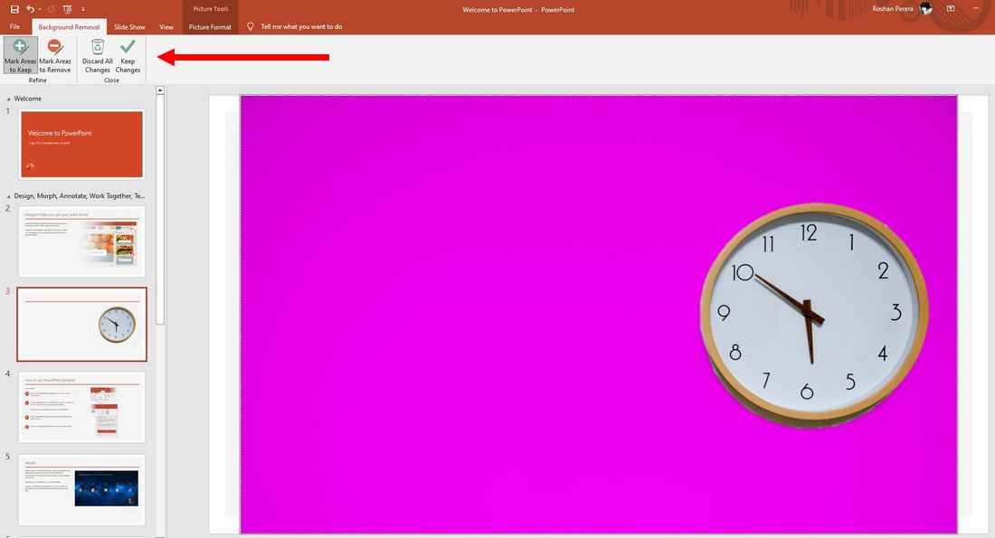
This tool will automatically make a selection of the background. If it clips into areas of the main object, use the Mark Areas tool to fix the selection. Then click the Keep All Changes button to finish.
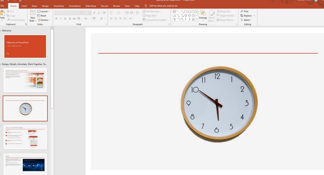
Now you have a PNG-style JPG image without a background.
Design Posters & Flyers
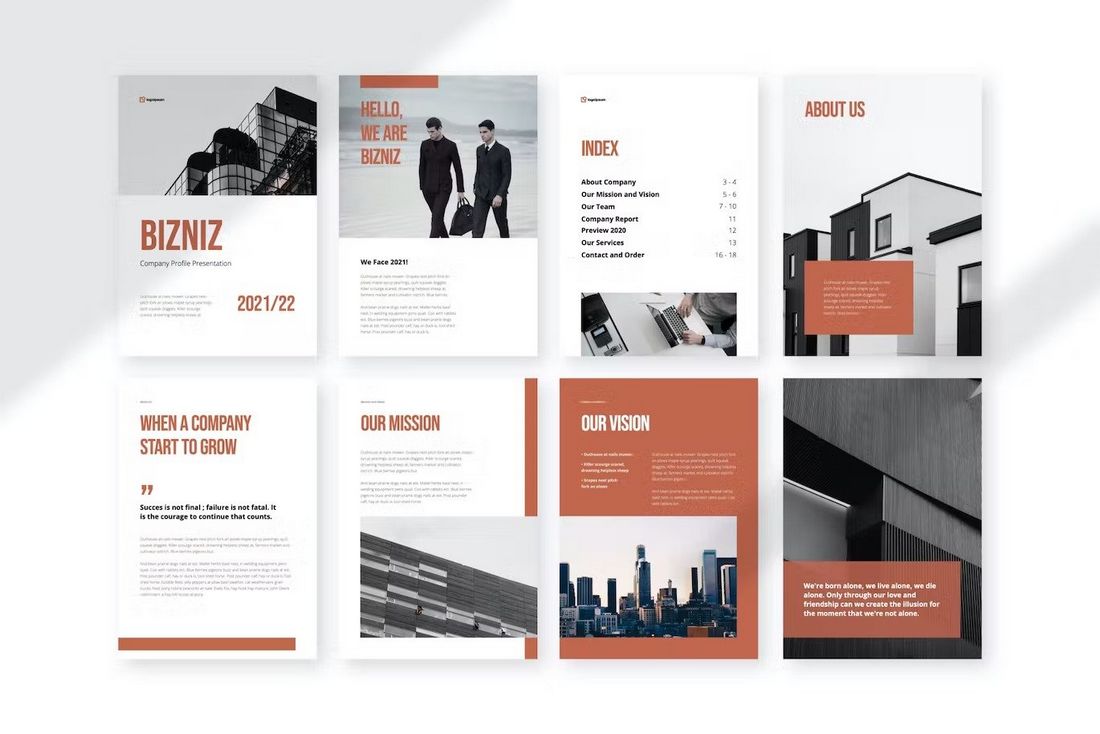
PowerPoint can be used to create many cool things than just presentations. You can use it for simple graphic designs, such as posters and flyers.
You can use pre-made PowerPoint poster templates to easily make posters or flyers in vertical layout using the app. We also have a step-by-step guide on how to make posters in PowerPoint . Check them out to learn more.
This can be a huge money-saver when you have to design a quick poster for a project and don’t have access to software like Photoshop.
Export to Video & PDF
If you want to share your presentation with a wide audience, one of the best ways to do that is to convert your presentation into video format. That way, your audience will be able to watch your presentation even if they don’t have access to Microsoft PowerPoint software.
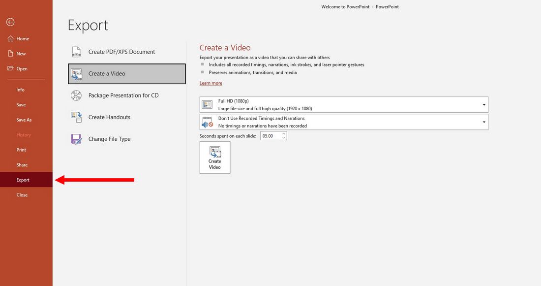
PowerPoint has a built-in function to help you with that process. Go to the File menu and select Export. From there you can choose the Create a Video option to convert your entire presentation into a video.
It’s perfect for creating video content for YouTube, online courses, and schools too. You can also export your presentation in PDF format or even turn it into a Word document.
In Conclusion
These are just a few of the cool PowerPoint tips and tricks we’ve found to be quite interesting. It’s surprising how much you can do with an app like PowerPoint. If you want to learn more cool PowerPoint tricks, be sure to check out our other guides.
Start with 7 tips for finding the perfect PowerPoint template . Also, read our 10 pro PPT tips guide. And our how to give a fun presentation guide has some useful tips too.
- Pitch Decks & Investor Materials
- B2B Graphic Design
- Startup Consulting
- Trainings & Workshops
- Case studies
- Downloadable resources
15 Powerpoint Hacks That Will Help You Save Hours And Wow Audiences
- Presentation design /
- Visual communication

Creating a great presentation takes a lot of work if you want to impress your audience and convince them that PowerPoint is still a very useful tool. But as much as you invest in your presentation, be it in the content or the design, you could still benefit from a few pro tips that can save you some time and effort.
We’ve rounded up 15 PowerPoint hacks to help you design your presentation faster and more efficiently, but also to make the delivery easier and more outstanding.
PowerPoint Hack #1: Embed your fonts
Fonts are an essential part of your presentation design. Many experiments have shown how different fonts can make a message more or less trustworthy and appealing to your audience.
Also, if you need to share a deck with someone who doesn’t have all the typefaces you used, it’s going to be a problem.
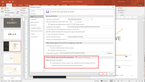
To avoid this, click File > Options, go to the Save menu, and check “Embed fonts in the file.” Another alternative is to always save and send a pdf version of your presentation.
PowerPoint Hack #2: Convert any document to a presentation
Did you know that you can use an existing Microsoft Word document to create a Microsoft PowerPoint presentation? To set up the slides in a presentation, PowerPoint uses the heading styles in your Word document. For example, each paragraph formatted with the Heading 1 style will become the title of a new slide, each Heading 2 will become the first level of text, and so on.
Create a presentation from an existing document by clicking Home > Slides > Slides from outline.

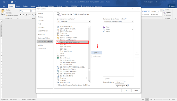
Or you can do it directly from Microsoft Word. Open the document you want to use to create a PowerPoint presentation; on the File menu, point to Send To, and then click Microsoft PowerPoint. If you can’t see this option in your Word, all you need to do is add it manually to your Quick Access Toolbar from File > Options.
PowerPoint Hack #3: Select separate bodies of text and other objects
Here’s a helpful tip about text selection. If you hold down Ctrl while highlighting text, you can select two completely separate sections at the same time.
You can use this to edit text quickly, to underline or bold certain terms or phrases, or to change the color of a series of non-sequential words.
This hack applies to selecting other objects as well such as geometric shapes or images.
PowerPoint Hack #4: Align images and objects to ensure symmetry
Organizing your content neatly will help convey your ideas more effectively. According to the American scientist Alan Lightman, human brains strive to see things symmetrically.
“The reason must be partly psychological,” he says. “Symmetry represents order, and we crave order in this strange universe we find ourselves in… [It] helps us make sense of the world around us”. Via
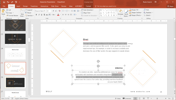
Going slide by slide to ensure everything is aligned can be a real nightmare. To align all images on a slide, select all of the objects you want by clicking on one of them, then hold Shift and select the rest. In the menu click Arrange > Align or Distribute > chose the type of alignment you want. You can also choose Align Left, Align Right or Center. For horizontal alignments, you can also choose Align Top, Middle, or Bottom.
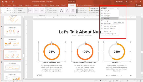
If your objects aren’t evenly spaced from each other, choose Draw > Align or Distribute > Distribute Vertically or Horizontally. To make sure you have a good overview of your content and how it’s organized, select the Grid/ Gridlines/ Guides option in the View menu.

PowerPoint Hack #5: Adding audio to your slides
This is perhaps my favorite hack. I feel like after I learned how to do this I became much more creative in my presentations. To add audio to your presentation, click the Insert tab > Audio > Audio online > Browse your computer for the file/ Audio on my PC > Play in background so that PowerPoint knows to play the audio in the background of the presentation. Or you can play the sound only when you click at that particular slide.
You can use music or white noise like waves or forest sounds, to create an enjoyable ambiance or mark a special idea (you can also use it to break into dance if you’re feeling dramatic).
This only works when you’re in presentation mode, not in editing mode. To get back to your presentation, use the same letter you used before.

Featured Download: An Easy Guide To Repurposing Content
Get your free copy
PowerPoint Hack #6: Use the Fade animation as a quick fix
If you didn’t have enough time to create an intro and outro animation for each slide, Fade will be your plan B. Changing each transition to a fade helps the presentation run much more smoothly. It only takes seconds to do and it makes every slide appear more considered.
The same goes for elements within the slides. Even if you just have each part of the slide fade in, one by one it helps to carry the narrative you are telling and looks so much better. However, make sure you don’t go overboard with the fade animation because it can drag the presentation and become tiresome for the audience. One fade animation per idea or per section is more than enough most times.

PowerPoint Hack #7: Need to show something specific? Create your own animation
If, on the other hand, you’re a more creative person with more time on your hands, you can create your own animation by creating a unique motion path. Select Add animations > Motion paths > Custom paths and you can draw freeform. When you are done, press the Esc button.
You can also select an existing motion path and edit it using the green and red buttons on the path. The green spot will show the initial state of the animation and the red spot represents the final position.
PowerPoint Hack #8: Reduce the size of your presentation
This is one of the most common issues with presentations – you do an amazing job of creating and designing it and then you have a huge document that you can’t send or transfer. Worry not, we have the solution for this. The first thing you’ll want to do is compress all your images, they are probably the biggest size troublemakers.
Click on an image, then go to Format > Compress Pictures. You can compress that image alone or, if you’ve finished the presentation, deselect Apply only to this picture. If you think you’ll need to re-work or edit the images, you might also want to deselect Delete Cropped areas of pictures. If you’re planning on using the presentation on a projector, click web(150dpi) is the best option, whereas if you’re planning to email it, go for the 96dpi compression when saving it.

If you don’t need this specifically in a .ppt format, we recommend you save it as a .pdf, which will reduce the size even more. After that, you can use Adobe Professional, Acrobat Pro or online tools like ilovepdf.com and smallpdf.com to reduce the size of the final document.
PowerPoint Hack #9: Create an invisible hyperlink
A marketer’s favorite hack – this will allow you to embed hyperlinks to campaign landing pages and social promotions in web presentations, while still looking flawless.
To create an invisible hyperlink – Insert a geometrical shape, preferably a rectangle, and format it to No fill and No line. Select the shape and click CTRL+K. Paste the link into the address box and click Ok. This is a good solution if you do not want any of the text to appear different, but need to include a link in your slide.

Use this hack to create a nice-looking table of contents or an interactive menu in the beginning of your presentation. Or you can use it to embed links into your product screenshots, redirecting to the product website.
PowerPoint Hack #10: Turn your presentation into a video
Recent statistics show that video content isn’t just effective, it’s desirable. Did you know that Facebook users watch 8 billion videos per day? Why not repurpose your amazing presentation into an engaging video and add a cool soundtrack?
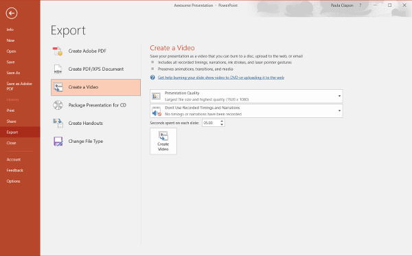
It only takes a couple of seconds. All you have to do is click File > Save and send / Export > Create video. Make sure you choose the right timing for each slide, otherwise you might end up with very slow or very fast-moving slides (we speak from experience).
PowerPoint Hack #11: Get creative and start drawing
When you’re delivering your presentation (in Slide show view), you can circle, underline, draw arrows, or make other marks on the slides to emphasize a point or show connections. I bet you didn’t know that.
Turn your cursor into a pen by click CTRL+P. This allows you to draw any shape, underline or highlight an area on the slide. I don’t recommend using this for writing, since that might be a bit tricky but it’s a great tool for sketching or circling. To make it stop, just click CTRL+A.
PowerPoint Hack #12: Combine geometric shapes
Sometimes you just need a different shape. PowerPoint is not perfect. If that’s the case, choose the shapes you want to combine from the Insert tab and select them. Click Merge shapes and choose the option you want. Here’s how they work:
Union joins the two shapes, becoming one shape that you can use like all other shapes in PowerPoint.Combine is similar to merge, but you get empty space where your shapes were overlapping.Fragment will combine them but give you a separate area to work with within these three compartments.Intersect will remove everything except the intersection of the two shapes, making it similar to the opposite of the combine function.Substract will remove from one shape what was covered by the second.

PowerPoint Hack #13: Get your audience’s attention back
The famous Microsoft “study” showed that the human attention span went from 12 seconds on average in 2000 to just 8.25 seconds in 2015, which is shorter than that of a goldfish.The truth is, most of the time, we don’t pay attention. It’s just how our brain works. If you’ve lost the attention of your audience or if you simply want to step away from the presentation for a moment and have a debate or emphasise an idea, we have the perfect hack.
Turn your screen Black or White for a moment, to get your audience’s full attention back with the simple pressing of the letter B on the keyboard (for black) or W (for white). Try it now (we’ll wait)!
PowerPoint Hack #14: Do a live poll of your audience
There’s this great app called Poll Everywhere that enables you to ask your audience questions and receive the answers in real-time. A great hack for webinars or conferences. The answers will be displayed instantly in your PowerPoint presentation. The app uses text messaging (SMS) to collect the replies, and audiences respond on their phones.
Here’s how it works:
Before the presentation, you create the questions and customize how the chart looks and how your audience can respond.During the presentation, you invite the audience to respond by visiting a webpage or texting. After the presentation you have access to a report.
PowerPoint Hack #15: Zoom in and out of slides
Another way to attract attention to a specific element on a slide is to zoom in. When you’re in Slide show view, you’ll notice a magnifying glass in the lower left corner of the slide. Click on that, then click on the part of the slide where you want to zoom. Once you’re done, click the magnifying glass again to zoom back out.
Use this hack for data visualizations and charts or to make your presentation more dynamic.
That’s it for our hack list. Hopefully you’ll find them useful when creating your next presentation.
What other hacks to you use? Let me know in the comments below.
Are you ready to take your presentations to the next level?
Our team can help with everything from researching your project, writing the content, designing and building your slides, and even creating handouts.
Get in touch
Top articles
- Infographics
- Personal branding
- Pitch deck design
- PowerPoint tutorial
- Presentation design
- Public speaking
- Uncategorized
Sign up for our monthly newsletter
Excellent post. This article is really very interesting and effective. I think its must be helpful for us. Thanks for sharing your informative. Keep it up. Thank you so much again. Technical Azad.
Pingback: PowerPoint hacks you've never heard of
Very nice. Thanks for sharing.
Leave a Reply Cancel Reply
Save my name, email, and website in this browser for the next time I comment.
This site uses Akismet to reduce spam. Learn how your comment data is processed .
Microsoft Office
10 minute read
Top 12 PowerPoint Tips and Hacks for Flawless Presentations

Saikat Basu
Facebook Twitter LinkedIn WhatsApp Email

Join the Microsoft Office conversation on Slack
Ask a question or join the conversation for all things Microsoft Office on our Slack channel.
We’ve all seen our fair share of bad PowerPoint presentations . We can all agree that for a PowerPoint presentation to impress, it needs time and attention to detail.
So how can you ramp up your PowerPoint productivity in the shortest time possible?
That’s where we come in. For starters, follow our proven PowerPoint tips and tricks for business presentations , which are sure to make an impact.
Step up your PowerPoint game
Download our print-ready shortcut cheatsheet for PowerPoint.
1. Keep it simple

Keep your slides simple. It’s the visual backdrop to what you are going to say.
The most recommended PowerPoint tip for your productivity is called simplicity . You may be tempted by the graphical razzmatazz of beautiful images, background, and charts. At the end of the day, PowerPoint is a background visual aid for your talk. It is not the talk.
PowerPoint has lots of bells and whistles. But you don’t have to use them all. For instance, your content may not need the much-maligned bullet points - you can just use one key point per slide instead.
That’s why…
2. Reduce the text
Less is more when it is about the text on your slides.
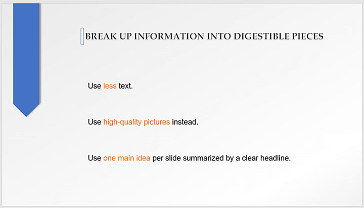
The average reading speed on a screen is around 100 - 150 words per minute. Too much information on the slide is a distraction and an inattentive audience will lose the message you are trying to convey.
Don’t give them too much to read. Use high-quality pictures and eye-catching graphics instead.
To make information digestible, expert slide designers recommend you write one key idea per slide that is summarized by a clear headline.
Tip: Exploit white space. Create more space between your text, paragraphs, and graphics on your slide.
3. Plan your content first

Think about the message you want to convey and use it to write an outline.
As PowerPoint is such a visual medium, it is easy to get sidetracked with the visuals. So it’s important to chalk out what you want to say and in what order even before you open PowerPoint.
Your slides will come together quickly with the help of PowerPoint design options and you can even choose the right templates if you know your stuff inside out.
Tip: Use brainstorming tools like mind maps, flowcharts, and even storyboards to sketch your content flow.
4. Use PowerPoint Designer for ideas
PowerPoint makes an intelligent guess by looking at the words on your slide and suggests high-quality artwork to complement it. You can pick one of the creative layouts or go back to your own design.
Tip: PowerPoint Designer can also turn lists, processes, or timelines into beautiful graphics too.
5. Use PowerPoint templates
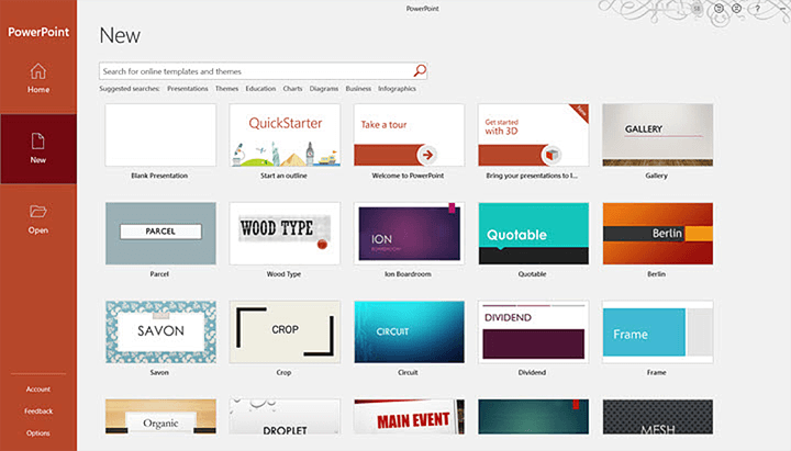
Start with a template to break through any creative blocks.
PowerPoint templates are meant to be the starter plugs when inspiration deserts you or you are design-challenged. PowerPoint ships with a set of readymade templates and there are more available online. Pick one to begin.
Tip: Manpreet Kaur, the head of Corporate Communications at Mercer also suggests you use templates for mining ideas for your own presentation.
Whenever you receive any PowerPoint presentation from any of your clients, business partners, or sellers, make it a point to add them to any folder as a stock for templates for future reference. You can leverage these templates to find inspiration for any icon idea, layout, idea presentation, and number representation on the slides.
6. Edit the Slide Master
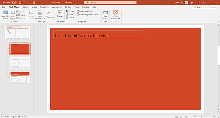
To open the Slide Master view, go to the View tab on the Ribbon and select Slide Master .
The first slide on the top is the Slide Master. Any changes to the Slide Master will be applied to all the slides in the presentation.
The Slide Master view also shows all the slide layouts used in PowerPoint. You can also use these Layout Master slides to control the appearance of any group of slides that share a common layout.
Tip: Make changes to the Slide Master before you start filling a presentation with the content.
7. Use PowerPoint Shapes for visuals
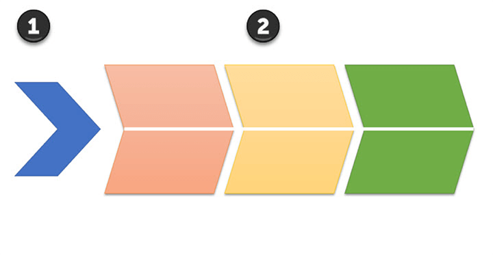
PowerPoint Shapes is the most powerful graphical tool in your control.
The multifaceted Shapes feature on the Ribbon gives you infinite ways to use PowerPoint like an illustration program. Look beyond the commonplace rectangle, oval, and rounded rectangle patterns.
Every shape is editable. You can customize any PowerPoint shape and create your own custom designs. They can be formatted with colors, 3-D effects and shadows too.
Tip: Most default shapes are overused. So, you can use your own custom shapes to add interest to a key point or a slide. For instance, you can turn a chevron into a more interesting arrow to illustrate the flow of a process.
8. Choose the right fonts
Choose the right fonts that are modern and pleasing.
It’s well established that fonts have a cognitive impact on how your audience will take in the information.
Sans-serif fonts are preferred for their smooth typefaces. But your typography choices will be influenced by the theme of the content. An artsy presentation can be more liberal with fonts that are decorative.
Also, to create contrast, you can use a technique called font-pairing where two complementary fonts are combined. For instance, use a serif font for titles and pair it with a sans-serif font in the body.
Tip: Want a free font library? Head over to Google Fonts and the collection of 916 free licensed fonts.
9. Use visual metaphors for your data
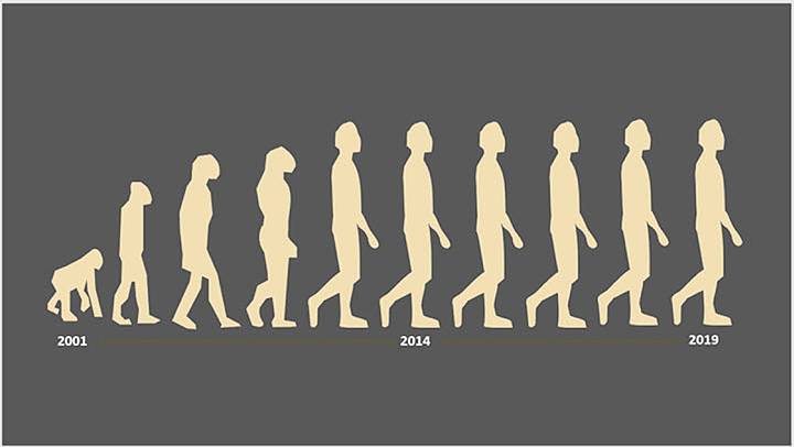
Visuals help everyone get the context behind data at a faster rate.
Business executives are used to spreadsheets . But that doesn’t mean they will like it in a presentation. Arresting illustrations are far better than bullet points and shoddy SmartArt.
We have talked about shapes and using high-quality photos before. But what if you have to analyze dry data?
Use visual metaphors or analogies to bring out the scale and relationships in the data. Executives can look up numbers, but the right use of an analogy can bring out the context behind it.
For instance, the evolution of man can be used to show the growth of a startup over time.
Tip: When stuck for ideas take inspiration from the best infographics on Slideshare and Pinterest. Infographics are designed to pack a lot of information in a small space.
10. Customize your slides for different audiences
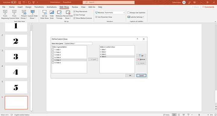
Save yourself a lot of time by reusing your slides for different audiences.
This somewhat lesser-known PowerPoint tip uses a feature called Custom Slideshow to filter what you want your audience to see. Maybe, you want to hide some sensitive information for a lower level of executives while revealing it to those higher up. You do not have to create different slideshows for these two groups.
Create a custom show in five steps.
- On the Ribbon, go to Slide Show > Custom Slide Show , and then select Custom Shows .
- Click the New button in the Custom Shows dialog box.
- In the Define Custom Show box , choose the slides that you want to include in the custom show, and then hit Add .
- You can change the order of the slides with the arrow keys.
- Type a name in the slideshow name box, and then click OK .
Tip: You can also create hyperlinked custom shows that you can jump to from your primary PowerPoint show.
11. Rehearse Your Presentation

Prepare your presentation according to the time allotted.
No PowerPoint tip is useful if you cannot fit the number of slides and the time you take to present them in the schedule. PowerPoint helps you rehearse your presentation before you do it. With the Rehearse Timing feature, you can tweak your delivery according to the time on hand.
A helpful Microsoft Support video walks you through the process.
Tip: Use the timer to check if you're spending too much or too little time on one particular slide. Maybe, explaining the data in a better way can shorten the time.
12. Make your PowerPoint presentations accessible
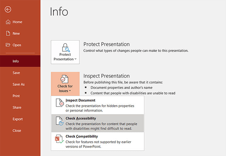
Go to File > Info > Check for Issues > Check Accessibility
Sharon Rosenblatt, Director of Communications at Accessibility Partners stresses the importance of making presentations more inclusive.
Always use the accessibility checker, and not just if your slideshow is being shared with someone you know has a disability, but you never know where files get sent to.
PowerPoint is all about visuals so it’s more important to finetune the little things that can help make the message easily understood by people who have accessibility challenges.
Tip: Microsoft details the best practices for making all PowerPoint presentations accessible .
The bottom line: Get to the point fast
When you are presenting to busy people, you have to cut the clutter but not lose the message. A successful presentation is about brevity and speed.
A business presentation is also a decision-making tool. So make sure you are presenting the information your audience wants to know. And nothing more.
Yes, they do take some work. But with the help of these PowerPoint tips and tricks, you can start and finish any presentation without losing your sleep.
Want more PowerPoint tips? Then check out these other PowerPoint features that will level up your presentations. Or try taking GoSkills top-rated PowerPoint certification course .
Ready to master Microsoft Office?
Start learning for free with GoSkills courses
Loved this? Subscribe, and join 467,476 others.
Get our latest content before everyone else. Unsubscribe whenever.

Saikat is a writer with over 20 years of experience writing and editing technology tutorials for brands such as MakeUseOf, Online-tech-tips.com, Lifewire, Lifehacker, and GuidingTech. His expertise is in topics such as apps, software, artificial intelligence, productivity, and operating systems like Windows and iOS. He hunts for the latest tricks in Microsoft Office and web apps. He has spent more than a decade in marketing and has a background in web development. He doesn't want to get off the learning curve, so a camera and a harmonica claim an equal share of his free time. Find him on LInkedin here.

Recommended
Should You Switch to Microsoft 365? What You Need to Know in 2024
We break down what Microsoft 365 is, and what makes it different from lifetime licenses.

24 Best Microsoft Office Add Ins in 2024
Supercharge your productivity with our picks of the best Microsoft Office add-ins for Word, Excel, PowerPoint, Outlook and OneNote.

What is Microsoft Teams? Everything You Need to Know in 2024
What is Microsoft Teams? Find out in this introductory guide. We cover what Microsoft Teams is, what you can do with it, and why you should use it.
© 2024 GoSkills Ltd. Skills for career advancement
🍪 This website uses cookies to improve your experience.
Learn more about our cookies Accept cookies

PowerPoint Tips, Tricks, and Hacks from 29 Experts
Bryan Jones
- eLearning Development , Posts , PowerPoint
PowerPoint is an extremely powerful tool when used correctly.
But when you’re new to it, it can feel like it’s just blank screens and bullet points.
It can take years (or decades) to fully master it.
But I decided to save you some time…
I asked the world’s leading PowerPoint experts the following question:
What’s your single best PowerPoint tip, trick, or hack?
Below you’ll see responses from some amazing PowerPoint gurus, including: top authors, speakers, instructors, bloggers, and even a handful of PowerPoint MVPs and Microsoft employees!
Enjoy the full tutorials by scrolling below or jump to these sections:
Summary | Presentation Approach | Design | Shortcuts | Delivery | Setup | Beyond Presentations
PowerPoint Presentation Approach Tips

1. Use the Tell ‘n Show method: a headline with a single point and media to support it
To get your audience to understand and remember what you say, use the Tell ‘n’ Show(SM) method. Use the slide title to tell your point–what you want them to remember. For example, write “3rd quarter sales rose 5% over last year” instead of just “3rd quarter sales.” Then use the rest of the slide to show your point with an image, animation, graph, or diagram. Research has shown the students who see slides done like this do better on tests and similarly, your audience will “get” your point more quickly and easily. They’ll be more engaged, too.
Ellen Finkelstein is the President & Owner of Ellen Finkelstein, Inc. She is one of only 12 Microsoft designated PowerPoint MVPs in the United States and is the author of one of the most popular PowerPoint blogs on the web.
2. Don’t open PPT until you have a clear message
Don’t launch PowerPoint until you have a clear message. Many people launch PowerPoint, think what they want to present, add slides, then think again, and add slides again. To compare with an analogy, they are on a fun journey, driving their car, stopping wherever they want, and then driving to wherever they fancy. It’s good to have an amazing journey–but a journey without a destination will get you nowhere. Continuing this analogy, a “clear message” is the destination where you want to go, and you want to take your audience along with you. So make sure you have a message before you begin creating your slides.
Geetesh Bajaj is the Owner of Indezine.com . He is a PowerPoint MVP and the author of the Indezine blog, one of the most visited PowerPoint and presentation websites.
3. Start with the end-scenario in mind
As a designer, I recommend you think more about the end scenario than the beginning. Practical considerations – is this a printout, email attachment, onscreen presentation, interactive discussion tool or combination of those? Where will it be seen – in a stadium, boardroom, café, at their desk? Then consider the conceptual considerations – who is your audience and what do they currently think about your topic? What would you like to change in that thinking? Based on what you know about them, how can you change that thinking? Write those things down, then build your presentation with that at the forefront.
Tom Howell is the Agency Director at Synapsis Creative. He was recently designated a PowerPoint MVP by Microsoft. His presentation blog is a must-read for anyone looking to improve their presentation design.
4. Tease the audience by revealing info in parts
Do you struggle to hold your participant’s attention – especially when your training topic is dull and boring? There’s a secret technique I use that works like a charm every time. It is… “Tease your audience by revealing your information in parts” Let me give you an example… Want to present a Framework? Present just the skeletal structure first. Explain the context. Then reveal the first step. Explain. Then reveal the next step and so on. Your audience can’t take their eyes off, till you finish your explanation. Why does this work so well? Studies have shown that as humans – we experience ‘tension’ when we leave things incomplete. We feel subconsciously compelled to pay attention to the task till we see it finished. It’s called the ‘Zeigarnik effect’. Try it in your next presentation. All you need is to apply a simple custom animation to your visuals – to reveal information in stages.
Ramgopal is the Director and Co-Owner of PrezoTraining . He also runs a popular YouTube Channel focusing on PowerPoint .
5. Don’t open PowerPoint first. Instead, sketch on a notepad
The first step on PowerPoint is…don’t open PowerPoint. Sketch out your presentation on a notepad (regular or digital) and plan out the whole thing. Then rewrite, numbering and ordering your thoughts. That’s your slide order.
Doug Thomas is a Video and Webinar Creator at Microsoft. He has created and appeared in over 250 videos at office.com.
PowerPoint Design Tips
6. Use transparent overlays on images for text contrast
My favorite trick to do in PowerPoint is to create transparent overlays over slides, videos, photographs in PowerPoint! First, you create a rectangle to cover up the slide > Then you set it to a solid color or a gradient > You right click, set the transparency of each color to around 20% or any value you like depending on the project > and there you have it! You can dim photos, create duo-tone overlays, darken, brighten, add exposure, add a vignette or do pretty much anything regarding colors with this type of object! Best part is – you can freely copy it between slides or even separate PowerPoints! Awesome to know about and use 🙂
Andrzej Pach is an Online Instructor for Udemy & Skillshare. He also hosts one of the most popular YouTube channels to focus on PowerPoint with over 2 million views and 19,000 subscribers.
7. Go big with visuals. Bleed photos and videos to the edge
Go big with your visuals. My top tip to presentation designers of all levels is a simple, elegant, and often overlooked technique: bleed your inserted photographs and videos all the way to the edges. Insert your image. Scale (don’t stretch!) and crop appropriately. If next is necessary, set it in a semi-transparent shape with sufficient contrast against the text color. Think about some of the best presentations you’ve ever seen. Think also about your favorite movies and TV shows. Their images take up all available screen space. Yours can too.
Tony Ramos is the Director of the Presentation Guild and the Owner of TonyRamos.com. He was the first blogger on the internet to cover PowerPoint topics. Tony is an expert designer and producer of PowerPoint presentations and proposal graphics.
8. Create quick native PPT icons using your subtract and combine tools
Create quick native PPT icons using your subtract and combine tools.
Bethany Auck is the Founder and Creative Director of SlideRabbit . As a presentation and communication specialist, she helps clients build high quality presentations, from basic slide design to complex animations and infographics.
9. Structure clean layouts by using a grid system on slide masters
Keep your layouts clean and well-structured by implementing a grid system with guides on the pasteboard of your master slide.
Stephy Lewis is a Senior Designer for Aerotek and a Director of the Presentation Guild . She is a top visual designer of presentations and websites.
10. Find a beautiful, fresh font pair. One for headers and one for body
When I create PowerPoint tutorials on YouTube I am always thinking about techniques that would be really simple to implement and yet would have the biggest positive impact. So if you have 2 minutes to transform your presentation from good to awesome, I would suggest looking at your fonts. Find a beautiful, fresh looking font pair (one font for the headers and one for the body) and you can instantly change how your presentation feels and looks like. I am planning to do a video soon on this topic, so please visit my YouTube channel in the near future, if you are interested in awesome font pairs for your ppt 🙂 Good luck everyone!
One Skill (aka Kasparas Tolkusinas) is the CEO of One Skill PowerPoint Tutorials. He hosts one of the most popular PowerPoint YouTube channels , with over one million views and 14,000+ subscribers.
11. Create an arrow with broken SmartArt
I have an easy favorite that I often use. You know the arrow type that looks like a Nike Swoosh logo? The ones that start at a point then become thicker as they softly curve up or down? I have an easy hack that uses broken SmartArt to create such an arrow. Of course, if you have the newest version of PowerPoint (2016/Office 365), you can insert this arrow style as an icon, but it’s not easily editable (other than to recolor). Do this instead: 1) Insert > SmartArt > Process > Upward Arrow (or Descending Process) | 2) Ungroup | 3) Ungroup again | 4) Delete all extra shapes and text boxes, leaving only the arrow. You’re left with an adjustable arrow that allows you to use the yellow handles to change the swoosh width and arrow head size. Rotate, Flip Vertical, Flip Horizontal, or resize to further customize.
Sandra Johnson is the Owner and Chief Presentation Officer at Presentation Wiz and is Vice President of the Presentation Guild. She has also been designated only 1 of 12 Microsoft PowerPoint MVPs in the United States.
PowerPoint Shortcuts, Tricks, and Hacks
12. Power-crop photos with SmartArt
The favorite hack is Power Cropping a bunch of photos in seconds. (1) In PowerPoint select a bunch of odd sized (or shaped) photos (2) Navigate to the Picture Tools Format Tab (3) Open up the Picture Layout drop down (4) Select a SmartArt layout (Bending Picture Semi-Transparent Text is my favorite) (5) CTRL+SHIFT+G to ungroup the graphic twice. It’s a great little PowerPoint hack that not a lot of people know about.
Taylor Croonquist is the Co-Founder of NutsAndBoltsSpeedTraining.com . He is the guru of time-saving PowerPoint tips. If you want to be blown away by how fast someone can whip a PPT into shape, check out his blog or videos.
13. Use Ctrl + arrow keys to nudge objects on the screen
Here’s a quick and easy one I share in my PowerPoint for eLearning 101 classes: Want to move something just a smidge using the arrow keys? You may notice that it’s hard to get to juuuuust the right spot using the arrow keys. Try holding down the [Control] key with the arrow keys and watch as your slide objects move by just a pixel at a time.
AJ Walther is the Chief Creative Officer at IconLogic. She is also the instructor for several PowerPoint courses: PowerPoint for eLearning 101 and 201 , and the author of 2 PowerPoint books.
14. Use SmartArt to break bullet points into text boxes
Use SmartArt as a tool to eliminate bullet points and “chunk” your information out visually. Select your text box of bullet points and either right-click or choose from the Home tab “Convert to SmartArt.” Select a SmartArt graphic that contains horizontal boxes. Select the newly created SmartArt containing your text, right-click and ungroup it twice, giving you text in rectangles. Now, delete any extraneous SmartArt items (i.e. arrows) and format the boxes however you like. Voila, you have magically turned a page of bullet points into visual chunks—much easier to read!
Nolan Haims is the Principal of Nolan Haims Creative. He leads a team of visual design professionals dedicated to all types of visual communication. Nolan blogs at Present Your Story and hosts the popular Presentation Podcast.
15. Create “smoky letters” with PPT’s new Morph transition
Magic Smoky Letters! I recently went on a crazy experimentation spree (channeling my inner mad scientist!) with the Morph transition and discovered this bizarre but very cool “smoky letters” trick. Let’s say, for instance, that you want the word TEXT to come out as smoke from a chimney (or fireplace, tailpipe, cigar, teapot, magic lamp, etc.). You first put a picture of the chimney on your slide. Next, you create smoke “seeds” by inserting a rectangle and editing one of the points (Format – Shape – Edit Points) – then making 4 copies of this rectangle (one for each letter in TEXT). Make these “seeds” tiny and transparent, then place on top of the chimney (where you want the smoke to come out). Next, duplicate the slide and on this new slide, delete the “seeds” on the chimney. Then, vectorize the word TEXT (by writing it in a text box, putting it on top of a colored rectangle, selecting both objects and going to Merge Shapes – Fragment and deleting the stuff around TEXT). Finally, add a Morph transition to the second slide, and you’re done! Simply view in presentation mode and prepare for your jaw to drop… check out this trick with more details and examples here .
Lia (aka “P-Spice”) is a management consultant with a passion for making presentations more innovative and “spicy.” She hosts a popular YouTube channel on PowerPoint with over 4 million views and 36,000+ subscribers focused on creative animation and design tricks. She is also the author of the Spicy Presentations blog .
16. Convert text to an image if the custom font might not be installed.
One of my favorite frustration-busters involves a work-around when I know my client won’t have a custom font installed. For example, if the slide would benefit from a gorgeous script as an accent element, I will turn that piece of text into an image. I do this by selecting the font as an object, copying it and then pasting it as a picture (either right click to paste or use the paste button in the Home menu). Now I know the “text” will display as designed on any computer.
Lori Chollar is the Co-Founder of TLC Creative Services, Inc .
PowerPoint Presentation Delivery Tips
17. Use the notes panel for detailed printed notes
I’m a College Professor and use PowerPoint for Lecture notes. Many students want detailed lecture notes, but get bored quickly reading mountains of text on a slide. So I use the “Notes Pages” panel for detail while keeping the slides simple – I urge students to read the notes which may contain more information than given in a lecture. If printing out the slides, it is essential to use “Notes Pages” print layout option.
Dr Eugene O’Loughlin is a Lecturer in Computing at the National College of Ireland. He also hosts one of the most popular YouTube channels that covers PowerPoint topics and has over 12 million views and 26k+ subscribers.
18. Leverage “Presenter View” and “sections” when there are multiple presenters
Increase the power of Presenter View with PowerPoint Sections. Sections are used to organize slides within a presentation by grouping slides and giving each group a name. In addition, Presenter View leverages these Sections that can be seen in Presenter View’s Grid Layout. When running a presentation with multiple presenters, or an awards show with multiple award categories, I add lots of PowerPoint sections. The ability to minimize live-show stress and find the correct section to jump to is amazing!
Troy Chollar is the Co-Founder of TLC Creative Services, Inc. He is also a Microsoft designated PowerPoint MVP, PowerPoint blogger , and host the popular Presentation Podcast.
19. Use “triggers” to create interactive presentations
Create interactive presentations with triggers to start animations through hot spots on a slide. You can reveal specific parts of a diagram, make something change color by clicking it, or give people multiple choice questions and have the correct answer pop-up. It takes seconds to do and works brilliantly, particularly with visual slides. Right click on any animation, choose Timing, then Triggers in the pop-up window, and choose which object you click to start (trigger) the animation. You can have multiple triggers on one slide and multiple animations triggered by the same object. It makes really compelling and effective presentations.
Richard Goring is the Director at BrightCarbon. He creates compelling and persuasive presentations using visuals and diagrams. Richard also blogs at the Bright Carbon blog and has a post on this trigger technique mentioned above.
20. Use a formatted “Notes” page for presentation handouts.
I open the most eyes when I discuss how to use the Notes page to create handouts that are contained within the same PPTX file as the slides. Most people have never spent even a second in the Notes master so they never knew you could globally reformat the Notes pages to allow them to better accommodate the creation of handout pages.
Rick Altman is the Director of R. Altman and Associates and the Conference Host of The Presentation Summit . If you looking to create PowerPoints that don’t suck, he literally wrote the book on it.
PowerPoint software and hardware setup tips
21. add “align” to your quick access toolbar.
Tired of eyeballing that slide to see if all the objects are all even or in the same grid? That is why my favorite tip is to make Align one of your favorites on your QAT. Imagine a slide that might introduce three speakers’ headshots and captions but they are not aligned or equidistant from each other. Let’s fix it. Select all three objects – click on the first object, then press and hold CTRL when you click on the others. You can also use SHIFT and your mouse to draw a box over what you want to align – I call it a “Lasso”. To arrange the three headshots, click on the Format Tab in the Picture tools, you will see an option to align objects. You can choose to center objects horizontally, vertically or to a box of text. You do the same when working with shapes, text boxes, SmartArt graphics, and WordArt by selecting Format in the Drawing Tools. The result: your objects snap to the grid and the smart guide lines that appear on your slide will help confirm it.
Sharyn Fitzpatrick is the Editor of PresentationXpert and the Chief Marketing, Communications, and Webinar Guru at Marcom Gurus. She also lives in my home town (Los Altos), is a raving Penn State fan, and a former competitive swimmer!
22. Customize your “quick access” toolbar with frequently used buttons
I don’t have a ton of keyboard shortcuts in PowerPoint, but I do customize my toolbar. When I do that (right-click on the toolbar at the very top of the window), I can add any button I want, especially the alignment buttons, which makes life a lot easier when you’re working with different slide objects such as text, images, and graphs. In Excel, my favorite keyboard shortcut is CTRL+1 (CMD+1 on Macs), which will bring you to the Format menu. And it works for everything–cells, line charts, bar charts, axis labels, gridlines, whatever you need.
Jonathan Schwabish is the Founder at PolicyViz.com and a Senior Fellow at the Urban Institute. He is well known in the presentation community for his presentation book Better Presentations and his expertise in data visualization.
23. Name screen elements on the “Selection Pane” for easy design layering and more
The Selection Pane is one of PowerPoint’s best kept secrets. By default, it’s hidden in the “Select” menu on the “Home” tab. I add it to my Quick Access Toolbar and keep the Selection Pane open anytime I’m working in PowerPoint. Once open, you can name all the objects on the screen. This really helps when you’re trying to change the layering order of the objects, add animations, and more. You can also hide objects by clicking the “eye” icon next to each object. That’s really helpful for revealing objects beneath that layer. Without the selection pane, both layering and animations are next to impossible.
Bryan Jones is the Founder and President of eLearningArt. He runs a stock photo and template site to help people build better presentations and graphics. He also blogs frequently about eLearning, PowerPoint, and presentations .
24. In a dark working environment, change the default interface for more contrast
When I’m working in a dark environment (at night in my office, backstage at a conference, etc.), I find it extremely helpful to change PowerPoint’s interface from the bright white and orange to black or at least dark grey. To do this, click File, then Account, then select Black or Dark Grey from the Office Theme dropdown. Note that _these_ Office Themes control your interface elements such as the Ribbon and the workspace; they aren’t the same Office Themes that you may think of when we talk about PowerPoint templates and themes. (Thanks for naming everything the same, Microsoft!)
Echo Swinford is a PowerPoint Corporate Presentation and Template Expert at Echosvoice . She is designated as 1 of only 12 Microsoft PowerPoint MVPs in the United States. Echo also authored a book on building PowerPoint templates and is the President of the Presentation Guild .
25. Get a good external mouse. One with a scroll wheel can zoom in and out
A comfortable external mouse is a must-have for quick toolbar navigation and graphics editing. Make your work even speedier by choosing a mouse with a scroll wheel. In PowerPoint, hold the Ctrl/Command key and scroll forward or backward to change the Zoom level. Go from big picture to the smallest details in an instant.
Julie Terberg is a Presentation Expert, Visual Communicator at Terberg design. She is a designated Microsoft PowerPoint MVP, author of a book on creating PowerPoint templates, and is the Art Director for the Presentation Guild.
Think beyond PowerPoint presentations
26. think of ppt as a tool beyond liner presentations.
Strangely enough, my best tip/hack is to start seeing PowerPoint as a tool that can do much more than linear presentations. Here are a few examples: 1) Produce better visuals & handouts at the same time by moving text to the notes pane, and design your Notes Master so it has your corporate colors and logo 2) Use PowerPoint’s screen capture tool (PPT2010 and up), or screen recording tool (PPT2013 and up) to create quick tutorials without needing other software 3) Get to know the drawing/shape tools to create your custom graphics and save them as images.
Chantal Bossé is the Owner of CHABOS, Inc. where she helps clients, such as TEDx speakers, maximize their presentation impact. She is also a designated Microsoft PowerPoint MVP.
27. Export to video and PDF to make content portable and reach a wider audience.
Exporting to video and PDF is a quick and easy way to make your content much more portable and mobile-friendly to reach a wider audience. The PDF option allows you to totally rethink your documents and make the switch to interactive “e-books”. The video option gives you a super flexible MP4 video file that you can use virtually anywhere. To see an example of each, visit this tutorial .
Mike Taylor is a Learning Technologist at Mindset Digital, as well as a former Community Manager at Articulate He is also a frequent speaker and popular blogger.
28. Hyperlink between slides to create a non-linear experience
Hyperlinking: Many who build eLearning with PowerPoint rely too much on the default linear slide 1- slide 2 -next-next-next setup. Learning to hyperlink across slide decks enables you to build interesting interactions like branching simulations and quizzes with scaffolded feedback. It takes patience and thinking through but isn’t technically difficult. Another tip: Figure out how to do the planning/layout the way that works best for you: I like to use Post-It notes I can move around. Others like to draw it out, and still others use the PPT flowcharting tools.
Jane Bozarth is an E-Learning Coordinator for the State of North Carolina. She is the author of several popular books, including Better Than Bullet Points: Creating Engaging e-Learning with PowerPoint.
29. Build clickable prototypes and hyperlink from any object to other slides
Creating prototypes is tough, right? Difficult software, expensive too. But wait… Do you realize that PowerPoint can be used to build prototypes? One of the coolest and simplest features that you’ll find in PowerPoint is the ability to put hyperlinks on any object on your slide and have it link to other slides. This way you can mock up any kind of e-learning, interactive job aid, software simulation or app you’d like and get a real feel of how it would work. Just create the screens you need for your prototype, add clickable areas (transparent shapes are great for that!) and voila!
Jeff Kortenbosch is a Performance Consultant at Bright Alley. He’s a PowerPoint guru and has a series of YouTube videos where he teaches users how to draw in PowerPoint.
29 PowerPoint Tips, Tricks, and Hacks Summarized
- Use the Tell ‘n Show method: a headline with a single point and media to support it | Ellen Finkelstein
- Don’t open PPT until you have a clear message | Geetesh Bajaj
- Start with the end-scenario in mind | Tom Howell
- Tease the audience by revealing info in parts | Ramgopal
- Don’t open PowerPoint first. Instead, sketch on a notepad | Doug Thomas
- Use transparent overlays on images for text contrast | Andrzej Pach
- Go big with visuals. Bleed photos and videos to the edge | Tony Ramos
- Create quick native PPT icons using your subtract and combine tool. | Bethany Auck
- Structure clean layouts by using a grid system on slide master. | Stephy Lewis
- Find a beautiful, fresh font pair. One for headers and one for bod. | One Skill
- Create an arrow with broken SmartArt | Sandra Johnson
- Power-crop photos with SmartArt | Taylor Croonquist
- Use Ctrl + arrow keys to nudge objects on the screen | AJ Walther
- Use SmartArt to break bullet points into text boxes | Nolan Haims
- Create “smoky letters” with PPT’s new Morph transition | Lia (P-Spice)
- Convert text to an image if the custom font might not be installed | Lori Chollar
- Use the notes panel for detailed printed notes | Dr Eugene O’Loughlin
- Leverage “Presenter View” and “sections” when there are multiple presenters | Troy Chollar
- Use “triggers” to create interactive presentations | Richard Goring
- Use a formatted “Notes” page for presentation handout. | Rick Altman
PowerPoint Software and Hardware Setup Tips
- Add “align” to your Quick Access Toolbar | Sharyn Fitzpatrick
- Customize your “quick access” toolbar with frequently used buttons | Jon Schwabish
- Name screen elements on the “Selection Pane” for easy design layering and more | Bryan Jones
- In a dark working environment, change the default interface for more contrast | Echo Swinford
- Get a good external mouse. One with a scroll wheel can zoom in and out | Julie Terberg
Think Beyond PowerPoint Presentations
- Think of PPT as a tool beyond liner presentations | Chantal Bossé
- Export to video and PDF to make content portable and reach a wider audience | Mike Taylor
- Hyperlink between slides to create a non-linear experience | Jane Bozarth
- Build clickable prototypes and hyperlink from any object to other slides | Jeff Kortenbosch

Get your free download
Get your free download.

- Presentation Design
- Report Design & Content Research
- Motion Graphics
- Interactive Design
- Design with AI

10 Essential PowerPoint Hacks to Elevate Your Presentations

Discover how we can create magic in your communication
PresentationPanda.com is now proudly owned by INK PPT. We're committed to enhancing and expanding the valuable content previously provided by PresentationPanda.com . Our blog will offer deeper insights, comprehensive guides, and innovative strategies to elevate your presentations to new heights. With INK PPT, expect enriched content that will help you create more engaging and effective presentations. We're here to provide you with the tools and knowledge to captivate your audience and deliver outstanding presentations. Stay tuned for expert tips, creative ideas, and practical advice to take your presentations to the next level.
TL;DR: Master PowerPoint with these hacks: use Poll Everywhere for real-time audience engagement, Control + B to black out the screen, and sparing animations to focus attention. Learn key shortcuts like F5 and customize templates to enhance your presentations. Visit our site for more tips!
Let’s begin!
PowerPoint Presentation Hack #1: Use Poll Everywhere To Ask Your Audience Questions and Keep Them Engaged

Poll Everywhere is one of those PowerPoint presentation hacks that once you start using it, you’ll wonder how you ever got by without it. It is a great tool to make you feel more like you’re having a conversation with your audience and less like a lecturing parent who is receiving an uninterested “yeah” and nod from their teenager without making any eye contact. You want your audience to come away feeling like they learned something, but a lot of times you want to learn from them too – even if it’s just feedback on how you’re doing.
By using this inexpensive and simple digital tool, you can ask your audience questions and receive the answers in real-time. It’s productive, and it keeps them engaged. Even better, their answers will be displayed instantly in your PowerPoint presentation, bringing you and your audience closer together (but just as friends).
Poll Everywhere is a huge improvement on other systems out there: it’s easier to use, simpler to set up, and very affordable. Instead of hardware, it relies on text messaging (SMS) and the web to collect the replies, and audiences respond with any web-enabled device they have with them. There are some clear advantages to this off-the-shelf mobile and web technology: 1.) No clunky “clicker” devices to pass out, explain how to use, struggle with during the presentation, and then worry about collecting at the end. We all knew there had to be a better way. 2.) No limits to the types of responses you can collect – use multiple choice questions, full-text comments, or questions from the audience. The sky's the limit! 3.) Extremely low learning curve. The audience starts out using a device that’s already most familiar to them: their own phone or laptop.
PowerPoint Presentation Hack #2: Use Control + B to Make The Presentation Screen Black and Draw Attention Back to You

You’re in the middle of your presentation, halfway through a slide. You’re about to make a great point – and your audience is looking as glazed as a Krispy Kreme donut. They’re probably zoning out and just staring at the screen, reading your title over and over again, or admiring the graphic you chose to complement your message. But that’s not what you want!
Instead of aggressively standing in front of the screen and waving your arms, use this nifty little presentation hack: hit “Control” + the “B” key on your keyboard, and suddenly, all your distracted audience will see is a black screen. If the black seems a bit harsh, you can go with a peaceful white-out instead. Hit “Control” + “W” and your audience will be dazzled by a white screen. It’s an easier and gentler way to wake them up and shift their focus back to you (and that important point you’re about to wow them with).
And don’t worry – your screen isn’t blank forever. Whenever you need to move to the next slide, you can hit any key or move the mouse to get your slide back, and proceed as normal.
PowerPoint Presentation Hack #3: Draw On Your Slides In Real Time During Your Presentation with Control + z

One of our favorite PowerPoint presentation hacks is the ability to draw right on the slide. If you want to be able to circle part of your slide to emphasize it (or satisfy your craving to doodle, we don’t judge), you can easily turn your mouse pointer into a pen by hitting “Control” + “P”. Voila, you can scribble all over your slide to your heart’s content. This hack can be especially helpful with webinars where the audience can not reference what part of the slide you are talking about.
If you’d like a demonstration, check out this video for a quick tutorial. Drawing with your mouse sounds easier than it is, and it can be a bit tough to control for things with more detail. It’s great if you want to be able to quickly circle or point to something, but a bit tougher if you want to write something out. If you need more control than a mouse can give you, you can always purchase a drawing pad to use when you make your drawings. Oh you fancy, huh? When sketch time is over, it’s easy to go back to the pointer, too. All you need to do is hit “Control” + “A”, and you can go on to the next slide.
PowerPoint Presentation Hack #4: Use Animations (In Moderation) To Introduce Key Points One-At-A-Time

An effective way to make your PowerPoint slides better is using animations. If you miss the bright, 3D, rotating screen savers of the 1990’s and want to relive your glory days, this presentation hack is for you (sort of). We don’t recommend going as all-out as they did back then (please no shimmering text), but a touch of animation and movement will make your slides look a lot cooler.
It’s easy to do, too. PowerPoint offers just about every permutation of every movement you could ever want. You can use their animations to make interesting slide designs or just to jazz up your presentation. To create them, click on the “Animations” tab in your presentation at the end of the Animations Gallery. Click the down arrow to get “More” animation options and you’ll arrive at the control center for the animation tool – everything you can dream, you can do. You can control everything from the pace of the animation to the degree it turns.
One of the best and most effective ways to use animations is when you have a list of points that you want to introduce one at a time: It will keep your audience engaged and focused on each element individually, instead of looking at the whole thing all at once. It will also give you a better chance to talk about each point before moving on to the next one, knowing your audience is right there with you.
We may have been a little misleading with the 1990’s reference at the beginning – the key word here is MODERATION. If your slide fades in, your title gets typed letter by letter, and then each line does a backflip before landing, you’ve gone way too far. Just use them for a touch of interest and movement. Excessive and unnecessary animation just makes your slides look childish and annoying – don’t give your audience the idea that you’ve teleported in from the 90s.
PowerPoint Presentation Hack #5: Use a Nice Template That Will Help You Stand Out From The Crowd and Look Like an Expert

Don’t be afraid to go against the grain a little to stand out – just like you don’t have to use the standard PowerPoint slide size , you don’t have to stick with stock templates for your presentation. Create something custom to wow your audience and be uniquely you. Here’s how to make a custom template from scratch:
- Open the “Themes” tab
- Click “Edit Master” on the right of the tab
- Click “Slide Master”
- Edit the template to your perfectionist heart’s desire
- Click “Close Master” to apply the template to all the slides in the current presentation
Of course, not everyone has the time or desire to create a custom template. If you don’t have the time, or you just don’t want to, you can purchase a pre-made professional template from several different vendors on the market. Of course, our favorite is GraphicRiver – it may be a little biased, but that’s the only place you can get our magical template, The Influencer, that our team of pandas launched a few months back.
What’s awesome about this template (and other templates on GraphicRiver) is that it gives you a great base to customize from directly in PowerPoint if you still want a bit of creative control. If you have a strong opinion on the teal vs. cerulean debate, change it! Same goes for the font and the images – if you want something different, all it takes is a few clicks of the mouse to swap it out for what you want.
If you have an important presentation to give, you don’t have to reinvent the wheel: By using a professional made template you can focus more on your content (what you are trying to communicate to your audience). GraphicRiver has a huge selection of PowerPoint templates you can use instead of making your own from scratch, which is one of the many reasons we love them. It’s also super easy to customize them by changing the color palette, font style, images, and much more.
Beyond our Influencer template (seen above) here is a list of some of the best ppt templates of 2016.
PowerPoint Presentation Hack #6: Navigate Through Your Presentation Like a Pro Using Key Commands
Moving through your presentation shouldn’t feel like memorizing a launch code – it should be something done so effortlessly that you don’t even have to think about it (much). Skillfully moving through your presentation is one of those things that if it’s done well, the audience doesn’t notice at all.
What the audience will notice is fumbling, awkward pauses, and clear technical issues (and swearing because of said issues, so don’t do that). Instead, avoid all that by practicing a few simple key navigation commands:
- “F5” starts your presentation
- “N” or “The Arrow Key” advances to the next slide
- “P” moves back to the previous slide
- “Enter” + slide number jumps directly to that slide
Knowing these commands will help you feel more at ease with your presentation, avoid getting muddled when fielding questions, and keep your audience’s focus where it belongs: on you and your message.
PowerPoint Presentation Hack #7: Use Hyperlinks to Give Your Presentation “Prezi-like” Functionality
If going through your slides in order seems passé, try a “choose your own adventure” style instead! By getting creative with the hyperlinks, you can get a Prezi-like functionality of jumping around to different parts of your presentation. An easy example of this is creating a table of contents that is interactive. You can use it to skip ahead to wherever you want in your presentation, and then go back to choose your next destination. If you’re looking for a quick tip on how to make an engaging PowerPoint presentation , this is it.
PowerPoint Presentation Hack #8: Fire Up Your Audience by Inserting Engaging Video Clips
Long presentations are necessary sometimes, but they can also be tough to pull off. Suddenly you can feel less like you’re talking to an audience of professional adults in suits, and more like you’re trying to keep the attention of a squirming kindergarten class that can’t wait to go to recess.
A presentation hack for any PowerPoint, but long ones in particular, is to insert a video. It’ll inject some much-needed variety between the slides, and re-ignite your audience’s interest. A video can also be great for a concept that is difficult to explain just through words or visual images, or something you know will resonate with your audience. Thankfully, inserting a video directly into PowerPoint has never been easier.
To embed a video, this is all you have to do:
- Click the “Video” button in the Media section (if you have your slide layout set up to add media, simply click on the film reel icon)
- Click “Video on My PC”
- Select the video you want in your documents
That’s it! Of course, don’t insert Quentin Tarantino’s entire filmography into your presentation – think more like highlight reels! Keep the clips short and sweet. In general, aim for videos that are 30 seconds to a minute long. That length will work well for most purposes, although of course it will vary depending on your audience.
PowerPoint Presentation Hack #9: Turn Your Boring Bullets Into Visual Masterpieces Using Smartart
Hopefully you’ve gotten the memo by now, but if you haven’t, let us fill you in: bullet points suck. That isn’t just an arbitrary judgment – aside from looking outdated by a couple of decades (we all loved the 90’s but some things you just have to let go), it’s difficult to pace the information when it’s laid out in bullet points. A lot of times you can fall into the trap of giving away your punchline before you’ve even started talking.
The problem of giving away the ending can be solved by using our #4 presentation hack on this list: use the animation tools to dole out your bullets one at a time. Unfortunately, that doesn’t solve the style problem. So what should you do?
We understand that sometimes you might not have the expertise to display your information in a super creative way, like an infographic. Sometimes, you just simply might not have the time. If that’s the case, enter our PowerPoint presentation hack: Smart Art.
A clever trick for turning a list of bullets into exciting visuals is the humble SmartArt tool. All you need to do is select your list of bullets and head over to the Convert to SmartArt tool. Clicking on this tool will instantly provide an array of options to give your boring list of bullet points into something more exciting.
As seen in the above image, by using the Convert to SmartArt tool I turned a boring list of bullets into something more visually appealing within seconds. Once you’ve finished testing out the different styles and picked your favorite, you can hit “Control” + “Shift” + “G” to ungroup everything. From there, you can edit the text and colors to make it pop even more. Here’s a video that shows how to do this step-by-step
PowerPoint Presentation Hack #10: Zoom In and Out of Your Slides to Focus on Specific Areas
There may be times when there is a part of a slide that needs more attention. A chart or image are good examples. You may just want to make sure one point is effectively shown. Note: You should really only be making one point per slide. But like everything else, there are times when you can break the rules.
Here is how to zoom in and out of a slide during presentation mode:
- In the Presenter View there is a magnifying glass at the bottom left corner. (Note: You have to hover your mouse over the left hand corner for it to show up on the screen) (See step one in the image above)
- Once you click on that, drag to where you want to zoom in and click again. (See step two in the image above)
- Once you’re done, click the magnifying glass again to zoom back out.
Using the zoom tool allows you to have more control over your presentations and zoom in on specific details when needed!
The internet is full of presentation hacks , some better than others. While a lot of people recommend picturing your audience in their underwear to relax, you may be too busy picturing them fast asleep in the middle of your presentation.
We put together this list of effective PowerPoint tips to help you stop imagining them snoring, and instead look forward to the thundering applause.
Have you used any of these PowerPoint hacks and achieved success, fame, and fortune? Do you have any clever presentation tips that we missed? Let us know!
Q1: How can I make my PowerPoint presentation more engaging?
A1: You can make your PowerPoint presentation more engaging by using tools like Poll Everywhere to interact with your audience, incorporating videos, using animations in moderation, and employing Smart Art to turn bullet points into visual masterpieces.
Q2: What is a good way to keep my audience's attention during a long presentation?
A2: To keep your audience's attention during a long presentation, try inserting engaging video clips, using animation to introduce key points one at a time, and employing tools like Poll Everywhere to involve your audience interactively.
Q3: How do I use animations effectively in PowerPoint?
A3: Use animations in moderation to introduce key points one at a time. This keeps your audience focused on each element individually and helps maintain their interest without overwhelming them with excessive movement.
Q4: What are some easy navigation commands for PowerPoint presentations?
A4: Some easy navigation commands include “F5” to start your presentation, “N” or “The Arrow Key” to advance to the next slide, “P” to move back to the previous slide, and “Enter” + slide number to jump directly to that slide.
Q5: How can I use hyperlinks creatively in my PowerPoint presentation?
A5: You can use hyperlinks to create a table of contents that allows you to jump to different parts of your presentation, giving it a Prezi-like functionality and making your presentation more interactive and engaging.
Looking for more effective tips and tricks to improve your presentations? Be sure to check out our other articles and resources for more insights on creating engaging and impactful PowerPoint presentations. Don't forget to share this blog with your friends and colleagues who could benefit from these PowerPoint hacks. Visit our website for more expert advice and professional templates to elevate your presentation game!
Here are a few more blogs that could be right up your alley:
20 Essential Presentation Accessories for Public Speaking Success
10 Essential Elements of a Winning Pitch Deck for Entrepreneurs
Blog Categories
Need a presentation that stands out we’ve worked with industry giants and assure results that command attention , about the author.

Aayush Jain - Crafting Stories from the Heart
As a passionate explorer, I see crafting the perfect story as embarking on a refreshing Himalayan journey. Every narrative is an adventure, a voyage of imagination, meticulously molded into captivating presentations. I'm here to guide you, ensuring your story becomes an unforgettable odyssey, with each creation as a vibrant landscape ready to captivate eager audiences.
Read The latest Related Blog

Best Presentation Design Agency for Leadership in 2024 [Oct Update]

12 Best Places to Outsource PowerPoint Design Services in 2024 [Oct Update]
.jpg)
Best Pitch Deck Cheat Sheet 2024: Essential Tips, Tools & Slides for Winning Pitches in 2024
Experience excellence with your presentations..
%20(1).png)

Microsoft 365 Life Hacks > Presentations > PowerPoint Tips: Make The Most of Your Presentation
PowerPoint Tips: Make The Most of Your Presentation
Got a presentation coming up but you’re not that familiar with PowerPoint ? We can help you get started with some easy PowerPoint tips and tricks that’ll help you create an impactful presentation , no matter what the occasion.

Our PowerPoint for beginners tips will show you how to:
- Make an outline.
- Choose a theme.
- Find a font.
- Use visuals.
- Not use too much text.
- Limit your color.
- Use a free online “speaker coach”.

Tell your story with captivating presentations
Powerpoint empowers you to develop well-designed content across all your devices
Outline your presentation before you start. Don’t spend time making unnecessary slides for your presentation. Create an outline before you start. Not only will this make it easier to put the content on the slides, but it will also let you know how many slides you need to make. Rather than winging it and making slides as you go, use your outline to make your slides efficient and organized . Working without an outline can sometimes lead to jumbled slides with more information than you need.
Choose a theme and template. Not everybody is a graphic designer, so coming up with the perfect slide theme and template can seem hard. Thanks to PowerPoint templates, it isn’t. Find a free online template that gives you the design, layout, color scheme, and aesthetic you want. Be sure to choose something that fits what you’re talking about (e.g. Don’t use a whimsical theme with bright colors and butterflies if you’re presenting a serious topic.)
Find the right font . Knowing which font to use for your presentation isn’t always easy. When it comes to the basics of selecting the best font, follow best-practice recommendations that say an easy-to-read sans-serif font is preferred. Fonts like Arial, Calibri, Helvetica, and others like it make for simple fonts that are easy to read. Although, there are some serif fonts that still look great on PowerPoint and are easy to read on high-resolution screens. When you’re building out the format of your slides, a great way to distinguish the title section from the body text is by using a different font for each or bolding your title font.
Use visuals . Words on a page aren’t nearly as engaging as visuals. Keep your audience’s attention during your presentation by using visuals like graphics, animations, photos, and videos. PowerPoint makes it easy to insert clipart, tables, graphs, and much more by using the features built into the program. You can also include gifs and YouTube videos to up the ante on your presentation.
While it’s great to use fun gifs or YouTube videos to enhance your presentation, don’t go crazy. Eventually, your audience will get tired of looking at a five-second loop on a gif as you speak, and videos don’t always have the impact you want. Videos can be distracting to your audience because they change the pace of your presentation, so it’s a good idea to limit the number of videos you include.
Tip: If you’re going to lay words over a picture, use a colored box with the opacity down around 50% to create more contrast between the image and the words.
Limit your text. Your audience doesn’t want to read; they want to listen to you. Don’t fill your slides with long sentences and complex phrasing. Instead, include only the most important points of what you want to say. The PowerPoint 6×6 rule suggests limiting your slides to six lines with a maximum of six words per line. Following this rule makes for slides that include only the most important points while avoiding information overload. Using bullet points is a great way to stick to the 6×6 rule.

Go easy on the colors. Be careful of the colors you use when making a PowerPoint presentation. Too many bright colors can be hard on the eyes and reduce the contrast between the letters, making them hard to read. It’s generally a good idea to use a black or white font with a color that makes the font pop against the background. Black on white is always easy to read, and white looks great against most solid colors. If you’re not sure how a specific font color looks against a background, sit back in your chair, and try to read it. If it’s hard to read with the font and background you have, it’s a good idea to change one or both.
Use a free online “speaker coach”. Rehearsing in front of a mirror is good, but using free speaker coaching software is even better. Do you say “um” a lot? Are you talking too fast? Did you use a culturally insensitive term? A free digital “coach” with built-in AI will catch all that stuff and more.It’s the best way to assess your strengths and weaknesses and identify areas of growth.
These PowerPoint tips are enough to get you started on your presentation. Soon, you’ll be creating and presenting a beautiful deck.
Get started with Microsoft 365
It’s the Office you know, plus the tools to help you work better together, so you can get more done—anytime, anywhere.
Topics in this article
More articles like this one.

How to make your presentations more attractive
Explore tips on how to make your PowerPoint presentation design aesthetically pleasing, no matter the subject.

How to introduce yourself in a presentation
Gain your audience’s attention at the onset of a presentation. Craft an impressionable introduction to establish tone, presentation topic, and more.

How to add citations to your presentation
Conduct research and appropriately credit work for your presentation. Understand the importance of citing sources and how to add them to your presentation.

How to work on a group presentation
Group presentations can go smoothly with these essential tips on how to deliver a compelling one.

Everything you need to achieve more in less time
Get powerful productivity and security apps with Microsoft 365

Explore Other Categories
- Courses Excel Essentials for the Real World Excel Pivot Table Essentials – Basics to Mastery Fast Track to Power BI View all Courses
- For Business
- Power Excel
- Dashboards, Charts & Features
- VBA & Scripts
🎊 New Course: Master Excel Pivot Tables! Click here to get started now.

Learn time-saving hacks to work smarter in Excel. Our members also consistently report a newfound enthusiasm for using Excel after taking our course.

Master Excel Pivot Tables FAST! Find insights, present with confidence, and unlock career growth. Learn from an industry leader.

Stay ahead of the game in 2024. Get access to our best-selling Power BI course now and become a highly sought-after Power BI professional. This course gets you started in Power BI – Fast!

3 PowerPoint HACKS to Never Hold a Boring Presentation Again
This post will introduce you to three PowerPoint techniques that you can use to impress your colleagues and boss. They will think you spent HOURS honing and crafting your presentation…
…but you won’t.
This will be our little secret.

Watch video tutorial
In this tutorial:
- Tip #1 – No More Bullet Points
- Ungroup the SmartArt Shapes
- Tip #2 – Effortless Animation
- Tip #3 – Enhanced Morph
- Practice Workbook
We’ve seen and read repeatedly how bullet points “are so 20 th Century”; we need to get with the times and break from the traditional bullet point slide format.

The problem is that most people still use the old-school bullet point format because
- its what we’re used to.
- our time to be creative is limited.
- our audience doesn’t expect anything different.
Here is how we can create amazing slides without relying on traditional bullet point techniques.
Insert a simple Text Box with your slide information ( Insert (tab)-> Text (group) -> Text Box ).

Do not worry about formatting of any of the text; just type your main points as you would have if you were typing bullet points.

Convert the Text Box to a SmartArt Object
Once your main points have been typed, with the text box selected, select Home (tab) -> Paragraph (group) -> Convert to SmartArt .

If you hover ( without clicking ) over the various thumbnail options, you can see that the text in the Text Box is broken into fancier pieces.
If you don’t see something that you like, select More SmartArt Graphics… at the bottom of the list.

Looking through the categories on the left, we will go with the List category and use the Vertical Curved List option.

This will convert our boring Text Box text to exciting SmartArt text.

Because we want to customize the SmartArt beyond what the default customization options will allow, we will convert the SmartArt to individual shapes. To perform the conversion, we will ungroup the SmartArt by selecting the entire SmartArt object and press
It is likely that a SmartArt object may contain multiple layers of groups. To ungroup this to its lowest level, perform another
If you can’t remember the keyboard shortcut for Ungroup , you can also right-click on the SmartArt object and select Ungroup from the context menu.

There are additional Ungroup actions located on various ribbons.
Customize the Shapes
Perform any cosmetic changes you wish to get the “look and feel” that best suits your needs. For this example, we will use a dark blue fill for the rectangles that contain text and a dark blue outline for the circles and arc.

To add numbering to the inside of the circles, insert another Text Box and place it inside of the top-most circle. We will type the number 1 in this first Text Box . Change the font style, size, and color as you see fit.
After we have customized to look of the “1” Text Box , copy and paste the Text Box twice; place the pasted Text Boxes in the middle and bottom circles. Change the text to read “2” and “3” respectively.

Regroup the SmartArt Shapes
To regroup the SmartArt shapes, we must first select the pieces we want grouped. We don’t want to regroup the entire set of shapes into a single shape; this would limit our flexibility when we animate the objects.
Our first group will consist of the “1” Text Box, the circle surrounding the “1”, and the blue rectangle labeled “Goodbye Bullet Points!”.
This can be done by clicking on the first object to be part of the group, then hold down the CTRL key and click the remaining objects.

Another way to select the object, assuming there is enough space between the needed versus unneeded objects, is to click and hold your left mouse button and drag a box to surround the desired objects.

Selection Tip: Any object that is 100% contained in the selection box will be selected. If you happen to capture the edge of a surrounding object, but that object is only partially contained in the selection box, the object will be ignored.
After you have selected the three objects, regroup them by pressing

Repeat the process for the remaining #2 and #3 items.

We want to start our presentation with an opening title slide and then progress to our slide that has our three main points. We have drafted the following two slides.

If we run the presentation as-is, the presentation will be boring and uninteresting; slide #2 instantly replaces slide #1 and everyone watching becomes instantly bored.
We could use some form of slide transition, like a fade or a wipe effect, but those transitions are also common, and our audience has seen them so many times that the effects have lost their luster.
Let’s transition between the slides in a way that most audiences have never seen.
Enter the Morph Transition!
The Morph transition is a relatively new slide transition effect that can perform same rather amazing feats of animation without the user knowing anything about entrance/emphasis/exit effects or motion paths .
The way you build a Morph transition is as follows:
Create the slide you are transitioning into. In our case, this will contain our title at the top and our 3-item SmartArt object in the middle of the slide.

Copy the slide so you have two of the same slides.

Selecting the slide we are transitioning FROM (we’ll call this “slide #1”), zoom out so you can see much of the surround empty space. Holding your CTRL key while spinning the wheel on the mouse is a great trick zooming for in and out of Office documents.

Move the three text objects below the slide, the arc line to the left of the slide, and the title to the middle of the slide.

Think of these moved objects as standing off-stage waiting for their big showbiz break.
Select the slide you are transition TO (we’ll call this “slide #2”) and apply a Morph transition. This is done by selecting Transitions (tab) -> Transition to This Slide (group) -> Morph .

Run the slideshow and advance from slide #1 to slide #2. You will see the title move up, the arc line fly in from the left side of the screen, and the three text objects fly in from the bottom of the screen.
The way the Morph transition works is that it looks for an item on the starting slide (slide #1) and that same item on the ending slide (slide #2). If those two items are not in the same position, Morph will calculate a motion path to move the item from the start position to the end position. Morph will also compare size, rotation, color, etc. Any differences between the same item on different slides are calculated when going from one to the other.
The result, to the untrained eye, appears to be a great investment in time, skill, and patience to achieve. The truth of the matter is that it couldn’t be simpler. It’s as if someone else did the work for you.
Let’s See More of the Morph Transition in Action
Let’s duplicate the slide with our title and three main talking points.
Next, we’ll move the title and the first and second talking point to the off-stage space above the slide.
Now move the arc line off-stage to the left and the third talking point to the upper-left corner of the slide.
Since we duplicated the slide that contained the Morph transition, the duplicate slide also contains the Morph transition.
Return to slide #2 and run the slide show starting from the current slide position. This can be easily done by pressing
Advance to slide #3 and watch as the slide elements move to their new positions.
Adjusting the Transition Speed
If you feel that the transition is taking too long to complete or is moving too quickly, you can adjust the speed of the transition by going to Transitions (tab) -> Timing (group) -> Duration and adjust the transition interval.

You can also adjust the effect options to control how you morph when using shapes (objects) or items containing text. Each of these settings brings different behaviors to the transition. It’s best to experiment to see what works best for you.

At the time of this posting (April 2019), Enhanced Morph is available to Office 365 subscribers who are members of the Insiders track. The full release should happen “soon”.
Here’s how Enhanced Morph works. Imagine we wish to show our audience what the new Office icons are going to look like. We show a slide with the old icons, then show them a slide with the new icons.
Moving from slide to slide results in a very boring, instantaneous switch from one set of icons to the other.
If we apply a Morph transition to the second slide, the result is only a slightly less boring transition. The icons fade from one set to the other.
The reason for this is that Morph tries to find the same object on the second slide that was on the first slide and calculate the differences between them. Since the same icons are not on both slide, Morph defaults to a simple fade transition.
Here’s where the new Enhanced Morph come in to play.
Follow these steps to morph one object into another object.
Starting with the two slides: Slide 1 with the old logos and Slide 2 with the new logos.
Open the Selection Pane . The Selection Pane can be activated by pressing Alt-F10 on the keyboard or by selecting Home (tab) -> Editing (group) -> Select -> Selection Pane…

Select an icon on the first slide and rename the icon’s label in the Selection Pane . In this case, we will select the Excel icon and rename the icon to “Excel”.
Perform the same operation on the other icon. In this case, we select the PowerPoint icon and rename its label to “PowerPoint”.

Repeat this process for the corresponding icons on Slide 2.
These steps alone will not give you the desired result. The result remains a simple fade transition.
Here is the key to get all of this to work. You must place 2 exclamation points in front of the item label.

This will programmatically connect these to object together and perform the necessary calculations in size, placement, shape, and color.
Notes about Enhanced Morph when working with complex images and shapes
When working with images or complex shapes; because there are so many variables in color, size, placement, and relationships from elements of one image to another, Enhanced Morph will only resize and fade between the two items.
If you are working with shapes that are relatively simple, like regular polygons ( i.e. triangles, quadrilaterals, pentagons, hexagons, octagons, etc… ), Enhanced Morph will have a much greater chance of calculating a smooth, multi-stepped conversion from one object to another.
The key here is to experiment with different shape, sizes, colors, and positions to see what Enhanced Morph can accomplish.
Even in situations where the objects are too diverse of one another, you will at least save time from plotting motion paths and various other trickery to achieve the same result as a single click of the Morph button.
Feel free to Download the Presentation HERE.
Leila Gharani
I'm a 6x Microsoft MVP with over 15 years of experience implementing and professionals on Management Information Systems of different sizes and nature.
My background is Masters in Economics, Economist, Consultant, Oracle HFM Accounting Systems Expert, SAP BW Project Manager. My passion is teaching, experimenting and sharing. I am also addicted to learning and enjoy taking online courses on a variety of topics.
Need help deciding?
Find your ideal course with this quick quiz. Takes one minute.

Featured Course
Master Excel Power Query – Beginner to Pro
Featured tutorials.
Black Belt Excel Package

You might also like...
Present Power BI Reports in PowerPoint
5 PowerPoint Tips You Wish You Knew Sooner
PowerPoint Design Tips for Memorable Presentations

EXCLUSIVE FREE NEWSLETTER
Join between the sheets.
Kickstart your week with our free newsletter covering Excel hacks, Power BI tips, and the latest in AI. You get to stay updated and get all the insights you need, delivered straight to your inbox.
You can unsubscribe anytime of course.
Stay Ahead with Weekly Insights!
Dive into Excel, AI and other essential tech news:
carefully crafted for the modern professional.
Success! Now check your email to confirm your subscription.
There was an error submitting your subscription. Please try again.
PowerPoint hacks you've never heard of

Have you ever seen a very good colleague working on PowerPoint , only to be struck by something he does, and you don’t understand how he did it?
You know, those gestures, those functions or shortcuts that surprise you and that if you’d known them before, you would have saved a lot of work time? I’ll show you 10 PowerPoint Hacks you’ve never heard of.
With time and experience, I have learned countless functions, generally by working directly on PowerPoint presentations and also by answering specific community questions.
So, I decided to create a list of PowerPoint tricks that, in my opinion, are more interesting and can really change your life, saving you an important amount of time.
From now on, I’ll update this list every time I discover a new, interesting trick. So, do not hesitate to give me some suggestions!
Let’s start.
PowerPoint Hacks You May Not Know About
1. make multiple images the same size.
If you have two or more images of different sizes and proportions and you want to make them uniform in size, how do you do it? Here’s one of our PowerPoint hacks to make it fast and easy.
In the article Free images for PowerPoint presentations: the definitive guide, I explained how to use proportional Crop images in PowerPoint which, in my opinion, is a very useful technique in many situations and fits well in this case.
Let’s see an example.
I pasted 3 images of different sizes and proportions.

To make them all the same size , traditionally, you just have to choose the reference image and then re-proportion the cutouts of the other 2 on the dimensions of the first.
To do this, the only solution would seem to be overlaying the images to be cut out on the first image and manually proportion the cropping frame.
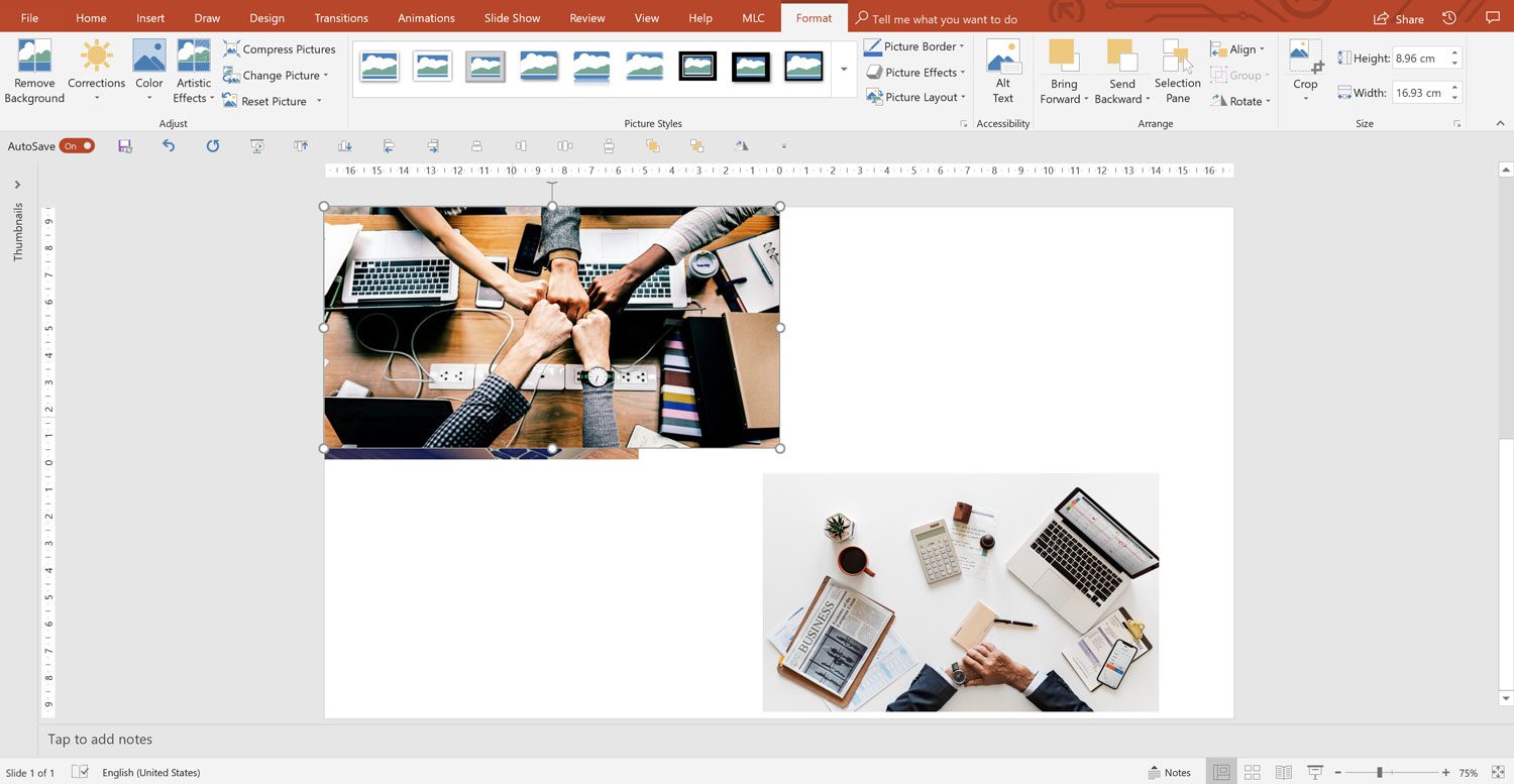
I remind you that the frame is recognized by the black handles around the image . Do not confuse it with the image handles, the white dots, which are used to resize the image itself (not the frame).
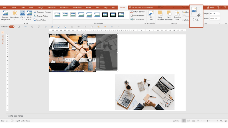
Note that I have matched the cropping frame with the dimensions of the image below.
Now I fill the cropping frame with the “Fill” command located inside the cropping menu, and the image will be centered and cut proportionally on the side edges so as to perfectly fill the cropping frame.

Repeating the operation, I get the same result and finally have the three alternatives re-proportioned, but there is a much smarter way.
Select the three images and access the menu called “Picture Layout” which, to be clear, is a kind of Smart Art menu dedicated to images.

I recommend a simple layout to the images clean up, and you will soon understand why.

You will get a sort of Smart Art that cages the images, re-proportioning them and making them uniform in size.
In our case, the text and cage are superfluous, so we can eliminate them. With the right mouse button, divide the group twice.

If you have the operating system in English, the shortcut is CTRL + SHIFT + G to split the group while you can use CTRL + G to group.

Now select and delete the blue rectangles, retaining only the images.

As you can see, the re-proportioned images all of the same size. This technique can save you a lot of time when working with images in PowerPoint . Add it to the techniques presented in the complete guide of images in PowerPoint to complete your timesaving arsenal.
A special mention to my friend Taylor, from whom I learned this technique .
Taylor’s technique is not bad at all, but if you’ve started to know me, you know how much importance I give to efficiency, and this PowerPoint hack requires multiple steps to get the result.
Moreover, the technique works because the images are set as the background of some shapes, so the final result is not images, but shapes with your images as a background, and this affects the graphics quality of the images.
For this reason, I decided to develop my functionality to resize images in PowerPoint.
First, insert images from the MLC Assets panel directly into PowerPoint . If you do not know the panel, I invite you to consult the search section and insert images directly into PowerPoint article:

Note that I have chosen images of different sizes and proportions. The proportions of the images are an additional problem compared to the shapes that, in fact, can be more easily resized.
You do not want to unmask an image by applying the proportions of another!
Let’s try to apply the dimensions and proportions of the image of the tiger to the other two.
I select the image of the tiger, select the other two and then use the “Make Same Size” button of the MLC PowerPoint Addin .

The images will be immediately resized proportionally.
Now I want to talk to you about the next point, so I’ll leave you to examine the MLC PowerPoint addin on the reference page.
Write to me if you have any questions.
2. Keep everything at your fingertips with the Quick Access Toolbar
Among the most-used PowerPoint Hacks by those who work professionally in PowerPoint , there are alignments and distributions .
Let’s take the example in which 3 shapes sit on the same slide and you want to align them vertically with respect to their center.
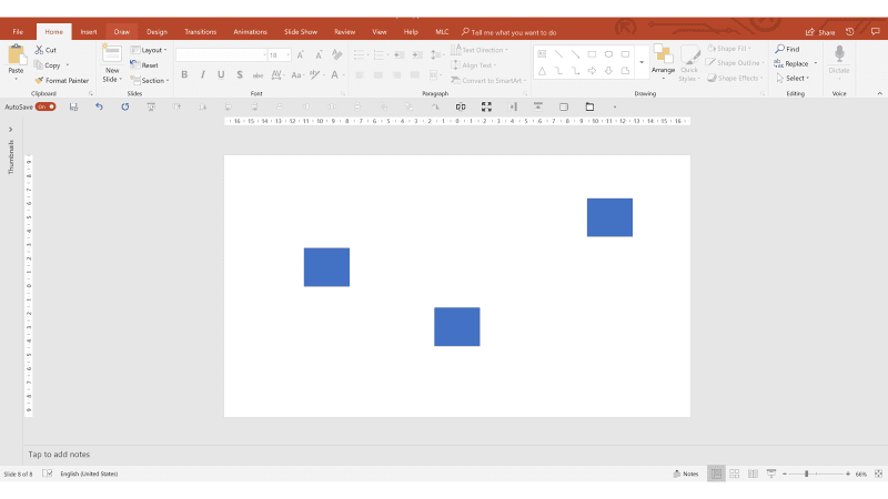
How do you do it as quickly as possible?

Let’s see the necessary steps. After selecting the three shapes, you have to open the “Arrange” menu and then the “Align” sub-menu to be able to click once on the “Align Middle” alignment (x1 click + x1 Submenu + x1 click ).

You have aligned them, now suppose you also want to distribute them.
Open the “Arrange” menu again, the “Align” sub-menu and, this time, select the horizontal distribution button.

Finally, the three forms are aligned and distributed, but it has certainly not been efficient. Want to see what would be really efficient?
Look under the main ribbon of my PowerPoint , do you notice something?

Enlarged for clarity, this is my “Quick Access Toolbar” (QAT).

Do we try to redo alignment and distribution with the functions available just a click away?
I select the shapes and I click on the two buttons Align and Distribute. Very simple!

What am I suggesting?
If you have not already done so, this is the time to set up your Quick Access Toolbar, and that should include a set of basic features, arranged in a specific order to enhance your efficiency in PowerPoint .
Once you understand how this amazing tool works, you can even customize it by adding all the features you want.
Let’s start by opening your “Quick Access Toolbar” which, unless you have already undertaken customization, will be on top of the ribbon.
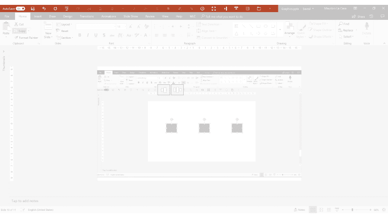
Do you see that little arrow at the end of the features?

That is the arrow you need to open the “Quick Access Toolbar” settings. In fact, clicking on it opens the menu that shows you some of the main commands that you can include in the QAT, simply by ticking them and then the “More Commands” option.
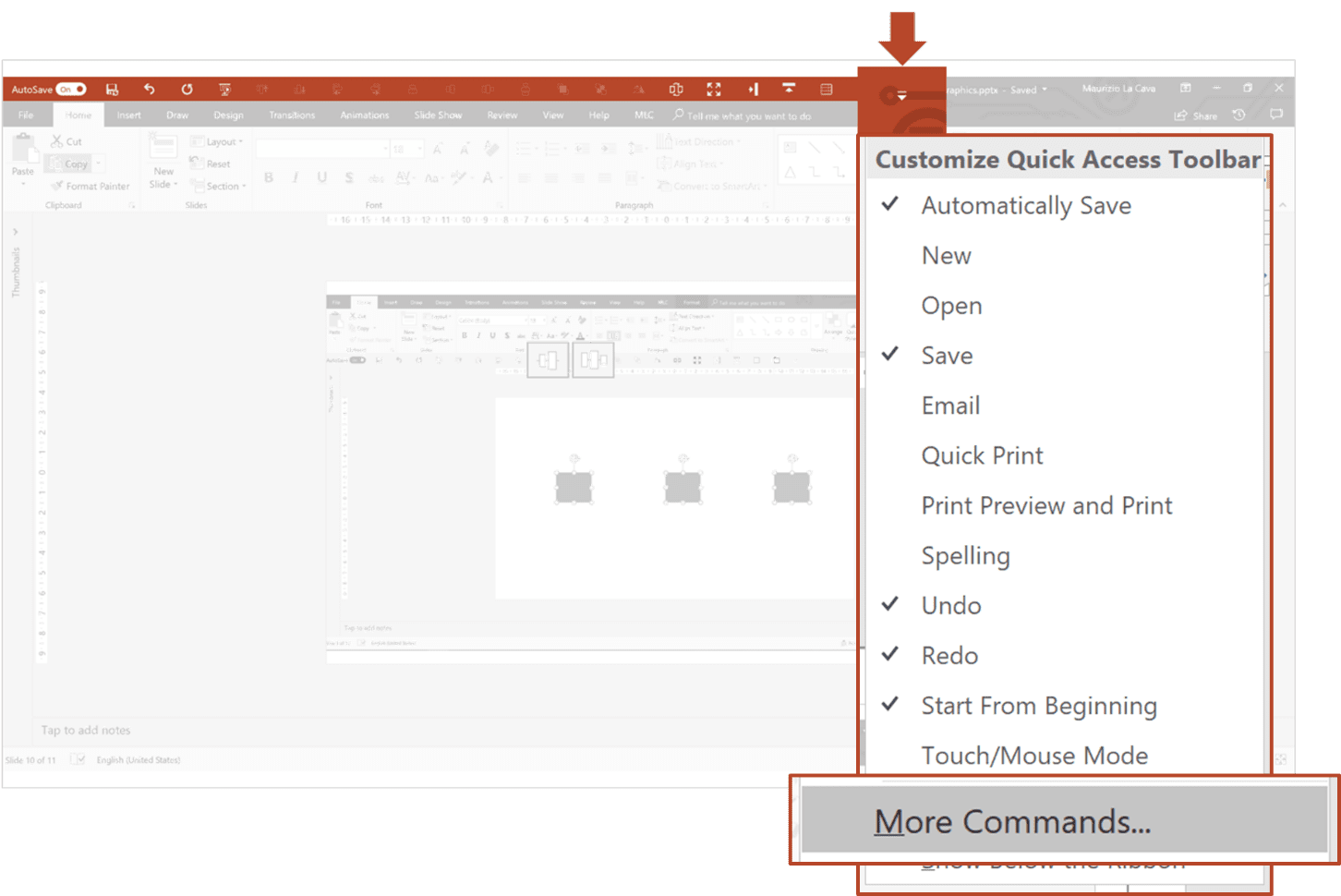
By clicking on “More Commands”, you can access the QAT administration panel.

The functions box on the left shows all the most popular PowerPoint commands (Popular Commands), while the box on the right shows the commands included in the QAT.
The first 5 commands of my QAT are automatically inserted by PowerPoint ; the others are those that I have inserted and distributed, those on which we will focus.

Do we set your QAT by copying the basic functions from mine?
For me, the basic functions are all the alignments , the distributions , the door forward and the back door.
First of all, I advise you not to look only at the most popular commands, because you will not find any alignments or distributions. Replace “Popular Commands” with “All Commands” to display a list of all the commands in PowerPoint . There are plenty of other PowerPoint hacks to work with here!

To move a command from the left box to the right one, simply select it and then click on the “Add” button.
Look for the first alignment button in alphabetical order.

Click the “Add” button repeatedly to add all 6 alignment buttons to your QAT:
1. Align Object Bottom
2. Align Object Center
3. Align Objects Left
4. Align Object Middle
5. Align Objects Right
6. Align Objects Top
The typical mistake is to add other alignment buttons that are not part of these 6 or to add the “Align Objects” menu that would add a little arrow with the list of all the alignments in the QAT, moving them a click away from you.
You can add the “Bring to Front” and the “Send to Back” functions from this same menu, in the same way. The purpose of these buttons is to allow you to quickly send behind or bring an object in front of you without going crazy with the levels.
Finally, all you have to do is add the function to rotate shapes 90° , which can often be convenient to have on hand.
Once you move the buttons into the box on the right, it’s time to rearrange them so you can always have them at your fingertips. For this reason, I suggest you follow the order I set up because after years of testing, it proved to be the most effective.
One last tip: move the QAT under the ribbon so you have it right near the work area and minimize mouse travel.

You can also watch my video tutorial on how to setup a Quick Access Toolbar.
Now you have the QAT set correctly, aside from the last buttons which are included in MLC PowerPoint Addin.

3. Quickly duplicate any object
You have an object on the slide and you want to duplicate it several times by arranging it in line with the first one. How do you do it? Are there any PowerPoint hacks to make it easy?

The most common answer is copy-paste (CTRL + C and CTRL + V). And then position by hand, or with the alignment functions at the desired point.

What if I wanted to duplicate it again? You just have to repeat the procedure.
There is a PowerPoint function called “ Duplicate ” and it is activated with the keyboard command CTRL + D.
Let’s see how it works.
When you select a shape and activate the CTRL + D shortcut, it’s as though you copy-paste the square.

Now position it manually, like you did before.

At this point, if you reactivate the CTRL + D shortcut, the square will be duplicated, keeping the alignment and the distribution (same distances).

Interesting, right? But I want to take it to an even higher level. In fact, this basic PowerPoint duplication technique has a problem, in that the first square has to be aligned manually.
I propose you the alternative I use.
Select the first image , hold CTRL (to duplicate) and SHIFT (to constrain the drag to the horizontal axis or abscissa).

Once positioned, you are ready to apply the great trick.

Try using the CTRL + Y combination, and the shape will be duplicated while maintaining distribution and alignment.
This advanced form of duplicating is more accurate than CTRL + D because, in this case, the restricted drag of the mouse is achieved thanks to the SHIFT button and, therefore, nothing is left to the free hand of the operator.
Do you have any other PowerPoint hacks for this?
4. Getting rid of bullet points
The classic bullet list is one of the most serious ills in PowerPoint. Here is an example.

We know that bullet points in presentations are not effective because they force the audience to read, distract them and cause the loss of attention that many speakers suffer because of their own slides.
One of our PowerPoint hacks is to fix the bullet point.
To solve a bullet point, the first thing to do is to independently manage each bullet point.
Are you wondering how to separate each bullet from the text box?
Certainly I will not tell you to drag the text sentence by sentence into new text boxes, because it would mean repeating an inefficient action several times.
An alternative is to convert the bulleted list into a SmartArt.
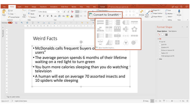
At first glance, it seems that you have caged the text in a model. In fact, all you need to do is split the group twice to get each separate point.
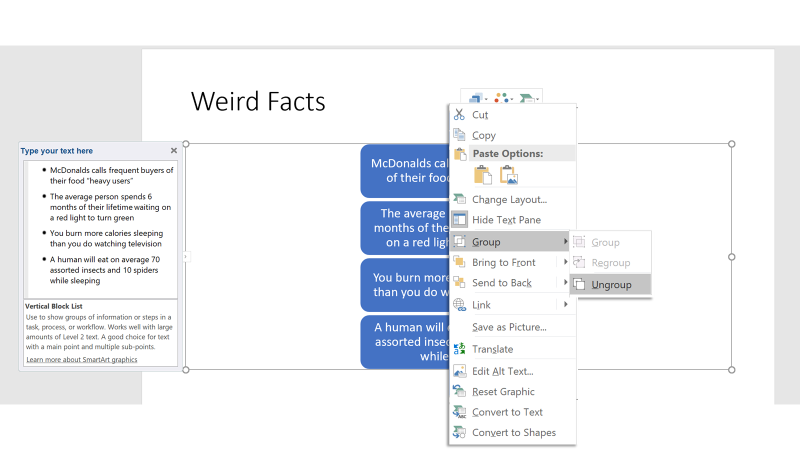
If you have the operating system set in English, the keyboard shortcuts are: CTRL + G to group and CTRL + SHIFT + G to divide.

To arrange them horizontally, simply drag the first one to the left, the last one to the right

And then combine the align and distribute functions.

I’ll show you first the distribute (function) that makes you better understand the dynamics of what I’m doing.
Now I can align center.
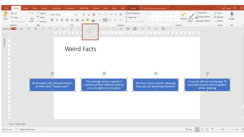
Now you just need to group the shapes and drag them inside the perimeter of the slide.

This procedure is certainly much more efficient than dragging any message outside the main text box.
However, dealing constantly with bullet points in the slides of my clients, I have developed an even more efficient alternative.
Do you remember the initial bullet point?
Just select it and apply a function that I have integrated into the MLC PowerPoint Addin, called “ Split “. This function breaks the bullet point into independent text boxes in a single click (the “Merge” button obviously does the opposite).

For the arrangement, it could then be combined with the historical “Grid Shapes” function that is always present in the MLC ribbon.

To prepare the texts before applying the “Grid Shapes”, make them smaller and remove the bullet point.
Launch the “ Grid Shapes “, setting the distribution on 4 columns and a row.

There’s still a trick I’ve used, and you’ve probably noticed that I have never closed the MLC ribbon, not even to make the text smaller.
How did I reduce the text without clicking on the button to make it smaller on the “Home” tab?
No, I didn’t use a shortcut.
In fact there are some very frequently used features (like font size change) on PowerPoint that do not have very practical keyboard shortcuts.
For this reason, I have provided myself with a very, very special mouse that allows me to be even more efficient when I work with PowerPoint .
Thanks to my very efficient friend Taylor, who taught me this hack.
5. Fixed page numbers (requires knowledge of the slidemaster in PowerPoint)
Have you ever had to add the page number to your slides?

In the PowerPoint default template, the page number is shown at the bottom right of the slide.
Do you remember how to apply the page number? Here’s one of our PowerPoint hacks to help.
In the insert menu, you will find two small buttons that open the same panel, from which you can check all the footers of your presentation.

The second panel entry concerns the page number.
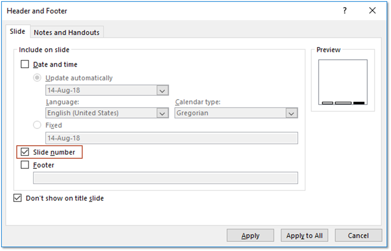
Once checked, just click “Apply to All” to apply the page number to all slides. To be precise, the page number will be seen in all slides that are linked to a layout in the master that contains the field footer (If you do not know what I’m talking about, it means that you’re probably losing a lot of time when you work in PowerPoint , so I suggest you learn what the slidemaster really is and how to use it – Slide Master PowerPoint: the Complete Guide to make the best use of it ).
Another interesting check is the option “Do not show on title slide”, which allows you to hide the page number from the title slide so that it starts from the first slide.

This is very useful when you do not want the page number in the opening cover, and I expect that you don’t brutally delete it with the mouse, because it is a master placeholder that should be treated appropriately.
The page number is a very useful tool that I use often in my presentations, but it has a problem that I find very frequently.
When more people work on the same presentation, the page number ends up being modified or moved from its original location.
I would like to give you an example where each slide has a page number that is sized and positioned differently.

It’s not strange that something like this happens because the page number is a text placeholder, which it is easy to stumble across during the processing of a slide. Therefore, you may need to move it or resize a PowerPoint slide easily , and this can result in a dancer page number on your slides.
One day, during a training session, a person asked me if it is possible to set the page number in the master so that it could not move in normal mode when working on the slides.
Thanks to this input and a bit of testing we did that day, I discovered this useful technique, which I want to share with you.
To access the placeholder of the page number, you must enter in the slidemaster (I repeat that if you are not prepared on, you should look at Slide Master PowerPoint: the Complete Guide to make the best use of it ).

When you enter the slidemaster, positioned on the first slide (the theme), look at the bottom right. See the page number?
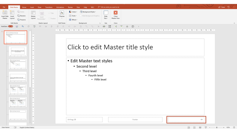
That is the placeholder of the page number.
The page number is a rather special placeholder ; it is identified by a pound sign in quotation marks.
In fact, when you apply it to changing slides, it increases by +1 and counts the pages automatically. But, being a placeholder, if you click on it during normal view, you can easily modify it and lose its functionality.
In the example below, I selected it and wrote in it to show you how easy it is to change it.

How do you block the page number so that no one can change it while maintaining its functionality (that is, that it updates slide by slide)?
The technique consists of imposing the special field: a page number inside an object that you can modify only in the master that is a text box.
Enter the slidemaster and insert a text box (not a text placeholder). Place it just above the placeholder of the page number to let you see the difference once set.

Instead of writing in the text box, apply the special text field: page number.

Be careful: Applying the page number via the button directly in the text box is not the same as writing it by hand. If you write it by hand, it doesn’t work, as the complete, hidden formula is not built into the slides.
At this point, exit the slidemaster.

On the slide, you will have two page numbers: the placeholder indicated in gray, and your text box. Try pulling a selection box with the mouse and selecting them both. What happens?

The placeholder can easily be modified by anyone that clicks on it, while the text box is protected from any changes; the only way to change it is to enter the slidemaster.
Now try to create some slides and you’ll see that the number is updated progressively, just like the placeholder field.

With this technique, you have learned to protect the page number from accidental changes that may occur during the processing of slides, especially in presentations made by more than one person, with different needs and styles.
6. Learn how to manage layers in PowerPoint
Do you know that in PowerPoint objects can be overlapped on each other?
This means that PowerPoint thinks of objects as levels, so it is possible to create a scale of priorities according to what is above which object.
One of our PowerPoint hacks is to understand the best way to utilize these layers.

In the paragraph where we talked about the Quick Access Toolbar, we have placed the buttons “Bring to Font” and “Send to Back” at your fingertips just to be able to manage the front level and background.
What happens if I have more items and intermediate levels to manage?
In this case, the level management panel can be very useful. Do you know where it is?
You can find the layer management panel in the “Home” tab under the heading “Select”.

The panel shows you the order of the levels of the objects you have on the slide, from top to bottom. Those at the top are in front, while those at the bottom are in the background.
By clicking on the name of the levels, you can change the name.

You can change the order of priority simply by dragging objects within the panel.
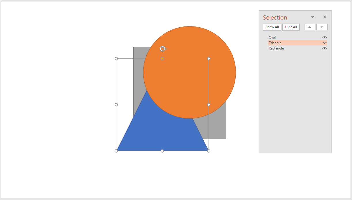
You can also hide some objects temporarily by clicking on the eye that is to the right of the level.

This function is extremely useful in cases where you want to lock an object once positioned, so you can work on everything else without clutter and then have it reappear at the end.
In the example in the picture , I could hide the oval that is in the foreground to work comfortably on the levels placed below, and then let it reappear in its place when I finish.
7. How to make a transparent image in PowerPoint
PowerPoint provides you with a good number of tools to edit images and customize them to make them effective

There is a technique that allows you to set a certain level of transparency on images in PowerPoint on Windows – How to Make Images Transparent in PowerPoint . I extracted this technique from the definitive guide to use images, to share it in this list of very special techniques.
Making a transparent image is an exceptional technique to create compositions in which the background image creates the context and the overlapping image an enrichment.
Thanks to the transparency, you can get effects in PowerPoint for which you often use Photoshop.
Wondering how to do it?
Get a high resolution image to be placed at full slide on your slide (Access millions of free, high resolution images free from copyrights from MLC Images for Presentations ).

Desaturate it, since we will keep it in the background and it has pretty bright colors. Keep this image in the background.
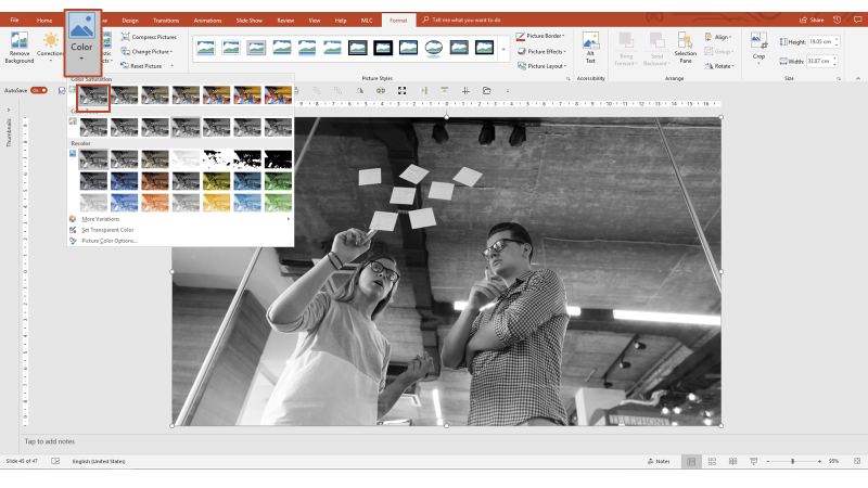
Now get another image to overlay the background and to which you’ll apply degrees of transparency.

Since this image represents a brainstorming and the principal object for each session of sharing ideas is post-it notes, I thought using an image of hands with post-its would fit.
I got an image with the white background so I can quickly remove the background in PowerPoint and keep my hands.
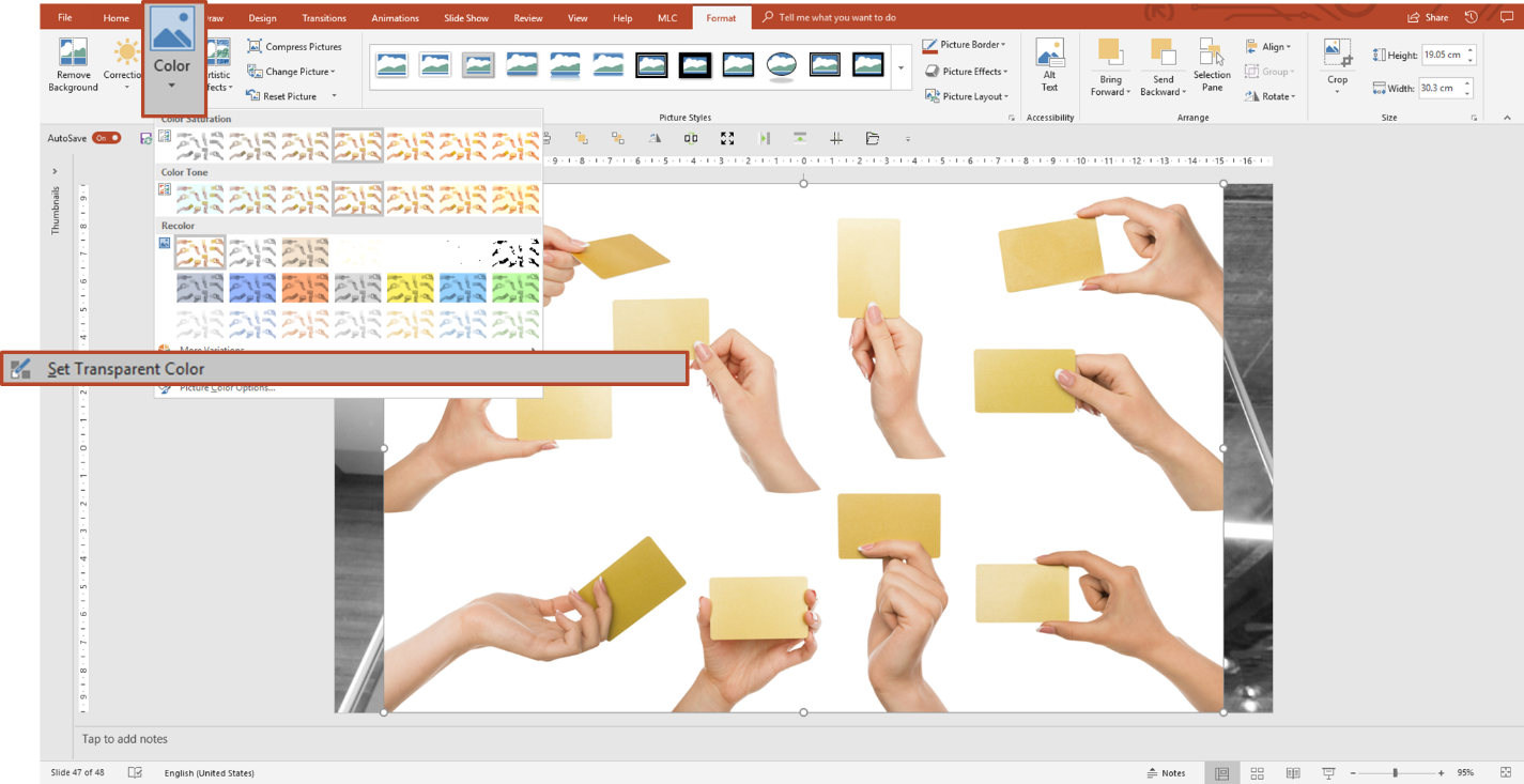
The PowerPoint background removal feature allows you to set a single color of the image to transparent. For this reason I need the background to be uniformly white.

In this image , I’ve removed the background, so I just have to size the image so that it overlaps the whole page.
Activate the cropping frame, drag it horizontally, while holding down CTRL on the keyboard, to cover the entire slide with a single drag.
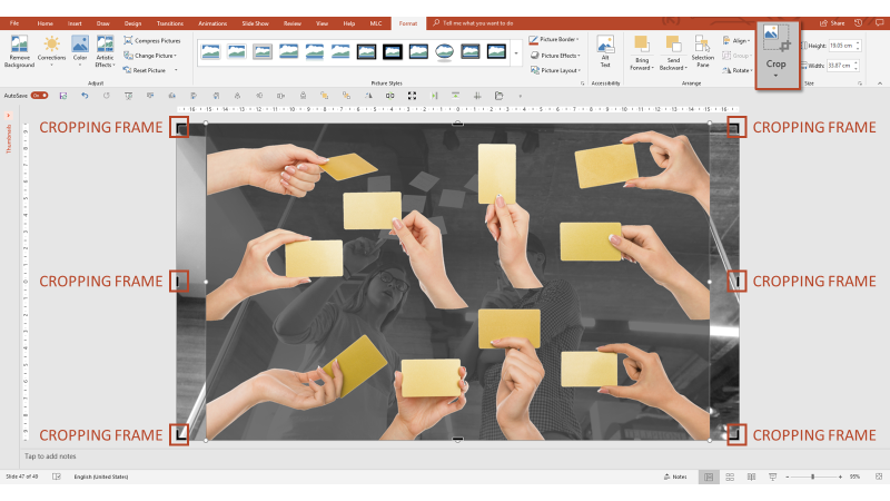
Now enlarge the image so that it fades the cropping frame and do not worry because all the parts that exceed the frame will be automatically cropped (note the black parts out of the frame).
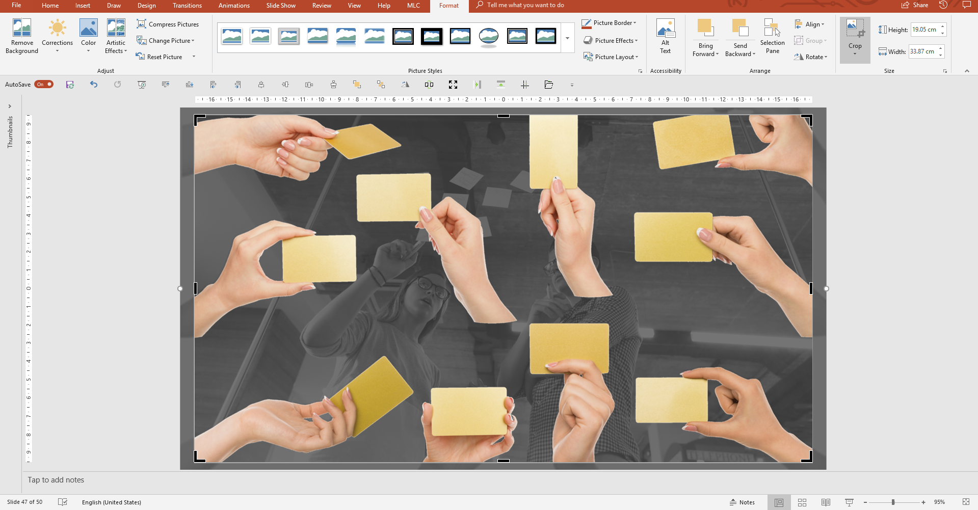
Now it is time to give transparency to the image superimposed on the background.
Insert a rectangle.

Give the rectangle the same dimensions as the image . To do this you can simply drag the edges of the rectangle until they coincide with the image that, in this case, coincides with the edges of the slide.
To go faster, I like to use the Make Same Size function of the MLC PowerPoint Addin .

Cut the image to give transparency (CTRL + X). The image disappears but is actually saved in the clipboard. You just need to paste it with CTRL + V to make it visible again on the slide.
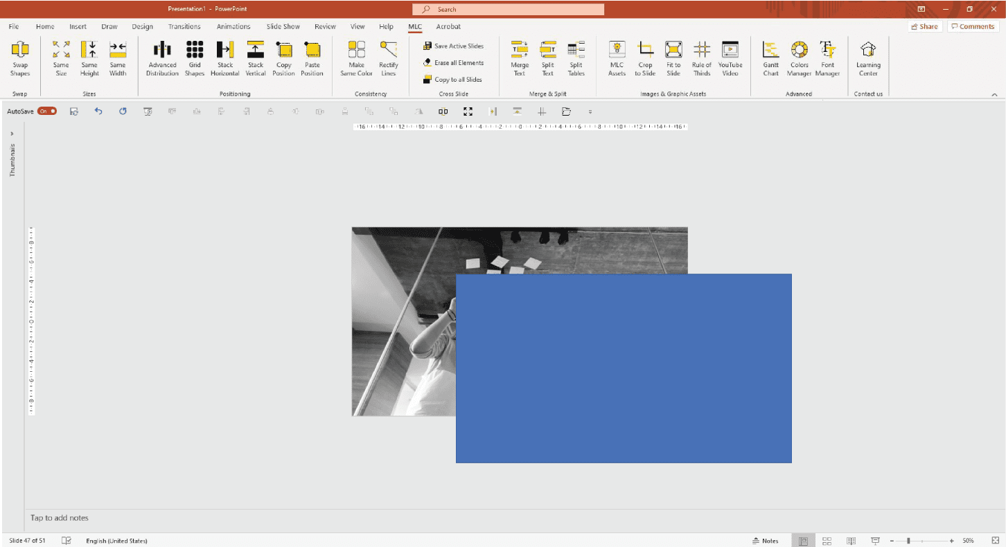
Select the shape with the right button and click on the “Format Shape” option.

Apply a background that is not the usual “Solid Fill” but “Picture or texture Fill” and indicates that it comes from the Clipboard.

Assign a background to the shape, to which you can apply transparency.

Here is your image that has acquired the desired transparency.
I showed you how to take the image from the Clipboard because I think it is the most advanced and interesting technique, but clearly you could take the image directly from a file, as shown in this video of Microsoft .
What do you think? Did you like this technique?
The last technique I want to show you is the simplest and it is useful only when you have to add trasparency to pictures .
All you need to do is to go to “Format” section, click on the image and select the grade of trasparency.

This technique is available only with the last update of PowerPoint.
8. Record videos in PowerPoint
Have you ever wanted to record a video of your screen while doing operations? Maybe you want to record a presentation, a course, or simply show steps to a friend or colleague on the other side of the screen. What software do you use?
There are many alternatives. The search for the easiest and most immediate free tool on Google to make videos often takes you on strange sites to download viruses, never really finding the tool you want.
Or you have to use a paid solution but, unless you are really professional, you are looking for a way to record your screen that is decent but not the best recording tool in the world.
PowerPoint has a feature that allows you to record videos of your screen or part of your screen, and then it makes them available in .mp4 format;
Too easy, right? In fact, it is!
In the “Insert” tab, there is a button called “Screen Recording” which allows you to record sessions of a selected area of your screen.

Note that the shot must not necessarily take place in PowerPoint ; you could take a recording of everything you want out of PPT.
After clicking on “Screen Recording”, a small panel appears at the top of your screen with 5 main functions:
Record : Start recording.
Stop : Stop recording.
Select Area : Indicate the area to be registered.
Audio : Record audio or not.
Record Pointer : Record pointer movements.
Clicking on the red button start recording, imagine it as your clapperboard!

To stop shooting, if you lose sight of the small panel at the top of the screen, you can simply perform the keyboard combination WINDOWS + SHIFT + Q.

The video will be available on PowerPoint in the slide where you were working. You can use it directly in the presentation or save it as an MP4 and use it as you like.
9. How to create image templates in PowerPoint
If I ask you to transform this image :

Applying a set of templates in PowerPoint .

Can you do it?
I’ll show you another example to help you understand how much you can play with this technique.

I leave to your galloping fantasies more creative experiments, so I will explain the technique.
To create a template formed by many different shapes in an image , the first thing to do is draw the template with simple shapes in PowerPoint .
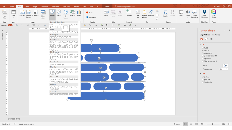
The set of shapes that I have designed represents the template that I will apply to the image .
For the technique to work, you must group all the forms into one group. Then select them all (CTRL + A) and then right click on Group> Group (CTRL + G for English operating systems).
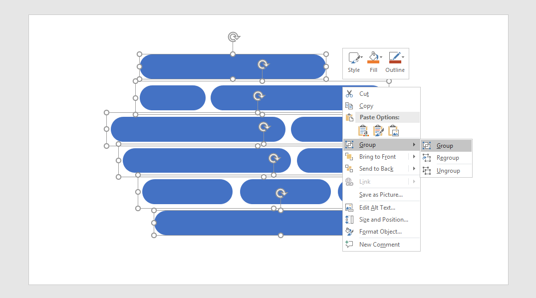
All the shapes will now be grouped together in a single selection box.

Select an image , right-click on the image and click “Cut” (CTRL + X).

The image disappears from view, but is actually saved in the Clipboard.
Now select the template with the right mouse button, open the “Format Shape” menu and assign a background from an image taken in the clipboard.
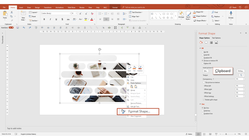
As long as you keep the merged group, you can even edit the shapes within the selection frame, and the template will update in real time. You could even delete some shapes and change others. For example, you could change rectangles into circles.

Now it’s up to you to experiment with the technique of template, free your creativity and use it to amaze your audience.
10. Auto play videos in your presentations
When you insert videos in the presentation, must you stop your presentation to play it? You have to go to the PC and click on the screen to start the video.
I use a lot of videos in my presentations, especially during company training, because if they are used at the right point and without excess, they help to change the rhythm and advance the audience through the flow of communication.
The best use of a video in a presentation is to launch it at the exact moment when you stop talking, in order to create a continuity effect for your audience.
In order to do that, you certainly can’t think of going back to the PC, which may not be at hand, and launching the video.
Here is where autoplay comes to our rescue.
First of all, you have to insert the video into the presentation.

I advise you that always have the videos on your PC so you don’t have to worry about collapsing wi-fi or lack of connection on the day of the presentation.
Select a video and enter it in the presentation.

Click “Sequence” option to “Automatically”

Thanks to this option, when launching the presentation mode the video will start automatically when you will pass to this slide from the previous slide.
Try Out These PowerPoint Hacks
So, in summary, in this article i showed you the tricks which will save you a lot of time and make your presentations more efficient..
- Make a lot of images the same size only in few steps
- With QAT you can customize up to 5 commands according to your needs and duplicate an object with the shortcut CTRL + D
- You can delete bullet points and redesign cleaner, more impactful layouts
- Apply the page number to all slides also with the use of Slide Master
- Use levels in PowerPoint , changing the order of objects priority . This function is extremely useful in cases where you want to lock an object once positioned
- Use transparency which is an exceptional technique to create compositions in which the background image creates the context and the overlapping image – an enrichment
- Recording video in PowerPoint which can be extremely useful during a presentation and you can easily convert it in MP4
- Create an image template in PowerPoint using shapes
- Autoplay in presentation : it helps to change the rhythm and advance the audience through the flow of communication.
Key Takeaways
Resize Multiple Images Efficiently : Use the “Picture Layout” feature to quickly resize multiple images to the same dimensions, saving time compared to manual cropping and resizing.
Quick Access Toolbar (QAT) Setup : Customizing your QAT with frequently used commands like alignments, distributions, and rotations will significantly speed up your workflow in PowerPoint.
Duplicate Objects Precisely : The CTRL + D shortcut allows for quick duplication of objects, but combining it with CTRL + Y after manual alignment ensures perfect distribution and positioning.
Break Free from Bullet Points : Convert bullet points into individual text boxes or use the MLC PowerPoint Addin’s “Split” feature for cleaner, more engaging slide layouts.
Stabilize Page Numbers : Protect your slide numbers from accidental changes by embedding them in text boxes within the Slide Master, ensuring consistent placement and format.
Manage Layers with Ease : Use the layer management panel to organize objects by priority, lock layers, and hide elements temporarily, giving you full control over your slide design.
Create Transparent Images : Apply transparency to images by using shapes as placeholders for your pictures, allowing for creative overlays and backgrounds directly in PowerPoint.
Record Screen Activity : PowerPoint’s built-in screen recording feature is a convenient tool for capturing tutorials or demonstrations without needing additional software.
Design Image Templates : Group shapes to create custom templates for images, enabling dynamic and visually appealing layouts that can be adjusted in real-time.
Autoplay Videos Seamlessly : Set videos to autoplay within your slides to maintain the flow of your presentation, eliminating the need to manually start the video during your talk.
How can I make multiple images the same size in PowerPoint?
You can make multiple images the same size by using the “Picture Layout” feature in PowerPoint. Select the images, apply a layout, and then ungroup them to achieve uniform sizing.
How do I keep everything at my fingertips in PowerPoint?
You can customize the Quick Access Toolbar (QAT) in PowerPoint to include frequently used commands such as align, distribute, and others. This helps in speeding up your workflow.
What is the shortcut for quickly duplicating any object in PowerPoint?
The shortcut to quickly duplicate any object is CTRL + D. This duplicates the object and maintains the alignment and distribution if used consecutively.
How can I get rid of bullet points in PowerPoint?
You can remove bullet points by converting the list into a SmartArt graphic, then ungrouping it. This allows you to manage each bullet point independently.
How can I make an image transparent in PowerPoint?
To make an image transparent in PowerPoint, insert a shape, fill it with the image, and then adjust the transparency of the shape. This technique can be used to overlay images for a professional look.
10 Essential PowerPoint Hacks For More Exciting Presentations
PowerPoint Hacks You Probably Didn’t Know
15 Powerpoint Hacks That Will Help You Save Hours And Wow Audiences
DON’T HAVE TIME TO READ THE ARTICLE? DON’T WORRY, LET ME SEND YOU A COPY
Maurizio La Cava
About Maurizio
Comments on PowerPoint hacks you’ve never heard of
Investigations Toronto
I enjoyed going to your webiste. I leave comments rarely, but you definately up deserve a thumbs!
Hi, I’d like to create a slightly bent/curved line that is NOT a shape with a bounding box, but still has two line end handles like a straight line or a connector. Isn’t that possible?
Leave a comment
Your email address will not be published. Required fields are marked *
MLC Presentation Design Consulting
We specialize in creating impactful business presentations. We offer design services, engaging training programs, and a PowerPoint add-in to enhance presentation efficiency and effectiveness. Let us help you transform your ideas into compelling visual stories.
Our books offer practical design tips, engaging techniques, and strategies to enhance presentation efficiency and effectiveness. Transform your ideas and data into compelling visual stories with these insightful resources.
We are always here for you, drop us a line.
What are you looking for?
Design Training Add-in Other
I accept privacy policy
Table of Contents

COMMENTS
Here's the goal: work fast and deliver great-looking presentations. With our PowerPoint design hacks, you'll definitely do both. These are the most efficient way to create your next presentation. Let's dive in! 12 Top PowerPoint Presentation Hacks. PowerPoint design hacks serve two purposes.
Go to the Shape Format tab and click on the Shape Fill dropdown. Select “More Fill Colors…” and click the eyedropper icon to begin color appropriating. 7. Record and Insert Audio. What’s it for: Infuse personality into your presentation by recording audio directly within PowerPoint.
Data is everywhere! Enhance your career and acquire new skills by taking a course on DataCamp! Click here to take the first chapter of any course for FREE:...
Time-saving PowerPoint hack #3: Use PowerPoint Templates. If you prefer non-paid options, however, there’s still a lot of PowerPoint tips and hacks you can use to save time when working on your presentations. And one of the most effective ones is definitely to work with templates.
Getting Started. 1. Open PowerPoint and click ‘New.’. A page with templates will usually open automatically, but if not, go to the top left pane of your screen and click New. If you’ve already created a presentation, select Open and then double-click the icon to open the existing file. Image Source.
PowerPoint is a versatile tool capable of many amazing tasks. It has lots of great features but unfortunately, most users aren’t even utilizing half of the software’s capabilities. Today, we’re going to change that. In this guide, we share some of the best PowerPoint tips and tricks for doing cool things with the presentation maker.
PowerPoint Hack #14: Do a live poll of your audience. There’s this great app called Poll Everywhere that enables you to ask your audience questions and receive the answers in real-time. A great hack for webinars or conferences. The answers will be displayed instantly in your PowerPoint presentation.
1. Keep it simple. Keep your slides simple. It’s the visual backdrop to what you are going to say. The most recommended PowerPoint tip for your productivity is called simplicity. You may be tempted by the graphical razzmatazz of beautiful images, background, and charts. At the end of the day, PowerPoint is a background visual aid for your talk.
Download your instructor file here ️ https://www.simonsezit.com/article/advanced-powerpoint-hacks/In this recorded webinar from Simon Sez IT, Microsoft ex...
PowerPoint Presentation Approach Tips. 1. Use the Tell ‘n Show method: a headline with a single point and media to support it. To get your audience to understand and remember what you say, use the Tell ‘n’ Show (SM) method. Use the slide title to tell your point–what you want them to remember.
Stick to a maximum of three or four primary colors for a harmonious and aesthetically pleasing look. 4. Keep It Simple and Concise. Less is more when it comes to PowerPoint presentations. Avoid overcrowding your slides with excessive text and complicated graphs. Use bullet points and concise phrases to summarize key points.
PowerPoint Presentation Hack #3: Draw On Your Slides In Real Time During Your Presentation with Control + z. One of our favorite PowerPoint presentation hacks is the ability to draw right on the slide. If you want to be able to circle part of your slide to emphasize it (or satisfy your craving to doodle, we don’t judge), you can easily turn ...
We can help you get started with some easy PowerPoint tips and tricks that’ll help you create an impactful presentation, no matter what the occasion. Our PowerPoint for beginners tips will show you how to: Make an outline. Choose a theme. Find a font. Use visuals. Not use too much text. Limit your color.
13 Time-Saving Microsoft PowerPoint Hacks for Better (and Prettier) Presentations. September 25, 2024. The trick to creating a PowerPoint presentation quickly is no secret at all. Slide after slide of black text on a white background – it may be the fastest way to make a presentation, but it’s also the most mind-numbing to sit through.
In PowerPoint’s “Home” tab, click “Paste”; 3. Select “Paste Special”; 4. Select “Paste Link” and “Microsoft Excel Chart Object” → The numbers are dynamic; 5. If you close Excel and then update the raw data, right click the PowerPoint chart, and select “Update link” to refresh the data.
For countless people in business, education and entertainment, PowerPoint is the default app for creating presentations. Here are top 10 shortcuts and hacks to help you become...
Step 2. Select an icon on the first slide and rename the icon’s label in the Selection Pane. In this case, we will select the Excel icon and rename the icon to “Excel”. Perform the same operation on the other icon. In this case, we select the PowerPoint icon and rename its label to “PowerPoint”.
Here’s one of our PowerPoint hacks to help. In the insert menu, you will find two small buttons that open the same panel, from which you can check all the footers of your presentation. The second panel entry concerns the page number. Once checked, just click “Apply to All” to apply the page number to all slides.