
Making Your PowerPoint Accessible for the Visually Impaired
May 1, 2015 / Blog, Rick Enrico Blog Power Point Tips, Powerpoint, visual impaired
When you’re up on the stage, you may notice that the crowd isn’t paying attention to your PowerPoint.
They might not be satisfied with your delivery style and content. But what if this disengagement is because of its design?
Though you may have used a template that appeals to you, you might unknowingly be making it harder for people look at what you’re trying to present.
To get your message across, it’s imperative to engage the audience in your discussion.

We redesign PowerPoint presentations.
Get your free quote now., there’s more of them than you think.
According to the World Health Organization (WHO), “[In 2015] 285 million people are estimated to be visually impaired worldwide—39 million are blind and 246 have low vision, which are caused by uncorrected refractive errors.” This means that your audience might be comprised of both people with normal vision and people with visual impairments.
Just because they’re not wearing prescription glasses doesn’t mean they’ve got perfect eyesight. Some people wear contact lenses or don’t even know they have a problem with their eyes.
Regardless of what corrective wear they’re using, an audience member’s visual impairment could be the reason they struggle to understand your presentation.
Common Visual Impairments
Low vision, color blindness, and dyslexia are three of the most common vision impairments.
For people with poor vision, objects appear out of focus whether they are near or far.
Color-defective people have a decreased ability to distinguish colors from others. Red and green are the most common colors that are hard to differentiate, while and blue and yellow are the least common.
People with a reading disability or dyslexia can take longer than others to identify colors, objects, or numbers.
This is what people with clear eyesight see versus what color-deficient people see:
If you’re new to making your design accessible to more people, don’t fret. Here are few basic guidelines:
How to Make Your Design More Accessible
Choose a readable font.
Managing your content’s font and size helps your audience read your slides from a distance. The World Blind Union (WBU) highly suggests using sans serif font types such as Helvetica, Arial, and Verdana. Unlike serif typefaces, these font styles don’t have small finishing strokes, which makes them more legible and readable for people with low vision and dyslexia.

When deciding what font size to use, consider what a comfortable viewing distance would be for a person seated across you—32-point is the ideal text size to use in most room settings. This is so that near-sighted people can understand what you’re pointing to, even from a distance.
Control Brightness and Contrast
Your template may have a vibrant and powerful look, but is it readable for your viewers?
Even if you painstakingly selected appealing colors for your PowerPoint, it’ll work against you if they’re virtually identical to each other. Using appropriate brightness and contrast is a great way to improve the readability of your slides.
Try employing a light background with dark text and graphics for your slides. This combination provides enough contrast that boosts the readability of your work for anybody who might have trouble distinguishing one color from another. When deciding on your color palette, always go for clarity instead of only visually appealing colors .

Limit Animations and Effects
Animations and effects might not sit well with visually impaired people, so keep them at a minimum.
Partially-sighted audiences wait for the text to stop moving before they can start reading it. Steer clear from moving text effects such as “Fly In,” “Bounce,” “Spiral,” or “Zoom.”

When it comes to choosing the appropriate effect, “Appear” suits most presentations because it’s the simplest and quickest animation.
Any effects that show one bullet point at a time are also good effects to consider. These help your viewers focus on specific points without getting overwhelmed by too much text on the screen all at once.
Preparing an effective PowerPoint is already a challenge. Preparing one for a visually impaired audience is even tougher.
Match your delivery technique with these design tips to provide a fully accessible presentation while leaving a great impact on your viewers.

Download free PowerPoint templates now.
Get professionally designed PowerPoint slides weekly.
References:
“ How To Make Visual Presentations Accessible To Audience Members With Print Impairments .” World Blind Union , 2012. Accessed March 24, 2015. “ Comfortable Viewing Distance for Text on Presentation Visuals .” Think Outside the Slide . n.d. Accessed March 24, 2015. “ Choosing the Right Colors for Your PowerPoint Design .” SlideGenius, Inc . June 3, 2014. Accessed March 24, 2015 “ Design 101: Basic Principles for Your PowerPoint Designs .” SlideGenius, Inc . July 31, 2014. Accessed March 24, 2015 “Visual Impairment And Blindness .” World Health Organization . August 2014. Accessed March 24, 2015.
Update: There are now 1.3 billion people living with some form of visual impairment worldwide. Thirty-six million are blind while 217 million people have mild to severe vision impairment. (2018)
Featured Image: Pixabay
Popular Posts
Save your deck: methods to recover an unsaved powerpoint file.

Twitter: Lessons from Social Media

Oscar Speech Sounds A Lot Like…..

Olympians Can Teach Presenters a Thing or Two

Overcoming a Public Speaking Disaster: A Lesson from Michael Bay

The Similarities Between Presentations and Advertisments : Super Bowl Edition
- Face to Face Disability Awareness Training
- Virtual disability awareness training
- Lunch and learn
- Tailored Disability awareness e-Learning
- Access audits
- British Sign Language
- BSL for your website
- Deaf awareness
- Testimonials
- Work Experience
- Myth Busters
- Helpful blogs
- Law and Policy
- Free Resources
Creating Accessible Powerpoint Presentations
This guide outlines best practice for creating accessible PowerPoint presentations. In the UK around 2 million people have sight loss. A visual impairment could be sensitivity to light, blurred vision or blindness. So please don’t think that because you don’t have a colleague with a guide dog that this isn’t relevant to you. It is! Video calling and webinars are the new norm so accessibility should be a priority rather than an afterthought.
Imagine presenting to an audience, or at a job interview only to discover those you need to impress can’t understand your slides. It’s not a good first impression, especially if equality and inclusion are values your employer actively promotes.
Good Practice
Lots of people who are visually impaired will be able to read your slides without using any specialist software IF you make some subtle and simple changes. Use these points when creating accessible PowerPoint presentations.
- Use PowerPoint’s inbuilt accessibility checker. It’s super easy to use and will quickly highlight accessibility issues.
- Have a sufficient colour contrast between the text and the background so that people with low vision can see the content. A dark font on a light background often works best and avoid a pure white background.
- Choose your fonts carefully. Sans Serif typeface is best and should be font size 24 or above (larger for titles).

- Some people will find reading italic and underlined text difficult so keep these to a minimum if you must use them.
- Make sure that you are not using colour alone to convey information. It can be useful to select greyscale from the view tab and scan your slides for occurrences of colour coding.
- Avoid busy backgrounds and keep ample ‘white space’ between sentences and paragraphs.
- Avoid using animations and sounds if it’s not vital to the presentation because they are distracting.
More Insights
Whilst not exhaustive these tips are a good starting point. Every month we add new articles to this site ranging from ‘How To’ practical instructions to insightful interviews.
Please contact us if you’d like to chat about working together to make your organisation accessible for all. We offer accessibility audits, disability awareness training, British Sign Language Lessons and much more.
You may also enjoy these articles:
12 Tips for Accessible Video Calls
Video Conferencing with Deaf Colleagues
What is A Hidden Disability
Join us on twitter @EnhanceTheUK for more practical tips on disability awareness and making your working environment inclusive for all.
Related Posts

6 tips for supporting autistic colleagues in the workplace

How to make healthcare appointments more accessible for D/deaf patients

Five quick ways to make sure your event is accessible
GOV.WALES uses cookies which are essential for the site to work. Non-essential cookies are also used to tailor and improve services. By continuing to use this site, you agree to our use of cookies.
How to create accessible PowerPoint presentations
Instructions for improving the accessibility of PowerPoint presentations.
- Create accessible documents and
- GOV.WALES standards and guidance (Sub-topic)
Arrange slides correctly
Put your slide content in a proper reading order so that screen reading software can read it aloud correctly for users with a visual impairment.
Reading order
To set the reading order, click on Home > Arrange > Selection Pane.
List objects in the slide in a logical order so that any screen reading software reads them aloud in the right order.
To rearrange objects into a new reading order, either drag the object into a new location or click on it and select Bring Forward or Send Backward.
To check the reading order, select a slide and press the Tab key. Each time you press the key, the focus moves to the next object that a screen reader will read.
Improve image accessibility
How to make the charts, graphs, and images in your PowerPoint slides accessible to users with visual or cognitive disabilities.
To make images more accessible:
- use colour, text, patterns, or shapes to communicate ideas
- add descriptive Alt Text to pictures, charts, and other visual objects
- group layered images, like a picture with callout lines, into a single object
- select View > Grayscale, to get an idea how your slides might look to someone with colour vision deficiency
Add Alt Text to a chart
- Highlight the chart by clicking on it.
- Right-click the chart and select Format Chart Area.
- Select Size & Properties > Alt Text.
- Add a meaningful Title and Description.
Add Alt Text to an image
- Right-click the picture and select Format Picture.
- Select the Size & Properties panel.
- Click on the Alt Text drop-down.
Group layered images for simplicity
- Select all the images you want to group.
- Click on the Format tab and choose Group.
Use accessible colours and styles
PowerPoint is primarily visual and often displayed at a distance from the audience. However, you can make your PowerPoint slides more accessible by following a few best practice tips.
The colours and styles you use for slides, text, charts, and graphics go a long way toward improving accessibility in PowerPoint.
Start with a template
Prebuilt PowerPoint templates can help save time and improve accessibility in the content that you create. Microsoft have a range of these templates available for users to download at office.com .
Templates from this collection have several features that support accessibility.
Tips for accessible colour and style choices
- Off-white backgrounds are better for people with perceptual differences, like dyslexia.
- Select templates and themes with sans serif fonts that are 18 points or larger.
- Use solid backgrounds with contrasting text colour. This is preferred to patterned / watermarked backgrounds and low-contrast text themes.
- To make information more accessible, differentiate it in more than one way. For example, use both colour and text to mark up different chart elements.
Design slides for people with Dyslexia
The elements that make presentations clearer and easier to follow for people with dyslexia also make them better in general.
These tips help you do both:
Use simple, sans serif fonts with adequate spacing between letters.
Use at least an 18-point font size. Good Sans Serif font examples include: Calibri, Franklin Gothic Book, Lucida Sans and Segoe UI.
Avoid compressed fonts, fonts with uneven line weights, fancy / script / display fonts and italic or underlined fonts.
To keep your text easily readable, limit the number of lines in each slide and leave plenty of space above and below each line.
Apply the “6 by 7” rule: only 6 words per line and 7 lines per slide.
Speaker notes
Use speaker notes to provide more in-depth information.
By default, speaker notes are formatted in a readable, sans serif font.
Share your slides after your presentation so your audience can refer to the slides and notes later. This will allow them to recall the verbal presentation delivery.
Bright white slide backgrounds can make text harder to read; choose an off-white or cream background instead.
Text should be dark, with lots of space around the letters.
Alternatively, a dark background with white text also works well.
Images are a great way to break up blocks of text and make your slide easier to scan.
Remember to add Alt Text to every image in your presentation.
A colourful, high-contrast graphic layout, with pictures and text creates a structured design.
Structured layouts are easier for people with dyslexia to understand.
Make use of alternative formats
To make a presentation more accessible to people with low vision, save it in an alternate format that can be read by a screen reader. Users can then open it on a personal device or port it to a Braille reader.
Create a document version of a presentation
- Open the PowerPoint presentation.
- Select File > Export > Create Handouts.
- To create a Word version, choose Create Handouts.
Formatting options for exporting slides:
- to display presentation slides first, followed by presentation notes, select Notes below slides
- to include slide images in the Word document, select Paste and then select OK
Remember to add Slide Titles using Heading Styles and add Alt Text to each image to improve accessibility in the exported Word document.
Slide titles
Add a colon (:) after each slide number in the document and then copy and paste the appropriate title from the PowerPoint presentation.
Heading styles
Highlight the slide title and then select Home > Heading 1.
To see an outline of the presentation with slide headings, select View > Navigation Pane
(Sometimes people who use screen readers or Braille review the navigation first to get an overview of the document).
- Right-click the slide image.
- Select Picture and then choose Alt Text.
Add a meaningful title and text that describes the image in the appropriate box.
Check accessibility
Use Microsoft’s built in accessibility checker to help ensure your content is easy for people of all abilities to read and navigate.
First published
Last updated, share this page.
- Share this page via Twitter
- Share this page via Facebook
- Share this page via Email
Home Blog Presentation Ideas Accessibility in Presentations: Making your Slides Accessible
Accessibility in Presentations: Making your Slides Accessible

Accessibility in web, print, and presentation design is of paramount importance. Approximately 2.2 billion people in the world have a near or distance vision impairment. An even larger number lives with other types of visual or cognitive dysfunctions. When delivering a presentation to an audience, you never know what type of people will attend. Some audience members may have dyslexia, color blindness, moderate or severe forms of vision impairments which can affect their ability to enjoy your presentation as much as others do. This post offers a walkthrough of web content accessibility guidelines and PowerPoint accessibility features that will help you design and deliver more inclusive presentations.
Accessibility Definition
Accessibility focuses on how a disabled person can access or benefit from a physical or digital object they interact with.
Web accessibility, in particular, pertains to how people can interact with online materials, apps, and digital systems effectively. A huge body of website accessibility research is specifically dedicated to removing software usage barriers for people with different types of disabilities.
What’s more, improving web accessibility is a global regulatory agenda. The US adopted the Americans with Disabilities Act (ADA) back in 1990. Three decades later, it remains an important regulatory mechanism for imposing compliance on digital service providers. Last year, over 2,285 ADA class-action suits were filed against businesses, who failed to create an inclusive environment.

Globally, Web Content Accessibility Guidelines (WCAG) , introduced by World Wide Web Consortium, are used to ensure a greater degree of accessibility for web content and web experience. Specifically, these include guidelines for:
- Adding support for voice-control systems
- Using transcripts and subtitles for content
- Prioritizing convenient navigation that does not use color
- Incorporating descriptive captions for images (alt texts)
To ensure compliance with the above, a lot of free web accessibility tools were created such as Section508 test , AChecker accessibility checker , and MAGENTA among others.
ADA accessibility guidelines also extend to presentation design . Since presentations are primarily digital mediums nowadays, making them easily accessible for different user groups is highly important.
Benefits of Making Your Presentations Accessible
Some of the benefits of making your slides accessible are:
- Inclusion of audience members with special needs
- Ability to engage people who lack language fluency
- Improved perception of you as a speaker (and as company representative)
- Supplementary materials such as transcripts or audio can be re-distributed through other channels
- Presentation transcripts also help improve the SEO of the website where they are published
Let’s see how to create accessible PowerPoint & Google Slides presentations.
How to Make Your Presentations More Accessible: Best Practices
Accessibility is all about making your content more inclusive to diverse people, despite their physical or mental abilities. It doesn’t take long since PowerPoint includes a number of accessibility features. You just need to be a bit more mindful about your design choices to create accessible designs.

Fonts can easily make or break the aesthetic appeal of the presentation. But far more importantly, a non-suitable font can prevent some audience members from benefiting from your slides.
Here are some best practices for accessible PowerPoint fonts:
- The best font size for a PowerPoint presentation is a minimum of 24 points . It’s okay to use a bigger typeface for headings and subheads to accentuate the important information. Likewise, go for a bigger size if you anticipate presenting in a big conference room.
- Prioritize sans serif fonts. Sans serif fonts are those without small lines (serifs) at the ends of characters. Popular examples of sans serif fonts are Palatino, Georgia, Verdana, Tahoma, Arial, and Helvetica. Also, avoid handwritten and calligraphy-style fonts as these are the hardest to read for most people.

- Do not use flickering, flashing, and animated text. Such animations may not land well with visually impaired people or those suffering from epilepsy. In most cases, flashing fonts also make your presentation look cluttered and amateurish.
- Use bold for emphasis. When you want to highlight an important idea, use bold styling over underline and/or italics . The latter change the letter shapes, making them less identifiable, and thus less readable.
- Mark the hyperlinks. A good accessibility practice is to mark all hyperlinks are marked properly with both color and underlying for color-blind people. Also, use descriptive hyperlink texts. Otherwise, people who use screen readers will struggle to understand where the link leads.
Slide Texts
Once you’ve settled on the fonts, you’d be itching to type some presentation texts. But before (and after) you do the writing, make sure that your accessible template has the following characteristics:
- Use strong contrast between text and background. Contrast helps visually impaired people better distinguish the characters. Use PowerPoint accessibility checker to locate insufficient color contrasts on slides. Also, check recommended color contrast values for text by WCGA.

- Go for simpler language. Don’t use jargon, industry-specific terms, acronyms, or catch-phrases. Most are not universally understood and some audience members may struggle to comprehend them. By using simpler language you are not “dumbing down” your copy — you make it more clear and concise. Add some more powerful words to make your texts more compelling.
- Check your texts for logic flow. Screen readers typically stand the text elements of the slide in the order they were added to the slide. It may be different from the order in which they actually appear. So double-check that your text flow is correct. Also, try adding ScreenTips if you are using PowerPoint.
- Don’t bottom-align slide text. Why? Because that may hide some of the bottom texts from people sitting in the last rows if the seating is tiered.
- Use captions and subtitles. Both can help audience members to better follow your delivery. Also, it’s easy to do since PowerPoint allows to automatically create real-time automatic captions for slides .
Presentation Visuals
Finally, an accessible PowerPoint template also features images everyone can understand, interpret, relate to, and process. Remember: some of the people may not see your slides well. Hence, you may need to add some extra cues for them.
Here are the essential accessibility practices for improving presentation visuals:
- Limit the use of GIFs, flashy videos or, animated transitions. Likewise, avoid shifting colors, rotating icons, and moving borders. Abusing of animations, or using too many effects and flashes in your slides can create unnecessary clutter and worsen the reading experience.
- Opt for texts over videos, when possible. If you absolutely must add a short video, ensure that the clip has good audio context for the listener to understand its content. As an alternative, add a slide note with a summary of the video clip.
- Include Alternative Texts (Alt Texts) for visuals. An ADA compliant PowerPoint presentation has to include alt texts for all images and other visual content. Alt texts can be processed by a screen reader, meaning people with visual impairments can better understand the featured information. Adding an alt text is easy. Right-click the graphic, select Format object , then click Alt Text pane, and provide a brief text description. The same approach works for Shapes. In the example below we can see how we configured the Alt Text for a human figure in the Health Check Dashboard template .

- Highlight diverse people on your slides. Our world is wonderfully diverse. So add use inclusive visuals featuring folks of different backgrounds, ethnicities, body shapes, and abilities. In fact, that’s what most people expect from you. According to a recent Getty poll , 80% of consumers believe that businesses should show more ethnic diversity in their advertising.
- Avoid complex charts or tables. These are often hard to process for screen reading software and audience members with cognitive issues. Thus, make your graphics as simple as possible. Be careful while using SVG format. SVGs are great as they give a lot of flexibility for designing the slides and including graphics in your presentations at a minimum file size, but the format lacks semantics for expressing structures like bar charts, tables, scattered plots, etc. The above makes the content difficult to parse by a screen reader.
Presentation Delivery
When the big day of the public speech comes, don’t let your accessibility design efforts go to waste by sabotaging the delivery. Remember: accessibility is about creating an inclusive experience, not just objects. Respectively, you’ll need to adjust your delivery too. Here’s how:
Before starting the presentation, ask if there are any people with special needs in the audience. That’s a simple gesture of courtesy that goes a long way. If you see some raised hands, ask how you could adjust your speech for the person’s comfort.
Overall, speak slowly and distinctively. Use simpler language when you can, mimicking the terms you are using in the presentation copy. Don’t overload your slides with text and instead use voice to communicate and explain extra concepts. Give enough time for the audience to read the slides. Make timely pauses, allowing people to catch up with reading and processing your main points.
Keep your language more inclusive overall. Use “they” as your main pronoun when making a generalization, instead of masculine pronoun (e.g., he), or the awkward “she/he” combo. Likewise, use plural noun forms (e.g. people, workers, employees) over terms marked for masculine (e.g. foreman, fireman, etc).
When you want to introduce a hero to your story, for example, as part of a case study , go for a “gender-neutral” name such as Alex, Dana, Kim to avoid stereotyping either males or females. By all means, avoid blanket, generalistic statements in your presentation such as “Women are better cooks” or “Asians are good in STEM”. This may alienate some audience members. The Linguistic Society has a great set of guidelines for inclusive language.
Finally, consider making your slides available in other formats. While accessibility in PowerPoint is rather great, converting your slides to another format such as PDF, HTML, mp3 audio, or another type of word processing document is another great step for ensuring that more people can access your content after a live delivery.
To Conclude: Go for an ADA Compliant PowerPoint Template
Designing accessible presentations requires some effort. Making your presentations accessible means you’re considering all disabilities. If you are not sure that you’ve got all the aspects of PowerPoint ADA compliance right, consider using a premade accessible template. Accessible PowerPoint templates are fully optimized for use by people with visual impairments and other types of special needs. By opting for such a solution, you won’t have to worry about the design intricacies and have more time to hone your delivery!

Like this article? Please share
Accessibility, ADA, Diversity, Inclusivity, Presentation Tips, WCAG Filed under Presentation Ideas
Related Articles

Filed under Google Slides Tutorials • March 22nd, 2024
How to Share a Google Slides Presentation
Optimize your presentation delivery as we explore how to share a Google Slides presentation. A must-read for traveling presenters.

Filed under Education , Presentation Ideas • January 1st, 2024
How to Create Presentations with AI using ChatGPT
We tested ChatGPT for helping us create better presentations. Join us in this article to know a first-hand experience on AI content generators and their potential role for presenters.

Filed under Presentation Ideas • December 21st, 2023
Presentation Aids: A Guide for Better Slide Design
Learn how we can elevate the quality of our speech by introducing presentation aids. A detailed guide explaining each type, tactics and more.
Leave a Reply
- Knowledge Hub Dashboard
- Knowledge Hub Resources
- Knowledge Hub Toolkits
- Disability Smart Management Tools
- BDF website
Looking for membership? See what we offer
- First Name *
- Consent * By submitting this form I am agreeing to the terms & conditions of this website *
- Mailing List Add me to your mailing list
- Phone This field is for validation purposes and should be left unchanged.
Making PowerPoint presentations accessible
Last reviewed: October 2023
Introduction
PowerPoint has a bad reputation for accessibility simply because most users build inaccessible presentations with it. Because it has the capacity for bright graphics and whizzy animations, people like to include them. There’s nothing wrong with that, as long as you remember that it is also important to make all the information contained within those visual elements available and accessible to users with disabilities.
About this guide
This guide is for people who are producing PowerPoint 2010 (or later) documents for internal circulation, to upload to the Internet, or to load into Adobe presentations. It explains how to make them accessible to various assistive software (AS) IT packages.
AS packages enable people with disabilities to access information online or in electronic documents. The most common are for people with visual impairments, spanning the entire range up to people with no sight at all. Screen readers read out the content of documents, magnifiers enlarge a portion of the screen. Some are pure screen readers, others combine magnifiers with speech readers (‘speech option’).
Voice recognition packages are widely used by people with limited arm or hand mobility (including those with Repetitive Strain Injury – RSI) to move around electronic documents and enter text by speaking to the computer. They are also used by people without disabilities who need to dictate a lot of text, or to enter information into a system quickly.
Support packages for dyslexics tend to concentrate on enhanced literacy support, including predictive text, context-sensitive spellcheckers, homonym definitions, and the ability to change screen and font colours (which reduces the symptoms for many dyslexics).
In the UK, the Equality Act 2010 requires that both public and private organisations make reasonable adjustments to make our products accessible to anyone, regardless of what their disability may be. Many other countries have similar regulations. Unfortunately, authors of guidance or informational documents do not always know where the pitfalls are. This guide will tell you what to look out for, and how to set documents up correctly.
Apologies in advance if you feel anything here is too basic for your needs. Some users will have enough experience of Office not to need the in-depth guidance, just pointers on what to include to make something accessible. But this guide must also cater for people with only a basic knowledge, so it includes step-by-step instructions.
Using PowerPoints in a face-to-face presentation
As a tool in a face-to-face presentation.
For visually impaired people, if someone stands up in front of a screen and talks to an audience, PowerPoint has no functionality. The same applies to any other information projected onto a screen, of course, but this is what PowerPoint is specifically designed for, so it tends to be the application of choice.
There are three ways to anticipate users’ needs when using PowerPoint like this.
- If you know that nobody in the audience has sight loss. The first can only be done when you know in advance who your audience is. Send them a message asking whether anyone has a visual impairment. If you get the response that there is no-one in your audience who will have trouble seeing the screen, accessibility is not a factor. Accessibility principles say that you must anticipate the audience’s needs, but if you know that the individuals concerned don’t need accessibility adjustments, there is no need to ‘go the extra mile.’ This is the usual situation with small teams, when you know everyone who will be present. The risk is that people will hear about your good presentation and ask for it to be shown to other groups – which may contain people with visual impairments.
- If you know that someone in the audience has sight loss. If you are presenting to an audience which does include visually impaired people, but you know who they are, you can prepare in advance by producing an accessible version specially for them. For example, a Braille printout of the information in the slides. But it is vital that you find out what format they require – not every blind person uses Braille, for example. A Word version that they can listen to on an earphone from their phone might be their medium of choice. When you are doing the presentation, tell them when you are moving on to the next slide so that they can follow you.
- If you don’t know whether anyone in the audience has sight loss. Thirdly, if you do not know in advance who will be in your audience, the solution is that none of the information on-screen can be vital. If someone needs to know it, you need to speak it. Always check your script to ensure that you include the critical information. The PowerPoint presentation will then back up your spoken words while the whizzy graphics keep your sighted audience awake.
When preparing slides for projection, consider the font size. It needs to be large. Some people do not identify themselves as being visually impaired, but may be sufficiently short-sighted that small print on a screen at the other side of the room can be a problem. Even for people with no eyesight difficulties, lots of text on a screen is off-putting and might be difficult to read, depending on the conditions in the room. Ambient light often reduces the contrast on-screen, for example.
Restricting the amount of text on-screen is not just an accessibility adjustment. It helps get your message across to everyone. While they are reading the text, the audience is not giving your spoken words their full attention. If they can take in the text on-screen at a glance, they can listen to you more easily.
Other considerations for projection are that contrast may need to be more pronounced (as described above) and colour shouldn’t be the only way to show content or importance. Many colour-blind people will not self-identify as needing adjustments when you sent around the query about requirements for reasonable adjustments at the event, but they can be confused by different meanings in colours they cannot distinguish.
PowerPoints circulated for information
PowerPoint documents are often also circulated for information. In some cases, it is a copy of the slides from a stand-up presentation, otherwise it is a style choice because the author likes the visual aspects of the application. Either way, the version you circulate needs to be accessible.
Tips for making PowerPoints circulated for information more accessible:
- PowerPoint contains slide layout templates, and they are highly accessible. Using these, your slides will have correctly structured headings and lists, proper reading order, etc.
- Make sure that all your slides have unique titles so that a screen reader user can search for the one that they need to refer to without working their way through the whole document. You can suppress the title so that it doesn’t show in the slide show, if you do not want it on-screen. (See the Microsoft website for the procedure.)
- If you paste something from another application (for example, Word) into a PowerPoint template, paste it in as unformatted text. Otherwise, it could be saved as an image. This will ruin the accessibility of the document.
- If you want to include a table, insert a blank table-formatted slide and copy the contents into the cells individually. This is restrictive as there are fewer cells available to fill, but remember the instructions above about keeping on-screen text to an ‘at-a-glance’ level. Tables in PowerPoint should not be more than four or five rows and columns. Though you could stretch that if the presentation is only designed for circulation not projection, you may still want to reconsider the format if you need to include more complex tables.
- Give any graphical object the proper alternative text (alt text) equivalents to describe their function if they are functional. In PowerPoint, that includes animations as well as pictures within slides. You can do this by selecting the image, navigating to ‘Picture Format’ in the ribbon, and selecting ‘Alt Text.’
- If images are only decorative, they should not have alt text by default. Navigate to the Alt Text button as above, and select the ‘Mark as decorative’ box.
- A quirk of PowerPoint is that items on the same slide may not be read by accessibility software in what appears to be the logical order, so keep that in mind when designing the slide layout. It can be checked through the Selection Pane.
- When in the ‘slide show view,’ a screen reader user can use the ‘page down’ and ‘page up’ facility to read through the presentation. It is therefore important to ensure that screen readers read through the slide/slides in the right order so the user doesn’t get lost within the presentation. In the normal slide view, check the running order by tabbing through the content of the slides. This will show you the way in which a screen reader will read through the presentation.
- Screen readers will not read out the ‘notes’ unless they are looking in the ‘notes view’, and they will be off the screen for users of magnifiers. It is best not to use these to enhance or add anything that’s not already on the slides.
- Just as with slides to be projected, bear in mind that for people a minor visual impairment (whether they use a screen magnifier or not), the cleaner and less cluttered the screen the better. Avoid having a low contrast text or a font overlying a similar background.
- Your final check should be to run the Accessibility Checker built into versions of PowerPoint from 2010 onwards. That will highlight any potential problems.
- Open the PowerPoint in the ‘Create and Edit’ mode
- Go to File > Save As
- At the bottom of the dialog box that opens, change the file type from Presentation (*.ppt) to Outline (*.rtf)
- Once it is saved as rich text format, compare the converted document to your original slides to ensure all text was converted properly.
Further information
Other documents in this series of guides on the topic of making Microsoft Office documents accessible:
- Creating accessible PDFs
- Making Excel spreadsheets accessible
- Making Microsoft Word documents accessible .
Other BDF resources:
- Inclusive Communication Toolkit .
© This resource and the information therein are subject to copyright and remain the property of the Business Disability Forum. It is for reference only and must not be copied or distributed without prior permission.
If you require this resource in a different format, contact [email protected] .
This resource is just a sample of what's on offer within our Knowledge Hub. Our Members and Partners enjoy exclusive access to all resources, toolkits and more within the Knowledge Hub. Find out more about membership
Loading, Please Wait
…learning, education, technology and stuff
Making your PowerPoints accessible to visually-impaired users
I think it is fair to say that PowerPoint is still a major part of teaching in Higher Education. Most lectures centre around a presentation, which has been prepared in advance on PowerPoint.
It is also widely known that many students find it useful, if not essential, to download these PowerPoints before the lecture so that they can prepare themselves for what they may hear – checking out unknown vocabulary, refreshing their knowledge of already-known topics that underlie the lecture or just making copies ready on their laptops or on paper for notes to be taken.
All well and good. Except, it’s not quite that simple for visually impaired students.
PowerPoint presentations can be empty for students who rely on screen-readers, if the content has not been added properly.
Let me explain.
PowerPoint can’t add things that are in text boxes to the outline view, which is what visually-impaired users rely on, because it can be read out loud to them from the computer.
This first image shows a PowerPoint presentation (yes, I know the content is basic, but stick with me!)

If I go to View > Outline View – this is what I see in an inaccessible version – and this is what a blind/visually-impaired student relies on.

If you go to View > Outline View in an accessible version – this is what you see – something that can be read easily with a screen-reader. It hasn’t taken any ‘extra’ work – it’s just used PowerPoint as it is meant to be used.

So, how do we do it?
The key is DO NOT USE TEXT-BOXES. Use the layouts that PowerPoint gives you when you add a new slide. Although it may look like a text box, these are actually ‘content’ boxes and are included in Outline View. So, go to New Slide and add the layout that you want. Only type within those boxes. If you want to check your PowerPoint for accessibility, go to File > Check for Issues (which is a box under the Info heading) and then choose Check Accessibility. It will highlight any immediate problems.
You should also add ALT text to any images or graphs that you use. This article explains how to do that.
Share this:
One thought on “ making your powerpoints accessible to visually-impaired users ”.
Hi Ross, you say do not use text boxes in PowerPoint, use Content boxes. I accept that text boxes do not show in Outline view but NVDA does read text boxes. I don’t know about Jaws. Maybe it’s how you have NVDA set up? I can’t see a problem with text boxes myself, but would value your further thoughts. Thanks, Bob.
Leave a comment Cancel reply

- Already have a WordPress.com account? Log in now.
- Subscribe Subscribed
- Copy shortlink
- Report this content
- View post in Reader
- Manage subscriptions
- Collapse this bar
- Accessibility Design
- Accessibility Development
- Accessibility Deployment
- Newsletters
Vendor Directory
- Digital Lawsuits
- Laws & Standards
- Disabilities

How To Make MS PowerPoint Presentations More Accessible
PowerPoint presentations can be an excellent way to present your ideas to your intended audience. Given the fact that more than 12 million people in the US have some kind of visual impairment, chances are some of your intended audiences might be visually impaired and may rely on assistive technology to access your presentations.
Considering this possibility, it makes sense for you to create presentations that everyone, including individuals with disabilities can easily access. Here are 12 tips to make your PowerPoint presentations more accessible.
Name all of your slides
Provide unique titles to all the slides in your presentation so that people who use assistive technology can navigate the document easily. Make sure the titles are descriptive enough that people can discern between slides.
Organize your slides in the proper order
It’s crucial to organize your slides in a logical reading order so that screen reading tools can read them in the order they are meant to be. You can use the Reading Order pane in the Accessibility Checker tool to organize your slides and set the reading order.
Add alternative text to visuals
Incorporating multimedia elements – especially visuals – can make your presentations look appealing. At the same time, visual elements can be hard to understand for those who use screen readers and text-to-speech tools to access your documents. To avoid this problem, add alternative text or text descriptions for all meaningful visual content, including photos, stock images, charts, and infographics.
Make your videos more accessible
If your presentation contains videos, you must make them accessible to an audience with diverse accessibility needs. Include an audio track with video descriptions and subtitles or closed captions to make your videos more accessible.
Make sure fonts are easily readable
Use widely available sans serif fonts like Calibri andArial. Do not use fancy or novelty fonts that can be hard to read. Do not use italics, underlines, text-shadow, or other effects, except in cases where it is necessary.
While there is no ideal font size for PowerPoint presentations, it should not be smaller than 18 points, regardless of other factors.
Pay attention to the contrast ratio
The contrast ratio between the foreground and background color can impact the accessibility of your presentation, which is why you should be careful about the colors you choose.
Ideally, you should use near black or any other dark color for your text and an off-white or cream-colored background. You can use the Accessibility Checker tool to determine if the contrast ratio is sufficient to make your presentation accessible.
Avoid animations
Avoid animations as much as possible, as they can be distracting for some people. More importantly, any visual content that moves rapidly or flashes, flickers, or blinks at a specific rate can induce seizure in people with photosensitive epilepsy.
Avoid automatic slide transitions
Automatic slide transitions should be V, as they can disrupt the flow of your presentation and make it harder for some users to read the slide content.
Minimize the amount of text in your slides
Adding too much text to your slides can affect readability. Ideally, you should follow the 6x7 rule – no more than six words per line and no more than seven lines of text per slide. And leave sufficient space between each line of text to keep content readable.
Limit the number of slides
Limit the number of slides to the extent you can. Try to make your points as succinctly as possible. It can make your document more accessible for everyone – not just for people with disabilities.
Avoid non-descriptive URLs
Don't use URLs, shortened URLs, or non-descriptive text like "click here" or "learn more," as they do not provide any information about the link to users, particularly those who use screen readers and text-to-speech tools. Make hyperlinks descriptive enough for the average user to read and understand, either by adding hyperlink text or by adding ScreenTips.
Use the Accessibility Checker tool
Use the Accessibility Checker tool to check for readability, legibility, and accessibility issues that can make it harder for people with disabilities to access your presentations.
Final Word – Engage the entire audience
As a presenter, your first goal should be to ensure the entire audience, including users with vision, hearing, motor, or cognitive impairments, are in a position to engage with and benefit from your content. Making your presentation more accessible using the tips and insights in this short guide will help achieve this goal.
PDF Remediation Software - Free Online Event!
Join us on Tuesday, April 9th, at 1 PM ET for a free online event to explore how to evaluate and select PDF remediation software for your business. Click here to learn more about this event and to register.
Click here to see our Events Calendar.
Accessibility.com's 2024 events will utilize the Zoom Events platform, offering a virtual expo hall for attendees to meet with prospective vendors. If your company is interested in being part of the expo hall, don't hesitate to get in touch with [email protected].
Accessibility.com offers the premier impartial listing of digital accessibility vendors. Search for products and services by category, subcategory, or company name. Check out our new Vendor Directory here.

- Research and Stats (392)
- Digital Accessibility (337)
- Website Accessibility (214)
- Employment (107)
- Physical Accessibility (71)
- Education (64)
- Technology and Innovation (60)
- Digital Accessibility Laws (32)
Recent Posts

The Ultimate Guide to Accessible Presentation Design
As a presentation design agency, we understand the importance a good design holds in effectively reaching your audience.
There are many factors that feed into an effective PowerPoint design including hierarchy, color and image selection, and which font you decide to use.
Presentation design relies heavily on creating enticing visuals that get your message across. But for those who are visually impaired, enticing visuals may not be enough to provide an accessible presentation.
Why you should design your PowerPoint for accessibility
At the forefront of why we practice accessible design is the desire to have clients benefit fully from the presentations we create for them. A large part of being a presentation designer is knowing your audience and knowing how they are accessing your material.
PowerPoint presentations may be viewed by individuals on their personal devices, or they may be projected in large auditoriums for thousands of people. Presentation designs can easily be washed out from the light of the projector, fluorescent lights, or even natural sunlight shining into the room. Having an accessible design will make your presentation easier to see for all members of your audience, with or without visual impairments.
As presentation designers, we are responsible for staying up to date with current standards and regulations surrounding design accessibility. In recent years, tech companies have been sued for web designs that did not align with the accessibility standards set by the ADA .
In 2018, a class action lawsuit was filed against Apple for having a website that was inaccessible to the visually impaired, due to its incompatibility with screen readers. In the same year, Amazon was hit with a class action lawsuit for the same reason.
At the beginning of 2019, Beyoncé’s company, Parkwood Entertainment, was sued on the grounds that their website was inaccessible to visually impaired users and was preventing them from being able to fully access the website.
Designing with accessible practices will allow more people to enjoy your content as well as protect you from avoidable legal ramifications.
Defining accessibility
When we mention accessible graphic design, we mean designing for people with color blindness, other visual impairments, such as low vision, and motor disabilities. Below is some information to keep in mind regarding how your designs will be experienced by those who have these disabilities.
Some notes on color blindness
People with color blindness are unable to distinguish between certain colors—these colors appear to look similar to each other and tend to blend together, rendering them indistinct.
There are three main types of color blindness, each with its own challenge:
- Red-green color blindness. This is the most common, affecting 1 in 12 men and 1 in 200 women . Those with this color blindness have difficulty distinguishing between reds and greens.
- Blue-yellow color blindness. Less than 1 in 10,000 people worldwide have this variety of color blindness, but it affects males and females equally. It presents as an inability to distinguish between blue and green, and red and yellow. In some cases, it can also make colors appear less vivid than they are.
- Monochromacy. This is complete color blindness and affects 1 in 100,000 people worldwide . With monochromacy, people cannot see color at all and are sometimes particularly sensitive to light.

Some notes on screen readers
For those with further visual impairments, such as low vision or tunnel vision, or individuals with motor impairments, screen readers are often used to navigate websites, read emails, go through presentations, fill out forms, and so on. Screen readers create an audio equivalent to visual material. This video shows how a screen reader reads a website.
How to design presentations for color blindness accessibility
In the case of PowerPoint presentations where sighted people may view the content on a slide all at once, screen readers voice out each item on the slide one at a time.
When we talk about creating accessible presentation designs, it can seem like we are separating our audience and creating one design for those with unaffected vision and a separate design for those who are colorblind or have other visual impairments—but this is not the case. Fortunately, many of the best practices for accessible presentation design are also the best practices for graphic design in general. The idea is that when you design for accessibility, you design for everyone. The list below highlights those design practices that are especially important for creating an accessible design.
Use the right color palette in your presentation design
When designing for clients, we are often given a set of guidelines that provides information on the branding and colors that their company uses to create their collateral. If you are not given brand guidelines to follow, you may need to come up with your own color palette for your presentation designs. Here are some important reminders on what to keep in mind as you plan what your presentations will look like.
How many colors should I use?
You will want to keep your presentation’s color palette as minimal as possible. A study from the University of Toronto showed that most people preferred simple color combinations that relied on only 2 or 3 colors.
Generally speaking, content is easier to understand if the audience does not have to interpret it through too many colors. Having one primary color with two supporting colors is a good place to start—many brand guidelines follow this format.
Which colors should I use for my design?
When selecting colors, whether from a brand guide or from scratch, it’s important to note how the colors you choose can influence your audience’s response to your presentation design. People are conditioned to attribute different meaning to different colors. Here is a brief look at what each color can mean for your presentation design.
- Red: Energy, passion, danger, love. Great for a presentation that is made to stand out or have a really large presence.
- Orange: Creativity, youth, enthusiasm. Orange is a good color to use for companies with a more youthful focus and want to do something a little bit different.
- Yellow: Happiness, hope, spontaneity, positivity. Good for use with companies that want to emphasize their efficiency, positivity, and lower costs.
- Green: Nature, growth, harmony, wealth, stability. Green is associated with both nature and money. It’s great to use for banks or companies that want to emphasize an eco-friendly message.
- Blue: Calm, trust, intelligence. Blue is often used for B2B brands and companies that set themselves up as hubs for information.
- Purple: Luxury, mystery, spirituality. Use purple to add a sense of prestige to your design.
- Pink: Femininity, playfulness, romance. Great for a company that wants to sell to a traditionally female audience.
- Brown: Wholesomeness, warmth, honesty. Brown is a good color to use for companies that want to point to a well-established heritage and sense of tradition.
- Black: Power, elegance, sophistication. Great for more luxurious brands.
- White: Purity, innocence, minimalism. White is often used as a secondary accent in a color scheme.
- Gray: Professionalism, formality, conventionality. If you are designing for a company that is more serious, gray will help you communicate authority and stability.
- Multicolor: Fun, diversity, optimism. Using an array of colors is a great way to show a company’s playfulness, and appeal to younger and more creative audiences.
When choosing a color palette, remember that red-green color blindness is quite common. If you have opted to use red or green, try not to pair it with the other color to avoid confusion. Below are some guidelines that will help you choose color combinations that will work for any audience.
The color wheel can help you choose your color combinations
When choosing your colors, the color wheel can be a great point of reference for what colors will work well together. Here is a short list of color schemes that traditionally complement each other.

Using the color wheel
- Complementary colors are any two colors that appear opposite from each other on the color wheel. Using a complementary color scheme will help make your design pop and create clear differentiation.
- Analogous colors are any three colors that appear side by side on the color wheel. In this type of color scheme, one color dominates, one color supports, and the last color accents. These combinations tend to be visually pleasing and effective in communicating different types of information.
- Triadic colors are any three colors that are equally spaced around the wheel. They create a bright and dynamic presentation, giving your presentation contrast and harmony at the same time. Red and green fall together easily with this type of combination. Keeping in mind the frequency of red-green color blindness, try to avoid combining these two colors where you can.
The best color schemes for readability tend to be complementary or analogous colors. Canva has a great color wheel that will help you choose the type of scheme you want, and experiment with different color combinations.
Proper color contrast makes your presentation design more accessible
Contrast is how well one color stands out against another. A common misconception is that contrast is created by the difference in colors—but the tone of the colors is what makes the real difference in being able to see each color clearly. Tone is how a color looks when you add a shade of gray to it, making the color less vibrant.
You might choose two vastly different colors and still find that they do not stand out from each other the way you had hoped. This is likely because they are the same tone. An easy way to test how well your colors contrast each other is to put them into grayscale.

Generally, you want to go for high contrasted elements in your design because that is the easiest to see. Light text on a dark background or dark text on a light background will appear more clearly than light text on a light background or a dark text on a dark background.
However, be careful not to oversaturate your designs with high contrast elements. If everything is highly contrasted, nothing stands out anymore. Contrast is best used to emphasize a point, such as a call to action, or a word or phrase that needs to stand out from the rest.
Low contrasts tend to be pleasing to the eye, but they impede the readability of text and the visibility of your graphics. The key here is to find balance between a beautiful color scheme and one that works for optimal clarity.
Since red-green color blindness is common, try to avoid this combination where you can. Some other combinations to be cautious with include: green and brown, green and blue, blue and gray, purple and blue, green and yellow, green and gray. These color combinations tend not to contrast well and it can be difficult to see a distinct difference between them, even for viewers without color blindness.

Contrast is especially important for text in a presentation. Text is an essential feature of any presentation, but it needs to be well contrasted against its background to be clearly legible to all audiences. Text is what provides the bulk of information in a presentation, so we want to make sure it doesn’t go undetected.
Besides contrast, our lead designers have some other tricks to emphasize text. One way is by giving the word or phrase being emphasized a different color from the rest of the text. Sometimes they will additionally place a thin box around the words to make it stand out even further.

When itemizing lists or outlining processes, it’s helpful to use numbers to indicate hierarchy and the order in which you want your audience to read.

Select photographs that are highly contrasted
Photographs are other graphics where you want to keep contrast in mind, especially if you will be overlaying text. Take the time to select photos with good contrast and try to avoid those with too much white if you already have lighter colors in your design palette. Light colors tend to get washed out by natural lighting, projector lights, and other environmental factors that tend to be beyond your control—accommodate for this in your design.
Use symbols for additional emphasis
It is important to not rely on color alone to convey your messages or be the focus of your design. Subtle changes or differences in color may go unnoticed by those with color blindness or other visual impairments. Where possible, try to incorporate symbols to emphasize parts of the slide that need to be highlighted. This can mean underlining a word so that it stands out or putting a symbol next to the point you are currently focusing on. This helps guide your audience through each point as it is presented, and can help to minimize any confusion.
Include patterns and textures in your graphs
One of the most effective and accessible techniques for distinguishing between the different series within your graph is to use patterns in addition to colors. Using textures gives viewers an additional point of reference when comparing the cells of a graph with the graph’s respective legend. This way, even if the viewer finds the colors difficult to distinguish, the pattern will be a clear indication of what the graph is showing.

Additional resources for designing for color blindness
To ensure your presentation design is color accessible, there are resources you can use to see what your design would look like to someone with any type of color blindness.
- Color Oracle is a tool that will show you how your design appears to color blind viewers, as you design it.
- Color Review lets you check the contrast between two colors.
- Color Contrast Analyzer is a desktop tool that is available for download. It helps you determine the legibility of text and the visibility of visual elements.
- Color Shark is another quick way to check that the contrast between your colors is distinct enough to make for clear visibility and text readability.
How to design PowerPoint presentations to work with screen readers
When designing presentation decks that will be read by screen readers, the layout and order of objects on each slide are key to provide a meaningful experience to listeners.
Creating an appropriate layout for screen readers can be difficult to do, but it is very important to facilitate how the audience understands the information being presented. Layouts that are difficult to follow will result in screen readers doing a poor job of reading the slide, and consequently the listener will not gain any useful information. They will also miss out on the full experience of the presentation.
When screen readers read information out of order, listeners hear information that is not cohesive and consequently, carries little value or meaning. While screen reader users may not be able to see the design of your slides, the order of your content is still important to ensure a seamless progression through the content.
These tips will help you ensure your layouts are logical and compatible with how a screen reader will navigate through the content.
Organize content in a linear fashion
Screen readers go through each item on a slide from top to bottom, left to right. When organizing content on a slide, be sure that it flows linearly and logically. Put distinguishing information as early as possible in your slide so that listeners will know the key focus of the slide sooner. The most important information should be introduced as early as possible so that listeners know what each slide focuses on.
The Selection Pane in PowerPoint shows you the order in which a screen reader will navigate through your content. This can be found on the Home tab in the “Drawing” section; click on “Arrange” then “Selection Pane” to bring up the Selection side panel. Note that the screen reader will read this list of objects from the bottom to the top , so you want to make sure the title of the slide is at the bottom of this pane.
Another way to check if your slides are accessible to a screen reader is in the Review tab; click on “Check Accessibility”. This will point out which slides, and which items on those slides, are presenting an issue.
Writing alternative text for images
Alternative text (alt text) is what the screen reader reads to describe an image to the listener. It is also displayed in place of an image in case it cannot be loaded. Images that do not have alt text will either be ignored by screen readers or the image file name is read instead—either way, missing alt text often leaves users without useful pieces of information. If you have any images that are important for understanding the context of the slide, be sure to include alt text for each one.
Be descriptive
- Alt text should be clear and provide all the relevant information needed to understand what the image is. Here’s a good test for descriptiveness: close your eyes and have someone read the alt text to you. You should be able to picture a reasonably accurate version of the image and understand the key concept it conveys.
Keep it concise
- While it is important to be descriptive, your audience does not need unnecessary details. Additionally, most widely used screen readers cut off alt text at 125 characters. Focus on writing succinct alt text that sufficiently describes the image.
Identify the image’s purpose
- It is important to determine what purpose the image serves on your slide: is it informative or decorative?
- Alt text for informative images should not only describe the content of the image, but also make sense when read with its surrounding content.
- Decorative images exist on presentation slides for layout or aesthetic purposes and do not contain important information as it relates to the slide. For these images, you can leave out alt text—PowerPoint allows you to mark items as decorative so that screen readers know to ignore them.
Use proper punctuation
- Commas and periods in the alt text will cause the screen reader to ‘take a breath’, creating a more natural-sounding flow to the speech produced.
Use language that is appropriate to your audience
- Knowing your audience will help you discern which images need alt text and how complicated the text needs to be. If your slides are being shown to the general public, you should use layman terms and be as straightforward as possible. If your slides will be presented to industry professionals, you may use more technical descriptions that will provide additional meaning.
Creating alt text for grouped objects
There is a common misconception that grouped objects in PowerPoint do not need alt text, but this is not necessarily true.
When you have a heavily detailed graph, you will want to write alt text that explains the main takeaway. For example, if you are showing a company’s performance as it has increased over the last five years, you don’t need to write the statistics for every year—but you might write alt text that lets the audience know the graph shows an increase in sales over the last five years.

If you have a simple chart, you can write the data in the alt text as it concisely explains the chart's purpose. For example, a chart that shows 50% of customers prefer email contact and 50% prefer phone calls is straightforward but important nonetheless. Each piece of information is important on its own, so it is a good idea to include both stats in the alt text.

Writing alt text in PowerPoint
PowerPoint has an easy-to-use, built-in feature that allows you to add alt text for slide objects . You select the image, then right-click and select “Edit Alt Text”. Or, you can select the image and under the Picture Tools tab, select “Format” then “Alt Text”.
When marking items as a group, you will need to indicate that each of the individual aspects of the graph or image are decorative. In the alt text window in PowerPoint, you will have the option of setting decorative images. Click this option if you do not need to write alt text for the image.
If marking individual elements of a group, you can write text that easily explains what each element of the graph represents. Using the above example, if the section shows that 50% of people like emails, that is all you need to include in your alt text.
If the slide has text that already provides a sufficient description of the information presented in the chart or graph, you may not need to go in-depth with your alt text.
Design for people
While a large focus when writing alt text is for it to be screen reader friendly, do not lose sight of the fact that you are designing for the people in your audience. The photos used in your presentation should exhibit diversity, and that should carry over into the alt text.
Create hidden titles for “untitled” slides
In some cases, not all presentation slides need a designated title. Unfortunately, slides without titles will bring up an error message in PowerPoint. A workaround we use is to create a hidden title—simply put, it is a slide title that is moved outside of the slide workspace. It will be read by screen readers and will not appear during presentation show mode.
Since the title will be read by a screen reader, you want to provide a title that is informative to what the focus of the slide is.
Additional resources for screen reader accessibility
There are many resources available to help you understand how your designs will be interpreted by a screen reader. Since 2000, Windows comes with Microsoft Narrator pre-installed, which you can use to listen to how your PowerPoint presentation is designed and adjust for improved accessibility. The Mac equivalent is VoiceOver .
Designing for accessibility in all areas of life , should not feel any different from designing for any other audience. Adhering to good design practices and techniques will ensure that your designs are accessible and easy to follow, no matter who your audience is. If your company works with an external design agency , be sure to let them know that you want your designs to be considerate and accessible to all audiences. Stay up to date on ADA standards for design to ensure that you are protecting yourself and your company and creating slides that everyone can enjoy.
We’d love to hear about your project.
Complete the form below and one of our consultants will reach out within 24 hours.

PowerPoint Accessibility
PowerPoint AccessibilityPowerPoint AccessibilityIn this guide, SensusAccess will introduce you to steps you can take to make your PowerPoint presentations accessible to most people – including people with a wide range of disabilities. Creating accessible presentations in PowerPoint is really a matter of adapting how you already work, rather than learning something completely new.
The guide will cover the following topics:
Slide Layout
Slide design, slide content, alternative text, accessible link text, accessibility checker, conversion to other formats.
Note: The following guide has been prepared using the PowerPoint version available in Office 365 on a Mac-computer (macOS).
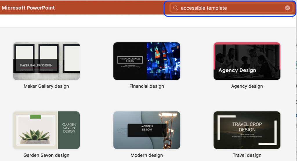
Firstly, make the work a bit easier by choosing a pre-designed template. Microsoft has a collection of their most popular accessible templates , or you can search for a template in PowerPoint by using the search field in the top right corner when opening the application.
You should not assume that the pre-designed templates found in PowerPoint are already completely accessible, but they have built-in features that can help to ensure that your presentations are more accessible.
Whether you are working in a pre-designed template or have started your presentation from scratch, PowerPoint provides you with different choices of slide layouts when you need to add new slides to the presentation.
- In order to add a pre-set slide, click on the arrow by the button New Slide from the Home tab or the Insert tab in the top ribbon.
- Pick the appropriate slide layout.
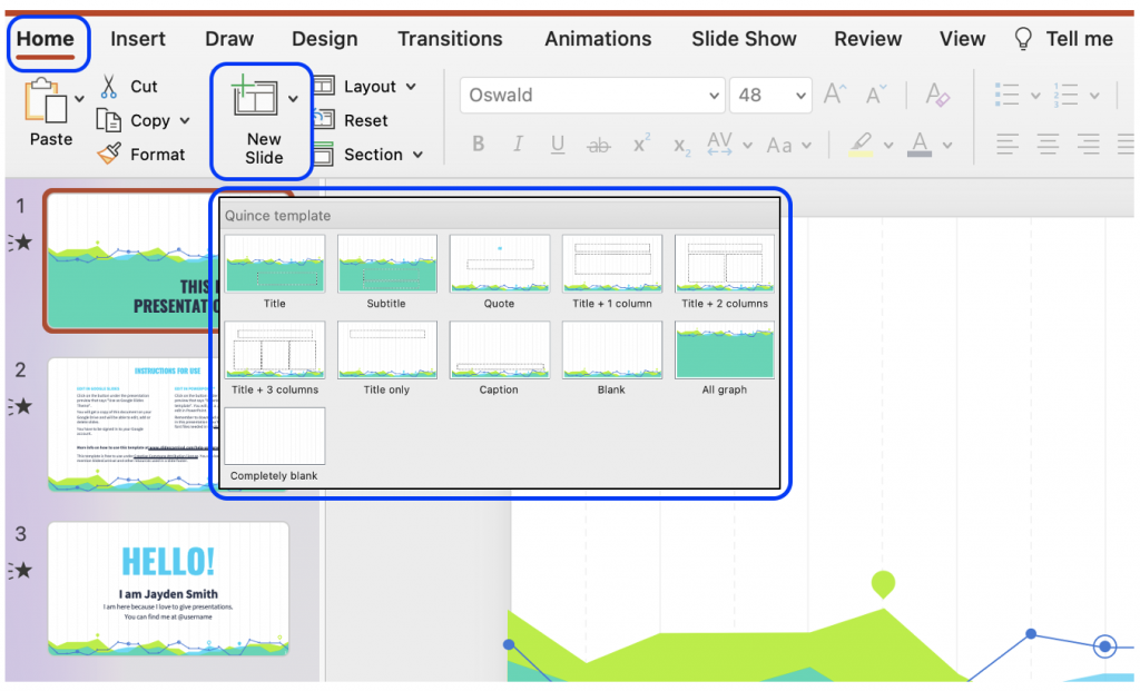
The dotted boxes on the slide layout are Placeholder Boxes . In these you can add titles, text, images, graphs, etc.
Reading Order
Users without a visual impairment usually read and view a PowerPoint slide in the order the elements appear in the slide. By default, screen reader software used by individuals with a visual impairment will first read the title of the slide, and then the software will read the elements in the order in which they were added to the slide.
The order the elements appear in and the order in which they were added may not match. To ensure the screen reader software reads the elements in the order it was intended, you should check and set the reading order.
The advantage of choosing a pre-set slide is that the reading order is already coherent with the order in which the elements are presented. Usually, at least. However, often you add new elements to the slide, or you rearrange the elements, in which cases you should make sure the reading order makes sense.
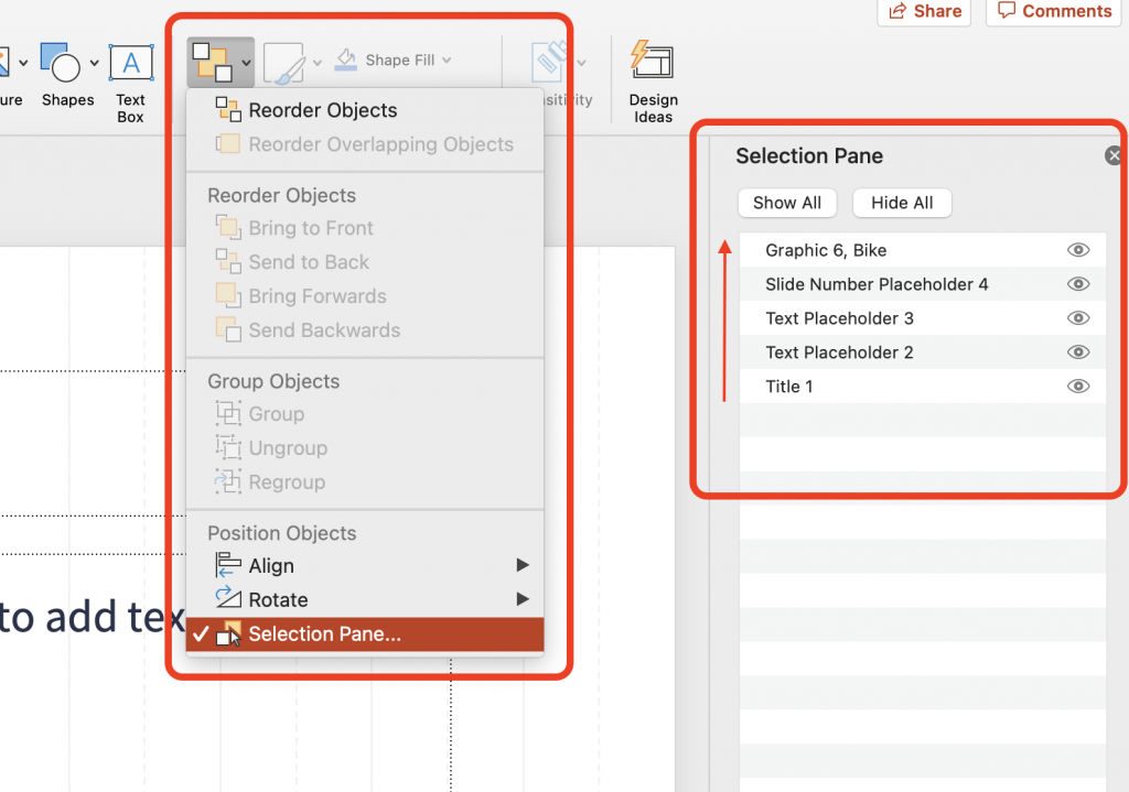
- On the Home tab, select Arrange , and click on Selection Pane .
- The Selection Pane will appear on the right side of you screen, and it will show you the order in which the elements were added. That means you should read the order from the bottom to the top in the panel.
- You can rearrange the reading order by simply clicking and dragging elements up and down. Note : In the Windows version of PowerPoint, you can also use the arrows in the pane to rearrange the order.
- To the right of each element is an icon that looks like an eye. If you click on this icon, the element will visually be hidden from the slide, but it will still be read by screen reader software.
If you have chosen a pre-designed template, this comes with design elements that work together such as colours, fonts, and backgrounds. However, if you choose to make edits to these elements, you should choose accessible fonts and colours.
When it comes to text, make sure your audience is able to read everything on your slides by opting for a large font size. Keep in mind that if you give an in-person presentation, your audience in the back should be able to read the text as well.
Colour Contrast
Being able to read the text in your presentation, requires that the contrast between the colour of the text and the colour of the background is sufficient. If you have chosen an accessible template provided by Microsoft, there is a high chance that the colours in this template will have sufficient colour contrast. However, you should always make sure; especially if you are in a position where you want to change the colours.
WCAG 2.1 Success Criterion 1.4.3 specifies a contrast ratio of 4,5:1 if the font size is less than 18pt/24px (or bold and less than 14pt/18½px). Font size bigger than this requires a contrast ratio of 3:1. There are many free colour contrast checkers available online.
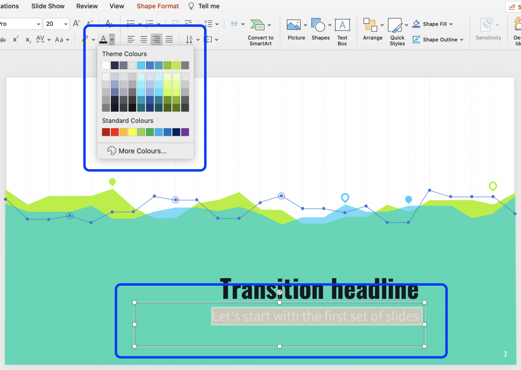
- To change the colour, simply highlight the problematic text.
- From the Home tab in the top ribbon, click on the arrow next to the Font Colour to open a selection of colours to choose from.
- Choose an appropriate colour and run a new colour contrast to make sure the contrast is now sufficient.
PowerPoint is a tool meant to make presentations. The application has built-in features that can make presentations more appealing, and you can present data in a way that, hopefully, captures the attention of your audience. However, some of these built-in features may not be accessible.
Slide Titles
Every slide should have meaningful and unique title. When navigating through the slides, a screen reader reads the title of the slide. If a slide does not have a title, or if more slides have identical titles, it can be difficult for users of screen readers to navigate in the presentation.
Most of the slide layouts provided by PowerPoint includes a Placeholder Box for a slide title. Choose one of these layouts and add the title.
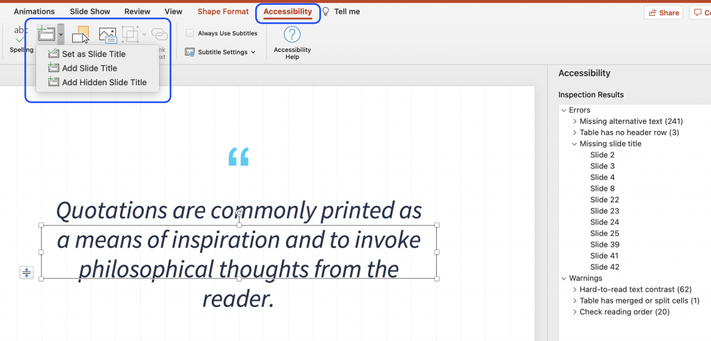
Even if you do not want a title on the slide – if the slide simply consists of a full image – you should still make the slide accessible by then adding an invisible title. This can be done by making it invisible from the reading order.
Alternatively, if you run the Accessibility Checker it will inform you of the slides that do not contain a slide title. From the Accessibility tab, you will then have the option to insert a slide title by either having the title be existing text on the slide, new text in a new Placeholder Box , or adding a hidden slide title.
Animation and Transition
In the tabs Animations and Transitions in the top ribbon, you can choose to animate different elements on a slide as well as the transitions between different slides.
Movements on the slide or in between slides can be distracting for some users. Likewise, it may cause screen readers to re-read the slide or read the elements out of order. You should therefore consider if an animation or transition is necessary for your presentation. If you choose an animation or transition, make sure it appears or advance “ on click ” and is not automatically timed.
Remember, if your animation conveys any form of information, that same information should be available to users with visual impairments. For example, by adding captions or alt text.
Data Tables
Using tables in your presentation can be an efficient and organized way to present data. However, if these tables are not implemented correctly, they can be an accessibility challenge for users of screen readers.
A table is implemented incorrectly if it contains split cells, merged cells, nested tables, and/or unspecified column header.
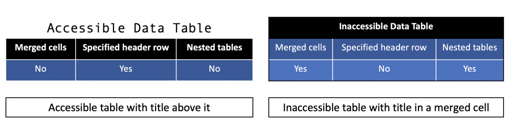
When a table is implemented correctly it is simple in its structure, the header row is specified, tables are not nested within each other, and the title is placed outside the table. Additionally, tables should be made using the correct tool in PowerPoint. Do not use the tab key to create a table, as it will only visually look like a table, but will not be accessible to users of screen readers.
- From the Insert tab, click Table and choose how many rows and columns you need.
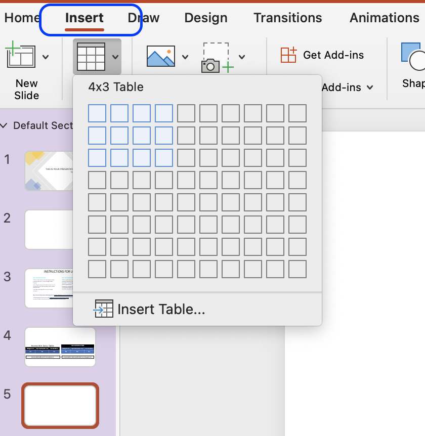
- Once the table is created, make sure that checkbox Header Row is checked in the Table Design tab.
- It is possible for you to change the design of the table, so it aligns better with the overall visual presentation.
- Keep in mind that the colours chosen for the table should have sufficient contrast. Likewise, you should not convey meaning through colour alone as users with colour blindness will not be able to understand that meaning.
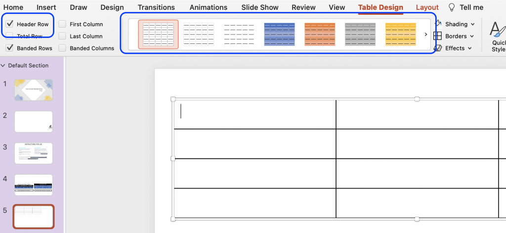
Embedded Multimedia
If your presentation includes time-based media, such as a video, make sure subtitles, closed captions or video descriptions are provided.
- Subtitles contains a transcription (or a translation) of the dialogue.
- Closed captions contain, beside a transcription, descriptions of audio effects such as music or other significant sound effects.
- Video descriptions are audio-narrated descriptions of important visual elements. This type of description ensure that video content is more accessible to individuals with visual impairment.
If the video or audio is longer than 3 seconds, make sure you provide a way for the user to pause or stop the media content.
For all non-text elements in your presentation, there should be a text alternative, also known as ‘alt text’. The alt text allows users who use text-to-speech assistive technology, such as screen readers, to understand the purpose of the non-text element. These elements can be graphics, images, charts, SmartArt, icons, logos, etc.
Without these alt texts, the blind or visually impaired users may not gain access to the information of the non-text element. The descriptions should be short and communicate the main purpose of the element.
- Click on the element you want to describe with an alt text.
- Click on the tap Picture Format in the top ribbon, and then the button Alt Text. A panel appears, and you can add the alt text.
- If the graphic is purely decorative, you should instead mark it as decorative in the panel, and screen readers will then ignore the element.
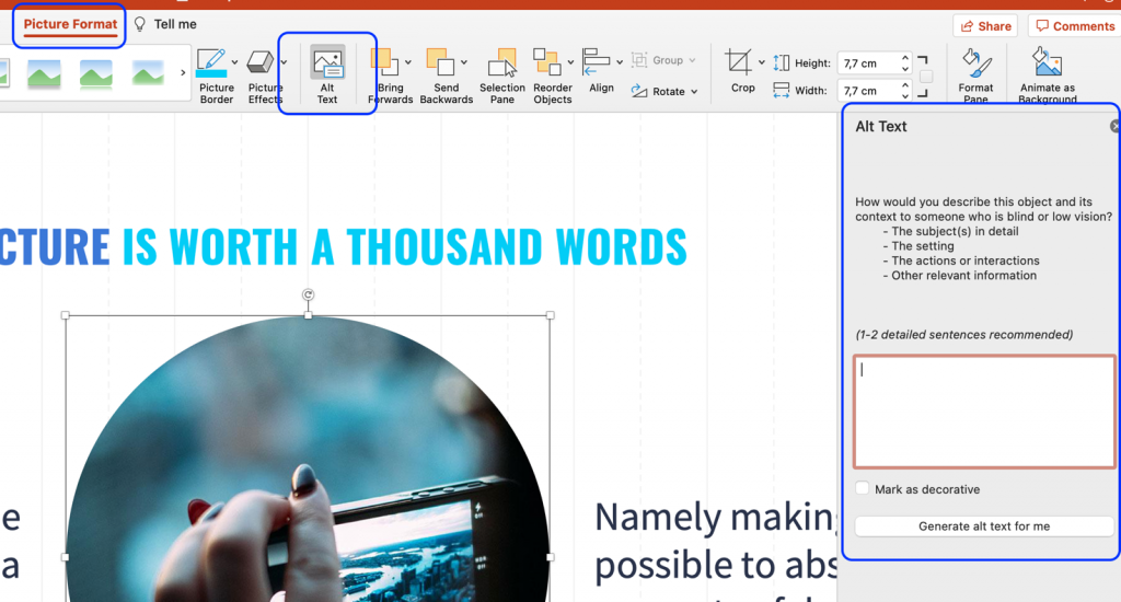
Go Beyond Alternative Text
Remember, alt text is only accessible to users of screen readers, and not all users with visual impairments use a screen reader. Some rely on screen magnification. Therefore, you should check that the graphical element can be enlarged by zooming in. If the element appears pixilated, you should add descriptive captions to the graphical element.
If you plan on distributing your presentation and it contains hyperlinks to websites, other online resources, or even other slides within the presentation, make sure that the link text makes sense in its own context.
A link text makes sense in its own context if it is descriptive. Link texts such as “Read more” or “Click here” are vague and redundant. Instead, accessible hyperlinks have a descriptive text that will become the active link.
- Highlight the descriptive text, you want to be the link text.
- In the Insert tab, click on Link .
- In the pop-up window, you can insert the URL or choose a slide within the document that the text should link to.
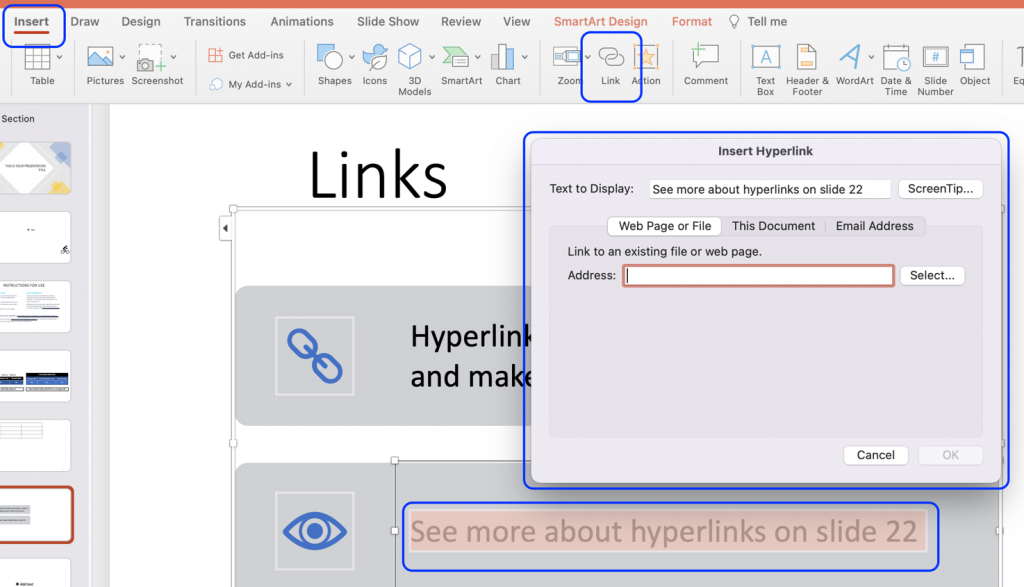
By default, the link text will now appear blue and underlined. You should ensure that the link text has sufficient contrast against the background of your slide. Remember, link text can be differentiated by colour, bold , underline , and/or italics . You cannot use colour alone to differentiate the link text from other text on the slide.
PowerPoint comes with a built-in accessibility checker. This accessibility checker can help you identify any potential accessibility problems with your presentation – including many of the issues listed in the steps above.
Although an automated accessibility checker is a great tool, do not skip on the manual check as well. An automated tool cannot detect all accessibility issues, and the build-in accessibility checker does not adhere to the WCAG 2.1 standards.
- In the Review tab, click Accessibility Checker .
- If the accessibility checker finds any issues, it will show them in a list in the right pane.
- At the bottom of the accessibility pane, the checker also provides information about how to fix the issue.
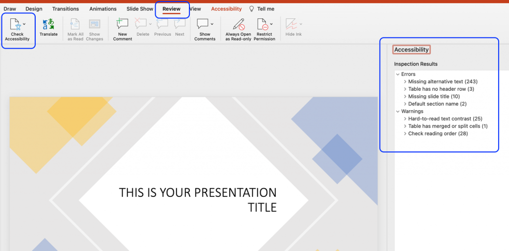
If you have followed the tips, tools, and best practised outlined above, you should have created a PowerPoint Presentation that is accessible to most people. However, PowerPoint is a software made specifically to design (visual) presentations, and it is often not the easiest format to work with for visually impaired users.
With the SensusAccess service it is possible for users to convert the PowerPoint format into something that is easier for work with. For example, a PowerPoint presentation can be converted into tagged PDF, HTML, or RTF outline. For more information on conversion possibilities with the SensusAccess service, check Module 4: Converting inaccessible and tricky documents (opens in new tab) or the SensusAccess Conversion Options .
Accessibility in PowerPoint: Presentations for people with colour blindness
- Written by: Olivia Kippax Jones
- Categories: PowerPoint design

Colour has always been powerful; from warning us which berries to avoid, to establishing iconic global brands. Many of us consider it a key tool when designing presentations – but what effect does this reliance on colour have on people with colour blindness?
This post is part of our mini-series on accessibility in PowerPoint. Check out the other post in the series: Presentations and Dyslexia
Colourblind Awareness say that people with colour blindness have “been forgotten in the race for progress in a digital world.” Though colour is an important tool, many designers don’t understand the needs of people with colour blindness. However, not understanding how to optimize your presentations for people with colour blindness could mean losing up to 10% of your audience before you even begin. To help you make your design more inclusive, we’re going to break down what exactly colour blindness is, before giving some practical tips to use in your slides.
Just want the practical tips? Click here to skip to the good stuff .
What is colour blindness and how does it affect people?
People with colour vision deficiency or CVD – commonly called colour blindness – find it difficult to distinguish between different colours. Complete colour blindness – being unable to see any colours at all – is very rare, but different types of CVD affect approximately 8% of men and 0.5% of women worldwide .
People are affected by CVD for a variety of reasons. It’s usually genetic but can also develop in adults as the result of health conditions, such as diabetes, multiple sclerosis and glaucoma. Colour blindness can also be a side effect of some medications, and it’s fairly common for people to find it more difficult to distinguish between colours as they get older. If you want to test your own colour perception try this online test.
As there are multiple types of CVD, and each affects sight differently, the effects of CVD on people’s day-to-day lives differ. A few common problems are:
- Children finding it difficult when colours are used to help with learning or games
- Certain career paths, like becoming a pilot, being unavailable to those with CVD
- Struggling to know when meat is properly cooked or whether fruit is ripe
- Getting medications confused
- Having trouble understanding signs
Why should this affect presentation design?
Here at BrightCarbon, we are brave champions of the visual presentation. We encourage presentation creators to rid their slides of boring bullets and put effective, dynamic visuals in their place. But we also understand that without proper consideration, this is where problems can sneak in.
Though ever-advancing technology means that lots of smartphones and computers have specific settings to assist people with colour blindness, this doesn’t help when they are sitting in front of projected slides. Slides that rely too heavily on colour to tell their story could be leaving some of your audience behind.
This problem is common in data visualisations as colours are often used to highlight comparative data points. Here is what a typical pie chart could look like to people with different types of CVD.
The difference between the colours is much less clear, rendering the legend useless.
In this example, the colours green and red are used to show positive and negative results. This is really common colour coding, but red and green is one of the most troublesome colour combinations for people with colour blindness.

As you can see, to someone with CVD, the colours are indistinguishable.
Other colour combinations that can cause problems are green and brown, green and blue, blue and grey, blue and purple, green and grey, green and black, and light green and yellow.
Using coloured text and coloured backgrounds can also cause problems. Though we would never recommend using a slide like this with so much text ( Death-by-PowerPoint alert !), it is also totally useless for people with colour blindness.

How to optimise presentations for people with colour blindness
So, how to tackle this? One option is to simply use colour-blindness-friendly colour palettes. There are lots of resources online if you chose to go down this route.
Using a colour blindness-friendly palette means you can just pull slides together without having to check your colours every time. If you want to create your own colour blindness-friendly palette in PowerPoint, download our resource that will help you set custom colours and read our blog post on changing theme colours.
However, if you’re creating slides in a corporate setting it’s likely that you have limited colour options set by your branding department. In fact, you probably have a brand-compliant colour palette that you have to stick to. But there is no need to give up. There are three things you can do to optimize your presentations for people with colour blindness.
1. Contrast
CVD does not affect perception of colour value – the lightness or darkness of a colour – but the colour hue. Explaining hue can get a bit scientific ( check out this site for a detailed explanation ), but an easy way to think of hue is as a position on the colour wheel – colours in their purest form. What this means is that people with colour blindness can distinguish between light and dark colours, even if they both appear the same hue. When optimising your presentations for people with colour blindness, you can increase the contrast between colours to help make things stand out.
For example, in the red/green example earlier, we can change the brightness of the colours to help people distinguish between the two lines.

Be sure to use more than just colours to tell your story. You can also employ patterns, shapes, text, positioning and hierarchy, and animation to create dynamic slides with a clear message. This is a great habit to get into anyway, as, if your presenting space has bad lighting or a dodgy projector, you might find the colours on your slides don’t look quite how they did on your laptop in the office. In that situation, it won’t just be those with CVD struggling to understand your slides!
We can sort out that pie chart by choosing colours with greater contrast and integrating the legend into the chart. We always recommend labelling your chart in this way as it makes the information quicker to process because your audience aren’t constantly looking back and forth.

Redundancy is a good way to safeguard against issues with colours. Use icons or other visual markers to make sure colour is not the only visual means of communicating your message, like with these simple symbols:

The most important thing you can do to ensure your use of colour is magical instead of miserable is to check that your slides are crystal clear when seen in greyscale. As we saw above, the difference between colours that have the same brightness can disappear when viewed by someone with colour blindness. When you convert your slides to monochrome you will be able to quickly tell whether your visuals make sense.
This is very easy to do directly in PowerPoint. You can either go to View and then choose Greyscale about halfway along the ribbon, or you can go to File , click Print , then select Grayscale . You can then view your slides in the preview window. You could also use an online contrast analyser (like this one) for checking text on a background.
Realised you need to change the contrast on every text box? Or on every other shape? What a nightmare! Actually, it doesn’t have to be. Download our free PowerPoint add-in BrightSlide and use the Select Objects tool to edit multiple objects in seconds. Let’s look at an example.

The contrast between the text and background on this slide is clearly not great! To use BrightSlide’s Select Objects tool and edit super speedily, click on one object then head to the BrightSlide tab , under Selection & Object , click Select Object and chose the appropriate formatting option from the drop down menu. In this example, you want to select the purple text boxes, so Fill Color is the appropriate formatting option.
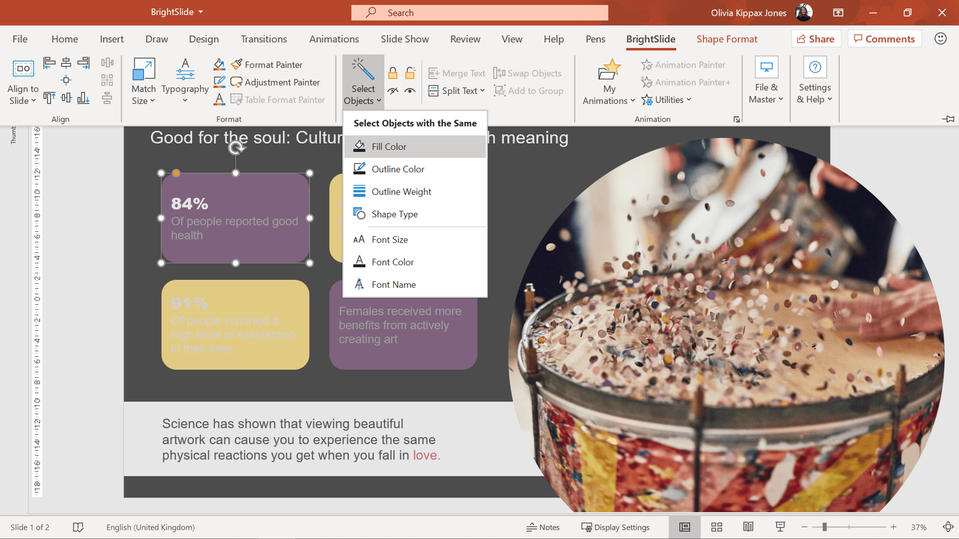
All the objects with the same fill color will be selected and you can go ahead and edit as usual.
Now, this is just a simple slide but imagine how much time this tool could save you if you’re editing a more complex slide, like this world map!

If you’re interested in continuing to make your presentations more inclusive, then check out our post on PowerPoint presentations and dyslexia . We also have loads of general design advice to get you started on the path to PowerPoint greatness, like this post on creating effective presentations with the wow factor .
References and further reading
Colour blind awareness
Coblis colour blindness simulator

Olivia Kippax Jones
Managing consultant; content marketing lead, related articles, insights from a presentation templates expert.
- PowerPoint design / Industry insights
A PowerPoint template is the foundation on which polished and professional presentations are built. We interview BrightCarbon’s new Templates Lead, Gemma Leamy, and pick her brains on the ideal process for creating robust PowerPoint templates.

How to reduce text on your presentation slides
- PowerPoint design / Visual communication
It can seem daunting to take a text-heavy slide or list of bullets and turn it into something visual, especially if you don’t think you’re super creative. However, the first step is simply reducing the amount of text on your slides – and you don’t have to be an artist to do that!

5 presentation creation habits you should quit today
- PowerPoint design
If you’ve been looking for one, this is your sign to kick those bad presentation creation habits for good!

Leave a Reply Cancel reply
Save my name and email in this browser for the next time I comment.
Join the BrightCarbon mailing list for monthly invites and resources
The video animation looks AWESOME! Thank you sooooo much. I am very happy and proud with the result; this video is really convincing. Really really well done. Elodie Maurer SES

- Create slides with an accessible reading order Video
- Improve image accessibility in PowerPoint Video
- Use accessible colors and styles in slides Video
- Design slides for people with dyslexia Video
- Save a presentation in a different format Video
- Present inclusively Video

Use accessible colors and styles in slides

The colors and styles you use for slides, text, charts, and graphics go a long way toward improving accessibility in PowerPoint presentations. Using an accessible template is a good starting point.
Use an accessible template
In PowerPoint, you can search for and use pre-defined accessible templates.
Open PowerPoint.
Note: If PowerPoint is already open, go to File > New .
Type accessible templates in the search text field.
To see information about an accessible template, select it.
To open a new presentation based on the selected template, select Create .
To see other color, style, and font options, browse the PowerPoint themes. On the Design tab, expand the Themes menu and select a theme that suits your purposes.
Tips for accessible color and style choices in PowerPoint
Off-white backgrounds are better for people with perceptual differences, like dyslexia.
Select templates and themes with sans serif fonts that are 18 points or larger.
Look for solid backgrounds with contrasting text color.
To make information more accessible, differentiate it in more than one way. In the image below, both color and text differentiate information:

Make your PowerPoint presentations accessible to people with disabilities
Download free, pre-built templates
Save a file
Excel training
Word training
PowerPoint training
PowerPoint is great for creating slide shows for work, school, or for an event. You can even use it to create handouts
PowerPoint is primarily visual, often displayed at a distance from the audience. However, you can make your PowerPoint slides more accessible by following a few best practices.
PowerPoint comes with a large collection of accessible templates. These can save you lots of time.
I can click on any one of these, and it opens with information about when to use this template.
This one, for example, says it works especially well for students or teachers
I can click the Create button to have PowerPoint set things up. Then it opens a slide deck ready for me to enter my information
This template has a lot of choices for me
This template already has accessible color choices, but I could browse just to see what else is there, in the Themes.
A Theme is a preset collection of colors and fonts. Accessible templates already have the right colors for contrast and have simple, easy-to-read fonts.
Choose the Design tab and now you have lots of options to choose from.
One reason I picked this template is that I like the off white background. This is important for people with perceptual differences like dyslexia.
For some of those people, too much stark contrast just makes words look distorted and kind of swim together.
Color choice is important too. About 15% of people are color blind and can’t see the difference between certain colors. The most common form of color blindness is Red/Green,
To make color more accessible, add information in another form, don’t rely on color alone. Use color and text, color and shape, and so on.
That gets my slide deck off to a good start.
For more about creating accessible documents, go to aka.ms/officeAccessibility

Need more help?
Want more options.
Explore subscription benefits, browse training courses, learn how to secure your device, and more.

Microsoft 365 subscription benefits

Microsoft 365 training

Microsoft security

Accessibility center
Communities help you ask and answer questions, give feedback, and hear from experts with rich knowledge.

Ask the Microsoft Community

Microsoft Tech Community

Windows Insiders
Microsoft 365 Insiders
Was this information helpful?
Thank you for your feedback.
Assistive Technology for Visually Impaired Individuals
2024-04-01 | By Orcam Staff

Assistive technology is a broad term that encompasses any device, software, or equipment that helps individuals with disabilities perform tasks that they would otherwise have difficulty completing. Assistive technology can be life-changing for individuals with vision impairments, providing them with the tools they need to live independently and achieve their goals.
In addition to the various types of assistive technology mentioned above, it's important to highlight the continuous advancements in this field. Technological innovations are constantly improving the quality and effectiveness of assistive devices for visually impaired individuals. Researchers and developers are working on creating more intuitive and user-friendly solutions to further enhance the independence and quality of life for people with vision impairments. By staying up-to-date with the latest developments in assistive technology, individuals with visual impairments can benefit from cutting-edge tools that cater to their specific needs and preferences.
In this article, we will explore the various types of assistive technology available for individuals with vision impairments and how they can enhance independence.
Types of Assistive Technology for Vision Impairments
Adaptive equipment.
Adaptive equipment refers to any device or tool that has been modified or designed specifically for individuals with disabilities. For individuals with vision impairments, adaptive equipment can include large print keyboards, talking calculators, and tactile maps.
These devices are designed to make everyday tasks easier and more accessible for individuals with vision impairments. For example, a large print keyboard can make it easier for someone with low vision to type on a computer, while a talking calculator can assist someone with a visual impairment in performing mathematical calculations.
Assistive Devices
Assistive devices are any tools or equipment that help individuals with disabilities perform tasks that they would otherwise have difficulty completing. For individuals with vision impairments, assistive devices can include screen readers, magnifiers, and braille displays.
Screen readers are software programs that read the text on a computer screen aloud, allowing individuals with vision impairments to access and navigate digital content. Magnifiers, on the other hand, are devices that enlarge text and images, making them easier to see for individuals with low vision. Braille displays are devices that convert digital text into braille, allowing individuals who are blind to read and navigate digital content.
Tools for Visually Impaired
There are also a variety of tools specifically designed for individuals with vision impairments. These tools can include talking watches, color identifiers, and audio labelers.
Talking watches are watches that announce the time aloud, making it easier for individuals with vision impairments to keep track of time. Color identifiers are devices that can identify and announce the color of an object, helping individuals with color blindness or low vision distinguish between different colors. Audio labelers are devices that allow individuals with vision impairments to record and play back audio labels for items, making it easier for them to identify and organize their belongings.
Low Vision Aids
Low vision aids are devices that help individuals with low vision make the most of their remaining vision. These aids can include magnifiers, telescopes, and filters.
Magnifiers, as mentioned earlier, enlarge text and images, making them easier to see for individuals with low vision. Telescopes, on the other hand, can help individuals with low vision see objects that are far away, such as street signs or bus numbers. Filters are colored lenses that can enhance contrast and reduce glare, making it easier for individuals with low vision to read and see objects.
Accessibility Tools

Accessibility tools are software programs or features that make digital content more accessible for individuals with disabilities. For individuals with vision impairments, accessibility tools can include screen readers, voice recognition software, and closed captioning.
Screen readers, as mentioned earlier, read the text on a computer screen aloud, making digital content accessible for individuals with vision impairments. Voice recognition software allows individuals to control their computer using their voice, making it easier for individuals with mobility impairments to use a computer. Closed captioning is a feature that displays text on a screen, making video content accessible for individuals who are deaf or hard of hearing.
How Assistive Technology Enhances Independence
Assistive technology can enhance independence for individuals with vision impairments in a variety of ways. Here are some of the key benefits of using assistive technology:
Assistive technology provides access to information through tools like screen readers and braille displays
Increased mobility with aids like magnifiers and canes helps individuals with vision impairments navigate their surroundings
Improved communication through voice recognition software and closed captioning enhances interactions
Overall, assistive technology promotes greater independence by equipping individuals with necessary tools and resources
Access to Information
Assistive technology, such as screen readers and braille displays, allows individuals with vision impairments to access and navigate digital content. This means they can read emails, browse the internet, and use various software programs, just like their sighted peers. This access to information is crucial for individuals with vision impairments to stay informed and connected.
Increased Mobility
Assistive technology, such as low vision aids and mobility aids, can help individuals with vision impairments move around more independently. For example, a magnifier can help someone with low vision read street signs and bus numbers, while a cane or guide dog can help someone who is blind navigate their surroundings.
Improved Communication
Assistive technology, such as voice recognition software and closed captioning, can improve communication for individuals with vision impairments. Voice recognition software allows individuals to communicate using their voice, while closed captioning makes video content accessible for individuals who are deaf or hard of hearing.
Greater Independence
Overall, assistive technology can greatly enhance independence for individuals with vision impairments. By providing them with the tools they need to perform tasks and access information, assistive technology allows individuals with vision impairments to live more independently and achieve their goals.
Examples of Assistive Technology for Vision Impairments
There are many examples of assistive technology that have been specifically designed for individuals with vision impairments. Here are a few examples:
OrCam MyEye
The OrCam MyEye is a revolutionary wearable device that harnesses the power of artificial intelligence to perform a variety of tasks that enhance the daily lives of individuals with vision impairments. Through its advanced technology, this innovative device has the ability to accurately read text aloud, easily recognize faces, and identify objects with remarkable precision. By providing users with these essential functions, the OrCam MyEye empowers individuals to navigate their surroundings more confidently and independently, opening up a world of possibilities for those with visual challenges. With its user-friendly design and intuitive operation, this device has the potential to truly transform the way in which individuals with vision impairments interact with the world around them.
Be My Eyes is a free app that connects individuals with vision impairments to sighted volunteers through a live video call. This app can be used for a variety of tasks, such as reading labels, identifying objects, and navigating unfamiliar surroundings.
JAWS (Job Access With Speech) is a screen reader that allows individuals with vision impairments to access and navigate digital content. This software is widely used in educational and professional settings, making it easier for individuals with vision impairments to participate in school and work.
Assistive technology not only enhances the quality of life for individuals with vision impairments but also empowers them to overcome daily challenges with greater ease. These innovative tools and devices are designed to bridge the gap between limitations and possibilities, offering a sense of autonomy and freedom that might otherwise be restricted. By embracing assistive technology, visually impaired individuals can navigate the world with confidence and pursue their aspirations without unnecessary barriers.
Assistive technology plays a crucial role in enhancing independence for individuals with vision impairments. By providing access to information, increasing mobility, improving communication, and promoting independence, assistive technology allows individuals with vision impairments to live more independently and achieve their goals. With the wide range of assistive technology available, there is a solution for every individual with a vision impairment.
Key Takeaways
Assistive technology, such as low vision aids and mobility aids, enhances independence for individuals with vision impairments by providing tools to perform tasks and access information.
Examples of assistive technology include the OrCam MyEye, Be My Eyes app, and JAWS screen reader, which empower visually impaired individuals to navigate their surroundings, connect with sighted volunteers, and access digital content.
By bridging the gap between limitations and possibilities, assistive technology offers autonomy, freedom, and confidence to visually impaired individuals, enabling them to pursue their aspirations without unnecessary barriers.
More Stories

The OrCam Guide to Rods and Cones | How Your Eyes Work
Ever wondered how your eyes see color and light? Discover the crucial roles of rods and cones in your vision here.
By OrCam Staff

Clarity in Aging: Wet vs Dry Macular Degeneration Guide
Gain insights into wet and dry macular degeneration, including symptoms, treatments, and tips for preserving vision in your golden years.

How to Use the New Smart Reading Feature on OrCam - OrCam
Select Your Country/ Region
North America
United States
United Kingdom
Deutschland
Middle East
Asia Pacific
Other Countries and Regions
Latinoamérica
Got any suggestions?
We want to hear from you! Send us a message and help improve Slidesgo
Top searches
Trending searches

solar eclipse
25 templates

12 templates

sunday school
65 templates

30 templates

public health
35 templates

elderly people
7 templates
Color Blindness
Color blindness presentation, free google slides theme and powerpoint template.
A person who suffers from color blindness has a decreased ability to discern different hues. In Slidesgo we have designed a presentation to provide details about the diagnosis and management of this condition. We have chosen a special color palette for people with impaired color vision and many circles inspired by the Ushihara test.
Features of this template
- 100% editable and easy to modify
- 29 different slides to impress your audience
- Contains easy-to-edit graphics such as graphs, maps, tables, timelines and mockups
- Includes 500+ icons and Flaticon’s extension for customizing your slides
- Designed to be used in Google Slides and Microsoft PowerPoint
- 16:9 widescreen format suitable for all types of screens
- Includes information about fonts, colors, and credits of the free resources used
How can I use the template?
Am I free to use the templates?
How to attribute?
Attribution required If you are a free user, you must attribute Slidesgo by keeping the slide where the credits appear. How to attribute?
Related posts on our blog.

How to Add, Duplicate, Move, Delete or Hide Slides in Google Slides

How to Change Layouts in PowerPoint

How to Change the Slide Size in Google Slides
Related presentations.

IMAGES
VIDEO
COMMENTS
Turn on the Color filter switch, and then select Grayscale . Visually scan each slide in your presentation for instances of color-coding. People who are blind, have low vision, or are colorblind might miss out on the meaning conveyed by particular colors. Use an accessible presentation template.
Common Visual Impairments. Low vision, color blindness, and dyslexia are three of the most common vision impairments. For people with poor vision, objects appear out of focus whether they are near or far. Color-defective people have a decreased ability to distinguish colors from others. Red and green are the most common colors that are hard to ...
To add alt text in PowerPoint: Insert an image or other visual content into the presentation. Right-click or long press on the image and select View Alt Text. Alternatively, select Alt Text in the Picture Format section of the ribbon. Type a 1-2 sentence description of the image, or have PowerPoint auto-generate alt text and correct the ...
The student can zoom the PPT presentation on his/her device and can take screenshots to review the information at a later date.) For more information about screen sharing apps, view the Join.me Post. PowerPoint presentations for students using screen readers. Share the PPT presentation with students who use screen readers.
This guide outlines best practice for creating accessible PowerPoint presentations. In the UK around 2 million people have sight loss. A visual impairment could be sensitivity to light, blurred vision or blindness. ... Lots of people who are visually impaired will be able to read your slides without using any specialist software IF you make ...
Open the PowerPoint presentation. Select File > Export > Create Handouts. To create a Word version, choose Create Handouts. Formatting options for exporting slides: to display presentation slides first, followed by presentation notes, select Notes below slides. to include slide images in the Word document, select Paste and then select OK.
Screen readers rely on having text to read to the visually impaired. For visual content like images, we need to add alt text to each object. To add alt text to an image, right click on it and choose Edit Alt Text. PowerPoint will open a sidebar dedicated to adding a description to the image. Microsoft recommends adding one to two sentences to ...
Contrast helps visually impaired people better distinguish the characters. Use PowerPoint accessibility checker to locate insufficient color contrasts on slides. ... Accessible PowerPoint templates are fully optimized for use by people with visual impairments and other types of special needs. By opting for such a solution, you won't have to ...
As a tool in a face-to-face presentation. For visually impaired people, if someone stands up in front of a screen and talks to an audience, PowerPoint has no functionality. The same applies to any other information projected onto a screen, of course, but this is what PowerPoint is specifically designed for, so it tends to be the application of ...
Disability Access Services shares these 7 steps on how to make an accessible PowerPoint slideshow. Establish the Slide Layout. Other Slide Design Considerations. Use sans serif fonts Arial or Verdana. 24 point minimal font size. Color Contrast. Avoid animations and transitions. Tables data visualizations are not accessible with a screen reader.
PowerPoint presentations can be empty for students who rely on screen-readers, if the content has not been added properly. Let me explain. PowerPoint can't add things that are in text boxes to the outline view, which is what visually-impaired users rely on, because it can be read out loud to them from the computer.
PowerPoint presentations can be an excellent way to present your ideas to your intended audience. Given the fact that more than 12 million people in the US have some kind of visual impairment, chances are some of your intended audiences might be visually impaired and may rely on assistive technology to access your presentations.. Considering this possibility, it makes sense for you to create ...
The Ultimate Guide to Accessible Presentation Design. Published on. May 1, 2020. As a presentation design agency, we understand the importance a good design holds in effectively reaching your audience. There are many factors that feed into an effective PowerPoint design including hierarchy, color and image selection, and which font you decide ...
If you have followed the tips, tools, and best practised outlined above, you should have created a PowerPoint Presentation that is accessible to most people. However, PowerPoint is a software made specifically to design (visual) presentations, and it is often not the easiest format to work with for visually impaired users.
When optimising your presentations for people with colour blindness, you can increase the contrast between colours to help make things stand out. For example, in the red/green example earlier, we can change the brightness of the colours to help people distinguish between the two lines. 2. Clarity. Be sure to use more than just colours to tell ...
PowerPoint is an accessible application, but visually impaired and blind users have difficulty reading content if they haven't been trained. However, conten...
Below you'll see thumbnail sized previews of the title slides of a few of our 24 best visual impairment templates for PowerPoint and Google Slides. The text you'll see in in those slides is just example text. The visual impairment-related image or video you'll see in the background of each title slide is designed to help you set the stage ...
Open PowerPoint. Note: If PowerPoint is already open, go to File > New. Type accessible templates in the search text field. To see information about an accessible template, select it. To open a new presentation based on the selected template, select Create. To see other color, style, and font options, browse the PowerPoint themes.
Premium Google Slides theme and PowerPoint template. Preparing a class for students with visual impairment requires careful planning and consideration of the individual needs of each student. As we know that it can be a complicated task, from Slidesgo, we want to propose you a very interesting template. This design includes content on how to ...
Download the "Blind and Visually Impaired Awareness Campaign" presentation for PowerPoint or Google Slides. Improve your campaign management with this template that will definitely make a difference. It will empower you to organize, execute, and track the effectiveness of your campaign. Enriched with innovative resources, it facilitates ...
Terrific resource explaining CVI designed for gen ed staff training! Perfect for back-to-school gen ed training, this CVI PowerPoint presentation introduces staff to Cortical Visual Impairments (CVI) and teaching students with CVI. Created by a dedicated TVI with 20 years experience working CVI students, Lisha regularly inspires educators and ...
Assistive Technology for Visually Impaired Individuals. Assistive technology is a broad term that encompasses any device, software, or equipment that helps individuals with disabilities perform tasks that they would otherwise have difficulty completing. Assistive technology can be life-changing for individuals with vision impairments, providing ...
Free Google Slides theme and PowerPoint template. A person who suffers from color blindness has a decreased ability to discern different hues. In Slidesgo we have designed a presentation to provide details about the diagnosis and management of this condition. We have chosen a special color palette for people with impaired color vision and many ...