Graphical Representation of Data
Graphical representation of data is an attractive method of showcasing numerical data that help in analyzing and representing quantitative data visually. A graph is a kind of a chart where data are plotted as variables across the coordinate. It became easy to analyze the extent of change of one variable based on the change of other variables. Graphical representation of data is done through different mediums such as lines, plots, diagrams, etc. Let us learn more about this interesting concept of graphical representation of data, the different types, and solve a few examples.

Definition of Graphical Representation of Data
A graphical representation is a visual representation of data statistics-based results using graphs, plots, and charts. This kind of representation is more effective in understanding and comparing data than seen in a tabular form. Graphical representation helps to qualify, sort, and present data in a method that is simple to understand for a larger audience. Graphs enable in studying the cause and effect relationship between two variables through both time series and frequency distribution. The data that is obtained from different surveying is infused into a graphical representation by the use of some symbols, such as lines on a line graph, bars on a bar chart, or slices of a pie chart. This visual representation helps in clarity, comparison, and understanding of numerical data.
Representation of Data
The word data is from the Latin word Datum, which means something given. The numerical figures collected through a survey are called data and can be represented in two forms - tabular form and visual form through graphs. Once the data is collected through constant observations, it is arranged, summarized, and classified to finally represented in the form of a graph. There are two kinds of data - quantitative and qualitative. Quantitative data is more structured, continuous, and discrete with statistical data whereas qualitative is unstructured where the data cannot be analyzed.
Principles of Graphical Representation of Data
The principles of graphical representation are algebraic. In a graph, there are two lines known as Axis or Coordinate axis. These are the X-axis and Y-axis. The horizontal axis is the X-axis and the vertical axis is the Y-axis. They are perpendicular to each other and intersect at O or point of Origin. On the right side of the Origin, the Xaxis has a positive value and on the left side, it has a negative value. In the same way, the upper side of the Origin Y-axis has a positive value where the down one is with a negative value. When -axis and y-axis intersect each other at the origin it divides the plane into four parts which are called Quadrant I, Quadrant II, Quadrant III, Quadrant IV. This form of representation is seen in a frequency distribution that is represented in four methods, namely Histogram, Smoothed frequency graph, Pie diagram or Pie chart, Cumulative or ogive frequency graph, and Frequency Polygon.

Advantages and Disadvantages of Graphical Representation of Data
Listed below are some advantages and disadvantages of using a graphical representation of data:
- It improves the way of analyzing and learning as the graphical representation makes the data easy to understand.
- It can be used in almost all fields from mathematics to physics to psychology and so on.
- It is easy to understand for its visual impacts.
- It shows the whole and huge data in an instance.
- It is mainly used in statistics to determine the mean, median, and mode for different data
The main disadvantage of graphical representation of data is that it takes a lot of effort as well as resources to find the most appropriate data and then represent it graphically.
Rules of Graphical Representation of Data
While presenting data graphically, there are certain rules that need to be followed. They are listed below:
- Suitable Title: The title of the graph should be appropriate that indicate the subject of the presentation.
- Measurement Unit: The measurement unit in the graph should be mentioned.
- Proper Scale: A proper scale needs to be chosen to represent the data accurately.
- Index: For better understanding, index the appropriate colors, shades, lines, designs in the graphs.
- Data Sources: Data should be included wherever it is necessary at the bottom of the graph.
- Simple: The construction of a graph should be easily understood.
- Neat: The graph should be visually neat in terms of size and font to read the data accurately.
Uses of Graphical Representation of Data
The main use of a graphical representation of data is understanding and identifying the trends and patterns of the data. It helps in analyzing large quantities, comparing two or more data, making predictions, and building a firm decision. The visual display of data also helps in avoiding confusion and overlapping of any information. Graphs like line graphs and bar graphs, display two or more data clearly for easy comparison. This is important in communicating our findings to others and our understanding and analysis of the data.
Types of Graphical Representation of Data
Data is represented in different types of graphs such as plots, pies, diagrams, etc. They are as follows,
Related Topics
Listed below are a few interesting topics that are related to the graphical representation of data, take a look.
- x and y graph
- Frequency Polygon
- Cumulative Frequency
Examples on Graphical Representation of Data
Example 1 : A pie chart is divided into 3 parts with the angles measuring as 2x, 8x, and 10x respectively. Find the value of x in degrees.
We know, the sum of all angles in a pie chart would give 360º as result. ⇒ 2x + 8x + 10x = 360º ⇒ 20 x = 360º ⇒ x = 360º/20 ⇒ x = 18º Therefore, the value of x is 18º.
Example 2: Ben is trying to read the plot given below. His teacher has given him stem and leaf plot worksheets. Can you help him answer the questions? i) What is the mode of the plot? ii) What is the mean of the plot? iii) Find the range.
Solution: i) Mode is the number that appears often in the data. Leaf 4 occurs twice on the plot against stem 5.
Hence, mode = 54
ii) The sum of all data values is 12 + 14 + 21 + 25 + 28 + 32 + 34 + 36 + 50 + 53 + 54 + 54 + 62 + 65 + 67 + 83 + 88 + 89 + 91 = 958
To find the mean, we have to divide the sum by the total number of values.
Mean = Sum of all data values ÷ 19 = 958 ÷ 19 = 50.42
iii) Range = the highest value - the lowest value = 91 - 12 = 79
go to slide go to slide

Book a Free Trial Class
Practice Questions on Graphical Representation of Data
Faqs on graphical representation of data, what is graphical representation.
Graphical representation is a form of visually displaying data through various methods like graphs, diagrams, charts, and plots. It helps in sorting, visualizing, and presenting data in a clear manner through different types of graphs. Statistics mainly use graphical representation to show data.
What are the Different Types of Graphical Representation?
The different types of graphical representation of data are:
- Stem and leaf plot
- Scatter diagrams
- Frequency Distribution
Is the Graphical Representation of Numerical Data?
Yes, these graphical representations are numerical data that has been accumulated through various surveys and observations. The method of presenting these numerical data is called a chart. There are different kinds of charts such as a pie chart, bar graph, line graph, etc, that help in clearly showcasing the data.
What is the Use of Graphical Representation of Data?
Graphical representation of data is useful in clarifying, interpreting, and analyzing data plotting points and drawing line segments , surfaces, and other geometric forms or symbols.
What are the Ways to Represent Data?
Tables, charts, and graphs are all ways of representing data, and they can be used for two broad purposes. The first is to support the collection, organization, and analysis of data as part of the process of a scientific study.
What is the Objective of Graphical Representation of Data?
The main objective of representing data graphically is to display information visually that helps in understanding the information efficiently, clearly, and accurately. This is important to communicate the findings as well as analyze the data.
Discover 20 Essential Types Of Graphs And Charts And When To Use Them

Table of Contents
1) What Are Graphs And Charts?
2) Charts And Graphs Categories
3) 20 Different Types Of Graphs And Charts
4) How To Choose The Right Chart Type
Data and statistics are all around us. It is very likely that you have found yourself looking at a chart or graph at work, in the news, sports, media, advertising, and many other places at some point in your life. That is because graphical representations of data make it easier to convey important information to different audiences. That said, there is still a lack of charting literacy due to the wide range of visuals available to us and the misuse of statistics . In many cases, even the chart designers are not picking the right visuals to convey the information in the correct way.
So, how do you make sure you are using and understanding graphs and charts in the right way? In this post, we will provide you with the necessary knowledge to recognize the top 20 most commonly used types of charts and graphs and give insights into when and how to use them correctly. Each type of chart will have a visual example generated with datapine’s professional dashboard software .
This knowledge will be valuable if you are a data visualization designer, a business user looking to incorporate visual analytics into his/her work, or just an average viewer looking to learn more about the topic. Let’s start this journey by looking at a definition.
What Are Graphs And Charts?
A graph or chart is a graphical representation of qualitative or quantitative data. It uses different symbols such as bars, lines, columns, tables, box plots, maps, and more, to give meaning to the information, making it easier to understand than raw data.
As you probably already know, multiple kinds of graphs and charts are widely used in various fields and industries such as business decision-making or research studies. These visual tools are used to find relationships between different data sets and extract valuable conclusions from them. In some cases, they are built by hand, and in others, most commonly, they are built using visualization tools.
That said, the type of chart or graph you use will vary depending on the aim of the analysis. For instance, percentages are better viewed through a pie or bar chart while data that is changing over time is better viewed over a line chart. For that reason, it is important to have a clear understanding of the different chart types to make sure you are using the right one.
Below we will discuss the graph and chart categories. These categories will build a solid foundation that will help you pick the right visual for your analytical aims. Let’s dive into them.
Charts And Graphs Categories
As mentioned, asking the right questions will form the foundations for choosing the right types of visualization graphs for your project, strategy, or business goals. The fundamental categories that differentiate these questions are based on:
- Relationship : Understanding connections between different data points can significantly help discover new relevant insights. For instance, in the medical field, analyzing relationships between diseases and gene interactions can help discover a treatment for a particular disease. When it comes to visuals, a few graphics can help you easily identify and represent relationships. Scatter plots are valuable when you want to represent smaller data sets of two variables while bubble graphs are best for larger information with three or more variables.
- Distribution: In statistics, distribution refers to the possibility of the occurrence of an outcome. To understand this, scientists and analysts use charts to represent the frequency distribution of the data and extract conclusions from it. For this purpose, they use line charts to analyze trends, scatter plots to highlight similarities across variables, and histograms to see the frequency distribution of a single variable across categories.
- Composition : The purpose of business graphs and charts for composition is to compare parts to a whole in absolute numbers and normalized forms, usually a percentage. It is one of the most common and traditionally used visualization categories and it is usually limited by the simplicity of the chart types. Common composition graphs include pies, tree maps, and stacked bar charts.
- Comparison: As its name suggests, this category refers to the comparison of multiple variables or multiple categories within a single variable. When comparing information it is fundamental to pick a chart that will make it easier to understand the differences. These differences can be within multiple elements, for example, top-selling products, or over time, such as the development of sales for different products over a year. For this purpose, tables, spiders, lines, columns, or area graphs are always a good choice.
To get a clearer impression, here is a visual overview of which chart to select based on what kind of data you need to show:

**click to enlarge**
Discover 20 Different Types Of Graphs And Charts
Now that you understand the key charting categories you are ready to dive into the main types of graphs and when to use them. Here, we will focus on the 20 most common types of visuals to represent your data in the most meaningful way possible. Each chart type has a visual example generated with datapine .
1) Number Chart

When to use
A real-time number chart is essentially a ticker that will give you an immediate overview of a particular KPI . At a glance, you can see any total such as sales, percentage of evolution, number of visitors, etc. This is probably the easiest visualization type to build with the only consideration being the period you want to track. Do you want to show an entire history or simply the latest quarter? It is crucial to label the period clearly so your audience understands what story you are telling. Adding a trend indicator compares your number to the previous period (or to a fixed goal, depending on what you are tracking).
Other considerations
Number charts are often the first thing people see and are the quickest to read, so if there are too many, your narrative can get diluted. Using too many can also make your dashboard a little superficial. If you want more in-depth information, limit the number of number graphs and leave room for other types of data visualization that drill down a little deeper.
When you add a trend indicator, we suggest you compare numbers from the same period. For example, if you are tracking total sales for the current quarter, compare that data to the same quarter last year (or last period – depending on your story). If you select a target manually (perhaps you have no accurate past data), be sure to set realistic goals to be able to get on top of your KPI management practice. Again, remember to label the trend indicator clearly so your audience knows exactly what they are looking at.
2) Line Chart

The purpose of a line chart is to show trends, accelerations (or decelerations), and volatility. They display relationships in how data changes over a period of time. In our example above, we are showing Revenue by Payment Method for all of 2019 . Right away, you can see that the credit card payments were the highest and that everything took a dip in September. The takeaways are quick to register yet have depth.
Too many lines (variables) can make your chart complicated and hard to decipher. You may also find your audience constantly referencing the legend to remind them which one they are looking at. If you have too many variables, it’s time to consider a second (or even third) chart to tell this story.
When it comes to layout, keep your numbers relevant. When you set up your axis scale, keep it close to the highest data point. For example, if we had set the y-axis above to track all the way to 200K (when our highest data point is just over 90K), our chart would have been squished and hard to read. The top half would have been wasted space, and the data crammed. Let your data breathe a little!
One more thing!
A great feature of line graphs is that you can combine them with other types of visualizations, such as bar graphs. Using a double y-axis, one for the bar graph and one for the line, allows you to show two elements of your story in one graph. The primary y-axis below shows orders (bar graph), and the secondary y-axis is sales totals (line). The metrics are different and useful independently, but together, they tell a compelling story.

Maps are great at visualizing your geographic data by location. The information on a map is often displayed in a colored area map (like above) or a bubble map. Because maps are so effective at telling a story, they are used by governments, media, NGOs, nonprofits, public health departments – the list goes on. Maps aren’t just for displaying data; they also direct action. This was seen most recently through the Zika outbreak. Mapping the spread of the disease has helped health officials track it and effectively distribute resources where they are most needed.
Even if you aren’t saving the world from Zika, maps can help! For example, they are great at comparing your organization’s sales in different regions.
Everyone loves maps. However, that doesn’t mean you always need to display one. If the location isn’t a necessary part of your analytics story, you don’t need a map. They take up a lot of room, so only use them when necessary. Also, don’t just fill your maps with data points. Clickhole did a good job of satirizing this common data visualization type by placing 700 red dots on a map. Filling your map with data points doesn’t tell a compelling story; it just overwhelms the audience.
4) Waterfall Chart

This extremely useful chart depicts the power of visualizing data in a static, yet informative manner. It shows the composition of data over a set time period, illustrating the positive or negative values that help in understanding the overall cumulative effect. The decrements and increments can cause the cumulative to fall below or above the axis at various points, causing a clear overview of how the initial value is affected. It is often used in financial departments for analytical purposes, usually depicting the changes in revenue or profit. For example, your MRR ( monthly recurring revenue ), new revenue, upsell, lost, and current revenue. In our example above, we can conclude that our current revenue increased in our set time period.
Waterfall charts are static in their presentation so if you need to show dynamic data sets, then stacked graphs would be a better choice. Also, showing the relationship between selected multiple variables is not optimal for waterfall charts (also known as Cascade charts), as bubble plots or scatter plots would be a more effective solution.
5) Bar Graphs
There are three key types of bar graphs that we will cover in this section: Horizontal, Grouped and Stacked. Although all are in the same chart family, each serves a distinct purpose. Let’s discuss each of them in detail below.
a) Horizontal Bar Graphs

Horizontal charts are perfect for comparative ranking, like a top-five list. They are also useful if your data labels are really long or complex. Keep them in an order that makes sense, though. Either list by value (like we did above) or, if that’s not the strength, choose a logic for the labels that makes sense, like listing them alphabetically.
Because time is best expressed left to right, it’s better to leave showing an evolution for the column chart. Also, like many charts, when you have too many values, a horizontal bar graph quickly becomes cluttered.
b) Grouped bar graph

When to Use
Grouped bar charts follow the same logic as horizontal bars, except that they show values for two variables instead of one. The two variables are often displayed in disparate colors to help differentiate them from each other. It is recommended to use this chart type when you want to compare elements within a specific category or across other categories on the chart. For instance, in our example generated with a customer service analytics tool, we can see customer service tickets by channel divided between the total and solved ones. In this case, the grouped chart can help compare the values between the total and unsolved tickets as well as compare the number of solved tickets across channels and extract conclusions.
Just like with the horizontal one, you need to be careful not to add too many categories into this graph type as they can make it look cluttered. The chart becomes difficult to read with the increase in categories, therefore, it is not the best when it comes to relationship or distribution analysis.
c) Stacked bar chart

When to Use
A stacked bar chart is a variation of the traditional bar graph but, instead of dealing with one categorical variable, it deals with two or more. Each bar is divided into multiple subcategories that are compared with each other usually using a percentage. In the example above, the chart is comparing management and non-management positions (first categorical variable) that are being occupied by female and diverse employees vs male employees (second categorical variable). This allows the users of the bar to not only focus on the comparisons between the bars themselves but also extract conclusions based on the subcategories from each individual bar.
When building a successful stacked bar graph it is important to carefully decide which of the two categorical variables will be the primary one. The primary one is the most important one and it will define the overall bar lengths. The secondary one will define the subcategories. Usually, if you are dealing with time ranges or numerical values, these make the best primary variables. However, it will vary from case to case.
6) Column Graphs

When to use
Column charts are the standard for showing chronological data, such as growth over specific periods, and for comparing data across categories (you can see this in the example where the accounts payable turnover is being compared based on date ranges). In general, for these kinds of charts, the categories are typically displayed on the horizontal axis while the numerical values are displayed vertically using rectangular columns. The size of the columns is proportional to the values displayed on the chart and their height allows people to easily extract conclusions at a glance. Unlike the bar chart which can display larger or more complex datasets, the column chart has a size limitation making it best to display smaller data. This makes it the go-to visualization for anyone looking for an easy and understandable way to display their information.
Aside from the obvious design mistakes like using too many colors or too many categories, other things you want to make sure of are: if there is no natural order for the data (e.g. age categories or time ranges), it is recommended to order the values from higher to lowest or lowest to highest. Additionally, the y-axis should always start at 0, otherwise, the height of the columns can become misleading.
c) Grouped column chart

Just like the grouped bar chart, the grouped column chart compares two categorical variables instead of one using vertical columns instead of horizontal bars. The purpose of this graph is to see how the subcategories from the secondary variable change within each subcategory of the primary variable. Comparisons can be done within-group or between groups depending on the aim of the analysis. In our sales data analysis example, Amount of Sales per Channel and Country (last year) , it is clear that we are comparing six regions and five channels. The color coding keeps the audience clued into which region we are referencing, and the proper spacing shows the channels (good design is at the heart of it all!). At a glance, you can see that SEM was the highest-earning channel, and with a little effort, the Netherlands stands out as the region that likely enjoyed the highest sales.
An important consideration when it comes to this graphic is to not use it to compare totals within the different levels of the categorical values. For this purpose, it is better to use a stacked column chart which we will discuss below.
b) Stacked Column Chart

Stacked charts handle part-to-whole relationships. This is when you are comparing data to itself rather than seeing a total – often in the form of percentages. In the example above, the story isn’t about the total number of customers aged 15-25, but that 22% of the customers were 15-25 in the first quarter of 2014 (and 26% in Q4). The numbers we are working with are relative only to our total.
When showing single part-to-whole relationships, pie charts are the simplest way to go. Twenty-two percent of our customers are 15-25, leaving the other 78% to fit into the pie somehow. People get pie charts. They’re easy. But what if we want to show the same information over different periods? This would be a multiple part-to-whole relationship, and for this, we use a stacked bar graph. Again, we are telling the story of the percentage of customers in a certain age range, per quarter . The total number of each isn’t relevant here (although that information is used in the calculations). With proper spacing, we see each quarter clearly, and the color coding shows that overall, 46-55-year-olds are the most difficult customers to attract.
Aesthetically speaking, when you have too much data, columns become very thin and ugly. This also leaves little room to properly label your chart. Imagine we had 10 different age ranges per column. Some results, if not most, would be only slivers. To make your chart easy to understand, use good colors, proper spacing, and a balanced layout. This invites people to look at your chart and even enjoy it. A pretty chart is a much nicer way to consume data than squinting at a table.
7) Pie Charts

The much-maligned pie chart has had a bad couple of years. In fact, it has become pretty cliché to talk about how bad pie charts are. We understand the pie chart doesn’t do a lot, but it does do some things quite well. Pie charts are useful when demonstrating the proportional composition of a particular variable over a static timeframe. Let’s look at some particular cases:
- When the parts add up to 100%: The “part-to-whole relationship” is built right into it a pie chart in an obvious way. At a glance, any user knows a pie chart is splitting a population into parts and that the total of those parts equals 100%.
- When approximating is okay: The pie chart is particularly effective when eyeballing values are enough to get the conversation going. Also, it’s easier to estimate the percentage value of a pie chart compared to, let’s say, a bar chart. That’s because pies have an invisible scale with 25%, 50%, 75%, and 100% built-in at four points of the circle. Our eyes can easily decipher these proportions, driving the conversation about what variables do and don’t take up most of the pie. Your audience doesn’t have to guess the proportions – you can easily add data labels or build the sister of the pie chart, the donut chart, to display additional information.
- When there aren’t many proportions to the variable or they are combined: Pie charts are great when answering questions like, “What two largest suppliers control 65% of the market?”
Your audience isn’t always going to be comprised of data scientists. Accordingly, your presentation should be tailored to your particular audience. This brings us to another pie chart strength: people are familiar with pie charts. Any audience member will feel comfortable interpreting what the pie chart is presenting. As a bonus, circles generate more positive emotions: our brains like to look at circles over sharp corners. In the end, a pie chart simplifies the data story and encourages the audience.
Data visualization guru Edward Tufte famously declared that “pie charts are bad, and the only thing worse than one pie chart is lots of them.” We already talked about the pros of pie charts and why we don’t adhere to this strict no-pie-chart philosophy. We should also state that there are plenty of instances where you should not use a pie chart. First off, pie charts portray a stagnate time frame, so trending data is off the table with this visualization method. Make sure your audience understands the timeframe portrayed and try to document or label this applied filter somewhere.
Pie charts are also not the best types of data charts to make precise comparisons. This is especially true when there are multiple small pieces to the pie. If you need to see that one slice is 1% larger than another, it’s better to go with a bar chart. Another thing about multiple pieces to your pie – you don’t want too many. Pie charts are most effective when just displaying two portions. They lose presentation value after six segments. After six, it is hard for the eyes to decipher the slice's proportion. It also becomes difficult to label the pie chart, and valuable online dashboard /reporting real estate is often wasted in the process.
This brings us to the last issue: circles take up space. If you are using multiple pie charts in a dashboard, it is probably best to combine the data in one chart. We recommend checking out the stacked bar chart for these cases. You can also have a look at the different pie charts that are commonly used and explore the disadvantages of pie charts .
8) Gauge Charts

Gauge charts , also known as dial charts or speedometer charts, use needles and colors to show data similar to reading on a dial/speedometer, and they provide an easily digested visual. They are great for displaying a single value/measure within a quantitative context, such as to the previous period or to a target value. The gauge chart is often used in executive dashboards and reports to display progress against key business indicators. All you need to do is assign minimum and maximum values and define a color range, and the gauge chart will display an immediate trend indication.
Gauge charts are great for KPIs and single data points. After that, they can get a bit messy. With only one data point, you can’t easily compare different variables. You also can’t trend data using gauge charts. All of this makes taking actionable insight from a gauge chart difficult. Furthermore, they take up a lot of space – if your live dashboard has precious real estate, it may not be most efficient to fill it with multiple gauge charts. Using one chart to summarize multiple KPIs, you will likely get more bang for your buck.
9) Scatter Plot

Scatter plot is not only fun to say – it’s what you need when looking for the correlation in a large data set. The data sets need to be in pairs with a dependent variable and an independent variable. The dependent (the one the other relies on) becomes the y-axis, and the independent – the x-axis. When the data is distributed on the plot, the results show the correlation to be positive, negative (each to varying degrees), or nonexistent. Adding a trend line will help show the correlation and how statistically significant it is.
Scatter plots only work when you have a lot of data points and a correlation. If you are only talking about a few pieces of information, a scatter plot will be empty and pointless. The value comes through only when there are enough data points to see clear results. If you only have a little data or if your scatter plot shows no correlation at all, this chart has no place on your business dashboard.
10) Spider Chart

Spider charts, or radar charts, are comparative charts used when multivariate data is displayed with three or more quantitative variables (aspects). This is useful when you want to evaluate two or more “things” using more than three aspects, all of which are similarly quantifiable. It’s certainly a mouthful, but it’s simple when you put it into use. Spider charts are great for rankings, appraisals, and reviews. For example, the three “things” we are comparing in our e-commerce example above are regions: Australia, Europe, and North America. The aspects we are comparing against are products sold are Cameras, TVs, Cell Phones, Games, and Computers. Each variable is being compared by how many units were sold – between 0 and 500. Europe is clearly outselling in all areas, and Australia is particularly weak in Cameras and Cell Phones. The concentration of strengths and weaknesses is evident at a glance.
This is not the easiest data analysis chart to pull off, but it really impresses when done correctly. Using this chart if you have more than five values in your dimension (five “things” to evaluate) makes it hard to read, which can make it pointless altogether. Whether you use solid lines or shaded areas, too many layers are difficult to interpret. Naturally, it is not a choice when you want to show time (the whole circular thing...).

We know – tables aren’t technically a graph. But sometimes, you really just need a table to portray your data in its raw format. With a table, you can display a large number of precise measures and dimensions. You can easily look up or compare individual values while also displaying grand totals. This is particularly beneficial when your audience needs to know the underlying data or get into the “weeds.” Tables are also effective if you have a diverse audience where each person wants to look at their own piece of the table. They are also great at portraying a lot of text or string values.
Remember – just because you are using a table doesn’t mean it can’t be visually pleasing. You can use various colors, border styles, font types, number formats, and icons to highlight and present your data effectively.
There are many reasons to use a table, but there are also many instances where different types of charts are a better choice. It all comes down to our eyes and brain. Tables interact primarily with the verbal system – we read tables. This reading includes processing the displayed information in a sequential fashion. Users read down columns or across rows of numbers, comparing one number to another. The keywords here are reading, processing, and time. Tables take longer to digest.
Graphs, on the other hand, are perceived by our visual system. They give numbers shape and form and tell a data story. They can present an immense amount of data quickly and in an easy-to-consume fashion. If data visualization is needed to identify patterns and relationships, a table is not the best choice. Also, while it is fun to get creative with colors, formatting, and icons, make sure your formatting and presentation choices are increasing your perception. The tables are hard enough to read as is!
12) Area Charts

The area chart is closely related to the line chart. Both chart types depict a time-series relationship, show continuity across a dataset, and are good for seeing trends rather than individual values. That said, there are some key differences between the two. Because of these differences, “when to use area charts” does not equal “when to use line charts.”
Line charts connect discrete but continuous data points through straight line segments. This makes them effective for facilitating trend analyses. Area charts technically do the same, except that the area below the plotted lines is filled with color. In this case, an un-stacked area chart is the same thing as a line chart – just with more coloring. The problem you run into here is occlusion: when you start comparing multiple variables/categories in an unstacked area chart, the upper layers obscure the lower layers. You can play around with transparency, but after three variables, un-stacked area charts are hard to read.
This brings us to the most commonly used area chart: the stacked area chart. Like stacked bar charts, stacked area charts portray a part-to-whole relationship. The total vertical of a stacked area chart shows the whole, while the height of each different dataset shows the parts. For example, a stacked area chart can show the sales trends for each region and the total sales trend. There are two different stacked area chart types you can use to portray the part-to-whole relationship.
Traditional Stacked Area Chart: The raw values are stacked, showing how the whole changes over time.
Stacked Percentage Area Chart: Percentages are stacked to show how the relationship between the different parts changes over time. This is best used to show the distribution of categories as parts of a whole where the cumulative total is less important.
As we hinted earlier, for the most part, you should stay away from un-stacked area charts. If you are just comparing 2-3 different variables that don’t obscure each other, then go ahead. But in general, they are often messy and don’t follow data visualization and dashboard design best practices . When it comes to stacked area charts, don’t use them when you don’t need to portray a part-to-whole relationship – use a line graph instead. Also, if you are trying to compare 7+ series, a stacked area graph becomes hard to read. In this case, you should once again turn to the line graph.
13) Bubble Plots

Bubble charts, or bubble graphs, are among the best types of data graphs for comparing several values or sets of data at a glance. If you’re looking to show the relationship between different product categories, revenue streams, investment risks, costs, or anything similar, bubble charts or plots are incredibly effective.
For instance, our example bubble plot showcases the relationship between a mix of retail product categories, primarily the number of orders and profit margin.
Here, you can tell that the TV & Home Theater product category has the highest number of orders (around 3,000 as you can see from the number scale on the left) as well as the highest profit margin, and therefore, it is the biggest bubble on the chart. Comparatively, the camera category shows the lowest number of orders in addition to the smallest profit margin and naturally is the smallest bubble on the chart.
The bubble plot is extremely powerful for visualizing two or more variables with multiple dimensions. And here, the bigger the bubble, the higher the profit margin. Not only are bubble plots visually stimulating, but they are also incredibly effective when building a comparative narrative for a specific audience.
It's difficult to go too far wrong with bubble charts, but the most common mistake with these types of business charts is focusing on varying the “radius” of the values rather than the “area” they take up on the chart. Doing so sometimes makes the bubbles on the plot disproportionate to the graph, making the information misleading at a glance. In short, your bubbles should be accurate in terms of size compared to the values. Get this right, and you’ll get the results you deserve.
14) Boxplot

Just like the histogram, the box plot is a graph that is used to represent the distribution of numeric data using boxes and lines. Each box is composed of five elements also known as the “Five-number summary” which are the minimum, first quartile, median (second quartile), third quartile, and maximum. Each of these elements represents a value and how it is distributed within the data set. Anything outside these values would be considered an outlier. An outlier is any value that is extremely high or extremely low compared to the nearest data point. Outliers (which are usually plotted as dots in the chart) need to be identified because they can affect the end result of the analysis and box plots are the best visuals to do so.
Just like other types of charts on this list, box plots are not the best choice when it comes to big data sets. Their visual simplicity makes it hard to see details about the distribution results which makes it more difficult to interpret, especially when dealing with complex data. Plus, this chart works at its best when comparing different groups (as seen in our example above). So, if you are trying to look at the distribution of one single group a histogram is a better choice.
15) Funnel chart

As its name suggests, a funnel chart is a visualization type used to show how data moves or flows through a specific process. They are commonly utilized to display sales, recruitment, or order fulfillment funnels where the values are often decreasing as the funnel becomes smaller. This can be seen in the example above in which the number of potential clients decreases at each stage of the sales funnel. This is a natural progression that happens because not every person that shows interest in the opportunities stage will end up buying the product or subscribing to the service.
In some cases, the sizes of the sections of the funnel chart are plotted proportionately with the value they are representing. This means the top section is 100% and the rest will represent their corresponding percentage with their size. This is not the case with our example in which the sections are sized to match the funnel shape, not the values contained in each section.
Funnel graphics are very specific visuals that can only be used in particular cases. You should only use it if your data goes through a sequence of stages and the values are decreasing with each stage. Plus, they are only useful to represent a single variable which means they cannot be used to visualize relationships between variables. A good alternative for a funnel graph is a bar or column chart.
16) Bullet chart

A bullet chart is a variation of a bar or column chart but it provides some extra visual elements to give more context to the data. It is usually used for performance tracking to make comparisons against a goal or other relevant values and it is composed of three key elements. A single measure is represented by a darker shade bar with a length that represents the performance of that value, qualitative ranges are represented by lighter shades in the background, and a target or comparative measure which is represented with a small line that is perpendicular to the orientation of the graph. Bullet charts are great alternatives to gauge charts, especially when you are working with a KPI dashboard and don’t want to take up too much space from it.
It is important to note that bullet charts are complex visuals that might be challenging to understand for non-technical audiences. In some cases, some people might choose to remove the shaded background to focus only on the actual value against the target or remove the target and focus on the qualitative ranges to make the chart friendlier to analyze. This variation is also known as an overlapping bullet chart and it can be done using columns and bars, as we will see in our two examples below.
1. Overlapping bars bullet chart

As we saw with different graph types previously, the bullet chart can be vertical (using columns) or horizontal (using bars). It is recommended to use bars when you want to display more categories or longer category names to avoid making the visual cluttered. In the example above, we can see the number of orders by product of the current year compared to a target. In this case, due to the number of products, a bar bullet graph is the best choice as it contains a lot of information without affecting the readability of the data.
2. Overlapping columns bullet chart

On the other side, a bullet column chart is a better choice when you want to organize categories from left to right or when you have fewer categories to show. In this case, we can see the number of orders by product category. Given that product categories are fewer than the actual number of products, it is a good choice to pick columns to represent this data. In a traditional bullet chart, the number of orders by a quarter could be added for additional context as qualitative measures.
17) Treemap chart

A treemap is a chart type used to display hierarchical data through rectangles that decrease their size as the value decreases, this process is also referred to as nesting. It is used to display large amounts of raw data in a visually appealing way that allows users to easily extract valuable conclusions at a glance. Its name comes from the shape of a tree, as the chart can be divided into multiple categories with different “branches” and “sub-branches”. Each of these categories should have a different color and the dimensions of the rectangles are based on the size of the data being displayed.
Given that a treemap is used to visualize massive amounts of raw data, they can display an infinite amount of subcategories (or sub-branches) which can make them harder to understand. However, in most cases, users can drill down into the different categories to dig deeper into the data and answer different questions that might arise.
If you are not trying to show hierarchical data then you should stay away from treemaps. Just like it happens with pie charts, this visualization is simply showing parts-to-whole relationships, therefore, it becomes useless for other purposes. You should also avoid treemaps if the data being displayed is too close in size. This defeats the purpose of the graph which is to easily identify the largest item from a specific category. A few alternatives for treemaps include column charts and scatter plots.
18) Stream charts

A stream graph is considered a variation of the area chart with the difference that, while the area chart is plotted with a fixed x-axis, the stream graph has values displayed around a central axis. Hence, the flowing river-like shape. They are frequently used to identify trends and patterns in big datasets with multiple categories and evaluate how they change over time. Just like with other kinds of charts on this list, the width and length of the streams are proportional to the values being displayed. The colors can represent different categories or other specific criteria. In our example above, we can see the number of orders by product categories each month. The width of each stream can provide valuable insights into the performance of each category. For instance, from June to August orders for TVs and Home Theaters decreased a lot compared to other months so some conclusions need to be drawn.
In general, if your aim is to use the chart to deeply analyze the data and extract conclusions from it, then the stream is not your best option. They are often cluttered with a lot of information which can lead to legibility issues. This can happen especially when you have smaller categories that end up looking way too small compared to bigger ones. For that reason, it is best to use stream charts as interactive visuals instead of static or printed ones.
19) Word Cloud

A word cloud is a straightforward type of graph that displays a set of words concerning a specific topic. The words are arranged in different directions and the sizes of the words will vary depending on specific criteria. For example, if a word cloud is generated based on a text from product reviews, the size of the words can be influenced by the number of times each word is mentioned within the text. On the other hand, if you are generating a word cloud of all the countries in the world, the names of the countries can be bigger or smaller depending on their population. From an analytical perspective, word clouds don’t provide a lot of value apart from being an engaging and visually appealing way of presenting a topic or supporting discussions.
There is no general rule when it comes to colors on a word cloud. Some might use different colors to provide meaning to certain words while others might use standard colors to match their branding. Whichever case you are using, the rule of not adding too many colors to avoid overcrowding the visual still applies when it comes to word clouds.
20) Progress chart
As its name suggests, this chart is used to track the progress of a specific activity or scenario usually in a percentage form. It can be represented using bars or columns and is often tracked against a set target, as seen in the graph examples below, in which you can see a colored area representing the completed percentage and a lighter shade representing the remaining percentage to complete 100%. Progress graphs are wildly popular when tracking the development of a project as they provide a clear overview of the status of different tasks. They are also valuable visuals when you are trying to show any kind of percentage value or progress against a target.
Progress charts are very straightforward and don’t provide a lot more information than the development of a metric. If you want to gain more insights you can explore using a bullet chart as they provide more context to the data.
- Progress bar graph

The progress bar chart is used to track the progress of a specific activity or metric using horizontal bars. The example above is tracking the percentage of purchases in time and budget from a procurement department. Ideally, the end goal for each category would be 100% as this means all purchases are made on the expected time and budget. However, this is not always the case and the progress bar is a great way to see how far from the expected target the values actually are. In this case, the average is represented by a darker color of green, and the remaining percentage to reach 100% is represented by a lighter shade.
- Progress column graph

The progress column chart is a type of progress chart that uses columns to represent different data values. In this case, our example is showing the average time to fill a position by the department where each department has a predefined target they are expected to reach. In this case, the target value is represented by a dark purple dot, in other cases, it could be represented with a lighter shade of the same purple from the column. Using a progress chart to represent this metric is a great way to compare the different departments and see if any of the processes need to be optimized to better reach the expected target.
How To Choose The Right Chart Type: 9 Essential Questions To Ask
To go further into detail, we have selected the top 9 questions you need to consider to ensure success from the very start of your journey.
1. What story do you want to tell?
At its core, data charts are about taking data and transforming it into actionable insight by using visuals to tell a story. Data-driven storytelling is a powerful force as it takes stats and metrics and puts them into context through a narrative that everyone inside or outside of the organization can understand.
By asking yourself what kind of story you want to tell with your data and what message you want to convey to your audience, you’ll be able to choose the right data visualization types for your project or initiative. And ultimately, you’re likely to enjoy the results you're aiming for.
For more on data storytelling, check out our full guide for dashboard presentation and storytelling.
2. Who do you want to tell it to?
Another key element of choosing the right data visualization types is gaining a clear understanding of who you want to tell your story to – or in other words, asking yourself the question, “ Who is my audience ?”
You may be aiming your data visualization efforts at a particular team within your organization, or you may be trying to communicate a set of trends or predictive insights to a selection of corporate investors. Take the time to research your audience, and you’ll be able to make a more informed decision on which data visualization chart types will make the most tangible connection with the people you’ll be presenting your findings to.
3. How big is your data?
As you probably learned from our list of the essential types of charts and when to use them, the size of your data will significantly affect the type of visualization you decide to use. Some charts are not meant to be used with massive amounts of data due to design aspects while others are perfect for displaying larger information.
For example, pie charts are not good if you are trying to show multiple categories. For that purpose, a scatter plot works best. Another example is with column and bar charts. Bar charts use horizontal bars that make it easier to represent larger data sets. On the other side, column charts are limited by size due to their vertical orientation, making them better for smaller data.
4. What is the type of data you are using?
Another important question to ask yourself is what type of data you are using. As we saw at the beginning of the post, there are 4 key categories when it comes to data visualization: composition, distribution, relationship, and comparison. There are also qualitative and quantitative data that can be better represented using a particular graphic. For this reason, it is important to carefully define the type of data you are using before thinking about visualizing it. In the following questions, we will see what you need to ask yourself based on the mentioned categories.
5. Are you looking to analyze particular trends?
Every data visualization project or initiative is slightly different, which means that different data visualization chart types will suit varying goals, aims, or topics.
After gaining a greater level of insight into your audience as well as the type of story you want to tell, you should decide whether you're looking to communicate a particular trend relating to a particular data set, over a predetermined time period. What will work best?
- Line charts
- Column charts
- Area charts
6. Do you want to demonstrate the composition of your data?
If your primary aim is to showcase the composition of your data – in other words, show how individual segments of data make up the whole of something – choosing the right types of data visualizations is crucial in preventing your message from becoming lost or diluted.
In these cases, the most effective types of visual charts include:
- Waterfall charts
- Stacked charts
- Map-based graphs (if your information is geographical)
7. Do you want to compare two or more sets of values?
While most types of data visualizations will allow you to compare two or more trends or data sets, there are certain graphs or charts that will make your message all the more powerful.
If your main goal is to show a direct comparison between two or more sets of information, the best choice would be:
- Bubble charts
- Spider charts
- Columned visualizations
- Scatter plots
Data visualization is based on painting a picture with your data rather than leaving it sitting static in a spreadsheet or table. Technically, any way you choose to do this count, but as outlined here, there are some charts that are way better at telling a specific story.
8. Is timeline a factor?
By understanding whether the data you’re looking to extract value from is time-based or time-sensitive, you’ll be able to select a graph or chart that will provide you with an instant overview of figures or comparative trends over a specific period.
In these instances, incredibly effective due to their logical, data-centric designs, functionality and features are:
- Dynamic line charts
9. How do you want to show your KPIs?
It’s important to ask yourself how you want to showcase your key performance indicators as not only will this dictate the success of your analytical activities but it will also determine how clearly your visualizations or data-driven stories resonate with your audience.
Consider what information you’re looking to gain from specific KPIs within your campaigns or activities and how they will resonate with those that you’ll be sharing the information with - if necessary, experiment with different formats until you find the graphs or charts that fit your goals exactly.
Here are two simple bonus questions to help make your data visualization types even more successful:
- Are you comparing data or demonstrating a relationship?
- Would you like to demonstrate a trend?
At datapine, data visualization is our forte. We know what it takes to make a good dashboard – and this means crafting a visually compelling and coherent story.
"Visualization gives you answers to questions you didn’t know you had." – Ben Shneiderman
Design-thinking In Data Visualization
When it comes to different data visualization types, there is no substitute for a solid design. If you take the time to understand the reason for your data visualization efforts, the people you’re aiming them at, and the approaches you want to take to tell your story, you will yield great results.
Here at datapine, we’ve developed the very best design options for our dashboard reporting software , making them easy to navigate yet sophisticated enough to handle all your data in a way that matters.
With our advanced dashboard features , including a host of global styling options, we enable you to make your dashboard as appealing as possible to the people being presented with your data.
Your part in creating an effective design for the different types of data charts boils down to choosing the right visualization to tell a coherent, inspiring, and widely accessible story. Rarely will your audience understand how much strategic thought you have put into your selection of dashboards – as with many presentational elements, the design is often undervalued. However, we understand how important this is, and we’re here to lend a helping hand.
In this guide, we covered different types of charts to represent data, explored key questions you need to ask yourself to choose the right ones, and saw examples of graphs to put their value into perspective. By now, you should have a better understanding of how each type of visual works and how you can use them to convey your message correctly.
To summarize, here are the top types of charts and their uses:
- Number Chart - gives an immediate overview of a specific value .
- Line Chart - shows trends and changes in data over a period of time .
- Maps - visualizes data by geographical location.
- Waterfall Chart - demonstrates the static composition of data.
- Bar Graphs - used to compare data of large or more complex items .
- Column Chart - used to compare data of smaller items.
- Gauge Chart - used to display a single value within a quantitative context.
- Pie Chart - indicates the proportional composition of a variable.
- Scatter Plot - applied to express relations and distribution of large sets of data.
- Spider Chart - comparative charts great for rankings, reviews, and appraisals.
- Tables - show a large number of precise dimensions and measures .
- Area Chart - portrays a part-to-whole relationship over time .
- Bubble Plots - visualizes 2 or more variables with multiple dimensions.
- Boxplot - shows data distribution within multiple groups.
- Funnel Chart - to display how data moves through a process.
- Bullet Chart - comparing the performance of one or more primary measures .
- Treemap - to plot large volumes of hierarchical data across various categories.
- Stream Graph - shows trends and patterns over time in large volumes of data.
- Word Cloud - to observe the frequency of words within a text.
- Progress Chart - displays progress against a set target or goal.
But in our hyper-connected digital age, there are many more different kinds of graphs you can use to your advantage. Putting everything together in a professional business dashboard is even better. These visual tools provide centralized access to your most important data to get a 360-view of your performance so you can optimize it and ensure continuous growth.
Complete with stunning visuals, our advanced online data visualization software can make it easy for you to manipulate your data and visualize it using professional dashboards. The best part is, you can try it for a 14-day trial , completely free!
16 Best Types of Charts and Graphs for Data Visualization [+ Guide]
Published: June 08, 2023
There are more type of charts and graphs than ever before because there's more data. In fact, the volume of data in 2025 will be almost double the data we create, capture, copy, and consume today.

This makes data visualization essential for businesses. Different types of graphs and charts can help you:
- Motivate your team to take action.
- Impress stakeholders with goal progress.
- Show your audience what you value as a business.
Data visualization builds trust and can organize diverse teams around new initiatives. Let's talk about the types of graphs and charts that you can use to grow your business.
.png)
Free Excel Graph Templates
Tired of struggling with spreadsheets? These free Microsoft Excel Graph Generator Templates can help.
- Simple, customizable graph designs.
- Data visualization tips & instructions.
- Templates for two, three, four, and five-variable graph templates.
You're all set!
Click this link to access this resource at any time.
Different Types of Graphs for Data Visualization
1. bar graph.
A bar graph should be used to avoid clutter when one data label is long or if you have more than 10 items to compare.

Best Use Cases for These Types of Graphs
Bar graphs can help you compare data between different groups or to track changes over time. Bar graphs are most useful when there are big changes or to show how one group compares against other groups.
The example above compares the number of customers by business role. It makes it easy to see that there is more than twice the number of customers per role for individual contributors than any other group.
A bar graph also makes it easy to see which group of data is highest or most common.
For example, at the start of the pandemic, online businesses saw a big jump in traffic. So, if you want to look at monthly traffic for an online business, a bar graph would make it easy to see that jump.
Other use cases for bar graphs include:
- Product comparisons.
- Product usage.
- Category comparisons.
- Marketing traffic by month or year.
- Marketing conversions.
Design Best Practices for Bar Graphs
- Use consistent colors throughout the chart, selecting accent colors to highlight meaningful data points or changes over time.
- Use horizontal labels to improve readability.
- Start the y-axis at 0 to appropriately reflect the values in your graph.
2. Line Graph
A line graph reveals trends or progress over time, and you can use it to show many different categories of data. You should use it when you chart a continuous data set.

Line graphs help users track changes over short and long periods. Because of this, these types of graphs are good for seeing small changes.
Line graphs can help you compare changes for more than one group over the same period. They're also helpful for measuring how different groups relate to each other.
A business might use this graph to compare sales rates for different products or services over time.
These charts are also helpful for measuring service channel performance. For example, a line graph that tracks how many chats or emails your team responds to per month.
Design Best Practices for Line Graphs
- Use solid lines only.
- Don't plot more than four lines to avoid visual distractions.
- Use the right height so the lines take up roughly 2/3 of the y-axis' height.
3. Bullet Graph
A bullet graph reveals progress towards a goal, compares this to another measure, and provides context in the form of a rating or performance.

In the example above, the bullet graph shows the number of new customers against a set customer goal. Bullet graphs are great for comparing performance against goals like this.
These types of graphs can also help teams assess possible roadblocks because you can analyze data in a tight visual display.
For example, you could create a series of bullet graphs measuring performance against benchmarks or use a single bullet graph to visualize these KPIs against their goals:
- Customer satisfaction.
- Average order size.
- New customers.
Seeing this data at a glance and alongside each other can help teams make quick decisions.
Bullet graphs are one of the best ways to display year-over-year data analysis. You can also use bullet graphs to visualize:
- Customer satisfaction scores.
- Customer shopping habits.
- Social media usage by platform.
Design Best Practices for Bullet Graphs
- Use contrasting colors to highlight how the data is progressing.
- Use one color in different shades to gauge progress.
Different Types of Charts for Data Visualization
To better understand these chart types and how you can use them, here's an overview of each:
1. Column Chart
Use a column chart to show a comparison among different items or to show a comparison of items over time. You could use this format to see the revenue per landing page or customers by close date.

Best Use Cases for This Type of Chart
You can use both column charts and bar graphs to display changes in data, but column charts are best for negative data. The main difference, of course, is that column charts show information vertically while bar graphs show data horizontally.
For example, warehouses often track the number of accidents on the shop floor. When the number of incidents falls below the monthly average, a column chart can make that change easier to see in a presentation.
In the example above, this column chart measures the number of customers by close date. Column charts make it easy to see data changes over a period of time. This means that they have many use cases, including:
- Customer survey data, like showing how many customers prefer a specific product or how much a customer uses a product each day.
- Sales volume, like showing which services are the top sellers each month or the number of sales per week.
- Profit and loss, showing where business investments are growing or falling.
Design Best Practices for Column Charts
2. dual-axis chart.
A dual-axis chart allows you to plot data using two y-axes and a shared x-axis. It has three data sets. One is a continuous data set, and the other is better suited to grouping by category. Use this chart to visualize a correlation or the lack thereof between these three data sets.

A dual-axis chart makes it easy to see relationships between different data sets. They can also help with comparing trends.
For example, the chart above shows how many new customers this company brings in each month. It also shows how much revenue those customers are bringing the company.
This makes it simple to see the connection between the number of customers and increased revenue.
You can use dual-axis charts to compare:
- Price and volume of your products.
- Revenue and units sold.
- Sales and profit margin.
- Individual sales performance.
Design Best Practices for Dual-Axis Charts
- Use the y-axis on the left side for the primary variable because brains naturally look left first.
- Use different graphing styles to illustrate the two data sets, as illustrated above.
- Choose contrasting colors for the two data sets.
3. Area Chart
An area chart is basically a line chart, but the space between the x-axis and the line is filled with a color or pattern. It is useful for showing part-to-whole relations, like showing individual sales reps’ contributions to total sales for a year. It helps you analyze both overall and individual trend information.

Best Use Cases for These Types of Charts
Area charts help show changes over time. They work best for big differences between data sets and help visualize big trends.
For example, the chart above shows users by creation date and life cycle stage.
A line chart could show more subscribers than marketing qualified leads. But this area chart emphasizes how much bigger the number of subscribers is than any other group.
These charts make the size of a group and how groups relate to each other more visually important than data changes over time.
Area graphs can help your business to:
- Visualize which product categories or products within a category are most popular.
- Show key performance indicator (KPI) goals vs. outcomes.
- Spot and analyze industry trends.
Design Best Practices for Area Charts
- Use transparent colors so information isn't obscured in the background.
- Don't display more than four categories to avoid clutter.
- Organize highly variable data at the top of the chart to make it easy to read.
4. Stacked Bar Chart
Use this chart to compare many different items and show the composition of each item you’re comparing.

These graphs are helpful when a group starts in one column and moves to another over time.
For example, the difference between a marketing qualified lead (MQL) and a sales qualified lead (SQL) is sometimes hard to see. The chart above helps stakeholders see these two lead types from a single point of view — when a lead changes from MQL to SQL.
Stacked bar charts are excellent for marketing. They make it simple to add a lot of data on a single chart or to make a point with limited space.
These graphs can show multiple takeaways, so they're also super for quarterly meetings when you have a lot to say but not a lot of time to say it.
Stacked bar charts are also a smart option for planning or strategy meetings. This is because these charts can show a lot of information at once, but they also make it easy to focus on one stack at a time or move data as needed.
You can also use these charts to:
- Show the frequency of survey responses.
- Identify outliers in historical data.
- Compare a part of a strategy to its performance as a whole.
Design Best Practices for Stacked Bar Graphs
- Best used to illustrate part-to-whole relationships.
- Use contrasting colors for greater clarity.
- Make the chart scale large enough to view group sizes in relation to one another.
5. Mekko Chart
Also known as a Marimekko chart, this type of graph can compare values, measure each one's composition, and show data distribution across each one.
It's similar to a stacked bar, except the Mekko's x-axis can capture another dimension of your values — instead of time progression, like column charts often do. In the graphic below, the x-axis compares the cities to one another.

Image Source
You can use a Mekko chart to show growth, market share, or competitor analysis.
For example, the Mekko chart above shows the market share of asset managers grouped by location and the value of their assets. This chart clarifies which firms manage the most assets in different areas.
It's also easy to see which asset managers are the largest and how they relate to each other.
Mekko charts can seem more complex than other types of charts and graphs, so it's best to use these in situations where you want to emphasize scale or differences between groups of data.
Other use cases for Mekko charts include:
- Detailed profit and loss statements.
- Revenue by brand and region.
- Product profitability.
- Share of voice by industry or niche.
Design Best Practices for Mekko Charts
- Vary your bar heights if the portion size is an important point of comparison.
- Don't include too many composite values within each bar. Consider reevaluating your presentation if you have a lot of data.
- Order your bars from left to right in such a way that exposes a relevant trend or message.
6. Pie Chart
A pie chart shows a static number and how categories represent part of a whole — the composition of something. A pie chart represents numbers in percentages, and the total sum of all segments needs to equal 100%.

The image above shows another example of customers by role in the company.
The bar graph example shows you that there are more individual contributors than any other role. But this pie chart makes it clear that they make up over 50% of customer roles.
Pie charts make it easy to see a section in relation to the whole, so they are good for showing:
- Customer personas in relation to all customers.
- Revenue from your most popular products or product types in relation to all product sales.
- Percent of total profit from different store locations.
Design Best Practices for Pie Charts
- Don't illustrate too many categories to ensure differentiation between slices.
- Ensure that the slice values add up to 100%.
- Order slices according to their size.
7. Scatter Plot Chart
A scatter plot or scattergram chart will show the relationship between two different variables or reveal distribution trends.
Use this chart when there are many different data points, and you want to highlight similarities in the data set. This is useful when looking for outliers or understanding your data's distribution.

Scatter plots are helpful in situations where you have too much data to see a pattern quickly. They are best when you use them to show relationships between two large data sets.
In the example above, this chart shows how customer happiness relates to the time it takes for them to get a response.
This type of graph makes it easy to compare two data sets. Use cases might include:
- Employment and manufacturing output.
- Retail sales and inflation.
- Visitor numbers and outdoor temperature.
- Sales growth and tax laws.
Try to choose two data sets that already have a positive or negative relationship. That said, this type of graph can also make it easier to see data that falls outside of normal patterns.
Design Best Practices for Scatter Plots
- Include more variables, like different sizes, to incorporate more data.
- Start the y-axis at 0 to represent data accurately.
- If you use trend lines, only use a maximum of two to make your plot easy to understand.
8. Bubble Chart
A bubble chart is similar to a scatter plot in that it can show distribution or relationship. There is a third data set shown by the size of the bubble or circle.

In the example above, the number of hours spent online isn't just compared to the user's age, as it would be on a scatter plot chart.
Instead, you can also see how the gender of the user impacts time spent online.
This makes bubble charts useful for seeing the rise or fall of trends over time. It also lets you add another option when you're trying to understand relationships between different segments or categories.
For example, if you want to launch a new product, this chart could help you quickly see your new product's cost, risk, and value. This can help you focus your energies on a low-risk new product with a high potential return.
You can also use bubble charts for:
- Top sales by month and location.
- Customer satisfaction surveys.
- Store performance tracking.
- Marketing campaign reviews.
Design Best Practices for Bubble Charts
- Scale bubbles according to area, not diameter.
- Make sure labels are clear and visible.
- Use circular shapes only.
9. Waterfall Chart
Use a waterfall chart to show how an initial value changes with intermediate values — either positive or negative — and results in a final value.
Use this chart to reveal the composition of a number. An example of this would be to showcase how different departments influence overall company revenue and lead to a specific profit number.

The most common use case for a funnel chart is the marketing or sales funnel. But there are many other ways to use this versatile chart.
If you have at least four stages of sequential data, this chart can help you easily see what inputs or outputs impact the final results.
For example, a funnel chart can help you see how to improve your buyer journey or shopping cart workflow. This is because it can help pinpoint major drop-off points.
Other stellar options for these types of charts include:
- Deal pipelines.
- Conversion and retention analysis.
- Bottlenecks in manufacturing and other multi-step processes.
- Marketing campaign performance.
- Website conversion tracking.
Design Best Practices for Funnel Charts
- Scale the size of each section to accurately reflect the size of the data set.
- Use contrasting colors or one color in graduated hues, from darkest to lightest, as the size of the funnel decreases.
11. Heat Map
A heat map shows the relationship between two items and provides rating information, such as high to low or poor to excellent. This chart displays the rating information using varying colors or saturation.

Best Use Cases for Heat Maps
In the example above, the darker the shade of green shows where the majority of people agree.
With enough data, heat maps can make a viewpoint that might seem subjective more concrete. This makes it easier for a business to act on customer sentiment.
There are many uses for these types of charts. In fact, many tech companies use heat map tools to gauge user experience for apps, online tools, and website design .
Another common use for heat map graphs is location assessment. If you're trying to find the right location for your new store, these maps can give you an idea of what the area is like in ways that a visit can't communicate.
Heat maps can also help with spotting patterns, so they're good for analyzing trends that change quickly, like ad conversions. They can also help with:
- Competitor research.
- Customer sentiment.
- Sales outreach.
- Campaign impact.
- Customer demographics.
Design Best Practices for Heat Map
- Use a basic and clear map outline to avoid distracting from the data.
- Use a single color in varying shades to show changes in data.
- Avoid using multiple patterns.
12. Gantt Chart
The Gantt chart is a horizontal chart that dates back to 1917. This chart maps the different tasks completed over a period of time.
Gantt charting is one of the most essential tools for project managers. It brings all the completed and uncompleted tasks into one place and tracks the progress of each.
While the left side of the chart displays all the tasks, the right side shows the progress and schedule for each of these tasks.
This chart type allows you to:
- Break projects into tasks.
- Track the start and end of the tasks.
- Set important events, meetings, and announcements.
- Assign tasks to the team and individuals.

Download the Excel templates mentioned in the video here.
5 Questions to Ask When Deciding Which Type of Chart to Use
1. do you want to compare values.
Charts and graphs are perfect for comparing one or many value sets, and they can easily show the low and high values in the data sets. To create a comparison chart, use these types of graphs:
- Scatter plot
2. Do you want to show the composition of something?
Use this type of chart to show how individual parts make up the whole of something, like the device type used for mobile visitors to your website or total sales broken down by sales rep.
To show composition, use these charts:
- Stacked bar
3. Do you want to understand the distribution of your data?
Distribution charts help you to understand outliers, the normal tendency, and the range of information in your values.
Use these charts to show distribution:
4. Are you interested in analyzing trends in your data set?
If you want more information about how a data set performed during a specific time, there are specific chart types that do extremely well.
You should choose one of the following:
- Dual-axis line
5. Do you want to better understand the relationship between value sets?
Relationship charts can show how one variable relates to one or many different variables. You could use this to show how something positively affects, has no effect, or negatively affects another variable.
When trying to establish the relationship between things, use these charts:
Featured Resource: The Marketer's Guide to Data Visualization

Don't forget to share this post!
Related articles.

9 Great Ways to Use Data in Content Creation

Data Visualization: Tips and Examples to Inspire You

17 Data Visualization Resources You Should Bookmark
![An Introduction to Data Visualization: How to Create Compelling Charts & Graphs [Ebook]](https://blog.hubspot.com/hubfs/data-visualization-guide.jpg "graphic representation examples")
An Introduction to Data Visualization: How to Create Compelling Charts & Graphs [Ebook]

Why Data Is The Real MVP: 7 Examples of Data-Driven Storytelling by Leading Brands
![How to Create an Infographic Using Poll & Survey Data [Infographic]](https://blog.hubspot.com/hubfs/00-Blog_Thinkstock_Images/Survey_Data_Infographic.jpg "graphic representation examples")
How to Create an Infographic Using Poll & Survey Data [Infographic]

Data Storytelling 101: Helpful Tools for Gathering Ideas, Designing Content & More

What Great Data Visualization Looks Like: 12 Complex Concepts Made Easy

Stats Shouldn't Stand Alone: Why You Need Data Visualization to Teach and Convince

How to Harness the Power of Data to Elevate Your Content
Tired of struggling with spreadsheets? These free Microsoft Excel Graph Generator Templates can help
Marketing software that helps you drive revenue, save time and resources, and measure and optimize your investments — all on one easy-to-use platform
What Is Data Visualization: Brief Theory, Useful Tips and Awesome Examples
- Share on Facebook
- Share on Twitter
By Al Boicheva
in Insights , Inspiration
3 years ago
Viewed 10,154 times
Spread the word about this article:

Updated: June 23, 2022
To create data visualization in order to present your data is no longer just a nice to have skill. Now, the skill to effectively sort and communicate your data through charts is a must-have for any business in any field that deals with data. Data visualization helps businesses quickly make sense of complex data and start making decisions based on that data. This is why today we’ll talk about what is data visualization. We’ll discuss how and why does it work, what type of charts to choose in what cases, how to create effective charts, and, of course, end with beautiful examples.
So let’s jump right in. As usual, don’t hesitate to fast-travel to a particular section of your interest.
Article overview: 1. What Does Data Visualization Mean? 2. How Does it Work? 3. When to Use it? 4. Why Use it? 5. Types of Data Visualization 6. Data Visualization VS Infographics: 5 Main Differences 7. How to Create Effective Data Visualization?: 5 Useful Tips 8. Examples of Data Visualization
1. What is Data Visualization?
Data Visualization is a graphic representation of data that aims to communicate numerous heavy data in an efficient way that is easier to grasp and understand . In a way, data visualization is the mapping between the original data and graphic elements that determine how the attributes of these elements vary. The visualization is usually made by the use of charts, lines, or points, bars, and maps.
- Data Viz is a branch of Descriptive statistics but it requires both design, computer, and statistical skills.
- Aesthetics and functionality go hand in hand to communicate complex statistics in an intuitive way.
- Data Viz tools and technologies are essential for making data-driven decisions.
- It’s a fine balance between form and functionality.
- Every STEM field benefits from understanding data.
2. How Does it Work?
If we can see it, our brains can internalize and reflect on it. This is why it’s much easier and more effective to make sense of a chart and see trends than to read a massive document that would take a lot of time and focus to rationalize. We wouldn’t want to repeat the cliche that humans are visual creatures, but it’s a fact that visualization is much more effective and comprehensive.
In a way, we can say that data Viz is a form of storytelling with the purpose to help us make decisions based on data. Such data might include:
- Tracking sales
- Identifying trends
- Identifying changes
- Monitoring goals
- Monitoring results
- Combining data
3. When to Use it?
Data visualization is useful for companies that deal with lots of data on a daily basis. It’s essential to have your data and trends instantly visible. Better than scrolling through colossal spreadsheets. When the trends stand out instantly this also helps your clients or viewers to understand them instead of getting lost in the clutter of numbers.
With that being said, Data Viz is suitable for:
- Annual reports
- Presentations
- Social media micronarratives
- Informational brochures
- Trend-trafficking
- Candlestick chart for financial analysis
- Determining routes
Common cases when data visualization sees use are in sales, marketing, healthcare, science, finances, politics, and logistics.
4. Why Use it?
Short answer: decision making. Data Visualization comes with the undeniable benefits of quickly recognizing patterns and interpret data. More specifically, it is an invaluable tool to determine the following cases.
- Identifying correlations between the relationship of variables.
- Getting market insights about audience behavior.
- Determining value vs risk metrics.
- Monitoring trends over time.
- Examining rates and potential through frequency.
- Ability to react to changes.
5. Types of Data Visualization
As you probably already guessed, Data Viz is much more than simple pie charts and graphs styled in a visually appealing way. The methods that this branch uses to visualize statistics include a series of effective types.
Map visualization is a great method to analyze and display geographically related information and present it accurately via maps. This intuitive way aims to distribute data by region. Since maps can be 2D or 3D, static or dynamic, there are numerous combinations one can use in order to create a Data Viz map.
COVID-19 Spending Data Visualization POGO by George Railean
The most common ones, however, are:
- Regional Maps: Classic maps that display countries, cities, or districts. They often represent data in different colors for different characteristics in each region.
- Line Maps: They usually contain space and time and are ideal for routing, especially for driving or taxi routes in the area due to their analysis of specific scenes.
- Point Maps: These maps distribute data of geographic information. They are ideal for businesses to pinpoint the exact locations of their buildings in a region.
- Heat Maps: They indicate the weight of a geographical area based on a specific property. For example, a heat map may distribute the saturation of infected people by area.
Charts present data in the form of graphs, diagrams, and tables. They are often confused with graphs since graphs are indeed a subcategory of charts. However, there is a small difference: graphs show the mathematical relationship between groups of data and is only one of the chart methods to represent data.

Infographic Data Visualization by Madeline VanRemmen
With that out of the way, let’s talk about the most basic types of charts in data visualization.

They use a series of bars that illustrate data development. They are ideal for lighter data and follow trends of no more than three variables or else, the bars become cluttered and hard to comprehend. Ideal for year-on-year comparisons and monthly breakdowns.

These familiar circular graphs divide data into portions. The bigger the slice, the bigger the portion. They are ideal for depicting sections of a whole and their sum must always be 100%. Avoid pie charts when you need to show data development over time or lack a value for any of the portions. Doughnut charts have the same use as pie charts.

They use a line or more than one lines that show development over time. It allows tracking multiple variables at the same time. A great example is tracking product sales by a brand over the years. Area charts have the same use as line charts.
Scatter Plot

These charts allow you to see patterns through data visualization. They have an x-axis and a y-axis for two different values. For example, if your x-axis contains information about car prices while the y-axis is about salaries, the positive or negative relationship will tell you about what a person’s car tells about their salary.
Unlike the charts we just discussed, tables show data in almost a raw format. They are ideal when your data is hard to present visually and aim to show specific numerical data that one is supposed to read rather than visualize.

Data Visualisation | To bee or not to bee by Aishwarya Anand Singh
For example, charts are perfect to display data about a particular illness over a time period in a particular area, but a table comes to better use when you also need to understand specifics such as causes, outcomes, relapses, a period of treatment, and so on.
6. Data Visualization VS Infographics
5 main differences.
They are not that different as both visually represent data. It is often you search for infographics and find images titled Data Visualization and the other way around. In many cases, however, these titles aren’t misleading. Why is that?
- Data visualization is made of just one element. It could be a map, a chart, or a table. Infographics , on the other hand, often include multiple Data Viz elements.
- Unlike data visualizations that can be simple or extremely complex and heavy, infographics are simple and target wider audiences. The latter is usually comprehensible even to people outside of the field of research the infographic represents.
- Interestingly enough, data Viz doesn’t offer narratives and conclusions, it’s a tool and basis for reaching those. While infographics, in most cases offer a story and a narrative. For example, a data visualization map may have the title “Air pollution saturation by region”, while an infographic with the same data would go “Areas A and B are the most polluted in Country C”.
- Data visualizations can be made in Excel or use other tools that automatically generate the design unless they are set for presentation or publishing. The aesthetics of infographics , however, are of great importance and the designs must be appealing to wider audiences.
- In terms of interaction, data visualizations often offer interactive charts, especially in an online form. Infographics, on the other hand, rarely have interaction and are usually static images.
While on topic, you could also be interested to check out these 50 engaging infographic examples that make complex data look great.
7. Tips to Create Effective Data Visualization
The process is naturally similar to creating Infographics and it revolves around understanding your data and audience. To be more precise, these are the main steps and best practices when it comes to preparing an effective visualization of data for your viewers to instantly understand.
1. Do Your Homework
Preparation is half the work already done. Before you even start visualizing data, you have to be sure you understand that data to the last detail.
Knowing your audience is undeniable another important part of the homework, as different audiences process information differently. Who are the people you’re visualizing data for? How do they process visual data? Is it enough to hand them a single pie chart or you’ll need a more in-depth visual report?
The third part of preparing is to determine exactly what you want to communicate to the audience. What kind of information you’re visualizing and does it reflect your goal?
And last, think about how much data you’ll be working with and take it into account.
2. Choose the Right Type of Chart
In a previous section, we listed the basic chart types that find use in data visualization. To determine best which one suits your work, there are a few things to consider.
- How many variables will you have in a chart?
- How many items will you place for each of your variables?
- What will be the relation between the values (time period, comparison, distributions, etc.)
With that being said, a pie chart would be ideal if you need to present what portions of a whole takes each item. For example, you can use it to showcase what percent of the market share takes a particular product. Pie charts, however, are unsuitable for distributions, comparisons, and following trends through time periods. Bar graphs, scatter plots,s and line graphs are much more effective in those cases.
Another example is how to use time in your charts. It’s way more accurate to use a horizontal axis because time should run left to right. It’s way more visually intuitive.
3. Sort your Data
Start with removing every piece of data that does not add value and is basically excess for the chart. Sometimes, you have to work with a huge amount of data which will inevitably make your chart pretty complex and hard to read. Don’t hesitate to split your information into two or more charts. If that won’t work for you, you could use highlights or change the entire type of chart with something that would fit better.
Tip: When you use bar charts and columns for comparison, sort the information in an ascending or a descending way by value instead of alphabetical order.
4. Use Colors to Your Advantage
In every form of visualization, colors are your best friend and the most powerful tool. They create contrasts, accents, and emphasis and lead the eye intuitively. Even here, color theory is important.
When you design your chart, make sure you don’t use more than 5 or 6 colors. Anything more than that will make your graph overwhelming and hard to read for your viewers. However, color intensity is a different thing that you can use to your advantage. For example, when you compare the same concept in different periods of time, you could sort your data from the lightest shade of your chosen color to its darker one. It creates a strong visual progression, proper to your timeline.
Things to consider when you choose colors:
- Different colors for different categories.
- A consistent color palette for all charts in a series that you will later compare.
- It’s appropriate to use color blind-friendly palettes.
5. Get Inspired
Always put your inspiration to work when you want to be at the top of your game. Look through examples, infographics, and other people’s work and see what works best for each type of data you need to implement.
This Twitter account Data Visualization Society is a great way to start. In the meantime, we’ll also handpick some amazing examples that will get you in the mood to start creating the visuals for your data.
8. Examples for Data Visualization
As another art form, Data Viz is a fertile ground for some amazing well-designed graphs that prove that data is beautiful. Now let’s check out some.
Dark Souls III Experience Data
We start with Meng Hsiao Wei’s personal project presenting his experience with playing Dark Souls 3. It’s a perfect example that infographics and data visualization are tools for personal designs as well. The research is pretty massive yet very professionally sorted into different types of charts for the different concepts. All data visualizations are made with the same color palette and look great in infographics.

My dark souls 3 playing data by Meng Hsiao Wei
Greatest Movies of all Time
Katie Silver has compiled a list of the 100 greatest movies of all time based on critics and crowd reviews. The visualization shows key data points for every movie such as year of release, oscar nominations and wins, budget, gross, IMDB score, genre, filming location, setting of the film, and production studio. All movies are ordered by the release date.

100 Greatest Movies Data Visualization by Katie Silver
The Most Violent Cities
Federica Fragapane shows data for the 50 most violent cities in the world in 2017. The items are arranged on a vertical axis based on population and ordered along the horizontal axis according to the homicide rate.

The Most Violent Cities by Federica Fragapane
Family Businesses as Data
These data visualizations and illustrations were made by Valerio Pellegrini for Perspectives Magazine. They show a pie chart with sector breakdown as well as a scatter plot for contribution for employment.

PERSPECTIVES MAGAZINE – Family Businesses by Valerio Pellegrini
Orbit Map of the Solar System
The map shows data on the orbits of more than 18000 asteroids in the solar system. Each asteroid is shown at its position on New Years’ Eve 1999, colored by type of asteroid.

An Orbit Map of the Solar System by Eleanor Lutz
The Semantics Of Headlines
Katja Flükiger has a take on how headlines tell the story. The data visualization aims to communicate how much is the selling influencing the telling. The project was completed at Maryland Institute College of Art to visualize references to immigration and color-coding the value judgments implied by word choice and context.

The Semantics of Headlines by Katja Flükiger
Moon and Earthquakes
This data visualization works on answering whether the moon is responsible for earthquakes. The chart features the time and intensity of earthquakes in response to the phase and orbit location of the moon.

Moon and Earthquakes by Aishwarya Anand Singh
Dawn of the Nanosats
The visualization shows the satellites launched from 2003 to 2015. The graph represents the type of institutions focused on projects as well as the nations that financed them. On the left, it is shown the number of launches per year and satellite applications.

WIRED UK – Dawn of the by Nanosats by Valerio Pellegrini
Final Words
Data visualization is not only a form of science but also a form of art. Its purpose is to help businesses in any field quickly make sense of complex data and start making decisions based on that data. To make your graphs efficient and easy to read, it’s all about knowing your data and audience. This way you’ll be able to choose the right type of chart and use visual techniques to your advantage.
You may also be interested in some of these related articles:
- Infographics for Marketing: How to Grab and Hold the Attention
- 12 Animated Infographics That Will Engage Your Mind from Start to Finish
- 50 Engaging Infographic Examples That Make Complex Ideas Look Great
- Good Color Combinations That Go Beyond Trends: Inspirational Examples and Ideas

Add some character to your visuals
Cartoon Characters, Design Bundles, Illustrations, Backgrounds and more...
Like us on Facebook
Subscribe to our newsletter
Be the first to know what’s new in the world of graphic design and illustrations.
- [email protected]
Browse High Quality Vector Graphics
E.g.: businessman, lion, girl…
Related Articles
‘living coral’ is pantone color of the year 2019, 60+ amazing memphis design examples that radiate euphoria, 8 tips for successful ecommerce website design + amazing examples, cartoon yourself today with 10+ tools, tutorials & tips, how to find the right website design company for your project, check out our infographics bundle with 500+ infographic templates:, enjoyed this article.
Don’t forget to share!
- Comments (2)

Al Boicheva
Al is an illustrator at GraphicMama with out-of-the-box thinking and a passion for anything creative. In her free time, you will see her drooling over tattoo art, Manga, and horror movies.

Thousands of vector graphics for your projects.
Hey! You made it all the way to the bottom!
Here are some other articles we think you may like:

40 of the Coolest Web Designs with Pattern Backgrounds + Freebies
by Iveta Pavlova

10 Principles of Design: The Pocket Guide (+ Examples)
by Bilyana Nikolaeva

Top Color Trends and Combinations to Try in 2021
by Lyudmil Enchev
Looking for Design Bundles or Cartoon Characters?
A source of high-quality vector graphics offering a huge variety of premade character designs, graphic design bundles, Adobe Character Animator puppets, and more.
Blog > Dataviz Resources
80 types of charts & graphs for data visualization (with examples).

Ask any dataviz expert and they will tell you there aren’t many things as annoying as the wrong use of data visualizations. Well, duh. It’s easy to say if your job is to know all about it. But what about the rest of us? What about those who don’t make a face when they look at a simple pie chart? How do we know when to pick the right chart type and avoid disapproval from the entire community of dataviz geeks and lovers?
First and foremost, ask yourself what is it you actually want to show and who is your audience? Sounds simple, I know. But remember, you can’t please everyone. And sometimes, a pie chart is really fine. We don’t hate pie charts and actually, there are cases when they’re quite appropriate charts to use to communicate data.
Yes, you can try to explore variations and alternatives to different chart types, it is encouraged. But before you gather all of your data and start creating beautiful graphs and visualizations, take a step back for a second and think. Who do you want to show your data to? Are the viewers equally knowledgeable about dataviz best practices? It’s very likely that you just want to present your information to someone who needs to easily understand it.
For this reason, it’s equally important to consider the right type of data visualization for you.
Read this article if you want to learn about the way you can display your data and how to tell your data story to your specific audience.
Now, if you want to include different charts and graphs in your final product, it’s a great next step to explore your options. There are many, many chart types and we won’t be able to cover all of them. In this article, we will show you some of the most important charts that can effectively convey a message and communicate your data, creating engaging data storytelling for your readers. Below, you might find charts you are familiar with and some that are less common. Either way, we hope you explore all chart types and find the most suitable ones for you and your data visualization project. The list consists of eighty types of charts and graphs, many of which you can create online for free with Datylon Online , or with our chart maker plug-in Datylon for Illustrator .
We divided the charts below into six categories that vary per use case. Sometimes, some of the charts can fall under multiple categories, so to make it easier, we only listed them once.

1. Comparison
Alternative name: Bar graph
One of the most common chart types out there. A bar chart is a set of rectangles with a length proportional to the values it represents. Each rectangle – the bar, is a representation of one category. Bar charts are great for comparison. The differences in bar length are easier to perceive, than, for example, differences in size and color.
Bar charts are commonly used charts due to their simplicity. Viewers mostly need to decode their bars' length and position, making bar charts very easy to understand. The general public is fairly capable of reading bar charts, so no additional dataviz expertise is necessary. For this reason, bar charts are doing their job really well. That's why, if the data structure and the actual message you're trying to convey allow for it, you should consider using bar charts in your data visualization.
It’s worth noting that to be really correct, bar charts display the bars horizontally. If you turn them 90 degrees, you will get a column chart. But, remember that long labels don’t suit column charts because of easy overlapping. You don’t have that issue in a bar chart.
If you want to improve your dataviz skills and design the best bar chart, we recommend you read this article about bar charts . But you can also check our bar chart resource page and discover even more pro design tips. You can also find some bar chart examples on our inspiration page .
Column chart
Alternative names: Column graph , Vertical bar chart
Long story short, you can say that a column chart is the same thing as a bar chart, turned by 90 degrees. Indeed, a column chart is a type of chart that resembles a bar graph with bars positioned vertically. They are often considered the same type of chart but from the dataviz point of view, that’s wrong. The main difference between a column chart and a bar chart is in the usage of categorical labels. Long labels don't suit column charts because of easy overlapping. But it might be useful if the labels are short and don’t take up a lot of horizontal space. Still, when it comes to design recommendations, you can use our bar chart resource page to learn how to greatly improve the readability of your column chart as well. You can find column chart examples on the inspiration page .
Grouped bar/column chart
Alternative names: Paired bar/column chart , Clustered bar/column chart

Made with Datylon - Edit
A grouped bar chart (or a grouped column chart if the bars are positioned vertically) is a multi-series variation of a bar/column chart where every category is represented by several columns communicating different aspects of the main category. Columns of each category are separated from the other categories using spacing. We use this type of chart to compare multiple series. Opposite to a basic bar chart, which doesn’t require any data to be formatted, to create a grouped bar/column chart, the data must be first organized. You can find more grouped bar chart examples on inspiration page .
Lollipop chart
Alternative name: Lollipop plot
A lollipop chart can be a sweet alternative to a regular bar chart if you are dealing with a lot of categories and want to make optimal use of space. It shows the relationship between a numeric and a categorical variable. This type of chart consists of a line, which represents the magnitude, and ends with a dot, or a circle, which highlights the data value. So it probably suffices to say that it is designed to resemble a bunch of lollipops. You can find more examples of lollipop charts on inspiration page .
Bullet chart
Alternative name: Bullet graph

A bullet chart is a type of chart designed to benchmark against a target value and ranges. It’s a very space-efficient chart used primarily for displaying performance data. Visually, bullet charts resemble a combination of bar/column charts and progress bars. The results are shown in a single bar or column. The ranges bar is constructed based on values from a category that comparison will be based on (for example competitor sales figures). All these values are then divided into a certain number of sub-ranges (in most cases it’s quartiles). Target shows the value which is aimed for. And the bar shows the actual figures. You can find more examples of bullet charts on inspiration page .
Alternative name: Dot chart
A dot plot (shows one or more quantitative values per category by plotting one or more dots per category on a numerical (or date-time) axis. A dot plot with only one value per category makes a comparison between those categories very easy. When the dot plot has multiple values per category, you can also compare within the categories. This results in a chart type that packs a lot of information in a small space. This chart may need gridlines that turn a dot plot into a chart with a proper context. We wrote a very interesting article about dot plots.
Make sure to also check our dot plot resource page and discover pro design tips. You can find more examples of dot plot on inspiration page .
Alternative names: Dumbbell plot , Dumbbell chart , Connected dot plot , Dumbbell dot plot , DNA chart , Barbell chart
A dumbbell is a type of dot plot with two connected values per category. Use it when you want to emphasize the delta (change) between the two values (data points, i.e. two points in time) and to compare and visualize this size in a difference between these two values across all categories. A dumbbell consists of dots (or circles) and connectors (or lines). Not adding marks and only leaving the connector makes it a range chart. We mentioned dumbbells throughout deep dive article about dot plots . You can find more examples of dumbbell charts on inspiration page .
Alternative names: Pictorial chart , Proportional unit chart , Picture graph
A pictogram chart is a type of chart that uses icons or symbols, or even small images, to represent data. Each of these icons corresponds to a certain category. Pictogram charts to some extent resemble bar charts, but instead of using a bar, they show icons. Some data visualization experts might argue this type of chart is very basic, to the point that it’s widely used in schools and kindergarten. While this is true, it’s also very important to keep in mind that using a pictogram chart helps overcome language barriers and it’s really easy to interpret. Moreover, it makes your data story memorable!
Alternative name: Proportional area chart
An icon chart will be a perfect choice if the position of the marks is not driven by data. Values can be bound to the color and size of the icons. The icon chart uses area rather than length to visualize values, which allows it to display a larger range of values in a compact way. But keep in mind, if you’re planning to use an icon chart in your visualization, it’s important to use the area and not the radius to present your value. This helps better compare the icons visually, as the difference between the categories will be much bigger if you use the radius. This will be misleading to your readers. See other icon chart examples on the inspiration pagehere .
Alternative name: Range chart
A range plot sometimes looks like a bar chart. The difference is that a range plot shows two values of a category, instead of just one. A range plot shows two points with a connecting line between them. This line indicates the difference, or a gap, between these points and suggests a direction of such change. So using this type of chart is great if you want to highlight this difference, rather than the values themselves. A use case example is any sort of demographical gap, i.e. gender pay gap. See examples of similar charts on our inspiration page .
Radial bar chart
Alternative name: Circular bar chart
A radial bar chart is simply a variation of a regular bar chart with the main difference being the circular shape of the chart. The chart itself is plotted on what is called a polar coordinates system. It means that each bar appears in a circle. The larger the value, the longer the bar. What's really great about radial bar charts is they are really beautiful, even impressive charts that can be used to compare key metrics in your data. The challenge that comes with using radial bar charts is that they're not the easiest to interpret. Some websites refer to radial bar charts as multilayered donut charts or multi-level doughnut charts but it's worth pointing out that it's not the same type of chart. You can find more details about this chart type on Data Viz Project .
Parallel coordinates
Alternative names: Parallel plot , Parallel coordinates plot
The parallel coordinates chart resembles a line chart, but instead of time values, categories are plotted on the horizontal axis. It allows you to plot a multitude of categories/dimensions without compromising the readability in a simple 2d space - all of the dimensions follow the same pattern. A dimension can have both a separate axis or just one of the gridlines if all the dimensions share the same data range. The simplicity of the chart, however, adds some limitations. Maximum two neighboring dimensions relationships can be followed at a time, so the ordering plays a crucial role in this chart.
Radar chart
Alternative names: Spider chart , Spider graph , Web chart , Spider web chart , Star chart , Star plot , Cobweb chart , Irregular polygon , Kiviat diagram
A radar chart shows a comparison between multiple data points or groups (minimum of three). It consists of several axes, all coming from the same point in the center (which resembles a spider web). Although it’s a very interesting chart to use, it’s important to keep in mind that it is harder to read. As it is designed in a circular fashion, it requires extra visual perception, in contrast to the more common linear types of charts and graphs. It is often easier to replace it with another type of chart. If all axes in your chart have the same scale, then a bar chart or sometimes a lollipop will suffice. If the axes have a different scale, it’s good to use parallel coordinates.
Nightingale chart
Alternative names: Nightingale's graph , Nightingale rose chart , Rose diagram , Coxcomb chart , Polar area chart
This chart is visually similar to a pie chart, but a Nightingale chart does not communicate a part-to-whole relationship. It compares values between categories like a bar chart does, only this one is radial.
Waterfall chart
Alternative names: Flying bricks chart , Mario chart , Bridge chart , Cascade chart
A waterfall chart is a type of graph that usually shows positive and negative values of change between two points, which helps in understanding the cumulative effect of these changes (so the net change). This chart does not only look at the starting value and the ending value of your data set but also visualized each individual positive or negative change that happened. As you can imagine, this type of chart is quite useful in financial sectors or human resources, but also in other industries (think of inventories, revenue tracking, etc.). Last but not least, the waterfall chart takes its name from the fact it looks like a waterfall. In the chart, the first value (column) typically starts from the baseline of zero, as does the ending value. They are connected by a number of seemingly floating shorter bars (that represent the said changes). The whole shape of the chart resembles then a waterfall.
Matrix chart
Alternative name: Matrix diagram
A matrix chart is a very common type of chart that helps in visualizing the relationship between two or more variables in a data set. Specifically, it shows the presence and strengths of such relationships and it does so in a grid format. It can have six different forms (shapes) depending on how many groups must be compared (L, T, Y, X, C, R, and roof-shaped). This chart usually presents a huge amount of data, so its visual display is limited. A matrix chart is very suitable for (but not limited to) project managers.
Small multiples
Alternative name: Trellis chart , Lattice chart , Panel chart
Unlike all the other graphs in this article, Small multiples are more of a visualization concept than a graph itself. That is because Small multiples use the same type of chart in it and multiply it within a grid to show different slices of the data set. The main advantage of using small multiples is the possibility of showing three or (usually) more variables presenting different values in the same graph without confusing your audience. If you go for this type of data visualization, make sure not to apply multiple colors in the charts as it might decrease the readability. You can find more Small multiples examples on our inspiration page .
Alternative name: Tag cloud , word collage , wordle

A word cloud is not a typical type of chart but it deserves its place in this list as it still is an instrument used to visualize qualitative (text) data. A word cloud is nothing more than a visual cluster of different words which vary in size accordingly to their frequency within the data set. In other words, the more often a certain word (or a keyword) appears in the text, the bigger (and perhaps bolder) it will be in a cloud. This type of chart is quite common across so many industries and segments. It can be a great visualization tool for students working on their dissertation who want to analyze their interviews. But just so you know, there are much more creative ways to show qualitative data.
Slope chart
Alternative name: Slopegraph
A slope chart is a chart that emphasizes the evolution between two values by using the angle of the slope to communicate the difference. It can be a change over time or a transition. A slope chart can be a good alternative for a line chart, grouped- or stacked bar chart, if we only have two points in time we want to address. See other slope chart examples See other slope chart examples on inspiration page .
Table chart
A table chart is a chart that helps visually represent data that is arranged in rows and columns. Throughout all forms of communication and research, tables are used extensively to store, analyze, compare, and present data.
Categorical scatter plot
A categorical scatter plot differs from a regular scatter plot by the presence of a categorical axis. It can be just one categorical axis or both of them. A categorical scatter plot can be quite similar to a dot plot. See other scatter plot examples See other scatter plot examples on our inspiration page .
Quadrant chart
Alternative names: matrix diagram , matrix chart , 4-quadrant matrix chart
A quadrant chart is very similar to a scatter plot but it’s divided into four equal parts (quadrants) in a 2x2 matrix. It is useful if we want to group distinctly data marks for some specific type of analysis. One of the best and most well-known examples of using the quadrant chart is for a SWOT analysis.
2. Correlation (relational)
Alternative names: Heat map , Heat table , Density table
A heatmap shows data variances, such as patterns, trends, and correlations. It does this by using color, hue, or intensity, as well as data labels, as a direct representation of the values. By adding a date or a time scale on the x-axis it shows how the values evolve over time. The data in a heatmap is structured as a table. Using a heatmap as a chart lets you explore the data and gives hints on where to look for outliers, other viewpoints, or specific angles. If you would like to explore the fascinating world of heatmaps, we definitely recommend you this article.
Also, make sure to check our heatmap resource page and discover pro tips on how to design the best heatmap chart yourself. You can find more heatmaps examples on the inspiration page.
Bubble chart
Alternative name: Bubble plot
Deriving from a scatter plot, a bubble chart is a chart that looks at a relation between three (numeric) variables. Two of those variables are represented by dots located between axes. The third value is represented by the size of a bubble. But with some expansions, a bubble chart can represent up to seven variables at once. But as it’s very easy to overwhelm a reader with too much information, it’s better not to plot too many variables. Being really popular among researchers and analysts, a bubble chart is also a chart with one of the best data/space ratios. One of the most interesting things about bubble charts is that they can be colored in many different ways. Make sure to check out a blog post taking a closer look at bubble charts .
Also, refer to our bubble chart resource page and discover pro tips on how to design the best bubble chart yourself. And if you want to see other bubble chart examples, find them on the inspiration page .
Scatter plot
Alternative names: Scatterplot , Scatter chart , Scattergram , Scatter diagram , Scatter graph
A scatter plot shows values for two numerical variables by plotting them as dots between horizontal and vertical axes. Simple one-sized data marks give a clear view of every observation’s positioning in a two-variable plane. A scatter plot is often used to show correlations between numeric variables and identify patterns. Being a swiss knife among the charts, a scatter plot is usually the first one for data exploration. It is a chart with one of the best data/space ratios. A scatter plot is also known for its versatility. It gives a lot of inspiration to infographic designers and data visualization specialists. It can be turned into almost any chart: heatmap, dot plot, icon chart, tilemap, or some hybrid chart. On the inspiration page you will find more scatter plot examples .
Connected scatter plot
Once upon a time, a line chart fell in love with a scatter plot. Were they to have a baby, it would look exactly like a connected scatter plot. This type of chart consists of a scatter plot with two variables and a line drawn between the dots in a continuous path. See other scatter plot examples on the inspiration page .
Hexagonal binning
Alternative names: hexagonal plot , hexagonal bin plot
A hexagonal binning is a method that uses hexagons in order to show the density of the data points. It is a good alternative to a scatter plot if the data gets too dense to interpret. The hexagons are binned into the area of the chart, and the color or hue (color intensity) is assigned accordingly to the number of observations it covers.
Contour plot
A contour plot allows you to visualize three-dimensional data in a two-dimensional plot/plane. Contour plots are typically used in cartography, as their contour lines can nicely indicate elevations. But they can also be used in meteorology, astrology, and similar scientific fields, where the contour lines would represent density or temperature.
3. Part-to-whole & hierarchical
Stacked bar chart & stacked column chart.
Being a variant of a bar chart (or a column chart, if plotted vertically), a stacked bar/column chart shows a relation of stacks to the whole bar or column and relations between whole bars/columns. The whole bar/column can be also presented as 100%. In this case, the stacks show a relative part to the whole bar/column in percentages. You can find more examples of bar chart on inspiration page .
Diverging (stacked) bar/column chart
A diverging bar chart (or, if plotted vertically, a diverging column chart) is a chart that resembles a regular bar chart. However, a crucial difference is a baseline located in the middle (usually corresponding to a zero) and the bars extending to both sides of this midpoint. Often used to display results of a questionnaire or a survey, but definitely not limited to this use case, as seen in the example above. In a diverging bar chart, we use contrasting colors to show the categories being compared. A very common variation of this chart is called a ‘diverging stacked bar chart’, which adds additional segments. In other words, it’s very similar to a regular stacked bar chart but with an extra baseline in the middle. But a diverging stacked bar is a very good alternative to a stacked bar chart since it is easier to compare the stacks with it. That is because the stacks here share the same baseline, which makes comparison much easier. See more variations of bar charts on inspiration page .
Population pyramid
Alternative names: Age-sex pyramid , Age structure diagram
Very similar to a diverging bar chart, a population pyramid is a type of chart that specifically visualizes the age and gender distribution across populations. Typically used by demographers, population pyramids can be a very simple and nice addition to many reports. You can find other bar chart examples You can find other bar chart examples on the inspiration page .
Alternative name: Pictograph
An icon array is a graph that clearly visualizes a proportion of a unit. Icon arrays use a matrix of icons, usually a 100. Each one of those icons represents a unit of something (i.e. people). A portion of the icons is then colored to represent a numerical value in our data. The rest of the icons can be greyed out or even absent. A very common type of graph, icon arrays are extremely easy to interpret. You can see more icon array examples You can find more icon array examples on inspiration page .
Waffle chart
Alternative names: Square pie chart , Square area chart , Gridplot
A waffle chart is very similar to an icon array. However, instead of using different icons, it consists of a grid of 100 square (or even round) cells. Each cell represents 1%. This grid pattern typically displays progress towards a target (or a completion percentage) but can be also used to show parts-to-whole contribution. Waffle charts are often called a square alternative to a pie chart and are very easy to interpret. And they do look like waffles. See examples of similar charts on inspiration page .
Alternative names: Pie graph , Pizza chart, Circle chart
Arguably the most popular type of chart, a pie chart is a circular graph that visualizes a part-to-whole relationship. It shows how the data is divided into categories with a certain value (the slices), but it always keeps the link between the value of one category and the total sum of those categories (the pie). This means that the slices should add up to a logical sum. If the data is in percentages, the total should round up to a hundred. If the data is in absolute values, for example in dollars, the categories should form a meaningful total. A pie chart works best with only a few categories, otherwise, the chart becomes an unreadable clutter. It is also very suitable when one category is very big or very small compared to the other categories. Pie charts are often ridiculed by dataviz specialists. Read the deep dive pie chart article to see our arguments for using pie charts. And if you want to create a really good pie chart yourself, don’t miss out on the pie chart resource page full of pro design tips. Also you can find more pie chart examples on inspiration page .
Donut chart
Alternative names: Doughnut chart
A donut chart is practically the same thing as a pie chart, with an obvious difference of an empty round hole in the middle, making it resemble a donut. However, the data-ink ratio of a donut chart is better than that of a pie chart and the data is depicted by the length of the sectors, rather than the surface, which is easier to interpret. Another advantage of a donut chart is that the space in the center can be used to add a title or a significant value derived from the data. For your convenience, we also created a donut chart resource page with valuable design tips for your next donut chart. On inspiration page you will find more examples of pie and donut charts.
Semicircle donut chart
Alternative name: Half moon chart , Half donut chart , Semi-circle doughnut chart
This chart works the same as a normal pie or donut chart, only the sum of all categories results in half a circle instead of a full circle. It can serve as a basis for a gauge chart, by using the slices to show progress or by adding a pointer. We have more pie and donut chart examples on the inspiration page .
Marimekko chart
Alternative names: Mekko chart , Mosaic chart , Mosaic plot
A Marimekko chart is a type of two-dimensional stacked chart that depicts data through varying heights of different segments and widths of columns. These columns are scaled to fill up the entire available chart area. They can be hard to read, especially if there are many segments. Although Marimekko charts can be used to visualize different types of data, they are most commonly used for analyzing marketing and sales data.
Treemap charts come in handy when you are dealing with large numbers of categories with a hierarchical structure. A treemap consists of multiple categories and each category in the treemap is given a rectangle. The categories could be subdivided into smaller rectangles if you are dealing with subcategories in the data. The size of the area of the rectangles communicates the value. Therefore, treemaps are very useful charts in finding relationships fastly, both within and between categories. Another benefit of a treemap is the efficient use of space which makes it easy to show a lot of data at the same time. If you’re curious about the history and different features of a treemap chart, you can’t miss the deep dive article . We also have a very elaborate treemap resource page for you to check out before you start making your own treemap.
Circular treemap
Alternative name: Circular packing , Circle packing
This type of treemap consists of circles instead of squares, which makes them a bit less space-efficient. Though, because of the space in between the circles, the groups and subgroups are presented very neatly. Moreover, when designed properly, the circular treemap could be really pleasing to look at.
Convex treemap
Alternative names: Voronoi treemap , Polygonal partition
A convex treemap is essentially the same thing as a regular treemap but with convex polygons instead of rectangles. With this type of treemap, it is possible to create treemaps within arbitrary shapes like circles, triangles, or any shape you can think of. Convex treemaps are great if you wish to show grouping and relations instead of the hierarchical structure typically found in a regular treemap. We presented a very nice example of such a treemap in this article that generally looks closely at treemaps.
Alternative name: Phylogenetic tree
To put it simply, a dendrogram is a diagram representing a tree or a network structure. Consisting of stacked branches, it is used to visualize taxonomic relationships (hierarchical relationships between objects). Dendrograms are commonly used in biology to show the clustering of genes but they can illustrate any type of grouped data.
Venn diagram
Alternative name: Set diagram , Logic diagram
Originating in the 1800s, Venn diagrams are widely used within different industries to illustrate relationships (i.e. commonalities or differences) between two or more sets. This type of graph is commonly used in presentations and reports. They are closely related (and similar) to Euler diagrams with the difference that the Euler diagram will omit a set if no relationship exists.
Euler diagram
Euler diagrams are very similar to Venn diagrams, so it’s not surprising that people may occasionally confuse the two. The main difference is that the Euler diagram (which is pronounced Oy-ler) will omit a set if no relationship exists. What does it mean? A Venn diagram shows all possible logical relationships between a collection of sets, while an Euler diagram will only show the relationships that actually exist in real world. If you’re curious to understand it better, we recommend this article that explains the difference between mentioned charts .
Circular gauge
Alternative names: Angular gauge , Radial gauge chart
A circular gauge is a type of chart that uses a circular or half-circular scale with a needle indicating a value on that circular scale. For this reason, it resembles a speedometer or even an analog clock. The interesting thing about circular gauges is that they are so easy to customize and can take so many different, visually interesting forms. This type of chart is extremely useful in all sorts of dashboards.
Sunburst chart
Alternative names: Multi-level pie chart , Multilayer pie chart , Sunburst graph , Ring chart , Radial treemap
A sunburst chart has many names but whatever you call it, it’s still a spectacular type of graph. It shows a hierarchical dataset through a series of concentric outward rings. Each of those rings corresponds to a different hierarchy level. The inner circle looks like a donut chart, but each outer ring can be sliced up depending on its relationship to the inner (parent) circle. Sunburst charts are often a good alternative to treemaps, but if you do opt for this type of chart, keep in mind that its radial layout takes more space than a rectangular shape of a treemap.
Pyramid chart & Funnel chart
Alternative name: Triangle chart
If you work in sales or marketing, this type of chart definitely won’t be new to you. A pyramid chart and a funnel chart are visually almost the same - if you flip a pyramid chart, you get a funnel chart. Funnel charts are very commonly used to visualize the flow of users through a business or sales process. This information is usually paired with the revenue or potential revenue amount at each stage of the funnel. They are widely used in infographics and business presentations or dashboards. In the pyramid chart, each level of the pyramid indicates a different level of hierarchy (among the topics).
4. Data over time (temporal)
An area chart is similar to a line chart. Data values are plotted in a similar way, and connected with lines. The difference is that the area between these lines and the x-axis is filled with a color. This helps in visualizing the change in volume over time. It doesn’t focus on specific data values but more on showing a general change that occurs over a period of time. You will find more area chart examples on inspiration page .
Stacked area chart
Alternative name: Stacked area graph
A stacked area chart is a variation of an area chart. It visualized the evolution of multiple data series (value of several groups) over time. See other stacked area chart examples on the inspiration page .
Stream graph
Alternative names: Streamgraph , ThemeRiver
A stream graph is undoubtedly one of the most beautiful chart types available. This stunning type of chart derives from a stacked area chart, from which it differs by using a central baseline rather than a fixed axis. A stream graph then visualizes different values (compound volumes) around the baseline. This creates a visualization that resembles a river-like stream. The shape of the stream, which consists of peaks and troughs referencing different values over time, can also indicate seasonal patterns. See more similar chart examples on our inspiration page .
A bump chart is a very good choice if you’re interested in showing rankings over time. Since every step in ranking has the same size, this type of chart is not useful in showing the data precisely. See other bump charts and line charts examples on the inspiration page .
Bump area chart
A bump area chart (or an area bump chart) is a variation of a bump chart that instead of only displaying the ranking over time also shows the values on the y-axis. This helps in visualizing the number of different categories over time and their ranking. If you were to compare this chart to a stream graph, they’re actually visually not so far from each other. However, a bump area chart sorts the categories based on their ranking. So in other words, a bump area chart shows both magnitude and rank. And it’s also a stunning chart.
Alternative names: Line graph , Line plot
A line chart is a type of chart that comes in very handy when showing overall trends or progress. Line charts are among the oldest types of charts and are still one of the most popular. They are versatile, simple, and easy to understand. They can show a lot of information at once. What’s really nice about line charts is that they can be also very easily applied onto or merged with other charts like the bar chart or the area chart. In a line chart, the data points represent two variables and are connected by a line to show the changing trend of the data. The x-axis or independent axis shows a continuous variable (usually time) and the y-axis or dependent axis contains a numerical value for a metric of interest. If you’d like to design really stunning line charts, make sure to see our line chart resource page full of great tips and more line chart examples.
Spline chart
Alternative names: Spline graph , Curve chart
A spline chart is functionally the same thing as a line chart. The only difference is that a spline chart connects data points using a smooth curve, whereas a regular line chart uses a straight line to join those points. For this reason, a spline is also known as a curve chart. A combination of an area chart with a spline chart creates a variation called a spline area chart. Find the examples of similar charts on inspiration page .
Step line chart
Alternative names: Step chart , Stepped line graph
The step line chart only uses horizontal and vertical lines to connect the data points. It is convenient to use when you want to highlight the exact moment in time when the data changes and is, therefore, helpful when you must deal with data that changes in irregular intervals. See more examples of similar charts on the inspiration page .
Candlestick chart
Alternative name: Japanese candlestick chart

A candlestick chart is a chart typically used in the financial industry. It helps visualize the price movements over a period of time. For this reason, it helps detect and predict market trends. This type of chart is almost exclusively associated with stock price information. If you’re interested in designing a candlestick chart and adding it to your financial report, it’s possible to create it with Datylon for Illustrator. You can read more about creating a candlestick chart in our article .
Gantt chart
A Gantt chart is a graph that typically shows activities or tasks performed against time: a project plan over time. Used in project management, it helps in tracking project progress, schedule, changes, etc. In other words, a Gantt chart shows what has been done and what still needs to be done. However, it’s worth noting that although this type of graph is most commonly used in project management, it is definitely not limited to it. The idea behind this chart is that it visualizes the start and end time in form of period blocks. Therefore, it can be also used to illustrate seasonal occurrences, such as the availability of different fruits and vegetables throughout the year, or the appearance of mosquitoes in different months of the year.
Barcode chart
Barcode charts are used when one of the dimensions of the dataset is extensive while the space is limited. Barcode charts can be created in several ways. The first is to place a row of thin bars along the horizontal axis. It can be useful as an alternative to a strip plot when the density of data marks is too high and individual elements can be hardly recognized. The second way is to use the thickness of the bar for binding an additional dimension. The color is also often used to show a few states of the bar. In most cases the number of colors is limited due to bar width - it’s hard to recognize a wide range of colors when the bar is very thin.
The OHLC chart’s name stands for Open-High-Low-Close Chart. This type of chart is nearly exclusively used in the financial sector. It helps visualize price changes over time, typically in a trading stock market.
5. Distribution
Density plot.
Alternative names: Kernel density plot , Density trace graph
A density plot is a type of chart that helps us visualize how the numeric data is being distributed over a period of time. Density plots somewhat resemble smooth peaks and valleys plotted between two axes. These correspond to a higher or lower concentration of values. A density plot is a variation of a histogram. However, it is visually more appealing, as it loses the sharp edges typical for histograms and adds a smooth continuous curve. Find more examples on the inspiration page .
Ridgeline plot
Alternative names: Joy plot , Joyplot
A ridgeline plot is a somewhat special type of chart. A ridgeline plot shows the distribution of a numeric value for several groups of a category. It is done by illustrating partially overlapping line plots (that can be made of density plots or histograms), which then can resemble a mountain range. This beautiful chart can be useful to visualize distribution over time or space. But what is the most interesting about it is its history! The alternative name for a ridgeline plot is a joy plot because this very example above appeared on the first album cover of the British band Joy Division (‘Unknown Pleasures’ from 1979). See other examples of similar charts other examples of similar charts on the inspiration page .
Horizon chart
The horizon chart is for some an unfamiliar chart. Though, it is definitely worth getting to know this type of chart. When you are dealing with a lot of categories and you want to make efficient use of space, this chart is the way to go. It is perfect to show time series data on the horizontal axis and with colored bands, the values are represented on the vertical axis. The use of colored bands makes it possible to show great precision of the values. With the use of a diverging color scheme, it is even possible to show both positive and negative values. The difference with other charts is that both the positive and negative values are shown above the baseline, instead of showing negative values under the baseline. This allows you to show a lot of data in a very condensed manner.
Alternative names: Frequency distribution graph, Frequency distribution chart
A histogram is a type of chart that visually resembles a column chart. It’s a graph that consists of vertical rectangles (columns), whose length is proportional to the frequency of a variable (data items). The main visual difference between a histogram and a column chart is that there is no empty space between each rectangle. That’s because, unlike in column charts, in a histogram, the numbers are grouped into ranges. Then the columns have different heights because they correspond to the frequency of each group - meaning, how many items fall in a certain range.
Radial histogram
Alternative names: Angular histogram, Circular histogram, Polar histogram

A radial histogram is simply a variation of a histogram (see above) but with columns wrapped around a circle. It functions the same way as a regular histogram. And it’s very likely going to grab your readers’ attention. See examples of similar charts on the inspiration page .
Alternative names: Individual value plot, Single-axis scatter plot
A strip plot is a type of scatter plot but it only has one categorical and one numerical axis. It is a chart used to illustrate the distribution of many individual one-dimensional values. These values look like dots located along a single (category) axis in this chart. If some of the dots have the same value, they can overlap, creating something that looks like a strip.
Jitter plot
Alternative names: Jittered strip plot , Jittered individual value plot
A jitter plot is an alternative to a strip plot (see above). It is used to visualize the relationship between a measurement variable and a categorical variable. The main difference from a strip plot is that the dots used in the charts are shifted on the horizontal y-axis, to avoid overlapping (overplotting), which in turn allows avoiding lack of clarity.
One dimensional heatmap
If you want to zoom in on one category and focus on the evolution of that variable, you can use heatmaps in only one dimension. These charts are very popular in climate communication and often visualize temperatures.
Beeswarm chart
Alternative name: Swarm plot
A beeswarm chart is like a dot plot with a lot of values per category. These values are each represented by one dot, and the swarm of dots represents the distribution found in the data. Instead of packing them in bins, the dots are scattered around each other and plotted on one single axis. This kind of chart is very useful when you want to display a lot of data points at once.
Alternative names: Box plot , Boxplot , Box-and-whisker plot/chart , Whisker plot
A box chart uses boxes and lines to depict the distributions of one or more groups of numeric data. They are meant to provide a high level of information at glance - a summary of data. In a box plot, boxes are the main part of the chart, and they represent the range of the central 50% (middle portion) of the data. There is also a line visible within the boxes that indicates the median value. The remaining half of the data is visualized with the lines (whiskers) extending out of each box. This type of graph is quite popular in the research and financial fields. See similar chart examples here .
Violin plot
A box chart (above) can be useful for comparing summary statistics (such as range and quartiles), but it doesn't let you see variations in the data - unlike a violin plot. This type of chart is a hybrid of a box plot and a density plot. Thanks to this, a violin plot depicts distributions of numeric data for one or more groups using density curves. Of course, visually, it resembles a violin, hence its name.
6. Geospatial & other charts
Geographic heatmap.
Alternative names: hot spot map , geo heat map , density heatmap
A geographic heatmap is a geographical representation of data that demonstrates where something occurs, specifying the areas of data’s high and low density. Unlike a choropleth map, a geo heatmap does not limit displaying geospatial data to specified boundaries. Therefore, using the data’s location radius, it can cover a small and specific geographic area, as well as large regions, such as oceans or coasts. It uses color to highlight the areas of occurrence.
Choropleth map
A choropleth map is a type of map in which different administrative areas are colored (or shaded) according to the magnitude of their numeric value. The main difference between a choropleth map and a geographic heatmap is that a choropleth map uses border-defined areas, such as countries, states, or neighborhoods. A common example of the use of choropleth maps can be a visualization of population density.
A tile map is a type of geographical map where a larger area (usually a country or a continent) is visualized by multiple equal-size and shape tiles, often square rectangles. Each tile represents a different region. A simple example of a tile map can be a collection of tiles forming the shape of the United States, where each tile corresponds to a state. What is important about tile maps is that all tiles don’t vary in size, meaning that larger regions can’t dominate the visualization and smaller regions are not harder to read.
Chord diagram
A chord diagram is used for showing the structure of paired connections between the instances of the same level. Every instance is represented by an arc. Every connection is shown as a band with various start and end widths which depicts differences in input and output. Common examples of chord diagrams vary from international trade flows to text and script analysis.
Arc diagram
An arc diagram in its essence is similar to a chord diagram. While the chord diagram focuses mostly on the quantitative aspect of the connection, the arc diagram is more focused on the existence of the link. The arc diagram shows the connections between points that are placed on the line axis with the arcs. Arcs could be placed on both sides of the axis showing the different aspects of the connection. Although the focus of the arc diagram is to show the existence of the connection it can also be used to show the quantitative aspect of the connection using the thickness of the arc.
A Sankey diagram is a type of visualization that allows you to display flows from one set of values to another. It shows entities that represent the values and connects them by links, or flows. Each flow has a varying height, which depends on its quantity. They can also differ in color. For this reason, it’s really common to use Sankey diagrams in visualizing supply chains, engineering and production processes, energy efficiency, etc. A known example is Google Analytics, which uses Sankey to depict the customer journey between pages of a website., The disadvantage of using this otherwise really beautiful graph is that inexperienced users will find it difficult to digest this visualization. Sankey diagrams are very often also called Alluvial diagrams. For an untrained eye, they will indeed appear to be the same chart. There is, however, a bit of a difference between the two. If you’re interested in learning more, we found this post quite a nice resource .
Network diagram
Alternative names: Network graph, Network mapping, Network visualization A network diagram is used to show the connections between multiple elements. The structure of the data and the purpose is somehow similar to the arc diagram. But while in the arc diagram, all of the points are placed on the same line, in the network diagram positioning of the peaks can vary. In some variations of the network diagram, the position of the point depends on the number of connections this point has and the group it belongs to. Network diagrams are often used to show the clusters of members based on the intensity of the connections.
A flowchart is a visualization of a workflow. It’s a diagram that depicts subsequent steps in the process. In other words, it shows what steps need to be followed to complete an action. A flowchart uses connecting lines and arrows to allow viewers to follow the process. It has many organizational use cases and can be a good tool to map out the customer journey, and step-by-step instructions. It’s also popular in project management.
Charts in Illustrator
As mentioned at the beginning, many of the charts and graphs listed in this post can be made with Datylon. Currently, we offer 130+ chart templates in our Chart Library. You can sign up for free and try it for yourself.
What is even more interesting, a lot of charts from this list can be designed in Adobe ® Illustrator ® . Of course, Illustrator has a built-in graphing tool but unfortunately for many graphic designers and data visualization experts, it is seriously limited . Check out the walk-through for our graph maker by "Yes I'm a Designer".
With Datylon for Illustrator , you get full freedom of chart design. It's a chart maker plug-in for Adobe Illustrator with extraordinary features that will help you make the most captivating chart design! Hey, did anyone say fully resizable charts?
➡️ Create an account and don't forget to download Datylon for Illustrator with a free 14-day trial (no credit card needed) and supercharge your data visualization!

Kosma Hess - Marketing Manager
Global citizen, world traveler, content creator, marketing specialist, can't sing to save his life. In his free time, he's mastering Datylon for Illustrator for no reason.
Related blog posts

Technical , Dataviz Resources
A guide to data visualization using excel & datylon plugin.
Data visualization is a useful tool to help users better understand trends, patterns, and insights...

Food For Thought
Datylon for illustrator vs. adobe illustrator graph tool.
We enjoy working in Illustrator. This is the industry-standard design tool that can do A LOT in...
Subscribe to our newsletter
Receive inspiration, practical advice, customer stories and news right in your mailbox.
Data visualisation beginner's guide: a definition, examples and learning resources
Data visualisation is the graphical representation of information and data. By using visual elements like charts, graphs and maps, data visualisation tools provide an accessible way to see and understand trends, outliers and patterns in data.
In the world of big data, data visualisation tools and technologies are essential for analysing massive amounts of information and making data-driven decisions.
The advantages and benefits of good data visualisation
Data visualisation is another form of visual art that grabs our interest and keeps our eyes on the message. When we see a chart, we quickly see trends and outliers . If we can see something, we internalise it quickly. It’s storytelling with a purpose. If you’ve ever stared at a massive spreadsheet of data and couldn’t see a trend, you know how much more effective a visualisation can be.
Big data is here and we need to know what it says
As the “Age of Big Data” kicks into high gear , visualisation is an increasingly key tool to make sense of the trillions of rows of data generated every day. Data visualisation helps to tell stories by curating data into a form that is easier to understand, highlighting the trends and outliers. A good visualisation tells a story, removing the noise from data and highlighting the useful information.
However, it’s not simply as easy as just dressing up a graph to make it look better or slapping on the “info” part of an infographic. Effective data visualisation is a delicate balancing act between form and function. The plainest graph could be too boring to catch any notice or it could make a powerful point; the most stunning visualisation could utterly fail at conveying the right message or it could speak volumes. The data and the visuals need to work together, and there’s an art to combining great analysis with great storytelling.
Why data visualisation is important for any career
It’s hard to think of a professional industry that doesn’t benefit from making data more understandable . Every STEM field benefits from understanding data – and so do fields in government, finance, marketing, history, consumer goods, service industries, education, sports and so on.
While we’ll always wax poetic about data visualisation (you’re on the Tableau website, after all) there are practical, real-life applications that are undeniable. And, since visualisation is so prolific, it’s also one of the most useful professional skills to develop. The better you can convey your points visually, whether in a dashboard or a slide deck, the better you can make use of that information.
The concept of the citizen data scientist is on the rise . Skill sets are changing to accommodate a data-driven world. It is increasingly valuable for professionals to be able to use data to make decisions and use visuals to tell stories of when data informs the who, what, when, where and how. While traditional education typically draws a distinct line between creative storytelling and technical analysis, the modern professional world also values those who can cross between the two: data visualisation sits right in the middle of analysis and visual storytelling.
Examples of data visualisation in action
With public data visualisation galleries and data everywhere online, it can be overwhelming to know where to start. We’ve collected 10 of the best examples of data visualisation of all time , with examples that map historical conquests, analyse film scripts, reveal hidden causes of mortality and more.
Tableau’s own public gallery shows off loads of visualisations made with the free Tableau Public tool, we feature some common starter business dashboards as usable templates, and Viz of the Day collects some of the best community creations . Plus, there are tonnes of great blogs and books about data visualisation containing excellent examples, explanations and information about best practices.
The different types of visualisations
Common general types of data visualisation:
- Infographics
More specific examples of methods of visualising data:
- Box-and-whisker plots
- Bubble cloud
- Bullet graph
- Circle view
- Dot distribution map
- Gantt chart
- Highlight table
- Radial tree
- Scatter plot (2D or 3D)
- Streamgraph
- Text tables
- Wedge stack graph
- And any mix-and-match combination in a dashboard!
Learn more about data visualisations (and how to create your own)
Blogs about data visualisation are a perfect place to start.
See our list of great data visualisation blogs full of examples , inspiration and educational resources.
The experts who write books and teach classes about the theory behind data visualisation also tend to keep blogs where they analyse the latest trends in the field and discuss new vizzes. Many will offer critiques on modern graphics or write tutorials on creating effective visualisations.
Others will collect many different data visualisations from around the web in order to highlight the most intriguing ones. Blogs are a great way to learn more about specific subsets of data visualisation or to look for relatable inspiration from well-done projects.
Learn about historical examples and theory from books
Read our list of great books about data visualisation theory and practice .
While blogs can keep up with the changing field of data visualisation, books focus on where the theory stays constant. Humans have been trying to present data in a visual form throughout our entire existence. One of the earlier books about data visualisation, originally published in 1983, set the stage for data visualisation to come and still remains relevant to this day.
More current books still deal with theory and techniques, offering up timeless examples and practical tips. Some even take completed projects and present the visual graphics in book form as an archival display.
There are loads of free courses and paid training programmes
There are plenty of great paid and free courses and resources on data visualisation out there, including right here on the Tableau website . There are videos, articles and white papers for everyone from beginner to data rockstar. When it comes to third-party courses, however, we won’t provide specific suggestions in this article at this time.
A note on data visualisation tools and software
Also, remember that good data-visualisation theory and skills will transcend specific tools and products. When you’re learning this skill, focus on best practices and explore your own personal style when it comes to visualisations and dashboards. Data visualisation isn’t going away any time soon, so it’s important to build a foundation of analysis, storytelling and exploration that you can carry with you regardless of the tools or software you end up using.
Types of Graphs and Charts And Their Uses
If you are wondering what are the different types of graphs and charts , their uses and names, this page summarizes them with examples and pictures.
Although it is hard to tell what are all the types of graphs, this page consists all of the common types of statistical graphs and charts (and their meanings) widely used in any science.
1. Line Graphs
A line chart graphically displays data that changes continuously over time. Each line graph consists of points that connect data to show a trend (continuous change). Line graphs have an x-axis and a y-axis. In the most cases, time is distributed on the horizontal axis.
Uses of line graphs:
- When you want to show trends . For example, how house prices have increased over time.
- When you want to make predictions based on a data history over time.
- When comparing two or more different variables, situations, and information over a given period of time.
The following line graph shows annual sales of a particular business company for the period of six consecutive years:
Note: the above example is with 1 line. However, one line chart can compare multiple trends by several distributing lines.
2. Bar Charts
Bar charts represent categorical data with rectangular bars (to understand what is categorical data see categorical data examples ). Bar graphs are among the most popular types of graphs and charts in economics, statistics, marketing, and visualization in digital customer experience . They are commonly used to compare several categories of data.
Each rectangular bar has length and height proportional to the values that they represent.
One axis of the bar chart presents the categories being compared. The other axis shows a measured value.
Bar Charts Uses:
- When you want to display data that are grouped into nominal or ordinal categories (see nominal vs ordinal data ).
- To compare data among different categories.
- Bar charts can also show large data changes over time.
- Bar charts are ideal for visualizing the distribution of data when we have more than three categories.
The bar chart below represents the total sum of sales for Product A and Product B over three years.
The bars are 2 types: vertical or horizontal. It doesn’t matter which kind you will use. The above one is a vertical type.
3. Pie Charts
When it comes to statistical types of graphs and charts, the pie chart (or the circle chart) has a crucial place and meaning. It displays data and statistics in an easy-to-understand ‘pie-slice’ format and illustrates numerical proportion.
Each pie slice is relative to the size of a particular category in a given group as a whole. To say it in another way, the pie chart brakes down a group into smaller pieces. It shows part-whole relationships.
To make a pie chart, you need a list of categorical variables and numerical variables.
Pie Chart Uses:
- When you want to create and represent the composition of something.
- It is very useful for displaying nominal or ordinal categories of data.
- To show percentage or proportional data.
- When comparing areas of growth within a business such as profit.
- Pie charts work best for displaying data for 3 to 7 categories.
The pie chart below represents the proportion of types of transportation used by 1000 students to go to their school.
Pie charts are widely used by data-driven marketers for displaying marketing data.
4. Histogram
A histogram shows continuous data in ordered rectangular columns (to understand what is continuous data see our post discrete vs continuous data ). Usually, there are no gaps between the columns.
The histogram displays a frequency distribution (shape) of a data set. At first glance, histograms look alike to bar graphs. However, there is a key difference between them. Bar Chart represents categorical data and histogram represent continuous data.
Histogram Uses:
- When the data is continuous .
- When you want to represent the shape of the data’s distribution .
- When you want to see whether the outputs of two or more processes are different.
- To summarize large data sets graphically.
- To communicate the data distribution quickly to others.
The histogram below represents per capita income for five age groups.
Histograms are very widely used in statistics, business, and economics.
5. Scatter plot
The scatter plot is an X-Y diagram that shows a relationship between two variables. It is used to plot data points on a vertical and a horizontal axis. The purpose is to show how much one variable affects another.
Usually, when there is a relationship between 2 variables, the first one is called independent. The second variable is called dependent because its values depend on the first variable.
Scatter plots also help you predict the behavior of one variable (dependent) based on the measure of the other variable (independent).
Scatter plot uses:
- When trying to find out whether there is a relationship between 2 variables .
- To predict the behavior of dependent variable based on the measure of the independent variable.
- When having paired numerical data.
- When working with root cause analysis tools to identify the potential for problems.
- When you just want to visualize the correlation between 2 large datasets without regard to time .
The below Scatter plot presents data for 7 online stores, their monthly e-commerce sales, and online advertising costs for the last year.
The orange line you see in the plot is called “line of best fit” or a “trend line”. This line is used to help us make predictions that are based on past data.
The Scatter plots are used widely in data science and statistics. They are a great tool for visualizing linear regression models .
More examples and explanation for scatter plots you can see in our post what does a scatter plot show and simple linear regression examples .
6. Venn Chart
Venn Diagram (also called primary diagram, set diagram or logic diagrams) uses overlapping circles to visualize the logical relationships between two or more group of items.
Venn Diagram is one of the types of graphs and charts used in scientific and engineering presentations, in computer applications, in maths, and in statistics.
The basic structure of the Venn diagram is usually overlapping circles. The items in the overlapping section have specific common characteristics. Items in the outer portions of the circles do not have common traits.
Venn Chart Uses:
- When you want to compare and contrast groups of things.
- To categorize or group items.
- To illustrate logical relationships from various datasets.
- To identify all the possible relationships between collections of datasets.
The following science example of Venn diagram compares the features of birds and bats.
7. Area Charts
Area Chart Uses:
- When you want to show trends , rather than express specific values.
- To show a simple comparison of the trend of data sets over the period of time.
- To display the magnitude of a change.
- To compare a small number of categories.
The area chart has 2 variants: a variant with data plots overlapping each other and a variant with data plots stacked on top of each other (known as stacked area chart – as the shown in the following example).
The area chart below shows quarterly sales for product categories A and B for the last year.
This area chart shows you a quick comparison of the trend in the quarterly sales of Product A and Product B over the period of the last year.
8. Spline Chart
The Spline Chart is one of the most widespread types of graphs and charts used in statistics. It is a form of the line chart that represent smooth curves through the different data points.
Spline charts possess all the characteristics of a line chart except that spline charts have a fitted curved line to join the data points. In comparison, line charts connect data points with straight lines.
Spline Chart Uses:
- When you want to plot data that requires the usage of curve-fitting such as a product lifecycle chart or an impulse-response chart.
- Spline charts are often used in designing Pareto charts .
- Spline chart also is often used for data modeling by when you have limited number of data points and estimating the intervening values.
The following spline chart example shows sales of a company through several months of a year:
9. Box and Whisker Chart
A box and whisker chart is a statistical graph for displaying sets of numerical data through their quartiles. It displays a frequency distribution of the data.
The box and whisker chart helps you to display the spread and skewness for a given set of data using the five number summary principle: minimum, maximum, median, lower and upper quartiles. The ‘five-number summary’ principle allows providing a statistical summary for a particular set of numbers. It shows you the range (minimum and maximum numbers), the spread (upper and lower quartiles), and the center (median) for the set of data numbers.
A very simple figure of a box and whisker plot you can see below:
Box and Whisker Chart Uses:
- When you want to observe the upper, lower quartiles, mean, median, deviations, etc. for a large set of data.
- When you want to see a quick view of the dataset distribution .
- When you have multiple data sets that come from independent sources and relate to each other in some way.
- When you need to compare data from different categories.
The table and box-and-whisker plots below shows test scores for Maths and Literature for the same class.
Box and Whisker charts have applications in many scientific areas and types of analysis such as statistical analysis, test results analysis, marketing analysis, data analysis, and etc.
10. Bubble Chart
Bubble charts are super useful types of graphs for making a comparison of the relationships between data in 3 numeric-data dimensions: the Y-axis data, the X-axis data, and data depicting the bubble size.
Bubble charts are very similar to XY Scatter plots but the bubble chart adds more functionality – a third dimension of data that can be extremely valuable.
Both axes (X and Y) of a bubble chart are numeric.
Bubble Chart Uses:
- When you have to display three or four dimensions of data.
- When you want to compare and display the relationships between categorized circles, by the use of proportions.
The bubble chart below shows the relationship between Cost (X-Axis), Profit (Y-Axis), and Probability of Success (%) (Bubble Size).
11. Pictographs
The pictograph or a pictogram is one of the more visually appealing types of graphs and charts that display numerical information with the use of icons or picture symbols to represent data sets.
They are very easy to read statistical way of data visualization. A pictogram shows the frequency of data as images or symbols. Each image/symbol may represent one or more units of a given dataset.
Pictograph Uses:
- When your audience prefers and understands better displays that include icons and illustrations. Fun can promote learning.
- It’s habitual for infographics to use of a pictogram.
- When you want to compare two points in an emotionally powerful way.
The following pictographic represents the number of computers sold by a business company for the period from January to March.
The pictographic example above shows that in January are sold 20 computers (4×5 = 20), in February are sold 30 computers (6×5 = 30) and in March are sold 15 computers.
12. Dot Plot
Dot plot or dot graph is just one of the many types of graphs and charts to organize statistical data. It uses dots to represent data. A Dot Plot is used for relatively small sets of data and the values fall into a number of discrete categories.
If a value appears more than one time, the dots are ordered one above the other. That way the column height of dots shows the frequency for that value.
Dot Plot Uses:
- To plot frequency counts when you have a small number of categories .
- Dot plots are very useful when the variable is quantitative or categorical .
- Dot graphs are also used for univariate data (data with only one variable that you can measure).
Suppose you have a class of 26 students. They are asked to tell their favorite color. The dot plot below represents their choices:
It is obvious that blue is the most preferred color by the students in this class.
13. Radar Chart
A radar chart is one of the most modern types of graphs and charts – ideal for multiple comparisons. Radar charts use a circular display with several different quantitative axes looking like spokes on a wheel. Each axis shows a quantity for a different categorical value.
Radar charts are also known as spider charts, web charts, star plots, irregular polygons, polar charts, cobweb charts or Kiviat diagram.
Radar Chart has many applications nowadays in statistics, maths, business, sports analysis, data intelligence, and etc.
Radar Chart Uses:
- When you want to observe which variables have similar values or whether there are any outliers amongst each variable.
- To represent multiple comparisons .
- When you want to see which variables are scoring low or high within a dataset. This makes radar chart ideal for displaying performance .
For example, we can compare employee’s performance with the scale of 1-8 on subjects such as Punctuality, Problem-solving, Meeting Deadlines, Marketing Knowledge, Communications. A point that is closer to the center on an axis shows a lower value and a worse performance.
It is obvious that Jane has a better performance than Samanta.
14. Pyramid Graph
When it comes to easy to understand and good looking types of graphs and charts, pyramid graph has a top place.
A pyramid graph is a chart in a pyramid shape or triangle shape. These types of charts are best for data that is organized in some kind of hierarchy. The levels show a progressive order.
Pyramid Graph Uses:
- When you want to indicate a hierarchy level among the topics or other types of data.
- Pyramid graph is often used to represent progressive orders such as: “older to newer”, “more important to least important”, “specific to least specific”‘ and etc.
- When you have a proportional or interconnected relationship between data sets.
A classic pyramid graph example is the healthy food pyramid that shows fats, oils, and sugar (at the top) should be eaten less than many other foods such as vegetables and fruits (at the bottom of the pyramid).
Conclusion:
You might know that choosing the right type of chart is some kind of tricky business.
Anyway, you have a wide choice of types of graphs and charts. Used in the right way, they are a powerful weapon to help you make your reports and presentations both professional and clear.
What are your favorite types of graphs and charts? Share your thoughts on the field below.
About The Author
Silvia Valcheva
Silvia Valcheva is a digital marketer with over a decade of experience creating content for the tech industry. She has a strong passion for writing about emerging software and technologies such as big data, AI (Artificial Intelligence), IoT (Internet of Things), process automation, etc.
10 Comments

I have learned a lot from your presentation. Very informative

Nicely described different graphs, I learned a lot.

very useful. exiting

I love this. I learned a lot.

Very good representation of date. I would suggest an addition of “stem and leaf” diagrams.

I have only one thing to say and that is this is the best representation of every graphs and charts I have ever seen 😀

Very well described. Great learning article for beginners on Charts.

Really helpful thanks

Very Helpful text; Thanks Silvia Valcheva for your hard work
Leave a Reply Cancel Reply
This site uses Akismet to reduce spam. Learn how your comment data is processed .
20 Best Examples of Charts and Graphs
We’ve collected these high-quality examples of charts and graphs to help you learn from the best. For each example, we point out some of the smart design decisions that make them effective in communicating the data.
There is a lot of variety in styles and structures, but you may notice common elements across these well-designed data visualizations. For example, you’ll see…
Thoughtful use of color;
Few distracting elements that undermine the message;
Labels and legends that highlight how to interpret the results.
The following 20 charts have been divided into categories based on their shared purposes. We hope you find inspiration in these examples.
Distribution Charts
Distribution chart — the pudding.
This chart shows how a bunch of items distributed across a single value — playcounts. It is a unique and fun example because:
The data points are represented using the musician’s faces, which draws the reader in.
The loose layout of the points emphasizes the informal nature of the graphic while still accurately representing the data.
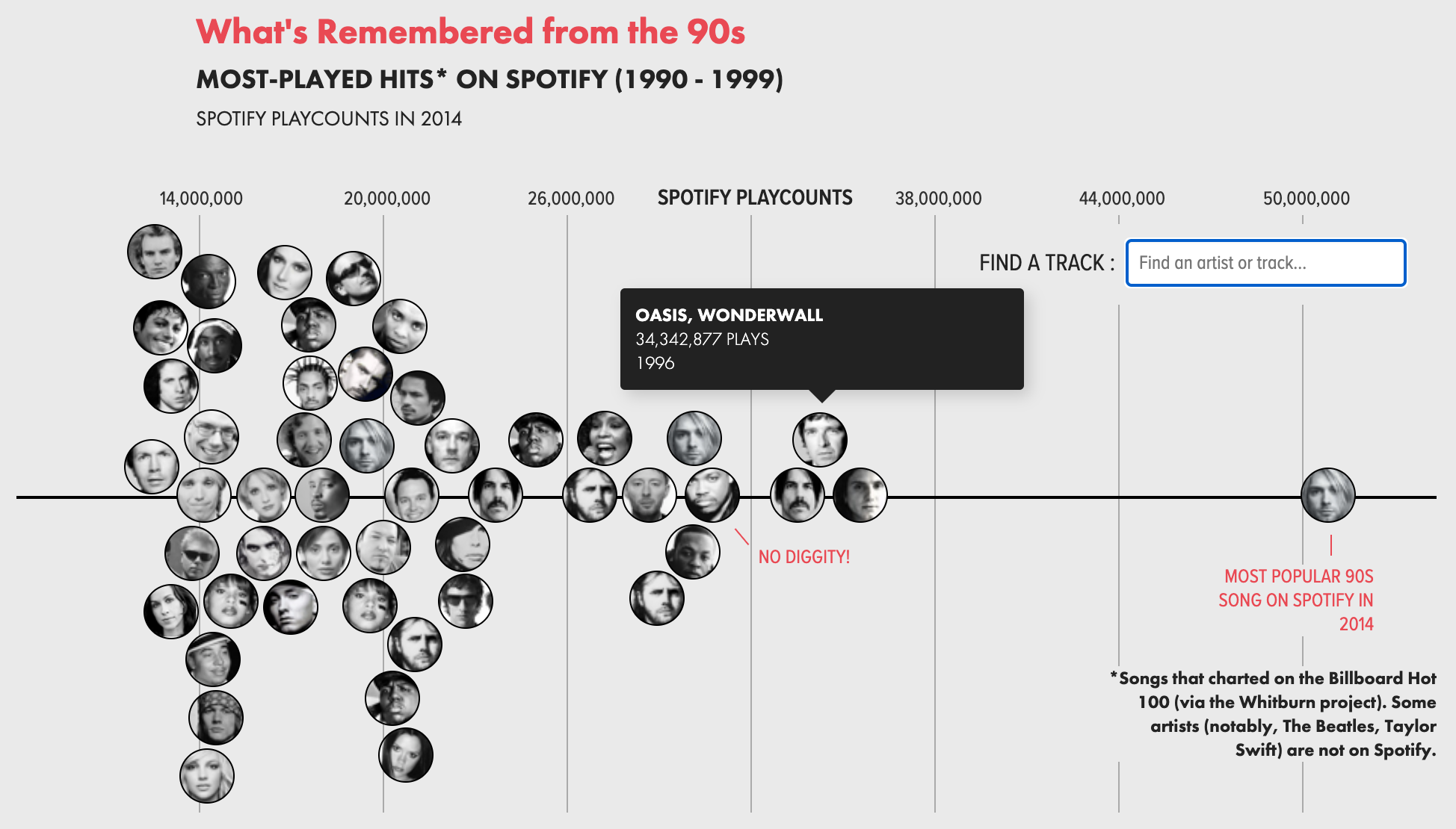
Flows and Distribution Chart — The Guardian
This is another, contrasting example of showing the distribution of values across a single axis. It is equally effective, though the design choices are radically different.
While the true distribution is represented on the right, the flows on the left help represent the human movement.
The labels on the chart highlight important insights.
The two-color theme emphasizes a distinct break in the data being shown.
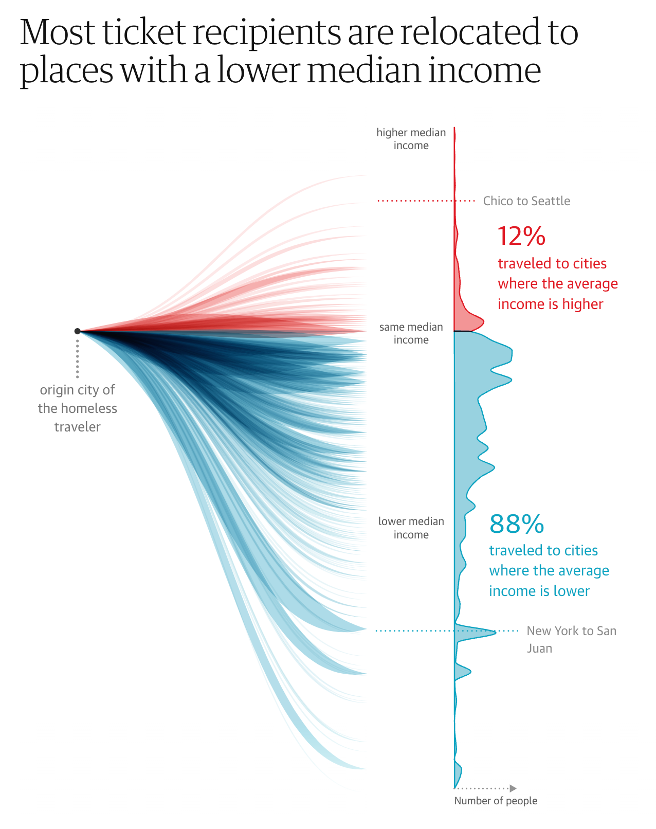
Bubble Flow Chart — Economist
It is a difficult design challenge to show changes across time in a static bubble chart. This example does it beautifully.
The historical changes of bubble position and size are shown as a connected, colored flow.
The contextual labeling helps explain a complex chart that is showing four values simultaneously.

Trend Chart — New York Times
A classic multi-series trend chart with the attention-to-detail we expect from the New York Times. For example:
The on-chart legend makes it easy read.
Emphasizing the last value in each series.
Distinct and attractive color scheme.
Subtle gridlines are helpful, not distracting.

Alluvial Chart — New York Times
Alluvial Charts show composition and changes over times using flows. This example demonstrate the form well with…
Labels that are positioned for readability.
Call-outs for important moments in time.
Grouping of countries to avoid too much visual complexity.

Comparisons with Bar Charts
Unit bar chart — new york times.
The basic bar chart is elevated in this example through a series of design choices:
The bars are visually broken into units that make the size easier to compare.
The primary data values are associated with the States, while a secondary set of values on the right provides context.
The overall average is separated at the top to provide context to the rest of the bars.
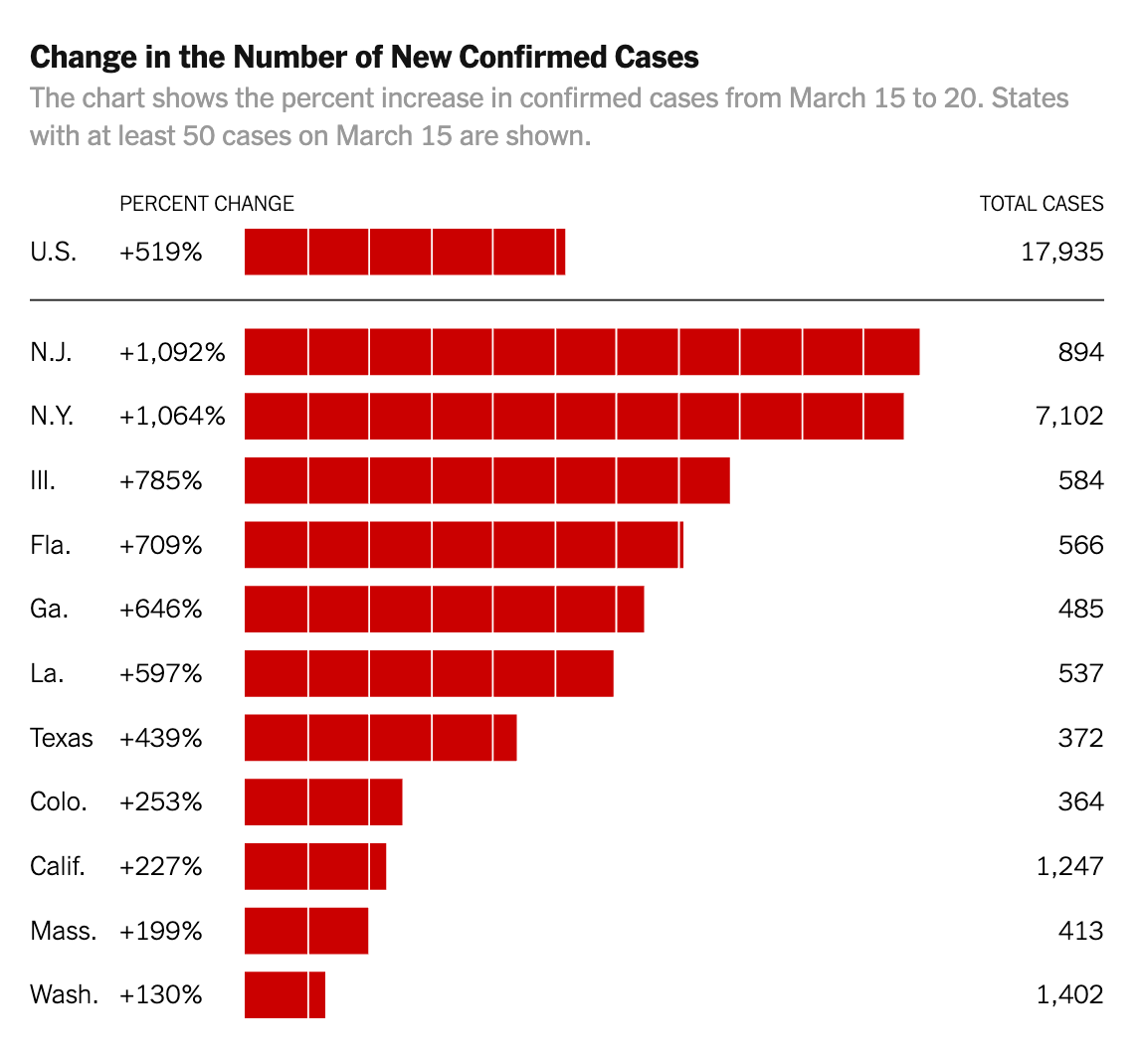
Small Multiple Bar Chart — Flowing Data
Small Multiples show a series of simple, identically structured charts together for easy visual scanning.
The simplified bar chart design allows the reader to understand the relative values without distracting details.
The single example of the axis is understood to apply across all the charts.
The emphasis is on the labels over the specific number values.

Real-life Bar Chart — Mary Pasciak
Charts can be composed of anything. In this case, beer in glasses provides a visual that is easy to understand.
The instigating question and $5 bill explain the context for the chart.
The individual beer mugs are clearly identified with labels.

Parts of a Whole
Pie chart — moveon.
Pie charts aren’t always bad — particularly when they convey a simple message. In this case, we like:
The title that underscores the message of the chart.
Linking the title color to the pie slice color.
Few slices gives it plenty of room for labels.

Waffle Chart — GE Health
This chart visualizes distributions by showing individual items, representing percentages of the population.
The people icons help the viewer stay connected to the meaning of the data.
Distinct colors make it easy to distinguish the different age ranges.
Cleverly positioned value labels delineate each of the population segments.

Bubble Chart — New York Times
Bubble charts use the size of bubble to show how individual element compose a whole. This NYT example is a classic:
Distinct color bands group the bubbles into categories of change.
A prominent legend describes the values by bubble size.
Interactivity lets the reader see details by rolling over individual bubbles.

Treemap - SmartMoney
Like a Bubble Chart, the Treemap shows how individual items add up to the whole. However, the treemap can also show a hierarchy of values (e.g. industry sectors, companies within those sectors). These two examples demonstrate:
Clear labeling of individual sections of the treemap, without trying to label each box.
Interactive exploration by changing what values are used for size and color.
Color schemes make it possible to identify the outlier values.

Comparison by Multiple Metrics
Leaderboard — juicebox.
A Leaderboard shows a series of items items ranked in columns according to multiple different values or performance metrics.
In this Juicebox example, an item can be selected, which will highlight where it ranks in each column.
Items that are ranked outside of the top 10 are positioned at the bottom with a ranking value.

Radar Chart — Jordan Vincent
Radar Charts show how individual things perform across multiple measures or, in this case, across time. In this way, they are related to the leaderboard and flower chart (see below)
This example is elegantly designed with careful use of color and flowing lines.
It is also an example of repeating the same chart (small multiples) to allow for comparison.

OECD Better Life — Mortiz Stefaner
This “Flower” visualization provides an intriguing model for showing the performance of individual countries by a series of scores.
The flowers in “full bloom” indicate countries with strong scores.
The height of each flower is also used to encode the overall score.

Scatterplot Chart — Juicebox
A Scatterplot Chart positions a collection of items in a matrix according to two values (shown on the two axes).
This example uses colored backgrounds on the 9-boxes to emphasize good or bad values.
Multiple mechanisms for selection allow the reader to choose which bubbles to focus on.

More Advanced Charts
Wind map — wattenberg and viegas.
This Wind Map is a unique and creative chart concept developed by a leading visualization thinkers, Martin Wattenburg and Fernanda Viegas.
One of the most effective characteristics is that the information being represented (wind patterns) is immediately obvious through the visual design.

Animated Unit Chart — Flowing Data
Chart animations are good for showing changes over time. In this example, the individual points represent people and their activities across time.
The prominent clock highlights the message of the chart.

What is the payoff? — Juice Analytics
This interactive Waffle Chart shows the composition of two things — the value of a company before and after.
The interactive labels allow readers to drag to change values and see the results in real time.
The two stacks are beautifully connected with a curving visual element.
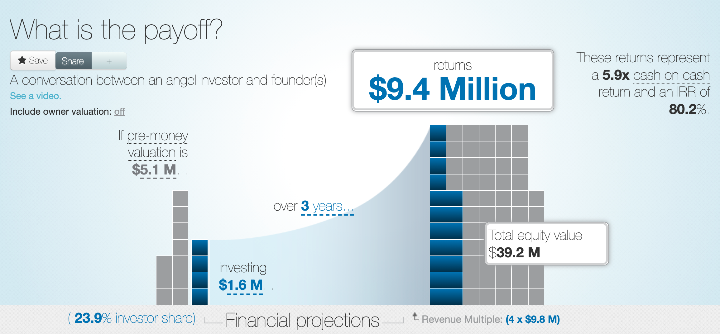
Your chart design needs to fit the audience and circumstances. This cool charting library gives a rough, sketched style. The charts and graphs suggest an unfinished nature that makes sense for prototyping or early presentations of data.

Juice Analytics named Nashville Technology Company of the Year 2022 🎉
Elevate your data visualizations with a free data makeover. get started.
- Business Essentials
- Leadership & Management
- Credential of Leadership, Impact, and Management in Business (CLIMB)
- Entrepreneurship & Innovation
- Digital Transformation
- Finance & Accounting
- Business in Society
- For Organizations
- Support Portal
- Media Coverage
- Founding Donors
- Leadership Team

- Harvard Business School →
- HBS Online →
- Business Insights →
Business Insights
Harvard Business School Online's Business Insights Blog provides the career insights you need to achieve your goals and gain confidence in your business skills.
- Career Development
- Communication
- Decision-Making
- Earning Your MBA
- Negotiation
- News & Events
- Productivity
- Staff Spotlight
- Student Profiles
- Work-Life Balance
- AI Essentials for Business
- Alternative Investments
- Business Analytics
- Business Strategy
- Business and Climate Change
- Design Thinking and Innovation
- Digital Marketing Strategy
- Disruptive Strategy
- Economics for Managers
- Entrepreneurship Essentials
- Financial Accounting
- Global Business
- Launching Tech Ventures
- Leadership Principles
- Leadership, Ethics, and Corporate Accountability
- Leading with Finance
- Management Essentials
- Negotiation Mastery
- Organizational Leadership
- Power and Influence for Positive Impact
- Strategy Execution
- Sustainable Business Strategy
- Sustainable Investing
- Winning with Digital Platforms
17 Data Visualization Techniques All Professionals Should Know

- 17 Sep 2019
There’s a growing demand for business analytics and data expertise in the workforce. But you don’t need to be a professional analyst to benefit from data-related skills.
Becoming skilled at common data visualization techniques can help you reap the rewards of data-driven decision-making , including increased confidence and potential cost savings. Learning how to effectively visualize data could be the first step toward using data analytics and data science to your advantage to add value to your organization.
Several data visualization techniques can help you become more effective in your role. Here are 17 essential data visualization techniques all professionals should know, as well as tips to help you effectively present your data.
Access your free e-book today.
What Is Data Visualization?
Data visualization is the process of creating graphical representations of information. This process helps the presenter communicate data in a way that’s easy for the viewer to interpret and draw conclusions.
There are many different techniques and tools you can leverage to visualize data, so you want to know which ones to use and when. Here are some of the most important data visualization techniques all professionals should know.
Data Visualization Techniques
The type of data visualization technique you leverage will vary based on the type of data you’re working with, in addition to the story you’re telling with your data .
Here are some important data visualization techniques to know:
- Gantt Chart
- Box and Whisker Plot
- Waterfall Chart
- Scatter Plot
- Pictogram Chart
- Highlight Table
- Bullet Graph
- Choropleth Map
- Network Diagram
- Correlation Matrices
1. Pie Chart

Pie charts are one of the most common and basic data visualization techniques, used across a wide range of applications. Pie charts are ideal for illustrating proportions, or part-to-whole comparisons.
Because pie charts are relatively simple and easy to read, they’re best suited for audiences who might be unfamiliar with the information or are only interested in the key takeaways. For viewers who require a more thorough explanation of the data, pie charts fall short in their ability to display complex information.
2. Bar Chart

The classic bar chart , or bar graph, is another common and easy-to-use method of data visualization. In this type of visualization, one axis of the chart shows the categories being compared, and the other, a measured value. The length of the bar indicates how each group measures according to the value.
One drawback is that labeling and clarity can become problematic when there are too many categories included. Like pie charts, they can also be too simple for more complex data sets.
3. Histogram

Unlike bar charts, histograms illustrate the distribution of data over a continuous interval or defined period. These visualizations are helpful in identifying where values are concentrated, as well as where there are gaps or unusual values.
Histograms are especially useful for showing the frequency of a particular occurrence. For instance, if you’d like to show how many clicks your website received each day over the last week, you can use a histogram. From this visualization, you can quickly determine which days your website saw the greatest and fewest number of clicks.
4. Gantt Chart

Gantt charts are particularly common in project management, as they’re useful in illustrating a project timeline or progression of tasks. In this type of chart, tasks to be performed are listed on the vertical axis and time intervals on the horizontal axis. Horizontal bars in the body of the chart represent the duration of each activity.
Utilizing Gantt charts to display timelines can be incredibly helpful, and enable team members to keep track of every aspect of a project. Even if you’re not a project management professional, familiarizing yourself with Gantt charts can help you stay organized.
5. Heat Map

A heat map is a type of visualization used to show differences in data through variations in color. These charts use color to communicate values in a way that makes it easy for the viewer to quickly identify trends. Having a clear legend is necessary in order for a user to successfully read and interpret a heatmap.
There are many possible applications of heat maps. For example, if you want to analyze which time of day a retail store makes the most sales, you can use a heat map that shows the day of the week on the vertical axis and time of day on the horizontal axis. Then, by shading in the matrix with colors that correspond to the number of sales at each time of day, you can identify trends in the data that allow you to determine the exact times your store experiences the most sales.
6. A Box and Whisker Plot

A box and whisker plot , or box plot, provides a visual summary of data through its quartiles. First, a box is drawn from the first quartile to the third of the data set. A line within the box represents the median. “Whiskers,” or lines, are then drawn extending from the box to the minimum (lower extreme) and maximum (upper extreme). Outliers are represented by individual points that are in-line with the whiskers.
This type of chart is helpful in quickly identifying whether or not the data is symmetrical or skewed, as well as providing a visual summary of the data set that can be easily interpreted.
7. Waterfall Chart

A waterfall chart is a visual representation that illustrates how a value changes as it’s influenced by different factors, such as time. The main goal of this chart is to show the viewer how a value has grown or declined over a defined period. For example, waterfall charts are popular for showing spending or earnings over time.
8. Area Chart

An area chart , or area graph, is a variation on a basic line graph in which the area underneath the line is shaded to represent the total value of each data point. When several data series must be compared on the same graph, stacked area charts are used.
This method of data visualization is useful for showing changes in one or more quantities over time, as well as showing how each quantity combines to make up the whole. Stacked area charts are effective in showing part-to-whole comparisons.
9. Scatter Plot

Another technique commonly used to display data is a scatter plot . A scatter plot displays data for two variables as represented by points plotted against the horizontal and vertical axis. This type of data visualization is useful in illustrating the relationships that exist between variables and can be used to identify trends or correlations in data.
Scatter plots are most effective for fairly large data sets, since it’s often easier to identify trends when there are more data points present. Additionally, the closer the data points are grouped together, the stronger the correlation or trend tends to be.
10. Pictogram Chart

Pictogram charts , or pictograph charts, are particularly useful for presenting simple data in a more visual and engaging way. These charts use icons to visualize data, with each icon representing a different value or category. For example, data about time might be represented by icons of clocks or watches. Each icon can correspond to either a single unit or a set number of units (for example, each icon represents 100 units).
In addition to making the data more engaging, pictogram charts are helpful in situations where language or cultural differences might be a barrier to the audience’s understanding of the data.
11. Timeline

Timelines are the most effective way to visualize a sequence of events in chronological order. They’re typically linear, with key events outlined along the axis. Timelines are used to communicate time-related information and display historical data.
Timelines allow you to highlight the most important events that occurred, or need to occur in the future, and make it easy for the viewer to identify any patterns appearing within the selected time period. While timelines are often relatively simple linear visualizations, they can be made more visually appealing by adding images, colors, fonts, and decorative shapes.
12. Highlight Table

A highlight table is a more engaging alternative to traditional tables. By highlighting cells in the table with color, you can make it easier for viewers to quickly spot trends and patterns in the data. These visualizations are useful for comparing categorical data.
Depending on the data visualization tool you’re using, you may be able to add conditional formatting rules to the table that automatically color cells that meet specified conditions. For instance, when using a highlight table to visualize a company’s sales data, you may color cells red if the sales data is below the goal, or green if sales were above the goal. Unlike a heat map, the colors in a highlight table are discrete and represent a single meaning or value.
13. Bullet Graph

A bullet graph is a variation of a bar graph that can act as an alternative to dashboard gauges to represent performance data. The main use for a bullet graph is to inform the viewer of how a business is performing in comparison to benchmarks that are in place for key business metrics.
In a bullet graph, the darker horizontal bar in the middle of the chart represents the actual value, while the vertical line represents a comparative value, or target. If the horizontal bar passes the vertical line, the target for that metric has been surpassed. Additionally, the segmented colored sections behind the horizontal bar represent range scores, such as “poor,” “fair,” or “good.”
14. Choropleth Maps

A choropleth map uses color, shading, and other patterns to visualize numerical values across geographic regions. These visualizations use a progression of color (or shading) on a spectrum to distinguish high values from low.
Choropleth maps allow viewers to see how a variable changes from one region to the next. A potential downside to this type of visualization is that the exact numerical values aren’t easily accessible because the colors represent a range of values. Some data visualization tools, however, allow you to add interactivity to your map so the exact values are accessible.
15. Word Cloud

A word cloud , or tag cloud, is a visual representation of text data in which the size of the word is proportional to its frequency. The more often a specific word appears in a dataset, the larger it appears in the visualization. In addition to size, words often appear bolder or follow a specific color scheme depending on their frequency.
Word clouds are often used on websites and blogs to identify significant keywords and compare differences in textual data between two sources. They are also useful when analyzing qualitative datasets, such as the specific words consumers used to describe a product.
16. Network Diagram

Network diagrams are a type of data visualization that represent relationships between qualitative data points. These visualizations are composed of nodes and links, also called edges. Nodes are singular data points that are connected to other nodes through edges, which show the relationship between multiple nodes.
There are many use cases for network diagrams, including depicting social networks, highlighting the relationships between employees at an organization, or visualizing product sales across geographic regions.
17. Correlation Matrix

A correlation matrix is a table that shows correlation coefficients between variables. Each cell represents the relationship between two variables, and a color scale is used to communicate whether the variables are correlated and to what extent.
Correlation matrices are useful to summarize and find patterns in large data sets. In business, a correlation matrix might be used to analyze how different data points about a specific product might be related, such as price, advertising spend, launch date, etc.
Other Data Visualization Options
While the examples listed above are some of the most commonly used techniques, there are many other ways you can visualize data to become a more effective communicator. Some other data visualization options include:
- Bubble clouds
- Circle views
- Dendrograms
- Dot distribution maps
- Open-high-low-close charts
- Polar areas
- Radial trees
- Ring Charts
- Sankey diagram
- Span charts
- Streamgraphs
- Wedge stack graphs
- Violin plots

Tips For Creating Effective Visualizations
Creating effective data visualizations requires more than just knowing how to choose the best technique for your needs. There are several considerations you should take into account to maximize your effectiveness when it comes to presenting data.
Related : What to Keep in Mind When Creating Data Visualizations in Excel
One of the most important steps is to evaluate your audience. For example, if you’re presenting financial data to a team that works in an unrelated department, you’ll want to choose a fairly simple illustration. On the other hand, if you’re presenting financial data to a team of finance experts, it’s likely you can safely include more complex information.
Another helpful tip is to avoid unnecessary distractions. Although visual elements like animation can be a great way to add interest, they can also distract from the key points the illustration is trying to convey and hinder the viewer’s ability to quickly understand the information.
Finally, be mindful of the colors you utilize, as well as your overall design. While it’s important that your graphs or charts are visually appealing, there are more practical reasons you might choose one color palette over another. For instance, using low contrast colors can make it difficult for your audience to discern differences between data points. Using colors that are too bold, however, can make the illustration overwhelming or distracting for the viewer.
Related : Bad Data Visualization: 5 Examples of Misleading Data
Visuals to Interpret and Share Information
No matter your role or title within an organization, data visualization is a skill that’s important for all professionals. Being able to effectively present complex data through easy-to-understand visual representations is invaluable when it comes to communicating information with members both inside and outside your business.
There’s no shortage in how data visualization can be applied in the real world. Data is playing an increasingly important role in the marketplace today, and data literacy is the first step in understanding how analytics can be used in business.
Are you interested in improving your analytical skills? Learn more about Business Analytics , our eight-week online course that can help you use data to generate insights and tackle business decisions.
This post was updated on January 20, 2022. It was originally published on September 17, 2019.

About the Author

- school Campus Bookshelves
- menu_book Bookshelves
- perm_media Learning Objects
- login Login
- how_to_reg Request Instructor Account
- hub Instructor Commons
- Download Page (PDF)
- Download Full Book (PDF)
- Periodic Table
- Physics Constants
- Scientific Calculator
- Reference & Cite
- Tools expand_more
- Readability
selected template will load here
This action is not available.
2: Graphical Representations of Data
- Last updated
- Save as PDF
- Page ID 22222

In this chapter, you will study numerical and graphical ways to describe and display your data. This area of statistics is called "Descriptive Statistics." You will learn how to calculate, and even more importantly, how to interpret these measurements and graphs.
- 2.1: Introduction In this chapter, you will study numerical and graphical ways to describe and display your data. This area of statistics is called "Descriptive Statistics." You will learn how to calculate, and even more importantly, how to interpret these measurements and graphs. In this chapter, we will briefly look at stem-and-leaf plots, line graphs, and bar graphs, as well as frequency polygons, and time series graphs. Our emphasis will be on histograms and box plots.
- 2.2: Stem-and-Leaf Graphs (Stemplots), Line Graphs, and Bar Graphs A stem-and-leaf plot is a way to plot data and look at the distribution, where all data values within a class are visible. The advantage in a stem-and-leaf plot is that all values are listed, unlike a histogram, which gives classes of data values. A line graph is often used to represent a set of data values in which a quantity varies with time. These graphs are useful for finding trends. A bar graph is a chart that uses either horizontal or vertical bars to show comparisons among categories.
- 2.3: Histograms, Frequency Polygons, and Time Series Graphs A histogram is a graphic version of a frequency distribution. The graph consists of bars of equal width drawn adjacent to each other. The horizontal scale represents classes of quantitative data values and the vertical scale represents frequencies. The heights of the bars correspond to frequency values. Histograms are typically used for large, continuous, quantitative data sets. A frequency polygon can also be used when graphing large data sets with data points that repeat.
- 2.4: Using Excel to Create Graphs Using technology to create graphs will make the graphs faster to create, more precise, and give the ability to use larger amounts of data. This section focuses on using Excel to create graphs.
- 2.5: Graphs that Deceive It's common to see graphs displayed in a misleading manner in social media and other instances. This could be done purposefully to make a point, or it could be accidental. Either way, it's important to recognize these instances to ensure you are not misled.
- 2.E: Graphical Representations of Data (Exercises) These are homework exercises to accompany the Textmap created for "Introductory Statistics" by OpenStax.
Contributors and Attributions
Barbara Illowsky and Susan Dean (De Anza College) with many other contributing authors. Content produced by OpenStax College is licensed under a Creative Commons Attribution License 4.0 license. Download for free at http://cnx.org/contents/[email protected] .
If you're seeing this message, it means we're having trouble loading external resources on our website.
If you're behind a web filter, please make sure that the domains *.kastatic.org and *.kasandbox.org are unblocked.
To log in and use all the features of Khan Academy, please enable JavaScript in your browser.
Praxis Core Math
Course: praxis core math > unit 1, data representations | lesson.
- Data representations | Worked example
- Center and spread | Lesson
- Center and spread | Worked example
- Random sampling | Lesson
- Random sampling | Worked example
- Scatterplots | Lesson
- Scatterplots | Worked example
- Interpreting linear models | Lesson
- Interpreting linear models | Worked example
- Correlation and Causation | Lesson
- Correlation and causation | Worked example
- Probability | Lesson
- Probability | Worked example
What are data representations?
- How much of the data falls within a specified category or range of values?
- What is a typical value of the data?
- How much spread is in the data?
- Is there a trend in the data over time?
- Is there a relationship between two variables?
What skills are tested?
- Matching a data set to its graphical representation
- Matching a graphical representation to a description
- Using data representations to solve problems
How are qualitative data displayed?
- A vertical bar chart lists the categories of the qualitative variable along a horizontal axis and uses the heights of the bars on the vertical axis to show the values of the quantitative variable. A horizontal bar chart lists the categories along the vertical axis and uses the lengths of the bars on the horizontal axis to show the values of the quantitative variable. This display draws attention to how the categories rank according to the amount of data within each. Example The heights of the bars show the number of students who want to study each language. Using the bar chart, we can conclude that the greatest number of students want to study Mandarin and the least number of students want to study Latin.
- A pictograph is like a horizontal bar chart but uses pictures instead of the lengths of bars to represent the values of the quantitative variable. Each picture represents a certain quantity, and each category can have multiple pictures. Pictographs are visually interesting, but require us to use the legend to convert the number of pictures to quantitative values. Example Each represents 40 students. The number of pictures shows the number of students who want to study each language. Using the pictograph, we can conclude that twice as many students want to study French as want to study Latin.
- A circle graph (or pie chart) is a circle that is divided into as many sections as there are categories of the qualitative variable. The area of each section represents, for each category, the value of the quantitative data as a fraction of the sum of values. The fractions sum to 1 . Sometimes the section labels include both the category and the associated value or percent value for that category. Example The area of each section represents the fraction of students who want to study that language. Using the circle graph, we can conclude that just under 1 2 the students want to study Mandarin and about 1 3 want to study Spanish.
How are quantitative data displayed?
- Dotplots use one dot for each data point. The dots are plotted above their corresponding values on a number line. The number of dots above each specific value represents the count of that value. Dotplots show the value of each data point and are practical for small data sets. Example Each dot represents the typical travel time to school for one student. Using the dotplot, we can conclude that the most common travel time is 10 minutes. We can also see that the values for travel time range from 5 to 35 minutes.
- Histograms divide the horizontal axis into equal-sized intervals and use the heights of the bars to show the count or percent of data within each interval. By convention, each interval includes the lower boundary but not the upper one. Histograms show only totals for the intervals, not specific data points. Example The height of each bar represents the number of students having a typical travel time within the corresponding interval. Using the histogram, we can conclude that the most common travel time is between 10 and 15 minutes and that all typical travel times are between 5 and 40 minutes.
How are trends over time displayed?
How are relationships between variables displayed.
- (Choice A) A
- (Choice B) B
- (Choice C) C
- (Choice D) D
- (Choice E) E
- Your answer should be
- an integer, like 6
- a simplified proper fraction, like 3 / 5
- a simplified improper fraction, like 7 / 4
- a mixed number, like 1 3 / 4
- an exact decimal, like 0.75
- a multiple of pi, like 12 pi or 2 / 3 pi
- a proper fraction, like 1 / 2 or 6 / 10
- an improper fraction, like 10 / 7 or 14 / 8
Things to remember
- When matching data to a representation, check that the values are graphed accurately for all categories.
- When reporting data counts or fractions, be clear whether a question asks about data within a single category or a comparison between categories.
- When finding the number or fraction of the data meeting a criteria, watch for key words such as or , and , less than , and more than .
Want to join the conversation?
- Upvote Button navigates to signup page
- Downvote Button navigates to signup page
- Flag Button navigates to signup page
- Privacy Policy
Home » Graphical Methods – Types, Examples and Guide
Graphical Methods – Types, Examples and Guide
Table of Contents

Graphical Methods
Definition:
Graphical methods refer to techniques used to visually represent data, relationships, or processes using charts, graphs, diagrams, or other graphical formats. These methods are widely used in various fields such as science, engineering, business, and social sciences, among others, to analyze, interpret and communicate complex information in a concise and understandable way.
Types of Graphical Methods
Here are some of the most common types of graphical methods for data analysis and visual presentation:
Line Graphs
These are commonly used to show trends over time, such as the stock prices of a particular company or the temperature over a certain period. They consist of a series of data points connected by a line that shows the trend of the data over time. Line graphs are useful for identifying patterns in data, such as seasonal changes or long-term trends.
These are commonly used to compare values of different categories, such as sales figures for different products or the number of students in different grade levels. Bar charts use bars that are either horizontal or vertical and represent the data values. They are useful for comparing data visually and identifying differences between categories.
These are used to show how a whole is divided into parts, such as the percentage of students in a school who are enrolled in different programs. Pie charts use a circle that is divided into sectors, with each sector representing a portion of the whole. They are useful for showing proportions and identifying which parts of a whole are larger or smaller.
Scatter Plots
These are used to visualize the relationship between two variables, such as the correlation between a person’s height and weight. Scatter plots consist of a series of data points that are plotted on a graph and connected by a line or curve. They are useful for identifying trends and relationships between variables.
These are used to show the distribution of data across a two-dimensional plane, such as a map of a city showing the density of population in different areas. Heat maps use color-coded cells to represent different levels of data, with darker colors indicating higher values. They are useful for identifying areas of high or low density and for highlighting patterns in data.
These are used to show the distribution of data in a single variable, such as the distribution of ages of a group of people. Histograms use bars that represent the frequency of each data value, with taller bars indicating a higher frequency. They are useful for identifying the shape of a distribution and for identifying outliers or unusual data values.
Network Diagrams
These are used to show the relationships between different entities or nodes, such as the relationships between people in a social network. Network diagrams consist of nodes that are connected by lines that represent the relationship. They are useful for identifying patterns in complex data and for understanding the structure of a network.
Box plots, also known as box-and-whisker plots, are a type of graphical method used to show the distribution of data in a single variable. They consist of a box with whiskers extending from the top and bottom of the box. The box represents the middle 50% of the data, with the median value indicated by a line inside the box. The whiskers represent the range of the data, with any data points outside the whiskers indicated as outliers. Box plots are useful for identifying the spread and shape of a distribution and for identifying outliers or unusual data values.
Applications of Graphical Methods
Graphical methods have a wide range of applications in various fields, including:
- Business : Graphical methods are commonly used in business to analyze sales data, financial data, and other types of data. They are useful for identifying trends, patterns, and outliers, as well as for presenting data in a clear and concise manner to stakeholders.
- Science and engineering: Graphical methods are used extensively in scientific and engineering fields to analyze data and to present research findings. They are useful for visualizing complex data sets and for identifying relationships between variables.
- Social sciences: Graphical methods are used in social sciences to analyze and present data related to human behavior, such as demographics, survey results, and statistical analyses. They are useful for identifying trends and patterns in large data sets and for communicating findings to a broader audience.
- Education : Graphical methods are used in education to present information to students and to help them understand complex concepts. They are useful for visualizing data and for presenting information in a way that is easy to understand.
- Healthcare : Graphical methods are used in healthcare to analyze patient data, to track disease outbreaks, and to present medical information to patients. They are useful for identifying patterns and trends in patient data and for communicating medical information in a clear and concise manner.
- Sports : Graphical methods are used in sports to analyze and present data related to player performance, team statistics, and game outcomes. They are useful for identifying trends and patterns in player and team data and for communicating this information to coaches, players, and fans.
Examples of Graphical Methods
Here are some examples of real-time applications of graphical methods:
- Stock Market: Line graphs, candlestick charts, and bar charts are widely used in real-time trading systems to display stock prices and trends over time. Traders use these charts to analyze historical data and make informed decisions about buying and selling stocks in real-time.
- Weather Forecasting : Heat maps and radar maps are commonly used in weather forecasting to display current weather conditions and to predict future weather patterns. These maps are useful for tracking the movement of storms, identifying areas of high and low pressure, and predicting the likelihood of severe weather events.
- Social Media Analytics: Scatter plots and network diagrams are commonly used in social media analytics to track the spread of information across social networks. Analysts use these graphs to identify patterns in user behavior, to track the popularity of specific topics or hashtags, and to monitor the influence of key opinion leaders.
- Traffic Analysis: Heat maps and network diagrams are used in traffic analysis to visualize traffic flow patterns and to identify areas of congestion or accidents. These graphs are useful for predicting traffic patterns, optimizing traffic flow, and improving transportation infrastructure.
- Medical Diagnostics: Box plots and histograms are commonly used in medical diagnostics to display the distribution of patient data, such as blood pressure, heart rate, or blood sugar levels. These graphs are useful for identifying patterns in patient data, diagnosing medical conditions, and monitoring the effectiveness of treatments in real-time.
- Cybersecurity: Heat maps and network diagrams are used in cybersecurity to visualize network traffic patterns and to identify potential security threats. These graphs are useful for identifying anomalies in network traffic, detecting and mitigating cyber attacks, and improving network security protocols.
How to use Graphical Methods
Here are some general steps to follow when using graphical methods to analyze and present data:
- Identify the research question: Before creating any graphs, it’s important to identify the research question or hypothesis you want to explore. This will help you select the appropriate type of graph and ensure that the data you collect is relevant to your research question.
- Collect and organize the data: Collect the data you need to answer your research question and organize it in a way that makes it easy to work with. This may involve sorting, filtering, or cleaning the data to ensure that it is accurate and relevant.
- Select the appropriate graph : There are many different types of graphs available, each with its own strengths and weaknesses. Select the appropriate graph based on the type of data you have and the research question you are exploring. For example, a scatterplot may be appropriate for exploring the relationship between two continuous variables, while a bar chart may be appropriate for comparing categorical data.
- Create the graph: Once you have selected the appropriate graph, create it using software or a tool that allows you to customize the graph based on your needs. Be sure to include appropriate labels and titles, and ensure that the graph is clearly legible.
- Analyze the graph: Once you have created the graph, analyze it to identify patterns, trends, and relationships in the data. Look for outliers or other anomalies that may require further investigation.
- Draw conclusions: Based on your analysis of the graph, draw conclusions about the research question you are exploring. Use the graph to support your conclusions and to communicate your findings to others.
- Iterate and refine: Finally, refine your graph or create additional graphs as needed to further explore your research question. Iteratively refining and revising your graphs can help to ensure that you are accurately representing the data and that you are drawing the appropriate conclusions.
When to use Graphical Methods
Graphical methods can be used in a variety of situations to help analyze, interpret, and communicate data. Here are some general guidelines on when to use graphical methods:
- To identify patterns and trends: Graphical methods are useful for identifying patterns and trends in data, which may be difficult to see in raw data tables or spreadsheets. Graphs can reveal trends that may not be immediately apparent in the data, making it easier to draw conclusions and make predictions.
- To compare data: Graphs can be used to compare data from different sources or over different time periods. Graphical comparisons can make it easier to identify differences or similarities in the data, which can be useful for making decisions and taking action.
- To summarize data : Graphs can be used to summarize large amounts of data in a single visual display. This can be particularly useful when presenting data to a broad audience, as it can help to simplify complex data sets and make them more accessible.
- To communicate data: Graphs can be used to communicate data and findings to a variety of audiences, including stakeholders, colleagues, and the general public. Graphs can be particularly useful in situations where data needs to be presented quickly and in a way that is easy to understand.
- To identify outliers: Graphical methods are useful for identifying outliers or anomalies in the data. Outliers can be indicative of errors or unusual events, and may warrant further investigation.
Purpose of Graphical Methods
The purpose of graphical methods is to help people analyze, interpret, and communicate data in a way that is both accurate and understandable. Graphical methods provide visual representations of data that can be easier to interpret than tables of numbers or raw data sets. Graphical methods help to reveal patterns and trends that may not be immediately apparent in the data, making it easier to draw conclusions and make predictions. They can also help to identify outliers or unusual data points that may warrant further investigation.
In addition to helping people analyze and interpret data, graphical methods also serve an important communication function. Graphs can be used to present data to a wide range of audiences, including stakeholders, colleagues, and the general public. Graphs can help to simplify complex data sets, making them more accessible and easier to understand. By presenting data in a clear and concise way, graphical methods can help people make informed decisions and take action based on the data.
Overall, the purpose of graphical methods is to provide a powerful tool for analyzing, interpreting, and communicating data. Graphical methods help people to better understand the data they are working with, to identify patterns and trends, and to make informed decisions based on the data.
Characteristics of Graphical Methods
Here are some characteristics of graphical methods:
- Visual Representation: Graphical methods provide a visual representation of data, which can be easier to interpret than tables of numbers or raw data sets. Graphs can help to reveal patterns and trends that may not be immediately apparent in the data.
- Simplicity : Graphical methods simplify complex data sets, making them more accessible and easier to understand. By presenting data in a clear and concise way, graphical methods can help people make informed decisions and take action based on the data.
- Comparability : Graphical methods can be used to compare data from different sources or over different time periods. This can help to identify differences or similarities in the data, which can be useful for making decisions and taking action.
- Flexibility : Graphical methods can be adapted to different types of data, including continuous, categorical, and ordinal data. Different types of graphs can be used to display different types of data, depending on the characteristics of the data and the research question.
- Accuracy : Graphical methods should accurately represent the data being analyzed. Graphs should be properly scaled and labeled to avoid distorting the data or misleading viewers.
- Clarity : Graphical methods should be clear and easy to read. Graphs should be designed with the viewer in mind, using appropriate colors, labels, and titles to ensure that the message of the graph is conveyed effectively.
Advantages of Graphical Methods
Graphical methods offer several advantages for analyzing and presenting data, including:
- Clear visualization: Graphical methods provide a clear and intuitive visual representation of data that can help people understand complex relationships, trends, and patterns in the data. This can be particularly useful when dealing with large and complex data sets.
- Efficient communication: Graphical methods can help to communicate complex data sets in an efficient and accessible way. Visual representations can be easier to understand than numerical data alone, and can help to convey key messages quickly.
- Effective comparison: Graphical methods allow for easy comparison between different data sets, making it easier to identify trends, patterns, and differences. This can help in making decisions, identifying areas for improvement, or developing new insights.
- Improved decision-making: Graphical methods can help to inform decision-making by presenting data in a clear and easy-to-understand format. They can also help to identify key areas of focus, enabling individuals or teams to make more informed decisions.
- Increased engagement: Graphical methods can help to engage audiences by presenting data in an engaging and interactive way. This can be particularly useful in presentations or reports, where visual representations can help to maintain audience attention and interest.
- Better understanding: Graphical methods can help individuals to better understand the data they are working with, by providing a clear and intuitive visual representation of the data. This can lead to improved insights and decision-making, as well as better understanding of the implications of the data.
Limitations of Graphical Methods
Here are a few limitations to consider:
- Misleading representation: Graphical methods can potentially misrepresent data if they are not designed properly. For example, inappropriate scaling or labeling of the axes or the use of certain types of graphs can create a distorted view of the data.
- Limited scope: Graphical methods can only display a limited amount of data, which can make it difficult to capture the full complexity of a data set. Additionally, some types of data may be difficult to represent visually.
- Time-consuming : Creating graphs can be a time-consuming process, particularly if multiple graphs need to be created and analyzed. This can be a limitation in situations where time is limited or resources are scarce.
- Technical skills: Some graphical methods require technical skills to create and interpret. For example, certain types of graphs may require knowledge of specialized software or programming languages.
- Interpretation : Interpreting graphs can be subjective, and the same graph can be interpreted in different ways by different people. This can lead to confusion or disagreements when using graphs to communicate data.
- Accessibility : Some graphical methods may not be accessible to all audiences, particularly those with visual impairments. Additionally, some types of graphs may not be accessible to those with limited literacy or numeracy skills.
About the author

Muhammad Hassan
Researcher, Academic Writer, Web developer
You may also like

Cluster Analysis – Types, Methods and Examples

Discriminant Analysis – Methods, Types and...

MANOVA (Multivariate Analysis of Variance) –...

Documentary Analysis – Methods, Applications and...

ANOVA (Analysis of variance) – Formulas, Types...

Substantive Framework – Types, Methods and...
- Data Structures
- Linked List
- Binary Tree
- Binary Search Tree
- Segment Tree
- Disjoint Set Union
- Fenwick Tree
- Red-Black Tree
- Advanced Data Structures
- Graph Data Structure And Algorithms
- Introduction to Graphs - Data Structure and Algorithm Tutorials
Graph and its representations
- Types of Graphs with Examples
- Basic Properties of a Graph
- Applications, Advantages and Disadvantages of Graph
- Transpose graph
- Difference Between Graph and Tree
BFS and DFS on Graph
- Breadth First Search or BFS for a Graph
- Depth First Search or DFS for a Graph
- Applications, Advantages and Disadvantages of Depth First Search (DFS)
- Applications, Advantages and Disadvantages of Breadth First Search (BFS)
- Iterative Depth First Traversal of Graph
- BFS for Disconnected Graph
- Transitive Closure of a Graph using DFS
- Difference between BFS and DFS
Cycle in a Graph
- Detect Cycle in a Directed Graph
- Detect cycle in an undirected graph
- Detect Cycle in a directed graph using colors
- Detect a negative cycle in a Graph | (Bellman Ford)
- Cycles of length n in an undirected and connected graph
- Detecting negative cycle using Floyd Warshall
- Clone a Directed Acyclic Graph
Shortest Paths in Graph
- How to find Shortest Paths from Source to all Vertices using Dijkstra's Algorithm
- Bellman–Ford Algorithm
- Floyd Warshall Algorithm
- Johnson's algorithm for All-pairs shortest paths
- Shortest Path in Directed Acyclic Graph
- Multistage Graph (Shortest Path)
- Shortest path in an unweighted graph
- Karp's minimum mean (or average) weight cycle algorithm
- 0-1 BFS (Shortest Path in a Binary Weight Graph)
- Find minimum weight cycle in an undirected graph
Minimum Spanning Tree in Graph
- Kruskal’s Minimum Spanning Tree (MST) Algorithm
- Difference between Prim's and Kruskal's algorithm for MST
- Applications of Minimum Spanning Tree
- Total number of Spanning Trees in a Graph
- Minimum Product Spanning Tree
- Reverse Delete Algorithm for Minimum Spanning Tree
Topological Sorting in Graph
- Topological Sorting
- All Topological Sorts of a Directed Acyclic Graph
- Kahn's algorithm for Topological Sorting
- Maximum edges that can be added to DAG so that it remains DAG
- Longest Path in a Directed Acyclic Graph
- Topological Sort of a graph using departure time of vertex
Connectivity of Graph
- Articulation Points (or Cut Vertices) in a Graph
- Biconnected Components
- Bridges in a graph
- Eulerian path and circuit for undirected graph
- Fleury's Algorithm for printing Eulerian Path or Circuit
- Strongly Connected Components
- Count all possible walks from a source to a destination with exactly k edges
- Euler Circuit in a Directed Graph
- Word Ladder (Length of shortest chain to reach a target word)
- Find if an array of strings can be chained to form a circle | Set 1
- Tarjan's Algorithm to find Strongly Connected Components
- Paths to travel each nodes using each edge (Seven Bridges of Königsberg)
- Dynamic Connectivity | Set 1 (Incremental)
Maximum flow in a Graph
- Max Flow Problem Introduction
- Ford-Fulkerson Algorithm for Maximum Flow Problem
- Find maximum number of edge disjoint paths between two vertices
- Find minimum s-t cut in a flow network
- Maximum Bipartite Matching
- Channel Assignment Problem
- Introduction to Push Relabel Algorithm
- Introduction and implementation of Karger's algorithm for Minimum Cut
- Dinic's algorithm for Maximum Flow
Some must do problems on Graph
- Find size of the largest region in Boolean Matrix
- Count number of trees in a forest
- A Peterson Graph Problem
- Clone an Undirected Graph
- Introduction to Graph Coloring
- Traveling Salesman Problem (TSP) Implementation
- Introduction and Approximate Solution for Vertex Cover Problem
- Erdos Renyl Model (for generating Random Graphs)
- Chinese Postman or Route Inspection | Set 1 (introduction)
- Hierholzer's Algorithm for directed graph
- Boggle (Find all possible words in a board of characters) | Set 1
- Hopcroft–Karp Algorithm for Maximum Matching | Set 1 (Introduction)
- Construct a graph from given degrees of all vertices
- Determine whether a universal sink exists in a directed graph
- Number of sink nodes in a graph
- Two Clique Problem (Check if Graph can be divided in two Cliques)
What is Graph Data Structure?
A Graph is a non-linear data structure consisting of vertices and edges. The vertices are sometimes also referred to as nodes and the edges are lines or arcs that connect any two nodes in the graph. More formally a Graph is composed of a set of vertices( V ) and a set of edges( E ). The graph is denoted by G(V, E) .
Representations of Graph
Here are the two most common ways to represent a graph :
Adjacency Matrix
Adjacency list.
An adjacency matrix is a way of representing a graph as a matrix of boolean (0’s and 1’s).
Let’s assume there are n vertices in the graph So, create a 2D matrix adjMat[n][n] having dimension n x n.
If there is an edge from vertex i to j , mark adjMat[i][j] as 1 . If there is no edge from vertex i to j , mark adjMat[i][j] as 0 .
Representation of Undirected Graph to Adjacency Matrix:
The below figure shows an undirected graph. Initially, the entire Matrix is initialized to 0 . If there is an edge from source to destination, we insert 1 to both cases ( adjMat[destination] and adjMat [ destination]) because we can go either way.

Undirected Graph to Adjacency Matrix
Representation of Directed Graph to Adjacency Matrix:
The below figure shows a directed graph. Initially, the entire Matrix is initialized to 0 . If there is an edge from source to destination, we insert 1 for that particular adjMat[destination] .

Directed Graph to Adjacency Matrix
An array of Lists is used to store edges between two vertices. The size of array is equal to the number of vertices (i.e, n) . Each index in this array represents a specific vertex in the graph. The entry at the index i of the array contains a linked list containing the vertices that are adjacent to vertex i .
Let’s assume there are n vertices in the graph So, create an array of list of size n as adjList[n].
adjList[0] will have all the nodes which are connected (neighbour) to vertex 0 . adjList[1] will have all the nodes which are connected (neighbour) to vertex 1 and so on.
Representation of Undirected Graph to Adjacency list:
The below undirected graph has 3 vertices. So, an array of list will be created of size 3, where each indices represent the vertices. Now, vertex 0 has two neighbours (i.e, 1 and 2). So, insert vertex 1 and 2 at indices 0 of array. Similarly, For vertex 1, it has two neighbour (i.e, 2 and 0) So, insert vertices 2 and 0 at indices 1 of array. Similarly, for vertex 2, insert its neighbours in array of list.

Undirected Graph to Adjacency list
Representation of Directed Graph to Adjacency list:
The below directed graph has 3 vertices. So, an array of list will be created of size 3, where each indices represent the vertices. Now, vertex 0 has no neighbours. For vertex 1, it has two neighbour (i.e, 0 and 2) So, insert vertices 0 and 2 at indices 1 of array. Similarly, for vertex 2, insert its neighbours in array of list.

Directed Graph to Adjacency list
Please Login to comment...
Similar reads.
- graph-basics

Improve your Coding Skills with Practice
What kind of Experience do you want to share?
What is the interpretation of a ROC curve and can you provide examples?
Table of Contents
A ROC (Receiver Operating Characteristic) curve is a graphical representation of the performance of a binary classification model. It plots the true positive rate (sensitivity) against the false positive rate (1-specificity) at various threshold values. The closer the curve is to the upper left corner of the plot, the better the model’s performance. The area under the ROC curve (AUC) is a measure of the model’s overall accuracy and a higher AUC indicates a better model.
For example, in medical diagnosis, a ROC curve can be used to evaluate the performance of a diagnostic test by plotting the true positive rate (proportion of correctly identified disease cases) against the false positive rate (proportion of incorrectly identified healthy cases). A higher AUC would indicate that the test is better at correctly identifying disease cases.
In the field of machine learning, a ROC curve can be used to evaluate the performance of a binary classification algorithm, such as logistic regression or support vector machines. The AUC can be used to compare and select the best performing algorithm for a given dataset.
In summary, a ROC curve is a useful tool for evaluating the performance of binary classification models and can be applied in various fields, including medicine and machine learning.
Interpret a ROC Curve (With Examples)
Logistic Regression is a statistical method that we use to fit a regression model when the response variable is binary. To assess how well a logistic regression model fits a dataset, we can look at the following two metrics:
- Sensitivity: The probability that the model predicts a positive outcome for an observation when the outcome is indeed positive.
- Specificity: The probability that the model predicts a negative outcome for an observation when the outcome is indeed negative.
An easy way to visualize these two metrics is by creating a ROC curve , which is a plot that displays the sensitivity and specificity of a logistic regression model.

This tutorial explains how to create and interpret a ROC curve.
How to Create a ROC Curve
Once we’ve fit a logistic regression model, we can use the model to classify into one of two categories.
For example, we might classify observations as either “positive” or “negative.”
The true positive rate represents the proportion of observations that are predicted to be positive when indeed they are positive.
Conversely, the false positive rate represents the proportion of observations that are predicted to be positive when they’re actually negative.
When we create a ROC curve, we plot pairs of the true positive rate vs. the false positive rate for every possible decision threshold of a logistic regression model.
How to Interpret a ROC Curve
The more that the ROC curve hugs the top left corner of the plot, the better the model does at classifying the data into categories.
To quantify this, we can calculate the AUC (area under the curve) which tells us how much of the plot is located under the curve.

The closer AUC is to 1, the better the model.

It’s particularly useful to calculate the AUC for multiple logistic regression models because it allows us to see which model is best at making predictions.
For example, suppose we fit three different logistic regression models and plot the following ROC curves for each model:

Suppose we calculate the AUC for each model as follows:
- Model A: AUC = 0.923
- Model B: AUC = 0.794
- Model C: AUC = 0.588
Model A has the highest AUC, which indicates that it has the highest area under the curve and is the best model at correctly classifying observations into categories.
Additional Resources
The following tutorials explain how to create ROC curves using different statistical software:
Related terms:
- RECEIVER-OPERATING CHARACTERISTIC CURVE (ROC CURVE)
- How can I plot a ROC curve using ggplot2? Can you provide some examples?
- What is the process of creating and interpreting a ROC curve in Stata?
- How can I create and interpret a ROC curve in SPSS?
- How do you plot a ROC curve in Python step-by-step?
- How can I create a ROC curve in Excel?
- How to create a ROC Curve in SAS?
- What is the easiest way to plot a ROC Curve in Python?
- How can I perform curve fitting in Excel and what are some examples of curve fitting in Excel?
- What is the meaning of Z-scores and can you provide examples of their interpretation?
IMAGES
VIDEO
COMMENTS
44 Types of Graphs Perfect for Every Top Industry. Popular graph types include line graphs, bar graphs, pie charts, bubble charts, scatter plots and histograms. Graphs are a great way to visualize data and display statistics. For example, a bar graph or chart is used to display numerical data that is independent of one another.
Examples on Graphical Representation of Data. Example 1: A pie chart is divided into 3 parts with the angles measuring as 2x, 8x, and 10x respectively. Find the value of x in degrees. Solution: We know, the sum of all angles in a pie chart would give 360º as result. ⇒ 2x + 8x + 10x = 360º. ⇒ 20 x = 360º.
A graph or chart is a graphical representation of qualitative or quantitative data. It uses different symbols such as bars, lines, columns, tables, box plots, maps, and more, to give meaning to the information, making it easier to understand than raw data. ... For example, if a word cloud is generated based on a text from product reviews, the ...
In the graphic below, the x-axis compares the cities to one another. Image Source. Best Use Cases for This Type of Chart. You can use a Mekko chart to show growth, market share, or competitor analysis. For example, the Mekko chart above shows the market share of asset managers grouped by location and the value of their assets.
You can create dashboards and graphical representations with a drag and drop user interface. 9. Tableau - a business intelligence system that lets you quickly create, connect, visualize, and share data seamlessly. 10. Domo is a cloud business intelligence platform that helps you examine data using graphs and charts. You can conduct advanced ...
Graphical Representation is a way of analysing numerical data. It exhibits the relation between data, ideas, information and concepts in a diagram. ... Example: Frequency Polygon Graph; Principles of Graphical Representation. Algebraic principles are applied to all types of graphical representation of data. In graphs, it is represented using ...
The Power of Good Data Visualization. Data visualization involves the use of graphical representations of data, such as graphs, charts, and maps. Compared to descriptive statistics or tables, visuals provide a more effective way to analyze data, including identifying patterns, distributions, and correlations and spotting outliers in complex ...
Data visualization is the graphical representation of information and data. By using v isual elements like charts, graphs, and maps, data visualization tools provide an accessible way to see and understand trends, outliers, and patterns in data. Additionally, it provides an excellent way for employees or business owners to present data to non ...
Data Visualization is a graphic representation of data that aims to communicate numerous heavy data in an efficient way that is easier to grasp and understand. In a way, data visualization is the mapping between the original data and graphic elements that determine how the attributes of these elements vary. The visualization is usually made by ...
Data visualization is the graphical representation of different pieces of information or data, using visual elements such as charts, graphs, or maps. Data visualization tools provide the ability to see and understand data trends, outliers, and patterns in an easy, intuitive way. Learn more about data visualization.
One of the most common chart types out there. A bar chart is a set of rectangles with a length proportional to the values it represents. Each rectangle - the bar, is a representation of one category. Bar charts are great for comparison. The differences in bar length are easier to perceive, than, for example, differences in size and color.
Data visualisation beginner's guide: a definition, examples and learning resources. Data visualisation is the graphical representation of information and data. By using visual elements like charts, graphs and maps, data visualisation tools provide an accessible way to see and understand trends, outliers and patterns in data.
The pictographic example above shows that in January are sold 20 computers (4×5 = 20), in February are sold 30 computers (6×5 = 30) and in March are sold 15 computers. 12. Dot Plot. Dot plot or dot graph is just one of the many types of graphs and charts to organize statistical data. It uses dots to represent data.
6 Real-World Data Visualization Examples. 1. The Most Common Jobs by State. Source: NPR. National Public Radio (NPR) produced a color-coded, interactive display of the most common jobs in each state in each year from 1978 to 2014. By dragging the scroll bar at the bottom of the map, you're able to visualize occupational changes over time.
Flows and Distribution Chart — The Guardian. This is another, contrasting example of showing the distribution of values across a single axis. It is equally effective, though the design choices are radically different. While the true distribution is represented on the right, the flows on the left help represent the human movement.
A waterfall chart is a visual representation that illustrates how a value changes as it's influenced by different factors, such as time. The main goal of this chart is to show the viewer how a value has grown or declined over a defined period. For example, waterfall charts are popular for showing spending or earnings over time. 8. Area Chart
2.3: Histograms, Frequency Polygons, and Time Series Graphs. A histogram is a graphic version of a frequency distribution. The graph consists of bars of equal width drawn adjacent to each other. The horizontal scale represents classes of quantitative data values and the vertical scale represents frequencies. The heights of the bars correspond ...
Data representations are useful for interpreting data and identifying trends and relationships. When working with data representations, pay close attention to both the data values and the key words in the question. When matching data to a representation, check that the values are graphed accurately for all categories.
Graphical Representation of Data: In today's world of the internet and connectivity, there is a lot of data available, and some or other method is needed for looking at large data, the patterns, and trends in it. There is an entire branch in mathematics dedicated to dealing with collecting, analyzing, interpreting, and presenting numerical data in visual form in such a way that it becomes ...
Here are some examples of real-time applications of graphical methods: Stock Market: Line graphs, candlestick charts, and bar charts are widely used in real-time trading systems to display stock prices and trends over time. Traders use these charts to analyze historical data and make informed decisions about buying and selling stocks in real-time.
Then the data collected is arranged, summarised, classified, and finally represented graphically. This is the concept of graphical representation of data. Let's study different kinds of graphical representations with examples, the types of graphical representation, and graphical representation of data in statistics, in this article.
A graphical representation is the geometrical image of a set of data that preserves its characteristics and displays them at a glance. It is a mathematical picture of data points. It enables us to think about a statistical problem in visual terms. It is an effective tool for the preparation, understanding and interpretation of the collected data.
A Graph is a non-linear data structure consisting of vertices and edges. The vertices are sometimes also referred to as nodes and the edges are lines or arcs that connect any two nodes in the graph. More formally a Graph is composed of a set of vertices ( V ) and a set of edges ( E ). The graph is denoted by G (V, E).
A ROC (Receiver Operating Characteristic) curve is a graphical representation of the performance of a binary classification model. It plots the true positive rate (sensitivity) against the false positive rate (1-specificity) at various threshold values.