Blog > Common mistakes in PowerPoint and what makes a bad presentation

Common mistakes in PowerPoint and what makes a bad presentation
08.09.21 • #powerpoint #tips.
Creating and giving a good presentation is actually not that difficult. If you know how to do it. Otherwise, no matter how much effort you put into it, it can quickly turn out to be a bad presentation.
Here we show you some examples of bad PowerPoint slides and common mistakes that are often made in presentations so that you won’t make them in your next presentation and avoid "Death by PowerPoint".
1. Reading aloud instead of speaking freely
One aspect in bad presentations is often that the text is simply read out. Prepare your presentation so well that you can speak freely. The goal is to build a connection with your audience and get them excited about your topic. However, this will hardly be possible if you only read from a piece of paper or your computer the whole time. Your audience should feel addressed, if you just read off, they will be bored and perceive your presentation as bad, even if your content and your PowerPoint are actually good.
2. Technical Problems
The sound of the video you inserted on a slide is not on, your laptop does not connect to the beamer, or your microphone does not work. These are just some of the problems that could occur during your presentation.
But nothing is more annoying than when technical problems suddenly occur during a presentation or even before, when everyone is waiting for it to start. It interrupts your flow of speech, only distracts the audience from the topic and breaks concentration. So before you get started with your presentation, it is important to first start your PowerPoint in the place where you will give it later, practice there and familiarize yourself with the technology.
- Don't forget the charging cable for your laptop
- Find out beforehand how you can connect your laptop to the beamer. Find out which connection the beamer has and which connection your laptop has. To be on the safe side, take an adapter with you.
- Always have backups of your presentation. Save them on a USB stick and preferably also online in a cloud.
- Take a second laptop and maybe even your own small projector for emergencies. Even if it's not the latest model and the quality is not that good: better bad quality than no presentation at all.
3. Losing the attention of your audience
One of the most common mistakes in presentations is to lose the attention of your audience. Especially in long presentations it is often difficult to keep your audience’s attention and to avoid “Death by PowerPoint”. Anyone who has had this experience knows how uncomfortable it is to give a presentation where you notice that no one is actually really listening to you. Especially if your presentation is an eternally long monologue, it is difficult to get the topic across in an exciting way and to captivate the audience.
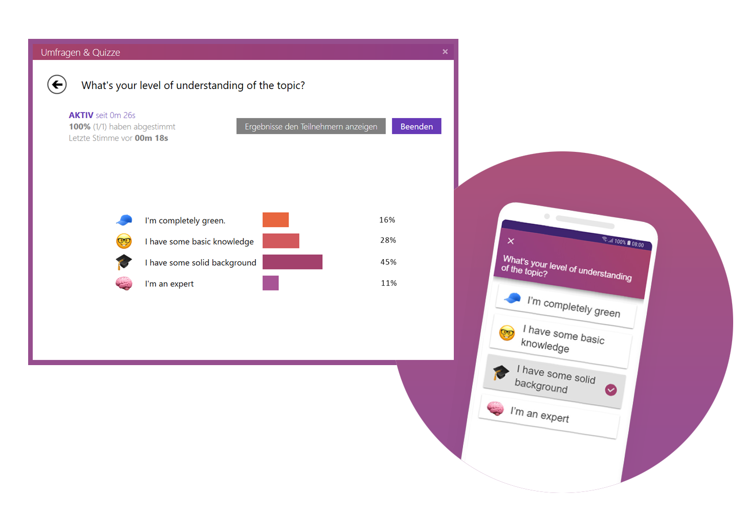
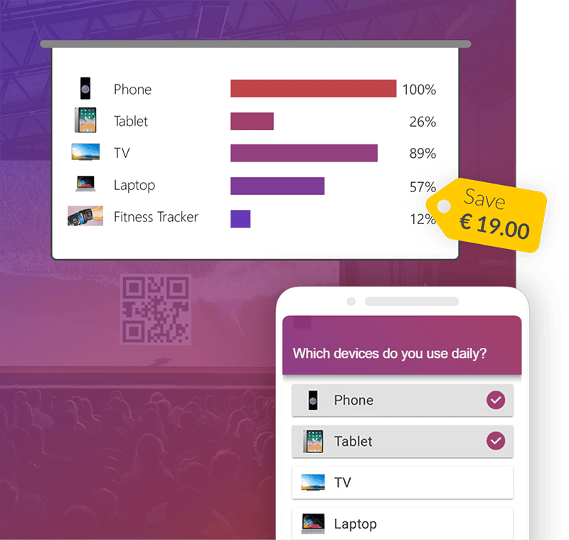
Our tip: Include interactive polls or quizzes in your presentation to involve your audience and increase their attention. With the help of SlideLizard, you can ask questions in PowerPoint and your audience can easily vote on their own smartphone. Plus, you can even get anonymous feedback at the end, so you know right away what you can improve next time.
Here we have also summarized further tips for you on how to increase audience engagement.
4. Avoid eye contact
You want your audience to feel engaged in your presentation, but if you avoid eye contact the whole time, they certainly won't. Avoid staring at just one part of the wall, at your paper or your computer. If the participants have the feeling that you are just talking to the wall, it is a bad presentation. Speak to your audience, involve them in your presentation and make it more exciting for them.
But also make sure you don't always look at the same two or three people, but address everyone. If the audience is large, it is often difficult to include everyone, but still try to let your eyes wander a little between your listeners and look into every corner of the room.
5. Speaking incoherently
Avoid jumping from one topic to the next and back again shortly afterwards. Otherwise your audience will not be able to follow you after a while and their thoughts will wander. To prevent this, it is important that your presentation has a good structure and that you work through one topic after the other.
Nervousness can cause even the best to mumble or talk too fast in order to get the presentation over with as quickly as possible. Try to avoid this by taking short pauses to collect yourself, to breathe and to remind yourself to speak slowly.

6. Many colors mixed with each other
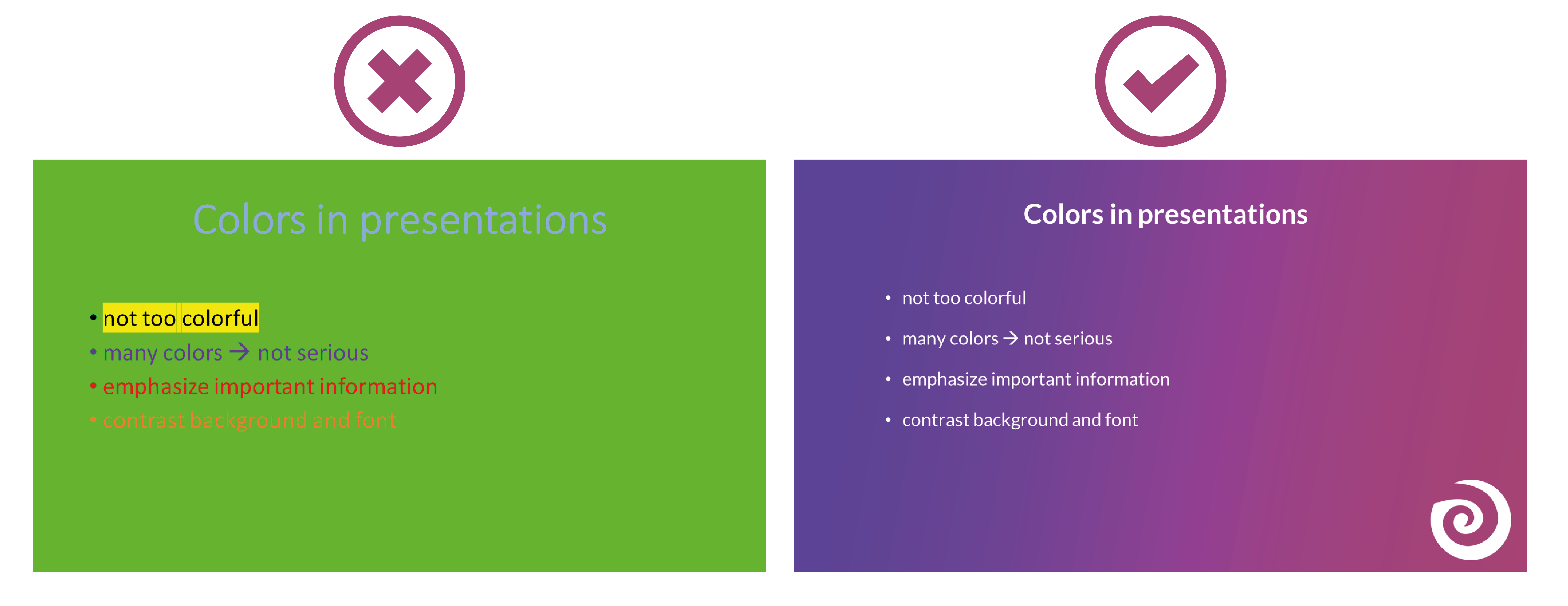
Make sure that your presentation is not too colorful. If you mix too many colours, bad presentation slides will result very quickly. A PowerPoint in which all kinds of colors are combined with each other does not look professional, but rather suitable for a children's birthday party.
Think about a rough color palette in advance, which you can then use in your presentation. Colors such as orange or neon green do not look so good in your PowerPoint. Use colors specifically to emphasize important information.
It is also essential to choose colors that help the text to read well. You should have as much contrast as possible between the font and the background. Black writing on a white background is always easy to read, while yellow writing on a white background is probably hard to read.
7. Too minimalistic design
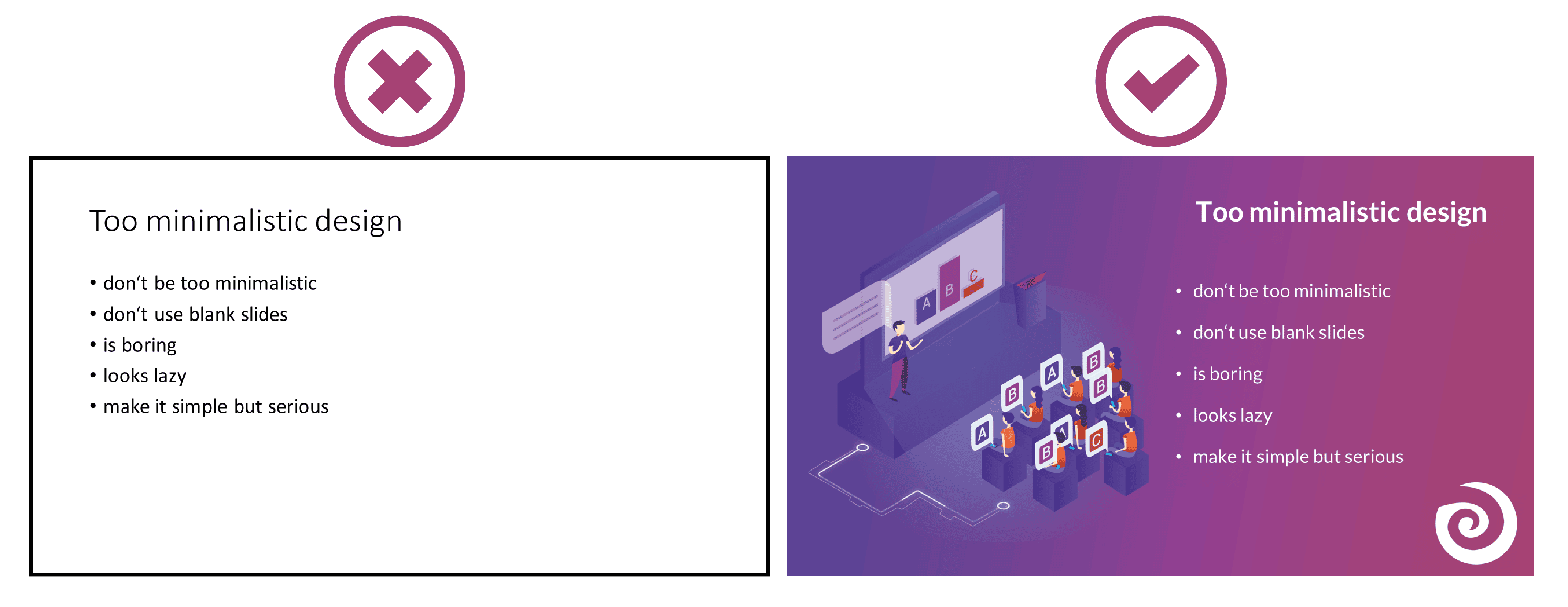
Even though it is often said that "less is more", you should not be too minimalistic in the design of your presentation. A presentation where your slides are blank and only black text on a white background is likely to go down just as badly as if you use too many colors.
Empty presentations are boring and don't really help to capture the attention of your audience. It also looks like you are too lazy to care about the design of your presentation and that you have not put any effort into the preparation. Your PowerPoint doesn't have to be overflowing with colors, animations and images to make it look interesting. Make it simple, but also professional.
8. Too much text
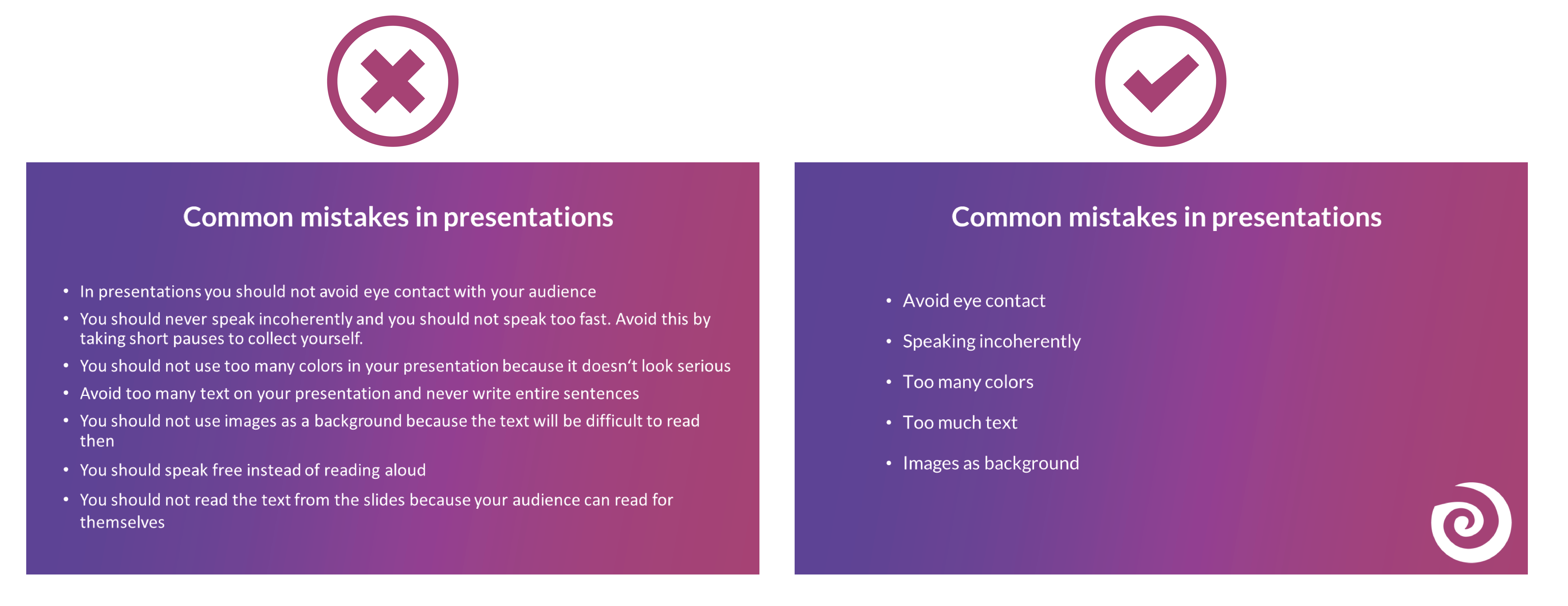
The slides of your presentation should never be overcrowded. Write only the most important key points on your slides and never entire sentences. Your audience should not be able to read exactly the text you are speaking in your PowerPoint. This is rather annoying and leads to being bored quickly. Summarize the most important points that your audience should remember and write them down in short bullet points on your presentation.
9. Many different animations
To avoid bad presentations it is important to never use too many animations. It looks messy and confusing if every text and image is displayed with a different animation. Just leave out animations at all or if you really want to use them then use them only very rarely when you want to draw attention to something specific. Make sure that if you use animations, they are consistent. If you use transitions between the individual slides, these should also always be kept consistent and simple.
10. Too many images
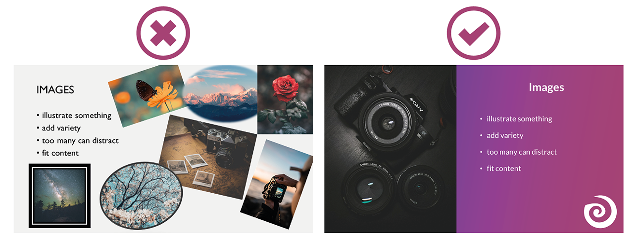
Bad presentation slides often occur when their design ist unclear and unorganised. Images and graphics in presentations are always a good idea to illustrate something and to add some variety. But don't overdo it with them. Too many images can distract from your presentation and look messy. Make sure that the graphics also fit the content and, if you have used several pictures on one slide, ask yourself whether you really need all of them.
11. Too many or unreadable fonts
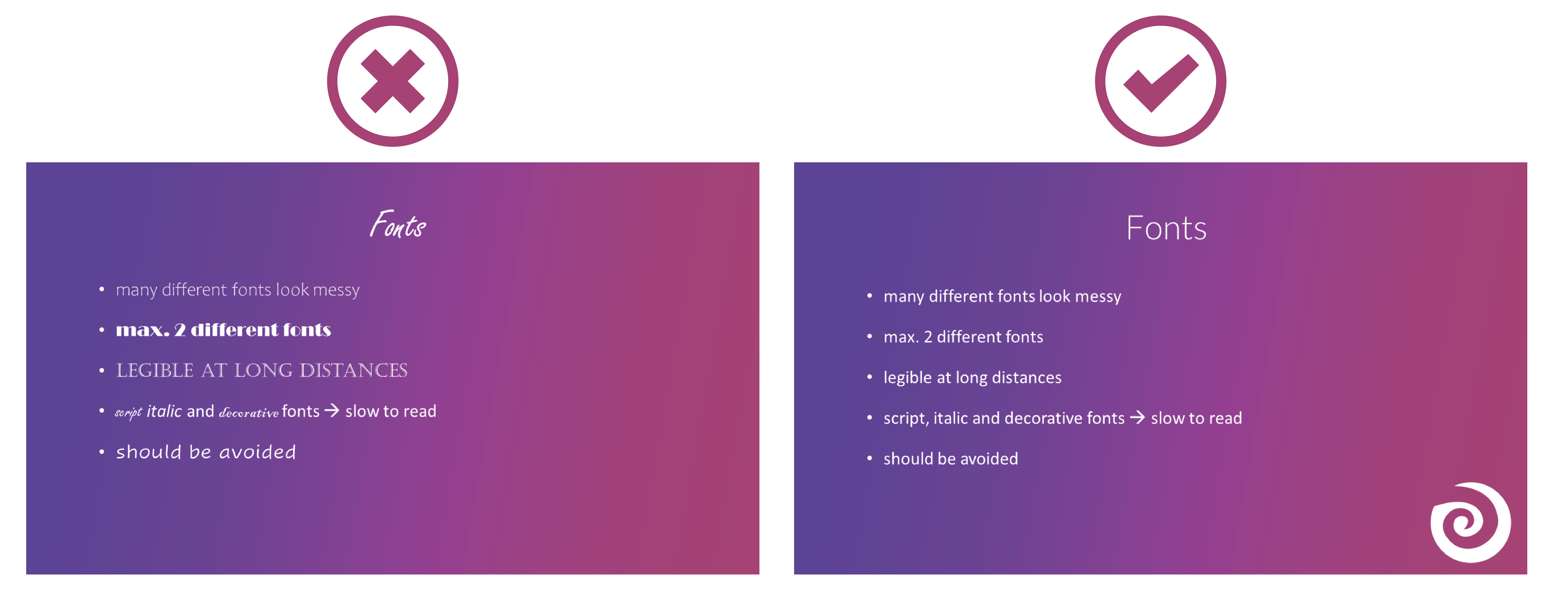
Never combine too many fonts so that your presentation does not look messy. Use at most two: one for headings and one for text. When choosing fonts, you should also make sure that they are still legible at long distances. Script, italic and decorative fonts are very slow to read, which is why they should be avoided in presentations.
It is not so easy to choose the right font. Therefore, we have summarized for you how to find the best font for your PowerPoint presentation.
12. Images as background
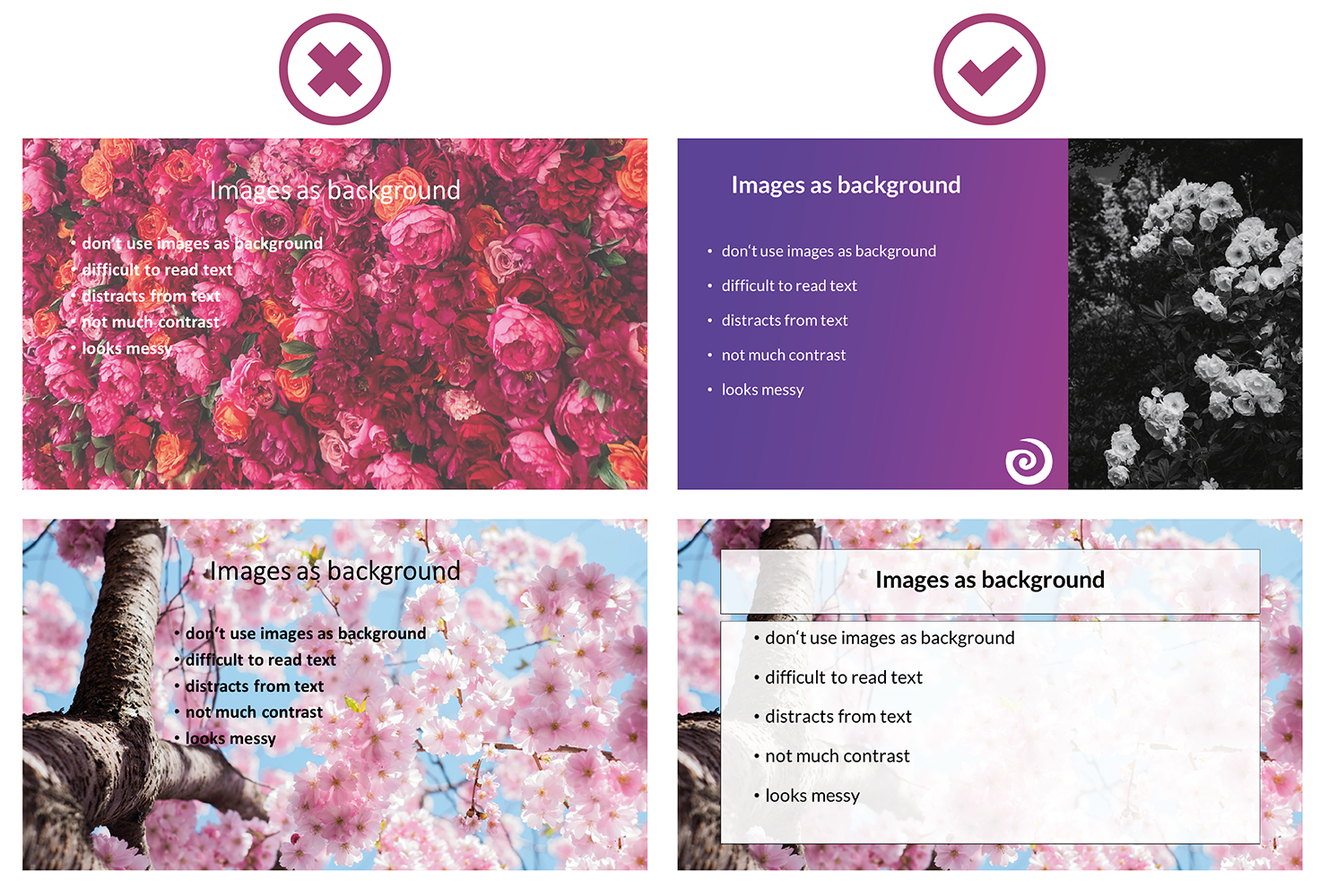
To avoid bad presentations, do not use images as slide backgrounds if there should be also text on them. The picture only distracts from the text and it is difficult to read it because there is not much contrast with the background. It is also harder to see the image because the text in the foreground is distracting. The whole thing looks messy and distracting rather than informative and clear.
13. Reading from the slides
Never just read the exact text from your slides. Your audience can read for themselves, so they will only get bored and in the worst case it will lead to "Death by PowerPoint". You may also give them the feeling that you think they are not able to read for themselves. In addition, you should avoid whole sentences on your slides anyway and only have listed key points that you go into more detail then.
14. Turn your back
Never turn around during your presentation to look at your projected PowerPoint. Not to read from your slides, but also not to make sure the next slide is already displayed. It looks unprofessional and only distracts your audience. In PowerPoint's Speaker View, you can always see which slide is currently being displayed and which one is coming next. Use this to make sure the order fits. You can even take notes in PowerPoint, which are then displayed during your presentation. You can read all about notes in PowerPoint here.
15. Forgetting the time
Always pay attention to the time given. It is annoying when your presentation takes much longer than actually planned and your audience is just waiting for you to stop talking or you are not able to finish your presentation at all. It is just as awkward if your presentation is too short. You have already told everything about your topic, but you should actually talk for at least another ten minutes.
Practice your presentation often enough at home. Talk through your text and time yourself as you go. Then adjust the length so that you can keep to the time given on the day of your presentation.

16. Complicated Structure
The structure of your presentation should not be complicated. Your audience should be able to follow you easily and remember the essential information by the end. When you have finished a part, briefly summarize and repeat the main points before moving on to the next topic. Mention important information more than once to make sure it really gets across to your audience.
However, if the whole thing gets too complicated, it can be easy for your audience to disengage after a while and not take away much new information from your presentation. So a complicated structure can lead to bad presentations and "Death by PowerPoint" pretty quickly.
17. Inappropriate clothes
On the day of your presentation, be sure to choose appropriate clothing. Your appearance should be formal, so avoid casual clothes and stick to professional dress codes. When choosing your clothes, also make sure that they are rather unobtrusive. Your audience should focus on your presentation, not on your appearance.

18. Inappropriate content
Think about who your audience is and adapt your presentation to them. Find out how much they already know about the topic, what they want to learn about it and why they are here in the first place. If you only talk about things your audience already knows, they will get bored pretty soon, but if you throw around a lot of technical terms when your audience has hardly dealt with the topic at all, they will also have a hard time following you. So to avoid "Death by PowerPoint" in this case, it is important to adapt your presentation to your audience.
You can also ask a few questions at the beginning of your presentation to learn more about your audience and then adapt your presentation. With SlideLizard , you can integrate polls directly into your PowerPoint and participants can then easily answer anonymously from their smartphone.
19. Too much or unimportant information
Keep it short and limit yourself to the essentials. The more facts and information you present to your audience, the less they will remember.
Also be sure to leave out information that does not fit the topic or is not relevant. You will only distract from the actual topic and lose the attention of your audience.
20. Monotone voice
If you speak in a monotone voice all the time, you are likely to lose the attention of your audience. Make your narration lively and exciting. Also, be careful not to speak too quietly, but not too loudly either. People should be able to understand you well throughout the whole room. Even if it is not easy for many people, try to deliver your speech with confidence. If you are not enthusiastic about the topic or do not seem enthusiastic, you will not be able to get your audience excited about it.

Examples of bad presentations to download
We have created a PowerPoint with examples of bad presentation slides and how to do it right. You can download it here for free.
Related articles
About the author.

Helena Reitinger
Helena supports the SlideLizard team in marketing and design. She loves to express her creativity in texts and graphics.
Get 1 Month for free!
Do you want to make your presentations more interactive.
With SlideLizard you can engage your audience with live polls, questions and feedback . Directly within your PowerPoint Presentation. Learn more

Top blog articles More posts

Effective Feedback for Presentations - digital with PowerPoint or with printable sheets
Best Sources for free Icons to use in PowerPoint Presentations
Get started with Live Polls, Q&A and slides
for your PowerPoint Presentations
The big SlideLizard presentation glossary
Vocalized pause.
A vocalized pause means the pause when the silence between words is filled by the speaker with vocalizations like "um", "uh" and "er".
Slide Layouts
PowerPoint has different types of Slide Layouts. Depending on which type of presentation you make, you will use more or less different slide layouts. Some Slide Types are: title slides, section heading slides, picture with caption slides, blank slides.
.odp file extension
.odp files are similar to .ppt files. It's a presentation which was created with Impress and contains slides with images, texts, effects and media.
Distributed Audience
A Distributed Audience means that the audience you are trying to reach is spread over long distances.
Be the first to know!
The latest SlideLizard news, articles, and resources, sent straight to your inbox.
- or follow us on -
We use cookies to personalize content and analyze traffic to our website. You can choose to accept only cookies that are necessary for the website to function or to also allow tracking cookies. For more information, please see our privacy policy .
Cookie Settings
Necessary cookies are required for the proper functioning of the website. These cookies ensure basic functionalities and security features of the website.
Analytical cookies are used to understand how visitors interact with the website. These cookies help provide information about the number of visitors, etc.

Bad Presentations: How To Avoid Common Presentation Pitfalls In 2023
Table of contents.
It’s easy to make a presentation, but it’s difficult to make a good presentation.
There are simple mistakes that are made when it comes to the fine art of designing and performing a presentation if you haven’t been doing it for the past 15 years, over and over, like we have!
In this article we explore the common pitfalls most presentation designers/presenters make , and how you can avoid them.
What Impact Can A Bad Presentation Have?
Bad presentations and good presentations have something in common, they’re memorable. Whether it’s a speech at a wedding, or pitching to investors, if it’s bad, it stands out.
The impact a bad presentation can have on your, your business or your brand is profound. It’s more than just the performance on the day. In today’s world, everyone is connected and people talk. It’s difficult to shift your image if you make the wrong impression.
Below are just a few hurdles you can expect to face if your presentation bombs.
Loss Of Confidence In You Or Your Company
When you have or give a bad presentation, it’s easy for your audience to lose confidence in you. After all, at that moment in time, you’re the face of the company and a direct representation of who you represent.
If you drop the ball, that’s what your audience is going to expect you to do if they decide to partner with you. How can they do business or trust in you if they don’t have confidence in you.
Fortunately, we understand how much hard work, time, and dedication it takes just to get the opportunity to deliver a presentation to your audience, your clients, your investors, or your own company. Which is why our presentation design services will help take care of the visual and organizational side of your slides.
We Can Make You Look Goood!
You Can Develop A Negative Reputation
Ineffective presentations are a waste of time, and as we all know, time is valuable. Simple things like unpreparedness, lack of audience engagement, talking too much, a poorly structured or visual presentation design.
These things DO NOT go unnoticed and you will develop a reputation that will most certainly work against you professionally. It takes a lot more work to repair damage that it does to put your best foot forward in the first place.
Slower Business Growth
If your presentation misses out on the key points and the words you’ve chosen for your slides are poor, you will experience slower business growth as there is less information for your audience about your brand. If they are missing out on the key idea because your slides are too simple, they won’t want to buy into your brand.
Here Are The Most Common Mistakes You Can Make With Your Presentation
There’s common mistakes that are both easy to make and easy to avoid if you know what you are looking for. There are common mistakes presenters make because most presentations have too much information, pictures and the information that you as the presenter are trying to communicate gets lost in the jumble of the presentation.

Talking Too Much About Yourself
Presenters who spend too much time speaking about themselves while they present is one example of a common mistake. The audience members want the informative information about your brand, not the informative information about you as the speaker.
Focusing Too Much On Facts And Not Storytelling
You want to engage your audience by using both facts and storytelling to sell them on your brand. If you focus too much on facts, it’s the worst thing you can do for your presentation because you’ll quickly lose your audience’s attention.
Poorly Designed Visual Aids
Visual aids are important to making a great presentation, but not if they are poorly designed. It’s important to have engaging visual aids, dark text on white background is a great way to focus the audience’s attention. Make your presentation your own by choosing well designed visual aids that add to your presentation as a whole.
Disorganized Information (No Logic Or Order)
Are your slides all over the place? Your examples don’t make sense to your brand? The worst presentations are hard to follow, confusing and distracting from the main points. An audience wants to sit through an engaging presentation, and by having order and logic to your slides with words that point back to your idea, you will capture their attention and keep them captivated.

Too Much Information
If you have too many points on your slides, or paragraphs that you’ll be reading off during your presentation, you have too much information. Have less on the slides, keep to the point and spend more time talking directly to your audience rather than reading to them.
No Engagement Or Interaction
A common pitfall that is easy to fall into, is not interacting with the audience members, by making eye contact, allowing time for questions or asking questions to the audience. They are sitting right in front of you (Physically or Virtually) so interact with them right from the beginning so they expect it throughout the presentation. If you need some tips on how to make a presentation interactive , we’ve got you covered.
If you’re looking for a few tips on, this article on being a better presenter can help.
Reading Directly From Your PowerPoint Presentation
When you read directly from the PowerPoint Presentation, your body language is not open to the audience, and it means that you aren’t engaging with either the material or your listeners. If you spend time in preparation and writing out what you will be saying, you can speak directly to the audience and portray confidence in your brand. By purposefully making eye contact, you are connecting with those who are listening to you.
Ending The Presentation Abruptly
When you finish your talk and forget to allow time for questions, you are sending a message that you don’t care about the audience’s understanding of the material you have presented. All it takes is one slide to finish a presentation well and leave space for the audience to ask questions.

Animation Overload
When you overload on animation, you make your presentation look cheap and distracting from your important points. It’s an easy way to make ineffective presentations, as it’s distracting to the main goal of your presentation. Keep animations to a minimum and bullet points on your slides instead to create engaging presentations.
So Is A Bad Presentation Worth The Risk?
Don’t talk too much about yourself, but tell stories about your brand so the audience can connect with you as the presenter and your company. You want to engage with the audience through well chosen visual aids, and keep order to your information both in your slides and your speech. Don’t overload in cheap looking animations and always leave room for your audience to ask questions at the end.
It’s best to be prepared, put our best foot forward and invest the time/money in making sure you’re well rehearsed and have some kick ass slides to back you up. Effort and intent are noticed, as long as they’ve been put it.
Are You In Need Of A Good Presentation To Give The Right Impression?
Your slides are more than just beautiful graphics, they’re opportunities for you to share your stories/ideas. Leave the PowerPoint, Prezi, Google Slides to us and focus on nailing the public speaking part!
Just click the button below and get the conversation started today! We’re here to support you, so connect with a Presentation Geek and take the first step towards a presentation that blows your competition out of the water.
Author: Content Team
Related posts.

FREE PROFESSIONAL RESOURCES DELIVERED TO YOUR INBOX.
Subscribe for free tips, resources, templates, ideas and more from our professional team of presentation designers.

How it works
For Business
Join Mind Tools
Article • 9 min read
10 Common Presentation Mistakes
Avoiding common pitfalls in your presentations.
By the Mind Tools Content Team

Most of us have experienced dull, irrelevant or confusing presentations. But think back to the last really great presentation you saw – one that was informative, motivating and inspiring. Wouldn't you love to be able to present like that?
This article looks at 10 of the most common mistakes that speakers make when giving presentations. By avoiding these, you'll make your presentations stand out – for all of the right reasons, and none of the wrong ones.
Mistake 1: Not Preparing Enough
Steve Jobs was a famously inspiring speaker. His speeches may have looked effortless, but, in reality, each one took days or weeks of preparation.
Careful preparation is essential. The amount of time you spend on planning depends on your situation, but it's a good idea to start early – you can never be too well-prepared.
Proper preparation also helps you to manage presentation nerves . When you know your material inside and out, you're far less likely to feel nervous. Our presentation planning checklist and Skillbook " Even Better Presentations " can help you to plan your next event properly.
Mistake 2: Not Familiarizing Yourself With the Venue and Equipment
Imagine that your presentation starts in an hour. You arrive at the venue and, to your horror, the projector won't work with your laptop. The slides you spent hours preparing are useless. This is a disaster!
You can avoid a situation like this by taking time to familiarize yourself with the venue and available equipment at least once before your presentation.
Often, the sorts of problems that can jeopardize your presentation will be situations beyond your control, but this doesn't mean that you're helpless. Conduct a risk analysis to identify potential issues, and come up with a good "Plan B" for each one.
Mistake 3: Ignoring Your Audience
Sometimes, speakers can get so wrapped up in delivering their presentations that they forget about the needs of their audience.
Start your presentation by telling your audience what to expect. Let them know what you'll cover first, whether and when you'll stop for a break, if you'll be taking questions during the presentation, and so on.
Providing these "signposts" up front will give your audience a clear idea of what to expect, so that they can relax and concentrate on your presentation.
Mistake 4: Using Inappropriate Content
The primary purpose of any presentation is to share information with others, so it's important to consider the level you'll pitch it at.
Do some research on your audience. Why are they here? How much do they already know about your topic, and what do they most want to learn from you? It's no use giving a presentation that's so full of jargon that no one understands you. But you wouldn't want to patronize people, either.
Try to put yourself in people's shoes, to get a clearer idea about their needs and motivations. You can also greet individuals as they arrive on the day, and ask questions to get a feel for their level of knowledge. This will also help you to personalize your presentation and make a connection with each person in your audience, so that they'll be more attentive to what you say.
Mistake 5: Being Too Verbose
Short, concise presentations are often more powerful than verbose ones. Try to limit yourself to a few main points. If you take too long getting to your point, you risk losing your audience's attention.
The average adult has a 15- to 20-minute attention span. So, if you want to keep your audience engaged, stick to the point! During the planning phase, make a note of the themes you want to cover and how you want to get them across. Then, when you start filling out the details, ask yourself: "Does my audience really need to know this?"
Our articles on the 7 Cs of Communication and Communications Planning have more tips for communicating in a clear, concise way.
Mistake 6: Using Ineffective Visuals
Poor slides can spoil a good presentation, so it's worth spending time getting yours right.
We've all seen slides with garish colors, unnecessary animation, or fonts that are too small to read. The most effective presentation visuals aren't flashy – they're concise and consistent.
When choosing colors, think about where the presentation will take place. A dark background with light or white text works best in dark rooms, while a white background with dark text is easier to see in a brightly lit room.
Choose your pictures carefully, too. High-quality graphics can clarify complex information and lift an otherwise plain screen, but low-quality images can make your presentation appear unprofessional. Unless an image is contributing something, embrace the negative space – less clutter means greater understanding. Use animation sparingly, too – a dancing logo or emoji will only distract your audience.
Mistake 7: Overcrowding Text
The best rule of thumb for text is to keep it simple . Don't try to cram too much information into your slides. Aim for a maximum of three to four words within each bullet point, and no more than three bullets per slide.
This doesn't mean that you should spread your content over dozens of slides. Limit yourself to 10 slides or fewer for a 30-minute presentation. Look at each slide, story or graph carefully. Ask yourself what it adds to the presentation, and remove it if it isn't important.
Mistake 8: Speaking Incoherently
Even though we spend a significant part of the day talking to one another, speaking to an audience is a surprisingly difficult skill, and it's one that we need to practice.
If nerves make you rush through a presentation, your audience could miss your most important points. Use centering or deep breathing techniques to suppress the urge to rush. If you do begin to babble, take a moment to collect yourself. Breathe deeply, and enunciate each word clearly, while you focus on speaking more slowly.
Our article on better public speaking has strategies and tips that you can use to become a more engaging speaker. One useful technique is storytelling – stories can be powerful tools for inspiring and engaging others. Our Expert Interviews with Annette Simmons and Paul Smith have tips that you can use to tell great stories.
Mistake 9: Showing a Lack of Dynamism
Another common mistake is to freeze in one spot for the duration of your presentation.
Some presenters feel most comfortable behind the podium. Try to emulate great speakers like Steve Jobs , who moved purposefully around the stage during his presentations.
As well as working the stage, he used gestures and body language to communicate his excitement and passion for his subject. Pay attention to what your hands are doing – they're important for communicating emotion. But only use gestures if they feel natural, and avoid being too flamboyant with your arms, unless you want to make your audience laugh!
See our Expert Interview, " Winning Body Language ," to learn more about body language and what it says to your audience.
Mistake 10: Avoiding Eye Contact
Have you ever been to a presentation where the speaker spent all of their time looking at their notes, the screen, the floor, or even at the ceiling? How did this make you feel?
Meeting a person's gaze establishes a personal connection, and even a quick glance can keep people engaged. If your audience is small enough, try to make eye contact with each individual at least once.
If the audience is too large for this, try looking at people's foreheads. The individual may not interpret it as eye contact, but those sitting around them will.
It takes practice and effort to deliver a good presentation. But, if you know how to avoid the pitfalls, your presentations will be great.
Common presentation mistakes include not preparing properly, delivering inappropriate content, and speaking poorly.
Time spent on careful planning always pays dividends. Check out the venue, and familiarize yourself with equipment in advance to avoid possible problems.
Keep your content clear and concise, with visual aids to match. And make sure that you pitch it at the right level for your audience's understanding, so that your presentation doesn't patronize or bewilder.
Remember, public speaking is a performance. Practice speaking clearly with a slower pace than your normal speech to avoid "rapid-fire" delivery. Use eye contact, body language and gestures that complement your message to keep your audience engaged.
Infographic
See 10 Common Presentation Mistakes represented as an infographic .
You've accessed 1 of your 2 free resources.
Get unlimited access
Discover more content
Expert Interviews
The Art of Public Speaking
With Professor Steve Lucas
Great Presentations
Add comment
Comments (0)
Be the first to comment!

Get 20% off your first year of Mind Tools
Our on-demand e-learning resources let you learn at your own pace, fitting seamlessly into your busy workday. Join today and save with our limited time offer!
Sign-up to our newsletter
Subscribing to the Mind Tools newsletter will keep you up-to-date with our latest updates and newest resources.
Subscribe now
Business Skills
Personal Development
Leadership and Management
Member Extras
Most Popular
Newest Releases

Pain Points Podcast - Balancing Work And Kids

Pain Points Podcast - Improving Culture
Mind Tools Store
About Mind Tools Content
Discover something new today
Pain points podcast - what is ai.
Exploring Artificial Intelligence
Pain Points Podcast - How Do I Get Organized?
It's Time to Get Yourself Sorted!
How Emotionally Intelligent Are You?
Boosting Your People Skills
Self-Assessment
What's Your Leadership Style?
Learn About the Strengths and Weaknesses of the Way You Like to Lead
Recommended for you
How to write a job description.
Advertising for the Ideal Candidate
Business Operations and Process Management
Strategy Tools
Customer Service
Business Ethics and Values
Handling Information and Data
Project Management
Knowledge Management
Self-Development and Goal Setting
Time Management
Presentation Skills
Learning Skills
Career Skills
Communication Skills
Negotiation, Persuasion and Influence
Working With Others
Difficult Conversations
Creativity Tools
Self-Management
Work-Life Balance
Stress Management and Wellbeing
Coaching and Mentoring
Change Management
Team Management
Managing Conflict
Delegation and Empowerment
Performance Management
Leadership Skills
Developing Your Team
Talent Management
Problem Solving
Decision Making
Member Podcast
- PowerPoint Themes
- Latest PowerPoint Templates
- Best PowerPoint Templates
- Free PowerPoint Templates
- Simple PowerPoint Templates
- PowerPoint Backgrounds
- Project Charter
- Project Timeline
- Project Team
- Project Status
- Market Analysis
- Marketing Funnel
- Market Segmentation
- Target Customer
- Marketing Mix
- Digital Marketing Strategy
- Resource Planning
- Recruitment
- Employee Onboarding
- Company Profile
- Mission Vision
- Meet The Team
- Problem & Solution
- Business Model
- Business Case
- Business Strategy
- Business Review
- Leadership Team
- Balance Sheet
- Income Statement
- Cash Flow Statement
- Executive Summary
- 30 60 90 Day Plan
- SWOT Analysis
- Flow Charts
- Gantt Charts
- Text Tables
- Infographics
- Google Slides Templates
- Presentation Services
- Ask Us To Make Slides
- Data Visualization Services
- Business Presentation Tips
- PowerPoint Tutorials
- Google Slides Tutorials
- Presentation Resources

The Best And Worst PowerPoint Presentation Examples
Who wouldn’t appreciate a PowerPoint presentation that is eye-catching and easy to understand? With the best and worst PowerPoint presentation examples below, you’ll know what makes a good PowerPoint presentation and what makes a bad one.

Engaging presentations are the lifeblood of effective communication in today’s information-driven world. Whether you’re in a boardroom pitching a new idea, standing in front of a classroom of curious learners, or delivering a keyote speech to an interested investor, the ability to create and deliver engaging presentations is a skill that can truly make or break your message.
Various elements contribute to making a presentation good or bad, from compelling visuals to persuasive delivery; these factors collectively influence how your ideas are received and remembered. So, in this article, we will look at some of the good and bad presentation examples to help you transform your presentations and make them more engaging.
Main Differences Between Good V/S Bad PowerPoint Slides
Knowing the difference between the best and worst PowerPoint presentations is vital for creating engaging presentations.
What Makes A Good PowerPoint Presentation?
Have you ever wondered how you differentiate between a good design v/s bad design PPT? In this section, we’ll look at some examples of making PowerPoint presentations that inspire and engage the audience. Look at what’s behind the slides that stick in mind long after the projector is turned off:
- Less text, more impact
- Choose a color scheme that works
- Proper balance of animation and texts
- Logical flow of information
- Context-relevant graphics or illustrations
READ MORE: The Golden Rules for Impactful Presentations
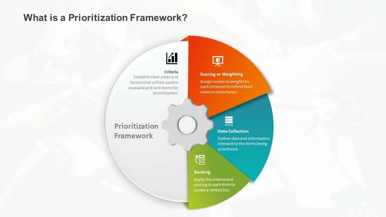
1. Less Text, More Impact
Imagine your presentation as a visual storybook. Less text on each slide means your audience can focus on your story, not squint at paragraphs. Use striking images or a single powerful phrase to grab attention. It makes your presentation look impressive and helps people remember the article’s key points. Keeping about 30 words per slide or 6-8 lines in your presentation will help maintain a proper flow of words and pictures, resulting in a fluid presentation.
2. Choose A Color Scheme That Works
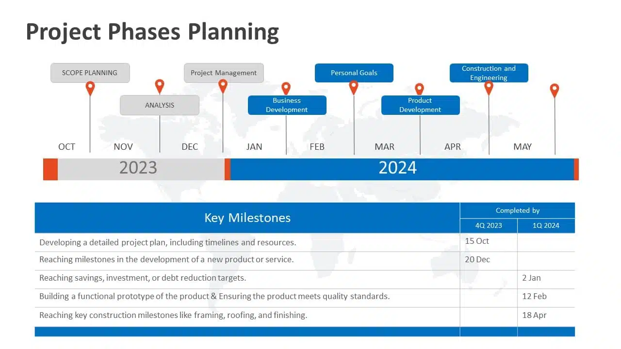
You don’t need to be an artist to pick the right colors. A good presentation uses colors that work together nicely. Choosing harmonizing colors can guide the audience to focus on important information. Choose colors that look good together and don’t hurt the eyes. Microsoft Office’s color schemes can save the day if you’re short on ideas. Avoid using light colors on a dark background and vice versa.
3. Proper Balance Of Animation And Texts
Animations and transitions can be like party crashers in your presentation if not used wisely. They might steal the show from your message. A top-notch presentation keeps both animations and texts in check, ensuring they don’t overpower each other. However, don’t ditch them altogether! Use transitions and animations only to highlight key points. For example, make bullet points appear individually instead of all at once. It keeps your audience focused.
READ MORE: How to add animation in PowerPoint?
4. Logical Flow Of Information
Think of your presentation as a road trip. Imagine if your GPS gave you all mixed up directions. Chaos, right? Similarly, your slides need a logical order and a roadmap. Maintaining the logical flow of your slides helps the audience follow the information easily. A logical flow makes your message clear and easy to remember. It’s like telling a great story with a beginning, middle, and end.
EXPLORE: Flowchart PowerPoint Templates
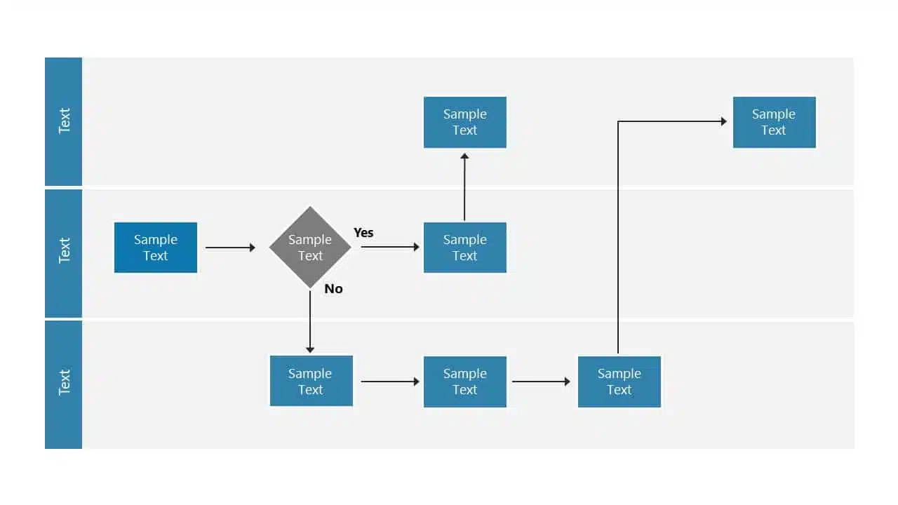
5. Context-Relevant Graphics Or Illustrations
A picture speaks volumes. Our brains love visuals. Using context-related graphs, photos, and illustrations that complement your slides can amp up important pointers and keep your audience engaged during the presentation. However, while presenting, make sure to explain why a graphic or a picture is there. Explaining the graphics verbally makes your message crystal clear and memorable.
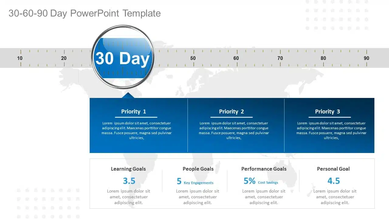
EXPLORE: Want to create stunning presentations? Check out our presentation services !
A PowerPoint presentation shall excel in these aspects of making it engaging, informative, and memorable. These good PowerPoint presentation examples could help you make a better PPT in one or more areas, not leaving the audience disengaged or confused.
While it’s important to look at good presentation examples, it’s equally important to avoid mistakes that can turn your presentation dull.
What Makes A Bad PowerPoint Presentation?
Ever been in a room with a presentation that made you want to escape through the nearest exit? We’ve all been there! In this section, we’ll highlight some common mistakes that turn a good presentation into a dull one. With many examples of good and bad PowerPoint slides on the internet, we have listed some bad examples that show the ‘DON’Ts’ and ‘AVOID AT ALL COSTS’ of PowerPoint mistakes:
- Image behind the text
- Using only bullet points and no paragraphs
- Having no symmetry in texts and pointers
- Being too minimal
- Keeping text too small
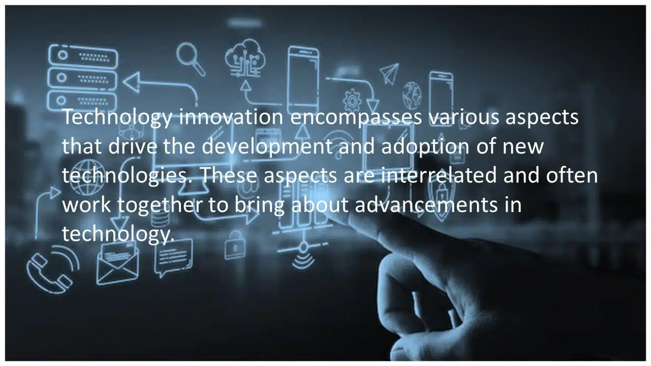
1. Image Behind The Text
Anyone who considered utilizing an image as a background most likely missed the memo. Text and images simply do not work together. One of the worst PowerPoint presentation examples is text overlaid on an image. Keeping the image in the background complicates understanding the text, and the main image should be clarified. Finding a text color that shines out in the background is nearly tough because all of those colors merely draw your attention away from the words. To avoid this calamity, avoid utilizing photos as slide backgrounds when you have text to highlight.
EXPLORE: Best PowerPoint Backgrounds Collection
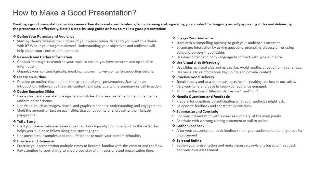
2. Using Only Bullet Points And No Paragraphs
To make a presentation audience-friendly, reducing paragraphs to bullet points is a wise choice. However, it is critical to emphasize that this is more than simply putting only bullet points and leaving out all paragraphs. Using 5-8 bullet points is ideal for a slide. If the text size shrinks to 12 or 10 points, you’ve written a lot. Lengthy bullet points tend to bore the audience; some might even think of them as paragraphs.
3. Having No Symmetry In Texts And Pointers
A lack of balance or alignment between textual material and supporting visual elements, such as arrows, bullets, etc., can make your presentations appear unpleasant. When text and pointers are strewn about, it’s difficult for the audience to follow a logical flow of information; a common bad PowerPoint slide example to avoid at any cost. Your audience will be obsessed with deciphering the relationship between the text and graphics if your presentation needs more harmony.
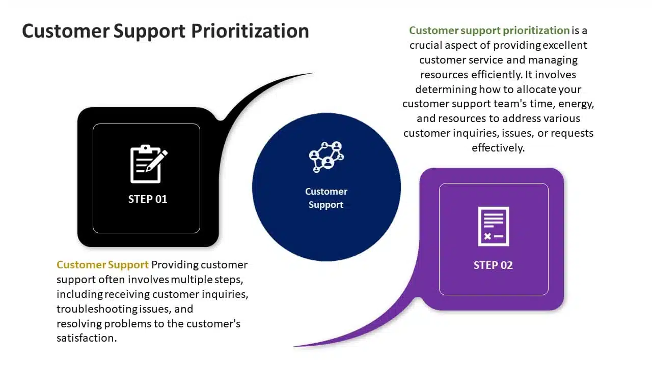
4. Being Too Minimal
Being too minimalistic is as bad as overdoing it. Not having the required text on slides or keeping them blank makes them dull and non-engaging. You don’t need a color explosion or too many texts, but bringing some life to your slides is always a good idea. Using pre-made PowerPoint templates is a good idea to keep your content balanced; however, it is best not to leave blank spaces. A blank slide with no colors or text might give the impression of minimal effort. Strive for a balanced approach to keep your audience engaged and awake.
EXPLORE: 40,000+ PowerPoint Templates and Google Slides Themes

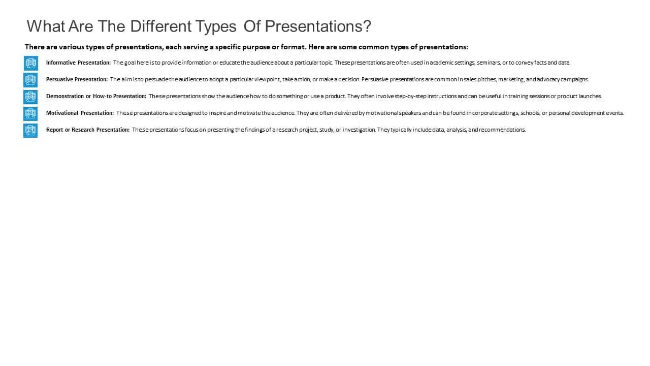
5. Keeping Text Too Small
Another thing to avoid is making your font size too tiny, almost like the size of a peanut. The size of the font is extremely important in any presentation. Think of it like trying to enjoy a beautiful scenic view through a tiny keyhole – not very enjoyable, is it? It’s the same with your PowerPoint. Your slides can be perfect with great colors, and graphics, but it’s a bummer if your audience can’t read them. A simple trick is to stand at the back of the room where you’ll present. If you can read the font comfortably, then you should be fine!
READ MORE: Best Presentation Fonts
A bad PowerPoint presentation will dismiss all your efforts and disengage your audience. To look more, avoid these bad PowerPoint presentation examples at any cost while making your next presentation.
We have carefully curated a visual appearance of how your PowerPoint presentations change by following the aforementioned points.
A good PowerPoint presentation is a balance – not too much, not too little. It’s about enhancing your message, not taking the spotlight away from you. However, striking that balance requires a lot of practice and trial and error.
You can always opt for presentation design services , like SlideUpLift. It gives you the advantage and access to presentation specialists. We design visually appealing presentations, with modern design elements, graphics, and illustrations; maintaining a perfect balance of every element.
Whether you want to customize your slides completely or just tailor the color or font, we ensure that your brand or personal style always reflects in your presentation.
Explore from our collection of 40,000+ PowerPoint templates and Google Slides themes. Utilize our presentation design services to create stunning PPTs. Give us a try with our custom-slides service , or schedule a call with us to know more!
What is the biggest difference between the best and worst PowerPoint presentations?
A good PowerPoint presentation effectively communicates its message, engages the audience, and uses visuals, layout, and content in a clear and compelling manner. In contrast, a bad PPT has cluttered slides, too much text, poor design choices, or distracting elements that hinder understanding.
How can I avoid making a bad PowerPoint presentation?
To avoid creating a bad PowerPoint presentation, focus on simplicity, use visuals wisely, keep text concise, maintain a logical flow, use appropriate fonts and colors, and avoid excessive animations or irrelevant content. Seek feedback from peers or experts to improve your overall presentation.
What role do visuals play in differentiating a good design v/s bad design PPT?
In a good presentation, visuals support and clarify key points. While in a bad one, they may be excessive, distracting, or irrelevant, overshadowing the main message.
How important is the audience's experience in determining the quality of a PowerPoint presentation?
The audience’s experience is essential in evaluating a presentation. A good PPT keeps the audience engaged and attentive compared to a bad PPT, which leads to disengagement and confusion.
How can I fix my bad PowerPoint presentation?
You can fix your PowerPoint presentation by opting SlideUpLift as your presentation buddy. With over 40,000+ PowerPoint Templates and Google Slides Themes to explore, you can choose what’s best for you. In case you have very specific presentation needs, you can opt for their presentation design services or custom slide service to create stunning PPTs. Schedule a call to know more.
Table Of Content
Related presentations.

FlowChart PowerPoint Template Collection
SWOT Analysis PowerPoint Templates Collection

List PowerPoint Template Collection
Related blogs.

10 Bad PowerPoint Slides Examples to Avoid

10 Best Animated PowerPoint Templates

10 Best Business PowerPoint Templates for Presentations

10 Best Business Presentation Topics to Captivate Your Audience
Tags and categories, privacy overview.
Necessary cookies are absolutely essential for the website to function properly. This category only includes cookies that ensures basic functionalities and security features of the website. These cookies do not store any personal information
Any cookies that may not be particularly necessary for the website to function and is used specifically to collect user personal data via ads, other embedded contents are termed as non-necessary cookies. It is mandatory to procure user consent prior to running these cookies on your website.

7 PowerPoint mistakes that are killing your presentation

By Paul Moss
Join 100k+ subscribers on our YouTube channel and enjoy highly engaging lessons packed full of best practices.
A few careless powerpoint mistakes can dramatically impact both the effectiveness and professionalism of your presentation..
Over the course of my career in consulting and strategy (and as a PowerPoint instructor for those industries), I’ve seen a lot of slides – great slides, terrible slides, and everything in-between. And what I’ve come to learn is that there’s a handful of common PowerPoint mistakes that many people don’t realize are hurting their presentation.
In this post I’m going to talk about the mistakes I see most often. I’ll give some basic examples of each mistake, explain why it hurts the presentation, and show you what you should be doing instead.
For the list, I’ll mostly be focusing on corporate style presentations, like what you’re likely to see day to day in the business world, but many of the lessons can be applied to other types of presentations as well.
If you’re interested in learning more about how to build your own high-quality PowerPoint slides, make sure you check our our advanced courses.

FREE Slide Design Course
Enroll in our free 5-day email course and learn how to design slides like a McKinsey consultant.
Complete hands-on exercises , review a realistic consulting case study , and get personalized feedback from your instructor!
Plus get a free copy of our Top 50 PowerPoint Shortcuts for Consultants cheat sheet.
Learn More ➔
Success! Please check your email.
We respect your privacy. Unsubscribe anytime.
Table of Contents
1. Complicated Visualizations
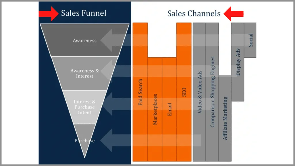
Your job as a slide creator is to make it as easy as possible for the audience to understand your message, and unnecessarily complicated visuals don’t help you do that. Instead, they just confuse the audience.
In this slide from Muckerlab there is a simple sales funnel on the left, with various sales channels on the right. With enough time I can figure out the message, but it’s a bit challenging for my brain to map sales channels to the various stages of the funnel.
“Ecommerce & Digital Marketing” Muckerlab, 2014
You might think that your visual is easy enough to understand, but remember that the audience hasn’t had the same amount of time to look at the slide as you have, so it’s much more difficult for them to grasp the key takeaway quickly.
In the slide below from Edelman there are four different charts, but each one is communicating the same type of information. By mixing up the chart style like this it makes the slide overly complicated. Instead of showing four simple column charts, they’ve forced the audience to understand and interpret each type independently. This just makes it harder for the audience to grasp the key takeaways of the slide.

“Global Deck” Edelman Trust Barometer, 2012
Instead, ask yourself, what’s the key takeaway of the slide, and how does my chart or graphic help support that key takeaway. Avoid trying to make yourself look smart, and instead figure out the simplest way to communicate the idea you’re trying to communicate.
This slide from Credit Suisse is a great example of keeping the chart simple and clear. It’s just a normal-looking stacked column chart with easy to read data labels, a clear background, and a simple takeaway. The result is an effective and professional looking slide that’s easy for the audience to understand.
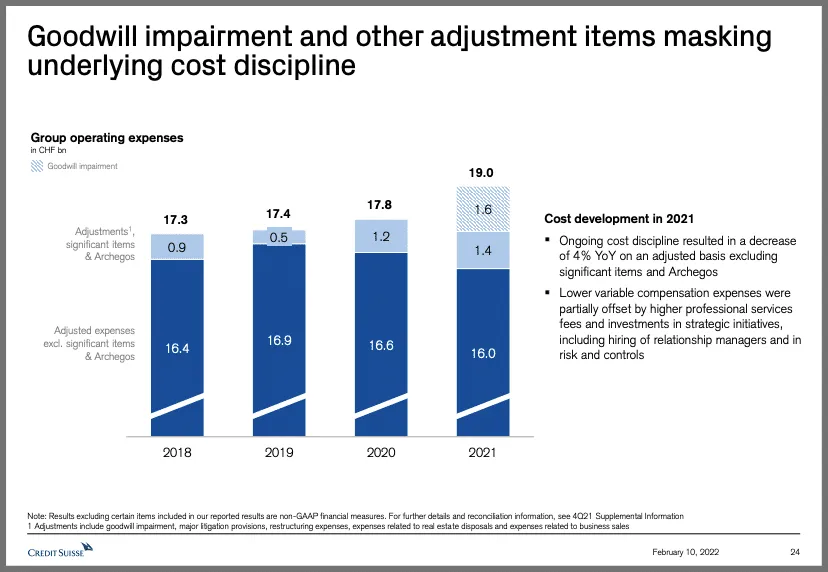
“Analyst and Investor Call” Credit Suisse, 2022
2. Simple Titles
The point of a title on a slide is to get a quick summary of the slide’s main takeaway, so the audience can better read and understand the details.
In this slide from BCG for example, the title says “Rising housing costs may be driving creatives out of the city”. So naturally, the audience is going to skim through the content looking for evidence of rising housing costs and creatives leaving the city, which makes for more effective delivery. (
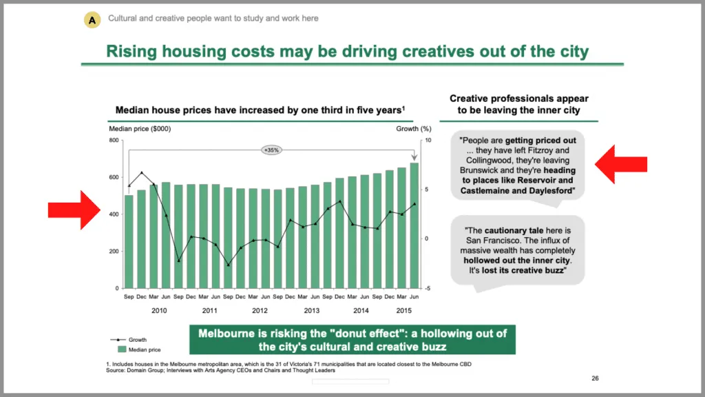
“Melbourne as a Global Cultural Destination” BCG. For more BCG content be sure to check out our full BCG slide breakdown
But unfortunately, many titles aren’t this descriptive. Instead what I see are titles that tell me the topic of the slide and nothing else . I get an idea of what the slide is about, but I’m forced to come up with my own takeaway.
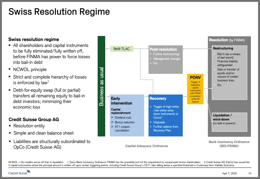
“Fixed Income Investor presentation” Credit Suisse, 2022
You see this especially on slides with summaries of data, like this slide from Salesforce about its finances. But even on these slides it’s usually a good idea to put a takeaway in the title.
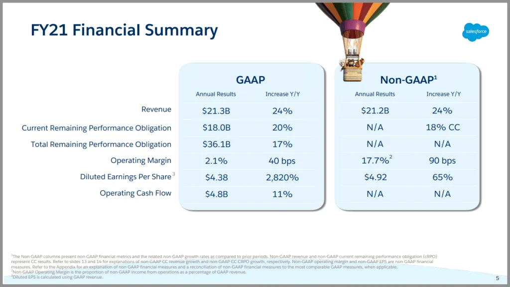
“Finance Update Q4 FY21” Salesforce
In this example from Orsted , they’ve shown some annual financial data, but they’ve also summarized what they want the audience to take away from the slide – that they are in line with expectations.
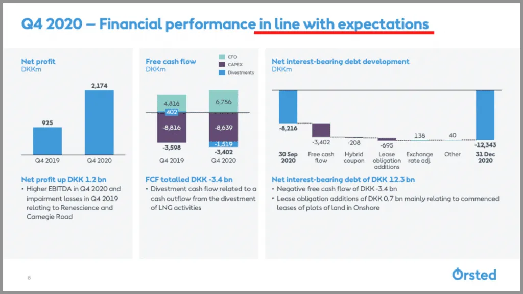
“Investor presentation Q4 and full-year 2020” Orsted, 2021
By including a full sentence for your title, ideally one that summarizes the main takeaway of the slide, you make it much easier for the audience to understand what it is you’re trying to tell them.
3. Default PowerPoint Designs
The third mistake I see more often than I’d like is using default PowerPoint designs. The worst case of this is using old slide themes, like in this example. Anyone who has spent any amount of time in PowerPoint recognizes this design, and aesthetics aside, it just looks like the slide was thrown together last minute.
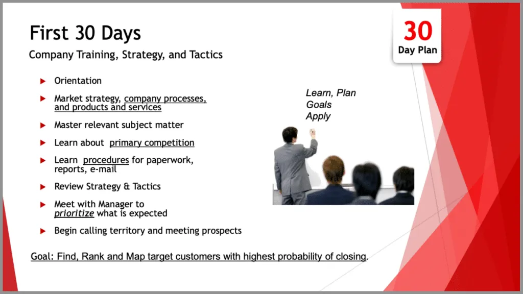
“First 30 Days” Markstar, 2017
You certainly don’t want to overdesign your slide, but at the very least try to avoid the out-of-the-box designs PowerPoint provides for you. Many of these designs haven’t changed in years, and usually they’re meant for a different kind of presentation (like a school project).
And the same goes for PowerPoint shapes, graphics, and even colors. They all come across as unprofessional and overused, so it’s in your best interest to avoid them altogether.
But where I think this is most easy to mess up is with tables. A table like this for example looks fine enough, but with just a few tweaks it can be made to look significantly better.

In this example, all I did was bold the titles, turn the negative values red, left align the first column and right align the others, make the top line extra thick, then add other lines to separate the regions. The result is a much better looking, and much easier to read table.

When it comes to design, even just a little bit of extra effort can help you avoid cliche, unprofessional looking slides.
4. Unrelated Content
In corporate style presentations, it’s completely okay to have lots of content, so long as each piece of content has a purpose. What I see way too often is stuff that’s just there to fill space, and doesn’t have an actual purpose.
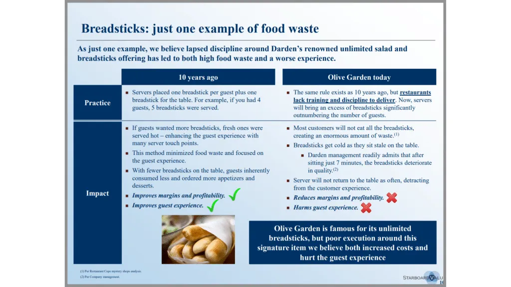
In this Starboard Value slide , there are a lot of unnecessary distractions. For example, the box at the bottom is really just a repeat of what’s in the subtitle. Likewise, there’s a lot of text in the bullet points that could be trimmed down or eliminated without changing the message of the slide. It would help the audience focus more on the key takeaways, without getting distracted by all the fluff.
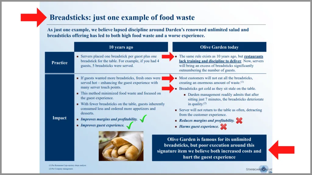
“Transforming Darden Restaurants” Starboard Value, 2014 See our full breakdown of this slide here .
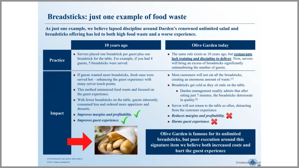
But what bothers me the most is the picture at the bottom, which really isn’t adding to the slide in any meaningful way. Yes, it’s on topic – the slide is about breadsticks after all – but it’s not giving me any useful information. We all know what breadsticks look like, and this doesn’t help me understand the key takeaway any better.
Pictures are typically the most common culprit when it comes to unrelated content. It can be really tempting to throw a picture on a slide to fill up the extra space – especially if that picture looks professional and seems to loosely match the topic of the slide.
Even McKinsey is guilty of this sometimes, as in this example . The picture looks great, but it doesn’t help the audience understand the main message of the slide about digital manufacturing being a high priority for a majority of companies. Instead, it just distracts the audience.
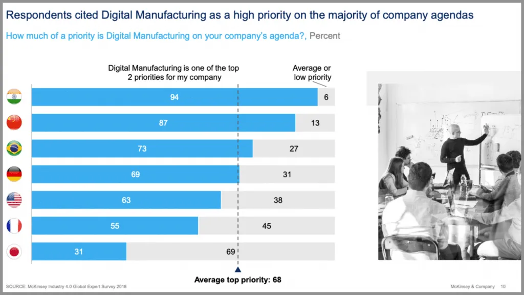
“Moving Laggards to Early Adopters” McKinsey & Co., 2018 Learn more about how McKinsey designs data heavy PowerPoint slides.
In this example from a different presentation, they kept the slide fairly simple, with only information that supports the main takeaway of the slide, and nothing else. The result is a clear and easy to understand slide with a well-supported takeaway.
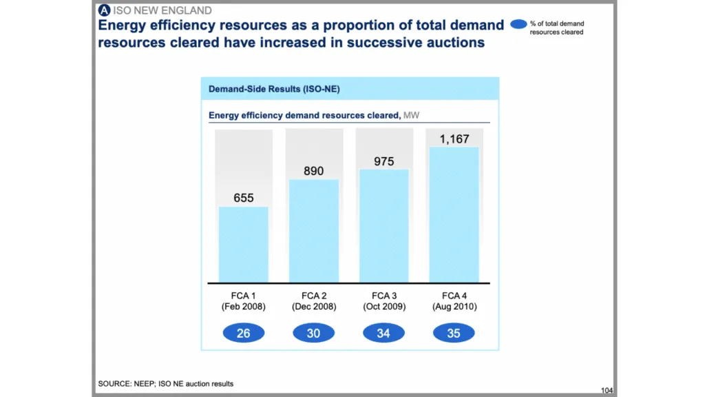
“Capturing the full electricity potential of the U.K.” McKinsey & Co., 2012
So when you’re adding content to your slide, whether that’s a picture, chart, or anything else, make sure it contributes to the message in some way. And if it doesn’t then just leave that part blank and adjust the other parts of the slide accordingly.
5. Distracting Backgrounds
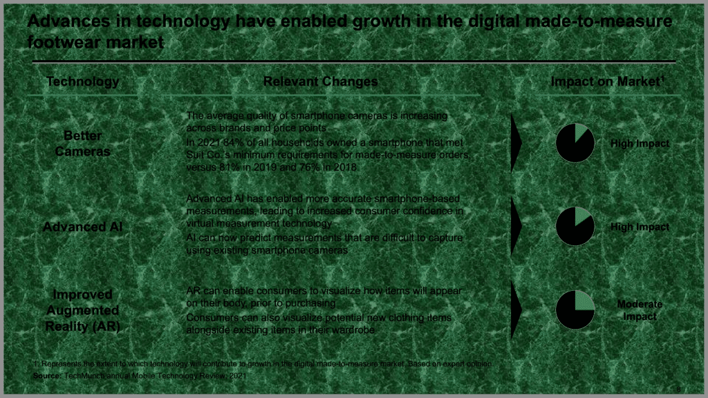
This is related to the last mistake about unrelated content but is important in and of itself. A bad background can completely ruin a presentation. At best it’s distracting, but at worst it looks horribly unprofessional and makes the content hard to look at.
Once again this is where PowerPoint is to blame. Some of the default backgrounds make it almost impossible to read the text, especially if that text doesn’t provide any contrast.
But even simple backgrounds can be distracting, as in our previous example from Starboard Value . Shading the background makes it difficult for my eyes to know where to focus my attention. Not to mention it makes some of the text slightly harder to read.
Even subtle text or images in the background can be distracting, as in this BCG example .
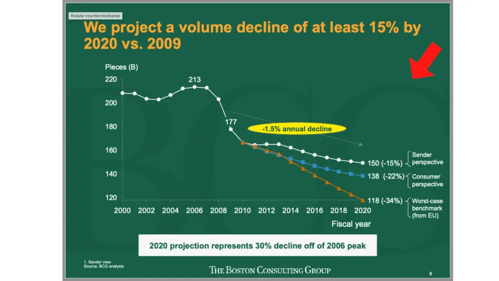
“Projecting US Mail volumes to 2020” BCG, 2010
The general rule of thumb with backgrounds is if you notice it, you should change it. The idea is you want to reduce the number of distractions on your slide so that the audience can focus on the insights. In that regard, you can almost never go wrong with a plain white background. This keeps the audience focused on your content, and ultimately on your message.
This slide from Accenture is a great example of a non-distracting background that keeps the emphasis on the content. Nothing is diverting my attention and I can focus on what they’re trying to tell me.

“Fintech New York: Partnerships, Platforms and Open Innovation” Accenture, 2015
But of course, the background doesn’t always have to be white. Sometimes darker backgrounds work better for longer, live presentations, especially when those presentations are given on a large screen.
In another example from later in the presentation, Accenture uses a darker blue background that’s simple, clear, and professional. And most importantly, it doesn’t take my attention away from the content on the slide.

6. Not Guiding the Audience
Most modern business presentations are full of text and data, which can make it difficult for the audience to process the information on a slide and see the key insights . In a live presentation, it is even more difficult – the audience has to simultaneously listen to the speaker, read through the content on the slide, and think critically about the information.
The easy way to manage this challenge is to guide the audience through your slide with visual cues – things like text, callouts, and boxes. Unfortunately, it is something that many people just don’t think to do. What this leads to is dense, difficult to read slides , as in these two examples:
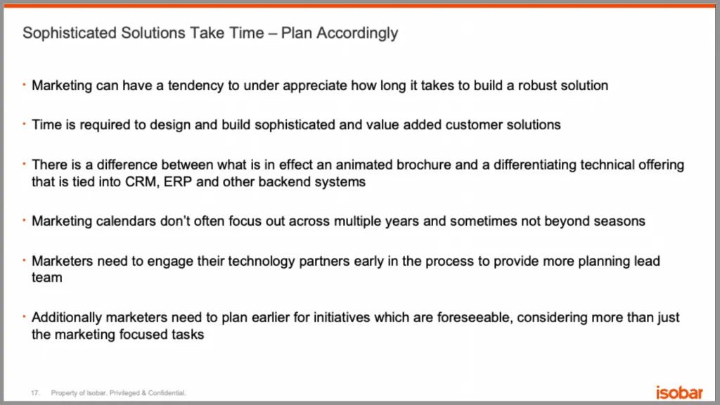
“Bridging the Gap Between CIO and CMO” Isobar, 2014
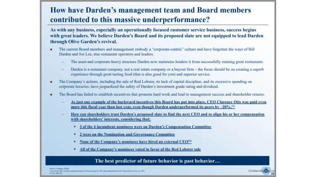
“Transforming Darden Restaurants” Starboard Value, 2014
And the same thing can happen with charts . By just putting up a chart with no real commentary or guidance, you make it hard for the audience to understand what it is you’re trying to tell them.

“Fifth Assessment Report- Synthesis Report” IPCC, 2014
In many ways, this is the counterpoint to the last mistake. Whereas you don’t want unimportant pieces like your background to be distracting, you do want the important parts of your slide to be distracting, because it helps the audience quickly grasp the key takeaways.
Returning to our Accenture example, notice how they’ve used bolded text to help call attention to what’s important. Likewise, they’ve also used a line to put emphasis on the title of the slide.

Check out our full breakdown of this slide here .
This BCG slide has quite a bit of information on it, but they’ve made it easy to work through by drawing the most attention to the title with green font and large text, then the next amount of attention to the subtitles with bold black text and green lines underneath, and then the least amount of attention to the bullet points. It helps the process the information on the slide in the way they want them to – starting with the highest level idea, and working their way through the details.
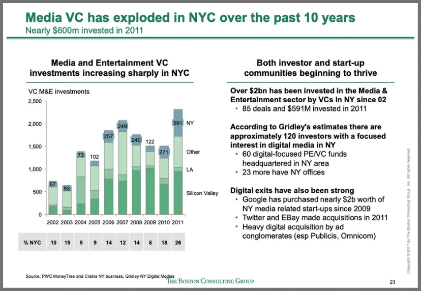
“Evaluating NYC media sector development and setting the stage for future growth” BCG, 2012
This chart from McKinsey is another good example of guiding the audience. Instead of just keeping the chart plain, they’ve added callouts that help emphasize the message in the title.

“Jobs lost, jobs gained: Workforce transitions in a time of automation” McKinsey, 2017
Guiding the audience can be as simple as adding an arrow or bolding important text. But even small changes like this can make a big difference in your presentation.
7. Too Many Colors
It can be tempting to use a variety of colors on your slide, but doing so just distracts the audience and takes attention away from the important parts. And not only that, it can look really unprofessional.
On this slide for example they’ve decided to separate each of these sections by color to make it easier to distinguish between them. But instead of making it easier to read, the slide is difficult to understand and hard to look at. The sections are already naturally separated, with lines, titles, and even icons. But by adding bright colors, in addition to the orange and green that’s already on the slide, they’ve reduced the slide’s readability considerably.
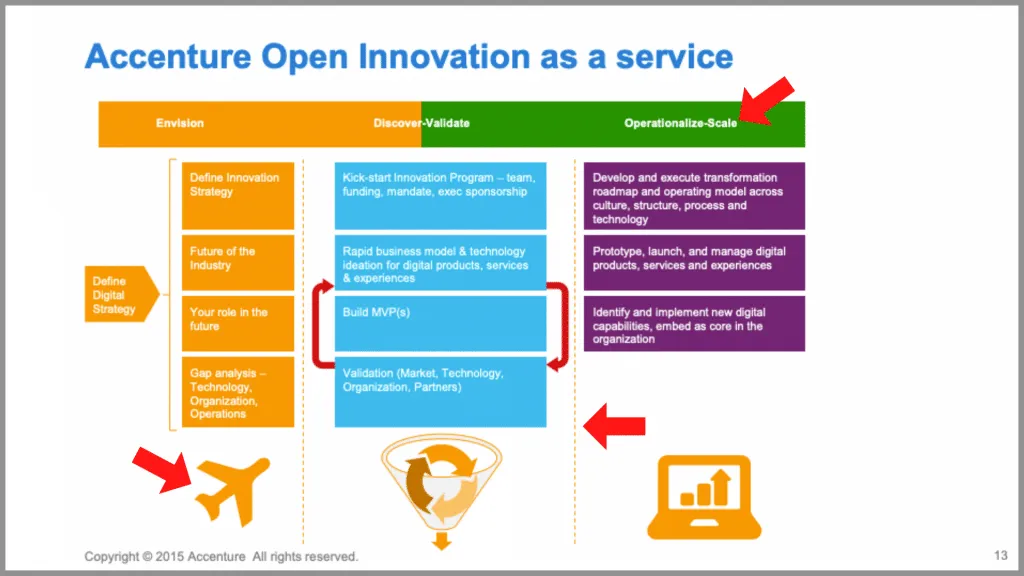
“Harnessing the Power of Entrepreneurs to Open Innovation” Accenture, 2015
The best slides use color strategically, to help highlight key points and ideas.
In this Bain slide for example, they’ve decided to highlight the important columns in red, while keeping the less important columns in grey. It provides a nice contrasting effect that helps emphasize the message.

“2011 China Luxury Market Study” Bain, 2011
Likewise, this Deloitte slide contains a minimal amount of color, making it easy to sift through the data and focus on only what’s important. Not to mention it keeps the visuals of the slide clean and professional.
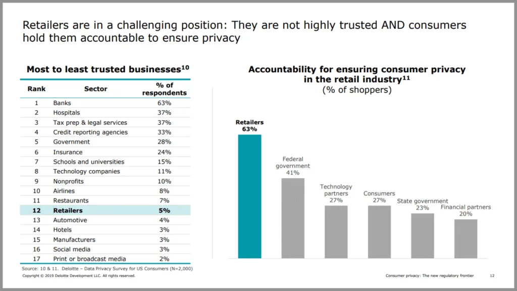
“Consumer privacy in retail” Deloitte, 2019
It’s a bit counterintuitive, but when it comes to color, sometimes less is more.
Final Thoughts
A few simple tweaks to your presentation can really make a difference in both its quality and overall professionalism. Above all, be sure to focus on your main message, and avoid any distractions that might take away from that message. If you can keep an eye out for cliché, unprofessional, and meaningless content, you’ll be well on your way to creating high-quality, insight-rich presentations.
P.S. – If you’re really looking to up your PowerPoint game, be sure to check out our full courses: Advanced PowerPoint for Consultants and Advanced Presentations for Consultants .
You can watch a video version of this article on YouTube .
- Print Friendly
- Tech Deals at Target Right Now!
- The Electric Grill You Need This Year
How to Lose an Audience and 10 Ways to Get Them Back
- Brock University
In This Article
Jump to a Section
- Equipment Isn't Working
Information Underload
Lack of focus.
- Reading From the Screen
- Too Many Visual Aids
- Fonts Too Small
- Bad Design Templates
- Too Many Slides
- Unusual Color Combinations
The Bottom Line
Welcome to Bad Presentation Techniques 101 . Almost everyone has sat through a bad presentation with poor techniques and unprepared presenters. There are also scenarios where presenters read verbatim from the presentation, mumble through their speech, or use way too many animations in their PowerPoint . Below are various presentations one has likely experienced, along with the solution on how to rectify it.
The Equipment Isn't Working
Many have experienced the scenario where the audience is settled, and the presenter is set and ready to start their presentation. All of a sudden, the projector doesn't work. Naturally, the presenter didn't bother to check out all of the equipment before starting.
To correct this presentation technique, it is recommended that presenters check out all of the equipment and rehearse their presentation, using the provided projector long before their time to present. Bringing extra tools needed like a projector bulb is a good idea, along with having a point of contact for a technician if things get beyond the presenter's control. If possible, presenters can check the lighting in the room they will be presenting in, prior to their time in the limelight, especially so they can dim the lights as needed during their speech.
Presenters may have experienced memorizing only the content of their presentation. In this scenario, someone in the audience may have a question and panic can set in. Because the presenter has not prepared for questions, all they know about on the topic is what is already written on the slides.
To rectify this situation, presenters should know their material so well that they could easily do the presentation without an electronic enhancement such as PowerPoint. Presenters can use keywords and phrases that include only essential information, to keep the audience focused and interested on the presenter. Lastly, speakers should be fully prepared for questions and know the answers or have an idea of how to guide the audience member.
The opposite of information underload, presenters may find themselves knowing so much about a topic that they jump all over the place. This creates a situation where the audience has no idea how to follow the thread of the presentation because there is none.
The way to fix this situation is to use the K.I.S.S. principle, which translates to "Keep It Simple Silly." When designing a presentation, presenters can stick to three or four points at most about their topic. Then, presenters can expand on the information so that the audience is most likely to absorb it and understand the main points being driven.
Reading Directly From the Screen
Imagine a setting where an audience member raises their hand and mentions that she can't read the slides. In this case, the presenter may graciously tell her that they will be reading the slides directly to her. As the presenter proceeds to do so, they look up at the screen and each of the slides is filled in with the text of their speech. The problem here is that the presenter is not needed if the slides provide all of the information for the audience members.
Simplifying the content is the key here. Presenters can keep the most important information near the top of the slides for easy reading in the back rows. They can also focus on one topic area and use no more than four bullets per slide. It's important for presenters to speak to the audience, not to the screen.
Using Visual Aids in Replacement of Scarce Content
Presenters might figure that no one will notice that they didn't do much research on their topic if they add many visual aids, like photos, complicated graphs, and other diagrams.
This mistake is huge. Presenters need to create presentations that include well-researched content and topics that the audience is looking for. Illustrating points with true substance is a good format to follow, and visual aids such as photos, charts, and diagrams should be used in addition to content, to drive key points of the demonstration home. After all, visual aids add a nice break to the material but must be used correctly in order to enhance the overall oral presentation.
Setting the Font on the Slides Too Small
Small script type fonts might look great when audience members are sitting mere inches away from the monitor; however, presenters who don't consider audience members with poor sight, or those who are sitting a decent distance away from the screen, will miss out on an engaged audience who had the potential to read the slides.
It is best for presenters to stick to easy-to-read fonts such as Arial or Times New Roman. Presenters should avoid script type fonts which are generally hard to read on screens. It is also suggested for presenters to use no more than two different fonts — one for headings, and another for content. Lastly, presenters should use no less than a 30 pt font so that people at the back of the room can read them easily.
Choosing Poor or Complicated Design Templates
Presenters sometimes make decisions in their presentation based on what they hear. For example, imagine a presenter who heard that blue was a good color for a design template or design theme. They may have found a cool template on the internet and went for it. Unfortunately, in the end, the presentation ends up being about a context that doesn't match the look and feel of the visual presentation itself.
This scenario can be easily fixed when presenters decide to choose a design template that is appropriate for the audience. A clean, straightforward layout is best for business presentation, for instance, while young children respond well to presentations that are full of color and contain a variety of shapes .
Including Too Many Slides
Some presenters go overboard with their slide count. For instance, imagine the presenter who recently went on a fantastic vacation cruise and included all 500 beach photos in their slides. Presenters who use too many slides, or too much personal content, are bound to hear snores in the room.
Presenters should ensure their audience stays focused by keeping the number of slides to a minimum. It is recommended to use 10 to 12 slides. Some concessions can be made for a photo album since most pictures will be on screen for only a short time, and this will require a judgment call based on how the audience will feel and respond.
Losing the Message With Animations
Presenters can forget the focus of their presentation when using too many animations and sounds with the goal to impress everyone. This ultimately fails to work most of the time, because the audience doesn't know where to look and will lose the message of the presentation.
While animations and sounds that are used well can heighten interest, it is important for presenters to keep them to a minimum. Otherwise, this flair will distract the audience. Presenters can design their presentation with the "less is more" philosophy so that the audience doesn't suffer from animation overload.
Picking out Unusual Color Combinations
Some presenters love unusual color combinations together, but a PowerPoint presentation is not the time to use them. For example, an orange and blue combination is unsettling to an audience and there may be people present who cannot see red and green due to color blindness.
Presenters should use good contrast with the background to make their text easy to read. Here are a few tips:
- Dark text on a light background is best but avoid white backgrounds. Tone it down by using beige or another light color that will be easy on the eyes. Dark backgrounds are very effective, but make a text a light color for easy reading.
- Patterned or textured backgrounds make text hard to read.
- Keep the color scheme consistent.
To be a good presenter , presenters need to be engaging with the audience and know their topic. Presenters should ultimately keep the presentation concise and include only relevant information. They should use an electronic enhancement, such as PowerPoint, as an accompaniment to their presentation to reinforce points, not as a crutch. Presenters should keep in mind that a slideshow is not the presentation — they are the presentation.
Get the Latest Tech News Delivered Every Day
- The 10 Most Common Presentation Mistakes
- 10 Dos and Don'ts for Technical Presentations
- 10 Tips on Becoming a Better Presenter
- 9 PowerPoint Presentation Tips for Students
- 10 Free PowerPoint Game Templates
- The Definition of a Slide (or Slides) in a PowerPoint Presentation
- Beyond the Basics in PowerPoint
- PowerPoint for Beginners - How to Use PowerPoint
- Hide Background Images for Cleaner Printed PowerPoint Slides
- 4 Parts of a Successful Presentation
- Change Font Colors and Styles on PowerPoint Slides
- Create a Wedding PowerPoint Presentation
- What Is Microsoft PowerPoint and How Do I Use It?
- Copy Slides to Another PowerPoint Presentation
- How to Copy a PowerPoint Design Template to Another Presentation
- The 10 Most Common PowerPoint Terms
6 dos and don’ts for next-level slides, from a TED presentation expert
Share this idea.
- Click to share on Facebook (Opens in new window)
- Click to share on Twitter (Opens in new window)
- Click to share on LinkedIn (Opens in new window)
- Click to share on Reddit (Opens in new window)
- Click to share on Pocket (Opens in new window)
- Click to share on WhatsApp (Opens in new window)

Want to prevent yawns and glazed-over eyes? Before you deliver your next speech, pitch or address, learn how to create exceptional slides by following these rules (with real before-and-afters).
Slides are an expected and crucial part of most speeches, presentations, pitches and addresses. They can simplify complex information or messages, showcase relevant images, and help hold an audience’s attention. But quite often, the best slides aren’t those that make people sit up and comment on how good they are; instead, they’re the ones that people take in without really noticing because the content is effortlessly conveyed and matches the speaker’s words so well.
These days, showing high-quality slides is more important than ever. “We’re living in a visual culture,” says Paul Jurczynski , the cofounder of Improve Presentation and one of the people who works with TED speakers to overhaul their slides. “Everything is visual. Instagram is on fire, and you don’t often see bad images on there. The same trend has come to presentations.”
He says there is no “right” number of slides. However, it’s important that every single one shown — even the blank ones (more on those later) — be, as Jurczynski puts it, “connected with the story you’re telling.” Here, he shares 6 specific tips for creating the most effective slides. ( Note: All of the examples below were taken from the actual slides of TED speakers. )
1. Do keep your slides simple and succinct
“The most common mistake I see is slides that are overcrowded. People tend to want to spell everything out and cover too much information,” says Jurczynski. Not only are these everything-but-the-kitchen-sink slides unattractive and amateurish, they also divert your audience’s attention away from what you’re saying. You want them to listen to the words that you slaved over, not get distracted by unscrambling a jam-packed slide.
“The golden rule is to have one claim or idea per slide. If you have more to say, put it on the next slide,” says Jurczynski. Another hallmark of a successful slide: The words and images are placed in a way that begins where the audience’s eyes naturally go and then follows their gaze. Use the position, size, shape and color of your visuals to make it clear what should come first, second and so on. “You don’t just control what the audience sees; you have to control how they see it,” says Jurczynski.
BEFORE: Too crowded
After: easy to absorb.

2. Do choose colors and fonts with care
Colors and fonts are like the herbs and spices of your presentation. When used wisely and with intention, they’ll enhance your slides; but when tossed in haphazardly, they’ll make it an unappealing mess.
Let’s start with color. “Color is a key way to communicate visually and to evoke emotion,” says Jurczynski. “It can be a game changer.” Your impulse might be to pick your favorite hue and start from there, but he advises, “it’s important to use color with a purpose.” For example, if you’re giving a presentation about a positive topic, you’ll want to use bright, playful colors. But if you’re speaking about a serious subject such as gun violence or lung cancer, you’d probably go for darker or neutral colors.
While it’s fine to use a variety of colors in your presentation, overall you should adhere to a consistent color scheme, or palette. “The good news is you don’t need a degree in color theory to build a palette,” says Jurczynski. Check out one of the many free sites — such as Coolors or Color Hunt — that can help you assemble color schemes.
With fonts, settle on just one or two, and make sure they match the tone of your presentation. “You don’t have to stick to the fonts that you have in PowerPoint,” or whatever program you’re using, says Jurczynski. “People are now designing and sharing fonts that are easy to install in different programs. It’s been an amazing breakthrough.” Experiment. Try swapping a commonly used font like Arial for Lato or Bebas , two of many lesser known fonts available online. Most important: “Use a big enough font, which people often forget to do,” advises Jurczynski. Your text has to be both legible and large enough to read from the back of the room, he recommends — about 30 points or so.
BEFORE: Weak and hard-to-read font, muddy colors

AFTER: Strong font, color that’s striking but not jarring
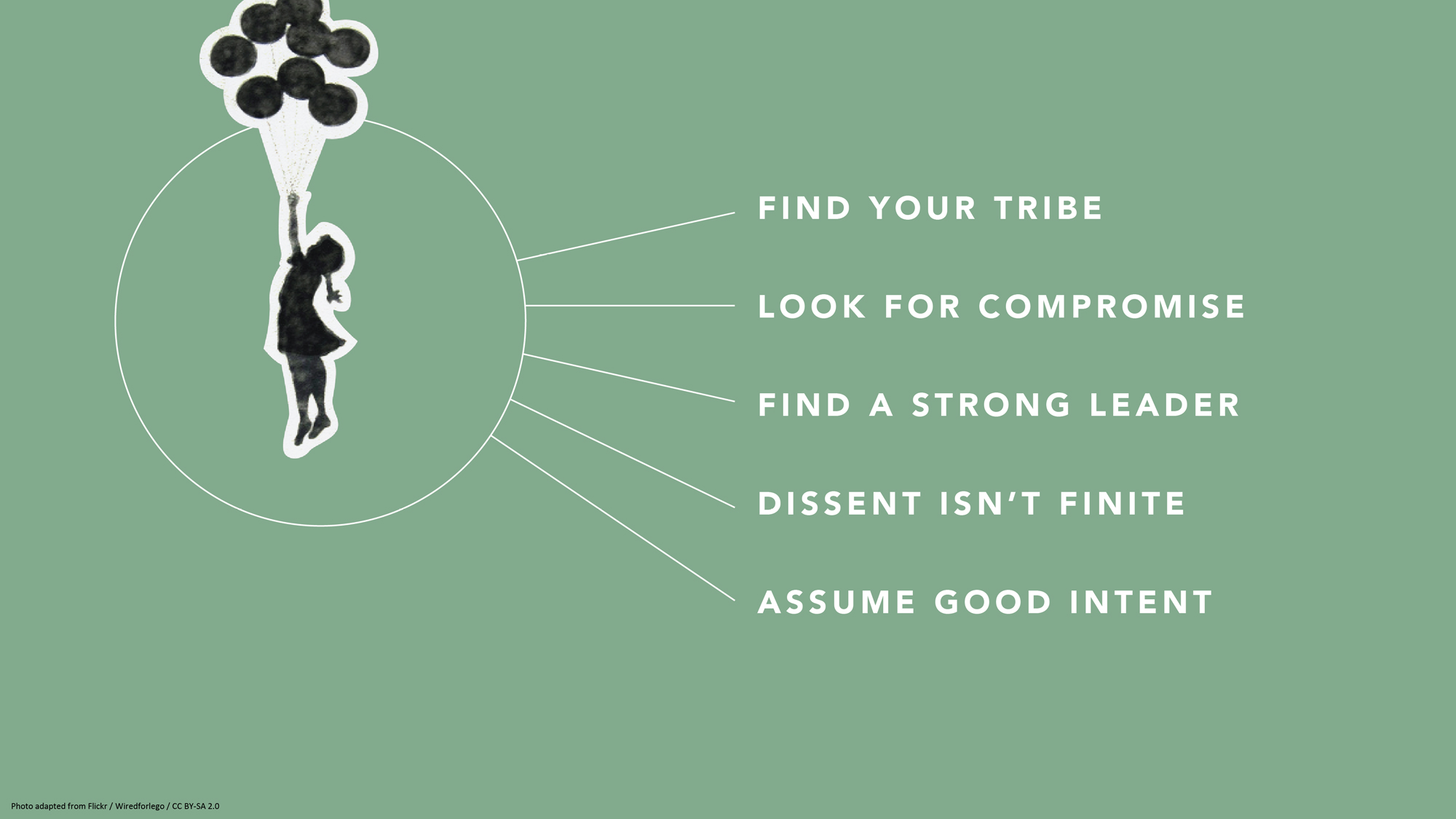
3. Don’t settle for visual cliches
When you’re attempting to illustrate concepts, go beyond the first idea that comes to your mind. Why? The reason it appears so readily may be because it’s a cliché. For example, “a light bulb as a symbol for innovation has gotten really tired,” says Jurczynski. Other oft-used metaphors include a bull’s-eye target or shaking hands. After you’ve come up with your symbol or idea, he advises people to resist the lure of Google images (where there are too many low-quality and clichéd choices) and browse other free image sites such as Unsplash to find more unique visuals. One trick: If you do use stock, amp it up with a color overlay (as in the pic at the top of this article) or tweak it in some other way to counteract — or at least muffle — its stock-i-ness.
One potential source of pictures is much closer at hand. “If it fits the storyline, I encourage people to use their own images,” says Jurczynski. “Like one TED Talk where the speaker, a doctor, used photos of his experience treating people in Africa. That was all he needed. They were very powerful.” Major caveat: Any personal photos must support your speech or presentation. Do not squander your audience’s precious time by showing them a gratuitous picture of your children or grandparents — beautiful as they may be.
BEFORE: Fake-looking stock photo to illustrate teamwork
After: eye-catching photo of nature to illustrate teamwork.

4. Don’t get bogged down by charts and graphs
Less is also more when it comes to data visualization. Keep any charts or graphs streamlined. When building them, ask yourself these questions:
What do I want the audience to take away from my infographic?
Why is it important for them to know this?
How does it tie into my overall story or message?
You may need to highlight key numbers or data points by using color, bolding, enlarging or some other visual treatment that makes them pop.
Maps are another commonly used infographic. Again, exercise restraint and use them only if they enhance your talk. “Sometimes, people put a map because they don’t know what else to show,” says Jurczynski. He suggests employing labels, color schemes or highlighting to direct your audience where to look. He adds, if you have the skill or know an artist, “you may even consider a hand-drawn map.”
BEFORE: Yikes! What’s important?!? AFTER: The takeaway is clear
5. don’t be scared of blank slides.
It may seem counterintuitive, but at certain points in your speech or pitch, the best visual is … no visual at all. “At the beginning, I was not a fan of blank slides,” says Jurczynski. “But the more talks I’ve seen, the more a fan I am of them, because sometimes you want all the attention on yourself and you don’t want people distracted by what they see in the slides. Or, you might use them to give the audience a visual break from a series of slides. Or maybe you want to shift the mood or tempo of the presentation.”
The blank slide is the visual equivalent of a pause, and most stories could use at least one. And with blank slides, Jurczynski has one main “don’t”: “You cannot use white blank slides, because if you do, people will see it and think something is broken.”

6. Do remember to practice
The easiest way to figure out if your slides really work? Recruit a colleague, friend or family member, and run through your entire presentation with them. Sometimes, people can get so carried away with rehearsing their delivery and memorizing their words that they forget to make sure their slides complement and synch up with what they’re saying.
“Even if you have the best visual s in the world, you need to practice in front of someone else. Once you start practicing, you may see, ‘I’m talking about a sad story, but on the slide behind me, I have something funny and that doesn’t make sense,'” says Jurczynski. “Or, ‘Oh, this could be a good place for a blank slide.’”
About the author
Amanda Miller manages curation for partner events at TED.
- business advice
- data visualization
- idea visualization
- presentation literacy
- public speaking
TED Talk of the Day

How to make radical climate action the new normal

3 strategies for effective leadership, from a former astronaut

Feeling unseen by your boss? Here’s what you can do

Let’s stop calling them “soft skills” -- and call them “real skills” instead

There’s a know-it-all at every job — here’s how to deal

The 7 types of people you need in your life to be resilient

Perfectionism holding you back? 3 ways to shift the habit

The unseen forces that can cause your great new idea to crash and burn

Have you quietly quit? Your next step: Go to the neutral zone

6 ways to give that aren't about money

A smart way to handle anxiety -- courtesy of soccer great Lionel Messi

7 Zoom mistakes you might still be making -- and how to raise your video skills

Want to speak from the heart? Answer this question first

Before your next presentation or speech, here's the first thing you must think about

The 2 kinds of praise we all need to get at work
12 Reasons why highly intelligent people are still delivering such bad presentations
Feb 18, 2023 by maurice decastro in general , presentation skills , presentation tips , public speaking.

We’ve all sat through bad presentations at work.
The question is, why are so many highly intelligent, creative and talented business professionals still delivering such bad presentations?
What is a bad presentation?
Before we consider why bad presentations are still so prevalent in the workplace today, it’s worth gaining some clarity on what these look and sound like.
Here are some of the most common
– Slides filled with text and data
– Tired and ‘cheesy’ visuals
– Monotone delivery
– Data dump
– Reading slides/notes
– Ego centric rather than audience focused
– Excessive nerves
– Making your audience read
– Lack of emotional connection
– Irrelevant content
– No clarity of purpose/message
– Poorly organized information
— Lack of energy/enthusiasm
– Inauthentic delivery
– Too lengthy
– Speaking too fast, rambling/waffling
– Too many bad habits; fidgeting, swaying, “um,” “uh,” “well,” “so,” “you know,” “er,”
I’m sure you could share many others
Just before you do, let’s take a look at some of the common reasons why so many of us have to endure bad presentations every day.
Here are just 12 of them
Follow the leader.
Unfortunately, high impact, mindful communication and presenting, isn’t something that most of us are taught at school, college or university.
In the absence of good training and coaching, many professionals have no choice but to simply do what everyone else in the business does. If your boss or colleagues are good communication role models, you’re one of the lucky ones. That isn’t often the case and we end up simply doing exactly what they do.
No time to prepare
We still live in a world where too many people are overworked and underpaid. Preparing for a presentation takes time, focus, energy, research, creativity, organization and commitment.
Once we have crafted content which is rich, relevant and rewarding for our audience, we then have to practice delivering it.
Who has time to prepare?
We all have projects, targets, deadlines, an inbox overflowing with emails and our phones ringing incessantly.
The last thing we have time for is to prepare a presentation which respects and values our audience’s time, when we don’t have enough of our own.
The easy option
Given how busy we are, the easy option is to simply put everything we know onto a slide and read it out to our audience.
That way we can copy and paste information from reports, marketing material and documents to put them into a template we have used countless times before.
If it’s all on a slide or formulated neatly in bullet points, we don’t have to remember anything.
Trying to impress
When we are presenting at work we are painfully aware that there is a great deal at stake.
Our credibility, reputation and sense of self are all perceived as at risk, unless we impress our audience. In an attempt to do so, it makes sense to tell them how clever we are, how much we know and how hard we work.
The net result of trying to impress them, is that most of our content is focused on us as the presenter rather than our audience.
No clear purpose/message
In the absence of having a very clear purpose and message when presenting, much of what we end up sharing with our audience is often not very helpful to them.
Without a clear and compelling purpose and message, most of us will simply tell our audience everything we want them to know, rather than what they need to know to help them.
A lack of vision
Aligned to purpose is vision.
In other words, if our audience have no clear sense of how listening to and acting on our presentation will help them, they will switch off quickly.
Our audience need to know very quickly how our presentation will help to make their lives better, easier, happier, more efficient or positively different in some way.
If we can’t show them what the future will look like for them, they will forget most of what we share by the time they return to their desk.
No emotional intent
In our public speaking and presentation training workshops the most important question we ask everyone is, ‘how do you want your audience to feel’?
The most common response to this question is, ‘informed.’
Information on its own isn’t enough.
If your audience don’t feel something about the information you are sharing, it’s likely that they won’t remember it or do anything with it.
Most audiences can read the information you have to share in the comfort of their own time and space. When they give up their precious time to listen to you share it, most people want to feel something emotionally too.
Passive values
Many of the training rooms we work in within organisations have big glossy, colourful posters of their company values framed on the wall.
If those values are active rather than passive, they are a joy to see and experience in their teams presentation. Unfortunately, sometimes they little more than posters.
‘Being yourself’
‘Thoughtful, creative, inspirational’
‘Approach every day with curiosity’
‘Find ways to do things differently to make them better’
‘Everyone can be bold, innovative, and creative’
Unless corporate values such these are active and visible in the way teams communicate, they are nothing more than platitudes.
Are they necessary?
Far too many business presentations would be better served through the written rather than spoken word. In other words, sometimes sending the team or client a self-explanatory email would be a far better use of their time.
One of the most common reasons for a bad presentation is because they are simply unnecessary. Many organisations already have far too many meetings, many of which are far too long.
If the presenter doesn’t understand and feel the necessity and value of a presentation, it’s unlikely they will give their audience their best.
A lack of mindfulness
Have you ever attended a business meeting or presentation where the same people sit in the same seats, say the same things in the same order every single time?
Unfortunately, many businesses are operating on ‘auto-pilot’.
That means that they have been communicating, meeting and presenting in exactly the same way year after year. If that level of ‘auto-pilot’ is highly effective and mindful, that’s great; often it isn’t.
In a previous article , I wrote about mindfulness being a key part of the future of high impact public speaking and presenting.
I don’t dare
This is an issue of fear.
Over the last decade, we have worked with a great number of professionals who would love to present differently but their organization doesn’t support their aspirations.
We have had professionals agree that it would be better to stand up when presenting but are terrified of doing so because no one else does.
Many of our clients relish the idea of making an emotional connection but tell us that their boss just wants them to read the data; ‘they don’t do emotions.’
For many, the very thought of trying to be themselves is anxiety provoking when their organisation doesn’t support it.
I know but…
Everyone we work with understands how important giving a good presentation is.
Many know exactly what to do to give a good presentation.
Despite their understanding and knowledge, they still craft and deliver bad presentations.
I’ve shared some of the reasons for this in this article but I’m sure there are many more.
If you’re one of those presenters who knows exactly what to do to craft and deliver a high impact presentation but still don’t do so, please let us know why.
If you’d like to learn how to turn bad presentations into mindful presentations
– Book yourself onto a powerful public speaking course .
– Invest in some really good one to one public speaking coaching .
– Get yourself some excellent presentation training
Image courtesy of Canva.com
- Connect Now
Share this article
- Share on Facebook
- Share on Twitter
- Share on LinkedIn
To join one of our workshops or lean more, complete our enquiry form or call us on +44 (0)20 7666 3453 and we can get connected.
- Our Approach
- The Benefits
- Public Speaking Courses
- Presentation Training
- The Complete Mindful Presenter
- One-to-One Public Speaking Coaching
- Coaching Development Package
- What Our Clients Say
- The Truth Series
- Our Podcast
- Style Review
- Mindful Selling 4D
- Mindful Leadership
Blog Sign Up
Recent posts.
- 12 Public Speaking & Presentation Tips For Q&A Success
- 10 Novel public speaking ideas from unexpected sources
- 7 Steps to Tap In To Your Presentation Genius
- 4 Universal elements to capturing hearts and minds when presenting
- How your presentation content can help or hinder your confidence
- Bullet Point
- Communication Skills
- Mindful Selling
- Mindfulness
- Presentating training
- Presentation Skills
- Presentation Tips
- Public Speaking
- Sales Skills
- Storytelling
- virtual presentation
- Virtual Presentations
- Who are you?
- Learning Centre
- Presentation Skills Review
- Our Clients
- Testimonials
- Presentation Skills Training
- Public Speaking Coaching London
- Public Speaking Anxiety Course
- Phone: +44 (0)20 7666 3453
- Email: [email protected]
- Address: Mindful Presenter Ltd 86-90 Paul Street, London, EC2A 4NE
Sign up for our newsletter and download your free guide to authentic public speaking.
- SUGGESTED TOPICS
- The Magazine
- Newsletters
- Managing Yourself
- Managing Teams
- Work-life Balance
- The Big Idea
- Data & Visuals
- Reading Lists
- Case Selections
- HBR Learning
- Topic Feeds
- Account Settings
- Email Preferences
What It Takes to Give a Great Presentation
- Carmine Gallo

Five tips to set yourself apart.
Never underestimate the power of great communication. It can help you land the job of your dreams, attract investors to back your idea, or elevate your stature within your organization. But while there are plenty of good speakers in the world, you can set yourself apart out by being the person who can deliver something great over and over. Here are a few tips for business professionals who want to move from being good speakers to great ones: be concise (the fewer words, the better); never use bullet points (photos and images paired together are more memorable); don’t underestimate the power of your voice (raise and lower it for emphasis); give your audience something extra (unexpected moments will grab their attention); rehearse (the best speakers are the best because they practice — a lot).
I was sitting across the table from a Silicon Valley CEO who had pioneered a technology that touches many of our lives — the flash memory that stores data on smartphones, digital cameras, and computers. He was a frequent guest on CNBC and had been delivering business presentations for at least 20 years before we met. And yet, the CEO wanted to sharpen his public speaking skills.
- Carmine Gallo is a Harvard University instructor, keynote speaker, and author of 10 books translated into 40 languages. Gallo is the author of The Bezos Blueprint: Communication Secrets of the World’s Greatest Salesman (St. Martin’s Press).
Partner Center
We use essential cookies to make Venngage work. By clicking “Accept All Cookies”, you agree to the storing of cookies on your device to enhance site navigation, analyze site usage, and assist in our marketing efforts.
Manage Cookies
Cookies and similar technologies collect certain information about how you’re using our website. Some of them are essential, and without them you wouldn’t be able to use Venngage. But others are optional, and you get to choose whether we use them or not.
Strictly Necessary Cookies
These cookies are always on, as they’re essential for making Venngage work, and making it safe. Without these cookies, services you’ve asked for can’t be provided.
Show cookie providers
- Google Login
Functionality Cookies
These cookies help us provide enhanced functionality and personalisation, and remember your settings. They may be set by us or by third party providers.
Performance Cookies
These cookies help us analyze how many people are using Venngage, where they come from and how they're using it. If you opt out of these cookies, we can’t get feedback to make Venngage better for you and all our users.
- Google Analytics
Targeting Cookies
These cookies are set by our advertising partners to track your activity and show you relevant Venngage ads on other sites as you browse the internet.
- Google Tag Manager
- Infographics
- Daily Infographics
- Graphic Design
- Graphs and Charts
- Data Visualization
- Human Resources
- Training and Development
- Beginner Guides
Blog Beginner Guides
How To Make a Good Presentation [A Complete Guide]
By Krystle Wong , Jul 20, 2023

A top-notch presentation possesses the power to drive action. From winning stakeholders over and conveying a powerful message to securing funding — your secret weapon lies within the realm of creating an effective presentation .
Being an excellent presenter isn’t confined to the boardroom. Whether you’re delivering a presentation at work, pursuing an academic career, involved in a non-profit organization or even a student, nailing the presentation game is a game-changer.
In this article, I’ll cover the top qualities of compelling presentations and walk you through a step-by-step guide on how to give a good presentation. Here’s a little tip to kick things off: for a headstart, check out Venngage’s collection of free presentation templates . They are fully customizable, and the best part is you don’t need professional design skills to make them shine!
These valuable presentation tips cater to individuals from diverse professional backgrounds, encompassing business professionals, sales and marketing teams, educators, trainers, students, researchers, non-profit organizations, public speakers and presenters.
No matter your field or role, these tips for presenting will equip you with the skills to deliver effective presentations that leave a lasting impression on any audience.
Click to jump ahead:
What are the 10 qualities of a good presentation?
Step-by-step guide on how to prepare an effective presentation, 9 effective techniques to deliver a memorable presentation, faqs on making a good presentation, how to create a presentation with venngage in 5 steps.
When it comes to giving an engaging presentation that leaves a lasting impression, it’s not just about the content — it’s also about how you deliver it. Wondering what makes a good presentation? Well, the best presentations I’ve seen consistently exhibit these 10 qualities:
1. Clear structure
No one likes to get lost in a maze of information. Organize your thoughts into a logical flow, complete with an introduction, main points and a solid conclusion. A structured presentation helps your audience follow along effortlessly, leaving them with a sense of satisfaction at the end.
Regardless of your presentation style , a quality presentation starts with a clear roadmap. Browse through Venngage’s template library and select a presentation template that aligns with your content and presentation goals. Here’s a good presentation example template with a logical layout that includes sections for the introduction, main points, supporting information and a conclusion:
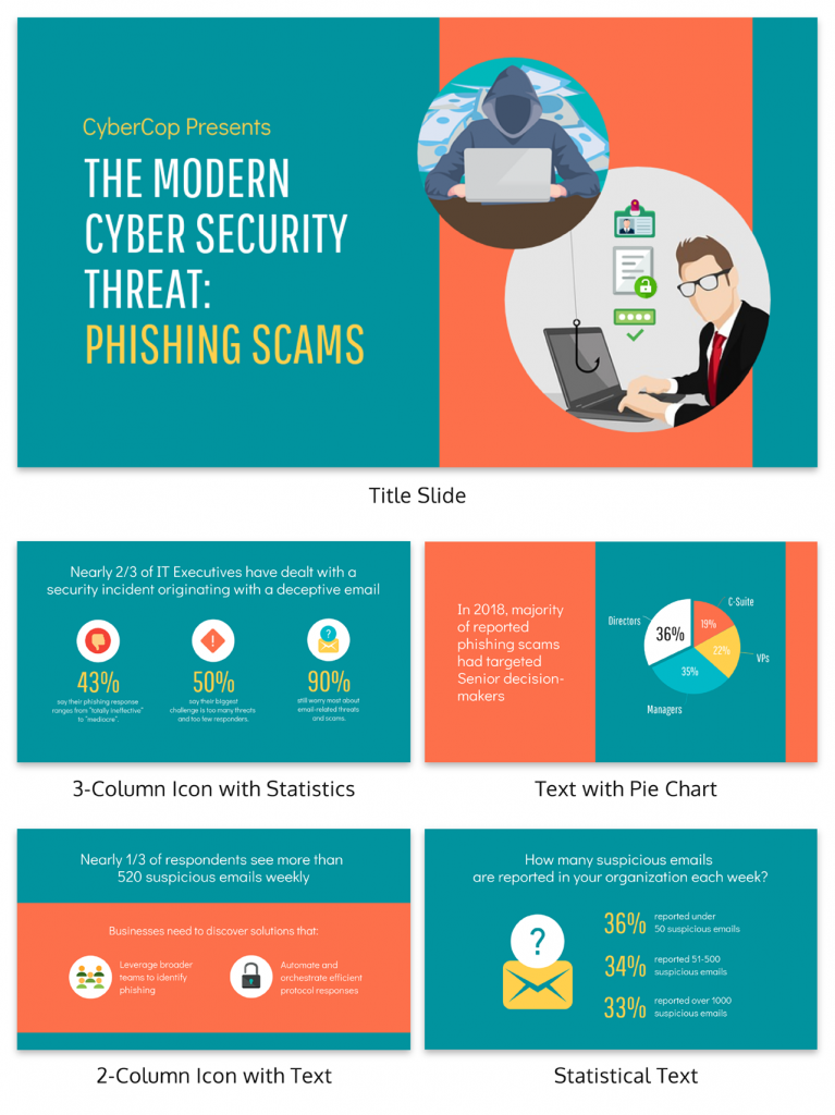
2. Engaging opening
Hook your audience right from the start with an attention-grabbing statement, a fascinating question or maybe even a captivating anecdote. Set the stage for a killer presentation!
The opening moments of your presentation hold immense power – check out these 15 ways to start a presentation to set the stage and captivate your audience.
3. Relevant content
Make sure your content aligns with their interests and needs. Your audience is there for a reason, and that’s to get valuable insights. Avoid fluff and get straight to the point, your audience will be genuinely excited.
4. Effective visual aids
Picture this: a slide with walls of text and tiny charts, yawn! Visual aids should be just that—aiding your presentation. Opt for clear and visually appealing slides, engaging images and informative charts that add value and help reinforce your message.
With Venngage, visualizing data takes no effort at all. You can import data from CSV or Google Sheets seamlessly and create stunning charts, graphs and icon stories effortlessly to showcase your data in a captivating and impactful way.
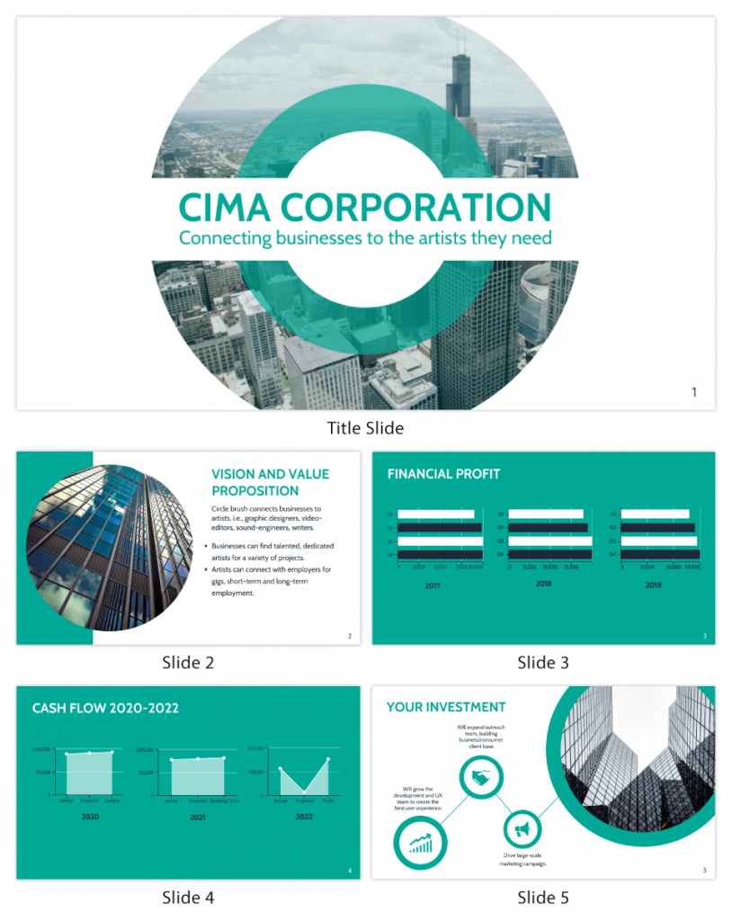
5. Clear and concise communication
Keep your language simple, and avoid jargon or complicated terms. Communicate your ideas clearly, so your audience can easily grasp and retain the information being conveyed. This can prevent confusion and enhance the overall effectiveness of the message.
6. Engaging delivery
Spice up your presentation with a sprinkle of enthusiasm! Maintain eye contact, use expressive gestures and vary your tone of voice to keep your audience glued to the edge of their seats. A touch of charisma goes a long way!
7. Interaction and audience engagement
Turn your presentation into an interactive experience — encourage questions, foster discussions and maybe even throw in a fun activity. Engaged audiences are more likely to remember and embrace your message.
Transform your slides into an interactive presentation with Venngage’s dynamic features like pop-ups, clickable icons and animated elements. Engage your audience with interactive content that lets them explore and interact with your presentation for a truly immersive experience.
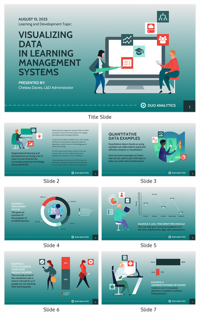
8. Effective storytelling
Who doesn’t love a good story? Weaving relevant anecdotes, case studies or even a personal story into your presentation can captivate your audience and create a lasting impact. Stories build connections and make your message memorable.
A great presentation background is also essential as it sets the tone, creates visual interest and reinforces your message. Enhance the overall aesthetics of your presentation with these 15 presentation background examples and captivate your audience’s attention.
9. Well-timed pacing
Pace your presentation thoughtfully with well-designed presentation slides, neither rushing through nor dragging it out. Respect your audience’s time and ensure you cover all the essential points without losing their interest.
10. Strong conclusion
Last impressions linger! Summarize your main points and leave your audience with a clear takeaway. End your presentation with a bang , a call to action or an inspiring thought that resonates long after the conclusion.
In-person presentations aside, acing a virtual presentation is of paramount importance in today’s digital world. Check out this guide to learn how you can adapt your in-person presentations into virtual presentations .
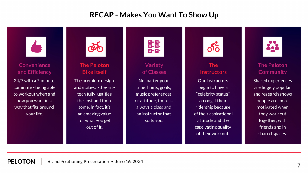
Preparing an effective presentation starts with laying a strong foundation that goes beyond just creating slides and notes. One of the quickest and best ways to make a presentation would be with the help of a good presentation software .
Otherwise, let me walk you to how to prepare for a presentation step by step and unlock the secrets of crafting a professional presentation that sets you apart.
1. Understand the audience and their needs
Before you dive into preparing your masterpiece, take a moment to get to know your target audience. Tailor your presentation to meet their needs and expectations , and you’ll have them hooked from the start!
2. Conduct thorough research on the topic
Time to hit the books (or the internet)! Don’t skimp on the research with your presentation materials — dive deep into the subject matter and gather valuable insights . The more you know, the more confident you’ll feel in delivering your presentation.
3. Organize the content with a clear structure
No one wants to stumble through a chaotic mess of information. Outline your presentation with a clear and logical flow. Start with a captivating introduction, follow up with main points that build on each other and wrap it up with a powerful conclusion that leaves a lasting impression.
Delivering an effective business presentation hinges on captivating your audience, and Venngage’s professionally designed business presentation templates are tailor-made for this purpose. With thoughtfully structured layouts, these templates enhance your message’s clarity and coherence, ensuring a memorable and engaging experience for your audience members.
Don’t want to build your presentation layout from scratch? pick from these 5 foolproof presentation layout ideas that won’t go wrong.
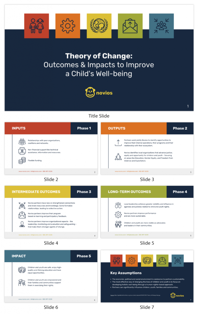
4. Develop visually appealing and supportive visual aids
Spice up your presentation with eye-catching visuals! Create slides that complement your message, not overshadow it. Remember, a picture is worth a thousand words, but that doesn’t mean you need to overload your slides with text.
Well-chosen designs create a cohesive and professional look, capturing your audience’s attention and enhancing the overall effectiveness of your message. Here’s a list of carefully curated PowerPoint presentation templates and great background graphics that will significantly influence the visual appeal and engagement of your presentation.
5. Practice, practice and practice
Practice makes perfect — rehearse your presentation and arrive early to your presentation to help overcome stage fright. Familiarity with your material will boost your presentation skills and help you handle curveballs with ease.
6. Seek feedback and make necessary adjustments
Don’t be afraid to ask for help and seek feedback from friends and colleagues. Constructive criticism can help you identify blind spots and fine-tune your presentation to perfection.
With Venngage’s real-time collaboration feature , receiving feedback and editing your presentation is a seamless process. Group members can access and work on the presentation simultaneously and edit content side by side in real-time. Changes will be reflected immediately to the entire team, promoting seamless teamwork.
7. Prepare for potential technical or logistical issues
Prepare for the unexpected by checking your equipment, internet connection and any other potential hiccups. If you’re worried that you’ll miss out on any important points, you could always have note cards prepared. Remember to remain focused and rehearse potential answers to anticipated questions.
8. Fine-tune and polish your presentation
As the big day approaches, give your presentation one last shine. Review your talking points, practice how to present a presentation and make any final tweaks. Deep breaths — you’re on the brink of delivering a successful presentation!
In competitive environments, persuasive presentations set individuals and organizations apart. To brush up on your presentation skills, read these guides on how to make a persuasive presentation and tips to presenting effectively .
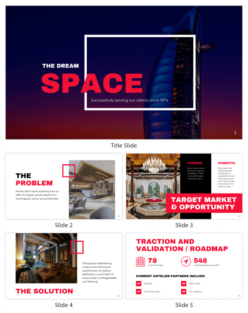
Whether you’re an experienced presenter or a novice, the right techniques will let your presentation skills soar to new heights!
From public speaking hacks to interactive elements and storytelling prowess, these 9 effective presentation techniques will empower you to leave a lasting impression on your audience and make your presentations unforgettable.
1. Confidence and positive body language
Positive body language instantly captivates your audience, making them believe in your message as much as you do. Strengthen your stage presence and own that stage like it’s your second home! Stand tall, shoulders back and exude confidence.
2. Eye contact with the audience
Break down that invisible barrier and connect with your audience through their eyes. Maintaining eye contact when giving a presentation builds trust and shows that you’re present and engaged with them.
3. Effective use of hand gestures and movement
A little movement goes a long way! Emphasize key points with purposeful gestures and don’t be afraid to walk around the stage. Your energy will be contagious!
4. Utilize storytelling techniques
Weave the magic of storytelling into your presentation. Share relatable anecdotes, inspiring success stories or even personal experiences that tug at the heartstrings of your audience. Adjust your pitch, pace and volume to match the emotions and intensity of the story. Varying your speaking voice adds depth and enhances your stage presence.
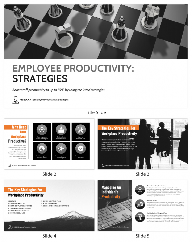
5. Incorporate multimedia elements
Spice up your presentation with a dash of visual pizzazz! Use slides, images and video clips to add depth and clarity to your message. Just remember, less is more—don’t overwhelm them with information overload.
Turn your presentations into an interactive party! Involve your audience with questions, polls or group activities. When they actively participate, they become invested in your presentation’s success. Bring your design to life with animated elements. Venngage allows you to apply animations to icons, images and text to create dynamic and engaging visual content.
6. Utilize humor strategically
Laughter is the best medicine—and a fantastic presentation enhancer! A well-placed joke or lighthearted moment can break the ice and create a warm atmosphere , making your audience more receptive to your message.
7. Practice active listening and respond to feedback
Be attentive to your audience’s reactions and feedback. If they have questions or concerns, address them with genuine interest and respect. Your responsiveness builds rapport and shows that you genuinely care about their experience.
8. Apply the 10-20-30 rule
Apply the 10-20-30 presentation rule and keep it short, sweet and impactful! Stick to ten slides, deliver your presentation within 20 minutes and use a 30-point font to ensure clarity and focus. Less is more, and your audience will thank you for it!
9. Implement the 5-5-5 rule
Simplicity is key. Limit each slide to five bullet points, with only five words per bullet point and allow each slide to remain visible for about five seconds. This rule keeps your presentation concise and prevents information overload.
Simple presentations are more engaging because they are easier to follow. Summarize your presentations and keep them simple with Venngage’s gallery of simple presentation templates and ensure that your message is delivered effectively across your audience.
1. How to start a presentation?
To kick off your presentation effectively, begin with an attention-grabbing statement or a powerful quote. Introduce yourself, establish credibility and clearly state the purpose and relevance of your presentation.
2. How to end a presentation?
For a strong conclusion, summarize your talking points and key takeaways. End with a compelling call to action or a thought-provoking question and remember to thank your audience and invite any final questions or interactions.
3. How to make a presentation interactive?
To make your presentation interactive, encourage questions and discussion throughout your talk. Utilize multimedia elements like videos or images and consider including polls, quizzes or group activities to actively involve your audience.
In need of inspiration for your next presentation? I’ve got your back! Pick from these 120+ presentation ideas, topics and examples to get started.
Creating a stunning presentation with Venngage is a breeze with our user-friendly drag-and-drop editor and professionally designed templates for all your communication needs.
Here’s how to make a presentation in just 5 simple steps with the help of Venngage:
Step 1: Sign up for Venngage for free using your email, Gmail or Facebook account or simply log in to access your account.
Step 2: Pick a design from our selection of free presentation templates (they’re all created by our expert in-house designers).
Step 3: Make the template your own by customizing it to fit your content and branding. With Venngage’s intuitive drag-and-drop editor, you can easily modify text, change colors and adjust the layout to create a unique and eye-catching design.
Step 4: Elevate your presentation by incorporating captivating visuals. You can upload your images or choose from Venngage’s vast library of high-quality photos, icons and illustrations.
Step 5: Upgrade to a premium or business account to export your presentation in PDF and print it for in-person presentations or share it digitally for free!
By following these five simple steps, you’ll have a professionally designed and visually engaging presentation ready in no time. With Venngage’s user-friendly platform, your presentation is sure to make a lasting impression. So, let your creativity flow and get ready to shine in your next presentation!

- Tips and Guides
- Industry Information

7 PowerPoint Mistakes to Avoid for Outstanding Presentation
Ramachandiran.
- July 26, 2023
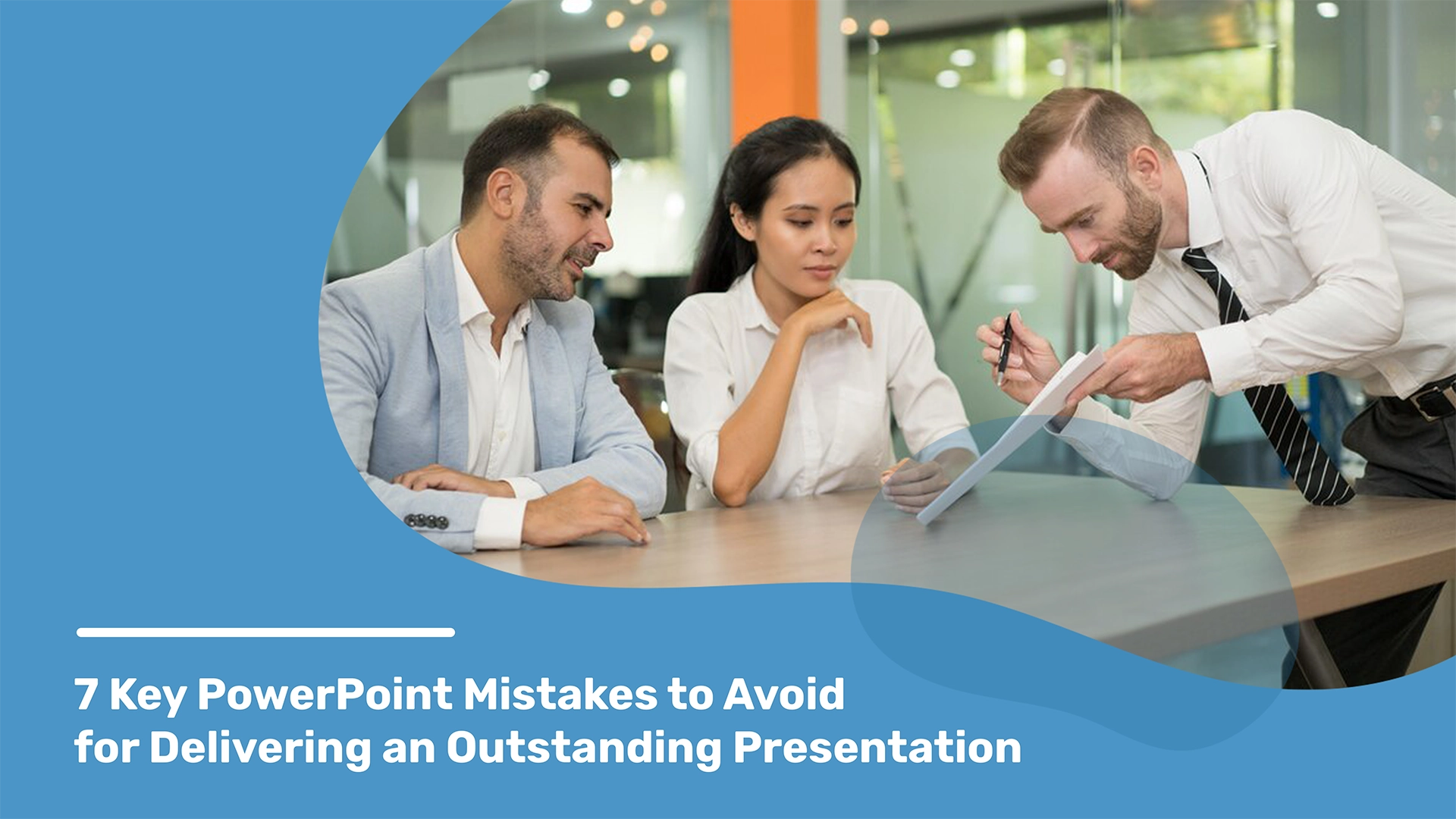
Table of Contents
Business professionals use PowerPoint in their everyday routines, making it an integral part of our professional lives.
Byway, it’s overcrowded slides, a lack of visual appeal, or a monotonous delivery, these mistakes can quickly turn your audience off and make them distracted.
This is why it’s crucial to be aware of these mistakes and take proactive steps to avoid them.
We’re here to help you to avoid these pitfalls and create presentations that captivate and impress. By doing so, you can ensure that your presentation stands out from the rest and leaves a lasting impression on your audience.
Let’s explore the seven most common PowerPoint mistakes and provide you with practical tips and strategies to overcome them. So, grab your notepad and get ready to take your presentation skills to the next level!
Before that, there is another option to avoid these mistakes: simply sign up and download free PowerPoint templates online. Here, we’ll explore common mistakes made when creating an investor pitch deck for your business upgrade.
Overwhelming Slides with Too Much Text
Presenters often make the mistake of overwhelming their audience with text on their slides. This can make it difficult for the audience to focus on the main points of the presentation. Slides should complement the presentation, not serve as a script.
To avoid this mistake, presenters should keep their text brief and use bullet points to highlight the key points. This will make it easier for the audience to scan the slides and identify the main ideas.
Presenters should also break down complex information into smaller, more manageable chunks. This will make it easier for the audience to understand and remember the information.
By following these tips, you can create slides that are clear, concise, and visually appealing. This will help your audience to focus on the key points of your presentation and retain the information.
Slide Design and Visual Elements
A clear and attractive slide design is essential in PowerPoint to capture and maintain audience attention.
Using too many colors, fonts, or complicated graphics can make your slides look cluttered and unprofessional.
To create an attractive slide, keep your design simple and consistent.
Stick to a limited color palette and use fonts that are easy to read. You can also incorporate relevant images, charts, or graphs to enhance understanding and engagement.
Always keep in mind that less is more in slide design, and simplicity often leads to better comprehension and retention.
Lack of Consistency in Your Style
Consistency is key when it comes to PowerPoint presentations.
Using different tools like fonts, colors, and styles on each slide can make your presentation look disjointed and unpolished. It’s important to establish a visual theme and stick to it throughout your presentation.
Choose your font and color scheme that aligns with your message and brand. Use the same fonts and colors consistently on each slide to create a harmonious and professional look.
According to some psychology-proven facts, Consistency in font, color, and style will not only make your presentation visually appealing but also help reinforce your message in the minds of your audience.
Additionally, pay attention to the size and spacing of your text to ensure readability.
Explore presentation design services to create impactful and effective slides that leave a lasting impression on your audience.
Importance of the Structure
Storytelling and structure are two essential elements of any good PowerPoint presentation. When used effectively, they can help you connect with your audience, make your message more memorable, and persuade them to take action.
However, many presenters make the mistake of ignoring the importance of storytelling and structure. They focus on simply presenting information, without taking the time to tell a story or create a clear structure. This can result in presentations that are boring, confusing, and ineffective.
Start with a strong introduction that captures your audience’s attention. Your introduction should set the tone for your presentation. Use clear and concise language that is easy to understand. Your audience should be able to follow your presentation without getting lost.
They help you to connect with your audience. When you tell a story, you are essentially creating a bond with your audience. They will be more likely to listen to you and understand your message if they can relate to it on a personal level!
By following these thoughts, you can create PowerPoint presentations that are clear, engaging, and memorable. And by using storytelling and structure to your advantage, you can increase the chances that your audience will connect with your message and take action.
Not Practicing Properly
Among the most common slip-ups by presenters is not practicing and rehearsing their presentations adequately.
Not practicing your presentation can lead to a number of problems, including stumbling over your words, losing track of your thoughts, or going off on tangents. This can damage your credibility and make your audience lose interest.
To avoid these problems, it is important to set aside dedicated time for practice and rehearsal.
First, familiarize yourself with the content and flow of your presentation. This means reading through your slides and notes several times so that you know the material inside and out.
You should also practice delivering your presentation aloud, paying attention to your tone, pace, and body language.
Second, rehearse in front of a mirror or record yourself. This will help you to identify any areas that need improvement, such as awkward pauses or repetitive phrases.
You can also use this time to experiment with different delivery techniques, such as using gestures or facial expressions.
The more you practice, the more confident and polished you will be during the actual presentation. This will make you appear more credible to your audience and help you to keep their attention throughout your talk.
Overusing Animations and Transitions
Add animations and transitions in your presentation to avoid distractions. Overusing them can also lead them away from your message. So try to be it enough you need and void presentation.
Here are some tips for using animations and transitions effectively:
Use them sparingly. Too many animations and transitions can be overwhelming and distracting.
Choose simple and subtle effects. Avoid flashy or gimmicky animations that will take away from your message.
Use animations and transitions to highlight key points. This will help your audience to focus on the most important information.
Use animations and transitions to guide your audience’s attention. This can be done by animating text or objects to move around the slide or by using transitions to move from one drop to the next.
Remember, the goal is to enhance your message, not overshadow it with unnecessary visual effects.
Neglecting the Audience’s Needs and Preferences
Presenters should also tailor their presentation to the audience’s needs and preferences.
Understanding your audience’s background, knowledge level, and expectations is essential for creating a presentation that resonates with them.
Research your audience beforehand and tailor your presentation accordingly. Consider their interests, industry-specific terminology, and learning preferences. Adapt your content and delivery style to meet their needs and engage them on a deeper level.
By doing so, you’ll be able to connect with your audience and deliver a presentation that is both informative and relevant.
After you give your presentation, ask your audience for feedback. This will help you to identify any areas where you can improve your presentation for future audiences.
PowerPoint presentations have the power to engage, inform, and inspire. However, common mistakes can hinder your ability to deliver a stellar presentation that leaves a lasting impact on your audience. By avoiding overcrowded slides, poor design choices, lack of consistency, and neglecting storytelling and audience needs, you can elevate your presentation skills and captivate your audience from start to finish.
Remember, a well-crafted PowerPoint presentation is a powerful tool that can help you communicate your message effectively and achieve your presentation goals. So, take the time to avoid these common mistakes, implement the tips and strategies mentioned in this blog, and watch as your presentations become truly stellar.
Related Blogs

Why Graphic Design Services are Essential for Your Business

Seven Essential Tips for a Successful Business Presentation
About the author.

10 Ways to Avoid Presentation Failure
April 28, 2023
We’ve all sat through bad presentations – the kind that make you want to check your email or scroll through your social media. Maybe you’ve even had a presentation failure at work.
But why do some presentations fail to engage and inspire, while others leave a lasting impression , preparing a business presentation is a real skill; a core business skills. and it’s a skill you can learn. over the last 15 years we’ve coached thousands of people to be brilliant business presenters. , do please call us and we’ll tell you about our business presentation coaching – it’s fast and good value., in the meantime, we share the top reasons for bad presentations, with tips on how to avoid the fails., here are 10 reasons for presentation failure.
Let’s review each of these reasons in more detail:
1. You don’t prepare enough
If you haven’t put in the time to research and rehearse your presentation, it will show. You’ll deliver a bad presentation. You may fail to land your message, stumble over unfamiliar words, or struggle to answer questions from the audience. Make sure you give yourself enough time to prepare and practice to avoid presentation failure.
2. You have a poor structure
A poorly structured presentation can leave your audience floundering, unable to follow your train of thought, leaving them bored and disengaged. Take time to plan. What’s the overarching message or purpose? What are your key points and are you providing clear evidence for each one? Does your presentation have a logical flow? And, most importantly, do you start with a powerful opening and close strongly?
Contact us for a free consultation on your coaching needs
3. Over-reliance on slides
Slides can be powerful visual aids, but if you rely on them too heavily, you are on track for a presentation fail. Slides should support your presentation, not drive it. You should be the focus of the audience’s attention, not your PowerPoint deck.
Perhaps you don’t even need slides at all – many business leaders never use them. Or think about what other visual aids you could use instead – powerful pictures, physical products, films or flip charts.
4. Lack of energy and enthusiasm
If you’re not excited about your presentation, your audience won’t be either. If you look bored, they’ll feel bored. Make sure you bring energy and enthusiasm to your talk. Smile, make eye contact, use a strong and confident voice.
Show that you’re passionate about your topic, that it’s important to you, that you believe what you’re saying. Your enthusiasm will be contagious – and it will help you carry your audience with you.
5. Ignorance of your audienc e
Have you thought about what your audience really wants and expects from your presentation? What’s in it for them? If you don’t take the time to understand their needs and interests, you’ll lose them. If you lose your audience you’ll have a presentation failure.
Instead, carefully consider what matters to them, show you care about them. Use language and examples that resonate with them.
6. Too much jargon
Jargon and technical language can be confusing and off-putting for your audience, especially if they’re unfamiliar with your business. A typical bad presentation includes too much industry-specific jargon, acronyms and technical terms.
The best presentations use simple, clear language. Sometimes it helps to imagine that you’re a teacher, explaining difficult concepts to a teenager. If your 15-year-old niece or nephew grasps your story, so will everyone else.
7. Lack of engagement
Making an emotional connection with your audience can often make the difference between a successful presentation and a failed presentation.
Try asking questions, soliciting feedback and encouraging participation. Get your audience involved. Make them feel engaged.
8 . You are too formal in your presentation
Your presentation should reflect your personality and individual style. If you’re too formal or stiff, it will feel as if you’re holding your audience at arms’ length, lecturing rather than informing them. Be authentic and let your personality shine through.
9 . Irrelevance
There’s no point giving a technically brilliant presentation if it’s out of date or simply not appropriate for your audience. Your material should be relevant and timely. Keep it as topical as possible. Use up-to-date data, anecdotes and examples.
Avoid talking about things that may be interesting in their own right, but have no relevance to the subject of your presentation – or your audience may simply tune out.
10. No clear call-to-action
It’s important you’re clear about what you want your audience to do, think or feel at the end of your presentation. A clear call-to-action is always the best way to close. It may be that you want them to buy into a big change in your business, or take part in a survey. Or you may just want to challenge them to think differently about something, or make a change in their behaviour. To avoid bad presentations make sure your audience knows what you want them to do – and make it easy for them to do it.
How to be sure your presentation does not flop
Discover why presentations fails and avoid failed presentations.
How to Make Sure Your Presentations Don’t Flop
Great presentations take careful planning and preparation. By avoiding these 10 common pitfalls, you can create something that engages, informs, and inspires your audience. You’ll avoid a failing presentation at work.
Remember to focus on their needs, inject energy and enthusiasm. Start strong and end with a clear call-to-action. With these simple tips, you can ensure your presentation doesn’t flop, but leaves a lasting impression.
Transform your presentation skills with tailored coaching

We can help you present brilliantly. Thousands of people have benefitted from our tailored in-house coaching and advice – and we can help you too .
“I honestly thought it was the most valuable 3 hours I’ve spent with anyone in a long time.” Mick May, CEO, Blue Sky
For 15+ years we’ve been the trusted choice of leading businesses and executives throughout the UK, Europe and the Middle East to improve presentation skills and presentations through coaching, training and expert advice.
Unlock your full potential and take your presentations to the next level with Benjamin Ball Associates.
Speak to Louise on +44 20 7018 0922 or email [email protected] to find out more and discuss transforming your speeches, pitches and presentations.
Or read another article..., how to sell your business: 9 success secrets.
Get the best value when you sell your company Embarking on the journey…
How to Write a Presentation: Expert Guide for Business
PowerPoint Presentations can be great. Or they can be crap. We all know…
Storytelling in Business Presentations – 10 top tips for 2024
No matter what the topic of your next speech or presentation, if you…
What is Presentation Coaching? The best way to improve your presentation skills
I am sure, if you have ever thought about presentation coaching, you will…
Contact us for a chat about how we can help you with your presenting.
What leaders say about Benjamin Ball Associates
Manager, ubs.
"Essential if you are going to be a spokesperson for your business"
Senior Analyst, Sloane Robinson
"Being an effective communicator is essential to get your stock ideas across. This course is exactly what's needed to help you do just that!"
CEO, Blast! Films
“Our investment in the coaching has paid for itself many times over.”
Ed Coulthard
Corporate finance house.
“You address 95% of the issues in a quarter of the time of your competitor.”
Partner International
“Good insight and a great toolbox to improve on my presentations and delivery of messages to not only boards, analysts and shareholders but to all audiences”
CEO, Eurocamp
“We had a good story to tell, but you helped us deliver it more coherently and more positively.”
Steve Whitfield
Ceo, ipso ventures.
“Ben did a great job on our presentation. He transformed an ordinary set of slides into a great presentation with a clear message. Would definitely use him again and recommend him highly.”
Nick Rogers
“Moved our presentation into a different league and undoubtedly improved the outcome and offer we received.”
Head of IR, Equinox
“A fantastic job reviewing and transforming our marketing material and helping us get our message across with clarity to potential investors.”
Sylvie Armand Delille
Let's talk about your presentation training needs, +44 20 7018 0922, [email protected], our bespoke presentation coaching services, investor pitch coaching, executive presentation coaching, public speaking training, executive media training, new business pitch coaching, privacy overview.
7 Types of Bad Presenters: Tips for Better Presentations
Delivery is key in presentations. Learn about 7 bad presenters and how you can avoid becoming one!

You can probably relate to this all too familiar scenario: You’re attending a presentation and the presenter is almost unbearable to watch. Whether they’re stumbling through slides or speaking rapidly, you find yourself unable to process any of the information presented. But what contributes to the failures of bad presenters? First, we should define what contributes to great presentations.
What Makes a Great Presentation?
When it comes to any type of presentation, its delivery is key to success. Take it from the masters at TED Talks . Speech and body language are important to delivering your message. These affect an audience’s perception. Chris Anderson, owner of TED, summarizes what all great presentations have in common:
“And even though these speakers and their topics all seem completely different, they actually do have one key common ingredient. And it’s this: Your number one task as a speaker is to transfer into your listeners’ minds an extraordinary gift — a strange and beautiful object that we call an idea.”
Telling a story is one way to help tap into audience members’ minds. Storytelling is scientifically proven to stimulate the entire human brain. Whereas the use of bullet points only stimulate 2 parts of the brain. Many impactful speakers choose to use images instead of words on slides — opting to use their voice to deliver their ideas.
Additionally, no matter how many slides your presentation ends up being, make sure it carries a consistent visual theme from start to finish. This helps to guide the audience along.
What Makes a Bad Presentation?
There are many factors that contribute to bad presentations. Geoffrey James, contributing editor at Inc.com, identifies 8 bad habits that ruin presentations . Whether it’s asking for extra time or fidgeting, there are numerous ways for a project to go south.
Most bad presenters are either unprepared or unaware of their habits. Or, they’re aware of their shortcomings but don’t know how to develop better presentation skills.
Prep for Your Next Presentation
When you’re creating your next set of slides, be sure to abide by presentation best practices . If you don’t have access to (or are worn out from) Microsoft PowerPoint, don’t fret. You have options. Here are 3 excellent alternatives to using Microsoft PowerPoint:
- Piktochart — Piktochart is home to themed templates for infographics, reports, and presentations. Use free graphics, fonts, charts, and pictures.
- Prezi — Prezi’s navigation is more of a journey, and less of slides. Check out their premade templates for lively transitions. Plus, access your Prezi from anywhere.
- Google Slides — Similar to PowerPoint, Google Slides has free templates and simple slide transitions. Access your slides from anywhere and integrate it with other information in your Google account.

Don’t forget Mimeo when it comes to preparing your next presentation! Sign up for a free account . Then build, proof, and ship your presentation in minutes!
- twitter Tweet
- facebook Share
- pinterest Pin
Mimeo Marketing Team
Mimeo is a global online print provider with a mission to give customers back their time. By combining front and back-end technology with a lean production model, Mimeo is the only company in the industry to guarantee your late-night print order will be produced, shipped, and delivered by 8 am the next morning. For more information, visit mimeo.com and see how Mimeo’s solutions can help you save time today.
Schedule a Print Consultation Today!
A representative will be in touch with you in the next 24 hours. See how much you can save.
Search Perspectives

- Finance and Real Estate
- Human Resources
- Marketing and Sales
- Operations and Supply Chain
- Proposal Teams
- Retail and Hospitality
- Small Business
- Training Firms Consultants, Associations
- Document Printing
- Wholesale Printing
- Warehousing Fulfilment
- Direct Mail Services
- Promotional Products
- Mimeo Print
- Mimeo Marketplace
- Mimeo Digital
- Training and Consultants
- Manufacturing
- Restaurant and Hospitality
- Medical Equipment
- Associations
- Construction
- Oil and Gas
- Pharmaceutical
- Real Estate
- Presentations
- Newsletters
- Business Cards
- Display Signage
- Kitting and Bundling
- Marketing Folders
- Posters and Banners
- News and Perspectives
- Mimeo Schools
- Mimeo Photos
- Mimeo Business
- Proven Process
- Case Studies
Select your platform to login.

Presentation Training Institute
A division of bold new directions training, what to do after a poorly received presentation.
It’s bound to happen at some point. You prepare well. You practice over and over. Then, you step in front of the audience and bomb your presentation. So, how do you recover after a poorly received presentation? The truth is, public speaking failures can be a learning experience and rather than being embarrassed by them, you need to learn from them and start again. Here are a few things you can do to recover from a bad presentation.
Don’t Beat Yourself Up
A bad presentation can be traumatizing and can lead people to avoid public speaking ever again. If it happens to you, the first thing you should do is hold your head up high and remember that you can’t hit it out of the ballpark every time. Public speaking is like falling off a bicycle- you’ve got to pick yourself up and get right back on. When you have messed up a presentation, it’s not healthy to dwell on it for too long. Give yourself time to “grieve” the poor performance and then take active steps to improve for next time.
Examine What Went Wrong
You can’t change what you don’t acknowledge so it’s time to take a hard look at your presentation and figure out what went wrong. If you received negative feedback from audience members, make notes of everything that was mentioned. If you already know what went wrong, write it down and then think about why. If you stumbled over your words, was it because you were too nervous or you didn’t prepare enough? If you had faulty technology, did you test it out prior to your presentation? If you missed the mark with your audience, did you research your audience beforehand? The answers to these questions will help you understand exactly where you went wrong so you can avoid those same mistakes in the future.
Change the Way You Prepare
Perhaps you gave a presentation that was all over the place. Or it might have been your nerves getting the best of you. Whatever it was that led to your poor presentation, you want to be sure and do something different next time. First, narrow down your topic to something more specific. Then, research your audience so you know who you will be presenting to and what their motivation is for listening. Now you need to organize your speech into a few key points, typically no more than three. Use a few pieces of evidence to support each key point. Don’t forget to add in an attention getter at the beginning and a strong conclusion at the end. Finally, rehearse your presentation several times before the big day. Do so in front of family and friends who can offer honest feedback and critiques.
Get a Coach or Take a Class
If you are struggling with how to improve your presentation skills, you should consider hiring a coach or attending a professional presentation training course. This will help you develop the skills necessary to give a dynamic presentation. It will also help you build confidence so you don’t feel as nervous the next time you present. If you have a career that involves giving a presentation from time to time, this could be a very beneficial investment in your future.
- Election 2024
- Entertainment
- Newsletters
- Photography
- Personal Finance
- AP Buyline Personal Finance
- Press Releases
- Israel-Hamas War
- Russia-Ukraine War
- Global elections
- Asia Pacific
- Latin America
- Middle East
- Election Results
- Delegate Tracker
- AP & Elections
- March Madness
- AP Top 25 Poll
- Movie reviews
- Book reviews
- Personal finance
- Financial Markets
- Business Highlights
- Financial wellness
- Artificial Intelligence
- Social Media
AT&T says a data breach leaked millions of customers’ information online. Were you affected?
FILE - The sign in front of an AT&T retail store is seen in Miami, July 18, 2019. The theft of sensitive information belonging to millions of AT&T’s current and former customers has been recently discovered online, the telecommunications giant said Saturday, March 30, 2024. In an announcement addressing the data breach, AT&T said that a dataset found on the dark web contains information including some Social Security numbers and passcodes for about 7.6 million current account holders and 65.4 million former account holders. (AP Photo/Lynne Sladky, File)
- Copy Link copied
NEW YORK (AP) — The theft of sensitive information belonging to millions of AT&T’s current and former customers has been recently discovered online, the telecommunications giant said this weekend.
In a Saturday announcement addressing the data breach, AT&T said that a dataset found on the “dark web” contains information including some Social Security numbers and passcodes for about 7.6 million current account holders and 65.4 million former account holders.
Whether the data “originated from AT&T or one of its vendors” is still unknown, the Dallas-based company noted — adding that it had launched an investigation into the incident. AT&T has also begun notifying customers whose personal information was compromised.
Here’s what you need to know.
WHAT INFORMATION WAS COMPROMISED IN THIS BREACH?
Although varying by each customer and account, AT&T says that information involved in this breach included Social Security numbers and passcodes — which, unlike passwords, are numerical PINS that are typically four digits long.
Full names, email addresses, mailing address, phone numbers, dates of birth and AT&T account numbers may have also been compromised. The impacted data is from 2019 or earlier and does not appear to include financial information or call history, the company said.
HOW DO I KNOW IF I WAS AFFECTED?
Consumers impacted by this breach should be receiving an email or letter directly from AT&T about the incident. The email notices began going out on Saturday, an AT&T spokesperson confirmed to The Associated Press.
WHAT ACTION HAS AT&T TAKEN?
Beyond these notifications, AT&T said that it had already reset the passcodes of current users. The company added that it would pay for credit monitoring services where applicable.
AT&T also said that it “launched a robust investigation” with internal and external cybersecurity experts to investigate the situation further.
HAS AT&T SEEN DATA BREACHES LIKE THIS BEFORE?
AT&T has seen several data breaches that range in size and impact over the years .
While the company says the data in this latest breach surfaced on a hacking forum nearly two weeks ago, it closely resembles a similar breach that surfaced in 2021 but which AT&T never acknowledged, cybersecurity researcher Troy Hunt told the AP Saturday.
“If they assess this and they made the wrong call on it, and we’ve had a course of years pass without them being able to notify impacted customers,” then it’s likely the company will soon face class action lawsuits, said Hunt, founder of an Australia-based website that warns people when their personal information has been exposed.
A spokesperson for AT&T declined to comment further when asked about these similarities Sunday.
HOW CAN I PROTECT MYSELF GOING FORWARD?
Avoiding data breaches entirely can be tricky in our ever-digitized world, but consumers can take some steps to help protect themselves going forward.
The basics include creating hard-to-guess passwords and using multifactor authentication when possible. If you receive a notice about a breach, it’s good idea to change your password and monitor account activity for any suspicious transactions. You’ll also want to visit a company’s official website for reliable contact information — as scammers sometimes try to take advantage of news like data breaches to gain your trust through look-alike phishing emails or phone calls.
In addition, the Federal Trade Commission notes that nationwide credit bureaus — such as Equifax, Experian and TransUnion — offer free credit freezes and fraud alerts that consumers can set up to help protect themselves from identity theft and other malicious activity.
AP Reporter Matt O’Brien contributed to this report from Providence, Rhode Island.
- Marketplace
- Marketplace Morning Report
- Marketplace Tech
- Make Me Smart
- This is Uncomfortable
- The Uncertain Hour
- How We Survive
- Financially Inclined
- Million Bazillion
- Marketplace Minute®
- Corner Office from Marketplace

- Latest Stories
- Collections
- Smart Speaker Skills
- Corrections
- Ethics Policy
- Submissions
- Individuals
- Corporate Sponsorship
- Foundations

What does a “good” economy look like — and are we in one?

Share Now on:
- https://www.marketplace.org/2024/03/27/what-does-a-good-economy-look-like-and-are-we-in-one/ COPY THE LINK
HTML EMBED:

Get the Podcast

- Amazon Music
Pretty much whenever pollsters ask American voters what issues are top of mind in a presidential election year, those related to the economy are at, or near, the top.
But sometimes, what voters believe about the economy doesn’t line up with their own economic realities or what’s actually happening in the economy. That gap can influence how someone views an incumbent officeholder’s job performance or how receptive they are to certain economic messages.
People’s perceptions of the economy, of course, are closely linked to their own experience and rarely match up exactly with top-line national economic trends. That disconnect can be apparent at the grocery store, where consumers are still feeling the sticker shock of higher prices , even as the rate of inflation cools.
At Dawson’s Market in Rockville, Maryland, owner Bart Yablonsky said he’s seeing signs of the economic recovery in higher foot traffic and steadier supply chains. I asked what a “good” economy looks like to him.
“I think people working makes a good economy,” Yablonsky said. “I think [having] a lot of good products that are out there and efficiencies in products, having things that people want to purchase. … Pricing is obviously the top discussion, and food prices have gone up all last year. We’re definitely starting to see them level out a little bit.”
Outside the store, it seemed like every one of the people buzzing around on their lunch breaks had their own take on what makes for a good economy and whether we are in one.
The economy’s “not perceived as good, but erroneously. I think all indicators are going well,” said 91-year-old Jacques Gelin, a retired lawyer for the federal government. Gelin said he pays attention to the macroeconomic data showing inflation declining, low unemployment and the bullish stock market.
At the same time, he said, “grocery prices and gas prices are up. And that’s what the average person thinks. And they’ve been told that things are bad by certain people. But they’re not that bad.”
Even many shoppers who said they were doing well for themselves still expressed some skepticism about the state of the economy.
“This is the land of opportunities,” said 48-year-old real estate agent Juan Umanzor. “But I will say that I’m not happy with what’s happening now. I mean, our economy is not great. So it’s time for a change.” Umanzor said his own personal economy is great, which he attributes to the hard work he put in over decades living in the United States.
“But a lot of people that I talk to and I surround myself with, I know they’re struggling to make ends meet,” he said.
That’s the case for 29-year-old Melody Wang, who came to the supermarket with her partner. “My standard for a good economy isn’t the stock market. It’s whether or not I can pay my bills and, like, have food to eat,” she said.
Wang recently graduated from college and is working as a substitute teacher. “I’m lucky enough that I can rely on my parents, but it’s not great so far.”
The struggles of younger Americans came up with a lot of the folks bustling in and out of Dawson’s Market.
“People are working again,” said M Aragon, who lives in nearby Takoma Park, “but that doesn’t necessarily mean that people aren’t, aren’t still struggling on … other aspects of living and surviving while still working.”
Aragon works for a nonprofit gallery, and while she likes the job, “I’m definitely, like, struggling,” she said. “I would have thought, like, at 26 I’d have much more of a surplus of money so that I can afford to travel and do things that feel like a human thing to do. But it just feels like I can only work and do other side hustles.”
Dawson’s is in a pretty affluent area just outside Washington, D.C., where many people have high-paying jobs. But it’s expensive to live there, and even people with steady work were hesitant to say we are in a good economy.
“Something as simple as, like, going to the movies is more expensive,” said Max van Over, a 35-year-old biostatistician who works for a clinical research organization. He said he makes decent money, but “I’d like to definitely save a lot more money. I had to downsize [apartments] in order to save a little bit more. But I think you probably shouldn’t have to do that in order to save.”
No matter what the numbers say about the economy, come Election Day, what matters is what people think and feel about their own economic realities.
Stories You Might Like

Perceptions that the economy’s bad can cost you an election, even if the economy isn’t actually bad

Gross domestic income (GDI), explained

Economic historian Claudia Goldin wins Nobel Prize in economics for research on gender pay gap

How voters feel about the economy

The economy apparently shrank and grew at the same time

Key for Trump voters? Economic anxiety
There’s a lot happening in the world. Through it all, Marketplace is here for you.
You rely on Marketplace to break down the world’s events and tell you how it affects you in a fact-based, approachable way. We rely on your financial support to keep making that possible.
Your donation today powers the independent journalism that you rely on . For just $5/month, you can help sustain Marketplace so we can keep reporting on the things that matter to you.
Also Included in
- Economic outlook
- Economic perceptions
- Sticker shock
Latest Episodes From Our Shows

Small businesses have Now Hiring signs up — whether they need workers or not

New FTC rule aims to crack down on impersonation scams

Affordability is key for the latest wave of car shoppers. Can carmakers keep up?

Who will pay for the Key Bridge collapse?
What is the 'God Bless the USA Bible'? The $60 Bible Trump and Lee Greenwood are selling

Donald Trump is now in the business of selling Bibles, according to an announcement made Tuesday.
Trump announced the partnership with country music singer Lee Greenwood, best known for his song "God Bless the USA". The pair is selling a custom version of the Bible for $59.99, called the " God Bless the USA Bible," which was previously announced in 2021 by Greenwood but then fell to the wayside after hitting snafus with publishing.
"All Americans need a Bible in their home, and I have many. It's my favorite book," Trump said in a video posted on social media "It's a lot of peoples' favorite book."
"We have to bring Christianity back into our lives and into what will be again a great nation," Trump said. "Our Founding Fathers did a tremendous thing when they built America on Judeo-Christian values. Now that foundation is under attack, perhaps as never before."
The announcement comes as Trump is embroiled in several legal battles, leaving him reportedly strapped for cash. He recently posted a $91 million bond as he appeals a jury award in a defamation case and, on Monday a New York state appeals court ruling imposed an additional $175 million bond while he appeals a civil fraud verdict against him. He will owe another $354 million plus interest if he loses the appeal.
Prep for the polls: See who is running for president and compare where they stand on key issues in our Voter Guide
Trump has denied that he is facing financial issues and a disclaimer on the controversial Bible's website claims it "has nothing to do with any political campaign" and is "not owned, managed or controlled by Donald J. Trump, The Trump Organization, CIC Ventures LLC or any of their respective principals or affiliates."
What exactly is this self-proclaimed patriotic version of the Bible and what does it have to do with a country song from the 1980s? Here's what we know.
Trump bibles: Donald Trump is selling $60 Bibles as he seeks funds for for campaign, legal bills
What is the 'God Bless the USA Bible'?
The "God Bless the USA Bible" is a version of the Christian Bible "inspired by Lee Greenwood's patriotic anthem 'God Bless the USA,'" according to the official God Bless The USA Bible website.
Touting itself as the "only Bible endorsed by President Trump" and Greenwood himself, it incorporates copies of American political documents and Greenwood's song lyrics into the copy.
A "spotlight" section on the website shows other conservative personalities posing with a copy of the bible, including Tomi Lahren, Donal Trump Jr., Rita Cosby, Travis Tritt and Gov. Mike Huckabee.
According to the website, "high order volume" means customers will have to wait four to six weeks for delivery.
What is in the 'God Bless the USA Bible'?
The "God Bless the USA Bible" is the King James Version translation interspersed with copies of the U.S. Constitution, the Bill of Rights, the Declaration of Independence, the Pledge of Allegiance and handwritten lyrics to the chorus of “God Bless the USA” by Lee Greenwood.
According to the Bible's website, it comes in a large print, two-column format.
Christian nationalism on the rise: As Trump support merges with Christian nationalism, experts warn of extremist risks
Who is Lee Greenwood?
Melvin Lee Greenwood is an American country music singer-songwriter. He has released more than 20 major-label albums but is best known for his 1984 patriotic song "God Bless the USA."
Greenwood identifies as a conservative Republican and Christian and his song has often been used at Republican political rallies and conventions. It has been used in the campaigns of Ronald Reagan, George W. Bush and more recently, Donald Trump.
President Bush nominated Greenwood to serve on the National Council of Arts, which he did from 2008 to 2022. In 2018, Greenwood was awarded the MMP Music Award and was inducted into the MMP Hall of Fame by Commander Joseph W. Clark.
'God Bless the USA Bible' controversies, response
Constitutional and legal scholars, as well as people in the Christian church, have rebuffed the existence of a Bible that mixes religion and legal doctrine. When the concept was first announced, it received notable backlash.
In 2021, HarperCollins Christian Publishing refused to manufacture the book after a preliminary agreement, leading Greenwood and Hugh Kirkpatrick, who led the company Elite Service Pro behind the custom Bible, to look elsewhere for publishing.
HarperCollins Christian Publishing, which includes Zondervan and Thomas Nelson publishing groups, is the North American licensor for the New International Version translation of the Bible, which ultimately was not used in the "God Bless the USA" version. Instead, it uses the King James Version translation.
It is now unclear who the publisher and licensor of the new version is. Greenwood's publicist previously told the Nashville Tennessean, part of the USA TODAY network, that Elite Source Pro is no longer a partner on the project. He was unable to name the new licensee who is manufacturing the Bible.
Advertisement
Supported by
‘Plan Ahead’: Baltimore Traffic Reporter on Congestion After Bridge Collapse
Tony Thornton looks ahead to years of crowded tunnels and highways with the loss of the Francis Scott Key Bridge.
- Share full article

By Adeel Hassan
When the Francis Scott Key Bridge was built in the 1970s, it was intended to relieve congestion from the Baltimore Harbor Tunnel.
Forty-seven years later, some of that traffic will be diverted back to the tunnel after the bridge collapsed last week upon being struck by a giant cargo ship, killing six construction workers. With the rebuilding process expected to take several years, that most likely means years of gridlock for commuters, travelers and truck drivers.
The flow of traffic through and around the city is taking on new patterns and shapes, as the 35,000 cars and trucks that once crossed the Key Bridge’s four lanes try alternative routes. The 1.6-mile bridge was the final link on Interstate 695, which loops around the city and is known as the Baltimore Beltway. The crossing’s overall structure, including its connecting approaches, was almost 11 miles long.
The bridge, a major north-south artery in one of the nation’s busiest ports, had connected working-class communities on either side, and it was used mainly by commuters. A former mayor called it the city’s “ blue-collar bridge .”
Most of its local drivers will merge with some of the out-of-town drivers traversing the city through the Harbor Tunnel, on Interstate 895, and the Fort McHenry Tunnel, on Interstate 95, underneath the city’s harbor and closer to Baltimore’s downtown.
As a morning traffic reporter for WBAL News Radio, Tony Thornton will be keeping a close eye on the snarled commutes. Mr. Thornton, who has lived in the area for about 40 years, uses scanners and cameras to get bird’s-eye views of the highways and byways.
He spoke to The Times about the Key Bridge, what drivers are facing and what may be ahead. This interview has been condensed and lightly edited for clarity.
What was it like on the morning of the bridge collapse?
I did my first traffic report, probably around 4:05. I figured out that they were detouring traffic off exit ramps prior to the bridge on each side. And I figured out where those points were. So now traffic had to be diverted to the tunnels.
And that’s tricky because the commercial trucks and tractor-trailers that have hazardous materials can’t go through the tunnels. They were used to taking the Francis Scott Key Bridge. So now I have to actually tell truckers the height or the clearance of the tunnel and direct them to the other side of the beltway. You’re talking about an additional 20 to 25 miles just for that.
What have you seen on the roads since then?
An increase in traffic, in the tunnels, especially heading south into the tunnels. And that traffic delay has been starting earlier than usual.
So, typically, we would see a little bit of congestion in the tunnels around 8 in the morning. I’ve seen that now as early as 6 in the morning. It actually almost triples the time it takes for traffic to go through the tunnels.
What I’ve seen on cameras, if you’re heading into the city, approaching the tunnels, is a lot more police presence. Just on the side, just making sure traffic is OK and responding to any accident or incident quickly. You can tell they want to clear the roadway off as quickly as possible, to make sure that traffic continues to flow. It’s a lot, lot quicker than they have been in the past.
Who has been most affected?
A lot of the commercial truckers, a lot of people that work in the ports, a lot of residents that live in that area rely on that bridge. It’s more just workers, folks that are heading to the ports, or folks that are looking to utilize the industry.
And it’s a 24/7 type of industry, too, so it’s always busy. It was just fortunate that at the time of the bridge collapse the Maryland Department of Transportation was able to stop traffic, and it wasn’t as busy at 1:30 in the morning. If that happened an hour and a half later, who knows?
What are you looking ahead to this week?
It was spring break for a lot of the local school districts last week. I’m looking for more of an impact. You already have the normal traffic volume around the beltway. That’s probably going to begin to double now because schools are going to be back.
During a typical school day, I will see traffic starting to build around the Baltimore Beltway around between 6:00 and 6:30. But I anticipate not only having that traffic, but also having additional traffic going through both of the tunnels now, because that’s going to be the way of life.
So now you’re going to have that increased traffic around the beltway, as well as increased traffic in both the Baltimore Harbor Tunnel and the Fort McHenry Tunnel. And, as you know, Interstate 95 comes from New Jersey, down through Philadelphia, Baltimore, Washington. It’s all just one big, big, big corridor there.
What’s your advice for drivers?
You’re going to have to plan ahead. If your normal commute takes you 30 to 45 minutes, you may have to leave 10 to 15 minutes earlier than usual because of the traffic delays starting earlier now.
For truck drivers or commercial drivers, just heed the hazardous materials warnings. If you have any type of hazardous materials, they will literally turn you around, and you have to exit onto a side road, and you will not be able to take the tunnels.
Have some patience. It is a very, very scenic ride driving through Baltimore city. You’ll be able to see a lot of the sights, whether you see the stadiums, Camden Yards, M&T Bank Stadium, you’ll see the skyline of Baltimore. Baltimore is a very beautiful city.
Adeel Hassan is a reporter and editor on the National Desk. He is a founding member of Race/Related , and much of his work focuses on identity and discrimination. He started the Morning Briefing for NYT Now and was its inaugural writer. He also served as an editor on the International Desk. More about Adeel Hassan

IMAGES
VIDEO
COMMENTS
Loud, bright colors, like orange, or lime green, are probably not the best for a presentation. Also, take into consideration that for your public to be able to read easily you need to contrast your colors. For example, black letters on a white background, despite looking very simple, is also very easy to read.
10. Keeping the size of the font too small. Last on this list of bad PowerPoint examples is keeping the font size too small, making it look invisible. Font size plays a very crucial role in the presentation. Imagine being served a delicious pizza and handed a magnifying glass to find the toppings.
13. Reading from the slides. Never just read the exact text from your slides. Your audience can read for themselves, so they will only get bored and in the worst case it will lead to "Death by PowerPoint". You may also give them the feeling that you think they are not able to read for themselves.
Animation Overload. When you overload on animation, you make your presentation look cheap and distracting from your important points. It's an easy way to make ineffective presentations, as it's distracting to the main goal of your presentation. Keep animations to a minimum and bullet points on your slides instead to create engaging ...
Imagine this bad, and typical presentation: "As you can see on this page, we have looked at fifteen initiatives to revitalise the businesses. We examined the pros and cons of each initiative, as outlined in the table below. Following our analysis, it looks like initiatives 3, 7, and 8 are the most interesting.
Use color to steer clear of bad PowerPoint slides with no style or contrast. You can also change shape colors in PPT to fit your own style. Click on a shape, then find the Shape Format tab on the ribbon. On it, you'll see the Shape Fill dropdown color chooser. Explore the countless options and click one to apply it.
Mistake 9: Showing a Lack of Dynamism. Another common mistake is to freeze in one spot for the duration of your presentation. Some presenters feel most comfortable behind the podium. Try to emulate great speakers like Steve Jobs, who moved purposefully around the stage during his presentations.
With many examples of good and bad PowerPoint slides on the internet, we have listed some bad examples that show the 'DON'Ts' and 'AVOID AT ALL COSTS' of PowerPoint mistakes: Image behind the text. Using only bullet points and no paragraphs. Having no symmetry in texts and pointers. Being too minimal.
A bad background can completely ruin a presentation. At best it's distracting, but at worst it looks horribly unprofessional and makes the content hard to look at. Once again this is where PowerPoint is to blame. Some of the default backgrounds make it almost impossible to read the text, especially if that text doesn't provide any contrast.
Take deep breaths, focus on speaking slowly, and don't forget to enunciate each word for better clarity. Listen to how Matt Abrahams clearly enunciates each and every word in his presentation Think Fast, Talk Smart: Think Fast, Talk Smart: Communication Techniques. Mistake 14. Dressing Inappropriately.
Five Presentation Mistakes Everyone Makes. by. Nancy Duarte. December 12, 2012. We all know what it's like to sit through a bad presentation. We can easily spot the flaws — too long, too ...
Here are a few tips: Dark text on a light background is best but avoid white backgrounds. Tone it down by using beige or another light color that will be easy on the eyes. Dark backgrounds are very effective, but make a text a light color for easy reading. Patterned or textured backgrounds make text hard to read.
10. 'Death by PowerPoint'. Don't quote me on this, but I don't think anyone's literally died yet just by watching a PowerPoint presentation. ' Death by PowerPoint' is a phenomenon brought about by the millions of PowerPoint presenters who bore their audiences to tears, or in this case, death.
The presentation improves from this point, with graphs and charts that are colorful and simple enough to engage the audience. However, such a bad start is detrimental to a presentation, making this PowerPoint one of the worst of all time. The lesson from this presentation: Use larger and more concise text to engage the audience! 5.
1. Do keep your slides simple and succinct. "The most common mistake I see is slides that are overcrowded. People tend to want to spell everything out and cover too much information," says Jurczynski. Not only are these everything-but-the-kitchen-sink slides unattractive and amateurish, they also divert your audience's attention away from ...
Take a pause after you ask a question or make a strong statement. Spare your audience a moment to think, reflect, and ponder. Or leave a gap of silence right before you present something exciting to build suspense and anticipation. No one expects you to go on talking for 10-15 minutes without a pause.
Unfortunately, sometimes they little more than posters. 'Being yourself'. 'Thoughtful, creative, inspirational'. 'Approach every day with curiosity'. 'Find ways to do things differently to make them better'. 'Everyone can be bold, innovative, and creative'. Unless corporate values such these are active and visible in the way ...
Here are a few tips for business professionals who want to move from being good speakers to great ones: be concise (the fewer words, the better); never use bullet points (photos and images paired ...
Apply the 10-20-30 rule. Apply the 10-20-30 presentation rule and keep it short, sweet and impactful! Stick to ten slides, deliver your presentation within 20 minutes and use a 30-point font to ensure clarity and focus. Less is more, and your audience will thank you for it! 9. Implement the 5-5-5 rule. Simplicity is key.
Presenters often make the mistake of overwhelming their audience with text on their slides. This can make it difficult for the audience to focus on the main points of the presentation. Slides should complement the presentation, not serve as a script. To avoid this mistake, presenters should keep their text brief and use bullet points to ...
9. Irrelevance. 10. No clear call-to-action. Let's review each of these reasons in more detail: 1. You don't prepare enough. If you haven't put in the time to research and rehearse your presentation, it will show. You'll deliver a bad presentation.
Here are 3 excellent alternatives to using Microsoft PowerPoint: Piktochart — Piktochart is home to themed templates for infographics, reports, and presentations. Use free graphics, fonts, charts, and pictures. Prezi — Prezi's navigation is more of a journey, and less of slides. Check out their premade templates for lively transitions.
Whatever it was that led to your poor presentation, you want to be sure and do something different next time. First, narrow down your topic to something more specific. Then, research your audience so you know who you will be presenting to and what their motivation is for listening. Now you need to organize your speech into a few key points ...
NEW YORK (AP) — The theft of sensitive information belonging to millions of AT&T's current and former customers has been recently discovered online, the telecommunications giant said this weekend.. In a Saturday announcement addressing the data breach, AT&T said that a dataset found on the "dark web" contains information including some Social Security numbers and passcodes for about 7. ...
Alvarez says this is why Christians call Jesus the "lamb of God." He adds that the symbolism of the "blood of the lamb" ties the two stories together and is why Christians believe God sacrificed ...
But it just feels like I can only work and do other side hustles." Dawson's is in a pretty affluent area just outside Washington, D.C., where many people have high-paying jobs.
The "God Bless the USA Bible" is a version of the Christian Bible "inspired by Lee Greenwood's patriotic anthem 'God Bless the USA,'" according to the official God Bless The USA Bible website ...
What was it like on the morning of the bridge collapse? I did my first traffic report, probably around 4:05. I figured out that they were detouring traffic off exit ramps prior to the bridge on ...