

Should I Use a Dark or Light PowerPoint Background?
- Post author: Jacob Stauttener
- Post published: October 1, 2021
- Post category: Presentations
- Post last modified: May 1, 2022
- Reading time: 9 mins read
Please Share This Share this content
- Opens in a new window
Ever find yourself needing to make a presentation and you are wondering should I use a Dark or Light PowerPoint Background.
In this article we discuss when you will want to use a light versus a dark background on your presentation deck. The quick answer is that it depends on the environment you are presenting in. If you are in a large dark space, go with a dark background. For a smaller or informal space, go with a light background. It is easy to state these guidelines, but further below I will illustrate the principles and discuss my reasoning for this advice.
As a note, this post applies no matter what presentation software you are using (Google Slides, Keynote, Libre Office Impress or anything else). That said, I will be referring to the slides mostly as PowerPoint because that is what I use.
Why Worry About Choosing a Dark or Light PowerPoint Background?
When you present to a group, it is best to keep the attention of the audience on you. This is because when you put too much in a slide, or make the slides too predominant, the audience splits their attention and focuses on your slide. It is much better to have the audience focusing on you and your message rather than what is on your slides.
A PowerPoint deck should be about supporting your message rather than the focal point of your presentation. There may be times that you want the deck as your focal point (such as in a heavily technical discussion) but generally, you want the attention on the presenter.
Knowing the environment where you plan to present allows you to optimize for the space. Some people even keep two copies of the deck. A dark background one for where they are presenting and a light one for the handouts
When to Use a Dark Background for Your Slides
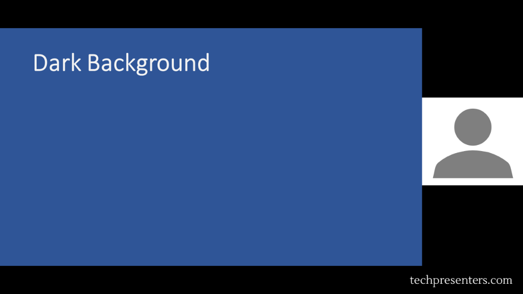
Use a dark background for your slides whenever you are presenting in a dark room or want to give a more formal feeling to your presentation. For illustration purposes, I made a couple of images of a presenter beside a slide. This is to quickly show you how the eye is pulled by the presentation.

Conversely, let me illustrate what a light image looks like in a large or dark room. Instantly you will see that the slide competes with the presenter for the slide. To which one do you pay attention?

Now, let’s take a look at how slides come across in smaller rooms and lighter spaces.
When to Use a Light Background for Your Slides
Use a light background whenever you are presenting to a smaller room or in a well lit space. You can also use a light background to convey an informal feel.

Dark or Light PowerPoint Background in Remote Presentations?
For remote (or virtual presentations) go with what you think is best. Personally, I like light color backgrounds. To help you judge for yourself, I did a quick mock up of a webcast showing a slide with a dark background and one with a light background.
Admittedly, all webcasting programs and collaboration programs are different and have different backgrounds. For illustration purposes, I laid out the image in the same way as the webcasting program that I use the most. If you use it too, you might recognize the layout.
Both are good, but I still like the light one for virtual presentations and webcasts. Again, the layout and background color of the empty space might be different depending on which program you use. Regardless, my preference is the light background on my PowerPoint deck. You can choose either though.
Some PowerPoint Tips for Simple Slide Design
The focus of this post is all about whether to use a dark or light PowerPoint background. That said, I want to give a few tips before wrapping up this article.
- Use dark fonts on light backgrounds
- Use light fonts on dark backgrounds
- Solid backgrounds work
- Try to avoid gradients and images under text
- Slides are for support – don’t overload them
- Limit text on slides
- 2D charts convey data better than 3D charts
- Have the slide deck complete well before the presentation date
- Don’t make the deck the night before
Now, I am not a graphic designer. If you are really good at design, you could make gradients and backgrounds with graphic elements that work well with your text. I find that a lot of presenters starting out try to make fancy looking slides and instead obscure the text and data in their presentations by accident.
If you work for a company that has slide templates, use those. The information above can still help you with your slide design and presentation though. If you are making the slides on your own, try a solid background where the data and text will go, but you can use graphic elements too around the edges of the slide and where the text is not. Simple slide design often helps convey information the best.
Bringing it together…
Using the tips above will help you decide whether to use a dark or light PowerPoint background. On top of that, I gave you some quick tips for simple slide design.
For some other tips, check out my article The Hottest PowerPoint HotKeys for Presenters . If you want to buy PowerPoint, may I recommend Microsoft Office 365 ? I use Office 365 myself.
Until next time, Happy Presenting Everyone!!!
You Might Also Like

Video Tips for Webcasts and Online Presentations

Audio Tips for Webcasts and Online Presentations

Presentation Tips for Webcasts and Online Meetings
This post has one comment.
Pingback: How to Make Bullet Points Show 1 by 1 in PowerPoint - Tech Presenters
Comments are closed.
By continuing to use this website, you consent to the use of cookies in accordance with our Cookie Policy.

- Michael's Blog |
- Presentation Skills |
PowerPoint tip 7: should the background be dark or light?
- " onclick="window.open(this.href,'win2','status=no,toolbar=no,scrollbars=yes,titlebar=no,menubar=no,resizable=yes,width=640,height=480,directories=no,location=no'); return false;" rel="nofollow"> Print
- Michael Brown
- Presentation Skills
Is your slide showing photographs? Diagrams/graphs/charts? Just words? A mixture?
It's going to be a judgement call, but here's a good rule of thumb. Where possible:
Make the background dark, preferably dark charcoal
Charcoal? Why not black?
Because black is too harsh. There's too much contrast. Our eyes don't like it, so it's harder to comprehend the message.
A couple of extra points:
Photographs . With few exceptions photographs should be set directly into dark charcoal without borders . However, if the photograph of an object sits in a white rectangle, you'll need a white background.
Diagrams/graphs/charts . Yes, I still favour the charcoal background, but I'm careful with the colours of the diagram - light and bright, rather than dark and dull. That's for the essential points of the diagram, but I usually use white for the supporting material, such as words and axis. It pays to decide on background before you make up the diagram - you can't drop a diagram made for a white background directly onto a dark background without making some changes.
Just words . There's no doubt. Our eyes take in white words on dark charcoal more easily than any other way - with obvious implications for comprehension.
A mixture of the above. Again, lay it all on dark charcoal.
Now, a word or two of warning.
Beware of words-only slides
All right, sometimes there's no other way. You might, for example, want to display exact wording. But the screen medium suits pictures more than words - whatever the background colour. Show your audience too many wordy slides and their eyes will glaze over, undermining your message. We humans sell ideas more effectively than words on a screen.
Does reading out the words to the audience help? Well, yes, you can justify that if you want to emphasize it in a way not obvious in the screened words. But you should know that when I carried out a survey entitled, What annoys you most about PowerPoint, the top annoyance was presenters who read aloud words the audience can see for themselves.
Beware of wall-to-wall PowerPoint
Here's some bad news for presenters who think that presentation means start-to-finish PowerPoint.
With rare exceptions, non-stop PowerPoint on the screen damages your credibility. Especially when what you're saying doesn't match what's on the screen. Photos, diagrams, or words - I urge you to do yourself and the audience a huge favour. Stand directly in front of the audience, until...
Use a screen only when the image directly and specifically illustrates what you're talking about right now.
How to turn it off? You might like to look at another blog: PowerPoint tip 10: insert a 'sleep slide'
Ready for more? See the archive
- Quiz Questions
- Quiz Answers
Leading people who work from home
Interested in training for your leaders.
We’ll show your leaders how to keep their teams motivated and productive. Learn more
Register for The Skillset Brief
Tips, advice and insights from our specialists.
It's not a newsletter. There's no news and it's not about us - just ideas you can use.
We send them out every few weeks.

- PowerPoint Design
- PowerPoint Training
- Presentation Skills Coaching
- Presentation Tips
Call Us. 202.681.0725
The Psychology of Color in PowerPoint Presentations
- April 12, 2013
- Kevin Lerner

Discover how the colors you choose for your PowerPoint presentations can guide the emotional response of your audience.
What are the best colors for a powerpoint presentation it all depends on who your audience is and what you want them to feel.
When used correctly, color can help audience members sort out the various elements of a slide. But its power goes beyond mere clarification. To some extent the colors you choose for your visuals guide the emotional response of your audience.
Blue: The most popular background color for presentation slides

Blue is one of the most common background colors. It’s calming and conservative, which is why it’s very popular with business presenters, as well as for for trainers. Studies have shown that blue has the power to slow our breathing and pulse rates. Dark blue backgrounds with light text are great for conservative corporate no-nonsense presentations. Lighter blue- more common in re cent times- work well in relaxed environments with the lights on, and help promote interaction.
Examples of BLUE in Presentations

- Quest Diagnostics: A serious company with a seriously navy blue background. The subtle angled lines promote a feeling a movement and technology. Blue complements the Green of Quest’s logo, and the white title bar provides a clean but stark contrast to the body.
- This blue template for waste management firm Republic Services provides a conservative backdrop for the financials and white bullet points. The yellow titles stand out, as does the orange, red and blue themed imagery at the bottom, not to mention the company’s logo.
- This slide for Dr. Soram Khalsa’ Complementrix Vitamin system features a template with a dark blue with angled lines. And the inner portion of the template featured a light blue-hue burst of a sun-ray to convey bright life and energy.
- This slide for Lender Direct featured an image of a file folder, edited in Photoshop, with a 80 % transparency set against a light blue background. The light blue graphic helped to convey a sense of openeness , and professionalism, while maintaining the company’s blue brand.
Green: Stimulates interaction and puts people at ease

Green stimulates interaction. It’s a friendly color that’s great for warmth and emotion. Green is commonly used in PowerPoint presentations for trainers, educators, and others whose presentations are intended to generate discussion. It’s also a great color for environmental and earth-oriented discussions.
Examples of Green in Presentations

- This slide for Hills Pet Nutrition features a modern green background with textured lines promoting a warm, but contemporary feeling. Great for their topic on pet affection.
- Money is green and so is this presentation for Presidio Finance. The white text contrasts nicely with the forest green finance images, helping to project a no-nonsense image of success and accomplishment.
- In this slide for TD Waterhouse, we created top title bar in dark green, integrating smoothly with their lime green logo. The green-hued process chart on the slide image stands out comfortably against the textured grey background.
- The flowing green arcs at the bottom and green title text helps substantiate this slides message of health and vitality. Executive Success Team’s green logo and brand also promotes a relaxed and comfortable feeling, just like Mona Vie.
Red: Handle with Care in Presentations!

Red is one of the most influential colors in your software palette — but it also carries negative cultural attachments, so use it carefully. Red is also a great color for conveying passion. Or talking about the competition. Do not use Red in financial information or tables and charts.
Examples of RED in Presentations

- The rich red of Oracle is maintained in this template, featuring red title text in an inset red rectangle and a red bottom bar of binary numbers for a look of blazing edge technology
- Trace Security uses a similar red title bar element, tying in to their black and red logo and brand.
- Red and black are also colors for Sales Training Consultants, and in this slide, we used a flat beige background, with a title bar in bright red together with red bullets and a red target graphic.
- The body pages of the Grenada presentation feature Red, but in an inset border. Text is inversed in white, as is the main body area. The key states in this map are highlighted in red.
Purple: Mystical and Emotional color in presentations and design

Purple is often associated with royalty and wealth. Purple also represents wisdom and spirituality. Purple does not often occur in nature, it can sometimes appear exotic or artificial. Nearly all the clients who come to me with presentations featuring purple or lavender are women. It’s a feminine color and it’s a good color for emotional or spiritual presentations.
Examples of Purple in Presentations

- Crosley & Company’s branding is maintained with a dominant dark purple background, and orange titles.
- A soft lavender background option gives these two medical doctors a chance to add some warmth for their mostly women audiences.
Yellow, Orange, & Gold: Attention-getting colors of affluence and prestige

Yellow can create feelings of frustration and anger. While it is considered a cheerful color, people are more likely to lose their tempers in yellow rooms and babies tend to cry more in yellow rooms.
Since yellow is the most visible color, it is also the most attention-getting color. Yellow can be used in small amount to draw notice, such as key words, or highlights but not in backgrounds. Rather than using flat yellow as a background color, consider a more “golden” or orange color. Simply adding texture to a yellow background or superimposing a photo (in Photoshop) with low transparency, can add more richness to the yellow background image.
Examples of Yellow / Gold in Presentations

- This flat yellow slide is for Web-Reach, an internet consulting firm in Miami. Even though their message was to compete with the Yellow Pages phone book, their yellow background was flat and uninspired.
- With a simple fix in Photoshop, yellow became Gold, and the same slide became more robust. We added a red bar to the top, and a grey arc to the left. Same information, just a textured golden hue helped deliver elegance and style.
- A golden textured earth background helped this slide convey the message of international elegance. The green money background blends with the gold, and the black text brings a nonsense message to the page.
- A golden textured background for Fountainhead Consulting with elements of yellow, blue, red, and grey.
Black: A strong and definite color that’s often overlooked!

Don’t forget your basic black. Often overlooked, black is a background color with useful psychological undertones. Its neutrality makes it a good backdrop for financial information. Black connotes finality and also works well as a transitional color which is why the fade to black transition is powerful, as it gives the impression of starting fresh.
Examples of Black in Presentations

- It’s a matter of black and white for this construction company. It’s intro slides were pure white text on a black background, emphasizing the company’s core beliefs. After the 3 b&w slides, the room lit-up with a series of dynamic colorful slides as the speakers enlightened the audience.
- Over 10 years old, this slide from Ryder transportation remains one of the strongest visuals. Set against a flat black background, the company’s grey logomark conveys a true sense of stability and no-nonsense action. The monotone building blocks tell a strong story.
White: Pure, Fresh and Clean. But a little boring.

White is also a calm and neutral color for presentations. It’s terrific for conveying a fresh start such as a fade to white. It represents purity or innocence. Good for positive information where you want the focus purely on the message, and not competing with a brand image. It’s clean/open and inviting and can create a sense of space or add highlights. But it can also be perceived as cheap, flat (it’s the default color for PowerPoint slides) and harsh on the eyes. Consider grey as a better background color.
Examples of White in Presentations

- To help to maintain a clean and open look this consumer collaborative called on us to integrate their brand colors set against a plain white background. The blue and orange bars provided a conservative frame, while the arcs provided a contemporary look of flow and motion.
- This slide for a large architecture and construction firm featured a flat white background offset by a colorful series of modern buildings and logos.
Grey and Silver: A conservative color; Good when Black or White won’t work.

According to psychologists, grey is often thought of as a negative color. It can be the color of evasion and non-commitment since it is neither black nor white. Some say that Grey is the color of independence and self-reliance. A few years ago, silver was the most popular color for cars. And in the presentation world, this calm color is making a comeback. Grey (or “Silver”) is a softer background than the harsh default color of white, and works well on almost all presentations. A dark grey background with light text…or light grey background with dark text…you can’t go wrong!
Examples of Grey in Presentations

- Farmers Insurance’s silver background integrates subtle ray of light elements to help add depth and texture to this slide. The red, blue, and black stock images blend comfortably with the rest of the page. And the white border around the letters add a level of modernism and clarity.
- The stainless steel background of this slide helps promote a modern contemporary look, helping to link the 4 brands together.
- A clean flowing blue arc with a non-obtrusive silver background help make this slide for Margie Seyfer appear fun but conservative
- Interim Healthcare’s brand is maintained, but a muted image in silver help add depth and dimension to the slide’s message, while supporting its key points.

We perceive dark colors as being “heavier” than light ones, so graphic elements that are arranged from darkest to lightest are the easiest for the eyes to scan. On charts, it’s best to arrange colors from dark to light.
Remember that most eyes aren’t perfect. Because color perception deficiencies are common, certain color combinations — including red/green, brown/green, blue/black and blue/purple — should be avoided.
color , powerpoint , powerpoint tips , presentation design , psychology of color , style
Presentation Perfection for Clients around the World.

"We engaged The Presentation Team to do a Presentation training for our team and he did a great job. He spent time understanding our requirements and the skill level of our team members and created a course which met our expectations and goals. I highly recommend The Presentation Team as a Presentation (PowerPoint) trainer."
Navdeep Sidhu Senior Director, Software AG
"Kevin Lerner provided best-in-class services when hired to work on promotional materials for the launch of a key product at Motorola. The expertise and quality that he brought to the project were second to none and as a result, he delivered a top-notch presentation that was quickly adopted throughout the organization. Kevin is great to work with, delivers on time, is a great team player and is always willing to go the extra mile."
Maria Cardoso Motorola
"Kevin has been a working with Cox Communications to deliver world-class PowerPoint presentation visuals since 2009. His ability to meet our specific needs, timeframe, and budgets has been exceptional. His professional interaction with our team reflects his deep expertise in the industry, superior presentation design skills, and commitment to superior service."
Jonathan Freeland VP, Video Marketing at Cox Communications
"Kevin is an enthusiastic, creative, and passionate presentation guru. Our company was impressed and felt the value of his training in 2013 that he was invited again recently to again share his knowledge. Both times he has been energetic and addressed many areas for presentation development. From planning to follow-up Kevin is personable and easygoing, motivating our teams to take their presentations to the next level."
Yoshimi Kawashima Project Coordinator, Nissin International
"Kevin helped me immensely improve my presentation slides development, from tips & tricks to aesthetics, all with the intent of getting the message across crisply and creatively. I've already received praise for decks that incorporate the skills obtained from his training. I highly recommend Kevin's services."
Era Prakash General Electric
"Kevin helped me immensely improve my presentation slides development, from "The PowerPresentations seminar opened my eyes to all the limitless possibilities in presenting."
Leah Gordillo Saint Francis Medical Center
"Kevin helped me immensely improve my presentation slides development, from "[Kevin and The Presentation Team have] always delivered 110% in terms of meeting our objectives for finished product and budget"
Paul Price Watsco Corp.
"I had more people come up to me after I spoke, commenting on the visuals you created, than I did on the subject matter!"
Andy Smith Smith & Robb Advertising
"As a Fortune 1000 company, we sought to produce a classy, yet conservative presentation for our shareholders. It was evident that you and your team listened to our thoughts as you developed the presentation..."
Will Flower Republic Services
"Your expertise in the filed of PowerPoint and general presentation techniques helped elevate us to the level necessary to beat the competition."
Mike Geary James Pirtle Construction
"Kevin brought a high level of creativity, enthusiasm, and deep multmedia experience to our team. He worked dillegently with the team to produce an outstanding proposal which we subsequently won.
Jeff Keller Accenture/L3
info @ presentationteam.com
Giving a Presentation? We can Help.
Sign-up for free PowerPoint Tips, PowerPoint Templates, and Presentation Strategies.
- PowerPoint and Presenting Stuff
How to Avoid the Four Biggest PowerPoint Color Mistakes
By Laura Foley
PowerPoint makes it easy to use bright, vibrant colors in a presentation, which can either be good or very, very bad. Used correctly, color can draw attention to important parts of a slide, elicit a desired emotional response, or reinforce a company’s brand identity. But poor color choices can be distracting in ways you might not even be aware of. And any time your audience’s attention is focused where it shouldn’t be, they’re missing your main message.
Some of the most common results of bad color choices in PowerPoint are illegibility, unintentional associations, unclear charts, and the creation of slides that are just plain ugly!
Illegibility
In a recent survey conducted by Dave Paradi , a well-known PowerPoint designer, it was found that one of the top five PowerPoint annoyances was “Slides are hard to see because of color choice.” Here’s an example of a slide that could be illegible under certain lighting conditions or on some monitors. There is very little contrast between the black text and the grey background, which makes the slide hard to read.

How to avoid it: The easiest combinations to read are light text/dark background and dark text/light background.
Unintentional Associations
Certain colors are associated with celebrations, ceremonies, or emotions so their misuse in a presentation can be subtly distracting.

In the United States, this combination of red and green reminds people of Christmas. The information on the slide has nothing to do with that holiday so this color choice doesn’t make any sense.
Colors can be warm (e.g., red, orange, yellow, gold) or cool (e.g., blue, green, turquoise). Warm colors are associated with heat, anger, and excitement, while cool colors evoke cold temperatures and calmness. In the following slide, you can see how the background color contradicts the message of the text.

How to avoid it: Choose colors that support your message drawing from the color palette in your PowerPoint template.
Unclear Charts
Colors can be used to separate data points on a graph or chart. The convention is that similar data are grouped by color. For instance, in a corporate organizational chart, the President could be Color #1, the VPs could be Color #2, and the Managers could be Color #3. That way, a quick glance at the chart tells the viewer what position the person holds within the company.

Alternately, it’s confusing if every box is a different color. On the following slide, even though the chart hierarchy communicates people’s level within the company, the colors imply that each person has a different function.

How to avoid it: Use color to group like information so that people can quickly make associations.
Just Plain Ugly!
PowerPoint templates typically include color palettes that go well with the background graphics and that look good when used together. Corporate PowerPoint templates are designed using the corporate palette to support the brand. When presenters decide to use bright colors just for the sake of brightness, the results can be awful:

How to avoid it: Use only the colors within your PowerPoint template’s color palette. If you don’t have a company template, use the same colors that appear in your company’s other marketing materials, such as its website, logo, and brochures.
So how can you tell if you’re making poor color choices? When in doubt, stick to the palette provided with the template. And always get one or more people to look at your slides before your presentation so that you can gauge their responses to the colors you’ve used. Rule of thumb: if your deck looks like a rainbow washed over it, you’re probably using too many bright colors! Just because you can doesn’t mean you should.

Laura M. Foley Design has developed creative marketing tools for many companies, including Procter & Gamble, Juniper Networks, Harvard Business School, Eloqua, Polaris Venture Partners, and Atlas Venture.
A graduate of the Massachusetts College of Art and Design, Laura has over two decades’ experience in creative presentation design, marketing, and copywriting. She lives in Central Massachusetts with her husband and two sons.
Visit her site and blog .
You May Also Like: Turn Your Speaking Fear Into Your Friend | Behind the Scenes of Building a Corporate Presentation Template | Ice-Breakers for Your Presentation: 5 Proven Suggestions
The views and opinions expressed in this blog post or content are those of the authors or the interviewees and do not necessarily reflect the official policy or position of any other agency, organization, employer, or company.
Related Posts

Filed Under: Guest Posts Tagged as: Guest Post , Laura Foley , Opinion , PowerPoint
Microsoft and the Office logo are trademarks or registered trademarks of Microsoft Corporation in the United States and/or other countries.
Home | PowerPoint | Photoshop | PowerPoint Templates | PowerPoint Tutorials | Blog | Notes | Ezine | Media Kit | Feedback | Site Map | About Us | Contact Us Link to Us | Privacy | Testimonials PowerPoint Backgrounds | Christian PowerPoint Backgrounds | Business PowerPoint Presentation Templates
Plagiarism will be detected by Copyscape
© 2000-2024, Geetesh Bajaj - All rights reserved.

Tips for creating and delivering an effective presentation
In this article.
Creating an effective presentation
Delivering an effective presentation
Tips for creating an effective presentation
Top of Page
Tips for delivering an effective presentation

Need more help?
Want more options.
Explore subscription benefits, browse training courses, learn how to secure your device, and more.

Microsoft 365 subscription benefits

Microsoft 365 training

Microsoft security

Accessibility center
Communities help you ask and answer questions, give feedback, and hear from experts with rich knowledge.

Ask the Microsoft Community

Microsoft Tech Community

Windows Insiders
Microsoft 365 Insiders
Was this information helpful?
Thank you for your feedback.
Choosing backgrounds: Light or dark?
It’s the most basic design decision when planning a PowerPoint project: Light background or dark? Corporate presentations often have to conform to a specific company style or template. For many of us though, we have to confront the light or dark question at the beginning of the process. Some random thoughts:
- The default seems to be a white slide with plain black text. (Add a plain black headline and a few bullets and we have that dreadfully boring look we have all come to hate.)
- Many presentation experts will say that text against a light background is most legible in bright rooms while a dark or black background is best for darkened rooms. This may or may not be true — you will have to judge for yourself.
- I personally like the dramatic effect of white or bright text against a dark background. If the text is large (it should be), there is not too much fine detail in the letterforms and there is enough contrast between the text and its background, legibility will not be an issue.
- Finally, I find the large expanse of brightness from a light background to be distracting — unnecessarily drawing the audience’s attention from the speaker.
I often use full frame images and then overlay text, but when I use a consistent background throughout a presentation I generally choose dark or black.
Experiment with your next project and see.
Share This Story, Choose Your Platform!
About the author: tom nixon.

Related Posts
Powerpoint makeover: making numbers pop, one reason why your core message is so important, the problem with a firehose of information, powerpoint bullets are not the problem, powerpoint makeover: an agenda is a useful thing.
What Colors To Choose For Your Presentation?

Colors are not only a matter of personal taste. They convey feelings, influence people’s mood, and even carry specific meanings. That is why you should leave nothing to chance when choosing the colors of your PowerPoint presentation. However, you don’t need to be an expert in graphic design or color psychology to select accurately the shades of your backgrounds and fonts. In this article, you will find a series of tips to help you pick the right color scheme. Get ready to come through your presentation with flying colors!
1. Choose the right color to convey the right feeling
Psychologists have taught us that colors can influence people’s perceptions and even trigger emotions. That is the reason why they have become such important elements in branding and marketing. The same goes for your visual aids: your audience will not have the same emotional response if you use a bright red background or a light blue one. Once you have identified the feelings at the core of your message, you will be able to choose the colors that can transmit them. Let’s have a look at the most common colors and discover the feelings and connotations they communicate.
RED – A powerful color to use with moderation
In the Western world, red is associated with love, passion, strength, and energy. It is a great color to put emphasis on a specific feature but can be tiring throughout a whole presentation since it raises the heart and respiration rates. Remember red is also the color of anger and danger. In conclusion, use red with care, only if you have a specific goal, for example, if your topic is food and you want to increase your audience’s appetite!

BLUE – The safe choice
More than one-third of people consider blue their favorite color, so grab this opportunity! The most popular color has a calming effect and suggests peace, sincerity, confidence, and security. It is therefore a great option as a background, especially used in the finance, business, computing, communication, and healthcare areas.

GREEN – A color with harmonizing effect, perfect for nature-related presentations
The third and last of the primary colors can have a positive impact on your public since it represents life, nature, and peace. Moreover, it conveys feelings of balance and growth. Green is also believed to increase interaction, so if you want to set a mood that leads to dialogue, go green!

YELLOW – Feed your presentation with positive vibes
Let there be light! If you want to be sure to capture everybody’s attention, yellow is the stimulating color you need. It inspires happiness, optimism, and creativity. Nevertheless, try to use a soft shade of yellow in your background, since a bright yellow can be perceived as unsettling.

ORANGE – Show your creative side
Why not try the color of innovation and creativity? If you want to convince your audience to try something new, orange will do the trick: it is the hue of extroversion and confidence.

PURPLE – Great for luxury topics
Even though purple is an intense color that can surprise your audience, the right shade of purple can transmit creativity, wisdom or even mystery. This color can also give a sense wealth and luxury. It is a good choice if you want your background to be original.

BROWN – A warm and earthy color
This color is generally associated with the Earth and more specifically wood. A light brown color with a discreet wood texture could be a great option if your presentation includes environmental elements. Besides, it suggests the idea of durability.

GRAY – A formal yet modern color option
Forget about the negative connotations of gray ! It might be considered as a conservative color, but it is definitely a popular one. It offers a softer alternative to the white backgrounds.

BLACK – A powerful color to be used sparingly
It is well-known that black never goes out of fashion. Even though it is not the most popular color for backgrounds, it can be used to suggest elegance, luxury, and seriousness. It may not be ideal for a whole presentation, but black slides can easily be used to indicate a transition or make a powerful statement.

WHITE – The simple color option, when your message is King (as it always should)
The classic white background works ideally to evoke purity or simplicity. However, some people deem it as unoriginal. It is also tiring for the eyes when projected on a screen, therefore a light grey background is often considered a better option. Nonetheless, it helps get your message across clearly and simply.

2. Combine your colors attractively to please the eye
Some colors simply don’t match! Be careful when you associate the font color and the background one! For instance, blue and green are red’s worst friends. Two colors too close together on the spectrum, such as black and brown or red and orange, will make your presentation unattractive and hard to read. On the other hand, the right combination could convey the perfect message: dark blue and golden symbolize refinement while dark blue and white refer to the ocean and suggest tranquility.
You can obviously choose a basic color scheme: one hue for your background and another for your font. You can nonetheless try more complex combinations with 3 or more colors. In this case, check that the palette you use is pleasant to the eye and that it evokes the emotions you want to transmit.
A great example of color matching can be the 2021 Pantone colors the year : Illuminating yellow and Ultimate gray. The first is bright and vivid, the second firm and reliable; together, they represent strength and optimism.
3. Improve your readability with the right contrast
Establishing the right contrast between your background shade and your font color is essential. The basic rule is a light font over a dark background or a dark font over a light background. A high contrast means an optimal readability, and thus a high level of impact on your audience. To avoid having the same level of saturation in both colors, try to choose different hues and tones. For example, the pastel shade of a color will create a better visual impression when combined with the pure hue of another color.
One last piece of advice: if possible, always try to visualize your presentation on the screen where it will be projected, in order to check the final visual impression. Now you have another string to your bow: you are ready to consciously choose the right colors for your PowerPoint presentation!
We hope you like these tips. Your feedback is very important to us. Tell us what is (are) the color(s) you love to use in your presentations.
Search Blog by topics
Search templates by categories, search templates by colors.
Love our templates? Show your support with a coffee!
Thank you for fueling our creativity.
Charts & Diagrams
Text & Tables
Graphics & Metaphors
Timelines & Planning
Best-Ofs & Tips
Terms and Conditions
Privacy Statement
Cookie Policy
Digital Millennium Copyright Act (DMCA) Policy
© Copyright 2024 Ofeex | PRESENTATIONGO® is a registered trademark | All rights reserved.

To provide the best experiences, we and our partners use technologies like cookies to store and/or access device information. Consenting to these technologies will allow us and our partners to process personal data such as browsing behavior or unique IDs on this site and show (non-) personalized ads. Not consenting or withdrawing consent, may adversely affect certain features and functions.
Click below to consent to the above or make granular choices. Your choices will be applied to this site only. You can change your settings at any time, including withdrawing your consent, by using the toggles on the Cookie Policy, or by clicking on the manage consent button at the bottom of the screen.
Thank you for downloading this template!
Remember, you can use it for free but you have to attribute PresentationGO . For example, you can use the following text:
If you really like our free templates and want to thank/help us, you can:
Thank you for your support

5 golden rules of PowerPoint design
april 30, 2024
by Deb Ashby
Wondering how to design the perfect PowerPoint presentation? It's easier than you think–just follow five simple rules to get started:
1. Consider using templates
When building a slide deck, it’s important to maintain consistency throughout. We want to ensure we are using consistent font styles, colors and themes. This can be tricky when designing from scratch, so why not start from a template?
Microsoft Create contains hundreds of pre-made, customizable PowerPoint templates, which means you don’t have to start from scratch and the fonts and colors are already set for you.
Simply choose a template from the gallery, customize it as needed, and you are done!

2. No walls of text
We’ve all seen PowerPoint presentations where slides contain too much text. The human brain struggles to listen and read at the same time. If you are presenting to an audience, keep the text on slides to a minimum.
Consider employing the “5-5-5" rule. No more than 5 lines, no more than 5 words, no more than 5 minutes. Think short and sharp memory joggers instead of rambling paragraphs.
Where possible, consider replacing text with visuals to represent your point. People remember images more than words.

3. Be mindful of colors and fonts
No one wants their audience to leave with a headache after an hour of straining to read slides. We need to ensure that our presentation is easy to read for everyone – even for those in the nosebleed seats at the back! Think about the font you are using. Is it appropriate for the presentation? What about the font size? Can people at the back easily read? What about people with visual impairment? Ensure all text is at least 24pts.
When it comes to color, ensure all slides have good contrast. Dark backgrounds should have light font and vice versa.
4. Use animation sparingly
Animation can really liven up an otherwise flat presentation. However, it should be used thoughtfully and sparingly. Too much of the wrong type of animation with objects flying in and zooming around the screen, while fun, can look confusing and unprofessional.
Animation should be subtle (especially for pitch decks and other formal presentations). With every animation you add, ask yourself, "Is this going to enhance my presentation or distract from it?"
5. Engage your audience
When presenting to an audience, there is usually an awkward time before the presentation begins while the speaker waits for everyone to arrive. During this time, people may start scrolling on their phones or get distracted with work emails, and it can be hard to pull the audience back.
To avoid this issue, work to grab your audience's attention before the presentation even starts. Instead of just having the title slide on the screen, consider creating "kiosk slides." These are a series of slides that contain a combination of interesting things for the audience to look at or engage with. Maybe you have an interesting image? A funny quote or fun facts? Or maybe there is a question you want them to think about prior to the session?
Create these slides and have them automatically cycle round before the presentation starts.

Related topics
- Slidesgo School
- PowerPoint Tutorials
How to Change Colors in a PowerPoint Presentation

Choosing colors is quite important when creating a presentation. In deed, you must adapt the hues depending on the topic and your audience. In this post, we are going to learn how to work with colors in your PowerPoint template . Remember that our templates are 100% editables! You can change the color of all their elements!
How to change the color of themes
Appling colors and gradients: texts, vectors and backgrounds, how to edit color: gradients and transparencies, downloading and editing a color variant.
If you have read a little bit about how to choose hues for your presentation, you may have made your mind about the colors you want to employ. Are you willing to create your own color palette? Remember that our templates already include their own color palettes.
- Go to View, in the toolbar, and select Slide master.
- Look for the section Colors, and then click on Customize Colors…
- A dropdown menu with different options will appear
- Let’s have a look at the sections in the menu: Text/Background-Light (1, 2), Text/Background-Dark (1,2), Accent (1-6), Hyperlink and Followed hyperlink.
- If you click on the color square close to the sections, a series of hues will appear. Note that it also includes the Theme colors.
- To add a custom color to the section, you need to click on More colors.
- There, you will encounter two different tabs: Standard and Custom.
- In Standard, there is a hexagon with different colors plus a square that shows the current color and the new one. It works as a comparative. In the hexagon, click on any color and then click OK → Save.
- If you prefer any other tone, instead of choosing between the ones that the hexagon offers, click on the Custom tab.
- Here, you can enter a hex code or simply play around with the picker. In Color mode, you can choose RGB or HSL. In RGB, you can add the number of Red, Green and Blue bits there (i.e., you’ll need to insert the hex code manually, adding the needed number of bits per color). In HSL, you need to work with Hue, Saturation and Lightness. When you finish, click OK → Save.
- The new color is now applied to all the elements that had the Text/Background-Dark 1 hue! Of course, we have used the Text/Background-Dark 1 as an example. Choose the one you need!
- Click on Close Master View (upper right corner) when you finish.
Let’s stop for a moment. Do you remember the color sections that we have mentioned? Text/Background-Light (1, 2), Text/Background-Dark (1,2), Accent (1-6), Hyperlink and Followed hyperlink. Have a look at the previous section! Although those are default names, the hyperlinks section is different. If you want to change hyperlink colors in PowerPoint, you need to make use of this section. If you change its color, all the links you add will appear in this hue! In any case, all the color sections are applied to different elements: backgrounds, vectors, texts… If you change the color of one section, It will be automatically applied to all the elements with such tone. Do you want to learn more about applying those colors to text?
- First of all, if Formatting Texts is not your cup of tea, it’s time to learn a little bit more about it!
- If you have read the tutorial, decide the typefaces you are going to use! Apply them. For changing the color, select your text. In the toolbar, click on Font color. The first row of colors correspond to Theme Colors. Choose any of them!
Let’s focus on changing the color of vectors. They can be part of the master slides, but let’s begin with those that are not part of the master. Now, we will focus on vectors that are not part of the master slide:
- Did you find an element in an image and you want to change it? Cool! Click on the image and, then, on the element.
- Click on Shape Fill.
- Choose a Theme color (the first row of hues).
If the vector you want to change in the master slides, you can change it as well.
- Click on View in the toolbar → Slide Master.
- Find the vector you want to change.
- Double click on it, and then right click → Fill. Select a color from the first row, the ones belonging to the theme. If you need it, you can also change the Outline.
- Click on the first slide and select Close Master View.

Of course, you can change the background color:
- In the toolbar, go to View → Slide Master.
- Then, click on Background Styles → Format Background.
- You have different colors, styles and the like, Let’s explore them.
- In Solid Fill, you can choose the Color and the level of Transparency.
- Do you like gradients? Cool! Click on Gradient Fill. There, you have different options you can choose from: Preset gradients, Type (Linear, Radial, Rectangular...), Direction, Angle, Gradient, Stop, Color, Position, Transparency and Brightness.
- In addition, you could add a picture or textures in the background. Click on Picture or texture fill. Choose its transparency, the picture or texture!
- If you prefer adding a pattern in the background, click on Pattern fill. Choose the one you like the most and select a Foreground and Background color.
- Finished? Click Apply to all. Then, go to the first slide and click on Close Master View.
As seen above, you can apply transparencies to your background, but you can use them with shapes and vectors as well. Let’s learn how to do so!
- First, click on the preferred image and once again on the element you want to change.
- Right click on the element → Fill → Gradients.
- Click on More gradients.
- In Fill, make sure that Solid option is marked. Then, choose the preferred transparency.
We include some color variants for different templates. Would you like to learn how to download them?
First of all, go to our webpage and look for a theme you like. If it has variants, they include bubbles in different colors.
- To go to the main page of the template, click on its title.
- On the right side, there are some Themes. Under it, click on each of the bubbles to see a preview of the variants.
- Choose Download a PowerPoint template.
- Done! Now go ahead and edit the template as above!
→ Did you like the Sketchnotes Lesson theme and the E-Learning Presentation ? Try them now, they’re free and 100% editable!! Rock the theme colors in your PowerPoint presentation!
Do you find this article useful?
Related tutorials.

New feature available: edit our templates with Canva
Whenever you need to create, Slidesgo is there. We’re continually enhancing your presentation design process with templates that are primed to impress for any occasion. And in order to let your ideas flow best, comfort is key. How could Slidesgo help you with this? By making you feel right at home with our resources, no matter your preferred platform.You spoke, and we listened. Now, your favorite slides can be accessed on a new platform: Canva! This new format adds to our existing options (PowerPoint and Google Slides), expanding your ways to utilize our first-rate presentation content. We’ve started with a selection of Canva-ready...

How to print PowerPoint notes
Crafting an impactful PowerPoint slideshow and delivering a captivating presentation are distinct skills. The first focuses on designing appealing visuals to convey a clear message, while the second involves employing effective presentation techniques to ensure the audience grasps the idea. The content of this article will help you with the latter part of this process, guiding future presenters on how to print PowerPoint with speaker notes to enhance your presentations success and effectiveness.

Discover Our Online Presentation Software for Free
We have great news for you today! If you’ve been a Slidesgo fan for years (or months, or weeks, or days, or mere hours, we welcome everyone!), you’ll probably know for now that our templates are available mostly in two formats: for use in Google Slides and PowerPoint.Google Slides is a free tool, since you only need a Google account in order to use it. PowerPoint, on the other hand, is part of the Microsoft Office suite, so it’s not a free program, but that didn’t stop it from being one of the most popular options in the world!What if we...

Webinar: Presentation Audit
With more than 15,000 templates released on Slidesgo and a user base composed of millions of people, we estimate that the total number of presentations created adds up to… um, a lot! Our team of professional designers work very hard to provide you with editable slides so that the only thing you need to do is, well, customize the elements to your liking. Starting from any given template, the results may vary a lot depending on the person who edited the contents.Have you ever wondered “Is my presentation good enough?” and wished that an expert on presentations looked at your template...
30+ Stylish PowerPoint Color Schemes 2024
Color is an element that can make or break a design, and that rule holds true for presentation design as well. Choosing the right PowerPoint color scheme is super important.
But there’s one extra thing to consider – where your presentation will be given. A PowerPoint presentation can look quite different on a computer or tablet versus on a projected screen.
When it comes to selecting a PowerPoint color scheme, this is an important consideration. We’ve rounded nearly stylish PowerPoint color schemes as inspiration. While darker color schemes might look great close-up on screens, opt for lighter backgrounds (for enhanced readability) for projected presentations.
Note: The last color in each scheme is for the slide background.
How Does Unlimited PowerPoint Templates Sound?
Download thousands of PowerPoint templates, and many other design elements, with a monthly Envato Elements membership. It starts at $16 per month, and gives you unlimited access to a growing library of over 2,000,000 presentation templates, fonts, photos, graphics, and more.

Maximus Template

Mystify Presentation

Explore PowerPoint Templates
1. Blue, Gray Green & Orange

With a bright overall scheme that’s easy on the eyes, this color scheme can help you create a modern PowerPoint presentation that’s readable and friendly. You can even tweak the colors somewhat to better work with your brand, if necessary.
The best thing about this color palette is that it lends itself to plenty of different presentation styles and applications.
2. Violet Gradient

Using the first two colors noted above, you can create a dark-to-light monotone gradient that can make for a modern PowerPoint design style.
Take this concept and expand it to any other colors you like for your spin on this modern color scheme.
3. Mint and Orange

On paper, these colors don’t seem to blend all that well, but with the right application min and orange on a black background can work.
Use a pair of colors like this for presentations where you are trying to make a bold statement or impact. This concept is often great for trendy topics or ideas that are a little unconventional.
4. Bright Blue and Light

The brighter, the better! Bright blue color schemes are a major trend in PowerPoint design … and for good reason. The color combination creates a bright, light feel with easy readability. Those are two things that pretty much everyone wants in a presentation template design.
The other thing that’s great about a color scheme like this – which focuses on one color – is that it matches practically everything else in the design with ease. It’s great for image-heavy presentations or those where text elements are a key focal point.
5. Teal and Lime

Two colors that you might not expect to see paired create a classy combo that’s interesting and engaging. Both teal and lime are considered “new neutrals” and work with a variety of colors easily. (What’s somewhat unexpected is putting them together.)
What’s great about this PowerPoint color scheme is that the extra interest from the hues can help generate extra attention for slides. The template in the example also mixes and matches teal and green primary color blocks to keep it interesting from slide to slide.
6. Colorful Gradients

Gradients are a color trend that just keeps reinventing and resurfacing. In the latest iteration, gradients are bright with a lot of color. Designers are working across the color wheel for gradients that have more of a rainbow effect throughout the design, even if individual gradients are more subtle.
What you are likely to see is a variety of different gradients throughout a project with different colors, but maybe a dominant color to carry the theme. Use this for presentation designs that are meant to be more fun, lighter, and highly engaging.
7. Light Blue Minimal

This color scheme with light blue and a minimal aesthetic is super trendy and so easy to read. You can add a lot of style with a black-and-white style for images or a deep blue accent for header text.
While a pale blue is ideal here, you could also consider experimenting with other pastels and the same overall theme for a modern presentation design.
8. Bright with Dark Background

The combination of bright colors on a dark background can be fun and quite different from the traditional PowerPoint color schemes that are often on white or light backgrounds. This design style for a presentation is bold and engaging but can be a challenge if you aren’t comfortable with that much color.
When you use a style like this, it is important to think about the presentation environment to ensure that everything will look as intended. A design like this, for example, can work well on screens, but not as well on a projector or in a large room.
9. Navy and Orange

The navy and orange color combination is stylish and classic for presentation design. To add a fresh touch consider some of the effects such as the template above, with color blocking and overlays to add extra interest.
What makes this color combination pop is the element of contrast between a dark and a bright pair. The navy here is almost a neutral hue and works with almost any other design element.
10. Dark and Light Green

A modern take on a monotone color scheme involves using two similar colors that aren’t exactly tints and tones of one another. This pairing of dark green and light (almost minty) green does precisely that.
What’s nice about this color scheme is that the colors can be used almost interchangeably as primary elements or accents. It provides a lot of flexibility in the presentation design.
11. Bright Crystal Blue

Blue presentation color schemes will always be in style. The only thing that changes is the variance of the hue. This pair of blues – a bright crystal blue with a darker teal – works in almost the same way as the pair of greens above.
What’s nice about this color palette though is that the dark color is the accent here. That’s a modern twist on color design for presentations.
12. Blue and Yellow

Blue and yellow are classic pairings and can make for a striking presentation color combination. With a bright white background, these hues stand out in a major way.
What works here is the element of contrast. A darker blue with a brighter yellow creates an almost yin and yang effect with color. The only real caution is to take care with yellow on a white or light background with fonts or other light elements.

Teal is a personality-packed color choice. If you are looking for a bold statement with a PowerPoint template, start here.
While the above color scheme also includes a hint of yellow for accents, the teal color option is strong enough to stand alone. You could consider a tint or tone for a mono-look. It also pairs amazingly well with black-and-white images.
Teal is a fun color option that will provide a lot of practical use with your slide deck.
14. Bright Coral

This color scheme is one of those that you will either love or hate. The bright coral color is powerful and generates an immediate reaction.
It’s also quite trendy and will stand out from many of the other more bland PowerPoint colors that you may encounter. This is a great option for a startup that wants to present with a bang or a brand that has a similar color in its palette. It may not work so well for more traditional brands or those that are more conservative with their slide designs.
15. Dark Mode Colors

A dark mode color scheme might be the biggest trend in all of design right now, and that also applies to presentation design.
This purple and emerald color paired with black with white text looks amazing. It is sleek, modern, and has high visual appeal without having to use a lot of images.
This works best for digital presentations when you don’t have concerns about room lighting to worry about.
If you aren’t ready to jump into dark mode on your own, the Harber template above is a great start with nice color, gradients, and interesting shapes throughout the slide types.
16. Navy and Lime

A navy and lime combination is a modern take on colorful neutrals that are anything but boring.
These colors have a nice balance with a white or light background and are fairly easy to use. With so many brands already using blue in their base color palette, this is an option that works and is an extension of existing elements for many brands. (Use your blue and add the lime to it.)
Also, with this color combination, the idea of a minimal overall slide structure is nice so that the power of the colors and impact comes through. They work beside images in full color or black and white.
17. Modern Blue

When you aren’t planning to use brand colors – or maybe as a startup or independent contractor so you don’t have them yet – a modern color combination can add the right flair to a PowerPoint presentation.
The bright grayish-blue in the Lekro PowerPoint template – you can find it here – adds the right amount of color without overwhelming the content. Plus, subtle orange accents help guide the eye throughout this PowerPoint color scheme. https://elements.envato.com/lekro-powerpoint-presentation-67YW3M
18. Blackish and Yellow

While at first pass, black and yellow might seem like a harsh color combination, it can set the tone for a project that should emanate strength. This PowerPoint color scheme softens the harshness of the duo with a blackish color, that’s grayer and has a softer feel.
Pair this combo on a light background or with black and white images for a stylish, mod look.
19. Orange and White

A bright color can soften the harshness of a stark PowerPoint design. Especially when used for larger portions of the content area, such as background swatches or to help accent particular elements.
The Sprint template makes great use of color with a simple palette – orange and white with black text – but has slide ideas that incorporate the color throughout for something with a more “designed” look to it. (And if you aren’t a fan of the orange, change the color for use with this template to keep the modern feel.)

Purple presentations are in. The color, which was once avoided by many in design projects, has flourished with recent color trends.
Because more funky, bright colors are popular, a presentation with a purple focus can be acceptable for a variety of uses. The use in Batagor template has a modern design with a deep header in the featured color, which works best with images that aren’t incredibly bold in terms of color.
21. Blue-Green Gradients

Another trending item in color is the use of gradients. This trend can be applied to PowerPOint presentations as well.
Use a blue-to-green gradient for a soft and harmonious color scheme that won’t get in the way of content. Use each hue alone for accents and informational divots throughout the presentation design.
22. Black and White

Minimalism is a design trend that never goes away. A black-and-white (or gray) presentation screams class and sophistication.
It can also be easy to work with when you don’t want the color to get in the way of your message. And if a design can stand alone without color, you know it works.
23. Reds and Black

If you are designing a presentation for viewing on screens, such as desktops or tablets, a dark background with bright color accents and white text can work well. (This combination gets a lot trickier on projector displays.)
While reverse text and red aren’t always recommended, you can see from the Nova template that they can be a stunning combination. But note, this modern color scheme is best for specific content and audiences.
24. Blue and Pink

This color scheme is a spin on Pantone’s colors of the year from 2016. https://designshack.net/articles/graphics/how-to-use-the-pantone-color-of-the-year-in-design-projects/ The brighter, bolder versions of rose quartz and serenity and fun and sophisticated.
The unexpected combo sets the tone with a strong, trustworthy blue and adds softness with the paler pink. The colors work equally well with white or darker backgrounds.
25. Blue and Green

Blue and green accents can help a black or white background come to life in a presentation template. The colors here can work with either background style, based on how you plan to display your presentation.
What’s nice about these colors is that they are pretty neutral – since both are found in nature – and can be used with ease for design or text elements in a PowerPoint color scheme.
26. Beige and Gray

If you are looking for a softer color palette, consider beige and gray. These hues can work well on screens or projected, making them a versatile option.
The nice thing about such a neutral palette is that it gives content plenty of room, so that will be the true focus of the presentation.
27. Tints and Tones

While the purplish blue-gray in the Business PowerPoint Presentation template is stunning, it represents a greater trend in presentation design. Pick a color – maybe your dominant brand color – and use tints and tones for the presentation color scheme.
By mixing the color with white or black and gray, you’ll end up with a stunning set of color variations that match your messaging.
28. Bold Rainbow

While most of the color schemes featured here only include a color or two, bright color schemes with wider color variations are trending.
This distinct “rainbow style” can be somewhat difficult to use without rules for each color. Proceed with caution.
29. Bright Neutrals

Lime green is the brightest “neutral” you might ever use. A fun palette that’s versatile can be a solid foundation for a color palette.
It works exceptionally well in the Rouka PowerPoint template thanks to a pairing with a subtle gray background. Using a light, but not white, background can be great for screens and projected presentations because it takes away some of the harshness of a white background. The subtle coloring is easier on the eyes for reading and viewing.
30. Rich Browns

Browns aren’t often what comes to mind when thinking of building a color scheme, but rich browns can be a modern option.
Pair a neutral beige-brown with a darker color for an interesting contrast that works with almost any style of content.
31. Mint Green

Go super trendy with a modern and streamlined palette of mint green and gray on white. While this combination can have a minimal feel, it also adds a touch of funkiness to the design.
Add another hint of color – think orange – for extra accents.
32. Dark Gray and Blue

It doesn’t get more classy than a combination of grays and blues. This new take on a classic color scheme adds another brighter blue as well to pick up on modern trends.
Just be careful with text using a dark background such as this one. White is probably your best option for typography (and look for a font with thicker strokes!)
28+ Best Dark PowerPoint (PPT) Templates and Themes 2024
It’s no surprise that the vast majority of software user interface designs have moved over to dark mode styles. This change has been in response to intense eye strain caused by white background applications.
So, what about your presentation formats? If everybody is looking at their software in dark mode, so too should you be presenting your next PowerPoint presentation with an expertly crafted dark PowerPoint template.
It can be a bother to get out there and find the best dark PowerPoint background presentation templates. This is exactly why we decided to compile a list of the best premium and free templates for you to choose from.
Read on to see our list of the best dark PowerPoint templates out there right now!
One Subscription: Everything You Need for Your PowerPoint Presentation
Get everything you need to give the perfect presentation. From just $16, get unlimited access to thousands of PowerPoint presentation templates, graphics, fonts, and photos.
Build Your PowerPoint Presentation

Ciri PPT Template

The X Note Template

Agency Portfolio PPT

Bolo PPT Template

Analysiz Powerpoint

Clean Business PPT
Artificial intelligence dark powerpoint template.

This dark and creative PowerPoint template is made with technology presentations in mind. It features an elegant slide design that accentuates the content above the dark background. The template includes 35 unique slides full of editable vector graphics and shapes.
eSports (Gaming) PowerPoint Presentation Template

If you’re working on a presentation for a new video game, eSports team, or a gaming startup, this PowerPoint template is perfect for creating your slideshow. It comes with 30 different slides with dark designs, each with fully customizable layouts and master slides.
Conferio – Creative Business Dark PowerPoint Template

With this dark PowerPoint template, you can create business presentations that stand out from the crowd. The template lets you choose from 36 slides that feature dark backgrounds mixed with vibrant titles and gradient shapes. It’s perfect for creative agencies and startups.
Dark Fantasy PowerPoint Template

The Dark Fantasy PowerPoint template is a sleek and modern take on the presentation format. It provides you with forty business slides, infographics, and a range of image and media placeholders to get you started. Easily one of the best dark PowerPoint background presentation templates!
Rules – Dark PowerPoint Template

Rules is a multipurpose, creative template, providing you with a versatile range of slide designs that will help you create a perfect PowerPoint presentation. The template provides you with over fifty unique slides, a range of vector icons, a free font pack, and much more!
Creative PowerPoint Dark Theme

If you’re looking for an ultra-modern business-focused presentation option, then you can’t go wrong with this gorgeously designed dark mode PowerPoint template, consisting of thirty plus unique slide designs, a range of icons, free fonts, and infographics for you to enjoy.
Unusual Dark PowerPoint Template

This PowerPoint template comes with a multipurpose presentation design. And it truly lives up to its name with its mysterious dark color theme. You can use it to prepare compelling business presentations with a modern look and feel. The template includes 16 slides featuring timelines, pyramid diagrams, and more. It’s available in Google Slides format as well.
Liquor – Dark PowerPoint Templates

Show off your next batch of incredible products with this dark vintage PowerPoint presentation format. Using a range of vintage-styled custom slides, each bordered with a gorgeous linework artistic flair, the template is a cut above the rest for presentation style. It provides thirty custom slides, a range of transition effects, and placeholder graphics for you to enjoy.
Atiqa – PowerPoint Dark Theme

Atiqa is an edgy and moody style of presentation template, with some truly unique slide designs to go along with it. The template provides you with thirty custom slides, each with a multipurpose style, as well as free fonts, a range of icons, image placeholders, and more!
Braze – PowerPoint Dark Theme

Braze is a dark and elegant dark PowerPoint background template, fashioned in a sleek and modern way. It provides a range of custom slides designed for professional presentation applications, as well as icons, multiple themes, and image placeholders.
Elevato Business – Dark PowerPoint Templates

If you’re looking for an image-focused presentation template, look no further than the Elevato Business dark PowerPoint background template. It’s a beautifully crafted template design that provides thirty custom slides, all focused around gallery presentation use.
Gustas – Dark PowerPoint Template

Blue Dark is a stunning PowerPoint dark theme that features thirty-five beautifully crafted slides, free fonts, drag and drop picture placeholder functionality that really make customization a piece of cake. A great dark PowerPoint background presentation template out there!
Bridge – Dark PowerPoint Template

Bridge is a dark-mode-styled presentation template that provides an incredible range of features for its users. With over two hundred slides, thousands of vector icons, and a choice between light and dark versions, Bridge truly sets itself apart from other template designs.
Tenebris – Dark PowerPoint Template

Tenebris is a dark and elegant PowerPoint presentation template. Providing you with a professional business-focused foundation, the template comes equipped with thirty unique custom slides, three iconic themes, and a range of easy-to-use customization options.
Lookbook Dark PowerPoint Templates

Here we have a PowerPoint template that’s a well-known staple in the presentation market, used for all kinds of business and creative portfolio needs. With this PowerPoint template in your toolkit, you can bring that iconic dark mode style to the table in an impressive fashion.
Workspace – PowerPoint Dark Theme

Workspace is a multipurpose presentation template that uses a gorgeous dark-mode-styled design. The template comes with fifty custom slides, spread across a range of applications. On top of this, Workspace provides master slides, free icons, image placeholders, and much more!
Bungundy – Dark PowerPoint Template

The Bungundy PowerPoint presentation template is a wonderfully designed set of custom slides. Designed as a multipurpose platform, Bungundy can present almost any kind of information effectively and uses a robust and aesthetically pleasing dark PowerPoint background design that is sure to impress.
Dark Concern PowerPoint Template

Our next template is a hyper-professional PowerPoint format that provides you with a range of business slide designs that will make your next presentation a hit in the office. A gold standard in the world of dark Powerpoint templates!
Tridio – PowerPoint Dark Theme

It’s not often we come across a fully integrated 3D business presentation template, yet here it is. The Tridio template is a professionally designed 3D presentation format, providing you with thirty custom slides, a free font pack, custom icons, and a range of infographics.
Duxy – Dark PowerPoint Template

Duxy is a different take on the traditional dark-mode PowerPoint template style, using a dark blue as its main color choice. It employs professional presentation slides and provides a range of features tailored for multipurpose applications.
Corner – Dark PowerPoint Template

Corner is a professionally designed presentation template, using a range of master slides to give you full creative control over the way you utilize its design. It comes with thirty-nine master slides, and incredible customization options to allow the template to appeal to a wide range of applications.
Free Dark PowerPoint Templates
You don’t have to spend a pretty penny to get your hands on some great dark PowerPoint templates. Let’s take a look at some free dark PowerPoint templates that stand out from the crowd.
Graffiti Artist Portfolio – Free Dark PowerPoint Template

This is a free PowerPoint template that comes with a dark and creative slide design. It includes 24 customizable slides with stylish brush strokes, icons, and shapes. You can use it to create effective portfolios for creative professionals.
Staff Meeting – Free Dark PowerPoint Template

Download this dark PowerPoint template for free to create professional presentations for business and team meetings. The template comes with 24 slides that you can edit to your preference.
Skywalker – Dark PowerPoint Template

Create a captivating presentation with the Skywalker PowerPoint template. The package comes with a range of multi-purpose custom slides, with each slide using a sleek and modern dark-mode style. A great resource for both creative and professional presentation needs!
Free Dark Brush PowerPoint Template

Here we have a sleek and modern presentation template, designed primarily for weekly meetings, internal reporting, and pitch deck applications. The template comes with a range of unique slide designs, vector graphics, and customization options for you to take advantage of.
Kitulah – Free PowerPoint Dark Theme

The Kitulah template is a presentation format that provides a minimalistic, yet effective, dark PowerPoint background template style. It includes twenty-one professionally designed slides 16:9 widescreen layout, flowcharts, vector graphics, and more.
Create A Stunning Dark-Mode Presentation with Ease!
Whilst it is always a stressful undertaking, tailoring a compelling presentation, that doesn’t mean finding a great dark-mode presentation template has to be. With these dark PowerPoint templates under your belt, you have everything you need to create a captivating presentation with ease.
COMMENTS
Use a light background in your PowerPoint files when you are working in a well-lit room, a small room or want to convey a less formal style of presentation. The dark presentation stands out more in a light room. Use this if you want a more formal feel, but be aware that it may draw attention away from the presenter.
So the answer is, it depends on the context. For example, in a darkened room it would be better to use a dark background. In a room with lights on, a light background may be more appropriate ...
There's too much contrast. Our eyes don't like it, so it's harder to comprehend the message. A couple of extra points: Photographs . With few exceptions photographs should be set directly into dark charcoal without borders. However, if the photograph of an object sits in a white rectangle, you'll need a white background. Diagrams/graphs/charts.
A dark grey background with light text…or light grey background with dark text…you can't go wrong! Examples of Grey in Presentations. Farmers Insurance's silver background integrates subtle ray of light elements to help add depth and texture to this slide. The red, blue, and black stock images blend comfortably with the rest of the page.
They tend to pop out and attract attention—especially a bright red. Greens, blues, and purples are cool colors. They tend to recede into the background and draw less attention, especially darker shades. White and very light colors also catch the eye, whereas black and very dark colors generally are less noticeable. Figure 1 - Color Groups
Light Background with Dark Text and Graphics. Background - warm beige. Text and Graphics - dark blue, black, dark purple. Accent Colors - dark green, burgundy. The beige background combines the emotional impact of brown and white without gaining too much of the negative effect of these colors such as boring and staid.
The only exception is when presenting in dark rooms with no windows and the lights turned off, when a dark theme may be more suitable. Usually light text on dark background works best for large keynote type presentations, whereas dark text on a light background works best for smaller settings such as a classroom.
How to avoid it: The easiest combinations to read are light text/dark background and dark text/light background. Unintentional Associations. Certain colors are associated with celebrations, ceremonies, or emotions so their misuse in a presentation can be subtly distracting.
Themes automatically set the contrast between a light background with dark colored text or dark background with light colored text. See Combining colors in PowerPoint - Mistakes to avoid. Check the spelling and grammar. To earn and maintain the respect of your audience, always check the spelling and grammar in your presentation.
The default seems to be a white slide with plain black text. (Add a plain black headline and a few bullets and we have that dreadfully boring look we have all come to hate.) Many presentation experts will say that text against a light background is most legible in bright rooms while a dark or black background is best for darkened rooms.
How to add a background in PowerPoint - the right-click method. Method 2 - the Design tab option. To access this option, go to the Design tab on the ribbon. On the far right side, you will see the Format Background option. Clicking it will open the Format Background pane on the right side of your screen.
The basic rule is a light font over a dark background or a dark font over a light background. A high contrast means an optimal readability, and thus a high level of impact on your audience. ... Now you have another string to your bow: you are ready to consciously choose the right colors for your PowerPoint presentation! We hope you like these ...
2. No walls of text. We've all seen PowerPoint presentations where slides contain too much text. The human brain struggles to listen and read at the same time. If you are presenting to an audience, keep the text on slides to a minimum. Consider employing the "5-5-5" rule. No more than 5 lines, no more than 5 words, no more than 5 minutes.
Here are five of the best premium dark and black theme PowerPoint templates: 1. DESIGNIUM - D ark PowerPoint Template. Dark Designium is a cool choice if you're looking for a clean design. See more of this template from the image gallery above. Dark Designium is a multipurpose dark PPT template.
Use dark text on light background or light text on dark background. However, dark backgrounds sometimes make it difficult for some people to read the text. Do not use all caps (except for titles). To test the font, stand back six feet from the monitor and see if you can read the slide. Graphics and Design Keep the background consistent and subtle.
Download and customize our Dark-colored Google Slides and PPT templates to communicate better with your presentations Free Easy to edit Professional. ... Download the "World Water Day" presentation for PowerPoint or Google Slides and start impressing your audience with a creative and original design. Slidesgo templates like this one here offer ...
Changing the color of vectors. If the vector you want to change in the master slides, you can change it as well. Click on View in the toolbar → Slide Master. Find the vector you want to change. Double click on it, and then right click → Fill. Select a color from the first row, the ones belonging to the theme.
Using the first two colors noted above, you can create a dark-to-light monotone gradient that can make for a modern PowerPoint design style. Take this concept and expand it to any other colors you like for your spin on this modern color scheme. 3. Mint and Orange. #21e9c5 #ff8513 #000000.
Graphic designers, artists, gamers, freelancers, and all other creatives will appreciate these free dark presentation templates from our impressive slide templates library, teeming with customizable layouts to suit your needs. Black Light Brown Shadow Bright Bold Purple Red Monochrome Grey Neutral Yellow Magic Death Blue Winter Green Warm ...
Professional with a fresh touch color combination. If the topic of your presentation is meant to build trust or confidence, to calm your audience or to deliver important — perhaps serious — news, then blue is the color for you. The bright green color balances the palette, creating a fresh feel. Color codes: #6B90B2 · #1B558E · #CCD64D.
Many offices and meeting rooms have windows. Sometimes it even gets sunny outside. When there is ambient light, that light will take over the dark theme and the presentation will become light-light over light text. It may be hard or impossible to read at this point. Before you make a presentation. You should go the presentation room and do a ...
Download your presentation as a PowerPoint template or use it online as a Google Slides theme. 100% free, no registration or download limits. Create illuminating presentations with these light templates, guaranteed to brighten up your audience's day. No Download Limits Free for Any Use No Signups.
Artificial Intelligence Dark PowerPoint Template. This dark and creative PowerPoint template is made with technology presentations in mind. It features an elegant slide design that accentuates the content above the dark background. The template includes 35 unique slides full of editable vector graphics and shapes.