Marketing Services


Business Marketing News: Inside KFC’s Controversial Rebranding
July 15, 2015 / by Raquel Royers

Who is this mascot? Well, the Colonel Sanders himself, of course! If you don’t know who that is, click here ... (warning: it’s pretty weird).
And some people aren’t too happy to see him again.
Why is he back?
KFC decided to undergo a rebranding with its business marketing because its brand was not as popular as it once had been, was down in sales and millennials weren’t hopping on the bandwagon. So much so that 60 percent of millennials had not eaten at the fried chicken chain ever, according to Business Insider.
Check out this article for some more insight from Ad Age:
KFC Resurrects Colonel Sanders for Brand Revamp
Posted by Maureen Morrison, Ad Age
First McDonald's brought back a slimmed-down Hamburglar for a limited-time promotion, and now KFC, which is celebrating its 75th anniversary this year, is bringing back Colonel Sanders, who has been dead for nearly 35 years. According to a spokeswoman, the Colonel -- or actors who played him -- hasn't appeared in ads since 1994, though an animated version of him ran until 1998. Consumers will see the new Colonel online, in social media, on broadcast and in stores as part of an effort to update the chain's image.
The brand refresh is the first major work from KFC's new agency, Wieden & Kennedy , which picked up the account earlier this year from FCB . The push includes a marketing blitz with the new Colonel played by "Saturday Night Live" alum Darrell Hammond, store remodels, new packaging, new menu items, a new KFC.com and a "reinvented" ColonelSanders.com, which gives the history of the Colonel in all his different iterations.
KFC had been struggling with sales recently, but has begun to see an uptick, reporting a 5% same-store sales increase outside of China. The chain, along with others in China, had been struggling amid various poultry concerns including the Avian flu.
Continue Reading Original Article: KFC Resurrects Colonel Sanders for Brand Revamp
Rebranding a business, especially such a large one can be a risky thing to do. It can often make or break the business. In this case, so far the numbers show that KFC made the right decision. It definitely has brought its name into the limelight and made people more aware of the chain. While some of the responses have been negative, they’re still being talked about and are top of mind.
According to Greg Creed, the CEO of KFC parent company Yum! Brands says that one out of five people hate the new ads featuring the Colonel. ( Business Insider )
"So far the response has been about 80% positive, 20% hate it," Creed said at a conference in New York on Wednesday, according to industry journal Food Business News . "And I am actually quite happy that 20% hate it, because now they at least have an opinion. They’re actually talking about KFC, and you can market to love and hate; you cannot market to indifference." Personally, I take no offense to them but only find them annoying. What do you think of KFC’s rebranding and new business marketing tactic bringing back Colonel Sanders in its new advertisements?
Does your business need a rebranding? Contact us below for a free assessment!

Since 2002, Half a Bubble Out has been dedicated to providing marketing, advertising and small business consulting that meet the needs of our clients. We specialize in powerfully telling stories through inbound marketing to grow your business filled with more passion and provision. Based in Chico California, we serve clients throughout Northern California and across the country to New York.
Topics: Our Thought Bubbles , News , Marketing
Subscribe for Weekly FREE Business Strategies and Resources

Latest Posts
Posts by topic.
- Ask Method (1)
- Best Practices (10)
- Blogging (65)
- Business Development (75)
- Calls-to-Action (5)
- Client Spotlight (5)
- Content Marketing (69)
- Culture (12)
- Customer Retention (7)
- Digital Marketing (10)
- email marketing (41)
- employee engagement (7)
- employee happiness (14)
- employee motivation (8)
- Employees (2)
- Grow Your Business (38)
- Guest Blogs (6)
- HaBO News (8)
- Holistic Strategy (1)
- Inbound Marketing (102)
- Internet marketing (157)
- Keywords (25)
- Landing Pages (25)
- Lead Conversion (46)
- Lead Generation (78)
- Lead Nurturing (19)
- Leadership (13)
- Link Building (17)
- Management (2)
- Marketing (48)
- Mobile Marketing (2)
- Non-Profts (1)
- Online Public Relations (11)
- Online Video (6)
- Our Thought Bubbles (38)
- Paid Advertising (2)
- Passion & Provision (29)
- Personal Reflections (1)
- Promotion (4)
- small business (104)
- Social Media (111)
- Traditional Marketing (19)
- video marketing (3)
- Website Development (70)
- Website Traffic (6)
Posts by Month
- April 2023 (1)
- March 2023 (2)
- December 2022 (1)
- September 2022 (1)
- March 2022 (1)
- February 2022 (2)
- January 2022 (4)
- September 2020 (1)
- October 2019 (1)
- January 2018 (2)
- December 2017 (1)
- August 2017 (2)
- May 2017 (1)
- December 2016 (1)
- October 2016 (2)
- July 2016 (1)
- April 2016 (2)
- March 2016 (3)
- February 2016 (7)
- January 2016 (10)
- December 2015 (12)
- November 2015 (12)
- October 2015 (12)
- September 2015 (15)
- August 2015 (20)
- July 2015 (23)
- June 2015 (19)
- May 2015 (17)
- April 2015 (20)
- March 2015 (15)
- February 2015 (16)
- January 2015 (23)
- December 2014 (22)
- November 2014 (22)
- October 2014 (21)
- September 2014 (22)
- August 2014 (20)
- July 2014 (22)
- June 2014 (25)
- May 2014 (26)
- April 2014 (24)
- March 2014 (21)
- February 2014 (20)
- January 2014 (25)
- December 2013 (25)
- November 2013 (28)
- October 2013 (27)
- September 2013 (27)
- August 2013 (21)
- July 2013 (23)
- June 2013 (24)
- May 2013 (31)
- April 2013 (19)
- March 2013 (9)
- February 2013 (8)
- January 2013 (2)
- September 2012 (2)
- August 2012 (1)
- July 2012 (2)
- May 2012 (1)
- April 2012 (1)
- February 2012 (1)
- October 2011 (1)
- August 2011 (1)
- July 2011 (3)
- March 2011 (2)
- December 2010 (1)
- September 2010 (1)
- May 2010 (1)
- February 2010 (1)
- January 2010 (1)
- August 2009 (1)
- April 2009 (1)
- March 2009 (2)
- February 2009 (1)
- January 2009 (6)
- November 2008 (1)
- August 2008 (3)
- July 2008 (2)
- There are no suggestions because the search field is empty.
Login Contact Us Accessibility Information
Half a Bubble Out Marketing, Advertising and Consulting 680 Rio Lindo Avenue, Suite 40 Chico, CA 95926 (530) 345-8295 [email protected]
Terms & Conditions | Privacy Policy | Earnings Disclaimer
©Copyright 2021 Half a Bubble Out
You can view videos online by purchasing a subscription. Videos are not available for download. Some cases only have a video. If there is no written PDF, only the video is available for the case. Subscribe here OK
Please log in to view content.
Don't have an account?
Subscribe to receive instant access to the Effie Worldwide library of finalist and award-winning case studies. Learn more >

2019 SILVER SUSTAINED SUCCESS - PRODUCTS UNITED STATES
Kfc the return of colonel sanders, ran in: united states.
Kevin Hochman, President Andrea Zahumensky, Chief Marketing Officer
Wieden+Kennedy *Lead Agency
Jennifer Lett, Director, Brand Advertising at KFC US Steve Kelly, Director of Media and Digital Mary Ellen Scott, Associate Manager of Advertising and Packaging Kevin Hochman, President Andrea Zahumensky, Chief Marketing Officer
Jesse Johnson, Group Brand Director Britton Taylor, Group Strategy Director Eric Baldwin, Executive Creative Director Freddie Powell, Creative Director Jarrod Higgins, Creative Director Matt Hisamoto, Sr. Strategist Alex Barwick, Group Media Director Anjali Patel, Associate Media Director Megan Riehl, Brand Management Steve Smith, Brand Management Jason Bagley, Executive Creative Director Kimmy Cunningham, Brand Management
MEC New York
Spark foundry.
KFC was once the #1 chicken restaurant in America. But after nearly a decade of declining sales, stores were closing and the brand was no longer on top. KFC was in dire need of a turnaround plan. We helped KFC rediscover its soul and recommitted the brand to everything that made it so special in the first place, including its iconic founder, Colonel Sanders. Kentucky Fried Chicken has made a dramatic comeback, improving perceptions with younger consumers and generating four consecutive years of sales growth in an increasingly competitive category.

Audience: 18–34-year-old fast food eaters
Objectives: Change brand image
Type: Business to Consumer
Language: English
Judge Tags: ;Sustainable Development Goal Recognition – SDG#5 – Gender Diversity
You can view videos online by purchasing a subscription. Videos are not available for download. Some cases only have a video. If there is no written PDF, only the video is available for the case. Subscribe here .
- Case Library
- Effie Index
2007: KFC, Brand Revitalisation: Case Study
A powerful combination of product development and inspired marketing that was true to the brand restored KFC’s fortunes on the high street.
Key insights
- A fresh business strategy, rigorously implemented through all aspects of marketing, transformed the KFC brand from sharp decline to category-beating growth.
- The strategy was based on the courageous decision to buck the trend among fast food outlets to talk about their ‘healthy’ options and instead stress the great product taste.
- This was accompanied by cleverly-timed new product development to reach both key target audiences of young people and families at the same time.
KFC Corporation, based in Louisville, Kentucky, is the world’s most popular chicken restaurant chain. It operates more than 5,200 restaurants in the US and over 15,000 around the world. It is part of Yum Brands!, which had revenues of just under $11 billion in 2009. KFC reached Britain in 1965 (before either McDonald’s or Burger King). It now has over 700 stores.
But by 2005 KFC had lost its way, with a lacklustre reputation on the high street and slumping sales. So in-depth research was carried out to find a way to revitalise the brand’s fortunes. A new strategy based on taste not only set the brand apart from its competitors but it brought back both families and young people. A cycle of new product development carried out over the year also increased both frequency of visits and expenditure.
By April of 2006 the brand grew steadily for the first time in three years, peaking at 30% year-on-year (YOY) growth. Communication boosted the brand’s popularity to the point that the average spend rose by over 60p per ticket throughout the year.
Headed in the wrong direction
By the end of 2005, KFC was in trouble. It had become a dinosaur on the high street. The brand remained as famous as ever, but now felt out of date and favour. KFC no longer seemed to have a role for consumers in modern Britain. Sales were in freefall, suffering ongoing and serious decline. Market penetration was also falling (as well as average ticket value).This poor performance was a result of a number of challenges facing both the category and the brand itself (Figures 1 and 2).
1. Category challenges
The nation’s attitudes to food changed significantly over 2005. The ‘health agenda’ that had been brewing for a few years, reached critical mass. Jamie Oliver launched ‘school dinners’ (See Chapter 10) and Gillian McKeith became a household name among a host of food and diet-related programming. As a result, quick-service restaurant (QSR) brands became public enemy number one. This, combined with the relentless coverage and hype about obesity in the media, had a significant impact on consumers’ dietary aspirations. For example, according to a 2006 study by TNS and the Food Standards Agency (FSA), by the end of 2005 67% of people believed they should eat fewer fatty foods, 64% fewer sugary foods and 58% less salt.
Moreover, new competitors were challenging the category, offering healthier alternatives. Service stations, supermarkets, chemists and coffee shops were all selling ready-to-eat food — significantly fragmenting the market. Branded sandwiches such as Subway and Prêt-a-Manger were stealing market share from KFC as they increased their number of stores and gained market penetration. McDonald’s and Burger King followed suit by attempting to become health-focused in response to public pressure.
2. Brand challenges
There was an abyss between how the brand projected itself and customers’ experiences. Recent advertising had given the brand a much-needed injection of credibility, youth and energy. However, while the advertising portrayed this appealing and sexy image, the reality was tired stores and underwhelming products.
The other challenge was new product development (NPD), an important element in this market. There were two key audiences for these quick-service restaurants: ‘families’ and ‘teens and young adults’. These groups accounted for 89% of KFC’s sales.
In 2005 KFC’s NPD was aimed at the youth market, with snacking items developed to increase their frequency of visits. The problem was that KFC then became the place for snacks (with low ticket prices and margins), not a meal destination. Attempts were also made to create healthier food with a range of non-fried chicken, salads and a response to new competitors with sub sandwiches. As well as confusing consumers about what the brand stood for, these innovations were either failing or cannibalising regular sales.
Meanwhile, families were leaving the brand. Despite eating more meals together they weren’t choosing KFC (an FSA food trends study in 2006 showed 57% of people ate one meal a day with all family members compared to 52% in 2004) and sales among families were suffering accordingly. Families did not feel the brand was for them any more — an image reinforced by poor service and stores frequented by ‘youths’. This was particularly damaging for sales because families’ average spend was almost three times that of young adults.
Learning from in-depth research
A new direction was badly needed. In the face of media pressure for healthy living and against fast food, what would motivate people to return to KFC? An in-depth qualitative study was launched to improve the understanding of consumer attitudes and inform brand repositioning.
- Fast food tastes good . The obesity debate gave consumers a new awareness that ‘fast food was not healthy’. However, this didn’t mean total abstinence from their favourite food. While still seeking ‘better for you’ cues, they didn’t want fast food to be ‘good for you’. Consumers choose fast food because it tastes good, not because it’s healthy. As one said, “You’ve decided to go to McDonald’s. Why would you buy chopped-up apple?”
- KFC tastes especially good . There’s something especially compelling about the taste of KFC: “You can’t make it yourself and competitors can’t get close”. KFC’s singular taste unified all consumers. Once the desire for KFC lodged in consumers’ minds, there was nothing else that would satisfy the urge. The thought of the taste quickly turned to a craving that had to be satisfied.
- What the KFC taste means to each audience . For families, KFC’s strength was the product itself. The media’s food obsession had made parents particularly aware of the authenticity of their food (in light of bad publicity surrounding products like Turkey Twizzlers ). As well as seeking an economic way to feed hungry mouths, they wanted the reassurance of ‘real food’. KFC was the only high street fast food outlet that served freshly-prepared whole chicken, not reformed or reconstituted chicken products. This authenticity was seen to be a crucial benefit.
Teens and youths also craved the taste of KFC. They were seen as impulsive eaters who ate whenever they were hungry. They followed their cravings and weren’t brand loyal, but constantly looking for variation and new tastes. Although their mealtimes were less formally defined than families, they were frequent purchasers of meals on the go. lf they got the urge for KFC, they followed it.
Devising a ground-breaking new strategy
The brand platform chosen for all communications was ‘That chicken urge can only be satisfied with the irresistible, indescribable taste of KFC’. This was indeed a radical step — doing the exact opposite of competitors and in the face of popularly-accepted consumer trends. While competitors attempted to embrace healthy eating trends, KFC repositioned itself around the fact that its product tasted delicious (Figure 3).
In other words, KFC became proud of its chicken again, reminding people about the heart of its brand and simultaneously connecting with what consumers sought from the fast food market.
The big challenge, however, was to take a single brand message and make it compelling for both audiences. So all marketing activities proudly put food at their heart. The brand’s endline was changed to become: ‘You’ve got great taste.’
Families were identified as the primary audience for reviving the brand, with mothers as the key decision-makers at dinner, deciding whether to take the night off or treat the family. Products, messages and media were all aimed at them. Youths became the secondary target, with separate products and communications developed specifically for them.
Nor was there any repeat of the previous mistakes where NPD sought to introduce healthy salads or ‘sub’ sandwiches. The year was instead divided into eight promotional periods in each of which one family and one youth product were promoted (Figure 4). As well as generating news, these products also encouraged current consumers to increase both their frequency and ticket price per visit, with new ‘layers’ of products avoiding cannibalisation of existing products.
Four new meals were introduced which either made mothers’ lives easier, or offered greater variety or better quality for the family. For younger consumers there were five new products offering variations of taste. The introduction of individual box meals also raised spend among this value-conscious group.
New products were not only rigorously tested in both qualitative and quantitative research, but were also trialled in test regions supported by above-the-line and in-store communications. Only after a sufficiently good test performance were they added to the national calendar.
Selling the great taste Given the strategy of constantly giving both targets new reasons to buy KFC, the challenge was to support all promotions with communications without significantly increasing the media budget.
1. Advertising
Advertising followed the NPD strategy by using media to ensure each group was targeted as effectively as possible. In all channels the core message was irresistible taste.
- To target mothers, prime-time TV was used in the run-up to the evening meal. Commercials used insightful truths about everyday family life to illustrate the relevance of new products and KFC began to feel like a mainstream, accessible, family brand again.
- The youth target was more likely to be out and about. Above-the-line spend was transferred from TV to posters within close proximity of stores. The product was made the hero of the ads, with appealing food photography in order to spark that unique KFC craving.
2. In-store communications
All messages were also carried through to the in-store environment which simplified the customer’s journey to purchase and reinforced new purchase behaviour. There was a distinct synergy of communications.
3. Other channels
In order to inform customers about provenance and nutritional details, a number of actions were taken. For example, the website was updated to contain all such information, and in-store leaflets about the food’s sourcing were produced. This was to provide reassurance, not to claim the food was ‘healthy’.
4. In-store experience
The new pride and energy in the brand was also reflected in the stores and customer experience. Staff training was focused on teamwork and education in new products. In addition, 30% of the estate was refurbished, with a tangible impact on sales.
Revolutionising brand performance
The results were dramatic. KFC demonstrated immediate growth as the new marketing plan was implemented.
- Sales rapidly improved. By April the brand was experiencing sustained growth for the first time since 2003, peaking at 30% year-on-year growth. Despite losses in the first quarter the year ended in significant growth (Figure 5).
- The brand’s increased penetration was a key factor behind the sales growth: shifting from a low of 31% in December 2005 to 49% a year later. This would be a significant change in fortunes for any brand, but was unprecedented, given the adverse factors this category had faced.
- Ticket price, which had been in continued decline, also rose steadily, partly as a consequence of the increased number of family meals but also because the brand was now able to sell products at a price premium based on the new positioning of superior taste. The average spend rose by over 60p per ticket over 2006.
Standing out from the competitive crowd
While other fast food brands continued to lose share of total eating occasions. KFC defied this trend, demonstrating continued growth at the expense of its competitors such as McDonald’s and Burger King. Perceptions of the KFC brand increased compared with its two major competitors. This measure combined perceptions of ‘value’, ‘experience’ and ‘food’ for each brand. KFC went from being considered the same or worse than these competitors to being superior in every area. Significantly, KFC’s food was its leading brand strength.
As well as a superior image, KFC also found a new salience among consumers. While awareness of its competitors declined, KFC reached an all-time high level of brand awareness. The communications strategy was clearly reaping its rewards.
However, KFC didn’t simply ‘purchase’ these improvements. The brand’s advertising spend increased only marginally between 2005-6, while it continued to be consistently outspent by McDonald’s. KFC’s proud new tone of voice was reflected in consumer attitudes. While other brands were losing their fans, KFC retained its popularity. By the third quarter of 2006, the gap between KFC and McDonald’s was at an all-time low (Figure 6).
The greatest success was among the new core target audience. KFC’s penetration and frequency among families improved radically, restoring KFC’s penetration to over 50% (a 20% change). This clearly demonstrated the fundamental role the marketing strategy played in the brand’s revival.
Entries for the 2013 Awards for Excellence are now open, now is the time to choose the category you would like to enter .
Download PDF
Enjoy this? Get more.
Our monthly newsletter, The Edit, curates the very best of our latest content including articles, podcasts, video.
Become a member
Not a member yet?
Now it's time for you and your team to get involved. Get access to world-class events, exclusive publications, professional development, partner discounts and the chance to grow your network.
- Equity, Diversity and Inclusion
- Brand First
- Our Services
KFC Is Not Clucking Around
Crossing new roads to a reconnect a brand audience.
When you become a professional chef at 40 years old and franchise your first restaurant at 62 (in 1952), you’ve set the tone for a company that won’t stand still and won’t give up. That’s what Col. Harlan Sanders did with Kentucky Fried Chicken , now KFC .
But even after achieving global success, businesses can’t rest. Brand audiences change. Where people get information, what they buy and where they buy have changed dramatically in the last two decades. It’s up to brands to move with them. Unfortunately, KFC had fallen behind.
Scratching Through the Recession
Like many fast food restaurants, the recession in 2008 hit KFC hard. Hundreds of stores were closed and industry rankings dropped. In addition, the company had drifted away from the brand’s core values. Making real changes to get back to those roots can be hard, but that’s exactly what KFC is doing. Kevin Hochman, KFC Brand President and Chief Concept Officer, told QSR Magazine , “When Kentucky Fried Chicken was at its best and growing the fastest, the colonel and his values were at the center of everything we did. Those values are critical to what makes Kentucky Fried Chicken so great.”
The Original Recipe Gets a Marketing Makeover
“We have to meet the customer where they are. They want to be entertained or they want something that’s going to get their attention, because if you don’t get their attention, it doesn’t matter what you’re saying,” says Hochman. The company has taken that idea to heart and won’t be ignored. Here’s a sampling of recent creative.
They’ve brought back the original Col. Sanders with technology.
They’ve added a posse of imposter cols., including norm macdonald, rob lowe, and others., they’ve sent a chicken sandwich into outer space. (yes, that’s rob lowe.), they created a robotic col. sanders to take your order., they wrote a romance novel (available on amazon ) for mother’s day., they even made a little movie about a big chicken., buckets of success.
Where previous KFC ads were vapid, the new communications are getting attention and driving results. QSR Magazine reports that over the last two fiscal years sales have grown, ending a nearly decade-long slide and that same-store sales have increased for 11 consecutive quarters. That’s a great start. Based on the most recent push in marketing, it doesn’t appear that it will let up anytime soon. It’s proof that even the most storied brands can lose their way, but by leveraging their biggest advantage—their legacy—in new ways they can fight their way back into the game.
For more insights and trends related to a brand audience , check out these posts.
For insight into how brands can nurture renewed brand growth, download our ebook, five gates of branding :, you might also like, running the martech numbers, fresh direction, in every direction, get more value from your brand..
Schedule a free, 30-minute Brand consultation, today!
Thank You! We will be in touch to schedule a time.
Table of Contents
Kfc consumer profile, types of kfc marketing channels, digital marketing strategy of kfc , kfc's social media marketing , kfc marketing strategy 2024: a case study.

Become a Certified Marketing Expert in 8 Months
KFC uses demographic segmentation to serve the target market that has both vegetarian and non-vegetarian customer segments. Its offerings cater to kids, young adults, and almost all age groups. KFC's target audience can be categorized into four groups:
- Teens and young adults
- Budget customers
Its primary customer profiles incorporate teenagers and families because most teenagers are impulsive, and they love to dine out with friends or order online to have a meal with their family. The secondary customer profile includes adults, and the tertiary customer profile has people with lower budgets.
KFC started with an undifferentiated targeting strategy as it served the same menu worldwide. However, in recent times, it has started localizing its menu for better acceptability in the market. The KFC marketing strategy incorporates two types of marketing channels: Personal and Non-personal.
Personal channels involve communicating directly with the audience, such as a KFC salesperson introducing products to a customer in person or over the telephone. Non-personal marketing channels include the use of media both online and offline, such as
- Promotion Campaigns
- PR activities
- Social Media
The KFC marketing strategy primarily includes SEO , content marketing , email marketing , social media marketing , and video marketing. However, the company pays special attention to social media marketing and uses the most popular digital marketing platforms to highlight its price and customer satisfaction.
KFC's Facebook and Twitter pages are extremely high on interactions with customers.
KFC's Facebook Pages
KFC uses Facebook as a medium to educate its customers with new offers, products, discounts, and other schemes. It also uses Facebook to address customer grievances. The brand ensures that they put across product-oriented content. It promotes online ordering facilities via social media.

KFC’s Official Facebook Page Displaying A Range of Meals
On festive occasions, the Facebook page has several animated photos that have often received tremendous responses and helped KFC connect with the audience on occasion. Their posts strike great engagement ratios, with likes soaring above 250,000 and comments reaching 5000+. On average, the total engagement level of the page is approximately 5% depicting quality interaction and engagement.
KFC's team that handles its Facebook page is extremely quick in responding to customers. They encouraged the audience to lodge a complaint of dissatisfaction at their outlets.
KFC's Twitter Handles
The Twitter handle of KFC is as interactive as the Facebook page. The team successfully pacifies unhappy customers and has an extremely high engagement level.

KFC’s Twitter Handle
To take interactions to the next level, the team organizes contests often integrated across Facebook and Twitter. They also promote new schemes and discounts via Twitter . Although the number of retweets or conversations on these tweets isn't quite high presently, the brand also seems focused on upscaling its business via Twitter.
KFC's Instagram Handles

KFC’s Instagram Post with the Latest Offers
KFC has several verified pages on Instagram for various countries besides its main page. It uses this digital marketing platform mainly to attract customers by posting luring images of food items on its menu. The brand also publishes posts about its present offers, new introductions, and other schemes.
KFC on Youtube

KFC India Youtube Channel Displaying Ads
Although KFC has video marketing on its list of digital marketing strategies, it uses its YouTube Channel for advertisements only. It has short videos of not more than two minutes, but the channel still has a good number of subscribers. The company uses Youtube as a secondary medium to show its ads.
KFC's Email Marketing Strategy
KFC restaurants create bulk mailings using the AMP technology to target its mobile phone users too. Its AMP emails are different from ordinary emails as these mails have interactive elements in the form of order buttons, product carousels, subscription forms, sliders, animations, an interactive showcase of meals, and more so that the emails do not get lost in the potential customer's inbox. The company also uses this strategy to segment its audience and personalize its email campaigns, targeting specific audiences. Their brand awareness campaigns lead to valuable conversions later.
Become a millennial Digital Marketer in just 6 months. Enroll now for our PGP in Digital Marketing course in collaboration with Purdue University!
The KFC marketing strategy is strong and actively uses Twitter and Facebook to attract customers, share promotions and schemes, and solve customer grievances. The potential of YouTube has still not been completely explored by them.
If you wish to formulate a stronger digital marketing strategy for your brand, enroll in Simplilearn's Post Graduate Program In Digital Marketing as the course allows you to learn from industry experts from Purdue University and Facebook. Master the digital marketing skills and take your career to the next level!
Our Digital Marketing Courses Duration And Fees
Digital Marketing Courses typically range from a few weeks to several months, with fees varying based on program and institution.
Recommended Reads
Digital Marketing Career Guide: A Playbook to Becoming a Digital Marketing Specialist
A Case Study on Apple Marketing Strategy
Best Country to Study Abroad
Introductory Digital Marketing Guide
A Case Study on Spotify Marketing Strategy
A Complete Guide on the Types of Statistical Studies
Get Affiliated Certifications with Live Class programs
Post graduate program in digital marketing.
- Joint Purdue-Simplilearn Digital Marketer Certificate
- Become eligible to be part of the Purdue University Alumni Association
- PMP, PMI, PMBOK, CAPM, PgMP, PfMP, ACP, PBA, RMP, SP, and OPM3 are registered marks of the Project Management Institute, Inc.
Featured Articles

The Power of a Strong Brand Identity: Definition, Importance, and Key Elements
Brand Personality: Definition, Examples, and How to Define Yours

Personal Branding: Why It Matters
Expert interviews.

Green Design: An Introduction by Sustainable Designer Emma Fanning

Luxury Branding: An Introduction by Philippe Mihailovich

Interview With Ken Segall – the Ad Man Who Placed the ‘i’ in iMac
Follow us on instagram.

thebrandingjournal

Receive our Monthly Newsletter
By checking this box, you confirm that you have read and are agreeing to our terms of use regarding the storage of the data submitted through this form.
What Happens if There’s No Established Branding for Your Business

3 Simple Steps to Boost Your Personal Brand

Elevating Brand Imagery: Lessons from the Detailed Illustrations of the Paris 2024 Olympics Posters

Boosting Efficiency in Brand Naming: Expert Tips for Agencies and Consultants
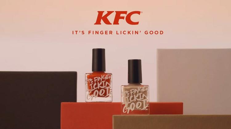
Finger lickin’ good just got real with KFC’s new product launch
We’re all for new product launches and brand extensions but for US fast food chain KFC, have they taken it to the extreme by introducing lick-able nail polish? Which, you guessed it, tastes like chicken! They’re really bringing their brand motto of “finger lickin’ good” to life – as the food giant unveiled its new product in Hong Kong earlier this week.
1) The new product
KFC, like most fast food companies, continuously look at ways to stand out from the crowd and to offer their customers something different. So for food giant KFC they looked at how they could address their main branding message in that their chicken and tastes/flavours are finger licking good.
Working with the food technologists who helped to devise KFC’s flavoursome recipes, the team set to work on how they could incorporate their two most popular recipes (original and hot and spicy) into edible nail polishes.
2) The result
A new product launch in the shape of edible nail polishes.
In a KFC brand statement to Ad Week it reported that “To use, consumers simply apply and dry like regular nail polish, and then lick—again and again and again,”.
To promote their branding exercise, the nail polishes were delivered to major media outlets in a couture-quality packaging in KFC’s corporate red and white colours. The nail polish bottles themselves were also emblazoned with the slogan “its finger lickin good”.
Great brand recognition through the packaging – also acting as the silent salesman as the box remains on someone’s desk for a period of time…
The colours have been described as hot orange to represent the “hot and spicy” taste, and the nude shade representing the original recipe. However, according to the BBC who received complimentary bottles of both polishes, the nude shade was more like “a dirty olive green with black specks”. Not something the brand wants to be associated with I should imagine?!

3) Testing the market
According to a KFC spokesman they’re aren’t mass producing these polishes but simply trialling the idea to test market reaction (and of course creating a great marketing campaign out of it at the same time!).
Currently the polishes are being heavily promoted by KFC Hong Kong on social media, but are not available to the general public.
Ogilvy Creative Director, John Koay, commented: “This campaign is designed to be intriguing and fun to increase excitement around the KFC brand in Hong Kong.” (Hong Kong was chosen as this was where the idea had originated, and Hong Kong customers seem more curious when it comes to limited-time offerings).
To help support their social media campaign the brand has also released an online music video and is inviting the people of Hong Kong to choose the best flavour to go into mass production (however, they should take note of the Vegemite case study , where if they are asking their customers for their choice, they need to listen and actually give them that choice when it comes to mass production, or they too could suffer the consequences).
4) Good for brand?
More interesting at this point possibly. Great brand recognition through the campaign and social media attention it is attracting. It is certainly showing their creative side, re-enforcing their brand statements and values and above all, it’s getting people talking about the brand. Whether this be from loyal customers or new, it seems to be hitting the spot when raising their status in the industry.
Even if the polishes aren’t exactly shaping up to how they’re being advertised, the promotion seems to be working judging by the activity on social media.
Of course as well as building the brand and strengthening their position, it can’t be bad for sales either, with everyone talking about fried chicken and posting snaps on social media, who wouldn’t be hungry!
References: AdWeek , BBC News Pictures from: AdWeek, NY Daily News
- brand extension
- nail polish

Leave a Reply Cancel reply
Your email address will not be published. Required fields are marked *
Save my name, email, and website in this browser for the next time I comment.
Receive Monthly Updates – Join Our Inner Circle
Related posts.
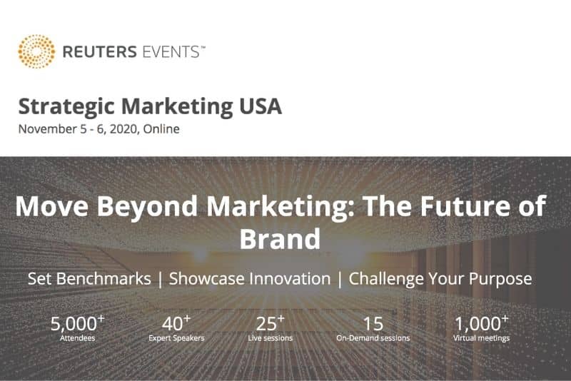
Reuters Events Launches Strategic Marketing USA
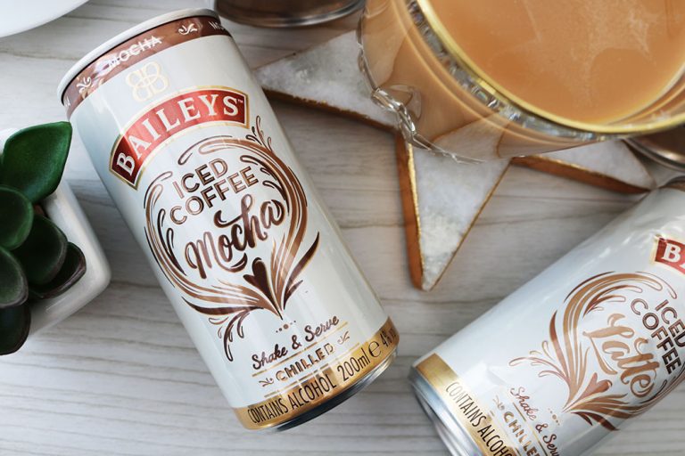
Will Baileys’ new brand extension, Baileys Iced Coffee, grow the brand?
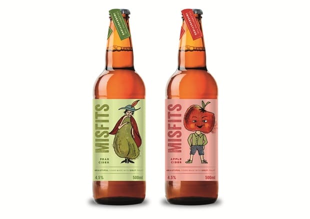
Coley Porter Bell Bring a New Lease of Life to `Misfits Cider`
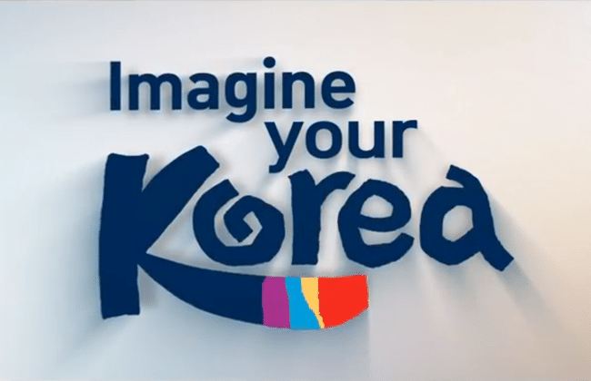
Korean Tourism Organisation Reinvigorate And Refresh The Nation’s Brand
10 Successful Rebranding Case Studies & Lessons Learnt
Ever wondered how a company’s image can be reborn, transforming its fate in the competitive business arena?
Successful rebranding case studies serve as captivating narratives that unravel the mysteries behind these remarkable transformations.
From tech giants to iconic beverage brands, the power of strategic rebranding has proven to be a game-changer, reshaping perceptions and propelling businesses to new heights.
We have listed some most successful rebranding case studies that show how industry leaders who dared to reinvent themselves, uncovering the key strategies that turned their fortunes around.
Join us on a journey through the dynamic world of corporate evolution, where questions of adaptability, consumer engagement, and market responsiveness take center stage.
Let’s dive in and learn more about branding through these compelling case studies.
What is rebranding, why and when it is required?
Rebranding is the process of strategically altering the brand identity of a company, product, or service.
It involves making significant changes to elements such as the brand name, logo, visual identity, messaging, and overall brand strategy.
The goal of rebranding is to create a fresh and updated image that better aligns with the evolving goals, values, and market dynamics of the business.
There are several reasons why and situations when rebranding might be required:
Business Evolution
As companies grow and evolve, their initial brand identity may no longer reflect their current mission, values, or target audience. Rebranding helps businesses stay relevant and in tune with their evolving identity.
Market Repositioning
Changes in the market, industry trends, or competitive landscape may necessitate a shift in how a company positions itself. Rebranding allows businesses to realign their image and messaging to better connect with their target market.
Mergers and Acquisitions
In cases of mergers or acquisitions, rebranding often becomes essential to create a cohesive and unified brand identity that represents the newly formed entity.
Negative Public Perception
A tarnished reputation or negative public perception can significantly impact a brand. Rebranding provides an opportunity to distance the brand from past issues, rebuild trust, and present a more positive image.
Diversification of Offerings
When a company expands its product or service offerings or enters new markets, rebranding helps ensure that the brand remains consistent and relevant across different business segments.
Outdated Image
Trends change, and what may have been cutting-edge or trendy in the past may become outdated. Rebranding allows a brand to refresh its image and stay current with contemporary design and messaging.
Legal Issues
Legal challenges, such as trademark disputes, may necessitate a rebranding effort to avoid legal conflicts and maintain the integrity of the brand.
Stagnation or Decline
If a brand is experiencing stagnation or decline in market share, customer interest, or overall performance, rebranding can inject new life and vitality into the business.
Now, let’s dive in some successful rebranding case studies and what lessons we can learn form them while making similar changes in our brand identity.
1. Apple Inc.
Apple’s Brand Evolution
One noteworthy change occurred in 2007 when Apple officially dropped “Computer” from its name, becoming Apple Inc. This shift reflected the company’s expanded focus beyond personal computers to a broader range of consumer electronics, including the iPhone, iPod, and later, the iPad.
Logo Evolution
While not a complete rebranding, Apple has subtly updated its iconic logo over the years. The most notable change was the removal of the rainbow color scheme in 1998, opting for a monochromatic look that aligns with the company’s minimalist design philosophy.
Reasons for Evolution
Apple’s expansion into new product categories, such as smartphones, tablets, wearables, and services, necessitated a brand strategy that could encompass a broader range of offerings.
Global Technological Influence
As Apple solidified its position as a global technology leader, a brand identity that transcended its origins as a computer company was essential. The shift to “Apple Inc.” reflected a more comprehensive and future-oriented brand image.
Apple’s brand evolution has been widely considered successful. The company’s brand is synonymous with innovation, sleek design, and a seamless user experience. The cohesive integration of hardware, software, and services has contributed to Apple’s strong and recognizable brand identity.
The minimalist approach to design, both in product aesthetics and marketing, has resonated well with consumers. Apple’s brand is often associated with premium quality, cutting-edge technology, and a user-friendly ecosystem.
2. Coca-Cola
Brand Evolution
Coca-Cola’s original logo, created by John Stith Pemberton in 1886, featured elaborate Spencerian script lettering, reflecting the aesthetic of the time.
The Contour Bottle
In 1915, the iconic contour bottle was introduced, enhancing the brand’s visual identity. The unique design aimed to make Coca-Cola recognizable even without the label.
Dynamic Ribbon Device
In the 1960s, Coca-Cola introduced the dynamic ribbon device, adding a modern and dynamic element to the brand. This coincided with the introduction of the slogan “It’s the Real Thing.”
While Coca-Cola has not undergone drastic rebranding changes like a complete logo overhaul, there was a significant event known as the “New Coke” in 1985. In an attempt to combat the rising popularity of rival Pepsi, Coca-Cola reformulated its classic recipe and introduced “New Coke.”
This move, however, faced strong consumer backlash, as people expressed a strong attachment to the original taste. As a result, Coca-Cola eventually brought back the original formula, labeling it as Coca-Cola Classic.
The introduction of New Coke and the subsequent backlash demonstrated the emotional attachment consumers had to the classic Coca-Cola formula.
The company’s quick response to revert to the original formula as Coca-Cola Classic was a testament to the power of consumer sentiment.
The New Coke incident, while initially viewed as a misstep, ultimately reinforced the deep emotional connection consumers had with the brand.
Coca-Cola Classic’s return was celebrated, and the episode highlighted the importance of respecting and preserving the heritage and identity of an iconic brand.
Over the years, Coca-Cola has introduced new products and variants, adapting to changing consumer preferences, such as the introduction of Diet Coke, Coca-Cola Zero, and various flavor extensions.
3. Old Spice
Old Spice underwent a significant rebranding in the 2010s, and the transformation was marked by a departure from its traditional image as a classic, somewhat dated brand to a modern, dynamic, and humorous identity.
The rebranding efforts were highly successful and garnered attention both for their creative marketing campaigns and their impact on consumer perception.
Evolution of Branding
Old Spice had long been associated with a traditional, classic image. The brand was often perceived as catering to an older demographic, and its market presence was not particularly strong among younger consumers.
Repositioning the Brand
In the early 2010s, Old Spice aimed to reposition itself in the market and appeal to a younger audience. The goal was to shed the image of a brand primarily for older generations and become more relevant to the younger, more dynamic consumer base.
Rebranding Strategies
Old Spice adopted a bold and unconventional approach to marketing. The “The Man Your Man Could Smell Like” campaign, featuring actor Isaiah Mustafa, became a viral sensation.
The commercials were humorous, quick-paced, and featured Mustafa delivering memorable lines in a charming and confident manner.
Social Media Engagement
Old Spice embraced social media platforms, responding to consumers in real-time with personalized videos. This interactive and engaging approach not only showcased the brand’s sense of humor but also increased its visibility and connection with consumers.
Product Innovation
Alongside the marketing efforts, Old Spice introduced new product lines and scents to modernize its offerings. The brand expanded its range to include body washes, deodorants, and grooming products, appealing to a broader and more diverse consumer base.
Old Spice’s rebranding efforts led to a significant increase in market share, particularly among younger consumers. The brand successfully broke away from its traditional image and became a symbol of confidence and humor.
The “Old Spice Guy” commercials became cultural phenomena, generating millions of views online and winning awards for their creativity. The campaign not only revitalized the Old Spice brand but also set a new standard for interactive and engaging marketing in the digital age.
The rebranding contributed to a positive shift in consumer perception. Old Spice went from being seen as a dated brand to one that was innovative, humorous, and in touch with contemporary culture.
4. Starbucks
Evolution of Starbucks Branding
Starbucks began as a single store in Seattle in 1971, featuring a brown color palette and a detailed, circular logo with a mermaid at the center. The initial brand reflected a connection to the maritime history of the city.
In 1987, Starbucks simplified its logo, zooming in on the iconic mermaid image. The color scheme transitioned to a more monochromatic green, a color that has since become synonymous with the brand.
As Starbucks expanded globally in the 1990s, its store design underwent changes to accommodate diverse cultural preferences while maintaining a consistent Starbucks experience.
Outcome of Branding Evolution
Starbucks’ evolving brand has achieved global recognition, with the green mermaid logo becoming an iconic symbol of the brand. The consistent use of the logo across various countries has contributed to Starbucks’ global identity.
Starbucks is known for creating a distinct café experience. The brand has successfully positioned itself as a “third place” — a space between home and work where customers can relax and enjoy quality coffee.
Over the years, Starbucks has expanded its product offerings beyond coffee to include teas, snacks, and merchandise. This diversification has allowed Starbucks to cater to a broader customer base and increase revenue streams.
Notable Changes and Initiatives:
In 2011, Starbucks unveiled a new logo that omitted the word “Coffee,” signaling the brand’s intention to expand beyond its coffee-centric image and venture into other beverage and food categories.
In recent years, Starbucks has placed a greater emphasis on sustainability. The company has committed to environmentally friendly practices, ethical sourcing of coffee beans, and reducing its environmental footprint.
Starbucks has embraced digital innovation, introducing the Starbucks mobile app, loyalty program, and mobile order and pay options. These initiatives align with evolving consumer preferences for convenience and technology integration.
Evolution of PayPal Branding
PayPal was founded in 1998, and its early logo featured a blue and white color scheme with a distinctive “P” incorporating overlapping letters. This logo reflected simplicity and a sense of security.
After being acquired by eBay in 2002, PayPal’s branding remained relatively consistent. The logo underwent minor tweaks, and the blue color scheme continued to convey trust and security.
In 2015, PayPal split from eBay to become an independent company. This marked a significant shift for PayPal, allowing it to focus on its own growth and innovation outside the eBay ecosystem.
Notable Changes and Rebranding
Before the formal separation from eBay, PayPal introduced a new logo in 2014. The updated design retained the blue color but featured a simpler and more modern appearance, with a stylized “P” in a contemporary font.
Following the split from eBay, PayPal has focused on positioning itself as a standalone financial technology company. This shift is reflected in its branding, emphasizing innovation, digital payments, and financial services.
PayPal’s acquisitions, such as Braintree and Venmo, have contributed to its evolution. The company has expanded its range of services, including mobile payments, peer-to-peer transactions, and online financial tools.
The evolution of PayPal’s branding aligns with its emphasis on innovation and the changing landscape of digital payments. The company has worked to stay at the forefront of technology in the financial services sector.
PayPal’s expansion beyond its initial online payment platform to include a range of services has broadened its market reach and appeal. This diversification has contributed to its ongoing relevance and growth.
The separation from eBay allowed PayPal to assert its independence and establish a strong market presence as a leading player in the fintech industry. The company’s branding reflects its status as a key player in the digital payments ecosystem.
6. Mailchimp
Evolution of Mailchimp Branding
Mailchimp, founded in 2001, initially built its identity around a playful and quirky aesthetic. The company’s logo featured a chimpanzee, reflecting the brand’s name, and its approach was characterized by a sense of humor.
In 2018, Mailchimp underwent a significant rebranding to better align its visual identity with its expanding suite of services beyond email marketing. The rebrand aimed to present Mailchimp as a comprehensive marketing platform rather than just an email service.
The most visible change in the rebrand was the introduction of a new logo and wordmark. The chimpanzee was de-emphasized, and the focus shifted to a cleaner, more modern design. The new logo retained the playful essence but appeared more refined and adaptable.
The color palette was simplified, moving towards a bold and vibrant combination of yellow, white, and black. The typography was also updated for a cleaner and more contemporary look, enhancing readability and brand consistency.
With Mailchimp expanding its services beyond email marketing to include features like automation, social media management, and customer relationship management (CRM), the rebrand aimed to reflect this broader scope. The new branding positioned Mailchimp as an all-in-one marketing platform.
The rebranding contributed to a more polished and professional image for Mailchimp. The updated visual identity aligned with the company’s growth and its evolution into a comprehensive marketing platform.
The simplified design, modern color palette, and updated typography improved brand communication. The rebranding aimed to make Mailchimp’s messaging clearer and more accessible to a diverse audience of users.
The rebranding contributed to increased recognition of Mailchimp as a versatile marketing platform. Users were better able to identify the range of services offered by the company, encouraging deeper engagement with the platform’s features.
Evolution of Airbnb Branding
Airbnb’s original logo, introduced in 2008, featured a blue, scripted “A” enclosed within a bubble. The logo was complemented by a clean and straightforward website design. However, it faced criticism for its similarity to existing branding and lack of uniqueness.
In 2014, Airbnb unveiled a major rebrand, introducing a new logo known as the “Bélo.” The Bélo represented a combination of a heart, a location pin, and the letter “A,” symbolizing the idea of belonging and community.
The Bélo logo was designed to convey Airbnb’s core values of belonging, sharing, and community. Its multi-symbol representation aimed to reflect the diverse experiences and connections facilitated by the platform.
The rebranding effort extended beyond the logo to include a redesign of Airbnb’s website and mobile app. The new design incorporated a more modern and user-friendly interface, emphasizing high-quality visuals and intuitive navigation.
Narrative Emphasis: The rebrand placed a strong emphasis on storytelling and user experiences. Airbnb sought to convey a sense of belonging and personal connection by highlighting the unique stories and experiences of hosts and guests.
The Bélo logo became a distinctive symbol associated with Airbnb. Its unique design and the story behind it contributed to increased recognition of the brand globally.
The redesign of the website and app, along with the emphasis on storytelling, aimed to provide users with a more engaging and immersive experience. The visual elements and narrative focus helped users connect with the brand on a more emotional level.
The rebranding coincided with Airbnb’s expansion into new markets and a broader range of offerings, including unique and immersive experiences beyond traditional accommodations. The refreshed branding helped Airbnb position itself as a global hospitality platform.
By highlighting the themes of belonging and community, Airbnb aimed to foster a sense of trust and connection among its users. The rebranding contributed to creating a distinct identity for Airbnb as a platform that goes beyond traditional accommodations to offer unique and personalized travel experiences.
8. Mastercard
Evolution of Branding:
Mastercard’s original logo, introduced in 1968, featured two overlapping circles—one red and one yellow—representing the brand’s core values of connectivity and partnership. This classic design served the company well for several decades.
As the world transitioned into the digital age, Mastercard faced challenges in maintaining a modern and relevant image. The original logo, though timeless, needed adaptation to resonate with contemporary consumers in an increasingly digital and mobile-driven landscape.
In 2016, Mastercard unveiled a simplified version of its iconic logo. The interlocking circles remained, but the design was streamlined. The most notable change was the removal of the text from the circles, allowing for a cleaner and more versatile visual identity.
The rebranding aimed to make the logo more adaptable to digital platforms and mobile devices. By removing the text and simplifying the design, Mastercard ensured that the logo would remain recognizable and legible even in small sizes on digital screens.
Alongside the logo update, Mastercard introduced a new brand element called the “Mastercard Symbol.” This design element featured the two interlocking circles without any accompanying text. It reinforced the brand’s commitment to simplicity and modernity.
The simplified and modernized logo, along with the introduction of the Mastercard Symbol, improved the brand’s visibility and recognition in the digital space. The logo was well-suited for mobile apps, websites, and various digital touchpoints.
The rebranding enhanced the logo’s adaptability across diverse applications, allowing for a consistent brand presence in various contexts. The removal of the text from the circles made the design more versatile for different marketing materials and platforms.
The updated branding contributed to Mastercard’s image as a contemporary and forward-thinking brand. The design changes aligned with the brand’s commitment to innovation in the digital payment landscape.
The rebranding was generally well-received and recognized within the design and branding industry. It demonstrated Mastercard’s willingness to evolve while retaining the essence of its iconic symbol.
9. Dunkin’
Dunkin’ Donuts had a longstanding and iconic logo featuring an illustration of a coffee cup alongside an image of a stylized donut. The brand was known for its emphasis on coffee and baked goods.
In the 2010s, Dunkin’ Donuts began to shift its brand focus away from being solely a donut and coffee shop to a more beverage-centric, on-the-go brand. The company wanted to emphasize its diverse beverage offerings, including coffees, teas, and other beverages.
In September 2018, Dunkin’ Donuts officially announced that it would be dropping “Donuts” from its name, rebranding as simply “Dunkin’.” The decision reflected the company’s desire to be recognized as a destination for a variety of beverages, not just donuts.
Along with the name change, Dunkin’ introduced a new, more modern logo. The updated logo retained the recognizable pink and orange color scheme but featured a more streamlined font and removed the illustration of the donut. The emphasis was on simplicity and versatility.
The rebranding effort extended beyond the visual identity to the digital and in-store experience. Dunkin’ invested in technology and digital innovations, enhancing its mobile app and drive-thru experiences to cater to the needs of on-the-go customers.
The rebranding successfully shifted the brand perception from primarily a donut shop to a beverage-centric, all-day destination. The simplified name and modernized logo reinforced Dunkin’s commitment to providing a diverse range of beverages.
The updated visual identity made Dunkin’s branding more adaptable across various platforms, including digital and social media. The removal of the donut illustration allowed for a cleaner and more versatile design.
The rebranding was generally well-received by customers. The simplified name and logo aligned with contemporary branding trends and resonated with the evolving preferences of Dunkin’s target audience.
By streamlining its name and visual identity, Dunkin’ could better communicate its broader menu offerings and emphasize its position as a go-to destination for a wide variety of beverages.
10. Instagram
Instagram’s original logo featured a vintage camera icon with a rainbow stripe. This design reflected the app’s initial focus on photography and the nostalgic feel of capturing moments through a camera lens.
In 2016, Instagram underwent a major rebranding, introducing a new logo that departed significantly from its original design. The new logo featured a simplified camera icon with a flat, gradient color scheme of vibrant purples, pinks, and oranges.
Alongside the logo change, Instagram updated the app’s user interface to adopt a cleaner, monochromatic design. The focus was on creating a more modern and streamlined visual identity.
The rebranding aimed to create a consistent brand identity across various platforms and devices. The simplified logo design was meant to be easily recognizable and adaptable for digital applications.
The rebranding contributed to a more visually cohesive Instagram experience. The updated logo and interface design created a unified and modern look across different devices and platforms.
Instagram’s rebranding was strategic in appealing to a broader and more diverse user base. The modernized design resonated with a younger audience, aligning with the platform’s evolving demographic.
The shift towards a simpler, flat design reflected broader design trends in the tech industry. The clean and minimalistic approach made the brand more in line with contemporary aesthetics.
dThe updated logo became quickly recognizable, contributing to Instagram’s brand recognition. User engagement remained strong, and the platform continued to grow in popularity globally.
05 Key Lessons Learnt from successful rebranding case studies
These lessons highlight the importance of a strategic approach to rebranding, taking into account both the internal and external factors that can influence a brand’s success.
Here are five overarching lessons that can be learned from these diverse examples:
- Successful rebranding involves adaptability to changing market landscapes, consumer preferences, and industry trends.
- Rebranding should strike a balance between preserving the brand’s heritage and embracing innovation to stay relevant.
- Creative and engaging marketing, particularly in the digital realm, can significantly contribute to the success of a rebranding effort.
- Rebranding should communicate clear brand values and resonate with the target audience on an emotional level.
- In the digital age, rebranding efforts should consider the adaptability of the brand’s visual identity to various digital platforms and prioritize a seamless user experience.
Final Words
The exploration of successful rebranding case studies unveils invaluable lessons for companies who are seeking to navigate change and stay relevant. Collectively, the successful rebranding case studies emphasize the importance of adaptability, a delicate balance between tradition and innovation, engaging marketing, clear communication of brand values, and the necessity of a digital-friendly design and user experience. As businesses embark on their rebranding journeys, these key insights serve as a compass, guiding them toward success in a constantly evolving marketplace.
About The Author

Tahir Abbas
Related posts.

What are the Characteristics of an Agile Organization?

How to Write a Business Case for Change Management?

Iceberg Model of Change Management
- SUGGESTED TOPICS
- The Magazine
- Newsletters
- Managing Yourself
- Managing Teams
- Work-life Balance
- The Big Idea
- Data & Visuals
- Reading Lists
- Case Selections
- HBR Learning
- Topic Feeds
- Account Settings
- Email Preferences
KFC’s Radical Approach to China
- Mary L. Shelman
To succeed, the fast-food giant had to throw out its U.S. business model.
Reprint: R1111K
Global companies face a crucial question when they enter emerging markets: How far should they go to localize their offerings? Typically they try to sell core products or services pretty much as they’ve been sold in Europe or the United States, with headquarters calling all the shots—and usually with disappointing results.
The authors, both of Harvard Business School, examined why KFC China has been able to find fertile ground in a market that is notoriously challenging for Western fast-food chains. KFC’s executives believed that the dominant logic behind the chain’s growth in the U.S.—a limited menu, small stores, and an emphasis on takeout—wouldn’t produce the kind of success they were looking for in China. KFC China offers important lessons for global executives seeking guidance in determining how much of their existing business model to keep in emerging markets—and how much to throw away.
Global companies face a critical question when they enter emerging markets: How far should they go to localize their offerings? Should they adapt existing products just enough to appeal to consumers in those markets? Or should they rethink the business model from the ground up?
- David Bell is a Harvard Business School professor and chairs its marketing unit.
- MS Mary L. Shelman is the director of the Agribusiness Program at Harvard Business School.
Partner Center
Rebranding Case Study: 17 Success Stories of Brands That Changed for the Better and You Can Too in 2024

Are you looking for a rebranding case study to follow?
During the last two years, companies were forced to rebrand in order to stay in business.
For instance, store owners that lost foot traffic switched to printing masks which were sorely in need.
You will find more than one creative rebranding case study success story here.
By the time you’re done reading this rebranding case study guide, you’ll be able to replicate the success stories. You’ll also be able to avoid the disappointments that this article also shares.
This post presents these success stories in hopes you can find at least one rebranding case study you can use as your action plan to follow.
I asked the experts at HARO (Help a Reporter Out) to provide rebranding case study examples in the form of success stories of businesses that made a change toward a more successful path.
This is what I asked the HARO experts:
“I am writing a post about companies that successfully rebranded. Please send three examples of rebranding success stories. What was the company like before the rebrand? What was the company like after the rebrand?”
Perhaps you’ll be inspired by these rebranding case study examples to make your own pivot that will lead toward greater business success.
By reading this guide, you can find a rebranding case study you can follow to boost your business’s success .
This post about how to conduct a rebranding case study will show you if it’s even worth your time to rebrand.
Which companies got it right? Let’s start looking at an example of a rebranding case study you can tweak for your business.
If you are only interested in the McDonalds rebranding case study and Target rebranding case study, watch this video.
What Does “Rebranding” Mean?
When a company rebrands, they intend to change the firm’s image.
Many brands change by becoming disruptors. In other words, they disrupt their industries. When they change, in order to keep up with the disruptor, the whole industry has to change.
For instance, their new way of operating might make the old way obsolete for everyone in their niche.
When they invent a product that makes their competitors’ products seem outdated, this is called a disruptive product.
This post shares 17 rebrands that resulted in greater success for the companies.
Read on to discover these companies’ success stories.
Rebranding Case Study: 17 Changes That Worked
Which rebranding case study is the most ingenious? Which will you use as an action plan?
Examples of a Successful Rebranding Case Study
What was the company like before the rebrand? What was the company like after the rebrand?
Rebranding Case Study #1: ANS
Ans: Rebranding is a thoughtful process of changing the brand image of the entire organization. It is also a strategic technique or a way to give a new brand name, logo, values, mission change in the design and overall look and feet for the established brand.
There are countless numbers of traditional as well as modern businesses who, at some point, feel unsatisfied when they release some different product and for which they stand differently. The rebranding process starts in the picture, and rebranding is very good and necessary today, especially in the modern business where there is a lot of competition among the different brands.
Rebranding your company or your product is a strategic decision used to upgrade the company’s image and occupy the space in the minds of the people when they are rebranding to make the lifestyle better.
For example, people do not value the BMW automobiles for their features, color or design features. These elements change every year as per the new trend. So, people value the company name and its logo more than the cars. This is what we can call rebranding.
Lyle Florez, http://easypeoplesearch.com/
Ans: Rebranding can range from the feel and look of a company to the entire structure of the company’s identity. Good rebranding done at the right time can provide the business with many opportunities.
Rebranding Case Study #2 : Microsoft
Microsoft’s search engine was formerly known as Bing, but in 2020 Microsoft renamed it from Bing to Microsoft Bing. This name rebranding states it clearly that the search engine belongs to the Microsoft team. Also, the logo was adjusted to fit Microsoft’s corporate design.
It is clear that rebranding does not usually require a complete change of the external features.
Rebranding Case Study #3: Merck
In 2015, Merck’s chemical and pharmaceutical company decided to rebrand their identity from a classic chemical and pharmaceutical company to a global science and technology group. To achieve this, Merck removed outdated elements and replaced them with newer eye-catching ones to further represent their brand name.
Rebranding Case Study #4: McDonalds “Supersize Me”

McDonald’s, a leading company in the fast-food industry, did not have a good image. The company was widely seen as a lowbrow and unhealthy food option for lunch.
In 2004, McDonald released the popular documentary known as “Supersize Me,” and this played a great role in further proving why fast food was not good for people’s health. But in 2006, McDonald reviewed their menu and started providing healthier options that could easily appeal to people, and this gave them a new image.
Jason CordesPosition, https://cocoloan.co.uk
Rebranding Case Study #5: Pepsi
Pepsi rebranded as “Pepsi Zero” in order to attract a more youthful audience.
When Pepsi announced their new Pepsi Zero line, they knew that they needed to target a younger audience. They created a completely new logo and packaging that was designed to look more like something you would see on social media or in a trendy bar. The goal was to create an image that was fun and youthful, while still being credible and respectable. After the rebranding, Pepsi saw a significant increase in sales among young adults.
Rebranding Case Study #6: Dell
Dell rebranded as “Dell Inspirion” to appeal to a more tech-savvy customer base.
Dell was a company that had been around for years, but its brand wasn’t very well-known or respected. They decided to rebrand and try to appeal to a more tech-savvy customer base. After the rebrand, Dell’s sales increased significantly and its image shifted from being a traditional computer company to one that was more in touch with the latest technological trends.
Rebranding Case Study #7: McDonalds McCafé

McDonald’s rebranded its McCafé coffee shops as “McDonald’s Coffee” to attract a more upscale clientele.
Prior to the rebrand, McDonald’s McCafé coffee shops were generally known for their lower quality coffee and lackluster customer service. After the rebrand, McDonald’s Coffee locations became more upscale, with a focus on providing high-quality coffee and attentive customer service. The results of the rebrand were positive; sales increased by 7% and Average Ticket Price (ATP) increased by 5%.
Asako Ito, Divine Lashes
Rebranding Case Study #8: Dunkin’ Donuts
Dunkin’ Donuts has changed its name and officially became Dunkin’ earlier this year. While this brand is identical to donuts, it no longer needs the word “donuts” to leave a mark on the customers.
This company is the best example of successful rebranding as it streamlines the experience for the customers while staying true to its heritage. Such rebranding executes from inside the store to the outside world, including store remodels, logo redesign, different brand messaging on the marketing channels, etc.
Rebranding Case Study #9 Dominos
This brand was at a loss in 2009 when it held only a 9% share of the entire pizza restaurant market. But this company transformed everything with a successful rebranding as it started focusing on fixing what customers didn’t like about its products. Therefore, as a result, by 2016, the company held a 15% share of the market and had become the higher customer fidelity among the pizza chains.
Stella Cooper, PaydayLoansUK
Rebranding Case Study? More like a new birth!
It is true that a brand’s success does not depend solely on its products or services. How the audience perceives the brand also plays a major role.
Here are a few brands that rebranded successfully:
Regarding Dominos, our expert added:
Domino’s: What comes to mind with this name? Most people would say Pizza and rightly so. But the brand was turning in huge losses towards 2010-11 and was almost on the verge of shutting down. But the strategy to rebrand and focus on customer feedback is what made them stand where they are today.
Rebranding Case Study #10: Harley-Davidson
Harley-Davidson: Once on the edge of bankruptcy, Harley-Davidson and its rebranding should be taught in B-Schools. Tough decisions of weeding out the unimpactful individuals from the management and not compromising on the high quality are what made Harley-Davidson’s rebranding a success.
Rebranding Case Study #11: Target
Target: There was a time when Target used to be another one of those discount supermarket chains that could not be distinguished from its counterparts. Until one day when they decided to join hands with renowned designers and launch their line of apparel which is how they successfully rebranded themselves.
Eliana Levine, https://findpeopleeasy.com
I have seen various rebranded success stories in the past few years. I would share my best three here.
Here is my take on your query.
Before explaining, the three rebrand success stories include Dunkin’, Tupperware, and Domino’s.
Regarding Dunkin’ Donuts, our expert added,
In the early days of 2022, Dunkin’ Donuts officially became “Dunkin’.” Customers have become familiar with the brand even without using donuts in it, thanks to their tagline, “America runs on Dunkin”. The rebranding includes logo redesign , packaging design, store models, and marketing communication. It is a rebranding success.
Rebranding Case Study #12: Tupperware
Next, we have Tupperware, the brand best known for durable household products. While becoming less relevant due to cheaper alternatives and better competitor branding, Tupperware hits back after a proper rebranding ( tagline: Confidence Becomes You) and price optimization approach. The rebrand was a success, and we see a major part of the USA and Indian population using Tupperware for their households.
Editor’s Note: Regarding Domino’s, our expert added,
“Finally, we have Domino’s. It was a literal loss and failure in 2009, having 9% of the market share. The company altered this with rebranding. They focused on what customers disliked. As a result, they received a 15% market share and held the highest customer loyalty among pizza chains.” Radhika Gupta, https://365solutions.com/
A CHANGE OF NAME GOT THEM AFLOAT!
Here is a list of three distinct companies that rebranded down to a change of name and now they have established their new brand successfully.
Rebranding Case Study #13: Instagram
Burbn is a social media app made by founders Kevin Systron and Mike Kreiger; the media app did not receive a favorable welcome on the social media market because of its many undesirable features.
Until October 6th, 2010 when they reintroduced themselves to the market as Instagram, with new and better features, they have been able to stay relevant as one of the highest-grossing and most used social media apps.
Related Reading: Advantages and Disadvantages of Instagram
Rebranding Case Study #14: PayPal
Confinity was doomed to a downward plunge in the financial market as its financial exchange app did not receive much acceptance.
Merging with Elon Musk’s X.com granted them an opportunity for a name change and a rebrand becoming the very successful PayPal that we know today.
Rebranding Case Study #15: Google
It was earlier called Backrub, a search engine for the early 1990s but it was way less of a success because the pun of the name did not sit well with the crowd of that time. So in other to gain a place and social acceptance, the name was changed to Google in 1997 and it has remained relevant and successful as a rebranded company to date.
Ellie Walters, http://findpeoplefaster.com/
Rebranding Case Study #16: MeWe
MeWe, the social media platform, was formed in 2012 and underperformed as a contender in the social media space.
In 2016, MeWe rebranded as a Facebook competitor. Also known as a Facebook clone, MeWe was virtually like Facebook in every way except one. Unlike Facebook, MeWe guaranteed your privacy would be protected and your data would be safe.
MeWe experienced stratospheric success as a result and today offers social media users a Facebook alternative.
More information about MeWe can be found in these MeWe reviews .
Rebranding Case Study #17: Burger King
Did you know Burger King rebranded by changing its packaging?
In 2022, Burger King changed its branding by adopting a flat logo.
According to a source , the fast-food giant wanted a more nostalgic brand with colors that consumers associate with food.
A Rebranding Case Study That Didn’t Work
New kids on the block, nkotb.
New Kids on the Block was a boy band that was extremely successful in the late 1980’s and early 1990’s. They sold more than 70 million records worldwide.
After experiencing unprecedented success, the group rebranded as NKOTB, an acronym for New Kids on the Block.
They immediately lost popularity. Despite trying to regain their success and go back to being known as “New Kids on the Block,” the group could never revive their superstardom.
Although New Kids on the Block is not a company, you get the idea that not all brands who try to change their images do so successfully.
Wrapping Up: Rebranding Case Study
In closing, this article presented 17 examples of a rebranding case study that worked for different brands.
Now that you’ve read them, you can also cut through the noise and stand out in your niche.
Did you notice that these companies all emerged as authorities in their industries after they rebranded?
Please share so entrepreneurs can follow a rebranding case study found here and become a success like these business owners.
I look forward to your views in the comments section. Did you find any rebranding case studies inspirational? Do you think you can follow a company’s example that made a successful pivot?

Janice Wald is the founder of MostlyBlogging.com and co-founder of the Mostly Blogging Academy. She is an ebook author, blogger, blogging coach, blogging judge, freelance writer, and speaker. She won the Best Internet Marketer Award and the Best Blogger Award at the 2021 Infinity Blog Awards. Wald was also nominated as 2019 Best Internet Marketer by the Infinity Blog Awards and in 2017 as the Most Informative Blogger by the London Bloggers Bash. She’s been featured on Small Business Trends, the Huffington Post, and Lifehack.
Share this:

Related Posts
Would you like to share your thoughts cancel reply.
Your email address will not be published. Required fields are marked *
Notify me of follow-up comments by email.
Notify me of new posts by email.
This site uses Akismet to reduce spam. Learn how your comment data is processed .
We have updated our terms and conditions and privacy policy Click "Continue" to accept and continue with ETHRWorldME
We use cookies to ensure best experience for you
We use cookies and other tracking technologies to improve your browsing experience on our site, show personalize content and targeted ads, analyze site traffic, and understand where our audience is coming from. You can also read our privacy policy , We use cookies to ensure the best experience for you on our website.
By choosing I accept, or by continuing being on the website, you consent to our use of Cookies and Terms & Conditions .
- SouthEast Asia
- The Middle East
- Leaders Speak
- Brand Solutions
- Talent Management
- 10 min read
- KFC Case Study: How KFC is building a winning culture where people grow & thrive
In an interaction with Özlem Kalaca Yurdakul, Chief People Officer, KFC Middle East, North Africa, Pakistan, and Turkey shares her thoughts on great resignation, the importance of learning and development opportunities, and building a culture where talent thrives. Read on to know some of the strategies to build a culture to win talent.
- Anushree Sharma ,
- Updated On Nov 17, 2022 at 02:41 PM IST

- Flexibility at work: Even before the pandemic, when many companies were discussing and exploring mechanisms, we launched a hybrid way of working. We had a structure behind it, we expected our talents to be in the office for only communication, collaboration, celebration, and community days. We have a corporate calendar for this- 2-3 days we are in the office for these moments. During the pandemic, since working from home became a common practice, we added the WFH benefit, which supported them to have better wi-fi, a better headset, and ergonomic chairs. Also, during the pandemic as a distinctive approach, we launched the Work from Anywhere/Everywhere Policy. Our talents could work from “anywhere in the world.” This is a permanent practice now. 4 weeks a year, they can work anywhere in the world. We support them with a unique WFE monetary benefit so that they can ensure they have the appropriate distant working condition.
- Wellness & well-being: During the pandemic, on top of our wellness programs, we launched an advanced 360 Wellness program. We had many virtual sessions about wellness. After the pandemic, we elevated the program and now, we work with a vendor, to give our talents a menu so that they can choose and create their own recipes. From Yoga to Salsa Dances, from Spa to Table tennis they create their own wellness routine. Other than standard wellness programs we work with global experts in finance, and psychology who can take consultation when needed. We updated our benefit structure and fixed all the friction points from a fairness perspective. irrespective of their levels we included all employees in our health and life insurance. Families are included in yearly health check-ups. Families became an integral part of the KFC community. We have family offsites outside Dubai for families.
- Inclusion: We believe in ALL people. Our talents become their best selves when they feel that they are treated fair when they are included. Even during the pandemic, we kept our focus on diversity, inclusion, and belonging layers. We have 19 different nationalities in the office. Our gender parity ratio is 50%/50 same for advancements. Advt
- Employee Resource Group: We have Employee Resource Groups where we aim to have micro communities for a better feeling of belonging. From cooking to outdoor, language learning to photography our talents are sharing their passions. We have Special programs like Shine (globally selected programs) where we focus on underrepresented groups. Shine is a program to: a. S ponsor them to have a fair share in the ladder of opportunities, b. H elp them to equip themselves with the right light skills c. I nspire them to unlock their own potential, d. N arrate their Stories, road blockers, friction points in life and e. E ncourage them to have an impact with their full potential.
- By Anushree Sharma ,
- Published On Nov 14, 2022 at 09:00 AM IST
All Comments
By commenting, you agree to the Prohibited Content Policy
Find this Comment Offensive?
- Foul Language
- Inciting hatred against a certain community
- Out of Context / Spam
Join the community of 2M+ industry professionals
Subscribe to our newsletter to get latest insights & analysis., get updates on your preferred social platform, follow us for the latest news, insider access to events and more..
- KFC Case study
- KFC Middle East
- Özlem Kalaca Yurdakul
- Workplace Culture Middle East
- employee experience
- Employee Wellbeing
- learning & development
ColorWhistle
Digital Web Design Agency India

Explore our Market-Fit Services
We ensure to establish websites with the latest trends as we believe that, products whose value satisfies the needs of the market and its potential customers can be efficiently successful.
Quick Links
- About Us – ColorWhistle
- Engagement Models
- Testimonials
- Case Studies
- Agency Services
- Web Development
- Web App Development
- Digital Marketing
- Travel Website Development Services Company
- Real Estate Website Development Services Company
- Education Website Development Services Company
- Healthcare Website Development Services Company
- Hotel and Restaurant Website Development Services

Category: Case Study blogs Redesign
Date: April 30, 2024
Popular Rebranding Case Studies for Inspiration
Establishing a compelling brand is pivotal for any business, and comprehending the intricacies of branding can be complex. It’s essential not only to understand your brand identity but also how customers perceive your products and services. Exploring brand case studies provides valuable insights, uncovering potential growth avenues based on the triumphs of other businesses. Leveraging the expertise of a reputable digital marketing company can further amplify your brand’s impact through strategic digital marketing services .
Did You Know?
It takes 5 to 7 impressions for people to remember a brand. And what if you were to rebrand the existing one?
Popular companies that were looking to rebrand often found it difficult because the old name was already established. The problem with this is when you are trying not only to establish your new brand but also live up the expectations of existing customers who have grown accustomed to buying from that particular business or industry category over time.
A lot goes down during this step: from researching companies’ history (both past successes/failures), coming up with new ideas about logo designs .
Here at ColorWhistle , we have curated a list of popular (non popular but useful ones too) rebranding case studies that you can refer to, when you are looking to rebrand your brand.
Inspirational Rebranding Case Studies
The rebranding process is a lot like an organism that evolves over time. The goal for any brand, whether they’re doing well or not so much in their market space, is to be able to find ways of improving on what’s already there and sometimes this means changing how you look from head-to toe!
As seen with many brands who’ve gone through major transformations such as Nike Inc., Redbull, Target etc.. Let’s have a look at some popular rebranding case studies to have a better vision of what worked and what was the thought process behind rebranding.
Animal Planet

The new logo and tagline for Animal Planet is “Bringing people up close in every way,” which really tells the channel’s story. The graphic reflects this mission statement with an elephant, just representing the mood of the brand!
Case Study Link
Animal Planet has been a much-loved brand around the world for more than 20 years and the time has never been more right to engage with mass audiences across every platform who are as passionate about animals as we are.
– Susanna Dinnage, Animal Planet’s Global President

Rejuvenating a well-loved brand is no easy task. But it’s critical to ensure that the refreshed, revitalized product resonates with customers and speaks directly at their hearts in order for them not only stay loyal but increasingly come back again and recommend your business or organization to others.
Your products should reflect what you stand for as an organization so they can speak volumes about who are trying new things while still holding true on key values like quality, durability & affordability; also ensuring there’s room left over just because people want more than anything else truly meaningful when engaging digitally these days
Evernote’s brand rejuvenation is a clear example of well crafted rebranding strategy.
Throughout the process of evolving our brand, we have looked to our past for inspiration for our future. We started as a place to remember everything, and that will never go away. Our brand now reflects our broader purpose.
– Chris O’Neill, Evernote’s CEO

Mailchimp’s branding was a bit outdated and they needed a complete rebranding. They also wanted their website updated so customers could find them easily on different devices like tablets or smartphones instead of just desktop computers.
With this redesign, we set out to retain all the weird, lovable elements that endeared our earliest customers to Mailchimp, while creating space for the brand to grow and connect with even more small businesses. We didn’t want to lose our heritage in the process, so we focused on capturing the essence of what Mailchimp has always been.
– Mailchimp’s Blog
The Ruby Mills

Ruby Mills teamed with a digital agency to rebrand itself and showcase it as a part of the new trending modern digital space. The logo was refurbished to reaffirm the legacy of the brand in a contemporary manner, and yet keeping the visual language flexible enough for digital (online) & offline media and product representation.
The brand name connoted preciousness and gave us a solid foundation to work with. The new identity was found completely aligned to the Ruby legacy and its progressive future.
– Elephant Design, Digital Agency

Slate’s Logo needed a revamp as their logo was outdated and needed a refresh to match the new industry standards. The logo was reimagined and cleaned up for a more distinct look. The “A” is being revealed, uncovering its true form in an elegant manner that hints at all those who have come before it.
Our approach was to visualize Slate’s story-making process with a language that feels like sifting through the news, looking for hidden clues and cracking the code that blows open the case.
– Gretelny, Design Studio

Uber was famous for its inverted U in their logo and when they decided they needed a brand refresh, There were mixed responses and yet Uber’s logo refresh was a very significant one with more sophisticated typography and branding elements.
Molly Watson, the director of the verbal identity at Wolff Olins San Francisco, said the new logo was designed to represent Uber’s growth and security.

The name dunkin itself reminds us of their bright colors and their fresh look in branding. While rebranding they took a big decision of letting go their second word which is donuts and made a more crispier logo that’s even more recognizable and carried their legacy.
The new branding, developed in partnership with new creative and branding agencies Jones Knowles Ritchie (JKR), BBDO New York and Arc Worldwide, is one part of Dunkin’s multi-faceted blueprint for growth, a plan designed to transform the company into the premier beverage-led, on-the-go brand.
– news.dunkindonuts.com

When you’re just starting out, it is enough to create a single image for your company. But as soon as growth starts happening at an impressive rate and new employees start calling in with questions about how things work or what their function might be within the organization, you need to be more aware of how the brand fits the industry. Dropbos decided on a revamp that didn’t change much but yet created an impact.
Our new illustration style picks up where our earliest style—loose, handmade, witty—left off,” write creative director Aaron Robbs and VP of Design Nicholas Jitkoff.

Slack always had an eye of detail in their logo. The hash in their logo was very popular for the kind of brand it was. Yet slack decided to rebrand and give a fresh look to their logo to adapt more into the trend and industry. The new logo looked fresh and more adaptable to the brand statement of Slack
It uses a simpler color palette and, we believe, is more refined, but still contains the spirit of the original. It’s an evolution, and one that can scale easily, and work better, in many more places.
– Slack Team

Intel with the ring is what comes to mind when one thinks about the brand. Intel decided to give a brand refresh while continuing their brand vision and brand statement. They believed that this refresh will help them connect more to their customers and do something wonderful.
The new logo represents a dramatic simplification of the Intel brand identity. Crafted with an underlying geometry, the logo has a refined symmetry, balance, and proportion that is understated and iconic.
– Team Intel

PayPal is a digital payments company known for its bold and progressive innovations. With all the exciting changes in the industry, they considered creating an even more creative expression of PayPal—the original innovator that started it all!
“At PayPal, we always strive to lead as a revolutionary brand. With our rapidly changing environment, we must create based on the needs and changes in the marketplace,” said Christina Smedley, vice president, Global Brand and Communications, PayPal.
Looking for Website Redesign Services?
Seize and experience the transformative impact of Website Redesign Services & Solutions with ColorWhistle.
The importance of branding/rebranding case studies to understand the process cannot be overstated.
These case studies provide an excellent and detailed look at how different brands were able to successfully navigate their own unique challenges, which will ultimately translate into success for your business in various aspects ranging from digital marketing efforts through customer service interactions with clients or employees alike!
Looking for rebranding services? Contact Us
The rebranding process is a lot of work, but it’s worth the effort. Case studies show that when you take on this challenge and succeed in your goal to make an improved version of who we were before-only then will people see how great the new branding really does help to achieve better positioning within markets.
This is where website redesign packages come in. Our packages can help you create a website that seamlessly integrates your new branding, strengthens your customer experience, and drives results. The benefits extend beyond just business leaders – a well-designed website empowers your entire team with a clear and consistent brand message.
-Sankar, CEO at ColorWhistle
In quest of the Perfect Website Redesign Solutions Buddy?
Be unrestricted to click the other trendy writes under this title that suits your needs the best!
- Website Redesign Journey of ColorWhistle – How We Achieved 100% Performance!
- Web Application Redesign – Things to Consider Before Starting
- How to Redesign a Website Without Losing SEO?
- Website Redesign Checklist: 9+ Things to Consider Before Website Redesign [PDF Download]
- Why Digital Marketing Demands Website Redesign?
- Website Redesign Complete Guide
- Why Should you Redesign your Website?
Related Posts

Branding / Rebranding Visualization with UseCases – How to build your brand?

40+ Branding Ideas & Inspiration

15+ Best Kitchenware Website Design Inspiration

About the Author - CW Content Team
ColorWhistle's content team is a group of rockstar writers and curators who create killer content for clients across industries. From blog posts to social media campaigns, ColorWhistle's content team creates content that captivates audience with content that educates, entertains, and inspires. With a passion for creativity and expertise in digital marketing, the team has what it takes to make your brand stand out in a crowded online space. In short, they're the wordsmith wizards that you want on your side for content that on-brand and on-trend.
View Our Services
Have an idea? Request a quote
Share This Blog
Leave a Reply Cancel reply
Your email address will not be published. Required fields are marked *
Ready to get started?
Let’s craft your next digital story

Sure thing, leave us your details and one of our representatives will be happy to call you back!
Eg: John Doe
Eg: United States
Eg: [email protected]
More the details, speeder the process :)
IMAGES
VIDEO
COMMENTS
KFC decided to undergo a rebranding with its business marketing because its brand was not as popular as it once had been, was down in sales and millennials weren't hopping on the bandwagon. So much so that 60 percent of millennials had not eaten at the fried chicken chain ever, according to Business Insider. This video is private.
This case study explores how KFC successfully ventured into the Metaverse to revitalize its Chinese brand and sell millions of ... KFC China's 30-year Rebranding (Source: Packaging of The World) ...
The answer was the 'Pulled' chicken range (burger, twister and wrap) - KFC's most important brand extension in recent years. The new 'Pulled' chicken range took KFC from fried and fast to slow and pulled. A brand extension that created its biggest new product launch in recent history, drove incremental sales and set KFC up for a new ...
KFC was once the #1 chicken restaurant in America. But after nearly a decade of declining sales, stores were closing and the brand was no longer on top. KFC was in dire need of a turnaround plan. We helped KFC rediscover its soul and recommitted the brand to everything that made it so special in the first place, including its iconic founder ...
Case studies. Snapshot. A powerful combination of product development and inspired marketing that was true to the brand restored KFC's fortunes on the high street. Key insights. A fresh business strategy, rigorously implemented through all aspects of marketing, transformed the KFC brand from sharp decline to category-beating growth.
The 1991 rebranding and the new KFC logo . The year 1991 marked the introduction of the first KFC logo featuring the shortened name KFC" rather than the full name "Kentucky Fried Chicken". This was the first major rebrand for the KFC brand since its inception. The KFC brand achieved a few things with the help of this rebrand:
A popular one is that KFC changed their name due to trademark issues and licensing fees with the state of Kentucky, according to Harvard Business Review. Despite the back and forth name changes ...
Buckets of Success. Where previous KFC ads were vapid, the new communications are getting attention and driving results. QSR Magazine reports that over the last two fiscal years sales have grown, ending a nearly decade-long slide and that same-store sales have increased for 11 consecutive quarters. That's a great start.
The KFC marketing strategy incorporates two types of marketing channels: Personal and Non-personal. Personal channels involve communicating directly with the audience, such as a KFC salesperson introducing products to a customer in person or over the telephone. Non-personal marketing channels include the use of media both online and offline ...
The Impact of Sensory Branding (Five Senses) on Consum er: A Case Study on KFC (Kentuck y Fried Chicken) 55 Impact Factor(JCC): 1.3423 - This article can be downloaded from www.impactjournals.us
2) The result. A new product launch in the shape of edible nail polishes. In a KFC brand statement to Ad Week it reported that "To use, consumers simply apply and dry like regular nail polish, and then lick—again and again and again,". To promote their branding exercise, the nail polishes were delivered to major media outlets in a couture ...
The impact of sensory branding (five senses) on cons umer: A case study on KFC (Kentucky Fried Chicken). International J ournal of Research in Business M anagement, 2014, 2(5): 47-56.
The main purpose of this study was therefore, to investigate the influence of rebranding on brand equity and firm performance. This study was quantitative in nature. Data were collected from 372 ...
KFC Crisis Management Case Study: Preparing for the Unexpected. Tahir Abbas May 28, 2023. Crisis can strike unexpectedly and have a profound impact on a company's reputation and bottom line. The ability to effectively manage these crises becomes paramount, and one such case that captured global attention was the KFC crisis.
Now, let's dive in some successful rebranding case studies and what lessons we can learn form them while making similar changes in our brand identity. 1. Apple Inc. Apple's Brand Evolution. One noteworthy change occurred in 2007 when Apple officially dropped "Computer" from its name, becoming Apple Inc.
This rebranding case study examines how Johnson and Johnson faced significant challenges in public relations and needed to restore brand trust after several publicized incidents. The company's response to these incidents is a critical lesson in the benefits of rebranding. By addressing the issues head-on and communicating transparently with ...
KFC's Radical Approach to China. by. David Bell. and. Mary L. Shelman. From the Magazine (November 2011) Summary. Global companies face a crucial question when they enter emerging markets: How ...
Ans: Rebranding can range from the feel and look of a company to the entire structure of the company's identity.Good rebranding done at the right time can provide the business with many opportunities. Rebranding Case Study #2: Microsoft. Microsoft's search engine was formerly known as Bing, but in 2020 Microsoft renamed it from Bing to Microsoft Bing.
Whether it's marketing, client management, resources management, or the crucial aspect of 'branding,' our team understands the significance. Elevate your brand presence with our expertise in social media design services. You can reach us via message or call us at +1 (210) 787 3600 (or) +91 (944).278.9110.
KFC Case Study: In an interaction with Özlem Kalaca Yurdakul, Chief People Officer, KFC Middle East, North Africa, Pakistan, and Turkey shares her thoughts on great resignation, the importance of learning and development opportunities, and building a culture where talent thrives. Read on to know some of the strategies to build a culture to win talent.
This marketing strategy appeals to multiple senses and the efforts are multiplied, creating powerful brands with lasting consumer connections. This study reveals the impact of sensory branding on consumers of Kentucky Fried Chicken (KFC). This study analyses all five senses applied to KFC to identify the impact of each sense on consumer.
Rebranding Case Studies Spotlight: A Compilation of the Best Rebrands. Rebranding can be a fresh beginning. Whilst this list focuses on the visual and brand identity side of a rebrand, there are also multiple business reasons to rebrand. Our post 13 of the Most Successful Rebrands Ever covers that side of things.
Yet slack decided to rebrand and give a fresh look to their logo to adapt more into the trend and industry. The new logo looked fresh and more adaptable to the brand statement of Slack. Case Study Link. It uses a simpler color palette and, we believe, is more refined, but still contains the spirit of the original.