- Ebooks & Courses
- Practice Tests

How To Write an IELTS Line Graph Essay
Here is the 5 steps process I recommend for planning and writing IELTS line graph essays:
1) Analyse the question
2) Identify the main features
3) Write an introduction
4) Write an overview
5) Write the details paragraphs
I’m going to take you through the whole process step-by-step as we work on a practice question.
Many students are reluctant to spend time on steps 1 and 2 as they want to spend as much of the 20 minutes allowed for the essay as possible actually writing it. However, it is essential that you do them as they are the key to writing a high-scoring IELTS line graph essay.
Before we begin, here’s a model essay structure that you can use as a guideline for all IELTS Academic Task 1 questions.
Ideally, your essay should have 4 paragraphs:
Paragraph 1 – Introduction
Paragraph 2 – Overview
Paragraph 3 – 1 st main feature
Paragraph 4 – 2 nd main feature
Now that we have all these tools we need, we’re ready to begin planning and writing our IELTS line graph essay.
Here’s our practice question:
The graph below shows radio and television audiences throughout the day in 1992.
Summarise the information by selecting and reporting the main features, and make comparisons where relevant.
Write at least 150 words.

Source: Official IELTS website
Step 1 – Analyse the question
The format of every Academic Task 1 question is the same. Here is our practice question again with the words that will be included in all questions highlighted .
The graph below shows radio and television audiences throughout the day in 1992.
Every question consists of:
- Sentence 1 – A brief description of the graphic
- Sentence 2 – The instructions
- The graphic – chart, graph, table, etc.
Sentence 2 tells you what you have to do.
You must do 3 things:
1. Select the main features.
2. Write about the main features.
3. Compare the main features.
All three tasks refer to the ‘ main features ’ of the graphic. You do not have to write about everything. Just pick out 2 or 3 key features and you’ll have plenty to write about.
Step 2 – Identify the Main Features
The graphic in IELTS line graph questions should not be difficult to interpret. Each question has been created to test your language skills, not your mathematics ability.
All you are looking for are the main features. These will usually be the easiest things to spot. There will be lots of information in the graphic to help you identify them.
Here are some useful questions to ask?
- What information do the 2 axes give?
- What are the units of measurements?
- What are the time periods?
- What can you learn from the title and any labels?
- What is the most obvious trend?
- Are there any notable similarities?
(I give more detail on how to use these questions, plus downloadable checklists for identifying the main features of all 7 different types of IELTS Academic Writing Task 1 questions, in the lesson on How To Understand & Analyse Task 1 Questions .)
So, what main features stand out in our practice graphic?
Here's our IELTS line graph again.
The timeline will give you the biggest clues as to the most significant trends. Look for general trends.
There are 2 main features/trends in this line graph:
Main feature 1: The peak time for TV audiences is in the evening (8 pm).
Main feature 2: The peak time for radio audiences is in the morning (8 am).
The general trends you select will be the starting point for your essay. You will then go on to add more detail. However, with just 20 minutes allowed for Task 1, and a requirement of only 150 words, you won't be able to include many details.
We’re now ready to begin writing our essay. Here’s a reminder of the 4 part structure we’re going to use.
Step 3 – Write an Introduction
In the introduction, you should simply paraphrase the question, that is, say the same thing in a different way. You can do this by using synonyms and changing the sentence structure. For example:
Introduction (Paragraph 1):
The line graph illustrates the proportion of people in the UK who watched TV and listened to the radio over 24 hours from October to December 1992.
This is all you need to do for the introduction.
Step 4 – Write an Overview (Paragraph 2)
In the second paragraph, you should report the main features you can see in the graph, giving only general information. The detail comes later in the essay. You should also make any clear comparisons you spot.
This is where we write about the general trends. Here are the ones we picked out above.
Now form these ideas into two or three sentences with a total of around 40 words. State the information simply using synonyms where possible. No elaborate vocabulary or grammar structures are required, just the appropriate words and correct verb tenses.
For example:
Overview (Paragraph 2):
Overall, a significantly greater percentage of the TV audience watched in the evening while radio had the most listeners in the morning. Over the course of each day and night, more people watched TV than listened to the radio.
Step 5 – Write the 1st Detail Paragraph
Paragraphs 3 and 4 of your IELTS line graph essay are where you include more detailed information about the data in the graphic. In paragraph 3, you should give evidence to support your first key feature. Don’t forget to make comparisons when relevant.
Here is our first main feature again:
And this is an example of what you could write:
Paragraph 3 :
Less than 10% of people watched TV between 1 am and 12 noon but at 4 pm this figure increased rapidly, reaching a peak of almost half the population at 8 pm. After this, the graph records a sharp decline in viewers, reaching a low of only a tiny percentage by 3 am.
Step 6 – Write the 2nd Detail Paragraph
For the fourth and final paragraph, you do the same thing for your second key feature.
Here’s an example of what you could write:
Paragraph 4 :
Radio, on the other hand, shows a very different trend. The most popular time for listeners to be tuned in was just after 8 am when around 27% of the population was listening. After a brief peak, the numbers dropped steadily to barely 2%, apart from fluctuations at around 4 pm and 10.30 pm. The percentage of listeners remained low overnight before beginning a rapid ascent from 6 am to the 8 am high.
Here are the four paragraphs brought together to create our finished essay.
Finished IELTS Line Graph Essay

This sample IELTS line graph essay is well over the minimum word limit so you can see that you don’t have space to include very much detail at all. That’s why it is essential to select just a couple of main features to write about.
Now use what you’ve learnt in this lesson to practice answering other IELTS line graph questions. Start slowly at first and keep practicing until you can plan and write a complete essay in around 20 minutes.
Want to watch and listen to this lesson?
Click on this video.
Would you prefer to share this page with others by linking to it?
- Click on the HTML link code below.
- Copy and paste it, adding a note of your own, into your blog, a Web page, forums, a blog comment, your Facebook account, or anywhere that someone would find this page valuable.
Like this page?
Ielts academic writing task 1 – all lessons.
IELTS Academic Writing – A summary of the test including important facts, test format & assessment.
Academic Writing Task 1 – The format, the 7 question types & sample questions, assessment & marking criteria. All the key information you need to know.
Understanding Task 1 Questions – How to quickly and easily analyse and understand IELTS Writing Task 2 questions.
How To Plan a Task 1 Essay – Discover 3 reasons why you must plan, the 4 simple steps of essay planning and learn a simple 4 part essay structure.
Vocabulary for Task 1 Essays – Learn key vocabulary for a high-scoring essay. Word lists & a downloadable PDF.
Grammar for Task 1 Essays – Essential grammar for Task 1 Academic essays including, verb tenses, key sentence structures, articles & prepositions.
The 7 Question Types:
Click the links below for a step-by-step lesson on each type of Task 1 question.
- Table Chart
- Process Diagram
- Multiple Graphs
- IELTS Writing
- IELTS Line Graph
- Back To Top
* New * Grammar For IELTS Ebooks

$9.99 each Full Set Just $ 23.97
Find Out More >>
IELTS Courses

Full details...

IELTS Writing Ebook

Discount Offer
$7 each Full Set Just $ 21

Find out more >>
Testimonials
“I am very excited to have found such fabulous and detailed content. I commend your good work.” Jose M.
“Thanks for the amazing videos. These are ‘to the point’, short videos, beautifully explained with practical examples." Adari J.
"Hi Jacky, I bought a listening book from you this morning. You know what? I’m 100% satisfied. It’s super helpful. If I’d had the chance to read this book 7 years ago, my job would be very different now." Loi H.
"Hi Jacky, I recently got my IELTS results and I was pleased to discover that I got an 8.5 score. I'm firmly convinced your website and your videos played a strategic role in my preparation. I was able to improve my writing skills thanks to the effective method you provide. I also only relied on your tips regarding the reading section and I was able to get a 9! Thank you very much." Giano
“After listening to your videos, I knew I had to ditch every other IELTS tutor I'd been listening to. Your explanations are clear and easy to understand. Anyways, I took the test a few weeks ago and my result came back: Speaking 7, listening 9, Reading 8.5 and Writing 7 with an average band score of 8. Thanks, IELTS Jacky." Laide Z.
Contact
About Me
Site Map
Privacy Policy
Disclaimer
IELTS changes lives.
Let's work together so it changes yours too.
Copyright © 2024 IELT Jacky
All Right Reserved
IELTS is a registered trademark of the University of Cambridge, the British Council, and IDP Education Australia. This site and its owners are not affiliated, approved or endorsed by the University of Cambridge ESOL, the British Council, and IDP Education Australia.
- Skip to main content
IELTS Podcast
Pass IELTS with expert help.
Line graph example
Ielts line graph sample essay.
Home » IELTS academic task 1 » Line Graph Sample Essay
Line graphs come up often in IELTS writing part 1. We will show you how to confidently answer questions about line graphs, helping you practice summarising the data and identifying trends.
For each line graph (or line chart) question, you will need to summarise the information by selecting and reporting the main features and make comparisons where relevant. You should write at least 150 words. To make the best use of your time it’s important to write with a clear structure, focus on the most important trend or trends, choose appropriate vocabulary and avoid common mistakes.
In this tutorial, we have a band range 6.5 / 7 academic task 1 IELTS line graph example essay graded by an ex-IELTS examiner (on our team of essay correctors). There are some great examples of useful feedback to help you improve your own line chart answers.
This line graph tutorial will help you:
- Choose the right information
- Use the right sentence structures
- Decide on the perfect tense to use
Each criteria has been considered and r eviewed by one of the ex-IELTS examiners on our team. T he different sentences in the essay have been colour coded to correspond to the four marking criteria used by the British Council / IELTS IDP . At the IELTS podcast website, we also have an amazing essay correction service if you need help with your IELTS writing, so this is an example of the personalised feedback you could receive.
Make sure you understand what the codes mean:
- TR means task response – have you summarised the main information and made comparisons?
- CC is coherence and cohesion (does your essay ‘flow’ well, does it make sense?)
- LR is lexical resource (or vocabulary)
- GR means grammar
Therefore TR1 is the first comment about Task Response.
Example line graph question:
The line graph shows the average rainfall for three countries in Great Britain over a 12 month period in 2018. Summarise the information by selecting and reporting the main features, and make comparisons where relevant. Write at least 150 words

The line graph reveals the information of rainfall in three countries: England, Scotland, and Wales for one year starting from January to December in 2018.
In England, the amount of rainfall in January was recorded just above 100ml, which slightly increased in the next month by 5ml, and dipped to 90ml in March. The trend of raising and falling continue for a couple of months and reached its lowest figure in the graph for the month of June at around 70ml. After that, it is predicted that the level of rain will fluctuate and will remain around 120ml in December.
In Scotland, the amount of rain in January was 125ml, dropped unexpectedly to its lowest level to 20ml in February, and rocketed in next month to its peak value of 135ml. In April, the amounts of rain were less than 50ml, then start went up slightly until June. Then after it is predicted to drop until September, the following month it will start climbing up to October, and it will be decreased to 50 ml before reaching to 105 ml in December.
In wales, the rainfall was 50ml in January increased slightly in February and decreased to its lowest point in April around 30ml. In next month went up sharply to 110ml and dipped by 50ml in June. It is predicted that the highest amount of rain will be in July at 125ml and went down just below the month of June’s record. It will remain constant for two months before reaching 105ml in November and it will dip down in December to 52ml.
Overall it can be clearly seen that in each country the amount of rain in January will be approximately same in the month of December.
Let’s look at the essay above with ex-IELTS examiner commentary on each section.
The line graph reveals the information of rainfall (LR1) in three countries: England, Scotland, and Wales for one year starting from January to December in 2018.
TR1 – A good opening paragraph. Effective use of paraphrasing and you have included the key information.
LR1 – This could sound more natural. Perhaps ‘shows information about rainfall’, ‘shows rainfall statistics’ or ‘shows how much rain fell…’?
In England (TR2), the amount of the rainfall (GR1) in January was recorded just above 100ml, which slightly increased in next month by 5ml, and dipped to 90ml in March. The trend of raising (LR2) and falling continue (GR2) for a couple of months and reached its lowest figure in the graph for the month of June at around 70ml. After that, it is predicted that the level of rain will fluctuate and will remain (TR3) / (GR3) around 120ml in December.
TR2 – Good to adopt a systematic approach to presenting the information
GR1 – the amount of rainfall
LR2 – Check the difference between ‘rise’ and ‘raise’. GR2 – continued
TR3 – Make sure you report the information accurately.
GR3 – Stick to using past tenses here as all the information relates to 2018
In Scotland, the amount of rain in January was 125ml, dropped (CC1) unexpectedly to its lowest level to 20ml (CC2) in February, and rocketed (LR3) in next month (GR4) to its peak value (LR3) of 135ml. In April, the amounts of rain were less than 50ml, then start went up (GR5) slightly until June. Then after (CC3) it is predicted to drop until September, the following month it will start climbing up to October, and it will be decreased (TR4) / (GR6) to 50 ml before reaching to 105 ml (LR4) in December.
CC1 – You need to link your ideas together in an appropriate way. Perhaps ‘125ml, and this figure dropped…’?
CC2 – As before. Perhaps ‘… to its lowest level, 20 ml, in February’?
LR3 – Accurate use of some key language to describe graphs.
GR4 – in the next month GR5 – started to go up
CC3 – Take care with your use of linking words.
TR4 – As with the previous paragraph, make sure you report the information correctly.
GR6 – Stick to using past tenses as all the information relates to 2018.
LR4 – Omit the ‘to’ – ‘… reaching 105ml…’
In wales (GR7), the rainfall was 50ml in January increased (CC4) slightly in February and decreased to its lowest point in April (LR5) around 30ml. In next month went up sharply to 110ml and dipped (LR6) by 50ml in June. It is predicted that the highest amount of rain will be in July (TR5) / (GR8) at 125ml and went down just below the month of June’s record. It will remain constant (LR7) for two months before reaching 105ml in November and it will dip down in December to 52ml.
GR7 – Take care with your use of punctuation. Use a capital letter for the name of a country.
CC4 – You need to be careful with the way you link your ideas together. Perhaps ‘… in January and this figure increased…’?
LR5 – Very natural use of language.
LR6 – Good to incorporate a wide range of appropriate vocabulary.
TR5 – As before, you need to report the information accurately.
GR8 – As in the previous paragraphs, this is an inappropriate use of tenses.
LR7 – Despite the problems with tenses, this vocabulary is appropriately selected.
Overall it can be clearly seen that (CC5) in each country the amount of rain in January will be (TR6) / (GR9) approximately same in the month of December. (TR7)
CC5 – On the right track to introduce the main features of the graph.
TR6 – As before, there are problems with task achievement.
GR9 – Inappropriate use of tenses.
TR7 – I think this paragraph is intended to be your overview? If so, this would be a useful area to work on as it is one of the key differences between a ‘6’ and a ‘7’ for task achievement.
PROBABLE IELTS SCORE: 6.5 / 7.0
Some final practical advice for answering line chart questions in your IELTS test:
- Do not start writing before giving yourself enough time to think. First decide the language you will need in your answer. Give yourself 5 minutes to look, think and plan.
- Study the line graph carefully: be clear about the topic and what each line represents.
- The labels on the axes will give you useful information. Look at the horizontal axis to understand the period of time shown, and the vertical or x axis to see how the data is shown (in centimetres, in dollars, in millions?)
- Check the time frames very carefully in the line and plan how time differences will affect your choice of verb tenses.
- What is the main trend or trends?
- The easiest way to make comparisons is by using superlatives in your answer. For example: comparing the largest and smallest amounts of rainfall by country or comparing the least and most expensive products over time.
- Say how two or more lines are related – do they both increase over time? Are any points connected?
- Finally, make sure you have included an overview!
Audio tutorial with transcript
You can download or listen to the audio version here:
| Direct Download Here | Stitcher | iTunes | Spotify | Soundcloud | Transcript |
IELTS task 1 line graph video tutorial
More useful IELTS Academic Task 1 lessons:
- Academic Task 1 Sample Essays
- How to describe a pie chart
- Bar Chart IELTS
- How to describe a map
- Describe an image
- Describe a natural process
- How to describe a table
- How to paraphrase
- Line graph sample answer
- Marking criteria for Task 1
- Map vocabulary for IELTS Task 1
- How to describe a flow chart
- Essential skills for Task 1
- How to get band 9 for academic task 1
- How to describe a process diagram
Podcast: Play in new window | Download

Welcome Guest!
- IELTS Listening
- IELTS Reading
- IELTS Writing
- IELTS Writing Task 1
- IELTS Writing Task 2
- IELTS Speaking
- IELTS Speaking Part 1
- IELTS Speaking Part 2
- IELTS Speaking Part 3
- IELTS Practice Tests
- IELTS Listening Practice Tests
- IELTS Reading Practice Tests
- IELTS Writing Practice Tests
- IELTS Speaking Practice Tests
- All Courses
- IELTS Online Classes
- OET Online Classes
- PTE Online Classes
- CELPIP Online Classes
- Free Live Classes
- Australia PR
- Germany Job Seeker Visa
- Austria Job Seeker Visa
- Sweden Job Seeker Visa
- Study Abroad
- Student Testimonials
- Our Trainers
- IELTS Webinar
- Immigration Webinar
IELTS Writing Task 1 – Line Graph

Updated On Jan 25, 2024
Share on Whatsapp
Share on Email
Share on Linkedin

IELTS Writing Prediction Questions for 2024
IELTS line graphs
In IELTS Writing task 1 of the academic section, there will be a visual representation or a diagram on which you have to write a paragraph. One of these visual representations may be pie charts.
Sometimes, in the IELTS examination , you are asked to explain a Line graph. The IELTS line graph shows how data changes over time. These line graphs will have 2 axes, one is X-axis and another is Y-axis.
The X-axis shows the time period and the Y-axis shows what is being measured. The line graph highlights the trends when the data goes up and down. You should take only 20 minutes to complete this task and it should be a 150-word essay.
Line graph – An example:

Types of Line Graphs:
There are three types of line graphs. They are:
- Simple line graph
- Multiline graph (or) Polyline graph
- Compound line graph
Simple Line Graph:
Definition: These types of graphs have just a single line plotted on them.

Sample Answer
The given image depicts a line graph representing the trend in the occurrence of X disease in Someland from 1960 to 1995.
The line graph represents the presence of X disease in Someland in varying numbers at different time intervals until it is wiped out entirely from the place.
It is clear from the line graph that the number of people affected by X disease did not cross 100 between 1960 -1965. The number of affected individuals began rising after the year 1965 and reached 200 in 1970 and 500 in 1975 respectively. The occurrence of X disease remained stagnant between 1975-1980 at 500 affected individuals. After the year 1980, the number of cases took a downward trend, falling down to almost 350 in 1985 before being completely eradicated by the year 1990. The number of people affected by X disease in Someland has been zero from 1990 till 1995.
Multiline graph (or) Polyline graph Task 1:
Definition: They are commonly used for comparison. These types of graphs have more than one line. ( on the same axis)
The graph portrays the consumption of three kinds of spread, namely, Margarine, Lowfat and reduced spreads and butter, over 26 years, from 1981 to 2007.
It is evident that butter and margarine were the primary spreads used until the introduction of low-fat and reduced spreads.
The staple spread from the early 1980s till the early 1990s was butter. The consumption of margarine followed a fluctuating trend over the years, from 1981 to 1986. The consumption decreased but then rose till 1991 and remained stagnant till 1996 after which it started declining. The use of low-fat and reduced spread began from 1996 and rose sharply from the first year till 2001 after which its preference decreased.
With regards to quantity, butter peaked at about 160 grams after which it followed a downward trend. The quantity of Margarine was within 80-100 grams for 20 years till 2001 after which it fell to 40 grams in 2007. The number of low-fat spreads crossed 80 grams in 2001 after which its consumption quantity fell.
Compound line graph:
Definition: It is an advanced version of the multi-line graph. The area between two lines is shaded indicating the size of that part.

The given graph shows the frequency of three different kinds of vehicles, which are, vans, trucks and tricycles on a road at different times of the day.
It is clear from the graph that at any point in time, the number of vans on the road are the highest among the three vehicles, followed by trucks and then tricycles. The peak hour of vans and trucks falls between 2-3 pm.
The number of vans on the road increases from 1-2 pm till 2-3 pm and then gradually decreases. The number of trucks on the road remains the same till 2-3 pm after which their number also starts declining. The number of tricycles is highest at 1-2 pm and then it follows a downward trend all throughout the day.
The road in question is dominated by vans for most of the day and trucks are also quite frequent during the afternoon. The number of tricycles are less as compared to the other two types of vehicles.
Tips for IELTS Writing Task 1 Line Graph 2022
- In the introduction part, you can paraphrase the question asked or the topic of the essay.
- When you explain the overall trend, identify the main feature and explain it.
- Ensure that each paragraph has examples that are percentages or numbers to support the sentence written as an explanation.
- You can look into the various lessons available on the line graph in order to answer the complex questions.
- The last tip is to practice as much as possible so that you get a good hold on what to write in the examination when questions become complex.
- You also need to use suitable verbs, nouns, adverbs, adjectives, prepositions related to time.
Writing the exam without practicing is a waste because you will not be able to understand anything in the exam. It may become complex and test-takers may skip the question which in turn will reduce your IELTS band score .
Here are the 10 examples for the IELTS Writing Line Graph Task 1 2022:
Also check :
IELTS Writing recent actual test
Frequently Asked Questions
What is a line graph?
Is there a dedicated vocabulary for line graph?
What is trend in a graph?
What is the structure used to describe a line graph?
Is conclusion required for writing task 1 – Line graph?
Practice IELTS Writing Task 1 based on report types

Effective IELTS Essay Connectors for Writing Task 2 & Task 1
Janet had been an IELTS Trainer before she dived into the field of Content Writing. During her days of being a Trainer, Janet had written essays and sample answers which got her students an 8+ band in the IELTS Test. Her contributions to our articles have been engaging and simple to help the students understand and grasp the information with ease. Janet, born and brought up in California, had no idea about the IELTS until she moved to study in Canada. Her peers leaned to her for help as her first language was English.
Explore other sample Line Graphs

Nehasri Ravishenbagam

Janice Thompson

Post your Comments

Khairul Alamgir
Posted on Sep 26, 2021
Its very nice your presentation.
Recent Articles

Raajdeep Saha

Kasturika Samanta

Akanksha Tripathi
Our Offices
Gurgaon city scape, gurgaon bptp.
Step 1 of 3
Great going .
Get a free session from trainer
Have you taken test before?
Please select any option
Get free eBook to excel in test
Please enter Email ID
Get support from an Band 9 trainer
Please enter phone number
Already Registered?
Select a date
Please select a date
Select a time (IST Time Zone)
Please select a time
Mark Your Calendar: Free Session with Expert on
Which exam are you preparing?
Great Going!
- IELTS Scores
- Life Skills Test
- Find a Test Centre
- Alternatives to IELTS
- General Training
- Academic Word List
- Topic Vocabulary
- Collocation
- Phrasal Verbs
- Writing eBooks
- Reading eBook
- All eBooks & Courses
- Sample Graphs
- Line Graph Examples
IELTS Line Graph Examples
Continuing with the sites IELTS line graph examples, this is an example of a line graph comparing car theft.
It's important to organise your graph clearly, draw out the key trends and make comparisons.
That has been done well in this answer.
You should spend about 20 minutes on this task.
The line graph shows thefts per thousand vehicles in four countries between 1990 and 1999.
Summarize the information by selecting and reporting the main features and make comparisons where relevant.
Write at least 150 words.

IELTS Line Graph Examples - Model Answer
The line graph compares the number of cars stolen for every 1000 vehicles in four countries from 1990 to 1999. Overall, it can be seen that car thefts were far higher in Great Britain than in the other three counties throughout the whole time frame.
To begin, car thefts in Sweden, France and Canada followed a fairly similar pattern over the first five years, all remaining at between 5 and 10 per thousand. The general trend though for France and Canada was a decline in the number of vehicles stolen over the period, with both at around 6 in 1999. In contrast, Sweden experienced an upward trend, starting the period at approximately 8, and finishing at just under 15.
Interestingly, car thefts in Great Britain started at 18 per thousand, which far exceeded that of the other countries. It then fluctuated over the next nine years, reaching a peak of 20 thefts per 1000 in 1996, and ending the period slightly lower than where it began, at approximately 17 per thousand.
(Words 174)
This graph would score highly in the IELTS test.
The graph starts with an overview that highlights the key information presented in the graph.
It has also been organised very clearly around the main trends.
The first body paragraph describes Sweden, France and Canada together as they follow a very similar pattern, whereas Great Britain is discussed separately in the second body paragraph as this follows a very different pattern.
This makes the description easy to follow and read and shows the writer has been able to make comparisons of the data.
There is also a good range of vocabulary and accurate grammar.
<<< Back
Next >>>
More on IELTS Line Graphs:

IELTS Line Graph Sample Answer: Average carbon dioxide (Co2) emissions
View an IELTS line graph sample answer that would score highly in the exam. It's well organised and covers all the requirements of the task.

Tips for Organising an IELTS Line Graph
Organising an IELTS Line Graph - This lesson shows you have to improve the coherency of your graph in order to achieve a high band score.

IELTS Task 1 Line Graph Structure Using Groups
For an IELTS Task 1 Line Graph there are different ways to organise your answer. Grouping information is a good way to get a logically structured response.

Line Graph Quiz
Line Graph Quiz: Have a go at this fun quiz to help you find out what you know about graphs and to help you improve your IELTS score.

IELTS Sample Line Graph
This is an IELTS Sample Line Graph with model answer that you can use to help you prepare to write your answer for a task 1 that describes changes over time.

IELTS Line Graph Worksheet: Practice the language of change
IELTS Line Graph Worksheet - this is a gap fill to help you practice the language of change for IELTS graphs over time.
Any comments or questions about this page or about IELTS? Post them here. Your email will not be published or shared.
Before you go...
Check out the ielts buddy band 7+ ebooks & courses.

Would you prefer to share this page with others by linking to it?
- Click on the HTML link code below.
- Copy and paste it, adding a note of your own, into your blog, a Web page, forums, a blog comment, your Facebook account, or anywhere that someone would find this page valuable.
Band 7+ eBooks
"I think these eBooks are FANTASTIC!!! I know that's not academic language, but it's the truth!"
Linda, from Italy, Scored Band 7.5

IELTS Modules:
Other resources:.
- All Lessons
- Band Score Calculator
- Writing Feedback
- Speaking Feedback
- Teacher Resources
- Free Downloads
- Recent Essay Exam Questions
- Books for IELTS Prep
- Useful Links

Recent Articles
Useful Language for IELTS Graphs
May 16, 24 04:44 AM

Taking a Gap Year
May 14, 24 03:00 PM
IELTS Essay: Loving Wildlife and Nature
May 10, 24 02:36 AM
Important pages
IELTS Writing IELTS Speaking IELTS Listening IELTS Reading All Lessons Vocabulary Academic Task 1 Academic Task 2 Practice Tests
Connect with us
Copyright © 2022- IELTSbuddy All Rights Reserved
IELTS is a registered trademark of University of Cambridge, the British Council, and IDP Education Australia. This site and its owners are not affiliated, approved or endorsed by the University of Cambridge ESOL, the British Council, and IDP Education Australia.
IELTS Academic Writing Task 1: Line Graph with Model Answer (Band 9)

On IELTS test day, you may encounter line graphs in the Academic Writing Task 1 section. To help you understand what components make up a good response to a line graph question, let’s take a look at a model band 9 essay .
To see why this essay is band 9, see our scorer commentary after the model essay below, and check out the official IELTS rubric for Task 1 (PDF) .
This particular prompt is a line graph. Your approach to this graph should be the same as your approach to any other Task 1 infographic Take a look at the information and think carefully. What is the best way to summarize the way the information is structured and the main points? From there, how can you best compare the most relevant pieces of information? Finally, how should you structure that summary and comparison? For more advice on how to approach this, see our article on IELTS Academic Task 1 paragraph structure , as well as our main page for IELTS sample questions and practice resources .
Try to do this prompt yourself. Then check out our band 9 model essay below the prompt and compare it to your own work to see how you did.
Model IELTS Academic Writing Task 1 Prompt: Line Graph
The chart below gives information about population growth in three major Australian cities from 1992 to 2016.
Summarise the information by selecting and reporting the main features and make comparisons where relevant.

Model Essay
This line graph shows the change in population for the cities of Melbourne, Sydney, and Brisbane from 1992 to 2017.
While all cities saw a net increase in annual population growth by 2011, the most dramatic increases happened between 2007 and 2010. In spite of this overall trend, there were a number of rises and falls in growth, with all cities showing a decrease in growth in 2011.
Although it started out with the least annual growth, Melbourne’s growth accelerated the most overall, starting with only a roughly 23k increase in people in 1992, but gaining around 110,000 people in 2017. Brisbane started out with nearly as little growth as Melbourne, but had a lower net gain, rising from slightly over 23k growth in 1992 to a gain of merely 50,000 by 2017. Sydney started out with the highest growth rate at 30,000 in a year, but ended with 105,000 annual growth by the end of the period, just behind Melbourne.
Why does this essay have a band 9 score?
All of Magoosh’s model IELTS Academic Writing Task 1 essays are meant to be band 9. But this model essay is special. Here, we’re going to give you a detailed explanation as to why this is a band 9 essay! Our scoring rationale is based on the band 9 category descriptors in the official rubric for Writing Task 1 .
Task achievement
Per the instructions, this essay summarizes the information by identifying the main features in paragraph one, reporting the general content of the main features in paragraph two, and making relevant comparisons between the cities in the graph in paragraph three. This matches the band 9 descriptor “fully satisfies all the requirements of the task.
The essay organizes its paragraphs clearly, identifying the characteristics of the graph in the first paragraph, reporting the main features in the second, and making comparisons in the third. Each paragraph’s ideas are connected with appropriate linking words, such as “while,” “in spite of,” “although,” and so on. This matches with “clearly presents a fully developed response” in the band 9 task achievement section.
Coherence and cohesion
Coherence and cohesion are tied closely to the points I mentioned above in task achievement. This essay organizes similar ideas closely together in paragraphs without any distracting less relevant details and uses natural-sounding transitions. In doing this, the essay “uses cohesion in such a way that it attracts no attention” and “skillfully manages paragraphing.”
Lexical resource
While this essay does repeat sum specialized terms related to the graph, such as “annual,” it uses a variety of language to describe the same thing when possible. As one example, when describing the beginning point on the graph for each of the three cities in the final paragraph, the essay uses the terms “started out,” “began,” and “initially had.” The means that the essay “uses a wide range of vocabulary,” per level 9 of the rubric.
Not only are the words varied, but they are also very suited to the context and meaning. For instance, sophisticated phrasing such as “net increase” and “the most dramatic increases” appear in paragraph 1. Overly wordy terms such as “the total increase for each year combined” are avoided for the most part. So are slightly awkward-sounding phrases like “the very shocking increases.”
Moreover, the mistakes in word use that do appear in the essay are minor. “Amounts of people” in the first paragraph is overly simple and slightly awkward, but the essay uses the much better term “population” after that initial slip. Similarly, the use of the term “trending” when “trends” would be a more commonly used word with more accurate meaning, is a very minor word form error.
Ultimately, this links to the rubric’s description of “very natural and sophisticated control of lexical features,” where “rare minor errors occur only as “slips.”
Grammatical range and accuracy
This essay shows a level of grammar variety that’s comparable to its variety of vocabulary. The first paragraph consists of a sentence with a relatively simple structure, but with a sophisticated prepositional phrase modifying the noun “change.” The paragraphs that follow have compound sentences (the first sentence of paragraph 2), and the use of a variety of modifying phrases (ex: “with all cities…”, “rising from slightly…”).
There is a minor error in parallel structure in the first sentence of the second paragraph, with a shift from present participle “starting” to past tense “gained.” Together, these aspects of grammar in the essay satisfy the level 9 rubric descriptor “uses a wide range of structures with full flexibility and accuracy; rare minor errors occur only as ‘slips’.”
More Practice IELTS Academic Writing Task 1 Sample Questions and Model Essays
- IELTS Academic Writing Task 1: Process Diagram with Model Answer
- IELTS Academic Writing Task 1: Bar Chart With Model Answer
- IELTS Academic Writing Task 1: Map With Model Answer
- IELTS Academic Writing Task 1: Pie Chart with Model Answer
- IELTS Academic Writing Task 1: Comparing two Graphics with Model Answer

David is a Test Prep Expert for Magoosh TOEFL and IELTS. Additionally, he’s helped students with TOEIC, PET, FCE, BULATS, Eiken, SAT, ACT, GRE, and GMAT. David has a BS from the University of Wisconsin-Eau Claire and an MA from the University of Wisconsin-River Falls. His work at Magoosh has been cited in many scholarly articles , his Master’s Thesis is featured on the Reading with Pictures website, and he’s presented at the WITESOL (link to PDF) and NAFSA conferences. David has taught K-12 ESL in South Korea as well as undergraduate English and MBA-level business English at American universities. He has also trained English teachers in America, Italy, and Peru. Come join David and the Magoosh team on Youtube , Facebook , and Instagram , or connect with him via LinkedIn !
View all posts
More from Magoosh

6 responses to “IELTS Academic Writing Task 1: Line Graph with Model Answer (Band 9)”
the numbers you wrote in the essay do not tally with the diagram
Thanks for writing! The essay uses the year 2017 because the graph seems to go beyond 2016. It also uses estimation, which will be necessary in some cases, like this, where the graph does not provide exact numbers and must be interpreted/estimated.
Hope this helps! 😀
“”While all cities saw a net increase in annual population growth by 2011, and the most dramatic increases happened between 2007 and 2010. “”
Wonderful train wreck of a sentence there to start your 2nd paragraph. Don’t you guys proofread your posts?
The key features highlighted in the overview are not even mentioned in the BPs.
We get starting and ending points in the BPs with no description of the middle. This is called “mechanical” reporting and closer to a 5 than a 9.
Thanks for pointing out the typo “and” to us–we really appreciate it! I’ll get that fixed up right away!
Note that we go through the scoring towards the end of this article, and we still stand by that.
Thank you! 😀
How this is a band 9 report if there is no Overview paragraph ?
The first paragraph in this essay is “This line graph shows the change in population for the cities of Melbourne, Sydney, and Brisbane from 1992 to 2017.” While this is only one sentence, it does clearly and accurately summarize the information by identifying the main features, which is what the Task asks students to do.
Happy studying! 🙂
Leave a Reply Cancel reply
Your email address will not be published. Required fields are marked *
Writing Strategies, Tips, and Samples for the IELTS Line Graph

Table of Contents
What is a line graph in ielts, use of line graph in ielts writing, structure of the ielts academic writing line graph, how to describe a line graph in ielts, strategies to score high in ielts academic line graph, tips to create ielts line graph, ielts line graph samples.
You may be familiar with the term "line graph" if you are getting ready for the IELTS Writing test in order to study abroad. Knowing how to analyse and present information from a variety of sources is essential for IELTS Academic Writing. The line graph is one typical type of data representation you might come across.
Task 1 of the IELTS A line graph can be used to show comparisons, changes, and trends across time. Acquiring knowledge of the Line Graph is crucial for achieving a high writing band score on the IELTS. But a lot of pupils don't know what a line graph is or how to utilise one. Therefore, in this blog, we will explore everything about the IELTS line graphs and sample responses to help you ace this aspect of the exam.
A line graph, also known as a line chart, is a graphical representation of data over time. It consists of a series of data points connected by straight lines. Each data point represents a specific value, and the lines help visualise the progression or fluctuations in the data over a specified period.
Line bar graphs are a common type of visual data representation used in the IELTS Academic Writing Task 1. Test-takers are presented with a line graph that depicts information related to a specific trend, such as changes in temperature, population growth, or economic data. Your task is to analyse the graph and write a descriptive report based on the provided information.
The structure of your IELTS Task 1 line graph typically consists of the following components -
Introduction - Provide a brief overview of the graph's subject, including the timeframe and data sources.
Overview - Summarise the main trends or patterns evident in the line bar graph. Mention the highest and lowest points, significant increases or decreases, and noteworthy observations.
Details and Comparisons - Present specific data points from the graph. Use data accurately to support your observations, and make comparisons where relevant.
Conclusion - Provide a concise summary of the key findings without introducing new information.
Describing a line graph effectively in IELTS involves the following steps -
Identify Trends - Start by identifying the major trends or changes in the graph. Look for upward or downward slopes, plateaus, spikes, or significant patterns.
Use Data Points - Refer to specific data points on the graph to support your description. Also, mention exact numbers, percentages, or values when applicable.
Vary Your Vocabulary - Utilise a rich and varied vocabulary to describe the data. In addition, use adjectives and adverbs to add nuance to your descriptions. For example, instead of saying "a significant increase," you can say "a substantial rise."
Provide Context - Offer contextual information that helps the reader understand the significance of the data. This could include reasons for the trends or comparisons with other data sets.
To score high in the IELTS Academic Writing Line Graph task, consider the following strategies:
Before you start writing, take your time to thoroughly understand the graph and its key features.
Pay attention to the major trends and significant changes. Your overview should capture the essence of the graph.
Stick to the information presented in the graph; do not make assumptions or provide personal opinions.
Employ a variety of words and phrases to describe trends and changes. This showcases your language skills.
Don't repeat the exact phrases from the graph - paraphrase when possible to demonstrate your language versatility.
The IELTS Academic Writing Task 1 is time-bound. Allocate sufficient time to each section (introduction, overview, details, and conclusion) to ensure balanced coverage.
Here are some essential tips for creating a successful IELTS Line Graph response.
Familiarise yourself with various line bar graphs for IELTS by practising with sample questions. This practice will build your confidence and improve your analysis skills.
Expand your vocabulary related to data representation. Knowing synonyms for standard terms such as "rise," "fall," "peak," and "trough" can be very helpful.
IELTS Task 1 Line graphs can depict various data, including trends, comparisons, and combined information. Understand how to approach different types.
Carefully review your response for grammar and spelling errors because clear and error-free writing is essential.
If possible, have someone with strong English language skills review your practice responses and provide feedback.
Now, let's explore some IELTS Line Graph samples to see these strategies and tips in action.
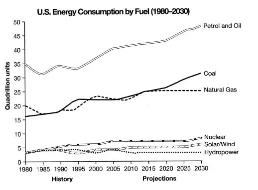
IELTS Line Graph Question
The graph below gives information from a 2008 report about the consumption of energy in the USA since 1980 with projections until 2030. Summarise the information by selecting and reporting the main features and make comparisons where relevant. Write at least 150 words.

IELTS Line Graph Response
The aforementioned line graphs showcase data extracted from a 2008 report detailing energy consumption trends in the USA from 1980, extending to projected figures up to 2030.
As an overview, it can be stated that there has been a consistent increase in the consumption of fossil fuels from the initiation of the period. Projections indicate a further dependence on these fuel sources. Conversely, cleaner energy sources have accounted for significantly less consumption, and forecasts anticipate a continuation of this pattern.
Within the realm of fossil fuels, including coal, natural gas, petrol, and oil, their energy consumption has shown consistent growth since 1980. Commencing at 35 quadrillion units in 1980, petrol and oil experienced fluctuations until 2000. Subsequently, they exhibited a stable and consistent increase, with a projected consumption surpassing 45 quadrillion units by 2030. Likewise, coal demonstrated a similar upward trend, with estimates indicating it will surpass 30 quadrillion units by 2030. Natural gas usage is expected to plateau at approximately 24 quadrillion units from 2020 onwards.
Conversely, at the onset of the period, cleaner energy sources began with consumption levels below 5 quadrillion units and showcased a decrease in their usage, except for nuclear power, which saw a slight uptick to 6 quadrillion units in 2005. Predictions anticipate a modest increase in the use of solar/wind energy. Moreover, hydropower is foreseen to sustain relatively constant consumption levels until 2030."
Mastering the IELTS Task 1 Line Graph requires a combination of understanding data visualisation, vocabulary, and effective writing strategies. By practising regularly, improving your vocabulary, and adhering to the recommended structure, you can confidently tackle this part of the IELTS exam . Success in the IELTS Line Graph task boosts your Writing band score and enhances your ability to analyse and present data effectively.
We hope you are now aware of the Line Bar Graph and how to create it for writing tasks. However, you can contact Prepare IELTS (PI) expert counsellors for further guidance. Our team of education experts is dedicated to providing you with the best guidance in the IELTS exam. You can get a one-on-one counselling session online via our platform. Contact us at [email protected] or call us at +91 9773398388 .
No, IELTS may also include other types of visual data representation, such as bar charts, pie charts, and tables. It is essential to be prepared for a variety of data formats.
Your response should be at least 150 words. It is important to strike a balance between providing sufficient detail and adhering to the time limit.
It's better to use full sentences and paragraphs in your response. This format allows you to provide a structured and coherent explanation of the data. Bullet points or lists are generally not recommended.

Boost your IELTS Speaking score
Latest News

IELTS Score Complete Guide
2024-05-23 18:24:48

Tips for the IELTS Academic Listening Section
2024-05-23 18:23:54

Top Universities Accepting IELTS Scores
2024-05-23 18:23:04

IELTS Score You Need for Admission in Europe
2024-05-23 18:22:08

IELTS Score for New Zealand
2024-05-23 18:21:16

IELTS Speaking test - Most commonly garble words
2024-05-23 18:20:16

How to use Adjectives and Adverbs in your IELTS Grammar test?
2024-05-23 18:19:12

Describe a Person You Know Who Likes to Talk a Lot - IELTS Cue Card
2024-05-23 18:17:57

IELTS Exam Fees 2024: Registration and Cancellation Fees
2024-05-23 18:17:10

IELTS Test Centers in India: Check city-wise IELTS exam Center
2024-05-23 18:16:45

Related Blogs
A php error was encountered.
Severity: Notice
Message: Undefined variable: tips_category
Filename: Blog/blog_detail.php
Line Number: 385
File: /home/prepareieltsexam/public_html/application/views/frontend/Blog/blog_detail.php Line: 385 Function: _error_handler
File: /home/prepareieltsexam/public_html/application/controllers/Tips.php Line: 551 Function: view
File: /home/prepareieltsexam/public_html/index.php Line: 316 Function: require_once
Severity: Warning
Message: Invalid argument supplied for foreach()

Describe your Idea of a Perfect Home or Dream House where you want to Live - IELTS Cue Card
Describe your Idea of a Perfect Home or Dream House where you want to Live - IELTS Cue Card Since Indian students are writing and speaking in English with Indian accent, with not much exposure to foreign accent, it can be the cause of
- (5.0 /152 votes)

Describe a Job That you Think is Interesting - IELTS Cue Card
Describe a Job That you Think is Interesting - IELTS Cue Card Since Indian students are writing and speaking in English with Indian accent, with not much exposure to foreign accent, it can be the cause of

Describe a Sports Program You Like to Watch - IELTS Cue Card
Describe a Sports Program You Like to Watch - IELTS Cue Card Since Indian students are writing and speaking in English with Indian accent, with not much exposure to foreign accent, it can be the cause of

Describe an Occasion When you Spent Time with a Young Child - IELTS Cue Card
Describe an Occasion When you Spent Time with a Young Child - IELTS Cue Card Since Indian students are writing and speaking in English with Indian accent, with not much exposure to foreign accent, it can be the cause of
Registration Now
Share Your Feedback
Free 1 day ielts class with our head of ielts program nick carey.
Register on the spot and get 10% Discount on IELTS fee!
Achieve IELTS Success with Our Comprehensive Classes, proven teaching methodology, and Experienced Teachers.
Affordable Fee Structure
Experienced & Certified Trainers
Interactive Class Activities
Friday, 2nd Feb 2024
11:00 AM - 4:00 PM

IELTS writing task 1: Line graph and model answer
Ielts academic writing task 1: c02 emissions line graph.
Updated: January 2023
Line graphs are very common in IELTS academic task 1 writing. In this lesson, we will look at a Model Answer for CO2 emissions for 4 European countries and an analysis.
This line graph comes from Cambridge IELTS 11 academic. Use only official IELTS material when doing practice tests as there is a lot of fake IELTS material out there on the web.

See a lesson on the grammar used in this type of task click here
Model Answer
The graph illustrates the average output of carbon dioxide in metric tonnes for each individual in four European countries over a forty year period.
Overall, C02 output per individual in the UK and Sweden began the highest but witnessed a decline toward the end of the period. Conversely, Italy and Portugal began with relatively low emissions and indicated large increases by the end of the timeframe.
In 1967, the UK showed the highest proportion of carbon emissions at around 11 metric tonnes per person; however, this figure declined steadily ending at approximately 9 metric tonnes for each individual. Sweden’s output started at just over 8 metric tonnes, this then rose to a peak of approximately 11 tonnes in 1977 and then witnessed a sharp decline to approximately half of that by 2007.
In contrast, Portugal in 1967 had the lowest output at just over 1 tonne per person. Over the next four decades, this increased sharply ending at over 5 metric tonnes. Italy demonstrated a similar rising pattern, beginning at a little over 4 metric tonnes and levelling off at nearly 8 tonnes of carbon dioxide for each person by 2007.
Keep your report at under 190 words. I have seen many task 1 reports with over 200 words which is far too long. Remember that you only have 20 minutes to write this. For task 1 academic it’s a good idea to aim for about 170 to 190 words to cover the task well . 150 words is considered the minimum but there is no penalty for going under this. However, you don’t get a higher band score for writing a very long report.
It is important to understand how the task is marked to give the examiner what they need for a higher band score.
Writing Task 1 is marked on 4 criteria:
- Task Achievement (accurately write about the information presented)
- Coherence and Cohesion (easy to understand, clear and logical)
- Grammatical range and accuracy (using the correct grammar to describe the trends, numbers, comparisons)
- Lexical Resource ( accurate clear vocabulary that is relevant to the task, good paraphrasing skills)
Grouping the information
You need to spend at least 3 minutes analysing the task and planning where to put the information. Grouping the information is crucial for a coherent logical response and a good band score in coherence cohesion.

The Introduction
I have paraphrased the task question here. You can use synonyms or you can change the grammatical structure of the sentences so that it retains the same meaning. Paraphrasing is not just about synonyms, you can re-arrange the sentences, this is a very important skill to practice.
The graph illustrates the average output of carbon dioxide in metric tonnes for each individual in four European countries over a forty-year period.
- shows = illustrates
- average carbon dioxide emissions = the average output of carbon dioxide
- per person = for each individual
- 1967 and 2007= over a forty-year period
I didn’t paraphrase the word ‘graph’ because a graph is always a graph, you can’t really paraphrase this word. I also wrote ‘ in four European countries’ instead of repeating the countries names.
The Overview
The overview is also an important feature in task 1 academic and your report must have one. The overview should not include any numbers, statistics or dates. Leave those details for the body paragraphs. You will need to look at the main trends of the graph and write briefly about those. Pick out the main trends and give a summary.
Overall, C02 output per individual in the UK and Sweden began the highest but witnessed a decline toward the end of the period. Conversely, Italy and Portugal started with relatively low emissions but saw considerable increases by the end of the timeframe.
I start with the word ‘Overall’ this is a good way to introduce the overview. I have picked out the two main trends here which are:
- The UK and Sweden = started high ended much lower.
- Italy and Portugal = started low ended much higher.
Key vocabulary:
- witnessed a decline
- toward the end of the period
- Conversely (shows contrast)
- relatively low
- saw considerable increases
- by the end of the timeframe
Do not write a conclusion in writing task 1 academic. Never include an opinion, you must write factually.
Body Paragraphs
Now we can write in more detail about the graph and the trends. Also, remember to be selective and do not write about everything in the graph . Grouping the information is very important in this part of the task. Take the 2 main trends and separate them into 2 body paragraphs as below.
In 1967, the UK showed the highest proportion of carbon emissions at around 11 metric tonnes per person, however, this figure declined steadily ending at approximately 9 metric tonnes for each individual. Sweden’s output started at just over 8 metric tonnes, this then rose to a peak of approximately 11 tonnes in 1977 and then witnessed a sharp decline to approximately half of that by 2007.
In this body paragraph, I wrote about the 2 highest C02 outputs , which are the UK and Sweden and described how they declined in the 40 year period. I added more detail and numbers here, notice how I have used prepositions also (at, around, over, to, by) and most importantly you must use the language of approximation as there a no exact figures in the chart.
- the highest proportion of
- declined steadily
- rose to a peak
- output = emissions
- a sharp decline
- each individual = per person
In the next paragraph, I have written about the 2 lowest C02 outputs (Italy and Portugal) and described how they increased in the 40-year time-frame.
- In contrast (shows contrast)
- the lowest (superlative)
- increased sharply
- demonstrated a similar rising pattern
- beginning at …. levelling off at
Using the language of comparisons is useful in this kind of task, make sure you know how to use comparatives and superlatives, especially if you get a graph or bar chart with 2 or 3 trends.
Language of approximation
In the graph, there is no figure in between the lines so you will need to use approximation for a better band score in vocabulary. It is important to notice this as it is common in many IELTS graphs or charts.
around 11 metric tonnes.
Just over 8 tonnes of c02 emissions., just under 11 tonnes., a little more than 4 metric tonnes of c02 output., slightly higher than 4 metric tonnes., slightly less than., approximately 11 tonnes of co2., close to 11 tonnes., almost 11 tonnes..
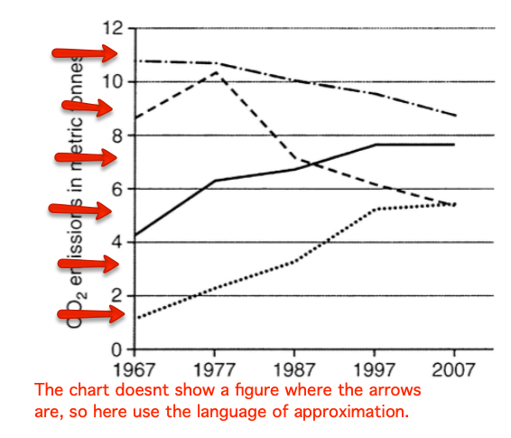
Using more academic vocabulary
For a higher score in vocabulary use more academic vocabulary when describing the data. such as: ‘proportion, figure, accounted for, amounted to, totalling, stood at, comprising’
Example sentences:
- The proportion of C02 emissions stood at around 7 metric tonnes for Sweden in 1967.
- The figure for C02 output for Portugal totalled nearly 6 metric tonnes in 2007.
- The UK had the highest amount of emissions comprising nearly 11 metric tonnes in1967.
- C02 output for Italy accounted for just over 4 metric tonnes in 1967.
To see lessons on the vocabulary to use in writing task 1 click on the links below:
Writing task 1 vocabulary: ‘number, total, amount, figure, accounted for’
Writing task 1 academic vocabulary
Any questions? post a comment below

3 thoughts on “IELTS writing task 1: Line graph and model answer”
THIS IS FROM MY MENTOR(HASAN.BD)[BODY1&2]
In 1967, the average CO2 emissions in the UK and Sweden were nearly 11 and 9 metric tonnes respectively. Sweden’s emissions rose significantly from about 9 metric tonnes in 1967 to approximately 10.5 metric tonnes in 1977, then dropped suddenly to around 5.5 metric tonnes, surpassed by Italy 1990 while the United kingdom’s emissions were decreasing gradually until reaching 9 metric tones in 2007, becoming one the highest emitters of CO2.
In early 1967, the average carbon emissions in Italy and Portugal were around 4 and 1.5 metric tones, respectively. CO2 Emissions in Italy rose significantly from around 4 to approximately 8 metric tonnes at the end of the period, exceeding Sweden’s emission in 1990 at around 7 metric tonne. Meanwhile, in Portugal, the country’s emissions grew steadily from around 1.5 to above 5 metric tonnes in 1997, before climbing slowly in the following years, meeting Sweden at the same lowest position.
[I MIGHT TRY TO SEND ITNRO & OVERVIEW OF THIS GRAPH]
Hello, I am Karim Muratov from Uzbekistan. I tried to study for IELTS at home so can you check my intoduction and overall. Thank you. The graph gives information about how many residents discharged CO2 in four countries from 1967 to 2007. Overall, it is clear that the UK made up the largest proportion of CO2, while Portugal accounted for the least share. Moreover, it is also worth mentioning that the difference between the biggest and the smallest was significant.
Hi, it’s a good attempt but the sentence ‘…how many residents discharged’ is not accurate, it would be better to say ‘..carbon output for the inhabitants of four European countries’ .
If you need corrections on writing take a look at the correction service at this link here: https://ieltsfocus.com/writing-correction-service/
Leave a Comment Cancel reply
- A Beginner’s Guide to IELTS
- Common Grammar Mistakes [for IELTS Writing Candidates]
Writing Correction Service
- Free IELTS Resources
- Practice Speaking Test
Select Page
How to Describe Line Graphs for IELTS Writing Task 1
Posted by David S. Wills | Sep 28, 2016 | IELTS Tips , Writing | 2

The IELTS Writing Task 1 often features a line graph. Describing a line graph is not as difficult as it seems. In fact, there are a few things to remember to help you gain a band 7.0 score.
You can learn these two structures and, with only a little bit of variation, you can describe almost any trend.
Interest rates decreased significantly.
Subject (what you’re describing) + verb + adverb
There was a significant decrease in interest rates.
There was + adjective + noun + (what you’re describing)
You can use these formulas to describe most trends in line graphs. Here are some more examples.
Unemployment levels dropped slightly.
The price of gas increased suddenly.
There was a steady decline in attendance.
As you can see above, you can use verbs or nouns to describe changes given that you alter the grammar of the sentence. This is useful for avoiding repetition. For example, read the following passage:
Interest rates increased from 5% to 6% and then increased again from 6% to 8%. They decreased to 4% and then increased once more to 7.5% before decreasing back to 5%.
It sounds awfully repetitive! Let’s trying mixing it up:
Interest rates increased from 5% to 6% and then rose again from 6% to 8%. They fell to 4% and then there was an increase once more to 7.5% before dropping back to 5%.
Here are some comparable pairs:
Keep in mind that if you use the verb + to then you must follow with a number. Also, most of those words can be used interchangeably, except for “boom” which suggests a large, sudden increase.
Being Specific
There’s a big difference between the right word and the nearly right word… In the IELTS, getting a higher band can be achieved by using more specific and accurate language . Instead of simply saying that something went up or went down, try using adverbs and adjectives to say how it went up or down.
Here’s a list of some useful words:
They can be used together thusly:

More Information About Line Graphs
If you want to see how you can use the above language in a report on line graphs, you should take a look at this helpful YouTube video:
If you need help describing line graphs, check out our writing correction service .
About The Author

David S. Wills
David S. Wills is the author of Scientologist! William S. Burroughs and the 'Weird Cult' and the founder/editor of Beatdom literary journal. He lives and works in rural Cambodia and loves to travel. He has worked as an IELTS tutor since 2010, has completed both TEFL and CELTA courses, and has a certificate from Cambridge for Teaching Writing. David has worked in many different countries, and for several years designed a writing course for the University of Worcester. In 2018, he wrote the popular IELTS handbook, Grammar for IELTS Writing and he has since written two other books about IELTS. His other IELTS website is called IELTS Teaching.
Related Posts

9 IELTS Phrases to Avoid
April 19, 2016

Describe your Ideal Home
December 2, 2022

Answering the Question – Task Achievement for IELTS Writing
May 7, 2019

5 Ways Get Feedback on Your English (from Native Speakers)
October 1, 2019

Hi David. Is it better to use past tense in the summary sentence in the last video? Thanks!
Either is possible here. Because I introduced the line graph as a line graph rather than referring to the data it represents, I felt the consistency in tense was important. However, from the perspective of the data, the past simple would be correct.
Leave a reply Cancel reply
Your email address will not be published. Required fields are marked *
This site uses Akismet to reduce spam. Learn how your comment data is processed .
Download my IELTS Books

Recent Posts
- How to Improve your IELTS Writing Score
- Past Simple vs Past Perfect
- Complex Sentences
- How to Score Band 9 [Video Lesson]
- Taxing Fast Food: Model IELTS Essay

Recent Comments
- Francisca on Adverb Clauses: A Comprehensive Guide
- Mariam on IELTS Writing Task 2: Two-Part Questions
- abdelhadi skini on Subordinating Conjunction vs Conjunctive Adverb
- David S. Wills on How to Describe Tables for IELTS Writing Task 1
- anonymous on How to Describe Tables for IELTS Writing Task 1
- Lesson Plans
- Model Essays
- TED Video Lessons
- Weekly Roundup
Press ESC to close

IELTS Writing Task 1 Line Graph Examples: Here’s a Guide to Master the IELTS Essays
One of the most popular essay topics in the IELTS writing task 1 is explaining the line graph. This is a type of essay where you will have to explain the data given in the form of line graphs. This task is particular to the academic writing and the general candidates need not worry about this.
As you must know that the IELTS writing task 1 line graph is the shorter of the two tasks and needs to be written in 150 words at least. It is also necessary that you finish this task in no more than 20 minutes, as the second task is lengthier and as such, requires more time. Let us get into the details of line graph essays.
Skills Tested in IELTS Task 1
In IELTS writing task 1, you will be asked to describe facts or figures presented in one or more graphs, charts or tables on a related topic; or they may be given a diagram of a machine, a device or a process and asked to explain how it works.
Important Points
You must write in an academic or semi-formal/ neutral style and include the most important and the most relevant points in the diagram.
This task assesses your ability to identify the most important and relevant information and trends in a graph, chart, table or diagram, and to give a well-organised overview of it using language accurately in an academic style.
You will also be judged on how appropriately, accurately and relevantly the response fulfils the requirements set out in the task, using the minimum of 150 words.
Further Assessment
- You will be assessed on how your response organises and links information, ideas and language with appropriate use of cohesive devices (for example, logical connectors, pronouns and conjunctions) to assist in making the conceptual and referential relationships between and within sentences clear.
- You will also be judged on your use of a range of vocabulary and grammatical devices and its accuracy in terms of the specific task.
How to Structure IELTS Writing Task 1 Line Graph Essays?
Structuring a line graph essay is not a big deal. All you need to remember is that you do not need a conclusion here. As this isn’t a discursive essay, so conclusions do not serve any purpose. Here is an IELTS sample essay to know how you can structure a line graph essay:
Paragraph 1 (Introduction)
- Sentence 1- Paraphrase Question
This paragraph should be one sentence long and demonstrates your ability to paraphrase. You should do this by using synonyms.
Paragraph 2 (Overview)
- Sentence 1- Overview of the first main feature
- Sentence 2- Overview of the second main feature
- Sentence 3- Make general comparison, if appropriate
An overview is a general statement, highlighting the most important information in the table. It should not include any numbers. This is just a summary of the main features. You can use numbers to support your answer in paragraphs 3 and 4.
The examiner is testing your ability to identify the most important information and then summarise it. Important information could include general trends, increase/ decreases, differences, comparisons etc.
Paragraph 3 (Details of significant feature 1)
- Sentence 1- Supporting details
- Sentence 2- Supporting details
- Sentence 3- Supporting details/ comparison details, if appropriate
In this paragraph, you take the first general statement from paragraph 2 and support it with details from the graph. The examiner is looking for your ability to choose the correct data and ability to describe data, trends, comparisons etc.
You then repeat this process for paragraph 4, only this time you describe the second sentence in paragraph 2.
Paragraph 4 (Details of significant feature 2)
There may also be three significant features, in which case you can adjust the structure slightly.
You must remember not to write a conclusion. Conclusions are for opinion or discursive essays and you are not expected to do this in task 1.
Also Read : 9 Practical IELTS Letter Writing Tips: Guide to General & Academic Writing
IELTS Writing Task 1 Line Graph Example Essay Question
Source: Cambridge English IELTS Past Papers.
The IELTS writing task 1 line graph gives information from a 2008 report about the consumption of energy in the USA since 1980 with projections until 2030.
Summarise the information by selecting and reporting the main features, and making comparisons where relevant.
IELTS Sample Essays Answer
The line graph shows energy consumption by fuel type in the United States from 1980-2008, with projected use until 2030.
Overall, fossil fuels have been the dominant type and will continue this trend into the future. Nuclear and renewable energy sources have represented a small but significant proportion of total energy use and despite small projected gains; it is projected that they will continue doing so.
Main Information
Petrol and Oil commanded the biggest share with 35 quadrillion units (35q) in 1980, rising to approximately 40q in 2008 and this trend is set to continue with a projected value of nearly 50q in 2030. In 1980 natural gas and coal came in second and third, with around 16q and 20q respectively. However, coal overtook natural gas in 1990 and despite some fluctuation, is set to be the second most used fuel in 2030 with just over 30q. It is predicted that natural gas will level off and remain relatively constant at about 25q.
Nuclear and the renewable energies all represented around 4q in 1980 and fluctuated up until 2008. It is speculated that nuclear energy will reach 10q by 2030 and solar/wind around 5q, with hydropower dropping and then remaining constant at approximately 2q.
Academic writing task 1 is a writing task which has a defined input and a largely predictable output. It is basically an information-transfer task that relates narrowly to the factual content of an input diagram and not to speculative explanations that lie outside the given data.
You can take help of any good IELTS online training programs for enhancing your skills in this topic. A proper IELTS online preparation will help you with the most important part and that is choosing the correct information. If you know what to put into the essay and have a concrete structure, you are absolutely good to go!
Also Read : Duolingo Test Scores Explained: Comparison with IELTS and TOEFL
One Comment

I was looking for this article for the preparation of graphs and how to write essays, this was very useful, what are you looking for?
Leave a Reply Cancel reply

Share Article:
About the Author
Indulekha prabha.
My name is Indulekha Prabha. I am an English teacher and a content writer by profession. When I'm not working you can find me writing fiction, reading poetry and painting.
You might also like

Describe Something Important that has been Kept in Your Family: A Cue Card Sample Topic for IELTS Speaking

How to Use an IELTS Calculator? Calculate Your Overall IELTS Exam Score

What is a Good IELTS Score? Is 7.5 a Good IELTS Score? Here’s All You Need to Know
Other stories, top ielts classes in ambala: all you need to know to score better, how to sound more confident in the ielts speaking test effective speaking practice guide.

- Feb 4, 2023
IELTS Academic Writing Line Graph Band 8 Sample Answer
Updated: Apr 28

- IELTS Academic Writing
Recent Posts
IELTS Writing Task 2. Both Views & Own Opinion
IELTS Academic Writing Describing Bar Chart Band 8 Sample
Jan 2023. IELTS Academic Writing Task 1. Process
HI Total-IELTS! I just wanna say thank you for posting this sample essay about a line graph. This is the hardest for me but your sample essay provided a clear and concise structure that helped me understand the different components of writing about a line graph. I hope you will not stop posting more helpful content for all of us taking the IELTS exam.
The way this essay describes the line graph is thorough and detailed. The writer effectively summarizes the main trends in the graph, using specific figures to illustrate their points. This information is especially helpful for those who struggle with interpreting data and graphs. Big thanks!!!
I will not be scared of line graph now lol, thanks!
IELTS Preparation with Liz: Free IELTS Tips and Lessons, 2024

- Test Information FAQ
- Band Scores
- IELTS Candidate Success Tips
- Computer IELTS: Pros & Cons
- How to Prepare
- Useful Links & Resources
- Recommended Books
- Writing Task 1
- Writing Task 2
- Speaking Part 1 Topics
- Speaking Part 2 Topics
- Speaking Part 3 Topics
- 100 Essay Questions
- On The Day Tips
- Top Results
- Advanced IELTS
IELTS Two Line Graph: Sample Answer & Exercise
Here is an IELTS line graph sample answer describing two lines. You must fill in the gaps to complete the model writing task 1. Answers are given below. If you wish to learn more vocabulary for a line graph , follow the link.
The line graph below shows radio and television audiences throughout the day in 1992.
Source: Graph below was not designed by IELTS Liz. Source unknown.
Line Graph Sample Answer
Fill in the gaps to complete the sample answer for the above line graph. You can use more than one word in each answer.
The line graph illustrates the (1) ………………………… of people listening to the radio and watching TV who were over the age of 4 in (2) …………………… period, in the UK from October to December 1992.
Overall, the (3)…………………….. of people listened to the radio in the morning while (4)………………. people watched TV in the evening. Over the 24 hour period, there were more people watching TV than there were listening to the radio.
(5)……………………. the TV, at 1am there were under 10% of people watching TV. This (6)…………………………… remained relatively (7)…………….. until 11am when there was a (8)……………. increase in people watching TV before (9)………….. at approximately 45% at around 9pm. After that time, there was a (10)…………… drop in viewers to under 20% by midnight.
Similarly, the percentage of listeners to the radio also began low at under 5%. After continuing at under 5%, the figure then rose (11)……………… to a (12) …………. of almost 30% at about 8am. From that point, the proportion of audience (13) ………………. in a gradual (14)……………… trend to 5% at the (15) ………. of the day.
- proportion / percentage
- Regarding / With regard to / In regard to
- stable / constant
- steady / gradual
- sharp / rapid / dramatic / sudden / considerable / significant
- sharply / rapidly / dramatically / suddenly / considerably / significantly
- peak / high
Recommended
- Line Graph Vocabulary
- All Line Graph Lessons
Get my free lessons by email
Subscribe for free to get my new IELTS lessons sent to your email inbox.
Email Address
The given graph illustrates radio and television viewing routines of the UK population from October to December 1992. Overall, television had consistently achieved a higher total viewership than the radio. The TV reached its peak viewership in the nighttime slot. While the radio had its peak listenership in the morning slot. The radio’s listenership was at the lowest from midnight to 6am with fewer than 5% of UK population tuning in. Afterwards, it quickly rose in the morning reaching its peak at 8am by attracting about 25% of the people. It could be that the audience enjoyed hearing radio in the morning while having breakfast, travelling to their offices, and performing other chores. Similarly, UK’s television viewership was also at its lowest in the midnight. It began to rise from 11am. Afterwards, it quickly picked up viewership and reached its peak at 5pm to 9pm. Post evening time, it engaged 45% of the population in their after-work leisure hours. This viewership fell quickly to almost 15% of the total after 9pm with the arrival of resting hours. Lastly, when listenership of the radio began to decline, viewership of the television started to rise, showcasing the shift in audiences’ preferences with the changes in time slots.
The line graph compares the proportions of the British population over 4 years old who were entertained by radio and TV during the different time of the day between October and December 1992.
Overall, it can be clearly seen that in the morning people preferred radio, whereas TV was a more popular choice in the second part of the day with the highest amount of hours spent in the evening.
Starting at 1am, 7% watched TV, which was followed by a drop to under 5% until around 6am; the same pattern was observed for those who listened to radio. However, from 6am the proportion of radio audience soared to its peak at over a quarter 2 hours later, followed by a constant fall onwards. In contrast, the percent of TV audience inclined to around 8% at 8am and to nearly 15% at 1pm after a dip to under 5% 2 hours before.
Moving to the activities of the second part of the day, the proportion of radio listeners kept on falling to about 5% by the end of the day with some fluctuation between 15.00 and 21.00. On the other hand, the percent of TV audience experienced a significant rise to its peak at roughly 45% between 8pm and 9pm, which was followed by a sharp decline to around 15% by the end of the day.
The line graph illustrates the frequency of using TV and radio during a day in the UK from October to December 1992. Overall, it can be seen that one activity alternates with the other one. In the first half of the day, the majority of the UK audience prefers listening to the radio, meanwhile, after 1 pm the number of TV users extremely goes up. At 1 am, the percentage of the audience slightly rises and at approximately 6 am, it sharply climbs and hits a high of about 27%. Then, people start using the radio less and the frequency decreases – the percentage goes down, soon rises at 5 pm to around 15% and declines again, having some insignificant drops. In terms of television, at 1 am, the percentage of users falls to 2%, then start rising, having some fluctuations. At 11 am, the frequency of using TV grows notably and reaches its peak at about 45% at 9 pm. Then, the percentage of TV users goes down.
The given graph illustrates the amount of audiences of radio and television in the span of 24 hours, this data has been collected from October to December of 1992 in UK.
We can see that in the period between midnight and early morning at 6 AM, the numbers of audiences are reaching the rock bottom with a value of around 5 % for both broadcasters.
when people begin to wake up to go to work in around 7 AM, numbers of radio audiences is wildly peaked and reached the highest point that it can go at around 25% of UK population, on the other hand television is still steady at 5%.
Throughout the day radio numbers is gradually step down and in contrast television is steadily increase until we reached the breakeven point at around 2 PM when television is outnumbering the radio because people is beginning to return from work.
In the final hours of the days, television reached its highest value of audiences in around 7 PM with nearly 45% of UK population, on the other hand radio is still at the rock bottom with only 5%.
We can conclude from this data is people tend to listen to radio while going to work and after returning home they begin to relax and watch tv until near their bedtime.
Hi Liz, Thank you so much for those materials! They are really helpful for my IELTS test preparation. I have a question. “The line graph illustrates the proportion of people listening to the radio and watching TV…” In this sentence, can I change proportion to proportions? and why? I considered the plural form, proportions, because there were two categories of people. One category is people watching TV and another category is people listenning to radio. Looking forward to your answer. Thank you very much!
Sure, that’s fine. English grammar isn’t always black and white. In this case, both options are possible.
This line chart illustrates the proportion of tv and radio listeners in England (age over four years old) from October to December 1992. Overall, the majority have presented as TV users, which is almost 45% at around 21 hours. Besides, these TV waivers gradually increased over the given time in a day. Around 11 its has slightly increased, up to 15% and then around 13.30, significantly increased up to 40%. Then instantly decreased to 15 present at midday or night. Although, around 1 to 10.30, we could see some slight changes in television viewers which is maximum goes to 6%. In terms of British radio audiences, who were highly active around 8 p.m. or a.m., that is notable while it gradually decreases and maximum indicate 4% during the day after midday or night. Outstandingly, the Radio listening Percentage has increased up to 25 at 5.30, and it lasts till 7.30. Then after, it eventually falls to likely 10%. Later 13.30 diagram shows some slight differences until the rest of the day. Likewise, we can see the Highest proportion of British children who tend to watch TV rather than listening to the radio in 1992, the period given. According to the chart, The proportion of children who had been watched TV is twice as much as people who were listening to the radio.
The graph line presents the British television and radio audience throughout the average day between October and December in 1992, which the percentage of UK population (over 4-years old) and the timeline from 1 a.m. to midnight are the vertical and horizontal values respectively. The TV and radio graph lines are compound of blue and red line colors each. At the beginning, The TV and radio audience had similar samples motions within a range of 2.5% to 7%, in which, TV watchers had obtained a slight lead from 1 a.m. to 6 a.m with 1% more.
Whereas the TV audience kept going its pace until 11:30 a.m., the listeners turned their radios on and abruptly reached to its hearing peak with a quarter at 8 a.m. Nevertheless, the listeners had started to gradually descend from this time and reached to the least mark of 5% at the end of the day.
On the other hand, the TV audience had 2 increases, firstly it had started to gradually go up from 11 a.m. to 2 p.m. reaching to 16%, secondly it hugely raised from 3 p.m. to 6 p.m. and achieving its peak with 45%, almost the half country population were watching the TV services at 8 p.m. However, it started to quickly go down just after 9 p.m and closed the graph with 15% at midnight.
Dear Liz, I tried doing the exercice and my exam is next week, i was hoping if you could give me a general feedback at my trial please. Thank you
The line graph demonstrates the proportion of british citizens that are entertained by either the television or the radio, over the course of the day, from October to December in 1992. Overall, the percentage of television viewing exceeds the radio’s frequency, specifically during the second half of the day. Conversely, the proportion of people listening to the radio falls remarkably from the afternoon till the end of the day. From 1 am to 6, the usage of both modes of entertainment is trivial with an average of only 5%. On one hand,, the number of people listening to the radio increases sharply at 6am, to reach its peak (25%) at almost 9 am. On the other hand, during this period, the percentage of Tv viewers remains steady at 5%, which is followed by a dip at 11 am. In the afternoon, the Tv and the Radio occupied a similar importance with a proportion of approximately 15%. However, from 13, the number of radio listeners fell gradually with a few fluctuations, until it reached 5% at the end of the day. Whereas, during that time the percentage of the population watching the TV grew dramatically and it reached its peak at around 20 with a percentage of 40%. During the end of the day, a steep decline in the television’s audience can be observed, as viewing decreases by almost 25%.
Sorry I don’t comment on writing.
The graph illustrates the audiences of TV and radio period 24 hours between Oct and Dec in 1992 in UK. Overall the radio unchanged from 1:00 AM to 6:00 AM but increased dramatically in 7:00 AM although after 3 hours drop to 26%. Likewise, in TV in morning duration it hadn’t changed until 8:00 AM rise to 6% which have decreased in 10:00 AM.As we see in TV is rises especially in evening whereas radio rocked in the morning.people almost reach to 50% between 16:00 PM to 21:00 PM which start to drop to 30% in the following hours. In the whole, the chart despite that in 13:00 PM both get to 15% but after an hour radio fall to 12% also decrease again to 10% in 15:00 PM. Although radio had fluctuate after 15:00 PM.which explain that people prefer watching TV in the evening until midnight even though 6% of people watching in morning.Despite of this that the most people as the graph shows they rather to listen to radio in the morning they reach to 25% in this percent was the highest one of radio. dear Liz could please tell me which the expected band can get it in IELTS. Thank you very much
I did the Ielts couple days ago, on the writing of task 1 I wrote the whole structure which includes intro by paraphrasing the question and in the over view I wrote that “Overall, USA has the highest number of immigration as posed as Australia has the lowest number of immigration while USA has the highest number of immigration for the the whole period whereas Australia has the lowest number of immigration “. Plus paragraph one I explain every year separately there was 11 years on the graph that is given + one sentence of paragraph 2, with using translation words in the whole task. On the other task or task 2. I wrote the almost the same intro as yours with including 2 or 3 high level of vocab it was about 100 words it took most of the first page. first I mention brief intro about the topic than a brief intro about what should I include than my opinion after that what I will include in the whole task. The paragraphs was containing (brief intro, thesis, one or two (complex or compound sentence)and full of simple sentence the result than a small conclusion). So please could you estimate my mark according to what I have said.
Your score is based on Task Achievement, Coherence & Cohesion, grammar and vocabulary. Your writing is analysed in great detail to decide a final score and is not based on a simple description of what you have done. You must wait for your results to see your score. However, I will say that an introduction which is 100 will not help your score. An introduction is usually 40 – 50 words.
Dear Liz, please how do you count words in ielts writing task?
One at a time. Each word counts as one word – one after another in order.
Namaste, from Nepal Dear Liz, we were taught to write conclusion in writing task 1, but i don’t feel comfortable with it as we mentioned same things in overview. What should I do?
Never repeat information. Task 1 is not an essay. It is a short report. All key features are reported in an overview and should not be highlighted again. The body paragraphs present the details (usually data).
Thank you a lot!
Hellor Liz, thank you so much for this amazing website.Much appreciated . With regard to writing task 2, I seem not to find any other lessons apart from writing Introduction and Thesis statement.Can I get a link to the rest of the lessons for writing task 2?. Thank you!
Look at the red nav bar at the top of this website. You will see links to all the main pages on that red bar. Click on the writing task 2 section to find a lot more posts, model answers, tips, videos etc.
Minh Hoa says: Hi Liz, I am not good at analyzing charts, tables to do IELTS TASK 1 . Could you really help?
Regards, Hoa
Sorry for the delay in replying. See this page: https://ieltsliz.com/ielts-writing-task-1-band-scores/ for tips on improving.
Thank you mam,
Can you give me any instruction or link abut the use of preposition?
Thanks in advance.
See this page: https://www.ego4u.com/en/cram-up/grammar/prepositions Liz
Thanks Very useful link for IELTS students. But there were a limited discussions about article (a, an, the). Can you provide me any link regarding article use?
Thank you for your time.
See this page for links: https://ieltsliz.com/useful-websites-and-resources-for-ielts/ All the best Liz
Your lesson is very useful.
Regards, Hoang
Is this sentence acceptable?
There were more people watching TV than listening to the radio
Yes, it’s fine.
Can a conclusion be avoided altogether in task 1 academic I’m confused!HELP
There is no conclusion in writing task 1. Please see my writing task 1 section to learn more. Thanks Liz
Hello Liz Your teachings have been of great help to me.I am presently preparing to take my test by the month end.Please how do I get my essays and reading practices assessed?
Unfortunately, I don’t offer any marking services. On this blog, all reading practice exercises have answers. If you want to practice full reading tests, you should get the IELTS Cambridge books 1 to 10 (number 10 is the most recent). They are books with real exam papers published by IELTS. For writing, you will need to find an IELTS teacher to help you with assessing your level. All the best Liz
Dear Liz, What’s the difference between “In regard to” and “With regard to”? Aren’t these the same in grammar and meaning?
Would be so kind of me by explaining it.
With regards, Mohan Anbgo
There is no difference. They are both acceptable and both grammatically correct. Liz
Liz, how about in behalf and on behalf of?
Please check this link: http://www.grammarphobia.com/blog/2006/09/in-behalf-of-vs-on-behalf-of.html Liz
Hi Liz.. All ur tips & lessons are truly amazing. Most important it really helping me to practise all the levels of writing task1..I really hope my real test goes well n score expected bands 🙂
I agree completely!
Speak Your Mind Cancel reply
Notify me of new posts by email.
Advanced IELTS Lessons & E-books
Click Below to Learn:
- IELTS Test Information
Copyright Notice
Copyright © Elizabeth Ferguson, 2014 – 2024
All rights reserved.
Privacy Policy & Disclaimer
- Click here: Privacy Policy
- Click here: Disclaimer
Return to top of page
Copyright © 2024 · Prose on Genesis Framework · WordPress · Log in
IELTS Writing Task 1 – Line Graph Essay Example 2
In this post, we will look at a Writing Task 1 Academic line graph essay example from the IELTS writing task 1 Academic Test. Students often ask if the questions are repeated year after year and the answer is no, but the type of chart or graph can be.
There are so many questions written each year, you may find you practice answering various questions on different topics. It is best practice to learn how to answer each one of the various types of writing task 1 questions , from bar charts, line graphs, maps, process etc.
If you would like to learn how to structure a charts and graphs essay please click the button below >
Take a look at the IELTS Writing Task 1 Academic essay example below >>
*This line graph question and answer were provided by a student. IELTS Achieve did not design this question*
The graph gives information about the number of spreads (Margarine, low fat & reduced spread and butter) consumed from the year 1981 up to 2007. The units were measured in grams.
Overall, the highest consumed spread was butter which started as the most used among the three, whereas low fat and reduced spread were only introduced in 1996, however, all three spreads fluctuated within the end of the given time frame.
On the one hand, butter started strong with 140 grams consumed in the year 1981 but gradually decreased as the years progressed until it plummeted to nearly 50 grams used by 2007. Similarly, this can be seen in margarine with almost 90 grams used in 1981 then it slowly decreased in 1986. It reached a plateau in 1991 up to 1996 and gradually decreased reaching 40 grams used in 2007.
On the other hand, low fat & reduced spread was introduced in 1996. It gently rose from almost 10 grams used when it started then progressively increased reaching its highest peak in 2001 (80 grams) however like the two other spreads it slowly decreased up until 2007 were it garnered almost 60 grams.
Word count – 194 / Band score – 8

- Task Achievement – The answer provides a paraphrased question, to begin with, followed by an overview that gives the reader key information.
- Coherence and Cohesion – The answer has been divided into clear logical paragraphs.
- Lexical Resource – There is evidence of paraphrasing, synonyms and some less common words.
- Grammatical Range and Accuracy – The answer has no grammatical errors. The sentences are mainly made up of multiple clauses and have a variety of structures.
We hope you found this post useful in helping you to study for the IELTS Test . If you have any questions please let us know in the comments below or on the Facebook page.
The best way to keep up to date with posts like this is to like us on Facebook , then follow us on Instagram and Pinterest . If you need help preparing for the IELTS Test, join the IELTS Achieve Academy and see how we can assist you to achieve your desired band score. We offer an essay correction service, mock exams and online courses.
Related Posts

IELTS Academic Writing Task 1 – Process
Do you want to learn how to create an essay worthy of a high band…

How coffee is produced ad prepared for sale? IELTS Process Question Essay Model Answer.
Academic essay based on a table: IELTS Writing Task 1 Band 8 sample answer. The…
1 thought on “IELTS Writing Task 1 – Line Graph Essay Example 2”

Thanks for finally talking about >IELTS Writing Task 1 – Line Graph Essay Example 2 – IELTS ACHIEVE <Loved it!
Leave a Comment Cancel Reply
Your email address will not be published. Required fields are marked *
Save my name, email, and website in this browser for the next time I comment.
IELTS Line Graph (Writing Task One Academic)
Line graphs are the most common IELTS academic task one question type. They can also be one of the hardest types to answer. On this page, you can check out my sample answer for an especially tricky line graph question and find out why it is worth a band nine.
IELTS Line Graph Band Nine Sample Answer
This question below is my band nine answer for a fairly famous task one question. Once you’ve finished, keep scrolling to find out why it would get a band nine and for some extra tips.
The graph below shows the population of India and China from the year 2000 to the present day with projections for growth to the year 2050. Summarise the information by selecting and reporting the main features, and make comparisons where relevant.

This graph demonstrates how the number of people in China and India have and will change over time. The graph starts with historical data going back to the year 2000 and continues with predictions up to 2050.
Overall, the population of India will overtake that of China in 2030 and continue to grow through to 2050. Meanwhile, China’s population will peak in the late 2020s before gradually declining.
At the beginning of the graph, in the year 2000, the population of China was 1.25 billion people. According to the graph, this has been growing and will continue to grow to a peak of just over 1.4 billion. After this time, the population will begin to steadily decline, reaching a low point of just under 1.4 billion by 2050.
On the other hand, the population of India has been increasing steadily since the year 2000 and will continue to grow into 2050. In the year 2000, the population of India was 1 billion, far lower than China’s. India’s population will overtake China’s in 2030 when both are just over 1.4 billion people. Its population will continue to grow to 1.6 billion in the year 2050, although this growth will become more gradual over time.
Why is this essay band nine?
At first glance, this looks like quite a hard line graph to write about. After all, you only have two lines to talk about, which means some test takers could run out of things to say. To make things worse, the tenses used to describe this graph are quite complex.
Using perfect continuous tense
When we want to describe something that has been happening non stop for an extended period of time and which are still happening now, we can use the present perfect continuous tense. We often use this tense with ‘for’ and ‘since’. For example:
- I have been living in London since 2020.
- They have been studying hard for the IELTS exam for a year.
- She has been watching that TV show for the last five hours.
To be honest, this is quite a rare tense, but it comes in handy for questions like this. In the essay, I’ve used it for:
- According to the graph, this has been growing and will continue to grow to a peak of just over 1.4 billion.
- On the other hand, the population of India has been increasing steadily since the year 2000 and will continue to grow into 2050.
For both of these sentences, I’ve combined the present continuous with the future tense. This is less clunky than something like ‘The population of India, has grown, is growing and will grow.’
Good Task One Structure
The structure of this answer is exactly how it should be. It has:
- An introduction telling you what the graph is about.
- An overview which gives the key points without going into detail or giving any numbers.
- Two body paragraphs both with a clearly defined topic.
Related posts
IELTS Mentor "IELTS Preparation & Sample Answer"
- Skip to content
- Jump to main navigation and login
Nav view search
- IELTS Sample
IELTS Writing Task 2/ Essay Topics with sample answer.
Ielts essay # 1515 - success in life comes from hard work, dedication and motivation, ielts writing task 2/ ielts essay:, some believe success in life comes from hard work, dedication, and motivation. while many believe success depends on other important factors like money and appearance., discuss both views and give your opinion..
- IELTS Essay
- IELTS Writing Task 2
- IELTS Essay Sample
- Discuss both views
IELTS Materials
- IELTS Bar Graph
- IELTS Line Graph
- IELTS Table Chart
- IELTS Flow Chart
- IELTS Pie Chart
- IELTS Letter Writing
- Academic Reading
Useful Links
- IELTS Secrets
- Band Score Calculator
- Exam Specific Tips
- Useful Websites
- IELTS Preparation Tips
- Academic Reading Tips
- Academic Writing Tips
- GT Writing Tips
- Listening Tips
- Speaking Tips
- IELTS Grammar Review
- IELTS Vocabulary
- IELTS Cue Cards
- IELTS Life Skills
- Letter Types

- Privacy Policy
- Cookie Policy
- Copyright Notice
- HTML Sitemap
IMAGES
VIDEO
COMMENTS
IELTS Line Graph Answer. The line graph illustrates the amount of three kinds of spreads (margarine, butter, and low fat and reduced spreads) which were consumed from 1981 to 2007. Units are measured in grams. Overall, the consumption of margarine and butter decreased over the period given, while for low fat and reduced spreads, it rose.
IELTS Line Graph Essay. Here is the 5 steps process I recommend for planning and writing IELTS line graph essays: 1) Analyse the question. 2) Identify the main features. 3) Write an introduction. 4) Write an overview. 5) Write the details paragraphs. I'm going to take you through the whole process step-by-step as we work on a practice ...
IELTS Academic writing task 1 - Line Graph. A line graph (also known as line chart) is a graphical presentation of data that changes over time. It uses line segments to connect data points and shows changes in data. The X and Y axis are used to denote the changes in the data. Within a line graph, there are points which are connected to show the ...
To make the best use of your time it's important to write with a clear structure, focus on the most important trend or trends, choose appropriate vocabulary and avoid common mistakes. In this tutorial, we have a band range 6.5 / 7 academic task 1 IELTS line graph example essay graded by an ex-IELTS examiner (on our team of essay correctors).
Tips for IELTS Writing Task 1 Line Graph 2022. In the introduction part, you can paraphrase the question asked or the topic of the essay. When you explain the overall trend, identify the main feature and explain it. Ensure that each paragraph has examples that are percentages or numbers to support the sentence written as an explanation.
IELTS Line Graph Examples - Model Answer. The line graph compares the number of cars stolen for every 1000 vehicles in four countries from 1990 to 1999. Overall, it can be seen that car thefts were far higher in Great Britain than in the other three counties throughout the whole time frame. To begin, car thefts in Sweden, France and Canada ...
On IELTS test day, you may encounter line graphs in the Academic Writing Task 1 section. To help you understand what components make up a good response to a line graph question, let's take a look at a model band 9 essay.. To see why this essay is band 9, see our scorer commentary after the model essay below, and check out the official IELTS rubric for Task 1 (PDF).
How to Tackle Line Graphs in IELTS Writing Task 1 Questions. In a line graph, there are usually multiple lines that show changes over time. In your writing, you need to group information based on lines having similar trends or values, so your essay structure will be as follows: Introduction: Paraphrase the question
The structure of your IELTS Task 1 line graph typically consists of the following components -. Introduction - Provide a brief overview of the graph's subject, including the timeframe and data sources. Overview - Summarise the main trends or patterns evident in the line bar graph. Mention the highest and lowest points, significant increases or ...
Line graphs are very common in IELTS academic task 1 writing. In this lesson, we will look at a Model Answer for CO2 emissions for 4 European countries and an analysis. This line graph comes from Cambridge IELTS 11 academic. Use only official IELTS material when doing practice tests as there is a lot of fake IELTS material out there on the web.
IELTS Writing Task 1 Academic line graph essay example that is a band score 8. The question is > The line graph below shows changes in the amount and type of fast food consumed by Australian teenagers from 1975 to 2000. Take a look at the sample answer >>
For example, my first line for this essay will be: The line graph shows information about sales in an unnamed bakery in the year 2014. Speaking of paraphrasing, you should also not include any reference to "below." Whilst the task description is above the graph, your essay will be on a separate piece of paper or on a computer screen.
The IELTS Writing Task 1 often features a line graph. Describing a line graph is not as difficult as it seems. In fact, there are a few things to remember to help you gain a band 7.0 score. Grammar You can learn these two structures and, with only a little bit of variation, you can […]
IELTS Sample Essays Answer. The line graph shows energy consumption by fuel type in the United States from 1980-2008, with projected use until 2030. Overall, fossil fuels have been the dominant type and will continue this trend into the future. Nuclear and renewable energy sources have represented a small but significant proportion of total ...
Lesson 2: Line Graph Tutorial: IELTS Academic Writing Task 1. This post will help you to write a successful line graph essay, there is a model answer for you to compare your work to at the end of the post. Remember that your essay should have a minimum of 150 words and ideally should be completed in 20 minutes.
HI Total-IELTS! I just wanna say thank you for posting this sample essay about a line graph. This is the hardest for me but your sample essay provided a clear and concise structure that helped me understand the different components of writing about a line graph. I hope you will not stop posting more helpful content for all of us taking the ...
Here is an IELTS line graph sample answer describing two lines. You must fill in the gaps to complete the model writing task 1. Answers are given below. If you wish to learn more vocabulary for a line graph, follow the link. The line graph below shows radio and television audiences throughout the day in 1992.
Take a look at the IELTS Writing Task 1 Academic essay example below >>. *This line graph question and answer were provided by a student. IELTS Achieve did not design this question*. The graph gives information about the number of spreads (Margarine, low fat & reduced spread and butter) consumed from the year 1981 up to 2007.
IELTS Line Graph Band Nine Sample Answer. This question below is my band nine answer for a fairly famous task one question. Once you've finished, keep scrolling to find out why it would get a band nine and for some extra tips. The graph below shows the population of India and China from the year 2000 to the present day with projections for ...
The Graph Below Gives Information About the Percentage of the Population in Four Asian Countries. READ MORE >>. Proportion of Population Aged 65 and Over. READ MORE >>. The Graph Below Shows the Consumption of Fish. READ MORE >>. The Graph Below Shows the Number of Shops That Closed. READ MORE >>. The Graph Below Gives Information From a 2008 ...
Jessica Nadal 3 years 9 months. Recent IELTS Graph 20:The table below shows the worldwide market share of the notebook computer market for manufacturers in the years 2006, 2007 and 2014.Summarise the information by selecting and reporting the main features and make comparisons where relevant.Answer: The table gives information about the ...
In this essay, I will discuss both perspectives. Personally, I believe that while wealth and appearance can bring success, hard work, dedication, and motivation are vital to success in life. Some argue that money and appearance play a vital role in achieving success in life. Financial power allows an individual to take calculated challenges and ...