Jazz Up Your Presentation: 6 Ways to Put an End to Ugly Charts and Graphs
Updated on: 22 December 2020

People often add charts and graphs to their presentation trying to make it more interesting. Unfortunately, most efforts to make it unique usually end up having the exact opposite effect.
Often, the enormous collection of slides with colorful presentation charts and graphs blows up your brain by the end of the presentation rather than arousing your interest in the data. You don’t want to be the person who puts his audience through this agonizing experience every time you fire up your laptop.
So, is there a way to jazz up your presentation with beautiful charts and graphs?
The short answer to this question is ‘Yes.’ Here are 6 ways to improve your presentation charts and graphs to effortlessly strengthen your message.

Refrain from Using Backgrounds
When it comes to decorating the graph background, you should avoid using gradients of color or varying the background color in any other way.
It not only undermines your ability to present the data unambiguously but also adds distraction. The context surrounding an object often influences our perception of it.

See the two graphs above, the grey background in the left graph doesn’t provide any information. On the contrary, it doesn’t contrast sufficiently with the object. As a result, it undermines the visibility of the objects in the graph. So, make sure the background is consistent with the slide background.
If you always use the default slide background, you should use ‘No Fill’ ‘or White’ background color as it matches the slide background.
Eliminate Redundant Labels
Why do you want to waste the space on redundant labels? Most graphs charts are quite self-explanatory. Repeated axis labels and legend are the two things that occupy the space for no reason.
In fact, they are taking up space that would be better spent on the graph. So, make sure to remove duplicate labels. The graph on the right looks better than the original graph to the left, as it is much easier to understand.

Alternatively, you can also label the bars directly. However, if you do, remove the Y-axis completely. As the exact value of each element is displayed, you don’t need to use the grid lines either.

Mind the Border Formatting
When it comes to graphs and charts, less is more. You should format the graph background to reduce the lines as far as possible while retaining the meaning of the data presented in it.
Though the default gridlines and borders are a sensible choice, they are a distraction as your audience is most likely not interested in knowing the exact figures for each data point.
If you want to display exact values, label the bars directly as discussed in the previous point. Removing the lines highlights the data and the pattern dramatically. So, remove all of the outer borders as well as grid lines as shown below.

Use Colors Meaningfully
Contrary to the popular belief, you should avoid using bright colors for presentation charts and graphs as far as possible. In fact, you should use natural colors to display general information and use the bright color only to highlight information that demands attention.
Using same colored bars on a graph makes it easier to compare the data. Use different colors only if they correspond to different elements in the data.
Sometimes, however, you can use different colors to highlight particular data or assemble different parts. In other words, you need to use colors meaningfully and with caution. The following examples will help explain the points mentioned above.
A) Using Natural Colors for Easier Comparison

B) Using Bright Colors to Pop Important Data

C) Using Different Colors to Point out Differences in Data Elements

Avoid Using Special Effects (Shadowing and Shading)
Avoid using special effects such as shadowing, shading, and 3D effects when creating presentation charts and graphs, especially for professional purposes. They just make it hard to compare the elements and confuse the reader.
You should, however, stick to presenting only essential information. So, keep it simple and avoid flashy special effects.

Text and Font
Using bold font isn’t going to make much difference in your graph. As far as possible, avoid using bold, underline or italic fonts. Keep the font size and type consistent throughout the presentation.
Avoid effects such as shading, outline, and 3D letters. Always lighten secondary data labels. The less you format the better.

Have More Tips for Creating Better Presentation Charts and Graphs?
When it comes to creating an attention-grabbing presentation , the rule of thumb is to display the data in a simple and clear way.
With the help of these 6 tried and tested tips, your presentation charts and graphs will look phenomenal without compromising your data. What about you? What tricks have you used to make your graphs look unique? Feel free to share your ideas and suggestions in the comments box below.
About the Author
Swati Kapoor is a qualified dietitian at Practo . She has a Masters degree in Dietetics and Food Service Management. She is a strong believer in spreading the goodness of ‘nutrition through healthy eating’. As a responsible dietitian, Swati examines her patients’ health history carefully before recommending any diet or workout regimen, because everybody has different requirements.
Join over thousands of organizations that use Creately to brainstorm, plan, analyze, and execute their projects successfully.

More Related Articles

Leave a comment Cancel reply
Please enter an answer in digits: four + four =
Download our all-new eBook for tips on 50 powerful Business Diagrams for Strategic Planning.

Are looking for custom service?
- Presentation Design
- Report Design
- Brochure Design
- Infographic Design
- Illustration Design
- Package Design
- Exhibition Design
- Print Design
- Logo Design
- Video Animation
- Motion Graphics
Presentation ideas • Tips and Tricks
15 Creative Ways to Use Charts and Graphs in Presentations
Emily Bryce
12 December 2022

In today’s data-driven world, presentations are no longer just about presenting ideas and concepts, but also about presenting data in an engaging and easy-to-understand manner. This is where charts and graphs come in. They help to visualize data, making it easier for the audience to grasp and retain information. In this blog post, we will explore creative ways to use charts and graphs in presentations.
1. Use charts and graphs to compare data
One of the most common uses of charts and graphs is to compare data. Whether you are comparing sales figures, market trends or customer feedback, charts and graphs can help you present the information in a visually compelling way. Use bar charts, line graphs, pie charts, and scatter plots to showcase the data in a way that makes it easy to understand and compare.
2. Use charts and graphs to show trends
Another way to use charts and graphs in presentations is to show trends over time. For example, if you are presenting the growth of your business over the last five years, use a line graph to show the upward trend. If you want to show the fluctuations in your business over a period of time, use a scatter plot to highlight the highs and lows.
3. Use charts and graphs to show relationships
Charts and graphs can also be used to show the relationship between different sets of data. For example, if you are presenting the correlation between customer satisfaction and sales, use a scatter plot to show the relationship between the two variables. You can also use bubble charts to show the relationship between three different variables.
4. Use charts and graphs to show distribution
If you are presenting data that is distributed across a range, such as the ages of your customers, use a histogram to show the distribution. Histograms are great for showing the frequency distribution of data, and they can help you identify patterns and trends in the data.
5. Use charts and graphs to show proportions
Pie charts are a great way to show proportions. Use pie charts to show the proportion of sales for different products or the proportion of the budget allocated to different departments. Make sure to keep the number of categories to a minimum to ensure that the chart is easy to read.
6. Use creative chart and graph designs
Charts and graphs don’t have to be boring. Use creative designs and colors to make your charts and graphs stand out. For example, you can use a bar chart with a gradient background to make it more visually appealing. You can also use icons and images to make your charts and graphs more engaging.
7. Use charts and graphs to tell a story
Finally, use charts and graphs to tell a story. Don’t just present the data, but use it to support your message. Use a combination of charts and graphs to create a narrative that engages your audience and leaves them with a clear understanding of your message.
In conclusion, charts and graphs are a powerful tool for presenting data in an engaging and easy-to-understand manner. Use them creatively to showcase data, tell a story, and leave a lasting impression on your audience. With the right use of charts and graphs, you can take your presentations to the next level.
Stay Updated
Join our exclusive subscribers list to receive the latest design trends, industry updates and digital world insights in your inbox.
You can read our privacy policy here .
Related Posts

The Psychology of Color in Presentation Design

10 Tips for Creating Effective Presentations

How to Choose the Right Font for Your Presentation

Top 5 Mistakes to Avoid in Your Next Presentation

My Presentation Designer is a brand of Out of Box Ltd. which is a registered company in England and Wales under company no. 06937876 and VAT ID GB381889149 .
Copyright © 2015-2023 • My Presentation Designer • All rights reserved.
18 Types of Diagrams in PowerPoint: Which is the Right Chart Type for Your Presentation?
Presenting data is one of the most common content types in presentations. Speakers are often faced with the task of presenting their data in a way that directs the audience’s attention to the key messages.
Today, we will show you 18 chart types with examples of their usage. This way, you can find the right diagram for your presentation purposes.
Storytelling & Data Visualization
Speakers should focus on telling a story with data. Storytelling is one of the most effective means of connecting with the audience and capturing their attention. Why? Because stories generate emotions and allow you to better reach your audience.
Presenting raw data without proper preparation will inevitably lead to losing the audience’s interest . The audience will unconsciously begin to orient themselves in the presented data series and interpret it, which consumes a significant portion of their concentration.
The challenge is to integrate complex and dry numbers into the narrative in a way that the audience can follow the argumentation. The key to success lies in communicating through targeted data visualizations.
The most well-known and popular form of data visualization is the diagram . The use of diagrams in PowerPoint presentations is practical due to the convenient integration of PowerPoint with Excel functions .
However, it is important to always consider the message that the presented data is intended to convey and the type of data involved. Not every diagram is suitable for every dataset.
- Is it relative or absolute numbers?
- How many dimensions do I want to represent?
- Am I presenting compositions or developments?
These are just a few examples of the questions you should ask yourself before choosing a diagram for your presentation.
The 18 most important types of diagrams in PowerPoint
We have summarized the most well-known chart types, along with their advantages, applications, and limitations .
Now, let’s explore these diagram types and find the one that best suits your data and goals, allowing you to create a clear and compelling presentation.
1. Column Chart
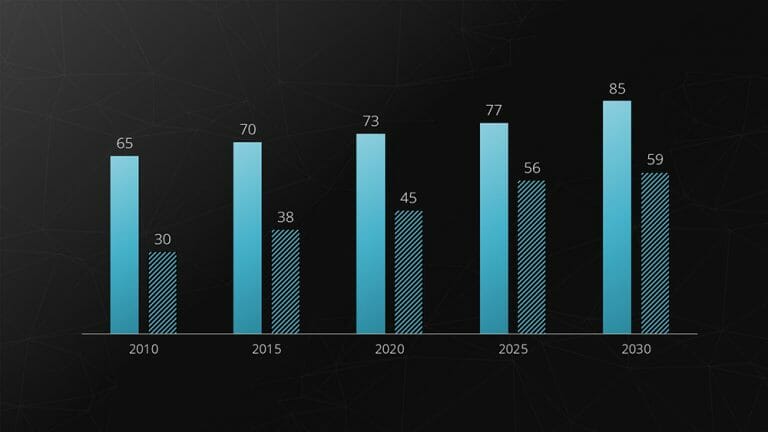
The bar chart is the most commonly used and simplest type of diagram. By representing data through the varying heights of the bars, you can visually illustrate data and its differences.
The strengths of the bar chart type lie in depicting fluctuations over a period of time or comparing different subjects of investigation.
For example : Revenues of different departments per year.
Feel free to use professionally designed slide templates for bar charts from PresentationLoad!
2. Bar Chart
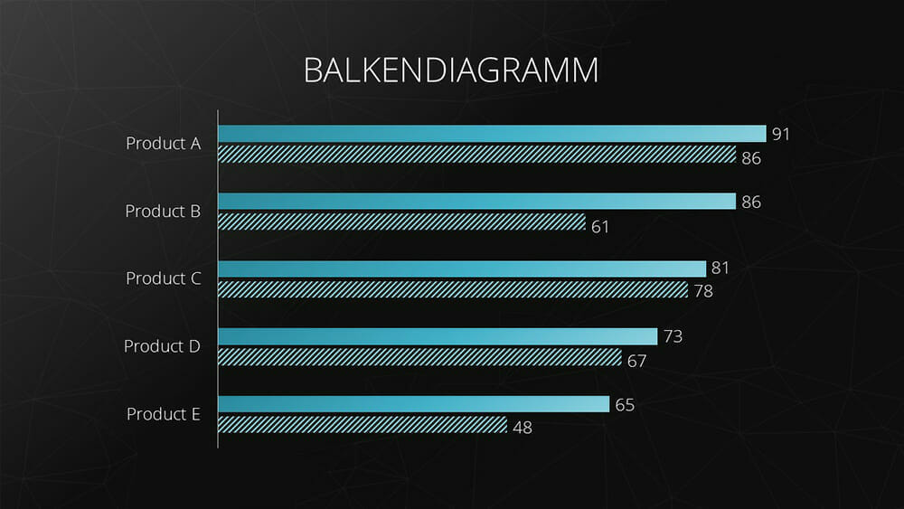
The bar chart is nothing more than a rotated version of the column chart . Like the column chart, the bar chart represents data and their differences through the distribution of bar sizes.
The major advantage of this chart type is that the horizontal orientation of the bars allows for the use of longer labels, such as survey questions.
Example: This chart type is excellent for representing rankings.
For tips on designing an appealing bar chart , you can refer to the article “ Bar Charts .”
3. Stacked Column Chart
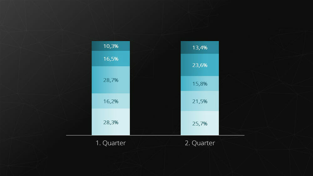
The stacked chart (also known as a cumulative or stacked chart) is a chart type that can represent the individual components of a composite whole. This chart type is suitable when comparing the composition of something over different time periods or with a different composition.
Example: Composition of cost components over a period of time.
Feel free to use professionally designed slide templates for stacked charts from PresentationLoad!

4. Line Chart
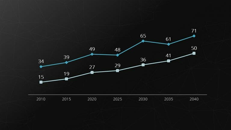
The line chart is used for comparing and representing temporal trends . The overlapping lines can be directly compared, making it easy to visualize developments and trends .
Example: Stock prices.
Feel free to use professionally designed slide templates for line charts from PresentationLoad!
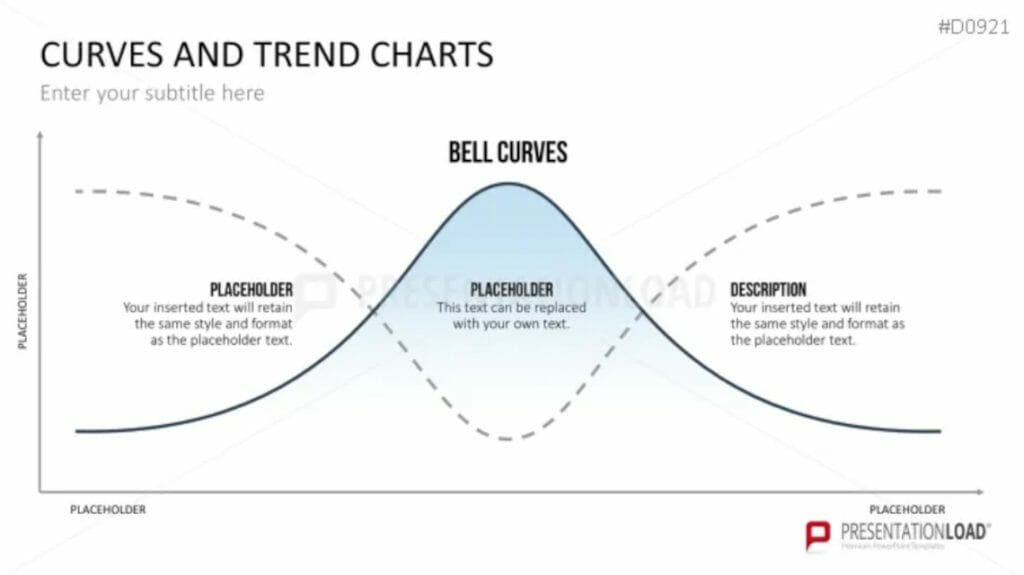
5. Area Chart
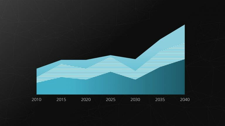
The area chart is a modified form of the line chart . In this chart, the area between two lines or between the line and the X-axis is filled with color.
This allows for highlighting the relative relationship between two quantities graphically. This type of representation is particularly useful for visualizing operational and strategic gaps.
Example: Gap analysis.
Feel free to use professionally designed slide templates for area charts from PresentationLoad!
6. Pie Chart
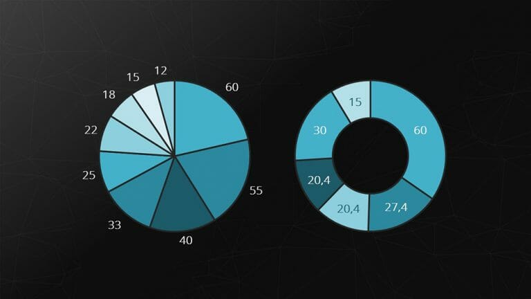
Pie and donut charts represent compositions of a whole as slices of a pie. The major strength of these charts is visualizing relative proportions.
Example: However, pie charts are not suitable for representing temporal sequences.
Feel free to use professionally designed slide templates for pie charts from PresentationLoad!
7. Combination Chart
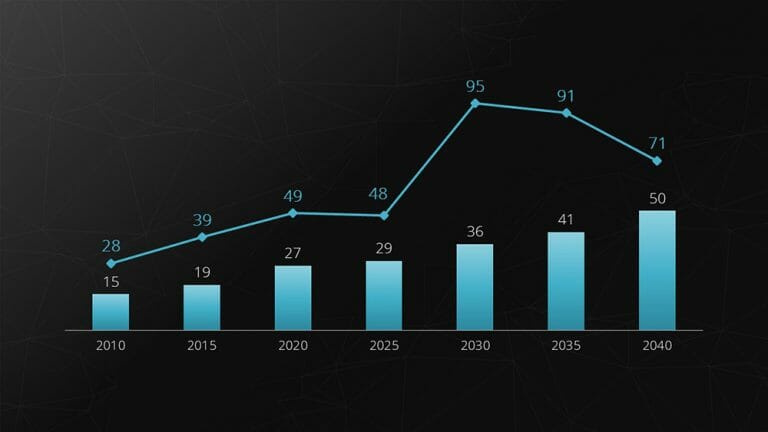
Combination charts are a combination of two different chart types. They are excellent for presenting the relationship between two data series with different scales. The most common variant is the combination of bar and line charts.
Example: Revenue (in millions) and number of employees (up to 100).
Feel free to use professionally designed slide templates for combination charts from PresentationLoad!
8. Radar Chart
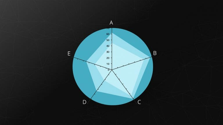
The spider chart, also known as a star or radar chart, is particularly useful for displaying the development or characteristics of predefined criteria . Each category has its own axis, with the zero point located at the center.
Example: Comparing two companies based on predefined criteria (including benchmarking).
Feel free to use professionally designed slide templates for spider charts from PresentationLoad!
9. Portfolio Diagram
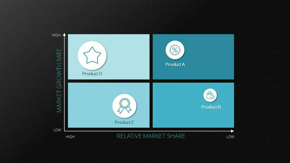
The bubble chart, also known as a portfolio chart, stands out with its three dimensions. The X and Y axes represent the measurement of a variable defined for each axis. This creates an accurate position of the bubble within the coordinate system. Additionally, the size of the bubble represents a third dimension.
Example : BCG matrix (depicting market growth, relative market share, and revenue).
Feel free to use professionally designed slide templates for bubble charts from PresentationLoad!
10. Waterfall Chart
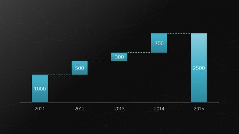
The waterfall chart is a special form of the bar chart. It shows an initial value that is increased or decreased by additional values . Finally, the end value is depicted.
Example: Breaking down total costs into individual costs.
Feel free to use professionally designed slide templates for waterfall charts from PresentationLoad!
11. Bubble Chart
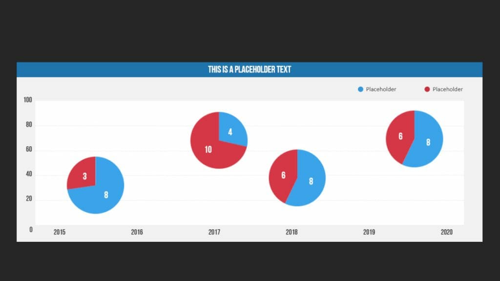
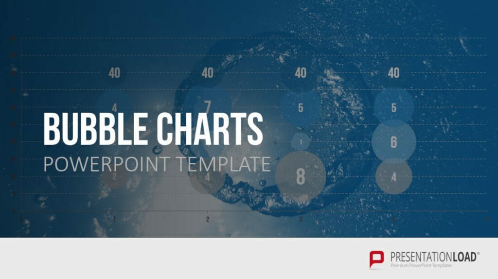
A bubble chart is used in data visualization to represent relationships between three or more variables . The purpose of a bubble chart is to visualize complex datasets in a simple and easily understandable way.
In a bubble chart, data points are represented as circles (bubbles), where the position of the bubbles on the X and Y axes represents the two main variables. The size of the bubbles represents a third variable, and in some cases, the color of the bubbles can be used to represent a fourth variable.
Companies use bubble charts to illustrate relationships between various financial data, such as in strategic management when visualizing BCG matrices.
Example: Creating a market share overview where revenue and product quantity are represented on the X and Y axes, and the respective market share is indicated by the different sizes of the bubbles.
12. Scatter Diagram
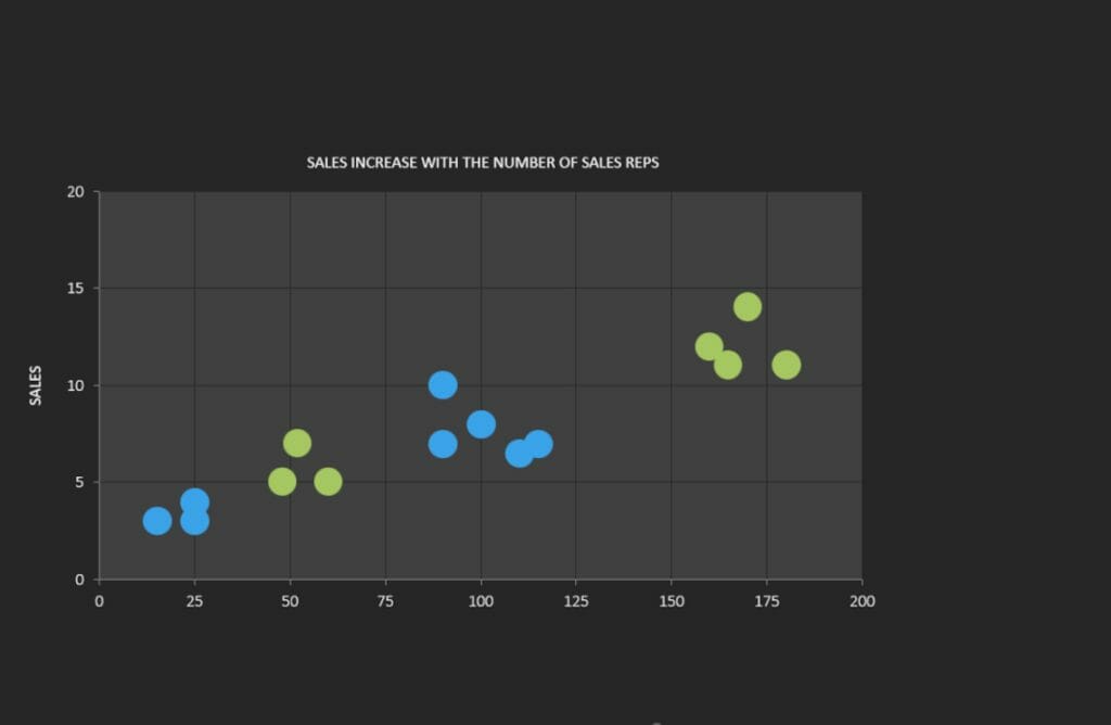
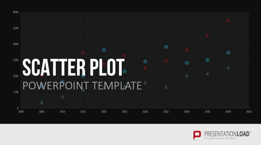
A scatter plot is used to represent the relationship between two continuous variables. The purpose of a scatter plot is to visualize the c orrelation or pattern between these variables in a simple and easily understandable way . If there are dependencies between the two variables, patterns or structures such as linear or quadratic relationships can be observed, revealing average values, trends/developments, or concentrations.
In a scatter plot, data points are represented as dots or symbols, where the position of the points on the X and Y axes represents the two variables. The points are plotted independently, and their distribution in the chart shows the relationship between the variables.
Example: Examining the relationship between age and income.
Feel free to use professionally designed slide templates for scatter plots from PresentationLoad!
13. Sales Funnel
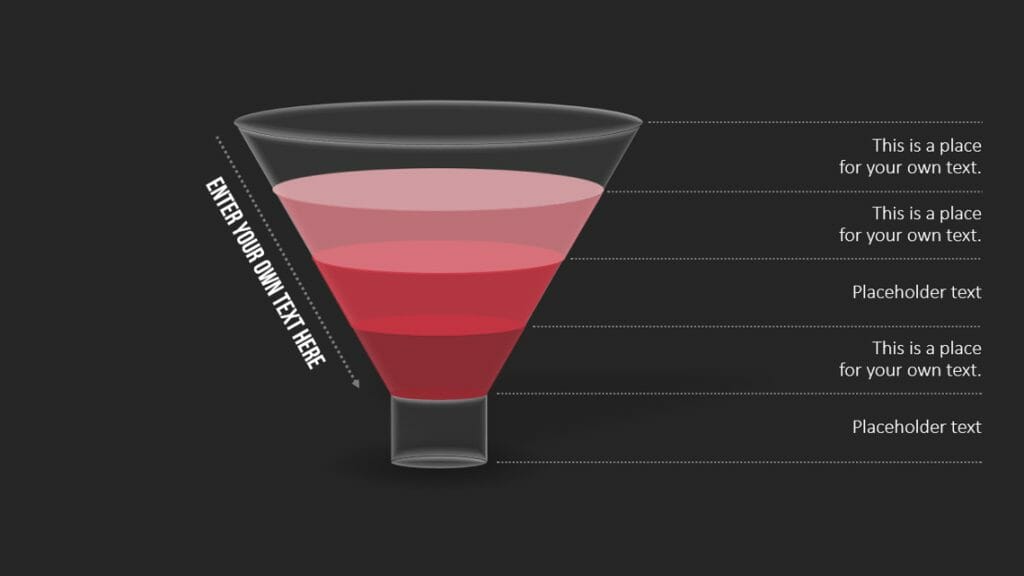
A funnel chart is used to represent the different stages of a process or sales pipeline . The shape of the funnel is crucial in the visualization. The first stage of the process is represented by the wider end, and the narrower end represents the final stage. The size of the sections within the funnel represents the number of items or data points in each stage of the process. The decreasing width of the funnel represents the decreasing magnitude of items transitioning from one stage to the next.
The purpose of a funnel chart is to visualize the number of items or data points going through the different stages of a process in a simple and easily understandable way. Funnel charts are often used to identify and analyze bottlenecks or weaknesses in a process.
Example: Analyzing a sales pipeline.
Feel free to use professionally designed slide templates for funnel charts from PresentationLoad!
14. Pyramid Chart
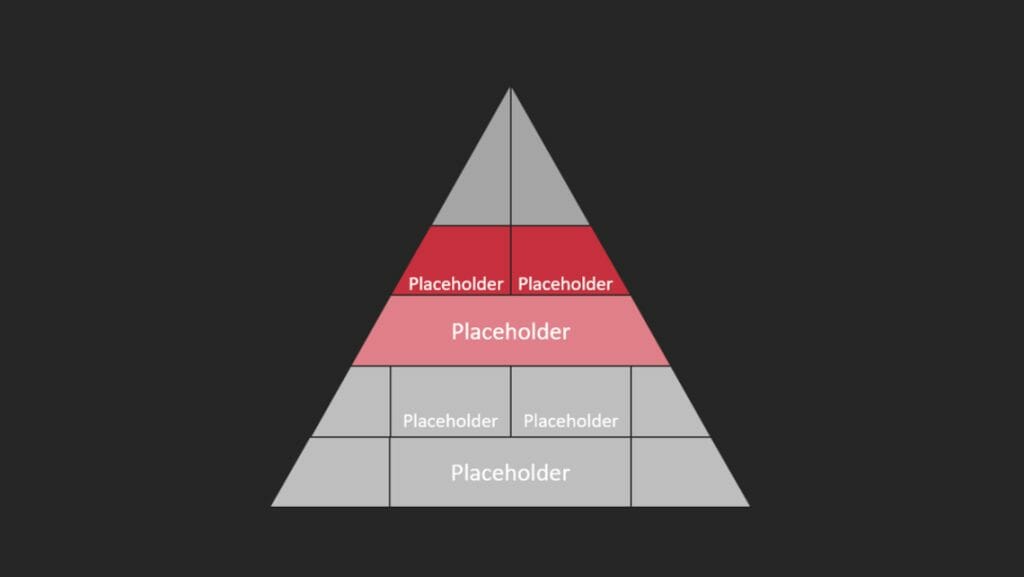
Pyramid charts are primarily used to represent demographic information in an easily understandable way. The chart depicts a vertically oriented, two-dimensional histogram.
Example: Visualizing the age structure and gender distribution of a population.
Feel free to use professionally designed slide templates for pyramid charts from PresentationLoad!
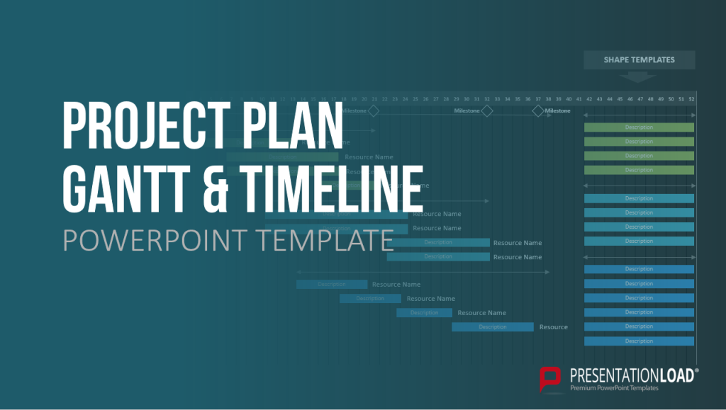
15. Gantt Chart
A Gantt chart is used to visually represent the activities of a project in a time-oriented table format. The structure of the chart allows for listing all project-related activities and their duration. This is displayed in the form of a bar that indicates both the start and end points of a time-based activity.
The chart provides an overview of how much time is required for each activity and when it will be completed, allowing project managers to have better control over the project timeline. It enables them to identify areas where the project is successful or not, thereby optimizing process flows through appropriate interventions.
Example: Presentation and management of a construction project.
Feel free to use professionally designed slide templates for Gantt charts from PresentationLoad!
16. Venn Diagram
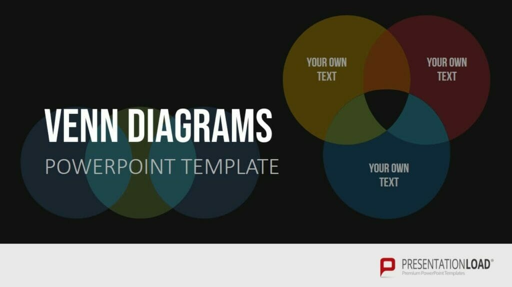
Venn diagrams, using two, three, or more circles, are a practical method for illustrating overlapping or interconnected relationships. They provide a visual representation of the relationships and dependencies within a complex set of elements.
Venn diagrams can be a valuable tool for capturing the entirety of complex situations and understanding the relationships between elements. For more information, feel free to check out our blog post on “ Venn Diagrams “.
Example: Analyzing the similarities and differences between different customer segments in a company.
Feel free to use professionally designed slide templates for Venn diagrams from PresentationLoad!
17. Process Diagram (for example Flowchart)
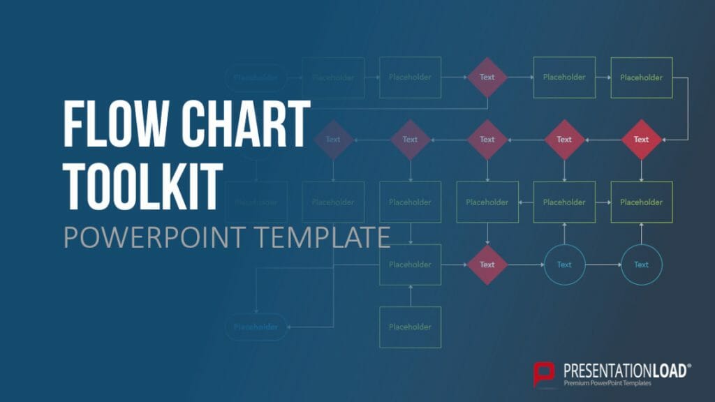
Process diagrams, such as flowcharts, are excellent for presenting processes and workflows in a clear and organized manner. They can represent both general concepts and specific relationships, making them a valuable tool for any company looking to showcase their business processes and workflows to stakeholders. Algorithms, workflows, and processes can be translated into flowcharts, facilitating analysis, documentation, and management of programs and workspaces.
Flowcharts are widely used and established in sectors such as business, finance, IT, and data processing, thanks to their effective visual representation.
Example: Illustrating and analyzing a customer service process in a company.
For more information, feel free to check out our blog post on “ Flowcharts “.
Feel free to use professionally designed slide templates for flowcharts from PresentationLoad!
18. Organizational Chart
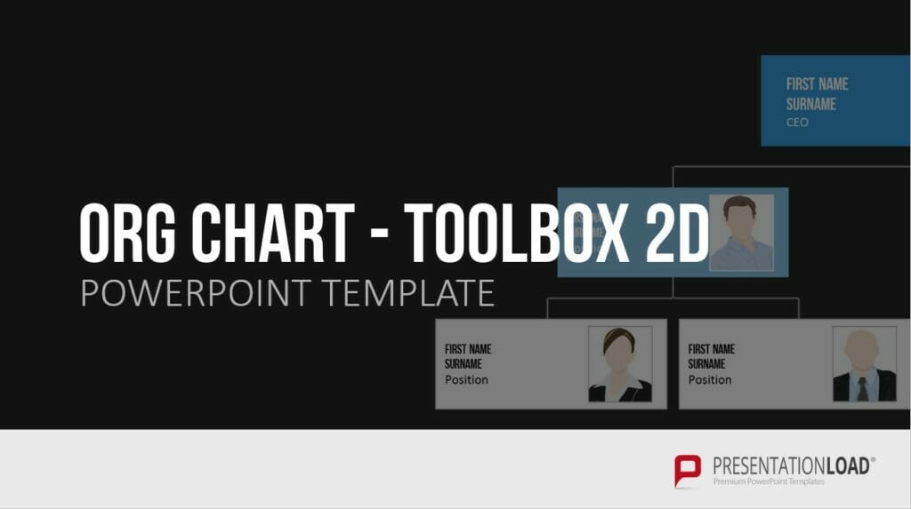
An organizational chart is a chart typed used to structure and organize a company or project , allowing for the clear representation of hierarchies. There are various types of organizational charts to choose from, including the single-line system, multiple-line system, matrix organization, and staff line representation.
The typica l single-line system emphasizes clear responsibilities and a streamlined structure, while the multiple-line system shortens information pathways and contributes to specialization within individual instances.
Example: Presenting a product range or service offering in a clear and organized manner.
For more information, feel free to check out our blog post on “ Organizational Charts “.
Feel free to use professionally designed slide templates for organizational charts from PresentationLoad!
Conclusion: Finding the right chart types for your purposes
In conclusion, you can find the right type of diagram for your purposes by referring to our 18 chart types and determining which one best suits your needs. With the appropriate diagram, you can visualize content much more easily and quickly, making it understandable for your audience.
If you have any questions regarding the article, feel free to contact us via email at [email protected] . We are here to assist you!
If you’re looking for visually supportive and professionally designed slide templates , be sure to check out our shop. We have a wide range of slides available for download on various (business) topics. Visit our shop today! ► Go to Shop
You may also be interested in the following articles:
- Create a Flowchart in PowerPoint
- Create a Venn Diagram
- Create an Organizational Chart
- 8 Tips for better Bar Chart in PowerPoint
- Present Numbers and Tables in an Engaging Way
Share this post
- share
- save

Design Thinking: Problem Solving with a Difference

Why Corporate Mission Statements Are So Important

7 Tips & Learnings from the Apple Keynote

- Get started with computers
- Learn Microsoft Office
- Apply for a job
- Improve my work skills
- Design nice-looking docs
- Getting Started
- Smartphones & Tablets
- Typing Tutorial
- Online Learning
- Basic Internet Skills
- Online Safety
- Social Media
- Zoom Basics
- Google Docs
- Google Sheets
- Career Planning
- Resume Writing
- Cover Letters
- Job Search and Networking
- Business Communication
- Entrepreneurship 101
- Careers without College
- Job Hunt for Today
- 3D Printing
- Freelancing 101
- Personal Finance
- Sharing Economy
- Decision-Making
- Graphic Design
- Photography
- Image Editing
- Learning WordPress
- Language Learning
- Critical Thinking
- For Educators
- Translations
- Staff Picks
- English expand_more expand_less
Google Slides - Inserting and Editing Diagrams
Google slides -, inserting and editing diagrams, google slides inserting and editing diagrams.

Google Slides: Inserting and Editing Diagrams
Lesson 15: inserting and editing diagrams.
/en/googleslides/editing-master-slides-and-layouts/content/
Inserting and editing diagrams
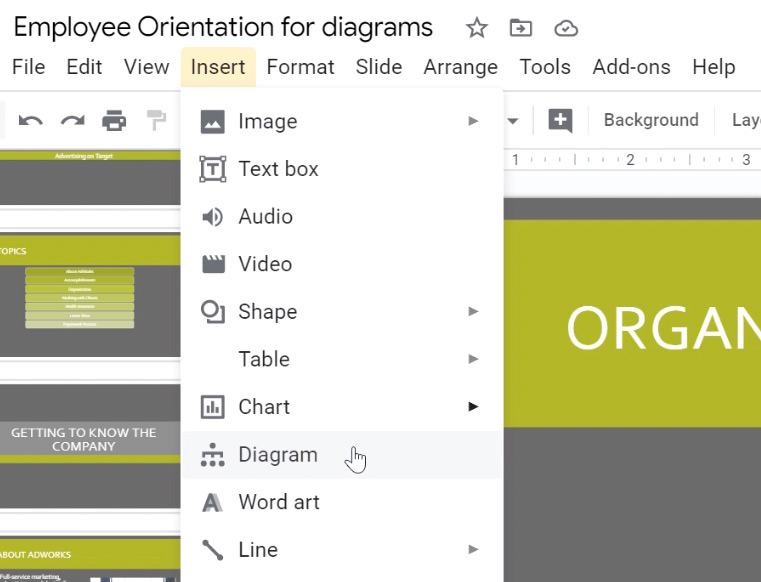
Google Slides has a variety of premade diagrams that are easy to insert into your presentation. There are a lot of fully editable presets to choose from, and they can be used to display all kinds of information.
Watch the video below to learn how to insert and edit diagrams.
To insert a diagram:
Editing diagrams
We know that learning how to edit diagrams in Google Slides can be tricky. In this lesson, we try to show you every step of the process. If you have trouble following along with our example, you can try watching the video at the top of the page. Sometimes it's helpful to see the process in action.
We hope that by the end of this lesson you'll know the basics of how to select , move , and edit different parts of the diagram. After you complete the lesson, we encourage you to continue practicing on your own. Play with your diagrams and see what you can create!
To move the diagram:
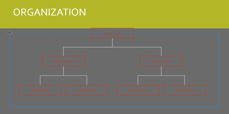
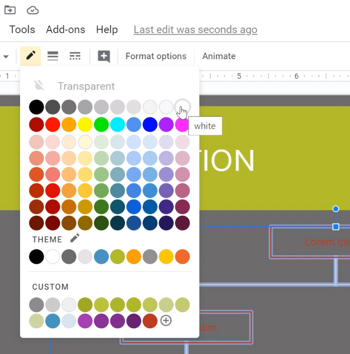
To change the border color:
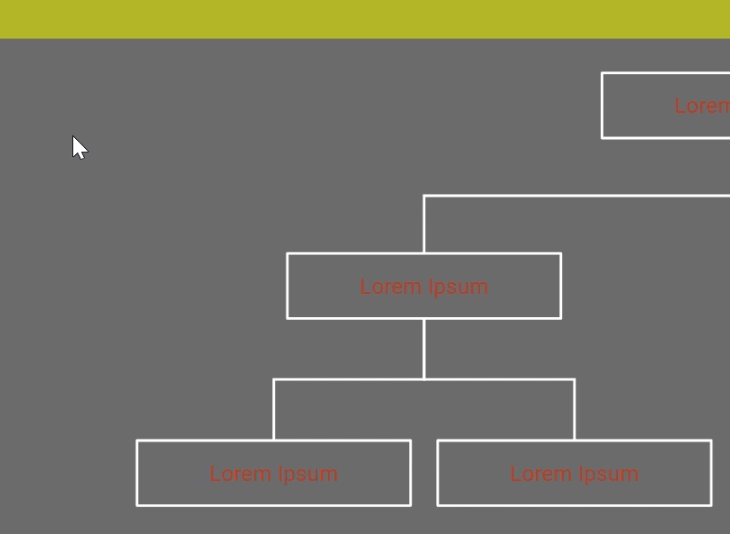
With the whole diagram still selected, click Border color and choose the color that you want. Note that this changes the color of the borders and of the lines connecting the boxes, but not of the text.
To change the text color:
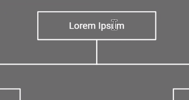
To edit the content of the diagram:
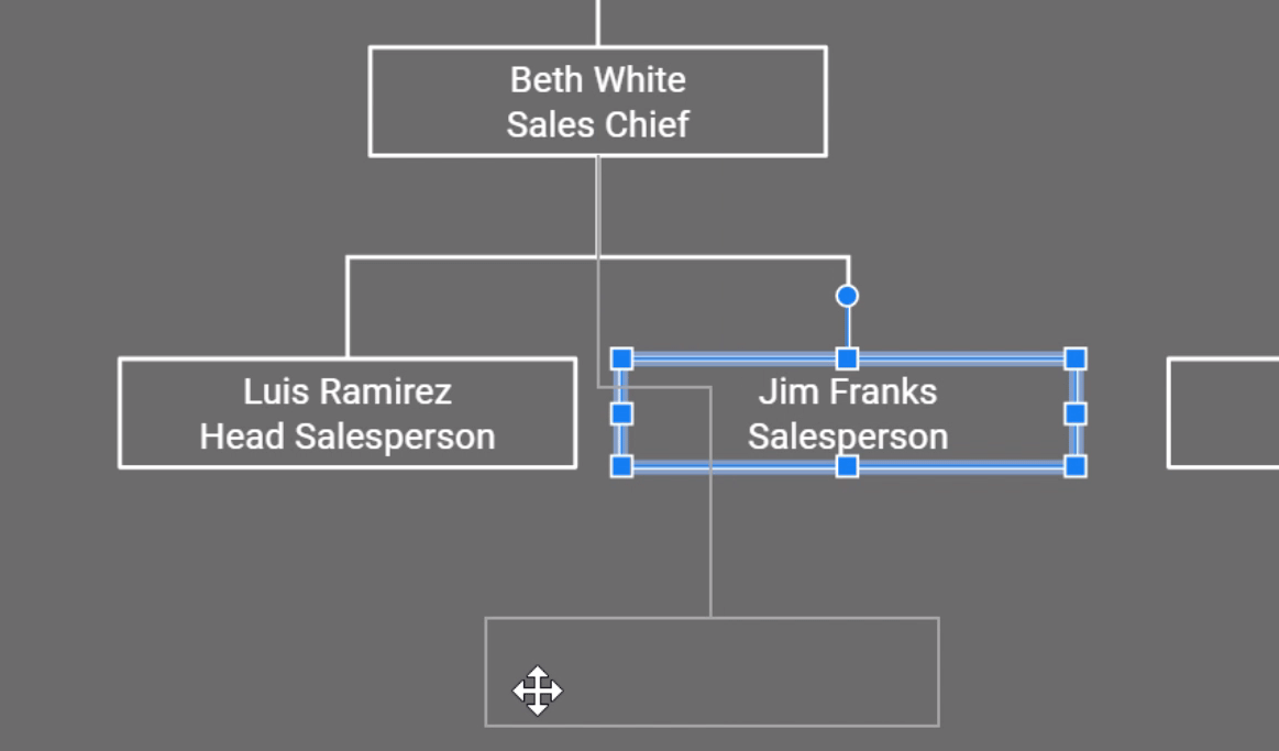
To rearrange the diagram:
In our example, we need to make a structural change to the diagram. Jim Franks should actually be underneath Luiz Ramirez.
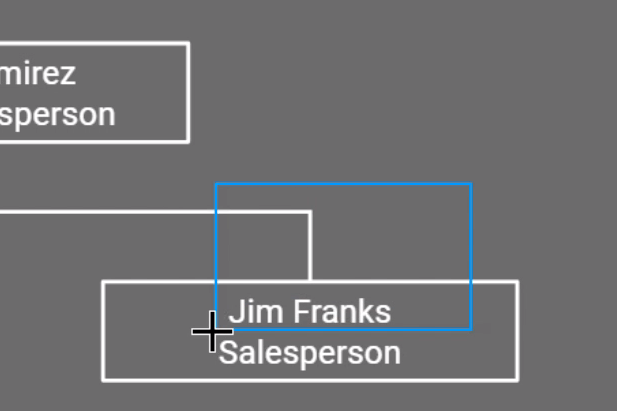
To add a box to the diagram:
You can use the drawing tools to create a new box, but it's usually easier to copy an existing box. Copying an existing box ensures that the formatting will be consistent.
As with most skills, learning to edit diagrams can be frustrating, but with some practice, you'll be able to create diagrams that look great and communicate what they're supposed to.
/en/googleslides/audience-qa/content/
Home Blog Design Understanding Data Presentations (Guide + Examples)
Understanding Data Presentations (Guide + Examples)

In this age of overwhelming information, the skill to effectively convey data has become extremely valuable. Initiating a discussion on data presentation types involves thoughtful consideration of the nature of your data and the message you aim to convey. Different types of visualizations serve distinct purposes. Whether you’re dealing with how to develop a report or simply trying to communicate complex information, how you present data influences how well your audience understands and engages with it. This extensive guide leads you through the different ways of data presentation.
Table of Contents
What is a Data Presentation?
What should a data presentation include, line graphs, treemap chart, scatter plot, how to choose a data presentation type, recommended data presentation templates, common mistakes done in data presentation.
A data presentation is a slide deck that aims to disclose quantitative information to an audience through the use of visual formats and narrative techniques derived from data analysis, making complex data understandable and actionable. This process requires a series of tools, such as charts, graphs, tables, infographics, dashboards, and so on, supported by concise textual explanations to improve understanding and boost retention rate.
Data presentations require us to cull data in a format that allows the presenter to highlight trends, patterns, and insights so that the audience can act upon the shared information. In a few words, the goal of data presentations is to enable viewers to grasp complicated concepts or trends quickly, facilitating informed decision-making or deeper analysis.
Data presentations go beyond the mere usage of graphical elements. Seasoned presenters encompass visuals with the art of data storytelling , so the speech skillfully connects the points through a narrative that resonates with the audience. Depending on the purpose – inspire, persuade, inform, support decision-making processes, etc. – is the data presentation format that is better suited to help us in this journey.
To nail your upcoming data presentation, ensure to count with the following elements:
- Clear Objectives: Understand the intent of your presentation before selecting the graphical layout and metaphors to make content easier to grasp.
- Engaging introduction: Use a powerful hook from the get-go. For instance, you can ask a big question or present a problem that your data will answer. Take a look at our guide on how to start a presentation for tips & insights.
- Structured Narrative: Your data presentation must tell a coherent story. This means a beginning where you present the context, a middle section in which you present the data, and an ending that uses a call-to-action. Check our guide on presentation structure for further information.
- Visual Elements: These are the charts, graphs, and other elements of visual communication we ought to use to present data. This article will cover one by one the different types of data representation methods we can use, and provide further guidance on choosing between them.
- Insights and Analysis: This is not just showcasing a graph and letting people get an idea about it. A proper data presentation includes the interpretation of that data, the reason why it’s included, and why it matters to your research.
- Conclusion & CTA: Ending your presentation with a call to action is necessary. Whether you intend to wow your audience into acquiring your services, inspire them to change the world, or whatever the purpose of your presentation, there must be a stage in which you convey all that you shared and show the path to staying in touch. Plan ahead whether you want to use a thank-you slide, a video presentation, or which method is apt and tailored to the kind of presentation you deliver.
- Q&A Session: After your speech is concluded, allocate 3-5 minutes for the audience to raise any questions about the information you disclosed. This is an extra chance to establish your authority on the topic. Check our guide on questions and answer sessions in presentations here.
Bar charts are a graphical representation of data using rectangular bars to show quantities or frequencies in an established category. They make it easy for readers to spot patterns or trends. Bar charts can be horizontal or vertical, although the vertical format is commonly known as a column chart. They display categorical, discrete, or continuous variables grouped in class intervals [1] . They include an axis and a set of labeled bars horizontally or vertically. These bars represent the frequencies of variable values or the values themselves. Numbers on the y-axis of a vertical bar chart or the x-axis of a horizontal bar chart are called the scale.

Real-Life Application of Bar Charts
Let’s say a sales manager is presenting sales to their audience. Using a bar chart, he follows these steps.
Step 1: Selecting Data
The first step is to identify the specific data you will present to your audience.
The sales manager has highlighted these products for the presentation.
- Product A: Men’s Shoes
- Product B: Women’s Apparel
- Product C: Electronics
- Product D: Home Decor
Step 2: Choosing Orientation
Opt for a vertical layout for simplicity. Vertical bar charts help compare different categories in case there are not too many categories [1] . They can also help show different trends. A vertical bar chart is used where each bar represents one of the four chosen products. After plotting the data, it is seen that the height of each bar directly represents the sales performance of the respective product.
It is visible that the tallest bar (Electronics – Product C) is showing the highest sales. However, the shorter bars (Women’s Apparel – Product B and Home Decor – Product D) need attention. It indicates areas that require further analysis or strategies for improvement.
Step 3: Colorful Insights
Different colors are used to differentiate each product. It is essential to show a color-coded chart where the audience can distinguish between products.
- Men’s Shoes (Product A): Yellow
- Women’s Apparel (Product B): Orange
- Electronics (Product C): Violet
- Home Decor (Product D): Blue

Bar charts are straightforward and easily understandable for presenting data. They are versatile when comparing products or any categorical data [2] . Bar charts adapt seamlessly to retail scenarios. Despite that, bar charts have a few shortcomings. They cannot illustrate data trends over time. Besides, overloading the chart with numerous products can lead to visual clutter, diminishing its effectiveness.
For more information, check our collection of bar chart templates for PowerPoint .
Line graphs help illustrate data trends, progressions, or fluctuations by connecting a series of data points called ‘markers’ with straight line segments. This provides a straightforward representation of how values change [5] . Their versatility makes them invaluable for scenarios requiring a visual understanding of continuous data. In addition, line graphs are also useful for comparing multiple datasets over the same timeline. Using multiple line graphs allows us to compare more than one data set. They simplify complex information so the audience can quickly grasp the ups and downs of values. From tracking stock prices to analyzing experimental results, you can use line graphs to show how data changes over a continuous timeline. They show trends with simplicity and clarity.
Real-life Application of Line Graphs
To understand line graphs thoroughly, we will use a real case. Imagine you’re a financial analyst presenting a tech company’s monthly sales for a licensed product over the past year. Investors want insights into sales behavior by month, how market trends may have influenced sales performance and reception to the new pricing strategy. To present data via a line graph, you will complete these steps.
First, you need to gather the data. In this case, your data will be the sales numbers. For example:
- January: $45,000
- February: $55,000
- March: $45,000
- April: $60,000
- May: $ 70,000
- June: $65,000
- July: $62,000
- August: $68,000
- September: $81,000
- October: $76,000
- November: $87,000
- December: $91,000
After choosing the data, the next step is to select the orientation. Like bar charts, you can use vertical or horizontal line graphs. However, we want to keep this simple, so we will keep the timeline (x-axis) horizontal while the sales numbers (y-axis) vertical.
Step 3: Connecting Trends
After adding the data to your preferred software, you will plot a line graph. In the graph, each month’s sales are represented by data points connected by a line.

Step 4: Adding Clarity with Color
If there are multiple lines, you can also add colors to highlight each one, making it easier to follow.
Line graphs excel at visually presenting trends over time. These presentation aids identify patterns, like upward or downward trends. However, too many data points can clutter the graph, making it harder to interpret. Line graphs work best with continuous data but are not suitable for categories.
For more information, check our collection of line chart templates for PowerPoint and our article about how to make a presentation graph .
A data dashboard is a visual tool for analyzing information. Different graphs, charts, and tables are consolidated in a layout to showcase the information required to achieve one or more objectives. Dashboards help quickly see Key Performance Indicators (KPIs). You don’t make new visuals in the dashboard; instead, you use it to display visuals you’ve already made in worksheets [3] .
Keeping the number of visuals on a dashboard to three or four is recommended. Adding too many can make it hard to see the main points [4]. Dashboards can be used for business analytics to analyze sales, revenue, and marketing metrics at a time. They are also used in the manufacturing industry, as they allow users to grasp the entire production scenario at the moment while tracking the core KPIs for each line.
Real-Life Application of a Dashboard
Consider a project manager presenting a software development project’s progress to a tech company’s leadership team. He follows the following steps.
Step 1: Defining Key Metrics
To effectively communicate the project’s status, identify key metrics such as completion status, budget, and bug resolution rates. Then, choose measurable metrics aligned with project objectives.
Step 2: Choosing Visualization Widgets
After finalizing the data, presentation aids that align with each metric are selected. For this project, the project manager chooses a progress bar for the completion status and uses bar charts for budget allocation. Likewise, he implements line charts for bug resolution rates.

Step 3: Dashboard Layout
Key metrics are prominently placed in the dashboard for easy visibility, and the manager ensures that it appears clean and organized.
Dashboards provide a comprehensive view of key project metrics. Users can interact with data, customize views, and drill down for detailed analysis. However, creating an effective dashboard requires careful planning to avoid clutter. Besides, dashboards rely on the availability and accuracy of underlying data sources.
For more information, check our article on how to design a dashboard presentation , and discover our collection of dashboard PowerPoint templates .
Treemap charts represent hierarchical data structured in a series of nested rectangles [6] . As each branch of the ‘tree’ is given a rectangle, smaller tiles can be seen representing sub-branches, meaning elements on a lower hierarchical level than the parent rectangle. Each one of those rectangular nodes is built by representing an area proportional to the specified data dimension.
Treemaps are useful for visualizing large datasets in compact space. It is easy to identify patterns, such as which categories are dominant. Common applications of the treemap chart are seen in the IT industry, such as resource allocation, disk space management, website analytics, etc. Also, they can be used in multiple industries like healthcare data analysis, market share across different product categories, or even in finance to visualize portfolios.
Real-Life Application of a Treemap Chart
Let’s consider a financial scenario where a financial team wants to represent the budget allocation of a company. There is a hierarchy in the process, so it is helpful to use a treemap chart. In the chart, the top-level rectangle could represent the total budget, and it would be subdivided into smaller rectangles, each denoting a specific department. Further subdivisions within these smaller rectangles might represent individual projects or cost categories.
Step 1: Define Your Data Hierarchy
While presenting data on the budget allocation, start by outlining the hierarchical structure. The sequence will be like the overall budget at the top, followed by departments, projects within each department, and finally, individual cost categories for each project.
- Top-level rectangle: Total Budget
- Second-level rectangles: Departments (Engineering, Marketing, Sales)
- Third-level rectangles: Projects within each department
- Fourth-level rectangles: Cost categories for each project (Personnel, Marketing Expenses, Equipment)
Step 2: Choose a Suitable Tool
It’s time to select a data visualization tool supporting Treemaps. Popular choices include Tableau, Microsoft Power BI, PowerPoint, or even coding with libraries like D3.js. It is vital to ensure that the chosen tool provides customization options for colors, labels, and hierarchical structures.
Here, the team uses PowerPoint for this guide because of its user-friendly interface and robust Treemap capabilities.
Step 3: Make a Treemap Chart with PowerPoint
After opening the PowerPoint presentation, they chose “SmartArt” to form the chart. The SmartArt Graphic window has a “Hierarchy” category on the left. Here, you will see multiple options. You can choose any layout that resembles a Treemap. The “Table Hierarchy” or “Organization Chart” options can be adapted. The team selects the Table Hierarchy as it looks close to a Treemap.
Step 5: Input Your Data
After that, a new window will open with a basic structure. They add the data one by one by clicking on the text boxes. They start with the top-level rectangle, representing the total budget.


Step 6: Customize the Treemap
By clicking on each shape, they customize its color, size, and label. At the same time, they can adjust the font size, style, and color of labels by using the options in the “Format” tab in PowerPoint. Using different colors for each level enhances the visual difference.
Treemaps excel at illustrating hierarchical structures. These charts make it easy to understand relationships and dependencies. They efficiently use space, compactly displaying a large amount of data, reducing the need for excessive scrolling or navigation. Additionally, using colors enhances the understanding of data by representing different variables or categories.
In some cases, treemaps might become complex, especially with deep hierarchies. It becomes challenging for some users to interpret the chart. At the same time, displaying detailed information within each rectangle might be constrained by space. It potentially limits the amount of data that can be shown clearly. Without proper labeling and color coding, there’s a risk of misinterpretation.
A heatmap is a data visualization tool that uses color coding to represent values across a two-dimensional surface. In these, colors replace numbers to indicate the magnitude of each cell. This color-shaded matrix display is valuable for summarizing and understanding data sets with a glance [7] . The intensity of the color corresponds to the value it represents, making it easy to identify patterns, trends, and variations in the data.
As a tool, heatmaps help businesses analyze website interactions, revealing user behavior patterns and preferences to enhance overall user experience. In addition, companies use heatmaps to assess content engagement, identifying popular sections and areas of improvement for more effective communication. They excel at highlighting patterns and trends in large datasets, making it easy to identify areas of interest.
We can implement heatmaps to express multiple data types, such as numerical values, percentages, or even categorical data. Heatmaps help us easily spot areas with lots of activity, making them helpful in figuring out clusters [8] . When making these maps, it is important to pick colors carefully. The colors need to show the differences between groups or levels of something. And it is good to use colors that people with colorblindness can easily see.
Check our detailed guide on how to create a heatmap here. Also discover our collection of heatmap PowerPoint templates .
Pie charts are circular statistical graphics divided into slices to illustrate numerical proportions. Each slice represents a proportionate part of the whole, making it easy to visualize the contribution of each component to the total.
The size of the pie charts is influenced by the value of data points within each pie. The total of all data points in a pie determines its size. The pie with the highest data points appears as the largest, whereas the others are proportionally smaller. However, you can present all pies of the same size if proportional representation is not required [9] . Sometimes, pie charts are difficult to read, or additional information is required. A variation of this tool can be used instead, known as the donut chart , which has the same structure but a blank center, creating a ring shape. Presenters can add extra information, and the ring shape helps to declutter the graph.
Pie charts are used in business to show percentage distribution, compare relative sizes of categories, or present straightforward data sets where visualizing ratios is essential.
Real-Life Application of Pie Charts
Consider a scenario where you want to represent the distribution of the data. Each slice of the pie chart would represent a different category, and the size of each slice would indicate the percentage of the total portion allocated to that category.
Step 1: Define Your Data Structure
Imagine you are presenting the distribution of a project budget among different expense categories.
- Column A: Expense Categories (Personnel, Equipment, Marketing, Miscellaneous)
- Column B: Budget Amounts ($40,000, $30,000, $20,000, $10,000) Column B represents the values of your categories in Column A.
Step 2: Insert a Pie Chart
Using any of the accessible tools, you can create a pie chart. The most convenient tools for forming a pie chart in a presentation are presentation tools such as PowerPoint or Google Slides. You will notice that the pie chart assigns each expense category a percentage of the total budget by dividing it by the total budget.
For instance:
- Personnel: $40,000 / ($40,000 + $30,000 + $20,000 + $10,000) = 40%
- Equipment: $30,000 / ($40,000 + $30,000 + $20,000 + $10,000) = 30%
- Marketing: $20,000 / ($40,000 + $30,000 + $20,000 + $10,000) = 20%
- Miscellaneous: $10,000 / ($40,000 + $30,000 + $20,000 + $10,000) = 10%
You can make a chart out of this or just pull out the pie chart from the data.

3D pie charts and 3D donut charts are quite popular among the audience. They stand out as visual elements in any presentation slide, so let’s take a look at how our pie chart example would look in 3D pie chart format.

Step 03: Results Interpretation
The pie chart visually illustrates the distribution of the project budget among different expense categories. Personnel constitutes the largest portion at 40%, followed by equipment at 30%, marketing at 20%, and miscellaneous at 10%. This breakdown provides a clear overview of where the project funds are allocated, which helps in informed decision-making and resource management. It is evident that personnel are a significant investment, emphasizing their importance in the overall project budget.
Pie charts provide a straightforward way to represent proportions and percentages. They are easy to understand, even for individuals with limited data analysis experience. These charts work well for small datasets with a limited number of categories.
However, a pie chart can become cluttered and less effective in situations with many categories. Accurate interpretation may be challenging, especially when dealing with slight differences in slice sizes. In addition, these charts are static and do not effectively convey trends over time.
For more information, check our collection of pie chart templates for PowerPoint .
Histograms present the distribution of numerical variables. Unlike a bar chart that records each unique response separately, histograms organize numeric responses into bins and show the frequency of reactions within each bin [10] . The x-axis of a histogram shows the range of values for a numeric variable. At the same time, the y-axis indicates the relative frequencies (percentage of the total counts) for that range of values.
Whenever you want to understand the distribution of your data, check which values are more common, or identify outliers, histograms are your go-to. Think of them as a spotlight on the story your data is telling. A histogram can provide a quick and insightful overview if you’re curious about exam scores, sales figures, or any numerical data distribution.
Real-Life Application of a Histogram
In the histogram data analysis presentation example, imagine an instructor analyzing a class’s grades to identify the most common score range. A histogram could effectively display the distribution. It will show whether most students scored in the average range or if there are significant outliers.
Step 1: Gather Data
He begins by gathering the data. The scores of each student in class are gathered to analyze exam scores.
After arranging the scores in ascending order, bin ranges are set.
Step 2: Define Bins
Bins are like categories that group similar values. Think of them as buckets that organize your data. The presenter decides how wide each bin should be based on the range of the values. For instance, the instructor sets the bin ranges based on score intervals: 60-69, 70-79, 80-89, and 90-100.
Step 3: Count Frequency
Now, he counts how many data points fall into each bin. This step is crucial because it tells you how often specific ranges of values occur. The result is the frequency distribution, showing the occurrences of each group.
Here, the instructor counts the number of students in each category.
- 60-69: 1 student (Kate)
- 70-79: 4 students (David, Emma, Grace, Jack)
- 80-89: 7 students (Alice, Bob, Frank, Isabel, Liam, Mia, Noah)
- 90-100: 3 students (Clara, Henry, Olivia)
Step 4: Create the Histogram
It’s time to turn the data into a visual representation. Draw a bar for each bin on a graph. The width of the bar should correspond to the range of the bin, and the height should correspond to the frequency. To make your histogram understandable, label the X and Y axes.
In this case, the X-axis should represent the bins (e.g., test score ranges), and the Y-axis represents the frequency.

The histogram of the class grades reveals insightful patterns in the distribution. Most students, with seven students, fall within the 80-89 score range. The histogram provides a clear visualization of the class’s performance. It showcases a concentration of grades in the upper-middle range with few outliers at both ends. This analysis helps in understanding the overall academic standing of the class. It also identifies the areas for potential improvement or recognition.
Thus, histograms provide a clear visual representation of data distribution. They are easy to interpret, even for those without a statistical background. They apply to various types of data, including continuous and discrete variables. One weak point is that histograms do not capture detailed patterns in students’ data, with seven compared to other visualization methods.
A scatter plot is a graphical representation of the relationship between two variables. It consists of individual data points on a two-dimensional plane. This plane plots one variable on the x-axis and the other on the y-axis. Each point represents a unique observation. It visualizes patterns, trends, or correlations between the two variables.
Scatter plots are also effective in revealing the strength and direction of relationships. They identify outliers and assess the overall distribution of data points. The points’ dispersion and clustering reflect the relationship’s nature, whether it is positive, negative, or lacks a discernible pattern. In business, scatter plots assess relationships between variables such as marketing cost and sales revenue. They help present data correlations and decision-making.
Real-Life Application of Scatter Plot
A group of scientists is conducting a study on the relationship between daily hours of screen time and sleep quality. After reviewing the data, they managed to create this table to help them build a scatter plot graph:
In the provided example, the x-axis represents Daily Hours of Screen Time, and the y-axis represents the Sleep Quality Rating.

The scientists observe a negative correlation between the amount of screen time and the quality of sleep. This is consistent with their hypothesis that blue light, especially before bedtime, has a significant impact on sleep quality and metabolic processes.
There are a few things to remember when using a scatter plot. Even when a scatter diagram indicates a relationship, it doesn’t mean one variable affects the other. A third factor can influence both variables. The more the plot resembles a straight line, the stronger the relationship is perceived [11] . If it suggests no ties, the observed pattern might be due to random fluctuations in data. When the scatter diagram depicts no correlation, whether the data might be stratified is worth considering.
Choosing the appropriate data presentation type is crucial when making a presentation . Understanding the nature of your data and the message you intend to convey will guide this selection process. For instance, when showcasing quantitative relationships, scatter plots become instrumental in revealing correlations between variables. If the focus is on emphasizing parts of a whole, pie charts offer a concise display of proportions. Histograms, on the other hand, prove valuable for illustrating distributions and frequency patterns.
Bar charts provide a clear visual comparison of different categories. Likewise, line charts excel in showcasing trends over time, while tables are ideal for detailed data examination. Starting a presentation on data presentation types involves evaluating the specific information you want to communicate and selecting the format that aligns with your message. This ensures clarity and resonance with your audience from the beginning of your presentation.
1. Fact Sheet Dashboard for Data Presentation

Convey all the data you need to present in this one-pager format, an ideal solution tailored for users looking for presentation aids. Global maps, donut chats, column graphs, and text neatly arranged in a clean layout presented in light and dark themes.
Use This Template
2. 3D Column Chart Infographic PPT Template

Represent column charts in a highly visual 3D format with this PPT template. A creative way to present data, this template is entirely editable, and we can craft either a one-page infographic or a series of slides explaining what we intend to disclose point by point.
3. Data Circles Infographic PowerPoint Template

An alternative to the pie chart and donut chart diagrams, this template features a series of curved shapes with bubble callouts as ways of presenting data. Expand the information for each arch in the text placeholder areas.
4. Colorful Metrics Dashboard for Data Presentation

This versatile dashboard template helps us in the presentation of the data by offering several graphs and methods to convert numbers into graphics. Implement it for e-commerce projects, financial projections, project development, and more.
5. Animated Data Presentation Tools for PowerPoint & Google Slides

A slide deck filled with most of the tools mentioned in this article, from bar charts, column charts, treemap graphs, pie charts, histogram, etc. Animated effects make each slide look dynamic when sharing data with stakeholders.
6. Statistics Waffle Charts PPT Template for Data Presentations

This PPT template helps us how to present data beyond the typical pie chart representation. It is widely used for demographics, so it’s a great fit for marketing teams, data science professionals, HR personnel, and more.
7. Data Presentation Dashboard Template for Google Slides

A compendium of tools in dashboard format featuring line graphs, bar charts, column charts, and neatly arranged placeholder text areas.
8. Weather Dashboard for Data Presentation

Share weather data for agricultural presentation topics, environmental studies, or any kind of presentation that requires a highly visual layout for weather forecasting on a single day. Two color themes are available.
9. Social Media Marketing Dashboard Data Presentation Template

Intended for marketing professionals, this dashboard template for data presentation is a tool for presenting data analytics from social media channels. Two slide layouts featuring line graphs and column charts.
10. Project Management Summary Dashboard Template

A tool crafted for project managers to deliver highly visual reports on a project’s completion, the profits it delivered for the company, and expenses/time required to execute it. 4 different color layouts are available.
11. Profit & Loss Dashboard for PowerPoint and Google Slides

A must-have for finance professionals. This typical profit & loss dashboard includes progress bars, donut charts, column charts, line graphs, and everything that’s required to deliver a comprehensive report about a company’s financial situation.
Overwhelming visuals
One of the mistakes related to using data-presenting methods is including too much data or using overly complex visualizations. They can confuse the audience and dilute the key message.
Inappropriate chart types
Choosing the wrong type of chart for the data at hand can lead to misinterpretation. For example, using a pie chart for data that doesn’t represent parts of a whole is not right.
Lack of context
Failing to provide context or sufficient labeling can make it challenging for the audience to understand the significance of the presented data.
Inconsistency in design
Using inconsistent design elements and color schemes across different visualizations can create confusion and visual disarray.
Failure to provide details
Simply presenting raw data without offering clear insights or takeaways can leave the audience without a meaningful conclusion.
Lack of focus
Not having a clear focus on the key message or main takeaway can result in a presentation that lacks a central theme.
Visual accessibility issues
Overlooking the visual accessibility of charts and graphs can exclude certain audience members who may have difficulty interpreting visual information.
In order to avoid these mistakes in data presentation, presenters can benefit from using presentation templates . These templates provide a structured framework. They ensure consistency, clarity, and an aesthetically pleasing design, enhancing data communication’s overall impact.
Understanding and choosing data presentation types are pivotal in effective communication. Each method serves a unique purpose, so selecting the appropriate one depends on the nature of the data and the message to be conveyed. The diverse array of presentation types offers versatility in visually representing information, from bar charts showing values to pie charts illustrating proportions.
Using the proper method enhances clarity, engages the audience, and ensures that data sets are not just presented but comprehensively understood. By appreciating the strengths and limitations of different presentation types, communicators can tailor their approach to convey information accurately, developing a deeper connection between data and audience understanding.
[1] Government of Canada, S.C. (2021) 5 Data Visualization 5.2 Bar Chart , 5.2 Bar chart . https://www150.statcan.gc.ca/n1/edu/power-pouvoir/ch9/bargraph-diagrammeabarres/5214818-eng.htm
[2] Kosslyn, S.M., 1989. Understanding charts and graphs. Applied cognitive psychology, 3(3), pp.185-225. https://apps.dtic.mil/sti/pdfs/ADA183409.pdf
[3] Creating a Dashboard . https://it.tufts.edu/book/export/html/1870
[4] https://www.goldenwestcollege.edu/research/data-and-more/data-dashboards/index.html
[5] https://www.mit.edu/course/21/21.guide/grf-line.htm
[6] Jadeja, M. and Shah, K., 2015, January. Tree-Map: A Visualization Tool for Large Data. In GSB@ SIGIR (pp. 9-13). https://ceur-ws.org/Vol-1393/gsb15proceedings.pdf#page=15
[7] Heat Maps and Quilt Plots. https://www.publichealth.columbia.edu/research/population-health-methods/heat-maps-and-quilt-plots
[8] EIU QGIS WORKSHOP. https://www.eiu.edu/qgisworkshop/heatmaps.php
[9] About Pie Charts. https://www.mit.edu/~mbarker/formula1/f1help/11-ch-c8.htm
[10] Histograms. https://sites.utexas.edu/sos/guided/descriptive/numericaldd/descriptiven2/histogram/ [11] https://asq.org/quality-resources/scatter-diagram

Like this article? Please share
Data Analysis, Data Science, Data Visualization Filed under Design
Related Articles

Filed under Design • March 27th, 2024
How to Make a Presentation Graph
Detailed step-by-step instructions to master the art of how to make a presentation graph in PowerPoint and Google Slides. Check it out!
Filed under Presentation Ideas • January 6th, 2024
All About Using Harvey Balls
Among the many tools in the arsenal of the modern presenter, Harvey Balls have a special place. In this article we will tell you all about using Harvey Balls.
Filed under Business • December 8th, 2023
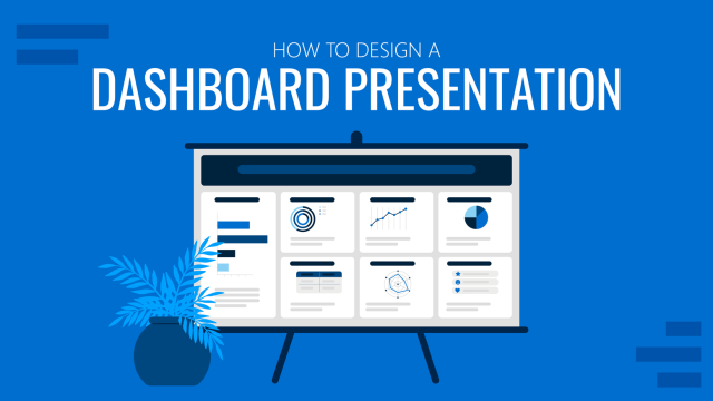
How to Design a Dashboard Presentation: A Step-by-Step Guide
Take a step further in your professional presentation skills by learning what a dashboard presentation is and how to properly design one in PowerPoint. A detailed step-by-step guide is here!
Leave a Reply
- Insert a picture in PowerPoint Article
- Edit pictures Article
- Add SmartArt to a slide Article
- Put a background picture on your slides Article
- Add a background picture to slides Article
- Use charts and graphs in your presentation Article
- Insert icons in PowerPoint Article

Use charts and graphs in your presentation
You can make a chart in PowerPoint or Excel. If you have lots of data to chart, create your chart in Excel , and then copy it into your presentation . This is also the best way if your data changes regularly and you want your chart to always reflect the latest numbers. In that case, when you copy and paste the chart, keep it linked to the original Excel file .
To create a simple chart from scratch in PowerPoint, click Insert > Chart and pick the chart you want.

Click Insert > Chart .

Click the chart type and then double-click the chart you want.
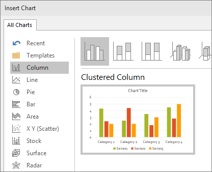
Tip: For help deciding which chart is best for your data, see Available chart types .
In the worksheet that appears, replace the placeholder data with your own information.

When you’ve finished, close the worksheet.
Create an org chart in PowerPoint
Create charts in Excel

Need more help?
Want more options.
Explore subscription benefits, browse training courses, learn how to secure your device, and more.

Microsoft 365 subscription benefits

Microsoft 365 training

Microsoft security

Accessibility center
Communities help you ask and answer questions, give feedback, and hear from experts with rich knowledge.

Ask the Microsoft Community

Microsoft Tech Community

Windows Insiders
Microsoft 365 Insiders
Was this information helpful?
Thank you for your feedback.
Multi-Level Charts
Immerse yourself in our diverse collection of multi-level charts, meticulously designed for PowerPoint and Google Slides presentations. Multi-level charts are visual representations that display hierarchical relationships or multiple layers of data in a clear and organized manner. They are perfect for illustrating complex data structures, organizational charts, or nested categories.
Multi-level charts can be used for a wide range of topics, such as corporate structures, family trees, decision trees, and data classification systems.
Our multi-level charts are visually engaging, customizable, and user-friendly, ensuring a polished and professional look for your presentations.
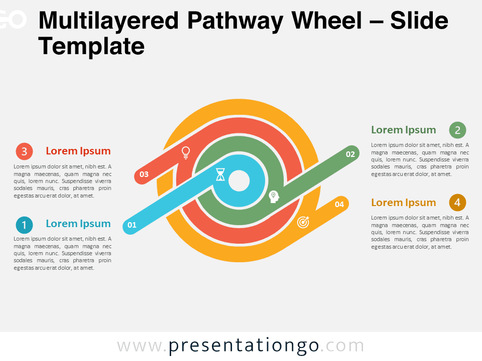
Multilayered Pathway Wheel
Google Slides , PPTX

6×2 Two-Level Chart for PowerPoint and Google Slides

5×2 Two-Level Chart for PowerPoint and Google Slides

4×2 Two-Level Chart for PowerPoint and Google Slides

4×3 Two-Level Chart for PowerPoint and Google Slides

3×2 Two-Level Chart for PowerPoint and Google Slides

3×4 Two-Level Chart for PowerPoint and Google Slides

2×5 Two-Level Chart for PowerPoint and Google Slides

Multi-Level Circular Diagram for PowerPoint and Google Slides

Grid with Hexagons for PowerPoint and Google Slides

Snail Diagram with 6 Levels for PowerPoint
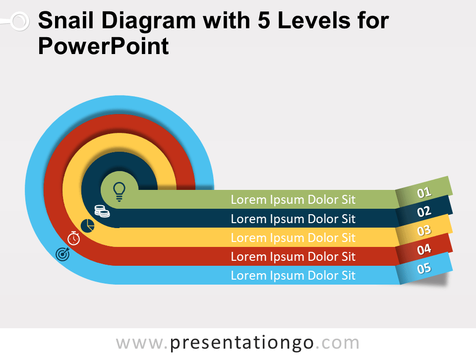
Snail Diagram with 5 Levels for PowerPoint
Search templates by categories, search templates by colors.
Love our templates? Show your support with a coffee!
Thank you for fueling our creativity.
Charts & Diagrams
Text & Tables
Graphics & Metaphors
Timelines & Planning
Best-Ofs & Tips
Terms and Conditions
Privacy Statement
Cookie Policy
Digital Millennium Copyright Act (DMCA) Policy
© Copyright 2024 Ofeex | PRESENTATIONGO® is a registered trademark | All rights reserved.

To provide the best experiences, we and our partners use technologies like cookies to store and/or access device information. Consenting to these technologies will allow us and our partners to process personal data such as browsing behavior or unique IDs on this site and show (non-) personalized ads. Not consenting or withdrawing consent, may adversely affect certain features and functions.
Click below to consent to the above or make granular choices. Your choices will be applied to this site only. You can change your settings at any time, including withdrawing your consent, by using the toggles on the Cookie Policy, or by clicking on the manage consent button at the bottom of the screen.
Thank you for downloading this template!
Remember, you can use it for free but you have to attribute PresentationGO . For example, you can use the following text:
If you really like our free templates and want to thank/help us, you can:
Thank you for your support

How to develop a graphical framework to chart your research
Graphic representations or frameworks can be powerful tools to explain research processes and outcomes. David Waller explains how researchers can develop effective visual models to chart their work
David Waller
You may also like

Popular resources
.css-1txxx8u{overflow:hidden;max-height:81px;text-indent:0px;} Students using generative AI to write essays isn't a crisis
How students’ genai skills affect assignment instructions, turn individual wins into team achievements in group work, access and equity: two crucial aspects of applied learning, emotions and learning: what role do emotions play in how and why students learn.
While undertaking a study, researchers can uncover insights, connections and findings that are extremely valuable to anyone likely to read their eventual paper. Thus, it is important for the researcher to clearly present and explain the ideas and potential relationships. One important way of presenting findings and relationships is by developing a graphical conceptual framework.
A graphical conceptual framework is a visual model that assists readers by illustrating how concepts, constructs, themes or processes work. It is an image designed to help the viewer understand how various factors interrelate and affect outcomes, such as a chart, graph or map.
These are commonly used in research to show outcomes but also to create, develop, test, support and criticise various ideas and models. The use of a conceptual framework can vary depending on whether it is being used for qualitative or quantitative research.
- Using literature reviews to strengthen research: tips for PhDs and supervisors
- Get your research out there: 7 strategies for high-impact science communication
- Understanding peer review: what it is, how it works and why it is important
There are many forms that a graphical conceptual framework can take, which can depend on the topic, the type of research or findings, and what can best present the story.
Below are examples of frameworks based on qualitative and quantitative research.
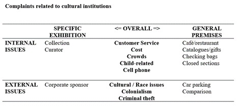
As shown by the table below, in qualitative research the conceptual framework is developed at the end of the study to illustrate the factors or issues presented in the qualitative data. It is designed to assist in theory building and the visual understanding of the exploratory findings. It can also be used to develop a framework in preparation for testing the proposition using quantitative research.
In quantitative research a conceptual framework can be used to synthesise the literature and theoretical concepts at the beginning of the study to present a model that will be tested in the statistical analysis of the research.
It is important to understand that the role of a conceptual framework differs depending on the type of research that is being undertaken.
So how should you go about creating a conceptual framework? After undertaking some studies where I have developed conceptual frameworks, here is a simple model based on “Six Rs”: Review, Reflect, Relationships, Reflect, Review, and Repeat.
Process for developing conceptual frameworks:
Review: literature/themes/theory.
Reflect: what are the main concepts/issues?
Relationships: what are their relationships?
Reflect: does the diagram represent it sufficiently?
Review: check it with theory, colleagues, stakeholders, etc.
Repeat: review and revise it to see if something better occurs.
This is not an easy process. It is important to begin by reviewing what has been presented in previous studies in the literature or in practice. This provides a solid background to the proposed model as it can show how it relates to accepted theoretical concepts or practical examples, and helps make sure that it is grounded in logical sense.
It can start with pen and paper, but after reviewing you should reflect to consider if the proposed framework takes into account the main concepts and issues, and the potential relationships that have been presented on the topic in previous works.
It may take a few versions before you are happy with the final framework, so it is worth continuing to reflect on the model and review its worth by reassessing it to determine if the model is consistent with the literature and theories. It can also be useful to discuss the idea with colleagues or to present preliminary ideas at a conference or workshop – be open to changes.
Even after you come up with a potential model it is good to repeat the process to review the framework and be prepared to revise it as this can help in refining the model. Over time you may develop a number of models with each one superseding the previous one.
A concern is that some students hold on to the framework they first thought of and worry that developing or changing it will be seen as a weakness in their research. However, a revised and refined model can be an important factor in justifying the value of the research.
Plenty of possibilities and theoretical topics could be considered to enhance the model. Whether it ultimately supports the theoretical constructs of the research will be dependent on what occurs when it is tested. As social psychologist, Kurt Lewin, famously said “ There's nothing so practical as good theory ”.
The final result after doing your reviewing and reflecting should be a clear graphical presentation that will help the reader understand what the research is about as well as where it is heading.
It doesn’t need to be complex. A simple diagram or table can clarify the nature of a process and help in its analysis, which can be important for the researcher when communicating to their audience. As the saying goes: “ A picture is worth 1000 words ”. The same goes for a good conceptual framework, when explaining a research process or findings.
David Waller is an associate professor at the University of Technology Sydney .
If you found this interesting and want advice and insight from academics and university staff delivered direct to your inbox each week, sign up for the THE Campus newsletter .
Students using generative AI to write essays isn't a crisis
Eleven ways to support international students, indigenising teaching through traditional knowledge, seven exercises to use in your gender studies classes, rather than restrict the use of ai, embrace the challenge, how hard can it be testing ai detection tools.
Register for free
and unlock a host of features on the THE site
- How to read graphs and diagrams
Are you looking to feel more confident reading and understanding graphs and diagrams? You’ve come to the right place.
No matter what field you study, you will need to read and analyze graphs and diagrams. It's an essential skill for understanding complex concepts and drawing meaningful conclusions.
Understanding graphs and diagrams
Determine what the graph is measuring.
- Read the title and labels to understand what is represented in the graph. The title of the graph provides context for the information presented. The labels on the axes (x-axis and y-axis) tell you what variables are being measured and the units of measurement.
- Check the scale or increments of measurement on the axes to interpret the data accurately. For example, if the scale on the y-axis of a graph representing temperatures ranges from 0°C to 100°C, you'll know that each increment represents a temperature increase of 10°C.
- Consider the context and background information provided alongside the graph or diagram to interpret it correctly. For example, you may consider climate change and human activity if you're analyzing a graph on global temperature trends.
Analyze patterns and trends
Identify key elements that convey information to analyze and recognizing trends, patterns, outliers or clusters in graphs and diagrams. Consider the following elements for different graphs.
Line graphs : identify the direction and slope of lines to understand trends. An upward slope indicates an increase, a downward slope indicates a decrease, and a steady slope suggests stability.
Bar graphs : compare the heights of bars to identify differences and similarities between categories. Look for variations in bar heights to discern patterns.
Scatterplots : examine the distribution of data points to discern correlations or associations between variables. Clusters of data points may indicate a strong relationship between variables. Scattered points may suggest a weak relationship or no relationship at all.
Pie charts : compare the size of segments to understand the proportion of each category relative to the whole. Larger segments represent a larger proportion of the total data.
Extract information
Once you've analyzed the graph or diagram, you can extract valuable information to support your arguments or conclusions for essays or reports. Some ways to include this information are:
Use data points or values to provide evidence for your claims.
Summarize key insights or takeaways that the graph or diagram conveys.
Calculate averages, percentages or rates based on the information presented to provide additional insights.
Consider how the information presented relates to the broader topic or concept you're studying. Reflect on the trends and patterns you've identified to contribute to a deeper understanding of the subject matter.
Do you need help deciding on what type of graph or diagram to create for an assignment? Read determine the best way to graph your data .
Don’t hesitate to reach out to your instructors and TAs for help reading graphs and diagrams. You can also book an appointment with a Peer Success Coach to work on these skills.

Related blog posts
- Determine the best way to graph your data
- How to apply critical thinking in learning
- A beginner's guide to successful labs
- A beginner's guide to note-taking
- 5 steps to get the most out of your next reading
Recent blog posts
Blog topics.
- assignments (1)
- Graduate (2)
- Learning support (27)
- note-taking and reading (8)
- research (2)
- tests and exams (8)
- time management (3)
- Tips from students (8)
- undergraduate (29)
- university learning (10)
Blog posts by audience
- Current undergraduate students (29)
- Current graduate students (3)
- Future undergraduate students (9)
- Future graduate students (1)
Blog posts archive
- December (1)
- November (6)
- October (8)
- August (10)

Contact the Student Success Office
South Campus Hall, second floor University of Waterloo 519-888-4567 ext. 84410
Immigration Consulting
Book a same-day appointment on Portal or submit an online inquiry to receive immigration support.
Request an authorized leave from studies for immigration purposes.
Quick links
Current student resources
SSO staff links
Employment and volunteer opportunities
- Contact Waterloo
- Maps & Directions
- Accessibility
The University of Waterloo acknowledges that much of our work takes place on the traditional territory of the Neutral, Anishinaabeg and Haudenosaunee peoples. Our main campus is situated on the Haldimand Tract, the land granted to the Six Nations that includes six miles on each side of the Grand River. Our active work toward reconciliation takes place across our campuses through research, learning, teaching, and community building, and is co-ordinated within the Office of Indigenous Relations .
Got any suggestions?
We want to hear from you! Send us a message and help improve Slidesgo
Top searches
Trending searches

memorial day
12 templates

151 templates

15 templates

11 templates

39 templates

christian church
29 templates
Data Charts
It seems that you like this template, free google slides theme, powerpoint template, and canva presentation template.
Do you need different sorts of charts to present your data? If you are a researcher, entrepreneur, marketeer, student, teacher or physician, these data infographics will help you a lot!
We have 30 different data diagrams for you. We have created a lot of different designs using different hues of blue: line, bars, pyramid or pie charts, together with different sorts of icons related to business, health or education, although you can edit and change them. No matter which type of chart you need, you’ll find the perfect one here.
Features of these infographics
- Different designs of multi-purpose data charts
- 100% editable and easy to modify
- 30 different infographics to boost your presentations
- Include icons and Flaticon’s extension for further customization
- Designed to be used in Google Slides, Canva, and Microsoft PowerPoint and Keynote
- 16:9 widescreen format suitable for all types of screens
- Include information about how to edit and customize your infographics
How can I use the infographics?
Am I free to use the templates?
How to attribute the infographics?
Attribution required If you are a free user, you must attribute Slidesgo by keeping the slide where the credits appear. How to attribute?
Related posts on our blog.

How to Add, Duplicate, Move, Delete or Hide Slides in Google Slides
How to Change Layouts in PowerPoint

How to Change the Slide Size in Google Slides
Related presentations.
Premium template
Unlock this template and gain unlimited access
Register for free and start editing online

IMAGES
VIDEO
COMMENTS
Using diagrams can make your presentations more exciting and engaging. They break down complex concepts into simpler parts, making them easier to understand. ... Choose the right graph. This step can help you better communicate your message. For example, a bar chart is better than a Venn diagram for comparing categories. ...
Improve your graph presentations with online Business English tutors. When creating charts for your presentations, keep them as simple as possible. Charts, graphs, and diagrams should explain themselves. Use the vocabulary in this article to describe your graphs and help your audience understand the importance of your data.
Switch to the Insert tab and click on Chart . Insert > Chart to add a presentation graph in PowerPoint. A new dialogue window will open, where you have to select the chart type and the specific representation type—i.e., for area charts, you can choose from 2D or 3D area charts and their distribution method.
Here you have the detailed step-by-step instructions: Select the slide where you want to add the chart. Choose the Insert tab, then select the Illustrations group's Chart option. A dialog box for inserting charts will appear. Choose a category on the left, then double-click the chart you want on the right.
To create a simple chart from scratch in PowerPoint, click Insert > Chart and pick the chart you want. Click Insert > Chart. Click the chart type and then double-click the chart you want. Tip: For help deciding which chart is best for your data, see Available chart types. In the worksheet that appears, replace the placeholder data with your own ...
Discover an extensive range of ready-to-use charts and diagrams for PowerPoint and Google. Our vast library features over 1,207 free, editable, and easy-to-customize designs to elevate your visual data representation and engage your audience. Charts and diagrams can be used to enhance any presentation, whether it's for a business meeting, a ...
Text and Font. Using bold font isn't going to make much difference in your graph. As far as possible, avoid using bold, underline or italic fonts. Keep the font size and type consistent throughout the presentation. Avoid effects such as shading, outline, and 3D letters. Always lighten secondary data labels.
Click on the Chart icon to launch the Insert Chart menu. The Insert Chart menu will open with a variety of chart templates. On the left side, you'll see a variety of PowerPoint chart types, such as Column, Line, Pie, Bar and more. Start by clicking on a chart type on the left side.
Select the slide where you want to insert a chart. Click Insert → Chart. You'll see different options: bar, column, line and pie. There's also an option to add a chart from an already existing Google Sheets document. Select the one that best fits your data. Inserting a chart in Google Slides.
Top 25 PowerPoint PPT Chart & Graph Templates From Envato Elements For 2024. Envato Elements is the best place to find premium PowerPoint chart templates. Take a look at some of the best PPT chart templates. These are all included with a subscription to Elements: 1. Annual Startup Infographic - PowerPoint Template.
1. Use charts and graphs to compare data. One of the most common uses of charts and graphs is to compare data. Whether you are comparing sales figures, market trends or customer feedback, charts and graphs can help you present the information in a visually compelling way. Use bar charts, line graphs, pie charts, and scatter plots to showcase ...
Excel document. Right-click the chart that you want to use and select Copy. You can also select it and press Ctrl/Cmd + C. Return to PowerPoint, select the slide where you want to paste the chart into and press Ctrl/Cmd + V.
The 18 most important types of diagrams in PowerPoint. We have summarized the most well-known chart types, along with their advantages, applications, and limitations. Now, let's explore these diagram types and find the one that best suits your data and goals, allowing you to create a clear and compelling presentation. 1. Column Chart
Easily create your customized charts & diagrams with Canva's free online graph maker. Choose from 20+ chart types & hundreds of templates. ... We don't stop at graphs. Canva offers a huge range of templates for infographics, presentations and reports, so you can put your beautiful custom charts exactly where you need them. And you can publish ...
Click and drag to draw a selection box around a box and its connecting line. Right-click on one of the selected elements and choose Copy. Right-click anywhere on the slide and choose Paste. Click and drag the new box to move it. Once you've moved the box to where you want it, hold down the Shift key and click the box.
Line graphs excel at visually presenting trends over time. These presentation aids identify patterns, like upward or downward trends. However, too many data points can clutter the graph, making it harder to interpret. Line graphs work best with continuous data but are not suitable for categories.
To create a simple chart from scratch in PowerPoint, click Insert > Chart and pick the chart you want. Click Insert > Chart. Click the chart type and then double-click the chart you want. Tip: For help deciding which chart is best for your data, see Available chart types. In the worksheet that appears, replace the placeholder data with your own ...
Download the "Marketing Theme with Cycle Diagrams" presentation for PowerPoint or Google Slides and take your marketing projects to the next level. This template is the perfect ally for your advertising strategies, launch campaigns or report presentations. Customize your content with ease, highlight your ideas and captivate your audience with ...
Making your presentation flawless and engaging requires a ton of creativity, especially when working with complex data and information. Presenting charts and graphs in a digestible and easy-to-understand way can also pose a challenge. Now, coming up with fun presentations is easy with Canva's visual chart presentation templates. These ...
Multi-Level Charts. Immerse yourself in our diverse collection of multi-level charts, meticulously designed for PowerPoint and Google Slides presentations. Multi-level charts are visual representations that display hierarchical relationships or multiple layers of data in a clear and organized manner. They are perfect for illustrating complex ...
It doesn't need to be complex. A simple diagram or table can clarify the nature of a process and help in its analysis, which can be important for the researcher when communicating to their audience. As the saying goes: "A picture is worth 1000 words". The same goes for a good conceptual framework, when explaining a research process or ...
Understanding graphs and diagrams. Determine what the graph is measuring. Read the title and labels to understand what is represented in the graph. The title of the graph provides context for the information presented. The labels on the axes (x-axis and y-axis) tell you what variables are being measured and the units of measurement.
We have 30 different data diagrams for you. We have created a lot of different designs using different hues of blue: line, bars, pyramid or pie charts, together with different sorts of icons related to business, health or education, although you can edit and change them. No matter which type of chart you need, you'll find the perfect one here.
Method 2: Using Smart Art. SmartArt graphics in PowerPoint offers pre-designed layouts that can be used to create circle diagrams. Go to the Insert tab and select the SmartArt . Choose the Cycle category from the SmartArt window. Select the cycle layout that aligns with your goal of the circle diagram and click OK.
Explore math with our beautiful, free online graphing calculator. Graph functions, plot points, visualize algebraic equations, add sliders, animate graphs, and more.
A finite vertex-cover set of a graph is a collection of chosen vertices such that each edge in the graph coincides with at least one of the chosen vertices, as is detailed in the relevant section. In this way, in order to obtain rich text summaries, the common opinion and content of the textual diagram are preserved while also achieving minimal ...