- Skip to main content
IELTS Podcast
Pass IELTS with expert help.

Line graph example
Ielts line graph sample essay.
Home » IELTS academic task 1 » Line Graph Sample Essay
Line graphs come up often in IELTS writing part 1. We will show you how to confidently answer questions about line graphs, helping you practice summarising the data and identifying trends.
For each line graph (or line chart) question, you will need to summarise the information by selecting and reporting the main features and make comparisons where relevant. You should write at least 150 words. To make the best use of your time it’s important to write with a clear structure, focus on the most important trend or trends, choose appropriate vocabulary and avoid common mistakes.
In this tutorial, we have a band range 6.5 / 7 academic task 1 IELTS line graph example essay graded by an ex-IELTS examiner (on our team of essay correctors). There are some great examples of useful feedback to help you improve your own line chart answers.
This line graph tutorial will help you:
- Choose the right information
- Use the right sentence structures
- Decide on the perfect tense to use
Each criteria has been considered and r eviewed by one of the ex-IELTS examiners on our team. T he different sentences in the essay have been colour coded to correspond to the four marking criteria used by the British Council / IELTS IDP . At the IELTS podcast website, we also have an amazing essay correction service if you need help with your IELTS writing, so this is an example of the personalised feedback you could receive.
Make sure you understand what the codes mean:
- TR means task response – have you summarised the main information and made comparisons?
- CC is coherence and cohesion (does your essay ‘flow’ well, does it make sense?)
- LR is lexical resource (or vocabulary)
- GR means grammar
Therefore TR1 is the first comment about Task Response.
Example line graph question:
The line graph shows the average rainfall for three countries in Great Britain over a 12 month period in 2018. Summarise the information by selecting and reporting the main features, and make comparisons where relevant. Write at least 150 words

The line graph reveals the information of rainfall in three countries: England, Scotland, and Wales for one year starting from January to December in 2018.
In England, the amount of rainfall in January was recorded just above 100ml, which slightly increased in the next month by 5ml, and dipped to 90ml in March. The trend of raising and falling continue for a couple of months and reached its lowest figure in the graph for the month of June at around 70ml. After that, it is predicted that the level of rain will fluctuate and will remain around 120ml in December.
In Scotland, the amount of rain in January was 125ml, dropped unexpectedly to its lowest level to 20ml in February, and rocketed in next month to its peak value of 135ml. In April, the amounts of rain were less than 50ml, then start went up slightly until June. Then after it is predicted to drop until September, the following month it will start climbing up to October, and it will be decreased to 50 ml before reaching to 105 ml in December.
In wales, the rainfall was 50ml in January increased slightly in February and decreased to its lowest point in April around 30ml. In next month went up sharply to 110ml and dipped by 50ml in June. It is predicted that the highest amount of rain will be in July at 125ml and went down just below the month of June’s record. It will remain constant for two months before reaching 105ml in November and it will dip down in December to 52ml.
Overall it can be clearly seen that in each country the amount of rain in January will be approximately same in the month of December.
Let’s look at the essay above with ex-IELTS examiner commentary on each section.
The line graph reveals the information of rainfall (LR1) in three countries: England, Scotland, and Wales for one year starting from January to December in 2018.
TR1 – A good opening paragraph. Effective use of paraphrasing and you have included the key information.
LR1 – This could sound more natural. Perhaps ‘shows information about rainfall’, ‘shows rainfall statistics’ or ‘shows how much rain fell…’?
In England (TR2), the amount of the rainfall (GR1) in January was recorded just above 100ml, which slightly increased in next month by 5ml, and dipped to 90ml in March. The trend of raising (LR2) and falling continue (GR2) for a couple of months and reached its lowest figure in the graph for the month of June at around 70ml. After that, it is predicted that the level of rain will fluctuate and will remain (TR3) / (GR3) around 120ml in December.
TR2 – Good to adopt a systematic approach to presenting the information
GR1 – the amount of rainfall
LR2 – Check the difference between ‘rise’ and ‘raise’. GR2 – continued
TR3 – Make sure you report the information accurately.
GR3 – Stick to using past tenses here as all the information relates to 2018
In Scotland, the amount of rain in January was 125ml, dropped (CC1) unexpectedly to its lowest level to 20ml (CC2) in February, and rocketed (LR3) in next month (GR4) to its peak value (LR3) of 135ml. In April, the amounts of rain were less than 50ml, then start went up (GR5) slightly until June. Then after (CC3) it is predicted to drop until September, the following month it will start climbing up to October, and it will be decreased (TR4) / (GR6) to 50 ml before reaching to 105 ml (LR4) in December.
CC1 – You need to link your ideas together in an appropriate way. Perhaps ‘125ml, and this figure dropped…’?
CC2 – As before. Perhaps ‘… to its lowest level, 20 ml, in February’?
LR3 – Accurate use of some key language to describe graphs.
GR4 – in the next month GR5 – started to go up
CC3 – Take care with your use of linking words.
TR4 – As with the previous paragraph, make sure you report the information correctly.
GR6 – Stick to using past tenses as all the information relates to 2018.
LR4 – Omit the ‘to’ – ‘… reaching 105ml…’
In wales (GR7), the rainfall was 50ml in January increased (CC4) slightly in February and decreased to its lowest point in April (LR5) around 30ml. In next month went up sharply to 110ml and dipped (LR6) by 50ml in June. It is predicted that the highest amount of rain will be in July (TR5) / (GR8) at 125ml and went down just below the month of June’s record. It will remain constant (LR7) for two months before reaching 105ml in November and it will dip down in December to 52ml.
GR7 – Take care with your use of punctuation. Use a capital letter for the name of a country.
CC4 – You need to be careful with the way you link your ideas together. Perhaps ‘… in January and this figure increased…’?
LR5 – Very natural use of language.
LR6 – Good to incorporate a wide range of appropriate vocabulary.
TR5 – As before, you need to report the information accurately.
GR8 – As in the previous paragraphs, this is an inappropriate use of tenses.
LR7 – Despite the problems with tenses, this vocabulary is appropriately selected.
Overall it can be clearly seen that (CC5) in each country the amount of rain in January will be (TR6) / (GR9) approximately same in the month of December. (TR7)
CC5 – On the right track to introduce the main features of the graph.
TR6 – As before, there are problems with task achievement.
GR9 – Inappropriate use of tenses.
TR7 – I think this paragraph is intended to be your overview? If so, this would be a useful area to work on as it is one of the key differences between a ‘6’ and a ‘7’ for task achievement.
PROBABLE IELTS SCORE: 6.5 / 7.0
Some final practical advice for answering line chart questions in your IELTS test:
- Do not start writing before giving yourself enough time to think. First decide the language you will need in your answer. Give yourself 5 minutes to look, think and plan.
- Study the line graph carefully: be clear about the topic and what each line represents.
- The labels on the axes will give you useful information. Look at the horizontal axis to understand the period of time shown, and the vertical or x axis to see how the data is shown (in centimetres, in dollars, in millions?)
- Check the time frames very carefully in the line and plan how time differences will affect your choice of verb tenses.
- What is the main trend or trends?
- The easiest way to make comparisons is by using superlatives in your answer. For example: comparing the largest and smallest amounts of rainfall by country or comparing the least and most expensive products over time.
- Say how two or more lines are related – do they both increase over time? Are any points connected?
- Finally, make sure you have included an overview!
Audio tutorial with transcript
You can download or listen to the audio version here:
| Direct Download Here | Stitcher | iTunes | Spotify | Soundcloud | Transcript |
IELTS task 1 line graph video tutorial
More useful IELTS Academic Task 1 lessons:
- Academic Task 1 Sample Essays
- How to describe a pie chart
- Bar Chart IELTS
- How to describe a map
- Describe an image
- Describe a natural process
- How to describe a table
- How to paraphrase
- Line graph sample answer
- Marking criteria for Task 1
- Map vocabulary for IELTS Task 1
- How to describe a flow chart
- Essential skills for Task 1
- How to get band 9 for academic task 1
- How to describe a process diagram
Podcast: Play in new window | Download

- IELTS Scores
- Life Skills Test
- Find a Test Centre
- Alternatives to IELTS
- General Training
- Academic Word List
- Topic Vocabulary
- Collocation
- Phrasal Verbs
- Writing eBooks
- Reading eBook
- All eBooks & Courses
- Sample Graphs
- Line Graph Examples
IELTS Line Graph Examples
Continuing with the sites IELTS line graph examples, this is an example of a line graph comparing car theft.
It's important to organise your graph clearly, draw out the key trends and make comparisons.
That has been done well in this answer.
You should spend about 20 minutes on this task.
The line graph shows thefts per thousand vehicles in four countries between 1990 and 1999.
Summarize the information by selecting and reporting the main features and make comparisons where relevant.
Write at least 150 words.

IELTS Line Graph Examples - Model Answer
The line graph compares the number of cars stolen for every 1000 vehicles in four countries from 1990 to 1999. Overall, it can be seen that car thefts were far higher in Great Britain than in the other three counties throughout the whole time frame.
To begin, car thefts in Sweden, France and Canada followed a fairly similar pattern over the first five years, all remaining at between 5 and 10 per thousand. The general trend though for France and Canada was a decline in the number of vehicles stolen over the period, with both at around 6 in 1999. In contrast, Sweden experienced an upward trend, starting the period at approximately 8, and finishing at just under 15.
Interestingly, car thefts in Great Britain started at 18 per thousand, which far exceeded that of the other countries. It then fluctuated over the next nine years, reaching a peak of 20 thefts per 1000 in 1996, and ending the period slightly lower than where it began, at approximately 17 per thousand.
(Words 174)
This graph would score highly in the IELTS test.
The graph starts with an overview that highlights the key information presented in the graph.
It has also been organised very clearly around the main trends.
The first body paragraph describes Sweden, France and Canada together as they follow a very similar pattern, whereas Great Britain is discussed separately in the second body paragraph as this follows a very different pattern.
This makes the description easy to follow and read and shows the writer has been able to make comparisons of the data.
There is also a good range of vocabulary and accurate grammar.
<<< Back
Next >>>
More on IELTS Line Graphs:

IELTS Sample Line Graph
This is an IELTS Sample Line Graph with model answer that you can use to help you prepare to write your answer for a task 1 that describes changes over time.

IELTS Line Graph Worksheet: Practice the language of change
IELTS Line Graph Worksheet - this is a gap fill to help you practice the language of change for IELTS graphs over time.

Tips for Organising an IELTS Line Graph
Organising an IELTS Line Graph - This lesson shows you have to improve the coherency of your graph in order to achieve a high band score.

IELTS Line Graph Sample Answer: Average carbon dioxide (Co2) emissions
View an IELTS line graph sample answer that would score highly in the exam. It's well organised and covers all the requirements of the task.

Line Graph Quiz
Line Graph Quiz: Have a go at this fun quiz to help you find out what you know about graphs and to help you improve your IELTS score.

IELTS Task 1 Line Graph Structure Using Groups
For an IELTS Task 1 Line Graph there are different ways to organise your answer. Grouping information is a good way to get a logically structured response.
Any comments or questions about this page or about IELTS? Post them here. Your email will not be published or shared.
Before you go...
Check out the ielts buddy band 7+ ebooks & courses.

Would you prefer to share this page with others by linking to it?
- Click on the HTML link code below.
- Copy and paste it, adding a note of your own, into your blog, a Web page, forums, a blog comment, your Facebook account, or anywhere that someone would find this page valuable.
Band 7+ eBooks
"I think these eBooks are FANTASTIC!!! I know that's not academic language, but it's the truth!"
Linda, from Italy, Scored Band 7.5

IELTS Modules:
Other resources:.
- All Lessons
- Band Score Calculator
- Writing Feedback
- Speaking Feedback
- Teacher Resources
- Free Downloads
- Recent Essay Exam Questions
- Books for IELTS Prep
- Useful Links

Recent Articles
Useful Language for IELTS Graphs
May 16, 24 04:44 AM

Taking a Gap Year
May 14, 24 03:00 PM
IELTS Essay: Loving Wildlife and Nature
May 10, 24 02:36 AM
Important pages
IELTS Writing IELTS Speaking IELTS Listening IELTS Reading All Lessons Vocabulary Academic Task 1 Academic Task 2 Practice Tests
Connect with us
Copyright © 2022- IELTSbuddy All Rights Reserved
IELTS is a registered trademark of University of Cambridge, the British Council, and IDP Education Australia. This site and its owners are not affiliated, approved or endorsed by the University of Cambridge ESOL, the British Council, and IDP Education Australia.
Press ESC to close

IELTS Writing Task 1 Line Graph Examples: Here’s a Guide to Master the IELTS Essays
One of the most popular essay topics in the IELTS writing task 1 is explaining the line graph. This is a type of essay where you will have to explain the data given in the form of line graphs. This task is particular to the academic writing and the general candidates need not worry about this.
As you must know that the IELTS writing task 1 line graph is the shorter of the two tasks and needs to be written in 150 words at least. It is also necessary that you finish this task in no more than 20 minutes, as the second task is lengthier and as such, requires more time. Let us get into the details of line graph essays.
Skills Tested in IELTS Task 1
In IELTS writing task 1, you will be asked to describe facts or figures presented in one or more graphs, charts or tables on a related topic; or they may be given a diagram of a machine, a device or a process and asked to explain how it works.
Important Points
You must write in an academic or semi-formal/ neutral style and include the most important and the most relevant points in the diagram.
This task assesses your ability to identify the most important and relevant information and trends in a graph, chart, table or diagram, and to give a well-organised overview of it using language accurately in an academic style.
You will also be judged on how appropriately, accurately and relevantly the response fulfils the requirements set out in the task, using the minimum of 150 words.
Further Assessment
- You will be assessed on how your response organises and links information, ideas and language with appropriate use of cohesive devices (for example, logical connectors, pronouns and conjunctions) to assist in making the conceptual and referential relationships between and within sentences clear.
- You will also be judged on your use of a range of vocabulary and grammatical devices and its accuracy in terms of the specific task.
How to Structure IELTS Writing Task 1 Line Graph Essays?
Structuring a line graph essay is not a big deal. All you need to remember is that you do not need a conclusion here. As this isn’t a discursive essay, so conclusions do not serve any purpose. Here is an IELTS sample essay to know how you can structure a line graph essay:
Paragraph 1 (Introduction)
- Sentence 1- Paraphrase Question
This paragraph should be one sentence long and demonstrates your ability to paraphrase. You should do this by using synonyms.
Paragraph 2 (Overview)
- Sentence 1- Overview of the first main feature
- Sentence 2- Overview of the second main feature
- Sentence 3- Make general comparison, if appropriate
An overview is a general statement, highlighting the most important information in the table. It should not include any numbers. This is just a summary of the main features. You can use numbers to support your answer in paragraphs 3 and 4.
The examiner is testing your ability to identify the most important information and then summarise it. Important information could include general trends, increase/ decreases, differences, comparisons etc.
Paragraph 3 (Details of significant feature 1)
- Sentence 1- Supporting details
- Sentence 2- Supporting details
- Sentence 3- Supporting details/ comparison details, if appropriate
In this paragraph, you take the first general statement from paragraph 2 and support it with details from the graph. The examiner is looking for your ability to choose the correct data and ability to describe data, trends, comparisons etc.
You then repeat this process for paragraph 4, only this time you describe the second sentence in paragraph 2.
Paragraph 4 (Details of significant feature 2)
There may also be three significant features, in which case you can adjust the structure slightly.
You must remember not to write a conclusion. Conclusions are for opinion or discursive essays and you are not expected to do this in task 1.
Also Read : 9 Practical IELTS Letter Writing Tips: Guide to General & Academic Writing
IELTS Writing Task 1 Line Graph Example Essay Question
Source: Cambridge English IELTS Past Papers.
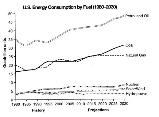
The IELTS writing task 1 line graph gives information from a 2008 report about the consumption of energy in the USA since 1980 with projections until 2030.
Summarise the information by selecting and reporting the main features, and making comparisons where relevant.
IELTS Sample Essays Answer
The line graph shows energy consumption by fuel type in the United States from 1980-2008, with projected use until 2030.
Overall, fossil fuels have been the dominant type and will continue this trend into the future. Nuclear and renewable energy sources have represented a small but significant proportion of total energy use and despite small projected gains; it is projected that they will continue doing so.
Main Information
Petrol and Oil commanded the biggest share with 35 quadrillion units (35q) in 1980, rising to approximately 40q in 2008 and this trend is set to continue with a projected value of nearly 50q in 2030. In 1980 natural gas and coal came in second and third, with around 16q and 20q respectively. However, coal overtook natural gas in 1990 and despite some fluctuation, is set to be the second most used fuel in 2030 with just over 30q. It is predicted that natural gas will level off and remain relatively constant at about 25q.
Nuclear and the renewable energies all represented around 4q in 1980 and fluctuated up until 2008. It is speculated that nuclear energy will reach 10q by 2030 and solar/wind around 5q, with hydropower dropping and then remaining constant at approximately 2q.
Academic writing task 1 is a writing task which has a defined input and a largely predictable output. It is basically an information-transfer task that relates narrowly to the factual content of an input diagram and not to speculative explanations that lie outside the given data.
You can take help of any good IELTS online training programs for enhancing your skills in this topic. A proper IELTS online preparation will help you with the most important part and that is choosing the correct information. If you know what to put into the essay and have a concrete structure, you are absolutely good to go!
Also Read : Duolingo Test Scores Explained: Comparison with IELTS and TOEFL
One Comment

I was looking for this article for the preparation of graphs and how to write essays, this was very useful, what are you looking for?
Leave a Reply Cancel reply

Share Article:
About the Author
Indulekha prabha.
My name is Indulekha Prabha. I am an English teacher and a content writer by profession. When I'm not working you can find me writing fiction, reading poetry and painting.
You might also like

Describe Something Important that has been Kept in Your Family: A Cue Card Sample Topic for IELTS Speaking

How to Use an IELTS Calculator? Calculate Your Overall IELTS Exam Score

What is a Good IELTS Score? Is 7.5 a Good IELTS Score? Here’s All You Need to Know
Other stories, top ielts classes in ambala: all you need to know to score better, how to sound more confident in the ielts speaking test effective speaking practice guide.
Useful Vocabulary for Writing an IELTS Graph Essay

When it comes to IELTS writing task 1, 25% of your marks are for the range of words you use. That means IELTS graph vocabulary is a very important component to review as you prepare for the Writing Task 1. You can start by checking out this IELTS writing task 1 vocabulary guide . And below, I’ll provide an overview of words and useful phrases to incorporate into your writing so that you can get top marks on the lexical resource category and a high band score overall. Basically, the better your IELTS writing chart vocabulary, the higher score you’ll get. It’s not hard, but there is a clear formula to doing well.
How to Use IELTS Graph Vocabulary in Writing Task 1
Because IELTS writing task 1 involves describing a graph or chart of some type, it will help to have a handle on IELTS writing chart vocabulary — words and phrases that help you write about the information on the chart or graph.

How are graphs described in IELTS? Let’s walk through the best vocabulary for the task, step by step.
1. Start With Introduction Phrases
Often ESL students start their essay with ‘The graph shows…’. While this is fine, the verb ‘shows’ could be replaced by a more exciting and high-level vocabulary word. Here are four different prompts to start your essay:

- The graph illustrates the trends in…
- The graph reveals information about the changes in…
- The graph provides the differences between…
- The graph presents how X has changed over a period of…
- DO NOT write the word below or above in your introduction. i.e. The graph above/below shows…
2. Add Suitable Adverbs
Adverbs help express a relation of place, time, circumstance, manner, cause, and degree, and can greatly add some color and interest to your writing as well as show off your range of vocabulary. Unlike adjectives (which describe nouns), adverbs describe verbs, or actions. Here’s a great list of adverbs to use:
3. Use Appropriate Synonyms
Again using a variety of nouns and verbs for words like rise and fall will help increase your overall score. Here are some suggestions:
4. Add Time Phrases
Below are some excellent time phrases with sentence examples:
Using IELTS Graph Vocabulary in a Model Essay
Look at the sample IELTS writing Task 1 graphs on the British Council website . Below is my model answer with useful words in bold:
The bar charts illustrate the trends in computer ownership, with a further classification by level of education, from 2002 to 2010.
Over the period, it can be observed that there was a significant surge in the percentage of the population that owned a computer. In the year 2002, only about 58% of the population owned a computer, whereas by 2010 , this gradually increased to where over three-quarters of individuals had a home computer.
Looking at the information by level of education reveals that higher levels of education correspond to higher levels of computer ownership in both of those years. In 2002, a significantly low percentage of the population who did not finish high school had a computer, but this figure skyrocketed by 2010, going from 15% to over 40%. There were also dramatic climbs , of approximately 30 percentage points, for those with a high school diploma or an unfinished college education (reaching 65% and 85%, respectively, in 2010).
To conclude, during the last decade, there has been a substantial growth in computer ownership across all educational levels.
Other IELTS Graph Vocabulary Resources
Keep in mind that IELTS writing task 1 may contain one of several different types of infographic: a bar chart, pie chart, line graph, diagram, etc. Regardless of the type, you’ll want to have a good handle on IELTS writing chart vocabulary.
For more specific guides to the different kinds of graphs, charts, and graphics you may find on IELTS writing task 1, check out the following resources:
- How to Describe a Bar Chart
- How to Describe a Pie Chart
- How to Describe a Map
- How to Describe a Process Diagram
You can also check out Magoosh’s IELTS linking words PDF for transitions between ideas. Hopefully you’ll start to incorporate some of these key words and phrases, as well as the above suggestions, in your IELTS Task 1 Writing. If you still don’t feel comfortable doing so, consider dedicating more time to your IELTS studies with Magoosh’s fun, engaging IELTS prep for extra practice.

Eliot Friesen-Meyers is the Senior Curriculum Manager for Magoosh IELTS and TOEFL. He attended Goshen College (B.A.), New York University (M.A.), and Harvard University (M.T.S.), gaining experience and skills in curriculum development, ESOL instruction, online teaching and learning, and IELTS and TOEFL test prep education. Eliot’s teaching career started with Literacy Americorps in Pittsburgh, Pennsylvania, and later, taught ESL programs at Northeastern University, University of California-Irvine, and Harold Washington College. Eliot was also a speaker at the 2019 TESOL International Conference . With over 10 years of experience, he understands the challenges students face and loves helping them overcome those challenges. Come join Eliot on Youtube , Facebook , and Instagram . Recent blog posts Complete Guide to IELTS Writing Task 1 Complete Guide to IELTS Writing Task 2
View all posts
More from Magoosh

11 responses to “Useful Vocabulary for Writing an IELTS Graph Essay”
I would like to get sample of all types of graph eassy
IELTS Liz offers a pretty good range of graphs and charts for IELTS Writing Task 1 (Academic) . You can also get a nice selection of these on the official IELTS websites . And last but not least, Magoosh offers a good selection of these types of questions with a Magoosh IELTS Premium subscription. 🙂
Thank you Magoosh for the comprehensive guide. I’m a subscriber to you GMAT course and is now checking out IELTS.
Wanna ask, I read and watched many other sources that says we should not write a conclusion. However, yours did.
So, is it permissible or not permissible?
The concluding sentence is optional–if you have time to write a concluding sentence after writing and reviewing your essay, then it looks good to have a concluding sentence. If you don’t have time to write a concluding essay or you’d rather focus on other parts of your essay, then it’s totally fine to leave it out. You can read more about this in our Complete Guide to IELTS Academic Writing Task 1.
“Growth” is not an noun? Because in the board it’s saying that it is a verb
Thanks for pointing this out! It seems like a mistake on our part. We should probably change that to “grow”. I’ll make a note for our writing team to make this change 🙂
I appreciate you very much. Your blog on Useful Words for Writing an IELTS Graph Essay was the outstanding blog ever. You have given so much good information about the new english words & grammar in your post, which will help me in future. Always keep data like this on your website
I have two significant questions. The first one is related to the unit of measurement in over view. Is it academic? And the second one is of conclusion. Do we need to write conclusion?
Hi Aakash, I’m afraid I don’t understand your first question. Can you please provide some more information? For your second question: a conclusion is not necessary. You can add one if you’d like, but it’s more important to spend time analyzing the graph.
This is one of the best among the essay I’ve read recently.
Thanks for the feedback! 🙂
Leave a Reply Cancel reply
Your email address will not be published. Required fields are marked *
IELTS Line Graph (Writing Task One Academic)
Line graphs are the most common IELTS academic task one question type. They can also be one of the hardest types to answer. On this page, you can check out my sample answer for an especially tricky line graph question and find out why it is worth a band nine.
IELTS Line Graph Band Nine Sample Answer
This question below is my band nine answer for a fairly famous task one question. Once you’ve finished, keep scrolling to find out why it would get a band nine and for some extra tips.
The graph below shows the population of India and China from the year 2000 to the present day with projections for growth to the year 2050. Summarise the information by selecting and reporting the main features, and make comparisons where relevant.

This graph demonstrates how the number of people in China and India have and will change over time. The graph starts with historical data going back to the year 2000 and continues with predictions up to 2050.
Overall, the population of India will overtake that of China in 2030 and continue to grow through to 2050. Meanwhile, China’s population will peak in the late 2020s before gradually declining.
At the beginning of the graph, in the year 2000, the population of China was 1.25 billion people. According to the graph, this has been growing and will continue to grow to a peak of just over 1.4 billion. After this time, the population will begin to steadily decline, reaching a low point of just under 1.4 billion by 2050.
On the other hand, the population of India has been increasing steadily since the year 2000 and will continue to grow into 2050. In the year 2000, the population of India was 1 billion, far lower than China’s. India’s population will overtake China’s in 2030 when both are just over 1.4 billion people. Its population will continue to grow to 1.6 billion in the year 2050, although this growth will become more gradual over time.
Why is this essay band nine?
At first glance, this looks like quite a hard line graph to write about. After all, you only have two lines to talk about, which means some test takers could run out of things to say. To make things worse, the tenses used to describe this graph are quite complex.
Using perfect continuous tense
When we want to describe something that has been happening non stop for an extended period of time and which are still happening now, we can use the present perfect continuous tense. We often use this tense with ‘for’ and ‘since’. For example:
- I have been living in London since 2020.
- They have been studying hard for the IELTS exam for a year.
- She has been watching that TV show for the last five hours.
To be honest, this is quite a rare tense, but it comes in handy for questions like this. In the essay, I’ve used it for:
- According to the graph, this has been growing and will continue to grow to a peak of just over 1.4 billion.
- On the other hand, the population of India has been increasing steadily since the year 2000 and will continue to grow into 2050.
For both of these sentences, I’ve combined the present continuous with the future tense. This is less clunky than something like ‘The population of India, has grown, is growing and will grow.’
Good Task One Structure
The structure of this answer is exactly how it should be. It has:
- An introduction telling you what the graph is about.
- An overview which gives the key points without going into detail or giving any numbers.
- Two body paragraphs both with a clearly defined topic.
Related posts
- A Beginner’s Guide to IELTS
- Common Grammar Mistakes [for IELTS Writing Candidates]
Writing Correction Service
- Free IELTS Resources
- Practice Speaking Test
Select Page
Describing an IELTS Line Graph [An Annotated Sample Answer]
Posted by David S. Wills | Mar 13, 2023 | Model Essays | 0
![Describing an IELTS Line Graph [An Annotated Sample Answer]](https://cdn.shortpixel.ai/spai/q_lossy+ret_img+to_webp/ted-ielts.com/wp-content/uploads/2023/03/Describing-a-Line-Graph-1280x640.png "graph essay for ielts")
In task 1 of the IELTS writing test, you could be asked to describe a line graph. This is actually very common and so it’s really important that you can do this well.
Today, I am going to show you a typical IELTS line graph and then give you some advice on how to describe it effectively. This will include my own sample band 9 answer, which I will annotate so that you can more easily understand it.
You can read my full guide to describing line graphs here .
The Line Graph – Bakery Sales
Here is our line graph for today:
The graph below gives information about the sales of the three most commonly purchased items in a particular bakery for the year 2014. Summarise the information by selecting and reporting the main features, and make comparisons where relevant.

This is a pretty straightforward line graph and I don’t think there are any particular difficulties here. However, it is important to read the question carefully and analyse the graph before you begin writing.
Note that this is not about all of the sales in this bakery. Specifically, it is about “the three most commonly purchased items.” You should mention that in your introduction or else it may seem as though only three items are available in this place.
What do you Need to Do?
With any graph description, you need to describe the data accurately for your reader. That means your language must be clear and precise. Also, you should not attempt to describe every little detail. Note the phrase “selecting and reporting the main features.” This means you have to be selective. You should also “make comparisons where relevant.”
Looking at this chart, we can see that each of the three lines had a pretty different trend from the others. One line went up and then down. Another went down and then up. A third just moved slowly up. Your job is to explain this effectively.

Remember to group your data logically. There are various ways to do this, but here’s how I will structure my essay:
Why have I organised my information like this?
As I said, there are different ways to do it effectively, but I felt that a good way was to group the final changes together. That’s because it is in these final months that there are substantial changes in the sales positions of these three items.
Normally, I would have grouped the sales of bread and buns together and then kept pies separate. That’s because pies seem to be at a very different level. However, because the sales of pies rose above buns at the end, it seems like an awkward way of grouping the information .
Learn more about task 1 structure here .
Common Problems to Avoid
It is worth mentioning a few mistakes that people often make in IELTS writing task 1. To begin with, you might have noticed the phrase “a particular bakery.” A lot of people try to paraphrase the question and this is a good option for task 1, but it can lead to problems. A “particular bakery” means a single business whose name we have not been given.
In such situations, I almost always write “an unknown ____.” For example, my first line for this essay will be:
- The line graph shows information about sales in an unnamed bakery in the year 2014.
Speaking of paraphrasing, you should also not include any reference to “below.” Whilst the task description is above the graph, your essay will be on a separate piece of paper or on a computer screen. To say “below” would be false information.
You also really need to avoid vague language that fails to convey the ideas expressed in the graph. This is actually one of the most common problems people make in task 1. Always make it clear to your reader that the data refers to sales (in dollar terms) of three select items from one bakery.
Sample Band 9 Answer
Here is how I would answer the question:
The line graph shows information about sales in an unnamed bakery in the year 2014. There are three items listed and their sales varied substantially during the period. In January, bread was by far the most commonly purchased product, with $80,000 of this sold. This was twice as much as the next highest item, buns, and eight times greater than the third one, pies. Over the next two months, however, bread sales plummeted to almost half their initial value while sales of buns increased by fifty percent. From March through to September, buns remained the most profitable item as bread sales fluctuated wildly in second place. Meanwhile, sales of pies slowly and steadily increased. Towards the end of the year, there were more changes. Sales of bread took off from October onwards, surpassing those of buns to become the most profitable item again and reached $80,000 in sales in December. Sales of buns continued to drop, falling into third place after pie sales shot in November and December.
Annotated Version
Now let’s look at the purpose of these sentences:

Final Comments
My structure was simple but effective and my language was accurate enough to convey the data. I picked only the important parts and glossed over the rest. Remember that you don’t have much time to complete this task!
Notice how few numbers there are. Many IELTS candidates make the mistake of cramming lots of numbers into their descriptions. This shows a lack of thinking and it is also a means of avoiding words. However, IELTS is an English test! You need to use words rather than copying numbers from a graph.
About The Author

David S. Wills
David S. Wills is the author of Scientologist! William S. Burroughs and the 'Weird Cult' and the founder/editor of Beatdom literary journal. He lives and works in rural Cambodia and loves to travel. He has worked as an IELTS tutor since 2010, has completed both TEFL and CELTA courses, and has a certificate from Cambridge for Teaching Writing. David has worked in many different countries, and for several years designed a writing course for the University of Worcester. In 2018, he wrote the popular IELTS handbook, Grammar for IELTS Writing and he has since written two other books about IELTS. His other IELTS website is called IELTS Teaching.
Related Posts

IELTS 17 Sample Answer: Industrial Area (Norbiton)
May 15, 2023

The Future of Health – IELTS Writing Task 2
July 4, 2022
![The Dangers of Relying on Technology [Sample Answer]](https://cdn.shortpixel.ai/spai/q_lossy+ret_img+to_webp/ted-ielts.com/wp-content/uploads/2023/11/The-Dangers-of-Digitalisation-Sample-IELTS-Essay-440x264.png "graph essay for ielts")
The Dangers of Relying on Technology [Sample Answer]
November 17, 2023

IELTS Essay: Owning vs Renting Property
March 12, 2021
Leave a reply Cancel reply
Your email address will not be published. Required fields are marked *
This site uses Akismet to reduce spam. Learn how your comment data is processed .
Download my IELTS Books

Recent Posts
- How to Improve your IELTS Writing Score
- Past Simple vs Past Perfect
- Complex Sentences
- How to Score Band 9 [Video Lesson]
- Taxing Fast Food: Model IELTS Essay

Recent Comments
- Francisca on Adverb Clauses: A Comprehensive Guide
- Mariam on IELTS Writing Task 2: Two-Part Questions
- abdelhadi skini on Subordinating Conjunction vs Conjunctive Adverb
- David S. Wills on How to Describe Tables for IELTS Writing Task 1
- anonymous on How to Describe Tables for IELTS Writing Task 1
- Lesson Plans
- Model Essays
- TED Video Lessons
- Weekly Roundup
IELTS Mentor "IELTS Preparation & Sample Answer"
- Skip to content
- Jump to main navigation and login
Nav view search
- IELTS Sample
40 difficult IELTS Graphs with model Answers
The diagram below shows the typical stages of consumer goods manufacturing, including the process by which information is fed back to earlier stages to enable adjustment..

The graph below shows information on employment rates across 6 countries in 1995 and 2005.

The chart below shows the amount spent on six consumer goods in four European countries.

The chart below shows the amount of money per week spent on fast foods in Britain. The graph shows the trends in consumption of fast foods.

The table below gives data on the hour of leisure time per year for people in Someland.

The table below provides information on rental charges and salaries in three areas of London.

The diagram below gives the information about the Hawaiian island chain in the centre of the Pacific Ocean.

The two maps below show an island, before and after the construction of some tourist facilities.

The diagram below shows the process by which bricks are manufactured for the building industry.

The graph below shows the Alcohol-related deaths in 7 different countries and the average beer consumption in 2005.

The graphs show figures relating to hours worked and stress levels amongst professionals in eight groups.

The table below gives information on internet use in six categories by age group.

The table below shows the number of medals won by the top ten countries in the London 2012 Olympic Games.

The graphs show enrolment in different colleges in the Higher Colleges of Technology in 1999.

The map below is of the town of Garlsdon. A new supermarket (S) is planned for the town. The map shows two possible sites for the supermarket.

The diagram below shows how the Australian Bureau of Meteorology collects up-to-the-minute information on the weather in order to produce reliable forecasts.

The diagrams below show the life cycle of the silkworm and the stages in the production of silk cloth.

The chart below shows information about changes in average house prices in five different cities between 1990 and 2002 compared with the average house prices in 1989.

The pie charts below show units of electricity production by fuel source Australia and France in 1980 and 2000.

The diagram below shows the stages and equipment used in the cement-making process, and how cement is used to produce concrete for building purposes.

The charts below give Information on the ages of the populations of Yemen and Italy In 2000 and projections for 2050.

The diagrams show a structure that is used to generate electricity from wave power.

The flowchart below shows the process involved in completing the work experience requirement for university students.

The diagram below shows the environmental issues raised by a product over its life cycle.

The map below shows the changes in an American town between 1994 and 2010.

The graph below shows the number of complaints made about noise to Environmental Health authorities in the city of Newtown between 1980 and 1996.

Plan A below shows a health centre in 2005. Plan B shows the same place in the present day.

The following diagram shows how greenhouse gases trap energy from the Sun. Write a report for a university lecturer describing the information shown in the diagram.

The pie charts below show responses by teachers of foreign languages in Britain to a survey concerning why their students are learning a foreign language. The first chart shows the main reason for learning a foreign language. The second chart shows how many teachers felt that there has been a recent change in the reason.

The figure shows the results of a survey of 1000 adolescents in five different countries. The participants were asked at what age they believed certain rights and responsibilities should be granted to young people.

The charts below show the percentage of water used for different purposes in six areas of the world.

The following diagram shows how rainwater is reused for domestic purposes.

The diagram below shows the life cycle of a salmon, from egg to adult fish.

The bar chart below shows the proportions of English men and women of different ages who were living alone in 2011. The pie chart compares the numbers of bedrooms in these one-person households.

The graphs indicate the source of complaints about the Bank of America and the amount of time it takes to have the complaints resolved.

The diagram shows the procedure for university entry for high school graduates.

The charts below show the workforce profile at the top management jobs by ethnicity and race in South Africa based on a 2015/16 report.

The bar chart below shows Scotland’s exports to the rest of the UK and the rest of the world for the year 2014.

The graph below shows the top priorities by business companies in the USA in 2016.

The bar charts and line graph below show the results of a survey conducted over a three-year period to discover what people who live in London think of the city.

IELTS Materials
- IELTS Bar Graph
- IELTS Line Graph
- IELTS Table Chart
- IELTS Flow Chart
- IELTS Pie Chart
- IELTS Letter Writing
- IELTS Essay
- Academic Reading
Useful Links
- IELTS Secrets
- Band Score Calculator
- Exam Specific Tips
- Useful Websites
- IELTS Preparation Tips
- Academic Reading Tips
- Academic Writing Tips
- GT Writing Tips
- Listening Tips
- Speaking Tips
- IELTS Grammar Review
- IELTS Vocabulary
- IELTS Cue Cards
- IELTS Life Skills
- Letter Types

- Privacy Policy
- Cookie Policy
- Copyright Notice
- HTML Sitemap
CHARTS AND GRAPHS ESSAY EXAMPLES
IELTS Writing Task 1 Academic Charts And Graphs Essay Examples
View High Band Score Examples Of IELTS Writing Task 1 Academic Charts And Graphs Essays
IELTS Writing Task 1 – Table Essay Example 3
IELTS Writing Task 1 Academic table essay example that is a band score 8. The question is: The table below gives information about the problems faced by children in two primary schools in 2005 and 2015. Take a look at the sample answer
IELTS Writing Task 1 – Table Essay Example 2
IELTS Writing Task 1 Academic table essay example that is a band score 8. The question is : The table illustrates the proportion of monthly household income five European countries spend on food and drink, housing, clothing, and entertainment. Take a look at the sample answer.
IELTS Writing Task 1 – Table Essay Example 1
IELTS Writing Task 1 Academic table essay example that is a band score 8. The question is: The following table gives statistics showing the aspects of quality of life in five countries. Take a look at the sample answer.
IELTS Writing Task 1 – Pie Chart Example Essay 1
IELTS Writing Task 1 Academic pie chart essay example that is a band score 8. The question is: The chart below shows how much money is spent in the budget on different sectors by the UAE government in 2000. Take a look at the sample answer.
IELTS Writing Task 1 – Line Graph Essay Example 2
IELTS Writing Task 1 Academic line graph essay example that is a band score 8. The question is: The line graph illustrates the amount of spreads consumed from 1981 to 2007, in grams. Take a look at the sample answer.
IELTS Writing Task 1 – Line Graph Essay 1
IELTS Writing Task 1 Academic line graph essay example that is a band score 8. The question is: The line graph below shows changes in the amount and type of fast food consumed by Australian teenagers from 1975 to 2000. Take a look at the sample answer.
IELTS Writing Task 1 – Bar Chart Example Essay 3
IELTS Writing Task 1 Academic bar chart essay example that is a band score 8. The question is: The chart shows the percentage of drugs taken by girls and boys in a school in New Zealand. Take a look at the sample answer.
IELTS Writing Task 1 – Bar Chart Example Essay – 2
IELTS Writing Task 1 Academic bar chart essay example that is a band score 8. The question is: The chart below shows the number of men and women in further education in Britain in three periods and whether they were studying full time or part-time. Take a look at the sample answer.
IELTS Writing Task 1 – Bar Chart Essay Example 1
IELTS Writing Task 1 Academic bar chart essay example that is a band score 8. The question is: The chart below gives information about Someland’s main exports in 2005, 2015, and future projections for 2025. Take a look at the sample answer.
Related Posts

Agree Disagree Essays
IELTS Writing Task 2 – How To Write An Agree-Disagree Essay 21 page PDF download…

IELTS Discussion Essay Sample 1 – Education
IELTS Writing Task 2 discussion essay example that is a band score 8. The question…
IELTS Preparation with Liz: Free IELTS Tips and Lessons, 2024

- Test Information FAQ
- Band Scores
- IELTS Candidate Success Tips
- Computer IELTS: Pros & Cons
- How to Prepare
- Useful Links & Resources
- Recommended Books
- Writing Task 1
- Writing Task 2
- Speaking Part 1 Topics
- Speaking Part 2 Topics
- Speaking Part 3 Topics
- 100 Essay Questions
- On The Day Tips
- Top Results
- Advanced IELTS
IELTS Line Graph Vocabulary
Essential vocabulary to describe an IELTS writing task 1 line graph. To get a good band score you must show the examiner a range of different words to show upward and downward trends as well as key features. IELTS line graphs show change over a period of time and you must vary your language and vocabulary when you write your report.
This page contains:
- Verbs & Nouns
- Practice Exercise
- Adverbs & Adjectives
- Time Phrases
- Useful link to model answers and more tips for line graphs
1. IELTS Line Graph Verbs & Nouns
Below are lists of verbs and nouns that can be used to describe a line graph in IELTS writing task 1.
Upward trend
- rise / a rise
- increase / an increase
- climb / a climb
- grow / a growth
Downward trend
- decrease / a decrease
- drop / a drop
- fall / a fall
- decline / a decline
Other vocabulary
- fluctuate / a fluctuation
- dip / a dip
- remain steady
- remain stable
- remain unchanged
- reach a peak of
- hit a high of
- hit a low of
Mistakes when using words will affect your band score. This includes spelling.
- Band 6 = some vocabulary errors.
- Band 7 = few vocabulary errors.
2. Practice with Nouns and Verbs
Fill in the gaps using the vocabulary above. Make sure you adapt the words to make the sentences grammatically correct. The completed paragraph below is an example of a body paragraph for a line graph.

- Source: IELTS Liz
- Notice: It is uncommon to be given only one line as a task unless it is combined with another chart or table. The above graph is for practising vocabulary.
Questions 1-5
Fill in the gaps with the correct vocabulary. You should use no more than two words for each gap.
The number of reported cases of influenza began at 40 in 1985 after which the figure (1). …………………… steadily to reach about 55 in 1987. In 1988, there was a (2) …………. in the number to below 50 before (3) ……………. to reach a (4) ………… (5) ……….. approximately 75 in 1991. After that date, the figure dropped to about 55 in the final year.
Click below to reveal the answers:
- rose / increased / climbed / grew / went up
- a fall / a decline / a drop / a dip / a decrease
- climbing / increasing / rising / going up / growing
3. Line Graph Adverbs & Adjectives
Below are useful adverbs and adjectives to describe change.
Adverbs : steadily, gradually, sharply, rapidly, steeply, slightly, dramatically, significantly, considerably
Adjectives : steady, gradual, sharp, rapid, steep, slight, dramatic, significant, considerable
Sentences :
- The number of cases of influenza increased steadily from 40 to 55 in the first three years.
- There was a steady rise in the number of cases of influenza to reach 55 in 1987 from 40 in the first year.
4. Time Expressions
IELTS line graphs show change over a period of time. Below are some expressions to help you describe the passing of time without too much repetition.
Time phrases :
- over the next three days
- three days later
- in the following three days
- the next three days show
- over the period
- from…to… / between … and…
- the last year
- the final year
- the first year
- at the beginning of the period
- at the end of the period
5. Recommended Links for more IELTS Writing Task 1
IELTS Writing Task 1: Tips, Model Answers and More
Full Model Answer and Guidelines for IELTS Line Graph
All other free materials are found on the RED BAR at the top of this site.
All the best
Subscribe for Free to get New Post by Email
Type your email…
Hi Liz, can I say add adver/adjective in (fluctuate) term, like it fluctuated continously or it experienced a steady fluctuation for the remainder of the period? Thank uuu Lizz..
Yes, it is possible to use adjectives or adverbs before the word “fluctuation”. However, you need to be careful which ones you use. To say it “fluctuated continuously” isn’t very meaningful when fluctuations are movements that do happen over a period of time which means they already are quite continuous. It is better to say whether the fluctuation is minimal or considerable. That shows the degree of change during the fluctuations.
Is this a good introduction? The graph underneath illustrates the number of elderly, influenced by influenza in a specific village in the UK between 1985 and 1965
You will be writing on paper or on a blank screen. There will be nothing underneath your writing.
I am very poor student. I don’t have enough money to enroll. help me
This website contains a lot of pages of model answers, tips, topics, practice lessons etc – all free. Go to the HOME page to learn how to use it.
The line graph describes data about those aged 65 and above who had flu over a 10-year period between 1985 and 1995 in a British village.
Overall, it can be clearly seen that the quantity of cases had grown from 1985 to the final year with the highest number of sick people reported in 1991.
During the first 5-year period, the number of cases climbed by around 80%: from 40 in 1985 to 70 in 1990. Over the first 2 years, the figure was constantly growing to its first peak at nearly 55 in 1987, which was followed by a gradual drop by approximately 10 cases one year later. Further marginal growth to roughly 48 by 1988 ended up with a dramatic jump to 70 cases in 1990.
For the following 5-year period, the figure experienced some fluctuation. Between 1990 and 1991, the trajectory was inclining to its highest point at nearly 75 cases, which was almost 2 times more than in 1985. Followed by a decline to about 61 cases in 1992, there was a last peak at about 64 reported cases in 1994. By the final year, 60 people had influenza, which was by 40 cases more than 10 years before.
I’m very glad to read your lessons Thanks alot for this God bless you 😇🙏🏻
You’re welcome 🙂
mam why you don’t post videos on YouTube now ?😞
Due to a serious long-term health problem.
Get well soon. All the prayers for you.
May you recover soon, your blog really helps me a lot.
I’m really sorry to hear about this. You’re in my thoughts and prayers
Hy liz! can we write our test with lead pencil so if we make any mistake we erase it or we need to use pens or ballpoints?
And secondly in writing can we write task 2 first and then task 1. or we need to go in sequence means first write task 1 and then task 2?
See this page for your answers: https://ieltsliz.com/ielts-help-faq/ . Always take time to read all pages on this website to learn about IELTS.
you are Great mam
Could you explain straightly the meanings of “dip “&”hit a high of “&”hit a low of”? I search these phrases on the Internet, but I cannot find their exact meanings. Hope to receive your response soon:)
“To hit a high of x” means to reach a peak and this is the highest point on the graph. “To hit a low of x” is the opposite. It means to reach the lowest point on the graph. “To dip” means the number drops and then returns back to its original number (or close to) – this is similar to a dip in the road when you are driving.
Wonderful insight. I am new here n it’s been so helpful. Keep the good work. Thank you.
I’m glad it’s useful.
hello Liz. my name is Oysha. I’m uzbek 🇺🇿 Thank you very much for your useful information about line graph. I have a question for you. Is it possible to increase from 3.5 degrees to 7.5 degrees in 2 months?
Are you cold? Try putting on a sweater. Just kidding. You mean to increase from 3.5 band score to 7.5 band score. It would depend on the reason you only got 3.5 in your test. If the reason is that you didn’t understand the test, ran out of time, got confused by the types of questions and didn’t prepare the topics, then it’s possible to quick address all those issues and increase your score. But if the reason you got band 3.5 is because your English language is very limited, you make frequent errors, you can’t understand words etc, then it would take a lot of time to improve your English to a level which is similar to 7.5.
The line chart illustrates the number of cases of influenza among people above 65 years in the countryside in the United Kingdom between 1985 to 1995. Units measured in years and number of people.
Looking from the overall perspective, during the decade, the graph fluctuated. In the beginning year, it had the least amount of cases and after 6 years it was at its peak.
In 1985, 40 people were infected and then it gradually increased till 1987 with nearly 55 persons. For the next 2 years, 5 cases were decreased compared to 1987. For the next couple of years, it was rapidly raised to one-quarter of humans and it was the highest number of cases registered in a decade.
From 1991 to 1993, cases dropped by approximately 15. For the last 2 years, there were ups and downs with 10 cases in 1994 and 1995 respectively and ending with 60 cases in the year 1995.
How is your health now? Come back soon 🙂
Thanks. I’m just in the middle of moving house which shatters my health. Hopefully once I move and rest, I can start gaining strength again.
I love you Liz, keep being strong.
Thank you. I appreciate your comment
Liz are you live? Why don’t you make new YouTube videos?
Of course I’m alive. See this page: https://ieltsliz.com/determination-my-story/
Hi, Liz Please help me for below my task, The graph illustrates the number of people over 65 who were infected by influenza, in a particular village. Th data described the survey period start from 1985 to till the end of 1995. Overall, the graph shows how, within a decade many people are suffered by flue in every years. In the beginning of the year 1985, total 40 people have infected by the flu. The disease was steeply increased to 55 in 1987. In 1988 the virous spread rate slightly dope to 48 but not last long till 1989, the flu hit to 50 people. Since than, the virous spread rate sharply increase to 70. The report from the graph, in the 1991, 75 people have been infected by influenza which is the highest cause rate in this decade.(1985 to 1995) The effected rate was gradually drop to 62 in 1992. The following year of 1993 to end of 1995, the number of people are slightly up and down. The flu rate was end up as over 65 people are suffered in this ten years.
The graph demonstrates the reported number of people over the age of 65 who were infected by influenza in a particular village in the period from 1985 to 1995. In particular, the graph shows how many people are affected by the flu every year. Firstly, in the year 1985, about 40 people over the age of 65 were attacked by the virus. The number went up gradually to around 45 in 1986 and reached a peak at 55 in 1987. Then, a significant decrease in the number of cases was observed in the consecutive year. Again, there was a slight increment in cases identified between 1988 and 1989. From 1989 onwards, there was a drastic improvement in cases touching 70 in 1990 and reaching around 75 in 1991. From then onwards, the number of people suffering from the flu decreased gradually in between the years 1991 and 1992 and then a slight drop off till 1993. 60 people were infected in the years 1993 and 1995 and around 65 in the middle year. Although 40 is not a small number, it was the least number which was recorded in the 10 years and it was in 1985. In 1991, the highest number of cases was reported as 75.
Thanks a lot Liz. Biggest support and inspiration 🙂
Each word i read i ask God to bless you. You are doing an incredible job by helping poor students gain knowledge for free .
Such a lovely comment. I’m so glad you like my lessons 🙂
Hi I got useful insights Thank you 😊 💓
hi do you have a telegraph channels
No, I don’t. I have this website, my Youtube channel, my online store and one Facebook page only. Anything else you see online is fake. I’m glad you contacted me to confirm this.
Great thanks mam 💖
Hi dear Liz. No word to appreciate your free help. Your expressions are wonderful and informative. You are amazing Liz. Thanks alot Shima
you are a wonderful lady ….. thanks to you for providing best material
Thanks mam ,ur teaching method is great
Hi Liz, Can I write “in the penultimate year”? I mean is it only used in graduation years or can I use it in a graph too?
It’s fine to use.
Thnk uh very much mam
Thank you for all of your lessons they are staggering! Just I can say wonderful! I found it very interesting.
You are the best of the best
I really want to appreciate your method of teachings. They have been very insightful and easy to understand. Keep up your good job madam! . I have now developed confidence for the exam. May God bless you richly.
Glad the lessons are helping you 🙂
I think I’m determined not to leave a work unread in your fascinating website for it seems you have prepared everything appropriately for your guests. I wonder if you could provide actual written answers for writing task 1 and 2 so that we can estimate our writings. Thanks
You can find everything on the main pages of this website. The model answers for task 1 are in the writing task 1 section of this site. You can find each section accessed either through the RED MENU BAR at the top of the site or on the HOME PAGE 🙂
thank you very much. your lessons are enriching my knowledge. they are incomparable.
This website is a blessing especially in times like these. Thank you so much for providing such amazing information and that too for free. You are such an amazing teacher. God bless you. 🙂
I’m glad you are finding my site useful. Good luck with your test 🙂
Dear Liz, Thank you so much for your excellent support for my IELTS preparation. From the couple of days, I am following your tips and lectures which are available here. I am so much pleased as I have found my confidence to sit for the exam recently. Wish you all the best. Thank you again.
I’m glad you’ve found my site useful 🙂
I see lot of foreinger use icon ” 🙂 ” when replied someone’s comment. Idk, if it’s normal to your country when responed like that. But in VietNam, that icon deemed not serious about the reply. Btw, I love your video. It’s free but more qualified than several courses in my country. Again thank youuu <3
To give someone a smile is normal online 🙂
Hi mam..! I’m new here and my elder brother given your link.Because Once he followed..! And now i following you..! thanks for everything..! and you pray for me so that i can improve myself.. “
Good luck!! 🙂
Dear madam! You are doing great job.thank you very much for that In the answer sheet task 1,,,there is a word rose,i think it should be rise Good bless you
I don’t understand. There is no answer sheet on the page above. I don’t know which word you are referring to. Can you explain more?
I guess what Prabash said was the word “rose”. he thought it should be “rise”, however in my opinion, he is wrong, “rose” is the correct one.
Is he referring to question 1? It is passed tense: rose / increased etc. You can’t use a present tense when past tense is required. You are correct, Peter 🙂
You are so kindhearted Liz ma’am 😊 and thanks for this
In writing task 1,you should maintain the use of one tense throughout.For example,if your explanation is in ‘past tense’ you should only use past tense throughout.
Thatswhy,Madam Liz used ‘rose’ instead of ‘rise’ in her graph explanation.
Sorry I didn’t see your comment before. Exactly correct 🙂
Thanks Liz.
Hi Liz, I was wondering whether all line graphs have trend or not thanks
Yes, they all have trends. They show change over a period of time and that is the trend you are reporting as well as any other significant key feature.
That is great
This helps a lot.
Thanks. It is helpful for me.
Yes definitely
Thank u Mam God bless u
Thank you Liz, I have my IELTS on the 30th of August and your website is very helpful and useful.
Good luck 🙂
Interesting website, lots of helpful materials in an organized manner, and the videos are very clear and informative.
Thanks a lot!
Thank you Liz.your help and useful advises .
Hi Liz, Your teaching lesson skills and tips are outstanding that’s helping me for IELTS preparation well.
Thank you and appreciate for your kind support.
Regards, Raju
tremandous job you are doing, carving us towards acheiving higher band scores mile stone. i appreciate for your great work
Hi dear Master. Well done. I really appreciate it. Many thxs
Nice and greate work ….ieltsliz.com . . From ludhiana-machhiwara 😊
Actually you have a great experience mam i also agree with jass ..so really thanks a lot.
thanks roop 🙂
Dear ,you are doing a good job….👍👍
It is very helpful to me.
It’s really very fruitfull for me Thanks mam your website very propitious for us
Thank u mam you helped me a lot.
Hii Liz I’ve just started IELTS . Thank you for all information given! I think there is a wrong word in the other vocabulary that is a drip. It should be a dip. Have a nice day 🙂
Well spotted! Good proof reading skills 🙂
Hey Liz i just want to ask you if i scored 5 on my ielts are there any college that would accept me?
You would have to ask each individual college if they would accept you.
Thank you very much ma,Nigerian nurses are also proud of you.
Hi liz if by chance you read this please do write a comment, I am still not confident in doing task 1. Anyway, I see this as a great help to me , thank you.
Here is my sample report for the line graph above , please correct me especially on my grammar since I am mostly doing a self review and I am thankful I found this because you freely give suggestions.
The line graph gives information about the number of people above 65 with reported cases of influenza in some village of UK starting 1985 up to 1995. The data is measured according to the number of people affected by the flu in the given time frame.
Overall, there is a fluctuation in the statistics throughout the period. Observably, its lowest cases is in the beginning while the highest occurs in the middle years (1991 to 1992) of the decade.
For over 3 years , starting from 1985 until 1987 there is a gradual increase of influenza cases, specifically from 40 going up to 50 respectively. In the following years on the other hand, it starts to fluctuate , it moves downward from the stated latter period above , afterwards the number of people with reported cases continuously rise reaching its peak data of more than 70 in 1991.
Meanwhile , in the next 4 years including the end of the period the number of people with influenza steadily decrease . Consequently, from above 70 it then decline to exactly 60 (1991 to 1995).
This is well written! But do check the last line where, I think you have got a grammatical mistake. Instead of using ‘declined’, you used the word ‘decline’.
Really appreciate your help ,May God bless you with good health and blessings.Thanks for being so generous.
thanks for your lesson, my teacher. it is very useful
Excellent tech mam
Thanks mam 😊 😊 😊 😊
I wish I could talk with Liz.🙄
Rubie expressed what i am feeling just right now. Dear Liz, you are so generous and I would like you to understand how much do I appreciate your free help. Right words – God bless you:)
hugs and kisses, Marija
Yes, off course.. Their is no doubt 😊
You are very generous to share these ideas, tips, examples and teach those struggling examiners for their IELTS test. I am one of those people who’s very thankful when I found your website. It was very helpful for me. Godbless your good heart Ms. Liz!
love lots, Rubie
Thanks liz that was very informative
as regard of my experience ietlsliz website has such a good materials for preparing ielts exam .
Hi Liz. I’ve started studying for IELTS for two months. My teacher taught me the way to practice for writing that I want to ask your opinion about that. She told us that, for beginners of course, we should spend for example one or two days on one sample of writing, study about topic and learn new words or collocations then try to write a good essay. What do you think? Is it a good way?
Why don’t you try it and see if it works. There is no one way to prepare for IELTS or to learn English. You need to decide which way works most effectively for yourself.
It worked for me!
Thank you a lot teacher for such fruitful initiative.
Thank you so much for your helpful material and tips.
Very good speak 👍
Thank you miss, this is really help me to study about english and ielts.. good job miss, hope you keep health
Thank you so much
Thank you so much for such a useful materials. No words to appreciate your hardworking.
Thanks so much ma’am, your lesson has always being wonderful.
This is good
Thank you very much Liz for a nice organised writing about task1 .
Thank you so much, I think it would help me to get good score next time. Thank you Mam.
Thank you so much, I think it would help me to get good score next time, thank you Mam
Thanks Liz that was very informative
thankyou teacher , that was really helpful , so if just used these phrases in my exam i will det a high score or at least 5.5 ?
Vocabulary counts for 25% of your marks.
ThankQ so much for your wonderful work you have given us.
Wow awesome tips. Many thanks for your boundless generosity and kindness.
Speak Your Mind Cancel reply
Notify me of new posts by email.
Advanced IELTS Lessons & E-books
Click Below to Learn:
- IELTS Test Information
Copyright Notice
Copyright © Elizabeth Ferguson, 2014 – 2024
All rights reserved.
Privacy Policy & Disclaimer
- Click here: Privacy Policy
- Click here: Disclaimer
Return to top of page
Copyright © 2024 · Prose on Genesis Framework · WordPress · Log in

IELTS with Mark Teacher
How to write ielts task 1 academic ‘static graphs’.

There are 3 main types of diagrams in Writing Task 1 Academic: a.) Dynamic graphs b.) Static graphs <– we’re talking about this one c.) Diagrams ( Maps , Processes )
In this post I will show you how to write about static graphs.

I now check IELTS Writing Task 1 Essays! Submit you work and get 4 pages of feedback in 72 hours

Fortunately, the essay structure for every type of Task 1 is basically the same.
Structure: Task 1 – Academic 4 paragraphs 1.) Summary / Introduction 2.) Overview 3.) Body 1 4.) Body 2
What are static graphs?
Static graphs are graphs that contain data in only 1 time period.
For example:

In this graph there are 3 age groups, but no time period is mentioned. We understand that all the data comes from the same time period.

In this graph, only 1 time period is mentioned: 2019. We understand that all time data comes from 2019.

Again, there are 2 different graphs, but no time period is mentioned. These are 2 static graphs.
In contrast, this is a dynamic graph . This is because it has 2 or more time periods. In this graph the data is measured in 3 time periods: 2005, 2010 and 2015.

As a result, the main features of static graphs are not changes (like in a dynamic graph), but instead the main features are proportions and popularity .
1.) Static Graph Introduction / Summary
The introduction paragraph in Task 1 only needs to be 1 or 2 sentences. Like all IELTS Writing Task 1 essays, your introduction should present the main purpose of the graph to the reader in your own words . This means paraphrasing the official IELTS diagram description if you can.
Again, static graphs only record data in 1 time period, which affects the language we use in the introduction. This language table can help you create static introductions. Notice that there is no time period mentioned at the end.
Here are some example introductions to IELTS Task 1 Static Graphs:
The chart gives information about marriage and children in a selection of countries.

- The graph provides data about + the average age of married couples, as well as their average number of children per couple + in a variety of countries.
- The graph measures + how old couples are on average when they get married, as well as how many children they have + in a selection of different countries.
Here’s another example:

- The graph shows + the sectors of employment chosen + by graduates of Brighton University in 2019.
- The pie graph provides data about + the popularity of different job sectors + among graduates from Brighton University in 2019.
- The pie graph reveals + the various job markets entered + by Brighton graduates in 2019.
You try! – Write an introduction sentence for this static task. Use the table above to help you.

- The graph provides data about + different book formats used by + 3 different age groups.
- The graph shows + the choices of various book formats + by people aged between 16 and 29.
- The graph measures + the book type preferences + of people in 3 different age ranges.
2.) Static Graph Overview
The purpose of the overview paragraph is to give a short summary of the main features. Static graphs show data in only one time period, so the main overall features are usually proportions or popularity of different categories. These features can include the most popular , the highest amount, the most chosen or the least popular, the lowest or least preferred.
Importantly, (just like dynamic graphs) you should describe these proportions in words – do not use any specific numbers or data points from the graph.
Here are some useful phrases you can use to describe these main features in words.
Here are some example overview paragraphs using the Task 1 graphs from earlier:

Main features:
+ Highest # of children : Kenya and India | Highest marriage age: AUS-NL-UK-DN
– Youngest marriage age: Kenya and India
+/- Exceptions: USA and China
- Overall, we can see that + there are large discrepancies between certain countries in terms of marriage age and family size. A select group of countries, Australia, the Netherlands, the UK and Denmark, had the latest marriage age and a similar amount of children. Meanwhile, the nations with the youngest marriage age, namely Kenya and India, had some of the highest numbers of children per couple. China and the United States are the only notable outliers of these two trends.
- Overall, we can see that + Kenya had the largest margin between marriage age and number of children, ahead of India. However, the majority of the countries surveyed showed a similar number of children. In contrast, China and the United States were the only nations outside of this trend.

Main features:
+ Most popular sector: Service industries
– Smallest sectors: civil service, transportation, science and technology + others
+/- Similar levels: Education, politics, manufacturing – make up around 33%
- Overall, we can see that + a significant majority of graduates entered the service industry. Education, manufacturing and politics and government also made up a large portion of Bright graduates, while the remaining amount was divided between six other work sectors.
- Overall, we can see that + the service industry was the most chosen job sector among graduates. Around a third of all graduates were spread across manufacturing, education and politics and government, while the remaining third of Bright graduates entered industries ranging from civil service to transportation and warehousing.
You try! – Write an overview paragraph for this static task. Use the table above to help you. The main features have been highlighted for you.
+ most common choice: printed books in all age groups
+/- similarly small: e-books and audiobooks
The chart shows data about reading among people under 30 years old.
- Overall, we can see that + printed books were the clear favourite across all age groups. Meanwhile, e-book and audiobook formats were only about a quarter as popular , though also spread evenly in popularity among the age groups questioned.
- Overall, we can see that + the most preferred book format by far was printed books. However, while audiobooks and e-books were equally popular among the age groups, their popularity was quarter of that of printed books.

My in-depth workbook explains the best way to organise and write your IELTS Task 1 Overview Paragraphs, as well as gives you the specific vocabulary and grammar for pie graphs, bar graphs, tables and more!

3.) Body Paragraphs
Next are the Body paragraphs of your Task 1 report. You can write 2 or 3 Body paragraphs.
Body paragraphs describe the main features in detail, including specific numbers from the graph. The data and features of a body paragraph should be similar in some way.
For example, you should describe the most popular categories together in one body paragraph. Then write about the least popular categories in a new body paragraph.
I usually use my overview paragraph to guide the structure of my body paragraphs.
Here is the complete example of a Task 1 static graph essay using the images from before:
Introduction : The graph provides data about the average age of married couples, as well as their average number of children per couple in a variety of countries.
Overview : Overall, we can see that there are large discrepancies between certain countries in terms of marriage age and family size. A select group of countries, Australia, the Netherlands, the UK and Denmark, had the latest marriage age and a similar amount of children. Meanwhile, the nations with the youngest marriage age, namely Kenya and India, had some of the highest numbers of children per couple. China and the United States are the only notable outliers of these two trends.
Body 1: (marriage age together)
Beginning with the latest marriage age, 4 nations waited until after 30 years old to get married, including Australia, the Netherlands, the United Kingdom and Denmark. Danish couples had the highest average of around 33 years old. In contrast, Kenyan, Indian and Chinese couples were notably younger. The average in Kenya was 22 years old, while India’s was 24 and China’s a year older than that.
Body 2: (number of children together + Exceptions)
Kenya and India, however, both had higher numbers of children per couple. Kenyan and Indian couples had on average 3 and 2.5 children respectively. American couples averaged the same number of children per couple, although their marriage age was closer to that of the 4 highest nations, which only typically had just under 2 children. China was another outlier in this regard, listing only 1.5 children per couple. (255 words)

Introduction: The graph shows the sectors of employment chosen by graduates of Brighton University in 2019.
Overview : Overall, we can see that a significant majority of graduates entered the service industry. Education, manufacturing and politics and government also made up a large portion of Bright graduates, while the remaining amount was divided between six other work sectors.
Body 1: (Biggest proportions together)
Starting with the most chosen sector on the graph, 33.0% of Brighton graduates entered service industries, making it the largest portion of the pie graph by some margin. Meanwhile, collectively the manufacturing industry, education sector and politics and government made up around a third of the graph. Manufacturing received 16.3%, education 14.7% and politics and government posted 12.1%. In total these 4 employment sectors account for almost three quarters of the whole graph.
Body 2: (Smaller portions together)
In regards to the less popular industries, 7.8% of graduates entered the transportation and warehousing sector while 7.3% entered science and technology fields. Civil service is the only remaining comparable sector, with 5.6%. The other sectors received small fractions of total graduates, with “Other” accounting for 2.8%, charity 0.3% and sport just 0.1%. (203 words)
You try! – Write the body paragraphs for this static task. Use the examples above to help you.
Introduction: The graph provides data about different book formats used by 3 different age groups.
Overview: Overall, we can see that printed books were the clear favourite across all age groups. Meanwhile, e-book and audiobook formats were only about a quarter as popular, though also spread evenly in popularity among the age groups questioned.
Body 1: (most popular category)
Starting with the most overwhelmingly popular choice of book format on the graph, printed books were chosen between 70% and 85% of readers in all age groups surveyed. 16-17 year-olds claimed they read printed books, while roughly 73% of 18-24 year-olds and 25-29 year-olds also chose printed books.
Body 2: (least popular together)
There you go! A high-band approach, several examples and a reliable framework for you to use in your own IELTS Writing test.
Questions? Write them in a comments below.

Want more IELTS Writing Task 1 help?
I’ve uploaded 28 more pages of high-band grammar, vocabulary and essay writing advice in my Static Graph workbook. If you want more practice and to see the structures behind high-band IELTS essays and sentences, click the image or click here to see more .
Show me what you’ve learnt from this guide – send me your IELTS Writing Task 1 Essays!

Share this:
- Click to share on Twitter (Opens in new window)
- Click to share on Facebook (Opens in new window)
Related Posts

IELTS Writing Task 1 Essay Sample – Static – News Sources
Learn how to write high-band IELTS Task 1 essays like this with my IELTS Task 1 – Static Graph eBook: Click here or the picture below! Want me…

IELTS Writing Task 1 Essay Sample – Static – Tea & Coffee Habits

IELTS Writing Task 1 Essay Sample – Static – Library Use

IELTS Writing Task 1 Essay Sample – Process – Geothermal Electricity
The diagram below shows how geothermal energy is used to produce electricity. Want me to check your IELTS Task 1 essays? You can send me your own IELTS…

IELTS Writing Task 1 Essay Sample – Map – Norbiton Industrial Area
If you want to learn how to write IELTS Task 1 essays like this one, you can get Advanced eBook here: Or …. you can send me your…

IELTS Writing Task 1 – Maps e-Book – Out now!
I’m excited to announce another addition to my growing IELTS Writing Task 1 eBook series! The latest downloadable PDF is all about Maps! 19 pages of grammar and…
- Skip to primary navigation
- Skip to main content
- Skip to primary sidebar
- Skip to footer
IELTS Advantage
IELTS Preparation Courses
IELTS Bar Chart Sample Essay
Static or Dynamic?
Before writing an IELTS task 1 bar chart or line graph answer it is important that we analyse the question correctly. Taking a few minutes to do this will help us write a clear answer that fully responds to the question. Just what the examiner wants us to do.
The first thing we need to do is decide if the bar chart is static or dynamic. Static means that the data comes from one point in time. Dynamic means the data comes from more than one point in time.
Whether a chart is static or dynamic will affect the information we choose to include in our answer and the kind of language (tense, grammar etc.) we use.
If it is dynamic we will have to compare the different times and comment on the general trends over the time period.
If it is static we will have to compare the different variables, in this case countries, car price, GDP and time it takes for one person to buy a car.
Main Features
Every IELTS academic task 1 question asks us to ‘select and report the main features’.
This means that we have to not only pick the most significant information from the graph and include it in our essay, but also decide which information is not important and should therefore not be included in our essay. One of the biggest mistakes you can make in task 1 is including all the information you see.
So which information should you choose?
You should look for:
- highest/lowest values
- biggest differences
- similarities
- significant exceptions
- anything else that really stands out
There are 3 main features in this graph
1) It takes over 26 years for a Vietnamese person to buy a car.
2) Vietnam has the second highest average costs but the second lowest wages.
3) Cost of a car in Singapore is nearly 3 times the next most expensive.
I advise my students to follow a basic four paragraph structure for these kinds of questions.
Paragraph 1
Paraphrase the question using synonyms.
Paragraph 2
Provide an overview of the main features. No need to include any data in this paragraph, just tell the examiner what is happening in general terms. If you had to describe the main features in two sentences, what would you say?
Paragraph 3
This is where we get more specific and use data. Take 2 of the main features (from your overview) and describe them in detail using data from the chart.
Paragraph 4
Simply do the same thing as you did in paragraph 3, but with two other main features (from your overview).
Sample Answer

The graph compares the GDP per capita, cost of a Toyota Camry and approximate length of time it takes for 1 citizen to purchase that mode of transport in eight Asian countries.
Despite having the second lowest average yearly income, it costs more to buy this car in Vietnam than in all but one other Asian nation. It also takes significantly longer for a standard person to buy an automobile in Vietnam than in any other state in Asia. On the other end of the scale, Singaporeans have to pay nearly three times more for their cars than the Vietnamese and it takes them the least amount of time to afford a motor vehicle.
It costs $49,944 to buy a Toyota Camry in Vietnam, but this dwarfs the average yearly income per person at just $1,910. It would therefore take a normal man or woman 26.1 years to save up for that particular car.
This is in contrast to Singapore where it costs $126,245 for that model of motorcar, however the average salary is much greater at $55,182. This means that it generally takes just over 2 years for a typical individual from Singapore to acquire this vehicle.
(200 words) Band 9.
It should be noted that this is not a real IELTS task 1 question. This is just a chart that I saw on the internet, but it allowed me to make a very important point- you don’t have to mention everything on the graph. I only talked about 2 out of the 8 countries and I still wrote 200 words and answer the question fully. The key is finding the most significant data and not talking about anything else. Don’t worry, you won’t lose marks for not talking about everything, quite the opposite.
This graph is also good for demonstrating how important it is to vary your vocabulary. There were four words that could have been overused in this essay- car, average, country and people. Instead of repeating them over and over again I used synonyms to show the examiner I have a wide vocabulary and gain extra marks. Here are the synonyms:
Car- Toyota Camry- automobile- vehicle- motor vehicle- motorcar
Average- approximate- normal- typical- standard
Country- countries- nation- state
People- citizen- man or woman- individual
Next time you see a chart or graph in a newspaper, in a textbook or on the internet, think about what the main features are and what common words would you have to vary with synonyms.
I hope you have found these tips useful. If you have any questions, let me know below.
For more band 9 sample essays check out our task 1 sample essay page.

About Christopher Pell
My name is Christopher Pell and I'm the Managing Director of IELTS Advantage.
I started IELTS Advantage as a simple blog to help 16 students in my class. Several years later, I am very humbled that my VIP Course has been able to help thousands of people around the world to score a Band 7+ in their IELTS tests.
If you need my help with your IELTS preparation, you can send me an email using the contact us page.
- Ebooks & Courses
- Practice Tests
How To Write an IELTS Bar Chart Essay
There are 5 steps to writing a good IELTS bar chart essay:
1) Analyse the question
2) Identify the main features
3) Write an introduction
4) Write an overview
5) Write the details paragraphs
Use this simple planning process as you practice writing IELTS bar chart essays and you’ll have no problem remembering it in the exam.
Steps 1 and 2 of the planning process should take around 5 minutes. It is essential that you don’t miss these out as they are the key to writing a high-scoring essay.
On this page, I’m going to take you through the whole planning process step-by-step as we work on a practice question.
Before we begin, here’s a model essay structure that you can use as a guideline for all IELTS Academic Task 1 questions.
Ideally, your essay should have 4 paragraphs:
Paragraph 1 – Introduction
Paragraph 2 – Overview
Paragraph 3 – 1 st main feature
Paragraph 4 – 2 nd main feature
Now that we have all these tools we need, we’re ready to begin planning and writing our IELTS bar chart essay.
Here’s our practice question:
The bar chart below shows the sector contributions to India’s gross domestic product from 1960 to 2000.
Summarise the information by selecting and reporting the main features, and make comparisons where relevant.
Write at least 150 words.
Contribution as % of India's GDP

Source: EPW Research Foundation
Step 1 – Analyse the question
The format of every Academic Task 1 question is the same. Here is our practice question again with the words that will be included in all questions highlighted .
The bar chart below shows the sector contributions to India’s gross domestic product from 1960 to 2000.
Every question consists of:
- Sentence 1 – A brief description of the graphic
- Sentence 2 – The instructions
- The graphic – chart, graph, table, etc.
Sentence 2 tells you what you have to do.
You must do 3 things:
1. Select the main features.
2. Write about the main features.
3. Compare the main features.
All three tasks refer to the ‘ main features ’ of the graphic. You do not have to write about everything. Just pick out 2 or 3 key features and you’ll have plenty to write about.
Our practice graphic is a dynamic bar chart. That is, it includes a timeline giving data from several different points in time.
So, for this question, we need to identify the main trends (that is, the general developments or changes in situation) in the three key sectors of the Indian economy – agriculture, industry and service – between 1960 and 2000.
Alternatively, a bar chart may be static with the data coming from one point in time, as in the example below. For this graphic, we would need to compare the different variables, that is, the different leisure activities favoured by Canadian boys and girls.

Step 2 – Identify the Main Features
The graphic in IELTS bar chart questions should not be difficult to interpret. Each question has been created to test your language skills, not your mathematics ability.
All you are looking for are the main features. These will usually be the easiest things to spot. As we’ve just seen, the type of key features will depend on whether the bar chart is dynamic or static.
There will be lots of information in the graphic to help you identify them. Here are some useful questions to ask?
- What information do the 2 axes give?
- Is it dynamic or static?
- What are the units of measurements?
- What are the time periods?
- What can you learn from the title and any labels?
- What is the most obvious trend?
- Are there any notable similarities?
(I give more detail on how to use these questions, plus downloadable checklists for identifying the main features of all 7 different types of IELTS Academic Writing Task 1 questions, in the lesson on How To Understand & Analyse Task 1 Questions .)
So, what main features stand out in our practice graphic?
Here's our practice IELTS bar chart again.
There are 3 main features/trends in this IELTS bar chart:
Main feature 1: The contribution of the agricultural sector dropped steadily.
Main feature 2: The contribution of the service sector increased each decade.
Main feature 3: Industry remained static from 1980 to 2000.
The general trends you select will be the starting point for your essay. You will then go on to add more detail.
With just 20 minutes allowed for Task 1, and a requirement of only 150 words, you won't be able to include many details.
We’re now ready to begin writing our essay. Here’s a reminder of the 4 part structure we’re going to use.
Step 3 – Write an Introduction
In the introduction, you should simply paraphrase the question, that is, say the same thing in a different way. You can do this by using synonyms and changing the sentence structure. For example:
Introduction (Paragraph 1):
The bar graph illustrates the relative percentage contributions made by the agricultural, industrial and service sectors to the Indian economy between 1960 and 2000.
This is all you need to do for the introduction.
Ideally, key words such as ‘sector’ and ‘contributions’ should be replaced by synonyms but there aren’t any obvious words that could be used instead so it’s fine to repeat them. It’s important that your language sounds natural so never try to force in synonyms that don’t quite fit.
Step 4 – Write an Overview (Paragraph 2)
In the second paragraph, you should report the main features you can see in the graph, giving only general information. The detail comes later in the essay. You should also make any clear comparisons you spot.
This is where we write about the general trends. Here are the ones we picked out above.
Now form these ideas into two or three sentences with a total of around 40 words. State the information simply using synonyms where possible. No elaborate vocabulary or grammar structures are required, just the appropriate words and correct verb tenses.
For example:
Overview (Paragraph 2) :
Over the whole time period, the significance of agriculture declined steadily while services grew in importance decade by decade. A different patterned emerged for industry, which initially showed a slowly increasing percentage but then plateaued from 1980 onwards.
Step 5 – Write the 1st Detail Paragraph
Paragraphs 3 and 4 of your IELTS bar chart essay are where you include more detailed information about the data in the graphic. In paragraph 3, you should give evidence to support your first 1 or 2 key features. Don’t forget to make comparisons when relevant.
Here are our first 2 main features again:
And this is an example of what you could write:
Paragraph 3 :
In 1960, agriculture contributed by far the highest percentage of GDP, peaking at 62%, but it then dropped in steady increments to a low of 12% in 2000. The service sector, on the other hand, had a relatively minor impact on the economy in 1960. This situation changed gradually at first, then its percentage contribution jumped from 28% to 43% between 1980 and 1990. By 2000 it matched the high point reached by agriculture in 1960, showing a reversal in the overall trend.
Step 6 – Write the 2nd Detail Paragraph
For the fourth and final paragraph, you do the same thing for your remaining feature/s. We have one main feature left to write about.
Here’s an example of what you could write:
Paragraph 4 :
Industry remained a steady contributor to India’s wealth throughout the period. As a sector, it grew marginally from 16% in 1960 to exactly a quarter in 1980 then remained static for the next two decades, maintaining a constant share of the overall GDP.
Here are the four paragraphs brought together to create our finished essay.
Finished IELTS Bar Chart Essay
(188 words)
This sample IELTS bar chart essay is well over the minimum word limit so you can see that you don’t have space to include very much detail at all. That’s why it is essential to select just a couple of main features to write about.
Now use what you’ve learnt in this lesson to practice answering other IELTS bar chart questions. Start slowly at first and keep practicing until you can plan and write a complete essay in around 20 minutes.
Want to watch and listen to this lesson?
Click on this video.
Would you prefer to share this page with others by linking to it?
- Click on the HTML link code below.
- Copy and paste it, adding a note of your own, into your blog, a Web page, forums, a blog comment, your Facebook account, or anywhere that someone would find this page valuable.
Like this page?
Ielts academic writing task 1 – all lessons.
IELTS Academic Writing – A summary of the test including important facts, test format & assessment.
Academic Writing Task 1 – The format, the 7 question types & sample questions, assessment & marking criteria. All the key information you need to know.
Understanding Task 1 Questions – How to quickly and easily analyse and understand IELTS Writing Task 2 questions.
How To Plan a Task 1 Essay – Discover 3 reasons why you must plan, the 4 simple steps of essay planning and learn a simple 4 part essay structure.
Vocabulary for Task 1 Essays – Learn key vocabulary for a high-scoring essay. Word lists & a downloadable PDF.
Grammar for Task 1 Essays – Essential grammar for Task 1 Academic essays including, verb tenses, key sentence structures, articles & prepositions.
The 7 Question Types:
Click the links below for a step-by-step lesson on each type of Task 1 question.
- Table Chart
- Process Diagram
- Multiple Graphs
- IELTS Writing
- IELTS Bar Chart
- Back To Top
* New * Grammar For IELTS Ebooks

$9.99 each Full Set Just $ 23.97
Find Out More >>
IELTS Courses

Full details...

IELTS Writing Ebook

Discount Offer
$7 each Full Set Just $ 21

Find out more >>
Testimonials
“I am very excited to have found such fabulous and detailed content. I commend your good work.” Jose M.
“Thanks for the amazing videos. These are ‘to the point’, short videos, beautifully explained with practical examples." Adari J.
"Hi Jacky, I bought a listening book from you this morning. You know what? I’m 100% satisfied. It’s super helpful. If I’d had the chance to read this book 7 years ago, my job would be very different now." Loi H.
"Hi Jacky, I recently got my IELTS results and I was pleased to discover that I got an 8.5 score. I'm firmly convinced your website and your videos played a strategic role in my preparation. I was able to improve my writing skills thanks to the effective method you provide. I also only relied on your tips regarding the reading section and I was able to get a 9! Thank you very much." Giano
“After listening to your videos, I knew I had to ditch every other IELTS tutor I'd been listening to. Your explanations are clear and easy to understand. Anyways, I took the test a few weeks ago and my result came back: Speaking 7, listening 9, Reading 8.5 and Writing 7 with an average band score of 8. Thanks, IELTS Jacky." Laide Z.
Contact
About Me
Site Map
Privacy Policy
Disclaimer
IELTS changes lives.
Let's work together so it changes yours too.
Copyright © 2024 IELT Jacky
All Right Reserved
IELTS is a registered trademark of the University of Cambridge, the British Council, and IDP Education Australia. This site and its owners are not affiliated, approved or endorsed by the University of Cambridge ESOL, the British Council, and IDP Education Australia.
Welcome Guest!
- IELTS Listening
- IELTS Reading
- IELTS Writing
- IELTS Writing Task 1
- IELTS Writing Task 2
- IELTS Speaking
- IELTS Speaking Part 1
- IELTS Speaking Part 2
- IELTS Speaking Part 3
- IELTS Practice Tests
- IELTS Listening Practice Tests
- IELTS Reading Practice Tests
- IELTS Writing Practice Tests
- IELTS Speaking Practice Tests
- All Courses
- IELTS Online Classes
- OET Online Classes
- PTE Online Classes
- CELPIP Online Classes
- Free Live Classes
- Australia PR
- Germany Job Seeker Visa
- Austria Job Seeker Visa
- Sweden Job Seeker Visa
- Study Abroad
- Student Testimonials
- Our Trainers
- IELTS Webinar
- Immigration Webinar
IELTS Bar Chart/Graph – Samples, Tips to Describe Bar Graphs

Updated On Mar 07, 2022
Share on Whatsapp
Share on Email
Share on Linkedin

Limited-Time Offer : Access a FREE 10-Day IELTS Study Plan!
Amidst all the other types of questions, you will also come across a question that will showcase a bar graph. Also known as a bar chart, the bar graph is evaluated similar to a line graph . Such a bar chart also comes with two axes, showing changes and diversifications over a given period of time. Furthermore, the bar graph has rectangular bars that could be either displayed vertically or horizontally, representing two or more values of data.
Types of IELTS Bar Graphs
When preparing for the IELTS exam , you would have to prepare for two different types of bar graphs: vertical and horizontal.
Vertical Bar Graph
Here is how a vertical bar graph looks like:

Horizontal Bar Graph
Here is how a horizontal bar graph looks like:

A Comprehensive Guide to Write IELTS Bar Chart Essay
If you wish to learn more about writing a high-scoring IELTS bar essay, here is a comprehensive process that will help you out.
Evaluating the Question
The first and foremost step is to evaluate and analyze the question. In the question, you will get a brief description of the bar chart along with instructions. Your job here will be to discover the central idea.
Assessing the Given Data
The next step is to assess the data that you have in the question. Find out whether it is dynamic or static. If it is dynamic data, it will show two or more time periods. If it is static data, it will show only one time period. For both these data types, you will have to use different languages to write the description.
Discovering Primary Features
Majorly, bar graph questions are meant to test your mathematical as well as language skills. Hence, you must know how to derive the primary features from the given data and write about it.
Describing a Bar Chart
Here is the complete format that should be used when describing a bar chart or a bar graph.
The Introduction
In the introduction paragraph, you would have to paraphrase the asked question. This can be done by using synonyms and paraphrased words and sentences. Also, ensure that this section is sounding natural.
The Overview
Usually, an overview forms the second paragraph of the essay. In this one, you would have to write down the main features. Also, you must discover available comparisons and talk about general trends occurring in the given data.
The First Body Paragraph
In the first body paragraph, you will have to give detailed information and explain the given data. Here, you must focus more on language instead of facts. Making relevant comparisons is always useful.
The Second Body Paragraph
This second body paragraph will have your explanation of the remaining features. It will be the same as the first body paragraph, but with different information.
Choosing the Information from the Bar Graph
As you would already know, a bar graph question requires a report of 150 words to be written. To help you out with an easier way, you can follow (but not stick to) the below-mentioned guidelines.
Tips to Write IELTS Bar Chart Essay
Jotted down below are some tips that will help you write a relevant, on-point IELTS bar chart essay
1. Is it difficult for you to match the word count?
Most of the time, people find it difficult to match the word count. Hence, they start using complicated words to unnecessarily extend the sentences. While using high-end vocabulary is a pro, writing sentences that are difficult to be understood is a con.
2. Be straightforward in your writing
When describing the bar graph, try not to complicate the description. Be straightforward and on-point.
3. Do you only practise with one type?
While practising, do you only try working on one type of chart or graph, or do you expand your horizons as well?
4. Practise as much as possible
While practising, work on varying bar charts or graphs so as to enhance your ability to explain whatever comes in the examination.
5. Are you always in a hurry for submission?
One of the common mistakes that people commit is not reviewing their answers before submission. This could lead to you missing out on errors and issues that can impact your marking.
6. Review your writings before submitting
Once written, double-check for grammatical errors . Review important details and superlatives to make sure you didn’t miss anything.
Here are 10 bar graph IELTS practice test examples:
Also check :
- IELTS Writing tips
- IELTS Writing recent actual test
- IELTS Writing Answer sheet
- IELTS map vocabulary
- IELTS Writing Task 1 Connectors
Frequently Asked Questions
What is a bar chart?
What is the structure of a bar graph?
What is the difference between introduction and overview? Can I skip the overview because I feel introduction is enough?
Can I have just one body paragraph where I give almost all the information?
What is the expected word count for describing a bar chart?
Practice IELTS Writing Task 1 based on report types

Start Preparing for IELTS: Get Your 10-Day Study Plan Today!
Janet had been an IELTS Trainer before she dived into the field of Content Writing. During her days of being a Trainer, Janet had written essays and sample answers which got her students an 8+ band in the IELTS Test. Her contributions to our articles have been engaging and simple to help the students understand and grasp the information with ease. Janet, born and brought up in California, had no idea about the IELTS until she moved to study in Canada. Her peers leaned to her for help as her first language was English.
Explore other sample Bar Charts

Janice Thompson

Post your Comments
Recent articles.

Akanksha Tripathi

Kasturika Samanta

Raajdeep Saha

Our Offices
Gurgaon city scape, gurgaon bptp.
Step 1 of 3
Great going .
Get a free session from trainer
Have you taken test before?
Please select any option
Get free eBook to excel in test
Please enter Email ID
Get support from an Band 9 trainer
Please enter phone number
Already Registered?
Select a date
Please select a date
Select a time (IST Time Zone)
Please select a time
Mark Your Calendar: Free Session with Expert on
Which exam are you preparing?
Great Going!
The graph below gives information about the percentage of the population in four Asian countries living in cities from 1970 to 2020, with predictions for 2030 and 2040. Summarise the information by selecting and reporting the main features, and make comparisons where relevant.

Unauthorized use and/or duplication of this material without express and written permission from this site’s author and/or owner is strictly prohibited. Excerpts and links may be used, provided that full and clear credit is given to Writing9 with appropriate and specific direction to the original content.
- Asian countries
- predictions
- estimations
- urbanization
- South Korea
- upward trend
- moderate increase
- significant surge
- Check your IELTS essay »
- Find essays with the same topic
- View collections of IELTS Academic Writing Task 1 Samples
- Show IELTS Academic Writing Task 1 Topics
A healthy person is often described as someone who has a good diet, gets plenty of exercises and avoids stress. what should people do to stay healthy in your country? give reasons for your answer and include any relevant examples from your own knowledge or experience.
Increasing the price of petrol is the best way to solve the growing traffic and pollution problems. to what extent do you agree or disagree what measures do you think might be effective, some people think that studying online is more effective than studying on campus. what are the advantages and disadvantages of online study, some people think tourism should be banned while some disagree. discuss both sides and give your own opinion., 20. disruptive school students have negative influence on others. students who are noisy and disobedient should be grouped together and taught separate. do you agree and disagree with this statement..
IMAGES
VIDEO
COMMENTS
Recent IELTS Graph 20: The table below shows the worldwide market share of the notebook computer market for manufacturers in the years 2006, 2007 and 2014. Summarise the information by selecting and reporting the main features and make comparisons where relevant. Answer: The table gives information about the percentages of international market shares of different notebook computer brands in ...
Introduce the Graph. You need to begin with one or two sentences that state what the IELTS writing task 1 shows. To do this, paraphrase the title of the graph, making sure you put in a time frame if there is one. Here is an example for the above line graph: The line graph compares the fast food consumption of teenagers in Australia between 1975 ...
To make the best use of your time it's important to write with a clear structure, focus on the most important trend or trends, choose appropriate vocabulary and avoid common mistakes. In this tutorial, we have a band range 6.5 / 7 academic task 1 IELTS line graph example essay graded by an ex-IELTS examiner (on our team of essay correctors).
IELTS Line Graph Essay. Here is the 5 steps process I recommend for planning and writing IELTS line graph essays: 1) Analyse the question. 2) Identify the main features. 3) Write an introduction. 4) Write an overview. 5) Write the details paragraphs. I'm going to take you through the whole process step-by-step as we work on a practice ...
If the line graph contains many lines and a lot of movement, be selective. You are being marked on your ability to select key features. Don't spend more than 20 mins on task 1. You will need a full 40 mins for task 2. Write 150 words or more. Aim for about 160-190 words. Don't write under the word count.
IELTS Line Graph Answer. The line graph illustrates the amount of three kinds of spreads (margarine, butter, and low fat and reduced spreads) which were consumed from 1981 to 2007. Units are measured in grams. Overall, the consumption of margarine and butter decreased over the period given, while for low fat and reduced spreads, it rose.
Comments. This graph would score highly in the IELTS test. The graph starts with an overview that highlights the key information presented in the graph.. It has also been organised very clearly around the main trends.. The first body paragraph describes Sweden, France and Canada together as they follow a very similar pattern, whereas Great Britain is discussed separately in the second body ...
On IELTS test day, you may encounter line graphs in the Academic Writing Task 1 section. To help you understand what components make up a good response to a line graph question, let's take a look at a model band 9 essay.. To see why this essay is band 9, see our scorer commentary after the model essay below, and check out the official IELTS rubric for Task 1 (PDF).
IELTS Sample Essays Answer. The line graph shows energy consumption by fuel type in the United States from 1980-2008, with projected use until 2030. Overall, fossil fuels have been the dominant type and will continue this trend into the future. Nuclear and renewable energy sources have represented a small but significant proportion of total ...
Using IELTS Graph Vocabulary in a Model Essay. Look at the sample IELTS writing Task 1 graphs on the British Council website. Below is my model answer with useful words in bold: The bar charts illustrate the trends in computer ownership, with a further classification by level of education, from 2002 to 2010.
Tips for IELTS Writing Task 1 Line Graph 2022. In the introduction part, you can paraphrase the question asked or the topic of the essay. When you explain the overall trend, identify the main feature and explain it. Ensure that each paragraph has examples that are percentages or numbers to support the sentence written as an explanation.
IELTS Line Graph Band Nine Sample Answer. This question below is my band nine answer for a fairly famous task one question. Once you've finished, keep scrolling to find out why it would get a band nine and for some extra tips. The graph below shows the population of India and China from the year 2000 to the present day with projections for ...
This lesson looks at an IELTS line graph and explains how to describe it effectively. It includes a band 9 sample answer. TRENDING: IELTS Speaking Partners. ... Whilst the task description is above the graph, your essay will be on a separate piece of paper or on a computer screen. To say "below" would be false information.
An activity which helps students use a range of suitable lexis for describing graphs. The session can be used for IELTS preparation or for more general academic writing skills. Time required: 60-70 minutes . Additional materials required: sample task: One copy per student, or display on the board :
The process for planning and writing IELTS multiple graph essays is the same as for any other Academic Task 1 essay. Here is the 5 steps process I recommend that you use: 1) Analyse the question. 2) Identify the main features. 3) Write an introduction. 4) Write an overview. 5) Write the details paragraphs.
In Academic IELTS Writing task 1, you will have one or more graphs (usually one to three) and you need to summarise the information or write a report about the data presented within 20 minutes. You are advised to write minimum 150 words and less than that would reduce your band score. Some diagrams or graphs are easy to examine and present.
IELTS Writing Task 1 Academic line graph essay example that is a band score 8. The question is > The line graph below shows changes in the amount and type of fast food consumed by Australian teenagers from 1975 to 2000. Take a look at the sample answer >>
IELTS Writing Task 1 - Bar Chart Essay Example 1. IELTS Writing Task 1 Academic bar chart essay example that is a band score 8. The question is: The chart below gives information about Someland's main exports in 2005, 2015, and future projections for 2025. Take a look at the sample answer. View high band score examples of IELTS writing task ...
IELTS Line Graph Verbs & Nouns. Below are lists of verbs and nouns that can be used to describe a line graph in IELTS writing task 1. Upward trend. rise / a rise. increase / an increase. climb / a climb. grow / a growth. go up. Downward trend.
Static Graph Introduction / Summary. The introduction paragraph in Task 1 only needs to be 1 or 2 sentences. Like all IELTS Writing Task 1 essays, your introduction should present the main purpose of the graph to the reader in your own words. This means paraphrasing the official IELTS diagram description if you can.
Before writing an IELTS task 1 bar chart or line graph answer it is important that we analyse the question correctly. Taking a few minutes to do this will help us write a clear answer that fully responds to the question. Just what the examiner wants us to do. The first thing we need to do is decide if the bar chart is static or dynamic.
There are 5 steps to writing a good IELTS bar chart essay: 1) Analyse the question. 2) Identify the main features. 3) Write an introduction. 4) Write an overview. 5) Write the details paragraphs. Use this simple planning process as you practice writing IELTS bar chart essays and you'll have no problem remembering it in the exam.
A Comprehensive Guide to Write IELTS Bar Chart Essay. If you wish to learn more about writing a high-scoring IELTS bar essay, here is a comprehensive process that will help you out. Evaluating the Question. The first and foremost step is to evaluate and analyze the question. In the question, you will get a brief description of the bar chart ...
Submit unlimited essays, letters and charts. Sign up right now and start improving your writing skills. ... Writing9 was developed to check essays from the IELTS Writing Task 2 and Letters/Charts from Task 1. The service helps students practice writing for IELTS and improve their writing skills. By using this site, you agree to read and accept ...