

How to create successful architecture presentation boards
In architectural design, the ability to communicate your vision effectively is as crucial as the design itself.
Architecture presentation boards are essential for this type of communication. These boards provide a visual and textual representation of your architectural solutions that is easy for your clients to understand.
Want some ideas for creating more effective architecture presentation boards?
In this 7-minute read, we’ll delve into the art of crafting presentation boards that not only convey your design intent but do so in a manner that captivates and convinces your audience.
So whether you’re a seasoned architect or a new contractor working on your first project, the tips in this article will help elevate your presentation skills and land you more clients.
Let’s start with a quick look at the basics.
What is an Architecture Presentation Board?

An architecture presentation board is a visual tool used by architects and designers to convey the concepts, details and essence of their architectural projects. It combines images, drawings, text, and sometimes physical materials, to provide a coherent and appealing overview of a project.
These boards are pivotal in architectural competitions and client presentations since they serve as a bridge between the architect’s vision and the client’s understanding.
But presentation boards should be more than just a random collection of visuals.
- Use your board to tell a story and guide the viewer through the project’s inception, development, and final design.
- Effective boards balance aesthetics with information by employing a strategic layout to highlight key elements and facilitate easy comprehension.
- Presentation boards can vary in format from digital displays to large printed panels.
Check out the next section to see the 8 steps to creating your presentation board.
How to Develop Architectural Presentation Boards
Developing architectural presentation boards that stand out requires a blend of creativity, strategic planning, and technical skills. Here’s a step-by-step guide to crafting boards that showcase your project and impress potential clients.
1. Size & Orientation
The size and orientation of your presentation board are foundational decisions that set the stage for the rest of the board’s design.
Size: Consider the amount of content and the level of detail you wish to present. Larger boards can accommodate more information and are suitable for complex projects but require careful organization to avoid overwhelming the viewer. Standard sizes often range from A3 for smaller projects to A0 for more detailed presentations.
Orientation: The choice between landscape and portrait orientation can influence the flow of your presentation. Landscape is preferred for its width which facilitates a natural, left-to-right reading flow. It’s ideal for showcasing panoramic site views or extensive floor plans.
PRO TIP :
- Always tailor the size and orientation to the context of your presentation. For intimate settings, a smaller board might be more practical since it allows for closer viewing and discussion.
The layout of your board is critical in guiding the viewer’s eye through your presentation. This ensures they focus on key elements without missing important details.
Balance and Flow: Create a layout that balances visual elements, text, and white space. Start with the most impactful images or drawings positioned centrally or towards the top, where they attract immediate attention. Use text sparingly to complement the visuals rather than overwhelm them.
Hierarchy: Establish a visual hierarchy that leads the viewer through your board logically, from the project overview to specific details. Use different sizes and styles of text and images to denote importance.
- Use grids to align elements. This creates a professional appearance and makes your board more readable.
- Consider color blocks or frames to delineate different sections without cluttering the board with too many lines.
DON’T FORGET:
- Keep a consistent margin around the edge of the board. This ‘frame’ ensures that none of your content is lost if the board is mounted or encased.
3. Structure
The structure of your presentation board is about more than just where things are placed. It’s about creating a coherent flow that guides the viewer through your design.
Organizational Strategy : Start with a clear organizational structure, such as chronological, thematic or by the project phase. This helps in making your presentation logical and digestible.
Connectivity: Ensure there is a clear connection between different elements on your board. Use lines, arrows or even a numbered path to indicate the order in which the content should be viewed.
PRO TIP:
- Incorporate an “Introduction” and “Conclusion” section on your board. An introduction at the top left can set the stage for your presentation. Then, a conclusion at the bottom right summarizes the project outcomes or next steps.
DON’T FORGET:
- The viewer’s eye naturally moves from left to right and top to bottom. Place your most important information (like the project title or key visuals) where viewers will likely see it first.
4. Background
The background of your architecture presentation board plays a crucial role in setting the tone and making your content stand out.
Simplicity is Key: Opt for a simple, non-distracting background that enhances the readability of your content. A subtle gradient or a light texture can add depth without overpowering the visuals and text.
Contrast: Ensure there is enough contrast between the background and the content to make everything easily readable. Light backgrounds with dark text and visuals usually work best.
PRO TIP:
- Experiment with soft, architectural textures as backgrounds to add a thematic touch to your board without overwhelming the main content.
DON’T FORGET:
- Always preview your board in its final form before printing or presenting. What looks good on a computer screen may not translate well to a large format print or display.
Colors can evoke emotions, highlight important information, and organize your board visually.
Color Scheme: Choose a color scheme that complements your project. Use your project’s primary colors, or select a palette that reflects the project’s mood and context. Consistency in color usage across the board ties the presentation together.
Accent Colors: Use accent colors sparingly to draw attention to key areas or important details. This can be an effective way to guide the viewer’s eye through the board.
- A limited color palette (2-3 main colors) can help in maintaining visual coherence and professionalism.
- Consider the psychological impact of colors. For example, blue can convey trust and stability, while green might be used to emphasize sustainability or environmental aspects.
6. Visual Ranking
Visual ranking on your presentation board ensures that key elements capture immediate attention and then guide the viewer through your design story.
Prioritize Content: Decide what elements of your design are most important and deserve the prime real estate on your board. Typically, this includes your main concept image, and key plans or sections.
Size Matters: Larger images attract more attention. Use size strategically to emphasize the most critical aspects of your project. Smaller images can show less important, but still relevant, information.
- Use visual contrast through varied textures or color highlights to elevate important content further. A high-contrast backdrop for your most crucial images or diagrams can make them stand out.
7. Image Selection

The images you choose to display on your architecture presentation board can make or break your presentation.
Quality Over Quantity: Select high-resolution images that clearly communicate your design. Blurry or pixelated images can detract from your professionalism.
Relevance is Key: Every image should serve a purpose, whether it’s to showcase design details, illustrate spatial relationships or convey the atmosphere of your proposed project.
PRO TIP: If you plan to use 3D-generated images, make sure they are high-quality. Poor-quality, unrealistic images can detract from your design presentation. That’s why more and more housing professionals are switching to easy-to-use 3D design software like Cedreo . Cedreo makes it easy for anyone to generate photorealistic 3D project images for architecture presentation boards.
8. Text & Font
The text and font choices on your presentation board are vital for communicating your design intent clearly and effectively.
Legibility is Crucial: Choose fonts that are easy to read at various sizes. Sans-serif fonts are often preferred for their clean lines and readability in both digital and print formats.
Hierarchy Through Typography: Use different font sizes and weights to create a visual hierarchy in your text. It should be easy for viewers to distinguish between titles, headings and body text.
- Limit your presentation to two fonts to maintain visual coherence—one for headings and one for body text. This simplifies the design and enhances readability.
Types of Architecture Presentation Boards
Understanding the different architecture presentation board templates and layouts is essential for selecting the most effective way to communicate your project’s vision. Each type serves a unique purpose and audience, from conceptual designs to detailed technical drawings.
Here are a few architecture presentation board examples.
Conceptual Board

Conceptual boards are the storytellers of architectural design. They focus on the vision, ideas, and themes behind a project. They are less about detail and more about conveying the concept and atmosphere of the design.
- Use compelling visuals that evoke the intended feel of the project, such as mood boards, abstract diagrams, and 3D floor plans .
- Include brief text descriptions or quotes that capture the essence of your design philosophy and the main concept behind the project.
Advice: Conceptual boards are your chance to connect emotionally with your audience, so choose images and words that resonate deeply with the project’s core idea. Remember: The goal is to intrigue and inspire while making viewers curious and excited about the potential of your design.
Technical Drawings Board

Technical drawing boards detail the specificities of the design through precise drawings and specifications.
- Incorporate a range of technical drawings, including floor plans , elevations , sections , and detailed construction drawings , to provide a comprehensive overview of the project.
- Use annotations, dimensions, and notes to clarify the technical aspects and innovative solutions within your design.
Advice: Make sure your technical boards are meticulously organized and labeled to ensure clarity and ease of understanding. Remember: While technical accuracy is important, consider the layout and visual appeal of your board to ensure it remains engaging and not overly dense.
Professional Board

Professional boards are tailored for client presentations, competitions, or public exhibitions. They blend both conceptual and technical elements to present a complete story.
- Combine striking visuals, key technical drawings, and succinct, persuasive text to showcase your project’s strengths and feasibility.
- Balance the layout to highlight the most compelling aspects of your design while ensuring a logical flow that guides the viewer through the narrative.
Advice : Professional boards are your portfolio’s highlight reel. Focus on quality over quantity and make sure to select only the most impactful images and information that demonstrates your vision.
Remember : Take the time to get it right. A well-executed professional board is a powerful tool for winning bids, gaining approval, and impressing stakeholders.
Get Designing with Cedreo Today!
Crafting an architecture presentation board that effectively communicates your vision and details can be a daunting task.
Whether you’re creating a simple conceptual board for a small project or a detailed technical board for a custom home, Cedreo empowers you to make the best boards as fast as possible.
- Rapid Visualization: Cedreo lets you quickly transform your ideas into visual concepts, with easy-to-use features that save you loads of time and effort.
- One-Stop Solution: From initial sketches to final presentation boards, Cedreo offers a comprehensive platform for all your design needs.
- High-Quality Outputs : Produce professional, high-resolution 3D presentation board images that impress clients and showcase your projects in the best light.
Get started with Cedreo now (there’s a FREE version !) and take your architectural presentations to the next level.
Take Your Designs to the Next Level with Cedreo
These articles might be of interest to you:.
Explore the articles covering the latest Cedreo’s features, keep up-to-date on 3D home design news, and hear more about what our clients have to say.

Strategies to Cut the Costs of Construction Drawing Revisions

Common Mistakes When Designing Architecture Presentations

Mistakes to Avoid When Creating Interior Design Presentations
Best Architecture Presentation Board Ideas
- AEC Marketing
- Digital Asset Management
Posted by: Cinthya Soto
If you’re an architect, you know that one of the most impactful methods for expressing your ideas is creating architecture presentation boards. These boards serve as more than just showcasing your project; they effectively portray your concepts and narrate the story of your design.
However, creating your architecture presentation board can prove challenging. It’s crucial to establish a well-designed layout that maintains a cohesive and engaging narrative. This will enable you to effectively communicate your ideas and elevate the impact of your architecture proposal .
In this blog, we’ll explore ten architecture presentation board concepts, encompassing vital elements necessary for crafting a polished and visually captivating presentation. These ideas include various aspects such as layout, structure, visual hierarchy, color, and more, all contributing to the creation of a professional and visually engaging presentation.
By the end of this blog, you’ll possess the knowledge and confidence necessary to produce a creative and impactful architecture presentation board. This will allow you to showcase your architecture projects accurately and secure new projects.
What Is an Architecture Presentation Board?
Applying all of this information to your architecture presentation board may seem challenging, but with the help of a well-designed layout, you can effortlessly tackle this task.
An architecture presentation board is a visually appealing graphic that effectively summarizes all the ideas of your project. It provides a condensed and clear representation of your design. Architects use architecture presentation boards to showcase their projects and work.
The purpose of a presentation board is to construct a narrative that effectively conveys the essential information of your project in a self-explanatory manner. This enables readers to comprehend each of the proposed solutions with ease.
An architecture presentation board fulfills multiple objectives, including:
- Serving as a tool for presenting designs to clients, superiors, or colleagues
- Assisting in attracting clients and securing commissions
- Contributing to the advancement of your career and elevating your architectural projects to new heights
Architecture presentation boards serve various purposes, being used by both students and professionals. During your time as a student, these presentations are crafted for juries and submissions, allowing you to present your work to professors and peers. In your professional life as an architect, these boards are used to present designs to clients, committees, shareholders, and exhibitions.
In many ways, an architecture presentation board resembles a sales pitch, as you are essentially promoting your design, ideas, and concept to win clients over.
10 Architecture Presentation Board Ideas
While the architecture presentation board may not be the only aspect of the project itself, it certainly has an impact on the audience. Additionally, it can showcase your artistic abilities and design skills.
The structure of an architecture presentation board serves as the platform for combining the key ideas of your project, presenting only the essential elements required for a clear understanding of the proposed concept. Remember, there is no need to incorporate every single detail into the presentation board. It is equally important to be careful with the amount of text used and to maintain focus on the central idea of the project.
To help you get started, let’s take a look at some of the essential concepts (with examples) that must be considered when creating your architecture presentation board. This will help you create a flawless presentation board for clients.
1. Size and Orientation
When designing your architecture presentation board, you will have to determine whether you will be presenting them in landscape or portrait orientation. You can explore different formats to enhance the presentation of your proposal.
However, it’s not certain you’ll get to choose the size or orientation of your presentation boards. You’ll most likely encounter limitations that restrict you to a particular board size and a specific number of boards. Sometimes you will have the opportunity to choose the size and orientation of your presentation boards. However, more often than not, these decisions will be decided by your director, client, or professor. It’s important to ensure that you are aware of the parameters beforehand to avoid any inconsistencies.
If you’re a student, it is common for professors to impose restrictions regarding board sizes and the number of boards. In such cases, you should verify whether your boards should be presented in landscape or portrait orientation.
However, if you have been allowed to decide for yourself, take some time to think about it. Consider which orientation will make your graphics stand out the most and which one will best tell the story of your project.
Apart from deciding whether your board will be in the landscape or portrait orientation, you will have to decide which way you will present your board. Some options include:
- Side by side as a single large board
- As one equivalent-sized poster
- As separate boards arranged in a sequence
Keep in mind, the orientation and size of your boards can also have an impact on the structure and layout of your presentation.

2. Layout
When arranging your architecture presentation board, think about the main ideas you want to express. Then, decide on the images and graphics that will best showcase those concepts. Collect all the required information and take note of the graphics and text that will best convey your concepts effectively.
Before starting the actual layout of your boards, take time to sketch out different versions to identify the most suitable arrangement. Create small-scale sketches to capture the basic flow of each board, enabling you to experiment with different element placements before finalizing your design on the boards themselves. This process allows for flexibility and adjustments to ensure you achieve a complete overview of your ideal layout.
Once you have decided on the layout you want, think about how much space each element will require on the page. Make sure each graphic is big enough to make an impact and consider the amount of space you want to leave between each graphic. Leave enough space so that it doesn’t look crowded or messy, but, avoid leaving too much space as well, as it may give the wrong impression.

3. Structure
Using a grid structure is the most common layout method used among architects because it simplifies the organization of visual elements in your presentation. Several compositions can be used when using a grid structure, such as square or rectangular grids, mixing texts, and images, or even adopting an organic structure.
The grid serves as the fundamental framework for diagramming. Diagramming an architectural presentation board involves the organization and arrangement of graphic and textual elements that deliver comprehensive information about your project. This process ensures a well-structured and cohesive representation of your proposal, providing viewers with an accurate representation of your architectural vision.
Keep in mind, you are essentially narrating a story, therefore you must carefully consider the flow of the narrative as you organize your presentation board. To help you get started, follow these steps:
- Consider the perspective of the individual observing your presentation
- Prioritize what you want them to see first
- Strategize the most effective approach to displaying your project’s story to them
- Evaluate if your structure and layout successfully achieve this objective
Remember, normally, we read presentations from left to right and from top to bottom, so consider the story of your project and how it will be read.
You should also consider how each board in your presentation relates to each other. Assess whether there is a logical progression from one board to the next, ensuring that the sequence flows seamlessly. In case you will not display all the boards simultaneously, consider numbering them to guide your viewers and ensure they follow the correct sequence.

4. Background
The background of your architecture presentation board should not be complex or cause difficulty. We want the viewer to easily see all the elements without any distractions from a busy background. It’s important to avoid anything that may draw attention away from the crucial details of the board. Let your graphics and text take center stage, refraining from using bold colors or textures that may take away the focus from them.
With that being said, be very careful when choosing a black background. It may diminish the readability of text and potentially reduce the impact of your graphics. Moreover, background images, if chosen, can often be distracting. A black background could also set a cold and boring tone. Therefore, if you opt for this approach, make sure that all the information remains easily comprehensible.
On the other hand, going for a white or light gray background will enhance the visibility of your graphics and text, allowing them to stand out effectively. This choice gives your presentation a professional appearance without overwhelming the viewer. While you can incorporate other colors that align with your central concept, ensure that the background remains plain enough for the viewer’s attention to be primarily directed towards the design rather than the background itself.
Regardless of the color you select for your background, use it strategically to your benefit. Embrace the concept of negative space and leverage its power. Include only essential information in your presentation, resisting the temptation to fill empty spaces with irrelevant details. The skillful use of negative space enhances the impact of your design, creating a clean and professional feel.

5. Colors
While we discussed the use of the typical black, white, and gray colors in an architecture presentation board, don’t hesitate to include some colors. However, be mindful of your color choices to strike the right balance, ensuring that your board doesn’t appear dull or overwhelming. Introducing hints of color can bring life to your presentation boards and draw attention to the elements you want to highlight. This will help guide your viewers’ focus to the key aspects of your presentation board.
How you can use colors to make your design more lively? One example is you can add a contrasting color like green for landscaping to a mostly single-color presentation. You can also use a different color to represent specific building materials, such as brick, glass, or wood. These color choices bring visual appeal and improve the overall look of your design.
You can also consider opting for a bold and attention-grabbing color, such as pink or red, to serve as a prominent feature in your diagrams. If you aren’t feeling inspired, there are many pre-made color palettes available online for you to work with.
The choice is yours and whichever color you decide to continue with, make sure to always ensure consistency by using the same color across all of your boards. This approach will help maintain a cohesive and seamless flow throughout your presentation.

6. Visual Hierarchy
When creating your architecture presentation board, leverage visual hierarchy to highlight specific images on your presentation boards. This means you should select which image deserves the most visual attention within the hierarchy. Identify your project’s strongest point that you want to highlight, and make it the main focus that catches the viewer’s eye from far away. You should also incorporate other images that reveal their details when viewed up close.
So, how can you do this effectively? There are various techniques to draw attention to a specific drawing, such as playing with color or size. Don’t be afraid to use up the space you need to display the images that are crucial for your vision. For example, you can make the image you wish to highlight the largest, ensuring it can be viewed clearly from a distance of 6ft. This effectively communicates the visual hierarchy and emphasizes the importance of the highlighted image.
Another method is to use color to direct the viewer’s attention to a specific graphic. By using color in a targeted manner, you can effectively guide the viewer’s eye toward the main idea on the board.
You also have the option to center the image you want to highlight and arrange the surrounding content to complement it. This technique is particularly effective when the image contains elements that serve as the background of the architecture presentation board, such as a large sky or landscape.
For the best outcome, focus on keeping the overall vision of your project in mind and selecting images that directly display and strongly support that idea.

7. Image Selection
Choosing the right images is an important aspect of creating your architecture presentation board. The graphics you select can either make or break your entire presentation board. Throughout the architectural design process, you will generate various sketches, models, renderings, and drawings. Make sure to carefully select the images that effectively communicate the important details of your project.
Keep in mind, using an excessive number of images in your presentation can lead to a cluttered and confusing visual experience for the viewer. However, using enough images may give the impression that you needed to invest more effort into your presentation. Strive for a balanced representation that showcases your project effectively.

8. Content
Not only should your architecture presentation board be easy to understand but it should also demonstrate your full commitment and dedication to your project.
When it comes to planning out the content for your presentation board, consider the following elements to ensure a clear understanding:
- Internal and external images
- Isometric views and exploded views
- Perspective cut
- Diagrams
- Volumetry studies
- Descriptive memorial
- Technical drawings (plans, cuts, and details)
It’s important to note that not all the mentioned items need to be included in every project, as this depends on the specific requirements and nature of each project. However, these elements are valuable resources that can enhance the understanding of your architecture proposal whenever applicable.

9. Text
It’s important to keep text at a minimum on your architecture presentation board. You should write a concise and focused concept statement, avoiding wasting time on lengthy descriptive text that is unlikely to be read. Shoot for a clear and short message that effectively communicates your concept.
Some questions to consider when organizing the text sections in your architecture presentation board include:
- What is easier to read?
- What flows best?
- What is pleasing to the eye?
Moreover, when creating the text for your architecture presentation board, consider the alignment of your text within its designated text box. Think about which alignment is easier to read and pay attention to text spacing and hyphenation to ensure they appear visually pleasing on your presentation board. Don’t forget that the size and alignment of your text boxes should complement your graphics. They are important elements of the visual hierarchy in your presentation.
Some tips to consider when creating the text for your architecture presentation board:
- Do not use all capitals in your text, unless it’s for the title
- Follow the standard rules of capitalization for a professional and easy-to-read presentation board
- When possible, replace text with simple illustrative sketches and figures
Remember, your presentation serves as your sales pitch. Therefore, avoid lengthy explanations that would cause you to lose your audience’s attention and keep your message concise and engaging to effectively capture and maintain their interest.

10. Font
Select an appropriate font for your title and text, using only one font type per project whenever possible. However, you can create variations by adjusting the font size for the title, concept statement, and labeling. Consider using Sans Serif fonts such as Futura or Helvetica, as their sleek and minimalistic style complements modern high-tech designs.
When choosing a font for your architecture presentation board, consider the following:
- Avoid script or handwriting fonts to achieve a clean and professional look
- Keep the color of your font dark (ex. black or dark gray) to provide contrast to a light background
- Choose a font and size that will be easy to read
- Make sure the title font and placement are consistent from board to board
- Use font sizes to create a hierarchy (e.g. a large font for titles, a slightly smaller font for subtitles, and a standard size for the rest of the content.)
The font you choose for your architecture presentation board can significantly impact its success or failure and greatly influence its level of engagement, which is why it’s important to make sure you find the best architecture font .

Choosing the Right Elements
Unless specific instructions are provided to you when creating your architecture presentation board, the choice of elements to include will be up to you. When making these important and creative decisions, consider what elements will effectively express and explain your design most compellingly. Remember to prioritize clarity and coherence to create a successful architectural presentation.
Next Steps
We hope this guide on the best architecture presentation board ideas was helpful. As you begin creating your architecture presentation board, remember that there are several solutions out there to help you make better presentation boards and win more business. When it comes to asset management for AEC and real estate professionals, OpenAsset provides a high-quality software solution.
At OpenAsset, the only Digital Asset Management (DAM) solution designed specifically for firms in the built world, we make it easy to find the digital assets you need. With OpenAsset, you can easily find assets by project or person using keywords or file type. Our secure platform also helps you protect your digital assets by keeping them safe from unauthorized access and accidental deletion. You can also easily share files with team members, clients, and partners using controlled access to files.
To ensure consistency and manage your ever-growing number of digital assets, request a demo with us and learn how OpenAsset can help you manage your digital assets today.
Get OpenAsset DAM Insights

How to Create Winning Proposals
What to read next.

Construction Technology: 16 Building Technologies Driving the Future
Despite being a $12 trillion giant, the architecture, engineering, and construction (AEC) industry has historically been slow to embrace dig...

21 Ways to Grow Your Construction Business + 5 Tools You Need
Are you running a construction business? Is that construction business ready for growth? Implementing effective strategies for growing...

8 Steps for Mastering AEC Marketing Content Management
A strong online presence is essential for any AEC (Architecture, Engineering, and Construction) firm in the digital age. But simply creating...
Introduction
The Architecture Presentation Board is a means of producing visually captivating summaries of design projects. They can be used for a variety of purposes. On an academic level, students use them for their architecture school submissions but they can also assist a client’s imagination or help win a commission on the professional side.
Your drawings, graphics and architecture presentation boards have one main purpose – to communicate your design in all its entirety from the concept to final renderings. If your presentation boards look good, but don’t do their job – you may need to think again.
In order to win over a tutor, client, planning officer or committee it is vital that your scheme is clearly conveyed and easy to understand. In a way it is like a sales pitch, you are selling your design, ideas, concept. So read through this post for some essential tips on designing the best architecture presentation boards!
And remember a great design can be mediocre if it is not presented well.
Scroll to the end to download this article as a handy PDF guide!

Our Top Important Tips for Architecture Presentation Boards
Brief requirements .
A project brief whether it is for a university project or for an architecture competition will typically outline what you need to include in your architecture presentation boards. So make sure you read this through and note down the non negotiables.
Architecture presentation boards usually include floor plans, elevations, and sections along with some sort of perspective views, 3d drawings or renders. There may be a focus on some of the key features of your design, perhaps with brief sentences explaining your scheme. Hand drawings and development work can be good to include if relevant/required.
Going through the brief will also help you determine what content to assign to your boards. For architecture school projects, there may be more than one presentation board to curate. Try to determine each board’s key focus – it could either be to depict your site analysis, conceptual development, material application, technical resolution or final scheme. Generally for competitions you will have to compile all of these key stages on one or two presentation boards.
For more helpful tips on how to dissect your briefs, check out our Architecture Assignments Brief Guide post. It includes a cool Architecture Assignment Planner:
Architecture Assignment Brief Guide – First In Architecture

When you start to plan your architecture presentation board is also crucial. If you begin planning out your boards immediately after reading through your brief, you will get an idea of what you are working towards. You can get as specific as you like with the details. Revisiting this rough plan throughout your design process may help you work on perfecting the images that will best represent your project.
On the other hand, if you plan your boards after completing your project, all the work you have done until then will determine your end result. It would sort of be like piecing all your work together as you would a puzzle. You may end up editing your existing work or even having to create more work to place on your presentation boards.
Either way, take a moment to organise your work. Think of what you are trying to convey. What drawings / images do you have to show as part of your brief/criteria? What are the key elements in your design that you would like to portray?
Collect all this information – list out all the images to be included and what text you would like to put in, then you can start planning the structure of your boards. This will really help you visualise what information will be on your boards and how you are going to communicate your design.

Inspiration
Similar to having precedents for your design, we recommend having an idea of what graphic style you would like to use for your architecture presentation board. Try to bring your work together as a unified selection of drawings with a format, scale and style that work together to create a logical and comprehensive view of the project. Different graphic styles and inconsistencies can cause a lack of clarity and confusion.
For this you can seek inspiration from a variety of sources like Pinterest or Instagram.
If you are finding it difficult to come up with a graphic style for your architecture presentation boards, check out our Pinterest board here:
https://www.pinterest.co.uk/1starchitecture/architecture-presentation-boards/

Representing Architecture
Your architecture presentation board must use graphics and text to represent your design idea and clearly communicate the details and essential aspects of the scheme. It is important to be efficient with the production of drawings, and only use what is necessary to convey your idea. Quality is better than quantity as quantity can lead to confusion.
View your project as if for the first time, and consider how easy or difficult it is to understand the concept and the main elements of the scheme. Only add work you would be confident presenting in person and avoid any unnecessary information.
Architectural Notation
When you plan your architecture presentation boards make sure that you can see the relationship between the drawings.
For example sections and plans should be aligned so it is clear to read. You can even use dashed/dotted lines to highlight these connections.
Every instance of a plan needs to be of the same orientation (north point always in the same place) otherwise it can get very confusing for someone who has not seen the project before.
When showing plans and elevations/sections together, it is beneficial if they are of the same scale and in line. However, if one drawing is more important than the others then it makes sense to show it on a different scale.
Just because it’s a pretty architecture presentation board, don’t forget to include your symbols! Scale bars, section lines and north points often get forgotten, but are important to be included in order to make your drawings and information clear.

We would recommend sketching out the structure of your architecture presentation board before you start, so you can get an idea of the possible configurations you can use and what might work best. A small storyboard sketch or small scale mock up of the presentation can work well as you can adjust the layout until you are happy with the arrangement and alignment.
In general we read design presentations from left to right and from top to bottom, so consider the story of your design and how it will be read. Show the progression and don’t be afraid to experiment.

Use a program you know. The last thing you need to be doing is learning a whole new software program whilst in the panic of putting your boards together. If you have allowed yourself enough time, fair enough. We would recommend InDesign or Photoshop, but Microsoft Word or Pages on the Mac will still give you good results if you are more comfortable using them. Powerpoint or Keynote on the Mac, can be good options, but do check they can print to the size you require the boards to be.
Orientation, setting and size
Confirm whether your architecture presentation boards are supposed to be presented in landscape or portrait orientation. Think of the size your presentation boards are going to be. Ensure you have the right resolution and print settings applied. Check if you are limited by the number of boards and don’t forget to explore relationships between each board, and how they will be read together. Consider numbering the boards to show what comes next.
Ensuring you have set up your presentation board files correctly will help save you loads of time in the end.

Key Information – Title, story, content
Do you need to have a title bar? If so, consider keeping it consistent throughout your architecture presentation boards. This gives a sense of professionalism, and orderliness. Don’t forget to include your details – name, title of project etc and whatever else is applicable.
It’s tempting to get carried away with multiple fonts but please, don’t! Stick to one font, a maximum of two. You can consider using fonts from the same font family for visual coherence.
Use font sizes to create a hierarchy on your architecture presentation boards – e.g. a large font for your titles, a bit smaller for subtitles and standard size for the remainder of your content.
Make sure your chosen font and size is readable. Keep your sentences short and punchy. No one is going to want to read an essay on your presentation board. A picture paints a thousand words!
Consider how to align your text within its text box. What is easier to read? Think about text spacing, and hyphenation and how it appears on your architecture presentation board.
For more advice on fonts and to discover some cool font recommendations, feel free to check out our blog post on the Best Fonts for Architects:
Best Fonts for Architects – First In Architecture
Try to keep your background plain, unless it is featuring one of your key images. Architecture presentation board backgrounds can get a little busy and it can be difficult to see the key details of the board.
A white background will make your images and text stand out and look professional. Most of the board images we are sharing in this post feature white backgrounds, it is clear to see why. The information comes across well, and the background makes the visuals pop on the page.
A background image can often be distracting, so make sure all the information is crystal clear if you decide to go down that route.
The standard architectural style particularly for students appears to be black, white and grey! Grey grey grey! We understand why people sway that way, but sometimes it’s good to break out and use a bit of colour. Agreed there is a place for simplicity, and grey can give a professional atmospheric board, but try to inject some colour.
Think how colour is reflected in your design. If the architecture presentation board is predominantly in black and white or grey, does this make the design feel cold? Consider how colour will have an impact on the overall feel of the scheme. Imagine the function and users of your design. What colours would resonate with these?
As a starting point you can insert colours for natural elements such as the sky, vegetation on your site etc. Experiment with accent colours to highlight key design elements or ideas.
You will also find numerous ready made colour palettes online that you can work with.
Layout options

Consider using a grid to help you organise the visual elements on your architecture presentation board. You can use a simple grid or something more complex. A grid helps you to organise the elements on your page and produce consistency across the architecture presentation board set.
Once you have set up your page size and orientation you can start creating a grid that suits your needs. The grid can include space for title bars, page numbers, and other information that needs to appear on each board. Using a program like InDesign is great as you can set up master pages as templates so you only need to create the grid once and it can then be used on numerous pages.
Keep in mind that the grid can also be used as a guide, so you don’t have to strictly aim for perpendicular lines. You can have elements and images that blend into one another if you want.

Visual Hierarchy
You will want some of your images to receive more visual attention than others, in order to communicate your idea. You can do this by giving certain images more space in the grid than others. If you wish to showcase one compelling visualisation, you can centre this image or make your other content fit around this image. It often works best when this type of image has elements that form the background of the architecture presentation board, for instance an extended sky or landscape.
When you view your architecture presentation board, you want something viewable from a distance (an impact image) 6ft away, and up close. This communicates your visual hierarchy.
Also if you plan to use precedent images on your architecture presentation boards, remember to distinguish them from your proposal images to avoid confusion for the readers.

Example Layouts
There are numerous ways to organise your work onto boards, here are some options to help you visualise:

Landscape Examples:

Portrait Examples:

Give yourself time

It’s a real shame when you have spent weeks/months on a design project, and leave yourself an hour or two to put it together for your architecture presentation boards. It is such a waste. By denying your project the time and care of developing a structure and a plan for how you present your work, you are effectively deducting grades/points there and then. By showing a well thought out presentation, with a clear process and design result, which is easy to engage with you will greatly increase your chances of showing how good your design is and why it should receive a stellar grade!
Our Architecture Presentation Board Templates

We are excited to present a selection of 14 Architecture Presentation Board Templates in Photoshop and Indesign that all have varying layouts and fonts. They are designed to help speed up your process, create a strong design identity, and save you a huge amount of time. This bundle also includes some textured backgrounds to help you experiment!
You can find out more about these here:
Architecture Presentation Board Templates – First In Architecture
You might also be interested in…
We have a dedicated Pinterest board full of architecture presentation board ideas and styles that will really help inspire you:
We also have lots of incredible architecture content. Be sure to check it out:

Download the Guide!
Download this helpful article as a pdf to keep for reference later!
We hope this post helps you come up with some really good architecture presentation boards, and to show off your work to its best.
If you have got some tips and advice to offer to our readers, let us know in the comments below.
And finally, if you found this post useful, do share it with a friend.
Thank you!

Image Credits
Landscape Example 1
https://www.arkxsite.com/site-chapel-_-winners
Landscape Example 2
https://architecturecompetitions.com/teamakersguesthouse
Landscape Example 3
https://archidose.tumblr.com/tagged/student
Landscape Example 4
https://www.kairalooro.com/competition_emergencyoperationcenter/winningproject_mentions.html
Landscape Example 5
https://www.archdaily.com/257270/buenos-aires-new-contemporary-art-museum-competition-results/0412750?next_project=no
Landscape Example 6
https://www.presidentsmedals.com/Entry-49001
Portrait Example 1
http://www.arquideas.net/es/vof1170
Portrait Example 2
https://www.pinterest.es/pin/488710997053933680/
Portrait Example 3
https://www.dezeen.com/2020/06/08/carleton-university-graduates-architecture-vdf-school-shows/
Portrait Example 4
https://www.behance.net/gallery/47245227/The-First-Half-A-War-to-Eywa
Portrait Example 5
https://www.archidiaries.com/result-announced-bauhaus-campus/
Portrait Example 6
http://www.arquideas.net/es/mesc1258
Other recent posts…

Form Follows Function
Introduction ‘Form follows Function’ is a popular architectural principle that was first introduced in 1896 by American architect Louis H. Sullivan (1856–1924) in his essay ‘The Tall Office Building Artistically Considered’. It was actually shortened from the...

Permitted Development Rights for House Extensions
Introduction to Permitted Development Rights When extending a house in the UK, understanding Permitted Development rights is essential. These rights allow certain building works and changes to be carried out without the need for a full planning application,...

Detail Library – New Details March 2024
New Details This month we are excited to share another set of details that have been requested regularly by our members. This set consists of external wall insulation details. In this set we explore a solid blockwork wall with 190mm mineral wool insulation and a...
24 Comments
Really great Emma,
Both in the tips and tricks but also in the observation and selection of images used. (nice to see them properly credited).
An extra tip; when including precedent studies, make it clear what is precedent rather than proposal by grouping, using a background colour or outline, and if they are on multiple pages keep them to the same place on each page.
Although your tutors are familiar with most precedents, confusing a precedent with proposal is embarrassing for all of us!
Hi Caine, Thanks for your comments – much appreciated.
I WAS ABLE TO USE THIS IN MY CLASS EMMA. WITH DUE RESPECT AND PERMISSION. MY STUDENTS WERE IMPRESSED WITH YOUR COLLECTION OF IDEAS. TNKS.
Thank you so much for this post, I’ve always had a bit of a problem with my boards and this will surely help me in the long run.
with what for a program do u make these portfolios ?
Those presentation boards look awesome! 🙂 what for a program is used to do something like that ?
Hi Jeffry, Boards like these can be achieved using a number of programs, most commonly inDesign or Photoshop. If you don’t have access to this software you can also use things like powerpoint or keynote – although you may be more limited with functionality.
Hi, just wondering what do you recommend to be the best way of getting images onto presentation boards? drawing/ rendering the design then scanning, then editing/ enhancing on photoshop? or using revit to draw and render and transferring these to the boards?
If you could reply to this, it would be muchly appreciated! thank you
Hi Stephanie, Thanks for your comment. I think a lot of it is down to what you are comfortable with, and what stage of your project you are presenting. If you are presenting initial ideas then hand drawings / sketches would be suitable for your boards. These would be best scanned in, and adapted in photoshop, adjust the levels and so on, to get the effect you are looking for. However, if you are presenting final work, perhaps some digital renders would be more relevant. Having said that, if you are comfortable with your drawing skills and have chosen to present your project as hand drawn work, then by all means you should draw and hand render your work to then scan in. I would recommend digitising all hand work and putting together on photoshop/inDesign, as it creates a more professional outcome – and also means you can adjust things as you wish. So, consider your time constraints, what can you achieve in the time you have. Consider what you want the desired outcome to be, and what stage of the project are you presenting. It may be that you use a combination of hand drawings, sketch up models, and final revit renders. There is no correct answer, just do what works well for you, and what you will be able to do at the best of your ability. Hope this helps – and best of luck with your work!! Emma
Heyyy how about capitalisation? Does all the writing should be in caps or it could include lower and upper case??? Thanksss
I think that is down to personal choice and how you want it to look. No strict rules on this. Just make sure you are consistent.
how about manual presentation formats?
thank you so much for all the tips! Appreciate it:)
You’re welcome 🙂
I had receive the pdf copy.however it doesnt contain any image
Hi Nurul, the pdf doesn’t have any images as it is for printing without using too much ink. If you want images you can print directly from the article web page.
Great post..Very helpful. Thanks
Hey, Thank you so much, this has been really very helpful as it has always been a task to understand the requirements and needs that have to be considered for architectural sheet presentation as we have a lot of information to put in but what matters is giving the information a hierarchy as to what needs to be included or not . Appreciate it.
Thank you Anand.
Hello Emma, thanks… I have a presentation next week, could you please send me a downloadable copy of that, thanks
can I take your post because your post very exelent
can i know what is a standard word size for an a1 size presentation board???
Hi, it will depend on many factors, like the font you are using, the intended purpose of the presentation board, how much text you are putting on there etc.
Submit a Comment Cancel reply
Your email address will not be published. Required fields are marked *
Submit Comment
This site uses Akismet to reduce spam. Learn how your comment data is processed .
This website uses cookies to improve your experience. We'll assume you're ok with this, but you can opt-out if you wish. Read More
10 Tips for Creating Stunning Architecture Project Presentation
Architectural design projects are the life and soul of architecture school . As a student, you are always working on one, and somehow it becomes what your life is revolving around.
You would give it every possible effort and believe you have done your best, but on jury day, when you see everyone else’s project you could lose a bit of your confidence, not because your project is any less, but because your presentation is lacking.
The architecture project presentation might not be the core of the project, but it surely influences the viewer. It can also be considered an indicator of your artistic skills and sense as a designer.

[irp posts=’151929′]
While you shouldn’t be completely dependable on positive results from a merely eye-catching architecture project presentation, you still need to give an adequate amount of time to properly plan it in a way that communicates your idea best. Your architecture professor might credit you for a creative design regardless of the presentation, but your future client might only see the presentation, so make it a habit, to involve your design skills in all aspects of your project, starting now.
Besides the essential tips and tutorials for photoshop architectural rendering that will definitely improve your board, here, we will give you some basic tips on how to create a Stunning Architecture Project Presentation . So, let’s get started.
Architecture Project Presentation Board Tips
1) size and orientation.

Most of the time your professors restrict you to specific board sizes and the number of boards. If that is the case then you need to confirm if your boards should be presented in Landscape or Portrait orientation. You, also, need to decide if you will be presenting your board side by side as one big board, one poster of equivalent size, or as separate boards that come in sequence.

Now, that you have a base to work on you need to start planning the layout of your boards or poster:
- If you are presenting hand drawings then you can do prior planning on one or more A4 paper sheets for example. Try to make an accurate estimation of the space needed per each drawing and the buffering space you would like to leave around each.

- If you will be presenting CAD drawings, then this might be easier. You can experiment with the actual drawings on CAD Layout or Photoshop if you will be rendering your project digitally.
- You can use a grid system to organize your drawings. Decide on a unit width, for example, 6cm, then use its multiples to create unit areas to contain your drawings, like for instance, 12cm for outer frame buffering, 36cm for main drawings and so.
Do This Or that! Here is an example!
3) placement and zoning.

Think of the way you would like the viewers to circulate through your presentation, what you would like them to see first, how they would best understand your project. For example, you may start by brief site analysis, then move to the concept statement and its illustrative sketches if needed.
- If your concept is form-based you may need to show the form first, before the plan, then move to the plan to reveal how the form has functionally worked out.
- If your concept is in the plan itself, then you may move directly to the plan and conclude with the rendered exterior form as usual.
Drawing and Rendering Tips
4) background.

Dark Background
It is called “background” for a reason. It should be a platform to feature your drawings as the main focus, clear of any distractions. Some students use faded renderings of their own projects as background, but this can be seriously diverting. White backgrounds are best, as they show the true colors of your project.
Some opt to use a black background to stand out, however, that doesn’t usually turn out so well. It may cause halation and strain for sensitive eyes.

Black and white presentation
There are many ways you can render your projects, choose the one you excel at and shows your project best.
- There is the Black & White or Greyscale presentation where you only show lines with various thicknesses, in addition to shade and shadow.
- There is the greyscale presentation with an element of color where you would choose one bright color, for example, green for landscape and greenery, to contrast with the, generally, achromatic drawings.
- One color might become two colors revealing different materials like wood or bricks and glass for example.

Presentation with a Color Scheme on Greyscale
All, these previous techniques would work out fine if colors are not the main focus in your project, however, if there is an idea behind your color scheme or the used materials, or there are many details that will go lost in greyscale, then there is no way out.
You need to fully color or at least broaden the color palette for your presentation.

Colored Presentation
The manual achromatic presentation can be via graphic pencils and ink, and the colored elements can be executed using watercolor, markers, brush pens, or pastels. For digital presentations, you can use Adobe Photoshop as the most commonly used tool. You can even mimic the aesthetic of the manual presentation in Photoshop using downloadable brushes and a mix of effects.
6) Visual Hierarchy

Black and White Contrast Color
What is your strongest point, the highlight of your project? Grab the attention from far away with that. There are many ways to grab the attention of a specific drawing, using color or size. For example, if the main idea is in your cross-section, you can present it on large scale with full-hue colors, against black and white plan drawings. That is mixing between two of the color presentation techniques mentioned in the previous point to get emphasis by contrast.
General Tips
7) Minimize text on your presentation board. Write a short and concise concept statement and add a very brief explanation, if needed. Don’t waste your time composing elongated descriptive text because no one will read it.
8) Replace words, whenever possible, with simple illustrative sketches and figures. After all, a picture is worth a thousand words. You may use colors and keys to further clarify your illustrations.

9) Use a suitable font for your title and text and, preferably, don’t use more than one font type per project. You can vary between the title, the concept statement, and the labeling by size. Sans Serif fonts like Century Gothic and Helvetica may be good for headlines; their slick minimalism befits modern high-tech designs.

10) Finally, don’t overdo it.
- Don’t pack your boards with drawings and text at every corner. Leave some breathing space but not too much, that it would look like a) you couldn’t finish your work, b) you didn’t well plan your boards or c) you haven’t worked hard enough.
- Don’t overuse colors to the extent that they would become a distraction but also don’t make your presentation too light and faded, or it might exhaust the eyes of the viewer and give an impression of weak effort.

Tags: Architecture Drawing Architecture presentation Architecture Project Presentation Presentation Presentation Tutorials Project Presentation Simple Projects Architecture

Quzhou Stadium | MAD Architects

Toy Blocks Kindergarten | Blocher Partners India

Angle Grinder House | Mark Frazerhurst Architect

Skyscrapers Growing Trend: How Vertical Cities are Shaping the Future of Architecture
The Throughline Blog
Practical Media Training and Public Speaking Tips
Great Panel Discussions: How To Open Your Panel
This is the fourth post of a six-part series that will teach you how to plan and deliver outstanding panel presentations. Click here to see all six parts .
Many panels run for 50 minutes at conferences. Below, you’ll find a typical format, which contains a major flaw. Can you spot it?
- Moderator sets up topic and introduces panelists (5 minutes)
- Each panelist delivers an opening statement (3 panelists x 5 minutes each = 15 minutes)
- Panelists answer moderator’s questions (15 minutes)
- Audience Q&A (15 minutes)

Here’s the problem: By the time the questions finally begin, the panel is already nearing its halfway point — and any energy that was present at the beginning of the session has likely fizzled away.
Shave Time Off at the Start
There’s an easy fix. Shrink the setup and introductions to just a few minutes and eliminate opening statements from each panelist altogether — the audience is there to hear a lively conversation, not three mini-presentations.
Your goal is to set the panel up just enough to establish context for the conversation that follows. You can begin with an open that sets up the topic, its relevance, and key trends; cites a key problem that your panel will help solve; and/or identifies your panel’s goals. Most of the openers you could use for a non-panel presentation would work perfectly here, too.
Then, move on to a mini-introduction of each person. You can read the short bio each panelist provided you in advance — but feel free to add relevant (but brief) detail. And don’t forget to introduce yourself, too!
Moderator in Motion
Moderators typically sit with the panel for the open and introductions. For longer openings, a nice alternative is to start the session and introduce the panel from a standing position toward the front of the stage (while the panelists are seated), then ask the audience to welcome the panel and walk to your seat while they applaud.
Whichever option you choose, you’re just a few minutes into the session at this point, and have already set the foundation sufficiently. You’ve also managed to shave at least 15 minutes off the first two parts of the sample agenda above.
In the next post, you’ll find nine in-depth tips to help you nail the interview.
See all six parts in this series , in which you’ll learn how to plan a panel, set up the room, ask riveting questions, engage with the audience in unexpected ways, and much more!
- moderating panels
- panel discussions
- panel presentations
Share this article
- Share on Facebook
- Share on Twitter
- Share on LinkedIn
- Share on Email
STAY UP TO DATE WITH THE THROUGHLINE NEWSLETTER
Join the thousands of professionals who receive our email newsletter. Improve your public speaking and media interviewing skills—and enhance your career— by signing up.
Learn More About Our Training Services
Public speaking and media training custom courses designed to make you a more effective communicator.
Comments (2)
Hi Brad. I’m enjoying this series, very helpful, thank you. Of course I could have written comments complimenting you on the other posts, but no, I just take the time to write now that I disagree… shame on me. : – ) I simply think the time to introduce a subject varies enormously with the content, and I tend to value structured exposition much more than unstructured talk (there’s plenty of that online, I don’t need to attend a panel for that). If I have a chance to hear an expert, I want him laying out the terms, the main ideas, the vision, not just answering audience questions which often are first thoughts on the subject, and sometimes are just rants or second-rate mini-conferences. So for some things 5 minutes is too little, not too much. If it’s lively or not, that depends on the brightness of the ideas. But some ideas take more than 5 minutes to really shine; those are the ones that make me leave my computer, go out and listen to someone.
Hi Pedro, Thank you for your kind words, and I’ll gladly accept your silent compliments for the articles you enjoyed but didn’t comment on. 🙂 A few points about your comment: 1. First, I agree with your general point that we shouldn’t be overly rigid with strict formats. These tips are general guidelines based on what I’ve observed to be the most commons barriers to effective panels, and the most efficient fixes. There are always reasons to break the format. 2. To clarify, I’m not suggesting that the audience begins asking questions from the start. A (hopefully) skilled moderator would lead the questioning at first, and would be able to tease out the terms, ideas, vision, etc. The next post will offer nine specific tips to become a better interviewer. 3. What you’re describing sounds largely like a one-on-one conversation, which I’d agree has somewhat different rules of engagement than a panel with multiple presenters. 4. My concern is also about audience expectations. “Panel” suggests that there will be conversation amongst the panelists, and possibly even disagreement. A talk with lengthy structured exposition may violate the audience expectation for a panel. A more proper billing might be to just call that a presentation + discussion. Thanks again for your comment, and for your loyal readership! Brad
More from the throughline blog
In Panel Discussions Great Panel Discussions: Nine Ways To Be A Terrific Panelist
In Panel Discussions Nine Ways To Be An Exceptional Interviewer
In Panel Discussions Great Panel Discussions: How To Create Segments and Draft Questions
This website or its third party tools use cookies, which are necessary to its functioning and required to achieve the purposes illustrated in the privacy policy . If you want to know more or withdraw your consent to all or some of the cookies, please refer to the privacy policy. By closing this banner or continuing to browse otherwise, you agree to the use of cookies.
Free Site Analysis Checklist
Every design project begins with site analysis … start it with confidence for free!
Architecture Competition Boards – Creating an award winning layout
- Updated: October 15, 2023

Creating and organizing your architecture competition boards is crucial for the success of a project presentation and can make or break an architecture competition entry. It is an important part of the competition process and often provides just as much weight in the review process as the design does.
To ensure that your competition boards stand out and grab the attention of the judging panel, it’s important to consider a number of factors.
In this article, we provide six simple tips and recommendations that can help you create effective boards for any architecture competition entry, we hope that by following these guidelines, you can increase your chances of producing an award winning project.
How to make your architecture competition boards stand out?
01 – start with a plan.
To effectively organize your architecture competition boards, it is important to clearly define the main idea and narrative you want to convey and to identify the supporting drawings, images, and information that will best illustrate this idea.
Gather this material and outline the points you will cover to help guide the organization of your board. Remember to choose your best work and ensure that all drawings, sketches, and images are of high quality and resolution.
Consider scanning your work at a resolution of approximately 200 dpi and touching up any images in Photoshop if necessary. The goal is to create a competition entry that speaks for itself and clearly communicates your idea and design approach.
02 – Keep it simple
It’s important to keep your competition boards simple as it helps make your complex design more understandable and easier to communicate to others. When you divide your panels into sections and arrange them in a clear and organized way, it helps your audience focus on the most important aspects of your design and follow your conceptual process more easily.
Additionally, using techniques like horizontal or vertical division can help create a visual hierarchy and guide the viewer’s attention to the most important elements. By presenting your ideas in a clear and concise manner, you can effectively communicate your design and convey your ideas to your audience.

03 – Be precise
In order to effectively communicate the key aspects of your work, it is important to present a clear and easily readable drawings and imagery. This is especially important in an architecture competition, where you don’t have the opportunity to explain your design decisions in person.
You can use contrast colors to highlight the most important elements and consider including diagrams , sketches , and perspectives of the most characteristic spaces to help explain the form-finding process , circulation , and functional aspects of your design.
Remember, your submission should clearly convey the leading idea and concept behind your work.
04 – Quality, quality, quality
It’s important to ensure that all of the visualizations , plans , sections , and axonometric views in your final submission are of high quality and have been fully developed. It is better to present a smaller number of well-crafted drawings than to include a large number of poorly executed or unfinished ones.
Be mindful that these drawings are meant to showcase your skills and abilities, so it is essential to put in the necessary effort to make them the best that they can be. Pay attention to the quality and polish of each drawing, as it is easy for reviewers to recognize when a submission has been given care and attention or not.
05 – Perspectives are your friends
Axonometric views are an effective way to show the three-dimensional relationships and volumetric qualities of your design. You can use exploded axonometry to illustrate the internal components of your building and to demonstrate how the structure functions.
These types of drawings can also be used to show the construction and finishing layers.
Perspectives can be used to convey the character and atmosphere of the space, and it is important to pay attention to the shots and camera positions you choose. When creating a 3D model, it is important to focus on adding detail to the areas that will be visible in the final perspective views.
There is no need to spend time adding unnecessary details that will not be visible at the intended scale.
06 – Name it
It is helpful to create a memorable and descriptive title for your submission that effectively communicates your design approach. A catchy title can help you stand out in the minds of the jury and increase your chances of being awarded.
Additionally, be sure to make all texts and descriptions clear and easy to read by using appropriate font sizes and styles that are easy to read. Make sure that your design includes all necessary descriptions, but avoid overwhelming the viewer with too much information.
It is important to strike a balance and provide enough context without overwhelming the viewer with excessive details.

FAQ’s about architecture competition boards
How do you conduct an architectural competition.
There are several steps involved in conducting an architectural competition. Here is a general outline of the process:
- Define the competition objectives : The organizers of the competition should clearly define the purpose, goals, and objectives of the competition. This may include the type of building or project being designed, the location, the target audience, and any specific requirements or constraints.
- Develop the competition brief : The competition brief is a document that outlines the competition guidelines and requirements. It typically includes information on the design brief, the timeline, the submission requirements, the evaluation criteria, and any other relevant details.
- Recruit judges and experts : The organizers of the competition should select a panel of judges and experts who are qualified and knowledgeable in the relevant fields. These individuals will be responsible for reviewing the submissions and selecting the winning design.
- Promote the competition : The organizers should promote the competition through various channels, such as social media, professional organizations, and industry publications, to ensure that a diverse group of architects and designers are aware of the opportunity.
- Review and evaluate submissions : Once the submission deadline has passed, the judges and experts will review and evaluate the submissions based on the criteria outlined in the competition brief. They may also conduct interviews or presentations with the finalists to get a more in-depth understanding of their designs.
- Select the winning design : Based on their evaluations, the judges and experts will select the winning design and announce the results of the competition. The winning design may be awarded a prize or contract to move forward with the project.
- Communicate the results : The organizers should communicate the results of the competition to all participants and make the winning design and any other notable submissions publicly available.
How many members are there in Board of Assessors for an architectural competition?
The size of the Board of Assessors for an architectural competition can vary depending on the specific competition and its objectives. In general, the Board of Assessors is typically composed of individuals who are qualified and knowledgeable in the relevant fields, such as architecture, design, engineering, planning, and construction.
The number of members on the Board of Assessors can range from a small group of experts to a larger panel of judges, depending on the size and complexity of the competition. It is important for the Board of Assessors to have a diverse range of perspectives and expertise in order to provide a fair and thorough evaluation of the submissions.
Are architecture competitions worth it?
Architecture competitions can be a valuable opportunity for architects and designers to showcase their skills, gain recognition, and potentially secure a contract or project. Participating in a competition can provide a platform to share innovative ideas and approaches to design, and it can also be a learning opportunity to receive feedback from experts in the field.
That being said, it is important to carefully consider the costs and time involved in participating in a competition, as the process can be time-consuming and may require a significant investment in terms of resources and effort. It is also important to be aware that the competition process can be competitive and there is no guarantee that a submission will be successful.
Ultimately, whether or not an architecture competition is worth it will depend on an individual’s specific goals and priorities, as well as the specific competition and its requirements. It may be worth considering if the potential benefits outweigh the costs and if the competition aligns with an individual’s career aspirations and interests.

How many types of architectural competitions are there?
There are several different types of architectural competitions, and the specific type of competition can vary depending on the goals, objectives, and scope of the project. Some common types of architectural competitions include:
- Design competitions : These competitions typically focus on the design of a specific building or project, and may include requirements such as site constraints, programmatic elements, and design guidelines.
- Ideas competitions : These competitions are often more open-ended and may ask participants to submit ideas or concepts for a specific problem or challenge. These competitions may be more focused on innovation and creativity rather than a specific design solution.
- Student competitions : These competitions are specifically tailored for students and may provide an opportunity for young designers to showcase their work and gain recognition.
- International competitions : These competitions may be organized by international organizations or agencies and may have a global focus or reach.
- Open competitions : These competitions are typically open to all interested parties, regardless of their level of experience or expertise.
- Invited competitions : These competitions are typically limited to a specific group of invited participants, such as a shortlist of architects or firms.
- Two-stage competitions : These competitions have two stages, with the first stage typically being an open call for submissions and the second stage being a more detailed design phase for a smaller group of finalists.
It is also possible for a competition to combine elements from different types of competitions or to have unique characteristics that do not fit into any specific category.

Every design project begins with site analysis … start it with confidence for free!.
Leave a Reply Cancel reply
You must be logged in to post a comment.
As seen on:

Unlock access to all our new and current products for life .
Providing a general introduction and overview into the subject, and life as a student and professional.
Study aid for both students and young architects, offering tutorials, tips, guides and resources.
Information and resources addressing the professional architectural environment and industry.
- Concept Design Skills
- Portfolio Creation
- Meet The Team
Where can we send the Checklist?
By entering your email address, you agree to receive emails from archisoup. We’ll respect your privacy, and you can unsubscribe anytime.
More From Forbes
Five steps to ace a panel presentation.
- Share to Facebook
- Share to Twitter
- Share to Linkedin
For professionals, participating in panel discussions is a common presenting scenario. We’re far more likely to sit on a panel at a conference or industry event than to deliver a keynote to a large group. Interestingly though, if we get speaker training at all, it’s for the solo speaker scenario that we rarely undertake.
So it’s not a surprise that most panel discussions range from uninspired to just plain boring. The panelists assembled haven’t been trained to be engaging presenters in this format. Panelists are overly agreeable, repeat each other, and present lackluster information. Since they are sharing the stage, panelists fail to practice with the same intensity that they would for a solo presentation.
Indeed, the first step to excelling as a panelist is understanding that there is a clear difference between panel presentations and solo presentations. It’s a bit of a nether world. You want to be part of the group and at the same time you need to stand out.
So what are some ways to make an impact as a panel participant and leave the audience with a great impression? If you have a panel presentation coming up, try these five ideas on for size.
Prepare like a keynote.
If you’re reading this, you’re already ahead on this point. Because panelists aren’t responsible for the entire presentation, they feel safer in this format and preparation suffers. Then the audience suffers from disengaging content.
If you want to present well, practice your speaking part like a keynote. Think through a compelling opening and closing statement, prepare stories to share, bring pithy anecdotes to spark discussion, and write down the main points you want the audience to take away from your part of the panel.
While you don’t have to rehearse each word, winging it isn’t acceptable. It’s insulting to an audience’s time – and they can always tell.
Research your other panelists, and interact.
Panel discussions are most lively when you can engage other panelists on topics that you know interest them. This is far easier to do if you actually know something about them. When you learn who will be sharing a panel with you, research their bios on LinkedIn and learn about their background. Often a moderator will schedule a prep call, but if not, put one together yourself. If you’ve discussed ahead of time, it’s far easier to ask pointed questions, and lob topic areas to others.
Guy Kawasaki argues that panel presentations should take the form of lively conversations between panelists: “I'd go so far as to pick a friendly fight with the moderator or another panelist. Let it rip. Have fun. Think of a panel as friendly, though emotional, conversation in front of 500 of your closest friends.”
If you make the panel a dialogue, audience members will be much more likely to tune in and join the conversation.
Arm yourself with stories.
We know that storytelling is an important part of any presentation, yet stories are severely underused on panels in lieu of stream of consciousness examples or just-in-time data.
To be a good storyteller you need to be a purposeful storyteller. Plan for them. Aspire to not just inform but to inspire. When you consider a concept or case study you want to present, structure it as a story.
In this prior post , I provided some of my best tips for storytelling, including how to structure stories.
Keep it succinct.
One of the hardest aspects to manage on panels is allotment of time. Some people tend to seize the floor greedily, while others sit back and wait to respond. Commonly, panelists will ramble on way past the point, giving extraneous details that take time away from a fresh topic.
Be conscious of how much air time you’re taking on a panel. If you’re talking more than others, lob a question to someone else or throw it back to the moderator. When you answer a question, strive to make your point then stop. One of the benefits of having a moderator is if your point isn’t clear, they can ask you to elaborate.
Be energetic start to finish.
Ideally, a panel should be enthusiastic, and even fun. Consider the energy that you’re bringing from the moment you begin through the last question. We’ve all seen panelists who are sitting up there, zoning out, and even checking their phones while others are talking.
Sit up with an engaged posture, even when you’re not speaking. When you do speak, project your voice, enunciate, and smile. Stay in the game so you don’t repeat comments that others have already said. Build on the momentum of other panelists’ remarks.
All eyes are on the panelists throughout the entire session, even when others have the microphone. If you want the audience to be energetic, you need to bring the energy you want to see.
Have some ideas to share? Comment here or @kristihedges.
Kristi Hedges is a leadership coach, speaker and author of The Power of Presence: Unlock Your Potential to Influence and Engage Others . She blogs at kristihedges.com .

- Editorial Standards
- Reprints & Permissions
- 27 Popular Panel Discussion Formats to Spark Your Creativity!
- Powerful Panels Blog
- Panel Format
How to Get Your Panel Discussion Proposal Approved by Conference Organizers

Attention Meeting Professionals: The Main Reason Your Panels are Boring

One of the most important tasks for a meeting organizer and panel moderator to do is to create an appropriate structure and panel discussion formats. What’s the difference? Consider the structure to be the essential framework of the panel discussion, (the tasks , the flow, and the timing) whereas the format gives it the shape, color, life, and energy.
Formats come in all kinds of shapes and sizes – the creativity is boundless! However, there are generally five types of formats that I have seen in the in-person and virtual world:
- Traditional Structured Formats
- Popular TV Show or Movie Formats
- Event Theme and/or Location Formats
- Room Set Formats
Audience-Driven Panel Discussion Formats
Segment-driven activities.
So let’s take a closer look at these popular panel discussion formats: when and why they might be a good fit. And if I have written up an example, I have also included a hyperlink to that format:
Structured Panel Discussion Formats
Consider these traditional formats to be the essential framework around many of the other formats:

1. Mainstage Style. A hard-hitting, short-duration panel discussion with panel members, typically the keynoter, main stage presenters, or invited panelists. There is no audience question and answer session (Q&A).
2. Q&A Style. A short introduction of the topic and panelists with moderator-curated questions, followed by audience Q&A.
3. Initial Remarks Style. A short introduction of the topic with each panelist taking time to introduce themselves and their perspectives on the topic. Then moderator-curated questions followed by audience Q&A.
4. Presentation Style. A short introduction of the topic and panelists with each panelist presenting their perspectives on the topic, followed by audience Q&A.
Riff a Popular TV Show or Movie
My absolute number one favorite format is to leverage a popular TV show . After all, popular TV shows have cracked the code on how to make 30-60 minutes interesting.
5. Talk Show Formats. The easiest format to mimic is the TV talk show (daytime and late night!). It has a host/moderator and guests/panelists who have interesting conversations! Think Oprah, The View, David Letterman.
6. Debate Formats. When there are two or more distinct or polarized viewpoints, (political or otherwise), consider a classic debate format . Think of the TV show Crossfire and create a panel using the same format.
7. Ho t Seat Formats. A panel of experts provides feedback to a willing audience member who presents an idea. Think American Idol , X-Factor , or The Voice .
8. Café Style Formats. Often called a “ fireside chat ” (but that is an informal interview and not a panel), I prefer the term “Café Style” for an informal chat between colleagues. Think Friends , Cheers , or any other show that is basically held in one location with the cast of characters coming in and out.
9. Game Show Formats. Great for more lighthearted topics. You can also use game show techniques and sprinkle them into the structure of the panel. For example, you can Spin the Wheel to determine who gets to answer then next question or what IS the next question.
10. Popular Movie Formats. If there is a movie that everyone is talking about, integrate some of the elements from the movie into the panel. For example, a colleague moderated a panel discussion that used the movie Forrest Gump to inspire creativity – complete with costumes and peas and carrots!)
11. Pitch Panels. Similar to a Hot Seat Format, but the willing audience member is pitching their idea to the panelists looking for more than just feedback! Think Shark Tank .
Event Theme Panel Discussion Formats
These formats are inspired by the event theme, the panel topic, or even the event location. Just brainstorm the different elements and integrate what feels right into the panel discussion. Use this checklist to inspire your creativity!
12. Themed Formats. Take the theme of the event and get creative! Programmatic Punch leveraged the word “Punch” into a boxing format!,
13. Topical Formats. Perhaps the topic itself inspires a bit of creativity. In this example , the topic was “the hero’s journey, which lead to a rap song, which led to a format inspired by Dr. Seuss.
14. Location Formats. Panel in Hawaii? That’s an easy one. Everyone wears a Hawaiian shirt. You get the idea.
Room Set Panel Discussion Formats
Sometimes, the way the room is set can inspire a creative format.
15. Fishbowl Format (also called Panel in the Round ) where panelists sit in a circle in the center of the room and the audience sits around the stage.
16. SME Format where each of the four panelists sits in one of the four corners of the room and interview the mainstage speaker(s).
17. Musical Chair Format similar to the game you played as a child. Start the first segment with three of the seven panelists sitting on the three chairs on the stage. Then play the music! The seven panelists scramble and when the music stops, only three can sit down to participate in the next segment.
18. Empty Chair Format is perfect for when you want to encourage deep dialogue that extends out into the audience. Simply add one extra chair for your panel to allow an audience member to rotate in and out of the panel.
When the audience has lots of questions to ask, let the audience drive the conversation ! You can gather the questions ahead of time or in real-time during the panel.
19. Screened Question Format . Have the audience submit their questions via question cards, texts, tweets, or using the meeting app.
20. Capture the Question Format. Have small groups discuss what questions they would like to ask, and then start with one table’s question, answer it, then have that table select the next table to ask the next question.
21. Crowdsourced Question Format . Let the audience submit their questions using a tool such as Slido and let them “like” their favorite questions. Then just start at the top and move your way down the list!
Finally, I look at each “segment” or “chunk” of time within a panel discussion to contain it’s own little format or activity. [Spoiler: To make your life easier, I wrote a book on 123 different ideas you can choose from!] Make sure that they are tied to the topic (vs some gratuitous game!), will resonate with the audience, and be congruent with the topic. (You don’t want to do a fun Newlywed Game if you’re talking about how to ban bullying from schools. That’s just a rude mismatch.)
22. The Newlywed Game is my fan favorite. The panelists AND audience are asked a question and the panelists write their one-word answer on a whiteboard. They turn them around at the same time. Laughter and interesting conversation ensue!
23. Progressive Answers where one panelist starts to answer the question and the moderator calls it to shift to the next panelist.
24. Rapid-Fire Panelist Polling where the moderator rattles through several quick answer questions with the panelists.
25. Agree/Disagree Game where you poll the panelists to show their stance using paddles or colored cards.
26. Lightning Round where The moderator asks the panelists a summarizing question and each panelist answers quickly and concisely.
27. Finally, there is the UnPanel Format where there IS no moderator facilitating the panel discussion.

So that’s 27 different panel discussion formats – and there’s more where that came from in my book, 123 Ways to Add Pizazz to a Panel Discussion.
The point is to be creative. Don’t just show up and do the expected: the boring, traditional panel. Spice it up. Add pizazz. Make ’em want to lean in to every minute of the panel discussion!
Related Articles:
How to Organize a Panel Discussion
How to Structure a Panel Discussion
How To Create GREAT Panel Discussion Questions
Panel Formats of the Past and Improvements of Today
For more panel discussion formats like this, check out Kristin’s latest book, 123 Ways to Add Pizazz to a Panel Discussion. For more information about how to moderate a lively & informative panel discussion, check out our free 7-part video series or our other resources to help you organize, moderate, or be a panel member.
Photo source

Related posts

9 Factors to Consider When Organizing Your Panel Discussion

Have a Vision for a Panel Discussion

What to Do With a Stale Topic in a Panel Discussion

Our privacy policy has been updated. By clicking, 'I agree,' you consent to the terms therein. I Agree

Free Project Boards Templates Pack | 20 Inspirations
Competitions.Archi in collaboration with winners of architecture competitions launched in previous years prepared Project Boards Template Pack . It is a set of 20 free panels templates of awarded projects in PhotoShop and InDesign formats. Here you can find 20 Inspirations for your presentation board, which are easy to transform and edit. They grabbed attention of the jury panels once, so they will do it again, for sure!
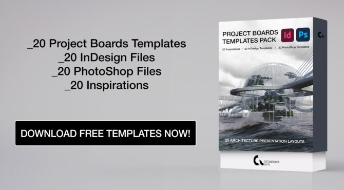
It is very important to have stand-out architecture boards during your final presentations at the universitiy as well as while submitting your competitions entries. Competitions.Archi realized that composing the representation boards is sometimes very demanding and is trying to help all students by offering free inspirations for their designs. Project Boards Template Pack is a wide range of presentation boards layouts, which look extraordinary and will help you to achieve the brilliant final result.
What is inside?
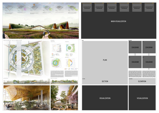
There are 20 layout examples inside the Project Boards Template Pack. They were prepared on the base of the best competitions entries and now available as editable 20 Photoshop and 20 InDesign files completely free. There are 10 landscape and 10 portrait layouts as well. Every template can be adjust to your design. Nevertheless, if you need inspiration, there is always an example how final presentation board may look like, which can be found in Tables of Contents. There are also short instructions how effectively use .psd and .indd files and videos showing how the templates can be transformed into a recognizable representation boards, by using drag-and-drop tools and smart objects . All files are prepared to be used very intuitive even for the beginners in graphics software.

Most popular competitions

People also viewed

Online Architecture, Design & Archviz Courses
Browse all course s
Access all courses for just £15 per month or £79 per year! Join now.
- AutoCAD Essentials
- The Perfect Floor Plan
- SketchUp Layout Essentials
- Microstation Essentials [coming soon]
Design & Practice
- Architectural Design in Practice Vol.1
- The Project Guide
- How To Setup Your Own Studio
- Architectural Detailing Basics Vol.1
- Lumion Raytracing & Advanced Rendering
- Twinmotion for Beginners
- The Advanced Twinmotion Guide
- Chaos Corona Interiors
- Chaos Corona Exteriors
- Enscape to Vray Workflow
3D Modelling
- The Complete Guide to SketchUp
- SketchUp & Vray
- Rhino & Vray
- Cinema 4D & Chaos Corona
- Complex Geometry in SketchUp
- Parametric Architecture Masterclass
- Grasshopper Basics
- Autodesk Maya for Architects
- Rhino to Revit Workflow
- Autodesk Revit for Beginners
- The Essential Guide to Revit
- BIM Collaboration in Revit
- The Essential Guide to Archicad
- Area Plans & Schedules
Graphics & Presentation
- Photoshop Essentials
- InDesign Essentials
- The Guide to Architectural Short Films
- The Perfect Portfolio [coming soon]
Realtime Rendering
- Unreal Engine Interiors
- Unreal Engine Exteriors & Environments
- Complete Guide to D5 Render
- Complete Guide to Lumion
- Enscape for SketchUp
- Enscape for Revit
Hand Drawing & Illustration
- Sketch Like an Architect
- Adobe Illustrator for Beginners
- The Guide to Architectural Diagrams [coming soon]
Professional Download Packs
In Practice
- Architects Tool Kit
- Architect in Practice
- CAD Drawings & Details
- Access For All Tool Kit
- CDM & Principal Designer Pack
- The Planning Tool Kit [coming soon]
Presentation, Design & Studies
- Ultimate Diagram Tool Kit
- Presentation Boards
- CAD Sheets & Title Blocks
- Technical Design Pack
- RIBA Part 3 Toolkit
- Architecture Student Bundle [coming soon]
Project & Software Examples
- SketchUp Model Set
- Project Pack Vol. 1
- Project Pack Vol. 2
Archviz & CGI
- Twinmotion Render Scenes
- Lumion Render Scenes
- D5 Render Scenes
- Vray for SketchUp Render Scenes
Learn more about the platform, its founders, tutors and how a membership works.
Gain valuable industry insights, practical knowledge and learn from our amazing guests!
Useful articles, tips, tricks & content updates. A great place to start to learn more about us.
Need support as a member or have a query about the platform, don’t hesitate to get in touch.
Architectural Presentation Templates | Example Boards
£ 10.00
Save HOURS of tediously designing your presentations and pick up our templates, instead! This pack contains 6 portrait presentation boards and 6 landscape boards, each with a unique design. The file formats available are Adobe InDesign & PDF. There are tons of bonuses within such as additional template boards, diagrams, visuals and more to inspire your future presentations, CVs and portfolios.
– The All-Rounder
– appearance & massing, – analysis & comparison, – design in detail, – key features, – introduction & analysis.
If you have any issues with your download, or you fail to receive the necessary email to access your purchase, get in touch with us right away. Please email us on: [email protected]
Generally, we work to the latest in file version (current year), but upon request we’re happy to ‘back-save’ the file for you to make it accessible.
By purchasing any files from ArchAdemia you are acquiring a Single Person Use license, whether for a personal or commercial project. You shall not directly replicate any of our drawings, details or imagery for your own use. All our downloads and templates are for training purposes only. We accept no liability for any replication that may cause any harm or damage to others. You may not rent, lease, sub-license, distribute, lend nor transfer photos ‘as is’ in their original unaltered form without prior written consent from ArchAdemia.

- This website uses cookies to ensure you get the best experience on our website.

Join our Mailing List.

Create professional slide layouts with Designer
Designer improves slides for Microsoft 365 subscribers by automatically generating design ideas to choose from.
While you're putting content on a slide, Designer works in the background to match that content to professionally designed layouts.
Get design ideas

The first time you try out Designer, it may ask your permission to get design ideas for you. If you want to use Designer, select Turn on .
To learn more, see the Microsoft Privacy Statement .
Once you've turned on "connected experiences," PowerPoint automatically shows you design ideas when you're creating your slides. Over time PowerPoint learns from your experience using design ideas and shows you design ideas at the appropriate time.

Scroll through the suggestions in the Designer pane on the right side of the window.
Click to select the design you want, or else close the window. If you select one of the ideas, your slide is changed accordingly.
You can also select another idea from the pane or go back to your original slide design: Press Ctrl+Z to undo a design change you've just selected.
What Designer gives you:
A title-slide photo and a design scheme
When you start a blank presentation and enter words on the slide, Designer recommends high-quality photos that reflect the slide text, plus a design scheme with colors that complement the photograph you choose. All the slides in the presentation will fit together visually.

Professional layouts
Designer detects pictures, charts, or tables on a slide and gives you several suggestions for arranging them in a cohesive, attractive layout.

More visuals, less text
Too much text on your slide? Designer can turn text such as lists, processes, or timelines into an easily readable graphic.

Bulleted lists get suggestions for an icon to accompany each bullet item. If you don't like a suggested icon, just select it and use our on-the-spot replacement button:

Illustrations
Designer watches for key terms and concepts that it has illustrations for, and it shows you those illustrations in various layouts. The Illustrations are from the Microsoft 365 icons library.

Designer and "ink"
(Only for Microsoft 365 subscribers) Designer recognizes when you draw or write with ink, and it incorporates that content into the design ideas it shows you.
Turn off Designer
If you don't want Designer to automatically offer suggestions:
On the File menu, click Options .
In the PowerPoint Options dialog box, click the General tab on the left, then scroll toward the bottom and clear the Automatically show me design ideas check box.
Requirements
Requirements for designer on windows.
Ask for design ideas any time by choosing Design > Designer on the ribbon.
The first time you try out Designer, it asks your permission to get design ideas for you. If you want to use Designer, select Turn on or Let's go .
Once you've turned on intelligent services, PowerPoint automatically shows you design ideas when you add photos to your slides.

You can also select another idea from the pane or go back to your original slide design: Press ⌘+Z to undo a design change you've just selected.
SmartArt graphics
Designer can turn text such as lists, processes, or timelines into an easily readable SmartArt graphic.
If you don't want Designer to offer suggestions:
On the PowerPoint menu, select Preferences .
Under Authoring and Proofing Tools , select General .
In the General dialog box, under PowerPoint Designer , clear the Automatically show me design ideas check box.
- The Designer button is grayed out
If you can see the Designer button in PowerPoint but it's grayed out, it means:
You aren't connected to the internet, or
A slide isn't selected. (This can be the case when multiple slides are selected in the slide thumbnail pane in Normal view, or when the focus in the thumbnail pane is between two slides. It also is the case when the focus is in the Notes pane or you are in Slide Show view rather than Normal view.)
The Designer button isn't there
Designer is a feature for Microsoft 365 subscribers. If you don't see the Designer button, you're using an older version of PowerPoint for Mac, rather than PowerPoint for Microsoft 365 for Mac.
Requirements for Designer on the Mac

PowerPoint shows design ideas for your slide.
If you can see the Designer button in PowerPoint but it's grayed out, it means that someone else is currently also editing the slide:
If you're co-authoring a presentation with someone else and more than one person is actively editing a single slide at one time, Designer won't give design suggestions on that slide.
However, as soon as there's only person editing the slide, Designer will begin offering design suggestions again once that person does an action (such as adding a photo) that Designer can respond to.
Requirements for Designer on PowerPoint for the web
Ask for design ideas any time by choosing Design > Design Ideas on the ribbon.

Scroll through the suggestions in the Design Ideas pane on the right side of the window.

The Design Ideas button is grayed out
If you can see the Design Ideas button in PowerPoint but it's grayed out, it means you aren't connected to the internet.
Requirements for Designer on iOS

Requirements for Designer on Android

Requirements for Designer on Windows Mobile
Troubleshooting.
- Which problem are you having?
- I don't see the Designer button
- I clicked the Designer button, but no suggestions are offered
Design ideas are only available to Microsoft 365 subscribers
On desktop versions of PowerPoint, only subscribers get design ideas. You can try or buy a subscription here .
On PowerPoint for the web, design ideas are available to everyone.
One Microsoft 365 subscription package doesn't include design ideas: Office 365 Germany Germany .
Turn on the Office connected experiences
To use Designer, make sure that Office "connected experiences" are turned on:
Go to File > Account , and under Account Privacy select Manage Settings .

See Enabling and disabling intelligent services for more information.
An administrator may have turned off Designer
Designer is a feature for Microsoft 365 subscribers, but some organizations turn off the feature. If you have an Microsoft 365 subscription but don't see the Designer button, ask your IT department.
Reinstall Office to get subscriber features
If you've upgraded from Microsoft 365 to an Microsoft 365 subscription, you need to uninstall Microsoft 365 and then reinstall in order to get the subscriber features. See the instructions in these articles:
Uninstall Office from a PC or Uninstall Office 2016 for Mac
Reinstall Microsoft 365
Restart the app to get Designer
Sometimes users find that the first time they start PowerPoint after installing Microsoft 365, the Designer button isn't available. Restarting the app fixes this problem.
If there are no design ideas available for you, a few things might be the cause. First of all:
Make sure you're connected to the Internet. Designer goes online to get its design ideas.
Use a theme that comes with PowerPoint (not a custom theme or one that you've downloaded from elsewhere).
Following are other problems and how to solve them:
No design ideas for slides with pictures
Make sure your slide has either the Title or Title + Content slide layout applied.
Don't use any additional objects or shapes on the same slide as your photo.
Use a maximum of four photos (.jpg, .png, .gif, or .bmp) per slide, and make sure they're larger than 200 x 200 pixels in size.
No design ideas for process-based slides
Make sure your slide has the Title + Content slide layout applied.
Don't use any additional photos, objects, or shapes on the same slide as your process text.
Because Designer is a relatively new service, it is still learning new tricks. If Designer can’t generate high-quality options for you, it won’t show any options at all. We're working hard to be able to generate great design ideas for more varieties of your content.
And of course, if you don’t find Designer useful, you can turn it off by going to File > Options > General , and then clearing the box that says Automatically show me design ideas .
Someone else is editing
No design ideas for slides that have shapes or text boxes.
Designer isn't able to suggest design ideas when a slide has a shape or text box drawn on it. You can have photos and you can have text in a placeholder.
You aren't connected to the internet , or
A single slide isn't selected . This can be the case when multiple slides are selected in the slide thumbnail pane in Normal view, or when the focus in the thumbnail pane is between two slides. It also is the case when the focus is in the Notes pane or you are in Slide Show view rather than Normal view.
Combining colors in PowerPoint: Mistakes to avoid
Format the background color of slides
Start with a presentation template

Need more help?
Want more options.
Explore subscription benefits, browse training courses, learn how to secure your device, and more.

Microsoft 365 subscription benefits

Microsoft 365 training

Microsoft security

Accessibility center
Communities help you ask and answer questions, give feedback, and hear from experts with rich knowledge.

Ask the Microsoft Community

Microsoft Tech Community

Windows Insiders
Microsoft 365 Insiders
Was this information helpful?
Thank you for your feedback.
IMAGES
VIDEO
COMMENTS
These panels can be used to display a variety of materials, such as drawings, images, models, diagrams, and text. Presentation boards are an effective way to present a comprehensive overview of a project or design concept, and they can be used to showcase the key features and characteristics of a project.
A high-contrast backdrop for your most crucial images or diagrams can make them stand out. 7. Image Selection. The images you choose to display on your architecture presentation board can make or break your presentation. Quality Over Quantity: Select high-resolution images that clearly communicate your design.
An in-depth Indesign tutorial for architecture presentation boards for thesis using Indesign, sharing my architecture designs, compositions, and architecture...
2. Layout. When arranging your architecture presentation board, think about the main ideas you want to express. Then, decide on the images and graphics that will best showcase those concepts. Collect all the required information and take note of the graphics and text that will best convey your concepts effectively.
Representing Architecture. Your architecture presentation board must use graphics and text to represent your design idea and clearly communicate the details and essential aspects of the scheme. It is important to be efficient with the production of drawings, and only use what is necessary to convey your idea. Quality is better than quantity as ...
General Tips. 7) Minimize text on your presentation board. Write a short and concise concept statement and add a very brief explanation, if needed. Don't waste your time composing elongated descriptive text because no one will read it. 8) Replace words, whenever possible, with simple illustrative sketches and figures.
Today's video is the ultimate guide to architecture presentation boards which will cover presentation skills, story, structure, content, orientation & size, ...
A lot of you guys are requesting a video on how to make architectural presentation boards, so here it is. In this video i discuss various techniques and tips...
Adequate creating and composing architecture panels is a key to a successful project delivery, a final presentation, or an awarded competition entry. It is an important part of designing process and very often it stands a synthesis of your long-term work. So, you supposed to take into consideration many aspects during creating your boards. In
4. My concern is also about audience expectations. "Panel" suggests that there will be conversation amongst the panelists, and possibly even disagreement. A talk with lengthy structured exposition may violate the audience expectation for a panel. A more proper billing might be to just call that a presentation + discussion.
They may also conduct interviews or presentations with the finalists to get a more in-depth understanding of their designs. Select the winning design: Based on their evaluations, the judges and experts will select the winning design and announce the results of the competition. The winning design may be awarded a prize or contract to move ...
A good presentation doesn't just rely on presentation design. There's your public speaking, the ability to connect with your audience and how well you understand your topic. However that doesn't mean that presentation design isn't important. Everything goes hand-in-hand when creating a presentation that will keep your audience engaged and talking about your topic for
1.Full Bleed Rule. Create a 36" x 72" presentation board in Photoshop. As the beginning of the sequences, choose a best image among all renderings and photos you have, locate it at the bottom of ...
Skip to start of list. 393 templates. Create a blank Architecture Presentation. Grey Modern Interior Design Business Presentation. Presentation by c l a s h i e. Pitch Deck Creative Minimal Presentation. Presentation by Dirtyline Studio. Minimalist White Interior Design Presentation. Presentation by Saga Design Studio.
Let it rip. Have fun. Think of a panel as friendly, though emotional, conversation in front of 500 of your closest friends.". If you make the panel a dialogue, audience members will be much more ...
1. Mainstage Style. A hard-hitting, short-duration panel discussion with panel members, typically the keynoter, main stage presenters, or invited panelists. There is no audience question and answer session (Q&A). 2. Q&A Style. A short introduction of the topic and panelists with moderator-curated questions, followed by audience Q&A. 3.
Competitions.Archi in collaboration with winners of architecture competitions launched in previous years prepared Project Boards Template Pack. It is a set of 20 free panels templates of awarded projects in PhotoShop and InDesign formats. Here you can find 20 Inspirations for your presentation board, which are easy to transform and edit. They ...
62. 2.2k. 1. Published: November 30th 2022. Architecture Presentation Boards and Portfolio Templates - featuring a captions grid and vertical gutters for spacing, these typographic grid systems have been designed for image-led presentations, posters and displays - perfect for architects, interior d….
Competitions.Archi in collaboration with winners of architecture competitions launched in previous years prepared Project Boards Template Pack. It is a set of 20 free panels templates of awarded projects in PhotoShop and InDesign formats. Here you can find 20 Inspirations for your presentation board, which are easy to transform and edit.
This pack contains 6 portrait presentation boards and 6 landscape boards, each with a unique design. The file formats available are Adobe InDesign & PDF. There are tons of bonuses within such as additional template boards, diagrams, visuals and more to inspire your future presentations, CVs and portfolios. Add to Cart.
Find all the presentation boards used in this video in this link, here you will also find more reference boards.https://co.pinterest.com/letsshowitbette/arch...
Free PowerPoint Presentation Design Templates. Alexa Thompson. 858 14.6k. Save. Board game "Animal stories" ...
Over time PowerPoint learns from your experience using design ideas and shows you design ideas at the appropriate time. Scroll through the suggestions in the Designer pane on the right side of the window. Click to select the design you want, or else close the window. If you select one of the ideas, your slide is changed accordingly.
You need high-quality business presentation software to take your slides to the next level. Some of the best presentation software include Visme, Haiku Deck, Prezi, Microsoft Powerpoint, Canva and Google Slides. In this comparison guide, we'll analyze each of these tools and many more to understand what the difference is between them so you ...
Every single animated presentation template in Visme includes an attractive staggered transition effect from slide to slide. More than 900 slides in our template library are designed especially for your presentations to look impressive and unforgettable. Plus, our design panel is loaded with free animations for PowerPoint slides.
Use the tabs at the top of the panel to explore shortcuts related to each set of actions. To view your current keyboard layout or select another one, select the Layout tab. You can continue to use in Figma while viewing the keyboard shortcuts panel. Try out a new shortcut and watch the panel update. Click to close the panel.
1. Visme. Let's start with the best app for presentations you can use to design your presentation. Visme is a cloud-based graphic design software that allows designers and non-designers alike to create beautiful and professional presentations, infographics, social media graphics and more.
Professionally designed and formatted. Millions of photos, icons and illustrations. Easily download or share. Design stunning custom maps with ease. No art background or design software necessary. Use Canva's free online map maker and create your maps you can add to infographics, documents, presentations, and even websites.