Home Blog Design How to Design a Winning Poster Presentation: Quick Guide with Examples & Templates

How to Design a Winning Poster Presentation: Quick Guide with Examples & Templates

How are research posters like High School science fair projects? Quite similar, in fact.
Both are visual representations of a research project shared with peers, colleagues and academic faculty. But there’s a big difference: it’s all in professionalism and attention to detail. You can be sure that the students that thrived in science fairs are now creating fantastic research posters, but what is that extra element most people miss when designing a poster presentation?
This guide will teach tips and tricks for creating poster presentations for conferences, symposia, and more. Learn in-depth poster structure and design techniques to help create academic posters that have a lasting impact.
Let’s get started.
Table of Contents
- What is a Research Poster?
Why are Poster Presentations important?
Overall dimensions and orientation, separation into columns and sections, scientific, academic, or something else, a handout with supplemental and contact information, cohesiveness, design and readability, storytelling.
- Font Characteristics
- Color Pairing
- Data Visualization Dimensions
- Alignment, Margins, and White Space
Scientific/Academic Conference Poster Presentation
Digital research poster presentations, slidemodel poster presentation templates, how to make a research poster presentation step-by-step, considerations for printing poster presentations, how to present a research poster presentation, final words, what is a research poster .
Research posters are visual overviews of the most relevant information extracted from a research paper or analysis. They are essential communication formats for sharing findings with peers and interested people in the field. Research posters can also effectively present material for other areas besides the sciences and STEM—for example, business and law.
You’ll be creating research posters regularly as an academic researcher, scientist, or grad student. You’ll have to present them at numerous functions and events. For example:
- Conference presentations
- Informational events
- Community centers
The research poster presentation is a comprehensive way to share data, information, and research results. Before the pandemic, the majority of research events were in person. During lockdown and beyond, virtual conferences and summits became the norm. Many researchers now create poster presentations that work in printed and digital formats.

Let’s look at why it’s crucial to spend time creating poster presentations for your research projects, research, analysis, and study papers.

Research posters represent you and your sponsor’s research
Research papers and accompanying poster presentations are potent tools for representation and communication in your field of study. Well-performing poster presentations help scientists, researchers, and analysts grow their careers through grants and sponsorships.
When presenting a poster presentation for a sponsored research project, you’re representing the company that sponsored you. Your professionalism, demeanor, and capacity for creating impactful poster presentations call attention to other interested sponsors, spreading your impact in the field.
Research posters demonstrate expertise and growth
Presenting research posters at conferences, summits, and graduate grading events shows your expertise and knowledge in your field of study. The way your poster presentation looks and delivers, plus your performance while presenting the work, is judged by your viewers regardless of whether it’s an officially judged panel.
Recurring visitors to research conferences and symposia will see you and your poster presentations evolve. Improve your impact by creating a great poster presentation every time by paying attention to detail in the poster design and in your oral presentation. Practice your public speaking skills alongside the design techniques for even more impact.
Poster presentations create and maintain collaborations
Every time you participate in a research poster conference, you create meaningful connections with people in your field, industry or community. Not only do research posters showcase information about current data in different areas, but they also bring people together with similar interests. Countless collaboration projects between different research teams started after discussing poster details during coffee breaks.
An effective research poster template deepens your peer’s understanding of a topic by highlighting research, data, and conclusions. This information can help other researchers and analysts with their work. As a research poster presenter, you’re given the opportunity for both teaching and learning while sharing ideas with peers and colleagues.
Anatomy of a Winning Poster Presentation
Do you want your research poster to perform well? Following the standard layout and adding a few personal touches will help attendees know how to read your poster and get the most out of your information.

The overall size of your research poster ultimately depends on the dimensions of the provided space at the conference or research poster gallery. The poster orientation can be horizontal or vertical, with horizontal being the most common. In general, research posters measure 48 x 36 inches or are an A0 paper size.
A virtual poster can be the same proportions as the printed research poster, but you have more leeway regarding the dimensions. Virtual research posters should fit on a screen with no need to scroll, with 1080p resolution as a standard these days. A horizontal presentation size is ideal for that.
A research poster presentation has a standard layout of 2–5 columns with 2–3 sections each. Typical structures say to separate the content into four sections; 1. A horizontal header 2. Introduction column, 3. Research/Work/Data column, and 4. Conclusion column. Each unit includes topics that relate to your poster’s objective. Here’s a generalized outline for a poster presentation:
- Condensed Abstract
- Objectives/Purpose
- Methodology
- Recommendations
- Implications
- Acknowledgments
- Contact Information
The overview content you include in the units depends on your poster presentations’ theme, topic, industry, or field of research. A scientific or academic poster will include sections like hypothesis, methodology, and materials. A marketing analysis poster will include performance metrics and competitor analysis results.
There’s no way a poster can hold all the information included in your research paper or analysis report. The poster is an overview that invites the audience to want to find out more. That’s where supplement material comes in. Create a printed PDF handout or card with a QR code (created using a QR code generator ). Send the audience to the best online location for reading or downloading the complete paper.
What Makes a Poster Presentation Good and Effective?
For your poster presentation to be effective and well-received, it needs to cover all the bases and be inviting to find out more. Stick to the standard layout suggestions and give it a unique look and feel. We’ve put together some of the most critical research poster-creation tips in the list below. Your poster presentation will perform as long as you check all the boxes.
The information you choose to include in the sections of your poster presentation needs to be cohesive. Train your editing eye and do a few revisions before presenting. The best way to look at it is to think of The Big Picture. Don’t get stuck on the details; your attendees won’t always know the background behind your research topic or why it’s important.
Be cohesive in how you word the titles, the length of the sections, the highlighting of the most important data, and how your oral presentation complements the printed—or virtual—poster.
The most important characteristic of your poster presentation is its readability and clarity. You need a poster presentation with a balanced design that’s easy to read at a distance of 1.5 meters or 4 feet. The font size and spacing must be clear and neat. All the content must suggest a visual flow for the viewer to follow.
That said, you don’t need to be a designer to add something special to your poster presentation. Once you have the standard—and recognized—columns and sections, add your special touch. These can be anything from colorful boxes for the section titles to an interesting but subtle background, images that catch the eye, and charts that inspire a more extended look.
Storytelling is a presenting technique involving writing techniques to make information flow. Firstly, storytelling helps give your poster presentation a great introduction and an impactful conclusion.
Think of storytelling as the invitation to listen or read more, as the glue that connects sections, making them flow from one to another. Storytelling is using stories in the oral presentation, for example, what your lab partner said when you discovered something interesting. If it makes your audience smile and nod, you’ve hit the mark. Storytelling is like giving a research presentation a dose of your personality, and it can help turning your data into opening stories .
Design Tips For Creating an Effective Research Poster Presentation
The section above briefly mentioned how important design is to your poster presentation’s effectiveness. We’ll look deeper into what you need to know when designing a poster presentation.
1. Font Characteristics
The typeface and size you choose are of great importance. Not only does the text need to be readable from two meters away, but it also needs to look and sit well on the poster. Stay away from calligraphic script typefaces, novelty typefaces, or typefaces with uniquely shaped letters.
Stick to the classics like a sans serif Helvetica, Lato, Open Sans, or Verdana. Avoid serif typefaces as they can be difficult to read from far away. Here are some standard text sizes to have on hand.
- Title: 85 pt
- Authors: 65 pt
- Headings: 36 pt
- Body Text: 24 pt
- Captions: 18 pt

If you feel too prone to use serif typefaces, work with a font pairing tool that helps you find a suitable solution – and intend those serif fonts for heading sections only. As a rule, never use more than 3 different typefaces in your design. To make it more dynamic, you can work with the same font using light, bold, and italic weights to put emphasis on the required areas.
2. Color Pairing
Using colors in your poster presentation design is a great way to grab the viewer’s attention. A color’s purpose is to help the viewer follow the data flow in your presentation, not distract. Don’t let the color take more importance than the information on your poster.

Choose one main color for the title and headlines and a similar color for the data visualizations. If you want to use more than one color, don’t create too much contrast between them. Try different tonalities of the same color and keep things balanced visually. Your color palette should have at most one main color and two accent colors.
Black text over a white background is standard practice for printed poster presentations, but for virtual presentations, try a very light gray instead of white and a very dark gray instead of black. Additionally, use variations of light color backgrounds and dark color text. Make sure it’s easy to read from two meters away or on a screen, depending on the context. We recommend ditching full white or full black tone usage as it hurts eyesight in the long term due to its intense contrast difference with the light ambiance.
3. Data Visualization Dimensions
Just like the text, your charts, graphs, and data visualizations must be easy to read and understand. Generally, if a person is interested in your research and has already read some of the text from two meters away, they’ll come closer to look at the charts and graphs.

Fit data visualizations inside columns or let them span over two columns. Remove any unnecessary borders, lines, or labels to make them easier to read at a glance. Use a flat design without shadows or 3D characteristics. The text in legends and captions should stay within the chart size and not overflow into the margins. Use a unified text size of 18px for all your data visualizations.
4. Alignment, Margins, and White Space
Finally, the last design tip for creating an impressive and memorable poster presentation is to be mindful of the layout’s alignment, margins, and white space. Create text boxes to help keep everything aligned. They allow you to resize, adapt, and align the content along a margin or grid.
Take advantage of the white space created by borders and margins between sections. Don’t crowd them with a busy background or unattractive color.

Calculate margins considering a print format. It is a good practice in case the poster presentation ends up becoming in physical format, as you won’t need to downscale your entire design (affecting text readability in the process) to preserve information.
There are different tools that you can use to make a poster presentation. Presenters who are familiar with Microsoft Office prefer to use PowerPoint. You can learn how to make a poster in PowerPoint here.
Poster Presentation Examples
Before you start creating a poster presentation, look at some examples of real research posters. Get inspired and get creative.
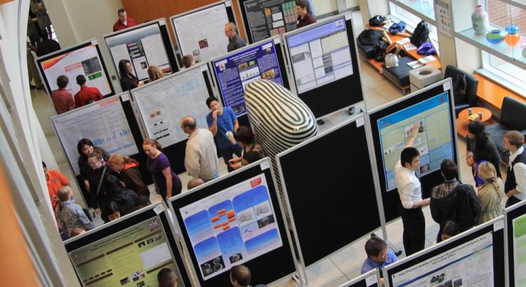
Research poster presentations printed and mounted on a board look like the one in the image below. The presenter stands to the side, ready to share the information with visitors as they walk up to the panels.

With more and more conferences staying virtual or hybrid, the digital poster presentation is here to stay. Take a look at examples from a poster session at the OHSU School of Medicine .
Use SlideModel templates to help you create a winning poster presentation with PowerPoint and Google Slides. These poster PPT templates will get you off on the right foot. Mix and match tables and data visualizations from other poster slide templates to create your ideal layout according to the standard guidelines.
If you need a quick method to create a presentation deck to talk about your research poster at conferences, check out our Slides AI presentation maker. A tool in which you add the topic, curate the outline, select a design, and let AI do the work for you.
1. One-pager Scientific Poster Template for PowerPoint
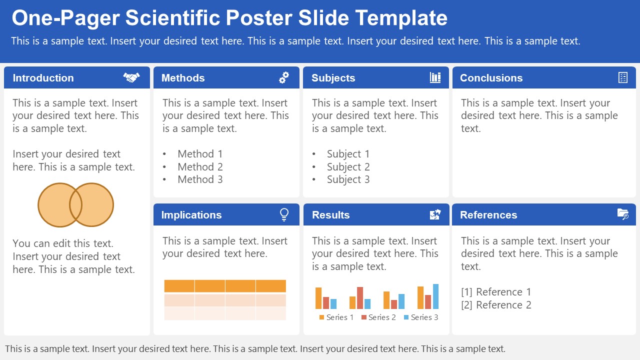
A PowerPoint template tailored to make your poster presentations an easy-to-craft process. Meet our One-Pager Scientific Poster Slide Template, entirely editable to your preferences and with ample room to accommodate graphs, data charts, and much more.
Use This Template
2. Eisenhower Matrix Slides Template for PowerPoint
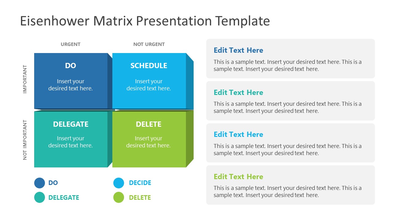
An Eisenhower Matrix is a powerful tool to represent priorities, classifying work according to urgency and importance. Presenters can use this 2×2 matrix in poster presentations to expose the effort required for the research process, as it also helps to communicate strategy planning.
3. OSMG Framework PowerPoint Template
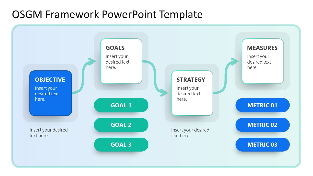
Finally, we recommend presenters check our OSMG Framework PowerPoint template, as it is an ideal tool for representing a business plan: its goals, strategies, and measures for success. Expose complex processes in a simplified manner by adding this template to your poster presentation.
Remember these three words when making your research poster presentation: develop, design, and present. These are the three main actions toward a successful poster presentation.

The section below will take you on a step-by-step journey to create your next poster presentation.
Step 1: Define the purpose and audience of your poster presentation
Before making a poster presentation design, you’ll need to plan first. Here are some questions to answer at this point:
- Are they in your field?
- Do they know about your research topic?
- What can they get from your research?
- Will you print it?
- Is it for a virtual conference?
Step 2: Make an outline
With a clear purpose and strategy, it’s time to collect the most important information from your research paper, analysis, or documentation. Make a content dump and then select the most interesting information. Use the content to draft an outline.
Outlines help formulate the overall structure better than going straight into designing the poster. Mimic the standard poster structure in your outline using section headlines as separators. Go further and separate the content into the columns they’ll be placed in.
Step 3: Write the content
Write or rewrite the content for the sections in your poster presentation. Use the text in your research paper as a base, but summarize it to be more succinct in what you share.
Don’t forget to write a catchy title that presents the problem and your findings in a clear way. Likewise, craft the headlines for the sections in a similar tone as the title, creating consistency in the message. Include subtle transitions between sections to help follow the flow of information in order.
Avoid copying/pasting entire sections of the research paper on which the poster is based. Opt for the storytelling approach, so the delivered message results are interesting for your audience.
Step 4: Put it all together visually
This entire guide on how to design a research poster presentation is the perfect resource to help you with this step. Follow all the tips and guidelines and have an unforgettable poster presentation.
Moving on, here’s how to design a research poster presentation with PowerPoint Templates . Open a new project and size it to the standard 48 x 36 inches. Using the outline, map out the sections on the empty canvas. Add a text box for each title, headline, and body text. Piece by piece, add the content into their corresponding text box.

Transform the text information visually, make bullet points, and place the content in tables and timelines. Make your text visual to avoid chunky text blocks that no one will have time to read. Make sure all text sizes are coherent for all headings, body texts, image captions, etc. Double-check for spacing and text box formatting.
Next, add or create data visualizations, images, or diagrams. Align everything into columns and sections, making sure there’s no overflow. Add captions and legends to the visualizations, and check the color contrast with colleagues and friends. Ask for feedback and progress to the last step.
Step 5: Last touches
Time to check the final touches on your poster presentation design. Here’s a checklist to help finalize your research poster before sending it to printers or the virtual summit rep.
- Check the resolution of all visual elements in your poster design. Zoom to 100 or 200% to see if the images pixelate. Avoid this problem by using vector design elements and high-resolution images.
- Ensure that charts and graphs are easy to read and don’t look crowded.
- Analyze the visual hierarchy. Is there a visual flow through the title, introduction, data, and conclusion?
- Take a step back and check if it’s legible from a distance. Is there enough white space for the content to breathe?
- Does the design look inviting and interesting?
An often neglected topic arises when we need to print our designs for any exhibition purpose. Since A0 is a hard-to-manage format for most printers, these poster presentations result in heftier charges for the user. Instead, you can opt to work your design in two A1 sheets, which also becomes more manageable for transportation. Create seamless borders for the section on which the poster sheets should meet, or work with a white background.
Paper weight options should be over 200 gsm to avoid unwanted damage during the printing process due to heavy ink usage. If possible, laminate your print or stick it to photographic paper – this shall protect your work from spills.
Finally, always run a test print. Gray tints may not be printed as clearly as you see them on screen (this is due to the RGB to CMYK conversion process). Other differences can be appreciated when working with ink jet plotters vs. laser printers. Give yourself enough room to maneuver last-minute design changes.
Presenting a research poster is a big step in the poster presentation cycle. Your poster presentation might or might not be judged by faculty or peers. But knowing what judges look for will help you prepare for the design and oral presentation, regardless of whether you receive a grade for your work or if it’s business related. Likewise, the same principles apply when presenting at an in-person or virtual summit.
The opening statement
Part of presenting a research poster is welcoming the viewer to your small personal area in the sea of poster presentations. You’ll need an opening statement to pitch your research poster and get the viewers’ attention.
Draft a 2 to 3-sentence pitch that covers the most important points:
- What the research is
- Why was it conducted
- What the results say
From that opening statement, you’re ready to continue with the oral presentation for the benefit of your attendees.
The oral presentation
During the oral presentation, share the information on the poster while conversing with the interested public. Practice many times before the event. Structure the oral presentation as conversation points, and use the poster’s visual flow as support. Make eye contact with your audience as you speak, but don’t make them uncomfortable.
Pro Tip: In a conference or summit, if people show up to your poster area after you’ve started presenting it to another group, finish and then address the new visitors.
QA Sessions
When you’ve finished the oral presentation, offer the audience a chance to ask questions. You can tell them before starting the presentation that you’ll be holding a QA session at the end. Doing so will prevent interruptions as you’re speaking.
If presenting to one or two people, be flexible and answer questions as you review all the sections on your poster.
Supplemental Material
If your audience is interested in learning more, you can offer another content type, further imprinting the information in their minds. Some ideas include; printed copies of your research paper, links to a website, a digital experience of your poster, a thesis PDF, or data spreadsheets.
Your audience will want to contact you for further conversations; include contact details in your supplemental material. If you don’t offer anything else, at least have business cards.
Even though conferences have changed, the research poster’s importance hasn’t diminished. Now, instead of simply creating a printed poster presentation, you can also make it for digital platforms. The final output will depend on the conference and its requirements.
This guide covered all the essential information you need to know for creating impactful poster presentations, from design, structure and layout tips to oral presentation techniques to engage your audience better .
Before your next poster session, bookmark and review this guide to help you design a winning poster presentation every time.

Like this article? Please share
Cool Presentation Ideas, Design, Design Inspiration Filed under Design
Related Articles

Filed under Design • May 22nd, 2024
Exploring the 12 Different Types of Slides in PowerPoint
Become a better presenter by harnessing the power of the 12 different types of slides in presentation design.

Filed under PowerPoint Tutorials • May 17th, 2024
How to Edit Background Graphics in PowerPoint
You don’t have to stick with template designs that don’t appeal to your intended message. Learn how to edit background graphics in PowerPoint to become a master user.

Filed under Google Slides Tutorials • April 23rd, 2024
How to Align Objects in Google Slides
Optimize your layouts by learning how to align objects in Google Slides presentations. Step-by-step guide with screenshots.
Leave a Reply
How to Create a Research Poster
- Poster Basics
- Design Tips
- Logos & Images
What is a Research Poster?
Posters are widely used in the academic community, and most conferences include poster presentations in their program. Research posters summarize information or research concisely and attractively to help publicize it and generate discussion.
The poster is usually a mixture of a brief text mixed with tables, graphs, pictures, and other presentation formats. At a conference, the researcher stands by the poster display while other participants can come and view the presentation and interact with the author.
What Makes a Good Poster?
- Important information should be readable from about 10 feet away
- Title is short and draws interest
- Word count of about 300 to 800 words
- Text is clear and to the point
- Use of bullets, numbering, and headlines make it easy to read
- Effective use of graphics, color and fonts
- Consistent and clean layout
- Includes acknowledgments, your name and institutional affiliation
A Sample of a Well Designed Poster
View this poster example in a web browser .

Image credit: Poster Session Tips by [email protected], via Penn State
Where do I begin?
Answer these three questions:.
- What is the most important/interesting/astounding finding from my research project?
- How can I visually share my research with conference attendees? Should I use charts, graphs, photos, images?
- What kind of information can I convey during my talk that will complement my poster?
What software can I use to make a poster?
A popular, easy-to-use option. It is part of Microsoft Office package and is available on the library computers in rooms LC337 and LC336. ( Advice for creating a poster with PowerPoint ).
Adobe Illustrator, Photoshop, and InDesign
Feature-rich professional software that is good for posters including lots of high-resolution images, but they are more complex and expensive. NYU Faculty, Staff, and Students can access and download the Adobe Creative Suite .
Open Source Alternatives
- OpenOffice is the free alternative to MS Office (Impress is its PowerPoint alternative).
- Inkscape and Gimp are alternatives to Adobe products.
- For charts and diagrams try Gliffy or Lovely Charts .
- A complete list of free graphics software .
A Sample of a Poorly Designed Poster
View this bad poster example in a browser.

Image Credit: Critique by Better Posters
- Next: Design Tips >>
- Last Updated: Jul 11, 2023 5:09 PM
- URL: https://guides.nyu.edu/posters
104: How to Give a Perfect Poster Presentation
Podcast: Play in new window | Download
Subscribe: Spotify | Email | TuneIn | RSS
It’s a tragic fact: many jaw-dropping, eye-opening, and heart-pounding research results never makes an impact on the scientific community.
And it’s partly your fault.
By “your,” of course, I mean all of us. Because when we waste the opportunity to share our results in their best light at a scientific conference or poster session, our viewers may overlook this valuable insight.
But we can do better! With a little planning, collaboration, and hard work, we can make even a humble poster presentation a vehicle for inspiring the next discovery and building our scientific network.
Let’s get started!
Poster Perfect
A poster session is a unique opportunity for a young scientist.
As a viewer, you get the chance to engage in a casual conversation with other scientists, often one-on-one, about a topic that interests you. It’s an opportunity to ask for clarity, pose a question, or offer ideas without an audience of 200 staring at the back of your head.
As a presenter, you get all of those benefits, as well as an opportunity to build your network and identify collaborators. You also get many chances to practice your ‘pitch’ as new visitors step up every few minutes. It will sharpen both your skill as a communicator and your research plan.
And while there are probably some guidelines for being a good poster-viewer, in this episode, we focused our discussion on the best ways to prepare and present a poster.
Before You Begin
As with any presentation, answering a few questions before you get started will save you hours in front of the computer.
Know Your Audience
If you are presenting to the Microbiology Conference, you may want to include more detailed background information than if you’re presenting to other experts in your sub-field at a Malaria Symposium. Space is limited, and thinking ahead about what your audience may, or may not, know will help you prepare for the proper range of visitor experience.
Start Early
You may be a wizard of poster creation and can put off your design until the night before you fly to the conference, but that’s a bad idea. Instead, leave extra time before printing share your file with collaborators for review. They need time to look over your work and offer feedback before it’s committed to (gigantic) paper.
Practice, Practice, Practice
You’ll also need time to practice presenting the poster. More on this later, but sometimes the act of presentation lets us see where we have gaps or mistakes in the logic or design. It’s a good idea to practice with people from outside your lab because if they are already familiar with your work, they won’t notice when you skip steps or fail to explain a concept clearly.
Find Your Story
It may sound odd, but poster presentation is a form of story-telling. The best posters make that story clear and concise.
Even if you have multiple projects in the lab, choose ONE to present in your poster. Start by jotting down a central question you’re trying to answer, or a hypothesis your lab is testing. Keeping this key idea in mind as you prepare the presentation will give you a firm structure on which to hang the other elements.
Making a Poster
There are a couple of broad guidelines to keep in mind as you create your poster.
First, remember that the poster is a visual form, and space is limited. That means you should avoid printing long paragraphs of text. Instead, use the space to display graphs, images, and figures, with a few bullet points or figure legends to help the viewer track the story.
Second, stick with a ‘standard’ layout. Your viewers have been trained for years to look for titles at the top and conclusions on the bottom right. You make viewing your poster harder by moving these elements around.
Third, maintain consistency within your poster. Stick with one or two fonts, and be sure that headings, bullets, and figures are matched in style, weight, and size.
Finally, give your work some breathing room. White-space is important, and will make the poster more readable.
Poster Pieces
Manuscript titles are often formulaic and a bit dull as they describe the basic findings of the research paper, but your poster title can be more creative. The goal is to catch a viewer’s attention while also letting them know what they’ll see when they visit.
Again, remembering your audience, include enough information to help them understand your main question or hypothesis. Avoid paragraphs, and include a figure or diagram if you can.
Hypothesis / Main Question
This section is an absolute must, so don’t forget it! It lets the viewer instantly understand what the poster is about and what they can expect to learn if they follow you through to the conclusion.
Again, a diagram or figure works great here. Use this section to help the viewer understand your experimental approach to the question. You don’t need to detail every last step – save that for the paper you publish!
This is where the action is. Remember – you don’t need to include every experiment you’ve ever done. Just describe the results that help address the main question/hypothesis.
Use descriptive figure titles that help the viewer understand your conclusion. “Gel of Protein X” doesn’t help anyone, but “Protein X is Up-Regulated After Drug Treatment” tells them what they should expect to see in the scan.
Cut out extraneous information or parts of the image, and use arrows or boxes to help direct attention to the relevant parts.
Double check this section for readability – axes and labels can often be too small to read from a four-foot distance.
Conclusions
Another chance to draw a diagram! Or use 2-3 bullet points to help summarize what you’ve found.
Other Sections
Some posters include acknowledgements or future directions. These are optional and might make sense on a case-by-case basis.
Every poster should include the author’s contact info, though! This allows people to reach out even if you’ve stepped away from the poster, and helps collaborators keep in touch after the meeting.
Presenting a Poster
Crafting the perfect poster is only half the battle, now it’s time to describe that work from start to finish.
Timing is Everything
Walking a viewer through your presentation should take roughly five to seven minutes. That doesn’t seem like a long time, but it’s an important target. Many presenters take too long to share the poster, leaving the audience bored, uncomfortable, and searching for a way out.
By telling your story in five minutes, you let the audience guide the conversation. If they’re satisfied with your description, or bored out of their minds, they can move on to another poster.
If they’re excited and want to learn more, they can ask questions or probe the results more deeply.
Act Like an Actor
As you present, remember that you mustn’t turn your back on your audience! You’ll be tempted to turn to look at the poster yourself, closing off the conversation. Instead, keep an open stance and point out relevant sections off to your side.
Also, check your enthusiasm. Too many poster presenters seem bored, tired, or listless. If they don’t think their work is exciting, why should their audience?!
Stop a moment to notice your energy level, and try to step it up as you present. Make eye contact, welcome new viewers as the approach, and modulate your voice.
Your enthusiasm for your work can be contagious.
Tailor Made
Because most poster presentations occur one-on-one, it’s imperative that you actively tailor your pitch to the person standing in front of you.
When they step up, you can briefly ask about their background or interest in the subject. If they’re a neophyte, you’ll want to avoid jargon and check that they’ve understood each section before moving on. If they’re an expert, they may want to skip straight to the results!
Be aware of their cues and body language, and let them help steer the conversation.
That’s it! Now you’re a poster-presenting-pro! Go make a splash at your next poster session, and be sure to share YOUR tips and ideas for poster presentation in the comments below.
For more information on attending conferences, check out Episode 097: Conference Like the Pros – How to Plan, Network, and Win
I’m Getting Seasick
This week, we sample a very special ethanol that has probably traveled farther than we have.
Jefferson’s Ocean Bourbon spends its time in a barrel bobbing around on a research ship as it sails around the world! Supposedly, all of that rocking, equatorial heat, and sea spray mimics the way bourbon tasted when it was shipped back from the New World.
Best part: you get to read the Captain’s Log of each batch’s journey!

Leave a Reply Cancel reply
Your email address will not be published. Required fields are marked *
This site uses Akismet to reduce spam. Learn how your comment data is processed .

- Library Pages
How to Create a Poster Presentation
Getting started, poster design best practices.
- Don't be too wordy! Keep text concise and clear.
- Organization is key. Think about what you want to say first and then carefully consider layout.
- Consider your audience. What will they have questions about? What do you want them to learn from your poster?
- Make sure your title is descriptive and large enough to be readable from far away.
- Think about image and font sizes so the poster is readable from 5-8 feet away.
- Use headings, bullets, and graphics to break up text.
- Make sure your images and graphics have contrast so they pop on the page.
- Think about including contact information for those who want more information.
- Remember, your poster will read left to right just like a page.
Example Posters (Click arrow to scroll through)

Award Categories
This year posters will be judged in two categories:
Most Visually Appealing Poster Description: A visually appealing poster can be judged based on the following criteria:
- Do visuals enhance poster content? Is it eye-catching?
- Are the components of the poster balanced across the space?
- Easy to read, pleasing-on-the-eye font/ color scheme choices? Is text error-free?
- Are photographs, graphs, tables, and other graphics creative?
Best Articulation of Career Development Through Internship Description: In this category, we are looking for the poster to show how the internship impacted the student’s career path and development of career competencies.
- Poster provides clear description of the internship including student’s responsibilities/accomplishments
- Poster clearly identifies career readiness skills and how they were strengthened through internship
- Poster articulates student’s next steps and career goals
- Poster showcases internship in dynamic way such as “day-in-the-life”
Poster Template
This template will help you get started. Just download this and add your content to the boxes using PowerPoint. Be sure to keep the box sizes the same so that the poster will print properly.

Need Access to PowerPoint?
Because of the ease of importing images, formatting text boxes, and making slides with extra-large dimensions, many people use PowerPoint for creating posters. For this project, please use the PowerPoint template on this page for your poster. BC students can download PowerPoint for free . You are only allowed one download per computer. If you have received a new computer since your first download, you can re-download it on your new device. For any other technical assistance or if installation does not work, please connect directly with BC Information Technology Services by either calling (617-552-4357) or visiting the IT Help Desk located in O’Neill Library, 3rd floor. For those on or close to campus this summer, you can also use the Library computers that house all softwares.
Microsoft Office @ BC
- Last Updated: Feb 7, 2023 11:38 AM
How to Make a Good Poster Presentation
- First Online: 02 February 2019
Cite this chapter

- Baris Kocaoglu 8 ,
- Paulo Henrique Araujo 9 &
- Carola Francisca van Eck 10
2696 Accesses
Poster presentations are a key component of any scientific conference. They are an excellent platform for a researcher to present their study to a large audience. Therefore, it is important to prepare the presentation in a way that catches the eye of the people attending the meeting while presenting the key data in an easy to interpret format. This will encourage the audience to engage in an academic discussion, which is vital for the researcher to obtain feedback on their study. This chapter aims to help orthopedic researchers in preparation and presentation of a scientific poster. After reading this chapter, the reader should know the various different types of poster presentation, be familiar with the technical aspect of how to make their own poster, and understand what to do at the scientific meeting to get the most out of presenting their research in poster format.
This is a preview of subscription content, log in via an institution to check access.
Access this chapter
- Available as PDF
- Read on any device
- Instant download
- Own it forever
- Available as EPUB and PDF
- Durable hardcover edition
- Dispatched in 3 to 5 business days
- Free shipping worldwide - see info
Tax calculation will be finalised at checkout
Purchases are for personal use only
Institutional subscriptions
Abicht BP, Donnenwerth MP, Borkosky SL, Plovanich EJ, Roukis TS. Publication rates of poster presentations at the American College of Foot and Ankle Surgeons annual scientific conference between 1999 and 2008. J Foot Ankle Surg. 2012;51:45–9.
Article Google Scholar
Beal JA. Preparing for a poster session—some practical suggestions. Mass Nurse. 1986;56:5.
CAS PubMed Google Scholar
Boullata JI, Mancuso CE. A “how-to” guide in preparing abstracts and poster presentations. Nutr Clin Pract. 2007;22:641–6.
Briscoe MH. Preparing scientific illustrations: a guide to better posters, presentations, and publications. New York: Springer; 1996.
Book Google Scholar
Daruwalla ZJ, Huq SS, Wong KL, Nee PY, Murphy DP. “Publish or perish”-presentations at annual national orthopaedic meetings and their correlation with subsequent publication. J Orthop Surg Res. 2015;10:58.
Donegan DJ, Kim TW, Lee GC. Publication rates of presentations at an annual meeting of the american academy of orthopaedic surgeons. Clin Orthop Relat Res. 2010;468:1428–35.
Erren TC, Bourne PE. Ten simple rules for a good poster presentation. PLoS Comput Biol. 2007;3:e102.
Frank RM, Cvetanovich GL, Collins MJ, Arns TA, Black A, Verma NN, Cole BJ, Forsythe B. Publication rates of podium versus poster presentations at the Arthroscopy Association of North America Meetings 2008-2012. Arthroscopy. 2017;33:6–11.
Gundogan B, Koshy K, Kurar L, Whitehurst K. How to make an academic poster. Ann Med Surg (Lond). 2016;11:69–71.
Hamilton CW. At a glance: a stepwise approach to successful poster presentations. Chest. 2008;134:457–9.
Hand H. Reflections on preparing a poster for an RCN conference. Nurse Res. 2010;17:52–9.
Kleine-Konig MT, Schulte TL, Gosheger G, Rodl R, Schiedel FM. Publication rate of abstracts presented at European Paediatric Orthopaedic Society Annual Meetings, 2006 to 2008. J Pediatr Orthop. 2014;34:e33–8.
PubMed Google Scholar
Lourie RJ. Preparing a poster presentation. Nurse Educ. 1989;14:10, 18, 23.
Article CAS Google Scholar
Matsen FA 3rd, Jette JL, Neradilek MB. Demographics of disclosure of conflicts of interest at the 2011 annual meeting of the American Academy of Orthopaedic Surgeons. J Bone Joint Surg Am. 2013;95:e29.
Miller JE. Preparing and presenting effective research posters. Health Serv Res. 2007;42:311–28.
Naziri Q, Mixa PJ, Murray DP, Grieco PW, Illical EM, Maheshwari AV, Khanuja HS. Adult reconstruction studies presented at AAOS and AAHKS 2011–2015 Annual Meetings. Is there a difference in future publication? J Arthroplasty. 2018;33(5):1594–7.
Ohtori S, Orita S, Eguchi Y, Aoki Y, Suzuki M, Kubota G, Inage K, Shiga Y, Abe K, Kinoshita H, Inoue M, Kanamoto H, Norimoto M, Umimura T, Furuya T, Masao K, Maki S, Akazawa T, Takahashi K. Oral presentations have a significantly higher publication rate, but not impact factors, than poster presentations at the International Society for Study of Lumbar Spine meeting: review of 1126 abstracts from 2010 to 2012 meetings. Spine (Phila Pa 1976). 2018;5:1347–54.
Preston CF, Bhandari M, Fulkerson E, Ginat D, Koval KJ, Egol KA. Podium versus poster publication rates at the Orthopaedic Trauma Association. Clin Orthop Relat Res. 2005;(437):260–4.
Google Scholar
Schulte TL, Trost M, Osada N, Huck K, Lange T, Gosheger G, Holl S, Bullmann V. Publication rate of abstracts presented at the Annual Congress of the German Society of Orthopaedics and Trauma Surgery. Arch Orthop Trauma Surg. 2012;132:271–80.
Voleti PB, Donegan DJ, Baldwin KD, Lee GC. Level of evidence of presentations at American Academy of Orthopaedic Surgeons annual meetings. J Bone Joint Surg Am. 2012;94:e50.
White A, White L. Preparing a poster. Acupunct Med. 2003;21:23–7.
Wipke-Tevis DD, Williams DA. Preparing and presenting a research poster. J Vasc Nurs. 2002;20:138–42.
Zelle BA, Zlowodzki M, Bhandari M. Discrepancies between proceedings abstracts and posters at a scientific meeting. Clin Orthop Relat Res. 2005;(435):245–9.
Download references
Author information
Authors and affiliations.
Department of Orthopedic Surgery, Acibadem University Faculty of Medicine, Istanbul, Turkey
Baris Kocaoglu
Santa Luzia Hospital, Clínica COB, Brasília, Brazil
Paulo Henrique Araujo
Department of Orthopedic Surgery, University of Pittsburgh Medical Center, Rooney Sports Complex, Pittsburgh, PA, USA
Carola Francisca van Eck
You can also search for this author in PubMed Google Scholar
Corresponding author
Correspondence to Carola Francisca van Eck .
Editor information
Editors and affiliations.
UPMC Rooney Sports Complex, University of Pittsburgh, Pittsburgh, PA, USA
Volker Musahl
Department of Orthopaedics, Sahlgrenska Academy, Gothenburg University, Sahlgrenska University Hospital, Gothenburg, Sweden
Jón Karlsson
Department of Orthopaedic Surgery and Traumatology, Kantonsspital Baselland (Bruderholz, Laufen und Liestal), Bruderholz, Switzerland
Michael T. Hirschmann
McMaster University, Hamilton, ON, Canada
Olufemi R. Ayeni
Hospital for Special Surgery, New York, NY, USA
Robert G. Marx
Department of Orthopaedic Surgery, NorthShore University HealthSystem, Evanston, IL, USA
Jason L. Koh
Institute for Medical Science in Sports, Osaka Health Science University, Osaka, Japan
Norimasa Nakamura
Rights and permissions
Reprints and permissions
Copyright information
© 2019 ISAKOS
About this chapter
Kocaoglu, B., Araujo, P.H., van Eck, C.F. (2019). How to Make a Good Poster Presentation. In: Musahl, V., et al. Basic Methods Handbook for Clinical Orthopaedic Research. Springer, Berlin, Heidelberg. https://doi.org/10.1007/978-3-662-58254-1_23
Download citation
DOI : https://doi.org/10.1007/978-3-662-58254-1_23
Published : 02 February 2019
Publisher Name : Springer, Berlin, Heidelberg
Print ISBN : 978-3-662-58253-4
Online ISBN : 978-3-662-58254-1
eBook Packages : Medicine Medicine (R0)
Share this chapter
Anyone you share the following link with will be able to read this content:
Sorry, a shareable link is not currently available for this article.
Provided by the Springer Nature SharedIt content-sharing initiative
- Publish with us
Policies and ethics
- Find a journal
- Track your research

How to Create a Poster Presentation
What is a research poster, why do a poster session, where do i begin, what makes a good poster.
- Poster Design Best Practices
- Samples and Templates
- Images and Visualizations
- Presenting a Poster
- Other Useful Resources
Research Help Desk
Posters are widely used in the academic community, and most conferences include poster presentations in their program. Research posters summarize information or research concisely and attractively to help publicize it and generate discussion.
Posters are ways of communicating your work visually and concisely to interested viewers. As viewers walk through the poster display area, they may skim your poster, stop to read, or ask questions. A poster session is a good opportunity, not only to explain and promote your research or project, but to get feedback on it, make connections with researchers working in related areas, and possibly even meet a future employer.
The poster is usually a mixture of a brief text mixed with tables, graphs, pictures, and other presentation formats. At a conference, the researcher stands by the poster display while other participants can come and view the presentation and interact with the author. They allow you to reach a large audience more informally than a prepared research talk and to interact directly with interested viewers.
You might be preparing for a poster session for a number of reasons:
- a class assignment
- an undergraduate or graduate research display
- a promotional event highlighting work done at the University
- a scientific conference or professional meeting
Regardless of the purpose, the same basic principles of poster design and presentation apply. Some details may vary depending on the requirements of the session organizer and whether you are presenting for a class assignment or for a conference.
Answer these three questions:
- What is the most important/interesting/astounding finding from my research project?
- How can I visually share my research with conference attendees? Should I use charts, graphs, photos, images?
- What kind of information can I convey during my talk that will complement my poster?
- Important information should be readable from about 10 feet away
- Title is short and draws interest
- Word count of about 300 to 800 words
- Text is clear and to the point
- Use of bullets, numbering, and headlines make it easy to read
- Effective use of graphics, color and fonts
- Consistent and clean layout
- Includes acknowledgments, your name and institutional affiliation
- Next: Poster Design Best Practices >>
- Last Updated: Oct 27, 2022 2:58 PM
- URL: https://guides.library.csupueblo.edu/posters
- Log In Username Enter your ACP Online username. Password Enter the password that accompanies your username. Remember me Forget your username or password ?
- Privacy Policy
- Career Connection
- Member Forums
© Copyright 2024 American College of Physicians, Inc. All Rights Reserved. 190 North Independence Mall West, Philadelphia, PA 19106-1572 800-ACP-1915 (800-227-1915) or 215-351-2600
If you are unable to login, please try clearing your cookies . We apologize for the inconvenience.
Preparing a Poster Presentation
Posters are a legitimate and popular presentation format for research and clinical vignettes. They efficiently communicate concepts and data to an audience using a combination of visuals and text. Most scientific meeting planners take advantage of the popularity and communication efficiency of poster presentations by scheduling more poster than oral presentations. Poster presentations allow the author to meet and speak informally with interested viewers, facilitating a greater exchange of ideas and networking opportunities than with oral presentations. Poster presentations often are the first opportunities for young investigators to present their work at important scientific meetings and preparatory for publication in a peer-reviewed journal.
Poster Production Timeline
In order to be successful, certain prerequisites must be met. First, you must have a desire to be scholastically effective and be willing to put the time into the design and production of the poster. Second, you need organizational skills. Like any other endeavor associated with deadlines, you must be able to deliver the product on time. Posters are associated with more deadlines than oral presentations, due to the necessary interaction with graphic artists, graphic production, and the needs of the meeting itself. Organizational skills are also needed to create a concise and logically structured graphic and text presentation of the research or vignette. In order to help you achieve these goals, this article addresses poster planning, production, and presentation. It may be helpful to create a poster production timeline .
- Determine if your poster will be judged at the scientific meeting. If so, ask for the judging criteria , which will be immensely helpful for you to plan and construct the poster.
- Know the rules . It is your responsibility to know the physical requirements for the poster including acceptable size and how it will be displayed. A 4' × 4' display area cannot accommodate a 6' × 6' poster and a 3' × 3' poster will look insignificant in an 8' × 8' display area. All scientific programs that sponsor a poster session will send you information on the display requirements at the time your poster is accepted for presentation. Review and follow the instructions precisely. However, be warned that not all scientific programs will automatically tell you how the poster will be displayed. Some programs provide a cork/tack-board system that allows you to display your poster by fastening it to a solid display board with stickpins. This gives you the option of displaying your poster as many individual parts (components of the poster, such as abstract, methods, graphics, conclusion, are fastened individually to the display board) or as one piece. Other programs "hang" their posters from a frame by large spring clips. This means that the poster must be created as a single unit and cannot be too heavy for the clips or too light such that it will curl upwards like a window shade. A few programs still use easels to display posters, mandating that the poster be constructed of or placed on a firm backing that can be supported in this way. The point is, find out how the poster will be displayed and engineer a poster that best meets the requirements.
- Determine exactly how the poster will be produced. Will you hire a graphic artist for partial or complete production? Does your institution provide graphic services to your department? Will you need to do this yourself? If payment is required, who will pay for the production? Regardless of who is doing the work and how it will be financed, only you can determine the individual tasks and set the deadlines. Make sure your deadlines include sufficient time to revise the poster if you find mistakes or otherwise need to make changes prior to the scientific meeting. Finally, if you are working with a graphic artist, make your timetable after consultation with him/her so it is realistic and he/she understands your time constraints.
- Compile a list of components that will appear on the poster. There are common elements to all posters, whether they are research presentations or clinical vignettes. At the top center, the poster should display the title, authors, and institutional affiliations. Any necessary acknowledgments can also be placed here. Many scientific programs will insist that the abstract be included on the poster and will specify its location (i.e., upper right corner).
Scientific posters should follow the IMRAD format (Introduction, Methods, Results, and Discussion) .
- The Introduction presents the background and the purpose of the research. The background information typically consists of a statement summarizing the current knowledge in an area, what knowledge is missing, and how this research project addresses the knowledge gap. A hypothesis can be included in the Introduction.
- The Methods section should specifically address the following areas: research design, research setting, number of patients enrolled in the study, and how they were selected. The Methods section should also include a description of the intervention (if appropriate), a description of the outcome variables and how they were measured, and the method of statistical analysis.
- The Results section includes the quantitative data. This section usually begins with a description of the subjects in the study and a description of those who were not included because they failed to meet the inclusion criteria or dropped out. Include the frequencies of the most important outcome variables. Consider comparisons of the outcome variables between various subgroups within the study (treated vs. untreated, young vs. old, male vs. female, and so forth). Numerical results should include standard deviations or 95% confidence limits and the level of statistical significance should be indicated.
- Finally, in the Discussion section, state concisely what can be concluded from the study and its implications. Make sure that the conclusions are supported by the data presented in the Results and do not present unsubstantiated personal opinion.
Clinical vignette posters generally have three components: Introduction, Case Description, and Discussion. A short Introduction typically describes the context of the case and explains its relevance and importance. When describing the case, follow the basic rules of medical communication by describing in sequence the history, physical examination, investigative studies, and patient's progress and outcome. The main purpose of the discussion is to review why decisions were made and to extract the lesson from the case. Be wary of boasting that your case is the "first" to describe a particular phenomenon, since even the most thorough searches often fail to reveal all instances of similar cases. Keep in mind that the best research and clinical vignette posters are those that make a small number of points (even just one) clearly and succinctly.
As you review your content, make decisions on what can be displayed pictorially. Posters that are mainly text discourage others from visiting and reviewing your work. Make your presentation as visual as possible; not only does it make your poster more appealing, but information can be transmitted more efficiently with a picture, figure, or graph. For example, information on patient demographics could be represented as a pie chart, frequencies of outcomes as bar graphs, and comparisons of means and statistical significance as tables. Clinical vignettes offer an excellent opportunity to display clinical photographs that illustrate important points of pattern recognition.
Finally, find out if you are required to be present during the poster session. Most scientific meetings schedule a period of time for the author to stand by the poster during the session. This enables you to answer questions about your work and, in some situations, is part of the judging process. Find out if and when this is scheduled.
A Few Tips on Poster Appearance:
Avoid clutter.
Limit your poster presentation to a few main ideas. It's better to present a few of your findings well than present all of your findings poorly. Arrange your poster components to read from left to right and top to bottom. Emphasize important points on the poster with lines, frames or boxes, and arrows.
Keep the lettering simple.
Use no more than three different font sizes; the largest for the poster title, second-largest for section titles, and smallest for text. For all lettering, use both upper- and lowercase letters. Words composed of all uppercase letters are difficult to read. The smallest font should be large enough so it is easily read from a distance of 3 to 5 feet (usually, 24-point font).
Keep the colors simple.
Too much color can be distracting, while too little color can be boring and lifeless. Use color mainly to highlight important elements.
You will need to decide how your poster will be constructed. Your budget and available graphic art resources will most likely influence this decision. At one end of the spectrum, you can inexpensively produce a poster with a graphics software package (such as PowerPoint) and a color printer. Your output will be limited to individual components that measure 8" × 11" to 11" × 17". These components will probably need to be mounted on a stiff backing, such as poster board or foam core, to effectively display them. At the other, more expensive end of the spectrum, you can work with the graphic arts department at your institution. They can use sophisticated software programs, such as Quark, to design and create a poster. The electronic version of the poster can be sent by e-mail to a printing or service bureau. Service bureaus produce a variety of visual products including posters, slides, signs, and limited print editions of books. They can print any size poster with all its component parts as a single unit usually within 24 to 48 hours. The cost of this service is difficult to estimate because it is dependent on a number of variables including poster size, use of color, resolution of the print (dpi, or dots per inch), whether it is laminated, or backed with foam core. A moderately priced poster may cost from $500 to $600. The staff in your graphic arts department can help you pick the options that are within your budget.
At the time of production, it is your responsibility to review the first draft, or copy, of the poster. This is your best chance to correct errors and make changes to improve the accuracy and visual attractiveness of the poster. Use the Poster Checklist to aid your review. In addition, have a colleague help you proofread. It's a good idea to have someone unfamiliar with the research or case help you because he or she will quickly identify areas that are confusing or ambiguous. It's a good idea to have someone who is expert in spelling and grammar review the poster as well. As mentioned previously, schedule the proofreading early enough in the process so that you have time to make any corrections or changes prior to the meeting.
As you prepare to travel to the scientific meeting, consider the following tips:
- Arrange for a proper carrying case for your poster. A worthy investment can prevent damage to your poster and your reputation.
- Don't check your poster as luggage. Carry the poster with you at all times. Better your clothes get lost than your poster.
- Come with some basic equipment. Although these items are typically provided at scientific meetings, you may not have quick access to them. Bring with you:
- Push pins, tacks, or stapler
- Know where and when to set up your poster. The room or area reserved for posters is usually noted in the meeting program. Arrive early to set up your poster. This will allow you to adapt to any surprises in the physical layout or unannounced changes in the method of displaying the poster. Additionally, it's easier to put up your poster when there are fewer people competing for space and equipment. Most scientific programs assign a unique identifying number to your poster that corresponds to location of the poster in the display area. Find out what your number is and place your poster in the corresponding spot.
- Know when to "stand-by" your poster. The time will be listed in the meeting program. Arrive on time and stay until the end of scheduled time. Don't wander off; you may miss the judges, your next fellowship director, or your next partner or employer.
- Know when to take your poster down. Meeting rooms turn-over fast. Have a clear understanding when the poster session is over and when the poster must come down. Failure to take the poster down at the appointed time can result in the hotel or convention staff (not so gently) removing it.
- Be prepared to promote yourself. Consider bringing handouts and business cards for those who visit your poster. Use this opportunity to "network" with other professionals who share similar academic interests.
This final section provides examples of what makes a poster effective. As you study the examples, note that they share similar characteristics:
- Organized and easy to follow the flow of information
- Easy to read, using large font size and are not overly dense with text
- Attractive, due to judicious use of colors, use of graphics, and arrangement
Listed below are a number of important poster characteristics and examples illustrating those characteristics:
- Use of a poignant attention getter
- Use of graphics to communicate data
- Well organized poster with easy to follow flow of information
- Overly dense presentation of content
How to make a great presentation
Stressed about an upcoming presentation? These talks are full of helpful tips on how to get up in front of an audience and make a lasting impression.

The secret structure of great talks

The beauty of data visualization

TED's secret to great public speaking

How to speak so that people want to listen

How great leaders inspire action

An official website of the United States government
The .gov means it’s official. Federal government websites often end in .gov or .mil. Before sharing sensitive information, make sure you’re on a federal government site.
The site is secure. The https:// ensures that you are connecting to the official website and that any information you provide is encrypted and transmitted securely.
- Publications
- Account settings
Preview improvements coming to the PMC website in October 2024. Learn More or Try it out now .
- Advanced Search
- Journal List
- Ann Med Surg (Lond)
- v.11; 2016 Nov
How to make an academic poster
Buket gundogan.
a University College London Medical School, London, UK
Kiron Koshy
Langhit kurar.
b Maidstone and Tunbridge Wells NHS Trust, UK
Katharine Whitehurst
Academic posters are an excellent way to showcase your work at conferences and meetings. They can be used in poster presentations and serve as a summary of your project. In this how to article, we demonstrate how trainees can make and deliver a successful academic poster.
- • Academic posters are an excellent way for trainees to showcase their work at conferences and meetings.
- • When done effectively they provide a succinct and attractive summary of your project.
- • This guide aims to provide trainees with a practical and concise method to prepare their academic poster.
Academic posters, when done effectively, are a succinct and attractive way to showcase your work at conferences and meetings. Unlike oral presentations, your audience may not be static so clear design and distilled content are all the more important. Similarly to oral presentations, successful posters can generate discussion amongst the audience members therefore its important to have a clear plan of what to say when stood alongside your poster. In this article, we highlight the important aspects to creating an effective academic poster.
1. Why make an academic poster?
A poster presentation allows you to summarise your project into a concise and aesthetically pleasing format. It is one of the main ways you will present your work when at conferences [1] , [2] . For this reason, you need to make sure your poster is of good quality. This guide will serve to help you with this.
2. How to prepare a poster
There are many computer programs you can use to create your poster. Many use Microsoft Publisher or PowerPoint. It is important that you are comfortable using these programs as you will likely be doing a lot of editing. If you are not familiar with these programs, librarians that are present in most universities will be able and usually willing to help you out.
2.2. Design
It is useful to attend a variety of scientific meetings to collate ideas on how to create an informative and aesthetically pleasing poster. The most important concept for the overall design is not to overly embellish the poster with formatting and pictures, as this may distract from the content. The information should be minimal, as in a slide presentation, stating only key points rather than complete sentences.
The colour system should have effective contrasting backgrounds (e.g. blue and yellow, black and white) to ensure the text is easy to read. The flow of the poster should also be logical and ideally follow a longitudinal algorithm. This should begin with aims and objectives and flow downwards in columns to methods, results, conclusions and finally references. The same format is also adopted when writing scientific abstracts. Once the poster is drafted, it is important to adhere to the instructions provided by the congress you are attempting to submit to. Failure to comply to guidelines may result in your poster not being considered for a poster award, or perhaps even result in expulsion from the meeting altogether.
Prior to submission it is also important ask as many senior colleagues for feedback on your poster as possible. They will be able to provide feedback on the overall readability of the poster, including formatting. Start preparing your poster early – one month is sufficient time to allow for revisions to be made [3] .
3. Information to include in the format – our top tips
3.1. headings.
This should be clear in bold and grab the reader's attention. It is recommended you use a short, sharp heading relevant to your study. Long scientific titles can often bore the reader and distract from the main body of text. The heading should also include the centre at which the study was conducted and the main contributory authors (as per the authorship critera of International Committee of Medical Journal Editors (ICMJE)). Logos for the trust you are working at, as well as the conference/congress you are attending can be placed on either side of the title.
- • Title: this needs to have the largest font size of your entire poster to be eye catching. Keep the title as short as possible – it doesn't need to be a paragraph long [1] , [3] .
- • Type of manuscript: whether systematic review, research article or another manuscript type.
- • Authors: include everyone who has contributed [4] .
- • Affiliations: should come directly under authors. This should show which organisations are represented by the authors and/or where the research took place and also contact details.
3.2. Main body
This should follow a logical structure guiding the reader through the poster. The more concise your poster, the better – approximately 100 words per section is ideal [5] , [6] . It is very important that your poster is not wordy. Too much text can be off-putting for the audience. The structure should follow a simple abstract outline.
These are the following sections we recommend as a rough guide, but do check the requirements at your specific conference:
- • Introduction
This should include a short background of the topic to set the context and state the main aims and objectives of your piece of work. What differentiates your work from your competition? Why is your work novel in the field?
- • Methods
The methods section (poster space permitting) should include basic parameters including target sample, setting, duration of study, inclusion/exclusion criteria, statistical techniques, key interventions assessed and primary outcome measures.
- • Results
The results section should include data analysis and stratification and should only include the results which answer the stated hypothesis. Moreover, essential to the results section is the inclusion of pertinent and key graphs, graphics, images and tables. These need to be large enough for the audience members to see and be as attractive and clutter-free as possible.
- • Conclusion
The conclusions must derive directly from the results section and answer solely what has been proposed at the start of the paper. Obvious confounders and limitations should also be acknowledged. Key improvements as well as potential for project expansion should also be considered.
- • References
Only cite key references integral to your study, as references are wordy and space consuming. Use a smaller font to the main body text to reduce this.
3.3. Templates
Your host institution or the conference may require you to use a specific template for the poster. This may include a logo, colour scheme or a certain layout. You should check this before you start designing your poster.
Numerous templates for designing poster exist online and within your local trust library. Computer software may also have inbuilt templates to assist with the design process.
3.4. Tables and figures
It is a good idea to include graphs/images/tables as this will make your poster look more aesthetically pleasing [1] , [6] , [7] . They can also provide more information without crowding the poster with text. Make them colourful, though avoid colours that clash with the text colour [8] . Tables and figures can add new information or graphically present what has already been said in the poster. The arrangement of figures and tables varies and there is no universal rule, however figures interspersed within text is popular and looks attractive. Furthermore, ensure that the figures and images chosen are of a good resolution to avoid blurring when printed and presented.
3.5. Font size
The conference may specify this, however, generally for the main body, size 24 is used for text and size 32 for titles. The introduction section at the top of the poster should have a larger font than this [2] .
3.6. Colour
It is a good idea to stick to one or two colours for main text; anymore and your poster may look too busy. It is also important to check colours in advance at the place you wish to print your poster, as certain colours may come out in a different way to that expected [9] .
3.7. Printing
Make sure to factor in the time (and cost) of printing the poster if this is required. Some companies will print the same day, while others may take longer. Check with your host institution/conference if they use a specific company, as they may be able to provide a discount.
3.8. Electronic posters
A growing number of conferences are using electronic posters (e-posters), which are screens that display an electronic copy of your poster, rather than a paper version. These can either be static images which are laid out similarly to a paper poster, or they can be slide shows of your work, which are displayed like a PowerPoint presentation which then go on rotation at the conference. They may also include videos and animations, so bear this in mind when you are selecting content for your poster [7] , [8] .
4. On the day
Poster presentations are generally more relaxed than oral presentations. You will need to arrive on time to put your poster up – bring extra pins or Velcro tabs as these aren't always in supply. Many presenters also place a plastic pocket to the bottom or side of their poster on the day which provides a small version of their poster for readers to take away – this can be useful.
Delegates of the conference will usually be able to look at the posters throughout the day or during tea/lunch breaks. However, there will usually be a set time when judges will inspect the posters. During this time, you will need to stay with your poster, perhaps present it and answer the questions which the judges or audience members will have.
4.1. Presentation
While presenting, the intention is to guide the reader through your poster which if organised in a logical order, should not be read off but simply used to illustrate your point. What you say can then be substantiated by pictures which you can refer to for emphasis. Do keep your presentation succinct and highlight the salient points of your study. Moreover, its good practice to provide some background to your work at the start – it may sound obvious, but the audience may not necessarily know why this work is important and it is up to you to set the scene on the relevance of the project.
It's a good idea to refresh your memory on your project and be familiar with it before the presentation as the audience will likely have questions and there are often prizes for the best posters. Examples of common questions to prepare for include: how your work may be relevant to current clinical practice, how can it be developed further and what the limitations of your study were.
Attire is also often overlooked. You must maintain a professional appearance throughout and this can often add hidden points to your poster score under presentation. Be friendly and approachable and if there are any questions left unanswered, acknowledge this and offer to develop your study further.
- • Academic posters are a good way to showcase your work.
- • Preparing posters in advance is vital.
- • Stick to a clear format which is easy to read from 1 m away.
- • Practice your presentation in advance and think about questions you may be asked after your presentation.
Sources of funding
No funding received.
Author contribution
BG, KK, LK, KW contributed to writing the paper.
Conflicts of interest
Buket Gundogan.
- Study and research support
- Academic skills
Presentations: posters
Effective poster presentations.
An effective poster presentation and a good oral presentation share many qualities: it's important to know your audience and their needs, be confident of your purpose, and to convey your key message with impact. Poster presentations challenge you to communicate your research in a different way to oral presentations or written assignments.
Before you start, make sure you read the marking and assessment guidelines and follow them.
Here are some key things that make an effective poster:
- Attractive visual impact to entice people to read it
- A compelling title, interesting and intriguing enough to compel your audience’s attention
- A clear message that differentiates your research poster from others
- Good use of images and diagrams – a picture paints a thousand words in a restricted space
- An obvious reading order
- Audience interaction – is there something you want your audience to do, or think about, as a result of reading your poster?
This guide will cover planning and designing your poster presentation. We will also consider how poster presentations are assessed.
We use essential cookies to make Venngage work. By clicking “Accept All Cookies”, you agree to the storing of cookies on your device to enhance site navigation, analyze site usage, and assist in our marketing efforts.
Manage Cookies
Cookies and similar technologies collect certain information about how you’re using our website. Some of them are essential, and without them you wouldn’t be able to use Venngage. But others are optional, and you get to choose whether we use them or not.
Strictly Necessary Cookies
These cookies are always on, as they’re essential for making Venngage work, and making it safe. Without these cookies, services you’ve asked for can’t be provided.
Show cookie providers
- Google Login
Functionality Cookies
These cookies help us provide enhanced functionality and personalisation, and remember your settings. They may be set by us or by third party providers.
Performance Cookies
These cookies help us analyze how many people are using Venngage, where they come from and how they're using it. If you opt out of these cookies, we can’t get feedback to make Venngage better for you and all our users.
- Google Analytics
Targeting Cookies
These cookies are set by our advertising partners to track your activity and show you relevant Venngage ads on other sites as you browse the internet.
- Google Tag Manager
- Infographics
- Daily Infographics
- Popular Templates
- Accessibility
- Graphic Design
- Graphs and Charts
- Data Visualization
- Human Resources
- Beginner Guides
Blog Marketing How to Make a Poster in 10 Steps (2024 Poster Design Guide + Templates)
How to Make a Poster in 10 Steps (2024 Poster Design Guide + Templates)
Written by: Sara McGuire Jan 21, 2024

Posters are one of the oldest, most tried-and-true types of marketing collateral. Posters are an effective way to draw attention to your sales, events, fundraisers and more.
While there is no one right way to make a poster , there are still poster design best practices that you should follow.
So we decided to take it upon ourselves to write the ultimate, most in-depth poster design guide out there. If you want to learn how to design a poster from scratch (or with our professionally designed poster templates ), you’re in the right place.
These poster design tips can be applied to virtually any poster you design. So let’s get into it!
How to design a poster from scratch
Creating a poster from scratch can be a fun and enriching experience. Whether you’re crafting a school project to impress your teacher, using one to promote an event or simply presenting information in an engaging way, posters offer a unique opportunity to express yourself visually and share your message effectively.
This step-by-step guide will equip you with the tools and techniques to make your own compelling poster:
- Identify the goal of your poster
- Consider your target audience
- Decide where to share your poster
- Select a professional poster template
- Pick a relevant or branded color scheme
- Include a clear call to action
- Use fonts to create a hierarchy of information
- Use icons to visualize concepts and grab attention
- Add high-quality images & stock photos
- Download & export in the right format
How to design posters for different occasions
1. identify the goal of your poster.
The most important step in the poster creation process is to understand why you are creating this type of promotional material in the first place.
Is it because of advertising purposes for a new product? To grab the audience’s attention about a concert in the area? To highlight important details about a campaign? Or even just because there’s a sale coming up? All of these are goals that some engaging poster templates can help you achieve.
If you think about your main goals from the beginning, you can use those goals to guide your choices like a professional designer would.
For example, if the goal of your poster is to invite your community to a fundraising event , then your poster should be designed strategically to help you achieve this goal. A common rule for written communication is that simplicity wins.
Take a look at another fundraising event poster :

Just so you know, some of our poster templates are free to use and some require a small monthly fee. Sign-up is always free, as is access to Venngage’s online drag-and-drop editor.
Now, if you’re looking for information posters for your fundraising event, here’s another example you can keep in mind:

CUSTOMIZE THIS POSTER TEMPLATE
Start with a goal and plan your custom poster around it.
2. Consider your target audience
Next, you should consider who you are trying to reach with your poster. Answering this question will probably remind you of all the important details you should highlight while you make your poster.
For example, say you’re advertising an event for women’s rights like below:

Now compare it to this other design below:

The goal and audience on each of these templates are different and both designs will appeal to distinct groups of people. Make sure you have decided exactly who you want to appeal to, before jumping into your online poster creator tool and starting your creation process.
A perk of these eye-catching posters is that we can see inclusive visuals, maximalist elements and bold shapes — which happen to be some of this year’s biggest graphic design trends .
Also, remember that you can make multiple posters that cater to different customer personas . You don’t have to use one for every type of customer!
3. Decide where you want to share your poster
The final thing you should determine to save time — before designing your poster — is where it will be shared.
Would you like to hang it up on a wall? Or just share it with your followers on social media so they can leave comments and send it to other friends?
It’s important to decide where you want your poster to be seen before you start working on your online poster maker. This is because, as you will see below, optimizing a poster properly for print is slightly different than for Twitter or Facebook.
Optimize your poster for print
You probably have an idea of where you’re going to share your poster. Where you decide to pin it up can help you make a few design decisions.
If you’re planning on printing out your poster, there are some basic guidelines you should keep in mind.
Visualize where you will pin up your poster
If it’s going on a wall with a bunch of other movie posters though , print your poster in a larger size so it will stand out:

But if it’s going on a relatively bare wall, print it in a smaller size and pin up a bunch of them to then create posters with a larger footprint like the minimalist poster templates below:

If you’re looking for more ideas to present your findings effectively, search through our selection of scientific poster templates .
Select a standard paper size
Unless you want to create a big poster background, you probably don’t want to spend money on getting it printed. You can print it yourself by simply designing your custom poster to fit the standard ISO A1-A5 printer paper.

With Venngage you can magically resize any of our poster templates into Letter, A3, A4, A5 and any custom dimensions with a few clicks. First, click on the page size tab on the top left and then select what size you would like:

The page resize option will also reformat your poster content to fit the new size you select — if you want it to. This simple feature will save you a TON of time in the long run, so be sure to try it out.
You’re more than welcome to manually resize your poster the old-fashioned way, by updating the page size:

You can also set the size of your poster background in Pixels, Inches, or Centimeters as well.
That said, for most of the posters that you’re going to print out, it’s best to use the preset sizes. This will ensure that your printer can actually print out a beautiful poster.
above, there’s now a white border added to your design. This is — you guessed it — the bleed marks!
Optimize your poster for social media.
There are fewer restraints when designing a poster for web than for print. This is a great opportunity to do something really fun with your design. Still, there are some guidelines you should follow.
If you want your poster to look really good on social media, size it for the specific platform you’re promoting it on . You may want to make a couple of different versions of your poster for different platforms.
Remember, a square or portrait orientation looks best for mobile viewing. People are used to scrolling up and down on mobile, rather than side to side.
These are the ideal dimensions for each of the big social media platforms:
- Facebook : 1200 x 630 pixels
- X ( Twitter) : 1200 x 675 pixels for landscape images, 900 x 900 pixels for square images and 506 x 253 pixels for 2:1 aspect ratio images.
- Instagram : 1080px by 1080px at a 1:1 aspect ratio. For landscape posts, use an image that is 1080px by 566px, with an aspect ratio of 1.91:1.
- Pinterest : You have more wiggle room here for length, but try to use a ratio of 2:3 to 1:3.5.
If you’re creating an advertisement poster for Twitter or Facebook, banners generally fit better on their newsfeeds. In that case, landscape orientation is fine.

Or if you’re looking for awareness campaign poster ideas to share on a Pinterest board:

4. Start with a professional poster template
You don’t need to hire professional designers to create powerful poster backgrounds. Designing your own poster might sound intimidating but with Venngage’s free poster maker , you can make an engaging poster online — for business, virtual events, scientific facts, and much more.
A poster template will give you a foundation to create your own poster stand, your own design.
Start by picking a template that will help communicate the goal of your poster. Look for templates that reflect your poster’s theme or have the right layout you’re looking for.
Here are some things to keep in mind when picking a poster template :
- Look for a poster template with a layout that fits your vision and goals (ex. header placement, image placeholders, icons and more).
- Pick a poster sample with the right dimensions for where you will be sharing your poster (ex. on a wall, on Facebook, in an email marketing campaign, etc).
- Remember that you can always customize your templates if there are aspects of the design that you don’t like.
For example, if you want to create a poster for your job fair, you would want to focus on the location, date, and jobs available:

However, if you’re creating information posters to raise knowledge and awareness about an important holiday or event:

If you’re creating an advertisement poster to promote a sale, the discount and date are probably should be the most eye-catching parts of your poster:

As you can see, these are all great poster templates, but each example is designed to help you achieve a unique goal. So just make sure you are picking a template that fits your goal and you will save a ton of time.
Now if you want to learn how to create an event poster, business poster, sales poster and more, jump to the last section. There you will find a more in-depth guide on creating a killer poster.
5. Pick a relevant or branded color scheme
One of the first things that someone will probably notice about your poster is the color scheme.
In most cases, the appropriate color scheme will be obvious. So try not to overthink it!
For example, if you’re creating a poster for a winter event, then a color scheme of warm green, red, and white will evoke the feeling of the holidays.

If your company has strict brand guidelines you need to follow, then you can incorporate your brand colors into your custom posters.

Now if you want to use your brand colors on any of our poster templates, just click the My Brand Kit tab on the left side of the screen:

Then click one of your branded colors to add them to any poster template:

Click the palette again to change where the branded colors are used:

With a few clicks, you can create a ton of variations of your poster, like so:

However, if you’re still struggling to come up with a relevant color scheme, take a look at the meanings and emotions of each color.
The color blue is usually associated with wisdom, trust, and loyalty. Use this color palette on a business, event, or marketing poster to make it feel very professional:

Green is associated with energy, the environment, and tranquility. It would make sense to use a green color combination on a nonprofit or fundraising poster, like below:

Red is associated with strength, courage, and joy. It also is super eye-catching, which you can see in the minimalist but stunning poster below:

As you can see, color theory should help you pick the right color palette in no time. Now if you’re not sure where to start when it comes to pairing colors, a color scheme generator tool like Coolors can be helpful.
6. Include a clear call-to-action
Once you have someone’s attention, you need to make it very clear what their next steps are to help. This is commonly known as a Call-To-Action (CTA).
Every poster, no matter the topic or type, should have a CTA. Otherwise, what is the point of creating a poster in the first place?
In this marketing poster template, the CTA is the “ Register Online ” at the bottom:

The designer made sure this CTA would stand out from the rest of the poster by highlighting it in blue and using a unique font.
Additionally, they made the CTA very simple to follow. You don’t want to make your CTA a chore, especially if your poster wants them to visit a website.
The same can be said about this fitness poster template:

But in this example, the creator of this poster made the CTA stand out even more!
As you can see these CTAs are both near the bottom of the poster. This is on purpose and allows the reader to get more information before taking action:

Can you imagine if the first thing you read on a poster was CTA? It would be very confusing and probably make you ignore the rest of the poster.
Not all CTAs require the reader to visit a website, call a business or make a purchase immediately.
That action may be as simple as telling their friends about what they learned on the poster. Or about when a garage sale happens to be:

The call to action on this poster is actually the entire black section of the poster. The top section informs the reader and the bottom helps them take an action.
In this case, the action is visiting the garage sale, but it still is a CTA. Without it, no one would know what this poster was trying to get them to do.
7. Use fonts to create a hierarchy of information
What information you choose to include on your poster will depend on the goal of your poster.
But if you’re creating a fairly standard poster, it’s best practice to follow a hierarchy of information.
For example, if you are creating an event poster the information on your eye-catching posters should be read in this order:
- The name of your event.
- The date and time of your event.
- A short description of the event or a catchy tagline.
- The location of your event (if you choose to include it).
- A simple call to action like a website, social media page or contact number.
- The name of your company, department, organization, etc.
As you can see in this event poster design, the designer used a handful of different fonts to organize the information:

The title of the event obviously uses the largest font, because it will hopefully catch someone’s attention. It also will give the reader context for the other information on the poster.

But if they aren’t interested in learning more, they can quickly move on with their day after reading the title.
If they are interested in the event, they can move on to the next piece of information, the date.
The designer used a bright yellow to catch your eye directly after reading the title of the event. If they would have used a simple white, the information would have been easily overlooked.
The tagline of the event is italicized below the title, giving the reader a little more context about the event. Again, if this sounds interesting to the reader, they can move on to the next piece of information, and so on.
This process will help eliminate people who don’t really need to see the CTA at the end of your poster.
And finally, after moving through all the information, the CTA at the bottom uses another bold font and color so that people will not miss it.

Can you imagine how hard it would be to navigate this poster if they would have used the same font throughout? It would look like a term paper that no one wants to read.
Now if you’re struggling to decide what the hierarchy of your poster should look like, think about the most important info you want the reader to walk away with.
In this example, the title of the event, the location and the CTA seem to be the most important.
Additionally, the font color used in this design contrasts exceptionally well with the poster background color. If you choose a font that doesn’t contrast, it will be very difficult to read your poster.

As you can see below, a good rule of thumb is to use a light font color on a dark background:

Or a dark font on a light background:

Even if you use a single font on your poster, you can quickly create a hierarchy of information just by changing the font’s color, size or weight. So again, don’t overthink it!
8. Use icons to visualize concepts and grab attention
Icons are symbols used in design to represent concepts. Icons are the perfect way to enhance your custom posters. You can use icons to embellish points and, in certain cases, replace text.
They’re also great for illustrating ideas quickly. Or you could make icons the main focal point of your design, like the template below:

Keep these best practices in mind when using icons in your poster design:
- Pick icons with a consistent style (line thickness, flat or illustrated, line art or filled).
- Use icons sparingly and allow for plenty of whitespaces to let your design breathe.
- Add a simple border or background shape to your icons.
- If you do replace the text with icons, make sure that the meaning is very obvious.
Let’s take a look at some of those best practices in action, starting with keeping your icons consistent.
As you probably know, there are a few different kinds of icons that you can use. Some are flat, and can be changed to match the color of your poster very easily:

While others are illustrated, and the colors can’t be changed:

Whatever icons you choose to use while designing a poster, just make sure the styles are consistent, like in the examples above.
So if you use a flat icon in one section, use flat icons throughout your poster and vice versa.
Next, let’s talk about using whitespace correctly when it comes to icons. If you’re not aware, whitespace is the open space around a design element like a block of text, a title or an icon:

Without it, your poster design will feel exactly cramped and unprofessional. It will also make your poster very hard to read or navigate. Check out how odd the poster below looks without adequate whitespace:

It looks like a mess, so be sure to take the time to use whitespace throughout your poster!
One very easy way that you can create this whitespace around your icons is by using a background or border shape. Each icon in the template below uses a background shape:

Using background shapes in this way will not only give your icons some room to breathe, but it will also make them a lot more eye-catching. Without the border shapes in the example above, the icons would have just faded into the background.
Plus, if you’re using illustrated icons it will make the design feel much more consistent across the poster:

And the finally best practice, be sure that if you replace text with an icon, the reader will actually understand it. The poster example below illustrates this tactic well in the contact section:

Readers are going to be able to decipher those icons because they are used a lot in the real world already. Others might not be so easy to understand, so you might have to add a label or title to them. Like below:

With Venngage, you can quickly swap any icon on your poster or one of our customizable poster templates , with just a few clicks as well. First, select on any icon on your poster and then click the Replace button:

Then just search for the icon that you want, and click on it to replace:

It’s really that simple and can help you turn any template into your own unique graphic in no time.
9. Use high-quality images & stock photos
If you have been paying attention to the templates and examples in this article you may have noticed that they use a lot of premium images.
Venngage’s free poster maker tool offers free and premium images, icons and graphs to help you edit poster designs with ease — no prior design skills needed. Here are some examples of stock images in the background:

While others make it one of the main focal points of the poster:

But all of them use very high-quality images, no matter the type of poster.
If you plan to print out the poster or enlarge it, using high-quality photos is important. The slight blurriness or pixelation will quickly become a nightmare.
It doesn’t matter if you are using a stock photo or one that you took, all of them should be very crisp and clear. Sometimes it’s better to use a professional stock photo in place of a blurry personal photo as well.
Plus, Venngage’s free poster maker tool is integrated with Pixabay and Pexels to elevate your design. Access stunning, professional photography with just one click.
Just head over to the left sidebar and click the Photos tab to bring up the search bar:

Once you find the perfect stock photo just click the photo to add it to your poster.
Additionally, like with icons, you can swap any photo on your poster using the Replace button:

After you select Replace , you can search for any stock photo in our library and insert it into the poster with one click:

Now if you don’t want to use any of our stock photos, you can upload your own images by dragging it on the screen or by selecting Image Upload in the left sidebar:

As you can see, adding your own photos to your poster is very easy, just make sure you pick the right ones.
10. Download & export your poster in the optimal format
After you have finished your poster, it’s time to share it with the world. On Venngage you can quickly download your poster by clicking the Download button on the right side of your screen:

Then select what type of file you would like your poster downloaded as:

Downloading your poster as a PNG should be fine for emails or social media.
But if you want to print out your poster, download it as a PNG HD. This will make sure your poster is crisp and perfect once it gets back from the printer!
Phew, that was a lot of info! Need a quick recap or want to share this information with your team? We have you covered with this video :
All of the advice we outlined above can be used on almost any poster. But in this final section, we are going to get a little more specific.
Below are some of the most popular types of posters that you can create.
But instead of waxing poetically on each type of poster, we are going to outline a simple checklist for each type of poster!
So let’s get into it!
How to make an infographic poster
- Choose a powerful topic you’d like to inform about.
- Do your research and gather relevant facts.
- Select an outstanding template that’ll help you grab attention.
- Add icons and graphs. Data visualization is key in an infographic poster.
- Create a content hierarchy and highlight the most interesting insights.
- Add your logo and company’s branding.
- Download in multiple formats and share.

Related: What Is an Infographic Poster and How To Make One?
How to make an event poster
- Start with an interesting background image or color.
- Use a large and bold font for your event title.
- Add some embellishments to the title to make it pop.
- Add the date, location and time of the event.
- Include a simple call to action.
- Describe your event or why people should attend.
- Make sure you add your logo and brand colors.

Related: 10 Event Poster Design Ideas [+ Free Templates]
How to make a marketing poster
- Arrange the 4 P’s of your strategy: your product, price, promotion and place.
- Choose a design that will mark your audience and look good in your selected place.
- Make your campaign details the focus of the poster.
- Add high-quality images of your product or service.
- Include a relevant call to action.
- Incorporate your branding.

CCUSTOMIZE THIS POSTER TEMPLATE
If you want to dig deeper into the steps to create a marketing poster and find campaign poster ideas, read this article: How to Design a Marketing Poster (10+ Templates Included).
How to make a sales poster
- Start with a simple background color or texture.
- Make the savings or discount the main focal point.
- Show where or what store the sale is taking place.
- List exactly what products are on sale or discounted.
- Add the start and end date or time of the sale.
- Add some contact information or a website
- Include your branding or logo.

How to make an HR poster
Summarize important information, helpful resources, processes or events information.
- Define the department you’re referring to.
- Include only the key information.
- Choose the best layout to showcase your announcement.
- Customize a brand-aligned design.
- Optimize your poster for distribution.

Related: 17 Essential Human Resources Poster Templates (Updated) .
How to make a conference poster
- Start with an interesting background texture or color.
- Use a large, eye-catching font for the conference title.
- Outline the speakers, events, or special guests.
- Add the time and date of the conference.
- Add the location(s) of the conference.
- Include a CTA for tickets or to sign up.
- Describe why people should attend this conference.
- Add the logo or branding of the conference organizer.

How to make a medical poster
- Select your health awareness topic or medical information theme.
- Write a catching title with bold fonts.
- Highlight important data, stats and recommendations.
- Add images and icons to ease retention.
- Invite your audience to a website or to access more resources.

Related: 15 Medical Poster Templates for Patient Education .
How to make a real-estate poster
- Include a few high-quality pictures of the house or listing.
- Add an eye-catching “For Sale” or “For Rent” header.
- List the purchase price or estimated rent.
- Add the address of the house or listing.
- List a few of the most interesting features of the house or listing.
- Elaborate on the listing, location, or real estate agency.
- Add a simple call to action.
- Include the contact information for the real estate agent.
- Add the logo or branding of the real estate company.

Hopefully, these simple checklists will help you create a poster in no time!
If you want to learn more about designing these types of custom posters , start with these articles:
- 20+ Attention-Grabbing Event Poster Templates
- 55+ Creative Poster Ideas, Templates & Design Tips
- 17 Essential Human Resources Poster Templates
- 10+ Research Poster Templates to Share Information Professionally
Discover popular designs

Infographic maker

Brochure maker

White paper online

Newsletter creator

Flyer maker

Timeline maker

Letterhead maker

Mind map maker

Ebook maker
- PRO Courses Guides New Tech Help Pro Expert Videos About wikiHow Pro Upgrade Sign In
- EDIT Edit this Article
- EXPLORE Tech Help Pro About Us Random Article Quizzes Request a New Article Community Dashboard This Or That Game Popular Categories Arts and Entertainment Artwork Books Movies Computers and Electronics Computers Phone Skills Technology Hacks Health Men's Health Mental Health Women's Health Relationships Dating Love Relationship Issues Hobbies and Crafts Crafts Drawing Games Education & Communication Communication Skills Personal Development Studying Personal Care and Style Fashion Hair Care Personal Hygiene Youth Personal Care School Stuff Dating All Categories Arts and Entertainment Finance and Business Home and Garden Relationship Quizzes Cars & Other Vehicles Food and Entertaining Personal Care and Style Sports and Fitness Computers and Electronics Health Pets and Animals Travel Education & Communication Hobbies and Crafts Philosophy and Religion Work World Family Life Holidays and Traditions Relationships Youth
- Browse Articles
- Learn Something New
- Quizzes Hot
- This Or That Game
- Train Your Brain
- Explore More
- Support wikiHow
- About wikiHow
- Log in / Sign up
- Computers and Electronics
- Microsoft Office
How to Design an Poster in Microsoft PowerPoint in 7 Simple Steps
Last Updated: October 30, 2023 Fact Checked
This article was co-authored by wikiHow staff writer, Hannah Dillon . Hannah Dillon is a Technology Writer and Editor at wikiHow. She graduated with a B.A. in Journalism from North Dakota State University in 2013 and has since worked in the video game industry as well as a few newspapers. From a young age Hannah has cultivated a love for writing and technology, and hopes to use these passions in tandem to help others in the articles she writes for wikiHow. This article has been fact-checked, ensuring the accuracy of any cited facts and confirming the authority of its sources. This article has been viewed 3,547 times. Learn more...
Do you need to make a poster for school or an event? PowerPoint can be a great tool to create a poster to accompany your project or advertise something. PowerPoint can create posters that are up to 56" by 56", and it's a convenient software choice if you already own Microsoft Office and don't want to learn Photoshop or InDesign. In this article, we'll teach you how to make a poster in PowerPoint easily and quickly.
Things You Should Know
- Make sure your images are high quality so they print clearly on the poster.
- Consider how your poster will look when printed, and make your text and images large enough to see.
- If you want to print a poster bigger than 11x17, you'll likely have to get the poster printed at a print shop.

- Make your own graphs or charts using PowerPoint . These assets can be resized while you're in the program so they print clearly on the poster.
- Collect images that are at least 150 dpi. You can check the DPI (dots per inch) of your image various ways , such as in the File Explorer or Paint.

- If you're planning to print at home, keep your poster size to 11"x17" or less. If your printer can print larger-format documents, size your poster accordingly. Otherwise, you'll need to get your poster printed at a print shop.

- Draw out your design before you make it. If you have an idea for your poster's design, sketch it out so you have an idea of where to start once you open up PowerPoint.
- Insert images directly into PowerPoint. Don't use copy and paste , as this may not import the highest-quality image.
- Make sure your text is big enough to read. Depending on your poster size, start with a headline font that is 100pt and a body font between 24 and 48pt. Make sure to select fonts that are easy to read, such as serif or sans-serif fonts.
- Remember contrast . Don't put dark text on a dark image or light text on a light image. If you selected a background with many different colors, consider adding a solid-colored box behind your text to make it legible.
- Arrange your content from top to bottom. Most people will read a poster from top to bottom, so put your initial or most important points near the top of the poster.

- Even if you're printing a small poster, you will have to go to a specialized print shop if you need your poster printed on a unique material like vinyl.
- At-home printers can usually print up to 11"x17" size paper and can generally handle paper thickness up to a sturdy cardstock. Some common paper sizes for at-home printers include 8.5"x11" (letter), 8.5"x14" (legal), and 11"x17".
- If you can't or don't want to go to a print shop, you can print large posters at home using the Rasterbator tool. Simply go to Rasterbator.net and follow the on-screen instructions to upload your poster file and split it into smaller pieces you can print at home. After printing, trim the margins from the papers and join them with tape or by gluing them to the poster board. While this won't create a professional-quality poster for a school or work project, it works when creating a rough draft or just making a poster for your wall at home.
Expert Q&A
You might also like.

- ↑ https://support.microsoft.com/en-us/office/change-the-size-of-your-slides-040a811c-be43-40b9-8d04-0de5ed79987e
About This Article

- Send fan mail to authors
Is this article up to date?

Featured Articles

Trending Articles

Watch Articles

- Terms of Use
- Privacy Policy
- Do Not Sell or Share My Info
- Not Selling Info
wikiHow Tech Help Pro:
Level up your tech skills and stay ahead of the curve
JavaScript seems to be disabled in your browser. For the best experience on our site, be sure to turn on Javascript in your browser.
- Compare Products
Have a question? +1 604 877 0713 or Email Us at [email protected]
Your cart has an existing quote
Your shopping cart contains an active quote order and cannot be modified. To modify your shopping cart, please remove the current quote order before making changes to your cart. If you require changes to the quote, please contact your local sales representative.
- Sign In Email Address Password Sign In Forgot your password?
Register for an account to quickly and easily purchase products online and for one-click access to all educational content.
- 7 Tips for Preparing and Presenting a Winning Scientific Poster
7 Tips for Preparing a Winning Scientific Poster Presentation

Presenting a scientific poster is a great way to share your research at a conference, interact with fellow researchers, and get instant feedback on your work. It also serves as a valuable networking opportunity and allows you to forge relationships for future collaborations.
Although there are many benefits to scientific poster presentations, your first attempt at preparing and presenting one can feel daunting. Graduate students are often left to figure out how to do this all on their own, which can lead to posters filled with too much text and data, and presentations that are difficult to follow. Follow these tips to create better posters and maximize the benefits of presenting.
1. Think of your poster as a conversation starter
A scientific poster is not meant to be a comprehensive report of your research. The primary goal is to attract the attention of conference attendees so that you can begin a conversation. With that in mind, design your poster as a visual tool to help share your research. You can use this opportunity to get feedback and ideas, and to network with fellow conference attendees—perhaps you’ll even be able to find new collaborators for your research.
2. Know your audience
Before you begin drafting the content, it’s important to know your audience. Consider how proficient the audience is on your research topic. Are you going to a broad conference where the audience may be less familiar with your niche topic? If so, try to make your content more accessible by simplifying complex concepts or ideas. Are you going to a conference specific to your research niche? If so, you may not need as much background information.

Conference and Networking ToolKit
Browse our collection of downloadable tools to help you prepare for a conference, including a presentation checklist and quick tips for networking.
Access Now >
3. Know the story you’re trying to tell
A scientific poster is more than just a collection of information and data; the components should work together to create one cohesive and engaging story that leads viewers to your main conclusion. It also needs to be concise. You may find it helpful to write a short narrative of the story you’re trying to tell before creating your poster.
4. Create an outline and draft your content
The content of your poster should be easy to digest. Your audience doesn’t have much time to spend on each conference poster. Make it as easy as possible for them to quickly scan your poster and understand the story you’re trying to tell.
Include the following components:
- Authors list and affiliations
- Introduction, background, or rationale
- A brief overview of methods
- Results and discussion
Follow these tips to make your poster easier to digest:
- Write a catchy title containing relevant keywords to help the audience quickly recognize whether they’re interested in your poster.
- Keep your methods to a brief overview instead of including detailed protocols.
- Use 5 figures or less, choosing only the most interesting data that are critical to support your conclusion.
- Use diagrams to illustrate complex concepts.
- Be concise and only include the essential details required to grasp the whole story.
- Ensure that the content can be presented in 5 - 10 minutes at a comfortable, conversational pace.
- Use bullet points and short sentences and paragraphs.
- Choose simple words (e.g. “use” instead of “utilize”).
- Proofread, proofread, proofread. Then ask a friend to!
5. Use design best practices
Having a well-designed conference poster can help you attract an audience and share your research in a way that is easy for the audience to follow. Fortunately, you don’t have to be a graphic designer to create a well-laid-out poster. Regardless of the tool you choose (e.g. Adobe Illustrator, Microsoft PowerPoint), follow these simple design tips:
- Use a simple, light, neutral-coloured background that provides enough contrast with the text. Avoid busy and distracting backgrounds.
- Choose one bold accent color, and use it sparingly to help your poster stand out without being distracting.
- Stick to simple and easy-to-read fonts (e.g. Arial, Helvetica).
- Distinguish headings and subheadings from the rest of the text with different fonts or font sizes.
- Use large font sizes that can be read from a distance of one meter. Try to stay between 18 pt (for figure legends) and 85 pt (for the main title).
- For the body text, set the line spacing to a minimum of 1.25 and don’t make the text box too wide. This will help improve readability.
- Leave enough clear space in the borders, between sections, and between lines to make your poster more inviting and easy to digest.
- Use gridlines to help you align your sections, columns, text, and figures so they look neat and evenly distributed.
- Use your layout to create a flow that helps the audience move logically from one section to the next.
6. Prepare to network and present your poster
A poster session is an opportune time for networking and sharing your research, so you should make the most of it. This can mean updating your LinkedIn profile prior to the conference, coming prepared with business cards, and practicing your poster presentation prior.
Practice your poster presentation prior to the poster session, but avoid sounding like you're reading off a script. Ensure that you can tell your story through the figures on your poster in 5 - 10 minutes at a comfortable pace. You could also anticipate some questions that your audience may ask you and be prepared to answer those questions.
Remember, the first time you present your poster will be the most difficult. Treat it as a warm-up and do it with a trusted friend or colleague, if possible. You should get more comfortable as the session progresses and can adapt your presentation on the go according to what your audience is responding best to.

Seven Networking Tips for Scientists
With the help of a networking expert, we've compiled some best practices so you can start building your network with confidence.
Read Now >
7. Engage your audience
The best poster presenters are those who are able engage their audience by having a clear presentation, a positive body language, and a genuine conversation. Follow these tips to effectively present your scientific poster:
- Stand on one side of the poster and avoid blocking the audience from viewing your poster or the poster next to yours.
- Smile and make eye contact with the audience. Shake their hands and introduce yourself.
- Ask your audience if they would like you to present your poster to them. Some people prefer to just scan posters on their own.
- As you’re presenting, use your hands to point to the relevant parts of your poster. Look at your audience instead of staring at your own poster the entire time. It helps to position your feet towards the audience instead of towards your poster.
- Be yourself and let your genuine personality show through your presentation and interaction with the audience.
- If you see others waiting for you while you’re still talking to others, acknowledge them with a smile or nod so they know you see them.
- Ask if your audience has any questions. Answer their questions to the best of your ability, and don’t be afraid to admit if you don’t know the answer.
- If you don’t see others waiting for your poster, take the opportunity to network with your current audience or other poster presenters around you. Ask them about themselves and what they’re working on. This is also a great time to ask for feedback on your work.
- Look for opportunities to exchange contact information or arrange to connect another time for further discussions or to explore potential collaborations.
- Afraid of missing people while you’re not at your poster? Include your email address if you would like to be contacted by conference attendees who may be reading your poster while you’re not there.
Related Content

10 Tips for Attending Scientific Conferences
Plan ahead and be prepared for the next conference you attend to ensure you’re maximizing the benefits.

The Seven Habits of Highly Effective Presenters
Tips on how to present data to an audience, and feel comfortable doing so.

Efficient Tools and Technologies for Life Science Research
Accomplish more in less time and with less effort by making smarter choices for the tools you use in the lab, including cell isolation and cell culture technologies.

- Organize Lab Bench
- Manage Inventory
- Organize Notebooks
- Share Duties
- Choose Technologies
- Productivity Habits
- Staying Motivated
- Productive Commute
- Mentor Effectively
- Successful Journal Club
- Immunologists to Follow
- Attending Conferences
- Effective Presentations
- Networking Tips
- Habits to Break
- Optimizing Value
- Thriving in Research
- Information Overload
- Storing and Preserving Data
- Poster Presentations
- Efficient Technologies
- Return to Lab
- Managing Projects
- Reopening the Lab
- Lab Coats & Life™ Podcast
- Increase Your Productivity
- Get Organized
- Communicate Effectively
- Advance Your Career
- Move from Academia to Industry
- About STEMCELL
- Public Relations
- Subscribe for News
- Ways to Order
- Cookie Preferences
- Terms & Conditions
- Current Country/Region
How-To Geek
How to make a poster using microsoft powerpoint.
Microsoft PowerPoint isn't just for presentations--you can make posters with it, as well. Here's how.
Quick Links
Define the poster dimensions, design your poster.
Microsoft PowerPoint isn't just for presentations---it also provides all of the creative tools you need to design a beautiful poster. Just set the dimensions, design the poster, and print it out. Here's how to make a poster using PowerPoint.
Posters come in all sizes, but the first thing you need to know is PowerPoint's slide limit is 56-inches x 56-inches, so you'll need to plan accordingly. It's also important to note that you want to set your poster dimensions before you start designing your poster. Otherwise, you might end up having to rework parts of your design due to the size change.
Related: How to Reduce the File Size of a PowerPoint Presentation
Here are some of the standard poster sizes to get you started:
- Small poster: 11" x 17"
- Medium poster: 18" x 24"
- Large posters: 24" x 36" or 27" x 39"
Once you've decided on your poster size, set the dimensions in PowerPoint. To do this, open PowerPoint and navigate to the "Design" tab.
In the "Customize" group, select "Slide Size."
Select "Custom Slide Size" from the dropdown menu.
The "Slide Size" window will appear. Input the width and height specifications to match your required size. Keep in mind that if your height is larger in size than your width, the orientation of the slide will automatically change to "Portrait."
When you're finished, select "OK."
Once selected, a new window will appear giving you two scaling options: Maximize or Ensure Fit. If your slide already has content on it, you'll want to select "Ensure Fit."
Your slide will now be resized.
Your poster design is going to depend completely on you. You'll want to pay attention to the background of the poster, text and image arrangement, font size and style, etc. Essentially, you should treat this part exactly as if you were just creating another slide for a presentation.
Because the design and process of this step is going to differ for everyone, we'd like to offer some of our previous guides to get you started in the design process:
- Insert a picture or other object.
- Use an image as a background.
- Insert an image inside text.
- Get a picture behind text.
- Make a border or frame.
Once your design is ready, all that's left to do is print it out and hang it up!
Related: How to Troubleshoot Printing Issues in Microsoft Word
- Prospective Students
- Current Students
- Residents & Fellows
- Give to SMHS
The Internal Medicine Current Residents
Poster presentation resources.

Poster presentations are widely used to communicate research findings. A good poster presentation can be an effective way to share the results of your research with your peers in a collegial and nonthreatening atmosphere. Feedback received during a poster session can be invaluable in refining your research and preparing for publication in a peer reviewed journal.
If your abstract has been selected for a poster presentation at a local, regional or national meeting, the research chief resident and program director can offer you guidance to create your poster and prepare for your presentation. You should use our residency poster template for your color scheme and GW logo (you may change the size as you like), and you can use the GW Biomedical Printing office in Ross Hall to create your poster.
Please see our policy on conference reimbursement for information.
- ACP abstract instructions
- SGIM scientific abstract instructions
- SGIM clinical vignette instructions
- Residency Poster Template (you may change size/font, however color and logo should be consistent). Use a sans serif font and be sure to include images, tables or figures and plenty of blank space for easy readability.
Preparing a Poster Presentation - ACP's Guidelines
Poster examples from gw, poster resources.
- The GW SMHS Office of Communications & Marketing offer a complete line of services to assist you with all of your graphic design and photography needs. Newsletters, brochures, posters, the perfect photo, and more! They do it all.
- Download the Official GW Logos to insert in your poster. Choose the format that best suits your software, download, copy and paste.
- Download your copy of "The Face of GW: Graphics Standard Manual" to learn about the approved ways to include GW's institutional brand in printed publications and media.
- The GW Image Bank features photos of GWU and Washington to feed your creative genius.
The following links will take you to banks of Powerpoint scientific poster templates located on other websites. Fill-in the contents, change the layout, fonts and colors according to your design, and submit for printing!. Overall there are over 50 different templates. Please notify the website administrator of any broken links.
- PosterSessions.com
- PosterPresentations.com
- MakeSigns.com
- PostersforResearch.com
- StudentsPosters.com
- Creating Effective Poster Presentations . By George Hess, Kathryn Tosney and Leon Liegel from North Carolina State University.
- Chapter 9: Posters . Briscoe, MH. Preparing Scientific Illustration, Second Edition. (pdf) Excellent resource on the nuts and bolts of preparing a poster, from planning to production.
- How to create a poster that graphically communicates your message . By George R. Hess and Leon H. Liegel. From the department of Biology at The University of Miami.
👀 Turn any prompt into captivating visuals in seconds with our AI-powered design generator ✨ Try Piktochart AI!
- Piktochart Visual
- Video Editor
- AI Design Generator
- Infographic Maker
- Banner Maker
- Brochure Maker
- Diagram Maker
- Flowchart Maker
- Flyer Maker
- Graph Maker
- Invitation Maker
- Pitch Deck Creator
- Poster Maker
- Presentation Maker
- Report Maker
- Resume Maker
- Social Media Graphic Maker
- Timeline Maker
- Venn Diagram Maker
- Screen Recorder
- Social Media Video Maker
- Video Cropper
- Video to Text Converter
- Video Views Calculator
- AI Brochure Maker
- AI Document Generator
- AI Flyer Generator
- AI Image Generator
- AI Infographic
- AI Instagram Post Generator
- AI Newsletter Generator
- AI Report Generator
- AI Timeline Generator
- For Communications
- For Education
- For eLearning
- For Financial Services
- For Healthcare
- For Human Resources
- For Marketing
- For Nonprofits
- Brochure Templates
- Flyer Templates
- Infographic Templates
- Newsletter Templates
- Presentation Templates
- Resume Templates
- Business Infographics
- Business Proposals
- Education Templates
- Health Posters
- HR Templates
- Sales Presentations
- Community Template
- Explore all free templates on Piktochart
- Course: What is Visual Storytelling?
- The Business Storyteller Podcast
- User Stories
- Video Tutorials
- Need help? Check out our Help Center
- Earn money as a Piktochart Affiliate Partner
- Compare prices and features across Free, Pro, and Enterprise plans.
- For professionals and small teams looking for better brand management.
- For organizations seeking enterprise-grade onboarding, support, and SSO.
- Discounted plan for students, teachers, and education staff.
- Great causes deserve great pricing. Registered nonprofits pay less.
AI-Powered Poster Generator
With the Piktochart AI poster generator, you can turn any prompt into a gorgeous poster in seconds. No design skills? No problem. Just tweak it as you wish, then share your poster.
The new way of creating posters
Create in a Flash
Prompt to poster in 10 seconds
Say goodbye to complicated design steps. Simply type in your theme and watch as our AI poster maker transforms it into reality.
AI Image Generation
Bring your vision to life
Go stock photos and generate images that are contextualized to your needs with our advanced AI image generator. Put your creativity to the test and generate highly realistic images that make you stand out.

Create Without Limits
Where every idea finds its canvas
For events, marketing, learning, or personal creations, Piktochart AI delivers captivating poster designs for every need. Dive into a universe of impressive imagery tailored to suit any subject.

Create Your Vision
Piktochart starts, you put the finishing touches
Our AI sets the stage with a professionally crafted poster, then passes control to you, allowing you to modify and refine each detail to amplify your visual impact while keeping true to your brand.
Posters created using Piktochart’s AI-powered poster maker

Professionals like you use Piktochart’s free online poster maker to:

- Create eye-catching promotional materials that align with brand identity, ideal for advertising campaigns, product launches, and trade shows.
- Design captivating posters for corporate events, webinars, and conferences.
- Communicate new offers, services, or store openings.

HR & Internal Comms
- Internal announcements, motivational quotes, or event notifications.
- Job advertisements and onboarding materials to attract and welcome new employees.
- Convey important company policies and reminders through clear, engaging posters, ensuring better compliance and awareness.

NGOs and Government Organizations
- Develop impactful posters for awareness drives, fundraising events, and community outreach programs.
- Attract volunteers, highlighting the roles, benefits, and the difference they can make.
- Announce charity events, workshops, and seminars.

- Create informative posters on health topics, wellness tips, and medical advisories.
- Showcase healthcare services, specialist departments, and new medical technologies available at healthcare facilities.
- Display important health and safety protocols within healthcare settings.
How to Make a Digital Poster
1. Define Your Story
Briefly describe (within 120 characters) the purpose behind your poster. Whether it’s for promotion, making an announcement, driving awareness, or sharing health information.
2. Select from Our Varied Poster Designs
Jumpstart your project with our array of ready-to-use poster templates, perfect for shining a spotlight on any subject. After picking your preferred design, you’ll find yourself in our editing suite.
3. Tweak the Design with Piktochart Editor
With your template chosen, hitting the “Edit” button grants you entry into the Piktochart editor. This is your playground to adjust, alter, and align the design to reflect your personal touch and message.
4. Enhance with Visual Elements
Piktochart’s user-friendly drag-and-drop editor makes personalization a breeze. Tap into our rich collection of complimentary photos, icons, illustrations, and text options to craft a poster that stands out. Enhancing and tailoring colors is just a click away with our versatile design tool.
5. Publish and Promote
Once your poster is exactly as you envisioned, it’s time to save and share your work. Export in various formats like JPG, PNG, or PDF, catering to both digital platforms and print materials.
AI-Powered Visualization for Any Topic
What kinds of posters can be generated using this AI tool?
Navigating design elements and finding the right visual style can be daunting. With Piktochart AI, it’s easy to transform data into high-quality posters . Excellence made simple, just for you.
Event posters
Drum up buzz and awareness for an upcoming event. Piktochart AI transform dense data and information into engaging invitational posters for your events.
Advertising posters
Spark emotions that incite action – whether it is to make a purchase, improve brand opinion, donate to a cause, or make a lifestyle change. With Piktochart AI, it’s achievable at the click of a button.
Conference posters
Inform your audience with a glance about an upcoming conference. Whether it’s for a medical conference, marketing conference, or any conferences, Piktochart AI’s user-friendly poster maker helps you catch the attention of your audience effortlessly.
Ready to use AI to design posters like a pro?
Join more than 11 million people who already use Piktochart to create stunning posters.
Is it possible to personalize my poster with my own photos and diagrams?
What’s the limit on poster creation, how do i enhance the quality of my posters, is signing up mandatory to use piktochart, poster resources.

How to Make a Poster in 6 Easy Steps [2023 Guide With Templates]

25 Poster Ideas, Templates, and Tips for Creative Inspiration

Communications
7 Types of Posters and What Makes Them Stand Out
What else can you create with piktochart ai.
IMAGES
VIDEO
COMMENTS
Step 3: Write the content. Write or rewrite the content for the sections in your poster presentation. Use the text in your research paper as a base, but summarize it to be more succinct in what you share. Don't forget to write a catchy title that presents the problem and your findings in a clear way.
Research posters summarize information or research concisely and attractively to help publicize it and generate discussion. The poster is usually a mixture of a brief text mixed with tables, graphs, pictures, and other presentation formats. At a conference, the researcher stands by the poster display while other participants can come and view ...
Stick to a color scheme. If you'd like to use a few different colors in your poster, stick to a color scheme that includes two or three shades. Then use them in a consistent pattern. For example, dark green for headings, light green for subheadings and yellow for section borders.
Practice a 1- to 2-minute pitch until you feel comfortable. The poster and your pitch must be aimed at the audience that will be present. The clearer and more rational your poster layout, the easier it will then be for you to make a strong pitch. —Srinivas.
i. Good posters, like billboards, should capture the interest of the potential audiencefrom a distance. ii. Make sure your poster is memorable. b. A poster should be self-sustaining i. The poster should be able to stand alone. A good poster contains just enough information to be understandable. The presenter can always fill in the gaps if requested
A good poster effectively communicates its message through a clear, coherent design, concise content, impactful visuals, and a viewer-friendly layout. ... Making and selling a poster presentation involves several steps: selecting the right content and visuals, designing the poster layout, printing or preparing the digital display, and finally ...
First, remember that the poster is a visual form, and space is limited. That means you should avoid printing long paragraphs of text. Instead, use the space to display graphs, images, and figures, with a few bullet points or figure legends to help the viewer track the story. Second, stick with a 'standard' layout.
Make sure your title is descriptive and large enough to be readable from far away. Think about image and font sizes so the poster is readable from 5-8 feet away. Use headings, bullets, and graphics to break up text. Make sure your images and graphics have contrast so they pop on the page.
Poster presentations are an important part of every scientific meeting [1, 17, 20].Often new ideas and concepts are presented here [].A poster can be an excellent way to present a research project to an audience of interested peers and can be used to obtain feedback on a study [8, 16].Peers can include fellow researchers but also surgeons, physical therapist, nurses, and engineers, and more ...
A poster session is a good opportunity, not only to explain and promote your research or project, but to get feedback on it, make connections with researchers working in related areas, and possibly even meet a future employer. The poster is usually a mixture of a brief text mixed with tables, graphs, pictures, and other presentation formats.
Rule 3: The Title Is Important. The title is a good way to sell your work. It may be the only thing the conference attendee sees before they reach your poster. The title should make them want to come and visit. The title might pose a decisive question, define the scope of the study, or hint at a new finding.
Avoid clutter. Limit your poster presentation to a few main ideas. It's better to present a few of your findings well than present all of your findings poorly. Arrange your poster components to read from left to right and top to bottom. Emphasize important points on the poster with lines, frames or boxes, and arrows.
Be at your poster. Dress appropriately (business casual) Wear a name tag. Have copies of publications, business cards, reprints of poster, and notebook. Hang poster on time and leave hanging until session is over. 30. What To Do When Someone Approaches Your Poster. Introduce yourself.
Follow this poster making tutorial in order or jump ahead to a section of your interest. Step #1: Identify the Purpose of Your Poster. Step #2: Choose a Poster Template. Step #3: Add in Your Text Content. Step #4: Add Photos and Graphics. Step #5: Customize Colors and Fonts. Step #6: Include a Call-to-Action.
The secret structure of great talks. From the "I have a dream" speech to Steve Jobs' iPhone launch, many great talks have a common structure that helps their message resonate with listeners. In this talk, presentation expert Nancy Duarte shares practical lessons on how to make a powerful call-to-action. 18:00.
1. Use at least 16 pt font in your poster to make it easy to read. If the font on your presentation poster is too small, it will discourage prospective viewers from reading it. Highlight all of your body text and select the 16 pt font option. [8] If you have enough room, increase the font size to 20 pt or 24 pt.
3.4. Tables and figures. It is a good idea to include graphs/images/tables as this will make your poster look more aesthetically pleasing [1], [6], [7]. They can also provide more information without crowding the poster with text. Make them colourful, though avoid colours that clash with the text colour [8].
Here are some key things that make an effective poster: Attractive visual impact to entice people to read it. A compelling title, interesting and intriguing enough to compel your audience's attention. A clear message that differentiates your research poster from others. Good use of images and diagrams - a picture paints a thousand words in ...
Arrange the 4 P's of your strategy: your product, price, promotion and place. Choose a design that will mark your audience and look good in your selected place. Make your campaign details the focus of the poster. Add high-quality images of your product or service. Include a relevant call to action.
Most people will read a poster from top to bottom, so put your initial or most important points near the top of the poster. 6. Click File > Export. You will want to export your file as a PDF, which is the best file type for printing. 7. Click Create PDF/XPS document. Type in a name for your file and save it.
A poster session is an opportune time for networking and sharing your research, so you should make the most of it. This can mean updating your LinkedIn profile prior to the conference, coming prepared with business cards, and practicing your poster presentation prior. Practice your poster presentation prior to the poster session, but avoid ...
Medium poster: 18" x 24". Large posters: 24" x 36" or 27" x 39". Once you've decided on your poster size, set the dimensions in PowerPoint. To do this, open PowerPoint and navigate to the "Design" tab. In the "Customize" group, select "Slide Size." Select "Custom Slide Size" from the dropdown menu.
Poster Presentation Resources. Poster presentations are widely used to communicate research findings. A good poster presentation can be an effective way to share the results of your research with your peers in a collegial and nonthreatening atmosphere. Feedback received during a poster session can be invaluable in refining your research and ...
1 Make a provocative statement. "I want to discuss with you this afternoonwhy you're going to fail to have a great career." One surefire way to get your audience's attention is to make a provocative statement that creates interest and a keen desire to know more about what you have to say. The presentation above, for example, does just that by ...
4. Enhance with Visual Elements. Piktochart's user-friendly drag-and-drop editor makes personalization a breeze. Tap into our rich collection of complimentary photos, icons, illustrations, and text options to craft a poster that stands out. Enhancing and tailoring colors is just a click away with our versatile design tool. 5.