
12.2 Functions of Presentation Aids
Why should you use presentation aids? If you have prepared and rehearsed your speech adequately, shouldn’t a good speech with a good delivery be enough to stand on its own? While it is true that impressive presentation aids will not rescue a poor speech, a good speech can often be made even better by the strategic use of presentation aids. Presentation aids can fulfill several functions: they can serve to improve your audience’s understanding of the information you are conveying, enhance audience memory and retention of the message, add variety and interest to your speech, and enhance your credibility as a speaker. Let’s examine each of these functions.
Improving Audience Understanding
Human communication is a complex process that often leads to misunderstandings. Most people can easily remember incidents when they misunderstood a message or when someone else misunderstood what they said to them. Misunderstandings happen in public speaking just as they do in everyday conversations.
One reason for misunderstandings is the fact that perception and interpretation are highly complex individual processes. Most of us have seen the image in which, depending on your perception, you see either the outline of a vase or the facial profiles of two people facing each other. Or perhaps you have seen the image of the woman who may or may not be young, depending on your frame of reference at the time. This shows how interpretations can differ, and it means that your presentations must be based on careful thought and preparation to maximize the likelihood that your listeners will understand your presentations as you intend them to do so (you can see these images at http://members.optusnet.com.au/~charles57/Creative/Drawing/vases.htm ).
As a speaker, one of your basic goals is to help your audience understand your message. To reduce misunderstanding, presentation aids can be used to clarify or to emphasize.

Clarification is important in a speech because if some of the information you convey is unclear, your listeners will come away puzzled or possibly even misled. Presentation aids can help clarify a message if the information is complex or if the point being made is a visual one.
If your speech is about the impact of the Coriolis effect on tropical storms, for instance, you will have great difficulty clarifying it without a diagram because the process is a complex one. The diagram in Figure 12.1 (“Coriolis effect”) would be effective because it shows the audience the interaction between equatorial wind patterns and wind patterns moving in other directions. The diagram allows the audience to process the information in two ways: through your verbal explanation and through the visual elements of the diagram. By the way, the Coriolis Effect is defined as “an effect whereby a mass moving in a rotating system experiences a force (the Coriolis force) acting perpendicular to the direction of motion and to the axis of rotation. On the earth, the effect tends to deflect moving objects to the right in the northern hemisphere and to the left in the southern and is important in the formation of cyclonic weather systems.” You can see why a picture really helps with this definition.
Figure 12.2 (“Model of Communication”) is another example of a diagram that maps out the process of human communication. In this image, you clearly have a speaker and an audience with the labels of source, channel, message, receivers, and feedback to illustrate a basic model of human communication. As with most models, it is simplified (can you remember what two components of the communication process, explained in Chapter 1, are missing here?).

Another aspect of clarifying occurs when a speaker wants to help audience members understand a visual concept. For example, if a speaker is talking about the importance of petroglyphs in Native American culture, just describing the petroglyphs won’t completely help your audience to visualize what they look like. Instead, showing an example of a petroglyph, as in Figure 12.3 (“Petroglyph”) can more easily help your audience form a clear mental image of your intended meaning.

Emphasizing
When you use a presentational aid for emphasis, you impress your listeners with the importance of an idea. In a speech on water conservation, you might try to show the environmental proportions of the resource. When you use a conceptual drawing like the one in Figure 12.4 (“Planetary Water Supply”), you show that if the world water supply were equal to ten gallons, only ten drops would be available and drinkable for human or household consumption. This drawing is effective because it emphasizes the scarcity of useful water and thus draws attention to this important information in your speech.
Another way of emphasizing that can be done visually is to zoom in on a specific aspect of interest within your speech. In Figure 12.5 (“Chinese Lettering Amplified”), we see a visual aid used in a speech on the importance of various parts of Chinese characters. On the left side of the visual aid, we see how the characters all fit together, with an emphasized version of a single character on the right.
So, clarifying and emphasizing are two roles that support the “Improving Audience Understanding” purpose of presentation aids. What are other purposes?
Aiding Retention and Recall
The second function that presentation aids can serve is to increase the audience’s chances of remembering your speech. An article by the U.S. Department of Labor (1996) summarized research on how people learn and remember. The authors found that “83% of human learning occurs visually, and the remaining 17% through the other senses—11% through hearing, 3.5% through smell, 1% through taste, and 1.5% through touch.”
For this reason, exposure to an image can serve as a memory aid to your listeners. When your graphic images deliver information effectively and when your listeners understand them clearly, audience members are likely to remember your message long after your speech is over. Moreover, people often are able to remember information that is presented in sequential steps more easily than if that information is presented in an unorganized pattern. When you use a presentation aid to display the organization of your speech (such as can be done with PowerPoint slides), you will help your listeners to observe, follow, and remember the sequence of information you conveyed to them. This is why some instructors display a lecture outline for their students to follow during class and why a slide with a preview of your main points can be helpful as you move into the body of your speech.
An added plus of using presentation aids is that they can boost your memory while you are speaking. Using your presentation aids while you rehearse your speech will familiarize you with the association between a given place in your speech and the presentation aid that accompanies that material.
Adding Variety and Interest
A third function of presentation aids is simply to make your speech more interesting. For example, wouldn’t a speech on varieties of roses have greater impact if you accompanied your remarks with a picture of each rose? You can imagine that your audience would be even more engaged if you had the ability to display an actual flower of each variety in a bud vase. Similarly, if you were speaking to a group of gourmet chefs about Indian spices, you might want to provide tiny samples of spices that they could smell and taste during your speech.
Enhancing a Speaker’s Credibility
Presentation aids alone will not be enough to create a professional image. As we mentioned earlier, impressive presentation aids will not rescue a poor speech. Even if you give a good speech, you run the risk of appearing unprofessional if your presentation aids are poorly executed. Conversely, a high quality presentation will contribute to your professional image. This means that in addition to containing important information, your presentation aids must be clear, clean, uncluttered, organized, and large enough for the audience to see and interpret correctly. Misspellings and poorly designed presentation aids can damage your credibility as a speaker. In addition, make sure that you give proper credit to the source of any presentation aids that you take from other sources. Using a statistical chart or a map without proper credit will detract from your credibility, just as using a quotation in your speech without credit would. This situation will usually take place with digital aids such as PowerPoint slides. The source of a chart or the data shown in a chart form should be cited at the bottom of the slide.
If you focus your efforts on producing presentation aids that contribute effectively to your meaning, that look professional, and that are handled well, your audience will most likely appreciate your efforts and pay close attention to your message. That attention will help them learn or understand your topic in a new way and will thus help the audience see you as a knowledgeable, competent, and credible speaker. With the prevalence of digital communication, the audience expectation of quality visual aids has increased.
Avoiding Problems with Presentation Aids
Using presentation aids can come with some risks. However, with a little forethought and adequate practice, you can choose presentation aids that enhance your message and boost your professional appearance in front of an audience. One principle to keep in mind is to use only as many presentation aids as necessary to present your message or to fulfill your classroom assignment. The number and the technical sophistication of your presentation aids should never overshadow your speech.
Another important consideration is technology. Keep your presentation aids within the limits of the working technology available to you. Whether or not your technology works on the day of your speech, you will still have to present. What will you do if the computer file containing your slides is corrupted? What will you do if the easel is broken? What if you had counted on stacking your visuals on a table that disappears right when you need it? Or the Internet connection is down for a YouTube video you plan to show?
You must be prepared to adapt to an uncomfortable and scary situation. This is why we urge students to go to the classroom well ahead of time to test the equipment and ascertain the condition of the items they’re planning to use. As the speaker, you are responsible for arranging the things you need to make your presentation aids work as intended. Carry a roll of masking tape so you can display your poster even if the easel is gone. Test the computer setup. Have your slides on a flash drive AND send them to yourself as an attachment or upload to a Cloud service. Have an alternative plan prepared in case there is some glitch that prevents your computer-based presentation aids from being usable. And of course, you must know how to use the technology.
More important than the method of delivery is the audience’s ability to see and understand the presentation aid. It must deliver clear information, and it must not distract from the message. Avoid overly elaborate presentation aids. Instead, simplify as much as possible, emphasizing the information you want your audience to understand.
Another thing to remember is that presentation aids do not “speak for themselves.” When you display a visual aid, you should explain what it shows, pointing out and naming the most important features. If you use an audio aid such as a musical excerpt, you need to tell your audience what to listen for. Similarly, if you use a video clip, it is up to you as the speaker to point out the characteristics in the video that support the point you are making—but probably beforehand, so you are not speaking over the video. At the same time, a visual aid should be quickly accessible to the audience. This is where simplicity comes in. Just as in organization of a speech you would not want to use 20 main points, but more like 3-5, you should limit categories of information on a visual aid.
It’s About Them: Public Speaking in the 21st Century Copyright © 2022 by LOUIS: The Louisiana Library Network is licensed under a Creative Commons Attribution-NonCommercial-ShareAlike 4.0 International License , except where otherwise noted.
Share This Book
7 Presentation Aids To Deliver A Successful Presentation
- By Judhajit Sen
- April 25, 2024
Key Takeaways
- Diverse Tools for Engagement : Different types of presentation aids, including images, graphs, diagrams, maps, audio and video aids, handouts, and demonstrations, enhance engagement by targeting various senses and learning styles and helping the audience to understand your message.
- Enhanced Comprehension : Aids simplify complex ideas, making them easier to understand and remember. They act as a bridge between abstract concepts and audience comprehension, ensuring more transparent communication.
- Strategic Selection and Integration : Choosing the right aid aligned with the speech’s purpose is crucial. Quality visuals, such as high-resolution images and clear charts, reinforce key points and maintain audience focus.
- Long-lasting Impact : Effective use of different types of presentation aids extends the presentation ‘s impact beyond its duration. Handouts and memorable demonstrations leave lasting impressions, reinforcing memory recall and audience association with the content.
What Are Presentation Aids?
Presentation aids, also known as sensory aids, are additional tools to boost good presentations. They come in various forms, such as visuals, sounds, and multimedia elements , and enhance the speech’s impact. By targeting different senses like sight and sound, different types of computer-based presentation aids ensure better audience engagement and retention. For instance, combining audio and video clips in a PowerPoint presentation slide can make your presentation more memorable.
Use of different presentation aids go beyond mere words, enriching the message and catering to diverse learning styles. Presentation aids can be used to complement spoken words, making complex ideas easier to understand. Audible aids, such as music or speech excerpts, add depth to the PowerPoint slides and make your speech more interesting.
Presentation aids tap into the psychology of presentation perception, elevating the overall quality from ordinary to extraordinary. They work hand in hand with the speaker’s delivery, enriching the audience’s experience and reinforcing key points.
Why Presenters Use Presentation Aids
Presenters choose presentation aids to enhance their message and engage the audience effectively. Whether in-person or virtual, presentation aids can help clarify complex ideas and ensure an introduction to speech communication. They help maintain focus, especially in nerve-wracking situations like public speaking , and bridge any gaps in understanding.
Use of visual aids, including slides and props, make presentations more engaging, credible, and memorable. They guide transitions, communicate data effectively, and reinforce key points, increasing the likelihood of a positive response to calls to action.
Strategic use of presentation aids helps speakers improve audience understanding, retention, and interest. While a well-prepared speech is crucial, aids further elevate its impact. They add variety, enhance credibility, and emphasize ideas, ultimately contributing to a successful presentation. As a speaker, choosing the right presentation aid tailored to various points in your speech is critical to delivering a compelling message.
Following are seven forms of presentation aids to deliver a successful presentation.
Images serve as your presentation aid in enhancing understanding and evoking emotions. Unlike words, photographs provide visual experiences, bridging the gap between description and reality. They offer a window for audiences to see and experience specific aspects throughout your presentation, ensuring more transparent comprehension.
While videos have their place, photographs capture singular moments without distractions, making them necessary to present your message. Strictly speaking, they are less likely to overwhelm or divert attention, ensuring the main speaking points remain the focus. Visual aids like photographs are cost-effective and easily editable, making them practical choices for presentations.
Quality and relevance are paramount when selecting images. High-resolution images prevent pixelation and maintain clarity, ensuring effective communication. Watermarked images should be avoided to maintain professionalism, with alternatives sought from reputable sources like iStockphoto or Creative Commons databases.
Simple images like silhouettes or diagrams can enhance understanding, particularly for complex topics, while avoiding clutter. However, they must align with the presentation’s message and evoke the desired emotions.
Presenters can create impactful presentations that resonate with audiences and enhance comprehension without distractions by using images judiciously and ensuring their compatibility with the speech.
Graphs And Charts

Graphs and charts serve as essential tools for visually presenting data and comparisons. They simplify complex information, making it easy for audiences to comprehend statistics and figures. In business contexts, they are among the most commonly used visual aids.
Long strings of numbers can overwhelm audiences, leading to disengagement. However, comparing simple shapes or lines in a chart is far easier for most people to understand. Selecting the correct types of charts or graphs is crucial to communicate your message effectively. Whether it’s a pie chart to show proportions, a line graph to illustrate trends over time, or a bar chart for precise comparisons, each presentation aid must serve a specific purpose of your speech.
When designing charts, simplicity is vital. Emphasize clarity over complexity, focusing on delivering a clear conclusion rather than cramming in excessive data. Clear labels, easily distinguishable colors, and consistent formatting enhance comprehension. Complex graphs should be avoided, as they can confuse rather than clarify.
Presenters facilitate audience understanding and engagement by transforming numerical data into visual formats , such as charts and graphs. Visualizing comparisons and trends allows audiences to grasp information more effectively, reinforcing key points and enhancing overall communication.
Diagrams serve as visual aids to elucidate the inner workings and relationships of subjects. They are distinct from mere sketches by their focus on function and connection rather than physical form. They offer flexibility in presenting complex concepts beyond physical attributes, making them invaluable for explaining intricate relationships where other visual mediums fall short.
Experimentation is key in selecting the most effective diagram type for audience comprehension. Diagrams excel in clarifying abstract concepts or unfamiliar entities, bridging understanding by relating them to familiar elements. Their step-by-step breakdown aids in following processes or sequences logically, enhancing audience retention and comprehension.
Unlike charts and graphs, which prioritize data, diagrams emphasize appearance, structure, and flow. They delineate parts, aiding in detailed explanations and mitigating potential confusion.
When incorporating diagrams, it’s crucial to articulate each component, particularly those prone to misunderstanding. Whether illustrating a product’s features or delineating a process’s steps, diagrams ensure clarity and coherence, facilitating audience understanding and engagement.
Diagrams are indispensable tools for dissecting and demystifying complex subjects, transforming abstract ideas into tangible concepts that resonate with audiences.
Maps serve as potent presentation aids, offering more than just geographical information. Maps convey relational data effectively as two-dimensional diagrams, especially when enhanced with animations or overlays. Modern presentation software makes updating map datasets seamless, ensuring real-time accuracy without manual manipulation.
Diverse types of maps, such as population, weather, political, or economic maps, cater to specific informational needs, emphasizing key aspects relevant to the speech’s purpose. In today’s interconnected world, where global interactions are commonplace, maps are crucial in visualizing relationships between nations and regions. Whether showcasing business expansions, disease spread patterns, or cultural trends, maps provide much information into geographical hotspots and trends.
Maps offer perspective, fostering emotional connections by illustrating proximity and spatial relationships. Whether presenting to a global audience or focusing on localized regions, maps help contextualize information and engage audiences more effectively. By incorporating maps into presentations, speakers can enhance comprehension and facilitate a deeper understanding of complex concepts, making them indispensable tools in communication across various domains.
Audio Visual Aids
Audiovisual aids, including video and audio clips, serve as invaluable tools to enrich presentations and enhance audience engagement . By incorporating diverse delivery methods, such as transitioning from speech to audio or video clips, speakers can more effectively captivate their audience’s attention. Videos, in particular, offer a powerful means of summarizing key points and conveying emotions beyond what speech alone can achieve.
However, while audiovisual aids can significantly elevate presentations, they also present potential challenges, such as technical compatibility issues and abrupt transitions. Integrating audiovisual elements into presentations requires adequate preparation, including familiarity with presentation software, checking the video equipment prior to speaking and practice with audio or video equipment.
To maximize the effectiveness of audiovisual aids, speakers should ensure clips are relevant in length and content, avoiding lengthy selections that distract when they give a speech. Prudent planning includes:
- Cueing clips to the appropriate starting point.
- Providing context to the audience.
- Avoiding technical mishaps that detract from credibility.
Ultimately, audiovisual aids should complement and reinforce key points of the speech, enhancing audience comprehension and retention without overshadowing the speaker’s message.
Handouts are tangible resources provided to the audience containing information relevant to the presentation. Their most significant advantage lies in the physical interaction they facilitate, allowing audiences to engage with the material through touch, sight, and reading. By involving multiple senses, handouts enhance information retention.
They also reference unclear points during the presentation, ensuring consistent audience comprehension. Additionally, handouts extend the presentation’s impact beyond its duration, as they persist in the audience’s possession long after the event. This reinforces memory recall and association with the presentation’s content.
Deciding when to distribute handouts is crucial. While providing comprehensive handouts at the end prevents distractions during the speech, offering summarized versions at the beginning aids audience comprehension and participation.
Effective handouts require careful management and consideration. Distributing enough copies for each audience member ensures professionalism and accessibility. Handouts should contain only essential information organized logically to support the presentation’s key points. Informing the audience of their purpose and how to use them effectively fosters engagement and understanding.
Brochures or detailed handouts offer additional depth, particularly in research-intensive presentations like business or healthcare topics. They enable audiences to review information at their own pace and engage in collaborative note-taking, fostering discourse and interaction.
Handouts are valuable tools for reinforcing presentation content, aiding audience comprehension, and extending engagement beyond the live event. Properly managed and designed, they contribute significantly to a speaker’s credibility and audience satisfaction.
Demonstrations

Demonstrations are dynamic tools used to illustrate and reinforce key points in presentations. They encompass various forms, including physical demonstrations, allegorical stories, or live performances, all of which aim to anchor abstract concepts in reality for audience comprehension.
Memorable examples, like those from science classes, highlight the effectiveness of demonstrations in engaging audiences. Demonstrations leave lasting impressions through sensory involvement, as they stimulate multiple senses, enhancing understanding and retention.
Personal stories or case studies serve as powerful demonstrations. They allow audiences to immerse themselves in the narrative, making the message more relatable and memorable.
However, while demonstrations can elevate presentations, they must be used judiciously. Overuse or irrelevant demonstrations can detract from the main message, undermining the presentation’s effectiveness.
Live performances, exemplified by Steve Jobs’ iconic product unveilings, showcase the potential of demonstrations in public relations. They garner attention and media coverage, even in the face of problem if your presentation aid malfunctions, as demonstrated by Tesla’s Cybertruck unveiling.
Despite setbacks, such as the unexpected failure of Tesla’s armored windows, demonstrations often generate significant publicity, underscoring their impact on audience engagement and perception.
Strategically incorporating demonstrations can transform a speaking situation from average to exceptional, leaving a lasting impression on audiences and effectively conveying key messages.
Maximizing Impact with Presentation Aids
Incorporating possible presentation aids into presentations can transform your message from average to unforgettable. From captivating images to informative graphs, these aids enhance audience understanding and engagement. They also act as a bridge between complex ideas and audience comprehension, ensuring your message resonates long after the presentation ends .
Quality visuals, such as high-resolution images and clear charts, are essential for effective communication. They help maintain focus and reinforce key points, guiding your audience through your presentation effortlessly. By strategically selecting and integrating video clips during a speech, you can enhance credibility, emphasize ideas, and leave a lasting impression on your audience.
Remember, choosing the right visual aid prior to beginning your speech is key to delivering a compelling message. So whether you’re presenting in person or virtually, consider incorporating these seven presentation aids to talk about during your speech. The right visuals can contribute positively to your speech and you can deliver a stellar presentation every time.
Frequently Asked Questions (FAQs)
1. Why should presenters use presentation aids?
Presenters use aids like visuals and sounds to boost their message and keep the audience engaged at any speaking event. These aids clarify complex ideas, especially in nerve-wracking situations like public speaking , ensuring clear communication and maintaining focus.
2. How do visuals like images contribute to presentations?
Images are powerful tools that enhance understanding and evoke emotions. They provide visual experiences, making presentations more engaging, credible, and memorable. Unlike words, photographs bridge the gap between description and reality, ensuring more transparent comprehension.
3. What role do graphs and charts play in presentations?
A: Graphs and charts simplify complex information, making it easier for audiences to grasp statistics and figures. They prioritize clarity over complexity, guiding transitions and reinforcing critical points effectively. Presenters facilitate audience understanding and engagement by transforming numerical data into visual formats.
4. How can handouts enhance presentations?
Handouts are tangible resources that aid information retention and extend engagement beyond the live event. They reference unclear points, reinforcing memory recall and association with the presentation’s content. Properly managed and designed, handouts significantly contribute to a speaker’s credibility and audience satisfaction.
Transform Your Presentations Today with Prezentium’s Interactive Workshops!
With Prezentium’s AI-powered workshops, you can learn to communicate complex ideas effortlessly using simple layouts, visualization techniques and presentation aids in a speech. Our interactive training programs are designed to help you master the art of engaging presentations, ensuring better audience comprehension and retention.
With Prezentium , you’ll discover how to utilize a variety of effective presentation aids, from captivating images to informative graphs, to enhance your message and leave a lasting impression. Elevate your presentations from ordinary to extraordinary by incorporating our proven techniques and strategies.
Don’t let your presentations fall flat—empower yourself with the skills to captivate and inspire. Join Prezentium’s interactive workshops today and unlock your full potential as a communicator!
Why wait? Avail a complimentary 1-on-1 session with our presentation expert. See how other enterprise leaders are creating impactful presentations with us.
What Is SWOT Analysis And How To Use It In A Presentation
4 tips to craft a winning pecha kucha style presentation, the 10 slides, 20 minutes and 30 point font rule for presentations.
Want to create or adapt books like this? Learn more about how Pressbooks supports open publishing practices.
Chapter 12: Presentation Aids
12.1 – what are presentation aids.
When you give a speech, you are presenting much more than just a collection of words and ideas. Because you are speaking “live and in person,” your audience members will experience your speech through all five of their senses: hearing, vision, smell, taste, and touch. A public speaking event can be greatly enriched by appealing to multiple senses: this is the role of presentation aids.
Typical presentation aids include pictures, diagrams, charts and graphs, maps, and the like. Audible aids include musical excerpts, audio speech excerpts, and sound effects. Short video clips are also popular. A speaker may even use fragrance samples or food samples as aids. Finally, presentation aids can be three-dimensional objects, animals, and people.
To be effective, each presentation aid needs to legitimately add value to the presentation and be used when presenting the relevant, related ideas.
For example, if you are speaking about coral reefs and one of your supporting points is about the location of the world’s major reefs, it would make sense to display a map of these reefs while you’re talking about location. If you display it while you are explaining what coral actually is or describing the kinds of fish that feed on a reef, the map will not serve as a useful visual aid—in fact, it’s likely to be a distraction.
12.2 – Functions of Presentation Aids
While impressive presentation aids will not rescue a poor speech, a good speech can often be made even better by the strategic use of presentation aids.
Presentation aids can improve your audience’s understanding and retention of the message, add variety and interest, and enhance your credibility.
Improving Audience Understanding
As a speaker, one of your basic goals is to help your audience understand your message. To reduce misunderstanding, presentation aids can be used to clarify or to emphasize.
If the information you convey is unclear, your listeners will come away puzzled or possibly even misled. Presentation aids can help clarify a message if the information is complex or if the point being made is a visual one. Another aspect of clarifying occurs when a speaker wants to help audience members understand a visual concept.
When you use a presentational aid for emphasis, you impress your listeners with the importance of an idea. Another way of emphasizing that can be done visually is to “zoom in” on a specific aspect of interest within your speech.
Aiding Retention and Recall
The second function that presentation aids can serve is to increase the audience’s chances of remembering your speech. An article by the U.S. Department of Labor (1996) found that “83% of human learning occurs visually, and the remaining 17% through the other senses—11% through hearing, 3.5% through smell, 1% through taste, and 1.5% through touch.”
For this reason, exposure to an image can serve as a memory aid to your listeners. When your graphic images deliver information effectively, and when your listeners understand them clearly, audience members are likely to remember your message long after your speech is over. Moreover, people often are able to remember information that is presented in sequential steps more easily than if the presentation is disorganized. Using a presentation aid to display the organization of your speech will help your listeners to observe, follow, and remember the sequence of information. This is why some instructors display a lecture outline for their students to follow during class and why a slide with a preview of your main points can be helpful as you move into the body of your speech.
An added benefit of using presentation aids is that they can boost your memory while you are speaking. Using your presentation aids while you rehearse your speech will familiarize you with the association between a given place in your speech and the presentation aid that accompanies that material.
Adding Variety and Interest
A third function of presentation aids is simply to make your speech more interesting. For example, wouldn’t a speech on varieties of roses have greater impact if you accompanied your remarks with a picture of each rose? You can imagine that your audience would be even more enthralled if you had the ability to display an actual flower of each variety in a bud vase. Similarly, if you were speaking to a group of gourmet cooks about Indian spices, you might want to provide tiny samples of spices that they could smell and taste during your speech.
Enhancing a Speaker’s Credibility
Presentation aids alone will not be enough to create a professional image. As mentioned earlier, impressive presentation aids will not rescue a poor speech. Even if you give a good speech, you run the risk of appearing unprofessional if your presentation aids are poorly executed. Conversely, a high quality presentation will contribute to your professional image. This means that, in addition to containing important information, your presentation aids must be clear, clean, uncluttered, organized, and large enough for the audience to see and interpret correctly. Misspellings and poorly designed presentation aids can damage your credibility as a speaker.
In addition, make sure that you give proper credit to the source of any presentation aids that you take from other sources. Using a statistical chart or a map without proper credit will detract from your credibility, just as using a quotation in your speech without credit would.
If you focus your efforts on producing presentation aids that contribute effectively to your meaning, that look professional, and that are handled well, your audience will most likely appreciate your efforts and pay close attention to your message. That attention will help them learn or understand your topic in a new way and will thus help the audience see you as a knowledgeable, competent, and credible speaker. With the prevalence of digital communication, the audience expectation of quality visual aids has increased.
Avoiding Problems with Presentation Aids
Using presentation aids can come with some risks.
One principle to keep in mind is to use only as many presentation aids as necessary to present your message. The number and the technical sophistication of your presentation aids should never overshadow your speech.
Another important consideration is technology. Keep your presentation aids within the limits of the working technology available to you (and know exactly what will be available beforehand).
What will you do if the computer file containing your slides is corrupted? What will you do if the easel is broken? What if you had counted on stacking your visuals on a table that disappears right when you need it? Or the Internet connection is down for a YouTube video you plan to show?
You must be prepared to adapt to an uncomfortable situation. This is why speakers should go to the venue well ahead of time to test the equipment and ascertain the condition of items they’re planning to use. As the speaker, you are responsible for arranging the equipment, props, or other supports you need to make your presentation aids work as intended. Carry a roll of masking tape so you can display your poster even if the easel is gone. Test the computer setup. Have your slides on a flash drive AND send it to yourself as an attachment or upload to a Cloud service. Have an alternative plan prepared in case there is some glitch that prevents your computer-based presentation aids from being usable. And of course, you must know how to use the technology.
More important than the method of delivery is the audience’s ability to see and understand the presentation aid. It must deliver clear information and it must not distract from the message. Avoid overly elaborate presentation aids. Instead, simplify as much as possible, emphasizing the information you want your audience to understand.
Another point to remember is that presentation aids do not “speak for themselves.” When you display a visual aid, you should explain what it shows, pointing out and naming the most important features. If you use an audio aid, such as a musical excerpt, you need to tell your audience what to listen for. Similarly, if you use a video clip, it is up to you as the speaker to point out the characteristics in the video that support the point you are making—but probably beforehand, so you are not speaking over the video. At the same time, a visual aid should be quickly accessible to the audience. This is where simplicity comes in. Limit the categories of information in a visual aid, just as in the organization of a speech.
12.3 – Types of Presentation Aids
Now that we’ve explored some basic hints for preparing visual aids, let’s look at the most common types of visual aids: charts, graphs, representations, objects/models, and people.
A chart is commonly defined as a graphical representation of data (often numerical) or a sketch representing an ordered process. Whether you create your charts or do research to find charts that already exist, match the specific purpose in your speech.
Statistical Charts
For most audiences, statistical presentations must be kept as simple as possible and they must be explained.

When visually displaying information from a quantitative study, you need to make sure that you understand the material and can successfully and simply explain how one should interpret the data. If you are unsure about the data yourself, then you should probably not use this type of information. This is definitely an example of a visual aid that, although it delivers a limited kind of information, does not speak for itself. As with all other principles of public speaking, remember rule number one of communication: know your audience and put them first.
Decision Trees and Sequence-of-Steps Charts
Sequence-of-steps charts are also useful when you are trying to explain a process that involves several steps. Decision trees are useful for showing the relationships between ideas. As with the other types of charts, you want to be sure that the information in the chart is relevant to the purpose of your speech and that each question and decision is clearly labeled. Here, the sequence for making red and white wine—which are very similar, but not identical—can be seen as a flow from the grapes to the bottle, with red wine and white wine taking slightly different routes (and white wine not necessarily going through malolactic fermentation).

Strictly speaking, a graph may be considered a type of chart, but graphs are so widely used that we will discuss them separately. A graph is a pictorial representation of the relationships of quantitative data using dots, lines, bars, pie slices, and the like. Graphs show how one factor (such as size, weight, number of items) varies in comparison to other items. Whereas a statistical chart may report the mean ages of individuals entering college, a graph would show how the mean age changes over time. A statistical chart may report the number of computers sold in the United States, while a graph will use bars or lines to show their breakdown by operating systems such as Windows, Macintosh, and Linux.
Public speakers can show graphs using a range of different formats. Some of those formats are specialized for various professional fields. Very complex graphs often contain too much information that is not related to the purpose of a speaker’s speech. If the graph is cluttered, it becomes difficult to comprehend. In this section, we’re going to analyze the common graphs speakers utilize in their speeches: line graphs, bar graphs, pie graphs, and pictographs.
A line graph is designed to show trends over time. In Figure 10.3 (“Enron’s Stock Price”), we see a line graph depicting the fall of Enron’s stock price from August 2000 to January 2002. Notice that, although it has some steep rises, the line has an overall downward trend clearly depicting the plummeting of Enron’s stock price. This is far more effective in showing the relationship of numbers than a chart (as in Figure 10.1) or reading the numbers aloud.

Bar graphs are useful for showing the differences between quantities. They can be used for population demographics, fuel costs, and many other kinds of data. The graph in Figure 10.4 (World’s Ten Largest Wine Producers) is well designed. It is relatively simple and is carefully labeled, guiding the audience through the changes in market share. The bar graph is designed to show how the three largest wine-producing nations are losing market share to the others. When you look at the chart, you can see Italy, France, and Spain decreasing in market share, while Chile, China, and the USA are gaining global market share.

Pie graphs are usually depicted as circles and are designed to show proportional relationships within sets of data; in other words, they show parts of or percentages of a whole. They should be as simple as possible without eliminating important information.

As with other graphs, the sections of the pie need to be plotted proportionally. In the pie graph shown in Figure 10.5, we see a clear and proportional chart that has been colour-coded. In this graph, audience members can see very quickly that more than half of the world’s population lives in the seven largest countries.
Similar to bar graphs, pictographs use numbers and/or sizes of iconic symbols to dramatize differences in amounts. These are seldom used in professional documents and require a great deal of graphic design skill to do well. Without due care (and skill), they can come off as amateurish.

Diagrams are drawings or sketches that outline and explain the parts of an object, process, or phenomenon that cannot be readily seen. Like graphs, diagrams can be considered a type of chart, as in the case of organizational charts and process-flow charts.
When you use a diagram, be sure to explain each part of the phenomenon, paying special attention to elements that are complicated or prone to misunderstanding. In the example shown in Figure 10.6, you might wish to highlight that the light stimulus is inverted when it is processed in the brain.
Maps are extremely useful if the information is clear and limited. There are all kinds of maps, including population, weather, ocean current, political, and economic maps, so you should find the right kind for the purpose of your speech. Choose a map that emphasizes the information you need to deliver.
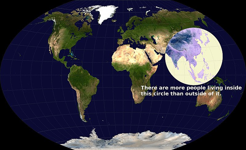
The map shown in Figure 10.7 is simple, but may be surprising to many, as it is shows the intense population density of southern and eastern Asia by demonstrating how half of the world’s population lives in a circle that is only a fraction of the world’s total land area.
Photographs and Drawings
Sometimes a photograph or a drawing is the best way to show an unfamiliar but important detail. Audiences expect high quality photographs now and, as with all presentation aids, they should enhance the speech and not just “be there.” Avoid stock images for the sake of an image and never use clip art. Make your images relevant.
Video or Audio Recordings
Another very useful type of presentation aid is a video or audio recording. Whether it is a short video from a website, such as YouTube or Vimeo, a segment from a song, or a piece of a podcast, a well-chosen video or audio recording may be a good choice to enhance your speech. Imagine, for example, that you’re giving a speech on how crowd surges can injure people at concerts or protests. One of the sections of your speech could explain what you’re talking about, but then you could easily show a short video of what a crowd surge looks like.
There is one major warning to using audio and video clips during a speech: do not forget that they are supposed to be aids to your speech, not the speech itself. In addition, be sure to avoid these five mistakes that speakers often make when using audio and video clips:
- Avoid choosing clips that are too long for the overall length of the speech. At most, 10% of your presentation should be clips.
- Practice with the audio or video equipment prior to speaking. If you are unfamiliar with the equipment, you’ll look foolish trying to figure out how it works. This fiddling around will not only take your audience out of your speech but also have a negative impact on your credibility. It also wastes valuable time. Finally, be sure that the speakers on the computer are on and at the right volume level.
- Cue the clip to the appropriate place prior to beginning your speech. We cannot tell you the number of times we’ve seen students spend valuable speech time trying to find a clip on YouTube or a DVD. You need to make sure your clip is ready to go before you start speaking.
- In addition to cuing the clip to the appropriate place, the browser window should be open and ready to go. If there are advertisements before the video, be sure to have the video cued to play after the ad. The audience should not have to sit through a commercial.
- The audience must be given context before a video or audio clip is played, specifically what the clip is and why it relates to the speech. At the same time, the video should not repeat what you have already said, but add to it.
Objects or Models
Objects and models are another form of presentation aid that can be very helpful in getting your audience to understand your message. Objects refer to anything you could hold up and talk about during your speech. If you’re talking about the importance of not using plastic water bottles, you might hold up a plastic water bottle and a stainless steel water bottle as examples.
Models, on the other hand, are re-creations of physical objects that you cannot have readily available with you during a speech. Major real estate development projects are often displayed as scale models to help potential customers, investors, governments, and other stakeholders visualize what the project will look like after completion.
People and Animals
The next category of presentation aids are people and animals. We can often use ourselves or other people to adequately demonstrate an idea during our speeches.
Animals as Presentation Aids
Many are tempted to bring an animal to serve as a presentation aid. While this can sometimes add a very engaging dimension to the speech, it carries some serious risks that you need to consider. Generally speaking, it’s a bad idea.
The first risk is that animal behaviour tends to be unpredictable. With a confined animal, such as a goldfish or a bird in a cage, this will not be a problem. However, even caged animals can be very distracting to your audience if they run about, chirp, or seem agitated. The chances are great that an animal will react negatively to an unfamiliar situation with a large number of new people. Additionally, the animal’s behaviour may not only affect audience attention during your speech, but potentially during other speeches, as well.
The second risk is that some audience members may respond negatively to a live animal. In addition to common fears and aversions to animals like snakes, spiders, and mice, many people have allergies to various animals.
The third risk is that some locations may have regulations about bringing non-service animals onto the premises. If animals are allowed, the person bringing the animal may be required to bring a veterinary certificate or may be legally responsible for any damage caused by the animal.
For these reasons, before you decide to use an animal as a presentation aid, ask yourself if you could make your point equally well with a picture, model, diagram, or other representation of the animal in question. (Stuffed animals go over surprisingly well.)
Speaker as Presentation Aid
Speakers can often use their own bodies to demonstrate facets of a speech. If your speech is about ballroom dancing or ballet, you might use your body to demonstrate the basic moves in the cha-cha or the five basic ballet positions.
Other People as Presentation Aids
In some cases, such as for a demonstration speech, you might want to ask someone else to serve as your presentation aid. You should arrange ahead of time for a person (or persons) to be an effective aid—do not assume that an audience member will volunteer on the spot. If you plan to demonstrate how to immobilize a broken bone, your volunteer must know ahead of time that you will touch them as much as necessary to splint the break.
You must also make certain that they will arrive dressed presentably and that they will not draw attention away from your message through their appearance or behaviour. The transaction between you and your human presentation aid must be appropriate, especially if you are going to demonstrate something like a dance step.
12.4 – Using Presentation Slides
Ever since the 1990s and the mainstreaming of personal computer technology, speakers have had the option of using slide presentation software to accompany their speeches and presentations. The most commonly known one is PowerPoint, although there are several others that are popular:
- Slide Rocket
- Google Slides
- AdobeAcrobat Presenter
These products, some of which are offered free for trial or basic subscriptions (called a “freemium”), allow you to present professional-looking slides. Each one is “robust,” a word used to mean it has a large number of functions and features, some of which are helpful and some of which are distracting. For example, you can use the full range of fonts, although many of them are not appropriate for presentations because they are hard to read.
The Advantages and Disadvantages of Using Presentation Slides
In some industries and businesses, there is an assumption that speakers will use presentation slides. They allow visualization of concepts, are easily portable, and can be embedded with videos and audio. You will probably also be expected to have slide presentations in future assignments in college. Knowing how to use them, beyond the basic technology, is vital to being a proficient presenter.
But why not use them? Franck Frommer, a French journalist and communication expert, published the book How PowerPoint Makes You Stupid (2012); the title says it all. He criticizes the “linearity” of PowerPoint and similar presentation software, meaning that audiences are not encouraged to see the relationship of ideas and that PowerPoint hurts critical thinking in the audience. Slide follows slide of bulleted information without one slide being more important or the logical connections being clear.
As recently as the mid-2000s, critics such as well-known graphics expert and NASA consultant Edward Tufte (2005) charged that PowerPoint’s tendency to force the user to put a certain number of bullet points on each slide in a certain format was a serious threat to the accurate presentation of data. As Tufte put it, “the rigid slide-by-slide hierarchies, indifferent to content, slice and dice the evidence into arbitrary compartments, producing an anti-narrative with choppy continuity.”
Prezi helps address one of the major criticisms of PowerPoint. Because Prezi, in its design stage, looks something like a mind map on a very large canvas with grid lines, it allows you to show the relationship and hierarchy of ideas better. For example, you can see and design the slides so that the “Big Ideas” are in big circles and the subordinate ideas are in smaller ones.
In addition to recognizing the truth behind Frommer’s and Tufte’s critiques, we have all sat through a presenter who committed the errors of putting far too much text on the slide. When a speaker does this, the audience is confused—do they read the text or listen to the speaker? An audience member cannot do both.
Creating Quality Slide Shows
Unity and Consistency
In terms of unity, the adage, “Keep It Simple, Speaker” definitely applies to presentation slides. Each slide should have one message, one photo, one graphic. The audience members should know what they are supposed to look at on the slide. A phrase to remember about presentation slides and the wide range of design elements available is “Just because you can, doesn’t mean you should.”
Never was this more true than with animation on slides. There are a number of ways to animate a slide, most of which is not helpful. Having text appear line by line could be helpful, but using this tool too much demands too much attention (and you shouldn’t have that much text anyway).
Animation demands audience attention; that’s not good. The audience should be focused on you, drawing on your visual aids as an aid . They support you; they don’t share the stage with you or distract the audience.
Slide transitions animate the movement from one slide to the next. In PowerPoint you can have the slides appear automatically or as blinds, as little checkerboards, from different sides of the screen, in opening circles, or other methods, but using one simple transition is best. The less jarring, the better. (You can also use sound effects, but that is strongly discouraged.) In Prezi, the slides transition by zooming in and out, which is a clever effect, but does make some audience members experience motion sickness.
With animation, less is more and more is awful.
Emphasis, Focal Point, and Visibility
Several points should be made about how to make sure the audience sees what they need to see on the slides.
- Make information is large enough for the audience; since the display size may vary according to the projector you are using, this is another reason for practicing with the equipment in advance.
- The standard rule is for text is 6 X 6. Does this mean 36 words on the slide? No. It means that you should have no more than six horizontal lines of text (this does not mean bullet points, but lines of text, including the heading) and the longest line should not exceed six words.
- Following the 6 X 6 rule will keep you from putting too much information on a slide and you should also avoid too many slides. Again, less is more. There is no “rule,” but a ten-minute speech probably needs fewer than ten slides, perhaps as few as three.
- Do not assume that all the templates feature visible text. In fact, be warned that many templates are terrible. Text should not be smaller than 22 point font for best visibility and some of the templates use much smaller fonts than 22 point. This is especially important in those situations where the speaker creates handouts. Text smaller than 22 is very difficult to see on handouts of your slides. (However, handouts are not recommended for most situations.)
- High contrast between the text and slides is extremely important. White fonts against very dark backgrounds and black fonts against very light backgrounds are probably your safest bet here. Avoid words on photos.
Rhythm in Presenting
The rhythm of your slide display should be reasonably consistent—you would not want to display a dozen different slides in the first minute of a five-minute presentation and then display only one slide per minute for the rest of the speech. Timing them so that the audience can actually take them in is important. Presenters often overdo the number of slides, thinking they will get a better response, but too many slides just causes overkill.
If you can obtain a remote mouse to change slides, that can help you feel independent of the mouse attached to the computer. However, you have to practice with the remote “clicker.” But if you have to use the mouse to change slide, keep your hands off of it between clicks. We have seen speakers wiggle the little arrow all over the screen. It is extremely annoying.
Graphic designers love to loathe certain fonts and justifiably so. Some fonts are simply not professionally acceptable, Comic Sans, Papyrus, Bradley Hand, and Brush Script being among the worst offenders. Other fonts were once acceptable, but now look like a relic of another age or have been used to death, such as Times New Roman, Courier New, Lucida Console, and Trajan Pro.
Some of the best fonts must be purchased and beware of free font websites; those can be a quick way to install viruses or other malware into your computer.
However, a variety of free fonts that are generally acceptable are available, such as Avenir, Garamond, Helvetica, Cambria, Tahoma, and Calibri.
A good font is easy to read both digitally and in print, provides no distraction to the reader, and is aesthetically consistent with the content.
For a more in-depth discussion of fonts and typefaces, this is a useful primer .
In your design, use a single font for your visuals so that they look like a unified set. Alternately, you can use two different fonts in consistent ways, such as having all headings and titles in the one font and all body text and bullet points in a second font. Additionally, the background should probably remain consistent, whether you choose one of the many design templates or if you just opt for a background colour.
Colour palettes
Choosing an aesthetically appealing colour palette is also necessary for slides. There are a wide variety of websites that offer technical assistance in producing an appealing palette, such as Canva or Adobe . An image search of “colour palettes” will also yield a wide selection of pre-made palettes to choose from. Ultimately, colour selection is a subjective decision, but that doesn’t mean every colour choice is merely “a matter of opinion.” Pretty much everybody finds the combination of lime green, neon pink, silver, and brown to be a hideous colour palette. Give care and thought to your selections and, especially if art and design are not your forte, take advantage of the attractive colour palettes that others have already assembled and published.
12.5 – Low-Tech Presentation Aids
One reason for using digital media is that they aren’t prone to physical damage in the form of smudges, scratches, dents, and rips. Digital images don’t suffer the effects of weather or accidents. However, there are times when “low-tech” media could work best for a presentation.
Dry-Erase Board
If you use a chalkboard or dry-erase board (a.k.a. “whiteboard”), you are not using a prepared presentation aid. Your failure to prepare visuals ahead of time can be interpreted in several ways, mostly negative. If other speakers carefully design, produce, and use attractive visual aids, yours will stand out by contrast.
However, numerous speakers do use whiteboards effectively. Typically, these speakers use the whiteboard for interactive components of a speech. For example, maybe you’re giving a speech in front of a group of executives. You may have a PowerPoint all prepared, but at various points in your speech you want to get your audience’s responses. (More recent technologies, such as on iPads, allow you to do the interaction on the screen, but this would have to be supported by the environment.) Whiteboards are very useful when you want to visually show information that you are receiving from your audience. If you ever use a whiteboard, follow these four simple rules:
- Write large enough so that everyone in the room can see (which is harder than it sounds; it is also hard to write and talk at the same time).
- Print legibly; don’t write in cursive script.
- Write short phrases; don’t take time to write complete sentences.
- Be sure you have markers that will not go dry and clean the board afterward.
- If possible, have a scribe do the writing for you. (This also applies to flipcharts below.)
A flipchart is useful for situations when you want to save what you have written for future reference or to distribute to the audience after the presentation. As with whiteboards, you will need good markers and readable handwriting, as well as a strong easel to keep the flipchart upright.
You may have the opportunity in your college years to attend or participate in a “poster session.” These are times during an academic conference where visitors can view a well-designed poster depicting a research project and discuss it one-on-one with the researcher. These kinds of posters are quite large and involve a great deal of work. Posters are probably not the best way to approach presentation aids in a speech. There are problems with visibility and portability.
Handouts are appropriate for delivering information that audience members can take away with them.
First, make sure the handout is worth the trouble of making, copying, and distributing it. Second, make sure to bring enough copies of the handout for each audience member to get one.
If you need your listeners to refer to the handout during your speech, place a copy of the handout at each seat before the speech or ask a volunteer to quickly distribute them right before you begin speaking. If the handout is a “takeaway,” leave it on a table near the exit and remind the audience to take one as they leave. Avoid distributing handouts during your speech; doing so is distracting and time consuming.
Attribution
This chapter was adapted from Exploring Public Speaking , 4th Edition by Barbara Tucker and Matthew LeHew, which is licensed under a Creative Commons Attribution-NonCommercial-ShareAlike 4.0 International License.
Public Speaking for Today's Audiences Copyright © 2023 by Sam Schechter is licensed under a Creative Commons Attribution-NonCommercial-ShareAlike 4.0 International License , except where otherwise noted.
Share This Book
Home Blog Presentation Ideas Presentation Aids: A Guide for Better Slide Design
Presentation Aids: A Guide for Better Slide Design

During a speech or presentation, information is conveyed orally. When relying solely on spoken words, a speaker may confuse and make it difficult for listeners to remember key facts. Therefore, combining presentation aids with oral explanations can improve the audience’s understanding and help them retain the main points.
This article defines what presentation aids are, their uses, different types of presentation aids, and their advantages and disadvantages.
Table of Contents
What is a Presentation Aid?
Are presentation aids the same as visual aids.
- Why Should we use Presentation Aids?
When Should Presentation Aids be Used When Delivering a Presentation?
Types of presentation aids, recommended ppt & google slides templates for presentation aids.
According to Leon, presentation aid refers to the tools and materials used by a speaker beyond spoken words to enhance the communicated message to the audience [1]. These tools comprise templates, multimedia, and visual elements to improve engagement and clarity. Presentation aids act as a bridge between the speaker and the audience, facilitating a presentation.
For instance, the strategic use of templates and multimedia elements can elevate a presentation from a mere speech to a compelling narrative. Integrating these aids is rooted in established practices, ensuring a comprehensive and impactful message delivery. The proper use of presentation aids can improve the quality of the presentation.
No, presentation aids differ from visual aids. Visual aid is also a type of presentation aid mainly used by speakers [1]. Examples of visual aids include images, tables, maps, charts, and graphs. In contrast, presentation aid is a broader category, including templates, 3D models, transitions, audio clips, and multimedia elements. The use of presentation aids goes beyond visuals, offering a diverse set of resources to enhance engagement and communication effectiveness [2].
Why Should we use Presentation Aids?
Presentation Aids are used for specific purposes in a presentation. To enhance audience understanding and retention can be one of the primary purposes. In addition, presentation aids guide transitions so the audience may remain focused [1]. For instance, charts and maps allow speakers to communicate complex information quickly.

Templates and multimedia elements advance the professionalism of a presentation. At the same time, using slideshows clarifies a presentation’s organization In short, a presentation aid ensures a lasting impact on the audience [3].
Presentation aids must be used when a speaker wants to emphasize critical points or evoke an emotional response from the audience. Integrate presentation aids when conveying a complex concept . The strategic use of presentation aids, in line with speech, complements spoken words without overshadowing them. Whether visualizing data or incorporating multimedia elements, presentation aids are most effective when seamlessly integrated into a presentation.
Therefore, presentation aids must be used when the speaker is presenting a specific idea relevant to an aid [4]. Consider a scenario where a speaker delivers a presentation on renewable energy sources. If one of the key points involves the efficiency of solar panels. He can use, for example, a graph or chart illustrating the comparative efficiency rates of various types of solar panels and contrast that with their average lifespan.

Some types of presentation aids can be used in various presentations to assist the speaker. Highlighted advantages and disadvantages of various presentation aids allow presenters to use these presentational aids best.
When considering visual aids for a presentation, one immediately thinks of a slideshow. Slide presentation software, such as PowerPoint, Prezi, and Google Slide, is commonly used by speakers. A slideshow consists of slides containing words, images, or a blend of both, serving as a primary presentation aid [1]. Slide and slide-show design has a greater impact on the effectiveness of conveying a message to the audience.
PowerPoint and similar slideware offer easily editable templates for a consistent slide show appearance. These PowerPoint templates provide a structured framework reorganizing the design process and ensuring a consistent visual identity. Templates are easy to use and helpful for a consistent slideshow.

When using slide templates, a presenter needs to place images or graphs according to the message, medium, and audience. Each slide reinforces the key message, so a conscious decision about each element and concept is essential [5].
Place one idea or concept per slide to keep it simple and understandable. Do not overcrowd it with images or text. However, slideshows limit the audience’s participation which may cause boredom or confusion among the audience. At the same time, the strict order of slides bounds the presenter. He won’t be able to explain the topic openly [6]. Therefore, a presenter should be aware of the background and needs of the audience. By blending different flexible techniques, a presenter can elaborate his slideware presentation.
Charts and Graphs
Graphs and charts are essential for precise data visualization. They simplify complex information for clearer communication. In business presentations , where data-driven decisions are paramount, these visual aids offer advantages in conveying key insights concisely.
Graphs and charts extract complex numerical data into accessible formats and provide precision in representation. These are used to present trends, comparisons, and relationships, particularly in contexts requiring nuanced data analysis. Different charts have distinct purposes. Choosing the one that aligns with your data is essential to ensure clarity [3]. Pie charts, for instance, depict the relationship between parts and the whole. It is ideal to present up to eight visually distinct segments. A line graph effectively illustrates trends over time, while a bar chart facilitates direct comparisons between variables [3].

When creating charts, use different colors and provide clear labels. Maintain consistency in both colors and data groupings. For clarity, refrain from using 3-D graphs and charts. Minimize background noise, such as lines and shading [7]. Ensure that all elements of your graph are distinguishable from the background color. Remove unnecessary clutter. Keep graphs straightforward. Prioritize clarity in conveying your message and visually emphasize the intended conclusion for the audience [7].
Using graphs and charts can be challenging regarding effectiveness and ethics. Therefore, a solid grasp of statistical concepts is essential, and the chosen graphs should clearly represent quantities [3].
Align visual presentation aids to the audience and topic for optimal impact. In business scenarios, the ability to convey data insights efficiently improves decision-making processes. Beyond representation, graphs, and charts enhance audience understanding [2]. Visual learners benefit from the graphical depiction of information. The choice of graph or chart type should align with the audience’s familiarity with the subject matter.
3D Modeling
3D modeling implies creating realistic or abstract representations of objects, fictional characters, environments, or concepts through digital tools [9]. 3D modeling enhances visualization, making complex concepts more accessible. It is mainly used in the Engineering and Architectural fields. It improves audience understanding and visual engagement. Presenters can use this technique to provide a clearer understanding of intricate details. It allows the audience to visualize the inner workings of machinery, architectural designs, or scientific processes [8]. The dynamic nature of three-dimensional visuals captures and sustains the audience’s attention. This engagement is particularly beneficial in holding the audience’s interest throughout the presentation and prevents attention fatigue. However, presenters should be cautious to avoid visual overload. Ensure that the 3D elements enhance rather than distract from the main message.
Creating a 3D model for a presentation requires basic skills and knowledge of 3D modeling techniques. It includes modeling, texturing, lighting, and rendering [9]. Modeling involves shaping and structuring 3D models. Texturing applies color, pattern, or material using images or shaders. Lighting incorporates light sources and shadows to build the desired mood or atmosphere. However, for basic 3D models, a presenter can use PowerPoint to create or access available designs from online sources.

Moreover, these models enhance communication by creating animations, simulations, or demonstrations for understanding a point or process. The versatility of 3D models allows for generating various views, angles, or perspectives of a subject, facilitating customization based on audience or purpose.
Maps are highly valuable to use when information is clear and concise [3]. Different types of maps include population, geographical, political, climate, and economic maps [3]. Therefore, select the one that aligns with the presentation. Choose a map that highlights the specific information the speaker intends to convey. If a speech necessitates geographic reference, a map is an effective tool [7].
Maps provide precise visual communication of geographical data and help convey spatial relationships effectively.

Maps communicate information with clarity [7]. They are used to present global market trends, regional analyses, or any scenario where location-based insights matter. For instance, a world map can highlight key regions of interest when presenting global market trends. It helps the audience grasp the distribution of market opportunities.
The visual appeal of maps enhances audience engagement, particularly when presenting data tied to specific locations [10]. For a marketing presentation , a map showcasing the distribution of target demographics can capture attention and reinforce the spatial context of the campaign.
However, overly complex maps can confuse the audience. Similarly, relying on maps for all data types can lead to oversimplification.
Dry-Erase Board
The Dry-Erase Board is useful for brainstorming and note-taking. It is one of the ideal presentation materials for spontaneous discussions and audience engagement. It allows the presenter to make live diagrams and emphasize key points. At the same time, it is cost-effective and user-friendly.
Suppose a presenter chooses a dry-erase board. He needs to ensure that the board is presentable, rehearsed, and clear [7]. There are a few rules to remember before using a Dry-Erase Board as a presentation aid [3]. First, ensure legible writing is large enough for everyone to see. Use clear printing instead of cursive script. Use short phrases rather than complete sentences. Avoid turning away from the audience while speaking. Use markers that are functional and clean the board afterward.
The drawback of the Dry-Erase Board is that it has limited visibility in large settings. When using a Dry-Erase board, a presenter may seem less prepared. However, many speakers effectively use these boards for interactive elements in their speeches [3]. It is great for dynamic presentations, but space and audience size should be considered.
Brochures and Handouts
Brochures and handouts are tangible takeaways for the audience. They enhance information retention and serve as lasting references [11]. These presentation materials are effective in educational presentations or seminars, offering supplementary details for in-depth understanding.
There are a few things to consider when distributing handouts to the audience [7]. Provide a handout for each audience member, avoiding the need for sharing. Never distribute a single copy to pass around, as it detracts from a professional image. Handouts should be distributed before, during, or after the presentation. If audience participation is required, distribute handouts before starting or have a volunteer distribute them. Include only essential information, organized for clarity. If the handout is meant for audience follow-along, inform them of this and mention specific references during the speech [7].
However, potential disadvantages include the timing of distribution. Handing out materials at the wrong moment can distract the audience.
Audio Clips
Using an audio clip in a presentation introduces an auditory dimension. It evokes emotions and enhances the overall experience.
When using an audio clip, select a clip of appropriate length for your speech duration. Prior to speaking, familiarize yourself with audio or video equipment to avoid disruptions and maintain credibility. Ensure computer speakers are on and set to the right level of volume level [7].
However, potential disadvantages of audio include technical issues with sound playback. It requires presenters to ensure seamless integration. Besides, overuse of audio clips can also be overwhelming, requiring careful selection and timing.
Integrating prerecorded videos offers a dynamic means of presenting information, catering to visual learners, and capturing audience attention. Prepare short videos from platforms like YouTube or Vimeo, song segments, or podcasts before your speech [7]. Cue the clip to the right spot and ensure the browser window is open. Before playing the clip, Provide the audience with context about its relevance to the speech. Explain its connection and significance. Ensure the video enhances the message without duplicating information already conveyed [3].
A video demonstration of a complex process can significantly enhance understanding in a training session. However, presenters should be mindful of timing and integration to avoid disruptions. Technical issues during playback can also pose challenges. It requires thorough testing beforehand.
1. Price Corridor of the Target Mass Presentation Aid Template
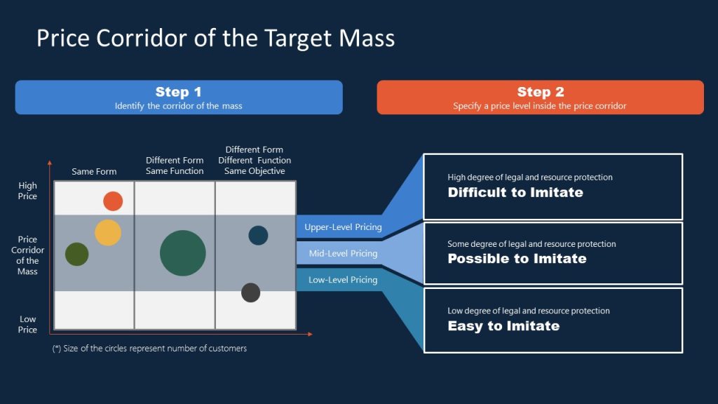
For presenters looking to implement the Blue Ocean Strategy in their organization, this presentation aid material gives emphasis on the potential pricing tiers and the difficulty of adapting that solution. Ideal for sales teams looking to innovate their pricing strategy.
Use This Template
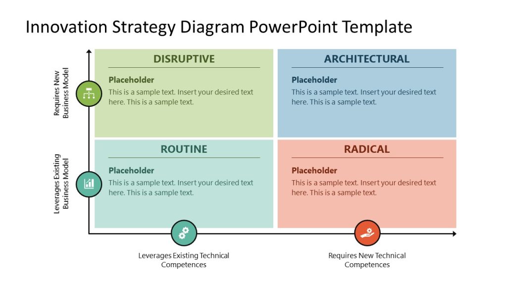
2. Innovation Strategy Diagram Presentation Aid Material Template
Professionals seeking to introduce new strategy models can benefit from this highly visual strategy diagram template for PowerPoint & Google Slides. By using this matrix PPT slide, we can compare approaches and leverage them regarding the effort required for their implementation.
3. AIDAL Model Funnel Sales Presentation Aid
Whether your project requires brand awareness analysis or the steps that lead to customer loyalty, this funnel diagram for PowerPoint & Google Slides based on the AIDAL model is the ideal resource for your presentation. We can go stage by stage on the customer buyer journey, expanding details on the horizontal timeline shown right next to it.
4. Opportunities Solution Tree Template Presentation Aid for Product Development
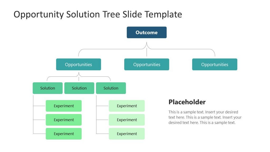
Showcase your product discovery process by using our Opportunities Solution Tree PPT template. With this tree diagram presentation aid, we can easily arrange the customer pain points and streamline ideas that offer solutions to those emerging opportunities.
5. Business Brochure Aid for Presentation Handouts
Say goodbye to boring presentation handouts with this business-tailored brochure template for PowerPoint and Google Slides. In a two-sided format, companies can add relevant information about their activities, value proposals, and contact data.
6. Atlanta City Map and City Skyline Illustration Aids for Presentations

Among the multiple product offerings we have for map templates , we would like to highlight the particular style of this slide deck of Atlanta City. By accessing this product, you can get skyline silhouettes of Atlanta City, the Georgia State Capitol Building, maps in white and dark blue tones, bar charts, etc. They can be an ideal presentation aid example for users looking to deliver talks about local politics, new business venues, and more.
7. 3D Tetris Cube Visual Aid for a Presentation
How many times have you looked to create a 3D model to express an idea or concept made of different components? If so, this template ranks among the best examples of a visual aid. It’s almost instant to edit, as you just need to change the content in placeholder text areas and the colors, and that’s it.
8. Sprint Retrospective Presentation Aid Template for PowerPoint & Google Slides
This Sprint board template is the answer to the lack of clarity during sprint retrospective meetings. Scrum Masters can discuss in detail the aspects of the project covering what was considered a good job during the sprint, what was missing, what the team learned, and which are the new goals to achieve.
Turn your Agile presentations into powerful tools for action with this visual presentation aid!
[1] Leon, M., 2023. Presentation Aids. Public Speaking as Performance . https://opentext.ku.edu/publicspeakingperformance/chapter/presentation-aids/
[2] Shier, M. 2020. 11.3 Presentation Aids. Student Success . https://opentextbc.ca/studentsuccess/chapter/presentation-aids/
[3] Mapes, M. 2019. Presentation AIDS. Speak Out Call in Public Speaking as Advocacy. https://opentext.ku.edu/speakupcallin/chapter/chapter-10-presentation-aids/
[4] Functions of Presentation Aids. 2016. Public Speaking . https://open.lib.umn.edu/publicspeaking/chapter/15-1-functions-of-presentation-aids/#:~:text=Presentation%20aids%20can%20help%20clarify,process%20is%20a%20complex%20one .
[5] Gruber, K. 2022. Chapter Fourteen – Presentation Aids, Principles of Public Speaking . https://mtsu.pressbooks.pub/principlesofpublicspeaking/chapter/chapter-fourteen-presentation-aids/
[6] Xingeng, D. and Jianxiang , L. 2012. Advantages and Disadvantages of PowerPoint in Lectures to ScienceStudents. I.J. Education and Management Engineering. MECS press. https://www.mecs-press.org/ijeme/ijeme-v2-n9/IJEME-V2-N9-10.pdf
[7] Goodman, Dr.L. and Amber Green, M.A. Presentation AIDS, Public Speaking . https://open.maricopa.edu/com225/chapter/need-presentation-aids/
[8] Vincenti, G. and Braman, J. 2011. Teaching through multi-user virtual environments: Applying dynamic elements to the modern classroom , Google Books. Available at: https://www.google.com.pk/books/edition/Teaching_through_Multi_User_Virtual_Envi/sekY2Iy5LdcC?hl=en&gbpv=1&dq=3d%2Bmodelling%2Bas%2Ba%2Bpresentation%2Baid&pg=PA389&printsec=frontcover (Accessed: 27 November 2023).
[9] Mamgain, P., 2020. Autodesk 3ds Max 2020: A Detailed Guide to Modeling, Texturing, Lighting, and Rendering . Padexi Academy.
[10] 15.1 Functions of Presentation Aids. 2016. Public Speaking. Available at: https://open.lib.umn.edu/publicspeaking/chapter/15-1-functions-of-presentation-aids/#:~:text=Presentation%20aids%20can%20help%20clarify,process%20is%20a%20complex%20one .
[11] Chapter 15 Presentation AIDS: Design and Usage . ( https://saylordotorg.github.io/text_stand-up-speak-out-the-practice-and-ethics-of-public-speaking/s18-presentation-aids-design-and-u.html ).

Like this article? Please share
Communication, Presentation Tips Filed under Presentation Ideas
Related Articles

Filed under Google Slides Tutorials • May 17th, 2024
How to Import Google Slides Themes
Importing Google Slides Themes is an easy task that can bring life into your presentations. Learn how to reuse old slides to create new cool themes here.

Filed under PowerPoint Tutorials • May 17th, 2024
How to Edit Background Graphics in PowerPoint
You don’t have to stick with template designs that don’t appeal to your intended message. Learn how to edit background graphics in PowerPoint to become a master user.

How to Make Google Slides Vertical
Power up your presentation skills by learning how to make google slides go vertical. Step-by-step instructions with examples.
Leave a Reply
Want to create or adapt books like this? Learn more about how Pressbooks supports open publishing practices.
12 Chapter 12: Presentation Aids
Victoria Leonard, College of the Canyons
Adapted by Katharine O’Connor, Ph.D., Florida SouthWestern State College

Figure 12.1: Katherine Maher 1
Introduction
We are sure that there are days when you just throw your clothes on to go to school or work, and that is all that is important! But, there are other days when you may choose to wear jewelry, hats, belts, or other accessory items. Presentation aids can be looked at as those accessory items. They don’t detract from what you are wearing, but rather the goal is to enhance what you are wearing! In writing a speech we all tend to put our greatest effort into the construction of the speech outline. That is still your primary goal. However, your instructor may ask you to also construct a presentation aid , which is anything that helps you convey the meaning of your speech to the audience. A presentation aid is a resource that goes beyond the words you say in a speech and enhances the message for the audience. This is not a “busy-work” activity! There are important reasons to construct presentation aids.
The Power of Presentation Aids
If you recall back to your youth, or even now, this may resonate with you. If you ever asked a parent why you had to do something, the answer you might have received would have been “Because I said so!” We hope that in looking at the value and power of presentation aids you will see that our reasons for telling you to use them in your speech go beyond what your professors have as requirements for your speech. There are six important reasons to use presentation aids.
Presentation Aids Add Clarity to Your Speech
Imagine a speech on how to do yoga. Would you know how to position your body without seeing either a picture, video, or human demonstration? Probably not. You would need something to see to be able to then go home and duplicate their movements. Presentation aids make your speech easier to understand.

Figure 12.2: Scorpion Pose 2
Presentation Aids Add Interest to Your Speech
This does not mean you are not interesting! When we have something to look at that is interesting, unique, and meaningful, there is the “ah-ha” moment that makes the speech more exciting. Later in this chapter, you will read more about the types of things you can do, but here’s an example of some of my favorite presentation aids. One student doing a speech on Harry Potter created a book that was three feet high. The cover of the book was a hand-drawn picture of Harry Potter and each subsequent page showed each of the books of the series. The detail and creativity were so compelling that the class was truly mesmerized.

Figure 12.3: Harry Potter’s Cupboard under the Stairs 3
Presentation Aids Help the Audience Remember What You Said
Before we had WAZE or GOOGLE MAPS , people would often give directions on how to get somewhere. Some of those directions could be complicated (especially if you live in a busy city). If you ever learned CPR, you probably remembered it for a short time, but could you replicate the process? Simply showing someone a map or watching a YouTube video on CPR can make it so much easier! You won’t need to give long explanations when you have a visual. Many of us are visual learners. When we engage more than our sense of hearing, we are more apt to remember facts and details.

Figure 12.4: Demonstration of CPR 4
Presentation Aids Make You a Credible Speaker
The effort you put into a quality visual will simply make YOU look better. Whether you design a simple PowerPoint, dress in a costume (or in appropriate business casual attire), or create posters, well-designed presentation aids will impress your audience and show that you cared enough about your speech to put in the effort.

Figure 12.5: Business Attire 5
Presentation Aids Prove Your Point
If you’ve ever heard the phrase “seeing is believing” then this will make sense to you. Whether the point is to believe that a friend can stand on their head, or a much more serious situation that might be represented in print media, presentation aids help everyone understand and believe what you say. Can you do splits while standing on one leg like Olympic ice skater Kamila Valieva? Perhaps you can, but telling an audience you can as opposed to seeing it done proves your point.

Figure 12.6: Kamila Valieva 6
Presentation Aids Can Help with Speech Anxiety
The more you use any form of presentation aid, you have something else to focus on aside from your anxiety. Some might argue that having something else to focus on will create more anxiety, but with practice, you will find that having something to hold or show an audience will calm your nerves. If you have ever used a stress ball, that squishy object that you can hold in your hand to help minimize stress, focusing on something within your speech that is outside of yourself can result in the same effect.
Types of Presentation Aids
There are many different types of presentation aids available. In this next section, we will explore the types of presentation aids you can use, and then we will look at the media for your presentation aids; what to put them on. It is always best to check with your instructor if you are unsure about the use of any presentation aid for your particular assignment.
Depending on your topic, objects can be very effective presentation aids. Objects consist of any item that you can hold up to show an audience. However, there are important guidelines. Objects need to be large enough to show your audience. If you are presenting a speech on how to string a necklace, chances are your necklace will not be large enough. Students presenting in a classroom need to keep in mind the distance of the audience; however, presenting in Zoom would allow you to show a smaller object because you can easily hold it up to the webcam.

Figure 12.7: Beaded Necklace 7
When it is not possible to bring an object into a classroom or a Zoom room, models are excellent alternatives. Models are small or large-scale representations of an object. For example, I once had a student who wanted to show the class a rollercoaster that he designed. Since it was not workable to show the entire rollercoaster, he made an image using digital software. We are all only limited by our own creativity!

Figure 12.8: Toy Airplane
Charts consist of information that is listed or represented in some way on your presentation aid. Charts could be designed simply in a PowerPoint or could be designed on a poster board. If you are doing a speech on depression, stress, or a disease, a chart could simply list the symptoms for your audience. They can be an effective presentation aid when you have a block of text that you want to show. Just be cautious not to put too much information on the chart. For example, the Symptoms of Stress chart included below provides you with a good guideline. A header with three to five bullet points is substantial enough to make a point and will not be too much information for an audience to comprehend.
Figure 12.9: Symptoms of Stress 9
Infographics
Infographics are visual representations that may use icons, diagrams, illustrations, and some limited text. These have become popular due to the ease of understanding the content and the creative way in which you can use different approaches to create them. For example, an infographic can be used to show the audience information about the COVID-19 pandemic, stress, or any topic that might include data. Infographics can present complex information in a way that is easy to understand.

Figure 12.10: Covid-19 PSA 10

Figure 12.11: Symptoms of Stress 11
Understanding what numbers or statistics mean can be difficult for anyone. Graphs are visual representations of data. They present important, factual information to your audience to help them better understand what statistics and numbers mean. Three common types of graphs used in speeches are pie graphs, bar graphs, and line graphs.
Pie graphs allow you to show “slices” of the pie in a visually appealing and impactful way. Using color to represent different areas of the graph will help your audience make the distinction between all data points.

Figure 12.12: Pie Graph of World Population 12
Bar Graphs show your data using rectangular bars that have varying heights that are proportional to what they are representing. These can be used to show comparisons between demographic information, inflation, social media, or other kinds of information.

Figure 12.13: Bar Graph of Preventable Causes of Death 13
Line Graphs use specific markers along a path to represent how trends occur over time. More than one line can be used to show how one variable has increased over time, and how another has decreased.

Figure 12.14: U.S. Votes for President from 1789 to 2020 14
Diagrams/Drawings
You no longer have to be an artist in order to use a diagram or drawing as a presentation aid. A diagram or drawing is a picture of what you are trying to explain. Often people say, “a picture is worth a thousand words.” You can save words if you use the right picture. Drawings or diagrams can be found online if you want to give a clear depiction of an object, process, or some other concept that cannot be easily represented in some other way.

Figure 12.15: Diagram of the Human Eye 15
As mentioned at the beginning of this chapter, maps can be used instead of providing directions to a location. But maps do much more than that. Depending on your speech, you may use a very specific type of map. If you were doing an informative speech on Disneyland, you might show a map of the park. You might show a map of U.S. voters for a persuasive speech on why people should vote.

Figure 12.16: 2004 U.S. Election Map
Photographs
One of the easiest types of presentation aids to use are photographs . Whether you have photos on your phone, or you download photos from an online source, these can be one of the most effective types of visual aids. For example, if you are doing a speech on author Maya Angelou, your audience will not experience the depth of your speech without seeing what she looked like. If you do use an image from online or any other copyrighted material, make sure to cite the photo as you have seen in this book. The copyright should go beneath the photo.
Also, make sure your photo is large enough for the audience to see. As you will see when you read about media for presentation aids, you will have a few different ways to present your photos.

Figure 12.17: Maya Angelou 17
On occasion, you may choose to use yourself or others as presentation aids. For example, you can add to the tone of your speech on Salsa dancing by doing a bit of Salsa in front of the class. You can dress the part as well. Perhaps you are doing your speech on the fictional character Harry Potter. You can find a costume and dress like his character.
At times you may want to ask another student to volunteer to participate in your speech. This student might be your Salsa partner! Or, if your speech is on How to Braid Hair , you might ask a classmate in advance if they will participate in the speech.

Figure 12.18: Ecuador Salsa Contest 18
Audio or Video Recordings
Audio or video recordings can be used to highlight different points of your speech. You might find a podcast that supports your speech, or a piece of music. You might have a segment from a famous speech, such as Martin Luther King Jr.’s I Have a Dream.
Video has been made easier now through the use of YouTube . Many students rely on YouTube to find specific clips that can be utilized once or more in the speech. You might show a segment of the I Have a Dream speech. YouTube has just about everything available from movies, television shows, TedEx presentations, and music videos.
Media for Presentation Aids
So far, we have discussed the different types of presentation aids you can use in a speech. You may have been wondering what we put those presentation aids on! There are a variety of media that can be used for these presentation aids, ranging from high tech to low tech. The choice you make should be based on where you will deliver your speech and assignment requirements.
High Tech Presentation Aids
High tech presentation aids include the use of computer-based media and audiovisual media, such as PowerPoint , Google Slides, and Canva . Most instructors will let you know which they prefer you to use. Microsoft PowerPoint has been around for a long time and allows you to easily create animations. Some campuses provide students with free PowerPoint access through their student accounts. PowerPoint has a variety of design options that users can edit for font and color. Google slides also allow you to embed animations and it also has excellent template options. One advantage of Google slides is that it is accessible from the cloud at any time. Canva is a more unique program as it allows you numerous options for the creation of presentations that use templates and designs not available on PowerPoint or Google Slides.
One of the benefits of using one of these methods is that you can create a presentation in minutes. You can add a chart, graph, diagram, drawing, map, or photo onto your slides quickly. You can easily find images online and download those to use. When adding an image that has a copyright it will be important to cite the source at the bottom of the image, just as you see the images cited in this textbook. When you read about the guidelines for using presentation aids you will see additional tips for creating your slideshow.
Low-Tech Presentation Aids
Low-tech presentation aids include posters or foam boards, flip charts, whiteboards, or handouts and are known for their dependability. You will never have to worry about your technology failing! These presentation aids are not reliant upon good Wi-Fi!

Figure 12.19: U.S. Army Posterboard NMAAHC 19
Presenting in Zoom
Zoom CEO Eric Yuan began his technological journey at WebEx. In 2011 he left WebEx to launch Zoom In 2011. By 2013, Zoom had one million users. By the time the Coronavirus pandemic hit in 2020, there were over 300 million users as people were forced to stay home to work. Public speaking courses all over the world met in Zoom so students could still present their speeches to their classmates. When using presentation aids in Zoom , the most important areas that we need you to think about include screen sharing, virtual backgrounds, and holding visuals in front of the camera effectively.
Screen Sharing
If you have created a slideshow with either PowerPoin t, Google Slides , or Canva , you will need to learn how to share your screen. Find the “share screen” button on your device; it may look different from phone to laptop to iPad or tablet. If you have embedded any audio into your slideshow, make sure to click the box that says, “share sound.”
Virtual Backgrounds
Many people have begun to create virtual backgrounds using their slideshow. Although this is a more advanced technology, it is a creative way to have the screen in the back of you show everything in your PowerPoint . Since all computers are different, and some computers are newer than others, you will need to see what is best for your presentation. One word of caution in using a virtual background is that any movement on your part may lead to you disappearing or floating in and out of view from your audience. You need to remain virtually still if using a Zoom background.
Holding Presentation Aids in Zoom
If you plan to hold up objects or photos while presenting in Zoom , it is best not to use a virtual background since a lot of movement can lead to your visuals disappearing from view depending on your position. As discussed in the chapter on delivery, it is important to find the most neutral background you can in your home so that both you and your presentation aids are the focal points.
Hold your presentation aid up to the camera for a minimum of four seconds. You want to give your audience a chance to see it and take it in. Depending on what you need to say about your presentation aid, you may need to hold it up longer.
Checklist for Effective Use of Presentation Aids
Having clear and professional-looking presentation aids is important to enhance your credibility and ensure that your speech is supported by your presentation aids. Remember, presentation aids are used to support the body of the speech but can also be used as part of your attention-getter or conclusion. Practical guidelines will make sure that you prepare thoroughly. The following list conveys best practices for the use of presentation aids. We hope you will check them off as you go!
Guidelines for Using a Slideshow Live or Virtually
- Use a minimal number of slides; perhaps one per main point and limit the amount of text per slide.
- Label any images that you embed on a slide (where the image came from). Ask your instructor what they want you to put on the slide because some instructors will ask for more detail.
- Do not use a title slide, rather use a blank slide at the beginning so that your audience will still be captured by your attention-getter rather than focusing on your speech title.
- Also, use a blank slide in between slides so that the audience does not spend a lot of time focusing on something you have moved on from.
- Put your presentation on a USB/Flash Drive. As a backup, have your slides in your email, Google Drive, DropBox , etc.
Guidelines for Using Presentation Aids in a Classroom
- Avoid presentation aids that require you to turn back to the audience.
- Make presentation aids large enough for everyone to see from a distance.
- Display objects, posters, etc. where everyone can see.
- Display presentation aids only while discussing the point you are on.
- Do not pass anything around because this will distract your audience and they won’t focus on the speech.
- Talk to the audience, not the presentation aids.
Guidelines for Using Fonts
- Use plain fonts that are easy to read, such as Arial, Times New Roman, Cambria, Palatino, Garamond, Georgia, or Helvetica. Avoid using any script font because those are harder for people to read.
- Use fonts sparingly; there is no need to use four different fonts on your slides.
- Use fonts that are large enough to read. Key ideas should be 32-point for titles. The recommended size for supporting points is 24-point font.
Guidelines for Using Color
- Create contrast on your slide. If you are using a white background, you can use black or blue font. If you have a black background, you can use a white font.
- Avoid font colors that are often difficult to read for individuals with any vision impairment, such as yellow, red, or green.
Guidelines for Preparation of Presentation Aids
- If your speech will be given in a classroom, check the room in advance and plan for emergencies (prepare to be without presentation aids if they should fail!)
- PRACTICE with your presentation aids so you know how much extra time they add to your speech.
- Proofread all materials – spelling errors affect your credibility.
Guidelines for Using Presentation Aids During your Speech
- Explain presentation aids clearly and concisely (don’t just put them up and expect the audience to understand them).
The use of presentation aids is a critical part of your speech if your instructor requires them. Remember, presentation aids are not designed to replace what you say in your speech. Just as you put your clothes on daily, you can choose to “dress” yourself up with accessory items, such as a watch, earrings, or hat, your speech is like your clothing, and your presentation aids are like your accessories. They only add to your speech. We hope you will be creative in the process and make your presentation aids look as though you put time into them. Remember that presentation aids will add clarity and interest, help the audience understand and remember your speech, and add credibility to your speech. We encourage you to practice with them as much as you can, and that way you can also minimize your anxiety and present an impactful speech.
Reflection Questions
- What do you feel your primary goal will be for using presentation aids in your next speech?
- How can you use presentation aids to help the audience remember what you said?
- What technology challenges do you have that you want to resolve early during your preparation process?
- After reviewing the checklist for effective presentation aids, are there any boxes you could not check off? If not, why? How can you make sure you meet all of the guidelines?
Diagram/Drawing
Line Graphs
Presentation Aid
Introduction to Public Speaking Copyright © by Jamie C. Votraw, M.A.; Katharine O'Connor, Ph.D.; and William F. Kelvin, Ph.D.. All Rights Reserved.
Share This Book

Want to create or adapt books like this? Learn more about how Pressbooks supports open publishing practices.
9 Chapter 9: Presentation Aids in Speaking
The materials below are attributed fully to the free online Open Education Resource, Exploring Public Speaking: The Free Dalton State College Public Speaking Textbook, 4th Edition (Chapter 11).
Chapter 9 Learning Objectives
After reading this chapter, the student will be able to:
- List and explain reasons why presentation aids are important in public speaking
- Explain how presentation aids function in public speaking
- Describe the various computer-based and non-computer-based types of presentation aids available to the students
- Explain the correct use of various types of presentation aids
- Design professional-looking slides using presentation software
Chapter Preview
9.1 – What are Presentation Aids?
9.2 – Functions of Presentation Aids
9.3 – Types of Presentation Aids
9.4 – Using Presentation Slides
9.5 – Low-Tech Presentation Aids
9.1 – What Are Presentation Aids?
When you give a speech, you are presenting much more than just a collection of words and ideas. Because you are speaking “live and in person,” your audience members will experience your speech through all five of their senses: hearing, vision, smell, taste, and touch . In some speaking situations, the speaker appeals only to the sense of hearing. They more or less ignore the other senses except to avoid visual distractions by dressing and presenting themselves in an appropriate manner. But the speaking event can be greatly enriched by appeals to the other senses. This is the role of presentation aids.
Professor West: What makes for an effective visual aid?
Presentation aids are the resources beyond the speech words and delivery that a speaker uses to enhance the message conveyed to the audience . The type of presentation aids that speakers most typically make use of are visual aids: pictures, diagrams, charts and graphs, maps, and the like. Audible aids include musical excerpts, audio speech excerpts, and sound effects . A speaker may also use fragrance samples or food samples as olfactory (sense of smell) or gustatory (sense of taste) aids. Finally, presentation aids can be three-dimensional objects, animals, and people; they can also change over a period of time, as in the case of a how-to demonstration .
P resentation aid s
the resources beyond the speech words and delivery that a speaker uses to enhance the message conveyed to the audience
of or relating to the sense of smell
of or relating to the sense of taste
As you can see, the range of possible presentation aids is almost unlimited. However, all presentation aids have one thing in common: To be effective, each presentation aid a speaker uses must be a direct, uncluttered example of a specific element of the speech . It is understandable that someone presenting a speech about Abraham Lincoln might want to include a photograph of him, but because everyone already knows what Lincoln looked like, the picture would not contribute much to the message unless, perhaps, the message was specifically about the changes in Lincoln’s appearance during his time in office.
Other visual artifacts are more likely to deliver information more directly relevant to the speech—a diagram of the interior of Ford’s Theater where Lincoln was assassinated, a facsimile of the messy and much-edited Gettysburg Address, or a photograph of the Lincoln family, for example. The key is that each presentation aid must directly express an idea in your speech.
Moreover, presentation aids must be used at the time when you are presenting the specific ideas related to the aid . For example, if you are speaking about coral reefs and one of your supporting points is about the location of the world’s major reefs, it would make sense to display a map of these reefs while you’re talking about location. If you display it while you are explaining what coral actually is, or describing the kinds of fish that feed on a reef, the map will not serve as a useful visual aid—in fact, it’s likely to be a distraction.
To be effective, presentation aids must also be easy to use and easy for the listeners to see and understand . In this chapter, we will present some principles and strategies to help you incorporate effective presentation aids into your speech. We will begin by discussing the functions that good presentation aids fulfill. Next, we will explore some of the many types of presentation aids and how best to design and utilize them. We will also describe various media that can be used for presentation aids. We will conclude with tips for successful preparation and use of presentation aids in a speech.
Why should you use presentation aids? If you have prepared and rehearsed your speech adequately, shouldn’t a good speech with a good delivery be enough to stand on its own? While it is true that impressive presentation aids will not rescue a poor speech, a good speech can often be made even better by the strategic use of presentation aids . Presentation aids can fulfill several functions: they can serve to improve your audience’s understanding of the information you are conveying, enhance audience memory and retention of the message, add variety and interest to your speech, and enhance your credibility as a speaker. Let’s examine each of these functions.
Improving Audience Understanding
Human communication is a complex process that often leads to misunderstandings. If you are like most people, you can easily remember incidents when you misunderstood a message or when someone else misunderstood what you said to them. Misunderstandings happen in public speaking just as they do in everyday conversations.
One reason for misunderstandings is the fact that perception and interpretation are highly complex individual processes . Most of us have seen the image in which, depending on your perception, you see either the outline of a vase or the facial profiles of two people facing each other. Or perhaps you have seen the image of the woman who may or may not be young, depending on your frame of reference at the time. This shows how interpretations can differ, and it means that your presentations must be based on careful thought and preparation to maximize the likelihood that your listeners will understand your presentations as you intend them to do so . (You can see these images at http://members.optusnet.com.au/~charles57/Creative/Drawing/vases.htm and https://www.youtube.com/watch?v=P9iv173VtGM.)
As a speaker, one of your basic goals is to help your audience understand your message. To reduce misunderstanding, presentation aids can be used to clarify or to emphasize.
Clarification is important in a speech because if some of the information you convey is unclear, your listeners will come away puzzled or possibly even misled. Presentation aids can help clarify a message if the information is complex or if the point being made is a visual one .
If your speech is about the impact of the Coriolis Effect on tropical storms, for instance, you will have great difficulty clarifying it without a diagram because the process is a complex one. The diagram in Figure 9.1 (“Coriolis Effect”) would be effective because it shows the audience the interaction between equatorial wind patterns and wind patterns moving in other directions. The diagram allows the audience to process the information in two ways: through your verbal explanation and through the visual elements of the diagram . By the way, t he Coriolis Effect i s defined as “an effect whereby a mass moving in a rotating system experiences a force (the Coriolis force ) acting perpendicular to the direction of motion and to the axis of rotation . On the earth, the effect tends to deflect moving objects to the right in the northern hemisphere and to the left in the southern and is important in the formation of cyclonic weather systems.” You can see why a picture really helps with this definition.
Figure 9.2 (“Model of Communication”) is another example of a diagram that maps out the process of human communication. In this image you clearly have a speaker and an audience with the labels of source, channel, message, receivers, and feedback to illustrate a basic model of human communication. As with most models, it is simplified. (Can you remember what two components of the communication process, explained in Chapter 1, that are missing here?)
Another aspect of clarifying occurs when a speaker wants to help audience members understand a visual concept. For example, if a speaker is talking about the importance of petroglyphs in Native American culture, just describing the petroglyphs won’t completely help your audience to visualize what they look like. Instead, showing an example of a petroglyph, as in Figure 9.3 (“Petroglyph”) can more easily help your audience form a clear mental image of your intended meaning.
Emphasizin g
When you use a presentational aid for emphasis, you impress your listeners with the importance of an idea . In a speech on water conservation, you might try to show the environmental proportions of the resource. When you use a conceptual drawing like the one in Figure 9.4 (“Planetary Water Supply”), you show that if the world water supply were equal to ten gallons, only ten drops would be available and drinkable for human or household consumption. This drawing is effective because it emphasizes the scarcity of useful water and thus draws attention to this important information in your speech.
Another way of emphasizing that can be done visually is to zoom in on a specific aspect of interest within your speech . In Figure 9.5 (“Chinese Lettering Amplified”), we see a visual aid used in a speech on the importance of various parts of Chinese characters. On the left side of the visual aid, we see how the characters all fit together, with an emphasized version of a single character on the right.
So, clarifying and emphasizing are two roles that support the “Improving Audience Understanding” purpose of presentation aids . What are other purposes?
Aiding Retention and Recall
The second function that presentation aids can serve is to increase the audience’s chances of remembering your speech. An article by the U.S. Department of Labor (1996) summarized research on how people learn and remember. The authors found that “83% of human learning occurs visually, and the remaining 17% through the other senses—11% through hearing, 3.5% through smell, 1% through taste, and 1.5% through touch.”
For this reason, exposure to an image can serve as a memory aid to your listeners. When your graphic images deliver information effectively and when your listeners understand them clearly, audience members are likely to remember your message long after your speech is over. Moreover, people often are able to remember information that is presented in sequential steps more easily than if that information is presented in an unorganized pattern. When you use a presentation aid to display the organization of your speech (such as can be done with PowerPoint slides), you will help your listeners to observe, follow, and remember the sequence of information you conveyed to them. T his is why some instructors display a lecture outline for their students to follow during class and why a slide with a preview of your main points can be helpful as you move into the body of your speech.
An added plus of using presentation aids is that they can boost your memory while you are speaking . Using your presentation aids while you rehearse your speech will familiarize you with the association between a given place in your speech and the presentation aid that accompanies that material.
Adding Variety and Interest
A third function of presentation aids is simply to make your speech more interesting . For example, wouldn’t a speech on varieties of roses have greater impact if you accompanied your remarks with a picture of each rose? You can imagine that your audience would be even more enthralled if you had the ability to display an actual flower of each variety in a bud vase. Similarly, if you were speaking to a group of gourmet cooks about Indian spices, you might want to provide tiny samples of spices that they could smell and taste during your speech.
Enhancing a Speaker’s Credibilit y
Presentation aids alone will not be enough to create a professional image . As we mentioned earlier, impressive presentation aids will not rescue a poor speech . Even if you give a good speech, you run the risk of appearing unprofessional if your presentation aids are poorly executed. Conversely, a high quality presentation will contribute to your professional image. This means that in addition to containing important information, your presentation aids must be clear, clean, uncluttered, organized, and large enough for the audience to see and interpret correctly . Misspellings and poorly designed presentation aids can damage your credibility as a speaker.
In addition, make sure that you give proper credit to the source of any presentation aids that you take from other source s. Using a statistical chart or a map without proper credit will detract from your credibility, just as using a quotation in your speech without credit would. This situation will usually take place with digital aids such as PowerPoint slides. The source of a chart or the data shown in a chart form should be cited at the bottom the slide.
If you focus your efforts on producing presentation aids that contribute effectively to your meaning, that look professional, and that are handled well, your audience will most likely appreciate your efforts and pay close attention to your message . That attention will help them learn or understand your topic in a new way and will thus help the audience see you as a knowledgeable, competent, and credible speaker. With the prevalence of digital communication, the audience expectation of quality visual aids has increased .
Avoiding Problems with Presentation Aids
Using presentation aids can come with some risks. However, with a little forethought and adequate practice, you can choose presentation aids that enhance your message and boost your professional appearance in front of an audience. One principle to keep in mind is to use only as many presentation aids as necessary to present your message or to fulfill your classroom assignment. The number and the technical sophistication of your presentation aids should never overshadow your speech .
Another important consideration is technology. Keep your presentation aids within the limits of the working technology available to you. Whether or not your classroom technology works on the day of your speech, you will still have to present. What will you do if the computer file containing your slides is corrupted? What will you do if the easel is broken? What if you had counted on stacking your visuals on a table that disappears right when you need it? Or the Internet connection is down for a YouTube video you plan to show?
You must be prepared to adapt to an uncomfortable and scary situation . This is why we urge students to go to the classroom well ahead of time to test the equipment and ascertain the condition of items they’re planning to use. As the speaker, you are responsible for arranging the things you need to make your presentation aids work as intended. Carry a roll of masking tape so you can display your poster even if the easel is gone. Test the computer setup. Have your slides on a flash drive AND send it to yourself as an attachment or upload to a Cloud service. Have an alternative plan prepared in case there is some glitch that prevents your computer-based presentation aids from being usable. And of course, you must know how to use the technology.
More important than the method of delivery is the audience’s ability to see and understand the presentation aid. It must deliver clear information, and it must not distract from the message. Avoid overly elaborate presentation aids. Instead, simplify as much as possible, emphasizing the information you want your audience to understand.
Another thing to remember is that presentation aids do not “speak for themselves.” When you display a visual aid, you should explain what it shows, pointing out and naming the most important features . If you use an audio aid such as a musical excerpt, you need to tell your audience what to listen for. Similarly, if you use a video clip, it is up to you as the speaker to point out the characteristics in the video that support the point you are making—but probably beforehand, so you are not speaking over the video. At the same time, a visual aid should be quickly accessible to the audience. This is where simplicity comes in. Just as in organization of a speech you would n ot want to use 20 main points, but more like 3-5, you should limit categories of information on a visual aid.
9.3 – Types of Presentation Aids
Now that we’ve explored some basic hints for preparing visual aids, let’s look at the most common types of visual aids: charts, graphs, representations, objects/models, and peopl e.
A chart is commonly defined as a graphical representation of data (often numerical) or a sketch representing an ordered process. Whether you create your charts or do research to find charts that already exist, it is important for them to exactly match the specific purpose in your speech. Figure 9.6 (“Acupuncture Charts”) shows two charts related to acupuncture. Although both charts are good, they are not equal. One chart might be useful in a speech about the history and development of acupuncture while the other chart would be more useful for showing the locations of meridians (the lines along which energy flows) and the acupuncture points.
graphical representation of data (often numerical) or a sketch representing an ordered process
The rest of this section will explore three common types of charts: statistical charts, sequence-of-steps chart, and decision trees.
Statistical Charts
For most audiences, statistical presentations must be kept as simple as possible , and they must be explained. The statistical chart shown in Figure 9.7 (“Birth Weight Chi-Square”) is from a study examining the effects of maternal smoking on a range of congenital birth defects. Unless you are familiar with statistics, this chart may be very confusing. When visually displaying information from a quantitative study, you need to make sure that you understand the material and can successfully and simply explain how one should interpret the data. If you are unsure about the data yourself, then you should probably not use this type of information. This is definitely an example of a visual aid that, although it delivers a limited kind of information, does not speak for itself. On the other hand, if you are presenting to an upper level or graduate class in health sciences or to professionals in health occupations, this chart would be appropriate. As with all other principles of public speaking, KNOW YOUR AUDIENCE.
Sequence-of-Steps Charts
Charts are also useful when you are trying to explain a process that involves several steps . The two visual aids in Figure 9.8 (“Steps in Cell Reproduction”) both depict the process of cell division called mitosis using a sequence-of-steps chart, but they each deliver different information. The first chart lacks labels to indicate the different phases of cell division. Although the first chart has more visual detail and may look more scientific, the missing information may confuse your audience. In the second chart, each phase is labeled with a brief explanation of what is happening, which can help your audience understand the process.
Decision Trees
Decision trees are useful for showing the relationships between ideas . The example in Figure 9.9 (“Open Educational Resource Decision Tree”) shows how a decision tree could be used to determine whether to use open-source textbook material. As with the other types of charts, you want to be sure that the information in the chart is relevant to the purpose of your speech and that each question and decision is clearly labeled. This particular tree is pertinent to this textbook, which is an open educational resource drawing from other open educational resources, and the decision tree shows some of the processes the authors went through to decide on the content of this text.
Strictly speaking, a graph may be considered a type of chart, but graphs are so widely used that we will discuss them separately . A graph is a pictorial representation of the relationships of quantitative data using dots, lines, bars, pie slices, and the like. Graphs show how one factor (such as size, weight, number of items) varies in comparison to other items . Whereas a statistical chart may report the mean ages of individuals entering college, a graph would show how the mean age changes over time. A statistical chart may report the amount of computers sold in the United States, while a graph will use bars or lines to show their breakdown by operating systems such as Windows, Macintosh, and Linux.
a pictorial representation of the relationships of quantitative data using dots, lines, bars, pie slices, and the like
Public speakers can show graphs using a range of different formats. Some of those formats are specialized for various professional fields. Very complex graphs often contain too much information that is not related to the purpose of a student’s speech. If the graph is cluttered, it becomes difficult to comprehend. In this section, we’re going to analyze the common graphs speakers utilize in their speeches: line graphs, bar graphs, pie graphs, and pictographs.
Line Gra ph
A line graph is designed to show trends over time . In Figure 9.10 (“Enron’s Stock Price”), we see a line graph depicting the fall of Enron’s stock price from August 2000 to January 2002. Notice that although it has some steep rises, the line has an overall downward trend clearly depicting the plummeting of Enron’s stock price. This is far more effective in showing the relationship of numbers than a chart (as in Figure 9.7) or reading the numbers aloud.
a graph designed to show trends over time
Bar graphs are useful for showing the differences between quantities . They can be used for population demographics, fuel costs, math ability in different grades, and many other kinds of data. The graph in Figure 9.11 (“Suicide vs. Homicide”) is well designed. It is relatively simple and is carefully labeled, making it easy for the speaker to guide the audience through the recorded numbers of each type of death. The bar graph is designed to show the difference between rates of suicides and homicides across various age groups. When you look at the data, the first grouping clearly shows that eighteen- to twenty-four-year-olds are more likely to die because of a homicide than any of the other age groups.
a graph designed to show the differences between quantities
The graph in Figure 9.12 (“Distribution of Income and Wealth in the United States”) is a complicated bar graph depicting the disparity between the so-called “haves” and the “have nots” within the United States. On the left hand side of the graph you can see that the Top 20% of people within the United States account for 84.7% of all of the wealth and 50.1% of all of the income. On the other hand, those in the bottom 40% account for only 0.2% of the wealth and 12.1% of the actual income.
While the graph is very well designed, it presents a great deal of information. For example, it shows “wealth” and “income,” for several groups; however, these are related but different concepts. In a written publication, readers will have time to sit and analyze the graph, but in a speaking situation, audience members need to be able to understand the information in a graph very quickly. For that reason, this graph is probably not as effective for speeches as the one in Figure 9.11 (“Suicide vs. Homicide”).
Pie graphs are usually depicted as circles and are designed to show proportional relationships within sets of data; in other words, they show parts of or percentages of a whole. They should be simplified as much as possible without eliminating important information . As with other graphs, the sections of the pie need to be plotted proportionally . In the pie graph shown in Figure 9.13 (“Causes of Concussions in Children”) we see a clear and proportional chart that has been color-coded. Color-coding is useful when it’s difficult to fit the explanations in the actual sections of the graph; in that case, you need to include a legend, or key, to indicate what the colors in the graph mean. In this graph, audience members can see very quickly that falls are the primary reason children receive concussions. However, the pie graph in Figure 9.14 (“World Populations”) is jumbled, illegible, confusing, and overwhelming in every way. The use of color coding doesn’t help. Overall, this graph simply contains too much information and is more likely to confuse an audience than help them understand something.
a graph designed to show proportional relationships within sets of data
Similar to bar graphs, pictographs use numbers and/or sizes of iconic symbols to dramatize differences in amounts. An example is found in Figure 9.15. Pictographs, although interesting, do not allow for depiction of specific statistical data. If you were trying to show the output of oil from various countries through oil wells, each oil well representing a ten million barrels a day, it might be hard for the audience to see the difference between a third of an oil well and a fourth of one, but that is a significant difference in amounts (3.3 million versus 2.5 million).
P ictograph
a graph using iconic symbols to dramatize differences in amounts
Graphs can present challenges in being effective but also in being ethical. To be both ethical and effective, you need a good understanding of what statistics mean, and you need to create or use graphs that show amounts clearly . If you were showing GPAs of freshmen, sophomore, junior, and senior students at your college, and the bottom number on the graph was 2.25 rather than 0.0, that would result in a visually bigger difference than what really exists (see Figure 9.16).
Diagrams are drawings or sketches that outline and explain the parts of an object, process, or phenomenon that cannot be readily seen. Like graphs, diagrams can be considered a type of chart, as in the case of organizational charts and process-flow charts .
drawings or sketches that outline and explain the parts of an object, process, or phenomenon that cannot be readily seen
When you use a diagram, be sure to explain each part of the phenomenon, paying special attention to elements that are complicated or prone to misunderstanding. In the example shown in Figure 9.17 (“The Human Eye”), you might wish to highlight that the light stimulus is reversed when it is processed through the brain or that the optic nerve is not a single stalk as many people think.
Maps are extremely useful if the information is clear and limited. There are all kinds of maps, including population, weather, ocean current, political, and economic maps, so you should find the right kind for the purpose of your speech. Choose a map that emphasizes the information you need to deliver. The map shown in Figure 9.18 (“African Map with Nigerian Emphasis”) is simple, showing clearly the geographic location of Nigeria. This can be extremely valuable for some audiences who might not be able to name and locate countries on the continent of Africa. The map also shows the relative size of Nigeria compared to its neighbors. Figure 9.19 (“Rhode Island Map”) is a map of the state of Rhode Island, and it emphasizes the complicated configuration of islands and waterways that characterize this state’s geography.
Photographs and Drawings
Sometimes a photograph or a drawing is the best way to show an unfamiliar but important detail . Figure 9.20 (“Wigwam Photograph”) is a photograph of a wigwam, a dwelling used by Native Americans in the North East. Audiences expect high quality in photographs now, and as with all presentation aids they should enhance the speech and not just “be there.” It is common to put stock photographs on PowerPoint slides as “clip art,” but they should be relevant and not detract from the message of the slide.
Video or Audio Recordings
Another very useful type of presentation aid is a video or audio recording. Whether it is a short video from a website such as YouTube or Vimeo, a segment from a song, or a piece of a podcast, a well-chosen video or audio recording may be a good choice to enhance your speech. Imagine, for example, that you’re giving a speech on how Lap-Band surgeries help people lose weight. One of the sections of your speech could explain how the Lap-Band works, so you could easily show a forty-three second video available on YouTube to demonstrate the part of the surgery. Maybe you could include a recording of a real patient explaining why they decided to get the Lap-Band.
There is one major warning to using audio and video clips during a speech: do not forget that they are supposed to be aids to your speech, not the speech itself . In addition, be sure to avoid these five mistakes that speakers often make when using audio and video clips:
- Avoid choosing clips that are too long for the overall length of the speech . Your instructor can give you some guidelines for how long video and audio clips should be for the speeches in your class, if they are allowed (and make sure they are).
- Practice with the audio or video equipment prior to speaking. If you are unfamiliar with the equipment, you’ll look foolish trying to figure out how it works . This fiddling around will not only take your audience out of your speech but also have a negative impact on your credibility. It also wastes valuable time. Finally, be sure that the speakers on the computer are on and at the right volume level.
- Cue the clip to the appropriate place prior to beginning your speech. We cannot tell you the number of times we’ve seen students spend valuable speech time trying to find a clip on YouTube or a DVD. You need to make sure your clip is ready to go before you start speaking. Later in this chapter we will look at using video links in slides.
- In addition to cuing the clip to the appropriate place, the browser window should be open and ready to go . If there are advertisements before the video, be sure to have the video cued to play after the ad. The audience should not have to sit through a commercial. There is a website called TubeChop that can allow you to cut a segment out of a YouTube video, then creating a new link. It has limitations but can be useful.
- The audience must be given context before a video or audio clip is played, specifically what the clip is and why it relates to the speech. At the same time, the video should not repeat what you have already said, but add to it.
Objects or Models
Objects and models are another form of presentation aid that can be very helpful in getting your audience to understand your message . O bjects refer to anything you could hold up and talk about during your speech. If you’re talking about the importance of not using plastic water bottles, you might hold up a plastic water bottle and a stainless steel water bottle as examples.
Models, on the other hand, are re-creations of physical objects that you cannot have readily available with you during a speech . If you’re giving a speech on heart murmurs, you may be able to show how heart murmurs work by holding up a model of the human heart. As will be discussed in the section on handouts below, a speaker should not pass an object or model around during a speech. It is highly distracting.
People and Animals
The next category of presentation aids are people and animals. We can often use ourselves or other people to adequately demonstrate an idea during our speeches.
Animals as Presentation Aids
When giving a speech on a topic relating to animals, it is often tempting to bring an animal to serve as your presentation aid. While this can sometimes add a very engaging dimension to the speech, it carries some serious risks that you need to consider.
The first risk is that animal behavior tends to be unpredictable. You may think this won’t be a problem if your presentation aid animal is small enough to be kept confined throughout your speech—for example, a goldfish in a bowl or a lizard or bird in a cage. However, even caged animals can be very distracting to your audience if they run about, chirp, or exhibit other agitated behavior. The chances are great that an animal will react to the stress of an unfamiliar situation by displaying behavior that does not contribute positively to your speech or to the cleanliness of the physical environment. Additionally, the animal’s behavior may not only affect audience attention during your speech, but potentially during your classmates’ speeches as well.
The second risk is that some audience members may respond negatively to a live animal . In addition to common fears and aversions to animals like snakes, spiders, and mice, many people have allergies to various animals. One of the authors had an experience where a student brought his six-foot yellow python to class for a speech. As a result, one of the other students refused to stay in the room because of her snake phobia (the instructor was not too comfortable either).
The third risk is that some locations may have regulations about bringing non-service animals onto the premises . If animals are allowed, the person bringing the animal may be required to bring a veterinary certificate or may be legally responsible for any damage caused by the animal.
For these reasons, before you decide to use an animal as a presentation aid, ask yourself if you could make your point equally well with a picture, model, diagram, or other representation of the animal in question.
Speaker as Presentation Aid
Speakers can often use their own bodies to demonstrate facets of a speech . If your speech is about ballroom dancing or ballet, you might use your body to demonstrate the basic moves in the cha-cha or the five basic ballet positions.
Other People as Presentation Aids
In some cases, such as for a demonstration speech, you might want to ask someone else to serve as your presentation aid. You should arrange ahead of time for a person (or persons) to be an effective aid— do not assume that an audience member will volunteer on the spot . If you plan to demonstrate how to immobilize a broken bone, your volunteer must know ahead of time that you will touch them as much as necessary to splint the break.
You must also make certain that they will arrive dressed presentably and that they will not draw attention away from your message through their appearance or behavior. The transaction between you and your human presentation aid must be appropriate, especially if you are going to demonstrate something like a dance step. In short, make sure your helper will know what is expected of them and consents to it.
9.4 – Using Presentation Slides
Ever since the 1990s and the mainstreaming of personal computer technology, speakers have had the option of using slide presentation software to accompany their speeches and presentations. The most commonly known one is PowerPoint, although there are several others:
- Prezi, available at www.prezi.com
- Slide Rocket, available at www.sliderocket.com
- Google Slides, available in Google Drive and useful for collaborative assignments
- Keynote, the Apple presentation slide software on MACs
- Impress, an Open Office product (http://www.openoffice.org/product/impress.html)
- AdobeAcrobat Presenter
These products, some of which are offered free for trial or basic subscriptions (called a “freemium), allow you to present professional-looking slides. Each one is “robust,” a word used to mean it has a large number of functions and features, some of which are helpful and some of which are distracting. For example, you can use the full range of fonts, although many of them are not appropriate for presentations because they are hard to read. In this section we will discuss the proper use of presentation slides, with the assumption that you understand the basics of cutting, pasting, inserting, etc. involved in these products. You may have taken a class in high school where you learned to use the technology, but that is not the same as learning to use them for actual presentations.
The Advantages and Disadvantages of Using Presentation Slides
In some industries and businesses, there is an assumption that speakers will use presentation slides. They allow visualization of concepts, they are easily portable, they can be embedded with videos and audio, words can dance around the screen —why wouldn’t a speaker use them? You will probably also be expected to have slide presentations in future assignments in college. Knowing how to use them, beyond the basic technology, is vital to being a proficient presenter.
But why not use them? F ranck Frommer, a French journalist and communication expert, published the book How PowerPoint Makes You Stupid (2012), whose title says it all. He criticizes the “linearity” of PowerPoint and similar presentation software, meaning that audiences are not encouraged to see the relationship of ideas and that PowerPoint hurts critical thinking in the audience. Slide follows slide of bulleted information without one slide being more important or the logical connections being clear.
As recently as the mid-2000s, critics such as well-known graphic expert and NASA consultant Edward Tufte (2005) charged that PowerPoint’s tendency to force the user to put a certain number of bullet points on each slide in a certain format was a serious threat to the accurate presentation of data. As Tufte put it, “ the rigid slide-by-slide hierarchies, indifferent to content, slice and dice the evidence into arbitrary compartments, producing an anti-narrative with choppy continuity.”
Tufte argues that poor decision making, such as was involved with the 2003 space shuttle Columbia disaster, may have been related to the shortcomings of such presentation aids in NASA meetings. While more recent versions of PowerPoint and similar programs allow much more creative freedom in designing slides, this freedom comes with a responsibility— the user needs to take responsibility for using the technology to support the speech and not get carried away with the many special effects the software is capable of producing.
It should be mentioned here that Prezi helps address one of the major criticisms of PowerPoint. Because Prezi, in its design stage, looks something like a mind map on a very large canvas with grid lines, it allows you to show the relationship and hierarchy of ideas better. For example, you can see and design the slides so that the “Big Ideas” are in big circles and the subordinate ideas are in smaller ones.
In addition to recognizing the truth behind Frommer’s and Tufte’s critiques, we have all sat through a presenter who committed the errors of putting far too much text on the slide. When a speaker does this, the audience is confused— do they read the text or listen to the speaker? An audience member cannot do bot h. (Remember the pipeline graphic in Chapter 7.) Then, the speaker feels the need to read the slides rather than use PowerPoint for what it does best, visual reinforcement and clarification . We have also seen many poorly designed PowerPoint slides, either through haste or lack of knowledge: slides where the graphics are distorted (elongated or squatty), words and graphics not balanced, text too small, words printed over photographs, garish or nauseating colors, or animated figures left up on the screen for too long and distracting the audience. What about you? Can you think about PowerPoint “don’ts” that have hurt your reception of a presentation or lecture? This would be a good discussion for class, and a good way to know what not to do with your own slides.
Creating Quality Slide Shows
Slides should show the principles of good design, which include unity, emphasis or focal point, scale and proportion, balance, and rhythm (Lauer & Pentak, 2000). Presenters should also pay attention to tone and usability. With those principles in mind, here are some tips for creating and then using presentation software .
Unity and Consistency
Generally it is best to use a single font for the text on your visuals so that they look like a unified set . Or you can use two different fonts in consistent ways, such as having all headings and titles in the same font and all bullet points in the same font . Additionally, the background should probably remain consistent, whether you choose one of the many design templates or if you just opt for a background color .
In terms of unity, the adage, “ Keep It Simple, Speaker” definitely applies to presentation slides. Each slide should have one message, one photo, one graphic . The audience members should know what they are supposed to look at on the slide. A phrase to remember about presentation slides and the wide range of design elements available is “Just because you can, doesn’t mean you should.”
Another area related to unity and consistency, as well as audience response, is the use of animation or movemen t. There are three types of animation in slideshows. First, you can embed little characters or icons that have movement. These may seem like fun, but they have limited use and should not stay on the screen very long—you can use the second type of animation to take them off the screen.
That second type is the designed movement of text or objects on and off the screen . Although using this function takes up time in preparing your slides , especially if you want to do it well and be creative with it, it is very useful. You can control what your audience is seeing. It also avoids bringing up all the text and material on a slide at one time, which tempts the audience again to pay more attention to the screen than to you. Movement on the screen attracts attention (see Factors of Attention in Chapter 7), for better or worse. PowerPoint, for example, allows bouncing words, pulsating text, swirling phrases, even Star Wars scroll, which may or may not serve your purpose.
The third type of animation is called slide transitions, which is the design of how the next slide appears . In PowerPoint you can have the slides appear automatically or as blinds, as little checkerboards, from different sides of the screen, in opening circles, etc. (You can also use sound effects, but that is strongly discouraged.) In Prezi, the slides transition by zooming in and out, which is a clever effect but does make some audience members experience motion sickness. In general, you want to use a consistent and efficient pattern of movement with the second and third types of animation.
Emphasis, Focal Point, and Visibility
Several points should be made about how to make sure the audience sees what they need to see on the slides.
- It is essential to make sure the information is large enough for the audience to see ; and since the display size may vary according to the projector you are using, this is another reason for practicing in advance with the equipment you intend to use.
- T he standard rule is for text is 7 X 7, or sometimes (if the screen is smaller) 6 X 6. Does this mean 49 or 36 words on the slide? No. It means, in the case of 7 X 7, that you should have no more than seven horizontal lines of text (this does not mean bullet points, but lines of text, including the heading) and the longest line should not exceed seven words.
- Following the 7 X 7 rule will keep you from putting too much information on a slide, and you should also avoid too many slides . Less sometimes really is more. Again, there is no hard and fast rule, but a ten-minute speech probably needs fewer than ten slides, unless you can make a good argument for more based on the content of the speech. If, however, the slides are just text, more than ten is too many.
- Do not assume that all the templates feature visible text. Text should not be smaller than 22 point font for best visibility, and some of the templates use much smaller fonts than 22 point. This is especially important in those situations where the speaker creates handouts. Text smaller than 22 is very difficult to see on handouts of your slides. (However, handouts are not recommended for most situations.)
- H igh contrast between the text and slides is extremely important . White fonts against very dark backgrounds and black fonts against very light backgrounds are probably your safest bet here . Remember that the way it looks on your computer screen is not the exactly how it will look when projected—the light is coming from a different place. Avoid words on photos. Figure 9.21 shows a photo with the words placed across the center of the image. Not only does this obviously obscure some of the picture, it also makes the words difficult to read . Figure 9.22, by contrast, has the accompanying text placed just blow the image, making both much easier to see, and a citation is provided.
- Al so in terms of visibility, most experts say that sans serif fonts such as Arial, Tahoma, and Verdana are better for reading from screens than serif fonts such as Times New Roman, Bookface, Georgia, or Garamond. Merriam-Webster (2018) defines “serif” as “any of the short lines stemming from and at an angle to the upper and lower ends of the strokes of a letter.” Serifs are additions to the letters on different fonts that give them a different appearance and help the flow of eye when reading .
How does the slide in Figure 9.23 stack up beside these rules for visibility? You probably noticed that slide is a “fail” in terms of high contrast between the font and background and the use of a block of text not broken up for easy reading. The audience would feel like they are supposed to read it but not be able to. Also, since the text is a quotation from John Dewey, the text should have quotation marks around it.
F onts, color, clip art, photographs, and templates all contribute to tone , which is the attitude being conveyed in the slides. If you want a light tone, such as for a speech about cruises, some colors (springtime, pastel, cool, warm, or primary colors) and fonts (such as Comic Sans) and lots of photographs will be more appropriate . For a speech about the Holocaust, more somber colors and design elements would be more fitting, whereas clip art would not be.
the attitude of a given artifact (humorous, serious, light-hearted, etc.)
Scale and Proportion
Although there are several ways to think about scale and proportion, we will discuss three here. First, bullet points. Bullet points infer that the items in the bulleted list are equal and the sequence doesn’t matter. If you want to communicate order or sequence or priority, use numbers. Do not mix outline points or numerical points with bullet points. Also, you should not put your outline (Roman numerals, etc.) on the slide.
Bullet points should be short—not long, full sentences—but at the same time should be long enough to mean something . In a speech on spaying and neutering pets, the bullet point “pain” may be better replaced with “Pet feels little pain.” Second, when you are designing your slides, it is best to choose a template and stick with it . If you input all your graphics and material and then change the template, the format of the slide will change, in some cases dramatically, and you will have distorted graphics and words covered up. You will then have to redesign each slide, which can be unnecessarily time-consuming.
The third aspect of scale and proportion is the relationship between the graphics and text in terms of size. This aspect is discussed below in the next section on “Balance.” Also, a graphic should be surrounded by some empty space and not just take up the whole slide.
In general you want symmetrical slides . Below are four examples of slides that are unbalanced (Figures 9.24-9.27); the last one (Figure 9. 28) achieves a better symmetry and design.
Rhythm in Presenting
The rhythm of your slide display should be reasonably consistent—you would not want to display a dozen different slides in the first minute of a five-minute presentation and then display only one slide per minute for the rest of the speech . Timing them so that the audience can actually take them in is important. Presenters often overdo the number of slides, thinking they will get a better grade, but too many slides just causes overkill.
If you can obtain a remote mouse to change slides, that can help you feel independent of the mouse attached to the computer . However, you have to practice with the remote “clicker.” But if you have to use the mouse to change slide, keep your hands off of it between clicks. We have seen students wiggle the little arrow all over the screen. It is extremely annoying.
Whether using a remote “clicker” or the attached mouse, you must attend to the connection between what is on the screen and what you are actually talking about at the moment. Put reminders in your notes about when you need to change slides during your speech.
For better or worse, we have become very screen-oriented in our communication, largely because screens change often and that changing teaches us to expect new stimuli, which we crave. If the screen is up but you are not talking about what is on the screen, it is very confusing to the audience.
If you are using PowerPoint and if you are not talking about something on a slide, hit the “B” key or the blank screen button on the remote mouse. This action will turn the screen to black. You can also hit the “W” key, which turns the screen to white, but that will make the audience think something is coming. Unfortunately, the downside of the “B” key action is that it will return you to the previous screen. To avoid this, some presenters put a black slide between slides in the presentation so that hitting the forward key gives the same effect, but hitting it again takes them to a new screen. (Other programs have similar functions; for example, if using Prezi, the “B” key also shows a black screen.)
In fact, a basic presentation rule is to only show your visual aid when you are talking about it , and remove it when you no longer are talking about it. Some other practical considerations are as follows:
- Be sure the file is saved in a format that will be “readable” on the computer where you are presenting. A common example is that a Keynote presentation (Apple) does not open on all PCs. You can save Keynote as a .ppt file for use on a PC. Likewise, if you chose to use Prezi or other web-based presentation software, you will need a strong, reliable Internet connection to show the slides.
- Any borrowed graphic must be cited on the slide where it is used; the same would be true of borrowed textual material. Putting your sources only on the last slide is insufficient.
- A very strong temptation for speakers is to look at the projected image rather than the audience during the speech. This practice cuts down on eye contact, of course, and is distracting for the audience. Two solutions for that are to print your notes from the presentation slides and/or use the slides as your note structure. Also remember that if the image is on the computer monitor in front of you, it is on the screen behind you.
- Always remember—and this cannot be emphasized enough—technology works for you, not you for the technology. The presentation aids are aids, not the speech itself.
- As mentioned before, sometimes life happens—technology does not work. It could be that the projector bulb goes out or the Internet connection is down. The show must go on.
- If you are using a video or audio clip from an Internet source, it is probably best to hyperlink the URL on one of the slides rather than minimize the program and change to the Internet site. You can do this by highlighting a key word on the slide, right clicking to find “hyperlink,” and then pasting the URL there. Although you can also embed video in a PowerPoint, it makes the file extremely large and that may cause problems of its own.
- Finally, it is common for speakers to think “the slide changes, so the audience know there is a change, so I don’t need a verbal transition.” Please do not fall into this trap. Verbal transitions are just as, and maybe more, necessary for a speech using slides.
9.5 – Low-Tech Presentation Aids
One reason for using digital media is that they can’t be prone to physical damage in the form of smudges, scratches, dents, and rips. Unlike posters and objects, presentation software can be kept professional looking if you have to carry them through a rainstorm or blizzard. However, there are times when it makes sense to use “low-tech” media for presentations. Here are some directions for those times.
Dry-Erase Board
If you use a chalkboard or dry-erase board, you are not using a prepared presentation aid. Your failure to prepare visuals ahead of time can be interpreted in several ways, mostly negative. If other speakers carefully design, produce, and use attractive visual aids, yours will stand out by contrast. You will be seen as the speaker who does not take the time to prepare even a simple aid. Do not use a chalkboard or dry-erase board and pretend it’s a prepared presentation aid .
However, numerous speakers do utilize chalk and dry-erase boards effectively. Typically, these speakers use the chalk or dry-erase board for interactive components of a speech. For example, maybe you’re giving a speech in front of a group of executives. You may have a PowerPoint all prepared, but at various points in your speech you want to get your audience’s responses. (More recent technologies, such as on iPads, allow you to do the interaction on the screen, but this would have to be supported by the environment.) Chalk or dry-erase boards are very useful when you want to visually show information that you are receiving from your audience. If you ever use a chalk or dry-erase board, follow these four simple rules:
- W rite large enough so that everyone in the room can see (which is harder than it sounds; it is also hard to write and talk at the same time!).
- Pr int legibly; don’t write in cursive script.
- Write short phrases; don’t take time to write complete sentences.
- Be sure you have markers that will not go dry, and clean the board afterward.
A flipchart is useful for situations when you want to save what you have written for future reference or to distribute to the audience after the presentation . As with whiteboards, you will need good markers and readable handwriting, as well as a strong easel to keep the flipchart upright.
You may have the opportunity in your college years to attend or participate in a “poster session.” These are times during an academic conference where visitors can view a well-designed poster depicting a research project and discuss it one-on-one with the researcher. These kinds of posters are quite large and involve a great deal of work. They can be generated from PowerPoint but often require a special printer. Otherwise, posters are probably not the best way to approach presentation aids in a speech . There are problems with visibility as well as portability. Avoid producing a presentation aid that looks like you simply cut pictures out of magazines and pasted them on. Slapping some text and images on a board looks unprofessional and will not be viewed as credible or effective.
Handouts are appropriate for delivering information that audience members can take away with them. As we will see, handouts require a great deal of management if they are to contribute to your credibility as a speaker.
First, make sure the handout is worth the trouble of making, copying, and distributing it. Does the audience really need the handout? Second, make sure to bring enough copies of the handout for each audience member to get one . Having to share or look on with one’s neighbor does not contribute to a professional image. Under no circumstances should you ever provide a single copy of a handout to pass around. It is distracting and everyone will see it at different times in the speech, which is also true about passing any object around the room.
There are three possible times to distribute handouts: before you begin your speech, during the speech, and after your speech is over. Naturally, if you need your listeners to follow along in a handout, you will need to distribute it before your speech begins . If you have access to the room ahead of time, place a copy of the handout at or on each seat in the audience . If not, ask a volunteer to distribute them as quickly as possible while you prepare to begin speaking. If the handout is a “ takeaway,” leave it on a table near the door so that those audience members who are interested can take one on their way out; in this case, don’t forget to tell them to do so as you conclude your speech. It is almost never appropriate to distribute handouts during your speech, as it is distracting, takes up time, and interrupts the pace of your presentation.
To finish this chapter, we will recap and remind you about the principles of effective presentation aids. Whether your aid is a slide show, object, a person, or dry erase board, these standards are essential:
- Presentation aids must be easily seen or heard by your audience. Squinting and head-cocking are not good reactions. Neither should they look at the screen the whole time and ignore the speaker.
- Presentation aids must be portable, easily handled, and efficient.
- Presentation aids should disappear when not in use.
- Presentation aids should be aesthetically pleasing, which includes in good taste. Avoid shock value just for shock value . You might want to show pictures of diseased organs and teeth, deformities, or corpses for your speech to make a point, but context is everything. Will your audience react so strongly that the overall point is missed? Additionally, electronic media today allows you to create very “busy” slides with varieties of fonts, colors, collages of photos, etc. Keep in mind the principles of unity and focal point.
- Color is another aesthetic aspect . Some colors are just more soothing, readable, and appropriate than others. Also, the color on your slides may be different when projected from what is on your computer. Finally, presentation aids must support your speech and have high relevance to your content.
This chapter has covered a wide range of information about all kinds of audio and visual aids, but audiences today expect and appreciate professionally designed and handled presentation aids. The stakes are higher now, but the tools are many.
Something to Think About
What are some attention problems caused by using projection equipment during a speech?
Which kind of presentation aid would be most useful for the following?
- data on how the average American family uses its income
- discussing the number of wind turbines in five Midwestern states
- explaining the changes in enrollment of minority students at your college over 20 year
- a speech on the chambers of the human heart
- a speech on the differences between North and South Korea
- a speech the Sutton Hoo archaeological dig in England
Chapter Nine Attribution:
Manley, J. A., & Rhodes, K. (2020). Exploring Public Speaking: The Free Dalton State College Public Speaking Textbook, 4th Edition. Manifold. Retrieved from https://alg.manifoldapp.org/read/exploring-public-speaking-the-free-dalton-state-college-public-speaking-textbook-4th-edition/
Also, thank you to Professor Dan West for generously sharing your Public Speaking videos.
Creative Commons License

Authors and Contributors
Barbara G. Tucker (Editor and Primary Author)
As chair of the Department of Communication at Dalton State College, Dr. Tucker oversees programs in communication, general studies, music, theatre, and interdisciplinary studies. She is a Professor of Communication and has worked in higher education for over 40 years. She lives in Ringgold, Georgia, with her husband; they have one son. She is a novelist and playwright. Her research areas are the basic course, open educational resources, historical perspectives on rhetoric, and gratitude.
Matthew LeHew (Editor)
As Assistant Professor at Dalton State College, Matthew LeHew teaches courses in public relations, integrated marketing communication, film studies, and video production. His research interests include various areas of media studies, especially examination of virtual communities for online games. He is currently writing his dissertation for the Ph.D. in Communication (Media and Society track) at Georgia State University. He lives in Marietta, Georgia with his wife, son, and two dogs.
The Public Speaking Resource Project Copyright © 2018 by Lori Halverson-Wente and Mark Halverson-Wente is licensed under a Creative Commons Attribution-NonCommercial 4.0 International License , except where otherwise noted.
Share This Book

33 Presentation Aids
Learning objectives.
- Explain reasons to use presentation aids.
- Differentiate between different types of presentation aids.
- Consider effective design for presentation aids.
- Utilize best practices for designing and using presentation aids.
Presentation Aids
If you have prepared and rehearsed your speech adequately, shouldn’t a good speech with a good delivery be enough to stand on its own? While it is true that impressive presentation aids will not rescue a poor speech, it is also important to recognize that a good speech can often be made even better by the strategic use of presentation aids.
Presentation aids are designed to enhance your presentation. We often fall into the “I’ll just make a slide show” mentality. However, this is not always the best choice for a presentation aid. This section will explore reasons to use presentation aids, different types, and tips on how to prepare them.
Slide and slide show design have a major impact on your ability to get your message across to your audience. Numerous books address various design fundamentals and slide design, but there isn’t always consensus on what is “best.” What research has shown, though, is that people have trouble grasping information when it comes at them simultaneously. “They will either listen to you or read your slides; they cannot do both.” This leaves you, the presenter, with a lot of power to direct or scatter your audience’s attention. This section will serve as an overview of basic design considerations that even novices can use to improve their slides.
First and foremost, design with your audience in mind. Your slide show is not your outline. The show is also not your handout. As discussed earlier, you can make a significantly more meaningful, content-rich handout that complements your presentation if you do not try to save time by making a slide show that serves as both. Keep your slides short, create a separate handout if needed, and write as many notes for yourself as you need.
All decisions, from the images you use to their placement, should be done with a focus on your message, your medium, and your audience. Each slide should reinforce or enhance your message, so make conscious decisions about each element and concept you include and edit mercilessly. Taken a step further, graphic designer Robin Williams suggests each element be placed on the slide deliberately in relation to every other element on the slide.

Providing the right amount of information, neither too much nor too little, is one of the key aspects in effective communication. See Figure 3.1 as an example of slides with too little or too much information. The foundation of this idea is that if the viewers have too little information, they must struggle to put the pieces of the presentation together. Most people, however, include too much information (e.g., slides full of text, meaningless images, overly complicated charts), which taxes the audience’s ability to process the message. “There is simply a limit to a person’s ability to process new information efficiently and effectively.” As a presenter, reducing the amount of information directed at your audience (words, images, sounds, etc.) will help them to better remember your message. In this case, less is actually more.
The first strategy to keeping it simple is to include only one concept or idea per slide. If you need more than one slide, use it, but don’t cram more than one idea on a slide. While many have tried to proscribe the number of slides you need based on the length of your talk, there is no formula that works for every presentation. Use only the number of slides necessary to communicate your message, and make sure the number of slides corresponds to the amount of time allotted for your speech. Practice with more and fewer slides and more and less content on each slide to find the balance between too much information and too little.
With simplicity in mind, the goal is to have a slide that can be understood in 3 seconds. Think of it like a billboard you are passing on the highway. You can achieve this by reducing the amount of irrelevant information, also known as noise , in your slide as much as possible. This might include eliminating background images, using clear icons and images, or creating simplified graphs. Your approach should be to remove as much from your slide as possible until it no longer makes any sense if you remove more.

What is the purpose?
Effective presentation aids are used for a specific purpose. They can help to clarify and emphasize ideas, increase audience recall, and increase interest in your speech. Your job as a speaker is to choose the correct presentation aid to enhance your speech.
Clarification is important in a speech because if some of the information you convey is unclear, your listeners will come away puzzled or possibly even misled. Presentation aids can help clarify a message if the information is complex or if the point being made is a visual one.

If your speech is about the impact of the Coriolis effect on tropical storms, for instance, you will have great difficulty clarifying it without a diagram because the process is a complex one. The diagram below may be an effective presentation aid because it shows the audience the interaction between equatorial wind patterns and wind patterns moving in other directions. The diagram allows the audience to process the information in two ways: through your verbal explanation and through the visual elements of the diagram.

Another example of clarifying occurs when a speaker wants to visually help audience members understand a visual concept. For example, if a speaker is talking about the importance of petroglyphs in Native American culture, just describing the petroglyphs won’t completely help your audience to visualize what they look like. Instead, showing an example of a petroglyph can more easily help your audience form a clear mental image of your intended meaning.
When you use a presentational aid for emphasis , you highlight the importance of an idea. In a speech on water conservation, you might try to show the environmental proportions of the resource. When you use a conceptual drawing like the one below, you show that if the world water supply were equal to ten gallons, only ten drops would be available and potable for human or household consumption. This drawing is effective because it emphasizes the scarcity of useful water and thus draws attention to this important information in your speech.

Visual images can serve as a memory aid to your listeners. When your graphic images deliver information effectively and when your listeners understand them clearly, audience members are likely to remember your message long after your speech is over.
An added plus of using presentation aids is that they can boost your memory while you are speaking. Using your presentation aids while you rehearse your speech will familiarize you with the association between a given place in your speech and the presentation aid that accompanies that material.
Variety and Interest
Presentation aids make your speech more interesting. While it is true that a good speech and a well-rehearsed delivery will already include variety in several aspects of the presentation, in many cases, a speech can be made even more interesting by the use of well-chosen presentation aids.
For example, you may have prepared a very good speech to inform a group of gardeners about several new varieties of roses suitable for growing in your local area. Although your listeners will undoubtedly understand and remember your message very well without any presentation aids, wouldn’t your speech have a greater impact if you accompanied your remarks with a picture of each rose? You can imagine that your audience would be even more enthralled if you had the ability to display an actual flower of each variety in a bud vase.
Remember, as you are thinking about possible presentation aids, they should be purposeful. You should not have a presentation aid you do not directly use just to have one. If you do not have a purpose for the presentation aid, leave it out.
What should I consider before choosing a presentation aid?
With a little forethought and adequate practice, you can choose presentation aids that enhance your message and boost your professional appearance in front of an audience.
Less is more: One principle to keep in mind is to use only as many presentation aids as necessary to present your message.
- The number and the technical sophistication of your presentation aids should never overshadow your speech. Your presentation aid must deliver clear information, and it must not distract from the message.
- Avoid overly elaborate presentation aids because they can distract the audience’s attention from your message. Instead, simplify as much as possible, emphasizing the information you want your audience to understand.
Technology: You will need to keep presentation aids within the limits of the working technology available to you.
- Know the physical context of the room. Will there be a projector, computer with internet, and sound system? Knowing what is available will help you to plan effective aids.
- Have a back up plan. Whether or not technology works on the day of your speech, you will still have to present. What will you do if the computer file containing your slides is corrupted? You must be prepared to adapt to an uncomfortable and scary situation.
It is an AID: Presentation aids do not “speak for themselves.” You need to use it. Don’t think you can just show it and it makes the point you want it to make. If you do not use it, then it probably isn’t necessary.
- When you display a visual aid, you should explain what it shows, pointing out and naming the most important features.
- If you use an audio aid such as a musical excerpt, you need to tell your audience what to listen for.
- If you use a video clip, it is up to you as the speaker to point out the characteristics in the video that support the point you are making.
Best Choice: Think about the purpose of your presentation aid (see above) to help you determine which is the best option.
What types of presentation aids can I use?
Now that you know why you are using a presentation aid, let’s look at your options.
In most careers in business, industry, and other professions for which students are preparing themselves, computer-based presentation aids are the norm today. Whether the context is a weekly department meeting in a small conference room or an annual convention in a huge amphitheater, speakers are expected to be comfortable with using slideshow software to create and display presentation aids.
Slides show design and theme should be consistent. It should be easy to read, free of clutter, and enhance your message. Below are several common slideshow software programs.
Slide Layout

It is easy to simply open up your slideware and start typing in the bullet points that outline your talk. If you do this, you will likely fall into the traps for which PowerPoint is infamous. Presentation design experts Reynolds and Duarte both recommend starting with paper and pen. This will help you break away from the text-based, bullet-filled slide shows we all dread. Instead, consider how you can turn your words and concepts into images. Don’t let the software lead you into making a mediocre slide show.
Regarding slide design, focus on simplicity. Don’t over-crowd your slide with text and images. Cluttered slides are hard to understand (see Figure 3.1). Leaving empty space, also known as white space , gives breathing room to your design. The white space actually draws attention to your focus point and makes your slide appear more elegant and professional. Using repetition of color, font, images, and layout throughout your presentation will help tie all of your slides together. This is especially important if a group is putting visuals together collaboratively. If you have handouts, they should also match this formatting in order to convey a more professional look and tie all your pieces together.

Another general principle is to use contrast to highlight your message. Contrast should not be subtle. Make type sizes significantly different. Make contrasting image placements, such as horizontal and vertical, glaringly obvious. A general principle to follow: if things are not the same, then make them very, very different, as in Figure 3.3.
A common layout design is called the rule of thirds . If you divide the screen using two imaginary lines horizontally and two vertically, you end up with nine sections. The most visually interesting and pleasing portions of the screen will be at the points where the lines intersect.
Aligning your text and images with these points is preferred to centering everything on the screen. See Figure 3.4. Feel free to experiment with the right and left aligned content for contrast and interest. Sticking with a centered layout means more work trying to make the slide interesting.

Understanding how people view images (and thus slides) can help you direct the viewer’s attention to the main point of your slide. In countries that read text from left to right and top to bottom, like English-speaking countries, people tend to also read images and slides the same way. Starting in the upper left of the screen, they read in a Z pattern , exiting the page in the bottom right corner unless their vision is side-tracked by the objects they are looking at (as in Figure 3.5).
Viewers’ eyes are scanning from focus point to focus point in an image, so you need to consciously create visual cues to direct them to the relevant information. Cues can be created subtly by the placement of objects in the slide, by showing movement, or more obviously by using a simple arrow. Make sure all people and pets are facing into your slide and preferably at your main point, as in Figure 3.6. If your slide contains a road, path, car, plane, etc., have them also facing into your slide. When the natural motion or gaze of your images points away from your slide, your viewers look that way too. Being aware of this and addressing the natural tendencies of people when viewing images can help you select images and design slides that keep the viewer engaged in your message.

Nothing is more hotly debated in slide design than the amount of text that should be on a slide. Godin says “no more than six words on a slide. EVER.” Other common approaches include the 5×5 rule — 5 lines of text, 5 words per line—and similar 6×6 and 7×7 rules. Even with these recommendations, it is still painfully common to see slides with so much text on them that they can’t be read by the audience. The type has to be so small to fit all the words on the slide that no one can read it. Duarte keenly points out that if you have too many words, you no longer have a visual aid. You have either a paper or a teleprompter, and she recommends opting for a small number of words.
Once you understand that the words on the screen are competing for your audience’s attention, it will be easier to edit your slide text down to a minimum. The next time you are watching a presentation and the slide changes, notice how you aren’t really grasping what the speaker is saying, and you also aren’t really understanding what you are reading. Studies have proved this split-attention affects our ability to retain information; so when presenting, you need to give your audience silent reading time when you display a new slide. That is: talk, advance to your next slide, wait for them to read the slide, and resume talking. If you consider how much time your audience is reading rather than listening, hopefully you will decide to reduce the text on your slide and return the focus back to you, the speaker, and your message.
There are several ways to reduce the number of words on your page, but don’t do it haphazardly. Tufte warns against abbreviating your message just to make it fit. He says this dumbs down your message, which does a disservice to your purpose and insults your audience’s intelligence. Instead, Duarte and Reynolds recommend turning as many concepts as possible into images. Studies have shown that people retain more information when they see images that relate to the words they are hearing. And when people are presented information for a very short time, they remember images better than words.

The ubiquitous use of bulleted lists is also hotly debated. PowerPoint is practically designed around the bulleted-list format, even though is it regularly blamed for dull, tedious presentations with either overly dense or overly superficial content. Mostly this format is used (incorrectly) as a presenter’s outline. “ No one can do a good presentation with slide after slide of bullet points. No One. ” Reserve bulleted lists for specifications or explaining the order of processes. In all other cases, look for ways to use images, a short phrase, or even no visual at all.
Quotes, on the other hand, are not as offensive to design when they are short, legible, and infrequently used. They can be a very powerful way to hammer a point home or to launch into your next topic. See Figure 3.10 for an example. If you do use a quote in your slide show, immediately stop and read it out loud or allow time for it to be read silently. If the quote is important enough for you to include it in the talk, the quote deserves the audience’s time to read and think about it. Alternately, use a photo of the speaker or of the subject with a phrase from the quote you will be reading them, making the slide enhance the point of the quote.

Images can be powerful and efficient ways to tap into your audience’s emotions. Use photographs to introduce an abstract idea, to evoke emotion, to present evidence, or to direct the audience attention, just make sure it is compatible with your message. Photos aren’t the only images available. You might consider using simplified images like silhouettes , line art , diagrams, enlargements, or exploded views , but these should be high quality and relevant. Simplified can be easier to understand, particularly if you are showing something that has a lot of detail. Simple images also translate better than words to a multicultural audience. In all cases, choose only images that enhance your spoken words and are professional-quality. This generally rules out the clip art that comes with slideware, whose use is a sign of amateurism. Select high-quality images and don’t be afraid to use your entire slide to display the image. Boldness with images often adds impact.
When using images, do not enlarge them to the point that the image becomes blurry, also known as pixelation . Pixelation, (Figure 3.11) is caused when the resolution of your image is too low for your output device (e.g. printer, monitor, projector). When selecting images, look for clear ones that can be placed in your presentation without enlarging them. A good rule of thumb is to use images over 1,000 pixels wide for filling an entire slide. If your images begin to pixelate, either reduce the size of the image or select a different image.
Never use an image that has a watermark on it, as in Figure 3.2. A watermark is text or a logo that is placed in a digital image to prevent people from re-using it. It is common for companies that sell images to have a preview available that has a watermark on it. This allows you, the potential customer, to see the image, but prevents you from using the image until you have paid for it. Using a watermarked image in your presentation is unprofessional. Select another image without a watermark, take a similar photo yourself, or pay to get the watermark-free version.

You can create images yourself, use free images, or pay for images from companies like iStockphoto for your presentations. Purchasing images can get expensive quickly, and searching for free images is time consuming. Be sure to only use images that you have permission or rights to use and give proper credit for their use. If you are looking for free images, try searching the Creative Commons database for images from places like Flickr, Google, and others. The creators of images with a Creative Commons License allow others to use their work, but with specific restrictions. What is and isn’t allowed is described in the license for each image. Generally, images can be used in educational or non-commercial settings at no cost as long as you give the photographer credit. Also, images created by the U.S. government and its agencies are copyright free and can be used at no cost.
One final consideration with using images: having the same image on every page, be it part of the slide background or your company logo, can be distracting and should be removed or minimized. As mentioned earlier, the more you can simplify your slide, the easier it will be for your message to be understood.
Backgrounds and Effects
PowerPoint and other slideware has a variety of templates containing backgrounds that are easy to implement for a consistent slide show. Most of them, however, contain distracting graphics that are counter to the simplicity you are aiming for in order to produce a clear message. It is best to use solid colors, if you even need a background at all. For some slide shows, you can make the slides with full-screen images, thus eliminating the need for a background color.
Graphic design is the paradise of individuality, eccentricity, heresy, abnormality, hobbies and humors. ~ George Santayana
Should you choose to use a background color, make sure you are consistent throughout your presentation. Different colors portray different meanings, but much of this is cultural and contextual, so there are few hard and fast rules about the meaning of colors. One universal recommendation is to avoid the color red because it has been shown to reduce your ability to think clearly. Bright colors, such as yellow, pink, and orange, should also be avoided as background colors, as they are too distracting. Black, on the other hand, is generally associated with sophistication and can be a very effective background as long as there is sufficient contrast with the other elements on your slide.
When designing your presentation, it is tempting to show off your tech skills with glitzy transitions, wipes, fades, moving text, sounds, and a variety of other actions. These are distracting to your audience and should be avoided. They draw attention away from you and your message, instead focusing the audience’s attention on the screen. Since people naturally look at what is moving and expect it to mean something, meaningless effects, no matter how subtle, distract your audience, and affect their ability to grasp the content. Make sure that all your changes are meaningful and reinforce your message.
Graphs and Charts

If you have numerical data that you want to present, consider using a graph or chart. You are trying to make a specific point with the data on the slide, so make sure that the point—the conclusion you want your audience to draw — is clear. This may mean that you reduce the amount of data you present, even though it is tempting to include all of your data on your slide.
It is best to minimize the amount of information and focus instead on the simple and clear conclusion. You can include the complete data set in your handout if you feel it is necessary. Particularly when it comes to numerical data, identify the meaning in the numbers and exclude the rest. “Audiences are screaming ‘make it clear,’ not ‘cram more in.’ You won’t often hear an audience member say, ‘That presentation would have been so much better if it were longer.” In some cases you can even ditch the graph altogether and display the one relevant fact that is your conclusion.
Different charts have different purposes, and it is important to select the one that puts your data in the appropriate context to be clearly understood. Pie charts show how the parts relate to the whole and are suitable for up to eight segments, as long as they remain visually distinct. Start your first slice of the pie at 12:00 with your smallest portion and continue around the circle clockwise as the sections increase in size. Use a line graph to show trends over time or how data relates or interacts. Bar charts are good for showing comparisons of size or magnitude and for showing precise comparisons. There are other types of charts and graphs available, but these are the most common.

When designing charts, one should use easily distinguishable colors with clear labels. Be consistent with your colors and data groupings. For clarity, avoid using 3-D graphs and charts, and remove as much of the background noise (lines, shading, etc.) as possible. All components of your graph, once the clutter is removed, should be distinct from any background color. Finally, don’t get too complex in any one graph, make sure your message is as clear as possible, and make sure to visually highlight the conclusion you want the audience to draw.
A chart is commonly defined as a graphical representation of data (often numerical) or a sketch representing an ordered process. A chart can take the form of a diagram or a picture or a graph.
A decision tree is one example of a chart. Decision trees are useful for showing the relationships between ideas. The below example shows how a decision tree could be used to determine the appropriate weather for playing baseball. As with the other types of charts, you want to be sure that the information in the chart is relevant to the purpose of your speech and that each question and decision is clearly labeled.

Wikimedia Commons – public domain.
A graph is considered a type of chart illustrating a pictorial representation of the relationships of quantitative data using dots, lines, bars, pie slices, and the like. Graphs show the variation in one variable in comparison with that of one or more other variables. Where a statistical chart may report the mean ages of individuals entering college, a graph would show how the mean age changes over time. A statistical chart may report the number of computers sold in the United States, while a graph will show the breakdown of those computers by operating systems such as Windows, Macintosh, and Linux. Public speakers can show graphs using a range of different formats. Some of those formats are specialized for various professional fields. Very complex graphs often contain too much information that is not related to the purpose of a student’s speech. If the graph is cluttered, it becomes difficult to comprehend.
In this section, we’re going to analyze the common graphs speakers utilize in their speeches: line graphs, bar graphs, and pie graphs.

A line graph is designed to show trends over time. The example to the left depicts the fall of Enron’s stock price from August 2000 to January 2002. Notice that although it has some steep rises, the line has an overall downward trend clearly depicting the plummeting of Enron’s stock price. Showing such a line graph helps the audience see the relationships between the numbers, and audiences can understand the information by seeing the graph much more easily than they could if the speaker just read the numbers aloud.

Bar graphs are useful for showing the differences between quantities. They can be used for population demographics, fuel costs, math ability in different grades, and many other kinds of data.
The graph to the right is well designed. It is relatively simple and is carefully labeled, making it easy for you to guide your audience through the quantities of each type of death. The bar graph is designed to show the difference between natural deaths and homicides across various age groups. When you look at the data, the first grouping clearly shows that eighteen- to twenty-four-year-olds are more likely to die because of homicide than any of the other age groups.
Pie graphs should be simplified as much as possible without eliminating important information. As with other graphs, the sections of the pie need to be plotted proportionally. In the pie graph shown, we see a clear and proportional chart that has been color-coded. Color-coding is useful when it’s difficult to fit the explanations in the actual sections of the graph; in that case, you need to include a legend, or key, to indicate what the colors in the graph mean. In this graph, audience members can see very quickly that falls are the primary reason children receive concussions.

In the world of presentation aids, representations are designed to represent real processes or objects. Often, speakers want to visually demonstrate something that they cannot physically bring with them to the speech. Maybe you’re giving a speech on the human brain, and you just don’t have access to a cadaver’s brain. Instead of bringing in a real brain, you could use a picture of a brain or an image that represents the human brain. In this section, we’re going to explore four common representations: diagrams, maps, photographs, and video or recordings.

Diagrams are drawings or sketches that outline and explain the parts of an object, process, or phenomenon that cannot be readily seen. When you use a diagram, be sure to explain each part of the phenomenon, paying special attention to elements that are complicated or prone to misunderstanding. In the example shown, you might wish to highlight that the light stimulus is reversed when it is processed through the brain or that the optic nerve is not a single stalk as many people think.

Maps are extremely useful if the information is clear and limited. There are all kinds of maps, including population, weather, ocean current, political, and economic maps, but you should be able to find the right kind for the purpose of your speech. Choose a map that emphasizes the information you need to deliver.
The African Map with Nigerian Emphasis is simple, showing clearly the geographic location of Nigeria. This can be extremely valuable for some audiences who might not be able to name and locate countries on the continent of Africa. The Road Island map emphasizes the complicated configuration of islands and waterways that characterize this state’s geography. Although the map does not list the names of the islands, it is helpful in orienting the audience to the direction and distance of the islands to other geographic features, such as the city of Providence and the Atlantic Ocean.
Photographs and Drawings

Sometimes a photograph or a drawing is the best way to show an unfamiliar but important detail. The first photograph is of a wigwam – a living dwelling used by Native Americans in the North East. In this photograph you can see the curved birchbark exterior, which makes this dwelling ideal for a variety of weather conditions. The photograph of the tall ship emphasizes the sheer amount and complexity of the ship’s rigging.
Video or Audio Recordings
Another very useful type of presentation aid is a video or audio recording. Whether it is a short video from a website such as YouTube or Vimeo, a segment from a song, or a piece of a podcast, a well-chosen video or audio recording may be a good choice to enhance your speech.
Imagine, for example, that you’re giving a speech on how “Lap-Band” surgeries help people lose weight. One of the sections of your speech could explain how the Lap-Band works, so you could easily show the following forty-three-second video to demonstrate the medical part of the surgery.
Or maybe you are talking about Midevil Folkrock Songs and want to play a short clip for the audience so they have an idea of what the music sounds like.
There is one major caveat to using audio and video clips during a speech: do not forget that they are supposed to be aids to your speech, not the speech itself! In addition, be sure to avoid these three mistakes that speakers often make when using audio and video clips:
- Avoid choosing clips that are too long for the overall length of the speech. If you are giving a five-minute speech, then any audio or video clip you use should be thirty seconds or under in length.
- Don’t fail to practice with the audio or video equipment prior to speaking. If you are unfamiliar with the equipment, you’ll look foolish trying to figure out how it works. This fiddling around will not only take your audience out of your speech but also have a negative impact on your credibility.
- Don’t fail to cue the clip to the appropriate place prior to beginning your speech. You will need to forward through any advertisements and/or previous parts of the video so that when you press play you begin exactly where you want your audience to start watching.
Objects or Models
Objects and models are other forms of presentation aid that can be very helpful in getting your audience to understand your message. Objects are anything you could hold up and talk about during your speech. If you’re talking about the importance of not using plastic water bottles, you might hold up a plastic water bottle and a stainless steel water bottle as examples. If you’re talking about the percussion family of musical instruments and you own (and can play) several different percussion instruments, you can show your audience in person what they look like and how they sound.
Models are re-creations of physical objects that you cannot have readily available with you during a speech. If you’re giving a speech on heart murmurs, you may be able to show how heart murmurs work by holding up a model of the human heart.
When giving a speech on a topic relating to animals, it is often tempting to bring an animal to serve as your presentation aid. While this can sometimes add a very engaging dimension to the speech, it carries some serious risks that you need to consider.
Unpredictable behavior: You may think this won’t be a problem if your presentation aid animal is small enough to be kept confined throughout your speech—for example, a goldfish in a bowl or a lizard or bird in a cage. However, even caged animals can be very distracting to your audience if they run about, chirp, or exhibit other agitated behavior. The chances are great that an animal will react to the stress of an unfamiliar situation by displaying behavior that does not contribute positively to your speech.
Negative response: In addition to common fears and aversions to animals like snakes, spiders, and mice, many people have allergies to various animals.
Restrictions: Some locations may have regulations about bringing animals onto the premises. If animals are allowed, the person bringing the animal may be required to bring a veterinary certificate or may be legally responsible for any damage caused by the animal.
Before you decide to use an animal, ask yourself if you could make your point equally well with a picture, model, diagram, or other representation of the animal in question.
People can be helpful to demonstrate things such as dance or yoga moves or procedures such as first aid. A few considerations if you decide this is your best option:
- You should arrange ahead of time for a person (or persons) to be an effective aid—do not assume that an audience member will volunteer on the spot. If you plan to demonstrate how to immobilize a broken bone, your volunteer must know ahead of time that you will touch him or her as much as necessary to splint their foot.
- Discuss how they should dress. You want them to arrive dressed presentably and ensure they will not draw attention away from your message through their appearance or behavior.
- The transaction between you and your human presentation aid must be appropriate, especially if you are going to demonstrate something like a dance step. Use your absolute best judgment about behavior, and make sure that your human presentation aid understands this dimension of the task.
Dry-Erase Board
Typically, these speakers use the chalk or dry-erase board for interactive components of a speech. For example, maybe you’re giving a speech in front of a group of executives. You may have a PowerPoint all prepared, but at various points in your speech, you want to get your audience’s responses. Chalk or dry-erase boards are very useful when you want to visually show information that you are receiving from your audience. If you use a dry-erase board, follow these three simple rules:
- Write large enough so that everyone in the room can see.
- Print legibly; don’t write in cursive script.
- Write short phrases; don’t take time to write complete sentences.
A flipchart is useful when you’re trying to convey change over a number of steps. For instance, you could use a prepared flipchart to show dramatic population shifts on maps. In such a case, you should prepare highly visible, identical maps on three of the pages so that only the data will change from page to page. Each page should be neatly titled, and you should actively point out the areas of change on each page. You could also use a flip chart to show stages in the growth and development of the malaria-bearing mosquito. Again, you should label each page, making an effort to give the pages a consistent look.
Organize your flip chart in such a way that you flip pages in one direction only, front to back. It will be difficult to flip large pages without damaging them, and if you also have to “back up” and “skip forward,” your presentation will look awkward and disorganized. Pages will get damaged, and your audience will be able to hear each rip.
In addition, most flip charts need to be propped up on an easel of some sort. If you arrive for your speech only to find that the easel in the classroom has disappeared, you will need to rig up another system that allows you to flip the pages.
Poster or Foam Board
Foam board consists of a thin sheet of Styrofoam with heavy paper bonded to both surfaces. It is a lightweight, inexpensive foundation for information, and it will stand on its own when placed in an easel without curling under the bottom edge. Poster board tends to be cheaper than foam board, but it is flimsier, more vulnerable to damage, and can’t stand on its own.
If you plan to paste labels or paragraphs of text to foam or poster board, for a professional look you should make sure the color of the poster board matches the color of the paper you will paste on. You will also want to choose a color that allows for easy visual contrast so your audience can see it, and it must be a color that’s appropriate for the topic. For instance, hot pink would be the wrong color on a poster for a speech about the Protestant Reformation.
Avoid producing a presentation aid that looks like you simply cut pictures out of magazines and pasted them on. Slapping some text and images on a board looks unprofessional and will not be viewed as credible or effective. Instead, when creating a poster you need to take the time to think about how you are going to lay out your aid and make it look professional. You do not have to spend lots of money to make a very sleek and professional-looking poster.
Some schools also have access to expensive, full-color poster printers where you can create a large poster for pasting on a foam board. In the real world of public speaking, most speakers rely on the creation of professional posters using a full-color poster printer. Typically, posters are sketched out and then designed on a computer using a program like Microsoft PowerPoint or Publisher (these both have the option of selecting the size of the printed area).
Handouts are appropriate for delivering information that audience members can take away with them. However, they require a great deal of management if they are to contribute to your credibility as a speaker.
Considerations for handouts:
- Bring enough copies of the handout for each audience member to get one. Having to share or look on with one’s neighbor does not contribute to a professional image. Under no circumstances should you ever provide a single copy of a handout to pass around. There are several reasons this is a bad idea. You will have no control over the speed at which it circulates or the direction it goes. Moreover, only one listener will be holding it while you’re making your point about it and by the time most people see it, they will have forgotten why they need to see it. In some cases, it might not even reach everybody by the end of your speech. Finally, listeners could still be passing your handout around during the next speaker’s speech.
- There are three possible times to distribute handouts: before you begin your speech, during the speech, and after your speech is over. Naturally, if you need your listeners to follow along with a handout, you will need to distribute it before your speech begins. If you have access to the room ahead of time, place a copy of the handout on each seat in the audience. If not, ask a volunteer to distribute them as quickly as possible while you prepare to begin speaking. If the handout is a “takeaway,” leave it on a table near the door so that those audience members who are interested can take one on their way out; in this case, don’t forget to tell them to do so as you conclude your speech. It is almost never appropriate to distribute handouts during your speech, as it is distracting and interrupts the pace of your presentation.
- Handouts should include only the necessary information to support your points, and that information should be organized in such a way that listeners will be able to understand it. For example, in a speech about how new health care legislation will affect small business owners in your state, a good handout might summarize key effects of the legislation and include the names of state agencies with their web addresses where audience members can request more detailed information.
- If your handout is designed for your audience to follow along, you should tell them so. State that you will be referring to specific information during the speech. Then, as you’re presenting your speech, ask your audience to look, for example, at the second line in the first cluster of information. Read that line out loud and then go on to explain its meaning.
- Handouts are not a substitute for a well-prepared speech. Ask yourself what information your audience really needs to be able to take with them and how it can be presented on the page in the most useful and engaging way possible.
Pro Tips for Preparing and Using Presentation Aids
- Use text only when you must .
- Carefully limit the amount of text on a presentation aid – less is more. Other than direct quotes, you should only have keywords.
- Do not use “fancy” font. Keep it simple and readable.
- The type must be big, simple, and bold with white space around it to separate it from another graphic element or cluster of text that might be on the same presentation aid.
- When you display text, refer to it as you are speaking.
- Under no circumstances should you merely read what’s on your text aids and consider that a speech.
- Graphic elements in your presentation aids must be large enough to be seen by the entire audience.
- You should cite your source with an added caption.
- On a poster or a slide, a graphic element should take up about a third of the area. This leaves room for a small amount of text, rendered in a large, simple font. The textual elements should be located closest to the part of your graphic element they refer to.
Additional tips for Slides:
- Color is very important and can definitely make a strong impact on an audience. However, don’t go overboard or decide to use unappealing combinations of color. For example, you should never use a light font color (like yellow) on a solid white background because it’s hard for the eye to read.
- While colors may be rich and vibrant on your computer screen at home, they may be distorted by a different monitor. Check your presentation out on multiple computers to see if the slide color is being distorted in a way that makes it hard to read.
- Avoid animation – this can be distracting unless it is relevant to the speech content.
In general:
- It is vital to practice with your presentation aids.
- Always have a back up plan. The show must go on. Decide in advance what you will do if your visual is not accessible or does not work the way you planned.
- You should always arrive at least fifteen minutes ahead of your scheduled speaking time to test the equipment. As the speaker, you are responsible for arranging the things you need to make your presentation aids work as intended. Good speakers carry a roll of duct tape so they can display your poster even if the easel is gone and always have a back up virtual presentation copy – just in case. The more sophisticated the equipment is, the more you should be prepared with an alternative, even in a “smart classroom.”
- What you choose should be easily seen and heard by your audience.
- You should be able to easily handle your presentation aid.
Key Takeaways
- Presentation aids must be organized and simple.
- Presentation aids are supposed to aid a speech, not become the speech itself.
- When presentation aids look unprofessional, they can decrease a speaker’s credibility.
- Always practice with your presentation aids, and be prepared for unexpected problems.
- Each presentation aid vehicle has advantages and disadvantages. As such, speakers need to think through the use of visual aids and select the most appropriate ones for their individual speeches.
- Every presentation aid should be created with careful attention to content and appearance.
Association for Psychological Science. (2011, May 28). Miracle fruit and flavor: An experiment performed at APS 2010 [Video file]. Retrieved from http://www.psychologicalscience.org/index.php/publications/observer/obsonline/miracle-fruit-and-flavor-an-experiment-performed-at-aps-2010.html
Lauer, D. A., & Pentak, S. (2000). Design basics (5th ed.). Fort Worth, TX: Harcourt College Publishers.
Lockard, J., & Sidowski, J. R. (1961). Learning in fourth and sixth graders as a function of sensory mode of stimulus presentation and overt or covert practice. Journal of Educational Psychology, 52 (5), 262–265. doi: 10.1037/h0043483
Macworld. (2010, June 7). WWDC: Steve Jobs’ iPhone 4 launch glitches [Video file]. Retrieved from http://www.youtube.com/watch?v=yoqh27E6OuU
Stoner, M. (2007). Uncovering the powers within PowerPoint. Communication Currents , 2 (4). Retrieved from http://www.natcom.org/CommCurrentsArticle.aspx?id=819
Licenses and Attributions
- Chapter 3 Design Principles. Authored by : Sheila Kasperek, MLIS, MSIT. Provided by : Mansfield University, Mansfield, PA. Located at : http://publicspeakingproject.org/psvirtualtext.html . Project : The Public Speaking Project. License : CC BY-NC-ND: Attribution-NonCommercial-NoDerivatives
- Figures 3.1-3.14 (3.1-3.14). Authored by : Sheila Kasperek and Tom Oswald . Located at : http://publicspeakingproject.org/psvirtualtext.html . Project : The Public Speaking Project. License : CC BY-NC-ND: Attribution-NonCommercial-NoDerivatives
Public Speaking Copyright © by Dr. Layne Goodman; Amber Green, M.A.; and Various is licensed under a Creative Commons Attribution-NonCommercial-ShareAlike 4.0 International License , except where otherwise noted.
Share This Book

13.2 Functions of Presentation Aids

Why should you use presentation aids? If you have prepared and rehearsed your speech adequately, shouldn’t a good speech with a good delivery be enough to stand on its own? While it is true that impressive presentation aids will not rescue a poor speech, a good speech can often be made even better by the strategic use of presentation aids. Presentation aids can fulfill several functions: they can serve to improve your audience’s understanding of the information you are conveying, enhance audience memory and retention of the message, add variety and interest to your speech, and enhance your credibility as a speaker. Let’s examine each of these functions.
Improving Audience Understanding
Human communication is a complex process that often leads to misunderstandings. If you are like most people, you can easily remember incidents when you misunderstood a message or when someone else misunderstood what you said to them. Misunderstandings happen in public speaking just as they do in everyday conversations.
One reason for misunderstandings is the fact that perception and interpretation are highly complex individual processes. Most of us have seen the image in which, depending on your perception, you see either the outline of a vase or the facial profiles of two people facing each other. Or perhaps you have seen the image of the woman who may or may not be young, depending on your frame of reference at the time. This shows how interpretations can differ, and it means that your presentations must be based on careful thought and preparation to maximize the likelihood that your listeners will understand your presentations as you intend them to do so.
As a speaker, one of your basic goals is to help your audience understand your message. To reduce misunderstanding, presentation aids can be used to clarify or to emphasize.

Clarification is important in a speech because if some of the information you convey is unclear, your listeners will come away puzzled or possibly even misled. Presentation aids can help clarify a message if the information is complex or if the point being made is a visual one.
If your speech is about the impact of the Coriolis Effect on tropical storms, for instance, you will have great difficulty clarifying it without a diagram because the process is a complex one. The diagram above would be effective because it shows the audience the interaction between equatorial wind patterns and wind patterns moving in other directions. The diagram allows the audience to process the information in two ways: through your verbal explanation and through the visual elements of the diagram. By the way, the Coriolis Effect is defined as “an effect whereby a mass moving in a rotating system experiences a force (the Coriolis force ) acting perpendicular to the direction of motion and to the axis of rotation. On the earth, the effect tends to deflect moving objects to the right in the northern hemisphere and to the left in the southern and is important in the formation of cyclonic weather systems.” You can see why a picture really helps with this definition.
Another aspect of clarifying occurs when a speaker wants to help audience members understand a visual concept. For example, if a speaker is talking about the importance of petroglyphs in Native American culture, just describing the petroglyphs won’t completely help your audience to visualize what they look like. Instead, showing an example of a petroglyph, such as the one below can more easily help your audience form a clear mental image of your intended meaning.

Emphasizing
When you use a presentational aid for emphasis, you impress your listeners with the importance of an idea. In a speech on water conservation, you might try to show the environmental proportions of the resource. When you use a conceptual drawing like the one below, you show that if the world water supply were equal to ten gallons, only ten drops would be available and drinkable for human or household consumption. This drawing is effective because it emphasizes the scarcity of useful water and thus draws attention to this important information in your speech.

So, clarifying and emphasizing are two roles that support the “Improving Audience Understanding” purpose of presentation aids. What are other purposes?
Aiding Retention and Recall
The second function that presentation aids can serve is to increase the audience’s chances of remembering your speech. An article by the U.S. Department of Labor (1996) summarized research on how people learn and remember. The authors found that “83% of human learning occurs visually, and the remaining 17% through the other senses—11% through hearing, 3.5% through smell, 1% through taste, and 1.5% through touch.”
For this reason, exposure to an image can serve as a memory aid to your listeners. When your graphic images deliver information effectively and when your listeners understand them clearly, audience members are likely to remember your message long after your speech is over. Moreover, people often are able to remember information that is presented in sequential steps more easily than if that information is presented in an unorganized pattern. When you use a presentation aid to display the organization of your speech (such as can be done with PowerPoint slides), you will help your listeners to observe, follow, and remember the sequence of information you conveyed to them. This is why some instructors display a lecture outline for their students to follow during class and why a slide with a preview of your main points can be helpful as you move into the body of your speech.
An added plus of using presentation aids is that they can boost your memory while you are speaking. Using your presentation aids while you rehearse your speech will familiarize you with the association between a given place in your speech and the presentation aid that accompanies that material.
Adding Variety and Interest
A third function of presentation aids is simply to make your speech more interesting. For example, wouldn’t a speech on varieties of roses have greater impact if you accompanied your remarks with a picture of each rose? You can imagine that your audience would be even more enthralled if you had the ability to display an actual flower of each variety in a bud vase. Similarly, if you were speaking to a group of gourmet cooks about Indian spices, you might want to provide tiny samples of spices that they could smell and taste during your speech.
Enhancing a Speaker’s Credibility
Presentation aids alone will not be enough to create a professional image. As we mentioned earlier, impressive presentation aids will not rescue a poor speech. Even if you give a good speech, you run the risk of appearing unprofessional if your presentation aids are poorly executed. Conversely, a high quality presentation will contribute to your professional image. This means that in addition to containing important information, your presentation aids must be clear, clean, uncluttered, organized, and large enough for the audience to see and interpret correctly. Misspellings and poorly designed presentation aids can damage your credibility as a speaker.
In addition, make sure that you give proper credit to the source of any presentation aids that you take from other sources. Using a statistical chart or a map without proper credit will detract from your credibility, just as using a quotation in your speech without credit would. This situation will usually take place with digital aids such as PowerPoint slides. The source of a chart or the data shown in a chart form should be cited at the bottom the slide.
If you focus your efforts on producing presentation aids that contribute effectively to your meaning, that look professional, and that are handled well, your audience will most likely appreciate your efforts and pay close attention to your message. That attention will help them learn or understand your topic in a new way and will thus help the audience see you as a knowledgeable, competent, and credible speaker. With the prevalence of digital communication, the audience expectation of quality visual aids has increased.
Avoiding Problems with Presentation Aids
Using presentation aids can come with some risks. However, with a little forethought and adequate practice, you can choose presentation aids that enhance your message and boost your professional appearance in front of an audience. One principle to keep in mind is to use only as many presentation aids as necessary to present your message or to fulfill your classroom assignment. The number and the technical sophistication of your presentation aids should never overshadow your speech.
Another important consideration is technology. Keep your presentation aids within the limits of the working technology available to you. Whether or not your classroom technology works on the day of your speech, you will still have to present. What will you do if the computer file containing your slides is corrupted? What will you do if the easel is broken? What if you had counted on stacking your visuals on a table that disappears right when you need it? Or the Internet connection is down for a YouTube video you plan to show?
You must be prepared to adapt to an uncomfortable and scary situation. This is why we urge students to go to the classroom well ahead of time to test the equipment and ascertain the condition of items they’re planning to use. As the speaker, you are responsible for arranging the things you need to make your presentation aids work as intended. Carry a roll of masking tape so you can display your poster even if the easel is gone. Test the computer setup. Have your slides on a flash drive AND send it to yourself as an attachment or upload to a Cloud service. Have an alternative plan prepared in case there is some glitch that prevents your computer-based presentation aids from being usable. And of course, you must know how to use the technology.
More important than the method of delivery is the audience’s ability to see and understand the presentation aid. It must deliver clear information, and it must not distract from the message. Avoid overly elaborate presentation aids. Instead, simplify as much as possible, emphasizing the information you want your audience to understand.
Another thing to remember is that presentation aids do not “speak for themselves.” When you display a visual aid, you should explain what it shows, pointing out and naming the most important features. If you use an audio aid such as a musical excerpt, you need to tell your audience what to listen for. Similarly, if you use a video clip, it is up to you as the speaker to point out the characteristics in the video that support the point you are making—but probably beforehand, so you are not speaking over the video. At the same time, a visual aid should be quickly accessible to the audience. This is where simplicity comes in. Just as in organization of a speech you would not want to use 20 main points, but more like 3-5, you should limit categories of information on a visual aid.
Introduction to Speech Communication Copyright © 2021 by Individual authors retain copyright of their work. is licensed under a Creative Commons Attribution-NonCommercial-ShareAlike 4.0 International License , except where otherwise noted.
Share This Book
Want to create or adapt books like this? Learn more about how Pressbooks supports open publishing practices.
36 Types of Presentation Aids
Now that we’ve explored some basic hints for preparing visual aids, let’s look at the most common types of visual aids: charts, graphs, representations, objects/models, and people.
A chart is commonly defined as a graphical representation of data (often numerical) or a sketch representing an ordered process. Whether you create your charts or do research to find charts that already exist, it is import- ant for them to exactly match the specific purpose in your speech. Figure 9.6 (“Acupuncture Charts”) shows two charts related to acupuncture. Although both charts are good, they are not equal. One chart might be useful in a speech about the history and development of acupuncture while the other chart would be more useful for showing the locations of meridians (the lines along which energy flows) and the acupuncture points. The rest of this section will explore three common types of charts: statistical charts, sequence-of-steps chart, and decision trees.
Statistical Charts
For most audiences, statistical presentations must be kept as simple as possible, and they must be explained. The statistical chart shown in Figure 9.7 (“Birth Weight Chi-Square”) is from a study examining the effects of maternal smoking on a range of congenital birth defects. Unless you are familiar with statistics, this chart may be very confusing. When visually displaying information from a quantitative study, you need to make sure that you understand the material and can successfully and simply ex- plain how one should interpret the data. If you are unsure about the data yourself, then you should probably not use this type of information. This is definitely an example of a visual aid that, although it delivers a limited kind of information, does not speak for itself. On the other hand, if you are presenting to an upper level or graduate class in health sciences or to professionals in health occupations, this chart would be appropriate. As with all other principles of public speaking, KNOW YOUR AUDIENCE.
Sequence-of-Steps Charts
Charts are also useful when you are trying to explain a process that involves several steps. The two visual aids in Figure 9.8 (“Steps in Cell Reproduction”) both depict the process of cell division called mitosis using a sequence-of-steps chart, but they each deliver different information. The first chart lacks labels to indicate the different phases of cell division. Although the first chart has more visual detail and may look more scientific, the missing information may confuse your audience. In the second chart, each phase is labeled with a brief explanation of what is happening, which can help your audience understand the process.
Decision Trees
Decision trees are useful for showing the relationships between ideas. The example in Figure 9.9 (“Open Educational Resource Decision Tree”) shows how a decision tree could be used to determine whether to use open-source textbook material. As with the other types of charts, you want to be sure that the information in the chart is relevant to the purpose of your speech and that each question and decision is clearly labeled. This particular tree is pertinent to this textbook, which is an open educational resource drawing from other open educational resources, and the decision tree shows some of the processes the authors went through to decide on the content of this text.
Strictly speaking, a graph may be considered a type of chart, but graphs are so widely used that we will discuss them separately. A graph is a pictorial representation of the relationships of quantitative data using dots, lines, bars, pie slices, and the like. Graphs show how one factor (such as size, weight, number of items) varies in comparison to other items. Whereas a statistical chart may report the mean ages of individuals entering college, a graph would show how the mean age changes over time. A statistical chart may report the amount of computers sold in the United States, while a graph will use bars or lines to show their breakdown by operating systems such as Windows, Macintosh, and Linux.
Public speakers can show graphs using a range of different formats. Some of those formats are specialized for various professional fields. Very complex graphs often contain too much information that is not related to the purpose of a student’s speech. If the graph is cluttered, it becomes difficult to comprehend. In this section, we’re going to analyze the common graphs speakers utilize in their speeches: line graphs, bar graphs, pie graphs, and pictographs.
A line graph is designed to show trends over time. In Figure 9.10 (“Enron’s Stock Price”), we see a line graph depicting the fall of Enron’s stock price from August 2000 to January 2002. Notice that although it has some steep rises, the line has an overall downward trend clearly depicting the plummeting of Enron’s stock price. This is far more effective in showing the relationship of numbers than a chart (as in Figure 9.7) or reading the numbers aloud.
Bar graphs are useful for showing the differences between quantities. They can be used for population demographics, fuel costs, math ability in different grades, and many other kinds of data. The graph in Figure 9.11 (“Suicide vs. Homicide”) is well designed. It is relatively simple and is carefully labeled, making it easy for the speaker to guide the audience through the recorded numbers of each type of death. The bar graph is designed to show the difference between rates of suicides and homicides across various age groups. When you look at the data, the first grouping clearly shows that eighteen- to twenty-four-year-olds are more likely to die because of a homicide than any of the other age groups.
The graph in Figure 9.12 (“Distribution of Income and Wealth in the United States”) is a complicated bar graph depicting the disparity between the so-called “haves” and the “have nots” within the United States. On the left hand side of the graph you can see that the Top 20% of people within the United States account for 84.7% of all of the wealth and 50.1% of all of the income. On the other hand, those in the bottom 40% account for only 0.2% of the wealth and 12.1% of the actual income.
While the graph is very well designed, it presents a great deal of information. For example, it shows “wealth” and “income,” for several groups; however, these are related but different concepts. In a written publication, readers will have time to sit and analyze the graph, but in a speaking situa tion, audience members need to be able to understand the information in a graph very quickly. For that reason, this graph is probably not as effective for speeches as the one in Figure 9.11 (“Suicide vs. Homicide”).
Pie graphs are usually depicted as circles and are designed to show proportional relationships within sets of data; in other words, they show parts of or percentages of a whole. They should be simplified as much as possible without eliminating important information. As with other graphs, the sections of the pie need to be plotted proportionally. In the pie graph shown in Figure 9.13 (“Causes of Concussions in Children”) we see a clear and proportional chart that has been color-coded. Color-coding is useful when it’s difficult to fit the explanations in the actual sections of the graph; in that case, you need to include a legend, or key, to indicate what the colors in the graph mean. In this graph, audience members can see very quickly that falls are the primary reason children receive concussions. However, the pie graph in Figure 9.14 (“World Populations”) is jumbled, illegible, confusing, and overwhelming in every way. The use of color coding doesn’t help. Overall, this graph simply contains too much information and is more likely to confuse an audience than help them understand something.
Similar to bar graphs, pictographs use numbers and/or sizes of icon- ic symbols to dramatize differences in amounts. An example is found in Figure 9.15. Pictographs, although interesting, do not allow for depiction of specific statistical data. If you were trying to show the output of oil from various countries through oil wells, each oil well representing a ten million barrels a day, it might be hard for the audience to see the difference between a third of an oil well and a fourth of one, but that is a significant difference in amounts (3.3 million versus 2.5 million).
Graphs can present challenges in being effective but also in being ethical. To be both ethical and effective, you need a good understanding of what statistics mean, and you need to create or use graphs that show amounts clearly. If you were showing GPAs of freshmen, sophomore, junior, and senior students at your college, and the bottom number on the graph was rather than 0.0, that would result in a visually bigger difference than what really exists (see Figure 9.16).
Diagrams are drawings or sketches that outline and explain the parts of an object, process, or phenomenon that cannot be readily seen. Like graphs, diagrams can be considered a type of chart, as in the case of organizational charts and process-flow charts.
When you use a diagram, be sure to explain each part of the phenomenon, paying special attention to elements that are complicated or prone to misunderstanding. In the example shown in Figure 9.17 (“The Human Eye”), you might wish to highlight that the light stimulus is reversed when it is processed through the brain or that the optic nerve is not a single stalk as many people think.
Maps are extremely useful if the information is clear and limited. There are all kinds of maps, including population, weather, ocean current, political, and economic maps, so you should find the right kind for the purpose of your speech. Choose a map that emphasizes the information you need to deliver. The map shown in Figure 9.18 (“African Map with Nigerian Emphasis”) is simple, showing clearly the geographic location of Nigeria. This can be extremely valuable for some audiences who might not be able to name and locate countries on the continent of Africa. The map also shows the relative size of Nigeria compared to its neighbors. Figure 9.19 (“Rhode Island Map”) is a map of the state of Rhode Island, and it emphasizes the complicated configuration of islands and waterways that characterize this state’s geography.
Photographs and Drawings
Sometimes a photograph or a drawing is the best way to show an unfamiliar but important detail. Figure 9.20 (“Wigwam Photograph”) is a photo- graph of a wigwam, a dwelling used by Native Americans in the North East. Audiences expect high quality in photographs now, and as with all presentation aids they should enhance the speech and not just “be there.” It is common to put stock photographs on PowerPoint slides as “clip art,” but they should be relevant and not detract from the message of the slide.
Video or Audio Recordings
Another very useful type of presentation aid is a video or audio recording. Whether it is a short video from a website such as YouTube or Vimeo, a segment from a song, or a piece of a podcast, a well-chosen video or audio recording may be a good choice to enhance your speech. Imagine, for example, that you’re giving a speech on how Lap-Band surgeries help people lose weight. One of the sections of your speech could explain how the Lap-Band works, so you could easily show a forty-three second video available on YouTube to demonstrate the part of the surgery. Maybe you could include a recording of a real patient explaining why they decided to get the Lap-Band.
There is one major warning to using audio and video clips during a speech: do not forget that they are supposed to be aids to your speech, not the speech itself. In addition, be sure to avoid these five mistakes that speakers often make when using audio and video clips:
- Avoid choosing clips that are too long for the overall length of the speech. Your instructor can give you some guidelines for how long video and audio clips should be for the speeches in your class, if they are allowed (and make sure they are).
- Practice with the audio or video equipment prior to speaking. If you are unfamiliar with the equipment, you’ll look foolish trying to figure out how it works. This fiddling around will not only take your audience out of your speech but also have a negative impact on your credibility. It also wastes valuable time. Finally, be sure that the speakers on the computer are on and at the right volume level.
- Cue the clip to the appropriate place prior to beginning your speech. We cannot tell you the number of times we’ve seen students spend valuable speech time trying to find a clip on YouTube or a DVD. You need to make sure your clip is ready to go before you start speaking. Later in this chapter we will look at using video links in slides.
- In addition to cuing the clip to the appropriate place, the browser window should be open and ready to go. If there are advertisements before the video, be sure to have the video cued to play after the ad. The audience should not have to sit through a commercial. There is a website called TubeChop that can allow you to cut a segment out of a YouTube video, then creating a new link. It has limitations but can be useful.
- The audience must be given context before a video or audio clip is played, specifically what the clip is and why it relates to the speech. At the same time, the video should not repeat what you have already said, but add to it.
Objects or Models
Objects and models are another form of presentation aid that can be very helpful in getting your audience to understand your message. Objects refer to anything you could hold up and talk about during your speech. If you’re talking about the importance of not using plastic water bottles, you might hold up a plastic water bottle and a stainless steel water bottle as examples.
Models, on the other hand, are re-creations of physical objects that you cannot have readily available with you during a speech. If you’re giving a speech on heart murmurs, you may be able to show how heart murmurs work by holding up a model of the human heart. As will be discussed in the section on handouts below, a speaker should not pass an object or model around during a speech. It is highly distracting.
People and Animals
The next category of presentation aids are people and animals. We can often use ourselves or other people to adequately demonstrate an idea during our speeches.
Animals as Presentation Aids
When giving a speech on a topic relating to animals, it is often tempting to bring an animal to serve as your presentation aid. While this can sometimes add a very engaging dimension to the speech, it carries some serious risks that you need to consider.
The first risk is that animal behavior tends to be unpredictable. You may think this won’t be a problem if your presentation aid animal is small enough to be kept confined throughout your speech—for example, a goldfish in a bowl or a lizard or bird in a cage. However, even caged animals can be very distracting to your audience if they run about, chirp, or exhibit other agitated behavior. The chances are great that an animal will react to the stress of an unfamiliar situation by displaying behavior that does not contribute positively to your speech or to the cleanliness of the physical environment. Additionally, the animal’s behavior may not only affect audience attention during your speech, but potentially during your classmates’ speeches as well.
The second risk is that some audience members may respond negatively to a live animal. In addition to common fears and aversions to animals like snakes, spiders, and mice, many people have allergies to various animals. One of the authors had an experience where a student brought his six-foot yellow python to class for a speech. As a result, one of the other students refused to stay in the room because of her snake phobia (the instructor was not too comfortable either).
The third risk is that some locations may have regulations about bringing non-service animals onto the premises. If animals are allowed, the person bringing the animal may be required to bring a veterinary certificate or may be legally responsible for any damage caused by the animal.
For these reasons, before you decide to use an animal as a presentation aid, ask yourself if you could make your point equally well with a picture, model, diagram, or other representation of the animal in question.
Speaker as Presentation Aid
Speakers can often use their own bodies to demonstrate facets of a speech. If your speech is about ballroom dancing or ballet, you might use your body to demonstrate the basic moves in the cha-cha or the five basic ballet positions.
Other People as Presentation Aids
In some cases, such as for a demonstration speech, you might want to ask someone else to serve as your presentation aid. You should arrange ahead of time for a person (or persons) to be an effective aid—do not assume that an audience member will volunteer on the spot. If you plan to demonstrate how to immobilize a broken bone, your volunteer must know ahead of time that you will touch them as much as necessary to splint the break.
You must also make certain that they will arrive dressed presentably and that they will not draw attention away from your message through their appearance or behavior. The transaction between you and your human presentation aid must be appropriate, especially if you are going to demonstrate something like a dance step. In short, make sure your helper will know what is expected of them and consents to it.
graphical representation of data (often numerical) or a sketch representing an ordered process
a pictorial representation of the relationships of quantitative data using dots, lines, bars, pie slices, and the like
a graph designed to show trends over time
a graph designed to show the differences between quantities
a graph designed to show proportional relationships within sets of data
a graph using iconic symbols to dramatize differences in amounts
Exploring Public Speaking Copyright © by Edited by Nicolet College is licensed under a Creative Commons Attribution-NonCommercial-ShareAlike 4.0 International License , except where otherwise noted.
Share This Book

- school Campus Bookshelves
- menu_book Bookshelves
- perm_media Learning Objects
- login Login
- how_to_reg Request Instructor Account
- hub Instructor Commons
Margin Size
- Download Page (PDF)
- Download Full Book (PDF)
- Periodic Table
- Physics Constants
- Scientific Calculator
- Reference & Cite
- Tools expand_more
- Readability
selected template will load here
This action is not available.
13.2: Functions of Presentation Aids
- Last updated
- Save as PDF
- Page ID 109995

- Kris Barton & Barbara G. Tucker
- Florida State University & University of Georgia via GALILEO Open Learning Materials
\( \newcommand{\vecs}[1]{\overset { \scriptstyle \rightharpoonup} {\mathbf{#1}} } \)
\( \newcommand{\vecd}[1]{\overset{-\!-\!\rightharpoonup}{\vphantom{a}\smash {#1}}} \)
\( \newcommand{\id}{\mathrm{id}}\) \( \newcommand{\Span}{\mathrm{span}}\)
( \newcommand{\kernel}{\mathrm{null}\,}\) \( \newcommand{\range}{\mathrm{range}\,}\)
\( \newcommand{\RealPart}{\mathrm{Re}}\) \( \newcommand{\ImaginaryPart}{\mathrm{Im}}\)
\( \newcommand{\Argument}{\mathrm{Arg}}\) \( \newcommand{\norm}[1]{\| #1 \|}\)
\( \newcommand{\inner}[2]{\langle #1, #2 \rangle}\)
\( \newcommand{\Span}{\mathrm{span}}\)
\( \newcommand{\id}{\mathrm{id}}\)
\( \newcommand{\kernel}{\mathrm{null}\,}\)
\( \newcommand{\range}{\mathrm{range}\,}\)
\( \newcommand{\RealPart}{\mathrm{Re}}\)
\( \newcommand{\ImaginaryPart}{\mathrm{Im}}\)
\( \newcommand{\Argument}{\mathrm{Arg}}\)
\( \newcommand{\norm}[1]{\| #1 \|}\)
\( \newcommand{\Span}{\mathrm{span}}\) \( \newcommand{\AA}{\unicode[.8,0]{x212B}}\)
\( \newcommand{\vectorA}[1]{\vec{#1}} % arrow\)
\( \newcommand{\vectorAt}[1]{\vec{\text{#1}}} % arrow\)
\( \newcommand{\vectorB}[1]{\overset { \scriptstyle \rightharpoonup} {\mathbf{#1}} } \)
\( \newcommand{\vectorC}[1]{\textbf{#1}} \)
\( \newcommand{\vectorD}[1]{\overrightarrow{#1}} \)
\( \newcommand{\vectorDt}[1]{\overrightarrow{\text{#1}}} \)
\( \newcommand{\vectE}[1]{\overset{-\!-\!\rightharpoonup}{\vphantom{a}\smash{\mathbf {#1}}}} \)
Why should you use presentation aids? If you have prepared and rehearsed your speech adequately, shouldn’t a good speech with a good delivery be enough to stand on its own? While it is true that impressive presentation aids will not rescue a poor speech, a good speech can often be made even better by the strategic use of presentation aids. Presentation aids can fulfill several functions: they can serve to improve your audience’s understanding of the information you are conveying, enhance audience memory and retention of the message, add variety and interest to your speech, and enhance your credibility as a speaker. Let’s examine each of these functions.
Improving Audience Understanding
Human communication is a complex process that often leads to misunderstandings. If you are like most people, you can easily remember incidents when you misunderstood a message or when someone else misunderstood what you said to them. Misunderstandings happen in public speaking just as they do in everyday conversations.
One reason for misunderstandings is the fact that perception and interpretation are highly complex individual processes. Most of us have seen the image in which, depending on your perception, you see either the outline of a vase or the facial profiles of two people facing each other. Or perhaps you have seen the image of the woman who may or may not be young, depending on your frame of reference at the time. This shows how interpretations can differ, and it means that your presentations must be based on careful thought and preparation to maximize the likelihood that your listeners will understand your presentations as you intend them to do so. (You can see these images at http://members.optusnet.com. au/~charles57/Creative/Drawing/vases.htm and https://www.youtube. com/watch?v=P9iv173VtGM .)
As a speaker, one of your basic goals is to help your audience understand your message. To reduce misunderstanding, presentation aids can be used to clarify or to emphasize.

Clarification is important in a speech because if some of the information you convey is unclear, your listeners will come away puzzled or possibly even misled. Presentation aids can help clarify a message if the information is complex or if the point being made is a visual one.
If your speech is about the impact of the Coriolis Effect on tropical storms, for instance, you will have great difficulty clarifying it without a diagram because the process is a complex one. The diagram in Figure \(\PageIndex{1}\) (“Coriolis Effect”) would be effective because it shows the audience the interaction between equatorial wind patterns and wind patterns moving in other directions. The diagram allows the audience to process the information in two ways: through your verbal explanation and through the visual elements of the diagram. By the way, the Coriolis Effect is defined as “an effect whereby a mass moving in a rotating system experiences a force (the Coriolis force ) acting perpendicular to the direction of motion and to the axis of rotation. On the earth, the effect tends to deflect moving objects to the right in the northern hemisphere and to the left in the southern and is important in the formation of cyclonic weather systems.” You can see why a picture really helps with this definition.
Figure \(\PageIndex{2}\) (“Model of Communication”) is another example of a diagram that maps out the process of human communication. In this image you clearly have a speaker and an audience with the labels of source, channel, message, receivers, and feedback to illustrate a basic model of human communication. As with most models, it is simplified. (Can you remember what two components of the communication process, explained in Chapter 1, that are missing here?)

Another aspect of clarifying occurs when a speaker wants to help audience members understand a visual concept. For example, if a speaker is talking about the importance of petroglyphs in Native American culture, just describing the petroglyphs won’t completely help your audience to visualize what they look like. Instead, showing an example of a petroglyph, as in Figure \(\PageIndex{3}\) (“Petroglyph”) can more easily help your audience form a clear mental image of your intended meaning.

Emphasizing
When you use a presentational aid for emphasis, you impress your listeners with the importance of an idea. In a speech on water conservation, you might try to show the environmental proportions of the resource. When you use a conceptual drawing like the one in Figure \(\PageIndex{4}\) (“Planetary Water Supply”), you show that if the world water supply were equal to ten gallons, only ten drops would be available and drinkable for human or household consumption. This drawing is effective because it emphasizes the scarcity of useful water and thus draws attention to this important information in your speech.
Another way of emphasizing that can be done visually is to zoom in on a specific aspect of interest within your speech. In Figure \(\PageIndex{5}\) (“Chinese Lettering Amplified”), we see a visual aid used in a speech on the importance of various parts of Chinese characters. On the left side of the visual aid, we see how the characters all fit together, with an emphasized version of a single character on the right.
So, clarifying and emphasizing are two roles that support the “Improving Audience Understanding” purpose of presentation aids. What are other purposes?
Aiding Retention and Recall
The second function that presentation aids can serve is to increase the audience’s chances of remembering your speech. An article by the U.S. Department of Labor (1996) summarized research on how people learn and remember. The authors found that “83% of human learning occurs visually, and the remaining 17% through the other senses—11% through hearing, 3.5% through smell, 1% through taste, and 1.5% through touch.”
For this reason, exposure to an image can serve as a memory aid to your listeners. When your graphic images deliver information effectively and when your listeners understand them clearly, audience members are likely to remember your message long after your speech is over. Moreover, people often are able to remember information that is presented in sequential steps more easily than if that information is presented in an unorganized pattern. When you use a presentation aid to display the organization of your speech (such as can be done with PowerPoint slides), you will help your listeners to observe, follow, and remember the sequence of information you conveyed to them. This is why some instructors display a lecture outline for their students to follow during class and why a slide with a preview of your main points can be helpful as you move into the body of your speech.
An added plus of using presentation aids is that they can boost your memory while you are speaking. Using your presentation aids while you rehearse your speech will familiarize you with the association between a given place in your speech and the presentation aid that accompanies that material.
Adding Variety and Interest
A third function of presentation aids is simply to make your speech more interesting. For example, wouldn’t a speech on varieties of roses have greater impact if you accompanied your remarks with a picture of each rose? You can imagine that your audience would be even more enthralled if you had the ability to display an actual flower of each variety in a bud vase. Similarly, if you were speaking to a group of gourmet cooks about Indian spices, you might want to provide tiny samples of spices that they could smell and taste during your speech.
Enhancing a Speaker’s Credibility
Presentation aids alone will not be enough to create a professional image. As we mentioned earlier, impressive presentation aids will not rescue a poor speech. Even if you give a good speech, you run the risk of appearing unprofessional if your presentation aids are poorly executed. Conversely, a high quality presentation will contribute to your professional image. This means that in addition to containing important information, your presentation aids must be clear, clean, uncluttered, organized, and large enough for the audience to see and interpret correctly. Misspellings and poorly designed presentation aids can damage your credibility as a speaker.
In addition, make sure that you give proper credit to the source of any presentation aids that you take from other sources. Using a statistical chart or a map without proper credit will detract from your credibility, just as using a quotation in your speech without credit would. This situation will usually take place with digital aids such as PowerPoint slides. The source of a chart or the data shown in a chart form should be cited at the bottom the slide.
If you focus your efforts on producing presentation aids that contribute effectively to your meaning, that look professional, and that are handled well, your audience will most likely appreciate your efforts and pay close attention to your message. That attention will help them learn or understand your topic in a new way and will thus help the audience see you as a knowledgeable, competent, and credible speaker. With the prevalence of digital communication, the audience expectation of quality visual aids has increased.
Avoiding Problems with Presentation Aids
Using presentation aids can come with some risks. However, with a little forethought and adequate practice, you can choose presentation aids that enhance your message and boost your professional appearance in front of an audience. One principle to keep in mind is to use only as many presentation aids as necessary to present your message or to fulfill your classroom assignment. The number and the technical sophistication of your presentation aids should never overshadow your speech.
Another important consideration is technology. Keep your presentation aids within the limits of the working technology available to you. Whether or not your classroom technology works on the day of your speech, you will still have to present. What will you do if the computer file containing your slides is corrupted? What will you do if the easel is broken? What if you had counted on stacking your visuals on a table that disappears right when you need it? Or the Internet connection is down for a YouTube video you plan to show?
You must be prepared to adapt to an uncomfortable and scary situation. This is why we urge students to go to the classroom well ahead of time to test the equipment and ascertain the condition of items they’re planning to use. As the speaker, you are responsible for arranging the things you need to make your presentation aids work as intended. Carry a roll of masking tape so you can display your poster even if the easel is gone. Test the computer setup. Have your slides on a flash drive AND send it to yourself as an attachment or upload to a Cloud service. Have an alternative plan prepared in case there is some glitch that prevents your computer-based presentation aids from being usable. And of course, you must know how to use the technology.
More important than the method of delivery is the audience’s ability to see and understand the presentation aid. It must deliver clear information, and it must not distract from the message. Avoid overly elaborate presentation aids. Instead, simplify as much as possible, emphasizing the information you want your audience to understand.
Another thing to remember is that presentation aids do not “speak for themselves.” When you display a visual aid, you should explain what it shows, pointing out and naming the most important features. If you use an audio aid such as a musical excerpt, you need to tell your audience what to listen for. Similarly, if you use a video clip, it is up to you as the speaker to point out the characteristics in the video that support the point you are making—but probably beforehand, so you are not speaking over the video. At the same time, a visual aid should be quickly accessible to the audience. This is where simplicity comes in. Just as in organization of a speech you would not want to use 20 main points, but more like 3-5, you should limit categories of information on a visual aid.

Want to create or adapt books like this? Learn more about how Pressbooks supports open publishing practices.
23 Presentation Aids
Learning Objectives
Upon completing this chapter, you should be able to
- explain how visual aids can improve the quality and impact of a presentation,
- distinguish unique benefits of different types of visual aids, and
- develop visual aids that are consistent with standard presentation quality criteria
Introduction
Presentations can be enhanced by the effective use of visual aids. These include handouts, overhead transparencies, drawings on the whiteboard, PowerPoint slides, and many other types of props. Once you have chosen a topic, consider how you are going to show your audience what you are talking about. Visuals can provide a reference, illustration, or image to help the audience to understand and remember your point.
Visual aids accomplish several goals:
- Make your speech more interesting
- Enhance your credibility as a speaker
- Guide transitions, helping the audience stay on track
- Communicate complex information in a short time
- Reinforce your message
- Encourage retention
Emphasis, Support, and Clarity
The purpose for each visual aid should be clear and speak for itself. If you can’t quickly link the purpose of a visual aid to the verbal message, consider whether it should be used. Visual aids can be distracting or confusing if they are not clearly connected to what you are saying.
Perhaps you want to highlight a trend between two related issues, such as socioeconomic status and educational attainment. You might show a line graph that compares the two, showing that as socioeconomic status rises, educational attainment also rises. People learn in different ways. Some of us learn best using visual stimuli; others learn by taking notes or by using tactile objects. So, by using visuals to support your presentation and, if possible, tactile aids or demos, you can help a significant proportion of the audience learn about your topic.
Clarity is key in the use of visual aids. Limit the number of words on your slides. No more than 10 words per slide, with a font large enough to be read at the back of the room or auditorium, is a good rule of thumb.
Methods and Materials
Slide decks.
The most common visual aid used in presentations, slide decks may be developed using software such as PowerPoint, Keynote, Prezi, or Google Slides. These tools allow you to show text, images, and charts and even to play audio or video files. They are an excellent enhancement to your presentation, but they do require a contingency plan. Computers sometimes fail to work as planned, so make sure you have a whiteboard or handout as a backup in case of any technical issues. You can minimize the risk by testing out equipment ahead of time.
Also, remember that these are an aid to your central, verbal message. Resist the urge to read directly from them with your back to the audience, or to pack slides full of text in lieu of speaking all of the information you want to get across.
Flip Charts, Whiteboards, and Large Prints
Flip charts and whiteboards are a good choice when you don’t have access to a computer and projector. Alternatively, you can print some visual aids like charts and graphs in large sizes and show them during your presentation. If you plan to get a lot of audience input and want to write or draw things out, then a whiteboard is an ideal choice. But make sure your writing is large enough to be seen at the back of the room and that it is easy to read.
If it will be helpful for your audience to refer to the information you’re sharing at a later date, they’ll appreciate it if you leave them with a handout. But never give handouts to the audience at the beginning of your speech. They will be distracted by reading and tune you out. If you decide to use one, let the audience know at the beginning of the speech that you’ll provide it at the end. This will relieve them from having to capture all your content by taking notes, and keep their attention focused on you while you speak.
Demonstrations and Tactile Aids
If your presentation is about how to do something, for example, how to cook a particular dish or how to use a tool, you will want to show the audience a demonstration. Sometimes it is helpful to pass around a tactile aid, for example, a model. These can be very helpful if you want your audience to learn by doing. Make sure to pass items around during pauses in your presentation so that you don’t lose the audience’s attention. If audience members need to move around to use a tactile aid, make sure the location has enough space to make this possible.
Using Visual Aids
Designing Slide Decks
Using PowerPoint or a similar program, You’ll be able to import, or cut and paste, words from text files, images, or video clips to represent your ideas. You can even incorporate web links.
At first, you might be overwhelmed by the possibilities, and you might be tempted to use all the bells, whistles, and sounds, not to mention the flying, and animated graphics. If used wisely, a simple transition can be effective, But if used indiscriminately, it can annoy the audience to the point where they cringe in anticipation of the sound effect at the start of each slide.
Stick to one main idea per slide. The presentation is for the audience’s benefit, not yours. Pictures and images can be understood more quickly and easily than text, so you can use this to your advantage as you present.
If you develop a slide deck for your presentation, test these out in the location beforehand, not just on your own computer screen, as different computers and software versions can make your slides look different than you expected. Allow time for revision based on what you learn.
Your visual aids should meet the following criteria:
- Big – legible for everyone, even the back row
- Clear – the audience should “get it” the first time they see it
- Simple – simplify concepts rather than complicating them
- Consistent – use the same visual style throughout
Another consideration that you’ll need to make when designing your slide decks is font. As previously mentioned, think about the people at the back of the room when choosing the size of your text, to make sure it can be read by everyone.
A common mistake that presenters make is to use decorative fonts, or to incorporate many different fonts in their slides. This not only creates a mixed message for the audience but also makes your message difficult to read. Choose legible, common fonts that do not have thin elements that may be difficult to see.
When considering your choice of colours to use, legibility must be your priority. Contrast can help the audience read your key terms more easily. Make sure the background colour and the images you plan to use complement each other. Repeat colours, from your graphics to your text, to help unify each slide. To reduce visual noise, try not to use more than two or three colours.
According to the standard colour wheel, colours are grouped into primary, secondary, and tertiary categories. Primary colours are the colours from which other colours are made through various combinations: blue, red, and yellow. Secondary colours—green, orange, and purple—combine two primary colours, while tertiary colours are made from combinations of primary and secondary colours.
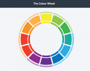
Figure 3.3.1 The Colour Wheel by Laura Underwood
Colours have relationships depending on their location on the wheel. Colours that are opposite each other are called complementary, and they contrast, creating a dynamic effect. Analogous colours are located next to each other and promote continuity and sense of unity.
Blue-green colour blindness, and red-green colour blindness are fairly common, so avoid using these colour combinations if it is important for the audience to differentiate between them. If you are using a pie chart, for example, avoid putting a blue segment
next to a green one. Use labelling so that even if someone is colour blind, they will be able to tell the relative sizes of the pie segments and what they signify.
Colour is also a matter of culture. Some colours may be perceived as formal or informal, or masculine or feminine. Certain colours have understood meanings; for example, red is usually associated with danger, while green signals “go.” Make sure the colours you use align with your message. If you are discussing climate change or the natural world, for example, you’d be more likely to use blues and greens rather than metallic colours to avoid confusing the audience.
Helpful Hints
Visual aids can be a powerful tool when used effectively but can run the risk of dominating your presentation. Consider your audience and how the portrayal of images, text, graphic, animated sequences, or sound files will contribute or detract from your presentation. Here are some hints to keep in mind as you prepare yours.
- Keep it simple
- One idea per slide
- Avoid clutter
- Use large, bold fonts that can be read from at least 20 feet away
- Use contrasting colours for a dynamic effect
- Use analogous colours to unify ideas
- Do not use clip art
- Proofread each slide with care
- Test in the presentation room beforehand
- If you are using a computer for your visual aids, have a backup plan
Using visual aids takes time and practice. The more you practise before your speech, the more comfortable you will be with your visual aids and the role they serve. Know your material well enough that you refer to your visual aids, not rely on them.
Check Your Understanding
Attribution statement (presentation aids).
This chapter is a remix containing content from a variety of sources published under a variety of open licenses, including the following:
Chapter Content
- Original content contributed by the Olds College OER Development Team, of Olds College to Professional Communications Open Curriculum under a CC-BY 4.0 license
- Content adapted from Nonverbal Delivery in Communication for Business Success, created by Anonymous, for previously shared at http://2012books.lardbucket.org/books/communication-for-business-success-canadian-edition/s15-non-verbal-delivery.html under a CC BY-NC-SA 3.0 license
- Content created by Jenn Q. Goddu, for Providing Feedback to Speakers from The Public Speaking Project, previously shared at http://publicspeakingproject.org/listening.html under a CC BY-NC-ND 4.0 license
Check Your Understandings
- Original assessment items contributed by the Olds College OER Development Team, of Olds College to Professional Communications Open Curriculum under a CC-BY 4.0 license
- Assessment items adapted from Boundless, for Boundless Communications, Choosing Appropriate Words Chapter Quiz, previously shared at https://www.boundless.com/quizzes/using-language-effectively-quiz-81357/ under a CC BY-SA 4.0 license
- Assessment items adapted from Boundless, for Boundless Communications, Defining an Informative Speech Chapter Quiz, previously shared at https://www.boundless.com/communications/textbooks/boundless-communications-textbook/informative-speaking-13/introduction-to-informative-speaking-69/defining-an-informative-speech-270-76/ under a CC BY-SA 4.0 license
- Assessment items adapted from Boundless, for Boundless Communications, Presentation Quiz, previously shared at https://www.boundless.com/quizzes/week-4-boundless-presentation-quiz-77222/ under a CC BY-SA 4.0 license
Professional Communications Copyright © by Olds College is licensed under a Creative Commons Attribution 4.0 International License , except where otherwise noted.
Share This Book
10 Presentation Aids To Enhance Your Presentation
Table of contents.
You’re putting together a presentation and you’ve considered using presentation aids but don’t know where to begin?
Whether you’re a seasoned veteran presenter or new to the industry and looking on how to become a better presenter , we’ve got you covered with tips and tricks and everything you need to know about presentation aids.
We’ve put together this comprehensive list of 10 presentation aids you should incorporate in your next presentation, seminar, public speaking event or any other audience engagement to ensure your key messages are retained and you remain at the forefront of people’s minds.
Whether it’s visual aids, creative design or new ideas you wouldn’t necessarily think of to use in your line of work, we’ve broken down the bias to help give you a fresh mind on some presentation aids you should use.
What Are Presentation Aids?

A presentation aid is a complementary tool you can and should use in order to have your presentation stand out and enhance it.
They are sensory aids to help elevate your speech, performance or powerpoint presentation.
Where words fail, presentation aids come in to support.
A presentation aid can be used alone or in combination with other presentation aids. More often than not, it is encouraged to combine a couple of presentation aids to target the different senses – hearing, vision, smell, & taste.
The more senses you target, the more likely your presentation will be remembered.
For example, audio and video clips might be sprinkled throughout your presentation slide deck. Although these are all different presentation aids, using them in a combined way will enhance the overall presentation and increase audience engagement.
Presentation aids work because they tap into the presentation psychology ; the underpinning of our minds and how we perceive and remember great presentations. Whether someone is an auditory or visual learner, using additional presentation aids that target these senses will help take your presentation from average to phenomenal.
Why Do Presenters Use Presentation Aids?

Every presenter has their reasoning for selecting the presentation aids they use.
With the advancement of technology, presenters have been using more and more visual aids in their presentations in order to enhance the overall audience experience and create a great visual presentation .
Whether your presentation is in-person or instead a virtual presentation , the objective is always the same. Get your key messaging across with minimal miscommunication. Getting your key message across to your audience members can be done with the help of effective presentation aids.

Both informal and formal presentations incorporate some degree of presentation aids.
Presentation aids provide many benefits to a presenter. A presenter may use a combination of both visual aids and auditory aids to increase audience engagement and to help deliver their message.
Let’s break it down as to why a presenter would use visual aids and why a presenter would use auditory aids.
At a high level, it first depends on the audience. You should always begin crafting your presentation by understanding who your audience is and what you want them to take away from your presentation. This will help define the aids you select.
If your audience has a shorter attention span such as young adults or children, consider using more visual aids like videos or imagery. You may do this by adding videos into your PowerPoint presentation or adding images.
Perhaps you want your audience to remember things or act on something after the presentation has already concluded. A brochure or presentation handout might be a great aid to use as it leaves a physical, tangible item with the audience.
Trying to get funding or convert audience members into sales? A demonstration or live performance of the product can help people envision themselves using the product.
Presentation aids are used to help deliver your message and influence people. Understand your audience and the message you want them to take away and you’re halfway done deciding which complementary presentation tool you should use.
10 Types Of Presentation Aids
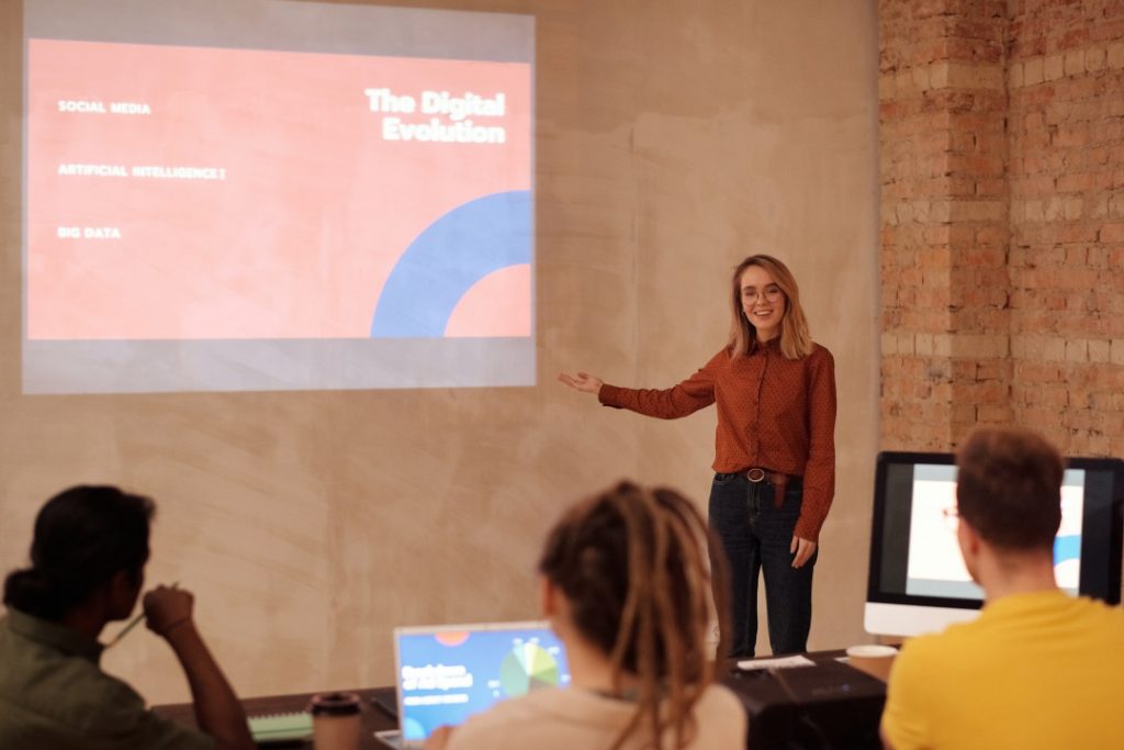
Before we begin going through the list of presentation aids you should use, we want to first preface with a word of caution.
Don’t overdo it.
As tempting as it may be to incorporate all 10 presentation types of presentation aids into your allotted time, don’t. You may be doing yourself a disservice.
Too many presentation aids may begin to distract your audience rather than support your messaging.
If you give your audience a handout, have them glance at an image with some written text all on one slide all the while you’re speaking over everything, there is too much going on. Your audience won’t know where to place their attention.
Also, some presentation aids don’t work in the environment in which the presentation is being held.
For example, if your presentation is virtual with absolutely no in-person audience members, a demonstration or live performance might not make practical sense.
Use these tools sparingly.
With that being said, let’s dive into the top 10 types of presentation aids we believe you should incorporate into your next presentation based on presentation feedback we’ve received over the years as presentation designers.
1 – PowerPoint Slides, Google Slides & Prezi Slides

One of the very first presentation aids we’ve all been taught to use and have more than likely used at least once in a school or work environment is a presentation slide deck.
Almost all presentations nowadays have a slide deck accompanying the presentation since it has been engrained in our minds as an essential for every presentation.
Whether it’s a motivational speech, client pitch presentation , RFP presentation , virtual presentation or an investment pitch presentation , they typically always use a slide deck.
Slide decks are great because they’re often easily customizable and there are plenty of well designed templates you can find online.

Slide decks such as PowerPoint Slides, Google Slides and Prezi Slides also allow a presenter to incorporate additional presentation aids such as videos, images or graphs seamlessly. Rather than having to jump back and forth between tabs, monitors or computers, a presentation slide deck consolidates all the information into one place.
When presenting to a large audience, a slide deck also allows audience members who are seated at the back of the venue to still take away the key points you’re trying to highlight. When highlighting key points, they will often be mentioned in the slide deck which is often displayed using a large projector and screen or video monitor.
Lastly, a presentation slide deck is a great tool to use as a reference.
The key details should be illustrated in the slide deck. Once the presentation is over, the slide deck can be a stand alone takeaway the audience or client can reference at a later date once the presentation has long past.
2 – Visual Aids, Audio And Video Clips

At a minimum, you should have at least one of the following presentation aids – imagery, audio or video.
Imagery can be more than just a photo. Imagery encompasses your slide deck, the color theory you use such as brand colors, how you embellish quotes and more.

For example, rather than sticking a text block on your slide deck with a quote, try enhancing the quote with the some visual appeal. You may consider adding a photo of the person who said the quote, stylizing the font with script writing so it seems more humanized and lastly using colors to highlight key words you want to bring to the audience’s attention.
Audio is another great tool to use, especially if you plan on incorporating motion graphics in your presentation. It also adds a layer of depth.
Since the audience will likely be hearing you speak for a majority of the presentation, having a pre-recorded narration over motion graphics will help create a “unique moment” in your presentation – almost like a bookmark. This will help your audience segment your presentation and retain information better.
Finally, videos have continued to grow in popularity as it is a combination of both visual aids and auditory aids.
Your video can be a live action video with real actors or it can be a stop motion animation. Whatever video style you decide, a video clip will help get your message across and enhance audience memory.
By combining all three aids, you’re targeting a combination of both visual and auditory senses. This combination will help your presentation stick out as human learning occurs visually and through auditory.
3 – Sizzle Reels
Although similar to videos, sizzle reels add a bit of flair traditional videos often lack.
Sentiment wise, videos can be positive, neutral or even negative while a sizzle reel’s sentiment is usually always positive.
Sizzle reels are very promotional in the sense that they are created with an intended purpose to have the audience act or feel in a certain way.
Unlike a video which may be used to support an argument or provide raw, unfiltered visual dialogue, a sizzle reel is typically created with a specific purpose for persuasion or selling.
Oftentimes, a sizzle reel is used to demonstrate or highlight a specific idea, product or sample of work usually presented with positive connotation. The presenter is trying to get the audience to be on the same page as them.
Like a video, a sizzle reel can be live action or animated – it is the intention of the video which makes it a sizzle reel or not.
4 – Motion Graphics
Keep your audience’s eyes stimulated by incorporating motion graphics into your presentation.
Motion graphics use the illusion of motion or rotation to make something which is typically stationary to appear as though it’s moving.
Motion graphics are great when they are used effectively. Too much motion graphics or improperly used motion graphics takes away your presentation’s credibility as it may begin to appear too animated and comical.
Depending on your presentation niche, motion graphics can really help enhance your presentation.
If your presentation primarily deals with lots of text, consider using motion graphics to help liven things up.
PresGeek Portfolio - Flowmill Explainer Video from Presentation Geeks on Vimeo .
You may be thinking to yourself, “Well, why not just use video?”. To that we say video isn’t for every industry. Although video may seem like the best option, it can often hurt your presentation more than it benefits it.
Consider a historical speech, one with a powerful message. Would you rather just watch a video of the person speaking, or perhaps a carefully curated kinetic typography motion graphic?
In this instance, although a video is still acceptable, you would be better off with motion graphics.
Motion graphics aren’t to be confused with animation. The difference between motion graphics and animation is motion graphics convert a typically stationary object into a moving one. Motion graphics don’t follow a typical storytelling narrative.
Animation on the other hand takes the audience on an emotional journey through storytelling which is an additional presentation aid we will discuss.
5 – 3D Modeling & Animation
If motion graphics aren’t enough, try using 3D Modeling and animation to bring your ideas to life and help tell a story!
3D Modeling and animation help bring hard to conceptualize ideas into a more tangible reality.
For example, if you’re presenting a prototype of a car, home or the latest piece of tech, spending money into developing a fully functional or full-scale product may not be feasible – especially if you’re merely pitching the idea to get funding in the first place.

3D modeling allows your audience to see how the product will look and perform if it were real.
Animation helps connect your messaging to your audience through the art of storytelling. Animation allows you to tell stories far beyond the scope of what is in our reality and can really help emphasize your brand’s essence.
For example, Red Bull did a great job with their advertising using the art of animation. Red Bull’s slogan of “Red Bull gives you wings” is personified through animation as their animated characters are given wings after drinking their product. They’re also put in high-intensity situations. Although often comical, animation helped bring the brand essence to life.
This could still be done with live-action actors and CGI, but the cost is far more than animation.
Animation is a cost-effective storytelling tool to bring even the most extremes of situations into a digestible reality.
6 – Maps
Our world has shifted to become a global village.
It is almost impossible to go about your day without hearing a piece of international news.
Whether it’s news, politics, culture or business, we are connected to different nations around the world. As you progress in your life, you’ll soon encounter yourself presenting to people around the world whether virtually or in-person.
If you are presenting to people around the world whether it be for politics, culture or business, adding a map is another great presentation aid to help visualize the interconnectedness between each other.
A map can be used to highlight geographical hotspots, geographical trends and more.
Here are some examples we’ve put together of when you would use a map.
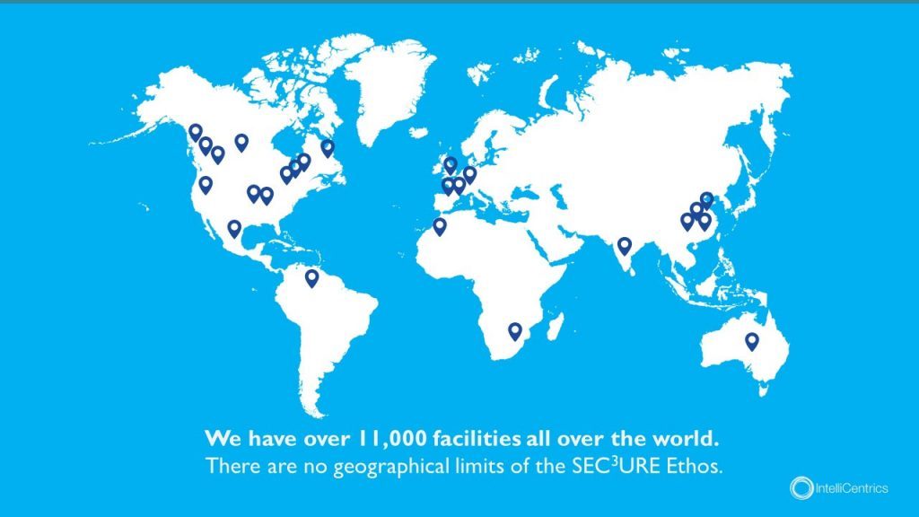
Planning to expand your business? Why not include a map pinpointing all your existing locations relative to your new expansion.
Planning to show how diseases spread throughout the world and relative hotspots of infections? Consider adding a map with varying degrees of color to highlight infection densities.
Maps don’t need to be international either depicting every country – they can be used for small businesses showcasing a localized region.
Lastly, maps help put things into perspective. Tying back to presentation psychology, people are more likely to express emotions or feel connected to something the closer they are to it, physically. By using a map, you can put your message into perspective for your audience.
7 – Infographic Charts & Graphs
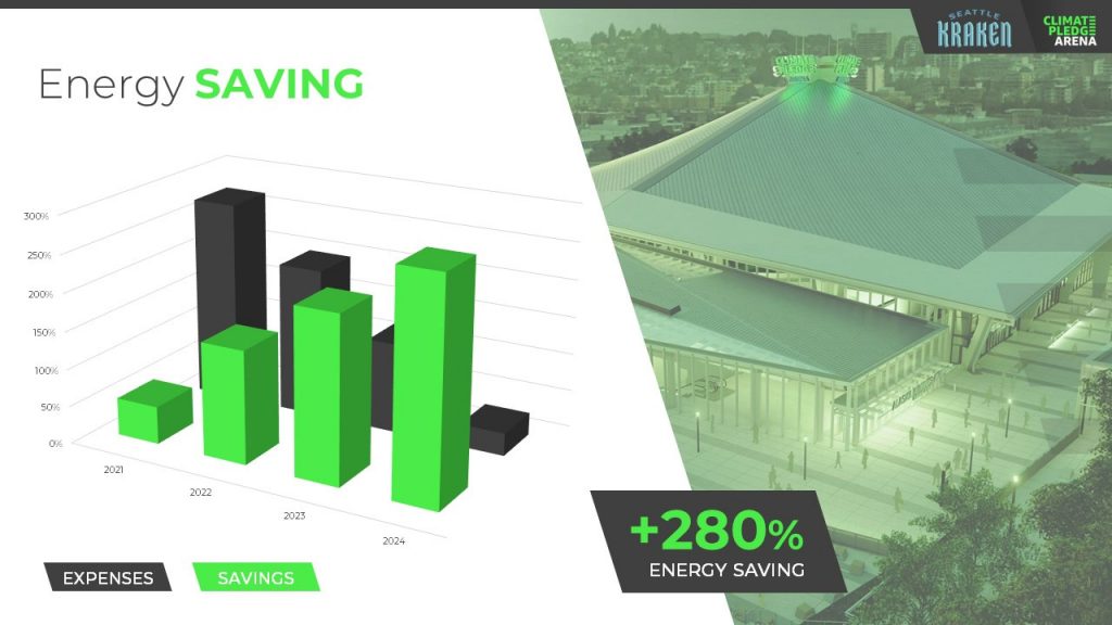
Rather than simply putting a few numbers up on a slide deck and calling it a day, try inputting these numbers in a chart or graph.
You have to consider your audience and not everyone learns or absorbs information by simply reading. They need to visualize comparisons and differences. Charts and graphs are one great way to do this.
Let’s take a look at the example above. It could’ve been easy enough to show there was a 280% increase in energy saving, but we were missing a big chunk of the story which was expenses were declining. You also don’t see the scale of energy savings relative to expenses with just words.
Instead, opting to put numbers into a visual format, the audience members can easily understand the advantages and compare it to the change over time.
Remember – try and avoid very complex graphs. When you start to input complex graphs into a presentation, you’ll begin to lose the audience as they will be too busy focusing on understanding the graph.
If possible, leave the audience with resources they can look back to after the presentation such as a brochure or handout where they can take as much time as they need to digest more robust graphs.
8 – Infographic Diagrams
Unlike charts and graphs which primarily focus on data and numbers, a diagram focuses on the appearance, structure, flow or workings of something.
A diagram is a great presentation aid to use as it helps break complex ideas into step-by-step sections the audience can follow along with.
Not only does it provide clear steps, but it can help speak to key points of a product or timeline.
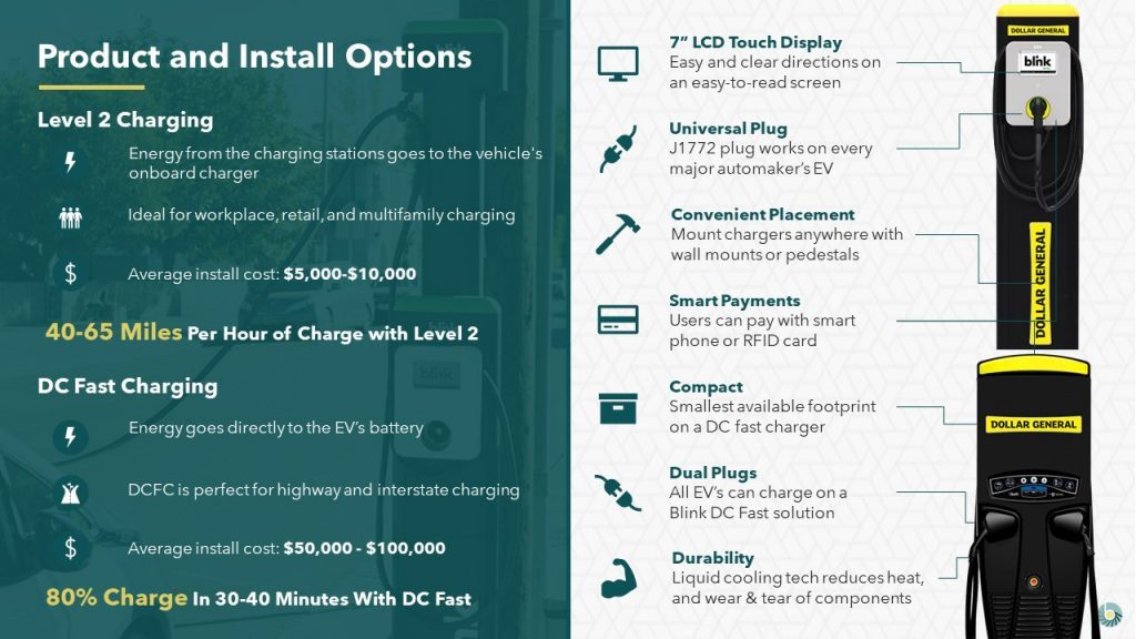
For example, this diagram goes over the structure of an EV charger.
Rather than just showing an image of the charger with bullet points off to the side, a diagram provides clear connection lines from the point being made and where it’s located on the final product.

Diagrams also help illustrate flow. Whether it be the customer journey, your product development or your company’s growth, diagrams are great ways to show consistent progression in a logical, step-by-step pattern.
9 – Brochures & Presentation Handouts
One way to really connect with your audience and almost guarantee they’ll leave the presentation remembering something is with a brochure or handout.
A brochure or handout is a physical printout which could be a combination of images, written text and diagrams.
Oftentimes, brochures and handouts are used to elaborate on information already being presented but in further detail. Depending on the scope of your presentation, you may want to opt to have a brochure or presentation handout.
If the nature of your presentation requires thorough research, data and insight such as business or healthcare, a handout can allow your audience to review the information at their own pace at a later time.
A brochure or handout also allows audience members to jot down information.
This is important if you’re trying to encourage audience participation.
By enabling the audience to jot down their own notes and have time near the end of your presentation for them to collaborate and speak to points throughout your presentation, you’ll be engaging in a discourse with your audience.
10 – Demonstration or Live Performance

The last presentation aid we recommend is also one of the hardest to pull off – a demonstration or live performance.
A demonstration or live performance is when you’re presenting the truth and validity of something. For example, you might do a demonstration of how your product performs. Or, instead of playing music, you could have a live performance.
One of the most well-known presenters to do demonstrations or live performances is Steve Jobs. At the unveiling of any new Apple product, Steve Jobs was there on stage with the product in-hand ready to demonstrate its state of the art capabilities.
Demonstration or live performances are one of the best presentation aids to use as they often go hand in hand with public relations. Whether the performance goes well or bad, you can almost be sure there will be press coverage of it afterwards.
A great example of a demonstration which went south was Tesla’s Cybertruck and their armored windows . What was supposed to be strong, armored glass came to a shattering end when a Tesla employee threw a steel ball at not just one window, but both the front and rear window leaving both of them shattered. The hope was for the steel ball to ricochet off the window to demonstrate their durability, but instead they failed.
Although this might seem like a failure, the coverage it got after the presentation was a complete publicity success.
Advantages & Disadvantages Of Using Presentation Aids
As with everything in life, there are always two sides of the coin – positives and negatives.
The same goes for using presentation aids.
Rather than experimenting yourself and learning the hard way of advantages and disadvantages, we’ve put together this short yet informative section to help guide your decision making.
Presentation aids are great complementary tools you should use in every presentation. They allow you to connect with audience members in new and unique ways.
One of the advantages of using presentation aids is to appeal to different audiences.
Everyone has a different attention span. Everyone also learns and absorbs information differently. By disseminating your key message using new and unique methods, you’re able to appeal to a larger audience.
Secondly, presentation aids allow the lifespan of your presentation to be extended.
Imagine your presentation was only you speaking. The moment you’re done talking, the presentation is over and it begins to fade from people’s memory. With the help of presentation aids, you avoid this outcome and extend how long your presentation is remembered for.
For example, if you used a slide deck to accompany your presentation, the slide deck can be made available to audience members after the presentation to reference.
Lastly, presentation aids help reduce the attention that’s put on you and allow you to take breaks while presenting.
If you’re a beginner, it can be intimidating to be the center of attention. With the added use of presentation aids, you can break up your presentation to allow the aids to do the work. If you have a video, once you begin to play it, the audience’s attention will be redirected to the video. This will allow you time to pause, recollect your thoughts, take a drink of water if needed and continue on with the presentation afterwards.
Disadvantages
Presentation aids are not the miracle solution.
If you don’t have a solid foundation on which your presentation is built upon, it doesn’t matter how many or which presentation aids you decide to use. You need to ensure your presentation is properly structured from the beginning.
Presenters can also get carried away with using too many presentation aids.
When you don’t take the time to reflect on the presentation aids you are using and just begin spitballing every presentation aid into your presentation just because you know of these tools, doesn’t mean you should. They begin to become a distraction and takeaway from the messaging you’re trying to get across.
Conclusion – Should You Use Presentation Aids?
The short and sweet answer is yes. You should absolutely use presentation aids.
Unless your plan is to only be a storyteller letting the audience create an image in their mind, then you should consider using at least one of the presentation aid types mentioned above.
Not only will presentation aids help your audience learn and retain the information better, it may actually help you!
Presentation aids require you to contribute more work to the final product. It requires you to carefully think of the story you’re trying to convey to your audience and which best method to do so. By taking this extra bit of time to sit down and reflect on your presentation and actually produce well-crafted aids, you’ll be setting yourself up as a thought-leader on the topic.
If You’re looking for a Pitch Deck Design Agency , we can help. Just click the button below to start your journey!
Author: Ryan
Related posts.

FREE PROFESSIONAL RESOURCES DELIVERED TO YOUR INBOX.
Subscribe for free tips, resources, templates, ideas and more from our professional team of presentation designers.
Want to create or adapt books like this? Learn more about how Pressbooks supports open publishing practices.
15.2 Types of Presentation Aids
Learning objectives.
- Understand how charts can be used to present information.
- Explain the importance of using graphs while speaking.
- Describe four common types of representations.
- Differentiate between objects and models.
- Identify why speakers may use people as presentation aids.
As we saw in the case of the orientation presentation at the organic farming conference, using presentation aids can be risky. However, with a little forethought and adequate practice, you can choose presentation aids that enhance your message and boost your professional appearance in front of an audience.
One principle to keep in mind is to use only as many presentation aids as necessary to present your message or to fulfill your classroom assignment. Although the maxim “less is more” may sound like a cliché, it really does apply in this instance. The number and the technical sophistication of your presentation aids should never overshadow your speech.
Another important consideration is technology. Keep your presentation aids within the limits of the working technology available to you. Whether or not your classroom technology works on the day of your speech, you will still have to present. What will you do if the computer file containing your slides is corrupted? What will you do if the easel is broken? What if you had counted on stacking your visuals on a table that disappears right when you need it? You must be prepared to adapt to an uncomfortable and scary situation. This is why we urge students to go to the classroom at least fifteen minutes ahead of time to test the equipment and ascertain the condition of things they’re planning to use. As the speaker, you are responsible for arranging the things you need to make your presentation aids work as intended. Carry a roll of duct tape so you can display your poster even if the easel is gone. Find an extra chair if your table has disappeared. Test the computer setup, and have an alternative plan prepared in case there is some glitch that prevents your computer-based presentation aids from being usable. The more sophisticated the equipment is, the more you should be prepared with an alternative, even in a “smart classroom.”
More important than the method of delivery is the audience’s ability to see and understand the presentation aid. It must deliver clear information, and it must not distract from the message. Avoid overly elaborate presentation aids because they can distract the audience’s attention from your message. Instead, simplify as much as possible, emphasizing the information you want your audience to understand.
Another thing to remember is that presentation aids do not “speak for themselves.” When you display a visual aid, you should explain what it shows, pointing out and naming the most important features. If you use an audio aid such as a musical excerpt, you need to tell your audience what to listen for. Similarly, if you use a video clip, it is up to you as the speaker to point out the characteristics in the video that support the point you are making.
Although there are many useful presentation tools, you should not attempt to use every one of these tools in a single speech. Your presentation aids should be designed to look like a coherent set. For instance, if you decide to use three slides and a poster, all four of these visual aids should make use of the same type font and basic design.
Now that we’ve explored some basic hints for preparing visual aids, let’s look at the most common types of visual aids: charts, graphs, representations, objects/models, and people.
A chart is commonly defined as a graphical representation of data (often numerical) or a sketch representing an ordered process. Whether you create your charts or do research to find charts that already exist, it is important for them to exactly match the specific purpose in your speech. Figure 15.6 “Acupuncture Charts” shows two charts related to acupuncture. Although both charts are good, they are not equal. One chart might be useful in a speech about the history and development of acupuncture, while the other chart would be more useful for showing the locations of meridians, or the lines along which energy is thought to flow, and the acupuncture points.
Figure 15.6 Acupuncture Charts

Wikimedia Commons – public domains.
In the rest of this section, we’re going to explore three common types of charts: statistical charts, sequence-of-steps chart, and decision trees.
Statistical Charts
Figure 15.7 Birth Weight Chi-Square
Source: Woods, S. E., & Raju, U. (2001). Maternal smoking and the risk of congenital birth defects: A cohort study. Journal of the American Board of Family Practitioners, 14 , 330–334.
For most audiences, statistical presentations must be kept as simple as possible, and they must be explained. The statistical chart shown in Figure 15.7 “Birth Weight Chi-Square” is from a study examining the effects of maternal smoking on a range of congenital birth defects. Unless you are familiar with statistics, this chart may be very confusing. When visually displaying information from a quantitative study, you need to make sure that you understand the material and can successfully and simply explain how one should interpret the data. If you are unsure about the data yourself, then you should probably not use this type of information. This is surely an example of a visual aid that, although it delivers a limited kind of information, does not speak for itself.
Sequence-of-Steps Charts
Figure 15.8 Steps in Cell Reproduction
Wikimedia Commons – public domain; and Wikimeida Commons – public domain.
Charts are also useful when you are trying to explain a process that involves several steps. The two visual aids in Figure 15.8 “Steps in Cell Reproduction” both depict the process of cell division called mitosis using a sequence-of-steps chart, but they each deliver different information. The first chart lacks labels to indicate the different phases of cell division. Although the first chart may have more color and look more polished, the missing information may confuse your audience. In the second chart, each phase is labeled with a brief explanation of what is happening, which can help your audience understand the process.
Decision Trees
Figure 15.9 To Play or Not to Play
Wikimedia Commons – public domain.
Decision trees are useful for showing the relationships between ideas. The example in Figure 15.9 “To Play or Not to Play” shows how a decision tree could be used to determine the appropriate weather for playing baseball. As with the other types of charts, you want to be sure that the information in the chart is relevant to the purpose of your speech and that each question and decision is clearly labeled.
Strictly speaking, a graph may be considered a type of chart, but graphs are so widely used that we will discuss them separately. A graph is a pictorial representation of the relationships of quantitative data using dots, lines, bars, pie slices, and the like. Graphs show the variation in one variable in comparison with that of one or more other variables. Where a statistical chart may report the mean ages of individuals entering college, a graph would show how the mean age changes over time. A statistical chart may report the amount of computers sold in the United States, while a graph will show the breakdown of those computers by operating systems such as Windows, Macintosh, and Linux. Public speakers can show graphs using a range of different formats. Some of those formats are specialized for various professional fields. Very complex graphs often contain too much information that is not related to the purpose of a student’s speech. If the graph is cluttered, it becomes difficult to comprehend.
In this section, we’re going to analyze the common graphs speakers utilize in their speeches: line graphs, bar graphs, and pie graphs.
Figure 15.10 Enron’s Stock Price
Wikimedia Common – CC BY-SA 2.0.
A line graph is designed to show trends over time. In Figure 15.10 “Enron’s Stock Price” , we see a line graph depicting the fall of Enron’s stock price from August 2000 to January 2002. Notice that although it has some steep rises, the line has an overall downward trend clearly depicting the plummeting of Enron’s stock price. Showing such a line graph helps the audience see the relationships between the numbers, and audiences can understand the information by seeing the graph much more easily than they could if the speaker just read the numbers aloud.
Bar graphs are useful for showing the differences between quantities. They can be used for population demographics, fuel costs, math ability in different grades, and many other kinds of data.
The graph in Figure 15.11 “Natural Death vs. Homicide” is well designed. It is relatively simple and is carefully labeled, making it easy for you to guide your audience through the quantities of each type of death. The bar graph is designed to show the difference between natural deaths and homicides across various age groups. When you look at the data, the first grouping clearly shows that eighteen- to twenty-four-year-olds are more likely to die because of a homicide than any of the other age groups.
Figure 15.11 Natural Death vs. Homicide
The graph in Figure 15.12 “Distribution of Income and Wealth in the United States” is a complicated bar graph depicting the disparity between the haves and the have nots within the United States. On the left hand side of the graph you can see that the Top 20% of people within the United States account for 84.7% of all of the wealth and 50.1% of all of the income. On the other hand, those in the bottom 40% account for only 0.2% of the wealth and 12.1% of the actual income.
Figure 15.12 Distribution of Income and Wealth in the United States

Source: Wolff, E. N. (2007). Recent trends in household wealth in the United States: Rising debt and the middle-class squeeze (Working Paper No. 502). Retrieved from the Levy Economics Institute of Bard College website: http://www.levy.org/pubs/wp_502.pdf
While the graph is very well designed, it presents a great deal of information. In a written publication, readers will have time to sit and analyze the graph, but in a speaking situation, audience members need to be able to understand the information in a graph very quickly. For that reason, this graph is probably not as effective for speeches as the one in Figure 15.11 “Natural Death vs. Homicide” .
Pie graphs should be simplified as much as possible without eliminating important information. As with other graphs, the sections of the pie need to be plotted proportionally. In the pie graph shown in Figure 15.13 “Causes of Concussions in Children” , we see a clear and proportional chart that has been color-coded. Color-coding is useful when it’s difficult to fit the explanations in the actual sections of the graph; in that case, you need to include a legend, or key, to indicate what the colors in the graph mean. In this graph, audience members can see very quickly that falls are the primary reason children receive concussions.
Figure 15.13 Causes of Concussions in Children
Figure 15.14 World Populations

The pie graph in Figure 15.14 “World Populations” is jumbled, illegible, confusing, and overwhelming in every way. The use of color coding doesn’t help. Overall, this graph simply contains too much information and is more likely to confuse an audience than help them understand something.
Representations
In the world of presentation aids, representations is the word used to classify a group of aids designed to represent real processes or objects. Often, speakers want to visually demonstrate something that they cannot physically bring with them to the speech. Maybe you’re giving a speech on the human brain, and you just don’t have access to a cadaver’s brain. Instead of bringing in a real brain, you could use a picture of a brain or an image that represents the human brain. In this section we’re going to explore four common representations: diagrams, maps, photographs, and video or recordings.
Diagrams are drawings or sketches that outline and explain the parts of an object, process, or phenomenon that cannot be readily seen. Like graphs, diagrams can be considered a type of chart, as in the case of organization charts and process flow charts.
Figure 15.15 The Human Eye
When you use a diagram, be sure to explain each part of the phenomenon, paying special attention to elements that are complicated or prone to misunderstanding. In the example shown in Figure 15.15 “The Human Eye” , you might wish to highlight that the light stimulus is reversed when it is processed through the brain or that the optic nerve is not a single stalk as many people think.
Maps are extremely useful if the information is clear and limited. There are all kinds of maps, including population, weather, ocean current, political, and economic maps, but you should be able to find the right kind for the purpose of your speech. Choose a map that emphasizes the information you need to deliver.
The map shown in Figure 15.16 “African Map with Nigerian Emphasis” is simple, showing clearly the geographic location of Nigeria. This can be extremely valuable for some audiences who might not be able to name and locate countries on the continent of Africa.
Figure 15.16 African Map with Nigerian Emphasis
Figure 15.17 Rhode Island Map

Source: Map courtesy of the National Atlas of the United States.
Figure 15.17 “Rhode Island Map” is a map of the state of Rhode Island, and it emphasizes the complicated configuration of islands and waterways that characterize this state’s geography. Although the map does not list the names of the islands, it is helpful in orienting the audience to the direction and distance of the islands to other geographic features, such as the city of Providence and the Atlantic Ocean.
Photographs and Drawings
Figure 15.18 Wigwam Picture
Iheartpandas – Wigwams – CC BY-NC-ND 2.0.
Figure 15.19 Ship’s Rigging

Sometimes a photograph or a drawing is the best way to show an unfamiliar but important detail. Figure 15.18 “Wigwam Picture” is a photograph of a wigwam, a wigwam was a living dwelling used by Native Americans in the North East. In this photograph you can see the curved birchbark exterior, which makes this dwelling ideal for a variety of weather conditions. The photograph of the tall ship in Figure 15.19 “Ship’s Rigging” emphasizes the sheer amount and complexity of the ship’s rigging.
Video or Audio Recordings
Another very useful type of presentation aid is a video or audio recording. Whether it is a short video from a website such as YouTube or Vimeo, a segment from a song, or a piece of a podcast, a well-chosen video or audio recording may be a good choice to enhance your speech.
Imagine, for example, that you’re giving a speech on how “Lap-Band” surgeries help people lose weight. One of the sections of your speech could explain how the Lap-Band works, so you could easily show the following forty-three-second video to demonstrate the medical part of the surgery ( http://www.youtube.com/watch?v=KPuThbFMxGg ). Maybe you want to include a recording of a real patient explaining why he or she decided to get the Lap-Band. Then you could include a podcast like this one from the Medical University of South Carolina ( http://medicaluniversc.http.internapcdn.net/medicaluniversc_vitalstream_com/podcasts/2007/1_Treado_June_22_final.mp3 ).
There is one major caveat to using audio and video clips during a speech: do not forget that they are supposed to be aids to your speech, not the speech itself! In addition, be sure to avoid these three mistakes that speakers often make when using audio and video clips:
- Avoid choosing clips that are too long for the overall length of the speech. If you are giving a five-minute speech, then any audio or video clip you use should be under thirty seconds in length.
- Don’t fail to practice with the audio or video equipment prior to speaking. If you are unfamiliar with the equipment, you’ll look foolish trying to figure out how it works. This fiddling around will not only take your audience out of your speech but also have a negative impact on your credibility.
- Don’t fail to cue the clip to the appropriate place prior to beginning your speech. We cannot tell you the number of times we’ve seen students spend valuable speech time trying to find a clip on YouTube or a DVD. You need to make sure your clip is ready to go before you start speaking.
Objects or Models
Objects and models are another form of presentation aid that can be very helpful in getting your audience to understand your message. Objects refer to anything you could hold up and talk about during your speech. If you’re talking about the importance of not using plastic water bottles, you might hold up a plastic water bottle and a stainless steel water bottle as examples. If you’re talking about the percussion family of musical instruments and you own (and can play) several different percussion instruments, you can show your audience in person what they look like and how they sound.
Models , on the other hand, are re-creations of physical objects that you cannot have readily available with you during a speech. If you’re giving a speech on heart murmurs, you may be able to show how heart murmurs work by holding up a model of the human heart.
People and Animals
The next category of presentation aids are people and animals. We can often use ourselves or other people to adequately demonstrate an idea during our speeches.
Animals as Presentation Aids
When giving a speech on a topic relating to animals, it is often tempting to bring an animal to serve as your presentation aid. While this can sometimes add a very engaging dimension to the speech, it carries some serious risks that you need to consider.
The first risk is that animal behavior tends to be unpredictable. You may think this won’t be a problem if your presentation aid animal is a small enough to be kept confined throughout your speech—for example, a goldfish in a bowl or a lizard or bird in a cage. However, even caged animals can be very distracting to your audience if they run about, chirp, or exhibit other agitated behavior. The chances are great that an animal will react to the stress of an unfamiliar situation by displaying behavior that does not contribute positively to your speech.
The second risk is that some audience members may respond negatively to a live animal. In addition to common fears and aversions to animals like snakes, spiders, and mice, many people have allergies to various animals.
The third risk is that some locations may have regulations about bringing animals onto the premises. If animals are allowed, the person bringing the animal may be required to bring a veterinary certificate or may be legally responsible for any damage caused by the animal.
For these reasons, before you decide to use an animal as a presentation aid, ask yourself if you could make your point equally well with a picture, model, diagram, or other representation of the animal in question.
Speaker as Presentation Aid
Speakers can often use their own bodies to demonstrate facets of a speech. If your speech is about ballroom dancing or ballet, you might use your body to demonstrate the basic moves in the cha-cha or the five basic ballet positions.
Other People as Presentation Aids
In many speeches, it can be cumbersome and distracting for the speaker to use her or his own body to illustrate a point. In such cases, the best solution is to ask someone else to serve as your presentation aid.
You should arrange ahead of time for a person (or persons) to be an effective aid—do not assume that an audience member will volunteer on the spot. If you plan to demonstrate how to immobilize a broken bone, your volunteer must know ahead of time that you will touch him or her as much as necessary to splint their foot. You must also make certain that they will arrive dressed presentably and that they will not draw attention away from your message through their appearance or behavior.
The transaction between you and your human presentation aid must be appropriate, especially if you are going to demonstrate something like a dance step. Use your absolute best judgment about behavior, and make sure that your human presentation aid understands this dimension of the task.
Key Takeaways
- Various types of charts can aid audience understanding of a speaker’s message. Statistical charts help audiences see and interpret numerical information. Sequence-of-steps charts show how a process occurs. Decision trees help audience members see how a specific decision can be made in a logical fashion.
- Line graphs, bar graphs, and pie graphs are commonly used by speakers to help present numerical information. The information presented on a graph should be clean and easily understandable from a distance.
- Representations are presentation aids designed to represent a real process or object. Commonly used representations in public speaking include diagrams, maps, photographs, and video or audio recordings.
- Objects are physical items that can be held up and used during a speech. Models, on the other hand, refer to tangible items that can be held during a speech, but are not the actual object but rather a facsimile of it.
- Speakers often will use their own bodies or the bodies of other people to help them illustrate a part of a speech. When using another person, it is very important to coach that person prior to the speech to ensure that he or she will not upstage the speaker. Using animals as presentation aids is generally not recommended.
- Watch the video on gshep1’s YouTube channel from Booher Consultants at http://www.youtube.com/user/gshep1 . How many mistakes can you identify that this speaker makes in using presentation aids?
- Find a speech on YouTube and see what types of presentation aids the speaker uses. Does the speaker select appropriate aids? How could you have made them better? Were there any missing presentation aids that should have been in the speech?
- Create a chart representing the speech creation process. Try using either a sequence-of-steps chart or a decision tree.
- Think about your next speech. What presentation aids can you use in your speech to enhance your audience’s understanding?
Stand up, Speak out Copyright © 2016 by University of Minnesota is licensed under a Creative Commons Attribution-NonCommercial-ShareAlike 4.0 International License , except where otherwise noted.
Share This Book
How to Summarize a PowerPoint Presentation: Tips and Tricks for Techies
- Recent Posts
- How to Use Morph in PowerPoint: A Step-by-Step Guide - May 25, 2024
- How to Insert Bullets in PowerPoint: A Step-by-Step Guide - May 25, 2024
- How to Summarize a PowerPoint Presentation: Tips and Tricks for Techies - May 25, 2024
Have you ever sat through a lengthy PowerPoint presentation and struggled to recall the key points? As a presenter, it’s important to keep your audience engaged and ensure that they leave with a clear understanding of the main takeaways. One effective way to achieve this is by summarizing your presentation. In this article, I will share my personal experience and provide tips on how to summarize a PowerPoint presentation effectively.

When I first started presenting, I would often include too much information on each slide, making it difficult for my audience to keep up. I quickly learned that summarizing my presentation helped me to focus on the key points and made it easier for my audience to follow along. Summarizing a presentation also helped me to stay within the allotted time and prevented me from going off on tangents.
To summarize a PowerPoint presentation effectively, it’s important to review the entire presentation first. This allows you to get a sense of the overall flow and the key themes. Pay attention to the title slides and the concluding slides, as they often contain the main message and summary points. Once you have a clear understanding of the presentation, you can start to identify the key points that you want to highlight in your summary.
JUMP TO TOPIC
Designing with Clarity and Purpose
Incorporating visual aids and media, utilizing ai tools for enhanced productivity, identifying main points, creating a compelling summary slide, effective use of speech and body language, interactive elements and audience participation, exploring powerpoint’s ai capabilities, customizing presentations with advanced tools, crafting an effective powerpoint presentation.

When it comes to crafting an effective PowerPoint presentation, there are a few key elements to keep in mind. These include designing with clarity and purpose, incorporating visual aids and media, and utilizing AI tools for enhanced productivity.
To design a PowerPoint presentation with clarity and purpose, it is important to choose a theme that is both visually appealing and easy to read. Microsoft PowerPoint and Google Slides offer a variety of templates and themes to choose from, so take the time to explore your options and choose one that fits the content of your presentation.
In addition to choosing a theme, it is important to use a consistent font and color scheme throughout your presentation. This will help to create a cohesive and professional look that is easy for your audience to follow.
Visual aids and media can be a powerful tool for enhancing the effectiveness of your PowerPoint presentation. This can include images, videos, and other multimedia elements that help to illustrate your points and capture the attention of your audience.
When incorporating visual aids and media, it is important to use them strategically and sparingly. Too much visual stimulation can be overwhelming and distracting, so choose your images and media carefully and use them to enhance your message rather than detract from it.
Finally, AI-powered tools like Microsoft Copilot can be a valuable asset when it comes to creating an effective PowerPoint presentation. These tools can help to automate repetitive tasks and suggest content and design elements that are tailored to your specific needs.
When utilizing AI tools, it is important to remember that they are meant to enhance your creativity and productivity, not replace it. Use these tools as a starting point and then customize the content and design of your presentation to fit your unique needs and style.
In summary, crafting an effective PowerPoint presentation requires careful attention to detail and a focus on clarity, purpose, and visual appeal. By following these tips and utilizing the right tools, you can create a presentation that is both engaging and informative for your audience.
Summarizing Key Points for Impact
As I mentioned earlier, summarizing a PowerPoint presentation involves distilling complex ideas or data into concise and easily understandable points. In this section, I will discuss the two most important aspects of summarizing key points for impact: identifying main points and creating a compelling summary slide.
To effectively summarize a presentation, it is important to identify the main points. This involves reviewing the entire presentation and paying close attention to the title slides and concluding slides. These slides often contain the main message and summary points. Additionally, it is important to identify the key themes and supporting data points that reinforce the main message.
One effective way to identify the main points is to create an outline of the presentation. This can be done by breaking down the presentation into sections and identifying the main idea or message of each section. Once you have identified the main points, you can then prioritize them based on their importance and relevance to the overall message of the presentation.
A compelling summary slide is an essential component of an effective presentation summary. This slide should contain the main points of the presentation in a concise and visually appealing format. It should be easy to read and understand, and it should capture the audience’s attention.
One effective way to create a compelling summary slide is to use visuals such as graphs, charts, or images to illustrate the main points. Additionally, it is important to use clear and concise language that summarizes the main points in a way that is easy to understand.
To make the summary slide more impactful, it is also important to include a call to action. This can be a simple statement that encourages the audience to take action based on the information presented in the presentation. For example, if the presentation is promoting a product or service, the call to action could be to visit the company’s website or contact the sales team for more information.
Overall, summarizing key points for impact requires careful consideration of the main message and supporting data points. By identifying the main points and creating a compelling summary slide, you can effectively summarize a PowerPoint presentation and leave a lasting impression on your audience.
Engaging Your Audience
When it comes to delivering a PowerPoint presentation, engaging your audience is crucial. It is not enough to simply present your material; you must also find ways to connect with your audience and keep them interested throughout the presentation. In this section, I will discuss some effective methods for engaging your audience during a PowerPoint presentation.
One of the most important ways to engage your audience during a PowerPoint presentation is through effective use of speech and body language. It is important to speak clearly and confidently, using a tone of voice that is both engaging and informative. Additionally, your body language can play a significant role in engaging your audience. Make eye contact with your audience, use natural gestures, and move around the stage to keep your audience’s attention.
Another effective way to engage your audience during a PowerPoint presentation is through the use of interactive elements and audience participation. This can include things like polls, quizzes, and other interactive elements that allow your audience to participate actively in the presentation. Additionally, you can encourage audience participation by asking questions, soliciting feedback, and inviting discussion throughout the presentation.
In conclusion, engaging your audience during a PowerPoint presentation is essential for delivering an effective and memorable presentation. By using effective speech and body language, as well as incorporating interactive elements and audience participation, you can keep your audience engaged and interested throughout the presentation.
Leveraging PowerPoint’s Advanced Features
As a frequent user of PowerPoint, I am always exploring ways to enhance my presentations. PowerPoint offers a wealth of advanced features that can help you customize and summarize your presentations. In this section, I will explore some of the most useful features that can help you take your presentations to the next level.
One of the most exciting features of PowerPoint is its AI capabilities. With the help of Microsoft 365, PowerPoint can now create intelligent slides that can summarize your presentation in real-time. By using the Copilot feature, you can ask PowerPoint to summarize your presentation, and it will automatically generate a bulleted summary of the key points. This can save you a lot of time and effort, especially if you need to create a summary of a long presentation.
PowerPoint also offers a range of advanced tools that can help you customize your presentations. For example, you can use the ribbon to access a range of functions that can help you create charts, diagrams, and other visual aids. You can also use the ribbon to customize the functionality of your presentation, such as adding animations and transitions.
If you have a Microsoft 365 subscription, you can also take advantage of the subscription benefits that come with it. These benefits include access to a range of templates, themes, and other design tools that can help you create professional-looking presentations. You can also use the subscription to access a range of advanced features, such as the ability to collaborate with others on your presentations.
In conclusion, PowerPoint offers a range of advanced features that can help you take your presentations to the next level. By exploring the AI capabilities and customizing your presentations with advanced tools, you can create engaging and informative presentations that will capture your audience’s attention.
Related posts:
- Unfortunately, PowerPoint Cannot Read: Troubleshooting Tips
- Error Occurred When PowerPoint Was Saving the File: How to Fix It
- Add Sound to PowerPoint Animation: A Step-by-Step Guide
- Vielen Dank für Ihre Aufmerksamkeit PowerPoint: Tips for an Engaging Presentation
- How to Easily Add Annotations in PowerPoint
- How to Easily Delete Comments in PowerPoint: A Step-by-Step Guide
- Remove Page Numbers in PowerPoint: A Simple Guide
- PowerPoint Presentation Images: Do You Need to Cite Stock Photos?
- How to Use Morph in PowerPoint: A Step-by-Step Guide
- Embedding a Website in PowerPoint: A Step-by-Step Guide
- How to Easily Edit Org Chart in PowerPoint
- How to insert a pie chart in powerpoint: A Step-by-Step Guide
Leave a Comment Cancel reply
Save my name, email, and website in this browser for the next time I comment.
What is Memorial Day? The true meaning of why we celebrate the federal holiday
For many Americans, Memorial Day is more than a long weekend and an unofficial start to the summer season. The real meaning of the holiday is meant to honor all U.S. soldiers who have died serving their country.
Originally called Decoration Day, Memorial Day's history goes back to the Civil War. It was was declared a national holiday by Congress in 1971, according to the U.S. Department of Veterans' Affairs.
Although Veterans Day in November also honors military service members, Memorial Day differs by honoring all military members who have died while serving in U.S. forces in any current or previous wars.
The late-May holiday has also evolved into an opportunity for Americans to head to the beach or lake , travel to see friends and family , or even catch a Memorial Day parade .
Here's what to know about the history and the reason behind why we observe Memorial Day.
Memorial Day weather: Severe storms could hamper your travel, outdoor plans for Memorial Day weekend
When is Memorial Day?
One of 11 federal holidays recognized in the U.S., Memorial Day is always observed on the last Monday of May. This year, the holiday falls on Monday, May 27.
Why do we celebrate Memorial Day?
The origins of the holiday can be traced back to local observances for soldiers with neglected gravesites during the Civil War.
The first observance of what would become Memorial Day, some historians think, took place in Charleston, South Carolina at the site of a horse racing track that Confederates had turned into a prison holding Union prisoners. Blacks in the city organized a burial of deceased Union prisoners and built a fence around the site, Yale historian David Blight wrote in The New York Times in 2011.
Then on May 1, 1865, they held an event there including a parade – Blacks who fought in the Civil War participated – spiritual readings and songs, and picnicking. A commemorative marker was erected there in 2010.
One of the first Decoration Days was held in Columbus, Mississippi, on April 25, 1866 by women who decorated graves of Confederate soldiers who perished in the battle at Shiloh with flowers. On May 5, 1868, three years after the end of the Civil War, the tradition of placing flowers on veterans’ graves was continued by the establishment of Decoration Day by an organization of Union veterans, the Grand Army of the Republic.
General Ulysses S. Grant presided over the first large observance, a crowd of about 5,000 people, at Arlington National Cemetery in Virginia on May 30, 1873.
This tradition continues to thrive in cemeteries of all sizes across the country.
Until World War I, Civil War soldiers were solely honored on this holiday. Now, all Americans who’ve served are observed.
At least 25 places in the North and the South claim to be the birthplace of Memorial Day. Some states that claim ownership of the origins include Illinois, Georgia, Virginia, and Pennsylvania, according to Veterans Affairs.
Despite conflicting claims, the U.S. Congress and President Lyndon Johnson declared Waterloo, New York, as the “birthplace” of Memorial Day on May 30, 1966, after Governor Nelson Rockefeller's declaration that same year. The New York community formally honored local veterans May 5, 1866 by closing businesses and lowering flags at half-staff.
Why is Memorial Day in May?
The day that we celebrate Memorial Day is believed to be influenced by Illinois U.S. Representative John A. Logan, who was elected to the U.S. House of Representatives as a Democrat in November 1858, and served as an officer during the Mexican War.
It is said that Logan, a staunch defender of the Union, believed Memorial Day should occur when flowers are in full bloom across the country, according to the National Museum of the U.S. Army.
Congress passed an act making May 30 a holiday in the District of Columbia in 1888, according to the U.S. Congressional Research Service.
In 2000, the National Moment of Remembrance Act – which created the White House Commission on the National Moment of Remembrance and encourages all to pause at 3 p.m. local time on Memorial Day for a minute of silence – was signed into law by Congress and the President.
What is the difference between Memorial Day and Veterans Day?
Memorial Day and Veterans Day both honor the sacrifices made by U.S. veterans, but the holidays serve different purposes.
Veterans Day, originally called “Armistice Day,” is a younger holiday established in 1926 as a way to commemorate all those who had served in the U.S. armed forces during World War I.
Memorial Day honors all those who have died.

Presentation Aids
When you perform a speech, your audience members will experience your presentation through all five of their senses: hearing, vision, smell, taste, and touch. In some speaking situations, the speaker appeals only to the sense of hearing. But the speaking event can be greatly enriched by appeals to the other senses. This is the role of presentation aids.
Presentation aids are the resources beyond the speech words and delivery that a speaker uses to enhance the message conveyed to the audience. The type of presentation aids that speakers most typically make use of are visual aids: PowerPoints, pictures, diagrams, charts and graphs, maps, and the like. Audible aids include musical excerpts, audio speech excerpts, and sound effects. A speaker may also use fragrance samples or food samples as olfactory (sense of smell) or gustatory (sense of taste) aids. Finally, presentation aids can be three-dimensional objects, animals, and people.
When used correctly, presentation aids can significantly improve the quality of a speech performance.
Why Use Presentation Aids
Public speakers can deploy presentation aids for many useful reasons, including to highlight important points, clarify confusing details, amuse the audience, express emotions that are impossible to convey through words alone, and much more.
Presentation Aids Support Audience Understanding
As a speaker, your most basic goal is to help your audience understand your message. Presentation aids can reduce the possibility of misunderstanding. Presentation aids do this by clarifying or emphasizing what you are saying in your speech.
Clarification is important in a speech because if some of the information you convey is unclear, your listeners will come away puzzled or possibly even misled. Presentation aids can help clarify a message if the information is complex or if the point being made is a visual one.
Clarifying is especially important when a speaker wants to help audience members understand a visual concept. For example, if a speaker is talking about the importance of petroglyphs in Native American culture, just describing the petroglyphs won’t completely help your audience to visualize what they look like. Instead, showing an example of a petroglyph, as in Figure 1.1 (“Petroglyph”) can more easily help your audience form a clear mental image of your intended meaning.

Another way presentation aids improve understanding is through emphasis. When you use a presentational aid for emphasis, you impress your listeners with the importance of an idea. In a speech on rising levels of CO2, you might show a chart. When you use a chart like the one in Figure 1.2 (“Global CO2 Emissions”) you give a pictorial emphasis on the changes in levels of CO2.

Presentation Aids Help Retention and Recall
Presentation aids can also increase the audience’s chances of remembering your speech. An image can serve as a memory aid to your listeners. Moreover, people remember information that is presented in sequential steps more easily than if that information is presented in an unorganized pattern. When you use a presentation aid to display the organization of your speech (such as can be done with PowerPoint slides), you’ll help your listeners to observe, follow, and remember the sequence of information you conveyed to them. This is why some instructors display a lecture outline for their students to follow during class and why a slide with a preview of your main points can be helpful as you move into the body of your speech.
Another advantage of using presentation aids is that they can boost your memory while you’re speaking. Using your presentation aids while you rehearse your speech will familiarize you with the association between a given place in your speech and the presentation aid that accompanies that material.
Presentation Aids Add Variety and Interest
Furthermore, presentation aids simply make your speech more interesting. For example, wouldn’t a speech on varieties of roses have greater impact if you accompanied your remarks with a picture of each rose? Similarly, if you were speaking to a group of gourmet cooks about Indian spices, you might want to provide tiny samples of spices that they could smell and taste during your speech.
Presentation Aids Enhance a Speaker’s Credibility
Even if you give a good speech, you run the risk of appearing unprofessional if your presentation aids are poorly executed. Conversely, a high-quality presentation will contribute to your professional image. This means that in addition to containing important information, your presentation aids must be clear, uncluttered, organized, and large enough for the audience to see and interpret correctly. Misspellings and poorly designed presentation aids can damage your credibility as a speaker. If you focus your efforts on producing presentation aids that contribute effectively to your meaning, that look professional, and that are managed well, your audience will appreciate your efforts and pay close attention to your message.
Types of Presentation Aids
Visual Aids: When we think of public speaking presentation aids, our thoughts go first to a slideshow. Slide presentation software is the most common tool used by speakers to accompany their speeches. The most well-known one is PowerPoint, although there are several others like Prezi and Keynote. A slideshow is a presentation aid that is made up of slides that typically contain words, images, or a combination of both.
Video: A speaker may wish to show the audience a clip of a video or other moving image in their speech. This can be played stand-alone or incorporated into a slideshow.
Music or Sound: Similarly, sound and music can be used as a presentation aid, recorded or live. Similarly, a sound recording could be played stand-alone or incorporated into a slideshow.
Physical Objects: A speaker may bring in a model, or other physical object, as an aid to presentation. For example, if you were doing a speech about the importance of emotional support animals, you might bring in a dog.
People: It is possible to use a person as a presentation aid, as in the case of demonstrations.
Other Aids: Other “low-tech” presentation aids include printed handouts, whiteboards, and flipcharts.
The sections that follow will discuss each of these types of aids in more depth.
Using Presentation Slides
In many industries and businesses, there is an assumption that speakers will use presentation slides. They allow visualization of concepts, they are easily portable, and they can be embedded with videos and audio. You’ll probably be expected to have slide presentations in future assignments in college. Knowing how to use them, beyond the basic technology, is vital to being a proficient presenter.
But when do presentation slides become less effective? We have all sat through a presenter who committed the common error of putting far too much text on the slide. When a speaker does this, the audience is confused—do they read the text or listen to the speaker? An audience member can’t do both. Then, the speaker feels the need to read the slides rather than use PowerPoint for what it does best, visual reinforcement and clarification.
We have also seen many poorly designed PowerPoint slides, either through haste or lack of knowledge: slides where the graphics are distorted (elongated or squatty), words and graphics not balanced, text too small, words printed over photographs, garish or nauseating colors, or animated figures left up on the screen for too long and distracting the audience.
Creating Effective Slideshows
There are principles you can follow to create slides and slideshows that are effective. In addition to the rules below, Microsoft offers tips on best practices for PowerPoint slides.
Unity and Consistency
Generally, it’s best to use a single font for the text on your visuals so that they look like a unified set. Or you can use two different fonts in consistent ways, such as having all headings and titles in the same font and all bullet points in the same font. Additionally, the background should remain consistent.
Each slide should have one message, often only one photo or graphic. The audience members should know what they are supposed to look at on the slide.
Another area related to unity and consistency is the use of animation or movement. There are three types of animation in slideshows:
- little characters or icons that have movement. These may seem like fun, but they can be distracting.
- movement of text or objects on and off the screen. Although using this function takes up time in preparing your slides, it’s very useful. You can control what your audience sees. It also avoids bringing up all the text and material on a slide at one time.
- slide transitions, which is the design of how the next slide appears.
Emphasis, Focal Point, and Visibility
Several points should be made about how to make sure the audience sees what they need to see on the slides.
- make sure the information is large enough for the audience to see. Text being at least 22-point font is best for visibility.
- the standard rule for amount of text is that you should have no more than seven horizontal lines of text and the longest line should not exceed seven words.
- you should also avoid too many slides. Less sometimes really is more. Again, there is no fixed rule, but a ten-minute speech probably needs fewer than ten slides.
- Good contrast between the text and background is extremely important. Sans serif fonts such as Arial, Tahoma, and Verdana are better for reading from screens than serif fonts such as Times New Roman, or Garamond.
Fonts, color, clip art, photographs, and templates all contribute to tone, which is the attitude being conveyed in the slides. If you want a light tone, such as for a speech about cruises, some colors (springtime, pastel, cool, warm, or primary colors) and fonts (such as Comic Sans) and lots of photographs will be more appropriate. For a speech about the Holocaust, more somber colors and design elements would be more fitting, whereas clip art would not be.
Scale and Proportion
Although there are several ways to think about scale and proportion, we will discuss two here.
First, bullet points. Bullet points infer that the items in the bulleted list are equal, and the sequence doesn’t matter. If you want to communicate order, sequence, or priority, then use numbers. Bullet points should be short—not long, full sentences—but at the same time should be long enough to mean something. In a speech on spaying and neutering pets, the bullet point “pain” may be better replaced with “Pet feels little pain.”
Second, when you’re designing your slides, it’s best to choose a template and stick with it. If you input all your graphics and material and then change the template, the format of the slide will change, in some cases dramatically, and you’ll have distorted graphics and words covered up. You’ll then have to redesign each slide, which can be unnecessarily time-consuming.
Suitable Visual Images
Often, a speaker alternates text slides with slides containing visual images. Sometimes, a slideshow is made up entirely of visual images, such as the PechaKucha method. Let’s look at the kinds of images you might use in a slideshow.
Charts : A chart is commonly defined as a graphical representation of data (often numerical) or a sketch representing an ordered process. Whether you create your charts or do research to find charts that already exist, it’s important for them to exactly match the specific purpose in your speech. Three common types of charts are statistical charts , sequence-of-steps chart , and decision trees . Graphs : A graph is a pictorial representation of the relationships of quantitative data using dots, lines, bars, pie slices, and the like. Common graphs speakers utilize in their speeches include line graphs, bar graphs, pie graphs, and pictographs. Diagrams: Diagrams are drawings or sketches that outline and explain the parts of an object, process, or phenomenon that can’t be readily seen. Maps : Maps are extremely useful if the information is clear and limited. There are all kinds of maps, including population, weather, ocean current, political, and economic maps. Photographs: and/or Drawings : Sometimes a photograph or a drawing is the best way to show an unfamiliar but important detail. Audiences expect high quality photographs, and as with all presentation aids, they should enhance the speech.
Video and/or Audio Recordings
Another particularly useful type of presentation aid is a video or audio recording. Whether it’s a short video from a website such as YouTube or Vimeo, a segment from a song, or a piece of a podcast, a well-chosen video or audio recording may be a good choice to enhance your speech.
There is one major warning to using audio and video clips during a speech: don’t forget that they are supposed to be aids to your speech, not the speech itself. Be sure to avoid these five mistakes that speakers often make when using audio and video clips:
- Avoid choosing clips that are too long for the overall length of the speech.
- Practice with the audio or video equipment prior to speaking. Fiddling around will not only take your audience out of your speech but also have a negative impact on your credibility. Be sure that the speakers on the computer are on and at the right volume level.
- Cue the clip to the appropriate place prior to beginning your speech.
- In addition to cueing up clip to the appropriate place, the browser window should be open and ready to go.
- The audience must be given context before a video or audio clip is played, specifically what the clip is and why it relates to the speech. At the same time, the video should not repeat what you have already said but add to it.
Objects or Models
Objects refer to anything you could hold up and talk about during your speech. If you’re talking about the importance of not using plastic water bottles, you might hold up a plastic water bottle and a stainless-steel water bottle as examples.

We can often use ourselves or other people to adequately demonstrate an idea during our speeches. If your speech is about ballroom dancing or ballet, you might use your body to demonstrate the basic moves in the cha-cha or the five basic ballet positions.
In some cases, such as for a demonstration speech, you might want to ask someone else to serve as your presentation aid. You should arrange ahead of time for a person (or persons) to be an effective aid—don’t assume that an audience member will volunteer on the spot. The transaction between you and your human presentation aid must be appropriate, especially if you’re going to demonstrate something like a dance step. In short, make sure your helper will know what is expected of them and consents to it.
Other Types of Presentation Aids
Dry-erase board.
Numerous speakers utilize dry-erase boards effectively. Typically, these speakers use the dry-erase board for interactive components of a speech. For example, maybe you’re giving a speech in front of a group of executives. You may have a PowerPoint all prepared, but at various points in your speech you want to get your audience’s responses.
If you ever use a chalk or dry-erase board, follow these four simple rules:
- Write large enough so that everyone in the room can see.
- Print legibly; don’t write in cursive script.
- Write short phrases; don’t take time to write complete sentences.
- Be sure you have markers that will not go dry; clean the board afterward.
A flipchart is useful for situations when you want to save what you have written for future reference or to distribute to the audience after the presentation. As with whiteboards, you’ll need good markers and readable handwriting, as well as a strong easel to keep the flipchart upright.
Handouts are appropriate for delivering information that audience members can take away with them.
- make sure the handout is worth the trouble of making, copying, and distributing it. Does the audience really need the handout?
- make sure to bring enough copies of the handout for each audience member to get one.
- Stay away from providing a single copy of a handout to pass around. It’s distracting and everyone will see it at different times in the speech, which is also true about passing any object around the room.
- If you have access to the room ahead of time, place a copy of the handout at or on each seat in the audience. If the handout is a “takeaway,” leave it on a table near the door so that those audience members who are interested can take one on their way out.
How to Perform with Presentation Aids
Just as everything else in public speaking performance, it takes practice to effectively perform a speech while seamlessly incorporating presentation aids. Below are some tips and tricks for how to include presentation aids as part of a strong speech delivery.
Speaking with a Slide Presentation
The rhythm of your slide presentation should be reasonably consistent—you would not want to display a dozen different slides in the first minute of a five-minute presentation and then display only one slide per minute for the rest of the speech.
Whether using a remote “clicker” or the attached mouse, you should connect what is on the screen to what you’re talking about at the moment. Put reminders in your notes about when you need to change slides during your speech.
A basic presentation rule is to only show your visual aid when you’re talking about it and remove it when you no longer are talking about it. If you’re using PowerPoint and if you’re not talking about something on a slide, put a black slide between slides in the presentation so that you have a blank screen for parts of the speech.
Some other practical considerations are as follows:
- Be sure the file is saved in a format that will be “readable” on the computer where you’re presenting.
- Any borrowed graphic must be cited on the slide where it’s used; the same would be true of borrowed textual material. Putting your sources only on the last slide is insufficient.
- A strong temptation for speakers is to look at the projected image rather than the audience during the speech. This practice cuts down on eye contact, of course, and is distracting for the audience. Two solutions for that are to print your notes from the presentation slides and/or use the slides as your note structure. Also remember that if the image is on the computer monitor in front of you, it’s on the screen behind you.
- Always remember—and this can’t be emphasized enough—technology works for you, not you for the technology. The presentation aids are aids, not the speech itself.
- As mentioned before, sometimes life happens—technology does not work. It could be that the projector bulb goes out or the Internet connection is down. The show must go on.
- If you’re using a video or audio clip from an Internet source, it’s probably best to hyperlink the URL on one of the slides rather than minimize the program and change to the Internet site.
- Finally, it’s common for speakers to think “the slide changes, so the audience know there is a change, so I don’t need a verbal transition.” Please don’t fall into this trap. Verbal transitions are just as, and maybe more, necessary for a speech using slides.
- Do not obscure your visual aid– practice standing to the side of your aid when rehearsing.
- Remember to keep eye contact with the audience, even when referring to a visual aid. Certainly, never turn your back on the audience!
- Rehearse with your visual aids. You want to have transitions between showing and hiding visual aids to be seamless, with as little filler time or distractions as possible. Practice makes perfect in this regard.
- As will be mentioned again below: simplicity is key. Avoid anything too distracting, too complicated, anything that will take a lot of time away from your speech content. You always want aids to supplement, not supplant, your speech content and delivery.
Avoiding Problems with Presentation Aids
Presentation aids can be tricky to use, as they can easily distract from the focus of your speech: the content and your delivery. One tip to keep in mind is to use only as many presentation aids as necessary to present your message or to fulfill your classroom assignment. The number and the technical sophistication of your presentation aids should never overshadow your speech.
Another important consideration is technology. Keep your presentation aids within the limits of the working technology available to you. As the speaker, you’re responsible for arranging the things you need to make your presentation aids work as intended. Test the computer and projector setup. Have your slides on a flash drive AND send it to yourself as an attachment or upload to a Cloud service. Have an alternative plan prepared in case there is some glitch that prevents your computer-based presentation aids from being usable. And of course, you must know how to use the technology.
More important than the method of delivery is the audience’s ability to see and understand the presentation aid. It must deliver clear information, and it must not distract from the message. Avoid overly elaborate or confusing presentation aids. Instead, simplify as much as possible, emphasizing the information you want your audience to understand. Remember the acronym KISS: Keep it Simple, Speaker!
Another thing to remember is that presentation aids don’t “speak for themselves.” When you display a visual aid, you should explain what it shows, pointing out and naming the most important features.
To finish this chapter, we will recap and remind you about the principles of effective presentation aids. Whether your aid is a slide show, object, a person, or dry erase board, these standards are essential:
- Presentation aids must be easily seen or heard by your audience.
- Presentation aids must be portable, easily handled, and efficient.
- Presentation aids should disappear when not in use.
- Presentation aids should be aesthetically pleasing, which includes in good taste. Avoid shock value just for shock value.
Media Attributions
- Petroglyphs © Jim Bouldin is licensed under a CC BY-SA (Attribution ShareAlike) license
- Rise in Global CO2 Emissions, 2022 © International Energy Agency is licensed under a CC BY (Attribution) license
- Speech with Prop © Ralf Rebmann is licensed under a CC BY-SA (Attribution ShareAlike) license
THR 120 Spring 23 Textbook Copyright © by Mechele Leon is licensed under a Creative Commons Attribution-NonCommercial-ShareAlike 4.0 International License , except where otherwise noted.
- Bureaus and Offices
- Contact HRSA
- Continuation Funding
Apply for FY 2025 Expanded Hours (EH)
STATUS: OPEN
Find out how and when to apply for fiscal year (FY) 2025 EH funding.
What to do first
View grant opportunity, join the applicant technical assistance (ta) webinar.
Thursday, June 6, 1 – 2:15 p.m. ET
Who can apply
- Key funding details
How to apply
- Resources for your application
- Technical assistance
You must be a Health Center Program award recipient with an active H80 grant award.
Review the Eligibility Information in the NOFO for more details.
Get key funding details
We expect to award $60 million in FY 2025 to 120 health centers.
Our funding will help you increase your operating hours to meet identified patient and community needs.
You must expand access to care during new operating hours within the first six months of award.
Apply in both systems:
- Grants.gov : Apply by 11:59 p.m. ET on June 24, 2024.
- HRSA Electronic Handbooks (EHBs) : Apply by 5 p.m. ET on July 23, 2024.
Find resources for your application
Frequently asked questions (faq).
EH FAQ
Application aids
- HRSA Scoring Rubric
- HRSA SF-424 Two-Tier Application Guide (PDF - 704 KB)
Attachments and forms
Budget presentation
- SF-424A: Budget Information Form (PDF - 145 KB)
- Budget Narrative Sample with Personnel Justification Table
Forms and form instructions
- Form 1B – Funding Request Summary (PDF - 176 KB)
- Form 5B – Select Site(s) from Scope (PDF - 209 KB)
- H80 Grant Number (PDF - 128 KB)
- Minor A/R Information (PDF - 187 KB)
- A/R Project Budget Justification
- Environmental and Information Documentation (EID) Checklist (PDF - 512 KB)
- Landlord Letter of Consent - Minor Alterations/Renovations (PDF - 79 KB) (if applicable)
- Project Overview Form (PDF - 199 KB)
- Equipment List (PDF - 119 KB) (if applicable)
Find technical assistance
- Scope of Project Resources
- Grants Policy Bulletin: Legislative Mandates in effect for FY24 (PDF - 109 KB)
- Sign up to receive the weekly Primary Health Care Digest
- Strategic Partnerships
- Uniform Data System (UDS) Training and Technical Assistance

Enigmatic Subterranean Feature Discovered Adjacent to the Pyramids of Giza Intrigues Experts : ScienceAlert
A ncient mysteries continue to unravel as new technological advancements aid archaeologists in uncovering the secrets that lie beneath the earth. The Giza plateau, a well-studied area, is at the center of a recent archaeological conundrum.
In the vicinity of the iconic Great Pyramid of Giza in Egypt, sophisticated technology, including ground-penetrating radar and electrical resistivity tomography, has identified a mysterious subterranean structure. This structure lies hidden underneath what has been a relatively undisturbed burial ground for over four millennia.
Beneath the Western Cemetery, adjacent to the Great Pyramid, these investigative methods have exposed a subterranean, L-shaped edifice spanning 10 meters (33 feet) by 15 meters, and situated between 0.5 and 2 meters below the desert’s surface.
This unusual discovery suggests another larger construction, buried 3.5 to 10 meters deep, with dimensions of 10 meters by 10 meters.
The nature and function of these intriguing structures are not yet understood, but their existence offers the opportunity for new insights into the ancient wonders of the Giza pyramid complex and the civilization that constructed it.
Recent uses of non-invasive subsurface imaging techniques have provided a wealth of new discoveries, revealing ancient secrets not only on Earth, but also on distant celestial bodies like Mars and the Moon. Such technologies minimize destruction while investigating historic sites.
Notably, a specific rectangular section of the Western Cemetery has remained bare and untouched, contrasting with other parts filled with tombs and graves. A joint Japanese and Egyptian research team, led by archaeologist Motoyuki Sato of Tohoku University, set out to study this under-examined plot of land.
Ground-penetrating radar can map subsurface structures by sending radio waves into the ground and observing variations in the reflection patterns caused by different materials. Similarly, electrical resistivity tomography detects changes in the electrical resistance of subsurface materials.
Employing these methods, the team identified areas under the formerly barren plot that exhibited non-natural patterns in density, implying human-induced alterations.
The shallower identified structure was found to contain uniform sand deposits, suggesting a deliberate filling post-construction. Meanwhile, the larger, more resistive structure below showed traits that could either attribute to densely packed sand or an empty space, leaving its nature as an ‘anomaly’ and a subject for further exploration.
The arrangement of the structures seems intentional. The researchers speculate that the shallower construction could have provided entry to the larger one. Given their proximity to the iconic pyramid, the team hypothesizes that the anomalies might be limestone walls or shafts related to a tomb, necessitating more detailed investigations to confirm.
These findings have been chronicled in the journal Archaeological Prospection .
FAQs about the Giza Plateau Anomaly
What have archaeologists found near the giza pyramids.
Investigators have discovered a mysterious large, two-part underground structure using ground-penetrating radar and electrical resistivity tomography.
Where is this underground anomaly located?
The structure lies below the Western Cemetery, west of the Great Pyramid on the Giza plateau.
What could this subterranean anomaly be?
While it is not clear what the structures are, archaeologists suggest they could be connected to tomb constructions. More investigations are needed to determine their exact nature.
Are the structures naturally formed or man-made?
The density patterns identified by the non-invasive imaging techniques suggest the structures are man-made, possibly part of ancient construction efforts.
Will there be further research on this anomaly?
Further detailed surveys are required to confirm any hypotheses regarding the purpose and composition of the underground structures.
The discovery of the enigmatic structures near the Great Pyramid of Giza offers a tantalizing glimpse into the past. It underscores the value of modern technology in archaeological research, enabling scientists to peer into the earth without disturbance. While this mystery remains unsolved, the potential to learn more about the ancient Egyptians and their funerary practices is profound. As researchers plan to delve deeper, the world awaits the revelation of secrets that have been hidden for millennia.

The Federal Register
The daily journal of the united states government, request access.
Due to aggressive automated scraping of FederalRegister.gov and eCFR.gov, programmatic access to these sites is limited to access to our extensive developer APIs.
If you are human user receiving this message, we can add your IP address to a set of IPs that can access FederalRegister.gov & eCFR.gov; complete the CAPTCHA (bot test) below and click "Request Access". This process will be necessary for each IP address you wish to access the site from, requests are valid for approximately one quarter (three months) after which the process may need to be repeated.
An official website of the United States government.
If you want to request a wider IP range, first request access for your current IP, and then use the "Site Feedback" button found in the lower left-hand side to make the request.
IMAGES
VIDEO
COMMENTS
Presentation aids should help audiences more thoroughly understand a speaker's basic message. There are four basic reasons to use presentation aids. First, they increase audience understanding of a speaker's message. Second, they help audiences retain and recall a speaker's message after the fact. Third, they make a speech more ...
Aiding Retention and Recall. The second function that presentation aids can serve is to increase the audience's chances of remembering your speech. An article by the U.S. Department of Labor (1996) summarized research on how people learn and remember.
The type of presentation aids that speakers most typically make use of are visual aids: pictures, diagrams, charts and graphs, maps, and the like. Audible aids include musical excerpts, audio speech excerpts, and sound effects. A speaker may also use fragrance samples or food samples as olfactory (sense of smell) or gustatory (sense of taste) aids.
Presentation aids are the resources beyond the speech words and delivery that a speaker uses to enhance the message conveyed to the audience. The type of presentation aids that speakers most typically make use of are visual aids: pictures, diagrams, charts and graphs, maps, and the like. Audible aids include musical excerpts, audio speech ...
This is the role of presentation aids. Presentation aids, sometimes also called sensory aids, are the resources beyond the speech itself that a speaker uses to enhance the message conveyed to the audience. The type of presentation aids that speakers most typically make use of are visual aids: pictures, diagrams, charts and graphs, maps, and the ...
Key Takeaways. Presentation aids should help audiences more thoroughly understand a speaker's basic message. There are four basic reasons to use presentation aids. First, they increase audience understanding of a speaker's message. Second, they help audiences retain and recall a speaker's message after the fact.
This is the role of presentation aids. Presentation aids are the resources beyond the speech words and delivery that a speaker uses to enhance the message conveyed to the audience. The type of presentation aids that speakers most typically make use of are visual aids: slideshows, pictures, diagrams, charts and graphs, maps, and the like.
Figure 9.2 ("Model of Communication") is another example of a diagram that maps out the process of human communication. In this image you clearly have a speaker and an audience with the labels of source, channel, message, receivers, and feedback to illustrate a basic model of human communication. As with most models, it is simplified.
Key Takeaways. Diverse Tools for Engagement: Different types of presentation aids, including images, graphs, diagrams, maps, audio and video aids, handouts, and demonstrations, enhance engagement by targeting various senses and learning styles and helping the audience to understand your message. Enhanced Comprehension: Aids simplify complex ...
12.2 - Functions of Presentation Aids. While impressive presentation aids will not rescue a poor speech, a good speech can often be made even better by the strategic use of presentation aids. Presentation aids can improve your audience's understanding and retention of the message, add variety and interest, and enhance your credibility.
Slide presentation software, such as PowerPoint, Prezi, and Google Slide, is commonly used by speakers. A slideshow consists of slides containing words, images, or a blend of both, serving as a primary presentation aid [1]. Slide and slide-show design has a greater impact on the effectiveness of conveying a message to the audience.
LEARNING OBJECTIVES. After reading this chapter, you should be able to: identify the importance of using presentation aids. describe the types of presentation aids used for public speaking. examine the methods for effectively creating presentation aids. list the guidelines for using presentation aids effectively. Figure 12.1: Katherine Maher 1.
Presentation aids. the resources beyond the speech words and delivery that a speaker uses to enhance the message conveyed to the audience. Olfactory. of or relating to the sense of smell. Gustatory. of or relating to the sense of taste. As you can see, the range of possible presentation aids is almost unlimited.
Presentation aids must be organized and simple. Presentation aids are supposed to aid a speech, not become the speech itself. When presentation aids look unprofessional, they can decrease a speaker's credibility. Always practice with your presentation aids, and be prepared for unexpected problems.
Visual aids help clarify and contextualize your points for your audience. Whether you deliver your presentation in person or over the web, the goal is to clearly communicate with your audience. Presentation aids help achieve this goal. Visual aids also help a presenter stay on a predefined train of thought while presenting.
The second function that presentation aids can serve is to increase the audience's chances of remembering your speech. An article by the U.S. Department of Labor (1996) summarized research on how people learn and remember. The authors found that "83% of human learning occurs visually, and the remaining 17% through the other senses—11% ...
36 Types of Presentation Aids Now that we've explored some basic hints for preparing visual aids, let's look at the most common types of visual aids: charts, graphs, representations, objects/models, and people. Charts. A chart is commonly defined as a graphical representation of data (often numerical) or a sketch representing an ordered ...
So, clarifying and emphasizing are two roles that support the "Improving Audience Understanding" purpose of presentation aids. What are other purposes? Aiding Retention and Recall. The second function that presentation aids can serve is to increase the audience's chances of remembering your speech. An article by the U.S. Department of ...
The purpose for each visual aid should be clear and speak for itself. If you can't quickly link the purpose of a visual aid to the verbal message, consider whether it should be used. ... Attribution Statement (Presentation Aids) This chapter is a remix containing content from a variety of sources published under a variety of open licenses ...
2 - Visual Aids, Audio And Video Clips. At a minimum, you should have at least one of the following presentation aids - imagery, audio or video. Imagery can be more than just a photo. Imagery encompasses your slide deck, the color theory you use such as brand colors, how you embellish quotes and more.
Representations are presentation aids designed to represent a real process or object. Commonly used representations in public speaking include diagrams, maps, photographs, and video or audio recordings. Objects are physical items that can be held up and used during a speech.
It is effective to pass photographs around the room. The purpose of using presentation aids is to _______ your spoken words. A ______ can be used if your visual aid is too large to bring to your presentation, too small to be seen, or too dangerous, valuable, or fragile to carry around. Visual aids can help make your speech more persuasive.
1 Make a provocative statement. "I want to discuss with you this afternoonwhy you're going to fail to have a great career." One surefire way to get your audience's attention is to make a provocative statement that creates interest and a keen desire to know more about what you have to say. The presentation above, for example, does just that by ...
To summarize a PowerPoint presentation effectively, it's important to review the entire presentation first. This allows you to get a sense of the overall flow and the key themes. Pay attention to the title slides and the concluding slides, as they often contain the main message and summary points. Once you have a clear understanding of the ...
Originally called Decoration Day, Memorial Day's history goes back to the Civil War. It was was declared a national holiday by Congress in 1971, according to the U.S. Department of Veterans ...
Presentation aids are the resources beyond the speech words and delivery that a speaker uses to enhance the message conveyed to the audience. The type of presentation aids that speakers most typically make use of are visual aids: PowerPoints, pictures, diagrams, charts and graphs, maps, and the like. Audible aids include musical excerpts, audio ...
Call 877-464-4772 (select option 1) 8 a.m. - 8 p.m. ET, Monday - Friday (except federal holidays) Where your application is in our review process. Track Grant Application. Date Last Reviewed: May 2024. Access everything you need to apply for the fiscal year (FY) 2025 Expanded Hours (EH) funding opportunity.
Ancient mysteries continue to unravel as new technological advancements aid archaeologists in uncovering the secrets that lie beneath the earth. The Giza plateau, a well-studied area, is at the ...
The purpose of this notice is to improve the public's awareness of, and participation in, the FAA's exemption process. Neither publication of this notice nor the inclusion nor omission of information in the summary is intended to affect the legal status of the petition or its final disposition.