Home » Fonts » 25 All-Time Best Fonts in Microsoft Word

25 All-Time Best Fonts in Microsoft Word
- January 11, 2024

- Written by a professional
Summary: While exploring the vast Microsoft Word's font library, I've handpicked 25 fonts that are my all-time favorite. My top three choices include:
- Impact : A bold choice, perfect for making strong, eye-catching headlines and statements.
- Goudy Old Style : Offers an elegant, traditional feel, ideal for formal documents.
- Century Gothic : Clean and modern, it's great for contemporary designs.
Diving into the diverse world of Microsoft Word's fonts, this selection of 25 is tailored for various needs and aesthetics. From enhancing business documents to giving a stylish edge to creative projects, these fonts cover a broad range of uses. Eager to discover these font gems? Join me in exploring their distinctive styles and practical applications, and see how they can transform your Word documents!
TOP 25: best fonts in Microsoft Word
- Goudy Old Style
- Century Gothic
- Baskerville Old Face
- The Serif Hand
- Cooper Black
- Gill Sans Nova
- Alasassy Caps
- Avenir Next LT Pro
- Century Schoolbook
- Georgia Pro
- Verdana Pro
- Vivaldi Italic
- Chamberi Super Display Regular
- Mystical Woods Smooth Script
- Tisa Offc Serif Pro
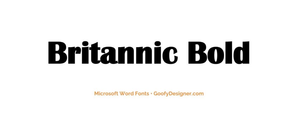
- Britannic Bold
- Baguet Script Regular
- Modern No. 20
- Modern Love Caps

- About Impact: Ideal for headlines and short titles, Impact is perfect for designs needing a bold, assertive font that captures attention instantly.
2. Goudy Old Style
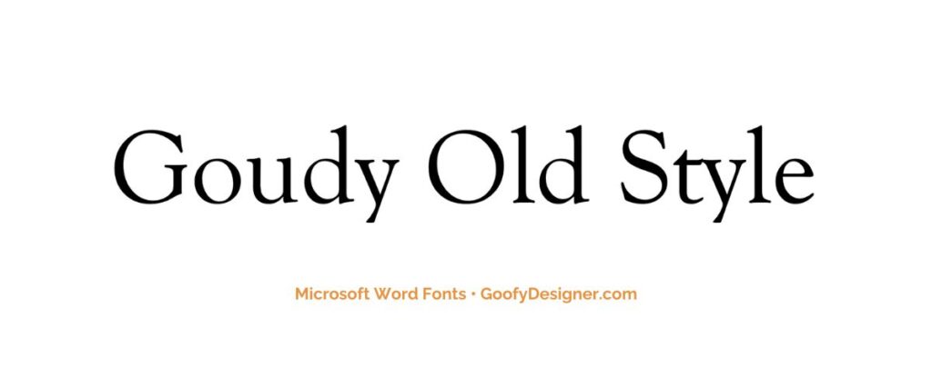
- About Goudy Old Style: Best suited for formal documents, like legal and academic papers, where a traditional and professional typeface is required.
3. Century Gothic

- About Century Gothic: A clean and modern sans-serif font, great for business and academic documents that require a sleek, contemporary look.
4. Baskerville Old Face
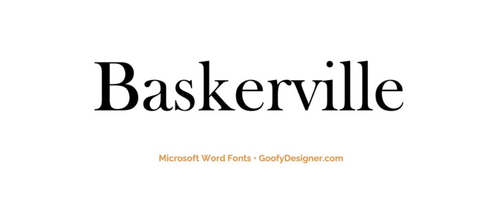
- About Baskerville Old Face: Perfect for literary and academic publications, this font offers a classic, elegant feel that enhances the readability of extensive texts.
5. The Serif Hand
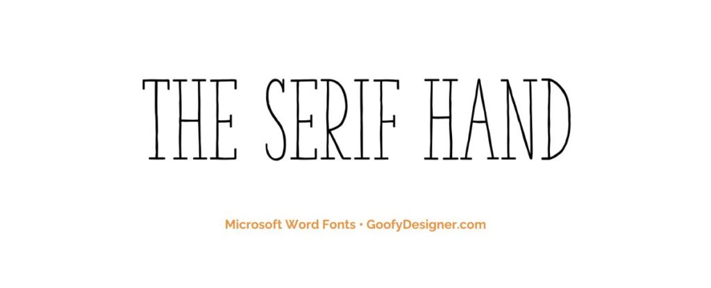
- About The Serif Hand: Ideal for casual, personal documents or creative projects that benefit from a relaxed, handwritten appearance.
6. Cooper Black
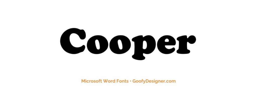
- About Cooper Black: A great choice for playful and bold designs, like posters and book covers, where a friendly and eye-catching font is needed.
7. Gill Sans Nova
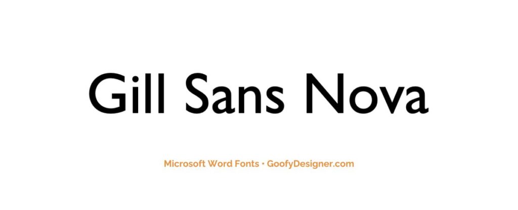
- About Gill Sans Nova: Suitable for both corporate and creative documents, this versatile font offers a modern, clean look for various applications.
8. Alasassy Caps
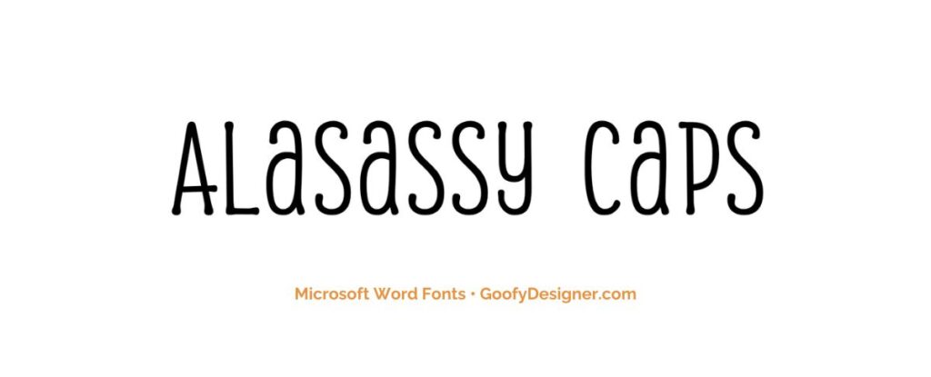
- About Alasassy Caps: Perfect for artistic or elegant designs, such as wedding invitations or stylish branding materials, where a decorative touch is desired.
9. Avenir Next LT Pro
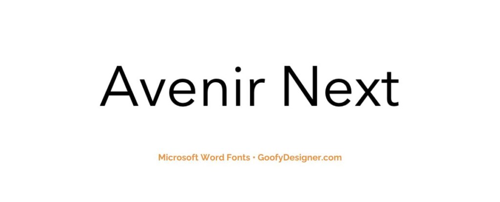
- About Avenir Next LT Pro: A modern and versatile font, great for corporate branding, digital content, and user interfaces requiring a clean, approachable look.
10. Century Schoolbook
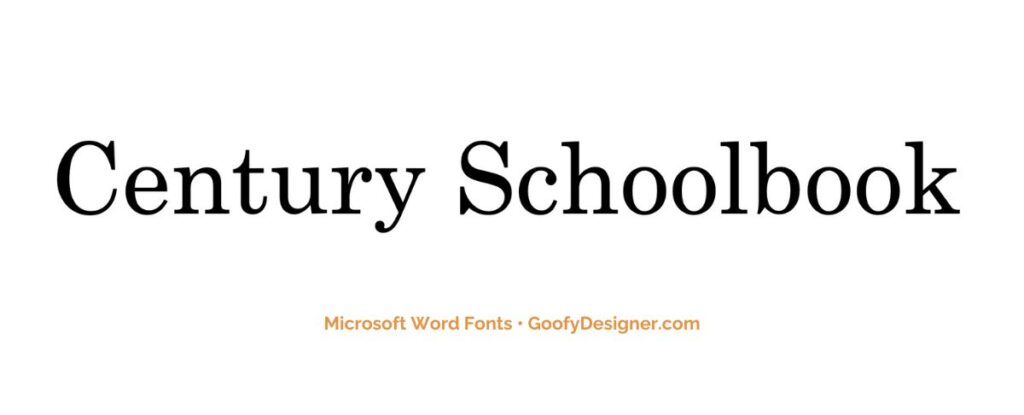
- About Century Schoolbook: Often used in educational materials and children's books, this font is designed for high readability and a comfortable reading experience.
11. Georgia Pro
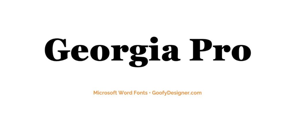
- About Georgia Pro: An excellent choice for both print and digital media, this font is renowned for its readability and classic elegance.
12. Verdana Pro
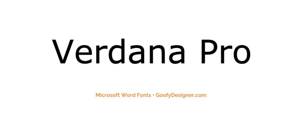
- About Verdana Pro: Ideal for web content and screen reading, offering exceptional clarity and legibility even at small sizes.
13. Vivaldi Italic
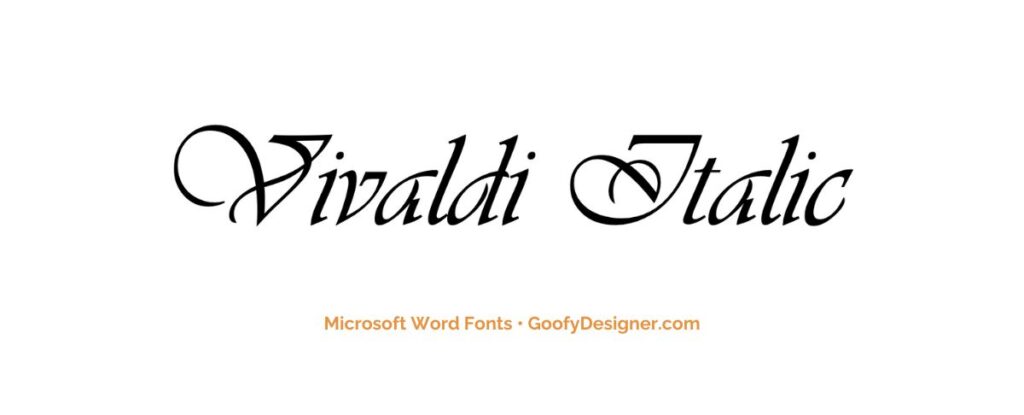
- About Vivaldi Italic: Best for formal invitations and certificates, this font adds a touch of elegance and sophistication with its ornate, script style.
14. Chamberi Super Display Regular
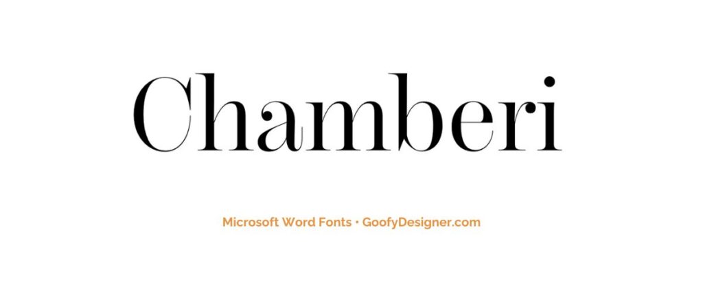
- About Chamberi Super Display Regular: A bold, modern font, perfect for impactful headlines, advertising, and any design needing a elegant and sophisticated feel.
15. Garamond
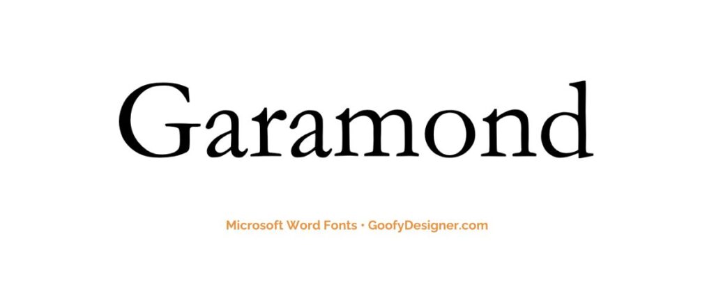
- About Garamond: This timeless font is suited for formal documents and publishing, offering a professional and classic appearance.
16. Broadway
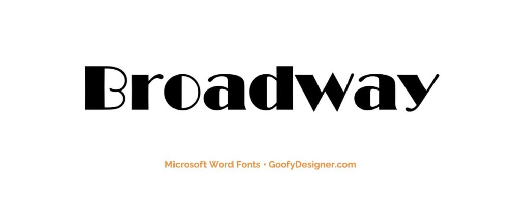
- About Broadway: Great for theatrical posters, event announcements, and designs requiring a retro, 1920s flair.
17. Tw Cen MT

- About Tw Cen MT: A versatile font that works well for both headings and body text, suitable for a variety of professional and creative applications.
18. Gungsuh

- About Gungsuh: This font is ideal for documents requiring an Asian aesthetic, offering a unique, stylized appearance for multilingual projects.
19. Mystical Woods Smooth Script
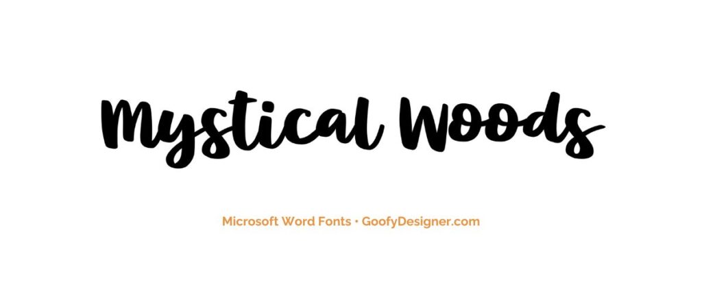
- About Mystical Woods Smooth Script: Perfect for fantasy-themed designs and creative projects that require a whimsical, handcrafted script style.
20. Tisa Offc Serif Pro
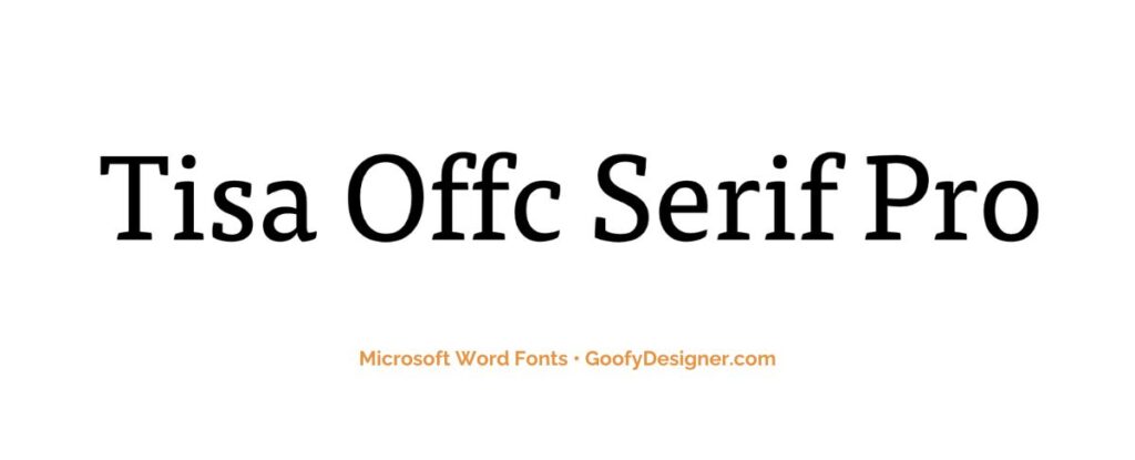
- About Tisa Offc Serif Pro: A contemporary serif font, excellent for editorial content, offering great readability and a modern yet professional look.
21. Britannic Bold
- About Britannic Bold: This font is a strong and assertive font, perfect for headlines and branding that require a modern, yet slightly playful and approachable character.
22. Rockwell
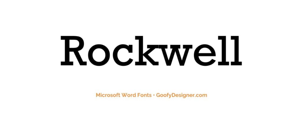
- About Rockwell: A strong, slab-serif font, ideal for headlines and statements in both print and digital media that require a solid, authoritative presence.
23. Baguet Script Regular
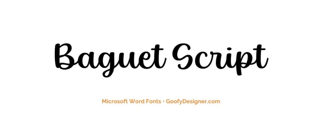
- About Baguet Script Regular: This elegant script font is perfect for wedding invitations, formal events, and branding where a touch of sophistication is desired.
24. Modern No. 20
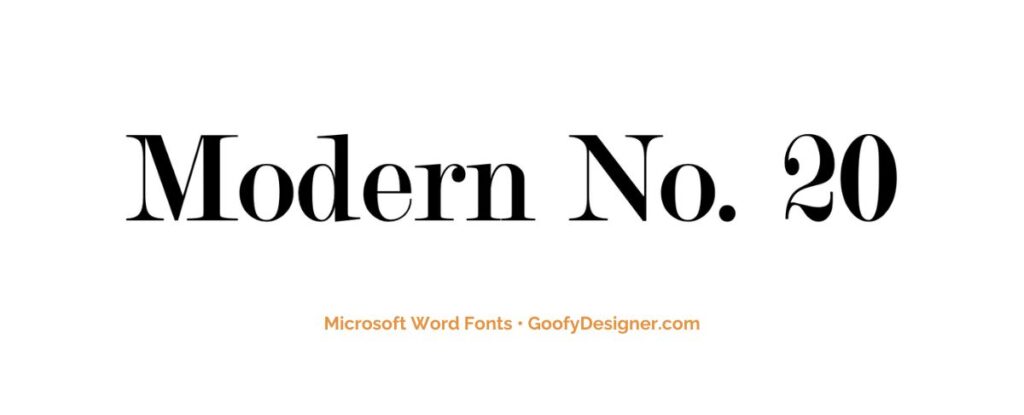
- About Modern No. 20: Ideal for formal documents, such as certificates and awards, offering a traditional, refined style.
25. Modern Love Caps
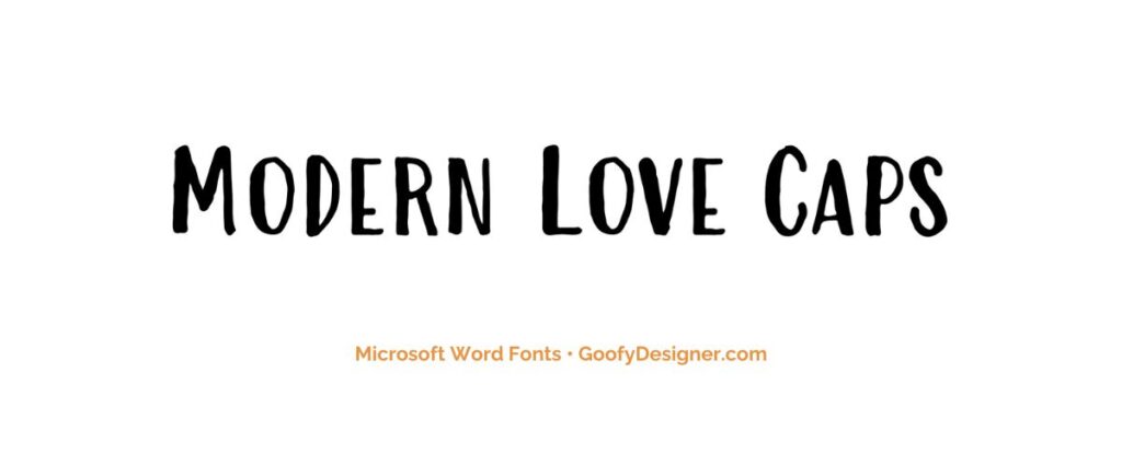
- About Modern Love Caps: Great for fashion and lifestyle branding, where a stylish, contemporary font can add a chic, modern touch.
Want more amazing fonts?
If you want to find more fonts and get access to milions of elements for Canva, browse my favorite site: Envato Elements .
They have all kinds of assets such as:
- Fonts (40,000+)
- Stock photos (9,3M+)
- Graphic templates (270,000+)
- Presentation templates (110,000+)
- Stock videos (5,1M+)
- Video templates (96,000+)
- 3D elements (210,000+)
- WordPress assets (6,500+)
- Royalty-free music (140,000+)
How to choose the best font in Microsoft Word?
- Consider the Purpose: Different documents require different fonts; a formal report may need a more professional font, while a creative flyer might benefit from a more decorative one.
- Readability: Choose fonts that are easy to read, especially for long texts. Sans-serif fonts are often more readable, particularly on digital screens.
- Audience and Context: Consider who will be reading the document and in what context. A young audience or a casual event might allow for more playful fonts.
- Pairing Fonts: If using more than one font, ensure they complement each other. A common approach is pairing a serif font for headings with a sans-serif for body text.
- Branding and Consistency: For business or personal branding, select fonts that align with the brand's style and use them consistently across all documents.
What are Microsoft Word fonts usually used for?
- Professional and Formal Documents: Certain fonts are favored for their clean and clear appearance, making them suitable for official reports, business correspondence, and academic writing.
- Creative and Decorative Purposes: Some fonts offer a more decorative or unique style, which is ideal for designing invitations, posters, and marketing materials that require a creative touch.
- Digital and Screen Readability: There are fonts specifically designed for digital readability, ensuring clarity and ease of reading on computer screens, tablets, and smartphones.
- Educational Content: For educational materials, especially those aimed at young learners, fonts that are simple, clear, and easy to read are often chosen to facilitate better comprehension and learning.
- Branding and Marketing Consistency: In branding and marketing, selecting a consistent font style across all materials is crucial as it helps in maintaining brand identity and recognition in all forms of communication and documentation.
Concluding our exploration of the 25 best fonts in Microsoft Word, the top picks that stand out for me are Impact , Goudy Old Style , and Century Gothic . However, it's important to remember that the term ‘best' is subjective and greatly depends on the specific needs and tone of your project. The ideal font choice will vary based on what you're creating and the ambiance you wish to convey. Approach this journey with excitement and allow your creative instincts to guide you. Each font has its own unique charm and character, ready to enhance and uplift your specific design aesthetic. Embrace this typographic adventure with enthusiasm and discover the perfect font to express your vision!

Hana Terber
Latest articles on goofy designer.

10 Best After Effects Award Show Templates (My Favorites)
Summary: In this guide, I’ve picked out 10 amazing After Effects templates for award shows that I think will really make your video projects shine.

10 Best After Effects Hud UI Packs (My Favorites)
Summary: In this guide, I’ve meticulously curated a selection of 10 outstanding After Effects HUD UI template packs that I believe will perfectly complement your

10 Best After Effects Action Vfx templates (My Favorites)
Summary: In this guide, I’ve chosen a selection of 10 outstanding After Effects action VFX (visual effects) templates that I believe will perfectly complement your

10 Best After Effects Company Profile Video Templates (My Favorites)
Summary: In this guide, I’ve carefully selected a collection of 10 excellent After Effects company profile video templates that I think are perfect for improving

Stay notified

- Color Palettes
- Superhero Fonts
- Gaming Fonts
- Brand Fonts
- Fonts from Movies
- Similar Fonts
- What’s That Font
- Photoshop Resources
- Slide Templates
- Fast Food Logos
- Superhero logos
- Tech company logos
- Shoe Brand Logos
- Motorcycle Logos
- Grocery Store Logos
- Beer Brand Ads
- Car Brand Ads
- Fashion Brand Ads
- Fast Food Brand Ads
- Shoe Brand Ads
- Tech Company Ads
- Motion graphics
- Infographics
- Design Roles
- Tools and apps
- CSS & HTML
- Program interfaces
- Drawing tutorials

From Courtroom to Website: Crafting Client-Centered

Beautiful Winter Color Palettes for Inspiration

How to Add Fonts to Figma:
The Best Event Planner Website Design
Design Your Way is a brand owned by SBC Design Net SRL Str. Caminului 30, Bl D3, Sc A Bucharest, Romania Registration number RO32743054 But you’ll also find us on Blvd. Ion Mihalache 15-17 at Mindspace Victoriei
Academic Appeal: The 11 Best Fonts for Academic Papers
- BY Bogdan Sandu
- 26 February 2024

Imagine settling into the rhythm of crafting your academic magnum opus—the words flow, ideas chime, yet it all hinges on how your prose meets the reader’s eye. You’re well aware that the best fonts for academic papers don’t just whisper to the intellect; they shout to the discerning critic in each evaluator. Here unfolds a narrative, not merely of typography but your academic saga’s silent ambassador.
In forging this guide, I’ve honed focus on one pivotal, often underestimated player in the academic arena: font selection .
Navigate through this roadmap and emerge with a treasure trove of legible typefaces and format tips that ensure your paper stands hallmark to clarity and professionalism.
Absorb insights—from the revered Times New Roman to the understated elegance of Arial —paired with indispensable formatting nuggets that transcend mere compliance with university guidelines .
Dive deep, and by article’s end, unlock a dossier of sage advice, setting your documents a class apart in the scrutinous world of academic scrutiny. Here’s to typography serving not just as a vessel but as your ally in the scholarly discourse.
The Best Fonts for Academic Papers
Traditional choices and their limitations, times new roman : ubiquity and readability vs. overuse.

The Pittsburgh Penguins Logo History, Colors, Font, And Meaning
The dallas stars logo history, colors, font, and meaning.

You may also like

Ad Impact: The 19 Best Fonts for Advertising
- Bogdan Sandu
- 20 December 2023

T-Shirt Typography: 30 Best Fonts for T-Shirts
- 21 December 2023
12 Best Fonts for Academic Papers in Microsoft Word
Good academic papers deserve good academic fonts. You might not have thought too much about which font you use before, but they play a big part in whether people will take your paper seriously or not. This article will explore the best fonts for academic papers.
Best Fonts for Academic Papers in Microsoft Word
The best fonts for academic papers are Times New Roman, Baskerville Old Face, and Georgia. There are plenty of good options, but you’ll mainly want to stick to serif fonts. They look much neater and more professional while showing that the reader can trust what you say.

Times New Roman
Times New Roman is the most famous font on Microsoft Word. It should come as no surprise that it’s a good pick when writing academic papers. It’s got everything you could possibly need when it comes to professionalism and readability.
Times New Roman is the best font to use in most situations. If you’re looking for a more formal font, you’ll find that Times New Roman ranks very highly on the list, regardless of what else is required.
It’s a fairly small font, which looks more appealing for an academic paper. A common pitfall that most people fall for is they try to use a font that’s too large, which can make their paper look less trustworthy and more informal. Neither of those traits is good for academics.
Baskerville Old Face
Baskerville Old Face is a great font to use in an academic paper. There have been studies in the past about different fonts and how they engage readers. It’s believed that Baskerville is one of the most reliable fonts, and the writer tends to be more “truthful” when using it.
Whether you buy into studies like this or not isn’t important. What is important is that Baskerville Old Face is a fantastic choice for most academic papers. It looks really good (like a more concise Times New Roman), and it’s very popular.
Baskerville is a fairly popular choice for published novels, so you might already be familiar with the font style. If you like the way it looks in some of the novels or publications you’ve read, you’ll find that it converts very well to your academic papers.
Georgia ranks very highly when looking for a formal font that will work well in an academic paper. It’s slightly larger than Times New Roman, but a lot of people say that this helps it to become a more “readable” font.
When writing academic papers, it’s wise not to overwhelm your reader with information. The more condensed the font is, the harder it can be to make sense of what you’re writing. With Georgia, this isn’t an issue.
Georgia might be one of the larger fonts listed here, but it makes for an easy read. Plenty of readers will be happy to read through an entire paper written in Georgia, but they might be a bit against reading one in something smaller.
Garamond is another decent option that can work well for academics. Garamond is the smallest font we have included on the list, which can allow you to get a lot of information into a very small space without overwhelming a reader too much.
While it’s not always ideal for including lots of information, Garamond does it really well. It’s readable and professional, allowing your readers to make sense of even the most concise explanations you might include.
It’s also quite a popular choice for many writers. You’ll find that it ranks quite highly simply because of how popular it’s become among a lot of writers on Word.
Cambria is a solid font choice that a lot of people like to use. It’s another default font (though it’s mainly reserved for sub-headings in most Word formats). It runs true to the font size, making it a fairly decent choice if you’re looking for something compact.
The serif style of this font makes it easy to read. It’s nearly indistinguishable from some of the other more popular serif fonts like Times New Roman and Georgia, which is why it is such a popular choice.
However, since it looks so similar, it can make it difficult for people to recognize the font or to figure out which font you’re using. While this isn’t the end of the world, it certainly won’t help you to create a unique feel for your paper either.
Book Antiqua
Book Antiqua is another suitable serif font. It’s not as popular as some of the others, but it looks really good as far as formal fonts go. People like it because it offers a slightly more authentic feel and looks like it could be used in a published novel or academic study.
It’s a standard-sized font, and it’s quite easy to read. A lot of people enjoy using it because it can offer a lot of character to their writing. You might not think that a font has that much power, but you’d be surprised once you try and use Book Antiqua a bit more.
Bookman Old Style
Bookman Old Style is another good font that can look like something out of a published paper. What makes this one special is its size. It’s quite a large font with a decent amount of width to each letter (without going too overboard with the letter spacing).
This font is quite popular for people looking to make their academic papers stand out. It’s not the same style as most of the other serif fonts, allowing your paper to bring a little bit extra that some other people might miss out on.
We encourage you to try this one in multiple different situations. It can work both formally and informally, depending on what you’re looking to get out of it.
Palatino Linotype
Palatino Linotype is a good font for many occasions. You’ll often find it used in academic papers because of the interesting style that comes with it. It looks like a classical font, which takes inspiration from some of the older styles of writing that came before computers.
If you want your academic paper to come across as a bit more traditional or formal, you’ll love this font.
Palatino Linotype offers a great deal of character without changing too much of the original formula that makes fonts like Times New Roman and Georgia so special.
Lucida Bright
Lucida Bright is a great font that is very large compared to most. It works well in academic papers, but you’ve got to make sure you know when to use it. If your paper is particularly word-heavy, it might not be wise to use a font that makes each word much larger.
For example, if you have a page limit on your paper, it might be wise to use a smaller font. Lucida Bright will definitely carry you far over that page limit before you come close to the words you might need to use to explain something.
Nevertheless, it’s still a very attractive font that looks really good in most academic papers. If you’re looking for something that’s stylish and readable, Lucida Bright is a good option.
Calibri is a sans serif font, and it’s the first of its kind on the list. We have only included serif fonts because they tend to be more readable and professional. However, Calibri can work really well if you’re looking for a slightly more approachable feel with your font.
Calibri is like the Times New Roman of the sans serif fonts. It is very popular, and most Microsoft Word versions come with it preloaded as the default font for most written pieces.
That’s what makes it such a valuable choice. You can use it in almost any situation (informal and formal) to a great degree.
Arial is another popular sans serif font that you will be able to use in your academic writing. You don’t always have to use the more formal serif fonts, and Arial is a great example of what can be achieved when you’re a little less formal with your presentation.
Arial is much larger than Calibri when the same font size is used. This makes it a lot more visually appealing, though you have to make sure you don’t overdo it with the number of pages it uses.
Before Calibri replaced it, Arial was also the default sans serif font on Microsoft Word. This has allowed it to be a fairly popular choice for many users, and it remains one of the most popular ones today.
Century Gothic
Century Gothic is the final font we want to cover. It’s a sans serif font that can work really well if you’re looking for a slightly larger font. It’s larger than Arial, making it an easy-to-read font that a lot of people like to utilize.
The only issue you might come across is that the size of it can make it seem much more informal. You should be careful with how you use this font, as it could take away from the professionalism or reliability of your academic paper.
You may also like: 12 Best Fonts for Notes in Microsoft Word 12 Best Victorian Fonts in Microsoft Word 12 Best Chalkboard Fonts for Microsoft Word

Martin holds a Master’s degree in Finance and International Business. He has six years of experience in professional communication with clients, executives, and colleagues. Furthermore, he has teaching experience from Aarhus University. Martin has been featured as an expert in communication and teaching on Forbes and Shopify. Read more about Martin here .
- 12 Best Serif Fonts in Microsoft Word
- 12 Smallest Fonts In Microsoft Word
- 12 Best Victorian Fonts in Microsoft Word
- 5 Best LaTeX Fonts in Microsoft Word

7 Best Fonts For University Essays (Teachers Choice)

Affiliate Disclaimer
As an affiliate, we may earn a commission from qualifying purchases. We get commissions for purchases made through links on this website from Amazon and other third parties.
Choosing the best font for university essays is really difficult. As a university student, you have to stand out from other students’ academic papers.
What are the best fonts for university essays? Arial and Helvetica sans-serif style is a common font choice among university students. Some universities do have guidelines on their website about what fonts are allowed in academic essays, so make sure to check before you start typing.
The right font can make your paper look more professional and appealing to readers. But it’s hard to find fonts that are both beautiful and easy to read especially when there are thousands of them available online!
Best Fonts will help you easily choose the most suitable font for your project by offering expert suggestions based on your needs and interests.
I’ve dedicated myself to helping students succeed in their studies with our website full of useful tips on how to write an effective essay or research paper, as well as relevant information about different types of fonts (serif, sans serif, script, etc).
Our team consists of experienced writers who also know what it takes to get top grades at universities around the world! So if you need some extra help writing your next academic paper or just want some advice on choosing.
If you are in a hurry! Then you should be considered these quick recommended picks.
UNLIMITED DOWNLOADS: 50+ Million Resume Templates & Design Assets
All the Resume Templates you need and many other design elements, are available for a monthly subscription by subscribing to Envato Elements . The subscription costs $16.50 per month and gives you unlimited access to a massive and growing library of over 50 million items that can be downloaded as often as you need (stock photos too)!
What Are The Best Fonts For University Essays?
Students often use clear sans-serif style Arial, Times New Roman, Helvetica, Calibri fonts on their university academic essays, and some universities have a proper guideline on their website about the fonts that should be used.
But for my academic papers, I’ve been researching on the internet and find these 10 best fonts for university essays that are clear in human eyes and look so professional. Your university professor will love your academic papers and essays after using these fonts.
1. Wensley Modern Serif Font Family (Top Pick)
The font of choice for many university students, Wensley is a modern serif font typeface. If you want to impress your professors with an elegant and professional appearance then this style will be perfect for the job! This font includes non-english characters so it can fit any language perfectly.

Wensley Font
- This font is known as the perfect headline maker.
- Improved readability.
- Available in a variety of weights and styles.
- Fast delivery to your inbox.
- All fonts are 100% licensed, free lifetime support.
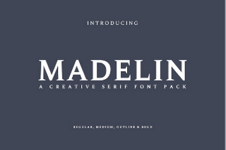
2. Madelin Serif Font Family
The font Madeline is a well accepted serif font among the universities and colleges. This high classed font includes all types of non-english characters and basic glyphs, making it perfect for students in academia. If you are a university student then this new typeface will drastically improve your academic papers.
Madelin Font
- Impress your professor with a professional looking paper.
- Make an academic research paper look more interesting and engaging to readers.
- Fonts that are easy to read on screens and in print.
- The best typeface for any design project.
- Be creative with your fonts!
- Unique and exciting typeface
- Can be used in any environment or situation
- Will have your audience drooling over this font
- Curvaceous letters make for an attractive design
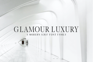
3. Glamour Luxury Serif Font Family
Glamour Luxury Serif is a font for those looking to be both stylish and minimalistic. With many variations, it can make your paper stand out from the rest or you can use it on your resume as well!
Glamour Luxury Serif Font Family
The wide variety of options in Glamour Luxury Serif means that students will have an easy time finding this typeface for their institution work while professionals will find just what they need in order to maximize their efficiency at work with its clean design.
- The best way to express yourself on the academic papers
- Increase visibility, increase recognition and get a leg up on competitors
- Make your content stand out with bold fonts that are beautifully designed
- Fonts mixes aesthetics with readability so you can use them unapologetically
4. Adrina Modern Serif Font Family
Adrina is a modern rounded serif font with 3 weights that can be used by creatives and commercial professionals. It also has multilingual support to help university students, adults in the professional world, or anyone who needs it!

Aridina Font
- Give your design a unique touch with our extensive library of stylish fonts
- With over 100 fonts on offer you have an entire world to explore
- Whether it’s for personal or commercial use these typefaces are perfect for all occasions, big and small
- The variety means that there’s something to suit every project – whether it’s formal, laid back or fun.
5. Immani Serif Font Family Pack
Immani serif font is a logos-ready font with a modern, eye-catching serif look! This classy typeface is perfect for including in headings and other text collaborations within your project. With its sleek fonts, you can easily create stylish headlines or any other type of text that will catch the eyes of those all around you. It’s time to stop searching: this font is what you need!

Immani Font
Effortlessly design your next project with FontsTTD Serif TTF Typewriter Font. Including a variety of letter and number characters, as well as an additional 5 ornaments at each.
Related Post: 10 Best Sellers Urban Lightroom Presets Free Download 2021
- You will be able to combine both Font Weight Regular and Light
- Fonts with different fonts, ensuring any text is legible.
- You will also have the option of using a web font kit or downloading an OTF or TTF file.
- No worries about missing out on any key characters!
6. Bergen Text – Sans Serif Font
Bergen Text is an elegant, clean and minimalistic font for university and college academic papers. It has been designed specifically in a small 9-pixel size for easy legibility and accessibility reasons.
Bergen Font
In contrast to Fontana families (that are heavy with serifs), Bergen Text is very straightforward. This makes it the perfect candidate for creative works that need a commercial license and readability that will satisfy any customer’s needs.
UNLIMITED DOWNLOADS: 50 Million+ Fonts & Design Assets

All the Fonts you need and many other design elements, are available for a monthly subscription by subscribing to Envato Elements . The subscription costs $16.50 per month and gives you unlimited access to a massive and growing library of over 50 million items that can be downloaded as often as you need (stock photos too)!
Envato element offers key resources and parent tips about effective teaching strategies so students can learn more effectively, from pre-kindergarten to high school.
- Fonts designed for people who use small text sizes
- Sans font is available!
- Get a wide variety of fonts with just one purchase
- Improve legibility by using different weights and styles
7. Morton – Sans Serif Font
University students always find the best font to use on their academic papers and essays. However, some university has its own criteria to write these papers.
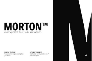
Morton Font
But most of the universities don’t have these font selections criteria on their academic guideline. That’s why students use basic and regular free fonts like Helvetica, Arial, Calibri.
If you want to stand out and increase your marks in academic and university essays. Then try to use a unique font. Because everyone is using the same font in their essays.
Related Post: 10 Best Dark & Moody Lightroom Presets Free and Premium
That’s why choosing a unique and stylish sans serif font in your writing is the best way to mark better.
- Fonts are a single click away.
- It’s perfect for small text sizes.
- A grotesque typeface classic.
- Comes in nine weights and stylistic variations for the nerd in all of us.
Final Words
Unique fonts are the key to standing out and making eye-popping clear academic papers. These best fonts can be really unique with clean formatting. Students and professionals always need these great typefaces for their documents, presentations, or any other assignment that needs design
You can check out Envato elements Fonts to get the most out of it. Thank you
About the author
Al Shariar Apon
I’m a digital content creators and tech-savvy enthusiast. In this website I would like to share my knowledge and Google productivity tools, tips, templates. Thank you.
Leave a Reply Cancel reply
Your email address will not be published. Required fields are marked *
Latest Posts

Top 8 Best Web Hosting Services for Beginner Bloggers in 2024
With over 330,000 web hosting companies globally, beginner bloggers are spoilt for choice. However, navigating this vast sea can be overwhelming. Here’s a distilled list of the top 8 web hosting services that stand out in 2024, tailored for those starting their blogging journey. 1. Hostinger Hostinger emerges as a beacon for beginner bloggers, offering…

Top 4 Bluehost Alternatives 2024: Real Survey Results
Did you know that in 2024, 65% of website owners are actively looking for alternative hosting platforms to Bluehost? If you’re among those considering a change, you’ve come to the right place. In this article, we will explore the top four Bluehost alternatives for 2024, based on real survey results. These alternatives have been carefully…

Wirelessly Transfer Photos: Canon to Mac
Wireless technology has reshaped how we connect devices, offering a simpler way to share and manage content. This article will guide you through setting up your Canon camera for wireless transfers to your computer or smartphone, ensuring a smooth and efficient process. With straightforward steps, you can enjoy the convenience and speed of wireless sharing,…
7 Best Fonts For University Essays

When it comes to writing essays for university, the type of font you use can be just as important as the content itself. Different fonts can help set the tone and create a specific mood or atmosphere. Today, we’ll discuss seven of the best fonts to use for your college essays. These fonts are professional yet easy to read, so they’ll help you produce a high-quality paper that will definitely impress your professor!
What are the best fonts for academic essays?
When it comes to university essays, there are a few things that are more important than the font. The content, of course, is the essential part. But the font can also be important, as it can help to set the tone of the essay and make it more visually appealing. As you might already know, some fonts are better suited for academic works than others.
For example, Times New Roman is a classic choice that conveys seriousness and sophistication; but if you want to add a little personality to your essay, you could try a handwriting font like Comic Sans. Anyway, the best font for your school essay is the one that makes your work look its best. So experiment with different fonts until you find the perfect match. And if you’re still not sure what font to use, contact an essay help professional and ask them for advice. Sometimes getting the help we need can easily solve the issue we’re experiencing.
Why is font selection important when writing an essay?
Just as a well-tailored suit can make you look more professional, the right font can make your writing appear more polished. Of course, there’s more to font selection than simply finding something that looks good on the page. For instance, a playful script font might be appropriate for a casual invitation, but it would look out of place in a formal business letter. Likewise, a serious serif font would be inappropriate for a child’s homework assignment.
What are some of the most common types of fonts used in academic papers?
There’s no need to get too fancy when it comes to fonts for academic papers. In most cases, simple is best. Here are seven of the most common types used in academic writings:
- Times New Roman: This classic serif font is a go-to for many writers. It’s easy to read and has a timeless look.
- Arial: A popular sans serif font, Arial is also easy to read and works well for long paragraphs of text.
- Calibri: Another sans serif font, Calibri is slightly more modern than Arial and is a good choice for papers that need to make a strong visual impact.
- Courier: Courier is a classic monospaced font that works well for lengthy blocks of text, such as code or large tables.
- Helvetica: Helvetica is another popular sans serif font that exudes professionalism and simplicity.
- Georgia: Georgia is a beautiful serif font with a slightly more playful feel than Times New Roman. It’s perfect for papers that need a touch of personality.
- Comic Sans : Comic Sans might not be appropriate for all academic papers, but it can be used sparingly to add visual interest or levity to an otherwise dry subject matter. Just use caution with this one – too much Comic Sans can be overwhelming!
How can you choose the right font for your paper’s tone and style?
The font you choose should be legible and appropriate for the tone of your paper. For instance, a formal research paper would benefit from a more serious font, while a lighthearted personal essay could be written in a playful script. In the end, the best way to choose the right font is to experiment with different options until you find one that feels right for your project, as explained above.
What should you avoid when selecting a font for your essay?
While there are a few general guidelines you can follow, ultimately it comes down to personal preference (and the whims of your teacher). That being said, there are a few things you should avoid when selecting a font for your essay.
- Steer clear of any fancy script fonts – they may look nice, but they’re hard to read and will likely decrease your chances of getting a good grade.
- Avoid using excessively small or large fonts; stick to something that’s easy on the eyes and won’t annoy your reader.
- Don’t be afraid to experiment a bit – try out different fonts and see which one works best for you.
Choosing the right font for your university essay is important. The type you choose should be legible, appropriate for the tone of your paper, and easy on the eyes. When in doubt, experiment with different fonts until you find the perfect match.
What are some of your favorite fonts? Let us know in the comments below!
Dr. Mark Womack
What Font Should I Use?
The Modern Language Association (MLA) provides explicit, specific recommendations for the margins and spacing of academic papers. (See: Document Format .) But their advice on font selection is less precise: “Always choose an easily readable typeface (e.g. Times New Roman) in which the regular style contrasts clearly with the italic, and set it to a standard size (e.g. 12 point)” ( MLA Handbook , 7th ed., §4.2).
So which fonts are “easily readable” and have “clearly” contrasting italics? And what exactly is a “standard” size?
For academic papers, an “easily readable typeface” means a serif font, and a “standard” type size is between 10 and 12 point.
Use A Serif Font
Serifs are the tiny strokes at the end of a letter’s main strokes. Serif fonts have these extra strokes; sans serif fonts do not. ( Sans is French for “without.”) Serif fonts also vary the thickness of the letter strokes more than sans serifs, which have more uniform lines.

Books, newspapers, and magazines typically set their main text in a serif font because they make paragraphs and long stretches of text easier to read. Sans serifs (Arial, Calibri, Helvetica, Gill Sans, Verdana, and so on) work well for single lines of text, like headings or titles, but they rarely make a good choice for body text.
Moreover, most sans serifs don’t have a true italic style. Their “italics” are really just “obliques,” where the letters slant slightly to the right but keep the same shape and spacing. Most serifs, on the other hand, do have a true italic style, with distinctive letter forms and more compact spacing.

Since they’re more readable for long passages and have sharper contrast in their italics, you should always use a serif font for the text of an academic paper.
Use A Readable Type Size
The standard unit for measuring type size is the point . A point is 1 / 72 of an inch, roughly one pixel on a computer screen. The point size of a font tells you the size of the “em square” in which your computer displays each letter of the typeface. How tall or wide any given letter is depends on how the type designer drew it within the em square, thus a font’s height and width can vary greatly depending on the design of the typeface. That’s why if you set two fonts at the same point size, one usually looks bigger than the other.
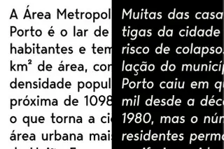
Compare the following paragraphs, both set at 12 point but in different fonts:

For body text in academic papers, type sizes below 10 point are usually too small to read easily, while type sizes above 12 point tend to look oversized and bulky. So keep the text of your paper between 10 and 12 point .
Some teachers may require you to set your whole text at 12 point. Yet virtually every book, magazine, or newspaper ever printed for visually unimpaired grown-ups sets its body type smaller than 12 point. Newspapers use even smaller type sizes. The New York Times , for example, sets its body text in a perfectly legible 8.7 point font. So with proper spacing and margins, type sizes of 11 or 10 point can be quite comfortable to read.
Font Recommendations
I usually ask my students to use Century Schoolbook or Palatino for their papers. If your teacher requires you to submit your papers in a particular font, do so. (Unless they require you to use Arial , in which case drop the class.)
One thing to consider when choosing a font is how you submit your essay. When you submit a hard copy or a PDF, your reader will see the text in whatever typeface you use. Most electronic submission formats, on the other hand, can only use the fonts available on the reader’s computer. So if you submit the paper electronically, be sure to use a font your instructor has.
What follows is a list of some widely available, highly legible serif fonts well-suited for academic papers. I’ve divided them into four categories: Microsoft Word Fonts, Mac OS Fonts, Google Fonts, and Universal Fonts.
Microsoft Word Fonts
Microsoft Word comes with lots of fonts of varying quality. If your teacher asks you to submit your paper in Word format, you can safely assume they have Word and all the fonts that go with it.

Morris Fuller Benton designed Century Schoolbook in 1923 for elementary-school textbooks, so it’s a highly readable font. It’s one of the best fonts available with Microsoft Word. Because it’s so legible, U. S. Supreme Court Rule 33.1.b madates that all legal documents submitted to the Court be set in Century Schoolbook or a similar Century-style font.

Hermann Zapf designed Palatino in 1948 for titles and headings, but its elegant proportions make it a good font for body text. Named for Renaissance calligrapher Giambattista Palatino, this font has the beauty, harmony, and grace of fine handwriting. Palatino Linotype is the name of the font included with Microsoft Word; Mac OS includes a version of the same typeface called simply Palatino.
Microsoft Word includes several other fonts that can work well for academic essays: Bell MT , Californian FB , Calisto MT , Cambria , Garamond , and Goudy Old Style .
Mac OS Fonts
Apple has a well-deserved reputation for design excellence which extends to its font library. But you can’t count on any of these Mac OS fonts being on a computer that runs Windows.

Finding his inspiration in the typography of Pierre Simon Fournier, Matthew Carter designed Charter in 1987 to look good even on crappy mid-80s fax machines and printers. Its ability to hold up even in low resolution makes Charter work superbly well on screen. Bitstream released Charter under an open license, so you can add it to your font arsenal for free. You can download Charter here .

In 1991 Apple commissioned Jonathan Hoefler to design a font that could show off the Mac’s ability to handle complex typography. The result was Hoefler Text , included with every Mac since then. The bold weight of Hoefler Text on the Mac is excessively heavy, but otherwise it’s a remarkable font: compact without being cramped, formal without being stuffy, and distinctive without being obtrusive. If you have a Mac, start using it.
Other Mac OS fonts you might consider are Baskerville and Palatino .
Google Fonts
When you submit a paper using Google Docs, you can access Google’s vast library of free fonts knowing that anyone who opens it in Google Docs will have those same fonts. Unfortunately, most of those free fonts are worth exactly what you paid for them, so choose wisely.

IBM Plex is a super-family of typefaces designed by Mike Abbink and the Bold Monday type foundry for — you guessed it — IBM. Plex serif is a solid, legible font that borrows features from Janson and Bodoni in its design. Plex is, not surprisingly, a thoroughly corporate font that aims for and achieves a bland neutrality suitable for most research papers.

John Baskerville originally designed this typeface in the 1850s, employing new techniques to make sharper contrasts between thin and thick strokes in the letter forms. The crisp, elegant design has inspired dozens of subsequent versions. Libre Baskerville is based on the American Type Founder’s 1941 version, modified to make it better for on-screen reading.
Unfortunately. Google Fonts has few really good serif fonts. Some others you might consider are Crimson Pro and Spectral .
Universal Fonts
Anyone you send your document to will have these fonts because they’re built in to both Windows and Mac OS.

Matthew Carter designed Georgia in 1993 for maximum legibility on computer screens. Georgia looks very nice on web sites, but in print it can look a bit clunky, especially when set at 12 point. Like Times New Roman, it’s on every computer and is quite easy to read. The name “Georgia” comes from a tabloid headline: “Alien Heads Found in Georgia.”

Times New Roman is, for better or worse, the standard font for academic manuscripts. Many teachers require it because it’s a solid, legible, and universally available font. Stanley Morison designed it in 1931 for The Times newspaper of London, so it’s a very efficient font and legible even at very small sizes. Times New Roman is always a safe choice. But unless your instructor requires it, you should probably use something a bit less overworked.
Writing Assignments 101: Formatting and Typography Essentials

Writing assignments is a necessary practice for everyone pursuing any academic endeavor. You must understand how to format your academic paper. You must also follow the typography guidelines for each type of assignment. Adhering to both ensures your paper meets the presentation standards applicable and is presentable, readable, and easy to follow.
Unfortunately, getting the formatting right does not always come easy for all students. Some academic papers may be easy to format, while others require a deeper understanding of typography and formatting rules.
Many students need help with this part of the essay. As Ken, an economics major in college, puts it, “Getting assistance with my assignments was the natural next step for me. I needed all the professional help I could get to maintain top university grades. And an assignment writing helper service did it for me.” Ken found guidance from experts who offer online academic guidance for students who need support in their essay preparation.
Formatting Styles
Most academic programs require students to follow one of two formatting styles:
- American Psychological Association (APA);
- Modern Language Association (MLA).
Different academic papers call for different formatting styles, with APA and MLA being the most widely used formats for student writing across schools and colleges. However, your professors may ask you to use the Chicago Manual of Style (CMS) formatting. So, always confirm the style to use with your professor before you start working on an essay.

APA Style Formatting
APA style mostly applies in social sciences, health sciences, and education courses. Under APA, you’ll organize your paper into four sections:
- Title Page;
- References.
The Title Page includes the following items, in this order:
- The title of your paper;
- The author(s);
- The institutional affiliation;
- Course name and number;
- Instructor’s name;
- Assignment due date;
- Header with page number.
The title :
- Should be centered in the top half of the page;
- Should be 12 words or less;
- Should not contain abbreviations;
- Should be in title case;
- Should be bold ;
- Use one or two lines for the title.
- List all authors by their full names. Use first name, middle initial(s), and then last name;
- If there are two authors, separate author names with “and”;
- If there are three or more authors, use a comma to separate each author, then use “and” before the last author;
- For author names with suffixes, use a space to separate the suffix from the remaining part of the name, e.g., Rob S. Smith Jr.
Institutional affiliation
Affiliation refers to the college or university you attend. Start with the department, add a comma, then the university.
The abstract is a summary of your paper, written on its own page. It should be 10% of your word count, written in one paragraph. Ensure that the abstract includes all the key points covered in the paper.
- The paper title goes to the top of the first page;
- Use title case for the title and bold it;
- Do not leave any space between the title and the beginning text;
- Add in-text citations;
- Enclose citation details in parenthesis;
- Position parenthetical citation at the end of the sentence where you’ve used the referenced material;
- Put the closing punctuation after the parenthetical citation;
- Include the author’s last name, year of publication, and paragraph or page number.
APA Typography Rules
- Font—APA recommends specific serif and sans-serif fonts:
- Acceptable serif fonts: 12-point Times New Roman, 11-point Georgia, or 10-point Computer Modern;
- Acceptable sans-serif fonts: 11-point Arial, 11-point Calibri, or 10-point Lucida Sans Unicode;
Use the same font throughout the paper, except:
- Within figure images, where you should use an 8- to 14-point sans-serif font;
- For footnotes, use the default font settings under the footnotes feature of your word processor;
- Computer code, where you should use a monospace font, e.g., 10-point Courier New.
- Double-space your text;
- Unless your professor states otherwise, use a margin of 1 inch on each side of the paper.
The references page is a list of all the sources cited in your paper. You should have a reference for every in-text citation in your paper. Follow these tips to format your references:
- Title the page “References,” bold it, and center it at the top of the page;
- Apply a hanging indent to each citation. To create a hanging indent:
- Ensure the first line of your reference aligns with the left margin;
- For each line that follows, create a half-inch indention from the left margin.
Most word processors have hanging indent settings, usually under Paragraphs and Spacing. Choose the hanging option and set the spacing to half an inch.
- Capitalize the first word of each citation;
- Do not leave additional spaces between citations.
MLA Style Formatting
MLA style is mostly used in humanities and some health courses. Unlike APA style, MLA style does not require a title page, except where several students write the paper. In this case, you’ll create a title page and list the full name of each contribution author. Use double spacing on each line.
Below the author names, list your professor’s name, course name, and date. Add the title of your paper one line below the date and center it. Each entry should go into a separate line.
If you’re the only author of the paper, the author’s name, instructor, date, title, and the beginning of the text body all go on the first page. Remember to add a double space between the title and the first line of your text.
MLA headers show the author’s last name and page number, separated by a space. Some professors require students to omit the header on the first page. If your instructor sets this rule, use the header, starting from the second page.
The header should be in the top right-hand corner of the paper. Position the header half an inch from the top and align it with the right margin.
MLA style recommends the use of headings and subheadings for longer papers. Format your headings in descending order of prominence, with the Level 1 heading having a larger, bold typeface. Subsequent subheadings should have a smaller, non-bold typeface.
You can cite the source in narrative form as part of your text or in parenthesis after mentioning the reference.
- To cite an author in your text, use the author’s last name and the page number of the work you’re citing;
- If quoting multiple works, separate each work with a semicolon;
- If citing two authors, use “and” to separate their names;
- If citing three or more authors, use only the first name shown in the source. Follow it with “et al.”
MLA Typography Rules
MLA formatting does not require you to use a specific font. The only requirements are:
- Your chosen font should be legible and in a standard font size, preferably 12-point;
- The font’s regular and italic types should be recognizable, with enough contrast to make the two styles easy to differentiate;
- Double-space the text;
- Leave a 1-inch margin on each side of the paper;
- For the first line of each paragraph, create a half-inch indent from the left margin;
- Include a line space above and below each heading.
Proper formatting improves the structure of academic papers and makes them more readable. Most student assignments require APA or MLA formatting. To improve your chances of scoring a good grade, adhere to all the formatting requirements of your academic paper.
How do I style headings and subheadings in a research paper? (2018, December 13). MLA Style Center. https://style.mla.org/styling-headings-and-subheadings/ Mandernach, B. J., Zafonte, M., & Taylor, C. (n.d.). Instructional Strategies to Improve College Students’ APA Style Writing. International Journal of Teaching and Learning in Higher Education. https://files.eric.ed.gov/fulltext/EJ1093747.pdf MLA Quick Citation Guide. (n.d.). PennState University Libraries. https://guides.libraries.psu.edu/mlacitation/intext Paper format. (n.d.). APA Style. https://apastyle.apa.org/style-grammar-guidelines/paper-format The Main Body Formatting the Main Body. (n.d.). Keuka College. https://libguides.keuka.edu/apa/mainbody
- Our Mission
Design 101 for Educators: Choose Your Fonts Carefully
Before we dig in, let's start with a quick multiple-choice quiz:
Font : Text ::
A. Hat : Head B. Coffee : Tea C. Voice : Speech
The answer is C. The font you choose to display text is every bit as important as the voice you use to speak if you want a reader to not only understand what they are reading, but also remember it as well. The primary purpose of type is not really to be readable, but to convey information that is to be remembered. Surprisingly, readability might not always lead to the best information retention.
Think about the last really great talk you listened to. Do you remember the content of that speech because it was compelling information or because the speaker spoke compellingly? It was probably a bit of both. However, no matter how vital the content of the speech, a speaker who drones on clearly but monotonously is far less likely to make a lasting impression than someone who speaks with animation and purpose.
Yet we spend very little time considering the font (or typeface) we use to communicate our messages. All too often we stick with the few fonts provided by our word processor, usually the default font, which is going to be the workhorse font Arial. However, imagine a world where everyone sounded exactly the same, where every voice had the same tones and inflections. It would be like a world of monotonous computerized voices. That's what text in Arial (or Helvetica on the Mac) is starting to feel like.
Clarity Does not Always Lead to Understanding
It is often assumed that good typography is about clarity, that the text should be as easy to read as possible. However, blogger Christian Jarret reports in Research Digest that studies by Connor Diemand-Yauman of the Princeton University Department of Psychology and his colleagues may call this assumption into question. Their research found a correlation between the effort it took to read text and the ability of subjects to remember that information for later testing. Yes, information presented in a "harder-to-read" font -- such as Comic Sans -- was better remembered than the same information in easier-to-read type.
One theory is that making the subjects work harder to read text forces them to focus on the text more acutely, engaging deeper parts of their brains than if they could simply breeze through it. Jarret observes from the report by Diemand-Yauman:
An alternative theory on this affect may be that most people pay attention to handwritten text as being more "authentic." Whatever the reason, this seems to be something that many designers inherently know, recognizing that making text more engaging is a better way to convey information that needs to be remembered. There's obviously a balance to be struck. If material becomes too difficult to read, students may simply give up or become more confused. But equally, if it's too easy, they may become bored and complacent.
In Praise of Comic Sans
Comic Sans is often the butt of jokes -- "Comic Sans walks into a bar and the bartender says, 'We don't serve your type here.'" Given what Diemand-Yauman and his colleagues have discovered, that ridicule may be unfair. Comic Sans has a very specific voice, one that -- to a less jaded audience like elementary school students -- feels friendly and familiar, and is very similar to the way in which these students are being taught to write. In fact, one teacher at my son's school explained to my wife that she prefers Comic Sans specifically because it is the only commonly available typeface that shows the form of the letter "a" that she is teaching her children how to write.
However, Comic Sans is not the only handwritten font on the block, nor should we assume that the effect noted by Diemand-Yauman and his colleagues is isolated only to handwritten fonts. There are many alternatives that you can choose from.
Choosing Your Font "Voice"
What designers rely on with typography is finding fonts that help reinforce the message of the text being presented. This may simply be a matter of finding a single typeface or two that will become your unique typographic "voice" -- or it may be that you begin to choose different fonts for the project, picking ones that reflect the tone of the text you are providing your students.
When choosing a font for presenting your own materials, you want to consider two types of content:
- Titles and Headers: Headers are meant to call attention to themselves and set the mood for the text underneath.
- Body text: This should generally be a little calmer and clearer to read, but still provide some visual interest to your students in order to keep them engaged. When choosing a typeface for body text, though, make sure the one you choose has a regular, bold and italic style.
You may choose the same font for both cases, but if you do choose different fonts, make sure they are very different. Pairing fonts that are similar but not the same is like wearing two similar but different cloth patterns: they invariably clash.
Finding Fonts
What a lot of people don't realize is that not all fonts are free. In fact, many cost tens or even hundreds of dollars apiece. Even the "free" fonts that come on your computer were actually licensed by the computer manufacturer. You are paying for them in the cost of your computer.
The good news, though, is that there are thousands of free fonts on the Web. One of my favorite repositories for free fonts is FontSquirrel.com . This site has over a thousand fonts to choose from, including over 50 handwritten fonts, and hundreds of clean sans-serif and serif fonts that will work well for body text. My other favorite source for free fonts is Fonts.com , which is home to some of the highest quality typefaces around, including Comic Sans and the new Comic Sans Pro.
Another great alternative to downloading fonts is to make a custom handwritten font with a program like iFontMaker , which allows even a novice to create his or her own custom handwritten font on an iPad ($6.99) or Windows Tablet ($4.99).
I used it to create my own handwritten font called JasonSpeaking01 . It took me a couple of hours, but the font really has a lot of my own voice in it. If you like this font, you can download it for free.
Whatever font or fonts you choose to get your message out, make sure you choose one that balances readability with personality, and you will find your students becoming increasingly engaged with whatever text they are reading.
Online Resources
- Free Fonts: FontSquirrel.com
- More Free Fonts: Fonts.com
- Another Free Font: JasonSpeaking01
- Font Tool: iFontMaker
- Windows Help: Installing Fonts in Windows
- Mac Help: Installing Fonts in Mac OS X
- Presentation and Formatting
Fonts for Business Communications

In the business world, the font you choose can significantly impact the readability and professionalism of your communications.
Here are some top font recommendations for business communications:
- Sans-serif Fonts : With the rise of electronic communication, it’s been observed that sans-serif fonts are generally easier to read on computer screens compared to their serif counterparts. Examples include Arial, Helvetica, and Calibri.
- Serif Fonts : While sans-serif fonts dominate digital screens, serif fonts like Times New Roman and Georgia can still be effective for printed business documents, offering a touch of formality and tradition.
- Email Fonts : When it comes to emails, readability is paramount. Some of the best fonts for email design include Arial, Verdana, and Tahoma. It’s essential to ensure that the chosen font appears correctly across different email clients and devices.
- Logo and Branding : For logos and branding materials, the font should reflect the brand’s personality. There are numerous logo font ideas ranging from simple to complex, but the key is to choose one that aligns with your brand’s identity.
In conclusion, the font you select for your business communications can influence how your message is received. It’s important to choose fonts that are both readable and appropriate for the medium, whether it’s an email, a business proposal, or a company logo.

*See Below for Proper Asterisk Usage
Readability – Why It’s Important

Proper Business Letter Format

Sourcing and Placing Images in Business Presentations
Choosing the Length of a Paragraph

- Business Communication
Quickly Get to the Point in Your Writing
Join the thousands who have sharpened their business writing skills with our award winning courses..
Copyright © 2024 Businesswritingblog.com.

The 24 Most Professional Fonts to Use
Selecting the right font is an important design choice that can enhance—or detract from—the professionalism of a document. With thousands of fonts to choose from, the possibilities may seem endless. However, not all fonts are well-suited for professional business communications and documents.
This comprehensive guide explores the 24 most professional fonts to create polished, credible business documents that leave a positive impression. We analyse characteristics like readability, legibility, clarity, formality, visual appeal, and versatility to determine which fonts will top for professional use cases in 2024.
A Serif Sensation: Traditional Serif Fonts Offer Readability & Polish
1. times new roman.
This quintessential serif font designed for the New York Times newspaper 1931 remains a staple choice to exude professionalism. The fluid serifs and sturdy letterforms allow Times New Roman to be readable in print. The versatile design also displays well digitally. This font suggests the competence and trustworthiness key for professional communications.

Designed by Matthew Carter in 1993, this serif typeface contains thick, bracketed serifs for enhanced readability. Slightly wider letter proportion compared to Times New Roman improves clarity while maintaining a highly legible 11-point font size. The chunky, semi-bold weight is warm and refined for formal business uses.

3. Bookman Old Style
This classic, versatile serif face echoes Old Style typefaces used in publishing from the mid-1500s into the 1900s. Designed in 1884 by Alexander Lawson for the Century Schoolbook , the slightly condensed letterforms offer a more compact footprint without compressing readability. The sturdy serifs, graceful curves and horizontal stress suggest Old World heritage, perfect for adding gravitas to professional communications.

Key Takeaway: Traditional serif fonts like Times New Roman, Georgia and Bookman Old Style offer proven readability and polish well-suited for formal business documents.
Distinctive & Dignified: Transitional Serifs Bridge Generations
4. baskerville.
This refined, stately serif face designed by John Baskerville in 1757 defined transitional serif styles, forging a bridge from Old Style to modern looks. The crisp edges offer exceptional clarity, while distinctive ball terminals on letter curves add flair. Baskerville brings heritage elegance to contemporary professional settings, from resumes to reports.

5. New Baskerville
Released in 1917, this refreshed Baskerville interpretation by designer George W. Jones is often preferred for clarity on screens and modern printing presses. The slightly thicker strokes offer a bolder definition without compromising legibility. Pair with Georgia for font contrast that delivers professional polish.

6. Times Ten
Photosetting provider Linotype released this updated take on Times New Roman in 1990 to improve output on low-resolution printers and poor-quality paper stock. Subtle changes like shortened ascenders and descenders optimise modern legibility without forfeiting professional persona. The economical proportions also save space.

Key Takeaway: Transitional serif typefaces like Baskerville, New Baskerville and Times Ten marry historical richness with sharp digital display for today’s professional contexts.
Modern Serifs Marry Heritage With Contemporary Flair
Created by renowned German typographer Jan Tschichold in 1964, Sabon draws inspiration from classic Garamond designs but optimises for modern requirements. The Roman letterforms offer exceptional clarity and even texture suitable for continuous business reading—an excellent choice to communicate expertise.

8. ITC Legacy Serif
This 1993 serif release from the International Typeface Corporation retains Times New Roman’s professional personality but exhibits tighter spacing and finer hairlines for improved modern display. The condensed proportions occupy less real estate, allowing more content presentation.

9. Merriweather
Designed by Eben Sorkin in 2010 for Google Web Fonts, this free serif selection exhibits classic proportions and styling adapted for optimal clarity across print, web and digital media. The understated design promotes continuous reading while conveying competence for various professional communications, from handouts to websites.

Key Takeaway: Modern serif font interpretations like Sabon, ITC Legacy Serif and Merriweather smartly evolve heritage styling for today's professional, multi-media business needs.
Sans Serif Fonts Signal Modernity For The Digital Era
Initially designed by Monotype in 1982 to offer Helvetica -style appeal more economically, this ubiquitous neo-grotesque sans serif font conveys professionalism and modernity. The comfortably spaced proportions ensure approachability while promoting exceptional on-screen readability.

11. Helvetica Neue
This seminal, globally recognised neo-grotesque face originated from the 1957 Helvetica release. Designer Max Meidinger evolved the styling in 1983 to enhance spacing and strokes for improved digital rendering. The Swiss heritage of architectural clarity and purity perseveres through this digitally-optimized typeface.

12. Calibri
As the default font for Microsoft Office programs and Windows since 2007, Calibri offers a humanist sans serif option deeply familiar to modern business professionals. The rounded contours ensure approachability while the reliable rendering remains professionally polished across documents, slides, forms and other uses.

Key Takeaway: Leading neo-grotesque sans serifs like Arial, Helvetica Neue, and Calibri adopt simplified styling that crisply conveys professional digital-age messaging.
Specialised Sans Serifs Target Professional Needs
13. clearviewhwy.
Specifically tailored for road signage by designer Don Meeker in 1998, this humanist sans serif face allows extraordinary readability for content viewed from a moving vehicle. Tested and proven across state transportation departments, Clearview denotes authority for wayfinding signage applications.

14. Frutiger
This Univers-inspired sans serif, designed by Adrian Frutiger in 1976, improves visual hierarchy through letter variation. Numerals and glyphs are easily distinguished from letters to enhance clarity for signage and labelling purposes. The streamlined Swiss styling also denotes modern efficiency.

15. FF Mark
Designed by Erik Spiekermann in 2009, FF Mark offers a simplified, dotless construction derived from industrial German engineering and architectural signage applications dating to the 19th century. The functional format, stripped of superfluous strokes, delivers clear communication of professional content.

Key Takeaway: Field-specific sans serifs like ClearviewHwy, Frutiger , and FF Mark provide optimised displays targeted for professional signage or technical applications.
Authoritative & Distinctive: Professional Slab Serifs
16. rockwell.
Designer Frank Hinman released this bold, sturdy slab serif font 1934 for the Inland Type Foundry. The thick, monolinear strokes offer substantial visual presence, while softened rectangles lend friendlier allure. Rockwell brings commanding gravitas yet approachable warmth simultaneously to business communications.

HCI editor Matthew Carter designed this efficient slab serif family in 2001 for media conglomerate Martha Stewart Living Omnimedia exclusive use. Structured, compact strokes ensure clarity even at small sizes on inferior printing presses, maximising professional polish for publishing at scale.

18. Roboto Slab
Christian Robertson expanded his 2013 Roboto humanist sans serif into serif and slab serif families as core Google Fonts selections. Roboto Slab’s modern appearance and responsiveness across digital platforms offer a distinctive professional personality deviating from traditional expressions.

Key Takeaway: Distinctive professional slab serifs like Rockwell, Archer and Roboto Slab couple commanding visual presence with sturdy legibility to elevate business content .
Specialist Display Fonts Grab Professional Attention
This imposing caps-only Roman square capital's face echoes the solid strokes displayed prominently on Trajan ’s Column monument erected circa 113 AD. The all-caps letterforms project monumentality, allowing this font to emphasise professional titles, logos, signage and headlines with gravitas.

Paul Renner’s 1927 milestone project encapsulated Modernist design with ideological efficiency through ordered, geometric strokes. Branding professionals leverage Futura to communicate focus and innovation, while design principals rely on minimal expression to emphasise information density.

Inspired by architectural signage, designer Tobias Frere-Jones crafted this bold, structural alphabet in 2000 to evoke steadfast New York heritage. Professional designers rely on Gotham’s straightforward style to communicate confidence through headlines, titles, and branding elements .

Key Takeaway: Columnar Trajan, modern Futura, and architectural Gotham offer scalable display fonts to attract professional interest to titles, branding and headlines.
Handwritten Fonts Convey Personal and Professional Approachability
22. dearsarah sf pro.
Software developers Balance Type Foundry crafted this stylish, contemporary handwritten face in 2021 to inject personal warmth into professional communications. Ligatures between specific letter pairs boost intimacy while practising restraint to sustain polish, befitting more formal contexts like event invitations or featured callouts.

23. Sf Handwriting Dakota
This casual handwritten font comes courtesy of the digital agency Design K to resonate authentically with personal correspondence for professional introductions or outreach touchpoints. Designed with multilingual support, the global accessibility remains professionally inclusive.

24. Homemade Apple
Independent type designer Sam Parrett delivers this distinctive, organic handwritten face that combines whimsical, retro warmth akin to scampering chalkboard renderings with the approachability of a trusted neighbour. Professional applications could include feature headers in reports or emphasis lines within newsletters to boost engagement.

Key Takeaway: Casual handwritten fonts like DearSarah SF Pro, SF Handwriting Dakota, and Homemade Apple humanise professional messaging through personalised execution.
Combining Complementary Fonts Creates Hierarchy & Contrast
When combining fonts for professional communications:
- Align Serif & Sans Serif Faces – Pairing a serif such as Garamond or Times New Roman with a sans serif like Arial or Helvetica offers visual hierarchy through contrast.
- Vary Weights For Emphasis – Mix heavy, light or condensed weights of compatible font families to make key content stand out.
- Highlight Display vs Text – Blend sturdy display fonts like Impact or Gotham to accent readable text choices like Georgia or Calibri.
- Maintain Consistent Typography – Limit professional font combinations to 2 or 3 compatible families and remain consistent across branded touchpoints.
Key Takeaway: Thoughtfully blending 2-3 complementary fonts into professional communications clarifies visual hierarchy through strategic contrast.
5 Key Criteria Define Great Professional Fonts
- Readability – Strong letterforms deliver content consumption efficiently
- Legibility – Distinct characters discern at small sizes
- Clarity – Crisp definition promotes engagement
- Compatibility – Adapts gracefully across media formats
- Personality – Unique traits align with context
Key Takeaway: Professional font technical effectiveness must match appropriate contextual emotion and personality to achieve communications goals fully.
Most Professional Fonts – Recap At A Glance
- Serif – Times New Roman, Sabon, Georgia, Merriweather
- Sans Serif – Arial, Helvetica Neue, ClearviewHwy
- Slab Serif – Archer, Roboto Slab, Rockwell
- Display – Futura, Gotham, Trajan
- Handwritten – DearSarah SF Pro, Homemade Apple
Conclusion: Apply Thoughtful Typography For Professional Results
This expansive guide highlights 24 exceptional font faces spanning common professional categories like Serif, Sans Serif, Slab Serif, Display and Handwritten. Each recommended font qualifies for business usage through optimal legibility, compatibility across modern media, and personality characteristics that strategically match professional communications goals.
While the highlighted selections represent esteemed options, designers must carefully contemplate additional criteria like industry context, audience demographics and branded guidelines when specifying fonts for professional documents or communications. Traditional selections like Times New Roman remain prudent choices that reliably convey professional expectations for specific formal uses like legal briefs or financial statements. More progressive companies may incorporate distinctive yet legible modern fonts like Helvetica Neue or Roboto Slab to signal forward-thinking, design-focused appeal.
Above all, professional font selections rely on thoughtful implementation aligned to the specifics of the intended communication and consumption formats. Suitable fonts effectively capture attention, sharpen hierarchy, strengthen retention and promote clarity to optimise audience engagement. As fine dining plates must be expertly paired to complemental courses, precision font selections elevate messaging while underscoring competence and care through thoughtful typographic presentation.
Review these 24 versatile professional fonts for your next communications project, effortlessly conveying your expertise through strategic typography optimised for business results.
Frequently Asked Questions (FAQ) About Professional Fonts
What are the top 5 most professional fonts.
The five most versatile and professionally appropriate fonts include Times New Roman (Serif), Arial (Sans Serif), Archer (Slab Serif), Futura (Display) and DearSarah SF (Script). Each reliably offers legibility, compatibility and polish for business uses.
What font does Google use?
Product Sans is the primary Google font applied in branding and communications. The custom-designed geometric sans serif offers friendly simplicity aligned with Google's accessible brand personality.
What is the most attractive font?
Beauty proves subjective; attractive fonts vary by audience and context. Classic serifs like Bodoni and Didot offer elegant, fashionable appeal. Friendlier picks like Brush Script and Great Vibes provide emotive warmth. Helvetica Neue and Futura convey sleek modernity.
What fonts do lawyers use?
Legal conventions rely on tradition, so most attorneys use customary fonts like Times New Roman, Arial and Courier New for contracts, rulings and communications upholding document integrity expectations. More progressive firms occasionally incorporate contemporary alternatives like Calibri and Georgia.
What font size is best for professional documents?
Content legibility proves essential for professional communications. Print documents should use at least 11pt font size. Digital presentations can scale down to 8pt font size. Headings should run 2-4pts larger to establish hierarchy. More essential documents may use 12-14pt for optimal clarity.

Stuart Crawford
Need help building your brand.
Let’s talk about your logo, branding or web development project today! Get in touch for a free quote.
Leave a Comment Cancel reply
Trusted by businesses worldwide to create impactful and memorable brands.
At Inkbot Design, we understand the importance of brand identity in today's competitive marketplace. With our team of experienced designers and marketing professionals, we are dedicated to creating custom solutions that elevate your brand and leave a lasting impression on your target audience.
- 301 Academic Skills Centre
- Study skills online
Formatting your assignments
Illustrated step-by-step guides to help you understand the formatting and presentation expectations of university assignments.

Introduction
Although formatting your essay, report or dissertation can feel like a lesser priority than the process of research and writing itself, it is an important way to ensure your ideas are given the spotlight through visually accessible, professional presentation. Formatting can be a minefield, especially when you’re formatting at the last minute; it’s important to leave a few days at the end of your essay writing process for working on your formatting, and to spend some time familiarising yourself with the different aspects of formatting.
301 Recommends:
Our Essay Structure and Planning workshop will outline how to analyse your essay question, discuss approaches logically structure all your ideas, help you make your introductions and conclusions more effective, and teach how to link your ideas and ensure all essay content flows logically from the introduction.
Below, you will find some general introductions to the key areas.
Action: know the rules
Because formatting rules can vary greatly depending on your department or assignment, it’s crucial to check the formatting specifications in your assignment description/rubric, and any general departmental presentation standards, as a first port of call. Many referencing systems also have specific rules about how to format your work, so make sure to familiarise yourself with the university library’s referencing guides . Many referencing systems also have more detailed style guides available via their websites.
Formatting key information
Assignment cover sheets .
In some departments, you may be expected to include a cover sheet on the front page of your assignment. This is a page including key information about your assignment, such as your module number, student registration number, essay title, and submission date.
You may be asked to submit a plagiarism declaration and to make your markers aware of any disabilities through the yellow sticker system . If you are asked to include a cover sheet in your assignment, your department should make you aware of where you can access this.
Assignment titles
Place your assignment title at the top of your first page, either centre or left aligned, in bold font. At university, you may be assigned a pre-designed essay title/question, or asked to select from several possible titles. You may also be asked to design your own essay title. Here are some top tips on designing your own title:
- To bring focus to your essay, draft a working title at the essay planning stage. You can come back and review this title in light of your finished essay draft.
- Make sure to use action words in your essay title that reflect the skills your assessors are looking for, both in the assignment description and the marking criteria you have been given. For example, if heavy emphasis is placed on critical analysis, you could use a title like ‘Analyse the effect of…’ See this glossary of essay terms , containing examples that you can use in your own titles.
- The action words you choose can also help you to reflect the structure of the essay in your question. For example, an essay using the action word ‘Discuss’ might use a for/against/conclusion or advantages/disadvantages/conclusion structure, or an essay using the term ‘Analyse’ might break an issue down into parts, e.g. into key themes, to understand its meaning as a whole. Think about the type of essay you want to write: do you want it to be comparative, look at several topics equally, or do you have a clear argument that you want to put forward? You can then create a question that gives you the opportunity to approach the topic from your own perspective.
- Make sure to include the main terminology you are working with in your assignment title.
- Make sure your question has a realistic scope, without being so broad that you cannot answer it within the limitations of your essay. To limit your question, you could include any limiting factors you are working with, such as specific time periods, geographical regions or sub-themes within the overall topic area. For example, in the title ‘Evaluate the proposition that a global monoculture will destroy diversity and difference’, the broad topic of global monoculture is limited down through a specific sub-focus on diversity and difference.
Stating word counts
Depending on the instructions you have been given, you may be asked to state your word count, either on your cover sheet or at the beginning of your essay. If you are asked to include this information, make sure your word count accurately reflects the assessment guidance: for example, are references included in your word count?
Visual clarity
Line spacing .
Most assignment descriptions specify that you should increase the space between each line on the page, from the standard 1.0 spacing to either 1.5 or 2.0 spacing. You are asked to do this to make the essay more visually accessible and easier to read, by breaking up the number of lines on each page.
Download this step-by-step illustrated guide to line spacing in Microsoft Word and Google Docs.
Fonts
All non-examination based assignments should be word processed rather than handwritten. Most assignment descriptions will specify that for visual clarity, and to ensure a professional appearance, you should use a plain, sans-serif font such as Arial. For readability, this should be in 11 or 12 point size. Check your departmental or assignment guidance for any specific rules about font choices.
Page numbering, headers and footers
Including page numbers in your assignments makes them more accessible. Depending on the departmental guidance you have been given, you may be asked to include these in either the header or the footer of your essay (the blank space above and below where the text would go on a normal page in a word processor). It may also be helpful to include your registration number and the module code of the essay in the same header or footers that specify the page number.
Download this step-by-step illustrated guide to adding page numbers and using headers and footers in Microsoft Word and Google Docs.
Page layout
Margins .
A margin is the amount of blank space on either side of a paragraph in a normal word processor. Traditionally, assignment descriptions specified that the margins should be made wider at the binding edge (the left hand side) of the page, to allow for easier reading of printed essays. However, with the shift to online essays, you might not be asked to do this any more and the default settings on your word processor are likely to be sufficiently wide.
For printed dissertations and theses, you may receive specific guidance about the suitable layout of margins, as these are more likely to be printed: see this university guide on formatting PhD theses .
Download this step-by-step illustrated guide to adjusting margins in Microsoft Word and Google Docs.
Paragraph alignment
Most formatting instructions specify that paragraphs should be lined up in a straight line (aligned) on the left hand edge, but left jagged on the right hand edge (like this page). This is called left alignment, or flush-left style, and should be the default alignment setting for your word processor. This style can be helpful for visual accessibility, but check any specific instructions you have been given by your department to see which style of alignment you have been asked to use.
Download this step-by-step illustrated guide to adjusting paragraph alignment in Microsoft Word and Google Docs.
Paragraph indentation
You may be asked to add indents to your paragraphs: an indent is an additional small gap between the margin and the beginning of a paragraph (it makes a ‘dent’ in the first line of your paragraph). Indents are used to provide extra clarification that the reader is starting a new paragraph after finishing the last one: therefore, they should not be used in the first paragraph of your essay. Indents are not always required, and whether you are expected to use them may depend on your referencing style , and any formatting instructions you have been given by your department.
Download this step-by-step illustrated guide to indenting paragraphs in Microsoft Word and Google Docs.
Formatting referenced material
Footnotes and endnotes .
Some referencing systems require you to use footnotes or endnotes to format your references (make sure to check the library’s referencing guide to familiarise yourself with the expected format of your referencing style). Inserting a footnote into your word document when you have cited from a source adds a superscript number (a number formatted in a smaller font) to the sentence. It creates a note with a matching number at the bottom of the page you are working on (in the footer), which you can add the reference information to.
Endnotes work in the same way, but instead of appearing at the bottom of the page, the reference list appears at the end of the document.
Download this step-by-step illustrated guide to manually inserting footnotes and endnotes in Microsoft Word and Google Docs.
References and bibliographies
Instead of, or alongside footnotes/endnotes, some referencing systems ask you to include a bibliography and/or a reference list at the end of the essay (make sure to check the library’s referencing guide to familiarise yourself with the expected format of your referencing style). A reference list is a list of all the sources you have directly referred to in the essay, which could be ordered numerically or alphabetically, depending on your referencing style.
A bibliography could be used alongside, or instead of, a reference list, depending on your referencing style; here, you list all the sources you have consulted that have influenced your ideas, whether they are included in the essay or not. The way this is ordered also depends on your referencing style.
If you auto-generate your citations in Microsoft Word or Google Docs, you can auto-generate your bibliography instead of creating it manually: instructions for doing so are in the resource below. If you use a different reference manager, such as Mendeley, Zotero, or Endnote, these have their own specific instructions for auto-generating bibliographies. See the reference management resources offered by the university.
Download this step-by-step illustrated guide to manually or automatically formatting a bibliography or reference list in Microsoft Word and Google Docs.
Block quotations
When you need to include a quotation in your essay that is three or more lines long, you can add this as a block quotation. A block quotation appears on a separate line to the other parts of the paragraph, and is indented (i.e. there is a wider gap between a block quotation and the left-hand margin than there is between the rest of the paragraph and the left-hand margin). Block quotations aren’t placed in quotation marks, so the indentation is used to indicate that you are using a quotation.
Check your referencing guide and any departmental guidance to learn more about the specific rules on formatting block quotations in your department. Because they take up large chunks of your word count, and break up the flow of your texts, make sure to use block quotations sparingly: they are especially helpful when you are going to perform close analysis of a large section of text. For more information on different types of quotation and how to use them, see our workshop on paraphrasing and using academic sources.
Download this step-by-step illustrated guide to formatting block quotations in Microsoft Word and Google Docs.
Advanced formatting
Headings and contents tables .
Most standard short essays do not include headings, other than the essay title and reference list and/or bibliography. Section headings may be required for some longer or more structured types of academic writing, such as reports; reports often follow a very closely prescribed structure, so it is essential to pay very careful attention to the specific guidelines issued with your brief. Make sure that any system you use for numbering your headings and subheadings is consistently applied throughout the document.
Depending on the advice you have been given, and the length and complexity of a lab report, you may also be required to include a table of contents to help the reader navigate between headings. Contents tables are generally standard practice in longer assignments such as dissertations and theses. Make sure to check any departmental guidance you have been given about formatting reports.
Download this step-by-step illustrated guide to formatting headings and contents tables in Microsoft Word and Google Docs.
301 Recommends: Scientific Writing and Lab Reports Workshop
This workshop will help you to familiarise yourself with some of the specific expectations associated with this assignment format.
Figures and tables
Some kinds of essays, dissertations and reports will require you to make use of figures (pictures, diagrams, and graphs) and tables (any data in a table format). Figures and tables are normally numbered in sequence, e.g. ‘Table 1’, ‘Figure 4’, and are directly referred to in the text according to their number, rather than according to their location on the page (e.g. ‘as shown in Table 2’ rather than ‘as shown below’).
If your text is of dissertation or thesis length, or if your text has several figures, it may also be helpful to include a list of figures immediately after the table of contents. Some referencing guides have specific rules about presenting and referencing tables and figures, so make sure to familiarise yourself with these and carefully read any specific instructions about figures and tables in your assignment brief.
Download this step-by-step illustrated guide to inserting figures and tables and creating lists of figures/tables in Microsoft Word and Google Docs.
Top tips for formatting tables and figures:
- Make sure that any tables or figures you use are placed below the paragraph where you refer to them, and that you have directly referred to all figures and tables in the text of the essay.
- The caption for a table usually acts as its title, so this is placed above the table in the document. The caption for a figure is usually placed underneath the figure. Do not include unnecessary additional titles in the graph image itself, if the title is already included in your image caption.
- Make sure to label your captions consistently, choosing between ‘Fig.’ or ‘Figure’ and consistently using either a full stop or a colon after the label (i.e. ‘Figure 1:’ or ‘Fig. 1.’)
- Your caption should clearly and succinctly explain what the figure or table is. If the figure is taken from an external source, you must provide a reference that accurately reflects its copyright status (see these university library guides to inserting and attributing images and figures in university work).
- Make sure to include legends in any charts you use (a key that helps to explain the data in the chart). Any data series you use should be clearly distinguishable from each other (e.g. avoid printing a report with coloured graphs in black and white!) If you are only using one series of data, a legend is not always necessary.
- Make sure tables are clear and easy to read, using sans serif fonts, a readable font size, and avoiding unnecessary use of colour.
- Make sure graphs are clear and easy to read, with clearly and appropriately labelled axes. Be wary of 3D effects that may obscure the clarity of a graph.
- Make sure to avoid presenting the same information in a graph and a table.
- Images and figures in printed essays, such as dissertations and theses, should be large enough for the text and numbers to be legible on the printed copy. Make sure they do not extend beyond the print margins of the document.
301 Recommends: Displaying Data in Graphs and Tables Workshop
This workshop will provide more technical advice on using graphs and tables in your work. See also this Engineering department guidance on formatting graphs and tables in Engineering lab reports.
Appendices
Appendices commonly appear in dissertations, theses, and lab reports. An appendix provides supporting information that gives the reader a better understanding of the essay, but that might be too long, detailed or awkward to insert into the main body of the essay without breaking up its flow. Interview questions or transcripts, sample questionnaires, raw data, figures, photographs, large/complex datasets, and diagrams are all examples of information that could be included in an appendix, if it is relevant to do so.
The reader should be able to understand the essay without reference to this supporting information, as all the most important and relevant information needed to answer the question should be included in the body (i.e., the appendix should not be used to make room for content that doesn’t fit within your word count). Your appendices must be clearly signposted and explained in the body of your report, highlighting any information that is essential for your reader to understand. Do not include any appendices that are not referenced in the text itself.
The appendices should be placed in numerical or alphabetical order, and signposted according to this specific system (e.g. ‘Appendix B indicates that…’) They should be clearly labelled, using headings that match up to the in-text reference. Appendices usually appear at the very end of the assignment, after your references/bibliography. Make sure to list any appendices used in your table of contents; if you have been instructed to do so by your department or within your referencing system, you could include a list of appendices separate to your contents list.
The specific format of the appendix heading, and the reference made to the appendix in the text, depends on your referencing style , so make sure to carefully review this information before you design your appendices.
Download this step-by-step illustrated guide to inserting appendices and creating lists of appendices in Microsoft Word and Google Docs.
Tips and resources
- Use this 301 proofreading checklist to check over your work when you are finished.
- Use the University Library referencing guide for advice about referencing and formatting that is specific to your referencing style. If you need extra clarification about formatting rules, it is often possible to download an extended style guide from the official website for a specific referencing system.
- For further training on referencing, using reference generators, and using images in your work, see the University Library workshop programme .
Related information
Academic Writing
Proofreading
Essay structure and planning
Scientific writing and lab reports
Creating accessible Word documents

Be the first to hear about our new and upcoming workshops!
The 301 Academic Skills Centre newsletter is a fortnightly email for study skills, mathematics and statistics.
Be the first to find out about our:
- new and upcoming workshops,
- special events and programmes, and
- new and relevant online materials and resources.
We use cookies to ensure we give you the best experience of our website. By browsing this site you accept we use cookies to improve and personalise our services and marketing. Read our privacy statement for more about what we do with your data, as well as your rights and choices.
- Studying by distance learning
- Get prepared for study
- How much time will you need?
- International and studying from overseas
- About our qualifications
- How to decide what to study
- Full-time or part-time study?
- How we'll support your studies
- Online tools and resources
- Te tautoko i te angitū o ngā ākonga Māori - Supporting Māori learner success
- Pasifika learner support
- Disability and Access Services
- Access to local campus services
- Fees free study
- Paying your fees
- Student loans
- Scholarships, awards and financial assistance
- Learner stories
- Choose courses
- How to apply to enrol
- Enrolment dates
- Recognising previous study and experience
- English language entry requirements
- Providing proof of your identity
- Terms and conditions of enrolment
- Fees and funding
- Changes to your enrolment
- Changes to benefit Open Polytechnic learners
- Student Advisory Group
- Disclaimer and copyright statement
- Notice of meetings
- Jobs at Open Polytechnic
- Who are our learners?
- Our Māori learners
- Our Pasifika learners
- Media Contact
- Publications
- First Impressions Survey
- Academic research
- Hei whaiwhakaaro i mua i tō ako - Some things to think about before you study
- Te whakatau he aha hei ako māu - Deciding what to study
- Whakawhiwhinga ākonga Māori - Scholarships and awards for ākonga Māori
- Message from Pule Ma’ata - Pasifika
- Meet our kaimahi Pasifika
- Pasifika success
- Scholarships for Pasifika
- Getting started with online learning
- Course and study support
- Supporting Māori learner success
- Dyslexia and the Dyslexia-Friendly Quality Mark
- Meet some of our learners
- Get help with academic writing and research skills
- Mental health support
- Using iQualify
- MyOP learner portal and app download
- Accessing your learner email and free Microsoft software
- Our library
- Assistive technology tools
- Helperbird free assistive technology tool
- How to re-enrol
- Withdrawals and course transfers
- Learner forms
- Get your student ID card
- Get started
- Make a plan
- Set study goals
- Reading skills
- Active learning
- Taking notes
- Mind mapping
- Researching
- Evaluating information
- Critical thinking for reading and research
- Step-by-step guide to tackling assessments
- Assessment types
- Plan your assessment
- Understand your assessment task
- Writing skills
Formatting and presenting assessments
- Assessments information
- Referencing and plagiarism
- How to reference
- Preparing for exams
- Types of exam questions
- Planning your time for an exam
- Information for sitting exams
- Research ethics for doing research projects
- How your work will be assessed
- How to submit your assessment for marking
- Submitting your work in te reo Māori
- How to request an assessment extension
- Special Consideration for in-course assessments
- Grading scales
- Academic Integrity
- Assessment writing
- Referencing
- Word limits and word count guidelines
- Using AI - Artificial Intelligence services
- Exam dates and venue information
- Exam admittance information and permitted materials
- Information for exam day
- Sitting exams from overseas
- Getting assistance with exams
- Exam reconsiderations, resits and the return of exam papers
- Aegrotat consideration
- Getting your final results
- Te whare tapa whā
- The Fonofale model of health
- Taha tinana – physical wellbeing
- Taha hinengaro – mental wellbeing
- Taha whānau – family, community and social wellbeing
- Taha wairua – spiritual wellbeing
- Free mental health support
- Rainbow learner support
- Applying to graduate
- Attending a graduation ceremony
- Academic transcripts
- Graduation Live Stream
- Tertiary and International Learners Code of Practice
- Complaints and concerns
- Learning Engine LMS
- CPD and training services
- Digital design, video, animation and software development
- Instructional design
- Content licensing
- Digital design, video and animation
Formatting and presenting your assessments correctly is important because many include marks for presentation.
This may include marks for things such as:
- formatting and layout
- APA referencing
- writing style
- grammar and spelling.
Before you start on your assessment:
- check your assessment question, emails from your course leader, and learning materials for how it should be presented
- read the instructions carefully. Make sure you understand them and follow them exactly
- if you're not sure about what’s required contact your course leader.
General guidelines for electronic submissions
- Most assessments should be produced using Microsoft Word.
- You can also submit assessments using: .doc, .docx, .xls, .xlsx or .rtf.
- if you don’t have Microsoft Word go to My Open Polytechnic to download and access your free version
- if you're not sure about the file type required, contact your course leader.
- Use a clear, readable font, such as Verdana, Calibri, Tahoma or Arial and use the same font throughout.
- Use black text on a white background.
- Avoid coloured backgrounds or text in a colour other than black, unless you have special permission to use them.
- Use 11 or 12 point font for the body of your assessment.
- Use 1.5 spacing and 2.53 cm (1”) wide margins.
- Leave a blank line between paragraphs.
- If the questions are short, leave a blank line between each question. If they are long, start each question on a new page.
- Left-justify your work (also known as left-aligned).
- Use bold for headings.
- Essays don’t usually need subheadings; reports usually do.
Most assessments need a title page, which should include:
- the title and number of the assessment
- the course number and name
- the due date
- your full name and student number.
Centre this information on the page, starting approximately one-third of the way down the page.
- Number and clearly label figures and tables.
- Add numbers as follows: Figure 1, Figure 2, Table 1, Table 2, and so on.
- Put table and figure captions above the table.
- Don't number the items in a reference list.
For more help with figures and tables, check:
Get more help with tables and figures – APA Style website
Headers and footers
Insert a header or footer on each page (except the title page). It should contain:
- your name (last name, first name/s)
- your student number
- the course code
- the assessment number
- page numbers.
Reference list
The reference list comes at the end of the assessment and should start on a new page labelled 'References'.
Need more help with reference lists? Check out the guides below:
Quick referencing APA guidelines (PDF 47 KB; opens in a new window)
Guide to APA referencing (PDF 395.11 KB; opens in a new window)
Appendices are used for information that:
- is too long to include in the body of your assessment
- supplements or complements the information you are providing.
Start each appendix (if applicable) on a new page. If there's just one appendix label it ‘Appendix’ without a number. If there is more than one, label them Appendix A, Appendix B, and so on.
In the main text of your assessment, refer to the Appendix by the label – for example, Appendix A.
Tops and bottoms of pages
Check the top and bottom of your pages to ensure they avoid:
- widows – single lines of text at the top of a page
- orphans – first lines of paragraphs at the bottom of a page
- tombstones – headings or subheadings alone at the bottom of a page
- split lists – lists that are divided between two pages (if possible).
General guidelines for hard copies
Most of the guidelines above also apply to hard copies (printed or handwritten documents).
If your course requires or allows handwritten assessments, be sure to follow the course instructions on presenting handwritten assessments.
Word limits and word count guidelines
Word limits support the development of concise writing skills. Word count guidelines help you to understand the expectation of workload for an assessment.
For more detailed information about these go to:
Word limits and word count guidelines
Got a question?
If you want to talk with someone about formatting and presenting your assessments, contact The Library and Learning Centre | Te Whare Pukapuka Wāhanga Whakapakari Ako.
Contact the Library and Learning Centre
Best Fonts for Word (And Where You’ve Seen Them Before)
November 9, 2022 Rent My Words Fonts , Microsoft Word , Writing
Believe it or not, Microsoft Word is packed full of stylish and cool fonts and typefaces—you’d just never know it because you’ve only used the program for basic word processing, right?
Well, what if I told you major blockbuster films, big-time musical acts, and designers from different corners of pop culture have used fonts you can easily find in Word for some of their biggest projects?
So, I’m sorry to burst your Calibri-filled bubble, but take a look at all that’s waiting for you under that mile-long font dropdown.
Think—what is the purpose of a font? To help your words stick in the mind of the reader, right? It’s certainly one thing a good font is supposed to do. Well, beyond where Garamond has been used out there in the real world (which we will get to in a second) Garamond is one of the best fonts in Word because it instills confidence in writers.
I’ve heard this from others, and tweets like this confirm—there is something about writing in Garamond that just makes you feel like you’re writing the absolute best text ever.
What’s your writing Hill I will Die On and why is it that Garamond is the best font? — Ally Ally Oxen Free (This Appearing House out now) (@AllyMalinenko) November 4, 2022
Now, in terms of where you might have seen Garamond used before, does this look familiar? As solopress.com notes, the Notting Hill font is in fact Garamond (and remember American Eagle Outfitters ?)
this notting hill poster makes it look like hugh grant is standing beside a window where a 12 ft tall julia roberts peers in pic.twitter.com/lwDK1JZtPr — Lou (@gothhorsegirl) March 3, 2018
“Thick and thin” is a great way to describe Bodoni as mentioned in this helpful tweet.
5. Bodoni Designed by Giambattista Bodoni in the late 1700s, this font – with its extreme contrast between thick and thin strokes – takes us back to a different era of typefaces. Though rather sophisticated, you can tell it wasn’t designed for digital display. pic.twitter.com/71MFycsvvq — The Cultural Tutor (@culturaltutor) October 4, 2022
A fancy and luxuorious font, Bodoni is used in more places than you might have originally noticed, but seeing where in fact it is used will cement the thought of it being an elite and upscale vessel.
I had no idea, but Vogue , Calvin Klein, Elizabeth Arden, and the movie Mamma Mia! all utilize Bodoni.
With a name like Futura, you know we are in for a bit of a modern ride, and straight clean lines confirm—Futura is that font.
First, though, I love this tweet because it mentions Garamond, which is already on this list, and because it is from someone who says they studied typography. So, while I and others might simply think Futura is cool (and love the fact that it is in Word), you have experts out here also giving the font praise.
I like serifed fonts, always have. For books, nothing beats Garamond for legibility and family flow. But my favourite font has always been Futura. Especially when weights are combined. Studied Typography, so my opinion is biased 😉 pic.twitter.com/nZw85WhkfQ — Cheryl Lawson (@CherylLCreative) November 6, 2022
Next, in terms of where you’ve seen it, The Hangover seems to be a popular source. Besides that, though, and what you have to appreciate about fonts, is that simple tweaks allow for words to take on a completely different look, feeling, and meaning.
Read More: Fonts Similar to Futura in Canva
As Solo Press points out , in addition to The Hangover, Futura has been used for The Help , Gravity, and other movies. As you can compare here, The Hangover poster gets its point across in all caps, while The Help opts for mixed case, with both working beautifully. Then you have Gravity which also uses all caps, but utlizes spacing for a, well, more spaced out feel.
Because of this, FUTURA is often used in many sci-fi IPs. For things like Destiny, Gravity & as Interstellar’s secondary type. Neat. pic.twitter.com/7qScJi1bUQ — Liam Wong (@liamwong) March 27, 2017
I went through a lot of this when talking about Star Wars fonts on Canva , but having a good space-age font on standby is always a valuable endeavor. On Word, that font is Eurostile, and it might look familiar if you’re a fan of the show Space Force . Never mind that the show is a parody, Eurostile has a place in all things space-age (as cemented by the tweet below).
The Andersons “helped to cement Eurostile’s reputation as the go-to science fiction typeface.” James Millner takes a look at the futuristic type used in the 60s/70s British TV series UFO, Captain Scarlet, and Thunderbirds. https://t.co/HprjpJbLjP pic.twitter.com/CggBhL0HR8 — Fonts In Use (@FontsInUse) November 16, 2021
Cooper Black
Without beating around the bush, Cooper Black is all over the place. I mean, Vox even has an article titled “Why this font is everywhere” with the subhead of “Cooper Black is pop culture’s favorite font.” That same piece goes on to mention the use of Cooper Black…
“Perhaps you know it from the Garfield comics, Tootsie Roll logo, or the Pet Sounds album cover by the Beach Boys. It’s called Cooper Black, and its popularity and ubiquity have never waned in the 100 years since it was first designed.”
Happy birthday to the Tootsie Roll. Keeping dentists and Cooper Black typophiles happy for more than a century. Celebrate by listening to our episode on display fonts that left an impression. https://t.co/OqHUr7WX5w #tootsieroll #cooperblack #typophile #podcast #popculture pic.twitter.com/rS2TN3Ydfs — TwoDesignersWalkIntoABar (@2deswalkin2abar) February 23, 2022
Just by me mentioning it here you’ll start seeing it more and more.
I don’t even have to write anything about Helvetica. ( Just Creative has labeled Helvetica the “most iconic font overall.”) I mean, if I did want to talk about how many organizations, movies, TV shows, etc. have used Helvetica, we’d be here all day.
So, let’s just focus on this list from Daily Synopsis , and look at how many times some form of Helvetica is mentioned on their list of “Fonts Used in Famous Logos.”
- American Apparel – Helvetica Black
- Caterpillar – Helvetica Inserat Roman
- Fendi – Helvetica Bold
- Jeep – Helvetica Bold
- LG – Helvetica Black
- Lufthansa – Helvetica Bold
- NBA – Helvetica Condensed Black
- Panasonic – Helvetica Black
- Standard Chartered – Helvetica Neue 55 Roman
- Subway – Helvetica Black
- Target – Helvetica Neue Bold
- WhatsApp – Helvetica Neue 75 Bold
- marketing tips

Related Articles

How I used Canva & KDP to illustrate and self-publish a children’s book
Summary: A lot of what I’m seeing already out there on the topic of illustrating a book with Canva seems to focus solely on the book cover, which is great! But, my goal here is to […]

Encouraging Website Visitors to Take Action & Make the Next Step
“But why?” A simple question, but what very well could be a guiding principle for any website. I routinely see website owners who spend hours on a blog post, but don’t bother to consider how […]

Scroll Trigger Pop-Up: What Is It & How Do You Create One?
It’s unfortunate that a lot of on-page marketing can be thought of as hunting or trapping your website visitor. And honestly, if that is in fact how you’re approaching it, there is a better way. […]
© 2021 Last Time Ago LLC
Foreign Imitation
Handwriting, college fonts, permalink to these settings, blockletter by sharkshock, pirate keg +1 by sharkshock, mutant academy +1 by blambot comic fonts, varsity team by don marciano, sf collegiate +5 by shyfoundry fonts, soccer league +3 by vladimir nikolic, college block by sharkshock, octin sports by raymond larabie, octin stencil by raymond larabie, octin vintage by raymond larabie.
Search for: Search Button
- How to list all fonts in a Word document
Here’s one way to make a list of all the fonts used in a Word document . Sometimes there are stray fonts used in a Word document, perhaps from earlier versions or unused formatting trials. Even a single letter or blank paragraph set to a font can make a difference.
List fonts with VBA
Open immediate window, run the font list code, list fonts in document – full code.
Removing these fonts isn’t just being tidy, unnecessary fonts can enlarge a document with embedded fonts or a PDF made from the document.
There are two methods of making a font list:
- Use VBA code to make a list.
- Dig into the document structure to reveal the included font list, see List fonts in a Word document – method 2
Once you have a list of fonts you can find or replace specific fonts in a Word document.
There are various chunks of VBA code that will make a list of the fonts in a document.
Many take a long time to run and while running Word is locked up.
We’ve made this code which is simple, fast and can be run on any Word document. The results appear as a simple text list in the Immediate window (we’ll explain where that is) ready to be copied anywhere you like.
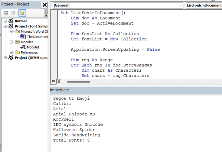
Using StoryRanges means all parts of the document should be checked including headers, footers, footnotes and endnotes.
A collection object to make a unique font list removes the need to check for duplicates.
Putting the font list into the Immediate window is faster, more contained and easily copyable.
The Application.ScreenUpdating = False/True lines might help speed up the code in a large document.
The full code is below.
How to run the font list code
This code can be run on any Word document as a ‘one off’, not just a macro-enabled .dotm file. This is NOT the standard way to add VBA to an Office document, it’s a simplified version for adding code to run only while the doc is open.
Open the document then switch to the Developer tab. Developer now showing – see here.
Choose Developer | Visual Basic to open the VBA editor. Right-click on the document you want to check. Look for the Project with the name of the document then “Microsoft Word Objects” and ThisDocument and finally “View Code”

“View Code” will open a code window for this document (we’re not bothering with Modules for this quick use).
Open the Immediate so you can see the font list View | Immediate Window.

Immediate window is normally used to for quick testing or debugging using Debug.Print commands.
Now the VBA editor should look like this with the document selected in the left-pane.

Click the Run button on the toolbar. If the document is large, there’ll be a wait of perhaps a few minutes for really big docs.
Here’s one result from our tests showing 27 different fonts in a large document.

That’s way more than there should be, so there’ll be some font hunting (Advanced Search) to search the text by font and change any stray font formatting.

Copying the code above should work OK in Edge/Chrome browsers.
With Firefox, we’re told there are problems, probably related to the end of line breaks. Make sure that each code line ends with a full line break, if necessary replace each end of line with a press of the ‘Enter’ key.
List fonts in a Word document – method 2 is another way to get a font list.
Use Google Fonts for free in Microsoft Office Check out the winner and other new fonts in Microsoft 365/Office 2021 Find out more about fonts
About this author

Office-Watch.com
Office 2021 - all you need to know . Facts & prices for the new Microsoft Office. Do you need it? Office LTSC is the enterprise licence version of Office 2021.
Office 2024 what's known so far plus educated guesses. Microsoft Office upcoming support end date checklist.
Latest from Office Watch
- A $125 Billion lesson in why cloud backups are vital
- How Word pastes into your document
- Make monsters and pipes with the Terantopia font
- Avoid the traps when adding Excel info into a Word document
- Circle & Sphere calculations in Excel using Pi 𝜋
- Face with rolling eyes 🙄 emoji in Word, Outlook, Office
- Glasses 👓 emoji in Word, Excel, PowerPoint and Outlook
- Calendar extras added to new Outlook
- Changes to PDFs made by Microsoft Office
- It's official - Calibri beats Aptos in font poll
- Vmware Workstation Pro is now free
- A quiet month of security fixes for Microsoft Office
- How Mark of the Web stops bad document infections
- Introducing Reading Coach to enhance Reading Fluency with AI
- Immersive Reader in Word for Windows, Mac and iPad
- Presenter Coach makes for better PowerPoint presentations
- Word changes a Paste Text option
- Paste Text Only gets a Word shortcut and confusion
- Try a faster Microsoft 365 secure login
IMAGES
VIDEO
COMMENTS
TOP 25: best fonts in Microsoft Word. 1. Impact. About Impact: Ideal for headlines and short titles, Impact is perfect for designs needing a bold, assertive font that captures attention instantly. 2. Goudy Old Style. About Goudy Old Style: Best suited for formal documents, like legal and academic papers, where a traditional and professional ...
First up, Constantia. It's like the chameleon of fonts, equally at home on screen and paper. It's got this subtle elegance that makes your academic work look effortlessly chic yet totally approachable. Plus, your eyes will thank you after those long hours of reading and writing.
Best Fonts for Academic Papers in Microsoft Word. The best fonts for academic papers are Times New Roman, Baskerville Old Face, and Georgia. There are plenty of good options, but you'll mainly want to stick to serif fonts. They look much neater and more professional while showing that the reader can trust what you say. Times New Roman
Your university professor will love your academic papers and essays after using these fonts. 1. Wensley Modern Serif Font Family (Top Pick) The font of choice for many university students, Wensley is a modern serif font typeface. If you want to impress your professors with an elegant and professional appearance then this style will be perfect ...
Here are seven of the most common types used in academic writings: Times New Roman: This classic serif font is a go-to for many writers. It's easy to read and has a timeless look. Arial: A popular sans serif font, Arial is also easy to read and works well for long paragraphs of text. Calibri: Another sans serif font, Calibri is slightly more ...
Use A Serif Font. Serifs are the tiny strokes at the end of a letter's main strokes. Serif fonts have these extra strokes; sans serif fonts do not. ( Sans is French for "without.") Serif fonts also vary the thickness of the letter strokes more than sans serifs, which have more uniform lines.
Writing assignments is a necessary practice for everyone pursuing any academic endeavor. You must understand how to format your academic paper. You must also follow the typography guidelines for each type of assignment. Adhering to both ensures your paper meets the presentation standards applicable and is presentable, readable, and easy to follow.
Before we dig in, let's start with a quick multiple-choice quiz: Font : Text :: A. Hat : Head. B. Coffee : Tea. C. Voice : Speech. The answer is C. The font you choose to display text is every bit as important as the voice you use to speak if you want a reader to not only understand what they are reading, but also remember it as well.
Serif Fonts: While sans-serif fonts dominate digital screens, serif fonts like Times New Roman and Georgia can still be effective for printed business documents, offering a touch of formality and tradition. Email Fonts: When it comes to emails, readability is paramount. Some of the best fonts for email design include Arial, Verdana, and Tahoma.
You should aim to stay under the specified word count limit to show you can follow directions and write concisely. However, don't write too little, as it may seem like you are unwilling or unable to write a detailed and insightful narrative about yourself. If no word count is specified, we advise keeping your essay between 400 and 600 words.
Helvetica: A widely used Swiss sans-serif font that was developed in 1957. It has clean lines and great clarity that fits well with most modern tastes. Helvetica definitely has its own special ...
A Serif Sensation: Traditional Serif Fonts Offer Readability & Polish. 1. Times New Roman. This quintessential serif font designed for the New York Times newspaper 1931 remains a staple choice to exude professionalism. The fluid serifs and sturdy letterforms allow Times New Roman to be readable in print.
Place your assignment title at the top of your first page, either centre or left aligned, in bold font. At university, you may be assigned a pre-designed essay title/question, or asked to select from several possible titles. You may also be asked to design your own essay title. Here are some top tips on designing your own title: To bring focus ...
So please print out sample texts in each font if you want to compare serif fonts, instead of just playing around with them on screen :). The boring but safe serif choices would be the defaults: Times New Roman (default in old Microsoft Word), Cambria (default in new Microsoft Word), and Computer Modern (default in LaTeX).
Fonts. Use a clear, readable font, such as Verdana, Calibri, Tahoma or Arial and use the same font throughout. Use black text on a white background. Avoid coloured backgrounds or text in a colour other than black, unless you have special permission to use them. Use 11 or 12 point font for the body of your assessment.
9. Autor. Autor is a set of sans serifs with a clean and sharp look. Created for editorials and body text, this typeface is a great font choice for papers and reports that utilize varying headers and titles. 10. Maine. Maine is a modernized version of the classic Book Antiqua serif, with 12 font styles.
When it comes to the best font size for assignments in MS Word, it's essential to strike a balance between readability and professionalism. UrbanPro's MS Word training covers these nuances to ensure your documents meet academic standards. Guidelines for Choosing Font Size: Standard Fonts: Stick to standard fonts such as Times New Roman, Calibri ...
The best font for a cover letter should be simple, clear, and match the font you use in your resume. The most popular choices include Times New Roman, Arial, Calibri, and Verdana. The font size should be set to 12pt and it's best to limit yourself to just one typeface. But that's not the full answer on what font is suitable for a cover letter.
If you are looking for some fresh and stylish fonts for your Word documents, you might want to check out this blog post by Rent My Words. It features some of the best fonts for Word and where you have seen them before in popular logos, brands, and media. You will also find links to other helpful tutorials on how to use Canva, a free online graphic design tool, to create stunning visuals for ...
Download quality, free fonts for your college assignments! Get the perfect font for any project with our selection of college fonts - available now and completely free!
For the heading/subheading, I think you can go with IBM Plex Sans, Barlow, Playfair Display or Open Sans.If the topic is somewhat related to modern, then you can use Roboto, Montserrat, or Rubik.. For the body text, you can go with either modern-like serif like Source Serif Pro, IBM Plex Serif, or Charis SIL, or traditional serif like Garamond, Newsreader, or Lora.
Tanziahanry. ·. Follow. Jul 17, 2023. --. Font size. It is best practice to type word documents in font size 14, and no smaller than font size 12, to assist readers with visual impairments ...
How to set recommended font & font size for all type of Word documentslike Letter, application, report, assignment, research paper, thesis, book notes etc.An...
Removing these fonts isn't just being tidy, unnecessary fonts can enlarge a document with embedded fonts or a PDF made from the document. There are two methods of making a font list: Use VBA code to make a list. Dig into the document structure to reveal the included font list, see List fonts in a Word document - method 2