Creating awesome Gantt charts for your PhD timeline

It’s a common scenario: you have never heard about Gantt charts. Then, when writing a PhD application or planning your PhD timeline for the upcoming years, someone suggests: You should include a Gantt chart! No need to worry. Here is all you need to know about Gantt charts for your PhD timeline.

What are Gantt charts?
Why are gantt charts frequently used for phd timelines, what information is included in gantt charts for phd timelines, creating a phd timeline gantt chart in microsoft excel, creating a phd timeline gantt chart in microsoft powerpoint, creating a phd timeline gantt chart in a microsoft word, creating a phd timeline gantt chart with an online tool, best gantt chart template for phd timelines in microsoft excel, best gantt chart template for phd timelines in microsoft powerpoint, best gantt chart template for phd timelines in microsoft word, gantt chart phd timeline example in microsoft excel, gantt chart phd timeline example in microsoft powerpoint, gantt chart phd timeline example in microsoft word.
A Gantt chart is a visual representation of a project schedule and a widely used tool in project management.
Gantt charts belong to the family of bar charts. In a Gantt chart, bars depict different project tasks. The length of each bar is proportionate to the task duration and indicates both start and finish dates.
Gantt charts are named after Henry Gantt. He lived from 1861-1919 and developed these types of charts as part of his work as a management consultant.
A Grantt chart is a great way to provide an overview of project tasks, activities and milestones.
Gantt charts are frequently used to illustrate PhD timelines because doing a PhD essentially means creating, managing and implementing a project with many components over several years.
Therefore, Gantt charts are popular tools among (aspiring) PhD students.
They are often featured in PhD proposals: Through visual representations, Gantt charts help communicate milestones, plans and estimated task durations.
Furthermore, Gantt chart PhD timelines allow PhD students to track their progress. They can also help PhD students to stay on track with their work.
You may also like: How to develop an awesome PhD timeline step-by-step
Gantt charts can include all kind of information, based on the specific project they are focusing on. When it comes to Gantt chart PhD timelines, there are several elements that are commonly featured:
- Extensive PhD proposal/plan
- Data collection
- Experiments
- Data analysis
- Writing plan
- Publications
- Conferences
- Courses/Coursework
Of course, every PhD project is unique. This uniqueness should be reflected in your Gantt chart. For instance, your Gantt chart PhD timeline will look different if you write a PhD based on articles or if you write a monograph .
For a PhD based on published articles, different bars in a Gantt chart PhD timeline could for example represent individual papers. For a monograph, it may be smarter to focus on research stages.
How do you create a Gantt chart for your PhD timeline?
Unfortunately, creating a Gantt chart in Microsoft Excel is far from straightforward as Excel does not provide its own Gantt chart template.
You can create a table, turn it into a bar chart and manually edit it until it looks like a Gantt chart. If you have some experience with Excel, it is doable. Detailed instructions on the process can be found in this manual from Ablebits.com.
However, why go through all the hassle when you can simply download a template? You can use Microsoft’s own free Gantt project planner template and adjust it to your PhD project.
Manually creating a PhD timeline Gantt chart in PowerPoint is a bit easier than in Excel. Therefore, I will explain the process here.
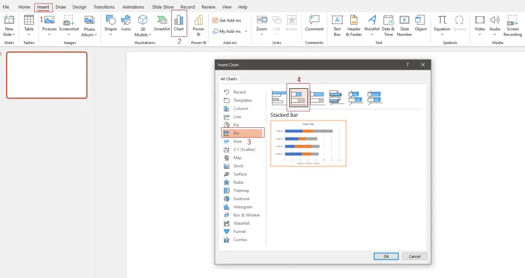
First, you need to open a blank PowerPoint slide. Then click on Insert (1.), then Chart (2.). A popup will appear. Select Bar (3.) and finally select the Stacked Bar option (4).
A standard bar chart will appear on your slide and a small Excel table with open next to it. The first column in the Excel table is called Categories . You can replace categories with the PhD tasks that you want to display. For instance, Literature Review, Interviews, Transcribing and Analysis. You can add more categories or delete existing ones by removing a row in the small Excel table.
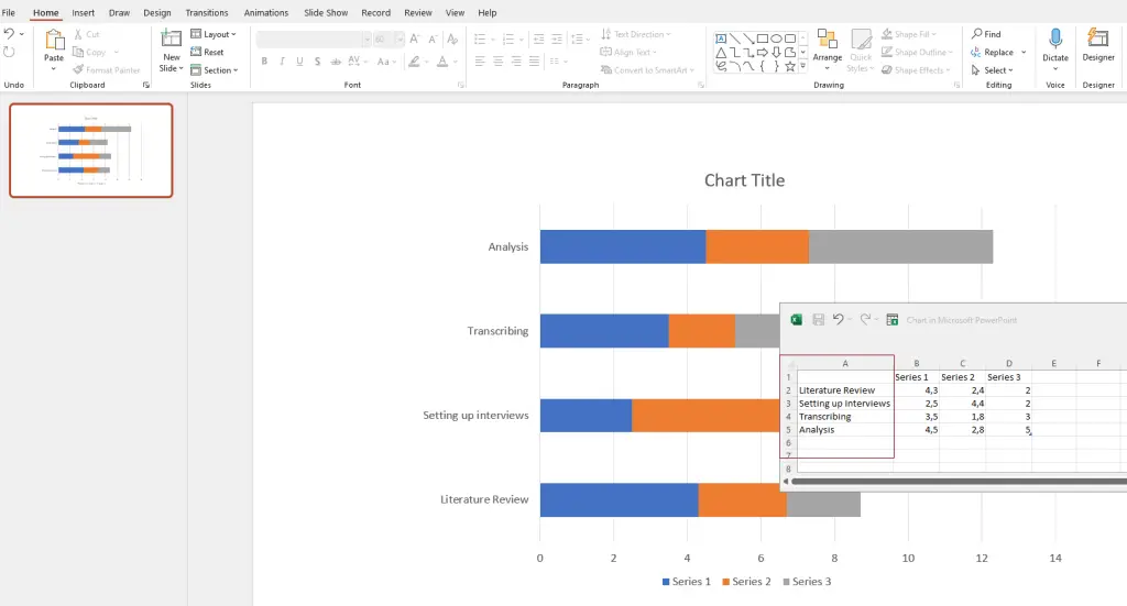
Next to the Categories (now tasks) column, you see three more columns: Series 1 , Series 2 , Series 3 . You can use these columns to showcase the length of tasks. Rename Series 1 into Start Date and Series 2 into End Date . Series 3 indicates the overall length. Depending on the timeframe you want to showcase, you can opt for instance for Length (weeks) or Length (months) .
In the example below, I decided to plan PhD tasks for a year. Thus, 1 means January, 2 means February, 3 means March and so forth. The length of tasks is also indicated in months:
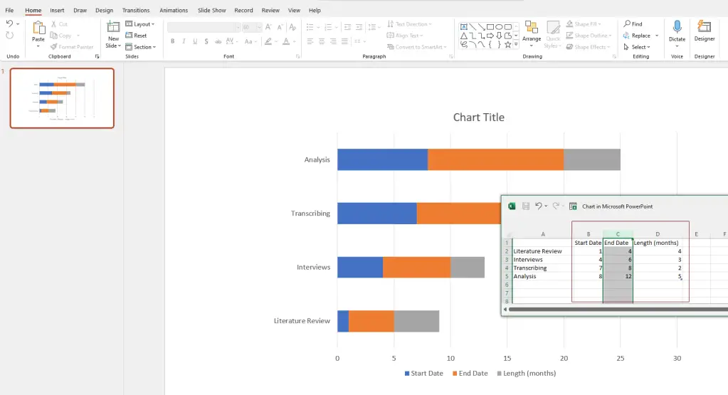
Next, click on your chart and three icons will appear in the upper-right corner next to it. Click on the bottom one, the Chart filters , remove the tick of the check box of End Date , and click on Apply. You will see that the bar chart will start to look like a Gantt chart:
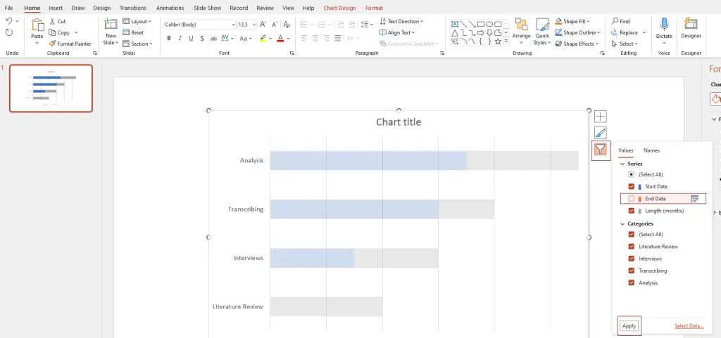
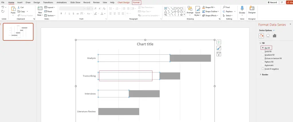
Now, the blue parts of the bar, indicating the Start Dates, need to be removed. Just click on one of them, and on the righthand side, Format Data Series should appear. Select No fill. Alternatively, in the upper menu, select Format , go to Shape fill, and select No fill .
Now comes the fun part, namely decorating. You can add a chart title, colour the bars in the colour of your choice, edit the legend and the axis descriptions. Just play with it to explore the options.
One more thing I did was changing the value of the axis, because I want to illustrate the months of a year. Thus, it was a bit weird that the horizontal axis started with 0 and ended with 13 while I needed 1-12 to indicate each month of a year. You can simply change this by clicking on the axis. On the righthand side, Format Axis will appear. Go to Axis Options , Bounds , and enter 1 for Minimum and 12 for Maximum .
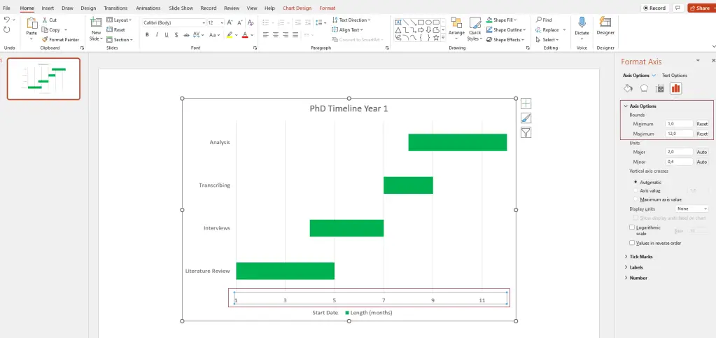
And voila! Your Gantt chart is ready.
The nice thing about learning how to create a Gantt chart in Microsoft PowerPoint is that you basically teaches you how to create one in a Word file as well! The process is very similar.
To start the process in Word, it is smart to first change the orientation of your page to Landscape . In the top menu, click on Layout , then select Orientation , then choose Landscape .
Next, select Insert , then Chart , and select a Stacked Bar chart again.
A basic bar chart will appear on your page:
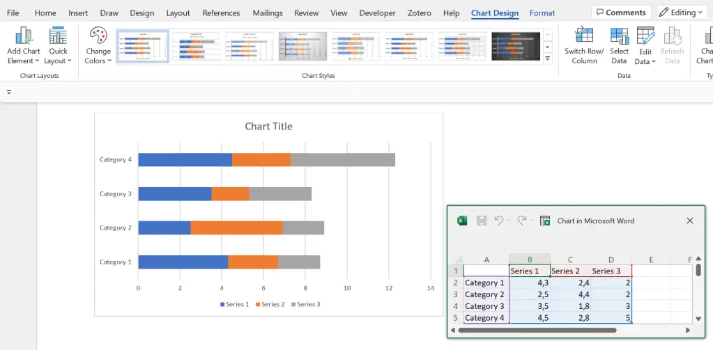
Looks familiar? Yes! From here, it is basically the same process as editing the bar chart in PowerPoint.
If you don’t want to go through the hassle of creating your own Gantt chart but are not convinced by any templates, you can make use of online tools and software.
There are some paid providers out there, but in my opinion, it is not worth paying to create an awesome PhD timeline.
You can use a free provider (or make do with one of the many Gantt chart templates that exist on the internet). One free online tool is the Free Online Gantt Chart Software :
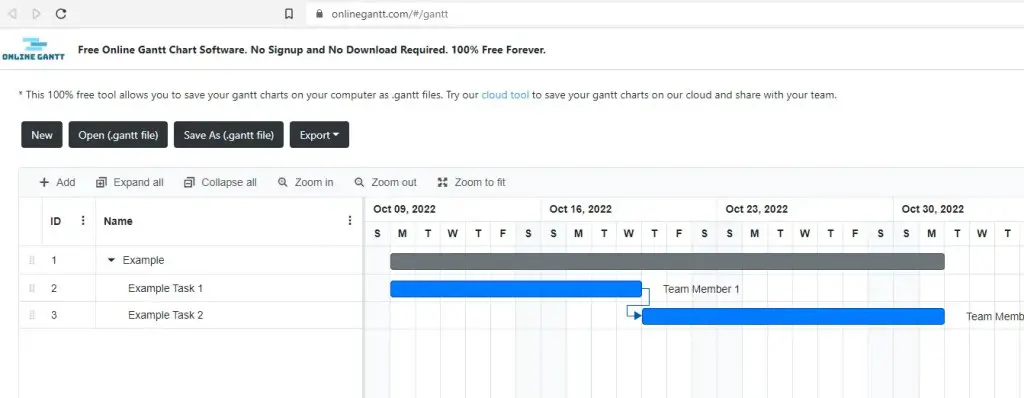
The site requires no signup. You can editing and simply start filling in the Gantt chart, and export it as an Excel, Image or PDF file when you are done!
PhD timeline Gantt chart templates
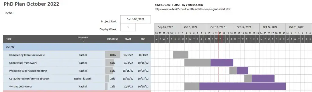
A great way to create a detailed Gantt chart in Microsoft Excel is by using Microsoft’s free Gantt project planner template . The level of detail and functionality exceeds those of simple, manually created Gantt charts. This makes this type of Gantt chart especially useful to track detailed PhD progress.
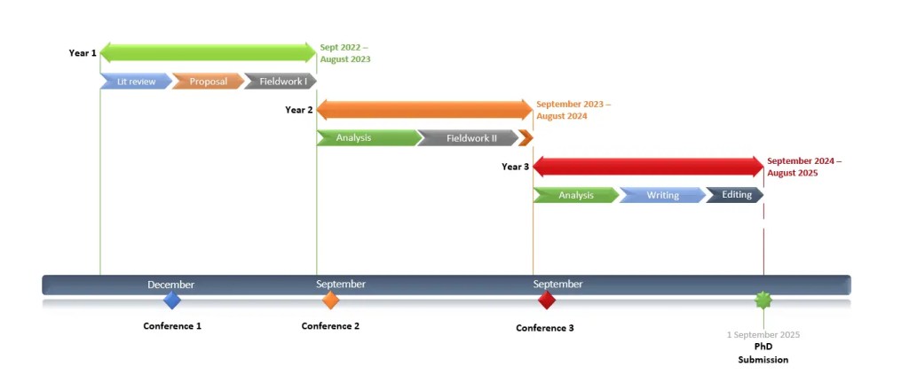
A useful Gantt chart template for PhD timelines in PowerPoint can be downloaded here via OfficeTimeline.com This Gantt chart is particularly great to provide a rough overview of plans over a longer period. For instance, with a few edits, you can illustrate a nice 3-year PhD timeline.
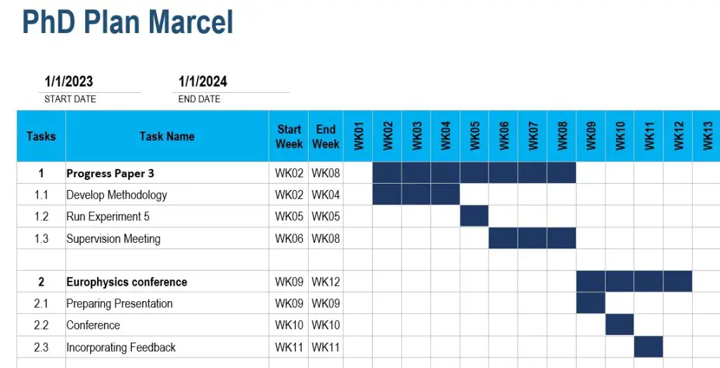
Useful Gantt chart templates for Microsoft Word can be downloaded here from TemplateLAB. I like these templates as they can be easily adjusted to the needs of a PhD timeline. For instance, a weekly Gantt chart template can be useful to establish a detailed plan with weekly objectives to keep your PhD progress on track.
PhD timeline Gantt chart examples
Using the template provided by Microsoft above, an example PhD timeline to track regular progress on tasks could look, for instance, like this:
Using the Gantt chart PowerPoint template by OfficeTimeline.com above, an example PhD timeline to present a plan for a 3 year PhD could look, for instance, like this:
Using a weekly Gantt chart template from TemplateLab mentioned above, an example PhD timeline with weekly tasks and objectives could look, for instance, like this:
Get new content delivered directly to your inbox!
Subscribe and receive Master Academia's quarterly newsletter.
10 reasons NOT to do a master's degree
9 smart questions to ask a professor about graduate school, related articles.

Introduce yourself in a PhD interview (4 simple steps + examples)

10 key skills of successful master’s students

10 qualities of successful postgraduate students

How to structure your viva presentation (with examples)
How to Create and Use a Gantt Chart for PhD Studies

A Gantt chart is a common tool used in the project management field. It is used for schedule planning of a project and its tasks and activities. It shows the tasks, their start and end dates, and the duration needed to complete them.
A PhD is a project and may last from as few as three years to as long as six years depending on the university and department a student is enrolled in.
In order to successfully complete a PhD program, one needs to plan when each of the tasks will be completed from the word go. A Gantt chart is very useful in doing this.
A PhD student can create one comprehensive Gantt chart or several smaller Gantt charts for each of the major deliverables.
This article discusses a Gantt chart for a general PhD program that has both coursework and dissertation components.
Benefits of a Gantt chart for planning PhD studies
Steps involved in creating a gantt chart for phd studies, how to effectively use the phd gantt chart, final thoughts on the phd gantt chart.
Creating a Gantt chart at the beginning of PhD studies has the following benefits:
- It is easy to create. A student can use the traditional pen-and-paper method or existing digital tools or softwares to create a Gantt chart.
- It is easy to read. The visual presentation of the Gantt chart makes it easy for the student to read and know what is expected of him at any point in time.
- A Gantt chart makes it easy to monitor progress of PhD studies. The user can choose to use different colors for tasks that have already been completed, tasks that are close to completion, and tasks that require more time and effort to complete.
- It forms the basis for monthly, weekly, and daily planning of the PhD studies. Depending on how detailed a student wants to go in terms of planning, the Gantt chart comes in handy when writing out the monthly, weekly and even daily plans.
Step 1: List all the deliverables expected of your PhD program. In this example, the PhD program has the following requirements:
- Coursework, divided into 4 modules each lasting 2 weeks. All 4 modules need to be completed within the first year of study.
- A comprehensive written exam at the end of the fourth module.
- An oral exam once a student passes the written exam.
- Submission of a concept note.
- Submission of a research proposal once a student passes the oral exam.
- Writing a business management case study.
- Three journal papers.
- At least two conference papers.
- A dissertation.
Step 2: For each of the requirements listed above, note the start and end dates. For the above example, the PhD program lasts a minimum of 3 years and a maximum of 6 years. Assuming the minimum of 3 years (beginning January 2021), the activities’ start and end dates are as follows:
Step 3: Using the above information, create the Gantt chart using Microsoft Word, Powerpoint or Excel.
The following are useful resources for creating a Gantt chart using:
- Microsoft Powerpoint: https://www.youtube.com/watch?v=wp0vr6OkW8Y
- Microsoft Excel: https://www.youtube.com/watch?v=00s5efQWrgU&t=10s
- Microsoft Word: https://www.youtube.com/watch?v=F90RdA5X4G0
The Gantt chart created from the above data is shown below. The chart was created using Microsoft Powerpoint.

Step 4: Once the Gantt chart is complete, print it out and hang it on the wall of your study room/area. This serves as a constant reminder of the tasks that need to be done at any point in time, as well as of the progress that has been made so far.
The greatest strength in using the Gantt chart for PhD studies lies in its ability to help one plan ahead. Using the Gantt chart above as an example, the user can plan as follows:
- At the beginning of every month, look at what is required of you. For instance, the student above needs to complete module one of the coursework and at the same time start working on proposal writing.
The student can plan for module one in advance by going through the course structure and expected readings, and reading in advance before the start of the module so that he is able to follow and understand what is being taught. If there are pre- and post-module exams, the student can also prepare for them in advance.
Preliminary tasks for proposal writing can include: discussing your proposed topic with your supervisor, and searching for and quick review of literature to identify the gap that your topic will be addressing. All these can be done in the first month before the actual proposal writing starts.
- The Gantt chart can help you identify the skills that are required for the successful completion of your dissertation. For instance, the student above is expected to write a Business Management case study by June of year 2.
If the student does not have case study writing skills, he can start looking for courses that teach case study writing and complete them way before the deadline for the case study. Same case for skills such as preparing and writing a journal paper, writing a conference paper, data analysis using softwares such as Stata, SPSS, NVivo etc.
- The Gantt chart can help you plan for academic-related events such as conferences.
In the example provided above, the student is expected to attend two scientific conferences (in November of year 2 and March of year 3) and make presentations.
The student can start looking for conferences related to his field that are held during the proposed times and mark the key dates and requirements of the conferences (for instance, abstract submission deadlines, abstract submission guidelines, registration deadlines etc).
- The Gantt chart can help you create monthly and weekly plans for longer tasks such as proposal writing.
In the above sample Gantt chart, proposal writing and defense spans a period of 15 months. By March of the second year, the student is expected to defend his proposal. This may seem like such a long period of time but in reality it is not. This is because it is not the only task that the student will undertake during this period. As a result, it is easier to focus on the tasks at hand and forget about the tasks that seem to have adequate time.
Proposal writing is a daunting task and requires constant reading and updating. To ensure that the student submits his proposal in time, he can create monthly and weekly plans for the task. An example of monthly planning for the proposal writing is provided in the table below:
The monthly plan is based on assumptions, for instance, that the supervisor will review the document within the scheduled timeframe. This may or may not hold, depending on the supervisor.
It is therefore important to allow ample time for such factors that are out of your own control in order to ensure that the task is completed by the deadline.
The monthly plans can further be broken down into weekly (and even daily) plans, for instance:
- Number of papers to read per week (day).
- Number of words to write per week (day).
- How many citations and bibliographies to insert (update) every week (day).
- Number of additional articles to search and add to your library each week etc.
Each of these tasks contributes to the overall proposal writing and make the task completion easier and faster than waiting for the last few months to do it all at once.
A PhD is a medium- to long-term project depending on how long it takes to finish. It therefore requires effective and careful planning from the start of the program to ensure that each deliverable is completed within the stipulated time. The Gantt chart is an easy-to-create, and easy-to-use planning tool that can be used by all PhD students. Not only does it save the student time but it also gives him peace of mind knowing the progress of each and every task required.
Grace Njeri-Otieno
Grace Njeri-Otieno is a Kenyan, a wife, a mom, and currently a PhD student, among many other balls she juggles. She holds a Bachelors' and Masters' degrees in Economics and has more than 7 years' experience with an INGO. She was inspired to start this site so as to share the lessons learned throughout her PhD journey with other PhD students. Her vision for this site is "to become a go-to resource center for PhD students in all their spheres of learning."
Recent Content
SPSS Tutorial #10: How to Check for Normality of Data in SPSS
The normality assumption states that the data is normally distributed. This post touches on the importance of normality of data and illustrates how to check for normality of data in SPSS. Why...
SPSS Tutorial #9: How to Check for and Deal with Outliers in SPSS
Outliers are data values that are different from most of the data values in a dataset. They can either be extremely high or extremely low compared to the rest of the data values. This post...
IMAGES
VIDEO
COMMENTS
Creating a PhD timeline Gantt chart in Microsoft Excel. Unfortunately, creating a Gantt chart in Microsoft Excel is far from straightforward as Excel does not provide its own Gantt chart template. You can create a table, turn it into a bar chart and manually edit it until it …