Excel Visualization: A Guide to Clear Data Presentation for Beginners
I once struggled with dull data tables.
Numbers clustered in rows and columns become a blur. But with Excel visualization , you can empower your audience to make informed decisions based on the data presented. Excel charts and graphs replace chaos, revealing patterns and trends.
Convey ideas efficiently with the right visual. It’s not just about creating a chart; it’s about making data understandable and engaging.
In this article, I’ll guide you step-by-step on transforming your Excel data into insightful visuals.
Let’s get started!
Table of Contents

Understanding the Basics of Excel Visualization
Excel provides various visualization options, whether 2D or 3D versions, standard, stacked, or 100% stacked options. It’s all about finding the right fit that best represents your data and message.
The Excel Charting Interface
Let’s start with creating a chart in Excel.
When you click on the Insert tab in Excel, you’ll see various chart types that you can use to visualize your data.

The Excel charting interface provides a wide range of options, from line and area charts to bar and column charts. When you click on a chart, the ‘ Chart Tools ’ contextual tab provides additional features for customizing your charts.
Types of Data for Visualization
Excel visualization data can be broadly categorized into numerical, categorical, and time-series data.
- Numerical data includes values that can be measured, such as sales figures or temperature readings.
- Categorical data includes information such as names, labels, or groups.
- Time-series data involves values measured over time, such as stock prices or website traffic.
Excel offers different chart types depending on your data type.
Selecting the Right Chart Type
Selecting the right chart type is half the battle for effective data visualization in Excel.
Pie charts are best for part-to-whole comparisons. Use line charts for time series or trends. Bar or column charts are the most suitable for categorical comparisons.
However, consider more advanced chart types for more complex data sets.
Scatter plots are excellent for correlation analysis , while histograms and box plots are ideal for distribution analysis of quantitative data.
It’s all about understanding your data and determining the best way to display it.
Steps for Visualizing Data in Excel – Creating Basic Charts
Creating basic charts in Excel is a fundamental skill for anyone looking to present data in a visual format.
Excel offers a variety of chart types, each with unique properties and use cases. The key to successful chart creation in Excel is understanding these different chart types and knowing how to present your data most effectively with them.
Organizing Your Data
Before you dive into creating Excel charts, it is crucial to organize your data correctly .
Well-organized data will make the charting process easier and the resulting charts more meaningful. Ensure your data is clean, error-free, and arranged clearly and logically.
This will make it easier to select the data for your charts and create visuals that effectively communicate your data analysis results.
Pie and Donut Chart
Pie charts are popular for showing the proportion of different categories within a whole. While visually appealing, they are often misused and can lead to misleading interpretations.
Generally, they are most effective when comparing a few categories representing parts of a whole.
On the other hand, donut charts are a variation of pie charts with a hole in the middle (as the name implies!). Like pie charts, they can display multiple data series, but they should be used sparingly.
To create a pie chart in Excel:
- Select the data you want to visualize
- From the “ Insert ” tab, choose “ Pie ” from the chart options.
- You can customize your chart by changing the colors, adding labels, and adjusting other settings in the “ Format Chart Area ” pane.
Here’s a video guide on how to create a donut chart:
Line and Area Chart
Line and area charts are handy when dealing with time-series data . These charts plot data points on a graph and connect them with a line, allowing you to see trends over time.
Check out this video for a step-by-step guide on how to create a line chart:
One of the business essentials when working with line and area charts is customizing the axis and gridlines. This can help make your chart more readable and meaningful .
The “ Format Axis ” pane allows you to customize the axis labels, adjust the scale, and add gridlines.
Column and Bar Graph
Bar and column charts are Excel’s most commonly used chart types. They are excellent for comparing different categories of data.
While bar charts and column charts are often used interchangeably, there is a difference: A bar chart presents data horizontally , while a column chart presents data vertically . This distinction can influence how easily your audience interprets the chart.
You can also choose between a stacked or clustered bar and column chart layout.
In a stacked chart , data series are stacked on each other, while in a clustered chart , they are placed side by side.
To create a bar or column chart:
- Select the data
- Then choose either “Bar” or “Column” from the chart options in the “ Insert ” tab
- Remember to format the chart and the axis labels to make the chart easier to understand
Advanced Charting Techniques
In this section, I’ll describe how to present complex data in a visually appealing and easily understandable format. Since each dataset is unique, treat these charts as ideas for meaningfully presenting your data.
Combination Charts
This type of chart combines the features of line and column charts, allowing you to present mixed data more comprehensively.
For example, when you have a target and actual data for comparison , a combination chart can be the perfect tool for visualization.
Clicking the Chart Design tab on the ribbon allows you to change the chart type and create a customized combination chart.

This allows you to have your target values in columns and the actual values marked along the line, which provides a clearer visualization of your data.
Trendlines and Data Analysis
Another essential feature of Excel charts is the ability to add trendlines. These can be linear, polynomial, or moving average trendlines.
A trendline graphically displays trends in your data , and you can extend it beyond the actual data to predict future values.
Along with trendlines, interpreting R-squared values is also crucial in data analysis. This will help you understand the relationship between your dependent and independent variables, thus enhancing your analysis results.
Check out our detailed how-to post on adding trendlines to Excel charts .
Conditional Formatting in Charts
Conditional formatting is another advanced charting technique in Excel that can enhance your data visualization. You can also add data bars, color scales, and icon sets.
These features allow you to customize your charts based on certain conditions, making it easier for your audience to understand your data. Applying these formatting options enables you to create more engaging and visually appealing charts for your data presentation.
Creating a Tornado Chart in Excel
Tornado charts are particularly effective when comparing and contrasting different variables . A well-crafted tornado chart can help you visualize how changes in several factors can impact a specific outcome – for example, the impact of inflation on NPV and IRR results.
Here’s a video showing you how to create a tornado chart:
Designing a Funnel Chart in Excel
Funnel Charts in Excel are highly effective tools for monitoring sales processes or any other process that narrows down over time.
Here are two quick methods for designing funnel charts in Excel:
Building a Waffle Chart in Excel
Waffle charts, also known as square pie or waffle bar charts, are a great way to visualize individual data points compared to the whole data set. They are a fun and engaging way to present percentages or proportions.
Here is a simple method for creating waffle charts:
Data Visualization Tips – Enhancing Chart Aesthetics
The aesthetics of your Excel chart play a significant role in how effectively your data is communicated.
A visually appealing chart is easier to understand and engages your audience. Enhancing chart aesthetics involves working with various chart elements and features, such as colors, styles, and data labels.
Adding data labels, for instance, provides additional information on your chart, making it easier to interpret.
Besides, you can customize the chart’s colors and styles to match your presentation theme or company branding.
Check out this post for more information on good dashboard design principles .
Working with Chart Elements
Working with chart elements can significantly improve the readability and effectiveness of your data visualization.
Some key chart elements you can manipulate include titles, legends, and data labels.
- Data labels provide additional context to your data and can be customized to suit your chart
- Modify axis labels and gridlines to adjust their appearance and improve readability. Check out this video on how to add gridlines to your Excel charts:
These chart elements can enhance your aesthetic appeal and make your data easier to interpret.
Customizing Chart Colors and Styles
Spicing up your Excel charts is easier than you think.
The ‘ Chart Design ‘ tab in the Excel ribbon allows you to alter your charts’ aesthetics significantly.
Navigate to the ‘ Chart Styles ‘ section, and you’ll see various styles for your chart.
Looking for a bit more customization? No problem! Simply click the ‘ Change Colors ‘ dropdown and choose a color scheme.

You can use Excel’s preset color schemes or create a custom color palette for brand consistency. Minor visual changes can significantly affect your chart’s overall look and feel.
3D Charts and Effects
Adding a third dimension to your charts can make them pop . But be careful.
While 3D effects can add a specific wow factor, they can also lead to misinterpretations of your data if they are not used properly.
To add 3D effects to your charts, click the ‘ Chart Styles ‘ and choose a style with 3D effects.
Remember, though, that 3D effects should be used sparingly and only when they can enhance the understanding of the data. Overuse of these effects can lead to cluttered, confusing charts. When it comes to 3D effects, less is often more .
Advanced Excel Graphics
Beyond the basic charts, Excel offers advanced graphics capabilities to take your data presentation to the next level.
This includes using Sparklines, shapes, and icons, among other features.
Sparklines are mini-charts within individual cells, each representing a row of data. They give a quick snapshot of trends, helping you understand your data at a glance.
Excel offers line, column, and win/loss types of Sparklines that you can add with the Quick Analysis tool.
Using Shapes and Icons

Remember to appropriately format these shapes and icons to convey the right message and not distract from the data.
Portraying a Story Through Data
Excel visualization is not just about creating charts or diagrams; it’s about telling a story with your data. This is where the concept of data storytelling comes in.
It’s about using visualization tools to highlight key points and trends in your data, making it easier for your audience to understand and absorb.
It’s not unlike creating a plot in a novel where rows and columns of data are the characters, and the chart is the narrative arc. Every element should convey your story effectively and compellingly, from simple bar charts to intricate trend analysis.
Exporting and Sharing Your Visualizations
Once you’ve created your data visualization in Excel, it’s important to know how to share it! This involves exporting the visual representation of data in a format that others can easily access.
Whether you’re sharing a simple bar graph or a complex infographic, the export method will depend on the intended use of the chart/graphic.
This process can be as simple as saving your chart as an image or embedding Excel visuals in PowerPoint presentations and documents.
Saving Charts as Images
One of the simplest ways to share visualizations is by saving them as images .
To do this, right-click the chart and select ‘Save as Picture.’ Several image formats are available, each with its uses.
For instance, JPEG is great for photographic images, while PNG is ideal for images with transparent backgrounds. However, it’s important to consider the resolution of your image. High resolution is crucial for clear, crisp images, especially if they’re intended for print.
Embedding Excel Visuals in Presentations and Documents
Embedding them in presentations and documents is another way to share your Excel visualizations.
This can be done in two ways: linking and embedding .
- Linking refers to connecting the original Excel file and the document where it’s inserted. Any changes made to the original file will automatically update in the document (assuming the link isn’t broken ).
- Embedding involves inserting a copy of the chart into the document. While this won’t update automatically, it ensures that the chart will always be available, regardless of the status of the original file.
Both methods have advantages and should be chosen based on your specific needs.
Frequently Asked Questions
What are some common mistakes for beginners to avoid in data visualization with excel.
Common mistakes include overcrowding the chart with too much data, using inappropriate chart types, neglecting to label axes or data points clearly, and choosing colors or styles that reduce readability.
What are the best practices for presenting Excel data visually to a non-technical audience?
Focus on simplicity and clarity .
Use straightforward chart types, avoid technical jargon, and highlight key takeaways. Ensure your charts are well-labeled, and use annotations or callouts to draw attention to important data points.
What are some resources to learn more about Excel visualization?
For more tips and tricks, visit my YouTube channel . Alternatively, look at Chandoo’s training, where I learned many excellent dashboard design ideas.
Can Excel visualization help in career development?
Absolutely! Proficiency in Excel visualization is a valuable skill in many industries.
It’s especially relevant in fields like data science, finance, marketing, and others involving large amounts of data. Effectively communicating data through graphical representation can give you a significant advantage in your professional journey.
Leave a Comment Cancel reply
Save my name, email, and website in this browser for the next time I comment.
Excel Charting Basics: How to Make a Chart and Graph
By Joe Weller | January 22, 2018 (updated May 3, 2022)
- Share on Facebook
- Share on LinkedIn
Link copied
Organizations of all sizes and across all industries use Excel to store data. While spreadsheets are crucial for data management, they are often cumbersome and don’t provide team members with an easy-to-read view into data trends and relationships. Excel can help to transform your spreadsheet data into charts and graphs to create an intuitive overview of your data and make smart business decisions.
In this article, we’ll give you a step-by-step guide to creating a chart or graph in Excel 2016. Additionally, we’ll provide a comparison of the available chart and graph presets and when to use them, and explain related Excel functionality that you can use to build on to these simple data visualizations.
What Are Graphs and Charts in Excel?
Charts and graphs in Microsoft Excel provide a method to visualize numeric data. While both graphs and charts display sets of data points in relation to one another, charts tend to be more complex, varied, and dynamic.
People often use charts and graphs in presentations to give management, client, or team members a quick snapshot into progress or results. You can create a chart or graph to represent nearly any kind of quantitative data — doing so will save you the time and frustration of poring through spreadsheets to find relationships and trends.
It’s easy to create charts and graphs in Excel, especially since you can also store your data directly in an Excel Workbook, rather than importing data from another program. Excel also has a variety of preset chart and graph types so you can select one that best represents the data relationship(s) you want to highlight.
Tired of static spreadsheets? We were, too.
Although Microsoft Excel is familiar, you were never meant to manage work with it. See how Excel and Smartsheet compare across five factors: work management, collaboration, visibility, accessibility, and integrations.
Watch the full comparison
When to Use Each Chart and Graph Type in Excel
Excel offers a large library of charts and graphs types to display your data. While multiple chart types might work for a given data set, you should select the chart that best fits the story that the data is telling.
In Excel 2016, there are five main categories of charts or graphs:
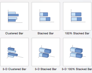
- Column Charts: Some of the most commonly used charts, column charts, are best used to compare information or if you have multiple categories of one variable (for example, multiple products or genres). Excel offers seven different column chart types: clustered, stacked, 100% stacked, 3-D clustered, 3-D stacked, 3-D 100% stacked, and 3-D, pictured below. Pick the visualization that will best tell your data’s story.

- Bar Charts: The main difference between bar charts and column charts are that the bars are horizontal instead of vertical. You can often use bar charts interchangeably with column charts, although some prefer column charts when working with negative values because it is easier to visualize negatives vertically, on a y-axis.
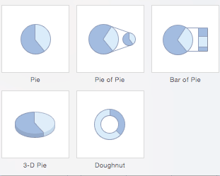
- Pie Charts: Use pie charts to compare percentages of a whole (“whole” is the total of the values in your data). Each value is represented as a piece of the pie so you can identify the proportions. There are five pie chart types: pie, pie of pie (this breaks out one piece of the pie into another pie to show its sub-category proportions), bar of pie, 3-D pie, and doughnut.
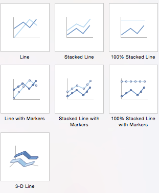
- Line Charts: A line chart is most useful for showing trends over time, rather than static data points. The lines connect each data point so that you can see how the value(s) increased or decreased over a period of time. The seven line chart options are line, stacked line, 100% stacked line, line with markers, stacked line with markers, 100% stacked line with markers, and 3-D line.
- Scatter Charts: Similar to line graphs, because they are useful for showing change in variables over time, scatter charts are used specifically to show how one variable affects another. (This is called correlation.) Note that bubble charts, a popular chart type, is categorized under scatter. There are seven scatter chart options: scatter, scatter with smooth lines and markers, scatter with smooth lines, scatter with straight lines and markers, scatter with straight lines, bubble, and 3-D bubble.
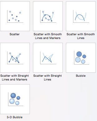
There are also four minor categories. These charts are more use case-specific:
- Area: Like line charts, area charts show changes in values over time. However, because the area beneath each line is solid, area charts are useful to call attention to the differences in change among multiple variables. There are six area charts: area, stacked area, 100% stacked area, 3-D area, 3-D stacked area, and 3-D 100% stacked area.
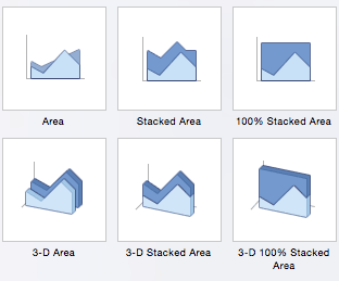
- Stock: Traditionally used to display the high, low, and closing price of stock, this type of chart is used in financial analysis and by investors. However, you can use them for any scenario if you want to display the range of a value (or the range of its predicted value) and its exact value. Choose from high-low-close, open-high-low-close, volume-high-low-close, and volume-open-high-low-close stock chart options.
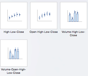
- Surface: Use a surface chart to represent data across a 3-D landscape. This additional plane makes them ideal for large data sets, those with more than two variables, or those with categories within a single variable. However, surface charts can be difficult to read, so make sure your audience is familiar with them. You can choose from 3-D surface, wireframe 3-D surface, contour, and wireframe contour.
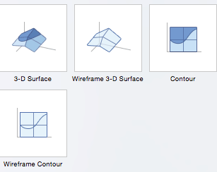
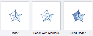
- Radar: When you want to display data from multiple variables in relation to each other use a radar chart. All variables begin from the central point. The key with radar charts is that you are comparing all individual variables in relation to each other — they are often used for comparing strengths and weaknesses of different products or employees. There are three radar chart types: radar, radar with markers, and filled radar.
Another popular chart is a waterfall chart, which is essentially a series of column graphs that show positive and negative changes over time. There is no Excel preset for a waterfall chart, but you can download a template to help make the process easier. For a full walkthrough, read How to Create a Waterfall Chart in Excel .
Download Waterfall Chart Template in Excel
Top 5 Excel Chart and Graph Best Practices
Although Excel provides several layout and formatting presets to enhance the readability of your charts, you can maximize their effectiveness with other methods. Below are the top five best practices to make your charts and graphs as useful as possible:
Make It Clean: Cluttered graphs — those with excessive colors or texts — can be difficult to read and aren’t eye catching. Remove any unnecessary information so your audience can focus on the point you’re trying to get across.
Choose Appropriate Themes: Consider your audience, the topic, and the main point of your chart when selecting a theme. While it can be fun to experiment with different styles, choose the theme that best fits your purpose.
Use Text Wisely: While charts and graphs are primarily visual tools, you will likely include some text (such as titles or axis labels). Be concise but use descriptive language, and be intentional about the orientation of any text (for example, it’s irritating to turn your head to read text written sideways on the x-axis).
Place Elements Intelligently: Pay attention to where you place titles, legends, symbols, and any other graphical elements. They should enhance your chart, not detract from it.
Sort Data Prior to Creating the Chart: People often forget to sort data or remove duplicates before creating the chart, which makes the visual unintuitive and can result in errors.
How to Chart Data in Excel
To generate a chart or graph in Excel, you must first provide the program with the data you want to display. Follow the steps below to learn how to chart data in Excel 2016.
Step 1: Enter Data into a Worksheet
- Open Excel and select New Workbook .
- Enter the data you want to use to create a graph or chart. In this example, we’re comparing the profit of five different products from 2013 to 2017. Be sure to include labels for your columns and rows. Doing so enables you to translate the data into a chart or graph with clear axis labels. You can download this sample data below.

Download Column Chart Practice Data
Step 2: Select Range to Create Chart or Graph from Workbook Data
- Highlight the cells that contain the data you want to use in your graph by clicking and dragging your mouse across the cells.
- Your cell range will now be highlighted in gray and you can select a chart type.
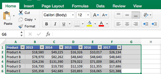
In the following section, we’ll walk you through the specifics of creating a clustered column chart in Excel 2016.
How to Make a Chart in Excel
After you input your data and select the cell range, you’re ready to choose the chart type. In this example, we’ll create a clustered column chart from the data we used in the previous section.
Step 1: Select Chart Type
Once your data is highlighted in the Workbook, click the Insert tab on the top banner. About halfway across the toolbar is a section with several chart options. Excel provides Recommended Charts based on popularity, but you can click any of the dropdown menus to select a different template.

Step 2: Create Your Chart
- From the Insert tab, click the column chart icon and select Clustered Column .
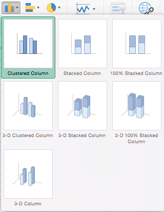
- Excel will automatically create a clustered chart column from your selected data. The chart will appear in the center of your workbook.
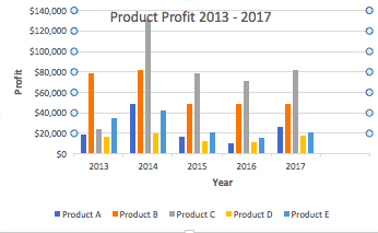
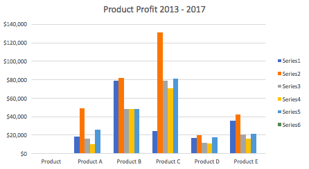
- To name your chart , double click the Chart Title text in the chart and type a title. We’ll call this chart “Product Profit 2013 - 2017.”
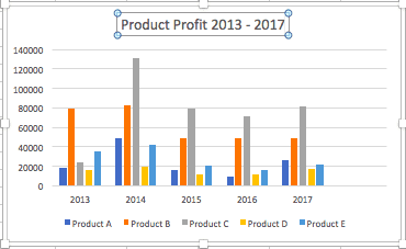
We’ll use this chart for the rest of the walkthrough. You can download this same chart to follow along.
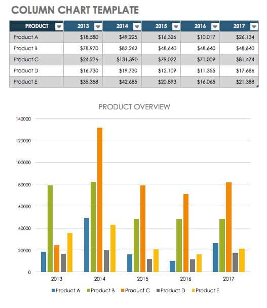
Download Sample Column Chart Template
There are two tabs on the toolbar that you will use to make adjustments to your chart: Chart Design and Format . Excel automatically applies design, layout, and format presets to charts and graphs, but you can add customization by exploring the tabs. Next, we’ll walk you through all the available adjustments in Chart Design .
Step 3: Add Chart Elements
Adding chart elements to your chart or graph will enhance it by clarifying data or providing additional context. You can select a chart element by clicking on the Add Chart Element dropdown menu in the top left-hand corner (beneath the Home tab).
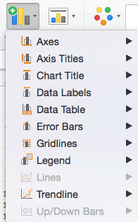
To Display or Hide Axes:
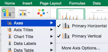
To Add Axis Titles:
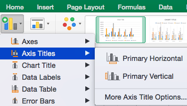
To Remove or Move Chart Title:
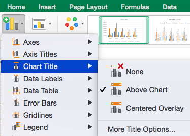
- Click None to remove chart title.
- Click Above Chart to place the title above the chart. If you create a chart title, Excel will automatically place it above the chart.
- Click Centered Overlay to place the title within the gridlines of the chart. Be careful with this option: you don’t want the title to cover any of your data or clutter your graph (as in the example below).
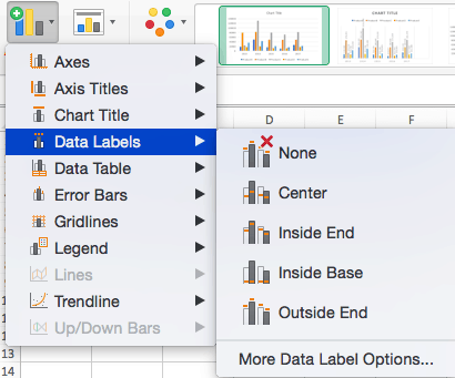
To Add Data Labels:
To Add a Data Table:
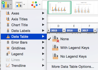
- None is the default setting, where the data table is not duplicated within the chart.
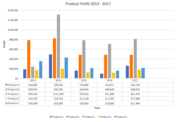
Note: If you choose to include a data table, you’ll probably want to make your chart larger to accommodate the table. Simply click the corner of your chart and use drag-and-drop to resize your chart.
To Add Error Bars:
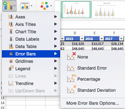
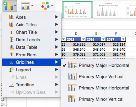
To Add Gridlines:
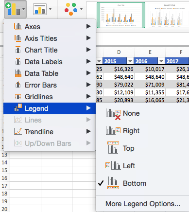
To Add a Legend:
To Add Lines: Lines are not available for clustered column charts. However, in other chart types where you only compare two variables, you can add lines (e.g. target, average, reference, etc.) to your chart by checking the appropriate option.
To Add a Trendline:
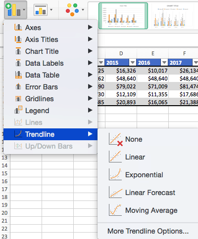
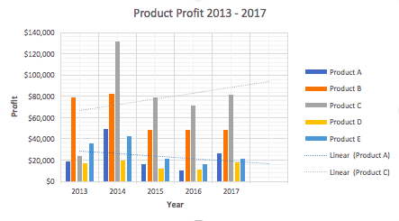
Note: You can create separate trendlines for as many variables in your chart as you like. For example, here is our chart with trendlines for Product A and Product C.
To Add Up/Down Bars: Up/Down Bars are not available for a column chart, but you can use them in a line chart to show increases and decreases among data points.
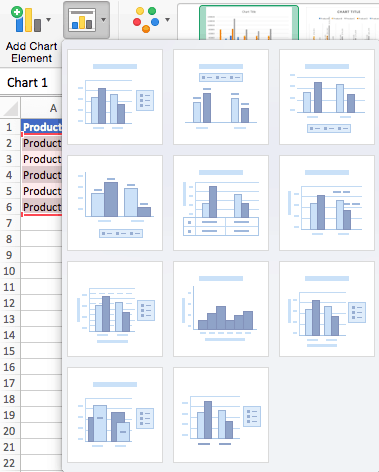
Step 4: Adjust Quick Layout
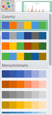
Step 5: Change Colors
The next dropdown menu in the toolbar is Change Colors . Click the icon and choose the color palette that fits your needs (these needs could be aesthetic, or to match your brand’s colors and style).
Step 6: Change Style
For cluster column charts, there are 14 chart styles available. Excel will default to Style 1, but you can select any of the other styles to change the chart appearance. Use the arrow on the right of the image bar to view other options.

Step 7: Switch Row/Column

In this example, switching the row and column swaps the product and year (profit remains on the y-axis). The chart is now clustered by product (not year), and the color-coded legend refers to the year (not product). To avoid confusion here, click on the legend and change the titles from Series to Years .
Step 8: Select Data

Step 9: Change Chart Type

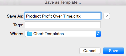
You can also save your chart as a template by clicking Save as Template …
Step 10: Move Chart

Step 11: Change Formatting

Step 12: Delete a Chart
To delete a chart, simply click on it and click the Delete key on your keyboard.
How to Make a Graph in Excel
Because graphs and charts serve similar functions, Excel groups all graphs under the “chart” category. To create a graph in Excel, follow the steps below.
Select Range to Create a Graph from Workbook Data

Now you have a graph. To customize your graph, you can follow the same steps explained in the previous section. All functionality for creating a chart remains the same when creating a graph.
How to Create a Table in Excel
If you don’t need to visualize your data, you can create a table in Excel instead. There are two ways to format a data set as a table: manually, or with the Format as a Table button.
- Manually: In this example, we manually added data and formatted as a table by including column and row names (products and years).
- Use Excel’s Format as Table Preset: You can also input raw data (numbers without any column and row names).

Related Excel Functionality
Excel is one of the most widely-used tools across all industries and types of organizations. Charts and graphs are great tools to visualize your work, but there are many ways to elevate your data in Excel.
We’ve created a list of additional features that allow you to do more with your data:
- Pivot Tables: A pivot table allows you to extract certain columns or rows from a data set and reorganize or summarize that subset in a report. This is useful tool if you only want to view a particular segment of a large data set, or if you want to view data from a new perspective.
- Conditional Formatting : A powerful feature that allows you to apply specific formatting to certain cells in your spreadsheet. You can use conditional formatting to highlight key pieces of information, track changes, see deadlines, and perform many other data organization functions.
- Dashboards: A powerful, visual reporting feature that pulls data from one or several datasets to display key performance indicators (KPIs), project or task status, and several other metrics. This gives the audience (team members, executives, clients, etc.) a snapshot view into project progress without surfacing private information.
- Collaborative Charts: To avoid version control issues and allow multiple team members to edit a chart simultaneously, you’ll want to use a collaborative chart tool. The desktop versions of Excel do not support this, but you can use Excel for Office 365, Microsoft’s cloud-based web application, or several other online chart tools.
- Data Series: A data series is any row or column stored in your workbook that you’ve plotted into a chart or graph. Once you’ve created your chart, you can add additional data series to it: Simply highlight the additional data you want to add and the chart will automatically update.
Make Better Decisions, Faster with Charts in Smartsheet
Empower your people to go above and beyond with a flexible platform designed to match the needs of your team — and adapt as those needs change.
The Smartsheet platform makes it easy to plan, capture, manage, and report on work from anywhere, helping your team be more effective and get more done. Report on key metrics and get real-time visibility into work as it happens with roll-up reports, dashboards, and automated workflows built to keep your team connected and informed.
When teams have clarity into the work getting done, there’s no telling how much more they can accomplish in the same amount of time. Try Smartsheet for free, today.
Discover why over 90% of Fortune 100 companies trust Smartsheet to get work done.
Microsoft Excel
11 minute read
11 Best Excel Presentation Tips in 2024

Brandon Pfaff
Twitter LinkedIn WhatsApp Pocket Email

Join the Excel conversation on Slack
Ask a question or join the conversation for all things Excel on our Slack channel.
There’s more to a spreadsheet than just the numbers on the page. It is equally important to make your spreadsheets look professional, easy to read, and visually appealing to your viewers.
The same way a lawyer with a crooked tie and disorganized papers might raise an eyebrow in court, your Excel presentation won’t hit the right marks with your audience if it looks clumsy and bland, no matter how many hours of research goes into making it or how important the information contained within it is.
Whether you are creating a spreadsheet for personal use, to pass information to your team or share with your project manager, the secrets locked away in this post will be of immense use to you. Let’s take a look at the best Excel presentation tips to help you create standout spreadsheets .
Free Excel crash course
Learn Excel essentials fast with this FREE course. Get your certificate today!
1. Get a template online
If you are a busy person, and you cannot fit an Excel presentation design into your schedule, enter the ex machina: pre-made Excel templates. You can choose from an array of purpose-specific templates with beautiful designs, fonts, and colors. Simply enter your values to customize it, and you are ready to go.
Of course, using a template means you will not get better at designing things yourself. If getting things done is your priority instead of getting better at designing presentations, then, by all means, use a template and be done with it. On the other hand, if you want to know how to make your Excel presentation better on your own, then find someone to teach you or stick around until the end of this post.
Check out our 50 best Excel templates to make your life easier and our 33 Excel business templates for workplace productivity .
2. Name your worksheets correctly
Excel presentation is all about clarity. For this single reason, the importance of a correct and reliable project or worksheet name cannot be overemphasized. It could be a sentence, a phrase or just a word. Just make sure it is easy to understand by you or by anyone you will be sharing the file with.

You also must make sure it is distinct from the names of other worksheets stored on your computer. After all, what is the use of all the tips you will learn here today if you will not be able to find the worksheet you applied them on?
3. Define your header/title
Your header and title can be anything but it needs to stand out. Your header must be able to speak to the reader and make the reader know at first glance what the header is.

To do this, try a larger font for your header, underline and embolden it. You should center align it and use a different font color. It has to stand out but also blend with the template color scheme and overall aesthetic look. You can also use a different readable for your header. Just remember, we want to make it distinct, not isolated.
Step up your Excel game
Download our print-ready shortcut cheatsheet for Excel.
4. Dos and don'ts of fonts
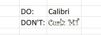
Full transparency: Fonts make or break your spreadsheet. Always use a uniform font for your data, you can use the same font for your header or you can change that of the header. You can use three fonts in a single presentation and that is the recommended maximum, else you would be pushing it. In this case, less is infinitely better.
These are the guidelines to follow in selecting the right format for your font.
Here is a quick tip, fonts of the sans-serif group are the best for your Excel spreadsheet if readability is your goal. Calibri, Helvetica, Arial or Playfair are few examples. If used with the right alignment, spacing, and color, they can bring out the best in your Excel presentation.
This ultimately depends on your presentation but officially, font 12 is often advised with double spacing to improve readability. As stated earlier, the header font can be larger. The headers should be larger than sub-headers which in turn should be larger than data fonts.

You want to create a sharp contrast between the text color and the background colors e.g. a light color text on a dark background and vice versa. This is where the "zebra stripes" rule comes in, which will be discussed later in the post.
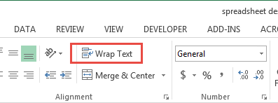
People don’t often use the alignment tool in Excel. If you want to make your presentation look beautiful and business-like , you will need to maximize the alignment feature.
5. Create space for breathing room
When you see tightly packed, clumsy or wordy text or spreadsheet, your brain automatically gets tired of reading it before you even start. But when there is breathing space and the spreadsheet is divided up into categories, it becomes more pleasant to the eyes and ripe for interpretation by the brain.
This brings us to the B2 rule. Try to start your presentation on column B, row 2. Leaving the A column and the first row blank. It works like magic. You should also make sure that the column and row dimensions are the same.

Additionally, don't autofit the height and width of your document. You need to have flexibility and creative control of your workspace. Instead, manually adjust the height and width so that they have just enough white space but not too much to give your presentation some breathing room and improve readability.
6. Add an image
Whether it’s a photograph, an artistic sketch or your logo, images go a long way in making your spreadsheet better. Images make your presentation look official and possess the professional feel in many of the beautiful presentations you have seen. Pictures speak a thousand words. While Excel is not designed to accomplish the kind of presentation you can make in PowerPoint, a picture will help you to drive the point home and make your presentation memorable.

7. Go off the grid
Do you know that erasing all grid lines apart from those of your result will have people asking how you did it and if you used the same Excel software they use? Try it today. In your spreadsheet
Go to the View tab on the ribbon.
- Under the Show section, uncheck the box next to Gridlines .

8. Zebra stripes: Excel jungle law
Zebra stripes are alternating dark and light colors on rows lying on top of each other. This helps in a number of ways. First, it has this aesthetic feel that makes your work seem orderly, especially if you are displaying hundreds of rows of data. Second, it helps correlation and readability. A reader can track a row from the right-hand side to the far left and not lose track of what row his or her eyes are set upon.
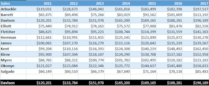
You can zebra stripe using many methods. When you create a table in Excel, by default this will be zebra striped (Tip- select your data and use the shortcut Ctrl + T on a PC or ^ + T on a Mac to quickly create a table). On the Design tab, under Table Styles, you can change the color and style of your zebra stripes.
It can also be done using a formula in conditional formatting if desired. Conditional formatting is done by highlighting values that satisfy certain requirements (e.g. all odd-numbered rows). It can be copied from cell to cell using the painter tool in the Home toolbar.
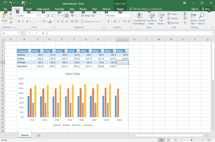
9. Use charts, tables , and graphs
Most presentations are incomplete without some form of visual representation. Whether table, graph or chart, you need to visually represent your raw data in mediums that would be understood in a single glance. Charts, graphs, and tables should not be underestimated, especially if you have cumbersome data spanning many columns and rows.
In the Excel ecosystem, the chart, graph, and table features are like symbiotic siblings. You need them to bring out the beauty in the brevity of your work.
10. Create cell styles
Excel has many preset cell styles but you can create your own custom styles that will be more customized, and easier to use and edit because you created it. This is actually an alternative to getting a template if graphics consistency is your goal. After creating a beautiful spreadsheet with the above information, you can save the style so that you can apply it to future presentations.

Now your presentation is perfect with the right feel and style. Simply highlight the cells with your design for saving, then go to the Home toolbar, click on "more" at the base of the style gallery, then select "new cell style". A style dialog box will open, name the style, edit its properties and save.
If it isn't broken and it works efficiently, why change it? You can, however, add a touch of variability by changing the color palette from time to time.
11. Show restraint
You have learned all of these tips and you are ready to start your presentation - be careful of overdoing it. Use color sparingly and don't combine too many tips at once. You need to tread the fine line between underwhelming and too much to find the "just enough" middle ground. Make sure your presentation is perfectly balanced, as all things should be.
Ultimately, the way your Excel presentation turns out depends on how well you communicate your data to your audience. Although, it does help to know the psychology of colors, good fonts. Browse beautiful spreadsheet presentations online to figure out what the "best" looks like. But at the end of the day, the ball is in your court and we hope that your dedication to practicing, sharpening and perfecting your presentation skills in Excel will be rewarded with cheers.
Ready to design your own Excel presentations?
If you would like to sum up the data on your Excel spreadsheet so that its insights are conveyed in a straight-forward manner, then follow this step-by-step guide. You’ll end up with a presentation that summarizes your data in a way that’s painless to analyze.
If you’re eager to brush up on your Excel skills, check out our Excel course and master the fundamentals to boost your productivity.
Loved this? Subscribe, and join 441,183 others.
Get our latest content before everyone else. Unsubscribe whenever.

Brandon is a full time CPA specializing in all things tax. When he is not serving clients, he enjoys spending time with his wife and son, real estate investing, and sipping fine bourbon.

Recommended
Why Your Team Needs Excel Training
Team Excel training can help your organization perform tasks better and faster. Here’s the best way to train them.

Excel Challenge 38: Data Lookup From Multiple Sources
Take this Excel challenge by showing us what to do when XLOOKUP or VLOOKUP alone isn't enough to extract the values you want.

How to Use Excel to Manage Your Travel Budget
You'll probably want to avoid surprises like going over budget when you travel. Take charge with these expert tips for managing your travel expenses in Excel.
© 2024 GoSkills Ltd. Skills for career advancement
How-To Geek
How to make a graph in microsoft excel.
Create a helpful chart to display your data and then customize it from top to bottom.
Quick Links
How to create a graph or chart in excel, how to customize a graph or chart in excel.
Graphs and charts are useful visuals for displaying data. They allow you or your audience to see things like a summary, patterns, or trends at glance. Here's how to make a chart, commonly referred to as a graph, in Microsoft Excel.
Excel offers many types of graphs from funnel charts to bar graphs to waterfall charts . You can review recommended charts for your data selection or choose a specific type. And once you create the graph, you can customize it with all sorts of options.
Start by selecting the data you want to use for your chart. Go to the Insert tab and the Charts section of the ribbon. You can then use a suggested chart or select one yourself.
Choose a Recommended Chart
You can see which types of charts Excel suggests by clicking "Recommended Charts."
On the Recommended Charts tab in the window, you can review the suggestions on the left and see a preview on the right. If you'd like to use a chart you see, select it and click "OK."
Choose Your Own Chart
If you would prefer to select a graph on your own, click the All Charts tab at the top of the window. You'll see the types listed on the left. Select one to view the styles for that type of chart on the right. To use one, select it and click "OK."
Another way to choose the type of chart you want to use is by selecting it in the Charts section of the ribbon.
There is a drop-down arrow next to each chart type for you to pick the style. For example, if you choose a column or bar chart , you can select 2-D or 3-D column or 2-D or 3-D bar.
Whichever way you go about choosing the chart you want to use, it will pop right onto your sheet after you select it.
From there, you can customize everything from the colors and style to the elements that appear on the chart.
Related: How to Make a Bar Chart in Microsoft Excel
Just like there are various ways to select the type of chart you want to use in Excel, there are different methods for customizing it. You can use the Chart Design tab, the Format Chart sidebar, and on Windows, you can use the handy buttons on the right of the chart.
Use the Chart Design Tab
To display the Chart Design tab, select the chart. You'll then see many tools in the ribbon for adding chart elements, changing the layout, colors, or style, choosing different data, and switching rows and columns.
If you believe a different type of graph would work better for your data, simply click "Change Chart Type" and you'll see the same options as when you created the chart. So you can easily switch from a column chart to a combo chart , for instance.
Use the Format Chart Sidebar
For customizing the font, size, positioning , border, series, and axes, the sidebar is your go-to spot. Either double-click the chart or right-click it and pick "Format Chart Area" from the shortcut menu. To work with the different areas of your chart, go to the top of the sidebar.
Related: How to Lock the Position of a Chart in Excel
Click "Chart Options" and you'll see three tabs for Fill & Line, Effects, and Size & Properties. These apply to the base of your chart.
Click the drop-down arrow next to Chart Options to select a specific part of the chart. You can choose things like Horizontal or Vertical Axis, Plot Area, or a Series of data.
Click "Text Options" for any of the above Chart Options areas and the sidebar tabs change to Text Fill & Outline, Text Effects, and Textbox.
For whichever area you work with, each tab has its options directly below. Simply expand to customize that particular item.
As an example, if you choose to create a Pareto chart , you can customize the Pareto line with the type, color, transparency, width, and more.
Use the Chart Options on Windows
If you use Excel on Windows, you'll get a bonus of three helpful buttons to the right when you select your chart. From top to bottom, you have Chart Elements, Chart Styles, and Chart Filters.
Chart Elements : Add, remove, or position elements of the chart such as the axis titles, data labels , gridlines, trendline, and legend.
Chart Styles : Select a theme for your chart with different effects and backgrounds. Or choose a color scheme from colorful and monochromatic color palettes.
Chart Filters : For viewing particular parts of the data in your chart, you can use filters. Check the boxes under Series or Categories and click "Apply" at the bottom to update your chart and only include your selections.
Chart Filters are only available for certain types of charts.
Hopefully this guide will get you off to a great start with your chart. And if you use Sheets in addition to Excel, learn how to make a graph in Google Sheets too.

- Tips and guides
- Microsoft 365
Tips for turning your Excel data into PowerPoint charts
- Courtney Owen
- Small business
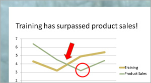
As a presenter, you probably use charts (also called graphs) in your presentations. Charts display data in a visual format that audiences can easily grasp – if you design the chart and slide clearly and crisply.
A crisp chart has nothing to do with your toaster’s setting. Instead, it’s a chart that shows only the data necessary to make the desired point clear – no less, no more. Too much data (sometimes called “data dump”) will overwhelm your audience, blunting your message.
Limit the Data
Instead of creating a chart from data in an entire Excel spreadsheet, first edit your spreadsheet. One way to do this is to copy and paste data onto a separate Excel workbook tab. Then look at what you can eliminate. When you have only the data you need, you’re ready to create the chart in PowerPoint.
Tip: If your data just has to be huge, see if you can divide the data into two sets. For example, you could cover two related sets in one table and two other related sets in another. These two tables, or sets of data, would end up being two easily digestible slides, instead of one overloaded slide.
Creating the chart
There are several ways to generate a chart in PowerPoint from Excel data, but here we’ll talk about one way. Let’s assume that you’ve already edited an Excel spreadsheet so that it contains only the data that will support your message.
Here are the basic steps to create the chart in PowerPoint from a data set:
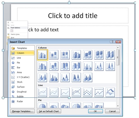
2. The Insert Chart dialog opens. Choose the type of chart you want. For this example, I’ll choose the default 2D column chart. Click OK .
Note: Some types of charts are appropriate for specific types of data; your chart type should match your data. For example, if you have one row of data showing percentages that make up a whole, a pie chart would work better than a column chart.
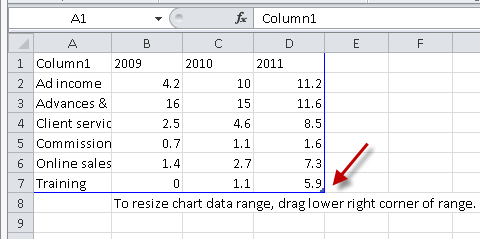
4. Go back to the temporary spreadsheet, click in cell A1, and paste.
5. If your data is smaller than the dummy data, you’ll need to drag the lower right corner of the blue border inward; in the figure, a red arrow points to this corner.
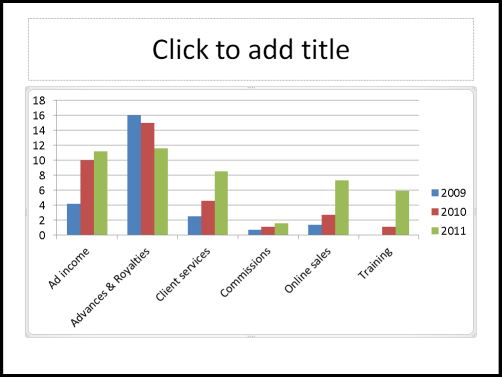
6. Go back to your PowerPoint slide to see the chart
Formatting charts for clarity
You’re not finished yet! PowerPoint’s default charts are overly busy and are rarely formatted in a way that’s easy to understand. Also, PowerPoint has many useful features that you can take advantage of to help you communicate your points clearly.
I can give you some best practices for clear charts, but in the end, you have to decide what is best for your message, your data, and your audience. Here are some ideas that should help you get the results you want.
Use 2D charts
3D charts are notoriously hard to understand. Which is the true value, the front or the back of the column? People aren’t sure. The “walls” and “floor” of the chart make it seem overly complex. Finally, the 3D perspective makes quickly judging values harder. Just switching to a 2D chart instantly makes the chart look easier to understand.
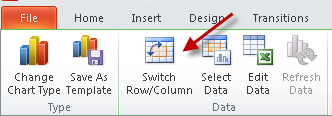
Luckily, PowerPoint 2007 and 2010 default to the 2D style, but PowerPoint 2003 had a 3D default and many charts out there still use that style. To change to a 2D chart, select the chart. On the Chart Tools Design tab, choose Change Chart Type.
Consider changing the chart type
As I mentioned, you should choose your chart type based on your data and the point you are trying to make. Column charts are the most common, but that may be because they are the default. When you’re trying to show trends, a line chart can make the point clearer.
Many people don’t like line charts because the lines are too thin to show up clearly, but you can easily make them thicker. First, try one of the chart styles from the Style gallery; the options near the bottom use thicker lines.
If the lines still aren’t thick enough for your taste, follow these steps to make them as thick as you want:
2. Click the Chart Tools Format tab.
3. In the Shape Styles group, click the Shape Outline button, then choose Weight, More Lines to open the Format Data Series dialog box with the Line Style category active.
4. In the Width text box, type a larger width or use the Up arrow to increase the width.
5. With the dialog box still open, select each remaining line, click the Line Style category, and choose a new width. You can even vary the widths to emphasize one data series over others.
Widen the bars
If you choose a column or bar chart type, widening the bars can make the chart clearer. The steps to widen the bars are not intuitive, so many people miss them. Here they are:
1. Right-click any column or bar and choose Format Data Series. The Format Data Series dialog box opens. ( Tip: Drag the dialog box off the chart, so you can see the result as you do the next step.)
2. With the Series Options category selected, drag the Gap Width slider to the left, toward the No Gap label. All of the columns or bars widen.
3. Click Close to close the dialog box.
Remove the gridlines and use data labels if necessary
The purpose of gridlines is to help your audience figure out the exact value of the data points. Is that sales number $3.5 million or $3.4 million? But when you display a presentation on a screen, your audience can’t easily follow the gridlines. Moreover, the gridlines are a distraction from the chart itself.
In some situations, you need to convey exact numbers. In others, an approximation is fine because no one cares. So you should base your choice of whether to use gridlines on both the goal of your presentation and your audience’s needs.
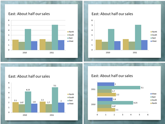
One way to get rid of the gridlines and still provide exact data is to use data labels. In fact, data labels will show your audience the numbers much more clearly. The only trick is to make sure that you don’t have too many numbers on the screen.
Here you see the evolution of a chart from grid lines to data labels. Follow these steps:
1. Click the grid lines, but not the top or bottom ones (because you’ll select the plot area instead of the grid lines).
2. Press the Delete key on your keyboard to delete the grid lines.
3. With the chart selected, click the Chart Tools Layout tab, choose Data Labels, and then Outside End.
4. If the data labels are too long and overlap, try a bar chart. On the Chart Tools Design tab, click Change Chart Type, choose one of the bar charts, and click OK.
What other options are useful?
PowerPoint has so many options for formatting charts, so I’ll just make a few comments.
Tick marks are small lines along the axes and they are usually unnecessary. They aren’t very noticeable, but getting rid of them will make your chart look cleaner. The red arrows in the figure point to the tick marks. Here’s how to remove them:
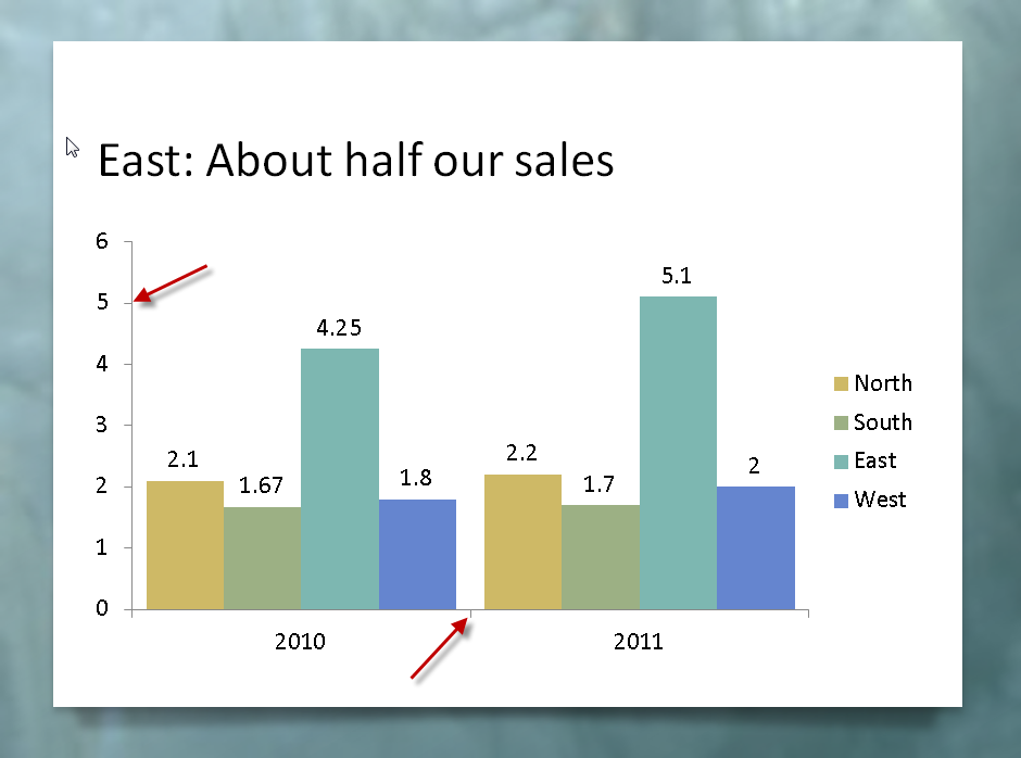
2. Right-click the axis and choose Format Axis.
3. In the Format Axis dialog box’s Axis Options category, from the Major Tick Mark Type drop-down list, choose None.
4. Select the next axis and repeat the previous step.
5. When you’re done, click Close.
Some charts have a chart title , but in most cases, I recommend using the slide’s title instead. To delete an existing chart title, just select it and press the Delete key.
Sometimes the legend is in the way of expanding the chart itself. You can select it and drag it to a better location. Then, to expand the rest of the chart, click the Plot Area (try clicking inside the main area of the chart) and drag its handles outward.
1. Click an axis to select it. The easiest way to make sure you select the axis is to click its labels.
3. In the Format Axis dialog box’s Axis Options category, from the Display Units drop-down list, choose the units you want. In the example, you would choose millions.
4. If you want to show the display units, check the Show Display Units Label on Chart checkbox.
5. If you want to show decimal values on the Y axis, click the Number category in the dialog box. From the Category list on the right, choose one of the options, such as Number, to set the decimal places and other number formatting.
6. Click Close to close the dialog box.
Calling out important points
No matter how simple you make your chart, it can seem overwhelming to your audience. You are familiar with the data, but the people watching aren’t. Also, you may need to point to specific sections of the chart as you discuss them. Walking up to the screen and pointing is usually awkward and ineffective, so you can use shapes and animation instead.
An arrow and a circle are two ways to point out sections of a chart, as you see here. I usually make them bright red, so that they stand out from the rest of the chart.
Here are the steps to insert a circle or arrow:
1. Make sure the chart is not selected. Then go to the Home tab and choose the arrow or circle from the Drawing group.
2. Click and drag to place the shape.
3. Format the circle so that it has no fill. To do so, select it, click the Format tab, click Shape Fill, and choose No Fill. To make it red, click Shape Outline and choose the red color swatch.
4. To format the arrow with a red fill, click the Format tab, click Shape Fill, and choose the red color swatch.
You may not want the audience to see the arrow or circle until you get to a specific part of your discussion, so you can add animation to make them appear when you click.
To add animation to the arrow in PowerPoint 2010, follow these steps:
1. Select the arrow.
2. Click the Animations tab.
3. Click Add Animation and choose Wipe from the Entrance section. (You can choose another entrance animation, but Wipe looks good with arrows.) If you don’t see the Wipe animation, choose More Entrance Effects from the bottom of the list to find it.
4. Click Effect Options and choose a direction. For a left-facing arrow, choose from Right. For a down-facing arrow, choose from Top.
To add animation to the circle in PowerPoint 2010, follow the same steps, except that I recommend the Wheel animation. Then choose 1 Spoke from the Effect Options list. This animation looks like you’re encircling the area within the circle.
Do a clarity test
When your chart is done, ask a friend or colleague to look at it. Ask what the chart means. If you get a correct answer, you’ve succeeded!
–Ellen Finkelstein
Ellen Finkelstein trains presenters to present more clearly and powerfully. For free tips and a free report, “From Death by PowerPoint to Life by PowerPoint,” go to www.ellenfinkelstein.com .
How to Insert Excel Chart into PowerPoint (4 Easy Ways)
Instead of presenting raw data, presenting a chart is more practical for data visualization and efficiency. A wide range of users including business experts to data analysts use Microsoft Excel for tracking and managing data. It is a very common practice to move a chart created in Excel to PowerPoint for presentation purposes. In this article, we will demonstrate how we can insert an Excel Chart into a PowerPoint slide.
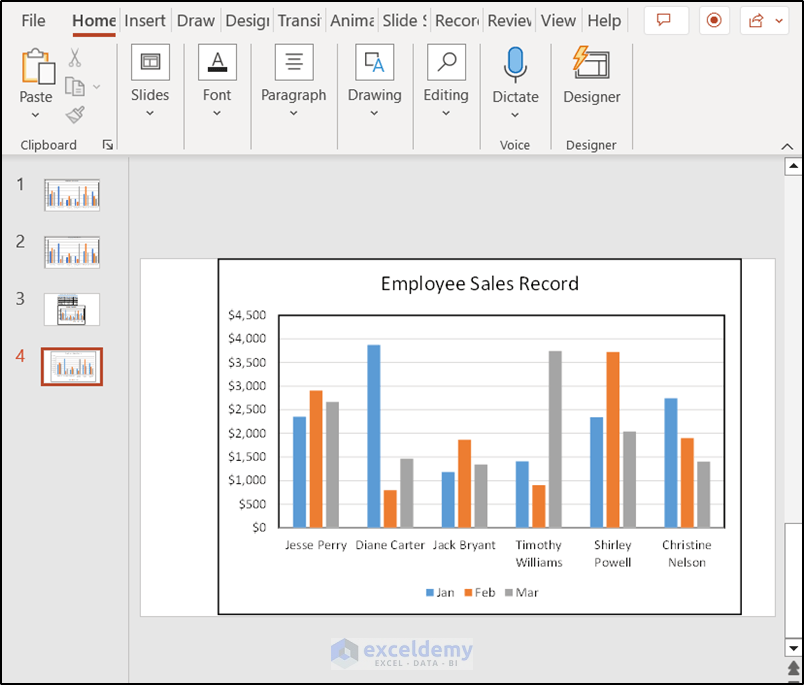
How to Insert Chart in Excel
If you don’t have an Excel chart, you can easily create one using its features. Suppose, we have a dataset like the following. It contains the Company’s sales records of six employees from January to March. We are going to use this to plot a chart within Excel.
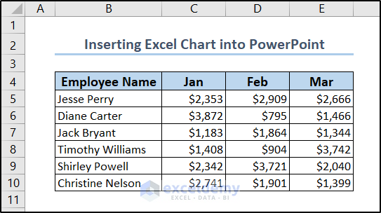
To create the chart, we need to select the dataset (the range B5:E10 ) and go to the Insert tab on the ribbon. There we can find a wide range of chart options from the Charts group.
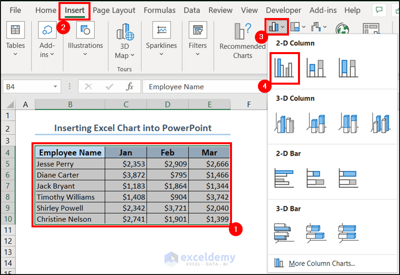
Select the one you prefer from there. You can find a variety of them from the drop-down too. We have selected a 2-D Column from the Column Chart drop-down and so we have the following chart to work with here.
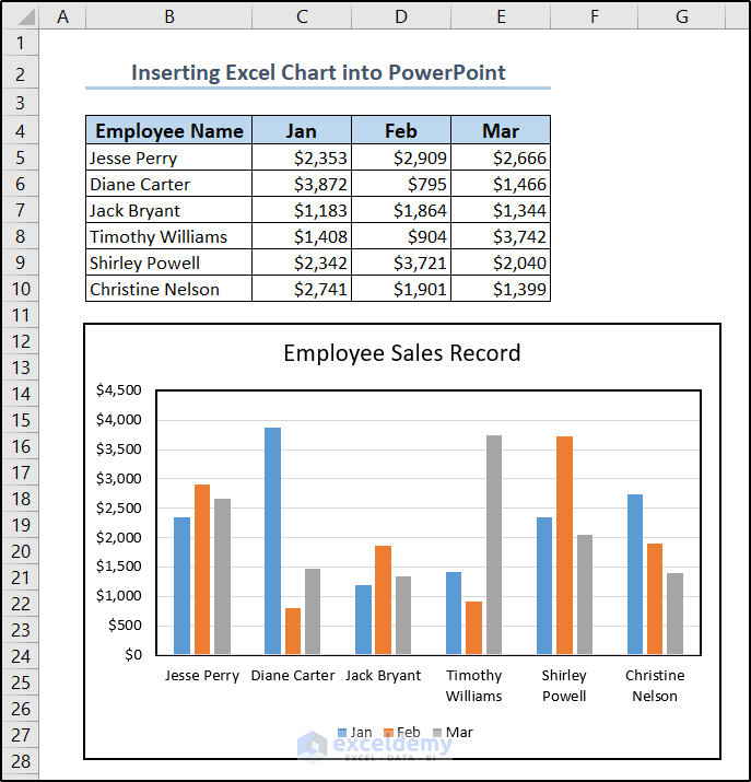
How to Insert Excel Chart into PowerPoint: 4 Suitable Ways
With the chart created above, we are going to demonstrate all of the methods we can insert this chart into a PowerPoint presentation. The idea is to copy the chart to the clipboard and paste it into the slide.
All of the methods result in almost the same output more or less. However, some may give us a dynamic chart where the charts update automatically with the change of data in Excel. While some methods give us more static images like charts.
Method 1: Using Keyboard Shortcuts to Paste Chart from Clipboard
This is the simplest and quickest method to insert an Excel chart into a PowerPoint slide. The process does not embed an actual link, although it may update the charts in PowerPoint from Excel automatically . Sometimes this may result in outdated or inconsistent information. Nevertheless, we can use this in everyday scenarios where presenting an outcome of a certain time is more of a priority.
- Go to the Excel spreadsheet and select the chart by clicking on it.
- Then copy the chart using Ctrl+C on your keyboard.
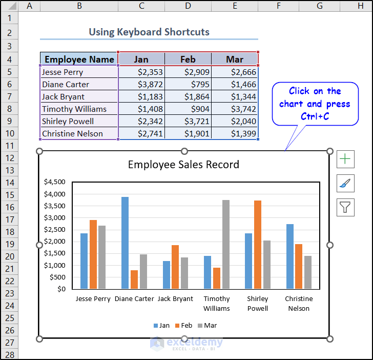
- Now go to the PowerPoint slide where you want to paste the chart and press Ctrl+V .
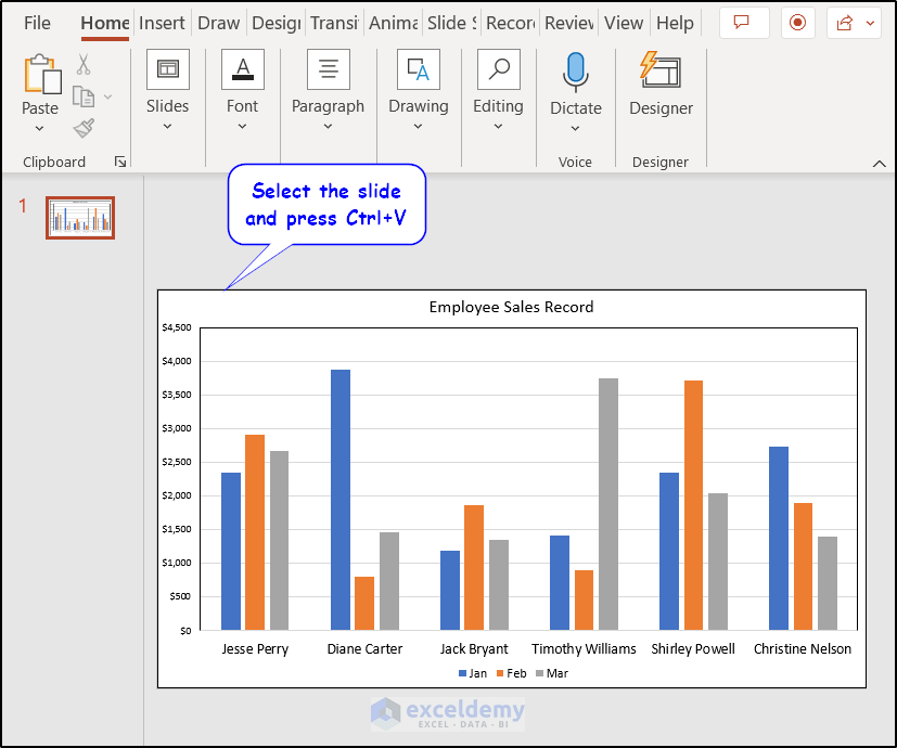
That is all it takes to insert an Excel chart into a PowerPoint presentation through copying and pasting.
Read More: How to Copy Chart from Excel to PowerPoint Without Link
Method 2: Insert Chart from Clipboard Through PowerPoint’s Paste Option
This method is the same as the previous one, just that we are using the Paste option provided in the PowerPoint to insert the Excel chart. So the advantages and disadvantages involved are basically the same.
- First, we need to copy the chart from the Excel spreadsheet. We can do that by pressing Ctrl+C on your keyboard after selecting the chart.
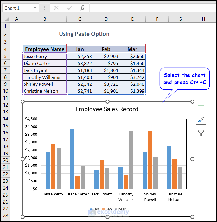
Note: As we are using ribbon commands here, we can also do this by the Copy option available in the Clipboard group of the Excel ribbon.
- Now we can select Paste available in the Clipboard group of the Home tab available in Microsoft PowerPoint to insert it into the selected slide.
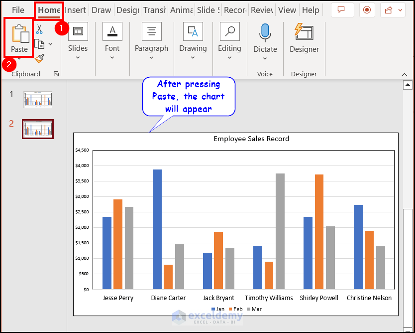
- Or you can select the downward-facing arrow below Paste to find more options and select the one you find appropriate.
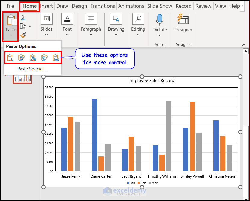
Note: The latter one provides more control, consistency, and accessibility over the pasted content, not just for charts but for everything to paste from a clipboard.
Method 3: Link Dynamic Charts Using Insert Command
Following the previous two methods give us more of a static chart. But what if we need a dynamic one that can update if we change the data in the Excel spreadsheet? This section will have this covered.
- This method doesn’t require any copying like the other methods. Instead, go to the Insert tab on the Powerpoint ribbon and select Object from the Text
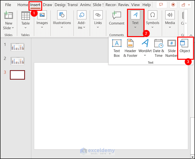
- A new box will pop up named Insert Object . Select the Create from file option and Browse the Excel file that contains the chart and check the Link .
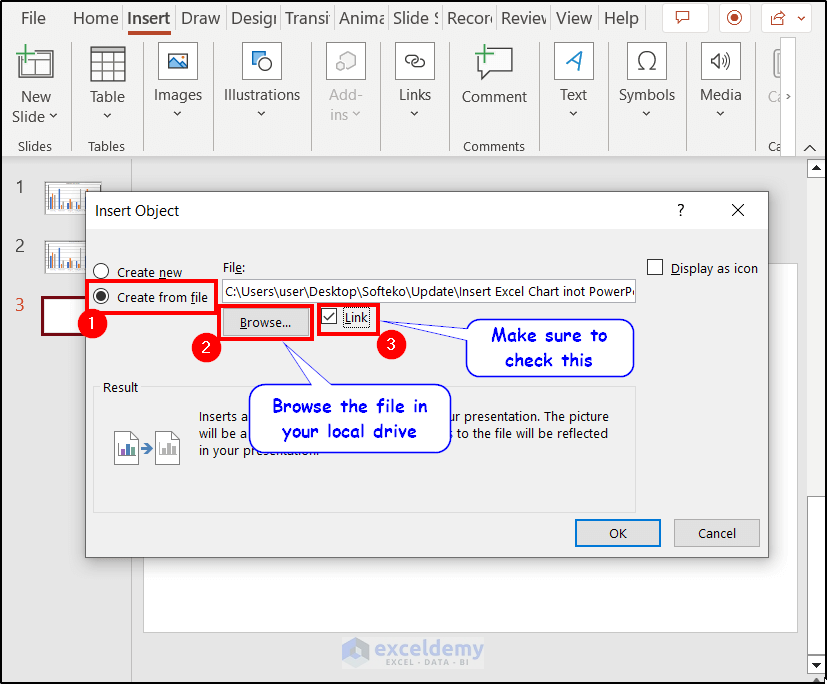
- After that, click on OK .
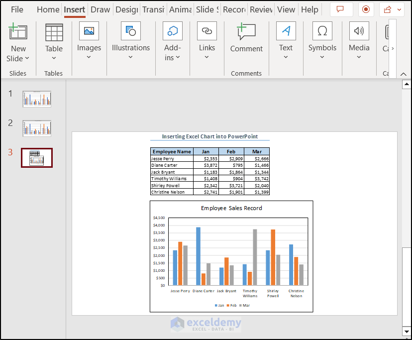
As we can see from the image above, this also imports the dataset along with the chart. Basically, this method imports the whole sheet from Excel and the slide will contain everything it has.
Note: This method only imports charts, datasets, and other objects from the first spreadsheet. So if the concerned chart is in any other sheets, put them in the first one or this will not work.

Method 4: Link Excel Chart Using Paste Special Option of PowerPoint
We can also copy a chart and create a link with the Excel spreadsheet. By principle, this is half of the static methods and half of the dynamic. But in the end, it creates a dynamic chart and a recommended one as it doesn’t require your chart to be in the first sheet in your Excel file, nor does it import datasets and other objects along with it.
One advantage the previous method has over it is that it didn’t require the Excel file to open. However, it isn’t an issue for most of the users in most of the cases.
- Copy the chart first from the Excel spreadsheet, either using the keyboard shortcut ( Ctrl+C ) or from the Copy command in the ribbon.
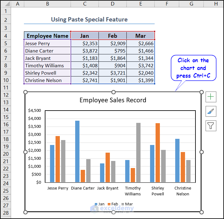
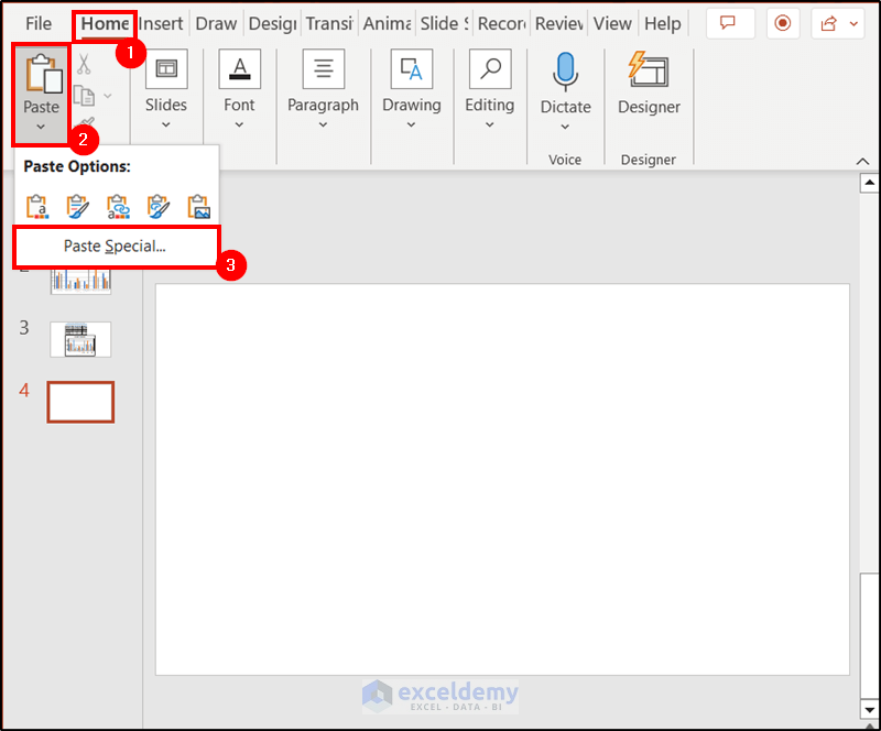
- Then go to the slide in the PowerPoint and select the Paste Special option from the drop-down menu that appears once you click on the downward-facing arrow below the Paste .
- Select Paste Link on the left side of the Paste Special box that popped up and click on OK .
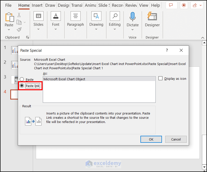
- This will insert the Excel chart into the PowerPoint file.
Using this method not only inserts the chart but also connects them through a link. So once, the Excel data or chart is updated, the chart in the PowerPoint also updates.
Read More: How to Copy Table from Excel to Powerpoint with Formatting
How to Refresh Linked Excel Charts
One of the disadvantages involved in copying and pasting methods (1 & 2) is that it doesn’t update automatically every time with the change of data in the Excel worksheet. However, you can refresh the charts manually to counteract this problem.
Suppose, we change the data in cell E6 of our dataset.
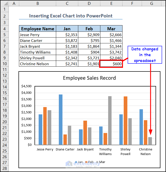
But the chart in PowerPoint didn’t update automatically.
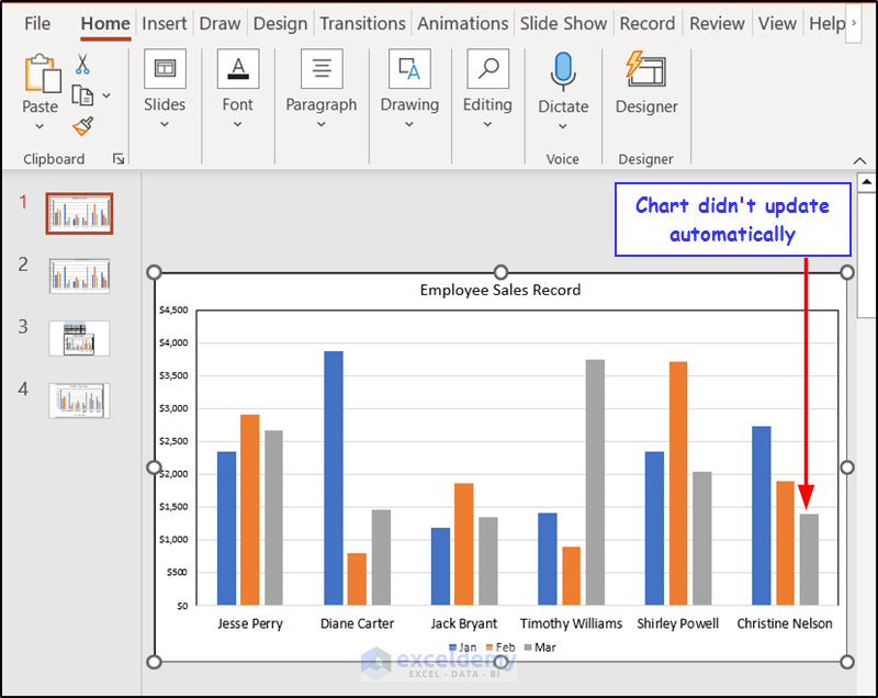
In these cases, there is an option called Refresh Data that can help us update the chart after editing the Excel file.
You can find the option in the Data group of the Chart Design tab from the PowerPoint ribbon.
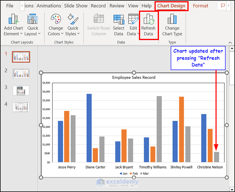
Note: The Chart Design and Format tabs only appear on the ribbon once you have clicked on the chart.
How to Troubleshoot Linked Charts in Excel
Facing issues such as updates with linked charts is not uncommon. If you are facing these issues or if you just want to maintain them in your PowerPoint presentation, here are some troubleshooting steps.
- Make sure the Excel file is in the same folder as when it was linked.
- Check if the Excel file name has been changed. The file name should remain unchanged for the link to work.
- Be sure to save the workbook before linking.
- Sometimes you may have to update links manually. Right-click on the chart on PowerPoint and select Update Link to update the link of the Excel file. This is helpful if the file path or name is changed.
- Check for missing data in Excel.
- Check for compatibility issues and updates for both Excel and PowerPoint.
- Recreate the chart.
Frequently Asked Questions (FAQs)
- How do I update a chart in PowerPoint that is linked to an Excel file?
In the PowerPoint slide where you want to update the chart, right-click on the chart and select Update Link from the context menu. This will open the Excel file and enable you to edit it there. After your edits, save and close the file. The chart will be updated.
- How do I change the chart type in PowerPoint?
To update the chart type, right-click on it and you will find the Change Chart Type option. You can change the type from here to the available options.
- Can I customize chart designs in PowerPoint?
Yes. Once you have clicked on the chart, you will find that new tabs such as Chart Design , Format , and Shape Format appear. You can change the design from the features available in the first two tabs.
- Can I edit chart data in PowerPoint that is linked to Excel?
Yes, you can do that easily by right-clicking on the chart and selecting Edit Data from the context menu. The Excel file will open and you can make the necessary changes from that window.
- Can I animate the Excel Chart in PowerPoint?
Yes, you can add visual effects such as fly-ins, fades, and other animations to the chart you have imported from Excel in PowerPoint.
Things to Remember
- Make sure you have selected the chart before copying it.
- Use Paste for a static chart that was copied from Excel, use Paste Special to enable the link option.
- The Chart Design and Format tabs will only appear if you have selected the chart.
Download Practice Files
You can download the workbook as well as the PowerPoint file used for the demonstration from the link below.
That was all about adding Excel charts in PowerPoint. We have described how we can insert an Excel chart into PowerPoint using four different methods. Each has its own advantages and disadvantages, but using the proper one depends entirely on the user as the end result is pretty much the same. Hopefully, you can insert Excel charts into your PowerPoint presentations easily now. I hope you found this guide helpful and informative. If you have any questions or suggestions, let us know in the comments below.
Related Articles
- How to Perform Excel to PowerPoint Automation
- Automatically Create PowerPoint Slides from Excel
- How to Insert an Excel File into PowerPoint as an Icon
<< Go Back to Excel to PowerPoint | Export Data from Excel | Learn Excel
What is ExcelDemy?
Tags: Excel to PowerPoint

Yousuf Khan has been working with the ExcelDemy project for over one year. He has written 47+ articles for the ExcelDemy site. He also solved a lot of user problems with ExcelDemy Forum. He has interests in Excel & VBA, Desktop and mobile applications, and projects & templates. He completed his graduation and post-graduation in Information Technology from Jahangirnagar University. Currently, he works as a VBA & Excel Content Developer in ExcelDemy projects, writing unique and informative content... Read Full Bio
Leave a reply Cancel reply
ExcelDemy is a place where you can learn Excel, and get solutions to your Excel & Excel VBA-related problems, Data Analysis with Excel, etc. We provide tips, how to guide, provide online training, and also provide Excel solutions to your business problems.
Contact | Privacy Policy | TOS
- User Reviews
- List of Services
- Service Pricing

- Create Basic Excel Pivot Tables
- Excel Formulas and Functions
- Excel Charts and SmartArt Graphics
- Advanced Excel Training
- Data Analysis Excel for Beginners

Advanced Excel Exercises with Solutions PDF

Excel Charts In Powerpoint
Key takeaway:.
- Excel Charts in PowerPoint can be a powerful tool for enhancing presentations: Using Excel Charts in PowerPoint can help to present data in a visually appealing and easy-to-understand manner, making presentations more effective and engaging.
- Inserting Excel Charts in PowerPoint is simple and straightforward: Excel Charts can be easily inserted into PowerPoint using either the copy and paste method or the Excel Object insertion method, both of which are simple to execute and offer flexibility in terms of editing and customization.
- A few best practices can help ensure the best results when using Excel Charts in PowerPoint: Consistency in chart design, choosing appropriate chart types for data, and ensuring data accuracy are all key factors that can help make Excel Charts in PowerPoint more effective and impactful.
Have you ever wanted to use data visuals to make a point in a presentation? Excel Charts in PowerPoint makes it easy for you to create a professional, dynamic presentation that captivates your audience. With a few simple steps, you can turn data into powerful visuals to help bolster your message.
Overview of Excel Charts in PowerPoint
Excel charts are a powerful tool for creating visual representations of data. They can help communicate complex information quickly and effectively. When used in PowerPoint presentations, Excel charts can enhance the overall impact of the presentation and convey the information more clearly.
Here are six key features of using Excel charts in PowerPoint:
- Excel charts are easily customizable in PowerPoint. Users have access to a range of chart styles and formatting options that can be tailored to the specific needs of the presentation.
- Excel charts can be updated easily. Users can update charts directly within PowerPoint and the changes will be reflected in real-time. This saves time and effort, as there is no need to create new charts each time data is updated.
- Excel charts can be animated in PowerPoint. Animation can help to engage the audience and draw attention to important data points.
- Excel charts can be excellently manipulated in PowerPoint. Users can arrange the charts on the slide and resize them as desired to make them stand out or fit in with the overall design of the presentation.
- Excel charts are seamlessly integrated into the PowerPoint presentation. Users can embed the charts directly into the presentation without having to switch between different applications.
- Excel charts allow for data-driven presentation design. Users can create a presentation based on data insights and showcase the data in an easily digestible format using Excel charts.
In addition to these benefits, Excel charts offer a level of flexibility that allows users to create the precise visual representation needed to convey the data effectively.
It’s worth noting that Microsoft first introduced Excel charts in PowerPoint in 1993, and since then, they have become an integral feature of the software. The seamless integration of Excel and PowerPoint has been a core focus of Microsoft, and it is clear that users appreciate the convenience and functionality of using Excel charts in PowerPoint.
Benefits of using Excel Charts in PowerPoint
Excel Charts in PowerPoint: Professional Benefits Explored
Excel Charts in PowerPoint enhance the visual appeal of presentations, and assist in better data comprehension, especially in professional settings.
Advantages of Integrating Excel Charts in PowerPoint
- Excel Charts help in displaying complex data sets in a visually informative and easy-to-understand format.
- Excel Charts keep the data point consistent and ensure accuracy in presentation.
- Excel Charts allow for better presentation customization, including style, colors, and fonts.
- Excel Charts can be easily updated and edited to reflect new data sets.
- Excel Charts offer an efficient and impressive way to present quantitative information.
Unique Details about Excel Charts in PowerPoint Integration
Essentially, incorporating Excel Charts in PowerPoint means more than just inserting data from Excel, but using it as an embedded data sheet in the PowerPoint. Such integration guarantees data consistency and easy update, while allowing formatting changes to be done on both platforms simultaneously.
Suggestions for Enhancing PowerPoint Presentations with Excel Charts
Incorporation of clear and concise titles, axis labels, and legends make it significantly easier for audience comprehension. Similarly, it is essential to select the correct chart type for the data presentation in order to maximize visual impact, and also optimize colors for better visual appeal.
How to Insert Excel Charts in PowerPoint
Want to place Excel charts in PowerPoint? No worries! Copy and paste them , or use the Excel Object in PowerPoint. You’ll be able to add your data quickly and without difficulty. Easy-peasy!
Copying and Pasting Excel Charts in PowerPoint
Selecting and Placing Excel Charts in PowerPoint
To embed and display charts created in Excel within the presentation slides of PowerPoint, users should follow a simple procedure:
- Copy your desired chart from the Excel worksheet by either right-clicking on it or pressing ‘CTRL + C.’
- Then, go to your desired slide location in PowerPoint and select either ‘Paste’ or ‘Paste Special’ options from the ‘Home’ tab.
- Finally, adjust size and formatting options for each specific chart as necessary.
It is important to note that depending on the type of data visualization used to create a chart, adjusting colors or size may be necessary to cater to your audiences needs.
Ensuring clear visual aids can support powerful narratives helps make for more effective presentations. Making sure visuals are large enough for audience members to see and understand ensures that everyone can get the most out of all presentations they attend! When PowerPoint and Excel collide, it’s like the ultimate power couple. Inserting Excel charts into PowerPoint? Piece of cake, even for technologically-challenged individuals.
Inserting Excel Charts using Excel Object in PowerPoint
Inserting Excel Charts in PowerPoint using Excel Object is a seamless way to enhance your presentations with rich data visuals that are easy to update and manipulate. Here’s how you can do it in just 6 simple steps:
- Open both Microsoft Excel and PowerPoint applications.
- Select the chart you want to insert into PowerPoint from your Excel spreadsheet.
- Click on Copy or press Ctrl+C on your keyboard.
- Go to the slide where you want to insert the chart in your PowerPoint presentation.
- Press Ctrl+V on your keyboard
- Right-click and select Paste from the context menu.
- Your chart will now appear in your slides, and you can format it as desired using various design tools available in PowerPoint.
When pasting an Excel chart into a PowerPoint presentation, ensure that both applications are open simultaneously. Make sure there are no confidential data present while copying the charts.
Did you know that Excel charts embedded in PowerPoint presentations were introduced back in 1997 with Microsoft Office? The feature has evolved significantly over time with newer versions of Office offering more advanced visual design tools for charts!
Editing Excel charts in PowerPoint: where you can finally fix all those mistakes you made in your data entry.
Editing Excel Charts in PowerPoint
Make your Excel charts look great in your PowerPoint presentations! To do this, you need to edit them. In this section, we’ll show you how to refine your charts. It’s called “Editing Excel Charts in PowerPoint” .
We will also teach you “Updating Chart Data in PowerPoint from Excel” and “Customizing Chart Elements in PowerPoint” . Match the look and feel of your presentation with these solutions!
Updating Chart Data in PowerPoint from Excel
To update chart data in PowerPoint from Excel, you can edit the charts directly from the presentation.
Follow these 4 simple steps to Update Chart Data in PowerPoint from Excel using Semantic NLP variation:
- On the slide with the chart, click on it to select it.
- In the ribbon menu, choose “ Chart Tools ” and then select “ Design “.
- Click “ Edit Data ” to open up the Excel spreadsheet containing the chart’s data.
- Make necessary changes in the Excel sheet then click outside of the spreadsheet window to automatically update the chart in PowerPoint.
It is worth noting that this method applies equally for bar graphs, pie charts as well as other chart types.
Pro Tip: If you want to make only minor edits or updates like changing labels or numbers on a chart, you can just double-click directly on that part of the visual inside PowerPoint and make those changes there.
Get ready to take your PowerPoint presentation to the next level by giving your charts a makeover that even Cinderella would envy.
Customizing Chart Elements in PowerPoint
Customizing the visual elements of a chart in PowerPoint enables you to create a cohesive and compelling presentation.
Here is a 4-Step Guide to Customizing Chart Elements in PowerPoint :
- Select the chart, go to ‘Chart Tools’ and click on ‘Design.’
- To modify chart elements, click on ‘Add Chart Element’ and select options such as ‘Data Labels,’ ‘Legends,’ or ‘Axis.’
- You can customize colors, shapes, and formatting of various elements through the “Format” tab.
- Ensure that your modifications are saved by right-clicking in the chart area and choosing “Save As Template.”
Of significance, keep in mind that when adding data labels to charts for large datasets, consider using leader lines or remove clutter by only labeling critical values.
Pro Tip: When modifying chart elements in PowerPoint remember that your final goal is to produce engaging graphics that enhance your message. Because who needs boring bullet points when you can visually impress with Excel charts in PowerPoint?
Best Practices for Using Excel Charts in PowerPoint
To smoothly integrate Excel charts in PowerPoint, it’s best to use these tips:
- Make sure a consistent design for the charts .
- Choose the correct chart type for your data .
- Verify that the data in the charts is accurate .
Keep Chart Designs Consistent
Establishing Uniformity in Chart Design
Maintaining a uniform template for the design aspects of Excel charts is crucial when creating presentations using PowerPoint. This helps to achieve consistency and ensures that your charts match the overall look and feel of your presentation. Here are five steps to keep chart designs consistent:
- Establish a standard format: Determine a set of standard formatting guidelines for your charts that meet your organization’s branding requirements.
- Use chart templates: Create templates with predefined designs, color scheme, labels, and data sources so that these can be quickly applied without compromising on visual consistency.
- Follow naming conventions: Use descriptive titles or names for each chart element (axis, title, data series) to easily locate and modify them.
- Reuse elements: Reusing design elements such as colors, fonts, and styles across different charts contributes to uniformity in chart design throughout the presentation.
- Test before sharing: Always check each slide containing the charts before presenting it to ensure that you have achieved consistency in both form and function.
Exemplary Characteristics
It takes time to develop an intuitive understanding of chart design best practices since they involve both technical skills and aesthetic judgement. Ensure that your PowerPoint slides remain aesthetically pleasing while still conveying important information by establishing uniformity in your chart design.
Unexpected Event
Microsoft Excel has been around for almost 30 years. The first version was introduced on September 30th, 1985! Since then, excel has become one of the most commonly used tools across workplaces all over the world.
Don’t be that person who uses a pie chart for everything – it’s like wearing a suit to the beach.
Use Appropriate Chart Types for Data Representation
When creating charts in Excel for use in PowerPoint, it’s critical to choose appropriate chart types that accurately represent the data. This ensures viewers understand the information presented without confusion.
Here is a sample table that shows which chart types are best suited to represent various kinds of data:
It’s important to note that each chart type has unique properties and best suits specific data types. Using the wrong chart type can result in inaccurate or confusing representations of the data.
Every organization should have internal guidelines about how they display data using Excel charts. For instance, some companies may prefer column charts over bar charts for comparison purposes. Therefore, practitioners must adhere to the organization’s standards and select appropriate chart types accordingly.
An illuminating fact is that Joseph Priestley used charts to illustrate scientific data back in 1765 . His graph showed the rise and fall of different gases under controlled conditions. Graphs plotting natural phenomena still use his technique today because it provides an effective way of representing complex information simply and intuitively.
Because nothing says ‘professional’ like a chart with inaccurate data – except maybe a typo in your boss’s name on the PowerPoint slide.
Ensure Data Accuracy in Charts
With the increasing reliance of businesses on data to make decisions, charts are an essential tool in delivering precise insights. Accurate data charting is vital since it provides a structure for proper decision-making. Clear analysis of data can only occur when the correct points are entered into spreadsheets and graphs flawlessly.
Any mistakes in data collection or presentation can severely impact analytical decisions, which could culminate in missed opportunities. Therefore, an imperative would be to ensure that all inputs are consistently checked and double-checked before sharing a graphic representation.
In one instance, planning officers at a leading travel company embarked on designing business plans based on misinformation about customer trends acquired by wrongly inputted spreadsheet formulas. This led to significant revenue loss from underestimation of their target market over some time due to unaltered graphs used for analyses.
Some Facts About Excel Charts in PowerPoint:
- ✅ Excel Charts can be easily added to PowerPoint presentations. (Source: Microsoft)
- ✅ Data in PowerPoint charts can be easily updated in real-time using linked Excel files. (Source: GoSkills)
- ✅ There are several chart types availabe in Excel to choose from, such as Bar, Line, Pie, and Scatter. (Source: Exceljet)
- ✅ Charts in PowerPoint can be customized with colors, font styles, and other design elements to match the presentation theme. (Source: SlideModel)
- ✅ Excel Charts in PowerPoint can help presenters convey complex data in an easy-to-understand format. (Source: BrightCarbon)
FAQs about Excel Charts In Powerpoint
What are excel charts in powerpoint.
Excel Charts in PowerPoint refer to the feature where users can insert charts and tables created in Excel into PowerPoint slides to represent data visually through graphs and charts that help convey information with ease.
How do I insert an Excel Chart into a PowerPoint presentation?
To insert an Excel Chart into a PowerPoint presentation, open the slide where you want to insert the chart and click “Insert” from the ribbon menu. Then, select “Chart” and choose the type of chart you want to insert. From there, select the Excel file that contains the data you want to include in the chart, and drag the selection box to adjust the size of the chart as needed.
How can I update an Excel Chart in PowerPoint?
To update an Excel Chart in PowerPoint, select the chart and then click the “Edit Data” button from the ribbon. This will open the Excel sheet where the chart is located, allowing you to make changes to the data. Once you have made the changes, close the Excel sheet and the changes will be automatically updated in the PowerPoint presentation.
What types of Excel Charts can be inserted into PowerPoint?
Almost all types of charts available in Excel can be inserted into PowerPoint, including line charts, pie charts, bar charts, area charts, scatter charts, and more. The process of inserting each type of chart is slightly different, but the overall steps remain the same.
Can I customize the appearance of an Excel Chart in PowerPoint?
Yes, you can customize various aspects of an Excel Chart in PowerPoint. You can change the chart type, axis labels, color scheme, font style, and more. To customize the chart, select it and then click the “Chart Tools” menu on the ribbon, where you can make your changes.
Can I animate an Excel Chart in PowerPoint?
Yes, you can add animation to an Excel Chart in PowerPoint to make it more engaging and interactive. To do this, select the chart and then click the “Animations” tab on the ribbon. From there, choose the animation effect and timing that you want to apply to the chart.
Charts and graphs in excel
this ppt is about charts in ms excel.there are many types of chart used in ms excel but in this ppt some common types are defined,as line chart,bar,column,area ,scatter chart etc... Read less

Recommended
More related content, what's hot, what's hot ( 20 ), similar to charts and graphs in excel, similar to charts and graphs in excel ( 20 ), recently uploaded, recently uploaded ( 20 ).
- 1. CHARTS AND GRAPHS IN EXCEL PRESENTED BY: ASIYA SALEEM IQRA NEHAL SANISH MEMON MARYAM SAEED SANIA RAHEEM
- 2. CONTENTS : • Introduction to charts. • Types of charts. • How to create/insert charts in EXCEL. • Importance of charts/graphs… • References..
- 3. A ‘chart’: “Any data which is represented graphically” OR “Diagram or graph that organizes and represents a set of numerical or qualitative data.”
- 4. TYPES OF CHART: • Scatter chart • Stock • Surface • Doughnut • Bubble • Radar • histogram
- 5. Common TYPES OF CHARTS • PIE CHART: • BAR CHART: • COLUMN CHART: • AREA CHART: • LINE CHART:
- 6. COLUMN CHART; • Shows the comparison between one or more series of data point. • STACKED: two comparisons of data points for time periods are stacked. • CLUSTERED: comparison of three data series for each time period.
- 7. PIE CHART; • Another frequently used chart is the pie chart. • A pie chart represents the distribution or proportion of each data item over a total value(represented by the overall pie).
- 8. BAR CHART; • A bar chart or bar graph is a chart that represent categorical data with rectangular or vertical bars.
- 9. AREA CHART; • Area charts are like line charts except that the area below the plot line is solid. • And like line charts ,area charts are used primarily to show trends over time or other category.
- 11. LINE CHART: • It is a type of chart that displays information as a series of data points called “markers” connected by a straight line segments. • It is often used to visualize a trend in data over Intervals of time.
- 12. HOW TO INSERT A CHART:
- 13. IMPORTANCE OF CHARTS/GRAPHS:
- 14. 1. https://www.keynotesupport.com/exc el-basics/excel-chart-types.shtml 2. https://www.google.com.pk/search?q =charts+and+graphs+in+excel&rlz
- 15. THANK YOU!!

Excel Charts in PowerPoint
Introduction.
When it comes to creating impactful presentations, visual representation plays a crucial role in conveying complex information effectively. And what better way to enhance your PowerPoint slides than by using Excel charts? Excel charts not only add visual appeal to your presentations but also provide an easy-to-understand summary of your data. In this blog post, we will explore the importance of using Excel charts in PowerPoint and how they can elevate the quality of your presentations.
Key Takeaways
- Excel charts enhance the quality of PowerPoint presentations by providing visual appeal and summarizing data effectively.
- Using Excel charts allows for dynamic and interactive presentations, real-time updates, and data manipulation.
- Creating an Excel chart in PowerPoint involves selecting and importing data, choosing the right chart type, and customizing its appearance.
- Tips for effective chart presentation include keeping the design simple, using appropriate colors and fonts, and adding clear labels and titles.
- Enhancing Excel charts in PowerPoint can be done by adding animation, multimedia elements, or using advanced charting options for deeper analysis.
- Common challenges when using Excel charts include compatibility issues, troubleshooting errors, and ensuring consistency and accuracy in data representation.
- Using Excel charts effectively can result in impactful presentations that convey complex information clearly and engage the audience.
Benefits of using Excel charts in PowerPoint
When it comes to creating impactful presentations, incorporating data and visual representations can greatly enhance the effectiveness of your message. By using Excel charts in PowerPoint, you can take your presentations to the next level, making them not only informative but also engaging and visually appealing. Let's explore some of the key benefits of using Excel charts in PowerPoint:
Ability to create dynamic and interactive charts
One of the primary advantages of using Excel charts in PowerPoint is the ability to create dynamic and interactive visualizations. Excel provides a wide range of chart types, from basic bar and line charts to more advanced options like scatter plots and surface charts. These charts can be easily customized and linked to your PowerPoint slides, allowing you to present complex data in a visually appealing and user-friendly manner. By incorporating interactive features such as data filters and drill-down capabilities, you can empower your audience to explore the data on their own, leading to a more engaging and interactive presentation experience.
Allows for real-time updates and data manipulation
Another significant benefit of using Excel charts in PowerPoint is the seamless integration between the two programs. By linking your charts to the underlying Excel data, any updates or changes made to the data in Excel will automatically reflect in your PowerPoint presentation. This allows you to present real-time information without the need for manual updates or recreating the charts from scratch. Additionally, Excel's powerful data manipulation capabilities enable you to perform calculations, apply filters, and analyze data directly within the spreadsheet, providing you with greater flexibility and control over your presentation visuals.
Provides professional and visually appealing presentations
When it comes to creating presentations, aesthetics play a crucial role in capturing your audience's attention and conveying information effectively. Excel charts offer a wide range of customization options, including color schemes, chart styles, and formatting choices, allowing you to create visually appealing and professional-looking presentations. With the ability to choose from various chart layouts, add labels and annotations, and apply visual effects, you can transform raw data into visually compelling insights that leave a lasting impact on your audience.
In conclusion, utilizing Excel charts in PowerPoint provides numerous benefits for creating impactful presentations. From the ability to create dynamic and interactive charts to real-time updates and data manipulation capabilities, Excel charts enable you to present data in a visually appealing and professional manner. By leveraging these benefits, you can effectively communicate your message, engage your audience, and enhance the overall effectiveness of your presentations.
How to create an Excel chart in PowerPoint
Step-by-step guide on selecting and importing data.
Creating an Excel chart in PowerPoint is a simple process that starts with selecting and importing the data you want to visualize. Follow these steps:
- Step 1: Open Excel and enter your data into a spreadsheet.
- Step 2: Select the data you want to include in the chart by clicking and dragging over it.
- Step 3: Copy the selected data by pressing Ctrl+C or right-clicking and selecting "Copy".
- Step 4: Open PowerPoint and navigate to the slide where you want to insert the chart.
- Step 5: Paste the copied data into PowerPoint by pressing Ctrl+V or right-clicking and selecting "Paste".
- Step 6: PowerPoint will automatically detect the pasted data as an Excel chart and provide options for customizing it.
Choosing the right chart type for your data
Selecting the appropriate chart type is essential to effectively communicate your data. Consider the nature of your data and the message you want to convey. Follow these guidelines:
- Column and Bar charts: Use these chart types to compare values across different categories.
- Line charts: Use line charts to show trends over time or data progression.
- Pie and Donut charts: Use these chart types to visualize the composition or proportion of different parts in a whole.
- Area charts: Use area charts to display the cumulative values of different data series over time.
- Scatter and Bubble charts: Use these chart types to show relationships or correlations between multiple variables.
Customizing the chart appearance and layout
Once you have selected the appropriate chart type, it's important to customize its appearance and layout to enhance its visual impact. Follow these steps:
- Step 1: Click on the chart to activate the "Chart Tools" tab in the PowerPoint ribbon.
- Step 2: Use the options available in the "Design" and "Format" tabs to modify the chart's colors, fonts, labels, and other visual elements.
- Step 3: Experiment with different chart layouts and styles to find the one that best suits your data and presentation style.
- Step 4: Consider adding titles, axis labels, and data labels to provide context and clarify the information being conveyed.
- Step 5: Resize and position the chart on the slide to ensure it is easily visible and fits well with the overall design.
Tips for effective chart presentation in PowerPoint
Keeping the chart design simple and uncluttered.
One of the key aspects of effective chart presentation in PowerPoint is to keep the design simple and uncluttered. This helps in enhancing the clarity and understanding of the information being conveyed. Some tips to achieve simplicity in chart design include:
- Minimize the number of data points displayed on the chart.
- Remove unnecessary gridlines and borders.
- Avoid using excessive colors or embellishments.
- Ensure that the chart elements are properly aligned and spaced.
Using appropriate colors and fonts for readability
The choice of colors and fonts plays a crucial role in the readability of the chart. To ensure that the chart is easily legible, consider these suggestions:
- Use high contrasting colors for different data series or categories to make them visually distinguishable.
- Avoid using colors that are too bright or too dull, as they can strain the eyes or make the chart appear uninteresting.
- Choose a font that is easily readable and consistent throughout the presentation. Sans-serif fonts like Arial or Calibri are usually preferred for their clean and modern appearance.
- Ensure that the font size is appropriate for the size of the chart and the viewing distance.
Adding clear labels and titles for easy understanding
Clear labels and titles on the chart are essential to facilitate easy understanding of the information being presented. Consider these guidelines when adding labels and titles:
- Include a descriptive title that accurately reflects the content and purpose of the chart.
- Label the axes and data series clearly, using concise and meaningful descriptions.
- Avoid overcrowding the chart with labels, but ensure that important data points or values are appropriately labeled.
- Consider using data labels or callouts to highlight specific data points or provide additional context.
Enhancing Excel charts in PowerPoint
Excel charts are a powerful tool for visually representing data, but when it comes to making impactful presentations, adding a few extra touches can take your charts to the next level. In this chapter, we will explore some ways to enhance Excel charts in PowerPoint and make them more engaging and interactive.
Adding animation and transition effects to the chart
Animation and transition effects can bring your charts to life and help you grab your audience's attention. Here are a few ways to incorporate these effects into your Excel charts:
- Entrance animation: Make your chart elements appear on the slide one by one, creating a sense of anticipation and focus.
- Exit animation: Gradually fade out or move chart elements off the slide to create a smooth transition between slides.
- Emphasis animation: Highlight specific data points or elements within the chart to draw attention to key information.
- Motion path animation: Animate the movement of chart elements along a predefined path, adding visual interest and dynamic movement to your charts.
Incorporating multimedia elements like audio or video
Adding multimedia elements to your Excel charts can provide an immersive experience for your audience. Here are a few ways to incorporate audio or video into your charts:
- Audio narration: Record and insert audio narration to explain the chart or provide additional context.
- Video demonstration: Embed videos within your chart to showcase a product demo, illustrate a process, or provide a visual explanation.
- Interactive elements: Use hyperlinks or clickable buttons within your chart to trigger specific audio or video elements, allowing the audience to explore the chart at their own pace.
Using advanced charting options for deeper analysis
Excel offers a range of advanced charting options that can help you dive deeper into your data and uncover valuable insights. Here are a few advanced techniques you can use to enhance your Excel charts:
- Combining chart types: Combine different chart types, such as bar charts, line charts, and scatter plots, to better represent complex data relationships.
- Adding trendlines and error bars: Highlight trends and variability in your data by adding trendlines and error bars to your charts.
- Using secondary axes: Compare data series with different scales by adding a secondary axis to your chart, allowing for better visualization and analysis.
- Data filtering and sorting: Use Excel's data filtering and sorting capabilities to focus on specific data subsets within your chart and present information more effectively.
By leveraging these techniques, you can create visually striking Excel charts in PowerPoint that not only convey data effectively but also captivate and engage your audience.
Common challenges when using Excel charts in PowerPoint
Excel charts can be a powerful tool for visualizing data, but when it comes to transferring them to PowerPoint presentations, several common challenges can arise. Understanding and addressing these challenges is essential for ensuring a seamless integration of charts into your presentations.
Compatibility issues between different versions of Excel and PowerPoint
One of the primary challenges when using Excel charts in PowerPoint is compatibility between different versions of the two software programs. Excel and PowerPoint are frequently updated, and with each update, there is the potential for compatibility issues to arise.
To overcome this challenge, it is important to ensure that both Excel and PowerPoint are updated to the latest versions. This will help minimize potential compatibility problems and ensure a smooth transfer of charts between the two programs.
Troubleshooting errors and data discrepancies
Another challenge when using Excel charts in PowerPoint is troubleshooting errors and resolving data discrepancies. It is not uncommon for charts to display inaccurately or for errors to appear when transferring charts from Excel to PowerPoint.
To troubleshoot these errors, it is helpful to double-check the data in Excel and verify that it is accurate and properly formatted. Additionally, ensuring that the chart is correctly selected and copied in Excel before pasting it into PowerPoint can also help prevent data discrepancies.
Ensuring consistency and accuracy in data representation
Consistency and accuracy in data representation are crucial when using Excel charts in PowerPoint presentations. It is essential that the data in the chart is up-to-date, correctly labeled, and visually appealing.
To ensure consistency, it is recommended to use the same data source for both Excel and PowerPoint. This eliminates any discrepancies that may arise from using different data sources. Additionally, regularly reviewing and updating the data in the Excel chart and PowerPoint presentation will help maintain accuracy.
Furthermore, it is important to design the chart in a visually appealing manner, using appropriate colors, fonts, and chart styles. This will enhance the overall presentation and make the data more engaging and easy to understand for the audience.
By being aware of these common challenges and taking the necessary steps to address them, you can effectively use Excel charts in your PowerPoint presentations. Ensuring compatibility between different versions, troubleshooting errors, and maintaining consistency and accuracy in data representation will help you create impactful presentations that effectively communicate your data.
In conclusion, utilizing Excel charts in PowerPoint presentations offers numerous benefits that can greatly enhance the impact of your message. The ability to visually represent data in a clear and concise manner not only improves audience understanding but also adds credibility to your presentation. By harnessing the power of Excel charts, you can effectively communicate complex information, facilitate data analysis, and make your presentations more memorable. So, don't miss out on this valuable tool – start incorporating Excel charts into your PowerPoint presentations today and make a lasting impression on your audience.

Immediate Download
MAC & PC Compatible
Free Email Support
Related aticles

The Benefits of Excel Dashboards for Data Analysts

Unlock the Power of Real-Time Data Visualization with Excel Dashboards

Unlocking the Potential of Excel's Data Dashboard

Unleashing the Benefits of a Dashboard with Maximum Impact in Excel

Exploring Data Easily and Securely: Essential Features for Excel Dashboards

Unlock the Benefits of Real-Time Dashboard Updates in Excel

Unleashing the Power of Excel Dashboards

Understanding the Benefits and Challenges of Excel Dashboard Design and Development

Leverage Your Data with Excel Dashboards

Crafting the Perfect Dashboard for Excel

An Introduction to Excel Dashboards

How to Create an Effective Excel Dashboard
- Choosing a selection results in a full page refresh.
- Courses Excel Essentials for the Real World Master Excel Power Query – Beginner to Pro Fast Track to Power BI View all Courses
- For Business
- Power Excel
- Dashboards, Charts & Features
- VBA & Scripts
Learn time-saving hacks to work smarter in Excel. Our members also consistently report a newfound enthusiasm for using Excel after taking our course.

Power Query is essential for Excel users who work with lots of data. This course teaches you how to use Excel in Power Mode and create meaningful reports with far less effort.

Stay ahead of the game in 2024. Get access to our best-selling Power BI course now and become a highly sought-after Power BI professional. This course gets you started in Power BI – Fast!

How to Best Present Charts in PowerPoint
Have you ever been tasked with presenting a chart or a graph in a meeting?
If you are using PowerPoint during the presentation, the way you setup the PowerPoint slide matters.
Let’s look and a normal (otherwise known as “boring and confusing”) slide and compare it to an engaging and much more understandable slide, both of which tell the same story, but one performs the task to a greater degree of professionalism.

Watch video tutorial
In this tutorial:
- The Scenario
- Pros and Cons of Both Presentations
- Why is Animation so Discouraged in the Business World?
- Let’s Use Animation EFFECTIVELY!
- Finding the Three Largest Values
- Add the New Series to the Chart
- Let’s Calculate Change to Budget
- Transferring the Charts to a PowerPoint Slide
- Time to Start Animating
- Testing the Dynamic Nature of the Chart
You are the manager and an associate is presenting data from an Excel workbook in a PowerPoint presentation.
Presentation #1 – No Animation

Here are the main points being conveyed by the associate:
- The countries with the highest sales are USA, Germany, and India.
- Although USA has the greatest sales in absolute terms, there is a large negative deviation to budget due to an unplanned shutdown. Germany is also behind budget, though not to as great a degree as USA.
- India is ahead of budget by more than 20% due to a successful product Launch
Presentation #2 – with Animation
The same information is conveyed, but by bringing in the objects one at a time, and in time when they are discussed, the information is not only easier to understand, but each additional block of information has greater impact. But why does animating the chart(s) add so much to the conversation.
Let’s look at the pros and cons.
Presentation #1
- All the information is presented the moment the slide appears. The audience does not know where to apply their attention regarding what you are discussing; they lose focus.
- The audience will begin examining data that is not being discussed and attempt to infer what the information about.
- The audience is no longer listening to the presenter and key points being discussed are missed due to the lack of audience focus.
- It’s difficult to identify individual characteristics of the data when all data points are the same color.
- The slide was easy to make.
- More time to surf the Web for exciting XelPlus videos. 😊
Presentation #2
- Takes more time to craft the story.
- Need to invest some time learning a few animation skills in PowerPoint.
- Not as much time to surf the web for exciting XelPlus videos.
- The information appears on the screen as the story points are made by the presenter.
- Audience focus is maintained resulting in no missed information, reduced confusion, and increased comprehension.
- Story points are easily seen due to color changes.
- Audience doesn’t have to play “Match the Visual with the Speaker’s Message”.
As with any tool, misuse of the tool can bring about a negative reputation.
Too many business presentations use visually jarring, distracting, or confusing animation. Animation that serves no purpose, other than to showcase the PowerPoint skills of the presenter, is a BIG problem with most animated slideshows.
Animation should serve a purpose; it should help tell the story. If you can point to a piece of animation and ask, “How does this help make the message easier to understand?”, and the answer is, “It doesn’t”, GET RID of the ANIMATION!!!
As with every element in a story, if it doesn’t help push the story in a positive direction, it shouldn’t be part of your story.
This will require a tag-team effort between Excel and PowerPoint. Our data and charts will be created in Excel but animated in PowerPoint.
Begin with Excel
Below is our data set.

Start by creating a chart for the Country vs. Actual information. We’ll select cells A3 through B10 and then select Insert (tab) -> Charts (group) -> 2D Clustered Column ( top left ).

Apply the following modifications to the chart:
- Right-click on a bar and select “Add Data Labels”
- Delete the vertical axis
- Remove the horizontal gridlines
- Delete the title (we’ll have our own title in the PowerPoint presentation)
- Right-click on a bar and select “Format Data Series”. Under “Series Options” (bar chart icon), set the Gap Width to 80% to bring the bars closer together.
- Select the “Fill & Line” icon (tilted paint bucket) and set the fill color to a solid gray.
The result should appear as follows.

We now need to create a second series of data that will highlight the bars of the top three countries in a different color. Because Conditional Formatting doesn’t work with charts, we must use a bit of chart trickery to get the look we a striving for. The best part about the second data series is that PowerPoint will allow us to display them in sequence, giving us the illusion of changing the color of the bars.
- Select cell D3 and add the title “ 3 Largest Sales ”.
- Select cell D4 and enter the following formula:
This formula answers two questions:
- (using LARGE ) – Is the value of B4 greater than or equal to the 3 rd largest value in range B4:B10 ?
- (using IF ) – If so, display the value in cell B4 ; otherwise, display nothing ( two double-quotes ).
Fill the formula down from cell D4 through cell D10 and observe the results.

We will add the new column of “3 Largest Sales” values to the existing chart.
Right-click the chart and click “ Select Data… ”.

In the Select Data Source dialog box, click the “ Add ” button on the left under “ Legend Entries (Series) ”.

In the Edit Series dialog box, set the “ Series name ” to =Start!$D$3 and the “ Series values ” to =Start!$D$4:$D$10 .
NOTE: In your spreadsheets, replace the word “Start” with the name of the sheet that contains the data.

Our updated chart should appear as follows.

ANOTHER NOTE: A super cool way to add the new data series to the chart is to highlight the data and it’s heading (cells D3:D10 ) and click COPY (or CTRL-C ). Next, click in the corner of the chart and click PASTE (or CTRL-V ). Like magic, the new data appears.
The chart needs a small amount of tweaking to be perfect, so select the second data series and perform the following actions:
- Set the Fill color to light green
- Set the Series Overlap to 100%
As an added touch, set the chart’s border ( Shape Outline ) to No Outline . The result should appear as follows.

Our second chart will calculate the variance from Actual to Budget. The formula is quite simple.
Select cell E3 and add a heading, such as “ Change ”, and select cell E4 and enter the following formula.
Fill the formula down from cell E4 to cell E10 .

To create the second chart for variance, select cells A3:A10 , press and hold the CTRL key and select cells E3:E10 . Add the second chart the same way you created the first chart: Insert (tab) -> Charts (group) -> 2D Clustered Column ( top left ).

The second chart is not easy to understand…

… so, we’ll perform the following modifications:
- Remove the Chart Area fill color ( No fill ). This will make it easier to see the two chart’s data when placed close to one another.
- Delete the vertical axis.
- Delete the horizontal gridlines.
- Add data labels to the bars.
- Set the Gap Width to 500%.
- Remove the title.
- Position the chart below the first chart and set them to as close to the same width as you can.
- Set the chart’s border (Shape Outline) to No Outline.

A modification that is not as straightforward as the previous is the removal of the horizontal axis labels ( country names ).
You would think it would be as simple as selecting a country and pressing the Delete key on the keyboard. It can be that simple, but that technique is too destructive. We want to remove the country names but not the horizontal line that represents the axis.
To remove the country names without affecting the line, select a country name. In the Format Axis panel select Axis Options -> Labels -> Label Position and set the dropdown to None .

A nice touch would be to have the negative value bars formatted in a different color. To achieve this, select a bar in the lower chart. Next, in the Fill options, check the box labeled “ Invert if negative ” and set the color to the same light green as the first chart.
Once the first ( positive ) color is set ( the same light green as in the first chart ), a second color picker will appear allowing you to select the negative value color. We’ll set ours to light orange .

The result is as follows.

If we were to leave the charts in Excel, a common strategy would be to group the charts together as a single object. This makes moving and resizing easier.
Because we wish to send these charts to a PowerPoint slide, we can’t group them together. Grouped object are rendered as pictures in the destination application, thus losing much of the chart functionality.
Our strategy will be as follows.
- Select a corner of the first chart and click COPY ( or CTRL-C ).
- Switch to PowerPoint and select the destination slide.
- Click the bottom part of the PASTE button and select “ Keep Source Formatting & Ling Data (F) ”.
- Perform steps 1-3 on the second chart.
- Position and resize the charts as you see fit.

Because we retained full chart functionality in our pasted charts, you can feel free to change chart colors, font sizes, or add/remove features without affecting the original charts in Excel. Because we are likely to show this to a group of people, we can do things like make the data labels larger. This makes the values easier to read for those farther back in the room.

What IS connected between the Excel charts and the PowerPoint charts is the data. If the data changes in Excel, the Excel charts will automatically update. This update will carry over to the PowerPoint charts to display the same information.
As the charts stands ( see previous image ), it has a lot of information to impart.
We need to bring portions of the chart to the attention of the audience in small doses. This way, we maintain audience focus and improve comprehension.

Animating the Top Chart
Select the first chart ( top ) and switch to the Animations tab.
Although you can select any animation you wish, I find that when working with column charts, the Wipe effect is visually effective.
The Wipe effect gives the chart the illusion that the bars are “growing” out of the horizontal axis.
The default effect is to bring in the entire chart as a single object. We will change that setting by clicking Animations (tab) -> Animation (group) -> Effect Options -> Sequence -> By Series .

Remember that the first series in our chart are the gray bars and the second series are the green bars.
Animating the Bottom Chart
Select the second chart ( bottom ) and apply the Appear animation to the chart.

As with the Wipe effect used earlier, the entire chart appears in a single instance. We want each data point to appear one after the other. Select a bar in the lower chart and set the Effect Options to animate By Category .

This setting gives us the flexibility to bring each data point onto the screen in time with the telling of our story.
Since many of the data points contain little change, we want to focus on the countries with the most change ( i.e. USA and India. )
We have two main adjustments to apply:
- modify the data points for USA and India to have a Wipe effect, leaving the remaining countries as Appear
- make the data points with little change appear at once. We will make an adjustment to the animation sequence of the countries Canada, Germany, China, and Brazil so they appear as a singe block of data points.
Activate the Animation Pane by selecting Animation (tab) -> Advanced Animation (group) -> Animation Pane .

Expand the animation list for the second chart ( double down arrows ) to reveal the individual animations.

NOTE: There is limited room to display the names of the chart elements. If you are unsure as to which object in the animation list applies to which object in the chart, you can hover over a list item to see the complete name of the associated chart object.

We will use the animation sequence numbers when reference items in the list ( ex: 5 = USA and 10 = India. )

Select USA ( sequence number 5 ) and set the animation effect to Wipe .
Next, change the direction of the Wipe effect for USA ( sequence number 5 ) by changing the Effect Option from From Bottom to From Top . This adjustment is useful because USA has a large negative variance.

For the next four countries, because there is little difference between them, and their amounts are small, we want them to appear simultaneously.
Select sequence numbers 7 , 8 , and 9 ( Germany, China, and Brazil ) and set the Start option to With Previous . This will cause those 3 bars to appear when Canada’s data point ( sequence number 6 ) appears.

Select sequence number 10 ( India ) and set the animation effect to Wipe . The default wipe direction is From Bottom which will work well for positive values.
The result should appear as follows:
To test the chart’s updating feature, we will return to the Excel file and change the Actual value for India to 9,200 . This will produce a different “Top 3” color set.

If we return to PowerPoint, we can see the data has already updated.

If for some reason your chart does not update automatically, you can force an update by selecting Chart Design (tab) -> Data (group) -> Refresh Data .

Practice Workbook
Feel free to Download the Workbook HERE.
Feel free to Download the Slidedeck HERE.
Leila Gharani
I'm a 6x Microsoft MVP with over 15 years of experience implementing and professionals on Management Information Systems of different sizes and nature.
My background is Masters in Economics, Economist, Consultant, Oracle HFM Accounting Systems Expert, SAP BW Project Manager. My passion is teaching, experimenting and sharing. I am also addicted to learning and enjoy taking online courses on a variety of topics.
Need help deciding?
Find your ideal course with this quick quiz. Takes one minute.

Featured Course
Excel Essentials for the Real World

Visually Effective Excel Dashboards

Automate With Power Query – Recipes to solve business data challenges
Featured tutorials.
Black Belt Excel Package

You might also like...

XLOOKUP vs VLOOKUP

VLOOKUP Function

COUNTIF Function in Excel

EXCLUSIVE FREE NEWSLETTER
Join between the sheets.
Kickstart your week with our free newsletter covering Excel hacks, Power BI tips, and the latest in AI. You get to stay updated and get all the insights you need, delivered straight to your inbox.
You can unsubscribe anytime of course.
Stay Ahead with Weekly Insights!
Dive into Excel, AI and other essential tech news:
carefully crafted for the modern professional.
Success! Now check your email to confirm your subscription.
There was an error submitting your subscription. Please try again.

How to use ChatGPT to master Microsoft Excel
M icrosoft Excel is a pretty difficult tool to master, but thankfully, ChatGPT knows it all. If you're the kind of person always working in spreadsheets and want something to help simplify your life, that's where ChatGPT can come in handy. It can help you create the perfect Excel formula everytime, and in seconds, too. These formulas will work in Google Sheets too, so if you're a Sheets person rather than an Excel person, this can help you out as well.
How to use ChatGPT: Making an account, prompts, and more
How to use chatgpt to write excel formulas, all you need to be is precise.
ChatGPT, like any computer, will generally only do exactly what you tell it to. That's especially true with Excel formulas, where precision is key. If you ask for it to give you the mean average in column F and you really meant the mode average, it won't pick up on your error, no matter what you asked it to do previously. As you can see above, ChatGPT knows what it needs. Be precise and you can't go wrong.
If you want to use ChatGPT integrated into your Microsoft Excel too, it's possible to do that. There are numerous plugins available that will, but we recommend trying out ChatGPT for Excel . On top of that, if you have a Copilot Pro subscription and Microsoft 365, you'll get Copilot in Excel for free. That's all of the GPT-4 goodness you could ever ask for, right inside of your spreadsheet.
Give ChatGPT your spreadsheets
This works in gpt-4.
If you have a spreadsheet and a ton of data, you first need to work out what exactly it is that you need. If you need an average of a column or to group data, then tell ChatGPT and it can tell you. It'll do literally everything that you need, both in the paid GPT-4 or in the free tier, GPT-3.5. You'll still need to manually input those formulas into your spreadsheet of course, but it'll do most of it for you.
If you have a spreadsheet in CSV or XLSX format though, then you can take things a step further. GPT-4 supports file uploads, and you can actually upload the spreadsheet or document and ask ChatGPT to do things to it for you. It'll run all the code in Python, but it will fundamentally create the same outputs. For example, I've used this to help with seeding esports tournaments in the past. I give it a CSV of all teams, players, and their average elo, and I ask it to create a new column with a seeding number for each player and then to group teams and calculate each team average.
There are a lot of creative ways to use ChatGPT when it comes to Excel, and it'll do basically anything that you ask it. It can even draw charts and tables, so give it a try!
How to use ChatGPT to make charts and tables


Present your data in a Gantt chart in Excel
A Gantt chart helps you schedule your project tasks and then helps you track your progress.
Need to show status for a simple project schedule with a Gantt chart? Though Excel doesn’t have a predefined Gantt chart type, you can create one using these free Gantt chart templates .
Need to show status for a simple project schedule with a Gantt chart? Though Excel doesn’t have a predefined Gantt chart type, you can simulate one by customizing a stacked bar chart to show the start and finish dates of tasks, like this:

To create a Gantt chart like the one in our example that shows task progress in days:
Select the data you want to chart. In our example, that’s A1:C6
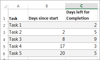
If your data is in a continuous range of cells, select any cell in that range to include all the data in that range.
If your data isn't in a continuous range, select the cells while holding down the COMMAND key.
Tip: If you don't want to include specific rows or columns of data you can hide them on the worksheet. Find out more about selecting data for your chart.
Click Insert > Insert Bar Chart > Stacked Bar chart.

Next, we’ll format the stacked bar chart to appear like a Gantt chart. In the chart, click the first data series (the Start part of the bar in blue) and then on the Format tab , select Shape Fill > No Fill .
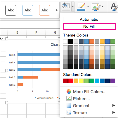
If you don’t need the legend or chart title, click it and press DELETE.
Let’s also reverse the task order so that it starts with Task1. Hold the CONTROL key and select the vertical axis (Tasks). Select Format Axis , and under Axis Position , choose Categories in reverse order .
Customize your chart
You can customize the Gantt type chart we created by adding gridlines, labels, changing the bar color, and more.
To add elements to the chart, click the chart area, and on the Chart Design tab, select Add Chart Element .

To select a layout, click Quick Layout.

To fine-tune the design, tab through the design options and select one.

To change the colors for the chart, click Change Colors .

To reuse your customized Gantt chart, save it as a template. Hold CONTROL and click in the chart, and then select Save as Template .
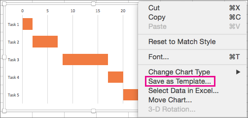
Did you know?
Microsoft 365 subscription offers Gantt chart templates designed to help you track project tasks with visual reminders and color-coded categories. If you don't have a Microsoft 365 subscription or the latest Office version, you can try it now:

Create a chart from start to finish
Save a chart as a template
PowerPoint presentation templates

Need more help?
Want more options.
Explore subscription benefits, browse training courses, learn how to secure your device, and more.

Microsoft 365 subscription benefits

Microsoft 365 training

Microsoft security

Accessibility center
Communities help you ask and answer questions, give feedback, and hear from experts with rich knowledge.

Ask the Microsoft Community

Microsoft Tech Community

Windows Insiders
Microsoft 365 Insiders
Was this information helpful?
Thank you for your feedback.

COMMENTS
However, the chart data is entered and saved in an Excel worksheet. If you insert a chart in Word or PowerPoint, a new sheet is opened in Excel. When you save a Word document or PowerPoint presentation that contains a chart, the chart's underlying Excel data is automatically saved within the Word document or PowerPoint presentation.
Here is a list of the ten charts mentioned in the video. Each section includes a brief description of the chart and what type of data to use it with. There is also a link to the tutorials where you can learn how to create and implement the charts in your own projects. 1. Column Chart with Percentage Change.
To create a pie chart in Excel: Select the data you want to visualize. From the " Insert " tab, choose " Pie " from the chart options. You can customize your chart by changing the colors, adding labels, and adjusting other settings in the " Format Chart Area " pane. Here's a video guide on how to create a donut chart:
To create a simple chart from scratch in PowerPoint, click Insert > Chart and pick the chart you want. Click Insert > Chart. Click the chart type and then double-click the chart you want. Tip: For help deciding which chart is best for your data, see Available chart types. In the worksheet that appears, replace the placeholder data with your own ...
Step 3: Add Chart Elements. Adding chart elements to your chart or graph will enhance it by clarifying data or providing additional context. You can select a chart element by clicking on the Add Chart Element dropdown menu in the top left-hand corner (beneath the Home tab). To Display or Hide Axes: Select Axes.
In this tutorial, we will explore the basics of creating graphical presentations in Excel. A. Exploring the different types of graphs and charts available in Excel. Excel offers a wide range of graph and chart types, each suited for different data sets and presentation purposes. Some of the most commonly used graph and chart types in Excel include:
6. Add an image. Whether it's a photograph, an artistic sketch or your logo, images go a long way in making your spreadsheet better. Images make your presentation look official and possess the professional feel in many of the beautiful presentations you have seen. Pictures speak a thousand words.
In Excel, select the chart by clicking its border, and then on the Home tab, in the Clipboard group, click Cut. The chart is removed, but the data remains in Excel. In Word, click where you want to insert the chart in the document. On the Home tab, in the Clipboard group, click Paste.
Choose Your Own Chart. If you would prefer to select a graph on your own, click the All Charts tab at the top of the window. You'll see the types listed on the left. Select one to view the styles for that type of chart on the right. To use one, select it and click "OK."
If you decide or can figure out which data comparison you want to make, choosing the right chart type is very easy: Pie, doughnut, or area: Use for part-to-whole data comparison. Bar, cylinder, cone, or pyramid: Use for a whole-to-whole data comparison. Line or column: Use for a time-series data comparison. Scatter or bubble: Use for a correlation data comparison in Excel.
In PowerPoint, navigate to the slide where you want to insert the graph. Right-click and choose "Paste" from the menu, or use the keyboard shortcut Ctrl + V. The Excel graph will now be pasted onto the PowerPoint slide. B. Provide guidance on how to update the graph in PowerPoint when changes are made in Excel.
Step 1: Create a Chart in Excel. Before you can add a chart to your PowerPoint presentation, you need to create the chart in Excel. Follow these steps: A. Open the Excel workbook that contains the data for the chart. B. Select the data that you want to include in the chart. C. Click on the "Insert" tab and choose the type of chart you want to ...
2. Click the Chart Tools Format tab. 3. In the Shape Styles group, click the Shape Outline button, then choose Weight, More Lines to open the Format Data Series dialog box with the Line Style category active. 4. In the Width text box, type a larger width or use the Up arrow to increase the width.
Type the data in EXCEL in 2 columns as shown - hair color in column 1, corresponding student count in column 2. To create a chart, you must first Select / Highlight the data. Second, Click INSERT from the menu bar and Select CHART. Alternately, you can select the Chart Button in the Standard Toolbar.
Go to the Excel spreadsheet and select the chart by clicking on it. Then copy the chart using Ctrl+C on your keyboard. Now go to the PowerPoint slide where you want to paste the chart and press Ctrl+V. That is all it takes to insert an Excel chart into a PowerPoint presentation through copying and pasting.
When used in PowerPoint presentations, Excel charts can enhance the overall impact of the presentation and convey the information more clearly. Here are six key features of using Excel charts in PowerPoint: Excel charts are easily customizable in PowerPoint. Users have access to a range of chart styles and formatting options that can be ...
To create a simple chart from scratch in PowerPoint, click Insert > Chart and pick the chart you want. Click Insert > Chart. Click the chart type and then double-click the chart you want. Tip: For help deciding which chart is best for your data, see Available chart types. In the worksheet that appears, replace the placeholder data with your own ...
Common TYPES OF CHARTS • PIE CHART: • BAR CHART: • COLUMN CHART: • AREA CHART: • LINE CHART: 6. COLUMN CHART; • Shows the comparison between one or more series of data point. • STACKED: two comparisons of data points for time periods are stacked. • CLUSTERED: comparison of three data series for each time period.
Radar chart. Map chart (Excel only) Funnel chart. Treemap chart. Sunburst chart. Column chart. XY (scatter) chart. Select the chart, click the Chart Design tab, and click Change Chart Type. Select a new chart type in the gallery of available options.
Step 2: Select the data you want to include in the chart by clicking and dragging over it. Step 3: Copy the selected data by pressing Ctrl+C or right-clicking and selecting "Copy". Step 4: Open PowerPoint and navigate to the slide where you want to insert the chart.
Select a corner of the first chart and click COPY ( or CTRL-C ). Switch to PowerPoint and select the destination slide. Click the bottom part of the PASTE button and select " Keep Source Formatting & Ling Data (F) ". Perform steps 1-3 on the second chart. Position and resize the charts as you see fit.
Unleash your creativity in Microsoft Excel by learning how to seamlessly insert images into any chart. Join our tutorial to explore the step-by-step process of adding visual elements to your charts, enhancing data visualization and making your presentations more engaging and impactful.
Click Insert > Recommended Charts. On the Recommended Charts tab, scroll through the list of charts that Excel recommends for your data, and click any chart to see how your data will look. Tip: If you don't see a chart you like, click All Charts to see all available chart types. When you find the chart you like, click it > OK.
M icrosoft Excel is a pretty difficult tool to master, but thankfully, ChatGPT knows it all. If you're the kind of person always working in spreadsheets and want something to help simplify your ...
Create a chart from start to finish. Save a chart as a template. PowerPoint presentation templates. Learn how to create a Gantt chart in Excel. Create a Gantt chart to present your data, schedule your project tasks, or track your progress in Excel.