

The Importance of Data Analysis in Research
Studying data is amongst the everyday chores of researchers. It’s not a big deal for them to go through hundreds of pages per day to extract useful information from it. However, recent times have seen a massive jump in the amount of data available. While it’s certainly good news for researchers to get their hands on more data that could result in better studies, it’s also no less than a headache.
Thankfully, the rising trend of data science in the past years has also meant a sharp rise in data analysis techniques . These tools and techniques save a lot of time in hefty processes a researcher has to go through and allow them to finish the work of days in minutes!
As a famous saying goes,
“Information is the oil of the 21st century , and analytics is the combustion engine.”
– Peter Sondergaard , senior vice president, Gartner Research.
So, if you’re also a researcher or just curious about the most important data analysis techniques in research, this article is for you. Make sure you give it a thorough read, as I’ll be dropping some very important points throughout the article.
What is the Importance of Data Analysis in Research?
Data analysis is important in research because it makes studying data a lot simpler and more accurate. It helps the researchers straightforwardly interpret the data so that researchers don’t leave anything out that could help them derive insights from it.
Data analysis is a way to study and analyze huge amounts of data. Research often includes going through heaps of data, which is getting more and more for the researchers to handle with every passing minute.
Hence, data analysis knowledge is a huge edge for researchers in the current era, making them very efficient and productive.
What is Data Analysis?
Once the data is cleaned , transformed , and ready to use, it can do wonders. Not only does it contain a variety of useful information, studying the data collectively results in uncovering very minor patterns and details that would otherwise have been ignored.
So, you can see why it has such a huge role to play in research. Research is all about studying patterns and trends, followed by making a hypothesis and proving them. All this is supported by appropriate data.
Further in the article, we’ll see some of the most important types of data analysis that you should be aware of as a researcher so you can put them to use.
The Role of Data Analytics at The Senior Management Level

From small and medium-sized businesses to Fortune 500 conglomerates, the success of a modern business is now increasingly tied to how the company implements its data infrastructure and data-based decision-making. According
The Decision-Making Model Explained (In Plain Terms)

Any form of the systematic decision-making process is better enhanced with data. But making sense of big data or even small data analysis when venturing into a decision-making process might
13 Reasons Why Data Is Important in Decision Making

Data is important in decision making process, and that is the new golden rule in the business world. Businesses are always trying to find the balance of cutting costs while
Types of Data Analysis: Qualitative Vs Quantitative
Looking at it from a broader perspective, data analysis boils down to two major types. Namely, qualitative data analysis and quantitative data analysis. While the latter deals with the numerical data, comprising of numbers, the former comes in the non-text form. It can be anything such as summaries, images, symbols, and so on.
Both types have different methods to deal with them and we’ll be taking a look at both of them so you can use whatever suits your requirements.
Qualitative Data Analysis
As mentioned before, qualitative data comprises non-text-based data, and it can be either in the form of text or images. So, how do we analyze such data? Before we start, here are a few common tips first that you should always use before applying any techniques.
Now, let’s move ahead and see where the qualitative data analysis techniques come in. Even though there are a lot of professional ways to achieve this, here are some of them that you’ll need to know as a beginner.
Narrative Analysis
If your research is based upon collecting some answers from people in interviews or other scenarios, this might be one of the best analysis techniques for you. The narrative analysis helps to analyze the narratives of various people, which is available in textual form. The stories, experiences, and other answers from respondents are used to power the analysis.
The important thing to note here is that the data has to be available in the form of text only. Narrative analysis cannot be performed on other data types such as images.
Content Analysis
Content analysis is amongst the most used methods in analyzing quantitative data. This method doesn’t put a restriction on the form of data. You can use any kind of data here, whether it’s in the form of images, text, or even real-life items.
Here, an important application is when you know the questions you need to know the answers to. Upon getting the answers, you can perform this method to perform analysis to them, followed by extracting insights from it to be used in your research. It’s a full-fledged method and a lot of analytical studies are based solely on this.
Grounded Theory
Grounded theory is used when the researchers want to know the reason behind the occurrence of a certain event. They may have to go through a lot of different use cases and comparing them to each other while following this approach. It’s an iterative approach and the explanations keep on being modified or re-created till the researchers end up on a suitable conclusion that satisfies their specific conditions.
So, make sure you employ this method if you need to have certain qualitative data at hand and you need to know the reason why something happened, based on that data.
Discourse Analysis
Discourse analysis is quite similar to narrative analysis in the sense that it also uses interactions with people for the analysis purpose. The only difference is that the focal point here is different. Instead of analyzing the narrative, the researchers focus on the context in which the conversation is happening.
The complete background of the person being questioned, including his everyday environment, is used to perform the research.
Quantitative Analysis
Quantitative analysis involves any kind of analysis that’s being done on numbers. From the most basic analysis techniques to the most advanced ones, quantitative analysis techniques comprise a huge range of techniques. No matter what level of research you need to do, if it’s based on numerical data, you’ll always have efficient analysis methods to use.
There are two broad ways here; Descriptive statistics and inferential analysis .
However, before applying the analysis methods on numerical data, there are a few pre-processing steps that need to be done. These steps are used to make the data ‘ready’ for applying the analysis methods.
Make sure you don’t miss these steps, or you will end up drawing biased conclusions from the data analysis. IF you want to know why data is the key in data analysis and problem-solving, feel free to check out this article here . Now, about the steps for PRE-PROCESSING THE QUANTITATIVE DATA .
Descriptive Statistics
Descriptive statistics is the most basic step that researchers can use to draw conclusions from data. It helps to find patterns and helps the data ‘speak’. Let’s see some of the most common data analysis techniques used to perform descriptive statistics .
Mean is nothing but the average of the total data available at hand. The formula is simple and tells what average value to expect throughout the data.
The median is the middle value available in the data. It lets the researchers estimate where the mid-point of the data is. It’s important to note that the data needs to be sorted to find the median from it.
The mode is simply the most frequently occurring data in the dataset. For example, if you’re studying the ages of students in a particular class, the model will be the age of most students in the class.
- Standard Deviation
Numerical data is always spread over a wide range and finding out how much the data is spread is quite important. Standard deviation is what lets us achieve this. It tells us how much an average data point is far from the average.
Related Article: The Best Programming Language for Statistics
Inferential Analysis
Inferential statistics point towards the techniques used to predict future occurrences of data. These methods help draw relationships between data and once it’s done, predicting future data becomes possible.
- Correlation
Correlation s the measure of the relationship between two numerical variables. It measures the degree of their relation, whether it is causal or not.
For example, the age and height of a person are highly correlated. If the age of a person increases, height is also likely to increase. This is called a positive correlation.
A negative correlation means that upon increasing one variable, the other one decreases. An example would be the relationship between the age and maturity of a random person.
Regression aims to find the mathematical relationship between a set of variables. While the correlation was a statistical measure, regression is a mathematical measure that can be measured in the form of variables. Once the relationship between variables is formed, one variable can be used to predict the other variable.
This method has a huge application when it comes to predicting future data. If your research is based upon calculating future occurrences of some data based on past data and then testing it, make sure you use this method.
A Summary of Data Analysis Methods
Now that we’re done with some of the most common methods for both quantitative and qualitative data, let’s summarize them in a tabular form so you would have something to take home in the end.
Before we close the article, I’d like to strongly recommend you to check out some interesting related topics:
That’s it! We have seen why data analysis is such an important tool when it comes to research and how it saves a huge lot of time for the researchers, making them not only efficient but more productive as well.
Moreover, the article covers some of the most important data analysis techniques that one needs to know for research purposes in today’s age. We’ve gone through the analysis methods for both quantitative and qualitative data in a basic way so it might be easy to understand for beginners.
Emidio Amadebai
As an IT Engineer, who is passionate about learning and sharing. I have worked and learned quite a bit from Data Engineers, Data Analysts, Business Analysts, and Key Decision Makers almost for the past 5 years. Interested in learning more about Data Science and How to leverage it for better decision-making in my business and hopefully help you do the same in yours.
Recent Posts
Causal vs Evidential Decision-making (How to Make Businesses More Effective)
In today’s fast-paced business landscape, it is crucial to make informed decisions to stay in the competition which makes it important to understand the concept of the different characteristics and...
Bootstrapping vs. Boosting
Over the past decade, the field of machine learning has witnessed remarkable advancements in predictive techniques and ensemble learning methods. Ensemble techniques are very popular in machine...

Home Blog Design Understanding Data Presentations (Guide + Examples)
Understanding Data Presentations (Guide + Examples)

In this age of overwhelming information, the skill to effectively convey data has become extremely valuable. Initiating a discussion on data presentation types involves thoughtful consideration of the nature of your data and the message you aim to convey. Different types of visualizations serve distinct purposes. Whether you’re dealing with how to develop a report or simply trying to communicate complex information, how you present data influences how well your audience understands and engages with it. This extensive guide leads you through the different ways of data presentation.
Table of Contents
What is a Data Presentation?
What should a data presentation include, line graphs, treemap chart, scatter plot, how to choose a data presentation type, recommended data presentation templates, common mistakes done in data presentation.
A data presentation is a slide deck that aims to disclose quantitative information to an audience through the use of visual formats and narrative techniques derived from data analysis, making complex data understandable and actionable. This process requires a series of tools, such as charts, graphs, tables, infographics, dashboards, and so on, supported by concise textual explanations to improve understanding and boost retention rate.
Data presentations require us to cull data in a format that allows the presenter to highlight trends, patterns, and insights so that the audience can act upon the shared information. In a few words, the goal of data presentations is to enable viewers to grasp complicated concepts or trends quickly, facilitating informed decision-making or deeper analysis.
Data presentations go beyond the mere usage of graphical elements. Seasoned presenters encompass visuals with the art of data storytelling , so the speech skillfully connects the points through a narrative that resonates with the audience. Depending on the purpose – inspire, persuade, inform, support decision-making processes, etc. – is the data presentation format that is better suited to help us in this journey.
To nail your upcoming data presentation, ensure to count with the following elements:
- Clear Objectives: Understand the intent of your presentation before selecting the graphical layout and metaphors to make content easier to grasp.
- Engaging introduction: Use a powerful hook from the get-go. For instance, you can ask a big question or present a problem that your data will answer. Take a look at our guide on how to start a presentation for tips & insights.
- Structured Narrative: Your data presentation must tell a coherent story. This means a beginning where you present the context, a middle section in which you present the data, and an ending that uses a call-to-action. Check our guide on presentation structure for further information.
- Visual Elements: These are the charts, graphs, and other elements of visual communication we ought to use to present data. This article will cover one by one the different types of data representation methods we can use, and provide further guidance on choosing between them.
- Insights and Analysis: This is not just showcasing a graph and letting people get an idea about it. A proper data presentation includes the interpretation of that data, the reason why it’s included, and why it matters to your research.
- Conclusion & CTA: Ending your presentation with a call to action is necessary. Whether you intend to wow your audience into acquiring your services, inspire them to change the world, or whatever the purpose of your presentation, there must be a stage in which you convey all that you shared and show the path to staying in touch. Plan ahead whether you want to use a thank-you slide, a video presentation, or which method is apt and tailored to the kind of presentation you deliver.
- Q&A Session: After your speech is concluded, allocate 3-5 minutes for the audience to raise any questions about the information you disclosed. This is an extra chance to establish your authority on the topic. Check our guide on questions and answer sessions in presentations here.
Bar charts are a graphical representation of data using rectangular bars to show quantities or frequencies in an established category. They make it easy for readers to spot patterns or trends. Bar charts can be horizontal or vertical, although the vertical format is commonly known as a column chart. They display categorical, discrete, or continuous variables grouped in class intervals [1] . They include an axis and a set of labeled bars horizontally or vertically. These bars represent the frequencies of variable values or the values themselves. Numbers on the y-axis of a vertical bar chart or the x-axis of a horizontal bar chart are called the scale.

Real-Life Application of Bar Charts
Let’s say a sales manager is presenting sales to their audience. Using a bar chart, he follows these steps.
Step 1: Selecting Data
The first step is to identify the specific data you will present to your audience.
The sales manager has highlighted these products for the presentation.
- Product A: Men’s Shoes
- Product B: Women’s Apparel
- Product C: Electronics
- Product D: Home Decor
Step 2: Choosing Orientation
Opt for a vertical layout for simplicity. Vertical bar charts help compare different categories in case there are not too many categories [1] . They can also help show different trends. A vertical bar chart is used where each bar represents one of the four chosen products. After plotting the data, it is seen that the height of each bar directly represents the sales performance of the respective product.
It is visible that the tallest bar (Electronics – Product C) is showing the highest sales. However, the shorter bars (Women’s Apparel – Product B and Home Decor – Product D) need attention. It indicates areas that require further analysis or strategies for improvement.
Step 3: Colorful Insights
Different colors are used to differentiate each product. It is essential to show a color-coded chart where the audience can distinguish between products.
- Men’s Shoes (Product A): Yellow
- Women’s Apparel (Product B): Orange
- Electronics (Product C): Violet
- Home Decor (Product D): Blue

Bar charts are straightforward and easily understandable for presenting data. They are versatile when comparing products or any categorical data [2] . Bar charts adapt seamlessly to retail scenarios. Despite that, bar charts have a few shortcomings. They cannot illustrate data trends over time. Besides, overloading the chart with numerous products can lead to visual clutter, diminishing its effectiveness.
For more information, check our collection of bar chart templates for PowerPoint .
Line graphs help illustrate data trends, progressions, or fluctuations by connecting a series of data points called ‘markers’ with straight line segments. This provides a straightforward representation of how values change [5] . Their versatility makes them invaluable for scenarios requiring a visual understanding of continuous data. In addition, line graphs are also useful for comparing multiple datasets over the same timeline. Using multiple line graphs allows us to compare more than one data set. They simplify complex information so the audience can quickly grasp the ups and downs of values. From tracking stock prices to analyzing experimental results, you can use line graphs to show how data changes over a continuous timeline. They show trends with simplicity and clarity.
Real-life Application of Line Graphs
To understand line graphs thoroughly, we will use a real case. Imagine you’re a financial analyst presenting a tech company’s monthly sales for a licensed product over the past year. Investors want insights into sales behavior by month, how market trends may have influenced sales performance and reception to the new pricing strategy. To present data via a line graph, you will complete these steps.
First, you need to gather the data. In this case, your data will be the sales numbers. For example:
- January: $45,000
- February: $55,000
- March: $45,000
- April: $60,000
- May: $ 70,000
- June: $65,000
- July: $62,000
- August: $68,000
- September: $81,000
- October: $76,000
- November: $87,000
- December: $91,000
After choosing the data, the next step is to select the orientation. Like bar charts, you can use vertical or horizontal line graphs. However, we want to keep this simple, so we will keep the timeline (x-axis) horizontal while the sales numbers (y-axis) vertical.
Step 3: Connecting Trends
After adding the data to your preferred software, you will plot a line graph. In the graph, each month’s sales are represented by data points connected by a line.

Step 4: Adding Clarity with Color
If there are multiple lines, you can also add colors to highlight each one, making it easier to follow.
Line graphs excel at visually presenting trends over time. These presentation aids identify patterns, like upward or downward trends. However, too many data points can clutter the graph, making it harder to interpret. Line graphs work best with continuous data but are not suitable for categories.
For more information, check our collection of line chart templates for PowerPoint and our article about how to make a presentation graph .
A data dashboard is a visual tool for analyzing information. Different graphs, charts, and tables are consolidated in a layout to showcase the information required to achieve one or more objectives. Dashboards help quickly see Key Performance Indicators (KPIs). You don’t make new visuals in the dashboard; instead, you use it to display visuals you’ve already made in worksheets [3] .
Keeping the number of visuals on a dashboard to three or four is recommended. Adding too many can make it hard to see the main points [4]. Dashboards can be used for business analytics to analyze sales, revenue, and marketing metrics at a time. They are also used in the manufacturing industry, as they allow users to grasp the entire production scenario at the moment while tracking the core KPIs for each line.
Real-Life Application of a Dashboard
Consider a project manager presenting a software development project’s progress to a tech company’s leadership team. He follows the following steps.
Step 1: Defining Key Metrics
To effectively communicate the project’s status, identify key metrics such as completion status, budget, and bug resolution rates. Then, choose measurable metrics aligned with project objectives.
Step 2: Choosing Visualization Widgets
After finalizing the data, presentation aids that align with each metric are selected. For this project, the project manager chooses a progress bar for the completion status and uses bar charts for budget allocation. Likewise, he implements line charts for bug resolution rates.

Step 3: Dashboard Layout
Key metrics are prominently placed in the dashboard for easy visibility, and the manager ensures that it appears clean and organized.
Dashboards provide a comprehensive view of key project metrics. Users can interact with data, customize views, and drill down for detailed analysis. However, creating an effective dashboard requires careful planning to avoid clutter. Besides, dashboards rely on the availability and accuracy of underlying data sources.
For more information, check our article on how to design a dashboard presentation , and discover our collection of dashboard PowerPoint templates .
Treemap charts represent hierarchical data structured in a series of nested rectangles [6] . As each branch of the ‘tree’ is given a rectangle, smaller tiles can be seen representing sub-branches, meaning elements on a lower hierarchical level than the parent rectangle. Each one of those rectangular nodes is built by representing an area proportional to the specified data dimension.
Treemaps are useful for visualizing large datasets in compact space. It is easy to identify patterns, such as which categories are dominant. Common applications of the treemap chart are seen in the IT industry, such as resource allocation, disk space management, website analytics, etc. Also, they can be used in multiple industries like healthcare data analysis, market share across different product categories, or even in finance to visualize portfolios.
Real-Life Application of a Treemap Chart
Let’s consider a financial scenario where a financial team wants to represent the budget allocation of a company. There is a hierarchy in the process, so it is helpful to use a treemap chart. In the chart, the top-level rectangle could represent the total budget, and it would be subdivided into smaller rectangles, each denoting a specific department. Further subdivisions within these smaller rectangles might represent individual projects or cost categories.
Step 1: Define Your Data Hierarchy
While presenting data on the budget allocation, start by outlining the hierarchical structure. The sequence will be like the overall budget at the top, followed by departments, projects within each department, and finally, individual cost categories for each project.
- Top-level rectangle: Total Budget
- Second-level rectangles: Departments (Engineering, Marketing, Sales)
- Third-level rectangles: Projects within each department
- Fourth-level rectangles: Cost categories for each project (Personnel, Marketing Expenses, Equipment)
Step 2: Choose a Suitable Tool
It’s time to select a data visualization tool supporting Treemaps. Popular choices include Tableau, Microsoft Power BI, PowerPoint, or even coding with libraries like D3.js. It is vital to ensure that the chosen tool provides customization options for colors, labels, and hierarchical structures.
Here, the team uses PowerPoint for this guide because of its user-friendly interface and robust Treemap capabilities.
Step 3: Make a Treemap Chart with PowerPoint
After opening the PowerPoint presentation, they chose “SmartArt” to form the chart. The SmartArt Graphic window has a “Hierarchy” category on the left. Here, you will see multiple options. You can choose any layout that resembles a Treemap. The “Table Hierarchy” or “Organization Chart” options can be adapted. The team selects the Table Hierarchy as it looks close to a Treemap.
Step 5: Input Your Data
After that, a new window will open with a basic structure. They add the data one by one by clicking on the text boxes. They start with the top-level rectangle, representing the total budget.

Step 6: Customize the Treemap
By clicking on each shape, they customize its color, size, and label. At the same time, they can adjust the font size, style, and color of labels by using the options in the “Format” tab in PowerPoint. Using different colors for each level enhances the visual difference.
Treemaps excel at illustrating hierarchical structures. These charts make it easy to understand relationships and dependencies. They efficiently use space, compactly displaying a large amount of data, reducing the need for excessive scrolling or navigation. Additionally, using colors enhances the understanding of data by representing different variables or categories.
In some cases, treemaps might become complex, especially with deep hierarchies. It becomes challenging for some users to interpret the chart. At the same time, displaying detailed information within each rectangle might be constrained by space. It potentially limits the amount of data that can be shown clearly. Without proper labeling and color coding, there’s a risk of misinterpretation.
A heatmap is a data visualization tool that uses color coding to represent values across a two-dimensional surface. In these, colors replace numbers to indicate the magnitude of each cell. This color-shaded matrix display is valuable for summarizing and understanding data sets with a glance [7] . The intensity of the color corresponds to the value it represents, making it easy to identify patterns, trends, and variations in the data.
As a tool, heatmaps help businesses analyze website interactions, revealing user behavior patterns and preferences to enhance overall user experience. In addition, companies use heatmaps to assess content engagement, identifying popular sections and areas of improvement for more effective communication. They excel at highlighting patterns and trends in large datasets, making it easy to identify areas of interest.
We can implement heatmaps to express multiple data types, such as numerical values, percentages, or even categorical data. Heatmaps help us easily spot areas with lots of activity, making them helpful in figuring out clusters [8] . When making these maps, it is important to pick colors carefully. The colors need to show the differences between groups or levels of something. And it is good to use colors that people with colorblindness can easily see.
Check our detailed guide on how to create a heatmap here. Also discover our collection of heatmap PowerPoint templates .
Pie charts are circular statistical graphics divided into slices to illustrate numerical proportions. Each slice represents a proportionate part of the whole, making it easy to visualize the contribution of each component to the total.
The size of the pie charts is influenced by the value of data points within each pie. The total of all data points in a pie determines its size. The pie with the highest data points appears as the largest, whereas the others are proportionally smaller. However, you can present all pies of the same size if proportional representation is not required [9] . Sometimes, pie charts are difficult to read, or additional information is required. A variation of this tool can be used instead, known as the donut chart , which has the same structure but a blank center, creating a ring shape. Presenters can add extra information, and the ring shape helps to declutter the graph.
Pie charts are used in business to show percentage distribution, compare relative sizes of categories, or present straightforward data sets where visualizing ratios is essential.
Real-Life Application of Pie Charts
Consider a scenario where you want to represent the distribution of the data. Each slice of the pie chart would represent a different category, and the size of each slice would indicate the percentage of the total portion allocated to that category.
Step 1: Define Your Data Structure
Imagine you are presenting the distribution of a project budget among different expense categories.
- Column A: Expense Categories (Personnel, Equipment, Marketing, Miscellaneous)
- Column B: Budget Amounts ($40,000, $30,000, $20,000, $10,000) Column B represents the values of your categories in Column A.
Step 2: Insert a Pie Chart
Using any of the accessible tools, you can create a pie chart. The most convenient tools for forming a pie chart in a presentation are presentation tools such as PowerPoint or Google Slides. You will notice that the pie chart assigns each expense category a percentage of the total budget by dividing it by the total budget.
For instance:
- Personnel: $40,000 / ($40,000 + $30,000 + $20,000 + $10,000) = 40%
- Equipment: $30,000 / ($40,000 + $30,000 + $20,000 + $10,000) = 30%
- Marketing: $20,000 / ($40,000 + $30,000 + $20,000 + $10,000) = 20%
- Miscellaneous: $10,000 / ($40,000 + $30,000 + $20,000 + $10,000) = 10%
You can make a chart out of this or just pull out the pie chart from the data.

3D pie charts and 3D donut charts are quite popular among the audience. They stand out as visual elements in any presentation slide, so let’s take a look at how our pie chart example would look in 3D pie chart format.

Step 03: Results Interpretation
The pie chart visually illustrates the distribution of the project budget among different expense categories. Personnel constitutes the largest portion at 40%, followed by equipment at 30%, marketing at 20%, and miscellaneous at 10%. This breakdown provides a clear overview of where the project funds are allocated, which helps in informed decision-making and resource management. It is evident that personnel are a significant investment, emphasizing their importance in the overall project budget.
Pie charts provide a straightforward way to represent proportions and percentages. They are easy to understand, even for individuals with limited data analysis experience. These charts work well for small datasets with a limited number of categories.
However, a pie chart can become cluttered and less effective in situations with many categories. Accurate interpretation may be challenging, especially when dealing with slight differences in slice sizes. In addition, these charts are static and do not effectively convey trends over time.
For more information, check our collection of pie chart templates for PowerPoint .
Histograms present the distribution of numerical variables. Unlike a bar chart that records each unique response separately, histograms organize numeric responses into bins and show the frequency of reactions within each bin [10] . The x-axis of a histogram shows the range of values for a numeric variable. At the same time, the y-axis indicates the relative frequencies (percentage of the total counts) for that range of values.
Whenever you want to understand the distribution of your data, check which values are more common, or identify outliers, histograms are your go-to. Think of them as a spotlight on the story your data is telling. A histogram can provide a quick and insightful overview if you’re curious about exam scores, sales figures, or any numerical data distribution.
Real-Life Application of a Histogram
In the histogram data analysis presentation example, imagine an instructor analyzing a class’s grades to identify the most common score range. A histogram could effectively display the distribution. It will show whether most students scored in the average range or if there are significant outliers.
Step 1: Gather Data
He begins by gathering the data. The scores of each student in class are gathered to analyze exam scores.
After arranging the scores in ascending order, bin ranges are set.
Step 2: Define Bins
Bins are like categories that group similar values. Think of them as buckets that organize your data. The presenter decides how wide each bin should be based on the range of the values. For instance, the instructor sets the bin ranges based on score intervals: 60-69, 70-79, 80-89, and 90-100.
Step 3: Count Frequency
Now, he counts how many data points fall into each bin. This step is crucial because it tells you how often specific ranges of values occur. The result is the frequency distribution, showing the occurrences of each group.
Here, the instructor counts the number of students in each category.
- 60-69: 1 student (Kate)
- 70-79: 4 students (David, Emma, Grace, Jack)
- 80-89: 7 students (Alice, Bob, Frank, Isabel, Liam, Mia, Noah)
- 90-100: 3 students (Clara, Henry, Olivia)
Step 4: Create the Histogram
It’s time to turn the data into a visual representation. Draw a bar for each bin on a graph. The width of the bar should correspond to the range of the bin, and the height should correspond to the frequency. To make your histogram understandable, label the X and Y axes.
In this case, the X-axis should represent the bins (e.g., test score ranges), and the Y-axis represents the frequency.

The histogram of the class grades reveals insightful patterns in the distribution. Most students, with seven students, fall within the 80-89 score range. The histogram provides a clear visualization of the class’s performance. It showcases a concentration of grades in the upper-middle range with few outliers at both ends. This analysis helps in understanding the overall academic standing of the class. It also identifies the areas for potential improvement or recognition.
Thus, histograms provide a clear visual representation of data distribution. They are easy to interpret, even for those without a statistical background. They apply to various types of data, including continuous and discrete variables. One weak point is that histograms do not capture detailed patterns in students’ data, with seven compared to other visualization methods.
A scatter plot is a graphical representation of the relationship between two variables. It consists of individual data points on a two-dimensional plane. This plane plots one variable on the x-axis and the other on the y-axis. Each point represents a unique observation. It visualizes patterns, trends, or correlations between the two variables.
Scatter plots are also effective in revealing the strength and direction of relationships. They identify outliers and assess the overall distribution of data points. The points’ dispersion and clustering reflect the relationship’s nature, whether it is positive, negative, or lacks a discernible pattern. In business, scatter plots assess relationships between variables such as marketing cost and sales revenue. They help present data correlations and decision-making.
Real-Life Application of Scatter Plot
A group of scientists is conducting a study on the relationship between daily hours of screen time and sleep quality. After reviewing the data, they managed to create this table to help them build a scatter plot graph:
In the provided example, the x-axis represents Daily Hours of Screen Time, and the y-axis represents the Sleep Quality Rating.

The scientists observe a negative correlation between the amount of screen time and the quality of sleep. This is consistent with their hypothesis that blue light, especially before bedtime, has a significant impact on sleep quality and metabolic processes.
There are a few things to remember when using a scatter plot. Even when a scatter diagram indicates a relationship, it doesn’t mean one variable affects the other. A third factor can influence both variables. The more the plot resembles a straight line, the stronger the relationship is perceived [11] . If it suggests no ties, the observed pattern might be due to random fluctuations in data. When the scatter diagram depicts no correlation, whether the data might be stratified is worth considering.
Choosing the appropriate data presentation type is crucial when making a presentation . Understanding the nature of your data and the message you intend to convey will guide this selection process. For instance, when showcasing quantitative relationships, scatter plots become instrumental in revealing correlations between variables. If the focus is on emphasizing parts of a whole, pie charts offer a concise display of proportions. Histograms, on the other hand, prove valuable for illustrating distributions and frequency patterns.
Bar charts provide a clear visual comparison of different categories. Likewise, line charts excel in showcasing trends over time, while tables are ideal for detailed data examination. Starting a presentation on data presentation types involves evaluating the specific information you want to communicate and selecting the format that aligns with your message. This ensures clarity and resonance with your audience from the beginning of your presentation.
1. Fact Sheet Dashboard for Data Presentation

Convey all the data you need to present in this one-pager format, an ideal solution tailored for users looking for presentation aids. Global maps, donut chats, column graphs, and text neatly arranged in a clean layout presented in light and dark themes.
Use This Template
2. 3D Column Chart Infographic PPT Template

Represent column charts in a highly visual 3D format with this PPT template. A creative way to present data, this template is entirely editable, and we can craft either a one-page infographic or a series of slides explaining what we intend to disclose point by point.
3. Data Circles Infographic PowerPoint Template

An alternative to the pie chart and donut chart diagrams, this template features a series of curved shapes with bubble callouts as ways of presenting data. Expand the information for each arch in the text placeholder areas.
4. Colorful Metrics Dashboard for Data Presentation

This versatile dashboard template helps us in the presentation of the data by offering several graphs and methods to convert numbers into graphics. Implement it for e-commerce projects, financial projections, project development, and more.
5. Animated Data Presentation Tools for PowerPoint & Google Slides

A slide deck filled with most of the tools mentioned in this article, from bar charts, column charts, treemap graphs, pie charts, histogram, etc. Animated effects make each slide look dynamic when sharing data with stakeholders.
6. Statistics Waffle Charts PPT Template for Data Presentations

This PPT template helps us how to present data beyond the typical pie chart representation. It is widely used for demographics, so it’s a great fit for marketing teams, data science professionals, HR personnel, and more.
7. Data Presentation Dashboard Template for Google Slides

A compendium of tools in dashboard format featuring line graphs, bar charts, column charts, and neatly arranged placeholder text areas.
8. Weather Dashboard for Data Presentation

Share weather data for agricultural presentation topics, environmental studies, or any kind of presentation that requires a highly visual layout for weather forecasting on a single day. Two color themes are available.
9. Social Media Marketing Dashboard Data Presentation Template

Intended for marketing professionals, this dashboard template for data presentation is a tool for presenting data analytics from social media channels. Two slide layouts featuring line graphs and column charts.
10. Project Management Summary Dashboard Template

A tool crafted for project managers to deliver highly visual reports on a project’s completion, the profits it delivered for the company, and expenses/time required to execute it. 4 different color layouts are available.
11. Profit & Loss Dashboard for PowerPoint and Google Slides

A must-have for finance professionals. This typical profit & loss dashboard includes progress bars, donut charts, column charts, line graphs, and everything that’s required to deliver a comprehensive report about a company’s financial situation.
Overwhelming visuals
One of the mistakes related to using data-presenting methods is including too much data or using overly complex visualizations. They can confuse the audience and dilute the key message.
Inappropriate chart types
Choosing the wrong type of chart for the data at hand can lead to misinterpretation. For example, using a pie chart for data that doesn’t represent parts of a whole is not right.
Lack of context
Failing to provide context or sufficient labeling can make it challenging for the audience to understand the significance of the presented data.
Inconsistency in design
Using inconsistent design elements and color schemes across different visualizations can create confusion and visual disarray.
Failure to provide details
Simply presenting raw data without offering clear insights or takeaways can leave the audience without a meaningful conclusion.
Lack of focus
Not having a clear focus on the key message or main takeaway can result in a presentation that lacks a central theme.
Visual accessibility issues
Overlooking the visual accessibility of charts and graphs can exclude certain audience members who may have difficulty interpreting visual information.
In order to avoid these mistakes in data presentation, presenters can benefit from using presentation templates . These templates provide a structured framework. They ensure consistency, clarity, and an aesthetically pleasing design, enhancing data communication’s overall impact.
Understanding and choosing data presentation types are pivotal in effective communication. Each method serves a unique purpose, so selecting the appropriate one depends on the nature of the data and the message to be conveyed. The diverse array of presentation types offers versatility in visually representing information, from bar charts showing values to pie charts illustrating proportions.
Using the proper method enhances clarity, engages the audience, and ensures that data sets are not just presented but comprehensively understood. By appreciating the strengths and limitations of different presentation types, communicators can tailor their approach to convey information accurately, developing a deeper connection between data and audience understanding.
[1] Government of Canada, S.C. (2021) 5 Data Visualization 5.2 Bar Chart , 5.2 Bar chart . https://www150.statcan.gc.ca/n1/edu/power-pouvoir/ch9/bargraph-diagrammeabarres/5214818-eng.htm
[2] Kosslyn, S.M., 1989. Understanding charts and graphs. Applied cognitive psychology, 3(3), pp.185-225. https://apps.dtic.mil/sti/pdfs/ADA183409.pdf
[3] Creating a Dashboard . https://it.tufts.edu/book/export/html/1870
[4] https://www.goldenwestcollege.edu/research/data-and-more/data-dashboards/index.html
[5] https://www.mit.edu/course/21/21.guide/grf-line.htm
[6] Jadeja, M. and Shah, K., 2015, January. Tree-Map: A Visualization Tool for Large Data. In GSB@ SIGIR (pp. 9-13). https://ceur-ws.org/Vol-1393/gsb15proceedings.pdf#page=15
[7] Heat Maps and Quilt Plots. https://www.publichealth.columbia.edu/research/population-health-methods/heat-maps-and-quilt-plots
[8] EIU QGIS WORKSHOP. https://www.eiu.edu/qgisworkshop/heatmaps.php
[9] About Pie Charts. https://www.mit.edu/~mbarker/formula1/f1help/11-ch-c8.htm
[10] Histograms. https://sites.utexas.edu/sos/guided/descriptive/numericaldd/descriptiven2/histogram/ [11] https://asq.org/quality-resources/scatter-diagram

Like this article? Please share
Data Analysis, Data Science, Data Visualization Filed under Design
Related Articles

Filed under Design • March 27th, 2024
How to Make a Presentation Graph
Detailed step-by-step instructions to master the art of how to make a presentation graph in PowerPoint and Google Slides. Check it out!
Filed under Presentation Ideas • January 6th, 2024
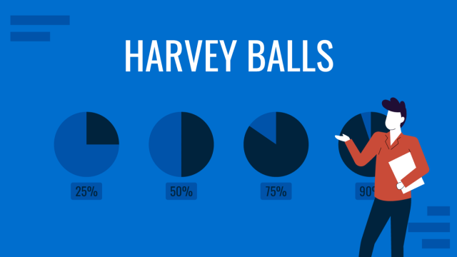
All About Using Harvey Balls
Among the many tools in the arsenal of the modern presenter, Harvey Balls have a special place. In this article we will tell you all about using Harvey Balls.
Filed under Business • December 8th, 2023
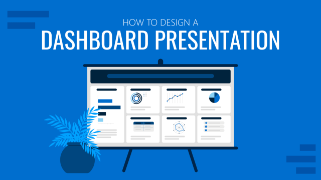
How to Design a Dashboard Presentation: A Step-by-Step Guide
Take a step further in your professional presentation skills by learning what a dashboard presentation is and how to properly design one in PowerPoint. A detailed step-by-step guide is here!
Leave a Reply
Academia.edu no longer supports Internet Explorer.
To browse Academia.edu and the wider internet faster and more securely, please take a few seconds to upgrade your browser .
Enter the email address you signed up with and we'll email you a reset link.
- We're Hiring!
- Help Center

Data Analysis and Interpretation

This is a slide presentation by Martin Otundo Richard to help learners, researchers and other scholars to understand how data is analyzed and presented.
Related Papers
Shanel Bautista
Fernando Macolor Cruz
Janine Javier
"Data analysis is the process of bringing order, structure and meaning to the mass of collected data. It is a messy, ambiguous, time consuming, creative, and fascinating process. It does not proceed in a linear fashion; it is not neat. Data analysis is a search for answers about relationships among categories of data."-Marshall and Rossman, 1990:111 Hitchcock and Hughes take this one step further: "…the ways in which the researcher moves from a description of what is the case to an explanation of why what is the case is the case."-Hitchcock and Hughes 1995:295 IV.1 INTRODUCTION In Chapter three, researcher had discussed the research design and methodology, origin of the research, design of the research, variable of the research, population and sample of the research, tools for data collection, development stage of the CAI package, procedure for data collection, statistical analysis done in research work. Data analysis is considered to be important step and heart of the research in research work. In the beginning the data is raw in nature but after it is arranged in a certain format or a meaningful order this raw data takes the form of the information. The most critical and essential supporting pillars of the research are the analysis and the interpretation of the data. With the help of the interpretation step one is able to achieve a conclusion from the set of the gathered data. Interpretation has two major aspects namely establishing continuity in the research through linking the results of a given study with those of another and the establishment of some relationship with the collected data. Interpretation can be defined as the device through which the factors, which seem to explain what has been observed by the researcher in the course of the
Dawit Dibekulu
Research is a scientific field which helps to generate new knowledge and solve the existing problem. So, data analysis is the crucial part of research which makes the result of the study more effective. It is a process of collecting, transforming, cleaning, and modeling data with the goal of discovering the required information. In a research it supports the researcher to reach to a conclusion. Therefore, simply stating that data analysis is important for a research will be an understatement rather no research can survive without data analysis. It can be applied in two ways which is qualitatively and quantitative. Both are beneficial because it helps in structuring the findings from different sources of data collection like survey research, again very helpful in breaking a macro problem into micro parts, and acts like a filter when it comes to acquiring meaningful insights out of huge data-set. Furthermore, every researcher has sort out huge pile of data that he/she has collected, before reaching to a conclusion of the research question. Mere data collection is of no use to the researcher. Data analysis proves to be crucial in this process, provides a meaningful base to critical decisions, and helps to create a complete dissertation proposal. So, after analyzing the data the result will provide by qualitative and quantitative method of data results. Quantitative data analysis is mainly use numbers, graphs, charts, equations, statistics (inferential and descriptive). Data that is represented either in a verbal or narrative format is qualitative data which is collected through focus groups, interviews, opened ended questionnaire items, and other less structured situations.
Abu rayhan soton
Abubakar Abdulkareem
The aim of this article is to provide and share several tools for analyzing researchable data collected from research participants or research respondents or even secondary data, be it quantitative research methodology or qualitative research methodology. In order to achieve the aim of this article, the researchers carefully itemized and discuss how tools for analyzing quantitative data would be used such tools are:
Springer eBooks
hany Elbardan
The analysis and interpretation of data about wearing high heels for female students of Ligao community college.
James Joel Delos Reyes
The analysis and interpretation of data about wearing high heels for female students of Ligao community college. To complete this study properly, it is necessary to analyze the data collected in order to answer the research questions. Data is interpreted in a descriptive form. This chapter comprises the analysis, presentation and interpretation of the findings resulting from this study. The analysis and interpretation of data is carried out in two phases. The first part, which is based on the results of the questionnaire, deals with a qualitative analysis of data. The second, which is based on quantitative analysis. The unit of analysis is the major entity that the researcher going to analyze in the study. It is not 'what' or 'who' that is being studied. Researchers were collecting the data or information from the following female student for the completion of the study 100 questionnaires were distributed, only 80 was retrieve, some students did not completely answer the given data, few of them with a lot of missing data, while the remaining students answer well on the given questionnaire. The researchers use table in order to easily identify the data and interpret it according to the response of the following female students. In order to get the percentage of the following data we use the formula P=the value or the frequency/ by total respondent, (100) multiply (100). Table 1.
This chapter aims to give you access to some of the routines, procedures, phases and tactics that are common in qualitative analytic reasoning and practice. Initially I focus on four routinely cited approaches to qualitative data analysis in order to explore their similarities and differences. I then describe some of the pragmatic issues you might need to consider alongside some of qualities or states of mind you might seek to cultivate.
Project Management for Research
Adedeji Badiru
RELATED PAPERS
Joseph Dossle
Current Genetics
Ladislav Kovac
Apoptosis : an international journal on programmed cell death
Bobby Joseph
Mireille Cifali Bega
tanuja nigam
Rika Astari
EDULEARN Proceedings
Giovanni Toffoli
26e JDL "Sélections, du système éducatif au marché du travail"
Renaud Cornand
Derhana Bulan Dalimunthe
Proceedings of the 2nd International Conference on Tropical Medicine and Infectious Disease
Rina Yunita
Brazilian Archives of Biology and Technology
Washington luiz
Jurnal AgroBiogen
Eny Riyanti
Héctor Ramos
aadharshila chatustaya
Nirmala Mani Adhikary
Journal of Central European Agriculture
Cecilia Georgescu
Emblemas - Revista do Departamento de História e Ciências Sociais - UFG/CAC
Ane Mecenas
International Journal of Botany
Hatice Nurhan Buyukkartal
Kassiani Theodoraki
Lessons from the Nigerian …
Dan Maldoom
SIGLO DIECINUEVE (Literatura hispánica)
José Manuel Goñi
TEACHING Exceptional Children
Stem Cell Reports
Lolitika Mandal
NIPPON SUISAN GAKKAISHI
HIROSHI UEDA
Kalliopi Kotsa
L'Endocrinologo
Cristina Ghervan
RELATED TOPICS
- We're Hiring!
- Help Center
- Find new research papers in:
- Health Sciences
- Earth Sciences
- Cognitive Science
- Mathematics
- Computer Science
- Academia ©2024
- Lecture 1: Course Overview
- Lecture 2: Intro to R
- Lecture 3: Data & Data Handling
- Lecture 4: Data Wrangling
- Lecture 5: Summary Statistics
- Lecture 6: Plotting 1
- Lecture 7: Plotting 2
- Lecture 8: Probability Basics
- Lecture 9: Models
- Lecture 10: Parameter Estimation 1
- Lecture 11: Classical Testing 1
- Lecture 12: Classical Testing 2
- Lecture 13: Classical Testing 3
- Lecture 14: Impact of Statistical Practices (T. Roettger)
- Lecture 15: Model Comparison
- Lecture 16: Simple Regression
- Tutorial 1: Using R, Data Handling / Wrangling
- Tutorial 2: More R, Wrangling, Summary Stats
- Tutorial 3: Summary statistics
- Tutorial 4: Plotting
- Tutorial 5: Probability calculus
- Tutorial 6: Probability calculus, models
- Tutorial 7: Parameter Estimation
- Tutorial 8: Classical Testing
- Tutorial 9: Hypothesis Testing
- Tutorial 10: Bayesian Hypothesis Testing

- My presentations
Auth with social network:
Download presentation
We think you have liked this presentation. If you wish to download it, please recommend it to your friends in any social system. Share buttons are a little bit lower. Thank you!
Presentation is loading. Please wait.
Data Analysis, Interpretation, and Presentation
Published by Benedict Brooks Modified over 4 years ago
Similar presentations
Presentation on theme: "Data Analysis, Interpretation, and Presentation"— Presentation transcript:

Critical Reading Strategies: Overview of Research Process
©2011 1www.id-book.com Data analysis, interpretation and presentation Chapter 8.

Chapter 8 Data Analysis, Interpretation and Presentation.
© Done by : Latifa Ebrahim Al Doy Chapter 8 Data analysis, interpretation and presentation and presentation.
Research methods – Deductive / quantitative
Data analysis and interpretation. Agenda Part 2 comments – Average score: 87 Part 3: due in 2 weeks Data analysis.
Aaker, Kumar, Day Ninth Edition Instructor’s Presentation Slides
SOWK 6003 Social Work Research Week 10 Quantitative Data Analysis
Chapter 9 Principles of Analysis and Interpretation.
More on Qualitative Data Collection and Data Analysis

Marketing Research Aaker, Kumar, Day Seventh Edition Instructor’s Presentation Slides.
CHAPTER 13, qualitative data analysis

Chapter 10 Conducting & Reading Research Baumgartner et al Chapter 10 Qualitative Research.
FOCUS GROUPS ANALYSIS OF QUALITATIVE DATA
Research Methods in Computer Science Lecture: Quantitative and Qualitative Data Analysis | Department of Science | Interactive Graphics System.
Data analysis, interpretation and presentation

RESEARCH IN MATH EDUCATION-3

Computer Science Department California Polytechnic State University San Luis Obispo, CA, U.S.A. Franz J. Kurfess CPE/CSC 484: User-Centered Design and.

Some Insight into Qualitative Analysis N.I.Teufel-Shone, PhD College of Public Health University of Arizona SREP 2015.
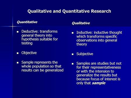
Qualitative and Quantitative Research Quantitative Deductive: transforms general theory into hypothesis suitable for testing Deductive: transforms general.
About project
© 2024 SlidePlayer.com Inc. All rights reserved.
- Skip to main content
- Skip to primary sidebar
- Skip to footer
- QuestionPro

- Solutions Industries Gaming Automotive Sports and events Education Government Travel & Hospitality Financial Services Healthcare Cannabis Technology Use Case NPS+ Communities Audience Contactless surveys Mobile LivePolls Member Experience GDPR Positive People Science 360 Feedback Surveys
- Resources Blog eBooks Survey Templates Case Studies Training Help center
Home Market Research
Data Analysis in Research: Types & Methods
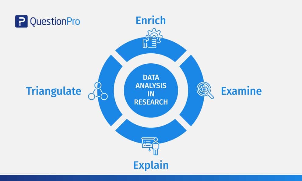
Content Index
Why analyze data in research?
Types of data in research, finding patterns in the qualitative data, methods used for data analysis in qualitative research, preparing data for analysis, methods used for data analysis in quantitative research, considerations in research data analysis, what is data analysis in research.
Definition of research in data analysis: According to LeCompte and Schensul, research data analysis is a process used by researchers to reduce data to a story and interpret it to derive insights. The data analysis process helps reduce a large chunk of data into smaller fragments, which makes sense.
Three essential things occur during the data analysis process — the first is data organization . Summarization and categorization together contribute to becoming the second known method used for data reduction. It helps find patterns and themes in the data for easy identification and linking. The third and last way is data analysis – researchers do it in both top-down and bottom-up fashion.
LEARN ABOUT: Research Process Steps
On the other hand, Marshall and Rossman describe data analysis as a messy, ambiguous, and time-consuming but creative and fascinating process through which a mass of collected data is brought to order, structure and meaning.
We can say that “the data analysis and data interpretation is a process representing the application of deductive and inductive logic to the research and data analysis.”
Researchers rely heavily on data as they have a story to tell or research problems to solve. It starts with a question, and data is nothing but an answer to that question. But, what if there is no question to ask? Well! It is possible to explore data even without a problem – we call it ‘Data Mining’, which often reveals some interesting patterns within the data that are worth exploring.
Irrelevant to the type of data researchers explore, their mission and audiences’ vision guide them to find the patterns to shape the story they want to tell. One of the essential things expected from researchers while analyzing data is to stay open and remain unbiased toward unexpected patterns, expressions, and results. Remember, sometimes, data analysis tells the most unforeseen yet exciting stories that were not expected when initiating data analysis. Therefore, rely on the data you have at hand and enjoy the journey of exploratory research.
Create a Free Account
Every kind of data has a rare quality of describing things after assigning a specific value to it. For analysis, you need to organize these values, processed and presented in a given context, to make it useful. Data can be in different forms; here are the primary data types.
- Qualitative data: When the data presented has words and descriptions, then we call it qualitative data . Although you can observe this data, it is subjective and harder to analyze data in research, especially for comparison. Example: Quality data represents everything describing taste, experience, texture, or an opinion that is considered quality data. This type of data is usually collected through focus groups, personal qualitative interviews , qualitative observation or using open-ended questions in surveys.
- Quantitative data: Any data expressed in numbers of numerical figures are called quantitative data . This type of data can be distinguished into categories, grouped, measured, calculated, or ranked. Example: questions such as age, rank, cost, length, weight, scores, etc. everything comes under this type of data. You can present such data in graphical format, charts, or apply statistical analysis methods to this data. The (Outcomes Measurement Systems) OMS questionnaires in surveys are a significant source of collecting numeric data.
- Categorical data: It is data presented in groups. However, an item included in the categorical data cannot belong to more than one group. Example: A person responding to a survey by telling his living style, marital status, smoking habit, or drinking habit comes under the categorical data. A chi-square test is a standard method used to analyze this data.
Learn More : Examples of Qualitative Data in Education

Data analysis in qualitative research
Data analysis and qualitative data research work a little differently from the numerical data as the quality data is made up of words, descriptions, images, objects, and sometimes symbols. Getting insight from such complicated information is a complicated process. Hence it is typically used for exploratory research and data analysis .
Although there are several ways to find patterns in the textual information, a word-based method is the most relied and widely used global technique for research and data analysis. Notably, the data analysis process in qualitative research is manual. Here the researchers usually read the available data and find repetitive or commonly used words.
For example, while studying data collected from African countries to understand the most pressing issues people face, researchers might find “food” and “hunger” are the most commonly used words and will highlight them for further analysis.
LEARN ABOUT: Level of Analysis
The keyword context is another widely used word-based technique. In this method, the researcher tries to understand the concept by analyzing the context in which the participants use a particular keyword.
For example , researchers conducting research and data analysis for studying the concept of ‘diabetes’ amongst respondents might analyze the context of when and how the respondent has used or referred to the word ‘diabetes.’
The scrutiny-based technique is also one of the highly recommended text analysis methods used to identify a quality data pattern. Compare and contrast is the widely used method under this technique to differentiate how a specific text is similar or different from each other.
For example: To find out the “importance of resident doctor in a company,” the collected data is divided into people who think it is necessary to hire a resident doctor and those who think it is unnecessary. Compare and contrast is the best method that can be used to analyze the polls having single-answer questions types .
Metaphors can be used to reduce the data pile and find patterns in it so that it becomes easier to connect data with theory.
Variable Partitioning is another technique used to split variables so that researchers can find more coherent descriptions and explanations from the enormous data.
LEARN ABOUT: Qualitative Research Questions and Questionnaires
There are several techniques to analyze the data in qualitative research, but here are some commonly used methods,
- Content Analysis: It is widely accepted and the most frequently employed technique for data analysis in research methodology. It can be used to analyze the documented information from text, images, and sometimes from the physical items. It depends on the research questions to predict when and where to use this method.
- Narrative Analysis: This method is used to analyze content gathered from various sources such as personal interviews, field observation, and surveys . The majority of times, stories, or opinions shared by people are focused on finding answers to the research questions.
- Discourse Analysis: Similar to narrative analysis, discourse analysis is used to analyze the interactions with people. Nevertheless, this particular method considers the social context under which or within which the communication between the researcher and respondent takes place. In addition to that, discourse analysis also focuses on the lifestyle and day-to-day environment while deriving any conclusion.
- Grounded Theory: When you want to explain why a particular phenomenon happened, then using grounded theory for analyzing quality data is the best resort. Grounded theory is applied to study data about the host of similar cases occurring in different settings. When researchers are using this method, they might alter explanations or produce new ones until they arrive at some conclusion.
LEARN ABOUT: 12 Best Tools for Researchers
Data analysis in quantitative research
The first stage in research and data analysis is to make it for the analysis so that the nominal data can be converted into something meaningful. Data preparation consists of the below phases.
Phase I: Data Validation
Data validation is done to understand if the collected data sample is per the pre-set standards, or it is a biased data sample again divided into four different stages
- Fraud: To ensure an actual human being records each response to the survey or the questionnaire
- Screening: To make sure each participant or respondent is selected or chosen in compliance with the research criteria
- Procedure: To ensure ethical standards were maintained while collecting the data sample
- Completeness: To ensure that the respondent has answered all the questions in an online survey. Else, the interviewer had asked all the questions devised in the questionnaire.
Phase II: Data Editing
More often, an extensive research data sample comes loaded with errors. Respondents sometimes fill in some fields incorrectly or sometimes skip them accidentally. Data editing is a process wherein the researchers have to confirm that the provided data is free of such errors. They need to conduct necessary checks and outlier checks to edit the raw edit and make it ready for analysis.
Phase III: Data Coding
Out of all three, this is the most critical phase of data preparation associated with grouping and assigning values to the survey responses . If a survey is completed with a 1000 sample size, the researcher will create an age bracket to distinguish the respondents based on their age. Thus, it becomes easier to analyze small data buckets rather than deal with the massive data pile.
LEARN ABOUT: Steps in Qualitative Research
After the data is prepared for analysis, researchers are open to using different research and data analysis methods to derive meaningful insights. For sure, statistical analysis plans are the most favored to analyze numerical data. In statistical analysis, distinguishing between categorical data and numerical data is essential, as categorical data involves distinct categories or labels, while numerical data consists of measurable quantities. The method is again classified into two groups. First, ‘Descriptive Statistics’ used to describe data. Second, ‘Inferential statistics’ that helps in comparing the data .
Descriptive statistics
This method is used to describe the basic features of versatile types of data in research. It presents the data in such a meaningful way that pattern in the data starts making sense. Nevertheless, the descriptive analysis does not go beyond making conclusions. The conclusions are again based on the hypothesis researchers have formulated so far. Here are a few major types of descriptive analysis methods.
Measures of Frequency
- Count, Percent, Frequency
- It is used to denote home often a particular event occurs.
- Researchers use it when they want to showcase how often a response is given.
Measures of Central Tendency
- Mean, Median, Mode
- The method is widely used to demonstrate distribution by various points.
- Researchers use this method when they want to showcase the most commonly or averagely indicated response.
Measures of Dispersion or Variation
- Range, Variance, Standard deviation
- Here the field equals high/low points.
- Variance standard deviation = difference between the observed score and mean
- It is used to identify the spread of scores by stating intervals.
- Researchers use this method to showcase data spread out. It helps them identify the depth until which the data is spread out that it directly affects the mean.
Measures of Position
- Percentile ranks, Quartile ranks
- It relies on standardized scores helping researchers to identify the relationship between different scores.
- It is often used when researchers want to compare scores with the average count.
For quantitative research use of descriptive analysis often give absolute numbers, but the in-depth analysis is never sufficient to demonstrate the rationale behind those numbers. Nevertheless, it is necessary to think of the best method for research and data analysis suiting your survey questionnaire and what story researchers want to tell. For example, the mean is the best way to demonstrate the students’ average scores in schools. It is better to rely on the descriptive statistics when the researchers intend to keep the research or outcome limited to the provided sample without generalizing it. For example, when you want to compare average voting done in two different cities, differential statistics are enough.
Descriptive analysis is also called a ‘univariate analysis’ since it is commonly used to analyze a single variable.
Inferential statistics
Inferential statistics are used to make predictions about a larger population after research and data analysis of the representing population’s collected sample. For example, you can ask some odd 100 audiences at a movie theater if they like the movie they are watching. Researchers then use inferential statistics on the collected sample to reason that about 80-90% of people like the movie.
Here are two significant areas of inferential statistics.
- Estimating parameters: It takes statistics from the sample research data and demonstrates something about the population parameter.
- Hypothesis test: I t’s about sampling research data to answer the survey research questions. For example, researchers might be interested to understand if the new shade of lipstick recently launched is good or not, or if the multivitamin capsules help children to perform better at games.
These are sophisticated analysis methods used to showcase the relationship between different variables instead of describing a single variable. It is often used when researchers want something beyond absolute numbers to understand the relationship between variables.
Here are some of the commonly used methods for data analysis in research.
- Correlation: When researchers are not conducting experimental research or quasi-experimental research wherein the researchers are interested to understand the relationship between two or more variables, they opt for correlational research methods.
- Cross-tabulation: Also called contingency tables, cross-tabulation is used to analyze the relationship between multiple variables. Suppose provided data has age and gender categories presented in rows and columns. A two-dimensional cross-tabulation helps for seamless data analysis and research by showing the number of males and females in each age category.
- Regression analysis: For understanding the strong relationship between two variables, researchers do not look beyond the primary and commonly used regression analysis method, which is also a type of predictive analysis used. In this method, you have an essential factor called the dependent variable. You also have multiple independent variables in regression analysis. You undertake efforts to find out the impact of independent variables on the dependent variable. The values of both independent and dependent variables are assumed as being ascertained in an error-free random manner.
- Frequency tables: The statistical procedure is used for testing the degree to which two or more vary or differ in an experiment. A considerable degree of variation means research findings were significant. In many contexts, ANOVA testing and variance analysis are similar.
- Analysis of variance: The statistical procedure is used for testing the degree to which two or more vary or differ in an experiment. A considerable degree of variation means research findings were significant. In many contexts, ANOVA testing and variance analysis are similar.
- Researchers must have the necessary research skills to analyze and manipulation the data , Getting trained to demonstrate a high standard of research practice. Ideally, researchers must possess more than a basic understanding of the rationale of selecting one statistical method over the other to obtain better data insights.
- Usually, research and data analytics projects differ by scientific discipline; therefore, getting statistical advice at the beginning of analysis helps design a survey questionnaire, select data collection methods , and choose samples.
LEARN ABOUT: Best Data Collection Tools
- The primary aim of data research and analysis is to derive ultimate insights that are unbiased. Any mistake in or keeping a biased mind to collect data, selecting an analysis method, or choosing audience sample il to draw a biased inference.
- Irrelevant to the sophistication used in research data and analysis is enough to rectify the poorly defined objective outcome measurements. It does not matter if the design is at fault or intentions are not clear, but lack of clarity might mislead readers, so avoid the practice.
- The motive behind data analysis in research is to present accurate and reliable data. As far as possible, avoid statistical errors, and find a way to deal with everyday challenges like outliers, missing data, data altering, data mining , or developing graphical representation.
LEARN MORE: Descriptive Research vs Correlational Research The sheer amount of data generated daily is frightening. Especially when data analysis has taken center stage. in 2018. In last year, the total data supply amounted to 2.8 trillion gigabytes. Hence, it is clear that the enterprises willing to survive in the hypercompetitive world must possess an excellent capability to analyze complex research data, derive actionable insights, and adapt to the new market needs.
LEARN ABOUT: Average Order Value
QuestionPro is an online survey platform that empowers organizations in data analysis and research and provides them a medium to collect data by creating appealing surveys.
MORE LIKE THIS

The Best Email Survey Tool to Boost Your Feedback Game
May 7, 2024

Top 10 Employee Engagement Survey Tools

Top 20 Employee Engagement Software Solutions
May 3, 2024

15 Best Customer Experience Software of 2024
May 2, 2024
Other categories
- Academic Research
- Artificial Intelligence
- Assessments
- Brand Awareness
- Case Studies
- Communities
- Consumer Insights
- Customer effort score
- Customer Engagement
- Customer Experience
- Customer Loyalty
- Customer Research
- Customer Satisfaction
- Employee Benefits
- Employee Engagement
- Employee Retention
- Friday Five
- General Data Protection Regulation
- Insights Hub
- Life@QuestionPro
- Market Research
- Mobile diaries
- Mobile Surveys
- New Features
- Online Communities
- Question Types
- Questionnaire
- QuestionPro Products
- Release Notes
- Research Tools and Apps
- Revenue at Risk
- Survey Templates
- Training Tips
- Uncategorized
- Video Learning Series
- What’s Coming Up
- Workforce Intelligence
- SUGGESTED TOPICS
- The Magazine
- Newsletters
- Managing Yourself
- Managing Teams
- Work-life Balance
- The Big Idea
- Data & Visuals
- Reading Lists
- Case Selections
- HBR Learning
- Topic Feeds
- Account Settings
- Email Preferences
Present Your Data Like a Pro
- Joel Schwartzberg

Demystify the numbers. Your audience will thank you.
While a good presentation has data, data alone doesn’t guarantee a good presentation. It’s all about how that data is presented. The quickest way to confuse your audience is by sharing too many details at once. The only data points you should share are those that significantly support your point — and ideally, one point per chart. To avoid the debacle of sheepishly translating hard-to-see numbers and labels, rehearse your presentation with colleagues sitting as far away as the actual audience would. While you’ve been working with the same chart for weeks or months, your audience will be exposed to it for mere seconds. Give them the best chance of comprehending your data by using simple, clear, and complete language to identify X and Y axes, pie pieces, bars, and other diagrammatic elements. Try to avoid abbreviations that aren’t obvious, and don’t assume labeled components on one slide will be remembered on subsequent slides. Every valuable chart or pie graph has an “Aha!” zone — a number or range of data that reveals something crucial to your point. Make sure you visually highlight the “Aha!” zone, reinforcing the moment by explaining it to your audience.
With so many ways to spin and distort information these days, a presentation needs to do more than simply share great ideas — it needs to support those ideas with credible data. That’s true whether you’re an executive pitching new business clients, a vendor selling her services, or a CEO making a case for change.
- JS Joel Schwartzberg oversees executive communications for a major national nonprofit, is a professional presentation coach, and is the author of Get to the Point! Sharpen Your Message and Make Your Words Matter and The Language of Leadership: How to Engage and Inspire Your Team . You can find him on LinkedIn and X. TheJoelTruth
Partner Center
Call Us Today! +91 99907 48956 | [email protected]

It is the simplest form of data Presentation often used in schools or universities to provide a clearer picture to students, who are better able to capture the concepts effectively through a pictorial Presentation of simple data.
2. Column chart

It is a simplified version of the pictorial Presentation which involves the management of a larger amount of data being shared during the presentations and providing suitable clarity to the insights of the data.
3. Pie Charts

Pie charts provide a very descriptive & a 2D depiction of the data pertaining to comparisons or resemblance of data in two separate fields.
4. Bar charts

A bar chart that shows the accumulation of data with cuboid bars with different dimensions & lengths which are directly proportionate to the values they represent. The bars can be placed either vertically or horizontally depending on the data being represented.
5. Histograms
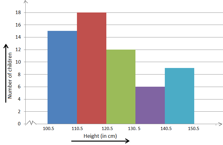
It is a perfect Presentation of the spread of numerical data. The main differentiation that separates data graphs and histograms are the gaps in the data graphs.
6. Box plots

Box plot or Box-plot is a way of representing groups of numerical data through quartiles. Data Presentation is easier with this style of graph dealing with the extraction of data to the minutes of difference.

Map Data graphs help you with data Presentation over an area to display the areas of concern. Map graphs are useful to make an exact depiction of data over a vast case scenario.
All these visual presentations share a common goal of creating meaningful insights and a platform to understand and manage the data in relation to the growth and expansion of one’s in-depth understanding of data & details to plan or execute future decisions or actions.
Importance of Data Presentation
Data Presentation could be both can be a deal maker or deal breaker based on the delivery of the content in the context of visual depiction.
Data Presentation tools are powerful communication tools that can simplify the data by making it easily understandable & readable at the same time while attracting & keeping the interest of its readers and effectively showcase large amounts of complex data in a simplified manner.
If the user can create an insightful presentation of the data in hand with the same sets of facts and figures, then the results promise to be impressive.
There have been situations where the user has had a great amount of data and vision for expansion but the presentation drowned his/her vision.
To impress the higher management and top brass of a firm, effective presentation of data is needed.
Data Presentation helps the clients or the audience to not spend time grasping the concept and the future alternatives of the business and to convince them to invest in the company & turn it profitable both for the investors & the company.
Although data presentation has a lot to offer, the following are some of the major reason behind the essence of an effective presentation:-
- Many consumers or higher authorities are interested in the interpretation of data, not the raw data itself. Therefore, after the analysis of the data, users should represent the data with a visual aspect for better understanding and knowledge.
- The user should not overwhelm the audience with a number of slides of the presentation and inject an ample amount of texts as pictures that will speak for themselves.
- Data presentation often happens in a nutshell with each department showcasing their achievements towards company growth through a graph or a histogram.
- Providing a brief description would help the user to attain attention in a small amount of time while informing the audience about the context of the presentation
- The inclusion of pictures, charts, graphs and tables in the presentation help for better understanding the potential outcomes.
- An effective presentation would allow the organization to determine the difference with the fellow organization and acknowledge its flaws. Comparison of data would assist them in decision making.
Recommended Courses

Data Visualization
Using powerbi &tableau.

Tableau for Data Analysis

MySQL Certification Program

The PowerBI Masterclass
Need help call our support team 7:00 am to 10:00 pm (ist) at (+91 999-074-8956 | 9650-308-956), keep in touch, email: [email protected].
WhatsApp us
Data Collection, Presentation and Analysis
- First Online: 25 May 2023
Cite this chapter

- Uche M. Mbanaso 4 ,
- Lucienne Abrahams 5 &
- Kennedy Chinedu Okafor 6
557 Accesses
This chapter covers the topics of data collection, data presentation and data analysis. It gives attention to data collection for studies based on experiments, on data derived from existing published or unpublished data sets, on observation, on simulation and digital twins, on surveys, on interviews and on focus group discussions. One of the interesting features of this chapter is the section dealing with using measurement scales in quantitative research, including nominal scales, ordinal scales, interval scales and ratio scales. It explains key facets of qualitative research including ethical clearance requirements. The chapter discusses the importance of data visualization as key to effective presentation of data, including tabular forms, graphical forms and visual charts such as those generated by Atlas.ti analytical software.
This is a preview of subscription content, log in via an institution to check access.
Access this chapter
- Available as EPUB and PDF
- Read on any device
- Instant download
- Own it forever
- Durable hardcover edition
- Dispatched in 3 to 5 business days
- Free shipping worldwide - see info
Tax calculation will be finalised at checkout
Purchases are for personal use only
Institutional subscriptions
Bibliography
Abdullah, M. F., & Ahmad, K. (2013). The mapping process of unstructured data to structured data. Proceedings of the 2013 International Conference on Research and Innovation in Information Systems (ICRIIS) , Malaysia , 151–155. https://doi.org/10.1109/ICRIIS.2013.6716700
Adnan, K., & Akbar, R. (2019). An analytical study of information extraction from unstructured and multidimensional big data. Journal of Big Data, 6 , 91. https://doi.org/10.1186/s40537-019-0254-8
Article Google Scholar
Alsheref, F. K., & Fattoh, I. E. (2020). Medical text annotation tool based on IBM Watson Platform. Proceedings of the 2020 6th international conference on advanced computing and communication systems (ICACCS) , India , 1312–1316. https://doi.org/10.1109/ICACCS48705.2020.9074309
Cinque, M., Cotroneo, D., Della Corte, R., & Pecchia, A. (2014). What logs should you look at when an application fails? Insights from an industrial case study. Proceedings of the 2014 44th Annual IEEE/IFIP International Conference on Dependable Systems and Networks , USA , 690–695. https://doi.org/10.1109/DSN.2014.69
Gideon, L. (Ed.). (2012). Handbook of survey methodology for the social sciences . Springer.
Google Scholar
Leedy, P., & Ormrod, J. (2015). Practical research planning and design (12th ed.). Pearson Education.
Madaan, A., Wang, X., Hall, W., & Tiropanis, T. (2018). Observing data in IoT worlds: What and how to observe? In Living in the Internet of Things: Cybersecurity of the IoT – 2018 (pp. 1–7). https://doi.org/10.1049/cp.2018.0032
Chapter Google Scholar
Mahajan, P., & Naik, C. (2019). Development of integrated IoT and machine learning based data collection and analysis system for the effective prediction of agricultural residue/biomass availability to regenerate clean energy. Proceedings of the 2019 9th International Conference on Emerging Trends in Engineering and Technology – Signal and Information Processing (ICETET-SIP-19) , India , 1–5. https://doi.org/10.1109/ICETET-SIP-1946815.2019.9092156 .
Mahmud, M. S., Huang, J. Z., Salloum, S., Emara, T. Z., & Sadatdiynov, K. (2020). A survey of data partitioning and sampling methods to support big data analysis. Big Data Mining and Analytics, 3 (2), 85–101. https://doi.org/10.26599/BDMA.2019.9020015
Miswar, S., & Kurniawan, N. B. (2018). A systematic literature review on survey data collection system. Proceedings of the 2018 International Conference on Information Technology Systems and Innovation (ICITSI) , Indonesia , 177–181. https://doi.org/10.1109/ICITSI.2018.8696036
Mosina, C. (2020). Understanding the diffusion of the internet: Redesigning the global diffusion of the internet framework (Research report, Master of Arts in ICT Policy and Regulation). LINK Centre, University of the Witwatersrand. https://hdl.handle.net/10539/30723
Nkamisa, S. (2021). Investigating the integration of drone management systems to create an enabling remote piloted aircraft regulatory environment in South Africa (Research report, Master of Arts in ICT Policy and Regulation). LINK Centre, University of the Witwatersrand. https://hdl.handle.net/10539/33883
QuestionPro. (2020). Survey research: Definition, examples and methods . https://www.questionpro.com/article/survey-research.html
Rajanikanth, J. & Kanth, T. V. R. (2017). An explorative data analysis on Bangalore City Weather with hybrid data mining techniques using R. Proceedings of the 2017 International Conference on Current Trends in Computer, Electrical, Electronics and Communication (CTCEEC) , India , 1121-1125. https://doi/10.1109/CTCEEC.2017.8455008
Rao, R. (2003). From unstructured data to actionable intelligence. IT Professional, 5 , 29–35. https://www.researchgate.net/publication/3426648_From_Unstructured_Data_to_Actionable_Intelligence
Schulze, P. (2009). Design of the research instrument. In P. Schulze (Ed.), Balancing exploitation and exploration: Organizational antecedents and performance effects of innovation strategies (pp. 116–141). Gabler. https://doi.org/10.1007/978-3-8349-8397-8_6
Usanov, A. (2015). Assessing cybersecurity: A meta-analysis of threats, trends and responses to cyber attacks . The Hague Centre for Strategic Studies. https://www.researchgate.net/publication/319677972_Assessing_Cyber_Security_A_Meta-analysis_of_Threats_Trends_and_Responses_to_Cyber_Attacks
Van de Kaa, G., De Vries, H. J., van Heck, E., & van den Ende, J. (2007). The emergence of standards: A meta-analysis. Proceedings of the 2007 40th Annual Hawaii International Conference on Systems Science (HICSS’07) , USA , 173a–173a. https://doi.org/10.1109/HICSS.2007.529
Download references
Author information
Authors and affiliations.
Centre for Cybersecurity Studies, Nasarawa State University, Keffi, Nigeria
Uche M. Mbanaso
LINK Centre, University of the Witwatersrand, Johannesburg, South Africa
Lucienne Abrahams
Department of Mechatronics Engineering, Federal University of Technology, Owerri, Nigeria
Kennedy Chinedu Okafor
You can also search for this author in PubMed Google Scholar
Rights and permissions
Reprints and permissions
Copyright information
© 2023 The Author(s), under exclusive license to Springer Nature Switzerland AG
About this chapter
Mbanaso, U.M., Abrahams, L., Okafor, K.C. (2023). Data Collection, Presentation and Analysis. In: Research Techniques for Computer Science, Information Systems and Cybersecurity. Springer, Cham. https://doi.org/10.1007/978-3-031-30031-8_7
Download citation
DOI : https://doi.org/10.1007/978-3-031-30031-8_7
Published : 25 May 2023
Publisher Name : Springer, Cham
Print ISBN : 978-3-031-30030-1
Online ISBN : 978-3-031-30031-8
eBook Packages : Engineering Engineering (R0)
Share this chapter
Anyone you share the following link with will be able to read this content:
Sorry, a shareable link is not currently available for this article.
Provided by the Springer Nature SharedIt content-sharing initiative
- Publish with us
Policies and ethics
- Find a journal
- Track your research

Skills for Learning : Research Skills
Data analysis is an ongoing process that should occur throughout your research project. Suitable data-analysis methods must be selected when you write your research proposal. The nature of your data (i.e. quantitative or qualitative) will be influenced by your research design and purpose. The data will also influence the analysis methods selected.
We run interactive workshops to help you develop skills related to doing research, such as data analysis, writing literature reviews and preparing for dissertations. Find out more on the Skills for Learning Workshops page.
We have online academic skills modules within MyBeckett for all levels of university study. These modules will help your academic development and support your success at LBU. You can work through the modules at your own pace, revisiting them as required. Find out more from our FAQ What academic skills modules are available?
Quantitative data analysis
Broadly speaking, 'statistics' refers to methods, tools and techniques used to collect, organise and interpret data. The goal of statistics is to gain understanding from data. Therefore, you need to know how to:
- Produce data – for example, by handing out a questionnaire or doing an experiment.
- Organise, summarise, present and analyse data.
- Draw valid conclusions from findings.
There are a number of statistical methods you can use to analyse data. Choosing an appropriate statistical method should follow naturally, however, from your research design. Therefore, you should think about data analysis at the early stages of your study design. You may need to consult a statistician for help with this.
Tips for working with statistical data
- Plan so that the data you get has a good chance of successfully tackling the research problem. This will involve reading literature on your subject, as well as on what makes a good study.
- To reach useful conclusions, you need to reduce uncertainties or 'noise'. Thus, you will need a sufficiently large data sample. A large sample will improve precision. However, this must be balanced against the 'costs' (time and money) of collection.
- Consider the logistics. Will there be problems in obtaining sufficient high-quality data? Think about accuracy, trustworthiness and completeness.
- Statistics are based on random samples. Consider whether your sample will be suited to this sort of analysis. Might there be biases to think about?
- How will you deal with missing values (any data that is not recorded for some reason)? These can result from gaps in a record or whole records being missed out.
- When analysing data, start by looking at each variable separately. Conduct initial/exploratory data analysis using graphical displays. Do this before looking at variables in conjunction or anything more complicated. This process can help locate errors in the data and also gives you a 'feel' for the data.
- Look out for patterns of 'missingness'. They are likely to alert you if there’s a problem. If the 'missingness' is not random, then it will have an impact on the results.
- Be vigilant and think through what you are doing at all times. Think critically. Statistics are not just mathematical tricks that a computer sorts out. Rather, analysing statistical data is a process that the human mind must interpret!
Top tips! Try inventing or generating the sort of data you might get and see if you can analyse it. Make sure that your process works before gathering actual data. Think what the output of an analytic procedure will look like before doing it for real.
(Note: it is actually difficult to generate realistic data. There are fraud-detection methods in place to identify data that has been fabricated. So, remember to get rid of your practice data before analysing the real stuff!)
Statistical software packages
Software packages can be used to analyse and present data. The most widely used ones are SPSS and NVivo.
SPSS is a statistical-analysis and data-management package for quantitative data analysis. Click on ‘ How do I install SPSS? ’ to learn how to download SPSS to your personal device. SPSS can perform a wide variety of statistical procedures. Some examples are:
- Data management (i.e. creating subsets of data or transforming data).
- Summarising, describing or presenting data (i.e. mean, median and frequency).
- Looking at the distribution of data (i.e. standard deviation).
- Comparing groups for significant differences using parametric (i.e. t-test) and non-parametric (i.e. Chi-square) tests.
- Identifying significant relationships between variables (i.e. correlation).
NVivo can be used for qualitative data analysis. It is suitable for use with a wide range of methodologies. Click on ‘ How do I access NVivo ’ to learn how to download NVivo to your personal device. NVivo supports grounded theory, survey data, case studies, focus groups, phenomenology, field research and action research.
- Process data such as interview transcripts, literature or media extracts, and historical documents.
- Code data on screen and explore all coding and documents interactively.
- Rearrange, restructure, extend and edit text, coding and coding relationships.
- Search imported text for words, phrases or patterns, and automatically code the results.
Qualitative data analysis
Miles and Huberman (1994) point out that there are diverse approaches to qualitative research and analysis. They suggest, however, that it is possible to identify 'a fairly classic set of analytic moves arranged in sequence'. This involves:
- Affixing codes to a set of field notes drawn from observation or interviews.
- Noting reflections or other remarks in the margins.
- Sorting/sifting through these materials to identify: a) similar phrases, relationships between variables, patterns and themes and b) distinct differences between subgroups and common sequences.
- Isolating these patterns/processes and commonalties/differences. Then, taking them out to the field in the next wave of data collection.
- Highlighting generalisations and relating them to your original research themes.
- Taking the generalisations and analysing them in relation to theoretical perspectives.
(Miles and Huberman, 1994.)
Patterns and generalisations are usually arrived at through a process of analytic induction (see above points 5 and 6). Qualitative analysis rarely involves statistical analysis of relationships between variables. Qualitative analysis aims to gain in-depth understanding of concepts, opinions or experiences.
Presenting information
There are a number of different ways of presenting and communicating information. The particular format you use is dependent upon the type of data generated from the methods you have employed.
Here are some appropriate ways of presenting information for different types of data:
Bar charts: These may be useful for comparing relative sizes. However, they tend to use a large amount of ink to display a relatively small amount of information. Consider a simple line chart as an alternative.
Pie charts: These have the benefit of indicating that the data must add up to 100%. However, they make it difficult for viewers to distinguish relative sizes, especially if two slices have a difference of less than 10%.
Other examples of presenting data in graphical form include line charts and scatter plots .
Qualitative data is more likely to be presented in text form. For example, using quotations from interviews or field diaries.
- Plan ahead, thinking carefully about how you will analyse and present your data.
- Think through possible restrictions to resources you may encounter and plan accordingly.
- Find out about the different IT packages available for analysing your data and select the most appropriate.
- If necessary, allow time to attend an introductory course on a particular computer package. You can book SPSS and NVivo workshops via MyHub .
- Code your data appropriately, assigning conceptual or numerical codes as suitable.
- Organise your data so it can be analysed and presented easily.
- Choose the most suitable way of presenting your information, according to the type of data collected. This will allow your information to be understood and interpreted better.
Primary, secondary and tertiary sources
Information sources are sometimes categorised as primary, secondary or tertiary sources depending on whether or not they are ‘original’ materials or data. For some research projects, you may need to use primary sources as well as secondary or tertiary sources. However the distinction between primary and secondary sources is not always clear and depends on the context. For example, a newspaper article might usually be categorised as a secondary source. But it could also be regarded as a primary source if it were an article giving a first-hand account of a historical event written close to the time it occurred.
- Primary sources
- Secondary sources
- Tertiary sources
- Grey literature
Primary sources are original sources of information that provide first-hand accounts of what is being experienced or researched. They enable you to get as close to the actual event or research as possible. They are useful for getting the most contemporary information about a topic.
Examples include diary entries, newspaper articles, census data, journal articles with original reports of research, letters, email or other correspondence, original manuscripts and archives, interviews, research data and reports, statistics, autobiographies, exhibitions, films, and artists' writings.
Some information will be available on an Open Access basis, freely accessible online. However, many academic sources are paywalled, and you may need to login as a Leeds Beckett student to access them. Where Leeds Beckett does not have access to a source, you can use our Request It! Service .
Secondary sources interpret, evaluate or analyse primary sources. They're useful for providing background information on a topic, or for looking back at an event from a current perspective. The majority of your literature searching will probably be done to find secondary sources on your topic.
Examples include journal articles which review or interpret original findings, popular magazine articles commenting on more serious research, textbooks and biographies.
The term tertiary sources isn't used a great deal. There's overlap between what might be considered a secondary source and a tertiary source. One definition is that a tertiary source brings together secondary sources.
Examples include almanacs, fact books, bibliographies, dictionaries and encyclopaedias, directories, indexes and abstracts. They can be useful for introductory information or an overview of a topic in the early stages of research.
Depending on your subject of study, grey literature may be another source you need to use. Grey literature includes technical or research reports, theses and dissertations, conference papers, government documents, white papers, and so on.
Artificial intelligence tools
Before using any generative artificial intelligence or paraphrasing tools in your assessments, you should check if this is permitted on your course.
If their use is permitted on your course, you must acknowledge any use of generative artificial intelligence tools such as ChatGPT or paraphrasing tools (e.g., Grammarly, Quillbot, etc.), even if you have only used them to generate ideas for your assessments or for proofreading.
- Academic Integrity Module in MyBeckett
- Assignment Calculator
- Building on Feedback
- Disability Advice
- Essay X-ray tool
- International Students' Academic Introduction
- Manchester Academic Phrasebank
- Quote, Unquote
- Skills and Subject Suppor t
- Turnitin Grammar Checker
{{You can add more boxes below for links specific to this page [this note will not appear on user pages] }}
- Research Methods Checklist
- Sampling Checklist
Skills for Learning FAQs

0113 812 1000
- University Disclaimer
- Accessibility

Research Guide: Data analysis and reporting findings
- Postgraduate Online Training subject guide This link opens in a new window
- Open Educational Resources (OERs)
- Library support
- Research ideas
- You and your supervisor
- Researcher skills
- Research Data Management This link opens in a new window
- Literature review
- Plagiarism This link opens in a new window
- Research Methods
- Data analysis and reporting findings
- Statistical support
- Writing support
- Researcher visibility
- Conferences and Presentations
- Postgraduate Forums
- Soft skills development
- Emotional support
- The Commons Informer (blog)
- Research Tip Archives
- RC Newsletter Archives
- Evaluation Forms
Data analysis and findings
Data analysis is the most crucial part of any research. Data analysis summarizes collected data. It involves the interpretation of data gathered through the use of analytical and logical reasoning to determine patterns, relationships or trends.
Data Analysis Checklist
Cleaning data
* Did you capture and code your data in the right manner?
*Do you have all data or missing data?
* Do you have enough observations?
* Do you have any outliers? If yes, what is the remedy for outlier?
* Does your data have the potential to answer your questions?
Analyzing data
* Visualize your data, e.g. charts, tables, and graphs, to mention a few.
* Identify patterns, correlations, and trends
* Test your hypotheses
* Let your data tell a story
Reports the results
* Communicate and interpret the results
* Conclude and recommend
* Your targeted audience must understand your results
* Use more datasets and samples
* Use accessible and understandable data analytical tool
* Do not delegate your data analysis
* Clean data to confirm that they are complete and free from errors
* Analyze cleaned data
* Understand your results
* Keep in mind who will be reading your results and present it in a way that they will understand it
* Share the results with the supervisor oftentimes
Past presentations
- PhD Writing Retreat - Analysing_Fieldwork_Data by Cori Wielenga A clear and concise presentation on the ‘now what’ and ‘so what’ of data collection and analysis - compiled and originally presented by Cori Wielenga.
Online Resources
- Qualitative analysis of interview data: A step-by-step guide
- Qualitative Data Analysis - Coding & Developing Themes
Recommended Quantitative Data Analysis books
Recommended Qualitative Data Analysis books
- << Previous: Data collection techniques
- Next: Statistical support >>
- Last Updated: Apr 22, 2024 11:02 AM
- URL: https://library.up.ac.za/c.php?g=485435

- Data Analytics
Powerpoint Templates
Icon Bundle
Kpi Dashboard
Professional
Business Plans
Swot Analysis
Gantt Chart
Business Proposal
Marketing Plan
Project Management
Business Case
Business Model
- Cyber Security
Business PPT
Digital Marketing
- Digital Transformation
Human Resources
Product Management
- Artificial Intelligence
Company Profile
Acknowledgement PPT
PPT Presentation
Reports Brochures
One Page Pitch
Interview PPT
All Categories

Best Data Analytics PPT Presentations, Templates & Slides
- Sub Categories
- 5G Technology
- Agile and Scrum
- Big Data Analytics
- Cloud Computing
- Cryptocurrency
- Green Energy
- Internet Of Things
- IT Certification
- Machine Learning
- Microprocessors
- Nanotechnology
- Robotic Process Automation
- Software Testing
- Technology Project Management
- Technology Quality Assurance
- Technology Stack
- Virtualization

This complete deck is oriented to make sure you do not lag in your presentations. Our creatively crafted slides come with apt research and planning. This exclusive deck with twenty slides is here to help you to strategize, plan, analyze, or segment the topic with clear understanding and apprehension. Utilize ready to use presentation slides on Data Analytics Powerpoint Presentation Slides with all sorts of editable templates, charts and graphs, overviews, analysis templates. The presentation is readily available in both 4:3 and 16:9 aspect ratio. Alter the colors, fonts, font size, and font types of the template as per the requirements. It can be changed into formats like PDF, JPG, and PNG. It is usable for marking important decisions and covering critical issues. This presentation deck can be used by all professionals, managers, individuals, internal-external teams involved in any company organization.

This complete deck can be used to present to your team. It has PPT slides on various topics highlighting all the core areas of your business needs. This complete deck focuses on Data Driven Strategy Analytics Technology Approach Corporate and has professionally designed templates with suitable visuals and appropriate content. This deck consists of total of thirteen slides. All the slides are completely customizable for your convenience. You can change the colour, text and font size of these templates. You can add or delete the content if needed. Get access to this professionally designed complete presentation by clicking the download button below.

Enthrall your audience with this Data Stewardship IT Powerpoint Presentation Slides. Increase your presentation threshold by deploying this well-crafted template. It acts as a great communication tool due to its well-researched content. It also contains stylized icons, graphics, visuals etc, which make it an immediate attention-grabber. Comprising ninty slides, this complete deck is all you need to get noticed. All the slides and their content can be altered to suit your unique business setting. Not only that, other components and graphics can also be modified to add personal touches to this prefabricated set.
Sharing Data Architecture PowerPoint Presentation Slides. This PowerPoint complete deck includes 29 professional designs. Customers can edit the fonts, text, and color as slide are fully editable. You can easily download the presentation in widescreen and standard screen. The presentation is supported by Google Slides. PowerPoint templates can be converted into JPG or PDF format.
Deliver this complete deck to your team members and other collaborators. Encompassed with stylized slides presenting various concepts, this Data Model IT Powerpoint Presentation Slides is the best tool you can utilize. Personalize its content and graphics to make it unique and thought-provoking. All the fifty eight slides are editable and modifiable, so feel free to adjust them to your business setting. The font, color, and other components also come in an editable format making this PPT design the best choice for your next presentation. So, download now.
Enthrall your audience with this Datafication In Data Science Powerpoint Presentation Slides. Increase your presentation threshold by deploying this well-crafted template. It acts as a great communication tool due to its well-researched content. It also contains stylized icons, graphics, visuals etc, which make it an immediate attention-grabber. Comprising fifty six slides, this complete deck is all you need to get noticed. All the slides and their content can be altered to suit your unique business setting. Not only that, other components and graphics can also be modified to add personal touches to this prefabricated set.
High-quality data management PowerPoint slides which are compatible with google sides. Easy conversion to your desired format and quick downloading. Widely used by business owners, marketers, investors, financial executives, professors and students for change and data management. You can modify and personalize these PPT's presentation by including the company name and logo by following the instructions given.

Presenting this set of slides with name - Data Migration Steps Powerpoint Presentation Slides. This PPT deck displays twenty-six slides with in-depth research. We provide a ready to use deck with all sorts of relevant topics subtopics templates, charts and graphs, overviews, analysis templates. When you download this deck by clicking the download button below, you get the presentation in both standard and widescreen format. All slides are fully editable. change the colors, font size, add or delete text if needed. The presentation is fully supported with Google Slides. It can be easily converted into JPG or PDF format.

Well-Constructed PPT templates beneficial for different business professionals from diverse sectors, simply amendable shapes, patterns and subject matters, authentic and relevant PPT Images with pliable data options, smooth downloads, runs smoothly with all available software’s, high quality picture presentation graphics which remain unaffected when projected on wide screen, well adaptable on Google slides also.
Presenting this set of slides with name - Data Structuring Powerpoint Presentation Slides. We bring to you to the point topic specific slides with apt research and understanding. Putting forth our PPT deck comprises of thirty one slides. Our tailor made Data Structuring Powerpoint Presentation Slides editable deck assists planners to segment and expound the topic with brevity. The advantageous slides on Data Structuring Powerpoint Presentation Slides is braced with multiple charts and graphs, overviews, analysis templates agenda slides etc. to help boost important aspects of your presentation. Highlight all sorts of related usable templates for important considerations. Our deck finds applicability amongst all kinds of professionals, managers, individuals, temporary permanent teams involved in any company organization from any field.
Deliver an informational PPT on various topics by using this Data Lineage IT Powerpoint Presentation Slides. This deck focuses and implements best industry practices, thus providing a birds-eye view of the topic. Encompassed with ninty slides, designed using high-quality visuals and graphics, this deck is a complete package to use and download. All the slides offered in this deck are subjective to innumerable alterations, thus making you a pro at delivering and educating. You can modify the color of the graphics, background, or anything else as per your needs and requirements. It suits every business vertical because of its adaptable layout.

Presenting Business Intelligence And Analytics Powerpoint Presentation Slides. You can modify the font size, type, and color of the slide as per your requirements. This slide can be downloaded into formats like PDF, JPG, and PNG without any problem. It is Google Slides friendly which makes it accessible at once. This slide is available in both the standard(4:9) and the widescreen(16:9) aspect ratio.
Grab our Data Analytic PowerPoint Presentation Slides PowerPoint Presentation Slides that are sure to impress executives, inspire team members, and other audience. This PPT is the most comprehensive presentation of intelligent data use you could have asked for your business. We have used beautiful PowerPoint graphics, templates, icons, and diagrams. The content has been well researched by our excellent team of researchers. You can change the colour, fonts, texts, images without any hassle to suit your business needs. Download the presentation, enter your content in the placeholders, and present it with confidence!

This complete deck covers various topics and highlights important concepts. It has PPT slides which cater to your business needs. This complete deck presentation emphasizes Stewardship By Business Process Model Powerpoint Presentation Slides and has templates with professional background images and relevant content. This deck consists of total of eighty two slides. Our designers have created customizable templates, keeping your convenience in mind. You can edit the color, text and font size with ease. Not just this, you can also add or delete the content if needed. Get access to this fully editable complete presentation by clicking the download button below.
This complete deck can be used to present to your team. It has PPT slides on various topics highlighting all the core areas of your business needs. This complete deck focuses on Analytics Roadmap Developing Management Platform Automation Framework Technological Business and has professionally designed templates with suitable visuals and appropriate content. This deck consists of total of twelve slides. All the slides are completely customizable for your convenience. You can change the colour, text and font size of these templates. You can add or delete the content if needed. Get access to this professionally designed complete presentation by clicking the download button below.
Enthrall your audience with this Linked Data Structure Powerpoint Presentation Slides. Increase your presentation threshold by deploying this well-crafted template. It acts as a great communication tool due to its well-researched content. It also contains stylized icons, graphics, visuals etc, which make it an immediate attention-grabber. Comprising fifty one slides, this complete deck is all you need to get noticed. All the slides and their content can be altered to suit your unique business setting. Not only that, other components and graphics can also be modified to add personal touches to this prefabricated set.
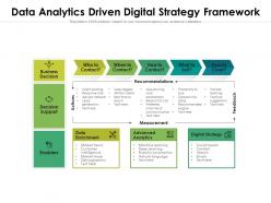
Presenting this set of slides with name Data Analytics Driven Digital Strategy Framework. The topics discussed in these slides are Business, Decision, Enablers. This is a completely editable PowerPoint presentation and is available for immediate download. Download now and impress your audience.
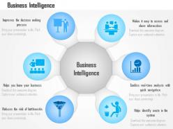
Fully modifiable PowerPoint design. High resolution presentation slide as can be anticipated on wide screen. Easily adjustable with maximum number of software i.e. JPG and PDF. Trouble free inclusion and omission of content as per industry need. Glorious quality of PowerPoint design. Presentation illustration download with different nodes and stages. Possible to download with standard and widescreen view.
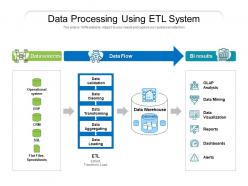
Presenting this set of slides with name Data Processing Using ETL System. This is a three stage process. The stages in this process are Operational system, Data validation, Data Cleaning, Data Aggregating, Data Transforming, Data Loading, Data Visualization, Dashboards, CRM, ERP. This is a completely editable PowerPoint presentation and is available for immediate download. Download now and impress your audience.
Deliver an informational PPT on various topics by using this Statistical Analysis For Data Driven Decision Making Powerpoint Presentation Slides. This deck focuses and implements best industry practices, thus providing a birds-eye view of the topic. Encompassed with seventy one slides, designed using high-quality visuals and graphics, this deck is a complete package to use and download. All the slides offered in this deck are subjective to innumerable alterations, thus making you a pro at delivering and educating. You can modify the color of the graphics, background, or anything else as per your needs and requirements. It suits every business vertical because of its adaptable layout.
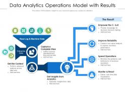
Presenting our set of slides with name Data Analytics Operations Model With Results. This exhibits information on four stages of the process. This is an easy to edit and innovatively designed PowerPoint template. So download immediately and highlight information on Raw Log And Machine Data, Capture A Complete View, Get Insights From Analytics.
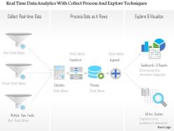
They are capable of providing up-to-date information about the enterprise. Better and quicker business decisions can be made using these layouts. Helps in forming a well organised business system. Compatible with Google slides. Modifiable by following simple instructions that come pre-defined with these PPT presentation Patterns.The stages in this process are networking, storage, big data analytics.
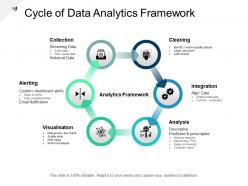
Presenting this set of slides with name - Cycle Of Data Analytics Framework. This is a six stages process. The stages in this process are Analytics Architecture, Analytics Framework, Data Analysis.
Presenting this set of slides with name Data Analytic Icon With Report Dashboard Snapshot. The topics discussed in these slide is Data Analytic Icon With Report Dashboard. This is a completely editable PowerPoint presentation and is available for immediate download. Download now and impress your audience.
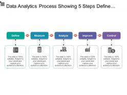
Presenting this set of slides with name - Data Analytics Process Showing 5 Steps Define Measure Improve Control. This is a five stage process. The stages in this process are Data Analytics Process, Data Analysis Cycle, Data Visualization Process.
Presenting big data analytics marketing impact ppt examples. This is a big data analytics marketing impact ppt examples. This is a four stage process. The stages in this process are healthcare, science, security, business.
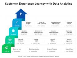
Presenting our set of slides with Customer Experience Journey With Data Analytics. This exhibits information on four stages of the process. This is an easy-to-edit and innovatively designed PowerPoint template. So download immediately and highlight information on Loyalty, Amplify, Activate, Acquire.
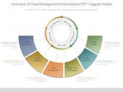
Presenting overview of data management and analytics ppt diagram slides. This is a overview of data management and analytics ppt diagram slides. This is a six stage process. The stages in this process are data retirement, data storage, data movement, data creation, data usage, data governance, data structure, data architecture, master data and metadata, data security, data quality.
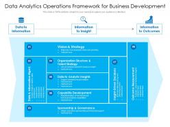
Introducing our Data Analytics Operations Framework For Business Development set of slides. The topics discussed in these slides are Organization Structure And Talent Strategy, Data To Analytic Insights, Capability Development. This is an immediately available PowerPoint presentation that can be conveniently customized. Download it and convince your audience.
This complete presentation has PPT slides on wide range of topics highlighting the core areas of your business needs. It has professionally designed templates with relevant visuals and subject driven content. This presentation deck has total of eleven slides. Get access to the customizable templates. Our designers have created editable templates for your convenience. You can edit the colour, text and font size as per your need. You can add or delete the content if required. You are just a click to away to have this ready-made presentation. Click the download button now.
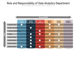
Presenting this set of slides with name Role And Responsibility Of Data Analytics Department. The topics discussed in these slides are Business, Responsibility, Decision Making, Business Intelligence, Decision Modeling. This is a completely editable PowerPoint presentation and is available for immediate download. Download now and impress your audience.
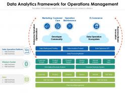
Introducing our Data Analytics Framework For Operations Management set of slides. The topics discussed in these slides are Data Sharing And Trading, Data Analytics Product, Information Discovery System. This is an immediately available PowerPoint presentation that can be conveniently customized. Download it and convince your audience.
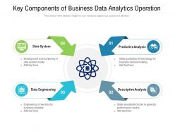
Presenting our set of slides with name Key Components Of Business Data Analytics Operation. This exhibits information on four stages of the process. This is an easy to edit and innovatively designed PowerPoint template. So download immediately and highlight information on Predictive Analysis, Descriptive Analysis, Data Engineering.
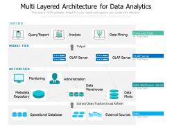
Presenting this set of slides with name Multi Layered Architecture For Data Analytics. The topics discussed in these slides are Analysis, Data Mining, Administration, Data Warehouse, Metadata Repository. This is a completely editable PowerPoint presentation and is available for immediate download. Download now and impress your audience.
Enthrall your audience with this Business Data Analytics Powerpoint Presentation Slides. Increase your presentation threshold by deploying this well crafted template. It acts as a great communication tool due to its well researched content. It also contains stylized icons, graphics, visuals etc, which make it an immediate attention grabber. Comprising twenty nine slides, this complete deck is all you need to get noticed. All the slides and their content can be altered to suit your unique business setting. Not only that, other components and graphics can also be modified to add personal touches to this prefabricated set.

This complete presentation has PPT slides on wide range of topics highlighting the core areas of your business needs. It has professionally designed templates with relevant visuals and subject driven content. This presentation deck has total of fifty three slides. Get access to the customizable templates. Our designers have created editable templates for your convenience. You can edit the color, text and font size as per your need. You can add or delete the content if required. You are just a click to away to have this ready-made presentation. Click the download button now.
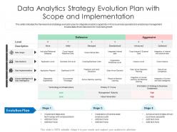
Introducing our Data Analytics Strategy Evolution Plan With Scope And Implementation set of slides. The topics discussed in these slides are Defensive, Aggressive, Evolution Plan. This is an immediately available PowerPoint presentation that can be conveniently customized. Download it and convince your audience.
Deliver a credible and compelling presentation by deploying this Analytics Journey Data Exploration Operational Reporting Value Creation. Intensify your message with the right graphics, images, icons, etc. presented in this complete deck. This PPT template is a great starting point to convey your messages and build a good collaboration. The twelve slides added to this PowerPoint slideshow helps you present a thorough explanation of the topic. You can use it to study and present various kinds of information in the form of stats, figures, data charts, and many more. This Analytics Journey Data Exploration Operational Reporting Value Creation PPT slideshow is available for use in standard and widescreen aspects ratios. So, you can use it as per your convenience. Apart from this, it can be downloaded in PNG, JPG, and PDF formats, all completely editable and modifiable. The most profound feature of this PPT design is that it is fully compatible with Google Slides making it suitable for every industry and business domain.
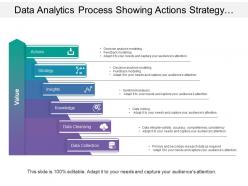
Presenting this set of slides with name - Data Analytics Process Showing Actions Strategy Insights And Data Collection. This is a six stage process. The stages in this process are Data Analytics Process, Data Analysis Cycle, Data Visualization Process.
Introduce your topic and host expert discussion sessions with this Digital Supply Chain Data Analytics Demand Forecasting Channel Optimization. This template is designed using high-quality visuals, images, graphics, etc, that can be used to showcase your expertise. Different topics can be tackled using the twelve slides included in this template. You can present each topic on a different slide to help your audience interpret the information more effectively. Apart from this, this PPT slideshow is available in two screen sizes, standard and widescreen making its delivery more impactful. This will not only help in presenting a birds-eye view of the topic but also keep your audience engaged. Since this PPT slideshow utilizes well-researched content, it induces strategic thinking and helps you convey your message in the best possible manner. The biggest feature of this design is that it comes with a host of editable features like color, font, background, etc. So, grab it now to deliver a unique presentation every time.
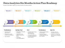
Presenting Data Analytics Six Months Action Plan Roadmap PowerPoint slide. This PPT presentation is Google Slides compatible hence it is easily accessible. This PPT theme is available in both 4,3 and 16,9 aspect ratios. This PowerPoint template is customizable so you can modify the font size, font type, color, and shapes as per your requirements. You can download and save this PowerPoint layout in different formats like PDF, PNG, and JPG.
If you require a professional template with great design, then this Data Analytics Operations Business Marketing Sale Developer Community Ecosystem is an ideal fit for you. Deploy it to enthrall your audience and increase your presentation threshold with the right graphics, images, and structure. Portray your ideas and vision using eleven slides included in this complete deck. This template is suitable for expert discussion meetings presenting your views on the topic. With a variety of slides having the same thematic representation, this template can be regarded as a complete package. It employs some of the best design practices, so everything is well-structured. Not only this, it responds to all your needs and requirements by quickly adapting itself to the changes you make. This PPT slideshow is available for immediate download in PNG, JPG, and PDF formats, further enhancing its usability. Grab it by clicking the download button.
Presenting Data Analytic Icon Bar Graph template. The slide is compatible with Google Slides which makes it accessible at once. The slide is completely editable. It can be saved in various document formats such as JPEG, PNG, or PDF. Moreover, both standard screen(4:3) and widescreen(16:9) aspect ratios are supported. High-quality graphics ensure that distortion does not occur.
Engage buyer personas and boost brand awareness by pitching yourself using this prefabricated set. This Data Analytics Organization Environment Representing Financial Information is a great tool to connect with your audience as it contains high-quality content and graphics. This helps in conveying your thoughts in a well-structured manner. It also helps you attain a competitive advantage because of its unique design and aesthetics. In addition to this, you can use this PPT design to portray information and educate your audience on various topics. With twelve slides, this is a great design to use for your upcoming presentations. Not only is it cost-effective but also easily pliable depending on your needs and requirements. As such color, font, or any other design component can be altered. It is also available for immediate download in different formats such as PNG, JPG, etc. So, without any further ado, download it now.
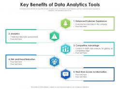
Following slide exhibits key benefits of data analytics tools. It includes major features such as- improved user experience, analytics, risk reduction and so on. Presenting our set of slides with Key Benefits Of Data Analytics Tools. This exhibits information on five stages of the process. This is an easy-to-edit and innovatively designed PowerPoint template. So download immediately and highlight information on Analytics, Information, Competitive Advantage, Customer Experience, Risk.
This complete deck can be used to present to your team. It has PPT slides on various topics highlighting all the core areas of your business needs. This complete deck focuses on Data Analytic Icon Business Growth Analysis Gear Magnifying Glass Dashboard and has professionally designed templates with suitable visuals and appropriate content. This deck consists of total of twelve slides. All the slides are completely customizable for your convenience. You can change the colour, text and font size of these templates. You can add or delete the content if needed. Get access to this professionally designed complete presentation by clicking the download button below.
Enthrall your audience with this ETL Data Lineage Powerpoint Presentation Slides. Increase your presentation threshold by deploying this well-crafted template. It acts as a great communication tool due to its well-researched content. It also contains stylized icons, graphics, visuals etc, which make it an immediate attention-grabber. Comprising ninety slides, this complete deck is all you need to get noticed. All the slides and their content can be altered to suit your unique business setting. Not only that, other components and graphics can also be modified to add personal touches to this prefabricated set.

It covers all the important concepts and has relevant templates which cater to your business needs. This complete deck has PPT slides on Risk Based Approach Success Assurance Management Analytics Assessment with well suited graphics and subject driven content. This deck consists of total of twelve slides. All templates are completely editable for your convenience. You can change the colour, text and font size of these slides. You can add or delete the content as per your requirement. Get access to this professionally designed complete deck presentation by clicking the download button below.
Deliver a lucid presentation by utilizing this Data Audit Checklist Analytics Organization Maintenance Management Business. Use it to present an overview of the topic with the right visuals, themes, shapes, and graphics. This is an expertly designed complete deck that reinforces positive thoughts and actions. Use it to provide visual cues to your audience and help them make informed decisions. A wide variety of discussion topics can be covered with this creative bundle such as Data Audit Checklist, Analytics, Organization, Maintenance, Management. All the twelve slides are available for immediate download and use. They can be edited and modified to add a personal touch to the presentation. This helps in creating a unique presentation every time. Not only that, with a host of editable features, this presentation can be used by any industry or business vertical depending on their needs and requirements. The compatibility with Google Slides is another feature to look out for in the PPT slideshow.
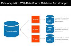
Presenting data acquisition with data source database and wrapper. This is a data acquisition with data source database and wrapper. This is a three stage process. The stages in this process are signal processing, data acquisition, signal acquisition.
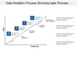
Presenting this set of slides with name - Data Analytics Process Showing Agile Process With Value And Complexity. This is a four stage process. The stages in this process are Data Analytics Process, Data Analysis Cycle, Data Visualization Process.
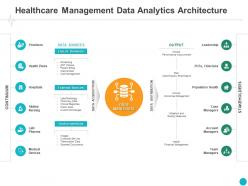
Presenting this set of slides with name Healthcare Management Data Analytics Architecture Leadership Ppt Powerpoint Presentation. This is a twelve stage process. The stages in this process are Management, Data, Analytics, Architecture, Leadership. This is a completely editable PowerPoint presentation and is available for immediate download. Download now and impress your audience.
Introduce your topic and host expert discussion sessions with this Business Data Sources Product Customer Analytics Organization Generation. This template is designed using high-quality visuals, images, graphics, etc, that can be used to showcase your expertise. Different topics can be tackled using the twelve slides included in this template. You can present each topic on a different slide to help your audience interpret the information more effectively. Apart from this, this PPT slideshow is available in two screen sizes, standard and widescreen making its delivery more impactful. This will not only help in presenting a birds-eye view of the topic but also keep your audience engaged. Since this PPT slideshow utilizes well-researched content, it induces strategic thinking and helps you convey your message in the best possible manner. The biggest feature of this design is that it comes with a host of editable features like color, font, background, etc. So, grab it now to deliver a unique presentation every time.
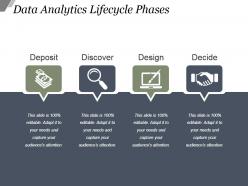
Presenting data analytics lifecycle phases powerpoint slide background designs. This is a data analytics lifecycle phases powerpoint slide background designs. This is a four stage process. The stages in this process are deposit, discover, design, decide.
Presenting data analytic icon computer screen bar graph. This is a data analytic icon computer screen bar graph. This is a one stage process. The stages in this process are data analytics icons, information analytics icons, content analytics icons.
Versatile and dynamic PPT presentation layouts. Loaded with influential patterns and icons. Offers thousands of icons to alter the appearance. Integrated with subtle complementary colours to impress the audience. Can be viewed in big screens without affecting the quality of images. Easy to merge and to operate. Performs incredibly fast.
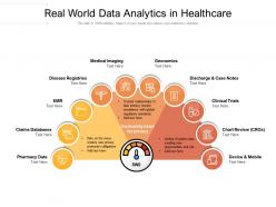
Presenting this set of slides with name Real World Data Analytics In Healthcare. This is a ten stage process. The stages in this process are Clinical Trials, Pharmacy Data, Device And Mobile. This is a completely editable PowerPoint presentation and is available for immediate download. Download now and impress your audience.
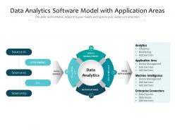
Presenting our set of slides with Data Analytics Software Model With Application Areas. This exhibits information on four stages of the process. This is an easy to edit and innovatively designed PowerPoint template. So download immediately and highlight information on Monitoring, Machine Intelligence.
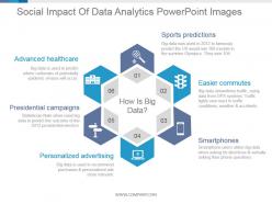
Presenting social impact of data analytics powerpoint images. This is a social impact of data analytics powerpoint images. This is a six stage process. The stages in this process are how is big data, sports predictions, easier commutes, smartphones, personalized advertising, presidential campaigns, advanced healthcare.
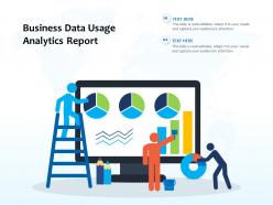
Introducing our Business Data Usage Analytics Report set of slides. The topics discussed in these slides are Business Data Usage Analytics Report. This is an immediately available PowerPoint presentation that can be conveniently customized. Download it and convince your audience.
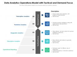
Introducing our premium set of slides with name Data Analytics Operations Model With Tactical And Demand Focus. Ellicudate the five stages and present information using this PPT slide. This is a completely adaptable PowerPoint template design that can be used to interpret topics like Prescriptive Analytics, Diagnostic Analytics, Operational Reporting. So download instantly and tailor it with your information.
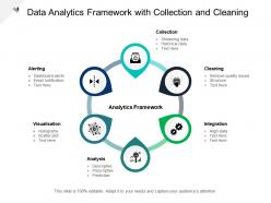
Presenting this set of slides with name - Data Analytics Framework With Collection And Cleaning. This is a six stages process. The stages in this process are Analytics Architecture, Analytics Framework, Data Analysis.
Engage buyer personas and boost brand awareness by pitching yourself using this prefabricated set. This Analytics Framework Strategic Value Portfolio Design Technology Opportunities is a great tool to connect with your audience as it contains high-quality content and graphics. This helps in conveying your thoughts in a well-structured manner. It also helps you attain a competitive advantage because of its unique design and aesthetics. In addition to this, you can use this PPT design to portray information and educate your audience on various topics. With Strategic, Value, Portfolio, Design, Technology Opportunities slides, this is a great design to use for your upcoming presentations. Not only is it cost-effective but also easily pliable depending on your needs and requirements. As such color, font, or any other design component can be altered. It is also available for immediate download in different formats such as PNG, JPG, etc. So, without any further ado, download it now.
Presenting data analytic arrow magnifying glass upward arrow. This is a data analytic arrow magnifying glass upward arrow. This is a three stage process. The stages in this process are data analytics icons, information analytics icons, content analytics icons.
Introduce your topic and host expert discussion sessions with this Advanced Analytics Implementation Solutions Functionality Executive Presenting Strategy. This template is designed using high-quality visuals, images, graphics, etc, that can be used to showcase your expertise. Different topics can be tackled using the twelve slides included in this template. You can present each topic on a different slide to help your audience interpret the information more effectively. Apart from this, this PPT slideshow is available in two screen sizes, standard and widescreen making its delivery more impactful. This will not only help in presenting a birds-eye view of the topic but also keep your audience engaged. Since this PPT slideshow utilizes well-researched content, it induces strategic thinking and helps you convey your message in the best possible manner. The biggest feature of this design is that it comes with a host of editable features like color, font, background, etc. So, grab it now to deliver a unique presentation every time.
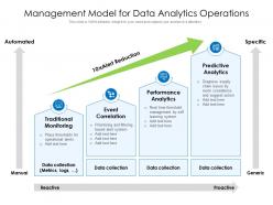
Introducing our premium set of slides with name Management Model For Data Analytics Operations. Ellicudate the four stages and present information using this PPT slide. This is a completely adaptable PowerPoint template design that can be used to interpret topics like Traditional Monitoring, Event Correlation, Performance Analytics. So download instantly and tailor it with your information.
Introduce your topic and host expert discussion sessions with this Data Usage Business Analytics Services Statistics Documenting. This template is designed using high-quality visuals, images, graphics, etc, that can be used to showcase your expertise. Different topics can be tackled using the twelve slides included in this template. You can present each topic on a different slide to help your audience interpret the information more effectively. Apart from this, this PPT slideshow is available in two screen sizes, standard and widescreen making its delivery more impactful. This will not only help in presenting a birds-eye view of the topic but also keep your audience engaged. Since this PPT slideshow utilizes well-researched content, it induces strategic thinking and helps you convey your message in the best possible manner. The biggest feature of this design is that it comes with a host of editable features like color, font, background, etc. So, grab it now to deliver a unique presentation every time.
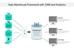
Presenting this set of slides with name Data Warehouse Framework With CRM And Analytics. The topics discussed in these slides are Data Warehouse, Analytics, Data Mining, Reporting, Billing. This is a completely editable PowerPoint presentation and is available for immediate download. Download now and impress your audience.
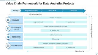
Presenting our well structured Value Chain Framework For Data Analytics Projects. The topics discussed in this slide are Design, Planning, Equipment. This is an instantly available PowerPoint presentation that can be edited conveniently. Download it right away and captivate your audience.

If you require a professional template with great design, then this 100 Day Plan Education Platform Business Credit Data Analytics is an ideal fit for you. Deploy it to enthrall your audience and increase your presentation threshold with the right graphics, images, and structure. Portray your ideas and vision using fourteen slides included in this complete deck. This template is suitable for expert discussion meetings presenting your views on the topic. With a variety of slides having the same thematic representation, this template can be regarded as a complete package. It employs some of the best design practices, so everything is well-structured. Not only this, it responds to all your needs and requirements by quickly adapting itself to the changes you make. This PPT slideshow is available for immediate download in PNG, JPG, and PDF formats, further enhancing its usability. Grab it by clicking the download button.
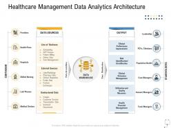
Increase audience engagement and knowledge by dispensing information using Healthcare Management Data Analytics Architecture Ppt Graphics Pictures. This template helps you present information on tweleve stages. You can also present information on Providers, Health Plans, Hospitals, Skilled Nursing, Medical Devices using this PPT design. This layout is completely editable so personaize it now to meet your audiences expectations.
Deliver a credible and compelling presentation by deploying this Strategic Icon Management Business Dashboard Snapshot Processes Marketing Goals. Intensify your message with the right graphics, images, icons, etc. presented in this complete deck. This PPT template is a great starting point to convey your messages and build a good collaboration. The twelve slides added to this PowerPoint slideshow helps you present a thorough explanation of the topic. You can use it to study and present various kinds of information in the form of stats, figures, data charts, and many more. This Strategic Icon Management Business Dashboard Processes Marketing Goals PPT slideshow is available for use in standard and widescreen aspects ratios. So, you can use it as per your convenience. Apart from this, it can be downloaded in PNG, JPG, and PDF formats, all completely editable and modifiable. The most profound feature of this PPT design is that it is fully compatible with Google Slides making it suitable for every industry and business domain.
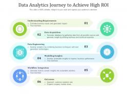
Introducing our premium set of slides with Data Analytics Journey To Achieve High ROI. Elucidate the six stages and present information using this PPT slide. This is a completely adaptable PowerPoint template design that can be used to interpret topics like Data Acquisition, Data Engineering, Modelling Insights, Workflow Integration, Outcomes. So download instantly and tailor it with your information.
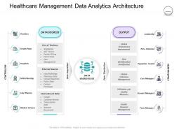
Introducing Pharmaceutical Management Healthcare Management Data Analytics Architecture to increase your presentation threshold. Encompassed with two stages, this template is a great option to educate and entice your audience. Dispence information on Line Of Business, External Sources, Management, Performance Improvement, Financial Management, using this template. Grab it now to reap its full benefits.
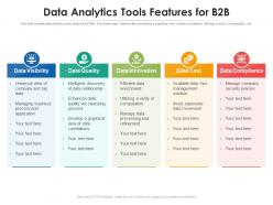
This slide exhibits data analytics tools features for B2B . it includes major features like-developing a graphical view of data correlations, Utilizing a verity of computation, etc. Introducing our Data Analytics Tools Features For B2B Marketing set of slides. The topics discussed in these slides are Data Visibility, Data Quality, Data Innovation, Data Cost, Data Compliance. This is an immediately available PowerPoint presentation that can be conveniently customized. Download it and convince your audience.
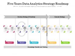
Presenting Five Years Data Analytics Strategy Roadmap PowerPoint slide which is 100 percent editable. You can change the color, font size, font type, and shapes of this PPT layout according to your needs. This PPT template is compatible with Google Slides and is available in both 4,3 and 16,9 aspect ratios. This ready to use PowerPoint presentation can be downloaded in various formats like PDF, JPG, and PNG.
Item 1 to 60 of 262 total items
- You're currently reading page 1


Understanding data analysis: A beginner's guide
Before data can be used to tell a story, it must go through a process that makes it usable. Explore the role of data analysis in decision-making.
What is data analysis?
Data analysis is the process of gathering, cleaning, and modeling data to reveal meaningful insights. This data is then crafted into reports that support the strategic decision-making process.
Types of data analysis
There are many different types of data analysis. Each type can be used to answer a different question.
Descriptive analytics
Descriptive analytics refers to the process of analyzing historical data to understand trends and patterns. For example, success or failure to achieve key performance indicators like return on investment.
An example of descriptive analytics is generating reports to provide an overview of an organization's sales and financial data, offering valuable insights into past activities and outcomes.
Predictive analytics
Predictive analytics uses historical data to help predict what might happen in the future, such as identifying past trends in data to determine if they’re likely to recur.
Methods include a range of statistical and machine learning techniques, including neural networks, decision trees, and regression analysis.
Diagnostic analytics
Diagnostic analytics helps answer questions about what caused certain events by looking at performance indicators. Diagnostic analytics techniques supplement basic descriptive analysis.
Generally, diagnostic analytics involves spotting anomalies in data (like an unexpected shift in a metric), gathering data related to these anomalies, and using statistical techniques to identify potential explanations.
Cognitive analytics
Cognitive analytics is a sophisticated form of data analysis that goes beyond traditional methods. This method uses machine learning and natural language processing to understand, reason, and learn from data in a way that resembles human thought processes.
The goal of cognitive analytics is to simulate human-like thinking to provide deeper insights, recognize patterns, and make predictions.
Prescriptive analytics
Prescriptive analytics helps answer questions about what needs to happen next to achieve a certain goal or target. By using insights from prescriptive analytics, organizations can make data-driven decisions in the face of uncertainty.
Data analysts performing prescriptive analysis often rely on machine learning to find patterns in large semantic models and estimate the likelihood of various outcomes.
analyticsText analytics
Text analytics is a way to teach computers to understand human language. It involves using algorithms and other techniques to extract information from large amounts of text data, such as social media posts or customer previews.
Text analytics helps data analysts make sense of what people are saying, find patterns, and gain insights that can be used to make better decisions in fields like business, marketing, and research.
The data analysis process
Compiling and interpreting data so it can be used in decision making is a detailed process and requires a systematic approach. Here are the steps that data analysts follow:
1. Define your objectives.
Clearly define the purpose of your analysis. What specific question are you trying to answer? What problem do you want to solve? Identify your core objectives. This will guide the entire process.
2. Collect and consolidate your data.
Gather your data from all relevant sources using data analysis software . Ensure that the data is representative and actually covers the variables you want to analyze.
3. Select your analytical methods.
Investigate the various data analysis methods and select the technique that best aligns with your objectives. Many free data analysis software solutions offer built-in algorithms and methods to facilitate this selection process.
4. Clean your data.
Scrutinize your data for errors, missing values, or inconsistencies using the cleansing features already built into your data analysis software. Cleaning the data ensures accuracy and reliability in your analysis and is an important part of data analytics.
5. Uncover valuable insights.
Delve into your data to uncover patterns, trends, and relationships. Use statistical methods, machine learning algorithms, or other analytical techniques that are aligned with your goals. This step transforms raw data into valuable insights.
6. Interpret and visualize the results.
Examine the results of your analyses to understand their implications. Connect these findings with your initial objectives. Then, leverage the visualization tools within free data analysis software to present your insights in a more digestible format.
7. Make an informed decision.
Use the insights gained from your analysis to inform your next steps. Think about how these findings can be utilized to enhance processes, optimize strategies, or improve overall performance.
By following these steps, analysts can systematically approach large sets of data, breaking down the complexities and ensuring the results are actionable for decision makers.
The importance of data analysis
Data analysis is critical because it helps business decision makers make sense of the information they collect in our increasingly data-driven world. Imagine you have a massive pile of puzzle pieces (data), and you want to see the bigger picture (insights). Data analysis is like putting those puzzle pieces together—turning that data into knowledge—to reveal what’s important.
Whether you’re a business decision maker trying to make sense of customer preferences or a scientist studying trends, data analysis is an important tool that helps us understand the world and make informed choices.
Primary data analysis methods

Quantitative analysis
Quantitative analysis deals with numbers and measurements (for example, looking at survey results captured through ratings). When performing quantitative analysis, you’ll use mathematical and statistical methods exclusively and answer questions like ‘how much’ or ‘how many.’

Qualitative analysis
Qualitative analysis is about understanding the subjective meaning behind non-numerical data. For example, analyzing interview responses or looking at pictures to understand emotions. Qualitative analysis looks for patterns, themes, or insights, and is mainly concerned with depth and detail.
Data analysis solutions and resources
Turn your data into actionable insights and visualize the results with ease.
Microsoft 365
Process data and turn ideas into reality with innovative apps, including Excel.
Importance of backing up data
Learn how to back up your data and devices for peace of mind—and added security.
Copilot in Excel
Go deeper with your data using Microsoft Copilot—your AI assistant.
Excel expense template
Organize and track your business expenses using Excel.
Excel templates
Boost your productivity with free, customizable Excel templates for all types of documents.
Chart designs
Enhance presentations, research, and other materials with customizable chart templates.
Follow Microsoft

IMAGES
VIDEO
COMMENTS
Analysis of data in research. Analysis of data is a process of inspecting, cleaning, transforming, and modeling data with the goal of discovering useful information, suggesting conclusions, and supporting decision-making. 1. Presented by Abhijeet Birari UNIT V ANALYSIS OF DATA. 2.
Data analysis is a way to study and analyze huge amounts of data. Research often includes going through heaps of data, which is getting more and more for the researchers to handle with every passing minute. Hence, data analysis knowledge is a huge edge for researchers in the current era, making them very efficient and productive.
Step 1: Define Your Data Hierarchy. While presenting data on the budget allocation, start by outlining the hierarchical structure. The sequence will be like the overall budget at the top, followed by departments, projects within each department, and finally, individual cost categories for each project. Example:
Therefore, simply stating that data analysis is important for a research will be an understatement rather no research can survive without data analysis. It can be applied in two ways which is qualitatively and quantitative. ... This chapter comprises the analysis, presentation and interpretation of the findings resulting from this study. The ...
Tutorial 1: Using R, Data Handling / Wrangling; Tutorial 2: More R, Wrangling, Summary Stats; Tutorial 3: Summary statistics; Tutorial 4: Plotting; Tutorial 5 ...
Chapter 9 Data Analysis, Interpretation, and Presentation. 2 Goals Discuss the difference between qualitative and quantitative data and analysis Enable you to analyze data gathered from: Questionnaires Interviews Observation studies Make you aware of software packages that are available to help your analysis Identify common pitfalls in data ...
Data analysis is a comprehensive method of inspecting, cleansing, transforming, and modeling data to discover useful information, draw conclusions, and support decision-making. It is a multifaceted process involving various techniques and methodologies to interpret data from various sources in different formats, both structured and unstructured.
3. Data Analysis: "Data Analysis is the process of ordering, categorizing, manipulating and summarizing data to obtain answers to research questions". It is usually the first step taken towards data interpretation. Interpretation of data is important and such needs to be done properly. Researchers have identified some data interpretation ...
In this section the aim is to discuss quantitative and qualitative analysis and how to present research. You have already been advised to read widely on the method and techniques of your choice, and this is emphasized even more in this section. It is outwith the scope of this text to provide the detail and depth necessary for you to master any ...
It is important to know w hat kind of data you are planning to collect or analyse as this w ill. affect your analysis method. A 12 step approach to quantitative data analysis. Step 1: Start with ...
Abstract. Quantitative data analysis serves as part of an essential process of evidence-making in health and social sciences. It is adopted for any types of research question and design whether it is descriptive, explanatory, or causal. However, compared with qualitative counterpart, quantitative data analysis has less flexibility.
Written by Coursera Staff • Updated on Apr 19, 2024. Data analysis is the practice of working with data to glean useful information, which can then be used to make informed decisions. "It is a capital mistake to theorize before one has data. Insensibly one begins to twist facts to suit theories, instead of theories to suit facts," Sherlock ...
Definition of research in data analysis: According to LeCompte and Schensul, research data analysis is a process used by researchers to reduce data to a story and interpret it to derive insights. The data analysis process helps reduce a large chunk of data into smaller fragments, which makes sense. Three essential things occur during the data ...
TheJoelTruth. While a good presentation has data, data alone doesn't guarantee a good presentation. It's all about how that data is presented. The quickest way to confuse your audience is by ...
Data Analysis and Data Presentation have a practical implementation in every possible field. It can range from academic studies, commercial, industrial and marketing activities to professional practices. In its raw form, data can be extremely complicated to decipher and in order to extract meaningful insights from the data, data analysis is an important step towards breaking down data into ...
Some of the most important components of postgraduate research are data collection, data presentation and data analysis, because these are the foundations that the 'new knowledge' stands on. These components establish the basis on which reviewers, examiners and readers evaluate the final research report, dissertation or thesis.
Overview. Data analysis is an ongoing process that should occur throughout your research project. Suitable data-analysis methods must be selected when you write your research proposal. The nature of your data (i.e. quantitative or qualitative) will be influenced by your research design and purpose. The data will also influence the analysis ...
INTRODUCTION. Statistics represent an essential part of a study because, regardless of the study design, investigators need to summarize the collected information for interpretation and presentation to others. It is therefore important for us to heed Mr Twain's concern when creating the data analysis plan. In fact, even before data collection ...
Data analysis is the most crucial part of any research. Data analysis summarizes collected data. It involves the interpretation of data gathered through the use of analytical and logical reasoning to determine patterns, relationships or trends. ... A clear and concise presentation on the 'now what' and 'so what' of data collection and ...
analysis to use on a set of data and the relevant forms of pictorial presentation or data display. The decision is based on the scale of measurement of the data. These scales are nominal, ordinal and numerical. Nominal scale A nominal scale is where: the data can be classified into a non-numerical or named categories, and
This is a overview of data management and analytics ppt diagram slides. This is a six stage process. The stages in this process are data retirement, data storage, data movement, data creation, data usage, data governance, data structure, data architecture, master data and metadata, data security, data quality.
Data analysis is like putting those puzzle pieces together—turning that data into knowledge—to reveal what's important. Whether you're a business decision maker trying to make sense of customer preferences or a scientist studying trends, data analysis is an important tool that helps us understand the world and make informed choices.
Although job analysis is a widely used organizational data collection technique, little research has investigated the extent to which job analysis information is affected by self-presentation processes. This study represents the first direct test of the propositions offered by F. P. Morgeson and M. A. Campion (1997) concerning self-presentation in job analysis measurement.