Infographics
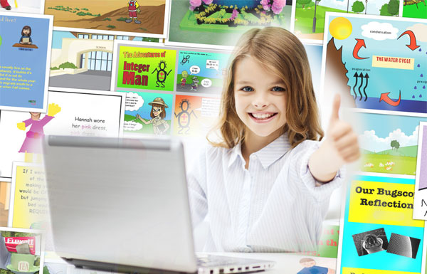
Students will create an infographic to share knowledge and data about an issue or science topic they are studying.

Infographics are an increasingly popular way of sharing information in newspapers, magazines, and online news sites. These visual representations of knowledge and information are designed to make complex ideas and large amounts of data easy to understand. There are many ways to create infographics. After exploring a variety of examples, you will create your own infographic poster that will help others better understand an issue or concept you are studying.
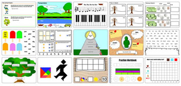
By now, most students have seen an infographic, but may not have thought about how they are used to help share data and information. Share a few sample infographics that are relevant to your classroom content and/or students’ interests. Here are a few examples to get you started. Explore your text books, support resources, and classroom posters for more examples.
- 70 Years of Batman Evolution
- Then/Now: Same Camping Gear Essentials, But Better
You can also share a snippet from the “Beauty of Data Visualization” TED Talk by David McCandless. Consider assigning this as homework prior to beginning the project.
Ask students for their reactions after watching the video and exploring examples. Ask questions that elicit opinions to engage students in the discussion, such as:
- Which infographic was the best? Why?
- What made them interesting, content or design? Or both?
- How did the use of fonts, color, graphics, and imagery contribute?
- Did the design contribute to how you felt about the information?
Let students know they will create infographic posters for an issue or topic in your class. Provide students, or small teams, with a list of topics and/or issues they can choose from. If your goal is related to curriculum content, you may want to ensure a variety of topics and content coverage, but if the goal is learning to show data and communicate visually, you can let students choose topics to explore.
The process begins not with making the infographic, but with research. Students will need time to research their selected concept as well as think about how they will visually convey it. Assess for understanding and comprehension of the content as they as they collect and clarify information.
Infographics, especially those that include lots of data, ALWAYS include citations. Take a moment to remind your students to capture citations for information they are including in their posters.

When their notes are complete and they are confident about the information and their knowledge of it, students/ teams should produce a rough visual sketch of how they will share the information. Organization and design of the poster will be critical in informing others. Check in again to evaluate how well they are thinking about representing data and information.
As they plan out design, students should ask and answer questions like:
- Which information, facts, and data are essential to include? Which aren’t?
- What colors and layout works best in sharing the information?
- What graphs and graphics best convey information and data to the viewer?
- What is the order, or flow, of information?
You may want to take a moment to look back at your samples and discuss how various infographics are structured. Since the point of an infographic is to transfer knowledge and information quickly, the final poster should be informative, simple, engaging, and design-friendly.
If you are building infographics in Wixie , adjust the canvas orientation before you begin. You can use the painting and drawing tools to create simple shapes as well as add and color common infographic symbols from the Symbols and Icons folder in the Library.
Print student posters and display in your room or around school. Publish the posters to PDF and image files to post on your classroom and school web site. Then, share them via blog, Edmodo, and social media, such as your school’s Facebook page or teacher’s Twitter account.

If the infographics are centered on a topic you are studying in your classroom, collect them into one file and use them as an electronic curriculum resource next year. You may also want to share this collection online for other students and teachers to use.
The completed infographic poster is a great artifact for summative assessment of content knowledge and ability to communicate information. Conduct formative assessments as students are collecting information and data during the research process and designing a rough sketch plan for their poster. You may also want to evaluate planning and team work skills demonstrated during the process.
The beauty of data visualization - TED Talk by David McCandless
13 Tricks for better Infographic Designs

Common Core Anchor Standards for English Language Arts - Grade 6-8
Reading Theme
Key Ideas and Details
1. Read closely to determine what the text says explicitly and to make logical inferences from it; cite specific textual evidence when writing or speaking to support conclusions drawn from the text.
Integration of Knowledge and Ideas
7. Integrate and evaluate content presented in diverse media and formats, including visually and quantitatively, as well as in words.
Writing Theme
Text Types and Purposes
1. Write arguments to support claims in an analysis of substantive topics or texts using valid reasoning and relevant and sufficient evidence.
2. Write informative/explanatory texts to examine a topic and convey ideas, concepts, and information through the selection, organization, and analysis of relevant content.
Production and Distribution of Writing
4. Produce clear and coherent writing in which the development, organization, and style are appropriate to task, purpose, and audience.
5. Develop and strengthen writing as needed by planning, revising, editing, rewriting, or trying a new approach.
6. Use technology, including the Internet, to produce and publish writing and to interact and collaborate with others.
Research to Build and Present Knowledge
8. Gather relevant information from multiple print and digital sources, assess the credibility and accuracy of each source, and integrate the information while avoiding plagiarism.
ISTE NETS for Students 2016:
6. Creative Communicator Students communicate clearly and express themselves creatively for a variety of purposes using the platforms, tools, styles, formats and digital media appropriate to their goals. Students:
a. choose the appropriate platforms and tools for meeting the desired objectives of their creation or communication.
b. create original works or responsibly repurpose or remix digital resources into new creations.
c. communicate complex ideas clearly and effectively by creating or using a variety of digital objects such as visualizations, models or simulations.
d. publish or present content that customizes the message and medium for their intended audiences.
Lessons by Subject
Language Arts
Social Studies
Lessons by Grade
Get the latest from creative educator.
Creative classroom ideas delivered straight to your in box once a month.
Add me to the Creative Educator email list!

- Hero's Journey Lesson Plan
- Infographics Lesson Plan
- Design a Book Cover Lesson Plan
- Informational text projects that build thinking and creativity
- Classroom constitution Lesson Plan
- Set SMART Goals Lesson Plan
- Create a visual poem Lesson Plan
- Simple surveys and great graphs Lesson Plan
- Embrace action research

Lesson: Exploring Line Symmetry

Developing 21st century learning environments

Lesson: Publish a Digital Magazine

Lesson: Animal Riddles
More sites to help you find success in your classroom
Share your ideas, imagination, and understanding through writing, art, voice, and video.
Rubric Maker
Create custom rubrics for your classroom.

Pics4Learning
A curated, copyright-friendly image library that is safe and free for education.
Write, record, and illustrate a sentence.
Interactive digital worksheets for grades K-8 to use in Brightspace or Canvas.
Professional Learning

Digital Storytelling
21st Century Classrooms
Project-based Learning
Teaching and Learning
Informational Text
English Language Aquisition
Visual Arts
© 2024 Tech4Learning, Inc | All Rights Reserved | Privacy Policy
© 2024 Tech4Learning, Inc | All Rights Reserved | https://www.thecreativeeducator.com
How to Plan an Infographic Project for Your Class

Students | Teachers
By latasha doyle - december 29, 2017.
Lesson plans are an important part of any teacher’s daily work.
Whether you plan your lessons months in advance or the night before, it’s important to keep them fun and fresh. Students respond to differentiation in lessons , and of course entertaining assignments and topics are always a hit!
A great way to ensure that students retain and reiterate information is to introduce tools like Easelly into your lessons. But if you’re new to Easelly – or infographics in general – your lesson plan might look a little like this:

Infographic planning tips in the classroom
If you’re hoping to develop a more in-depth plan and give your students clearer direction before you start an infographic project, we’re here to help.
Here are our tips for planning an infographic project for your class:
1. Play with the tool first.
Before using any new EdTech tool in the classroom, a teacher or educator should get familiar with the platform first. If you’re new to Easelly, play around with the tool by yourself first.
Scroll through the variety of infographic templates , play with the different features each design offers, and make sure you know how to save, download, share, etc. This way, you can walk your students through the tool quickly and easily, even though they’ll probably catch on without much help!
Here’s a short tutorial to finding and customizing templates in Easelly.
Pro Tip: It also helps to set up Easelly Groups with each of your students before you introduce them to the tool so there is no confusion about accounts or student emails. You can contact Easelly support if you’d like to have alias emails set up to keep your students’ information private.
2. Choose a topic
If you’re an elementary school teacher who covers multiple subjects, you’ll need to decide which subject you’d like to teach with infographics.
If you only teach one subject, you’ll need to pick a unit or topic for which you can create an infographic lesson plan.
Don’t assume that topics like reading or history can’t be visualized; there are plenty of lessons that can incorporate infographics!
If you’re stuck trying to find a way to teach a specific topic with infographics, ask yourself:
- What data or numbers are involved with the specific unit you’re teaching?
- How do you want students to draw conclusions about a subject?
- Is there a path, journey or story of a specific person/place in history/character in a novel you want students to follow?
- How can students share their research, conclusions or questions on the topic?
Infographics don’t have to be all about numbers!
In fact, the different types of templates can help students share various interpretations of a topic.
Timeline infographic templates can help students visualize a history lesson. Watch the short video on timeline infographics below before you try it out with templates.
Meanwhile, a map infographic can help students visualize geography or historical events. Finally, a flowchart can help literature students track a storyline or think critically about themes.
Infographics can be used for every subject so get creative!
3. Create a lesson plan
Now it’s time to figure out how you’re going to introduce the infographic project to your students. Megan Schonhar recently spoke with Easelly about her own infographic lesson plans and had some great tips to share.
She recommends developing a plan that:
- Explains what infographics are and where they came from.
- Shows “mentor images” or examples of infographics you’d like students to use as inspiration.
- Discusses how to use of templates, colors, fonts, images, etc. to create a visual message (not a text-heavy one).
- Incorporates “workshop” or play time for students to familiarize themselves with Easelly.
- Design elements
- Research standards
- Rubric or project requirements
- The topic/subject itself
- The use of objects or icons that reflect ideas or concepts
- Logical flow and organization
- Must-haves (i.e. sections, name/date, research citations, etc.)
- Creativity and design
- Includes due dates, workdays, and buffer time for students who need extra support
From there, you should have an infographic project outline that you can use in your classroom.
4. Have fun!
The best part about using infographics for student projects is seeing the different ways they choose to interpret and visualize information.
While you can give them the parameters for their infographics, it will be up to them to decide the correct objects, fonts, colors and even templates to share their information.
If you’ve created an infographic project with your class, we’d love to hear how you did it. Follow us on Twitter @easel_ly to share your experiences!
Recommended resources:
- Easelly’s Free Infographic Activity Book for Students
- How to Customize Infographic Templates in Easelly (video tutorial)
- How to Pick the Right Color Scheme for Infographics (video tutorial)
- 10 Easelly Shortcuts to Help You Make Infographics in Minutes
- 10 Types of Infographics with Examples and When to Use Them
*Editor’s Note: This post was originally published on December 29, 2017 and updated on June 11, 2020 for accuracy and comprehensiveness.
More to learn from the blog…
How to write sharp, compelling infographic copy.
Have you ever been on a long trip only to realize that you’ve overpacked? Ask a seasoned traveler, and you’ll get tips and h...
Easelly User Story: Infographics in the Library with School Librarian Jessica Fitzpatrick
Our Easelly User Story series features Easelly users whose infographic creation or advocacy caught our eye on social media. For November...
How to Communicate Better With Infographics
Did you know that over 65 percent of people are visual learners? Or that visuals make it easier for the brain to process information faster...
👀 Turn any prompt into captivating visuals in seconds with our AI-powered design generator ✨ Try Piktochart AI!
- Piktochart Visual
- Video Editor
- AI Design Generator
- Infographic Maker
- Banner Maker
- Brochure Maker
- Diagram Maker
- Flowchart Maker
- Flyer Maker
- Graph Maker
- Invitation Maker
- Pitch Deck Creator
- Poster Maker
- Presentation Maker
- Report Maker
- Resume Maker
- Social Media Graphic Maker
- Timeline Maker
- Venn Diagram Maker
- Screen Recorder
- Social Media Video Maker
- Video Cropper
- Video to Text Converter
- Video Views Calculator
- AI Brochure Maker
- AI Document Generator
- AI Flyer Generator
- AI Image Generator
- AI Infographic
- AI Instagram Post Generator
- AI Newsletter Generator
- AI Quote Generator
- AI Report Generator
- AI Timeline Generator
- For Communications
- For Education
- For eLearning
- For Financial Services
- For Healthcare
- For Human Resources
- For Marketing
- For Nonprofits
- Brochure Templates
- Flyer Templates
- Infographic Templates
- Newsletter Templates
- Presentation Templates
- Resume Templates
- Business Infographics
- Business Proposals
- Education Templates
- Health Posters
- HR Templates
- Sales Presentations
- Community Template
- Explore all free templates on Piktochart
- Course: What is Visual Storytelling?
- The Business Storyteller Podcast
- User Stories
- Video Tutorials
- Need help? Check out our Help Center
- Earn money as a Piktochart Affiliate Partner
- Compare prices and features across Free, Pro, and Enterprise plans.
- For professionals and small teams looking for better brand management.
- For organizations seeking enterprise-grade onboarding, support, and SSO.
- Discounted plan for students, teachers, and education staff.
- Great causes deserve great pricing. Registered nonprofits pay less.
15 Infographic Examples for Students (Plus Editable Templates)

Whether you’re a student or a teacher, infographics are one of the best ways to convey your knowledge in the classroom.
With infographics, you can present lessons, excel at homework, or organize data for academic research.
Regardless of your student’s age or IQ, infographics can drill down on essential concepts, clarify complex ideas, and even make dull topics more engaging.
So if you’re looking to use infographics to promote learning among students, you’re in the right place.
In this post, we’ll look at what makes visual content like infographics effective in the classroom and several examples to help you make the most of this teaching strategy.
You’ll also find editable infographic templates that are perfect for whatever subject or topic you’re presenting in class. Let’s get started!
Table of contents
How infographics promote student learning.
- Use these 5 infographic examples to inspire your next learning session
- 10 infographic examples and templates for students that are easy to edit and customize
Want to jump right into creating infographics ? Sign up for free and get access to our constantly updated library of infographic templates .
Text-based learning is no match for visual aids such as infographics in the classroom. Many studies have shown that visuals improve learning .
Here are the core benefits of infographics in education:
1. Better retention
Students, like most people, can retain about 10% of what they hear, and just 20% percent of what they read. Do you know how much they retain of what they can see? A whopping 80% .
This makes visuals a great way to ensure students can focus on — and remember more of — what they are learning.
2. High engagement
Infographics don’t just ensure a deeper level of learning , but also keep students engaged. And this is vital in today’s day and age, where attention spans are at an all-time low.
In fact, visual aids can increase the motivation to learn and help prevent dullness during classroom sessions. In short, visuals make learning fun!
3. Easy comprehension
Since infographics use imagery to emphasize and explain text-based content, students can grasp the information much faster than reading plain text.
4. Improved analytical thinking
One of the most essential skills for any student is identifying patterns, deducing logic, and connecting the dots. And visuals help in all these areas because they improve critical thinking , according to research by IISTE.
As the following graph illustrates, students display a higher level of selection, ordering, comparison, and other characteristics when paired with visual learning as compared to traditional learning methods.

For these reasons, it’s evident why more and more educators are looking for ways to integrate visual elements into their curriculums.
Use these infographic examples to inspire your next learning session
Now that you know the benefits of infographics for students, we bet you’re pumped up and ready to create your own infographic .
But where do you start? What type of visuals can you create?
Use the following infographic examples for students as your inspiration.
1. Infographic about sentence fragments and run-ons

This education infographic example shows students how to correct common English errors like sentence fragments and run-ons.
Using white text, for the most part, on a black background makes it highly legible. And the sparingly used blue, green, and purple colors add a nice touch to the whole design. Plus, the light borders and small icons separate and organize each section neatly and beautifully for easy navigation.
2. Let’s explore the ocean infographic

This infographic is great for your next science or geography class. As the information gets dense in the infographic, accenting colors have been used in the background to depict the concept of going deeper into the ocean. As a result, the infographic keeps viewers engaged from start to finish, and the content is easy to follow.
3. Comprehensive guide to mathematics infographic

This infographic example is great for situations when you want to cover a glossary of terms or a list of related items. It covers exactly what’s essential. Nothing more; nothing less.
Each element of the list captures attention instantly, and the icons provide a strong association for students to retain the meanings in the memory.
As a bonus, check out our free math worksheet templates !
4. How to study, get smarter, and succeed in school infographic

While learning different subjects is important, knowing how to learn and succeed is just as vital. This infographic example has an excellent pairing of visual aids with text, making it perfect for creating tips, lessons, and tutorials.
The use of engaging illustrations, excellent typography , and varying backgrounds ensures that students never get bored and scroll through the whole infographic.
5. The life of Leonardo Da Vinci infographic

10 infographic examples and templates for students that are easy to edit and customize
Did the above examples help get your creative juices flowing?
The good news is you don’t need to start creating infographics for education from scratch.
Piktochart has hundreds of pre-made infographic templates you can use to create infographics for students within minutes. On top of that, you don’t need to download or install anything on your computer. Piktochart works right in your web browser.
Watch the short video tutorial below to learn more about making infographics in Piktochart’s free infographic maker .
On that note, here’s a sampling of some of our best infographic examples you can use in the classroom, and how they can be used for educational purposes.
1. Infographic example showing pros and cons

This comparison infographic template is great for teaching students how to compare two concepts, objects, or ideas.
Since you can easily add contrasting information side by side, it is excellent for emphasizing differences and similarities. Not just that, you can later go into details with separate sections for pros and cons.
2. Infographic example visualizing statistics and research findings

Understanding academic research and statistics are one of the crucial skills for students in the 21st century. And it’s a great way to help them quantify the magnitude of abstract ideas. That’s where this infographic template shines.
It says a lot about the link between social media and children’s self-esteem without relying too much on text alone, making statistics and figures easy to understand.
3. Infographic example to help students understand complex information

Informational infographics help students grasp complex topics and technical content with ease. This infographic template is ideal for simplifying complex ideas with visuals like icons and illustrations.
4. Infographic example to help explain timelines

Timeline infographics are great for going over key events in the history of a person, place, or subject.
This template can help students connect events to each other and understand how they shaped the present era. It keeps each event neatly organized and separated from others through rectangle shapes, and also gives you space to add any text, data, or icons.
You can also use a timeline maker, a one-stop shop for inspiration, designing, and sharing in multiple formats!
5. Infographic example inviting students to attend an event or enroll in a course

Looking to generate interest in a course, event, or program? Then this infographic template can get the job done.
With this template, you can make students aware of important events, along with the benefits of attending the program. Plus, it ends with a call to action to further encourage students to enroll in advance.
6. Infographic example about virtual learning

This simple infographic example for virtual learners is packed with tips to make virtual learning fun and comfortable for students and teachers alike. You can edit this infographic with more tips by adding more text boxes.
7. Infographic example explaining the steps of a process

Process infographics work well in the classroom if you want to go into detail about a process or workflow. Use this infographic example to choose a research paper topic idea as your guide. You can customize the texts, color schemes, and illustrations using Piktochart’s powerful yet easy-to-use visual editor .
8. Infographic example about classroom quiz games

Get your students excited about learning by introducing games and quizzes to your class!
The infographic example below also doubles as a classroom poster that you can use to explain how your quiz or game works.
9. Infographic example about class schedules

This fully customizable class schedule infographic template makes classroom schedule documents more fun and engaging for students. Whether you’re scheduling a week or the entire semester, this versatile infographic template has everything you need.
Bonus tip: You can also use infographics for your school syllabus .
Give our class schedule maker a try to access more templates for free! Sign up to access presentations , posters , and more.
10. Infographic example explaining the stages of a lesson

Introduce the stages of a lesson using this simple infographic about the stages of design thinking. The infographic’s layout makes it easy to follow for its audience.
Want to add more stages? All you need to do is duplicate the circles and add your text or content.
Wrapping up: Make infographics for students in minutes with Piktochart
As you can see, infographics are one of the best ways to encourage and enhance learning among students.
Whether you create them for teaching or have your students make them for a project, they always bring more excitement and energy to the classroom.
Recommended reading: A Student’s Guide to Getting Started With Piktochart
No matter the budget or design skill level, Piktochart’s infographic maker can help you design compelling infographics fast.
The templates we covered above don’t just help you create infographics quickly and easily, but can also be used to repurpose other projects to save time in the future.
Give Piktochart a go , and see the difference it can make in your classroom.
Editor’s Note: This blog post is a collaboration between guest post author Hitesh Sahni and Piktochart’s content team.

Other Posts

12 Graphic Organizer Examples for Teachers and Students

From Chaos to Clarity: Streamlining Your Student Life with a Schedule Builder

Resume with No Experience
- 6th Grade Math
- Data graphing
Grade 6 data and graphing worksheets: Creating and interpreting graphs
Do you want to reinforce your 6 th grader’s data and graphing skills with fun and engaging activities? If so, you’ve come to the right place. In this article, we’ll share why data and graphs are useful for 6 th graders, simple steps to follow when creating and interpreting graphs , and where to find enriching Grade 6 data and graphing worksheets for your students.
How to make and read graphs: Activities and worksheets for 6th Grade
Do your students like puzzles, games, and stories? Do they enjoy finding out new things and sharing them with others? If you answered yes, they might also love these data and graphing activities and worksheets for 6th Grade! In this article, they will learn how to make and read different types of graphs using data from various sources. They will also discover how to use data and graphing skills to have fun and learn more about their favorite topics.
Data and graphing are ways of collecting, organizing, and visually presenting information. They can help us explore the world around us, answer questions, solve problems, and communicate our ideas better.
So, by the end of this article, your 6th-grade students will see that data and graphing are useful, exciting, and creative!
BROWSE THE WEBSITE
Download free worksheets, grade 6 math topics.
- Whole numbers
Multiplication
- Exponents and square roots
- Number theory
- Add & subtract decimals
- Multiply & divide decimals
- Fractions & mixed numbers
- Add & subtract fractions
- Multiply fractions
- Divide fractions
- Operations with integers
- Mixed operations
- Rational numbers
- Problems solving
- Ratio & proportions
- Percentages
- Measuring units
- Consumer math
- Telling time
- Coordinate graph
- Algebraic expressions
- One step equations
- Solve & graph inequalities
- Two-step equations
- 2D Geometry
- Symmetry & transformation
- Geometry measurement
- Data and Graphs
- Probability

Start practice on Sixth Grade here
What are data and graphs, and why are they useful for 6th graders.
Data are pieces of information that can be measured or counted. For example, the number of students in your class, the colors of your clothes, the temperature of the day, and the scores of a game are all data. We can collect data by observing, surveying, experimenting, or researching.
Graphs are visual representations of data that show how they are related or change over time. For example, a bar graph can show how many students prefer different types of music, a line graph can show how the temperature changes throughout the year, and a pie chart can show how the scores of a game are distributed among players.
Graphs can help us understand data better by making them easier to compare, analyze, and communicate. For 6th graders, data and graphing are useful skills because they can help them with math, science, social studies, and other subjects. They can also help them develop critical thinking, creativity, and communication skills to prepare them for future challenges.
Types of data: How to classify data into categories, numerical or ordinal
There are three main types of data that we can use to make graphs : categorical, numerical, and ordinal .
Categorical data are data that belong to different groups or categories. For example, the names of animals, the types of fruits, and the colors of cars are categorical data. We can use words or symbols to label categorical data.
Numerical data are data that have numerical values or measurements. For example, the heights of plants, the weights of rocks, and the distances of planets are numerical data. We can use numbers or units to label numerical data.
Ordinal data are data that have an order or rank. For example, the student's grades, the ratings of movies, and the difficulty levels are ordinal data. We can use numbers or words to label ordinal data.
Types of graphs: How to choose the best graph for different types of data
We can use many types of graphs to display different types of data. The most common are bar graphs , line graphs , pie charts , pictographs , histograms , scatter plots , and stem-and-leaf plots . Each type of graph has its advantages and disadvantages depending on the type of data and the purpose of the graph. Here are some general guidelines on how to choose the best graph for different types of data :
- Bar graphs : Use bar graphs to compare categorical or ordinal data across groups or categories. For example, we can use a bar graph to show how many students like different types of sports.
- Line graphs : Use line graphs to show numerical data that change over time or across a continuous variable. For example, we can use a line graph to show how people’s height changes as they grow older.
- Pie charts : Use pie charts to show categorical or ordinal data as parts of a whole or percentages. For example, we can use a pie chart to show how much time we spend on different daily activities.
- Pictographs : Use pictographs to show categorical or ordinal data using pictures or symbols representing a specific number or amount. For example, we can use a pictograph to show how many books we read in a month using book icons.
- Histograms : Use histograms to show numerical data grouped into intervals or bins. For example, a histogram can show how many students have different heights in a class.
- Scatter plots : Scatter plots show numerical data with two variables or dimensions. For example, we can use a scatter plot to show how the weight and height of students are related.
- Stem-and-leaf plots : Use stem-and-leaf plots to show numerical data with two or more digits. For example, we can use a stem-and-leaf plot to show how many points each player scored in a game.
Creating graphs: How to use tables, scales, labels, and titles to make graphs
Before creating a graph , we must organize our data in a table. A table is a way of arranging data in rows and columns. A table can help us see the patterns and relationships in our data more clearly. To make a table, we’ll decide what variables or categories to include and how to label them. For example, if you want to make a bar graph of how many students like different types of music, you need to choose the types of music as your categories and the number of students as your variable. You can label the categories as "Music Type" and the variable as "Number of Students."
After making a table, we’ll choose a scale for our graph. A scale is a way of measuring or dividing the data along an axis. An axis is a line that shows the range or direction of the data. A graph usually has two axes: a horizontal axis (x-axis ) and a vertical axis (y-axis ). To choose a scale, we must consider our data's minimum and maximum values and how to divide them into equal intervals or units. For example, if you want to make a bar graph of how many students like different types of music, and the minimum and maximum values are 0 and 20, you can choose a scale of 1 unit = 1 student for both axes.
After choosing a scale, label your axes with the names and units of your variables or categories. For example, if you want to make a bar graph of how many students like different types of music, you can label the x-axis as "Music Type" and the y-axis as "Number of Students."
After you label your axes, draw your graph using the data from your table and the scale from your axes. For example, if you want to make a bar graph of how many students like different types of music, you need to draw a bar for each type of music that matches the number of students from your table.
After drawing your graph, we must give it a title that describes what it shows. For example, if you want to make a bar graph of how many students like different types of music, you can give it a title like "Students' Music Preferences."
Interpreting graphs: How to read and understand the information in graphs
Once we have made a graph, you will interpret it. Interpreting a graph means reading and understanding the information that it shows. To interpret a graph, we can ask ourselves these questions:
- What is the title of the graph? What does it tell about the topic or purpose of the graph?
- What are the labels and units of the axes? What do they tell about the variables or categories in the graph?
- What are the scales of the axes? What do they tell about the range or intervals of the data in the graph?
- What are the shapes and colors of the bars, lines, pies, or points in the graph? What do they tell about the values or relationships of the data in the graph?
- What are the patterns or trends in the graph? What do they tell about how the data change or vary over time or across groups or categories?
- What are the outliers or errors in the graph? What do they tell about any unusual or incorrect data in the graph?
Comparing graphs: How to compare and contrast different graphs and data sets
Sometimes, we may want to compare two or more graphs or data sets that show similar or different information. Comparing graphs means finding out how they are alike or different. To compare graphs, we’ll look at some aspects:
- The titles : Do they show similar or different topics or purposes?
- The labels and units : Do they show similar or different variables or categories?
- The scales : Do they show similar or different ranges or intervals?
- The shapes and colors : Do they show similar or different values or relationships?
- The patterns or trends : Do they show similar or different changes or variations?
- The outliers or errors : Do they show similar or different unusual or incorrect data?
Analyzing graphs: How to identify patterns, trends, outliers, and errors in graphs
One of the most essential skills for 6th graders is to be able to analyze graphs and data. Analyzing means to examine something closely and carefully to understand what it means. When we analyze graphs, we can look for four things: patterns, trends, outliers, and errors .
Patterns are repeated or regular shapes or arrangements in the data. For example, if we have a graph that shows the number of books read by different students in a month, we might see a pattern of increasing or decreasing numbers. Patterns can help us see how the data is organized and related.
Trends are general directions or tendencies in the data. For example, if a graph shows a city's average temperature over a year, we might see a trend of rising or falling temperatures. Trends can help us see how the data changes over time or across categories.
Outliers are data points that are very different from the rest of the data. For example, if we have a graph showing the height of different plants in a garden, we might see an outlier much taller or shorter than the others. Outliers can help us see if there are any unusual or exceptional cases in the data.
Errors are mistakes or inaccuracies in the data or the graph. For example, if we have a graph showing the population of different countries worldwide, we might see an error with a wrong number or a missing label. Errors can affect how we interpret and trust the data and the graph.
To analyze graphs and data, we need to ask ourselves some questions:
- What is the purpose and audience of the graph?
- What type of data and graph is used?
- What are the scales, labels, and titles of the graph?
- What patterns and trends can we see in the data?
- Are there any outliers or errors in the data or the graph?
- What conclusions or inferences can we make from the graph?
Your 6th-grade students can improve their critical thinking and problem-solving skills by asking and answering the questions above.
Evaluating graphs: How to critique and improve graphs based on their purpose and audience
Another vital skill for 6th graders is to be able to evaluate graphs and data. Evaluating means to judge something based on specific criteria or standards. When we evaluate graphs, we can use four criteria: clarity, accuracy, relevance, and ethics .
Clarity means how easy it is to understand the graph and the data. A clear graph should have the following:
- A suitable type of graph for the type of data
- A clear title that describes what the graph shows
- Labels for the axes, categories, and units
- Scales that are appropriate and consistent
- Colors, shapes, and symbols that are distinct and meaningful
Accuracy means how correct and precise the graph and the data are. An accurate graph should have:
- Data that is collected from reliable sources and methods
- Data that is represented correctly and consistently
- No errors or mistakes in the data or the graph
- No distortion or manipulation of the data or the graph
Relevance means how vital and valuable the graph and the data are for the purpose and audience. A relevant graph should have:
- Data that is related to the topic or question
- Data that is sufficient and appropriate for the purpose
- Data that is current and up-to-date
- Data that is interesting and engaging for the audience
Ethics means how fair and respectful the graph and the data are for the people and situations involved. An ethical graph should have the following:
- Data that is collected and used with consent and honesty
- Data that is respectful of privacy and confidentiality
- Data that is unbiased and objective
- Data that is presented with honesty and integrity
To evaluate graphs and data, we need to ask ourselves some questions:
- How clear is the graph and the data?
- How accurate are the graph and the data?
- How relevant is the graph and the data?
- How ethical is the graph and the data?
Your 6 th graders can improve their communication and presentation skills by asking and answering the above questions.
What are the main takeaways and applications of data and graphing skills?
Although Data and graphing skills are useful for 6th graders, they are also essential for everyone who wants to learn more about themselves and their world. By learning how to create, interpret, compare, analyze, and evaluate graphs , we can:
- Organize information in a visual way
- Understand information in a deeper way
- Communicate information in an effective way
- Make decisions based on information
Data and graphing skills can help us in many areas of life, such as:
- Science : We can use graphs to explore natural phenomena such as weather, climate, plants, animals, etc.
- Math : We can use graphs to explore mathematical concepts such as numbers, operations, fractions, decimals, etc.
- Social Studies : We can use graphs to explore social issues such as population, culture, history, geography, etc.
- Art : We can use graphs to express our creativity and emotions, such as colors, shapes, patterns, etc.
Data and graphing skills can also help us develop essential habits of mind such as:
- Curiosity : We can use graphs to ask questions and seek answers
- Creativity : We can use graphs to generate ideas and solutions
- Critical Thinking : We can use graphs to analyze and evaluate information
- Collaboration : We can use graphs to share and discuss information with others
Bonus: Where to find exciting resources to improve 6th graders' graphing skills?
If you want your 6 th graders to learn more about data and graphing or practice their skills, there are many exciting online resources that you can use. Here are some of them:
- Khan Academy : This website has videos, exercises, and quizzes on many topics, including data and graphing. Grade 6 students can learn how to create and interpret different graphs, such as bar graphs, line graphs, pie charts, histograms, etc. They can also learn to analyze data using mean, median, mode, range, and other measures. https://www.khanacademy.org/math/cc-sixth-grade-math/cc-6th-data-statistics
- Math is Fun : This website has interactive activities and games that help 6 th graders learn and practice data and graphing skills. They can create graphs using online tools or play games that test their knowledge of graphs and data. They can also find definitions and examples of data and graphing terms. https://www.mathsisfun.com/data/index.html
- IXL : This website has online practice questions on data and graphing for 6th grade. Students can choose from different topics, such as organizing data, creating graphs, interpreting graphs, comparing data sets, and more. They can get instant feedback and explanations for their answers. https://www.ixl.com/math/grade-6
Thank you for sharing the links of MathSkills4Kids.com with your loved ones. Your choice is greatly appreciated.
Data and graphing are essential skills we will use in many areas of life. They help us organize, display, understand, and communicate information in a visual way. They also help us make sense of the world around us and discover new things.
In this article, your 6 th Grade students have learned about the basics of data and graphing, such as how to classify data into different types, how to choose the best graph for their data, how to create and interpret graphs, how to compare and analyze data sets, and how to evaluate graphs based on their purpose and audience.
You also learned where to find exciting resources to improve your 6 th graders’ data and graphing skills online. They can use these websites to watch videos, exercise, play games, or create graphs.
We hope you and your students enjoyed this article and learned something new. Data and graphing can be fun and exciting if you know how to use them. Remind your students to practice their skills regularly and apply them to real-life situations.
Happy graphing!
WHAT’S THIS ALL ABOUT?
This is mathskills4kids.com a premium math quality website with original Math activities and other contents for math practice. We provide 100% free Math ressources for kids from Preschool to Grade 6 to improve children skills.
Subtraction
Measurement
Telling Time
Problem Solving
Data & Graphs
Kindergarten
First Grade
Second Grade
Third Grade
Fourth Grade
Fifth Grade
Sixth Grade
SUBSCRIBE TO OUR NEWSLETTER
Privacy policy.
Our team Don't Pass on to third parties any identifiable information about mathskills4kids.com users. Your email address and other information will NEVER be given or sold to a third party.
USE OF CONTENTS
Many contents are released for free but you're not allowed to share content directly (we advise sharing website links), don't use these contents on another website or for a commercial issue. You're supposed to protect downloaded content and take it for personal or classroom use. Special rule : Teachers can use our content to teach in class.
Infographics
Creating infographics summative task.
Click Here: Printable Lesson Plan
On a computer? Click "file" then "make a copy" to save and make changes.
On an iPad? Select the 3 dots in the top right hand corner. "Share and Export" then "Make a Copy".
Expectations:
D1.4 create an infographic about a data set, representing the data in appropriate ways, including in tables, histograms, and broken-line graphs, and incorporating any other relevant information that helps to tell a story about the data
C4 apply the process of mathematical modelling to represent, analyse, make predictions, and provide insight into real-life situations**
Key Concepts:
Infographics are used to share data and information on a topic, in an appealing way.
Infographics contain different representations of the data, such as tables , plots, and graphs , and minimal text.
Information to be included in an infographic needs to be carefully considered so that it is clear and concise.
Infographics tell a story about the data with a specific audience in mind.
Learning Goal
We want students to understand...
Infographics are visual representations of knowledge and information and are designed to make complex ideas and large amounts of data easy to understand.
Success Criteria
The graphs included are appealing, easy for the viewer to understand and include all of the following: ( frequency tables, stem-and-leaf plots, multiple-bar graphs)
The layout of the infographic is eye catching and includes survey data results, important information and tells the story of the data.
The infographic includes fonts that are creatively linked to the infographic topic.
Full bibliographic citations for all sources used (including pictures) are included.
Data collected from earlier lessons
By now, most students have seen an infographic, but may not have thought about how they are used to help share data and information. They may also not understand the purpose of Infographics. Share this vi deo with the class.
As a class create an anchor chart titled: “Why Infographics Matter” based on what they learned from the video. Possible responses include:
Infographics make complex information easier to understand
Visuals are a preferred way for people to consume information
People are 3 times more likely to read an infographic than printed text (users only read ¼ of words in an online article)
Visual information is more appealing for the brain and easier to understand.
Share the following 4 sample infographics
In partners, students will answer the following questions and be prepared to discuss as a class.
Which infographic was best? Why?
What made them interesting, content or design? Or both?
How did the use of fonts, color, graphics, and imagery contribute?
Did the design contribute to how you felt about the information?
Here is a c hart for them to record their thinking:
Let students know they will create an infographic poster based on the data they collected in the previous lessons using “Canva” https://www.canva.com/ or another tool of your choice such as Piktochart. Students will create infographics. You can use this video as a guide.
Show the students this exemplar of an infographic
Using the exemplar, review the success criteria for creating an infographic and decide if the exemplar meets the criteria:
Review the Rubric for Infographic with the students and ask what level they would give the exemplar:
Students should produce a rough visual sketch of how they will share the information. Organization and design of the poster will be critical in informing others. Infographics, especially those that include lots of data, always include citations. Take a moment to remind your students to capture citations for information they are including in their posters.
As they plan out their design, students will use the following planning chart
Provide time for students to create their infographics. Hold small group conferences over the course of the infographic creation time frame to monitor how students are doing with the creation of the infographic.
Consolidation Ideas
Print student posters and display in your room or around school. Publish the posters to PDF and image files to post on your classroom or virtual classroom and school website. Use them as electronic exemplars next year. You may also want to share this collection online for other students and teachers to use.
Independent Task / Assessment Opportunities
The completed infographic poster is a great artifact for summative assessment of content knowledge in the Data and Introduction to Mathematical Modelling unit. and ability. Conduct formative assessments as students are collecting information and data during the research process and designing a rough sketch plan for their poster. You may also want to evaluate planning and team work skills demonstrated during the process using the SEL rubrics and self assessment documents:
SEL Self-Assessments (French and English ) and Teacher Rubric
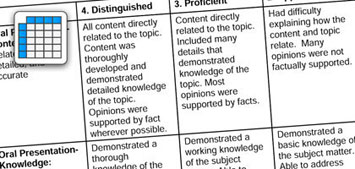
Rubric for Infographic
Educator resources
Presentation that was completed on the PD day with extra information : https://docs.google.com/presentation/d/1Fb-gqt-AI9OZ14dJZHay89646_hYHRvGh8-MUCA8e24/edit?usp=sharing

- CTL Reports
- News & Announcements
Book a Consultation
- Mailing Lists
- All CTL Programs
- TA Programs
Program Directory
- Certificates
- Conferences
- Registration Help
Upcoming Events
- Accessibility in Teaching
- Assessing Student Learning
- Engaging Students
- Fundamentals of Learning
- Supervising TAs and Graduate Students
- Teaching Assistants
- Intercultural Teaching Competence
- Part-time Instructors
- Indigenous Teaching and Learning Resources
- OWL Brightspace Training and Help Resources
- Components of Online and Blended Course Design
- Self-Directed Modules and Workshops
- Generative AI Resources
- Accessibility Boosts
- Choose an eLearning Tool
- Student Assessment
- Synchronous eLearning Workshops
- Curriculum Review Support Online
- Course Design
- Curriculum Innovation and Review
- Western Degree Outcomes (WDOs)
- Teaching Awards
- Teaching Dossiers
- Writing a Teaching Philosophy Statement
- Getting Feedback on Teaching
- Grant Opportunities
- Publications
- Scholarship of Teaching and Learning
- Centre for Research on Teaching and Learning in Higher Education (CRTLHE)
- Teaching & Assessment
- Awards & Dossiers
Elements of an Effective Infographic Assignment
Elearning at the ctl.
All | Faculty | Grad Students
LOGIN TO REGISTER
Centre for Teaching and Learning Arts and Humanities Building Room 3R34 (519) 661-2111 x80346 [email protected]
This post is a summary of the eLearning Lunch and Learn session presented on October 2nd, 2017. Images presented throughout are available for download as full infographics – these are available under Resources at the bottom of the post. Video clips from the Lunch and Learn session are also available throughout.
What is an Infographic?
An infographic is a highly visual representation of information, data, or content that is intended to quickly communicate information to a reader. Smaller than but similar to a poster, an Infographic often communicates a central argument, topic, or thesis focusing on the overall patterns, themes, or salient points.
An infographic is often designed using graphic design software. Photoshop, PowerPoint, and Word can be used, however, new online digital tools for Infographic creation are increasingly popular. Examples include Canva, Piktochart, or Infogr. am.
For a comparison of the three above-mentioned online tools for Infographic creation, see the following comparison chart.
Download (PDF, 33KB)
What makes for an effective Infographic?
Effective infographics tell a story. There is an introduction, main argument, and conclusion (Canva, 2017). Each element (text, graphics, data representations, etc.) meaningfully contributes to communicating an accurate and concise presentation of information. As a quick visual representation, Gillicano and colleagues (2014) suggest that an infographic is easily comprehended and read in less than a minute.
Much like an essay, an infographic is often the end product of a research project or inquiry process. As an academic work, it is important that the information be accurate and properly cited. Infographics should easily allow readers to access referenced material through citation.
Overall, thought should be given to who the target audience is and what purpose the infographic will serve. Accurate, properly referenced material is communicated effectively through a highly visual and well organized layout.
What are the elements of an Effective Infographic Assignment Design?
Learning Outcomes and Rationale
First and foremost, the infographics assignment aligns with intended learning outcomes of the course. Producing an infographic requires that students draw on a large skill set. It requires that they find, synthesize, and integrate a range of information in order make decisions for then arranging and designing the infographic to effectively communicate the argument through a highly visual format.
Scaffolding Student Work
Before introducing an infographics assignment, instructors should consider the skills students currently have to effectively research, integrate, and organize the information to be communicated through an Infographic as well as the design and digital technology skills for designing the infographic in a visually appealing way. Assignments should adequately scaffold students movement through the various steps involved in designing an infographic as a final product of an inquiry process. Steps could include:
- Research Stage: Submission of an annotated bibliography, report, or first draft of infographic content
- Drafting Stage: Students receive feedback on a draft of the infographic and/or it’s content from instructors or peers
- Designing Stage: Students receive support on designing their infographic, through tutorials, peer support, or design sprints
Effective infographic assignment design regularly incorporates a component requiring students to reflect on their infographic, what was learned, or how they aimed to communicate information to their target audience (Matrix & Hodson, 2014).
Peer Review
Another common element of infographics assignment designs is the use of peer review. The chance to receive feedback from peers can be incorporated at the drafting or final stages of the assignment. Peer review serves two purposes: it gives feedback to students on their infographic designs and it supports student reviewers to critically analyze the infographics of others.
Rubric Design
The following evaluative components are common amongst infographics rubrics (Matrix & Hodson, 2014; Schrock, 2012; Texas Education Agency, 2015):
Content: accurate and detailed information is provided and supports the thesis/argument/purpose
Focus: All content (visual and textual) concisely complements the purpose of the infographic
Visual Appeal: Fonts, colours, layouts, & visual elements meaningfully contribute to the infographic’s ability to convey the overall message
Argument: The infographic effectively informs and convinces the reader of its intended purpose
Organization: Information is systematically organized and supports readers’ comprehension of the main message
Citation: Full bibliographic citations are included for all sources referenced
Mechanics: The infographic is free of spelling or grammatical errors
The following Infographics are a summary of the above-mentioned information and are available for use under a Creative Commons Attribution-NonCommercial 4.0 Licence (CC BY-NC 4.0):
A Students Guide to Infographics
Download (PDF, 195KB)
An Instructor’s Guide to Infographics Assignments
Download (PDF, 158KB)
Canva. (2017). Infographic design. Retrieved from https://designschool.canva.com/how-to-design-infographics/
Gallicano, T., Ekachai, D., Freberg, K. (2014). The infographic assignment. A qualitative study of students’ and professionals’ perspectives. Public Relations, 8 (4), 1-22. Retrieved from http://prjournal.instituteforpr.org/wp-content/uploads/2014GallicanoEkachaiFreberg.pdf
Matrix, S. & Hodson, J. (2014). Teaching with infographics: Practicing new digital competencies and visual literacies. Journal of Pedagogic Development, 4 (2). Retrieved from https://www.beds.ac.uk/jpd/volume-4-issue-2/teaching-with-infographics
Schrock, K. (2012). Infographic Rubric . Retrieved from http://www.schrockguide.net/uploads/3/9/2/2/392267/schrock_infographic_rubric.pdf
Texas Education Agency. (2015). Rubric for infographic or poster. Retrieved from http://cte.sfasu.edu/wp-content/uploads/2015/04/Rubric-for-Infographic-or-Poster.pdf
Centre for Teaching and Learning Arts and Humanities Building Room 3R34 London, Ontario, Canada, N6A 3K7 Tel: 519.661.2111 x80346 [email protected] Privacy | Web Standards | Terms of Use | Accessibility
Event Registration
- Projects & partnerships
- Micro-credentials
- eLearning Café
- Teaching & learning toolkit
- Emerging AI
- Teaching & PD: Overview
- Instructor Certification Program (ICP)
- New Instructor Orientation Program (NIOP)
- Peer observation
- Scholarship of Teaching & Learning (SoTL)
- TEF: Self-assessment
- Camp Horizon 2024
- CanvasCon Gala: A Decade in Learning – May 2, 2024
- Communities of practice
- Integrated student supports
- Team resources
Infographics for assessment

Infographics for Assessment
Infographics are visual representations of information, data, or knowledge. They ’ re also a great way for learner s to represent data, visualize their understanding of concepts and explain processes.
Provide learner s with their assigned topics. Learner s can work individually or in groups. If they work in groups, assign specific roles to each member (e . g. , researcher, writer, editor, designer).
- Review the learning outcome learner s will need to achieve. Note: This activity will requir e that learner s find, synthesize, and integrate a range of information and then arrange and design the content in a way that effectively communicates to a specific audience.
- Next , review the assignment rubric . This will depend on the learning outcome learner s need to achieve, however, common components to an infographic assignment rubric include:

Accurate , detailed and well-researched information is presented and supports the topic/purpose or argument.

All content (visuals & text) are intentional and complementary to the purpose of the infographic.

Visual Appeal
Colours , fonts, graphics and data visualization effectively contribute to the topic and message being conveyed.

The infographic effectively informs the audience of its intended purpose .

Organization/Layout
Information is systematically organized and effectively aligns with the main message .

Full bibliographic citations are included for all sources of information referenced .

The infographic is free of spelling and grammatical errors.
Note : It ’ s helpful to show learner s examples of infographics used for different purposes. A simple Google image search will bring up hundreds of options to choose from. Ask learner s to walk through the rubric criteria and rate the different components of the examples shown.
Learner s can use software applications such as PowerPoint or Photoshop to create their infographics. They can also explore other free or inexpensive online options. Here are a few of our favourites .

A simple tool to create infographics, presentations, posters, flyers and other visual resources. Watch demo: https://youtu.be/LdRMqJWyvik

Another tool for data visualization, explaining processes and communicating information. Visit webpage: https://venngage.com/

Similar to Piktochart and Vennage . Canva users can work from templates or create from scratch. Visit webpage: https://www.canva.com/ “
Learner s can present their infographic options through asynchronous online discussions , or synchronously by sharing their screens and facilitating a group/class discussion on applications such as Microsoft Teams, Zoom, Blackboard Collaborate, Adobe Connect or other conferencing tools available to them.
Tips & Tricks
Universal Design for Learning principles suggest providing learner s with multiple ways to interact with content and show what they ’ ve learned. For example, you could provide learner s with the choice to create an infographic, a video or a written essay to explain a concept. As long as the learning outcome still align s with the type of assessment, the approach learner s take to get there shouldn’t matter. For more tips on curriculum alignment, see the Curriculum Alignment Framework Guide in the Teaching and Learning Toolkit (need to add this and link this project to it.).
To learn more about Universal Design for Learning, visit the CAST website: http://www.cast.org/our-work/about-udl.html#.Xp4C5VNKhTY

Jaclyn Doherty
Dean, Centre for Teaching, Learning & Innovation
Recent Posts
- Integrated Student Supports Case Study: Preparing Ag students for their live symposium presentations
- STEM Expert TEMPLATE
- Measurement Toolkit Activity (Grade 6)
- Measurement Toolkit Activity (Grade 5)
- Measurement Toolkit Activity (Grade 4)

Located on the traditional lands of the Blackfoot Confederacy, Lethbridge College is committed to honouring the land from a place of knowing. We honour the Siksikaitsitapi as both the traditional and current Land Keepers of this area, and we welcome all First Nations, Métis, Inuit, and non-Indigenous peoples who call Blackfoot territory their home.
Discover more from Learning Innovation | Centre for Teaching, Learning and Innovation | Lethbridge College
Subscribe now to keep reading and get access to the full archive.
Type your email…
Continue reading
We use essential cookies to make Venngage work. By clicking “Accept All Cookies”, you agree to the storing of cookies on your device to enhance site navigation, analyze site usage, and assist in our marketing efforts.
Manage Cookies
Cookies and similar technologies collect certain information about how you’re using our website. Some of them are essential, and without them you wouldn’t be able to use Venngage. But others are optional, and you get to choose whether we use them or not.
Strictly Necessary Cookies
These cookies are always on, as they’re essential for making Venngage work, and making it safe. Without these cookies, services you’ve asked for can’t be provided.
Show cookie providers
- Google Login
Functionality Cookies
These cookies help us provide enhanced functionality and personalisation, and remember your settings. They may be set by us or by third party providers.
Performance Cookies
These cookies help us analyze how many people are using Venngage, where they come from and how they're using it. If you opt out of these cookies, we can’t get feedback to make Venngage better for you and all our users.
- Google Analytics
Targeting Cookies
These cookies are set by our advertising partners to track your activity and show you relevant Venngage ads on other sites as you browse the internet.
- Google Tag Manager
- Infographics
- Daily Infographics
- Popular Templates
- Accessibility
- Graphic Design
- Graphs and Charts
- Data Visualization
- Human Resources
- Beginner Guides
Blog Infographics What is an Infographic? Examples, Templates & Design Tips
What is an Infographic? Examples, Templates & Design Tips
Written by: Midori Nediger Oct 12, 2023

Since infographics exploded onto the graphic design scene about 15 years ago, they’ve become a staple for communication in classrooms, in the workplace, and across the web.
But if you’re new to the world of design, the term “infographic” might still be foreign to you.
You might wonder: what are infographics?
Today, I’ll give you a crash course on infographics and infographic design to answer all of your questions and more. Don’t worry if you’re no designer — I’ll also show you how you can easily customize designs with Venngage’s Infographic Maker and easy-to-edit infographic templates .
Your guide to infographics 101:
What is an infographic.
- Why use infographics?
12 infographic examples for different use cases
How do i create an infographic, what is the importance of using visual elements in an infographic, what are the different types of infographics, what makes an infographic design effective, faqs about creating infographics.
According to the Oxford English Dictionary , an infographic (or information graphic) is “a visual representation of information or data”.
But the meaning of an infographic is something much more specific.
An infographic is a collection of imagery, data visualizations like pie charts and bar graphs, and minimal text that gives an easy-to-understand overview of a topic.
As in the example below, infographics use striking, engaging visuals to communicate information quickly and clearly.

Infographics are a valuable tool for visual communication . The most visually unique, creative infographics are often the most effective because they grab our attention and don’t let go.
But it’s crucial to remember that the visuals in an infographic must do more than excite and engage.
They must help us understand and remember the content of the infographic, as seen in this infographic about employee resignation announcements:

Ready to dive right in and create your first infographic? Check out our ultimate infographic design guide for everything you need to get started.
Why should you use infographics?
Infographics are great for making complex information easy to digest. They can be helpful anytime you want to:
- Provide a quick overview of a topic
- Explain a complex process
- Display research findings or survey data
- Summarize a long blog post or report
- Compare and contrast multiple options
- Raise awareness about an issue or cause
When you need to give someone a really quick rundown on something that can be hard to explain in words alone, an infographic is a good way to go.
Ever noticed infographics can be useful in pretty much any industry? It’s true! They can explain tough topics, show off cool data or just grab your attention, depending on what you’re after.
Here are just some of its use cases:
- Infographics for marketing
- Infographics for consulting and freelancing
- Infographics for small businesses and entrepreneurs
- Infographics for government
- Infographics for nonprofits
- Infographics for education
Marketing infographics
What are infographics used for in marketing?
Marketers use infographics to build brand awareness and boost engagement about topics important to the company, such as this infographic on diversity and inclusion:

Marketers can use infographics to:
- Showcase your business’s achievements on a landing page or downloadable one-pager
- Send a visually striking newsletter to deliver news, showcase a new product or service or demonstrate thought leadership
- Improve their online courses or course handouts
- Drive interest on social media . Share snippets on Instagram or the full infographic on Pinterest.
- Make a roundup infographic. Collect quotes from influencers, compile them into an infographic and write a blog post on that. Here’s an example: 61 Women In Tech Speak Up [Infographic]
- Summarize key points in a white paper or ebook .
Informational infographic examples, like this one about the effect of excess sodium, are great tools for educating a variety of audiences.

Consulting and freelancer infographics
Consultants use timeline infographics to visualize project timelines and to simplify new or industry-specific topics to their clients:

Consultants use infographics to:
- Present data in a fresh way in client presentations
- Strengthen your argument and visualize timelines in client proposals
- Deliver progress reports to clients. Include an infographic in your report to visualize project timelines or progress “by the numbers”
Small business and entrepreneurship infographic examples
Small businesses and entrepreneurs use infographics to reach new audiences and increase brand awareness :
This brand style guide cheat sheet is a great infographic example for small businesses. It’s visual and compact, which helps readers absorb the information faster.

Lists are a common type of document that all businesses have. But long lists can get tedious to read. It’s unlikely that readers will even remember the items on the list.
Businesses can use infographics to visualize lists for better learning retention, like this colorful infographic example below.

Or this list infographic which discusses three different change styles:

A business may also want to visualize processes and activities. This infographic example on supply chain analysis could easily have been a boring document. Instead, the topic is covered more thoroughly and succinctly in an infographic:

Small businesses and entrepreneurs can use infographics to:
- Create their brand style guide
- Highlight their offerings and past successes in flyers and brochures
- Promote their business or demonstrate thought leadership on social media
- Better showcase products/services and past successes on their website’s sales page or in a downloadable one-pager
- Showcase your company’s history on their website’s about page
- Send creative newsletters
- Create more interesting webinars
Government infographics
What are infographics used for in the governmental sector? Governments use infographics to share statistics and census data, like in this visual from the Government of Canada :

Government can also use infographics to spread useful healthcare information , such as vaccine infographics which promote accurate vaccine information and increase vaccination rates. Here’s an example:

Nonprofit infographics
Nonprofits use infographics to promote events and raise awareness for their causes or to showcase their successful fundraising efforts:

Nonprofits use infographics to:
- Make data and information about a given cause easy to understand. This can be applied to a newsletter , social media campaign , donation page , poster, and more.
- Plan a campaign strategy
- Show the impact of a fundraiser that can be sent to donors in an email
- Highlight results in an annual report
- Showcase successes in an impact report or case study
- Visualize information in crisis communications
Education infographics
Educators and trainers use infographics to make content more memorable for students and employees:

Need to explain a complex process? Our process infographics can help communicate cumbersome processes in a visual way.

Infographics can be useful whenever you need to communicate information quickly, or any time you want to make an impact with your data or your message.
If I’ve convinced you that infographics are a tool you should be using, you’re probably wondering how you can create your own infographic.
Our step-by-step guide on how to create an infographic is a great resource to design an infographic.
No matter how excited you are to get started making your very first infographic, you shouldn’t jump into the design process without a game plan.
Instead, start by creating an infographic outline.
- Organize your information with an infographic outline
- Pick an infographic template
- Customize your infographic
1. Organize your information with an infographic outline
The process of creating an outline will help you organize your thoughts and ensure that your content will work in an infographic.
Create an infographic outline from existing content using these 4 steps:
- Determine the key takeaways of your content
- Determine the title, headers, subheaders, and facts
- Consider the length of paragraphs and points
- Include notes for the designer

Starting with an outline in this format will ensure that the rest of the design process goes smoothly.
For a more detailed run-down of this process, check out our guide on how to create an infographic outline .
2. Pick an infographic template
Once you’ve got an outline, you’re ready to pick an infographic template .
Pre-made infographic templates (like the one below) can give you the design inspiration you need to get your infographic rolling. Even just using them as a jumping-off point can be helpful.

There’s a lot to consider when picking an infographic template, including the colors, fonts, length, size, and style of each template, and how well each of those factors aligns with your content.
But most importantly, you need to pick the right type of infographic template for your content.
3. Customize your infographic
Once you’ve chosen an infographic template, you can start customizing it to your needs. This infographic can be adapted for other types of lists with the Venngage editor.

Here are a few ways to adapt the infographic examples in this post:
- Change the background and text colors
- Adjust the text to suit your message
- Add or swap out icons that are relevant to your story
- Add your brand logo in the footer
- Increase or decrease the size of the list
Want more information about creating infographics? This video guide will show you how you can make an infographic in just 5 steps:
The use of visual elements in an infographic can help enhance the overall effectiveness of the communication. Here are some key points highlighting the importance of using visual elements in an infographic:
- Enhanced comprehension: Visual elements, such as graphs, charts and illustrations can simplify complex information, making it easier for the audience to understand the data presented.
- Improved retention: Human beings tend to remember visual information more effectively than text alone. By incorporating visual elements, infographics can improve the retention of information, ensuring that the key points are more likely to be remembered by the audience.
- Increased engagement: Visual elements in infographics make the content more engaging and appealing. People are naturally drawn to visuals, and the use of color, images and graphics can capture the audience’s attention, encouraging them to spend more time interacting with the information.
- Facilitated comparison: Infographics often involve the presentation of data sets, comparisons or contrasts. Visual elements can effectively facilitate such comparisons, enabling the audience to discern patterns, trends and differences more easily.
- Universal understanding: Visual elements can transcend language barriers, making infographics a powerful tool for communicating with diverse audiences across different cultural and linguistic backgrounds.
- Aesthetic appeal: Infographics that are well-designed and visually appealing are more likely to be shared and distributed widely, especially in the context of social media and online platforms. Aesthetically pleasing visual elements can attract more attention and help the infographic reach a broader audience.
- Storytelling: Visual elements can contribute to the storytelling aspect of an infographic, allowing for the creation of a narrative that flows logically and is visually engaging. By combining text and visuals, infographics can effectively communicate a compelling story or message.
In summary, the use of visual elements in infographics is critical for conveying complex information in a more accessible and engaging manner, enhancing comprehension, improving retention, and increasing overall audience engagement and appeal.
At Venngage, our library of infographic templates is sorted into 9 different categories:
- Statistical infographics
- Informational infographics
- Timeline infographics
- Process infographics
- Geographic infographics
- Comparison infographics
- Hierarchical infographics
- List infographics
- Resume infographics
This video summarizes these 9 types of infographics and when to use them:
Each type of infographic is tailored to visualize a different type of content .
Informational infographics , for example, are typically more text-heavy than the other types of infographics.
Like this example from Course Hero below, they work best as summative, standalone pieces that provide a high-level explanation of a topic.

There are also informational infographics that explain something niche, but very simply. These are handy to have as visual references for topics that are new and unfamiliar.
TalentLyft’s infographic on recruitment metrics is a great example – a short and sweet summary of the six key recruitment metrics hiring managers should understand and track.
Statistical infographics , on the other hand, are more focused on numbers and data visualizations, charts, and data, for example:

They tend to contain much less text than informational infographics and have less of a narrative flow.
Instead, they make a statement with big numbers and standalone facts, like this infographic from the Internet of Things .

Similarly, this sample infographic from Podia on the “ State of the Side Hustle ” uses numbers and stylization to make its most important points prominent with sparse supporting text.

Choosing the right type of template for your content is one of the keys to a successful infographic.
For a full description of each type of infographic, and when to use them, check out this guide to the 9 types of infographic templates .
When it comes to designing an effective infographic, it’s important to recognize that our brain seeks patterns in visual information to help us make sense of the world.
We can use this idea to structure our information visually and create patterns that will enhance the message that we’re trying to communicate.
Let’s run through some infographic design best practices to help you create infographics that are as effective as they are beautiful.
Also, check out our post on 7 ways to customize your infographic template for more easy hacks on how to make your design pop.
Use lines, borders, and shapes to group related information
Even something as simple as the position and grouping of elements on a page can influence the way our readers understand our graphics.
If we use basic design elements like borders, lines, circles, and squares to visually organize our content, our readers will find it easier to interpret that content.
For example, we can enclose related elements within an outline or a shape. Most infographics, like the sample below, use this tactic to break up the design into multiple sections, making the graphic easier to scan.

Alternatively, when the structure of the information is the main focus of the infographic (like in an organizational chart or a flow chart ) it can be helpful to explicitly connect related elements with lines. Like in this marketing flow chart infographic:

Click the template above to make an organizational chart . Edit the template to your liking — no design experience needed.
Want more tips on organizing your information in an infographic? Check out our step-by-step guide on how to summarize information and present it visually .
Use contrasting colors to guide your readers’ attention
Another major design element to think about is color. We’re naturally inclined to use color to make infographics look pretty, but color can also be used as a powerful communication tool .
Just like lines and borders, colors can be used to indicate information groupings, as seen in the business strategy infographic example below:

But more importantly, we can use color to draw attention to particular pieces of information and push supporting information into the background.
Pick one color that contrasts with all of the other colors in the graphic, and use it to make the most important information stand out.
Take the infographic below, for example. The bright teal icons contrast with the plain white background to make the icons (the most important visual aspect of the graphic) stand out.

This strategy also happens to be highly trendy. Pops of color are one of the biggest graphic design trends of 2022 .
Need some infographic color scheme inspiration? Check out our guide on how to pick colors for infographics .
Create a text hierarchy with three different font styles
Fonts are one of the first things people notice when they first look at an infographic. If chosen poorly, fonts can ruin an otherwise great infographic.
Our roundup of popular font types will steer you on the right path.
The key to using fonts correctly in infographics is to create a clear text hierarchy with three different font styles–one for the main heading, one for the section headings, and one for the body text.

The main header font should be the biggest and can be the most stylized. Think of it as the way to set the mood of your infographic.
The font for the section headers should be a bit smaller and less stylized, but it should still stand out on the page.
Finally, the font for the body text should be the smallest, and not stylized at all. It needs to be as easy to read as possible.
Not sure what a readable font looks like? Here’s a quick reference guide to fonts that are great for body text:

For more infographic font tips and best practices, check out our guide all about choosing infographic fonts .
Use images, icons, and illustrations to make key takeaways memorable
Last but certainly not least, make sure that the focus of your infographic is on visuals like images, symbols , icons, illustrations , and data visualizations like charts and graphs.
Visuals are crucial for making your information engaging and memorable. The best infographics have an equal balance of text and visuals.
The easiest way to make sure you have enough visuals in your graphic is to add an icon to represent each header, as seen in the example below:
Or even better, create visual examples of each main point in the infographic, as seen in this sample infographic from Elle & Company :

It’s important to have fun with your design, too. It doesn’t need to be strictly business-y and serious.
Infographics are supposed to be engaging and memorable, and illustrations are great story-telling devices.
Making a data-heavy infographic and need help visualizing your data? Check out our guides on designing effective charts and choosing the best charts for your infographic .
What does infographic mean?
The word “infographic” is a combination of two words (you guessed it!): “information” and “graphic”.
Simply put, an infographic is a graphic that presents information and/or data — most importantly, in an easy-to-understand way.
What is an infographic example?
An infographic example is a visual representation of information. Infographics examples include a variety of elements, such as images, icons, text, charts, and diagrams to convey messages at a glance.
What is the purpose of an infographic?
The purpose of an infographic is to visually present information and data in a clear and engaging manner, making complex concepts more understandable.
Are infographics limited to one page?
Infographics are not limited to one page and can vary in length. That said, they are often designed to be concise and easily digestible, frequently fitting on a single page for optimal accessibility.
What are infographics used for?
An infographic has numerous uses in different industries. Infographics can be used to convey complicated data in a simple visual format. They are also visual tools to tell stories.
Visual information graphics help people understand information quickly and more accurately.
Infographics can also be used to show changes or comparisons in data, time, and place, as well as statistics, maps, and hierarchies.
What are the five types of infographics?
We’ve mentioned the nine major infographic categories, among which these are the most common types of infographics are:
- Statistical
- Informational
Different types of infographics require specific elements. Timeline infographics need to include the date and time stamps. A comparison infographic usually includes columns and rows.
The infographic examples in this post will help you understand what type you need to use for your message so you can make the right choice.
Do you need quantitative data to make an infographic?
Simple answer: No! You don’t need quantitative data (numbers) to create an infographic. Infographics are meant to convey information in an easy-to-understand way, and that applies whether the information you have on hand is purely qualitative:

Or quantitative:

Or a combination of both, like in this infographic example:

Conclusion : Create an infographic to make the most out of your knowledge and data
The best infographics use a combination of text, images, and data to inform and engage.
If you’re ready to create infographics that strike the perfect balance between fun and educational, make sure you follow these infographic design best practices:
- Use lines, borders, and shapes to group related information.
- Use one contrasting color to draw attention to key information.
- Create a text hierarchy with three different font styles.
- Use images, icons , and illustrations to make key takeaways memorable.
For more help getting started on your first infographic, check out this guide: How to make an infographic in 5 steps .
Not a designer? No problem. Create an infographic today using our easy-to-edit templates and simple online editor.
Discover popular designs

Infographic maker

Brochure maker

White paper online

Newsletter creator

Flyer maker

Timeline maker

Letterhead maker

Mind map maker

Ebook maker
Going Digital | Creating an Infographic Assignment
- Designing the Assignment
- Digital Intensive SLOs
The Basics #
An infographic assignment is a great way to get your students thinking about your course content a little differently. A project like this can be designed as a standalone assignment or incorporated as part of a group project, in-class presentation, or recorded video presentation.
1. What is an infographic?
An infographic is a visual representation of information, designed to share knowledge quickly and clearly. Here’s an example:

2. Why might you want to create an infographic assignment?
- An option for creating AI-resistant assignments
- Gives students options to demonstrate proficiency (a core tenet of Universal Design for Learning )
- Help with classroom engagement
- Gives students experience with digital tools
- Can be a step towards creating a Digital Intensive course
3. What kind of assignments can this replace or supplement?
- Research Projects
- Journals
- In-Class & Recorded Presentations
- Group Projects
Designing the Assignment #
Whether you are designing the assignment from the ground up or converting an existing assignment, the steps below can help you think through framing, building, and grading the project.
1. Decide on goals
Student outcomes.
The goals of an infographic assignment can vary greatly, depending on what you hope your students will get out of the project. A few common outcome objectives for this type of assignment are:
- Demonstrate understanding of course content
- Synthesize concepts to create new information
- Practice communicating information clearly
- Practice research and citation
- Demonstrate technical proficiency with graphic design tools
All are valid goals, and being clear about how much priority you assign to each one will help in designing the assignment (and ultimately your grading criteria).
If you are creating this assignment to be a large final project or other large assignment, you may want to break it down into smaller parts with due dates for each (much like a research paper). Some possible steps are:
- Topic selection
- Source selection
- Information outline and design plan or rough sketch
- Final infographic
Smaller projects, such as weekly “social media post” style infographics, may need fewer steps but the end product will likely be less polished.
Project Format
How do you imagine your students might apply these skills outside of your classroom? Perhaps you are hoping students will learn to communicate accurately and effectively on social media platforms, or maybe you want them to practice creating informative presentation visuals.
If you are planning to share these infographics on the web, or want the students to practice designing posts for a specific platform that is common in your discipline, the best thing to do is web search for “[platform name] image dimensions.” You could also recommend that your students do that research to plan their project format themselves!
If you aren’t sure where to start or want to give your students some guidelines, here are some common platforms and their dimensions:
Instagram Post
1080 x 1080 pixels
Good for smaller projects.

PowerPoint/Full Screen Presentation
1920 x 1080 pixels
Good for infographics designed to supplement presentations.

Website, Blog Post, or Journal Article
This format is the hardest to pin down, and varies widely based on how the student wants viewers to navigate their infographic, where the infographic is placed in relation to text, and how much information the infographic needs to communicate. One possibility is the default Canva template shown below (800 x 2000) which reveals the information vertically as viewers scroll down the page.

Alternatively, you may decide to let the students pick the dimensions that work best for their project (though in this case you might end up with a lot of default Canva template sized projects). This article by Edward Tufte showcases several excellent infographics using various dimensions.
2. Recommend resources
Some students may already have tools they prefer, while others will have no prior experience with these tools. Unless you have a specific reason, there’s no need to require use of a certain tool, but it’s a good idea to offer your students some options. Below are a few we suggest.
Graphic Design Software
A free browser-based tool for graphic design. Canva includes a large library of graphic elements that can be used to design an infographic, but students must be careful to avoid premium assets that require purchase.
Vectr is a free browser-based graphic design tool that uses vectors. Vectors are a bit complicated for beginners, but are a powerful way to creating design that can be shared at many different scales without compromising image quality.
Adobe Express
Similar to Canva, Adobe Express is a free browser-based graphic design tool.
Adobe Creative Cloud
Adobe tools like PhotoShop, Illustrator, and InDesign may be overwhelming for beginners, but have many features that can help a project shine. All Adobe Creative Cloud apps are available via AppsAnywere , UMW’s virtual computer lab.
Graphic Design Hardware
With so many browser-based tools for graphic design, students can accomplish simple infographic projects with a basic laptop, Chromebook, or even a phone! But if students want or need more powerful hardware, there are several options available to them.
HCC Computer Workstations
The Hurley Convergence Center contains computers throughout the building that can be used for graphic design projects. The HCC is open 24/7 to students with an EagleOne swipe.
Digital Knowledge Center
The Digital Knowledge Center has several computers with the Adobe Creative Cloud suite, including two Surface Studios that can fold down to become large drawing tablets.
HCC Computer Loan
The HCC Info Desk loans PC and Mac laptops to students for up to six days.
3. Offer support
Make sure your students are aware that they have many options for support for digital assignments (they don’t have to always come to you!).
DKC Class Visits
Consider having the Digital Knowledge Center visit your class to introduce tools and best practices for your assignment. This can go a long way in helping your students get off on the right foot. Visits can be tailored to the needs of your class.
DKC Appointments
If students run into issues, they can book appointments with a Digital Knowledge Center consultant to help get them unstuck.
DKC Online Guides
The Digital Knowledge Center maintains online guides on many tools for digital projects, including “Getting Started” best practices for audio, video, graphic design, and website-building projects.
4. Consider Accessibility
It is important to consider accessibility in any digital project. Since infographics are a visual medium, providing the information in alternative formats is essential. Here are a few methods to accomplish this:
Provide a written outline of information
Usually the information shared in an infographic can be summarized in a paragraph or two. Consider asking students to share this outline as part of the project, either beforehand (so you can make sure they are on the right track) or alongside the project. This is particularly important if students are sharing work publicly outside of the classroom.
Alternative text (or “alt text’) is used to describe the appearance and function of an image on a page. Alt-text is incredibly helpful for visually impaired viewers who are using screen readers but it also has many other benefits. Most platforms (word processors, social media platforms, web-building tools like WordPress, and presentation tools like PowerPoint) have some method of including alt text. If students are sharing their work on any of these platforms, consider asking them to include a short description of their infographic in the alt text.
5. Determine Grading Criteria
Many of the grading criteria you might use for a “traditional” project still hold true for a digital assignment. If you already have criteria you are comfortable with, great! If you are unsure how to go about grading an infographic, below are some guiding questions and a sample rubric for an assignment.
Guiding Questions
- Does the student address the prompt and fulfill the assignment effectively?
- Does the student think creatively?
- Does the student clearly state their argument, or thesis?
- Do the visual elements facilitate communication of the thesis?
- Has the student cited sources? Are sources high-quality and support the thesis?
- Are the graphic elements high-quality (not grainy or distorted)?
- Are the graphic elements royalty free or open-license? Does the student credit the creator?
- Has the student included alt text or otherwise endeavored to make the project accessible?
Example Rubric
- 40 points | Thesis and argument
- 30 points | Visual Communication
- 15 points | Sources and Citations
- 15 points | Accessibility & Attribution
6. Determine Submission Method
There is no “wrong” way to receive assignment submissions, so choose the one that works best for your learning objectives. Below are a few options.
Canvas Assignment
Canvas is a great submission option if you just want to receive the files directly. You can set the assignment submission type to “File Upload,” and students can upload their image file and supporting documentation all at once.
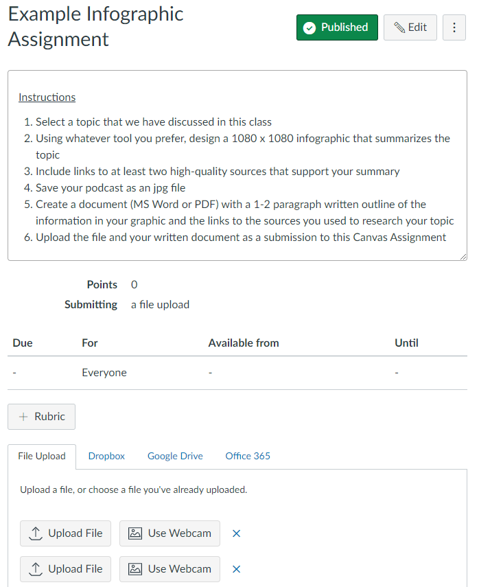
Alternatively, if you are interested in having your students think about their work as having life outside of your class, embedding their image in a blog post is a great option. This gives students the experience of creating an infographic as part of a larger piece, such as a news article or journal.
Digital Intensive SLOs #
Each Digital Intensive proposal is considered by the DI committee on a case-by-case basis, so there is no “guaranteed” method to acquire the designation. But below are few examples that may help a podcasting assignment address the DI Student Learning Objectives.
These are just a few options – there are countless ways to accomplish the DI objectives. And remember that a single assignment does not need to address every SLO! An infographic assignment could address some, while other assignments could address others.
Students will successfully locate and critically evaluate information using the Internet, library databases, and/or other digital tools.
- Require students to share sources for the claims made in their infographic
- Use the SIFT Method or other criteria to evaluate an online source’s credibility
Students will use digital tools to safely, ethically, and effectively produce and exchange information and ideas.
- Converting a written assignment to an infographic assignment goes a long way to addressing this SLO
- Require a written outline, alt text, and attribution of graphic assets as part the project
Students will creatively adapt to emerging and evolving technology.
- Instead of requiring a specific tool to create their infographic, ask students to evaluate several and select the one that best fits their needs
- Instead of submitting a file in Canvas, ask students to build a public web site using Domain of One’s Own or Sites@UMW to post their infographics
Resources #
Liberated learners – graphic design.
A great resource to share with your students! This walks through the graphic design process from start to finish.
DKC Graphic Design Guides
The Digital Knowledge Center maintains getting-started guides, tool recommendations, and repositories of free media resources for various digital project types.
Project Resources
Free umw resources.
A list of tools and services available to UMW students that can help with digital projects.
Free Media Resources
A repository of online sources for copyright and royalty-free stock photos, video, and audio that students can incorporate into their projects.
Edward Tufte article on Megan Jaegerman’s News Infographics
A great source of inspiration highlighting the tremendous variety of what’s possible with infographic projects.
Dr. Andrea Smith’s Historic Preservation Infographic Course
Students in this course designed infographics that are still referenced by Fredericksburg City and professionals in the field.
How can we help?
- Department & Units
- Majors & Minors
- LSA Course Guide
- LSA Gateway
Knowledge base
- Administrative Applications
- Classroom Support & Training
- Computer & Desktop Support
- Equipment Loans & Reservations
- Lecture Recording
- Media Center
- Research Support & Tools
- Emergency Remote Teaching
- Website Services & Support
- Support Hours
- Walk-in Support
- Access Controls
- Student Resources
- Support LSA
- Course Guide
Search: {{$root.lsaSearchQuery.q}}, Page {{$root.page}}
Infographic assignments: blending creative and critical.
- News & Events
- Teaching Tip of the Week
- Search News
Innovate Newsletter
While many of your students are likely familiar with infographics from campus posters and social media, they may not have had much experience critiquing or authoring them in an academic setting. To create an effective infographic assignment, first consider what you want your students to be able to do with infographics. Do they need to analyze them? Do they need to research their infographic topic, or will you provide the data for them? Perhaps they need to create a specific type of infographic? Is the focus of your class more on the research, on the data visualization, or on the creative graphic element? These decisions will shape how you scaffold the assignment. For creative assignments, especially, consider what level of experience your students have and what type of information they need to convey. That will help narrow down the best tool for them to use.
Weekly Ed-Tech Spotlight:
Did you know that Gradescope , a tool for tests and assessments, is available to LSA? Gradescope includes support for scanning paper exams or hand-written answers, and flexible tools for grading with a team and adjusting rubrics as needed while grading.
Structuring an Infographic Assignment
If students have not analyzed or created compact data graphics before, it’s especially important that the assignment clearly lay out the individual steps involved in designing an infographic. This helps beginners start to frame their analysis of examples, as well as helping instructors pace the project. Students may not initially understand infographics as the end product of a research process, but if their assignment includes a research stage, they soon will! If your students are beginners in this genre, be sure you also make explicit for them what the purpose of this specific infographic is. Should it:
Provide a quick overview of a topic?
Explain a complex process?
Display research findings or survey data?
Summarize a long article or report?
Compare and contrast multiple options?
Raise awareness about an issue or cause?
Each of these will require a different layout and approach. The purpose of the infographic will also shape what tool will be most effective, to create the infographic.
Some useful step to include in most infographic assignments are:
Analysis Stage: Students read and start to critically analyze examples of infographics.
Research Stage: Submission of an annotated bibliography, report, or first draft of infographic content
Drafting Stage: Students receive feedback on a draft of the infographic and/or it’s content from instructors or peers
Designing Stage: Students receive support on designing their infographic, through tutorials, peer support, or design sprints
Peer Review: The chance to receive feedback from peers can be incorporated at the drafting or final stages of the assignment.
To ensure peer review is substantive and directed, you might use a rubric like the one below, which separates out the specific skills students need to demonstrate. Each area can then receive directed and useful feedback.
Potential Tools
There are many tools available at UofM to use for creating infographics. Be sure to select one that matches the assignment’s purpose. If your focus is on showing comparative or quantitative data, it may be best for students to generate data charts from Excel spreadsheets or Google Sheets. If you are focusing on statistics, especially with advanced students, using histograms from R Studio will suit the purpose and also give them additional practice using this industry-standard tool. Beginners, or students who will be focusing on the creative graphic element, may be better served by easy-to-use free software such as Piktochart or Canva , or even using PowerPoint.
If you would like to discuss how an infographic assignment might fit into your class, or what tools might best suit, please feel free to reach out to the [email protected] or request a consultation here .
Office of the CIO
News & events, help & support, getting started with technology services.
TECHNOLOGY SERVICES
G155 Angell Hall, 435 South State St, Ann Arbor, MI 48109–1003 734.615.0100 [email protected]
- Information For
- Prospective Students
- Current Students
- Faculty and Staff
- Alumni and Friends
- More about LSA
- How Do I Apply?
- LSA Magazine
- Academic Advising
- Majors and Minors
- Departments and Units
- Global Studies
- LSA Opportunity Hub
- Social Media
- Update Contact Info
- Privacy Statement
- Report Feedback
Jump to navigation
- Inside Writing
- Teacher's Guides
- Student Models
- Writing Topics
- Minilessons
- Shopping Cart
- Inside Grammar
- Grammar Adventures
- CCSS Correlations
Infographics

Check out our growing storehouse of free infographics that teach English language arts, 21st century skills, and social-emotional intelligence.
Infographic
Text structures revealed.

7 C's for Building a Rock-Solid Argument

Tricks to Beat Writer's Block

Show or Tell


This cross-curricular resource was designed to help students practice creating fractions, ordering decimals and incorporating elements of art, while creating their very own infographic! This project was created for Grade 6 and a rubric is included. Grade 5 Infographic Assignment is sold separately.
About This Product:
- Grade 6 Rubric
- Incorporates infographics, media, art, fractions and ordering numbers
- Step-by-step instruction guide with examples
- Clip Art from LittleRed and Creative Clips on TpT
math - project - middle school - art - media - infographic - grade 6
Similar Resources You May Be Interested In:
Grade 5 Math - Number Sense Infographic
Grade 4 Math - Number Sense Unit Plans
Grade 4 & 5 Math - Number Sense Unit Bundle
Grade 5 Math - Number Sense Unit Plans
Grade 6 Math - Number Sense Unit Plans
Grade 5 & 6 Math - Number Sense Unit Bundle
Grade 5 Math - Number Sense Cross-Curricular Infographic Project
Grade 5 & 6 Math - Barbecue on a Budget Financial Literacy Project
Grade 5 & 6 Math - Vacation on a Budget Financial Literacy Project
Grade 5 & 6 Math and Health - My Healthy Plate Assignment
Junior / Middle School Math - Stop Motion Coding Assignment
Grade 5 Math - Infographic Assignment
Grade 5 & 6 Math - Measurement Unit Plans
Grade 5 & 6 Math - Financial Literacy Unit Plans
Grade 5 & 6 Math - Fractions, Rates and Ratios Unit Plans
Grade 5 & 6 Math - Data & Probability Printable Unit Plans
Check out other Math resources in the Smarty Pants Studies store by clicking here! If you're looking for cross-curricular projects, click here!
What are the benefits of using Smarty Pants Studies’ educational resources?
All Smarty Pants Studies’ resources have been used in the classroom and crafted using Ontario curriculum expectations with increasing student engagement and understanding in mind. Smarty Pants Studies’ resources are little to no-prep and many are cross-curricular, print and/or digital, allow for student choice and foster creativity.
Before you leave a review, a friendly reminder that I am a hardworking teacher and small business owner; I appreciate all reviews and feedback (positive or constructive), but please ensure you have used the product and your rating is reasonable and justified before submitting.
Terms of Use:
· Do not give this product away to others. If you wish to purchase multiple copies to share, you will receive a discount for any additional licenses you purchase.
· Do not claim this work as your own.
· Do not cover or delete the Smarty Pants Studies footer or logo.
· If you have any other questions about acceptable use of Smarty Pants Studies products, please feel free to contact me at [email protected].
Thank you for your interest in Smarty Pants Studies! Follow along on Teachers Pay Teachers and @smartypantsstudies on Instagram to stay in the loop on new product launches!
Grade 6 - Dinner Menu Infographic! Fractions, Decimals and Art!
Creating Infographics. FDNT 213. Life Cycle Nutrition: Assignment and Grading Rubrics
- Assignment and Grading Rubrics
Assignment and Grading Rubric
- FDNT 213 Life Cycle Portfolio Grading Rubric
- Infographic Rubric
- Infographic Assignment Guidelines
- << Previous: Home
- Last Updated: Nov 14, 2019 11:27 AM
- URL: https://libraryguides.lib.iup.edu/c.php?g=455637
- help_outline help
iRubric: Infographic Project rubric
- Program Cover
grade 6 media
All Formats
Resource types, all resource types.
- Rating Count
- Price (Ascending)
- Price (Descending)
- Most Recent
Grade 6 media

Grade 6 Media Literacy Ontario

- Easel Activity

Country Infographic ( Grade 5/ 6 Writing/ Media )

Grades 4 - 6 : Winter Cup Art / Media Print or Digital Media Project!

- Google Apps™

Watercolor Glue Art Tutorial | Step by Step | Grades 6 -12 | Mixed Media

GRADE 6 7 8 MEDIA LITERACY, CREATING MAGAZINE COVER, ONTARIO CURRICULUM

- Word Document File

Media Arts: Grades 5 - 6

Grade 6 Math - Infographic Data Management and Media Assignment

Media Literacy Unit Ontario Grade 6 -8

- Google Slides™

Famous People Biographies Social Media Profile Project Grade 4 5 6 BUNDLE

Super Bowl Extravaganza: Economics and Media Literacy Bundle for Grades 6 -12

ELA End of Year Social Media SEL Reflection Drawing Activity - Grades 6 -12

Canadian Media Literacy Activities Grades 4- 6
GRADE 6 7 8 MEDIA LITERACY, ADVERTISEMENT ANALYSIS RUBRIC, ONTARIO CURRICULUM

Real-Life Integers: Integer Math in Sports, Media , Geography and Finance Grade 6

Engaging Pearl Harbor Webquest & Creative Media Project - Grades 6 -12
- Google Drive™ folder

Globalization Social Media Project with Digital Resources: Grades 6 -12

Juneteenth Social Media Project with Digital Resources: Grades 6 -12

Electoral College Social Media Project with Digital Resources: Grades 6 -12

Branches of Government Social Media Project with Digital Resources: Grades 6 -12

Bill of Rights Social Media Project with Digital Resources: Grades 6 -12

Memorial Day Social Media Project with Digital Resources: Grades 6 -12

Russian Revolution Social Media Project with Digital Resources: Grades 6 -12

Indian Independence Social Media Project with Digital Resources: Grades 6 -12

Industrial Revolution Social Media Project with Digital Resources: Grades 6 -12
- We're hiring
- Help & FAQ
- Privacy policy
- Student privacy
- Terms of service
- Tell us what you think
Yankees rotation hits a speed bump, Clarke Schmidt shut down for 4-6 weeks

ANAHEIM, Calif. - It's been an amazing run for the Yankees' 2024 rotation, but they hit a speed bump on Thursday, with right-hander Clarke Schmidt heading to the injured list.
An MRI taken Wednesday revealed a strained right lat. Following an exam Thursday by Dr. Neal ElAttrache in Los Angeles, Schmidt was instructed not to throw a baseball for the next four-to-six weeks.
"It's going to be a while,'' said Yankees manager Aaron Boone at Angel Stadium.
After the Yankees' 8-3 win against the Angels, Schmidt was a bit more optimistic on the "soft timeline'' for his recovery, expecting to be re-evaluated in three weeks and throwing by week four.
Vowing to “do every single thing I can to expedite this process and get back out there,’’ Schmidt also pledged to be smart in his rehab.
“I really want to help this team down the stretch and win big games and playoff games.’’
Prior to Thursday night's series finale, right-hander Cody Morris was recalled from Class AAA Scranton/Wilkes-Barre.
According to Boone, right-hander Cody Poteet is expected to slot into Schmidt's rotation spot Saturday, when the Yankees play the Giants at San Francisco.
Whether he'll remain as Schmidt's rotation replacement has yet to be determined.
Yankees' Clarke Schmidt talks about his road back to the rotation
Schmidt last pitched on Sunday at San Diego, yielding one earned run over five innings, in a 5-2 loss to the Padres.
After the game, Schmidt said it was one of those starts where he did not feel 100 percent physically but mentioned nothing specific.
“It definitely came out of nowhere, my body’s been feeling amazing,’’ said Schmidt, who felt some discomfort during his pregame bullpen and during the game.
Having trouble recovering between starts, Schmidt felt it was “more than typical soreness,’’ and went for an MRI.
“It’s definitely devastating,’’ said Schmidt, who is “probably having the most fun I’ve ever had playing this game’’ and a part of him feels he’s “letting the team down’’ because he’s unavailable.
Schmidt said he spoke to his good friend and ex-teammate Luis Severino about the injury, which Severino dealt with as a Yankee, and with ace Gerrit Cole who’s “had something similar with a lat in the past.’’
Yankees staff's wild success to date
Following the right elbow nerve irritation diagnosis of Cole, the Yankees slotted rookie Luis Gil into his open rotation spot - and the staff has taken off.
In 16 starts, through May 29, the Yankees' rotation combined to post a 1.00 ERA across 99 innings, and Schmidt was enjoying an excellent season, with a 2.52 ERA over 11 starts.
Poteet was 3-0 with a 4.05 ERA in seven starts for the Yankees' Class AAA affiliate this season.
“He’s thrown a number of sides, getting ready for this weekend,’’ said Boone, adding that the Yanks were "excited'' to sign Poteet as a free agent in January.
"He’s a guy we valued and felt could help us’’ potentially down the road.
Yankees' narrow list of choices to replace Clarke Schmidt
Due to Gil's success in Cole's absence, the Yankees' thin rotation depth hasn't been further tested until now.
Among the rotation candidates late in spring training, Clayton Beeter is on the IL with a shoulder issue, while fellow right-hander Will Warren has struggled to an 8.53 ERA over 10 starts at Scranton/Wilkes-Barre.
Morris (3-0, 2.82) has almost exclusively been a reliever this season. This week, the Yankees received pitcher Matt Sauer as a Rule 5 return from the Kansas City Royals.
Other than Schmidt, Gil, Carlos Rodon, Nestor Cortes and Marcus Stroman, Poteet is the only other pitcher to have made a start for the Yankees this year, necessitated by a rainout.
On April 13 at Cleveland, Poteet went six innings and yielded one run in an 8-2 victory against the Guardians.
A former fourth-round draft pick by the Marlins in 2015, Poteet pitched in parts of two seasons with Miami, going 2-4 with a 4.45 ERA during 2021-22.
Poteet, 29, had Tommy John surgery in August 2022. He'd recently been sidelined by a blister, but Poteet was due to return to the Scranton/Wilkes-Barre rotation this weekend.
Gerrit Cole draws closer to beginning a rehab assignment
Cole threw another session to live batters Thursday at Tampa, Fla., and he might be ready to go on a rehab assignment by Tuesday - putting him roughly a month away from joining the rotation, barring any setbacks.
“Sounds like everything went well,’’ said Boone, who spoke by phone with Cole after Thursday’s session. “He was pretty pleased with his outing and just how he felt.’’
Assuming all goes well in his recovery, Tuesday is “definitely a possibility’’ for Cole to begin a rehab assignment, possibly at Class A Tampa or Class AA Somerset.
IMAGES
VIDEO
COMMENTS
13 Tricks for better Infographic Designs. Standards Common Core Anchor Standards for English Language Arts - Grade 6-8. Reading Theme. Key Ideas and Details. 1. Read closely to determine what the text says explicitly and to make logical inferences from it; cite specific textual evidence when writing or speaking to support conclusions drawn from ...
This product contains materials for guiding students in using infographics in the classroom. This is an assignments you can use as a formative assessment in the middle of a unit or a summative assessment at the end of a unit. Students can analyze a pre-made infographic or summarize a section of non-fiction text as a formative assessment.
Here are our tips for planning an infographic project for your class: 1. Play with the tool first. Before using any new EdTech tool in the classroom, a teacher or educator should get familiar with the platform first. If you're new to Easelly, play around with the tool by yourself first. Scroll through the variety of infographic templates ...
Use the following infographic examples for students as your inspiration. 1. Infographic about sentence fragments and run-ons. View the rest of the infographic at RunOnChecker.com. This education infographic example shows students how to correct common English errors like sentence fragments and run-ons.
Example One: The Advantages and Disadvantages of Online Education. Via Get a Real Degree. In a world steadily growing in new technology, online courses have become quite common. They allow students to take a course they may not be able to otherwise, and many colleges offer online courses.
Students analyze data then create intervals and a histograph to display the number of minutes students spend on devices! This project was created for Grade 6 and a rubric is included. Opportunity to practice Excel and Google Sheets skills! Grade 4 and Grade 5 Infographic Assignments are sold separately, but can be bundled as well.
Products. $22.00 $25.00 Save $3.00. View Bundle. Grade 6 Math Full Year! 2020 Ontario Math Curriculum! This MEGA BUNDLE is aligned with the Grade 6 Ontario 2020 Math Curriculum Expectations! This Bundle includes Unit Plans, Individual Lessons, Answer Keys, Key Assessments and Cross-Curricular Projects with rubrics including projects for data ...
Browse grade 6 infographics resources on Teachers Pay Teachers, a marketplace trusted by millions of teachers for original educational resources.
Report this resource to let us know if this resource violates TPT's content guidelines. I had a difficult time finding resources for the new Data Management expectation, so I created my own. What's included in this resource:Data collection method + processInfographic generic examplesInfographic assignment description w/ example ...
Addition And Subtraction Word Problems Multiplying whole numbers for 6th Grade Fun division activities for grade 6 Number Theory practice with solutions, lessons, and explanations in grade 6 Mixed numbers and fractions activities for 6th Grade free Mixed operations activities in 6th Grade All Operations with Integers and answer key for Grade 6 More...
Infographics are used to share data and information on a topic, in an appealing way. Infographics contain different representations of the data, such as tables, plots, and graphs, and minimal text. Information to be included in an infographic needs to be carefully considered so that it is clear and concise. Infographics tell a story about the ...
Effective infographic assignment design regularly incorporates a component requiring students to reflect on their infographic, what was learned, or how they aimed to communicate information to their target audience (Matrix & Hodson, 2014). Peer Review. Another common element of infographics assignment designs is the use of peer review.
Infographics can be a great way for learners to represent data, visualize their understanding of concepts and explain processes. ... common components to an infographic assignment rubric include: Content. ... (Grade 6) Measurement Toolkit Activity (Grade 5) Measurement Toolkit Activity (Grade 4) Measurement Toolkit Activity (Grade 3) Previous.
An infographic is a collection of imagery, data visualizations like pie charts and bar graphs, and minimal text that gives an easy-to-understand overview of a topic. As in the example below, infographics use striking, engaging visuals to communicate information quickly and clearly. CREATE THIS INFOGRAPHIC TEMPLATE.
Whether you are designing the assignment from the ground up or converting an existing assignment, the steps below can help you think through framing, building, and grading the project. 1. Decide on goals. 2. Recommend resources. 3. Offer support. 4. Consider Accessibility.
Some useful step to include in most infographic assignments are: Analysis Stage: Students read and start to critically analyze examples of infographics. Research Stage: Submission of an annotated bibliography, report, or first draft of infographic content. Drafting Stage: Students receive feedback on a draft of the infographic and/or it's ...
This bundle includes: an introductory activity for students to analyze different infographics (Google Slides & Google Doc - "Infographic Viewing Sheet"), an assignment package with instructions and success criteria (Google Doc), Student Examples of infographics (Google Slides) and a rubric for assessment
Activity 6 Assessment Creating an Infographic Mathology 5 The right to reproduce or modify this page is restricted to purchasing schools. ... "I would survey 10 students from both grade 5 classes, then compare results." Chooses the most efficient sampling technique to collect data that is a representative
Check out our growing storehouse of free infographics that teach English language arts, 21st century skills, and social-emotional intelligence. Infographic. Text Structures Revealed. Level: Grade 4. ... Grade 6. Grade 7. Grade 8. Grade 9. Grade 10. Grade 11. Grade 12. Infographic. Show or Tell. Level: Grade 6. Grade 7. Grade 8. Grade 9. Grade ...
This cross-curricular resource was designed to help students practice creating fractions, ordering decimals and incorporating elements of art, while creating their very own infographic! This project was created for Grade 6 and a rubric is included. Grade 5 Infographic Assignment is sold separately. About This Product: Grade 6 Rubric Incorporates infographics, media, art, fractions and ordering ...
Creating Infographics. FDNT 213. Life Cycle Nutrition: Assignment and Grading Rubrics ... Assignment and Grading Rubrics; Assignment and Grading Rubric. FDNT 213 Life Cycle Portfolio Grading Rubric. Infographic Rubric. Infographic Assignment Guidelines << Previous: Home; Last Updated: Nov 14, 2019 11:27 AM; URL: https://libraryguides.lib.iup ...
Grade Levels: 9-12 Desktop Mode ... The infographic includes all of the required information as outlined on the assignment sheet in an exceptional manner. Proficient The infographic includes the required information as outlined on the assignment sheet. ... Infographic is somewhat formatted to enhance readability and audience understanding ...
This project was created for Grade 6 and a rubric is included. Grade 5 Infographic Assignment is sold separately, but BOTH the Grade 5 and 6 version are available in the Data Management Bundle!About This Product:Grade 5 and 6 RubricsIcons are provided but can be changed to suit student interests e.g., Among Us characters!Learning Goals
you?). The research report (in APA 7th ed. format and includes an Infographic) will be the deliverable for this project. Students will present a written report to the instructor and will also discuss their research with classmates throughout semester including a final poster presentation. This assignment is worth 30% of semester grade.
Yankees rotation hits a speed bump, Clarke Schmidt shut down for 4-6 weeks. ANAHEIM, Calif. - It's been an amazing run for the Yankees' 2024 rotation, but they hit a speed bump on Thursday, with ...