- Design Presentation Boards

Presentation Board Content
Consistency in presentation boards.
- Presentation Boards should all be the same size and orientation (landscape/portrait)
- Common colour scheme
- Same font size, colour and style for titles and lables
- Same Layout/ Grid patern of content
- Consistent style and size of images
- Common Logo/Insignia on each board
Presentation Board Titles & Labels
Grid layout in presentation boards, "reading" a presentation board, left to right or center outward reading order in presentation boards, top -> down reading order in presentation boards, presentation board weighting, framing images in a presentation board, stand back from the presentation board.

Free Design Stuff Ad
Popular Topics

Featured post
What's the best ecommerce platform.

Most Read Articles

Blog Archive
- ► June (5)
- ► May (46)
- ► April (52)
- ► March (28)
- ► February (18)
- ► January (9)
- ► December (9)
- ► November (17)
- ► October (20)
- ► September (7)
- ► August (14)
- ► July (11)
- ► June (11)
- ► May (12)
- ► April (9)
- ► March (17)
- ► February (8)
- ► December (7)
- ► November (12)
- ► October (30)
- ► September (22)
- ► August (16)
- ► July (4)
- ► June (8)
- ► May (2)
- ► April (7)
- ► March (3)
- ► February (5)
- ► January (2)
- ► December (3)
- ► November (6)
- ► October (4)
- ► September (4)
- ► August (7)
- ► July (10)
- ► June (4)
- ► May (10)
- ► April (8)
- ► February (9)
- ► January (4)
- ► November (7)
- ► October (5)
- ► September (3)
- ► August (3)
- ► July (1)
- ► January (1)
- ► November (3)
- ► September (1)
- ► August (1)
- ► June (3)
- ► March (11)
- ► November (1)
- ► October (1)
- ► August (2)
- ► June (2)
- ► April (3)
- ► March (1)
- ► February (4)
- ► January (3)
- ► December (2)
- ► November (4)
- ► June (1)
- ► February (1)
- ► December (1)
- ► August (9)
- ► July (2)
- ► May (11)
- ► April (5)
- ► March (36)
- SEO For Images
- Interior Design Styles at a Glance
- Magazine Cover Design Features
- The Most Powerful Words In The English Language
- Create a Cartoon Character
- Top Advertising Techniques In Graphic Design
- White Space In Graphic Design
- Elements of Design
- The Meaning of Shapes
- A Brief History Of The Computer Games Industry
- Want To Be An Interior Designer?
- Interior Design Drawing Techniques
- Interior Design Room Layout Tips
- Interior Design Materials & Finishes
- Interior Design Process
- Furniture Joinery
- Furniture Materials
- Furniture Design Careers
- Furniture Design Process
- Get The Right Paper Size For Your Design
- Want A Career In The Games Industry?
- How To Review A Computer Game
- Games Design Team
- UE4 Start Screen UI
- UE4 Enemy Characters & Animations
- UE4 Enemy AI
- UE4 Custom Static Meshes
- UE4 Pickups
- UE4 BSP & Geometry
- UE4 Custom Textures & Materials
- ► January (18)
- ► November (8)
- ► March (35)
- ► October (3)
- ► September (2)

Free Site Analysis Checklist
Every design project begins with site analysis … start it with confidence for free!
How to Create a Successful Architecture Presentation Board
- Updated: December 31, 2023
Architecture is as much about effective communication as it is about innovative design. At the heart of this communicative process lies the architecture presentation board, a tool quintessential for architects to convey their vision, ideas, and concepts.
These boards are more than mere visual aids; they are the narrative bridge between an architect’s imaginative conception and the practical world where these ideas may take shape. They are not just a requirement for academic submissions or professional proposals but are a fundamental aspect of the architectural design process.
They serve as a canvas where ideas are visualized, concepts are explained, and designs are brought to life for various audiences, be it clients, peers, competition judges, or the general public.
Understanding how to effectively create and present these boards is crucial, as a well-crafted presentation not only showcases a finished scheme but also reflects the thought process, attention to detail, and the authors ability to communicate complex ideas succinctly and visually.
What are architecture presentation boards used for?
Architecture presentation boards serve several different purposes:
- Students use them to present work to their professors and peers.
- Professionals use them to present designs to clients, committees, shareholders, and exhibitions.
- They may be a means to win a commission, or they may help to take a project into the next stage.
What is the purpose of an architecture presentation board?
Architecture presentation boards are a tool to showcase your work. They are a way to draw your viewers into your design process and methods, providing an overall summary and vision for the project. You are communicating your design and showcasing your artistic skills, and your sense as a designer.
Every successful project has a central concept, a “big picture” theme that gives it purpose. When you look at your project, what is that big idea?
As it is central to your whole project, this will guide you as you prioritize your work and determine the flow of your ideas. The primary purpose of your project is to communicate this central concept in the best way possible.

AutoCAD Template Kit
Format your drawings with the correct set of tools. This CAD template enables you as a designer to spend your time on what matters – the design!

Stop searching for CAD blocks!
How do you layout an architecture presentation board, 01 – structure/order.
Before you begin laying out your presentation board, think about the main points you want to convey. From there, determine what images and graphics will best represent those ideas. Gather all of the information you will need, making a note of what graphics and text you will need to communicate your ideas.
Remember, you are essentially telling a story, so pay close attention to the flow of the narrative as you arrange your elements. Consider the beginning, middle, and end of the story you want to tell.
Depending on the guidelines you are given, you may present your boards side-by-side, as separate boards presented in a sequence, or as one big poster. If no strict parameters are in place, figure out what structure and layout will tell your story the best. While a series of boards will logically convey your story, one big board is often the easiest option.

02 – Orientation
Will your presentation board be oriented in portrait or landscape? Sometimes you will get to make that call, but many times it will be determined for you by your director, client, or professor. Make sure you know beforehand what the parameters are.
If you get to choose, give it some careful thought. Which orientation will give your graphics the room they need to be the most impactful? Which orientation gives your whole project a natural flow for your narrative?
03 – Size
Much like orientation, you may or may not get to decide what size your presentation boards will be. You will often have restrictions that limit you to a specific board size and a certain number of boards.
Make sure you know your limitations before you start working on your layout. Your boards should all be the same size to achieve continuity.
You can use a combination of different sizes to produce a board of equivalent size. For example, a combination of two A1 boards will add up to an A0 board.

04 – Layout
The most common way to organize your layout is by using a grid. Using a grid will help keep the boards in your project consistent.
If you are using InDesign , you can achieve this uniformity by creating a master page that acts as a template for your whole project.
Templates are useful because they can save you a great deal of time, and they ensure uniformity throughout your project. Your grid should include spaces for titles, numbering, your name, and any other information that will repeat on each board.
Before you start laying out your actual boards, sketch out various configurations so you can determine what will work best. You can do a small-scale sketch to get the basic idea of the flow of each board. This allows you to change the arrangement of the elements before you commit to anything on your boards.
You can do this initial phase using software or sketching it out on paper.
After you have determined what type of layout you want to use, estimate how much space you will need for each element on the page. Each graphic needs to be large enough to have an impact. Determine how much space you would like to leave in between each graphic.
Use equal spacing throughout your project to create continuity. Here is an excellent tutorial on planning your layout using Indesign:
The layout of each board should show the relationship between all of the elements. It should be clear to read and follow a logical left-to-right and top-to-bottom progression.
Imagine a viewer looking at your presentation. What do you want them to see first? What is the best way to make them understand your project? Does your layout achieve this?
You should also pay attention to the relationship between each board. Is there a logical progression from one board to the next? Does the sequence make sense? If you will not display the boards in a configuration that makes them all visible at once, make sure you number them, so your viewers follow the correct sequence.
Don’t feel the need to fill every square inch of your presentation board. Leave enough space so that it doesn’t look too busy or cluttered. On the other hand, don’t leave too much space either, or it will look like you didn’t finish the board, didn’t have enough material for the board, or that you didn’t work very hard.
05 – Visual Hierarchy
Some of your images need to garner more attention than others. Consider all of the graphics and text you will be using. Which images are central to your main idea?
The images that are essential for communicating your vision should take up more space in the grid. You should have an image that people can see from a distance and other images that they can see from up close. This creates a visual hierarchy.
What is the most important aspect of your project? Make that the element people can see from a distance. There are ways to accomplish this in addition to making it the largest element on the board. For example, you can use color to draw the viewer’s eye to a particular graphic, especially if the rest of the board is monochromatic.

06 – Background
The background of your presentation board should be simple. This allows the viewer to see all of the elements without the distraction of a busy background. You don’t want anything to detract from the critical details of the board. Your graphics and text should be the primary focus; don’t use bold colors or textures that will detract from that.
A white, or even light gray, background will make your graphics and text stand out. It will give your presentation a professional look that isn’t too busy. You can use other colors if they help convey your central concept; just make sure the background is plain enough that the viewer focuses on the design, not the background.
Be very selective when using a black background, as it may make the text harder to read, and your graphics may not stand out as much as you would like them to.
Whatever color you choose for your background, use it to your advantage. Effective use of negative space can make your design look clean and professional.

07 – Color Scheme
Many professionals and students stick with black, white, and gray for presentation boards. While this can give your boards a professional look, don’t be afraid to add a pop of color. While sticking with greyscale may seem like a safe choice, there is a risk of blacks and greys making your design seem cold and lifeless.
Think about ways you can use color to bring life to your design. You may opt to add just one color, such as green for landscaping, to provide contrast to an otherwise monochromatic presentation. You could also bring in an additional color to represent a particular building material (brick, glass, wood, etc.).
You can also choose a brighter, more eye-catching color, such as yellow or orange, as a feature in your diagrams . Whatever you choose, use the same color across all of your boards to maintain a consistent flow.
If color is one of the main focuses of your project, or if there are details that you cannot adequately represent in greyscale, then you should feel free to delve deeper into the world of color. Don’t limit yourself to merely an accent color in this case, but don’t take it too far and make the mistake of overusing color to the point where it is a distraction.
08 – Font
All of the text throughout your project should be in one font. Don’t use font style as an avenue for creativity; it is more important to make sure the font style and size produce a readable, consistent product.
Sans serif fonts, such as Helvetica or Futura, will give your presentation a clean, minimalist look.
Avoid script or handwriting fonts, as they will not give your boards a clean, professional look. Keep the color of your font dark (black or dark grey work well) to provide contrast to a light background.
Whichever font you select, make sure the style and size are readable for your viewers before you finalize your boards. The best way to do this is to print out your text on an A3 paper, pin it up somewhere, and stand back to see how it will look when it is displayed.

A full breakdown, list, and description of the most popular fonts for architecture can be found here .
09 – Title
The most common placement for a title bar is the top left since your board will most likely follow a left-to-right and top-to-bottom progression. Many successful and professional-looking boards have titles at the top right, at the bottom, or somewhere in the middle.
Choose the position that makes the most sense for your project. As with other design decisions, make sure it does not distract the viewer from seeing the big picture.
Make sure the title placement is consistent from board to board. This consistency will be both visually appealing and professional.
10 – Text
Keep your explanations concise. People are not going to spend much time reading lengthy descriptions, so only include relevant information and keep it short. Remember that your text boxes are part of your visual hierarchy, so utilize the size and alignment to complement your graphics. Consider the various ways you can align the text within the text box. What flows best? What is pleasing to the eye?
Aside from your title, do not use all capitals in your text. Your work will look more professional and be easier to read if you stick with the standard rules of capitalization.
Whenever possible, use a graphic or a sketch, rather than an explanation, to portray an idea. Since this is a graphic presentation, you want your graphics to tell the story, not your text. Include a concise statement that highlights the features of your design. This is basically your sales pitch; lengthy explanations will make you lose your audience.
11 – Image Selection
The selection of images is a critical part of putting your presentation board together. The graphics you choose can make or break your entire design presentation.
You want to select the images that best convey the important details of your project. If you use too many images, your presentation may appear cluttered and confusing. If you use too few images, it may look like you did not put much effort into your presentation.
Over the course of your project, you have generated countless sketches, renderings, models, and drawings. Resist the temptation to include everything just to show how hard you worked. Keep your big picture in mind and determine which images will directly show or best support that idea.

12 – Models
On occasion, a physical model, or even several models showing different aspects of your design, may be required for your presentation board. This is an additional means of communicating your vision to your viewers.
There are several materials you can choose for your model. Card and cardboard are inexpensive and come in various weights, finishes, and colors.
Foam board is also available in various widths and thicknesses. It is generally white, but it also comes in other colors. It is very lightweight and sturdy, making it an ideal material for your presentation board.
Balsawood is another good option. It is easy to work with and comes in varying weights. The material you choose will depend on the look you are trying to achieve as well as how much weight you can adhere to your presentation board.
Your model pieces can be cut by hand with tools such as an X-Acto knife or a scalpel. If you have access to a laser cutter, it will save you some time and give you more precision.

13 – Time Constraints
Give yourself enough time to produce a well-thought-out, effective, visually appealing presentation. You spent a considerable amount of time on your design; it would be a shame to rush through your presentation boards. Give each part of the process enough attention so that your final product really showcases and highlights your talent and hard work.
Time management is critical when working on a big project like this. It can seem overwhelming at first, so split the project into smaller sub-tasks to make it more manageable. Give yourself a deadline for each of those smaller tasks. Make a schedule that shows which tasks you will accomplish each day. Make sure you leave yourself a little wiggle room in case anything unexpected comes up.
What should be included in an architecture presentation board?
Unless you receive explicit instructions regarding what to include in your presentation boards, it is up to you which elements make the cut. When you are deciding what elements to incorporate into your project, reflect on what will best explain your design.
When someone completely unfamiliar with your project is looking at your boards, what do you want them to see?
When deciding what text to include in your project, make sure you include an introduction, your design brief, and any applicable precedents. In addition, you will want to include concise textual explanations as needed throughout your presentation.
For your graphic representations, you want to include the basics: elevations, floor plans, and sections. You can represent these with 3d drawings, perspectives, or renders. You may also include some key features of your design that make it unique, and in addition to highlighting the finished product, select elements that show your concept and design development.
Some additional tips:
- When choosing a perspective view, select one that highlights the best aspects of your design. This graphic is usually the most prominent picture on the presentation board. The hero image!
- You will want to include at least two different elevation views so your viewers can get a sense of the bigger picture.
- Don’t be afraid to include sketches. If you include some sketches that show the progression from a simple idea to the final product, you can communicate your vision as well as your process.
When you are adding all of these elements to your presentation board, make sure each graphic representation of the plan has the same orientation. If one picture has north pointed in one direction and another picture has north pointed in a different direction, it can be disorienting for the viewer.
Likewise, each graphic should use the same scale unless there is one picture that is bigger than the others for the purpose of visual hierarchy.
There is one obvious detail that you may inadvertently overlook. Make sure your name is on your presentation board. If you have more than one board, put your name on each one. The name is in the bottom right-hand corner, but it can also appear in the title bar.

Types of Architectural Presentation Boards
Organizing your architectural presentation sheets into specific categories can be a very effective way to present your projects. There are several types of architectural presentation boards, and the following tips can help you present your project at different stages:
C onceptual board
Concept sheets are a type of presentation board that showcase your initial ideas and approach to a project. They typically include information about the concept behind the project and how design decisions were made. It is important to submit concept sheets before presenting your architectural drawings and renderings.
When creating concept sheets, you may want to include conceptual collages and diagrams to help explain your ideas to the audience. These can be created using 3D modeling software or programs like Adobe Photoshop or Illustrator. The goal of concept sheets is to clearly and simply present the various stages of your project to the review panel.
Site a nalysis board
Before beginning a project, architects perform thorough analyses to determine the needs, conditions, and limitations of the site. This analysis serves as the foundation for the concept development. Site analysis boards may include site analysis, urban scale analysis, sociocultural analysis, analysis of physical conditions, and environmental analysis.
It is important to conduct extensive research and present your findings in a clear and organized way, as analysis boards can help reinforce the concepts presented in your architectural drawings.
It is also important to keep in mind that the jury members may have difficulty understanding analysis presented alongside the architectural drawings.
Technical / Detail Board
Technical drawings are a crucial aspect of architectural projects, as they help to depict the structural elements of a design and guide the construction process. It is important to present technical drawings in a clear and organized manner, particularly in application projects and student projects.
Technical drawing boards should typically include a master plan at a scale of 1/5000 or 1/1000, as well as site plans and floor plans at a scale of 1/500, and sections and elevations at a scale of 1/200. Detail drawings, including system sections and details at scales of 1/20, 1/10, and 1/5, should also be included on the technical drawing boards.
These drawings will help to provide a more complete understanding of the project to the review panel.

Professional Boards
While student projects and competition entries are evaluated by a panel of judges, in professional practice, the client serves as the “jury” for your work. Instead of preparing presentation boards in the same way you would for school or competition projects, it is important to create presentations that will appeal to clients.
The most important factor for most clients is the design of the living space, so it can be helpful to focus on renderings and plain plans rather than technical drawings. The visual appeal of your presentation boards, including the color scheme and atmosphere in the renderings, as well as your ability to effectively present and explain your ideas to the client, will also be important factors in their evaluation of your work.
Programs, Software, and Tools
There are several software applications you can use to build your presentation board. Choose one that you are already familiar with, so you aren’t trying to learn new software while you are doing your layout. That is an added stressor that you just don’t need!
InDesign, Illustrator, and Photoshop are excellent programs, but if you need something a bit more simple, Microsoft Word, Pages, Powerpoint, or Keynote will also work.
InDesign was designed for making presentations. AutoCAD was designed for constructing plans. Photoshop was designed for editing raster images. Illustrator was designed for creating vector art. While some people are able to make their whole presentation using Illustrator, Photoshop, or even PowerPoint, it makes more sense to use each piece of software in a way that takes advantage of its strengths.
You can import files from AutoCAD, Photoshop, and Illustrator into InDesign and take advantage of the strengths of each application.
Before you delve into your own presentation board, do some research. Look online for examples and make a note of the elements you like. Combine that inspiration with your creativity to produce a stunning presentation.
Here are some websites you can use for inspiration:
The President’s Medals Winners
Pinterest – Architectural Presentation Boards
World Architecture Students Community – Presentation Boards
FAQ’s about architecture presentation boards
How do you present an architecture presentation.
Here are some general guidelines for presenting an architecture presentation:
- Define your objective : Clearly define the purpose of your presentation and the main ideas or arguments you want to convey.
- Organize your material : Gather and organize your material in a logical and coherent manner that supports your objectives. This may include drawings, images, models, diagrams, and text.
- Create a clear and visually appealing layout : Use a layout that is easy to follow and that effectively presents your material. Consider using contrast, hierarchy, and balance to guide the viewer’s eye.
- Practice your presentation : Practice your presentation to ensure that you are comfortable with your material and can deliver it in a clear and confident manner.
- Use visual aids effectively : Use visual aids such as slides, drawings, and models to supplement your presentation and help illustrate your points. Avoid overloading the viewer with too much information and focus on presenting the most important ideas.
- Engage your audience : Engage your audience by using a variety of presentation techniques, such as asking questions, using storytelling, and using interactive elements.
- Conclude with a summary : Recap the main points of your presentation and conclude with a clear and concise summary.
Why do architects use presentation boards?
As explained above, architecture presentation boards are commonly used by architects and designers to visually communicate their ideas and designs.
Presentation boards typically consist of a series of large format panels that can be mounted on a wall or a stand. These panels can be used to display a variety of materials, such as drawings, images, models, diagrams, and text.
Presentation boards are an effective way to present a comprehensive overview of a project or design concept, and they can be used to showcase the key features and characteristics of a project.
They are often used in design reviews, presentations, exhibitions, and competitions , and can be a useful tool for architects and designers to communicate their ideas to a variety of audiences, including clients, stakeholders, and reviewers.
Presentation boards can be customized to suit the specific needs of the project and can be designed to effectively convey the key ideas and concepts of the design, enabling architects and designers to effectively present and showcase their work in a clear and visually appealing manner.
To Sum Up…
Even the most exceptional design concept can appear uninspired if you do not present it well.
You have spent weeks, maybe even months, on your design. Don’t sell yourself short by not communicating your vision well. The professional, creative, and aesthetic quality of your presentation will affect how your work is received.
Every design project begins with site analysis … start it with confidence for free!.
Leave a Reply Cancel reply
You must be logged in to post a comment.
As seen on:

Unlock access to all our new and current products for life .
Providing a general introduction and overview into the subject, and life as a student and professional.
Study aid for both students and young architects, offering tutorials, tips, guides and resources.
Information and resources addressing the professional architectural environment and industry.
- Concept Design Skills
- Portfolio Creation
- Meet The Team
Where can we send the Checklist?
By entering your email address, you agree to receive emails from archisoup. We’ll respect your privacy, and you can unsubscribe anytime.
Get presentation templates that impress for InDesign & Illustrator.
Wow audiences with slick presentation design templates for Adobe InDesign & Illustrator.
Not sure which apps are best for you?
Take a minute. We'll help you figure it out.
Pastel Presentation Layout
Keep it professional with this clean, minimalist presentation layout.
Download free
Modern Pitch Deck Layout
Make an impact with this slick, photo-ready presentation design.
Sophisticated Proposal Layout
Tell your story with this professional proposal template.
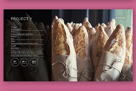
Interactive Block Project Layout
Design stunning presentations with this versatile template.
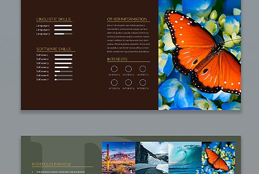
ILLUSTRATOR
Dark Presentation Layout
Exhibit your product or brand with this authoritative presentation template.
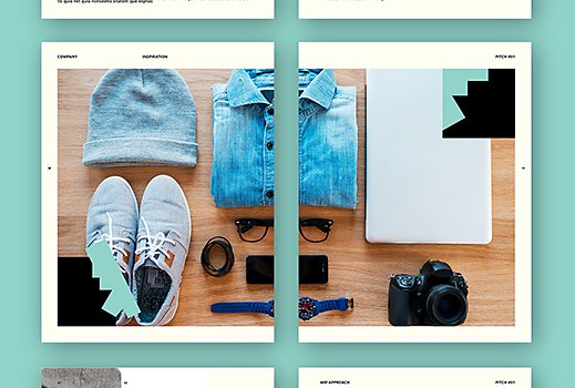
Pitch Presentation Layout
Craft a compelling case with this stylish proposal template.
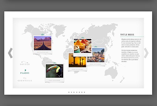
Interactive Journey Presentation Layout
Inspire your audience with this stunning presentation template.
Vivid Presentation Layout
Make your data pop with this colorful, professional presentation design.
Infographic Elements Set
Present clear, convincing numbers with this customizable template.
Neon Presentation Layout | InDesign
Show some personality with this bright, modern presentation design.
Interactive Pitch Presentation Layout
Deliver compelling concepts with this interactive leave-behind presentation.
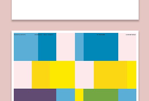
Colorful Presentation Layout
Keep it simple, clean, and direct with this bold presentation design.
Share this article
Do more with Adobe Illustrator.
You may also like
Language Navigation
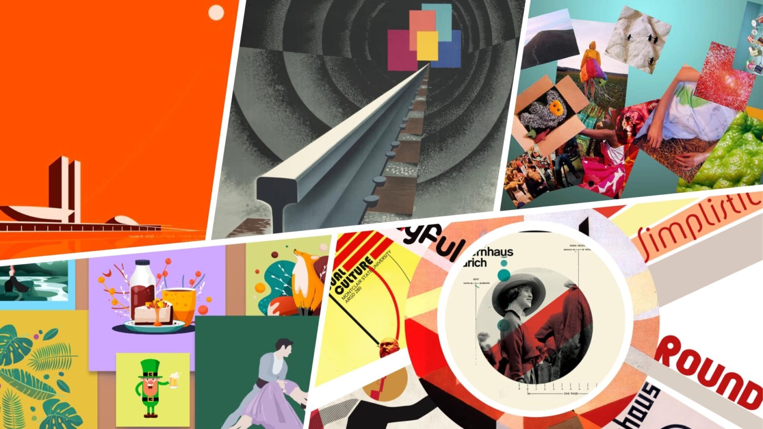
How to Make a Graphic Design Mood Board — Tips & Examples
- Top Mood Board Apps
- What is a Mood Board
- How to Make a Mood Board
- Mood Board Layout
- Mood Board Template
- Mood Board Examples
- Fashion Mood Board
- Aesthetic Mood Board
- Writer Mood Board
- Photography Mood Board
- Interior Design Mood Board
- Digital Mood Board
- Graphic Design Mood Board
- Wedding Mood Board
- Architecture Mood Board
- Film Mood Board
- Video Game Mood Board
- Brand Mood Board
- Web Design Mood Board
- Mood Board Without Photoshop
D o you ever get to a certain point in your creative process as a graphic designer and just feel…stuck? If so, then creating a graphic design mood board may be the answer. Mood boards are an invaluable tool for any graphic designer, allowing us to visually organize our ideas, harness inspiration, and craft projects that truly reflect our intent. Plus the process of creating one can be incredibly fun.
In this post we’ll show you how to make a graphic design mood board that will help spark creativity as well as guide it in the right direction for whatever project you are embarking on.
Mood Board Graphic Design Tutorial
Why use a graphic design mood board.
A mood board is an essential tool for a graphic designer because it allows them to visually communicate their ideas and concepts in a creative way. A mood board can help them conceptualize, experiment and explore different design directions and create a visual reference of their ideas. It’s also great for helping with brainstorming sessions and keeping track of creative ideas.
A graphic design mood board helps designers to quickly access a variety of elements that they could use in the design process, such as colors, fonts, images, textures and shapes.
By using these elements together, they are able to create a visual identity for the project. This is especially important when pitching creative ideas for something like a brand logo. Check out how this applies in the video below.
How To Make A Logo Graphic Design Mood Board
For example, by placing photos of buildings or landscapes on the same page as typography samples and color palettes, the designer can get an idea of how all these elements interact with each other and form a consistent look that reflects the desired style or message.
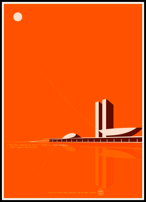
Mood Board Graphic Design Example
Additionally, creating a mood board also helps designers to identify potential problems before investing time into creating the actual design product.
By using a graphic design mood board in the early stages of the design process, graphic designers are able to save time and resources while still producing an innovative product. Mood boards also provide an effective way for designers to present their work in progress to clients so they can easily see where their project is headed from concept to completion.
In summary, having access to a well-organized mood board makes it easier for graphic designers to convey their ideas visually, conceptualize new designs quicker and share their projects more effectively with others.
How to Make a Mood Board Graphic Design
Determine your inspiration .
The first step in creating your mood board should be to determine what inspires you and how this inspiration relates to the project at hand. Consider various topics, artifacts, objects, or trends related to the project’s goals that may serve as sources of inspiration for your design. Brainstorm ideas in order to come up with a selection of visuals that will drive your creative process.
Consider the following components of graphic design when looking for inspiration: lines, shapes, color, texture, and typography. Each is at play in a great graphic design. What inspirational material speaks to you? Be sure to note this when including it in your mood board.
Related Posts
- Mood Board Layout Explained →
- How to Create a Brand Mood Board →
- Mood Board Examples from Photography and Films →
How to Make a Graphic Design Mood Board
Gather materials & content .
Now it’s time to gather materials and content related to the project. Start by researching online resources such as blogs, magazines, websites, books or other publications on topics relating to your project’s theme.
Social media networks such as Instagram are also full of inspiring visuals that can be used in a mood board. Simply searching through hashtags relevant to your project or following accounts related to your chosen topic can yield some amazing results. Furthermore, Pinterest is another great resource for finding graphics and images which could be added to your mood board.
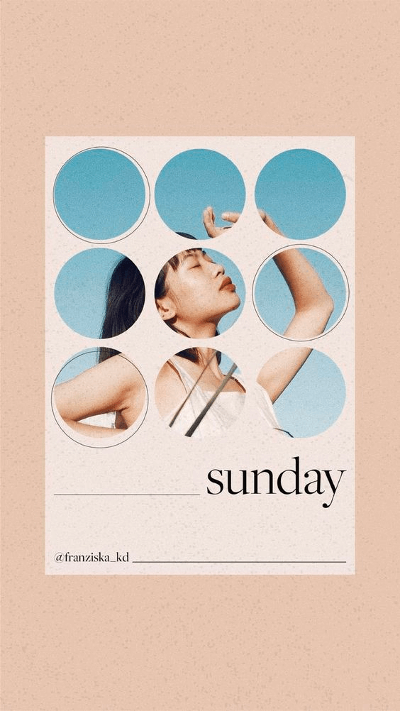
Instagram • Mood Board Examples Graphic Design
It’s also important not to forget about offline sources when creating a moodboard for graphic design projects — magazines are often filled with interesting imagery that could be included in your visual collage alongside digital sources. Furthermore, printouts from books or old posters can contribute greatly to the overall effect of the project; these items often require more effort since they cannot simply be downloaded but this effort may pay off in terms of unique visuals that would otherwise remain hidden away in forgotten corners.
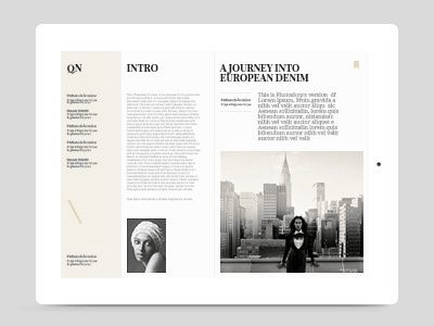
Vogue Magazine • Graphic Design Mood Board Examples
Make sure you have enough content to choose from - aim for around 50 different images or assets before moving onto the next step.
Additionally, consider using collaboration tools such as StudioBinder which allow you and your team members to add comments about specific images in real-time. These tools are especially helpful when working with remote teams who are unable to share physical mood boards in person.
- How to Make a Digital Mood Board →
- What is a Mood Board — Definition and Examples →
- Mood Board Examples from Fashion and Photography →
What is a Mood Board in Graphic Design Used For?
Select & organize visual elements .
Once you have gathered all necessary materials and content related to the project, it’s time to choose which ones will be used on your mood board. Remember that each image should relate back to the overall theme of the project — select visuals which serve as reminders of why certain decisions were made during the design process and provide context for future designs associated with this project.
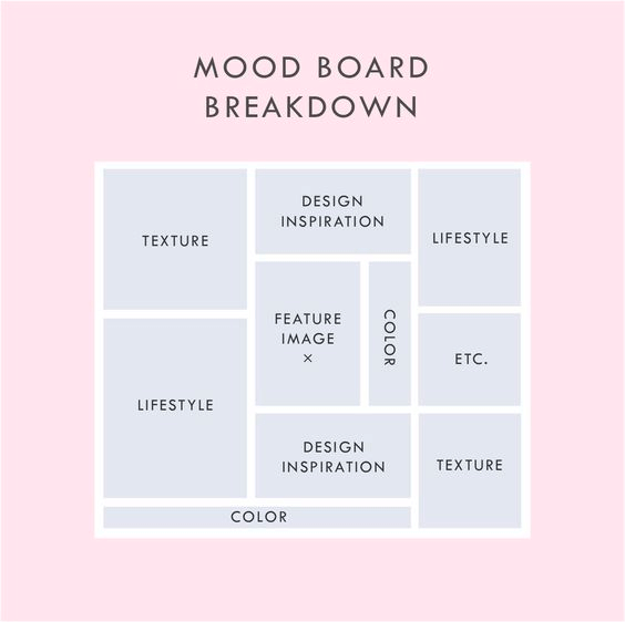
Graphic Design Mood Board tempalte
Finally, organize these visuals into categories or clusters based on their relationship with one another; once again using collaboration tools like StudioBinder’s mood board app can make this part of the process easier if you are working with multiple people
Graphic Design Mood Board Examples
Create the mood board .
Now it’s time for some creative expression! Use whatever medium makes sense for conveying your vision — programs like Adobe Photoshop or Illustrator may be ideal for more intricate projects while Pinterest boards could suffice for simpler projects requiring less detailed illustration work.
To create our own graphic design mood board, we used StudioBinder’s mood board app. It’s intuitive and fun to use. Check out our example below.
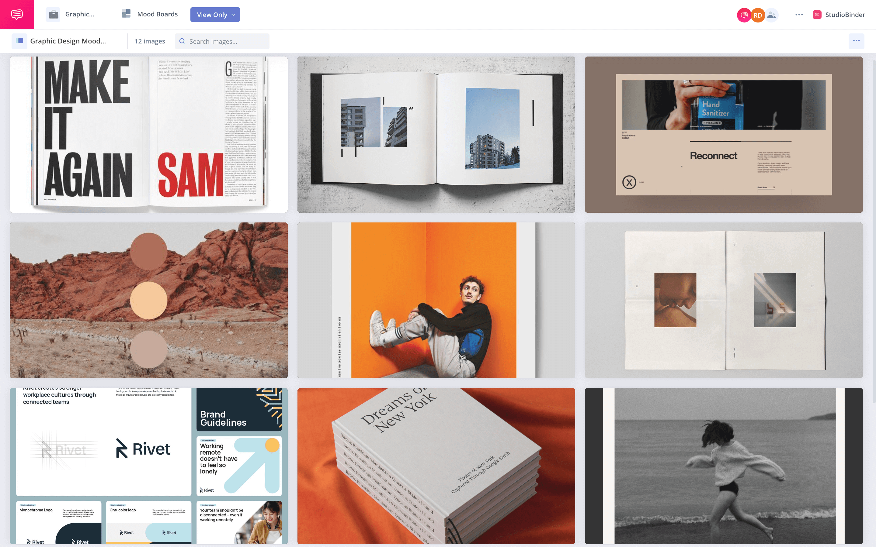
Mood Board Examples Graphic Design Guide
Assemble all selected visuals onto one canvas in order create a cohesive composition that visually communicates your desired message - don't forget about typography too.
Typographical elements such as fonts and colors should also be considered when designing a graphic design mood board since they play an important role in how we interpret meaning from visual cues (e.g., bold serif fonts evoke feelings of strength whereas light sans-serif fonts might evoke feelings of peacefulness).
Making a Graphic Design Mood Board
Evaluate the mood board .
You have now created your own unique graphic design mood board. Before submitting it as final work however, take some time away from it and evaluate it objectively afterward so that you can identify any potential issues or areas of improvement before making submissions/presentations publically available.
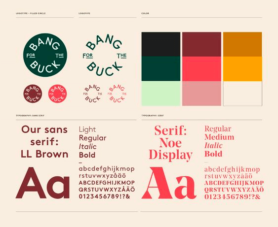
Graphic Design Mood Board Example
Additionally, if possible try gathering feedback from others within or outside of the team (this could include customers/clients) who may provide valuable insights into how effective (or ineffective) certain aspects of the mood board are at delivering its intended message. Check out our article on how to create a brand mood board to hone in on messaging through design.
Finally remember that creating consistent graphics helps reinforce brand values; so use this opportunity when constructing your final product by seeing what changes would need made if all other campaigns were designed similarly. This includes ensuring colors match closely throughout each piece or continuing usage of similar typefaces from previous projects associated with this brand/company.
A mood board is a great way to collect ideas and inspiration for your project. By gathering images, colors, and text that you are drawn to, you can start to see patterns emerge. These patterns can be helpful in guiding your design process. If you’re feeling stuck, try making a mood board for your next project. You may be surprised at what comes out of it.
How to Create a Brand Mood Board
Many graphic designers often use a mood board as a means of presenting their creative ideas for a company or brand. If this sounds similar to the project you are creating, check out our next article where we breakdown how to create a brand mood board.
Up Next: Creating a Brand Mood Board →
Showcase your vision with elegant shot lists and storyboards..
Create robust and customizable shot lists. Upload images to make storyboards and slideshows.
Learn More ➜
Leave a comment
Your email address will not be published. Required fields are marked *
- Pricing & Plans
- Product Updates
- Featured On
- StudioBinder Partners
- The Ultimate Guide to Call Sheets (with FREE Call Sheet Template)
- How to Break Down a Script (with FREE Script Breakdown Sheet)
- The Only Shot List Template You Need — with Free Download
- Managing Your Film Budget Cashflow & PO Log (Free Template)
- A Better Film Crew List Template Booking Sheet
- Best Storyboard Softwares (with free Storyboard Templates)
- Movie Magic Scheduling
- Gorilla Software
- Storyboard That
A visual medium requires visual methods. Master the art of visual storytelling with our FREE video series on directing and filmmaking techniques.
We’re in a golden age of TV writing and development. More and more people are flocking to the small screen to find daily entertainment. So how can you break put from the pack and get your idea onto the small screen? We’re here to help.
- Making It: From Pre-Production to Screen
- The Rule of Six — Eye Trace Editing Technique Explained
- How to Get a Film Permit — A Step-by-Step Breakdown
- How to Make a Storyboard: Ultimate Step-by-Step Guide (2024)
- VFX vs. CGI vs. SFX — Decoding the Debate
- 5 Pinterest
Best Architecture Presentation Board Ideas
- AEC Marketing
- Digital Asset Management
Posted by: Cinthya Soto
If you’re an architect, you know that one of the most impactful methods for expressing your ideas is creating architecture presentation boards. These boards serve as more than just showcasing your project; they effectively portray your concepts and narrate the story of your design.
However, creating your architecture presentation board can prove challenging. It’s crucial to establish a well-designed layout that maintains a cohesive and engaging narrative. This will enable you to effectively communicate your ideas and elevate the impact of your architecture proposal .
In this blog, we’ll explore ten architecture presentation board concepts, encompassing vital elements necessary for crafting a polished and visually captivating presentation. These ideas include various aspects such as layout, structure, visual hierarchy, color, and more, all contributing to the creation of a professional and visually engaging presentation.
By the end of this blog, you’ll possess the knowledge and confidence necessary to produce a creative and impactful architecture presentation board. This will allow you to showcase your architecture projects accurately and secure new projects.
What Is an Architecture Presentation Board?
Applying all of this information to your architecture presentation board may seem challenging, but with the help of a well-designed layout, you can effortlessly tackle this task.
An architecture presentation board is a visually appealing graphic that effectively summarizes all the ideas of your project. It provides a condensed and clear representation of your design. Architects use architecture presentation boards to showcase their projects and work.
The purpose of a presentation board is to construct a narrative that effectively conveys the essential information of your project in a self-explanatory manner. This enables readers to comprehend each of the proposed solutions with ease.
An architecture presentation board fulfills multiple objectives, including:
- Serving as a tool for presenting designs to clients, superiors, or colleagues
- Assisting in attracting clients and securing commissions
- Contributing to the advancement of your career and elevating your architectural projects to new heights
Architecture presentation boards serve various purposes, being used by both students and professionals. During your time as a student, these presentations are crafted for juries and submissions, allowing you to present your work to professors and peers. In your professional life as an architect, these boards are used to present designs to clients, committees, shareholders, and exhibitions.
In many ways, an architecture presentation board resembles a sales pitch, as you are essentially promoting your design, ideas, and concept to win clients over.
10 Architecture Presentation Board Ideas
While the architecture presentation board may not be the only aspect of the project itself, it certainly has an impact on the audience. Additionally, it can showcase your artistic abilities and design skills.
The structure of an architecture presentation board serves as the platform for combining the key ideas of your project, presenting only the essential elements required for a clear understanding of the proposed concept. Remember, there is no need to incorporate every single detail into the presentation board. It is equally important to be careful with the amount of text used and to maintain focus on the central idea of the project.
To help you get started, let’s take a look at some of the essential concepts (with examples) that must be considered when creating your architecture presentation board. This will help you create a flawless presentation board for clients.
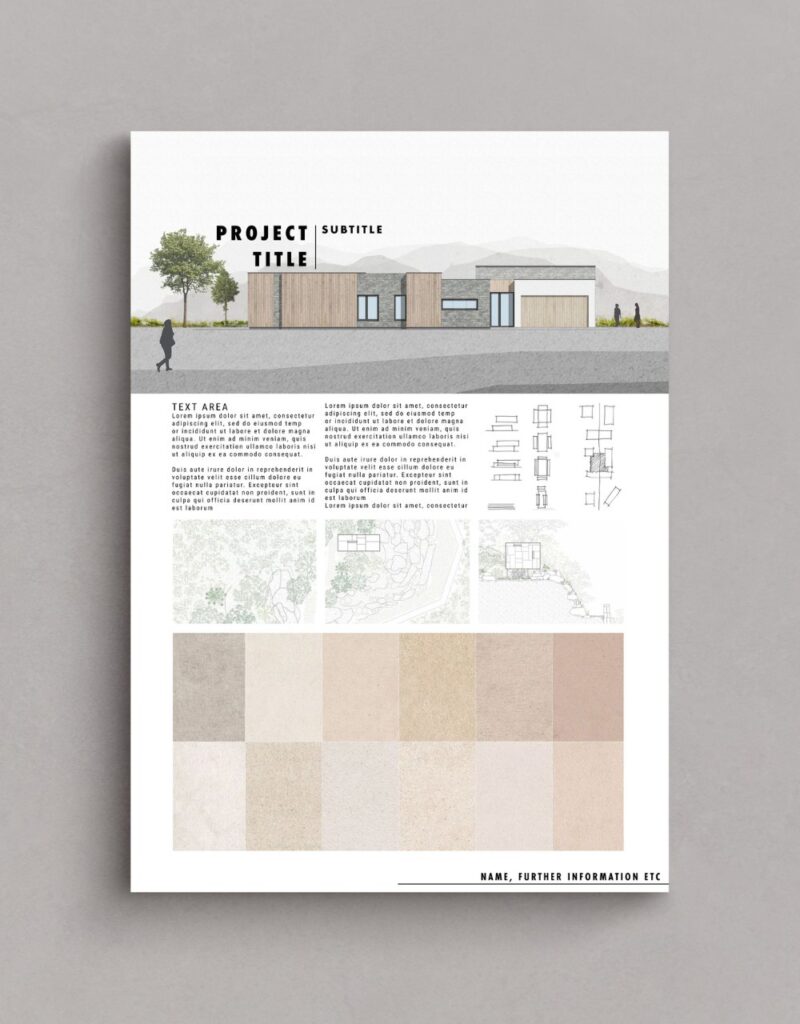
1. Size and Orientation
When designing your architecture presentation board, you will have to determine whether you will be presenting them in landscape or portrait orientation. You can explore different formats to enhance the presentation of your proposal.
However, it’s not certain you’ll get to choose the size or orientation of your presentation boards. You’ll most likely encounter limitations that restrict you to a particular board size and a specific number of boards. Sometimes you will have the opportunity to choose the size and orientation of your presentation boards. However, more often than not, these decisions will be decided by your director, client, or professor. It’s important to ensure that you are aware of the parameters beforehand to avoid any inconsistencies.
If you’re a student, it is common for professors to impose restrictions regarding board sizes and the number of boards. In such cases, you should verify whether your boards should be presented in landscape or portrait orientation.
However, if you have been allowed to decide for yourself, take some time to think about it. Consider which orientation will make your graphics stand out the most and which one will best tell the story of your project.
Apart from deciding whether your board will be in the landscape or portrait orientation, you will have to decide which way you will present your board. Some options include:
- Side by side as a single large board
- As one equivalent-sized poster
- As separate boards arranged in a sequence
Keep in mind, the orientation and size of your boards can also have an impact on the structure and layout of your presentation.
2. Layout
When arranging your architecture presentation board, think about the main ideas you want to express. Then, decide on the images and graphics that will best showcase those concepts. Collect all the required information and take note of the graphics and text that will best convey your concepts effectively.
Before starting the actual layout of your boards, take time to sketch out different versions to identify the most suitable arrangement. Create small-scale sketches to capture the basic flow of each board, enabling you to experiment with different element placements before finalizing your design on the boards themselves. This process allows for flexibility and adjustments to ensure you achieve a complete overview of your ideal layout.
Once you have decided on the layout you want, think about how much space each element will require on the page. Make sure each graphic is big enough to make an impact and consider the amount of space you want to leave between each graphic. Leave enough space so that it doesn’t look crowded or messy, but, avoid leaving too much space as well, as it may give the wrong impression.
3. Structure
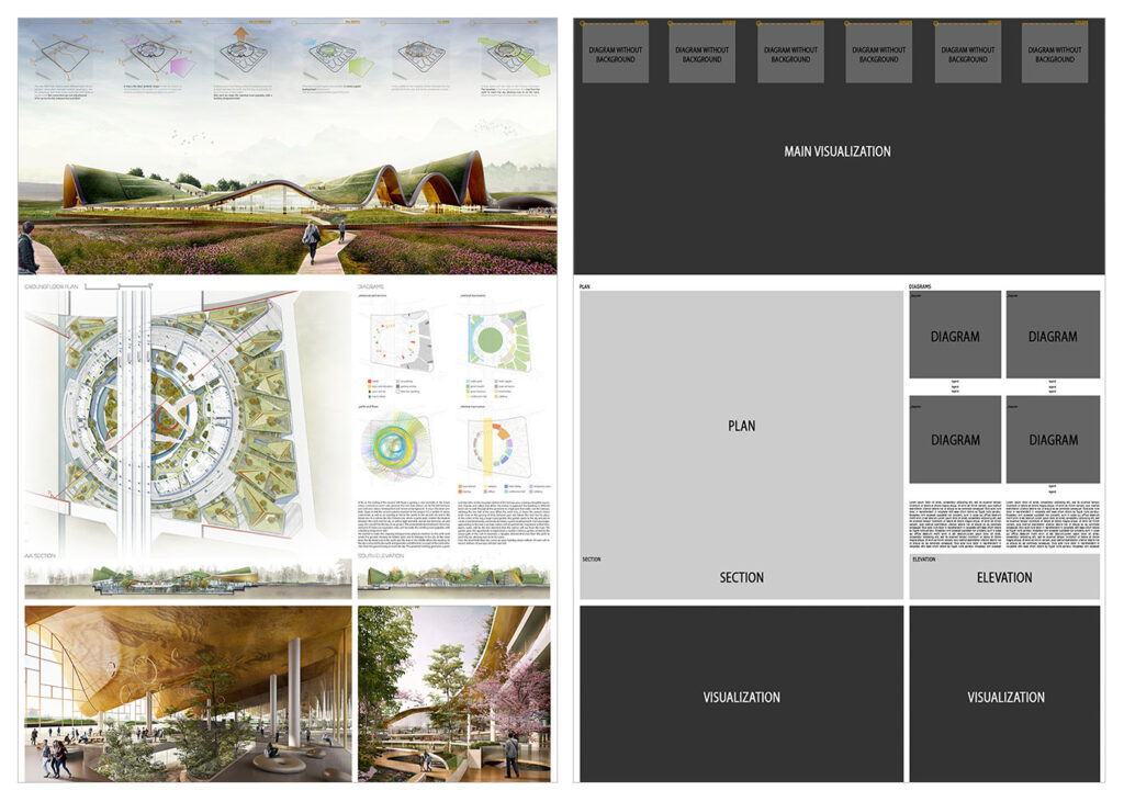
Using a grid structure is the most common layout method used among architects because it simplifies the organization of visual elements in your presentation. Several compositions can be used when using a grid structure, such as square or rectangular grids, mixing texts, and images, or even adopting an organic structure.
The grid serves as the fundamental framework for diagramming. Diagramming an architectural presentation board involves the organization and arrangement of graphic and textual elements that deliver comprehensive information about your project. This process ensures a well-structured and cohesive representation of your proposal, providing viewers with an accurate representation of your architectural vision.
Keep in mind, you are essentially narrating a story, therefore you must carefully consider the flow of the narrative as you organize your presentation board. To help you get started, follow these steps:
- Consider the perspective of the individual observing your presentation
- Prioritize what you want them to see first
- Strategize the most effective approach to displaying your project’s story to them
- Evaluate if your structure and layout successfully achieve this objective
Remember, normally, we read presentations from left to right and from top to bottom, so consider the story of your project and how it will be read.
You should also consider how each board in your presentation relates to each other. Assess whether there is a logical progression from one board to the next, ensuring that the sequence flows seamlessly. In case you will not display all the boards simultaneously, consider numbering them to guide your viewers and ensure they follow the correct sequence.
4. Background
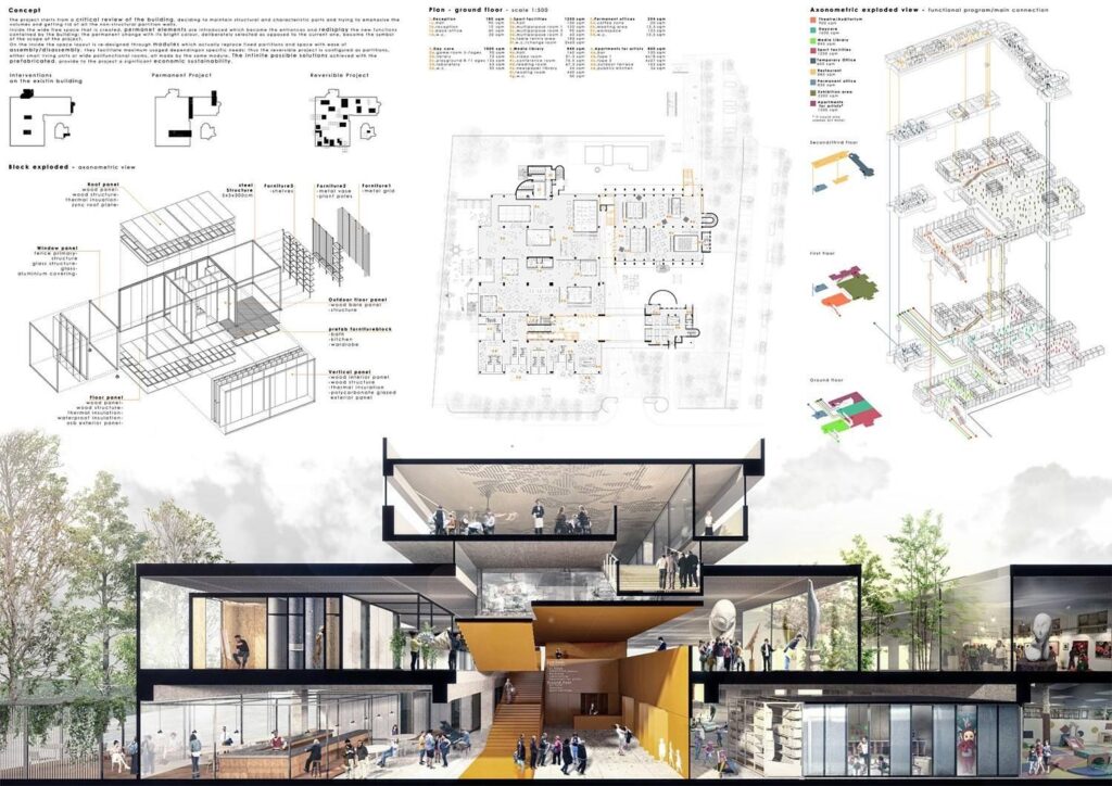
The background of your architecture presentation board should not be complex or cause difficulty. We want the viewer to easily see all the elements without any distractions from a busy background. It’s important to avoid anything that may draw attention away from the crucial details of the board. Let your graphics and text take center stage, refraining from using bold colors or textures that may take away the focus from them.
With that being said, be very careful when choosing a black background. It may diminish the readability of text and potentially reduce the impact of your graphics. Moreover, background images, if chosen, can often be distracting. A black background could also set a cold and boring tone. Therefore, if you opt for this approach, make sure that all the information remains easily comprehensible.
On the other hand, going for a white or light gray background will enhance the visibility of your graphics and text, allowing them to stand out effectively. This choice gives your presentation a professional appearance without overwhelming the viewer. While you can incorporate other colors that align with your central concept, ensure that the background remains plain enough for the viewer’s attention to be primarily directed towards the design rather than the background itself.
Regardless of the color you select for your background, use it strategically to your benefit. Embrace the concept of negative space and leverage its power. Include only essential information in your presentation, resisting the temptation to fill empty spaces with irrelevant details. The skillful use of negative space enhances the impact of your design, creating a clean and professional feel.
5. Colors
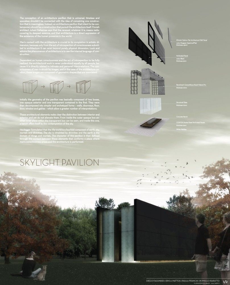
While we discussed the use of the typical black, white, and gray colors in an architecture presentation board, don’t hesitate to include some colors. However, be mindful of your color choices to strike the right balance, ensuring that your board doesn’t appear dull or overwhelming. Introducing hints of color can bring life to your presentation boards and draw attention to the elements you want to highlight. This will help guide your viewers’ focus to the key aspects of your presentation board.
How you can use colors to make your design more lively? One example is you can add a contrasting color like green for landscaping to a mostly single-color presentation. You can also use a different color to represent specific building materials, such as brick, glass, or wood. These color choices bring visual appeal and improve the overall look of your design.
You can also consider opting for a bold and attention-grabbing color, such as pink or red, to serve as a prominent feature in your diagrams. If you aren’t feeling inspired, there are many pre-made color palettes available online for you to work with.
The choice is yours and whichever color you decide to continue with, make sure to always ensure consistency by using the same color across all of your boards. This approach will help maintain a cohesive and seamless flow throughout your presentation.
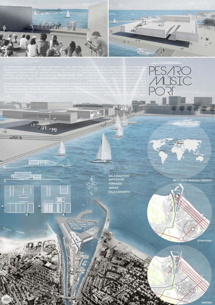
6. Visual Hierarchy
When creating your architecture presentation board, leverage visual hierarchy to highlight specific images on your presentation boards. This means you should select which image deserves the most visual attention within the hierarchy. Identify your project’s strongest point that you want to highlight, and make it the main focus that catches the viewer’s eye from far away. You should also incorporate other images that reveal their details when viewed up close.
So, how can you do this effectively? There are various techniques to draw attention to a specific drawing, such as playing with color or size. Don’t be afraid to use up the space you need to display the images that are crucial for your vision. For example, you can make the image you wish to highlight the largest, ensuring it can be viewed clearly from a distance of 6ft. This effectively communicates the visual hierarchy and emphasizes the importance of the highlighted image.
Another method is to use color to direct the viewer’s attention to a specific graphic. By using color in a targeted manner, you can effectively guide the viewer’s eye toward the main idea on the board.
You also have the option to center the image you want to highlight and arrange the surrounding content to complement it. This technique is particularly effective when the image contains elements that serve as the background of the architecture presentation board, such as a large sky or landscape.
For the best outcome, focus on keeping the overall vision of your project in mind and selecting images that directly display and strongly support that idea.
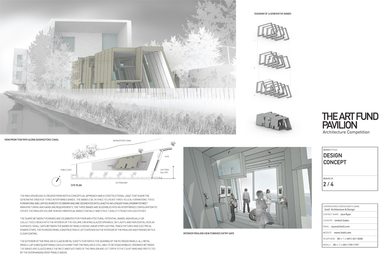

7. Image Selection
Choosing the right images is an important aspect of creating your architecture presentation board. The graphics you select can either make or break your entire presentation board. Throughout the architectural design process, you will generate various sketches, models, renderings, and drawings. Make sure to carefully select the images that effectively communicate the important details of your project.
Keep in mind, using an excessive number of images in your presentation can lead to a cluttered and confusing visual experience for the viewer. However, using enough images may give the impression that you needed to invest more effort into your presentation. Strive for a balanced representation that showcases your project effectively.
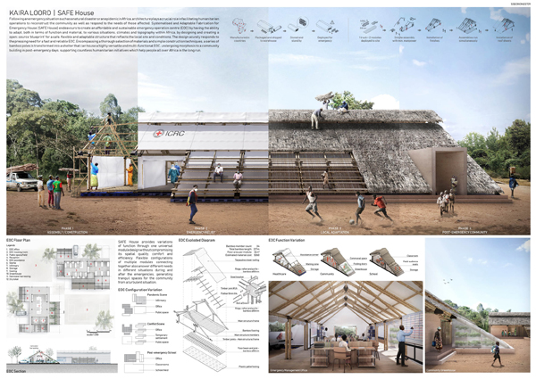
8. Content
Not only should your architecture presentation board be easy to understand but it should also demonstrate your full commitment and dedication to your project.
When it comes to planning out the content for your presentation board, consider the following elements to ensure a clear understanding:
- Internal and external images
- Isometric views and exploded views
- Perspective cut
- Diagrams
- Volumetry studies
- Descriptive memorial
- Technical drawings (plans, cuts, and details)
It’s important to note that not all the mentioned items need to be included in every project, as this depends on the specific requirements and nature of each project. However, these elements are valuable resources that can enhance the understanding of your architecture proposal whenever applicable.
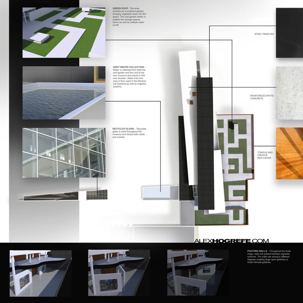
9. Text
It’s important to keep text at a minimum on your architecture presentation board. You should write a concise and focused concept statement, avoiding wasting time on lengthy descriptive text that is unlikely to be read. Shoot for a clear and short message that effectively communicates your concept.
Some questions to consider when organizing the text sections in your architecture presentation board include:
- What is easier to read?
- What flows best?
- What is pleasing to the eye?
Moreover, when creating the text for your architecture presentation board, consider the alignment of your text within its designated text box. Think about which alignment is easier to read and pay attention to text spacing and hyphenation to ensure they appear visually pleasing on your presentation board. Don’t forget that the size and alignment of your text boxes should complement your graphics. They are important elements of the visual hierarchy in your presentation.
Some tips to consider when creating the text for your architecture presentation board:
- Do not use all capitals in your text, unless it’s for the title
- Follow the standard rules of capitalization for a professional and easy-to-read presentation board
- When possible, replace text with simple illustrative sketches and figures
Remember, your presentation serves as your sales pitch. Therefore, avoid lengthy explanations that would cause you to lose your audience’s attention and keep your message concise and engaging to effectively capture and maintain their interest.
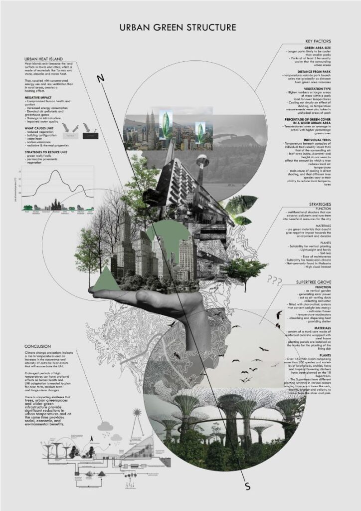
10. Font
Select an appropriate font for your title and text, using only one font type per project whenever possible. However, you can create variations by adjusting the font size for the title, concept statement, and labeling. Consider using Sans Serif fonts such as Futura or Helvetica, as their sleek and minimalistic style complements modern high-tech designs.
When choosing a font for your architecture presentation board, consider the following:
- Avoid script or handwriting fonts to achieve a clean and professional look
- Keep the color of your font dark (ex. black or dark gray) to provide contrast to a light background
- Choose a font and size that will be easy to read
- Make sure the title font and placement are consistent from board to board
- Use font sizes to create a hierarchy (e.g. a large font for titles, a slightly smaller font for subtitles, and a standard size for the rest of the content.)
The font you choose for your architecture presentation board can significantly impact its success or failure and greatly influence its level of engagement, which is why it’s important to make sure you find the best architecture font .
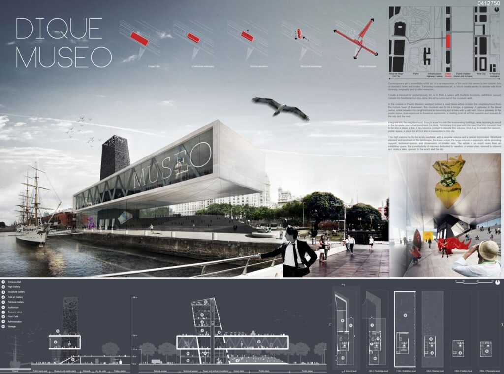
Choosing the Right Elements
Unless specific instructions are provided to you when creating your architecture presentation board, the choice of elements to include will be up to you. When making these important and creative decisions, consider what elements will effectively express and explain your design most compellingly. Remember to prioritize clarity and coherence to create a successful architectural presentation.
Next Steps
We hope this guide on the best architecture presentation board ideas was helpful. As you begin creating your architecture presentation board, remember that there are several solutions out there to help you make better presentation boards and win more business. When it comes to asset management for AEC and real estate professionals, OpenAsset provides a high-quality software solution.
At OpenAsset, the only Digital Asset Management (DAM) solution designed specifically for firms in the built world, we make it easy to find the digital assets you need. With OpenAsset, you can easily find assets by project or person using keywords or file type. Our secure platform also helps you protect your digital assets by keeping them safe from unauthorized access and accidental deletion. You can also easily share files with team members, clients, and partners using controlled access to files.
To ensure consistency and manage your ever-growing number of digital assets, request a demo with us and learn how OpenAsset can help you manage your digital assets today.
Get OpenAsset DAM Insights

How to Create Winning Proposals
What to read next.

What Are Brand Assets? 15 Examples + Importance of Digital Brand Assets
A pivotal part of any company’s marketing strategy is the creation and exchange of brand assets used in the promotion of the business....

Image Relay vs. OpenAsset
Selecting the right Digital Asset Management (DAM) system is essential for businesses looking to optimize their digital asset organization a...

Construction Technology: 16 Building Technologies Driving the Future
Despite being a $12 trillion giant, the architecture, engineering, and construction (AEC) industry has historically been slow to embrace dig...

Successful Architectural Presentation Boards #5
- by Elif Ayse Fidanci
In this series of article, we try to share successful architectural presentation boards from architectural competitions, architectural design school presentations by students and proffesional project presentation boards by architecture firms. We have understood that a successful presentation board should have a clear and organized layout that allows viewers to easily understand the information presented. The layout should be visually pleasing, with balanced use of space, color, and typography. Also the use of high-quality images and graphics is essential to create a visually engaging and informative presentation board. The images should be clear and well-lit, and the graphics should be well-designed and easy to read. Architects need to consider the information presented on the board should be concise, focused, and relevant to the design concept. It should not be cluttered with unnecessary details or information that is not related to the project. In the 5th series of successful architectural presentation board articles, you will see more examples below.

First example is a presentation board that in a landscape format. We do not used to see landscape format in architectural presentation boards because landscape format causes space occupation sometimes. However in this presentation board, designer use the spaces as two portrait posters in a landscape format. The left of the poster include abstract and concrete drawings but we can see more abstract visuals on the right. The designer of the poster has tried to make balance in his work. Also linear shapes are an important design element in this architectural presentation board. Linear shapes are defined as shapes that are created by lines or curves and are one-dimensional in nature. They can be straight or curved, and can be used to create a variety of effects in architectural presentation boards.

Like in the first example, we can see linear shapes in this presentation board. These shapes can be used to create a sense of depth and perspective. By using converging lines or vanishing points, the eye is drawn into the image, creating a sense of depth and perspective. This can be particularly effective in showing the spatial relationships between different elements of a building or space. They can also be used to create a sense of structure and order in architectural presentation boards. By using horizontal or vertical lines, a sense of stability and order can be created, which can be particularly effective in showing the structural elements of a building or the organization of space. Also, pastel colors are a popular choice in architectural presentation boards due to their soft and muted appearance. Pastel colors are created by adding white to pure hues, resulting in colors that are less intense and more subdued than their pure counterparts. Pastel colors are often associated with femininity, sweetness, and tranquility.

Showing architectural details and layers is an essential component of architectural presentation boards. The details and layers of a building provide crucial information about the design, construction, and materials used, and are important in conveying the overall aesthetic and functionality of the building. One way to show architectural details in presentation boards is to use close-up images that highlight specific details. These images can be used to showcase the intricate details of the building, such as ornamental details, material textures, or the intersection of different building elements.

Another way to show architectural details is to use exploded or exploded axonometric views. These views break down the building into its individual components, highlighting how they fit together and creating a clear understanding of the construction and design details.
Layering can also be effectively used in architectural presentation boards to convey the different functional and spatial elements of a building. By using different layers or colors, the presentation board can visually separate the different parts of the building, such as the structural elements, mechanical systems, and interior finishes. This creates a clear understanding of the functional and spatial relationships between different building elements. The use of diagrams and sections can also be helpful in showing architectural details and layers. Diagrams can help to explain the design concept or process, while sections can reveal how the building is organized vertically and horizontally, as well as how the different elements fit together.
- arch projects presentation
- architectural presentation
- Architectural Presentation Boards
- architectural presentation boards guide
- architectural presentation sheets
- Architecture Student Presentation
- Fonts for Presentation
- How to create architectural presentation
- how to prepare jury presentation
- jury presentations
Elif Ayse Fidanci
architect, writer
Best Bubble Diagram Samples #1
Rethinking antique cities, you may also like.
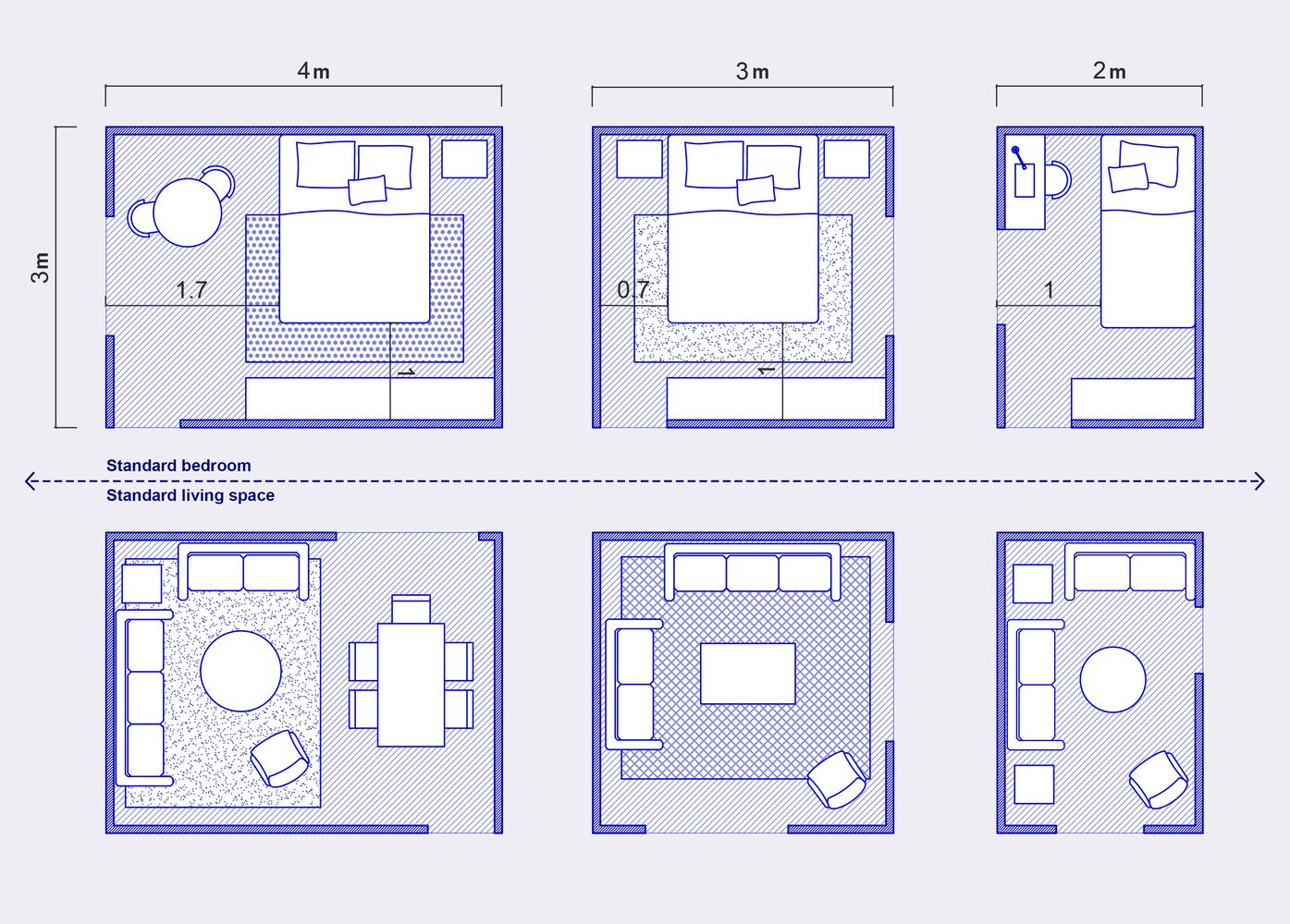
- 3 minute read
The Relationship Between Architectural Scale and Furniture Proportions
- 23 October 2023

Designing Livable and Sustainable Cities
- 9 June 2023

- 7 minute read
Sustainable Architectural Solutions for Smart Homes
- 18 May 2024

- 2 minute read
Architectural Site Analysis
- 22 March 2022

Best Bubble Diagram Samples #2

- 4 minute read
Architectural Technologies Redefining Design
- 9 November 2023
Privacy Overview
How to create mood boards that inspire: 20 pro tips
Expert advice on how to create mood boards to convey your design ideas, win pitches and get an early sign off.
Learning how to create mood boards can transform your experience of pitching design ideas to clients. At the start of a new project, a mood board helps to communicate your vision as a designer. To impress the client, it should offer a visually stunning summary of your ideas, full of textures and images that paint a picture in ways that words alone could not achieve. In a way, it allows the client to get inside your creative mind, while also helping you to organise your own ideas.
This means it's vital to make sure that your mood board is more than a confusing collage of disparate ideas. It should be a cohesive, visually attractive expression that makes your vision clear. But how do you create a mood board that achieves this? Below, we offer a series of tips that should allow you to effectively convey your creative ideas to a client.
If you think your design portfolio also needs some work in order to accompany your next pitch, make sure you also see our tips to create a stunning portfolio website and our top portfolio examples for inspiration. Meanwhile, read on to see how to create mood boards to communicate your ideas.
How to create mood boards: 20 pro tips
01. look beyond the digital world.
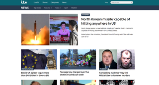
When you begin working on a mood board, it's easy (and very tempting) only to use images that you find online. But even if you're working on a digital product, that doesn't mean you need to stick to digital inspiration (and chances are you may also be breaking copyright laws by using online images).
It's worth stepping away from the computer and looking at other sources of inspiration too. When it worked working on the ITV news website, digital product design company Made by Many turned to copies of the classic Picture Post magazine to explore how powerful and effective an image plus caption can be when it comes to telling a news story. Real-world inspiration like this can be a very powerful 'convincer' when putting together a board for a client.
02. Take pictures for your mood boards

Real-world inspiration is all around us, and we have the means to capture it in our pockets. Use the camera on your phone to take pictures of everything you see that inspires you, whether it's a bird in flight, great use of typography on a sign in the street, or even brickwork on a building. It might even be a little corner of your own house. You don't need to capture great photos in the traditional sense – it's more about communicating thoughts, impressions, themes and feelings.
03. Curate the content on your mood boards
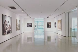
Have you ever been to a gallery exhibition and just not felt 'touched' by the exhibition or 'moved' by what was on show? It's very easy to shove a load of stuff together and call it an exhibition, but it takes real talent to curate threads and synergies between works to make an exhibition that holds together.
Mood boards work in a similar way. When putting together your mood boards, think of yourself as a curator rather than a collector, and try to introduce meaning and threads that connect the images. This can make it much easier for a client to interpret your ideas.
04. Choose the right format
Aim to establish how your mood board is going to be presented from the outset because this will determine how you go about creating it and how much or little detail to include.
An 'offline' mood board will generally be looser in style and could still be presented online, with some explanation, while a completely online mood board should be tighter and will generally need to work harder to convey a theme or style. Think about how a person viewing your mood board solely via email would view it, and make sure that they will be able to follow its flow.
05. Build things up around a large image
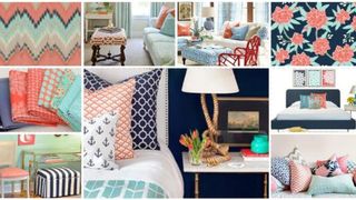
Whether your mood board is electronic or physical, the layout should give more prominence to key thematic images. You can then surround these with smaller supporting images that serve to enhance the theme.
This is something of a subliminal trick. When someone sees a large image on your board, they'll immediately have questions about it and they'll quickly scan the rest of the board to find answers to those questions. If you place smaller supporting images around the larger image, they can answer these questions by clarifying the message conveyed in the larger one.
06. Get tactile
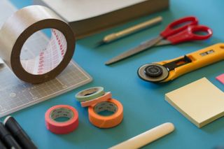
When it comes to making a physical mood board, don't be afraid to get, well, physical. Traditionally, mood boards were made from foam board. Although cutting this stuff up with a scalpel and spray mounting cut-out images onto it can be a hassle (especially if you're not dexterous with a blade), it can also be extremely effective as a presentation tool.
It may seem like an old-fashioned thing to do, but perception-wise it's a real ace up your sleeve as a designer. The tactile nature of cut-out images glued onto boards enhances the emotiveness of what's being communicated. Just be careful with your fingers on that blade!
07. Incorporate your mood board into your pitch
Mood boards are generally considered to be separate from a pitch or presentation. They stand alone to provide guidance on mood and tone. That's the standard practice, but you can also consider making them part of your pitch or presentation.
Remember, you're trying to use subliminal visual tricks to help a client to 'get it'. Mixing mood board elements in with a presentation rather than bolting them on at the end can be an effective way of communicating concepts to the client.
08. Don't reveal everything too early

It's important to make sure that a well-meaning project manager doesn't email an offline mood board ahead of a presentation giving the client a preview of what you're going to present.
For an offline mood board, it's far better to let it all sink into the client's mind as and you showcase it rather than to let the client form an opinion before you've had a chance to explain your vision, otherwise you can expect the client to come armed with a lots of questions before you even start.
09. Present your own mood board
In a similar vein, if your mood board is being presented to the client, try to be involved in the presentation yourself. It can be counterproductive to leave something that originated in your head to be communicated by someone else, which can lead to meaning becoming muddled in a Chinese whispers-type mess.
10. Keep things loose
Locking down an idea or style in a mood board can be detrimental because the client will often feel shoehorned into going with a particular aesthetic. Keep everything a little loose so that nothing looks too final.
If you're using imagery from image libraries as previews, don't worry about the watermarking on them. It can help to emphasise a 'these are only ideas; we can still change this' feel to the board.
11. Watch the audience

When you're presenting a mood board, watch the faces of those you're showing it to. Ignore any verbal 'oohs and ahhs' and instead watch your audience's facial and emotive reactions as they look around the board. This will give you a much more honest take on whether the board is doing its job, and if they're reacting well or badly to what you're showing them.
12. Hone your mood board skills

It's good to practise your skills in creating and presenting mood boards, even if it's not for a client. Employees at branding agency Landor Associates use a form of mood board to showcase themselves to other members of the team. Individuals put together nine images in a 3 x 3 grid to give their work colleagues an insight into what they're like; their interests, passions, cares and worries.
13. Text it up
Don't ignore the power of isolated words on a mood board. A few well-chosen words can be fantastic show-stoppers that can give the viewer pause for thought because they have to mentally read what's in front of them. Big, bold words juxtaposed together work very well at creating drama, tone and meaning for any project.
14. Make the theme of your mood board clear

Obscure references can be fun, but try to have a number of relatable items or 'touchpoints' in your mood board to make sure that the theme is clear. You want to let others in, so being deliberately obtuse will earn you no points at all. It's easy to fill out a board with a pile of incomprehensible references; it often takes more thought to be clear and use imagery that can be easily interpreted to sell your vision.
15. Aim to spark an emotional response
Having said that, it also pays to think a little left of centre when you're presenting a mood board to a client. Ask yourself what would give them a genuine emotive response. Real-world objects are good for this. If you were inspired by the beach, bring in a shell. If your eureka moment happened on the train, bring in the ticket. This type of thing can create intrigue, which triggers that all-important emotive reaction.
16. Don't make presumptions

Expecting too much of your audience can make the difference between a successful mood board and one that's dismissed as being too cerebral – or downright confusing. There's a great danger in assuming that people will "know what you mean". The chances are they won't. Even if it takes a few more references, images or textures to really clarify what's inside your head, it's worth adding them in.
17. Test your mood board

That leads us on to our next tip for how to create mood boards. It can really help to show your mood board to someone not involved in the project to check how it goes down before you share it with the client. Remember, it's not a game of Pictionary: if your test audience has to ask too many times what an image means or why it's there, then you should probably make changes.
18. Have fun with your mood board
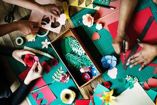
It's a lot of work, but the whole process of creating mood boards should be fun – and a refreshing break from the often tedious tasks of the jobbing designer. If you're not having fun, that's a sure sign you're going about things the wrong way.
19. Use mood boards to brief designers
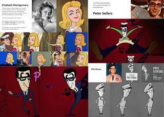
Mood boards are a good way to brief a creative. Don't be afraid to go into detail here. The mood board above was compiled for animator Tom Baker as a mood and style guide for a celebration of the Avengers TV series in 2011. Instead of relying on one example of a character, several types are shown in many different poses, which gave Baker a clear take on the style and direction of the piece.

20. Speed up client sign-off

Mood boards aren't only for pitches. Consider preparing mood boards throughout projects before creating polished visuals. 'I'll know it when I see it' is a phrase that most of us are familiar with, and hearing this feedback when finished artwork comes back from a client can be gutting, meaning it's back to the drawing board. Using mood boards at different stages of the process can help you avoid this from happening by allowing you to get feedback along the way.
Related articles:
- Top-quality WordPress portfolio themes
- 10 tips for building a killer portfolio website
- 7 tips for pitching perfectly
Thank you for reading 5 articles this month* Join now for unlimited access
Enjoy your first month for just £1 / $1 / €1
*Read 5 free articles per month without a subscription
Join now for unlimited access
Try first month for just £1 / $1 / €1
Get the Creative Bloq Newsletter
Daily design news, reviews, how-tos and more, as picked by the editors.
Joe is a regular freelance journalist and editor at Creative Bloq. He writes news, features and buying guides and keeps track of the best equipment and software for creatives, from video editing programs to monitors and accessories. A veteran news writer and photographer, he now works as a project manager at the London and Buenos Aires-based design, production and branding agency Hermana Creatives. There he manages a team of designers, photographers and video editors who specialise in producing visual content and design assets for the hospitality sector. He also dances Argentine tango.
Related articles

- 2 Users are already poking fun at the Discord rebrand
- 3 This is why McDonald's wiped the smile from its Happy Meals
- 4 How to use Blender to create atmospheric concept art
- 5 The Red Sox once had the most disturbing sports logo in history
- 2 10 artists provoking a pin-up revolution
- 3 Ingenious optical illusion billboard takes the terror out of the prostate check
- 4 Blackmagic Fusion Studio 19 review: VFX software goes from strength to strength
- 5 A little-known Google hack lets you remove all that AI garbage
👀 Turn any prompt into captivating visuals in seconds with our AI-powered design generator ✨ Try Piktochart AI!
- Piktochart Visual
- Video Editor
- AI Design Generator
- Infographic Maker
- Banner Maker
- Brochure Maker
- Diagram Maker
- Flowchart Maker
- Flyer Maker
- Graph Maker
- Invitation Maker
- Pitch Deck Creator
- Poster Maker
- Presentation Maker
- Report Maker
- Resume Maker
- Social Media Graphic Maker
- Timeline Maker
- Venn Diagram Maker
- Screen Recorder
- Social Media Video Maker
- Video Cropper
- Video to Text Converter
- Video Views Calculator
- AI Brochure Maker
- AI Document Generator
- AI Flyer Generator
- AI Image Generator
- AI Infographic
- AI Instagram Post Generator
- AI Newsletter Generator
- AI Quote Generator
- AI Report Generator
- AI Timeline Generator
- For Communications
- For Education
- For eLearning
- For Financial Services
- For Healthcare
- For Human Resources
- For Marketing
- For Nonprofits
- Brochure Templates
- Flyer Templates
- Infographic Templates
- Newsletter Templates
- Presentation Templates
- Resume Templates
- Business Infographics
- Business Proposals
- Education Templates
- Health Posters
- HR Templates
- Sales Presentations
- Community Template
- Explore all free templates on Piktochart
- Course: What is Visual Storytelling?
- The Business Storyteller Podcast
- User Stories
- Video Tutorials
- Need help? Check out our Help Center
- Earn money as a Piktochart Affiliate Partner
- Compare prices and features across Free, Pro, and Enterprise plans.
- For professionals and small teams looking for better brand management.
- For organizations seeking enterprise-grade onboarding, support, and SSO.
- Discounted plan for students, teachers, and education staff.
- Great causes deserve great pricing. Registered nonprofits pay less.
AI-Powered Poster Generator
With the Piktochart AI poster generator, you can turn any prompt into a gorgeous poster in seconds. No design skills? No problem. Just tweak it as you wish, then share your poster.
The new way of creating posters
Create in a Flash
Prompt to poster in 10 seconds
Say goodbye to complicated design steps. Simply type in your theme and watch as our AI poster maker transforms it into reality.
AI Image Generation
Bring your vision to life
Go stock photos and generate images that are contextualized to your needs with our advanced AI image generator. Put your creativity to the test and generate highly realistic images that make you stand out.
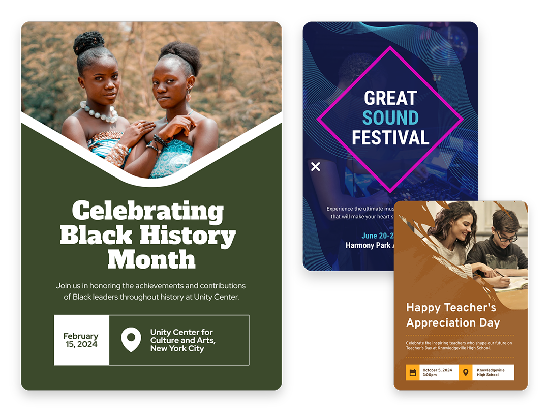
Create Without Limits
Where every idea finds its canvas
For events, marketing, learning, or personal creations, Piktochart AI delivers captivating poster designs for every need. Dive into a universe of impressive imagery tailored to suit any subject.
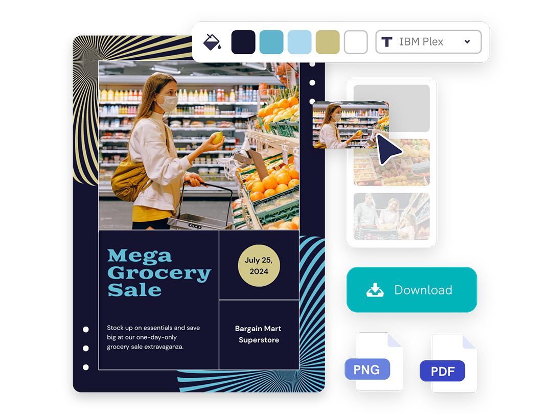
Create Your Vision
Piktochart starts, you put the finishing touches
Our AI sets the stage with a professionally crafted poster, then passes control to you, allowing you to modify and refine each detail to amplify your visual impact while keeping true to your brand.
Posters created using Piktochart’s AI-powered poster maker
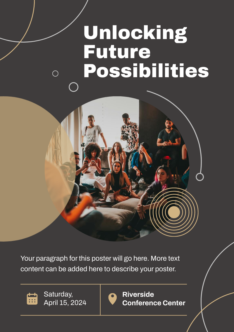
Professionals like you use Piktochart’s free online poster maker to:

- Create eye-catching promotional materials that align with brand identity, ideal for advertising campaigns, product launches, and trade shows.
- Design captivating posters for corporate events, webinars, and conferences.
- Communicate new offers, services, or store openings.

HR & Internal Comms
- Internal announcements, motivational quotes, or event notifications.
- Job advertisements and onboarding materials to attract and welcome new employees.
- Convey important company policies and reminders through clear, engaging posters, ensuring better compliance and awareness.

NGOs and Government Organizations
- Develop impactful posters for awareness drives, fundraising events, and community outreach programs.
- Attract volunteers, highlighting the roles, benefits, and the difference they can make.
- Announce charity events, workshops, and seminars.

- Create informative posters on health topics, wellness tips, and medical advisories.
- Showcase healthcare services, specialist departments, and new medical technologies available at healthcare facilities.
- Display important health and safety protocols within healthcare settings.
How to Make a Digital Poster
1. Define Your Story
Briefly describe (within 120 characters) the purpose behind your poster. Whether it’s for promotion, making an announcement, driving awareness, or sharing health information.
2. Select from Our Varied Poster Designs
Jumpstart your project with our array of ready-to-use poster templates, perfect for shining a spotlight on any subject. After picking your preferred design, you’ll find yourself in our editing suite.
3. Tweak the Design with Piktochart Editor
With your template chosen, hitting the “Edit” button grants you entry into the Piktochart editor. This is your playground to adjust, alter, and align the design to reflect your personal touch and message.
4. Enhance with Visual Elements
Piktochart’s user-friendly drag-and-drop editor makes personalization a breeze. Tap into our rich collection of complimentary photos, icons, illustrations, and text options to craft a poster that stands out. Enhancing and tailoring colors is just a click away with our versatile design tool.
5. Publish and Promote
Once your poster is exactly as you envisioned, it’s time to save and share your work. Export in various formats like JPG, PNG, or PDF, catering to both digital platforms and print materials.
AI-Powered Visualization for Any Topic
What kinds of posters can be generated using this AI tool?
Navigating design elements and finding the right visual style can be daunting. With Piktochart AI, it’s easy to transform data into high-quality posters . Excellence made simple, just for you.
Event posters
Drum up buzz and awareness for an upcoming event. Piktochart AI transform dense data and information into engaging invitational posters for your events.
Advertising posters
Spark emotions that incite action – whether it is to make a purchase, improve brand opinion, donate to a cause, or make a lifestyle change. With Piktochart AI, it’s achievable at the click of a button.
Conference posters
Inform your audience with a glance about an upcoming conference. Whether it’s for a medical conference, marketing conference, or any conferences, Piktochart AI’s user-friendly poster maker helps you catch the attention of your audience effortlessly.
Ready to use AI to design posters like a pro?
Join more than 11 million people who already use Piktochart to create stunning posters.
Is it possible to personalize my poster with my own photos and diagrams?
What’s the limit on poster creation, how do i enhance the quality of my posters, is signing up mandatory to use piktochart, poster resources.

How to Make a Poster in 6 Easy Steps [2023 Guide With Templates]
25 Poster Ideas, Templates, and Tips for Creative Inspiration
Communications
7 Types of Posters and What Makes Them Stand Out
What else can you create with piktochart ai.

Image Unavailable

- To view this video download Flash Player

XL Flag Elektrostal Moscow oblast | landscape flag | 2.16m² | 23sqft | 120x180cm | 4x6ft - 100% Made in Germany - long lasting outdoor flag
Purchase options and add-ons, about this item.
- 100% Made in Germany » ... because the first impression last, quality flag for representative purposes *****
- State-of-the-art High-Tech Outdoor Fabric » One air-permeable 110 GSM Polyester to keep wind forces low and lifetime high
- Mirrored Back » Image printed on the front, mirrored image 100% visible on the rear side
- Landscape flag | 2.16m² | 23sqft | 120x180cm | 4x6ft
- Show your pride for your hometown with the Elektrostal flag! Made with quality materials and vibrant colors, this flag is the perfect way to display your patriotism and love for your city. Fly it proudly at home, at events, or even in your car. Get yours today and show your Elektrostal pride!
- The flag of Elektrostal, Moscow Oblast, is a striking combination of Old Glory red, representing strength and courage at 81%, complemented by a subtle touch of light grey at 5% for balance and harmony. The bold black stripe at 3% adds a touch of sophistication, while the shimmering gold stripes at 3% each symbolize prosperity and success. The flag is completed with a touch of very dark grey at 1%, representing the city s resilience and
- Elektrostal Moscow oblast
Product information
Warranty & support, looking for specific info, product description.
Flag: Elektrostal Moscow oblast landscape flag | 2.16m² | 23sqft | 120x180cm | 4x6ft Elektrostal Moscow oblast Elektrostal obwód moskiewski , flaga ???????????? ?????????? ??????? Since we know how important your external presentation is, we print our Elektrostal Moscow oblast flag for your representative appearance using the most modern machines in Germany. To ensure your maximum flexibility, we have equipped the flags with quality metal eyelets, to let you simply attach these flags to any flagpole. To let you use the flags for a long time, we have strengthened the flag using double safety seams and a tear proof strap at the side of the pole. Due to the quality of this business flag, you show a particular degree of the closeness to Elektrostal Moscow oblast. Details about this flag This landscape Elektrostal Moscow oblast flag is a quality product Made in Germany made of 110g/m² gloss polyester. This Elektrostal Moscow oblast flag is wind- and weather-resistant and highly durable. The flag colors are intensive and UV-resistant. This flag is specially made for outer space. This Elektrostal Moscow oblast flag will be delivered with a double safety-seam as well as with 2 metal eyelets to hoist at the flag pole. The metal eyelets give you great flexibility for placing this flag on any flagstaff. The mast side is reinforced with a white hem. The quality flag material and the metal eyelets will take care of a long endurance of this Elektrostal Moscow oblast flag. If required, the flag can be washed at 60 degrees Celsius. Recommended height of flag pole Elektrostal Moscow oblast flags of 2.16m² | 23sqft | 120x180cm | 4x6ft look best with flagpoles of around 6m | 18ft height. Need a bigger size or an other configuration? We can provide bigger sizes, other configurations, exclusive indoor ...
Customer reviews
Customer Reviews, including Product Star Ratings help customers to learn more about the product and decide whether it is the right product for them.
To calculate the overall star rating and percentage breakdown by star, we don’t use a simple average. Instead, our system considers things like how recent a review is and if the reviewer bought the item on Amazon. It also analyzed reviews to verify trustworthiness.
No customer reviews
- Amazon Newsletter
- About Amazon
- Accessibility
- Sustainability
- Press Center
- Investor Relations
- Amazon Devices
- Amazon Science
- Sell on Amazon
- Sell apps on Amazon
- Supply to Amazon
- Protect & Build Your Brand
- Become an Affiliate
- Become a Delivery Driver
- Start a Package Delivery Business
- Advertise Your Products
- Self-Publish with Us
- Become an Amazon Hub Partner
- › See More Ways to Make Money
- Amazon Visa
- Amazon Store Card
- Amazon Secured Card
- Amazon Business Card
- Shop with Points
- Credit Card Marketplace
- Reload Your Balance
- Amazon Currency Converter
- Your Account
- Your Orders
- Shipping Rates & Policies
- Amazon Prime
- Returns & Replacements
- Manage Your Content and Devices
- Recalls and Product Safety Alerts
- Conditions of Use
- Privacy Notice
- Consumer Health Data Privacy Disclosure
- Your Ads Privacy Choices
- About company
- GENERAL CONTRACTOR

+7 (495) 526-30-40 +7 (49657) 0-30-99
THE HISTORY OF THE COMPANY CREATION
1993 how the construction company remstroy was created the year 1993 was a period when a lot of construction companies, which had been working successfully during the soviet times and had rich staff capacity, were forced to cease their activity for various reasons. a lot of capable specialists either had to look for another job or change their field. but there were also those who were willing to realise their potential in the field of construction in accordance with the received degree and the experience they had accumulated. thus, in 1993 in elektrostal (moscow oblast) a group of specialists and people sharing each other’s ideas, who had enormous educational background and the highest degree in architecture, organized and registered ooo firm erg which began its rapid development and successful work, offering its service both on the construction market and other areas. 2000 industrial construction is the main area seven years of successful work have shown that combining different types of activities in the same company is not always convenient. and in the year 2000 the founders of ooo firm erg decided to create and register a monoprofile construction company ooo remstroy construction company. industrial construction was chosen as the priority area. it was in this area that the directors of ooo sk remstroy began their working life and grew as specialists. in order to achieve the set goal, they selected a mobile team of professionals in the field of industrial construction, which allows us to cope with the tasks assigned to ooo sk remstroy throughout russia and the near abroad. 2010 manufacturing of metal structures we possess modern equipment that allows us to carry out the entire cycle of works on the manufacture of metal structures of any complexity without assistance. designing – production – installation of metal structures. a staff of professionals and well-coordinated interaction of the departments let us carry out the work as soon as possible and in accordance with all customer’s requirements.” extract from the list of members of self-regulatory organizations, construction.
LICENSE OF MINISTRY OF EMERGENCY SITUATIONS
Certificates, system of managing quality.
SYSTEM OF ECOLOGIAL MANAGEMENT
SYSTEM OF OCCUPATIONAL SAFETY AND HEALTH MANAGEMENT
LETTERS OF RECOMMENDATION
THE GEOGRAPHY OF CONSTRUCTION SITES
YOU CAN FIND MORE INFORMATION ON THE CONSTRUCTION SITES OF OOO REMSTROY ON THE PAGE OF THE SITE
OUR CLIENTS

http://remstroi.pro/yandex-promyshlennoe-stroitelstvo

Geographic coordinates of Elektrostal, Moscow Oblast, Russia
City coordinates
Coordinates of Elektrostal in decimal degrees
Coordinates of elektrostal in degrees and decimal minutes, utm coordinates of elektrostal, geographic coordinate systems.
WGS 84 coordinate reference system is the latest revision of the World Geodetic System, which is used in mapping and navigation, including GPS satellite navigation system (the Global Positioning System).
Geographic coordinates (latitude and longitude) define a position on the Earth’s surface. Coordinates are angular units. The canonical form of latitude and longitude representation uses degrees (°), minutes (′), and seconds (″). GPS systems widely use coordinates in degrees and decimal minutes, or in decimal degrees.
Latitude varies from −90° to 90°. The latitude of the Equator is 0°; the latitude of the South Pole is −90°; the latitude of the North Pole is 90°. Positive latitude values correspond to the geographic locations north of the Equator (abbrev. N). Negative latitude values correspond to the geographic locations south of the Equator (abbrev. S).
Longitude is counted from the prime meridian ( IERS Reference Meridian for WGS 84) and varies from −180° to 180°. Positive longitude values correspond to the geographic locations east of the prime meridian (abbrev. E). Negative longitude values correspond to the geographic locations west of the prime meridian (abbrev. W).
UTM or Universal Transverse Mercator coordinate system divides the Earth’s surface into 60 longitudinal zones. The coordinates of a location within each zone are defined as a planar coordinate pair related to the intersection of the equator and the zone’s central meridian, and measured in meters.
Elevation above sea level is a measure of a geographic location’s height. We are using the global digital elevation model GTOPO30 .
Elektrostal , Moscow Oblast, Russia

IMAGES
VIDEO
COMMENTS
Batzorig Regzen. Pro. 1.3k 43.4k. From US $10. Branding & Identity Presentation Kit. Greg Shuster. 539 41.4k. Jump to Main Content. Behance is the world's largest creative network for showcasing and discovering creative work.
These notes outline and explain interior design Presentation Boards Layout tips and techniques and how to create eye catching Presentation Boards. Presentation Boards are used by interior designers but also by architects, graphic designers and concept artists in order to present their ideas, drawings and designs to clients, co-workers or their boss. Lets look at the key points to consider when ...
Graphic Design; Illustration; Industrial Design; Interaction Design; Motion Graphics; Photography; UI/UX; Web Design; Alphabetical # 3D Art; 3D Modeling; 3D Motion; a. ... PAYUNG TEDUH - Placemaking Design Presentation Board. Fakhri Haris. 11 153. Save. A&R URBAN Boutique Hotel - ID Presentation Board. Fakhri Haris. 12 174. Save. ELEGAN ...
Architecture presentation boards are a tool to showcase your work. They are a way to draw your viewers into your design process and methods, providing an overall summary and vision for the project. You are communicating your design and showcasing your artistic skills, and your sense as a designer. Every successful project has a central concept ...
Get presentation templates that impress for InDesign & Illustrator. Wow audiences with slick presentation design templates for Adobe InDesign & Illustrator. Explore InDesign.
Free Powerpoint Presentation Design. Ppt Board Template. Genious Infographics. Pro. 646 11.4k. US $24. Studio Grandeur - Brand Proposal Presentation Templates. Arba Studio. 148 7k.
Explore thousands of high-quality graphic design presentation board images on Dribbble. Your resource to get inspired, discover and connect with designers worldwide. Find talent ... graphic design presentation board. 10,000+ inspiring graphic design presentation board designs for inspiration. Related: powerpoint; powerpoint template; keynote ...
In this course you will understand and learn how to create a presentation board that can communicate effectively the message of the architecture that is being portrayed. ... main composition components in graphic design, how to tell a story and many more! This course is divided into two important parts: First it is understanding presentation ...
I think that if you can create a stunning presentation board, then you have 40% of the job done (which is captivating everyone's attention), and now your design can speak for itself! If you are interested, join me in this course so we can explore the world of presentation boards and everything there is to it! Enroll now for $99.
Generate ready-to-use designs with Visme AI Designer. Go from a text prompt to a ready-to-use design in mere minutes with Visme AI Designer (Beta). Do you need to create a presentation, document, or social media graphic but lack the time? Let Visme AI Designer help you save time and effort. Try Now
Consider various topics, artifacts, objects, or trends related to the project's goals that may serve as sources of inspiration for your design. Brainstorm ideas in order to come up with a selection of visuals that will drive your creative process. Consider the following components of graphic design when looking for inspiration: lines, shapes ...
2. Layout. When arranging your architecture presentation board, think about the main ideas you want to express. Then, decide on the images and graphics that will best showcase those concepts. Collect all the required information and take note of the graphics and text that will best convey your concepts effectively.
Create a vision board. 100% fully customizable. Beautifully designed templates. Millions of photos, icons and illustrations. Easily download or share. Craft a stunning vision board for every area of your life — from health and career to relationships. Drag and drop images, quotes, affirmations, and other vision board ideas to create a design ...
The images should be clear and well-lit, and the graphics should be well-designed and easy to read. Architects need to consider the information presented on the board should be concise, focused, and relevant to the design concept. ... However in this presentation board, designer use the spaces as two portrait posters in a landscape format. The ...
How to create mood boards: 20 pro tips. 01. Look beyond the digital world. Made by Many used copies of Picture Post to inspire its redesign of the ITV News site. When you begin working on a mood board, it's easy (and very tempting) only to use images that you find online.
517. Forge Design. 0. 295. Sign up to continue. Discover 14 Presentation Board designs on Dribbble. Your resource to discover and connect with designers worldwide.
Design your mood board with Canva's library of millions of professional elements and graphics. You can add text boxes with different background colors and font styles that complement your design. Keep customizing. Your mood board is as unique as you are. Upload your own art, rearrange illustrations and change font styles.
1,336 inspirational designs, illustrations, and graphic elements from the world's best designers. Want more inspiration? Browse our search results ... Rahid Rehman | Logo & Branding Designer Pro. 42. 1.1k. Alex Arutuynov 🤘 Pro. 46. 11.9k.
ISBN: 978-1-394-17357-. April 2024. 352 pages. <p> Comprehensive guide covering all aspects of visual design, including planning, layout, and presentation. <p><i>Interior Design Visual Presentation </i>comprehensively addresses the visual design and presentation skills of the interior designer, featuring thorough, process-oriented ...
4. Enhance with Visual Elements. Piktochart's user-friendly drag-and-drop editor makes personalization a breeze. Tap into our rich collection of complimentary photos, icons, illustrations, and text options to craft a poster that stands out. Enhancing and tailoring colors is just a click away with our versatile design tool. 5.
Amazon.com : magFlags XL Flag Elektrostal Moscow oblast | landscape flag | 2.16m² | 23sqft | 120x180cm | 4x6ft - 100% Made in Germany - long lasting outdoor flag : Outdoor Flags : Patio, Lawn & Garden
2000. Seven years of successful work have shown that combining different types of activities in the same company is not always convenient. And in the year 2000 the founders of OOO Firm ERG decided to create and register a monoprofile construction company OOO Remstroy Construction Company. Industrial construction was chosen as the priority area.
Just answer a few questions to get matched with a local Landscape Architect & Landscape Designer. Or browse through the list of trusted Landscape Architects & Landscape Designers
Geographic coordinates of Elektrostal, Moscow Oblast, Russia in WGS 84 coordinate system which is a standard in cartography, geodesy, and navigation, including Global Positioning System (GPS). Latitude of Elektrostal, longitude of Elektrostal, elevation above sea level of Elektrostal.