11 Inspiring UX Case Studies That Every Designer Should Study

A UX case study is a sort of detailed overview of a designer's work. They are often part of a UX designer's portfolio and showcase the designer's skill in managing tasks and problems. From a recruiter's perspective, such a UX portfolio shows the skill, insights, knowledge, and talent of the designer.
Therefore, UX case studies play an important role in the recruitment and demand for designers.

What Makes a Powerful Case Study
Building a UX case study includes showing the design process through compelling stories. They will use plain language to demonstrate how they handled key design issues, offering a comprehensive view of their process. Well done case studies often include:
- A problem statement and solutions with real applications.
- Relevant numbers, data, or testimonials to demonstrate the work and efforts.
- A story that directly connects the problem to the solution.
Any competent UX professional will know that creating a stunning UX case study is about the little details.
11 Best UX Case Studies for Designers
The best way to understand what a good case study looks like is to go over other examples. Each of these UX case study examples shows a designer's insights, basic skills, and other designers' lessons learned through their experience.
1. Promo.com web editor

For this video-creation platform , UX designer Sascha was brought on to revamp v2.0, adding new features that could work alongside the existing UX design. The point was to work on interface details that would help create a user friendly platform, and that users could find simple enough to use.
User personas mapped by the UX designer revealed the most common confusion to be the process of inserting particular features into the video, such as subtitles. The designer's goal, therefore, was to create a platform with improved editor controls.
The designer then used a common text-editor layout to include top and side navigation bars that made it easy to access and implement text editing.
Key Learnings from Promo.com
This case study focuses on addressing a particular problem that customers were currently facing. Its main theme is to show a problem, and how the product designer addressed this problem. Its strength points include:
- clearly highlighting the problem (i.e. inaccessible and limited video-text editor options)
- conduction research to understand the nature of the problem and the kind of solutions customers want
- implementing research insights into the redesign to create a platform that actively served customer needs
2. Productivity tracker app
The main concept behind this UX case study is to address a pre-existing problem through the design of the app. Immediately from the start, the study highlights a common pain point among users: that of a lack of productivity due to device usage.
This UX case study example addressed some of the main problems within existing productivity apps included:a poor UI and UX that made navigation difficult
- a poorly-built information architecture
- limited functions on the mobile application
Key Learnings from the Productivity app case study
The case study highlights the simple design process that was then used to build the app. Wireframes were created, a moldboard developed, and finally, individual pages of the app were designed in line with the initial goals.
3. Postmates Unlimited

This case study clearly identifies the improvements made to the Postmates app in a simple overview before jumping into greater detail. The redesign goal, which it achieved, was to improve the experience and other interface details of the app.
The problems identified included:
- usability that led to high support ticket volume.
- technical app infrastructure issues that prevented scalability.
- lack of efficient product management, such as batching orders.
A UX research course can help understand the kind of research needed for a case study. The app redesign involved bringing couriers in and running usability testing on improvements. The final model, therefore, had input from real users on what worked and what caused issues.
Key Learnings from Postmates
The Postmates redesign works as a great UX case study for the simple way it approaches problem-solving. Following an overview of the work, it addresses the problems faced by users of the app. It then establishes research processes and highlights how changes were made to reduce these issues.
4. TV Guide

Addressing the fragmentation of content across channels, this case study sought to redesign how people consume media. The key problems identified included:
- the overabundance of content across various TV and streaming platforms
- the difficulty in discovering and managing content across all platforms
To deliver on the key goals of content personalization, smart recommendations, and offering cross-platform content search, the design process included conducting interviews, surveys, and checking customer reviews.
The design of TV Guide enables users to get custom recommendations sourced from friends' and family's watchlists.
Key Learnings from TV Guide
Like previous UX design case studies, this one tackled the issue head-on. Describing the research process, it goes into detail regarding the approach used by the UX designers to create the app. It takes readers on a journey, from identifying pain points, to testing solutions, and implementing the final version.
5. The FlexBox Inspector

Designer Victoria discusses how she developed the investigator tool for the Mozilla Firefox browser. Surveys into understanding the problems with the existing CSS Flexbox tool revealed a need for a user-friendly design. Interviews with a senior designer and other designers helped developers understand the features design-focused tools ought to have. A feature analysis revealed what most users look for in such tools.
The final result of the development process was a design that incorporated several new features, including:
- a new layout
- color-coded design
- multiple entry points to make workflow management efficient
Key Learnings from the Flexbox
This UX design case study starts with a clear goal, then addresses multiple user needs. It clearly defines the design process behind each feature developed by the time, and the reasoning for including that feature. To give a complete picture, it also discusses why certain features or processes were excluded.
6. The Current State of Checkouts

This Baymard UX design case study looks into the checkout process in over 70 e-commerce websites. Through competitive analysis, it isolates problem points in the UX design, which, if addressed, could improve the customer's checkout process.
The study found at least 31 common issues that were easily preventable. The study was designed and conducted on a large scale, over 12 years, to incorporate changing design patterns into the review.
Recommendations based on findings include:
- prominent guest checkout option
- simple password requirements
- specific delivery period
- price comparison tool for shipping vs store pickup
Key Learnings from Checkout Case Study
Each identified issue is backed up by data and research to highlight its importance. Further research backs up each recommendation made within the case study, with usability testing to support the idea. As far as UX case studies go, this one provides practical insight into an existing, widely used e-commerce feature, and offers practical solutions.
7. New York Times App

Using a creative illustration website, the designers proposed a landing page feature "Timely" that could counter the problems faced by the NYT app . Its major issues included too much irrelevant content, low usage, and undesirable coverage of content.
The goal behind Timely was to improve user incentives, build long-term loyalty, and encourage reading. Design mapping for the app covered:
- identifying the problem
- understanding audience needs
- creating wireframes
- designing and prototyping
The end result was an app that could help readers get notifications regarding news of interest at convenient moments (at breakfast, before bed). This encouraged interaction and improved readability with short-form articles.
Key Learnings from NYT App
The UX case study proposes a problem solution that works with an existing information architecture, instead adding custom graphics to the mobile app. It leads from a simple problem statement to discuss the project that could address these issues without changing was customers already loved.

UX case studies focused on redesign include the FitBit redesign, which started off by understanding personas and what users expect from a fitness tracker. Developing use cases and personas, Guerilla usability testing was employed to assess pain points.
These pain points were then ranked based on their importance to users and to app performance. They were addressed through:
- Highlighting essential parts and features of the app
- Changing easily missed icons to more recognizable icons
- relabelling tracking options to guide users better to its usage
Key Learnings from Fitbit
While the case study maps user experiences and offers solutions, it does not begin with an intensive research-based approach. The prototype is successful in testing, but problem factors are not identified with research-based statistics, meaning key factors could have been ignored.
9. Rating System UX

The designer behind the rating system UX redesign sought to solve issues with the 5-star rating system. Highlighted issues included:
- the lack of subjective accuracy of a 5-point rating system
- the issue of calculating the average of a zero-star rating
- average ratings are misleading
Better alternatives include:
- 5-star emoticon rating that relates the user experience
- Like/dislike buttons that make approval/disapproval simple
The final design incorporated both these styles to make full use of the rating system.
Key Learnings from Rating System UX
The UX case study stemmed from insight into the limitations of the existing rating system. The new design addressed old issues and incorporated better efficiencies.

The Intuit redesign was focused on making content readable, more engaging, and accessible. Looking into product personalization, the content was found to be lacking aesthetic value, as well as being hard to find. The goal was to create content that was easy to find, clear, and consistent.
The implemented solutions included:
- increased readability with increased body text and header spacing
- table of contents on the sidebar for easier navigation
- visible and prominent search bar
- illustrations and designs for pretty visuals
Key Learnings from Intuit
The Intuit case study approaches the problem from a practical point of view. It begins with isolating problems with the interface, in particular with the content. This is an example of a case study that breaks down problems into broader categories, and solves each problem with a practical solution.

This UX case study about a social platform tackles a commonly-faced problem from existing platforms. It addresses the issue of recognizing non-monetary user engagement, to help creators identify their user base.
The case study addresses the problem statement and establishes the design process (building wireframes and prototypes) as well as conducting user testing. The final result is to develop "Discover" pages, engaging layouts, and animated interactions to increase usability.
Key Learnings from Jambb
The study goes into detail regarding problem identification, then moves on to propose solutions that take into account the perspective of all stakeholders involved. It then explains why each design decision was made, and proves its efficacy through testing and prototyping.
Key Takeaways
Developing good UX case studies examples is as much about the details you include as the ones you leave out. Going over UX courses can give you a better understanding of what your case study should look like. A good case study should provide an overview of the problem, include numbers and statistics, and offer practical solutions that directly address the problem. The above-discussed UX case studies provide a good example of the dos and don'ts of a well-structured UX design case study that should be part of every UX portfolio .
Additional Resources
Check out these resources to learn more about UX case studies:
8 UX Case Studies to Read
UX Design Case Study
Frequently Asked Questions
Upskill your design team effectively.
Equip your design team with the best-in-class design training that sticks.
Do you know your design team skill level? Send them this quick test & see where their skills stand among 300K+ designers worldwide.
Level up your design career
Get step-by-step guide how to build or advance your UX design career.
Do you know your design skills level? Take a quick test & see where you stand among 300K+ designers worldwide.
Continue reading
The impact of ux design on application success: exploring costs and trends, 7 top ux careers & specialisations: skills, paths & opportunities, 15 figma plugins to boost your design workflow, cookie settings 🍪.
- Interactive UX learning for all levels
- 20+ UX courses and career paths
- Personalized learning & practice
Design-first companies are training their design teams. Are you?
- Measure & identify team skill gaps
- Tailor learning for your team’s needs
- Unlock extensive learning library
- Visualize team growth over time
- Retain your designers
20+ Outstanding UX/UI Design Case Studies

Discover an expertly curated collection of 20+ inspirational UX/UI design case studies that will empower you to create outstanding case studies for your own portfolio.
- Comprehensive end-to-end case studies covering research, ideation, design, testing, and conclusions.
- Perfect for designers building portfolios and looking for inspiration to create their own case studies.
- Learn new methods and techniques, improve your understanding, and apply them to your projects.
- Gain insights from the successes and challenges of accomplished designers.
Want to get access to 30+ more case studies including smart tagging system?
Download full version
All case studies included in this collection are sourced from real designers' portfolios and are used for the purpose of learning and inspiration. The original authors retain all rights to their work.

Get a free custom homepage design for your new website.
Design, UI, UX , Inspiration
15 excellent ux case studies every creative should read.
- By Sandra Boicheva
- October 21st, 2021
In a previous article, we talked about UX portfolios and how they carefully craft a story of how designers work. Interestingly enough, recruiters decide if a UX freelance designer or an agency is a good match within 5 minutes into the portfolio . In order to persuade these recruiters, the portfolio needs to present an appealing story that showcases the skill, the thought process, and the choices taken for key parts of the designs. With this in mind, today we’ll talk about UX case studies and give 15 excellent examples of case studies with compelling stories.
The Storytelling Approach in UX Case Studies
An essential part of the portfolio of a UX designer is the case studies that pack a showcase of the designer’s skills, way of thinking, insights in the form of compelling stories. These case studies are often the selling point as recruiters look for freelancers and agencies who can communicate their ideas through design and explain themselves in a clear and appealing way. So how does this work?
Photography by Alvaro Reyes
Just like with every other story, UX case studies also start with an introduction, have a middle, and end with a conclusion .
- Introduction: This UX case study example starts with a design brief and presents the main challenges and requirements. In short, the UX designer presents the problem, their solution, and their role.
- Middle: The actual story of the case study example explains the design process and the techniques used. This usually starts with obstacles, design thinking, research, and unexpected challenges. All these elements lead to the best part of the story: the action part. It is where the story unveils the designer’s insights, ideas, choices, testing, and decisions.
- Conclusion: The final reveal shows the results and gives space for reflection where the designer explains what they’ve learned, and what they’ve achieved.
Now as we gave you the introduction, let’s get to the main storyline and enjoy 15 UX case studies that tell a compelling story.
1. Car Dealer Website for Mercedes-Benz Ukraine by Fulcrum
This case study is a pure pleasure to read. It’s well-structured, easy to read, and still features all the relevant information one needs to understand the project. As the previous client’s website was based on the official Mercedes Benz template, Fulcrum had to develop an appealing and functional website that would require less time to maintain, be more user-friendly, and increase user trust.
- Intro: Starts with a summary of the task.
- Problem: Lists the reasons why the website needs a redesign.
- Project Goals: Lists the 4 main goals with quick summaries.
- Project: Showcases different elements of the website with desktop and mobile comparison.
- Functionality: Explains how the website functionality helps clients to find, and order spare parts within minutes.
- Admin Panel: Lists how the new admin panel helps the client customize without external help.
- Elements: Grid, fonts, colors.
- Tech Stack: Shows the tools used for the backend, mobile, admin panel, and cloud.
- Client review: The case study ends with a 5-star review by the marketing director of Mercedes Benz Ukraine, Olga Belova.
This case study is an example of a detailed but easy to scan and read story from top to bottom, featuring all relevant information and ending on the highest note: the client’s review.
Advertisement
2. Galaxy Z Flips 5G Website by DFY
This is a big project that covers every aspect of the website, including the UX strategy. The creative studio aimed to fully illustrate and demonstrate the significant upgrades over previous models and to enable two-way communication with the customers through an interactive experience.
- Intro: Summary of the project and roles.
- Interactive Experience: The main project goal.
- Demonstration: Explains the decision to feature 360-degree views and hands-on videos instead of technical terms.
- Screens: Includes high-quality screenshots of significant pages and features.
- Ecosystem: Highlight a page with easy navigation across different products as a marketing decision that makes cross-selling seamless.
- Essentials: Showcases a slider of all products with key features that provide ample information.
- Showroom: Interactive experience that helps the user “play around” with the product.
- Credits: As a conclusion, DFY features the stakeholders involved.
A strong presentation of a very ambitious project. It keeps the case study visual while still providing enough insight into the thought process and the most important decisions.
3. Jambb Social Platform by Finna Wang
Here we have a beautiful case study for a platform that aims to help creators grow their communities by recognizing and rewarding their base of supporters. It tackles a curious problem that 99% of fans who contribute in non-monetary ways don’t get the same content, access, and recognition they deserve. This means the creators need a way to identify their fans across all social platforms to grow their business and give recognition. To get a clear picture of what the design has to accomplish, Finna Wang conducted stakeholder interviews with the majority of the client’s team.
- Intro: Listing roles, dates, team, and used tools.
- Project Overview: The main concept and the reasons behind it.
- Exploration: What problem will the platform solve, preliminary research, and conclusions from the research. The section includes the project scope and problem statement.
- Design Process: A thorough explanation of the discoveries and the exact steps.
- User Flows: 3 user flows based on common tasks that the target user/fan would do on the site.
- Design Studio: Visualization process with wireframes, sitemap, prototypes.
- Design Iterations: The designer highlights the iterations they were primary behind.
- Style Guide: Typography, colors, visual elements breakdown.
- Usability Testing: Beta site vs Figma prototype; usertesting.com, revised problem statement.
- Prototype: Features an accessible high fidelity prototype in Figma you can view.
- Takeaways: Conclusions.
An extremely detailed professionally made and well-structured UX case study. It goes a step further by listing specific conclusions from the conducted research and featuring an accessible Figma prototype.
4. Memento Media by Masha Keyhani
This case study is dedicated to a very interesting project for saving family stories. It aims to help users capture and record memories from their past. To do so, the design team performed user research and competitive analysis. The entire project took a 6-week sprint.
- Overview: Introducing the client and the purpose of the app.
- My Role: Explaining the roles of the designer and their team.
- Design Process: A brief introduction of the design process and the design toolkit
- Home: The purpose of the Homepage and the thought process behind it.
- Question Selection: The decision behind this screen.
- Recording Process: Building the recording feature and the decisions behind it.
- User research: a thorough guide with the main focuses, strategies, and competitor analysts, including interviews.
- Research Objectives: The designer gives the intent of their research, the demographics, synthesis, and usability testing insights.
- Propositions: Challenges and solutions
- User Flow: Altering the user flow based on testing and feedback.
- Wireframes: Sketches, Lo-Fi wireframing.
- Design System: Typography, colors, iconography, design elements.
- The Prototype: It shows a preview of the final screens.
This UX study case is very valuable for the insights it presents. The design features a detailed explanation of the thinking process, the research phase, analysts, and testing which could help other creatives take some good advice from it for their future research.
5. Perfect Recipes App by Tubik
Here we have a UX case study for designing a simple mobile app for cooking, recipes, and food shopping. It aims to step away from traditional recipe apps by creating something more universal for users who love cooking with extended functionality. The best idea behind it is finding recipes based on what supplies the user currently has at home.
- Intro: Introducing the concept and the team behind it.
- Project: What they wanted to make and what features would make the app different than the competitors.
- UI design: The decisions behind the design.
- Personalization: Explaining how the app gives the user room for personalization and customizing the features according to their personal preferences.
- Recipe Cards and Engaging Photos: The decisions behind the visuals.
- Cook Now feature: Explaining the feature.
- Shopping List: Explaining the feature.
- Pantry feature: The idea to sync up the app with AmazonGo services. This case study section features a video.
- Bottom Line: What the team learned.
This UX case study is a good example of how to present your concept if you have your own idea for an app. You could also check the interactive preview of the app here .
6. SAM App by Mike Wilson
The client is the Seattle Art Museum while the challenge is to provide engaging multimedia content for users as well as self-guided tours. Mile Wilson has to create an experience that will encourage repeat visits and increase events and exhibition attendance.
- Intro: Listing time for the project, team members, and roles.
- The Client: A brief introduction of Seattle Art Museum
- The Challenge: What the app needs to accomplish.
- Research and Planning: Explaining the process for gathering insights, distributing surveys, interviews, and identifying specific ways to streamline the museum experience.
- Sloane: Creating the primary persona. This includes age, bio, goals, skills, and frustrations.
- Designing the Solution: Here the case study features the results of their research, information architecture, user flows, early sketching, paper prototypes, and wireframes.
- Conclusion: Explaining the outcome, what the team would have done differently, what’s next, and the key takeaways.
What we can take as a valuable insight aside from the detailed research analysis, is the structure of the conclusion. Usually, most case studies give the outcome and preview screens. However, here we have a showcase of what the designer has learned from the project, what they would do differently, and how they can improve from the experience.
7. Elmenus Case Study
This is a case study by UX designers Marwa Kamaleldin, Mario Maged, Nehal Nehad, and Abanoub Yacoub for redesigning a platform with over 6K restaurants. It aims to help users on the territory of Egypt to find delivery and dine-out restaurants.
- Overview: What is the platform, why the platform is getting redesigned, what is the target audience. This section also includes the 6 steps of the team’s design process.
- User Journey Map: A scheme of user scenarios and expectations with all phases and actions.
- Heuristic Evaluation: Principles, issues, recommendations, and severity of the issues of the old design.
- First Usability Testing: Goals, audience, and tasks with new user scenarios and actions based on the heuristic evaluation. It features a smaller section that lists the most severe issues from usability for the old design.
- Business Strategy: A comprehensive scheme that links problems, objectives, customer segment, measurements of success, and KPIs.
- Solutions: Ideas to solve all 4 issues.
- Wireframes: 4 directions of wireframes.
- Styleguide: Colors, fonts, typeface, components, iconography, spacing method.
- Design: Screens of the different screens and interactions.
- Second Usability Testing: Updated personas, scenarios, and goals. The section also features before-and-after screenshots.
- Outcome: Did the team solve the problem or not.
A highly visual and perfectly structured plan and process for redesigning a website. The case study shows how the team discovers the issues with the old design and what decisions they made to fix these issues.

8. LinkedIn Recruiter Tool by Evelynma
A fresh weekend project exploring the recruiting space of LinkedIn to find a way to help make it easier for recruiters to connect with ideal candidates.
- Background Info: What made the designer do the project.
- Problem and Solution: A good analysis of the problem followed by the designer’s solution.
- Process: This section includes an analysis of interviewing 7 passive candidates, 1 active candidate, 3 recruiters, and 1 hiring manager. The designer also includes their journey map of the recruiting experience, a sketch of creating personas, and the final 3 personas.
- Storyboard and User Flow Diagrams: The winning scenario for Laura’s persona and user flow diagram.
- Sketches and Paper Prototypes: Sticky notes for paper prototypes for the mobile experience.
- Visual Design: Web and mobile final design following the original LinkedIn pattern.
- Outcome: Explaining the opportunity.
This is an excellent UX case study when it comes to personal UX design projects. creating a solution to a client’s problem aside, personal project concepts is definitely something future recruiters would love to see as it showcases the creativity of the designers even further.
9. Turbofan Engine Diagnostics by Havana Nguyen
The UX designer and their team had to redesign some legacy diagnostics software to modernize the software, facilitate data transfers from new hardware, and improve usability. They built the desktop and mobile app for iOS and Android.
- Problem: The case study explain the main problem and what the team had to do to solve it.
- My Role: As a lead UX designer on a complicated 18-month project, Havana Nguyen had a lot of work to do, summarized in a list of 5 main tasks.
- Unique Challenges: This section includes 4 main challenges that made the project so complex. ( Btw, there’s a photo of sketched wireframes literally written on the wall.)
- My Process: The section includes a description of the UX design process highlighted into 5 comprehensive points.
- Final Thoughts: What the designer has learned for 18 months.
The most impressive thing about this case study is that it manages to summarize and explain well an extremely complex project. There are no prototypes and app screens since it’s an exclusive app for the clients to use.
10. Databox by FireArt
A very interesting project for Firearts’s team to solve the real AL & ML challenges across a variety of different industries. The Databox project is about building scalable data pipeline infrastructure & deploy machine learning and artificial intelligence models.
- Overview: The introduction of the case study narrows down the project goal, the great challenge ahead, and the solution.
- How We Start: The necessary phases of the design process to get an understanding of a product.
- User Flow: The entire scheme from the entry point through a set of steps towards the final action of the product.
- Wireframes: A small selection of wireframe previews after testing different scenarios.
- Styleguide: Typography, colors, components.
- Visual Design: Screenshots in light and dark mode.
A short visual case study that summarizes the huge amount of work into a few sections.
11. Travel and Training by Nikitin Team
Here’s another short and sweet case study for an app with a complete and up-to-date directory of fitness organizations in detailed maps of world cities.
- Overview: Explaining the project.
- Map Screen : Outlining the search feature by categories.
- Profiles: Profile customization section.
- Fitness Clubs: Explaining the feature.
- Icons: A preview of the icons for the app.
- App in Action: A video of the user experience.
This case study has fewer sections, however, it’s very easy to read and comprehend.
12. Carna by Ozmo
Ozmo provides a highly visual case study for a mobile application and passing various complexities of courses. The main goal for the UX designer is to develop a design and recognizable visual corporate identity with elaborate illustrations.
- Intro: A visual project preview with a brief description of the goal and role.
- Identity: Colors, fonts, and logo.
- Wireframes: The thinking process.
- Interactions: Showcase of the main interactions with animated visuals.
- Conclusion: Preview of the final screens.
The case study is short and highly visual, easy to scan and comprehend. Even without enough insight and text copy, we can clearly understand the thought process behind and what the designer was working to accomplish.
13. An Approach to Digitization in Education by Moritz Oesterlau
This case study is for an online platform for challenge-based learning. The designer’s role was to create an entire product design from research to conception, visualization, and testing. It’s a very in-depth UX case study extremely valuable for creatives in terms of how to structure the works in their portfolio.
- Intro: Introducing the client, project time, sector, and the designer’s role.
- Competitive Analysis: the case study starts off with the process of creating competitive profiles. It explains the opportunities and challenges of e-learning that were taken into consideration.
- Interviews and Surveys: Listing the goals of these surveys as well as the valuable insights they found.
- Building Empathy: The process and defining the three target profiles and how will the project cater to their needs. This section includes a PDF of the user personas.
- Structure of the Course Curriculum: Again with the attached PDF files, you can see the schemes of the task model and customer experience map.
- Information Architecture: The defined and evaluated sitemap for TINIA
- Wireframing, Prototyping, and Usability Testing : An exploration of the work process with paper and clickable prototypes.
- Visual Design: Styleguide preview and detailed PDF.
- A/B and Click Tests: Reviewing the usability assumptions.
- Conclusion: A detailed reflection about the importance of the project, what the designer learned, and what the outcome was.
This is a very important case study and there’s a lot to take from it. First, the project was too ambitious and the goal was too big and vague. Although the result is rather an approximation and, above all, at the conceptual level requires further work, the case study is incredibly insightful, informative, and insightful.
14. In-class Review Game by Elizabeth Lin
This project was never realized but the case study remains and it’s worth checking out. Elizabeth Lin takes on how to create an engaging in-class review game with a lot of research, brainstorming, and a well-structured detailed process.
- Intro: What makes the project special.
- Research: Explaining how they approached the research and what they’ve learned.
- Brainstorming: the process and narrowing all How Might We questions to one final question: How might we create an engaging in-class math review game.
- Game Loop and Storyboarding: Sketch of the core game loop and the general flow of the game.
- Prototyping: Outlining basic game mechanics and rounds in detail.
- Future Explorations: The case study goes further with explorations showing how the product could look if we expanded upon the idea even further.
- What Happened?: The outcome of the project.
This case study tells the story of the project in detail and expands on it with great ideas for future development.
15. Virtual Makeup Studio by Zara Dei
And for our last example, this is a case study that tells the story of an app-free shippable makeover experience integrated with the Covergirl website. The team has to find a way to improve conversion by supporting customers in their purchase decisions as well as to increase basket size by encouraging them to buy complementary products.
- Intro: Introducing the project and the main challenges.
- Discovery and Research: Using existing product information on the website to improve the experience.
- Onboarding and Perceived Performance: Avoiding compatibility issues and the barrier of a user having to download an app. The section explains the ideas for features that will keep users engaged, such as a camera with face scan animation.
- Fallback Experience and Error States: Providing clear error messaging along with troubleshooting instructions.
- Interactions: explaining the main interactions and the decisions behind them.
- Shared Design Language: Explaining the decision to provide links on each product page so users could be directed to their preferred retailer to place their order. Including recommended products to provide users with alternatives.
- Outcome and Learning: The good ending.
- Project Information: Listing all stakeholders, the UX designer’s role in a bullet list, and design tools.
In Conclusion
These were the 15 UX case studies we wanted to share with you as they all tell their story differently. If we can take something valuable about what are the best practices for making an outstanding case study, it will be something like this.
Just like with literature, storytelling isn’t a blueprint: you can write short stories, long in-depth analyses, or create a visual novel to show your story rather than tell. The detailed in-depth UX case studies with lots of insights aren’t superior to the shorter visual ones or vice versa. What’s important is for a case study to give a comprehensive view of the process, challenges, decisions, and design thinking behind the completed project .
In conclusion, a UX case study should always include a summary; the challenges; the personas; roles and responsibilities; the process; as well as the outcomes, and lessons learned.
Video Recap
Take a look at the special video we’ve made to visualize and discuss the most interesting and creative ideas implemented in the case studies.

In the meantime, why not browse through some more related insights on web development and web design?
- The 30 Best UX Books Every Creative Should Read in 2022
- Great UI Animation Examples to Make Your Jaw Drop [+Tips and Freebies]
- 60 Superb App Design Inspiration Examples
Popular Posts
- 20 UI/UX Design Trends that will Rock 2023 [Updated]
- Best 15 UI Color Palette & Scheme Generators for the Perfect Interface Design
- 10 Golden UI Design Principles and How To Use Them
- GET A QUICK QUOTE
Subscribe for our newsletter
We hate boring. Our newsletters are relevant and on point. Excited? Let’s do this!

Fashion App| UI UX Design | Case Study

Delve into the journey of crafting Aurelia's sustainable fashion app, where user-centric design principles, meticulous eco-friendly curation, and Read More
Creative fields.

- fashion app
- ios presentation
No use is allowed without explicit permission from owner

We stand with Ukraine and our team members from Ukraine. Here are ways you can help

A Community Of Over 800,000
A UX/UI Case Study on Spotify
- September 29, 2020
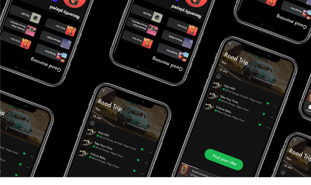
For this case study, I will be focusing on the modern music streaming platform — Spotify.
This case study was completed as an independent project during a four day sprint while I was a student at Ironhack. I was challenged to create a new feature to an already existing and highly adopted app, so I chose to work on one of my favorite apps for streaming music, Spotify!
Music streaming has changed so much over the past few years in response to the digital revolution. What seems to feel like a lifetime ago, people were using MP3, Napster, iPods and even resorting to not so legal ways to download and listen to music. And before that, there were CDs, cassettes and vinyls. Although the idea of having a record player at home and lining up outside the store to buy the latest music drops seems charming and entertaining, I couldn’t imagine not having music at finger tips — available whenever and wherever I want it! The evolution of music streaming in itself is a topic I could talk about for hours, but for this case study, I will be focusing on the modern music streaming platform — Spotify .
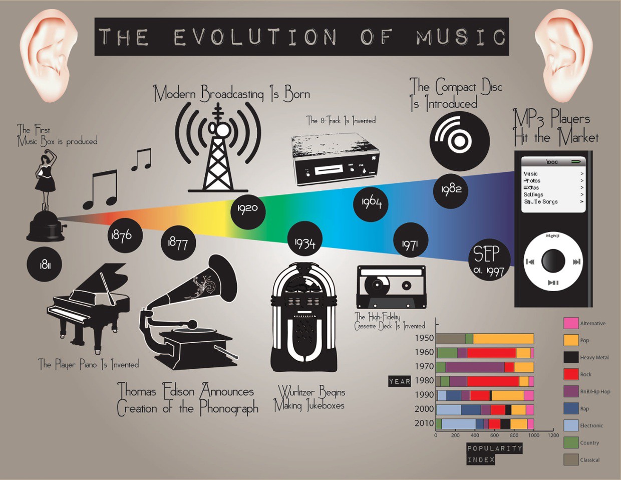
This week’s design challenge at Ironhack was to incorporate a new feature for an existing and highly adopted app. I chose Spotify because it completely changed the streaming industry in 2008 by setting the trend for subscription based music streaming services. It has also been my music streaming platform of choice for years now.
During this four day sprint, we focused more on visual design and Atomic Design Principals and developed our ideas to hi-fidelity prototypes. I was both excited and nervous about this weeks project since it was my first solo design project, but I am big on challenging myself, so I felt that it was the perfect time to tackle my own project.
So, let’s get started!
Just to give you a bit of background, Spotify is a music streaming platform — the biggest in the world by number of subscriptions. It was founded in Sweden by Daniel Ek and Martin Lorentzon, and eventually launched in 2008. As of March 2020, they have 248 million monthly active users , compared to Apple Music that has about 68 million users. Spotify uses a freemium model that offers users a free tier that includes ads, and a premium subscription for a monthly payment.
“Our mission is to unlock the potential of human creativity — by giving a million creative artists the opportunity to live off their art and billions of fans the opportunity to enjoy and be inspired by it.” — Spotify Mission Statement
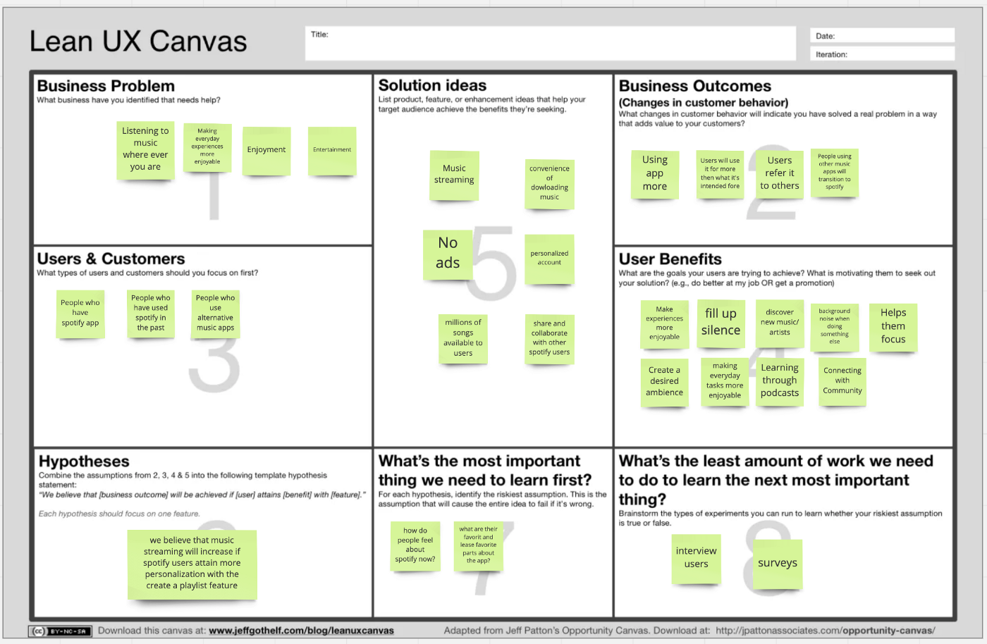
Lean UX Canvas
Using the Lean UX Canvas, I outlined the current state of Spotify and wrote down my assumptions that I began within boxes 1–4. Since this is a living document, I revisited it to make updates as I went through the Design Thinking Process.
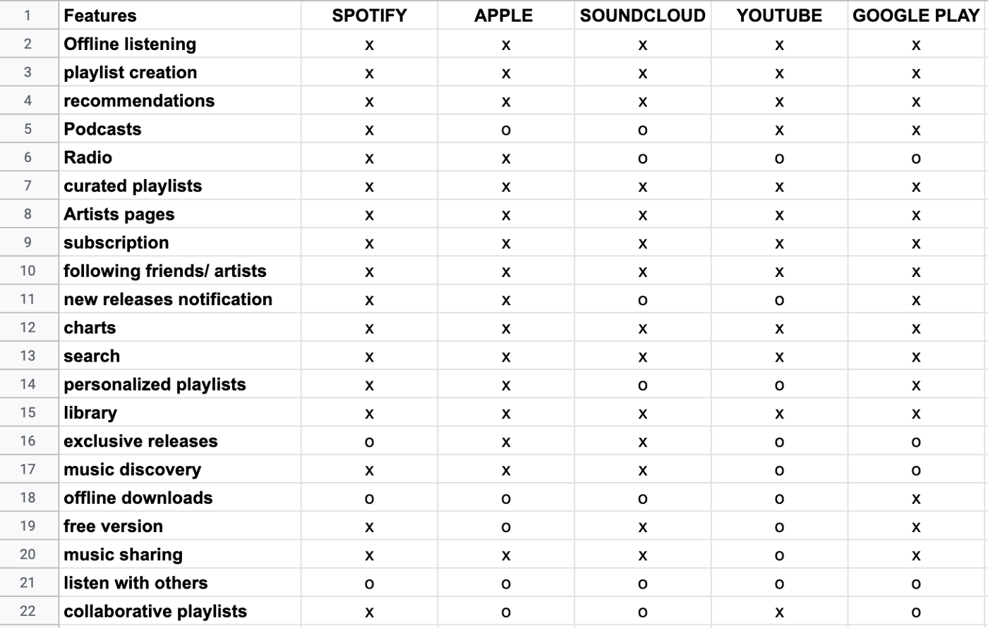
Competitive Feature Analysis
I started off my research with an analysis of Spotify’s direct competitors — Apple Music, Youtube, Soundcloud, and Google Play. I compared their features in the snapshot below.
Competitive Positioning Chart
I mapped out the competitors’ positions in relation to the axes to better visualize areas of opportunity and the competition. I decided to compare them based on the level of social interactions that they facilitate and the level of personalization that each platform allows for their users.
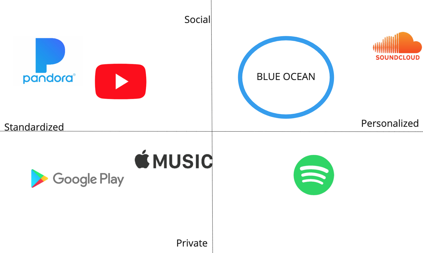
Spotify’s app can be personalized for premium users but is more so for private use. The “Blue Ocean” is an opening in the current market without many competitors which symbolizes an area of opportunity that I believe Spotify can enter with an additional feature. Although I had originally wanted Spotify to move towards a social adaptation, I decided to pivot later on in the process to create a more advanced personalization feature after getting some user insight.
User Research
I started off my user research with a survey of 12 questions. Surveys have been a really valuable tool for gathering a large amount of quantitative data, so I took some time to craft my questions to reflect the information I really needed at the beginning of my process.
I posted my survey in a Slack channel and a few Reddit pages related to music and received about 65 responses in 24 hours.
Here are some important statistics relevant to my project:
- About 60% of respondents said they use Spotify
- 90% said they listen to music for both pleasure and when doing other things (driving, working)
- Only about 1/3 of people like the personalized playlists that their platform creates for them
The last bullet point validated the need for a better-personalized playlist feature , so I decided to run with it and dive into some more user research to see where I can add value!
I conducted 5 interviews with people who use Spotify and/or Apple Music. I got A LOT of valuable insights from my interviews. One of the most surprising pieces of information that I found was the fluid nature of my interviewee’s streaming service choices depending on their needs. Their preferences constantly shifted based on the music experience they were looking for, attributing each platform its own function and purpose.
For example, users brought up the variety and diversity of music that Youtube and Soundcloud offered. When asked about finding new music, 4/5 people said they find more new music either through Youtube or Soundcloud.
“If I was able to find new music easily on Spotify, I wouldn’t be using Soundcloud or Youtube.”
However, I had to keep in mind that these platforms have an advantage for music discovery because some music is exclusively on Youtube or Soundcloud.
I converted all of my recorded interviews and survey results into digital sticky notes using Miro . This week I discovered a new tool in Miro that made data synthesis so much faster! In the sticky notes feature on the sidebar, there’s a “ Bulk Mode ” button that allows you to type several sticky notes at once instead of doing them one by one. This cut my synthesis time down by so much! (Credit to our TA, Kathryn)
Affinity Map
After dropping all of my data onto sticky notes, I organized them onto my Affinity Map with themes and color-coded them by streaming service . I found that several of the insights were very much interrelated with one another, so connections between ideas are indicated with arrows .
The most prominent themes are:
- Finding new music
Many of the smaller headers are sub-themes that branch off of the two bigger themes.
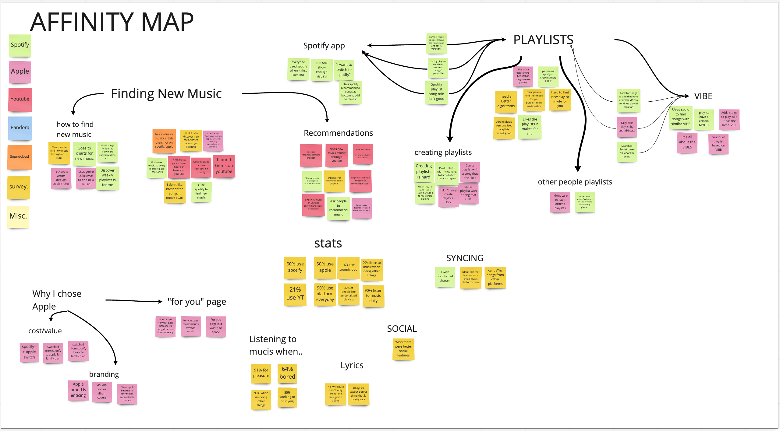
Some key findings:
- Most of the data points were related to finding new music and playlists
- People find a lot of new music on Youtube
- Playlists are defined by their “vibe”
- The word “vibe” came up a lot in the interviews — this will be an important term that I will revisit later in my case study
- Songs on a playlist should have a similar sound and consistent genre variation
- People value finding new music/artists that are aligned with their preferences
Customer Profile
Stratagyzer’s Value Proposition Canvas is another great tool for identifying customers’ jobs (things they need to get done), pains, and gains. This tool helps us better understand the customer we are creating value for. The customer profile connects directly to the second part of the canvas — the value map, which describes the elements of the value proposition.
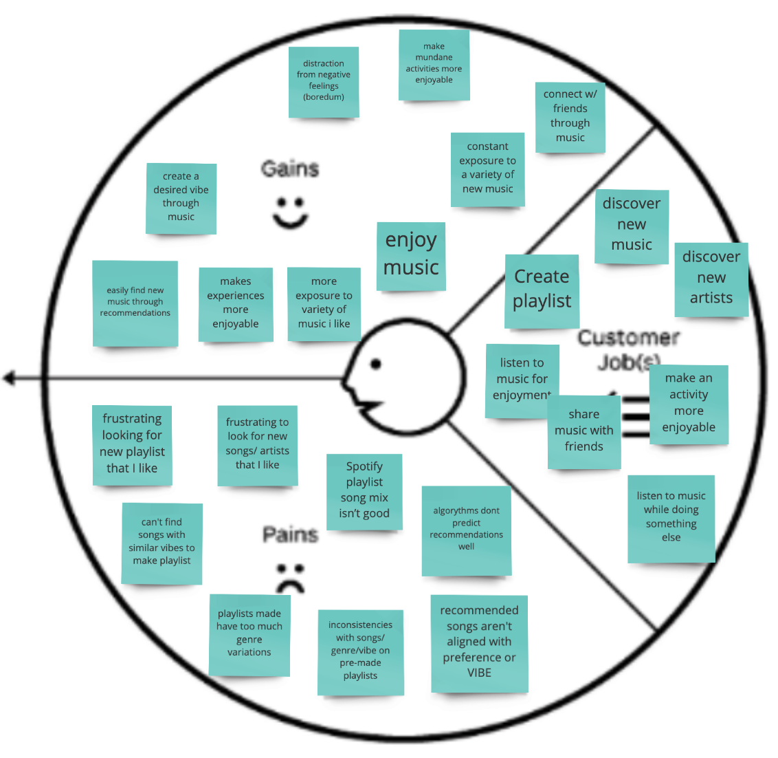
Customer jobs can be functional, social and emotional . Most of the customer jobs above are either emotional or social, which indicates that several gains and pains also fall into that category.
Task Analysis
The task analysis is a visual used to map out the path that users take to create a playlist. Although there are several different ways to create a playlist on Spotify, I used my interview data to choose the steps that users would usually take.
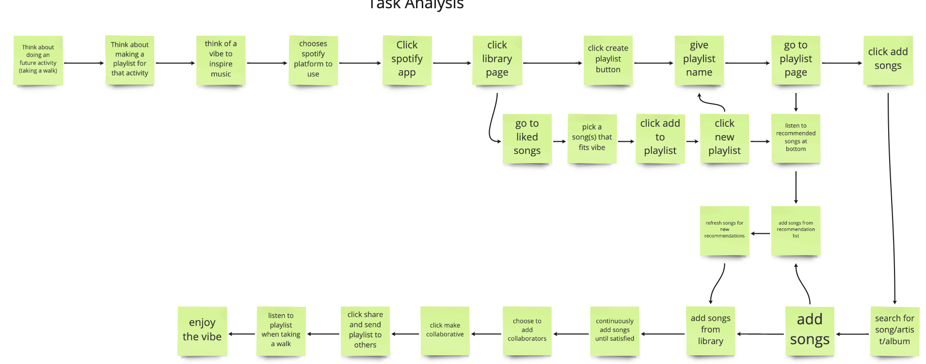
User Journey Map
A user journey map is useful for getting a more complete view of the user’s experience for a specific task. The goal is to find the significant low points or problems that the user is facing. It’s also a great time to highlight the thoughts and emotional aspects of the user’s experience.
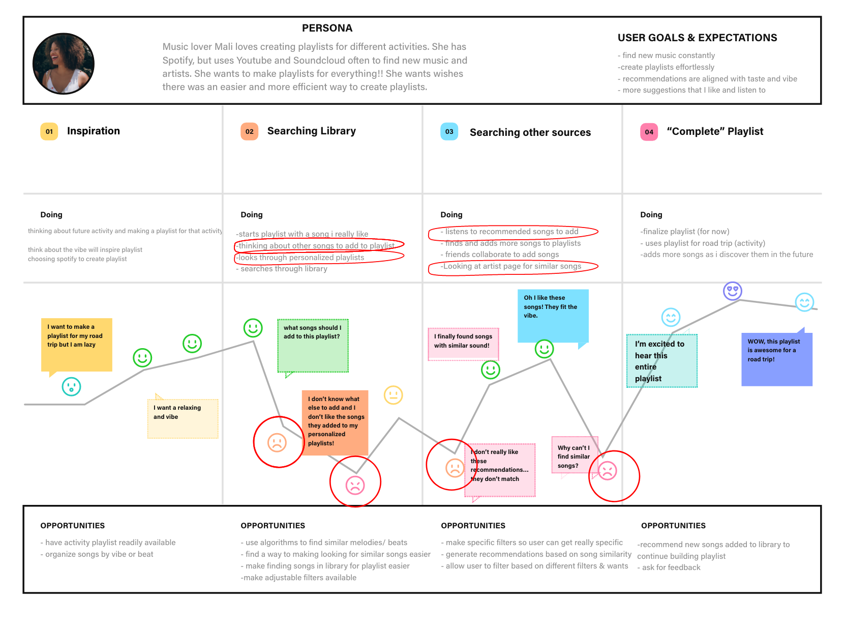
The user’s journey is centered around creating a new playlist for an upcoming activity (like a road trip). First, the user may think about a future activity, which will motivate them to create a playlist to make it more enjoyable. The user experiences low points when:
- Thinking about suitable songs to start the playlist
- Looking through their library to find songs to add to the playlist
- Listening to the songs recommended by the Spotify Algorithm
- Trying to find similar songs to the ones they already have on their playlist
After identifying these four pain points, I quickly wrote down some opportunities and ideas to use during ideation.
I synthesized the pain points into a problem statement.
Problem Statement

Then, I converted the problem statement into four “How Might We” statements:
- HMW make sorting through the personal library easier and more specific to users preferences
- HMW make newly recommended songs align more with users taste and requirements for the vibe
- HMW help users curate songs with a similar sound to make creating a playlist easier
This is just another way to frame the problem by turning them into questions to better prepare myself for ideation!
Ideation is one of my favorite parts of the process!
Collaborating with my classmates Sebastian Benitez , Christina Rice and Dave Ostergren for a brainstorming session was awesome! We came up with about 80+ ideas in 15 minutes using the time-boxing method to really push us forward.
Here’s what our brainstorming session looked like:
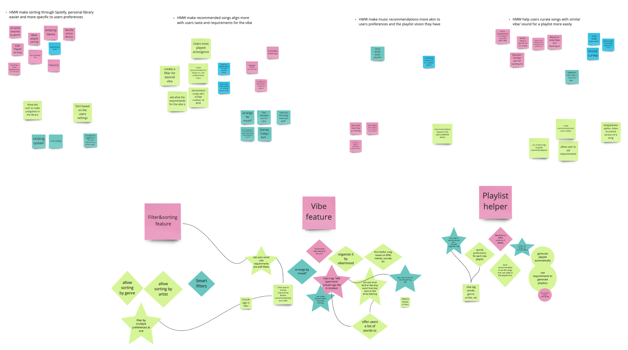
After brainstorming some ideas for each HMW statement, I reshaped the best ideas into stars and diamonds then made three umbrella headers that the ideas are categorized into — A sorting/filter feature, a “vibe” feature and a playlist creating helper.
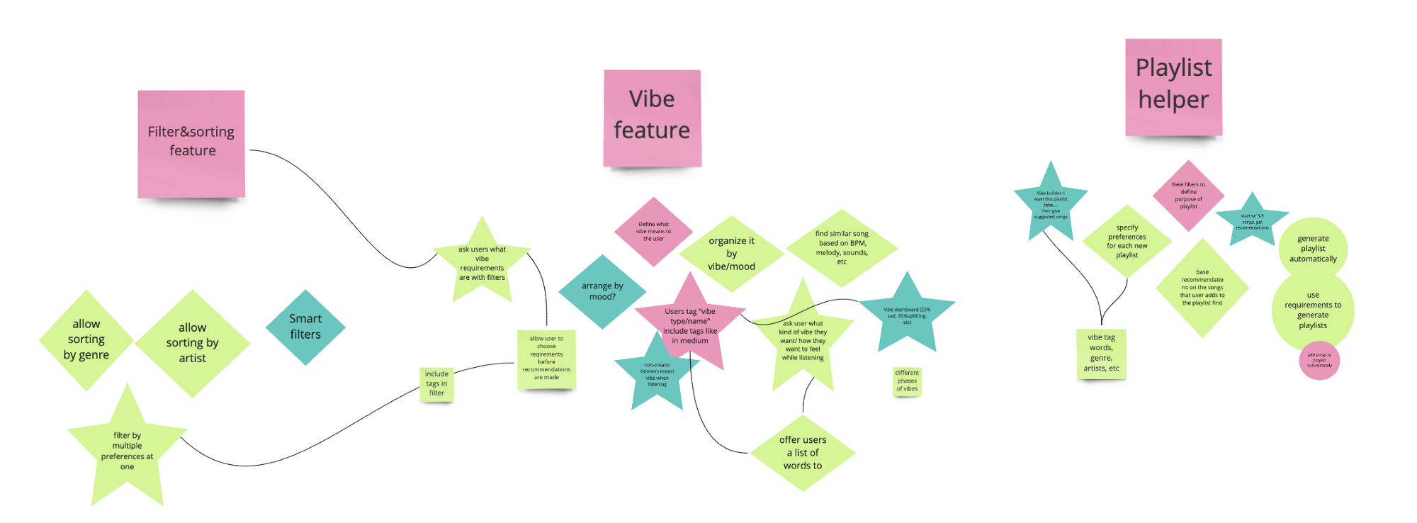
Organizing all of the the contents and ideas from the brainstorming session was a vital step before moving on to prioritizing the ideas since there were so many to consider and analyze. I really enjoyed this part of the process because it allowed me to arrange the detailed ideas under three overarching ideas and set myself up for prioritization.
MoSCow Method
I further categorized the ideas from brainstorming into the MoSCoW Method chart pictured below to prioritize the features into Must Haves, Should Haves, Could, Haves, and Won’t Haves.
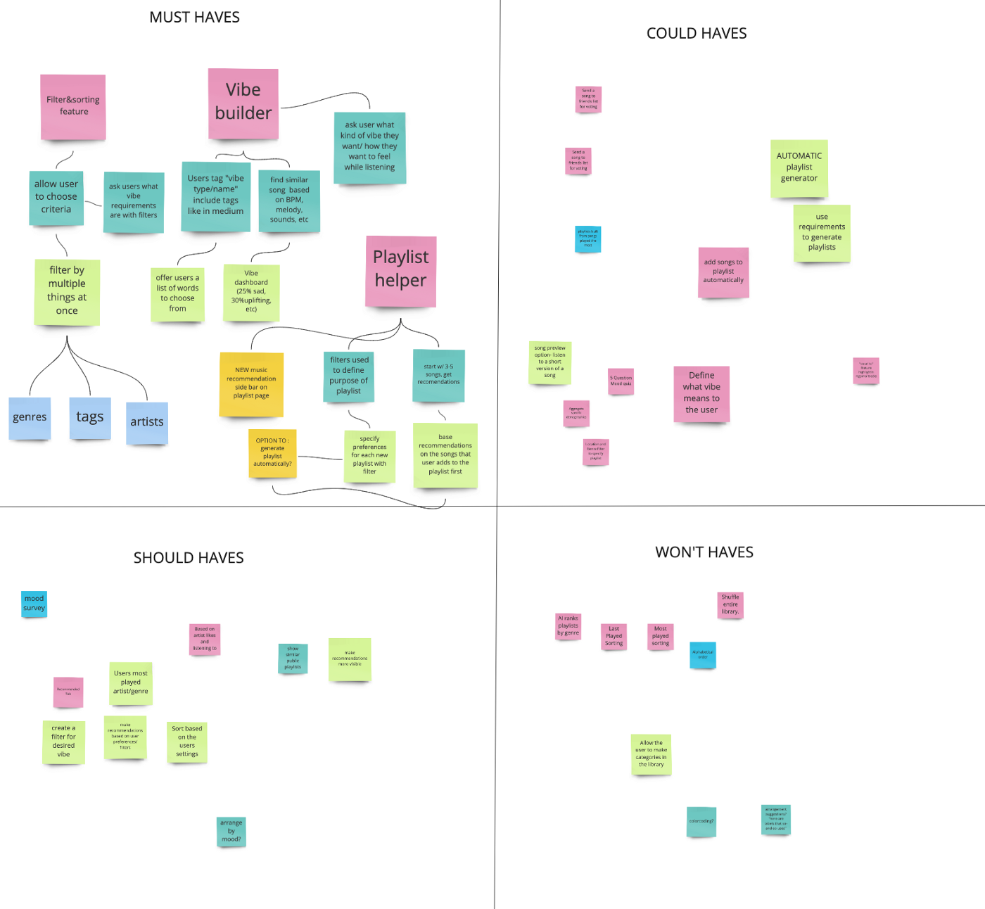
The must haves are the mandatory features that are key to solving the users problems. These include the three umbrella solutions and their corresponding ideas.
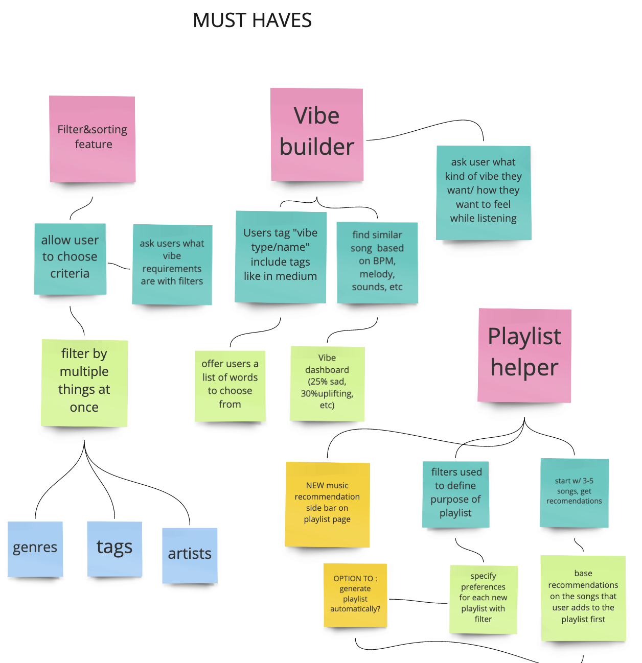
After prioritizing the features, I was able to define the products necessary to make my idea work, in addition to the gain creators and pain relievers on my Value Proposition Canvas.
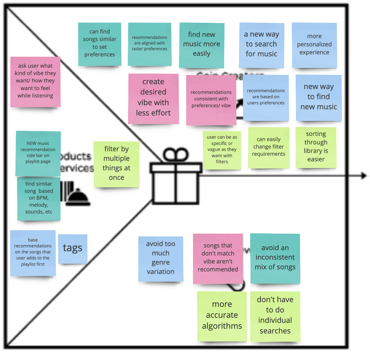
The products and services on the left of the canvas are color coded to correspond with the gain creators and pain relievers on the right.
Just to recap, the pain points are :
Although the sprint was short and my workload for the week was high, I still wanted to incorporate a solution that solved both problems related to creating a playlist AND finding new music.

My Minimum Viable Product includes a solution to address both pain points (creating a playlist and finding new music).
Job-To-Be-Done
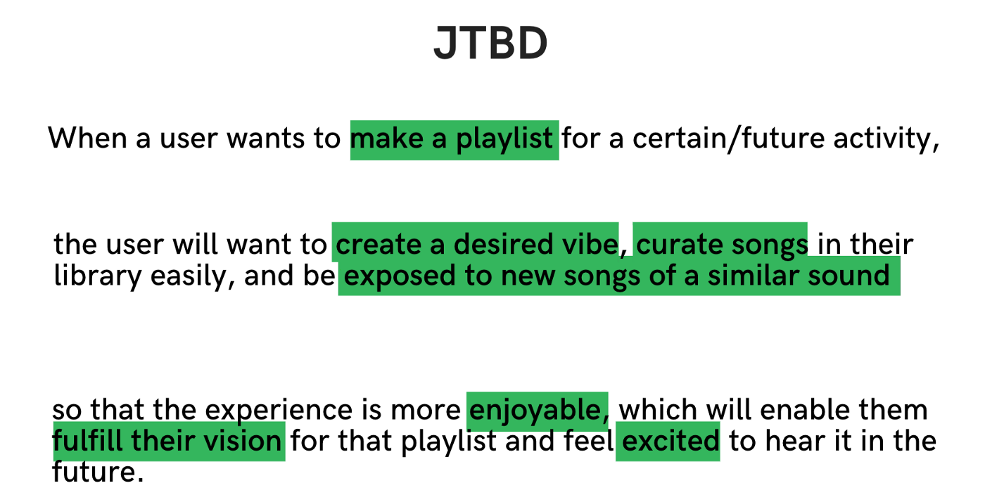
When Spotify users want to make a playlist for a future activity (I used an upcoming road trip for this scenario), they will “hire” Spotify to create a desired “vibe,” curate songs in their library (already saved songs), and be exposed to similar songs — the perfect opportunity to suggest new songs for the playlist based on user specifications like specific genres, artists and tags .
At the end of the day, the goal is to make whatever experience that the user is creating the playlist for to be more enjoyable. So my job is to help them fulfill their vision so that they are excited about hearing it in the future, and hopefully listening to it several more times.
Next, I created the user flow based on this job-to-be-done to create a visual representation of the path that the user will take to create a playlist with the new feature. The user flow also includes instances of human interaction (taps) and places where onboarding is necessary.
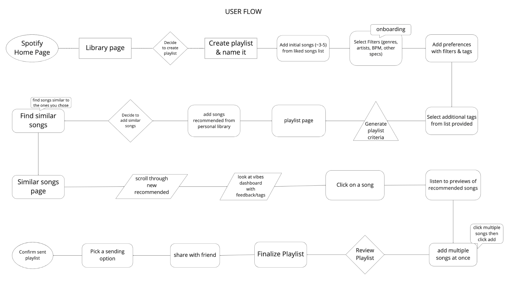
PROTOTYPING
I created a low-fi prototype for the process of creating a playlist, incorporating the new filter feature.
Low-Fidelity Prototype

After conducting usability testing using Maze , the heat maps indicated that many miss-clicks occurred where there were no clear guidelines for each step and also when people followed their natural tendencies. Seeing where people tapped enabled me to design the feature so that it would fit into their mental models instead of trying to go against it.
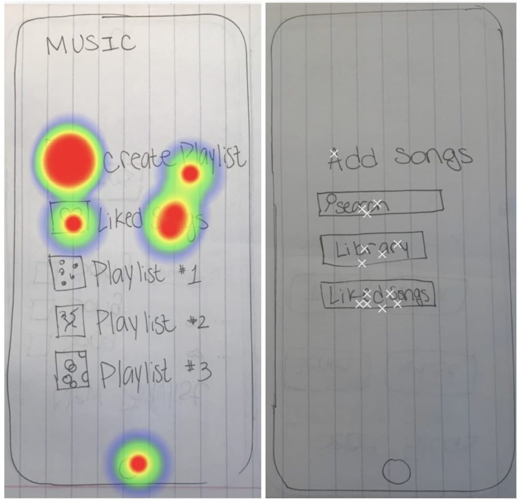
For example, many people clicked “liked songs” on this screen because that’s what they are used to doing when they create playlists. So I used this insight to make the next iteration more intuitive by guiding the user through the liked songs page to pick a few songs to start the playlist.
Another indication that people go to their “liked songs” or “library” to create a playlist using songs they already have saved.
Mid-Fidelity Prototype
For my mid-fi, I used the atomic design principles to build out my “atoms” and “molecules” that would later become icons, buttons, and footers that I used repeatedly throughout the entire design.
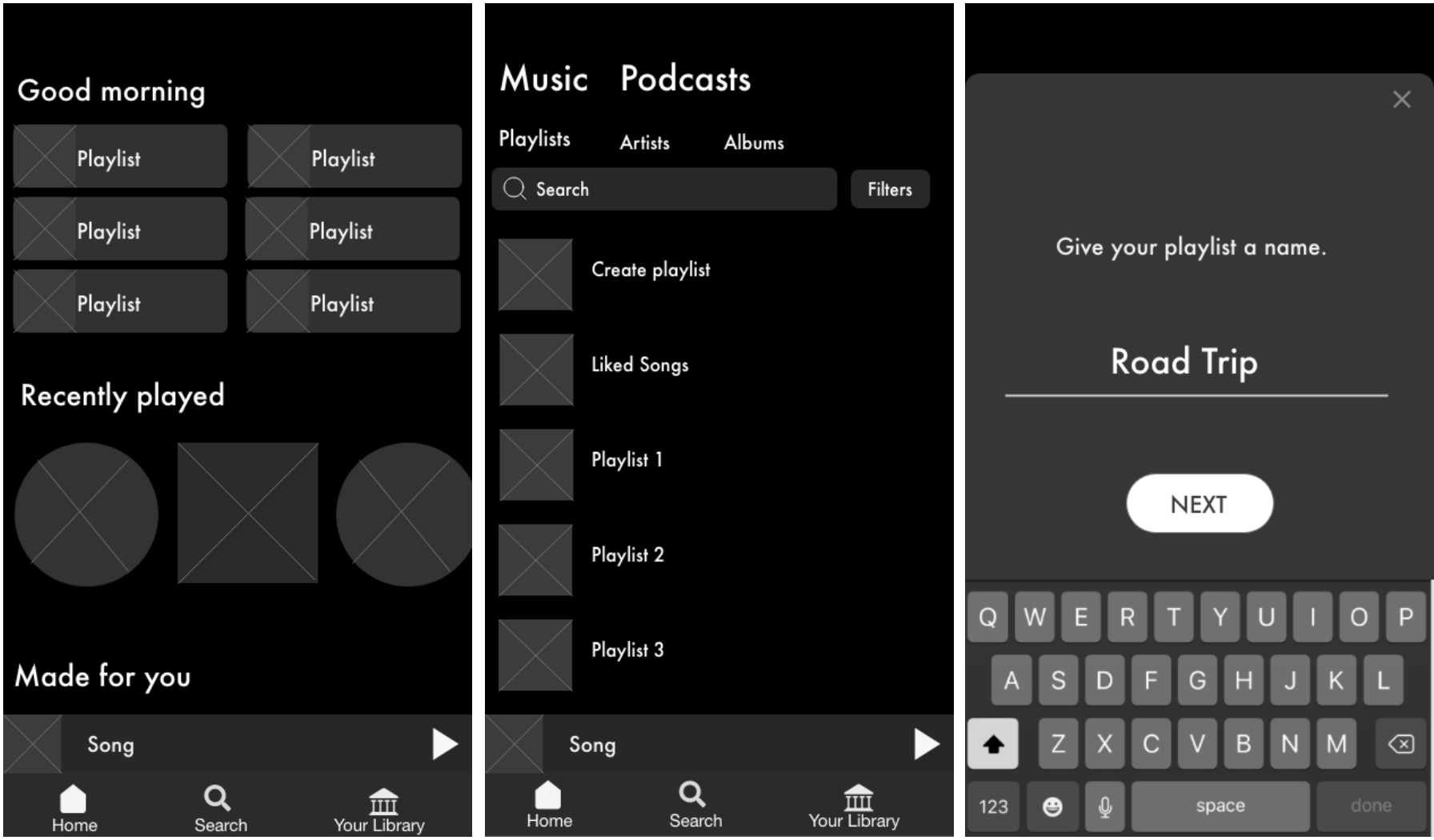
After testing my mid-fi, I added a few more changes to the layout of the screens and updated the prototype with colors and pictures for my hi-fi.
Hi-Fidelity Prototype
Here is a high level overview of my hi-fi prototype. I tried my best to make it look as close as possible to Spotify’s interface!
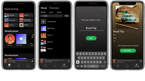
Here’s a step-by-step micro-level view:
The process begins by going to the library and pressing “create playlist”and giving it a name. Let’s say we are going on a road trip!
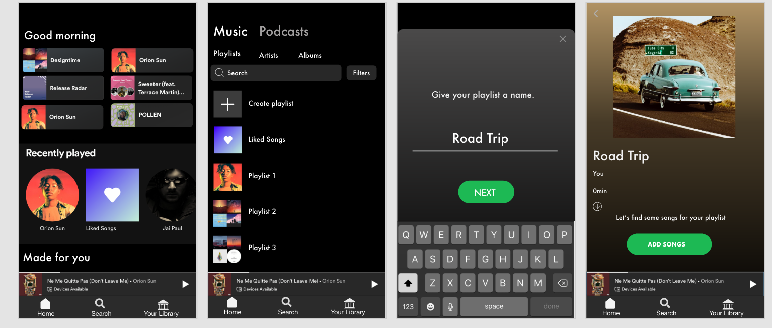
After pressing “add songs” users would go directly to the liked songs page and would be prompted to choose as many songs as they would like to start the playlist as a basis for the “vibe.” Once a few songs are selected, users go to “Find your vibe” which is where they can specify preferences for suggestions.
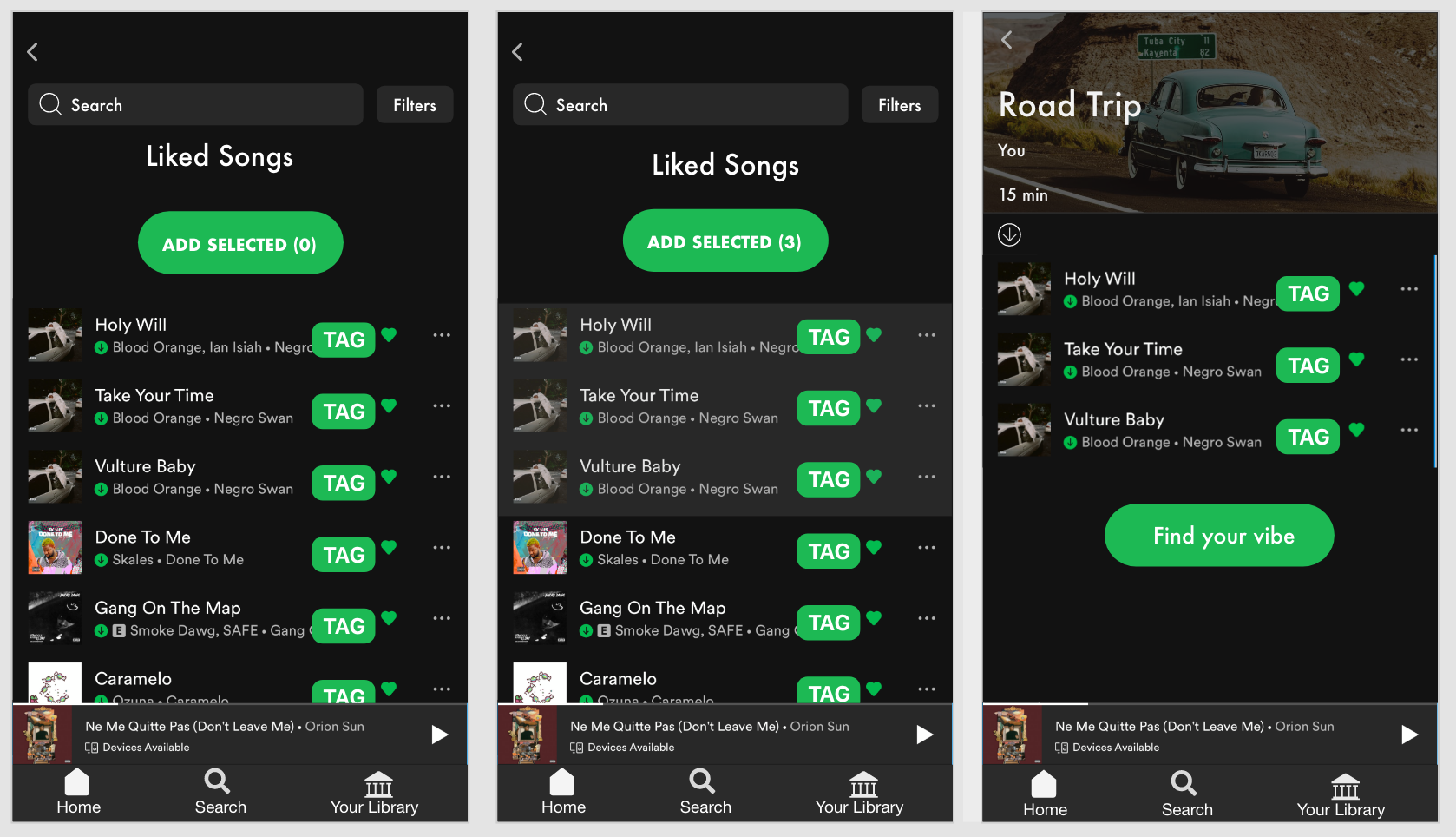
The tag can be defined as a label or set or labels attached to each song. Songs can have several tags that describe their “vibe” or mood. Tags are reported by users themselves, and the most prominent tag is displayed on these screens. However, if the user wants to find songs with the same tag, they can click each tag to be taken to the “tag dashboard” where songs with the same tag are listed. — This is yet another way that users can add songs of a certain “vibe” and find new music!
Then, users go through the filter feature of drop down menus to select their specific criteria for suggestions. Here, the user can be as specific or as vague as they would like, to accommodate very specific preferences and those who are more open to a variety of suggestions.
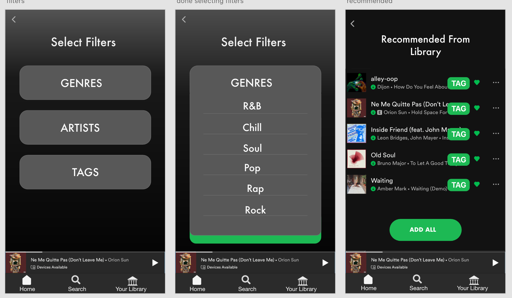
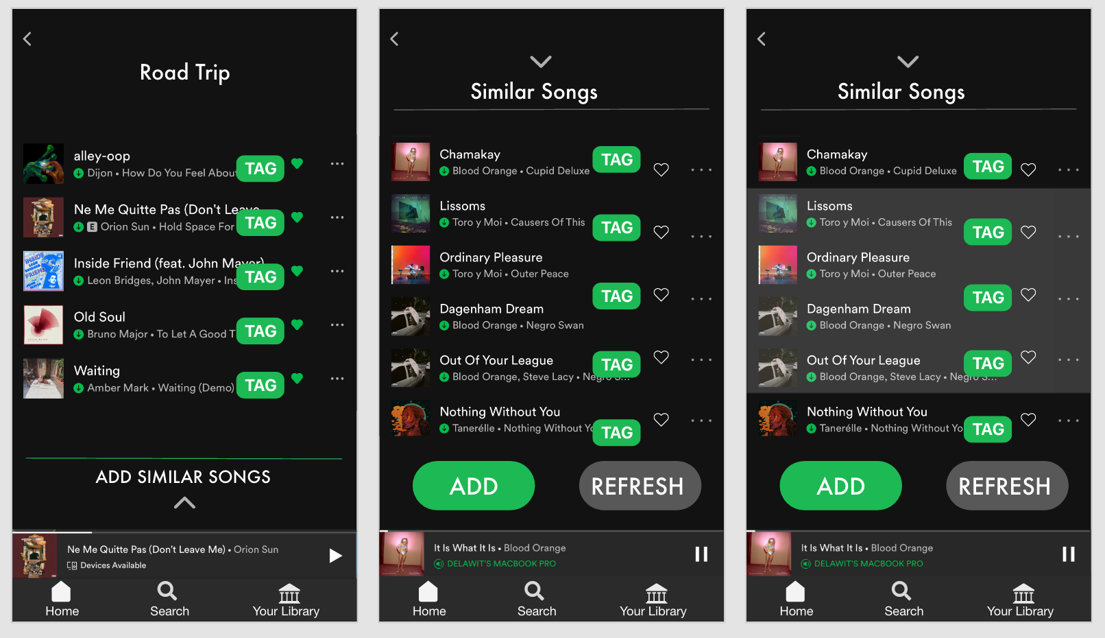
Spotify will first recommend songs within the library of saved music and users will have the option to add all or a add a few to their playlist.
Then, there will be an option to add *new* songs that are similar and also fall under the user’s preferences that were designated earlier.
The user can also share their playlist with a friend for collaboration!
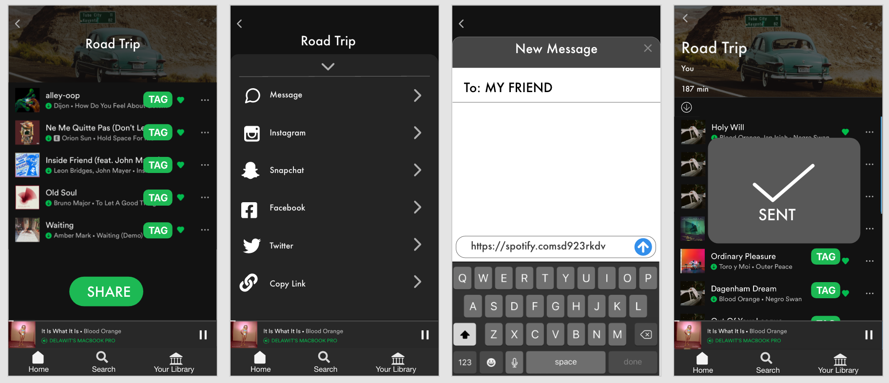
Here’s a link to my presentation if you would like to see a live walk through of the hi-fi! (Go to slide 30)
Success and Failure Metrics
We will know if the new feature is a success through these metrics:
- Less time creating playlist
- Higher Satisfaction
- More People Use Feature
- Save newly recommended music
And we will know if the feature is a failure through these metrics:
- More time creating playlist
- Lower Satisfaction
- Users don’t Use Feature
- Disproval of recommended music
Knowledge Gaps
If I had more time, I would’ve loved to do some in-person usability testing with some of my friends to get some more insights on the way they use Spotify. I would’ve also loved to dive deeper with a second round of interviews focusing on the other music streaming platforms that they mentioned, like Youtube, to see which features they find most valuable and exactly how they use them. I believe that there are features that Spotify could potentially adopt from the other music streaming platforms that would give users additional value.
- Finish atomic design inventory
- Test the hi-fi prototype and make another iteration
- Develop the tag feature for multiple functions
I am not the user even if I use the app! Although I am a loyal Spotify user , I had to keep reminding myself not to accept my assumptions as facts. It’s a universal UX principal to always keep the users at the center of the design.
Adopt the users’ language and make it a part of the product! Like I mentioned earlier, the word “ vibe ” kept coming up in my interviews, so I knew that this is something that may be universally understood across the music listening community. I incorporated it into my design to further relate to the users and use a language that they can appreciate.
Overall, this project was extremely rewarding! Spotify is an already amazing music streaming platform with features that go above and beyond. So the challenge to create an additional feature that adds value was definitely challenging. I enjoyed going every step of the Design Thinking Process and being able to go all the way through a hi-fi prototype!
Let me know if you have any thoughts or comments! Feel free to connect with me on LinkedIn as well. And if you’re in the mood to listen to some of my *very much incomplete* playlists, here’s my Spotify .

- Consumer products , Content and Copy , Design , Interface and Navigation Design , Product Releases and Redesigns , Prototypes , Visual Design

Delawit Assefa is a UX/UI Designer in the Washington D.C. Area, a recent first-generation college graduate looking for new opportunities. She is passionate about user-centered design, problem-solving, and storytelling through different mediums and is looking forward to creating meaningful experiences and bridging the gap between technology and human experiences through design in her career.
Related Articles
Do founders even care about design.
- The article emphasizes the importance of design in startup success, highlighting the risks of ignoring user feedback and the necessity of effective communication between founders and designers.
Share this link
- March 7, 2024

The Essential Guide to Microcopy and Becoming a More Literate Designer
- Accessibility , Content and Copy , Design , Personal and Professional Development , UX Magazine
Designers should not be mere decorators, but understand language and microcopy, which is a crucial design skill, now more than ever.
- The article emphasizes the importance of microcopy in design, highlighting its role in enhancing user experiences and providing guidelines for crafting effective microcopy throughout the design process.
- March 12, 2024
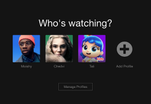
How Insight from Netflix Profiles Doubled Our Conversions
- Accessibility , Agile and Iterative Process , Design , Mobile Technology , Technology for the Common Good
Out-of-the-box design process by Gett mobile team.
- The article discusses how Gett, a taxi booking platform, leveraged insights from Netflix to implement a profile selection feature, significantly improving user experience and doubling business conversions.
- March 19, 2024
Did you know UX Magazine hosts the most popular podcast about conversational AI?
Join 740,000 designers, thinkers, and doers.
This website uses cookies to ensure you get the best experience on our website. check our privacy policy and.

IMAGES
COMMENTS
Swiftwash Laundry UI/UX Mobile App Case Study. Orbix Studio UI/UX Digital Design Agency. 6.3k 76.6k. Save. Game Website UI/UX Design. Neil Tortora - Senior UI/UX Designer. Pro. 511 6k. Save. Doctor Appointment UX & UI Case Study. Multiple Owners. 39 299. Save. UX Case Study-Children Clothing App. Siyam Abdullah. 336 9.3k. Save. Digital Menu App ...
The main concept behind this UX case study is to address a pre-existing problem through the design of the app. Immediately from the start, the study highlights a common pain point among users: that of a lack of productivity due to device usage.. This UX case study example addressed some of the main problems within existing productivity apps included:a poor UI and UX that made navigation difficult
About. Discover an expertly curated collection of 20+ inspirational UX/UI design case studies that will empower you to create outstanding case studies for your own portfolio. Comprehensive end-to-end case studies covering research, ideation, design, testing, and conclusions. Perfect for designers building portfolios and looking for inspiration ...
5. Perfect Recipes App by Tubik. Here we have a UX case study for designing a simple mobile app for cooking, recipes, and food shopping. It aims to step away from traditional recipe apps by creating something more universal for users who love cooking with extended functionality.
Grocery delivery apps have gained enormous popularity after the Coronavirus pandemic. According to Bain & Company's research, before the pandemic, only 3%-4% of customers (of total grocery buyers) used online apps. During the pandemic, this number surged to 10-15% which is a ~5x bump. Zepto, Instamart, Blinkit, and the like are players in ...
Oct 8, 2020. 9. Redesigned screens of the app. Right off the bat, I'm not affiliated with Forbes in any capacity, and the views for this case study are strictly my own. Since I don't have full access to all the user data that influenced their current design, this case study is not fully comprehensive. This case study was done to enhance my ...
This project was part of my bootcamp with the UX Design Institute and the brief was pre-defined as: Your client is a start-up airline. They're looking to create an online experience that is fast, easy and intuitive: one that's based on a deep understanding of their target users. Design a new mobile app for your client, focusing specifically ...
Restaurant Food Waste Management App Design — UI/UX Case Study In this article, I will go through my latest UI/UX case study for designing a restaurant food waste management app that aims to reduce…
1. Choose a Project. The first step in creating a compelling UX/UI case study is to select the right project. Choose a project that not only showcases your design skills but also aligns with your interests and passions. The project should be substantial enough to demonstrate your abilities and have a clear problem that needs to be addressed ...
3.3k. Published: March 7th 2024. Delve into the journey of crafting Aurelia's sustainable fashion app, where user-centric design principles, meticulous eco-friendly curation, and seamless navigation converged to redefine the shopping experience.
To better understand users' steps and how they are using the Uber app, we broke it down into steps: need a ride, requesting for a ride, waiting, riding, and coming to the destination. Using this tool, we can better understand their mental models. And indeed, be prepared for the next step in our defined stage.
According to a 2020 Gallup study, approximately 73% of Americans reported donating money to charity while the prior low was 79% back in 2009. Countless factors go into why this may be an issue. However, looking at this from a UX perspective, the research that goes behind finding trustworthy charities online could be incredibly time-consuming.
The evolution of music streaming in itself is a topic I could talk about for hours, but for this case study, I will be focusing on the modern music streaming platform — Spotify. This week's design challenge at Ironhack was to incorporate a new feature for an existing and highly adopted app. I chose Spotify because it completely changed the ...
InterSpace is a huge collection of 760 mobile app screen templates inspired by most popular app design patterns. Best for UX/UI designers, design agency, developers and startup business. Build, prototype and customize any design for your next social media app, e-commerce shopping app, fitness app, hotel booking app and more. https ...
In parallel, as we were improving the User Experience, we worked on refining the visual design of the app. We developed a rule-based system to support branding, typography, icons, and colors in order to achieve visual consistency with the styling of the app. The system served as a base for the entire user interface used on iOS, iPad, Android ...
Before starting the redesign process, it is essential to thoroughly understand Visorando's target audience. The hiking community is diverse, ranging from beginners to experts and from young ...
In this blog, I will be describing the 13 week process of revamping this app from interviewing pet owners and identifying their problems to creating a high-fidelity prototype of the new app itself ...
A UX Case Study Template Guide In the dynamic world of UX design, a case study serves as a showcase of your skills, telling the story of a project from inception to… 3 min read · Feb 17, 2024
A. Setting research goals. Understand the target audience better and get to know their needs/goals. To understand what pain points users experience while using the app. To understand how users go about performing the various tasks like logging in, browsing the menu, customising their orders, using rewards/benefits etc.
Health Pal is an individual project which allowed me to plan and direct each step of the design thinking process as a UX strategic design student with mobile and web UI design experience. Starting ...