How to Design a Great Presentation Cover Page
A cover page is a quick and easy way to add polish to your presentation. We'll cover a few tips for creating a great cover image, and we've got ten free PowerPoint cover image templates you can download at the bottom of the page.
The cover image sets the tone for your presentation—you don't want to dive right into the content—and is a great opportunity to start your deck off on the right foot.

What to include
Your cover image should include these basic facts:
- Title Short and sweet.
- Your contact information. Email or phone number
- Your company logo. It's all about branding.
Bonus tips:
Cobranding. Presenting to a customer? Add their logo to personalize the presentation.
Conferences. Including your Twitter handle is a great idea—you might gain some followers, and it gives your audience someone to tag when they gush about your awesome presentation.
Know your Audience
Consider how your audience will view your presentation deck (projected, on their laptop, or printed like it's 1995), and make sure that the scale of your design is appropriate.
If you're presenting at a conference, your type needs to be big enough to read from the cheap seats, and make sure you have enough contrast that the text is legible even if there's poor projector quality. You don't want your audience squinting at the screen before your presentation even starts. And remember—the title page will be what's on screen when you're getting ready—walking up to the stage, fixing your microphone, or just swallowing back the sheer terror of public speaking.
If you're emailing the presentation, make sure your cover image works well as a thumbnail. That will be the first thing your reader sees when she receives the file—and, let's face it, a better image is going to drive more opens than a boring one.

Know your brand
If you have an established brand, your cover image needs to reflect it. One of the biggest problems we see with decks out in the wild is when the creator goes off-brand and uses the wrong colors or typeface. Imagine how surprising it would be to see a presentation from Coca-Cola without their trademark red, or Facebook without their blue.
Cover Image Techniques
Now that we have the basics down, here are some techniques you can use make a well-designed cover image.
Stock Photography
The workhorse of cover images is stock photography—an attractive photo with plenty of negative space, then place your text on top of it. The trick is to find the right photo and make it work for you. Pexels is a great place to find free images you can use anywhere. When you're looking for stock photos, keep these tips in mind to help you find the right image.
Sometimes you'll need to do a quick bit of editing to make the image work for you. The important thing is to find an image that works in the background —one that lets your reader focus on your message, not the photo. These images tend to look boring all by themselves—you need to use a bit of imagination to see how it will work once you layer text on it.

Once you have an image, you can desaturate and tint it to give it better contrast for your text, or manipulate the image to give it more negative space, as you see below.
Typographic
Nice typography will take a you a long way, and it's something you can do in PowerPoint without any special tools. We're in a renaissance of great, free fonts. Take a look at this selection of the best Google Fonts from the always awesome TypeWolf for inspiration.
Using custom fonts can be tricky in PowerPoint. If you're having trouble getting your fonts to show up, take a look at this article . If you're sharing the PowerPoint with others, they'll need to have the fonts installed (we recommend always exporting your deck to PDF before sharing with customers to avoid font problems).
We all know PowerPoint isn't the greatest design tool—but it does the basics well enough, and you can use it to make a minimal design that works well.
Even though they're "easy" to do, with the right layout and sense of balance you can make a design that really sings with hardly any design elements.
Strong color combinations, simple shapes, and nice typography can yield a cover page that looks great without searching for stock images or opening Photoshop. Need a little help with color combinations? Check out Kuler from Adobe .
Free PowerPoint Cover Page Templates
We've made examples of the styles above for you to download and use. These are completely free—do whatever you like with them!
Coffee Cup PowerPoint Cover
Requires open sans download powerpoint file, beach powerpoint cover, requires playfair display download powerpoint file, office building powerpoint cover, requires open sans and playfair display download powerpoint file, circles powerpoint cover, bridge powerpoint cover, desk powerpoint cover, design tools powerpoint cover, simple powerpoint cover, tiled background powerpoint cover, topographic background powerpoint cover.

Enjoy! If you need some ideas to get you started, take a look at our portfolio of decks we've designed . Or if you'd like a little help on your next project, we're happy to help .
Want to see more from Lightboard?
Subscribe for notifications about new posts.

About Lightboard
Lightboard is a B2B design service. We've helped great companies like Autodesk, Nasdaq, and Tile with design, and we'd love to help you.
Need great design for your presentations, website, and inbound marketing? Look no further.
See what we can do.
6 Tips to Create an Eye-Catching Presentation Cover Page

Table of Contents
- What Is a Presentation Cover Page?
6 Tips to Create a Winning Presentation Cover Page
- Key Takeaways
- Conclusion
A good presentation cover page is just as important as the content inside it, but a great one will also draw attention and give your presentation an extra lift. By drawing attention to your presentation’s topic upfront, you can compel your audience to want to know more about what you have to say.
The cover page is one of the first things the audience will notice about your presentation. So, you must make a good first impression, and immediately. An effective PowerPoint cover page can set the tone for your entire presentation, and engage the audience from the get-go. And to get better at creating presentation cover page designs , you need to understand what an ideal presentation cover page is.

What Is a Presentation Cover Page?
When it comes to presentations, don’t underestimate the value of a powerful and captivating title slide. It’s one of the easiest and quickest ways to get people’s attention. A sound presentation cover page design helps achieve two crucial goals.
- Clarity in terms of the topic
- A strong introduction to your brand
In a nutshell, your PowerPoint cover page (or any other presentation cover page for that matter) exposes your viewers to the main points of your presentation. It should also pique their interest and make them want to hear more. Now, let’s move on and understand the steps involved in creating a stunning cover page .
The cover page of the presentation is often the first clue that people get about what you are going to speak about. Therefore, you need to make sure that it’s clear, concise, and compelling. To ensure this, we have put together a few easy tips for you.
1. Come up with a catchy title
It’s ideal to come up with a title that’s plain, descriptive, and easy if you’re delivering a presentation to a bunch of people who don’t know much of what you’re going to say. If you’re having trouble cutting down a long title, you can include a subtitle underneath that explains what you’ll be delivering information on.
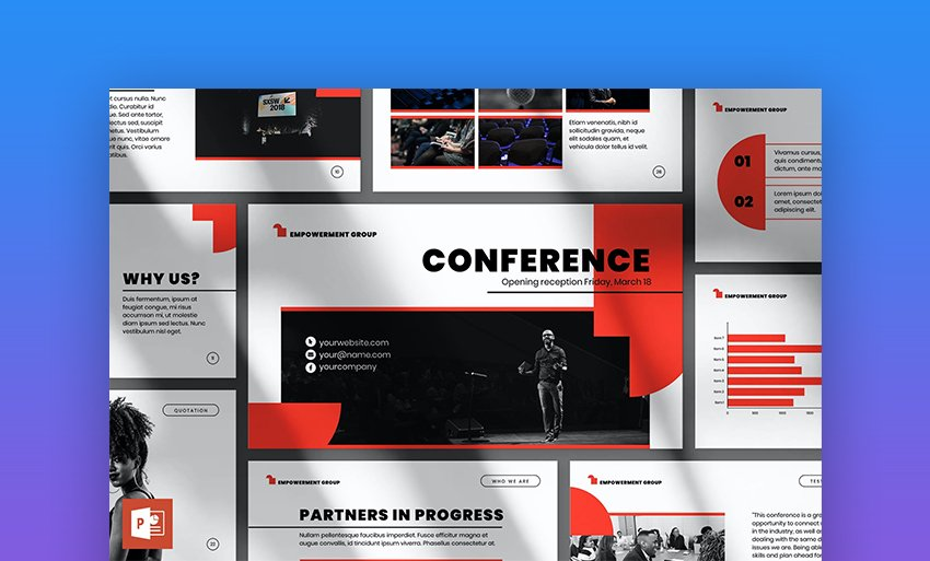
You can get away with anything more intriguing or artistic, depending on the topic of your presentation, but make sure your title is not too obscure or incomprehensible. For example, the title in the below-mentioned slide is easy to understand and captivating as well. Notice how the word “Conference” has been highlighted and is followed by supplementary text underneath.
2. Check the overall tone
Why does the tone of your presentation, specifically the cover page, matter so much?
The cover page paves the way for the rest of your presentation, and audiences are quick enough to decide whether they want to continue watching the presentation judging by its tone. But what do we mean by tone? In this context, tone means the overall style of the presentation.
A presentation cover page must dictate the objective in a professional yet quirky manner to attract and retain your audience’s attention. It should represent the worthiness and quality of your overall content.
Apart from that, recently, aesthetics have become the topmost priority for many marketers. We, as humans, find aesthetics in everything, and easily get attracted to it. That’s why having an informative yet aesthetic cover page can set you apart from your competitors.
Here’s an example of how tone and aesthetics should go together in a presentation cover page design.
3. Humanize your cover page
Humans are emotional beings. A good presentation page can do more than just present the work; it can set an emotional tone for the rest of the site.
You want to be able to wow people with your presentation, but that doesn’t mean you need to be flashy, unemotional, or insensitive. On the contrary, if you create a cover page that uses emotions to get people excited about your work, nothing like it. They will not only know what to expect but will also be able to connect with your presentation on a deeper level.
Let’s look at an example of an emotion-driven approach for presentation cover pages.
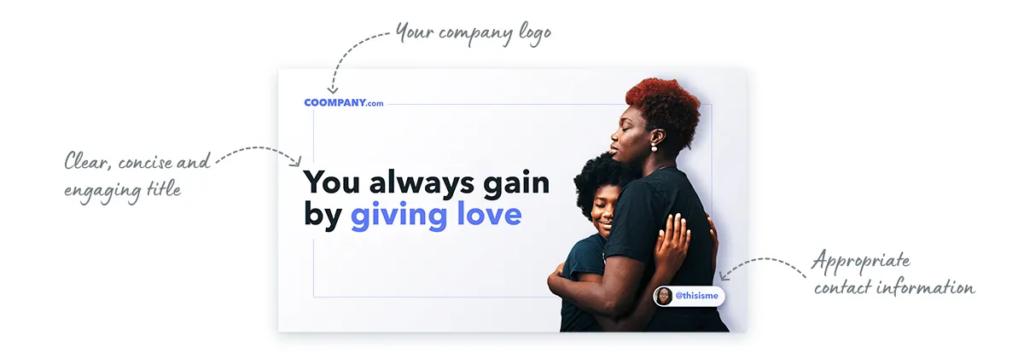
4. Shed some light on your brand
While it’s great to illustrate your objective on the cover page, it is also equally crucial to throw some light on your brand. In general, the opening page of your deck should convey what your company does. After all, it’s the first impression people will have of your company or project.
While you may be tempted to include your own photo and contact information on the cover page, it may be more appropriate to emphasize your team or brand instead.
Here’s a brilliant example.

5. Keep it simple
As a content creator, you must make presentation cover page designs that educate and inform your audiences. You can do so effectively by going minimalistic.
Having too many pictures and words can distract the audience and confuse them. That is why having a minimal background is extremely important. It also lends professional and clarity to your presentation.
Check out this example to get a sense of what a minimalistic cover page should look like.

6. Use bold fonts
Last but not least, you should use bold fonts to display your ideas perfectly on the cover page. Strong fonts that include letters and numbers will attract eyeballs immediately.
Therefore, whenever you’re preparing a presentation cover page design, make sure you’re using bold and simple fonts, and not complex and thin fonts.
Here’s an example of a presentation cover page that has a bold font.

Key Takeaways
- A presentation cover page is a basis on which your audience decides whether to give their attention to the rest of the deck.
- To create a stunning cover page for your presentation, you need to ensure it has a catchy and short title.
- The cover page should go well with your brand’s tonality.
- Ensure you add emotions to attract your readers.
- Add a little about your brand/business as well.
- Follow a coherent tone for the cover page, which can be carried forward to the rest of the presentation.
- Smartly use bold fonts to capture the audience’s attention.
The cover page of your presentation is the first thing your audience will see. So, it’s important to make a great first impression with it. A well-designed presentation cover page can highlight the topics of your presentation and pique the interest of your audience. You’ll want to keep the design simple and clean.
In order to create a stunning cover page for your presentation, there are certain things you need to take care of and implement. For starters, you can keep your title short, and if there’s something more you want to add to the title, you can insert it as a subhead. Next, you should add some emotion to your cover page to gain your viewer’s attention. Apart from this, you should try and experiment with bold fonts, as they catch the viewer’s attention immediately.
You must also add a minimalistic background to your cover pages, as too much information and pictures can confuse the viewers. And lastly, do not forget to add information about your brand or business to get your viewers acquainted with it. Remember, a great cover page can win half of your viewer’s heart, so make sure to make it as stunning as possible.
A presentation cover page is the first thing your viewer gets to see. Basically, it is the first slide that informs your viewers about the presentation and its objectives.
An ideal PowerPoint cover page should have a captivating title, engaging imagery, and details about the company.
For the cover page, you should use bold fonts to attract the viewer’s attention and make a lasting impact.
Yes, infographics help give viewers a clearer picture of your message. They may make them proactive listeners as well as responders.
Numbers attract viewers. So if you have statistics to back your claims, and if they’re relevant or fit the title, you should definitely go ahead and use them.
Latest Blogs
In this blog, explore the golden rules of using AI marketing tools so you can leverage the benefits to their maximum potential.
In this blog, you’ll learn how to avoid the pitfalls of SEO over-optimization while enhancing your site’s performance.
In this article, we’ll take a look at what AMP is, its advantages and disadvantages, and how it affects SEO.
Get your hands on the latest news!
Similar posts.

10 mins read
How to Start a Successful Food Blog in 2022

4 mins read
10 Best Translation Blogs To Follow In 2022

11 mins read
What Type Of Media Can You Add To Make A Blog Post More Interesting?
Got any suggestions?
We want to hear from you! Send us a message and help improve Slidesgo
Top searches
Trending searches

11 templates

28 templates

holy spirit
36 templates

islamic history

memorial day
12 templates

165 templates
Cool Presentation templates
Make the most of these cool slide designs for your presentations that will leave your audience amazed. customize them directly in google slides or download them as ppt templates for use in microsoft powerpoint and keynote..

Deep Gradient Layers - Business Basic Template
Download the Deep Gradient Layers - Business Basic Template presentation for PowerPoint or Google Slides. The world of business encompasses a lot of things! From reports to customer profiles, from brainstorming sessions to sales—there's always something to do or something to analyze. This customizable design, available for Google Slides and...

Trendy and Eye-Catching Newsletter
Download the Trendy and Eye-Catching Newsletter presentation for PowerPoint or Google Slides. Attention all marketers! Are you looking for a way to make your newsletters more creative and eye-catching for your target audience? This amazing template is perfect for creating the perfect newsletter that will capture your audience's attention from...

Youthful Retro Chic Style Portfolio
Download the "Youthful Retro Chic Style Portfolio" presentation for PowerPoint or Google Slides. When a potential client or employer flips through the pages of your portfolio, they're not just looking at your work; they're trying to get a sense of who you are as a person. That's why it's crucial...

Premium template
Unlock this template and gain unlimited access
Cool Homework
Who said that doing homework is boring? Motivate your students preparing some amazing activities for them. Make them as visual as possible and edit some of the infographics we offer to make it dynamic and enjoyable.

Cocktail Bar for Social Media
Download the Cocktail Bar for Social Media presentation for PowerPoint or Google Slides. How do you use social media platforms to achieve your business goals? If you need a thorough and professional tool to plan and keep track of your social media strategy, this fully customizable template is your ultimate...

Cool Computer Interface Style Student Book
Let your student’s creativity run free through these retro, yet modern slides for a student book. What are these exercises about? Science? Math? Literature? No matter what subject you teach, with these editable slides you can prepare a fun and challenging student book to keep track of your student’s learnings....

Dengue Disease
Download the "Dengue Disease" presentation for PowerPoint or Google Slides. Taking care of yourself and of those around you is key! By learning about various illnesses and how they are spread, people can get a better understanding of them and make informed decisions about eating, exercise, and seeking medical attention....

Design Inspiration for College
Download the Design Inspiration for College presentation for PowerPoint or Google Slides. As university curricula increasingly incorporate digital tools and platforms, this template has been designed to integrate with presentation software, online learning management systems, or referencing software, enhancing the overall efficiency and effectiveness of student work. Edit this Google...

Cool Doodles
Make use of your own innovation and imagination to present your project with this original template full of drawings.

Cool Cream Background Pitch Deck
If you combine cool, cream-colored backgrounds of this presentation with your incredible content, success will be guaranteed for sure. Using this pitch deck template, you will make all investors interested in your project and want to participate in it. The slides include all the resources you might need to expose...

Cute Stickers Template for Education
Download the Cute Stickers Template for Education presentation for PowerPoint or Google Slides. The education sector constantly demands dynamic and effective ways to present information. This template is created with that very purpose in mind. Offering the best resources, it allows educators or students to efficiently manage their presentations and...

Futuristic Background
When you need to impress everybody and stay relevant, you must look ahead and aim to be the first. Take a peek into the future with this new template Slidesgo has just designed. It’s free and perfect for techie topics or just for giving your presentation a futuristic vibe!

Our Creative Company
Do you firmly believe that your company is pure creativity? Don't tell us, tell your audience by using a presentation created out of this new template! We'll make it easy for you: there are lots of abstract and wavy shapes included, along with several illustrations from Storyset, one of our...

Super Neon Notebook
Your future will be as bright as these glowy slides if you use this presentation template from Slidesgo! It is designed so that it looks like a notebook, but the surprise is that the fonts and the decorations all look like glowing neon signs! And as if that wasn’t enough,...

Impostors Among Crewmates
It’s time to have fun! If you are a video game fan, you will surely love this template inspired by that of battles between crewmates and impostors. With this presentation you can create an instructions manual to teach how to play like a pro. It is interactive, with a fun...

White Night
Night falls in the city of lights, a very appropriate name for the night of October 3. Indeed, the White Night of Paris begins. Shows, music, dance, art, concerts... You will find all this in the streets of Paris. With the presentation we have designed you will be able to...

Cool Cinema Company Profile
There's a lot of people who dream of having their own movie theater. If you have one, you can tell how it's like with this template, which draws a line between cool and creative. The backgrounds alternate between orange and blue, and there are some abstract shapes here and there....

College Candy Aesthetics
The moment you open this template to start editing it... an explosion of colors welcomes you! It's the perfect example of the "aesthetics" style that is so cool and is shaking the latest trends in art. So, now that you are here, why don't you use these slides to provide...
- Page 1 of 152
Great presentations, faster
Slidesgo for Google Slides :
The easy way to wow

Register for free and start editing online
We use essential cookies to make Venngage work. By clicking “Accept All Cookies”, you agree to the storing of cookies on your device to enhance site navigation, analyze site usage, and assist in our marketing efforts.
Manage Cookies
Cookies and similar technologies collect certain information about how you’re using our website. Some of them are essential, and without them you wouldn’t be able to use Venngage. But others are optional, and you get to choose whether we use them or not.
Strictly Necessary Cookies
These cookies are always on, as they’re essential for making Venngage work, and making it safe. Without these cookies, services you’ve asked for can’t be provided.
Show cookie providers
- Google Login
Functionality Cookies
These cookies help us provide enhanced functionality and personalisation, and remember your settings. They may be set by us or by third party providers.
Performance Cookies
These cookies help us analyze how many people are using Venngage, where they come from and how they're using it. If you opt out of these cookies, we can’t get feedback to make Venngage better for you and all our users.
- Google Analytics
Targeting Cookies
These cookies are set by our advertising partners to track your activity and show you relevant Venngage ads on other sites as you browse the internet.
- Google Tag Manager
- Infographics
- Daily Infographics
- Popular Templates
- Accessibility
- Graphic Design
- Graphs and Charts
- Data Visualization
- Human Resources
- Beginner Guides
Blog Data Visualization 120+ Presentation Ideas, Topics & Example
120+ Presentation Ideas, Topics & Example
Written by: Ryan McCready May 08, 2023

Did you know that 46% of people can’t sit through a presentation without losing focus?
That’s why I wanted to learn how to make a presentation that will captivate an audience. After looking at hundreds of different authors, topics and designs, I’ve assembled over 100 presentation ideas and tips on how to design a compelling presentation for:
- Social media
- Online courses
- Pitch decks
- Lead generation
In this blog, you’ll find 120+ presentation ideas, design tips and examples to help you create an awesome slide deck for your next presentation.
To start off, here’s a video on the 10 essential presentation design tips to make sure that your presentations don’t fall under the YAWN category.
1. Use a minimalist presentation theme

CREATE THIS PRESENTATION TEMPLATE
The best designs can also be some of the simplest you see. In the Airbnb pitch deck below, they use a minimalist color scheme and font selection.

A minimalist design is sleek, organized and places the most important thing in focus: your information. There are no distracting stock images, icons, or content. Everything on this unique presentation feels like it belongs and works together perfectly.
Learn how to customize this template:
2. Use a consistent design motif throughout your presentation
Here’s a go-to tip to for a cohesive presentation design: use a design motif. The motif could be a recurring shape (like circles, lines or arrows) or symbol (like a leaf for “growth” or a mountain for “goals”). For more ideas, check out our guide to common symbols and meanings used in design .
For example, this presentation template uses circles as a design motif. The same circle icon is used in three different colors to add a bubbly touch to the design. The team photos are also incorporated using circle frames:

3. Use an eye-catching presentation background image

Like with any type of design work, you should want to catch the eye of your audience. In a presentation, this should be done from the beginning with a compelling background image or a color gradient.

In this presentation template, the creators were able to do just that with a landscape photo. When a presentation like this is seen on social media, during a webinar or in person, your audience will definitely listen up.
4. Visualize your points with icons

Icons are the perfect visuals to include in presentations. They’re compact and can convey a concept to your audience at a glance. You can even combine multiple icons to create custom illustrations for your slides.
Use the Icon Search in Venngage to find illustrated and flat icons:
5. Use a black & white color scheme for a corporate presentation design

In the presentation below there are only two colors used: black and white. Now, you might be worried that only using two colors is boring, but it all comes down to balance.

Playing off the ideas of classic minimalism, the designer made this presentation look sleek and professional. And now your content can be the main attraction of your presentation as well!
6. Repurpose your slide deck into an infographic

Different types of presentations serve different purposes and sometimes it helps to work smarter, not harder when you are creating a unique presentation. In fact, the spacing, layout, and style used in this presentation makes it easy to repurpose the same images into an infographic.

This allows you to create two unique pieces of content from one idea! Which is exactly what Officevibe did .

Join Venngage’s CEO, Eugene Woo, to learn how you can design impactful infographics that will help maintain trust, increase productivity and inspire action in your team.
SIGN UP NOW
7. Break your genre mold for a fun presentation idea

When I first clicked on this creative presentation from SEMrush, I was not expecting to be transported into a comic book. I’m glad I clicked because it may be the most unique slide deck I have ever seen. Going this extreme with your presentation ideas may seem a bit risky, but to be able to break the mold in this age of cookie-cutter presentations is worth it.
To leave a lasting impression on your audience, consider transforming your slides into an interactive presentation. Here are 15 interactive presentation ideas to enhance interactivity and engagement.
8. Make your presentation cover slide count

As I was scrolling through all of the presentations, this one made me stop in my tracks. It could be that I have a life-long love of Star Wars, or it could be that their presentation cover slide was designed to do just that: grab your attention. That’s why you should not stick with a boring, text-only title slide. Don’t be afraid to use icons and illustrations to make a statement.
9. Alternate slide layouts to keep your presentation engaging

Keeping your audience engaged throughout an entire presentation is hard, even if you have been working on your presentation skills . No one wants to look at slides that look exactly the same for an hour. But on the other hand, you can’t create a unique masterpiece for each slide.

That’s why I’m very impressed with what the designers did in the presentation example above. They use a consistent visual theme on each slide, but alternate between vertical and horizontal orientations.
The swapping of orientations will show people that the presentation is progressing nicely. It can help you make a strong, almost physical, distinction between ideas, sections or topics.
10. Make your audience laugh, or at least chuckle

Sometimes you need to not take your business presentations too seriously. Not sure what I mean? Go check out slide number 10 on this slide deck below.

If you did not actually laugh out loud, then I don’t know what to tell you. Small illustrated embellishments can be very powerful because they evoke an emotional response and to gain your audience’s trust.
Did you know 70% of employees think that giving a good presentation is an essential workplace skill? Check out the top qualities of awesome presentations and learn all about how to make a good presentation to help you nail that captivating delivery.
11. Supplement your presentation with printed materials

Printed takeaways (such as brochures and business cards ) give audience members a chance to take home the most important elements of your presentation in a format they can easily access without using a computer. Make sure you brand these materials in a way that’s visually consistent with your slide deck, with the same color scheme, icons, and other iconic features; otherwise, your recipients will just end up scratching their heads.

If you’re giving people multiple materials, try packaging them all into one convenient presentation folder. There are over 100 styles with a wide range of custom options, so feel free to get creative and make your folder stand out. Sometimes a unique die cut or an unusual stock is all you need to make something truly memorable. Here are some brochure templates to get you started.
12. Only use one chart or graphic per slide

Having too much information on a slide is the easiest way to lose the focus of your audience. This is especially common when people are using graphs, charts or tables .

In this creative slide deck, the author made sure to only include one focal point per slide, and I applaud them for it. I know this may sound like a simple presentation tip, but I have seen many people lose their audience because the slides are too complex.
13. Keep your employee engagement presentations light

Sometimes you need to get away from stuffy, professional presentation ideas to capture your audience’s attention. In this case, Officevibe used some very colorful and playful illustrations to stand out from the crowd.

I mean, who could not love the plant with a face on slide number 9? And if you want to see some more icons and illustrations like this, be sure to check out our article on how to tell a story with icons.
14. Feature a map when talking about locations

Including a map in your creative presentations is a fantastic idea! Not only do they make an interesting focal point for your slide layout, they also make location-based information easier to understand.

This cool presentation example by our pro designers at Venngage uses maps to visualize information. This map both dominates the screen, and also displays all the locations being covered.
15. Use a font that is large and in charge

If you are presenting to a small group or a packed stadium, make sure your audience can see your text! Use a large and in charge font that can be read from even the nosebleed seats.
Honestly, you really never know where your unique presentation will be seen. It could be seen in a conference room or conference hall, and everything in between. Be ready to present almost anywhere with a bold and easy to read font.
16. Use pop culture references to build a fun presentation

Using a meme or pop culture reference is another way that you can jive with your audience. It can be used to quickly get a point across without saying a word or create a moment that you can connect with the room. For example in this presentation, they used Napoleon Dynamite to give the audience feelings of nostalgia.
17. Use more than one font weight on your presentation cover slide

Just like you would never use one font on an infographic, you should never use just one font on your presentation (for more tips, read our guide on how to choose fonts ). In this presentation example from HubSpot, they use a bunch of different font weights to add emphasis to key words and ideas.
As you can see, they use a bold font on the presentation cover to bring attention to Steve Jobs name. This makes it easy for the audience to know what your presentation is going to be about from the beginning as well.
18. Use a color theme for each idea

Color is another extremely powerful nonverbal tool that you can use to guide your audience. By using a different color for each section of your creative presentation, Dell is able to clearly indicate when they are switching points or ideas. Going from green to orange, and even red almost effortlessly.

This is a great way to design a list, guide, or a how-to presentation as well. And each color can be assigned to a different step or number with ease.
Need help picking the perfect color palette? Start here !
19. Use illustrations instead of pictures

An easy way to keep your design consistent throughout your unique presentation is to use illustrations like in this slide deck by Domo.
They used illustrations instead of pictures to show off their subject on slide numbers 4-10 and it looks fantastic. This will ensure that the audience focuses on the content, instead of just the photo they could have used.
It also helps that illustrations are a top design trend for 2020 .
20. Use contrasting colors to compare two perspectives or sides of an argument

Contrasting colors can be used to quickly show each side of topic or an argument. For example in this presentation, they use this trick to show the difference between their company and the competition.

They use color very effectively in this example to show their company is better, in a nonverbal way. With a lighter color and illustrated icons, the company is able to position them as the better choice. All without saying a word.
Now if they would have used similar colors, or a single color the effect wouldn’t have been as strong or noticeable.
21. Include your own personal interests

This example is one of the most interesting and cool presentations I have seen in awhile, so I suggest checking out the entire thing. The creator inserts a bunch of his personal interests into the slide to make his presentation about education fun and relatable. And they even use a Super Mario Bros inspired presentation cover, so you know it has to be fantastic!
22. Try to stick to groups of three

How many major ideas should be present on your presentation aid? Never break your presentation layout down into anything more than thirds. This means there should be at most three columns, three icons, three ideas and so on. A great example of this idea starts on slide number 9 in this slide deck and continues throughout the rest of the presentation.
Here is a great three columned slide template to get started with.
23. Add a timeline to help visualize ideas

One of the best ways to visualize a complex process or historical event is to use a timeline presentation. A list of all the steps or events is just not going to cut it in a professional setting. You need to find an engaging way to visualize the information.

Take the presentation example above, where they outline the rise and fall of Athens in a visually stimulating way.
24. Label your graphs & charts

If the people at Pollen VC had not added those annotations to the graphs on slide number 5, I would have definitely not known what to make of that graph.
But when you combine the visuals on a graph with descriptive text, the graph is able to paint a picture for your audience. So make your graphs easy to understand by annotating them (this is a chart design best practice ).
Create a free graph right here, right now!
25. White font over pictures just works

There is a reason that you see so many quotes or sayings in a white font that are then overlaid on an image. That it is because it just works in so many situations and the text is very easy to read on any image.
If you do not believe me, look at the slide deck example above where they use a white font with a few different fonts and about 100 images. Plus the presentation template is chocked full of other tips on how to create a winning slideshow.
26. Color code your points across the whole presentation

Here is another example of a presentation that uses color to keep their points organized. In this case, they use 10 different pastel colors to match the 10 different tips for employee engagement.

Check out our guide for how to pick the best colors for your visuals .
27. Use a simple flow chart to break down a process

If you’re a fan of the movie Step Brothers , you may have heard of Prestige Worldwide before. In this fun presentation example they are back to sell you on their business model and growth plans.
This time, the presentation will be effective because it actually talks about what the business does.

Instead of making a music video, they use a helpful flowchart template to explain their business model. I would recommend following their lead and creating a dynamic flow chart to visually break down any process. Try making your own flowchart with Venngage.
28. Make your slide deck mobile friendly

As more people move to mobile as their main device each year, making your presentations mobile-friendly is becoming increasingly important. This means that the text is large and there aren’t too many small details, so everything can scale down. Just like in this presentation example from the creators at Globoforce.
29. Don’t be afraid to include too many examples

If you are presenting a complex idea to a group, especially a large audience, I would recommend having a ton of good examples. Now, I would try not to overdo it, but having too many it is better than having too few.
In this creative presentation, the people at With Company spend about 20 slides just giving great examples of prototyping. It doesn’t feel too repetitive because they all are useful and informative examples.
30. Use consistent visual styles for an elegant presentation design

I have already written extensively about using icons in all of your design projects . I haven’t talked as much about matching icons to your presentation template.

But that’s just as important, especially if you want to create a professional presentation for your audience.
As you can see in the example above, the designer used minimalist icons that fit the slide designs. All of the other graphics, charts and visual elements fit together nicely as well.
Plus the icons don’t distract from the content, which could ruin a stellar presentation.
31. Use a consistent presentation layout

In this example from Bannersnack, they use a consistent layout on each of their slides to help with the flow by using the same margins and text layout.

It’s a solid presentation example because they help the user know where to look immediately. It may seem like they are playing it safe, but anything that can speed up the time it takes for a user to read the content of the slides, the better.
32. Use loud colors as much as possible

This is one of my favorite presentations because of the highlighter yellow they chose to use as their main color. It is actually very similar to one that I saw presented live a few years ago and I have used this same approach in a few presentations ideas of my own.
33. Pull your design motif from your content

If you are talking about an interesting topic, why not use the topic as the main design motif in your creative slide deck? For example, in this presentation about sketchbooks, the creator uses a sketchy, handwritten motif. It is something simple that helps the audience connect with the topic. Plus, it allows you to include a ton of great examples.
34. Utilize a call & answer cadence

In this SlideShare about how to create a presentation, Peter Zvirinsky uses a two-step process to present a point. First, he presents the header presentation tip in a speech bubble. Then he shows a supporting point in a responding speech bubble. This gives the presentation a conversational flow.
35. Repurpose ebook content into a creative presentation

This slide deck was adapted perfectly from a Seth Godin ebook into the presentation example you see above. In the slide deck, they take a piece of content that would usually take a while to read and cut it down to a few minutes. Just remember to include only the most important ideas, and try to present them in a fresh way.
36. Add a timed outline to your presentation

We have already covered how important it is to have a table of contents in your slides but this takes it a bit further. On the second slide of the presentation below, the creator added how long each of the slides should take.

This is great because it helps your audience know the pace the presentation will take and will help keep them engaged. It also will help them identify the most important and in-depth parts of the presentation from the beginning.
37. Use a “next steps” slide to direct your audience

One of the worst things you can do as a presenter is to leave your audience without any idea of what to do next. A presentation should never just end because you ran out of slides.

Instead, use a conclusion or “next steps” slide like in the example above to finish your presentation. Sum up some of your main points, tell your audience where they can get more information, and push them to take action.
38. Go a bit crazy with the design

Sometimes you need to throw convention to the wind to create something unforgettable. This presentation from Velocity Partners does just that, and I think it is one of my favorite ones from this entire roundup.

They use unconventional typography, quirky icons, and unusual presentation layout to make each slide surprising.
39. Make your slide deck easy to share

If you are looking to get a lot of eyes on your presentation I would make sure people will want to share it on social media. How do you do that? By presenting new and interesting value. This means your content needs to answer a common question and your design needs to be clutter-free. For example, look at this very social media-friendly. The slides are simple and answer questions directly.
40. Use shapes to integrate your photos into the slides

Want to include a bunch of images in your presentation? I say do it!
Now most of the time you would add a raw image directly to your slide. However, if you want to present images in a professional way I would recommend using an image frame .

Like in the example above, you can use these frame to create a collage of images almost instantly. Or provide a similar visual theme to all of your slides.
Overall, I believe it’s a great way to add a new visual component to your presentation.
41. Hijack someone’s influence in your marketing slides

If you are stuck in the brainstorming phase of your presentation, focusing on a brand or influencer is a great place to start. It could be a case study, a collection of ideas or just some quotes from the influencer. But what makes it effective is that the audience knows the influencer and trusts them. And you are able to hijack their awareness or influence.
42. Put y our logo on every slide

Whether you have a brand as powerful as Moz, or you are just getting started, you should always have your logo on each slide. You really never know where a presentation is going to end up–or what parts of it will! In this presentation template, Moz does a good job of including their branding and such to get others interested in Moz Local. Don’t have a logo yet? Our logo design tips will help you create a logo that’s iconic and will stand the test of time.
43. Lead your audience to it

In this example, the creator uses something very similar to the call and answer approach I mentioned above, but with a little twist. Instead of just throwing all the info up at once, they use three slides to build to a particular point and include a subtle call to action in the third slide.
44. Make visuals the focal point of your presentation slides

If you haven’t noticed, illustrated icons are having a revival in 2020 and beyond. This is likely because minimalist icons dominated the design world for the past decade. And now people want something new.
Brands also like using illustrated icons because they are seen as genuine and fun.

And because they are so eye-catching you can use them as focal points in your presentation slides. Just like they did in the creative presentation example above.
Picking the perfect icon is tough, learn how you can use infographic icons like a pro.
45. Use a quirky presentation theme

In this slide deck, the authors show you how to become an Animation Ninja…and they use ninja graphics and icons extensively. This caught my eye immediately because of the amount of work that I knew was behind this. It takes a lot of time and effort to line all of the content and graphic up to create a cohesive theme, but the payoff can be massively worth it.
46. Use a consistent background image

I am a big fan of the way that Aleyda Solís uses only a single presentation background image throughout her presentation.

By using this tactic the audience is able to focus on what is happening in the foreground. Plus it gives the whole presentation a different feel than all the other ones I have looked at.
47. Summarize your points at the end

It’s a good idea to summarize your points before you end your presentation , especially if you’ve covered a lot of information. In this presentation example, Deanta summarizes exactly what they do on slide numbers 16-18. They also provide their contact information in case their audience has any more questions. I think that every presentation should use this same approach, especially the ones you are presenting outside of your company.
48. Use a minimalist presentation template

This slide deck from QuickBooks uses a minimalist theme to help the audience focus on what is important, the content.

There were only five colors used in the entire presentation and the graphics were simple line drawings. This made it easy to read and very pleasing to the eyes.
49. Split your slides length-wise

Here is a simple template you can use to separate your headers, or main points, from your body text in a presentation.

Instead of using a solid presentation background, split the slide in half like Sequoia did in their slide deck. They used their brand color for the title portion and a neutral white for the supporting content.
Use this company report template to create a very similar slide right now!
50. Embrace a bold color scheme throughout your presentation

My favorite part of the creative presentation example above is the use of complementary colors in each slide. As you can see, not one of the slides use the same color scheme but they all feel related connected.

This approach can be used to make your presentation visually unique, without abandoning a cohesive theme or idea.
51. Put text in the top left corner

English speakers will instinctively try to read text from a top to bottom, left to right orientation. I would recommend using a left alignment for your text and adding additional things from top to bottom, just like Aaron Irizarry did in this presentation layout.
52. Break up your tables

A plain table with a white background with black or gray lines are difficult to read on a computer screen, so why would you create one for viewing on a large presentation screen? You shouldn’t!
Instead, follow Intuit’s lead and break up the rows with a bit of color. This applies to data visualization in general , but think it is even more important when it comes to presentations.
53. Present connected information in a visually similar way

In this startup pitch presentation example, they have a ton of information to get through. But they present their most important slides, the problem and solution, in a visually similar way.

By using a similar layout on each slide, the audience will be able to quickly make a connection. If you want to present two connected pieces of information, use this tactic.

From the font to the layout, it’s all basically the same. The main message they’re trying to impart is a lot more impactful to the reader.
If they would have used two wildly different presentation layouts, the message may have been lost.
54. Roundup expert tips into one presentation

If you are looking for useful insights into the topic of your presentation, talk to some influencers in your niche. These are called “expert roundups” in the content marketing world and they are incredibly shareable.

Plus, they are pretty easy to create and have a great shelf life. In the example above, we talked to a gaggle of marketing experts about what makes a SlideShare great.
55. Use bold & brash colors throughout

B old colors usually make your presentation template a lot easier to read and remember. Like at this slide deck made by our talented designers, which doesn’t shy away from bright, bold colors.
Want to pick a perfect color palette for your presentation? Read this blog on the do’s and don’ts of infographic color selection .
56. Make your graphs easy to read & interpret

It should not require a Master’s degree in statistics to understand the graphs that someone uses in a presentation. Instead, the axis should be easy to read, the colors should enforce the point, and the data should be clearly plotted.

For example, in this presentation on slide numbers 14 and 25, the graphs nail all of those tips perfectly.
57. Condense your presentation into a memorable line

If you can, try condensing your information into a simple one-liner to help the message stick with your audience. In slide number 36 of this presentation, Mika Aldaba does just that and shows that “Facts + Feelings = Data Storytelling.”

He does this again a few times throughout the presentation with other memorable one-liners.
58. Bring attention to important figures with colorful icons

If you’re including a figure or number on your slides, I’m guessing you want the audience to actually see it.
That’s why I would recommend using an icon or graphic to highlight that figure. Maybe use a color or icon that isn’t used anywhere else in the presentation to make sure it really jumps off the screen.

In the presentation example above, all that’s used is a simple circle to make each figure a focal point. It’s really that easy, but many people leave it out of their presentations.
59. Anchor Your Text With Icons

Having your text or content floating out in the white space of your presentation is not a good look.

Instead, you should use anchor icons to give the text something to hold onto and draw the audience’s eye. If you need some examples of good anchor icons, check out slide numbers 4, 7 and 9 in this presentation example.
60. Add semi-opaque lettering as a presentation background

A neat way to keep your slide deck organized is to number your slides or points using semi-opaque lettering in the background.

Then, place your slide content on top of the opaque lettering. This helps your audience know that you are on the same point or idea, plus it just looks really good when done right.
61. Use simple or minimalist borders

An easy way to class up your slides is to put a border around your text. Take this presentation from Venngage that uses a couple of different types of borders to make their slides look professional.

Plus it helps keep all of your content contained on the slide!
62. Feature one idea per slide

Nothing is worse than a confusing, cluttered slide. Instead of trying to pack a bunch of ideas into one slide, focus on one core idea on each slide. If you need to flesh the idea out, just make another slide.
Having trouble condensing your slides? Our presentation design guide can help you summarize your presentations and convey a singular idea with a clear focus.
63. Keep your style consistent with your brand

You might be tempted to switch up the style of your creative presentations each time, but think again. If your brand is known for fun and lighthearted content, like Officevibe, let that be your style throughout all of the presentations you publish under that brand. This will make your slide decks recognizable and will enforce your brand’s message .
64. Use accent fonts to emphasize important numbers

Some people hate pie charts with a passion, but I think they are perfect for presentations. Especially if you want to bring attention to a figure or percentage point .

In this simple example, the pie charts are used to visualize each figure in an interesting way. Plus the pie charts fit the circular and fun theme of the rest of the presentation very well.
65. Use patterned and textured presentation backgrounds

Source
Adding some subtle textures, icons or shapes to the presentation background can help make your slides more interesting. This is especially effective when you are only showing one point per slide, because it makes the slide design less sparse.

You can even switch up the colors on your shapes or textures to match the theme of the slide like DesignMantic did in this presentation.
66. Illustrate complex or confusing concepts with icons

Ideally, you don’t want every slide in your deck to just be text. Instead, switch things up every few slides by using just pictures.

This slide deck by Gluwa uses icons to create little diagrams to illustrate their presentation ideas. Their slides still communicate concepts to the audience, but in a new way.
67. Overlay stock photos with color

One problem many people encounter when creating a presentation or slide decks are finding photos with a consistent style. An easy way to edit photos to make them consistent is to add a transparent color overlay. In this example, Change Sciences uses a blue overlay on all of their photos. Plus, the color you choose can also help convey a particular mood.
68. Use black and white blocks

An easy way to make your text pop, particularly on a photo background, is to use white font on a black blog background (and vise-versa). Check out this slide deck by Abhishek Shah, which uses this trick in an effective way.
Now if you want to become a better leader this year, check out some of our favorite leadership infographics .
69. Use photos with similar filters

Using a bunch of photos with wildly different filters can be jarring in a business presentation. To maintain a consistent flow, use photos with a similar filter and color saturation.

Take a look at this example from HubSpot across slide numbers 1-6 and you can see what I mean.
70. Visualize your points with diagrams

Sometimes the best way to get your point across is to throw some diagrams into the presentation mix. But be sure to make is something that the audience can pick up on in three to five seconds tops.

For example, Jan Rezab uses a diagram to illustrate what takes up time in our lives on slide numbers 4, 5, 7 and 9!
71. Get experts to share tips

If you want to provide even more value to your audience than you can offer yourself, why not call in some expert reinforcement? See what experts in your field have to say on the topic of your presentation and include their tips and insights. Plus you can hijack their influence and expand your audience fairly quickly.
72. Mimic a popular presentation style

Uber’s pitch deck helped them raise millions of dollars in venture capital eventually leading to the glorious moment when they IPOed this year.
Aside from our sleek design upgrade (hey, we love good design!), this pitch deck template is the exact same one that Uber used to go from Idea to IPO.
And who knows? Maybe you might start the next Uber. But to raise money, you will need to create flawless business pitch decks to impress investors and raise those dollars.
73. Plan your presentation idea ahead of time

I know that minimalist designs are all the rage this year, but there is a big difference between a well-thought-out minimalist design and a lazy design without the finish touches. The same goes for a cluttered design with too many things going on at once.

That’s why it’s worth it to take the time to really plan out your presentation ideas and design concepts. Take this slide deck about storytelling by HighSpark. A quick glance will tell you that they put a lot of thought into designing their slides.
74. Use tables to compare your brand to the competition in sales presentations/pitch decks

There are a lot of ways to visually compare similar things in this day and age. You could use a comparison infographic , or even a venn diagram!
However, when it comes to presentations I think that the simple table is best. Especially if you are comparing more than two things, like in this presentation example.

With a table, you can clearly lay out all the pros and cons of each idea, brand or topic without it being overwhelming to the audience. Plus, virtually everyone knows how to follow a table, so your information will be easy to consume.
See more examples of the best pitch decks .
75. Blend icons & content effortlessly

Usually, icons are used as eye-catching objects detectors or anchors for text in a slideshow. But they can be used for so much more than that!

Like in this marketing presentation from Constant Contact they are very large but do not distract from the content.
76. Make your audience want more

This tactic has been used by everyone since the idea of marketing was invented (or close to that). In this presentation example called “100 Growth Hacks, 100 Days” the creator only shows the audience the first 10 days of it and then uses a call to action at the end of the presentation to encourage them to seek out the rest.

The only risk with these kinds of presentation ideas is if your initial content is not great, you can’t expect your audience to seek out more information.
77. Use memes (for real, though)

Usually, memes do not have a place in a serious business setting, so maybe don’t use them for formal presentations. But if you’re covering a lighter topic, or if you’re going for a fun presentation that will connect with your audience, don’t be afraid to throw a meme or two into the mix.
The audience immediately knows what you are trying to say when you use a popular meme in your presentation. For example, on slide number 7, the creator uses a meme to show that it will be hard to create great content
78. Include a slide that introduces your team in pitch decks

In this presentation example, the creators decided to include their team on a slide. I think it’s a great gesture.

Showing your team can help the audience put a face to your brand and make the whole company feel more genuine. So if there is a team that has helped you get where you are today, give them some recognition!
79. Feature a complementary color palette

Even though I am not a formally trained designer, I still understand that proper color usage is the base of any good design. Although not all of the tenets of color theory work great for presentations, complementary colors are always a great pick.

Take a look at the color usage in this business presentation from Gary Vaynerchuk below . The purple and Snapchat yellow, which are complementary colors, look fantastic and the content jumps off the screen.
80. Use a heavy or bold font

The very back of the room should be able to read your content if you are giving a group presentation. To ensure that your entire audience can read the slides I would not only use a large font, but also use a heavy font. If you are confused by what I mean by a heavy font take a look at this unique presentation example by Slides That Rock.
81. Do the math for your audience

If you are going to use a graph in your presentation to compare data you should do the match for your audience. Do not make them do the calculations in their head because you will quickly lose their attention. For example, on slide number 5 the people at Sickweather lay out exactly what figures they want the audience to take from the slide.
82. Use unique colors for different sections

The example below has 145 slides but it does not feel overwhelming or confusing.

That’s because each section has a different corresponding color, which makes it easier to flip through the slide deck and find a particular part.
83. Give your presentation a catchy title that anyone can remember

What I really love about the presentation example above is that it features a catchy tagline on the second slide–“The 3S Framework.” It’s simple but it works!

This motto helps outline the structure of the presentation, and each slide referring back to it. Plus, the tagline will give the audience something to latch onto and remember from the presentation.
84. White backgrounds are not always bad

A lot of people think that plain white background is a boring presentation faux pas. So the first thing they do is add color or image, which is not a bad thing at all.

But I also think that when used correctly, like in this example, plain white backgrounds can lead to beautiful presentations.
85. Split the header text from the body text

This idea is very similar to the one-two punch tactic that I talked about above, but it spreads the content over two slides as opposed to a single slide.

Use this design choice when you have fairly easy to follow presentations, like the one below from Steve Young. I know that this is effective because it allows the audience to focus on the main point before he drives it home with the supporting details.
86. Feature circle image frames

I am a big fan of the design choices that Frank Delmelle uses in this slide deck about content strategy. He uses circles as his main design motif and frames his images in circles as well.
87. Talk directly to your audience

This slideshow tops out at 70 slides but it’s a breeze to flip through. That’s because the creator, Ian Lurie, decided to present it in the form of a conversation instead of a classic slide deck.
While each slide only has one or two sentences, it flows just like a friendly chat. He also includes the necessary pauses, breaks and other conversational tics that helps make it even more convincing.
88. Illustrated icons are key this year

Icons add a fun and functional element to your designs. In this presentation by Iryna Nezhynska, they use illustrated icons to make a potentially intimidating topic seem manageable.
89. Highlight key numbers and percentages

Surprising percentages have the ability to excite and shock an audience. To make the percentages on your slides even more impactful, present them in a different color or font than the rest of the text.

In the presentation example above, Contently uses that exact tactic to bring more attention to key numbers.
90. Use a gradient as your presentation background

Just like bold color schemes, gradients are a current social media graphic design trend . They may feel retro to some, but I believe they will be around well into the future.
Gradients are perfect for presentation backgrounds because they are so versatile and eye-catching. I mean, you can literally create a gradient with any colors you can think of! And they look a lot more interesting than a simple flat background.
So embrace the future and use a gradient in your next presentation!
91. Track the steps in a process

In this example, the creators from O.C. Tanner add a very interesting feature to their slides, starting on slide number 6. If you take a look at this business presentation template, you will see that they number the steps in a process and track which step they’re on at the bottom of the slides.
92. Use mind blowing font pairings

The creator of this slide deck uses at least 10 different types of fonts. And it looks fantastic because they know that one font choice is boring. But this does not mean that you should use a bunch of random fonts–pick font pairs that play well together and keep your font choices for different types of information consistent throughout the presentation.
93. Make your ideas as obvious as possible

Your audience shouldn’t be guessing at what you mean. That is why I think that this presentation example from In a Rocket is so powerful because they make the information easy to digest.

Learning to code can be challenging, but they break the information down with simple diagrams and clear examples. Heck, I have not touched CSS in a few years and I could still follow what they were instructing.
94. Use images that will actually scale

A large mistake that you can make in your slide deck is using low-quality images. They may look great on your computer, but as soon as the slides are put up on a screen, the low quality will show. In this example by ThoughtWorks, all of their presentation background images look great and will scale well to a bigger screen. And that is even after the image compression that LinkedIn most likely does!
95. Take risks with your presentation layout

I honestly was blown away the first time I saw this presentation because it capitalized on such a risky design idea. The creators from Weekdone literally turned their presentation into an 8-Bit video game. A nd if you are looking for something that will stick with your audience, I would take a few creative cues from them!
96. Seriously, you better use memes

In this day and age memes are mainstream, so why wouldn’t you use them in a creative presentation? These do not have to be the coolest meme that all the hip kids are sharing, they can be some of the classics. Like the one that Dana DiTomaso uses on slide 16 to emphasize that it’s a trap!
97. Follow a clear design rhythm

I really like how this presentation introduced each new point in three or four steps, using the same design. It gave the presentation a rhythm that flowed almost like a song!

I would recommend using this approach if you have to introduce multiple points per slide.
98. Use LOTS of icons

If you have made it this far in the list you have already probably seen how effective icons are in presentations. They are the perfect way to support your ideas and make your presentation more pleasing to the eyes.

For example, take a look at all the icons SlideShop uses in this presentation. Almost every slide has at least one icon and a few have more than ten!
99. Give each slide its own spark

I know this goes against earlier points I had about creating a cohesive theme in your presentation layout, but everyone knows that rules are made to be broken (if you can do it better)!

In this slide deck, the team at Officevibe literally created different designs for all 27 of their slides. And to top it off, each of the designs fit the quotes they used extremely well.
100. Use LARGE header cards

An easy way to stick to that “one piece of content on each slide rule” is to use header cards. They are basically the header that you would normally use in a blog post or article, but it gets is own slide before the content. Here is an example of that idea in the real world in this presentation from Brian Downard.
101. Ask your audience questions

I think one of the most common elements I saw in all the slide decks was that they asked the audience questions. You can use questions to engage with your audience and get them thinking a bit harder about the topic. The Site By Norex team did an exceptional job of this when they explored what the topic of what makes up a brand.
Need some more info about creating a memorable brand? Check out some of the best branding stats for 2020 and beyond!
102. Introduce yourself and your brand

I would say that a majority of presentations that I looked at in this list just jumped right into the content without an introduction to the author or brand in the actual slide deck.
This introduction is very important because it establishes your credentials from the beginning, especially if someone is just reading the slide deck. In this example from Losant, they do just that by spending the first few slides telling the audience who they are.
103. Mix up your mediums

Finally, this slide deck effectively marries two very distinct content forms together: digital images and hand-drawn illustrations. In this example, Freshdesk uses the timeless classic of a comic strip, Calvin & Hobbes, in something so modern to inform the audience in a fun way.
104. Show off your credentials

Just like with any piece of content, people are more likely to believe what you are saying if they know what your company does. That is why I really like when people insert their qualifications right into the presentation slides. Just like Andreas von der Heydt, from Amazon, did at the beginning of this presentation about thinking big.
105. Highlight key data points

If you are presenting a chart or graph on a dry topic, I would recommend using a single color to highlight the most important data point. For example, the investment firm a16z uses orange to highlight the data points they want their audience to focus on in each of their charts.
Check out some examples of how to highlight your key information in bar charts .
106. Show your audience where to find more information

A lot of people end their presentations by literally just running out of slides, and that is the wrong way to do it. Instead, CBInsights consistently pushes their readers towards another piece of content at the end. This is also where you can insert a call to action!
107. Tell your origin story

Source
This idea is kinda similar to showing off your company qualifications at the beginning of your presentation. But with this approach, you are trying to make an emotional connection with your audience instead of just showing off accolades.

And Rand from Moz does this extremely well in the presentation example above.
108. Use one focused visual

This presentation uses a central visual of a structure, with each slide moving down the levels of the structure. This is incredibly powerful because the entire presentation is about sinking your company, and the visual they designed mirrors that idea perfectly. Using one focus visual also makes your slide deck design cohesive.
109. Don’t take presentation design too seriously

Sometimes we get caught up trying to make the perfect presentation and it ends up making us crazy!

But in this presentation example, Jesse Desjardins uses a mix of wit and hilarious retro images to create a memorable and light-hearted presentation.
110. Use size to your advantage

I am a big fan of using bubble charts and other charts that use size to compare two pieces of data. That is why I like this pitch deck from the ShearShare team that utilizes a size-based chart on slide number 9. The chart is used to illustrate the massive growth potential in their industry.
111. Split section headers from the main content with different background colors

In this presentation, Seth Familian uses alternating colors in a very interesting way. For each of the title slides, he uses a black color background, but for the content slides he uses a white background.

This helped the readers follow along and comprehend what was on the page even faster. And when you are presenting to hundreds of different types of people, this can make or break your presentation.
112. Have a conversation with your audience

Take a conversational tone in your presentation is a great way to encourage your audience to participate.
In this slide deck example, we presented a simple storyline and use questions to engage with the audience throughout. And it helped create a flow throughout the presentation template that is easy to follow.
113. Include your branding throughout your presentation ideas

Another thing that people seem to forget when they are working on a presentation is to include their business’s branding. You honestly never know where your work is going to be shared, so it is important to make sure people know it’s yours. HubSpot does an outstanding job of this on all their presentations, as you can see in the bottom left corner of each slide.
Plus you have spent a ton of time creating your brand guidelines , might as well use them.
114. Include multiple slides to build to your main point

Try using multiple slides to build to your main point. This helps you walk through the components of one overarching point while also building suspense. In this slide deck, the creator uses 6 slides to build up to one main point, adding a new illustration to the diagram on each slide.
115. Split the difference

Use either the left or right side of the slide to hold your text and the opposite to display an image. If you are using a photo or graphic as the main background in your slides, this is a great way to keep things organized.
116. There are millions of fonts out there…use them

Hey, I love simple fonts just as much as the next guy, but sometimes you need to step up your font game to stand out. For example, WebVisions uses a very gritty, probably custom font in their unique presentation that fits the topic extremely well. Take a look!
117. Build your presentation content around icons

Try using icons as the focal points of your presentation layout. This example from Omer Hameed uses icons to draw the audience’s eyes right to the middle of the presentation, where the main points and headers are located.
118. Mix up font style to emphasize important points

If you would like to draw some extra attention to a certain word or idea, switch up the font to one that is bolder. For example, in this oldie but goodie presentation from HubSpot they use a heavy sans-serif font to highlight ideas, as opposed to the serif font for the other text.
119. Add personal touches to your presentation

If you want to create a truly unique presentation, add personal touches. In the slide numbers 6-13 from this presentation, the creator adds something to their design that no one else could ever have: they use original drawings they did themselves.
120. Harness the power of your own brand colors

Sometimes people forget that they already have a battle-tested color palette that they can use in their brand colors . I try to incorporate one of our brand colors in most of my designs and it makes so much easier to choose colors.
In this simple presentation example, Spitfire Creative used a palette that had both of their brand colors throughout the slideshow.
121. Used dark-colored blocks to highlight words

I have seen this trick used in a lot of presentations and it works well. Highlight certain words or phrases by laying them overtop a colored rectangle. Take slide number 7 in this presentation example as a great guide. Use it to bring attention to a saying or idea you really want your audience to remember.
122. Show the audience your mug

This presentation example comes from the same presentation as a previous one, but it was too good not to share. Throughout the slides, you will see Rand from Moz pop up to add a human element to the design. Using an image of your team or yourself can put the audience at ease and make it easier to connect with the presenter.
123. Include a helpful table of contents

I only saw this presentation idea used a few times throughout my research, but I believe it should be used a lot more. A table of contents will help the audience know what to expect and keep their focus throughout. Especially if you are creating a presentation that is a bit longer than normal.
124. Do not post just screenshots, do more

Screenshots of a program or app are very common in any blog post, but I think you can do a little better when it comes to presentations.
So instead of just posting a boring screenshot, add a little more to the slide by using illustrations and product shots. If you are not sure what I am talking about, just check out how great the screenshots look at slide numbers 7 and 8 in this presentation.
125. Highlight keywords using BOLD color

Here’s another slide deck that uses different colors and blocks to highlight keywords. If you are going to use text-heavy slides, then make sure the key points are easy to pick out. Take this slide deck: starting in slide number 4, they highlight exactly what they want you to take away from the text on each slide!
Enough presentation ideas for you?
You made it! I applaud you for making it through all those presentations. Hopefully, now you have a few nifty presentation ideas ready for when you need them.
The next step is to create a presentation that will captivate a meeting room, an amphitheater, and even the world (hey, it doesn’t hurt to dream big).
Discover popular designs

Infographic maker

Brochure maker

White paper online

Newsletter creator

Flyer maker

Timeline maker

Letterhead maker

Mind map maker

Ebook maker
20 Great Examples of PowerPoint Presentation Design [+ Templates]
Published: January 17, 2024
When it comes to PowerPoint presentation design, there's no shortage of avenues you can take.

While all that choice — colors, formats, visuals, fonts — can feel liberating, it‘s important that you’re careful in your selection as not all design combinations add up to success.
![→ Free Download: 10 PowerPoint Presentation Templates [Access Now]](https://no-cache.hubspot.com/cta/default/53/2d0b5298-2daa-4812-b2d4-fa65cd354a8e.png "presentation cover slide ideas")
In this blog post, I’m sharing some of my favorite PowerPoint tips and templates to help you nail your next presentation.
Table of Contents
What makes a good PowerPoint presentation?
Powerpoint design ideas, best powerpoint presentation slides, good examples of powerpoint presentation design.
In my opinion, a great PowerPoint presentation gets the point across succinctly while using a design that doesn't detract from it.
Here are some of the elements I like to keep in mind when I’m building my own.
1. Minimal Animations and Transitions
Believe it or not, animations and transitions can take away from your PowerPoint presentation. Why? Well, they distract from the content you worked so hard on.
A good PowerPoint presentation keeps the focus on your argument by keeping animations and transitions to a minimum. I suggest using them tastefully and sparingly to emphasize a point or bring attention to a certain part of an image.
2. Cohesive Color Palette
I like to refresh my memory on color theory when creating a new PowerPoint presentation.
A cohesive color palette uses complementary and analogous colors to draw the audience’s attention and help emphasize certain aspects at the right time.

10 Free PowerPoint Templates
Download ten free PowerPoint templates for a better presentation.
- Creative templates.
- Data-driven templates.
- Professional templates.
You're all set!
Click this link to access this resource at any time.
Tell us a little about yourself below to gain access today:
It‘s impossible for me to tell you the specific design ideas you should go after in your next PowerPoint, because, well, I don’t know what the goal of your presentation is.
Luckily, new versions of PowerPoint actually suggest ideas for you based on the content you're presenting. This can help you keep up with the latest trends in presentation design .
PowerPoint is filled with interesting boilerplate designs you can start with. To find these suggestions, open PowerPoint and click the “Design” tab in your top navigation bar. Then, on the far right side, you'll see the following choices:

This simplistic presentation example employs several different colors and font weights, but instead of coming off as disconnected, the varied colors work with one another to create contrast and call out specific concepts.
What I like: The big, bold numbers help set the reader's expectations, as they clearly signify how far along the viewer is in the list of tips.
10. “Pixar's 22 Rules to Phenomenal Storytelling,” Gavin McMahon
This presentation by Gavin McMahon features color in all the right places. While each of the background images boasts a bright, spotlight-like design, all the characters are intentionally blacked out.
What I like: This helps keep the focus on the tips, while still incorporating visuals. Not to mention, it's still easy for me to identify each character without the details. (I found you on slide eight, Nemo.)
11. “Facebook Engagement and Activity Report,” We Are Social
Here's another great example of data visualization in the wild.
What I like: Rather than displaying numbers and statistics straight up, this presentation calls upon interesting, colorful graphs, and charts to present the information in a way that just makes sense.
12. “The GaryVee Content Model,” Gary Vaynerchuk
This wouldn‘t be a true Gary Vaynerchuk presentation if it wasn’t a little loud, am I right?
What I like: Aside from the fact that I love the eye-catching, bright yellow background, Vaynerchuk does a great job of incorporating screenshots on each slide to create a visual tutorial that coincides with the tips. He also does a great job including a visual table of contents that shows your progress as you go .
13. “20 Tweetable Quotes to Inspire Marketing & Design Creative Genius,” IMPACT Branding & Design
We‘ve all seen our fair share of quote-chronicling presentations but that isn’t to say they were all done well. Often the background images are poor quality, the text is too small, or there isn't enough contrast.
Well, this professional presentation from IMPACT Branding & Design suffers from none of said challenges.
What I like: The colorful filters over each background image create just enough contrast for the quotes to stand out.
14. “The Great State of Design,” Stacy Kvernmo
This presentation offers up a lot of information in a way that doesn't feel overwhelming.
What I like: The contrasting colors create visual interest and “pop,” and the comic images (slides 6 through 12) are used to make the information seem less buttoned-up and overwhelming.
15. “Clickbait: A Guide To Writing Un-Ignorable Headlines,” Ethos3
Not going to lie, it was the title that convinced me to click through to this presentation but the awesome design kept me there once I arrived.
What I like: This simple design adheres to a consistent color pattern and leverages bullet points and varied fonts to break up the text nicely.
16. “Digital Transformation in 50 Soundbites,” Julie Dodd
This design highlights a great alternative to the “text-over-image” display we've grown used to seeing.
What I like: By leveraging a split-screen approach to each presentation slide, Julie Dodd was able to serve up a clean, legible quote without sacrificing the power of a strong visual.
17. “Fix Your Really Bad PowerPoint,” Slide Comet
When you‘re creating a PowerPoint about how everyone’s PowerPoints stink, yours had better be terrific. The one above, based on the ebook by Seth Godin, keeps it simple without boring its audience.
What I like: Its clever combinations of fonts, together with consistent color across each slide, ensure you're neither overwhelmed nor unengaged.
18. “How Google Works,” Eric Schmidt
Simple, clever doodles tell the story of Google in a fun and creative way. This presentation reads almost like a storybook, making it easy to move from one slide to the next.
What I like: This uncluttered approach provides viewers with an easy-to-understand explanation of a complicated topic.
19. “What Really Differentiates the Best Content Marketers From The Rest,” Ross Simmonds
Let‘s be honest: These graphics are hard not to love. I especially appreciate the author’s cartoonified self-portrait that closes out the presentation. Well played, Ross Simmonds.
What I like: Rather than employing the same old stock photos, this unique design serves as a refreshing way to present information that's both valuable and fun.
20. “Be A Great Product Leader,” Adam Nash
This presentation by Adam Nash immediately draws attention by putting the company's logo first — a great move if your company is well known.
What I like: He uses popular images, such as ones of Megatron and Pinocchio, to drive his points home. In the same way, you can take advantage of popular images and media to keep your audience engaged.
PowerPoint Presentation Examples for the Best Slide Presentation
Mastering a PowerPoint presentation begins with the design itself.
Get inspired by my ideas above to create a presentation that engages your audience, builds upon your point, and helps you generate leads for your brand.
Editor's note: This post was originally published in March 2013 and has been updated for comprehensiveness. This article was written by a human, but our team uses AI in our editorial process. Check out our full disclosure to learn more about how we use AI.
![Blog - Beautiful PowerPoint Presentation Template [List-Based]](https://no-cache.hubspot.com/cta/default/53/013286c0-2cc2-45f8-a6db-c71dad0835b8.png "presentation cover slide ideas")
Don't forget to share this post!
Related articles.
![17 PowerPoint Presentation Tips From Pro Presenters [+ Templates]](https://blog.hubspot.com/hubfs/powerpoint-design-tricks_7.webp "presentation cover slide ideas")
17 PowerPoint Presentation Tips From Pro Presenters [+ Templates]
![How to Write an Ecommerce Business Plan [Examples & Template]](https://blog.hubspot.com/hubfs/ecommerce%20business%20plan.png "presentation cover slide ideas")
How to Write an Ecommerce Business Plan [Examples & Template]
![How to Create an Infographic in Under an Hour — the 2024 Guide [+ Free Templates]](https://blog.hubspot.com/hubfs/Make-infographic-hero%20%28598%20%C3%97%20398%20px%29.jpg "presentation cover slide ideas")
How to Create an Infographic in Under an Hour — the 2024 Guide [+ Free Templates]

Get Buyers to Do What You Want: The Power of Temptation Bundling in Sales

How to Create an Engaging 5-Minute Presentation
![How to Start a Presentation [+ Examples]](https://blog.hubspot.com/hubfs/how-to-start-presenting.webp "presentation cover slide ideas")
How to Start a Presentation [+ Examples]

120 Presentation Topic Ideas Help You Hook Your Audience
![How to Create the Best PowerPoint Presentations [Examples & Templates]](https://blog.hubspot.com/hubfs/Powerpoint%20presentation.jpg "presentation cover slide ideas")
How to Create the Best PowerPoint Presentations [Examples & Templates]

The Presenter's Guide to Nailing Your Next PowerPoint
![How to Create a Stunning Presentation Cover Page [+ Examples]](https://blog.hubspot.com/hubfs/presentation-cover-page_3.webp "presentation cover slide ideas")
How to Create a Stunning Presentation Cover Page [+ Examples]
Marketing software that helps you drive revenue, save time and resources, and measure and optimize your investments — all on one easy-to-use platform
Home PowerPoint Templates Template Backgrounds Cover Slides for Presentations with Shapes & Gradients
Cover Slides for Presentations with Shapes & Gradients
The title slide is inarguably one of the most important parts of any PowerPoint. It is the first impression for the rest of the presentation. If the audience loses interest from the beginning, the crux of the talk may have the same effect. Therefore, the title and design must perfectly reflect the contents of the entire presentation. The Cover Slides for Presentations with Shapes & Gradients is a collection of multi-purpose business cover templates. These aesthetic slides contain fully editable shapes to let users customize colors and design modifications.
The corporate cover slides of gradient PowerPoint offers a range of editable design for all-important first introductions. The audience will care about the presentation as much as the effort that has gone into creating it. A PPT cover page sets the tone of what comes afterward. The PowerPoint Title Slide starts with basic introductions such as name of presenter, purpose title, organization’s name, or affiliations. This is why an attractive layout design is necessary to build viewer’s interest from the beginning. With the use of visually appealing cover slides for PowerPoint, you can make your presentation standout from the start.
The Cover Slides for Presentations with Shapes & Gradients has seven PowerPoint background options with color and design variations. Each layout includes flat PowerPoint shapes with shadows and gradient colors. These slides give a modern and minimal look which could work with all types of presentations. Moreover, users can choose shapes to move, resize, or change color from the drawing format menu. You can download these banner slides deck to set the stage for your upcoming presentations.

You must be logged in to download this file.
Favorite Add to Collection
Details (7 slides)

Supported Versions:
Subscribe today and get immediate access to download our PowerPoint templates.
Related PowerPoint Templates

10-Minute Interview Presentation Template

Animated Student Intro PowerPoint Template

CRAP Design Principles PowerPoint Template

Intro Slide PowerPoint Template
80+ Creative Ideas for Presentation Cover Slides #117
Graphic Design Tips for Cover Slides RECAP #117: Challenge | Recap
This week’s challenge asked course designers to use a simple design technique to create cover slides for e-learning courses. Examples include interactive intro slides, animation techniques, and dozens of visually creative ideas for using faded images in course designs.
Big thanks and welcome to first-time challengers: Luke Barrett , Karlis Sprogis , Brett Schlagel , Jon Stepro , Derek Carr , Matt Hicks , Alexander Bufton , Maggie Cowan , and Ieva Swanson ! We're glad you're here!
And thanks to everyone who shared an example, download, or feedback this week!
Razvan Tuca

Example | Razvan Tuca
Richard Hill

View project | Richard Hill
Wendy Farmer

Wendy Farmer | Website
Jennifer Sader

Jennifer Sader | Website | @jensader
Linda Lorenzetti

View project | Learn more | Linda Lorenzetti | Website | @lindalor
Melissa Milloway

Learn more & download | Melissa Milloway | Website | @MelMilloway
Tracy Carroll

View project | Tracy Carroll | Website | @1tracycarroll
Daniela Slater

Daniela Slater | Website

Daniela Slater | Website
Alexander Salas

View project | Alexander Salas | Website | @stylelearn
Tracy Carroll

View project | Learn more | Tracy Carroll | Website | @1tracycarroll
Meaghan Lister

View project | Learn more | Meaghan Lister | Website | @meg_afe

View project | Learn more | Meaghan Lister | Website | @meg_afe
Lauren Franza

View project | Learn more | Download | Lauren Franza | Website | @eLearningLauren
Dianne Hope

Dianne Hope | Website | @DianneHope
Veronica Budnikas

View project | Veronica Budnikas | Website | @verobudnikas

View project | Zsolt Olah | Website | @Rabbitoreg
David Charney

David Charney | Website | @elearninglocker
Alexander Salas

View project | Alexander Salas | Website | @stylelearn
Lyn Lucovsky

View project | Lyn Lucovsky

Julia Collins

Dianne Hope

V Dianne Hope | Website | @DianneHope

Dianne Hope | Website | @DianneHope

Kartik Tyagi

Kartik Tyagi | @kartik88
Veronica Budnikas

Ashi Tandon

Ashi Tandon | Website | @ashi_tandon
Céline Pejot

Céline Pejot | Website
Parichaya Kanungo

Parichaya Kanungo
Preston Ruddell

Learn more & download | Preston Ruddell
Tom Kuhlmann

View project | Tom Kuhlmann | Website | @TomKuhlmann
Jen Anderson

Jen Anderson | Website
James Hall

Cary Glenn | @glenncary
Rachel Craig

Luke Barrett

Christine Jeziorowski

Christine Jeziorowski | Website
Joanna Kurpiewska

Joanna Kurpiewska | Website | @elearningjoanna
Daniela Slater

Daniel Adeboye

View project | Learn more | Daniel Adeboye | Website | @danno4krist

View project | Learn more | Daniel Adeboye | Website | @danno4krist

Chris Chagnon

Chris Chagnon | Website
Karlis Sprogis

View project | Karlis Sprogis | Website | @fastercourse
Richard Polk

Richard Polk
Joanne Chen

Virak Yang

View project | Virak Yang | Website
Mohammad Hassam

Mohammad Hassam | Website
Cecilia Bernal

Learn more | Cecilia Bernal | Intexpliki | @intexpliki
Heather Peppy

Clearly Trained

View project | Brett Schlagel | Website

View project | Jon Stepro | Website

View project | Derek Carr | Website

View project | Matt Hicks | Website
Ryan Govreau

Ryan Govreau | Website
Bill Kelleher

Bill Kelleher
Glenn Hammond

Glenn Hammond | Website | @glennhammond
Amar Kulshreshtha

Amar Kulshreshtha | Website
Alexander Bufton

Noelle Dattilo

View project | Noelle Dattilo
Arkadiusz Malkowski

View project | Arkadiusz Malkowski | @amalkowski_
Maggie Cowan

Ieva Swanson

Download (PDF) | Ieva Swanson
Christina Skowronek

Christina Skowronek | Website
Matthew Lee

Matthew Lee

View project | Learn more | Download | Tracy Carroll | @1tracycarroll
Mary Anne Lynch

Mary Anne Lynch | Website
Ademola Johnson

Ademola Johnson
Crissey Dunbar

Crissey Dunbar
Paul Venderley

Paul Venderley | Website
Emily Pfeiffer

Aman Vohra | Website
Richard Watson

Richard Watson | Website | @rwatsonID
David Lindenberg

David Lindenberg | Website | @dvdlindenberg
Ashley Chiasson

View project | Learn more | Ashley Chiasson | Website | @amdchiasson
David Jones123

View project | Learn more | David Jones123 | @ourdavidteacher
Hector Martinez

View project | Hector Martinez
Montse Anderson

View project | Montse Anderson | Website | @mLearning
Yvonne Leklou

View project | Yvonne Leklou

View project | Learn more | Jane Lomas | Website | @moodleberry
Allison Goldthorpe

View project | Learn more | Allison Goldthorpe | Website | @AGoldthorpeID

View project | Phil Mayor | Website | @philmayor
New to the E-Learning Challenges?
The weekly challenges are ongoing opportunities to learn, share, and build your e-learning portfolios . You can jump into any or all of the previous challenges anytime you want. I’ll update the recap posts to include your demos.
If you have a blog, please consider writing about your challenges. We’ll link back to your posts so the great work you’re sharing gets even more exposure.
If you share your demos on Twitter, try using #ELHChallenge so your tweeps can track your e-learning coolness.
Share Your Transparent Echo Designs!
The transparent echo technique challenge is still open! If you have one or more ideas you'd like to share, please jump over to the original challenge and post your links in the comments section. I'll update this recap page to include your examples.

Related Content
30+ creative ideas for using blurred backgrounds in e-learning #131, e-learning presentations to follow on slideshare #120, 30+ creative examples of skeuomorphism in e-learning #124.
IMAGES
VIDEO
COMMENTS
Creating an attractive presentation cover page for PPT can be challenging. Create stylish and eye-catching PowerPoint cover slides for your next presentation. Use a professionally designed PowerPoint template. Toetiec is a premium template with attractive-looking cover slide and stunning slide designs.. Having the cover page pop is the first step in creating a memorable presentation.
Title. We probably don't need to tell you this one, but your presentation cover page should be centered around a title. And ideally, a title that's straightforward, descriptive, and simple. If you're finding it hard to keep your title short, add a subtitle (in smaller print) to clarify what you'll be speaking about.
In this post we'll be discussing how to design an impressive and effective cover page. Let's get started. What to include on your cover page and why. 4 design options for engaging and memorable presentation cover pages. Go big with your imagery. Go big with your icons. Make use of strong colors and shapes. Type-only cover.
A cover page is a quick and easy way to add polish to your presentation. We'll cover a few tips for creating a great cover image, and we've got ten free PowerPoint cover image templates you can download at the bottom of the page. The cover image sets the tone for your presentation—you don't want to dive right into the content—and is a great ...
I believe that it is possible to create professional PowerPoint templates and to design creative presentations at the same time. Let's check out together how to craft a minimal cover slide. 1) Design (or download) the template I am using a pre-built, cover slide template that I customize for most of my PowerPoint presentations.
The cover page should go well with your brand's tonality. Ensure you add emotions to attract your readers. Add a little about your brand/business as well. Follow a coherent tone for the cover page, which can be carried forward to the rest of the presentation. Smartly use bold fonts to capture the audience's attention.
5. Pick a visual motif that runs throughout your presentation templates. You can use visuals to pull your presentation design together and make it cohesive. Picking a visual motif will allow you to use consistent visuals throughout your presentation. A visual motif is a repeated pattern, design, or image.
Download the Design Inspiration Theme for Education presentation for PowerPoint or Google Slides. The education sector constantly demands dynamic and effective ways to present information. This template is created with that very purpose in mind. Offering the best resources, it allows educators or students to efficiently manage their ...
Previous. Free title & presentation cover template contains 12 slides with photo backgrounds for PowerPoint that you can use in your Microsoft PowerPoint presentations. We have created this free PowerPoint template design so you can easily edit the placeholders with your own content and present your ideas and content with a fresh & modern design.
Elegant Black & White Thesis Defense. Present your research findings with grace and assertiveness through this template. Available for Google Slides and PowerPoint, this design set offers minimalistic charm with its simple, gray scale elegance. The template not only provides a polished platform to showcase your thesis but also ensures seamless ...
Download the Creative Conference Style Presentation presentation for PowerPoint or Google Slides and start impressing your audience with a creative and original design. Slidesgo templates like this one here offer the possibility to convey a concept, idea or topic in a clear, concise and visual way, by using different graphic... Multi-purpose.
Use clear and legible fonts, and maintain a consistent design throughout the presentation. 2. Visual appeal: Incorporate visually appealing elements such as relevant images, charts, graphs, or diagrams. Use high-quality visuals that enhance understanding and make the content more engaging.
Finding presentation ideas is hard & designing a unique one is even harder! Here are 125 presentation ideas, examples & topics to try. ... It could be that I have a life-long love of Star Wars, or it could be that their presentation cover slide was designed to do just that: grab your attention. That's why you should not stick with a boring ...
In this video, I'm going to teach you How to Make a Best Title Cover Slide In PowerPoint and get PPT Cover Page Ideas | PowerPoint show. This best title cove...
Animated Video Templates in PowerPoint Designer. To access these PowerPoint Design Ideas, simply go to PowerPoint's Design tab in the Ribbon, and look for the Design Ideas button, as shown below: Design Ideas option in Designer. Alternatively, to take advantage of video presentations, you can insert videos from the Insert tab.
Explore this technique for different presentation slide ideas, especially when aiming for a bold and visually striking effect. Image Source . 45 Get surreal. Surrealism is an avant-garde movement from the 20th century which was meant to tap into subconscious creativity. This might not be the kind of design technique for any sort of presentation ...
Create your next awesome presentation with our stunning slide templates. Completely online and free to personalize. ... Pink Purple Business Solution Pitch Deck Presentation. Presentation by 9"IDEAS. 1 of 15. Grey Modern Professional Business Project Presentation. ... Album Covers. Magazine Covers. ID Cards. Newsletters. Calendars. Social ...
6. "Blitzscaling: Book Trailer," Reid Hoffman. If you're going to go the minimalistic route, I'd take note of this PowerPoint presentation example from Reid Hoffman. This clean design adheres to a simple, consistent color scheme with clean graphics peppered throughout to make the slides more visually interesting.
The Cover Slides for Presentations with Shapes & Gradients is a collection of multi-purpose business cover templates. These aesthetic slides contain fully editable shapes to let users customize colors and design modifications. The corporate cover slides of gradient PowerPoint offers a range of editable design for all-important first ...
80+ Creative Ideas for Presentation Cover Slides #117. This week's challenge asked course designers to use a simple design technique to create cover slides for e-learning courses. Examples include interactive intro slides, animation techniques, and dozens of visually creative ideas for using faded images in course designs.
Apr 28, 2024 - Inspiration for your presentation cover design layouts. See more ideas about presentation design, presentation, cover design.
Mar 13, 2023 - Explore 30,000+ PowerPoint Templates &'s board "PowerPoint Cover Slides", followed by 12,148 people on Pinterest. See more ideas about powerpoint, powerpoint templates, presentation slides templates.